
Josh Clark's Blog, page 31
March 10, 2011
South By or Bust
Friends, it's that time of year again. South by Southwest time. I'll be at Austin's annual festival of geekery and beer-drinkery starting Friday, March 11, right through Tuesday, March 15. In addition to ogling internet heroes and catching up with old chums, I'm especially excited to be part of several portions of the SXSW proceedings.

Cartoon by Adam "Ape Lad" Koford.
My Talk
On Saturday at 9:30 am, I'll stake out the Austin Hilton's mighty Salon J to talk iPad app design:
The iPad and its entourage of Android tablets have
introduced a new style of computing, confronting designers
with unfamiliar aches and pains. Learn the symptoms (and
fixes) for a range of new-to-the-world iPad interface
ailments, including Greedy Pixel Syndrome, the dreaded
Frankeninterface, and the "I Can't Believe It's Not
Butter" bait and switch. Explore practical techniques and
eye-opening gotchas of tablet interface design, all
grounded in the ergonomics, context, psychology, and
nascent culture of these new devices (both iOS and
Android). The presentation inoculates you against common
problems with close-up looks at successful iPad apps from
early sketches to final design. Genial bedside manner is
administered by Josh Clark, author of
Tapworthy: Designing Great iPhone Apps
(O'Reilly, 2010).
Book Signings
I'm doing a pair of book signings. Come get my John Hancock on one of my books or, even better, just swing by to say hello.
Saturday, 11:10–11:30am. SX Book Store: Austin Convention Center (4th floor, outside Ballroom D)
Monday, 5:00–6:00pm. O'Reilly booth: Austin Convention Center (trade show floor, exhibit hall 3/4)
iPhone Developer Meetup
On Saturday at 3:30 pm, I'm emceeing the official SXSW meet up for iPhone developers (Austin Hilton, room 615 AB). Lord knows there are plenty of opportunities to rub elbows with like-minded folks at SXSW, but this one's focused, without the noisy background rumpus of SXSW's enormous parties. Never fear, that doesn't mean that it will be buttoned up, either: there's a cash bar. Here are the details from on high:
As the SXSW Interactive Festival continues to grow, it
often becomes harder to discover /network with the
specific type of people you want to network with. Hence a
full slate of daytime Meet Ups are scheduled for the 2011
event. These Meet Ups are definitely not a panel session
-- nor do they offer any kind of formal presentation or AV
setup. On the contrary, these sessions are a room where
many different conversations and (and will) go on at once.
This timeslot is for registrants to network with other
SXSW Interactive, Gold and Platinum registrants who are
iphone developers. Cash bar onsite.
Other Places I'll Be
Best of all, I'm also a member of the audience. But with over 750 panels this year, it's no easy trick to pluck out the small handful that the laws of space and time allow you. I've struggled and strained, however, and I somehow managed to suss out my picks. I've posted my schedule at a few of the SXSW-themed social calendars:
My SXSW calendar at Lanyrd:
Panels I'm attending |
Others that caught my eye |
Both at once
My Sitby.us calendar
(nifty mobile calendar that lets you check in at panels and see
where your pals are)
My schedule at the official SXSW calendar
Hey: don't be a stranger. If you spot me, give me a shout and say howdy, y'hear?
Tags:
conference,
speaking,
sxsw


February 5, 2011
I ♥ UX Design
What designer has the most elaborate, the most complex, the most beautiful job in the world? It's the user experience designer, a very special species indeed!
An unabashedly adorable look at what we do...
ILUVUXDESIGN from lyle on Vimeo.
February 2, 2011
Nailing Down the Mobile Context

Mobile means "the couch" as often as it means "out in the world." Photo by Luke Redmond.
The most important software design work happens before you even start pushing pixels or slinging code. Design starts with figuring out what your app does... and why. In that process, the most important starting point is to ask, what makes my app mobile? The answer crucially boils down to tailoring your app to specific mobile use cases. Why, for example, would someone use your app on a phone instead of a traditional desktop machine?
Trouble is, the mobile context is so potentially huge that it's difficult to pin down. Mobile apps can be used anywhere and anytime, so the potential environments and scenarios seem nearly infinite. Sure enough, mobile means "on the couch" or "in the kitchen" at least as often as "out in the world." Bring needed focus by crafting a solid idea of who your audience is and how they use their devices. The best way to do this is to ask and observe. Wherever possible, rely on actual data and research instead of hunches.
Mobile stats maven Luke Wroblewski helps us all do just that by boiling down stats on when and where people use their mobile gizmos:
Since mobile devices are (just about) always with their
owners, time and location play a big role in defining
their context of use. And because mobile devices have
the ability to talk, text, IM, and email people (plus
an address book!), social rounds out the triumvirate
of mobile context. When you design for mobile you are
designing something that can be used anywhere, anytime,
and be instantly shared/discussed with other people.
But I promised a more concrete definition so let's
look at where and when mobile devices are used.
Where are people using mobile devices?
84% at home
80% during miscellaneous downtime throughout the day
76% waiting in lines of waiting for appointments
69% while shopping
64% at work
62% while watching TV (alt. study claims 84%)
47% during commute in to work
Source: Compete's Quarterly Smartphone Report
Here's one other tidbit, possibly to be filed under "too much information": one-third of mobile phone users admit to checking Facebook in the bathroom, according to a study by AIS Media. And we're not talking kids: bathroom Facebooking is most popular among 30- to 49-year olds. (Never fear, I promise I'm writing this post from the comfort of my desk.)
Tags:
demographics,
mobile,
research
Underworld
As a software designer, it's in my nature to think not only about surface appearances but how things actually work down deep—the infrastructure, machinery, and bones that prop up apps, machinery, ideas, and even cities. Maybe even especially cities. I confess to a fascination with urban guts: subway lines, sewer tunnels, and all the hidden labyrinths that run under our feet. The older the city, the more curious I am about what's below.

Firefighters practicing underwater rescues in the Canal Saint-Martin, whose construction was ordered by Napoleon in 1802. Photo by Stephen Alvarez.
So I was totally delighted to stumble upon National Geographic's feature on the sprawling world below Paris:
The cab glides through Saturday morning. The great
avenues are quiet, the shops closed. From a bakery
comes the scent of fresh bread. At a stoplight a blur
of movement draws my attention. A man in blue coveralls
is emerging from a hole in the sidewalk. His hair falls
in dreadlocks, and there is a lamp on his head. Now
a young woman emerges, holding a lantern. She has long,
slender legs and wears very short shorts. Both wear
rubber boots, both are smeared with beige mud, like
a tribal decoration. The man shoves the iron cover
back over the hole and takes the woman's hand, and
together they run grinning down the street.
Paris has a deeper and stranger connection to its underground
than almost any city, and that underground is one of
the richest. The arteries and intestines of Paris,
the hundreds of miles of tunnels that make up some
of the oldest and densest subway and sewer networks
in the world, are just the start of it. Under Paris
there are spaces of all kinds: canals and reservoirs,
crypts and bank vaults, wine cellars transformed into
nightclubs and galleries. Most surprising of all are
the carrières—the old limestone quarries that fan out
in a deep and intricate web under many neighborhoods,
mostly in the southern part of the metropolis.
Into the 19th century those caverns and tunnels were
mined for building stone. After that farmers raised
mushrooms in them, at one point producing hundreds
of tons a year. During World War II, French Resistance
fighters—the underground—hid in some quarries; the
Germans built bunkers in others. Today the tunnels
are roamed by a different clandestine group, a loose
and leaderless community whose members sometimes spend
days and nights below the city. They're called cataphiles,
people who love the Paris underground.

In a sandy chamber known as "the beach," a wave rolls across a wall painted (and repainted) by cataphiles in the style of Japanese printmaker Hokusai. Photo by Stephen Alvarez.
Love it. It reminds me of the recent stories at NPR and at the New York Times about underground explorers Steve Duncan and Erling Kagge, and their 25-mile expedition below New York City. From the New York Times:
It must have been the third or fourth day — time, by that point, had started to dissolve — when I stood in camping gear on Fifth Avenue, waiting as my companions went to purchase waterproof waders at the Orvis store. We had already hiked through sewers in the Bronx, slept in a basement boiler room, passed a dusty evening in a train tunnel; we were soiled and sleep-deprived, and we smelled of rotting socks. Yet no one on that sidewalk seemed to notice. As I stood among the businessmen and fashionable women, it dawned on me that New Yorkers — an ostensibly perceptive lot — sometimes see only what's directly in front of their eyes.
I suppose that's not a bad way to think about the urban expedition we were on: a taxing, baffling, five-day journey into New York's underground, the purpose of which, its planners said, was to expose the city's skeleton, to render visible its invisible marvels.

Photo by Steve Duncan.
New York has always been an ambitious city. Its infrastructure has churned as rapidly as its commerce: tunnels open and close as quickly as that restaurant on the corner. The city has a short memory, and even entire subway stations can disappear into oblivion. The secret City Hall subway stop, for example, is on my short list for a near-future visit:
The City Hall Station was closed on December 31, 1945. The skylights were covered over and the station was boarded up. Although it would spend the next few decades closed to the public, the tracks were still used as the turnaround point for the IRT 6 after its final Brooklyn Bridge stop. So while the station was lost to the ages, it was not forgotten. …
But today there still is a way to see this wonder of the New York underground. The IRT 6 used to make all passengers leave the train at the Brooklyn Bridge stop, but not any longer. Those with a little extra time can stay on the train and view the City Hall Station as it is used as a turnaround. This is a little forgotten piece of New York that makes the city seem a little more intimate.

The City Hall subway station. Photo by John-Paul Palescandolo.
February 1, 2011
Keynotopia: Recommended Kit for Keynote Prototyping
Lately I've been on a tear prototyping iPhone and iPad apps with Keynote. I spend my life in Keynote anyway, so the interface is second nature to me. Even better, though: since you can link buttons in Keynote, you can also export clickable PDFs to tap through your design live on an actual device. That kind of testing is a critical step for early designs, helping you make sure that your pixels not only look good but feel good in the hand, too.
Keynotopia is a sensational resource for Keynote prototypers. The site's creator, Amir Khella, has put together a truly useful collection of reasonably priced templates sporting a comprehensive collection of standard controls and widgets. Just drag these visual elements into place to quickly build mockups for a variety of platforms, including iOS, Android, BlackBerry, Windows Phone 7 and more. Amir put together several tutorials and free sample prototypes to help you nail down the workflow quickly.
And hey, even better: I see that UX Booth and Keynotopia are plugging a promotion this week for 50% off the full slate of Keynotopia templates. The discount runs through Febuary 7, 2010, at 10 am ET. Go get 'em, recommended.

A screen from Keynotopia's iPad template set.
Tags:
design,
keynote,
mobile,
productivity,
prototyping
Stripping Ads and Paying Your Way

Photo by Salvis Are.
Instapaper has long been one of my favorite apps and online services, giving me a nifty way to tuck away items I want to read later. That save-for-future feature is handy enough, but Instapaper's greatest service is how it puts content front and center. Instapaper examines a web page, finds the bit with the article, and strips the rest away—all the logos, ads, and surrounding design—so that I can just focus on the text in relative calm.
Readability does something similar, letting you click a button in your browser to instantly reformat the current page in a gloriously pristine and uncluttered display.
Trouble is, the act of liberating this content also chips away at its funding: the ads that support most content-driven sites. Content we want to read deserves our financial support, not just our eyeballs. But ugh: what to do when the ads become unbearable? Readability just introduced a novel revenue system to try to have it both ways. Pay a monthly fee to Readability (whatever you like, but $5 is suggested) and the company will distribute 70 percent of your payment to the various websites whose pages you read with Readability:
As a Readability subscriber, you'll be a part of something
bigger: a sustainable publishing ecosystem. Here's
how it works: every time you use Readability on a particular
article, a portion of your subscription fees go right
to the content creators. You get a fantastic reading
experience. Publishers and writers get compensated
for the content you enjoy. Everyone reads happily ever
after.
I don't know that this will revolutionize the online content game, but I very much like the spirit of the gesture. Set your own monthly budget for what ad-free online content is worth to you and then invisibly pay out that amount to the sites you read. If you care for content enough to coax it into the most pleasing visual format, after all, then you should probably care enough to throw a little coin behind that content, too. I've ponied up my $5/month, and I'm curious to see where it all goes.
(Also worth noting: Instapaper's Marco Arment is tweaking Instapaper to talk to Readability in order to give your favorite sites "credit" and steer the appropriate portion of your Readability fee their way. He also built a custom-branded version of Instapaper to act as Readability's iPhone/iPad app. Great to see these two worthy services working together. Smart people unite!)
Tags:
advertising,
instapaper,
readability
Smartphone Stats Fascinating, Important, and Not the Whole Story

Photo by Gerwin Sturm.
The latest marketshare stats tell us how the smartphone market is evolving—and boy howdy, it's all happening fast. Lots of stats this week show just how rapidly the mobile landscape is changing. First up, Canalys yesterday published its 2010 Q4 market data on smartphones, and here are a few of the tastier tidbits:
Smartphone adoption is growing fast. Smartphone sales nearly doubled (89 percent) from the same quarter last year: 101.2 million phones sold in Q4 2010.
Android is growing fastest. Android-based phones outsold all other operating systems worldwide in the quarter (32.9 million phones, or 33 percent), edging out Nokia's Symbian phones (31 million). HTC and Samsung made the most popular Android handsets (45 percent of Android phones sold).
The US is the biggest single country for smartphone sales. Twice the size of the Chinese market. Android was by far the best-selling smartphone platform in the US in Q4 (53 percent according to The NPD Group).
Fastest smartphone growth is in Europe, Middle East, and Africa. Sales up 90 percent from the same quarter last year.
But it's still a Nokia world. Even if its Symbian operating system wasn't on top, Nokia is still the number one seller of smartphone hardware (28 percent of Q4 worldwide sales). Nokia leads in Europe, Middle East, Africa, and Asia Pacific, but not Latin America, where BlackBerry took the lead.
Slow start for Windows Phone 7. Microsoft's new smartphone operating system arrived somewhat late in the quarter, so these numbers don't quite tell the whole story, but still: Microsoft lost share in the United States, dropping from eight percent in Q4 2009 to five percent in Q4 2010. And it seems the new phones aren't even faring that well against the old Windows Mobile. According to The NPD Group, Windows Mobile phones outsold Windows Phone 7 two to one in the US.
Everybody's growing. It's worth noting that while relative positions are shifting in the market, everybody is selling lots more smartphones than last year. Even the companies who look like they're losing ground above are still growing in absolute volume. Smartphones are gradually replacing dumb feature phones.
Meanwhile, Horace Dedieu offered this eye-opener on the iPhone's overall smartphone market share:
The iPhone ended the quarter with 17.25% smartphone share and
4.2% phone share. Share of revenues was about 22% and share
of earnings was about 51%.
I still hold that 20% smartphone share is possible for the
iPhone. As the smartphone market slowly becomes the entire
phone market that share will be worth something.
Catch that? Four percent of phones, but 51 percent of profits. Wow.
Update: Nielsen yesterday shared its US smartphone snapshot as of December 2010:
Nearly 1/3 of US mobile phones are smartphones. "As of December 2010, nearly a third (31%) of all mobile consumers in the United States owned smartphones, cellphones with app-based, web-enabled operating systems."
Dead heat between Android, iPhone, and BlackBerry in US. It's a three-way tie at 27 percent each, but the momentum is with Android, which accounted for 43 percent of US smartphone sales in Q4 2010 the last half of 2010, compared to 26 percent for Apple iOS and 20 percent for Blackberry RIM.
How important is this horse race for designers?
Most designers and developers don't exactly follow quarterly marketshare reports with avid interest. But these numbers are important for designers to watch. They help us track the growth of "app phones" generally, telling us about the audience for our high-falutin' mobile apps and websites. They also give us clues about the relative distribution—and importantly, the geographic distribution—of these smartphone platforms. As designers, we need to know what devices our customers use and how they use them.
It's important to realize, though, that raw numbers don't give us the whole story when it comes to deciding what platform to develop for. After all, if sheer popularity was the most important thing, everyone would be a Nokia developer, since Nokia's Symbian operating system still claims the largest (by far) number of smartphone users worldwide. (Android has the biggest sales momentum, but there are more Symbian phones in use right now than any other smartphone.)
Choosing a platform to design for is about more than following the numbers, although that's certainly part of it. There are a slew of other softer considerations. The personality and demographics of each of these operating system vary widely, and each effectively has its own culture, sensibility, and style of use. It seems obvious to say, but we tend to gloss over it: there's no single mobile culture. Different types of people use different types of phones; the app experience changes from platform to platform; and our experience as designers and developers varies across operating systems, too.
It's more important than ever to know your customer—not only in terms of traditional demographics, but how they use and approach their personal devices. iPhone users tend to see their phones (and their apps) as vehicles of content, media, and personal/emotional connection. Android users meanwhile tend to be more tech/tool oriented, with a more efficient view of their phone's role in their lives. I'm painting with a broad brush here, but the personality I describe shines through in the apps—and in users' expectations of them. As designers, we need to keep that personality in mind. An Android app should look like an Android app. An iPhone app should look like an iPhone app.
Like any competition, watching this horse race makes for interesting spectator sport, and I'm sure we all have favorites we'd like to see "win." But right now there's so much innovation at work, consumer uses for these devices are still evolving, and the remaining market is still so large (less than a third of US mobile phone owners have a smartphone). We're very early in this game, and it's entirely premature to choose a winner right now, no matter what the marketshare snapshots might say.
In fact, it's not clear that there even will be a single winner. Because this class of device is so personal, because our uses vary so widely, I think there's room for plenty of platforms. It's not like the world of desktop computers, where compatibility issues, switching costs, and employer purchases nudged the industry into a winner-take-all scenario. Cloud storage and low app prices make switching costs low for smart phones, and compatibility just isn't an issue. Purchasing decisions instead comes down to style, personality, cost, and even emotional attachment — all issues we should take into consider when we choose a platform to develop for.
Tags:
android,
iphone,
marketshare,
mobile,
nokia
January 29, 2011
The Perils of Conference as Party

Photo by Richard Crowley.
I'm all atingle to return to SXSW, the interactive industry's annual shindig/mindfest/bbq in Austin, where I'll be giving a talk on iPad design. The awesome thing about SXSW is not only that it's a great conference (hundreds of sessions) but also a great party, with more beer, food, and live music than any geek possibly deserves.
Alas, that's also sometimes the worst part about SXSW, which has a reputation for uneven and sometimes unfocused talks—often thanks to speakers' extracurricular adventures the evening before. So I had to chuckle as I was reviewing the event's speaker agreement:
I understand that all panel sessions, solo presentations,
workshops, core
conversations and book readings adhere to a very precise
schedule / time limit.
I understand that the time I spend talking about the
fabulous networking event
that I attended last night is time that cannot be devoted
to the topic at hand
-- so, I should refrain from making these references
during my session.
Tags:
conference,
speaking,
sxsw
January 28, 2011
Hampshire Laptop Sleeve from Pack & Smooch
I hemmed, I hawed, I prevaricated, I waffled, and finally I went back and forth. After looking at something like a jillion sleeves and cases for my beloved new MacBook Air, I decided to go with the Hampshire laptop sleeve from Pack & Smooch:

I ordered it this week, but because these beauties are handmade to order in Germany, I haven't yet received it. Still, I'm already digging the handsomely industrial look of the wool felt. Here's how the Pack & Smooch gang describe it:
100% Merino wool (Made in Germany)
100% vegetable tanned leather (most of the other leather
is chrome-tanned)
Our wool felt has a unit mass of 900g/m² and with a
thickness of 3 mm it provides excellent protection
for your laptop. Felt is water repellent, insulating
and anti-static. While the material offers aesthetically
strength it is also soft to the touch. At the bottom
you will find finest leather pads made from 100% vegetable
tanned leather which makes it comfortable to carry.
The sleeve is designed to have a front pocket to fit
some stuff like sheets, CD´s, USB-Stick or a pen. This
pocket also protects the snaps to be in contact with
your laptop.
Pack & Smooch have their own website and online store, but I found 'em at Etsy, where I've been doing just about all of my personal shopping and gift-giving these days.
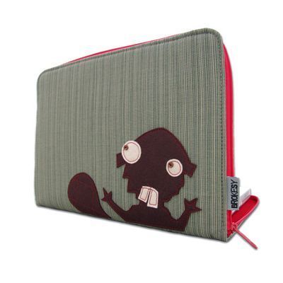
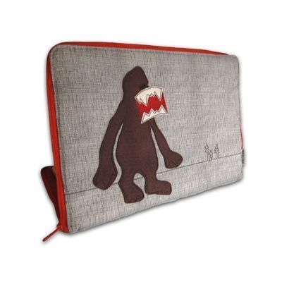
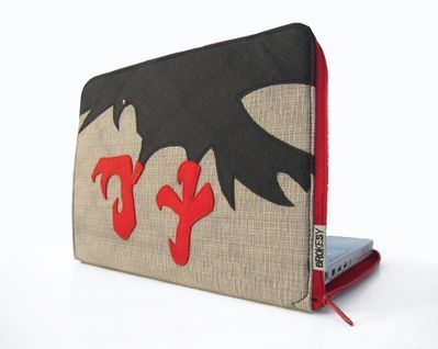
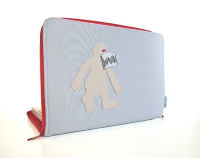
I found several other sleeve contenders at Etsy, too, and I was this close to picking up one of these bags from Brokesy, which just kinda tickled me, but I decided to go a bit more conservative:
Tags:
macbookair,
shopping
January 27, 2011
3G for iPad? Nah, Don't Need It

Illustration by Charis Tsevis.
Ars Technica ponders the seeming lack of interest in 3G iPads:
AT&T activated 4.1 million iPhones last quarter,
but only 442,000 tablets. Considering Apple shipped
7 million iPads during the same period, we wonder where
the love for 3G data has gone.
Oh, I think we all love 3G data, but it's all about context... when and where we use iPads. Mark Zuckerberg caused a stir a few weeks back when he said, "The iPad is not mobile," but for many typical users he's exactly right. Me, I use my iPad almost exclusively when I'm in places that have wifi: home, offices, coffee shops, airports, hotels, airplanes. Unlike my phone, which I constantly use in unwired (and unwifi-ed) places, the iPad is a device of settled contemplation. It's form dictates that: it's difficult to use when you're not sitting down.
I bought my WiFi iPad the first day the iPad was available, a month before the 3G models came out. My expectation was that I'd flip it immediately for a 3G device, but during that first month I realized that I didn't miss 3G even once. I haven't looked back. For the millions of others who consider the iPad primarily a device for breakfast table, bed, and living room, the WiFi-only features are just fine, thank you very much.
As the price of the device drops, more may be willing to pay a few extra bucks for 3G. But for now, it seems it's not urgently needed enough to be worth the cost.


