
Josh Clark's Blog, page 26
February 20, 2012
Roundup of Recent Appearances

Photo by Drew McLellan
I've had the pleasure of sharing my ideas about mobile experience design with a bunch of fascinating people lately, either at conferences or one-on-one. Here's a quick roundup of what I've been talking about and where you can find the traces of those conversations:
Buttons Are a Hack / Teaching Touch
Touch is leading us to a future with less and less chrome, possibly even none at all, as gestures replace familiar buttons, menus, and tabs. This presentation addressed why beloved buttons are weak replacements for manipulating content directly. I shared some practical principles for designing mobile interfaces that are both more fun and more intuitive. But hang on; if there are no visible controls, how do users figure out how to use the darn thing? I explained how to teach users new interfaces and gesture vocabularies by making it effortless to discover invisible gestures. I discussed the power of animation, the examples of game design, and techniques to build native and web apps according to the new rules of touchscreen design.
Luke Wroblewski posted his notes from this talk at An Event Apart in Atlanta, as did Evan Mullins.
PDF of the presentation slides from this talk at Web 2.0 Expo, with accompanying notes of my comments
Archive of the virtual seminar I gave for UIE to discuss these ideas ($149)
Busting Mobile Myths
The mythical mobile user who's always distracted and in a rush doesn't always, or even usually, exist. Yet too often we design for that context, creating mobile apps and websites as lite versions of desktop counterparts. Instead, mobile apps should almost always do MORE than their desktop counterparts. In this talk, I explain the difficult craft of designing simple interfaces for complex mobile apps, sharing techniques for future-friendly mobile efforts and, along the way, debunking several stubborn mobile myths.
Video of this talk from Do It with Drupal:
PDF of the presentation slides from this talk
Notes by Luke Wroblewski
Notes by The Next Web from Future of Web Design
Podcasts
I've been talking mobile over the podwaves, too. Here's where you can find those conversations:
UIE Spoolcast with Jared Spool: Discoverability in Designing for Touch
UIE Brain Sparks with Adam Churchill: Buttons are a Hack follow-up
Iterate podcast with mobile geniuses Rene Richards, Seth Clifford and Marc Edwards
The Web Ahead podcast with UX phenom Jen Simmons
Even more!
I'm slated to do a slew of talks this year, and I hope you'll come say hello. You can always find my upcoming schedule at Lanyrd for the where and when.
Tags:
conference,
josh,
podcast


February 19, 2012
Farewell, Big Medium
Global Moxie began exactly ten years ago as a one-man show with a single product, a web content management system called Big Medium. It's painful to bring an end to one's beginnings, so it's difficult to make this announcement: development, support, and sales will no longer be offered for Big Medium.
This unfortunately makes official what's already been the case for some time. The last software update was over three years ago, and as sales ebbed and new opportunities arose, my ability to provide adequate support waned. It's time to throw in the towel.
What happened?

Big Medium was aimed at web designers who wanted a simple, inexpensive system that could accommodate very flexible designs without requiring much tech know-how. It was a product that was sorely needed in the first years of the century before the explosion of competent open-source CMS's. At the time, Big Medium seemed promising both commercially and creatively.
Although thousands of websites adopted Big Medium, it never got the scale to make it commercially successful. With Wordpress, Drupal, and many other terrific systems now available to designers, an inexpensive commercial CMS just isn't viable for me as either a business or a creative pursuit. The future—for Global Moxie, at least—lies elsewhere.
This is hard. I care a great deal about the product and its small but dedicated community. I stuck with Big Medium far longer than good business sense dictates because I love it… along with the community that formed around it. I'm proud of what I built, and proud that so many people still use the software. Thank you all very much. I wish I'd been able to make Big Medium more successful for you.
I know this leaves people who use Big Medium to power their businesses in an awkward spot. I'll do what I can to make sure that you can continue using it as long as you find it useful.
What now for Big Medium?
In the next few weeks or months, I'll release one more version of Big Medium with an MIT-style license that allows anyone to use and modify the software for free. The "new" Big Medium will live at a separate website, where the FAQ and forum will continue to exist for reference and community-based assistance.
When will this happen? I don't have a firm date yet. I'll get this done as soon as I possibly can, but there are a few non-trivial code changes to make this happen—and a new website to be built, too.
In the meantime, licensed users can continue to use the software indefinitely; you may install it on an unlimited number of servers using your current license number. The support forum will remain open here until the transition to the new site. Please feel free to use the forum to pose questions to the community. I may stop by occasionally, but I'm afraid it's no longer a source of official support.
I'll continue to use Big Medium to power this site and my own projects, and so I expect that I'll make occasional improvements to the software for my own needs. When I do that, I'll update the open-source version to include those changes.
I'll have more announcements about this when there's more news to share. For now, if you have any questions about these changes, please email support@globalmoxie.com.
What now for Global Moxie?
Global Moxie is all about the mobile future. And we're growing. I'm assembling all-star teams to take on ambitious client projects for mobile apps and websites. I'm on the road nonstop these days to meet companies, teach design workshops, and speak at a constant stream of tech conferences. If all goes well, there may even be a pair of new books about mobile design this year.
This is all wildly exciting, with the very disappointing caveat that it no longer leaves any time or resources for Big Medium. Thanks to everyone who supported the genie over the last decade. I'll miss him—and you—very much.
Tags:
bigmedium
February 5, 2012
Desknots
"Mobile" doesn't mean what it used to mean. Once upon a time and not so very long ago, "mobile" meant digital experiences for on-the-go phones. Now we use the word for experiences that are neither on-the-go, nor for phones. Mobile isn't especially mobile anymore: it's on the couch, or in bed, or stalled out at a three-hour layover. And even the crisp equation mobile=phone started to break down with the arrival of tablets of all shapes and sizes.
More and more, when we refer to mobile, what we really mean is "non-traditional computing devices and environments," a stodgy mouthful that really boils down to not the desktop. Our usage overloads poor mobile to include gizmos like phones, tablets, game consoles, e-readers, even TVs. Let's give mobile a break. I propose a new catch-all term for our myriad non-desktop screens: desknots.
Desknots are connected devices that present alternative contexts and form factors for non-desktop computing. (The word "desknot" was suggested by Terence Tuhinanshu, many thanks!) But um, who cares, right? Why split hairs over what we call this stuff? Me, I think it's useful to have a broad term to refer to this entire sweeping class of new personal gadgetry. As our industry slowly gets the hang of responsive design and progressive enhancement, it's handy to have a term for all the screen contexts we've ignored (or that never even existed) over the last two decades of web and software design.
That's what we've adapted the term "mobile" to mean over the last few years. In the beginning, that made sense. Mobile phones were the only other mainstream target for personal software and web interfaces. You had your desktop version and, if you were forward looking, your mobile version. As other mobile-ish platforms came along, we folded those in, too. Kindles, iPads, 7" tablets, all called mobile. As similar interfaces expand to near-future devices for TVs, refrigerators, car dashboards, household windows, bathroom mirrors, and so on, "mobile" will become even more inappropriate and confusing as a term. I'd love to see the meaning of "mobile" reclaimed by devices that are actually mobile (rather than merely portable).
Let's call the rest of 'em desknots.
A transitional notion
A term like desknot is necessary only because the desktop still holds such a primary place in the mainstream understanding of computing. There's a damaging assumption that the desktop represents the "real" web, and all these other platforms should just get lite versions of our websites and software, if anything at all. As more and more connected devices arrive in all shapes and sizes, though, it seems clear that our computing experience will be a continuous spectrum of gadgets, our information flowing among them as our context changes throughout the day.
Over time, we'll understand desknots as having equal standing with the desktop. The desktop will be just one platform among many, on the same footing as the rest. When that happens, I suspect we won't need a term like desknot, and we can focus instead on the specific characteristics of each platform.
Desknots aren't (necessarily) mobile. Desknots aren't (necessarily) wireless. Desknots aren't (necessarily) personal. Every category of desknot has contexts, form factor, use cases, and usability considerations that are very different from the desktop. It's useful to have a term that suggests: "hey, it's not just about the desktop. Remember to do the design thinking for this whole collection of alternative devices." Those devices began with mobile, but they don't end there. Our mindset—and our language—has to embrace this sprawling landscape.
A Day Made of Glass
The folks at Corning put together a heckuva concept video that peeks into the near future of touchscreen interfaces. I'm not usually a huge fan of concept videos—they tend to veer into science fiction. While I appreciate the creative value of imagining "what if," concept videos are often slight marketing vehicles for companies who are unlikely ever to deliver.
But this video splits the difference by looking to the very near (and very plausible) future. It also goes the extra mile to spell out what's already happening, what's emerging, and to put caveats around what's more speculative. A lot of this stuff feels right around the corner, though, and it's pretty marvelous.
I especially appreciate the emphasis on screens embedded in convenient places in our lives, rather than full-blown computers. Mirrors and windows and interactive dashboards that talk to our personal computers (phones and tablets) to build context-appropriate interfaces on nearly any surface.
This closet door is actually a display driven by Amy's
tablet. All this intelligence you see on this display—all
these apps—they're all residing and running on Amy's
tablet. This display spans the entire door. It has its own
small-footprint operating system, and it's smart enough to
recognize Amy's device. And based on proximity and other
rules, it knows what to display and in what format.
It's exciting and, frankly, not so far off. If you think touch-based phones and tablets are stretching interface conventions, just wait until this stuff lands.
February 1, 2012
Designing for Touch

Fingers and thumbs turn desktop conventions on their head. For designers creating finger-friendly touch interfaces, there are entirely new conventions to learn and old ones to discard. The good folks at .net magazine indulged me by letting me grace their website with a slew of guidelines for touch design.
Great mobile designs do more than shoehorn themselves
into tiny screens: they make way for fingers and thumbs,
accommodating the wayward taps of our clumsy digits.
The physicality of handheld interfaces take designers
beyond the conventions of visual and information design‚
and into the territory of industrial design. With touchscreens
there are real ergonomics at stake. It's not just how
your pixels look, but how they feel in the hand.
The article explores the ergonomic differences of designing for phones vs tablets, iPhone vs Android, native vs web. A few of the things you'll learn:
Place primary tap targets in this thumb-thumping hot zone.
This rule of thumb applies to tablets, too, except that the thumb zone is different because we hold it differently.
Stacking controls in a touch interface should always be avoided, especially at screen bottom.
On iPhone, put app controls at screen bottom.
On Android, put app controls at screen top.
For the web, put navigation at page bottom (as opposed to screen bottom).
For the iPad, it depends.
The closer you squeeze buttons together, the larger those buttons should be.
January 31, 2012
QR Codes Are Footnotes, Not Ads
Who the heck actually snaps a QR code? Seriously, you've gotta be motivated: pull out your phone, find your code-scanning app, fumble for focus, and then wait for the network to take you to... what exactly? You're never sure. QR codes are opaque. They're intended to be gobbled down by robots (or barfed up), and so have no meaning to actual humans. QR codes ask for a leap of faith that is typically rewarded with only an advertisement on the other side. I remain deeply skeptical of QR codes as a marketing device, but that doesn't necessarily mean they won't find their place in other domains.
Use QR codes as footnotes
Like QR codes, footnotes are opaque, offering only a whiff of information scent. But the kind of information we expect of footnotes is at least generally understood. Footnotes are portals to information that's tangential to the text, offers technical details, provides a caveat to the main point, or otherwise takes a deep dive into details that are primarily of interest to a narrow sliver of the audience. They are paths to relatively obscure information, not the main event. Like footnotes, QR codes ask you to break out of a narrative to chase down a vague cloud of related information. You have to be deeply interested in what's on the other side to take that plunge. They're best for the truly motivated—not a casual audience.
That means QR codes are lousy for marketing slogans and simple ads, where a good old-fashioned URL is more effective, more memorable, and possibly even as machine-readable, as Kevin Marks points out:
With a URL they could type it in, take a photograph of it
and type it in later, or if they have the right app, it
will recognise the URL text from the image and make it
clickable.
That is the irony of this. QR Codes ignore years of
research and culture on how to communicate meaning in
symbolic form designed to be captured by image processing
tools behind a lens. We have this technology. It is called
writing.
Written language has a set of symbols that are relatively
unambiguous, that are formed of curves rather than hard
edges making them resilient to noise, and have been
market-tested for milennia. QR Codes don't just ignore
this, they ignore the relative success of one dimensional
barcodes. Notice something about a barcode? It has the
number printed on it as well, so you can type it in if the
scan fails.
Then again, those barcode numbers don't exactly hold lots of meaning for most of us, either. In fact, that's when QR codes (and barcodes, too) are at their most useful: replacing impenetrable strings of numbers that are at least as opaque as the QR code itself. That's especially true for information that you want to present out in the world to those who are motivated to fetch it. Shelley Bernstein of the Brooklyn Museum offered up some good examples of how New York City is using QR codes to fast-track mobile access to personally important information:
I think we are starting to see a tide change in New York
City. For starters, the city is using them on all the
building permits, so you can learn more as you pass
construction sites. There are plans in the works for QR
codes on all the restaurant inspections plaques. If
there's one thing that would motivate people to jump the
technical hurdles of installing a QR reader, this would be
it—the notion that we could see the actual violations that
led to a restaurant's letter grade makes QR truly useful
for those of us who obsess about where we eat.
These examples reveal information hidden behind the inscrutable id of a bureaucratic permit or violation, both of which would make for tough-to-type, tough-to-remember URLs. The examples are well suited to a mobile context, too, ideal for someone who wants to know the information now. They're motivated. These are footnote examples. QR codes are good for linking to obscure information tailored to a specific context and interest.
But will people really use them?
Even if we start using QR codes the right way, will they ever get traction? It's still early, but we do see that people are starting to use them. According to comScore, 6.2 percent of US mobile users scanned a QR code in June 2011, and that number rose to 8.6 percent by October. That's a lot of people, an increase from 14 million to 20.1 million in just four months.
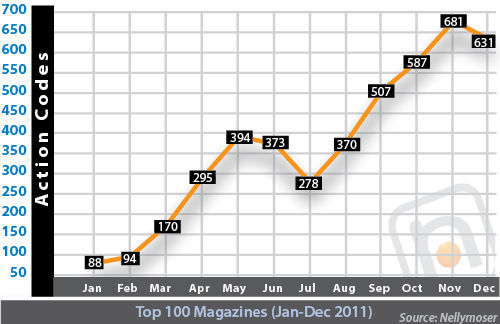
It's hard to know whether that increase is thanks to genuine interest in QR codes or a passing curiosity factor due to the deluge of these things flooding our environment. The top 100 US magazines saw the number of QR codes increase 439 percent over the course of 2011, according to Nellymoser. That study showed that QR codes are overwhelmingly used for ads, swamping the kind of editorial footnotes for which they're better suited. Even editorial QR codes are moving in an ad direction: "In the beginning of the year, editorial codes were dominated by videos related to features in the magazine. By the end of the year, many of the editorial codes were for sweepstakes run in the editorial section."
Banal use of QR codes for marketing is unlikely to keep drawing people, though, and it may even poison the well. Adam Greenfield and his crew at Urbanscale did some informal guerilla research in the streets of New York, showing people QR codes, asking them if they knew what they were, and then trying to coach them through scanning one. Awareness of QR codes was fairly high, but less than 10 percent were able to resolve a QR code into a URL, and most weren't interested anyway:
A strong theme that emerged — which we certainly found
entirely unsurprising, but which ought to give genuine
pause to the cleverer sort of marketers — is that,
even where respondents displayed sufficient awareness
and understanding of QR codes to make use of them,
virtually no one expressed any interest in actually
doing so. As one of our respondents put it, "I've already
seen the ad, and now I'm going to spend my data plan
on watching your commercial? No thanks."
If traditional ads aren't motivating enough, what about more editorial content? It seems even there, with footnote-style information, people are slow to warm up to QR codes. At the Brooklyn Museum, Shelley and her team have been typically innovative in ways to use QR codes to supplement exhibitions, with mixed results. The museum was reasonably pleased by visitors' use of QR codes that supplement wall text ("I want to know more about this"), but was disappointed in other areas. In one case, replacing a text-based scavenger hunt for mobile phones with the same game driven by QR codes resulted in a five-fold drop in participation. The codes actually chased the audience away. For advertising, it was a bust, too:
We put a QR code on all the advertising for [the
exhibition] The Latino List, so people could download
the exhibition's iPhone app. Given the amount of
advertising that was done, it seems incredible that the
code was scanned only 118 times. Yes, that's right, 118
scans, but this figure seems right in line with Adam
Greenfield's research at Urbanscale.
So, I think what we end up with is simply a project that
isn't an overwhelming success or failure. Certainly, QR
on advertising didn't do so well for us. QR use in the
building is overall very low, with visitors seeming to
favor application-like uses for it. However, compared to
pre-QR code use, the use of those applications dropped
significantly. This suggests that QR might be appropriate
for special projects, but that we probably need to stay
away from it as a baseline visitor amenity if we are to be
at all inclusive about how we serve content.
Label the portal
Still, the relative success of the wall-text QR codes in Brooklyn suggests that QR codes are at their best when the benefits are evident and it's clear what's on the other side. That means there's some important design work to do around QR codes: Let me know what I'm going to get from this hassle. Nellymoser says advertisers are starting to do this by offering explanatory captions next to QR codes in their magazine ads:
By Q4, more than two-thirds of all action codes (1327 or
70%) were accompanied by information that described what
happens after the scan. This is considered by many to be a
best practice and follows the pattern of many other calls
to action.
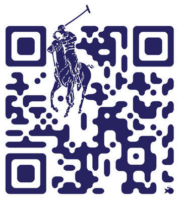
Labeling QR codes is a good start, and it may likewise help to improve the design of the QR codes themselves. Turns out QR codes don't have to be a black-and-white jumble; they can include color and even images. For example, Ralph Lauren's agency, Red Fish Media, whipped up a custom QR code that featured the company's iconic polo player, reporting that the designed codes see three times the action as the plain vanilla version.
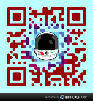
It's not hard to create a custom QR code, either, thanks to tools like QRhacker, which lets you generate a QR code and then customize it with colors and images, even changing the shape of the dots in the code. Using QRhacker I whipped up this QR code for the futurefriend.ly site in all of two minutes:
Captions, images, and color help give unwelcoming QR codes some identity and, more important, an information scent that hints at what's on the other side. At a time when touch interfaces—and even the humble text link—are cutting through complexity by using content itself as navigation, an opaque, unadorned QR code feels like a step backward. Making the codes visually meaningful is helpful.
In the end, though, the thing that will most coax people to overcome the technical barriers of QR codes is simply linking them to actually meaningful content. Traditional advertising messages won't cut it. Go figure, but pulling someone through a QR portal means we have to give people information they actually want or need.
Tags:
advertising,
content strategy,
marketing,
mobile,
publishing,
qrcodes,
usability
December 18, 2011
Gifts for Designers, Nerds, and Mobile Mavens
What to get for the nerd who has everything? As a nerd who most certainly doesn't have everything, the best I can offer up is my own list of coveted items. Here's my Amazon wish list. Perhaps you'll find some inspiration for your nerd, too.
Below you'll find a few selections from that storied list, appropriate for all designers, nerds, and mobile mavens. And hey: Murray Christmas!

Murray Christmas tshirt by Luke Dixon.
Susan Kare Icons book
Susan Kare is the graphic designer who created many of the original interface icons for the Mac back. This book is a curated look at 80 of the icons she created between 1983 and 2011, with zoomed views and notes by the artist.
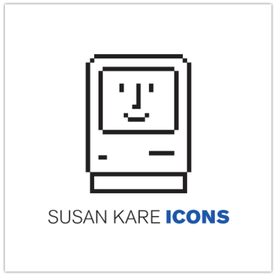
Susan Kare Icons
iPhone and iPad stencil kits
These sturdy steel stencils are ideal for app-sling craftsmen and craftswomen. Separate stencils available for iPhone and iPad.

iPhone stencil kit from UI Stencils.
Eames: The Architect and the Painter documentary DVD
A documentary about the husband-and-wife team of Charles and Ray Eames, widely regarded as a pair of America's most important designers.
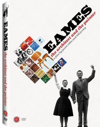
Eames: The Architect and the Painter
Secret-agent phone holster
For tough-guy nerds and phone fans: a Bond-style shoulder holster.
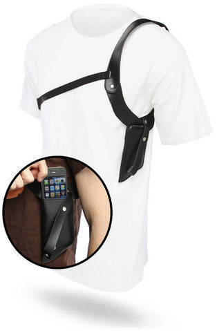
Secret-agent phone holster
A no-kidding-around charger
This surge-protecting charger ombines traditional and USB plugs so your nerd's many, many devices will never go without power.
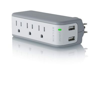
Belkin Min Surge Protector Dual USB Charger
Classy Laptop Backpack
Incase's Terra line has several nerd cases that are decidedly unnerdy, including this backpack, which has compartments for both laptop and iPad.
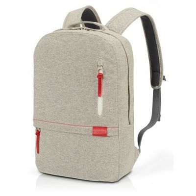
Incase Terra Campus Pack
Dieter Rams
Braun's longtime lead industrial designer had a huge impact on modern design, most notably in the clean aesthetic championed by Apple. Less and More: The Design Ethos of Dieter Rams explores his work.

Less and More: The Design Ethos of Dieter Rams
Retro Phone Cradle and Headset
The mid-century telephone may not have been mobile, but man it had a great headset—you know, the kind that you could actually hold to your ear with your shoulder. The original hands-free headset! This nifty cradle charges your iPhone while you talk in old-school glory on the retro headset.

iRetrofone Cradle and Headset for iPhone
Future-friendly helmet
This junior astronaut helmet is a great toy, but even more important, it's the very helmet that inspired the future-friendly logo and that accompanied the gang at Mobilewood this year.
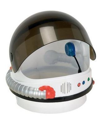
Aeromax Junior Astronaut Helmet
Stylish stylus
Speaking of astronauts, no wish list would be complete without the Cosmonaut, a new stylus for touchscreens. Chunky like a marker, it's easy to grip and pleasing to draw with.

Cosmonaut stylus
Nerdiest watch ever
Sure, I confess: I sported a classy Casio Gold calculator watch in my misspent youth. But baby, it's got nothing on this beauty. The Click Keypad Watch sports a giant keypad and no discernible display, flashing numbers on the keypad to tell you the time. Sublime AND ridiculous.
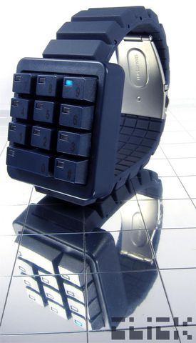
Click Keypad Watch
"Hero Mash" print
Because one hero just isn't enough, artist Simon C. Page's print mashes several into one EVEN MORE SUPER hero.
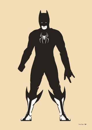
Hero Mash #1
Saul Bass monograph
This book explores the work of designer Saul Bass, creator of posters and title sequences for films including Alfred Hitchcock's Vertigo and Otto Preminger's The Man With The Golden Arm and Anatomy of a Murder. He also created some of the most famous logos and corporate identity campaigns of the century, including those for major companies such as AT&T, Quaker Oats, United Airlines and Minolta. One of the great designers of the 20th century.
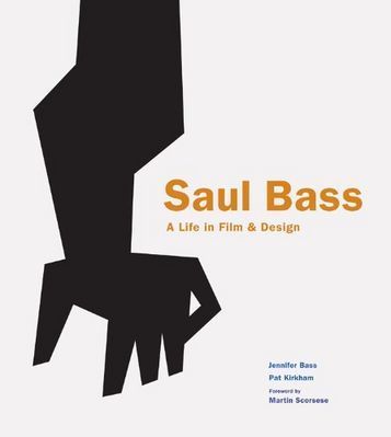
Saul Bass
iCufflinks
When your geek wears a tuxedo, make sure that the nerd still shows. The LED on these power-button cufflinks gently pulses.

iCufflinks
iPhone boombox
This whole music-library-in-your-pocket thing is all well and good, but everyone knows it's not a music system if you can't carry it on your shoulder and blast that bass. Enter the iHome Portable FM Stereo Boombox for iPhone. Oh yes, friends, yes.
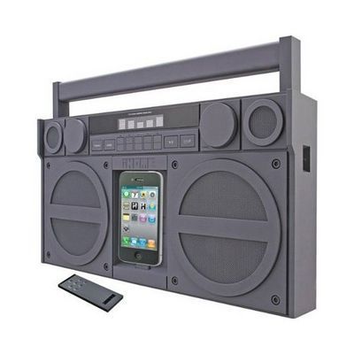
iHome Portable FM Stereo Boombox for iPhone
Giant LEGO heads
Every nerd loves LEGOs, and these giant LEGO heads double as containers for all of your geek's nerd gear.
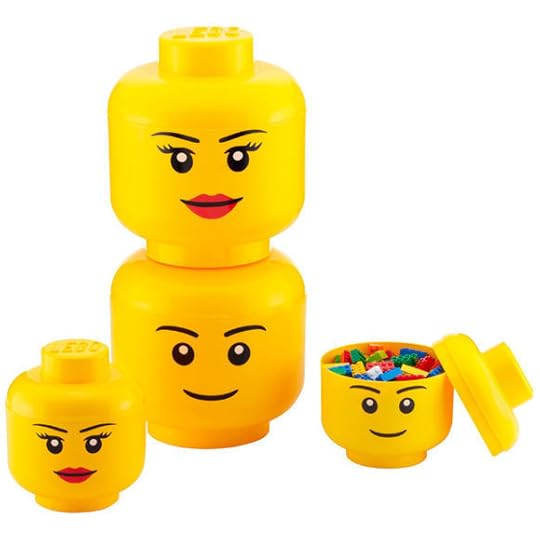
LEGO storage heads
Sifteo Interactive Game Cubes
These little toys are miracles of network technology. Sifteo cubes can communicate with the others, detecting their neighbors, and "talking" to them to enable a slew of interactive games.
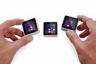
Sifteo game cubes
Peek into great designers' sketchbooks
Steven Heller's book, Graphic: Inside the Sketchbooks of the World's Great Graphic Designers gives a voyeuristic peek into the working process of some sensational designers.
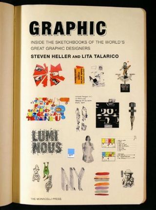
Graphic: Inside the Sketchbooks of the World's Great Graphic Designers
Atomic disintegrator
An honest-to-heaven 1954 vintage toy ray gun. This will make your nerd's brain melt.

Vintage Hubley Atomic Disintegrator
Pass the Bat-Spatula, Robin
The Batman apron: when your nerd comes out the nerd cave for food, this kitchen protective gear is essential.
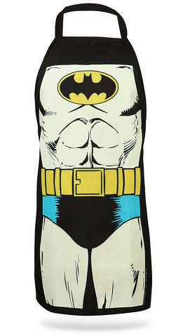
Batman apron
Bedside manner
Seems pretty much everyone uses their phone for an alarm clock now, but you can still relive the glory days of the radio alarm clock with this wood-replica phone dock, which also happens to charge your phone while you sleep.
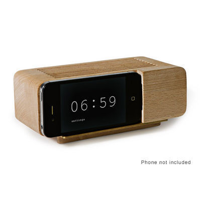
AREAWARE phone dock
May I be so bold?
If your nerd designs mobile apps, many have generously told me that they've found my book useful for that. Tapworthy focuses on how to think iPhone and create terrific app experiences, but it's useful for designers on all platforms. You'll get the cheapest deal at Amazon, but O'Reilly sells DRM-free ebooks for all the major ebook platforms.
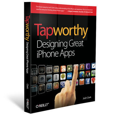
Tapworthy at Amazon or O'Reilly
And that oughtta get you started, but there's an embarrassing number of other things to discover in my Amazon wish list. Hey, happy holidays, full of merry nerdiment.
Tags:
shopping
December 17, 2011
Gestures in #NewNewTwitter
Gnashing of teeth and rending of garments greeted the arrival of New New Twitter last week, and the iPhone app caught an especially stiff backlash. Much of the criticism focused on Twitter's downplay of once-core features (direct messages and account switching) and the arrival of the Discover tab which pimps Twitter's trending topics. The changes seem due to an apparent shift away from power users and toward relative civilians, as well as a try at positioning Twitter as a content discovery service as much as a communication service. In that light, many of the changes make good sense, and it's clear lots of hard thinking went into it.
Me, I was most intrigued—both positively and negatively—by changes in the app's gesture interactions. I put together a quick screencast that summarizes my thoughts, along with demos of the gestures at hand:
If you prefer your opinions in prose instead of video, here's the skinny...
A swipe, swiped
Swiping left to right across the Navigation bar returned you to your timeline in previous versions of Twitter.
I was disappointed to see Twitter remove a little-known swipe shortcut. In previous versions, swiping left-to-right across the Navigation bar popped you back up to your Twitter timeline after you'd descended down through several layers. Twitter, like Facebook, is great for exploring content and profiles: tap a tweet to drill down through links and account profiles. This is terrific, but you can go a long way down the rabbit hole, which means lots of tap-tap-tapping of the Back button to find your way home. The swipe was a shortcut for teleporting directly back to your timeline without retracing your entire path, and I had begun to hope that this might become a de facto standard for iOS apps.
Trouble was, this shortcut wasn't even close to widely known. A friend at Twitter confided, "Half of our employees didn't even know about that swipe gesture," let alone regular folks. So Twitter changed the action to something they hoped we'd all find more easily: another tap on the Home tab now zips you back to the top level of your timeline.
I support the motive but have misgivings about the change. It's too easy to do a single tap by mistake, and here that mistap will lose your place if you're drilled way down into the app—a form of data loss. By contrast, a swipe requires just enough intent to keep you out of trouble. That's why a swipe is used in iOS to unlock your phone, power off, answer a call, turn off an alarm, or trigger the delete shortcut. Those are all actions that you don't want to touch off accidentally. Losing a deep position in the app is just as serious, and should be protected by a similarly serious gesture. A swipe is good defensive design, an ideal shortcut for that.
Alas, few people knew about the swipe shortcut, so the gesture wasn't serving its purpose. A better solution than changing the gesture, though, would be to help people find it in the first place. More on that in a bit.
This rabbit-hole problem is common enough in iOS apps that a standard shortcut is badly needed. I'd hoped that the swipe gesture might be it, and for a few brief weeks, it was beginning to look like that just might happen.

In Facebook, swiping left to right across the Navigation bar reveals the top-level navigation.
See, until last month, Facebook for iPhone had its own top-secret gesture for this. When you drilled deep down into versions prior to 4.0, you could tap the screen title in Facebook's Navigation bar to zip back to the app's home screen. So here we had two highly influential apps using different actions to accomplish the same task. But when Facebook 4 came out and reorganized the app's navigation, the swipe was suddenly the common action for both. In the current version of Facebook, swiping left to right across the Navigation bar reveals the app's top-level navigation, and from there you can hop to the top of any of Facebook's sub-apps.
For a bare few weeks, in other words, both Twitter and Facebook used the same swipe to spring back to the top of the app. With two such big-audience apps supporting the gesture, it stood a chance of becoming a useful standard. But the latest version of Twitter removed it, and that suddenly seems less likely.
I'd love to see Twitter reintroduce the swipe gesture and take a fresh approach to helping folks find it.
Don't prune. Teach.
Lots of designers avoid using gesture shortcuts altogether, because they rightly assume that their audience won't find them on their own. Gestures are invisible, without the cues of buttons and other traditional controls. The answer, though, is not to prune gestures entirely, but instead to supply visual hints at appropriate times to help people find these shortcuts.
Before doing this teaching, though, there's real value in having the app's audience learn the slow way. Thumping the Back button to return home, for example, reinforces the mental model of the app. Before someone learns a shortcut, it's helpful for them to know just what it is they're shortcutting. But after they've done it a few times, it's appropriate to reveal the shortcut—just like a video game rewards you for completing a level. Shortcut achievement unlocked! This is how games take players from novice to expert to master, and other kinds of software can benefit from this, too.
That includes Twitter and Facebook. After someone returns to the top level several times from, say, three or more levels deep, a text overlay and gesture animation should materialize to explain the shortcut. The best way to teach is to build in steps from a basic foundation to more advanced moves, and I believe these gradual, contextual lessons are the best way to teach gestures. This is how you help people level up.
In your corner
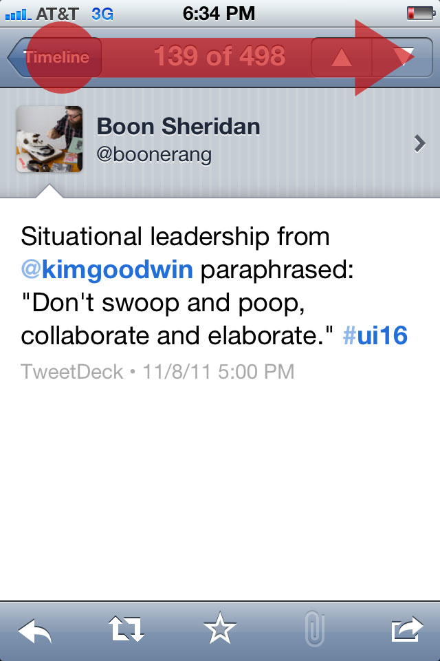
Meanwhile, I very much like two new shortcuts in the Twitter app. The new version buries direct messages and account switching under the app's Me tab. That's a double-tapping hassle for frequent users of those features, but two new gestures remove the sting. Swiping up from the right corner slides up your direct messages, and swiping left from the right corner flips to the view for switching accounts.
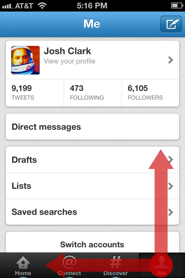
Twitter's new corner gestures let you swipe up to reveal direct messages, or left to change accounts.
Those swipes conveniently start on the Me tab, where both features live, but the fact that it's the corner is more important. On both touchscreens and traditional screens, the corners are especially easy targets. On the desktop, you can just slam the cursor into the corner and you're guaranteed to hit that one pixel. It's not quite as easy on the touchscreen, but the corners are still more forgiving touch targets than just about any other part of the screen. Swiping from a corner is the easiest part of the screen to start from.
Corner swipes are great gestures for navigation shortcuts, with one caveat: iOS designers shouldn't count on downward swipes from the top corners, where you'll run afoul of the Notification Center. I imagine that's one reason why you can't dismiss Twitter's direct messages by swiping back down; if you miss, you'll instead pull down the notifications windowshade. (You can, however, flip back from the accounts view by swiping right across the bottom.)
So, the practical guideline for adding corner swipes in iOS is: you can swipe both horizontally and vertically from the bottom corners, but only horizontally from the top corners. (Ideally, you'll reserve those top corners for zipping back to the top level, as discussed above.)
The foiled hijacking
Previous versions of Twitter let you swipe a tweet in the timeline to get quick access to a toolbar of actions to reply, retweet, and so on. That's been removed; to get those actions you now have to tap the tweet to go its detail view and tap the action there—a quick swipe-tap combo replaced by a slower tap-tap combo.
I've long been conflicted about the old Twitter's swipe gesture. In iOS, a swipe in a list typically triggers a delete action, though apps sometimes piggyback on that gesture's familiarity to do something different. Reeder, for example, uses the swipe as a shortcut to mark an article read. No harm done there, since there's no such thing as deleting a Google Reader article, and marking read is kind of delete's cousin. But Twitter's old swipe gesture didn't just piggyback; it outright hijacked the swipe to do something completely different.
I generally frown on hijacking standard gestures for new actions. People who expected that swipe to delete a tweet either never found the action or were surprised when they did. That's not ideal, but on the other hand, the swipe had such obvious utility. On balance, I miss that shortcut, and I'm sorry to see it go.
If it's gone for good, then I'd at least like to suggest an alternative shortcut:
Tap-and-hold is a universal problem solver
I wish more iOS apps used tap-and-hold to reveal an action sheet for an iOS equivalent of a right-click contextual menu. It's a quick win to give power users easy access to actions on the tapped object without distracting novices. In this case, tapping and holding a tweet could reveal buttons to reply, retweet, or quote that tweet. Previous versions of Twitter let you tap and hold a link to copy it, and I'd love to see the same offered in the new version, along with the ability to open in Safari, read later, and so on.
I count many of the folks at Twitter as some of the smartest people I know and, not least, as good friends. I see how much work and thought went into Twitter, and man, they had a tough brief: make the app easy for new and mainstream users, create an environment that will support advertising without damaging content, and surface (hopefully) interesting topics to explore. These goals suggest solutions that are at odds with the habits of many of the service's most passionate users, as we saw in last week's backlash.
I think, though, that the addition of a few well-considered gestures can give those users quick access to the features they care about without derailing the service's evolving goals. The challenge of designing for gestures is that they're invisible, but that's also their advantage. They remove the chrome and clutter of advanced features, tucking those features away until newcomers are ready to tackle them.
Tags:
design,
gestures,
iphone,
touch,
twitter,
usability,
video
December 12, 2011
Board Games

Photo by Derrick Collins.
You are the company you keep, or so the saying goes. And maybe the companies, too. I just joined the advisory boards of two outfits I very much admire, and I'm looking forward to contributing to the bright future of both.
I'm a freshly minted advisor to Mobiquity, a new firm focused on building mobile software for the big boys in the Fortune 200. Great team, great clients, great projects, great ideas. So, yeah: just great.
I'm also on the editorial advisory board of Rosenfeld Media, the publishing house of UX legend and all-around mensch Lou Rosenfeld. Lou's authors help shape the industry. As for the others on the editorial board, well, they're pretty much all my heroes.
This is an exciting way for me to end the year, and I'm flattered to find myself in the company of such good companies.
Tags:
business,
josh,
publishing
November 27, 2011
Eve's Wireless
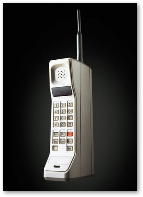
Combine a fire hydrant, an umbrella, and a heavy wooden box, and you've got the components of a circa-1922 mobile phone. Add a cheerful operator and a phonograph to the mix, and you've got your own flapper-era Siri playing music on demand.
When you think of early mobile phones, you probably think of one of these 1980s-style bricks:
Or perhaps if you're an old-timer, you might recall these spiffy 1970s numbers that basically required you to haul a car battery everywhere you went:
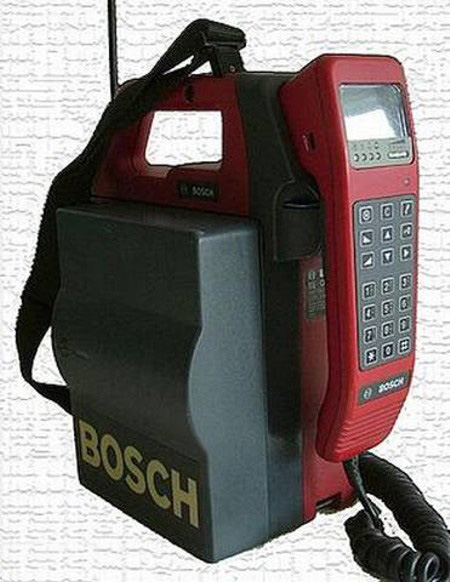
But friends, these technological marvels of the 1970s and 1980s were lazy latecomers compared to Eve's "portable wireless phone":

Eve's wireless was documented in a 1922 silent film recently uncovered by British Pathé. In the movie, Eve hauls her contraption around in a heavy box ("and won't hubby have a time when he has to carry one!"), grounds it to a convenient fire hydrant, and unfurls her umbrella antenna to make a call. An obliging operator answers and plays Eve some music on her new-fangled phonograph.
Hard to tell thanks to grainy film quality, but the device looks to be a Home-o-Fone, manufactured by New York City's own Radio Receptor Company, Inc.


