
Josh Clark's Blog, page 23
January 7, 2017
Natural Gesture Language for Smartwatches

When Samsung wanted to explore smartwatch interactions beyond the screen, the company came to Big Medium.
Samsung developed prototype software for Android Wear watches to detect natural gesture���motions and signals you make with your hand. Using the accelerometer on the watch, the software detects not only motion but the subtle impact signature of a snap, a flick of the finger, or a knock on the table.
Big Medium���s Josh Clark worked with the team to develop a system of gestures and associated meanings so that a watch on your wrist can control the phone in your pocket or across the room. Snap to start playing music, or flick to go to the next song. Samsung highlighted the technology in a keynote to showcase its potential use in virtual reality.


UX for a Connected Inhaler

Propeller Health’s connected cap turns any asthma inhaler into a discreet monitoring device to track and improve a patient’s condition.
Propeller Health helps people with asthma manage their condition by tracking their attacks and offering insight and actionable steps to reduce their symptoms. Just attach a bluetooth sensor to an inhaler, and Propeller takes care of the rest.
Big Medium���s Josh Clark collaborated with G51 Studio to design Propeller���s UX flow, data visualization, and visual interface for iOS, Android, and responsive web. Crucial areas of work focused on:
making it effortless to complete the potentially complex pairing process
presenting information in a way that delivered actionable insight and interpretation, not just a pile of data
developing a visual language that worked well across all platforms
Learn more: Propeller Health
Design To Wake a Sleeping Giant

Before and after: Verywell (right) replaced the venerable About Health network, injecting new life into About.com as part of its new vertical strategy.
The Team
Josh Clark: Creative direction, UX design
Dan Mall: Art direction
Brad Frost: Front-end design and development
Ian Frost: Front-end design and development
After 20 years on the web, About.com was showing its age. Big Medium helped the company reinvent its product strategy and design process���and created some mighty good-looking and profitable sites along the way.
At the start of 2016, About.com was still the 40th-largest site on the web in page views, but the network was seeing punishing drops in page views. The network���s massive collection of general-interest content, once its greatest asset, was now seen by search engines as a content farm. Its design was generic and conservative, and the pages were choked with ads and pay-per-click links in a desperate attempt to keep revenue level. Audience and advertisers were turning elsewhere.
Big Medium worked with About.com to develop a new vertical strategy, carving out the content from the main network into branded premium experiences. Big Medium designed the health vertical Verywell and the finance vertical The Balance, giving both a warm, humane feel that was missing from About.com. The results were beyond expectations:
The new verticals have more than doubled engagement in every metric.
With far fewer ads, ad visibility and engagement are way up, along with ad revenue.
About.com���s verticals Verywell, The Balance, and Lifewire are all in Comscore���s top ten in their categories .
Along the way, Big Medium also overhauled the company���s entire approach to web development. Josh Clark, Brad Frost, and Dan Mall embedded with the Verywell team���s leadership and introduced:
A newly collaborative design process
���Designing and deciding��� in the browser
The atomic design methodology
A tight focus on the mobile experience
See the sites in action: www.verywell.com and www.thebalance.com

Verywell���s design is a welcome departure from the hyper-clinical approach of other health sites. The stock-photo-heavy sector gets a reprieve with hand-drawn, humanizing illustrations.

We designed every page starting with mobile, reflecting the reality that smartphones are the preferred experience for most visitors.
Shake Music from your Phone to your PC
Larry Legend: App development
Josh Clark: Interaction
Happy Together is an experiment in making gadgets play nice. Developer Larry Legend teamed up with Big Medium’s Josh Clark to create a prototype app to shake music, photos, webpages, maps, or text from iPhone to Mac. Here, Larry shows how the app works to flip music from your phone to your Mac.
Want to get involved? Get in touch with us, or fork the project at Github.
An Online Home for the World's Biggest Publisher

“Be rambunctious” was a design principle for this project. And thus: Beyonc��.
The Team
Josh Clark: Creative direction
Kevin Hoffman: Information architecture
Ahava Leibtag: Content strategy
Melissa Frost: Art direction
Brad Frost: Front-end design and development
When Time Inc. spun out from parent Time Warner in 2014, the company was on its own for the first time in decades���and it needed its own brand. Big Medium gave Time Inc. a new visual swagger, a responsive website, and strong messaging to explain the company���s lasting value as the publisher of the world���s most iconic brands. Time Inc. owns and publishes over 100 magazine brands, including Time, Sports Illustrated, People, Fortune, and Entertainment Weekly.
Big Medium worked with a broad team including Time Inc.���s CEO, chief content officer, and chief marketing officer to distill the essence of the reinvented brand. With the directive to ���be rambunctious,��� Big Medium crafted a message and visual brand for Time Inc. that is as lively as its many titles.
See the site: www.timeinc.com

We designed high-impact landing pages for each of Time Inc.’s iconic brands, recalling the importance of those brand’s cover photos over the past century.
September 17, 2016
The Difference a Decade Makes
An Event Apart marked its 10th birthday by asking friends and collaborators to look back and remember what they were doing back in 2006. They shared the results in four installments: one, two, three, and four. Here���s my contribution:
Ten years ago, I lived in Paris, where I designed websites and built a designer-friendly content management system.
Back then, I assumed that digital interfaces would always sit inside a big box on my desk. I naively assumed the web would always be tied to screens. Now I design digital interfaces for phones, living rooms, cars, clothing, jewelry, and asthma inhalers.
Ten years ago, my watch couldn’t tell me the weather. When I asked my living room to “turn on the lights,” it ignored me. I watched my favorite TV shows in agonizing weekly intervals, an hour at a time. When I needed a car to take me somewhere, I had to go into the street and wave my arm at yellow automobiles. Keeping in touch with friends required individual communication via phone call, email, or ink scratchings on a sheet of wood pulp. A tweet was the sound a bird made.
Ten years ago, my primary phone plugged into the wall. People left messages on a recording device that sat next to it. I occasionally typed text messages into a cell phone, using a keyboard labeled 0-9.
Ten years ago, there were two screens in my life: my PC and my TV. Now I have eight. When friends went out to dinner, none of us looked at our phones, ever. When I browsed the web, I didn’t see the same ad following me everywhere. There wasn’t a microphone in my living room allowing one of the world’s biggest companies to listen to everything I say. I didn’t feel beholden to my bracelet to walk a certain amount of steps per day.
2006 still seems like yesterday, but since then, technology has changed the entire fabric of our lives. Through it all, An Event Apart shined a bright light not only on the best techniques for crafting that technology, but the values that should shape it. Thank you, AEA, and happy birthday. You look just great.
June 14, 2016
The Physical Interface
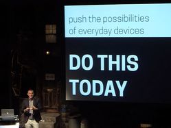
Watch the video from Smashing Conference New York, June 2016.
Watch video
Download slides
We suddenly live in a strange and wonderful nexus of digital and physical. Touchscreens let us hold information in our hands, and we touch, stretch, crumple, drag, and flick data itself. Our sensor-packed phones even reach beyond the screen to interact directly with the world around us. While these digital interfaces are becoming physical, the physical world is becoming digital, too. Objects, places, and even our bodies are lighting up with with sensors and connectivity. We���re not just clicking links anymore; we���re creating physical interfaces to digital systems. This requires new perspective and technique for web and product designers. The good news: it���s all within your reach. With a rich trove of examples, Josh Clark explores the practical, meaningful design opportunities for the web���s newly physical interfaces.
March 12, 2016
Multidevice Mambo: UX Choreography Among Gadgets

Designers tend to approach every interface as a dance solo, assuming that their UI will enjoy sole attention. Truth is, the stage is jammed with digital performers, and more join every day. Watches, thermostats, televisions, jewelry, phones, and everyday appliances are lighting up with new intelligence and interactions. The challenge and opportunity for designers is to create experiences for each gizmo that anticipate and embrace these other players, designing with the whole troupe in mind���and encouraging users to sashay among them.
Josh Clark shares a whirling fandango of practical techniques and interaction examples to show how designers can plan and craft a UX for this whole complex ecosystem, not just for the individual device. The nature of UI design is cha-cha-cha changing; learn to keep up with the tempo of this multi-device mambo. Learn to:
Dance with a partner (or many of them): design patterns for slinging content between devices
Get physical: how physical interaction is just as important to multidevice UX as screen-based digital interaction
Do the latest dance: how emerging platforms like conversational UI and the internet of things are relevant to every web designer or developer
Stay in step: manage brand consistency as you sashay across devices, operating systems, platforms
Organize the steps: Process, technique, and planning for multi-device, multi-platform experiences (e.g. making it work in your organization)
December 20, 2015
Magical UX and the Internet of Things

Watch video
Download slides
What if this thing was magic?
The web is touching everyday objects now, and designing for the internet of things means blessing everyday objects, places, even people with extraordinary abilities���requiring designers, too, to break with the ordinary. Designing for this new medium is less a challenge of technology than imagination. Sharing a rich trove of examples, designer and author Josh Clark explores the new experiences that are possible when ANYTHING can be an interface.
The digital manipulation of physical objects (and vice versa) effectively turns all of us into wizards. Sling content between devices, bring objects to life from a distance, weave “spells” by combining speech and gesture. But magic doesn’t have to be otherworldly; the UX of connected devices should build on the natural physical interactions we have everyday with the world around us. This new UX must bend technology to the way we live our lives, not the reverse. Explore the values and design principles that amplify our humanity, not just our superpowers.
September 7, 2014
Smart Watches, Wearables, and That Nasty Data Rash
This article first appeared in Issue #2 of Connected, a quarterly publication about connected devices, alongside many smarter observations about wearable technology. You should totally buy the issue here.
da•ta rash \ˈdātə ˈrash\, n. an irritating or unsightly eruption of information on the wrist or other site of wearable technology.
Every technology has its toxic byproducts and associated maladies. The pollutants of the industrial era cursed us with black lung, lead poisoning, radiation sickness and more. Now the information age threatens to ding us with the damaging, if less deadly, ailments of data pollution.
For all the remarkable opportunities that information technology has unlocked, it’s hard to dispute the downside of our diminished ability to focus, to find calm, to connect with the people we care about. As social networks spew a dazzling blizzard of text, images and alerts, we’re buried under the impossibility of consuming those messages as quickly as they are produced. Online, we enjoy the illusion of companionship without the demands or benefits of friendship. Offline, we test our genuine friendships by gazing into glass slabs instead of enjoying one another’s company.
And now here come the wearables. I’m a technologist, an enthusiast, an optimist. I’m beside myself about the possibilities of ubiquitous computing. But I’m also concerned that the first generation of wearable gadgets is buffeting the body in unintended ways, like so many other technologies that came before. Will our skin burn with bubbling boils of data? Will our ears buzz with non-stop notifications? Will our eyes flicker with the alerts streaming across the clothing and accessories of others?
There are so many opportunities in the fact that we can now wear data. But the risk is that it will wear us.
It doesn’t have to be that way, of course. Careful, humane design can give us the benefits of wearing data without allowing information poisoning to seep beyond the screen and into our physical selves.
Some suggestions: design for pre-attention; design for fashion; design for identity; design for the individual; and design to amplify our humanity.
Design for pre-attention
Designers of smartphone interfaces did their jobs a little too well. They created experiences that are so engaging that they soak up all of our attention. They did it by combining very personal data, social interaction, and a hefty dose of FOMO into a visual interface that requires focus and concentration to make sense of it. Our screens become the foreground to everything else, and in the moments when we allow them to fade to the background, alerts prompt us to pick them up again.
This model is not a promising future for wearables. Smart-watch designers, however, seem to be smitten with the idea of strapping a smartphone equivalent on your wrist. These watches strive to replace or supplement smartphones with screens that update you constantly with the latest info. This “convenience” imposes more information onto your body than it can or should bear.
As the internet of things turns everything—every object, every place, every person—into a potential interface, those interfaces have to be more discerning. They should demand our attention only at truly demanding moments, not at the receipt of every new email. The real luxury of wearing information is not in exposing ourselves to every passing data point but in filtering that data in ways that alert us gently, even subconsciously, to changes in our environment.
Cognitive science has a name for this. Pre-attentive processing is the way our brains gather information from the environment when we don’t even realize it. In the flash of an eye and without even a moment of concentration, we detect changes in temperature, in color, in motion, in facial expression. We process these environmental cues subconsciously, without effort, so they don’t compete with or intrude upon the subject of our conscious focus. Contrast that with the concentration it takes to read even a short text message, an activity that requires you to tune out everything else for a few seconds.
Designing for pre-attention makes the information display so subtle that it becomes practically instinctual—a spidey-sense awareness of your personal data. The original wearable technology—the watch—is a model of this kind of ambient, low-impact display. Unlike phones, watches don’t push or interrupt but quietly make their information available whenever you choose to seek it out. That information also happens to be highly glanceable, consistently formatted, and requires virtually zero cognitive overhead. We glance absentmindedly at clocks or watches without losing the attention we’ve invested elsewhere. As an information interface, the watch is neither greedy nor preening.
Turning a watch into a smartphone undoes all of that elegance. Ideally, the smart things we wear on our bodies shouldn’t ever buzz, beep, or tantrum. They should quietly respect our attention, standing ready to deliver information with as little distraction as possible.
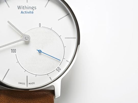
Withings Activité smart watch
The Withings Activité is one of the few smart watches to embrace the original, inspired interface that served analog watches so well. It’s a pedometer that does the usual fitness-tracker stuff, syncing via bluetooth with your devices to track your steps and sleep patterns. But its display is decidedly low-res; a simple dial shows your progress toward your daily goal, from zero to 100 percent. It's elegant, nonintrusive, and by the way, the battery lasts a whole year, not just a few hours.
All pre-attentive interfaces are similarly simple, though not necessarily so analog. If you must design a watch that alerts you to the state of your inbox, for example, there are better, less intrusive alerts than numbers, beeps, or buzzes. Just ask Bilbo Baggins. In The Hobbit, Bilbo’s sword Sting glows when orcs are nearby, its glow growing stronger as danger increase.

Sting is a pre-attentive approach to personal safety. A pre-attentive approach to smart watches could do the same, changing the color or intensity of a glow as messages from certain people start to pile up (family or coworkers in this case, not orcs). This shift in color or intensity is, for all practical purposes, a single-pixel display. It’s a low-resolution signal that cuts out unnecessary detail to give just enough info to make a decision or dedicate attention. When this glow reaches a threshold of importance, you can turn your focus to a different, more attentive display, like your computer or phone.
A single-pixel display doesn’t have to be single-function. This glow-meter approach could deploy multiple colors to track multiple types of data. If your watch glows red when your inbox needs attention, it might glow blue when rain is on the way, or green when a deadline approaches. The result would be a kind of mood ring to show the state of your personal data cloud. (In fact, why not add mood as a data dimension, too? Your wrist watch could glow when your partner is in distress or is simply thinking about you.)
Happily, this glowing “Hobbit effect” could also be beautiful, which brings us to the next remedy to unsightly data rash:
Design for fashion
Clunky objects lend themselves to unsightly data rash. (Literally. The plastic Fitbit Force bracelet was recalled after causing allergic rashes and blistering.) As we’ve begun to dress bodies with wearable technology, the focus has been more on “technology” than on “wearable.” The industry has tended to focus on the engineering question (how can we bolt this technology onto a body?) instead of a more challenging and subtle fashion question (what if this beautiful wearable object happened to be magic?).
We should strive to create objects that people want to wear even without its built-in technology. We might love our gadgets for their special powers, but we should equally love them for their essential wearability as aesthetic objects and personal fashion statements.
Just look to our earliest wearable technologies—eyeglasses and wristwatches—for instructive inspiration. Both gained real commercial traction only when they also became fashion statements—ornamental as well as functional. Fitness fashion (rubber bracelets) and tech fashion (screens and polished titanium) are fine as far as they go, but it’s time to explore a fuller range of fashion and personality in the smart objects we intend to wear. It’s time to look smart, not just act smart.
Our clothing and accessories are personal expressions to the world. Too many of this first generation of smart objects ignore this fundamental external role. They are instead designed for a relentless inward focus, tracking data for private consumption, or displaying info intended solely for its wearer. These gadgets let us wear data, but they rarely share that data with the outside world in the traditional way that we share what we wear. Meantime, the selfie stands in for our current state of digital dress-up.
This is an observation that raises more questions than answers, but those questions all present fascinating and useful starting points for designers. What does it mean to wear data? How can I project data in a way that expresses my passions, my sense of humor, my well being, my state of mind, or whether I’m available for interaction versus feeling private?
In other words, how might we turn data from a rash-inducing assault of information to a personal expression of self?
Design for identity
Clothing and accessories are essential to our public identity, and so their augmented versions should likewise augment and extend the broadcast of that identity. This sharing won’t always be visible, and the target of the sharing won’t always be people. Wearing data means that we expand our social circle beyond people and to the smart things and places that surround us.
Location data was what gave smartphones the magic necessary to create a mainstream wave of mobile computing. For wearable computing, identity data seems likely to be a similarly critical ingredient. Gadgets like the Nymi bracelet or Disney’s MagicBand turn our bodies into secure broadcasters of unique identity. Both use biometrics to ensure that you're the one actually wearing them—Nymi via heart signature and MagicBand via bone density scan. By broadcasting unique identity, they open the opportunity to let us invisibly negotiate with trusted sources to wrangle anything from government services, to door locks, to payments, to restaurant reservations.
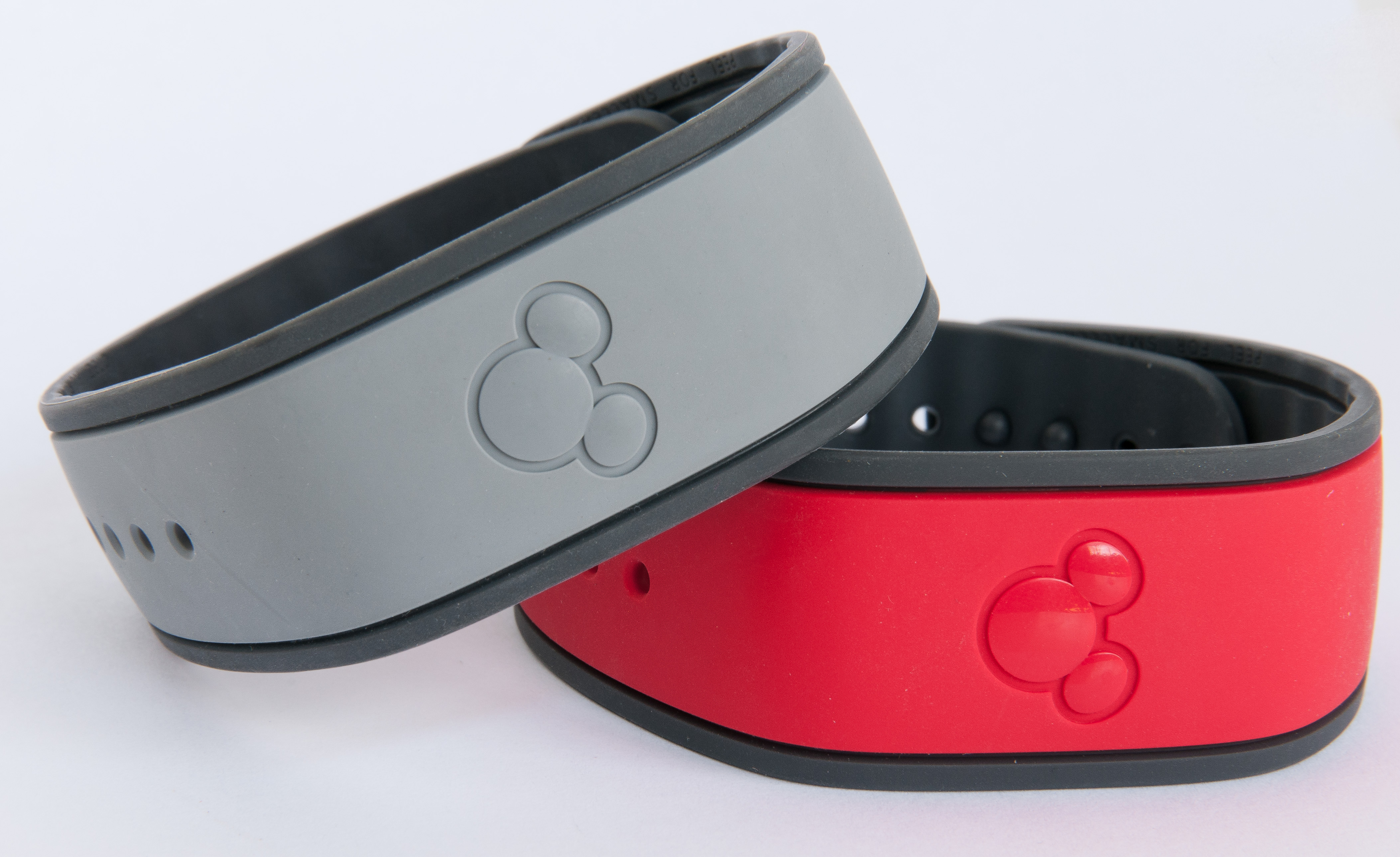
Disney’s MagicBands.
But this approach has an important secondary effect, too. When wearables focus on identity first, they can relegate a whole range of features, sensors, and data-gathering functions to other gizmos that happen to be nearby. Your bed is perhaps better suited to tracking your sleep patterns than a bracelet, for example; the bed just needs to know that it’s you who’s sleeping in it. Foursquare co-founder Naveen Selvadurai calls these embedded technologies “there-ables,” devices and sensors that are already there in the room; you just show up.
A sensible way to avoid data rash is simply to limit exposure to information allergens. Let’s find ways to reduce the number of sensors we have to wear and push them instead into the smart environment around us. Certain activities will always require wearable sensors in order to work. We have to wear pedometers or heart-rate monitors to make them go. But a whole host of location, security, and home automation features can be pushed off of our bodies and into the semi-smart environments around us.
When sensors can live near us instead of actually wrapped around us, we don’t have to wear so many of the things in the first place. How many bracelets are we expected to strap on, after all? My friend Rachel Kalmar, a data scientist, often wears over 20 smart bracelets at a time in order to make the point that most of them are at once redundant and incompatible. The emerging wearables industry can surely do better.
Alas, there’s a potentially troublesome outcome if we make wearables focus on identity in order to outsource data-gathering: it could make our identities far more public than most of us are comfortable with. When our gadgets start announcing our presence to any device in broadcast range, it’s easy to imagine those devices getting a little pushy. A subset of marketers persistently and excitedly promise a future of location-based advertising where we’re pummeled by ad messages and discount offers as we pass by storefronts or walk through shop aisles. What could be more horrific than a “service” that bombards you with ads you can never escape? This is perhaps the worst kind of information poisoning: wandering endlessly through a thick and toxic cloud of targeted commercial messaging.
And so we must take care. Managing identity, that most personal piece of data, requires respect, transparency, and the confidence to cede control to the individual.
Design for the individual
When I talk to people about a sensor-laden future full of smart objects, the topic is greeted with equal parts excitement and dread. The dread comes from several creepy prospects: sensors everywhere (including our bodies) might create a culture of constant surveillance; our data might be used and seen in ways we don’t understand or control; and we might forfeit agency over our environments to “smart” devices that aren’t quite smart enough, buffeting us with dubious decisions.
These fears—the staples of every dystopian sci-fi movie—are about loss of control. They rail against a data environment so polluted that we no longer know how our personal information will be used or how machines might impose themselves on us.
As we design the personal services and devices that respond to the individual it’s important that we design first and foremost for the individual. Your data—and especially your identity—should be yours and yours first. You should have confidence that your personal gadgets and services operate in your interest, and not solely in the ambiguous interest of the megacorp that created them.
Services should be designed as opt-in, not opt-out. You decide which service gets access to your identity, and the off switch should be obvious and available. Wearables maven Liza Kindred suggests that services should have “nutrition labels” that clearly identify the information that they’ll use, and how they’ll use it. Who gets your data? How much of it, and for how long? Are they allowed to compare it with other people’s info? Can you make the data self-destruct? All of those decisions should be in your easy understanding and control as the person who’s making data or identity available.
Design to amplify our humanity
The wearables world often uses the familiar but unfortunate language of science fiction to describe its smart devices: they “augment” or “enhance”, they are prosthetics, bionics, even cyborg extensions. This language emphasizes the technology, not the human being wearing it.
Technology should bend to our lives instead of vice versa. Instead of using the cold and creepy terms of enhancement or augmentation, I suggest wearables should aim to amplify our humanity. They should let us be who we already are, only more so. They should give us greater control, mastery, and understanding over our environment and ourselves. They should reinforce connections with the people we love and the places we visit, instead of isolating us under a torrent of data. They should draw us into the world instead of drawing our eyes to a screen.
We are suddenly awash in data, with the fresh possibility of wearing devices that are able to capture, process, and report that data. Like previous eras of technology, we’ll make missteps as we learn to use this newly abundant raw resource. We’ll sometimes create interfaces that overwhelm or irritate with the effects of data pollution and information poisoning. But if we can focus first on human needs and natural interaction, we can soothe the occasional data rash and promote healthy insight instead.
Tags:
design,
internet of things,
smartwatch,
wearables


