Josh Clark's Blog, page 19
April 15, 2017
The Crisis of Attention Theft
Consider,
for example, the ���innovation��� known as Gas Station
TV���that is, the televisions embedded in gasoline pumps
that blast advertising and other pseudo-programming
at the captive pumper.��There is no escape: as the CEO
of Gas Station TV puts it, ���We like to say you���re tied
to that screen with an 8-foot rubber hose for about
five minutes.��� It is an invention that singlehandedly
may have created a new case for the electric car.
Attention theft happens anywhere you find your time
and attention taken without consent.��The most egregious
examples are found where, like at the gas station,
we are captive audiences.��In that genre are things
like the new, targeted advertising screens found in
hospital waiting rooms (broadcasting things like ���The
Newborn Channel��� for expecting parents); the airlines
that play full-volume advertising from a screen right
in front of your face; the advertising-screens in office
elevators; or that universally unloved invention known
as ���Taxi TV.���
What to do about ad screens that are imposed on us in these captive scenarios? Wu suggests towns and cities have managed this problem before:
In the 1940s cities banned noisy advertising trucks bearing loudspeakers; the case against advertising screens and sound-trucks is basically the same. It is a small thing cities and towns can do to make our age of bombardment a bit more bearable.
Wired | The Crisis of Attention Theft���Ads That Steal Your Time for Nothing in Return
April 14, 2017
The Dark Secret at the Heart of AI
At MIT Technology Review, Will Knight writes about the unknowable logic of our most sophisticated algorithms. We are creating machines that we don’t fully understand. Deep Patient is one example, a system that analyzes hundreds of thousands of medical records looking for patterns:
Deep Patient is a bit puzzling. It appears to anticipate the onset of psychiatric disorders like schizophrenia surprisingly well. But since schizophrenia is notoriously difficult for physicians to predict, [project leader Joel] Dudley wondered how this was possible. He still doesn���t know. The new tool offers no clue as to how it does this. If something like Deep Patient is actually going to help doctors, it will ideally give them the rationale for its prediction, to reassure them that it is accurate and to justify, say, a change in the drugs someone is being prescribed. ���We can build these models,��� Dudley says ruefully, ���but we don���t know how they work.���
As deep learning begins to drive decisions in some of the most intimate and impactful aspects of life and culture���policing, medicine, banking, military defense, even how our cars drive���what do we need to know about how they think?
As the technology advances, we might soon cross some
threshold beyond which using AI requires a leap of
faith. Sure, we humans can���t always truly explain our
thought processes either���but we find ways to intuitively
trust and gauge people. Will that also be possible
with machines that think and make decisions differently
from the way a human would? We���ve never before built
machines that operate in ways their creators don���t
understand. How well can we expect to communicate���and
get along with���intelligent machines that could be unpredictable
and inscrutable?
This is especially important when the machines come up with bad answers. How do we understand where they went wrong? Or to know how to help them learn from the mistake? Knight offers a few examples of how researchers are experimenting with this, and many come down to new ways of visualizing and presenting the logic flow.
This resonates strongly with a key belief I have: the design of data-driven interfaces has to get just as much attention as the underlying data science itself���perhaps even more. If we’re going to build systems smart enough to know when they’re not smart enough, we need to be especially clever about how those systems signal the confidence of their answers and how they arrived at them. That’s the stuff of truly useful human-machine partnerships, and it’s a design problem I find myself working on more and more these days.
One hitch: we humans aren’t always so great at explaining our thinking or biases, either. What makes us think that we can train machines to do it any better?
Just as many aspects of human behavior are impossible to explain in detail, perhaps it won���t be possible for AI to explain everything it does. ���Even if somebody can give you a reasonable-sounding explanation [for his or her actions], it probably is incomplete, and the same could very well be true for AI,��� says Clune, of the University of Wyoming. ���It might just be part of the nature of intelligence that only part of it is exposed to rational explanation. Some of it is just instinctual, or subconscious, or inscrutable.���
MIT Technology Review | The Dark Secret at the Heart of AI
Managing Technology-Agnostic Design Systems
Brad Frost tackles the challenge of building a design system that works across different tech frameworks. It’s a nasty and common conundrum.
If your design system or pattern library puts down roots too deeply into any one JavaScript framework���Angular or React, for example���or a specific templating engine, then you’ve created a barrier for teams using a different tech stack. (And you’ve likewise created a barrier for future change, when product teams want to shift to a new and improved tech stack.)
Brad outlines the approach that we’ve followed in the design system work we’ve done together: the core design system should focus on the rendered interface���the HTML, CSS, and presentational JavaScript. It should otherwise be “tech-agnostic” on implementation. Easier said than done, of course:
Of course there���s a lot of work that goes into getting that HTML, CSS, and presentational JavaScript onto a page. That���s why teams reach for different backend languages, templating languages, and JavaScript frameworks. Which is where things get complicated. The evolution of JavaScript has especially made things thorny. since it���s gone from simple UI manipulation (a la jQuery) to full-fledged application frameworks (a la React, Angular, Ember, et al). It can be tough to find to find the seams of where the canonical design system ends and where the tech-specific version begins.
Brad suggests that development teams then build implementation-specific versions of the components that match the recommended rendered output. So you might have a React layer, an Angular layer, and so on. But those implementation details are all carefully segregated from the recommended markup.
The design system itself doesn’t care how you build it as long as the end result comes out the right way. Of course, developers do care how it’s built, and one promise of design systems is to deliver efficiencies there. So organizations should make it a goal for teams to share those platform-specific implementations, Brad writes:
This architecture provides a clear path for getting the tech-agnostic, canonical design system into real working software that uses specific technologies. Because it doesn���t bet the farm on any one technology, the system is able to adapt to inevitable changes to tools, technologies, and trends (hence the placeholder for the ���new hotness���). Moreover, product teams that share a tech stack can share efforts in maintaining the tech-specific version of the design system.
Brad Frost | Managing Technology-Agnostic Design Systems
April 13, 2017
Scaling Great Design Across a Fortune 10 Company
Josh Clark: Product/UX director
Brad Frost: Technical director
Dan Mall: Creative director
Matt D. Smith: Designer
Ian Frost: Developer
Big Medium crafted an enterprise design system to help one of the world���s biggest companies���ExxonMobil���scale design best practices across hundreds of internal web applications.
Before the new design system, the company had no common visual language or underlying front-end code to connect its sprawling library of web apps. Instead, every web project started at square one, with developers piecing together design solutions in isolation. Time after time, they rolled out reinvented wheels.
The result of this ad hoc process: developer productivity was slower than it might have been, quality was uneven, the user experience changed from app to app, and most visual designs didn���t reflect the company���s brand.
Big Medium built a cohesive design system called Unity to help fix those problems. Much more than a pattern library, Unity embraces a fully expressed design language, detailed UX guidelines, and tools to fit the organization���s workflows.
Watch the Unity video
Unity launched internally with this video to announce and explain the design system to ExxonMobil's huge IT community.
The emphasis throughout is on helping developers build fully conceived applications���not just assemble parts.
Faster, better, less expensive
The project���s key goals were to speed app development, reduce costs, and instill design best practices across the developer organization. Faster, better, cheaper; usually you have to pick two. We knew we had our work cut out for us.
After listening carefully to developers throughout the design process, we knew we had to provide tools that would naturally fit their workflow. An ���eat your spinach��� approach would fail; if developers didn���t find the design system easy to use, they���d turn to an off-the-shelf framework instead. The design system had to be ���better than Bootstrap,��� a defining phrase for the project.
The early returns are promising. A first wave of developers is now using Unity to build on-brand apps more quickly and consistently than ever. We���re getting comments like this from developers:
���Someone on my team white-boarded out a design this morning. With Unity, I converted it to a working page while multi-tasking in a one-hour meeting.���
A developer community has begun to coalesce around the system, too. Developers are creating and sharing front-end libraries to fit the design-system components to back-end systems. Just as it should be, developers are beginning to share ownership of the system and its tools.
As the design system���s first wave of pilot apps rolls out, we���re also expecting efficiencies on the user end, too, with employees enjoying the productivity gains of improved, consistent UX. The company���s brand and UX best practices are baked directly into code that developers can assemble with newfound speed.
We had terrific internal partners on the project. ExxonMobil���s Mobility and Design group is a small design team within an enormous developer-driven technology group. Unity���s product manager Nick Cochran understood the need to socialize the system to the developer community. Nick was smart to see this as more than just a design project, organizing it as the first stage of a product launch, complete with marketing materials, maintenance and governance plans, and an education campaign. Meanwhile, designer Chris O���Brien and developer Hernan Almeida guided us to keep Unity in tune with the company���s design sensibility and developer workflows.
Here���s what we built with them to unlock the company’s pent-up design potential.
An elegant and efficient visual language
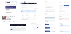
Dan Mall and Matt D. Smith created element collages to work through early approaches to Unity���s visual language.
We adapted ExxonMobil���s existing brand guidelines to fit the needs of modern web apps. As is typical of our process, we began with a series of element collages, component sketches for exploring visual style outside of fixed designs.
Hand in hand with this process, we codified this emerging visual language with a set of design principles that tell the system���s story:
Just enough interface. When in doubt, remove.
Strong and direct. The design sensibility is simple, plainspoken, solid, and durable.
Speed is a feature. Construct interfaces to be lightning fast, with as little friction as possible. Every click or tap yields useful information and insight.
Adaptable density. Images and text often benefit from generous whitespace, while certain data applications yield insights only through high-density presentation. Components should adapt to size and density appropriate to the context.
Safety always. In a digital context, this translates to a strong dedication to accessibility, security, and error prevention (with patient forgiveness of errors when they happen).
No tricks or stunts. Be faithful to the digital medium. Don���t create a false sense of depth but embrace the flat plane of the screen. Be predictable and consistent.
Recycle, reduce, reuse. Limit yourself to a compact set of solutions. Interface components should borrow structure and design styles from one another.
Design and code for nearly 100 interface components
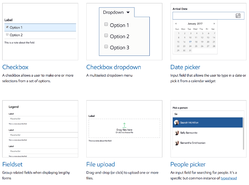
A peek into Unity���s gallery of interface components.
We audited a slew of the company���s web apps to identify the design problems those apps most commonly solve. With that inventory in hand, we designed nearly 100 interface components���everything from a comprehensive set of simple buttons to complex navigation. We created several flexible variations for each���hundreds in all���to demonstrate adaptability to a variety of use cases. Brad and Ian Frost rendered them all in lovingly responsive markup.
A resilient CSS framework
We developed a CSS foundation that would be friendly to maintain and stand up to large-scale collaboration. In other words, we crowd-proofed the thing. Brad Frost developed a set of strict code conventions for us as we built the system. The class naming is easy to understand and obvious to extend; it’s effectively self documenting. All of this makes the system fast to learn, inviting contribution and extension by developers.
Three pilot apps
Design systems can���t be built in isolation. The best design systems are built from battle-tested components extracted from production apps. Part of that process happened during our interface inventory. But a big chunk happened when we developed pilot apps during and after construction of the design system.
The best design systems are built from battle-tested components extracted from production apps.
This process helped us test our assumptions for all three aspects of design, UX, and markup. We selected projects that embraced fairly common design scenarios for the company���dense table data, form entry, data cards, etc���so that we���d be dealing with components with high reuse.

One of the pilot apps was a dashboard for managers to update employee account access.
As expected, these pilot projects revealed both flaws and opportunities in the fledgling design system, and we folded those learnings back into the components and underlying CSS framework. In the end, these pilots informed Unity���s design as much as the reverse.
A self-serve reference site
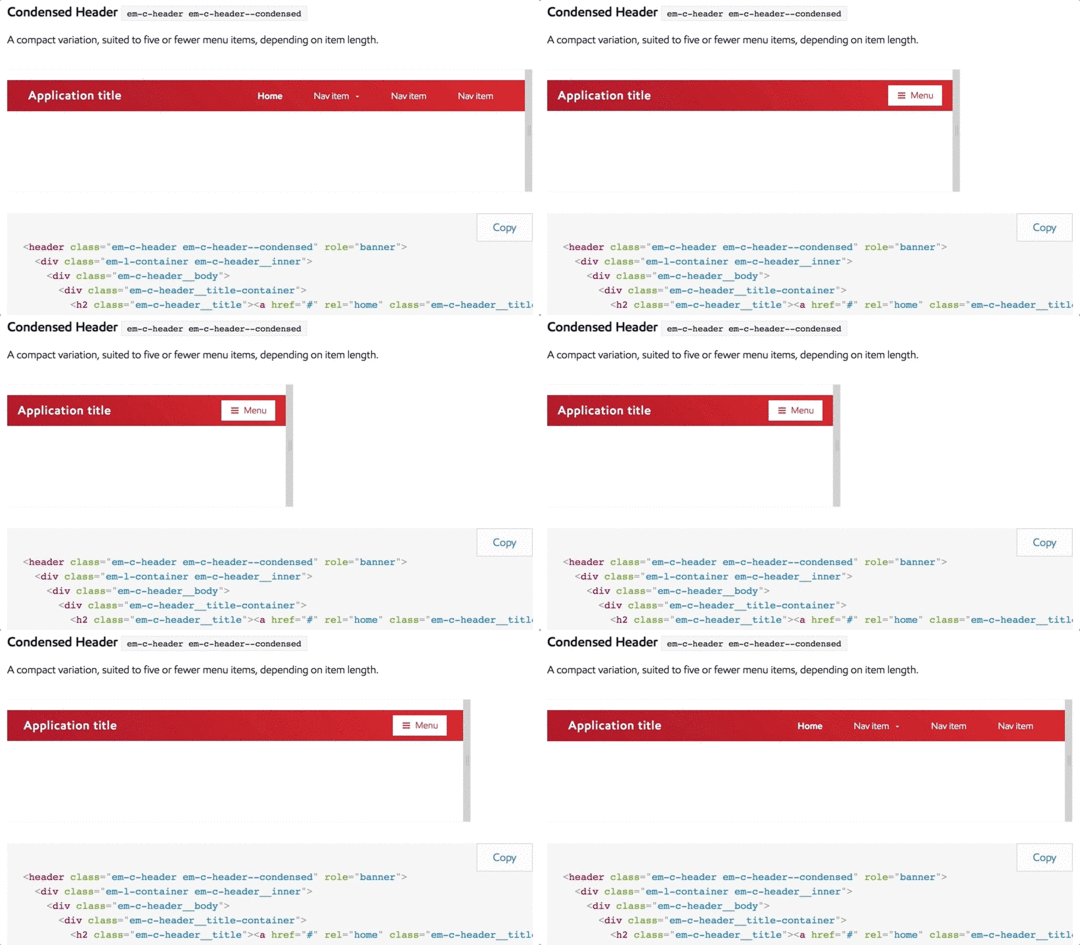
The reference site lets developers preview components at any viewport width.
We built a genuinely useful reference site for developers to preview components, grab code, and quickly learn how to customize Unity to their needs. It was important that this site be more than just a code library; it also had to suggest how and when to use Unity���s many components. You can���t grab code on this site without also bumping into the right way to use it.
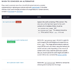
Unity���s reference site offers UX guidance on when to use the component and when to consider an alternative. We also offer detailed documentation of classes, noting required and recommended elements and classes.
The site offers sitewide UX guidelines for data-driven topics including data entry, display, and validation, as well as best practices for accessibility, navigation, layout, and copywriting.
At the component level, ���do this, not that��� examples show the right way to use each interface element. Detailed class documentation shows how to achieve all kinds of variations on each component, with cut-and-paste code snippets for every last one of those variations.
And to be extra-meta, the reference site is of course built entirely out of the very components that it showcases.

Ready-to-use starter templates
It’s hard to build a car when all you���re given is a pile of parts. The reference site had to make it easy to grab more than just individual components. We also wanted to help developers see the big picture.
We created several starter templates for common scenarios and web views. Developers can get these up and running to test the system and start building their own apps fast. (Here again, building pilot apps during the construction process made it easier to provide these templates to developers right from the outset.)
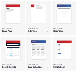
A selection from Unity’s gallery of page templates.
Visual themes for the system
Developers consistently told us they were concerned the design system would straitjacket them to a one-size-fits all set of visuals and interactions. We shared that concern; while we wanted to promote a consistent approach to design and UX, we didn’t want strict homogeneity.
We optimized the CSS styles and JavaScript hooks for flexibility so that developers could extend Unity to fit their needs within the brand context. We created a set of color themes as a demonstration for extending the system���for specific departments or sub-brands, for example.
Making the best solution the easiest
In the end, the secret to the project���s success was understanding the habits, workflows, and incentives of the company���s developers. The system we delivered had to fit an environment where development speed and efficient production are highly valued. More than just creating good code and design solutions, we created the foundation for a good workflow solution���a solution for the organization.
It just happens that we snuck in a whole lot of design goodness along the way, too.
Does your company need a design system to bring order to a disconnected set of apps and websites? Big Medium can help with workshops, executive sessions, or a full-blown design engagement. Get in touch.
April 11, 2017
The More You Use Facebook, the Worse You Feel
In Harvard Business Review, Holly B. Shakya and Nicholas A. Christakis report the results of their rigorous study of Facebook use:
Overall, our results showed that, while real-world
social networks were positively associated with overall
well-being, the use of Facebook was negatively associated
with overall well-being. These results were particularly
strong for mental health; most measures of Facebook
use in one year predicted a decrease in mental health
in a later year. We found consistently that both liking
others��� content and clicking links significantly predicted
a subsequent reduction in self-reported physical health,
mental health, and life satisfaction.
Our models included measures of real-world networks
and adjusted for baseline Facebook use. When we accounted
for a person���s level of initial well-being, initial
real-world networks, and initial level of Facebook
use, increased use of Facebook was still associated
with a likelihood of diminished future well-being.
This provides some evidence that the association between
Facebook use and compromised well-being is a dynamic
process.
Be careful out there.
Harvard Business Review | The More You Use Facebook, the Worse You Feel
Web Performance Optimization Stats
WPO Stats is a super-useful collection of stats from Tammy Everts and Tim Kadlec to demonstrate the business value of faster websites. If you need support for making the business case for your performance project, here’s your go-to library.
A sampling:
BBC has seen that they lose an additional 10% of users
for every additional second it takes for their site
to load. [source]
���
AliExpress reduced load time by 36% and saw a 10.5%
increase in orders and a 27% increase in conversion
for new customers. [source]
���
For every 100ms decrease in homepage load speed, Mobify’s
customer base saw a 1.11% lift in session based conversion,
amounting to an average annual revenue increase of
$376,789. [source]
WPO Stats
April 10, 2017
Google Launches New Effort To Flag Upsetting or Offensive Content in Search
I missed this a few weeks back. At Search Engine Land, Danny Sullivan reported that Google is empowering its 10,000 human reviewers to start flagging offensive content, an effort to get a handle on hate speech in search results. The gambit: with a little human help from these “quality raters,” the algorithm can learn to identify what I call hostile information zones.
Sullivan writes:
The results��that quality raters flag��is used as ���training
data��� for Google���s human coders who write search algorithms,
as well as for its machine learning systems. Basically,
content of this nature is used to help Google figure
out how to automatically��identify upsetting or offensive
content in general.���
Google told Search Engine Land that has already been testing these new guidelines with a subset of its quality raters and used that data as part of a ranking change back in December. That was aimed at reducing offensive content that was appearing for searches such as ���did the Holocaust happen.���
The results for that particular search have certainly improved. In part, the ranking change helped. In part, all the new content that appeared in response to outrage over those search results had an impact.
���We will see how some of this works out. I���ll be honest. We���re learning as we go,��� [Google engineer Paul Haahr] said.
Search Engine Land | Google Launches New Effort to Flag Upsetting or Offensive Content in Search
The Most Successful Interface Design of All Time
In ~20 years, Google Search lost some cruft and gained
speech recognition, but the fundamental design of the
entry page is virtually identical.
“Fast, easy, and useful beats all,” Erika writes.
Amen. What’s the job of the page? How can you focus exclusively on that and cut out the extraneous?
Erika Hall | The Most Successful Interface Design of All Time
April 9, 2017
Federated Learning: Collaborative Machine Learning without Centralized Training Data
Google researchers Brendan McMahan and Daniel Ramage report that Google has begun offloading some of its machine learning to mobile devices to keep private data… private. Instead of pulling all your personal info into a central system to train its algorithms, Google has developed the chops to let your phone do that data analysis. They call it federated learning:
Federated Learning allows for smarter models, lower
latency, and less power consumption, all while ensuring
privacy. And this approach has another immediate benefit:
in addition to providing an update to the shared model,
the improved model on your phone can also be used immediately,
powering experiences personalized by the way you use
your phone.
We’re currently testing Federated Learning in Gboard
on Android, the Google Keyboard. When Gboard shows
a suggested query, your phone locally stores information
about the current context and whether you clicked the
suggestion. Federated Learning processes that history
on-device to suggest improvements to the next iteration
of Gboard���s query suggestion model.
Old way: beam everything you do on your Google keyboard (!!) back to the mothership. New way: keep it all local, and beam back only an encrypted summary of relevant learnings. “Your device downloads the current model, improves it by learning from data on your phone, and then summarizes the changes as a small focused update.” To do this, Google has smartphones running a minature version of TensorFlow, the open-source software library for machine learning .
One knock against predictive interfaces is how much you have to give up about yourself to get the benefits. If this new model works as promised, new systems may be just as helpful, without the central service absorbing your nitty-gritty details to learn how.
Google Research | Federated Learning: Collaborative Machine Learning without Centralized Training Data
The Full Stack Design System
Emmet Connolly shared some wonderful thoughts about pattern libraries���and how they’re only one part of a full design system:
But there are a few problems with pattern libraries.
Yes, they allow you to keep all of the smallest elements
consistent. But they don���t have an opinion about how
they should be put together. They don���t know anything
about your product or the concepts behind it.
To return to our Lego analogy, simply having a limited
pattern library of bricks to choose from doesn���t preclude
me from building some really crazy shit.
Now think about those branded Lego kits you can buy.
Each piece is much more opinionated. It knows what
it���s going to get used for. There are still generic
pieces involved, but when you put them together in
a certain way they form something specific, like the
leg of an AT-AT Walker. This is a design system.
I love it. Design systems are more than a kit of parts. The best design systems have a strong point of view���a gravitational force that coerces disparate components into patterns and ultimately into a coherent whole. The design system brings order to the pattern library and what would otherwise appear to be a chaotic jumble of components.
Another metaphor: if components are words, then patterns are sentences, and the design system is the full story.
If this nested arrangement echoes Brad Frost’s Atomic Design methodology, that’s by design. Atomic Design champions design elements built from a common set of lesser design elements. In Atomic Design, UI ���atoms��� assemble ���molecules��� which assemble ���organisms��� which assemble templates which assemble pages.
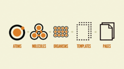
The matroyshka-doll elements of Brad Frost’s Atomic Design methodology.
But there’s a common misunderstanding about Atomic Design which Connolly in turn suggests is a limitation:
Atomic Design will tell you to
take some of your basic elements (label, input, button),
stick them together, and call it a molecule. Then you
can reuse that molecule again and again. Further, you
can stick some molecules together to form a reusable
organism.
The problem with every real-world example of a system
like this that I���ve encountered is that they remain
willfully unaware of the product being built.
Atomic Design does indeed promote reuse, assembling larger parts from smaller ones. However, many mistake this philosophy for linear process, that somehow Atomic Design demands that all design must first start by building its smallest pieces (e.g. ���start with buttons and labels���) before proceeding to page- and site-level design. It���s an approach that would indeed be blind to the end-result project, placing design tactics ahead of design strategy. But that���s exactly opposite to how Brad himself approaches projects.
It���s never a linear path from small to large; it���s a constant roundtrip between the two scales.
Right from the start, when Brad was first developing his tools and methodologies in our designs of TechCrunch and Entertainment Weekly, our process constantly zoomed back and forth between page level and atomic level. It���s never a linear path from small to large; it���s a constant roundtrip between the two scales.
As Connolly writes, ���Complex systems can be designed, but to do so you must first sketch the outline. Only then can you start filling in the detail.���
Well said, and I totally agree. Indeed, our Atomic Design projects always begin with the big-picture questions. What are the business goals for the project? What are the user needs? What���s the brand promise? When we get to individual pages, it���s about the user mindset when they arrive, and the jobs the page has to do for both user and company.
From there, we do sketching of the whole page, identifying the broad design patterns that the page needs to do its job. We start to imagine the components necessary to bring those patterns to life.
Only then do we start to work at the atomic level, building out those component atoms and molecules to construct the pattern organisms, and ultimately the page itself. As more high-level pages and components are designed, we zoom back down to revisit the atoms and molecules, making adjustments to make them more flexible and support a wider range of organisms and pages. The atoms and molecules might compose the design, but it���s the high-level design that creates the order, the overall system.
In the end, a pattern library emerges. Here���s the important bit: the design system is implicit in the process that led to the library���s construction, and it���s implicit in the design���s use of components. For a small team on a contained project, that implicit knowledge may well be enough, commonly shared in the heads of the designers who built it.
But implicit knowledge won���t do when you���re working at scale across many projects and many teams. The design system has to be documented. That���s where all the other artifacts of a fully articulated design system come in: design principles, style guide, voice and tone, UX guidelines, code repository, and so on.
I agree very much with Connolly that those pieces are required for the “full-stack design system.” My only caveat is to add that an Atomic Design process can get you there, too.
Atomic Design surfaces all of those aspects during the course of the design process. Responsible designers document them.
For more, see The Most Exciting Design Systems Are Boring.
Is your organization wrestling with inconsistent interfaces and duplicative design work? Big Medium helps big companies scale great design through design systems. Get in touch for a workshop, executive session, or design engagement.
Inside Intercom | The Full Stack Design System


