Josh Clark's Blog, page 22
April 2, 2017
Can Amazon's Alexa Be Your Friend?
Aaron Paul Calvin investigates the emotional connections people are making with Alexa:
In many ways, Alexa is the progeny of ELIZA. The way
it interacts with people is much more sophisticated
than the teleprinter-fed program that communicated
through a disassembling and reassembling of its users’
words, but the overall intended effect is still the
same. Both programs are meant to interact with users
in a way that’s supposed to elicit feelings of comfort
and intimacy within the user.
It strikes me that purposeful efforts to create a genuine emotional connection can backfire when they’re even a few degrees off. Here at home, our Echo has a 80–90% success rate understanding our daughter and me. But it never understands my wife Liza. An emotional connection has been made, for sure: Alexa annoys the hell out of Liza.
A voice UI that doesn’t understand your voice is frustrating. An affection UI that inspires anger is doubly so.
Digg | Can Amazon's Alexa Be Your Friend?
AMP: breaking news
Andrew Betts describes a recent browsing session:
I tapped a link in the Twitter app, which showed as
google.co.uk/amp/s/www.rt.c���, got a page in Twitter���s
in-app webview, where the visible URL bar displays
the reassuring google.co.uk. But this is actually
content from Russia Today, an organisation 100% funded
by the Russian government and classified as propaganda
by Columbia Journalism Review
and by the former US Secretary of State.
Google are allowing RT to get away
with zero branding, and are happily distributing the
content to a mass audience.
This is not OK. This is catastrophic.
Betts is talking about content cached by Google’s AMP (Accelerated Mobile Pages) platform. While the goal of the platform is ostensibly to speed delivery of pages, it also serves those pages from a Google URL. With the URL spoofed, the origin of the content is hard to discern. This “recklessly devalues the URL,” Betts writes, and makes AMP an attractive petri dish for fake news:
If the world���s biggest content discovery and delivery platforms
prioritise security, performance and popularity, over authenticity,
evidence and independence, well, the likely result is an exponential
rise of simplistic, populistic thinking, inevitably spreading and
amplifying until false beliefs become tacitly accepted as facts.
… [W]e need a much stronger focus on authenticity as a strong ranking signal.
This is not only critical to avoid potentially huge societal implications of
bad decision making, but also cultivates better content by improving incentives for creators.
Totally agree. As our answer machines continue to be overwhelmed by propaganda (and worse), they need to listen for new ranking signals. We need to build systems smart enough to know when they’re not smart enough���and that know to complain when their immune systems have been compromised.
Technology decisions in AMP are affecting far more than page speeds, aggravating what I consider to be one of the big civic crises of our times: the erosion of trust in the fourth estate. At the very least, let’s protect the URL as citation and origin model.
Andrew Betts | AMP: Breaking News
2017: The Year of the Dishwasher Security Patch
Another day, another hacked dishwasher. Miele’s internet-connected dishwasher is vulnerable to an attack that could allow hackers to take control of the network and make a mess well beyond the kitchen. While the security problem is bad enough, Hackaday points out there’s no good way to address it:
The problem is, a dishwasher is not a computer.��Unlike��Microsoft,
or Google, or even the people behind VLC, Miele don���t
have infrastructure in place to push out an update
to��dishwashers worldwide.��This means that as it stands,
your only real solutions are to either disconnect the
dishwasher from your network, or��lock it behind a highly
restrictive firewall. Both are likely to impede functionality.
While poor security is already becoming a hallmark of internet-of-things gadgets, the lack of a plan for fixing inevitable problems is even more concerning. It suggests a vacuum of care not only for customer experience but for sustainability of the product. Sending your dishwasher to the landfill for a software bug shouldn’t be part of the product lifecycle.
Hackaday | 2017: The Year of the Dishwasher Security Patch
Style Guide Audience
First, Andy Clarke said web style guides should be more stylish. Then Jeremy Keith said beauty is in the eye of the beholder; the design and style should suit the audience.
Now Brad Frost adds to the exchange by suggesting that there may be more than one audience for a design system’s style guide. If establishing consensus is a key goal of a design system (and it should be), then its style guide should welcome a big, broad group:
A style guide has the opportunity to serve as a watering
hole for the entire organization, helping establish
a common vocabulary for every discipline invested in
the success of the company���s digital products. Establishing
this common vocabulary can lead to more efficient work,
better communication, and more collaboration between
disciplines across the organization. That���s why the
style guide should be an inviting place for everybody,
not just [core] design system users.
Amen. As the front door to the design system, this reference site should be at once approachable, practical, and yeah, even a little inspiring for the whole organization. That can happen over time; get it out there, refine it, and help your organization to shape it to its disparate needs.
That’s a pretty good triangulation among the three points of views here. The one thing I’d also add: style guides are ideally built out of their own components, guidelines, and design principles. They should be not only a container for the design system, but a living demonstration of it. It should be exactly as stylish as the underlying system.
Brad Frost | Style Guide Audience
March 23, 2017
Your Traffic Went Mobile; Why Hasn���t Your Design Process?
The mobile audience is now twice as big as desktop. Does your organization���s design process reflect that mobile is now your primary platform?
The top 1000 digital properties welcome twice as many mobile visitors as desktop visitors, comScore reported this week. Time spent on mobile is likewise more than double desktop time (69% of digital time is spent on mobile, versus 31% on desktop). These top properties are a decent proxy for general internet use; chances are good that your site is part of the enormous mobile majority, too.
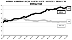
Data: comScore, 2017 U.S. Cross-Platform Future in Focus
Despite the obvious importance of mobile, I visit organizations all the time that still embrace a desktop-driven design process. While much lip service is given to mobile-first strategy and process, the desktop tail continues to wag the mobile dog. Desktop web designs inevitably seem to gobble up more time and attention than their mobile counterparts.
This is an expensive mistake
This mismatch between where traffic comes from (mobile) and where design attention is spent (desktop) is not only backwards, it���s costly. For e-commerce, comScore reports that only 20% of dollars spent came from mobile, although mobile accounts for 67% of time spent shopping. This gap is a breathtaking missed opportunity.
Executives often tell me that they interpret these numbers to mean that people don���t want to buy on mobile, that touch is too clumsy, the security too untrusted, the task too slow for phones. The problem, they suggest, is mobile itself.
I tell them I have a different interpretation: their mobile experience isn���t measuring up to the opportunity. It���s not a platform problem; it���s a design problem. I’ve seen first-hand how quickly the traffic-revenue gap closes up when organizations start treating mobile as the main event.
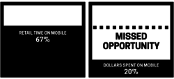
Data: comScore, 2017 U.S. Cross-Platform Future in Focus
Faster, easier, kinder
Nearly all of the techniques and flows I suggest in my book Designing for Touch are tuned for making interactions faster and easier, for reducing the unnecessary and wasteful friction still found in so many mobile interfaces. This is more important than ever. Designers have to be relentless in uncovering the key tasks people want to accomplish���and then helping them get there quick.
Too many interfaces instead get in the way. In commerce sites, the average checkout flow has 15 form fields, about twice as many as needed.
Media companies meanwhile assault mobile visitors with takeover ads or with banners that effectively trick you into tapping them. This improves click rate, alas, but ironically also turns out to harm overall revenue. When we designed several verticals for About.com, we found that revenue, page views, and session length all went up when we reduced the number of ads. Yep: revenue went up when the number of ads went down. We also made their interactions more respectful of the content, more in tune with the platform. By focusing on user wants and needs���a good reading experience in this case���we increased revenue, with fewer ads.
Across all categories, mobile experiences need to be faster, easier, and kinder.
What keeps us from making mobile the primary focus?
Too many organizations don���t treat mobile as the primary platform, even when traffic definitively says it is.
It���s a chicken and egg problem: when desktop revenue is higher than mobile, intuition says keep favoring desktop. Yet you���ll never close mobile���s yawning traffic-revenue gap until you lean hard into making that mobile experience truly great. Meanwhile, desktop���s share is shrinking; it���s time to switch horses.
This takes more than just a change of mind, of course. Designing truly mobile-first is a different workflow than designing with desktop top of mind. It requires fundamental process change in the way you research, prioritize information, wireframe, and iterate between design and code. That���s a deep transition we help our client companies make.
But there���s also a fundamental shift in mindset (and even office infrastructure) that���s required. The place and manner in which we work is often hostile to mobile design. It���s helpful to recognize and compensate for these off-putting influences:
Our design infrastructure isn���t friendly to mobile. Designers work and think at desktop machines; reviews are held in conference rooms with giant shared displays. Instead, all of us need to review our work constantly where it will be experienced most: on mobile. Pull out your phones for those design reviews.
Bigger screens have distracting impact. With a bigger canvas, desktop experiences have the potential for correspondingly bold expression. Don���t let the desktop���s Big Brand Experience divert you, however, from the small-screen platform where your service is actually delivered. This takes discipline.
Bigger screens have more design complexity. This one is tough. Fine-tuning a wide, multi-column visual design is a more complicated project than designing a single-column mobile layout. It���s a big reason teams find themselves spending a disproportionate amount of time on widescreen designs. At a certain point, it���s important to call the thing good enough, and return focus to the mobile main event.
Changing habits, perspectives, and process is easier said than done, but we���re past due. When two-thirds of the audience has gone mobile, it���s time to recognize that mobile experience is actually the experience, not a poor cousin to what happens on desktop. Mobile is the show now, and the design process has to adapt.
Does your company need help adopting (and sticking to) mobile-first design? Big Medium offers workshops, executive sessions, and full-blown design engagements to help you make the transition for real. Get in touch.
March 16, 2017
No Share Buttons on Mobile Sites (Except This One Weird Case)
Only 2 out of every 1000 mobile web users ever tap a custom share button���like even once���according to a Moovweb study. We found similarly tiny numbers during our research designing Philly.com and verticals for About.com. That means people are over 11 times more likely to tap a mobile advertisement than a mobile share button for Facebook, Twitter, Pinterest, etc.
To be clear: people do share a ton of webpages to those services from mobile devices, but it happens through other means���using browsers��� built-in sharing tools or copying the URL directly into a social post. Mobile users have established their own sharing habits, in other words, and for the vast majority, those habits don���t involve share buttons embedded in the page canvas.
So here���s the guideline I follow:
Don���t include social share buttons in small-screen websites, unless the user just tapped through from a social network.
That last bit is important.
Visitors from social networks
Turns out that use of custom share buttons leaps way, way, way up for visitors coming directly from a social network. People are 20 times more likely to use a social button on mobile when they���ve tapped through from a social network, we discovered during our research designing the About.com verticals. Call them the ���20x users.���
Apart from that one specific context, though, effectively nobody ever uses custom share buttons in mobile sites. Don���t even bother with them in other scenarios. Small screens demand sharp focus on core tasks; anything else is a distraction. When the data shows that there���s vanishingly small interest in a feature, your job is to pluck it out of the design. Be ruthless; if nobody���s using it, it���s the wrong solution. So: no custom share buttons for mobile users���except for the 20x users.
We missed that nuance when we redesigned Philly.com a little over a year ago. We knew share-button usage was low, but we didn���t yet have the insight about the 20x users for social-network traffic. Without that knowledge, we went a little overboard, taking out the share buttons for all mobile visitors, no matter what the referring site.
���What happened to the [flippin���] Facebook share button on mobile?��� is the redacted and typically Philadelphian feedback we received from a small but vocal set of readers. In retrospect, I understand that this was more than the ���who moved my cheese?��� complaints typical after a redesign. Instead, these were the 20x users, the people who heavily follow and share content from their favorite social network. Removing the social buttons disrupted their back-and-forth ricochet between content and social network. Cursing ensued.
The revised approach I now recommend is simple and borne out by data:
Show mobile share buttons only to social traffic
For small screens, always show share buttons for visits originating from a social network. (Set a cookie and show buttons for subsequent visits, too.)
For all other small-screen visitors, don���t show share buttons.
For larger screens, always show share buttons; usage is high enough to be valuable.
Super-size the preferred network
Lean into the visitor���s demonstrated network preference. On both desktop and mobile, super-size the button for the referring social network. The site you���re reading now, for example, has three share buttons for Twitter, Facebook, and email. Mobile users visiting from Facebook will see the Facebook button displayed not only first but also twice the size of the other two share buttons. If you come in from Twitter, it���s the Twitter button that instead shows up first and biggest.
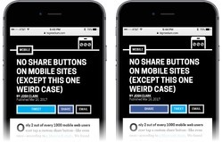
bigmedium.com gives preferred size and placement to the button for the referring social network (Twitter at left, Facebook at right).
As mentioned above, set a cookie for that network preference. When people visit from a social network, remember that network preference for the next visit; display and super-size the buttons accordingly. Set the cookie again when someone actually clicks one of those social buttons, a much stronger signal of network preference than the referring site.
No more than three
Don���t bother with more than three share buttons. In our research designing the About.com verticals, we found that displaying more than three share buttons actually reduces usage on both mobile and desktop. Pick only the three most popular channels for your audience, and stick with those. You harm sharing when you add more.
Verbs do better than nouns
We also found that labeling the buttons with verbs (���share,��� ���tweet,��� ���pin���) performed better than network names (���Facebook,��� ���Twitter���, ���Pinterest���) which in turn performed better than logos alone. The verbs evidently work as a stronger call to action, and also distinguish these share buttons from follow buttons.
On this site, for example, the share buttons carry only these verbs, with buttons tinted with the Facebook and Twitter blues.
Pinning social buttons is not the answer
Hey, please, under no circumstances should you pin social buttons to the top or bottom of mobile screens. In an effort to try to boost mobile use of share buttons, About.com experimented with fixing them to screen bottom and separately to screen top, so that the buttons were always visible when scrolling. While this did modestly increase share-button usage, it also caused overall session engagement to go down.
You read that right: adding a locked toolbar to the small-screen experience shortened sessions and reduced page views. The very small increase in share-button usage was far outweighed by reduced site usage. (I can’t explain why this is the case, but I’ve seen it elsewhere with locked toolbars, too. They chase small-screen users away.)
Locked toolbars are rarely a good idea in mobile browsers. In Designing for Touch, I detail a bunch of ergonomic and interaction reasons why fixed toolbars fail users. Among them:
Fixed toolbars adjacent to browser buttons invite errors and mistaps.
On Safari, tapping a fixed toolbar at screen bottom conjures the browser buttons instead of honoring the tap; the toolbar slides out of the way, and you have to chase your tap target around the screen.
On larger phones, toolbars at screen top are out of reach.
So under normal circumstances there are lots of reasons to avoid pinny any kind of toolbar to the top or bottom of small-screen browsers. But for social buttons, it���s multiplied by the stark fact that most users simply don���t want to use your custom buttons in the first place.
Need help nailing best practices for your mobile app or responsive website? That’s what we do! Big Medium specializes in multidevice experiences, and we’d love to help. Get in touch.
March 13, 2017
Systems Smart Enough To Know When They're Not Smart Enough
Our answer machines have an over-confidence problem. Google, Alexa, and Siri often front that they���re providing a definitive answer to questions when they���re on shaky ground���or outright wrong.
Google���s Featured Snippets Are Worse Than Fake News, writes Adrianne Jeffries, pointing out the downsides of Google���s efforts to provide what Danny Sullivan calls the ���one true answer��� as fast as possible. About 15% of Google searches offer a featured snippet, that text excerpt that shows up inside a big bold box at the top of the results. It���s presented as the answer to your question. ���Unfortunately, not all of these answers are actually true,��� Jeffries writes. You know, like this one:

Google confirms Obama’s plans to implement martial law. Wait, what?
The problem is compounded in voice interfaces like Echo or Google Home, where just a single answer is offered, giving the impression that it���s the only answer.
There are two problems here: bad info and bad presentation. I���ve got some thoughts on how designers of data-driven interfaces can get better at the presentation part to help caution users about inevitable bad info.
First, let���s lay out why all of this is troubling in the first place.
Crummy answers
Both Jeffries and Sullivan offer a slew of stinkers given by Google as the one true answer: presidents are klan members, dinosaurs lived a few thousand years ago, Obama is king of America. And then there���s this truly horrifying result, since removed by Google, for the question, ���are women evil?���
Google Home giving that horrible answer to “are women evil” on Friday. Good article on issues; I'll have more later https://t.co/EUtrx4ZFul pic.twitter.com/Ec8mEqx8Am
— Danny Sullivan (@dannysullivan) December 4, 2016
The worst of these cases tend to result in contentious areas where the algorithm has been gamed. In other cases, it’s just stright-up error; Google finds a page with good info but extracts the wrong details from it, like its bad answer to the innocuous question, ���how long does it take to caramelize onions?��� As Tom Sacco writes:
Not only does Google, the world���s preeminent index of information, tell its users that caramelizing onions takes ���about 5 minutes������it pulls that information from an article whose entire point was to tell people exactly the opposite. A block of text from the Times that I had published as a quote, to illustrate how it was a lie, had been extracted by the algorithm as the authoritative truth on the subject.
Something similar might be behind the exactly-backwards response Alexa gave John Gruber when he asked, ���how do you make a martini?���
���The martini is a cocktail made with 1 part gin and 6 parts vermouth.���
Those of you who enjoy a martini know that that recipe is backwards, and would make for a truly wretched drink ��� the International Bartenders Association standard recipe for a dry martini calls for 6 parts gin to 1 part vermouth. ��� ���I don���t know, go check Wikipedia��� is a much better response than a wrong answer.
Bad answers and unwarranted confidence
Let it first be said that in the billions of requests these services receive per day, these examples are rare exceptions. Google, Siri, Alexa, and the rest are freakin��� magic. The fact that they can take an arbitrary request and pluck any useful information at all from the vast depths of the internet is amazing. The fact that they can do it with such consistent accuracy is miraculous. I can forgive our answer machines if they sometimes get it wrong.
It���s less easy to forgive the confidence with which the bad answer is presented, giving the impression that the answer is definitive. That���s a design problem. And it���s one that more and more services will contend with as we build more interfaces backed by machine learning and artificial intelligence.
It���s less easy to forgive the confidence with which the bad answer is presented, giving the impression that the answer is definitive.
It���s also a problem that has consequences well beyond bad cocktails and undercooked onions���especially in the contested realms of political propaganda where a full-blown information war is underway. There, search results are a profoundly effective battleground: a 2014 study in India (PDF) found that the order and content of search rankings could shift voting preferences of undecided voters by 20%.
The confident delivery of bad information can also stoke hate and even cost lives. In The Guardian, Carole Cadwalladr describes going down a dark tunnel when she stumbled on Google���s search suggestion, ���are Jews evil?���
It���s not a question I���ve ever thought of asking. I hadn���t gone looking for it. But there it was. I press enter. A page of results appears. This was Google���s question. And this was Google���s answer: Jews are evil. Because there, on my screen, was the proof: an entire page of results, nine out of 10 of which ���confirm��� this.
The convicted mass-murderer Dylann Roof ran into a similar set of gamed results when he googled ���black on white crime��� and found page after page of white-supremacist propaganda at the top of the results. He later pinpointed that moment as the tipping point that radicalized him, eventually leading him to kill nine people in the Charleston church massacre. ���I have never been the same since that day,��� he wrote of that search result.
Responsible design for slippery data
Many of us treat the answer machines��� responses to our questions uncritically, as fact. The presentation of the answer is partly to blame, suggesting a confidence and authority that may be unwarranted. The ego of the machines peeks out from their ���one true answer��� responses.
How can we add some productive humility to these interfaces? How can we make systems that are smart enough to know when they���re not smart enough?
I���m not sure that I have answers just yet, but I believe I have some useful questions. In my work, I���ve been asking myself these questions as I craft and evaluate interfaces for bots and recommendation systems.
When should we sacrifice speed for accuracy?
How might we convey uncertainty or ambiguity?
How might we identify hostile information zones?
How might we provide the answer���s context?
How might we adapt to speech and other low-resolution interfaces?
When should we sacrifice speed for accuracy?
The answer machines are in an arms race to provide the fastest, most convenient answer. It used to be that Google delivered a list of pages that were most likely to contain the information you were looking for. Want the weather for New York City? Here are links to pages that will tell you. Then Google started answering the question itself: no need to click through to another page, we���ll show the forecast above the old-school search results. These days, Google doesn���t even bother waiting for you to search. For certain searches, Chrome shows you the answer right in the search bar:

I often say that the job of designers is to collapse the time between intent and action. How can we deliver the desired action as close as possible to when the user knows what they want? Here, you���ve got the action (the answer) before you���ve even formulated the intent (the question). The machine anticipates you and effectively hits the ���I���m feeling lucky��� button after just a few keystrokes.
Speed is a competitive advantage, and time is considered the enemy in most interfaces. That���s reflected in our industry���s fascination with download and rendering speeds, though those metrics are merely offshoots of the underlying user imperative, help me get this job done quickly. ���Performance isn’t the speed of the page,��� says Gerry McGovern. ���It’s the speed of the answer.���
But it has to be the right answer. While this approach works a treat for simple facts like weather, dates, or addresses, it starts to get hairy in more ambitious topics���particularly when those topics are contentious.

Start typing ���did Trump��� into the search bar and Google jumps in to say he committed treason.
The reasonable desire for speed has to be tempered by higher-order concerns of fact and accuracy. Every data-driven service has a threshold where confidence in the data gives way to a damaging risk of being wrong. That���s the threshold where the service can no longer offer ���one true answer.��� Designers have to be vigilant and honest about where that tipping point lies.
The reasonable desire for speed has to be tempered by higher-order concerns of fact and accuracy.
I believe Google and the rest of the answer machines still need to tinker with their tipping-point settings. They crank the speed dial at the expense of accuracy, and so we see the confident expression of wrong or controversial answers all too often.
Still, you can see that there is a tipping point programmed into the service. For Google, that tipping point is visually represented by the presence or absence of the featured snippet, the wrapped-with-a-bow answer at the top of the page. When there���s no high-confidence answer���about 85% of the time���Google falls back to a simple, old-school list of search results. It���s John Gruber���s premise that ���I don���t know��� is better than a wrong answer.
Do things have to be so either-or, though? Instead of choosing between ���I know the answer��� and ���I don���t know the answer,��� perhaps the design of these services should get better at saying, ���I think I know.��� That brings us to the next question to ask when designing these services.
How might we convey uncertainty or ambiguity?
One of my favorite Twitter accounts these days is @picdescbot, a bot that describes random photos by running them through Microsoft���s computer-vision service. It generally gets in the right ballpark, but with misreads that are charmingly naive:
a dinosaur on top of a surfboard pic.twitter.com/IJFzqxplBL
— picdescbot (@picdescbot) June 25, 2016
a group of people standing in front of a building pic.twitter.com/PumwtubRJ3
— picdescbot (@picdescbot) March 6, 2017
a person flying through the air on a skateboard at night pic.twitter.com/UF7Kqhqygc
— picdescbot (@picdescbot) March 7, 2017
Other times it���s just not even close:
a drawing of a tree pic.twitter.com/OM5g777r9q
— picdescbot (@picdescbot) March 3, 2017
In all of these cases, the description is presented with the same matter-of-fact confidence. The bot is either right or it���s wrong. @picdescbot is a toy, to be sure, and a big part of its charm is in its overly confident statements. But what if we wanted to make it more nuanced���to help the visually disabled understand what���s pictured, for example?
Behind the scenes, the algorithm reports a more subtle understanding. Here, the system reports 97% confidence that it���s looking at a dinosaur, but only 26% confidence that it���s on a surfboard.

Microsoft’s computer-vision API reveals its confidence in its analysis.
Acknowledging ambiguity and uncertainty has to be an important part of designing the display of trusted systems. Prose qualifiers can help here. Instead of ���a dinosaur on top of a surfboard,��� a more accurate reflection of the algorithm���s confidence would be ���a dinosaur (maybe on top of a surfboard?)���
Other signals could come into play, too. We could add a caption of the overall confidence of the result, supplemented by a visual indicator:
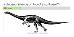
…and even do the same for individual words or comments in the description:
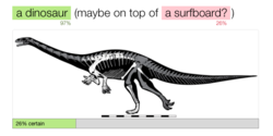
A similar set of quick hints might prove useful in Google���s featured snippets. For more complex topics, however, we���d likely want to know more than just how ���true��� the result is. We might want to see confidence on a few dimensions: the degree to which the facts of the snippet are definitive, relevant, and controversial. (There���s also reliability of the source; I���ll get to that in a bit.) I���m just noodling here, and I���m not certain those terms are right, but conceptually I���m thinking of something like:

Relevance and definitive accuracy are metrics that we���re already familiar with. The notion of controversy is more ticklish. It applies neatly to places where facts are emerging but remain in dispute. But it���s much more challenging for topics that are under siege by cynical attempts to game search results.
As I���ve wrestled with this, I���ve found the term ���controversy��� isn���t strong enough for those cases. Saying that women or Jews are evil isn���t ���controverisal���; it���s hostile hate speech. Saying that Barack Obama isn���t an American citizen is a cynical lie. There are some cases where the data has been poisoned, where the entire topic has become a hostile zone too challenging for the algorithms to make reliable judgments.
How might we identify hostile information zones?
We live in an era of hot-button topics where truth is fiercely disputed, and where two well-intentioned people can believe a completely opposite set of ���facts.��� Worse, we also have ill-intentioned saboteurs spreading misinformation to create hatred or controversy where none should exist. With its awful track record on questions like ���are women evil?��� and ���are Jews evil?���, Google has proven that algorithms aren���t up to the task of sorting out reliable facts when bad actors are fouling the information supply.
Our answer machines should do more to signal that their immune system has been compromised.
When you have malicious information viruses circulating the system, our answer machines should do more to signal that their immune system has been compromised. They should at least acknowledge that some answers are disputed and that the system might not have the judgment to determine the truth.
The moment an algorithm fails is an excellent time to supplement it with human judgment. Wikipedia���s crowd-sourced editor model generally does well at monitoring and flagging contentious topics and articles. The system is also very public about its potential problems. You can review all 6000+ of Wikipedia���s controversial/disputed pages; these are the articles that may not conform to the encyclopedia���s neutral-POV policy.
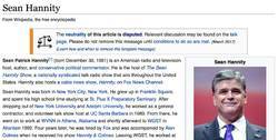
Wikipedia adds warnings to articles when their objective accuracy is in dispute.
Perhaps our systems have the data to detect the signals of controversy, or maybe we need to rely on human know-how for that. Either way, whether flagged by people or robots, there are clearly some topics that demand some arm waving to alert the reader to proceed with a skeptical eye and critical mind. That���s especially true when data is faulty, controversial, incomplete, or subject to propaganda campaigns. All of these cases create hostile information zones.
In the instances when our tools can���t make sense of besieged topics, then our tools have to let us know that we can���t rely on them. The answer machines should at least provide context���even if just a flag to say proceed with caution���along with the raw source material for humans to apply some smarter interpretation. How might it change things if search results in hostile information zones said something like this:
Warning: This topic is heavily populated by propaganda sites, which may be included in these results. Read with a critical eye, and check your facts with reliable references, including [set of trusted resources].
In topics like these, we need more explicit help in evaluating the source and logic behind the answer.
How might we provide the answer���s context?
Google gives only the shallowest context for its featured snippets. Sure, the snippets are always sourced; they plainly link to the page where the answer was extracted. But there���s no sense of what that source is. Is it a Wikipedia-style reference site? A mainstream news site? A partisan propaganda site? Or perhaps a blend of each? There���s no indication unless you visit the page and establish the identity and trustworthiness of the source yourself.
But nobody follows those links. ���You never want to be in that boxed result on Google,��� About.com CEO Neil Vogel told me when we designed several vertical sites for the company. ���Nobody clicks through on those top results. Their search stops when they see that answer.��� About.com sees a steep traffic drop on search terms when their content shows up as the featured answer.
People don’t click the source links, and that’s by design. Google is explicitly trying to save you the trouble of visiting the source site. The whole idea of the featured snippet is to carve out the presumed answer from its context. Why be a middleman when you can deliver the answer directly?
The cost is that people miss the framing content that surrounds the snippet. Without that, they can���t even get a gut sense of the personality and credibility of the source. It���s just one click away, but as always: out of sight, out of mind. And the confidence of the presentation doesn���t prompt much fact-checking.
Quick descriptions of the source could be helpful. Human reporters are adept at briefly identifying their sources, suggesting both agenda and expertise: ���a liberal think tank in California,��� ���a lobbying organization for the pharmaceuticals industry,��� ���a scientist studying the disease for 20 years,��� ���a concerned parent.��� What���s the corollary for data sources? How might we ���caption��� sources with brief descriptions or with data that suggest the source���s particular flavor of knowledge?
Or what if we try to rate sources? One way machines gauge and reflect trust is by aggregating lots of disparate signals. As users, we tend to trust the restaurant that has four stars on 300 Yelp reviews more than we trust the restaurant that has five stars on just one. Google itself is built on a sophisticated version of just that kind of review: its original breakthrough innovation was PageRank, measuring authority by the number of inbound links a page received.
Reviews and PageRank can both be gamed, of course. One hedge for that is to identify a set of trusted reviewers. Metacritic aggregates movie ratings by professional film critics to give an establishment perspective. How might we apply something similar to track and rate the trustability of data sources?
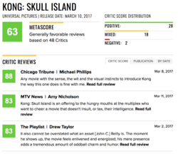
Metacritic aggregates the ratings of trusted sources (professional critics) in addition to broader crowdsourced reviews.
And perhaps as important: how might we offer insight into why this is the answer or top result? ���Neither Google or Facebook make their algorithms public,��� Carole Cadwalldr wrote in her Guardian piece. ���Why did my Google search return nine out of 10 search results that claim Jews are evil? We don���t know and we have no way of knowing.���
But it doesn���t have to be that way. Even very sophisticated data services can offer hints about why data pops up in our feed. We see it in recommendation services like Netflix (���Because you watched Stranger Things,��� ���TV dramas with a strong female lead���) or Amazon (���Buy it again,��� ���Inspired by your browsing history,��� ���People who bought that widget also bought these gizmos���). Even coarse insights are helpful for understanding the logic of why we see certain results.
How might we adapt to speech and other low-resolution interfaces?
The ���one true answer��� problem becomes especially acute when we���re speaking to Alexa or Google Home or other voice services. Voice is a super-low-resolution interface. You can���t pack anywhere near as much data into a conversation as you can on higher-resolution interfaces like paper or a webpage. You can communicate that data eventually; it just takes more time versus other modes.
With time at a premium, Alexa and Google Home call it quits at the top result. Google���s onscreen featured snippet is effectively Google Home���s entire answer.
���Google���s traditional list of search results does not translate well to voice,��� writes Danny Sullivan calls, ���Imagine Google Home reading you a list of 10 websites when you just want to know how many calories are in an orange.���
The calorie question, of course, is the unequivocal quick-info data that our answer machines are good at. But what about when there���s not a quick answer?
The word ���set��� has nearly 500 definitions in the Oxford English Dictionary. Ask Alexa for the definition, and the response takes over 60 seconds: ���Set has many different meanings,��� Alexa says, and then lists 15 definitions���five each for adjective, verb, and noun. The answer is at once too detailed (the dense response is hard to follow) and not detailed enough (only about 3 percent of the word���s definition).
A really good thing, though, is that Alexa kicks off by saying that there���s more than one answer: ���Set has many different meanings.��� It���s an immediate disclaimer that the answer is complicated. But how to better communicate that complexity?
The way human beings use speech to negotiate one another���s vast and complex data stores is through conversation and dialogue. I ask you a question and you give me some information. I ask another question to take the conversation down a specific path, and you give me more detailed information about that. And so on. A dialogue shaped like this will certainly be one way forward as these voice interfaces mature:
Me: What does ���set��� mean?
Alexa: ���Set��� has 464 definitions. Would you like to hear about nouns, verbs, or adjectives?
Me: Nouns.
Alexa: As a noun, ���set��� means: [three definitions]. Would you like more meanings?
Me: Would you give me an example sentence with that first definition?
Alexa: Sure. ���He brought a spare set of clothes.���
At the moment, however, our voice interfaces are more call-and-response than dialogue. Ask Alexa a question, gives an answer, and then immediately forgets what you asked. There’s no follow-up; every question starts from scratch. Google Assistant is starting to get there, saving conversation ���state��� so you can ask follow-up questions. Other systems will follow as we transition from voice interface to truly conversational interface. Dialogue will certainly be a critical way to explore information beyond the first response.
In the meantime, the Alexa-style caveat that there���s more than one meaning can at least serve us well for flagging contentious or ambiguous content. ���This topic is controversial, and there are competing views of the truth…���
Even when truly conversational interface arrives, most of us probably won���t have time for a Socratic dialogue with our living-room answer machine about the nuances of the word ���set.��� A second approach���and one we can apply right now���is to kick complex answers over to a higher-resolution interface: ������Set��� has 464 definitions. I texted you a link to the complete list.��� Or, ���There���s not an easy answer to that. I emailed you a list of links to explore the topic.���
As we pour our data-driven systems into more and more kinds of interfaces, those interfaces have to be adept at encouraging us to switch to others that are likely more appropriate to the data we���re trying to communicate. A key to designing for low-resolution interfaces is helping to leap the gap to higher-resolution contexts.
Critical thinking is… critical
The questions I���m asking here are tuned to inquire how we might arm people with stronger signals about how much we can trust an answer machine���s response.
This approach suggests a certain faith in human beings��� capacity to kick in with critical thinking in the face of ambiguous information. I���d like to be optimistic about this, to believe that we can get people thinking about the facts they receive if we give them the proper prompts.
We���re not in a good place here, though. One study found that only 19% of college faculty can even give a clear explanation of what critical thinking is���let alone teach it. We lean hard on the answer machines and the news-entertainment industrial complex to get the facts that guide our personal and civic decisions, but too many of us are poorly equipped with skills to evaluate those facts.
So the more Google and other answer machines become the authorities of record, the more their imperfect understanding of the world becomes accepted as fact. Designers of all data-driven systems have a responsibility to ask hard questions about proper thresholds of data confidence���and how to communicate ambiguous or tainted information.
How can we make systems that are not only smart enough to know when they���re not smart enough… but smart enough to say so and signal that human judgment has to come into play?
If your company is wrestling with how to present complex data with confidence and trust, that’s exactly the kind of ambitious problem that we like to solve at Big Medium. Get in touch.
March 7, 2017
Let's Make the World We Want To Live In
���This conference can���t be about doing business as usual when terrible things are happening in the world. It’s got to be about what we can do to make the world better.���
That���s what I told over 1100 interaction designers when John Payne and I opened the Interaction 17 conference last month. As co-chairs, John and I had considered and shaped the event���s program for over a year with our steering committee. We decided early on that Interaction 17 would consider how to design for the fast-moving contexts of our culture, industry, and craft. Over three days, the main conference addressed what to make of emerging interfaces and new design process. But more crucially, the event examined the responsibilities of designers in wielding those technologies.

Photo by Alex Margot.
I couldn���t be more pleased with how it turned out. Designers leaned into these sessions with a sense of mission. Two weeks into the Trump presidency, as our international audience negotiated the president���s travel ban at our border, the conference hall was thick with questions about what makes a good society���and what designers��� role in it should be.
With the design community all in one place, it's clear that the natives are restless. #ixd17
— Rachel Ilan (@rilan) February 6, 2017
I���m quite impressed with the political overtones at this year���s Interactions conference. Designers need to be politically active. #ixd17
— Thomas Wendt (@Thomas_Wendt) February 7, 2017
We talked about how to design in the era of the algorithm, of data surveillance, of bad data (and misinformation). We talked about how our services can earn trust and foster respect as our interfaces become more intimate, more knowing, more��ubiquitous, leaping off our screens and into our homes or onto our bodies. We asked how new technologies like virtual reality, chatbots, and the internet of things can be used in meaningful ways that go beyond novelty and address real purpose.
We focused not only on how to do design, but why���to what end and to whose benefit.
Throughout, the constant subtext was to look beyond our interfaces and at their impact. What are the intended and unintended consequences of our work at both societal and individual levels? As digital interfaces mediate more and more of our personal, social, and civic lives, how can designers shape behavior to amplify our humanity, build human connection, and empower the disempowered?
���The people here design, make, and control the experiences had by millions of humans,��� said Chelsea Mauldin, executive director of Public Policy Lab, in her opening keynote Design and Power. ���We alter the life experiences, the social relationships, the fabric of the lives of millions of people. ��� How do we use that power to alter our users��� lives in ways that are meaningful for them?���
���We should be building the technology for the world we all want to live in,��� said Third Wave Fashion’s Liza Kindred, the smartest person I know (and also my wife). Her talk Mindful Technology offered antidotes to our industry���s dubious focus on constant engagement. ���The same way we can take a deep breath before we reach for our phones, we can also take a moment during our design process: step back and just think about our values���and whether we���re actually designing something we want to put out there.��� (Liza’s launching a new venture, Mindful Technology, to help companies and individuals align their tech with core values.)
Indeed, nearly every session reminded that design is much more than technique. Designers have to be more explicitly thoughtful about the principles that define our work.
Several strong themes emerged across the three days:
Software is ideology
Information is subtle, subject to bias and error
Design + humility = respect
Efficiency isn���t the be-all and end-all
Talk to objects, talk to services
New tech creates new behaviors
We still don���t really know what we���re doing
Safe places foster creative risk
We are the leaders we���ve been waiting for
That���s the TL;DR. Below is a bunch of rumination on the details, albeit on just a sliver of the talks. The good news: all talks were recorded, and the videos have begun to make it online at the IxDA Vimeo account, with more on the way.
1. Software is ideology
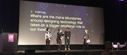
Madoka Ochi, Natalie Phillips-Hamblett, and Kevin Gaunt talk smart homes with MJ Broadbent. Photo by Christina Noonan.
The work of interaction design is to shape behavior. The way designers choose to do that is full of value decisions, whether conscious or not. When you stack those decisions up, you get software that is opinionated, even ideological, and which shapes the culture of its use.
Do we give users agency (help cook a healthy meal) or replace it (food delivery)?
Do we reveal how decisions are made, or is the algorithm a magical black box?
Is the goal efficiency, or to add texture to an experience?
Are we designing for accessibility or a privileged few?
Do we want to trap users in our service or give them freedom?
���We are in an industry where we are pushed to create new products fast without necessarily thinking how that impacts our life, our values, our culture,��� said Simone Rebaudengo in his talk, Domesticating Intelligence. ���We really need to think deeply about what motives are behind the objects that we create, and what types of relationships we want to create.���
Simone and others encouraged designers to explicitly consider their own values as well as the implicit values of the products they make. It���s worthwhile. In my own practice, I constantly revisit a list of design principles that I believe are important for technology today. And at the start of every client project, I work with stakeholders to set out the design principles that will govern the project.
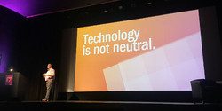
Cennydd Bowles. Photo by Sami Niemel��.
���Design is applied ethics,��� said Cennydd Bowles in his talk Ethics for the AI Age. Cennydd offered four ethical tests as a way to check the values of what you���re doing:
What if everyone did what I���m about to do?
Am I treating people as ends or means?
Am I maximizing happiness for the greatest number?
Would I be happy for this to be published in tomorrow���s papers?
Not for nothing, but it���s pretty clear that companies like Uber���especially Uber���routinely fail all those tests. So what instead? Consider this set of design principles Liza proposed in her Mindful Technology talk:
Design for human connection.
Awake the senses.
Create utility or joy.
Let the tech disappear.
Design for disconnect.
Build extensibly.
Simplify. Then simplify again.
Narrow the digital divide.
Make something the world needs.
2. Information is subtle, subject to bias and error
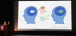
Chelsey Delaney. Photo by Diego Pulido.
Fact and truth have become slippery: the partial perspectives of our social-media bubbles, the outright lies of our leaders, bad assumptions that throw off our algorithms, tainted data in our applications. The presentation of information has become not only challenging but controversial.
As designers, that first means we have to accept that our worldviews���even when objectively true���are not shared by all. ���GOOB: get out of your bubble,��� said Chelsey Delaney, director of digital UX for Planned Parenthood, in her talk Designing To Combat Misinformation. ���The more we are grounded in our own biases, the more we are polarized by our own biases.���
Chelsea shared how her organization tackles damaging but closely held healthcare myths (what you can and cannot catch from toilet seats, for example). She counseled compassion, suggesting that designers seek out the source of misinformation and get to know the communities where it springs from: research for the win. From there, plainspoken presentation of myth vs fact, with clear paths to alternate, detailed explanations prove effective.
But what about when that bad information springs from our own data? As more and more of us build services upon sprawling heaps of data, several talks suggested that we have to treat our own data with skepticism���and sometimes as hostile.
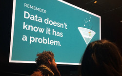
Slide by Sonia Koesterer. Photo by Joanne Weaver.
���Data is a lot like a drunk aunt,��� said Sonia Koesterer of Collective Health in her talk, Not Dead Yet: Designing Great Experiences with Bad Data. ���She’ll go on and on talking, she’ll blurt out numbers everywhere, but she’s never going to tell you that she’s had too much to drink. She’s never going to tell you hey, you maybe should stop taking me seriously right about now and it’s really up to all of us to understand that she’s off her game.���
Sonia suggested a slow-burn prototyping process to make sure you live with your data long enough to understand whether you���re building the right thing in a reliable way. Build forcing functions that bail out at the first whiff of bad data. Establish redundant data checks to confirm your data is actually what it says it is���almost like how you secure your services by making sure users are who they say they are.
This kind of ���garbage in, garbage out��� sensibility seems like common sense, yet our culture tends to embrace a ���garbage in, gospel out��� ethic instead. We have unreasonable trust in the output of the algorithm���just because it���s an algorithm.
What if Alexa is the drunk aunt? And how do we correct Alexa when the algorithm is off-kilter?
���We think that objects [and algorithms] are objective, that they are better than humans at making decisions because they don’t have emotions or they don’t have biases,��� said Simone Rebaudengo. ���Computers themselves have biases that are baked in the data that we feed them.���
Trouble is, we often don���t understand those biases because the decision-making process is invisible to us.
���Why should I trust Alexa?��� asked Simone. ���What is the logic behind it? And if I don’t have any clue, what can I do about it? Right now these things are very black box, but at a certain point it will have to be more transparent.���
3.Design + humility = respect
���Good design takes a certain amount of humility,��� Dori Tunstall reminded us in her keynote, Respectful Design.
At the moment, too many of our products lack humility; they are noisy, clamoring for more attention than the underlying service actually deserves in the larger context of our lives. We have to do better at scaling the attention our applications demand to the importance they properly have in people���s lives.
That was the strong thesis of Liza Kindred���s talk, questioning our industry���s drive to engagement, and our love affair with our own products. ���People don’t really care about technology,��� Liza said. ���When it comes down to it we really care about ourselves and our loved ones more than the gadgets and the interfaces. We want to connect with the people we love. ��� Allow people to stay in their moment. ��� Have the judgment not to interrupt when it’s not necessarily important.���
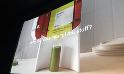
Slide by Simone Rebaudengo. Photo by Michelle Tepper.
Ours is an industry that tends to assume technology will always make things better. It���s all too rare to ask ourselves if specific contexts would perhaps be easier without that nifty new tech. The light switch, after all, remains the gold standard of interaction design, despite attempts to ���improve��� on it with fancier technology. ���I have never had a harder time turning my lights on since we hooked them up to Alexa,��� Liza said. ���That is an example for me of the technology getting in the way.���
Questioning the current tech onslaught does not make you a Luddite. It makes you smart and aware. #ixd17
— Gary Schroeder (@gary_schroeder) February 8, 2017
���The opportunity space here is: what do we not design?��� said Matt Yurdana of Intel���s IoT Experiences Group in a talk about establishing trust with self-driving cars. ���Where are those places in this new space and in other newly connected spaces where we want the technology to be out of the way, and not necessarily mediate social interactions between people in all contexts?���
This question popped up in lots of ways at Interaction as designers wrestled with the appropriate moments to cede agency���and sometimes control���to the robots.

Discussing agency and respect in interfaces with (from left) Matt Yurdana, Liza Kindred, Zach Paradis, and Josh Clark. Photo by Jose Coronado.
4. Efficiency isn���t the be-all and end-all
���There are a series of products that see life as a problem,��� Simone said. ���You know, where your kitchen is a big gigantic problem to solve, and where efficiency is the main value.���
A core value of Silicon Valley is the relentless elimination of friction and the creation of highly efficient services that reduce effort and even predict our wants and needs. Often the ���friction��� that���s eliminated is a conversation with another human being. In other words, sometimes the friction we���re removing is actually the texture of life.
���Look, I like a nice efficient interface as much as anyone else,��� said Brendan Dawes in his keynote The Beautiful Inconvenience of Things. You want that thing to get out of the way. But sometimes what I would like to explore is interfaces for encouraging serendipity ��� in such a way that you can bump into things.���
���We imagine it���s all going to be automated,��� said Pamela Pavilscak in her talk When Your Internet Things Know How You Feel. ���It’s rational, frictionless, invisible. ��� The problem is that our experience of technology is not really rational. We have an emotional attachment to our objects. We touch our phones hundreds of times a day, probably, sadly, more than we touch our partners or our children or our pets. ��� What if our objects had a little more compassion and empathy and etiquette about us?���
5. Talk to objects, talk to services
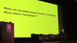
Paul Pangaro: Conversation is more than interface. Photo by Stephanie Aaron.
If efficiency isn���t always the goal, then there���s an exciting opportunity to introduce wonderfully human inefficiencies in the way we talk to data services. It means that push-button interactions may sometimes be replaced by conversation or physical interaction. Emotion and personality play a stronger role.
Brendan shared lots of his hardware projects, all of which blend physical and digital in ways that amplify the meaning of the object in our lives���making it more of what it already is. He shared a New York City snow globe that, when you shake it, tells his computer to show photos from a long-ago NYC visit: ���Physical artifacts as digital interfaces. We have these artifacts in our home, and they’re there to maybe remind us of something. ��� So these objects, they tell us things, they talk to us.���
More and more data services are explicitly talking these days, through speech interfaces like Alexa or Siri, or through a wave of chatbots in our messaging interfaces. I hosted an afternoon of sessions about conversational interface design. Paul Pangaro, Whitney French, Elizabeth Allen, Greg Vassallo and Elena Ontiveros tackled various angles of designing, prototyping, and managing bots���and considering what���s a conversation in the first place.
Much of the talk about these conversations with systems revolved around issues of tone, how to avoid the uncanny valley of robots that try too hard (and unsuccessfully) to be human. ���I would like to see technology that is more humane, not necessarily more human,��� Pamela Pavliscak said in a separate session. The work here is to establish appropriate expectations for the conversations people can have with bots���and to create systems that are smart enough to know when they���re not smart enough.
As it turns out, the very ���botness��� of these interactions tends to spur some new and productive behaviors: people are often much more open, even vulnerable, when talking to bots versus talking to humans.
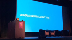
Facebook’s Elena Ontiveros. Photo by Roxanne Mustaffa.
Yet some things remain the same: we care what the ���person��� we talk to thinks of us���even when they���re robots. We change our behavior because we know they���re watching/listening. ���We are becoming aware of the fact that there are a lot of algorithms that are learning about our life, and a lot of people are starting to define their own strategies to train objects and train algorithms,��� said Simone Rebaudengo. He mentioned Spotify���s Discover Weekly playlists, which gather new music based on your listening history. ���The first time I started using it, it only played German techno. And I kind of felt shit about myself, so I started listening to other music to mix up my feed and feel better about myself.���
6. New tech creates new behaviors

Brenda Laurel. Photo by Kevin M. Hoffman.
In her talk VR and AR: What���s the Story, Brenda Laurel kicked off a spirited discussion of virtual reality. ���You should be able to support emergent goals and behaviors,��� she said. ���The more stuff that���s in there that’s reactive, interactive, responsive, the better.���
Part of our jobs as designers of new interfaces is to provide people with enough freedom that they can pursue unanticipated but productive new uses of those systems. Our virtual realities, in other words, are creating new realities in ���reality prime��� as Brenda called it.
���I have dreams in VR now, because I’ve been using it so much,��� said filmmaker Gary Hustwit in his talk Unframed about VR filmmaking. ���I also have dreams about new VR experiences that don’t exist yet, which is even weirder.���

Gary Hustwit. Photo by Jose Coronado.
These were potent reminders that new categories of tech products tend to have strong ripple effects beyond the product itself. Matt Yurdana struck a similar theme when he quoted poet Stephen Dunn: ���Normal: the most malleable word our century has known. The light bulb changed the evening. The car invented the motel.��� Matt said:
Right now the focus [for self-driving cars] is on the vehicle, getting it to drive automatically, but in the long run, it’s not really about the vehicle, it’s about what is our changing notion of getting from Point A to Point B, how it’s going to transform the infrastructure in which we travel through. How will this work reshape and redesign our cities and our suburbs?
7. We still don���t really know what we���re doing
���I think I���ve distilled what this conference is all about,��� Jeremy Keith quipped to me during one of the breaks. ���It���s about how we���ll save the world through some nightmarish combination of virtual reality, chatbots, and self-driving cars.���
I���m not sure I���d put it exactly that way ����, but Jeremy���s right to bring some skepticism to this. Heedlessly deployed, these new technologies could indeed stitch together a nightmare of bad experiences that hinder more than help, that distance us from the world and from each other. There are a million ways we could get this wrong, and we don���t yet know what these emerging interfaces are truly for���or what good or harm they might do.
This is all happening so quickly and for such a diversity of digital systems, we haven’t come close to establishing best practices for any of them. With so many unknown potential consequences���long-term consequences���of our work, it���s likely to be a while before those best practices fully bake.
“The world's most depressing venn diagram.” -Nathan Moody #ixd17 pic.twitter.com/LGjGYVtBQN
— Small Planet (@SmallPlanetApps) February 7, 2017
So, more than ever, we need to experiment, research, and prototype. And in that research we need to try some zany and unexpected ideas. We need to accept that our expertise in the point-and-click medium may have only limited application in these emerging interfaces.
“When designing the future, you need to constantly question your known tricks,” said Artefact’s Brad Crane in Suspending Disbelief: Building Immersive Designs for the Future, his talk with Jon Mann.
���Put things into the world that deserve to exist,��� said Brendan Dawes. ���That thing in your notebook that you’ve never made doesn’t change anything. You’ve got to make these things real, even in a lo-fi way. You’ve got to put it out there.���
8. Safe places foster creative risk
If we���re going to go outside of our comfort zones to explore truly new and meaningful uses of new technologies, our organizations and processes need to be not only creative, but creatively safe. Trying new things inevitably means failing at new things, and that can be bruising.
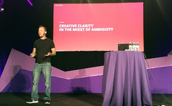
Jon Kolko. Photo by Jose Coronado.
���The role of design leadership is to focus on building trust as much as you focus on building craft,��� said Jon Kolko in his talk Sh*t Sh*w: Creative Clarity in the Midst of Ambiguity. Design leaders, he said, can create an atmosphere of trust and collaboration by framing questions and demonstrating that possible solutions are only steps in the journey, not the end of it:
You begin the negotiation by making something and you acknowledge when you make it that it’s wrong. The whole point is to start the snowball effect. The whole point is not to be right. That takes an awful lot of pressure and burden off of you. You don’t have to be the biggest brain in the room. ��� The mindset of a creative director shouldn���t be, ���I���m the person who has to have the good idea.��� Instead, you’re the person who simply needs to be able to articulate the problem.
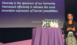
In her keynote A Journey in Social Entrepreneurship, BRCK executive director Juliana Rotich described the benefits of her team���s diverse geography, culture, and skill sets. Photo by Jose Coronado.
Many talks brought home the importance of diverse viewpoints in teasing out the most creative results���not only for sturdy products but for sturdy values.
���Diversity is an ethical early-warning system,��� Cennydd Bowles said. ���A homogenous group can really only focus on likely impacts for people like them. But a team with diverse traits and acquired experiences, they can better anticipate what’s going to go wrong further down a path. ��� Most unethical design and decisions happen because of insular thinking.���
Dori Tunstall���s keynote especially brought this home in the telling of her focused effort to bring more indigenous designers into the faculty of Ontario College of Art and Design: ���Respectful design is really about designing futures of inclusion and belonging for everyone and everything.���
9. We are the leaders we���ve been waiting for

We invited designers to scrawl their plans for a better world onto the conference walls. Photo by Pekka Hartikain.
In a moment as divisive as this one, when the stakes are so high, it wasn���t a surprise that so many designers came to Interaction looking for ways they can personally make the world a better place. Speaker after speaker gave the audience permission to just go and do it.
���Part of our gift as designers is that we bring things into the world, and we can bring in new conversations into our organizations,��� said Hannah Du Plessis in her thoughtful closing keynote with Marc Rettig.
All of us are empowered���even obliged���to go and figure out how to make the world better��� how to make power more evenly distributed��� how to make justice more universal.
���The great thing about design is that we make the work tangible,��� said Dori Tunstall. ���We can make justice tangible, too.���
Here���s the thing, though: design is commercial work. And that means it has to deliver business value in order to justify itself.
���We want to serve the people, but we have to answer to the man.���
���Chelsea Mauldin, Design and Power
���However much we want to embrace this user-centered perspective, in the end, the people commissioning our services, our clients, the people employing us and paying our salaries, they actually have more power over what we deliver than our users. They have signoff,” said Chelsea Mauldin in her opening keynote.
���When you create a new app or tool or platform,��� she asked, ���are you fundamentally serving the best interests of your users or the owners or shareholders who are going to profit from that thing that you’ve made? ��� Can you put your users first? Can you really put their interests before your own? Before your clients��� and your employers���? Can you say my first duty is to the wellbeing of my users?���
The best case, of course, addresses the needs of both user and shareholder. The hard work of user experience is to uncover the elusive path that connects user goals and business goals… and then light it as brightly as possible so that the business is encouraged to stick to that path. But power and money don���t always respect the path, instead choosing cynical designs that take advantage of the audience and corrupt the product. (This is what advertising always threatens to do to media properties, for example.)
So what can we do when we can���t find that narrow path, or when the powers that be refuse to follow it? Resist. Take ownership of what your role will and will not be.
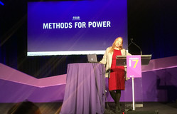
Chelsea Mauldin. Photo by Liisa Benmergui.
Chelsea put it better than I possibly could:
There’s daily and challenging work to do right inside of our design practices. We can observe the exercise of power and resist its injustices. We can reject simplistic notions of our users and seek to understand ourselves in them���and to dedicate ourselves to act as their tools.
We can resist the very strong current of authority. We can resist state power, and we can also resist commercial power. And we can explore ways to alter or expand our orders. We will be given orders. The question is, whether we have to obey them exactly.
We can bear witness. We can raise our hands and our voices when we see our teams or our employers or ourselves taking actions that undermine the humanity of others.
We can refuse to carry out work that troubles our conscience or runs contrary to our moral commitments. And we can choose always to seek out work that is dedicated to empowering others, and empowering in particular the people who are more vulnerable, more in need, or maybe just less lucky than ourselves.
Ready for Action
As one of the organizers of the event, I���m admittedly biased. But wow, I found Interaction to be a powerful rallying cry for our craft and our industry���and for me personally. It���s already changed the way I think about both the micro and macro decisions in my work, from the niceties of interface language to the big-picture project work I���ll pursue this year.
But also, some sad news: I���m incredibly upset to report that Interaction speaker Whitney French died just weeks after the conference. Her tragic and senseless death through domestic violence is a huge loss; this thoughtful and generous young designer was just starting to hit her stride. The world is poorer because she’s no longer with us.
For me, this life cut short is another reminder that we can’t wait���yet another reason that this is no time for business as usual. Please: get after your work on making this the world we all want to live in.
February 10, 2017
The People Behind Interaction 17

Interaction 17 co-chairs Josh Clark and John Payne open the conference.
What an extraordinary week! Over 1100 designers swept into New York City over the past several days for Interaction 17, the tenth annual gathering of IxDA (the Interaction Design Association). I had the privilege of planning the event as co-chair, an honor and responsibility I shared with the wonderful John Payne of Moment. Over the next few days, I���ll share some thoughts about the themes that emerged during the week, but first I need to say thanks to a whole lot of people.
Our team accomplished a ton. By many metrics, the event was the most successful edition of Interaction so far:
We solicited a record number of talk and workshop proposals
We sold out faster than any previous year
We sold the most workshop tickets of any previous year, with most workshops selling out completely
We created the most profitable Interaction so far, underwriting the continued good works of IxDA
We stood on the shoulders of giants for sure, inheriting the momentum built by previous Interactions. The attractive power of New York city helped, too. But hey, much of this year���s success is also due to plain hard work. I���m in awe of the many people who came together to make this happen.
The IxDA community
First up, huge thanks to the 1100+ designers who attended from 46 countries around the world. The Interaction conferences always have an unusually high level of engagement: the workshops buzz, the hallway conversations are heady, and the talks are packed. Attendees somehow maintain that energy for days. There���s an intense sense of tight-knit community and camaraderie.
I think a lot of this is due to the nature of IxDA itself. It���s a grassroots organization of nearly 200 community chapters around the world. These local groups each have their own passionate level of participation. Somehow when these groups come together, that���s magnified. Newcomers to the conference and organization feel the warm embrace of IxDA, too. The enthusiasm for our industry, our craft, and one another is contagious.
Came in knowing nobody, leaving feeling like family. Thank you @ixdconf community! #ixd17 pic.twitter.com/SU82lxrOOa
— Elissa Frankle (@museums365) February 9, 2017
#ixd17 is over, but friendships continue. I've met such wonderful people here and it reminds me we're part of a global community.
— Chelsea Hostetter (@chostett) February 9, 2017
The Interaction 17 team

Volunteers and committee take a bow at the end of Interaction 17. Photo by Christina Noonan.
The whole thing was made possible only by the vast energy, enthusiasm, and effort of over 100 volunteers. Yep, volunteers. Every year, Interaction is planned and produced in the spare time of designers from the community where it is hosted. As a conference team, we are literally amateurs���but holy cats, what an impressive collection of amateurs! It���s been a privilege to work alongside this group for the past year:
Elaine Matthias was the glue that held this little enterprise together. Her ���project manager��� title doesn���t begin to capture it. She kept the details lined up, the schedule in place, and ultimately kept us all honest���and on track. We would���ve been a puddle of drooling goo without Elaine.
Liz Danzico and Fred Beecher headed up the Interaction Design Education Summit, putting together a super-smart program to prod the state of design education.
Joshua Seiden, Dianna Miller, and David Fine chaired Interaction���s program committee, with attentive speaker support provided by Kristine Mudd. (Kristine was also indispensable as our onstage producer throughout the event.) With the support of 70 volunteer reviewers, this group did the painfully challenging work of distilling our record number of proposals down to the 60 sessions that we ultimately included. Enormous thanks to this group for doing so much to help curate the smart, coherent body of talks that emerged this week.
Abby Covert and Stokes Jones headed the submissions committee. They organized the call for proposals and drew 736 submissions for talks and workshops.
Mary Quandt, Christopher Fahey, and Henrik Rydberg chaired the workshop committee, with tremendous help from Richard Herring. The group organized 16 workshops and 5 field trips for the day before the main conference.
Kevin M. Hoffman ran the communications committee, with tweets, posts, emails, and photos wrangled by Nathan Gao, Jose Coronado, Samara Watkiss, and Jessa Bartley-Matthews.
Jason Santa Maria and Aarron Walter chaired the design committee, overseeing the design and production of the website, print materials, motion graphics and stage set. Stephanie Aaron designed the print program and badges. TJ Pitre, Kelsey Cahill, and Rob Nero made the web development happen. Christina Noonan and Allegra Fisher created the core brand and web design, and Kelsey Scherer refined it over the course of the year. Alanna John collaborated with Kelsey S., Stephanie Aaron and Elaine Matthias to design all the signage and wayfinding materials. Our friends at Portugal���s Hi Interactive created the videos and motion graphics that rolled during the show.
Jennifer Brook, Daniel Stillman, Michele Washington, and Lisa Welchman headed up our interstitial committee with the special brief of designing activities between program sessions. Jenn and Michele came up with concepts for the response walls that were so beautifully lettered by Jen Mussari. Daniel sorted pre-conference activities, including a sketching workshop he facilitated. The group wrote prompts and icebreakers for the inter-session slideshow, and produced concepts for getting attendees talking during the walks between venues.
Peter March headed up the operations committee, organizing vendors and volunteers with Michele Tepper and Martha Post.
Ana Domb and Ahmed Riaz led the Student Design Challenge, selecting and shepherding six remarkable student teams who worked like crazy during the week to prototype products that fit the theme “everyday magic.”
Molly Wright Steenson and Thomas Kueber chaired the Interaction Awards, recruiting the jury and overseeing the selection of some truly kick-ass design projects that are changing the world.
Finally, IxDA executive director Brenda Sanderson offered guidance and encouragement throughout, lending us her experience and expertise as she steered the high-level finances and contracts for the event.
This was the core crew that planned the conference throughout 2016. But a whole army of additional volunteers generously shared their time, putting their shoulders into the event in the final weeks and during the conference itself. Stuffing badges, running microphones, and dashing out on errands is not the most glamorous work. So I���m especially grateful to these designers, each of whom took on those jobs (and many others) so cheerfully:

Just a few of the speakers at Interaction 17.
Akiko Ikkai, Alex Frankel, Amanda Persky, Amsha Kaira, Ankit Mawande, Ankita Gupta, Ashley Jang, Azu Rom��, Brian Durkin, Charlene Lertlumprasert, Christine Lawton, David Mahmarian, Deborah Barber, Elushika Weerakoon, Eva McSweeney, Fernando Capeto, Gerti Geier, Gwen Kurtz, Janel Wong, Jaqueline Gordon, Jason Rabie, Jenil Gogari, Jessica Greco, Jimmy Chandler, John Chin, Julian Gonzalez, Katarina Yee, Kinjal Shah, Kohzy Koh, Kyungmin Lee, Lana Voynova, Lillian Yuan, Lorina Binning, Malik Wormsby, Martha Post, Mischa Fierer, Ning Xu, Nour Malaeb, Oriol Sall��s Duran, Raina Huang, Ricardo Huang, Ritwik Deshpande, Rob Kovacs, Rodrigo Sanchez, Ruth Tupe, Saba Singh, Sam Anderson, Santiago Bustelo, Sara Lim, Sejal Kotak, Seungyoun Lim, Shane Strassberg, Traci Paris, Tyler Gumb, Uijun Park, Valli Ravindran, Wolfgang Gil, Young Jang, and Yue Yuan.
The speakers of Interaction
If the Interaction 17 team was the behind-the-scenes crew who enabled the show to happen, it was the speakers who were the show. Sixty main-program talks and 16 workshops made for a full slate of forward-looking, mind-bending talks about the state of our craft.
A special shout out to our seven keynote speakers who framed the conversation each day: Chelsea Mauldin, Brendan Dawes, Juliana Rotich, Xavier Vendrell, Dori Tunstall, Hannah du Plessis, and Marc Rettig.
At the speaker dinner, I told the speakers that being in the same room with them reminded me of Dave Bowman in 2001, A Space Odyssey: ���My god, it���s full of stars.��� The speakers were truly the stars who made the conference. I learned a ton in a few short days.
If you weren���t at the show, never fear. We recorded all the sessions, and we���ll share those videos later this month, along with all the slide decks. I���ll also share some personal thoughts and highlights in the coming days.
Our sponsors
Gigantic thanks, too, to the many companies who backed Interaction 17 as sponsors and partners. The amazing Andr��a Pellegrino managed all of those relationships, providing the vital financial foundation for the conference.
An especially big shout to our major sponsors: Adobe, Bloomberg, Capital One, IBM, Intel, and SVA.
Thanks, too, to our many other partner companies: Amazon, TD Ameritrade, Coroflot, Google, HBO, MailChimp, R/GA, Razorfish, Clover, Clover Health (two Clovers!), we.design, Fidelity Investments, Fjord, Goodpatch, Green Stone, Hi Interactive, Invision, Mark43, Moment, OpenTable, Perka, Reaktor, ThoughtWorks, Verizon, Balsamiq, Etsy, Johnson & Johnson, Microsoft, O���Reilly Media, Rosenfeld, Southleft, and WeWork.
IxDA NYC
And finally, a big, big thank you to Interaction���s IxDA hosts of the event, the local New York City chapter of IxDA. Those thanks go to the whole leadership team of IxDA NYC, but especially to Peter March, Stephanie Aaron, David Fine, and Kristine Mudd who did so much to make the conference happen. Nearly 18 months ago, that group spearheaded the bid to bring Interaction to New York City, and they asked John Payne, Liz Danzico, and me to throw in with them. I���m incredibly glad I did.
Interaction 17 was an amazing experience, and in a very real way, an amazing family, too.
January 7, 2017
Josh Clark

Josh Clark is founder of Big Medium, a design studio specializing in connected devices, mobile experiences, and responsive web design. His clients include Samsung, Time Inc, TechCrunch, Entertainment Weekly, eBay, O���Reilly Media, and many others. Josh is author of several books, including Designing for Touch (A Book Apart, 2015) and Tapworthy: Designing Great iPhone Apps (O���Reilly, 2010).
Josh speaks around the world about what���s next for digital interfaces. He has keynoted 100+ events in over 20 countries, and offered countless more private workshops and executive sessions.
Josh founded the design studio Global Moxie in 2002 (the name changed to Big Medium in 2015). He holds a B.A. from Harvard University.
Before the internet swallowed him up, Josh was a producer of national PBS programs at Boston���s WGBH. He shared his three words of Russian with Mikhail Gorbachev, strolled the ranch with Nancy Reagan, hobnobbed with Rockefellers, and wrote trivia questions for a primetime game show. He was crowned 11th strongest man in Maine after a highly scientific series of trials���at a county fair with, ahem, just ten other competitors. In 1996, he created the uberpopular ���Couch-to-5K��� (C25K) running program, which has helped millions of skeptical would-be exercisers take up running. (His motto is the same for fitness as it is for software user experience: no pain, no pain.)
Josh lives in Brooklyn with his sensational wife Liza, his astonishing stepdaughter Veronika, and their rescue dog Eddie.
����������������������������
Twitter: @bigmediumjosh


