
Josh Clark's Blog, page 24
October 13, 2013
Making of: Entertainment Weekly's Responsive Mobile Site
Entertainment Weekly has a new responsive mobile website, and the design is a Global Moxie joint. Check it out at m.ew.com.
I had the good fortune to lead the overall design effort for the project, and I invited some of the planet’s finest web heroes to join in.1 They’re like The Avengers, only without all the bickering and Hulk-like rage:
Robert Gorell wrangled IA and UX on the project, serving up an entire smorgasbord of content to small screens, one bite-sized morsel at a time.
Dan Mall and his SuperFriendly colleagues Scott Cook and Matt Cook managed the art direction and visual design of the site. They created a fresh look on top of the rich visual brand that Entertainment Weekly had already established in its print and digital projects.
Brad Frost made the magic happen with HTML and CSS. We put his new Pattern Lab environment through its paces as an ideal way to manage both process and deliverable for a responsive project.
Jonathan Stark made the site dance with JavaScript that is at once compact, flexible, and even understated. Just like the man himself.
Kristina Frantz kept the trains running on time (and on the right track) as producer of this fandango.
10up was our technology partner, handling the back-end integration of the design into Entertainment Weekly’s content management system. They’re just great.
Everything happened under the careful and pragmatic attention of Entertainment Weekly Product Director Chad Schlegel. We also worked closely with EW.com Editor Bill Gannon, Art Director Martin Schwartz, and Senior Project Manager Serena Tan. Everyone on their crew was a pleasure to work with: enthusiastic, flexible, and willing to hand themselves over to the responsive design process. That process continues to evolve and its departures from traditional design milestones and deliverables can sometimes give all of us vertigo. With every project, though, the process gets more grounded, more settled.
I’d like to share some of that process, as well as some novel design solutions that we developed.
The brief
A magazine feel
Killing the carousel
Progressive disclosure
Limiting the long scroll
Navigation: content as an enhancement
Nifty anchor navigation
Photo galleries that are more than photo galleries
Share share share share
Respectful advertising
Cross-platform branding
A responsive process
More from the team
The brief
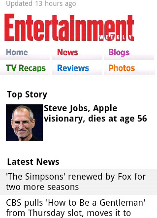
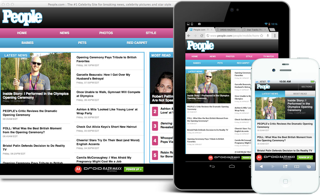
Ye olde website. Entertainment Weekly's original mobile site.
Our mission: design a responsive site for phones and small tablets—everything south of the iPad Mini.2 This new edition replaces a simple site that has served phones for several years. While that site focused on efficient delivery of news and headlines, the new site was to branch out and include the full EW.com experience, including photo galleries, videos, and community experiences.
Beyond a full slate of features and content, though, a big piece of this was about brand. The simple design of the original mobile site, while efficient, did not capture the energy and ebullience of Entertainment Weekly’s desktop and print experience. “The mobile site right now doesn’t convey our personality. It’s like a government form. It’s not fun,” Chad told us. Assistant Managing Editor Mike Bruno brought the message home: “We want to take what we’re good at and just wallop you in the head with that stuff.”
Part of connecting the mobile design with the larger Entertainment Weekly brand also meant literal connection across platforms. The design had to feel not only consistent with those platforms (print, apps, and web across devices) but also had to make them known. One of the site’s job in both function and aesthetic was to plug readers into the breadth of the Entertainment Weekly universe in all of its platform contexts.
So: featureful, pretty, on-brand, and platform-minded... all with the goals of increasing reader engagement as measured by page views, user sessions, and community involvement.
We spent a lot of time with Entertainment Weekly readers, finding out their sense of the brand, and the jobs that the website, apps, and magazine do for them. Robert and I did hours of interviews with regular readers. And from there, we were off. (Dan gives a great overview of our kickoff process, including a slew of photos.)
A magazine feel
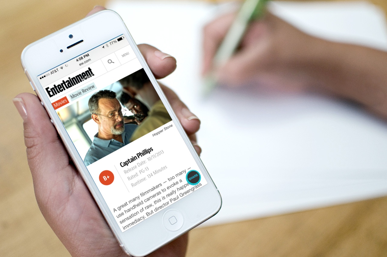
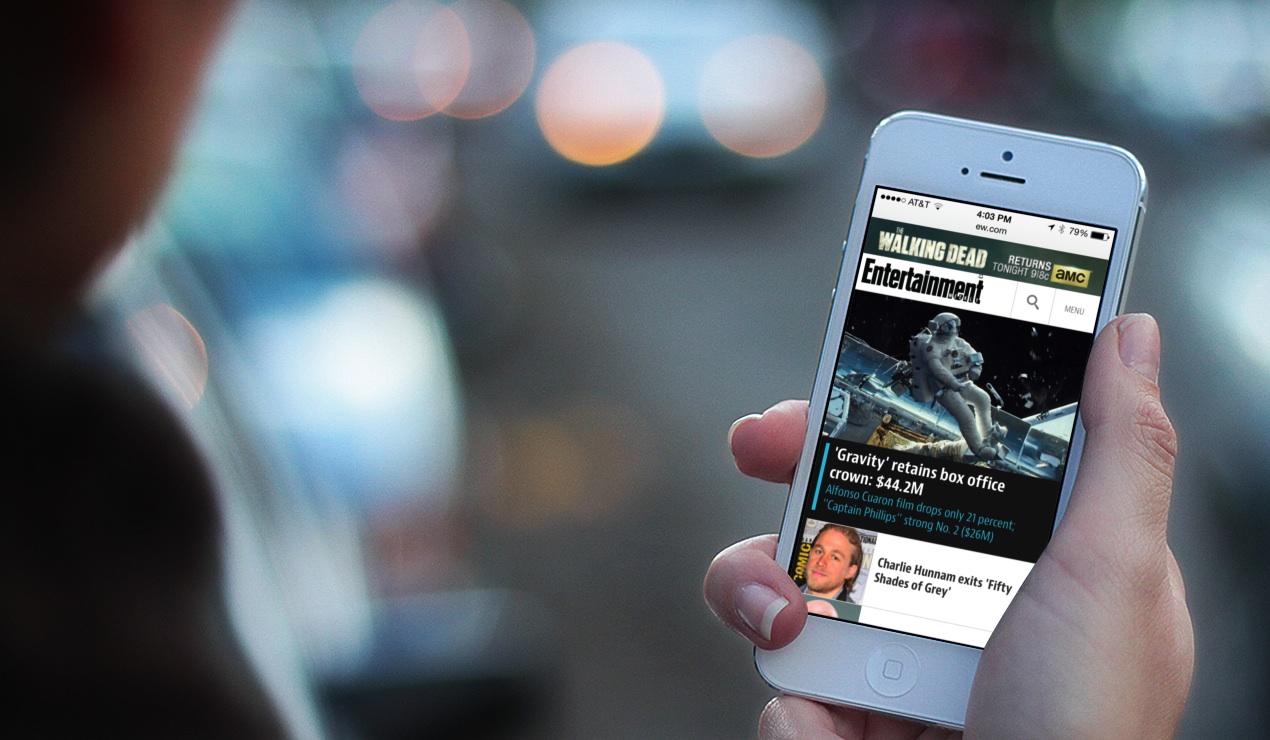
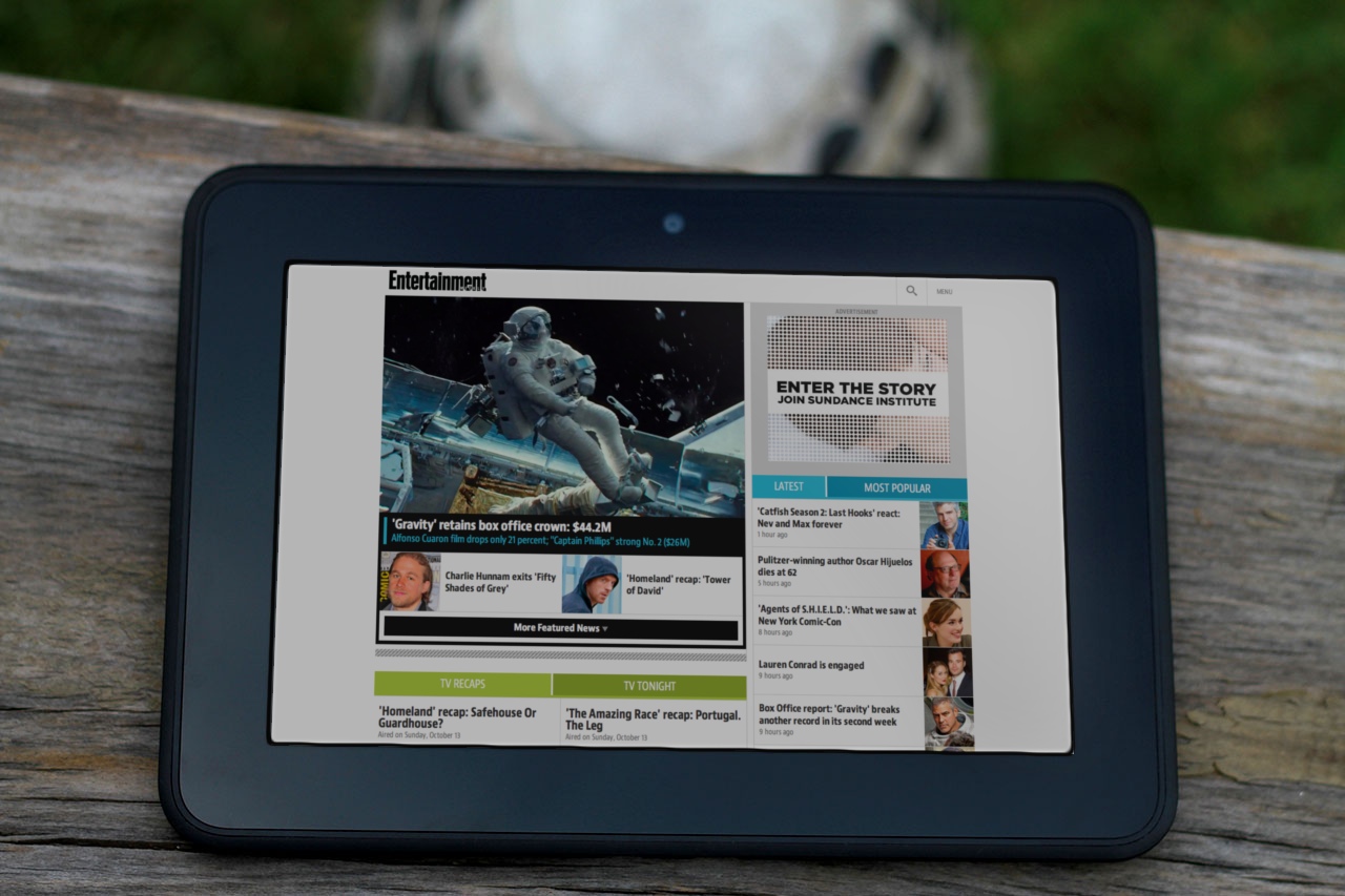
EW.com cranks out a huge amount of news every day, typically between 50 and 75 new stories per day. Yet for all of this emphasis on breaking entertainment news, the brand’s roots are in its magazine origin. As part of the mission to connect the brand across platforms, we wanted to create a magazine feel even on the small screen. That meant leading with the site’s wealth of glossy, high-quality photos. When you hit the site, no matter what page, the art leads as key content, taking up much of the first-screen experience.
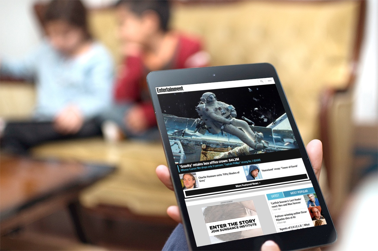
On larger screens, like small tablets, this photo-led design is even stronger, with the photo running huge, almost like a magazine cover. For a site that has so many exclusive photos and videos—where multimedia is a peer to prose—this approach had three advantages: it’s visually arresting; it connects to the print brand; and it promotes photos as one of the biggest draws to the site (a fact which traffic patterns had long indicated).
As a result, a strong lead image commands a third of the screen on nearly every page of the site. But which stories should get the lead-image treatment on the homepage and channel pages? For the past several years, Entertainment Weekly has long promoted several top stories in its “dynamic lead” (DL), a bit of industry jargon that refers to a carousel.
There was vigorous discussion about the pros and cons of keeping the carousel, and we finally ditched it.
Killing the carousel
Carousels are slideshow-style widgets that chop content into individual panels, and you swipe or tap to spin through the offerings one by one. Media sites like this one often use them to create a slideshow of featured headlines. Carousels seem to solve lots of problems, delivering high-impact visuals without sacrificing screen real estate. Because carousels let you stack lots of content into the same compact space, it’s especially tempting to impose them on tiny mobile screens. Pour featured stories into carousels, and presto, the headlines all magically share the same premium top-of-page position.
Alas, research reveals miserable click-through rates on carousels.3 Poking at them only a little bit reveals why: carousels are slow because you have to work to use them. They rely on physical repetition, cognitive effort, and little more than vague trust that there’s going to be something useful on that next slide. Carousels ask for those rarest of commodities: patience and attention.
Consider the seven stories featured at the top of Entertainment Weekly’s new mobile site. If we piled the seven headlines into a slideshow carousel, then getting to that seventh story would be a six-swipe slog through the first six. That’s six interactions before you even see that last headline, and most will never get there. Instead of highlighting content, a carousel defeats the purpose by hiding that content behind a pile of swipes and taps.
Our goals for this featured area were twofold: strong visual impact and easy access to all top articles. We wanted a solution that solved for both, instead of a carousel which neglected one of those goals (easy access to all headlines). So we turned to an old friend.
Progressive disclosure
Progressive disclosure is a mobile designer’s best secret weapon. It’s a high-falutin’ term for giving people full content a little bit at a time. You give people a taste or a synopsis and then let them ask for more if they want it, a great strategy for managing content on small screens. A slideshow carousel is a kind of progressive disclosure: you give someone a piece of content and then invite them to browse more of the same. The problem with carousels for headlines is that they have no scent of information and very low content density. You don’t know whether the next slide will be interesting, and you just have to work through the thing to find out, one headline at a time.
Progressive disclosure works best when you give people more to go on. We wanted to show several featured articles at once and then let people decide whether they wanted to see lots more of the same. Otherwise they could move on to other content.
Our solution was a simple More button. The top area of the homepage shows a gigantic splash image for the lead story, followed by two secondary headlines with thumbnail images. Hit the More button to reveal four more articles. By showing three stories at the top, we give people enough information to know if they’d like to see more like that. If so, we give them everything we’ve got. That’s one interaction instead of six for a carousel.
We extended this pattern to all the content sections on the homepage and channel pages. Each of these sections shows a small handful of headlines. Tap a button to see lots more of them, or just keep scrolling down to the next content section to explore a different vein of entertainment news.
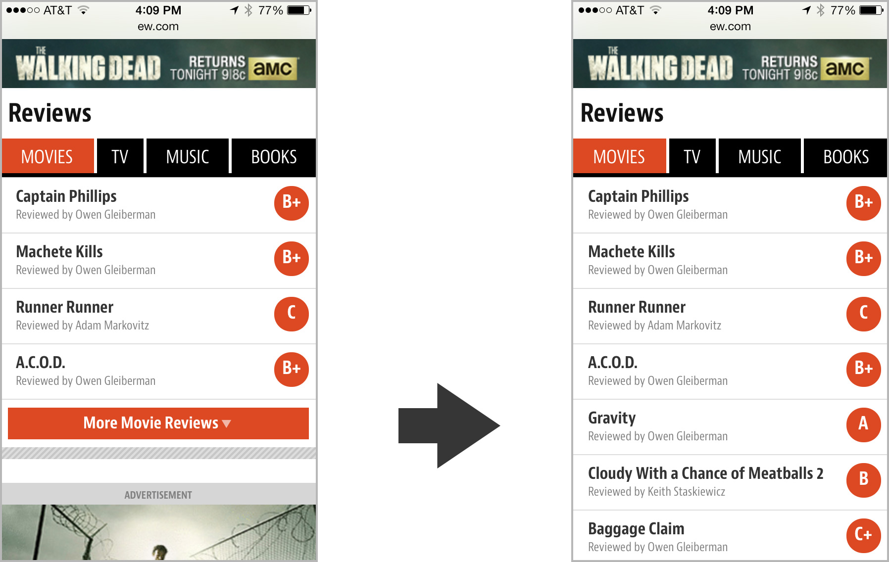
Tapping the More button in this module for movie reviews expands the view from four headlines to ten.
For larger screens with more real estate, we did away with several of these More buttons and just poured all the headlines in at once. Larger screens offer easier scanning of lots of headlines, so they can support that additional content density. That underscores an important job that progressive disclosure does for small screens...
Limiting the long scroll
One of the unfortunate side effects of responsive designs is all too often a crazy-long page on small-screen gadgets. That’s especially true when you design for the desktop first and then crush that design into a single column for phones. “Hm, I’ve got a three column design... I guess I’ll just stack all of those columns on top of each other. Mission accomplished!”
That gives you content parity with the desktop site, which is great, but it doesn’t provide the same parity of usability. When you do that, third-column content that was easily accessible on large screens now gets sunk to the depths of a seemingly endless single column on phones. This buries content... and risks the occasional case of swipe-swipe-swipe thumb sprain for those determined enough to go all the way to the bottom of the page.4
The More button (and progressive disclosure generally) enables a compact view of each content section. You get a taste of each section by scanning the top stories, without committing the design to displaying everything at once. It makes the content quickly scannable while giving easy one-tap access to more if you want it. This approach allows the site to feature lots of content on the homepage and channel pages without risking thumb sprain. Boom: content parity and easy accessibility.
Navigation: content as an enhancement
Implicit in progressive disclosure is the notion of primary and secondary content: show the most important stuff always, but push secondary or optional content into another view or state. Optional, nice-to-have content provides some interesting room to play, because you have the possibility of treating content itself as an enhancement. Just like progressive enhancement tests the browser to see if it can handle fancy functionality, progressive disclosure lets you do the same with content, too. “Does this device have the ability (usually: the space) to display this extra content?”
That’s the approach we took with the navigation. Typically, of course, navigation offers you links to the top sections of the site, and that’s what you get on Entertainment Weekly’s mobile site at narrow views, too. You get the primary sections as well as some currently hot topics, and the core job is done.
For larger screens, though, we wanted to take the opportunity to share the featured stories of the hour. We went beyond the staple section navigation to promote individual pieces. The goal of navigation is to help people find great content, so we decided to use this area to make explicit suggestions. Nice-to-have content enhanced the navigation to make it into a kind of dashboard panel, a mini homepage with splashy promotion of top stories.
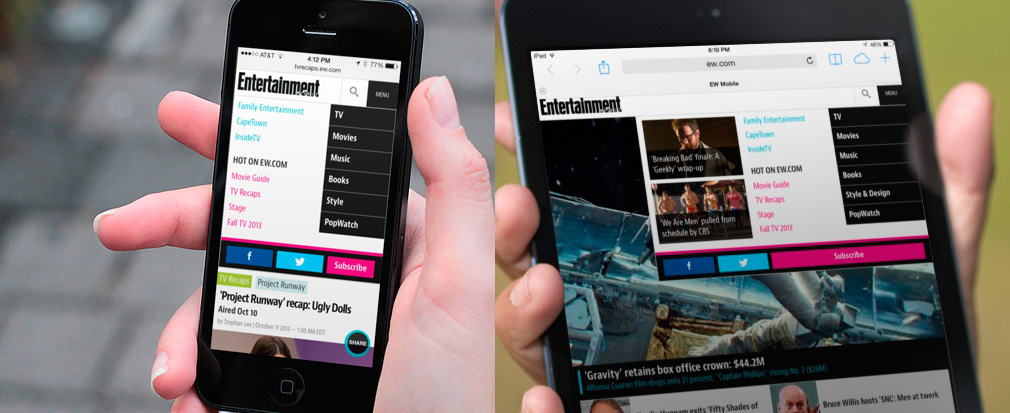
On phones (left), the nuts-and-bolts navigation shows only the main channels and selected hot topics. On tablets (right), the extra space affords the opportunity to promote featured articles, too, complete with image touts.
Nifty anchor navigation
We had some fun with other aspects of navigation, too. On the page for “Tonight's Best TV,” we created an app-like interaction for navigating anchor links. The page shows editor’s picks of the best TV shows airing in the next seven days. A fixed navigation bar at the top of the screen lets you hop directly to a specific day; tap a date, and the page scrolls smoothly to that day. So far, so good.
But the navigation is also an indicator of your progress through the week. As you scroll down the screen, the navigation bar moves and highlights to show you the date you’re currently browsing. It’s a small thing, but it feels smart and helpful when you use it. The navigation bar is also swipeable; for small screens that can’t fit all seven days across, you can swipe the navigation bar to browse the dates. It’s a fun little interaction for an important corner of the site.

The page for "Tonight's Best TV" has a fun interactive twist in its screen-topping date navigation.
Photo galleries that are more than photo galleries
As for most entertainment sites, photo galleries are a huge draw at Entertainment Weekly, driving redonkulous levels of traffic. Entertainment Weekly adds a twist to their galleries, though: nearly all of them are also lists:
Movie Tech Breakthroughs: 10 That Broke the Mold
Breaking Bad: We Rank Every Episode
14 Worst Movie Jobs
You get the idea. It’s a perfect viral lovechild of lists and entertainment photos. But crucially, they’re also combined with Entertainment Weekly’s wry and witty commentary. That means the photos don’t just have captions; they sometimes have awesome essay-length missives. We had to make it easy to browse the photos and this potentially very long text and the comments for each photo—all on small screens. There’s a lot going on here, but we managed to wrangle it into a tidy package.
The caption/essay toggles into view over a portion of the photo, so you can still see the photo as you read the text, or dismiss it if you like. Tap the comment button to “flip” the gallery over to reveal comments on the back. If you’re just in it for the photos, tap the center of the photo to toggle all of the gallery controls on and off.
This was a challenging bit of UX to sort out, which likewise meant for challenging code. Jonathan Stark brought it smoothly home.
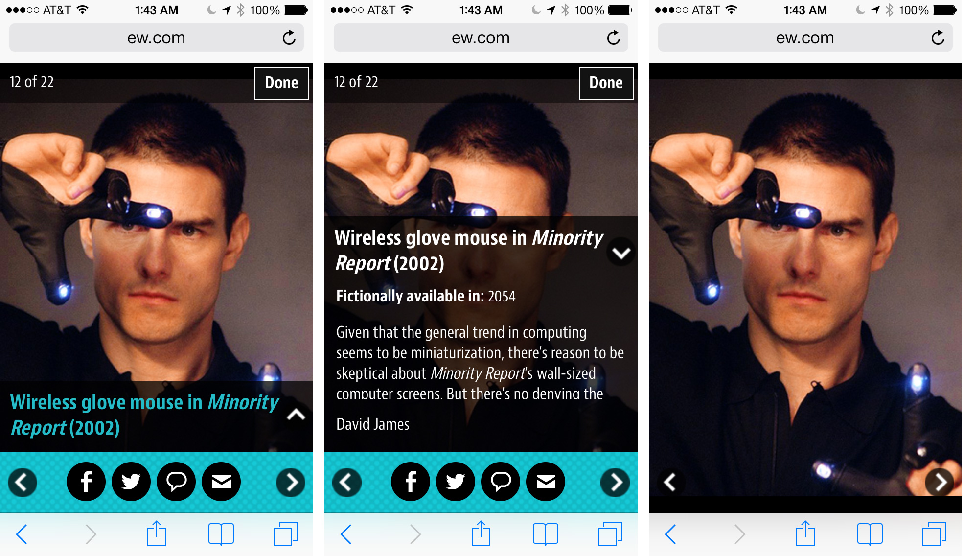
Three different states of a single photo gallery screen (from the rather irresistible collection "22 Movie/TV Gadgets We Want Now!").
Share share share share
Media companies across the board are seeing more and more so-called “earned traffic.” That is, readers are sharing their content with other readers, so that a growing number of visitors are now coming to the site via Twitter, Facebook, blogs, and so on. Homepage and search-engine traffic has lost ground to this newer social traffic for years. That means that media sites, Entertainment Weekly included, are more invested in ever than encouraging readers to share. No great surprise there.
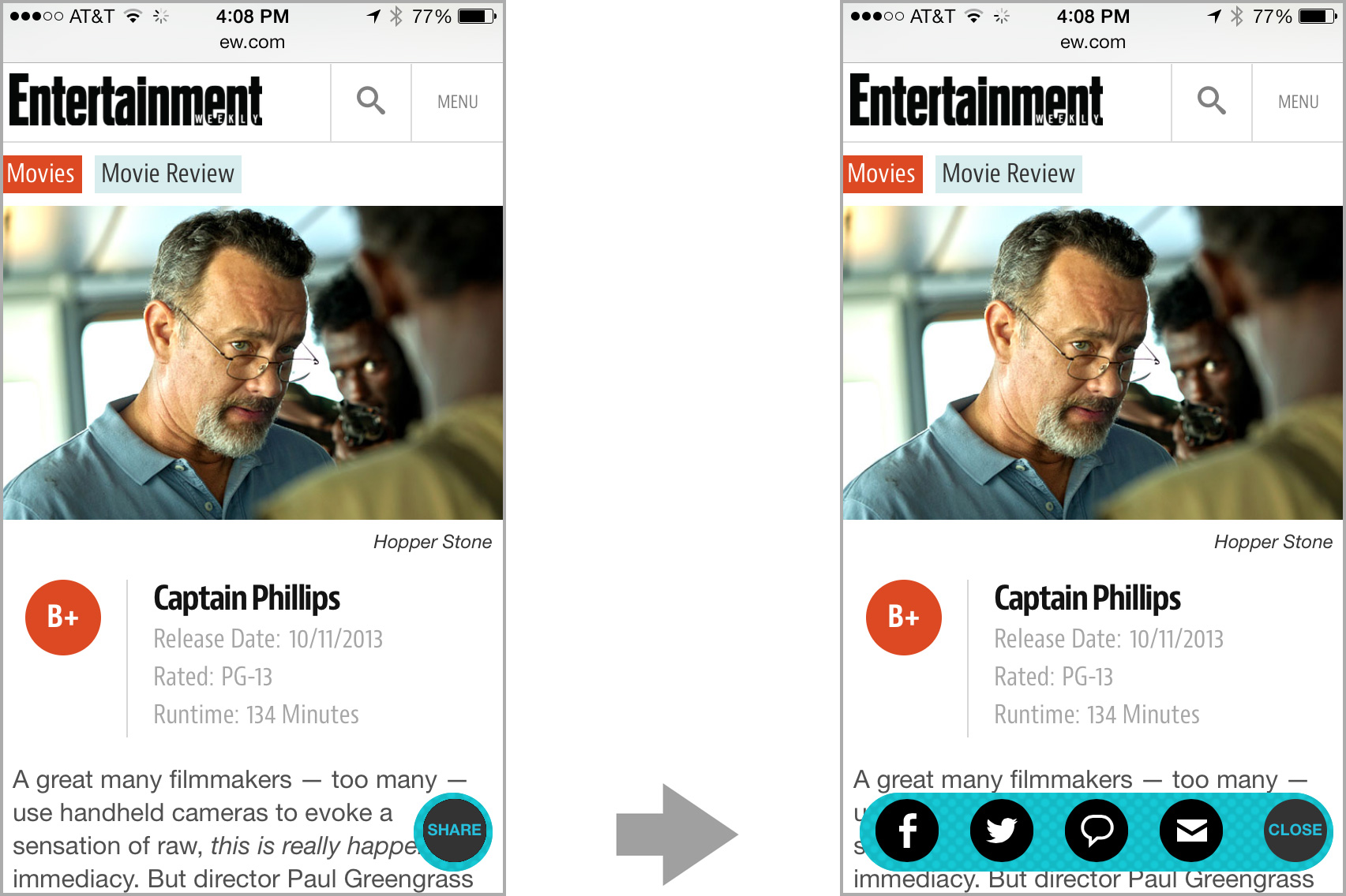
We originally planned to put static share buttons at the top and bottom of article pages, but the crew at Entertainment Weekly wanted us to push harder. Social sharing would be a key metric for the success of the redesign. We toyed with gluing a social toolbar to screen bottom, but that absorbed too much space on smaller screens. We wanted this sharing button to be convenient without being obnoxious.
Instead, we wound up with a little share “bug” that floats in the right corner of the screen, staying fixed as you scroll. We made the button translucent so that it was a bit less in your face, competing less with the content it’s intended to support. Tapping this Share button triggers an animation that rolls out the share buttons; tap it again to roll it back up. The whole thing is done with CSS animations. It’s cool. You should try it out.
Sharing is one of those functions that almost always serves both reader and publisher. Everyone wins there, and we felt okay about making share functions so omnipresent. Alas, readers typically don’t feel the same way about advertising.
Respectful advertising
Handling ads is always one of the toughest elements of a design project like this one. Ads make the whole enterprise possible, but readers often perceive them as getting in the way of the action. Our responsibility as designers is to give advertisers a good position without trampling the reading experience for users.
When I led the design of People magazine’s mobile website last year, I invented a new ad format called the snap banner. It was a so-called adhesion banner that stuck to the bottom of the page but then snapped into place on the page and scrolled away. The result was an ad that stuck around long enough to make itself known, but which knew enough to leave when it wasn’t wanted.
Since that site launched, Time Inc (parent company of both People and Entertainment Weekly) has adopted the snap banner as a standard format. They changed it up a bit, though, moving the ad to the top of the screen, where it disappears after a certain amount of scroll. We used that format on the homepage for small screens, but combined its interaction with a second ad on the page. When that second ad scrolls into view we disappear the top-of-screen snap banner, so that only a single ad is ever onscreen at any one time.
On larger screens, we show a different ad format entirely, and these scroll normally with the page. With a bigger screen, the ads linger longer, and there’s no need to stick them to the screen for attention. The ad bumps around to different positions on the page according to available width.
In the widest view for landscape tablets, the snap banner is replaced by a square banner slotted at top right.
Cross-platform branding
From a branding perspective, one of the most important “ads” on the page is the “Subscribe to Entertainment Weekly” section at the bottom of every single page of the site leading into the page footer. This section details the premium content available in this week’s paid edition of Entertainment Weekly, which you can get in both print and app versions.
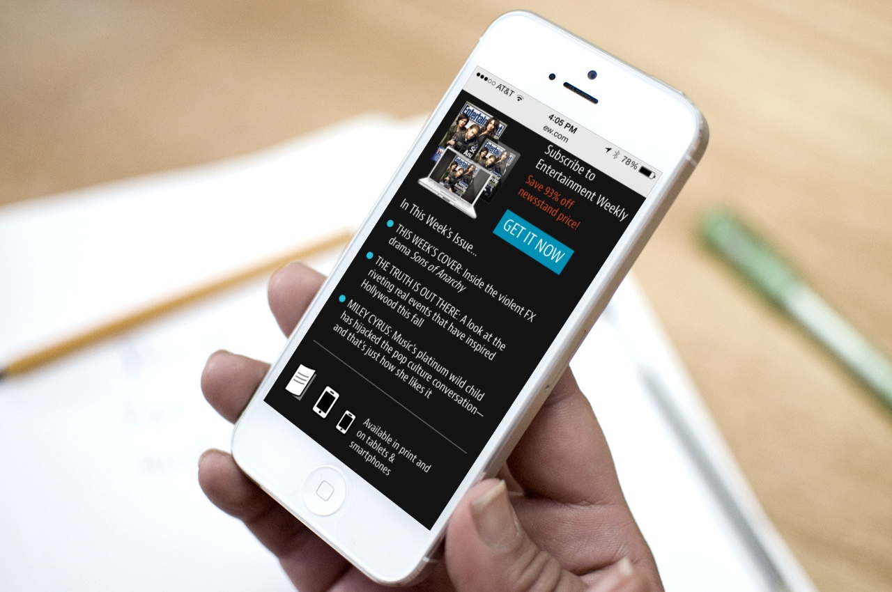
This is the bit of business where we explicitly detail where else you can find Entertainment Weekly content and how it morphs across platforms. From there, the page links to all the company’s accounts on social media. The intended message: Entertainment Weekly is not a magazine, it’s not a website, it’s not an app, and it’s not a Facebook account. It’s all of them at once, an editorial platform that pours content into many different containers.
“We can’t really consider ourselves a magazine company anymore,” incoming Time Inc CEO Joe Ripp recently said. “We’re a media company.” It’s true for everyone now. As platforms proliferate, you have to meet your customers on whatever device or medium they choose. This footer business we cooked into every page of the site is intended to reinforce that message.
A responsive process
That’s also the core principle that animates responsive design: there is no one “true” presentation for your content, no single container. Like many, we’ve seen our design process transform to meet that reality. The process continues to evolve, but we had some great learnings here.
Avoid formal wireframes
We stayed sketchy and informal for as long as possible, emphasizing coarse blocks of content at very high levels of abstraction. This let us move quickly as we planned the broad strokes of the site. Sketches also keep conversation high level, avoiding the all-too-common headaches that emerge when you get into the weeds too early with fine details. Robert did a lot of these big-picture sketches and then gradually gave fine definition the repeating patterns that we found across pages. As soon as we had the system worked out, we moved right into HTML, skipping the formal wireframe altogether.
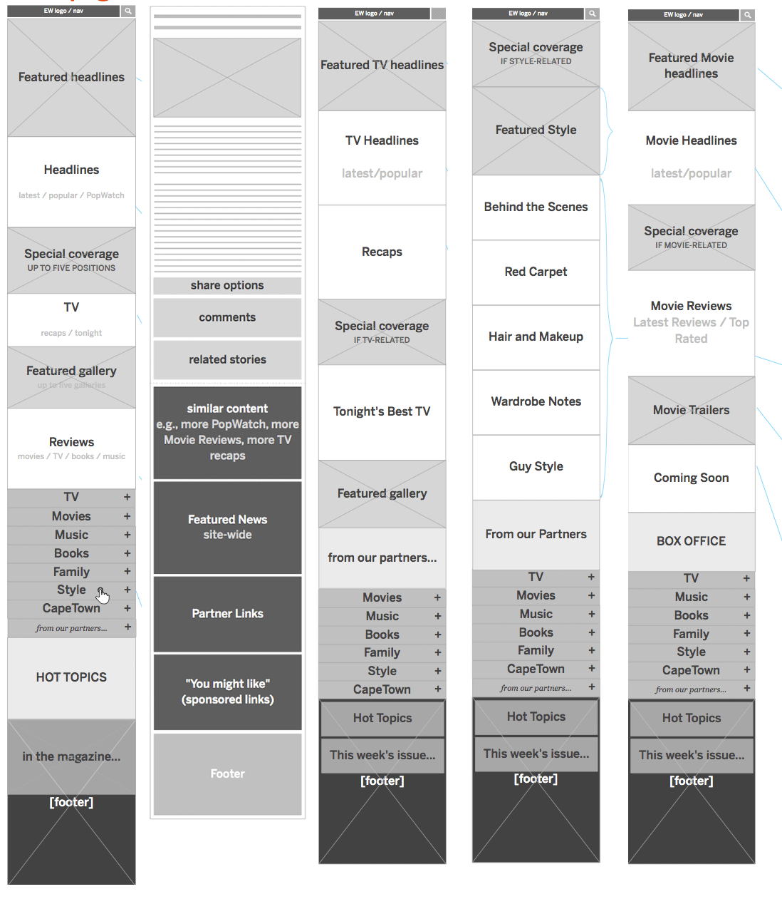
Work with the patterns, not the pages
Responsive design is about creating systems of content rather than a rigid page design. This system is built of modules that shift and reorder according to what the device can display. Rather than designing in one page, it’s helpful to drive the main design effort down to its component parts. Brad and others have lately been calling this atomic design, where you design from the building blocks and gradually up to the entire page, rather than the reverse. It’s very powerful.
Brad’s pattern lab tool proved to be the ideal way to collect and define these atomic components. Once marked up, the components could be assembled inside pattern lab into templates and, with actual content, final pages. The approach encouraged code reuse, which was not only efficient but promoted uber-consistent UX across the site. And because we anticipated this approach, Brad was able to get started on initial markup well before the IA and visual design was complete. Brad detailed his process for the site here.
Element collages rhyme with these patterns
Even while Robert was working on the early sketches for the site’s architecture, Dan and Scott were already at work on the visual design. They did this with element collages, a kind of style tile on steroids. Element collages are collections of lots of branded design elements that give a sense not only of color and type, but of a variety of constructed UI widgets.
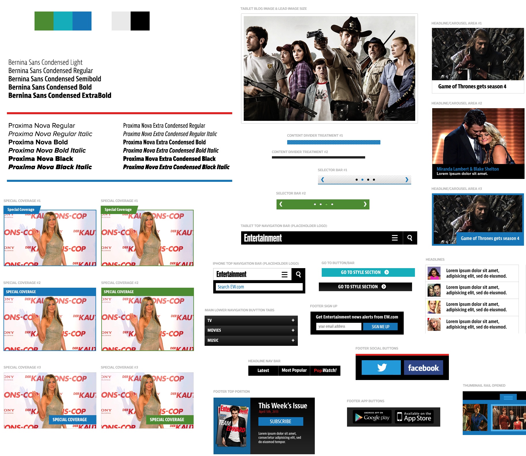
A corner of one of the early element collages for the site.
What this meant was that IA sketches and visual design happened in parallel and eventually merged. Dan and Scott started with impressionistic notions to establish visual direction. As Robert’s sketches simultaneously evolved, the element collages adopted their information and became examples of the finished patterns. Again, these were like exploded web pages, emphasizing page components more than complete design. Just to be sure that they hung together as a page, we assembled a couple of full-page comps, but we didn’t do this for every page. Full-page Photoshop comps still have a useful role, in other words, but not anything close to the key deliverable they once were.
We didn’t create visual comps of every single element, either. Once we had enough designed elements in hand, we could make good guesses in the HTML itself, where we were able to see how things actually played out at different widths. Dan detailed the visual design process for the site here.
We’re getting there
Responsive design is a squishy process. When IA, design, and markup happen in overlapping stages, there are fewer crisp milestones and deliverables. One stage melts into the next, and it takes more discipline than it has in the past to keep the train moving forward. Transitions to new methods and techniques are always a bit bumpy, but the good news is that we’re definitely getting there. Things are settling.
A proliferation of platforms and gadgets has reminded us that the packaging of digital content is naturally ambiguous. Responsive design tries to capture that truth and turn it into an advantage. Slowly but surely, our collective design process is evolving to do the same.
More from the team
The rest of the design crew have also shared their perspectives on the Entertainment Weekly project and its process. Check em out:
The Responsive Mobile Entertainment Weekly Site by Dan Mall
Entertainment Weekly by Brad Frost
Global Moxie is a design agency of one—your humble host, Josh Clark. I take on a handful of design projects every year and, for each one, I assemble bespoke teams purpose-built for each project. Afterward, we disperse into the night until we gather again for new projects. The result is a lightweight organization that nevertheless delivers heavyweight design teams tailored to the problem at hand. ↩
For technical and business reasons, Entertainment Weekly maintains a separate site for desktop and other larger screens. In an ideal world, this wouldn’t be necessary, and Entertainment Weekly would serve all devices the same markup. Indeed, this process began with the assumption that a single responsive design would be best. As all projects should, we began with the question, “Can we do this with a single website?” For a variety of reasons that I won’t elaborate here, the answer was no. As always, it depends. ↩
People rarely swipe beyond the first couple of slides so the effect is that you wind up hiding the very items you mean to feature. The data shows dramatically lower clicks for the “slides” that follow the lead image. Here’s some sample research to back that up:
WeedyGarden: Carousel Interaction Stats
University of York: Are Homepage Carousels Effective?
Do Frontpage Slideshows Increase Conversion Rate?. This one's in Swedish; try Google Translate's attempt at English
The gist of this research is that carousels definitely do help you have a strong visual impact (big image!), but this helps only the first article. This has the unfortunate effect of making the follow-on articles go unexplored. ↩
Luke Wroblewski offers a useful pattern to combat the long scroll: off-canvas multi-device layouts, which slides columns, navigation, or other content elements on and off the page on demand. The More pattern is a close cousin of off-canvas layouts, but simplifies it with this simple toggle approach. ↩
Tags:
advertising,
design,
mobile,
publishing,
responsive,
webdev,
work,
workflow


December 13, 2012
The Mobile Book
Smashing Magazine published The Mobile Book this week, and wow… it’s a humdinger. It’s full of smart advice from all the people I simultaneously love, fear, and admire in the universe of mobile web: Jeremy Keith, Peter-Paul Koch (PPK), Stephanie Rieger, Trent Walton, Brad Frost, Dave Olson, and Dennis Kardys. With such great company, I was especially honored to contribute the book’s final chapter about designing for touch.
The book is not only smart but beautiful. The dead-tree version is hardcover with stitched binding and, get this, an old-school ribbon bookmark. The thing is just gorgeous. Even if you prefer your books in pixels instead of paper, you still get an elegant interior design featuring the illustrations of Mike Kus.
Much of the book looks at mobile through the lens of the web, but it’s also a useful resource for developers and designers on other platforms. The book is neatly organized into three sections: the mobile landscape, responsive web design, and UX design for mobile. The first and last of these are applicable to any platform, and frankly, the web-specific responsive-design techniques will quickly become matters of basic digital literacy.
This matter of evolving literacy is very much the point of Jeremy’s forward to the book:
This book is an artefact of its time. There will come a time when this
book will no longer be necessary, when designing and developing for
mobile will simply be part and parcel of every Web worker’s lot. But
that time isn’t here just yet. So in the meantime you’ve got the
current state of all things mobile packed together into this single
volume.
I’m flattered to report that the first round of reviewers agree with Jeremy about the book’s stature as a well-rounded and authoritative review of mobile design technique.
Design Shack: “It’s a handbook for web design today. Earlier I mentioned that you should add this book to your shelf, in reality, you’ll probably want to keep it on your desk.”
UX Magazine: “I highly recommend this book to both the blossoming and the experienced UX designer. The various voices of different authors breathe fresh narrative air that carries diverse-and-deep domain knowledge along in a cohesive story about how to harness the chaos of our ever-evolving world into a mobile-UX delight. Consider the lessons in this book a whopping set of New Year resolutions.”
Open Designs: “As somebody who spends a lot of time tinkering and tweaking websites to make them work better, I thought this book was bloody brilliant. There is so much depth and information packed into its 336 pages that I think it will become the book for the mobile Web.”

The table of contents:
Jeremy Keith: Foreword
Peter-Paul Koch: What’s Going on in Mobile?
Stephanie Rieger: The Future of Mobile
Trent Walton: Responsive Design Strategy
Brad Frost: Responsive Design Patterns
Dave Olsen: Optimization for Mobile
Dennis Kardys: Hands-On Design for Mobile
Josh Clark: Designing for Touch
I’m admittedly biased, but my advice is to run out and buy The Mobile Book immediately. It belongs on every webslinger’s bookshelf and/or ebook. Buy the book, or download a free chapter, “Responsive Design Strategy” by Trent Walton (PDF, 8MB). Enjoy.
November 5, 2012
New Rule: Every Desktop Design Has To Go Finger-Friendly

Photo by Jeffrey Riehle.
Touch has landed on the desktop. A whole new category of touch devices is flooding the consumer market in coordination with the release of Windows 8: touchscreen laptops and tablet/keyboard combos. These new hybrid combinations of touch and keyboard create a new ergonomic environment... and fresh demands on designers.
Like tablets before them, the ergonomics of these hybrid gizmos demand UI conventions that depart from desktop layouts of similar screen size. The hybrids not only need big touch targets to accommodate clumsy fingers, but they also need controls and navigation conveniently placed where hands naturally come to rest. Designing for touch introduces elements of industrial design: physical comfort and ease are critical considerations.
Unfortunately, the top-of-screen navigation and menus of traditional desktop layouts are outright hostile to hybrid ergonomics. Tried-and-true desktop conventions have to change to make room for fingers and thumbs. For now at least, the solution is not just a matter of designing separate interfaces for touch and non-touch gadgets. That won’t fly, because as designers (and especially web designers) we often don’t have enough information about the device.
After poking at this problem for a few weeks, my conclusion is: every desktop UI should be designed for touch now. When any desktop machine could have a touch interface, we have to proceed as if they all do.
Walk with me.
Gorilla Arms Get a Rest
Hybrids require us to move our hands back and forth between the keyboard and the touchscreen just behind it. Before this new onslaught of hybrids arrived, many (including a dismissive Steve Jobs) criticized the concept as untenable: people wouldn’t want to shuttle their hands back and forth to point at the screen. The effort would be too much, too inefficient, and the result would be the fatigue of “gorilla arms.” It’s a criticism leveled at Minority Report-style interfaces of science fiction, too: who wants to work with your arms constantly in the air?
Early returns suggest those initial worries were unfounded. People do embrace touch with these hybrids, but they do it by barely lifting their arms. In usability studies by John Whalen of Brilliant Experience and by Intel,1 newcomers shifted naturally to interacting directly with the touchscreen, ignoring any mouse or trackpad. Despite the availability (and greater precision) of these time-tested pointers, people said the touchscreen felt more intimate and direct. The hand became their preferred pointer for buttons, scrolling, you name it. Even expert users accustomed to tabbing between fields switched to independently selecting form fields by touch.
There seems to be something irresistible about the touchscreen, even when more precise or efficient options are available. Jeff Atwood put it nicely in his review of Microsoft’s Surface tablet:
I’ve stopped thinking of touch as some exotic, add-in technology
contained in specialized devices. I belatedly realized that I love to
touch computers. And why
not? We constantly point and gesture at everything in our lives,
including our screens. It’s completely natural to want to interact
with computers by touching them. That’s why the more unfortunate among
us have displays covered in filthy fingerprints. …
After living with the Surface RT for a few days now, I’m convinced
that this form factor is the replacement and way forward for the
stagnant laptop. I can’t even remember the last time I was this
excited about a computer. The more I use it, the more I think that
touch plus keyboard is the future of all laptops.
But what about those gorilla arms? John Whalen’s research found that people avoid raising their arms with hybrids by instead resting them alongside the keyboard, keeping a loose grip at the bottom corners of the screen. (Among other things, this grip helps to steady a sometimes floppy laptop screen when you tap at it.)

People who use hybrids tend to rest their arms alongside the keyboard with a loose grip on the bottom corners of the screen.
As with any handheld touchscreen device, the way you hold the thing informs where primary controls should go. So this bottom-corner grip has important implications for the visual layout of websites and apps on hybrid devices. But first, to basics...
Rule of Thumb
Designing for touch means designing for fingers, yes, but to be more specific, you’re really designing for thumbs. On every handheld touchscreen, from phones to tablets to hybrids, the thumbs call the shots. Here’s why.
Phones: One Hand Means One Thumb
On phones, the best interfaces optimize for a one-handed grip, because it’s at once the most freeing and the most limiting. It’s freeing because it lets you do things with the other hand—write, sip coffee, hold a baby—a fact that makes it the most common grip. But it’s limiting because working a phone one-handed means working it with your thumb. Thumbs separate us from the beasts, but alas, when it comes to driving software, thumbs lack both reach and dexterity.

This peculiar combination of freedom and constraint requires specific design concessions, most of them imposed by thumbspan. While a thumb can manage to sweep most of the screen on all but the most oversized phones, only about a third of the screen is in truly effortless territory—at the bottom of the screen on the side opposite the thumb. When holding a phone in the right hand, for example, the thumb falls naturally in an arc at the bottom left corner of the screen.
This is a big reason why apps and mobile operating systems pin primary controls to the bottom edge of the screen—precisely the opposite of typical desktop layouts. (It’s not only simple comfort and convenience that drive screen-bottom conventions, though. It’s also the awkward fact that fingers obscure the screen. Pushing controls below the content keeps hovering hands out of the way.)
Tablets: On the Edges
Tablets are trickier because we hold them so many different ways. We grab, tilt, lean, cradle, and clench in a whole variety of embraces, many of which depend upon stance. The rule of thumb still applies to these guys, except that the thumb zone changes. The special headache here is that the thumb zone isn’t consistent even for individual devices; it changes depending on posture.
Standing up, you use two hands to tap away on a large tablet like iPad. You likely hold it halfway up the sides for leverage (hold it too close to the bottom, and the thing goes floppy.) Or perhaps you have one arm wrapped around it like a clipboard while you tap with the other hand. Sitting at a table, you’re likely to prop a tablet with one hand at the lower third and tap with the other. Reclining in an armchair, you tend to rest it in your lap and tap with the other hand. Lying down or reclining, you rest the thing on your belly or nestled in a blanket, propping it with one hand, tapping with the other. In all of these grips, fingers fall in different places on the device.
When it comes to tablets, in other words, we’re all hands. We roam all over the things—all over, that is, except the top and bottom edges. As varied as tablet grips can be, two things are true for all of them. First, we tend to hold tablets at the sides; though the specific location wanders up and down, thumbs tend to settle at the middle- to top-third of the screen.
Second, the larger the screen, the harder it is to take in the whole thing at a glance as you can on a phone. On larger tablets, as with print design, our visual attention naturally focuses on the top of the tablet, and the design’s information hierarchy should reflect that.
These factors mean eyes and thumbs naturally occupy the top half of tablets, with thumbs straddling the edges. Spreading navigation and primary controls across the bottom—the standard pattern for phones—turns out to be ergonomically hostile on tablets. Sometimes the bottom isn’t even visible at all. In the laziest and perhaps most common of positions—lying down or reclining—the bottom bezel tends to disappear into blankets, sweaters, and soft bellies.
Tablet navigation and other frequent controls should hug the sides or top corners for easy thumb access. Avoid forcing people to lift and haul their entire arms over to the top or bottom edges for frequent touch targets. Some arm lifting is of course inevitable. Tablets are thumb and index-finger devices, with the index finger driving interaction inside the tablet’s canvas. You have to move your arm for that, no way around it, but focusing navigation around the thumb as the anchor at least means that you can spare your arm the most frequent taps. The top corners are within thumb striking distance while also remaining in the tablet’s primary visual area.

A typical grip puts the thumb zone at the sides and top third of larger tablets like iPad.
But what happens when we strap a keyboard onto the thing?
Hybrids: All thumbs
Here again, the rule of thumb calls the shots. You’ll recall that hybrid users frequently adopt a bottom-corner grip, resting their arms alongside the keyboard. Placing primary controls and navigation in easy reach of bottom-corner thumbs means you avoid gorilla arms. The result is a vertically flipped version of the thumb zone we saw for standalone tablets.

Not everyone adopts the bottom grip, though. Others (especially newcomers) go freeform, jabbing their index finger at the screen. This approach unhinges the hands from the screen edges, giving freedom to roam the interface. Still, the center of the screen tends to be an easier touch than the corners with this technique. Trouble is, this finger hot zone is exactly the reverse of the thumb zone.

The upshot: optimizing for thumbs means a subpar experience for the index finger—and vice versa. One layout has to win, though, and as with every other touch device, the winner is the thumb. John Whalen’s study suggests that hybrid users begin to prefer thumb use over time, with expert users going nearly all thumbs, reaching them in and out of the screen from the edges to drive interaction. Once again, thumbs are the primary utility pointer.
Cluster primary controls and gestures for hybrid screens around the bottom corners and sides. That’s one reason Windows 8 uses edge gestures to summon system and app controls. A swipe from the right edge conjures the system charms, and a swipe from the bottom edge brings up a shelf of app tools.
What all of this adds up to: input type and grip should drive the placement of controls, not screen size. For web designers in particular, this is a big headache.
A Touching Problem for Responsive Design
For most of its short history, web-design practice has focused on the visual—on screen size. It’s not yet in our industry’s DNA to consider physicality and environment in our layouts. That’s why many are still surprised at the idea that they can’t just use their legacy desktop layout on iPad, even though the screen size is the same. The layout looks good, sure, but that rarely means it’s also finger-friendly.
The rise of the hybrids means touch is no longer the sole province of phones and tablets. It’s arrived on desktops and laptops, too. Most desktop website layouts, however, are not optimized for touch. They challenge our clumsy fingers and thumbs with small touch targets for links and menus, or they lean on hover interactions that can’t be triggered by touch at all. Few sites place primary navigation in easy reach of the thumb zone for either tablets or hybrids; they favor cursor-friendly screen-top navigation instead.
Ideally, we would all tweak our CSS to accommodate a range of input types in the same way responsive design has encouraged us to accommodate a range of screen sizes. Responsive web designers have so far used screen size as a proxy to assume support for touch. “If it’s a small screen, it’s touch. If it’s a big screen, it’s mouse-driven.” That distinction was already in trouble with large tablets like the iPad, and hybrids break that approach even more.
Unfortunately, we don’t yet have media queries to specifically target touch devices, but that may change soon. Recent draft proposals for CSS4 include a pointer media query to target gadgets with “fine” or “coarse” pointing tools. A mouse, trackpad, stylus or any other precision accessory would be a fine pointer, while fingers would be coarse. This would allow you to create specific rules to pamper fat fingers:
/* Make input fields taller for touch */
@media (pointer:coarse) {
input[type=”text”] {
min-height:44px;
}
}
This will get us part of the way, although it’s not clear whether a browser with a keyboard/mouse and a touchscreen should identify itself as coarse or fine. Even better would be targeting the combination specifically. As we’ve already seen, the layout for a touch-keyboard hybrid should be different from that of a touch-only tablet, because the ergonomics are different. That makes it important to identify not only the availability of touch but whether it’s combined with other input types. It would be helpful if media queries could target additional input types. While we’re at it, it would be great to have http headers that announce to the back-end server what type of device it’s dealing with:
“Hi, I’m a touchscreen!”
“Howdy, I’m a touch-keyboard hybrid.”
“Greetings, I have no screen at all...”
Until we get these “Hello, my name is” name tags in CSS or http, we have to make do. There’s only one sensible way to do that:
Assume every screen your website serves is a touchscreen
If a device can be used for touch, its interface should be finger-friendly. This isn’t a problem that’s specific to touch, either; it’s just that touch got here first. A new desktop design language is needed, one that replaces cursor-only interactions with conventions flexible enough to handle any of several potential input styles. For the moment, that means covering touch-only, keyboard and mouse, or these new touch-keyboard hybrids. It won’t stop there; even more input methods are on their way.
Windows 8 is one of the first ambitious—and imperfect—efforts to try to address this thorny issue. It’s the first attempt at an operating system whose interface can handle any input (from handwriting to speech to touch) and any output (screens of any size or no-screen spoken experiences). That’s a hard problem, and Microsoft is wrestling with it earlier than most of us, but it’s a problem all of us will have to address in the very near future.
Despite their valiant effort, however, Microsoft’s designers still run headlong into a collision of input styles, which is probably unavoidable. You see this, for example, in the difference between the desktop-style Internet Explorer and the Metro-style Internet Explorer. Both are present in Windows 8, and the one you get depends on what mode you’re using. They have very different interfaces, with the desktop layout tuned for mouse and Metro tuned for fingers. The address bar, for example, slips to the bottom for the Metro version, as Matthew Honan describes in his Surface review:
Web browsing works well. I liked having the ability to swap between
multiple browser windows by right clicking, but the address bar on the
bottom side is something I still haven’t gotten used to. It makes
sense when you are using the device in touch mode, because that’s
where your thumbs naturally land, but it’s just plain odd with a
keyboard.
New Navigation Standards for the Desktop
So how to build this new touch-and-every-other-input desktop experience? This one is going to take some time. Luke Wroblewski and Jason Weaver shared some useful suggestions this week for responsive navigation across touchscreen devices, and it’s exactly the kind of exploration we need.2
I’d add to Luke and Jason’s work a few guidelines to inform how we might evolve our desktop designs:
Pin controls to the left and right edges for easy thumb access on both tablets and hybrids.
Favor the left for primary controls. Most index-finger users use their right hand for poking the canvas, leaving the left hand in place for thumb navigation.
Treat hover as an enhancement, not a requirement.
Make sure all touch targets are large enough to accommodate fat fingers.
As we’ve seen over and over again in the last few years, the growing range of devices and platforms continues to make our work both more exciting and more challenging. Our job is getting harder, but it’s also our job, period. The ideal of the web, after all, is a platform that can be accessed from any device, no matter what its input or output method. For now, that means opening up all desktop layouts for easy finger-tapping.
Luke described the Intel study as part of the fine video series he created for the company about adapting desktop interfaces for touch. ↩
I quibble a bit with Jason’s and Luke’s strict emphasis on bottom corners on tablets and hybrids; I’d nudge those up the side to accommodate more varied thumb grips. ↩
Tags:
design,
future,
hybrid,
ipad,
mobile,
responsive,
touch,
windows8
July 29, 2012
Making of: People Magazine's Responsive Mobile Website
People Magazine launched a new mobile site this week, the first responsive website from Time Inc.’s 95 magazine titles. Check it out at m.people.com.
The People website is a Global Moxie project. I had the good fortune to lead the design effort and pull together some of the finest web talent on the planet (and also some of my favorite people):
Ethan Marcotte wove the remarkable markup (remarkup?)
Jenny Ng dazzled with the visual design.
Karen McGrane crafted content strategy (and a steady stream of smart insights about everything else, too).
Jonathan Stark coded the photo gallery into submission.
Travis Harwood wired up the information architecture.
The whole thing happened under the pragmatic (and genuinely gymnastic) direction of Time Inc.’s Tony Brancato, a great partner for us in this. And man, did we ever need the enormous brains of all these talented folks. Bringing a site as vast as People’s to the small screen conjures a slew of challenges and opportunities.
We developed some novel approaches that I want to share here. I’ll cover the site’s approaches to advertising, progressive enhancement, navigation, web interactions, full content across devices, and cross-screen community. First, though, here’s what we set out to do.
Our Mission
Our brief was to design a responsive site for phones and 7” tablets (Kindle Fire, Nexus 7, etc.). People has two other sites: one for desktop and one for iPad. The new edition stakes out the smaller end of the spectrum, replacing a very simple site that has served phones for several years. The new site’s responsive web design adapts to three primary breakpoints: the phone, 7” portrait, and 7” landscape.
The irony for this “small-screen” website is that its 7” landscape layout is nearly as wide as People’s desktop design. In creating this small-screen design, in other words, we also created a desktop-sized design, too. This is the essential nature of responsive design, of course, a layout that adapts gracefully to a wide range of screen sizes.
One of Three... For Now?
So why maintain three separate websites? Why not have a single responsive site and be done with it? I’m on record with a strong point of view that everyone should strive to have a single website that feeds the same content to all devices. That’s the ideal, at least, and I believe it should be the default starting point for any web project. Always ask, “Can we do this with a single site for all devices?” And if you can, you probably should.
But pragmatism is required here, and business realities leave little room for dogma. There are a whole slew of potential reasons why it can be tough to blow up your existing sites and replace them with a single responsive site—business reasons, technical reasons, organizational/political reasons, or simple risk management. Sometimes change can’t happen all at once.
But you can still get there one step at a time. People’s approach is a sensible one: build a mobile site using responsive techniques as a first step. Over time, you can overcome business/tech/org challenges to let your responsive mobile site grow up and eat the other sites. I don’t speak for People, and I don’t know if that’s their plan. But I hope so. This new site positions People to move eventually to a single responsive site, which would simplify their tech maintenance and editorial workflow. Word is, this new site will eat the iPad site next.
For now, though, this is a sturdy first step in the march to the promised land. You can’t always make the whole journey in a single leap, but you can still make steady progress toward the ideal. Eyes on the prize, friends.
(And hey, if all of this pans out as it should, perhaps it will boost People’s digital IQ, already in the top ten among magazines.)
The Whole Shebang
Unlike the previous mobile site, this new edition serves (nearly) all of the content of the desktop version, a frank acknowledgment that the mobile experience has to be more than a lite version of the “real” desktop website. We do everything on our phones now, and with more than just a quick glance. People’s stats bear that out, as People Digital’s general manager Liz White told paidContent, explaining why the old mobile site wasn’t cutting it:
“The initial version was us operating on the assumption that people were coming to the mobile phone to snack.” But when 25 percent of mobile users spend 5 minutes or more on the site, they’re coming for more than a quick snack.
Our job was to figure out how to wedge People’s vast store of content into the small screen without overwhelming readers. Here’s how we did it.
Progressive Disclosure
People.com offers a fast-flowing stream of daily content. The homepage’s job is to surface a ton of that content for quick, frequent scans of headlines and photos. On larger screens, we do that by displaying lots of links for the key sections, in typical news-website style. We show two columns for portrait and three for landscape.

Portrait and landscape views on the Nexus 7 tablet.
Shrink the screen, though, and that giant collection of links suddenly becomes unwieldy. If you squeeze those links into a single column, you get an endless list of links, which is swipe-swipe-swipe frankly awful swipe-swipe if you just want a swipe-swipe-swipe summary of the swipe-swipe top news.
This is a common problem for mobile sites, and that’s where progressive disclosure is such a successful technique for small-screen interfaces. Progressive disclosure is a high-falutin’ term for showing only essential or summary information but making it dead easy to drill down into secondary screens or content panels when you want more.
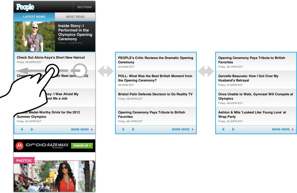
On the homepage, we deployed carousels to do that work for phones. At the smallest breakpoint, the two or three columns of links collapse into a three-panel carousel. Only one panel of the carousel is visible at any moment, of course, so the initial display shows only the first one-third of links for each section. This approach lets you scan the latest headlines in every section with a quick vertical scroll, but you have the option to drill into a section’s secondary headlines by swiping horizontally through the carousel, or by using the arrow navigation.
Carousels require JavaScript to fire up their engines, of course, which means that phones without JavaScript (or operating systems like BlackBerry 4 whose JS is too awful to deal with) don’t get the carousels at all. That’s okay, because those browsers still get a link to the section homepages for access to that content. For less capable devices, in other words, progressive disclosure is managed by plain old web links.
We’ve been trained to believe that extra taps, clicks, or swipes or evil, and that’s not true. As long as every tap provides satisfaction (a completed task, more information, a smile), then it’s a quality tap. If the information scent is strong and if every tap is a quality tap, then it’s appropriate to require extra taps in the service of clarity on individual screens. Quality taps are more important than their quantity. This is true in all interfaces, but especially for mobile: Clarity trumps density.
Aggressive Enhancement
Since some devices can’t display carousels, we didn’t want to burden those devices with content that they don’t need. We deployed a strategy that Filament Group’s Scott Jehl rather awesomely calls aggressive enhancement. (Scott was a huge friend to this project, as was Mat Marquis and the rest of the gang at Filament Group.1)
If you’re a web developer, you’re already familiar with progressive enhancement, where you gradually layer new functionality into a site according to the capabilities of the browser or device. Aggressive enhancement goes further, treating content itself as an enhancement.
Know how Readability and Instapaper whittle a page down to its basic content? That’s what we did by design. Aggressive enhancement delivers a page containing only the most fundamental content, then fills in secondary content via Ajax. This approach works well for sidebars, “about us content,” some forms of secondary navigation—and in the case of the People website, the carousel content.
If a browser doesn’t have JavaScript, it doesn’t even download the secondary carousel content. The result is a light page that lets the browser start rendering that basic content right away. It’s a technique that’s respectful of visitors’ bandwidth, computing power, and time. It’s not only responsive, it’s responsible, one of Scott Jehl’s favorite phrases.
We also took extreme care (and a lot of lumps) to make the photo galleries accessible to all devices. Visit the gallery on a capable touch-enabled device, and you get a solid, fast, silky experience as you swipe through the entire photo gallery within a single page. The gallery is a full-screen experience, and you can tap to toggle the navigation controls, view photo captions, and reveal sharing options.
No JavaScript? No problem: less fancy browsers can still tap through all the photos, with each image loading in a separate page. In that case, the controls and captions get an appropriate inline display, without all the fancy toggling.
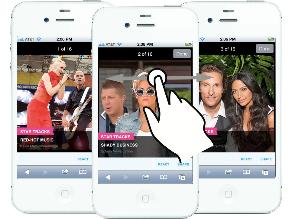
The swiping photo galleries degrade elegantly for less capable browsers.
Backward Compatible = Forward Compatible
Why go through all this trouble to support underpowered devices? Many are older devices due to go out of rotation, right? First, supporting the largest possible audience is just plain good business sense. Doing otherwise leaves money on the table. More important, though, it’s a future-friendly strategy.
When it comes to the web, the more backward-compatible you are, the more forward-compatible you’re likely to be. It’s all too common to assume that the web’s future consists exclusively of ever more capable browsers on ever smarter devices. That’s part of the story, but the future will include dumber devices, too. Speech is coming on strong, for example, and the voice-driven web browsers in future automobiles probably won’t be JavaScript champs. Building sites that are gentle to less capable older browsers also paves the way for less capable future browsers, which may be more common than you think.
Content First, Navigation Last
Aggressive enhancement emphasizes essential content in the way it delivers pages over the wire. The same content-first values should apply to the design, too.
Mobile web experiences should lead with content, not a big stack of navigation controls. With time and screen real estate at a premium, mobile designs should fill the first screen of every page with the good stuff, with content.
At People.com, screen navigation is tucked behind a Sections button in the top toolbar. Tap the button and the entire screen fills instantly with navigation options. The menu’s appearance is instant and feels like an overlay has appeared, but in reality, it’s actually an anchor link to navigation at the bottom of the page.
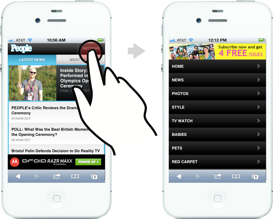
This is my favorite navigation pattern for mobile websites, and it’s one championed by my pal Luke Wroblewski in his excellent book Mobile First:
This design uses a minimum amount of navigation elements (just a
single link at the top), gives people an opportunity to pivot and
explore when they get to the end of content, doesn’t duplicate the
content of another menu, and (best of all) only requires a simple
anchor link to work. That’s right: no fancy JavaScript, overlays, or
separate navigation pages to maintain – just an anchor that links to
the bottom of the page. That’s like HTML 0.
In larger layouts, we fall back to traditional desktop conventions and shift the navigation to a horizontal strip at the top of the page.
Make Way for Ads: Snap Banners
Delivering effective ads on mobile is just plain hard, and I’m not convinced that display ads will pan out as the future of mobile sponsorship.2 For the moment, though, banners remain at the center of things. Display ads are the revenue model, and publishers and advertisers are trying hard to find a way to make them work. It’s an uphill climb.
Traditional expectations continue to apply: advertisers want “above the fold” banner ads, but those usually choke out content or flick by so fast you don’t see them. Both the advertiser and the reader are poorly served. I came up with a new ad format to try to address this.
Snap banners hug the bottom of the screen in a fixed position but, as you scroll, they find a home and snap into a scrolling position on the page, eventually scrolling away like any other content.3 This new format stays on screen longer than a traditional inline ad, and the banner’s sudden leap into the scrolling page catches the eye, too. Those elements work to advertisers’ advantage. But the snap banner also stays out of readers’ way at screen bottom and then eventually gets clear of the screen entirely, both to readers’ advantage.

Snap banners stay fixed at page bottom (left) but eventually snap into place in the page to scroll freely (middle). Tap the image to see it expand to full screen (right).
Even with the snap banner, though, tiny 320x50 mobile ads don’t carry much visual oomph. So we experimented with ads that expand to full screen. In addition to the snap banner delivery slot, we delivered responsive snap-banner templates that expand to full-screen on any device when you tap them, without taking you off the site. Tap again to dismiss.
We also serve occasional full-screen ads as interstitials in the photo galleries. In past user testing, I’ve seen high acceptance of ads in that context. Since you’re in gallery-flipping mode, it’s no problem to keep on trucking past the ad to the next slide. It’s like flipping through a paper magazine, but the format is bold enough that a reader will pause if interested.
Ads Are Hard
Aside from interaction challenges, ads remain a real challenge for responsive layouts. Most ads are still delivered as blocks of immovable pixels packed into into files with names ending in gif or png. Typically, you get one size of creative and that size is almost certainly defined by IAB standards.
We need more flexible ad creative: messages that are delivered in fluid html rather than static images. Ad agencies and networks need to step up here. It will open bigger opportunities for them, and unlock design freedom for publishers along the way. A well-crafted snippet of ad HTML can flow into any space it’s placed, adapt to any screen resolution, and target any device. Instead of juggling a ton of assets for a single campaign, you’ve got one tidy package. It’s better for everyone.4
We delivered some responsive, cross-platform ad templates as part of the design, and we’re hopeful that they yield useful discussions between People and its advertisers. This is a tough chicken-and-egg problem. Even with 1 billion page views a month (a billion!), People.com doesn’t have the individual weight to swing industry-wide change on ad formats. Unfortunately, agencies and networks show little interest in doing this on their own, despite the advantages. Someone has to budge. The best we can do is be noisy in our advocacy and generous with our examples. Meanwhile, we have to work around these inflexible ad units.
Typical banner ads jam the machinery of a responsive design. Responsive design relies on flexible elements: images, text, and other design elements that shrink and expand with the layout. Ads are rarely flexible. Shrink them down, and the text becomes unreadable. They are nearly always intended to be displayed at one size and one size only.
For now, that means ad-driven responsive designs have to build themselves around these immovable building blocks. When you build to IAB standard sizes, for example, the design favors the 320x240 ad block, since that’s the largest size that will squeeze inside most phone screens. In larger layouts, column widths are set to accommodate that same ad block. You see this in The Boston Globe’s design, and we did the same thing.
It’s not just a technical issue. It’s also a sales issue. “Separate creative for separate devices” is a reflection of the way these ads are sold. Mobile, tablet, and desktop versions of websites are presented as completely separate properties instead of simply “the website.” Trouble is, it’s people who form market segments, not devices. Segmenting by device—whether that’s for content or for advertising—just doesn’t reflect the way we consume information today.
We need to start selling sponsorship across platforms instead of in device silos. Responsive ads require responsive sales packages, too. My friend Mark Boulton has done some clever writing on this, and he boils it down to this:
Providing space for ads needs to be broadened into multiple spaces
for one ad concept. This requires closer collaboration between
advertisers and web sites, designers and marketeers and sales teams.
We’re still learning how to do all this stuff, and ad experimentation is needed on technical, business, and cultural fronts.
Photos Are Hard, Too
Photos are core content for People, and it was a real challenge to improve the presentation of photos—really feature them—while also remaining lean for mobile performance and compact for mobile display.
Tears, sweat, and blood have been spilled over the past several months over how to handle responsive images, serving varying image sizes or crops depending on screen size. (Chris Coyier, as usual, has a great roundup of the options.) For better or worse, we punted on this, and we serve the same image files to all devices.5
That decision was due to the nature of the source images available to us. People’s digital team does a ton of work with the photos, manually cropping and sizing each and every image that comes through. They typically generate over ten different versions of every photo. It’s a tremendous workflow.
People selected their cut sizes based on the needs of the desktop web layout, which is sensible since that’s almost exclusively where they’ve been displayed so far. But here’s the thing: those desktop-sized photos are too small for mobile—or at least, for retina-display screens. You read that right: too small for mobile.
Most photos on the desktop site max out at 435x580, smaller than the iPhone’s 640x960 screen, for example. (A jumbo photo size for iPad is also available for some photos, but not all.) Since we rarely had a high-resolution image available in the first place, we didn’t have to cope with the responsive-image issue, a mixed blessing. Unfortunately, that meant we weren’t able to serve People’s remarkable archive of photos in the best light for the growing population of high-res screens.
Responsive design is more than just front-end tech magic. It also requires hard changes to editorial workflow and content strategy. This stuff takes time. As high-density displays make the leap from handheld phones to desktops and laptops, revising our photo workflows will become an especially high priority. Lots of work ahead for all of us. (I’m grateful that Karen McGrane’s book is arriving this fall to help: Content Strategy for Mobile.)
Emoticomments
Another goal of the site was to knit together community on all platforms. People uses Disqus as its comment platform, so we wrestled their API into the new site’s design. But we also introduced a new element to the People ecosystem. I call them emoticomments.
Emoticomments are one-tap microcomments: they’re multiple-choice “Like” buttons, with emoticons as your options. They’re available on any photo or article, on all platforms. They’re a playful, effortless way for readers to share their reactions. Jenny Ng designed simple emoticomment icons to capture five essential emotional responses to People’s editorial.

People’s design crew replaced these with their own to make them consistent with the icons used on the desktop site.

Fast Progress for Responsive Design
Responsive web design is only a little over two years old. We’ve come a long way in that time, and every launch of a responsive design for a giant content site like this one is a marker of just how far. Responsive design is elegant and even simple in its theory, but sometimes devilishly complex in its details. Ethan has been barnstorming the country this year, sharing his techniques for overcoming some of the bumps and headaches that are inevitable with any new technique. We’re making headway. I’ve shared a few of our strategies for managing those bumps here, and all of it continues to evolve.
In any fresh technology or technique, the initial challenge is simply, “can we make this thing work?” Once you do, it’s time to add the polish. That’s the stage we’re at with responsive web design. As an industry, we’re moving at remarkable speed to improve the experience now that we’ve built the machinery. That's happening not only in geeky areas of performance and optimization, but also in content strategy, workflow, and business strategy. I’m crazy proud of our team for some of the new techniques that bring that polish to People’s new site. Lots more great stuff ahead.
We made much use of SouthStreet, Filament Group’s suite of tools for progressive enhancement. The code is open source, forward-thinking, and available for download via Github. (If you’re a web developer, get over there now. Run, don’t walk.) In particular, we used the Enhance, AjaxInclude and PictureFill libraries, and our prototype included the QuickConcat library, too. Scott and Mat were supremely generous with code and advice on the carousels, too, which were tricky devils to put together. ↩
If you care about content, you should care about ads. It’s a civic responsibility for designers to help make content sponsorship work for mobile, whether through ads or some other strategy. Great content costs money, and figuring hout how to pay for it on the desktop is already a desktop. The problem is compounded in mobile, where click rates and sales rates for banner ads trail abysmally. The solution is likely to lie with sponsor messages that feel much more organic to both the design and the content of the site. This is something we experiment with in another project for People. Can’t say much about that now, but stay tuned for autumn. ↩
Snap banners rely on position:fixed to do their magic, but fixed positioning is poorly and inconsistently supported across mobile browsers. We had to revert to a browser whitelist provided by the jQuery Mobile team to detect whether the browser supports the feature. If not, the snap banner is delivered like a regular static banner at the very top of the page. ↩
These responsive approaches have to be crafted with more care than we’ve seen with rich-media ads to date. If you look at the JavaScript payload delivered by most rich-media ads, shield your eyes. The approaches are often a decade old, full of nested document.write(') declarations that block the page, slowing mobile display to a crawl. Ad agencies and networks badly need to audit their code (and let publishers audit it, too) to improve performance and be more respectful of the surrounding page. Wrestling with and accommodating third-party JavaScript was one of our biggest challenges on this project. ↩
The design we delivered did use SouthStreet’s marvelous picturefill pattern to load certain homepage images only for larger layouts and to serve different thumbnail sizes at different breakpoints. That was dropped during implementation, and the same thumbnail images are served to all screen sizes. For my money, picturefill is the best way to tackle responsive images at the moment. ↩
Tags:
advertising,
design,
mobile,
publishing,
responsive,
webdev
July 21, 2012
Wroblewski's Theorem
Luke sure knows how to spin a meme, and I think he’s got a good one in Wroblewski’s Theorem:
Anything that can be connected to the Internet, will be.
Truth.
Also, while Wroblewski’s Theorem has more weight, I believe Clark’s Theorem may have more universal appeal:
Anything that can be eaten with bacon, will be.
July 17, 2012
Touch Means a Renaissance for Radial Menus
Everything old is new these days. A constant parade of new input methods (touch, speech, gesture, facial recognition) demand that designers revisit “settled” ways to build interfaces. New interaction patterns sometimes evolve (yay!), but more frequently it’s a chance to dredge up older methods that never got their fair shake. Exhibit number one:
The radial menu is seeing a renaissance in touch interfaces, and that’s a good thing.
Microsoft yesterday previewed the Office 15 productivity suite [video], including OneNote, its first Metro-style app for Office. (Metro is the touch-based design language introduced in Windows Phone and now set to storm Windows 8 this fall.) OneNote features a radial menu as a kind of right-click contextual menu. Tap the ever-present menu circle, and out pops a wheel of icons to work on your current selection. Here’s a clip from yesterday’s demo that illustrates the action.
Radial menus (sometimes called pie menus or marking menus) have been around since the late 1960s but never really got much traction in traditional mainstream interfaces, with one exception: games. Combat-based RPG games have a particular fondness for radial menus and often use them for quick access to inventory or combat options.
It makes good sense that itchy-trigger-finger games have adopted the radial menu over more typical list-based menus. In games, limiting interruptions is essential to the experience, and radial menus are more efficient than other selection tools. More interfaces should follow the gamers’ example here.
The kind-of-awesomely-named "Game of Thrones: The Game" uses a radial menu to control the action.
Radial Menus Are Fast
Radial menus are faster to access than list-based menus in every kind of pointer-based UI, including cursor, stylus, and touch. One big part of that is because every option is spaced at the same distance from the pointer. That’s classic Fitts’ Law: the closer the target and the bigger it is, the easier and faster it is to hit. (So you know: Fitts’ Law also explains why golf is such a miserable sport.)
Even better: you get faster with radial menus over time, because they take advantage of muscle memory in a way that list-based menus cannot. Radial menus are essentially gesture-based: touch-swipe-release. That’s why some call radial menus “marker menus”: it’s like making a mark on the screen. Swiping to 2 o’clock has one meaning, and swiping to 6 o’clock another. Like all physical actions—playing an instrument, typing a keyboard, serving a tennis ball—gestures get embedded in muscle memory, which is faster to access than visual memory. Tap-swipe is faster than scanning for an item in a linear list, just like touch-typing is faster than hunt-and-peck.
The research on this has been in the can for nearly 25 years. A 1988 study did the comparison and found that for a specific test of eight-item lists, users were faster with radial menus than linear ones. And it turns out that speed only improves.
The application used in 1994 to test stylus users’ increasing speed of radial menus over time. Credit: Bill Buxton and Gordon Kurtenbach.
The more you use radial menus, the faster you become. That was borne out in a 1994 study by Bill Buxton and Gordon Kurtenbach, who tested radial-menu speed with a stylus. Over time, they found that expert users stopped looking at the menu at all. They no longer needed the visual cues and went entirely “blind,” marking the screen with gestures, or “marks,” instead of pecking at buttons:
Using a mark on average was 3.5 times faster than selection using the
menu. … A user begins by using the menu, but, with practice, graduates
to making marks. Users reported that marking was relatively error free
and empirical data showed marking was substantially faster than using
the menu. … Marking menus, however, are not appropiate when the list
of items changes dynamically. In this situation, users can still use
the menus but will never graduate to using marks since menu item
locations change.
Wow, great, right? All of which begs the question...
Why Doesn’t Everyone Use These Things?
Like any technique, radial menus have their drawbacks, too.
They don’t scale. You can only cram so many items around a circle. Eight seems to be the reasonable maximum for radial menus.
They’re big. Radial menus swing a big stick and take up a wide swath of real estate. On phones, a radial menu gobbles up a big share of pixels.
First use might be awkward. Despite the evident speed boost that comes with experience, we’re more at ease scanning linearly than around a circle. That’s especially true for content that is naturally ordered in a list. But that comfort level may not be so important when you look at actual use. Back in 1994, Bill Buxton wrote:
When a user is familiar with the layout of a menu, selection from a
radial menu will be faster than selection from a linear menu. Callahan
et al provide empirical evidence of this for eight-item
menus. It is possible that a linear menu may be more suitable
when there is a natural linear ordering to the menu items and a user
must search the menu for an item before making a selection.
Alternatively, a radial menu may be more suitable when there is a
natural radial ordering of menu items. However,…the effects of
organization disappear with practice. Callahan et al provide
evidence that, for eight-item menus, even when menu items have a
natural linear ordering, selection using a radial menu is still faster
and less error-prone than selection using a linear menu.
Why the Renaissance Now?
Radial menus are starting to trend. Tap Path’s splashy menu button to spray out posting options in a 90 degree radius—a one-quarter radial menu. There’s even some experimentation on the web, where you can find the occasional jquery plugin for radial menus or a CSS3 clone of the Path radial menu.
But the expansive screens of tablets seem to be where radial menus have the most opportunity. Microsoft explored the radial menu’s potential in its never-released Courier tablet. Check out the proposed use of nested radial menus in the first part of this concept video for Courier.
Radial menus are great for touch. Part of this is simply experiential. There’s a subtle sense of magic to touching an object on the screen and seeing options sprout from your fingertip.
But it also works neatly with the touch-driven trend of pulling back on controls, buttons, switches, and menus. In the best touch interfaces, the content itself is the control. The information is the interface. Touch the data itself to manipulate it.
That’s why, while bold and useful, the radial menus in OneNote and Path don’t show off the best face of radial menus.
Liberate Radial Menus from the Button
Why do we have to tap a tiny patch of the screen in order to trigger the Path navigation or the OneNote contextual menu? This feels like a vestige of desktop conventions. Especially for large screens, seeking out and pecking at a small button takes effort and concentration. Big screens demand more finger freedom; big screens demand big gestures.
Just as important, the action of tapping a button is removed from the item we want to work on. In almost every case: We don’t want to act on the button. We want to act on the content.
Contextual menus—which is where radial menus are at their best—should be triggered by touching the object you want to affect, or in some cases by touching an empty part of the canvas, probably with a long press. Many apps trigger contextual menus in this way, but it’s typically via linear lists, like popovers on the iPad. Radial menus may work better for you than popovers.
iPad collage-making app Layout uses a radial menu to display options for manipulating a photo. Touch a photo, get the menu. Screenshot by Judith Leist.
Don’t get me wrong; buttons aren’t evil. They are clear, visual calls to action. Every gesture requires an invitation, and buttons are an efficient way to draw people in, to invite them to touch. But so is the content itself. As we begin to create new conventions for touch interfaces, I suggest the trigger for contextual menus should be the object you want to work on, not a free-floating button.
That gives you the sense of direct interaction with the content. Even better, when you introduce broad canvas-wide gestures, that kind of interaction even allows eyes-free interaction. That gets back to the gesture-based nature of radial menus. As Bill Buxton observed nearly 20 years ago:
Unlike linear menus, marking menus can be operated “eyes free” because
selection is based on direction of movement, not position. Hence, they
are especially suited to tasks that require attention on other matters
(e.g., transport control while watching video).
Radial menus may seem novel, but they aren’t new. It’s just that their time has come. This is more than fashion. This is good interaction design with a wealth of research behind it.
July 11, 2012
With iOS Buttons, Know Your Right from Your Left
Back! Done! Cancel! Save! Mobile apps sport a bevy of buttons to dismiss a view, but their proper placement isn't always obvious. Let me cut through the fog: for iOS apps, it boils down to these general rules.
The Back button always goes at top left.
A Done or Save button always goes at top right.
A Cancel button goes at top right, unless paired with a Done or Save button, in which case it slides over to top left.
Here's why. In iOS, the Done, Save and Cancel buttons are almost always used to dismiss a modal view, a screen that temporarily interrupts the action by sliding up from the bottom to cover the "regular" screen. Modal views themselves often have internal navigation that requires a Back button at top left, so those Done/Save/Cancel buttons have to make way. As a result, they stake out a default location at top right. For consistency, they should stay there even when there is no Back button in your modal view.
The inimitable Lukas Mathis spells out the whys and wherefores in his Back Button Placement blog post:
This is reinforced using animations: if something slid in from the
right (the user moved further into the currently visible information
hierarchy), use «Back» (the button on the left) to move to the left.
If something slid in from the bottom (a modal view), use «Done» (the
button on the right) to have the currently visible sheet slide back
down again. To the user, there’s a spatial system that conveys how
screens are arranged, and which button should be used, depending on
where she wants to go.
July 10, 2012
Grids, Design Guidelines, Broken Rules, and the Streets of New York City
What do the streets of New York City have to do with web and graphic design? For better or worse, the grid.
I finally made my way this past weekend to “The Greatest Grid,” a terrific exhibition at the Museum of the City of New York. The show traces the evolution of New York’s grid street system. I came away with a new appreciation for the ambition and willfulness of the city’s design—but a fresh skepticism for our own rigid adherence to grid design on the web and elsewhere.

The Natural History Museum loomed over empty lots during the expansion of the grid along Central Park West.
Our Story Begins in 1811
That’s when New York’s commissioners outlined a brazen plan to extend the city north from 14th street. They drew streets and avenues across the island without regard to its rugged landscape. And they went big: 155 east-west streets slicing up Manhattan across 12 north-south avenues.
The city grid wasn’t New York’s invention. “The grid was the default approach of surveyors to laying out land: it was logical, repetitive, uncomplicated, and facilitated land division,” the exhibition curators explain. It was an urban pattern that was useful to empires as far back as Rome; impose a grid on a conquered city and you have tidy parcels to dole out to colonists. Savannah and Philiadelphia were American cities that followed that pattern for the same reason: real-estate convenience.
New York’s plan, however, was remarkable in how uncompromising it was. The 1811 grid gave way to nothing except a tiny collection of small parks. Everything was even, everything was regular, and no region of the city escaped this relentless order. (Central Park, not yet imagined, wasn’t part of the plan.)
This was not the fashion of contemporary city design. The great cities of Europe followed a pattern like that of Washington, DC, designed just 20 years before New York’s grid plan was unveiled. While a basic grid underlies Washington’s design, it’s criss-crossed by diagonals and chopped up by frequent squares and parks. The design emphasizes grand boulevards that create vistas for elegant monuments.
New York’s grid provided none of that.
Such distinctive advantage of position that Rome gives St. Peter’s,
Paris the Madeleine, London St. Paul’s, New York, under her system,
gives to nothing.
—Frederick Law Olmsted, 1877
For six decades after the 1811 plan was released, the city was relentless in imposing its grid on Manhattan, flattening hills, mowing forests, and filling ponds to create the flat expanse we know now. Along the way, farmlands were seized, old roads erased, and property owners enraged. The grid uprooted both the physical and fiduciary landscapes of the city.
Nothing is to be left unmolested which does not coincide with the
street commissioner’s plummet and level. These are men…who would have
cut down the seven hills of Rome.
—Clement Clarke Moore, 1818

"View of 2nd Ave. Looking up from 42nd St." Egbert L. Viele, 1861. The new streets carved canyons into Manhattan, leaving existing homes on the precipice.
Efficiency = Ease = Profit
So what was gained? Modern New Yorkers won’t be surprised to learn that the essential motive was real-estate profit. Regular city blocks created a dense set of regular property lots, creating a rational market—and overnight fortunes. Better still for developers, rectangular lots made for rectangular buildings: “straight-sided and right-angled houses are the most cheap to build and the most convenient to live in,” city commissioners pointed out. The grid enabled developers to build faster and cheaper.
That’s what visual designers get from the grid, too: efficiency, ease, and cheap builds. No question, a well-deployed grid also bestows order and visual harmony on a layout, and those are worthy goals (perhaps the best goals!) of good design. But when you look around at how we use grids on the web, one has the strong impression that we lean on them more for efficiency than aesthetic delight.
Just like the real-estate barons of the 19th century, we like how grids make orderly subdivisions possible. A grid lets us stretch columns across predefined units, just like city blocks span property lots. Plug those values into a CSS framework and, presto magico, the layout reveals itself. We shift columns across grid units with just a few keystrokes.
I don’t dismiss the importance of efficiency in our design tools, not at all. But I do wonder if web designers aren’t squashing some creative opportunities with our rigid adherence to the grid. Formal grid design is still a newish thing to our field, and we haven’t mastered it.
The Storied History of Grid Design
Draftsmen used grids for centuries to break down their work into manageable stages. Painters deployed grids to create perspective. Graphic designers arrived late to the party, exploring the grid in the late 1950s in a movement championed by the post-war Swiss. Grid Systems in Graphic Design by Josef Müller-Brockmann was the seminal work which, in 1961, changed the entire design practice.

"Draughtsman making a perspective drawing of a woman." Albrecht Dürer, 1525.
The ever-talented Khoi Vinh almost singlehandedly did the same for web design only a few years ago, applying and popularizing this modernist technique for the web. (If you haven’t read his book, Ordering Disorder: Grid Principles for Web Design, you oughtta.)
Out of Khoi’s advocacy emerged the many grid frameworks you know and love. That means we can happily browse blog posts with titles like, “The 25 Best CSS Grid Frameworks.” The extreme popularity of these frameworks invites parody.
But there’s trouble here.
Grids Are the Foundation, Rarely the Design
New York’s rigid adherence to the grid is unusual in city design—so much so that the grid actually becomes the design. It’s an extreme case that creates one of the most unique and identifiable cityscapes in the world. The grid’s dense uniformity creates canyons of skyscrapers, with buildings pushed right up to the sidewalk in walls that stretch for miles. The grid itself is the prevailing design of the city.
That’s not how most designs should work, for cities or otherwise.
Typically, the grid should be a quieter influence, providing the underlying armature but not necessarily restricting every element to its strict borders. Graphic design provides thousands of examples daily. Magazine design elements erupt out of the page grid, pushing text out of the way to flow around rounded or jagged edges. Even newspapers, rigidly devoted to their column layouts, are frequent grid scofflaws whose design elements bust columns and gutters. The grid remains a strong foundation in these examples, but the design overflows its neat boxes.
A layout from Politiken, a Copenhagen newspaper.
Web design tends to be much boxier than most print work—and getting more so. Responsive web design nudges us to fall back to boxy layouts, organizing content blocks that rearrange themselves into new column grids for different screens. As a result, most modern designs mirror the rigid rectangles of their component parts. The design is the grid, and the grid is the design.
We could stand to loosen up.
As we become more confident in the techniques of these dynamically shifting columns, I’m optimistic that we’ll slowly return the grid to its proper role as background guide, rather than foreground design. For now, we’re still figuring out how to make responsive design work at all. Style and art direction will continue to emerge, and we’ll become more playful with our grids.
A proposed feature for CSS, exclusions, would help certainly help. Exclusions let you flow text around shapes, making it easier for web designers to adopt some of print’s grid-busting mojo, for example.
I also like my pal Luke Wroblewski’s experiments with off-canvas layouts which, while still grids, cleverly slide columns on and off screen for mobile devices. The effect is to turn a phone's screen into a magnifying glass that focuses on one section of the grid at a time. The grid remains rigid, yes, but the user floats around it.
Exceptions Make the Design
Winking diversions from the grid elevate the best designs. In the case of New York City, that diversion is called Broadway. The famous boulevard slices diagonally across the grid (and in fact all of Manhattan). Originally an Indian path predating the arrival of Europeans, Broadway is one of the few pre-grid remnants allowed by the 19th-century commissioners.
The Great White Way gives character not only to the city’s map, but also to its street-level view. Broadway creates “bowtie” intersections that challenge architects to extend the intersection’s shape into the sky, into three dimensions. The canyon wall splinters in a moment of relief. Gorgeous.

The Flatiron Building, at the bowtie intersection of Fifth Avenue, Broadway and East 22nd Street.
Rules Are For Breaking
Right from the start, New York’s grid was always contentious, despised by legacy property owners and naturalists, too. The construction of Central Park in the 1860s created a new appetite to preserve what was left of Manhattan’s natural features. In 1867, opponents won a reform of the 1811 plan, making it bend more gracefully to the landscape of undeveloped areas north and west of the park.
As a result, New York’s Upper West Side respects the grid where appropriate, but often breaks ranks to allow streets and parks to curve along steep ridges (Riverside Park, Morningside Drive, Convent Avenue) or waver and wobble across the grid (St. Nicholas Avenue).
The 1867 plan broke the rules of the grid, but did it knowingly, carefully, to preserve a beauty more striking than rectangular order. All designers should be so wise in their work.
Grid systems should be respected but, when appropriate, flaunted. Like any guideline, grids are rules that exist to be broken.
That Goes for Interface Guidelines, Too
For those of us making mobile apps, we should bring a similar canniness to the interface guidelines of companies like Apple or Microsoft. Both companies have minutely detailed guides to what you should and should not do when building apps for their mobile platforms. In both cases, those guidelines helped establish a consistent design language across third-party apps. (The same can’t be said for Android, where guidelines were AWOL for several years, and the platform’s design practice grew in an ungoverned sprawl—New York without a grid.)
In the first years of iPhone apps, few developers strayed from Apple’s guidelines. Offbeat designs like the robot-themed apps from Tapbots went off the grid and were rightfully celebrated. Most app designers, however, hewed to the standard controls, widgets, and navigation systems that Apple provided out of the box.
Over time, designers and developers learn to bend rules. As the iOS developer community matures and grows more confident, we’ve seen corresponding experimentation with new design patterns, gestures, and navigation schemes. The iOS design language is flowering beyond Apple’s design guidelines. The babies are flying from the nest, and with great results.
This hasn’t happened yet with Windows Phone, a younger platform, but I suspect it will. My friend Marco Arment recently suggested that the rigid consistency of Metro app design is a potential weakness of the platform:
If designers create beautiful, rich, iOS-style Metro interfaces,
they’ll look garish or out of place. And if they follow Metro’s lead
instead, there’s a good chance that everything will look stark, bland,
sterile, and undifferentiated.
Assuming neither approach can produce great, desirable designs that
fit well on the platform and give designers the creative freedom and
differentiation that they need, can Metro’s rigid design language
accommodate a middle ground?
I’m more optimistic than Marco here. I believe that the design language will loosen over time, just like it has for iOS. If Windows Phone and Windows 8 are successful, the Metro look will evolve to include “non-standard” designs. That’s the way of things; creative people learn the rules and then build upon them. The first step, though, is to establish those rules. Successful platforms begin with consistency, a sturdy baseline.
The best designers know this: you’re allowed to break design rules as long as you actually know the rules and understand why you’re breaking them.
New York had to build its grid in order to learn the right way to depart from it.
Want More on New York’s Grid?
The exhibition’s catalog is chock full of documents, maps, and photos
cataloging the progress of the grid as it crept up Manhattan. You can
pick it up at Amazon: The Greatest Grid: The Master Plan of
Manhattan, 1811-2011. Recommended.
July 9, 2012
iOS App Icon Template for Illustrator
Mo' Pixels, Mo' Problems. As Apple's Retina Display screens keep blooming on new devices, the number of app icons developers must generate keeps blooming, too. The new iPad added five new icon sizes:
Application icon (144x144)
App Store icon (1024x1024)
Spotlight search results icon (100x100)
Two sizes of document icons (128x128 and 640x640)
And that brings the final tally to—hang onto your pixels—SIXTEEN different app icons you need to generate for a universal iOS app. Hooboy.
Never fear, though, the sensational Jon Hicks has you covered with his Illustrator template for iOS app icons, freshly updated with the iPad 3 icon sizes (except for document icons). Snap it up.

The 967 Grid System
“Stop thinking, and start designing!” Here at Global Moxie, we’re kinda in love with The 967 Grid System, Jonathan Ogden’s send-up of grid frameworks as well as half-baked nods to mobile design. “One column, one size, one amazing website. The 967 grid is mathematically engineered to bring you less hassle, and less columns. Perfect for single-column websites, or websites with just one column.”

And what about mobile? “The 317px Grid System is a perfect fit for any mobile phone, as long as the screen is bigger than 317px wide. It works much like the 967 grid in that it uses just one column, with the added option of 317 1-pixel columns.”
The stock photo treatments alone are worth a visit.


