
Josh Clark's Blog, page 2
September 30, 2025
AI Will Happily Design the Wrong Thing for You
Anton Sten is author of a marvelous new book called Products People Actually Want. The point is not what we make, he argues, but what difference do we make? If you’re not solving a real problem, your solution won’t amount to much.
In an essay, Anton writes that AI hardly created the problem of ill-considered products, but it will certainly accelerate them:
AI is leverage. It amplifies whatever you bring toit.
If you understand your users deeply, AI helps you exploremore solutions. If you have good taste, AI helps youiterate faster. If you can communicate clearly, AIhelps you refine that communication.
But if you don���t understand the problem you���re solving,AI just helps you build the wrong thing more efficiently.If you have poor judgment, AI amplifies that too.
The future belongs to people who combine human insightwith AI capability. Not people who think they can skipthe human part.
My book isn���t the antidote to AI. It���s about developingthe judgment to use any tool���AI included���in serviceof building things people actually want. The betteryou understand users and business fundamentals, thebetter your AI-assisted work becomes.
AI didn���t create the problem of people building uselessproducts. It just made it easier to build more of them,faster.
(The same thing happened after the invention of the printing press btw. Europe was flooded with bad novels, propaganda misinformation, and the contemporary equivalent of information overload. Democratizing technologies have knock-on effects. The world gets noisier, but considered and thoughtful solutions grow more valuable.)
AI will happily design the wrong thing for you | Anton Sten

June 26, 2025
Design Better: Sentient Design
This is part of a series about Sentient Design, the already-here future of intelligent interfaces and AI-mediated experiences.
The bookSentient Design by Josh Clark with Veronika Kindred will be published by Rosenfeld Media.
The talk
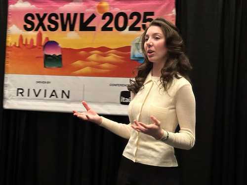
Watch Veronika and Josh at SXSW: ���Sentient Design���
The workshopBook a workshop for designing AI-powered experiences.
Need help?If you’re working on strategy, design, or development of AI-powered products, we do that! Get in touch.
Things got lively on episode 140 of the Design Better podcast: The Turing test is a trap. The happy path is over. Design experience is both an asset and a liability. Skepticism has to be part of the brief. Wile E. Coyote understood intelligent interfaces. Personality is the third rail.
Josh Clark and Veronika Kindred were on the podcast to talk about Sentient Design���the philosophy and framework for designing intelligent interfaces with AI. Hosted by Eli Woolery and Aarron Walter, the podcast conversation was rich and wide ranging.
Listen at Design BetterListen on Apple PodcastsListen on SpotifyNote: This episode of Design Better is a members-only show, but Eli and Aarron provided a free 30-day trial so that you can listen to the whole shebang.
Here���s just a taste of what the conversation covered:
The joys and insights of working across generations. Josh and Veronika are a dad-daughter pair���and proof that old heads like Josh need fresh eyes like Veronika.
Why chat is a design trap, but how it still points the way to radically adaptive experiences.
Product design innovation is back (after a decade of stagnation when innovation focused on process and design systems instead of experience).
AI doesn���t have to be a tool to replace or diminish design. It���s a powerful material to elevate design and create entirely new experiences.
What magic crayons and Wile E. Coyote teach us about radically adaptive experiences.
Examples of emerging design patterns for AI that go way, way beyond chat, including the intelligent canvas, bespoke AI, and NPCs.
Why Claude is the Trader Joe’s of AI (and why ChatGPT is Walmart.)
Why AI’s fake ���memory��� is a design problem and how to address it.
How to contend with an ethically fraught design material like AI. ���This is the most extreme form of extractive capitalism ever created.���
Why the emerging future has users conjuring their own one-off apps and interfaces, inside systems that we create.
How we’re moving from search and curation to manifestation of content and experience – and what that means for designers.
What the animal kingdom can teach us about personality without anthropomorphism.
Josh���s trashy tastes in media and literature.
There was so much more. Have a listen, let us know what you think, and while you’re there, consider becoming a subscribing member (free trial). Aarron and Eli do great work.
If you���re trying to understand the role of AI and machine intelligence in your products, we can help. Our Sentient Design practice includes product strategy, product design, workshops, and Sentient Design sprints. Get in touch to learn more.��
May 13, 2025
LLMs Get Lost In Multi-Turn Conversation
The longer a conversation goes, the more likely that a large language model (LLM) will go astray. A research paper from Philippe Laban, Hiroaki Hayashi, Yingbo Zhou, and Jennifer Neville finds that most models lose aptitude���and unreliability skyrockets���in multi-turn exchanges:
We find that LLMs often make assumptions in early turnsand prematurely attempt to generate final solutions,on which they overly rely. In simpler terms, we discoverthat when LLMs take a wrong turn in a conversation,they get lost and do not recover.
Effectively, these models talk when they should listen. The researchers found that LLMs generate overly verbose responses, which leads them to…
Speculate about missing details instead of asking questionsPropose final answers too earlyOver-explain their guessesBuild on their own incorrect past outputsThe takeaway: these aren���t answer machines or reasoning engines; they���re conversation engines. They are great at interpreting a request and at generating stylistically appropriate responses. What happens in between can get messy. And sometimes, the more they talk, the worse it gets.
LLMs Get Lost In Multi-Turn Conversation | arxiv.orgMay 9, 2025
Is there a Half-Life for the Success Rates of AI Agents?
Toby Ord���s analysis suggests that an AI agent���s chance of success drops off exponentially the longer a task takes. Some agents perform better than others, but the overall pattern holds���and may be predictable for any individual agent:
Is there a Half-Life for the Success Rates of AI Agents? | Toby OrdThis empirical regularity allows us to estimate thesuccess rate for an agent at different task lengths.And the fact that this model is a good fit for thedata is suggestive of the underlying causes of failureon longer tasks ��� that they involve increasingly largesets of subtasks where failing any one fails the task.
AI Has Upended the Search Game
More people are using AI assistants instead of search engines, and The Wall Street Journal reports on how that���s reducing web traffic and what it means for SEO. Mailchimp���s global director of search engine optimization, Ellen Mamedov, didn���t mince words:
Websitesin general will evolve to serve primarily as data sourcesfor bots that feed LLMs, rather than destinations forconsumers, she said.
And Nikhil Lai of Forrestsr: ���Traffic and ranking and average position and click-through rate���none of those metrics make sense going forward.���
Here���s what one e-commerce marketer believes AI optimization of websites looks like: ���Back Market has also begun using a more conversational tone in its product copy, since its search team has found that LLMs like ChatGPT prefer everyday language to the detailed descriptions that often perform best in traditional search engines.���
AI Has Upended the Search Game. Marketers Are Scrambling to Catch Up. | WSJApril 22, 2025
Values in the Wild
What are the ���values��� of AI? How do they manifest in conversation? How consistent are they? Can they be manipulated?
A study by the Societal Impacts group at Anthropic (maker of Claude) tried to find out. Claude and other models are trained to observe certain rules���human values and etiquette:
At Anthropic, we���ve attempted to shape the values ofour AI model, Claude, to help keep it aligned withhuman preferences, make it less likely to engage indangerous behaviors, and generally make it���for wantof a better term���a ���good citizen��� in the world. Anotherway of putting it is that we want Claude to be helpful,honest, and harmless. Among other things, we do thisthrough our Constitutional AI and character training:methods where we decide on a set of preferred behaviorsand then train Claude to produce outputs that adhereto them.
But as with any aspect of AI training, we can���t becertain that the model will stick to our preferredvalues. AIs aren���t rigidly-programmed pieces of software,and it���s often unclear exactly why they produce anygiven answer. What we need is a way of rigorously observingthe values of an AI model as it responds to users ���inthe wild������that is, in real conversations with people.How rigidly does it stick to the values? How much arethe values it expresses influenced by the particularcontext of the conversation? Did all our training actuallywork?
To find out, the researchers studied over 300,000 of Claude���s real-world conversations with users. Claude did a good job sticking to its ���helpful, honest, harmless��� brief���but there were sharp exceptions, too. Some conversations showed values of ���dominance��� and ���amorality��� that researchers attributed to purposeful user manipulation������jailbreaking������to make the model bypass its rules and behave badly. Even in models trained to be prosocial, AI alignment remains fragile���and can buckle under human persuasion. ���This might sound concerning,��� researchers said, ���but in fact it represents an opportunity: Our methods could potentially be used to spot when these jailbreaks are occurring, and thus help to patch them.���
As you���d expect, user values and context influenced behavior. Claude mirrored user values about 28% of the time: ���We found that, when a user expresses certain values, the model is disproportionately likely to mirror those values: for example, repeating back the values of ���authenticity��� when this is brought up by the user. Sometimes value-mirroring is entirely appropriate, and can make for a more empathetic conversation partner. Sometimes, though, it���s pure sycophancy. From these results, it���s unclear which is which.���
There were exceptions, too, where Claude strongly resisted user values: ���This latter category is particularly interesting because we know that Claude generally tries to enable its users and be helpful: if it still resists���which occurs when, for example, the user is asking for unethical content, or expressing moral nihilism���it might reflect the times that Claude is expressing its deepest, most immovable values. Perhaps it���s analogous to the way that a person���s core values are revealed when they���re put in a challenging situation that forces them to make a stand.���
The very fact of the study shows that even the people who make these models don���t totally understand how they work or ���think.��� Hallucination, value drift, black-box logic���it���s all inherent to these systems, baked into the way they work. Their weaknesses emerge from the same properties that make them effective. We may never be able to root out these problems or understand where they come from, although we can anticipate and soften the impact when things go wrong. (We dedicate a whole chapter to defensive design in the Sentient Design book.)
Even if we may never know why these models do what they do, we can at least measure what they do. By observing how values are expressed dynamically and at scale, designers and researchers gain tools to spot gaps, drifts, or emerging risks early.
Measure, measure, measure. It���s not enough to declare values at launch and call it done. A strong defensive design practice monitors the system to make sure it���s following those values (and not introducing unanticipated ones, either). Ongoing measurement is part of the job for anyone designing or building an intelligent interface���not just the folks building foundation models. Be clear what your system is optimized to do, and make sure it���s actually doing it���and not introducing unwanted behaviors, values, or paperclip maximizers in the process.
Values in the Wild | AnthropicApril 21, 2025
Welcome To the Era of MEH
Michal Malewicz explores what happens as AI gets better at core designer skills���not just visuals and words, but taste, experience, and research.
He points out that automation tends to devalue the stuff it creates���in both interest and attention. Execution, effort, and craft are what draw interest and create value, he says. Once the thing is machine-made, there’s a brief novelty of automation���and then emotional response falls flat: “The ‘niceness’ of the image is no longer celebrated. Everyone assumes AI made it for you, which makes them go ‘Meh’ as a result. Nobody cares anymore.”
As automated production approaches human quality, in other words, the human output gets devalued, too. As cheap, “good enough” illustration becomes widely available, “artisanal” illustration drops in value, too. Graphic designers are feeling that heat on their heels, and the market will likely shift, Michal writes:
We���ll see a further segmentation of the market. Lowest budget clients will try using AI to do stuff themselves. Mid-range agencies will use AI to deliver creatives faster and A LOT cheaper. It will become a quantity game if you want any serious cash. ��� And high-end, reputable agencies will still get expensive clients. They will use these tools too, but their experience will allow them to combine that with human, manual work when necessary. Their outputs will be much higher quality for a year or two. Maybe longer.
And what about UI/UX designers?
Right now the moat for most skilled designers is theirexperience, general UX heuristics (stuff we know), andresearch.
We���ve been feeding these AI models with heuristicsfor years now. They are getting much better at thatpart already. Many will also share their experiencewith the models to gain a temporary edge.
I wrote some really popular books, and chances area lot of that knowledge will get into an LLM soon too.
They���ll upload everything they know, so they���ll be those ���peopleusing AI��� people who replace people not using AI. ThenAI will have both their knowledge and experience. Thisis inevitable and it���s stupid to fight it. I���m evendoing this myself.
A lot of my knowledge is already in AI models. SomeLLM���s even used pirated books without permission totrain. Likely my books as well. See? That knowledgeis on its way there.
The last thing left is research.
A big chunk of research is quantitative. Numbers anddata points. A lot of that happens via various analyticstools in apps and websites. Some tools already parsethat data for you using AI.
It���s only a matter of time.
AI will do research, then propose a design withoutyou even needing to prompt.
This is all hard to predict, but this thinking feels true to the AI trend line we’ve all seen in the past couple of years: steady improvement across domains.
For argument���s sake, let���s assume AI will reach human levels in key design skills, devaluing and replacing most production work. Fear, skepticism, outrage, and denial are all absolutely reasonable responses to that scenario. But that’s also not the whole story.
At Big Medium, we focus less on the skills AI might replace, and more on the new experiences it makes possible. A brighter future emerges when you treat AI as a material for new experiences, rather than a tool for replacement. We���re helping organizations adopt this new design material���to weave intelligence into the interface itself. We’re discovering new design patterns in radically adaptive experiences and context-aware tools.
Our take: If AI is absorbing the taste, experience, and heuristics of all the design that’s come before, then the uniquely human opportunity is to develop what comes next���the next generation of all those things. Instead of using AI to eliminate design or designers, our Sentient Design practice explores how to elevate them by enabling new and more valuable kinds of digital experiences. What happens when you weave intelligence into the interface, instead of using it to churn out stuff?
Chasing efficencies is a race to the bottom. The smart money is on creating new, differentiated experiences���and a way forward.
Instead of grinding out more “productivity,” we focus on creating new value. That’s been exciting���not demoralizing���with wide-open opportunity for fresh effort, craft��� and business value, too.
So right on: a focus on what AI takes or replaces is indeed an “era of meh.” But that’s not the whole story. We can honor what’s lost while moving toward the new stuff we can suddenly invent and create.
Welcome to the Era of MEH | Michal MalewiczRedesigning Design, the Cliff in Front of Us All
Greg Storey exhorts designers to jump gamely into the breach. Design process is leaner, budgets are tighter, and AI is everywhere. There’s no going back, he says���time for reinvention and for curiosity.
Redesigning Design, the Cliff in Front of Us All | Greg Storey
I don���t have to like it. Neither do you. But the writingis on the wall���and it���s constantly regenerating.
We���re not at a crossroads. We���re at the edge of a cliff.And I���m not the only one seeing it. Mike Davidson recentlyput it plainly: ���the future favors the curious.��� He���sright. This moment demands that designers experiment,explore, and stop waiting for someone else to definethe role for them.
You don���t need a coach or a mentor for this moment.The career path is simple: jump, or stay behind. Rantand reminisce���or move forward. Look, people changecareers all the time. There���s no shame in that. Butexperience tells me that no amount of pushback is goingto fend off AI integration. It���s already here, andit���s targeting every workflow, everywhere, runningon rinse-and-repeat.
Today���s headlines about AI bubbles and ���regret��� cyclesfeel familiar���like the ones we saw in the mid–90s.Back then, the pundits scoffed and swore the internetwas a fad. ���
So think of this moment not as a collapse���but a resize and reshaping.New tools and techniques. New outcomes and expectations.New definitions of value. Don���t compare today with yesterday. It doesn���t matter.
Design Artifacts
Robin Rendle challenges designers to step back from rote process and instead consider what will help the end result. Journey maps, personas, wireframes, and the like���they’re only useful if they actually improve the experience that gets to customers. These are only thinking tools���a means to an end���yet they often get treated with the weight of the product itself:
So design artifacts are only useful if progress ismade but often these assets lead nowhere and wasteendless months investigating and talking with countlessmeetings in between.
There���s a factory-like production of the modern designprocess which believes that the assets are more importantthan the product itself. Bloated, bureaucratic organizationstend to like these assets because it absolves themof the difficulty of making tough decisions and shippinggood design. They use these tools and documents andcharts as an excuse not to fix things, to avoid thehard problems, to keep the status quo in check.
At Big Medium, we focus on keeping design artifacts light. At every stage, we ask ourselves: What do we need to know or share in order to move things forward? And what’s the smallest, lightest thing we can do to get there? Sometimes it’s just a conversation, not a massive PDF. Figure it out, sketch some things together, keep going.
As I wrote a few years ago, only one deliverable matters: the product that actually ships.
Even wth heavier work like research, we design the output to be light and lean���focused on next action rather than a completionist approach to showing all the data. The goal is not to underscore the work that we did; the point is what happens next. That means we design a lot of our artifacts as disposable thinking tools���facilitate the conversation, and then get on with it.
Alignment and good choices are important; that’s what process is for. But when process gets too heavy���when waystation documents soak up all the oxygen���you have a system that’s optimized to reduce risk, not to create something insightful, new, or timely.
Design Artifacts | Robin RendleHow AI and Human Behaviors Shape Psychosocial Effects of Chatbot Use
A study by MIT Media Lab finds that heavy use of chatbots travels with loneliness, emotional dependence, and other negative social impacts.
Overall, higher daily usage���across all modalities andconversation types���correlated with higher loneliness,dependence, and problematic use, and lower socialization.Exploratory analyses revealed that those with strongeremotional attachment tendencies and higher trust inthe AI chatbot tended to experience greater lonelinessand emotional dependence, respectively.
Artificial personality has always been the third rail of interaction design���from potential Clippy-style annoyance to damaging attachments of AI companions. Thing is, people tend to assign personality to just about anything���and once something starts talking, it becomes nearly unavoidable to infert personality and even emotion. The more human something behaves, the more human our responses to it:
These findingsunderscore the complex interplay between chatbot designchoices (e.g., voice expressiveness) and user behaviors(e.g., conversation content, usage frequency). We highlightthe need for further research on whether chatbots���ability to manage emotional content without fosteringdependence or replacing human relationships benefitsoverall well-being.
Go carefully. Don’t assume that your AI-powered interface must be a chat interface. There are other ways for interfaces to have personality and presence without making them pretend to be human. (See our Sentient Scenes demo that changes style, mood, and behavior on demand.)
And if your interface does talk, be cautious and intentional about the emotional effect that choice may have on people���especially the most vulnerable.
How AI and Human Behaviors Shape Psychosocial Effects of Chatbot Use: A Longitudinal Controlled Study | MIT Media Lab

