
Josh Clark's Blog, page 9
February 6, 2024
ShopTalk: Brad Frost on a Global Design System

Big Medium’s Brad Frost joined the ShopTalk podcast for a conversation with Chris Coyier and Dave Rupert. The big topic: Brad’s call to action to create a global design system. (And okay, a little bit about what he’s planning for his 40th birthday, too.)
Brad Frost has got design systems on his mind���at a global scale. What is a global design system? Are two design systems ever the same? How would this slot inside atomic design? What has been the response from the web community to global design system as an idea? And what’s Frostapalooza?


Thoughts on a Global Design System
Hot on the heels of his podcast conversation with Big Medium���s Brad Frost, Chris Coyier shared his ruminations on Brad���s call to create a universal design system.
Chris’s post, Thoughts on a Global Design System, is a smart, incisive, and thought-provoking set of questions and critiques about Brad’s proposal. It’s the tough love that an ambitious idea needs in order to survive.
Chris nods to the problem that Brad seeks to solve with a global design system: “Surely, the world is wasting the brain power of too many smart people solving the same set of problems again and again.” And then he pokes at whether this is the right solution. How would it work in practice? Who would run it? How could it be opinionated enough to be useful without being so opinionated that it’s no longer universal? And why haven’t similar efforts succeeded? Is what we already have as close as we’re likely to get?
That feels like I���m being awfully critical. Sorry!Like I said, I like the enthusiasm and I do think thereis potential here. But to realize the potential, Ithink you need to ask really hard questions and havereally strong answers. Ultimately I sincerely hope itcan be done. Having a super robust go-to set of componentsthat are essentially vetted by the world would be awesome.I think it will take very strong set of principalsand leadership to get there.
We love both the spirit of the critique, and the depth of the commentary. Thanks, Chris, for the great framing for the conversation to come.
Thoughts on a Global Design System ��� Chris CoyierFebruary 2, 2024
A Little Big Medium
Love email? Neither do we! But we really, really, really love sharing and receiving genuinely helpful perspectives and resources that help everyone do their work better.
That���s what we deliver in Big Medium���s occasional email newsletter ���A Little Big Medium���: practical insights to help complex organizations design for what���s next���and do it at scale.
So what will you get? Lots of signal, no noise; the newsletter is certified spam-free. Sign up to receive links to Big Medium’s latest ideas, case studies of recent projects, and, sure, hot takes on process, technique, and technology from the industry’s best.
Sound good? Let’s go! Sign up here:
Email addressJanuary 15, 2024
Do More with Less: Digital Leadership in Lean Times
Nothing concentrates the mind like tough times. Adversity invites you to return to fundamental priorities. With the right response, you can turn crisis to opportunity, setting yourself up for success well beyond the current storm. Tough times are an opportunity to get your head right.
The digital industry is in one of those moments. Waves of layoffs have washed over the tech giants in the past several months after years of exuberant hiring. Traditional firms have pulled back on digital investment, shelving projects that are deemed non-essential. Despite signs that the US economy is growing and that interest rates will relent, companies are easing into the year with conservatism. Lean budgets are the order of the day, and execs are obliged to turn a gimlet eye to how well their digital teams and initiatives are performing.
If there���s a silver lining here, it���s that there���s fresh urgency for the important���a focus on what should have been in focus all along. For digital leaders, the top focus has to be nurturing a high-performing digital organization. If there���s investment to be made, it must be here. Savings and profit will both follow many times over.
For digital leaders, the top focus has to be nurturing a high-performing digital organization.
By ���high performing,��� I mean ���doing more with less.��� Become an organization that can realize the elusive trifecta of faster/better/cheaper while delivering exceptional digital experiences. The goal is hardly novel, but it���s surprising how rarely it���s an actual priority. Big Medium works with the world���s biggest companies���organizations that have the potential to realize huge economies of scale. Too often, though, their size only magnifies each company���s particular dysfunctions. We guide our clients to develop healthy processes and organizational strategy to be their best selves���to be that high-performing digital team.
Economic uncertainty is an invitation for companies to do just that, to become their best selves. So while this essay may be framed as ���digital leadership in lean times,��� it���s more truly a call to return to the touchstones of responsible digital leadership. As a leader, how do you focus on what is really valuable to both the company and its customers, and how do you set up your team to deliver that value? How do you tell your group���s story in a way that reinforces your ability to do new and useful things with technology?
Before jumping into it, here���s a preview of the key principles I���ll cover for leading and nurturing your ���do more with less��� high-performing team:
Earn your keepRally around deliveryEnlist the robotsBust silosMind your vendorsBuild institutional knowledge and promote radical reuseInnovate within constraintsSet the visionLean into kindness and safety1. Earn your keepFirst, let���s be straight about the cold calculus of your business goals: you must make or save money for the company. If your team contributes to making/saving more money than it spends���and if it can do that with a bigger margin than competing initiatives���then you earn your keep and win the budget. The more direct the connection to making/saving money, the better. It���s important that this connection be explicit in the story that you tell internally about the work���and understood by the teams doing that work.
Make moneyDigital organizations make money by launching successful products or marketing vehicles���and by keeping/retaining customers through feature updates and bug fixes. Shipping and supporting these products is typically the focus for in-house teams, so chances are, you already have a handle on the research, design, and development of good products that are core to your business. The metrics to measure and the desired outcomes are generally clear and understood. But things tend to get messy in the other category���
Save moneyYou save money by developing processes or platforms that help get things done faster, with fewer resources, or with less reliance on outside vendors. There���s often lots of untapped opportunity here, because digital organizations often contend with lots of inefficiencies���especially in large and complex organizations. That���s where teams encounter the friction and inefficiencies of siloed bureaucracy, politics, and poor visibility. There���s lots to be done, but it means fighting the tide of corporate scale. This is the realm of slow decisions, reinvented wheels, waterfall handoffs, and inconsistent solutions.
Saving money by reducing friction and creating new efficiencies is the big opportunity to move the needle for most digital organizations. Do more with less: make more money while spending the least money, time, and resources possible. You can spot high-performing teams by their speedy, low-friction, collaborative process���complete with supporting tools and platforms���for designing and delivering digital products.
Saving money by reducing friction and creating new efficiencies is the big opportunity to move the needle for most digital organizations.
The trick is that investing in projects that will save money often looks at first glance like pouring funds into an operational cost center. Hiring folks to improve process can be misunderstood as adding a layer of middle management that doesn���t directly contribute to shipping product. Building a well-considered, effective design system can be misconstrued as a costly convenience for internal teams, a distraction from building actual applications. (I���ll address the very real benefits of investing in these things later.)
To avoid this false impression, commit fully to these efficiency-building efforts by plugging them immediately into roadmap projects so that you can prove (or disprove) their value right away. For example, apply new process improvements to the scrum teams working on the latest project. Or use that project to build your design system by introducing component-driven design/development and then extracting the foundational components for the system from that project.
When Big Medium helps client companies build money-saving design systems, for example, we tuck in with production teams working on strategically important roadmap projects. We help them accelerate those projects with new design/development process���and end up with a bouncing baby design system on the other end. The efficiencies and savings from that design system snowball as it continues to be used and evolved in follow-on projects.
Working this way lets you realize the value of the effort immediately, and contribute directly and materially to money-making projects at the same time that you���re developing your money-saving efforts. But just as important, it also helps you justify the expense of these initiatives by leaning into this important fact of corporate finance:
Your CFO loves a capital expenditureI bet you didn���t see this coming, but we���re going to take a brief detour into the intoxicating realm of��� accounting. How your project is categorized by the finance department affects how it affects the company���s bottom line���and how profitable or costly your group is perceived to be.
It takes money to design and build a website, application, or platform. If that expense is charged as an operational expense (���OpEx��� in the lingo), then the full cost dings the company���s bottom line for the year. However, if it���s considered a capital expense (���CapEx���), then on the books, the cost can instead be spread out over the product���s useful lifespan���typically three to five years.
A simple example: A company spends $1 million to deliver a software product. If it���s categorized as OpEx, then the company books a $1 million expense before it���s able to realize any revenue���your project just cost the company a ton of money this year with no income to show for it yet. If it���s categorized as CapEx, however, then the accountants view the software product as a $1 million asset with a five-year lifespan. The $1 million expense to build it can be amortized over five years ($200,000 per year). So the balance sheet for the first year shows a $1 million asset with $200,000 expenses���an increase of $800,000 in the company���s net worth for the year, instead of a $1 million expense.
What is this witchcraft? CapEx means ���investment.��� It applies to the purchase or creation of assets that will deliver value over time: buildings, machinery��� and software. Capitalization is an accounting method that spreads out the cost of the asset over its useful lifespan. Even though the company lays out the cash all at once, it looks on paper like a payment plan. The reasoning is that it aligns the expense of a revenue-producing product with the timing when it���s actually expected to generate that revenue���a more accurate reflection of an asset���s financial performance. The end result: capitalization improves financial statements, enhances the balance sheet, and unlocks tax savings that can free up money for further investment and operations.
Caveat: The Magic Dissipates
Every year, the value of the software asset decreases on the balance sheet (the $1 million asset is worth $800,000 the next year, $600,000 in the year after that, and so on). And the amortized expense hits the income statement every year, too. So CapEx accounting is only effective over the long haul if the software actually delivers revenue that matches or exceeds its original expense. Otherwise, wave after wave of amortized expenses will drag the whole thing down like a house of cards.
Position your work as asset creation, not operational expense. This is not only better accounting, but better storytelling: ���we���re creating value, not a cost center.��� It means that the company understands your digital organization as a builder of enduring, profit-generating machinery. The design system you build for savings and efficiency becomes more than an operational artifact: it is a platform. It is critical front-end infrastructure and a financial asset of enduring value.
Here���s the catch: to qualify as CapEx, expenses have to be direct contributors to the creation of revenue-generating software���building new products or adding new features. For digital products, this includes UI design, application development, QA, and some content creation, but it does not include requirements gathering, research, maintenance, bug fixes, modernization, or training, all of which are all considered operating expenses. (Here are the rules for websites.)
So don���t get it twisted. We still need to spend on OpEx efforts that reduce technical debt and keep these beautiful CapEx projects running well and delivering profit. Likewise, we need to be smart about funding research and building good requirements that will ensure the products deliver the expected revenue. But don���t miss any opportunity to frame (and fund) the work that you do as value-building capital assets. It���s not only savvy and timely, it���s also true.
Don���t miss any opportunity to frame (and fund) the work that you do as value-building capital assets. It���s not only savvy and timely, it���s also true.Choose metrics that matter
This has to be more than storytelling. You have to demonstrate the value your team is creating, and that means gathering and sharing the right measurements. Too many teams get swept up in measuring the wrong thing, if they bother to measure at all.
Many design system teams, for example, try to measure the success of the system by tracking how many projects have adopted it, or how complete its component coverage is. Neither is directly relevant to the bottom line. A better measure is how much money the system is saving by reducing design, development, and maintenance time: how much faster (or with how many fewer resources) can you build/maintain a project that uses the system, versus one that does not? That���s the stuff that will keep the lights on for your design system team.
All of this is about having your financial story straight for how you���re delivering value to the business. This is your first priority: get clear on how you���ll make/save money, justify your work as capital expenditure, and understand how to prove its value with the right metrics.
This asset-building mindset also establishes an important cultural and process imperative for digital organizations, which brings us to the next principle for digital leadership in lean times.
2. Rally around deliveryEveryone on the team has to understand that their job is all about actually shipping a great product. In digital design and development, it���s all too easy to get precious about the things we make along the way. I���ve certainly been guilty of this, confusing the output of my individual contribution as my end goal. And so we convince ourselves that the wireframes we build have to be exhaustive. The Figma file must be perfect in every high-fidelity detail. The design system library has to have complete coverage and be ���pure��� from a system perspective. We treat our work as if it���s the product itself.
In the end, none of those artifacts matter. The only thing that���s important is what actually gets delivered to customers���and what happens next. That���s where the value of your digital organization is realized. Everything else along the way is a stepping stone that will be discarded after the next phase is complete. Recognize that requirements, wireframes, designs, and prototypes are disposable���and treat them accordingly.
Document less, ship fasterDoing more with less means reducing the time and energy spent on these ephemeral artifacts, so that you can ship faster and realize product benefits as quickly as possible. At each stage, figure out what you need to do to understand with confidence what the next step toward delivery should be. Invest precisely that effort and no more. That���s the real meaning and value of the much-misunderstood MVP process.
Figure out what you need to do to understand with confidence what the next step toward delivery should be. Invest precisely that effort and no more.
This doesn���t mean cutting corners. This doesn���t mean avoiding appropriate thinking and exploration. This doesn���t mean that design is unimportant. It simply means that we should not treat every phase of planning, design, and development with the same polish that the shipping product needs to have. Instead, let���s recognize when further design work has diminishing returns and ask instead how we can push production downstream into code as soon as possible.
I discuss this approach and its implication in more detail in my essay Only One Deliverable Matters. The gist is: document only what���s necessary to communicate what needs to be done next, and figure out how/where you can express that work most efficiently. The essay stakes out these core principles:
Words, not wireframesSkip the wireframe, sketch mobile UIPush the point of production downstreamCode commits instead of redlinesCultivate trust outside of documentationThe product is the common workspace, and vice versa
If you���re not already working this way, it will feel��� uncomfortable��� when you first adopt it. Hiring folks who bring this mindset can help shepherd the process and realize the associated savings. Product owners, design directors, delivery managers, and project managers are all influential roles here. Outside consultants can also help.
At Big Medium, for example, we help our client companies work in this way. Doing so lets you ship faster���and it creates a common sense of purpose and collaboration among disciplines. Instead of tossing highly polished documentation over the wall waterfall-style, you���re instead having conversations to ask your colleagues, ���what do you need from me in order to know what to do next?��� It���s almost always less than you think it needs to be. Do more by doing less.
3. Enlist the robotsAs you revisit what needs to be done, also ask how���and whether it can be automated. The recent sudden breakthroughs and broad availability of generative AI in particular mean that our new robot friends are becoming important teammates in digital organizations.
At Big Medium, we���ve begun helping our clients use AI to do production work for design and development. We���re setting up private, secure systems that use large language models (LLMs) to deliver high-quality results in seconds instead of the hours or days of our human colleagues. Some examples that we���re delivering right now:
Writing production-ready code for design system components across multiple web frameworks (React, Web Components, Vue, etc) in the organization���s house styleAssessing and delivering recommendations on the quality and accessibility of designs and front-end codeWriting and communicating design system documentation (UX guidelines, developer docs, tutorials) in a context- and audience-specific mannerWriting automated tests for code librariesWriting pull requests and changelogs, including high-level summaries of their impact���including breaking changes and the migration path for developersWe���ve got all of that working today, and we���re teaching our clients to do it, too. Still to come: we���re working on teaching the robots to read and write Figma files to create designs based on communicated requirements, to identify gaps between design and code, and to deliver useful code based on the designs.
Digital leaders and their teams can���t afford to ignore this. This is the time to learn, adopt, and invest in this kind of automation and how to manage it. These are early days, but it���s clear that this is where the industry is headed���and quickly. The tools and methods are available now, and improving steadily.
This is at once great news and deeply unsettling. Broad swaths of digital production are fast becoming automated commodity work. The business implication is that we can realize the value of digital products much faster and at lower cost���terrific! But the professional implications at the personal, organizational, and societal levels are profound. This is a sea change in how work gets done and by whom (or by what).
This is a big topic and more than can be shoehorned into this essay, but: as you begin to introduce your inevitable robot workforce, anticipate necessary shifts in roles and responsibilities. The technical aspect of human work will shift to training and maintaining the robots and their models, writing prompts based on clear requirements, and reviewing the design/code output. Done right, this relieves us of nitty-gritty, error-prone, and repetitive production work and frees us to do higher-order thinking, posing new questions that solve bigger problems.
This means our teams will eventually engage in more human inquiry and less technical implementation: more emphasis on research, requirements, and outcomes and less emphasis on specific outputs. In other words, teams will focus more on the right thing to do���and less on how to do it. The robots will take care of the how.
In that context, human relationships and shared vision within your digital organization become even more important. Divvying people up by technical specialty may become more of a hindrance than a help as the robots take on more of the technical work. That brings us to the next principle.
4. Bust silosAnother way to think about rallying around delivery is that you���re blurring the lines between production stages, so that the whole team is involved, informed, and invested throughout the process. This means busting the silos that isolate disciplines.
Painful design-to-development handoffs disappear, for example, when you decide we will no longer have formal handoffs. Instead, pull developers back into the design process, and push designers forward into the development process. This is what happens when you prioritize pushing production downstream into code as soon as possible. It���s also easier said than done. That���s because it intentionally blends roles/responsibilities across production stages, introducing a degree of ambiguity into your delivery process. But it also bolsters the agency of the production team and its individual contributors. It empowers the team to focus on what���s needed across disciplines for this feature right now in order to ship faster.
Painful design-to-development handoffs disappear when you decide we will no longer have formal handoffs.
Done right, busting silos improves both the speed and quality of delivery, with fewer surprises. You know it���s working when you see a decline in adversarial relationships between disciplines. By contrast, it���s a danger signal when you see frayed working relationships and lack of trust simmering between designers and developers, for example. That frustration represents a ton of wasted time and energy. You have to resolve it to stop burning money.
Is your org chart broken?Improvements in process and personal relationships can go a long way there, but friction between disciplines is often seeded by structural issues in the organization. When a company dumps design, development, product, and marketing into completely different departments, these groups inevitably have different incentives, goals, and cultures. The structure alone threatens to turn these teams into disdainful competitors instead of supporters of a common mission.
High-performing digital organizations have cross-discipline production teams that share responsibility for shipping great features. At Big Medium, we���ve helped clients establish a variety of different reporting relationships to manage the individual contributors in those teams (designers versus developers versus product managers etc). There���s no single best org chart for high-performing teams, but there is a common factor: the reporting relationships merge not far above the production team itself.
To rally around product delivery, you have to have common leadership to do the rallying. The closer that shared leadership is to the teams doing the work, the more effective it will be. When reporting relationships for distinct disciplines don���t merge until they hit the C-suite, that���s especially fertile territory for dysfunction. The silos are way too tall for collaboration to be effective, and a reorganization is almost certainly necessary.
5. Mind your vendorsAgencies and other vendors are their own silos. Although hired to accomplish specific outcomes for the business, these third-party companies have their own management structures and incentives, which can diverge in ways large or small from the interests of their clients. This divergence is made worse when you have multiple vendors working on the same projects, making coordination challenging and responsibilities murky. Streamlining your agency roster delivers cost savings, eliminates duplicate work, reduces management overhead, and lets you focus on the healthiest business partnerships.
I lead an agency. I���m a fan of agencies. Agencies and contractors play an important role in lean times, filling gaps when companies can���t risk full-time hires. But those same lean times oblige digital leaders to ask: where are my agencies taking me and to what end? Are they the right partners for the moment?
Many agencies are keen to create long-term dependencies and get as many heads in the door for as long as possible. That���s the whole business model. Their DNA rejects getting projects done in the leanest way, which means that these agencies are at cross purposes with their clients��� interests, at least in that particular sense.
At Big Medium, our goal is to enable meaningful change���in product, in process, in culture, in technique���and then step aside. We purposely avoid making our clients dependent on us in the long term. Instead, we want to empower them by teaching them what we know, making our knowledge their knowledge. We don���t create superfluous deliverables to boost our billing. We���ve done a lot of work to design a business that aligns our goals with those of our clients, and our clients tell us we leave them more effective, happier, transformed. That���s a healthy partnership. The question to ask: can you say the same of all of your vendors?
Lean times oblige digital leaders to ask: where are my agencies taking me and to what end? Are they the right partners for the moment?
Find your trusted partners, the ones that line up with your own goals and incentives, and streamline to them. If you discover that this leaves you empty-handed, then it���s time to find new partners better suited to the challenges you���re facing today and tomorrow. On the other hand, if your agency roster is still stacked, consider trimming the long tail of vendors who don���t offer unique value or services. Having multiple agencies who solve the same problems in the same way does you no good. It only costs you time, money, and attention to coordinate all the companies doing the exact same work. Consolidate to the difference makers.
Be careful not to confuse difference makers with those who introduce change for change���s sake. Innovation and novelty are not the same thing. Many agencies, especially design agencies, understand their job to be to create something new and novel and dazzling. Nothing is inherently wrong with those things, and sometimes that���s what the moment warrants. But too often the pursuit of novelty abandons valuable foundations. Too many agencies deliver product designs that ignore a company���s existing design system or standards, without creating an alternative. They create solutions that don���t show consideration for what���s come before or what will come next.
Circumstances sometimes call for dramatic change. I am not calling for incrementalism. But as you work on innovative projects with your agency vendors, ask yourself how the new thing you���re creating can capitalize on what you���ve already built. If you���re walking away from that, do it with clear eyes about what you���re gaining and what you���re giving up���and what will replace it. Otherwise your shiny new project risks becoming a money pit.
Novelty is not innovation. Continuity is not stagnation. In fact, there���s a lot to be said for building upon what you���ve already got.
6. Build institutional knowledge and promote radical reuseHigh-performing teams figure out the right thing to do faster than other teams. That���s not because they���re more clever; it���s because they have good habits. In particular, they quickly identify ���our team���s way��� to do the thing at hand, and they have the assets, routines, and culture to stay in sync with each other and with other teams.
On the other hand, teams introduce friction (and delays and re-work) when individual contributors are never clear on the settled solution for a specific problem���and don���t know where to turn. When that���s the case, institutional knowledge, such as it is, is locked up in the heads of longtime employees. Knowledge is conveyed via direct message, which requires knowing who to ask. Onboarding is painful as new team members don���t have easy access to the basic knowledge to do their job.
When there���s no clear ���our way,��� designers and developers burn lots of time and energy to find answers. And when they can���t find them, they wind up reinventing the wheel by solving a problem that���s already been solved��� somewhere. Quality, consistency, and velocity all take a hit. Design and technical debt abound.
This is the whole reason for design systems, of course. They are repositories of institutional knowledge���libraries of solved problems. They���re all about encouraging radical reuse through the principles of Atomic Design, the methodology created by Big Medium���s Brad Frost. Done right, design systems provide a single source of truth with common language, clear guidelines, and grab-and-go elements for designers and developers.
In lean times, developing a mature design system has to be an area of focus and investment. It pays off quickly in stanching redundant work, wasted time, and poor-quality design & development. Creating design and code libraries for common patterns has become table stakes for a healthy digital organization.
It���s also not enough. High-performing teams have design systems, but having a design system won���t make you a high-performing team. What makes the difference is how you operationalize that system to fit naturally into the everyday workflow and practice of teams and individual contributors. That is the real work: establishing the processes to use, govern, and contribute to those systems in ways that elevate the team and deliver bottom-line value in shipping product.
High-performing teams have design systems, but having a design system won���t make you a high-performing team.
This effort requires committed leadership���especially for large, siloed organizations that tend to favor local solutions. In our work with big companies, we often see similar-but-different design systems spring up in different pockets of the company. Companies bring in Big Medium to bridge the gap, unify systems, and help teams work together. The fact that this is happening in the first place, though, is a sign of teams trying to create institutional knowledge and radical reuse within their spheres of influence���but their effort to reduce duplicative work is only duplicating the work of others elsewhere in the organization.
That���s a signal that design system work is no longer a team issue. It���s a leadership issue that demands silo-busting and collaboration organization-wide. The result sweeps away ambiguity for common use cases. Getting the design system implementation right means teams can spend less time on reinventing old boring solutions and more on solving new problems. Speaking of new solutions…
7. Innovate within constraintsWhen you consolidate what you already know how to do, you create time, energy, and resources for exploring the new. That���s how companies make space for innovation projects in lean times, and it���s what we���re seeing right now.
Confronted by flat or shrinking budgets, high-performing teams are deploying all the efficiencies described above in order to protect space for exploring new technologies and opportunities���especially AI. ���There is a reallocation of resources from noncore areas to projects such as AI rather than hiring new people,��� the Wall Street Journal reports. Another Journal report surveyed CIOs and found that ���while their budgets for the new year remain flat, they���re under pressure to deliver new innovations, especially using generative AI. Getting the cash for that means that the cost-control priorities of 2023���from reducing cloud usage and consolidating vendors to negotiating discounts and leaning on automation���will remain in effect into 2024, they said.���
���Doing more with less��� also means doing new with less.
���Doing more with less��� also means doing new with less. When there���s no contingency budget for failed projects, you���re asked to reduce risk even as you chase big results.
Choose innovation projects with care, selecting the ones most likely to return high value, with limited risk.�� At Big Medium, for example, we���re helping clients adopt AI in the service of delivering roadmap projects. Our client teams develop new skills and explore new features without the risk of giant moonshot projects.
This approach transforms AI from daunting next-generation technology into a practice of making software with casual intelligence. (Designing for casual uses of AI has been a focus of ours for several years now; here are some examples from my 2019 talk, AI Is Your New Design Material.)
From there, as your team���s skills grow in pace with demonstrated product benefits, innovation efforts can become bolder. That���s the maturity path we���re following, for example, when Big Medium helps companies use AI to write production code, as described earlier���moving from using AI-supported features to AI-produced applications.
Here are a few key concepts as you follow this trajectory with tight resources:
Keep innovation projects rolling even in lean times���but grow those features in step with the growth of your skillset, and vice versa. If you don���t have the skillsets you need, hire those skills���or hire a consultant like Big Medium to help you get them.Prefer lots of little bets to one giant bet. Don���t send a team into an ���innovation cave��� to disappear for a year in hopes that they come back with a company-saving product. Instead, do lots of experiments as targeted product interventions, measure the results of each, and then based on those results, decide what the next intervention will be. Over your time, your ���small��� experiments will get bigger. (This, again, is what MVPs are intended to be and do.)Mind the difference between innovators and implementers. The people who dream up or demonstrate the new idea aren���t always the best ones to take it forward���and often don���t want to be. Inventing and operationalizing are different tasks, often best handled by different people or teams. In lean times, make sure you have the right people in their best place.8. Set the visionWhere does all of this effort and innovation take you? Where are you headed? Much of what I���ve covered so far has focused on the management and operational considerations of nurturing a high-performing team. But once you���ve got this team zipping along like a sleek and nimble jet, where will you fly together? Building, fueling, and flying the jet are all different from imagining its destination���and persuading people to come along.
That���s vision, and a leader isn���t a leader without a vision. Vision provides the ���why��� for all the ���how��� and ���what��� that occupy everyone���s day to day. This is the flag that you plant in the distance to orient your team, to show them where you���re leading them, and to what end.
Vision provides the ���why��� for all the ���how��� and ���what��� that occupy everyone���s day to day.
Peter Merholz shares a good example from Kaaren Hanson, chief design officer at Chase Bank. Kaaren had four near-term initiatives���each similar to the principles I���ve described so far���all of them focused on making her team more effective: build a senior team, nurture executive relationships, establish UX metrics, and evolve product development processes. These initiatives were concrete goals intended to serve as stepping stones to the long-term vision that Kaaren staked out: to create ���one freaking experience������a seamless, coherent, and consolidated way to navigate all the bank���s many-faceted services. The near-term initiatives were all in service of that longer-term vision.
The vision������one freaking experience������is so simply stated, yet it���s brimming with implicit value for both the business and its customer. It���s a simple container that contains tons of complexity, suggests many stages, and prompts lots of inquiry, yet also provides clear directional orientation. It describes to Kaaren���s team of 800+ people why they���re doing their work. It is the desired eventual meta-outcome for the team.
Naming the simple ���why��� is important for several reasons: the vision provides mission and clarity for your team; it provides a strong organizing principle that guides you to make clear and deliberate decisions as a leader; and it takes us all the way back to our first principle, ���earn your keep,��� to tell the story of how your team provides real and meaningful value to both company and customer.
I want to highlight the word ���meaningful��� for a moment. One of the common characteristics of high-performing teams is a culture motivated by a strong sense of purpose and meaning���specifically work that benefits others. David Burkus writes:
More and more people desire to do work that benefits others. Knowing the reason behind their work���s importance isn���t enough ��� employees also want to know who their work is serving. One study even indicated that when people hear stories about how their colleagues��� work benefits others, they become more motivated to engage in helpful actions. This suggests that when people hear how their work is positively affecting others, they���re more likely to set their own goals and desires aside and focus on the needs and objectives of the team.
What���s your vision for your team? How does that vision benefit colleagues, clients, or the community? And how does your vision dovetail with undeniable business value for the company? Expressing that vision provides comforting reassurance and motivational purpose for your team���both of which are especially important in lean times.
9. Lean into kindness and safetyThe importance of purpose in your team���s work is a reminder that high-performing teams are built on more than technical skill, good funding, or effective management alone. Teams that ���do more with less��� emerge from healthy and supportive culture.
While it may be tempting to apply pressure to teams to wring more out of them, fear and adrenaline are not sustainable management methods.
Lean times introduce a ton of stressors���tight budgets, the threat of layoffs, changes in leadership, shifts in how we work. You may not have control over all or even any of the factors that leave your team unsettled. But you can still help your team find professional grounding in ungrounded times by fostering a culture of kindness and psychological safety. This kind of healthy culture not only boosts individual satisfaction but turns out to be the essential ingredient for effective team dynamics.
And this may be a bit crass, but: fear is bad for business. Fear of failure, fear of losing work, fear of management, fear of speaking up���all of it hurts creativity, motivation, and team collaboration. A work culture that is adversarial, intimidating, impatient, or judgmental will not take you where you need to go, a fact that���s doubly true in tough times. While it may be tempting to apply pressure to teams to wring more out of them, fear and adrenaline are not sustainable management methods. The better thing is to encourage people to show up as their whole selves, not as robot exemplars of efficiency. Done right, the results are remarkable.
A decade ago, Google embarked on a study called Project Aristotle to study hundreds of Google���s teams and figure out why some were way more successful than others. They looked at team composition, personalities, social relationships, and management style, but no strong patterns emerged from those. Instead, the secret of high-performing squads turns not on who is on the team but how team members behave with each other. The common element: team psychological safety.
The term was coined in 1999 by Harvard���s Amy Edmondson: ���the belief that one will not be punished or humiliated for speaking up with ideas, questions, concerns, or mistakes, and that the team is safe for interpersonal risk taking.��� This is a professional context where you can be confident being yourself (including your confused or uncertain self). It emerges from ���a blend of trust, respect for each other’s competence, and caring about each other as people.��� Project Aristotle and a bevy of other studies have found strong links between psychological safety and improvements in performance, creativity, resilience, and learning.
Leaders cultivate team psychological safety by encouraging input, replacing blame with curiosity, and perhaps most important: by offering their own vulnerability and trust to the team. The trust is offered by openly acknowledging uncertainties, failures, and even personal weaknesses. This is interpersonal risk, for sure; it runs counter to the instinct of many leaders to front a false confidence, especially in times of crisis. But offering this trust is rewarded with a culture where nobody is expected to be perfect���a place where it���s safe to admit mistakes, share half-formed ideas, and ask naive questions. Instead of being a leader who has to have all the answers, it allows you to frame questions for your team to answer���and give them confidence that they won���t be punished for trying.
No, this is not coddling. Kindness is not weakness. Psychological safety does not mean ���everyone gets a trophy,��� nor is it at odds with demanding standards or industry-beating outcomes. On the contrary, psychological safety delivers those outcomes by providing the space for a constant flow of new ideas and critical thought���and the confidence to explore both. Critique and hard conversations remain critical; the difference is that the critique is always understood to be about the work, not the person. In lean times it���s especially important to be clear about expectations���and to listen when those expectations aren���t realistic.
At Big Medium, we think a lot about how to promote this kind of healthy culture, especially since we���re constantly forming new teams by joining forces with our clients. We���re told by those same clients that we not only deliver fast, highest-caliber results, but that we���re also kind���and awfully fun to work with. (That rings true, since we look for the same in our clients.) We care about the challenges of the teams we work with���and of the people that make up those teams. We���re invested in their success and we���re interested in their ideas, both the ones that work and the ones that don���t.
In every engagement we lean into process, habits, and norms that foster this kind of kindness and safety in our client teams. We know the engagement is working when we���re all enjoying our work together, not only the results. That makes all of us real allies at a personal level in making our client���s vision real.
In lean times, who could ask for better friends than that?
Let���s return to fundamentalsLeadership is always a tough gig. The squeeze is hardest when money is tight and you���re called upon to do more with less���all while giving teams what they need to do their best work. The good news is that digital leadership in tough times is basically the same as what great digital leadership looks like all the time. So let���s get back to fundamentals. Focus on what delivers value, and create the circumstances for your team to get it done.
From accounting to AI, from automation to Atomic Design, from vision to vendors, from innovation to institutional knowledge, from constraints to a culture of kindness��� you have a lot of tools and methods to meet the moment.
And hey, Big Medium is here if you need help. We help complex organizations do big design, and nurturing high-performing teams is what we do. We can help your team to:
fit AI into into your products (and production process)realize all the benefits of a design systemdesign and build websites/applications that deliver value and earn your keepbuild the skills, process, and culture to deliver better products fasterand much moreGet in touch, and we���ll help you do more with less.
Is your design, development, or product organization struggling with AI, process, delivery, or roles & responsibilities? Need help designing and building your next great product? We can help. Big Medium helps complex organizations do big design���building and shipping great digital products at scale. Get in touch to find out how.
January 12, 2024
A Global Design System
This article was originally published at bradfrost.com.
Looking for help? If you’re planning, building, or evolving an enterprise design system, that’s what we do. Get in touch.
TL;DR: This is a call to action to create a Global Design System that provides the world���s web designers & developers a library of common UI components. A Global Design System would improve the quality and accessibility of the world���s web experiences, save the world���s web designers and developers millions of hours, and make better use of our collective human potential.
Sounds pretty good, right? In this article, I���ll talk about our collective design system journey, the rationale for creating a Global Design System, some thoughts on how to make a Global Design System actually happen, and discuss how a Global Design System would impact the world���s web designers and developers. Let���s dig in!
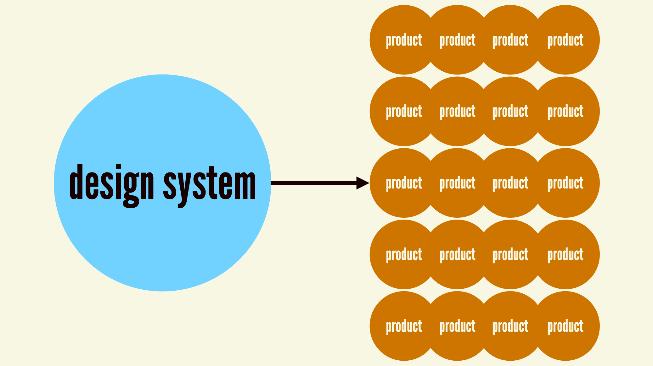
Our design systems journeyOnce upon a time, people had to design, construct, and maintain a bespoke user interface for each and every web digital product. This was manageable when an organization���s digital landscape looked something like this:

But as we all know, the digital landscape has exploded into a cacophony of websites, web apps, native mobile applications, and other software applications we can collectively call ���digital products.��� It���s not unusual for an organization���s digital product landscape to look something like this:

Designing, building, and maintaining a bespoke user interface for each individual digital product is expensive, inefficient, and fraught. And so a chorus of voices rings out across organizations the world over: ���Let���s stop reinventing the wheel! Let���s save designers and developers time and agony! Let���s promote consistency and cohesion! Let���s ship higher-quality users interfaces!��� This is the rallying cry for what we have come to know as design systems.
Over the past ~10–15 years, concepts around modular UIs have matured, technologies have been born, and tools have evolved to create a library of common user interface components that power an organization���s portfolio of digital products.
 Design systems have become critical tools to help scale design across many products and teams.
 With a design system in place, product teams can wield the design system���s buttons, form controls, accordions, and other common UI components in order to increase speed, improve UI quality, and free teams up to work on more worthwhile tasks. This approach has proven to be very effective, and now design systems have become a best practice employed by digital organizations of all shapes and sizes around the world. Hooray design systems!
Our duplicative presentAnd we all live happily ever after, right? Well, not so fast. Organization-wide design systems have eased the individual burden of designing/building (and redesigning/rebuilding ad nauseam) common solutions over and over again. But an ironic pattern emerges: every organization ends up building solutions that overlap substantially with what every other organization is building. Our efforts to reduce duplicative work at the individual level are resulting in duplicative work at the inter-organization level.
 Our efforts to reduce duplicative work at the individual level are resulting in duplicative work at the inter-organization level.
 This phenomenon is understandable: organizations are trying to bring order where they have influence. (We see this��within��organizations as well, where several production teams under the same roof build their own systems because they don���t have influence beyond their group to build an org-wide system.) But the result is the same: now we have a meta design system problem.
Right now, vast numbers of human beings are devoting their time and energy to designing, building, documenting, and maintaining the exact same set of common components. Accordions that open when a user clicks them. Accordions that ��� you guessed it ��� close when a user clicks them again. Datepickers that���pick dates. Tabs that switch panels when selected. Form fields that associate labels with their respective inputs. Alerts that communicate success, error, warning, and information status. Dialogs and tooltips and drawers oh my! By and large,��these components are unexceptional commodities that assume the same general shape and behavior regardless of whether the design system serves a non-profit, a federal agency, a bank, a publication, an e-commerce site, a Fortune 500 enterprise, a dog salon, a startup, SaaS company, you get the picture.
These basic UI components are tricky to get right. Looking across the World Wide Web, zero of the top 100 websites use valid HTML, and our collective accessibility game is abysmal. The WebAIM Million project crawls the top million websites and reliably delivers a depressing annual report about the state of website accessibility:
Across the top one million home pages, 49,991,225 distinct accessibility errors were detected���an average of 50.0 errors per page.
While these issues can���t solely be attributed to the constant reinvention of common UI components, they certainly contribute to the problem! Historically our approach to this important issue has been to shout louder at developers to construct things with accessibility as a primary consideration, but that strategy doesn���t appear to be working.
All of this duplicative work yields experiences that still suffer serious quality deficiencies, and there are even more wrinkles to consider. Each design system is isolated and disconnected, which means each organization is left to its own devices to ensure the library keeps up with the web���s ever-evolving best practices. Updating components to adopt new HTML elements, attributes, and techniques has so far been a manual process that is delicate and error-prone. And it���s a two-way street: there���s not a clear path for the broader web to benefit from excellent solutions and ideas that were born in org-specific systems.
So what are we to do? Let���s return to our wise design systems rallying cry: ���Let���s stop reinventing the wheel! Let���s save designers and developers time and agony! Let���s promote consistency and cohesion! Let���s ship higher-quality users interfaces!�����
Only now let���s redirect that rallying cry outside of any individual organizations��� walls and apply it to the world at large.
A proposal for a Global Design System
When the design system is boring, it frees designers and developers to do the new stuff, to solve new problems.��The design system carries the burden of the boring, so that designers and developers don���t have to.
���Josh Clark, The Most Exciting Design Systems Are Boring
There is a massive opportunity to save the world���s designers and developers millions upon millions of hours, freeing up time and human potential to work on far more pressing problems than making an accordion open and close.
There���s a massive opportunity to dramatically improve the accessibility, semantics, and overall quality of the world���s web experiences.
There���s a massive opportunity to harness the collective brain power of the world���s best and brightest.
There���s a massive opportunity for the web community to demonstrate to a volatile world what true worldwide collaboration and cooperation looks like.
I think there���s a massive opportunity to create a Global Design System.
 A Global Design System would support the common elements of many design systems.
 A Global Design System would centralize common UI components, reduce so much of this unnecessary duplication, integrate with any web-based tech stack, and create a connected vehicle for delivering front-end best practices to the world���s web experiences.
What exactly would a Global Design System look like? We���ll get to that, but first let���s talk about how it differs from a few things that already exist.
A layer on top of HTMLYou might be asking, ���So you���re saying we just need to add a bunch of new elements to the HTML spec?��� To which my answer is ���Maybe!��� But also ���Maybe not!���
HTML is amazing, and provides the elemental pieces we need to make websites and apps work. I think about HTML elements and attributes as the most elemental, low-level IKEA furniture parts:

Historically, that���s all developers have had to work with. We���d rummage around the pile and pick out the things we need to create our products. As we���ve already discussed, there���s a lot of room for error in this process; it���s a bit like drawing the rest of the owl.
Thanks to the tireless work of browser folks and standards bodies, I think that by and large we have most HTML elements and primitives in place to make most common web user interfaces. What we need now are more prefabricated UI components that abstract away much of the close-to-the-metal HTML and give developers composed, ready-to-use modules to drop into their projects.
 We don���t necessarily need more HTML elements; we need more sturdy pre-fabricated components that developers can drop in with confidence.
 Many ��� or even most! ��� web developers shouldn���t need to understand many close-to-the-metal HTML concepts in order to make web applications function. What would it mean to centralize the markup of dozens of common components and provide those as plug-and-play solutions to back-of-the-front-end developers?
A Global Design System can also serve as an incubator or test kitchen for new HTML elements or properties. We see this with recipes in the layered design system ecosystems we encounter; great ideas born in product-specific layers can eventually be absorbed by the lower-level system. The HTML standards process is necessarily slow, deliberate, and comprehensive, so a Global Design System layer on top of HTML can pragmatically help developers get things done now while also creating a path to future inclusion in the HTML spec if applicable.
Why don���t we just use [third-party library]?For many years, we���ve heard ���Why doesn���t everyone just use [Material Design | Bootstrap | Tailwind UI | Foundation by Zurb | etc]?��� After all, these tools are already constructed, tested, documented, open sourced, and put through their paces by some of the world���s largest organizations.
This instinct makes a ton of sense! Great artists steal, and there���s a real pragmatism in reaching for existing, sturdy work. However, adopting someone else���s design system surfaces two important issues:��
These solutions were (understandably!) created with a specific organization���s specific goals & considerations in mind. The architecture, conventions, and priorities of these libraries are tuned to the organization it serves; they don���t take into account the sheer breadth of the world���s UI use cases.They nearly always come with a specific default aesthetic. If you adopt Material Design, for example, your products will look like Google���s products. These libraries can be configurable, which is great, but themeabilitiy has limits and often results in many teams fighting the default look-and-feel to achieve custom results. In our experience, this is where folks end up creating a big mess.Projects like Headless UI and react-aria provide primitive UI components and functionality without a default look and feel. This is what we���re shooting for! We want the common structure and functionality that third-party components provide, but we often want to bring our own styles to the party. However, many of these libraries are tied to a specific technology, namely React, which limits their reach.
So while existing libraries are great, they come with a default look and feel that have limits to their customizability. And while headless UI libraries capture the right spirit, they���re tethered to specific libraries or frameworks. What we need is a library of aesthetic-and-technology-agnostic UI components that provides sturdy semantics and functionality while also providing a ton of aesthetic flexibility.
Making a Global Design System happenHere���s where the rubber meets the road. What does this look like? How would all of this go down? Who would be involved? Where would this live? When should this happen?
The answers to these questions require a lot of conversation, collaboration, and coordination amongst a diverse, yet-to-be-determined set of stakeholders. I don���t pretend to know exactly how to turn this idea into a reality, and I���d very much welcome ideas and conversation about how to make it happen! With that caveat, I���d like to share a few ideas that could be helpful.
What would a Global Design system be?A Global Design System would be a common library containing common UI components currently found in most design systems (Shout out to the brilliant Open UI project for this epic matrix!). In order to be successful, these components would need to be:
Vehicles for accessibility and other front-end best practices, creating a single source of truth for common UI components.Easily themeable in order to match any brand or design language.Intuitive to use, providing users with a cohesive & consistent API language, sensible structure, and grokkable syntax.Interoperable to be able to power any website or app.Be internationalized in order to account for the sheer diversity of languages, writing modes, et al. found throughout the world.Be composable and extensible so users can modify or extend the system without having to hack things to pieces.Given the above principles, I think it would make sense for the Global Design System to be a library of Web Components. Web Components are part of the web platform and are interoperable (in theory at least) with any web-based tech stack. Setting aside current weirdness with Web Components (that���s a post for another day), they seem like a sensible technology choice for an initiative like this.
Web Components for a Global Design System could look something along the lines of these examples:
<w3c-text-field label="Email Address" type="email" required>/w3c-text-field><w3c-alert variant="error"> <w3c-icon name="stop" slot="icon"></w3c-icon> Your credit card is expired. Please update your information.</w3c-alert><w3c-button-group> <w3c-button variant="primary">Log In</w3c-button> <w3c-button>Cancel</w3c-button></w3c-button-group>For all you literal people out there, take all of this with a grain of salt. I���m not proposing this exact syntax or structure; take this as a ���for instance��� gesture sketch.
A Global Design System would exist as a standalone library of components that consumers would pull into their projects, style to match their brand/visual language, and integrate into their application���s business logic. Not only would this be far more efficient than having to design, build, test, deploy, and integrate bespoke components from scratch, a Global Design System would give teams added confidence that the components are sturdy and reliable.
Of course it would also make sense to create a corollary UI library in Figma and other design tools that share the same API, structure, conventions, and default appearance as the Global Design System code library. And of course there would need to be solid reference documentation for this library, which would take the burden away from each and every design system team on the planet to define and describe what a freaking button is. And while we���re at it, it likely makes sense to consider native mobile and desktop operating systems as well; while these environments differ in important ways, there are also many shared conventions that a Global Design System can help define or inform.
What wouldn���t a Global Design System be?I think there are a few special callouts for what a global design system wouldn���t be. A Global Design System wouldn���t:
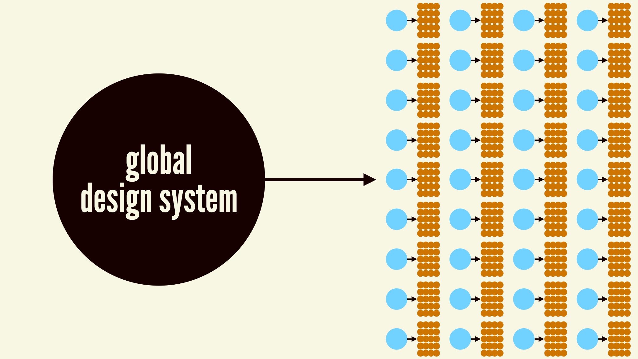
Provide a particular aesthetic ��� Think of this as a vanilla base containing only browser-default styles. People can create their own custom themes or use styles contained in Tailwind, Open Props, Bootstrap, Material, et al. In our experience working with scores of different design systems, common components have a shared general semantics and behavior, but are styled dramatically different. Think Global Design System + CSS Zen Garden.Be a comprehensive solution for all UI needs ��� It���s impossible to account for every use case on the planet. Think pragmatism and the 80/20 rule here. If the Global Design System could provide solutions for the majority of use cases for a given component, that would be a huge win! But what if you have a need to make a custom SVG starburst button that does a backflip when you click on it? That���s fine! We still have the ability to make our own special pieces of UI the old-fashioned way. This is also why a layer on top of HTML might be a better approach than extending HTML itself; HTML has to account for all use cases, where a Web Component library can limit itself to the most common use cases. It would be critical for the library itself to be quite conservative and focus on extremely common use cases or else it would buckle under its own weight and endless requests from the peanut gallery. Governance would be key!WhoI tend to define a design system as the official story of how an organization builds user interfaces. A design system needs to be tuned for the specific digital product landscape that exists at an organization in order for it to be successful. But the organization we���re talking about here is this:
 This is the target organization for the Global Design System.
 Because of the global nature of this effort, it couldn���t be owned by a specific corporation. With that said, it seems like it would make sense for huge tech companies to sponsor and fund an effort like this!
From my perspective, an organization like the W3C would be the best home for something like this. Their mission is pretty hand-in-glove with this whole idea:
The World Wide Web Consortium (W3C) develops��standards and guidelines��to help everyone build a web based on the principles of��accessibility,��internationalization,��privacy��and��security.
It���s also worth mentioning the amazing Open UI project, which has been doing a lot of the hard legwork on rounding up common UI components across many popular design systems. And I have no doubt there are many other organizations, projects, and people from the design system community who would love to participate in an effort like this.
WhereA Global Design System would need to consist of a set of assets that include:
A code repository containing the source code for the Web ComponentsAny necessary code packages (npm, yarn, composer) to deliver the Web Components to any environment. (Note: reliance on JS, packages, etc is something to address in order to create components that can be easily used by any web environment. This post by Lea Verou captures how the modern landscape creates barriers for people to create/use Web Components)A design library in popular design tools like Figma and Sketch.A reference website to provide documentation and information about the project.Where exactly those things would live is determinant on a whole slew of factors, so we can leave it here for now.
HowAs mentioned before, I have no idea how exactly this would all go down. I���d figure it would require a lot of conversation, alignment, and coordination before anything tangible could happen. Here���s my hand-wavy stab at a process from my naive outsider perspective:
Have conversations with any interested party, including: standards bodies, relevant existing groups, design system teams, individual designers & developers, etc to get some momentum going.Probably create a working group or similar to start moving forward in a more formal way.Do research to better understand what common UI components and variants should exist in a Global Design System. Have conversations with and learn from popular design system teams and popular UI library maintainers. Talk to product designers and web developers to better learn what their pain points are and learn what they���d like to see in a Global Design System. Involve experts in accessibility, semantics, internationalization, and other relevant specialists to ensure a Global Design System embodies best practices. Sync with Open UI to see how this overlaps with their existing work. Study existing design systems. Conduct an interface inventory across the web to capture a cross-section of in-the-wild use cases.Lay out a plan of attack to build a Global Design System library. Define what exactly it is, align on technology choices, establish architecture, align on naming conventions, etc. Establish a roadmap for creating and delivering the Global Design System components. Figure out who���s doing what, and so on.Design and build ��� This is the easy part ����. Design, build, document common UI components according to the architectural conventions. Test alpha/beta releases with guinea pigs.Release ��� Make the Global Design System components available to use; get everyone in the web community to evangelize, and get prominent design systems and projects to adopt the new library.Iterate ��� Add new components and variants to the library according to the roadmap. Get feedback, etc.Govern ��� A core group would of course need to govern the design system on an ongoing basis to address issues, field requests, protect the system���s integrity, and so on. This would obviously be a tough gig considering the global nature of the project, but I���d imagine it would be fulfilling in the same ways that working on big globe-spanning projects are.Something like that. Again, my perspective is naive so take all of this with a grain of salt. For now, let���s at least get the conversation part started!
WhenI���ve had the opportunity to speak about this topic at several conferences, and I���ve thoroughly enjoyed the subsequent discussion about the prospects of a Global Design System. The number of ���I���ve been saying this for years!��� and ���you have my sword!��� responses leads me to believe there���s a strong appetite for a Global Design System. People are hungry for this to happen, the technologies are now largely in place, and the whole industry has a far better understanding of component-driven design and development. I think the time for a Global Design System is now.
What would this mean for the world���s web designers and developers?I think that a Global Design System has the potential to transform how web designers and developers do their jobs.
When I talk about design systems, I often talk about respect and human potential. Every design system team having to build their own common components isn���t a respectful use of their time and potential. Lord knows there are some wicked problems to solve, so let���s free our hands and brains up to work on those problems instead!
If a Global Design System existed, what would design system teams do?��While I understand anxiety around being replaced (hey, we hear this about design systems from product designers & developers all the time), there���s still plenty of work to do. I find this tremendously exciting: design system teams would be freed up to focus on more interesting aspects of creating great digital products than simply component construction.
Plenty of the current work would remain:
Crafting a design language ��� The design system team would continue to be responsible for the applying the brand���s application to digital product as a thoughtful design language.Documenting guidelines for specific use and context of components within the organization would still need toBut there would also be a huge opportunity to free teams up to focus on bigger-picture issues. In our work at Big Medium, we help our clients with the human, process, product-level, and organization-level aspects of design systems. This is the stuff that truly makes or breaks a design system effort, but too often gets lost in the ground-level work of component production.��With a Global Design System in place, teams could:
Architect and orchestrate a thoughtful design system ecosystem that helps the organization ship better products faster, realizing the value of a design system.Collaborate with production teams to create and curate high-value product-specific design patterns, on top of the common UI.Create smart components that are wired up and ready to integrate into product codebases.Build new automation tools (hello, AI!) to scaffold designs, code, and tests quickly.Use the design system to bust barriers between disciplines, especially between design and development. A Global Design System can help these world���s get closer together, butHelp consuming teams make great UX and development decisions with common and org-specific components.Capture, curate, and celebrate the organization���s standards, best practices, and innovations.Freed from much of the mechanical production work, design system teams can spend more time on the stuff that is truly unique to the organization. There���s still a ton of work to do, and that remaining work makes better use of our human intellect.
What���s next?That���s a damn good question! How to transition from ���A Global Design System seems like a good idea��� into ���let���s do this!��� is a big question mark. So I���ll pose the question to you: what���s next? What do you think about the idea of having a Global Design System? Good idea? Bad idea? What would you like to see in a Global Design System? How do you envision it all going down?
I believe in the web. There have been many weird twists and turns over the years, but the idealistic embers of the World Wide Web are still burning. I want the web to thrive, and I want people working to build the web to thrive and realize their potential as human beings. I bet you feel the same way. So let���s make a Global Design System happen together!
January 2, 2024
Scaling Digital Strategy in Complex Organizations
Big Medium���s Josh Clark joined The Design Systems Podcast for a conversation with Knapsack CEO Chris Strahl. Josh shared why big, complex organizations struggle to scale digital design and delivery���and why solving that is more important than ever in a period of economic uncertainty. Listen to the podcast or read the transcript.
���Let’s figure out how to do more with less. Let’s figure out how to fix our process so that we’re getting to market faster, doing more with less, improving stuff for our customers,��� Josh said. ���That investment comes back to you really quickly again, especially if you can capitalize it.���
Although design systems have become a piece of critical infrastructure for scaling design and development of digital interfaces, Josh talked about why they���re also not enough. ���High-performing teams have design systems, but having a design system doesn’t make you a high-performing team,��� Josh said. ���It takes time and care and leadership to make the thing actually work at its best. You’re always going to get some benefit from it at some level, but you’re not going to get the exponential benefits that you can get from design systems without having the right process in place.���
When that collaborative process is missing, it usually can���t be built from the ground up. It takes a commitment from leadership, Josh said:
What it suggests is that this is no longer a team issue, but a leadership issue. We need companies to say, ���You know what, we are serious about our digital process. We have made this investment. It has gotten messy because we’ve moved quickly and we haven’t had the discipline or experience to do it right. We now need to have a concerted effort to make this happen in the right way.���
Doing that in the context of lean budgets means that this sort of persuasion and explanation to get the attention of leadership around this stuff is more important than ever. And I think that often the designers and developers who are leading design systems aren’t necessarily well equipped in the language of finance and in the language of value to actually make that case.
Josh shared ways that designers and developers should make the financial case for efficiency-building efforts���including how to categorize those efforts as capital expenditures, which in turn helps the company���s balance sheet (and makes the CFO happy).
���What leadership cares about is really only three things: how are we making money; how are we saving money; and how are we attracting new customers?��� Josh said. ���I think design systems have a great story to tell there: that actually investing in design systems as a capital project also means that you’re going to do better on all those things.���
Along the way, Josh and Chris also talk about:
the issues to resolve in operationalizing a design system to realize its benefitshow to reconcile the different timeframes of production work and design system workhow companies should mind their agencies to make sure their incentives are aligned with business goalshow AI and automation can help companies not only scale their digital delivery but also elevate the work and wellbeing of the humans involvedhow to balance innovation with leaning into established best practicesListen to the podcast or read the transcript.
Is your design, development, or product organization struggling with process, delivery, or roles & responsibilities? We can help. Big Medium helps complex organizations do big design���building and shipping great digital products at scale. Get in touch to find out how.
December 12, 2023
Can AI Bridge the Dev/Design Gap?
Big Medium senior developer Kevin Coyle has been cooking up all kinds of experiments in the Big Medium laboratories to test the opportunities and challenges of AI and machine learning. His work has blazed new paths for Big Medium’s client work, for our individual practices, and even for the way we relate to each other as friends and colleagues.
Kevin is responsible for creating Dr. Frank, Big Medium’s AI sandbox. In this talk at the Converge conference, Kevin shares some of the ideas and findings that have emerged from that work.
He digs into how and why web development has become siloed, burdened by frustrating communication barriers between developers, designers, and product managers. With a blend of technical demos and good ol��� human kindness/empathy, Kevin shows how artificial intelligence can help us overcome those barriers by streamlining workflows and improve human-to-human communication.
You’ll discover:
The roots of bad communication in digital product teamsThe benefits that come from meaningful communication with your colleagues, no matter their skillsetHow AI can make it easier for designers to create for developers, and for developers to understand designers��� workHow AI can make design system documentation more inclusiveHow anyone and any organization can build their own AI platform (and yes, your data will stay private!)October 23, 2023
Ship Faster by Building Design Systems Slower
���Bayo Akomolafe
It���s a signature trait of design system teams to believe they���re moving too slow and must move faster. In Big Medium���s work guiding and building dozens of enterprise design systems, we see it over and over again:
When a design system team isn���t delivering new features, components, or patterns as fast as product teams need them, the team believes it���s a bottleneck.When a UI component in the system doesn���t provide for every product-level variation or use case, the team convinces itself the component isn���t production-ready���and taking too long to get to ���done.���If system patterns don���t include fresh ideas or experiments, the team worries that they���re promoting stagnation by not moving at the speed of innovation.For design system teams, this feels like an existential problem. After all, a design system is supposed to improve the efficiency (and quality and consistency) of user interfaces by delivering a library of solved problems. And so of course it feels like a fundamental failure if this supposedly efficient system is instead a bottleneck. And worse: if product teams believe that, too, then they���ll resist adopting the system.
Successful design systems do indeed help product teams move more quickly, but here���s the twist: Successful design systems move more slowly than the products they support. That���s a feature, not a bug. The slower pace doesn���t mean that design systems have to be a bottleneck to shipping product.
Product and design system can and should run at their own independent speeds, and we���ve developed strategy and process to help the two do their thing without tripping over each other. Read on to learn:
why design systems should move more slowly than productwhat to do when product has a need that the design system can���t support in timehow to coordinate the design system roadmap with product roadmapsDesign systems should prioritize quality over speedThe design system is critical front-end infrastructure. When it���s successful, its components and patterns drive the UI, UX, and front-end code of the entire organization. You inject the design system into the very bloodstream of the whole product portfolio���as a general rule, it���s a bad idea to inject crap into the bloodstream.
That���s why ���quality over speed��� is one of the core principles of our design system practice. Critical infrastructure is not a place for rushed solutions and quick hacks. Infrastructure should be stable, durable, and well engineered. A design system establishes this reliability in its approach to experience, in the craft of its design and development, in the standards it always observes, and even in the practice and rituals followed by the team that builds it.
Successful design systems move more slowly than the products they support. That���s a feature, not a bug.
Quality can���t be rushed. This infrastructure layer should move more deliberately than the faster product layer, where products often have to emphasize speed over quality. Shipping a product feature on time, even if just a rough MVP, often has enormous business implications. And so short-term hacks, design debt, and technical debt are often necessary to meet business goals. Sometimes you just have to take shortcuts to get the thing out the door. That���s a fact of life for the product world.
While that���s true for product, it���s not true for the design system or other infrastructure projects, where design and technical debt are far more expensive. Understanding the design system as critical infrastructure���not mere production support���provides the logic and permission to move deliberately in pervasive, high-stakes aspects of your product development (infrastructure) while still moving very quickly in others (product).
But how can a slower-moving design system support a faster-moving product? How do those varied speeds and efforts coexist? That���s the whole idea behind pace layers.
Pace layers: the right speed for the right jobIf you���re not familiar with pace layers, here���s the gist. Say you have an object in orbit,like a planet around the sun. It moves at a steady pace, returning with every rotation to the same spot in the same fixed amount of time.

Now say that you have another planet in an outer orbit, and that it circles the sun in the very same amount of time as the inner object. That outer element necessarily moves much faster, covering more ground in the same interval���same time period, different speeds.

Back in 1999, Stewart Brand applied this to how civilization works in his book, The Clock of the Long Now. Instead of orbits, think of geological layers that move at different speeds but are all part of one whole. Brand called these pace layers.
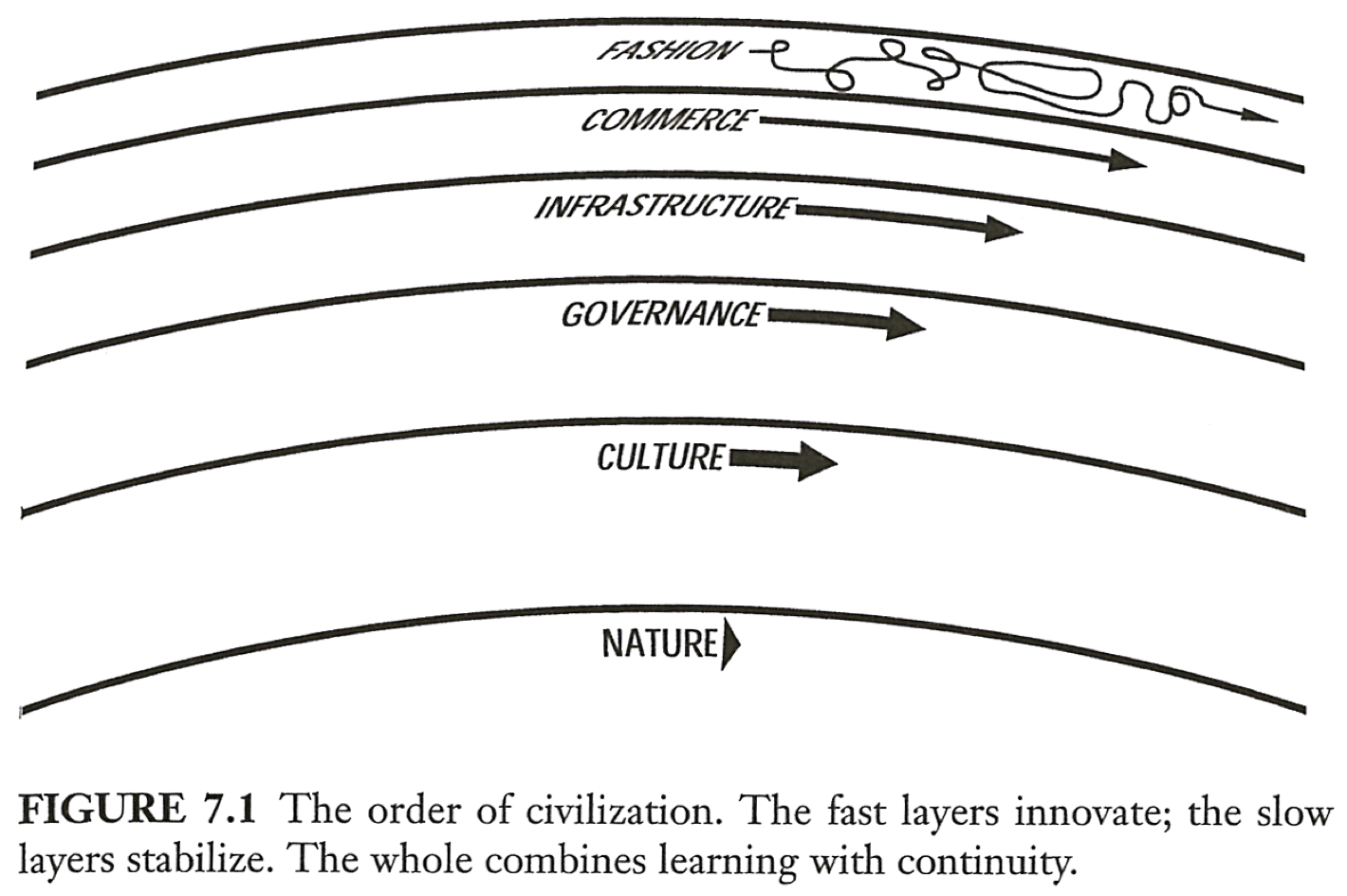 Stewart Brand’s original diagram of pace layers from his book, The Clock of the Long Now (1999).
 Nature, for example, moves slowly but influences culture, which moves faster and influences governance, which influences infrastructure and so on. And out at the outer edge, fashion is moving at a frenetic and sometimes chaotic pace, bouncing around like crazy. Brand wrote that each of these pace layers have an important role to play, and that the speed (or slowness) of each one is crucial to its role:
Fast learns, slow remembers.��Fast proposes, slow disposes.��Fast is discontinuous, slow is continuous.��Fast and small instructs slow and big by accrued innovation and by occasional revolution.��Slow and big controls small and fast by constraint and constancy.��Fast gets all our attention, slow has all the power.
���Stewart Brand
Pace Layering: How Complex Systems Learn and Keep Learning
Here���s the point. All of these pace layers are part of the whole, coexisting in the same ecosystem and moving productively at their own speed. The fast and slow serve each other: Fast layers innovate, and slow layers stabilize. Out at the edge is where experimentation and discovery and innovation happens. At the center is where institutional memory and stability happens.
Fast learns, slow remembers. Fast instructs slow, slow controls fast.
The pace layers of digital product process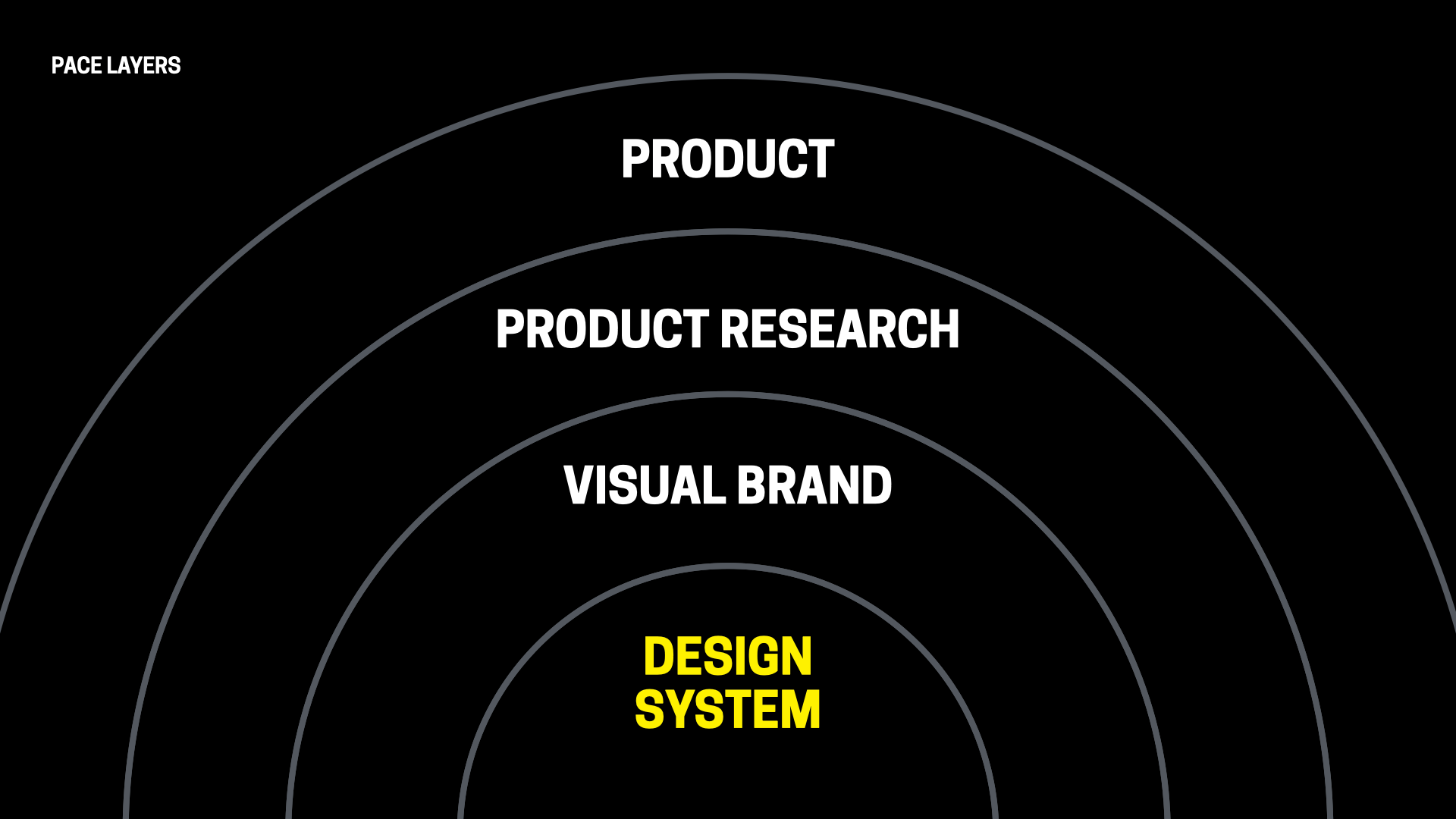 In the pace layers of digital products, product zips along at the outer layer while design systems and other supporting infrastructure move more slowly at the inner layer.
 In the pace layers of digital product process, products occupy the fast outer layer. Products ship constantly and iterate quickly, keeping up with the fast tide of changing customer needs, competitive trends, and market demands.
Product research meanwhile keeps tabs on what���s happening, and how well a product is answering those product needs, but research inquiry typically trails product, delivering its insights slower than product timelines.
That���s in the context of visual brand, which moves more slowly but often has epochal shifts like a rebrand, or maybe has new brands come and go with white-labeling, for example.[1]
And then at the base is the design system���along with other slow-moving standards and infrastructure that govern the foundations of the product build.
When that design system layer is missing or poorly developed, the product layer doesn���t enjoy consistency, reuse, efficiency and other benefits of a design system���s institutional knowledge. When that design system is built with care and quality, however, it speeds the work of product because teams can use it with confidence: drop it in, and it just works.
Tension and frustration between pace layersSparks sometimes fly among the layers. That happens when one layer is impatient with the speed of the others.
Customers want product to move faster, or at least to be flexible enough to bend and get out of customers��� way when they need to do something the product can���t yet accomplish. Product teams meanwhile are frustrated by the deliberate pace of research-informed decisions (so they skip research entirely) or by infrastructure pacing (so they build their own).
For design system teams, the fear surrounding this tension is that the design system could be seen as a bottleneck, or a distraction, or an expense���something that slows down production, that becomes a drag on the business. This comes to a head when a product team wants something that is outside the design system���s scope or timeline.
What do you do when a product team needs a UI component, pattern, or feature that the design system team cannot provide in time, or is not part of their scope?
The answer is not to add a rushed or ill-considered solution to the design system library to meet the product team���s urgent need. But it also doesn���t mean that the product team should slow down and wait. The pace layers should move at their pace and in their own lane, without hurrying or slowing the others. Here���s what that means in practice.
Product teams should cook their own recipesProduct can���t be expected to pause for the design system to catch up. If they need a feature that the design system does not yet (or may never) provide, the product team should move ahead and build the solution themselves.
We call these solutions recipes. Recipes are UI patterns that are cooked up in whole or in part from design system ingredients (components, design tokens, icons and/or styles). Recipes are their own layer of the design system ecosystem. These recipes are not part of the core system itself, but are examples of how the system can be used���or even first-draft proposals for new features for the system. Product teams often have entire cookbooks of pattern recipes built out of design system goodies. These cookbooks are often represented by their own Figma libraries, code repos, and style guides. While Google���s Material design system provides lots of building-block components, for example, Google products like Calendar, YouTube, or GMail all have their own product-specific pattern recipes that they maintain themselves, to serve their specific domains.
It is good and desirable for product teams to invent, prototype, ship, and maintain their own UI recipes. In fact, as Big Medium���s Brad Frost describes, this is a formal part of the design system governance workflow we recommend.
This is true even for components or patterns that the design system team eventually intends to include in the library but can���t commit to building in time while still meeting the design system���s standard of quality and satisfying all the contexts beyond the immediate product ask. In that case, the product team should build what they need���effectively building the first draft of the feature, component, or pattern���and the design system team should add that component to its backlog for review, improvement, and eventual inclusion in the library. Meanwhile, the product team owns and hosts the recipe.
When product teams follow this path, they should collaborate with the design system team on high-level approach and architecture, so that the coded component has properties that anticipate and align with how the eventual design system component will be developed and delivered. This allows teams to drop in the official design system component when it becomes available and with as little rework as possible.
Let it be said: this approach does accrue design and technical debt, but that���s also the cost of innovation and of doing something new. Debt is a trade-off, not an absolute evil, and it has to be wielded with intention and transparency. With proper communication with the design system team, the debt can be mitigated over the long term. Meanwhile, debt at the product layer is at least cheaper than debt at the infrastructure layer.
Maybe more fundamentally, this approach recognizes the role of product as the innovative outer pace layer. Product is where experiments and first efforts should happen. The design system should capture and share the successful experiments after they prove out. ���Fast learns, slow remembers.���
In other words: The job of the design system team is not to innovate, but to curate. The system should provide answers only for settled solutions: the components and patterns that don���t require innovation because they���ve been solved and now standardized. Answers go into the design system when the questions are no longer interesting���proven out in product. The most exciting design systems are boring.
The job of the design system team is not to innovate, but to curate.
The corollary to this is that product teams should prefer design system solutions when they���re available. When there���s already a settled solution for the problem at hand, then… settle for that solution. While the recipe approach gives permission to product teams to take a first stab at features and patterns, it���s not permission to willy-nilly build whatever they like, just because they don���t care for the existing solution or they have a whim for something new. Experiments should still be chosen with intention and with spiritual alignment with the design system and the standards it offers.
But! This still leaves room for innovation and growth when the product team believes they have an idea that could improve on an existing design system solution���and perhaps eventually replace the interaction or design pattern that the design system provides. This too should be treated with communication, transparency, and intention: the product team should propose the new approach to the design system team, suggest a scoped experiment, and then both teams can evaluate the result to see if it should be brought into the system as an addition or replacement. (And if it fails, then the product team should go back to the design system���s proven approach.)
All of this takes planning and cooperationThis has to happen in good faith. This tends to fall apart when there���s not trust, clear communication, and healthy dialogue among the teams and layers. As usual, the biggest challenge is not the technical implementation but the coordination of humans.
The design system team should communicate that product teams will have the best results with the design system team if they share new-feature wants and needs in advance. When product teams do annual or quarterly feature roadmapping, they should keep the design system team up to date on anticipated needs for features and components. If it aligns with design system roadmaps and timing, then the design system team can prioritize that work accordingly. If the feature doesn���t fit the plans or capacity of the design system team, then the product team can plan for building it themselves. No surprises.
As usual, the biggest challenge is not the technical implementation but the coordination of humans.
Either way, both teams know that they���re working at exactly the right pace for their layer���and have confidence that they���re serving the organization in the best way by doing so.
Meanwhile, design system teams, you can put aside your existential dread. You���re an infrastructure team. Moving with steady deliberation is what infrastructure teams are supposed to do. Support the culture of speed by going slow.
Is your design, development, or product organization struggling with process, delivery, or roles & responsibilities? We can help. Big Medium helps complex organizations do big design���building and shipping great digital products at scale. Get in touch to find out how.
In some organizations, visual brand may be more fixed and slower moving; for the multi-brand design systems we create, we���re building design systems meant to support and outlast brands, sub-brands, and so on. So we think of brand as moving faster than infrastructure. ↩
October 17, 2023
Is Atomic Design Dead?
Big Medium���s Brad Frost invented the Atomic Design methodology for creating, maintaining, and evolving design systems. In this talk, Brad reflects on the past, present, and future of design systems���sharing bumps, bruises, and best practices along the way. He explores the current design system ecosystem, dives into best practices and common pitfalls, and peeks into the exciting future of design systems. (Spoiler: Atomic Design is going stronger than ever.)
October 16, 2023
The Design System Ecosystem
This article was originally published at bradfrost.com.
Looking for help? If you’re planning, building, or evolving an enterprise design system, that’s what we do. Get in touch.
What does a mature, end-to-end design system look like in a big, complex organization? What are all the moving pieces, and how do they hang together in a well-considered architecture? What���s required and what���s optional? Hold onto your butts, because we���re going to go deep on this one.
Let���s start here: a design system���s relationship to digital products can be boiled down like so:
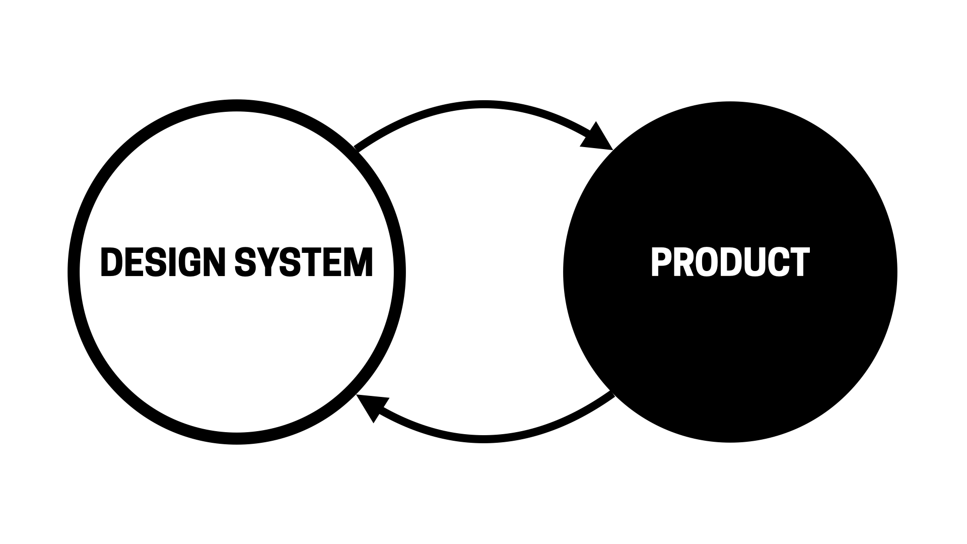 The virtuous cycle of design system and product. Both feed each other.
 There���s a design system. Products use the design system. The design system informs and influences the products, and in turn the products inform and influence what���s in the design system.
While this depiction is true, it ignores the complexities many organizations wrestle with day in and day out. Over the years, the digital product landscape has become vastly more complex, the responsibilities of design systems have grown substantially, tooling has evolved and matured, and processes & organizational structures for managing digital products have grown up.
In order to account for this complex reality, it���s important to paint a more nuanced picture of a design system ecosystem that can power an enterprise���s portfolio of digital products. The design system ecosystem of a complex organization takes the form of a delicious-yet-dense layer cake. Call it a devil cake: the devil���s in the details, and the devil can end up looking something more like this:
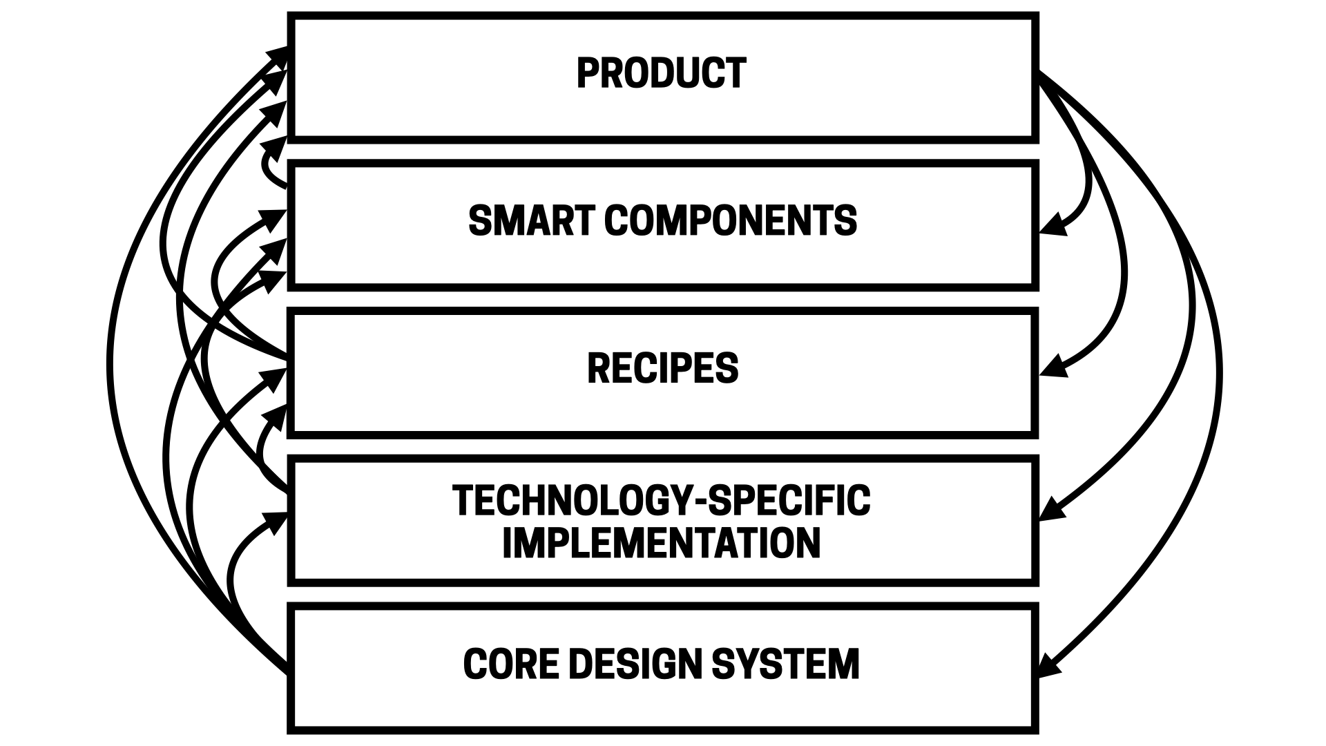 Design systems are a layer cake of implementations, all interconnected. The core design system is the bottom layer, technology-specific implementation on top of that, recipes on top of that, smart components on top of that, and product sitting on top.
 And to really show it in all of its terrifying detail:
 A terrifying and detailed flow chart of a 5-tier design system ecosystem. The diagram maps out the relationships between all of the design, code, and documentation assets in a design system ecosystem.
 Wow, that looks overwhelming huh!? Before you freak out, it���s important to stress a few things.
First of all, nearly all of these layers are optional and don���t necessarily apply to every organization. Instead, this is a visualization of a complete, mature enterprise design system. It���s informed by our work helping some of the world���s largest companies successfully establish and evolve their design systems. We know companies start seeing value after implementing only a fraction of what���s shown here.
Second, Gall���s Law is extremely relevant here:
A complex system that works is invariably found to have evolved from a simple system that worked. A complex system designed from scratch never works and cannot be patched up to make it work. You have to start over with a working simple system.
All to say, it���s critical for a design system architecture to be only as complex as it needs to be, and add additional layers or complexity only when real needs arise. Growing a design system is a gradual process. (And if it seems overwhelming, well, we���re happy to help. Get in touch to hire us to help plan, build, or evolve your design system.)
In this article we���ll get down to the gory details of what makes up a successful, sophisticated, and mature design system ecosystem. We���ll break down what the capital-E Enterprise folks call the ���end-to-end experience��� for deploying user interfaces at scale. This is tricky, nuanced work, but that���s the nature of the beast for digital organizations managing several/dozens/hundreds/thousands of products and people.
Alright, let���s dive in!
Anatomy of a design system ecosystemWe���re going to detail this diagram, which describes the various UI assets and the relationships between them. While the diagram looks intimidating, the crux of the ecosystem can be broken down like so:
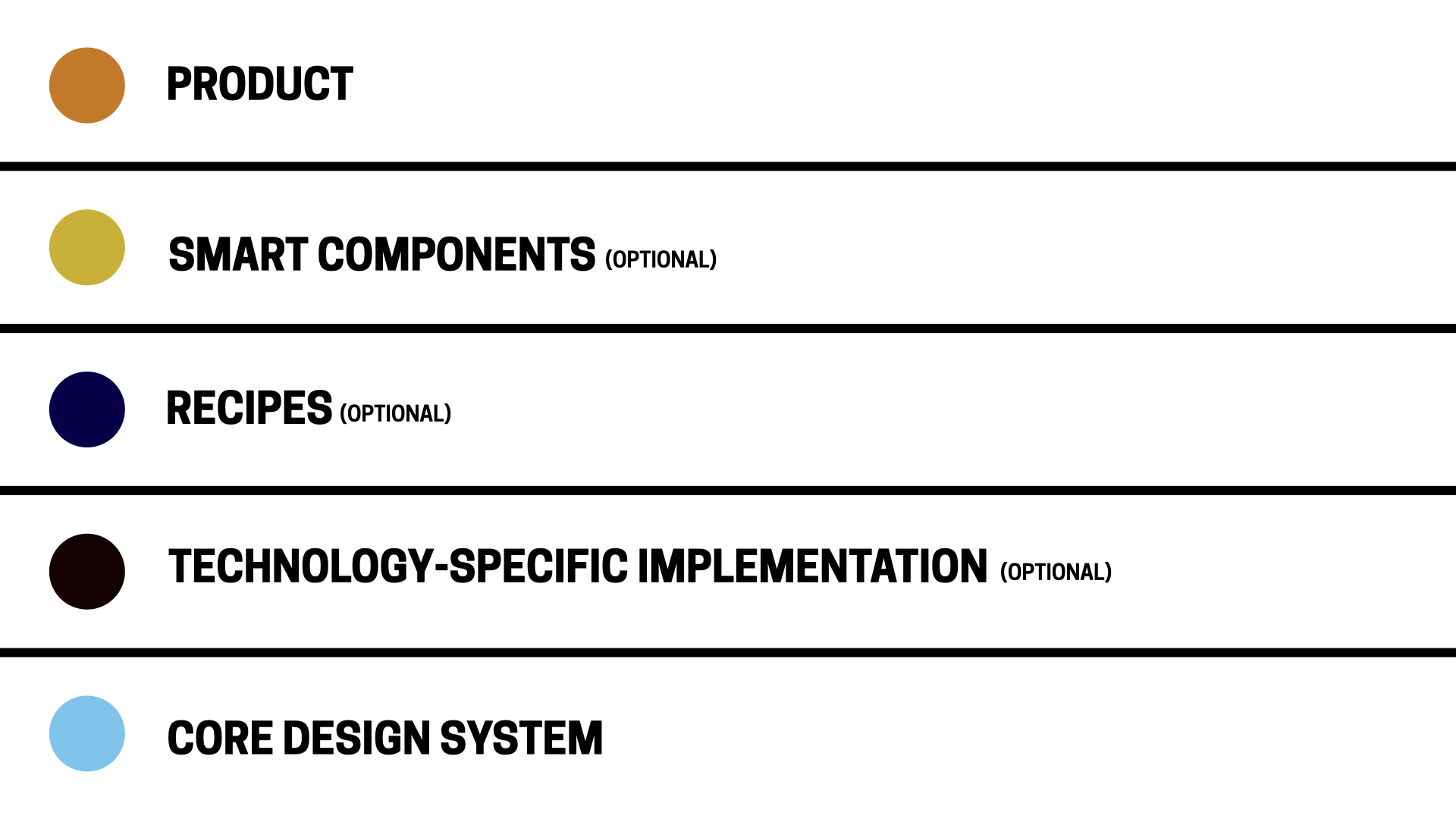 Illustration of the five layers of a mature, end-to-end design system. Core design system layer ��� which contains the common, organization-wide UI building blocks for both design and development.Optional technology-specific layer ��� which contains framework-specific and native implementations of those common UI components.Optional recipe layer ��� which contains composed UI components to be used consistently across specific contexts (like a product or product family), but aren���t reusable across the entire organization.Optional smart components layer ��� which contains UI components wrapped in logic, functionality, or other smarts to make the integration of common components and services easier for product developers.Product layer ��� the actual websites and apps that we ship to customers (aka the whole reason we���re doing all of this!)
If those are the broad layers of a UI ecosystem, here���s a breakdown of the types of assets that go into those layers:
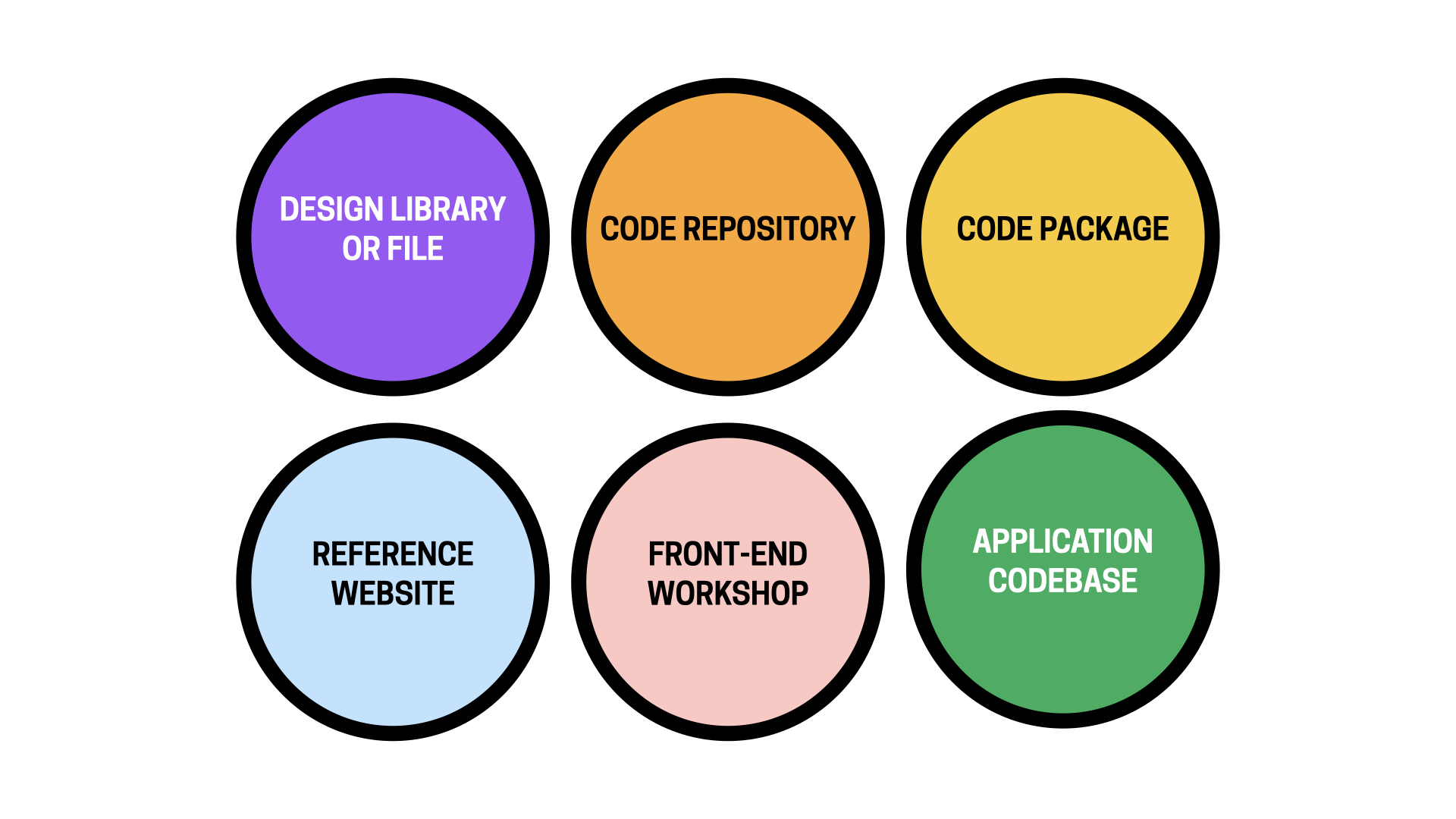 The many assets that populate the complete design system ecosystem: design library or file, code repository, code package, reference website, front-end workshop, and application codebase. Design library ��� Figma team library or similarDesign file ��� Figma project file or similarCode repository ��� the source code home ��� GitHub or similar
Front-end workshop
��� a tool like Storybook to build, view, test, review and document coded UI componentsCode package ��� a code library packaged up and published (on npm or similar) in order to be consumed as a dependency by other applications.Reference website ��� Zeroheight or similar
The many assets that populate the complete design system ecosystem: design library or file, code repository, code package, reference website, front-end workshop, and application codebase. Design library ��� Figma team library or similarDesign file ��� Figma project file or similarCode repository ��� the source code home ��� GitHub or similar
Front-end workshop
��� a tool like Storybook to build, view, test, review and document coded UI componentsCode package ��� a code library packaged up and published (on npm or similar) in order to be consumed as a dependency by other applications.Reference website ��� Zeroheight or similarWith all of that table setting out of the way, let���s dig into the anatomy of the core design system!
Core design systemThe core design system contains common components, patterns, principles, and conventions that help an organization:
tell the official story of how it designs and builds user interfaces,��andprovide the building materials to do it.It���s a library of solved problems, the settled solutions that don���t need re-hashed for the 15th time It���s the boring stuff like form controls, buttons, accordions, and the standard-fare components you see across many popular design systems.
So what ingredients are included in the core design system? The key assets the design system includes are design tokens, icons, UI components, and a reference website.
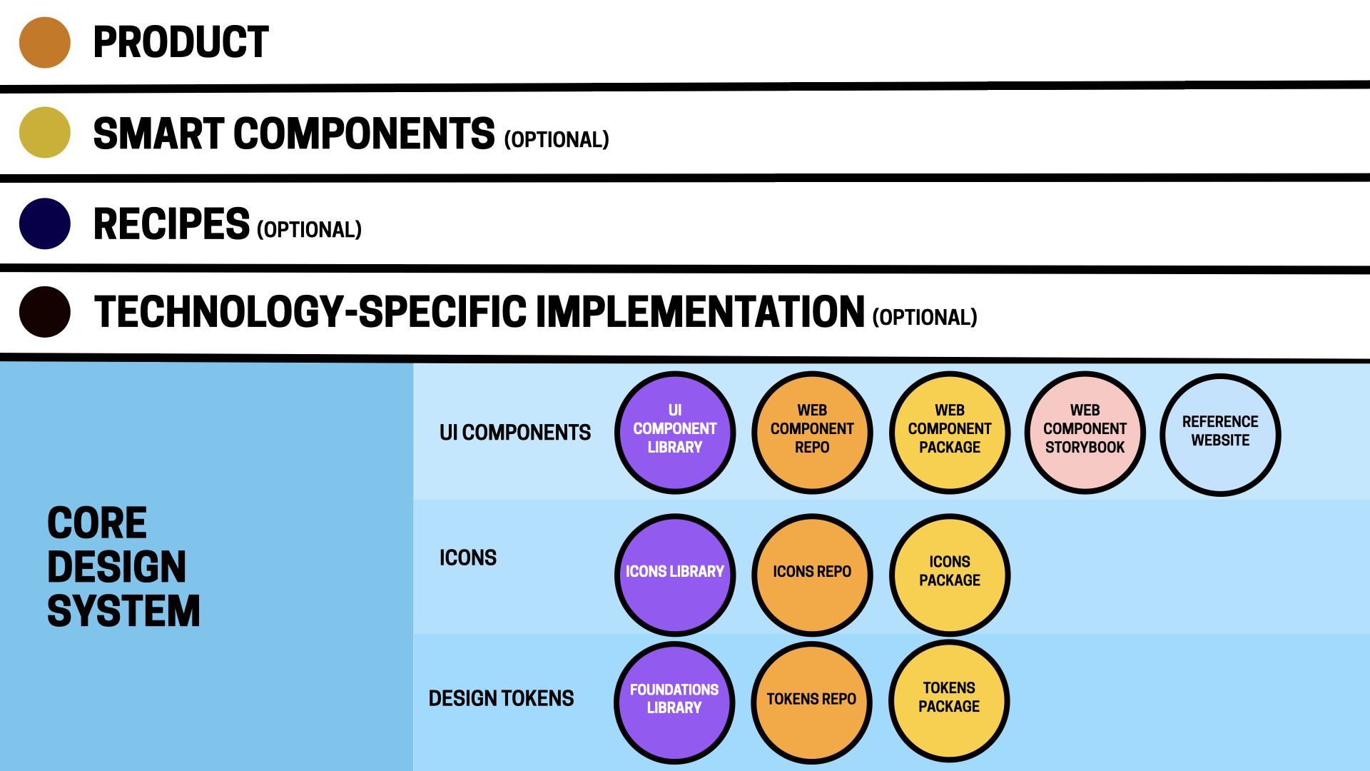 The core design system layer includes design tokens, icons, and UI components, each represented by their own set of assets. Design tokens layer
Design tokens are low-level design definitions (the sub-atomic particles if you will) ��� color, typography, border radius, spacing, elevation, and other values ��� that make up a design language. Design tokens are ultimately applied to UI components in order to achieve a specific look and feel. Think of them as brand variables.
Nearly all of our design-system client work over the last 5 years has included creating/evolving some form of themeable design system. Architecting a thoughtful 3-tier token architecture is the secret sauce for making a design system support multiple brands, white-labeling, different product families, redesigns, dark mode, and more.
We recommend splitting design tokens into their own layer (separate from the UI component layer) to unlock theming, create a separation of concerns between brand language and UI components, and version brand languages independent of UI components.
 The design tokens layer consists of a foundations design library, a code repo, and a design tokens package. Foundations design library
Design tokens and associated styles are often referred to as ���foundations��� in the design discipline. In Figma, these design token foundations are defined as variables for most values, while typography-specific tokens need to be defined as styles (Note: for now! Figma said they���re working on making typography-specific variables available). The foundations should be managed in their own design library that other files and libraries ��� including the UI component library ��� can subscribe to. This library can contain the definitions for each supported theme, though organizations supporting dozens or hundreds of themes might want to consider chunking things out into different foundations libraries.
Design tokens repoIn code, the design token source of truth is a repository of JSON files that define all theme values. Tooling (Style Dictionary has become the standard) then converts design token JSON files into the appropriate technology-specific format (CSS custom properties, Sass, iOS, Android, etc), which can then be applied to UI components.
Design tokens packageThe technology-specific formatted tokens are packaged up and published on a software registry in order for consuming developers to pull them into web products, native apps, and other environments.
IconsIcons are a weird one! Like design tokens, they can exist as their own product that gets packaged up and consumed by many different environments. More commonly, we tend to see icons bundled up alongside the design tokens. Teams powering web, native, and other non-web software that need to manage/version icons independently might want to consider splitting icons out as its own independent layer supported by the following assets:
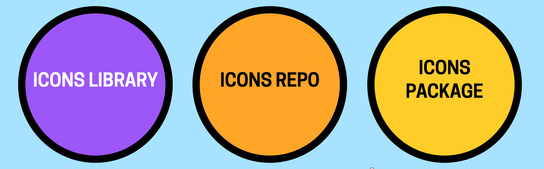 The icons layer consists of a design library, a code repo, and an icons package. Icon Figma libraryIcon SVG repositoryIcon packageUI Components
This is the star of the design system show! When people think of a design system, they think of a set of common UI components that can be used and reused in other products. There are a few different assets that constitute a design system���s UI component library, so let���s break it down.
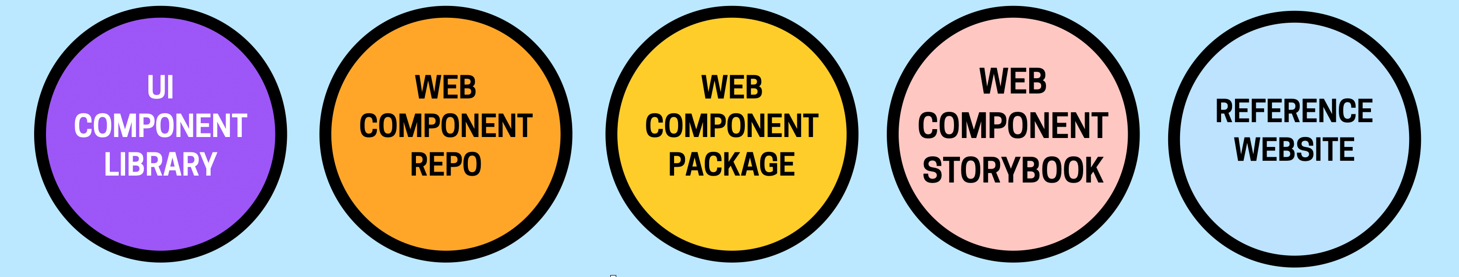 The UI components layer consists of a Figma component library, a Web Component repo, a Web Component package, a Web Component storybook, and a reference website Core UI components Figma library
For designers, a design system���s design library is a dedicated project where designers capture the design specifications for common UI components. Here���s where the design system designers sweat the small stuff (Alert layout! Accordion affordances! Badge variants! Required form field treatment! Etc etc) so other product designers don���t have to. The published design library becomes the thing product designers subscribe to in order to drag-and-drop the system���s components into their product design files.
Web Components library repositoryWhile a Figma library is super helpful for designer efficiency, the true source of truth for a design system is a library of coded components that build real digital products. After all, despite all of this ecosystem mumbo jumbo, the only thing that really matters at the end of the day is the actual user experience human beings interact with. And that reality snags many design system teams; it���s really easy to lose the forest for the trees. Don���t get it twisted: a design system is a means to an end.
We���ve helped organizations build design systems in a multitude of technologies over the years, but as time goes by we now heartily recommend one specific technology to build a core design system for the web: Web Components. Web Components are a standard, part of the web platform itself. That means they���re interoperable with any web framework or technology, they���re lightweight, they���re themeable, and they���re self-contained. Note: It���s totally possible to build the coded design system in a specific technology like React, but just be eyes-wide-open to the fact that the system can���t power products that aren���t compatible with that technology. Everything has pros and cons!
The Web Component repository contains the source code for your design system���s common components. We���ve been using Lit for the last few years with great success (and have used Stencil successfully in the past) to help us author Web Components in a thoughtful, efficient manner.
Web Components StorybookWe use Storybook in order to build, visualize, test, review, and document our coded design system library. Storybook is included in the web component repository as a dev dependency; it���s not a separate repository or anything like that. We publish our Storybook to a URL for testing/review/documentation, and like to use Netlify or similar to publish each work-in-progress branch of the Web Components so that our client teams can test, review, and discuss changes before they get merged into the main library.
Web component library packageA build step converts the web component source code into a dist directory containing the built library of Web Components, which then gets packaged up and published on a software registry. This allows for any web product ��� a static website, React/Angular/Vue/Etc app, a CMS-powered website, whatever ��� to pull the web component library into their project and use the design system���s components in their products��� user interfaces.
Reference websiteA reference website serves as the storefront that is part marketing website, part documentation, part support channel, and all things design system. The reference website gather all of the assets described above under one roof to help the organization successfully wield the design system to build great interfaces for digital products.
You can build the reference website from scratch, or power it using a third-party tool like Zeroheight. As time goes on, we���ve found great success with Zeroheight as it elegantly pulls design assets from Figma and code assets from Storybook. This maintains Figma and code (visualized through Storybook) as the workshops for design and dev respectively, but brings them together in a single location to provide cross-disciplinary guidance for teams using the system.
Technology-specific implementation (optional)This optional layer translates the core design system into specific technical implementations. This can help application developers working in specific tech stacks easily wield the design system���s ingredients.
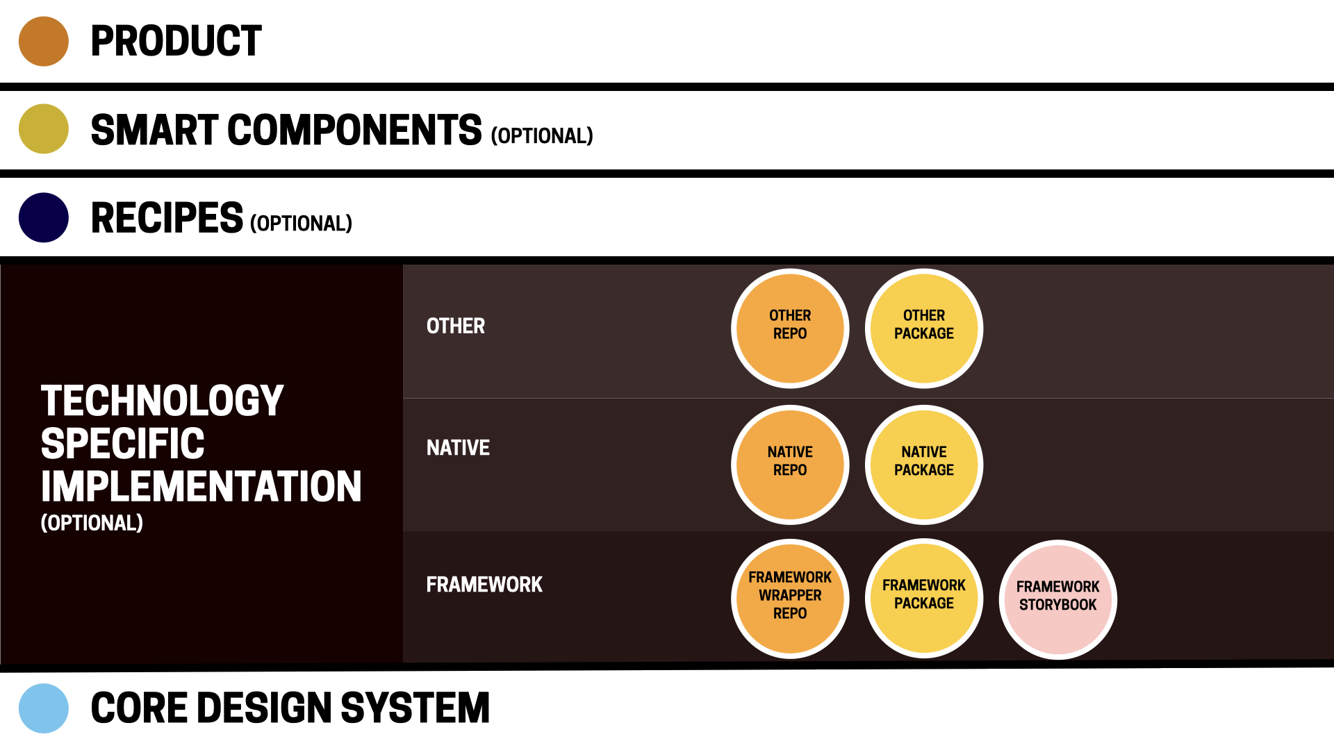 The technology-specific implementation layer includes code for specific platforms like web frameworks, native apps, and more. Framework wrapper layer
As we���ve discussed, Web Components are a fantastic choice for front-of-the-front-end code that serves as the backbone of a design system. But! It can be helpful or necessary to maintain a framework-specific flavor of the design system. This entails wrapping the design system���s Web Components in framework-specific syntax (for example, the button Web Component <ds-button variant="primary"> could be wrapped in React and exposed to developers as <DsButton variant="primary">).
Our team thinks framework-specific implementations will diminish over time; most frameworks can consume Web Components as is. But in our experience, we���ve encountered a few good reasons to create and maintain these framework-wrapped versions:
Some frameworks ��� especially earlier versions of React ��� need some massaging to get Web Components to work properly. Lit���s React wrapper is an example of a bit of glue code that���s necessary to get Web Components to work smoothly with the way React handles events.Teams with existing React/Angular/Vue/etc libraries that power real products should preserve all that hard-earned adoption! Those-framework-specific libraries can continue to exist, but we often help teams replace the component guts with new web component-powered internals instead.Maintaining existing framework-specific libraries can be a good way of incrementally adopting a sturdier API naming standard while still supporting legacy API language.Teams used to wielding framework-shaped components (e.g. <DsButton text="Click me">) don���t have to adopt an unfamiliar web component convention (<ds-button text="Click me">). This layer can also serve as a safeguard in case teams want to swap out different technologies under the hood over time.Framework code repoWhere does the framework-wrapper repository live? We���ve seen it live under the formal design system umbrella (often as a sibling of the web component package in a monorepo), but we���ve also seen framework-wrapper layers live outside of the formal system maintained by downstream teams working in a specific technology.
Regardless of where the framework layer lives, it���s crucial for the core and framework-specific layers to stay in sync with one another. This can be helped along by the technical architecture of the system, but it ultimately requires coordination between the humans managing the different layers.
Framework StorybookIf a React flavor of the design system exists, spinning up a React-specific Storybook is necessary to provide React developers the appropriate code syntax to reference and copy-and-paste.
Framework code packageEach framework-specific flavor of the design system library gets built and published on a software registry, which allows product teams working in a specific framework to pull in the appropriate flavor of the design system as a dependency.
Native layerNative apps are often an important part of an organizations��� digital landscape. They���re challenging from a design system perspective for a number of reasons:
Native app UIs can be coded in an array of technologies. Some use (often heavily-modified) web tech like React Native or Ionic. There���s Jetpack Compose, Flutter, Swift UI, UIKit, and others for bespoke native application development. At the end of the day, there���s not exactly a standard for developing UI components for native platforms, so implementation can be uneven.iOS and Android bring OS-level UI conventions and OS-provided UI components along for the ride, which means an organization���s bespoke UI needs to work with the grain of the operating systems.Design system tooling for native codebases are absent or immature (If I had a nickel for every time I���ve been asked ���is there a Storybook for iOS and Android?���, I���d have a handful of nickels).Native teams tend to be more siloed (or outsourced) compared to their web counterparts.Whatever the challenges may be, organizations creating native design systems will need the following assets:
iOS and/or Android component library repositoriesThese repositories contain the source code for a design system���s native app implementations, similar to Material Design���s Android codebase.
iOS and/or Android code packagesThe native landscape operates a bit differently than the web landscape, but package managers exist (e.g. Swift Package Manager) to help deploy a native design system���s library to other native application codebases.
Other non-web implementationsiOS and Android mobile apps are certainly some of the more common non-web digital products, but there can be a vast array of other software interfaces floating around an organization. We���ve dealt with airplane seat-back UIs, banking ATM UIs, kiosk UIs, medical equipment UIs, scientific equipment UIs, and more. All of these UIs come to life somehow, and the technologies that power these experiences vary widely (and often frighteningly!). Regardless of the specific tech employed for these experiences, the same guidance applies: create a dedicated repository for common UI-specific code, and deploy that code using some form of software registry.
Recipe layer (optional)We often encounter design system teams who are frantically trying to keep up with every UI-related product decision happening across their organization. The (often small-and-scrappy) team runs from meeting to meeting, captures other product teams��� UI needs in their already-crowded backlog, and then gets to work implementing those requests. This road leads to bottlenecks and burnout.
There���s a better way. The design system doesn���t have to own, include, or oversee every bit of UI across a company���s product landscape. It just needs to provide a core set of ingredients���and support/encourage teams to build recipes with those ingredients.
When we introduce the concept of a recipe component layer to these frazzled teams, you can almost see the weight lift from their shoulders. The recipe layer serves as an important pressure release valve for the UI ecosystem. With recipes, product designers are able to own their product-specific UI components and work at a relatively fast pace, while design system designers carry on working on the core component ingredients at a slower, more considered pace.
The recipe layer proves to be a really crucial layer in the ecosystem for many teams, and an essential layer for massive organizations managing many business units or sub-brands. This article by Robin Cannon explains why IBM���s Carbon Design System team leaned into this concept of recipes:
Business units needed extra capability to tailor how the design system was going to be consumed in their domain.
This layer provides individual business units, sub-brands, product families, or products with important agency and autonomy over their domain while still adhering to the standards defined by the core design system.
What are recipes, exactly? As the name suggests, recipes combine ingredients to create UI experiences that are complex, delicious, nutritious. The design system���s core components are the ingredients stocked in the pantry. Other product designers then take those ingredients to create product-specific compositions that meet their product needs.
A design system���s core component library might contain a card, button, button group, heading, text passage, badge, and key-value table:
 A smattering of design system components: a card, heading, text passage, badge, button group, and key-value pair table.
 Out of those ingredients, different product teams can create their own compositions to be used consistently across their digital products. The e-commerce team can compose a product card recipe, the marketing team can compose a promo card recipe, and the analytics team can compose a customer data card recipe.
 Recipes compose system components into context-specific uses. Here: a product card for e-commerce, a promo card for content marketing, and a customer data card for an application dashboard.
 The cool thing is that the design system team can monitor these recipes and decide to ���graduate��� a recipe component into the core design system if it proves to be super successful. While not every recipe is a core design system candidate, it���s cool that the recipe layer provides a little design system component incubator.
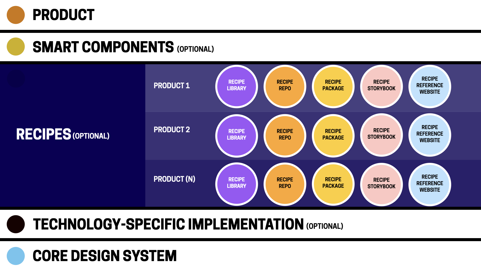 The recipes layer includes assets for specific contexts, like individual products (or families of products). Recipe design libraries
Think of recipe design libraries as cookbooks. They are Figma libraries that contain product- or discipline-specific components and compositions. Recipe libraries subscribe to both the design system foundations and core UI component libraries. Designers working in these libraries create composite components out of core design system components that are meant to be used consistently across their product or product family, but may not be abstract enough or broadly used enough (yet?) to include in the core design system.
Product design teams maintain and publish their own recipe libraries, and downstream product designers subscribe to them in order to use recipe components in individual product files.
Recipe repositoriesRecipe code repositories contain the coded corollaries to the recipe Figma libraries. These repositories contain the source code for component compositions meant to be used consistently across a product or product family. A product���s website header is a great example of a recipe: the specific header composition is reusable across one product family, but likely distinct from other headers in other product families:
<site-header></site-header>Specific card recipes can be created so downstream developers don���t have to assemble raw design system ingredients for every product card instance:
<product-card heading="Kids Sloth T-Shirt" price="$18" imgSrc="path/to/image.jpg" imgAlt="Purple t-shirt with smiling sloth illustration graphic" href="path/to-product"></product-card>Developers can create reusable recipes as Web Components, React/Angular/Vue/etc components, or native components. Because recipes are product-specific, they can be written in whatever language is practical for the team and technical architecture.
Recipe StorybooksWe���ve discussed how important it is for design system teams to be able to view, review, test, and document core UI components, and the same holds true for coded recipe components. Each recipe repository ought to maintain and publish a Storybook for the recipes used in a product or product family. Any recipe Storybook should mirror the corresponding recipe Figma library.
Recipe code packagesIn order for recipes to be consumable to downstream products developers, they need to be published on a software registry.
Recipe reference websitesThink of this as a product-specific style guide. If YouTube uses Google���s Material Design System, the YouTube reference site would detail the YouTube-specific components and recipes built on top of Material. It���s important to provide guidelines, rationale, and examples for recipes. How should designers and developers use that product card recipe? What are the configurations? The gotchas?
Smart component layer (optional)Design system UI components are intentionally dumb. This is by design! In order to be as portable and interoperable as possible, design system components (and many recipes) don���t contain business logic and aren���t wired up to any backend services; they strictly handle a component���s presentation and basic functionality (e.g. an accordion opens and closes on click).
However, these components actually need to work eventually! Enter the smart component layer. If core design system components are strictly front-of-front-end, then smart components introduce the back-of the-front-end. This is is a place where the dumb design system components and recipes get wrapped in logic in order to provide downstream development teams with drop-in, ready-to-use functional components and services.
Some smart component layer use cases include:
Form submission and validation (e.g. React Hook Form and React Redux Form)Payment component for processing credit card paymentsTypeahead querying specific services or databases (e.g. search a company directory or product database and the typeahead dropdown returns the appropriate results)Data tables with sorting/filtering/searching logic (e.g AG Grid)Product grids with sorting/filteringWiring up analytics to UI componentsCMS-ready components that make design system and recipe components available to CMS editors.In the same way design systems keep teams from reinventing the wheel, these common smart components and services take care of common business logic and functionality so downstream teams can focus their energy on more worthwhile tasks.
We���ve seen this concept extend beyond smart components and into the realm of full-blown software starter kits. We���ve had a few clients develop their own custom boilerplates akin to Create React App: ���here���s a NextJS environment with the design system tokens, components, and other recipes linked as dependencies, all the form fields wired up, and routes ready to go.��� Product developer teams can quickly spin up a new project and immediately get to work building their application logic rather than futzing with plumbing and infrastructure. Pretty cool!
This layer is often maintained by the team that also supports the underlying service, using the design system components to deliver ready-to-roll solutions for application teams.
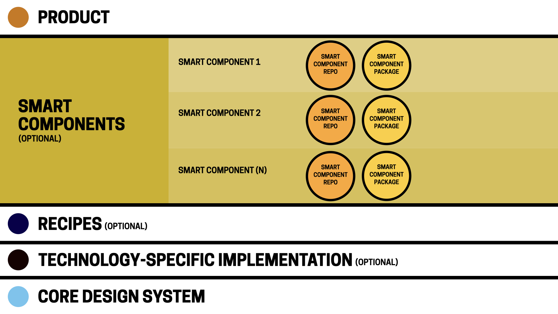 The smart component layer is composed of components or flows integrated with back-end services and business logic. Smart component repositories and packages
The structure and location of smart component repositories and packages can vary wildly since they���re directly adjacent to specific product architecture built using specific technologies. But ultimately, smart components and drop-in services should be managed as discrete products to make usage, versioning, and maintenance as easy as possible.
Product layerFriends, we have finally arrived! The product layer is where the rubber meets the road. This is where all of this infrastructure comes together to help power real websites and apps used by real human beings.
It���s at this product level where a design system���s success can truly be measured. In order for a design system to be successful, it needs to become the critical front-end infrastructure that powers real digital products. So let���s discuss how all of this design system ecosystem makes its way into real product environments.
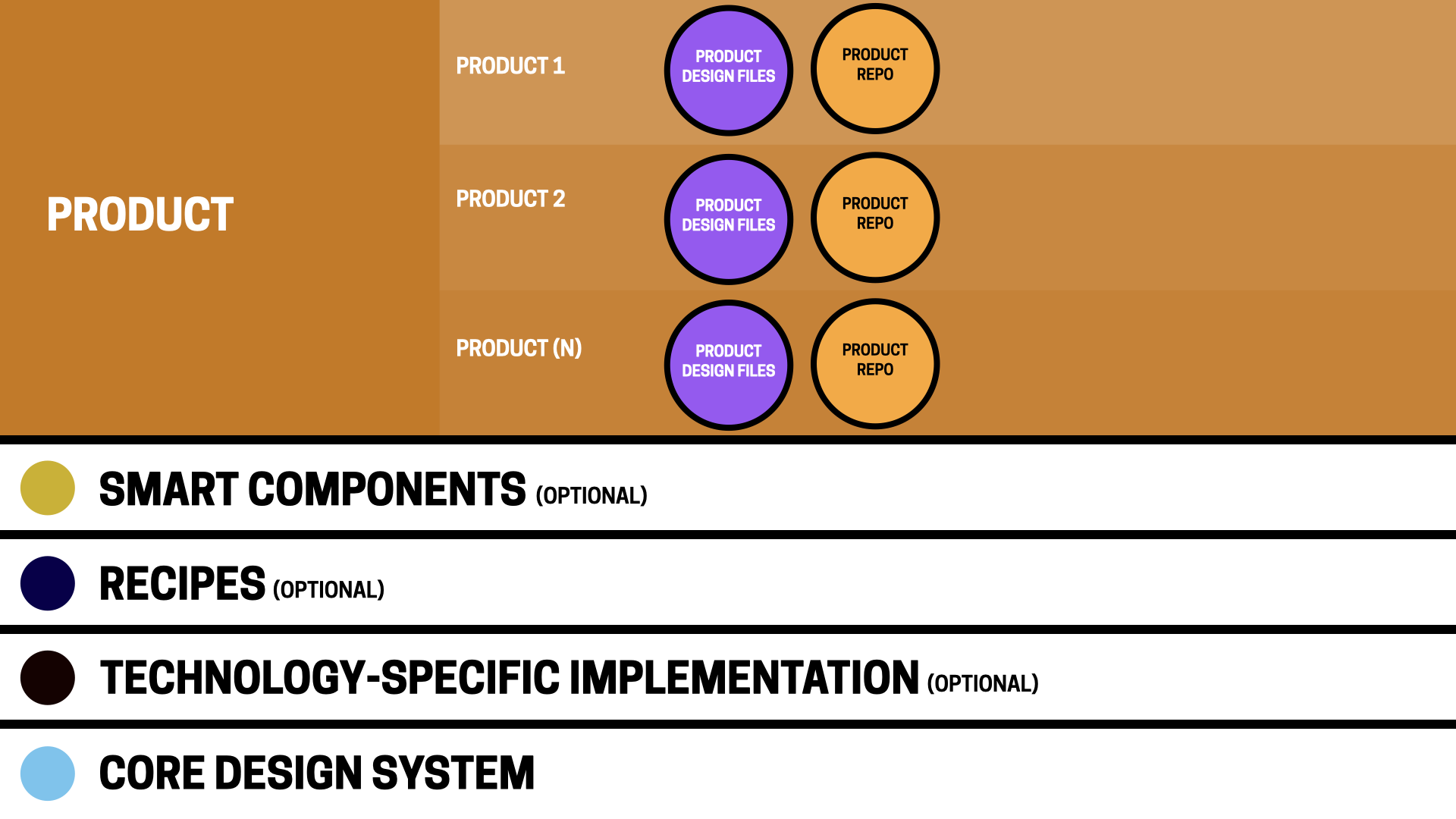 The product layer consists of the production files that integrate design system components into end-result design files and application code. Product design files
Product designers working at this layer would spin up Figma files that subscribe to:
The design systems Foundations library with the appropriate theme appliedThe design system���s UI component libraryAny relevant recipe libraryWith all of those tools at their disposal, designers can go about their business designing product-specific screens and flows.
Product codebase powered byFor organizations building React apps, here���s where you���d find apps powered by Next.js/Express/Remix/Gatsby/whatever. It���s at this layer that back-of-the-front-end things like business logic, routing, state management, and cache invalidation come into play.
Product codebases consume as dependencies the appropriate framework flavor of the design system���s component library, any applicable recipe packages, and any smart components. A package.json file could look something like this:
"dependencies": { "@your-org/design-system-name": "^0.1.0", "@your-org/marketing-site-recipes": "^0.1.0", "@your-org/smart-form-components": "^0.1.0"}With these packages installed, product engineers can pull in design system components and recipes into their projects like so:
import DsButton from "@your-org/design-system-name/Button";import SiteHeader from "@your-org/marketing-site-recipes/SiteHeader";import TextField from "@your-org/smart-form-components/TextField";<SiteHeader /><form onSubmit={handleSubmit(onSubmit)}> <TextField label="Email" /> <TextField label="Password" /> <DsButton variant="primary" text="Sign in" /></form>The SiteHeader is provided by the recipe package. The TextField is coming from the smart component package that handles the form logic. And the DsButton is coming from the design system. The ecosystem provides all of the look and feel and even some common functionality, which frees up product developers��� time to focus on bringing the application to life.
Product codebase not powered byProducts that aren���t based on React/Angular/Vue/whatever can consume the design system���s Web Components directly, either via npm/yarn or even by pulling them into a regular ol��� webpage.
<head> <link rel="stylesheet" href="https://bigmedium.com/ideas/design-sy..." /> <script type="module" src="https://bigmedium.com/ideas/design-sy... <ds-button variant="primary" text="Hello"></ds-button></body>It���s worth stepping back for a second to marvel that the design system���s web component source of truth can power any web-based digital product ��� irrespective of tech stack. It���s incredible! And because these are directly consumable components, improvements and additions can be deployed simply by pulling down the latest version of the library.
iOS/Android/Non-web product codebasesAs we���ve already covered, native apps are likely written in non-web languages, which means they can���t share in the web component goodness. Native app environments would pull in their own flavors of the component library as dependencies.
It���s that easy, folks!Whew, what a ride, huh!? We���ve gone deep into the weeds, so let���s zoom out a bit. A mature design system ecosystem for a complex organization may not be simple, but this layer-cake approach provides a robust way to orchestrate UI for designers and developers across the company. The word ���ecosystem��� is apt here; these are interconnected systems that all play an important role in powering the UI of a company���s digital products.
It bears repeating that every piece articulated here doesn���t apply to every organization. We���ve explained that most of these layers are optional and can be added iteratively. Start simple and iterate your way to a more complex ecosystem as real needs arise.
It���s People!Here���s the fun part: you can craft all of these layers and assets and the whole thing can still fall to pieces. Design systems are less about assets and their relationships to one another, but more about people and their relationships to one another.
What we���ve covered here simply defines the ingredients and relationships between the different assets of a design system ecosystem. Of course, it���s human beings that hold it all together. We���ll be following this article up with others that detail the human relationships and processes that make this whole Rube Goldberg machine work. Also, I���ll update this post with demos we���re putting together to show examples of nearly every piece of this vast ecosystem.
Do you see yourself in this post? We���d love to hear about how you���re defining and managing your organization���s design system ecosystem. And hey! Do you need help figuring out how to make all of this work? At Big Medium, we help complex organizations plan, architect, build, evolve, and manage design systems and other aspects of big design at scale. Feel free to get in touch!


