Josh Clark's Blog, page 12
November 14, 2018
Getting the iPad to Pro
Craig Mod considers the new iPad Pro and finds that its sleek and speedy hardware highlights the software’s flaws. Craig is one of the biggest iPad fans and power users I know, and it’s a fascinating read to get the rundown of the weird snags that slow his flow.
I have a near endless bag of these nits to share. For
the last year I���ve kept a text file of all the walls
I���ve run into using an iPad Pro as a pro machine. Is
this all too pedantic? Maybe. But it���s also kind of
fun. When���s the last time we���ve been able to watch
a company really figure out a new OS in public?
And I think that’s a great way to think about it. Nearly a decade into the iPad form factor, Apple is still trying to sort out the interaction language suited to these jumbo slices of glass. How will this evolve, and what will our future workflow look like? The details elude us, but Craig’s vision sounds good to me:
The ideal of computing software ��� an optimized and delightful bicycle for the mind ��� exists somewhere between the iOS and macOS of today. It needs to shed the complexities of macOS but allow for touch. Track pads, for example, feel downright nonsensical after editing photos on an iPad with the Pencil. But the interface also needs to move at the speed of the thoughts of the person using it. It needs to delight with swiftness and capability, not infuriate with plodding, niggling shortcomings. Keystrokes shouldn���t be lost between context switches. Data shouldn���t feel locked up in boxes in inaccessible corners.
Craig Mod | Getting the iPad to Pro
November 7, 2018
Design Systems: Mastering Design at Scale
Here���s a gift for you: years and years of experience building design systems, molded into a gorgeous video series. I teamed up with Brad Frost, Dan Mall and InVision to create Design Systems: Mastering Design at Scale, a set of videos to help you plan, build, use, and maintain design systems.
At Big Medium, our whole thing is helping organizations design for what���s next���to navigate new opportunities and challenges in digital design. On the ���challenge��� front, few are as common or thorny as designing at scale. That scale might be about people (wrangling big production teams), or time (fighting design and code sprawl in longtime products), or breadth (maintaining consistency across projects). And of course a growing number of outfits struggle with all three at once. People multiplied by time multiplied by projects makes for a truculent trifecta that conspires to reduce quality, consistency, speed, and creativity. I call it ���the heartache of design at scale.���
That���s also the title of the first episode of the series, which explains the problems design systems address, how they help, and how to get started on your own.
We hope you find the series useful���and maybe even a little provocative. Design systems have of course become a popular solution to the problem of scaling production. But a system of assets in itself is not enough. A design system will fail if it’s not combined with new kinds of product strategy and collaborative design process.
Build your design system to be a platform for radical collaboration.
That���s why the series explains not only how to build a design system, but how to adapt it into a platform for radical collaboration. Learn why your UI kit isn���t really a design system. See why the most exciting design systems are boring (in a good way!). Find out why design systems are ushering out wireframes and comps���and what you should do instead. Learn to avoid creating cookie-cutter experiences with your system, and instead unlock new heights of creativity.
Brad, Dan, and I have collaborated on a slew of design systems for our clients. We���ve distilled our hard-won lessons into six compact, powerful episodes. We���d love to hear what you think. Meanwhile, get to watching: the first episode is available now, with the remaining to be released over the coming weeks. Enjoy!
Is your organization suffering from the heartache of design at scale? From inconsistent interfaces and duplicative design work? Big Medium helps organizations scale great design through design systems. Get in touch.
October 16, 2018
Only One Deliverable Matters
A huge and varied amount of work goes into making any digital experience. As software makers, we do research, we sketch screens, we map flows, we do animation studies, we stub out code, and we make hundreds or thousands of Git commits before we finally ship.
All of this preparation is incredibly important. But the documents it generates are not.
Too many designers get precious about those documents���I know I���ve been guilty of it. Somewhere along the way, detailed wireframes, high-fidelity comps, and motion prototypes all got enshrined as critical deliverables. Those design artifacts are unimportant. Only one deliverable matters: the product itself. Everything else gets thrown away when you ship.
At Big Medium, we are clear-eyed that those artifacts are merely drawings of websites���aspirational watercolors of imagined interfaces. We aim to help clients ship software, not pictures of software. Or, to put it in the words of the Agile Manifesto: we value ���working software over comprehensive documentation.���
While we still do lots of planning and thinking, we save the high polish for the product itself. That means we spend as little time as possible on wireframes, comps, and motion graphics. We���ll even skip them entirely if more informal communication gets the job done.
It works. Ours is a nimble process that gets projects finished faster, improves collaboration, and ensures better alignment between design and business goals. And with every engagement, we coach our client teams to help them adopt that process, too.
Tools for thinking and conversation
Don���t get me wrong. Up-front thinking and planning is critically important. It���s as important to design the right thing (strategy) as it is to design the thing right (tactics). That takes lots of thinking, talking, and experimentation. The original spirit of wireframes, journey maps, comps, and the like was for exploration and to communicate ideas efficiently. They began as devices for conversation and experimentation, and in that loose context they remain as useful as ever.
It���s as important to design the right thing (strategy) as it is to design the thing right (tactics).
Over time, process calcified. Artifacts became shrines. These sketches became ���milestones��� and ���deliverables.���
It became the norm to design a website over and over again in high fidelity across several different formats. First the UX designer sweats over a detailed wireframe. Then the UI designer replaces the wireframe with a detailed comp (and then another and another and another). Then the interaction designer replaces those comps with a full-blown motion prototype. Our industry builds generations of carefully crafted, disposable facsimiles before even writing a line of code. It���s a waste of time, effort, and resources.
���As it stands now, every step in the design process and every artifact produced is a dead end,��� says Benjamin Wilkins, design technology lead at Airbnb. ���Work stops whenever one discipline finishes a portion of the project and passes responsibility to another discipline.���
In fact, all those high-fidelity pictures of websites and earnest drawings of apps soak up much needed time from the work that matters: building the actual product itself.
���There���s only one role that���s strictly necessary to get a software product made: the developer,��� says designer Dan Mall, SuperFriendly founder and frequent Big Medium collaborator. Yet developers are often left with bare scraps of time after designers burn weeks on wireframes and comps that will ultimately get thrown away.
Designers, I love you. I���m a designer myself. But there���s a better way for us to work. At Big Medium, we treat those artifacts as rough sketches, not deliverables, and we instead shift our design effort into working software.
Here���s how we do our thinking and planning:
Words, not wireframes
Skip the wireframe, sketch mobile UI
Push the point of production downstream
Code commits instead of redlines
Cultivate trust outside of documentation
The product is the common workspace, and vice versa
Words, not wireframes
I stopped making wireframes years ago, with the inspiration of the brilliant Jennifer Brook. Jennifer was the researcher and interaction designer on our projects designing the TechCrunch and O���Reilly Media websites back in 2013 and 2014. Jennifer showed us that you could do the work of a wireframe with a simple spreadsheet.
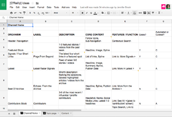
Gorgeous, isn���t it? No, really. It at once has lots of content detail but very little layout detail. It doesn���t prescribe visual layout at all; there are no boxes or arrows here. And that���s okay���great, even���because the UI designer will almost certainly have stronger ideas for layout. Let���s not waste time on that now (or tie the UI designer���s hands).
Instead, the spreadsheet details the content that this page should display, with brief notes on functionality. This is work that���s informed by customer and stakeholder research. And it puts an implicit focus on the jobs that this page has to do, as well as each of its elements (or ���organisms,��� in Atomic Design lingo).
I���ve since become more explicit about that focus on jobs, goals and outcomes, so I also accompany every page���s spreadsheet with a list of:
mindsets that users bring to these pages
tasks that the page can complete for users
goals that the page must fulfill for the organization
These always reference and build upon the findings from our research interviews. These contexts describe the page���s reason for being. Any element that doesn���t address those mindsets, tasks, and goals does not belong. To help check that, I also add a column to label the primary job for each element.
Now we have a discussion document that sets out the content of the page, along with the priority, function, and existential job for each element���all in plain text. This simple, prioritized list of content turns out to be a valuable discussion piece. Does the page have all the content we need? Do the content and functionality focus tightly on the jobs we agree this page should do? Is the content in the proper priority?
The focus is not only on what to make, but why… and to what end. The entire team can use this document to have a conversation about the UI solutions that will best deliver on those tasks and goals.
���The core value of a wireframe is in the conversation, not in the boxes,��� says accessibility expert Derek Featherstone. If we can get to that conversation without the wireframe, perhaps we don���t need that wireframe in the first place.
Skip the wireframe, sketch mobile UI
It turns out, though, that the spreadsheet quietly delivers a kind of stealth wireframe on its own. Squint your eyes and just look at that first column. It looks an awful lot like a mobile wireframe, doesn���t it? It���s a single column of content elements, a box for each. This gives us enough to sketch out a design.
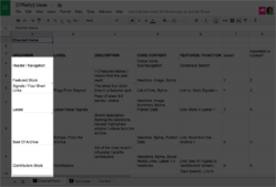
Traditional wireframe layouts are distracting because they say both too little and too much. They say too little in the sense that civilians often have a hard time imagining how those squiggles will actually look as a website: ���Sure, I guess that���s fine, but I���ll need to see the whole thing to know for sure.��� (In other words: ���you���ll need to design the website before I can approve this wireframe.���)

Wireframes also say too much. Despite their abstraction, wireframes create expectations for what the layout should be before the layout expert���the UI designer���even starts work. The whole intention of wireframes is to put the focus on content hierarchy instead of visual design, yet the very fact that they embed layout undercuts that mission.
Turns out our humble spreadsheet gives us enough to validate content hierarchy. So instead, we go straight from the spreadsheet to a proper visual sketch. Now we can let people evaluate a design that actually looks like a website.
Working with mobile comps at this stage lets us visualize our spreadsheet content in the context of first-take brand styles and interaction models. And because mobile layouts are far less complex than widescreen versions, we don���t yet dive down the rabbit hole of figuring out the whole layout puzzle. The emphasis remains on content hierarchy.
Along the way, we still draw the boxes to share layout ideas with each other, but we do it in informal sketches on paper and whiteboards. But these are not the carefully annotated, high-effort specifications that is typical of wireframes. These sketches are instead the minimum we need to convey an idea and get to the next stage of production.
Push the point of production downstream
By skipping wireframes and jumping into mobile comps, the UI designer is effectively replacing production work that���s traditionally reserved earlier in the process for UX and interaction designers. The core tenet of our process is to push as much production effort downstream toward working software.
In fact, front-end developers are already up and running at this stage, too. Even as the mobile comp is getting sorted out, developers have enough to go on to start blocking out page layout. Pseudo-code markup yields ���pseudo-design��� visuals, scaffolding for the interface to come.
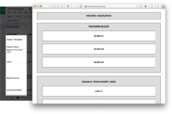
In short order, that pseudo-design gets replaced by the real thing, or at least as much as we���ve figured out so far. Once we feel like the comp design is about 70 percent there���on the right track but not yet complete���we shift design into markup. We linger as little as possible in static comps. We treat these only as sketches, initial explorations. The front-end developer takes over production of the interface from here on out, as we continue to fine-tune the design and sort out responsive behavior.
That doesn���t mean that the developer is exclusively responsible for the rest of the design. UI and UX designers are right in there collaborating, offering feedback, suggesting direction. Informal sketches and spot comps of individual components fly back and forth. Conversations are frequent.
To bring the design home, designers continue to work in their preferred tools���everyone should work where they do their best thinking���but instead of cranking out elaborate full-page comps, they comp the small bits that need attention. It���s a just-in-time design process that supports developers with what they need in order to do the very next thing.
This process evolved over several years in collaboration with Dan Mall and Brad Frost. They put together a two-hour (!!) video that illustrates how this back-and-forth works:
In this process, design becomes a collaborative effort, with the developer as the main point of production. What you see in the browser���the product itself���becomes the reference design, not a static wireframe or comp.
This means design and development happen in parallel, interleaving efforts. If they like, developers can contribute to solving design problems instead of implementing received solutions. The happy result is that they also get more time to work on the project. This design process extends the development deadline instead of shrinking it. It also hedges against unexpected trouble; problems not immediately evident in static comps can surface sooner to be solved earlier.
Done badly, though, this arrangement could leave developers whipsawed by the changing whims of designers���or flummoxed by a flood of redlines and spec changes. The fix is to get designers involved in the dev work, too.
Code commits instead of redlines
Just as we get developers involved earlier in the design process, we also get designers contributing to development. In traditional process, designers deliver corrections and updates to developers in the form of redlines. These are marked-up comps showing where spacing, font size, border radius���you name it���needs to be adjusted. Instead of using redlines, we enable designers to handle those changes themselves.
Depending on the project, we use either a design token platform or a simple SASS variables file to create a single place where all design values are held. It���s where all the hex colors, typefaces, paddings, margins, and the like are defined. With little to no coding know-how, designers can get in there and edit the variables, which go straight into the build process to update the design���no redlines needed.
The result is that specs live in the code itself and are available to designers and developers alike. This is also a boon for future maintenance. Static spec documents tend to fall out of sight, out of mind. By recognizing the production code as the source of truth and by opening a corner of it to designers, everything is always in one place and visible to all. No redlines required.
The product is the common workspace and vice versa
By pushing into code as early as we can and by finishing the design inside working software, the team���s working environment converges. The wonderful effect of this is that designers and developers both locate design truth in the product itself, and the design system emerges in production code.
That���s a far better arrangement than trying to document a design system inside a Sketch library, for example. As I recently wrote, such a library will inevitably fall out of sync with what���s in production:
This causes a disconnect between designers and developers because design comps drift from the realities of the established patterns in the code base. A Sketch library���or any collected drawings of software���can be a canonical UI reference only when the design is first conceived. Once the design gets into code, the product itself should be the reference, and fresh design should work on top of that foundation. It���s more important that our design libraries reflect what���s in the code than the reverse. Production code���and the UI it generates���has to be the single source of truth, or madness ensues.
This does not mean that designers have to be come developers. We can still use our favorite visual design tools. But now we���re riffing on and improving the designs pumped out by the developers��� pattern library.
In fact, once there���s a sturdy pattern library in place, comps aren���t always needed. That original spreadsheet, or a quick whiteboard sketch can get the job done. Just name the patterns to use, and the developer can get a first prototype up and running in the browser. From there, designers and developers can bounce back and forth to refine the final design.
Cultivate trust outside of documentation
Documentation signals lack of trust���either in ourselves or in others. Sometimes it���s distrust of the people who will implement the design. Other times it���s a lack of faith in our own memory (or our organization���s) to remember our decisions months or years down the line. Sometimes we just do it to cover our butts.
Trust is a human concern, however, not a technical one���and it requires human solutions. Meticulous documentation can often be replaced with (or at least reduced by) real-time communication and collaboration���just enough to communicate intent. Good communication and fast progress will boost trust, understanding, and quality better than any detailed spec.
Meanwhile, embedding specs into the fabric of the production code makes the product self-documenting. It���s an approach that aids individual and institutional memory much better than off-to-the-side documents that often go ignored or, worse, go missing. Comps, wireframes, and motion studies are terrific thinking and sketching devices, but we over-invest in them. In doing so, we make them a replacement for more meaningful and successful collaboration on the end product itself.
We���re all here to make amazing, meaningful, lasting products. The explorations we make along the way are ephemeral, and it���s okay to treat them that way. Eyes on the prize, friends.
Is your organization wrestling with slow process, inconsistent interfaces and duplicative design work? Big Medium helps companies scale great design and improve collaboration through design systems and other best-practice process. Get in touch for a workshop, executive session, or design engagement.
October 14, 2018
Design Tools Are Running Out of Track
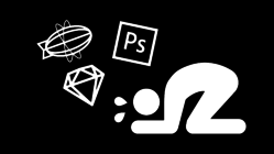
About a year ago, Colm Tuite reviewed the state of UI design tools and found them wanting: Design Tools Are Running Out of Track. If anything, his critique feels even more relevant a year later. Our most popular design tools are fundamentally disconnected from the realities and constraints of working software:
They generate static images in an era of voice, video, motion, and complex interactions. (���Our design tools should manipulate the actual product, not a picture of it.���)
They have no awareness of the layout conventions of the web, so they don���t help designers work with the grain of CSS grid and flexbox.
They���re tuned for infinite flexibility instead of usefully embracing the constraints of a design system or code base.
As I���ve worked with more and more companies struggling to design at scale, this last point has proven to be especially troublesome when maintaining or evolving existing software. Most design tools are not well tuned to support designer-developer collaboration within design systems (though some are beginning to innovate here). Tuite writes:
Your design tool is never going to tell you that you can���t do something. It���s never going to pull you up for using an off-brand color. It���s never going to prevent you from using a whitespace value which doesn���t belong in your spacing scale. It���s never going to warn you that 20% of the population literally cannot see that light gray text you���ve just designed.
And why not���? Because design tools don���t care.
Design tools are so waywardly enamoured with a vision for unlimited creativity that they have lost sight of what it means to design sensibly, to design inclusively, to design systematically.
Put simply, design tools allow us to do whatever the hell we want. To some extent, this level of boundless creativity is useful, especially in the ideation phases. As UI designers though, the majority of our workflow doesn���t call for much creativity. Rather, our workflow calls for reuse, repetition, familiarity and standardisation; needs that our tools do little to satisfy.
Developer culture and workflow have a strong bias toward consistency and reuse. That���s less true of design, and the tools are part of the problem. When there are no guardrails, it���s easy to wander off the road. Our systems don���t help us stay the path within established design systems.
This causes a disconnect between designers and developers because design comps drift from the realities of the established patterns in the code base. A Sketch library���or any collected drawings of software���can be a canonical UI reference only when the design is first conceived. Once the design gets into code, the product itself should be the reference, and fresh design should work on top of that foundation. It���s more important that our design libraries reflect what���s in the code than the reverse. Production code���and the UI it generates���has to be the single source of truth, or madness ensues.
That doesn���t mean that developers exclusively run the show or that we as designers have no agency in the design system. We can and should offer changes to the design and interaction of established patterns. But we also have to respect the norms that we���ve already helped to establish, and our tools should, too.
That���s the promise of design-token systems like InVision���s Design System Manager. Tokens help to establish baseline palettes and styles across code and design tools. The system gets embedded in whatever environment where designers or developers prefer to work. Designers and developers alike can edit those rules at the source���within the system itself.
This approach is a step forward in helping designers and developers stay in sync by contributing to the same environment: the actual product and the pattern library that feeds it. We���ve seen a lot of success helping client teams to make this transition, but it requires adopting a (sometimes challenging) new perspective on how to work���and where design authority lies. Big rewards come with that change in worldview.
Is your organization wrestling with inconsistent interfaces and duplicative design work? Big Medium helps companies scale great design and improve collaboration through design systems. Get in touch for a workshop, executive session, or design engagement.
freeCodeCamp | Design Tools Are Running Out of Track
October 5, 2018
Apple Used to Know Exactly What People Wanted ��� Then It Made a Watch

The latest version of Apple Watch doubles down on its fitness and health-tracking sensors, but as John Herrmann writes in The New York Times, it���s not yet clear exactly what value all that data-tracking might deliver���and for whom:
For now, this impressive facility for collecting and organizing information about you is just that ��� it���s a great deal of data with not many places to go. This is sensitive information, of course, and Apple���s relative commitment to privacy ��� at least compared with advertising-centric companies like Google and Facebook ��� might be enough to get new users strapped in and recording.
As Apple continues its institutional struggle to conceive of what the Apple Watch is, or could be, in the imaginations of its customers, it���s worth remembering that Apple���s stated commitment to privacy is, in practice, narrow. The competitors that Cook likes to prod about their data-exploitative business models have a necessary and complicit partner in his company, having found many of their customers though Apple���s devices and software.
This is especially relevant as Apple casts about for ideas elsewhere. Apple has already met with the insurance giant Aetna about ways in which the company might use Apple Watches to encourage healthier ��� and cheaper ��� behavior in its tens of millions of customers. John Hancock, one of the largest life insurers in America, said after Apple���s latest announcement that it would offer all its customers the option of an interactive policy, in which customers would get discounts for healthy habits, as evidenced by data from wearable devices. Here we see the vague outlines of how the Apple Watch could become vital, or at least ubiquitous, as the handmaiden to another data-hungry industry.
The New York Times | Apple Used to Know Exactly What People Wanted ��� Then It Made a Watch
September 27, 2018
Facebook Is Giving Advertisers Access to Your Shadow Contact Information

One of the more insidious aspects of the social graph is that companies can mine data about you even if you don’t actively participate in their network. Your friends inadvertently give you up, as Kashmir Hill writes at Gizmodo:
Facebook is not content to use the contact information you willingly put into your Facebook profile for advertising. It is also using contact information you handed over for security purposes and contact information you didn���t hand over at all, but that was collected from other people���s contact books, a hidden layer of details Facebook has about you that I���ve come to call ���shadow contact information.���
Information that we assume to be under our control is not. Or, in many cases, information that you provide for one specific purpose is then flipped around and applied to another. Hill mentions an especially cynical dark-pattern example of that pattern:
[Researchers] found that when a user gives Facebook a phone number for two-factor
authentication or in order to receive alerts about
new log-ins to a user���s account, that phone number
became targetable by an advertiser within a couple
of weeks. So users who want their accounts to be more
secure are forced to make a privacy trade-off and allow
advertisers to more easily find them on the social
network.
This is despicable. This is a moment when companies should strive to improve literacy about data sharing and data usage. Instead, companies like Facebook purposely obscure and misdirect. This is both a crisis and an opportunity. As designers, how might we build new business models and interactions that rely on honesty and respect, instead of deception and opportunism?
Arguments for transparency are too often met with counterarguments like, “Well, if we tell them what we’re doing, they might not opt in.” (Or, more bluntly, “If people knew about it, they wouldn’t want any part of it.”) When we find ourselves using these words to justify covering our tracks, it’s a cue that we almost certainly shouldn’t be doing that thing in the first place.
Gizmodo | Facebook Is Giving Advertisers Access to Your Shadow Contact Information
Google Data Collection Research

Whoops, Google, it looks like your business model is showing���
In ���Google Data Collection,��� Douglas C. Schmidt, Professor
of Computer Science at Vanderbilt University, catalogs
how much data Google is collecting about consumers
and their most personal habits across all of its products
and how that data is being tied together.The key findings include:
A dormant, stationary Android phone (with the Chrome
browser active in the background) communicated location
information to Google 340 times during a 24-hour period,
or at an average of 14 data communications per hour.
In fact, location information constituted 35 percent
of all the data samples sent to Google.
For comparison���s sake, a similar experiment found that
on an iOS device with Safari but not Chrome, Google
could not collect any appreciable data unless a user
was interacting with the device. Moreover, an idle
Android phone running the Chrome browser sends back
to Google nearly fifty times as many data requests
per hour as an idle iOS phone running Safari.
An idle Android device communicates with Google nearly
10 times more frequently as an Apple device communicates
with Apple servers. These results highlighted the fact
that Android and Chrome platforms are critical vehicles
for Google���s data collection.��Again, these experiments
were done on stationary phones with no user interactions.
If you actually use your phone the information collection
increases with Google.
Pair that with Google’s substantial ad tech, including the network formerly known as DoubleClick, and Google’s data collection reaches well beyond the company’s own properties:
A major part of Google���s data collection occurs while a user is not directly engaged with any of its products. The magnitude of such collection is significant, especially on Android mobile devices, arguably the most popular personal accessory now carried 24/7 by more than 2 billion people.
Digital Content Next | Google Data Collection Research
September 25, 2018
How Josh Clark Invented ���Couch to 5K��� and Helped Millions Start Running
Watch the BBC film, ���Anybody Can Run: The Story of Couch to 5K���
Watch video (4:01)
BBC World Service radio
Listen to the BBC World Service radio story.
Listen to audio (9:00)
���If you���ve taken up jogging in the past decade, there���s a significant chance you���ve done it thanks in part to Josh Clark,��� the BBC reports in a nine-minute radio story for BBC World Service about the Couch to 5K running plan. A four-minute film for BBC World television also tells the tale.
More than two decades ago, I scribbled down a nine-week schedule to help skeptical, would-be runners get off the couch and on the move. I called the training plan ���Couch to 5K��� and published it on the web in 1996. Since then, my Couch to 5K schedule has become one of the world���s most popular exercise programs. Millions around the world have followed ���C25K��� to a regular running habit. (For designers here, you might say C25K was my first onboarding project.)
Since I first wrote the core schedule, many others have catapulted its content into podcasts, apps, websites, online communities, and real-world running clubs and clinics. The National Health Service of the United Kingdom even endorsed it as an official exercise plan. (Over 1 million people have downloaded the NHS podcast in the last year alone.)
I���ve received hundreds of notes and letters from people who tell me C25K changed their lives���and not only on the fitness front. Many tell me that the program changed their sense of self and what they���re capable of, that it gave them the courage to accomplish a professional, creative, or personal goal that previously seemed unattainable. It���s deeply moving simply to hear these stories, let alone know that I played some small part of them.
Featured on the BBC
I can���t totally explain the runaway success of Couch to 5K, but the BBC did its best to do just that in the radio story and film. In both, I describe how I went from hating running to loving it, why I created Couch to 5K, the accidental science and psychology behind the program, and even the identity of the first C25K runner (my mom!).
Many thanks to BBC World Service radio producer Elizabeth Davies for bringing this story to the BBC, to BBC World producer Jonathan Coates for taking it to the screen, and to director of photography Richard Numeroff for using a gentle lens to picture these old bones.
The real heroes of this story

I wrote Couch to 5K for my mom Nancy Griffin, the first C25K runner.
These broadcasts are part of the BBC���s Witness series, which shares first-person accounts of notable moments in history���from the making of the Good Friday Agreement to the invention of the veggie burger.
I���m delighted to find myself in the company of the veggie-burger people, but I confess I can���t really take credit for the success of Couch to 5K. I may have put the schedule into the world, but the real champions of this story are the millions of people who put C25K through its paces. Every single one of those runners has overcome some mix of inertia, self-doubt, skepticism, and physical discomfort to get out there and run longer and farther with every workout.
This of course is what Couch to 5K is designed to help people do. The schedule delivers early victories for people who may have experienced only defeat when it comes to fitness.
That was certainly my own story. I always hated running. To me, it was a toxic mix of boredom, burning lungs, aching shins, and heart-bursting fatigue. Early on, I came to the conclusion that I was not a runner and never would be. I was not ���one of those people.��� I was not an athlete, I told myself.
In my mid–20s, the anxious and jittery energy of a bad breakup got me running. It was punishing and painful, and if I���m honest, maybe that was the point. But then something crazy happened: it started to feel good.
Physically, mentally, even spiritually���running makes me feel better. It delivers meditative and creative benefits. It keeps me grounded and sane no matter what else is happening in my life. And so, at that moment in the mid–1990s, I got the zeal of the converted. I wanted to help others discover what I had discovered���but without all the awful discomfort of my own first runs.
No pain, no pain

Pausing along my Brooklyn running route. Photo by Richard Numeroff.
My motivation for creating Couch to 5K was to correct the tired slogan ���no pain, no gain.��� If C25K has a motto, it���s ���no pain, no pain.��� Couch to 5K is about being kind to yourself, letting yourself go more slowly than you think you should so that you can do more than you believed you could.
Many people start a program like Couch to 5K because they���re unhappy with something about themselves. We think we weigh too much, we feel unhealthy, we���re depressed, we���re stressed. In that light, running is the half-hearted solution for ���fixing��� something. It is a penance, and that���s a difficult place to find enthusiasm.
Time and again, I���ve seen people change from this penance mindset to a celebration mindset over the course of C25K���s nine weeks. Somewhere along the line, a switch flips, and people find themselves running not to ���fix something broken��� but simply to experience the sensations and benefits of motion. The activity becomes worthwhile in itself, and the rewards of physical and mental health follow as happy side effects.
It all starts with being gentle to yourself. The first week of Couch to 5K asks you to jog for just a minute at a time, an achievable victory for most of us right out of the gate. The challenges gradually increase, but in increments that are always within reach. In the process, one discovers that there���s more inside them than they realized.
Nearly all of us can run if we want to; we just have to start by walking or jogging. Speed, distance, frequency���those are all beside the point. The animating notion behind Couch to 5K is that anyone who laces up their shoes and gets moving earns the right to be called ���runner������and to enjoy the benefits in mind, body, and even self-image of finishing a run or crossing a finish line. Recognizing yourself as a runner���giving yourself permission to do this thing���is half the trick of actually doing it.
For everyday people, by an everyday person

After a 5K with my pal Cathleen, my daughter Veronika, and my wife Liza.
Couch to 5K is designed to give you the kindest way to find out if running is for you. But it might not be, which is totally okay. Besides matters of personal preference, it���s obviously true that some disabilities make running extremely difficult if not impossible; for others, personal-safety concerns or harassment may keep people off the roads. In the BBC film I say, ���Anybody can run.��� I try to be more careful with my language around this, but this one slipped by me and became the title of the film. I regret that my comment made anyone feel ignored or unseen.
More personally, I closed the film by saying, ���I���m still trying to get my wife and our daughter to be runners.��� I was trying to be cute, and I wasn���t. Fact is, Liza and Veronika are already runners, and they didn���t need my help to get there. A few times a year, we even run local races together as a family. Not only are they runners, they���re my very favorite runners.
So you know: I make mistakes in interviews. While we���re at it, you should also know that I���m no champion athlete. I���m an unexceptional, middle-of-the-pack runner. I���ve got this 20 pounds I can���t seem to lose. I go through periods where I don���t run at all���although I do happen to know a great running schedule that always gets me back into it when I���m ready. I���m a Couch to 5K runner myself.
Perhaps all of this is a reason that Couch to 5K is a success: it���s a program for everyday people written by an everyday person. The schedule recognizes and respects limitations as it celebrates achievements.
Over 20 years since writing the original C25K schedule, running is still a welcome part of my life���and of my family���s life. For me, running is an end in itself, a part of the day I look forward to. The steady, gentle principles of Couch to 5K have set me up for a lifetime of doing this activity I enjoy.
Far more important than that, it���s done something similar for millions of others. If you���re one of them, I���d love to hear your Couch to 5K story. What was your experience of it? What did you learn about yourself in the process? Shoot me an email; I���d love to hear from you. Thanks, and good running.
BBC World film
Watch the BBC film, ���Anybody Can Run: The Story of Couch to 5K���
Watch video (4:01)
BBC World Service radio
Listen to the BBC World Service radio story.
Listen to audio (9:00)
September 23, 2018
If Software Is Eating the World, What Will Come Out the Other End?
���So far, it’s mostly shit,��� wrotes John Battelle suggesting that there’s a world beyond the optimization and efficiency so cherished by the would-be disrupters:
But the world is not just software. The world is physics,
it���s crying babies and shit on the sidewalk, it���s opioids
and ecstasy, it���s car crashes and Senate hearings,
lovers and philosophers, lost opportunities and spinning
planets around untold stars. The world is still real.
Software hasn���t eaten it as much as bound it in a spell,
temporarily I hope, while we figure out what comes
next.
John Battelle's Search Blog | If Software Is Eating the World, What Will Come Out the Other End?
September 10, 2018
The iPhone���s original UI designer on Apple���s greatest flaws
Fast Company offers an interview with Imran Chaudhri, the original designer of the iPhone user interface. According to Chaudhri, Apple knew that the device and its notifications would be distracting, that the personal nature of the phone would soak up attention in entirely new ways. But Apple consciously decided not to make it easy to tone down those distractions:
���Inside,
getting people to understand that [distraction] was
going to be an issue was difficult. Steve [Jobs] understood
it���internally though, I think there was always a struggle
as to how much control do we want people to have over
their devices. When I and a few other people were advocating
for more control, that level of control was actually
pushed back by marketing. We would hear things like,
���you can���t do that because then the device will become
uncool.���
���The controls exist for you. They���ve always been there
and yet it���s incredibly hard to know how to use them
and to manage them. You literally have to spend many
days to go through and really understand what���s bombarding
you and then turn those things off in a singular fashion.
So for the people who understand the system really
well, they can take advantage of it, but the people
that don���t���the people that don���t even change their
ringtone, who don���t even change their wallpaper���those
are the real people that suffer from this sort of thing.
They don���t have that level of control.���
Since then, Apple has embraced privacy as a competitive advantage versus Android, but Chaudhri suggests that iOS could do more to offer transparency and smart adjustments to personal settings:
���The system is intelligent enough to let you know that there are [apps] that you���ve given permission to that are still using your data, and notifications you���ve turned on that you���re not actually responding to. So let���s circle back and let���s reestablish a dialogue between the phone and the customer, where the phone asks, ���Do you really need these notifications? Do you really want Facebook to be using your address book data? Because you���re not logging into Facebook anymore.��� There���s a lot of ways to remind people if you just design them properly.���
Seems to me that we should all do a similar inventory of the systems we design. There remain so many opportunities to create interventions to improve user literacy and control over privacy, data usage, and distraction. Responsible design in the era of the algorithm demands this kind of transparency.
Also, when Chaudhry says, ���there was always a struggle as to how much control do we want people to have over their devices,��� my take is: people should have all the control.
Fast Company | The iPhone���s original UI designer on Apple���s greatest flaws


