Josh Clark's Blog, page 30
March 27, 2011
The Kalininskaya Nuclear Plant
Regular readers know I'm a fan of complexity. Our job as designers isn't to remove complexity, which after all adds texture and meaning to our lives and work. Instead, it's to manage complexity, to make complexity uncomplicated. (Complexity and complication are very different things.) As we craft simple interfaces, the goal is not to dumb down our designs but to streamline those designs for the task at hand. Hide complexity from the audience where appropriate, and make it manageable when it must be revealed.
I somehow doubt that the designers of Russia's Kalininskaya nuclear power plant's control room have properly pulled off that task.
But there sure is something frankly beautiful about the absurdly complicated seventies-era control panels. It may or may not be an optimized design for a control room, but one thing I know: I'm dying to trick out my home office to look like this. You can find these photos and many awesome others at the English Russia blog.


Tags:
complexity,
design,
photos,
russia,
simplicity
Interrobang‽

I was walking down the sidewalk last night around 10pm, and I brushed against a woman carrying a cake decorated with an interrobang.
"Nice cake," I said. It looked like a giant, awkwardly frosted whoopee pie. Y'know, with an interrobang.
"Thanks. It's an interrobang." Evident pride in the cake.
"I know," I said. "They're popping up everywhere these days. It's like a golden age of interrobangs."
She explained that she's editor of Interrobang?! Magazine and that the magazine was celebrating it's fourth edition. I said that this news made me both excited and quizzical.
We laughed, and we laughed, and then we laughed. And I continued down the sidewalk.
Tags:
life,
providence
Interrobang

I was walking down the sidewalk last night around 10pm, and I brushed against a woman carrying a cake decorated with an interrobang.
"Nice cake," I said. It looked like a giant, awkwardly frosted whoopee pie. Y'know, with an interrobang.
"Thanks. It's an interrobang." Evident pride in the cake.
"I know," I said. "They're popping up everywhere these days. It's like a golden age of interrobangs."
She explained that she's editor of Interrobang?! Magazine and that the magazine was celebrating it's fourth edition. I said that this news made me both excited and quizzical.
We laughed, and we laughed, and then we laughed. And I continued down the sidewalk.
Tags:
life,
providence
March 26, 2011
Responsive Web Design or Separate Mobile Site? Eh. It Depends.
Geeks love systems, and that means we love rules. We love laws and dependable truths. This passion for order, along with a certain smartypants confidence, often lulls us into pronouncing One True Way in any number of disciplines. Whether the topic is programming languages, mobile operating systems, bracket style, mobile web vs native app, or robots vs zombies, geeks tend to latch onto a favorite as The Only Way It Must Be Done.
Religion, nationalism, and sports-team rivalries? They can't compare to the passion of a nerd's technical conviction. And so kerfuffles result. Well-intentioned zeal leads to distracting dustups. Alas, complex problems rarely resolve themselves into neat black-and-white principles. The only principle that ever seems reliable is drearily unsatisfying: "it depends."
In the mobile world, we have the persistent and circular debate over whether the mobile web should be powered by the very same sites and webpages that render the desktop web. Savvy CSS media queries, beautifully explained as "responsive web design" by Ethan Marcotte, can transform any webpage into device-specific layouts tailored for any device. But should they? Strong opinions sally forth.

Angry mob of nerds. Photo by LDM.
Jason Grigsby neatly laid out the essential (and long running) debate in a blog post last August, New to Mobile? Welcome to the One Web Debate. And he took a side, too, suggesting that we shouldn't automatically assume there's some inherent value in serving the same HTML page to every device:
Anyone who has worked on a site that supports multiple
languages knows that we don't have One Web on the desktop
web. We don't have any problem delivering different html
documents and assets to someone who speaks a different
language.…
Why is it ok for us to deliver different HTML documents
because the user uses a different language, but it isn't
ok for us to deliver different HTML documents because the
user is using a different device?
As long as every user has access to thematically consistent content from any device, Jason said, sites aren't obliged to serve identical content. That's fool's gold, he said. Serving "desktop" HTML to low-bandwidth phones can cause performance headaches and ignore opportunities to provide the most appropriate content for the mobile context.
Brian Fling put it out there even more strongly on Twitter last week:
[1] Anyone that claims "responsive design" as
a best practice clearly has never actually tried to
support multiple contexts or devices. [2]
Creating great contextual experiences has absolutely
nothing to do with markup or css. [3]
Responsive design seems like the easy hack that attempts
to avoid solving the much harder but more thoughtful
solution.
Brian's thoughtful solution is to create a bespoke experience for mobile, a from-scratch conception of what people want from your service when they're on the go with a handheld touch device as opposed to planted in front of a desktop screen. In other words, strapping on some fancy CSS doesn't address the core issue: mobile apps and websites demand mobile content. This is often not the same content (or at least not in the same priority) that you want in a desktop context.
As the Twitter confab continued, though, it became clear that it's not really a debate after all. CSS-based responsive web design is a great tool for adapting a layout to different screens, period. It is a tool, not an end. In some cases, where a site's content should be the same from device to device (a blog, for example), responsive web design is enough for the job. More complex services, though, may need much more, including different content, tools, and services.
Yes, friends: it depends.
What's it depend on? Certainly the needs of the audience. But as with so many things, it often depends a great deal on business considerations, too. What can you afford to build and maintain? Building a separate mobile site (and a separate TV site and a separate tablet site) is the cure that kills the patient, Jeremy Keith wrote last month:
Those who are currently rejecting responsive design point
to the difficulties of making desktop-optimised sites work
on small screens with potentially narrow bandwidth.
They're right. But the solution is not to create a
separate site just for smaller screens. The solution is to
fix the site so it isn't optimised for just one
environment.
The truth is that web designers and developers have been
making device-specific websites for years; it's just that
the device in question was the desktop computer. But just
about every point in the W3C's Mobile Best Practices should
be applied to all websites.
The bottom line is whether you're really talking about the same website in the first place. Depending on what you're building, a mobile website could be an entirely different animal than its desktop counterpart, addressing entirely different needs. The simple thing to remember is that layout≠content. Great designs require considerable attention to both. Responsive web design cannot dictate content strategy, nor vice versa.
When you start a mobile project, ask yourself: what makes this project mobile? Why would someone use this website in a non-traditional computing environment? The use cases that flow forth dictate your content. From there, flexible layout techniques make the content look good wherever it might appear. The activities are related but independent. Knowing the ins and outs of CSS media queries is important. Understanding context and content strategy is important, too. They're two different disciplines that need not be at odds.
A couple of days after the Twitter exchange above, Ethan posted this gentle message:
I'm not interested in a religious debate. And chances are
good that you're not, either.
I really do believe responsive design can be a great way
to design for our ever-changing web. Sure, I've got some
fairly evident biases on that front: but with
the right planning, implementation, and forethought, it
can be a damned compelling approach.
But let's say that your project—or more specifically, your
audience—is better served by a
mobile-/tablet-/$DEVICE-specific experience. Heck, I've
worked on a number of projects that benefitted from that
approach: where a separate mobile site was needed, and
where a responsive approach would've been less than ideal.
That decision wasn't driven by any "mobile vs. desktop"
mindset, though: it was dictated by research, by our
content strategy, and by studying the needs of that site's
particular audience.…
The moral here is that you should tailor the approach to
the project, and put the polemic aside.
We're all in this together, baby. But people are interested in religious debates. Many seem to find them good sport and, every so often, some light even emerges from the heat. Sometimes, by arguing, we realize our positions actually coexist quite neatly. And in this case, it turns out that mobile content strategy and responsive web design go hand in hand. It might not offer the appeal of a One True Way, but "it depends" turns out to be a mighty good watchword.
"I don't have to waste time playing the pricing game"
Justin Williams, creator of the excellent Elements app and others, recently wrote about his no-nonsense, single-price approach to app pricing. On why Elements is five bucks, and always five bucks:
I frequently explain to people that I don't build consumer
applications and instead target the nerds. The nerds
are more than willing to spend money on quality software.
Nerds have bought tens of thousands of copies of OmniFocus's
$40 iPad app, so I find it hard to believe they would
struggle to part with a $5 bill to use my application.
Moreover,
I don't want someone who is interested in the app to
hesitate buying it because they fear it may go on sale
soon. By never putting it on sale, I ensure that everyone
who hops on board the Elements train got paid the same
toll and doesn't feel cheated out of a few bucks.
Does that make me a bad Capitalist? Am I leaving money
on the table? Maybe, but at least I don't have second
thoughts or hesitations about it and I don't have to
waste any of my time playing the pricing game.
I don't need or even want everyone with an iPhone or
iPad to be my customer. I'd rather have a small percentage
of the user base that I can more easily manage as a
small independent development shop.
I'm always dubious about the various App Store strategies I see trotted out for gaming the store (or perhaps more accurately, gaming your audience). Sales, keyword marketing, carefully timed promotions... all of these have a role, but I often sniff a little rancid SEO snake oil, too. I'm sure part of my skepticism is that I simply have little affinity or talent for marketing stunts; we distrust what we don't understand. For me, though, that's all the more reason to like Justin's advice for pricing and App Store marketing: build something great, seed it with an enthusiastic community, and let the App Store take care of itself.
Infographic: Mobile Phone Sales in the Last Decade
The gang at VisionMobile put together this pretty infographic showing mobile phone sales by handset manufacturer over the last ten years. The graphic is organized to show the top five sellers for each year. Nokia crushes the competition every year, with (wow) over 3 billion handsets over the last decade. Meanwhile, the chart shows Motorola evaporating, while two new faces (RIM/BlackBerry and Apple/iPhone) crack the top-five list for the first time in 2010.
Tags:
marketshare,
mobile
March 24, 2011
IA Summit: Mobile Design Workshop
I'm going mile-high next week, headed to Denver to give my full-day workshop on tapworthy mobile design at the IA Summit. There are still a few spots available, but you should hurry: we're keeping this fandango under 50 to allow some good conversation, give-and-take, and best of all, some very fun show-and-tell as we all design a mobile app over the course of the day. I'll cover big-picture concepts of adapting to mobile mindsets as well as nitty-gritty ergonomic details of designing for touch. All will be eye-opening, even surprising, and if I have my way, plenty of fun, too.
Register here. The details:
Tapworthy Mobile Design and User Experience
Denver, Colorado
March 30, 2011; 9:00am – 5:00pm
From idea to polished pixel, this workshop explains how to create a mobile app that delights.
Participants will discover how to conceive and refine an app's design in tune with the needs of a mobile audience—and their fingers and thumbs. This workshop teaches how to "think mobile" to plan and create app interfaces in tune with the psychology, culture, ergonomics, and context of an audience on the go.
Experienced designers and newcomers alike will uncover the shifts in mindset and technique required to craft a great app. This workshop isn't (only) for geeks. It's for everyone involved in the app design process—designers, programmers, managers, marketers, clients.
Participants will equip themselves to ask the right questions (and find the right answers) to make aesthetic, technical, and usability decisions that will make their apps a pleasure to use. The workshop focuses on generally on broad principles of mobile design, using examples from all major mobile platforms, but particularly through the lens of iOS apps.
This full-day workshop is built on seven core sessions:
The Mobile Context
Designing for Touch
Organizing Your App
Crafting a Visual Identity
Introducing Your App
Working with Gestures and Screen Orientation
The iPad and other Tablets
If you can't make it to Denver next week, you might be interested in one of the other workshops I'm teaching later this year:
User Experience Lisbon: Designing for Touch (half day)
Lisbon, Portugal
May 11, 2011; 3:00pm – 6:30pm
WebVisions: Designing for Touch (half day)
Portland, OR
May 25 – May 27, 2011
Wharton Web Conference: Tapworthy Mobile Design and User Experience (full day)
Philadelphia, PA
July 12, 2011
I'm also dishing talks and keynotes at a crazy volume of frankly awesome conferences. Please do come and say hello. You can also follow my conference misadventures at Lanyrd.com.
March 11, 2011
Web App Masters Tour and UIE Online Seminar
Event discounts ahead! Read on...
It's an odd and marvelous thing to share the stage with professional heroes. I've had the good fortune to do that several times over the past several months as my speaker's dance card has filled up. I've shyly met scores of my internet idols in conference green rooms and after-parties, an altogether great experience.
And so of course I felt that same thrill when I was invited by the one-and-only Jared Spool to join the Web App Masters Tour, the conference series organized by UIE, Jared's web usability powerhouse. I'm a little giddy. (If you're interested in finding out what the tour is all about, they're giving away recordings of last year's talks for free, through March 14.)
This year, the conference's focus took a surprising turn toward toward mobile, as Jared explained:
As we were finalizing the program for this year's UIE Web App Masters Tour,
a theme quickly emerged that we hadn't originally planned on: designing mobile applications.…
It's clear that there's an energy around UX design that is far more vibrant
than ever before. I wanted to know where that was coming from. As I dug
into our research, I realized there are multiple forces making all this happen.
And right in the middle of these forces is the world of designing for mobile.
I have a mobile bias, of course, but man, it seems to me that the program and its speakers are strictly top shelf.
Me, I'll be talking about sorting through the chaotic mobile environment to choose the right mobile platforms for your organization, whether that's a mobile website or a native app on Android, iPhone, BlackBerry, or one of the jillion other operating systems out there:
Cage Match: Native Apps vs Mobile Web
When deploying our applications in a mobile world, eventually our conversation turns to the million-dollar question: Do we implement a native app or build a web-based interface? Native apps give us faster performance, great animation, and a natural look and feel. Web-based apps have the promise of build once and run everywhere, plus they use familiar skills of HTML and CSS. It's a close decision.
We've asked mobile expert, Josh Clark, author of Tapworthy, to guide us through the pros and cons of this difficult choice. He'll walk you through the advantages and disadvantages of each side, plus expose you to some interesting alternatives rarely seen before.
For a little preview, tune into the conversation I had with Jared about this very topic during his regular podcast.
Discount on Web App Masters Tour
Register now with discount code WAMT11 and get $100 off the ticket price. The tour is slated for:
Philadelphia (March 21-22)
Seattle (May 23-24)
Minneapolis (June 27-28)
Online Seminar on Mobile Design
Separate from the Web App Masters Tour, I'm also contributing to UIE's series of online seminars. On March 17, I'm giving a 90-minute presentation on mobile app design:
Mobile Design: Designing Tapworthy Mobile Apps
With mobile quickly emerging as a viable and practical source of web based content, designers need to know how to adapt and keep up. In this lively, insightful seminar, designer and Tapworthy author Josh Clark walks you through the surprising changes in technique and perspective that mobile design demands. From first concept to polished pixel, you'll learn to "think mobile". And you'll be shown how to craft interfaces in tune with the psychology, culture, and ergonomics within the context of an audience on the go.
What's that? You want a discount code for THIS, TOO? Well, don't tell 'em you heard it here, but if you use code GLOBALMOXIE when you register, they'll throw in lifetime access to the recording for free.
Hope to see you at one or both of these events.
Tags:
conference,
speaking,
wamt
March 10, 2011
Stay in My Paris Home
I split my time between two cities: Paris and Providence, Rhode Island (y'know, the Paris of the northeast). When I'm not in Paris, I rent out my apartment there. And hey, if you plan to be in Paris this spring or this fall, you can stay there, too!
Me, I've always felt that renting a real home from real people is pretty much the best way to visit a city. I hope you'll think so, too. It's a great place in a terrific area: the charming St. Paul neighborhood of the Marais. It's just a five-minute walk to the Seine and Ile St. Louis. We rent the place by the week or by the month.


Mobile Design Patterns and Galleries
Sometimes the best way to solve a new design problem is to find out how others solved an old one. That's the whole idea of design patterns, which stake out familiar solutions to common problems. In recent days, several mobile design-pattern resources have passed through the series of tubes which criss-cross my desk. All are useful sites for reference or inspiration for mobile app designers:
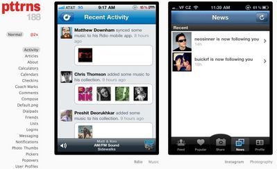
Pttrns
Pttrns is a project of Robin Raszka and neatly categorizes screenshots of iOS apps according to functions like logins, searches, custom tab bars, and so on. Nice work, lots of great examples.

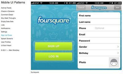
Mobile UI Patterns
This site from Mari Sheibley similarly clusters iOS screenshots by functional category. While a bit less comprehensive, it's a great companion to Pttrns.

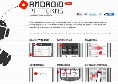
Android Patterns
Unlike the other sites, this one doesn't show screenshots but instead uses wireframe sketches to show common solutions to frequent design problems. In the Dealing with Data category, for example, patterns are organized by the specific challenge: "How can I change view on a set of data?" "How can I let users know my app is loading data?" "How can I let users sort data?" etc. This wiki site is a project of UNITiD.

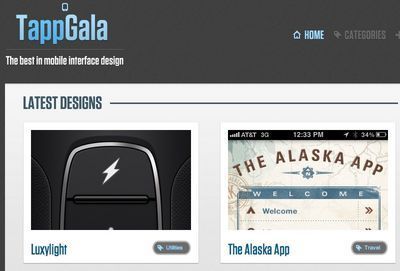
TappGala
This one's not really a design pattern collection, but it is a consistently good and useful gallery of pretty designs. A fine resource of inspiration and clever experiments. TappGala is a project of John Phillips and David Mulder.


