
Josh Clark's Blog, page 29
March 31, 2011
FOWD Throws in the Towel
My dresser is overflowing with tshirts. Designer tshirts. Road race tshirts. Promotional tshirts. And oh so many conference tshirts. I dig 'em, but the hard tshirt truth is: I don't really need any more. (I could use some more socks, though, but that's another post.)
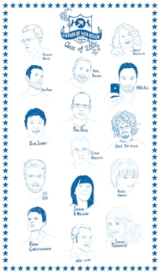
So I was totally charmed and won over when I learned that Future of Web Design made tea towels instead of tshirts for conference attendees:
Mike Kus, has put together these awesome "Class of
2011″ tea towels! They feature our Main Stage line
up in classic old school tea towel style (and we think
they'd look as nice in a frame as they would hanging
by your kitchen sink!)

Leveling with you: I couldn't stop giggling when I saw my ugly mug on it. (It also has the far more alluring likenesses of fellow speakers Ethan Marcotte, Sarah Parmenter, Jeff Veen, Paul Boag, Dan Rubin, Elliot Jay Stocks, Aral Balkan, Molly Holzschlag, and many more of my internet heroes.) I mean come on: this thing is bound to be a hugely sought-after collectible, and I can't wait to hang it alongside my velvet Elvis and Franklin Mint plate collection. Covet it for yourself? Think Vitamin is giving away a few of them.
And hey, speaking of FOWD, please do join us in London May 16-18. My talk, "Buttons Are a Hack: the New Rules of Designing for Touch," will explain how to make the most of new touchscreen interactions:
Fingers and thumbs turn design conventions on their head. Touchscreen interfaces create ergonomic, contextual, and even emotional demands that are unfamiliar to desktop designers. Find out why our beloved desktop windows, buttons, and widgets are weak replacements for manipulating content directly, and learn practical principles for designing mobile interfaces that are both more fun and more intuitive. Along the way, discover why buttons are a hack, how to develop your gesture vocabulary, and why toys and toddlers provide eye-opening lessons in this new style of design.
Can't wait. Also: tea towel!
Tags:
conference,
design,
fowd,
illustration,
josh


Justin Williams: A Tablet Isn't a Large Phone
It's all too easy to lump tablets in with phones as "mobile devices." There are certainly similarities. The iPad and Android tablets run the same operating systems as their smaller cousins, and some touchscreen principles work the same across devices. But tablets have a different form, ergonomics, and context than phones. So designing for tablet takes a fresh perspective and, almost always, a whole new design concept.
As usual, Justin Williams puts it best in an economy of words:
The best iPad apps are not those that just stretch
their iPhone table views out to take advantage of the
larger screen. They are apps like Twitter,
Reeder and
that invented new paradigms and changed the
way we used the device. They are the apps that get
lost under our fingers because they work intuitively
with multitouch gestures.
By similar token, the best Honeycomb apps are not going
to be those that just stretch out a ListView control
to adapt to the screen size whether it be 4" or 9".
Tablets offer us an opportunity to shake up how we
have interacted with computers in the past thirty years.
If all Android subscribed to was to make it easy to
port a product designed for a phone to a tablet, then
it is a waste for developers and a shame for users
who will embrace the platform. The Xoom is still in
its infancy, so there is plenty of time for Android
developers to kick the tires and see what the tablets
can offer.
As I'm fond of saying: a tablet is like a phone as a swimming pool is like a bathtub. Similar on the surface, but intended for entirely different uses. The design has to reflect that.
March 29, 2011
Asymco: The Post PC Era as Explained by Developer Events
Mobile stats maven Horace Dediu of Asymco posted a nifty visual illustration starkly showing how quickly new platforms generate enthusiasm along with an appetite for learning and community among developers. His chart shows the time it took for developer conferences Google I/O and Apple's World Wide Developer Conference to sell out over the past few years:
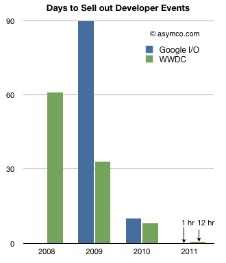
Source: asymco.com
For years, Apple's developer conference rarely sold out and, if it did, it took weeks. Yesterday, it sold out in under 12 hours. Google I/O meanwhile sold out in just an hour. Both conferences have seen a big change in focus in the last few years: Apple's event used to be focused principally on desktop software, and Google's on web technologies. Those topics still persist, but both events have swung to have a huge focus on mobile now. Times have changed, and fast. Dediu writes:
What should be noted is that these events are focused
on post-PC development. Clearly the increased
interest among developers is for the mobile side of
the business.
Developers certainly seem to sense the way the wind
is blowing. They are, as humans, prone to over-confidence
but they are also often accused of being hard to please.
The most common lament among new platform builders
is "How do we attract developers?" The platforms showcased
here had no trouble attracting developers in the tens
of thousands three years after being launched.
Fugly Android
A new site shares messy and garish screenshots of Android home screens with custom themes and wallpapers. Fugly Android calls itself "an argument for closed systems," but it's really just a demonstration that bad taste abounds.
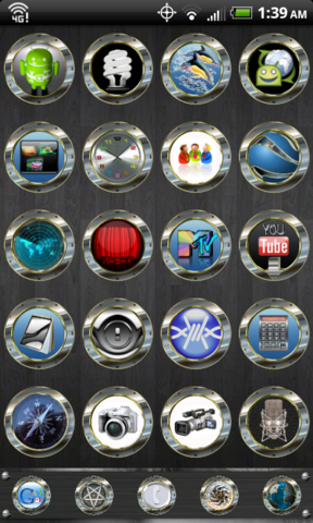
We all love our own bad taste. It explains the misplaced exuberance of early desktop publishing, where design newbies gleefully sprayed fifty fonts on a page, and it explains the blindingly bad personalizations of MySpace. Give people a brush, and they'll paint something crazy just to make it their own. The number one reason people jailbreak their iPhones, according to Cydia creator Jay "Saurik" Freeman, is to pimp the home screen with custom themes. Beauty, it seems, is in the eye of the beholder. There's something that many find irresistible about branding a visual claim of ownership on their stuff.
Platforms are cultures, and a key cultural value of Android is customization. Among geeks, at least, the appeal of Android is the ability to make the phone do and be anything you want. That's not at all a cultural value of iOS, where consistency of presentation and style (Apple's style) is a given. In both cases, these are values that are embraced by the audience, but are also established from the top, by the platform owners. Just compare the detail of Apple's iOS interface guidelines to the broad and limited Android guidelines. Apple says, this is what the iPhone experience should be, while Android seems to say, hey, do what you want. (For what it's worth, Microsoft splits the difference with Windows Phone 7, offering thoughtful interface guidelines (PDF) while also giving users a carefully controlled ability to personalize the OS's look.)
Me, I'm an iPhone guy. That's just the culture where I feel most at home. So yeah, I shake my head when I browse Fugly Android's gallery of horrors. But I also know that where I shudder, lots of others see creative freedom and opportunity. That whole beauty and beholder thing.
March 28, 2011
Mobile Web vs Native App: Give It a Rest

Oy. While it's fun to see the phrase HTML5 make its way into mainstream headlines, it's off-putting to see it fuel the fire in a conflict that isn't really a conflict in the first place. The New York Times heralds that HTML5 Is Breathing New Life Into the Web, noting that the web is "slipping" versus native apps but is "poised for a comeback":
THE rivalry between the worlds of the Web and native
applications, analysts say, is set to play out over
the next couple of years. There are strong advocates
in each camp, even within companies. Google, for example,
straddles the two worlds, with its Android team as
well as its developers of HTML5 technology.
Sundar Pichai, vice president for product management
for Google's Chrome browser, is betting on the triumph
of HTML5. "In the mobile world, the dominant model
is native apps," Mr. Pichai concedes, but he adds that
the real competition is just beginning. "As these ecosystems
evolve," he says, "I think the incredible advantages
of the Web will prevail."
Now I'm hardly above making hay from this purported death match. As part of the Web App Masters Tour, I'm giving a talk titled "Cage Match: Mobile Web vs Native Apps." (Luke Wroblewski shared his generously detailed notes from my talk.) But my dirty little secret—spoiler alert!—is that I don't really think it's a matchup at all. Providing a great experience almost certainly means that you'll do both. We're all in this together, friends.
Build a mobile web app or website
Creating a mobile website is table stakes, basic cost of entry, and every company and service should have one. Your website should be viewable on any device, and since more and more people are using their phones as primary browsers, that means your website or app should be awesome on those devices too. The web buys you universal access to every device, no matter what type of phone people use. It's a no-brainer that you should build for the web. The web is the hub for everything. There's a growing expectation that our content will follow us seamlessly from device to device. Whether you access that content in a traditional browser or a native app, you're almost certainly accessing it via the web. Building a web app simply puts your app in its natural habitat. Everyone should do it.
But here's the thing. We have an app culture right now. In user interviews, I find time and again that people say they use the web primarily for quick lookups, while they use apps for doing. For tasks, games, or recurring activities, people instinctively turn to an app store. And there are good reasons for that. First, it's certainly convenient: marketing, operating systems, and even the hardware nudges people toward plugging into app stores, where payment is also a breeze. And by and large, native apps tend to deliver better experiences, too. Don't get me wrong: you can do amazing things with HTML5, CSS3, and JavaScript. (Aside: HTML5 and CSS3 are mature on mobile, where all the major platforms use cutting-edge browsers. If you've been holding back on learning the new stuff, waste no more time. Get on it.) But while the web is closing the gap—and quickly—for interface slickness and user experience, I believe native apps will always have an edge in that department. They'll always hold greater potential for a better, sharper experience that fits in better with the overall operating system.
Build flagship apps
It's not a matter of either-or, however. Do both. Build a mobile web app for everyone but consider flagship native apps to reward your best customers. Choose the platform that fits the personality and demographics of your best companies, and build an app that sings for them. For the foreseeable future, I believe the best way forward is a common-denominator mobile website—with graceful degradation so that a majority of mobile users are served—paired with one or three audience-appropriate native apps.
Fact is, we all use both. According to Comscore, 37 percent of mobile users browse the web, and 35 percent use downloaded apps. Presumably those are basically the same people, since about 35 percent of mobile users have smartphones. So it's not that one is winning over the other in terms of usage; we use both.
Making the Mobile Web Better
Still, there are many ways that web apps could provide better experience, and nearly all of those rely on the OS makers to start treating web apps on equal footing with native apps. Trapping web apps in the browser doesn't help, while native apps get first-class placement on home screens. The distributed nature of web apps means that you can't find them in app stores, where people are trained to look for apps. And payment remains a problem for web apps. These are all areas where platform vendors should help make all of our lives better—as both developers and users. As a community, we need to press for this.
But let's not shoot ourselves in the foot by getting tangled up in this "web vs native" thing. Our future is going to be one of many, many thin clients talking to smart web services. Some of those clients will be accessed via HTML, others via native code. I love the "one web" ideal but I also believe in the very real value (despite its high cost of entry) in crafting carefully tailored and high-performance interfaces for specific devices and operating systems.
As makers, we have to make rooms in our hearts, budgets, and schedules for both. Let's call off the death-match hoax, grab a beer, and then go make some awesome together.
Tags:
business,
mobile,
webdev,
webservices
A Tale of Type and Transportation
Just now ordered a new book, Paul Shaw's Helvetica and the New York City Subway System, thanks to an intriguing book review in the Wall Street Journal. The book traces the history of Gotham's subway through its signage. Michael Bierut reviewed the book for the Journal:
By the 1960s, using the New York subway meant navigating
what a John Lindsay-era task force called "the
most squalid public environment of the United States:
dank, dingily lit, fetid, raucous with screeching clatter,
one of the world's meanest transit facilities."
The ugly and baffling signs underlined the city government's
loss of control.
Seeking to bring order out of chaos, the Transit Authority
in 1966 turned to the new design firm Unimark International.
Two of its leaders, Massimo Vignelli and Bob Noorda,
hailed from Milan, where Noorda (who died last year
at age 82) had just designed the graphics for the Metropolitana
Milanese. The heart of Mr. Shaw's book is the story
of what happened when these champions of High Modernism
collided with the union labor at the Transit Authority's
Bergen Street sign shop.
Mr. Vignelli and Noorda conducted an analysis of the
foot-traffic patterns at several of the subway system's
most convoluted stations and devised a sequence of
coordinated directional signs. By placing information
only at the point of decision, never before or after,
the designers aimed to eliminate redundancy and contradictions,
establishing a system that New Yorkers could navigate
with confidence.

Clear language, clean design, a premium on navigation, and a relentless impulse to pare content to "just enough." These are great design precepts for any medium, but they seem especially applicable to the constraints faced by mobile designers. As always, the design challenges faced in other domains often shed light and inspiration in our own work.
Interesting to note, too, that no matter what the project, client execution doesn't always meet designer expectation. This one seems like a doozy. Vignelli and Noorda made a host of recommendations, including use of the then-novel Helvetica font for all signage. Recommendations in place, they left the Transit Authority to do the work of creating and hanging the signs. Alas, the city didn't have Helvetica handy and went with Standard Medium, a 19th-century sans-serif. The logistics were even messier, as Bierut writes:
New signs were installed, but the old ones were left up. Then the Transit Authority added still more signs,
hastily made by hand in an attempt to address the resulting chaos. Typical of the confusion was the fact
that the sign-makers misread the blueprints. Not understanding that a black horizontal bracket was meant
to secure the signs from above, they painted a black stripe along the top of each sign. In the face of public
criticism of what the Daily News called the "Flubway," Unimark was brought back to plan a system-wide implementation.
The cleanup went apace, including use of Helvetica, which eventually became the official systemwide font in 1989.
The tale combines several of my personal passions—design, wayfinding, type, and urban history—into a tidy story told through the unassuming tale of the transit system's signage. Can't wait for the book to arrive.

The MTA began introducing modern replicas of the old mosaic signs. Photo from The Wall Street Journal.
March 27, 2011
Video of My Mobile Design Course Available
Last week, I taught the eighth and final installment of my online class, Tapworthy iPhone Design and User Experience. I had a huge amount of fun teaching it, the feedback was positive, and the class sold out—all factors that are already nudging us to fire up the class again, probably in the fall.
If you're itchin' for mobile know-how before that, you can also order the course video from O'Reilly. At 90 minutes per class, that's 12 heaping hours of design principles, examples, and bad jokes from yours truly. Interested? Here's the gist:
Want to create an iPhone app that truly delights its
users? Learn how to go from initial idea to exceptional
app with this 8-session video course. You'll discover
how to "think iPhone" as you plan and create app interfaces
in tune with the ergonomics, psychology, and culture
of an audience on the go. Experienced designers and
newcomers alike will learn the techniques and mindset
required to craft a tapworthy iPhone app.
SXSW 2011: Bloated but Lovable

Seeing Dale Watson at The Continental Club: sensational. This is my Instagram snap.
I had a great time at SXSW this year. Maybe too great: this old man did his best to keep up with the kids through a storm of backflips, Escalades, house parties, roadhouses, cocktails, barbecue, rockabilly, beers, and mighty smart conversation. All that fun takes a toll, and I'm just now getting over the nasty chest cold I caught on the plane on the way home.
For all the fun that was afoot, though, a personal highlight for me (and oh man, I hope, for my audience) was giving my talk about iPad app design. "iPad Design Headaches: Take Two Tablets and Call Me in the Morning" focused on the common mistakes I've seen in tablet design in our first full year with the iPad. With my very best bedside manner, I did my best to offer prescriptions for these design maladies. A large and generous group showed up bright and early on Saturday morning, and I couldn't have asked for a better audience. Thanks to all of you for your interest and enthusiasm.
Miss My Talk?
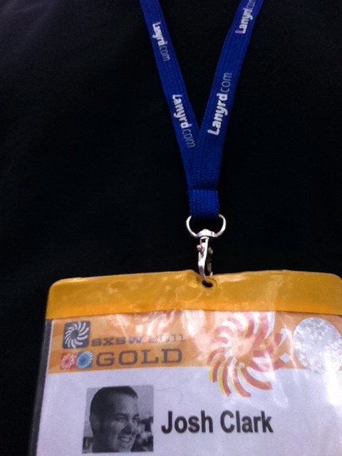
Simon and Nat gave me a Lanyrd lanyard, which I plan to wear obsessively at all conferences going forward.
The best way to find out what went down is to visit the Lanyrd page for my session. There you'll find the slides from my presentation, as well as links to the many write-ups, sketchnotes, and photos that emerged from the talk. Many thanks especially to Kyle Pott, who shared his extraordinarily detailed notes. (You can also find my slides at Slideshare, where I included an outline of my comments in the presenter notes.)
Hey, speaking of Lanyrd, I'm hardly the first to say so, but man they really hit their stride at SXSW. If you don't know it already, Lanyrd is a social conference directory and a great way to discover new conferences, see what your network is attending, and track content from talks. Simon and Natalie, the geniuses behind the curtain, really showed off the service's promise by making SXSW's session schedule manageable and understandable, even unveiling a GPS-powered session finder midway through the event. Amazing.
SXSW sure needed Lanyrd's help to make sense of the schedule. This was one king-sized hootenanny. As is customary after every SXSW, many have bemoaned the sprawling size of the thing. For the first time, though, I really felt that it was just too unsustainably big—unmanageable as a conference. It imploded under its own weight. I can't argue with anything that Leonard Lin wrote about this year's event. And John Gruber summed it up nicely:
Used to be that SXSW was an interesting conference and a great
weekend experience. Now it's a terrible conference and a
good-but-crowded weekend experience.
It's not that there's not great content in SXSW sessions—there is. (Man, you should've heard the smart conversation hosted by Jennifer Brook and Erin Sparling about the future of tablet-based news.) It's just that with over 700 talks, there are also a slew of clunky ones. Even if you do find the good presentations, it's mighty tough to physically get to them. This year, the show was spread out over seven different "campuses," some of them a good mile from the main convention center location.
The organizers faced an impossible puzzle of finding a home for all those sessions, and that meant that lots of sessions wound up in completely inappropriate venues. Kristina Halvorson's content strategy panel was in a room that sat only around 100 people—the very same room where Michael Lopp (Rands), John Gruber, and Jim Coudal gave a sensational presentation about writing. Both of those sessions had lines out the door and could have filled a room of 1000 or more, easy.
It's frustrating to schlep a mile only to find a room not even reasonably close to the size of the speakers' following. Meanwhile, other cavernous rooms were given over to sparsely attended talks given by unknowns. I really like that SXSW makes it a priority to find new voices, but the venue mismatch was disappointing for speakers and audience alike.
My take: for the first time, SXSW finally ran over the levee, flooding Austin's limited hotel and conference infrastructure. With around 20,000 attendees, it just became too big to be a useful conference.
And yet it was also one of the best social weeks of my professional life, because I had the good fortune to meet or get reacquainted with some of my favorite people in the business. You know who you are, and I hope you also know just how much you rock. Thanks for being so mind-bendingly awesome. I learned and laughed a ton.
This may change (and soon), but for now, just about everyone comes to SXSW, and the opportunities to talk, eat, and imbibe with good friends, internet idols, and our entire tribe is just too good not to miss. It's spring break for nerds, and while it seems unfashionable to say, I can't help it: I love SXSW.
Tags:
conference,
design,
ipad,
lanyrd,
sxsw
Suzanne Ginsburg on the "Evolution of Discoverability"
The wonderful Suzanne Ginsburg recently shared her pointers for the evolving techniques of discoverability in touchscreen interactions.
Sure, things could be better, but many apps actually
improve upon the status quo. In particular, there have
been some innovative approaches to discoverability—the
ability for users to locate something they need to
complete a certain task. While discoverability can
still be improved in many applications, the strategies
in this article may be a helpful starting point for
iPad and other tablet designers.

Illustration by www.lumaxart.com.
Touchscreens—and especially big touchscreens—offer us the opportunity to explore more natural, more direct interactions. Over the last 30 years, we've developed a host of abstractions to manage the desktop GUI: a bevy of menus, buttons, and tabs. But here's the thing: our brains developed over millions of years to navigate the physical world, to explore objects physically and directly. Yet our daily computing lives are trapped in a temporary alternate universe of arbitrary and abstract metaphors, working at a cognitive distance from the information and tasks. Just watch a toddler use an iPad to see how readily she grasps touchscreen interactions; but your two-year old isn't quite so capable with multilevel menu navigation, is she? As touch designers, it's useful to conceive of our designs as infant-ready interfaces. Let your toddler lead the way.
Friends, buttons are a hack. As in the real world, they're often necessary, but they work at a distance—secondary tools to work on primary objects. A light switch here turns on a lightbulb there. These indirect interactions must be learned; they're not contextually obvious. The revolution that touchscreen devices are working is that they allow us, more and more, to use primary content as a control, to create the illusion of direct interaction.
We're just starting to explore these possibilities, and as we do, new interface metaphors are emerging. There's some retraining that must be done, both for designers and our audiences. Suzanne's examples offer some useful pointers on how to make touch controls easy to find and understand. Her recommendations include:
Leverage mental models and exploit physical characteristics. Use real-world visual metaphors to hint how your app works.
Spring into action. Use subtle animation to draw the eye and hint how the interface can be manipulated.
Provide sneak peeks. Sweep secondary tools offscreen, but use animation to give a glimpse at where they may be found.
Just-in-time features. Reveal controls when they make sense contextually.


