
Aperture's Blog, page 93
January 24, 2019
The Photobook Publisher with a Deceptively Subtle Touch
For Roma Publications, the artist’s vision is front and center.
By Taco Hidde Bakker
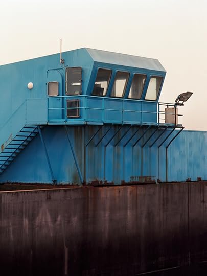
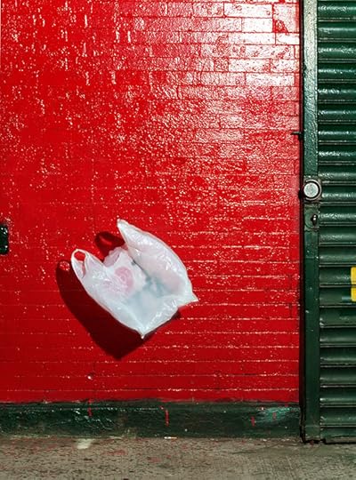
Geert Goiris, Brest, 2017
Courtesy the artist and Roma Publications
Graphic designer Roger Willems and visual artist Marc Nagtzaam (whose work predominantly comprises pencil drawings) knew each other from art school, where they had collaborated on projects. It was a 1998 collaboration that unintendedly launched the career of one of today’s most prolific small publishers of art and artist books: a forty-page booklet titled (SOME), containing text fragments in longhand by Nagtzaam and drawings depicting abstract scenes of his exhibitions. This publication, later known as “Roma Publication #1,” was followed in 1999 by seven more, most of them collaborations between Willems and the artist Mark Manders (who mainly works in sculpture, drawings, and installations), taking the format of newspapers, posters, a collection of poems, and an artist book. Two decades on, the catalogue of Roma Publications—which takes its appellation from the first syllables of the founders’ names—numbers over 330 publications.
Willems has gone on to publish many volumes and artist editions with both Nagtzaam and Manders, while in the meantime Roma Publications has expanded into “a platform to produce and distribute autonomous publications made in close collaboration with a growing number of artists, institutions, writers and designers,” as stated on its website. Most of the releases consist of art and artist books and exhibition catalogues, oftentimes in conjunction with museums and other cultural institutions, but the press’s oeuvre also contains leporellos, DVDs, audio CDs, leaflets, posters, and a website. Editions run from two to 150,000 copies, and volumes from four pages to 32,544. Depending on the subject and purpose of each publication, Willems and his collaborators determine rules for the appearance and type of distribution. Willems is responsible for most of the book designs although other designers have occasionally worked on Roma’s publications. Manders, who has a successful artistic career of his own, still acts as a sounding board for Willems, who regularly seeks his opinion on editorial or design questions.
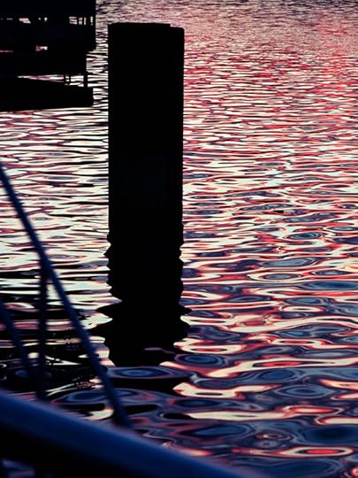
Geert Goiris, Strasbourg, 2017
Courtesy the artist and Roma Publications
Willems’s graphic design style could be called subtle, sober, (deceptively) simple, and in service of the publications’ content. In an interview with Willems for Foam Magazine, Hester Keijser noted the modernist influence in his design practice.* Willems’s preference for minimalist design has been influenced by the Dutch modernist graphic design tradition, including Willem Sandberg, Wim Crouwel, and Willems’s mentor, Karel Martens. Another motivation for his sobriety is the desire of many artists to make focused books, unfettered by external noise such as institutional logos, obligatory prefaces by curators, and so on. Many artists are also put off by designers leaving too strong a mark, so Willems considers book design “an attempt to come to the point.” A subtle design also means that the type of paper, size, and printing and binding techniques are important choices, while Willems sees technical or budget constraints as an invitation to keep carefully designed publications affordable, avoiding the path of the luxury edition.
Roma Publications also regularly publishes books that may qualify as photobooks, but Willems prefers not to distinguish between these and other art publications. Whether he works on books with photographers, artists who employ photography, or artists who appropriate archival, vernacular, and other photographic imagery, the process of editing and sequencing differs per project. As a guiding principle, Willems aims to discover and to understand the specific body of work an artist wishes to turn into a book. He thinks it’s important to engage in a collaboration in a playful and creative manner, letting a book grow from the process of looking more than from thinking, as long as a project is given the time it needs to ripen, and shifted into the right focus. For example, Dana Lixenberg’s long-term portrait series about the residents of the Los Angeles neighborhood of Watts was already marked by a crisp and clear story. For what was to become the 2015 book Imperial Courts 1993–2015, Lixenberg and Willems had a large number of high-quality photos at their disposal. They wanted neither to feed four hundred of the photos into a machine-like book, nor to arrive at too small a selection that would miss the point of the overall story. In the end, Willems added an index of medium size images and thumbnails, allowing every image in the book to return in chronological order and clarify the complex interrelationships within the community depicted.
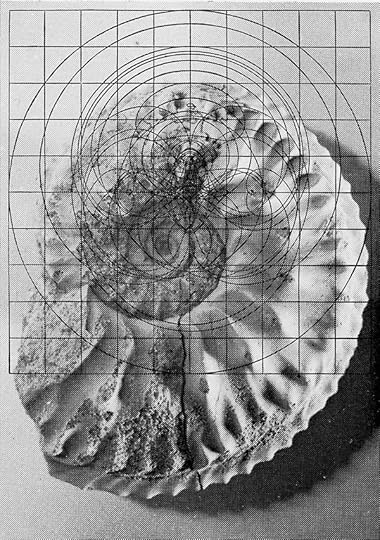
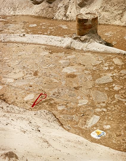
Batia Suter, Ammoniet, 2018
Courtesy the artist and Roma Publications
Artists Geert Goiris and Batia Suter also have each published more than one book with Roma Publications and have established long-term working collaborations with Willems. Goiris first published leporellos and a two-sided printed card before his photobooks Lying Awake (2013), Proliferation (2014), Prophet (2015), and Peak Oil (2017) came out. While Lying Awake recapitulates fifteen years of work, the latter three establish a series comprising works from shorter time frames, published with a corresponding design. Suter, on the other hand, recently published Radial Grammar on the occasion of her 2018 solo exhibition at Le Bal in Paris, as a sort of refreshing interlude after her intense and voluminous Parallel Encyclopedia #2 (2016). While Suter worked on the slideshow film for the Radial Grammar exhibition, Willems designed the book, for which he employed two layers of black in the printing so that image-doubling and fading effects akin to the movie could be produced in the book.
In 2014, photographer, writer, and educator Stanley Wolukau-Wanambwa proposed a photo project to Willems about violence, throughout history and into the present, which would include his own texts. In order for the project to gain a sharper focus, after consulting with Willems, Wolukau-Wanambwa continued adding images and editing his texts without any set deadline. In 2018, the project resulted in the book One Wall a Web (a winner in the 2018 PhotoBook Awards). The process benefited from not being rushed or limited by institutional constraints, so as to arrive at the type of book that Willems values most in his publishing endeavors: serious and earnest, but with a surprisingly light touch.
*Hester Keijser, “Roma Publications: Holding the Course,” Foam Magazine 33, pp. 13–18.
Taco Hidde Bakker is a writer, translator, and researcher based in Amsterdam.
Read more from The PhotoBook Review Issue 015 or subscribe to Aperture and never miss an issue.
The post The Photobook Publisher with a Deceptively Subtle Touch appeared first on Aperture Foundation NY.


January 15, 2019
Wanting to be Held
What can Robert Bergman teach us about the act of seeing?
By Stanley Wolukau-Wanambwa
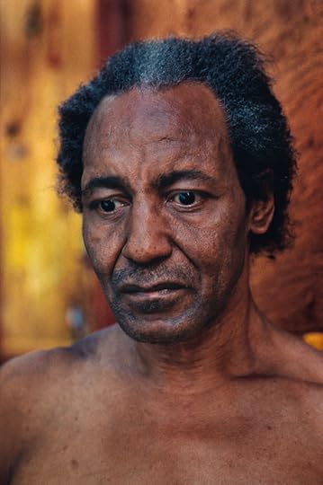
Robert Bergman, [untitled] from A Kind of Rapture (Pantheon, 1998)
© the artist
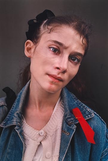
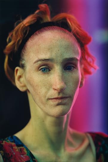
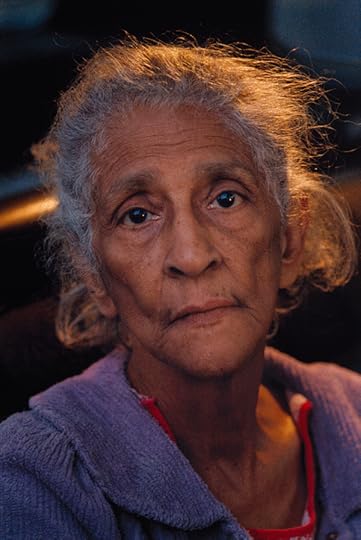
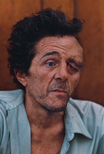
Twenty-one years ago, Robert Bergman published the classic photobook A Kind of Rapture. The book’s title is a quotation from Toni Morrison’s introduction, entitled “The Fisherwoman,” and it encapsulates the alternating currents of sublimity and seizure that define the extraordinary strengths of Bergman’s work. A Kind of Rapture consists of two short essays—the first by Morrison, the second by art historian Meyer Schapiro—and fifty-two closely cropped portraits of fifty-one unnamed Americans made in the twelve years between 1985 and 1996. Each image is crafted from sonorous, deeply congruent shades of color—color that regulates the compositional structure of each portrait so that figures emerge in a thickened, dimensional solidity that roots them in the wider setting that the pictures fractionally describe. With one or two exceptions, the portraits are illuminated by softened, diffuse, and indirect light that tempers the spartan austerity of the framing, so that the stark silhouetting of the figure is suffused by the mellifluous movement of graduated hues and shades.
These qualities combine to describe a series of varied, startlingly immediate faces possessed of a vivid, careworn beauty, which is proffered in knowing and proximate relation to the photographic surface that both divides and conjoins us to one another in complex reciprocity. The absence, within the book, of any identifying information pertaining to the people or places described in the portraits leaves me adrift in the uncertainty of an encounter in which I am looked upon with acuity, with sagacity, or with tensed circumspection—in which I am named as a subject by the intense and irreducible presence of an unknown Other, and yet asked nothing in return. The philosopher Emmanuel Levinas describes this experience in his essay “Philosophy and the Idea of Infinity,” when he writes that “in his face, the other appears to me not as an obstacle, not as a menace I evaluate, but as what measures me.”
Robert Bergman, [untitled] from A Kind of Rapture (Pantheon, 1998)
© the artist
In this dynamic of being seen while seeing another, John Berger writes that our vision is continually “constituting what is present to us as we are,” reminding us in Ways of Seeing that the “eye of the other combines with our own eye to make it fully credible that we are part of the visible world.” Thus, looking at Bergman’s portraits means entering into reciprocal visibility—the portraits make it impossible not to be conscious of our own habits of looking as we engage the people they describe. Leo Steinberg, writing in his 1960 essay “Contemporary Art and the Plight of Its Public,” described this experience in spatial terms, noting that “as soon as you recognize a thing as a face, it is an object no longer, but one pole in a situation of reciprocal consciousness; it has, like one’s own face, absolute ‘Hereness.’” The polarities of a shared world emerge when we experience the reciprocal recognition of a consciousness as present to us as our own mind is to ourselves. We are bonded to the presence of the Other in a form of recognition that cannot be reduced to a meeting of the eyes—we are bonded to a place of shared relation by this fact, and such proximity can “summon a ripple of alarm,” to quote Morrison in “The Fisherwoman.” But I think that it is precisely here, in this reciprocal conjuncture, that rapture plays its part in Bergman’s portraits.
Robert Bergman, [untitled] from A Kind of Rapture (Pantheon, 1998)
© the artist
*
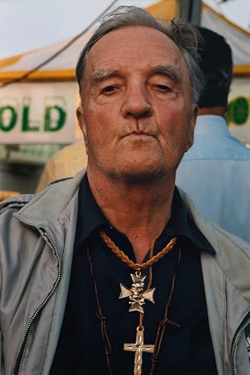
Take the weathered features of a middle-aged white man in one of Bergman’s untitled images. He seems to be seated in front of a wood-paneled wall painted in burnished tones of russet gold, his powder-blue shirt splayed open at the neck to reveal the slender outlines of his collarbones. He is close to the surface of the lens, and thus close to the surface of the frame in which his image is distilled. He lies on the page beneath the thickening glimmer of a delicate varnished coating, the hints of orange flecks in the skin at the base of his throat seeming to draw his chest backward into resonant proximity with the wooden wall behind, the soft flush of salmon pink in his face seeming to rise with the pale hue of his shirt like an inhalation of light ascending from the frame line, and pointing up the faint reflection of a blue window mirrored in his right eye. The wavy blurred creases of his shirt echo the worn lines of his face and the elegant swirl of his thick dark black hair, which is tendrilled faintly by streaks of white.
The confluence of all these elements seems to move, or rather to wend around and toward and away from his face. The right side of his face seems to be shaped by a wordless question that creases his brow and draws his rapt attention outward away from the lens and beyond the frame. The left side of his face is warped by the heavy swollen distension of flesh that bows the clean lines of his brow, marking his left eye with a sense of grim or implacable resolve. A trick of the light makes one eye a darker brown hue than the other, just as the play of contrasts in the thickness of his flesh seems to make of his visage a tale of two irreconcilable halves.
Robert Bergman, [untitled] from A Kind of Rapture (Pantheon, 1998)
© the artist
But in the portrait, his lassitude cannot be conclusively divided from deep meditation, nor his nobility from weariness, nor his beauty from damage and aging. The starkness of the frame and the sinuousness of its parts produce a kind of seizure that is also a caress, so that I am drawn into abrupt, sensuous, and wordless proximity with this man—so that I am simultaneously transported and held. I want to work out how to respond to the mystery of this stranger without seeking to reduce him to some manageable position on a calibrated index of difference from which I might separate myself. What I learn to want, in looking at this image, is to be unbound by it, to be decentered by it as I look on in permanent irresolution, so that through this encounter I am compelled to remain open to an inassimilable difference.
Robert Bergman, [untitled] from A Kind of Rapture (Pantheon, 1998)
© the artist
*
At the root of the word rapture, within the diametrically opposing valences of the term rapt, are resonances of spiritual exaltation—what the Oxford English Dictionary defines as “the expression of ecstatic feeling”—and also of abduction, violation, and rape, derived from the Latin term raptura, which describes the “act or power of carrying forcibly away.” Bergman’s portraits are defined by their simultaneous articulation of such seemingly contradictory meanings. In them, woundedness and beauty cannot be opposed, nor can the impulse to control be separated from a fear of being subject to the gaze of the Other. That gaze is not reducible to something purely retinal; it does not depend upon an encounter between two sets of eyes, but rather on the disruptive intensity of the presence of someone other than ourselves, and on their capacity to make themselves irreducibly and unmanageably present to us through these radiant images, and thus to disorder our sovereign centrality within the world.
Robert Bergman, [untitled] from A Kind of Rapture (Pantheon, 1998)
© the artist
If we are to remain open as we look at Bergman’s portraits, we will have to occupy a liminal position between holding and being held, between beholding and being beheld. In that reciprocal conjuncture, we are confronted not merely by what we do not yet know of one another, but more pressingly by the question of what we owe to one another. The excellence of Bergman’s work is registered by the clarity with which this quandary is formulated in his portraits: what are we to do in the face of the Other? Bergman’s pictures deny us any access to the raptures of their formal beauty that might be severed from the all too injurious work of surviving the ravenous world that we presently, and unevenly, share. Rather, their beauty is indivisible from the fundamental ethical challenges that we all face: their aesthetics are an ethics.
Between the chromatic fullness of the pictures and their formal restraint, there is a kind of precision and an overflowing—a visceral transgression of the two-dimensional threshold of the photographic image. I think that this has to do with love, a seemingly outmoded and nevertheless vital term. Simply put, in our openness to these images we must be willing to be undone by them, just as our openness in love fucks us up. We must be willing to be uncertain in their presence, naked under their gaze—willing, finally, to meet them there at the surface, “at the property line,” as Morrison writes, where we might learn to relinquish possessive instincts, learn not to hold but to be beheld.
Robert Bergman, [untitled] from A Kind of Rapture (Pantheon, 1998)
© the artist
Stanley Wolukau-Wanambwa is a photographer and a writer. His debut monograph, One Wall a Web, was published by ROMA Publications in 2018, and his forthcoming volume of selected essays is due out from MACK in 2020.
The post Wanting to be Held appeared first on Aperture Foundation NY.
Roe Ethridge on Getting It Exactly Wrong
In dizzying sequences, the irreverent photographer embraces risk and failure.
By David Company
Roe Ethridge, Louise, 2011
© and courtesy the artist
Roe Ethridge’s approach to editing and sequencing his work in book form has almost become synonymous with a particularly contemporary mode of picture organization. He embraces the nonnarrative and the nonsequitur, eschewing traditional definitions of genre and series-making in favor of unlikely and inexplicable connections between images across the pages.
David Campany: I get the impression that you’ve come to be known as much for the way you set up relations between your images, in your books and exhibitions, as the images themselves. Whatever it is your work communicates, or suggests, emerges in the associations and resonances between quite different kinds of photographs. From how early on in your development were you thinking about the way images might play off each other?
Roe Ethridge: It was early on. In 1999 I finished a project that was very typological. It was pictures of trees on highway medians. I loved German objective photography when I was in school and it felt like the way to do the American road story through my interpretation of objective photography. Simultaneously, I had just moved to NYC and had started shooting commercially. I had a few outtakes from a beauty story I did for Allure in the studio while trying to make “tough, smart, conceptual” photography. There was no denying that the outtake was as good or better than anything I intentionally made as an “artist.” I realized that the cross-pollution of images from an art practice and an applied practice was something that was more true than being a “good” photographer. Russell Haswell put me in the MoMA PS1 Greater New York show in 2000 with that outtake of a beauty model and an image of a UPS/mail store. That was the first public showing of that approach.
Roe Ethridge, Screenshot of Point Break (plus), 2011, from the book Le Luxe
© and courtesy the artist
Campany: I agree about the close relation between so-called “art” photography and applied or commercial photography. I enjoy those books from the 1920s that tried to show these connections. Roh and Tschichold’s Photo-Eye (Akademischer Verlag Dr. Fritz Wedekind & Co., 1929), Moholy-Nagy’s Painting, Photography, Film (Albert Langen Verlag, 1925). Back then there was a broad sense that one should try to make good photography wherever in the culture one could, and the art part would take care of itself. That’s easier to accept in hindsight, but when practitioners like you do it in the present it always feels like a provocation, or a transgression, as if on some level these diverse image forms shouldn’t be seen together. Over the years I can tell your editing has become incredibly nuanced, but is there still a sense of provocation or transgression, either for you, or as something you’re bearing in mind for your audience?
Ethridge: I know there’s a word for when influence skips a generation but I can never remember it.
For me it was the work of Paul Outerbridge that really got me excited, but I also had this guilty pleasure of Stieglitz and other early Pictorialist images. For some reason, what pops into my mind right now is Outerbridge’s image Ide Collararar [1922], versus Stieglitz’s Spiritual America [1923]. Funny how they speak to each other.
I definitely think about the audience’s reception of the sequence, but I first think of what I want to see and how it provokes something for me. I like the idea that a layout is like the whole musical score and how notes or tunings or progressions are correlatives of color, composition, or subject. So for me those considerations are understood going into a sequence. I’m not sure if I think about it as provocative, or transgressive, but I often feel that if the sequence doesn’t give me a bit of nausea I’m probably not doing it right.
Roe Ethridge, I Love NY Bag, 2011
© and courtesy the artist
Campany: What do you mean by nausea? And can you give an example in your own work?
Ethridge: Feeling sick. Like my using the Mistral font that says “Sacrifice Your Body” over an image of a skeleton wearing a Florida State Seminoles hat preceded by an image of Gisele in a bathtub and followed by an image of carnations, tulips, and roses laid on a mirror. It’s all “right” in its wrongness. Maybe “nausea” is a substitute for Warhol’s quote about getting a painting “exactly wrong.”
Campany: For this issue of The PhotoBook Review, I put a call out for people to send me images of their editing process. Most sent pictures of printed images laid out over floors. At first you sent me a JPEG of the logo for InDesign. Then you sent a number of screenshots of your books in progress. So I presume you do your book editing on-screen. Do you do any editing with actual prints, or is it all done on the computer? Does the screen give you a better understanding of how your photographs work? I guess they are pure and immaterial images on-screen.
A lot of your books feel like elaborate brochures for imaginary and maybe neurotic corporations. You like to push glossy lifestyle imagery into awkwardness, or place it next to something abject or forlorn. In this the books often feel like reedits of America’s self-image. Taking familiar things but shuffling the order, so that the fantasy begins to question itself, unraveling before one’s eye. I like the idea that someone looking at these books in fifty years could actually get quite a good sense of how messed up society was. Or maybe things will be way worse in fifty years and your books will seem like fond remembrances!
Ethridge: I made a few books by hand but they were one-offs or zines or an artist book. I remember someone trying to explain how to use QuarkXPress and it was like unintelligible to me. However, working in the magazine world and seeing the way a magazine came together on-screen had me chomping at the bit. When I started using InDesign it was fairly intuitive and then I was off to the races. I think it was like 2003, and I have never sequenced a book or story any other way since then.
I feel like it goes back to the notion of writing the whole musical score. I can see the images as thumbnails, almost like they are equivalent to notes in a score. Then I can bring the image forward and see it in direct relation to its page left, page right, verso, etc. I also love the ability to use the margin as a place stacked with failed attempts. Sometimes the margin is where I find combinations of images I would not have predicted and they wind up sequenced in the final book.
Roe Ethridge, Leelee, 2011
© and courtesy the artist
Campany: I think of many of your images almost as Readymades, like they already existed somewhere and you happened to be the one to find them. And then, when you arrange them, it often feels as if you’re showing us things you’ve found. Does this make sense?
Ethridge: I love what you are saying about the found object and the Readymade. I think that is such a big part of my education and earliest affections for art. My two big early influences were Lee Friedlander and Andy Warhol.
Campany: Photography has such a complicated relation to chance. It’s always there but it can be destabilizing unless you can figure out your relation to it and make it work for you. Just coming back to the Readymade, I guess Duchamp’s idea of nominating an object as a work of art is a pretty radical act of editing. Picking something out from the continuum, isolating it in a way that makes it strange and compelling.
Ethridge: Absolutely. Selection is editing. In a way it’s the opposite of chance. All intention. I used to think of myself as a kind of stock photographer. Making an inventory of images from which I would select.
Roe Ethridge, Sand Pit #3, 2006
© and courtesy the artist
Campany: Yes, few of your images seem chancy, although maybe never entirely conscious. Chance comes into the equation through the putting together of the different images.
Ethridge: Right. A good accident is better than a bad intention!
David Campany is a curator and writer based in London.
Read more from The PhotoBook Review Issue 015 or subscribe to Aperture and never miss an issue.
The post Roe Ethridge on Getting It Exactly Wrong appeared first on Aperture Foundation NY.
Can a Photography Festival Thrive in Today’s China?
In the city of Lianzhou, visions of global power collide with official censorship.
By Annika Klein
He Qingsong, Untitled, from the series About a Prophecy, 2018
© and courtesy the artist
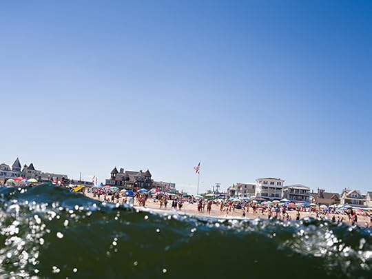
In an installation at the 2018 Lianzhou International Photography Festival in December, six screens of public transport passengers staring at their smartphones illuminated a dark, carpeted room. Dutch artist Jacqueline Hassink, who died of cancer in 2018, shows how, from this view, Seoul looks a lot like New York, and Moscow’s not that dissimilar from Tokyo. This reflection of our current moment describes a state of isolation and interconnection not so different from that between China and the West.
Despite its population of half a million, Lianzhou is referred to as a provincial town by those who live in the region’s capital, Guangzhou. Restaurants and shops spill their wares, from medicinal herbs to industrial netting, onto the street in heaping baskets, and curiosities, like a shop window brimming with pulled teeth, abound. The festival, located in the southern Chinese province of Guangdong, took place across two venues and coincided with the opening of four exhibitions at the Lianzhou Museum of Photography. Previously a sugar factory, the understated, open-air complex opened in 2017 as China’s first public photography museum. The two festival venues are also renovated industrial spaces, an old shoe factory and a grain storage facility, both of which include multiple small buildings.
Salvatore Vitale, Untitled, from the series How to Secure a Country, 2015–18
© and courtesy the artist
The granary, with its high-ceilinged cisterns and polished wood floors, hosted the marquee group exhibition, Winds of Time, curated by Jérôme Sother of the GwinZegal center in France. Featuring mostly European artists, the exhibition is broad enough to include a wide variety of work, all relating to the theme—if tenuously—but not all relating to one other. Michele Borzoni’s Open Competitive (2014–17), critiquing Italy’s civil service examinations, hangs near a project by Lau Wai, whose Walking to Nam Kok Hotel (2018) deconstructs Hollywood’s depictions of the “Orient” from the 1950s on. In a building across the courtyard, videos by Sebastian Stumpf show the artist lying facedown in puddles or jumping off bridges—nihilistic performance art fifty years too late. Despite these outliers, the exhibition more or less holds together thematically.
The strongest thread within Winds of Time speaks to global systems of power and commerce related to the internet. Salvatore Vitale, winner of the Punctum award (given each year at Lianzhou), explores Switzerland’s vast security networks, from insurance companies to the military. Vitale sees Switzerland as a case study for the West, “confronted with growing threats—real or perceived—from migration and cybercrime, surveillance and big data,” as he told me recently by email. In Where the money is made (2017), Eline Benjaminsen traces the banal European landscapes where data centers for algorithmic, automatic trading, known as high-frequency trading, are housed. Esther Hovers, in False Positives (2018), asks viewers to put themselves in the position of “smart” surveillance systems, which use algorithms to analyze security footage and detect suspicious behavior. Slightly different, but equally compelling, Henk Wildschut’s ongoing Thomas Struth–like project, Food (2011–13), considers how we might feed a growing global population.
Shi Zhen, Untitled, from the series Kwei Yih, 2017
© and courtesy the artist
The festival also included thirty-two solo exhibitions and four group exhibitions of varying quality. Solo exhibition highlights included Yan Changjiang’s excavation of a shuttered art college; He Quinsong’s poetic photographs reminiscent of Rinko Kawauchi; Shi Zhen’s journey of self-discovery through landscape; and Koji Onaka’s Slow Boat, a tidy display of black-and-white travel photographs from the ’80s and ’90s. For an international festival, however, I would have liked to see more artists from outside of Europe and Asia.
The standout among the four museum exhibitions was Leaving Speed by Peng Ke, considering changing Chinese cities. Located near the entrance of the museum, off the main courtyard, this one-room exhibition features large color photographs hung on the wall, two light boxes on the floor, and a wire-and-cinderblock fence. Ke, who was born in the neighboring province of Hunan, effectively merges photography and installation without being gimmicky or hackneyed.
Peng Ke, Malatang, Changde, 2014
© the artist and courtesy the Lianzhou Museum of Photography
Unfortunately, at both the museum and the festival, many of the projects couldn’t be viewed in their original and intended forms. Almost one-third of the works in Winds of Time—120 in total—were removed by government officials; some were confiscated the night before the festival opened. Swaths of white drywall dotted the galleries, with only screws to mark where a photograph should have been. Some artists, like Wildschut, who had half his works pulled, rehung their shows entirely. Andy Sewell—whose installation, Known and Strange Things Pass (2018), considers the physical structure of the internet—instead drew boxes on the wall where his photographs had been. In the most severe case, Oliver Sieber’s solo show portraying countercultural music scenes around the world was so heavily censored that the festival closed the room off altogether.
Henk Wildschut, Feaces. Maatschap Stroo, Slootdorp, The Netherlands, July 2012, from the series Food, 2011–13
The Lianzhou festival is funded by the local Chinese government—along with international partners, including the Institut Français and the Mondriaan Fund—and is therefore required to submit a full list of works included in the festival for approval months prior to the opening. In past years, the festival has gotten away with submitting a partial list of works, and then finalizing the exhibitions closer to the opening. This year, however, there were administrative changes to the censorship system, and the festival didn’t properly adjust. They went on with business as usual and didn’t send a totally final list, but because of the changes, they got in trouble for it. “It definitely had an impact on the quality of the festival,” Duan Yuting, the festival director, noted. “Following changes in the approval process, we were not prepared properly. Next year we will take extra time and care to make sure every image has been submitted in order to safeguard the program’s integrity to the best of our ability.”
There didn’t seem to be a particular logic to the removal of works: some works that weren’t on the list were left in place, and there was some joking among artists that the censors consistently took the smallest pictures because they were easier to remove. “There seems to be no sense, no system of rules that explains why one picture was taken and another left on the wall. They just disappeared in the night with no explanation,” Sewell said. Even stranger, photographs that were removed from exhibitions were still displayed in front of party officials at the elaborate opening ceremony, as well as on billboards and posters throughout the city.
Andy Sewell, Untitled (New Jersey, USA), from the series Known and Strange Things Pass, 2018
© and courtesy the artist
The festival’s scale and scope, along with the museum itself, is impressive; in the years since the festival first launched, the city itself has changed remarkably. “Fifteen years ago, many cities in China sought new projects to push development in the city, and some cities chose to develop projects related to culture and art,” Yuting explained. “It was quiet, there were not so many cars, and the festival had arrived out of the blue for the people of Lianzhou. But after a few years, the festival has grown to become part of the city and a pride of the local community.”
The city of Lianzhou is just one example of a country undergoing rapid growth. Winds of Time, appropriately, considered change and asked questions of what the future might hold. As China continues to expand its global influence, nothing is more relevant. The West, however, already failed in predicting China’s current role as an autocratic economic powerhouse. Academics and presidents alike wrongfully assumed that prosperity would lead to a demand for liberal values. Imagined as a vehicle for free speech, the internet has instead become a tool for China to monitor and control its people. Even Google, which refused to do business in China for years, is now developing a government-approved search engine. One must wonder, will Western artists and institutions also bend to the will of the Party?
Annika Klein is assistant editor of Aperture magazine.
Winds of Time was on view in Lianzhou, China, from December 1, 2018, to January 3, 2019. Leaving Speed is on view at the Lianzhou Museum of Photography through March 18, 2019.
The post Can a Photography Festival Thrive in Today’s China? appeared first on Aperture Foundation NY.
January 11, 2019
The Woman Who Made the World’s First Photobook
Why Anna Atkins deserves her place in the pantheon of great photographers.
By Maika Pollack
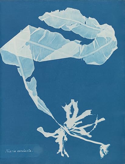
Anna Atkins, Alaria esculenta, 1848–49, from the book Photographs of British Algae: Cyanotype Impressions
Courtesy The New York Public Library
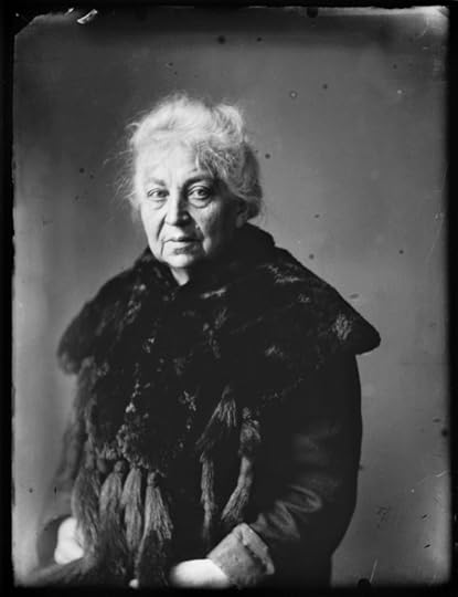
Anna Atkins’s book Photographs of British Algae: Cyanotype Impressions (1843–53) has long been, to photographers, a highlight of the New York Public Library collection, and perhaps even a subtle highlight of the city itself. As part of the library’s exhibition Blue Prints: The Pioneering Photographs of Anna Atkins, this exquisite book of nineteenth-century photograms, rarely on display, can be seen in person in all its delicate glory. Photographs of British Algae is now widely seen as the first photographically illustrated book, thanks to the scholarship of Larry Schaaf; an expanded reprint of his original Aperture catalog accompanies the exhibition.
Like other better-known British women photographers of the nineteenth century—Julia Margaret Cameron, for example—Atkins came from means, and started photography later in her life, in her early 40s. To create the approximately fourteen copies of British Algae, Atkins printed some six thousand cyanotype photogram exposures on hand-treated paper. The book was produced without the backing of a major enterprise or society, though a few works, some containing peacock feathers and ferns, are collaborations with Anne Dixon, a childhood friend, and Atkins apparently had the help of household staff.
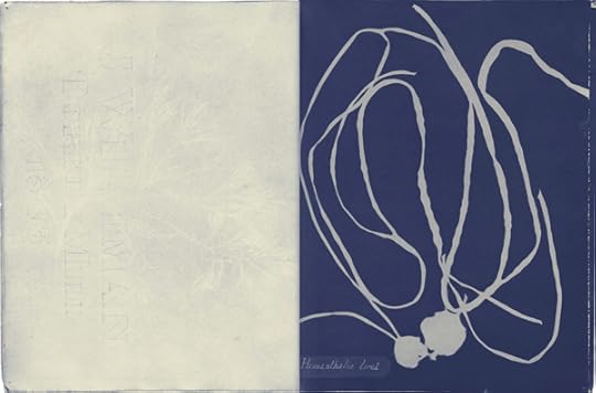
Spread from Photographs of British Algae: Cyanotype Impressions, 1848–49
Courtesy The New York Public Library
The New York Public Library’s copy of British Algae originally belonged to John Hershel, the scientist-inventor of the cyanotype. Never bound, it consists of delicately hand-stitched folios each a dozen or so pages, like little zines meant to be assembled and bound by the owner. This vulnerable form—not hidden by the officious leather cover and spine—gives the viewer a more intimate glimpse of Atkins’ process: streaks of Prussian blue, hand-sewn bindings, and the watermarks by J. Whatman Turkey Mill, the venerable nineteenth-century art-paper maker, all add to its allure, and all might have been hidden by binding. A title page has little pieces of seaweed spelling out the words on the cover: “British Algae Vol. 1”—the strands slightly fuzzy, like electricity hit them.
Cyanotype blue, or Prussian blue, is durable and unfading as a medium, and appears very close now to how it must have looked to the wealthy friends and amateur scientist readers (including Talbot) who received gifts of the volumes. The algae photograms appear not just in silhouette but also with some gradations of blue showing the thickness of the strands of seaweed, giving a diaphanous floating quality to the prints. You can almost smell the seawater. The page layouts are beautiful—the relatively modest size of the paper sometimes seems too vast for a tiny centered sprig, while other tentacled strands have to be wrapped artfully to fit on the page. Latin text (always present) is sometimes tucked to one side, a reminder that these photograms are products of scientific inquiry, and even an unconscious colonial impulse, an endeavor to categorize and name seaweed and capture its unfathomable detail with photographic precision.
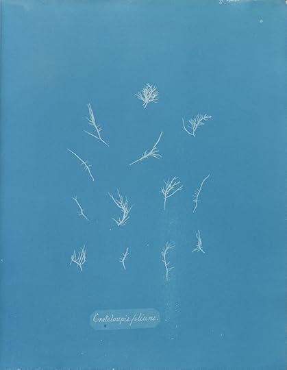
Anna Atkins, Grateloupia filicina, 1848–49, from the book Photographs of British Algae: Cyanotype Impressions
Courtesy The New York Public Library
The lapidary exhibition in the NYPL’s tiny rare book gallery is dense with both illuminating objects and carefully chosen contextual details: for example that Atkins’s father, John George Children, was “Keeper of the Department of Natural History and Modern Curiosities” at the British Museum, and that Atkins had an herbarium with 1,500 examples of plants. The exhibition includes works such as Atkins’s early drawings of shells; the botanical illustrations of Elizabeth Blackwell (women, generally barred from academic art training, could instead illustrate plants); a mediocre watercolor by Atkins of Halstead Place (her home); and Mary Wyatt’s 1832 books on algae with actual specimens of marine plants somewhat comically flattened inside.
The larger question the show raises is this: We know that William Henry Fox Talbot aspired to create the first photographically illustrated book, The Pencil of Nature (1844–46)—but because of the laborious progress of that book’s production, the diligent Atkins beat him to it with her modest edition about seaweed. But why do we constantly cite Talbot as the first individual to create a photographically illustrated book (now adding the words “commercially available” for accuracy), and why has Atkins received so little credit on that front? What does it mean to succeed as the “first” in any medium or form?
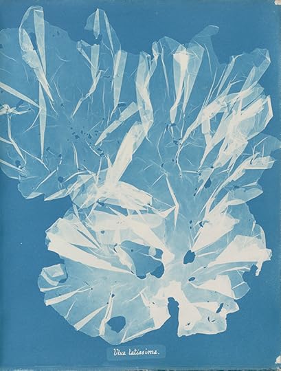
Anna Atkins, Ulva latissima, 1848–49, from the book Photographs of British Algae: Cyanotype Impressions
Courtesy The New York Public Library
A number of distinguished women have told me that it hardly matters who is “first”—as if “first” were merely a male ambition—and as if women have better things to do than worry about their place in these histories. Yet major histories of photography almost completely omitted Atkins until the 1990s. At various points her “A. A.” initials on the book were even said to stand for “Anonymous Amateur.”
Woman, only child, mother, and scientist, Anna Atkins has progressed in the public imagination from an “Anonymous Amateur” to a proper pioneer of photography. A photographer recently told me she took her children to see the show, telling them, “This is part of why Mom is a photographer.” The exhibition is spectacular, and you can’t help but wonder what else we don’t know and who else we aren’t crediting in our histories of the medium.
Maika Pollack teaches the history of photography in the MFA program at the Pratt Institute.
Blue Prints: The Pioneering Photographs of Anna Atkins is on view at the New York Public Library’s Stephen A. Schwarzman Building through February 17, 2019.
The post The Woman Who Made the World’s First Photobook appeared first on Aperture Foundation NY.
January 9, 2019
Richard Renaldi: Building a Body of Work

Photo by Bill Kotsatos
Join Richard Renaldi for a two-day workshop where participants will discuss the ideas and practices behind fostering a long-term photographic project. Students are expected to bring to class one or two photographic series that they have been working on for some time, and should be looking for guidance on how to “grow” their project. Students will be required to participate in a dialogue that is self-critical and encourages reflection. The instructor will make suggestions and provide tools to help build a strong and lasting photographic body of work. There will be an examination of both renowned and lesser-known photographic projects, as well as a deliberation regarding the “why” and inspiration behind the themes in each of the students’ work. Participants in this workshop will also be asked to remark upon and develop an opinion about their colleagues’ work.
Richard Renaldi was born in Chicago in 1968. He received a BFA in photography from New York University in 1990. He is represented by Benrubi Gallery in New York and Robert Morat Galerie in Berlin. Five monographs of his work have been published, including Richard Renaldi: Figure and Ground (Aperture, 2006); Fall River Boys (Charles Lane Press, 2009); Touching Strangers (Aperture, 2014); Manhattan Sunday (Aperture, 2016); and I Want Your Love (Super Labo, 2018). He was the recipient of a 2015 fellowship from the John Simon Guggenheim Memorial Foundation.
div.important {
background-color: #eeeff3;
color: black;
margin: 20px 0 20px 0;
padding: 20px;
}
Objectives:
Build a set of goals that will help further advance your project(s)
Learn how to build a strong and lasting body of work
Be comfortable in explaining your project(s) to a group of people
Materials to bring:
Please bring one or two long-term projects. You may bring prints or send your image files to education@aperture.org.
Tuition:
Tuition for this two-day workshop is $500 and includes lunch and light refreshments for both days.
Currently enrolled students and Aperture Members at the $250 level and above receive a 10% discount on workshop tuition. Please contact education@aperture.org for a discount code. Students will need to provide proper documentation of enrollment.
REGISTER HERE
Registration ends on Wednesday, March 20, 2019
Contact education@aperture.org with any questions.
GENERAL TERMS AND CONDITIONS
Please refer to all information provided regarding individual workshop details and requirements. Registration in any workshop will constitute your agreement to the terms and conditions outlined.
Aperture workshops are intended for adults 18 years or older.
If the workshop includes lunch, attendees are asked to notify Aperture at the time of registration regarding any special dietary requirements. Please contact us at education@aperture.org.
If participants choose to purchase Aperture publications during the workshop they will receive a 20% discount. Aperture Members of all levels will receive a 30% discount.
RELEASE AND WAIVER OF LIABILITY
Aperture reserves the right to take photographs or videos during the operation of any educational course or part thereof, and to use the resulting photographs and videos for promotional purposes.
By booking a workshop with Aperture Foundation, participants agree to allow their likenesses to be used for promotional purposes and in media; participants who prefer that their likenesses not be used are asked to identify themselves to Aperture staff.
REFUND AND CANCELLATION
Aperture workshops must be paid for in advance by credit card, cash, or debit card. All fees are non-refundable if you should choose to withdraw from a workshop less than one month prior to its start date, unless we are able to fill your seat. In the event of a medical emergency, please provide a physician’s note stating the nature of the emergency, and Aperture will issue you a credit that can be applied to future workshops. Aperture reserves the right to cancel any workshop up to one week prior to the start date, in which case a full refund will be issued. A minimum of eight students is required to run a workshop.
LOST, STOLEN, OR DAMAGED EQUIPMENT, BOOKS, PRINTS, ETC.
Please act responsibly when using any equipment provided by Aperture or when in the presence of books, prints etc. belonging to other participants or the instructor(s). We recommend that refreshments be kept at a safe distance from all such objects.
The post Richard Renaldi: Building a Body of Work appeared first on Aperture Foundation NY.
January 8, 2019
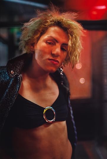
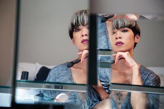
What Does It Mean to Navigate Queer Life in Hong Kong?
Meet the winner of the 2018 Aperture Portfolio Prize.
By Stephanie H. Tung
Ka-Man Tse, Untitled, 2017, from the series narrow distances
Courtesy the artist
It began with a landscape in the viewfinder. Ka-Man Tse was making a long exposure of a Hong Kong public square with her large-format camera when a teenage couple waltzed onto the scene. The image of the girls laughing and openly flirting imprinted on Tse as she indulged in imagining the infinite possibilities of their budding romance. “What does it mean to navigate queer life in Hong Kong?” she recalls thinking. “What does it mean to look, who has the right to look, what does it mean to be seen?”
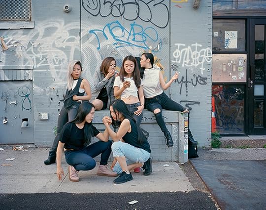
In 2004, Tse began working on narrow distances, an ongoing body of images that attempts to visualize the circumstances that led up to that moment. Tse’s photographs propose what she calls “B sides”: queer narratives and obsessions set against the backdrop of Hong Kong, the place of her birth, and New York, where she grew up and now lives and works. Shifting back and forth between the two cities, her images are made at the intersection of the Asian and Pacific Islander and LGBTQ communities. In a society in which queer folks are often either hidden—as she states, “invisibilized”—or oversexualized and objectified, Tse tells the stories of her subjects by looking for the most subtle of gestures: a halfheartedly held cigarette, an affectionate caress, a longing gaze.
Ka-Man Tse, Untitled, 2017, from the series narrow distances
Courtesy the artist
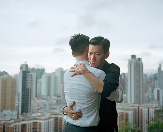
Each portrait starts with an interview. “I often ask for a mental image, memory, or location,” Tse tells me. She likes to inquire: “Is there a space that you have that you go to?” As photographer and protagonist trade images and ideas over the course of months, or even years, they collaborate to imagine a world recast according to their own experiences and desires. References from pop culture and literature weave in and out of the work. Lines from Ken Chen’s debut poetry collection, Juvenilia (2010), become touchstones for musings on family and intimacy. The toxic relationship of Wong Kar-wai’s 1997 film Happy Together appears restaged as a desperate embrace. A parody of the postpageant group photograph channels the “bad Asians” of Hellen Jo’s LA-based comic book, Frontier #2 (2013). “The work is about responding and seeing, rather than directing or executing,” says Tse.
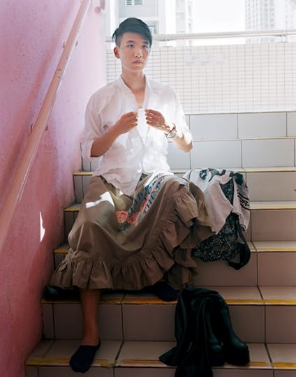
The physicality of Hong Kong frames many of the pictures. There are few images of vast, open spaces; the only unpeopled photographs are of the abandoned Kai Tak International Airport and close-ups of water and cramped rooms. Most of the portraits are made on rooftops and in alleyways, the nooks and crannies where people go to escape. In one photograph, a friend, who is an outspoken queer activist by day, changes his clothing in the stairwell of his building, a ritual he completes each night before returning to the apartment shared with his family. Light pours from his chest as he gazes outward in the unabashed act of either putting on or taking off. In a place like Hong Kong, where it is common for young people to live with their parents until marriage, spatial precarity shapes the everyday lives of its queer inhabitants.
Ka-Man Tse, Untitled, 2017, from the series narrow distances
Courtesy the artist
When Tse writes about how “occupying a space and a conversation is an act,” she invokes the urgent, political need to “establish a sense of personal space and agency where it is often contested and eroded.” Tse centers the gaze in narrow distances on queer subjectivity as she and her collaborators carve out space, both physical and psychological, to be vulnerable. Maneuvering through the city with her 4-by-5 camera, she compels others to make way, as she writes, to “be deliberate, breathe together, slow time together.” Each resulting composition is carefully layered, activating the space between the viewer and the protagonist.
Curator Helen Molesworth, citing Black Lives Matter cofounder Patrisse Cullors, connects the notion of “holding space” with a more gentle, generative, and provisional act of displacement that Molesworth sees as manifested most powerfully in Rosa Parks’s 1955 refusal “to make room for whiteness” on a Montgomery, Alabama, bus. It seems that narrowing the distances with “small gestures, clear or coded,” as Tse says, is a means of challenging spatial dominance.
Hong Kong itself is a contested space, caught between a British colonial past and an increasingly Chinese colonial future. Navigating through the territory’s streets, Tse continues to investigate the condition of being in between, making visible the everyday acts of care—for one’s home, each other, and our built communities—that sometimes get lost in the gaps and dashes.
Ka-Man Tse, Untitled, 2017, from the series narrow distances
Courtesy the artist
Stephanie H. Tung is assistant curator of exhibitions and research in the department of photography at the Peabody Essex Museum, Salem, Massachusetts.
Ka-Man Tse is the winner of the 2018 Aperture Portfolio Prize. Her exhibition narrow distances is on view at the Aperture Gallery through February 2, 2019. Click here for more information about the 2019 Aperture Portfolio Prize.
The post What Does It Mean to Navigate Queer Life in Hong Kong? appeared first on Aperture Foundation NY.
January 7, 2019
From August Sander, Stirring Portraits of Nazis and Jews
An extraordinary photobook reveals the lives of persecuted Germans during World War II.
By Brendan Embser
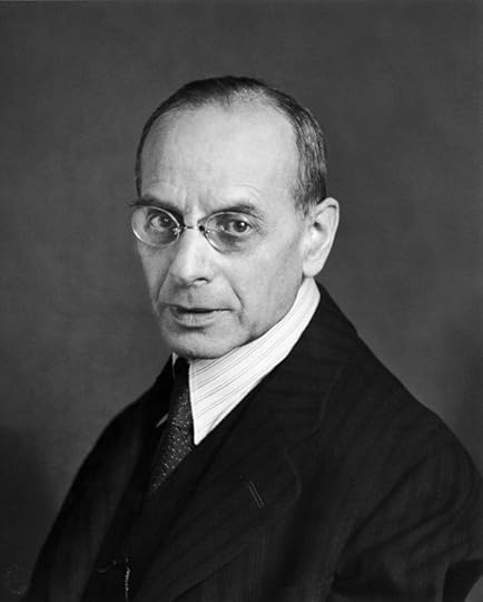
August Sander, VI/44/8 Persecuted Portfolio VI/44—The City, Persecuted, ca. 1938
In December 1941, Adele Katz sent a postcard that was never received. “My two dears, first of all let me send you my very best wishes,” she wrote from the Litzmannstadt ghetto, in the Polish city of Łódź. “I’m sorry to say that so far we have waited in vain for news from you.” Adele’s father, Benjamin (Benno) Katz, had been a prosperous butcher and meat wholesaler in Cologne, having opened his business in 1892 not far from the home and studio of the photographer August Sander. But on April 1, 1933, the day of Germany’s first nationwide boycott of Jewish businesses, Benno and his son, Arnold, were forced to march the streets of Cologne carrying defamatory, anti-Semitic signs. It was a scene of humiliation.
Soon, the family business would become untenable; several years later, unable to go abroad, Benno and Adele were sent to the Łódź ghetto. By May 1942, just months after Adele wrote her postcard from Łódź, she and Benno were deported to the Chemno extermination camp and killed.

August Sander, VI/44/5 Persecuted Portfolio VI/44—The City, Persecuted, ca. 1938
This is not how a story about August Sander—the Rembrandt of photography, whose name summons classical archetypes of German identity between the wars—is supposed to start. How do the Jews fit in? But the German Jews who Sander photographed in the late 1930s, among them Benno Katz and his family, are at the center of August Sander: Persecuted/Persecutors, People of the 20th Century (Steidl, 2018), an extraordinary book that accompanies an exhibition of Sander’s portraits at the Mémorial de la Shoah, the Holocaust museum in Paris. Numerous photographic collections have put faces to 180,000 German Jews killed during World War II, as Sophie Nagiscarde, head of the cultural department at the Mémorial, notes in the introduction. But “none compare with August Sander’s skillfully produced portraits of the Jews who sat for him in his studio.” And none, perhaps, have been collected and printed with the austere clarity of this book, with its fragrantly inky, unvarnished pages, which was overseen by Gerhard Sander, the photographer’s grandson.
Persecuted/Persecutors unfolds with the graceful structure of a sonata: exposition, development, recapitulation. In the beginning comes Face of Our Time, the 1929 photobook that would precede Sander’s masterwork, People of the Twentieth Century. Taken in the German Westerwald region and in Cologne, Sander’s portraits, as he gathered them into highly organized portfolios, were meant to portray the breadth of humanity through individual faces and bodies marked by a person’s station in life. Here, Young Farmers (1914), Country Girls (1925), Pastry Cook (1928), Working Students (1926), and Tycoon (1927)—some of the most memorable photographic portraits in the history of the medium—are set at quarter-page size, as aides-mémoire. We know them, but they’re not the stars this time. They remind yet again of Sander’s brilliance, and a time when making a photograph was an event, not a habit.
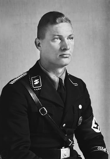
August Sander, IV/23a/4 National Socialist [Member of SS-Leibstandarte Adolf Hitler] Portfolio IV/23a—Classes and Professions, The National Socialist, ca. 1940
There follows an entirely black spread, the silence before the next movement: “Portfolio IV/23a—Classes and Professions, The National Socialist.” Across ten pages are masculine exponents of the Nazi regime, each at full-page and uninterrupted by any text. They are members of the SS or Hitler Youth, according to the captions in the back matter. Some, in their looks, edge close to Aryan deities; others, with their glasses and well-kept hair and pudgy middles, look like someone’s father or brother. NS insignia is apparent in subtle or glaring ways, as in Sander’s portrait of the Nazi head of the department of culture, seated in profile, a pose that foregrounds the swastika on his armband. “Since millions of Germans from all social backgrounds abhorred it, the Nazi armband was meaningless,” Alain Sayag, of the Centre Pompidou, writes in one of the book’s many wide-ranging essays. “Similarly, the Nazi uniform, authentic or costume, became a hollow symbol: the mask behind which an entire society was hiding.” But it’s not the Nazi accessorizing that makes the portraits in this portfolio unnerving. It’s the hands, calm and carefully folded, a wedding ring shining—or, in one fearsome young National Socialist, wide-spanned and clenched, veins popping. Those hands are capable of anything.
August Sander, Persecuted [Mrs. Franken], ca. 1938
With comparative precision, the persecuted share this book with their persecutors. “Portfolio VI/44—The City, Persecuted” is a collection of studio portraits of German Jews, most taken in 1938. They appear pensive, guarded, their minds are elsewhere. They were having their ID portraits made; they were thinking of escape. Persecuted/Persecutors tethers these plates to biographical research conducted by Cologne’s NS-Documentation Center. Brief and empathic in tone, and printed on light blue pages in the appendix, the stories of the persecuted are often accompanied by transcriptions of letters. Many end with a chilling cadence about deportation. Philipp Fleck, for instance, an editor of a bis z, the magazine of the influential Cologne Progressives with which August Sander was associated, died in the Lódz ghetto in 1942. He never received the letter his brother, Richard Fleck, sent in May of that year. “You can imagine how I long for some news of you,” Richard wrote. “I hope you are, at least, in good health.”
Of the Nazis, we learn nothing.

August Sander, VI/44a/7 Political Prisoner Portfolio VI/44a—The City, Political Prisoners, 1943
Apart from the exceptional reproduction of the plates, the revelation of Persecuted/Persecutors comes in the form of the contact prints from which Sander selected the twelve images for the portfolio “The Persecuted” in People of the Twentieth Century, as well as various other ephemera (letters, book covers, archival photographs) that are threaded throughout. The contact prints are set to scale, with full negative frames, on a pale gray-green background, and pull back slightly to reveal the apparatus of the studio. They lose none of the intensity of the final cropped versions. Adele Katz appears in profile with her white blouse and watch, alongside her brother, Arnold, with his wide-lapelled jacket and the still-youthful openness of his features.
This sequence concludes with smaller 6-by-9- centimeter contact prints of Erich Sander, August’s older son, who was imprisoned in 1934 for his political activities with the Socialist Workers’ Party. Erich, who died in prison in 1944, became a prison photographer, and several of his own portraits of political prisoners would be integrated into his father’s work in “The Persecuted.” A leitmotif in Persecuted/Persecutors, the unexpectedly moving relationship between father and son, between master and protégé, finds its most eloquent expression in a photograph of August at his desk, two years after Erich’s death. On the wall are five portraits of Erich, including one from his student days, recognizable from Face of Our Time, and one of his death mask, included in Sander’s final portfolio, The Last People.

August Sander, Persecuted [Adele Katz], ca. 1938
“Last week I was again busy with Menschen des 20. Jahrunderts,” Sander wrote, in 1947, of his intention to include the persecuted in his portfolios. “We got the Jew folder down on paper. These are people who emigrated or breathed their last in the gas chambers. All magnificent heads of unpolitical people.” Sander aspired to make a portrait of society as it was, not as it could or should be. The pictures might well have been enough. But, the cumulative effect of the research and short biographies of the Jewish subjects and political prisoners in Persecuted/Persecutors, arriving at the end of this book like a coda, is devastating. No longer “types,” Sander’s subjects are envisioned here as windows onto individual lives brutally cut short. Adele Katz’s letter was never received because it was intercepted by the Nazis. She is alive now only in a photograph, but her words, at last, can be read by an audience she might never have imagined: “Heartfelt greetings and kisses from me, and say hello to everyone who knows me.”
Brendan Embser is the managing editor of Aperture magazine.
All photographs © Die Photographische Sammlung/SK Stiftung Kultur – August Sander Archiv, Köln; VG Bild-Kunst, Bonn; ADAGP; and Courtesy Galerie Julian Sander, Cologne and Hauser & Wirth, New York.
Read more from The PhotoBook Review Issue 015 or subscribe to Aperture and never miss an issue.
The post From August Sander, Stirring Portraits of Nazis and Jews appeared first on Aperture Foundation NY.
January 4, 2019
Aperture Remembers the Life of Hector Xtravaganza (1965–2018)
The grandfather of the legendary House of Xtravaganza was known as an artist, activist, and family man.
By Chris Boot
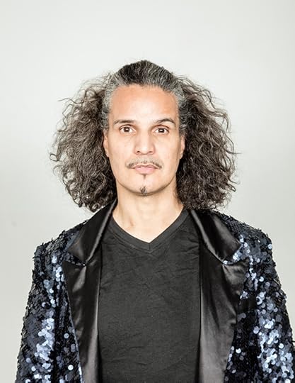
Stefan Ruiz, Grandfather Hector Xtravaganza, July 2018
Photograph by Stefan Ruiz for Aperture
We were shocked and saddened by the news that Hector Xtravaganza, grandfather of the legendary House of Xtravaganza, passed away on December 30, 2018, after a battle with cancer. A few short weeks beforehand, he led a crew of Xtravaganzas to perform with Kathy Sledge to “We Are Family” at Aperture’s Family gala, while simultaneously working long shifts preparing holiday window displays for Bloomingdale’s, following a season of vogue workshops across Europe and America. He was a whirlwind of energy and purpose, and he got a whole lot done, even in the last few weeks of his life.
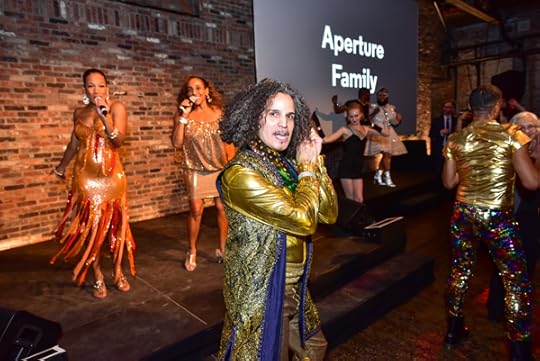
Grandfather Hector Xtravaganza performing at the Aperture Gala, New York, October 2018
Photograph by Sean Zanni/PMC
Aperture approached Grandfather Hector as we built the “Family” theme for our gala and the fall issue of Aperture magazine. Thinking about photography’s role in the evolving depiction of the family, we proposed an Xtravaganza portrait photo shoot at Aperture’s gallery, with photographer Stefan Ruiz. What Hector wanted out of it was a great family portrait, with as many members of the family present as possible. He pulled out all the stops, cajoling and threatening all the Xtravaganzas to participate. On July 29, 2018, more members of the House gathered at Aperture’s gallery than ever before to help realize Hector’s vision—and for a joyous and exhausting ten-hour shoot. After the family picture was done, Hector gathered the family in Aperture’s boardroom. For forty-five minutes there was silence, and the rest of us wondered what was going on. Hector told us later that they were able to solve a decade-long dispute that afternoon, and thanked Aperture profusely for creating the atmosphere that made it possible. His work with us moved our story forward, too—and led to a picture that justifies inclusion in future surveys of the family and photography from here on.

Left to right: Jaclyn Perez, Marisol Xtravaganza, Chelsea Maria Xtravaganza, Angelia Xtravaganza, Alexia Xtravaganza, and Nomi Xtravaganza, July 2018
Photograph by Stefan Ruiz for Aperture
Grandfather Hector combined the roles of artist, activist, and family man. As Stefan photographed the House’s newest recruits—six awe-inspiring young transgender women who looked like the future leaders of America—Hector mused about how far we’ve come, what world might be open to them today that just a few years ago was entirely closed. When Hector cofounded the House of Xtravaganza in 1982, rescuing kids from the streets, young brown transgender runaways had little hope of a livelihood outside the sex industry. There may be a long way to go before we see true equality, but few have advanced that dream more than Hector. Thank you, sir. “I’m a hugger,” as we learned, were among the first words he introduced himself with. A huge collective hug from all of us here whose lives you touched.
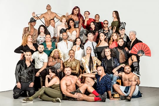
The House of Xtravaganza, 2018
Photograph by Stefan Ruiz for Aperture
Chris Boot is executive director of Aperture Foundation.
The post Aperture Remembers the Life of Hector Xtravaganza (1965–2018) appeared first on Aperture Foundation NY.
Aperture Remembers the Life of Hector Xtravaganza (1958–2018)
The grandfather of the legendary House of Xtravaganza was known as an artist, activist, and family man.
By Chris Boot
Stefan Ruiz, Grandfather Hector Xtravaganza, July 2018
Photograph by Stefan Ruiz for Aperture
We were shocked and saddened by the news that Hector Xtravaganza, grandfather of the legendary House of Xtravaganza, passed away on December 30, 2018, after a battle with cancer. A few short weeks beforehand, he led a crew of Xtravaganzas to perform with Kathy Sledge to “We Are Family” at Aperture’s Family gala, while simultaneously working long shifts preparing holiday window displays for Bloomingdale’s, following a season of vogue workshops across Europe and America. He was a whirlwind of energy and purpose, and he got a whole lot done, even in the last few weeks of his life.
Grandfather Hector Xtravaganza performing at the Aperture Gala, New York, October 2018
Photograph by Sean Zanni/PMC
Aperture approached Grandfather Hector as we built the “Family” theme for our gala and the fall issue of Aperture magazine. Thinking about photography’s role in the evolving depiction of the family, we proposed an Xtravaganza portrait photo shoot at Aperture’s gallery, with photographer Stefan Ruiz. What Hector wanted out of it was a great family portrait, with as many members of the family present as possible. He pulled out all the stops, cajoling and threatening all the Xtravaganzas to participate. On July 29, 2018, more members of the House gathered at Aperture’s gallery than ever before to help realize Hector’s vision—and for a joyous and exhausting ten-hour shoot. After the family picture was done, Hector gathered the family in Aperture’s boardroom. For forty-five minutes there was silence, and the rest of us wondered what was going on. Hector told us later that they were able to solve a decade-long dispute that afternoon, and thanked Aperture profusely for creating the atmosphere that made it possible. His work with us moved our story forward, too—and led to a picture that justifies inclusion in future surveys of the family and photography from here on.
Left to right: Jaclyn Perez, Marisol Xtravaganza, Chelsea Maria Xtravaganza, Angelia Xtravaganza, Alexia Xtravaganza, and Nomi Xtravaganza, July 2018
Photograph by Stefan Ruiz for Aperture
Grandfather Hector combined the roles of artist, activist, and family man. As Stefan photographed the House’s newest recruits—six awe-inspiring young transgender women who looked like the future leaders of America—Hector mused about how far we’ve come, what world might be open to them today that just a few years ago was entirely closed. When Hector cofounded the House of Xtravaganza in 1982, rescuing kids from the streets, young brown transgender runaways had little hope of a livelihood outside the sex industry. There may be a long way to go before we see true equality, but few have advanced that dream more than Hector. Thank you, sir. “I’m a hugger,” as we learned, were among the first words he introduced himself with. A huge collective hug from all of us here whose lives you touched.
The House of Xtravaganza, 2018
Photograph by Stefan Ruiz for Aperture
Chris Boot is executive director of Aperture Foundation.
The post Aperture Remembers the Life of Hector Xtravaganza (1958–2018) appeared first on Aperture Foundation NY.
Aperture's Blog

- Aperture's profile
- 21 followers

