
Aperture's Blog, page 2
October 17, 2025
A Miraculous Trove of Pre-Stonewall Secrets
In a photograph from the mid-1960s, identified as a “photo shoot with Lili, Wilma, and friends, Casa Susanna, Hunter, NY,” three women spill out from what appears to be the wooden slats of a closet door. The walls are clad in period-perfect knotty-wood paneling. The women, too, look fabulously of the moment, all kicky little mod dresses and gently curling bobs and headbands and horn-rimmed glasses and pearls. A fourth woman reclines, and yet another stands, filling the tiny room. All are holding cameras pointed at one another. In the corner, a blond with a wicked gleam in her eye trains her pocket-size camera on the person taking the picture. But she’s also winking at her future viewer, whom, one might imagine, every person in this photograph assumed would be someone like them: someone the world saw as a man but who found pleasure in seeing themselves as a woman. Which makes this photo not only joyous but dangerous. Because in appearing as women, each of them, in that moment, was committing a crime. And having the time of their life.
 Andrea Susan, Photo shoot with Lili, Wilma, and friends, Casa Susanna, Hunter, NY, 1964–1968
The exhibition Casa Susanna at the Metropolitan Museum of Art, organized in collaboration with the Art Gallery of Ontario and Les Rencontres d’Arles, showcases this image alongside some 160 other works made by and for a community of cross-dressers in New York and beyond throughout the 1960s. (While many of these folks identified as “transvestites,” the exhibition’s curators use the term cross-dressers, and this text follows suit. All identifying pronouns are used per the curators’ direction.) This community had a series of hubs. The first was a wig shop on Manhattan’s Fifth Avenue, run by Marie Tornell. One day in the mid-1950s, Humberto (Tito) Arriagada, who had moved to New York after serving in the United States’ Foreign Information Service during World War II, walked into the shop. It was love at first sight between Arriagada and Tornell—and love at second sight when Tornell met Susanna Valenti, the person Tito had been cross-dressing as since teenage years. The pair transformed Tornell’s shop into a dear, clandestine resource for cross-dressers at a time when New York’s so-called masquerade laws still criminalized wearing clothes associated with the “opposite” gender.
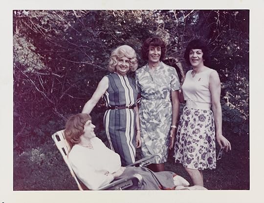 Andrea Susan, Daphne sitting on a lawn chair with Ann, Susanna and a friend outside, Casa Susanna, Hunter, 1964–1968
 Susanna standing by the mirror in her New York City apartment, 1960 – 1963
Once this close-knit underground community had the looks, it needed somewhere to show them off. Tornell and Arriagada—now free to be Susanna Valenti more regularly—made their apartment a safe space. In a photograph of “Susanna standing by the mirror in her New York City apartment” (1960–63), the home is a charming hall of mirrors. At the forefront, Valenti poses seductively in a lavender-pink dress not far from the shade of the painted walls, her eyes burning with confidence through the chromogenic print. Behind her, her reflection shows off the elegant cut of her lavender dress; farther back still, another woman stands in front of another mirror, bent over some distant domestic task as a lamp gently illuminates the back of her neck. That lamp, too, is reflected, forming a pair that frames the woman’s dark hair. These photographs are charged. They are proof that their subjects could live as they wanted, happily. They electrify the viewer. They urge the viewer to take charge of their own lives.
The exhibition design groups photographs of women engaged in similar pursuits—posing in front of televisions, for example, or for Christmas cards complete with girly, curliecue well-wishes in ink. The subjects assert their identities through action. They are women because they look and act like women. Femininity is an achievement, and these photographs advertise the spoils. In these images, “wish I was her” becomes “wish you were here.”
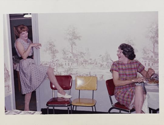 Susanna and Felicity in the kitchen, Chevalier d’Éon, Hunter, NY, 1960–1963
 Andrea Susan, Carlene playing scrabble, Chevalier d’Éon, Hunter, NY, 1960–1963
  Lili on the diving board, Casa Susanna, Hunter, NY, September 1966
 Arriagada and Tornell certainly took charge of their own lives. In 1960, they began transforming a humble cluster of bungalows and a barn in the Catskill Mountains into Chevalier d’Éon—named for the eighteenth-century cross-dressing French spy Chevalière d’Éon—and invited their community to visit and stay. A photograph of “Susanna and Felicity in the kitchen, Chevalier d’Éon, Hunter, NY” (1960–63) shows two women thrilled to be in their element, the former camping it up with her leg on a stool while the latter, cross-legged, laughs and cuts her food as if at dinner theater. Like “Lili on the diving board, Casa Susanna, Hunter, NY” (1966), taken at the second resort Arriagada and Tornell set up in 1964, these are holiday snapshots. They’re proto-selfies. But they’re also performances: moments of people willing themselves into the kind of person and life they desire.
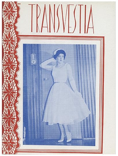 Transvestia vol II, no 8, March 1961
All photographs © AGO
Casa Susanna surrounds these photographs with others taken in their friend Gail’s Greenwich Village apartment, along with copies of the groundbreaking Transvestia magazine, founded in 1960 by Virginia Prince to connect and celebrate cross-dressers across the country. Arriagada starred as Susanna herself for its December 1961 cover. The ephemera, alongside the photographs, help shape our contemporary understanding of transgender identity. Some of these individuals later took further steps towards living as women—medically and legally. Whether or not all the people in these images fit our current categories, the community they built offered the chance to experiment and escape the narrow confines of gender before the modern gay rights movement exploded.
Moreover, the exhibition emphasizes how Transvestia and its photographers seized the means of production: Before the DIY freedom of the Polaroid arrived, they must have had to find sympathetic photo-lab workers to develop their chromogenic and gelatin-silver prints. They certainly kept these photographs safe. Although countless images have been lost, much of this show draws from a cache discovered at a Manhattan flea market in 2004. The pictures are in such exemplary condition that there’s no doubt they were held dear, and perhaps close to the vest. This exhibition is proof not only that people have always refused the despicable gender laws now resurfacing in this country, but also that remaking the world in your own image is possible, vital, and a hell of a lot of fun.
Casa Susana is on view at the Metropolitan Museum of Art, New York, through January 25, 2026.


How Diane Keaton Moonlighted as a Photographer
Since Diane Keaton’s death last Saturday at age seventy-nine, much has been said about her great depths as an actor, one who brought to her best performances a vivacious vulnerability and flustered grace. She was other things too: an openhearted memoirist, a designer, an androgynous icon, a single mother. Less discussed is Keaton’s surprising contribution to photography, a medium she held close throughout her life.
 Cover and interior spread of Reservations by Diane Keaton (1980, Knopf)
A couple of years ago, a friend with unimpeachable taste gifted me Keaton’s first photobook, Reservations, published in 1980 by Knopf, and I’ve treasured it ever since. Like all great photobooks, it seems endowed with talismanic powers. Clad in a flamingo-pink cover, the monograph consists of forty-five black-and-white photographs of deserted lobbies and banquet halls in luxury hotels across the United States, taken during the 1970s—presumably as Keaton traveled around the country promoting New Hollywood classics like The Godfather, Annie Hall, Looking for Mr. Goodbar, and Reds, which had begun production in 1979.
When trying to describe the nervy warmth of Keaton’s performances, people often resort to “lived-in,” that film-criticism cliché. Her photographs are seemingly the opposite: unpeopled, icily observed interiors that announce a “strong, direct photographer with a cool and deadly eye,” as the jacket copy puts it. The book makes no mention of her acting credits, and why should it? No mere vanity project, Reservations is an angular meditation on American emptiness, the kind Todd Hido would thematize to enormous success two decades later. Keaton locates a wry, forlorn comedy in awkward furniture, plastic plants, florid wallpaper, ersatz backdrops, quirky light fixtures, and conspicuous cables snaking down white walls, all shot deadpan (a word coined in the 1920s for that other Keaton, Buster) and gilded with a harsh flash that renders surfaces slightly unreal.
 Interior spread of Reservations by Diane Keaton (1980, Knopf)
 Interior spread of Reservations by Diane Keaton (1980, Knopf)
Certainly, the other Diane looms large in the perturbing directness of these photographs. Like Arbus, Keaton favored Rolleiflex cameras, though she was probably less fussy about film type. One especially Arbus-like image finds two cheerless Christmas trees installed atop a pair of tables at the Ambassador, a hotel whose demolition Keaton fought passionately against as a member of the Los Angeles Conservancy. That several of these hotels have since met the wrecking ball or changed to overseas ownership lends the photographs an elegiac air. This quality finds its fullest expression in a phalanx of stacked chairs in the ballroom of the Waldorf Astoria, or perhaps in a photograph of a small dining table, marooned in a sea of plush carpet at what was then the Fontainebleau Hilton in Miami Beach.
Keaton’s interest in photography was wide-ranging. In the late 1970s, she struck up a friendship with the curator and writer Marvin Heiferman, who was then working at Castelli Graphics gallery in New York. They went on to collaborate on several books and exhibitions, including Still Life: Hollywood Photographs (1983), Local News: Tabloid Pictures from the Los Angeles Herald Express (1999), and Bill Wood’s Business (2008), which features the work of a Fort Worth studio photographer whose negatives—all ten thousand of them—had sat in Keaton’s closet for twenty years.
 Interior spread of Reservations by Diane Keaton (1980, Knopf)
 Interior spread of Reservations by Diane Keaton (1980, Knopf)
All photographs by Madison Carroll
“She was so smart about pictures,” Heiferman told me. “We would go into archives and sit there and be elbowing each other, laughing, pointing at things, going, ‘Oh wow, isn’t this weird?’” Her taste, he said, helped spur a wave of interest in commercial and vernacular photography. She was an obsessive collector and a habitué of flea markets on both coasts. Her ultimate fantasy, she once told an interviewer, was to purchase every photography book ever published. “My mission is to buy an old warehouse I can transform into a massive library of image-driven books and open it to the public.”
In 2007, Keaton’s friend Larry McMurtry wrote an essay in The New York Review of Books calling attention to her writing on photography. In a letter to the editor, none other than Janet Malcolm chided the Lonesome Dove author for failing to note Keaton’s own work as a photographer. Malcolm praised the “mordant melancholy” of her Reservations images, arguing that they “established her place in contemporary photography” and “form the pendant to Keaton’s wonderful acting career.” Diane Keaton’s place in the photographic canon is hardly assured, of course. She probably wouldn’t mind. Long out of print, Reservations and her other photobooks endure nonetheless, as yet another testament to the compulsive creativity and liberated spirit of an artist who inhabited many different roles in life, all of them herself.
October 10, 2025
Nikki S. Lee Stays in the Picture
Nikki S. Lee’s name carries a strange currency in the Korean art world, sparking instant recognition but also a sense of enduring mystery. After all, Lee’s breakout series, Projects (1997–2001), which began as a graduate-school project and was first exhibited while she was in her twenties and living in New York, saw the artist assume the guise of over a dozen of characters as she descended into different US subcultures, photographing herself amid drag queens, punks, skateboarders, strippers, and other communities mostly on the fringes of society. The series catapulted Lee to international stardom, while establishing her as something of an enfant terrible, all while raising a question that was never really answered: Who is the “real” Nikki S. Lee? Her mystique deepened in the aughts when Lee, whose work is so preoccupied with what it means to belong, chose to walk away from the New York art world entirely.
I encountered Lee and her art for the first time through a part-time job. In 2013, as an undergraduate art history student, I worked as a gallery guide at one of her solo exhibitions in Seoul, where she has long been based. Day after day, I stood among her large-scale prints, reciting information to visitors while observing how they responded—some with recognition, some with confusion, and others with quiet reverence. By then, series such as Projects, Parts (2002–5), and Layers (2008) had already cemented Lee’s reputation. For Korean students of photography and visual art, she was foundational. Unlike many contemporaries whose imagery was geared toward geopolitical history, political activism, or typical national narratives, Lee’s gaze turned inward, exploring identity as something performative, fluid, and unresolved. Her reputation as an artist who was even more famous overseas made her career particularly fascinating.
 Nikki S. Lee, The Ohio Project (6), 1999
  Nikki S. Lee, The Punk Project (1), 1997
 When I met Lee again this past spring at her studio in Seoul’s Itaewon neighborhood, over a decade later, she was radiant and quietly reflective, generous with her stories but never indulgent. Our conversation stretched across a long afternoon in her studio, touching on her singular practice, her relationship with identity, and her enduring desire to remain in motion, always chasing the present while never quite escaping the past. Her father was a photographer, and Lee, who was born in 1970, grew up surrounded by images. “I was ambitious, driven,” she said. “I wasn’t afraid to throw myself into whatever I wanted to do. But at the same time, I had a strong literary sensibility. Even as I chased my goals, I often felt a deep emptiness about life. There was always this quiet sadness inside me—a tenderness, maybe.” Still, she never really thought of picking up the camera herself until she decided to study photography at Seoul’s Chung-Ang University, where the curriculum was highly technical and traditional. She grew curious about other creative fields and, after graduating, moved to the United States and enrolled at New York’s Fashion Institute of Technology, where she took fashion-design classes alongside her photography studies. It was the era of supermodels and grunge, and the line between art and commerce, and art and life, was becoming harder to find. Lee had hopes of becoming a fashion photographer, and she needed an English name. One day, flipping through an issue of Vogue while applying for an assistant position with David LaChapelle (a job she would get), she came across the model Niki Taylor. For some reason, the name spoke to her.
Lee subjected the New York art world’s newfound ideals of inclusivity to an ambiguous acid test.
During her graduate studies in photography at New York University, Lee’s practice took a sharp turn. At NYU she was given space to step away from commercial work and focus on defining her own language as a fine artist. But more than any institution, the city itself changed her. “I lived in the East Village. It was rough but also magical,” she said. “From 1994 to around 2009, I think New York had this golden period. There was a balance between freedom and safety, between chaos and creativity. There was energy in the streets, a sense that anything was possible. You could live however you wanted and invent your own rules. It was a place where fixed ideas didn’t really exist. It felt like the right place for someone like me, who didn’t want to follow convention.”
 Aperture Magazine Subscription 0.00 Get a full year of Aperture—the essential source for photography since 1952. Subscribe today and save 25% off the cover price.
[image error]
[image error]
Aperture Magazine Subscription 0.00 Get a full year of Aperture—the essential source for photography since 1952. Subscribe today and save 25% off the cover price.
[image error]
[image error] 
In stock
Aperture Magazine Subscription $ 0.00 –1+ View cart DescriptionSubscribe now and get the collectible print edition and the digital edition four times a year, plus unlimited access to Aperture’s online archive.
After finishing her MFA at NYU, Lee rose to prominence with Projects, her now-iconic series documenting her immersion into various demimondes: skateboarders, punks, yuppies, lesbians, hip-hop fans, high-school students, seniors, and more. Like the New York–based artists Cindy Sherman and Adrian Piper, Lee used performance to negotiate the construction of gender, race, and the self. Yet unlike them, Lee didn’t emerge from the context of American second-wave feminism, and her images, which at first glance resemble candid snapshots, were, in fact, the result of monthslong embedding and assimilation. Lee would adopt the clothing, gestures, slang, and social rituals of each group, documenting her transformations with the help of a friend or stranger who would release the shutter. Lee began Projects in 1997, at a time of reckoning around issues of representation and identity within the US art world, and her chameleonic provocations, teetering between irony and sincerity, seemed to subject its newfound ideals of multiculturalism and inclusivity to an ambiguous acid test.
One of the most physically grueling chapters of the series was The Skateboarders Project (2000). “I fell so many times,” Lee said. “My body was sore the entire time. I had to wear patches on my arms and legs. Physically, it was exhausting. I remember skating near the East River—there were a lot of makeshift skate parks there. Usually, my projects last about three or four months, but this one took a real toll on me.” Another challenging chapter was The Exotic Dancers Project (2000), for which Lee worked at a strip club on the outskirts of Hartford, Connecticut, and undertook a strict dietary and training regimen. “That one was so lonely,” she remembered. “I stayed in a motel near a highway, in this desolate, isolated place. The motel was in the middle of nowhere. Every night, I went out to the clubs, and during the day, I was alone. That solitude really got to me.”
 Nikki S. Lee, The Exotic Dancers Project (20), 2000
  Nikki S. Lee, The Yuppie Project (19), 1998
 With Projects, Lee became a star almost overnight. “My very first work was reviewed by The New York Times,” she recalled. “Honestly, I didn’t even know I was going to become an artist. I was just doing a school project. Suddenly, everyone was calling me an artist.”
The attention, though thrilling, was disorienting. The pressure was less about being in the spotlight than about the fear of being a one-hit wonder. “I remember thinking, If I don’t do well with my next project, maybe I was just lucky. Maybe it’ll all fade away. I didn’t want to be that kind of artist—the kind who peaks early and disappears.”
Lee’s embrace of stereotypes, especially in Projects, has drawn accusations of cultural appropriation, and she could sometimes resort to racist caricature, as in The Hip Hop Project, for which she appeared in blackface. Such photographs reveal less about the limits of assimilation than they do about the limits of Lee’s own series, whose often nuanced commentary on power dynamics and liberal visibility politics could, without a sense of emotional authenticity, succumb to empty farce. But Lee remains unfazed. “Projects is timeless,” she said, laughing. “I think I did well. Depending on the political climate, sure, it could be controversial. But that’s not the point. The point is, people are still talking about it twenty, twenty-five years later. That’s what matters.” There’s a saying in Korea: What’s scarier than criticism is silence. In other words, indifference is more humiliating than disapproval.
Advertisement
googletag.cmd.push(function () {
googletag.display('div-gpt-ad-1343857479665-0');
});
That pressure led to Parts, a series in which Lee photographed herself with various male partners, later cropping the men out of the frame so that only fragments of their bodies remained. The gesture underscored the idea that identity, especially in intimate relationships, is shaped relationally, sometimes even erased in the process. She followed that line of inquiry with Layers, made the year Lee moved from New York back to Seoul. For Layers, Lee traveled to various cities around the world, asking local street artists to draw her portrait. She then superimposed three of these interpretations in a single light box, creating a hybrid image that was at once hers and not hers—a visual echo of the mutability she has always explored.
While many critics and curators have framed her work as an inquiry into Asian American identity, Lee resists that reading. “People always say my work is about identity,” she said. “But I’ve never questioned my own identity. I was born in Korea. I grew up Korean. That’s never been in doubt. My sense of self has always been fluid but not uncertain. I wasn’t searching for an identity—I was just trying to show that identity is something you can perform, mold, and play with. It wasn’t about proving anything. It was about saying, ‘Look—I can do this too.’”
 Nikki S. Lee, Part (3), 2003
  Nikki S. Lee, Wedding (8), 2005
All photographs © the artist and courtesy Sikkema Malloy Jenkins, New York
Though best known for her photographic series, Lee was never entirely comfortable with the label of photographer. “I’ve never once dreamed of being a photographer,” she stated. “To me, photography was just one medium I happened to use. I never saw it as the end goal.” This is probably why Lee took a break from still photography for a while, turning instead to video and painting. An emblematic 2006 video piece, a.k.a. Nikki S. Lee, is a pseudodocumentary in which she plays herself—or rather, several versions of herself, blurring the line between fiction and reality. More recently, she has returned to painting, a medium she rarely discusses publicly. “The paintings I’m working on now are totally different in character from my earlier works,” she said. “They’re not even related, really. But I’m following my instincts.”
This year, Lee will release a new video, exhibit in a group show, and publish a book cowritten with the essayist Im Ji-eun, a close friend. “We meet almost every day,” Lee said. “We start with lunch and end up talking until dinner. One day, we joked about starting a podcast, but then we thought, Why not turn these conversations into a book?” The result is about artificial beauty, a meditation on aesthetics, artifice, and the human-made. “People always talk about the beauty of nature,” Lee said. “But I love artificial beauty. Art is human. It’s artificial by definition. And I think there’s something really beautiful about that.” Seoul—a site of ceaseless reinvention, and now a viable candidate for the plastic surgery capital of the world—is perhaps a fitting home for an artist so invested in the malleability of the self.
Recently, Lee founded a creative management agency called Beatnik in the city. Currently, Beatnik manages one actor—her partner, Teo Yoo—and is preparing to sign a young actress. “It’s not a separate thing from my art,” Lee said. “It’s just another way of being in the world creatively.” Lee and Yoo married in 2007, and Yoo’s recent success with films such as Celine Song’s Past Lives (2023) has rekindled interest in Lee’s work locally, though her art has long been circulating in Korea, and was featured in the 1999 Gwangju Biennale.
When I asked what her long-term goals are, she laughed. “I don’t usually set big goals. I focus on short-term things . . . I just want to make sure I’m enjoying the moment. If I don’t want to do something, I won’t do it.” She added, “But there is one big goal. When I’m on my deathbed, I want to be able to say: ‘I lived as an artist.’ If I can say that, I think I’ll be at peace.”
This article originally appeared in Aperture No. 260, “The Seoul Issue.”
A Native American Artist’s Prayer for Home
An earlier version of this article was originally published in Aperture, fall 2020, “Native America,” and was updated and expanded for Kimowan Metcheswais: A Kind of Prayer (Aperture, 2023).
For the 2002 installation Without Ground, the Cree artist Kimowan Metchewais transferred dozens of small photographic self-portraits to the white walls of the Institute of Contemporary Art (ICA) at the University of Pennsylvania. The full-length likenesses were posed in the ICA’s Ramp Space, as if they were searching the empty expanse for something hidden from both artist and viewer. By cleverly using scale and gently fading some of the photo transfers, Metchewais, who went by his stepfather’s surname, McLain, at the time, created the illusion of figures receding into space. Treating the walls of the museum as the “ribcage of a living animal,” he felt that his photographs were like “tattoos etched onto the bones of the beast,” anticipating their burial within the institution’s architectural memory, covered by future layers of accumulated paint.
Over a decade later, in 2014, the Omaskêko Cree artist Duane Linklater meticulously scraped away layers of paint from the ICA’s walls, creating stratified craters in search of the installation. The effort to uncover these photographic traces was akin to a search for Metchewais himself, an attempt to connect with the artist who had passed away only a few years earlier, in 2011. The hunt for evidence was forensic, replicating the investigatory nature of Metchewais’s wandering figures. “I think North America is a crime scene,” Metchewais said of Without Ground in 2006. “Something was lost and it needed to be found. The figures were detectives, a search party. I wanted them to be looking for the crime itself. . . . I hate to say it, but what happened to the land and people here was/is a crime. People today don’t see that. They understand it, they know it, but it doesn’t seem to mean that much to them. To me, it means a lot, in many ways.”
Without Ground lacks perspectival space or a defined horizon line, evoking the Pueblo watercolors of the Studio style—which typically favored depicting costumed dancers on neutral grounds—that developed out of the Santa Fe Indian School in the early twentieth century. Metchewais, however, insisted that the land in these paintings was not actually absent but rather “unseen,” a symbolic denial of ground taught to the Studio painters that corresponded with the historic displacement of Indigenous peoples from their ancestral lands. His installation at the ICA was thus about seeking an invisible landscape and the crime behind its loss and continued absence. The white museum wall, rather than a neutral ground, became a site at which to consider the theft of Indigenous land, underscored by the installation’s title, an example of the ways in which Metchewais rearticulates colonial memory through photography. “I am concerned about how people see the landscape of North America,” Metchewais said while speaking about Without Ground. “I want the land to be omniscient.” In this statement lies the breadth of his practice, which moved between perception, representation, and understanding the capacity of the land to sense and speak for itself. His work explores the ground, aesthetic and territorial, on which contemporary Native art and communities might stand, and his images propose a new intellectual space that exceeds the mere subversion of stereotypical representation.
 Kimowan Metchewais, Raincloud Over-the-Head, Masque Collection, Chapel Hill, North Carolina, ca. 2010
  Kimowan Metchewais, Lucky Strike/Green, Chapel Hill, North Carolina, ca. 2002
 Consider Metchewais’s most lauded work: the Cold Lake series (2004–6). It consists of photographs of children and other community members from the artist’s homeland of Cold Lake First Nations, a Cree and Dene reservation in Alberta, Canada, pictured in the style of straight photography on the street or wading in the namesake Cold Lake. Metchewais returned repeatedly to his home to take thousands of photographs of Indigenous children, who he sought to depict as a youthful and emergent force. These works form the bulk of the sub-series that the artist titled Child Nation. Notes in Metchewais’s sketchbooks from about 2000 also propose what he called “post-Curtis portraits,” works that are empty of ethnographic baggage and instead emote “reclamation” and “a desperate, pathetic attempt to restore” and “elevate human status. It seeks to be heroic. It wants to be owned.”
This label is a reference to and an attempt to move beyond the outsize influence of the photographer Edward Curtis, whose staged and romanticized portraits from the twenty-volume anthropological series The North American Indian (1907–30) have permeated the visual imaginary. The post-Curtis portrait is also about community, place, and belonging. “To be Indian, Inuit,” Metchewais writes, “that is in the heart.” In Young Mothers at Cold Lake (2005), four women gather knee-deep in the water, smiling and laughing together; one looks backward to keep an eye on her children, who are outside the frame. Other images from the series are taken on the streets of Edmonton and at powwows. But the artist’s attention was mainly reserved for creating striking three-quarter length or closely cropped portraits of children in the lake waters.
His most well-known image from the series, Cold Lake Venus (2005), features a young girl facing the camera, hip-deep in water that stretches behind her to meet the sky at the horizon. The photograph is saturated with what Metchewais calls “divine beauty,” which emanates from the girl like the ripples in the lake water. “Look at us emerge. We are beautiful, standing in a magical place, just back from the Wal-Mart [sic],” Metchewais writes of the work. His wry superstore reference dispels the tendency in the popular imagination to take Indigenous communities out of time when romanticizing their ties to the landscape. He succeeds in picturing new image worlds to express a fundamental connection to home and place while evoking Indigenous and Greek creation myths.
 Kimowan Metchewais, Cold Lake Venus, Cold Lake First Nations, Alberta, Canada, 2005
Born in 1963, in Oxbow, Saskatchewan, Metchewais adopted his mother’s maiden name in the latter part of his life. He began his career making political cartoons and graphics for Windspeaker, Canada’s most widely distributed Indigenous-content newspaper, before receiving a BFA from the University of Alberta in 1996. His early work tackled the legal and cultural frameworks of Indigenous identity and tribal membership, questioning the means by which identity is defined and challenging the demand, still present today, for Indigenous artists to perform a so-called authentic connection to land, language, and community. His 1989 painting A Guide to Doing Contemporary Indian Art pokes fun at the collage aesthetic prevalent in the work of First Nations contemporary artists in the 1980s, such as George Longfish, Jane Ash Poitras, and Joane Cardinal-Schubert (who was a mentor and purchased the piece). Handwritten penciled text on a red-painted rectangle instructs: “Place images below . . .” “old photographs,” “some modern stuff for contrast,” “syllabics,” “buffalo(s),” “a few tipis,” and so forth.
Metchewais received his MFA from the University of New Mexico (UNM) in 1999. He was attracted by the school’s well-regarded photography and Native American art history programs, and found there a network of Indigenous classmates including Larry McNeil, Will Wilson, and Rosalie Favell. While at UNM he began to rigorously develop the photographic and mixed-media practice he is known for today. He challenged the authority of fixed representation while pursuing answers to the question of authenticity that he asked of himself and his work: “What makes Indian people Indian?” His mixed-media compositions and elaborate photo collages incorporate references to Native art history: winter counts, ledger paper, and parfleche designs juxtaposed with images of urban and natural landscapes in Sandias (1998); portraits of Plains elders mined from archives and popular culture, and those taken with his own lens, in The Origin of Tobacco (2000). His 1999 installation After, first exhibited in his MFA thesis show at UNM’s John Sommers Gallery, featured illusionistic photo transfers depicting birds, insects, and bowls on the gallery walls, a process Metchewais called “photographic gallery tattoos.” It was an antecedent to the later ICA installation Without Ground and exemplified his “search of elegant solutions to challenges of narrative in space.”
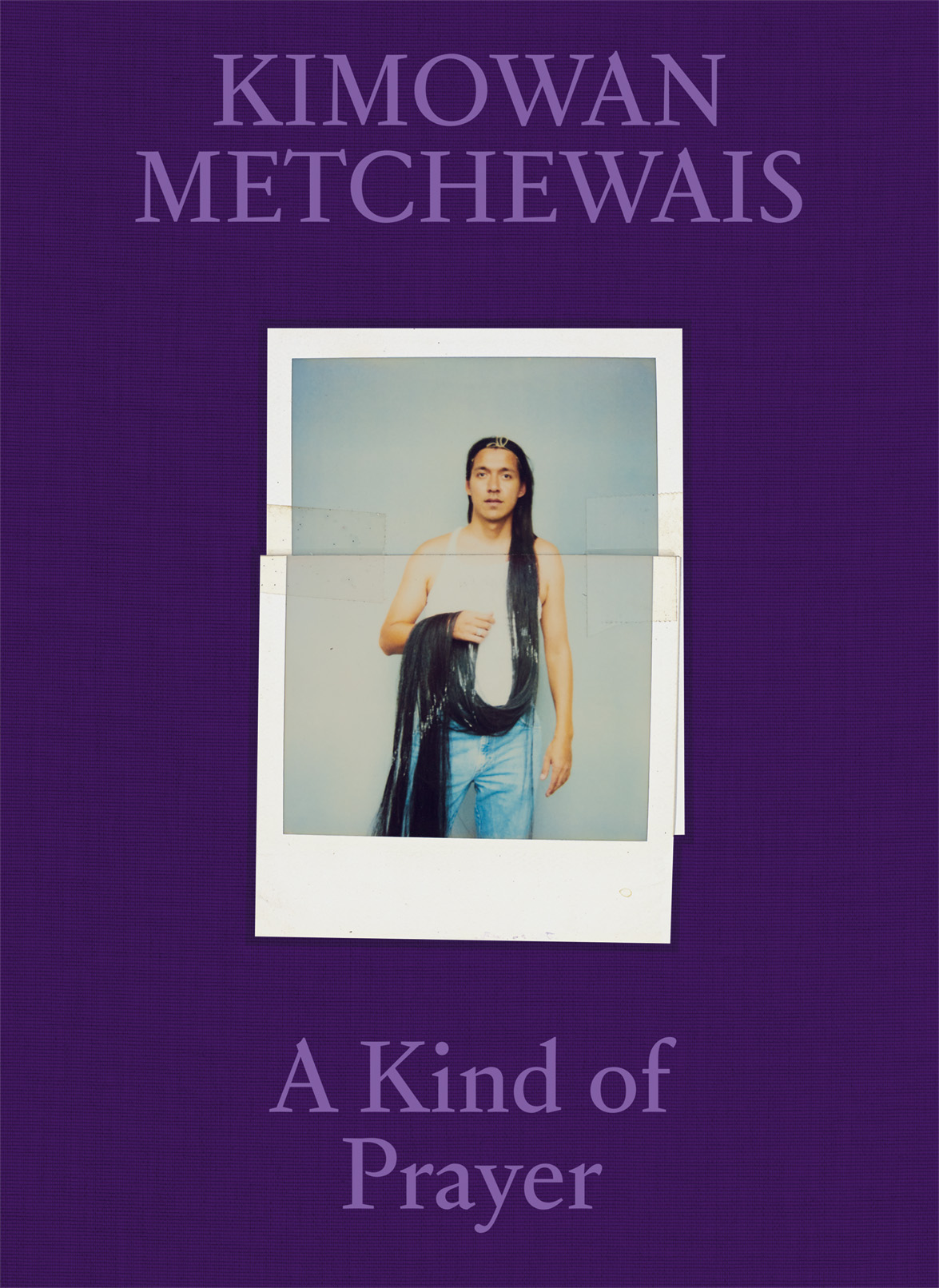 Kimowan Metchewais: A Kind of Prayer 75.00 A Kind of Prayer presents the first-ever survey dedicated to the late Cree artist Kimowan Metchewais and his singular body of work on Indigenous identity, community, and colonial memory.
 $75.0011Add to cart
[image error] [image error]
In stock
Kimowan Metchewais: A Kind of PrayerPhotographs by Kimowan Metchewais. Text by Christopher T. Green, Kimowan Metchewais, Emily Moazami, and Jeff Whetstone. Designed by A2/SW/HK, London.
$ 75.00 –1+$75.0011Add to cart
View cart Description A Kind of Prayer presents the first-ever survey dedicated to the late Cree artist Kimowan Metchewais and his singular body of work on Indigenous identity, community, and colonial memory.After his untimely death at age forty-seven in 2011, Metchewais left behind a wholly original and expansive body of photographic and mixed-media work. At the center of his practice is an extensive Polaroid archive, which addresses a range of themes—including the artist’s body, performative self-portraiture, language, landscapes, and everyday subjects—and served as the source material for works in other media, such as painting and collage. Metchewais’s exquisitely layered works offer a poetic meditation on his connection to home and land, while challenging conventional narratives and representations of Indigeneity.
Metchewais was a contemporary artist of stunning originality, and until now, his work has been woefully understudied and underexposed. A Kind of Prayer is a comprehensive overview that showcases this essential artist’s astonishing vision. Details
Format: Hardback
Number of pages: 268
Number of images: 150
Publication date: 2023-01-10
Measurements: 7.75 x 10.55 x 1 inches
ISBN: 9781597115322
“Kimowan is a gift – an important voice for Native artists and the contemporary art world. He left us before he got the recognition he so deserved, but we can continue to learn and gain inspiration from the work he left behind.” —Wendy Red Star, The New York Times.
“A Kind of Prayer presents the first-ever survey dedicated to the late Cree artist Kimowan Metchewais and his singular body of work on Indigenous identity, community, and colonial memory.” —Photo London
“The Photographer 2000, a mixed-media artwork by Kimowan Metchewais, whose monograph A Kind of Prayer was published in January by Aperture. Metchewais’s work is on view this month as part of the exhibition Native America: In Translation at the Milwaukee Art Museum.” —Laena Wilder, Harper’s Magazine
“A Kind of Prayer is an exploration of Indigenous identity and community, as seen through photography and multi-media work of the late Cree artist Kimowan Metchewais.” —International Center of Photography
“A monograph that is both a photobook and a scholarly publication but, as its subtitle suggests, also an expression of something that lies beyond analysis of the physical world.” —Maymanah Farhat, The Brooklyn Rail
ContributorsKimowan Metchewais (1963–2011; born in Oxbow, Saskatchewan, Canada) was a multidisciplinary Cree artist who began his artistic career working as an illustrator and editor at the Native newspaper Windspeaker. He later received his bachelor of fine arts at the University of Alberta, Edmonton, Canada, before completing his master of fine arts at the University of New Mexico, Albuquerque. In 1995, Metchewais received the Ellen Battell Stoeckel Fellowship to spend the summer at Yale University, New Haven, Connecticut, and in 1996, a national award from the Canadian Native Arts Foundation. At the time of his death, he was associate professor in the art department at the University of North Carolina at Chapel Hill.
Christopher Green is a writer and art historian whose research focuses on modern and contemporary Native American art and material culture. His work has appeared in Aperture, Artforum, Art in America, and Frieze, among other publications.
Emily Moazami is assistant head archivist at the National Museum of the American Indian, Washington, DC.
Jeff Whetstone is professor and head of photography at Princeton University, New Jersey.
 Essays Can the Photo-album Hold Cultures Together?
  From the Editors How Can Native Artists Challenge the Story of North America Today?
 The Polaroid was core to Metchewais’s process, and while at UNM he began amassing an extensive personal archive, meticulously organized during his lifetime by subject and alphabetized in boxes. He used these photographs as references for his paintings and embedded them in his mixed-media collages and as transfers to large-scale works on paper. He cut up, rearranged, and taped them back together before rephotographing and reentering them into the collection as a shifting and circulating living archive. The tactility of the cut-up photographs, with conspicuous scratches, creases, and Scotch tape fastenings, distinguishes them from digital images, and Metchewais sought to maintain these qualities even when he rephotographed his Polaroids and digitally printed them. He commented at the 2009 conference Visual Sovereignty at the University of California, Davis, that “few things compare to the silky touch of a newly developed print in the palm of one’s hand.” His Polaroids also freed him from a reliance on archival images from outside sources. Instead, Metchewais’s use of personal imagery avoided the need for intervention, interrogation, and reinscription that weighs down some work by contemporary Native photographers who explore museum and institutional archives as sites of privileged access, subjugation, and colonial violence.
 Kimowan Metchewais, Storyteller, Chapel Hill, North Carolina, 2000
  Kimowan Metchewais, Structure 07, New Mexico, 1997
 Metchewais’s Polaroids contain many series: toy buildings and animals shot in a studio; smokestacks and mountain ranges; flowers, cars, and other quotidian objects. Many are portraits depicting family, friends, classmates, and colleagues, and being from many periods of his life they serve as both an essential precursor to and extension of the deep exploration of community seen in the Cold Lake series. Portraits include his brothers, Hans and Luther; Archie Seelkoke, an Alaska Native man that Metchewais met in Albuquerque; fellow photographer and friend Laena Wilder; and many more faces from his home, his time at UNM, and his later colleagues in North Carolina. These individual portraits are an archive of stories, personalities, and bodies, occasionally cut up, rearranged, and accompanied by biographic annotations in Metchewais’s notebooks.
The artist frequently includes his own body in this archive. In one undated set of Polaroids, he photographed his own hand in a series of gestures, some of which were later modified and digitally printed under the title Indian Handsign. Loosely held poses of fingers and arm recall anatomical studies, while distinct hand shapes suggest a form of sign language. On these Polaroids, Metchewais penciled labels directly below the images: a trigger-finger pose is labeled “GO”; an upward-facing palm is labeled “OPEN.” The hand signs function as study and reference materials while also triangulating a relationship between body, language, and image. The signs do not appear to be based on American Sign Language but rather obliquely reference Plains Sign Talk, a historical sign language used by Indigenous peoples across central North America in trade and oratory. Purported manuals for Plains Indian Sign Language were published throughout the twentieth century, and the language was widely appropriated by the Boy Scouts and other non-Native summer camps and societies. The images also recall the hand signals from the rapidly paced Cree handgame (or “stick game”) that Metchewais played with his uncles on Cold Lake First Nations. Eraser smudges on the Polaroids suggest that Metchewais wrote and rewrote the labels, drafting his own language for this series of universal gestures, countering appropriations with a new baseline of bodily signs. In some instances, he printed multiple photographs on single sheets of paper in three-by-four arrangements of hand gestures, forming a kind of visual dictionary or record.
Metchewais images propose a new intellectual space that exceeds the mere subversion of stereotypical representation.
Metchewais circulated language throughout his work, often in deeply personal ways. Images of his grandmother’s Cree-language Bible recur in his oeuvre, including in works that reproduce its worn leather cover and front matter, namely a page of the Cree syllabic alphabet with French phonetic translations. Metchewais often signed his name Kimowan in Western Cree syllabics, ᑭᒧᐘᐣ, which means “it is raining.” In several versions of his 2004 photo collage Cold Lake, the Cree name for the lake, atakamew-sakihikan, appears in syllabics underneath the English. These works are examples of what he called his “paper walls,” photographs printed on paper sheets taped together into wall-size constructions. Emulating Plains parfleches, Metchewais designed such works to be mobile, foldable into transportable packets that can be tucked under one’s arm as a carry-on until unfurled into nearly room-size installations. They also make clear why Metchewais identified himself not as a photographer but rather as “a sculptor of flat, rectangular objects of various textures and tone.” Some of the pieces of tape are in fact photographic images of paper taped together, such that the simulation of texture blurs reality with representation. The papers were dipped in water colored by rust and tobacco, “baptized,” in the artist’s words, as a ritual act. Because tobacco is a sacred substance among many Indigenous peoples, the material of the work might be considered animate. “Tobacco is a handshake. It signals honesty and honorable intention. Cold Lake is a kind of prayer,” Metchewais said.
 Kimowan Metchewais, Cold Lake, Cold Lake First Nations, Alberta, Canada, 2006
  Kimowan Metchewais, Goodwill, 118 Avenue, Edmonton, Alberta, Canada, 2005
 That prayer is about home, family, and memory. Cold Lake includes multiple iterations of a scene of Metchewais and his cousin Conrad wading below the long horizon line of the lake. It combines several snapshots taken from shore by the artist’s mother. The photographs are “a record of family love,” binding Metchewais, his family members, and the lake and sky in kinship relations. Given the installation’s wall-size scale, the close viewer becomes wrapped in the experience and memory of that place. These works are less about the recovery or performance of memory than a living relation to the land. They also situate home and place as terms that escape essentialism. In Goodwill, 118 Avenue, Edmonton (2005), Metchewais captured a scene of furniture donations awaiting pickup along a wall in an urban Native neighborhood. The orderly rectangles evoke modernist compositions in what Metchewais called “a Mondrian and serendipitous scene.” For the artist, they also stand in as one of many incarnations of home, both territorial and adopted. His shadow appears on the right edge of the photograph, an index of his presence in the Edmonton neighborhood that he called “an unofficial reservation in the city.”
 Kimowan Metchewais, Striped Man, Brother Luther McLain, Albuquerque, 1998
  Kimowan Metchewais, The Marlboro Man/ A Man Named Lucky, The Origin of Tobacco, Chapel Hill, North Carolina, 2000
 Metchewais was ever conscious of the pitfalls of representation and stereotypes. In 1999 he began a post-doctoral fellowship at the University of North Carolina at Chapel Hill and taught in the studio art program there until 2011, reaching the rank of associate professor. When he arrived in North Carolina, the birthplace of his white stepfather, he began to more regularly go by his mother’s maiden name, Metchewais, reflecting his difficult relationship with Mr. McLain. His course-planning notes include outlines of the histories of depicting Native America, from the trope of the noble savage to the erroneous notion of the vanishing race. His sketchbooks contain drawings based on art-historical representations, such as copies of the famous portraits of Native American delegates and visitors to Washington, DC, drawn by Charles Balthazar Julien Févret de Saint-Mémin, from 1804–7.
Yet Metchewais’s fully realized works show little of the typically overwhelming concern among Native American photographers of his generation with debunking and overturning such stereotypes. Instead, his self-portraits pursue the kind of “self-made Native imagery” he saw in online culture, as he wrote on Facebook in 2009. He fashioned a host of such characters as the Marlboro Indian smoking a cigarette in a cowboy hat (Marlboro Indian, 2000). In a series of self-portraits from 2000, Metchewais’s shirtless upper body, painted dark blue from the chin down, sparkles with starry points of light like the cosmological images from the late nineteenth-century ledger art of the Itázipčho Lakota artist and visionary Čhetáŋ Sápa’ (Black Hawk). Several photographs from Metchewais’s graduate-school period, Ghostdancer (1998) and Striped Man 02 (1998), depict his brother, Luther, wrapped head to toe in a black-and-white striped textile—a body that, while abstracted, evokes the heavily romanticized image of the Plains Indian wrapped in a chief’s blanket and the loaded history of disease-laden trade blankets.
 Kimowan Metchewais, Self-portrait with long hair, Albuquerque, 1998
  Kimowan Metchewais, Self-portrait with long hair, Albuquerque, 1998
 In 1993, Metchewais was diagnosed with a brain tumor that chased him for the rest of his life. Surgery and subsequent treatments left him with a permanent bald spot on the back of his head. In a series of Polaroid self-portraits, Metchewais, in a white tank top and faded jeans, dons a hairpiece that stretches to the floor. In two Polaroids that he took to fully capture the length, he drapes the hair over one arm and allows it to drag along the floor beside his bare feet. In another Polaroid, the hairpiece is pictured lying snakelike on the floor. Long hair was a sign of Indianness to Metchewais, and he incorporated his own hair into some of his sculptural installations. In a 1984 comic for Windspeaker, a cartoonish Native man with long braided hair, perhaps representing the artist, asks, “Tell me . . . what is the true essence of being an Indian?!” A guru on a mountaintop replies, “That all depends . . . on if your mother married off the reserve before or after 1950 . . . how long yer hair is . . . how much pure blood you have.” Visual markers and the “poetics of identity”—hair, tobacco, place—were of great interest to Metchewais, who noted in the proposal for his University of North Carolina postdoc that it would be worthwhile to “question what it is to be an Indian with a white father.” The exaggerated length of the hairpiece and its visible artificiality compose an ironic take on this sign of Native identity while highlighting what was both a vulnerable feature for the artist and a site, as he explained, to investigate his “bi-racial identity and the ensuing ambiguity [that] falls in line with my interest in contradiction.”

Kimowan Metchewais, Indian Handsign, Albuquerque, New Mexico, 1997
var container = ''; jQuery('#fl-main-content').find('.fl-row').each(function () { if (jQuery(this).find('.gutenberg-full-width-image-container').length) { container = jQuery(this); } }); if (container.length) { const fullWidthImageContainer = jQuery('.gutenberg-full-width-image-container'); const fullWidthImage = jQuery('.gutenberg-full-width-image img'); const watchFullWidthImage = _.throttle(function() { const containerWidth = Math.abs(jQuery(container).css('width').replace('px', '')); const containerPaddingLeft = Math.abs(jQuery(container).css('padding-left').replace('px', '')); const bodyWidth = Math.abs(jQuery('body').css('width').replace('px', '')); const marginLeft = ((bodyWidth - containerWidth) / 2) + containerPaddingLeft; jQuery(fullWidthImageContainer).css('position', 'relative'); jQuery(fullWidthImageContainer).css('marginLeft', -marginLeft + 'px'); jQuery(fullWidthImageContainer).css('width', bodyWidth + 'px'); jQuery(fullWidthImage).css('width', bodyWidth + 'px'); }, 100); jQuery(window).on('load resize', function() { watchFullWidthImage(); }); const observer = new MutationObserver(function(mutationsList, observer) { for(var mutation of mutationsList) { if (mutation.type == 'childList') { watchFullWidthImage();//necessary because images dont load all at once } } }); const observerConfig = { childList: true, subtree: true }; observer.observe(document, observerConfig); }Following complications from one such surgery, in 2007, Metchewais lost the capacity for movement and feeling in the left side of his body. One notices that his hand-sign Polaroids are almost exclusively of his right hand. Many of the words labeling the Polaroids—“TOUCH,” “FLIGHT,” “RECALL,” “CHANGE”—took on a different valence in the wake of his partial paralysis. Metchewais called his studio “a laboratory” where he conducted an “archeology of the self,” and in the years following his surgery, he seemed to come to terms with his body, identity, and artistic practice. As curator Lois Taylor Biggs adeptly observes, “Metchewais blurred the boundaries of the body and the archive for the purpose of healing,” and his practice as personal archive served as medicine, both a “site of healing” and “a living body.”
Grow All Over Again (2008), a short film by Christina Wegs, intimately documents Metchewais discussing this process and his return to the studio after a hospital stay and period of rehabilitation. In the film, he describes a desire to revisit his old works and “to paint white and black rectangles over all the shit that I don’t like, and then go from there.” In a mixed-media work, Self-Portrait with Peach Brain Tumor (ca. 2006) the upper right and lower left sides of his face are split between two cut Polaroids that cast his skin color in different tones, one pink and the other bronze. Amid the Scotch tape is a series of inked black and beige rectangles that spread across the artist’s face but don’t mask his features. The original Polaroids were taken in 2000, prior to his 2007 surgery, but the modifications suggest he continued to explore his body as a site of the etched cultural markers of ethnic and corporeal identity.
 Kimowan Metchewais, Self-portrait, ca. 2006
As Metchewais rehabilitated and worked his way back into the physical studio, he began to transition his attention from analog photographic processes to the digital space, which he understood as a natural site for Indigenous subjectivity. “It turns out the thing in the modern world that most matches the Indian psyche is the web,” he wrote in 2009. His personal website and blog, “Images & Other Curios,” became a space to share his work, personal reflections on art and the artistic process, updates on his health, and other musings. He often gave his website background the texture of his folded paper works, bringing his love of photography’s tactility to the screen. He began a vibrant experimental video practice on YouTube, including kaleidoscopic treatments of his own face and banal videos of him shaving, and used Facebook and his blog as galleries for found images, not unlike his self-made Polaroid archive. The Facebook image portfolio labeled “Cree beadwork and modern color tactics” provocatively juxtaposes intricate abstract beadwork designs with artworks by the likes of Piet Mondrian, Josef Albers, and Fernand Léger. The internet, Metchewais astutely observed, could be a site where one could collide modernist and Indigenous histories to sovereign visual ends. “Indians exist in impossible spaces,” he noted, “and [the web] has given us a purchase on the power of our space.”
In the composition Hymn over Water (2000), syllabics hover over the horizon line of Cold Lake, and above them is the phrase “Air: Vole au plus tôt” (Fly as soon as possible). The French phrase and syllabics are sourced from a Dene hymnal; the receding water, slightly out of focus, is sourced from one of the many trips Metchewais took back home. In this portrait of Cold Lake, there are no figures bathing in its waters, only the hymn, which hangs like a caption, an ode to the land. Language and the translation of word to image are central themes of Metchewais’s work, and here the French and Dene texts transition into the rhythmic pattern of the waves, an attempt by Metchewais, perhaps, to translate words into the omniscient language of the land.
Advertisement
googletag.cmd.push(function () {
googletag.display('div-gpt-ad-1343857479665-0');
});
In early 2009, Metchewais posted an image of Self-portrait with Peach Brain Tumor to his online blog alongside a text addressing the return of symptoms from his brain tumor. “Now that it’s been confirmed with a brain scan that my brain tumor has changed its shape, I can stop playing games of self-denial. . . . Things move quickly now. My brain surgeon already called this morning to set up a consult this coming Tuesday morning. My main questions are these: Can I decide not to have surgery? And, if I opt out of surgery, what then happens? I noticed that I saw a prism rainbow on the wall and felt a little delight, which leads me to believe that my good spirit is still intact, not to mention my artistic vision.”
In July 2011, Metchewais passed away at his mother’s home in Alberta. The artist gifted his personal collection and archive to the Smithsonian’s National Museum of the American Indian, which finalized the accession in 2015. In addition to this legacy, traces of his presence remain online. The photographer and scholar Hulleah Tsinhnahjinnie said shortly after the artist’s passing that “Kimowan’s creative spirit did not hesitate about living with death, and it was with a genuine thoughtfulness he has bequeathed his digital presence so that we may consider our own existence.” Metchewais’s final works move between digital, photographic, and earthly spaces, like the hymnal syllabics hovering between celestial and watery realms. In a July 2008 YouTube video diary, “tellytwoface returns from the rez,” Metchewais recounts a recent trip to Cold Lake following his recovery from surgery. He describes in near baptismal terms a full-bodied plunge into its cool waters, dipping his body as a kind of prayer. “To go in the water and come back out, and see that view. That’s good medicine. . . . I’m back and I feel full. I’m really full.”
This essay originally originally appeared in Kimowan Metchewais: A Kind of Prayer (Aperture, 2023).
October 3, 2025
The Lives of Coreen Simpson
Coreen Simpson—photographer, writer, jeweler—has done it all.
Working for publications such as Essence, Unique New York, and The Village Voice, from the late 1970s onward, Simpson covered New York’s art and fashion scenes, producing portraits of a wide range of Black artists, literary figures, and celebrities. Her iconic jewelry, the Black Cameo, has been worn by everyone from the model Iman to civil-rights leader Rosa Parks.
The second title in Aperture’s Vision & Justice Book Series, created and coedited by Drs. Sarah Lewis, Leigh Raiford, and Deborah Willis, Coreen Simpson: A Monograph showcases the luminous, wide-ranging contributions of an essential artist. This long-awaited volume, Simpson’s first, features her celebrated B-Boys series—portraits of young people coming of age during the early years of hip-hop—as well as her experiments with collage and other formal interventions. An assortment of essays and an extended interview offer powerful reflections on Simpson’s unique blend of portraiture, sartorial politics, and her riveting story of an intrepid life in journalism, art, and fashion. Below, read a conversation from the volume between Simpson and Willis.
 Coreen Simpson, Self-portrait, New York, 1970s
Deborah Willis: Thank you for this opportunity to discuss your work for our Vision & Justice project as we remember the impact photography had on our lives as young girls until now. I recall us living as neighbors on the Upper West Side in the 1980s when we would run into each other going to events, shopping, and participating fully in the arts movements around New York. We always respected each other and our work.
I also remember the time we took our first trip together to Detroit, Michigan, for an exhibition I curated in 1982 with Dan Dawson, Photography: Image and Imagination, held at the Jazzonia Gallery. George N’Namdi and Rosalind Reed were the owners. It was a long road trip, but it was an exciting time as we began to reshape ideas about photography and its meaning to social justice, migration, and art. The photographers included Joan Byrd, Dawoud Bey, Albert Chong, Frank Stewart, Adger Cowans, Jules Allen, Bob Fletcher, and John Pinderhughes, naming only a few of the twenty artists. We were committed to bringing diverse stories to the exhibition. I remember with great fondness being inspired by your work because they were large-scale images of women, strikingly beautiful, and you painted on the photographs.
I also will never forget the time we spent on the 1989 artists’ trip that included David Avalos and Yong Soon Min, among many other artists, to Palestine, Tel Aviv, Jerusalem, and Gaza, particularly the difficult moments when the men didn’t understand our focus as women. Geno Rodriguez, then director of the Alternative Museum in New York, organized it with the invitation of Palestinian and Israeli artists. We visited these and other cities for the exhibition Occupation and Resistance: American Impressions of the Intifada, which was on display at the Alternative Museum, in 1990. Some of the people in the group challenged us because we took photographs of items and objects that were of interest to us: We focused our cameras on the land, interiors of homes, and I searched for Black Palestinians and children in hospitals. Some thought our work was apolitical because we were looking at the land in a totally different way. We saw Molotov cocktails on window ledges and photographed them.
Coreen Simpson: On that trip, we thought as mothers because we were also mothers. We saw how the Palestinian women lived under adversity and yet kept a home filled with color, and domesticity, despite lack of finances. This was truly inspiring.
 Coreen Simpson, My Sister Is Dead, Palestine, 1989
  Coreen Simpson, Egypt, 1989
 Willis: In New York, we spent days and nights attending openings in the Village and on the West Side, and, of course, at Just Above Midtown gallery. The 1980s were, indeed, an exciting time, especially for Black artists. We were all together—photographers, painters, sculptors, writers, performance artists, musicians. Getting to know you affirmed my interest in imagining a biographical narrative in your portraits.
Simpson: That was a great time.
Willis: It was.
Simpson: We didn’t know that we were living in such a great time. We were just going with the flow.
Willis: It was normal. Everything was just love.
Simpson: That’s right.
Willis: You were recognized as a photographer and jewelry designer. If you agree that is the case, and I’m leaving it to you to decide if it is, what would you say has been your lifelong quest?
Simpson: I think my quest was to really be independent and just to do something that I would enjoy. I worked as an executive secretary. I always had good jobs. But I was tired of that. And I realized one day—Coreen, you’ve got to get a career, this is not working.
So, I interviewed myself: “Well, what do you like to do?” I was freelancing, writing little lifestyle articles for Unique NY and stuff like that. But I wanted to do something that I enjoyed doing, where I could be free to do what I wanted to do. That is my lifelong quest. I haven’t worked for anybody in many, many years. I can’t believe I pulled that off.
Willis: How did your interest in visual culture and photography begin?
Simpson: I was doing freelance writing, and I didn’t like the photographs that people were sending in or taking of my subjects. I just thought, My articles would look better if I could photograph the way I see my subjects. So when I told Vy Higginsen that I wanted to take my own pictures, she replied, “We didn’t know you took photographs.” I called up Walter Johnson, who became one of my mentors, and I said, “Show me how to use this 35mm camera.” He came over, loaned me a Canon 35mm, and showed me how to use the light meter inside the camera. That’s how I started, just like that. And then I liked taking pictures better than writing. To me, it was more interesting.
[image error] Coreen Simpson, Street Preacher, Harlem, 1979 Coreen Simpson, Think Positive, Harlem, 1980
 Willis: Tell us more about Vy Higginsen.
Simpson: Vy Higginsen was a Broadway producer at this point. But she was a very well-known New York DJ on the radio, with Frankie Crocker on WBLS. And she had a magazine called Unique NY. I loved the magazine. It was a long vertical magazine, very thin, and it had little articles about the uniqueness of New York.
I called her up one day. I didn’t even know Vy at the time. I said, “I have an idea for an article.” Because I was dating a bartender at the time—he was an actor, a very handsome guy—I told her, “I’ve met a lot of bartenders. Why don’t you do an article about bartenders? I could do it. I could interview four bartenders for you.” So she said, “Oh, that sounds great. Can you make it three typewritten pages?” So that’s how I started writing for her. That’s when I decided I didn’t like the photographs. The next time they called me to do an article, I told them, “I want to take the pictures; I will do the article only if you use my photographs.” That’s how I got started.
Willis: Sounds like you created your first photographic assignment, do you agree?
Simpson: Yes. That taught me a lesson. Don’t wait for anyone to give you an assignment. Never wait. Just do what you want to do, then sell it. That’s what I’ve always done.
Willis: Did you continue writing?
Simpson: A little bit here and there. The Village Voice asked me to do little things.
Willis: But you did a lot of lifestyle and fashion stories?
Simpson: Style things and lifestyle pieces. I’m very curious about how people live.
 Coreen Simpson, Untitled, 1979
  Coreen Simpson, Cooking Is My Game (Lady Chef), Velma James, Hotel Roosevelt, New York, 1977
 Willis: But during that time, did the photography of the civil rights movement and the activists from the Black Arts movement change your perception of how you wanted to see Black people in print? Your portraits reveal identities that had not been seen.
Simpson: I just didn’t want to see Black people all downtrodden. I was very inspired by Richard Avedon when I saw his work, his fabulous work. He made a big impression on me. I said, I want to do this with Black people. Because that’s how I always saw my own people. I was raised in a foster home, two foster homes, but really there was the main one later on that raised us. I always saw Black people, my people, as heroic in many ways. The women that I met were fabulous, and I just always wanted to take pictures to show the beauty, the grace, the dignity. I always wanted to put that in my pictures.
Willis: You described in an interview recently that you sat on the stoop in Brooklyn when your mother combed your hair.
Simpson: Yes.
Willis: As if the stoop was your auditorium seating.
Simpson: It was like the theater. And it was up a little high. She would part my hair. And other neighbors would sit on the stoop in Brooklyn. As a young kid, I would see these fabulous people walking by, dressed so beautifully. I said, Oh, did I just see that? I saw a man one time in an orange suit. I mean, can you imagine?
Willis: You still remember that.
Simpson: I still remember that, and the swagger. I just wanted to capture it. But I didn’t know how because I knew nothing about photography. I have no pictures of myself as a baby, as a young kid, my brother and I—because we were in an orphanage and then in foster homes. So the camera was very important to me. I would love to see a picture of my parents, my biological parents. I have none. So the value of the photograph . . . I always think it’s so important, the document that you have. And I wish I had that.
 Coreen Simpson, The Three Greats, James Van Der Zee (seated), Gordon Parks (left), and P. H. Polk (right), 1980
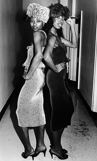
  Coreen Simpson, Grace Jones, 1980s, from the series Nitebirds/Nightlife
 Willis: I love that story of thinking about how you viewed the world and your desire to document and change the visual experience of how Black people have been portrayed. What other photographers influenced you?
Simpson: Gordon Parks. James Van Der Zee, of course.
When I was studying at the Studio Museum, in Frank Stewart’s darkroom classes, he would always come to me and say, “Oh, have you seen this book?” He did it so casually. He planted the seed in me that we must study the history of what we’re doing. Then I learned about Baron de Meyer, and I loved the lighting techniques. Cartier-Bresson. All those I learned. And I started collecting my own books.
I have quite a big library of photobooks.
Willis: It’s amazing, because when I think of your work, I always connected it to Henri Cartier-Bresson.
Simpson: Capturing the moment!
Willis: Moments at night.
Simpson: Oh, I love it.
Willis: How to rethink joy and pleasure. It’s not just everyday night moments, but the way that you visualize how women dress. Can you talk about how you began to think about fashion and photography?
Simpson: Well, fashion has always been something I was interested in. I remember as a teenager, I worked for a camera store, never realizing one day I would be a photographer. I never had a really good wardrobe. So I saved my money and bought clothes for my junior year. No one really paid me any attention until I had these nice clothes that I saved for. I remember going out one day in my neighborhood, and I had a fake pink leather jacket on, and I just remember how people were looking at me. I thought, Oh, that’s powerful. Fashion is a powerful thing.
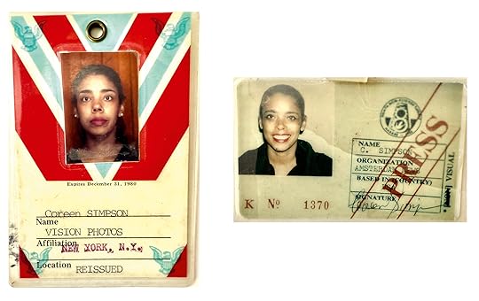 Left to right: Vision Photos press pass, 1980; Amsterdam News press pass, 1980s
Willis: What made you decide to take a class at the Studio Museum in Harlem?
Simpson: Because I was taking pictures, taking them to the lab, but I didn’t know how to develop my pictures. Frank was teaching that class in the late ’70s. Carrie Mae Weems was in my class. Isn’t that amazing?
Willis: In 1970, I took my first class at the Studio Museum in Harlem, and I studied with the filmmaker Randy Abbott. He led filmmaking and editing workshops there, and Toni Cade Bambara was one of the student-participants at Studio then. I wanted to make films. Studio Museum has been a core for many of us. Did you have any early exhibitions at the Studio Museum in Harlem during that time?
Simpson: I had a show there in the late 1970s with John Pinderhughes, a two-person show, Encounters. I remember showing at the Urban League’s Gallery 62. They gave me a one-woman show.
Willis: I remember that show and another exhibition Photographs: Coreen Simpson and Jacqueline LaVetta Patten (1980). The Urban League supported artists by hosting exhibitions in the lobby gallery.
Simpson: Yeah. So long ago. I had those big photographs up. I showed the Nitebirds/Nightlife because I liked a lot of night stuff, parties and stuff like that. I blew up pictures of the characters that I met at night.
Willis: Where did you go out then?
Simpson: All those clubs. I can’t even remember. The Mudd Club was one. Different little clubs. When I would go to the clubs, I would see a lot of different people and just click, click, click, click, you know.
 Coreen Simpson, Man with Curl, 1990s, from the series B-Boys
  Coreen Simpson, Helene, Roxy Club, 1985, from the series B-Boys
 Willis: One of the points of your work is that directness of the gaze. People posing, wanting to be seen, and you see them!
Simpson: I always tell people to look right in the camera lens. Like when I did the B-Boys series in the 1980s, I would just pull people off to the side that I thought looked fabulous and put them into the studio that I set up. I always had to give them a little pep talk. I would say, “You look so fantastic and I want to photograph you,” then very briefly tell them what I’m trying to do, and have them sign releases. I would tell them that this is for posterity.
Willis: Why the title B-Boys? There are girls in there as well.
Simpson: Well, the girls came later. I was really focusing on the hip-hop scene, the breakdancers. That’s why I called them B-Boys. I saw a guy on the train. I gave him my card and said, “Come to my apartment,” because I wanted to photograph him. Richard. That was my first B-boy. Then he brought his friend with him, and he was gorgeous.
I showed the pictures to my daughter and asked, “Where do I find more?” She said, “Oh, go to the Roxy, Mommy, because that’s where they hang out—at the Roxy.” I went to the owner of the club and told him what I was trying to do. “I want to do this as a project. Would you help me do this as a project? Can I set up a studio here?” They went along with it. Everybody liked to be photographed. People go out at night, and they look great. They want to be documented.
Willis: You had the camera and the backdrop, and the studio was set up at the club?
Simpson: I had a big backdrop for the portraits that I did at the Roxy. The Roxy was huge. So they gave me a space, and I just put the backdrop up real quick, the lights and everything, the tripod and all that. But people like that attention. So I had no problem. And then a man came over to me one day, and he said, “These photographs are going to be very important one day.” He told me that. This was the early part of hip-hop, and I wasn’t really that interested in the music. I was more interested in the style. I like jazz.
Willis: I love how some of the kids use style from the ’50s in terms of dress.
Simpson: They had their own unique style.
 Coreen Simpson, Ntozake Shange, 1997/2021, from the series Aboutface
  Coreen Simpson, Alva with Clock, 1992/2021, from the series Aboutface
 Willis: I see your portraits as stories. They’re storytelling in the most profound ways. It is fascinating that you moved toward enhancing your stories, from direct portraits to collage work. What led you to enhance the images?
Simpson: In the early 1990s, I wanted to do some new work, and I was looking at old photographs in my archives, just looking through things. Some were extras from test prints. They weren’t the prints that I really liked because it takes a while to get the print that you like when you’re printing in the darkroom. I had kept the test prints, and then I wondered, What am I going to do with them? So I began to fool around. At one time, I was doing actual collages. I got very caught up in it.
As a photographer, you want your own language. And it took me years to come to my own language. When I was fooling around with those test prints, little did I know I was creating my own language with the AboutFace series (1991–ongoing). I was just having a little fun. I think I wasn’t feeling so good at one time, maybe it was the wintertime, and I wanted to photograph, but I didn’t want to go out, or I couldn’t go out. So I said, Well, I’ll create a new body of work—I’ll do some collages with these test prints.
Willis: Did you look at Romare Bearden, at his collages as inspiration?
Simpson: Of course. But his were more stories. They were linear.
 Coreen Simpson: A Monograph 65.00 The comprehensive survey of a singular, creative force who interweaves photography, design, and explorations of identity.
 $65.0011Add to cart
[image error] [image error]
In stock
Coreen Simpson: A MonographPhotographs by Coreen Simpson. Edited by Sarah Lewis, Leigh Raiford, and Deborah Willis. Text by Bridget R. Cooks, Awol Erizku, Doreen St. Félix, Rujeko Hockley, Sarah Lewis, Valerie Cassel Oliver, Jonathan Michael Square, and Salamishah Tillet. Interviewer Deborah Willis.
$ 65.00 –1+$65.0011Add to cart
View cart DescriptionThe second title in Aperture’s Vision & Justice Book Series, created and coedited by Drs. Sarah Lewis, Leigh Raiford, and Deborah Willis, showcases the luminous, wide-ranging contributions of an essential artist.
Coreen Simpson—photographer, writer, jeweler—has done it all. Working for publications such as Essence, Unique New York, and The Village Voice, from the late 1970s onward, Simpson covered New York’s art and fashion scenes, producing portraits of a wide range of Black artists, literary figures, and celebrities. Her iconic jewelry, the Black Cameo, has been worn by everyone from the model Iman to civil-rights leader Rosa Parks.
This long-awaited volume, Simpson’s first, features her celebrated B-Boys series—portraits of young people coming of age during the early years of hip-hop—as well as her experiments with collage and other formal interventions. An assortment of essays and an extended interview offer powerful reflections on Simpson’s unique blend of portraiture, sartorial politics, and her riveting story of an intrepid life in journalism, art, and fashion.
DetailsFormat: Hardback
Number of pages: 236
Number of images: 179
Publication date: 2025-10-14
Measurements: 8.5 x 10.75 x 1 inches
ISBN: 9781597115858
Coreen Simpson (born in New York, 1942) is a celebrated photographer and jewelry designer from Brooklyn, whose career has spanned more than five decades. Her work has been featured in Essence, The New York Times, The Village Voice, and Vogue, among other publications. Her photographs are held in the permanent collections of the Museum of Modern Art, New York; Bronx Museum; Le Musée de la Photographie, Belgium; and Schomburg Center for Research in Black Culture at the New York Public Library, among others.
Sarah Lewis is the John L. Loeb Associate Professor of the Humanities and associate professor of African and African American studies at Harvard University and the founder of Vision & Justice. She is an award-winning art and cultural historian whose books and edited volumes include The Rise (2014), the “Vision & Justice” issue of Aperture magazine (2016), Carrie Mae Weems (2021), The Unseen Truth (2024), and Vision & Justice (2025).
Deborah Willis is an author and curator whose pioneering research focuses on cultural histories, the Black body, women, and gender. She is a celebrated photographer, acclaimed historian of photography, MacArthur and Guggenheim Fellow, and university professor and chair of the Department of Photography and Imaging at the Tisch School of the Arts at New York University. Willis is also a coeditor of the Vision & Justice Book Series.
Bridget R. Cooks is professor of art history and African American studies at the University of California, Irvine. Her research focuses on African American artists, Black visual culture, and museum criticism. She is author of Exhibiting Blackness: African Americans and the American Art Museum (2011) and her writing can be found in dozens of art exhibition catalogs and academic publications such as Afterall, Afterimage, American Studies, Aperture, and American Quarterly.
Awol Erizku’s multimedia work has been exhibited at the Metropolitan Museum of Art, Museum of Modern Art, Gagosian, New York; Crystal Bridges Museum, Bentonville, Arkansas; Museum of Contemporary Art Toronto; Ben Brown Gallery, Hong Kong; Sean Kelly Gallery, Los Angeles; and FLAG Art Foundation, New York. Aperture published his first major monograph, Mystic Parallax, in 2023. He lives and works in Los Angeles.
Doreen St. Félix is a staff writer at The New Yorker. She is a winner of a National Magazine Award for Columns and Commentary.
Rujeko Hockley is the Arnhold Associate Curator at the Whitney Museum of American Art, where she cocurated the 2019 Whitney Biennial. Additional projects at the Whitney include Amy Sherald: American Sublime (2025), Inheritance (2023), and Julie Mehretu (2021). In 2017, she cocurated We Wanted a Revolution: Black Radical Women, 1965–85, which originated at the Brooklyn Museum and traveled to three additional US venues in 2017–18.
Valerie Cassel Oliver is the Sydney and Frances Lewis Family Curator of Modern and Contemporary Art at the Virginia Museum of Fine Arts. From 2000 to 2017, she was at the Contemporary Arts Museum Houston (CAMH) where she was senior curator. Prior to her tenure at CAMH, she was the director of the Visiting Artists Program at the School of the Art Institute of Chicago and a program specialist at the National Endowment for the Arts.
Jonathan Michael Square is an assistant professor of Black Visual Culture at Parsons School of Design. He is the founder of the digital humanities project Fashioning the Self in Slavery and Freedom. He most recently curated the exhibition Almost Unknown: Afric-American Picture Gallery at the Winterthur Museum, Garden & Library, Delaware.
Salamishah Tillet is a scholar, writer, and feminist activist. She is the Henry Rutgers Professor of African American Studies and Creative Writing at Rutgers University–Newark, where she also directs the New Arts Justice Initiative.
Related Content Interviews These Radical Black Women Changed the Art World
  Featured 12 Photobooks That Celebrate Black Voices and History
 Willis: And your collages are from your own photographs.
Simpson: Yes.
Willis: So that detail that you’re exploring, like the image with the clock that you made in the 1990s. What does that mean when we think about those braids?
Simpson: I’ll let you think about what it means. It just worked.
Willis: Because it became timeless. Braids have become timeless in discussions about Black women and hair.
Simpson: The original picture is of my godchild Alva. Later, it was published in The Village Voice when Lisa Jones wrote an article on Black hair, and they used that picture to illustrate what she was talking about. Then for the collage, I used one of those test prints.
I cut the head out, and I just would go through fashion magazines and pull out anything that interested me. I laid on the clock, and I said, “Oh, I like that,” and I rephotographed the photograph. Because we didn’t have Photoshop then and all that.
 Coreen Simpson, The Fun House, New York, 1979, from the series Nitebirds/Nightlife [image error] Coreen Simpson, Man with Rings (Arthur Smith Project, Master Silversmith, for the Hatch-Billops Collection), 1987, from the series B-Boys
 Willis: One can see the layers that you created by hand and the shadow within the collages. With the color photographs in Sky Portraits from the early 1980s, when did you decide you wanted to begin experimenting with adding texture, color, or sparkles?
Simpson: That was just an experiment. But I did like painting on the color photographs because of the saturation. When I would get a print back from the lab, I might say, That watermelon isn’t red enough; that watermelon should be red. So I would take the fingernail polish and color it in.
Willis: As you said, you were creating your own language. But then, these were also becoming ways to create new identities. That’s something that you explored, in my mind, in the work that you were making—that these people were reimagining their identities, and they had a little sparkle in them—just to have those moments.
Simpson: Dazzle, yes.
Willis: To me, they were dazzling.
Simpson: That’s why I called the one series Nitebirds. Birds of the night.
Willis: Here again, you’re creating your own terminology, your own language in that work.
When I think about your role during that era, a creative time for us, you were acknowledging that we walk the talk of self and beauty. That’s something I was encouraged by when looking at your work. You transformed the Black body, you posed new questions. Like your directing of the poses in the B-Boys series: You tell them to turn away from the camera, but at the same time, you are seeing them—because they’ve not been seen. These are kids who have struggled but they found a way to shine. How did they respond to you?
Simpson: They responded very well. I always want people to say, “Damn, where’s Coreen going?” It’s an adventure. The camera gave me license to see the world. When I have my camera with me, I’m not afraid of anybody. I always feel like I can just do anything if I have my camera with me.
Willis: The camera gave you security.
Simpson: It did. I love that feeling.
 Catalog cover for Black Cameo Collection, 1990s
  Coreen Simpson, Gail Pilgrim Wearing a Black Cameo Collection Crown by Coreen Simpson, 1990s
 Willis: What I see in the photographs that you create is not only that you’re helping them create their identity, but you are documenting their identity. I think about identity and about how art and social practice come hand in hand, specifically with your photographs, jewelry, and cameos. Did the Black Cameo start with a photograph? Or with a drawing?
Simpson: I had never even thought of doing a cameo until one of my clients asked. She was editor in chief of a magazine. It was a white magazine, and she was a Black woman. One day she asked me, “Oh, Chanel came out with a new cameo. I love it. But I don’t feel like I should wear a cameo of a white woman, Coreen. Can you make a cameo for me?” I told her, “I don’t make cameos. But I’ll look around and see if I can find one for you.” I went to the diamond district, and no one had a cameo of a Black woman. They were all white cameos. Then I asked a lot of Black women, elderly Black women, and they said, “No, I never saw it.” Although there were Black cameos in Europe, of course. There are famous ones, including cameo habillé. I went to the library to do research and saw some from the 1800s. And they were beautiful. But I wanted to do a modern cameo of a modern Black woman.
Willis: Whose profile is that?
Simpson: I found a model maker, a Black model maker, and I showed him a picture of one of my subjects. I said, “I want it to look like her profile.” Jewelry is very similar to photography, in a way. It’s a visual. That’s all.
When my business took off, I had a studio on Thirty-Seventh Street off Fifth Avenue, and a Black woman wrote to me and asked, “Can you make an angel for me? A little Black angel pin? I see all these little white angels. But I want a Black angel.” And
I sat down with my factory, and we designed the Black Angel pin. That was a phenomenal success.
Willis: That’s amazing. You and I have similar interests, because that’s also why I like going to Florence, Italy, looking for those cameos. I remember my mother had one of those Black cameos that they had. They had a lot of lamps and figurines that focused on the Black female body.
Simpson: Well, when George Mingo went to Italy, he went to visit David Hammons. David won the Prix de Rome and invited George to visit him. I said, “I want a cameo that’s a Black woman.” I still have it, but it’s not a Black woman. It’s a white woman in black. That’s what I was always seeing.
Willis: Yes. And that’s the same thing that my mom had. It wasn’t a Black woman. It was in black.
Simpson: So when I was creating the cameo, I was doing well financially, so I went to a scarf company, one of the major scarf companies, and told them I wanted to do a scarf like an Hermès scarf but for Black women. I designed the scarf for the Avon company. They sat me down with their designer, and I would tell them: “I want it like this.” I designed umbrellas, jewelry. I did a cameo for Avon that was different than mine. That was their cameo. They signed me and Elizabeth Taylor at the same time. They had an Elizabeth Taylor jewelry collection, and they had the Coreen Simpson Regal Beauty Collection.
 Coreen Simpson, Abyssinian Baptist Church Lady, Harlem, 1992, from the series Church Ladies
Willis: I was just thinking about Avon when we were kids, because my mom had a beauty shop, as you know, and we grew up in the beauty shop. Women would come in, and they’d pay Mom. So I’m thinking about how entrepreneurial women were during that time, in the 1950s, during the civil rights and human rights activist period.
Simpson: Right.
Willis: But beauty was consistent.
Simpson: Always.
Willis: Always consistent. And I see that’s something that has been consistent with your work. Hank [Deborah Willis’s son, the artist Hank Willis Thomas] has been creating public monuments, and I see that you’re also creating public monuments with your jewelry in a way.
Simpson: It’s so funny. I was talking to Lorna Simpson several years ago, and she gave me a really big compliment. She said, “Coreen, your photographs. . . . You have your photography. But you created that cameo. I see it all over.” But you know what? I always wanted to make money aside from photography. Jewelry sustained my photography, because I could always buy what I wanted to buy. I didn’t have to go get a grant or something like that. I have to always give the jewelry business a big thank you because it underwrote my photography. Jeanne Moutoussamy-Ashe [the photographer] told me, “I saw you in The New York Times when you first came out with that cameo.” I don’t know if she knew I was doing jewelry. But she saw that, and she was very impressed.
Willis: That’s what I mean. You have created a monument.
Simpson: It was totally unplanned.
Willis: But that’s how most things are. I see pride in the photographs of the people who have worn your jewelry, like Celia Cruz.
Simpson: Yes. She loved it. Her hairdresser was a friend of mine, Ruth Sanchez. I was doing these sparkly eyeglasses. I was selling them. I told the company, “I want you to design it like this for me.” I did a pair of leopard sunglasses, all crystal. I showed it to Ruth.
She said, “I got to have this for Celia. Celia is going to really love this.” And when she got it, Celia went crazy. Then she asked, “Well, what else do you do?” That’s how I met Celia Cruz. People couldn’t believe that she was at my apartment. She came with her husband. I went to her house. She was fabulous. She wore my jewelry on a couple of her album covers.
[image error] Coreen Simpson, Ebony, 1989/90, from the series B-Boys Coreen Simpson, William and Sam, Roxy Club, 1985, from the series B-Boys
 Willis: Thinking about your earlier mention that you don’t have photographs of your birth parents, do you think this shaped your work in any way, specifically of photographing younger people? Do you think that has any kind of silent message, why you want to make sure some of these younger people see themselves?
Simpson: When I’m taking their picture, I’m thinking, I wish I had had my picture taken when I was growing up. Although I did have a beautiful picture from when someone took me and my brother to get our picture taken. I love that picture. But that’s the earliest.
Willis: But that’s the love I see in the photographs you’re making. I see a sense of reflection.
Simpson: I’m glad you see that.
Advertisement
googletag.cmd.push(function () {
googletag.display('div-gpt-ad-1343857479665-0');
});
Willis: That’s what I see with the young people that you’ve photographed over time. Yes, the breakdancing, the B-boys. But the way that they look at you, the way they look at the camera and they see you past the camera, they see us today. I just get chills when I think about it.
You traveled to Europe and the Middle East during your early years. I’m curious how those experiences influenced you?
Simpson: I had a job at a marketing company on Madison Avenue called Patents International Affiliates. A small Iranian company. They were all preparing to go to Iran for a marketing convention or something. I didn’t think I was going, but the president that I was working for, I was his assistant, he said, “Coreen, you have a passport? You’re coming with us.” I was like, “Oh my God, I never would imagine . . .”
Willis: And you already had your passport, so you were ready.
Simpson: The shah of Iran was still in power then. That’s how long ago it was. And after I left, that’s when he was toppled. We were all invited to a nightclub, which I think was owned by one of his brothers. It was called La Cheminée. I don’t know how I remember that club. It was fabulous. You know, Iranians, they were in the oil business, and the people that worked with my company at the time were very, very wealthy. I met so many Arab princes that were there. It was a conference of the Arab Emirates, formerly the small Trucial States, Dubai and all, and they were all in their long, fabulous robes. It was such a fabulous experience. But I wasn’t even a photographer then.
Willis: But did seeing those robes affect some of the things that you experienced when you began covering fashion?
Simpson: Oh, it was so beautiful and inspiring. But I wasn’t even thinking of being a photographer then. I was a young working woman. My kids were little at the time, like five or six or something, and my mother kept them while I was in Iran for a month.
 Coreen Simpson with her children, Suzanne and Andrew, 1970s. Photograph by Ernie Washington
  Coreen Simpson, Paris, 1983
 Willis: Tell us about the photographer Bill Cunningham guiding you through the fashion world.
Simpson: I met Bill Cunningham because he covered the collections, and he was one of the star photographers. Everyone respected Bill Cunningham so much. In New York, I would always see him on his bicycle covering his street fashion stuff, and he would say, “Come here, child. Stand over there.” So he photographed me and put me in The New York Times a couple of times. I got to be friends with Bill. When I went to Paris, they were kicking my ass, all the photographers. First of all, there were very few women. There might have been two or three women at the most. And there were so many men, and they would always push me out of the way. I would be too far back. Because at that time, you could sit on the runway. They don’t do that anymore. That was the best. When the women would walk by, you could feel the fabric. That’s how close you were to the models. It was so fabulous. But I could never get to the runway. And Bill saw that I was struggling. He reached out to me and extended his arm and pushed me forward. No one ever bothered me after that.
Willis: You remind the world about Black beauty, and what it means to walk out of the house feeling that you’ve fashioned yourself. The idea of self-fashioning was important, from slavery to the present. So when I share your work, when I give my talks, when I think about your practice in the art, I acknowledge that you are always thinking about social justice. Social justice has many frames of entry, forms of entry. You have created something that I really appreciate—the love and respect that you show to us.
Simpson: I see that we are kings and queens. So with my photographs, I want to show the royalty that I see in Black people—and other people too. I want to show the regalness. That’s what’s behind what I’m doing.
This interview originally appeared in Coreen Simpson: An Aperture Monograph (Aperture, 2025).
Why Don McCullin Doesn’t Want to Be Called a War Photographer
This interview originally appeared in Aperture, Summer 2009, as “Don McCullin: Dark Landscapes,” and was published in Aperture Conversations: 1985 to the Present (Aperture, 2018).
Don McCullin is the acknowledged dean of those photographers who have repeatedly witnessed the horrors of war. Working since the 1960s in Biafra, Bangladesh, Cambodia, Cyprus, Lebanon, Northern Ireland, and Vietnam, among other places, his imagery of exhausted and wounded troops, of civilians and soldiers struck with madness, of people starving and ill, reveal in intimate detail many of the agonizing ways in which atrocity can be visited.
Today, McCullin rebels against the moniker “war photographer.” He is not content with the impact of his decades’ worth of images, particularly their insufficient role in diminishing the very violence they depict. The ambiguous position of the image in society is a preoccupation that he has had for a long time, as evidenced by the title of one of his books on the Vietnam War, Is Anyone Taking Any Notice?, published in 1973.
In conversation McCullin speaks passionately, with enormous lyricism, of the revulsion and guilt that remain after years of navigating various borderlines with hell, of his lifelong fascination with photography, of his impoverished youth in a rough North London neighborhood, and of his attempts to heal himself. Recently, he has been photographing landscapes in his native England as well as depicting the remains of the Roman Empire for a large-scale documentary project. While expanding his range as a photographer, he has been editing and printing his previous work, and simultaneously attempting to find some semblance of serenity. —Fred Ritchin
 Don McCullin, Fishermen playing during their lunch break, Scarborough, Yorkshire, 1967, from Don McCullin (Aperture, 2015)
  Don McCullin, The battlefields of the Somme, France, 2000, from Don McCullin (Aperture, 2015)
 Fred Ritchin: Today we’re going to talk about you being a photographer, a larger career than that of a war photographer.
Don McCullin: I’d like to get away from the awful reputation of being a war photographer. I think, in a way, it’s parallel to calling me a kind of abattoir worker, somebody who works with the dead, or an undertaker or something. I’m none of those things. I went to war to photograph it in a compassionate way, and I came to the conclusion that it was a filthy, vile business. War—it was tragic, and it was awful, and I was witness to murder and terrible cruelty.
So do I need a title for that? The answer is no, I don’t. I hate being called a war photographer. It’s almost an insult. I wasn’t trying to pick up the Robert Capa mantle; I went to war because I felt I was suited to do it. I was young and ambitious, but the ambition started to fade away when I saw people coming toward me carrying dead children, or wounded people coming toward me holding their entrails . . . things like that. Things the average man in the street simply wouldn’t understand, because he’s never been there, thank God.
Ritchin: In the work you’re doing now, the Roman work and the landscapes, it’s as if life has more to offer than simply death. Your sense of time is different. You’re working much more slowly. The time passes over thousands of years. These are traces of things. Before, it was quick, instantaneous, news.
McCullin: It was like what we would call a head-butt. It was about butting somebody in the head and showing them my images. Now I’m behaving in a much more dignified way. Naturally, I’m getting older and coming to the end of my life, so I’ve slowed down. I’ve reinvented myself. The reason I am doing these new landscapes, this new Roman project, is because it’s a form of healing. I’m kind of healing myself. I don’t have those bad dreams. But you can never run away from what you’ve seen. I have a house full of negatives of all those hideous moments in my life in the past.
So now my challenge is the landscape, the archaeological landscape of Rome . . . it’s very challenging and it’s very beautiful. When I can get into the pariah nations—Syria and Lebanon, they’ve eased up a bit, though Syria is a notorious police state—but when I’m there, I am totally safe and alone. I am constantly pushing the barriers, simply for the privilege of getting my cameras out and taking beautiful photographs.
 Don McCullin, Irish man down and out, alone and hungry in London’s East End, January 1986
Ritchin: Of stuff that happened two thousand years ago.
McCullin: Yes. Because it’s not as if I’m trying to photograph today’s political struggles. In a way, I am trying to do justice to the culture of these historical sites.
Ritchin: But it seems to me you’re also trying to find a meaning in life, what’s good in life or what’s important, or, as you say, dignified. The war itself is the abattoir. War itself is the meaninglessness of life, and somehow that is there, even in your landscapes and the Roman work. You’re finding something else, something spiritual, some other kinds of answers in life.
McCullin: My landscapes are dark. People say: “Your landscapes are almost bordering on warscapes.” I’m still trying to escape the darkness that’s inside me. There’s a lot of darkness in me. I can be quite jovial and jokey and things like that, but when it comes down to the serious business of humanity, I cannot squander other people’s lives.
Ritchin: Is that because of what you’ve seen in life, or because of where you’ve come from in life? Are you talking about your life as a war photographer, or are you talking about the neighborhood where you grew up—a sense of fairness or fair play?
McCullin: Well, there wasn’t any of that where I grew up. The boys I grew up with were determined to become criminals. I never really wanted to be incarcerated in prison. I spent a few days in prisons in Uganda, and got beaten by the soldiers. Freedom was paramount to my dreams. And in England we have this class structure. It’s very much there—though it’s being exchanged for new racial structures and religious structures that have come in. England is quite a racial country: it was never really on your side if you didn’t have white skin.
So I grew up with all those things, and I’m still living with them, even though I live in the countryside. There are many hurdles in my country; you’re never really going to be free of the hurdles.
 Don McCullin, Former Roman city of Palmyra, Syria, 2008
  Don McCullin, The Somerset Levels near Glastonbury, England, 1994
 Ritchin: But in a way, then, maybe you’ve turned to a kind of poetry of the image, or a kind of lyrical photography, with tonal ranges that are different, more studious, larger formats . . . In other words, you talk about it as informational, the “Roman Empire,” but you’re doing something else. You’re showing the light and the beauty, the metaphors. You’re working in a broader way. It’s like you have a bigger palette now.
McCullin: Yes, it is a bigger palette. The Roman Empire as it was, was extraordinary, apart from the fact that it was based on cruelty and horror . . . You know, when I’m in these great Roman cities, which earthquakes and time have destroyed, I like the fact that I am there, I am enjoying the challenge—but all the time I feel as if I can hear the screams of pain of the people who built these cities. It doesn’t go away. The Roman slaves were paid nothing. All they probably expected was a bowl of food. So when you’re in these remarkable cities, you’re not comfortable really.
You could say: “Well, why are you doing this?” I’m doing it because I have never collectively seen several Roman cities in the Middle East. What I’m getting at is that when I first started as a photographer, I thought: “This is going to be good. I’ll get behind this camera and I won’t have to worry about academia. I’ll just take pictures. It will be easy. And of course, there’s no politics involved!” I’ve done nothing but political assignments in my life. Even going back to ancient Rome, it was steeped in politics and evil.
I feel comfortable doing landscapes in England. I don’t have any apologies, I don’t have problems. And I never do landscapes in England when it’s sunny. I always do them in the winter when the trees are naked. It’s more Wagnerian. I don’t know . . . I like drama and I like darkness.
When it comes down to the serious business of humanity, I cannot squander other people’s lives.
Ritchin: Eugene Smith used to listen to Wagner when he was printing. That’s how he’d stay up for nights in a row, listening to Wagner, and he’d get those deep prints, like yours—deep skies, your dark skies.
McCullin: Well, I was influenced by Eugene Smith, as much as I was by Bill Brandt. I like the great prints that Steichen made. I really studied photography in depth. [I brought a stack of books] home to where I lived, in a Hampstead Garden suburb, and they were as tall as this table—and my God, they were full of information. I used to sit nightly when my children went to bed, studying those books. They became my university. I taught myself everything in photography that I know. Don’t get me wrong about this, I still take a stand—but I am still a student of photography. The moment I think that I have arrived, I’ve had it. I am never going to arrive.
Ritchin: So your life as a photographer, then . . . it’s almost like Crime and Punishment. It’s almost like you’ve created a novel with all these images, from Vietnam, Biafra, landscapes, Rome. There’s something that hangs together. It’s a human struggle.
McCullin: I’ve always been imprisoned in my own struggles. I’ve never known freedom in my life. I suppose most photographers haven’t, really. Life has always been a terrible struggle, even my private life—my marriages, my children, my behavior. So in a way, human struggle has been my biggest factor. I’ve never really found freedom. If I did, I’d probably feel incredibly uncomfortable. Maybe I’m one of those people who is better off in life with someone always tormenting me with the sharp end of a blade.
 Don McCullin 75.00 A retrospective survey offering an examination of Don McCullin’s photographic career and a record of half a century of international conflict.
 $75.0011Add to cart
[image error] [image error]
In stock
Don McCullinPhotographs by Don McCullin. Text by Harold Evans and Susan Sontag.
$ 75.00 –1+$75.0011Add to cart
View cart DescriptionFirst published in 2001, this retrospective survey offers both an examination of Don McCullin’s photographic career as well as a record of half a century of international conflict. Coinciding with the photographer’s eightieth birthday, this expanded edition of Don McCullin serves as fitting homage to a photographer who dedicated his life to the front line in order to deliver compassionate visual testament to human suffering. With texts by Mark Holborn, Harold Evans and Susan Sontag, and photographs taken by McCullin in England, Cyprus, Vietnam, the Congo, Biafra, Northern Ireland, Cambodia, Bangladesh and Beirut, this is an essential volume on one of the legendary photographers of the 20th century. I have long admired Don McCullin’s heroic journey through some of the most appalling zones of suffering in the last third of the 20th century, Sontag wrote in her essay. We now have a vast repository of images that make it harder to preserve such moral defectiveness. Let the atrocious images haunt us Seeing reality in the form of an image cannot be more than an invitation to pay attention, to reflect, to learn, to examine the rationalizations for mass suffering offered by established powers. Details
Format: Hardback
Number of pages: 352
Number of images: 0
Publication date: 2015-08-25
Measurements: 11.7 x 12.3 x 1.5 inches
ISBN: 9781597113427
The artistry of his compositions and the compassion with which he approached his subjects gave his work accessibility—and for years it was his photographs that connected British people to the reality of wars and natural disasters in faraway places. – CNN
One of his great skills as a photojournalist was being able to shoot an image of something people find hard to look at and transform it into something they can’t look away from. – CNN
With his visceral frontline images, he brought intense, gut wrenching moments of combat into the homes of millions. – Mother Jones
ContributorsDon McCullin grew up in north London. He worked for the Sunday Times for eighteen years and covered every major conflict during his adult lifetime, until the Falklands War. He has received many honors and awards, including being named Commander of the Order of the British Empire (CBE). Since the original publication of this definitive retrospective book in 2001, Mcullin has continued to take photographs, publishing Don McCullin in Africa (2005), In England (2007), Southern Frontiers: A Journey Across the Roman Empire (2010), and Shaped by War (2010). He lives in Somerset, UK.
Sir Harold Evans was editor of the Sunday Times from 1967 to 1981. He lives in New York.
Susan Sontag was an influential writer, director, and activist. She was awarded many honors, including the National Book Critics Circle Award for On Photography (1977), and was a MacArthur Fellow between 1990 and 1994.
Ritchin: So in your earlier work, you did try to make a difference, with, let’s say, the photographs of war or starvation or illness. Is Anyone Taking Any Notice?, The Destruction Business (1971). And so on. You were very frustrated that not enough people took notice.
McCullin: Absolutely.
Ritchin: I remember you once said that Eddie Adams was the only photographer in the Vietnam War who actually made a difference.
McCullin: It still took seven years for the war to end. But Eddie’s was the ultimate statement. The most famous picture in the war, along with Eddie’s, was [Huynh Cong Ut’s 1972 photograph of] the girl running down the road, burning. These pictures eventually helped to turn public opinion here in America against the war, but it still took years. And if you mount up the casualties in those seven years they would run into the thousands.
So do we make a difference? I have now become seriously doubtful. Because after me came James Nachtwey and others, and then we had Rwanda—and there we go again. There was nothing more horrendous than the massacres in Rwanda. So I say to myself: “No, it didn’t work. We didn’t make any difference.”
Ritchin: But do you think that sometimes people are grateful that you’re there, that somebody does pay attention?
McCullin: No, not really. If you were a fallen man or woman, would you want to be looked upon as documentary material? You’re down here, they’re up there. It’s taking advantage.
Now, I’m really talking to you in a very open, honest way: we [photographers] know we’re doing this. Let’s not make any mistake. We know we’re doing it. It’s not a matter of just happening upon [these scenes]. We sometimes go out premeditating it: we will find these people. We know that we can become well known in photography. We know we can be celebrated in photography.
Ritchin: So there is a mercenary aspect.
McCullin: There is a mercenary aspect. So when I do these things, I am taking along a whole briefcase of psychology up here, knowing that I am on a very fine line. So there is a guilt. It’s like shame.
 Don McCullin, Palestinians fleeing the Christian Phalangist massacre at the Quarantina refugee camp, Beirut, Lebanon, January 1976
  Don McCullin, Vietnamese family after a grenade-attack on their bunker, Hue, 1968, from Don McCullin (Aperture, 2015)
 Ritchin: If you turn to the war in Iraq today, there’s no imagery coming out that’s impacting people in any sense the way that it did in Vietnam.
McCullin: Well, we know why. We had so much freedom in Vietnam. We could do anything we wanted, go anywhere, do anything, photograph anything. [In Iraq,] you can’t photograph a dying soldier as you could in Vietnam, because you have to be “embedded” now. And being embedded is basically like being somebody’s dog who is being taken out to Central Park for a walk with a collar on. So therefore you’ve got censorship, really. That’s what it comes down to.
Ritchin: Young war photographers today become part of a system. And you were trying to disrupt the system. Is it still possible to disrupt the system? Are there other strategies as a photographer? Can you photograph war differently?
McCullin: Well, you know, Philip Jones Griffiths photographed the Vietnam War in a totally antiwar way. His book Vietnam Inc. (1971) was a totally different kind of presentation. Philip spent three or four years there. His book wasn’t about, you know, the Hollywood image of war. It was the real image, the truth of war. So, yes, there’s always another way. There are many ways of photographing war. And you don’t have only military wars. There are wars of poverty, there are wars of degradation, there are wars of hunger, there are wars about crops . . . All these things can be seen as wars, in my mind.
Ritchin: They’re just not as glamorous as the military war.
McCullin: Yeah. But the fact is, we’ve had enough of that anyway. There are so many people now against the war in Iraq. The irony is that [the United States] just signed a contract with the Chinese for oil . . . So there I am talking about politics, which I’ve always tried to keep away from. But in the old days, I didn’t just rush into these areas and get my camera out and have a go. I did the research before I went. For somebody who couldn’t read properly—I’m horribly dyslexic, even to this day—I managed to do it. I managed to get there, and I brought things back. There were always barriers, even in those days, but one got around them.

Don McCullin, Poor neighborhood in Liverpool, England, 1961
All photographs © Don McCullin/Contact Press Images
Ritchin: What about digital photography? That’s a whole different process.
McCullin: I don’t do it.
Ritchin: You feel that film says something different?
McCullin: Well, I process all the film as well. I don’t rush things: I wait, I don’t tear the lid off the film-processing tank when it’s being processed, to look at it. I bring it out in a very gentle way, I treat it with great care, and I am very calm. Whereas with the digital camera, you can see what you’ve got from the moment you’ve taken it. I go around the world now, and see people doing that all the time—and I don’t belong there at the moment. I’m interested in film and paper.
Ritchin: But also, I think you’re interested in intuition. Because when you work with film, since you don’t see it immediately, you don’t know if you did a good job or a bad job immediately on the screen.
McCullin: I think I do, sometimes. If you don’t mind me sounding slightly conceited by saying this: you know when you’ve shot a picture whether there’s a good chance of it being the way that you want it to be. If you use a digital camera, it can be that way. But with film, I leave my house, I go all the way across to the other side of the world, I come back with the image, process the film, and wait and wait . . .
I have enormous patience, as I can testify in my landscape work. Sometimes I stay out for two or three hours in the same place, waiting for the sun to go behind those dark clouds. Patience is one of my virtues. Many times I go home without a picture, because at the last minute, the clouds go somewhere else, the sun is beating in my face—I get nothing. You know, it’s like somebody who sits on a riverbank fishing. It’s not about catching fish or getting negatives. It’s about being there, having the privilege to be there and be in command of your own joy. And mind.
Ritchin: It’s a kind of meditation in its way.
McCullin: I suppose. Yes, that’s a better way of putting it. There’s nothing nicer than finding peace of mind, because then it allows you to broaden your mind and then do something better the next time.
Advertisement
googletag.cmd.push(function () {
googletag.display('div-gpt-ad-1343857479665-0');
});
Ritchin: Henri Cartier-Bresson thought of a photojournalist as somebody who was keeping a journal with a camera. He was keeping a diary with a camera. It was very personal for him.
McCullin: People would say to me: “Did you ever keep journals?” I’d say: “No. My journals are my negatives. Why would I want to keep journals?” But I can see the point of it. Because when I went to Africa I did start keeping journals. The photograph is not the be-all and end-all. There are other dimensions in life. Lucian Freud is a great painter; that doesn’t mean he has to be a great writer.
Ritchin: What about your autobiography (Unreasonable Behavior, 1990)?
McCullin: That was me talking, really.
Ritchin: It’s well articulated. There’s a lot there, too.
McCullin: I had a good tutor in life. And it was the way I grew up. I grew up with no luxury, no guidance. There was only bigotry and ignorance where I lived—and fists. I could not have had a better start in life! Not that I enjoyed it. But it was the very best start. Because if I’d gone to a university, say, I would never have come out with the same compassion and understanding.
I saw my own father die when he was forty, and nothing hurt me more. So I know about misery and unhappiness: the loss of my father taught me a lot. So here I am. I’ve got slightly further down the road than my father did, but I feel sad that he couldn’t see that I’ve tried to honor his name—by trying to overcome the misery and the poverty and the ignorance. I’ve kind of extended his life, I hope.
Well, that’s just a way of trying to explain to people who might see this that really it’s not just about photography. It’s about being a human being. That’s what it’s about.
This interview originally appeared in Aperture, Summer 2009, as “Don McCullin: Dark Landscapes,” and was published in Aperture Conversations: 1985 to the Present (Aperture, 2018).
October 2, 2025
Announcing the 2025 PhotoBook Awards Shortlist
Paris Photo and Aperture are pleased to announce the shortlist for the 2025 Paris Photo–Aperture PhotoBook Awards—an annual celebration of the photobook’s enduring role within the evolving narrative of photography. Now in its thirteenth year, the awards recognize excellence in three major categories of photobook publishing: First PhotoBook, PhotoBook of the Year, and Photography Catalog of the Year.
This year, Paris Photo–Aperture PhotoBook Awards received over one thousand books from fifty-five countries around the world, including standout entries from Ecuador, Lesotho, Uruguay, and Vietnam. On September 17–19, the 2025 shortlist jury met in New York for three concentrated days of review and deliberation by an international team: Brendan Embser, senior editor, Aperture; Florian Koenigsberger, technologist and photographer; Paul Moakley, executive producer, The New Yorker; Anna Planas, artistic director, Paris Photo; and Keisha Scarville, artist.
“The 2025 PhotoBook Awards shortlist represents an extraordinary range of artistic styles, geographic perspectives, and design innovation, showing how the photobook remains one of the most compelling and effective vehicles for storytelling today,” says Brendan Embser. “From catalogs that consider how digital images have entered the hard drive of our lives, to intensely personal chronicles of individuals facing the extremities of politics and the desire for freedom, these publications speak to a year of vitality and achievement by independent publishers and artists.” Anna Planas adds, “Displayed on the balconies of the Grand Palais during Paris Photo, the shortlisted titles of the PhotoBook Awards will captivate an international audience and stand as one of the most anticipated highlights of the fair.”
The shortlisted books will be exhibited at Paris Photo, open to the public from November 13 through November 16, followed by an international tour, including in New York at Printed Matter, in January 2026, among other venues to be announced.
On Thursday, November 13, a final jury composed of five members will meet in Paris to select the winners for all three prizes, which will be revealed on Friday, November 14, at 3:00 p.m. (CET), at a ceremony at Paris Photo, and announced on Aperture.org and Parisphoto.com.
Below, see the thirty-seven selected titles for the 2025 PhotoBook Awards shortlist.
Advertisement
googletag.cmd.push(function () {
googletag.display('div-gpt-ad-1343857479665-0');
});
First PhotoBook

Eleonora Agostini, A Study on Waitressing, Witty Books, Turin, Italy. Design by Massimiliano Pace

Genesis Báez, Blue Sun / Sol Azul, Capricious Publishing, New York. Design by Studio Lin

Hélène Bellenger, Bianco Ordinario, Editions de l’Observeur, Vinzelles, France. Design by Hugo Berger and Eleonora Paciullo

Widline Cadet, Ritual [Dis]Appearance / Seremoni Disparisyon, Black Mountains Studio, Los Angeles. Design by Blake Duncanson and Widline Cadet

Daniel Chatard, Niemandsland, The Eriskay Connection, Breda, the Netherlands. Design by Carel Fransen
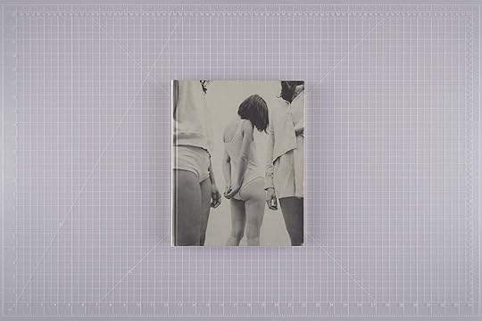
Louise Desnos, Acedia, Witty Books, Turin, Italy. Design by Ilaria Miotto

Salome Erni, Interesting Things, Self-published, The Hague. Design by Salome Erni

Alanna Fields, Unveiling, Meteoro Editions, Amsterdam. Design by Brian Paul Lamotte
[image error]Christine Furuya-Gössler, Photographs (1978–1985), Chose Commune, Marseille, France. Design by Cécile Poimboeuf-Koizumi and Perrine Serre

Farid Renais Ghimas, Angan-Angan Harsa, Jordan, jordan Édition, Jakarta. Design by Jordan Marzuki

Mohamed Hassan, Our Hidden Room, Ediciones Posibles, Fundación Photographic Social Vision, and Editorial RM, Barcelona; PHREE, Madrid. Design by Brian Carroll

Balarama Heller, Sacred Place, TIS Books, New York. Design by Balarama Heller, David Schnapper, and Carl Wooley

Daniel Stephen Homer, Route de la belle etoile (Route of the beautiful star), GOST Books, London. Design by GOST

Frida Lisa Carstensen Jersø, Frida Forever, Disko Bay, Copenhagen. Design by Spine Studio

Heba Khalifa, Tiger’s Eye, Self-published, Waziz Books, Cairo. Design by Nike Dieterich

Mahmoud Khattab, The Dog Sat Where We Parted, Self-published, Cairo. Design by Mahmoud Khattab

András Ladocsi, There Is a Big River . . ., VOID, Athens. Design by João Linneu and Myrto Steirou

Martha Naranjo Sandoval, Small Death, MACK, London. Design by Martha Naranjo Sandoval and Morgan Crowcroft-Brown

Alick Phiri, Lusaka Street, Art Paper Editions, Ghent, Belgium. Design by Jurgen Maelfeyt

Clara Simas, My father died three times / Meu pai morreu três vezes, Propágulo, Recife, Brazil. Design by Clara Simas and Estúdio Ligatura
Previous NextEleonora Agostini
A Study on Waitressing
Witty Books, Turin, Italy
Design by Massimiliano Pace
Genesis Báez
Blue Sun / Sol Azul
Capricious Publishing, New York
Design by Studio Lin
Hélène Bellenger
Bianco Ordinario
Editions de l’Observeur, Vinzelles, France
Design by Hugo Berger and Eleonora Paciullo
Widline Cadet
Ritual [Dis]Appearance / Seremoni Disparisyon
Black Mountains Studio, Los Angeles
Design by Blake Duncanson and Widline Cadet
Daniel Chatard
Niemandsland
The Eriskay Connection, Breda, the Netherlands
Design by Carel Fransen
Louise Desnos
Acedia
Witty Books, Turin, Italy
Design by Ilaria Miotto
Salome Erni
Interesting Things
Self-published, The Hague
Design by Salome Erni
Alanna Fields
Unveiling
Meteoro Editions, Amsterdam
Design by Brian Paul Lamotte
Christine Furuya-Gössler
Photographs (1978–1985)
Chose Commune, Marseille, France
Design by Cécile Poimboeuf-Koizumi and Perrine Serre
Farid Renais Ghimas
Angan-Angan Harsa
Jordan, jordan Édition, Jakarta
Design by Jordan Marzuki
Mohamed Hassan
Our Hidden Room
Ediciones Posibles, Fundación Photographic Social Vision, and Editorial RM, Barcelona; PHREE, Madrid
Design by Brian Carroll
Balarama Heller
Sacred Place
TIS Books, New York
Design by Balarama Heller, David Schnapper, and Carl Wooley
Daniel Stephen Homer
Route de la belle etoile (Route of the beautiful star)
GOST Books, London
Design by GOST
Frida Lisa Carstensen Jersø
Frida Forever
Disko Bay, Copenhagen
Design by Spine Studio
Heba Khalifa
Tiger’s Eye
Self-published, Waziz Books, Cairo
Design by Nike Dieterich
Mahmoud Khattab
The Dog Sat Where We Parted
Self-published, Cairo
Design by Mahmoud Khattab
András Ladocsi
There Is a Big River, in Which There Is a Big Island, in Which There Is a Lake, in Which There Is an Island, in Which There Is a Small House, Where a Life Is Growing in a Womb
VOID, Athens
Design by João Linneu and Myrto Steirou
Martha Naranjo Sandoval
Small Death
MACK, London
Design by Martha Naranjo Sandoval and Morgan Crowcroft-Brown
Alick Phiri
Lusaka Street
Art Paper Editions, Ghent, Belgium
Design by Jurgen Maelfeyt
Clara Simas
My father died three times / Meu pai morreu três vezes
Propágulo, Recife, Brazil
Design by Clara Simas and Estúdio Ligatura
PhotoBook of the Year

Hicham Benohoud, The Classroom, Loose Joints Publishing, Marseille, France / London. Design by Loose Joints Studio

Soumya Sankar Bose, A Discreet Exit Through Darkness & Things We Lost Last Night, Self-published / Red Turtle Photobook and Mandas, Kolkata, India. Design by Barnali Bose

Pippa Garner, Personal Ads, Art Paper Editions, Ghent, Belgium. Design by Jurgen Maelfeyt

Pia-Paulina Guilmoth, Flowers Drink the River, STANLEY/BARKER, London. Design by ramel·luzoir

Katherine Hubbard, The Great Room, Loose Joints Publishing, Marseille, France / London. Design by Loose Joints Studio

Edgar Martins, Anton’s Hand Is Made of Guilt. No Muscle or Bone. He Has a Gung-Ho Finger & a Grief-Stricken Thumb.,
The Moth House, Bedford, United Kingdom. Design by Pedro Falcão

Jorge Panchoaga, Kalabongó, Editorial RM and Musuk Nolte, Barcelona. Design by Estudio Herrera

Bharat Sikka, Ripples in the Pond, Fw:Books, Amsterdam. Design by Hans Gremmen
[image error]Éva Szombat, Echo in Delirium, Symposion and Everybody Needs Art, Budapest. Design by Anna Bárdy

Stanley Wolukau-Wanambwa, INDEX 2025, Roma Publications, Amsterdam. Design by Roger Willems
Previous NextHicham Benohoud
The Classroom
Loose Joints Publishing, Marseille, France / London
Design by Loose Joints Studio
Soumya Sankar Bose
A Discreet Exit Through Darkness & Things We Lost Last Night
Self-published / Red Turtle Photobook and Mandas, Kolkata, India
Design by Barnali Bose
Pippa Garner
Personal Ads
Art Paper Editions, Ghent, Belgium
Design by Jurgen Maelfeyt
Pia-Paulina Guilmoth
Flowers Drink the River
STANLEY/BARKER, London
Design by ramel·luzoir
Katherine Hubbard
The Great Room
Loose Joints Publishing, Marseille, France / London
Design by Loose Joints Studio
Edgar Martins
Anton’s Hand Is Made of Guilt. No Muscle or Bone. He Has a Gung-Ho Finger & a Grief-Stricken Thumb.
The Moth House, Bedford, United Kingdom
Design by Pedro Falcão
Jorge Panchoaga
Kalabongó
Editorial RM and Musuk Nolte, Barcelona
Design by Estudio Herrera
Bharat Sikka
Ripples in the Pond
Fw:Books, Amsterdam
Design by Hans Gremmen
Éva Szombat
Echo in Delirium
Symposion and Everybody Needs Art, Budapest
Design by Anna Bárdy
Stanley Wolukau-Wanambwa
INDEX 2025
Roma Publications, Amsterdam
Design by Roger Willems
Photography Catalog of the Year

Black Chronicles: Photography, Race and Difference in Victorian Britain. Edited by Renée Mussai, Thames & Hudson and Autograph, London. Design by Fraser Muggeridge Studio

Calamita/á: An Investigation into the Vajont Catastrophe. Edited by Gianpaolo Arena and Marina Caneve, Fw:Books, Amsterdam. Design by Hans Gremmen

Donna Gottschalk and Hélène Giannecchini: Nous Autres (We Others). Edited by Nathalie Chapuis and Camille Cibot, Atelier EXB and LE BAL, Paris. Design by Coline Aguettaz

Generalized Visual Resistance: Photobooks and Liberation Movements. Edited by Catarina Boieiro and Raquel Schefer, ATLAS, Lisbon. Design by Teo Furtado and Ana Schefer

The Lure of the Image. Edited by Marco De Mutiis, Gwendolyn Fässler, Doris Gassert, and Alessandra Nappo, Fotomuseum Winterthur, Switzerland, and Spector Books, Leipzig, Germany. Design by UNSTATED

Paiter Suruí, Gente de verdade: Um projeto do Coletivo Lakapoy. Edited by Thyago Nogueira, Txai Suruí, and Lahayda Mamani Poma, Instituto Moreira Salles, São Paulo. Design by Estúdio Daó
Previous NextBlack Chronicles: Photography, Race and Difference in Victorian Britain
Edited by Renée Mussai
Thames & Hudson and Autograph, London
Design by Fraser Muggeridge Studio
Calamita/á: An Investigation into the Vajont Catastrophe
Edited by Gianpaolo Arena and Marina Caneve
Fw:Books, Amsterdam
Design by Hans Gremmen
Donna Gottschalk and Hélène Giannecchini: Nous Autres (We Others)
Edited by Nathalie Chapuis and Camille Cibot
Atelier EXB and LE BAL, Paris
Design by Coline Aguettaz
Generalized Visual Resistance: Photobooks and Liberation Movements
Edited by Catarina Boieiro and Raquel Schefer
ATLAS, Lisbon
Design by Teo Furtado and Ana Schefer
The Lure of the Image
Edited by Marco De Mutiis, Gwendolyn Fässler, Doris Gassert, and Alessandra Nappo
Fotomuseum Winterthur, Switzerland, and Spector Books, Leipzig, Germany
Design by UNSTATED
Paiter Suruí, Gente de verdade: Um projeto do Coletivo Lakapoy
Edited by Thyago Nogueira, Txai Suruí, and Lahayda Mamani Poma
Instituto Moreira Salles, São Paulo
Design by Estúdio Daó
Special Mention
 Wolfgang Tillmans: Nothing Could Have Prepared Us—Everything Could Have Prepared Us. Edited by Florian Ebner and Olga Frydryszak-Rétat, Centre Pompidou, Paris, and Spector Books, Leipzig, Germany. Design by deValence
Wolfgang Tillmans: Nothing Could Have Prepared Us—Everything Could Have Prepared Us
Edited by Florian Ebner and Olga Frydryszak-Rétat
Centre Pompidou, Paris, and Spector Books, Leipzig, Germany
Design by deValence
The 2025 PhotoBook Awards winners will be announced at Paris Photo on Friday, November 14.
September 25, 2025
A Bittersweet Ode to the Teenagers of 2000s Seoul
Korean high schoolers spend on average twelve to sixteen hours a day at school, but you wouldn’t know that from looking at Sung Jin Park’s series Kid Nostalgia (2001–9). Here we see them cutting class, sneaking cigarettes, and recovering from fist fights (one kid gingerly sports a bandaged hand under his school uniform). For this work, Park turned Seoul into his photography studio, capturing public high school students in alleyways, clearings, and other banal public spaces of various outer-borough neighborhoods. The series is photographed like an editorial, with the subjects often looking straight at you; we meet their gaze as teenagers ourselves and are transported back to the thrilling desperation of youthful indiscretions and the hope that they’d puncture the seemingly endless expanse of adolescent boredom. Through the scowls and the smoke, these kids, with their untucked shirts and hiked-up skirts, strike poses with assured nonchalance, as if the tumble of emergent self-formation were the most effortless thing in the world.
Aperture Magazine Subscription 0.00 Get a full year of Aperture—the essential source for photography since 1952. Subscribe today and save 25% off the cover price.
[image error]
[image error] In stock
Aperture Magazine Subscription $ 0.00 –1+ View cart DescriptionSubscribe now and get the collectible print edition and the digital edition four times a year, plus unlimited access to Aperture’s online archive.
“Looking back, I can only get a glimpse of what I was looking for,” Park told me in Korean (the translations are mine). “These were kids who were striving to express themselves in the most naive ways—cutting their own hair, cutting their own clothes. It’s endearingly awkward. I’m interested in the moment before those impulses are confirmed. I was looking for the kinds of kids I liked, I guess, the ones with a certain style or attitude. In a country where everyone believes that education is the only way up, these were the kids from the bad schools in the wrong neighborhoods.”
Park, who had followed his older brother to New York for high school and stayed on to attend Pratt Institute in Brooklyn, returned to Seoul some years after college. It wasn’t long before he began Kid Nostalgia, scoping out subjects on the margins of the metropolis for nearly a decade. The photographer spoke of deriving a vicarious satisfaction from finding these students and their attitudes of refusal. I wonder what fantasies or desires drove Park to sustain this project throughout his thirties, and if they relate to my own immediate sense of identification with his subjects. Was he searching for recognizable parts of himself in a place where he feels both enmeshed and estranged—a way to mark not just a coming home, but the construction of a home? The nostalgia that drives this series is the photographer’s and the viewer’s, a nostalgia unmoored from any real memories. Kid Nostalgia might more accurately be titled Adult Melancholia, for it is essentially a body of work that seeks to retrace that which can’t be located or recognized, a loss without object.


Advertisement
googletag.cmd.push(function () {
googletag.display('div-gpt-ad-1343857479665-0');
});


 All photographs by Sung Jin Park from the series Kid Nostalgia, 2001–9
Courtesy the artist
This article originally appeared in Aperture No. 260, “The Seoul Issue.”
In New Delhi, Bending Facts to Get to the Truth
Vani Bhushan was thousands of feet in the air when her Yale MFA project began to come together. In a way, the long-haul flight between the United States and India was the perfect time for Bhushan to reflect on her practice developing between two continents. “In those fifteen hours, I started giving structure to what I had known and seen in India and what I had learned existing away from it,” she says. Bhushan grew up in New Delhi, a city that, as India’s capital, has witnessed some of the republic’s most intense political furores, particularly in the past few years. Through extemporaneous, enacted scenes of policemen and protestors in action, her current work, comprising one untitled series and another called Waiting on images that won’t appear, explores the relationship between camera and field, state and citizen, and history and memory.
 Vani Bhushan, Untitled (Office), 2025, from the series Untitled, India
  Vani Bhushan, Untitled (Water), 2025, from the series Untitled, India
 Famously hostile to its women, Delhi’s landscapes, especially in times of unrest, can thwart their access. “The street does not favor me as it does a man,” Bhushan says. “And I think that that’s where I’m starting from.” This disadvantage might propel a young woman photographer toward elaborate tactics, such as staged reconstructions of past events. Over the last year, Bhushan spent her summer and winter breaks doing precisely this, shooting every day in Delhi, using two different cameras, a large-format 4-by-5 “not commonly seen in India” and a 35mm. She staged locations covered by the international press during the heatwave that wracked India in 2024. The idiosyncratic criterion was a way of asserting control over an “unforgiving” geography. Collaborating with aspiring actors from Delhi’s informal street theater communities, who were largely migrants from smaller towns and villages, she photographed young men playing the roles of the policemen and protestors who could well have been part of, for instance, the protests against the Citizenship Amendment Act five years ago.
The nature of the camera influences the choreography and distance between Bhushan and her protagonists; the photographer’s body becomes a focal point. Elaborating on how she set up the shots, Bhushan says, “I photographed while the actors perform the seemingly ‘actual’ event; they do not know when I will choose to make the photograph. I was also often pushed, shoved, and me and my camera hit by lathis during the making of these.”
 Vani Bhushan, Waiting on Images That Won’t Appear (I), 2019
  Vani Bhushan, Waiting on Images That Won’t Appear (III), 2019
 The untitled series, shot with the 4-by-5 camera, depicts the characters of the policemen in medias res at the untended, vaguely industrial, and desolate frontiers of Delhi. Bhusan composed the images without a viewfinder, shooting without seeing. She gave little direction to the participants, because “once the film is in and you’re exposing the negative, you’re not looking at anything. I don’t see what I’m doing as I press the shutter. I am positioning my actors, but they’re not standing still. And standing still is very important to the 4 x 5.” On the other hand, in the series Waiting on images that won’t appear, the fluidity of the 35mm camera places Bhusan—and by extension the viewer—in the thick of what resembles a first-person record of police brutality. Shooting these images, she felt like a photojournalist, “because I’m moving while the performance is happening and there’s multiple times where I have gotten hit because I’m so within the moment.”
 Vani Bhushan, Untitled (Soldier), 2024, from the series Untitled, India
  Vani Bhushan, Untitled (The Moment Before MY Camera Is Taken Away), 2024, from the series Untitled, India
 The landscape, too, was in conversation with the camera, becoming yet another participant. “I had to wait for the landscape to perform for me,” Bhushan explains. “The dust, for example.” There were no fixed roles—actors played both policemen and protestors depending on the day’s schedule—destabilizing fixed notions of identity over the course of the series. Nor were there scripts or pre-planned scene blocks, leading to Bollywood-inspired improvisations: “You want to let the actor be the actor. What’s really interesting is the take on masculinity when they’re in uniform. I think there’s a shift in power.” In one photograph, a policeman stands arms akimbo in the dust-hazed background, while an out-of-focus colleague prowls towards the camera, once again casting Bhushan in the role of intrepid photojournalist, recalling the risks that chroniclers of state violence often take. “In this emulation of a journalist, that image is the last one before my camera’s taken away from me,” she says. “But in reality, I would never have access to it.”
 Vani Bhushan, Archival Photograph (1), 2024
  Vani Bhushan, Darkroom Print (in collaboration with the Lens Media Lab), 2024
 This play with facticity, an increasingly common mode of image-making in the post-documentary era, runs through Bhushan’s work. A bleak off-highway wide shot, a decrepit airplane, and tear-gas-misted policemen offer clues to an ominous but irrecoverable chain of events. During her darkroom experiments, Bhushan printed these photographs from the untitled series on paper aged in an environmental chamber, bestowing on them an unsettling vintage quality, as though they’d been sourced from a dusty old police file, or perhaps film stills from a defunct studio’s detritus. The ambiguous effect is enhanced by the archival disaster images found in a box at a secondhand market that intersperse the series—the flotsam of what looks like a tram submerged in monsoon deluge and the scene of motorcycle accident. Bearing the stamp of a famous old tabloid’s art department, they intrigued Bhushan, who wondered if they were actual images or if they had been staged.
Advertisement
googletag.cmd.push(function () {
googletag.display('div-gpt-ad-1343857479665-0');
});
The instability of truth was inscribed by the camera itself onto Bhushan’s images. In the photographs from Waiting on images that won’t appear, the left quarter of the frame is covered by a black vertical strip, the result of inadvertent shutter drag. The effect gives the sense that the photographer was shooting from behind a screen, her visual field occluded and her vision therefore unreliable. “I don’t like the term half-truth,” she says. “A half is when something is divided equally. The black shroud on the left cannot be equated to the event on the right. They both have separate meanings, but are read as one plane.” Perhaps one way to think about the relationship between the two sections is to compare it to that between object and subject, between history as it happened and as it was experienced, when it becomes memory.
 Vani Bhushan, Waiting on Images That Won’t Appear, 2025
  Vani Bhushan, Waiting on Images That Won’t Appear, 2025
 Bhushan considers her work a record of recollections, both unauthorized and official, rather than hard realities. Considering the figure of the photojournalist and the artifice of the archive, she questions the medium’s claims of verisimilitude and the integrity of photography collections. In discussing her work, “truth comes up a lot, document comes up a lot. I think the word ‘document’ is flattening, both formally and conceptually.” Bhusan is interested, instead, in the camera’s ability to reveal truths, citing revelations yielded in the darkroom off the blindly shot 4-by-5 negatives scratched by Delhi’s dust, or the accidental shutter drag of the new 35mm camera. “I learn from the medium when I make the image . . . I think of the photograph as a didactic device.” The word document comes from the Latin docere, to teach. There are lessons in revisiting well-documented narratives of contemporary state violence. Bhushan’s practice reflects on how history (and, indeed, truth), as she puts it, “exists in imagery in one way, and then within memory in another.”
 Vani Bhushan, Untitled (Plane), 2024, from the series Untitled, India
  Vani Bhushan, Untitled (Dust Storm), 2024, from the series Untitled, India
 Read more from our series “Introducing,” which highlights exciting new voices in photography.
Stephen Shore on the Color Red
“I knew that red was the most difficult color to work with.”
—William Eggleston
Thirty years ago, an old-school, Magnum photographer came for a visit. He showed me a copy of his latest book. It was his first foray into color photography. Up to that point, he had been shooting in black and white professionally for four decades. I immediately noticed that every photograph had something red in it. It was as though he thought that if he loaded his camera with Kodachrome, he had to photograph something red. I also noticed that all of the reds in his pictures were, inexplicably, the exact same shade of red.
Since I began working in color in 1971, I’ve been aware of technical and formal issues with the color red. Red objects sometimes appeared flat, monochromatic, without tonal gradation. They lacked the appearance of three-dimensionality. Without the tonal gradation that we read as dimensionality, they didn’t “sit” in the spatial illusion of an image. In a sense, they floated up to the surface of the picture. The formal issue red presented was that since red attracts attention in a unique way, it can disrupt the structure of the image. A painter can choose the shade of red they want. They can choose not to use the color at all. They can place it where they want on the canvas and in relation to the other colors they have chosen. If a painter were to see a red door and want it to turn black, they would have that option. A photographer wouldn’t. We, as photographers, are tied to the world in front of us. If Fred Herzog, who made the below left in Vancouver, had instead taken it in Seattle, the Canada Post red mailbox would have been United States Postal Service dark blue.
 Fred Herzog, Man with Bandage, 1968
Courtesy Equinox Gallery and the Estate of Fred Herzog
 Version of Man with Bandage digitally altered by the author, 2025
 Knowing this, whenever possible I avoided red unless it was central to the image, unless it accorded with the image’s structure. Otherwise, it was obvious and problematic.
When William Eggleston was quoted about the difficulty of red, he was discussing his famous picture of the red ceiling.
So, when I looked through the Magnum photographer’s color book, I had for two decades understood the issues red presented. What caught my attention, leafing through the book, was the similarity of the reds. I intuited that this similarity was key to the behavior of the color.
 Stephen Shore: Uncommon Places 65.00 Originally published in 1982, Stephen Shore’s legendary Uncommon Places has influenced more than a generation of photographers.
 $65.0011Add to cart
[image error] [image error]
In stock
Stephen Shore: Uncommon PlacesPhotographs by Stephen Shore. By Stephen Shore. Text by Stephan Schmidt-Wulffen and Lynne Tillman.
$ 65.00 –1+$65.0011Add to cart
View cart Description Originally published in 1982, Stephen Shore’s legendary “Uncommon Places” has influenced more than a generation of photographers. Shore was among the first artists to take color beyond the domain of advertising and fashion photography, and his large-format color work on the American vernacular landscape inaugurated a vital photographic tradition. “Uncommon Places: The Complete Works,” published by Aperture in 2005, presented a definitive collection of the landmark series, and in the span of a decade has become a contemporary classic. Now, for this lushly produced reissue, the artist has added nearly 20 rediscovered images and a statement explaining what it means to expand a classic series. Like Robert Frank and Walker Evans before him, Shore discovered a hitherto unarticulated vision of America via highway and camera. Approaching his subjects with cool objectivity, Shore retains precise systems of gestures in composition and light through which a hotel bedroom or a building on a side street assumes both an archetypal aura and an ambiguously personal importance. An essay by critic and curator Stephan Schmidt-Wulffen and a conversation with Shore by writer Lynne Tillman examine his methodology and elucidate his roots in Pop and Conceptual art. The texts are illustrated with reproductions from Shore’s earlier series “American Surfaces” and “Amarillo: Tall in Texas.” DetailsFormat: Hardback
Number of pages: 208
Number of images: 176
Publication date: 2015-02-24
Measurements: 12.8 x 10.3 x 1 inches
ISBN: 9781597113038
At age fourteen, Stephen Shore had his work purchased by Edward Steichen for the Museum of Modern Art, New York. At seventeen, Shore was a regular at Andy Warhol’s Factory, producing an important photographic document of the scene, and in 1971, at the age of twenty-three, he became the first living photographer since Alfred Stieglitz forty years earlier to have a solo show at the Metropolitan Museum of Art. He has had numerous one-man shows, including those at the Museum of Modern Art, New York; George Eastman House, Rochester; Kunsthalle Düsseldorf; Hammer Museum, Los Angeles; Jeu de Paume, Paris; and Art Institute of Chicago. He has received two NEA grants and a Guggenheim Foundation grant. Since 1982 he has been director of the photography program at Bard College, Annandale-on-Hudson, New York, where he is the Susan Weber Professor in the Arts.
Stephan Schmidt-Wulffen was born in 1951 in Witten/ Germany. He works as an art theoretician and director of the art academy Akademie der bildenden KA1/4nste in Vienna/Austria.
Lynne Tillman is a novelist, short story writer, and critic. Her fiction includes the novels Haunted Houses, Motion Sickness, Cast in Doubt, and No Lease on Life, a finalist for the National Book Critics Circle Award in fiction. Tillman’s art and literary criticism has been published in Artforum, Frieze, Aperture, Nest, the Village Voice, The Guardian, Bomb, and The New York Times Book Review. She has written stories for the artists’ books and catalogues of a variety of contemporary artists, including Kiki Smith, Juan Munoz, Jessica Stockholder, Barbara Kruger, Roni Horn, and Vik Muniz. Her most recent story collection, This Is Not It, appeared in 2002. Tillman’s new novel, American Genius, A Comedy, will be published in October by Soft Skull Press.
I had recently attended a workshop on the use of Adobe Photoshop. This was in the days of Photoshop 3 (as I write this, Photoshop is up to version 26). The workshop was taught by Richard Benson, a true master of photomechanical reproduction and a professor at Yale, and an engineer from Adobe, whose business card listed his position as “Digital Evangelist.” In that workshop, I learned about “gamut,” the range of colors that film or a digital sensor can record, and that gamut is always more circumscribed than what our eyes can see.
When a shade of red falls outside the gamut of a particular device, it is typically mapped to the closest reproducible red at the edge of the gamut. This process, known as “clipping,” substitutes the nearest available color, which can lead to distortions in tonal gradation and saturation.
 Stephen Shore, Pueblo Bonito, New Mexico, June 1972
© the artist and courtesy 303 Gallery, New York
 Stephen Shore, Amarillo, Texas, July 1972
© the artist and courtesy 303 Gallery, New York
This clipping effect explains why certain red objects in photographs may appear flat and lack shading or tonal variations. Since the out-of-gamut red is replaced by a single reproducible red, subtle differences in brightness or hue are lost, resulting in a uniform appearance that diminishes three-dimensionality.
In essence, a pie-shaped wedge of different shades of red lying outside a material’s gamut are all assigned the same red at the edge of the gamut. These issues stem from the spectral sensitivities of dyes in color films and design constraints of digital sensors. Color negative film has a larger color space than transparency film; and transparency film, in turn, has a larger color space than digital sensors. The larger the color space, the less clipping.
We, as photographers, are tied to the world in front of us.
I can use Photoshop to turn Herzog’s red Canadian mailbox dark blue, but I can’t restore the tonal gradation and modeling that was lost to clipping on his original transparency. It will always appear two-dimensional.
While red is the color most vulnerable to clipping, clipping is not unique to it. The blue of skies, for example, experiences clipping. But the rendering of sky is not dependent on three-dimensional modeling.
 William Eggleston, Untitled, 1971–74
© Eggleston Artistic Trust and courtesy Eggleston Artistic Trust and David Zwirner
 William Eggleston, Untitled, 1971–74
© Eggleston Artistic Trust and courtesy Eggleston Artistic Trust and David Zwirner
Clipping can be clearly seen in two photographs by Bill Eggleston.
Not only are the ketchup bottles and the painted wall rendered the same red, but the lack of gradation and shading makes the bottles appear flat. All the reds run together.
The car door’s embossing in the shade shows gradation of tone, but in the direct sunlight, the reds are clipped. The embossing disappears. The shaded part appears three-dimensional; the sunlit part is flat.
One final example.
In this picture of my wife, Ginger, the red of the shirt lacks the tonal modeling that I see on her skin. To be honest, it was years before I really noticed the problem with the red in this picture. I couldn’t take my eyes off the intensity and intelligence of Ginger’s face. This may be proof that love is blind.
 Stephen Shore, Ginger Shore, Flagler Street, Miami, Florida, November 12, 1977
© the artist and courtesy 303 Gallery, New York
This article originally appeared in Aperture No. 260, “The Seoul Issue,” under the column Notebook.
Aperture's Blog

- Aperture's profile
- 21 followers

