
Aperture's Blog, page 4
August 8, 2025
Ike Edeani’s Quest for Sartorial Flair
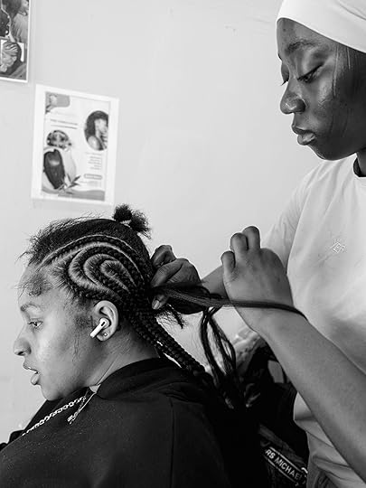
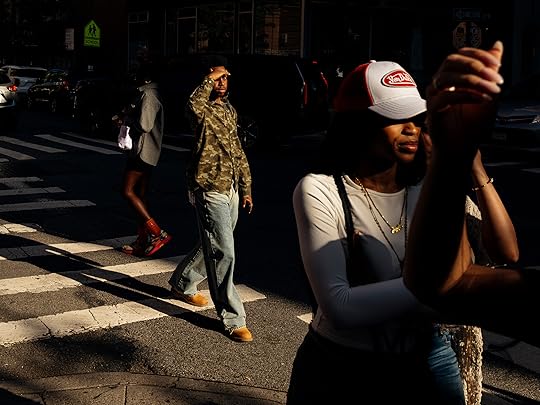
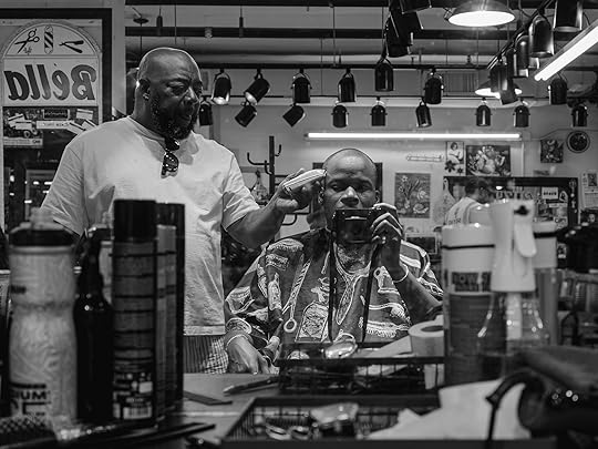
On a recent Sunday afternoon in Harlem, Ike Edeani spent two minutes in a bustling beauty salon on a quest for gestures of vibrant Black personal style. The beauty salon is, by any measure, the service station of Black vernacular style. In a testament to Edeani’s razor-sharp eye, those two minutes produced a stunning black-and-white photograph that tells a story about hair braiding, tenderness, labor, and intimacy within the Black beauty shop.
By slowing down to focus on the details, Edeani creates an image dense with meaning. “The woman braiding her hair has tribal marks, which I know from Nigeria,” Edeani says. “Here are these two Black women with completely different complexions and backgrounds. You’ve got the tribal marks, you’ve got the tattoo, the chain, the hoodie. For me, widening the frame made the image much stronger, much more of a story.”

Born in Nigeria before moving to the United States at the age of sixteen, Edeani is a self-taught photographer who initially trained as an architect. Even so, he always knew he wanted to be an artist. At a young age, he dabbled in drawing and still life painting, and realized how easy it was for him to reproduce things he saw in the world. “I would draw and paint all the time,” he shares. “But in Nigeria, the only kind of career options that are visible to you, at least as a kid, are doctor, engineer, or lawyer. I wasn’t interested in science and I knew I wasn’t going to be a doctor.”
Architecture was a happy medium between creative expression and the safety of a stable career. After practicing in the field for a few years, he soon realized that he didn’t want to build anything, but he was interested in design.
Watch Now: Ike Edeani on Style as a Form of LiberationThe photographer reflects on photographing in the city, what drives his work, and documenting everyday Black style.

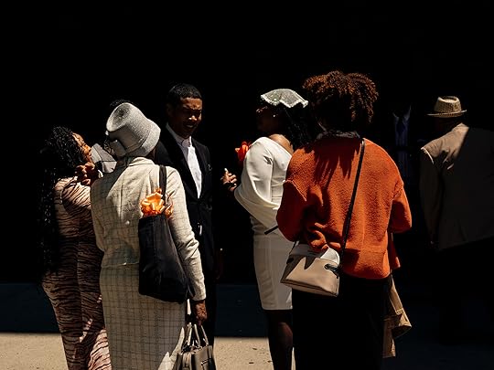
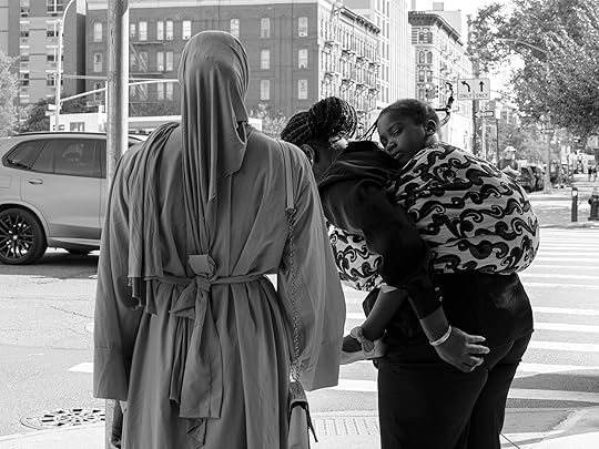
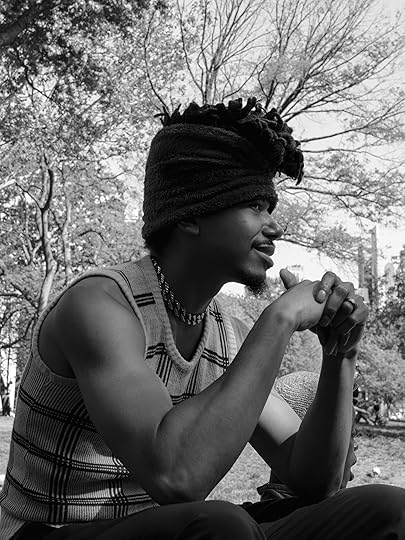
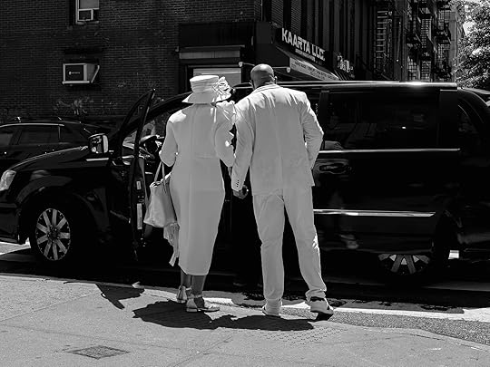
What better place to see design than through Black style on the streets of New York? As proof of life in the city, the street has excited the brushstrokes and lenses of a wide range of artists and photographers, from the gritty paintings of John Sloan in the early twentieth century to photographers like Roy DeCarava, Jamel Shabazz, and Bill Cunningham. Edeani extends this legacy by turning his cinematic flair toward the brilliance of the everyday. Black vernacular style—the kind of vibrant personal style that takes place far outside an extractive fashion system driven by labels, trends, and fashion seasons—has a mind of its own.
Church Sunday. Harlem. Little girls dressed in stockings and barrettes. Mothers, grandmothers, and aunties in hats, head wraps, and pencil skirts. “I don’t think I could have done this project justice without including Sunday style,” Edeani says. “Sundays were when we got dressed up. Sunday was the day you show out because that’s when you go to church, which means you’re seeing everybody. That’s the Met Gala.”
Advertisement
googletag.cmd.push(function () {
googletag.display('div-gpt-ad-1343857479665-0');
});

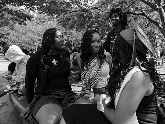
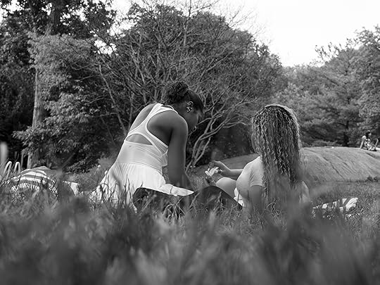
At the heart of Edeani’s work is an insistence on glimpses, gestures, and fleeting encounters, rather than posed portraits. Call it the intimacy of the moment. When we pose, we pose the way we always pose. We become hyper aware of the camera, of the photographer, and of our own awkward selves. The juice of Black personal style, for Edeani, lies in the zhuzh—a moment of expression that comes when we add our own twist, our own five-six-seven-eight set to the look, particularly for folks who work jobs that require them to wear a uniform every day. “Black folks do that better than anybody,” Edeani says, “Because we’re denied access, so you make your own shit. And I think that’s so beautiful.”
For Black folks, who exist within the frame of what the poet Dionne Brand calls “virtuosity or despair,” style is never about vanity. It’s always about creativity, personal expression, and small—even if the smallest—gestures of refusal. The way Edeani sees it, whether we’re going to church or just going about our day, “Black folks want to look good in front of other Black folks. What I really love about Black style is the idea that this is what people choose to put on before they leave the house—this is their best foot forward. And that, to me, is amazing.”
Ike Edeani’s photographs were created using FUJIFILM GFX100RF.
 All photographs by Ike Edeani, New York, May–June, 2025


The Darkroom Master Keeping Diane Arbus’s Vision Alive
Neil Selkirk, photographer and darkroom wizard, is perhaps best known as the only person who has printed Diane Arbus’s work since her death, in 1971. Working closely with Doon Arbus, Diane’s eldest daughter and executor of the estate, Selkirk has served as a longtime consigliere on matters pertaining to Diane Arbus’s prints and their reproduction. During her time as Aperture’s creative director, Lesley A. Martin worked with Doon and Selkirk to maintain the faithfulness of reproduction in Diane Arbus’s books—from the remastering of Diane Arbus: An Aperture Monograph, first published in 1972, to the publication of the close study of Arbus’s Box of ten portfolio, and the reissue of Revelations, in 2022. In late June, on the occasion of two major exhibitions of Arbus’s work, one in Los Angeles and one in New York, Martin sat down to talk with Selkirk about the more than fifty years he has dedicated to channeling the artist’s intentions as experienced through the prints of her work.
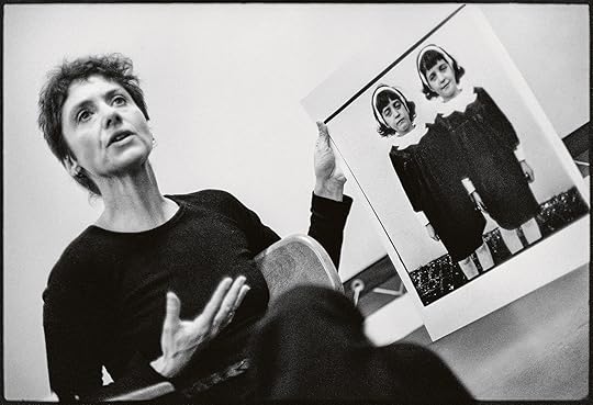 Stephen A. Frank, Diane Arbus at a Rhode Island School of Design seminar in 1970, from Diane Arbus: A box of ten photographs (Aperture/Smithsonian American Art Museum, 2018)
© Stephen A. Frank
Lesley A. Martin: Thank you for taking time to speak with me, Neil. It’s a big Arbus moment, with Cataclysm: The 1972 Diane Arbus Retrospective Revisited at David Zwirner in Los Angeles, and of course the amazing Constellation show on at the Park Avenue Armory , New York, which exhibits more than 450 images that you printed from Diane Arbus’s negatives . You’ve written and spoken at length about printing her work, but I realized I didn’t know: How did you learn to print?
Neil Selkirk: How did I learn to print? Oh, no one’s ever asked me that before. Well, I went to photography school in London, to what was then the London College of Printing. It was a printing school, set up by the trade, and it had, incidentally, a small design school and a small photography school. It was a very good trade school—and its attitude to photography then was as a trade. In those days, that was the equivalent of a degree course, a three-year course in England. And when you come out of that, you go to work as an assistant in a studio. I’m not sure how you go from being a beginner student printer to being good at it. I wound up coming to New York, and at both Richard Avedon’s and Hiro’s studios, where I worked, the assistants did the printing. I guess it’s just something you get better at by doing.
However, regarding the Arbus printing, I am becoming increasingly emphatic that it is understood that it was not my skill as “a printer,” in quotes. It was my ability to duplicate her prints as precisely as possible, which was the issue. Meaning, there was effectively no creative input whatsoever. It was all about having the patience to figure out how she did it. And then, once one had run out of her exhibition prints to duplicate that, turning the process into a philosophy that could produce other prints that would be what she would have done. Which, in fact, in Diane’s case, was significantly more straightforward than would be the case for someone printing anybody else’s work, because she didn’t dodge and burn. Which meant that all I had to do was come up with something that was philosophically right in terms of density and contrast, and we were winning.
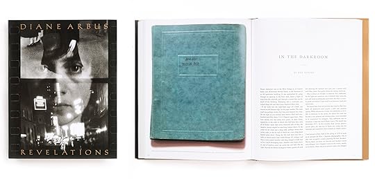 Cover and interior spread of Diane Arbus Revelations (Aperture, 2022)
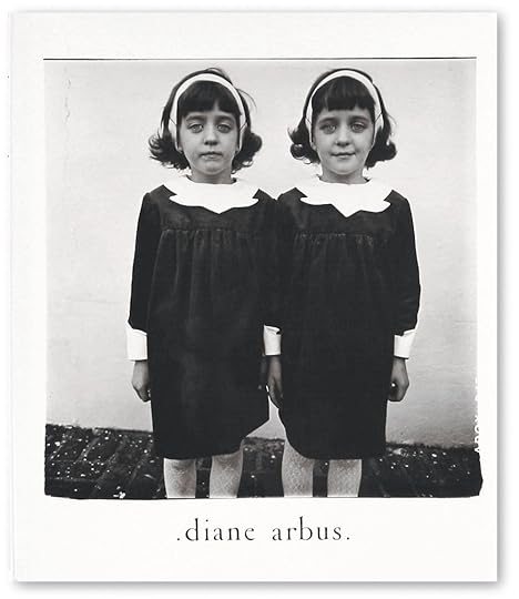
Martin: In the essay you wrote for Revelations, “In the Darkroom,” you also talk about finding the right way to duplicate the edges of the images on the paper; about the little pieces of cardboard you had to find in order to be able to replicate her softening of the edges of her image — that it took not just any cardboard, but a particular type of cardboard, with a particular depth, and dampening down the edges with saliva, etc. The essay is illustrated with iterations of the identical twins photo [Identical Twins, Roselle, New Jersey , 1967], showing the different types of edges that Arbus experimented with—one with crisply squared-off edges, one with ragged black borders from a filed-out negative carrier, and one with soft edges. In the end, the estate chose to recreate the prints that had been most recently printed by Diane in the years before her death, which tended toward soft edges. What is the impact of a tiny decision like that , about how to print the edges of an image in a print?
Selkirk: Everybody seems to agree and understand that one of the things she was doing was showing that there was nothing hidden or changed in the printing, by demonstrating that you were seeing to the edge of the negative and that there was no subsequent manipulation. That seems to have become a major element of her whole printing philosophy—of everything she was doing—which was that it was unmanipulated, and thereby credible. This had to have been one of the major factors to the shock of the pictures: an awful lot had gone into making them not appear to be manipulated. People recognized pictures they could believe in. Nobody believes in an Ansel Adams picture. Everybody believes in a Diane Arbus picture, for reasons that had been built into the work. Initially, it was by showing the borders, but she got teed off because everybody was using big black borders showing the edge. So she tried to retain the credibility that the black borders give an image, while making them distinctively hers. And then you get into the whole thing of the print being an object, a thing—which is what you can’t get on your screen. With the soft border, the image becomes the paper. It’s a critical element of the thingness of the object—a treasured entity.
Martin: Doon writes about recognizing that “a kind of history arrives more or less intact in the objects.” I think she was speaking to the preservation of Diane’s archive and legacy as a whole, but that’s also what you’re talking about, in essence. The overlay of this sort of “anti-technique” is also a strategy—or what you describe as a philosophy.
Selkirk: Funnily enough, I only hit on it recently. I’d always understood that there was a sort of reference to snapshots and newspaper photographs in her work. I’d never before realized that audiences tend to set aside photographs by people like Ansel Adams and Paul Caponigro and all those master, super printers, as “art.” Whereas Diane’s work was more about: This is the world. What she meant was that in reality, that’s how photographs are read. Always have been. It’s the photo-establishment that had worked to deny it. And she was incredibly antiestablishment. But she seemed to manage to trample all over the establishment and be embraced by it, ultimately.
People recognized pictures they could believe in. Nobody believes in an Ansel Adams picture. Everybody believes in a Diane Arbus picture, for reasons that had been built into the work.
Martin: It’s interesting that you emphasize the work in relation to the snapshot, because I don’t think of Arbus’s work as employing the snapshot aesthetic.
Selkirk: It doesn’t, except in the unmanipulated appearance of the print. There’s a quote from her about the image of the lady sitting in the room with all the paneling. She’s on the couch, holding a baby monkey. Diane wrote to Allan that she had taken this really dumb photograph, that she was now completely falling in love with because “It looks as if her husband took it.” Which is such a great line. Because again, absolute credibility.
Martin: Arbus is often associated with Garry Winogrand and Lee Friedlander, because they all appeared together in MoMA’s New Documents show , in 1967. Winogrand and Friedlander were each invested in their own versions of the snapshot aesthetic, albeit one increasingly placed within a fine art context. I always thought that her inclusion was an outlier or stood out from those two, though.
Selkirk: In terms of how she took photographs, it’s got nothing to do with snapshots, really. Even when people like Walter Benjamin and Siegfried Kracauer talk about snapshots, they both use the term to denote something “grabbed,” which may be what Kodak meant, too. But mostly it doesn’t really mean that now. It means taken with a certain approach to the subject—and maybe there’s a little bit of Arbus in that. But she also said, “I don’t arrange the picture, I arrange myself.” So you’re looking at a picture which is deliberately not composed, but also deliberately not grabbed.
Martin: Right. There’s a direct engagement with the subject in Arbus’s work that separates it from what I think of in terms of “the snapshot.” And it’s interesting to hear you talk about her approach to printmaking as one of several conscious decisions she made intending to lead the viewer to believe that “what you see is what there was.”
Selkirk: Yes, with enormous intelligence and intensity—and this insanity of her not being able to find a film that she could stand in the United States and going to all lengths to get it from Germany. And the paper she used, the Agfa Portriga Rapid. She really knew aesthetically where she wanted to get and she was absolutely, unremittingly relentless about trying to find it.
 Installation view of Diane Arbus: Constellation, Park Avenue Armory, 2025. Photograph by Nicholas Knight
All artworks © The Estate of Diane Arbus exhibited courtesy of Collection Maja Hoffmann/LUMA Foundation
Martin: Of course, originally, in photography’s early pursuit of the art world, people rejected things that seemed too easy; too unrefined or inartistically pursued. Then came John Szarkowski, who was fascinated by the snapshot. Artists he chose to show often had some oblique relationship to the idea of the snapshot. William Eggleston’s first show, for example, was deeply reviled and dismissed by so many people (including Ansel Adams) for being “just” snaps—an old shoe under a bed; a ceiling fan. Is there a thread there, do you think?
Selkirk: Absolutely. For the longest time, there had been a total collusion between the art establishment, the critical establishment, but most importantly the photographers themselves, to make photographs into paintings. What photography actually offers is spontaneity, incredible detail, the element of chance, reproducibility. All of which were rejected as defining what made photography “not” art.
Friedlander, Winogrand, and Arbus revert and resort to photography’s original qualities and dared people to think of it as art, for want of a better term—the innate qualities of photography, which had been annihilated. Even when you get somebody like Eadweard Muybridge, it was considered intriguing, but as science. It didn’t occur to anyone that photography was a medium that would enable you to see. There’s a fabulous quote from Dorothea Lange, that the camera is a wonderful device that enables you to see without a camera.
Martin: In the early 1960s, Clement Greenberg popularized the idea of media specificity as something foundational to painting as an art form— there was a strenuous effort to drill down and to identify the essence of painting’s inherent properties, fueling the discourse around abstraction by focusing on the surface materiality and flatness of a painting. A decade later, in the ’70s , we’re on a similar track in the critical discourse around American photography, aren’t we? Szarkowski, in particular, was very committed to defining the essential properties of photography.
Selkirk: I think the medium-specificity framework for engaging with a medium as your tool of choice as an artist is very important, in fact. There’s this incredible thing about the frame—paintings are entirely about what’s inside the frame. And photographs are about what’s outside the frame. There is no relationship between the two media except for their propensity to appear on museum walls.
Related Items
Diane Arbus: An Aperture Monograph
Shop Now[image error]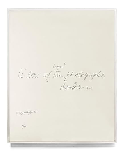
Diane Arbus: A box of ten photographs
Shop Now[image error]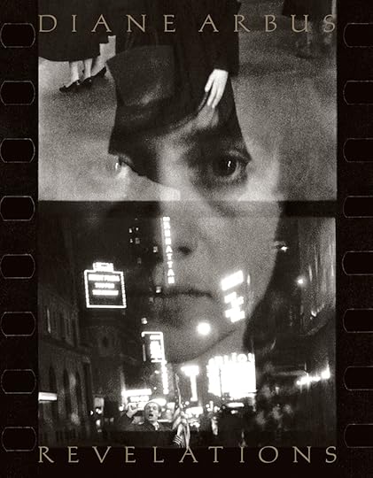
Diane Arbus Revelations
Shop Now[image error]Martin: Many people, of course, don’t have the experience of getting to know Arbus by looking at prints on walls. They’ve experienced the work in a book. Were you involved in translating the prints into separations for reproduction and the printing of Diane Arbus: An Aperture Monograph in 1972?
Selkirk: Absolutely not. I made the prints for reproduction, but Marvin Israel, who designed the book, worked with Sydney Rapoport, the first printer of the book. Syd prepared the separations. He told Marvin that under the densitometer, the blacks in the prints were the blackest blacks he’d ever come across. Which again, you know, it’s that Portriga paper and her technique. The first printing of the monograph, which everybody loved and thought was amazing, in fact, I thought wasn’t very good.
Martin: Now, of course, you’re deeply involved, with Doon, in supervising the printing of each new Arbus publication. Is there anything in particular that you are looking for in the proofs or the printed page versus the print that makes it good or less good?
Selkirk: Usually when we’re looking at book proofs, we take the preferred printing to compare them to. We almost never take prints for reference. I mean, it seems to me that offset printing has more to do with the differences between the relationship of the paper and the ink and the surfaces of both than it does with the print density. It’s almost to do with handling it and the angle at which the light is falling on it.
 Installation view of Diane Arbus: Constellation, Park Avenue Armory, 2025. Photograph by Nicholas Knight
All artworks © The Estate of Diane Arbus exhibited courtesy of Collection Maja Hoffmann/LUMA Foundation
Martin: The classic reference point for Arbus’s work, of course, remains the 1972 monograph. But the style of presentation of her work in exhibition has changed dramatically over the years. Currently in LA you have Cataclysm, which recreates the original 1972 retrospective—clean, matted and framed prints linearly presented in a white-box space. And at the same time, one can see a fairly radical presentation of many of the same works in a very different experience of viewing at the Armory here in New York.
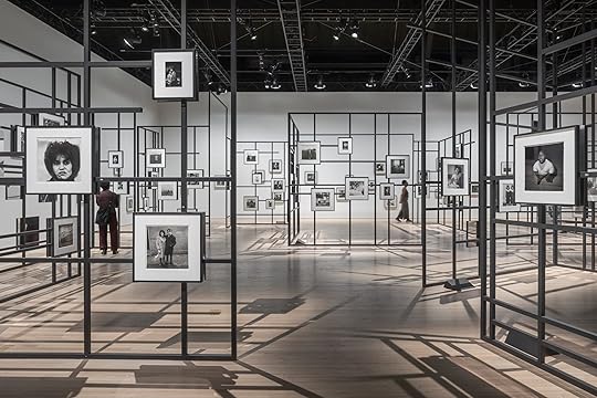
Selkirk: What’s always been important is to make sure that no picture impinges on the next one. The exact opposite of what most curators are dying to do, which is to explain the relationship between the images. This is one of the things that blew Doon and I away when we first saw the Constellation show in Arles. Matthieu Humery had, on his own, drawn exactly the same conclusions.
Martin: I was also curious about the relationship of Constellation’s almost jungle gym–like installation to the method of display that was used for the exhibition at the Met Breuer in 2016, In the Beginning , which was also a sort of constellation or thicket of images.
Selkirk: Yes, In the Beginning was superb. Each print was given its own totem or monolith pedestal within the presentation, off the gallery walls. And, philosophically, it’s not unrelated to the idea of giving each image its space.
Martin: In viewing both Constellation and In the Beginning , one feels as though you are out on the street—catching glances across the room. They both gave you a sense of swimming through the world via the photographs , of being in the photographer’s shoes.
Selkirk: Certainly. You have a sense of exploration.
 Installation view of Diane Arbus: Constellation, Park Avenue Armory, 2025. Photograph by Nicholas Knight
All artworks © The Estate of Diane Arbus exhibited courtesy of Collection Maja Hoffmann/LUMA Foundation
Martin: In my recent rereading of parts of the 2003 edition of Revelations, I noted that Doon describes her own strategy of releasing a “surfeit” of material from Diane Arbus to create a context for viewing the work that is as fully textured as possible. She describes her work as building “a safe place for anyone who cares to wander around at will and play detective, to peer into dark corners . . . to invent a path without the interference of a tour guide, making independent discoveries.” And that describes In the Beginning , I think, and even more so, perhaps, Constellation. Contained but also open – ended.
Selkirk: The pictures, in fact, were not curated in Constellation. Just about everything is included. In a sense, the photos were “disencurated.” The complaint that one hears about the Armory show is that the viewer is not guided. A couple weeks ago, I was taking Madonna through, and she was initially disconcerted at not being directed. People very badly want direction.
Martin: My last question : You have your own practice, Neil. And you have an incredible depth of experience and engagement with photography. Over the past fifty years, however, you’ve become a conduit for another artist. I imagine there’s a sense of tremendous responsibility that comes with this role. Could you speak to that and do you see this role as interpretive in any way?
Selkirk: This is really important. It’s absolutely not interpretive. I’m very aware that almost everyone in the world only knows Diane Arbus’s work through the prints I’ve made. Meaning, if you discount people who’ve been to shows, but consider the half million people who bought the book, they were all looking at my attempt to duplicate, replicate, or simply present. Of that, I’m pretty confident. You know, when Revelations opened in San Francisco, some knowledgeable writer about photography said he thought my prints were better. And I just said, if you can tell the difference, I failed. And basically, they can’t.
Diane Arbus: Constellation is on view at the Park Avenue Armory, New York, through August 17, 2025.
The Darkroom Artist Keeping Diane Arbus’s Vision Alive
Neil Selkirk, photographer and darkroom wizard, is perhaps best known as the only person who has printed Diane Arbus’s work since her death, in 1971. Working closely with Doon Arbus, Diane’s eldest daughter and executor of the estate, Selkirk has served as a longtime consigliere on matters pertaining to Diane Arbus’s prints and their reproduction. During her time as Aperture’s creative director, Lesley A. Martin worked with Doon and Selkirk to maintain the faithfulness of reproduction in Diane Arbus’s books—from the remastering of Diane Arbus: An Aperture Monograph, first published in 1972, to the publication of the close study of Arbus’s Box of ten portfolio, and the reissue of Revelations, in 2022. In late June, on the occasion of two major exhibitions of Arbus’s work, one in Los Angeles and one in New York, Martin sat down to talk with Selkirk about the more than fifty years he has dedicated to channeling the artist’s intentions as experienced through the prints of her work.
Stephen A. Frank, Diane Arbus at a Rhode Island School of Design seminar in 1970, from Diane Arbus: A box of ten photographs (Aperture/Smithsonian American Art Museum, 2018)© Stephen A. Frank
Lesley A. Martin: Thank you for taking time to speak with me, Neil. It’s a big Arbus moment, with Cataclysm: The 1972 Diane Arbus Retrospective Revisited at David Zwirner in Los Angeles, and of course the amazing Constellation show on at the Park Avenue Armory , New York, which exhibits more than 450 images that you printed from Diane Arbus’s negatives . You’ve written and spoken at length about printing her work, but I realized I didn’t know: How did you learn to print?
Neil Selkirk: How did I learn to print? Oh, no one’s ever asked me that before. Well, I went to photography school in London, to what was then the London College of Printing. It was a printing school, set up by the trade, and it had, incidentally, a small design school and a small photography school. It was a very good trade school—and its attitude to photography then was as a trade. In those days, that was the equivalent of a degree course, a three-year course in England. And when you come out of that, you go to work as an assistant in a studio. I’m not sure how you go from being a beginner student printer to being good at it. I wound up coming to New York, and at both Richard Avedon’s and Hiro’s studios, where I worked, the assistants did the printing. I guess it’s just something you get better at by doing.
However, regarding the Arbus printing, I am becoming increasingly emphatic that it is understood that it was not my skill as “a printer,” in quotes. It was my ability to duplicate her prints as precisely as possible, which was the issue. Meaning, there was effectively no creative input whatsoever. It was all about having the patience to figure out how she did it. And then, once one had run out of her exhibition prints to duplicate that, turning the process into a philosophy that could produce other prints that would be what she would have done. Which, in fact, in Diane’s case, was significantly more straightforward than would be the case for someone printing anybody else’s work, because she didn’t dodge and burn. Which meant that all I had to do was come up with something that was philosophically right in terms of density and contrast, and we were winning.
Cover and interior spread of Diane Arbus Revelations (Aperture, 2022)Martin: In the essay you wrote for Revelations, “In the Darkroom,” you also talk about finding the right way to duplicate the edges of the images on the paper; about the little pieces of cardboard you had to find in order to be able to replicate her softening of the edges of her image — that it took not just any cardboard, but a particular type of cardboard, with a particular depth, and dampening down the edges with saliva, etc. The essay is illustrated with iterations of the identical twins photo [Identical Twins, Roselle, New Jersey , 1967], showing the different types of edges that Arbus experimented with—one with crisply squared-off edges, one with ragged black borders from a filed-out negative carrier, and one with soft edges. In the end, the estate chose to recreate the prints that had been most recently printed by Diane in the years before her death, which tended toward soft edges. What is the impact of a tiny decision like that , about how to print the edges of an image in a print?
Selkirk: Everybody seems to agree and understand that one of the things she was doing was showing that there was nothing hidden or changed in the printing, by demonstrating that you were seeing to the edge of the negative and that there was no subsequent manipulation. That seems to have become a major element of her whole printing philosophy—of everything she was doing—which was that it was unmanipulated, and thereby credible. This had to have been one of the major factors to the shock of the pictures: an awful lot had gone into making them not appear to be manipulated. People recognized pictures they could believe in. Nobody believes in an Ansel Adams picture. Everybody believes in a Diane Arbus picture, for reasons that had been built into the work. Initially, it was by showing the borders, but she got teed off because everybody was using big black borders showing the edge. So she tried to retain the credibility that the black borders give an image, while making them distinctively hers. And then you get into the whole thing of the print being an object, a thing—which is what you can’t get on your screen. With the soft border, the image becomes the paper. It’s a critical element of the thingness of the object—a treasured entity.
Martin: Doon writes about recognizing that “a kind of history arrives more or less intact in the objects.” I think she was speaking to the preservation of Diane’s archive and legacy as a whole, but that’s also what you’re talking about, in essence. The overlay of this sort of “anti-technique” is also a strategy—or what you describe as a philosophy.
Selkirk: Funnily enough, I only hit on it recently. I’d always understood that there was a sort of reference to snapshots and newspaper photographs in her work. I’d never before realized that audiences tend to set aside photographs by people like Ansel Adams and Paul Caponigro and all those master, super printers, as “art.” Whereas Diane’s work was more about: This is the world. What she meant was that in reality, that’s how photographs are read. Always have been. It’s the photo-establishment that had worked to deny it. And she was incredibly antiestablishment. But she seemed to manage to trample all over the establishment and be embraced by it, ultimately.
People recognized pictures they could believe in. Nobody believes in an Ansel Adams picture. Everybody believes in a Diane Arbus picture, for reasons that had been built into the work.
Martin: It’s interesting that you emphasize the work in relation to the snapshot, because I don’t think of Arbus’s work as employing the snapshot aesthetic.
Selkirk: It doesn’t, except in the unmanipulated appearance of the print. There’s a quote from her about the image of the lady sitting in the room with all the paneling. She’s on the couch, holding a baby monkey. Diane wrote to Allan that she had taken this really dumb photograph, that she was now completely falling in love with because “It looks as if her husband took it.” Which is such a great line. Because again, absolute credibility.
Martin: Arbus is often associated with Garry Winogrand and Lee Friedlander, because they all appeared together in MoMA’s New Documents show , in 1967. Winogrand and Friedlander were each invested in their own versions of the snapshot aesthetic, albeit one increasingly placed within a fine art context. I always thought that her inclusion was an outlier or stood out from those two, though.
Selkirk: In terms of how she took photographs, it’s got nothing to do with snapshots, really. Even when people like Walter Benjamin and Siegfried Kracauer talk about snapshots, they both use the term to denote something “grabbed,” which may be what Kodak meant, too. But mostly it doesn’t really mean that now. It means taken with a certain approach to the subject—and maybe there’s a little bit of Arbus in that. But she also said, “I don’t arrange the picture, I arrange myself.” So you’re looking at a picture which is deliberately not composed, but also deliberately not grabbed.
Martin: Right. There’s a direct engagement with the subject in Arbus’s work that separates it from what I think of in terms of “the snapshot.” And it’s interesting to hear you talk about her approach to printmaking as one of several conscious decisions she made intending to lead the viewer to believe that “what you see is what there was.”
Selkirk: Yes, with enormous intelligence and intensity—and this insanity of her not being able to find a film that she could stand in the United States and going to all lengths to get it from Germany. And the paper she used, the Agfa Portriga Rapid. She really knew aesthetically where she wanted to get and she was absolutely, unremittingly relentless about trying to find it.
Installation view of Diane Arbus: Constellation, Park Avenue Armory, 2025. Photograph by Nicholas KnightAll artworks © The Estate of Diane Arbus exhibited courtesy of Collection Maja Hoffmann/LUMA Foundation
Martin: Of course, originally, in photography’s early pursuit of the art world, people rejected things that seemed too easy; too unrefined or inartistically pursued. Then came John Szarkowski, who was fascinated by the snapshot. Artists he chose to show often had some oblique relationship to the idea of the snapshot. William Eggleston’s first show, for example, was deeply reviled and dismissed by so many people (including Ansel Adams) for being “just” snaps—an old shoe under a bed; a ceiling fan. Is there a thread there, do you think?
Selkirk: Absolutely. For the longest time, there had been a total collusion between the art establishment, the critical establishment, but most importantly the photographers themselves, to make photographs into paintings. What photography actually offers is spontaneity, incredible detail, the element of chance, reproducibility. All of which were rejected as defining what made photography “not” art.
Friedlander, Winogrand, and Arbus revert and resort to photography’s original qualities and dared people to think of it as art, for want of a better term—the innate qualities of photography, which had been annihilated. Even when you get somebody like Eadweard Muybridge, it was considered intriguing, but as science. It didn’t occur to anyone that photography was a medium that would enable you to see. There’s a fabulous quote from Dorothea Lange, that the camera is a wonderful device that enables you to see without a camera.
Martin: In the early 1960s, Clement Greenberg popularized the idea of media specificity as something foundational to painting as an art form— there was a strenuous effort to drill down and to identify the essence of painting’s inherent properties, fueling the discourse around abstraction by focusing on the surface materiality and flatness of a painting. A decade later, in the ’70s , we’re on a similar track in the critical discourse around American photography, aren’t we? Szarkowski, in particular, was very committed to defining the essential properties of photography.
Selkirk: I think the medium-specificity framework for engaging with a medium as your tool of choice as an artist is very important, in fact. There’s this incredible thing about the frame—paintings are entirely about what’s inside the frame. And photographs are about what’s outside the frame. There is no relationship between the two media except for their propensity to appear on museum walls.
Related Items
Diane Arbus: An Aperture Monograph
Shop Now[image error]
Diane Arbus: A box of ten photographs
Shop Now[image error]
Diane Arbus Revelations
Shop Now[image error]Martin: Many people, of course, don’t have the experience of getting to know Arbus by looking at prints on walls. They’ve experienced the work in a book. Were you involved in translating the prints into separations for reproduction and the printing of Diane Arbus: An Aperture Monograph in 1972?
Selkirk: Absolutely not. I made the prints for reproduction, but Marvin Israel, who designed the book, worked with Sydney Rapoport, the first printer of the book. Syd prepared the separations. He told Marvin that under the densitometer, the blacks in the prints were the blackest blacks he’d ever come across. Which again, you know, it’s that Portriga paper and her technique. The first printing of the monograph, which everybody loved and thought was amazing, in fact, I thought wasn’t very good.
Martin: Now, of course, you’re deeply involved, with Doon, in supervising the printing of each new Arbus publication. Is there anything in particular that you are looking for in the proofs or the printed page versus the print that makes it good or less good?
Selkirk: Usually when we’re looking at book proofs, we take the preferred printing to compare them to. We almost never take prints for reference. I mean, it seems to me that offset printing has more to do with the differences between the relationship of the paper and the ink and the surfaces of both than it does with the print density. It’s almost to do with handling it and the angle at which the light is falling on it.
Installation view of Diane Arbus: Constellation, Park Avenue Armory, 2025. Photograph by Nicholas KnightAll artworks © The Estate of Diane Arbus exhibited courtesy of Collection Maja Hoffmann/LUMA Foundation
Martin: The classic reference point for Arbus’s work, of course, remains the 1972 monograph. But the style of presentation of her work in exhibition has changed dramatically over the years. Currently in LA you have Cataclysm, which recreates the original 1972 retrospective—clean, matted and framed prints linearly presented in a white-box space. And at the same time, one can see a fairly radical presentation of many of the same works in a very different experience of viewing at the Armory here in New York.
Selkirk: What’s always been important is to make sure that no picture impinges on the next one. The exact opposite of what most curators are dying to do, which is to explain the relationship between the images. This is one of the things that blew Doon and I away when we first saw the Constellation show in Arles. Matthieu Humery had, on his own, drawn exactly the same conclusions.
Martin: I was also curious about the relationship of Constellation’s almost jungle gym–like installation to the method of display that was used for the exhibition at the Met Breuer in 2016, In the Beginning , which was also a sort of constellation or thicket of images.
Selkirk: Yes, In the Beginning was superb. Each print was given its own totem or monolith pedestal within the presentation, off the gallery walls. And, philosophically, it’s not unrelated to the idea of giving each image its space.
Martin: In viewing both Constellation and In the Beginning , one feels as though you are out on the street—catching glances across the room. They both gave you a sense of swimming through the world via the photographs , of being in the photographer’s shoes.
Selkirk: Certainly. You have a sense of exploration.
Installation view of Diane Arbus: Constellation, Park Avenue Armory, 2025. Photograph by Nicholas KnightAll artworks © The Estate of Diane Arbus exhibited courtesy of Collection Maja Hoffmann/LUMA Foundation
Martin: In my recent rereading of parts of the 2003 edition of Revelations, I noted that Doon describes her own strategy of releasing a “surfeit” of material from Diane Arbus to create a context for viewing the work that is as fully textured as possible. She describes her work as building “a safe place for anyone who cares to wander around at will and play detective, to peer into dark corners . . . to invent a path without the interference of a tour guide, making independent discoveries.” And that describes In the Beginning , I think, and even more so, perhaps, Constellation. Contained but also open – ended.
Selkirk: The pictures, in fact, were not curated in Constellation. Just about everything is included. In a sense, the photos were “disencurated.” The complaint that one hears about the Armory show is that the viewer is not guided. A couple weeks ago, I was taking Madonna through, and she was initially disconcerted at not being directed. People very badly want direction.
Martin: My last question : You have your own practice, Neil. And you have an incredible depth of experience and engagement with photography. Over the past fifty years, however, you’ve become a conduit for another artist. I imagine there’s a sense of tremendous responsibility that comes with this role. Could you speak to that and do you see this role as interpretive in any way?
Selkirk: This is really important. It’s absolutely not interpretive. I’m very aware that almost everyone in the world only knows Diane Arbus’s work through the prints I’ve made. Meaning, if you discount people who’ve been to shows, but consider the half million people who bought the book, they were all looking at my attempt to duplicate, replicate, or simply present. Of that, I’m pretty confident. You know, when Revelations opened in San Francisco, some knowledgeable writer about photography said he thought my prints were better. And I just said, if you can tell the difference, I failed. And basically, they can’t.
Diane Arbus: Constellation is on view at the Park Avenue Armory, New York, through August 17, 2025.
“Tyler Mitchell: Wish This Was Real” Book Launch
Dashwood Books
33 Bond St.
New York
VIP passes to the New York Armory Show
The Javits Center
Crystal Palace Entrance, 429 11th Avenue
New York
August 7, 2025
Vik Muniz Book Signing at Sikkema Malloy Jenkins
Sikkema Malloy Jenkins
530 West 22nd Street
New York
Opening Reception for Alana Perino: 2025 Aperture Portfolio Prize Winner
Leica Gallery New York
406 W 13th St
New York
August 6, 2025
Essex Hemphill’s Love Knew No Bounds
The activist and poet Essex Hemphill, who died in 1995, at age 38, due to complications from AIDS, was a singular voice. “I’m an oversexed / well-hung / Black Queen / influenced / by phrases like / ‘I am the love that dare not speak its name,’” he writes in “Heavy Breathing” (1992). The poem, exemplary of Hemphill’s work, eulogizes the unfulfilled promises of civil rights and beseeches a place for the poor gay Black man—and others left in the margins—at the table of a solidifying African American nationalism in the waning years of the twentieth century. “At the end of heavy breathing / the dream deferred / is in a museum / under glass and guard.” Hemphill’s unflinching gaze, fervent advocacy for the downtrodden, and love of collaboration have made him a major influence for many of his peers and generations thereafter, for writers, and especially for visual artists.
Born in Chicago in 1957, Hemphill moved with his family to Anacostia, a segregated neighborhood in Southeast Washington, DC, in the 1970s. He was awakened spiritually and erotically by the closeted Harlem Renaissance literature of Countee Cullen, Langston Hughes, and Richard Bruce Nugent, and emboldened by the clarity and poise of public intellectuals such as James Baldwin and Audre Lorde. These figures served as guiding lights over the corporeal realities of poverty, racial and gendered violence (by state or kin), and the crack and AIDS epidemics. “I live in a town / where pretense and bone structure / prevail as credentials of status and beauty / . . . where everyone is afraid of the dark,” Hemphill writes in “Family Jewels” (1992). Cabs speed past him, refusing service. Meanwhile, “My mother’s flowers are wilting / . . . Our dinner is cold / by now.” In taking up poetry and performance, Hemphill found a path to dignity and self-liberation.
 Poster announcement for Wayson Jones and Essex Hemphill performance at d.c. space
Courtesy Wayson Jones
 Wayson Jones, Christopher Prince, and Essex Hemphill perform at d.c. space in Washington, DC, Saturday, May 31, 1986
© Sharon Farmer/sfphotoworks
Fashioning an alternative to the American dream deferred was by no means a solitary endeavor. In DC, Hemphill was part of a vibrant literary, performing and visual arts scene. He founded the Nethula Journal, a platform for young writers of color, with Kathy Anderson and Cynthia Lou Williams. With his friends Wayson Jones and Larry Duckette, he formed the spoken word group Cinque. His early work appeared in Joseph Beam’s revolutionary In the Life: A Black Gay Anthology (1986), the first of its kind to center Black gay, lesbian, and trans perspectives. When Beam died of AIDS in 1988, Hemphill published the follow-up Brother to Brother: New Writings by Black Gay Men (1991). For a constellation of underground communities along the East and West Coasts, this period in the ’80s through early ’90s was a veritable Black Gay Renaissance, more creatively free, more academic and brazenly political, more unapologetically Black, queer, and sexual than the movements that came before.
 Installation view of Essex Hemphill: Take care of your blessings, Phillips Collection, Washington, DC, 2025
Essex Hemphill: Take care of your blessings, a group exhibition curated by Camille Brown at the Phillips Collection, in Washington, DC, commemorates the bygone era in which the poet thrived, and celebrates the dream that he kept alive for the next generation. Brown gathers multimedia works by friends and creative partners, and those of younger artists whose practices engage with Hemphill’s writing. In a town of memorials set in stone, the show pulsates with optimism and collective life. It is dedicated to someone who was of these streets and who, hard as the powers that be may have tried, refused to be rendered a ghost or statistic, and did what he could to save others from that fate.
Hemphill’s poems have been collected in a new volume by Robert F. Reid-Pharr and John Keene, Love Is a Dangerous Word (2025). To read them—a selection is projected in the main gallery over a cabinet of self-published chapbooks and performance programs—is to become entangled in a bed of blood, sweat, tears, spit, and spunk. That is, to be swept off your feet by unrelenting waves of desire, rage, sorrow, and, despite everything, tenderness. Much as the speaker is looking for love in back rooms, underground clubs, and public parks, he is cruising time itself for redemption in the past or hope for the future. He is discursive, provocative, witty, and lyrical, Mercutio playing jester to the hypocrisy of the American enterprise. In “American Wedding” (1986), Hemphill delivers his vow:
I place my ring
on your cock
where it belongs.
No horsemen
bearing terror,
no soldiers of doom
will swoop in and sweep us apart.
They’re too busy
looting the land
to watch us.
Across the way in the gallery, among a set of haunting black-and-white photographs, is Living Monuments (1980s), by Sharon Farmer, which Hemphill paired with “American Wedding” in “Dear Muthafucking Dreams,” his landmark interdisciplinary and collaborative “unrhymed poetry concert,” performed most prominently at Franklin Furnace, in New York, in 1988. In the photograph, a hooded figure strides across a bridge in front of the Washington Monument. From the viewer’s perspective, the walkway is at eye level with the pyramidion of the 555-foot obelisk. Farmer evokes Orientalist motifs, conjuring an empire bearing down on itself. Or is the figure rising to meet it? Notably, during the Clinton administration, Farmer became the first African American woman appointed White House photographer. She captured, among many historic moments, the handshake between prime minister of Israel Yitzhak Rabin and Palestine Liberation Organization chairman Yasser Arafat, in 1993.
 Joyce Wellman, Someone Different, 1987. Oil paint stick on paper
Another piece Hemphill integrated into “Dreams,” the painting Someone Different (1987), by Joyce Wellman, shares the same wall. As posited by the title, and expressed by the freestyle whorls and patches of frenetic Twombly-esque brushstrokes, the painting suggests transfiguration, as in the Christlike mystery in the paired poem “Black Beans” (1984): “Our chipped water glasses are filled / with wine from our loving. / And the burnt black beans— / caviar.” The pursuit of “the good life” recurs throughout Hemphill’s work. Set in biblical terms, it is the quest for salvation. If not granted by God or state, the hope is that it could be found in or offered by one another. But, as lived by Hemphill and other gay men of his time, the road to paradise is rife with straying paths to danger and self-destruction.
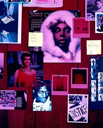 Lyle Ashton Harris, The Watering Hole III, 1996
Courtesy the Museum of Modern Art, New York
In photographer Lyle Ashton Harris’s Watering Hole series, ephemera tacked on a wood-paneled background are lit with a red neon glow, as in the bathroom of a gay bar or the basement lair of a closeted recluse. Alongside pictures of protesters, male models, and divas—Donna Summer, a Venus in white fur; Elizabeth Taylor as Cleopatra—hang newspaper clippings of Magic Johnson’s HIV diagnosis and murders by the serial killer Jeffrey Dahmer. Stuck on throughout each frame are precarious yellow Post-its, notes of a dysphoric mind. The clandestine scene queer people called “the life” allowed for improvisation and indulgence, a desperate break from the mainstream. With so much of the life to live, moderation and safety were often checked at the door.
 Installation view of Essex Hemphill: Take care of your blessings, Phillips Collection, Washington, DC, 2025
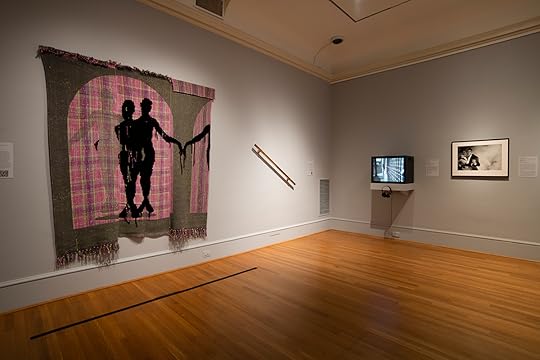
Diedrick Brackens’s tapestry the night is my shepherd (2022) casts two shadows in melancholy embrace. A faded silhouette in the first panel, and a disembodied arm in the third, luring one of the figures in the central panel, suggests the time-lapse of a doomed affair, or an endless loop of faceless encounters. In either case, heartache. Tiona Nekkia McClodden’s readymade sculpture THE BRASS RAIL (After Essex) (2017), mounted at an obtuse angle, is beguiling and unnerving in its simplicity. Are we going up or down? It’s titled after Hemphill’s poem of the same name about the long-gone “raunchy Black gay club” in DC that was always “bulging out of its jockstrap.” “The Brass Rail,” from the 1980s is a call-and-response with the readers starting at the opposite ends of the poem. The effect is that of an aural house of mirrors, or a two-man tightrope walk, or, like the Brackens tapestry, a pas de deux heading toward ecstasy and/or oblivion.
CALL: I saw you last night
RESPONSE: Many occupants are never found.
CALL: In the basement
RESPONSE: Many canoes overturn.
CALL: of the Brass Rail.
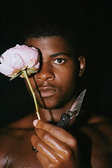 Clifford Prince King, Conditions, 2018
Courtesy the artist, Gordon Robichaux, NY, and STARS, Los Angeles
On the east wall of the gallery, visions of hope. Clifford Prince King’s photographs stage scenes of intentional tenderness and care between Black men. Like Hemphill’s poetry, especially near the end of his life, King’s photographs are salves to the rigid dictums of patriarchal masculinity. The poet’s candor about living with HIV moved King to interrogate his own positive status through his work. The still lifes Night Sweats (2018), which shows a bed imprinted by a night’s feverish bout with infection, and Orange Peel and Biktarvy (2019) render life with HIV rather ordinary. Sonny and David (2019), depicting lovers intertwined in peaceful slumber, is eerily echoed by Shikieth’s adjacent Visiting Hours (2022). A figure wrapped in a white sheet cradles the sleeper. It’s an ancestral visitation or, for those who don’t believe in ghosts, a portrait of self-love.
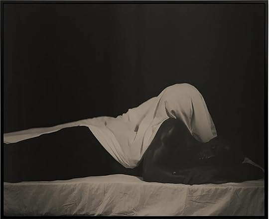 Shikeith, Visiting Hours, 2022
Courtesy Yossi Milo, New York
Hemphill’s legacy was his generosity of spirit, in life and in art. His poetry demands to be performed, shared, and interpreted. One of his most synergistic collaborations was with the filmmaker Isaac Julien. In the film Looking for Langston (1989), a spoken-word fantasia of gay Black bon vivants frolicking in an ethereal 1920s speakeasy, Julien mingles archival footage of Langston Hughes with tracks of Hemphill reading his own poems. In the exhibition, a viewing station for a five-minute B-roll montage of Hemphill recording the audio for the film allows visitors to hear the poet’s rhythmic, emotive idiolect for themselves. Nearby is Pas de Deux No. 2 (1989/2016), a still from Looking for Langston, in which two of the characters are dancing affectionately, breaking through a cloud of smoke. A bouquet of roses adorns the foreground. In the film’s denouement, we would see the dapper revelers fleeing from an armed mob of killjoy straights, running up a staircase lined by a brass handrail. We hear “The Brass Rail” read by two voices in playful repartee, likely belonging to the duo of go-go boy angels guiding the gentlemen’s ascent.
 Isaac Julien, Pas de Deux No. 2 (Looking for Langston Vintage Series), 1989/2016
Courtesy the Beth and Richard Marcus Collection
Closing the exhibition, in a secluded room off the main gallery, is a wall projection of Hemphill’s speech at the City University of New York’s “Black Nations/Queer Nations?” Conference, in 1995, just a few months before his death. In dedication to his partner Roger, Hemphill says, “If I had known sooner the true power of love to heal and affirm, I would have left the bathhouses, bushes, and bookstores immediately . . . I would have pursued a healthy way of living with more diligence than I gave to pursuing and busting a nut.” But how could these young men have known any better? What else were they supposed to do? Languishing in the closet may have been an option for some, but for Hemphill and his kind, it was out of the question. It was not these men who were at fault, nor was the pursuit for companionship and gratification the problem. Are those not essential? It was the lack of support and empathy from wider society that sealed their fate.
 Poster for Tongues Untied by Marlon Riggs, featuring Essex Hemphill, 1989
Courtesy Brian Freeman and © Signifyin’ Works
In a 2019 interview with ARTnews, Lyle Ashton Harris calls Hemphill and the filmmaker Marlon Riggs his “elder brothers.” “There was an insatiable need to try to create a language for something that I felt was there, that was real to me,” Harris said, recalling when he first saw Hemphill and Riggs’s documentary performance film Tongues Untied (1989). “I felt that Essex and Marlon had a language that I did not have. It was a language out of necessity. It was what sustained me.” Borne out of precarity, manifest of tenacity and survival, is the miracle of mortal creation. The convictions and dreams of those who came before made art, these are our blessings. “I ask no more of you / than I ask of myself: / no more guilt / no more pity,” Hemphill writes in “The Tomb of Sorrow” (1992) which is set in Meridian Hill Park, what was then a cruising site Black people claimed as Malcolm X. “Occult risks await us / at the edge of constraint.”
Essex Hemphill: Take care of your blessings is on view at the Phillips Collection through August 31, 2025.
August 1, 2025
How Baghdad Is Rebuilding Its Arts Community
Iraq’s capital has endured waves of violence, from civil unrest to foreign invasions, leaving little room for arts infrastructure. But the launch of Baghdad Photo Week, the country’s first photography festival, marks a notable turning point. Organized by the photographer Aymen Al-Ameri and his partner Meena Alyassin, who also cofounded the Iraqi arts magazine Henna, the event took place last December at The Gallery, a commercial art space in Baghdad.
The festival’s theme, “Forgotten,” paid tribute to two pioneering Iraqi photographers of the past, Nadhim Ramzi and Hadi Al-Najjar—key figures, alongside Latif al-Ani, in establishing the medium in the country. Much of the photography on view carried an aesthetic shaped by conflict and melancholy. Al-Ameri, Amir Hazim, and Alhassan Jamal Aldeen each capture daily life in high-contrast black and white, depicting ecological pollution, antiestablishment protestors, and the month of Muharram, the start of the Islamic New Year when Shias mourn Imam Ali, whose face is plastered on every street corner.
 Aymen Al-Ameri, from the series Halves, 2012–23
 Charles Thiefaine, Ala Allah, Mosul, Iraq, 2018
The program aimed to foster collaboration between diasporic Iraqis, image makers from throughout the country, and international photographers such as Charles Thiefaine, who is based in Paris and has made work about the massive 2019 protests in the capital that left hundreds dead, the subject of his project Tahrir Disobedience. Another body of his work, Ala Allah (On God), offers a quieter, warmer portrayal of daily life in Iraq —a more humanizing view than typically seen abroad.
The wide accessibility of photography, which requires little more than a smartphone, has accelerated its growth in Baghdad. With more photographers emerging, the need for a communal space to share images has become crucial. Al-Ameri, the festival organizer, is committed to working with photographers to develop a diverse range of projects. “We have many good Iraqi photographers, but most of the pictures are of the marshes and Karbala,” he told me, referring to Iraq’s southern marshlands and the Shia pilgrimage city. “We need to see more exhibitions. We donʼt have many galleries, and most photographers are stuck in the same cycle.”
The need for a communal space to share images has become crucial.
Documentary photography remains dominant, shaped by heavy international coverage of wars in Iraq. Abdullah Dhiaa Al-Deen’s work is notable for capturing pivotal political moments and social issues with striking honesty. Professional photography in Iraq often prioritizes income potential over artistry, reflecting the country’s high unemployment rates. Bearing witness to decades of tragedy has been central, but now, with the country’s relative stability and recent urban development, visual narratives are evolving.
 Wisam Mutwak, Holy soil, 2023
Coming to Iraq for the first time as a war correspondent in 2015, Thiefaine noted that many international journalists reproduced similar imagery. “I started to realize there was a big gap between what international photographers show and the lived experience,” he said. Befriending Iraqi youth, Thiefaine noticed that people were very open to being photographed. “Even during the protest, people wanted to show what they have in mind as a society. They were proud of what they were trying to do. I try to stay far from the imagery of violence in my personal work.”
Thiefaine believes that although Western journalism has contributed to shaping Iraq’s maligned global image, the “political situation is changing very fast, which brings about new representation,” pointing to different subcultures, queer culture, and how the festival itself aimed to show diverse perspectives. With Iraq frequently cited as one of the world’s fastest-warming nations, environmental concerns also drove projects on view, such as Tamara Abdul Hadi’s pictures of the iconic marshes and the Tigris and Euphrates Rivers, as well as Emily Garthwaite’s photographs of Kurdistan’s biodiverse landscapes and minority communities, including Yazidis, Zoroastrians, and Bahá’ís.
 Aline Deschamps, Two friends hold arms and walk around the fairy amusement park, 2022
  Paul Hennebelle, from the series Brown Eyes and Sand, 2016–21
  Claudia Willmitzer, light source of a vehicle headlight spot at the desert of Dasht e lut, Iran, 2014
Female representation in Iraqi photography is growing, albeit slowly. Initiatives such as Iraqi Female Photographers, founded by Ishtar Obaid, spotlight women, including Asmaa Turki, Saba Kareem, and Tiba Sadeq. Turki’s work ranges from young ballerinas in Baghdad to serene abaya embroidery in Najaf, vitalizing traditional themes with quiet beauty. Kareem’s images of the marshes and pilgrimages add to this expanding repertoire.
Al-Ameri organized Baghdad Photo Week with minimal funding—an impressive and steadfast effort emblematic of the Iraqi attitude to life. “Habibi, send me photos right now, let’s talk tonight,” he recalls saying to friends just months before the festival. “To deal with Iraqis is not easy,” he added. “Everything is al Allah [with God],” a phrase symbolizing a relaxed approach to deadlines. Creative problem-solving became vital for handling damaged prints and mismatched frames. Censorship presents another challenge. Political content, nudity, and drug-related themes are taboo. Social media offers some freedom, but constraints still limit expression. Despite Baghdad Photo Week’s groundbreaking success, significant obstacles remain. The country’s cultural infrastructure is underdeveloped, with minimal arts education, scant media coverage, and few exhibition spaces. Yet Baghdad Photo Week highlighted not only Iraq’s wealth of talent but also its need to rebuild an artistic community and, after decades of relentless conflict, reimagine its global image.
This article originally appeared in Aperture No. 259, “Liberated Threads,” under the column Dispatches.
Aperture's Blog

- Aperture's profile
- 21 followers

