
Aperture's Blog, page 74
April 2, 2020
How Are Young Photographers Documenting the Protests in Hong Kong?
Beyond the tear gas and the front lines, these Hong Kong photographers have found new ways to represent the city’s political crisis.
By Casey Quackenbush

Billy H.C. Kwok, Untitled, from the series It’s raining, Magic and Others, 2019
Courtesy the artist
The Hong Kong protests hold a strong grip over the public imagination. Even if you’re only a passive observer of the news, the demonstrations will most likely conjure at least one of these images: clusters of umbrellas, tear gas raining down over yellow hard hats, masked protesters hurling Molotov cocktails, black-clad crowds flooding onto freeways, police firing blue dye from a water cannon against Hong Kong’s iconic skyline.
These are undoubtedly some of the most defining moments in the city’s historic uprising, whose mass demonstrations began in June 2019. They capture the fiercest scenes as Hong Kongers fought for the city’s rapidly deteriorating democratic freedoms. As a former British colony, Hong Kong inherited special civil liberties when Britain returned the territory to China in 1997, forming the backbone of a remarkably unique and vibrant society on communist Chinese soil. After years under threat, the fight for democracy erupted last June over a now-withdrawn extradition bill proposed by the Beijing-backed government, which would have allowed Hong Kong criminals to be sent to mainland China for trial. The furor evolved into a wider movement for democratic reforms that is now in hibernation amid the coronavirus outbreak.
Etienne Leung, “No Extradition Bill March,” June 9, 2019
Courtesy the artist
When an entire city is convulsing, as a photographer, the challenge becomes one in finding meaning beyond the immediate mayhem. The protesters’ clarion call was “Be water,” a Bruce Lee–inspired catchphrase that made confrontations forceful, fluid, unpredictable, and nonstop. It also made the protests felt in every corner of life in Hong Kong, no matter race or class or neighborhood. When a movement is so charged and all-consuming, how do you transcend the news, capture something quieter, and say something bigger? From documentary to the conceptual, several young Hong Kong photographers endeavor to create images that capture life and identity beyond the front line.

Billy H.C. Kwok, Untitled, from the series Subway Strike, 2019
Courtesy the artist
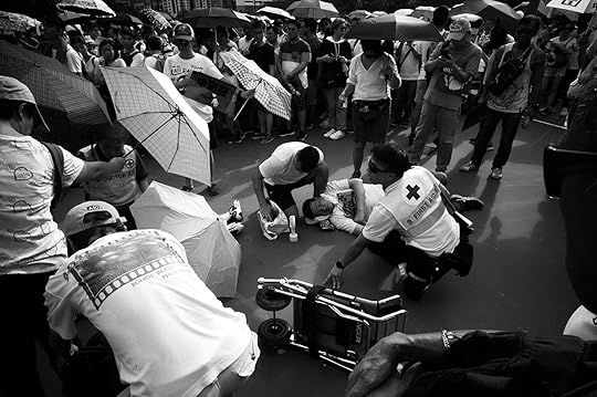
Billy H. C. Kwok was on assignment when Hong Kong first came to a halt. It was peak morning rush hour on August 5, 2019, on the subway when protests took a new turn: a general strike. With the government refusing to concede to any demands, protesters across the city used every means necessary to block the entrances of train doors—umbrellas, fire extinguishers, bodies, backpacks—and freeze the subway. Kwok had been covering the protests since the first canister of tear gas was fired in June. Up until this point, protests had meant action in the streets.
Down on the subway platform, Kwok was unsure how he could photograph such a static moment. Kwok looked around and observed all the faces and emotions of commuters trapped in the train cars. “People were not used to the protests in this way,” says Kwok, one of several young photographers I spoke to recently. Any disruption to Hong Kong’s renowned public transportation and work-driven way of life is jolting, and he could see it in everyone’s expressions. Through the glare and dirty subway windows, Kwok captured Subway Strike (2019), a series of portraits of individuals looking at their phones, quietly staring off, deep in their thoughts—trying to go about their everyday lives yet caught in the crossfire.
“I’m trying to step back and see the protests as a social landscape for Hong Kong,” says Kwok.
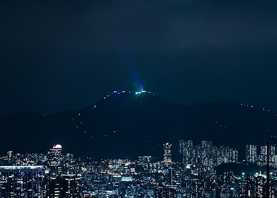
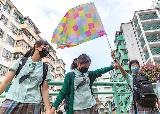
Kenji Wong, The Peak, Hong Kong, from the series Hello darkness, my old friend, 2019
Courtesy the artist
With a similar photojournalistic background, Kenji Wong also pushed the creative boundary with his color-heavy project Hello darkness, my old friend (2019). From landscapes of Victoria Peak illuminated by laser pens and flashlights to a rainbow beneath a water cannon pummeling protesters, Wong created high-energy pictures that glorify the movement.
Wong was particularly interested in photographing the humanity and solidarity of the movement. People have a “certain impression about the protesters,” he says, referring to the stereotype of the Hong Kong protester—a young, masked, violent man. “But behind the mask, they are also teenagers. They’re Hong Kong people, they’re human. They do normal things that normal people do.”
In his work, Wong strives to capture the diversity of emotions and participants. The night after a university siege, protesters stayed up all night on a bridge to watch the sunrise, where Wong caught a young couple kissing. In another, Wong captures a chain of young female students in their school uniforms holding hands in a human chain, a popular form of nonviolent protest that at times would span the entire city.
Kenji Wong, Kwun Tong, from the series Hello darkness, my old friend, 2019
Courtesy the artist
With CCTV cameras and Beijing’s lurking presence everywhere, fear of surveillance turned masks into the protest uniform. From the streets to the internet, protesters became extremely suspicious of being photographed. So as a street photographer, Etienne Leung struggled to capture those daily moments. Instead, she opted for a more indirect, cinematic approach, using black and white to enhance emotion and a wide-angle lens for more impact.
One photo from her untitled series captures a protester who had just broken into Hong Kong’s Legislative Council Building, framed by a broken pane of coincidentally heart-shaped glass. Another captures a protester running into a beam of light on the highway bouncing off the city skyline. “It’s not like all the explosive moments of police brutality,” says Leung. “It mimics that sense of hope within a youngster’s heart.”

Etienne Leung, Legislative Council, July 1, 2019
Courtesy the artist
Another major governing force of the protests: the internet.
Unlike the pro-democracy protests in 2014, known as the Umbrella Movement, the 2019–20 Hong Kong protests were—and still are—leaderless. For fear of surveillance and individual retribution, protest actions have been governed anonymously online, especially via Telegram, an encrypted messaging app. The cybersphere as a public forum creates a whole new dynamic for forging relationships among protesters and strangers.

O’Young Moli and Julian, 1/8_glimpse_6. They both like to take impromptu pictures of each other, to capture a glimpse of the other’s posture, from the series 1/8, 2019
Courtesy the artists and WMA, Hong Kong
This concept formed the basis of the 1/8 series—a finalist for the WMA Masters prize, an annual photography initiative supported by the Hong Kong–based WYNG Foundation—by two photographers who go by the pseudonyms O’Young Moli and Julian. The two found each other as kindred spirits online. But then the protests erupted, and they could never find the time to meet in person. The movement calls for five major demands, including an investigation into police brutality and direct elections. While the government met one of these demands by withdrawing the extradition bill, O’Young Moli and Julian joked that they should meet only after a second demand was met—an unlikely possibility.
So they began an experiment: until that goal was achieved, they would only meet in person in a dark room. To mimic their impressions of each other online, they would only see each other’s faces through the light flashes of an instant camera. The result is a photo series of disjointed, semiabstract snaps—of ceilings, curtains, cluttered desks, faceless bed-lounging, and nude backsides. The series speaks to the random yet intimate nature of online relationships amid the unrest.

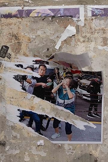
Wong Ka wing, Cold blood speech. Who are we?, from the series Lennon Wall: Tear Here, 2019. (The torn poster of a nurse, covering her eye with her hand, is from a rally held in solidarity with a young female first-responder who was blinded by police projectiles.)
Courtesy the artist
In a similarly conceptual project, Wong Ka wing set out to document the so-called Lennon Walls of the movement. Since the protests kicked off in earnest last June, Lennon Walls have been one of their defining features. Every public wall space—from tunnels to footbridges to staircases—burst to life as a mosaiced message board, fluttering with neon-colored Post-its and graphic posters calling for action against the government and voicing grievances over police violence. Inspired by the original 1968 pro-democracy graffiti wall in Prague, which was later named after John Lennon to symbolize freedom of expression in the 1980’s, Hong Kong’s Lennon Walls first emerged in the 2014 Umbrella Movement and became a key protest barometer in 2019.
As a public display of outrage, Lennon Walls became flashpoints between pro-democracy and pro-government groups, leading to droves of opposition groups calling to tear down the walls. The role of the walls as an extension of the conflict fascinated Wong, especially the irony of it all. To justify their removal, the opposition argued the Lennon Walls made Hong Kong look ugly, when what was left behind was even messier.
The opposition has the mindset of, “if I destroy the wall, the movement will fade away,” says Wong. “That’s ridiculous. The poster is just paper. To destroy it does not tackle the problem.”
Wong Ka wing, AHHH, from the series Lennon Wall: Tear Here, 2019. (The torn image is from a rally on December 1, 2019 in Tsim Sha Tsui, a district in Hong Kong, during which police used pepper spray on a middle-aged woman in the crowd. Most of the figures of policemen have been torn from the poster.)
Courtesy the artist
The act of tearing the walls down also inadvertently added several layers of meaning in Cantonese. For example, one Lennon Wall poster showed an image of an elderly woman being pepper-sprayed in the eye by police. The image is significant, because protesters repeatedly posted it online while opposition groups repeatedly reported it. Wong likened the act of ripping down the poster to “attacking the older woman.”
After another ripping spree, all that remained of a different poster—commemorating the five-month anniversary of the Yuen Long attack, when a gang of white-clad men wielding rods and poles assaulted passengers in a subway station—was the character for the number five. Wong likened this to the removal of time; there was no end to their anger. “After the damage, it shows the event will never fade out, it is still here,” says Wong. “After the damage, it’s even stronger.”
Casey Quackenbush is a Hong Kong–based journalist who writes about Asia-Pacific politics, culture, and climate change. Her writing has appeared in publications including TIME, the Washington Post and Al Jazeera.


April 1, 2020
The Light All Around Us
In his 1970s photographs from Colorado, Robert Adams finds the beauty and emotion in everyday homes.
By Pico Iyer
Robert Adams, Colorado, ca. 1973
Courtesy the artist and Fraenkel Gallery, San Francisco, and Matthew Marks, New York and Los Angeles
To find beauty where others see only emptiness, or junk: that might be one of the artist’s greatest gifts. To bring clear eyes to what the rest of us overlook, and never forget that the same light that shines on the postcard sites of our vacations shines alike on the gas stations and strip malls where we go to make those vacations possible (and fashion our everyday lives).
When Robert Adams showed us a deserted drive-in theater screen against Cheyenne Mountain—in his indelible 1974 book, The New West—as well as a stop sign, a cross, and a cluster of flimsy vacation homes set against the majestic landscapes of Colorado, he was not so much diminishing the glory of our wilderness as reminding us of the poignancy, and touching hopefulness, of our attempts to make a home within it. Yes, the great peaks and open spaces of the West put us in place and make our subdivisions and motel blocks seem fragile indeed; but the interplay of such temporary structures and an enduring landscape is what has given rise to the deeply human and almost religious art of both the filmmaker Terrence Malick and the writer Cormac McCarthy.
Robert Adams, Lakewood, Colorado, 1973–74
Courtesy the artist and Fraenkel Gallery, San Francisco, and Matthew Marks, New York and Los Angeles
In the seldom-seen works we get to view here, Adams trains his quiet and observant eye on interiors instead. The majesty of nature is entirely absent. But the brave fragility of our constructs, what we gather as stays against eternity, is no less affecting. A cruel eye might see the stuff we collect as silly, unbecoming; a sympathetic eye sees that it is all we have.
I don’t know what exactly I feel when I see the latest evidence Adams has assembled of our attempts to build a home here on an Earth so much larger than we are. There’s no question that loneliness and an Edward Hopper-like sense of abandonment are part of it. But these works also make me think of the classic postwar films of the Japanese director Yasujiro Ozu, such as Late Spring (1949) or Tokyo Story (1953). Ozu’s still, low camera, in many scenes, registers four regular guys talking around a low table. But it’s only when the humans leave, and the camera remains fixed for many seconds, silently taking the measure of the room that’s left behind them, that the emotion (even the humanity) becomes almost overwhelming.
Absence can fill us up as much as presence does, Adams knows, and something beyond us remains even as we come and go. The light that’s so much a part of all these works is as everywhere as the TV sets and trifles we set against it. We won’t last and the crags and deserts all around us will, we know; yet what else can we fill the emptiness with but whatever gives us a sense of perhaps doomed security?
Robert Adams, Untitled, 1973–74
Courtesy the artist and Fraenkel Gallery, San Francisco, and Matthew Marks, New York and Los Angeles
I questioned the master photographer recently about these images in which, as ever, he blends an unquenchable tenderness with an acute sense of all that we’re destroying. “Overall,” Adams wrote back, in three exquisite pages of handwritten answers, “I wanted just to show what lay within the houses that were a part of my primary subject, the new western landscape. I also hoped, however, to find evidence of human caring.”
In high school, he recalled, his family had lived in a small tract house, where there was “a lack of relation to the outside (was this innocent, willful, or coerced?) . . . between the cramped interior and the vast, plastic, and living green.”
His sense of social fragility had increased, he continued, especially given what’s happening to our democracy, but “the sublime seems more and more certain. And the sublime is evident even in a ditch, a road, or in a backyard.”
Then Adams concluded, “Yes, joy is still possible, either because of the love of friends and family, or owing to the inextinguishable beauty revealed by natural light. Every day can be the first day.”
Pico Iyer is the author of fifteen books including, most recently, Autumn Light: Season of Fire and Farewells (2019) and A Beginner’s Guide to Japan: Observations and Provocations (2019).
Read more from Aperture, issue 238, “House & Home,” or subscribe to Aperture and never miss an issue.
March 31, 2020
In Japan, a Photographer Finds There’s No Stranger Place than Home
Fumi Ishino’s photographs ask what happens when a house becomes unfamiliar.
By Moeko Fujii

Fumi Ishino, from the series Loom, Japan, 2018
Courtesy the artist
Two years ago, on his annual visit to Japan, the photographer Fumi Ishino started feeling that things were a little bit off. Perhaps it was the billboards gearing up for the 2020 Olympics. Perhaps it was the advertisements trumpeting a Cool Japan. Whatever it was, fifteen years after his move to the United States for college, he walked around neighborhoods of Tokyo with his camera, followed by a feeling that the place was suddenly neither home nor foreign. It was a feeling of zure, he said, of slippage, and he repeated the word softly. A feeling of zure, lopsidedness: a frame on the wallever so slightly crooked.

Fumi Ishino, from the series Loom, Japan, 2018
Courtesy the artist
This slight but powerful sense of unease suffuses Ishino’s images, that of witnessing the familiar transform into the strange. Ishino, born in Hyogo and now residing in Los Angeles, marauds in the particulars of the placeless: what we can learn from, say, a whitewashed wall in a nameless residential town, or from the ready symbolism of the Tokyo Tower. In Loom (2018), Ishino’s first collection of photographs taken entirely in Japan, he disrupts our habits of scouring images for markers of nationhood. “I avoided anything that hinted of Tokyo or Japan,” he told me. “I wanted to obscure the sense of location.” In a city stuffed with shrines and monuments to capital, Ishino wanted to capture things that weren’t made to endure at all. He is interested in places that are always forgotten, the category of images that are usually shelved, in our field of vision, as unimportant. When we remember a place, what does our perception fill in on the periphery? “And, when you no longer have a place you call home,” Ishino said, with a little laugh, “doesn’t everything become background?”

Fumi Ishino, from the series Loom, Japan, 2018
Courtesy the artist
We see a shade of white across all of his photographs in Loom: on exteriors, curtains, a trash can. It’s cold with the blue undertones of whitewash, a hue that, exhilaratingly, doesn’t yield to interpretation. I found myself alternating between examining this peculiar whiteness and being pulled to bursts of human color: a pink flower planted just at the edge of the frame, a child’s imagination on a garage wall, an orange elephant, a recycling bin with brown scruff around its mouth. In my dueling impulse to fixate on the differences in the debris of people, and also on the sameness of sprawling, cut-off expanses of white, I felt the weight of my own displacements, the everyday tensions of being constructed by multiple cultures, not just one.
Fumi Ishino, from the series Loom, Japan, 2018
Courtesy the artist
“I think we are always competing between wanting to travel and live in a world with no borders,” Ishino says, “and the desire to call somewhere home.” None of his photographs from Loom illustrates this more than one of a white shirt hung alone on a pole, caught mid-dry. I see the clothespins acting as competing identities and notions of nationality, tugging the cloth into a slumping, restless grace. But in its loose tautness, Ishino presents a more complicated aesthetics of suspension, a gentle balance upheld amid buffeting forces, found only from crisscrossing between worlds.
Moeko Fujii is a writer and critic living in Chiba, Japan, and New York.
Read more from Aperture, issue 238, “House & Home,” or subscribe to Aperture and never miss an issue.
What Happens When the American Dream of Homeownership Reaches Mexico?
For more than a decade, Alejandro Cartagena has photographed Mexican suburbs transformed by the rapid construction of new homes.
By Yxta Maya Murray
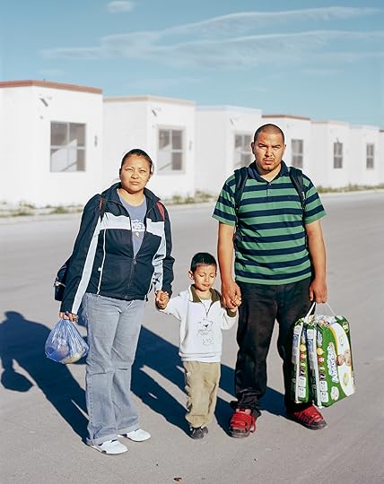
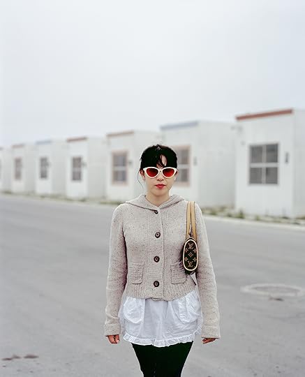
Alejandro Cartagena, Family walking back from store in Juárez suburb, 2009
Courtesy the artist and Kopeikin Gallery, Los Angeles
The photographer Alejandro Cartagena knows you want to go home. You yearn for a house that really feels like home—an affordable space of serenity or happy chaos, with easy access to work, clean air, and clean water. Where you can become fully human and maybe raise a family. Not a site of destruction or pollution. Not a place that will bankrupt you or pen you in or poison you. Home.
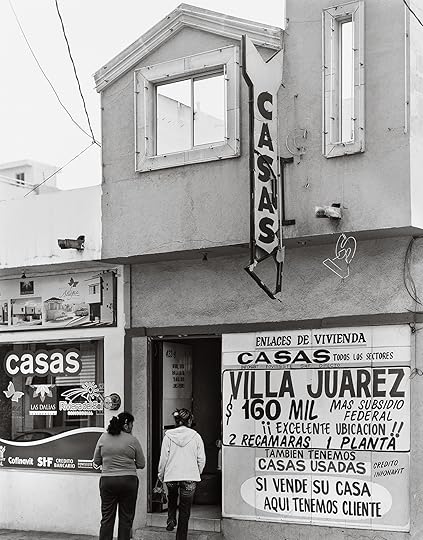
Alejandro Cartagena, Housing agency, Monterrey, 2011
Courtesy the artist and Kopeikin Gallery, Los Angeles
The failure of the world’s metropolitan areas to fulfill this dream for all of its residents drives Cartagena’s work. Cartagena, who was born in the Dominican Republic in 1977 and now lives in Monterrey, Mexico, has photographed Mexican suburban architecture and its housing-challenged inhabitants for the past fourteen years. His images of cheap structures and exhausted commuters critique the international club of politicians and urban planners whose model of quick and unequal development has left many people bereft of a safe place to call home. The housing boom started in Mexico in the early 2000s, when aspiring landholders began acquiring properties financed by mortgages.
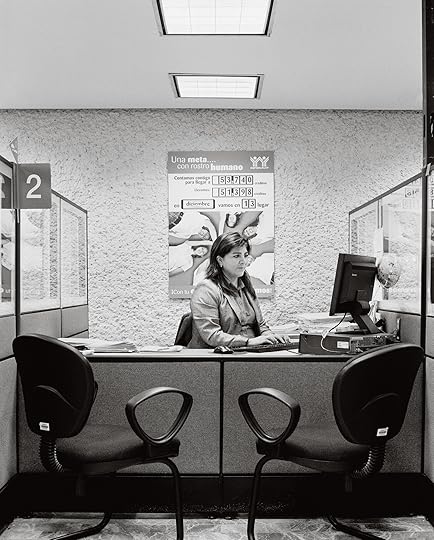
Alejandro Cartagena, Bureaucrat at her desk at the INFONAVIT, Monterrey, 2011
Courtesy the artist and Kopeikin Gallery, Los Angeles
Though this practice has allowed more people to acquire homes built out of permanent materials, government loans are only available to those with salaried employment, a status that sixty percent of the Mexican working population can claim. Salaried workers thus possess a greater likelihood of living in such sound structures than those surviving in seasonal or gig economies.
“My images are trying to present the more complex situation that’s never told in the commercial and ideological stories of homeownership,” Cartagena says. “The idea of buying a home is that it will bring social mobility, safety, love, a family, the whole Hollywood, Disneyland version. But there exist loopholes in this story, particularly in how homeownership had been photographed, always from the outside.”
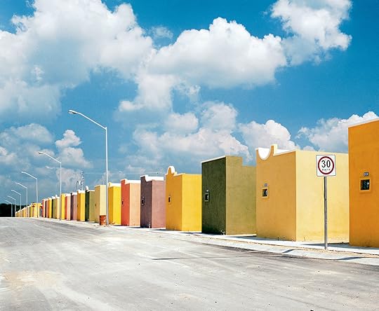
Alejandro Cartagena, Apodaca, 2007
Courtesy the artist and Kopeikin Gallery, Los Angeles
In 2010, Cartagena published Suburbia Mexicana: Fragmented Cities with Daylight/Photolucida. This project recorded the suburban sprawl in Monterrey, a city that had 339,282 residents in 1950, but today lodges over 3.8 million. Suburbia Mexicana features images of 328-square-foot houses that typically billet four to six people and look like the cookie-cutter “little boxes” lampooned by folk singer-songwriter Malvina Reynolds in her song by that title. In 2014, Cartagena self-published Carpoolers: on Monterrey’s Highway 85, a route carrying men from their homes in the new suburbs to their work sites, he captured his voyagers lying down, eating, and sleeping in the backs of trucks, often amid the detritus of their jobs.
Alejandro Cartagena, Girl coming home to suburb in Juárez from a night out in the city, 2009
Courtesy the artist and Kopeikin Gallery, Los Angeles
Cartagena’s recent series A Small Guide To Homeownership: Case Study: Mexico (2019) takes the form of a photo-collaged proto-Dummies manual that blithely, and blindly, gives tips on financing residential real estate and managing thirty-year, fixed-rate mortgages. It tucks images from Suburbia Mexicana and Carpoolers into found text from home-buying guidebooks. In a particularly lacerating chapter, Cartagena layers the pictures of the little boxes over the real estate–industrial complex’s conventional rah-rah fantasies, which counsel that if your family has “two who cook, you need . . . a big kitchen,” and if you have “small children, you need . . . lots of bedrooms,” conveying how unrealistic the own-your-own-home cult can be.
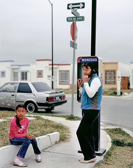
Alejandro Cartagena, Mother and daughter at public phone in Juárez suburb, 2009
Courtesy the artist and Kopeikin Gallery, Los Angeles
Cartagena observes that his photographs fill in the gaps left by government and development propaganda that pushes the idea of homeownership as an unqualified good. “If you connect a picture of a house in the suburbs with a picture of carpoolers, with a picture of a desiccated river—those images weren’t meant to be together,” he says. “But if you connect those dots, the story becomes more complex, and the questions open up to ‘What are we really doing?’”
Yxta Maya Murray is Professor of Law at Loyola Law School, Los Angeles, and the author of the forthcoming novel Art Is Everything.
Read more from Aperture, issue 238, “House & Home,” or subscribe to Aperture and never miss an issue.
March 27, 2020
11 Photographers on How To Finish a Body of Work
Over the course of her career, curator and lecturer Sasha Wolf has heard countless young photographers say they often feel adrift in their own practices, wondering if they are doing it the “right” way. This inspired her to seek out insights from a wide range of photographers about their approaches to making photographs and a sustained a body of work, which are brought together in PhotoWork: Forty Photographers on Process and Practice. Structured as a Proust-like questionnaire, the responses from both established and newly emerging photographers reveal that there is no single path. Below, eleven artists respond to the question: How do you know when a body of work is finished?
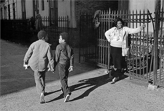
Dawoud Bey, Woman and Two Boys Passing, Harlem, NY, 1978
Courtesy the artist
Dawoud Bey
On the one hand, I think the project is finished when I have said visually all that I think needs to be said about that particular subject. But one never knows. Recently, I thought my project Harlem Redux [published in 2012] was done, but then I started to feel like there were gaps in terms of the kinds of pictures, range of subjects, and varying vantage points from which I wanted to tell the story about the ways the Harlem community is changing. I couldn’t shake this nagging feeling that there was more to do, and so I went back. Turns out, I made some of the strongest photographs on that visit. So sometimes you know, and sometimes you don’t.
John Chiara, Topanga Canyon Boulevard at Pacific Coast Highway, Los Angeles, 2012, from John Chiara: California (Aperture/Pier 24 Photography, 2017)
Courtesy the artist
John Chiara
It’s so hard to know! Maybe when I’ve run out of things to say and pictures I want to take. There are, of course, lots of practical and pragmatic reasons it ends: deadlines, energy, inspiration, resources. Even so, I find it very difficult to end a body of work. I might not ever truly end it because of the way I work. I can spend five or six years in a place if I’m drawn to it, even after an exhibition has ended. I revisit places. I continue following the train of thought until I feel it’s resolved.

Siân Davey, Before Prom, Getting Ready, 2016
Courtesy the artist
Siân Davey
I know when a body of work is finished when the charge drops, and the thing that pulled you along is no longer there. You can feel yourself lose your connection to the narrative. At this point, the story has been told and is now in danger of repeating itself. It’s about knowing when that time has come and having the courage to let it go.
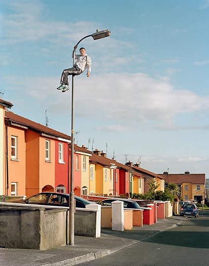
Doug DuBois, Jordan up the Pole, Russell Heights, Cobh, Ireland, 2010, from My Last Day At Seventeen (Aperture, 2015)
Courtesy the artist
Doug DuBois
Deadlines help and are often critical to preventing something from getting overthought and overworked. I’ve been lucky to have some good book editors who, more than once, kept me from ruining a good idea. Repetition is another sign—but it’s tricky. Going back again and again to a certain subject or making variations is an important discipline. The bad repetition, the kind that doesn’t add up to anything and becomes a dead end or a compulsive gesture—that’s a sign that you are done with a project.
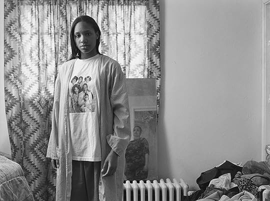
LaToya Ruby Fraizer, Huxtables, Mom, and Me, 2008, from The Notion of Family (Aperture, 2014/2016)
Courtesy the artist
LaToya Ruby Frazier
It will never be finished. The meaning of an image is never fixed. It changes as history changes. We’re all connected intergenerationally—we’re connected to the images of the past and to the future. I’m thinking about time travel when I make my work—take, as an example, my work with my mother and my grandmother (The Notion of Family, Aperture 2014). I’m suggesting we are one entity; we are all markers on a timeline that is cyclical. But even within that work, things change. Take the self-portrait Huxtables, Mom, and Me (2008). I’m wearing a T-shirt that’s worn, the ink is peeling off; the mirror behind me, in which a reflection of my mom can be seen, is dusty and scratched. The image already had meaning embedded in it because of what the Huxtables meant to American society—the first public image of a middle-class Black family and the whole “Cosby effect” that I wanted to critique. Looking at it now, thanks to Bill Cosby’s sex crimes, that image has acquired a whole new layer of meaning.
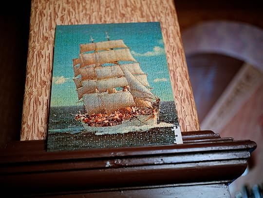
Paul Graham, Ship Jigsaw, Berlin, 1989, from New Europe
Courtesy the artist
Paul Graham
When the question “Does this work?” is not keeping me awake anymore. At that point you have the answer to the thing that has been troubling you, so in a way it is, or will soon be, finished, and you can start to think ahead to the future.
Todd Hido, #3737, 2005, from Intimate Distance (Aperture, 2016)
Courtesy the artist
Todd Hido
I used to say, “When I stop getting out of the car to take the picture.” Basically, you know you’re finished when the burden of setting up the camera outweighs your drive to capture that particular image.
One note of caution: I feel that photographers and artists these days are very much on an accelerated production cycle, where we can feel pressured to have an entirely new project every couple of years. It is important to slow down around your own work, trust yourself, and ask if you really are done. Knowing when to push through and keep going is just as important as knowing when to stop. The new iterations, the small discoveries, and the nuances of my own way of working were all important realizations for me, and those only came through continued efforts.
Peter Kayafas, Twin Bridges, Montana, from The Way West (Purple Martin Press, 2020)
Courtesy the artist
Peter Kayafas
I think it is essential to finish, to edit and present, in whatever form, a project or body of work so that it is permanent, out of the hands of the artist, and into the public sphere. When I look back on any project that I have finished, whether it be from a few years or a few decades ago, I find that there are always things I’m proud of, as well as things I would do totally differently. It seems to me that there is no better indication of growth as an artist than to have circumstances that allow for such insights.

Justine Kurland, Poison Ivy, 1999, from Girl Pictures (Aperture, 2020)
Courtesy the artist
Justine Kurland
I teach with Nayland Blake, and I have heard him tell students, “Finishing is for furniture.” Once the problems of construction are resolved, of a table for instance, the process no longer involves thinking. Finishing is the stage where the person mindlessly applies polish but no longer pays attention. At this point you are no longer making art. Nayland is one of the most intelligent and clear-sighted artists I know. I often ask myself, “What would Nayland do?”
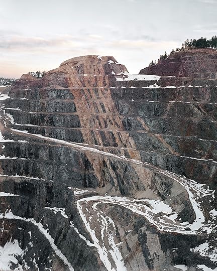
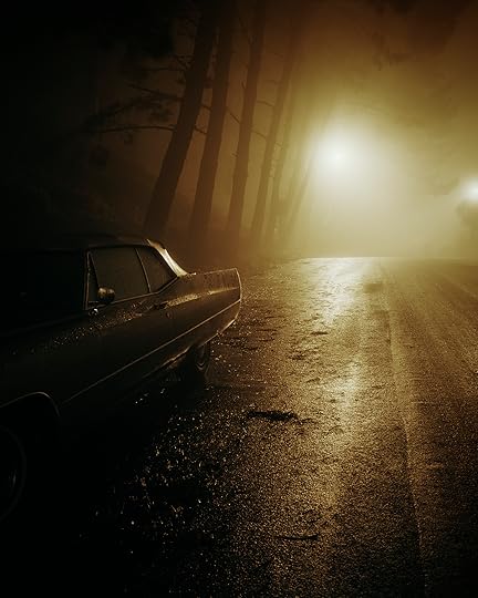
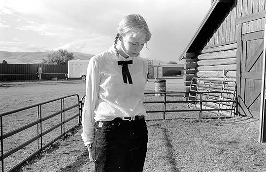
Bryan Schutmaat, Gold Mine, 2011
Courtesy the artist
Bryan Schutmaat
What’s the cliché? A work of art is never finished, only abandoned. With the kind of work I do, I could shoot forever, trying to improve the photos or tweak the edit or just fuck with things endlessly. But life is short, and at some point you have to say, “Ok, this is enough.” If you feel the subject matter isn’t thoroughly explored after the completion of a project, then you can always go shoot the same kind of stuff in the future.

Alec Soth, Peter’s Houseboat, Winona, Minnesota, 2002, from Sleeping by the Mississippi (2004)
Courtesy the artist
Alec Soth
This is a difficult question to answer. If photography were a true narrative art like filmmaking or fiction-writing, you’d have certain narrative conventions like the feature-length film, the television program, the novel, the short story, etc. But photography functions more like poetry and, like contemporary poetry, is usually free verse in nature. There are no standards for beginning, middle, and end. It’s up to each photographer to create her own structure. In the past, I’ve usually used the book as the chief structural device. Since most of the photobooks I love generally have around forty to sixty pictures, that’s been the number I tried to achieve. But I’m currently less project-orientated. Nowadays, I’m just happy to work on an individual poem and see where it takes me.
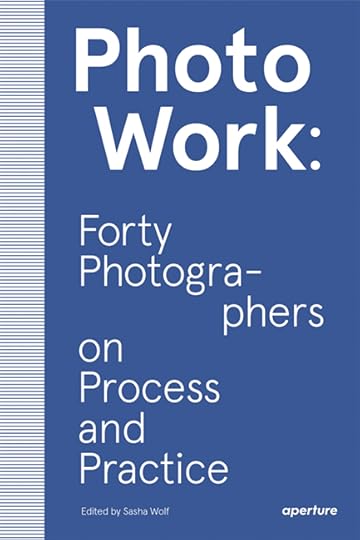
Responses have been edited for space. To read the full interviews, order your copy of PhotoWork here.
March 26, 2020
Denise Scott Brown on the Signs and Symbols for Living
For the acclaimed architect, photography has always been a central approach to design.
By Peter Barberie
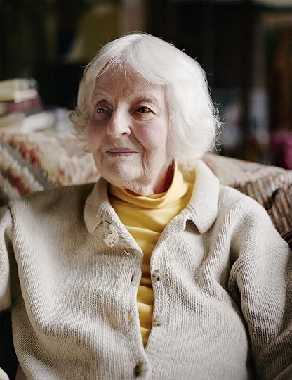
Denise Scott Brown, Philadelphia, November 2019
Photograph by Jody Rogac for Aperture
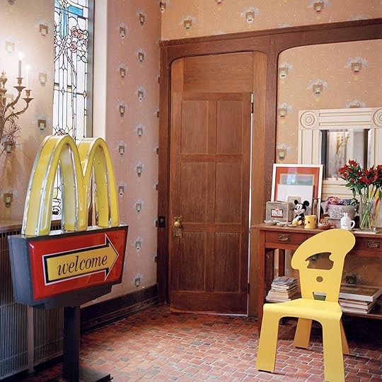
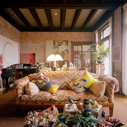
In her 1907 Art Nouveau home on the outskirts of Philadelphia, the architect Denise Scott Brown lives among an eclectic collection of art, furniture, and knickknacks. As in her iconic designs and writings, elements of vernacular culture mix freely with classical references. Batman pillows converse with a Piranesi etching.
Born and raised in South Africa, Scott Brown arrived in the United States in 1958 following extensive travel in Europe. She and her first husband, Robert Scott Brown, came to study with the architect Louis Kahn, bringing with them a strong commitment to urban planning that has informed her designs, teaching, and writing ever since. As a professor at UC Berkeley and UCLA in the mid-1960s, she became interested in the rapidly growing cities of Los Angeles and Las Vegas. In 1967, she married fellow architect Robert Venturi and returned to Philadelphia to join his architectural practice. Five years later, with Venturi and Steven Izenour, she coauthored the groundbreaking 1972 book Learning from Las Vegas.
Scott Brown’s built projects range from the Sainsbury Wing at the National Gallery in London to the Mielparque Nikko Kirifuri Resort in Japan to Franklin Court, a dramatic reconstruction of Benjamin Franklin’s Philadelphia house frame that blends her love of building, archaeology, and neighborhood planning. Photography has been a key element of Scott Brown’s approach to architecture and urban design: she will soon publish a book of her photographs, Wayward Eye, Photographs 1950–1970.
Denise Scott Brown’s house, Philadelphia, 2019
Photographs by Jason Fulford for Aperture
Denise Scott Brown: It was said that, of all crowded rooms, there was never one so crowded as when Thomas Jefferson dined alone.
Peter Barberie: [Laughs] I’ve heard that.
Scott Brown: Yes. So this house is us dining alone. These crowded things mean I can sit here and have happy memories, or be reminded of what to talk about.
Barberie: I can see that you have eclectic taste.
Scott Brown: Well, Bob Venturi and I could spot things that other people would like in a few years and buy them when they still cost four dollars. Look at this Art Nouveau detail on this chair. One day, I’ll see it in a book. Do you see it?
Barberie: Yes, I do. It’s delicate.
Scott Brown: It’s so exquisite. The chairs aren’t Majorelle, because they are too small. But one day we’ll find someone illustrating something like them, and we’ll say, “Oh, that’s like our chairs.”
Barberie: They are made with great, great attention.
Scott Brown: Yes. And we had fun reupholstering them. I’d go to New York and return with a pile of samples, and we’d choose those we liked. We spent a year or so decorating, once we had a new roof. We were afraid of leaks.
That couch is from the Traymore Hotel [a grand Atlantic City hotel that was demolished in 1972]. It was exhibited in Paris in 1925. And it cost us twenty dollars. That table was in the elevator lobbies. We picked up two van loads at the Traymore.
Denise Scott Brown’s house, Philadelphia, 2019
Photograph by Jason Fulford for Aperture
Barberie: This room is amazing, with its painted patterns on the ceiling and walls. The wall mural looks familiar to me. It’s quite like the decorated skin on the Venturi, Scott Brown and Associates buildings that I’ve seen.
Scott Brown: The ceiling was painted in the 1920s. The wall is stenciled; its pattern was designed by Bob. It was a long story that began with a trip to Decorators Walk to find floral wallpaper for the bedrooms. And perhaps you could call this suite of rooms our Strip. The house is from 1907.
Barberie: It’s a wonderfully open house. The light that comes through this entire floor is beautiful.
Scott Brown: Oh, that’s the first thing we saw. We drove by it regularly and were fascinated to see all the way through the house to the yard beyond. So one day we drove down the driveway, and sure enough, there was a vista through the wide glass doors, and there were stained-glass windows on either side. Art Nouveau has been my style, like this pin, you see, and my clothes. It’s what I have worn since I bought my first Art Nouveau pin in about 1953. So I said to Bob, “I can’t believe this; it’s an Art Nouveau house in America.” Because I hadn’t seen even one here.
Barberie: Yes, there are not too many. Do you know who designed it?
Scott Brown: Milton B. Medary at the age of twenty-five. He had a very distinguished later career, and his work is all over Philadelphia, but, just as he was to become dean at the School of Architecture at Penn, he died. His clients here were German. They wanted and got a German Art Nouveau house, and its woodwork was probably made in Germany. But because it’s close in design to Arts and Crafts, neighbors called it the California house. The first owners were art collectors and patrons, and important works by Samuel Yellin and Wharton Esherick were housed here. They lived here from 1909 to 1970. Then a painting contractor bought it and redecorated it in “Art Nouveau” as he knew it, rubbing lye into woodwork and smearing white paint on that, to make it look like driftwood.
Not all Art Nouveau goes with this house, because its scale lies between English Romantic and automobile freeway. So I tuck this little Art Nouveau pitcher into a corner, because it’s too prim for the house. This library now supports two work nooks; the one facing the bay window is a small conference space and my favorite place to work. I have four such places to sit so my back doesn’t die. It’s like, “We need small, mass-repeated comfort enhancers distributed system-wide, to reveal places changed for new use. And they should be soft to give their users comfort.” Small, mass- repeated events that make you feel comfortable are pillows. But I said, “I don’t want them to be Art Nouveau; I want them to be Art Deco—related but not altogether.” And then Charlotte Caldwell, who worked here, said, “Have you thought of Batman?” So people think—it was even said in one article—that I designed the pillows. I didn’t. I went to the catalogs, and I looked up “little boys’ rooms.” I found cotton Batman pillowcases at eight dollars apiece.
Denise Scott Brown’s house, Philadelphia, 2019
Photograph by Jason Fulford for Aperture
Barberie: I see you’ve got Catwoman alongside Batman.
Scott Brown: Yes. You see, they talk to each other, but boy, do they talk to that Piranesi etching of a Roman street. Look at the technique there, such beautiful drawing. Roy Lichtenstein learned from this. And adjacent to the Piranesi, Bob hung a Lichtenstein comic- book print.
Barberie: From the way you’re explaining the house, it sounds as though you think of it almost the way you think about cities.
Scott Brown: Very much so. Look out here at the yard. I saw one like it in front of the Mies van der Rohe houses in Krefeld. An English Romantic landscape. Our house was built for Germans who knew [Hermann] Muthesius’s Das Englische Haus. Germans and Austrians fell in love with that style, and also with Charles Rennie Mackintosh, but Americans and the English wouldn’t touch it. This is an English Romantic landscape to go with a German house.
Barberie: Is the Wissahickon Creek down there, that way?
Scott Brown: It’s down there. That’s our German linden tree, at the edge of the lawn. Its life span is one hundred years, and this one is 110 years now. Our landscape contractor gives our trees very loving attention. And I think about the garden in urban terms. Its carriage driveway, for example, is augmented to suit the geometry of cars and trucks.

Denise Scott Brown’s dog, Alvar Aalto, Philadelphia, 2019
Photograph by Jason Fulford for Aperture
Barberie: [A dog enters.] Who is this?
Scott Brown: You won’t believe it—his name is Alvar Aalto.
Barberie: Well, he’s very handsome.
Scott Brown: Hello, lovey. Hello, doggie. You see, he comes and leans against my knee. Bob used to say, “Where’s man’s best friend?”—and he’d come running. And, “Where’s the dog?” And, “Poochie.” And, “Aalto-ie.” [Walking from the sitting room to the dining room, she pauses to show Peter Barberie things on the mantel.] I like this combination. This was here to amuse Bob, because, in his nineties, he liked to sit here.
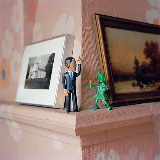
Obama and Liberty toys in Denise Scott Brown’s house, Philadelphia, 2019
Photograph by Jason Fulford for Aperture
Barberie: So we have plastic wind-up toys of the Statue of Liberty and Barack Obama.
Scott Brown: And look what the Statue of Liberty can do. [She winds it, and noise is emitted.] Isn’t that enchanting? As I went by Bob, I’d give it a wind up. Mmmmmmm.
Bob grew up with this chair and surrounded by books filled with photographs of Italian architecture. Princeton added modern architecture, particularly Le Corbusier, and openness to the study of historical architecture. Two years at the American Academy in Rome deepened his outlook, but it was only just before he left that he discovered Italian Mannerist architecture and vocabulary.
For the Vanna Venturi House (1964), which used our postmodernism, not Philip Johnson’s “PoMo” of the 1980s, his process was fascinating. He was learning about David Crane’s “four faces of movement.” He knew Crane, who was teaching us urban design courses about the street, the buildings, the communications systems that you can study between them, how the crossroads beget marketplaces and towns, and all of that. Bob was very eager to learn about these things—he was the only architect at Penn who was. That’s why I invited him to come and look at Las Vegas.

Denise Scott Brown, Vanna Venturi House, 1969
Courtesy Venturi, Scott Brown and Associates, Inc.
Barberie: So you had been to Las Vegas prior to that?
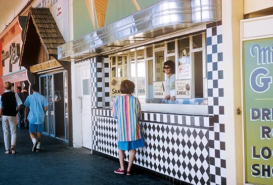
Scott Brown: No. My parents went to Las Vegas in 1950, and they sent back photographs. They were very strange, because of my mother’s inexpertise. She’d just been on a game reserve in South Africa, and then they went to see family in America, and in one of her rolls of film of the Strip at night there’s a giraffe walking down it—so two pictures are superimposed. Anyway, so I saw that then. But I was already in love with theme parks because my dad was, and because my grandparents had sent us souvenirs from Coney Island in 1936. That was my first piece of magic. Later, I was interested in Pop art and popular culture. I wanted to look at places like Disneyland or Las Vegas, where people actually liked to go. We wanted to do some work around there, and that’s how the Las Vegas Studio started.
We also did a studio called “mass communication on the people’s freeway.” In Santa Monica, Los Angeles, we did a studio on the beach, thinking about it as a Strip too. In Los Angeles, on Sunset Boulevard, for example, I was seeking an outlook on urbanism in the essence of sun and seduction—what were these very private buildings, possibly of film stars, communicating?

Denise Scott Brown, Soweto, 1970
Courtesy Venturi, Scott Brown and Associates, Inc.
Barberie: Did Las Vegas in the 1960s remind you of the Johannesburg that you had known a decade earlier? You have written about Johannesburg being less than fifty years old when you went there as a young woman.
Scott Brown: Well, Johannesburg when it started was really small. It was mining camps, you see. And then it grew to a big scale.
Barberie: I read a wonderful quote from you about your experience traversing countries and cultures, which you said gave you a healthy perspective on things. You were in your twenties, a young woman, when you landed here.
Scott Brown: Yes, and I was with Robert Scott Brown then, you see—it was the two of us. We’d been photographing all over Venice for a full month. When we arrived in Philadelphia, looking at our maps, I found Thirtieth Street Station and then a bridge to cross with all these little houses, and I was sure I’d find something in there. So I point to one, and I say, “We must go and look for an apartment in this house. It was Boathouse Row! It turned out I was right. They did have apartments in Boathouse Row. But we ended up in Grays Ferry, an Irish neighborhood. Pretty quickly people started telling us to avoid black neighborhoods. I said, “I think I’m in apartheid South Africa, with people saying, ‘Don’t go to this area because it’s bad.’”
Denise Scott Brown, Los Angeles, 1965
Courtesy Venturi, Scott Brown and Associates, Inc.
Barberie: Looking at the galleys of your book—just the pictures—I could see that you’re drawing a line from Johannesburg and Soweto to New York, Philadelphia, and Levittown, and even to the Vanna Venturi House.
Scott Brown: The book needs a little novella about Soweto. The initial, liberal aim for building the settlements before apartheid was to give shelter to the employees in the gold mines and white-owned businesses. You needed to do that if you wanted to have a workforce. Then the Nationalists said, “Yes, we must do that, and we’re going to use it as our means of enforcing apartheid. We’ll build townships in places far enough away from Johannesburg to never meld, but close enough so that these people can be employed in Johannesburg and in the mines.” That’s how Soweto developed.
Douglas Calderwood wrote about African mass housing in the 1940s. No one knows about him, but his book really shows it was a liberal activity taken up by the Nationalists. He says that housing will do better if it comes with strong strategic planning. But look at the people who do planning. In Levittown it was William Levitt, a sly developer. Follow the forces where they take you, and find a way to get the extra little business. In Soweto it was Joe Slovo, an amazing character of the African National Congress Underground, who did that sly planning.
Barberie: And photography is a powerful tool to show these systems and patterns.
Scott Brown: Photography is crucial for ideas about architecture and urbanism, to intrigue students and win them over. And you can do that by having slides that show your ideas.
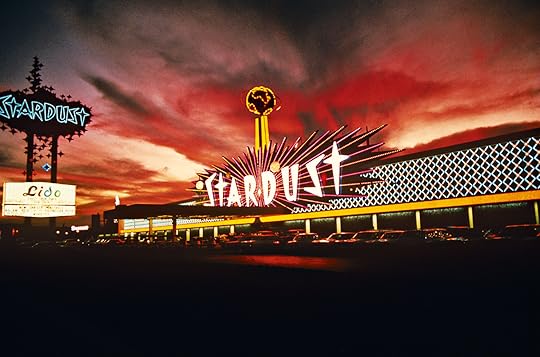
Denise Scott Brown and the Learning from Las Vegas Studio, The Stardust Resort and Casino, Las Vegas, 1968
Courtesy Venturi, Scott Brown and Associates, Inc.
Barberie: So you really were photographing, in essence, for slide-shows? To show the context for buildings and urban design?
Scott Brown: Robert Scott Brown and I began taking photographs on our trip through Europe, because we were planning to return home to South Africa, and we thought we would not have much opportunity to travel for a while, given the Nationalist government. When we set off to travel, I didn’t take photographs until Robert arrived, and he had the camera—I didn’t have one then. Though I had done photographs at home and my mother was always doing photographs. She did beautiful photographs.
We wanted a record. Everyone tells young architects, no matter which school, “You can’t just look at pictures and books; you have to go and look at the real thing.” We were strongly told that. “Get out and see these things; get out and see them before you can’t, and then take good photographs so that you can have a memory of them when you come back.” So we went out to do record shots.
We were going through all these museums. We were learning about the Japanese organization of paintings, and about [Piet] Mondrian and how he painted, and seeing all these interesting ways of putting together things, which I’ve lived with ever since. That whole philosophy is in how I’ve organized my book of photographs. Even if it looks very dour, it’s made in such a way as to draw people in. A lot of it is based on the plan for Chicago in 1909.
Bob and I were at first looking for record shots, and then we got all involved with communication, streets, and the way store signs behave. So we began taking those photographs too. By then Bob had already fallen in love with Coca-Cola signs.
Then, you see, there’s a tradition in America where you show pairs of slides. So I began designing lectures with pairs of slides, sometimes for contrast.
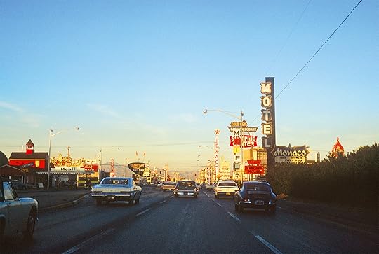
Denise Scott Brown, Las Vegas, 1966
Courtesy Venturi, Scott Brown and Associates, Inc.
Barberie: I know you and Robert Venturi commissioned Stephen Shore to make photographs for your 1975 exhibition Signs of Life: Symbols in the American City. Were you looking at other street photographers too?
Scott Brown: Yes, we moved from Las Vegas to Levitttown to the Smithsonian for that exhibition. We asked photographers to work with us. We figured, why not get some great photographers and send them on a journey? The studios were not only visual; they were sociological. Before then, I became very keen on [Henri] Cartier-Bresson. That’s another interesting story, how that happened. But I found a picture in a Cartier-Bresson book that took me a little while to work out. It’s got to be London. But it didn’t say. At least, I couldn’t find it.
Barberie: Sure.
Scott Brown: When I saw the picture, it prompted me to utter a quote: “The mild, lumpy faces of the British.”
Barberie: [Laughs]
Scott Brown: So there they are, this crowd, sitting on the balustrade, looking out, and they’re looking at something. You don’t know what it is, but you can see it. Then, at the bottom, there’s a drunken guy lying, sleeping, and there are all the remnants of a big parade.
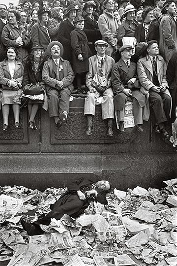
Henri Cartier-Bresson, Coronation of King George VI, London, 1937
Courtesy Magnum Photos
Scott Brown: And so he’s lying on this system, like the pillow system we have here in our house. He’s there, and then all these people are looking out—and what’s going by is the whole might of the British Empire in golden carriages for the coronation. And Cartier-Bresson couldn’t care less about the coronation. He’s looking at people, or looking at one thing, and making geometric formulas. Well, I was very taken with things like that, as I was with the geometry of trees when I was lying under them while camping and just looking up.
Barberie: So tell me how you became keen on Cartier-Bresson.
Scott Brown: Before Robert Scott Brown came to England, I traveled on my own in Europe. In Bonn, I met a young law student who offered to show me around. I was hesitant, but I wanted to see the city, so I said yes.
Later on, he invited me to join him and a friend on a road trip through Spain. I accepted the invitation, and then they wrote me and said, “We have been joined. He’s an American. He’s called Len. You would like him.” It was an amazing adventure. Len had set out to do a grand tour, and then he discovered that if he didn’t eat very much, and didn’t buy anything, and just kept his camera and traveled the way we traveled, he could spend two or three times as much time there as he had budgeted for.
So there he was, falling apart, his clothes falling apart, long and lanky, about a foot taller than all the Spanish and my two German friends, with lots of dark hair, taking photographs of Spanish markets and talking about Cartier-Bresson, the monopoly of Kodachrome, and all kinds of things. He went to Columbia. It turned out Len was Len Freed—Leonard Freed. So that was a terribly worthwhile trip.

Denise Scott Brown, Philadelphia, 1961
Courtesy Venturi, Scott Brown and Associates, Inc.
Barberie: He also went on to make incredibly important photographs of the civil rights marches. Did you reconnect with him later on?
Scott Brown: We met once, and he looked at Robert’s black-and-white photographs. You see, I took the color ones (those are the fun ones), and Robert took the serious ones. Len looked at them and said, “If you’re going to do this kind of photography, you’d better get to be a lot more serious about focus.” Then suddenly he changed, and he wasn’t so keen on focus either, and that’s when he started to do the antiwar-activity pictures, which were blurred and had movement in them.
Barberie: Did you always love color photography?
Scott Brown: I did. I loved the black-and-white, but I couldn’t be that kind of serious photographer.
Barberie: Well, you’re so drawn to the flavor of the street that I’m guessing color was crucial.
Scott Brown: Very much so. But then there’s my picture of a wall that says, “I love you.” We’d been making pictures like that in Italy for political posters—some of the urban surfaces were peeling—and saying, “Gee, that looks like [Georges] Braque” or “That looks like Mondrian when he’s learning how to abstract a tree.” I remember Cartier-Bresson talking about a little girl crossing a sunny patch on the square. He said, “I sat and waited and waited, and then she suddenly was there—that was my picture.” You see, it was a decisive moment. So, with the “I love you” photograph, I was sitting and waiting in Philadelphia. I’m thinking, “Something miraculous will happen, just listen and wait.”
Peter Barberie is Brodsky Curator of Photographs, Alfred Stieglitz Center, at the Philadelphia Museum of Art.
Read more from Aperture, issue 238, “House & Home,” or subscribe to Aperture and never miss an issue.
Midcentury Modern in Black and White
In the postwar years, Ezra Stoller photographed iconic buildings by Frank Lloyd Wright and Mies van der Rohe. But, were his images a reality—or an ideal?
By Mimi Zeiger
Ezra Stoller, Frank Lloyd Wright, Mossberg House, South Bend, Indiana, 1952
Courtesy the artist/Esto
Ezra Stoller photographed postwar U.S. architecture with the rigor of a true believer. His images—published widely in numerous trade magazines as well as in House Beautiful and House & Garden—presented modernism not as an avant-garde or utopian vision, but as a movement in situ, one born fully formed like Athena from Zeus’s skull. Yet a global war and an ocean unequivocally separate early twentieth-century experiments undertaken at the Bauhaus and by Le Corbusier from the postwar embrace of modern architecture by corporate leaders and the cultural elite in the United States.
Ezra Stoller, Marcel Breuer, Gilbert Tompkins House, Hewlett Harbor, New York, 1947
Courtesy the artist/Esto
In Stoller’s crisp, black-and-white prints, boxy-shouldered skyscrapers like Ludwig Mies van der Rohe’s Seagram Building (1958) or Skidmore, Owings & Merrill’s building for Union Carbide (1960), both in New York, proudly rise above the city grid—steel and glass curtain walls towering over masonry edifices. These were depicted as the heroes of a new age. Stoller, always precise about natural light and time of day, photographed Mies’s structure at dusk; every floor is illuminated, and the building seems to glow with industry. His image of New York’s Solomon R. Guggenheim Museum (1959), taken looking straight up into the cylindrical belly of the building, freezes Frank Lloyd Wright’s experiential design of spiraling ramps into an iconic composition—modernism’s dynamism temporarily tamed.
Ezra Stoller, Harry Weese, Brenner House, Champaign, Illinois, 1952
Courtesy the artist/Esto
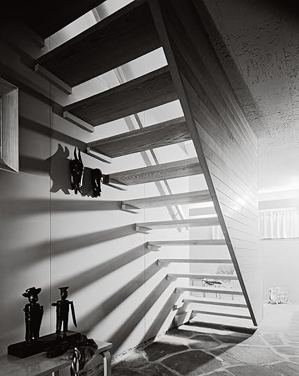
While civic and commercial architecture have come to define both Stoller’s oeuvre and the heroism of the modern movement in the United States, his archive is full of transparencies showing residential buildings. Throughout his career, he photographed homes designed by architects he was friends with, and those he admired, from Paul Rudolph and Marcel Breuer to Alvar Aalto and Eero Saarinen. Indeed, one of his earliest published images is of the A. C. Koch House (1936) in Cambridge, Massachusetts, designed by the architects Carl Koch and Edward Durell Stone, who taught the evening architecture classes Stoller attended at New York University in the mid-1930s. (He would graduate a few years later with a degree in industrial design and an established photography practice.)
Pierluigi Serraino, author of the recent volume Ezra Stoller: A Photographic History of Modern American Architecture (2019), and Erica Stoller, Stoller’s daughter and director of Esto Photographics, Inc., the company her father founded, both claim that the photographer didn’t change his approach according to building type. “He was extremely studied, each composition was a painting,” says Serraino. Stoller would visit each site and meticulously take notes about the building and the light before setting up a single shot. “His goal was to understand something and explain it,” says his daughter. “He spent a lot of time figuring out the architecture. He believed his pictures were telling the truth.”

Ezra Stoller, Arthur Erickson, David Graham House, Vancouver, British Columbia, Canada, 1967
Courtesy the artist/Esto
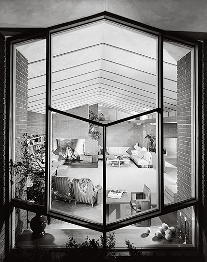
However, the drive toward veracity registers differently when looking at houses and not at the swooping monumentality of Saarinen’s TWA Terminal (1962) or the repetitive efficiency of IBM’s corporate campus (1958) in Rochester, Minnesota. When modernism is performed at the scale of the home, it is personal. Each home signifies a break with the past, a new way to live, the postwar American dream. The architectural photography of Julius Shulman most immediately comes to mind when thinking about mid-century modern residential architecture. His images sell a California lifestyle of improbable vistas and turquoise swimming pools. Stoller’s vérité presents the modern home as attainable, not aspirational. And although Stoller, like Shulman, photographed on the West Coast, most of his commissions were along the Eastern Seaboard, capturing pockets of modernism around Cambridge; Rye, New York; New Canaan, Connecticut; and Sarasota, Florida. That difference in geography, cultural and topographic, points away from the drama of palm trees and blue sky. A forest of tree trunks with bare branches surrounds the Baker Residence (1951) by Minoru Yamasaki, while the interior is full of lush houseplants. A spindly bush nearly dominates Stoller’s photograph of Breuer’s Gilbert Tompkins House (1946), its branches offering a compositional counterpoint to the austerity of the architect’s geometries.

Ezra Stoller, Carson, Lundin & Shaw, Shaw House, Long Island, New York, 1959
Courtesy the artist/Esto
In many ways, Stoller’s own bootstrapped life encapsulated the American dream he so carefully depicted. The child of Jewish immigrants from Poland, he had an upbringing marked by uncertainty. His father was blacklisted due to union activism, and his mother suffered from depression. The family moved from New York to Chicago and back again, and he went to school in New Jersey, the Bronx, and Manhattan. Success (and his eventual position as gatekeeper) was built through countless magazine and firm assignments and the ability to capture a unity within a space, public or private, even if in real life that cohesion wasn’t quite there.
Such alchemical skill led the architect Philip Johnson to quip that architects wanted their projects “Stollerized.” In 1981, around the time Stoller was winding down his decades-long career, the New York Times architecture critic Ada Louise Huxtable questioned the very truths of architectural photography central to Stoller’s work. “How much is real and how much is ‘edited’ reality?” she wrote. “At what point do the actual and the ideological merge?”

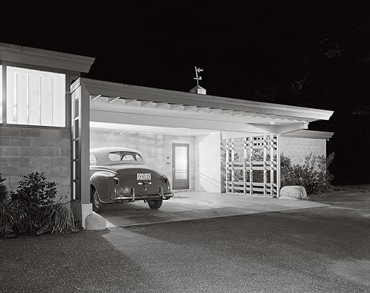
Ezra Stoller, Helen Stoller with children, Erica and Evan, at the Stoller House, designed by Nemeny and Geller, Rye, New York, 1949
Courtesy the artist/Esto
A series from 1949 underscores Huxtable’s query. That year, Stoller photographed his own home in Rye. He had worked closely with the architects Abraham Geller and George Nemeny on the low-slung design clad in vertical timber. The double-height living room, pictured with Eames plywood lounge chairs, a fire in the hearth, and late-afternoon sun casting long shadows across the floor, peddles a modernism that is warm and cozy. In an image of the kitchen, Stoller’s wife, Helen, stands at the stove as two of his children, Erica and Evan, sit at the counter eating from cereal bowls. Erica is in pigtails. In a color version of this photograph, Helen is wearing a bright-red dress and is posed against the white stove and blue countertops. This is the dream manifested.
“The late ’40s was the American moment,” says Erica Stoller. “He had a perfection in mind, especially if you grew up in rental apartments. This is the ideal life cleaned up and controlled.” Her childhood coincided with the exponential growth of her father’s practice, a time when he was capturing the modernist possibilities of other houses, corporate campuses, and high-rises. She recalls that he was always on the road and rarely at home: “The ideal life wasn’t always so ideal.”
Mimi Zeiger is a critic, editor, and curator based in Los Angeles. She was the cocurator of the U.S. Pavilion for the 2018 Venice Architecture Biennale.
Read more from Aperture, issue 238, “House & Home,” or subscribe to Aperture and never miss an issue.
March 25, 2020
The Terror and Pleasure of Staying at Home
How did an early 1990s exhibition anticipate the transformation of family life in the U.S.?
By Sara Knelman
Philip-Lorca di Corcia, Sergio and Totti, 1985
Courtesy the Museum of Modern Art, New York/Art Resource, New York
In 1991, the Department of Photography at the Museum of Modern Art in New York staged Pleasures and Terrors of Domestic Comfort, among its most ambitious group exhibitions since The Family of Man in 1955. While The Family of Man sought to universalize human experience by surveying journalistic images of familial bonds and rituals from around the globe, Pleasures and Terrors looked squarely at a narrow swathe of distinctly American life: the home and, more pointedly, its affluent surfaces. (“Comfort,” after all, implies not only the rounded edges of cozy furniture, but the economic ease that affords them.) Curated by Peter Galassi, who would formally succeed John Szarkowski as head of the department during the show’s run, it included over 150 images by more than seventy artists. Pleasures and Terrors marked a shift in interest, by both photographers and their subjects, from the politics of the wider world and even from the street outside, toward the warm, lit living rooms of American domestic life. What might we understand of this moment if we take the time to wander back through some of these homes today?
With the exception of William Eggleston’s 1970s images—Eggleston being the hero then as now of recasting the mundane as monumental—most of the works in the show were made in the 1980s. After Watergate and Vietnam, after Margaret Thatcher, Ronald Reagan, and George H. W. Bush, the politics of social concern gave way to a tidal wave of late-capitalist individualism and aspiration. A culture of slogans and protests retreated inside to the solace of TV and tchotchkes. Galassi explained it this way:
It became all too reasonable to conclude that moral conviction and political effectiveness, at least on a national scale, had parted company forever. If there is any truth in these partisan simplifications, then perhaps an effort to get one’s own house in order, or at least to see it clearly, will seem less a withdrawal from responsibility than an expression of sanity.
The American dream, it seems, is alive and well, if a little frayed at the edges.

Doug DuBois, My Sister Lise, Christmas Eve, Far Hills, NJ, 1984
Courtesy the artist
On the surface, there were the usual snapshot-worthy events in the exhibition: babies and backyards, Christmas trees and card games. The plethora of patterns and interior decor is one of the pleasures of looking back. Indeed, the show drew attention from Elle Decor, House Beautiful, and Parenting, which all ran lighthearted notices. The soft pinks of Laurie Simmons’s Coral Living Room with Lilies (1983) and the typical youthful mess of Doug DuBois’s My Sister Lise, Christmas Eve, Far Hills, NJ (1984) give us a feeling for the palettes and textures of the time, the kinds of pictures that might provoke nostalgia in a certain generation or inspire Pinterest mood boards or period cinema now. Set against the backdrops of enviable domestic spaces, the kind we might find in advertising images for perfect kitchens or in home-decorating magazines, the subtler hints of disquiet can be missed.
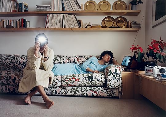
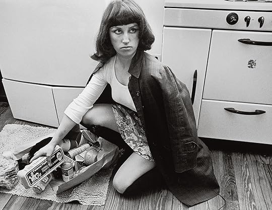
Yet the stark undertone and palpable discomfort in many of the images, often overlooked at the time, are unmistakable from this perspective—though one also wonders if the past always looks a little melancholy. The cinematic stagings of Philip-Lorca diCorcia and Tina Barney are dramatically forlorn, suggestive of larger narratives that never quite unfold. The young boy in diCorcia’s Brian (1988) looks glumly at a large hunk of meat, the counter awash with piles of food and gadgets. In Sergio and Totti (1985) a couple in loungewear sit on a floral couch looking away from one another, one watching television, the other obscured by the camera’s flash, as he—presumably Sergio—documents his own documentation. (Interestingly, the exhibition also utilized television as a promotional tool, a medium that museums had long eschewed. A three-minute spot for a short-lived PBS culture show called The Edge broadcast an unnarrated montage of images from the exhibition interspersed with audio clips from popular TV shows and Hollywood movies of the era, making an implicit connection between popular dramatizations of domestic life and those displayed in the MoMA exhibition.)
Cindy Sherman, Untitled Film Still #10, 1978
Courtesy the artist and Metro Pictures, New York
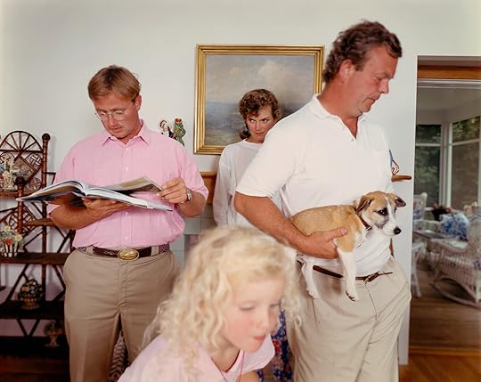
Barney’s Sunday New York Times (1982) shows a big family orbiting a table, the newspaper spread across it, in a warm-yellow room. A woman in the corner holds a baby and scowls ineffectually at a man in the foreground intently reading the news, oblivious to the baby bottle beside him and the chaos that surrounds. Similarly, The Landscape (1988) depicts a group sharing space but distinctly lost in their own worlds, the youngest a blur of blonde curls in the foreground. Though they are crowded together in the center of the frame, each person, even the dog, looks away. A gilt-framed painting echoes the blues and greens outside a bay window in the room beyond, layering natural and contrived landscapes. However enviable the real estate or ornamentation, otherwise gracious rooms are also filled with less tangible things—loneliness, resentment, desire, and uncertainty.
If the show is remarkable in its expression of such subtlety of feeling, this comes in part from the work of the many women photographers included (about half ), whose projects look unflinchingly at the subjects of motherhood, domestic labor, and the wider expectations of girls and women near the close of the twentieth century. The show brought together poetic documents of intimacy in the work of Sally Mann, Marilyn Nance, and Jo Ann Walters, whose thirty-year project, only just published in 2018, began with the image of a family in a Connecticut backyard included in Pleasures and Terrors. In many photographs, like Barney’s, or those of Mary Frey, women appear conspicuously as mothers and wives, often the less powerful figures in the frame. As if in challenge to them, selections from Carrie Mae Weems’s Kitchen Table Series (1990) and Cindy Sherman’s Untitled Film Stills (1977–80) sought to reconsider these expectations from the inside out. In these projects, placed side by side in the catalog, Weems holds her cards close to her chest and looks sidelong at her male companion, while Sherman crouches to collect her fallen groceries, gazing intently beyond the frame. Who are we, in your eyes, they each ask, and who do we want to be?

Laurie Simmons, Coral Living Room with Lillies, 1983
Courtesy the artist and Salon 94, New York
The emphasis on female practices is significant, though it’s also curiously glossed over in the catalog essay. Indeed, Galassi writes that “photographers, like businessmen, generally have maintained a barrier between work and home.” Such a statement ignores the fact of domestic labor, the business of keeping house, long a cultural expectation of women and one that extended to maintaining a photographic record of the family. The photographers Rosy Martin and Jo Spence have suggested in their extraordinary work on the culture and aesthetics of the family album that, as a genre, it is beholden to a set of conventions and expectations. “Family snaps,” they write, “hardly give any indication of the contradictions, power struggles or desires inherent at all levels of family life, or in the intersection of that life with the structures which make up a patriarchal society with sexual, racial and class divisions.” In retrospect, Pleasures and Terrors is striking not only as a powerful expression of the significance of the domestic sphere, but as an opening up of its complicated dynamics, often through the eyes of women working in the wake of second-wave feminism and ushering in the third.
Pleasures and Terrors also had a number of clear gaps, some acknowledged openly at the time, others more starkly visible from a distance. Galassi makes brief note of some omissions, writing that “a great deal is missing. Racially, ethnically, and economically the pictures are far from representative of contemporary America.” He fails to account for these gaps, however, other than to group them together with what he calls “the journalistic favorites of domestic trouble—homelessness, drug abuse, child abuse, violence,” suggesting such subjects belong to a realm that is somehow in opposition to or outside the bounds of art. This division is disturbing, a circuitous excuse releasing the museum from any sense of social responsibility. With the exception of images by Weems and Nance, most display white, heteronormative figures. Carol Squires wrote at the time that Weems’s image “raises a variety of questions, not least among them whether a black female photographer has ever been shown before by MoMA’s photography department.” And most omit the violence, physical or psychological, that is often wrought in the home. The exception was Nan Goldin’s slideshow The Ballad of Sexual Dependency (1986), which contains a more complex idea of family and of the brutality of desire—though it screened only once, for an extra cost of eight dollars. Like the omission of the nuclear explosion in The Family of Man, there is a void at the center of the exhibition’s contents that hollows out both critical and moral perspectives.
Tina Barney, The Landscape, 1988
Courtesy the artist and Kasmin Gallery, New York
This problem is inherently one of self-reflection and is hinted at, even if obliquely, in the sheer number of images that contain mirrors, or, in the case of diCorcia’s Sergio and Totti, the camera’s flash. A trick of domestic decor and a trope of self-reflection, mirrors enact a visual deceit and enable vanity. In hindsight, the show’s failings made clear the willful blindness to a diversity of perspectives and lifestyles, a circumstance that began to be redressed by artists, including Catherine Opie and Alec Soth, who have credited Pleasures and Terrors as a catalyst for their work. Opie drove an RV around the country to make her series Domestic (1998), which pictures everyday lesbian domestic life in America, in response to Pleasures and as part of a conversation with Galassi. Soth, who was a college student when he saw the exhibition, has credited it with making “domestic life seem like a worthwhile subject for photographers,” a subject he’s pursued, loosely, in his varied pictures of American life, including Broken Manual, which documents the desire to abandon the comforts of home in favor of a reclusive existence off the grid.
Curators were equally attuned to the significance of Pleasures and Terrors, and a number of exhibitions looking at domesticity and everyday life sprung up in its wake, most notably Snapshots: The Photography of Everyday Life at the San Francisco Museum of Modern Art in 1998, Who’s Looking at the Family? at the Barbican in 1994, and, over a decade later, the similarly oppositional photography exhibition Cruel and Tender: The Real in the Twentieth- Century Photograph at Tate Modern in 2003. Pleasures and Terrors is notable as the first encompassing exploration of the translation of the “snapshot aesthetic” into formal, monumental museum photography (and, it should be said, for the rise of an art market that would support such works—pictures made as much of the subjects as for their big empty walls). Galassi also understood intuitively the way that it would connect with wider audiences.

Mary Frey, Women at Coffee Break, 1979–83, from the series Domestic Rituals
Courtesy the artist and Foley Gallery, New York
At a time when museums had to adapt to survive, the relevance of photography as a document of everyday life became crucial. Pleasures and Terrors was important not only for opening up new photographic territory for future generations, but for legitimizing the subject of everyday life within the history of the medium, and within the parameters of the public art museum. And as an extension, Pleasures and Terrors also preluded the deluge of images that would define social media within a decade.
The ambiguity of pleasure is played out endlessly in the contradictions of our enjoyment and our pathological projection of enjoyment, and in the dissolution of the boundaries between private and public.
Galassi seems to have found a poetic name in a riff on the title of Aaron Siskind’s 1954 series The Pleasures and Terrors of Levitation (Siskind died in February 1991, as the show was being planned). The photographs depict bodies suspended dramatically in midair, perhaps floating, perhaps falling, their beauty complicated by the uncertainty of their peril or safety. Though Siskind’s images are neither domestically themed nor included in the exhibition, the tension between aesthetic pleasure and lurking threat evident within them is an apt analog for the themes of Galassi’s show.
Myopic as it was, Pleasures and Terrors opened up a conversation about what it might mean to be American, not from a view of patriotism or warfaring, but from an internal perspective of private life. It can be retrospectively understood as a fulcrum for its historical moment, connecting back to Edward Steichen’s imperialist vision of a collective view of human experience in The Family of Man and to John Szarkowski’s predilection for poetic subjectivity. But it also pointed out the problems of those histories and looked forward to the future, toward the demise of privacy, the loneliness of late capitalism, and the significance of image and identity culture in shaping our perceptions of gender, class, and race. Pleasures and terrors, the show suggests, are like holograms, embedded within one another, twisting and changing according to the slant of light.
Sara Knelman is an educator, curator, and writer living in Toronto.
Read more from Aperture, issue 238, “House & Home,” or subscribe to Aperture and never miss an issue.
8 Educational Photography Resources to Spark Creativity
Aperture is invested in providing resources for photography enthusiasts looking to develop their knowledge of the medium, as well as to educators who want to teach their students visual literacy skills. From educational titles written by the world’s top photographers to Aperture’s free twenty-lesson photography curriculum (Aperture On Sight), we’ve gathered a variety of educational resources and activities to inspire those who are eager to engage with the craft of photography.
Activities for kids:
Go Photo! An Activity Book for Kids
By Alice Proujansky
Go Photo! features twenty-five creative hands-on activities inspired by photography. Aimed at children between eight and twelve years old, this playful and fun collection of projects encourages young readers to experiment with their imaginations, get messy with materials, and engage with the world in new and exciting ways.
Try “Little Me,” a fun and engaging activity from Go Photo! today.

In this student example of Visual Dominoes, both images include a sports ball.
Visual Dominoes Activity
From Aperture On Sight
Visual Dominoes is a game that challenges students to create a sequence of images by finding visual connections. To play, download, print, and cut out the deck of cards provided by Aperture. Once you have all of the images, find a specific color in one of the photographs (like red), and place it next to another photograph that has the same color in it. Now find a shape in the second photograph, and place a photograph that has that same shape in it next to that one. Keep going like this, trying to find harder elements as you go, like composition or focus (color and shape are usually the easiest to notice).

James Mollison, Tristan, 7, New York, USA; from Where Children Sleep (2010)
Signs and Symbols Activity
From Aperture On Sight
Lesson Five from Aperture On Sight introduces signs and symbols and how they contribute to meaning in photographic images. Understanding that photographic content can function like a symbol—representing things not seen in the picture—encourages students to look for elements in their own work that stand in for something else. Have your students look at James Mollison’s book Where Children Sleep, part of which you can view in the Lesson Five slideshow. Have each student choose an object from their bedroom, and ask them to photograph the object against a colored poster-board backdrop to create a still life “self-portrait.”
Resources for college students and adults:
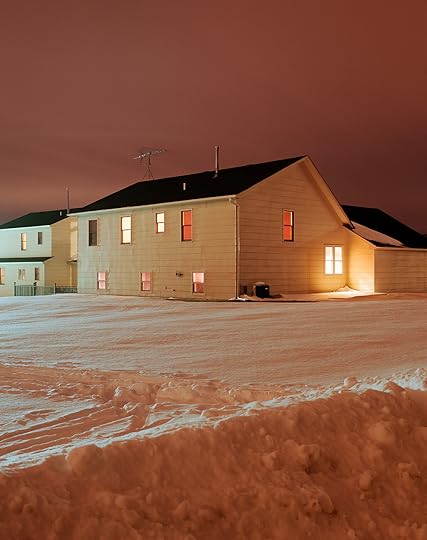
Todd Hido, #2479-a, 1999, from House Hunting (2001)
PhotoWork: Forty Photographers on Process and Practice
Edited and introduced by Sasha Wolf
Curator and lecturer Sasha Wolf was inspired to seek out and assemble artist responses to specific questions about their craft after hearing from countless young photographers that they often feel adrift in their own practice, wondering if they are doing it the “right” way. The responses, from both established and emerging photographers, reveal that there is no single path. PhotoWork is a collection of interviews with forty artists—Robert Adams, Dawoud Bey, Elinor Carucci, LaToya Ruby Frazier, Paul Graham, Rinko Kawauchi, Richard Renaldi, Alec Soth, and more—about their approaches to making individual photographs and a sustained a body of work. Structured as a Proust-like questionnaire, each individual answers the same set of questions; the resulting interviews provide essential insights and advice from both emerging and established photographers.
Aperture Conversations
With wide-ranging conversations and inspiring artist talks, we offer over one hundred Aperture Conversations online. To list just two examples: hear from Elinor Carucci, Paul Graham, and Gus Powell on their processes of making photographs; or delve into Diana Markosian’s exploration of immigration and identity through family.
Resources for educators:

Alex Webb, Nuevo Laredo, Tamaulipas, 1996; from Alex Webb: La Calle (Aperture/Televisa Foundation, 2016)
Free Visual Literacy Curriculum
The Aperture On Sight curriculum is designed to teach visual literacy through working with photography and creating photobooks. It builds students’ abilities to communicate as visual storytellers and develops their creative and critical thinking, as well as building their capacity for academic and professional success. Educators can download all twenty lesson plans, plus a variety of resources, for free through Aperture’s website.
Mary Ellen Mark, Ram Prakash Singh with His Elephant Shyama, Great Golden Circus, Ahmedabad, India, 1990; from Mary Ellen Mark on the Portrait and the Moment (Aperture’s Photography Workshop Series, 2015)
Workshop Books by Leading Photographers
With Free Learning Guide Companions
For The Photography Workshop Series, Aperture Foundation works with the world’s top photographers to distill their creative approaches to, teachings on, and insights into photography—offering the workshop experience in a book. Our goal is to inspire photographers of all levels who wish to improve their work, as well as readers interested in deepening their understanding of the art of photography.
Aperture has created free learning guides for almost all of the Workshop Series titles. Aperture’s Education Department staff have organized each guide thematically, highlighting salient topics from the text. Within each theme, relevant chapters, passages, and vocabulary are noted, along with guiding questions to accompany specific images. You can download the free guides here.
Virtual Professional Development
Alice Proujansky, Aperture’s community partnerships coordinator and the author of Go Photo! An Activity Book for Kids, is available to provide direct educational services virtually, or over the phone. Aperture is also available to assist educators and schools in developing best practices and strategies on how to work with students who are learning from home. Proujansky was the lead curriculum writer for the Aperture On Sight program and is currently coordinator of the online program and all professional development activities. If interested, please email Alice Proujanksy and Emily Stewart, manager of education and engagement programs, at education@aperture.org.

Browse Aperture’s collection of educational publications.

Access free learning guides to accompany Aperture’s educational titles.
View and download the full Aperture On Sight curriculum here.
March 24, 2020
Picturing Obama
Aperture is deeply saddened by the loss of Maurice Berger (1957–2020), whose urgent writing about race and visual culture defined a standard of excellence for the photography community and beyond. Here, we revisit his essay for Aperture, issue 223, “Vision & Justice.”
How have photographs defined a transformative presidency?
By Maurice Berger

Damon Winter, Barack Obama, October 28, 2008
Courtesy Damon Winter/ The New York Times/Redux
“What really exercises my mind is not this hypothetical day on which some other Negro ‘first’ will become the first Negro President. What I am really curious about is just what kind of country he’ll be President of.”
—James Baldwin, “Nationalism, Colonialism, and the United States: One Minute to Twelve,” 1961
The photograph by chief official White House photographer Pete Souza of President Barack Obama boarding Air Force One in Jamaica last year is at once mystical and trite. As the president waves to the crowd below, the rainbow that appears behind him seems to issue from his outstretched hand. “With hard work and hope, change is always within our reach,” tweeted the White House along with the photograph, echoing themes that go back to Obama’s first presidential campaign. Although Souza has claimed that the image was largely the result of luck, his admission that he “ran under the wing of the plane to try and line up where the President would be when he waved goodbye” suggests the degree to which the image was premeditated.
The photograph’s calculation attests to the lengths this administration has gone to in order to control the public image of the president and First Lady, a vigilance motivated, in part, by the need to push back against the unprecedented bigotry and vehemence of their adversaries. Admired by supporters and maligned by foes, political leaders inevitably serve as lightning rods for public opinion. Depictions of them appear in myriad forms and are shaped by multiple and often contradictory motives, from documenting official duties to disseminating partisan propaganda. But this president’s race has rendered his image vulnerable to extreme manipulation and distortion. Right-wing and white supremacist media outlets have habitually altered, taken out of context, and falsified photographs of him in order to promulgate a range of racist stereotypes and myths. Intent on undermining Obama’s authority and legitimacy, they have portrayed him as an inept neophyte, an angry black man intent on avenging historic injustices, a foreign-born Muslim, a liar, and, at their most debased, a primate.

Pete Souza, Inside the White House, May 8, 2009
© Pete Souza/The White House/Handout/Corbis
Depictions of Michelle Obama have been similarly fraught. Tabloids have shown her as a fist-bumping black militant bent on destroying white patriarchy and have doubted her fitness to be First Lady. “I was . . . the focus of another set of questions and speculations; conversations sometimes rooted in the fears and misperceptions of others,” she recalled last year. “Was I too loud, or too angry, or too emasculating? Or was I too soft, too much of a mom, not enough of a career woman?” Like her husband, the First Lady has also been subjected to more subtle slights. Mainstream publications, perhaps taking their cue from a cautious White House concerned about perceptions of her as strident, have downplayed her formidable intellect and distinguished career before becoming First Lady, focusing instead on her roles as dutiful mother in chief, health advocate, and fashion icon.
There is no doubt that affirmative images of the Obamas have played an important role in the struggle for racial equality and justice. They have defied stereotypes, established new role models, bolstered confidence and self-possession, and challenged expectations about political and cultural power. But the White House’s vigilant management of these images, whatever the motivation, has a complicated history. For one, it has raised concerns among photojournalists who have routinely been denied access to the president, restrictions with serious long-term implications. In 2013, a number of news organizations, in a letter submitted to White House press secretary Jay Carney, made clear their dismay: “As surely as if they were placing a hand over a journalist’s camera lens, officials in this administration are blocking the public from having an independent view of important functions of the Executive Branch of government.”
Also, the White House and its supporters have at times been drawn into a battle of stereotypes with their detractors, countering right-wing myths with left-wing ones. This problem has been especially true of depictions of the president. To liberal admirers, he has been an object of fascination, the epitome of cool. To the White House, as Nicole Fleetwood has observed, he has served as a paragon of black masculinity as he implores African American men to take “responsibility as fathers.” To Senator Joe Biden, before he joined the Democratic ticket, Obama was “storybook” perfect—a mainstream African American presidential candidate who was “articulate and bright and clean and a nice-looking guy.” To the mythmakers of the 2008 campaign, he was a messiah who would unite a divided nation and heal its racial wounds.

David Burnett, Senator Barack Obama with his wife Michelle at Fourth of July celebrations, July 4, 2008
© David Burnett/Contact Press Images
This myth was enabled by the most notable image of that election: Shepard Fairey’s Hope poster, distributed independently by the artist and then with the approval of the Obama campaign. Hope depicted the man who would soon be president as confident and dynamic. But the band of white paint that raked across his face, in a picture devoid of the color brown, implied something else: that Obama was beyond race, a “postracial” politician, half African, half white American, unburdened by the legacy of slavery and segregation. This idea helped to placate apprehensive white Democrats in the campaign against Hillary Clinton—many of these voters, their lives largely segregated, were plagued by racial angst. In Fairey’s ingenious poster, Obama was depicted as black and white, race specific and race neutral, a blank screen onto which voters were invited to project their dreams and aspirations. Obama the man was transformed into Obama the myth—a mystical leader, who, for the price of their support, allowed voters to assuage their guilt and feel good about themselves.
Implicit in this purposely iconic imagery was the idea that the senator from Illinois was uniquely qualified to bestow upon white America a divine gift: racial “atonement and redemption,” as Barbara Ehrenreich wrote during the campaign. Thomas L. Friedman, writing in the New York Times, imagined a similar possibility: the election of the first black president had ushered in a “different country,” where we could “start afresh . . . from a whole new baseline,” despite the persistence of racial prejudice. “And so it came to pass that on Nov. 4, 2008, shortly after 11 p.m. Eastern time, the American Civil War ended,” Friedman proclaimed in language befitting the Bible, a breakthrough not possible until “America’s white majority actually elected an African American as President.”
If the seven and a half years of racial discord, violence, and murder since Obama’s election have not been sobering enough, a simple statistic concerning the 2008 election results reveals the hollowness of this claim: America’s white majority, in fact, gave the bulk of its support to white men, affording Obama only 43 percent of its vote. In Obama’s race for reelection in 2012, the number was even lower, at 39 percent. The president’s victories proffered neither a sweeping repudiation of white racism nor the end of racial divisions. Nevertheless, as Friedman’s argument suggests, many white Americans, with much to prove about their racial attitudes and behavior, believed that the election of the first black president was principally about them. But Obama’s victory owed more to other forces: a motivating and gifted nominee, the promise of change, and rapidly evolving demographics. In the twenty-first century, a national candidate of color could prevail without a majority of white voters, a sign of the latter’s inexorable decline toward minority status.
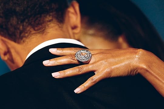
Chip Somodevilla, President Barack Obama and First Lady Michelle Obama, 2009
Courtesy epa/Chip Somodevilla
Seen in this context, one of the most realistic and hopeful implications of the 2008 election was the extent to which Obama inspired a robust electoral majority, consisting principally of people of color, other minorities, and urban whites, to elect a commander in chief who better reflected their diversity. If this milestone was not always stressed by the president or the campaign, for fear of alienating white supporters, it nonetheless has motivated or underscored some of the most inspiring images of the Obama presidency.
A sense of hope and possibility infuses Pete Souza’s 2009 image of the president interacting with five-year-old Jacob Philadelphia, for example. The child’s father, leaving the White House after two years of service on the National Security Council, had asked for a family photograph with the president. After those pictures were taken and the family was about to leave, Jacob had a question for Obama: “I want to know if my hair is just like yours.” “Why don’t you touch it and see for yourself ?” the President replied, leaning forward. As the child hesitantly patted his head, Obama asked him what he thought. “Yes, it does feel the same,” said Jacob. Souza’s poignant image affirmed the extraordinary symbolic power of the Obama presidency as well as its potential to challenge stereotypes. Against a relentless backdrop of pessimism and deprecating myths about black men, a little boy had come to realize that he, like the president who bowed before him, could one day achieve his dreams.
Historically, images of hope, accomplishment, and self- assurance have been influential in achieving stability in the black community and social justice in the nation at large. They have bolstered the self-esteem of African Americans, steeling them against a relentless tide of negative images and withering stereotypes, just as they have challenged white Americans to rethink the misconceptions that underwrite their prejudices. Almost since its introduction in the United States, photography has done more than just document the reality of racial prejudice and oppression: it has motivated a people, even during periods of extreme violence and repression, to create alternative and affirmative images of themselves and thus take control of how they are seen by others. As Deborah Willis and Barbara Krauthamer observe in their groundbreaking 2012 book Envisioning Emancipation: Black Americans and the End of Slavery:
These wide-ranging photographs can be seen as the embodiment of the history and memories of slavery, emancipation, and freedom. They constitute an archive of black people’s seen and unseen lives, their spoken and unspoken experiences. . . . They offer powerful evidence of how black women, men, and children saw themselves and each other: as dignified, beautiful, creative, intellectual, energetic, diligent, steadfast, powerful, and free.
Nona Faustine, My Wishes and Dreams Are with You …, January 20, 2009
Courtesy the artist
The representation of black political and cultural leaders—from Frederick Douglass and Harriet Tubman to Dr. Martin Luther King, Jr. and Malcolm X—has played a significant role in this history. Douglass believed that the broad “moral and social influence” of photography was more powerful in transforming national culture than “the making of its laws.” An ex-slave who became one of the leading abolitionists and crusaders for racial equality and justice, Douglass was also the most photographed American of the nineteenth century. His commitment to being pictured was coextensive with his social activism: images of black role models and leaders, he argued, had the potential to challenge racial biases and empower people of color.
As the editors of Picturing Frederick Douglass: An Illustrated Biography of the Nineteenth Century’s Most Photographed American (2015) write, the sheer number of public portraits of Douglass, “from his earliest known photograph as a young man with an Afro, circa 1841, to the postmortem portrait fifty-four years later, conveys not only Douglass’s faith in photography but his understanding of the public identity he was crafting.” By disseminating pictures of himself that were nuanced and continually evolving, Douglass was effectively undermining the stereotypes and clichés that robbed human beings of their individuality and humanity. This transformative understanding of selfhood—and the social possibilities of a nascent visual technology—helped destabilize the rigid misperceptions that justified racism, perpetuated slavery, and endangered the survival, confidence, and self-possession of African Americans.
Today, with stereotypes continuing to perpetuate racism and harm people of color, it is impossible to underestimate the symbolic importance of the myriad photographs of President Obama. But the unique circumstances of his presidency have also complicated the ability of his image to achieve the broad disruption of stereotypes that Douglass envisioned. Ultimately, the public image of every president is largely reduced to the superficial clichés that inform popular conceptions of them: John F. Kennedy as the tragic hero of an unattainable Camelot, for example, or Richard Nixon as the deceitful Tricky Dick. From the beginning, Obama’s race has constituted the abiding adjective of his groundbreaking presidency, regardless of whether it has impacted his policies and conduct in office. Ultimately, he will always be known as the first black president, a fact that has also exposed him to other, more insidious forms of stereotyping. Thus, his public image has been constricted by the mythmaking endemic to his job, the media, and his race, as well as the magical thinking that has burdened him with unattainable expectations. Nearing the end of his tenure, and despite remarkable achievements, Obama remains, for many, the mystical cipher of the Hope poster or the foreign-born imposter of right-wing fantasy: a one-dimensional symbol of our loftiest ambitions or our most venomous fears.

Gary Hershorn, U.S. President-elect Senator Barack Obama leaves with his wife Michelle after being declared the winner of the 2008 presidential campaign, November 4, 2008
Courtesy REUTERS/Gary Hershorn
The most illuminating and inspiring depictions of the president, like those of the First Lady, transgress this limitation, subtly challenging stereotypes with images that are complex, nuanced, and, to a great extent, spontaneous. Rejecting political clichés and symbols, these pictures return to the Obamas the humanity lost not only to seditious rhetoric, but also to veneration or the routine give-and-take of partisan politics. The photograph of little Jacob, for example, was neither staged nor planned, as its awkward composition, unintentional cropping, and blurred foreground affirm. Its unguarded interaction reveals a nimble, sensitive, and racially aware president, a leader who has inspired, by his own example, millions of Americans to imagine a positive and just future. Similarly, a photograph taken by Damon Winter during the 2008 campaign shows Obama not as a rainbow whisperer but rather as a vulnerable human being, drenched by rain but determined to be there for the crowd who turned out to support him in Chester, Pennsylvania. Another impromptu image from the campaign, taken by photojournalist David Burnett, reveals a thoughtful, poised, and introspective Michelle Obama absorbed in conversation as her husband looks on, an inversion of the conventional image of political leader and adoring spouse.
In an age when millions of photographs are posted on social media each day—and the camera endures as a vital weapon in the struggle for racial justice—it is important to remember that the authority to represent the president and First Lady belongs not only to political insiders or the media, but also to the people they serve. Whether amateurs with cellphones or renowned photographers, their take on the Obamas constitutes the ultimate commentary on how Barack and Michelle are being received and understood. Well before the White House released the picture of little Jacob, for example, the photographer Nona Faustine recognized the personal and historic significance of the proximity of Obama’s election to the birth of her daughter. Watching his first inaugural address on television, her newborn stirring in the foreground, Faustine did what generations of African American men and women had done before her: she picked up her camera and recorded for posterity the beauty and consequence of the moment. The photograph she took is at once intimate and historic, a testament to new possibilities and a touching declaration of hope. It is also a reminder that the prosaic can be monumental, quietly testifying to the faith, aspirations, and triumphs of a people.
Maurice Berger was Research Professor and Chief Curator at the Center for Art, Design and Visual Culture at the University of Maryland, Baltimore County. He wrote the monthly “Race Stories” series for the Lens Blog of the New York Times.
This piece was originally published in Aperture, issue 223, “Vision & Justice,” Summer 2016.
Aperture's Blog

- Aperture's profile
- 21 followers

