
Aperture's Blog, page 72
April 27, 2020
A Land of Their Own
In the 1970s, Meadow Muska documented the feminist collectives that offered a new definition of home for hundreds of women.
By Michelle Millar Fisher

Meadow Muska, Rising Moon Welcoming, Aitkin, MN, 1974/2019
© the artist and courtesy Minneapolis Institute of Art
Anyone who has studied architecture’s histories knows that utopias are rarely, if ever, realized. The annals are littered with paper plans for radical homes never built or, worse, promised paradises—from Pruitt–Igoe in St. Louis to Abu Dhabi’s Masdar City—that saw the light of day and either failed their residents or only worked as intended for a fortunate few.
Yet, there are exceptions to every rule.
It surprises me little that when utopia comes close to actualization, its architects are usually not men. One such breach, born of the radical feminist movements of the 1960s, came in the form of 1970s and ’80s womyn’s land collectives that created new paradigms of domestic freedom and kinship between lesbians denied those rights across the United States. Meadow Muska, a photographer, feminist, and master electrician, recorded land collectives that existed in her home state of Minnesota. Fresh out of her BFA at Ohio University, Meadow (who prefers to be referred to by first name) made work that chronicled the “beautiful, strong women, full of love and joy” that she witnessed at places like Rising Moon, a one-hundred-sixty-acre site in Aitkin, Minnesota. Her work was largely unknown until a 2019 exhibition curated by Casey Riley, Strong Women, Full of Love, was staged at the Minneapolis Institute of Art (MIA).
Meadow captured a time when hundreds of women, most identifying as lesbians, imagined a radically different version of belonging, forming intentional, women-only, agrarian communities across the U.S. As women were usually paid less than their male counterparts in the workplace and unable to access the same credit as men, the womyn’s land movement burgeoned as they pooled their resources and purchased pockets of rural land. Rejecting traditional expectations around their reproductive capacities, the shape and design of the home, and women’s prescribed roles within it, they made room for their own desires and identities. They built physical and psychological hearths with their own hands, from the ground up, and recorded these revolutionary acts through photographing their lives, loves, and independence.

Meadow Muska, Tradeswomen: Get Serious!, 1976/2019
© the artist and courtesy Minneapolis Institute of Art
For Meadow, as for so many of her generation, freedom to express one’s sexuality and personhood meant crossing a threshold both literally and figuratively. In 1972, aged twenty, Meadow found her way to a South Minneapolis feminist bookstore, where she met her first important romantic partner and publicly affirmed her sexuality. A photograph taken at the city zoo shortly after that meeting shows her smiling radiantly next to her girlfriend, Cydni James Irish, whose shades reflect the photographer, their friend Molly McCarthy. It is an uninhibited moment. Their faces are nestled close together and Irish’s Afro hairstyle is echoed in the curve of her partner’s raised parka hood. The composition conjures the signature style of New York Times wedding announcement photographs.
There is irony in this similitude. In the same year that Meadow met Cydni, the U.S. Supreme Court upheld a local Minneapolis county clerk’s refusal to issue a marriage license to a gay couple. The nonchalance captured by McCarthy belied the daily reality of threats, harassment, and ostracization experienced then (and still) by LGBTQ individuals and communities across the country. While that case, Baker v. Nelson, catalyzed activists in the fight for equal access to the institution of matrimony, contemporary commentary on average American homelife more often focused on heterosexual couples trying to escape it, as evidenced by the ensuing spike in divorce rates, which peaked in the 1970s. Photographers were primed to document this dissolution of the nuclear family. LIFE commissioned photo-essays that drew back the curtain on varied domestic stories of separation, collective living, and birth outside wedlock, though they centered predominately heteronormative, middle-class, white protagonists. Wanda Adams, a thirty-five-year-old Seattle spouse and mother, smiled confidently on the cover of the March 17, 1972, issue under a headline in scarlet type: “DROPOUT WIFE: A Striking Current Phenomenon.”

Cover of LIFE, 1972
But women were not “dropping out.” They were directing their expertise and energies to places and people they—not a husband, boss, or society at large—chose. And while reimagining home was an expansive project with heterogeneous outcomes, in many cases redefining domesticity took very concrete skills. Like Adams in Seattle, Meadow was active in her local chapter of Women in the Trades, a 1970s labor advocacy group that supported women working as independent contractors—the career Meadow turned to when she lost her job as a photojournalist after coming out. Meadow’s 1976 portrait of nine women in Eugene, Oregon, shows them collapsed together in laughter. They form a joyous frieze; their bodies read almost as one, hands clasped tightly atop one another. (A moment later, Meadow told them to “get serious!” so she could capture the shot for a skilled-trades grant application.) In a 1981 picture of one of the first residents of Rising Moon, River Brady, Meadow shows her subject bare breasted, a sawhorse in the background, and holding a tool whose end extends out of the shot, hard at work on a farm she rented in Osseo, Minnesota, where she raised goats.
Meadow recalled that women rode horses from Missouri and Wisconsin to get to these sites of freedom in Minnesota. Like her, many had lost their livelihoods, or family ties, after coming out. Some had experienced gender-based violence. “It was a huge deal to them—for everybody involved—to trust me that I wouldn’t use these images without consent,” Meadow told me. “It wasn’t just a snapshot.” To avoid confiscation or exposure of identity, she had her own basement darkroom and gave her subjects a copy of their photograph. Usually a 5-by-7-inch print, it was perfect for domestic presentation and, as Meadow put it, a way of “my sharing as they shared themselves.”

Carmen Winant, spread from Notes on Fundamental Joy; seeking the elimination of oppression through the social and political transformation of the patriarchy that otherwise threatens to bury us (Printed Matter, 2019)
Meadow was not the only person documenting these rural inhabitants. Working from a generation’s distance, contemporary artist Carmen Winant has recently amplified the work of photographers from that era who made similar images. Her recent project, Notes on Fundamental Joy; seeking the elimination of oppression through the social and political transformation of the patriarchy that otherwise threatens to bury us, includes works by Tee Corinne, Joan E. Biren (JEB), Ruth and Jean Mountaingrove, Carol Newhouse, and Clytia Fuller. Part artist book and part historical document, Notes on Fundamental Joy gathers photographs that show circles of women sitting on the land, tending to each other with haircuts, and reimagining their lives through collective models of domesticity. They formed not only new spaces, but whole lexicons (menstruation → moonstruation / women → womyn / history → herstory) and last names. These photographers conducted workshops, “Ovulars” (a conflation of ovulation + ocular, against the seminar and its etymological connotation of “spreading seed.”) In the wake of feminisms that contested each other as fiercely as they did the systems of patriarchy around them, they photographed these spaces as proof of their will to self-determine. Winant’s opening lines set out these stakes clearly:
Is it possible to leave everything behind? Is it possible to begin again, outside of and
beyond every system of living you’ve ever known, reinventing what it means (and
looks like) to exist as a body and its soul, on the land?
And yet, whose utopias were these? Winant’s book contains an essay by San Francisco Bay Area writer Ariel Goldberg that meditates on who gets to create and define spaces of their own. Goldberg parses the relative nature of difference and separatism as both a form of affirmation and one that demarcates others with even less privilege, agency, or defenses against exclusion. They wonder where trans and bisexual, poor, and nonwhite identities fit within womyn’s utopias, historically and today. And, in the portrayal of predominately white women, “how separatism functions when it has not dismantled whiteness as its norm.” These were questions that many of the photographers, including Meadow, asked of themselves at the time. And in re-presenting images taken almost fifty years ago in a book or museum—a paragon of exclusionary space—Meadow and Casey Riley in the exhibition at MIA, and Winant in her artist book, were all painstakingly careful about seeking permission from their subjects, thinking carefully about who benefits from such recirculation. Is the act of making a home always inherently exclusionary of some, even as it seeks to sow inclusion?

Samantha Nye, Attractive People, Doing Attractive Things In Attractive Places—Pool Party 1, 2018
Courtesy the artist
The week after I stood enraptured by Meadow’s exhibition, I visited Samantha Nye, a young painter and filmmaker, in her basement studio on Manhattan’s Upper West Side. Nye, like Winant, reaches back into the historical archive, drawing primarily on two celluloid sources: 1960s Scopitone films (precursors to MTV, in which scantily clad white women grin and grind to pop hits) and Slim Aarons’s mid-century jet-set scene photographs of, in his formulation, “attractive people doing attractive things in attractive places.” In her video work and canvases, Nye casts elders from her own family and queer communities with whom she collaborates. She inserts them into these historic scenes to create fantasies that function as an imaginary future for spaces like Rising Moon, “bound by the concept of chosen family” in a vision that is age and trans inclusive. Like Meadow and her generation, faced with suburban conformation, for Nye the photograph is a site for artistic subversion of homogeneous and oppressive worlds that socialize women to expected patterns of desire and domesticity. In her attempt to image queer kinship, Nye acknowledges its “beautiful parts, the prickly parts, the radical parts and the parts that have long needed fixing.” The parts, in other words, that exist in most families, and most homes, and most portraits of domestic life, however they are built, and whomever by.
Originally from Scotland, Michelle Millar Fisher is currently the Ronald C. and Anita L. Wornick Curator of Contemporary Decorative Arts at the Museum of Fine Arts, Boston.
Read more about photography and the domestic realm in Aperture, issue 238, “House & Home.”


April 24, 2020
Dorothea Lange and the Afterlife of Photographs
Confronting the economic crisis of the Great Depression, Lange produced some of the most influential photographs of the twentieth century. A new exhibition reveals how her concern for the dispossessed has never been more relevant.
By Brian Wallis

Dorothea Lange, Migratory Cotton Picker, Eloy, Arizona, November 1940
Courtesy the Museum of Modern Art, New York
In 1934, in the midst of an economic, agricultural, and environmental disaster that was actively devastating the United States during the long depression, Dorothea Lange abandoned her lucrative San Francisco portrait-studio practice to photograph the urgent and unfolding humanitarian crisis. Over the next ten years, working for the Farm Security Administration (FSA) and a variety of other government agencies, Lange produced some of the most powerful and influential social-documentary photographs of the modern era. Her photographs—and their distribution through government channels—gave a human face to indigent, outcast, starving, and forgotten laborers, often in the form of iconic images, such as her famous Migrant Mother (1936). Yet despite the evocative efficacy of her individual pictures, Lange claimed that, “All photographs—not only those that are so-called ‘documentary,’ and every photograph really is documentary and belongs in some place, has a place in history—can be fortified by words.”
Lange’s contention pinpoints a dilemma at the heart of all documentary photography: despite the tremendous evidentiary potential of the image to document historically specific effects and relations of power, it still relies on the inherently ambiguous medium of photographic realism, particularly when such photographs are decontextualized or uncaptioned. As German playwright Bertolt Brecht famously observed in 1931, a simple reproduction of the Krupp weapons factory tells us nothing about the labor relations of that workplace or its imperial significance. Seizing this classic modernist dilemma as its thesis, Dorothea Lange: Words & Pictures, the stylish retrospective at the Museum of Modern Art in New York (currently closed due to the coronavirus pandemic, but reopening online this month), cleverly organized by curator Sarah Hermanson Meister, reconsiders Lange’s key photographs as formal solutions to this essentially political problem.

Installation view of Dorothea Lange: Words & Pictures, The Museum of Modern Art, New York, 2020. Photograph by John Wronn
© The Museum of Modern Art
One of the first objects in the exhibition is a magazine, the leftist Survey Graphic, in which a reproduction of Lange’s heroizing portrait of a labor organizer speaking at a rally for strikers in San Francisco in 1934, dramatically shot from below, is given pointed meaning by the militant caption “Workers, unite!” This photograph accompanies a fiery article by Paul S. Taylor, a progressive economist at the University of California, Berkeley, with a deep knowledge of the history and economic structure of modern agricultural practices, from the tenant farms of the Old South to increasingly industrialized farming in California. Soon thereafter, Lange and Taylor married and began a years-long collaboration to produce books and field reports containing clear, factual information through data mining, research, interviews, travel, and photography. Lange became what her biographer, historian Linda Gordon, calls a “visual sociologist,” meaning that she brought to her documentary photography an almost scientific precision and an empathetic sociological interest in the lives and working conditions of the laborers and others she photographed and interviewed.
The environmental catastrophe of the Dust Bowl and the economic and health requirements of migrant farm laborers flooding into California throughout the 1930s formed the narrative of Lange and Taylor’s great documentary photobook An American Exodus: A Record of Human Erosion (1939). The book was compiled and designed by Lange and Taylor, and it traces their journeys crisscrossing five geographical areas of the United States. With Lange’s hard-hitting photographs, often close-up portraits of individual workers, and Taylor’s clear and passionate prose, An American Exodus made a radical case for establishing a systematic and sustained government policy on agriculture, with reforms based around the family-owned farm and cast in opposition to increasingly industrial-scale farm mechanization. In their introduction, Lange and Taylor outlined their activist strategy: “We use the camera as a tool of research. Upon a tripod of photographs, captions, and text we rest themes evolved out of long observations in the field.”

Dorothea Lange, Tractored Out, Childress County, Texas, 1938
Courtesy the Museum of Modern Art, New York
Formally, what is most radical about An American Exodus is how Lange and Taylor shaped their arguments through a sophisticated type of photomontage, an ingenious juxtaposition of many of Lange’s most dramatic photographs (though, surprisingly, not Migrant Mother) with an unexpected variety of primary texts—newspaper headlines, excerpts from government reports, and snippets of oral testimonies. Words & Pictures includes a rich selection of Lange’s photographs from this period, drawn from MoMA’s extensive collection. These pictures are emblazoned in our collective memories: workers in cloth caps and overalls, standing alone or in groups, looking stunned or lost; farm families of dirty and barefoot children piled into the backs of open pickup trucks; rows of fieldworkers hunched over roughly plowed furrows. But the real kicker in An American Exodus comes when one unforgettable 1938 image from Texas—showing a weary woman in a sack dress, her hand to her forehead, silhouetted against a sweltering sky—is captioned with words the woman spoke: “If you die, you’re dead—that’s all.”
With its rich and politically pointed collage of American farmworkers in distress, An American Exodus provides the most compelling proof of the idea proposed by Words & Pictures that words shape the effects of documentary photographs. Similar documentary photobooks were hugely popular internationally in the 1930s, often with highly innovative uses of graphic design and photomontage. But the American examples, like An American Exodus, are less well known and less commonly exhibited than those produced by avant-garde Russian or European makers. So it is a welcome intervention that this exhibition generously highlights not only An American Exodus, but also two other important American photobooks—Archibald MacLeish’s Land of the Free (1938) and Richard Wright and Edwin Rosskam’s 12 Million Black Voices: A Folk History of the Negro in the United States (1941)—both extraordinary visual compilations which borrowed Lange’s photographs, though without her texts or direct involvement.

Installation view of Dorothea Lange: Words & Pictures, The Museum of Modern Art, New York, 2020. Photograph by John Wronn
© The Museum of Modern Art
In considering the words that provide the politicized context for Lange’s work, Meister focuses primarily on what some have called the “afterlife of photographs”—that is, not the decisive moment of capture, but rather the subsequent uses of images, how they circulate and accrue new meanings, often well beyond the photographer’s original intentions. This perspective is particularly crucial for understanding Lange, whose best work was created for and controlled by U.S. government agencies, often in the form of propaganda, sometimes to the point of censorship. For example, as historian Nicholas Natanson has pointed out, while almost a third of Lange’s FSA photographs depicted people of color, the New Deal government agency, mindful of Southern social codes and the political power of white Southern congressmen, never distributed any of them. And her World War II–era images of the Japanese American evacuation and internment camps, taken on assignment for the U.S. Army’s Western Defense Command in 1942, were immediately impounded by the government and not published until 2006.
This blatantly propagandistic deployment of Lange’s photographs is often reflected in the shifting titles of her works, some applied by Lange (Damaged Child, 1936), but most not. Few photographs have been as transformed in their afterlife as Migrant Mother, which portrays an unemployed female pea picker and her children huddled in a makeshift tent in a laborers camp in Nipomo, California. Almost immediately, this portrait was recognized as an archetypal symbol of the impact of the blistering economic crisis, and it was published in halftone reproduction in national newspapers. Within days, the photograph was printed alongside a scathing editorial in the San Francisco News, which shamed the state of California for attempting to block the construction of government-sponsored sanitary workers camps. Echoing Lange’s own activist stance, the headline screamed, “What Does the ‘New Deal’ Mean To This Mother and Her Children?” The text continued, “Here, in the fine strong face of this mother . . . is the tragedy of lives lived in squalor and fear, on terms that mock the American dream of security and independence and opportunity.” Providing secure and sanitary living conditions for migratory farmworkers was one of Lange and Taylor’s pet projects—they succeeded in gaining a one-time $20,000 grant to build better facilities—but for the most part, even the reformist New Deal government ignored this need.
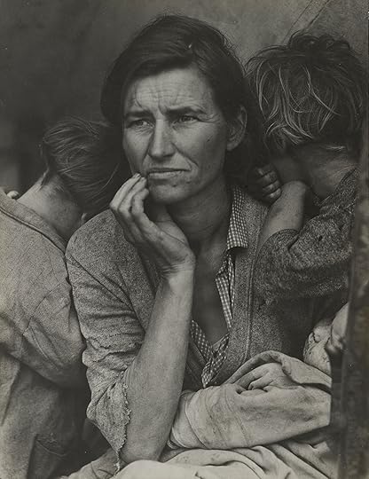
Dorothea Lange, Migrant Mother, Nipomo, California, March 1936
Courtesy the Museum of Modern Art, New York
When originally published in the New York Times in 1936, Migrant Mother was captioned “A destitute mother—the type aided by the W.P.A.,” and in 1940, it was shown at MoMA as “Pea Picker Family, California”; the photograph was not given its lasting title until 1952. It was featured prominently recast as a symbol of eternal motherhood in curator Edward Steichen’s magisterial 1955 MoMA exhibition The Family of Man, and much of its subsequent sentimental mythologization depended on that presentation and on the photographer’s own hazy recollections, as spelled out in two prominent magazine articles exhibited in Words & Pictures, one by Lange and one by her son, Daniel Dixon.
More recently, Migrant Mother has been the focus of substantial critical attention, much of it focusing on the afterlife and recontextualization of the image. It is the subject of a small, separate monograph by Meister, published by MoMA, and a lengthier scholarly examination, published last month, Migrant Mother, Migrant Gender, by photo historian Sally Stein. As these studies show, following the popular circulation of Migrant Mother as a “Dust Bowl Madonna,” scholars have uncovered the real person behind this previously anonymous symbol of universal suffering, Florence Owen Thompson—not a Nordic Okie or universal everywoman, but a Native American pea picker with ten children, driven west in search of backbreaking labor and forced to shelter in a roadside lean-to in a camp with 1,500 other indigent farmworkers. For years, the migrant mother’s identity as a full-blood Cherokee was masked by racial fantasies and misrepresentations.

Dorothea Lange, Kern County, California, 1938
Courtesy the Museum of Modern Art, New York
Words & Pictures also provides a useful perspective on the limitations of the classic photo-essay, especially as deployed by LIFE magazine during the 1940s and 1950s (itself the subject of an enlightening exhibition at the Princeton University Art Museum, New Jersey). The brutally reductive photo-editing style of LIFE and the magazine’s right-of-center politics tamped down the progressive political slant of Lange’s photography. Though she focused almost exclusively on photo-essays from 1945 to 1960, she had difficulty mastering the blunt requirements of LIFE; all but two of her six commissions for the magazine were rejected. One of the successful ones, part of an extensive sociological study done jointly with Dixon, was called Irish Country People (1955). The other, produced in collaboration with Ansel Adams, was titled Three Mormon Towns (1954) and featured thirty-five images—a lot for LIFE—but only a fraction of Lange and Adams’s 135-image layout. The MoMA exhibition boldly exhibits every page of these stories, and it is clear what happened: while Lange was interested in the complex communal life of isolated, self-sufficient, almost utopian villages, the LIFE magazine machinery used nostalgic subheads (“Serenely they live in age-old patterns”) to turn them into sentimental pap. As Adams lamented, “The Mormon story turned out very sour indeed.”
Unfortunately, more often than not, Lange had little control over how her photographs were distributed or presented, and her own views on the subject of contextualization shifted. Lange’s images were repeatedly wrenched from their original contexts and accompanying voices, particularly by museums. As Meister shows through numerous MoMA installation photographs, Lange had a long and complex relationship with MoMA, beginning with the photography department’s inaugural exhibition in 1940. Over time, Lange came increasingly to regard her photographs as autonomous artworks, accompanied by descriptive captions and poetic texts. Lange was instrumental in the formulation of Steichen’s exhibition The Family of Man, for which she was an informal associate curator. The exhibition’s initial proposal included a long list of keywords (“birth,” “death,” “pestilence,” “conflict,” “peace”) and solicited photographs that would “reveal by visual images Man’s dreams and aspirations, his strength, his despair under evil.” As Steichen’s West Coast advisor, Lange suggested potential photographers as well as additional texts and thematic categories. But the Cold War–era exhibition tried to make its political points regarding the universal nature of certain human traits through a photo-magazine-style layout, with juxtapositions of large photomurals, mounted and unframed photographs, and allusive texts, including quotations, religious citations, proverbs, and folk songs.
Dorothea Lange, Richmond, California, 1942
Courtesy the Museum of Modern Art, New York
Subsequently, Lange seems to have advocated a more abstract attitude toward her photographs, including her earlier reformist ones. For Lange’s 1966 retrospective at MoMA, organized by the young curator John Szarkowski, her photographs were arranged thematically rather than chronologically and, again, presented large and unframed, as more traditional artworks, with no wall labels and largely devoid of explanatory historical context. Looking at old installation photographs of that exhibition (online or in the Words & Pictures catalogue), we see Lange’s brutal photographs, like Migrant Mother and White Angel Bread Line, San Francisco (1933), aligned like so much black-and-white formal imagery, removed from their original advocacy. In a letter to Szarkowski in 1965, Lange stated that she wanted the captions to “carry not only factual information, but also added clues to attitudes, relationships and meanings.” About half of that 1966 retrospective comprised photographs from the last ten years of Lange’s life—more formalist images of trees, gardens, family members, and hands—with fewer and fewer words.
This is the fundamental dilemma Words & Pictures seeks to overcome. By acknowledging the interdependence of what artist Martha Rosler calls “two inadequate descriptive systems,” the exhibition aims to reunite Lange’s powerful pictures with their original political rhetoric. But amid the elegance of the exhibition design and the sheer artiness of the large, framed photographs, it is hard for viewers to reconstruct the filthy and intolerable conditions that Lange’s subjects endured and the contested politics engaged in fighting for justice, what she called “the big story which is behind it, which is the story of our natural resources.” Seeing these same photographs today, even in this provocative exhibition, we cannot help reading them as stolen gestures, misused and misinterpreted, or regarding them as valuable trophies in the context of today’s runaway market for vintage photography. (A vintage print of Lange’s White Angel Bread Line sold at Sotheby’s in 2005 for a record price of $822,400.) Blunting the edge of Lange’s content with an overriding emphasis on style and photographic beauty, Words & Pictures fits the apolitical through line of MoMA’s recent revisionist expansion. Like a lot of the museum’s new galleries, this temporary exhibition tries to overturn the museum world’s long-standing sexism by celebrating a female artist. But at the same time, it struggles to identify—much less harness—what made Lange’s bold work such an awkward fit in an art museum to begin with: her deliberate sociological investigations, her idealistic and tireless visual activism, the sharp feminist critique embodied in all her work.

Dorothea Lange, White Angel Bread Line, San Francisco, 1933
Courtesy the Museum of Modern Art, New York
Lange’s relevance could hardly be greater today. The themes she addressed—environmental blight, enforced migration, economic division, exploitation of labor, ingrained racial discrimination—are perhaps even more obvious and more contested now than in Lange’s lifetime. And yet, focusing on Lange’s formal juxtaposition of words and pictures, and by reprising Lange’s historical engagement with successive generations at MoMA, this exhibition inadvertently downplays the immediacy of Lange’s themes and portrays her as a onetime political activist whose photographs were gradually drained of their meaning and force, and an increasingly style-conscious artist who acceded to the poetic reinterpretation of her powerful images in museum settings. Read in reverse, Words & Pictures provides an exemplary case study of the way museums are complicit in stripping devastating pictures of their once-urgent words, and hence of their politics.
Brian Wallis is a writer and curator based in New York.
Dorothea Lange: Words & Pictures opened on February 9, 2020, at the Museum of Modern Art, New York. The museum is currently closed, but an online version of the exhibition opens April 30 at moma.org.
Is African Photography a State of Mind?
In a biennial and two recent photobooks, artists consider the postcolonial African subject through intriguingly intimate images.
By Nicole Acheampong

Bruno Boudjelal, Blida Hospital where Frantz Fanon Worked, Blida, Algeria, from the series Fanon, 2011
Courtesy the artist and Autograph ABP, London
In 1952, Frantz Fanon, the Martinican philosopher and psychiatrist, published a galvanizing work of anticolonial critical theory, Black Skin, White Masks (Peau noire, masques blancs). Fanon often attended to dislocated bodies, and his writing is meticulously depersonalized. The Negro body, for example, “impedes the closing of the postural schema” of the white body. Devalued bodies “experience a destructuration.” For Fanon, the Black body is at risk of becoming overly corporeal. In the book’s last pages he writes, with uncharacteristic plainness, “There are times when the black man is locked into his body.”
After the release of Black Skin, White Masks, Fanon made his home in Algeria, where he secured an appointment as a psychiatrist at Blida-Joinville Hospital. In the following years, he would become an influential participant in the Algerian revolutionary struggle. He worked with patients subjected to the twin tortures of colonial oppression and wartime violence. Their psyches were haunted, their bodies too.

Eric Gyamfi, Nana and Razak, 2016
© the artist
Such haunting is explicit in the Franco-Algerian photographer Bruno Boudjelal’s series Fanon (2011), which claimed a corridor of the FotoFest Biennial 2020 in Houston, Texas. (The biennial was originally scheduled to be on view through April 19; online programming continues through the end of the month.) Curated by Mark Sealy and taking as its title and theme African Cosmologies: Photography, Time, and the Other, the multi-venue exhibition and extensive accompanying exhibition catalogue feature thirty-two artists—including Eric Gyamfi, Santu Mofokeng, Eustáquio Neves, and Jean Depara—from all regions of the African continent and several countries throughout the diaspora, among them Brazil, Canada, and Belgium.
Boudjelal’s contribution is likewise transnational. In his Fanon series, Boudjelal tracks the writer’s geographical legacy and finds parallels with his own, traveling to Algeria, Martinique, and other significant sites in the theorist’s life to make hazy black-and-white images that carry the spook and insistent intimacy of dream fragments. Boudjelal zeroes in on Blida-Joinville Hospital, in slivers. He catches a crack on a concrete wall, a blurred figure, just visible, rushing by; a sudden spray of white flowers; a small girl peering through the delicate grid of a screen or gate, something weighty and somber expanding in her face. Beneath one photo, the caption reads: “The Haunted House,” Casino during the French colonization, then center of torture during the war of independence. Now no more people want to live in this because they say it is haunted, Algiers, Algeria. The house is cut off and askew. The landscape leans; the horror disorients.
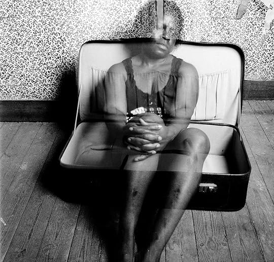
Hélène A. Amouzou, Self-Portrait, 2008
Courtesy the artist
For Hélène A. Amouzou, the body is bluntly ethereal—to borrow from Fanon, the body is deprived of itself. The Togo-born artist made her 2008 series Self-Portraits in the attic of a transitional housing unit in Belgium as she awaited an official residence visa. In these images, she is blurred and vaporous against the backdrop of an open suitcase, peeling wallpaper, low-slung, exposed rafters. Her gaze is steady and still, though she seems always braced for involuntary movement. This limbo is clearly untenable. Even so, one self-portrait suggests the soft touch of healing: nude, standing ramrod-straight, her arms crossed tightly before her chest in a protective gesture, she appears braced for flight.
Similarly spectral are the images in Lebohang Kganye’s Ke Lefa Laka: Her-story (2013), which are featured in the book Africa State of Mind: Contemporary Photography Reimagines a Continent (2020) by the London-based curator and writer Ekow Eshun, the publication of which happens to coincide with FotoFest. Following the passing of Kganye’s mother in 2010, the South African artist burrowed into the family archive, culling old pictures of her mother as a young woman. Outfitted and coiffed to match, Kganye creates digital photomontages in which she is her mother’s ghostly double. The artist virtually images, in her own words, “a new story and a commonality––she is me, I am her.” By indulging these ambiguously and imperfectly unified bodies, Kganye cultivates a new language for mourning and memory, not unlike Lindokuhle Sobekwa’s diary-format series I carry Her photo with Me (2017–ongoing), which was displayed in glass vitrines at FotoFest, and which mourns the South African artist’s sister by imagining her presence in the bodies of other subjects, in particular the women with whom she made a life after running away from home.
Lebohang Kganye, Tshimong ka hara toropo II, 2013
© the artist and courtesy Afronova Gallery
In his introduction to Africa State of Mind, Eshun reflects on photography’s historical entrenchment in the colonial project while also recognizing the presence of African photographers “as far back as the Victorian era,” whose images held “an affinity for their subject matter that runs far contrary to the degrading stereotypes promulgated by Europeans.” The cultivation of both new and newly remembered visual languages is therefore integral to his premise.
In 2020, this premise is not prototypical. Eshun picks up on a schema that is nearly twenty-five years in the making, beginning with the late, acclaimed curator Okwui Enwezor’s 1996 Guggenheim exhibition and catalogue In/sight: African Photographers, 1940 to the Present, and evidenced in Chris Spring’s 2008 anthology Angaza Africa: African Art Now. But unlike Spring, Eshun doesn’t attempt to exhaustively catalogue the continent’s immense sweep of art-makers from a bird’s-eye view. Rather than “any sort of movement,” writes Eshun, the book testifies to “a moment when a generation of African photographers claims the creative freedom to look inwards.” Africa State of Mind is arguably most in alignment with Enwezor’s follow-up to In/sight, the 2006 International Center of Photography exhibition Snap Judgments: New Positions in Contemporary African Photography, which argues for space for the dynamic postcolonial artist, as well as the “uses of Afro-Pessimism,” while acknowledging the aesthetic histories that ground modern image-making on the continent. Threading these progenitors to the diverse group of contemporary photographers assembled in the book, Eshun proposes a concept of Africa that is critically amorphous and sustained by subjectivity.

Zina Saro-Wiwa, Futures, 2018
Courtesy the artist and Tiwani Contemporary
Many of the artists represented within the pages of Africa State of Mind abandon a Western frame of reference in favor of nestling into a pleasurable, elastic alterity. In a section titled “Myth and Memory,” Eshun includes Zina Saro-Wiwa’s series Karikpo: Holy Star Boyz (2018), which draws inspiration from the annual Karikpo masquerade of the Niger Delta’s Ogoni community. Featuring male subjects who don peroxide-bright antelope masks, the images are pointedly playful in their subversion of traditional performance practices. They also introduce to the visual record a set of bodies that are somehow both impossible and inevitable. “The Holy Star Boyz are a new breed,” Saro-Wiwa divulges in her artist statement. “From another place that is still being invented, they are hybrid forms of existence that cannot truly belong.” Unrecognizable and ever-mutating, these bodies initiate what Fanon calls, in the penultimate chapter of Black Skin, White Masks, “the possibility of the impossible.”
Nobukho Nqaba, Untitled, 2012
© the artist
“The Black presence ruins the representative narrative of Western personhood,” the cultural theorist Homi Bhabha notes in his introduction to the 1986 edition of Black Skin, White Masks. “The White man’s eyes break up the Black man’s body and in that act of epistemic violence its own frame of reference is transgressed, its field of vision disturbed.” Sealy included these musings from Bhabha at FotoFest, as well as from scholars and artists like Fred Moten and Rotimi Fani-Kayode. They’re meant, Sealy says, to act as “moments of reflection”—not captions, but rather “things you might overhear.” Overheard in quick succession, these quotes reveal the festival’s intentions: to lay bare that ruined representative narrative and revisit the body it disturbed. Africa is not a body, although the Western gaze often endeavors to lock it into one. And what does the non-body look like? Eshun’s and Sealy’s projects seek looser frames—a state of mind, a collection of cosmologies. Most notably, they gather artists who have already looked away from the ruins. They’re tending their own bodies now.
Nicole Acheampong is the editorial assistant of Aperture magazine.
The FotoFest Biennial 2020, African Cosmologies: Photography, Time, and the Other, opened on March 8, 2020, in Houston. The biennial is currently closed, but visit fotofest.org for updates and further information.
Africa State of Mind: Contemporary Photography Reimagines a Continent was published by Thames & Hudson in April 2020.
A Visual Record of Black Lives, Four Decades After Emancipation
A new book revisits W.E.B. Du Bois’s landmark 1900 exhibition on Black American identity.
By Jovonna Jones

Cadets at Haines Normal and Industrial Institute, Augusta, Georgia, from The Exhibit of American Negroes, 1900
In 1900, partway through the official planning for The Exhibit of American Negroes at the Paris Exposition, photographer Harry Shepherd was kicked off of the project. Shepherd was a successful African American studio-owner from Minnesota, and for the fair’s American Pavilion, he had photographed students at Black colleges in the South. He showed particular compassion for young people trying to figure out what kinds of members of society they might become, as Black Codes and Jim Crow laws increasingly encroached on their prospects. But these photographs were not the cause of controversy. According to the Afro-American Advance, Shepherd was dismissed from the project for preaching “anarchy” in the South and advising “the Negroes to combine against the United States in the event of war with foreign powers.”

Man seen in profile, from The Exhibit of American Negroes, 1900
Shepherd is a pretty fleeting character in the history of the American Negro exhibition, which was co-organized by W. E. B. Du Bois. The first and only time I came across Shepherd in the scholarly literature on the exhibition was in Deborah Willis’s and David Levering Lewis’s seminal work on the subject, A Small Nation of People: W. E. B. Du Bois and African American Portraits of Progress (2005). He remains a footnote contributor to the exhibition’s visual archive. But Shepherd rushed to my mind while I was studying visual pairs of photographs and infographics in the book Black Lives 1900: W. E. B. Du Bois at the Paris Exposition (2019), edited by Julian Rothenstein.
On one page in the book, cadets pose in rows for a group portrait in front of an American flag at the Haines Normal and Industrial Institute in Augusta, Georgia. They appear so upright and stern that this group of young boys looks almost like men. Their fidgeting, uncertain hands and curious faces give away their performance. On the opposing page, an infographic depicts the “proportion of Negroes in the total population of the United States” as literal small nations within a nation, to use Du Bois’s phrase. At the turn of the century, in the midst of wars, colonization, and a burgeoning twentieth-century Pan-African movement, these cadets stood at a crossroads. Where Shepherd proposed anarchy, Du Bois strategized an exhibition, placing Black students like these at the center of a global conversation on progress.

Infographic from The Exhibit of American Negroes, 1900
Du Bois originally displayed the photographs and infographics in the award-winning Paris exhibition separately: three thick albums of hundreds of photographs, a set of infographics on the “Georgia Negro,” and another set of infographics on “the Condition of the Descendants of Former African Slaves Now in Residence in the United States of America.” Each set offered discrete narratives and arguments. In Black Lives 1900, Rothenstein takes on the interpretative challenge of reading the photographs and the data visualizations together. This approach opens up the archive in some instances—working Shepherd and his politics back into the story—and overdetermines or flattens the archive in others.
In one spread, Rothenstein places a studio portrait of a young girl, with a light complexion and silky curls, looking at an open book above an image of three women and a man hoeing in what appears to be a hot field. Rothenstein pairs these photographs with an infographic that compares the number of Black people living in cites to those in rural areas and villages in 1890. The photographs not only mimic the explanatory function of the infographic, they make a more specific claim: to be urban is to comport oneself as pristine, contemplative, and youthful, to imagine a life in modern cities away from a feudal past. Rothenstein is likely gesturing toward Alain Locke’s canonical (and criticized) concept of the “New Negro,” which would take root among Black intellectuals and artists decades after The Exhibit of American Negroes. But without some kind of contextual nudge, the pairing risks reproducing Black archetypes rather than complicating them.

The Exhibit of American Negroes at the Paris Exposition, 1900
Black Lives 1900 celebrates the dynamism of the Paris exhibition’s visual archive, but the photographs and infographics might be better analyzed and interpreted when treated on their own terms. They each emerge from entirely different visual logics and concerns, and for Du Bois, the distinctions were critical. The photo albums he compiled included no captions, no markers; he instead arranged a visual record of Black living that could reference itself. The infographics presented numerical data as striking visual figures. Through modernist aesthetics, Du Bois made the statement that any competent study of Black Americans into the new century would need a new framework, a novel way of considering social scientific data. If the importance of the exhibition and its legacy relies on Du Bois’s meticulous attention to the visual in distinct ways, then maybe a dynamic, information-dense archive of this kind needs the spaciousness that a live exhibition affords. If not a new exhibition, then a more exhaustive scholarly catalogue.
The archive and this book are ultimately about Black lives as a subject of visual empirical study. Still, I’m itching to appreciate these photographs and the people in them as something other than figural data points, and the addition of the infographics only enhances that desire. While elegant, even the portraits feel quite lonely and impersonal. To be Black and aspirational at the turn of the century and on the world stage is to possibly feel isolated and scrutinized, even while being admired.
Young women, three-quarter length portrait, from The Exhibit of American Negroes, 1900
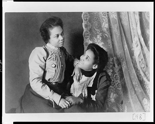
I did find one delightful moment of intimacy, a glimpse of Black sociality beyond the twin burdens of representation and exceptionalism. Two young women pose together in a three-quarter length studio portrait. Unlike all of the other group portraits in the book, these sitters touch, nearly embrace. One woman sits on the other’s lap, their hands clasped and resting on the former’s thigh. Their rings glitter; their gazes linger. The woman smiles up at her friend—or lover—this person is special to her. The caption does not identify sitters by name nor relation; the photographs were intended to be representative after all. But the touch between these two women, the warmth made and held between them, is entirely their own. This portrait—its tenderness, its intimacy—holds open the purpose at the heart of the project. That is, in Du Bois’s words, to picture Black lives honestly, “without apology or gloss, and above all made by themselves.”
Jovonna Jones is a PhD candidate at Harvard University. She researches Black cultural history and aesthetics in the U.S., with a special focus on Black women’s photographs and spaces.
Black Lives 1900: W. E. B. Du Bois at the Paris Exposition was published by Redstone Press in October 2019. All images courtesy Redstone Press.
April 22, 2020
What It Takes to Be a Photo Editor
For TIME magazine’s editor at large, photography is about speaking truth to the world.
By Brendan Embser

Paul Moakley. Photograph by Peter Hapak for TIME
In November 2014, Paul Moakley traveled to Liberia with the photographer Jackie Nickerson to make portraits of the doctors and frontline workers fighting against the Ebola epidemic for TIME magazine’s “Person of the Year” issue. As they waited to see Dr. Jerry Brown, a medical director in Monrovia, Moakley and Nickerson witnessed a burial team preparing to move Ebola victims to a site for mass cremation.
“All I could think about was how no family members were present to witness this final moment,” he wrote in TIME for a behind-the-scenes diary about the photo shoot. “All I could do was hold my head down in respect.”
Covering the Ebola crisis prepared Moakley for the challenges posed by COVID-19, as visitors are restricted from hospitals and funeral homes, and people throughout the world—including reporters—face isolation in all forms. The need to protect photographers and subjects, he says, is as important as telling a story accurately. “Our job as journalists is to point these things out, to show the visual evidence.”
As TIME’s deputy director of photography and later editor at large for special projects, Moakley, one of the cocurators of the 2020 Aperture Summer Open, has produced ambitious visual stories and iconic covers, from a 2018 special issue about the devastating opioid epidemic in the United States, to Ryan Pfluger’s controversial portrait of presidential candidate Pete Buttigieg. He values long-standing creative relationships with photographers, but he also seeks out new voices. “There’s room for everyone,” he says.
When I spoke with Moakley in early April, he was calling in from TIME’s temporary photo headquarters—the kitchen at the Alice Austen House, a museum on Staten Island, where he lives and moonlights as the museum’s caretaker. He was working around the clock, figuring out with the team at TIME how to approach the most consequential story in recent memory.

Covers of the April 20, 2020, issue of TIME. Clockwise from top left, photographs by Danny Kim, Elizabeth Bick, Lorenzo Meloni/Magnum Photos, Lauren Lancaster, and Christopher Morris/VII for TIME
Brendan Embser: How quickly did you and everyone at TIME have to adapt to the new working situation caused by the coronavirus?
Paul Moakley: I went to a shoot in Brooklyn on March 11—we were shooting the chef José Andrés with photographer Martin Schoeller—and our security person told us we had to follow CDC guidelines and ask everyone who’s entering the room where they’ve traveled. It was really weird being in Brooklyn that day. When I went home on the train, there was one person with a mask on. He had just got it, and he had an Amazon package on his lap. I asked if I could photograph him. I said, “I feel like everyone’s starting to prepare.” He was really excited about his mask. It was camo and kind of cool looking.
Embser: Do you carry a camera with you all the time? Or do you just take lots of pictures on your phone?
Moakley: I do carry a camera around, a little Sony RX100 VII. It fits in my pocket, has a great flash, and takes awesome pictures.
Embser: Some of the best photo editors are also photographers, because they know what’s good and they can cut through things quickly.
Moakley: Yes, sometimes. Jason Fulford, for instance, is a wonderful editor and collaborator. And I think back to the history of photography, to Alfred Stieglitz’s journal Camera Work (1903–17) and the way photographers used to publish magazines and have galleries and also take pictures. I’ve made people like that the model for myself. I’ve often felt some anxiety about needing to specialize in one thing—to be either a photographer or a photo editor.
Embser: And now you have it all!
Moakley: I don’t know if I have it all, I don’t think so! Being a photographer keeps me sharper as an editor. If I’m taking my own pictures and editing them, I feel like I’m better at editing other people’s pictures. It’s like exercise for me. I live in a museum, the Alice Austen House, which is a whole other way of thinking about pictures, as compared to laying them out in a magazine, which is more about delivering information.
Embser: We are living in a moment when people are obsessed with information, looking at their news feeds every hour, and possibly even have an unhealthy relationship to the news. On the other side of that are people like you—essential workers, I would say!—who are helping us interpret and understand what’s going on. What has changed for you over the last few weeks? What has it been like to put together visuals and images for a magazine that’s a major part of the American news DNA?
Moakley: It really hit me in a weird way the first time we had a phone call about what might happen with the virus. We have a security specialist at TIME who worked for the FBI, and she keeps an eye on all of our photo shoots that might have a dangerous aspect to them. All of a sudden, every shoot became dangerous, and this possibility of being locked down as a city came up. It scared me. It took me some time to process how to approach it visually.
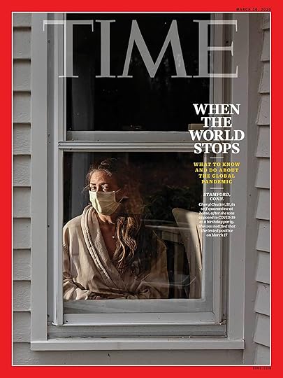
Cover of the March 30, 2020, issue of TIME. Photograph by Angela Strassheim for TIME
Embser: When you realized what was happening, at least in the U.S., how did you develop a cover for the magazine?
Moakley: As things got stranger and stranger by the day, I called the photographer Angela Strassheim. She’s a really wonderful artist. I knew she knew how to make work about forensics. I told her the story is getting really big, and it’s dangerous, and I think we’re afraid to have photo shoots and to bring people together right now. I thought she could do something with fingerprints on everyday objects, all the things you carry around, to raise consciousness about what people touch. We kept talking, a little bit through email and text.
Eventually, Angela called me and said she had a friend in Connecticut who thinks she has COVID-19. “She can’t leave the house, and she’s a single mother,” Angela said. “I was dropping groceries off for her, and I saw her inside her house in her robe with a mask.” And then she said, “That’s the picture I want to make for you.” (Angela makes incredible pictures of people in domestic spaces, and they have this really strange tension that she taps into, like Doug DuBois—they just pick up on another part of the ether that we’re not seeing.)
I had to call the security people at work to evaluate the situation and explain that Angela would never go into the house or have any direct contact with the subject. (We weren’t even thinking six feet yet.) We told her, “Don’t go in the house, photograph through the window, stay far away.” That shoot went really well—Angela made a startling picture of this person trapped in her home with a mask on. This was early on, when we had government leaders telling us we didn’t need to wear masks. But this woman was being really responsible, worried about other people and her son, quarantining in her bedroom, and depending on family and friends to bring her food. So it was a great story.
We then decided to crash a bunch of covers around the world of people who either have COVID-19 and are stuck at home, or have a role as essential workers, like delivery people. It was difficult in China, where they make everyone stay in quarantine. But in the UK, Iran, the United States, Brazil, and all of the other places where our photo department did shoots, we approached them the way Angela did. We had everyone shoot from a safe vantage point, a doorway or window, and it created a series that was very effective. One cover our deputy photo director, Andrew Katz, produced was by David Ryder, a Reuters photographer who works on the wires primarily in Seattle. He was photographing the nursing home in Kirkland, Washington, where there was one of the biggest outbreaks of COVID-19. David made a powerful photo of a middle-aged woman staring into the window of a nursing home and trying to talk to her mother, who was in bed inside. It was like Angela’s picture—this idea of being separated by glass and walls and space.
Embser: Angela’s image strikes me as iconic. It’s a classic TIME magazine cover, quintessential TIME. And the others radiate outward into different styles.
Moakley: That’s the fun thing about working at TIME. You’re communicating to this mass audience and you’re trying to come up with a really smart way to tell a story, like any other magazine—like the New Yorker, New York Times Magazine, or California Sunday Magazine. I love the clarity of Angela’s photograph, along with the message the other covers send that this was not only happening in the U.S.

A COVID-19 patient being prepared to be intubated by the anesthesiologist. The plastic tent is so the virus isn’t spread while transporting the patient between units. March 31, 2020. Photograph by Danny Kim for TIME
Embser: What kinds of conversations are you having with photographers about how they’re doing their reporting? Would it be fair to say that everyone is a war photographer now?
Moakley: Yeah, that is exactly what’s happening. Almost every assignment is treated almost like a war assignment. We run through a checklist with photographers, and we make sure we have emergency contacts for them in case something happens while they’re traveling. We have to prepare special letters and IDs for them, so people know they’re essential workers. We have to check and see if they have health insurance, and if they don’t, we can look into getting them some kind of temporary insurance. Then there’s the issue after the photo shoot of what happens to the person, and when does our responsibility to take care of photographers end?
Embser: Have you had an experience like this before?
Moakley: In 2014, I traveled to Liberia with the photographer Jackie Nickerson and writer Aryn Baker to produce our “Person of the Year” shoot. That was a series of photographs around the Ebola fighters, and we were looking at people on the ground in Liberia, specifically Liberian doctors. The Liberian doctor Jerry Brown was the first person to figure out how to get people to recover and walk out of the hospital. It was one of those issues we were so proud to work on, because we were honoring people doing incredible, dangerous work.
Embser: Is it typical that the photo editor would travel with the photographer like that, especially for such a dangerous assignment? Or was that specific to your role producing “Person of the Year”?
Moakley: I would say I’m definitely a rare hybrid of being a producer and photo editor—I produce photography and video, and I also work a lot as a reporter. So I’m useful in these kinds of situations, to multitask. I was also worried about Jackie. We wanted a photographer I had a relationship with, someone who could work without lights and make elevated, beautiful, monumental portraits. Jackie had no hesitation—she understood the dangers immediately, but she was willing to take the risk and felt it was a story she wanted to tell. I wanted to be there as a photo assistant, as a producer, to be an extra set of hands for her, in situations where she needed someone to hold a reflector, hold an umbrella over someone’s head, and to do all the fact-checking for captions.

Cover of the 2014 “Person of the Year” issue of TIME. Photograph by Jackie Nickerson for TIME
Embser: I remember the pictures from that period, in Liberia and elsewhere in West Africa, were incredibly distressing—in some cases, they were apocalyptic. Jackie’s covers are regal. They’re not sensational. And I think that’s why, at least in my opinion, they hold up really well.
Moakley: Thank you, that was precisely our intention.
Embser: What was it like for the two of you working together on the ground?
Moakley: It was a moment that really prepared me for COVID-19, I have to say. There was a period during the Ebola crisis when we said, “We are not sending photographers into this, it’s too dangerous.” It was a wall of “No.” But our job as journalists is to point these things out, to show the visual evidence—at TIME, the photo editors all feel strongly about that.
For the shoot, we had the most elaborate security plan—I have it in a binder to this day—and directions to airlift us if one of us got Ebola and we had to be taken out of the country. We were some of the only foreign journalists in the country at the time, and it was spooky to be alone almost, and not see any other press around. I remember learning about PPE [personal protective equipment] and how to apply it properly and how to put it on someone else—it’s really a two-person job to don full PPE.
I went to Liberia with trunks of equipment, and when I got off the plane, a man in a white space suit checked my temperature. Our fixer picked us up at the airport with Aryn Baker, our reporter. I remember he opened the car door, and he had a sweat rag sitting on the seat he wanted me to sit on. I was too polite to say, “Can you move the towel that you’ve been sweating on?” I was just like, Okay, this is where I’m in it. I can’t touch my face anymore. I moved the towel and locked my hands onto my knees until I was in a space where I could wash my hands again.

Jackie Nickerson photographs nurse Salome Karwah in Monrovia, Liberia, on November 26, 2014. Photograph by Paul Moakley
Embser: When you were working with Jackie and Aryn, did you have a sense that this was a moment you would share for the rest of your lives?
Moakley: Yeah, we all really bonded. There were moments when it really started to escalate. I was seeing things that I’d only seen in pictures of genocide: a dump truck loaded up with bodies. Seeing people working so carefully and diligently at a time when they couldn’t really have funerals, they were just trying to take care of the dead, and the dead were sadly being buried without funerals and without family members around. It was one of the most unforgettable scenes I’ve ever witnessed as a journalist, and it marks me to this day.
I remember looking at Jackie, in our gear, and making eye contact with her. We were working quietly, and I thought, This is where you just have to focus and get this. After almost two weeks in Monrovia, the best day was when we were with Dr. Brown and he told us they were sending a whole family home who had recovered. To see this family come out of quarantine, it looked like they were in a camp—like in Holocaust pictures. The gates opened, this family walked out, and they were weakened but smiling and so excited and happy. That really lifted our spirits after seeing such death and destruction. Knowing that people were getting better and that we were on a mission to celebrate the people who were helping them.

Spread from the 2014 “Person of the Year” issue of TIME. Nurses Augustine Bindi (left) and Princess Ideko (right) in Monrovia, Liberia, November 2014. Photographs by Jackie Nickerson for TIME
Embser: Over the course of your photo editing career, I imagine there have been photographers you’ve called on repeatedly. What makes those creative relationships work?
Moakley: It’s truly the energy of the collaboration. If I tell a photographer I love some part of their portfolio, I really mean it. I don’t say those things lightly. When you hire someone and they do a job for you, you trust them. On the inverse, you have to publish their work well, treat it with the utmost respect, be their representative at the magazine, and they begin to trust you too. I would say how that relationship grows is the most essential thing about photo editing, because from that point of trust, I can ask them to go a little bit out of their comfort zone. If it doesn’t go well, they know I’ll be respectful, and that I’ll only show their best work.
Embser: How do you engage with photographers you’re commissioning for the first time?
Moakley: When you work with a photographer who has a lot of raw talent, or someone who’s in a place where they are given an opportunity to rise up to the challenge, you have to set up circumstances for them to be successful. And that is really where a photo editor comes in. I think people don’t realize how much production, research, mood board–making, and therapy go into photo shoots. Everyone needs different levels of help. Whether they’re experienced or not, I just want it to be exciting for them. I value the energy of what somebody puts into an assignment, how friendly they are in the back and forth, and their openness to ideas. We spend a lot of time thinking of what the outcome of a shoot’s going to be, because that’s our job, but we also want to be open to the unexpected—that’s where amazing work happens.

Staff of the Capital Gazette, December 9, 2018. Photograph by Moises Saman/Magnum Photos for TIME
Embser: You are one of the curators of the 2020 Aperture Summer Open, which this year is called Information, inspired by the 1970 exhibition of the same name at the Museum of Modern Art in New York. At a time when we have divided ideas about authority and truth, what does “information” mean to you?
Moakley: As a photo editor and journalist working in the new social-media landscape—where you’re called into question more and more, where the audience can respond directly—we’ve all had to work harder. We’re three years into a presidency where this idea of “fake news” has escalated. There’s a whole segment of our country, and the world, that doesn’t believe journalists. I think it’s good to be skeptical—we all need to be—and we need to take a lot of different sources of information into account to come up with our own ideas. But it’s also hurtful and deeply harmful to have such powerful people dismiss organizations that are doing good work. We’re fighting against that every day.
I think we have to let people know what we do, bring them into the process a bit, and be really clear about what’s real and what’s not, especially when it comes to photography. At TIME, we have a mass audience, so we have to account for different levels of visual literacy—letting people know when images are manipulated in some way or when we’re calling it an illustration, and what’s the information that runs next to a picture that might be staged. That is all really tricky and delicate. I think when people come to TIME magazine, there’s an expectation that they’re going to look at news pictures that aren’t retouched or altered in any way. This week, we needed to protect the identity of somebody in a hospital, blurring out the name of somebody in a room, and with that picture, we have to run a statement saying that it has been altered, so the viewer knows that this is a very special picture, that we wouldn’t do this to any other picture. That also sends the message that everything else is real.
Embser: Yet, don’t you think that artists—photographers who are not only working in journalism but also making lens-based artwork—need space to blur the lines between fact and fiction a little bit?
Moakley: Yes, on the other side of things, when we’re talking about art—definitely. My interest in photography has always been in that ambiguous part of it, that power to really play. I love documentary work, but I love documentary artists who challenge the idea of photography’s authority. Some of the most exciting things I’m seeing right now are photographers playing with ideas of sequence and repetition in their work. One of the last bodies of work that stuck in my head was Sohrab Hura’s The Coast (2019). He makes these very intense pictures, but there is something about the repetition, and this idea of seeing a repetition and a sequence, that makes the pictures even more powerful.

Eleventh-grade student Robbie Moore and Jayde LaPorte, a transgender ninth grader, attend Milwaukee’s Alliance School, October 2011. Photograph by Ryan Pfluger for TIME
Embser: I have to ask you about the Pete Buttigieg cover. The cover of a magazine, especially the cover of TIME, still holds an amazing symbolic value, even if you don’t buy the magazine or ever see it in print. The TIME cover is like a way station toward immortality. And the concept of the cover has completely survived the leap into the world of Instagram—just look at Tyler Mitchell’s 2018 Beyoncé cover for Vogue. Mayor Pete’s cover is part of a queer trajectory in TIME, from Ellen’s cover from 1997 to Laverne Cox’s cover in 2014. You commissioned Ryan Pfluger for the portrait of Buttigieg and his husband, Chasten, and Ryan is someone who is known for his beautiful and sensitive work around LGBT themes. Can you talk a little bit about how that image was made?
Moakley: Definitely. Ryan Pfluger has been a contributor to TIME for about ten years. As our relationship has grown, I think of Ryan for a number of things. I think of him definitely for queer subject matter (I love the way he photographs men), and he’s obsessed with cinema, so I think of him for movies. I also like his artwork, what he posts on his personal Instagram feed. For this cover, I had twenty-four hours to set it up, and I knew the shoot was going to be ten minutes and that Ryan could work under pressure. I actually felt a little self-conscious, because I was like, Is he going to think I’m calling him just because it’s a queer subject? But Ryan was excited about it.
Last spring, when I flew to South Bend, Indiana, for the shoot, Ryan was waiting at the hotel, ready to have a conversation and to start work right away. This is one of those situations where you have to trust each other. I was really pushing Ryan toward this clean picture of Pete, and we spent a lot of time lighting and setting it up. Pete was on the cover of New York magazine the previous week, so we knew we would have to do something different.
Embser: And you ended up with this totally American portrait, with the front porch and the natural light.
Moakley: Yeah, it was all very fast. I remember Pete opened the door for us, and he was the most normal person in the world. He offered us coffee. (He was walking around with a JFK mug, which made me crack up—I asked him if he would pose in the picture with the JFK mug, and he was totally into it.) Anyway, we made these beautiful painterly portraits of Pete, and then I wanted a secondary shot with Chasten—I didn’t know if Pete and Chasten were going to go on the cover together, but I knew one picture would end up on the cover and one would end up on the inside. We were trying to get as much as possible out of ten minutes. Ryan said he was going outside for a look. I give it to Ryan because he had the instincts to see the house, to see American Gothic. The picture is this queer American Gothic.
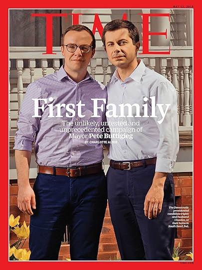
Cover of the May 13, 2019, issue of TIME. Photograph by Ryan Pfluger for TIME
Embser: Greta LaFleur in the Los Angeles Review of Books said that this cover offers “the promise that our first gay family might actually be a straight one,” meaning it’s a very straight image of a gay couple, who are adopting the posture of a “regular” American family.
Moakley: They were just being themselves. And that’s a big part of that picture, whatever perception the Los Angeles Review of Books has about them, it’s just Pete and Chasten being themselves. That’s the picture they would have taken for their engagement, they would have stood that way—but then it’s filtered through Ryan, and it’s filtered through TIME, and packaged by TIME.
Embser: And seen around the world. So, perhaps the suspicion derives from the spectacle of someone who is getting all this attention on the American stage, and who happens to be gay, and therefore his perfect nuclear family image is inaccurately associated with a queer community that’s, in fact, completely fragmented and diverse—a population that has many different ideas of what a family can be.
Moakley: Yes, I think so. In my own search for my identity as a queer individual, as a gay man in America, in this generation that comes post–AIDS crisis, I think about how our self-perceptions have changed and what acceptance means. I think it means something different for people in different parts of the country. Pete Buttigieg, like all of us, is growing into his queerness and discovering his sense of masculinity or whatever that means to him.

Chasten Buttigieg and Mayor Pete Buttigieg on the front steps of their home in South Bend, Indiana. Photograph by Ryan Pfluger for TIME
Embser: The best portraits, and especially those on a magazine cover, have more than one meaning. Ryan’s portrait of Pete is destined to cause disagreement: it’s a touchstone, or it’s offensive, or it’s conformist. It’s “queer” in every sense. It’s also the last of its kind. The next time we have a gay candidate, you won’t need to do a cover like this, because it won’t be a TIME magazine cover story. It’ll just be like, yeah, that’s another presidential candidate.
Moakley: Exactly. If we can make important pictures that people share and talk about—what else could we do that would be better right now? That’s what we hope to do as journalists, writers, and artists. We’re living through extraordinary times since Black Lives Matter and Me Too, and I feel like the internet and social media propelled a revolution around all of our lives and the way we’re rethinking who tells stories. As photographers and the publishing community, we all are in a place where we’re trying to emphasize diversity of perspectives in storytelling. And this goes back to your question about photography: it’s really the artists that lead this. Artists drive all the ideas. And the great art photographers, their ideas trickle down into other things. We all need that inspiration and that energy.
Brendan Embser is managing editor of Aperture magazine.
The 2020 Aperture Summer Open is accepting applications through April 29, 2020. See here for details.
What it Takes to Be a Photo Editor
For TIME magazine’s editor at large, photography is about speaking truth to the world.
By Brendan Embser
Paul Moakley. Photograph by Peter Hapak for TIME
In November 2014, Paul Moakley traveled to Liberia with the photographer Jackie Nickerson to make portraits of the doctors and frontline workers fighting against the Ebola epidemic for TIME magazine’s “Person of the Year” issue. As they waited to see Dr. Jerry Brown, a medical director in Monrovia, Moakley and Nickerson witnessed a burial team preparing to move Ebola victims to a site for mass cremation.
“All I could think about was how no family members were present to witness this final moment,” he wrote in TIME for a behind-the-scenes diary about the photo shoot. “All I could do was hold my head down in respect.”
Covering the Ebola crisis prepared Moakley for the challenges posed by COVID-19, as visitors are restricted from hospitals and funeral homes, and people throughout the world—including reporters—face isolation in all forms. The need to protect photographers and subjects, he says, is as important as telling a story accurately. “Our job as journalists is to point these things out, to show the visual evidence.”
As TIME’s deputy director of photography and later editor at large for special projects, Moakley, one of the cocurators of the 2020 Aperture Summer Open, has produced ambitious visual stories and iconic covers, from a 2018 special issue about the devastating opioid epidemic in the United States, to Ryan Pfluger’s controversial portrait of presidential candidate Pete Buttigieg. He values long-standing creative relationships with photographers, but he also seeks out new voices. “There’s room for everyone,” he says.
When I spoke with Moakley in early April, he was calling in from TIME’s temporary photo headquarters—the kitchen at the Alice Austen House, a museum on Staten Island, where he lives and moonlights as the museum’s caretaker. He was working around the clock, figuring out with the team at TIME how to approach the most consequential story in recent memory.
Covers of the April 20, 2020, issue of TIME. Clockwise from top left, photographs by Danny Kim, Elizabeth Bick, Lorenzo Meloni/Magnum Photos, Lauren Lancaster, and Christopher Morris/VII for TIME
Brendan Embser: How quickly did you and everyone at TIME have to adapt to the new working situation caused by the coronavirus?
Paul Moakley: I went to a shoot in Brooklyn on March 11—we were shooting the chef José Andrés with photographer Martin Schoeller—and our security person told us we had to follow CDC guidelines and ask everyone who’s entering the room where they’ve traveled. It was really weird being in Brooklyn that day. When I went home on the train, there was one person with a mask on. He had just got it, and he had an Amazon package on his lap. I asked if I could photograph him. I said, “I feel like everyone’s starting to prepare.” He was really excited about his mask. It was camo and kind of cool looking.
Embser: Do you carry a camera with you all the time? Or do you just take lots of pictures on your phone?
Moakley: I do carry a camera around, a little Sony RX100 VII. It fits in my pocket, has a great flash, and takes awesome pictures.
Embser: Some of the best photo editors are also photographers, because they know what’s good and they can cut through things quickly.
Moakley: Yes, sometimes. Jason Fulford, for instance, is a wonderful editor and collaborator. And I think back to the history of photography, to Alfred Stieglitz’s journal Camera Work (1903–17) and the way photographers used to publish magazines and have galleries and also take pictures. I’ve made people like that the model for myself. I’ve often felt some anxiety about needing to specialize in one thing—to be either a photographer or a photo editor.
Embser: And now you have it all!
Moakley: I don’t know if I have it all, I don’t think so! Being a photographer keeps me sharper as an editor. If I’m taking my own pictures and editing them, I feel like I’m better at editing other people’s pictures. It’s like exercise for me. I live in a museum, the Alice Austen House, which is a whole other way of thinking about pictures, as compared to laying them out in a magazine, which is more about delivering information.
Embser: We are living in a moment when people are obsessed with information, looking at their news feeds every hour, and possibly even have an unhealthy relationship to the news. On the other side of that are people like you—essential workers, I would say!—who are helping us interpret and understand what’s going on. What has changed for you over the last few weeks? What has it been like to put together visuals and images for a magazine that’s a major part of the American news DNA?
Moakley: It really hit me in a weird way the first time we had a phone call about what might happen with the virus. We have a security specialist at TIME who worked for the FBI, and she keeps an eye on all of our photo shoots that might have a dangerous aspect to them. All of a sudden, every shoot became dangerous, and this possibility of being locked down as a city came up. It scared me. It took me some time to process how to approach it visually.
Cover of the March 30, 2020, issue of TIME. Photograph by Angela Strassheim for TIME
Embser: When you realized what was happening, at least in the U.S., how did you develop a cover for the magazine?
Moakley: As things got stranger and stranger by the day, I called the photographer Angela Strassheim. She’s a really wonderful artist. I knew she knew how to make work about forensics. I told her the story is getting really big, and it’s dangerous, and I think we’re afraid to have photo shoots and to bring people together right now. I thought she could do something with fingerprints on everyday objects, all the things you carry around, to raise consciousness about what people touch. We kept talking, a little bit through email and text.
Eventually, Angela called me and said she had a friend in Connecticut who thinks she has COVID-19. “She can’t leave the house, and she’s a single mother,” Angela said. “I was dropping groceries off for her, and I saw her inside her house in her robe with a mask.” And then she said, “That’s the picture I want to make for you.” (Angela makes incredible pictures of people in domestic spaces, and they have this really strange tension that she taps into, like Doug DuBois—they just pick up on another part of the ether that we’re not seeing.)
I had to call the security people at work to evaluate the situation and explain that Angela would never go into the house or have any direct contact with the subject. (We weren’t even thinking six feet yet.) We told her, “Don’t go in the house, photograph through the window, stay far away.” That shoot went really well—Angela made a startling picture of this person trapped in her home with a mask on. This was early on, when we had government leaders telling us we didn’t need to wear masks. But this woman was being really responsible, worried about other people and her son, quarantining in her bedroom, and depending on family and friends to bring her food. So it was a great story.
We then decided to crash a bunch of covers around the world of people who either have COVID-19 and are stuck at home, or have a role as essential workers, like delivery people. It was difficult in China, where they make everyone stay in quarantine. But in the UK, Iran, the United States, Brazil, and all of the other places where our photo department did shoots, we approached them the way Angela did. We had everyone shoot from a safe vantage point, a doorway or window, and it created a series that was very effective. One cover our deputy photo director, Andrew Katz, produced was by David Ryder, a Reuters photographer who works on the wires primarily in Seattle. He was photographing the nursing home in Kirkland, Washington, where there was one of the biggest outbreaks of COVID-19. David made a powerful photo of a middle-aged woman staring into the window of a nursing home and trying to talk to her mother, who was in bed inside. It was like Angela’s picture—this idea of being separated by glass and walls and space.
Embser: Angela’s image strikes me as iconic. It’s a classic TIME magazine cover, quintessential TIME. And the others radiate outward into different styles.
Moakley: That’s the fun thing about working at TIME. You’re communicating to this mass audience and you’re trying to come up with a really smart way to tell a story, like any other magazine—like the New Yorker, New York Times Magazine, or California Sunday Magazine. I love the clarity of Angela’s photograph, along with the message the other covers send that this was not only happening in the U.S.
A COVID-19 patient being prepared to be intubated by the anesthesiologist. The plastic tent is so the virus isn’t spread while transporting the patient between units. March 31, 2020. Photograph by Danny Kim for TIME
Embser: What kinds of conversations are you having with photographers about how they’re doing their reporting? Would it be fair to say that everyone is a war photographer now?
Moakley: Yeah, that is exactly what’s happening. Almost every assignment is treated almost like a war assignment. We run through a checklist with photographers, and we make sure we have emergency contacts for them in case something happens while they’re traveling. We have to prepare special letters and IDs for them, so people know they’re essential workers. We have to check and see if they have health insurance, and if they don’t, we can look into getting them some kind of temporary insurance. Then there’s the issue after the photo shoot of what happens to the person, and when does our responsibility to take care of photographers end?
Embser: Have you had an experience like this before?
Moakley: In 2014, I traveled to Liberia with the photographer Jackie Nickerson and writer Aryn Baker to produce our “Person of the Year” shoot. That was a series of photographs around the Ebola fighters, and we were looking at people on the ground in Liberia, specifically Liberian doctors. The Liberian doctor Jerry Brown was the first person to figure out how to get people to recover and walk out of the hospital. It was one of those issues we were so proud to work on, because we were honoring people doing incredible, dangerous work.
Embser: Is it typical that the photo editor would travel with the photographer like that, especially for such a dangerous assignment? Or was that specific to your role producing “Person of the Year”?
Moakley: I would say I’m definitely a rare hybrid of being a producer and photo editor—I produce photography and video, and I also work a lot as a reporter. So I’m useful in these kinds of situations, to multitask. I was also worried about Jackie. We wanted a photographer I had a relationship with, someone who could work without lights and make elevated, beautiful, monumental portraits. Jackie had no hesitation—she understood the dangers immediately, but she was willing to take the risk and felt it was a story she wanted to tell. I wanted to be there as a photo assistant, as a producer, to be an extra set of hands for her, in situations where she needed someone to hold a reflector, hold an umbrella over someone’s head, and to do all the fact-checking for captions.
Cover of the 2014 “Person of the Year” issue of TIME. Photograph by Jackie Nickerson for TIME
Embser: I remember the pictures from that period, in Liberia and elsewhere in West Africa, were incredibly distressing—in some cases, they were apocalyptic. Jackie’s covers are regal. They’re not sensational. And I think that’s why, at least in my opinion, they hold up really well.
Moakley: Thank you, that was precisely our intention.
Embser: What was it like for the two of you working together on the ground?
Moakley: It was a moment that really prepared me for COVID-19, I have to say. There was a period during the Ebola crisis when we said, “We are not sending photographers into this, it’s too dangerous.” It was a wall of “No.” But our job as journalists is to point these things out, to show the visual evidence—at TIME, the photo editors all feel strongly about that.
For the shoot, we had the most elaborate security plan—I have it in a binder to this day—and directions to airlift us if one of us got Ebola and we had to be taken out of the country. We were some of the only foreign journalists in the country at the time, and it was spooky to be alone almost, and not see any other press around. I remember learning about PPE [personal protective equipment] and how to apply it properly and how to put it on someone else—it’s really a two-person job to don full PPE.
I went to Liberia with trunks of equipment, and when I got off the plane, a man in a white space suit checked my temperature. Our fixer picked us up at the airport with Aryn Baker, our reporter. I remember he opened the car door, and he had a sweat rag sitting on the seat he wanted me to sit on. I was too polite to say, “Can you move the towel that you’ve been sweating on?” I was just like, Okay, this is where I’m in it. I can’t touch my face anymore. I moved the towel and locked my hands onto my knees until I was in a space where I could wash my hands again.
Jackie Nickerson photographs nurse Salome Karwah in Monrovia, Liberia, on November 26, 2014. Photograph by Paul Moakley
Embser: When you were working with Jackie and Aryn, did you have a sense that this was a moment you would share for the rest of your lives?
Moakley: Yeah, we all really bonded. There were moments when it really started to escalate. I was seeing things that I’d only seen in pictures of genocide: a dump truck loaded up with bodies. Seeing people working so carefully and diligently at a time when they couldn’t really have funerals, they were just trying to take care of the dead, and the dead were sadly being buried without funerals and without family members around. It was one of the most unforgettable scenes I’ve ever witnessed as a journalist, and it marks me to this day.
I remember looking at Jackie, in our gear, and making eye contact with her. We were working quietly, and I thought, This is where you just have to focus and get this. After almost two weeks in Monrovia, the best day was when we were with Dr. Brown and he told us they were sending a whole family home who had recovered. To see this family come out of quarantine, it looked like they were in a camp—like in Holocaust pictures. The gates opened, this family walked out, and they were weakened but smiling and so excited and happy. That really lifted our spirits after seeing such death and destruction. Knowing that people were getting better and that we were on a mission to celebrate the people who were helping them.
Spread from the 2014 “Person of the Year” issue of TIME. Nurses Augustine Bindi (left) and Princess Ideko (right) in Monrovia, Liberia, November 2014. Photographs by Jackie Nickerson for TIME
Embser: Over the course of your photo editing career, I imagine there have been photographers you’ve called on repeatedly. What makes those creative relationships work?
Moakley: It’s truly the energy of the collaboration. If I tell a photographer I love some part of their portfolio, I really mean it. I don’t say those things lightly. When you hire someone and they do a job for you, you trust them. On the inverse, you have to publish their work well, treat it with the utmost respect, be their representative at the magazine, and they begin to trust you too. I would say how that relationship grows is the most essential thing about photo editing, because from that point of trust, I can ask them to go a little bit out of their comfort zone. If it doesn’t go well, they know I’ll be respectful, and that I’ll only show their best work.
Embser: How do you engage with photographers you’re commissioning for the first time?
Moakley: When you work with a photographer who has a lot of raw talent, or someone who’s in a place where they are given an opportunity to rise up to the challenge, you have to set up circumstances for them to be successful. And that is really where a photo editor comes in. I think people don’t realize how much production, research, mood board–making, and therapy go into photo shoots. Everyone needs different levels of help. Whether they’re experienced or not, I just want it to be exciting for them. I value the energy of what somebody puts into an assignment, how friendly they are in the back and forth, and their openness to ideas. We spend a lot of time thinking of what the outcome of a shoot’s going to be, because that’s our job, but we also want to be open to the unexpected—that’s where amazing work happens.
Staff of the Capital Gazette, December 9, 2018. Photograph by Moises Saman/Magnum Photos for TIME
Embser: You are one of the curators of the 2020 Aperture Summer Open, which this year is called Information, inspired by the 1970 exhibition of the same name at the Museum of Modern Art in New York. At a time when we have divided ideas about authority and truth, what does “information” mean to you?
Moakley: As a photo editor and journalist working in the new social-media landscape—where you’re called into question more and more, where the audience can respond directly—we’ve all had to work harder. We’re three years into a presidency where this idea of “fake news” has escalated. There’s a whole segment of our country, and the world, that doesn’t believe journalists. I think it’s good to be skeptical—we all need to be—and we need to take a lot of different sources of information into account to come up with our own ideas. But it’s also hurtful and deeply harmful to have such powerful people dismiss organizations that are doing good work. We’re fighting against that every day.
I think we have to let people know what we do, bring them into the process a bit, and be really clear about what’s real and what’s not, especially when it comes to photography. At TIME, we have a mass audience, so we have to account for different levels of visual literacy—letting people know when images are manipulated in some way or when we’re calling it an illustration, and what’s the information that runs next to a picture that might be staged. That is all really tricky and delicate. I think when people come to TIME magazine, there’s an expectation that they’re going to look at news pictures that aren’t retouched or altered in any way. This week, we needed to protect the identity of somebody in a hospital, blurring out the name of somebody in a room, and with that picture, we have to run a statement saying that it has been altered, so the viewer knows that this is a very special picture, that we wouldn’t do this to any other picture. That also sends the message that everything else is real.
Embser: Yet, don’t you think that artists—photographers who are not only working in journalism but also making lens-based artwork—need space to blur the lines between fact and fiction a little bit?
Moakley: Yes, on the other side of things, when we’re talking about art—definitely. My interest in photography has always been in that ambiguous part of it, that power to really play. I love documentary work, but I love documentary artists who challenge the idea of photography’s authority. Some of the most exciting things I’m seeing right now are photographers playing with ideas of sequence and repetition in their work. One of the last bodies of work that stuck in my head was Sohrab Hura’s The Coast (2019). He makes these very intense pictures, but there is something about the repetition, and this idea of seeing a repetition and a sequence, that makes the pictures even more powerful.
Eleventh-grade student Robbie Moore and Jayde LaPorte, a transgender ninth grader, attend Milwaukee’s Alliance School, October 2011. Photograph by Ryan Pfluger for TIME
Embser: I have to ask you about the Pete Buttigieg cover. The cover of a magazine, especially the cover of TIME, still holds an amazing symbolic value, even if you don’t buy the magazine or ever see it in print. The TIME cover is like a way station toward immortality. And the concept of the cover has completely survived the leap into the world of Instagram—just look at Tyler Mitchell’s 2018 Beyoncé cover for Vogue. Mayor Pete’s cover is part of a queer trajectory in TIME, from Ellen’s cover from 1997 to Laverne Cox’s cover in 2014. You commissioned Ryan Pfluger for the portrait of Buttigieg and his husband, Chasten, and Ryan is someone who is known for his beautiful and sensitive work around LGBT themes. Can you talk a little bit about how that image was made?
Moakley: Definitely. Ryan Pfluger has been a contributor to TIME for about ten years. As our relationship has grown, I think of Ryan for a number of things. I think of him definitely for queer subject matter (I love the way he photographs men), and he’s obsessed with cinema, so I think of him for movies. I also like his artwork, what he posts on his personal Instagram feed. For this cover, I had twenty-four hours to set it up, and I knew the shoot was going to be ten minutes and that Ryan could work under pressure. I actually felt a little self-conscious, because I was like, Is he going to think I’m calling him just because it’s a queer subject? But Ryan was excited about it.
Last spring, when I flew to South Bend, Indiana, for the shoot, Ryan was waiting at the hotel, ready to have a conversation and to start work right away. This is one of those situations where you have to trust each other. I was really pushing Ryan toward this clean picture of Pete, and we spent a lot of time lighting and setting it up. Pete was on the cover of New York magazine the previous week, so we knew we would have to do something different.
Embser: And you ended up with this totally American portrait, with the front porch and the natural light.
Moakley: Yeah, it was all very fast. I remember Pete opened the door for us, and he was the most normal person in the world. He offered us coffee. (He was walking around with a JFK mug, which made me crack up—I asked him if he would pose in the picture with the JFK mug, and he was totally into it.) Anyway, we made these beautiful painterly portraits of Pete, and then I wanted a secondary shot with Chasten—I didn’t know if Pete and Chasten were going to go on the cover together, but I knew one picture would end up on the cover and one would end up on the inside. We were trying to get as much as possible out of ten minutes. Ryan said he was going outside for a look. I give it to Ryan because he had the instincts to see the house, to see American Gothic. The picture is this queer American Gothic.
Cover of the May 13, 2019, issue of TIME. Photograph by Ryan Pfluger for TIME
Embser: Greta LaFleur in the Los Angeles Review of Books said that this cover offers “the promise that our first gay family might actually be a straight one,” meaning it’s a very straight image of a gay couple, who are adopting the posture of a “regular” American family.
Moakley: They were just being themselves. And that’s a big part of that picture, whatever perception the Los Angeles Review of Books has about them, it’s just Pete and Chasten being themselves. That’s the picture they would have taken for their engagement, they would have stood that way—but then it’s filtered through Ryan, and it’s filtered through TIME, and packaged by TIME.
Embser: And seen around the world. So, perhaps the suspicion derives from the spectacle of someone who is getting all this attention on the American stage, and who happens to be gay, and therefore his perfect nuclear family image is inaccurately associated with a queer community that’s, in fact, completely fragmented and diverse—a population that has many different ideas of what a family can be.
Moakley: Yes, I think so. In my own search for my identity as a queer individual, as a gay man in America, in this generation that comes post–AIDS crisis, I think about how our self-perceptions have changed and what acceptance means. I think it means something different for people in different parts of the country. Pete Buttigieg, like all of us, is growing into his queerness and discovering his sense of masculinity or whatever that means to him.
Chasten Buttigieg and Mayor Pete Buttigieg on the front steps of their home in South Bend, Indiana. Photograph by Ryan Pfluger for TIME
Embser: The best portraits, and especially those on a magazine cover, have more than one meaning. Ryan’s portrait of Pete is destined to cause disagreement: it’s a touchstone, or it’s offensive, or it’s conformist. It’s “queer” in every sense. It’s also the last of its kind. The next time we have a gay candidate, you won’t need to do a cover like this, because it won’t be a TIME magazine cover story. It’ll just be like, yeah, that’s another presidential candidate.
Moakley: Exactly. If we can make important pictures that people share and talk about—what else could we do that would be better right now? That’s what we hope to do as journalists, writers, and artists. We’re living through extraordinary times since Black Lives Matter and Me Too, and I feel like the internet and social media propelled a revolution around all of our lives and the way we’re rethinking who tells stories. As photographers and the publishing community, we all are in a place where we’re trying to emphasize diversity of perspectives in storytelling. And this goes back to your question about photography: it’s really the artists that lead this. Artists drive all the ideas. And the great art photographers, their ideas trickle down into other things. We all need that inspiration and that energy.
Brendan Embser is managing editor of Aperture magazine.
The 2020 Aperture Summer Open is accepting applications through April 29, 2020. See here for details.
April 21, 2020
The Photographer’s Playlist
Photography might be a silent medium, but these renowned photographers are turning up the volume while in isolation. Coinciding with the “House & Home” issue of Aperture magazine, Nan Goldin, Alec Soth, Jamel Shabazz, and others share the music that comforts, inspires, or makes them move.
Nan Goldin, Crowd at Saint Rosalia Feast, Paternò, 1986
Courtesy the artist and Marian Goodman Gallery, New York, London, and Paris
In 1986, I was in Palermo, Italy, during the feast of Saint Rosalia. She is the patron saint of Palermo, who rescued the Sicilian city from the plague. According to legend, people found her bones in a cave, and when they carried them through the city, the plague ended and people were cured. Today, Palermo is invoking Saint Rosalia to protect the city from COVID-19. I’m praying to her myself. I remember when the world looked like this photograph, not so long ago. Hopefully, we’ll be able to touch each other again soon. We need to call it physical distancing, not social distancing. Words are important. When I went into quarantine, Thora, a writer, came to interview me and never left. I’ve gathered the songs that we’ve been listening to, while baking pies and playing backgammon.

Alec Soth, Park Hyatt Hotel, Tokyo, 2015
Courtesy the artist
The pandemic has provided an opportunity to reflect on the power of stripped-down communication. The Rolling Stones seem closer to their roots when forced to perform in their living rooms. Here are some of the bare-bones songs that have inspired me over the years. This playlist starts with my teenage neighbor Prince, and ends with my 2021 collaborator Dave King of The Bad Plus. In between are songs by artists that inspired my projects Sleeping by the Mississippi (2004: Low, Lucinda Williams), NIAGARA (2006: Antony and the Johnsons, Leonard Cohen), Broken Manual (2010: The Langley Schools Music Project, Daniel Johnston), Songbook (2015: Sufjan Stevens), and I Know How Furiously Your Heart Is Beating (2019: Max Richter with Tilda Swinton reading this line by Franz Kafka: “Everyone carries a room about inside them”).
Jamel Shabazz, The Basement, Hempstead NY, 2010
Courtesy the artist
Music has always played a major role in my creative process. It fed my soul and provided me with a glimpse into a larger world. I am personally drawn to music and recording artists that address political and social issues. Those types of songs and artists are needed more today than ever before due to the current state of the world. It brings me great joy to share these ten songs that are all very close to my heart and soul.

Justine Kurland, Shipwrecked, 2000
Courtesy the artist
I listened to these songs repeatedly while driving cross-country during my two decades on the road. The music operated as a narrative, each song articulating the sense of loss I felt leaving, being left, running away. But also an optimism for what lay ahead—confinement in a car is a space for imagining. The strangest song on this list, a must-listen, is by Scott Walker, who basically sings a synopsis of Ingmar Bergman’s The Seventh Seal (1957).

Awol Erizku, Untitled (A Bowl of Soul), 2018
Courtesy the artist
Meticulous selections of high-frequency vibrations.
Pieter Hugo, Yu Yuechao, Beijing, 2015–16
Courtesy the artist
Music for house cleaning. Vacuum. Underneath the sink, behind the toilet. Scrub. Scrub hard. Repeat.
Elle Pérez, Tomashi and Ally, 2019
Courtesy the artist
My playlist is a love story and a dance party. My quarantine experience has been truly bittersweet: finding myself distanced from and concerned about my friends and family, but getting to spend such wonderful and rare time with my partner. These are some of the songs that have just been keeping me going during this time.
Want to be the first to hear about Aperture’s latest publications? Subscribe to our newsletter and never miss our new releases, latest editorial content, and more.
Why Farah Al Qasimi Has Her Eye on You
The photographer and cocurator of the 2020 Aperture Summer Open speaks about glamorous bodegas, New York maximalism, and why art is essential—even during a crisis.
By Brendan Embser
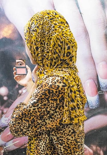
Farah Al Qasimi, Woman in Leopard Print, 2019
Courtesy the artist, Helena Anrather, New York, and The Third Line, Dubai
Farah Al Qasimi has her eye on you. In Woman in Leopard Print, one of her seventeen photographs commissioned by the Public Art Fund in 2019 and presented at one hundred bus shelters across New York’s five boroughs, a woman in said leopard print peers into a tiny compact mirror, her eyebrow superbly arched and perfectly groomed. The bold print of her headscarf is thrown into uncanny relief against a backdrop of giant yet slender fingers with glitter-tipped nails. It’s a scene of explosive beauty and humorous excess, one in which the gazes between photographer, subject, and viewer bound back and forth.
For Al Qasimi, who was raised in Abu Dhabi, United Arab Emirates, and earned her MFA from the Yale School of Art, that hall-of-mirrors choreography is central to her ideas about cultural exchange and hybridity: she’s photographed a fake “Amazon” department store in Dubai, a sparkling chandelier at a bodega in Queens, a Muslim beauty pageant in Iowa, a goat in a playhouse, and a bright blue volume of United States Treaties and Other International Agreements teetering perilously on the edge of a bookshelf.
When we spoke earlier this month, Al Qasimi, one of the most exciting young photographers working today, and a cocurator of the 2020 Aperture Summer Open, was hunkered down in rural Massachusetts, trying to make a new video piece while in isolation amidst the coronavirus crisis. Her latest solo show, Funhouse, had opened at Helena Anrather at the beginning of March, only to close a week later, along with all of New York’s other galleries; the custom orange carpeting she installed for the exhibition remains untouched—for now.

Farah Al Qasimi, Miss Muslimah Pageant 2019 (Miss Iowa), 2019
Courtesy the artist and Helena Anrather, New York
Brendan Embser: Your current exhibition, Funhouse at Helena Anrather in New York, shows your sense of curiosity about female subjects and feminine-oriented spaces, perhaps in contrast to More Good News (2017), which was more concerned with ideas about manhood and masculinity. Do you see Funhouse as a follow-up when it comes to looking at gender, or is that too simple of a comparison?
Farah Al Qasimi: I don’t see it as being so much a division by gender. But I do see that there is a similarity, in that all of the photographs have a confusing sense of location or geography that indicates that you are in a lot of in-between spaces, whether they’re immigrant communities in the U.S. or signs of colonial influence in the Middle East. There’s usually that dichotomy in the work, but I think that this particular project is more concerned with an affect. It’s more self-referential to photography as a medium that can only produce mistakes or imperfections. I compare the act of photographing something to the act of it being reflected in a funhouse mirror that warps or exaggerates reality.

Farah Al Qasimi, Trompe L’oeil Car Seat, 2019
Courtesy the artist and Helena Anrather, New York
Embser: What do you mean by “mistakes or imperfections”? One of the qualities that’s recognizable in your work is actually a type of perfection in the way that you build images and the quality of your printing and composition.
Al Qasimi: It’s impossible for a photograph to be truly subjective, even when we think about photojournalism and work that is primarily concerned with the act of truth-telling. There’s always a decision to leave something out of the frame. I think of “imperfection” as a replacement word for a clear lack of subjectivity. As somebody who engages with photography primarily as an artist and secondarily as a photojournalist, I’m always interested in taking creative liberties with the truth—and also in presenting a situation or an image in which people might not feel the need to ask for the truth. Maybe there’s something inherent in the image that provides information, or enough interest that you could take it at face value.
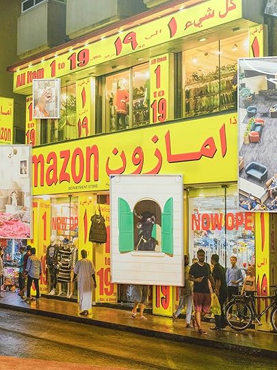
Installation view of Farah Al Qasimi, Funhouse, 2020. Photograph by Sebastian Bach
Courtesy the artist and Helena Anrather, New York
Embser: In your captions, you often don’t tell us where a picture is made. For example, The Amazon Department Store (2020), which is presented in the exhibition at life size.
Al Qasimi: First and foremost, it’s about certain types of visibility. There are a couple of references in the show to fakes—fake surfaces that are printed to look like something else. There’s an image of a trompe l’oeil car seat that’s printed to look as though it’s tufted, but it’s not. There’s a video in which I’m wearing a copy of a clown suit from a mall that’s known for selling copies of things [Alone In A Crowd (King of Joy) (2020)]. The Amazon store is a fake Amazon, obviously. When you see it in life size, you can see there’s a tiny “the” in the corner of the sign, so it’s actually called “The Amazon.” It’s a scaled-down dollar store that’s claiming to have the same variety and low prices that the actual Amazon does. I think it’s like entering a place in which there is a real scale shift and a sense of humor about it. And also, a comedic failure in trying to transcend reality.
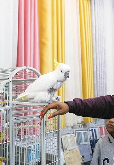
Farah Al Qasimi, Coco, 2019
Courtesy the artist, Helena Anrather, New York, and The Third Line, Dubai
Embser: It plunges us into this distinct yet still inexact setting, which is compounded by the other images in the exhibition that are taken in a variety of places. “Back and forth,” as you say—and that’s the title of your commission for the Public Art Fund, Back and Forth Disco (2020), an outdoor exhibition displayed where advertisements usually appear on New York’s bus shelters. It’s one of the few exhibitions New Yorkers can actually see this spring! How did you approach this commission? When you were making the images, did you know that they’d be displayed at bus stops, and if so, did you have a sense of a different type of audience or a different way of seeing?
Al Qasimi: There was definitely a distinction. I took a very different approach to this versus making photographic work for a gallery or a book. I think part of that was just understanding how those images would function in the public landscape. I really wanted to make the photographs more celebratory than critical. I focused on small businesses in New York, many of which are run by immigrants—it started off with a desire to celebrate some of the places in my own neighborhood that I frequent as a customer. Then it grew to other neighborhoods, and I wanted to echo New York back to these people in a way that would make them feel properly represented.

Farah Al Qasimi, Woman on Phone, 2019
Courtesy the artist, Helena Anrather, New York, and The Third Line, Dubai
Embser: The word disco—was that in your mind at the beginning, or did that come later on?
Al Qasimi: That came later. There’s a lot of color, a lot of mirrored surfaces. I think of the movement of New York as this harsh choreography of routine. We are going back and forth between places all the time on public transport, people are constantly in motion, it’s this wild frenzy of movement. Obviously, that doesn’t really apply now, but at the time it was certainly truthful to my vision of New York.
Embser: What has been your experience of seeing your work on the street or hearing about it from other people? It’s not like visiting a gallery or a museum, where you’re going to the “altar,” where there’s this agreed-upon meditation or sense of “aura.” Yet when you see an image on the street, its presence can be really interrogative, it might prompt you to be critical and self-questioning, maybe even more so than when you’re in a gallery. You’re like, What is that?
Al Qasimi: For some of the people that I’ve heard from, it’s been a surprise. They weren’t necessarily paying attention and then they saw something that echoed an advertisement, except it wasn’t really trying to sell them something. It was a photograph of something that already existed, and that was a positive thing for them to witness. I’ve also seen a few that have been graffitied—and I actually like that, because I feel like it further affirms their presence as a part of the city. I think that they’re not supposed to be these precious things that are protected by white walls. I like that people are interacting with them, even if it does “deface” the surface of the thing. A lot of the surfaces that I’m photographing have already been weathered, because they’ve been a part of the public domain for so long, and this is just an act of collaging or repurposing.

Farah Al Qasimi, Woman in Leopard Print, 2019. Sixth Avenue Between Minetta Lane and West 3rd Street, Manhattan. Photograph by James Ewing
Courtesy the Public Art Fund, New York
Embser: Your photographs for the project focus on local communities and small businesses. Was it a challenge for you to do this kind of work? Going into a bodega or a shop, do you find it easy to interact with people and draw them out? Does that come easily to you?
Al Qasimi: No, it doesn’t. I’m extremely shy and I’m really wary of taking up people’s time, so it took a lot of courage to talk to people, and I had to come up with a way to efficiently explain the project so that I wasn’t bothering people if they weren’t interested. When people were interested, though, they were incredibly generous with their time.
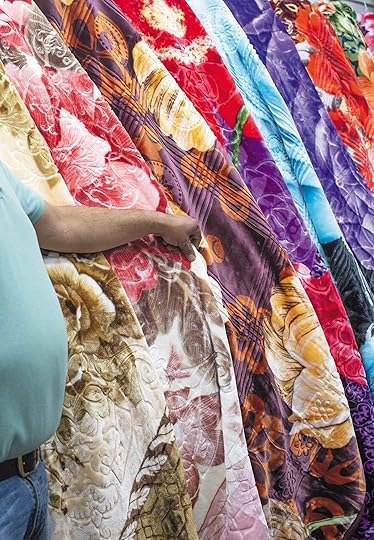
Farah Al Qasimi, Blanket Shop, 2019
Courtesy the artist, Helena Anrather, New York, and The Third Line, Dubai
Embser: Were there any discoveries along the way?
Al Qasimi: There was one beauty salon, Grace Beauty Salon, that I ended up at in Brighton Beach, Brooklyn, that was great. The owner had been there for a while, and it turns out that one of my good friends who grew up nearby, in Sheepshead Bay, went to this salon to get her eyebrows done as a teenager. Rubeena, the beautician and owner—her back is in one of the photographs, and she’s wearing a floral printed dress. (I actually had my eyebrows done there and she did a great job.)
Embser: I used to live in Bed-Stuy—also in Brooklyn—and there was a dry cleaner near me that was run by an elderly Korean couple. After the dry cleaner closed, that shop building reopened as a bodega, and it was fully renovated and tricked out with chandeliers. I called my dad, and I was like, “Dad, my bodega has a chandelier!” The guys who worked there were so proud of how they had redecorated the place. My dad was like, “That’s New York. That’s just what happens.”
Al Qasimi: Totally. This is your business, this is where you spend most of your time, and it’s also the way that you represent yourself to the world. It’s beautiful when somebody takes pride in that and attempts to make people feel welcome with their sense of aesthetic.
Farah Al Qasimi, Bodega Chandelier, 2019
Courtesy the artist, Helena Anrather, New York, and The Third Line, Dubai
Embser: You have a color palette that’s increasingly recognizable as yours. The “Farah Al Qasimi” look. It’s a lot of light greens and pinks and blues. I had a sense about this from both More Good News and Funhouse, but it really hit me when I saw your photograph Bird Market (The Blue One Escaped)(2019)—all those colors are in one image. Then I began to see it more in your images of staircases, bedspreads, the gold ball gown in the beauty pageant. How did you develop your photographic sensibility when it comes to ideas of beauty and surface?
Al Qasimi: I grew up in the United Arab Emirates, a place that was still being developed in the 1990s and early 2000s, but there was also a lag in taste, where people were designing buildings in the style of ten years earlier. There’s also a real appreciation of the old that still exists in some pockets of the country, despite its rapid growth. At the same time, it’s a place that privileges maximalist aesthetics over minimalism, the Brooklyn-esque, the faux industrial. So, my work reflects the world that surrounded me as a young person. It’s really hard to shake. It’s funny, even with the Public Art Fund photographs, so many people are like, “Are those really all in New York?” And they are absolutely all in New York. I think it’s just that we all respond to things that feel familiar to us.
Farah Al Qasimi, Bird Market (The Blue One Escaped), 2019
Courtesy the artist and Helena Anrather, New York
Embser: When you said the work for the Public Art Fund commission was less “critical,” what do you mean by that?
Al Qasimi: When I say “critical,” I mean it’s embedded in a sense of humor. Certainly, the Amazon image is a bit more critical in that way. With the Public Art Fund work, I really wanted the images to be much more quickly legible than other photographs. People are moving very fast, they don’t have a lot of attention to give, and I’m very conscious of how much space I want to take up in their daily lives, when they’re already being bombarded by so much imagery that’s asking them to do something, buy something, sign up for something, or call Cellino & Barnes or whatever. I think that the photographs do have a certain undercurrent of humor, but I think it’s more of a loving humor than a dark humor.

Farah Al Qasimi, Beige Bathroom, 2020
Courtesy the artist and Helena Anrather, New York
Embser: Whereas in your exhibition, to take the example of Beige Bathroom (2020)—this might not have played in the same way if it was at a bus stop. In a gallery, it becomes an object of complete fascination. The surfaces are so exacting; there’s perfect, even lighting across everything. It almost looks like a Thomas Demand construction. Then the toilet paper hanging down is the punctum, this uncanny detail. When you’re working in these private spaces, how do you achieve the perfection of the surfaces?
Al Qasimi: You know, what’s crazy is that I didn’t make any changes to that bathroom— that’s our bathroom at our house in the Emirates. It has looked that way since the house was built in the early nineties. I love that from a distance, it looks so great photographed; I think there’s something about the evenness of the light that transforms it. But when you look closer, you can see that a lot of the taps have started to rust green, because the water where we live has an incredibly high iron content. It’s this very pristine, undisturbed scene, but then you think about what happens in bathrooms and it starts to lose this veneer of beauty. It almost looks like a dollhouse bathroom, a bathroom that doesn’t get used. But I use it! There’s something kind of funny about that to me. I also think a lot of my work contains signifiers of class, but they’re legible in different ways depending on where you come from. In the Emirates, there are a lot of places where you can buy these maximalist designs for cheap. You can get beautiful baroque furniture from a Walmart. There’s a very different relationship to taste and class there than there is here.

Farah Al Qasimi, Green Soap in Blue Bathroom, 2020
Courtesy the artist and Helena Anrather, New York
Embser: The viewer brings something to these images that also depends on timing. Your Green Soap in Blue Bathroom (2020) has lately become a kind of stylish quarantine icon—and a cheerful reminder to wash your hands. Yet somehow it will outlive even this moment of fear and vigilance about hygiene; it will mean something else in one or two years.
Al Qasimi: I hope so! I’ve been photographing soaps for four or five years now. It’s sort of an ongoing joke that every show I ever do has to have soap in it. For me, soap has always been a stand-in for the body. I come from a place where we have a particularly formal relationship to bodies and visibility, and I like to photograph things that touch the naked body, as opposed to photographing a nude. Soaps have that undercurrent of intimacy and almost perversion.
Farah Al Qasimi, G Climbing a Prop Warehouse Facade, 2018
Courtesy the artist and Helena Anrather, New York
Embser: You are one of the curators for the 2020 Aperture Summer Open, the theme for which was inspired by an exhibition presented by MoMA fifty years ago called Information. The remit for that show was a global survey of young artists, with “information” being the through line for organizing disparate projects. Kynaston McShine, the curator, noted in his catalogue essay that young people around the world, no matter if they’re in Brazil or Argentina or the U.S., may face some kind of political violence every day, regardless of whether or not their country is at war. He wrote, “It may seem too inappropriate, if not absurd, to get up in the morning, walk into a room, and apply dabs of paint from a little tube to a square of canvas. What can you as a young artist do that seems relevant and meaningful?” As a curator who is also an image-maker, what are you interested in seeing from the Aperture Summer Open?
Al Qasimi: I really appreciate work with a sense of curiosity and purpose. I don’t know what that looks like, but I know that you know it when you see it. One of the best things about photography is that we all have the same raw materials available to us, but it’s a matter of how we transform those materials. It’s really about how we see the world and how we engage with it. We’re inundated with imagery so often that I think it sometimes feels like the most eye-grabbing thing will make the most successful image. But there has to be something at stake, there has to be something that is being said beyond the act of making an intriguing image. What happens after the intrigue fades? What are you actually saying with your photographs? What are you bringing to the world that is particularly of your own mind and nobody else’s? I think that’s what I’m excited about seeing.
Farah Al Qasimi, My Dear, 2018
Courtesy the artist and Helena Anrather, New York
Embser: Finally, do you think it’s going to be harder as an artist now, in this moment, and in the coming years? What advice would you give photographers out there to stay the course?
Al Qasimi: We should continue because we have to. With relationship to “information,” artists form so much how we see the world and how we connect with one another. They teach us so much, they teach me so much. It is really important to maintain that curiosity, to keep the lines of communication open. Obviously, things will change with these extenuating circumstances. I haven’t made any art for a while. I’m trying—I was trying to make this dumb video piece on my cell phone before you called me, and it’s going terribly. But I’m trying to do it with what I have available to me, because it’s how I reckon with the world. And there are days when I can’t, because I’m too busy dealing with taxes, or emails, figuring out how to finance my studio rent for the next couple of months, or doing lectures so I can make a little bit of money here and there. But when I have a moment to breathe, I do it because I have to, because it’s the only thing that I know how to do, and that keeps me going, and that gives me a fighting chance of understanding anything about the world. If anybody else feels that urgency, then I think it’s imperative that they find a balance: being kind to themselves and meeting their basic needs, but also leaving space every so often when they’re able to practice.
Brendan Embser is managing editor of Aperture magazine.
Funhouse opened on March 5, 2020, at Helena Anrather, New York. See the gallery’s website for updates during the coronavirus crisis. Farah Al Qasimi: Back and Forth Disco is on view through May 17, 2020, in public spaces throughout New York City’s five boroughs.
The 2020 Aperture Summer Open is accepting applications through April 29, 2020. See here for details.
April 20, 2020
A Searing Exhibition Charts the History of Abortion
Through photographs, historical documents, and recent interviews, Laia Abril presents the case that abortion is here to stay, whether it’s legal or not.
By Russet Lederman

Françoise, 76, is known as the grandmother of modern abortion in Europe. She describes her lifelong activism as a calling, with the personal motto, “When you have power, you also have a responsibility.” Vintage image from Laia Abril: On Abortion, 2020
Courtesy the artist
A friend’s text message popped up on a thread that covered everything from family to work to the usual mundane news we frequently share with one another. She was pregnant. It was unplanned, and she and her partner had made the decision to terminate the pregnancy through a “medication abortion” (aka abortion pills). She is one of the lucky ones. She lives in a city, a state, and a country where abortion is legal and accessible; has a partner who is supportive; health insurance that would cover a portion of the cost; and a private doctor who would handle the prescription with care and confidentiality. Yet despite her access and support, making the decision, undergoing the procedure, and dealing with the aftermath of an abortion was, and will always be, traumatic. Add to that the obstacles in states that have enacted bans and stringent abortion restrictions both before and since the COVID-19 pandemic—Alabama, Louisiana, Mississippi, Ohio, Oklahoma, Texas, and Wyoming—and a difficult personal decision is egregiously turned into a political issue with often tragic consequences.
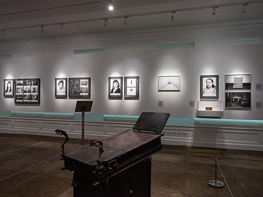
Installation view of Laia Abril—On Abortion, Museum of Sex, New York, 2020
Photograph by Kris Graves
In Laia Abril’s exhibition On Abortion: And the Repercussions of Lack of Access, the debate over abortion is center stage. Through historical documents, medical publications, gynecological tools, personal stories, and news and police reports, Abril confronts the misogynistic horrors that befall our society when women are denied access to affordable and safe abortions.
A long-term project presented as a book and series of exhibitions, On Abortion is the first chapter in her ongoing A History of Misogyny series. It is a project I’ve been following since I first saw an earlier installation at Les Rencontres de la Photographie in Arles, France, in 2016. Both then and now, I left the exhibition with the feeling that my head was about to explode. Reading, hearing, and seeing the personal stories of condemned, criminalized, and in extreme cases, dead women in Brazil, Chile, El Salvador, Ireland, Poland, and the United States—who had no other choice but to seek an illegal abortion due to rape, incest, or a medical condition that put their lives at risk—is an unbearable experience. Yet, it is an experience and a discussion that needs to be had by any society that sees itself as humane.

Installation view of Laia Abril—On Abortion, Museum of Sex, New York, 2020
Photograph by Kris Graves
In selecting New York’s Museum of Sex (now temporarily closed due to the coronavirus crisis) as the venue for the U.S. premiere of On Abortion, Abril has done more than just share her work. She has consciously chosen to place this discussion within a context that reaches beyond the art world and engages a diverse audience that may have no interest in art, but does in sexuality and the partisan discourse on abortion. Within this setting, Abril makes abundantly clear that abortion is unequivocally linked to sex and that the only way to depoliticize, decriminalize, and liberate the right to a difficult private decision is to make visible the factual evidence and tragic outcomes that have harmed women when abortion is denied or limited. As long as women have sex, abortion will remain an experience shared by millions of women around the world. Despite the efforts of religious groups and antiabortion crusaders, abortion is here to stay, whether legal or not.
The Museum of Sex deserves credit for a respectful restraint in the exhibition design of On Abortion. It is not their norm. Unlike the three other shows at the museum—Superfunland: Journey into the Erotic Carnival, Cam Life, and Stag: The Illicit Origins of Pornographic Film—the installation of On Abortion is thoughtful and befitting the subject. Entering the exhibition, the viewer encounters a space that combines wall-mounted photographs, poster-size news clippings, illustrations, a circa-1890s OB-GYN exam table, and books and antique medical instruments (from the Burns Archive and Collection) displayed in a traditional Americana-style vitrine. A wall text by abortion historian Linda Greenhouse reads like a treatise for action: “Instead of stigma and silence, we need to raise our voices and lift our sights, as this fascinating exhibit by a brilliant young artist inspires us to do. Abortion is a word. It is also a right we must fight for.”

Installation view of Laia Abril—On Abortion, Museum of Sex, New York, 2020
Photograph by Kris Graves
It is a contemplative exhibition that requires not just looking, but close reading and listening. Illustrations and photographs of early contraception (fish-bladder condoms, vaginal douches, and soap or enema syringes) along with pregnancy termination devices (knitting needles, wood and plastic rods) lead the way to more graphic and personal stories that caption black-and-white photographs of the women who have performed, sought, or been accused of having illegal abortions, and the spaces where their terminated pregnancies occurred. Sometimes their eyes are pixilated, their faces presented as photographic negatives or blurred, but most of the time they stare straight ahead, fixing the viewer in their gazes. Reading their stories on the wall texts or typed notes that accompany their photographs is wrenching. Whether it is the two-year prison sentence given to an Indiana woman who left her stillborn fetus in a dumpster after using abortion pills ordered illegally online from a Hong Kong pharmacy, or the tale of a young Salvadoran woman who was sentenced to thirty years in prison for homicide after losing her wanted baby in her third trimester when her employer would not let her go home after passing out, Abril’s direct use of personal narrative is fearless.
Trained in journalism, Abril is a multidisciplinary artist whose projects are the result of years of in-depth research. The strength of On Abortion is its all-encompassing approach to its subject matter and the range of perspectives presented. Included with the personal stories of survivors are police records of antiabortion terrorists accompanied by their rhetoric—a disturbing voice mail recording received by an abortion clinic can be heard on a phone within the installation. Through the voices of victims, family members, advocates, providers, historians, and antiabortion protesters, Abril forces the visitor to confront the slow and steady erosion of women’s rights as they pertain to their own bodies.
Installation view of Laia Abril—On Abortion, Museum of Sex, New York, 2020
Photograph by Kris Graves
Discussion while viewing On Abortion is unavoidable. During my visit, I overheard a male teenager quietly telling his friends, “This shit is crazy tragic!” It is exactly this kind of response that is needed for a society to address the horrific repercussions that women must endure when safe and legal abortions are denied. And if we are to have this discussion across genders, races, religions, and nationalities, it is most fitting that Abril’s work should be seen in settings that draw audiences beyond the art world, such as the Museum of Sex—an space where both sex and abortion can be discussed by adults, teenagers, tourists, and others who wander past a gift shop filled with sex toys to encounter this enormously important exhibition.
Russet Lederman, a researcher and writer based in New York, is a cofounder of 10×10 Photobooks and The Gould Collection.
Laia Abril—On Abortion: And the Repercussions of Lack of Access is now temporarily closed due to the coronavirus crisis, but is scheduled to be on view at the Museum of Sex, New York, through October 15, 2020.
April 18, 2020
2020 Portfolio Prize Winner: Dannielle Bowman
Dannielle Bowman hijacks the traditional language of black-and-white photography to inject new meaning into the search for home.
By Lesley A. Martin
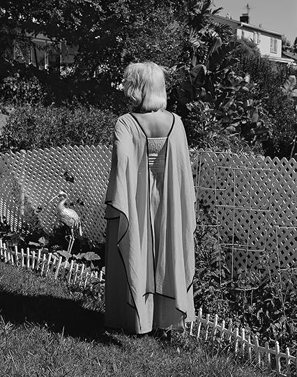
Dannielle Bowman, Vision (Bump’N’Curl), 2019, from the series What Had Happened
There are multiple entry points into Dannielle Bowman’s What Had Happened, a series in progress. Bowman makes excellent use of the pleasures of photographic space, described in elongated tonal-gradations of black, white, and maximum greys balanced against compositions etched sharply by California-noir shadows—Robert Adams meets Maya Deren in the Los Angeles suburbs. These elements lure the viewer to linger within the work. Aside from the surplus of visual gratification, the work simmers with the tension of a story mostly withheld. What has happened? On one level, these pictures are about the neighborhoods in and around the artist’s family home in Los Angeles. On another, Bowman’s work describes the passage of time and memories of home—or more precisely, the homes one makes on leaving old ones; about the search for better places in which to put down new roots and grow. Dig further, and the work begins to hint at even more specific histories—those of the Great Migration, which drew African Americans from the South (like Bowman’s own grandparents) into not only the North, but also the American West. The clues are not part of the standard-issue, broad brush–stroke narrative of the African American diaspora; they are found in details, such as the framed family photos on the mantle and the bump ’n’ curl hairdo worn by the woman standing on her flamingo bedecked lawn.
In Isabel Wilkerson’s history of the Great Migration, The Warmth of Other Suns, she describes the stories African Americans tell of their various journeys as “a secret told in syllables.” Similarly, Bowman has begun to map histories that remain mostly unspoken, eliciting memory via the judicious placement of alternative signifiers—signifiers mostly illegible to those outside or unfamiliar with these stories. In doing so via a rigorously composed, formal set of pictures that stand outside traditional documentary storytelling, Bowman not only begins to carefully unfurl these secrets; she also manages to bend a classic set of photographic conventions toward her own goals, enfolding her own family history within them.

Dannielle Bowman, Untitled (Hand), 2019, from the series What Had Happened

Dannielle Bowman, Carpeted Stairs, 2019, from the series What Had Happened
Dannielle Bowman, Faces, 2019, from the series What Had Happened

Dannielle Bowman, Screen Door, 2019, from the series What Had Happened
Dannielle Bowman received a BFA from The Cooper Union and an MFA from the Yale School of Art, where she was awarded the 2018 Richard Benson Prize. In 2019, she was a contributor to the New York Times Magazine’s The 1619 Project. Bowman has been an artist in residence at Baxter St at the Camera Club of New York; the Center for Photography at Woodstock, New York; and PICTURE BERLIN. Bowman has exhibited in the US and internationally. She lives and works in New York.
Lesley A. Martin is Aperture’s Creative Director and Publisher of The PhotoBook Review. All images courtesy the artist.
Aperture's Blog

- Aperture's profile
- 21 followers

