
Aperture's Blog, page 203
February 12, 2013
JH Engström Photography Workshop
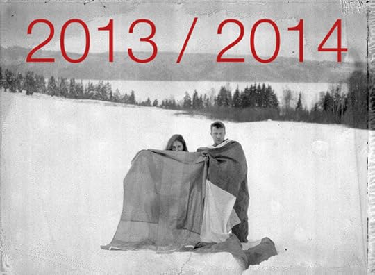
For the past fifteen years, JH Engström, an internationally acclaimed photographer, has held workshops regularly all over Europe and has lectured at the International Center of Photography in New York. He considers the workshop a critical part of his development as a photographer and artist, and in that spirit has launched Atelier Smedsby, a year-long web-based workshop coordinated by Engström and photographer Margot Wallard.
Through the Atelier, Engström strives to “spread out the possibilities of contact between the participants and [himself],” since time, he believes, is such an important tool in the photographic process. During the course of the year, attendees will critique the work of their colleagues in one-month intervals, incorporating three individual/group meetings in Paris and monthly reports on the progress of their works via e-mail or Skype. During these monthly reports, they will be able to ask questions, demonstrate the evolution of their work, receive evaluation and feedback, and thus move forward in the accomplishment of their personal projects.
The application deadline for the 2013/2014 session is March 30, 2013. Application information can be found on www.atelier-smedsby.com.
Aperture plans to publish Sketch of Paris: Photographs by JH Engström in Fall 2013.
 CDG/ JHE #41, 2006
$1,800.00
 Trying to Dance Portfolio, 2004
$2,500.00


February 8, 2013
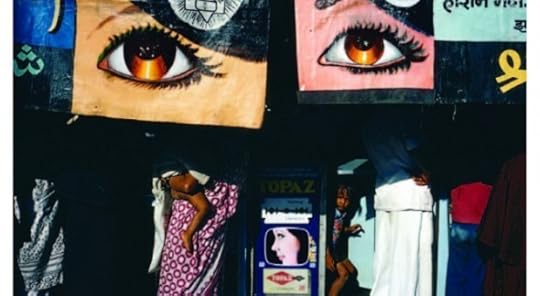
Alternative Realities at El Museo del Barrio
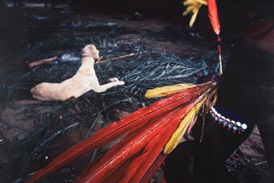
Miguel Rio Branco, Feather and Dog, 1983. © Miguel Rio Branco. Courtesy of El Museo del Barrio.
Photographic mediums conventionally assert the notion of reality and accuracy to viewers, but the works included in superreal: alternative realities in photography and video, an exhibition of photography and video that opened at El Museo del Barrio this past week, investigate the many layers that surround our traditional sense of the real. superreal presents photo- and video-based works from 1980 to the present that explore the role of photographic mediums in presenting reality. This exploration manifests through the artists’ creations of alternative realities, ones where the worlds of landscapes, human figures, architecture, objects, and natural phenomena are emphasized or subverted, revealed or obscured.
superreal features 150 works by artists such as Adál, Tania Bruguera, Vik Muniz, Miguel Rio Branco, Betsabee Romero, and Andres Serrano. These artists utilize their distinct working methods and viewpoints to challenge preconceived reality and engage with their environments in both surreal and super-real ways that also subvert narrative forms.
superreal: alternative realities in photography and video is on view at El Museo del Barrio in New York City through May 19.
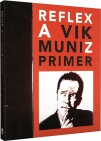 Reflex
$39.95
February 7, 2013
On Process and Color
A conversation with curator Jordan Tate and artist Sherwin Rivera Tibayan
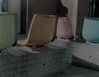
Color Shift, a group show curated by Jordan Tate, is on view at Mixed Greens in New York until February 9. The exhibition explores and revisits modernism’s reductive approach to medium, material, and color and its influence on contemporary art production. It includes new work by the artists Arabella Campbell, Wyatt Niehaus, Zachary Dean Norman, Rick Silva, Kate Steciw, Sherwin Rivera Tibayan, and Alex Walp.
Color Shift group exhibition at Mixed Greens. Image courtesy of Mixed Greens.
Paula Kupfer: Jordan, did Mixed Greens contact you with a proposal, or had you been thinking about these ideas already?
Jordan Tate: Courtney Strimple and Heather Dacry Bhandari contacted me and asked if I had an interest in curating an exhibition for Mixed Greens to start off the year. After giving it some thought, I proposed the idea of Color Shift to the gallery directors and we got started.
PK: Where did the inspiration come from?
JT: I believe that modernist methodologies (distinctly different from modernist aesthetics) are being utilized by a growing number of artists. Given the important role that photography played in catalyzing modernism, I find the medium functioning similarly following the popularization of the internet. I also define photography very broadly, and tend to think of it as a mode of inquiry more than an idea that rests on fixing light on a surface—objective reality be damned.
PK: Many of the works in the show involve photography, but most come at the medium in oblique ways. You identified five influential artists—Ellsworth Kelly, Yves Klein, Robert Irwin, Ay-O, Barnett Newman—whose legacy you sought to explore through this exhibition. How did you arrive at this list? What other criteria did you use? Were these five the basis for your participating artists’ responses, or was the curatorial process more of an open conversation?
JT: As I mentioned earlier, I view photography as a philosophical exchange more than a medium, and in that manner, I think it is nearly impossible to find an art object that isn’t in some way governed by our relationship to photography and image-making. I wanted the artists to try to approach this Herculean task from a place of seeming simplicity. The biggest ideas are born out of the simplest questions.
I chose artists whose work I trusted to be good and relevant, people who were aesthetically, historically, or methodologically concerned with the theme of the exhibition and capable of addressing it in a sophisticated yet accessible way. I gave the artists virtually no prompting other than the press release. Sherwin, does that seem accurate?
Sherwin Rivera Tibayan: Right, I remember receiving the email from Jordan and understanding the exhibition proposal as an introduction and an opportunity to continue working along the lines I had, over the past year, been traveling. In terms of the other artists in the show, I was happy to see a mix of new artists whose works I could engage with and others I had been following for some time.
PK: Sherwin, your two pieces were created on site, at night, in the gallery?
SRT: Two nights even!
JT: I think he was locked in, too!
Color Shift group exhibition at Mixed Greens. Image courtesy of Mixed Greens.
SRT: To be honest, the nights went pretty quickly because the labor involved required so much of attention. The folks at Mixed Greens were very generous and provided me with all the materials I requested, showed me where the fridge was, and let me connect my phone to the gallery sound system so I could listen to some music. Because I was constructing this work with blue tape on sheets of drywall, all that was remained was making sure I kept my taped lines straight and tight. This was important for me because I wanted the viewer to have at least two experiences with the work. From a distance, I needed it to look like the uninterrupted blue of a Klein monochrome, while up close, where the individual lines of tape could be discerned, I wanted a depiction of the space that housed such a work. In the end, each piece required around fifteen hours of taping.
PK: Sherwin, your projects negotiate art and photo history. How did the requirements of site-specificty creation add to these two works?
SRT: I tried to think of this project as operating between different types of site-specificity, both material and immaterial. For a few years I’ve been interested in the ways we now come to encounter historical works of art and photography. Like many people who don’t live in a major art center, my most frequent encounters with works of art are with documentary images—especially online images—in forms like the installation-view photograph. Because of this show’s themes and the fact that the exhibition would be on view in New York, I wanted to make pieces that were also informed by an institutional space within the city, about a work of art I’ve never seen in person. In this case, I began by using tourist snapshots of Yves Klein’s Blue Monochrome (1961) at the Museum of Modern Art that I found on sites like Flickr. (The work, according to MoMA’s website, is not currently on view.) Lastly, since I was working with six-by-four-foot pieces of drywall (the dimensions of Klein’s piece) and blue painter’s tape that is often used during exhibition installations, it felt appropriate to construct the objects inside the gallery during the week of the install.
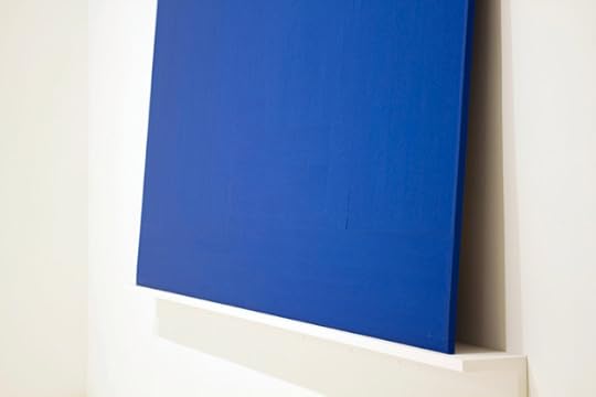
Above: Color Shift group exhibition at Mixed Greens. Below: Sherwin Rivera Tibayan, Installation View (MOMA, Blue Monochrome, 1961, Yves Klein), 2012. Images courtesy of Mixed Greens.
PK: Why tape? Can you describe your process in arriving at the two final Installation View pieces?
SRT: I’ve always associated blue painter’s tape with installation and exhibition preparation. In that sense, it was an easy fit. But more importantly, I loved how a roll of tape can encompass both digital and analog metaphors. Left alone, it showcases a kind of continuous and unbroken nature. But in order to use tape, to get that form to function, we have to cut it up into discrete units. The transformation that the tape undergoes seemed to fit rather well with my interest in the digital experience of actual works.
In the months leading up to the exhibition I began collecting photographs online depicting the site, at MoMA, where the piece was on display. I wanted to deal with the multiplicity of images and angles available to depict this one object and selected two that I felt best introduced this collection. Ultimately, I see this as a series of between seven and ten similarly sized tape constructions.
PK: This was a commission-based exhibition. Jordan, how did that change the process for you as a curator? Were you surprised by the outcome?
JT: It was risky given the time frame, but I chose people who I thought would rise to the challenge. It was still very difficult to have that little curatorial agency—a little terrifying, even. It was my first attempt at a lack of curatorial control and that was tough. I saw most of the works about forty-eight hours before to the opening, though some of the artists sent me JPEGs prior to the installation. That said, installing the show gave me great latitude in creating conversations between works and helping the overall flow.
As for your second question, I don’t know if I was necessarily surprised, as most artists were already considering these ideas in their studios. I don’t think it was a stretch for any of them—but I was very curious about what I would end up with. I guess I thought that the connections between these artists were perhaps not readily apparent, though they were certainly prevalent to me. I also wanted to focus on artists from a broader geographic spectrum.
SRT: I think a lot of people enjoyed the geographic breadth of the roster.
PK: Was this in response to other curators’ New York–centric approach?
JT: Yes. That said, I am not making any judgments of the geographic diversity of exhibitions in this city. I feel there is a lack of diverse representation in the majority of shows—but, to be fair, there are a disproportionately large number of artists in New York. I thought this would be an opportunity for showcasing work from other regions, too.
PK: I want to return for a moment to the element of surprise. For instance, I was surprised to see Kate Steciw, who is known for her digitally manipulated photographs, presenting works in oil. Do you think the artists viewed this as an opportunity to explore materials or themes outside the normal bounds of their practice?
JT: I found that all of the artists made work that was true to their aesthetics and concerns in some fashion. When I say I wasn’t surprised by any of the works, it’s because I didn’t have rigid expectations of how they would approach the exhibition. I expected them to do something great—and they did!
—
Paula Kupfer is the assistant editor for Aperture magazine.
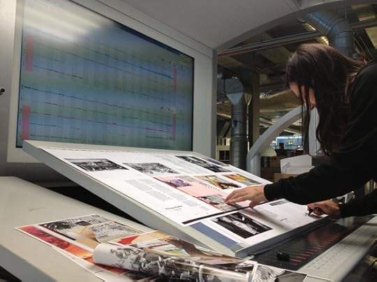
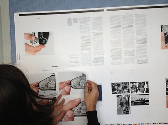
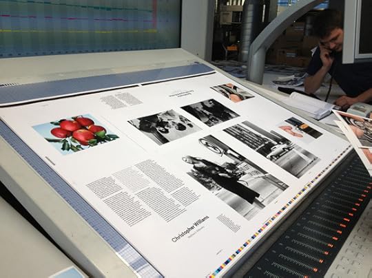
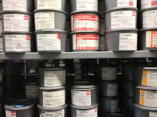
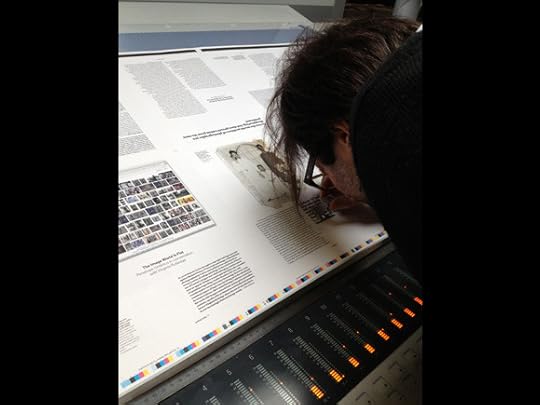
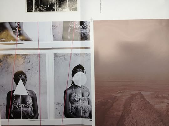
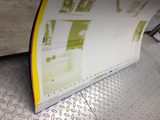
A2/SW/HK: On Press


 [image error]
All images courtesy of A2/SW/HK.
101 Tragedies of Enrique Metinides
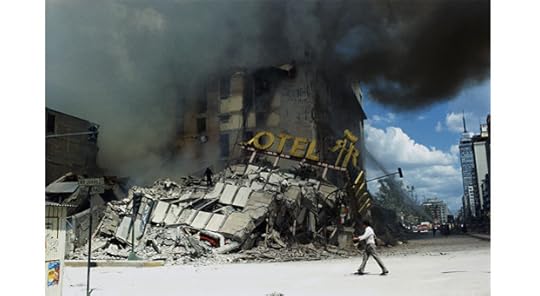
Mexico City, September 19, 1985 © Enrique Metindies, Courtesy 212berlin
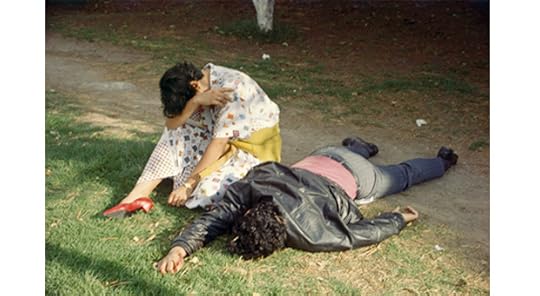
Chapultepec Park, Mexico City, 1995 © Enrique Metindies, Courtesy 212berlin
Mexico City, 1977 © Enrique Metindies, Courtesy 212berlin

Mexico City, April 29, 1979 © Enrique Metindies, Courtesy 212berlin
Curated by Trisha Ziff, 212berlin
101 Tragedies of Enrique Metinides is Enrique Metinides’s choice of the key images from over fifty years of photographing crime scenes and accidents in Mexico for local newspapers and the nota roja crime press. Accompanying the images are Metinides’s own accounts of the characters and life of the streets, the sadness of families, the criminals, and the heroism of emergency workers—which reveal much about himself as well. Selected photographs are also paired with their original newsprint tearsheets, collected by Metinides. The photographs have been compiled by Trisha Ziff, a filmmaker and curator who has collaborated with Metinides on this project for over five years and who contributed an essay about his life, work, and personality to the accompanying publication, 101 Tragedies of Enrique Metinides (Aperture, 2012). Though Metinides’s photographs have been exhibited and published internationally, this is the first selection of images chosen by the photographer himself, and which offers his own account of his life’s work.
A limited‐edition portfolio featuring Metinides’s latest photographs is available through Aperture. In this series, Metinides has re‐constructed and created fictional rescue scenarios for crime scenes photographed early in his career, using his collection of over ten thousand toy firemen and medics. These recent pictures are a new twist on an extraordinary career. The prints were made at the artist’s local Costco in Mexico City, and are offered in the paper Costco bags in which he picked them up.
Enrique Metinides (born in Mexico City, 1934) worked as a crime photographer for over fifty years, capturing murders, car crashes, and catastrophes for the nota rojas, Mexico’s infamous crime magazines. He has won numerous prizes and received recognition from the Presidency of the Republic, journalists’ associations, rescue and judicial corps, and Kodak of Mexico. In 1997 he received Mexico’s Espejo de Luz Prize (Mirror of Light), awarded to the country’s most outstanding photographer. His work as been shown internationally, including at the Museum of Modern Art, New York; Les Rencontres d’Arles festival, France; and the Photographers’ Gallery, London.
Trisha Ziff is a curator of contemporary photography, a filmmaker, and a Guggenheim Fellowship recipient. She has produced and directed several award-winning documentary films that deal with photographic subjects, including Chevolution (2008) and The Mexican Suitcase (2011).


February 5, 2013
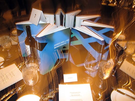
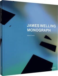
James Welling: Monograph
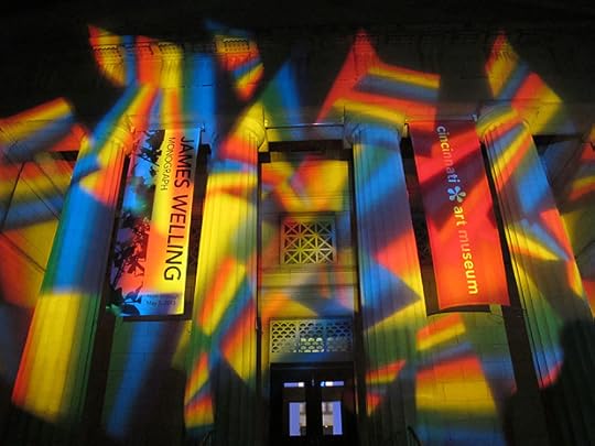
Monograph, a career-spanning survey of photographs by James Welling, opened at the Cincinnati Art Museum last Saturday. The exhibition, organized by curator James Crump, synthesizes Welling’s disparate photographic series, which range from abstract photograms to documentary-style portrayals of the New England landscape.
Aperture has published James Welling: Monograph to accompany the exhibition, which will also travel to the Fotomuseum Winterthur in Switzerland. This volume is now available for purchase in our online store. Below are two short excerpts from Museum of Modern Art curator Eva Respini’s conversation with Welling, one of four extensive texts included in the book. The conversation took place on March 27, 2012, in New York.
Eva Respini: You refer to yourself as a photographer rather than as an artist. Why is it important for you to self-identify as a photographer?
James Welling: No one in my generation called themselves photographers, even if they were doing photography exclusively. But, for me, it was an acknowledgment that I wanted to think of my work in the context of the history of photography as well as the art world.
ER: You’ve acknowledged Paul Strand as a key influence. The modernist tradition of photography is antithetical to the use of photography in conceptual art and in the work of your teachers at CalArts [California Institute of the Arts], such as John Baldessari. You are self-taught in photography, yet now you’re one of the most influential artists and teachers of photography. How did you make that leap?
JW: I got to Strand because I was totally enamored of Hollis Frampton’s writings and films. In the early 1970s, Frampton wrote on the work of Edward Weston and Strand in Artforum. So, here was a structural filmmaker thinking seriously about Strand. When I moved to LA in 1972, I saw the Strand retrospective at LACMA and that blew my mind. A year later, I stumbled upon his Mexican Portfolio in the CalArts library. His pairings of religious sculpture with portraits seemed strikingly contemporary.
When I was a graduate student at CalArts I wasn’t making my own photographs. I was interested in media images, mostly portraits, and for my 1974 thesis show I made photo collages from books and magazines. After I graduated, I spent about a year and a half trying to figure out what to do. It was a hard time. I read a lot, and I made small watercolors and photo collages. In December 1975, Matt Mullican and I were hiking in Connecticut. Frustrated by my confusion about what to do, he joked, “You’re always talking about photography—you should just get a camera like Ansel Adams and take photographs.” I had borrowed my sister’s Minolta at the time, and Mullican’s admonition got me thinking seriously about photography. It never occurred to me until then that I could think of myself as a photographer.
ER: You’re self-taught in the history of photography, too. You absorbed images mostly through reproduction, which is, of course, a big part of how the medium is disseminated. You have no signature style and work in a variety of genres with different cameras and processes. Do you think your self-taught beginnings have allowed you to be open and experimental with the medium?
JW: Being self-taught in photography has allowed me a certain freedom. There’s a way in which I explore some aspect of the history of photography with each project, although this is unconscious and not at all systematic. Early on, I worked with Polaroids. I made a camera out of a shoe box and then moved to a four-by-five view camera. More recently, I’ve worked with photograms and trichromatic color.
Hollis Frampton wrote about the “knight’s tour,” a chess fantasy where the knight can occupy every position on the chessboard. For Frampton, his knight’s tour would be a tour of all possible films from the beginning of the medium till now. The idea of a creative tour around photography is very compelling to me.
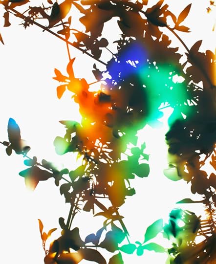
21, 2006, from Flowers. Copyright © James Welling. Courtesy Cincinnati Art Museum, David Zwirner Gallery, New York and Regen Projects, Los Angeles.
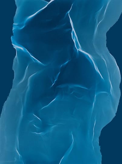
9-7, 2005–06, from Torsos. Copyright © James Welling. Courtesy Cincinnati Art Museum, David Zwirner Gallery, New York and Regen Projects, Los Angeles.
[ ... ]
ER: When you were making the Glass House pictures, you held filters and gels in front of the camera. I imagine you’re juggling camera, gels, prisms—it’s almost a performance.
JW: I think every photograph has performance built into it on a couple of levels. There’s the performance of the photographer making a picture. Converging on a spot, various preparations, getting lucky—all of this involves performance. Then you have the performance of printing the photograph. My Glass House photographs accentuate the performance of their making by intervening with things that I put in front of the camera. I started out with a few colored filters and then gradually added more filters, then curved Mylar, clear and colored glass, and finally a scientific diffraction grating.
ER: In a lot of your pictures, there’s a scrim, a screen, or a texture that’s in front of the lens.
JW: I’ve always found the idea of the scrim or the screen compelling as a stand-in for the photographic process. In Light Sources, one of the first images I made, Meriden, shows the sun peeking through tree branches. I thought of it as looking up at the light source of the photographic enlarger from the point of view of the negative. In the Andrew Wyeth photographs, there’s an image I made, in Maine, of the moon in a cloudy sky between pine trees. The idea is similar to Meriden: we’re looking at a light source, which is partially obscured.
ER: Is chance attractive to you? When you were at Carnegie Mellon, Merce Cunningham and John Cage were in residence.
JW: They were on campus for a week. Seeing Cunningham rehearse and dance for a week and talking to Cage, both were life-changing for me. I read a lot of Cage, and I studied modern dance for a year at the University of Pittsburgh.
ER: Of course, in photograms there’s chance. But yet there is a side of your practice that seems rigorous and meticulous, with little opportunity for chance.
JW: With New Abstractions, I became interested in thematizing the darkness of photography, the part of the medium where you can’t see what you’re doing. With that work, I started by randomly dropping strips of Bristol board onto photographic film in total darkness. It’s as though a dark curtain is pulled around the act of making the work. Photography has to be created in darkness, both literally and figuratively. It’s a very special and unpredictable medium. I think this gives way to a desire for control or mastery in the way some photographers try to plan everything in the picture.
Last week in my senior studio class, we were talking about things that are unplanned. The problem is this: you don’t want to be working completely in the dark, but if you have too much control, then nothing works out well. There’s a great quote by the filmmaker Jean Renoir: “You control everything, you plan everything, but you always leave a door open for chance to enter.” I try to let in the unexpected as I’m working like mad to control it.
—
Eva Respini is associate curator at the Museum of Modern Art, New York. She has organized numerous exhibitions on contemporary art and photography at MoMA, including the recent, critically acclaimed Cindy Sherman retrospective, Boris Mikhailov: Case History (2011), Pictures by Women: A History of Modern Photography (2010), and Into the Sunset: Photography’s Image of the American West (2009).
 James Welling: Monograph
$80.00
 FDB9, 2009-12
$1,200.00
February 4, 2013
January 31, 2013
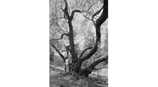
Interview with Laura Letinsky
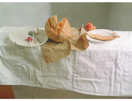
Untitled #54 from the series Hardly More Than Ever, 2002 © Laura Letinsky
Brian Sholis: How did you shift from your early photographs of people to the still lifes for which you are now best known?
Laura Letinsky: For a long time I’ve asked myself questions about what a photograph is. While I was taking photographs of couples in the 1990s I began thinking about love, and about how photography relates to love, how it can functions within a kind of circuitry of production and consumption. We produce photos that show us what love is supposed to look like, then we enact in our everyday lives the conventions depicted in visual media. I wanted to break out of that cycle, and to break out of the conventions of the genre in which I was working. I love portrait photographers like Philip-Lorca diCorcia and Rineke Dijkstra, but I felt stifled by the inescapability of romance. I also wanted to switch from an omnipotent point of view to something that felt more immediate, more first-person.
Still lifes increasingly drew my interest. It interests me as a genre in the same way that concepts of love interest me—its association with the feminine, its characterization as “less important,” its affiliations with domesticity and intimacy. There seemed to be potential there, room for exploration. I realized that still lifes were a vehicle to explore the tension between the small and minute and larger social structures. For the last fifteen years I’ve explored this realm, increasingly weaving in questions about perception, about how we see and understand the world around us, and about how photography conflicts with and constrains our sense of our environment by reinforcing certain ideas we have about perception.
BJS: You’ve spoken in the past about your interest in the corporeal aspects of your subjects, the inference of a bodily presence. In your most recent still lifes you’ve introduced your own previous work. How does this “cannibalism”—the consumption of a “body” of work—build upon this notion?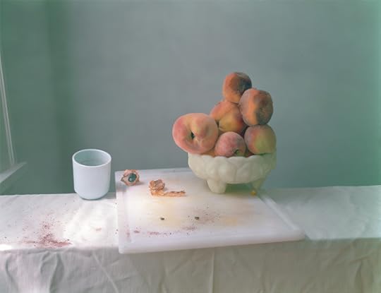

Above: Untitled #49 from the series Hardly More Than Ever, 2002. Below: Untitled #31 from the series Ill Form & Void Full, 2011 © Laura Letinsky
LL: I do like the idea of ingestion and consumption and photography. You could say that my work is in part about the relationship between looking at something and other bodily experiences. Pictures can induce sensations: You can see something in a photograph and it might make your mouth water, or it might stimulate other wants, desires, regrets, or needs.
Using images already in the world, including my own earlier works, is akin to using objects in the world. It’s all raw material ripe for the picking, so to speak. Alongside its ability to provoke sensations, photography has a way of homogenizing experience. A piece of schmutz and a Tiffany diamond become the same thing once they’re photographed—they become photographs. I have a love/hate relationship with this power of the camera to flatten difference.
Subjecting my own work to this process, whether old test prints or reproductions from books—makes all images, anything and everything, fair game from which to cull. And images are promiscuous; they are everywhere, and they don’t care what we do with them, or how they circulate.
BJS: And yet you’re very careful about the scale and presentation of your work …
LL: I am very invested in printing my work at a certain scale and in not having glazing between the photograph and the viewer—I want to offer a sense of proximity and the experience of the picture’s materiality. This new work especially called for this treatment. When I’m making pictures, I try to deal with the demands of the picture, what it needs to get my idea across. It’s a question of form and content, not one or the other. I’ve become much more freewheeling about how to satisfy this question. I draw from, dare I say, intuition as well as the huge image world—including scanning or downloading objects and images to insert into my photographs. What’s the difference? They all end up as a picture.


Above: Untitled #3, 2011 Below: Untitled #18, 2011. Both from the series Ill Form and Void Full. © Laura Letinsky. Courtesy of the artist and The Photographers’ Gallery, London
This new process has manifested itself as a way of dealing with the slurry of images. I have two or three tables in the studio laden with piles of objects and images. Sometimes slowly, sometimes quickly, groupings emerge. Once I’ve found a way to begin an arrangement, I often have to wait for the light to be right, or I have to pull parts out and rearrange until the picture reaches the level of precariousness that feels right. I wanted to be a painter when I first began making art, and now I work in a manner similar to how I imagine painters work in their studios.
BJS: Despite your description of accumulations in the studio, your pictures have a remarkable visual economy. Can you speak about how you determine what’s necessary to depict versus what’s unnecessary and therefore left out?
LL: I want to keep the images on a precipice but it’s not one I can easily explain with words. Artists are increasingly encouraged to be able to explain their working processes, and yet it’s a nonverbal intelligence that often leads you to make a decision.
I teach at the University of Chicago, and when a colleague was going through the tenure process she described one aspect of her work using the word “intuition.” She made no excuses for it, and did not try to explain that aspect of her artwork further. And she was right to do that. Some of the decisions I make in the studio are very conscious, and I use words to think about them. But when I make pictures I also do a lot of “grunting”—“ooh”s and expletives included; I use a kind of visual thinking that just can’t be articulated. Morandi paintings, for example, resist textual description. I love them but it’s difficult to explain why. Maybe it’s like love—try explaining why you love someone. It defies such definition. Some might say it’s emotional, but I think of it as bodily—or rather, that the body and the mind are inseparable. The body does have intelligence.
How can you legitimize the body’s intelligence? Think of people with refined palates, or designers who consistently make pitch-perfect decisions. It is in this realm that a lot of pleasure and discomfort resides. It’s an important component of the experience of art, and one that is often left behind in today’s overly intellectualized, airless conversations around art. The sensation of my child’s body, or the experience of food, sex, or pain—photography can help access these feelings that are intrinsic to being human.
—
Brian Sholis is a member of the editorial staff of Aperture Foundation. He writes frequently on photography, landscapes, and American history.
January 29, 2013
INTERVIEW: Scott Williams of A2/SW/HK
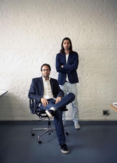
Henrik Kubel and Scott Williams
Aperture: What’s your font-making process like? Do you start with historical samples? Your own sketchbook?
Scott Williams: It really depends on the project and context. Some of our typefaces are inspired by historical forms, others originate through sketching by hand, and others are created with a particular production method or outcome in mind (neon, laser-routing, weaving, etc.). In the case of the Aperture suite of fonts, our starting point was a work-in-progress sans-serif typeface that was inspired by the hot metal fonts Futura and Memphis. This modern, geometric typeface echoes the Aperture logotype and also acknowledges the original incarnation of the magazine from the early 1950s. By contrast Aperture Serif, developed parallel to the redesign of the magazine, is rooted in the classicism of the sixteenth century and has been designed to contrast and complement Aperture Sans across multiple weights and to offer another flavor to the pages of the magazine. The process of designing typefaces, and working with them, is one of trial and error, of testing various typefaces and weights with one another, across various point sizes. You’re searching for an optimum interline space and line length, hoping to arrive at a point were it just looks “right” and creates a balanced “color” when printed.
Aperture: How did the two of you meet, and how did you begin working together?
SW: We met as post-graduate students at the Royal College of Art in 1998, and started working together, informally, on various projects almost immediately. We opened our design studio in London in 2000.
Aperture: How do the two of you work together? Does it start with a conversation, is a file passed back and forth, or does one partner shepherd a project while another focuses on something else?
SW: It’s like cats and dogs! Only joking!
Aperture: You’ve designed many art magazines and journals as well as several book series. Can you talk about the difference between designing for a single project (like a book) and designing for a series or multi-issue publication?
SW: There is a unique rhythm to working on magazines and multiple-series publications, particularly periodicals. Natural lulls, between issues, are punctuated by intense periods of work as teams of people focus on what seems to be a “moving target.” The sheer pace and intensity of working this way can be exhilarating, though a little stressful, too!
Aperture: Name a dream future project for the studio.
SW: A newspaper redesign would be a challenge, but one that we’d embrace.
Aperture: How has your practice changed (if at all) since websites and digital publications have become more prevalent?
SW: Technology has changed, but our design process remains largely the same. Our focus is still upon crafting design for specific purposes, whether that takes the form of print, screen, or interiors.
Aperture: How do you stay inspired?
SW: Reading.
Aperture: Name three things you must have when you’re working.
SW: Clients, calm, and caffeine.
Aperture: Are there any past or existing designers that you look up to?
SW: To choose a favorite designer, working in any discipline, is difficult. But if I have to choose one, it would be Yves Saint Laurent for his groundbreaking work, creative flair, sensational use of color, and longevity.
January 24, 2013
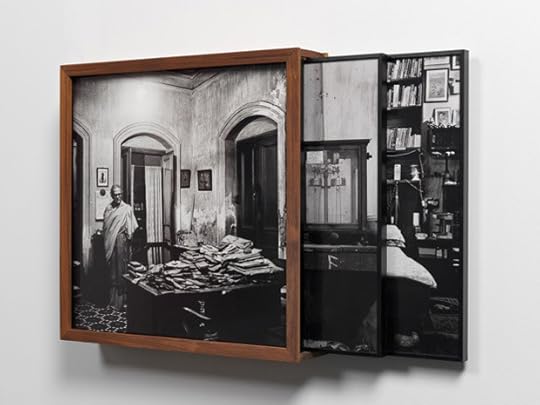
Dayanita Singh: File Museum

Dayanita Singh, Installation view, 2012. Courtesy of the artist and Frith Street Gallery, London
Ever since she left photojournalism behind, Dayanita Singh has wandered India, digging under the stereotype of a bustling, teeming nation to catalog absence. Few humans intrude into her luminous sodium nightscapes or deserted industrial sites, but in her new photographic installation File Museum, on view at Frith Street Gallery, London, until January 26, the sense of emptiness is more acute than ever. Archives are her subject. Not the digital-data sort growing in India’s gleaming technological hubs, but the crumbling, cavernous kind—windowless subterranean interiors crammed full of old paper.
Most of the 140 photographs on display show similar scenes: functional but rusty shelving units channel our vision to the point where darkness subsumes them, or where more shelves block our gaze. Files, sacks, trunks, and boxes contest for space. Cupboard doors are forced open by their contents. Shelves lean like dominoes under their loads. Empty chairs (the subject of an earlier series of Singh’s) come under siege from the piles surrounding them. Small patches of wall are only occasionally visible. At times, the floor is taken over with paper towers.
Dayanita Singh, Installation view, 2012. Courtesy of the artist and Frith Street Gallery, London
In a sense, people are absent and everywhere here. The bulging records, bursting out of the frame, chronicle snippets of millions of lives, both past and present, though what exactly the endless deluge of files contains remains oblique. Despite the chaos, handwritten signs in both Hindi and English can be spied (Secret F, 1908, September hints at one). Some of the archives she’s peering into are clearly locked away and classified; others, Singh’s images seem to suggest, are relics, buried underground and forgotten.
Most artists and photographers who are interested in archives (think Larry Sultan and Mike Mandel, or the Atlas Group) highlight the contents of the idiosyncratic collections they find, and are often suspicious of the power systems that generate them. They take the archive out of its context. Singh, however, is determined to bring the archives themselves to light, to show us the haphazard but very human organizational systems at these forlorn and increasingly anachronistic places. Singh’s choice of subject is reminiscent of the many abandoned, ruined sites that artists Jane and Louise Wilson, for instance, are drawn to. Her approach, however, and particularly her use of black-and-white film, is more akin to the repetitive monochrome cataloguing of Bernd and Hilla Becher, albeit with a more tender, elegiac eye. The technological vision India wants for its future is a long way from here.
Singh always experiments with the display of her images, calling herself a “bookmaker who works with photography.” Here she has made a huge rectangular teak storage system for the contents of File Museum—an archive of archives, if you like. It stands in the middle of the gallery like a giant tome, with one side of its moveable exterior open as if it were a book cover—a cover you could endlessly redesign, since the forty images displayed on the outside are interchangeable with the many stored within.
Pristine and neatly packed with frames, it feels like the opposite of the chaotic archives it houses, particularly within the ordered, rigid environment of the white cube, which doesn’t quite encourage interaction. Compared to Singh’s previous delicate and fragile publishing ventures, among them concertinaed books and a collection of postcards, it’s more monumental and contrived.
On a nearby wall are the images of the custodians themselves. While File Museum is far more straightforward than Singh’s previous works, which are often tinged with mystery and lyricism, with these portraits her elegy hits its most forceful note. Here women and men are lost in activity, sorting, retrieving, or rummaging; their heads are dwarfed, peeking over mountains of files or framed by gaps in piles. Compared to the empty archives, they are not so uniformly captured. Some are proud and smiling. Others are alert, pen-poised. A few are pensive or tired. A couple seem wary, used to being cataloguers, not being catalogued.
They may be an afterthought, slightly out of step with the rest of the installation, or with what we have come to expect from Singh. But these far more traditional images are the real highlight. It’s possibly no coincidence that there are just enough to cover the entire exterior of her giant teak “book.”

Dayanita Singh, Installation view, 2012. Courtesy of the artist and Frith Street Gallery, London
—
Isabel Stevens works at the film magazine Sight & Sound and writes on photography and film for a variety of publications, including Source and The Wire.
Aperture's Blog

- Aperture's profile
- 21 followers

