
Aperture's Blog, page 201
March 18, 2013
Interview with Bill Armstrong
For more than fifteen years, the New York–based photographer Bill Armstrong has been working on his Infinity series, which entails photographing handmade collages of printed source material with his camera’s focus ring set to infinity. His latest exhibition, Film Noir, is on view at ClampArt in New York through April 6. In addition, Armstrong appears tonight at Aperture Gallery in conversation with W. M. Hunt on the subject of “Thinking in Color.” —The Editors
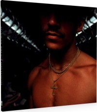
Bill Armstrong, Untitled (Film Noir #1433), 2012. Courtesy of the artist and ClampArt, New York.

Bill Armstrong, Untitled (Film Noir #1414), 2011. Courtesy of the artist and ClampArt, New York.

Bill Armstrong, Untitled (Film Noir #1435), 2012. Courtesy of the artist and ClampArt, New York.

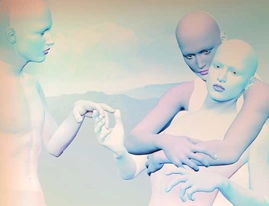
Bill Armstrong, Apparition #909, 2005. Courtesy of the artist and ClampArt, New York.

Bill Armstrong, Apparition #906, 2005. Courtesy of the artist and ClampArt, New York.

Bill Armstrong, Figure #30, 2000. Courtesy of the artist and ClampArt, New York.
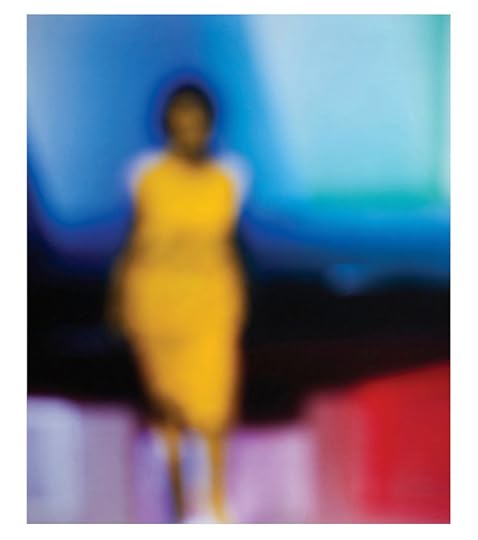
Aperture: This is your fourth exhibition at ClampArt. Were a viewer to try and trace the arc of these shows’ development, he or she might suggest that your source material and themes have become decidedly more contemporary. Earlier exhibitions involved images of Roman sculpture or Renaissance-era master drawings. This show, while referencing the classic films of the 1940s and ‘50s, seems to use contemporary source material. (Is that Michelle Obama we see in one image?) How do you aim to balance universal, timeless concerns with references to things—films noir, today’s advertising and stock imagery—that might be in the living memory of some viewers?
Bill Armstrong: I see what you are saying about an apparent arc from the past to the contemporary in the source material of my shows at ClampArt, but over entire the course of the Infinity series, the path is more wayward; in fact, the first portfolio, Early Figures, is made the same way as Film Noir. I felt it had been so long since I started the series that it made sense to circle back.
The idea of the Film Noir project is to revisit in color the themes of the classic black-and-white films of the 1940s and ’50s. The solitary figures contemplating the unknown reference the ethical and philosophical dilemmas laid out in those stories. However, the dark, mysterious images remain unresolved to hint at the increased uncertainties of the contemporary viewpoint.
I think of the film-noir subjects of loneliness, alienation, and the existentialist dilemma as universal themes that fit right into the overall trajectory of my work. I’m always trying to bite into the big themes: death, love, redemption, freedom, spirituality. I don’t have the exact quote, but Jack Pierson once said something like, “If it’s not about lonely, it’s not art.” Even though that’s apocryphal, I think the fact that we are alone is a major theme today, as much as faith and hope were in the Renaissance, or mortality was to the Romans. In a way I see all these themes as asking the same question. What is the meaning of it all? Does it matter what we do?
And by the way, I’m happy that many people read the image on the exhibition invitation as Michelle Obama—all the better—but it’s not her. It’s actually a figure from a Garry Winogrand photograph! An important aspect of blurring is that, by erasing individual features, I push the viewer to supply his/her own interpretation. I’m interested in this increased subjectivity: that the psychology and imagination of the viewer comes in to play. In many ways my work is about perception, how we try to resolve images but can’t, and how in that moment of confusion, when we are unsure of what we are seeing, the rational mind is derailed and we are freed to respond on a more subconscious level. I can’t be sure what it all means exactly, but I think a lot of people are very comfortable with the idea of Michelle Obama, and putting her into the picture may represent a desire for safety, for the known in an uncertain world. But perhaps you’d have a different explanation …
Aperture: Perhaps the fact that many people see Michelle Obama in the photograph included in this show is indicative of a “desire for the known,” as you aptly put it. Now that you’ve been at work on the Infinity series for a decade and a half, have you found viewers generally able to balance this desire for stability and familiarity with your own interest in pushing the meaning of the images out into more abstract, universal “big themes”? A related question: Given the methdological constraint of always setting the focus ring to infinity, what techniques have you developed over the years for varying the meaning conveyed by your pictures? I imagine it has something to do with color theory …
BA: For an artist like myself, who has a singular style, the challenge is always to keep a thread of familiarity connecting the bodies of work while at the same time spinning an expanding web in which each new portfolio is fresh enough to grab attention.
There are constraints to my blurred process—the images can’t be sharp, of course—but the range of subjects I can work with is broad. My overall goal of creating an ephemeral, spirit double for the real world is in some ways an endless quest, and each step along the way intersects with reality somewhat differently. The subject matter establishes the wide parameters of the meanings, but, yes, I use hues and values of color to fine-tune the emotional range of the individual images. My process is quite gestural: I mix and match colors, foregrounds, and backgrounds quickly and shoot rapidly. Sometimes it’s almost trancelike and depends on chance, but at the same time I’m fully aware of the principles of the contrast and harmony of colors.

Bill Armstrong, Untitled (Film Noir #1431), 2011. Courtesy of the artist and ClampArt, New York.
Aperture: I wouldn’t have expected your process to be described as “gestural,” given the precision of the effects achieved by your individual prints. It must require rigorous editing. Your work is featured on the cover of the recent Aperture book The Edge of Vision. That book is about abstraction in photography, a topic that has been very prominent in recent conversations about the medium. Are these conversations—around the work of such photographers as Walead Beshty, Liz Deschenes, Mariah Robertson, Michele Abeles, and others who manipulate their materials—of interest to you?
BA: I mention the “gestural” aspect of my work because I often find that if I work with a palette of colors one day, the next day those colors won’t interest me. There’s a subconscious aspect driving the process—the work is expressing some sensitivity or mood that I’m not aware of—and that seems important.
Of course, the printing requires care and precision. I’m still making my own prints in the color darkroom, and I do think the prints in the ClampArt show jump off the wall, if I say so myself. Brian Clamp is a wizard with lighting, and that makes a big difference. I know some people think working in the darkroom is a bit pathetic these days, but I’m proud of those prints!
I’m thrilled that there’s a new interest in abstract photography. I’ve always thought of the lens as a paintbrush for making creative images. Over the years, I’ve often felt out of step with my peers: in the beginning people even told me color was for commercial work and black and white was for art! Luckily I didn’t listen.
I love smart, original, and visually compelling work: Mariah Robertson and Walead Beshty’s virtuoso photograms blow me away. How about Ellen Carey’s crumpled series; do you know those? They make me want to work without a camera—it’s so pure and direct. I show the mixed-media artists, Sarah Anne Johnson and Sam Falls, in my class, as well the rest of the Higher Pictures crew: Artie Vierkant, Jessica Eaton, Letha Wilson. I’m also interested in the idea of the printer being the medium. Wade Guyton, Gerhard Richter, and John Baldessari all had big shows last year, making inkjet prints without using a camera. I bet we’ll see more of that.
I’ve been making some abstract videos myself. I had an exhibition of them in 2011 at the Cornell Museum of Art. I’d love to make more, I’ve got lots of ideas, but it’s hard to find the time. Lately, I’ve been making some abstract images in the subway with a camera phone. Maybe they will see the light of day sometime—I’m not sure yet.
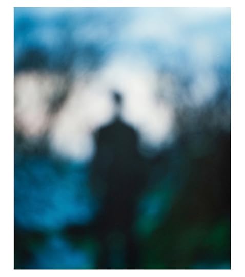
Aperture: Unlike some iterations of your Infinity series, the subjects in Film Noir are all human, are all seen full-length, and are often in outdoor locations. Can you speak about the decisions that led to these being the works’ defining characteristics?
BA: I mentioned before that Film Noir represents circling back to my first portfolio in the Infinity series which was in the style of horizontal “environmental portraits.” I always think in terms of portfolios, so once I’ve got an idea the variations tend to stay within a fairly close range.
I’m not sure how I started this series, but there’s a back story which brings in the subconscious again—that seems to be my theme right now. I was in a show at Robischon Gallery in Denver with Halim Al-Karim a few years ago. He’s an Iraqi refugee and dissident who also uses blur. His work is political and a powerful metaphor for his experience. On the airplane back from the opening, I wondered how I might create work that would reflect personal experience, the way he did. I recalled how I was halfway through my Apparition series before I realized I was making photographs of ghosts of old men and that my father had just died. I consider Apparition my most powerful work and believe that fact that the motivation was subconscious is a key to its power, its truth. I thought about how it might be worthwhile to make work about my mother’s death, but I never came up with any ideas and when I got home I soon forgot about it.
A short while later I began shooting figures in the landscape, in the style of my early work. As I went along the images kept getting darker and more mysterious, and I gradually developed the idea of having the portfolio relate to the Film Noir themes. As well as the films the writers Raymond Chandler and Dashiell Hammett were very important to me as I came of age, and so, too, were Albert Camus and Jean-Paul Sartre—I lump them together in my mind.
As with Apparition, it wasn’t until I was well into the project that it dawned on me that this was it—this was the work about my mother’s death that I had imagined on the airplane. My mother committed suicide when I was fourteen, and as one can imagine it turned my life upside down. I realized these dark images of solitary figures were self-portraits in a way, and represented the ideas and feelings I carried through adolescence into adulthood—the period when I was interested in film noir and existentialism. For many years I felt that I was alone, that my universe was darker and less defined than my peers, and that it existed somewhat in parallel to conventional reality—that truth and meaning were obscured, perhaps unattainable.

Bill Armstrong, Figure #70, 2003. Courtesy of the artist and ClampArt, New York.
Some people believe that the power behind art is communicated through the work if the work is true, that the viewer feels that power and internalizes it according to his or her own needs and consciousness. If that’s the case, then there’s no point in artists explaining themselves too much. In some ways I agree with this idea; at the same time, however, I often find that if I like art, I like it even better when I learn more about it. It’s a fine line. I doubt I’d write about this in my artist’s statement, but in an interview I feel it’s a bit different, more personal and informal. And of course it is important to me and doesn’t feel it should be a secret—it was well over forty years ago that my mother took her own life, yet the power of that event still exists within me. If I can transform any of that power into imagery that others can relate to, well, that seems like a good thing.
Aperture: Given your interest in spirituality and universality, do you have any religious beliefs or belief in God?
BA: Spirit was the title of my first show at ClampArt, and it referred to a whole range of ideas about spirits: nineteenth-century ghost photography, evil spirits of African masks, Bhuddism, Kandinsky. A philosophy professor I met at the opening suggested that my work was not really about spirituality but about spiritism. That was his word for the idea that I investigate a lot of different aspects of “spirit.” I think he was right.
I had an interesting experience the other day. Bill Hunt and I were talking about the spiritual aspects of blue. He asked me if I believed in God and when I hesitated, he said, “You believe in the subconscious.” It occurred to me that belief in the subconscious might be another way of saying God is within you. I had never thought of that before. I guess I’m still learning.


March 15, 2013
Rinko Kawauchi On Press – Ametsuchi
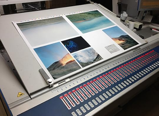
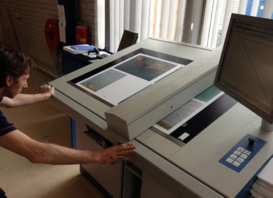
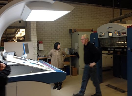


The presses were rolling in China earlier this month for Rinko Kawauchi’s forthcoming monograph Ametsuchi (Aperture, 2013), an eighty-page clothbound volume of the Japanese photographer’s latest work designed by Hans Gremmen.
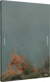
Rinko Kawauchi has gained international recognition for her nuanced, lushly colored images that offer closely observed fragments of everyday life (see, for example, Illuminance, her 2011 Aperture monograph). In her latest work, Kawauchi shifts her attention from the micro to the macro—images of distant constellations and tiny figures lost within landscapes, as well as photographs of a traditional style of controlled-burn farming (yakihata) in which the cycles of cultivation and recovery span decades and generations.
Ametsuchi: Photographs by Rinko Kawauchi is coming soon.
 Ametsuchi
$80.00
 Untitled, from Illuminance
$2,500.00
 Illuminance Limited-Edition Box Set
$1,800.00
 Illuminance
$60.00
March 14, 2013
A Great Improvisation

Don Cherry and Manfred Eicher at Tonstudio Bauer in Ludwigsburg, Germany. Photograph by Roberto Masotti. © Robert Masotti, courtesy Haus der Kunst, Munich.

Installation view of ECM—A Cultural Archeology. Photogrph by Wilfied Petzi, courtesy of the Haus der Kunst, Munich.
Spread from ECM—A Cultural Archeology.

Keith Jarrett. Photograph by Roberto Masotti. © Roberto Masotti, courtesy of the Haus der Kunst, Munich.
Don Cherry. Photograph by Gérard Amsellem. © Gérard Amsellem, courtesy of the Haus der Kunst, Munich.
Spread from ECM—A Cultural Archeology.
ECM—A Cultural Anthology is the name of a multidisciplinary exhibition organized last year by Okwui Enwezor and Markus Müller for Münich’s Haus der Kunst as well as an engrossing new catalog documenting over four decades of history issuing from, inspired by, and surrounding the Münich-based Edition of Contemporary Music. Founded in 1969 by musician and producer Manfred Eicher, ECM’s name was different from the start. Not a “label” tagged onto a varied set of recordings but something much closer to a small literary press or publisher of artists’ books, like the ones the nearby Edition Hansjörg Mayer had been publishing in Stuttgart with artists like Dieter Roth, Emmett Williams, and Robert Filliou since 1963. Frequently these books captured the uncapturable—poems that couldn’t be read, performances and happenings that left only graphic traces or elliptical photographic documentation. Eicher’s ECM attempted the same with its live recordings and studio sessions. And, like Mayer’s books, ECM’s editioned events were meticulously produced, artistically challenging, often unfamiliar, and as far as possible from what catalog contributor Wolfgang Sandner describes as “cultural fast food.”
Nowhere was ECM’s dedication to creative nourishment more clear than when it released a ten-record box set of Keith Jarrett’s Sun Bear Concerts in 1978. The edition documented an entire cycle of improvised solo piano performances across five Japanese cities—a testament to sustained, meditative concentration. And while it was easy to see this achievement as heroic, I remember being particularly touched as I lingered over the liner booklet with photographs by Klaus Knaup and Akira Aimi, stopping at a double-page spread of a street sweeper shot from above. So much of ECM and Jarrett was in these images: the broom a kind of instrument and the sweeper its player, improvising a path through the graphic markings of the street unaware but subconsciously guided by the azimuth of telephone wiring above. Each image marks a beat in time, but, taken together, they became a micro-cinema, a flicker that preserved this fleeting, solitary, humble moment in the booklet’s pages. Sun Bear was my first ECM record. It was not my last.
View of ECM archive, as seen in the exhibition ECM—A Cultural Archeology. Photograph by Wilfied Petzi. Courtesy Haus der Kunst, Munich.
ECM’s first record was the Mal Waldron Trio’s Free at Last, and Enwezor devotes much of his essay to unpacking its complex network of influences, both historic and political. Historically, thirty years before ECM’s founding there was Blue Note, triggered by a migration of Europeans like founder Alfred Lion and label photographer Francis Wolff from Berlin to New York. These two, along with recording engineer Rudy van Gelder and graphic designer Reid Miles, established the label’s distinctive modern look, which drew on expressive wordplay and urban typographic vernacular with Miles’s covers; tightly-framed, often black-and-white portraits of musicians in Wolff’s photos; and van Gelder’s warm, up-close sound. ECM had a different perspective for a new generation of musicians. The migration was reversed, with American musicians traveling to Europe and Scandinavia to record. It was founded by Eicher, a musician and engineer with an artistic eye, who quickly hired the artist and designer Barbara Wojirsch, and, later, designers Dieter Rehm, Sascha Kleis, and Mayo Bucher to craft its look, which frequently pairs spare, International-style typography or Cy Twombly–like glyphs, runes, and expressive handwriting with images of what Eicher describes as “the inner landscape”: photographs of vast expanses like the sea or severe, distressed landscapes frequently absent of people. The aesthetic is strongly graphic, textural, cinematic, or sequential—these covers encourage listening and contemplation. Aurally, the landscape manifests itself with clear, pristine recordings that are variously described as luminous, transparent, open, and austere—Eicher’s signature sound. They act as one: the recording makes a room, the photograph a state of mind, the typography a human sense of organization or expression, the music a transformation, a transcendence, a freedom.
This last political value is the one most provocatively and persuasively explored by Enwezor and Müller’s exhibition, which staged ECM’s cultural history against the backdrop of other forms of artistic and formal dislocation and deconstruction in the 1960s. Enwezor reads Waldron’s title, Free at Last, through several lenses: freer forms of musical practice and production; free jazz itself, with its emphasis on the group and its explicit resistance to co-option by more mainstream musical culture; and finally, “the emancipatory processes set in motion by the Civil Rights Movement in the United States and the postcolonial and decolonization processes of the 1960s.” As Enwezor points out, Waldron’s title makes reference to Martin Luther King’s pivotal 1963 “I Have a Dream” speech, whose refrain is itself drawn from the music of African-American spirituals and set in motion through the metaphorical instrument of a pealing bell as freedom rings “from every city village and every hamlet, from every state and every city” until everyone can join hands and sing “Free at last! Free at last! Thank God Almighty, we are free at last!” As King departed from his prepared remarks that day, this refrain, along with the speech’s titular image, were entirely improvised. When asked if free jazz had any political meaning to him in the 1960s, Eicher responds with another musical metaphor: “I felt at home in this music because it was in tune with my thinking—the way I thought about society and life.”

Installation view of ECM—A Cultural Archeology. Photograph by Wilfied Petzi. Courtesy Haus der Kunst, Munich.
Waldron’s liner notes give Enwezor’s essay its title, “Great Big Ears,” and suggest that listening, like looking at photographs, is a deeply empathic process, a response to the turmoil of the time and a method for remaining open-minded in the future. Music-making is a deeply social endeavor, about playing and listening, interaction and translation, call and response. And ECM’s orbit constitutes a sustained effort at not just music- but world-making over its forty-three years. Eicher encourages us to “think of our ears as eyes,” and the book begins with a visual overture of sorts, echoes of ECM’s many collaborators and participants. The book’s dozens of photographs begin with a young, wide-eyed Eicher at his desk. Flipping through them, we eavesdrop on pre-concert prep, studio hangouts, laughing musicians, the breeze in the trees, the idling hum of a bus, the fizzled fry of an old boombox, the pop of flashbulbs, and, finally, a double-page spread of a ping-pong match between pianist Keith Jarrett and Manfred Eicher—the genius solo improviser on one side, and the bootstrapping entrepreneur on the other. Smiling broadly, the two friends don’t seem so much in competition as perfectly in sync. Back and forth over decades, the photos testify silently to the music that remains.
Rob Giampietro is a writer and a principal at Project Projects, a design studio in New York. He teaches in the MFA graphic design program at the Rhode Island School of Design.
ECM—A Cultural Archeology was on view at the Haus der Kunst, Munich, from November 23, 2012, to February 10, 2013. The catalog of the exhibition is published by Prestel.

Cover of ECM—A Cultural Archeology.
March 12, 2013
Album Art
Paula Roush, Found Photo Foundation / FPF, 2007–2012. Courtesy of the artist and Museum für Gegenwartskunst, Siegen, Germany.
Manfred Pernice, 18 Nov, 2012. Courtesy of the artist and Museum für Gegenwartskunst, Siegen, Germany.
Batia Suter, Surface Series (Table Selection), 2010. Courtesy of the artist and Museum für Gegenwartskunst, Siegen, Germany.
Lia Perjovschi, Timeline on General Culture (detail), 1997–2006. Courtesy of the artist and Museum für Gegenwartskunst, Siegen, Germany.
Marianna Christofides, L'histoire d'histoire d'une histoire, 2012. Courtesy of the artist and Museum für Gegenwartskunst, Siegen, Germany.
Thea Djordjadze, Archäologie Politik Politik Archäologie Archäologie Politik Politik Archäologie Archäologie Politik Politik Archäologie, 2008. Courtesy of the artist and Museum für Gegenwartskunst, Siegen, Germany.
Johann Joachim Winckelmann, the German art historian and theoretician of Neoclassicism, believed that it was the concern of art to give expression to beauty. To express this concern he developed the concepts of “noble simplicity and quiet grandeur.” He applied these concepts to, of all things, the antique statue of Laocoön, a work of art that is neither noble nor quiet, but seems to absolutely explode with struggle, aggression, and despair. Aby Warburg noticed this discrepancy and it awakened in him a passion that lasted a lifetime. Warburg asked himself to what extent the things that we perceived in an image were merely the projection of our particular culturally determined convictions. For example, in Warburg’s view, Winckelmann projected his own ideals of beauty regarding classical antiquity onto the statue of Laocoön. Yet perhaps there might be universal pictorial structures, of physical and psychic origin, stored in our memories as “pre-concepts” or forms. The Greeks called such images mnemosyne [remembrances/memories]. Warburg began to search for such pictorial “pre-concepts,” which he termed “pathos formulas.”
Warburg began his search for these “pathos formulas” at exactly the right moment. Photography had become established and offered previously unimagined opportunities for comparing images. “Thanks to the resource of photography, the comparison of images can be further developed,” Warburg stated. As a means of refuting Winckelmann’s ideal of beauty, in the 1920s Warburg collected plates with photographs not only of works of art, but also of stamps, coins, and newspaper pictures. Warburg believed that art served as a means of overcoming traumatic experiences.

Cécile Hummel, Zurück-Blicken, 2012. Courtesy of the artist and Museum für Gegenwartskunst, Siegen, Germany.
Warburg’s plates, which he called the Bildatlas Mnemosyne [Mnemosyne Album], were groundbreaking in their treatment of images. They proved provocative both for art theory and for art itself, and are still stimulating today. The intensity with which young artists in particular attempt to emulate Warburg is amazing, and was vividly displayed in this exhibition, which explicitly references the famous scholar and researcher of images. The exhibition also demonstrates, however, that these twenty-three young artists often do not share Warburg’s view of photography as simply an auxiliary resource for pursuing concrete interests. For them, photography has value in and of itself and can stand alone. This can be dangerous: believing every picture has inherent meaning can easily lead to randomness and nostalgia. One only needs to conjure a gentle appearance of old age and the job is done.
What are these artists doing with their images? If you are Manfred Pernice, you construct a pedestal out of used crates to house a photograph of the first demonstration that took place in East Berlin on November 4, 1989. The artist originally bought it for eighteen Euros as a framed souvenir. Katalin Deér installs photographs in plaster and builds large blocks of them; Tobias Buche makes photos transparent by affixing them to walls of Plexiglas. These artists spatially extend their photographs, as does Alexandra Leykauf, who transfers a photograph of a Turkish tent into the third dimension and, in the process, creates a photographic tent. Images found in the archives of the Ullstein Publishing Company are confronted with texts written by Ulrike Kuschel. She writes Lenin Gives a Speech next to one photograph. But does it really depict Lenin? Sometimes the description corresponds to the photograph; sometimes they seem to contradict each other; sometimes one discovers absolutely no correlation between them, as in the case of Lenin. Confusion reigns.
These artists also use photographs as material for creating works of art. Thea Djordjadze unrolls a carpet on the floor. In an allusion to André Malraux’s Musée imaginaire, she spreads out upon it erotic photographs from India. A tableau, a picture, an installation is created. Other artists tell stories. Marianna Christofides projects two images side by side—flower sellers, a beach, palm branches, maps on a wall—while a female voice hovers “off-screen.” The photographs are mismatched, not associated with each other, and the narration is completely unrelated to anything else. This leaves space for our imagination to solve the puzzle.

Ulrike Kuschel, Bildbeschreibungen I and II, 2005/2006. Courtesy of the artist and Museum für Gegenwartskunst, Siegen, Germany.
Two works in the exhibition refer to Warburg directly. In their film, Ines Schaber and Stefan Pente attempt to grasp Warburg’s photos of the Pueblo Indian Snake Ritual from New Mexico, in part by taking pictures of themselves in front of his photographs. Elke Marhöfer’s silent film documents a trip to London, where she filmed the glass plates of Warburg’s Mnemosyne Album (the original plates have been lost). One thing becomes clear in this exhibition: in contrast to many works by younger artists, which often slip into arbitrariness or randomness, Warburg was concerned with essentials. Another fact emerges with great clarity: the search for the “pathos formula” is nowhere near complete.
Noemi Smolik is a critic living in Bonn, Germany, and Prague.
Translated from German by Alan Paddle.
The exhibition Dear Aby Warburg, What Can Be Done with Images? Dealing with Photographic Material was on view at the Museum für Gegenwartskunst Siegen, in Siegen, Germany, from December 2, 2012, to March 3, 2013. It is accompanied by a catalog published by Kehrer Verlag.
March 7, 2013
Emily Davidson, Bruce Davidson Book Talk
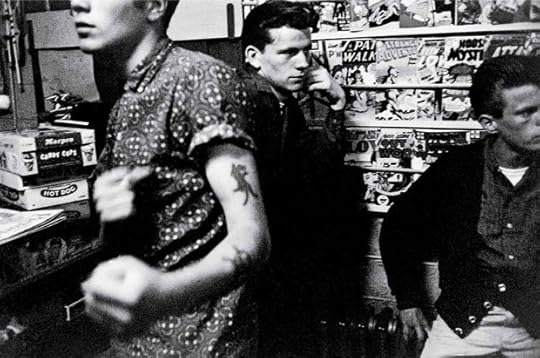
From the series Brooklyn Gang, 1959 © Bruce Davidson / Magnum Photos
In 1959, Bruce Davidson spent eleven months shooting images of the members of a Brooklyn gang that included a young Bobby Powers, producing one of the first full-immersion photo essays about an American youth subculture. Nearly forty years later, in 1998, journalist Emily Davidson began a decade-long correspondence with Powers, former gang leader turned drug-addiction counselor, a project to bring to light Powers’s struggle to overcome his drug-ridden and violent past. Decades of photographic documentation and correspondence has culminated in Bobby’s Book (Seven Stories Press, 2012), authored by Emily Haas Davidson, as told by Bob Powers, with photographs by Bruce Davidson.
Join Bob Powers, Emily Haas Davidson, and Bruce Davidson in New York next Tuesday, March 12, 2013, for a conversation about Bobby’s Book. The event will also feature a slideshow of Bruce Davision’s 1959 photographs.
Bobby’s Book: A conversation with Emily Haas Davidson, Bruce Davidson, and Bob Powers
Tuesday, March 12, 2013, at 7:00 pm
Barnes & Noble (86th and Lexington Avenue)
New York
Related Links:
“With Brass-Knuckled Tales, 50′s Street Gang Looks Back” –
New York Times
Bruce Davidson: Retrospective
at Robert Klein Gallery in Boston through March 30 –
Le Journal
“Leader of the Pack” –
New York Times
 Subway
$65.00
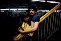 Untitled, (Couple on the Platform) from Subway,1980
$1,500.00
Swiping at Pictures
This essay is one of a series of online-only texts commissioned to accompany Aperture‘s Spring 2013 issue.
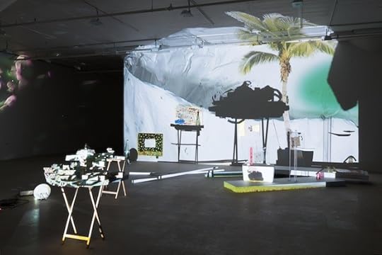
Trisha Baga, installation view of The Biggest Circle at Greene Naftali, New York, 2012. Courtesy of the artist and Greene Naftali, New York. Photograph: Martha Fleming-Ives.
As smartphones and tablets become enmeshed in our daily activities and everything from the flat-screen TV to the kitchen fridge becomes connected to the cloud, our relationship to technology and to the Internet has changed dramatically. It is no longer a matter of yes or no, Luddite or first adopter, online or off. Rather, life entails a range of interactions that combine direct encounters with information that is pulled from the ether. Everyday experience is a triangulation of three points: first, what is physically in the world; second, what is on the touch screen in one’s hand; and third, how the mind processes it all. It is as common as meeting a friend over coffee while texting another and then checking which celebrity has been spotted where by the Daily Mail. These types of interactions have changed—in big and small ways—how we engage with one another, how we process images and information, and how we regard the world at large.
I do not propose that technology alone has radically reshaped contemporary life, but rather that recent innovations have facilitated tendencies that began with the rise of advertising and media culture in the first half of the twentieth century and continued through the explosion of images in the 1970s and ’80s. Art has always attempted to bring new meaning to the rapid changes caused by technology. Pop Art, which emerged in the late 1950s, and the Pictures Generation of the ’70s and ’80s examined and made use of images that held currency in their respective times. A new generation of artists is now utilizing early-twenty-first-century images and exploring what they mean. Unlike in previous decades, today’s pictures circulate in an increasingly interactive and participatory manner, and the distinction between original and copy has been rendered more and more inconsequential.
Helen Marten fully acknowledges the circuitous life of images. In a 2011 interview with curator Hans Ulrich Obrist, she says, “There is a viral mentality that borrows from a mass of known imagery, from accessible and generous vocabularies, but does so understanding that it will become dispersed, boot-legged, pirated.” Her sculptures and videos are populated with logos and brands—known forms that she draws together, alluding to rebus-like meanings—and yet comprise a shorthand that frustrates direct communication. By featuring BMW logos, bottles of Campari, and Oakley sunglasses, Marten takes advantage of the status and desirability companies have tried to impart to their products. Tracing the history of modern advertising in his 2002 BBC documentary The Century of the Self, Adam Curtis notes of this phenomenon, “irrelevant objects could become powerful emotional symbols of how you want to be seen by others.”
Michele Abeles, Publicity Photograph, Artist Michele Abeles, Rob Pruitt 2010 Art Awards, 2011. Courtesy Roger Kirsby.
The circulation of images and a sense of visual literacy is made explicit in the work of Michele Abeles and Lucas Blalock, two artists who are steeped in photographic tradition and attuned to image dissemination. In her recent photographs, Abeles has incorporated details of previous compositions, making explicit the meme-like replication and development of images. In a performative mode, Abeles had actress Paz de la Huerta take her place at Rob Pruitt’s 2010 Art Awards, for which the photographer was nominated as New Artist of the Year. The hot downtown actress stood in for the emerging artist like one stock photo swapped for another. Blalock riffs on commercial images, still lifes, and architectural shots in humorous photographs made with a large-format camera and a computer. He takes pictures of ordinary objects like erasers, fabrics, and drinking glasses to create an archive of images that he later manipulates in Photoshop. One image may be layered onto another, or sections of a picture can be duplicated or erased; each manipulation is blunt and visible, as if the images had gone awry. Adept at moving between various styles of photography—a skill that goes beyond mimicry—his works make apparent the highly constructed nature of images and, at times, offer backhanded compliments to other artists mining similar ground.
Lucas Blalock, installation view of xyz, Ramiken Crucible, New York, 2011. Courtesy of the artist and Ramiken Crucible, New York.
Margaret Lee, installation view of New Pictures of Common Objects, MoMA PS1, New York, 2012. Courtesy of the artist and Jack Hanley Gallery. Photograph: Joerg Lohse.
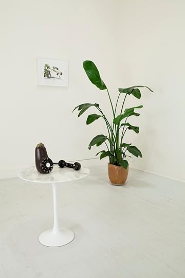
Margaret Lee creates lifelike sculptures of fruits and vegetables by casting them in plaster and then hand-painting them with acrylic. Lee aspires for the perfect fruit, one that never rots and appeals both to the eye and camera. Composed like ads, the photographs she takes of these objects often include hand models or decorative elements like ferns and furniture. In exhibitions the photographs may be presented with the sculptures they depict, as well as with furniture and objects reminiscent of those in the images. This is not to suggest a photo shoot, but rather to bring closer together the object and its image. The photograph—through the language of advertising—creates a context for the object that is related to, but different from, the sculpture in the same space. The eggplant’s marble base may differ from the one depicted in the image. The plant in the gallery does not match the photograph. And yet the work and its image seem to serve the same aims, in particular to narrow the gap between objects and images, a divide that is currently bridged by fingertips and touch screens.
Describing an attempt to sculpt clay, artist Mark Leckey says, “it was as if my body, the instinctual part of it, couldn’t grasp why I couldn’t just copy, paste, and flip the other half [of the material].” We are all babies learning when it is appropriate to pinch and swipe. A sense of this familiar but strange space, in which it is difficult to distinguish between the physical world and video images, is evoked in Trisha Baga’s installations. Her works bring together video projections, found objects, paintings, and other elements created by the artist. Video footage—a combination of material she shot herself and culled from pop-culture sources—is projected onto a field of objects to produce an array of shadows that nest themselves within the video images. For Baga, the shadows represent the space between the physical object and video—a gradient of light and dark she taps to treat unwieldy topics like American history.
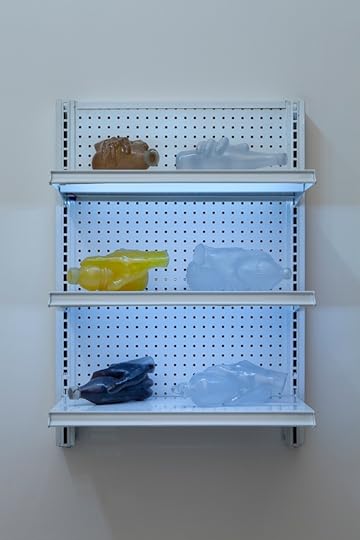
Another artist who points towards future ways of making is Josh Kline, who has utilized 3-D scanners and printers to create sculptures of the hands and feet of creative workers. By scanning footwear designers wearing their own creations and the hands of tastemakers—writers, artists, and designers—holding bottled drinks of their choice, Kline has made fragmentary portraits that double as product displays. Presented on metal shelves with custom lighting, the metonymic works evoke the seemingly limitless supply of a convenience store; they become a shop that holds the promise of copies tailored for each customer. Additionally, Kline’s titles explicitly identify by name and profession the individuals whose feet and hands were scanned. By doing so he metaphorically point towards the social networks that connect us professionally and personally. Kline has taken the visual language of advertising and commercial display—a language in which he says we are not only literate but fluent—and uses it to do something other than push products.
Similarly playing against expectations, Darren Bader has been known to include the work of other artists, and even non-artists, in his solo exhibitions. Exhibited without attribution or marks of differentiation, Bader fosters a space of equivalence. A framed movie poster can be regarded alongside a French horn filled with guacamole or a live snake improbably accompanied by mittens and a dildo. How Bader’s work is presented in publications is just as surprising. He generally prefers that his images to run without captions; one is never sure if the images he submits are of another artist’s work or sourced elsewhere. Bader does not aim to trick the viewer. Instead, his published images suggest a placeholder or stand-in, an acknowledgement that these have been and will continue to be subjected to what Marten calls acts of dispersion, bootlegging, and piracy.
Within Pop Art, Hal Foster sees a politics “centered on its commitment to what is held in common, including our shared image world understood (perhaps perversely) as a newfangled commons.” The Internet has made manifest our shared image world. Despite the fact that much of it is colonized by corporations, it serves as a digital commons that exerts a force of equivalence. Minority voices like conspiracy theorists and Holocaust deniers are as easy to find as traditional sources of journalistic information. Because you can Google it does not make it true. In his essay on the role of journalism today, Der Spiegel reporter Ullrich Fichtner writes, “In the ever-chatting grinder of the web, facts can look like just opinions; and opinions can wander around like facts.” Such commingling of fact and fiction allows for notions untethered to reality to grow in popularity and furthers a frame of mind that blends news and entertainment—as seen on twenty-four-hour news channels. It also gives rise to the bizarre scenes in which acting and real life are nearly indistinguishable. How does one parse Sarah Palin’s bid to be vice president from her showdown with her Saturday Night Live impersonator, or Charlie Sheen’s “winning” meltdown and his role on Two and a Half Men? On their own, such incidents may not seem of consequence, but in times of climate change and political upheaval the difference between fact and fiction is one we cannot fail to see.
Josh Kline, Tastemaker’s Choice, 2012. Courtesy the artist and 47 Canal. Photograph: Joerg Lohse.

Helen Marten, installation view of Plank Salad, Chisenhale Gallery, London, 2012. Courtesy of the artist, Johann König, Berlin, and T293, Rome and Naples.
This essay is one of a series of online-only texts commissioned to accompany Aperture‘s Spring 2013 issue.
March 6, 2013
Photography at Novartis AG
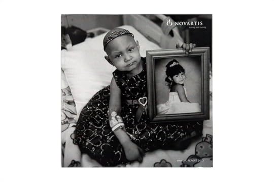
Cover of Novartis AG Annual Report, 2012. Photograph by Mary Ellen Mark.
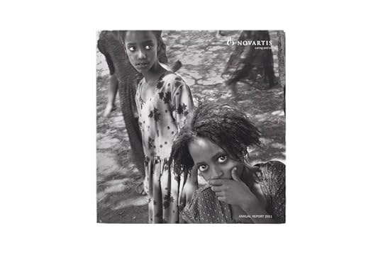
Cover of Novartis AG Annual Report, 2011. Photograph by Eugene Richards.
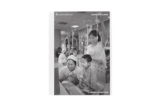
Cover of Novartis AG Annual Report, 2004. Photograph by Cristina Garcia Rodero.
Melissa Harris: Does a specific mission or philosophy guide Novartis? Does that relate to your reason for welcoming artists to work with the company?
Daniel Vasella: Yes, our mission is to always find better medicines for patients, and that implies curing and caring for people. Human beings are at the center of all we do. Art is an essential part of human existence, a very important way to express feelings and thoughts which are not always rational or conscious. Artists have ways of crossing barriers and boundaries, transcending cultures. So, art in companies often builds bridges and touches people and associates.
In choosing specific photographers, you always have to look at a person’s background. I myself am trained as a physician and that influences me.
MH: In what particular area?
DV: I was trained in internal medicine and psychosomatic medicine. That has always remained close to my heart.
MH: What role does art and architecture play at Novartis?
DV: I do believe our “internal” Novartis audience responds to the art collection, and also the excellent and diverse architecture that comprises our campus. We have a highly educated employee base. Our concept was to create a lot of open space, to facilitate interaction inside the buildings, but also between buildings—in the courtyards, the open spaces, and so forth. We aim to integrate these spaces with art.
For example, the first building was conceived as collaboration between a painter and an architect. The painter did the outside facade, the design, and the architect completed the rest. In every building, we have one or more artists—but at least one who makes a major intervention.
MH: So part of the philosophy, then, in terms your sensibility, has to do with collaboration at some level.
DV: Yes, collaboration is essential. Nobody can achieve alone what we can realize collaboratively. Our work is such a complex endeavor. How do you get people to work together not only vertically within one function, but also across functions? How do you make sure that people’s intrinsic motivation for the job they are doing is not constrained, but is appreciated and utilized?
Along these lines, the annual report was at one time just an informational and promotional approach to community building, but did not actively engage people. It was my ambition to have the annual report embrace the high standards we apply in other areas of our business. The photography it contained should be more than simply photography; I felt it should go beyond the text. I am much more of a visual person.
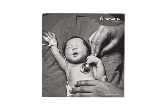
Cover of Novartis AG Annual Report, 2009. Photograph by Steve McCurry.
MH: But how did you get this way?
DV: If only I knew! For my parents, art was important. Probably more for my mother than for my father. We had very little, but it was always appreciated. I grew up in Switzerland. At seventeen, I began to collect Japanese prints. I did not have a very significant budget but all the money I had went into the prints. I loved it. Maybe my brother played a role also. He is ten years older than I am and liked Asian art.
Then I took art history classes. I remember we visited the medieval town in which I grew up, and for the first time I looked at the houses, the architecture. Because I had been taught to look at specifics, and symbolic meanings, and the Gothic style of building, I became very interested.
MH: When did photography come into play?
DV: At the same time; no, in fact, earlier. I started to take pictures myself, and created my own darkroom. I entered competitions, but then I stopped at eighteen. So I had a period during my adolescence when photography was central. It was all I did.
MH: Whose work were you looking at?
DV: Cartier-Bresson for certain things; Newton for others. At the time, there was also a very fashionable Swedish guy who took these nudes of young girls. He created a bit of a dreamy environment, and he photographed these girls in a very romantic setting. It’s completely passé now, but I remember that well, too.
I wanted mostly to make portraits, for example to go and take pictures of people in the street. I hoped to do a book on the homeless, the faces of homeless, across the world …
So now, years later, with the annual reports, I thought I would really like to create something people would rather keep than throw away. Photography is an emotional form of communication. It’s informative, but it’s also very emotional. We have thousands of examples of that.
Then I began to look at different photographers, and then I began to choose.
MH: Did you do this on your own?
DV: Yes. I went to Magnum, and then to VII to begin looking. As I looked through pictures, I said, “This—I like this.” But I was never looking for the name. Only later did I discover the names, the people behind the photographs. Gene Richards, for example, is very intense, with strong feelings and beliefs. In the end, each photographer speaks with his or her own language. They are all so different, but they are all talking through their pictures. Christina Rodero had some pictures that were almost surrealistic, and Jim Nachtwey moved between showing the cruelty of war to the softness of a man who just loves people.
MH: Well, you picked passionate, mission-driven people with strong sensibilities. But tell me more about your process.
DV: This year we will make a big shift, because I want to do a report in color. I have asked Stephanie Sinclair to be the photographer. In years past I had said, “I really want black-and-white,” because many annual reports with flashy colors and glossy stuff look cheap. Now I believe we have achieved an elegance, and what we do with great photography is clear-cut, so it does not matter.
My process, since the beginning, has been to look at a selection of about twenty photographers each year. I look through their works, books, and materials. I leave everything on my table for a while, and I look again, and I look again. Then I eliminate. I like consistently good work. If I see very good work and then I see something that I think is not as good, I eliminate it.
I am generally left with about three people, and it’s very, very hard to decide. I ask my daughter, who is in her twenties and studied art history and psychology, and my wife to look as well. While I’m listening to their responses, I am also looking again.
MH: Are you looking for storytellers? For individually powerful images?
DV: I think all of the work I’ve responded to has a narrative aspect, although I am not looking for it. But I think that’s the part I react well to.
I’m responding to the quality of the picture, and then I wonder, “Why do they take this picture? Why do they show that?” I think they express something about themselves by how they take a picture. The work says something.
Cover of Novartis AG Annual Report, 2011. Photograph by Eugene Richards.
MH: You’ve selected photographers whose work, for the most part, gets under the skin of something, who want to go beyond the surface. They want to ask questions, and they want to go deeper.
DV: What you are saying, “below the surface,” is what I tried to say. “Below the surface” communicates something beyond the cognitive process. It’s more an unconscious understanding of what is being communicated.
MH: What do you tell these photographers? What is the mandate?
DV: I tell them that I would like them to capture patients and caregivers across the globe, and to show the human face. Then we discuss what this might mean; this discussion is different with each photographer.
I try to understand the person also, where we have an overlap, how we can best communicate. As a company we have certain basic needs. For example, we are involved in veterinary medicine, so photographs of animals are part of it. Once I meet the photographers, I trust them.
It doesn’t always work, though. One photographer went to Egypt for us. Unfortunately, he didn’t have a good feeling for cultural limits and boundaries of politeness and was arrested. It would have been a wonderful project, but it didn’t work out.
Another time, we had a problem because we didn’t have all the signed forms. The photographer took a picture of a man with his wife who had an ablation because of breast cancer. She showed it, and that was shocking for people. Some activists asked, “Do you have the release form?” Then, we went searching for the forms …
MH: How much of this has to relate back to Novartis, and how much of it is just about the human condition?
DV: I provide the photographers with the purpose of our business and the aspirations and values we stand for. Equally, they must know our lines of business, our main activities and the outline of the annual report.
I would like to see a representation of the patients and customers we serve. Of course, it is impossible to include all ethnic, age, and social groups, and in addition to that touch on all of our functions. But, at the same time, I leave a lot of leeway. There is so much breadth and possibility.
Once they have completed their yearlong projects, I need to make choices for the actual report. Some may be great pictures, great emotional stories, but for this or that reason I will not use them for the report, which also has to speak directly and clearly to our shareholders. But I may purchase some of these photographs for our collection. Each year, I buy about twenty-five pictures, then I put them on the walls throughout the campus.
Cover of Novartis AG Annual Report, 2004. Photograph by Cristina Garcia Rodero.
MH: How do you contextualize the photographs? Do you explain the relationship between the images and Novartis?
DV: I have a team who has begun to understand my approach to the annual report, so they prepare options for me. I have put in place a process where I select the photographs, then, according to my assessments, the team tries to place them. Then we look at the report together with the photographer. I like to have the photographer in the room so they can have input. Sometimes we debate the picture selection: “Why don’t you take this one?”
MH: Is that interesting for you?
DV: Yes. They sometimes are connected to what they saw and who they met, and that influences their sense of the picture. I only see what I observe. I may eliminate more of the images, and after I look at the text I say, “That fits the story, that doesn’t fit.”
MH: Is anything taboo?
DV: Yes, anything which would unduly intrude into the lives of a subject, or any photographs without clearance for shooting pictures of the subject.
MH: Do you know yet what Stephanie Sinclair will focus on? What made you select her now?
DV: I am very much looking forward to her work. I saw an initial series of pictures that captured birth, life, and death in and around a clinic in Africa. She also has a specific second motive in mind. It is an idea which I will not disclose other than to say that I was skeptical about it at first. However, based on her enthusiasm, I agreed. Time will tell how well it will fit our project.
MH: Do you believe that photography can (or should?) address and/or comment on the human condition?
DV: The photographers I interact with generally have a keen sense of purpose. They do not want just to shoot outstanding pictures, but also to show what others don’t or can’t see. They aim to touch viewers emotionally, to move them. They have the conscious or unconscious desire to influence and even change attitudes.
MH: Along these lines, do you have any advocacy goals with regard to your annual reports?
DV: I don’t believe I am an activist of any sort. For most of us life has moments of joy, sadness, well-being, and suffering. Unfortunately, many people live under difficult conditions. Novartis aspires to help to reduce suffering from disease and to save lives. So, it is also our intention to show aspects of the human condition.
March 5, 2013
Lingua Photographica
Ryan Whittier Hale, Abomination, 2012. Courtesy of the artist.
Of all the changes the web has undergone since its inception in the early 1990s, the most jarring, of course, is the way in which its related technologies have become enmeshed in almost every avenue of daily life. The Internet (at least in the places on the globe where it’s freely available) is no longer a novelty or pastime; it’s a fundamental aspect of contemporary experience. Millions of users fluidly shuttle between online and off, often functioning in both realms at the same moment.
In this dual reality, photography has taken on an intriguing role. In a virtualized world of constant information intake, the ability to read photographs instantly, to say nothing of the unprecedented ease of taking pictures and disseminating them online, makes photographic imagery the new lingua franca.
But while photography is more pervasive than ever, it is also every day less consciously photographic. Photographs are now pics: the mutable, disposable flotsam of daily life. Beyond even the automated comforts of the point-and-click or the one-time-use disposable camera, a modest telephone can now snap and distribute a quick digital image with ridiculous ease—an image with a richness and clarity that would have been enviable to previous generations of photographers. For artists, these new conditions, and the changing valuation of photographs, present myriad creative opportunities.
This is by no means a new area of investigation. Throughout the history of photography, artists—from John Heartfield to Robert Heinecken to Cindy Sherman—have explored the shifting status of the photographic image: that is, the way photographs are distributed, used, and received. Many artists working in and around the Internet today continue this inquiry, opening up new ways of understanding how photographic imagery functions in contemporary culture, with the new technologies that have now taken hold of our lives.
Katja Novitskova, Earth Calls 2 (Night), 2012
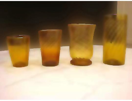
Jeff Baij’s CL Still Life series (2010) explores the aesthetics of banal images uploaded to the classified-ads website Craigslist. His particular focus here is on inexpensive dishes, glassware, and other dull items of home décor. His eye is drawn to low-resolution images, most likely taken with cellphones, almost certainly uploaded without artistic intent. Every once in a while an image will (accidentally) have an interesting composition, or will strike Baij as so supremely boring that it transcends its ostensible function. When he finds such images, he imports them into Photoshop and slaps on a raw filter, making the subjects at once humorously self-important—but also glowing, haunted, memorably strange.
The pursuit of the banal is an amply rewarding endeavor. In their blog Tanner America, artists Aaron Graham and Shawn C. Smith pose as suburban parents Allison and Rob Tanner, who use default web 2.0 blogging tools to “share photos with family and friends.” Photographs found online are collaged together and combined with short captions, satirizing the way many Baby Boomers and other non-digital-natives often awkwardly use the Internet. The result could be a cheap stunt, but the artists are able to strike a David Lynch–like balance of funny, creepy, bland, and surreal. Like Baij, Graham and Smith are mining a particular type of photography familiar to anyone who surfs the Internet on a regular basis—but then playing with the images, making them alien to themselves.
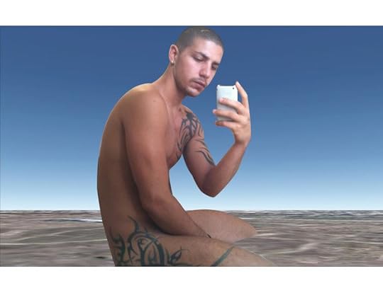
Katja Novitskova’s Earth Calls (2012) presents two images, each featuring an empty landscape (found on Google Earth) combined with an image of a man holding a smartphone (photographs culled from the blog platform Tumblr). In Earth Calls I, a man is seen taking a nude self-portrait by holding the phone up to a mirror. In Earth Calls II, another man, in a baseball cap, looks down in order to manipulate his phone. By themeselves, these images, like the empty Google Earth landscapes, are no more than random Internet finds. Through Novitskova’s simple juxtapositioning, though, the generic landscapes become abstracted planes and the men’s poses are elevated to something almost classical: overall, the work has an air of the elusive and mysterious.
In each of these bodies of work, there is an element of in-between-ness: the photographs seem caught between two polar attractions. There is of course an essential, definitive, inescapable irony in the use of these particular images. But there is another side to them, too: a gentle humor, perhaps a genuine affection for the subjects. And although in some ways the images in these projects are richly colorful and well-composed, there is a decided anti-aesthetic to them as well: they revel in the sort of low-res trashiness that characterizes so much photography on the web.
This disorienting in-between-ness can take other forms as well. Bunny Rogers’s ongoing project 9 Years is made up of screen captures taken from the artist’s experiences in the virtual landscapes of Second Life. Rogers places her avatar, Bunny Winterwolf, in sexually provocative situations with other users’ avatars. She then snaps hundreds of screencaps, trying to get one that strikes the correct intuitive balance. The images she ends up with are lush and evocative, but also odd and dark—sexuality becomes something both erotic and detached, both giddy and nightmarish.
Jeff Baij, CL Still Life 04, 2010. Courtesy of the artist.

Allison and Rob Tanner (Aaron Graham and Shawn C. Smith), Rob has this everyday for a snack, 2010, from Tanner America. Courtesy the artists.
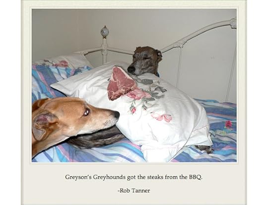
Allison and Rob Tanner (Aaron Graham and Shawn C. Smith), Greyson’s Greyhounds got the steaks from the BBQ, 2010, from Tanner America.
Courtesy the artists.
Ryan Whittier Hale, Caress, 2012. Courtesy of the artist.
Katja Novitskova, Earth Call 1, 2012. Courtesy of the artist.
Bunny Rogers, Untitled, from the series 9 Years, 2010. Courtesy of the artist.
Ryan Whittier Hale, Abomination, 2012. Courtesy of the artist.
Katja Novitskova, Earth Calls 2 (Night), 2012
With similar affect, in Ryan Whittier Hale’s Null Presence series (2012) android bodies exist in an uncanny space between emotional empathy and antiseptic nothingness. Borrowing compositional strategies from Mannerist paintings and imagery inspired by science fiction, Whittier Hale’s worlds seem on the verge of generating emotion—both between the figures and between the work and the viewer—but that feeling is swallowed into a void of artificiality and surface flatness. Whittier Hale says that with this project, he is “working with the idea of something that simultaneously has a presence and is completely vacant.”
Such dichotomies correspond, I believe, to a larger sensibility evolving on the Internet: the liminal feeling of life in the digital age—perched as it is between the virtual world and the physical, the organic and inorganic, the emotional and the disaffected. Without offering value judgments, these series open up those threshold sensibilities and allow viewers a peek inside.
—
Gene McHugh is a writer and curator based in Brooklyn.
This essay is one of a series of online-only texts commissioned to accompany Aperture‘s Spring 2013 issue.
March 1, 2013
Aperture Magazine at Sundance Film Festival
Celebrities assembled in Park City, Utah, this past January for the annual Sundance Film Festival. Renowned photographer Henny Garfunkel, who has attended the film festival for the past nineteen years, captured a few famous faces with the freshly relaunched Aperture magazine.

January Jones, Photograph by Henny Garfunkel at the Sundance Film Festival, 2013

Kate Bosworth, Photograph by Henny Garfunkel at the Sundance Film Festival, 2013
Andrew Dosunmu, Photograph by Henny Garfunkel at the Sundance Film Festival, 2013
Michael Cera, Photograph by Henny Garfunkel at the Sundance Film Festival, 2013
Dakota Fanning, Photograph by Henny Garfunkel at the Sundance Film Festival, 2013
Emily Browning, Photograph by Henny Garfunkel at the Sundance Film Festival, 2013
Juno Temple, Photograph by Henny Garfunkel at the Sundance Film Festival, 2013
Catalina Sandino Moreno, Photograph by Henny Garfunkel at the Sundance Film Festival, 2013
Boyd Holbrook, Photograph by Henny Garfunkel at the Sundance Film Festival, 2013
Peter Sarsgard, Photograph by Henny Garfunkel at the Sundance Film Festival, 2013

Josh Lucas, Photograph by Henny Garfunkel at the Sundance Film Festival, 2013
Jean-Marc Barr, Photograph by Henny Garfunkel at the Sundance Film Festival, 2013
Radha Mitchell, Photograph by Henny Garfunkel at the Sundance Film Festival, 2013

Elizabeth Olsen, Photograph by Henny Garfunkel at the Sundance Film Festival, 2013
Jason Isaacs, Photograph by Henny Garfunkel at the Sundance Film Festival, 2013

Thomas Jane, Photograph by Henny Garfunkel at the Sundance Film Festival, 2013
Have you picked up issue #210? Take a photograph of you and your copy of Spring 2013 Aperture for the chance to win a one-year subscription to the magazine. Use the hashtag #myaperturemag on Instagram or Twitter to take part in our portrait competition! Click for contest details.
February 26, 2013
Jeff Wall and Lucas Blalock: A Conversation on Pictures
Jeff Wall’s photographic work made over four decades has opened up the parameters of the medium to issues long understood to be outside its provenance. At the same time, his prolific writing has been an important factor in the development of a much-needed critical vocabulary. Wall’s contributions in both arenas provide conceptual underpinnings for contemporary artists. He requires photography to do the work of reflecting not only the world, but also the terms of that engagement. And his explicit relationships to both painting and film have opened new paths of understanding photography’s possibilities and place in the world. Wall makes use of a form of “cinematography” to pry photography from the narrow confines of technique and definition. His coinage phantom studio proposes that any given location can be imbued with the intentionality of the studio. These concepts and others have shaped the way we think about photography. In the conversation below, Wall speaks with Lucas Blalock about the current state of the medium, his recent work, and the freedom of the artist.
* * *
Lucas Blalock: Considering the changes that photography has undergone in the past decade, how might we consider it as a “medium” in its current situation? I mean here not the physical support, but the set of conventions or historical uses that act as a ground, making the decisions of the photographer legible.
Jeff Wall: I cling to the notion of photography as a medium insofar as it is an authentic way to achieve what we can call “the picture.” The physical nature of any medium has never been free from the conventional—and therefore historical—manners in which the physical elements have been handled. So I don’t feel there is anything particularly new happening in photography in that regard.
LB: You have written about the idea of “emphatic picture making,” which I think provides a compelling structure for thinking about photography. Could you talk about what you mean by this idea of the “emphatic”?
JW: “Emphatic picture making” is a phrase that I think expresses how photography can be free just to be an art form. Sculpture, painting, drawing, and the other older visual arts freed themselves this way a long time ago, but photography is still tied up with the practicalities of image production, and it’s hard for a lot of people working with it to achieve some sort of distance from that almost overpowering identity.
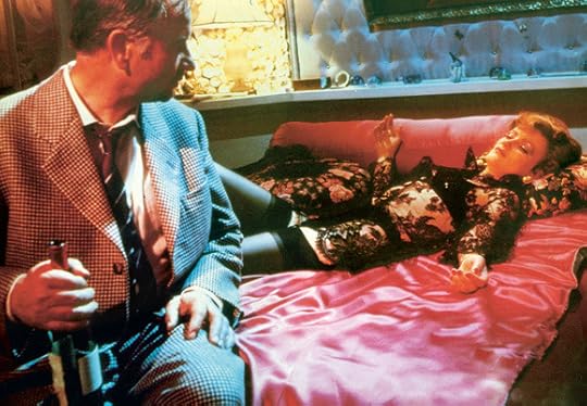
Still from Rainer Werner Fassbinder’s Lola, 1981. United Artists/Photofest
I’ve been criticized over the years for the perceived artificiality of some (or even most) of my pictures, for their apparently unwarranted, overcooked, and roundabout relation to the actualities of life—things that can be addressed much more immediately by remaining “true to the nature of photography.” But I like photographs that don’t look altogether the way photographs are supposed to look. We don’t really know how photographs are “supposed to look.” The existing conventions make it seem that we do, because they are authentic and central to photography, but they cannot predict what the next interesting photograph is going to look like. Nobody claims to be able to predict what the next good painting will look like.
LB: Lately we have seen the reemergence of a more literal “ studio picture,” and the photographer’s studio itself as the site of looking and picturing. The studio is being used by some artists for its particular conventional attributes: as a site with a specific history and the possibility of a kind of play on genre images (still lifes, commercial pictures, and so on). Do you find the work of artists like Christopher Williams, Roe Ethridge, or Michele Abeles to be in dialogue with your own thoughts on making studio pictures in the 1970s, or related to your “phantom studio” work of the past few years?
JW: A studio is a set of relationships, not so much a specific kind of interior—it doesn’t have to be an interior at all. But it can manifest in the kind of workspace that’s traditionally been used as a studio by photographers, or painters, or sculptors. There is no reason to view that kind of workroom as obsolete, as it seemed to be a few years ago, when everyone was excited about “post-studio art.”
Today the studio is not thought of in the binary, polarized sense that tended to prevail in the period when documentarytype photography was the norm, when the studio was defined as an artificial environment somehow not part of the real life that real photographers hunted and captured. That polarity was affected by the cinema of the 1960s, ’70s, ’80s—filmmakers such as Rainer Werner Fassbinder, Jean-Luc Godard, Pier Paolo Pasolini, and Ingmar Bergman could move from extreme artifice to moments of apparent documentary immediacy within a few seconds. Now we recognize the studio as a site of actuality no different in principle from any other site.
LB: In your 1993 essay on the Japanese artist On Kawara, you talk about how, in painting, the attraction to “lower”-genre pictures in the early modern era was understood as a movement toward the freest space, that these kinds of pictures are particularly good at “permitting a picture to be seen as a picture.” Can we look at contemporary photographic practice through a parallel lens? Do you think that there is a certain kind of work that these minor-genre pictures are particularly suited for?
JW: As photography becomes more and more familiar with itself as high art, and in some sense begins to be absorbed into the whole idea—the institution—of high art, photographers seem to be able to go through the same sorts of dialectics that painters and sculptors went through in the past century. In the nineteenth and twentieth centuries, “lower”-genre pictures were less constrained by the social and cultural ambitions that were woven into the structure of the higher types, so they became a less-delineated space in which a process of experimentation took place. Photographers were aware of this, and to some extent responded to it. But since there were no real “high” genres of photography back then, there wasn’t the intensity of engagement that there was in painting. Maybe now that there are apparently high genres in photography, the situation has evolved to the point at which it is possible to respond to their presence by moving away from them and, to an interesting degree, repeating aspects of what happened in painting a hundred or more years ago.
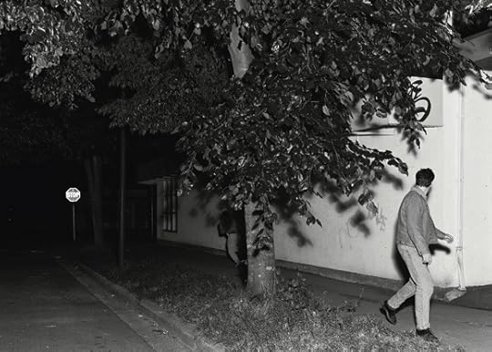
Jeff Wall, Passerby, 1996. Courtesy the artist.

Roe Ethridge, Pigeon, 2001. Courtesy the artist and Andrew Kreps Gallery, New York.
But it looks like people are trying to extend the sense of what permits a something to be seen as a picture—that is, with an ambition to matter in terms of proposing what a picture is at its most significant level. Younger artists (and some older ones, too) seem to be testing out this dialectic of higher and lower genres. The engagement with what have often been seen as trivial and compromised studio types—like the still life that started out as a commercial product photograph—seem to have to do with finding those little voids in the canon that can still disturb the consensus of what is worth bothering to photograph in the first place. This whole direction is really complex and sophisticated, and has been an undercurrent throughout the history of modernism. It became “ problematic” when product photography had evolved to the point where, vampirically, it almost destroyed the genre of still life, in the 1920s.
LB: Interestingly, the same period saw the rise of commodity culture, which was arguably made possible by the cheap circulation of photographic images. I wonder if this is in part because objects again have a central role in this stage of capitalism, a role that will eventually be subsumed by the abstract strategies of brands and identity marketing. And, in an increasingly digital environment, commodity objecthood—once seen as a tremendous abstraction and mode of distancing from the world—can now be seen instead as a connective possibility.
In the digital age, images are infinitely transferable, editable, and contiguous with their surroundings. They relate as much to the bodiless virtual archive as to the “having-beenseen” of the camera’s subject. To me, this is a new problem for a picture.
JW: That’s interesting—the idea that the network of electronic image traffic has become present in the relation between the photographer and the picture he or she sees in a viewfinder. But I think that that is true if you want it to be, not in itself. Because image traffic has become so heavy and so continuous, it now seems as if these millions of images came into being by themselves, without the agency of a person. And in a certain percentage of them, it’s true, because a lot of images are now made robotically and circulated automatically.
But that is more about the experience of seeing images than of making them. Artists have been fascinated by the notion of imitating a robot since the emergence of machines. But it is a willful imitation, an individual decision, not caused by the nature of the economy or technology. This is a good moment to look once again at the old idea of artistic freedom. In this context, artistic freedom means the awareness that as an artist you can choose your relation to the technologies; none is imposed on you the way it would be if you were an operative in an automated image-generating system of some kind. You cannot point to any institution that requires this or that behavior from you—art can be anything now.
Your own pictures, Lucas, show a sort of angst about this disembodiment—there’s an almost expressionistic aspect to the rough handling of the digital information. That does make them resemble paintings or prints … and you’re aware of this and very into it. You could say that your angst is your take on a social condition, and you’d be right about that. But there’s no social necessity to respond to social conditions artistically this way or that. There are no rules for this, so another artist could just as legitimately respond in a very different manner. All we have to compare between them are the results. And your results can be art of the highest quality, and mine, which could come from a completely different and even dissenting take on the same social material, could also and simultaneously be art of the highest quality, and both could be in touch with some true state of that same social material at the same time, but other to each other. So, to answer your question “Is this disembodiment a new problem for the picture?”—yes, it is a new problem if you need it to be one. If you need to ignore it and pretend it isn’t happening, you might get laughed at socially, but there’s no way to claim that that, probably childish and neurotic, act cannot lead to something artistically significant and first-rate.
LB: I want to ask about a shift I have felt more generally in the last decade from a discussion about photography modeled on cinematic tropes to one that is ostensibly based in painting. I feel like your work has long been a bridge across these two models and am curious to know if you have felt that this realignment has impacted your practice. You have said that some of your recent pictures were made in a “more pronounced” way, and I wonder if that might relate to this discussion.
JW: The relationship of photography to cinema and painting has always been the important thing for me. If it is just painting, then you fall into the situation that’s been so constantly criticized over the decades—that you are betraying this medium in the name of another one. If it’s cinema, you’re relegated to being commentary on the more complex results of another medium that therefore seems more powerful, and predominant, than it really is. It could be that at the moment artists are drifting further in the direction of the painter’s studio and métier, away from either cinematography or the documentary style. But there is a wide band where you’re in touch with all three elements even if you’re tending toward one or another pole.
My take on it has been that photography as art is constituted by this complex interrelationship between the documentary root, the cinematographic, and the kinship with the other, manual, depictive arts. This is a very large and high-energy entity; it’s not swamped by the vast “social” identity of photography—I mean, the aspects that aren’t art. It is almost magnetically attracted to them, because they aren’t art. As we know, art needs non-art in order to recognize itself. So I’m not aware of realignment because I feel that the domain is so large and internally various that one can shift this way and that and not really go anywhere radically different. I spent quite a bit of time over the past ten years or so exploring a kind of “near-documentary” picture, one that resembled snapshots or documentary photos. That was something I really wanted to do consistently, for a lot of reasons—the main one being to find out what that kind of picture actually looked like. And now more recently I’ve felt the need to diverge from that and try to make pictures that are more emphatically pictorial. I’m tired of struggling with a certain kind of problem, but the result of that struggle is that I find myself in a different spot, with a different relation to “near documentary.”
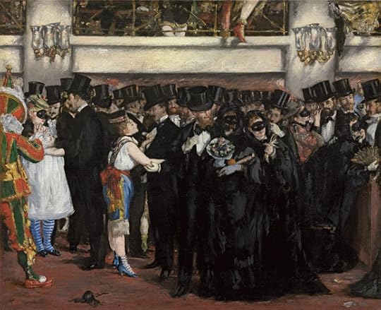
Édouard Manet, Masked Ball at the Opera, 1873. Courtesy National Gallery of Art.
LB: That reminds me of Garry Winogrand’s remark that he made photographs “to see what things looked like photographed.” Although I think that the character of Winogrand’s statement actually has a very different inflection. To make pictures that make a something—the thing pictured—be seen not only as itself but as a picture of itself sets up a certain kind of problem.
JW: A few years ago I wrote a short essay on Édouard Manet’s 1873 painting Masked Ball at the Opera. I noticed it seemed that Manet created a particular amount of space between his own position and the large group of people at the masked ball. That gap could easily have occurred in real life—anything can occur—but, still, what he did was interesting. I thought he insinuated into the social event he was depicting the kind of space that would almost naturally exist between a painter and a model in a studio situation. He created a subtle bracketing of the immediacy of what he was depicting by stepping back ever so slightly. He could not deny himself the excitement of making the most complex event hover with a very slight sense of suspension, in the form of the tableau—that form that can absorb and arrest any and every event once it becomes a picture.
I find this pictorial structure itself so suggestive and rich because it transforms the thing it depicts in the process of depicting it, of recording it. The “motif,” the thing depicted, comes to life not because of its own liveliness—even though it has that, too—but because of the way it almost vanishes into the tableau. The tableau-form, like a magic substance, both records with great fidelity and transforms the thing to which it is being true into another thing: a picture.
LB: You have used the term occultation in connection to similar ideas, and I’d like to get at the relationship between the “occulted” picture and the notion of immediacy. Please correct me if I’m wrong, but the immediate here is a presentation of the world that tries to suppress its qualities as a picture. The advertising image or the swimsuit photo might be good examples; an image depicting the seamlessness of technology might be another. I want to press this question of immediacy because it is potentially a defining characteristic of our time. I feel like, from this vantage, the dull, the boring, and the unspectacular have in turn been imbued with a lot of promise.
JW: Occultation was a term used by André Breton, I think in the Second Manifesto of Surrealism in 1929. He meant it partly in the sense of getting serious about the turn to myth and esotericism. But there was also a side of it that had to do with moving artistic work away from direct engagement with public matters and with “the public” as such in favor of a radical idea of artistic experiment, but also of artistic seriousness. Art that took into account the expectations of the public and of the existing domain of convention and taste was seen as compromised and kitsch. This attitude originated before Breton, with the Romantic and Symbolist poets, and it carried over into the New York School and the attitude toward seriousness and “high art.” It’s part of a long, and I hope still meaningful, tradition or lineage that expects art to dissent from conventional artistic taste at any given time, for all the well-known reasons, and to dispense with the idea that it is necessary to be popular in any way to be significant and even to be successful.
I have tried to practice photography in intense empathy with that, though not always in the same way. There is no one kind of “ serious” art. Fassbinder’s work is “occultish” to me even though he parodied and pastiched popular genres and styles. It’s the way he did his pastiche that gives his films their occulted feeling. It might not be something you can point to precisely and identify but it is there. On the other hand, Mark Rothko’s paintings are examples of the grand style of occultation. They are “ classic,” where Fassbinder is “mannerist,” but both are great—and they are akin somehow because they are great. In both you are looking at something that never occurred, did not exist, but has been made visible nevertheless. There is therefore a feeling of emanation, of something surfacing; the surface is coming into being, into visibility, not as a response to an existing surface, a social surface. And when a something surfaces as a picture, it can’t be dull or boring—no matter the subject.
—
Top image: Photograph of Jeff Wall by Greg Girard, October 2012 (detail).
Jeff Wall’s photographs have been exhibited internationally, and his critical writings have been widely published. The most recent of Wall’s retrospective exhibitions was presented at the Museum of Modern Art, New York, in 2007. He has received many prizes, including the Hasselblad Award for photography in 2002. He is based in Vancouver.
Lucas Blalock is a photographer and writer who lives and works in Los Angeles.
Aperture's Blog

- Aperture's profile
- 21 followers

