
Aperture's Blog, page 197
May 18, 2013
Colin Greenwood on Cuny Janssen, Yoshino

Cuny Janssen
Yoshino
Snoeck Verlagesgesellschaft mbH
Cologne, Germany, 2013
Designed by -SYB-
18 ¼ x 13 ¾ in. (46.3 x 34.8 cm)
54 pages
19 color photographs
Hardcover
snoeck.de
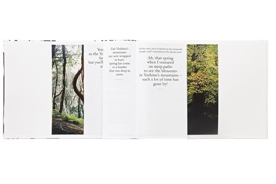
Cuny Janssen’s photographs of the sacred and beautiful Japanese mountain of Yoshino make you feel like you’re there. Her camera directs your eye to the blossoms and branches, streams and forest floors. In one image you float, ghost-like, above the other tourists. She invites us to imagine we are sharing these views with the ancient writers whose texts are interspersed between Janssen’s images. In combination with the texts, Janssen’s photographs become an enraptured revisiting of pre-photographic scenes of Yoshino.
Yoshino’s cover is a Sharpie-pen sketch of woodland; its swaying trunks and entwined limbs are like animist spirits. The book begins with traditional Japanese texts (translated by Jos Vos, who also contributes an essay), which fan out over five widening pages. Janssen’s images don’t appear to be in any seasonal order; rather, they are a series of vivid stills that fix you in their moment of beauty, and are interleaved with writing praising the same occasion.
 The book form and design brilliantly serves to narrate the experience of Yoshino. Its size is like a large sketch book, such as you’d take to draw outdoor scenes. Holding this book and turning through its pages is an intimate experience, and the smaller pages of poetry and prose about Yoshino—tipped in on a different paper stock cut to varying sizes—propel the reader along into each sequence of Janssen’s images. I experience the texts between the photographs like a drama’s chorus, exhortatory voices that punctuate longer, more contemplative passages and spur on this storybook. Janssen matches the different tones of the writings with the forms in the photographs—the bare rectitude of the deciduous trees’ trunks is contrasted with the playful, exotic, splayed sprays of kerria, with cherry-tree blossoms, and with the red-gold-green badges of maples. Her photographs convey a sense of personality in nature—particularly in the later images, where Yoshino’s natural glories butt up against human structures. You start to feel that some of the trees—the cherry trees at the back of the house and in the Shinto cemetery, the bright persimmon in the vegetable patch—are indeed spirits. By photographing them, Janssen makes them active, watchful participants in her scenes of Yoshino.
Vos’s essay describes a pilgrimage to Yoshino in steamy August and an arduous climb through the hills in the poets’ footsteps. Through it runs a nice thread about the fallibility of memory as it relates to place. This is underscored by two small, lonely black-and-white photos, which remind me of the depopulated photographs in W. G. Sebald’s books and follow glumly after Janssen’s glorious portraits of nature. Yet Vos and Janssen have created a harmonious book, one that expresses the enduring desire to share some collected memories of Yoshino, a place of pilgrimage, retreat, and return. As Vos writes: “It is as Tanikazaki once said: you can go and party under the cherry blossoms in a Tokyo park, but enjoying the same kind of blossoms at Yoshino, surrounded by spirits of the past, is a totally different thing.”
Or you can just get the book.
Colin Greenwood plays bass guitar with the English group Radiohead. He enjoys photographing the other band members on tour, and is interested in the history of photography. He has recently come back from working with the South Africa–based Children’s Radio Foundation and enjoyed documenting his trip on crf.waste.uk.com.


Publisher’s Note
Dear PhotoBook Review Readers,
We’re delighted to bring you the fourth issue of The PhotoBook Review. Many thanks for your continued interest if you are joining us again—and if this is your first time to pick up an issue of PBR, cheers and welcome. The PhotoBook Review 004 launches at the Los Angeles edition of Paris Photo, and is available once again to Aperture magazine subscribers, at the Aperture gallery, and at the Milan Image Art Fair, extending our audience to the west coast and across the Atlantic.
In addition to launching this issue together at the Paramount Studios, Paris Photo is also our intrepid partner in the Paris Photo–Aperture Foundation PhotoBook Prize, the second edition of which we are pleased to announce will be open for entries May 6. Open to self-published, boutique- and indie-published, and mega publisher–published books, we look forward to taking another dip in the river of creativity that is photobook publishing now. Check out the PhotoBook Prize website (aperture.org/photobookawards) for more details on how and when to enter.
Finally, a big thanks to Charlotte Cotton for taking the helm of this issue. For each volume of PBR we invite a colleague who has given the photobook serious consideration to help shape the issue and to tap contributors for inclusion. Miss Cotton brings to us the combined perspective of an author and curator—one who has written her own best-selling book, contributed to a slew of other people’s books, and, perhaps most radically, in Words Without Pictures, reformulated the idea of and process by which books come into being. A collection of talks, conversations, essays, and responses to those essays, Words Without Pictures was originally published online; subsequently appeared in a print-on-demand edition from the Los Angeles County Museum of Art; and is now available as an Aperture/LACMA copublication. It functioned, in essence, as a community-sourced snapshot of the state of photography during a critical moment of transition. In our first issue of this journal, we outlined the importance of community to The PhotoBook Review’s philosophy, acknowledging that “those of us who care about the photobook come to the table with a vested interest.” In this issue, Cotton injects an ontologically broad and digitally grounded set of definitions to the idea of the photobook and its community, expand ing the set of concerns to include photography that lives not just on the printed page of a book, but also on record covers, in ebooks, and in magazines. Other additive ingredients are the contributions of aficionados who are knowledgable but not specialists—musicians Kieran Hebden and Colin Greenwood, magazine editor Penny Martin, and design critic Emily King—in addition to an international coterie of deeply immersed advisors and photobook veterans such as Jeffrey Fraenkel, Richard Misrach, and others. Our thanks, as always, for the generous responses of all involved. In this issue, we’re treated to a perspective on community as an evolving delivery system for networked knowledge that is both personal and observant. Most critically, it is built on a set of recommendations that don’t just reaffirm what we already know, but open the doors to ideas we’ve yet to encounter.
—Lesley A. Martin
Publisher, The PhotoBook Review
Iñaki Domingo on Paul Kooiker, Heaven
Paul Kooiker
Heaven
Van Zoetendaal
Amsterdam, 2012
Designed by Willem van Zoetendaal
13 ⅜ x 9 ½ in. (34 x 24 cm)
176 pages
494 photographs
Hardcover
vanzoetendaal.com
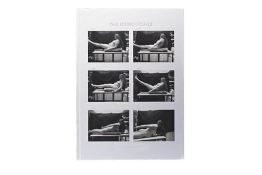
Paul Kooiker is best known for his startling and singular photographs of voluptuous female forms, yet his individual images are incomprehensible except as a part that cumulatively make up his psychologically charged oeuvre. Kooiker’s photographs do not allow for comfortable looking, instead demonstrating his fascination with the game of perception. He uses a visual language that is both dry and delicate, and that pushes at the limits of the unnerving, forcing us to keep our guard up and making us acknowledge our act of looking at these women’s bodies.
Kooiker’s work continues themes explored frequently throughout the history of representation: the relationship of the artist and the model, between the subject and the object of representation. Voyeurism is an ineluctable constant in his work, but it seems as if an explicit sexuality has been (somewhat surprisingly) kept away from his images. Furthermore, he manages to endow the female bodies of his models with a rotund material quality that goes beyond the merely corporeal, and is in line with artists such as Carlo Mollino or Boris Mikhailov.
In Heaven, his most recent publication, the author invites us to consider personal imagery gathered during the last twelve years through a selection of almost five hundred Polaroids that span multiple genres. From his most intimate photographs to the preparatory works created during studio sessions, from landscapes to street photography, these images always convey the fresh and direct style that results from the mastery of a tool that is at the service of his needs. In a sense, he shares with us his creative process when it is still unfinished. It seems that each step of the decision-making process is shared with his audience—as if we are voyeurs peering in upon the process of a voyeur.

The complex and, apparently, random narrative structure is the most prominent feature of this photobook, which is conceived as a journal that records Kooiker’s anxieties and obsessions in the course of everyday life. Notwithstanding the personal nature of this work, it is important to point out the impeccable editorial production of this title. Wise choices as to the format, materials, design, and printing strengthen Kooiker’s project and denote the close and prolific relationship he maintains with his editor, Willem van Zoetendaal, with whom he has published the majority of his books. The rhythm, the typology, and the number of images per page change through the book in a manner that seems to follow the author’s impulses. Throughout, Kooiker adheres to the grid, a very demanding element in terms of layout, in an exercise of Cartesian rationalism that counterbalances the personal nature of the imagery. Added to this is the disquieting presence of blank space, used as a narrative element that allows us to perceive, over and over again, the idea of the ellipsis—that is to say, what is missing, what is left out.
Iñaki Domingo is photographer and photo editor. He is a founding member of the NOPHOTO collective and his photographic works are represented by Ines Barrenechea Gallery. He is co-editor of the blog 30y3.com, which specializes in Spanish contemporary photography, and he is editorial coordinator at Ivorypress publishing house, where he is the photo editor of C Photo.

ONLINE ONLY: Jason Fulford in Conversation with David Reinfurt—Part 2

Mai Abu ElDahab, Anton Vidokle, and Florian Waldvogel, eds., Notes for an Art School, 2006. Amsterdam, International Foundation Manifesta. Designed by Dexter Sinister. 6 1/4 x 10 in. (15.9 x 25.4 cm), 96 pages, paperback.
David Reinfurt: William James described “attention” as what you choose to attend to, what you select as your present moment. “My experience is what I agree to attend to.” There is a lot in that idea that it is a conscious act to decide, “This is my present moment.” There was a series of fascinating experiments done by German psychologists at the end of the nineteenth century that attempted to measure how long a person understands the present moment to be.
Jason Fulford: It sounds like the font you’ve made for the Kadist Art Foundation, which is updated once a week. In this instance, the present is one week.
DR: Yes, the project for Kadist was about framing the organization’s present. The late-nineteenth-century experiments to define the length of an individual’s sense of the present suggested a human average of approximately seven seconds. The experiments were made using a series of sounds or musical chimes. The participants were asked to say when a previous chime had gone out of their present moment, when it was no longer there. There was a related experiment in which they added a metronome to the chime, so you could see a pendulum go back and forth—tick, tick, tick, tick. The subjects were supposed to indicate when they heard the chime, which sounded when the metronome pendulum reached the furthest point. The experiments consistently showed that the longer a subject participated in the experiment the farther ahead of the actual chime they would hear the chime.
JF: They were anticipating it.
DR: Yes, anticipating it, which makes sense. James puts this phenomena in the realm of attention, saying that the perceptual act is something you are initiating and that it’s your decision to say, “I see,” or “I feel,” or “I hear.”

Alex Klein, ed., Words Without Pictures, 2010. Los Angeles/New York, Los Angeles County Museum of Art/Aperture. Designed by Dexter Sinister. 5 3/4 x 8 1/4 in. (14.6 x 21 cm), 510 pages, paperback.
JF: You just reminded me of my friend Meghann. She told me that at some point in her childhood, her mother got the idea that Meghann’s sister liked clocks. So, for every holiday or special occasion, her mother would give her another clock—to the point that her room was full of ticking clocks. Her sister admitted later to Meghann that she wasn’t actually interested in clocks at all, and that this was just a strange notion that her mom had; in face she found them really disturbing. [laughs] On our way down to the Computer History Museum I was asking you about The Serving Library, and why its contents are initially published as a downloadable PDF and then are printed as a book. Why both of those forms?
DR: Well, it’s clearly a choice, a design choice that is supposed to stand for a point of view. It manifests a larger idea about how something works. In the case of The Serving Library publication, our choosing to both release it as PDFs online and in print has practical ramifications, but it’s more a statement about how those two things are different from each other and how they can live and work together. We print thematic “bulletins” of The Serving Library. Every six months we organize about seven to ten texts of about two thousand words each on a given a theme. So we imagine these as kind of semester-length publications, in a way, half-a-year-length publications. They’re supposed to work without the context of any of the other texts that are released at the same time …
JF: An archipelago of ideas.
DR: It is, actually. So, they are supposed to work completely on their own. They shouldn’t rely on prior knowledge of previous bulletins, because as with any editorial umbrella, which The Serving Library is, you are editing for an audience that you don’t fully know and doesn’t fully know you.
JF: But as a publisher you have a point of view that people become familiar with.
DR: Yes, exactly, but we work with the assumption that each bulletin has to stand on its own. It can’t rely on some assumption from a previous text.
JF: It’s like the Golden Record sent into space in 1977 with the Voyager.

David Reinfurt, Stuart Bailey, and Angie Keefer, eds., Bulletins of the Serving Library #3, 2012. New York/Berlin, The Serving Library/Sternberg Press. Designed by Dexter Sinister. 6 1/2 x 9 1/4 in. (16.5 x 23.5 cm), 212 pages, paperback.
DR: Each bulletin is a golden record in and of itself. It should be able to travel in the world, land somewhere, be legible, and not need any other context or support. This effects how we decide to produce the bulletin. If we want to include an image—and the bulletins always have images on the cover—it has to have a certain format that makes them seem like an object as much as possible. We realized that we wanted to release the bulletin electronically but with a design form that had some sense of objecthood about it, some sort of discreteness, and also a certain fixity. A bulletin is published and released on the website on a certain date. The next text is often edited and written after the one that has been posted, so there is an embedded sense of chronology of the bulletin that gets posted over the six-month period.
JF: Let’s stick to form for a minute. You’re saying the form of the bulletin tells you how to use it.
DR: Yes.
JF: So, when you print the bulletins as a book, do they function differently than the digitally available PDFs?
DR: At the end of the six months, we collect the set of texts, and we print them in a journal—a magazine—which is called Bulletins of the Serving Library. This is distributed through conventional printed book-distribution channels and ends up in bookstores and on people’s bookshelves. And, unlike the PDFs, you have to pay for the book: it’s $15. We find that the printed journal accords the whole project a degree of legitimacy, which is partially problematic. But the fact that it is an object, is fixed and done, exists in the world, and you can differentiate it from another object manifests a certain kind of identity for the whole project.
JF: When I download your PDFs I always print them out to read.
DR: I think a lot of people do that, and that’s fine. It actually has nothing to do with the experience of reading on screen or not on screen, it’s the distribution mechanism. It’s the fact that you can download it right now, print it, and go read it, which is the way that you want to relate to it and which the distribution method allows. The texts are explicitly “bite-size.” We expect the reader to read one text, and to be able to do so right now.
JF: You know, after I’m finished reading the printed PDF bulletins, I cut the pages in half and I make a scrapbook. I recycle the PDFs and they become a notepad.
DR: Oh, nice, lovely—
JF: —and then I use it for my daily lists, to-do lists go on the back. Eventually they’re shredded, and they are then composted and they go to the vineyards of Sonoma County. [laughs]
DR: [laughs] They go … really?
JF: Yes!
DR: [laughs] Wow, that’s a publishing ecology right there!
JF: I have a friend who works in the printing business. He found out that when a book published in the U.S. is remaindered, the leftover copies are shipped to China and most likely destroyed in one of two ways. They’re either shredded and turned into pig bedding or they’re shredded and put into fireworks as stuffing.
DR: [laughs] Beautiful.
JF: It makes this friend of mine think of how much work goes into the book, however many years the author is stewing about this stuff, getting it out of her system, finally getting a publisher, finding an editor to work it over, the designer to typeset it, the printer, the ink, the PR, all the radio interviews … and then eventually the books are exploding in the sky.
Interview has been condensed and edited.
Top 5 Photo Bookstores—San Francisco and Los Angeles
By Darius Himes
Opened by Lee Kaplan in 1987 and newly located in the historic Helms Bakery district, Arcana: Books on the Arts is a fixture of the Los Angeles scene. Photography is a specialty at the store, but the shelves contain far more, including rare and collectible titles on modern and contemporary art, design, architecture, cinema, music, and fashion. Long a favorite of Hollywood insiders (John Waters can regularly be seen flitting through the stacks), Arcana’s selection is unparalleled and the staff is knowledgeable and friendly.
Arcana. Illustration by Damien Correll.
Run by the gracious, ever-informed Dagny Corcoran, the first Art Catalogues opened in 1977 above the Nicholas Wilder Gallery on Santa Monica Boulevard. In the intervening years, Art Catalogues had several homes. It is now happily settled on the grounds of LACMA, where Corcoran has the talent and authority to craft a full roster of talks, readings, and interviews with some of contemporary art and photography’s shining stars. The shelves are always filled with a great selection of known and obscure monographs, catalogs, anthologies, and essays.
With over twenty thousand titles in stock and thirty years of thriving business under its belt, William Stout Books is exactly what you want in a neighborhood bookstore: an open, airy space; an informed staff; and shelves and shelves of art, design, photography, and architecture titles from around the world. What started as essentially a favor—travels abroad yielded unseen titles that friends wanted access to—has become a mainstay of the tightly knit San Francisco art community. The shop near Chinatown is the original store, and there is a great second space in Berkeley.
Artbook | D.A.P. Showroom, Los Angeles
ARTBOOK | D.A.P. is the nervous system of the independent art and photography book community in North America. Under the laser-sharp leadership of Sharon Gallagher, the company has continued to thrive in this attack-of-the-Amazon era by simultaneously publishing new titles, distributing books by more than two hundred small art publishers, fueling art fairs with their book booths, and nurturing independent bookstores from sea to shining sea. Its Los Angeles showroom, ARTBOOK | D.A.P. Showroom, Los Angeles, is open by appointment to bookstore and specialty retail buyers, cultural institutions, journalists, and other bibliophiles (that’s you). Contact Tricia Gabriel at triciagabriel@gmail.com or call (323) 969-8985.
Park Life. Illustration by Damien Correll.
Another combination bookstore and art gallery, Park Life marries the feel of a neighborhood shop with the leanings of a hipster/fringe artist hangout to produce a space some have affectionately referred to as “Giant Robot North.” The photobook selection is smartly curated and placed amid design titles, graphic novels, and other contemporary artist monographs. Don’t forget to pick up a Chris Baird– or Tucker Nichols–designed T-shirt while you’re there.
Top 5 Photo Bookstores—London
Banner Repeater is a reading room and project space in a Victorian waiting room on Platform 1 of the Hackney Downs train station. Open during commuter rush hours, this artist-run space is also home to the Publish and Be Damned library of independently published artists’ books. It is also a prime location for a range of discussions and occasional publications that offer intelligent proposals about the politics and material meanings of contemporary publishing.
KK Outlet. Ilustration by Damien Correll.
KK Outlet is the Hoxton Square gallery and bookstore of KesselsKramer, the Dutch creative agency. It is small but perfectly formed and always offers an enticing array of interesting publishing ideas, both in terms of design and photographic content.
Bökship is an East London haven for independent book-making. Its enticing display of artists’ books and profiles on new art publishers offers an insight into this dynamic field of artistic practice. Workshops and events are often held in the space. They are curated by the charming Eleanor Vonne Brown, who makes everyone who visits (on its mainly Friday and Saturday opening hours) a very welcome part of the bookmaking community.
Donlon Books on Broadway Market is a treasure trove of art and photog- raphy books, whether totally new, hard to find, or out of print. Spend only a few hours in this beautiful space and you will improve your antenna and develop your passion for the photobook form.
Donlon Books. Ilustration by Damien Correll.
Maggs Bros. Ltd.
This exquisite antiquarian book store in Mayfair’s Berkeley Square is home to the most magnificent collection of Japanese photobooks. Curated by Titus Boeder, this desirable and highly collectible library offers a true education, and is deserving of your time and admiration. For a viewing appointment, contact titus@maggs.com.
Between Analog and Digital—Jason Evans In Conversation with Kieran Hebden (Four Tet)
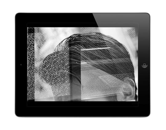
Jason Evans, NYLPT iOS app, 2013. Produced by MAPP, London. Designed by Grégoire Pujade-Lauraine and Jason Evans.
Photographer Jason Evans and musician Keiran Hebden (a.k.a. Four Tet) have been collaborators for the past fifteen years. They share a fascination with utilizing both old and new technologies in their creative lives. Evans’s most recent book, NYLPT (MACK Books, 2012), features images collected in New York, London, Paris, and Tokyo. Evans re-exposed the same frames of film up to five times, overlapping images in a search for “chance, happy accident, luck.” The project appears as an iOS app produced by MAPP, the new digital publishing arm of MACK Books. Evans has created work for major fashion and commercial campaigns; his photographs have also been exhibited internationally and published in dozens of publications, including the Spring 2013 issue of Aperture magazine (#210). He is the founder of the websites TheDailyNice.com and TheNewScent.com.
Since the late 1990s, Hebden has released music under the moniker Four Tet. His albums include Pause (2001), Rounds (2003), Everything Ecstatic (2005), There Is Love In You (2010), and Pink (2012), and he has created mixes for the prestigous series DJ-Kicks and FabricLive. He has collaborated with the musicians Burial, Thom Yorke of Radiohead, and the late Steve Reid, and he has remixed dozens of other artists’ songs. This conversation, held in London on January 25, 2013, outlines a common creative ground between photography and music in the digital realm.
Jason Evans: NYLPT is an expanded body of work that has found two homes. One is a digital format with an audio component that’s immersive and essentially nonlinear in its narrative. It is never evoked in the same sequence [of sound or images] more than once. I think you’d have to watch it every day all the time for about two lifetimes to see the same thing twice. Whereas the printed book is a much more narrative-structured object that you might look at once or twice. There are conscious narrative interruptions in the printed book. The fact that it’s a softcover means that it is designed to be flipped through, that it’s hard to differentiate the front from the back—things like that. There are interrelations between the digital and analog forms, but what I wasn’t trying to do was to make different versions of the same thing. I mean, NYLPT could also be an exhibition, and if it was an exhibition people would be less likely to question the variance between what’s on the wall and what’s in the pages of the book. But as soon as you compare a physical book and an ambient digital version, people are more likely to question the difference.
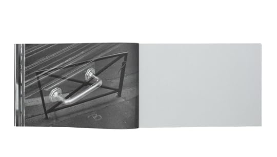
Jason Evans, spread from NYLPT, 2012. London: MACK Books. Designed by Grégoire Pujade-Lauraine and Jason Evans. 11 5/8 x 9 1/2 in. (29.5 x 24 cm), 160 pages, 80 duotone plates. Paperback with flaps.
Kieran Hebden: I think it makes sense today almost not to worry about those concerns too much, to be less conventional. You could say, “I’m not really interested in doing an exhibition. That’s not what I’m about right now. I’m going to put a book out through a conventional book publisher and they are going to do their thing. And then I’m going to do an app with the same material, but it’s a completely different thing. It has totally different images and it has a synthesizer soundtrack. I’m going to put that out and a different group of people will relate to it.” I think people can do things that way now and have it be okay.
I decide things like the price of my records and other releases based on how people will feel about it in the shop rather than the budget for the production or anything else. I’ll consider losing money on the production if I believe it’s going to make people think or make people happy. And sometimes you charge more for things because you know that people will then take them more seriously. I know that because I’ve got that same sort of fetish. I say things to myself like, “Oh my God! They are only releasing 150! They’re £25 each, but I’ve got to buy it.” I don’t know how well that translates to the world of photography and photobooks. Maybe you have a situation where you could release everything digitally, totally disregarding the commercial world, knowing that it was going to create such a hoo-ha that you will be invited to photograph Kate Moss for H&M and then you can buy a new house or something . . .
JE: It’s funny because that’s exactly how it works. [laughs]
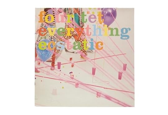
KH: I can’t shake my deep respect for the tradition of the album: maybe forty-five minutes long, two sides, a kind of experience in itself, with the sleeve and all the artwork. I find that whatever I’m doing with music I keep coming back to that as a very pure and perfect way to put music together. Releasing my music that way allows it to be part of that history, and if I know that people might have my album sitting on the shelf next to . . . well, I can’t resist wanting to be part of that. I am very aware that we now have created an enormous body of artwork together. And the whole collaboration has become a sacred thing to me. How long have we been working together? Fifteen years? This is an unbelievable amount of music and sleeves, and two people have seen the whole thing through. Pure bodies of work like that don’t exist so much these days. I love labels like ECM Records or Impulse, for which people had an artistic vision and were militant about it, saw it through.
Interior gatefold of Four Tet, There Is Love In You LP, 2010. Domino Recording Co. Design by Matthew Cooper and Jason Evans; photographs by Jason Evans.
JE: We are both so passionate about music artwork. You mentioned ECM and I get really excited by Hipgnosis. Why do you think that the history of music-industry artwork has been neglected? So many great pieces of music from great albums have an extraordinary visual-physical presence . . .
KH: I think it has been seen as solely a functional part of music culture. Some of the best sleeves that I own are for library records, and the person doing the sleeve would never have heard the music. They simply would have been commissioned. You know, “We need something! This record is called Industry 4, we need something that goes with that.” And they would make some bonkers painting, then put some crazy text on it and say, “Here you go!” And the record wasn’t even being made for commercial release. We look back at it now and think, “This is the best record sleeve I’ve ever seen. This is amazing music.” But it’s very, well, functional.
JE: The kind of photography I like was never intended as art. The kind of music and artwork you’re describing were never intended as art.
KH: But maybe in four hundred years someone will look at a Cornflakes box and think, “Oh my God, these people were mad!” [laughs] “This crazy, crazy thing. How beautiful is that?”
JE: That should be the case! I collect Japanese chewing-gum packaging because it’s a really bizarre visual manifestation of late capitalism and it has driven people to insane heights of aesthetic discourse in the same way that LSD did in the late 1960s.
KH: Record sleeves must be getting made for so many people in that purely functional way and I’m an enthusiastic record collector, so it appeals to me. I’m a big believer in the concept that time will tell. After ten years or so you can get some sense of whether something was any good or not, be it the music or the sleeve. We find these records from the 1960s and ’70s and think the sleeves are fantastic, but maybe at the time we would have thought absolutely nothing of them. At some point in time someone is going to find these things and they are going to be relevant and exciting and inspiring. One of the best things about having your NYLPT book out is seeing people getting excited by it. But the part that is even more exciting is the idea of some kid finding it on her grandmother’s shelf, you know—
JE: Yes, I do—
KH: —Seventy-five years from now, and it’s sitting next to an A-to-Z and a copy of Reader’s Digest. They’ll think, “Well, I’m going to sit on the toilet and read this one today. . . .” And then realize, “Whoa, this is amazing!”
Interior gatefold of Four Tet, Everything Ecstatic LP, 2005. Domino Recording Co. Design by Matthew Cooper and Kathryn Bint; photographs by Jason Evans and Simon Foxton.
JE: I hope so. It’s funny you should say that because when I designed the book I was thinking about a book by Marianne Wex that I had stumbled across. I love the format of Let’s Take Back Our Space—the printing quality and the design, the naïveté versus or counterbalanced by the intention. It was really important to me. The kind of photobooks I get excited about are like the kind of record covers that we get excited about . . . things that were never too self-conscious—or maybe self-conscious but not very self-aware. And especially when I’m on the West Coast of the U.S., I go to thrift stores and I find a book from the 1970s about how to make a teepee or how to make your own toffee. I want NYLPT to end up battered and found on such a shelf. I’ve got a copy that I carry around in my rucksack to get more knackered, so it can look like it should. The form of the book is obviously really important, but the form is designed to bring you back to the content.
KH: You should plant copies in bizarre places.
JE: I’ll let you know!
This interview has been condensed and edited.
Front cover of Four Tet, Rounds LP, 2003. Domino Recording Co. Design by Matthew Cooper; photographs by Jason Evans.
Interior gatefold of Four Tet, Rounds LP, 2003. Domino Recording Co. Design by Matthew Cooper; photographs by Jason Evans.
Back cover of Four Tet, Rounds LP, 2003. Domino Recording Co. Design by Matthew Cooper; photographs by Jason Evans.
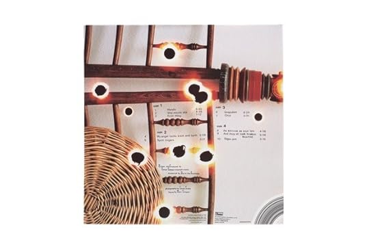
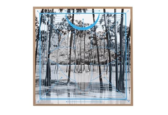
Aaron Schuman on Maurizio Cattelan, Toilet Paper

Maurizio Cattelan
Toilet Paper
Freedman Damiani
Bologna, Italy, 2012
Designed by An Art Service
13 ¾ x 9 ½ in. (34.9 x 24.1 cm)
220 pages
Hardcover
damianieditore.com
During a week marked by a distinct sense of absurdity—St. Peter’s Basilica was struck by lightning just hours after Pope Benedict announced his resignation; a ten- thousand-ton meteor crashed into the Ural Mountains—it seems fitting to have been asked to consider Toilet Paper, Maurizio Cattelan’s recent book. I first encountered Cattelan’s work in 2000, during a visit to the exhibition Apocalypse at London’s Royal Academy, which featured his La Nona Ora—a life-size waxwork sculpture depicting Pope John Paul II on a plush red carpet, crushed by a meteorite and surrounded by sparkling shards of broken glass. I remember finding the work itself strangely captivating, mostly due to the physicality of the installation and the life- like quality of the effigy. But it’s interesting to note (as Frieze did at the time) that a photograph of La Nona Ora also served as the “PR image of choice” for Apocalypse. Of course, given its headline-grabbing content and the accompanying title of the show, this image was sure to attract publicity. Yet when flattened into two-dimensions and stuck onto posters and billboards, the sculpture was reduced to a tongue-in-cheek visual one-liner, seemingly more suited to a T-shirt or skate graphic than a resonant work of art.
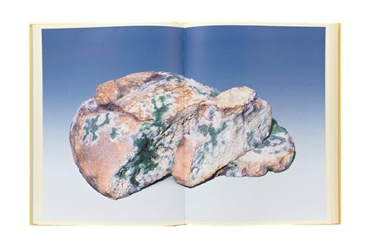
In recent years, Cattelan has announced his “retirement from making art” and has instead concentrated his efforts on being co-image-maker and coeditor of Toilet Paper—a text-free biannual that he cofounded with photographer Pierpaolo Ferrari in 2010. The magazine contains only full-page photographic spreads that mimic the high-gloss, high-key, highly saturated aesthetic of “commercial” photography while aiming to both subvert and harness it for other means. As Cattelan has explained it, “I hope some of these images can sustain more than thirty seconds of attention—most images can only sustain around ten seconds.”
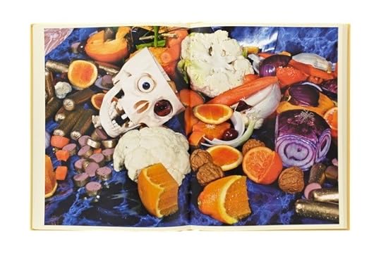 Toilet Paper presents the first five issues of the magazine in hardback monograph form, interspersed—for the first time—with a selection of quizzical texts that have been cleverly sourced by James Hoff, including a 1919 New York Times article entitled “12 Killed When Tank of Molasses Explodes,” the 1995 United States Patent for the Braille Slot Machine, and
E. T. Hoffman’s short story “The Sandman” (central to Freud’s essay “The Uncanny”). The texts are frenetically captivating,
and some of the images are successful in sustaining one’s attention for longer than expected, such as one photograph in which a light bulb is caught mid-explosion, having just triggered a mousetrap, or the book’s wince-inducing cover image, which depicts a bright-yellow canary, against a blue-sky studio backdrop, about to have its out-spread wing clipped.
Toilet Paper presents the first five issues of the magazine in hardback monograph form, interspersed—for the first time—with a selection of quizzical texts that have been cleverly sourced by James Hoff, including a 1919 New York Times article entitled “12 Killed When Tank of Molasses Explodes,” the 1995 United States Patent for the Braille Slot Machine, and
E. T. Hoffman’s short story “The Sandman” (central to Freud’s essay “The Uncanny”). The texts are frenetically captivating,
and some of the images are successful in sustaining one’s attention for longer than expected, such as one photograph in which a light bulb is caught mid-explosion, having just triggered a mousetrap, or the book’s wince-inducing cover image, which depicts a bright-yellow canary, against a blue-sky studio backdrop, about to have its out-spread wing clipped.
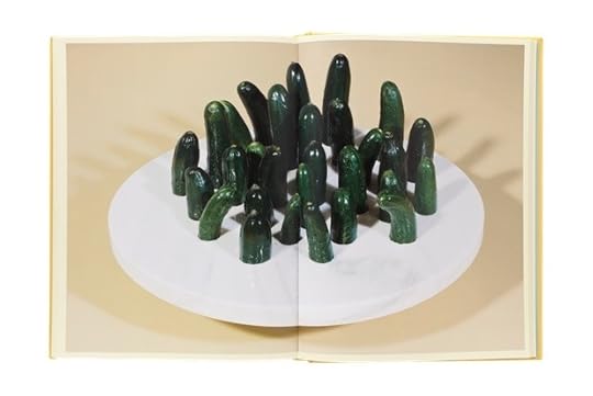
Yet Cattelan’s puerile urge to provoke, particularly by emphasizing without ambiguity the attention-seeker’s favorite themes of sex and violence, often come across as self-conscious rather than subconscious—more “Like, so surreal,” in a pubescent sense, than genuinely Surrealist. (Labored references to oral sex and genitalia abound, predictably including phalluses made of sausages, cucumbers, cigarettes, and dildos.) Furthermore, one gets the distinct feeling that many of these works and the juxtapositions they present would, like La Nona Ora, be much more engaging if conveyed via mediums that invoke the third and fourth dimensions—perhaps as sculptures, installations, or films. In fact, as the magazine’s own website reveals, short videos made during several of the photographic shoots are far more effective.
As a biannual magazine that contains nothing but imagery, each issue of Toilet Paper offers a regular, mischievous, and somewhat cathartic alternative to the high- fashion glossies that populate newsstands—a provocation to consider the visualization of both life and style within this specific context, from Cattelan’s unique perspective. But in book form, even with texts and hardcovers in place to help prop it up, it feels strangely flimsy, feeble and thin; in more than one way, it falls flat.
Aaron Schuman is a photographer, curator, and writer, and is the founding editor of the online photographic journal SeeSaw Magazine.
ONLINE ONLY: Jason Evans in Conversation with Kieran Hebden—Part 2
Front cover of Four Tet, Lion / Peace for Earth 12″, 2012. Text Records. Design and photograph by Jason Evans.
Jason Evans: I think DJing is quite an important part of the glue between us. I was promoting the club night “No Requests” at Electricity Showrooms, and every week I would play a few records and sometimes you’d be the guest DJ. DJing has been important to the promotional portraits and cover art we’ve made together, because it gives me a sense of where your head’s at because you don’t DJ for the crowd but for the love of music. And (one) I never really knows what you are going to play next. Whenever you make a new album or we start a discussion about artwork, it begins with me trying to make photographs that look like the music sounds. And we’ll speak about the artwork well before the record is finished, so there is loads of time to think about it and to prepare. I feel like we have reached a point where we have things very structured because you just can’t help having structure after working together for a long time.
But there has been another shift: I think I’m facilitating much more. For the cover of Pink you had a very specific idea about what you wanted and the references.
Kieran Hebden: I think that was by far the most specific I’ve ever been for any sleeve.
JE: One of the funny things about Pink is how your photographic referencing has changed since we first started. You’d seen an Atget show in New York … I love Atget’s photographs, but we’d never discussed the fact. And I particularly love Atget’s trees, which you picked out along with a bunch of amazing hand-drawn record covers from the Lebanon and Kenya from the late 1970s.
KH: I sent you an e-mail that said, “I’ve actually got a really clear idea for the next album. I’ve been to an exhibition by this old French photographer and I like these pictures of his and I’m really interested in these Lebanese 78 sleeves, so can you do something that brings all those things together, please?” [laughs] I remember you sent me an e-mail back: “I think that’s the weirdest e-mail pitch I’ve ever had.”
Jason Evans, spread from NYLPT, 2012. London: MACK Books. Designed by Grégoire Pujade-Lauraine and Jason Evans. 11 5/8 x 9 1/2 in. (29.5 x 24 cm), 160 pages, 80 duotone plates. Paperback with flaps.
JE: And the most refreshing: what a great hybrid! That’s exactly what digital dissemination should be leading to, those kind of hybrids, those kind of marriages. One of the things that was really interesting was the way that we finally created the imagery for Pink as objects for a physical release that had been staggered over a year as a series of 12 inches and then also as digital releases. So, when you’re making a piece of artwork that has to operate as a twelve-inch square and as an MP3 icon—essentially an inch square—it has to be right in both areas. And one of the things that I really love about Pink is that in order to make the MP3 icon and the printed artwork look as good as each other, we had to do the print as a lithograph with a screenprint on top of it. In order to make it look as good as it looked on screen, we used entirely analog methods. I just loved that hilarious moment of turning to screenprinting to make something look as good as it would on an Apple device. [laughs] It’s the only way to get that density of color. And now there are two thousand original screenprints floating around the world— really lovely objects for people to find. Thinking about how to make stuff shift easily between analog and digital formats has become more and more important to us.
KH: Another thing has happened that I feel is hugely liberating to me: I feel like there is absolutely no need anymore to have any text on a record sleeve. You are never going to be in a situation where somebody is going to buy that record after flicking through record racks at a store or by first seeing it in a window display. Nowadays, the computer tells you what you’re listening to. The name, artist, and track name always comes up, and if you’re buying it anywhere online all that information appears next to the cover. So I can’t see any reason, ever again, to put any text on a record sleeve. Because of websites like Discogs.com, which archive all the information on all records ever released, all you have to do is give your record a catalog number. And if anybody wants to find out who did the artwork, what studio it was recorded in, what date it was recorded, whatever, that information will always be available on the internet. None of us know how rock-solid digital archives will be, but at the moment I feel like it’s so easy to find things out that putting much less information on albums is perfectly fine because people will find it. And people like to find that stuff out. The weirder its name, the more difficult it is to get hold of, all those things, the more popular the record is. Go as weird as you like…
JE: Have you ever been guilty of being deliberately enigmatic?
KH: All of the time! [laughs]
Front cover of Four Tet, There Is Love In You LP, 2010. Domino Recording Co. Design by Matthew Cooper and Jason Evans; photograph by Jason Evans.
JE: I relate to this. It was really important to me to keep the information on and in the NYLPT book as spare as possible. It doesn’t have an essay in it and it doesn’t need one. I’m borrowing a model of innovation from the music world, and I’d love the photography world to do more of this. Digital photo innovation is often fueled by the perceived amateur market and is currently obsessed with ideas of quality, as opposed to qualities . And one of the things that’s really interests me about your work—your collaboration with Burial, for example—is turning away from an industry-standard perceived notion of quality. It seems like one is able to get away with that in music but not in photography. Do you agree?
KH: One of the really, really nice things about working in music, especially electronic music, is that once you’ve paid your electricity bill, you can do everything for free, including distribution. You can do something that is entirely digital, you can quietly make your own thing—in complete isolation, without telling anybody in the world about it—and then distribute it to the world in a very efficient kind of way. But all creative forms, including music, film, photography, have issues with the disseminators and the hardware providers. One of the things that we share as content providers is a real anxiety about paying for the electricity and that, I think, is going to be one of the next big forms of cultural struggle … to rethink the way in which content providers are supported.
JE: There is always going to be another generation willing to buy the back catalogue of Madonna, so you could argue that we won’t need any new music or images to accompany it. I wonder if the question at Apple HQ is “Do we need any more content? No, we’ve got content now. We just keep repackaging Michael Jackson forever.” And that worries me, that’s one of the things we both have to think about. I’m anxious about the ways in which photographic technology governs, maybe even authors, what it produces. There will be fewer options for ways of making images. Perhaps that’s a controversial thing to say, but I stand by it. It’s different with music because there are any number of computer programs or piece of hardware or objects that you can make a noise with. How can we find that diversity for photography?
Front cover of Four Tet, Everything Ecstatic LP, 2005. Design by Matthew Cooper and Kathryn Bint; photographs by Jason Evans and Simon Foxton.
KH: There are problems with digitization, of course. If you take a recording that was made in the 1950s or ’60s, when the quality of recording was amazing, and play it on the best studio stereo equipment, it will floor you. It will sound like the musicians are there with you in the room. Recordings made now, on the other hand, are optimized an iPod speaker or the radio. The music sounds great on those devices. You can also listen to an old jazz record or whatever on those devices, and it will sound good, too. But the difference is in the potential in them. The modern recording has gone as far as it can go, whereas when you play the old one on sophisticated equipment and it sounds better and better. Contemporary recordings just don’t have the same depth of information inside them. It’s really important to me that things that I make have got this hidden potential in them, that they can be better and better than most people ever even realize.
So if someone looks at the sleeve for There Is Love In You and loves it; if this person sees it on all the different formats and notices that they’re all different in their scale; if this person looks closely and maybe reads an interview where you discuss the process for making the sleeve; then perhaps that’s a way to see the potential in photography, to see it go much further. I think that understanding makes it truly lasting and stands the test of time in an amazing way.
Remembering Gigi Giannuzzi

Gigi Giannuzzi. Photo: Carla Borel.
Gigi Giannuzzi died last Christmas eve, having published over eighty-five titles, mostly through his imprint Trolley Books. Publish is too polite a word to describe the process. Making a book with Gigi was more like surrendering your heart to a strange ritual. Magic, dread, and the perception of death were at the root of it. This was back when we were all busy inventing ourselves as an unlikely group, congregating around this wild man who wanted to help us make our books, help us form ourselves. Not because they were books. Or because they were even good. But because they provided him with ammunition, some resistance to the status quo. Even though Gigi could be very charming, he refused to be polite—to individuals, to institutions, to power. He rejected the systems of abuse, etiquette, and normality that he found abominable. Even toward his end Gigi was gathering evidence, publicly outing the corporations who control the world of cancer and the production of the chemotherapy that ironically gave him a few more weeks to battle.
This was also our chance to say good-bye. We gathered around him as he lay on his famous green couch, drinking chocolate milk through a straw. Nine years earlier, on the night of his fortieth birthday, Gigi saved us from drowning. We were marooned in a narrow cigar boat, his old Luna Rosa, without even an inch of gas. It was midnight and we were drunk. On board were photojournalists Thomas Dworzak, Alex Majoli, and actor Sarita Choudhury, who was six months pregnant. Within minutes we were out at sea, and it was only when Gigi saw the anxious flashlight from Thomas’s camera that he pumelled out into the choppy water and pulled us back.
Gigi saved our skins many times over. But mostly he saved us from mediocrity. He was still angry at the state of the world, in love with what was possible, and thinking about new books as he lay on his couch with the look of a clown’s deep gloom. “Bad luck, isn’t it,” he growled softly, still fighting, still laughing. And even though he was weak, the atmosphere in the room was uniquely his. Messy and intense, full of joy and pain, full of contradictory personalities. It was a reminder of the multitude of book launches that merge into one epic blur, first in his sprawling apartment in Venice, where we met; then in the narrow shop front on Redchurch Street in London’s East End; and finally in his elegant gallery on Riding Street, further west, where his remarkable collaborator, Hannah Watson, continues unbroken.
Adam Broomberg and Oliver Chanarin are artists living and working in London. Together they have had numerous international exhibitions and have published nine monographs, including Ghetto (2003) and Mr. Mkhize’s Portrait (2004), both with Trolley Books.
Trolleyology, a survey of the first ten years of Trolley Books, will be published in June 2013. For more information, visit trolleybooks.com.
Aperture's Blog

- Aperture's profile
- 21 followers

