
Aperture's Blog, page 195
June 25, 2013
Interview with Lorna Simpson
A retrospective of Lorna Simpson’s work opened to the public on May 28 at the Jeu du Paume in Paris. In the words of curator Joan Simon, Simpson’s work can be argued “to be built on the juxtaposition of gestures and reenactments.” Reenactments of the past, that is, of memories that form part of an American twentieth-century psyche as well the artist’s own childhood experiences. Black-and-white and tinged with gold, her art often employs era-specific clothes and hairstyles, materials found in second-hand shops, and old photographs and postcards, calling forth memories of the past. She supplies the props and the gestures, a short text or melody, and beckons the viewer to relate these to cultural inheritance and personal experience.
This conversation took place via e-mail and in person in April and May 2013.
Lorna Simpson, still from the video Cloudscape, 2004. Courtesy the artist; Salon 94, New York; and Galerie Nathalie Obadia, Paris and Brussels. © Lorna Simpson/Centre national des arts plastiques.

Lorna Simpson, 1957–2009 (detail), 2009. Renne Collection, Vancouver. Courtesy the artist; Salon 94, New York; and Galerie Nathalie Obadia, Paris and Brussels. © Lorna Simpson.
Lorna Simpson, Chandelier, 2011. Courtesy the artist; Salon 94, New York; and Galerie Nathalie Obadia, Paris and Brussels. © Lorna Simpson.
SM: Your first European retrospective has just opened here in Paris at the Jeu de Paume. Given that much of your work is informed by an American history of race and gender relations, did you or the curators make any decisions about the show based on the audience?
LS: I feel that the history of British and European colonialism in the Americas, Africa, and India involves many of the same issues. Of course, there are different ways to approach the concept of audience. The exhibition spans about twenty-seven years of work, and was put together by curator Joan Simon in collaboration with Marta Gili of the Jeu de Paume and Okwui Enwezor of the Haus der Kunst in Munich, both of whom I have worked and exhibited with in the past, in different European countries. We all viewed this exhibition as an opportunity to present a wide scope of the work; I personally did not give consideration to tailoring the presentation to any preconceived idea about the audiences in different countries—that would be an improbable touring package. This exhibition operates as a vehicle to introduce viewers to my work in a comprehensive manner. The European context is explored more in depth by art critic Elvan Zabunyan in the accompanying exhibition catalog.
SM: Do you have a favorite work in this exhibition’s survey?
LS: Well, I like what’s new! [Laughs.] Since it’s an installation, you don’t quite get to see it until it’s up. This is really the first time I’m seeing the most recent pieces in this way.
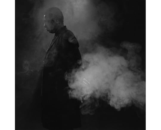
SM: It makes a huge difference. For instance, watching Cloudscape (2004) in a darkened room is strangely hypnotic. Was that hymn being whistled by the man covered in smoke composed specifically for the video? Does the melody have a title?
LS: Terry Atkins is the artist and musician in the film. In a thrift shop, I found a songbook of American compositions and turn-of-the-century hymns. A lot of them sound like American spirituals from the 1800s. What we were looking for was something that wasn’t completely recognizable but at the same time—
SM: —nostalgic and familiar?
LS: Yes. And with a melodic element that would be interesting when played in reverse as well, but with a short and not overly complicated phrasing, so that it would make sense as a video piece. We went through it little by little, reflecting on what this or that tune would sound like if whistled, played backwards, etc.
Lorna Simpson, 1957–2009 (detail). Renne Collection, Vancouver. Courtesy the artist; Salon 94, New York; and Galerie Nathalie Obadia, Paris and Brussels. © Lorna Simpson.
SM: Several African-American visual artists use jazz improvisation as a point of reference for their work. Is it also important to you?
LS: Music is a big part of the American historical and cultural experience. Jazz is the music I grew up with: lots and lots of John Coltrane, Miles Davis, and Charlie Parker, to name a few.
I just completed a new video project for the show that involves a collaboration with and filmed performance of Jason Moran. We have been trying to do something together for a while and I am really excited—it was a great opportunity to work with him.
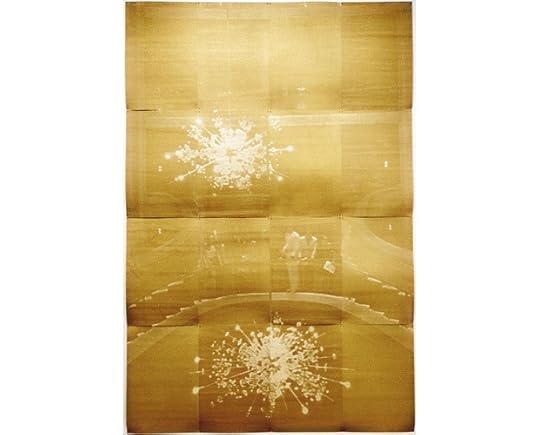
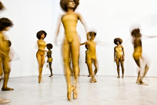
SM: Within this exhibition, which largely comprises black-and-white photographs and videos, the section in which gold and fabric are used really stands out. Could you tell me about the use of the color and felt?
LS: It’s from a re-creation. The monitors playing the videos in front of the felt and the gold prints are all from a piece called Momentum (2010), which is based on a childhood performance at Lincoln Center. I was ten or eleven years old at the time, dressed up in gold body paint and a gold Afro, and on pointe. Daytime (2011), Daytime Gold (2011), and Chandelier (2011) were all made from late-1960s-era found postcards, printed with gold glittery ink, that documented the early years of Lincoln Center.
The other “gold” pieces in that room are from Public Sex (1995–98), a series of works printed on felt. The text in those works is about how a public space is transformed during different times of the day by the people using it, and the kind of sex they might have there. By using felt and found postcards, the room is meant to represent the fifteen-year period I’ve spent working with those materials and the different ideas in play during that time.
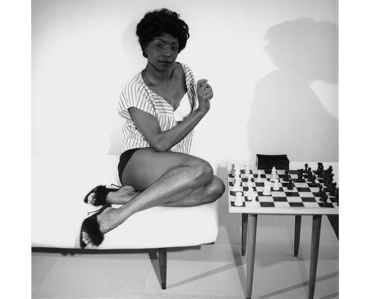
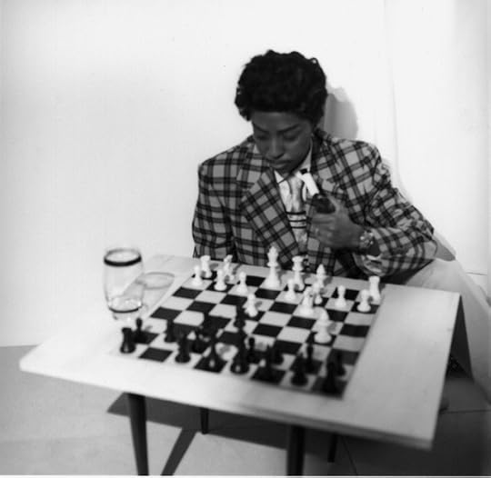
SM: You’ve mentioned that this childhood performance was important because it made you realize that you would rather be the audience than the performer. Now, however, we see you stepping into the center of your own works in 1957–2009 (2009) and again in the Chess video projections (2013). What brought about this change?
LS: I started really stepping in front of the camera with 1957–2009, which was painful! Every day I was in a bad mood and I just wanted to get through it. [Laughs.] I was suffering through that. It’s very artificial: I was imitating a woman’s body that is different from mine, a woman’s body that is more agile—I think she was slightly double-jointed and I’m not. I was less self-conscious, though, because my aim was to mirror her. But even then, I hated it at the beginning. Toward the end of the project I became more comfortable and it became less of a horrible chore.
SM: Was it just as excruciating to get in front of the camera for Chess?
LS: No, actually—that was a few years later and was, in a way, capping off that body of work. I felt more comfortable by then.
Lorna Simpson, still from the video Momentum, 2010. Courtesy the artist; Salon 94, New York; and Galerie Nathalie Obadia, Paris and Brussels. © Lorna Simpson.
SM: Did you want to be a photographer growing up, or was this an interest that developed later on?
LS: From a young age, I was immersed in the arts. I had parents who loved living in New York and loved going to museums, and attending plays, dance performances, concerts. They would take me with them. Their appreciation was free and open; they did not think that they had an artist in the making. The High School of Art and Design introduced me to photography and graphic design. At the School of Visual Arts, where I got my BFA, I became interested in photography and the history of New Wave cinema. When I was in grad school, at University of California, San Diego, I focused more on performance and conceptually based art.
SM: So your foundation was in photography, but you now incorporate other elements into your work, like sculpture and performance. Why is this?
LS: When I was growing up in photography, photography departments and their views of photography were very narrow. Photography was something that went in a frame, was kept to a certain scale, and didn’t have text or any other element. A lot of the support for my early work came from institutions that focused on painting and sculpture, or institutions that didn’t insist on the separation between genres.
My foundation in photography allows me to think about things in terms of film and video, because I can imagine things and know how to communicate them by working with a DP, for example. It’s kind of hard not to have a background in photography and have an interest in film, especially if you’re interested in what is happening in front of the camera.
That said, my practice as an artist does not work out of a single viewpoint of photographic practice. I experiment with many different mediums for the sake of coming to experience different processes. Conceptually, I enjoy working in different mediums—outside my comfort zone and range of experience—and how that exploration expands the content of my work.
SM: During an interview last year with artist Deana Lawson, she mentioned that getting to know your work was an epiphany for her own development, as it was the first time she had an African-American female role model. Are you aware of your own trailblazing, so to speak? Who were your role models when you were a student?
LS: When I was a student, the work of artists from varying cultural contexts was not as broad as it is now. I think of the work of David Hammons, Adrian Piper, Bill T. Jones, and many of the artists in Kellie Jones’s 2011–2012 exhibition Now Dig This! Art and Black Los Angeles 1960–1980, presented at the Hammer Museum in Los Angeles and MoMA PS1 in New York.
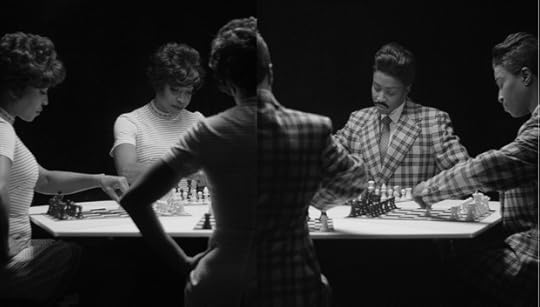
Lorna Simpson, still from the video Chess, 2013. Courtesy the artist; Salon 94, New York; and Galerie Nathalie Obadia, Paris and Brussels. © Lorna Simpson
From time to time, when I teach or mentor students, I am reminded how much the work is appreciated. I am always surprised because I feel there are so many people—other artists who were around when I was in my twenties—who I really loved and appreciated, and who deserve the same attention and opportunity, like Howardena Pindell or Adrian Piper. There are tons of them. It is about race and being African American, but it’s also about gender—and there are just so many women who either should be given more credit or have more vibrant careers for having paved the way. It’s a little bittersweet. Things should be better. But then, that’s just where we are.


Interview with Karol Hordziej, Art Director of Krakow Photomonth
Since 2006, Karol Hordziej and his team have transformed Krakow, Poland, into an international destination for photography. Andrea Hill conducted this conversation with Hordziej, about the 2013 edition of Krakow Photomonth and the future of photography festivals, in person and over e-mail.
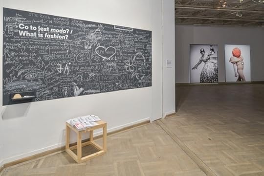
Above and below: Installation views of Krakow Photomonth 2013 exhibitions. Courtesy Krakow Photomonth.
Andrea Hill: Why have you chosen to focus the 2013 festival on fashion? Is fashion more or less relevant today as a tool for investigation than it was during the historical moments chronicled in the exhibitions?
Karol Hordziej: The decision had several motivations. One of them was a will to embrace fashion photography and show it as part of a larger context. Fashion photography is usually presented in fashion ghettos, outside of the artistic debate.
The only part of the program fully devoted to “real” fashion photography is an exhibition from the F.C. Gundlach collection. German photographer and collector Gundlach points out that for decades, fashion photography was able to capture the spirit of the times more effectively than photojournalism. It depicted dreams and hopes, while photojournalism focused on facts and events.
But fashion photography was not the center of our interest. We have focused on clothing and the cultural meaning of what we wear and how we wear it—without dividing everyday street clothing from haute-couture fashion. It’s more about a very broad definition of fashion that makes it such an interesting tool for the investigation of culture.
AH: Can you speak about the evolution of Photomonth during your tenure as art director and some of the past themes this festival has touched on?
KH: In 2006, when our team took over the festival, we began working with very general themes like “Youth” and with different guest countries like the UK and Poland. During these years we also produced several projects based on the idea of the artist as curator. Theaters of War by Mark Power was presented at the former Schindler’s Factory (where the Museum of Contemporary Art is currently located). In 2011, we invited Adam Broomberg and Oliver Chanarin to be the guest curators of the entire main program, which resulted in the project Alias, which was based on the concept of exhibiting only fictional artists.
Alias was a turning point for the festival since it pushed the limits of what a photography festival could be. It garnered very positive feedback from the international art press but was too demanding for many visitors. After this edition we decided to establish a new arm of the festival called the Experimental Section, through which we could continue in this direction. The inaugural Experimental Section, in 2012, was advised by Charlotte Cotton and took form as the interactive, monthlong exhibition Photography in Everyday Life, which invited the audience to participate in its creation.
For future editions of Photomonth, we have decided to work with professional curators. For Photomonth 2014, we have invited Aaron Schuman to be the curator and I’m happy to confirm his participation!

AH: The medium of photography itself has experienced more change in the past decade than any other, what with the advent of digital methods of production and distribution. How has Photomonth responded to photography’s existential issues?
KH: The changes in photography related to the digital revolution were visible in our program mostly through specific art projects. In 2012, Jason Evans made an installation called Pictures for looking at and sculpture for photography. The audience was invited to interact with his sculptures, make their own photographs, and upload the images online. It was in the same gallery space where we exhibited Masao Yamamoto’s unique handmade prints several years earlier. I think that both shows are very relevant to the analog/digital discussion.
In general, our response has been channeled through an overall awareness of the material print and the physical experience of prints. Since you can now see so many great photographs online—and for free—it’s important that the experience of attending the festival be different. I believe that we get much more from images if we use not only use our eyes but all of our senses—when we have to move our bodies to look at an image.
The whole analog/digital discussion gets really interesting when it enters our daily lives. Yoachim Schimd stopped collecting pictures from the street because people no longer throw away pictures they don’t want anymore; they just delete them. At the same time, we all collect tons of images and are losing the skill to select what is really important. At Krakow Photomonth this year, we welcomed people to participate in our shows by bringing images from their own family archives. The most important factor in this participatory event was to teach people how to choose one image and tell a story. It sounds very banal but I believe it’s an important issue.

AH: Returning to the subject of broadening definitions, what are the wider possibilities for what a photography festival might be?
KH: I think there are many ways for photography festivals to go and it’s important that different models exist. I expect festivals to propose long-term ways of thinking. For example, it took us a few years to break down the wall between the contemporary art and photography audiences in Poland. We were also looking for models that work as year-long projects instead of singular events. We have formalized a part of the festival, which previously selected the best submitted artist projects, into ShowOFF, a new section intended to incubate young Polish photographers. In ShowOFF, five jury members choose ten artists to develop a project with them that will be produced for the festival, and we continue to promote the artists after the festival concludes. Since it’s very easy to travel between the various festivals, it makes sense to be attentive to current and local issues. I was speaking earlier about a participatory element. This is also crucial in the development of photography festivals. But of course the traditional role of the festival is to be an exhibition space and an international meeting place.
Andrea Hill is a New York–based curator and creative director of Paddle8, the online auction house for museums and non-profits.
The eleventh edition of Krakow Photomonth ran through June 16.
June 24, 2013
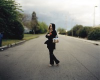
Richard Renaldi’s Touching Strangers on Kickstarter
Through August 5, 2013, backers can pre-order Richard Renaldi’s forthcoming special-edition photobook, Touching Strangers, exclusively on Kickstarter.
Since 2007, photographer Richard Renaldi has worked on a series of photographs for which he asks complete strangers to physically interact while posing together for a portrait. Working on the street with a large-format 8-by-10 view camera, Renaldi encounters his subjects in towns and cities all over the United States.
Renaldi’s objective was to introduce an unpredictable variable into a traditional photographic formula, and to create spontaneous and fleeting relationships between complete strangers. The portraits are extremely difficult to make, involving complex negotiations with the participants that push them past comfort levels into a physical intimacy normally reserved for loved ones or friends. Touching Strangers creates intimate and ephemeral relationships that exist only for the moment of the photograph. The images are beautiful and strange, crossing out of the zones of safe physical intimacy with strangers and into deep emotional landscapes never photographed before.
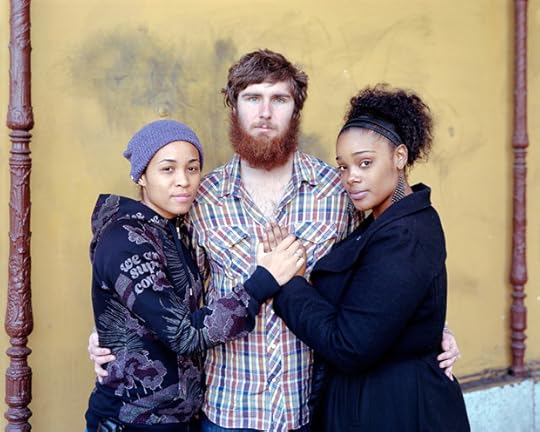
Tari, Shawn & Summer, from the series Touching Strangers. © Richard Renaldi.

Sonia, Zach, Raekwon & Antonio, from the series Touching Strangers. © Richard Renaldi.
In Spring 2014, through the support of backers on Kickstarter, Aperture will publish Touching Strangers as a photobook, including new photographs from Renaldi’s shoots this summer in Albuquerque, Chicago, New York, and Southern California.
Chris Boot, executive director of Aperture, says, “We think these great photographs have something positive to say about human connection . . . about a diverse society in which people have been taught not to touch each other but in which we can and do transcend the boundaries set around us. In seeking support to make the book possible, we want to ask you—strangers—to help us. This makes this Kickstarter campaign—Aperture’s first—part of the work itself, a way for strangers to connect with each other. We hope this project touches you, and that you’ll want to participate with us in bringing this book to the world.”
Pre-order Touching Strangers: Photographs by Richard Renaldi now on Kickstarter (funding period: June 21–August 5, 2013).
—
Aperture published Richard Renaldi’s first monograph, Figure and Ground: Photographs by Richard Renaldi, in 2006.
In October 2013 Richard Renaldi will host Strangers in New York: Photographing People, a two-day intensive workshop for students wishing to sharpen their skills making portraits of strangers. Register here.
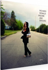 Figure and Ground
$45.00
 Richard Renaldi: Strangers in New York: Photographing People Workshop
$500.00
 Christine, 2003
$600.00
June 20, 2013
Aperture #211—What Matters Now?
Photographs as Things

Photograph by Andrew Blum’s three-year-old daughter. Courtesy Andrew Blum.
Photographs, especially personal ones, have always served as physical manifestations of memory. Held between fingers or hung on a wall, photographic prints had a direct material connection to their subjects, from light to lens to film to paper. Today, of course, our photographs are born digital. Their power as images remains, gloriously so; but their reality as objects is often lost.
In my house, these two ideas collide in the small hands of my three-year-old daughter, compulsively snapping photographs with a phone snatched off the table. She has amassed hundreds of them (mostly of fingers and floors). They are not merely weightless, but evanescent. So in an effort to fix them in the most literal way, we bought a sixty-nine-dollar wireless printer. The effect was strange: a photograph taken with one magic box was magically transferred through the air to another magic box, out of which a photograph (on paper!) slowly emerged. Up it went on the refrigerator door. The images themselves are beside the point. What I am grasping for, perhaps foolishly, is the sense of a photograph as a thing, an object of value—something to be cared for in the physical world, as we care for each other.
—Andrew Blum, journalist and author of Tubes: A Journey to the Center of the Internet (Ecco, 2012)
CIA Torture Tapes

Production still from the film Zero Dark Thirty, 2012 (dir. Kathryn Bigelow). Photograph by Jonathan Olley. © Zero Dark Thirty, LLC. All rights reserved.
For the past several years I have been obsessed with images I’ve never seen. They were recorded and destroyed. These images document torture. In their absence, fictitious images have emerged.
Jose Rodriguez, the man who in 2005 ordered the destruction of ninety-two videotapes of torture committed by the Central Intelligence Agency, claims: “I was not depriving anyone of information about what was done or what was said. I was just getting rid of some ugly visuals that could put the lives of my people at risk.”
Rodriguez, a high-ranking intelligence officer, made the decision to destroy the torture tapes in response to the public reaction to the Abu Ghraib photographs in 2004. It is often forgotten that the abuse at Abu Ghraib was made “public” before those images were released. Four months before the publication of the photographs, the U.S. military issued a press release saying they were investigating claims of prisoner abuse in Iraq. The announcement received little media coverage or interest. Had the photographs not been leaked to the New Yorker and 60 Minutes, Abu Ghraib would likely have disappeared from history.
Without visual evidence of CIA torture, history is being written by Hollywood. In Zero Dark Thirty, the CIA torturers are the heroic protagonists. Can we imagine this happening with Lynndie England, the woman holding the end of a dog leash around the neck of a naked prisoner at Abu Ghraib? Or Sabrina Harman, who gives the “thumbs up” sign over the dead body of Manadel al-Jamadi, a man killed during a CIA interrogation?
If the CIA’s torture tapes had been made public, how would history be told differently?
—Laura Poitras, documentary filmmaker and MacArthur Fellow, whose work includes The Oath (2010); My Country, My Country (2006); The Program (New York Times Op-Doc, 2012); and Death of a Prisoner (New York Times Op-Doc, 2013)
North Korea’s Gulag
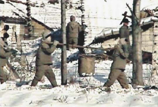
Screenshot of a Google Maps view of the Yodok Gulag in North Korea, 2012.
After Hurricane Sandy last year, photographer Iwan Baan captured an iconic shot of Manhattan, half in blackout: it is a photograph that will haunt our collective memory for a long time. At the same time, Google Maps recently added North Korean coverage by means of a clever juxtaposition of aerial shots, satellite imagery, and clandestine on-the-ground documentary photos by daring locals and visitors alike, giving us firsthand views of this notoriously media-shy country and its equally notorious death camps. With this ostensibly minor extension of its mapping service, everyone’s favorite search engine entered the political arena—and Google deserves great credit for this unexpected advance. In the end, this “citizen documentation” of actual gulags on North Korean ground is more likely to unsettle the restrictive regime than any international sanctions.
Both Baan’s image and Google Maps in North Korea have reignited my appreciation for straightforward reportage that channels and politicizes key issues via powerful visual records. When I think about Vietnam, the Cold War, or space-age advances—as well as events that occurred before my lifetime—I consider those times and events through iconic press shots that strike a mental, emotional, and sociopolitical chord. Images help us to contextualize topics, ideas, and historical events. Great press photographs trigger desires, anger, compassion: they get me going. I expect photography to play a powerful part in developing my political agenda. I believe that the decline of quality news outlets goes hand in hand with a decline in empathy, political involvement, and democratic engagement. We are ready for a new breed of earnest and enthusiastic photojournalists who can produce those shots that capture our hearts and minds.
—Robert Klanten, founder and publisher of Gestalten, Berlin
Possibilities of Pleasure
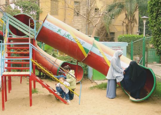
Maha Maamoun, El-Sayyida Park #02, 2006. © Maha Maamoun.
A favorite image from the past few years is by Maha Maamoun. What is depicted is a children’s playground in a Cairo park, dominated by an aging tubular metal slide, which is painted in the bright colors of the flag of the Arab Republic of Egypt and bears an inscription in Arabic that translates to: “Baby Land Welcomes You!” Two small girls and a toddler boy are about to climb the stairs to the top of the slide, while a young woman in gray veil is helping another woman, in a black niqab, who just slid down, to emerge from the industrial-looking orifice at the bottom of the slide.
The image, which is humorous, sad, and indicative of a certain psychosis, brings to my mind a 1920 drawing by Max Ernst called The Hat Makes the Man, which is full of colorful tubular forms and men’s black hats, and bears a cryptic inscription: “seedcovered stacked-up man seedless waterformer [edelformer] well fitting nervous system also tightly fitting nerves! (the hat makes the man) (style is the tailor).” Like Ernst’s drawing—which suggests a kind of an alchemical-industrial transubstantiation of masculinity— Maamoun’s photograph delicately charts a cosmology of women’s lives and the possibilities of pleasure within a certain conveyor-belt religious order.
—Anton Vidokle, artist and co-editor of e-flux journal
June 19, 2013
Land Rover
By Schuyler Duffy

Terry Evans, Intersecting the Flint Hills, April, 1994. All photographs © Terry Evans and courtesy the artist and Yancey Richardson Gallery, New York.
Terry Evans’s The Inhabited Prairie grasps a thread of photographic history that has preoccupied many, from Alfred Stieglitz to Sally Mann: the material, chemical, and divine properties of light. Evans hired two pilots, Duane Gulker and Major Jonathan Baxt, to explore the American prairie from above; together they boarded a Cessna 172 airplane and flew low above the plains, affording a particular perspective that lies at the upper register of human scale. At this height, one catches the faintest glimpse of the entirety of the earth, yet allusions to the prairie’s human inhabitants are markedly apparent: houses, cattle tracks, tires, hay bales, trees, graves. The resulting photographs depict a relationship between living organisms and the terrain they inhabit. The earth itself is given character, as a divine body. Flight, as a methodology for making photographs, could also be characterized as an act of piety, as a prayer or even ascension. Nonetheless, Evans’s use of celestial perspective encourages an awareness of three irrefutable forces of nature: gravity, entropy, and light.
Through Evans’s eyes, the earth appears planar, albeit with a slight curve. A simple optical truth: a single luminary, the sun, illuminates a single plane, the earth. A simple physical truth: gravity presides over matter. Our earthbound lives sometimes mask these axioms, yet flight provides Evans with a unique relationship to light that animates the elements that compose the earth. As she floats through the air, she authors images that, by her very positioning, call attention to our subjection to those natural laws.
Nineteen prints hang on the wall at Yancey Richardson Gallery, all of them vintage excepting one, the largest image, Intersecting the Flint Hills, April (1994). The majority are hung in square frames approximately twenty-four inches a side. These pre-digital prints, sized smaller than tableaux, ensure the landscapes retain a personal and meditative affect.
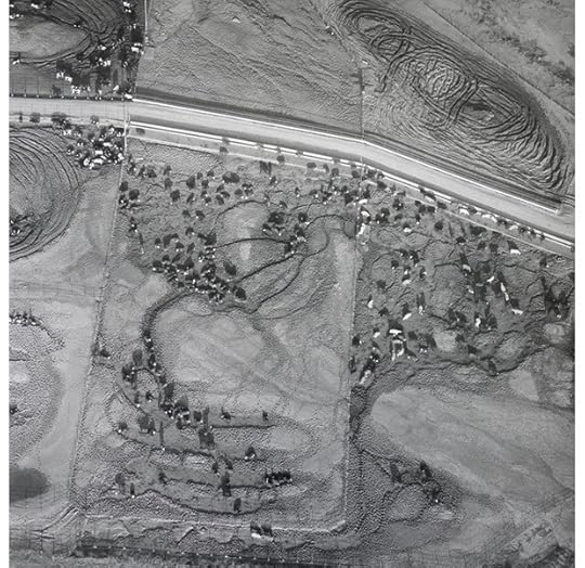
Terry Evans, Cattle Feed Lot, April 24, 1993.
Cattle Feed Lot, West of Saline County, Kansas, April 24 (1990) is an exquisite composition in which a herd is shot from almost directly overhead. The orthogonal perspective gives the cattle the precarious semblance of sliding off the plane of the earth, and particular attention is paid to the patterns the steers’ tracks leave as they mill about their pen. Indeed, Evans maps the order and tools of industrial agro-business alongside abandoned military infrastructure and the humblest domestic decorations. A prisoner-of-war camp, abandoned at the end of the Second World War, sits alongside livestock feedlots and prairie homesteads, many of which are abandoned as well. These variances in land use, from their rise to their ruin, catalog the futile combat between civilization and entropy as it unfolds over time. Evans illustrates the idea that the great American Prairie will endure longer than the men and women who inhabit it, and that the order brought by agriculture, development, and war, when viewed from the air, displays many of the same fractal, diffused, organic qualities that characterize many systems of nature. And that the semantic cuts humans make upon the earth, the parceling of the land and its exploitation, cannot and will not interrupt the mottled texture of the plain.
All the while, this drama is soaked in warm Midwestern sunlight, which, despite the single hue of silver gelatin, shines through in Evans’s prints. On the prairie, light and shadow are ubiquitous and pay no respect to manmade boundaries; after all, light is fundamental the experiment of agriculture, and therefore to our subsistence. Light bounds and bends and envelops the globe; it fills the most oblique nook and cranny and implicates itself even in its absence. It is impossible to imagine life without light; and while this may be self-evident—light is taken for granted anytime one reads past sunset, drives at night, or goes underground—with The Inhabited Prairie, Evans pays homage to that most sacred illumination.
Schuyler Duffy is an Aperture Work-Scholar and a photographer. A native New Yorker, he holds a BA in Art and French from the University of California, Los Angeles.
Terry Evans’s exhibition The Inhabited Prairie is on view through July 3 at Yancey Richardson Gallery in New York.
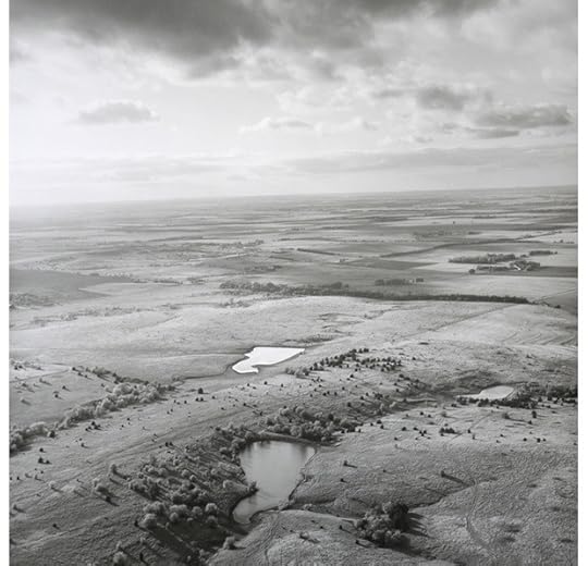
Terry Evans, Pond and Sky, Western Saline County, Kansas, May 8, 1991.
June 17, 2013
Attention! Photography and Sidelong Discovery
By Brian Dillon
Nina Katchadourian, Topiary, from Landscapes, part of the series Seat Assignment, 2010 and ongoing. Courtesy the artist and Catharine Clark Gallery, San Francisco.
Curiosity is an oddly ambivalent word that historically has pointed almost as frequently to a condition of ruinous distraction as to a state of intense and productive concentration or to an urge to discover. To be curious or to be interested in curiosities is to be charmed by details, trifles, niceties, or subtleties, and to disregard fundamentals. Distraction has its uses, however, as the history of detective fiction tells us. In Edgar Allan Poe’s “ The Purloined Letter” (1845) the stolen object fails to reveal itself to the most sedulous searches; the suspect’s apartment is investigated long and hard, the walls and carpets peered at through microscopes, the furniture probed with needles. The very cobblestones in the courtyard are prised apart, to no avail. At length, Poe’s detective Dupin discovers the thing, tattered but undisguised, on a letter rack in the rooms of the minister who has stolen it. Dupin’s distracted, sidelong mode of attention has won out over the prefect of police and his zealous and methodical program of close inspection.
Poe’s prototypical sleuth springs easily to mind when considering the role of curiosity in photography, past and present. And once we have thought of Poe it’s a safe bet that somebody will invoke Walter Benjamin’s comment about the photograph looking increasingly, in the twentieth century, like the scene of a crime. This last is a conceit that does not apply only to photography’s evidentiary potential: it’s of a piece with the idea that the photographer sees more intensely into the heart of things, but also reminds us of all the lures and feints that he or she might employ to frustrate that assumption. The melodrama of appearance and reality conditions much of our thinking about photography and what it discovers about the world. But there’s another sort of photographic curiosity, something like Dupin’s state of oblique diversion or attention to the humblest, most fleeting scraps of the made world and their abject, slapstick, sometimes delicate poetry.
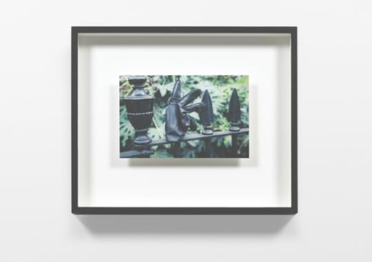
Consider Making Do and Getting By, the photographic series that British sculptor Richard Wentworth has been producing since the 1970s, and which amounts at this point to an archive of found semi-sculptural interventions in the fabric of the everyday. Many of them (as in Poe’s tale) involve scraps of paper slotted or crammed into slits and crevices. There are napkins and newspapers jammed under café tables, bits of cardboard or tape holding things together, or nearly. Wentworth is fascinated by how the ordinary world around us has been made—step into a London street with him and he will spin a narrative out of the history of manhole covers—but also by the materials we append to our surroundings by way of repair or warning or inadvertent decoration. Making Do and Getting By includes numerous curbside assemblages designed to keep drivers out of parking spaces: hulking agglomerations of old gates and busted chairs, or sparse but informative settings of bricks and broken plaster balusters. Elsewhere, the stuff superadded starts to assume the form and substance of its support, of a surface or structure that now serves as temporary storage: discarded paper cups seem to sprout like spring buds from the pipe they’ve been jammed behind; scribbled notes on somebody’s palm bleed into the hand’s lines; and a lost leather glove stuck on black metal railings takes on the spiny structure of the railings and the foliage in the background. Wentworth alights time and again on those moments when forms and substances transmute into each other, and the most incongruous additions seem organic outgrowths of ordinary infrastructures.
Richard Wentworth, London, 1994. Making Do and Getting By, 1999. Courtesy the artist and Lisson Gallery, London.
There’s something of Wentworth’s capacity for simply noticing things in Nina Katchadourian’s photographs; the two artists share a knack for spotting ephemera crushed in the street: a driver’s license plate (Wentworth) or an old music cassette (Katchadourian) so completely flattened by traffic that it has become a mere phantom stain on the asphalt. In fact, Katchadourian, whose hugely various work includes sound, video, installation, and performance, has described her art as precisely a process of noticing—of paying more attention to the world than the rest of us do. Her skewed sense of curiosity is to be seen, for example, in her long-running series Sorted Books, begun twenty years ago, in which the titles of books in a given library compose scurrilous or touching found poems, jokes, and legends: in one tellingly summarizing image from 1996, two volumes have come together to say: “What Is Art?/Close Observation.”
It’s a tendency that finds some of its keenest, and funniest, expression in Katchadourian’s Seat Assignment: a series of photographs—latterly also video and sound—made entirely in flight, with her camera phone. A subset of this series found unexpected celebrity in 2011 when her group of Self-Portraits in the Flemish Style were taken up by mainstream media outlets such as the New Yorker and even Oprah Winfrey’s website. (In March 2010, she spontaneously tricked herself up in an airplane bathroom, using tissue and paper toilet-seat covers, as a figure out of Flemish portraiture; many more such images followed.) But the admittedly hilarious Flemish pictures are just one small part of a much larger corpus of curious improvisations. In more recent images, for example, two small figures train a telescope on a night sky dominated by a salt or sugar constellation, and ectoplasmic clouds obscure photographed faces. The series has begun to splinter into more subseries—Landscapes, High-Altitude Spirit Photography, Creatures, Athletics, Disasters, even Top Doctors in America—all made with in-flight magazines, airplane food, and the crude lighting effects available at Katchadourian’s aisle seat.
Nina Katchadourian, Bather, from High-Altitude Spirit Photography, part of the series Seat Assignment, 2010 and ongoing. Courtesy the artist and Catharine Clark Gallery, San Francisco.
The comic register broached by Wentworth and Katchadourian feels light, almost frivolous, but it has something profound to say about the effort and pleasure involved in breaking habits of looking or not looking, of paying a new sort of attention. (I suspect that part of the appeal of Seat Assignment is in our envy that Katchadourian is the one person on the plane not bored senseless.) One version, philosophically speaking, of that process is summed up in Ludwig Wittgenstein’s definition of the aim of his discipline as “to show the fly the way out of the fly-bottle.” The aphorism ghosts British artist Jeremy Millar’s 2012 photograph of a fly on Wittgenstein’s grave in Cambridge, England. No doubt Millar, whose videos, photographs, and installations frequently address modes of museological or archival looking, knows that Wittgenstein’s fly is an ambiguous creature: natural curiosity has got the insect into trouble in the first place, and it takes some rigor and self-control to crawl back out to the other side of the glass.
The curious photographic impulse I’m trying to corral here is also capable of a kind of metaphysical facetiousness. All the works I’ve mentioned are as much about the boundaries of our native curiosity, the constraints in which we improvise our existence, as they are about acts of extreme concentration and discovery. There’s a cosmically scaled version of that comedy of ambition and overreach in Katie Paterson’s History of Darkness: a “lifelong project” (as she calls it) in which the Scottish artist is amassing images of darkness, sourced globally from observatories and laboratories and transferred to 35mm slides, that show vacant black fragments of the night sky or of deepest, emptiest space. The slides are exhibited in a box that allows them to be taken out and examined, and each is labeled with a date and location in the heavens; an offshoot of the project (with the same title) involves large-scale photographic prints, similarly void. We know or suspect, of course, that there is something beyond or behind the darkness shown there, but even the most prying look will not disclose it as we hold each slide to the light. It’s a lesson in the infinitude of human curiosity and its attendant hubris.

Jeremy Millar, Fly on Wittgenstein’s Grave, 2012. Courtesy the artist.
History of Darkness is just one of several of Paterson’s works that essay a cosmically laconic take on astrophysical discovery and the protocols of its recording. A 2007 work, Earth-Moon-Earth, involved translating the first movement of Beethoven’s “Moonlight” Sonata into Morse-code radio signals and bouncing it off the moon; in the gallery a player piano performed the piece—somewhat degraded during the transmission—as it returned to Earth. For The Dying Star Letters—like History of Darkness, a continuing project—Paterson is sent an email each time scientists note that a star has expired; she then writes a letter of condolence, directed for instance to a staff member at the gallery where the work is on display: “I’m sorry to inform you of the death of the star SN2011kd.” The piece composes an index of disappearances, the light winking out as previous discoveries vanish into the void.
As Poe’s Dupin tells us in another story, “Murders in the Rue Morgue” (1841), the best way to catch sight of a heavenly body is to catch it off guard by looking a little to the side—“it is possible to make even Venus herself vanish from the firmament by a scrutiny too sustained, too concentrated, or too direct.” An excess of application, in other words, may result paradoxically in a failure of attention, and the cure is an oblique curiosity, a faith in peripheral vision. (What is Paterson’s History of Darkness if not an archive of all that’s off to the side?) It’s an essential lesson, especially in an era when we like to guiltily accuse ourselves of regular failures of attention, dispersed as our minds supposedly are among digital distractions. The history of curiosity reminds us that accidents will happen, and instructs its contemporary adepts how to be waiting when they do.
Brian Dillon is UK editor of Cabinet magazine and teaches critical writing at the Royal College of Art. A collection of his essays, Objects in This Mirror, was published by Sternberg Press in May 2013.
Curiosity: Art & the Pleasures of Knowing, a Hayward Touring exhibition conceived in association with Cabinet, will be presented at Turner Contemporary, Margate, England, May 25–September 15, 2013. The exhibition will travel to Norwich Castle Museum & Art Gallery (September 28, 2013–January 5, 2014) and then to de Appel, Amsterdam (June–August, 2014).
Katie Paterson, History of Darkness, 2010 and ongoing. Installation view, BALTIC Centre for Contemporary Art, Gateshead, UK, 2010. © Katie Paterson and courtesy the artist and James Cohan Gallery, New York and Shanghai, and Haunch of Venison, London.
June 6, 2013
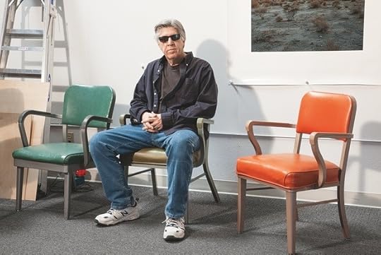
John Divola at his Riverside Workplace
By Jonathan Griffin
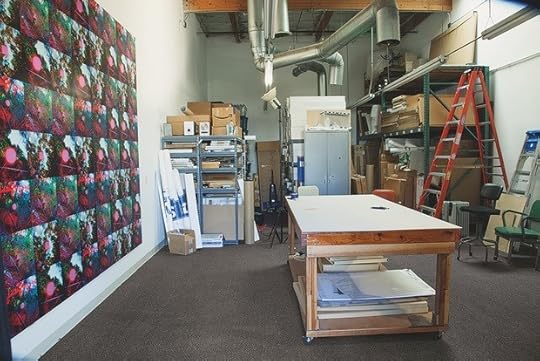
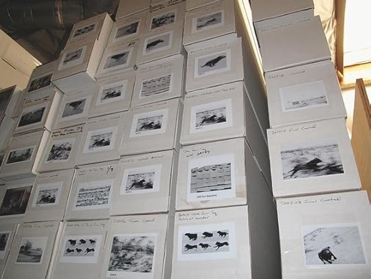
Views of John Divola's house and studio. All photographs © and courtesy John Divola.

In the distance, a soaring elevated freeway intersection frames a widescreen view of the San Gabriel mountains. The dissonance is typical of Southern California: awesome nature matched by equally awesome urban development. Despite the seemingly endless sprawl, it is rare in the Los Angeles basin that one cannot see out of it to the wilderness beyond.
Down below the traffic lies a quiet industrial development—rows of identical roller-doored units off a street with young trees and clipped lawns. In one of these units John Divola stores the bulk of his archive, which spans five decades, in metal shelves, with a table and empty walls at the front for viewing work. Two doors down, weightlifters have rented a unit as a gym. To his knowledge, he is the only artist on the block.
It is, perhaps, an unlikely place to find an artist’s studio. The town of Riverside, where Divola has lived for over a decade and worked since 1988, is situated sixty or so miles east of Los Angeles, in the heart of the Inland Empire. It is a comfortable, suburban place—maybe even a little bland. Divola admits that most of his artist colleagues and students at the University of California Riverside, where he is a distinguished professor, choose to commute from Los Angeles.
What brought him to Riverside? Partly, perhaps, the same qualities that he cites for choosing the studio: “Being here is a practical consideration—it’s very inexpensive, convenient, clean, and air conditioned.” I point out that the area is not dissimilar to the San Fernando Valley, which he documented in an eponymous series of photographs from 1971–73, made at the outset of his career. In those images, I suggest, there was a sense of sociopolitical criticality, of the photographer’s estrangement from the outwardly conventional suburban environment in which he had grown up.

“That’s a misinterpretation,” he says. “Even though I was to some extent alienated, especially by the war in Vietnam, I never had a desire to get away from it. It was what I was. And actually, one of the reasons my work changed after that was that your reading of that work was everybody’s reading of that work—that it was critical. It wasn’t. That was my landscape, and I was moving through that landscape, and I wanted to bring back an index of my engagement with it.”
This widespread misreading of Divola’s position as an artist has dogged him throughout his career, and it has to a great extent shaped his subsequent work. Putting himself in the picture, implicating himself in the situations that he photographs, is for him a central strategy. After the San Fernando Valley series he made Vandalism (1973–75), black-and-white images of derelict houses featuring spray-painted marks that, it becomes clear, were made by Divola himself. He is the vandal—or one of them.
In Los Angeles International Airport Noise Abatement Zone (1975) he photographed evidence of forced entry into empty houses marked for demolition. Was it the artist himself who had caused the damage? Additional photographs taken inside some of the houses suggest it probably was. In certain images from his Zuma series (1977–78), shot in an oceanfront house in Malibu, the camera flash pins objects such as a newspaper in midair, thrown into the frame by the unseen photographer.
Divola talks about himself as a “specter” haunting his pictures. He feels this especially strongly when he looks back at early photographs and tries to recognize himself in them. Retrospection has occupied him a great deal recently—not least because he is currently preparing for a three museum exhibition in California this October. The Santa Barbara Museum of Art, the Los Angeles County Museum of Art, and the Pomona College Museum of Art will mount coinciding but separate exhibitions of his work, none of which, Divola insists, is a retrospective.
He also found himself reflecting on his photographs from the 1970s while scanning old prints for his book Three Acts, published by Aperture in 2006. Revisiting these images prompted him to look once again for abandoned houses in which he could make photographs—this time with far more advanced technology.
Divola’s Dark Star series, from 2008, was shot largely in an empty house fifteen miles inland from Riverside, at the eastern edge of the megalopolis that stretches all the way to the Pacific Ocean. Large discs of black spray paint recollect the mysterious markings he had made in Vandalism. In the same house, Divola made the more recent series Theodore Street (2008–12) using an ultra-high-resolution method of photography called Gigapan. Between 40 and 120 separate photographs are stitched together by software to make a picture that can be printed at large scale without losing detail. Divola says his early prints are small only because, printed any larger, the raw materiality of his subject—scraps of plywood, shattered glass—would have been overwhelmed by the grain and fuzz of the photograph. In prints up to five by ten feet, some of which will be shown in Santa Barbara, Divola physically enters the scene and secretes himself among the details. There is plenty of space for the artist to get lost.
Divola doesn’t actually make art in his studio. His “indoor practice,” as he calls it, is taken up with managing his archive, the logistical challenges that he likens to Napoleon marching through Russia (“because it’s hard to move forward when you’re looking after the stuff in the rear”). The studio also gives him space to assess prints, old and new, some of which, such as his unfinished multipart work Malibu Progressions, from 1984, he is revisiting now that he has large inkjet printers at his disposal.
The real work, however, is done out in the field. “The beauty of photography, or conventional photography, is that it draws you out into the world, it draws you into an engagement with present reality,” says Divola. And with that, we’re out the door.
–
This article is from: Aperture 211$19.95
June 4, 2013
Interview with Jason Evans
Jason Evans’s photographs circulate in many worlds, from fashion magazines and websites to record covers and museums, and he’s often interested in subverting the conventions of the genres and venues in which he works. Such is the case with this portfolio of seventeen images currently on view at Aperture Gallery, which is the first such series Evans has created for photography collectors.
Here, Evans discusses these works, all part of his ongoing series Pictures for looking at, drawing for photography. They consist of Evans’s own photographs, to which he has applied brightly colored stickers, mainly from Japan and Germany. The stickers’ arrangements are randomly and intuitively generated, and create an oscillation between foreground and background, image and abstraction, pattern and randomness.
For information regarding print sales, and to see additional images from the series, contact prints[at]aperture.org.
—
Contributions by Jason Evans appear in Aperture magazine issues 192 and 195, and last spring his work was featured in the relaunch issue of the magazine (#210). Additionally, he was the subject of an interview in The PhotoBook Review 004, which you can read online.
 Aperture 210$19.95
 Monkey Face: Pictures for looking at, drawing for photography
$1,800.00
June 3, 2013
Richard Mosse at the Venice Biennale
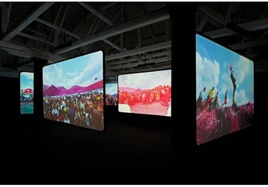
Richard Mosse, The Enclave, 2013. Six-screen film installation, color infrared film transferred to HD video. All images of the installation courtesy of the artist and Jack Shainman Gallery. Photos by Tom Powel Imaging Inc.
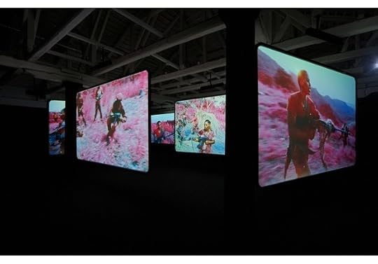
Richard Mosse, The Enclave, 2013. Six-screen film installation, color infrared film transferred to HD video.
Richard Mosse, The Enclave, 2013. Six-screen film installation, color infrared film transferred to HD video.
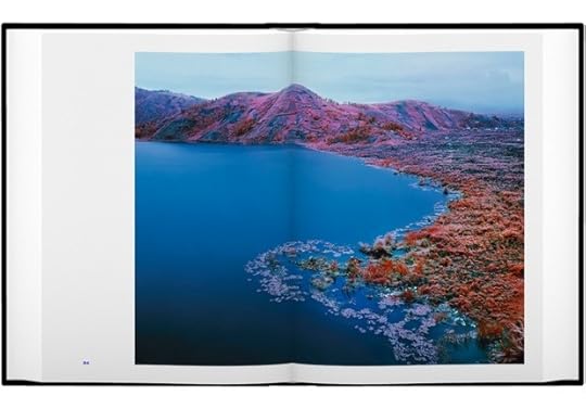
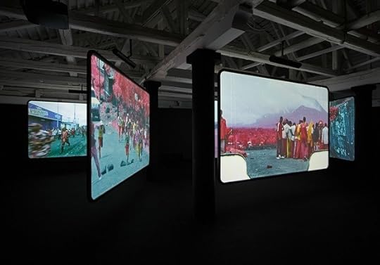
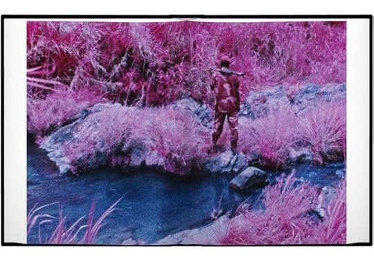
Spread from Richard Mosse, The Enclave (Aperture, 2013).
Spread from Richard Mosse, The Enclave (Aperture, 2013).
Last weekend the art world descended on Venice for the 55th International Art Exhibition of the Venice Biennale. In addition to the thematic exhibition “The Encyclopedic Palace,” curated by Massimiliano Gioni, there are national pavilions from dozens of countries. The Irish Pavilion, located at Fondaco Marcello, is given over to The Enclave, a new six-screen film installation by artist Richard Mosse. Aperture is pleased to publish the artist’s book accompanying this installation. The book is available now in Venice, and will be available soon via Aperture.org and other outlets.
For the last three years, Mosse has photographed in eastern Democratic Republic of Congo, a region in which a long-standing power vacuum has resulted in a horrifying cycle of violence. Shooting with both still- and 16 mm-cameras, he uses a discontinued military surveillance film, which registers an invisible spectrum of infrared light. Mosse has captured the landscape in disorienting psychedelic hues of scarlet, lavender, cobalt, and puce, creating images that are deceptively seductive andalluring. Ultimately, however, the resulting images and film map the otherwise invisible edges of violence, chaos, and incommunicable horror of isolated, jungle war zones. At the heart of the project, as Mosse states, is his exploration of the contradictions and limits of art’s ability “to represent narratives so painful that they exist beyond language—and photography’s capacity to document specific tragedies and communi- cate them to the world.”
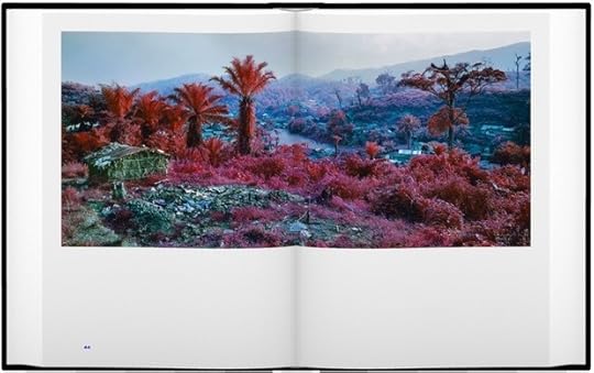
Spread from Richard Mosse, The Enclave (Aperture, 2013)
The book is an extraordinary object, and is printed in a limited run. There will be only one thousand copies of this title, 250 of which have been released as part of a limited-edition boxed set. The boxed set includes a 45 rpm record with sound and music design by Ben Frost; a poster featuring an image by Richard Mosse and a transcription from the film; and a signed-and-numbered copy of the book.
Our friends at Frieze magazine profiled Mosse on the occasion of his presentation in Venice. Watch the video below.
—
Aperture also published Infra, Richard Mosse’s first book, in Spring 2012.
 The Enclave
$80.00
 The Enclave
$200.00
 Infra
Infra
$100.00
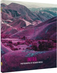 Infra
Infra
$50.00
Mali’s Era of Independence, in Photos
This post comes via Creative Time Reports. It was written by Amadou Chab Touré and translated by Christine Schwartz-Hartley. For more on Creative Time Reports, click here.

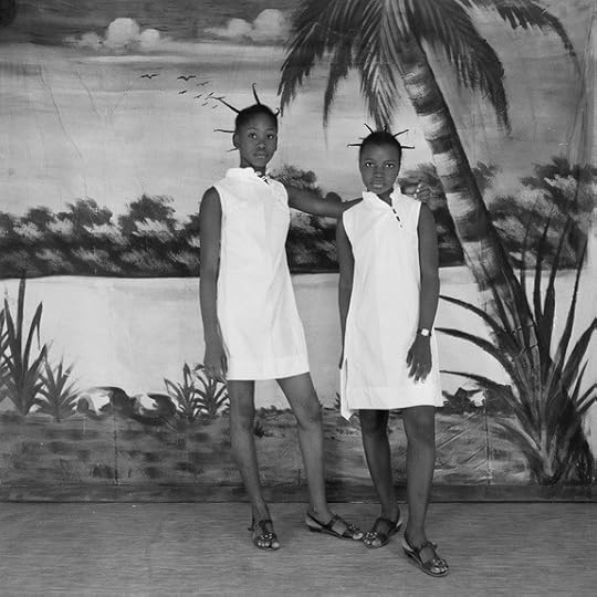
Adama Kouyaté, Les deux amies, 1971. All photographs courtesy the artist and Creative Time Reports.
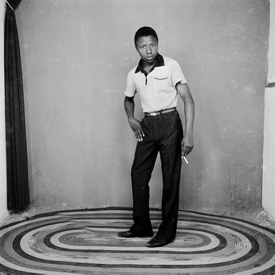
Adama Kouyaté, Joe Brin, 1967.
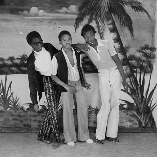
Adama Kouyaté, Les trois amis, 1971.
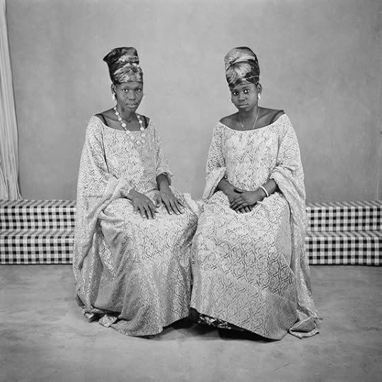
Adama Kouyaté, Mère fille, 1969.
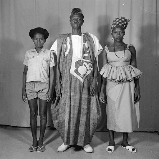
Adama Kouyate, La famille, 1954.
The entire studio fits in a small room, just over forty square feet. There’s no need for more. Two high-voltage lamps are plugged into a round, made-in-China power strip, just in case, to light a striped curtain. Behind the curtain, a bit of wallpaper representing a seaside landscape with palm trees and flower beds can easily be made out—a landscape of Chinese dreams. This decor serves as backdrop for the images to come. In front of this scene, an ordinary wooden stool awaits. Outside, seated on a nylon-strap chair, the studio photographer also awaits potential clients. If, after this ritual waiting, one shows up, the photographer has him sit on the stool in front of the backdrop. He turns on the lamps. He leans over his camera, glues his eye to the shutter, and shoots. He winds up the roll of film, sets an appointment for the customer to pick up the photo, and begins awaiting the next likely client.
Confined inside the territory of their studios, a few of these “sentry-duty” photographers have imagined tricks and perfected strategies to attract a clientele. They have acquired accessories (radios, briefcases, Vespas, bouquets of plastic flowers), built sets (multipart frescoes, painted backgrounds, various wall hangings) and prepared costumes (bowler hats, close-fitting jackets, multicolored ties)—all bought at top prices—so that the person being photographed can become more beautiful than he might be otherwise for the duration of the shoot.
With each passing shot, these silent magicians, servants to a narcissistic luxury, have become artists. They are true directors, awaiting the arrival of a subject they can magnify inside a “perfectly decked out” space. The African photo studio is an artistic space par excellence. There, intimacy can be invented and freedom is always present.
Photographic production in Mali began with the first European explorer missions and continued with photo studios established in Bamako, the capital, and run by European or Lebanese traders. African photographers entered the picture only toward the end of the 1930s. Printing apprentices, errand boys, or housekeeping attendants at first, almost all of them learned the trade through their contact with the master photographer, a white man, who employed them. Then the magic reeled them in. And with varying degrees of success, they opened the first people’s photographic studios and began producing images of their fellow citizens.
Adama Kouyaté, Les minieuses, 1971.
Early in the 1960s, there were few photographers in Bamako—six at most. You would find them in the city’s poorer central neighborhoods (Madina Kura, Bamako Kura, Bagadadji, Dravela). Lively and warm, these districts of the capital were inhabited by carefree young people happy to be living in a society that had been launched on a path of high hopes. Every Malian believed that independence would bring about even more reasons to hope.
Euphoria was permitted and prevalent. People celebrated and danced with joy at every occasion. Adults were working to build a society that promised prosperity; young people were bound by rigorous social and civic codes, yet at the same time encouraged to experience their age group’s pleasures. In clubs with unambiguous names like “The Friends,” “The Carefree,” “Beach Boys,” and “Charming Ladies,” they dressed in the “Yé-yé” fashions shown in European celebrity magazines: bell-bottom pants, tight-fitting shirts, and shoes of the darkest brown. They danced to American pop music. They swung to James Brown and Aretha Franklin.
The photographer was witness to and guardian of the happiness of a Bamakoan society that yearned for its image—the image of its new independence.
In the 1990s, a decade of renewed euphoria for Mali after twenty-three years of despotism, the West discovered and celebrated two men it considered—and still considers—the greatest photographers of the “dark continent”: Seydou Keïta and Malick Sidibé. The works of these two nearly retired Malian photographers became all the rage in galleries and museums in New York, Madrid, Barcelona, Paris, and London.
Anonymous portrait galleries, joyful memories of a famous family, glowing faces from a day’s happiness—a thousand and one images resurfaced and began to circulate in the Western art market, which succumbed to their charms. Mali’s recent and tangible past was now being summoned before the spectators of Africa’s democratic renewal—as if the memory of the hopes that had been reclaimed from oblivion were coming to reassure the new hopes.
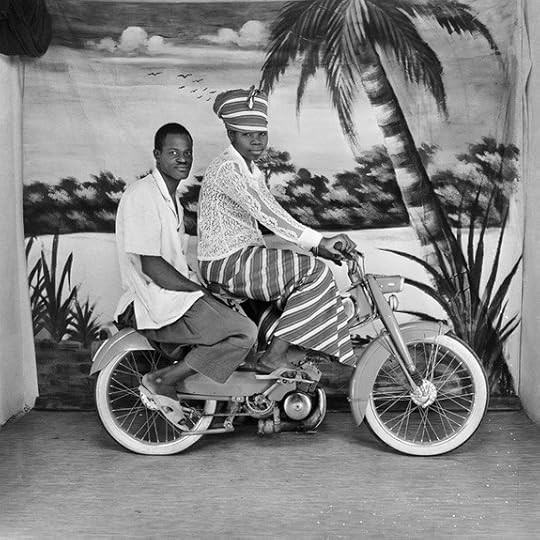
Adama Kouyaté, Le couple à moto, 1971.
Thanks to the West’s infatuation with photographs produced in Africa in the mid-1950s, numerous African studio archives were unearthed, either by researchers driven by an anthropological approach or by curators of all stripes promoting a previously unknown African photography aesthetic. It was at this time that the name Adama Kouyaté finally surfaced, north of the Mediterranean and across the Atlantic.
Kouyaté was born in Bougouni and remained in this small southern Malian town until age seventeen. After his cobbler father died in 1944, Kouyaté found himself at the family’s helm. Without resources to provide for everyone’s needs, he decided to leave for Bamako, the capital, hoping to find work there. He began an internship with a master cobbler while waiting to find a better position.
On December 25, 1946, Kouyaté gave his girlfriend a Christmas present: he invited the photographer Bakary Doumbia to her house so that he could take their portrait. “The photo was so beautiful that I wanted to be a photographer myself,” Kouyaté says. “And I never let go of Bakary Doumbia again.” At the time, Doumbia and his brother Naby were two well-known and acclaimed Bamako photographers. Bakary ran the studio in the Dravela district and Naby was employed as a photographer with the National Police Force.
Kouyaté began an apprenticeship at Bakary Doumbia’s side. Very quickly, he familiarized himself with photography and its magic, also becoming acquainted with other photographers’ apprentices and the city’s studios. Finally, he met Pierre Garnier, the master teacher of all the city’s photographers, while admiring the images Garnier had taken and was exhibiting in the window of his “Photo Hall Soudanais.”
As a result of spending time at the Photo Hall Soudanais, Kouyaté was eventually hired by Garnier as his photo-enlarging assistant in 1947. Two years later, Kouyaté opened a studio in Kati, some nine miles from Bamako, and christened it “Photo Hall Kati.” Becoming a truck driver a few years later, he entrusted the studio to a young man he had trained, who managed the studio while Kouyaté was away. Over a period of ten years, Kouyate traveled all the roads in West Africa, staying in Lomé, Togo; Abidjan and Bouaké, Ivory Coast; and Ouagadougou, Burkina Faso. In Bouaké, a small trading town, he opened another studio, “Photo Hall Ivoire,” operating it until 1968, the year of the military coup in Mali. This event put an end to Kouyaté’s African adventure.
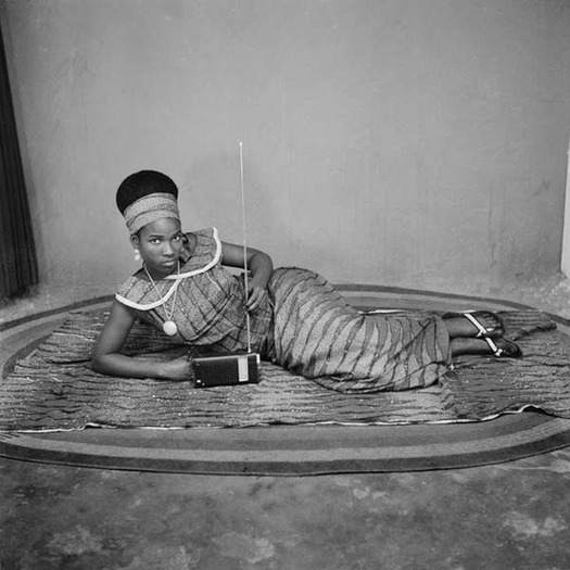
Adama Kouyaté, Transistor, 1967.
Back in Mali, investigating business opportunities and gathering information about the practice of photography, Kouyaté soon learned that Ségou’s Agence Nationale d’Animation (ANIM, or National Animation Agency)—which served as a photo studio, among other things—was about to close. No studio in town existed to replace it. Kouyaté knew the town of Ségou: in fact, he already owned a house there. An important city in the country, a trading crossroads counting several kings in its history, Ségou had a say in all of Mali’s national affairs. The great Bambara and Somono families kept a vigilant eye on local prosperity. Convinced of Ségou’s commercial opportunities, Kouyaté sold his car and, with the proceeds from the sale, set up a studio specializing in portraits called “Photo Hall d’Union,” in the Adama Seck building on Elhadj Oumar Tall Street, in the heart of the commercial district. The studio was inaugurated on September 22, 1969.
For a long while, Adama Kouyaté remained the only photographer in town. On ordinary days, he was content with taking two rolls of twenty-four exposures each. In times of celebration—Tabaski (Eid al-Adha), Christmas, Ramadan, baptisms, weddings—he shot as many as six rolls per day. Other photographers eventually settled in Ségou, but Kouyaté never suffered from the competition. Women and young people, the majority of his clientele, always came to him to have their pictures taken.
Today, at the age of eighty-two, Kouyaté continues to take picture IDs in his studio on Elhaj Omar Tall Street in Ségou.
Amadou Chab Touré is a professor and gallery manager in Bamako, Mali.
Aperture's Blog

- Aperture's profile
- 21 followers

