
Aperture's Blog, page 194
July 19, 2013
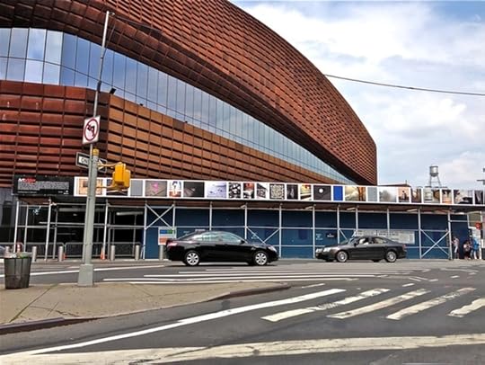
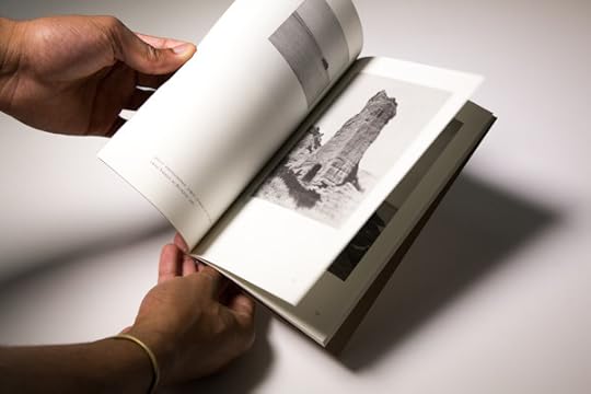
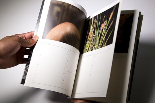
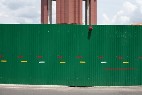
Another New York at Barclays Center in Brooklyn
Another New York installation view.

Another New York installation view. Photo: Aaron Rezny.
Another New York installation view. Photo: Aaron Rezny.
Another New York installation view. Photo: Carl Gunhouse.
Another New York installation view.
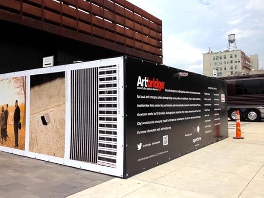
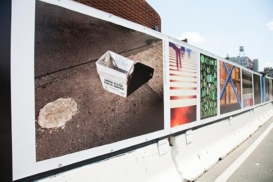
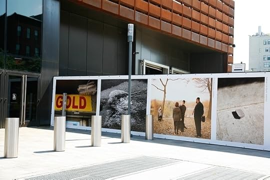
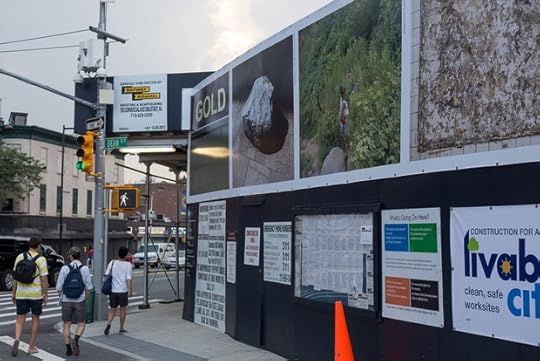
Aperture is happy to announce the recent unveiling of Another New York, a public exhibition on the construction hoardings surrounding the Barclays Center that features the work of fifteen Brooklyn-based photographers. Curated by artist Mickalene Thomas and Humble Arts co-founder Jon Feinstein from an open call, the show offers these photographers’ distinct visions of the enormous metropolis they call home. “We selected work that we feel gives us a new perspective on such a heavily photographed terrain,” said Thomas. The featured artists are Timothy Briner, Nathan Lee Bush, Maureen Drennan, Adam Frezza, Darren Hall, Curtis Hamilton, Jayson Keeling, Paul Raphaelson, Barry Rosenthal, Niv Rozenberg, Irina Rozovsky, Matthew Schenning, Luke Swenson, Wendy Whitesell, and Jason John Würm. Aperture is pleased to be the media sponsor for this public presentation, which will remain on view for several months. To learn more about the exhibition, visit the Artbridge website.


July 18, 2013
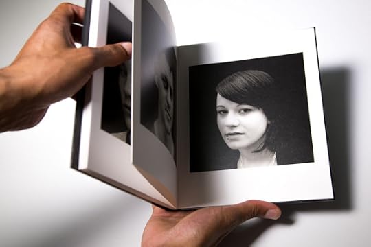
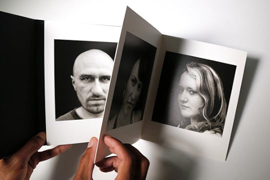
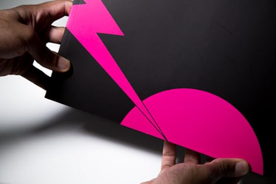
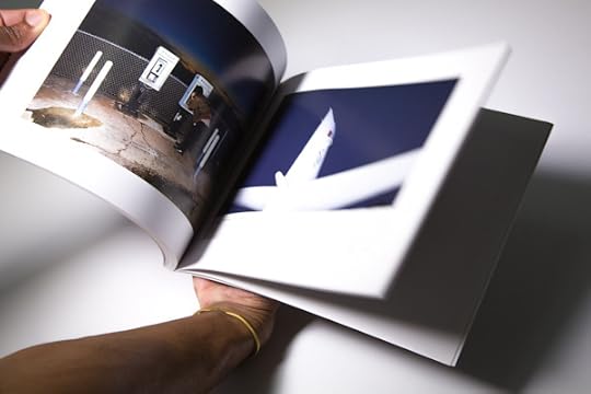
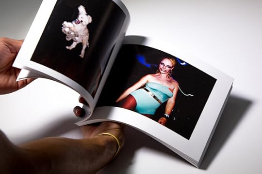
PhotoBook Awards 2013: Latest Arrivals Vol. 1
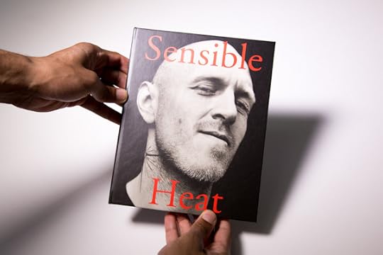
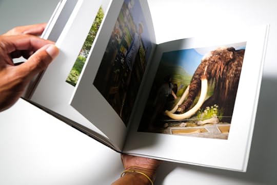
From Sensible Heat. Photographs by Jürgen Schmidt.
From Sensible Heat. Photographs by Jürgen Schmidt.
From Sensible Heat. Photographs by Jürgen Schmidt.
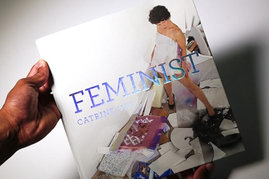
From Feminist. Photographs by Catrine Val.
From Feminist. Photographs by Catrine Val.
From Feminist. Photographs by Catrine Val.
From Feminist. Photographs by Catrine Val.
From Odes. Photographs by Taca Sui.
From Odes. Photographs by Taca Sui.
From Odes. Photographs by Taca Sui.
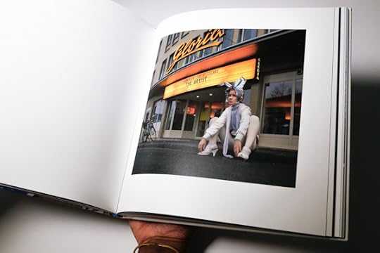
From I Don't Warna Grow Up. Photgraphs by Sean Vegezzi.
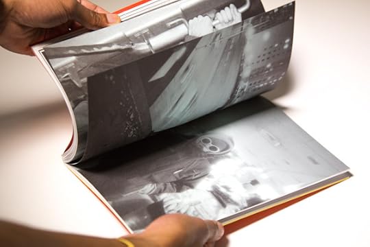
From I Don't Warna Grow Up. Photgraphs by Sean Vegezzi.
From I Don't Warna Grow Up. Photgraphs by Sean Vegezzi.
From Selections from the Joint Photographic Survey. Edited by Adam C. Ryder.
From Selections from the Joint Photographic Survey. Edited by Adam C. Ryder.
From Selections from the Joint Photographic Survey. Edited by Adam C. Ryder.
From Dew Dew, Dew Its. Book by Hiro Tanaka.
From Dew Dew, Dew Its. Book by Hiro Tanaka.
From Dew Dew, Dew Its. Book by Hiro Tanaka.
From Ubatama. Book by Hayata Daisuke.
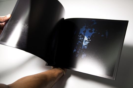
From Ubatama. Book by Hayata Daisuke.
From Ubatama. Book by Hayata Daisuke.
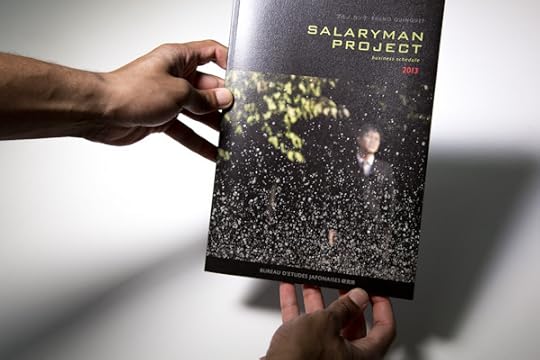
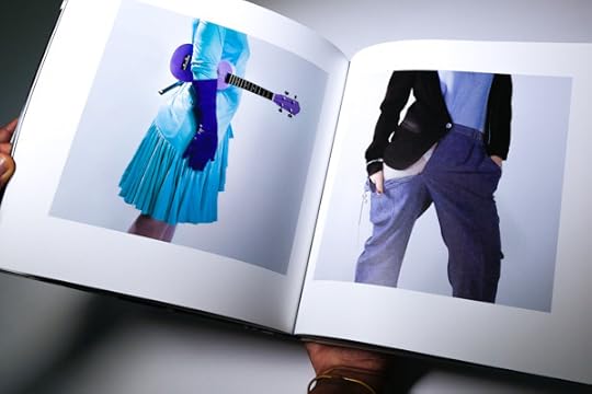
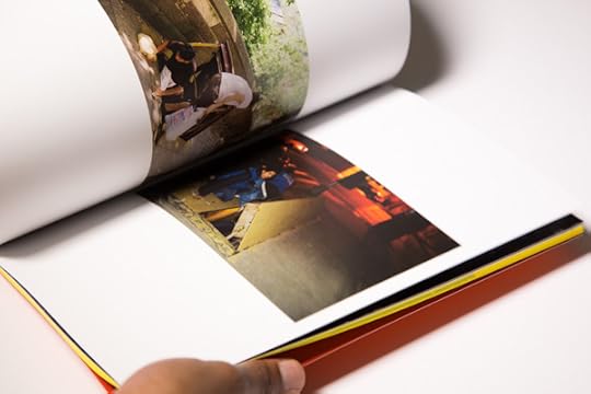
From Salaryman Project. Photographs by Bruno Quinquet.
From Salaryman Project. Photographs by Bruno Quinquet.
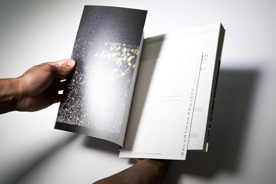
From Salaryman Project. Photographs by Bruno Quinquet.
You can enter the Paris Photo–Aperture Foundation PhotoBook Awards now through September 13, 2013. Dozens of submissions have already arrived in our New York office. Here, we highlight a selection of the latest arrivals in the First PhotoBook category.
Stay tuned for more images the latest arrivals in the news section of the PhotoBook Awards site and on Instagram (@aperturenyc).
Visit the prize site for FAQ and full entry details.
July 15, 2013
Horst Ademeit: Secret Universe
By Lynne Cooke
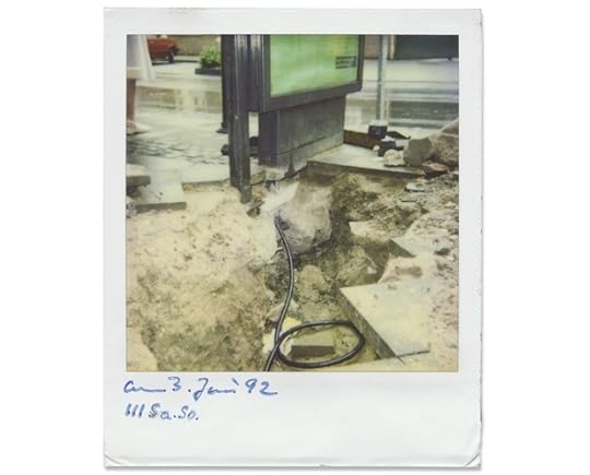
Horst Ademeit, Untitled (03.06.1992), 1992. All photos courtesy Galerie Susanne Zander/Delmes & Zander, Cologne.
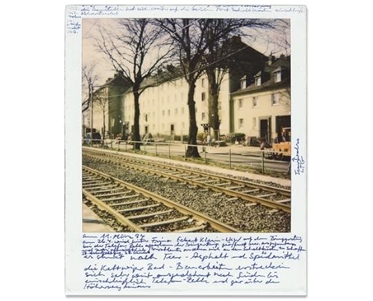
Horst Ademeit, Untitled (11.03.1994), 1994.
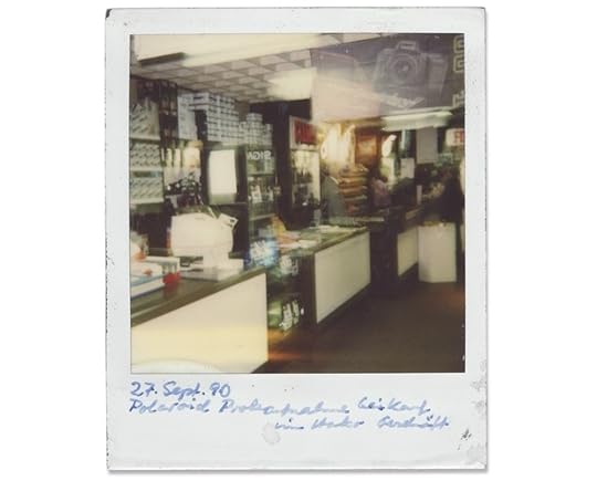
Horst Ademeit, Untitled (27.09.1990), 1990.
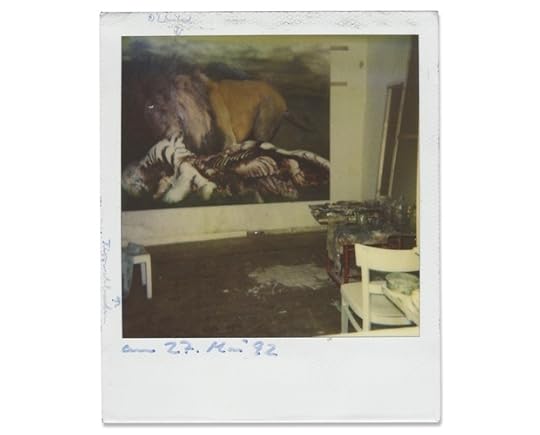
Horst Ademeit, Untitled (27.05.1992), 1992.
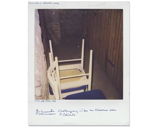
Horst Ademeit, Untitled (19.02.1994), 1994.
Horst Ademeit, 4883 (29.07.2002), 2001.
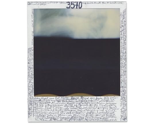
Horst Ademeit, 3570 (14.12.1998), 1998.
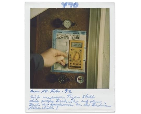
Horst Ademeit, 490 (10.02.1992), 1992.
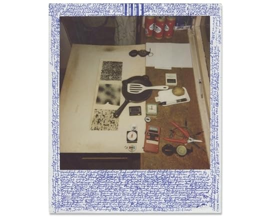
Secret Universe is the title of the exhibition series under which, in 2011, the late Horst Ademeit’s work was first presented to a museum audience. It was a fitting choice for an exceptional corpus of Polaroid (and later digital) photography that was neither conceived as an artistic project nor intended for public exposure. Compiled over some fifteen years, beginning around 1990, these images were made for strictly personal, utilitarian ends.
Trained as a textile designer, Ademeit entered Joseph Beuys’s class at the Kunstakademie Düsseldorf in the late 1960s. When his work was rejected as too conservative—too academic—he left not only Beuys’s class but the art world at large. Thereafter Ademeit supported himself primarily as a manual laborer in the building trade. He took up photography in order to contend with a mounting concern: his belief that he was increasingly subject to the deleterious effects of what he referred to as “cold rays” and invisible radiation, emanating from electrical sockets and fittings in his apartment. To contain and counter the harmful yet undetectable rays, Ademeit photographed their sources at home, and, by extension, in his neighborhood, notating his feelings and impressions— as well as detailed data from electricity meters, thermometers, clocks, and other devices—in the narrow margins of his Polaroid prints. While capitalizing on the ease and immediacy offered by this particular process, Ademeit may also have valued the fact that, exceptionally among photographic media, the Polaroid camera produces a unique and unrepeatable image. On the evidence of those few among his six-thousand-plus Polaroid shots made public to date, it seems, however, that the making of the image— the pointing, shooting, transfixing, and hence warding off of the feared effects— took priority over the character of what was produced. The more rudimentary his methods, and the more seemingly happenstance his compositions, the greater the charge generated by the resulting images—as if something had, indeed, been caught on the fly. In short, these works are compelling almost in inverse relation to the degree of attention lavished on their production. Ademeit’s oeuvre has been likened by critics to a Conceptual art project of the kind that fueled the practices of On Kawara and Hanne Darboven. It might equally well be compared with works by certain individuals who have felt themselves subject to the wiles of what Viktor Traub (an associate of Freud) termed “influencing machines”: that is, machines that appear, in the words of the psychoanalyst, “a s an outer enemy, a machine used to attack the patient.” Among the most haunting precursors to Ademeit’s murky testimonials, the annotated drawings of Hugo Rennert, Jakob Mohr, and Robert Gie sometimes depict their authors entangled in the immaterial coils emitted by unidentifiable contraptions, and sometimes simply record the pathways traversed by sinister impulses. Had Ademeit picked up pencil and paper, in place of a camera, while grappling with his infested environment, he too would likely be identified as an Outsider artist. Fortunately, photography has not been subject to the same disciplinary distinctions as the other visual arts: it largely eschews hierarchies between what is produced by the marginal and/ or self-taught for leisure and utilitarian ends and the panoply of artifacts produced by mainstream professionals of various ilks. In photography’s short history, conventions based on notions of center and periphery, of accredited and amateur, are less determinant than they are in the discourses attending painting, sculpture, and the graphic arts. Indeed, one measure of the strength of Ademeit’s singular endeavor is that it can be viewed through multiple lenses.
Curator and art historian Lynne Cooke is currently Andrew W. Mellon Profesor at the Center for Advanced Study in the Visual Arts, National Gallery of Art, Washington D.C. She recently curated Rosemarie Trockel: A Cosmos, at the New Museum, New York.
July 11, 2013
Penelope Umbrico Moving Mountains ebook


In October 2012, Aperture presented Penelope Umbrico’s Moving Mountains (1850–2012) as part of Aperture Remix, an artist commission and exhibition. For the project, a select group of contemporary photographers were invited to choose an Aperture publication and to pay it artistic homage. The works that each artist created for Aperture Remix—incorporating new images made in response or interventions with the original publication itself—comprise a way of mapping the enduring influence of Aperture’s publication history as it relates to contemporary practice.
Umbrico worked with the Aperture Masters of Photography series, focusing on the mountain, a classic and long-standing subject of photographers as symbolic of the idea of mastery. Using a series of camera apps and filters on her iPhone, she created new photographs of the mountains that appear throughout the series, drawing on images from Edward Weston, Wynn Bullock, Henri Cartier-Bresson, Manuel Álvarez Bravo, and others. For the exhibition, Umbrico arranged a grouping of over eighty new images side-by-side with vintage prints of each of the images that she had re-photographed from the pages of the Masters series. In doing so, the expansive and elastic nature of contemporary photography was neatly illustrated—from the original, stable object of the masters, to the to the ever-mutating, fluctuating digital iterations possible today.
A limited-edition book created for the exhibition, drawing on the format and design of the Masters Series, included over seventy-five images out of the hundreds created as part of her process; subsequently, Umbrico has created an ebook containing over one hundred images and downloadable for free—in many ways, the optimum manifestation of the project.
Moving Mountains is Aperture’s first artist’s ebook—and first free publication! Click here to visit the iTunes store and download the ebook.
—
Aperture published Penelope Umbrico’s first monograph Penelope Umbrico: Photographs in 2011.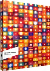 Penelope Umbrico: Photographs
$65.00
July 10, 2013
Back In Black
By Fred Ritchin
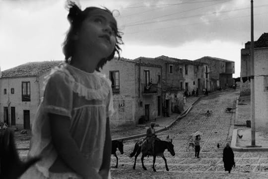
Sergio Larrain, Main Street in Corleone, Sicily, 1959. © Sergio Larrain/Magnum Photos
Sitting under a hot sun at one of the several outdoor cafés in the Place du Forum, surrounded by photographers, curators, tourists, and an occasional waiter, one cannot but reflect on the recent changes in the world of photography through the lens of this pioneering festival—now over forty years old. While there are numerous exhibitions saluting older or deceased (nearly all male) heroes from the field (Gordon Parks, Hiroshi Sugimoto, Jacques Henri Lartigue, Arno Rafael Minkkinen, Daido Moriyama, and Sergio Larrain, among others), there are comparatively few shows that give a sense of the medium’s possible futures. It feels, in a sense, like a convention of nineteenth-century oil painters—this is, after all, Van Gogh territory—who are still confused and somewhat in shock over the invention of another new medium (in their case, photography) that challenges the primacy of their own. This year’s theme, in fact, is “Arles in Black,” a nod to the glory days of black-and-white photography of the last century, a moment when photographic artists and documentarians were clearly ascendant. (It may also be, unconsciously or not, a title that acknowledges a certain amount of mourning.)
There are highlight exhibitions, including a nostalgic, finely curated display of photographic albums by Erik Kessels (much more interesting than an adjacent room containing one day’s worth of photographs uploaded to Flickr, a conceptual piece which he had previously shown at Foam in Amsterdam); the superb Gordon Parks retrospective, situated at a distance from the town’s center in the old Atelier area, which forcefully documents decades of American racism and also his varied gifts as an artist; and a viscerally disturbing, well-printed black-and-white standout show of photographs by Michel Vanden Eeckhoudt, which explores the acute, rasping agony of animals in captivity and the simultaneous spiritual decline of humans.
One of the best of the outdoor evening projections, a group project called Transitions that focuses on the deteriorating social landscape in South Africa, features work by a dozen photographers (half South African, half French and Belgian). It was at times extraordinarily moving in its depiction of the havoc caused by fracking and gold and diamond mining, including the dislocation of entire mountains in search of precious metals. Raphaël Dallaporta’s zig-zagging color aerial photographs made with a drone and Alain Willaume’s eerily compelling, subtle images of dust storms were standouts, as were Zanele Muholi’s color images of young South African women at a Zulu ceremony. Unfortunately, the prints hung on the wall from the same project looked more like a school exhibit, lacking the grandeur and the tonalities of the images projected onto the large screen.
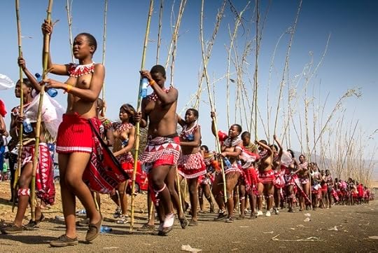
Zanele Muholi, Untitled, 2013.
Alfredo Jaar’s retrospective felt somewhat dated: critiquing Newsweek and Life is less pertinent than it once was, given the diminished stature of these and other magazines. Nonetheless, it emerges as one of the only thought-provoking, politically engaged exhibitions at the festival. Located in a medieval church, the Église des Frères Prêcheurs, Jaar installed the work so that there remains something of the sacred about it—a welcome change from the commercial underpinnings of the gallery. His public conversation about the media landscape with veteran curator and writer Christian Caujolle needed to be amplified with many other such conferences engaging the changing contexts for photography.
The star of this edition of the festival is undoubtedly Chilean photographer and Magnum member Sergio Larrain, who had largely disappeared from public view for many years. Upon his death a few years ago it has become easier to display his work, both his photographs and his mystically oriented notebooks. It is a confused legacy—he comes across as both a passionate seeker of peace and enlightenment and a bit of a self-involved crank. His decades-old black-and-white photographs from Valparaiso, Chile, and elsewhere remain powerful, lyrical depictions of the spiritual life of people who happen to be poor. But featuring him for three straight evenings during the nighttime projections in the outdoor ampitheater may have been too much. His rediscovery is more than laudable, but so many issues he raised are being pursued by others who might also have benefitted from the spotlight of the stage.
A highlight: running into a young Dutch woman who is part of a group of five embarked on a project to diminish the number of images in the world. It is called “ED: Restoring the Value of Photography Through Editing.” They are planning to present the results of their endeavor this September at Unseen, the Amsterdam festival. Surrounded by the fifty exhibitions on view here and the many young artists showing portfolios, their project gives one pause: in our media-saturated world, less may well be more.
The exhibitions at Les Rencontres d’Arles run through September 22, 2013. For more information, click here.
Anonymous photographer, undated. Included in Erik Kessels’s exhibition Album Beauty.
July 7, 2013
Sarah Charlesworth (1947–2013)
By James Welling
Sarah Charlesworth with Princeton students in her Introductory Photography course, fall 2012. Photo: M. Teresa Simao.
We shared a sun-filled office in the Lewis Center and I saw Sarah every week this past fall. I taught on Tuesdays and Wednesdays; Sarah on Wednesday only. Many weeks I stayed over, so I’d be in the office when Sarah rolled in. She’d give me a big smile and a hug. The smile said, “Can you believe we’re doing this, Jim? Isn’t this the greatest? We’re both at Princeton.”
Sarah was my big sister last fall. We’d walk over to Prospect House for lunch, discuss the department and our students, and Sarah would fill me in on what I needed to do.
Sarah was tickled to be at Princeton. She was a direct descendent of Jonathan Edwards, a philosopher and theologian who became president of the university in the eighteenth century. Like Edwards, who died only weeks after coming to Princeton, Sarah’s time at the university was painfully short.
I preferred to take the train back to New York but I drove back with Sarah once in November. We wanted to attend a MoMA panel on abstraction, so we began our afternoon classes thirty minutes early. We got in Sarah’s black Volvo station wagon, which was full of wicker baskets she’d bought up in Connecticut. She moved some around for my suitcase of books to squeeze in. We took a melange of turnpikes and surface streets and were making good time until we got to the Lincoln Tunnel. Crawling along the helix entrance to the tunnel for an hour, we talked about New York versus Los Angeles, digital versus film, Princeton, how bad the traffic was.
Sarah Charlesworth with Princeton students in her Advanced Questions in Photography course at David Zwirner Gallery. Photo: Matt Lange.
When we got to the panel, we were so late we drew attention to ourselves. I was asked a question and mumbled some sort of evasive answer; Sarah received a quick follow-up. She answered with typical Charlesworthian poise. She was more burned out than I was, but she quickly sized up the discussion and offered her nuanced yet opinionated thoughts on abstraction.
After the panel we toasted each other with plastic cups of white wine. And she gave me that smile: “Can you believe we were just at Princeton? And now this.”
And now this.
James Welling is an artist based in Los Angeles. James Welling: Monograph was recently published by Aperture.
July 3, 2013
Rinko Kawauchi on Ametsuchi (Video)
On the occasion of the her recent book launch at Aperture Gallery, Japanese photographer Rinko Kawauchi sat down with us to discuss the origins of Ametsuchi, her latest volume of photography.
In this video, Kawauchi describes the genesis of her journey to photograph at Aso, a city and volcanic mountain region in southern Japan, whose image first appeared to her in a dream years ago. Ametsuchi brings together images from her exploration of the area’s landscapes, distant constellations, and tiny figures lost within land—as well as her observations of a traditional style of controlled-burn farming (yakihata), Buddhist rituals, and other religious ceremonies.
Kawauchi also discusses the title of this new volume, whose multiple meanings (“heaven and earth,” “top and bottom”) have been translated into a moving physical object by Dutch designer Hans Gremmen. We spoke with Gremmen earlier this spring about the choices surrounding Ametsuchi’s unique form in an online-only interview that can be read here.
—
Ametsuchi: Photographs by Rinko Kawauchi is now available.
 Ametsuchi
$80.00
 Illuminance
$60.00
July 1, 2013
Out of Nowhere: Photography in Cambodia
This post comes via Creative Time Reports. It is written by Leeza Ahmady and Erin Gleeson. For more on Creative Time Reports, click here.
Following photography’s invention in the mid-1800s, colonizers and travelers photographed and disseminated images that portrayed Cambodia as an exotic land. It was only at the outset of the independence years (1953–70) that the country began to record itself, but this practice was interrupted, and its archive mostly destroyed, by war. Concerned by the lack of physical documentation of the stories, traits, and monuments specific to the country’s past and present, Cambodian photographers and artists are devising new ways of showing and telling. Below is a selection of landscape photographs, taken in both a literal and symbolic sense, that draw on historical as well as contemporary events.
Sovan Philong, born 1985

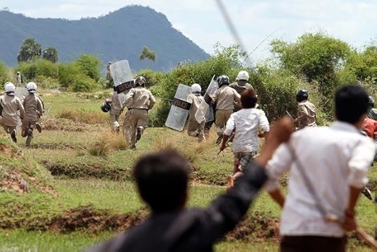
Both images above: Sovan Philong, Violent Scenes from a Rice Paddy, 2011. Courtesy of the artist and Asia Motion.
One early morning in June 2011, 250 villagers of Stock Slat village in Kampong Speu Province took up arms and blocked the path of 300 police officers who had arrived to evict them. Cambodia’s Supreme Court had awarded their 160 acres of farmed rice paddies to a foreign company. The English-language daily that first printed these images reported that concerned residents had stayed up all night to prepare for the eviction, transporting beds and entire houses to block the authorities’ path. The police forced their way through the makeshift barricades. The villagers fought back with whatever tools they could grab, including sticks and farming tools. Blood was shed on both sides. Sovan Philong recorded the events on the front line, risking his safety to capture and share photographic evidence of the conflict. In a political climate where national media are cautious about reporting on land evictions, images such as Sovan’s are particularly important. Often circulated internationally and spread through social media networks, they help to foster engagement with these issues.
The paragraph above has been adapted with permission from an essay on Sovan Philong by artist and curator Vuth Lyno.
Vandy Rattana, born 1980
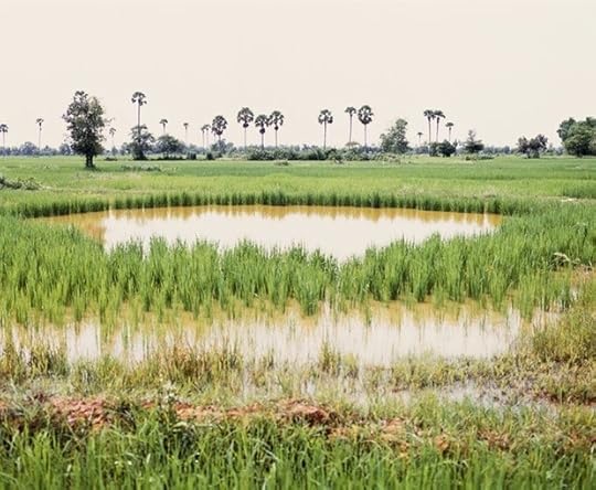
Vandy Rattana, Takeo, from the series Bomb Ponds, 2009.
Vandy Rattana, Kompong Cham, from the series Bomb Ponds, 2009.
“You can hear something a thousand times and not know it; yet if you see it with your eyes just once, you know.” —Khmer proverb
For his acclaimed Bomb Ponds series, Vandy Rattana confronted the physical and psychological scars left by the American carpet-bombing of Cambodia, a campaign that lasted from 1965 to 1973 but is largely unknown even within Cambodia. Visiting the ten most affected Cambodian provinces bordering Vietnam, Vandy photographed the craters left by bombs, most of which are now filled with water. Recognizing the contradictions between the violent history and the current serenity of the landscapes, and questioning the photographs’ ability to speak beyond the silence, Vandy interviewed villagers who had lived through the bombing. (The artist presents their stories in a gripping one-channel video accompanying his photo series.) While Bomb Ponds brings attention to the lack of documentation of these unwarranted acts of violence undertaken by the United States, it also pays respect to the resilience of the land and the survivors. The intense distance between experiential, written, and oral history provoked a shift in the artist’s beliefs about the relationship between historiography and image making. Following Bomb Ponds, for Vandy, photography and history itself became fiction.
Lim Sokchanlina, born 1987
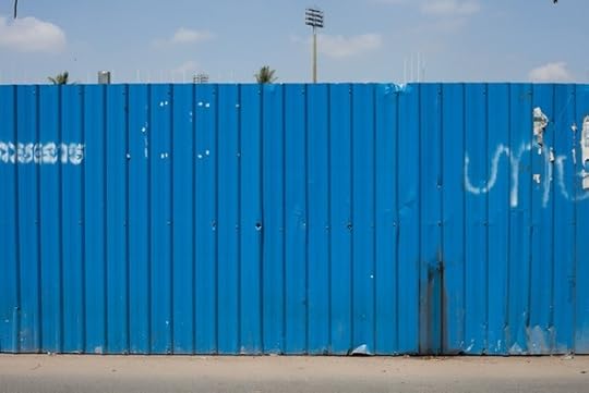
Lim Sokchanlina, Wrapped Future/Phnom Penh. Cambodia. 2012: Olympic Stadium, East Side, 2012.
Lim Sokchanlina, Wrapped Future/Phnom Penh. Cambodia. 2011: Independence Monument, 2011.
With heightened urban construction since 2009, various fences and makeshift enclosures have come to define much of Phnom Penh’s topography. Lim Sokchanlina has been photographing such partitions for over four years with special attention to contentious sites. Concerned with divisive development launched in the name of a “New Phnom Penh,” Lim scrutinizes these newly erected borders, portraying the physical and psychological effects of their separation of public and private, past and future, and the known and unknown. “The land enclosed is no longer a presence, as if what was displaced or destroyed at these sites no longer matters,” the artist declares. “Memory has been traded for development. These fences are wrapping the future, standing in place of what was forgotten or never even known.” Lim’s corrugated color fields flatten the imposing fences into mundane facades. Arrested expanses of color, patterns, and markings invite painterly reflections, while his titles record what was where, and when. Isolated from their bustling surroundings and rescued from their impending fate, the fences are photographically preserved as landmarks. The above images document the enclosure of two revered architectural icons by Cambodian architect and urban planner Vann Molyvann: Independence Monument (1958) and Olympic Stadium (1964).
Khvay Samnang, born 1982
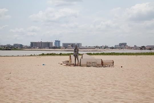
Khvay Samnang, Newspaper Man, 2011. Courtesy of the artist.
An alien figure, the titular “Newspaper Man,” stands alone in the center of a surreal, light-washed urban landscape: a sand-filled lake in central Phnom Penh. Khvay Samnang has engaged this site many times in recent years; in this iteration, he responded to a historical moment absent in local media reportage with a performance documented by the above photograph and a single-channel video. Blinded by newspapers wrapped around his body, Khvay clumsily walked along a contrived shoreline, tripping over the few remains of the homes lost by thousands of families evicted and relocated from this site. A panorama of developments lines the horizon while excavators are seen at work. As “Newspaper Man,” the artist calls attention not only to the land and its recent history but also to the role of Khmer-language journalism in neglecting to cover a matter of deep environmental, infrastructural, and humanitarian concern.
Pete Pin, born 1982
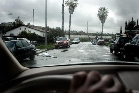
Pete Pin, from the series Cambodian Diaspora, 2011. Courtesy of the artist.
Pete Pin, from the series Cambodian Diaspora, 2011. Courtesy of the artist.
Part of his ongoing work with the Cambodian diaspora in the United States, the two above images by Cambodian-American photographer Pete Pin show a cautious engagement with space in an attempt to translate his subjects’ stories about “navigating life in the context of the very hard, and at times violent, realities of adapting to a new homeland.” A daunting view of a tenement-building row reflects the intimidating landscape of the Bronx as experienced by numerous refugees who relocated there from Cambodian refugee camps throughout the 1980s. A windshield frames a gloomy landscape and standard motifs of Cambodian tourist photography: pigeons, which abound at the Royal Palace, and palm trees, seen throughout the countryside. However, not being in Cambodia is an emphasis of Pin’s work to date.
Taken while driving in Long Beach, California, home to the largest community of Cambodians in the United States, the photograph’s edge features Pin’s hand at the wheel. Behind the palm trees is a canal referred to by neighborhood residents as “The Ditch.” It was the meeting space for many Cambodian and Hispanic gang members, a site that took the lives of countless young men who, ironically, were the children of survivors who fled Cambodia. Pin notes this “generational transfer of trauma” as a central motif in his work.
Khiang H. Hei, born 1968
Khiang H. Hei, from the series The Highlands Crossing, 2013. Courtesy of the artist.
Khiang H. Hei, from the series The Highlands Crossing, 2012. Courtesy of the artist.
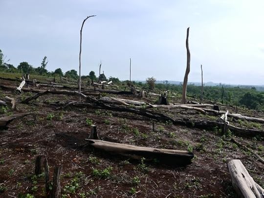
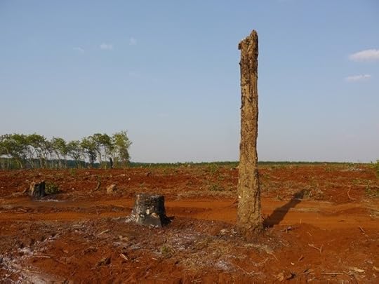
For two decades, Khiang H. Hei has regularly traveled the Ho Chi Minh Trail to document life on this historic pathway, which physically connects China, Laos, Vietnam, and Cambodia to the legacy of the U.S.-Vietnam War. While Hei’s vast archive focuses on the resourceful appropriations of military waste by the indigenous minorities living near the trail, the artist has also turned his lens to the land itself. Northeastern Cambodia’s highland communities are the focus of his recent work. Increasingly over the last decade, native lands have been stolen or sold under pressure to an array of local and international investors. Dense and diverse forests have been cleared. Various hill tribes, whose members commune with forest spirits in everyday rituals and funerary rites, are forced to work the land in opposition to custom. “Without forests they are without hope,” says Hei, who lives and labors with villagers during his travels. The ongoing “Highlands Crossing” series reveals challenging realities for minority tribes. The first image above shows a rare plot where healthy, centuries-old slash-and-burn practices continue, while the image below reveals a logged site where the barren red earth, well known to this region, is now prepared to become a rubber plantation.
Kong Vollak, born 1983
Kong Vollak, from the series Leaving, 2007. Courtesy of the artist.
Kong Vollak, from the series Temple, 2010. Courtesy of the artist.
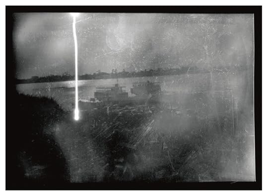
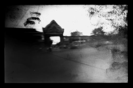
Kong Vollak handcrafts models of architectural sites and cityscapes in various media. Best known for his ominous black-and-white charcoal drawings of both the real present and imagined future of Phnom Penh, Kong also uses photography as a tool for mapmaking. His light drawings from rudimentary pinhole cameras echo the shadows, smudges, and scratches of his charcoal works, while mimicking the gritty areas of the city itself. He welcomes flaring from extraneous light, while his fingerprints mark the surface from intentional handling. The low-tech effects of Kong’s Leaving and Temple series hint at previous times and unknown places. Leaving, in particular, recalls the eerie state of the capital, emptied by the Khmer Rouge in 1975; however, the above image was actually taken in 2007 at Phnom Penh’s old ferry port on the Tonle Sap River. The Leaving series captures transportation hubs on national holidays, when most of the city’s two million residents temporarily migrate to their countryside homelands. Another pinhole series, titled Temple, considers Phnom Penh’s Buddhist architecture. This particular image, taken in 2010 at the north side of Tul Tumpung Temple on Mao Tse Tung Boulevard, pays homage to one of the many imitations of Angkorean architecture in today’s pagoda gateways.
David Galjaard, Cristina de Middel at PhotoIreland 2013
Throughout the month of July the photo world will turn its eye to PhotoIreland, the international festival of photography and image culture dedicated to promoting dialogue on photography in Ireland.
In July 2012 visitors to the festival’s Books & Magazines Fair got an early glimpse of Dutch photographer David Galjaard’s first self-published photobook, Concresco, which later earned him the Paris Photo–Aperture Foundation PhotoBook Award in the First PhotoBook category. This year during PhotoIreland, Galjaard will present a solo exhibition of images from the Concreso series at The Copper House Gallery in Dublin. The show will be on view July 14–August 2.
The series paints a picture of development in Albania through photographs of the landscape, where more than 750,000 aboveground bunkers built during the dictatorship of Enver Hoxha serve as physical reminders of the country’s struggles for security during the Communist era. You can read more about David Galjaard and his Concresco series in an interview we conducted with the photographer last fall following the announcement of his First PhotoBook prize.
Cristina De Middel, from the series The Afronauts.
Also on view at the Copper House Gallery will be documentary photographer, artist, and PhotoBook Awards finalist Cristina de Middel’s first self-published book The Afronauts. The volume is a subjective reimagination of the failed 1964 initiative to launch the first African space program in the country of Zambia.
The now sold-out book, which was shortlisted for the Paris Photo–Aperture Foundation First PhotoBook Prize, is comprised of Middel’s staged color photographs, sequenced alongside manipulated documents, drawings, and reproductions of original texts that documented this now anecdotal moment in Zambian history. Known for her play with reconstructions that blur the border between reality and fiction, Middel’s The Afronauts recontextualizes these elements to create a fictional portrait of that national dream.
Both Concresco and The Afronauts will be on view at the Copper House Gallery, Dublin, July 14–August 2, 2013, as part of PhotoIreland Festival 2013.
Featured image: David Galjaard, from the series Concresco.
June 26, 2013
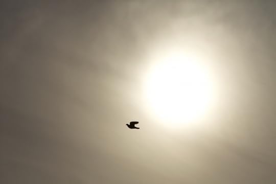
Ahae, The Extraordinary within the Ordinary

© Ahae
The Korean photographer Ahae has just opened The Extraordinary within the Ordinary, an exhibition of 220 recent photographs in specially constructed galleries at the Orangerie Hall of the Palace of Versailles, near Paris. The show, on view through September 9, is part of the Versailles estate’s celebration of the four-hundredth anniversary of the birth of landscape architect André Le Nôtre, who designed the palace’s grounds. Ahae, who shoots all of his photographs from a single window, captures pristine natural forms and the animals that pass through or inhabit them. Ahae works from dawn to dusk, and in all seasons, and the photographs he creates distill the landscape to moments of movement, shadow, and light.
This is the artist’s second exhibition in France, after a successful presentation last summer at the Jardin des Tuileries in Paris. For more information about The Extraordinary within the Ordinary, please click here. For more information about Ahae, please click here.
© Ahae
Aperture's Blog

- Aperture's profile
- 21 followers

