
Aperture's Blog, page 177
July 15, 2014
On Remote Sites of War by Diana C. Stoll
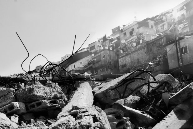
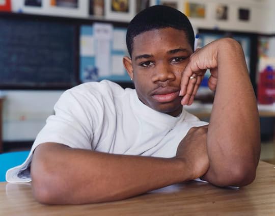
Todd Drake, from Looking In, from the Double Vision: Perspectives from Palestine series, 2013. Courtesy the artist
In June 2014, as Barack Obama readies to deploy a team of “military advisors” to Iraq, Americans have reason to reflect, yet again, on how distant this conflict and our ongoing war in Afghanistan seem to many of us here at home. The numbness (is it really inevitable?) that dulls our consciousness with regard to news and images of violent atrocities—from wars overseas to shooting rampages at home—is all too familiar, and yet remains beyond comprehension. The exhibition Remote Sites of War, at Western Carolina University’s Fine Art Museum, brings us into the mind of conflict from several oblique angles, looking for ways to puncture the stupor. The show, curated by David J. Brown (the museum’s director), features three protagonists: artist Skip Rohde, and photographers Todd Drake and Christopher Sims.
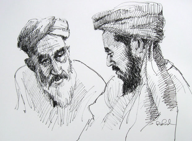
Skip Rohde, Consultation, from the series Faces of Afghanistan, 2012 (ink on paper). Courtesy the artist
Rohde, a Navy veteran, worked as a consultant with the U.S. State Department in Afghanistan’s Kandahar Province from 2011 to 2012, helping to bolster “Afghan capabilities” in terms of both security and governance. His job required that he attend many shuras—gatherings of Afghan officials and tribal leaders—where he took the opportunity to sketch portraits of attendees. More than fifty of Rhode’s rather classical pen-and-ink and pastel drawings from Afghanistan (and some from Iraq, where he lived from 2008 to 2010) are hung salon-style here, offering an unusual glimpse into the specific human dimension of places we tend to understand largely in terms of statistics.
Todd Drake presents Double Vision: Perspectives from Palestine, which was created in the West Bank and East Jerusalem over the course of three weeks in 2013. In recent years, Drake has traveled and conducted photography workshops in Saudi Arabia and Bahrain; like those trips, his visit to Palestine was at the invitation of the U.S. State Department. The project is in two parts: “Looking In” (photographs by Drake); and “Looking Out” (images by young Palestinians with whom Drake held workshops). “Looking Out” follows in the steps of Wendy Ewald, Eric Gottesman, Zana Briski, and others who have worked with young people in underrepresented communities around the world with a view to “empowering” them with the capability of generating their own photographic narratives (though the practical agency of that power is not always clear).
Here, the resulting images are mixed, of course—some are plainly youthful attempts at polished commercial-style work; others are more raw and more intriguing. Several are accompanied by impassioned texts, as for example Yara’s image of a young child and a birthday cake topped with fireworks, with a poem/declamation about the life of a Palestinian girl living under occupation: “I will keep resisting,” Yara writes. “And resisting/And resisting.” As for “Looking In,” Drake’s images of barbed wire, Israeli settlements, the separation wall, and checkpoints belie the ingenuousness of his statement: “To be in Palestine is to walk inside two visions: that of Zionists seeking a place to come home to, the other of Palestinians seeking to keep olive trees and stones they can call their own, their pasts, presents, and futures seeming to run along parallel tracks.” And yet, as irresolute as Drake’s stated position is, it may be as good a summation as any of the intractable loggerheads of that region: Israel and Palestine have far to go on their “parallel tracks.”
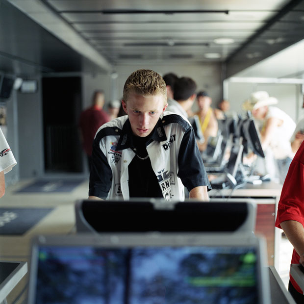
Christopher Sims, Richmond International Raceway, Richmond, Virginia #1, , from the series Hearts and Minds, 2008. Courtesy the artist
The three photo-projects by Christopher Sims in this exhibition take us in directions that are more complex and less trodden. Hearts and Minds is an unsettling look at young people (all boys, as represented here) at a U.S.-military-administered traveling recruitment event known as the Virtual Army Experience. Here, inside massive tents set up at amusement parks, state fairs, and NASCAR races, participants can play virtual-soldier games and engage with other forms of “militainment.” As Sims notes: “The army reveals itself to be a keen reader of American adolescent emotions and passions, and employs this understanding through a brilliantly designed and bloodless simulation of the thrill of the fight.” Indeed, the young men in these photographs are aflush with the intensity of the moment—the fun of it—reminding us of journalist Chris Hedges’s chilling observation that “the rush of battle is often a potent and lethal addiction.”
Far calmer—and disturbing as such—is Sims’s series of images from Guantánamo Bay, where he traveled in 2006 (after more than two years wrangling for U.S. government clearance). Under rigid military restrictions about what could be photographed at Gitmo—no aircraft, no radio domes, no faces of prisoners, etc.—Sims shot scenes that are quite intentionally action-free: worn playground structures, an empty café, desk chairs in anonymous, fluorescent-lit offices. These images serve as an ominous basso continuo, bracing the unknown activities taking place in detention camps just around the corner.
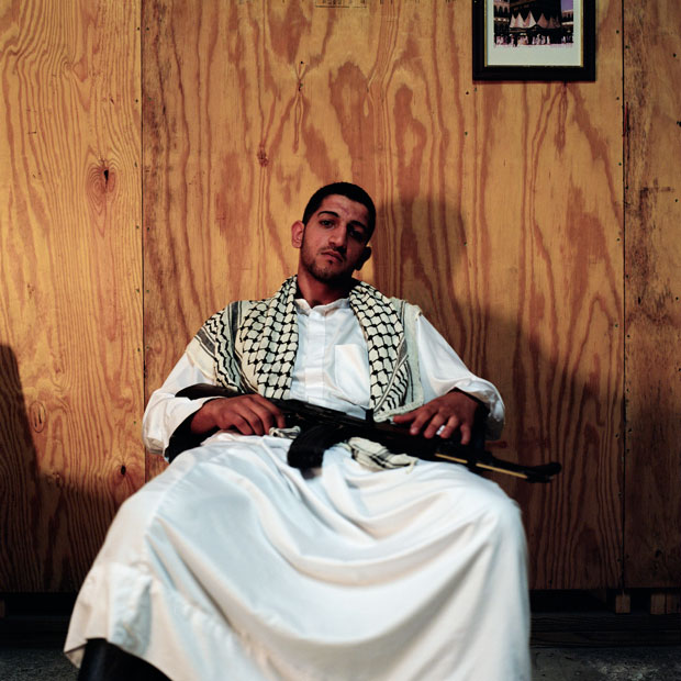
Christopher Sims, Iman’s Bodyguard, Camp Mackall, North Carolina, from the series Theater of War, 2006. Courtesy of the artist.
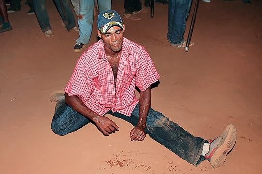
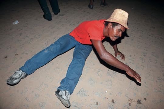
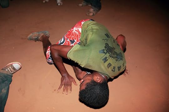
Finally, Sims’s Theater of War: The Pretend Villages of Iraq and Afghanistan brings us into mock worlds set up within the training grounds of U.S. Army bases in North Carolina, Louisiana, and California. Here, in the pretend tumult of pretend countries (“Talatha,” “Braggistan”), U.S. soldiers can (sort of) see how it feels to interact with people in the Middle Eastern territories with which the United States is engaged. In these staged environments, the “villagers” are often played by recent immigrants from Iraq and Afghanistan—and Sims himself sometimes plays the part of a “war photographer” in these non-wars. While Sims’s photographs inevitably bring to mind the images of war simulations by An-my Lê and Richard Barnes, here we are in full color and full disclosure: there is nothing convincing about these bizarre games.
A former photo archivist at the U.S. Holocaust Memorial Museum, Sims knows something about the many ways images interact with the monstrous fact of violence. Of his Guantánamo project, he has said: “I became interested in the idea of making war photographs that . . . weren’t about seeing violence, or spectacle, or the things that make people turn away from most war photographs. I began thinking that maybe the thing to do was to try to make a type of war photograph that captured something else.”
In a sense, this is the challenge taken up in each of the projects in Remote Sites of War: they are sneak attacks, intended to poke at, and perhaps reawaken, our exhausted cultural psyches.
_____
Remote Sites of War was presented at the Fine Art Museum, Western Carolina University, Cullowhee, North Carolina, April 10–May 30, 2014.
Diana C. Stoll is a writer and editor based in Asheville, North Carolina.
The post On Remote Sites of War
by Diana C. Stoll appeared first on Aperture Foundation NY.


Fall Photography Workshops at Aperture
The Aperture Foundation workshop program continues a valued tradition originating with Aperture magazine’s founding editor and legendary teacher, Minor White. Known for his open-minded, inventive, and insightful approach to teaching, White leaves a legacy that defines the workshop program at Aperture. Join us this fall for the chance to work one-on-one with major figures in the global photographic community in an intimate and immersive classroom.
Talking Pictures with W. M. Hunt
Saturday, September 20, 11:00 a.m.–4:00 p.m.
Image © Martin Schoeller
A one-day workshop intended for photographers wishing to learn from a longtime collector, curator, and consultant who has been teaching for more than two decades. The workshop will focus on influences, how to look at photographs, and considerations for analyzing them.
W. M. Hunt is a frequent lecturer on photography and an adjunct professor at the School of Visual Arts, New York. This summer he organized the exhibition Foule: American Groups before 1950 at Rencontres d’Arles, France, where his show Sans Regards (No Eyes) debuted in 2005. That show toured to the Musée de l’Elysée, Lausanne, Switzerland; FOAM, Amsterdam; and the George Eastman House, Rochester, New York, and was the basis for his book The Unseen Eye: Photographs from the Unconscious (Aperture, 2011).
Finding the Universal in Photographic Narratives with Elinor Carucci
Sunday, October 5 & Saturday, November 1, 10:00 a.m.–5:00 p.m. both days

Elinor Carucci, The woman that I still am 2, 2010
A two-part workshop designed as a point of inspiration and constructive criticism for the photographer who wishes to enhance their vision and style while delving deeper into the emotions, layers, and nuances of their images. On the first day, Carucci will give each student an assignment to be completed by the time the class reconvenes four weeks later.
Elinor Carucci (born in Jerusalem, 1971) graduated in 1995 from Bezalel Academy of Arts and Design with a degree in photography, then moved to New York that same year. She has had solo shows at Edwynn Houk Gallery, New York; Gallery Fifty One, Antwerp; and James Hyman Gallery and Gagosian Gallery, both in London, among others. She has also been included in group shows at the Museum of Modern Art, New York, and The Photographers’ Gallery, London. Her photographs are included in the collections of institutions such as MoMA, Brooklyn Museum, and Museum of Fine Arts, Houston, and her work has appeared in the New York Times Magazine, the New Yorker, Details, New York, W, Aperture, ARTnews, and many more publications. She was awarded the International Center of Photography’s Infinity Award for a Young Photographer in 2001, the Guggenheim Fellowship in 2002, and a New York Foundation for the Arts fellowship in 2010. Carucci has published three monographs to date: Mother (2013), Diary of a Dancer (2005), and Closer (2002). Carucci currently teaches at the photography graduate program at the School of Visual Arts, New York, and is represented by Edwynn Houk Gallery.
Portrait of Place with Gail Halaban
Saturday, October 11 & Sunday, October 12, 10:00 a.m.–5:00 p.m. both days
Gail Albert Halaban, Out My Window, Upper East Side, 1438 3rd Avenue, Families Just Before Dinner, 2008
A weekend workshop that integrates portrait and landscape photography and explores the relationship of New York City to its inhabitants. Following a guided study of historic photographic precedents, Halaban will accompany students as they make new work on location in New York City.
Gail Albert Halaban (born in Washington, D.C.) holds an MFA in photography from Yale University. She has taught at the Art Center College of Design, Pasadena; International Center of Photography, New York; and Yale, among other notable institutions. She has been included in both group and solo exhibitions internationally. Her previous book, Out My Window, was published by powerHouse Books in 2012. Her most recent book, Gail Albert Halaban: Paris Views, will be published by Aperture in fall 2014. She is represented by Edwynn Houk Gallery, New York.
Jason Fulford on Visual Language: How Pictures Speak to Each Other
Saturday, November 15 & Sunday, November 16, 10:00 a.m.–5:00 p.m. both days
Image © Jason Fulford
In this hands-on workshop, participants will discuss and experiment with visual language and the relationship between images. Participants will engage in a series of games and exercises that will teach them conceptual editing tools using found imagery.
Jason Fulford is a photographer and cofounder of J&L Books. He is a contributing editor to Blind Spot magazine and a frequent lecturer at universities. Monographs of his work include Sunbird (2000), Crushed (2003), Raising Frogs For $$$ (2006), The Mushroom Collector (2010), and Hotel Oracle (2013). He is coeditor with Gregory Halpern of The Photographer’s Playbook (Aperture, 2014), and coauthor with Tamara Shopsin of the photography book for children This Equals That (Aperture, 2014). Fulford is also a 2014 Guggenheim Fellowship recipient.
The Portrait in a Community Context with Dawoud Bey
Saturday, December 6 & Sunday, December 7, 10:00 a.m.–5:00 p.m. both days
Dawoud Bey, DeMarco, South Shore High School, Chicago, 2003
Join Dawoud Bey for a workshop on creating compelling portraits within a community context. Aperture will partner with a church, school, community center, or shelter where students will craft engaging portraits of members of the community.
Dawoud Bey (born in New York, 1953) began his career as a photographer in 1975 with a series of photographs called Harlem, USA, which was later exhibited in his first one-person exhibition at the Studio Museum in Harlem in 1979. He has since had numerous exhibitions worldwide, at such institutions as the Art Institute of Chicago; Barbican Centre, London; Cleveland Museum of Art; Los Angeles County Museum of Art; Detroit Institute of Arts; High Museum of Art, Atlanta; National Portrait Gallery, London; and the Whitney Museum of American Art, among many others. The Walker Art Center, Minneapolis, organized a mid-career survey of his work, Dawoud Bey: Portraits 1975–1995, which then traveled to institutions throughout the United States and Europe. A major publication of the same title was also published in conjunction with that exhibition. Class Pictures was published by Aperture in 2007, and a traveling exhibition of this work toured to museums throughout the country from 2007 to 2011.
The post Fall Photography Workshops at Aperture appeared first on Aperture Foundation NY.
Announcing Cathy Kaplan New Chair of Board of Trustees
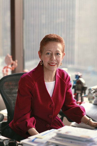
Aperture Foundation is pleased to announce that Cathy Kaplan is the new chair of our Board of Trustees. Since her appointment to the Board in 2008, Ms. Kaplan has served as vice chair and head of the Development Committee. She has also been the co-chair of Aperture Foundation’s benefit parties on several occasions, and conceived the annual pre-benefit weekend of studio tours and collection visits, which has become a highly anticipated event among patrons.
Ms. Kaplan is a partner in the New York office of Sidley Austin LLP, a global law firm of approximately 1,800 lawyers. Ms. Kaplan’s practice is focused on a broad range of structured finance transactions, including cross-border financings. She also represents clients in a wide range of art-related transactions.
In addition to her long service as a Trustee of Aperture Foundation, Ms. Kaplan is on the Board of Her Justice, a non-profit corporation that provides legal services for victims of domestic violence. She serves as a member of the Her Justice Executive Committee, co-chair of the Development Committee, and co-chair of the annual Photography Auction and Benefit. Ms. Kaplan is also a member of the Photography Acquisitions Committee of the Whitney Museum of American Art. She serves on the Board of Visitors for Columbia Law School and is a member of the Advisory Board for the Columbia Law School Center on Global Legal Transformation.
After nine years as Aperture Foundation’s chairman, Celso Gonzalez-Falla has stepped down from the role. He will continue to be a member of the Board, and serve as chair of the Development Committee. Mr. Gonzalez-Falla became a Trustee and has served as chairman of the Board of Trustees since 2006. In 2012, the Museum of Contemporary Art Jacksonville organized a traveling exhibition, also presented at Aperture Foundation, titled Shared Vision: The Sondra Gilman and Celso Gonzalez-Falla Collection of Photography and featuring a selection from Mr. Gonzalez-Falla and his wife Sondra Gilman’s world-renowned collection of photography. Active with several non-profit foundations, Mr. Gonzalez-Falla also published a small-edition poetry book in 2011, and My Lost Cuba, his first novel, in 2013.
“I am honored to have been selected as the chair of the Board of Aperture Foundation. I believe that Aperture Foundation represents the best of what a non-profit arts organization can offer: scholarship on photography and the visual arts, education for everyone from students to practicing photographers, discovery and encouragement of new artists, and a community for discourse. I am humbled to follow Celso Gonzalez-Falla in the role of chair. Celso has been a strong and inspiring leader of Aperture through difficult economic times for arts organizations. He is a brilliant collector, with a terrific eye and a deeply humanistic view of photography. I am delighted that he will continue to be my friend, colleague, and advisor on the Board,” says Ms. Kaplan.
Photograph © Peter Freed
The post Announcing Cathy Kaplan
New Chair of Board of Trustees appeared first on Aperture Foundation NY.
July 10, 2014
Olivia Bee’s Photographic Love Letters
Olivia Bee, Lovers, 2013

Oliva Bee, Max Jumped Off A Train, 2012

Olivia Bee, Pre-Kiss, 2010
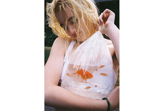
Olivia Bee, Untitled (T-Shirt Weather Heaven), 2013
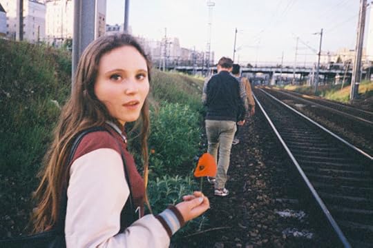
Olivia Bee, Paris At Sunrise (Poppy), 2013

Olivia Bee, 4th Of July (The Family You Choose), 2013
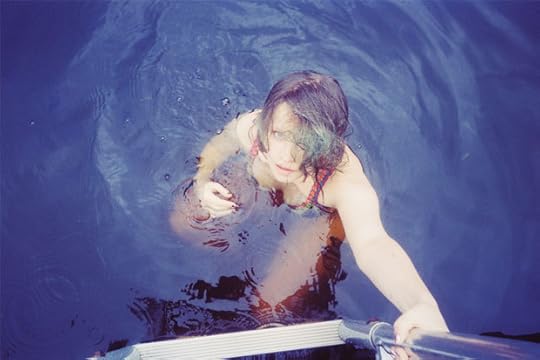
Olivia Bee, Rivkah, 2013
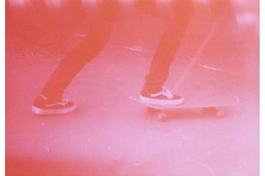
Olivia Bee, Untitled (Liam), 2011
Olivia Bee, Mayne Island, 2010
Unlike some other young contemporary photographers, Olivia Bee does not play the role of voyeur in her photographs. Her subject matter comes from her own life experiences. Her imaginative photos possess the magic of teetering between childhood and adulthood, and she has an undeniable signature style: a mix of dreamy romanticism and nostalgia. With the release of her limited-edition Aperture print Mayne Island, 2010, we joined Olivia to discuss the role photography plays in her life, and where she’s headed next. Her first solo show in New York, Kids in Love, is on view at agnès b. Galerie Boutique until July 27, 2014.
Aperture: I love the intimacy in your work. It feels like an honest exploration of growing up: there’s both innocence and exploration. Has photography helped you make sense of the last years?
Olivia Bee: Yes. I think photography helps me process things. Sometimes I get really sad and realize I’m having withdrawal from not getting film back for a while. I’m addicted to photography. It helps me process my life, explore things, show people I love and appreciate them, and love and appreciate my life.
A: Congrats on your show Kids in Love at agnès b! What’s it like to see your work presented in a gallery space as opposed to online, especially since you started out posting on Flickr?
OB: It feels amazing. It feels like I’m a real artist. Everything before has existed online or as a Walgreens 4-by-6 print. When I was looking at the show all hung up, I realized that they kind of looked like large drugstore prints, which I really like.
A: Aperture will be selling a limited-edition print of your photograph Mayne Island (2010). The photograph is of your friend Liam’s dad. How have your family and friends responded to your work, since they’re so often featured?
OB: Liam’s mom has one of the earlier editions of this photo actually, which she bought Liam’s dad for his birthday. It feels really special to take photos of the people in my life—to show them to them and get positive feedback. I think you could classify all of my photos as love letters to the people, places, and things featured in them.
A: Let’s talk about love. What, or whom, are you loving right now?
OB: I’m so blessed to have so many people I love around me all the time. I have the best of friends. My family is amazing. My boyfriend is too. I’m really lucky. I am really lucky to have a really colorful life—even when I hate it at times, I love it.
A: Your photographs are nostalgic and dreamy. How do you translate these feelings into your pictures?
OB: It’s not something I really think about. I never try to make a photo a certain way, really, especially with my diary work. They just happen.
A: What’s the relationship between your personal and commercial work? Do you approach the two differently?
OB: I approach them a similar way, with care and respect, but my work for brands I do not consider love letters. I love making [those] images; I think it’s really good practice to work on composition and how to control an image when you are working commercially. But my personal work is my favorite work—like most artists, haha.
A: Back in 2012, you interviewed Joel Meyerowitz for VICE. Which other photo legends would you love to interview?
OB: Annie Leibovitz. She had such a big influence on me so early. Also Gregory Crewdson. I would love to know how his brain works.
A: You’ve mentioned an interest in film alongside photography. What’s your favorite scene in a movie, and why?
OB: I love the dream scene in The Virgin Suicides, and also the prom scene and afterwards when she’s left in the field. You feel it so much. And the color and use of light is amazing. Also the opening scene from Paris, Texas, and basically that whole movie. Everything is so precise and beautiful and intentional, but it can be messy at times, which I love. The way characters are spread across the landscape of the desert is something I’m kind of obsessed with.
A: Where are you living these days, and what’s your favorite spot to hang out?
OB: I live in Brooklyn. I don’t have a favorite spot; I feel like I’m still figuring that out in New York City. But I love the Rockaways. I’ve been at the beach a lot lately.
A: What are you excited about this summer?
OB: Going on a trip with my brother, making a lot of great photos, going home to Portland for a while, going camping in the desert (if I don’t die). Going to LA and driving and listening to music loud.
___
Olivia Bee (born in Portland, Oregon, 1994) has shot campaigns for Hermès and Converse, and is a regular contributor to the New York Times Magazine and ZEITmagazin, Germany. Bee lives and works in Brooklyn.
The post Olivia Bee’s Photographic Love Letters appeared first on Aperture Foundation NY.
July 9, 2014
Bárbara Wagner: The Maracatu by Agnaldo Farias
The following first appeared in Aperture magazine #215 Summer 2014. Subscribe here to read it first, in print or online.
Bárbara Wagner, Águia Dourada (Golden eagle), 2010. Courtesy Galleria Extraspazio, Rome
Bárbara Wagner, Cambinda Brasileira (Brazilian cambinda), 2009. Courtesy Galleria Extraspazio, Rome
Bárbara Wagner. Courtesy Galleria Extraspazio, Rome
Bárbara Wagner, Estrela Brilhante (Shining Star), 2008. Courtesy Galleria Extraspazio, Rome
Bárbara Wagner, Cambinda Brasileira (Brazilian cambinda), 2009. Courtesy Galleria Extraspazio, Rome
Bárbara Wagner. Courtesy Galleria Extraspazio, Rome
Bárbara Wagner. Courtesy Galleria Extraspazio, Rome
Bárbara Wagner. Courtesy Galleria Extraspazio, Rome
Bárbara Wagner. Courtesy Galleria Extraspazio, Rome
Bárbara Wagner. Courtesy Galleria Extraspazio, Rome
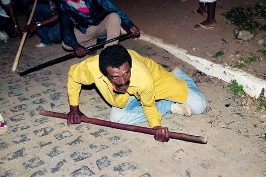
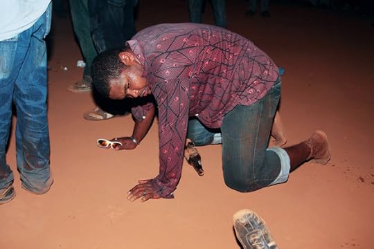
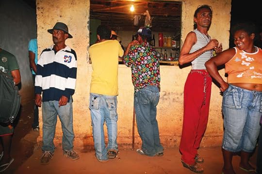
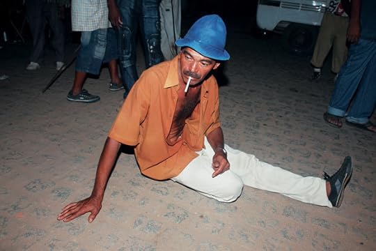
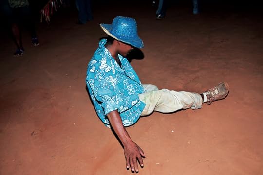
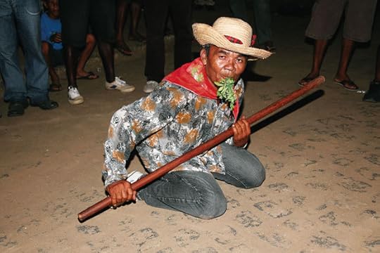
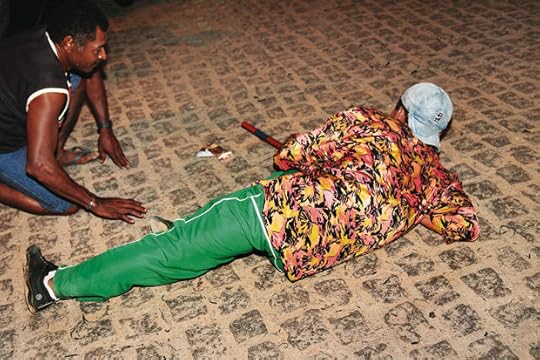
Since the early eighteenth century, Afro-Brazilian performance groups known as Maracatu have descended onto the streets of Recife and other cities in the interior of Brazil’s northeastern state of Pernambuco during Carnival and other festivals. There are two groups: the urban form, the Maracatu nação (nation), devote their dancing and singing—set to the mesmerizing rhythms of the musical style called batuque—to the coronation of the Rei do Congo (King of the Congo). Their rural counterparts, the Maracatu rural, have their origins in the sugarcane mills, an environment with a history of authoritarianism and oppression.
The name Maracatu derives from an amalgam of sources—maracas, the American Indian percussion instrument; catu, which means “beautiful” in the Tupi language; and marã, Tupi for “war” or “confusion.” Their complex background is also evident in the processional standard-bearer of the Maracatu nação, who dresses in the style of Portugal’s Louis XV and is followed by an entourage of ornately styled performers and representations of religious imagery, centering around a dead queen attended by various courtesans. The layered imagery of this ritual performance, which has metamorphosed over centuries, reflects a fusion of African, indigenous, and European elements.
Today, these groups have become seamlessly incorporated into the popular festivities of Pernambuco and involve the participation of all types of people, regardless of racial origin or socioeconomic background, in a nation that still suffers from discrimination and segregation. During Pernambuco’s Carnival, Maracatu groups are distinguished by a unique dance style characterized by formalized frolicking and a subtle choreography of mythic origin related to the dances of the syncretic religion known as Candomblé. Brazilian author Mário de Andrade described this unique dance as follows: “Intoxicated by the percussion, the dancers proceed almost lethargically, slightly reeling on each quarter note, with an almost undetectable trot, and without any visibly formal footwork.” The generally hypnotic nature of a Maracatu procession contrasts with the frenetic rhythm of other dance groups participating in Carnival, most notably the fiercely syncopated Frevo, whose musical style also originated in Pernambuco. The Frevo and the Maracatu reflect a sense of momentary collective elation. For a few days of the year, they don lavish costumes, spend their scant savings to enjoy themselves in the festivities, and parade proudly through the streets of the city. Official government tourist photography often turns to these festivities to highlight the “gold” of Brazilian racial democracy.
Bárbara Wagner became interested in what lies beneath this false gold veneer and began documenting the dancers’ rehearsals. Her series on the Maracatu offers a portrait of the people who make up the “joyful” faces of this northeastern Brazilian group as they practice their dance. The photographs delve into who the maracatuzeiros actually are when they are not involved in festival performances, and how their days are spent in the run-up to Carnival and afterward. The series looks beyond those brilliantly colored costumes and the atmosphere of celebration flowing almost anarchically through the darkened streets to reveal the dancers as they wait to share their tradition with others for a few moments.
–
Agnaldo Farias is a critic, curator, and professor of architecture and urbanism at the College of the University of São Paulo.
The post Bárbara Wagner: The Maracatu
by Agnaldo Farias appeared first on Aperture Foundation NY.
July 8, 2014
Workshop: Talking Pictures with W. M. Hunt

Photo © Ethan Hill
“Hunt uses language clearly, colorfully, and intelligently. His stories—along with the whys and wherefores—were extremely valuable.”
“Hearing Mr. Hunt talk about his relationship to photographs and the pictures he likes was enlightening.”
- Past workshop students
Join W. M. (Bill) Hunt for a one-day workshop intended for photographers wishing to learn from a non-photographer who has been looking at and talking about images for forty years. Hunt is a longtime collector, curator, and consultant who has been teaching for more than two decades. Participants are asked to put together a portfolio of at least five great photographs made by others—images they believe reflect their taste, are influential to them, or provoke them. The workshop will focus on influences, how to look at photographs, considerations for analyzing them, and tips for being articulate about them.
W. M. Hunt is a frequent lecturer on photography and an adjunct professor at the School of Visual Arts, New York. This summer he organized the exhibition Foule: American Groups before 1950 at Rencontres d’Arles, France, where his show Sans Regards (No Eyes) debuted in 2005. That show toured to the Musée de l’Elysée, Lausanne, Switzerland; FOAM, Amsterdam; and the George Eastman House, Rochester, New York, and was the basis for his book The Unseen Eye: Photographs from the Unconscious (Aperture, 2011).
Tuition: $500 ($450 for currently enrolled photography students and Aperture Members at the $250 level and above)
Register here
Contact education@aperture.org with any questions.
Refund / Cancellation Policy for Aperture Workshops
All fees are non-refundable if you should choose to withdraw from a workshop less than one month prior to its start date unless we are able to fill your seat. In the event of a medical emergency, please provide a physician’s note stating the nature of the emergency, and Aperture will issue you a credit that can be applied to future workshops. Aperture reserves the right to cancel any workshop up to one week prior to the start date if the workshop is under-enrolled, in which case a full refund will be issued. A minimum of eight students is required to run a workshop.
The post Workshop: Talking Pictures with W. M. Hunt appeared first on Aperture Foundation NY.
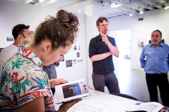
Jo Ann Callis: Other Rooms (Video)
On June 17, 2014, we joined artist Jo Ann Callis for a conversation with Lesley A. Martin and Amelia Lang, publisher and managing editor of Aperture’s book program. Callis discussed the evolution of her work, which began under the instruction of Robert Heinecken, whose work was recently exhibited in a retrospective at MoMA, and developed through her own exploration of tactile elements and experiences. Callis also discussed her mid-1970s investigation of the nude body and sexuality, featured in her new Aperture book Other Rooms. In that work, the artist’s playful, evocative use of constrictions and overlays on the human form, including twine, belts, tape, and other everyday materials, is both humorous and fraught. It offers an intensely personal assessment of the variable meanings of pleasure, eros, and the female nude as a staple of fine art photography. After her discussion, Callis took questions from audience members.
Watch “Jo Ann Callis: Other Rooms” Part 2, Part 3, and Part 4 on Vimeo.
The post Jo Ann Callis: Other Rooms (Video) appeared first on Aperture Foundation NY.
Preview: Aperture Summer Open Exhibition
Jill Frank, Un Homme et un Femme; from the series Romance, 2013
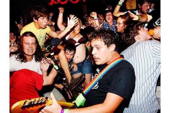
Hiro Tanaka, Florida; from the series Dew Dew, Dew Its, 2009
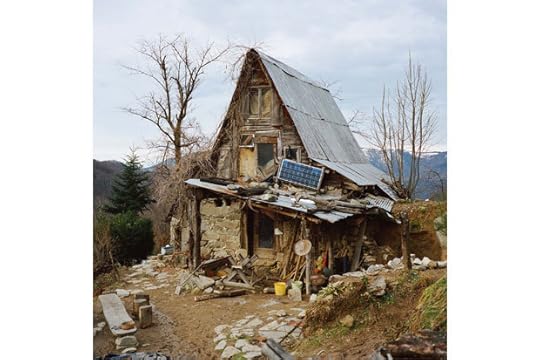
Antoine Bruy, Les Maquis
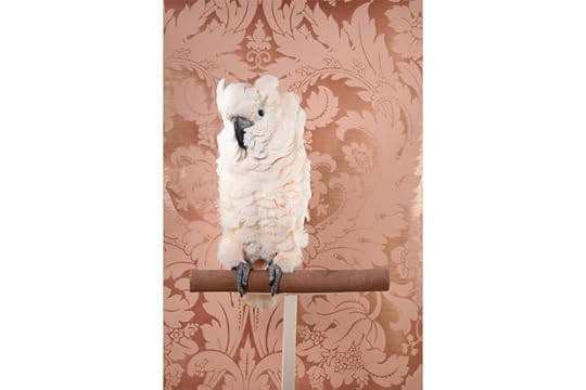
Claire Rosen, Rosy-Faced Love Bird; from the series Birds of a Feather, 2012
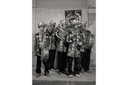
Supranav Dash, Master Band-Party Boys, $6 on assignment, 2011; from the series Marginal Trades, 2013
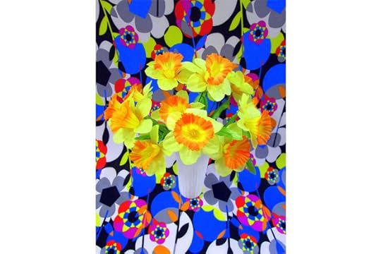
Melissa Eder, from the series Can You Dig It? A Chromatic Series of Floral Arrangements, 2014
I am honored to have had the opportunity to select work for Aperture Foundation’s first Summer Open exhibition.
We’ve initiated the Summer Open project as a way to show a wider group of photographers on our walls, and to build and enhance our membership program. As our first open submission exhibition, we had simply no idea what to expect. We are thrilled that 860 photographers presented work—all of whom submitted photographs of a universally high standard. The work of ninety-one photographers was selected for exhibition. In addition to the single images by each photographer selected for display on the wall, the full series (ten images each) of thirty-seven artists were selected for digital projection.
As well as choosing the “best” of the work submitted (of course, flavored by my own taste—the “best” could never be an objective criteria), the aim of this project was also to take the temperature of contemporary photographic practice. Here, the breadth of approaches wasn’t necessarily as wide as I imagined it might be—few photojournalists submitted work, for instance. Perhaps that’s not so surprising; the submissions were “very Aperture,” with most work reflecting a clear relationship to the photography that we are publishing. In this respect, the resulting exhibition reflects a particular bandwidth of contemporary practice, rather than the complete spectrum of the medium. In the end, this helps the exhibition make a clear statement about what concerns serious photographers today, in the range between art and documentary practice.
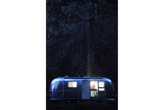
Some very clear themes emerged, or tropes, which I have turned into a structure for the exhibition: the Forest as Idyll, which seems to be a major thread of what interests photographers; Flowers, a longstanding photographic subject, now being reinvented with a contemporary edge; Ice and Wallpaper, among others; and there’s a section called Reading Faces that features various approaches to portraiture (where I borrowed the section title from a series by featured photographer, Qiren Hu). Some may find my “tagging” of photographs this way overly playful. I certainly could have divided the work in other ways: lots of submissions deal with LGBT and gender issues; many play with photographic spatiality—flatness, and depth; much of the documentary work warns against being taken literally, alerting viewers to read pictures as myth, or fantasy, rather than reality. Each of these could have merited their own sections. I hope the outcome gives some focus to the patterns and preoccupations at work in contemporary photography, and my tagging system is in keeping with the playfulness of much of the work featured.
Photography has become such a sophisticated medium. We all know now how to read influences. Viewers will detect the inspiration of many other photographers who have forged distinct paths in contemporary photography—Alec Soth, Daniel Gordon, and Robert Polidori, to name three particularly visible figures (each of whose practices can of course be traced to figures before them). In this respect, the work selected provides a commentary on the concerns, concepts, and stylistic approaches that define this moment in the medium’s story. Most of the work submitted is highly sophisticated, and self-aware. Compared to a few years ago, it’s clear that the volume of sophisticated work being produced has grown phenomenally—something that speaks in particular to the advances in photographic education. The level of sophistication among the submissions also caused me look in the other direction. I found myself seeking, and in some cases choosing, moments of what I perceive to be photographic innocence—pictures made, apparently, without self-consciousness, driven by more basic visual or compulsive instincts. Innocence is becoming a rare, and desirable, commodity in a medium now characterized by such sophistication.
The work submitted for the exhibition left me with one overwhelming impression that caught me by surprise: that serious photography today, for all its self-awareness and sophistication, is characterized above all by a sense of joy. Serious photography used to be, well, serious—about itself, its place in the world, its social and aesthetic agendas. When did it free itself of these constraints and become so playful? Even the work engaged with complex personal or social issues seems marked by an evident sense of playfulness and pleasure—the creative pleasure of making photographs, delight in the particular characteristics of the medium, and the pure joy of visual articulation. The work on show suggests that photography is at ease with itself in a new way, and its place in the world: full of pleasure, and enjoying every advantage of its freedom.
—Chris Boot
Executive Director
The post Preview: Aperture Summer Open Exhibition appeared first on Aperture Foundation NY.
July 2, 2014
Revisiting the Winogrand Archive: Philip Lorca diCorcia in Conversation with Leo Rubinfien
Garry Winogrand, New York ca. 1960. © Estate of Garry Winogrand and courtesy Fraenkel Gallery, San Francisco
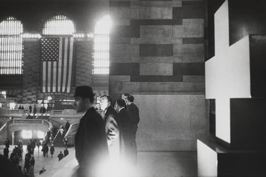
Garry Winogrand, Grand Central Terminal, New York, 1964. © Estate of Garry Winogrand and courtesy Fraenkel Gallery, San Francisco
Garry Winogrand, Point Mugu Naval Air Station, California, ca. 1979. © Estate of Garry Winogrand and courtesy Fraenkel Gallery, San Francisco
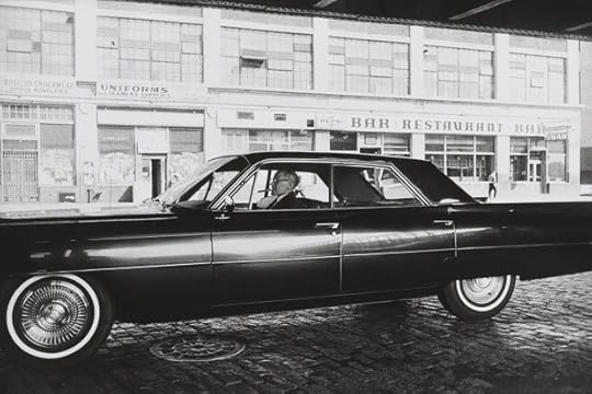
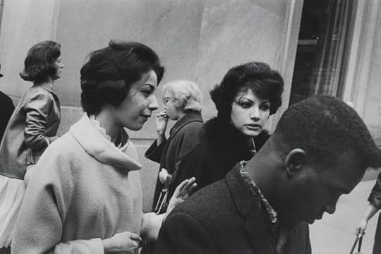
Garry Winogrand, New York ca. 1963. © Estate of Garry Winogrand and courtesy Fraenkel Gallery, San Francisco
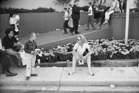
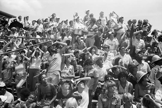
Garry Winogrand, State Fair, Dallas, Texas, 1964. © Estate of Garry Winogrand and courtesy Fraenkel Gallery, San Francisco
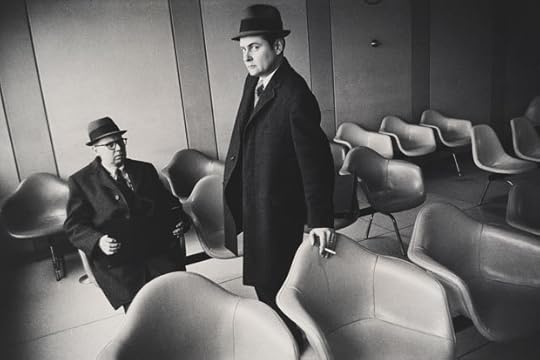
Garry Winogrand, La Guardia Airport, New York, 1968. © Estate of Garry Winogrand and courtesy Fraenkel Gallery, San Francisco

Garry Winogrand, Centennial Ball, Metropolitan Museum, New York, 1969. © Estate of Garry Winogrand and courtesy Fraenkel Gallery, San Francisco
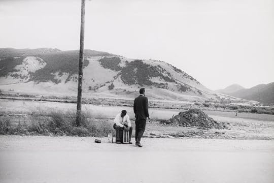
Garry Winogrand, Wyoming, 1964. © Estate of Garry Winogrand and courtesy Fraenkel Gallery, San Francisco
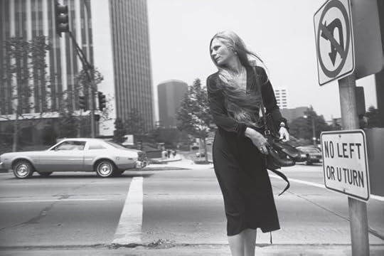
Garry Winogrand, Los Angeles, ca. 1980–83. © Estate of Garry Winogrand and courtesy Fraenkel Gallery, San Francisco
Garry Winogrand, New York, ca. 1960. © Estate of Garry Winogrand and courtesy Fraenkel Gallery, San Francisco
For many years, an aura has surrounded the Garry Winogrand archive. The photographer, who died in 1984 at age fifty-six, left behind more than
six thousand rolls of unedited film and numerous photographs that had been marked on his proof sheets but never printed. Over the past three years, photographer Leo Rubinfien has been working for the San Francisco Museum of Modern Art and the National Gallery of Art in Washington, D.C., as guest curator of the first Winogrand retrospective since the mid-1980s, re-editing these materials—in collaboration with curator Erin O’Toole (SFMOMA) and Sarah Greenough (NGA)—and supervising the printing of many never-before-seen images, some of which appear in the accompanying pages. The exhibition Garry Winogrand—accompanied by a major publication—began in March last year at SFMOMA, subsequently traveled to the NGA, and recently opened at the Metropolitan Museum of Art, New York (it will later travel to the Jeu De Paume, Paris, and the Fundación MAPFRE, Madrid). Here, photographer Philip-Lorca diCorcia (known as PL) speaks with Rubinfien about the complexities of Winogrand’s work, which has often been mischaracterized as “street photography,” the legacy of curator John Szarkowski, and the new meanings we may discover today by revisiting this influential photographer.
— The Editors
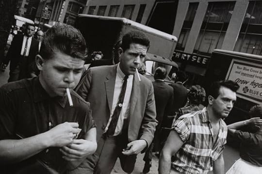
Philip-Lorca diCorcia: As someone who went to Yale in the late 1970s and had Tod Papageorge as a professor, I resisted Garry Winogrand. By ’78, he was a cult; there was an orthodoxy around him at that time.
Leo Rubinfien: There was certainly a circle of people associated with Winogrand—mainly photographers, but not exclusively. They had intense convictions about the value of his work—and other people’s work, too—and also about how photography should be thought about and discussed, but to say that a cult formed around him seems harsh to me. These were thoughtful, intelligent people, and each one had reasons for being present. Did an orthodoxy develop? Maybe so, but slowly. The photographers connected with Winogrand in the 1960s were drawn at least partly by the sense that there was more freedom in his approach to photography than they could find anywhere else. Later, they had to defend themselves and if there was some dogmatizing, that was only human.
PL: Of course, the arbiter of photographic quality at that time was the Museum of Modern Art. There was a pantheon there, and Winogrand was one of them. With that pantheon came certain attributes—for instance, black-and-white work. I remember going to MoMA and the only color photography that was up at that time was by Irving Penn.
LR: When MoMA showed the color work of Eggleston and Stephen Shore in the mid-1970s it was news, although I’m not sure that noncommercial photographers were doing a vast amount in color before that, anyway before C-printing made it affordable. As a matter of fact, though, one component of MoMA’s famous 1967 New Documents exhibition was a slide show, in color, by Winogrand. It’s true of course that Winogrand was openly supported by John Szarkowski and the Museum of Modern Art, and that Szarkowski had his own case to make, and didn’t compromise it. He dismissed a lot of work, and that made many people resentful. But if somebody asked: “What’s the simplest explanation you can give of what Szarkowski did?” I would say that it was to move photography out of the world of journalism and into the world of the fine arts. The old picture magazines were dying. They had dominated the practice and the dissemination of photography for three decades, and now their culture and their mode of thinking were fading away. Szarkowski didn’t just bring a gang of photographers across the street from the Time-Life building to the Museum of Modern Art; he replaced one set of values with another, one way of looking at photographs with another. Journalism had demanded pictures that explained the world “clearly,” in well-accepted ways, but Szarkowski said that photographs explain almost nothing, and that this was not a defect, but a virtue. And Winogrand’s work demonstrates that the ambiguity of photography can be one of its great strengths.
Garry Winogrand, New York, ca. 1960. © Estate of Garry Winogrand and courtesy Fraenkel Gallery, San Francisco
PL: In terms of the legacy in museums, the Szarkowski world is disappearing. The Museum of Modern Art has a new director of photography, Quentin Bajac, who has nothing to do with that world. Is this major project about Winogrand— one of the core figures of that school—in some way marking the end of that era?
LR: I didn’t work on the Winogrand retrospective to make a statement about MoMA, but to better understand Winogrand. Although it’s true that since shortly before Szarkowski’s death, his prime protégés have been having retrospectives—Arbus, Friedlander, Eggleston, Robert Adams—and that these have inevitably re-evaluated Szarkowski’s work. The SFMOMA Winogrand project is the most recent one. Is it the end of something, or the beginning of something else? Maybe it’s both. Today, the debates of the Szarkowski years have mostly expired, or turned into other debates, so maybe an artist like Winogrand can now be set free of them. The SFMOMA book and show say: “Let’s go back and look again at what Winogrand did.” It’s particularly interesting to do this because he died young and until now his work has never been thoroughly explored. A lot of what’s in SFMOMA’s book and show has never been seen before, or has rarely been seen, and it presents a somewhat different Winogrand from the one we thought we knew.
PL: There was presumably a reason that so much work was left behind, unprocessed and unedited. Is there any sense that that was the way it should have been left?
LR: Well, I didn’t think the work should be left in the closet or I wouldn’t have undertaken SFMOMA’s project. The unfinished work was unfinished because Winogrand died not only young, but suddenly, and he had no time to prepare anything for posterity. In December 1983 he thought he had years to live. In March 1984 he was gone. There are many reasons why he didn’t edit and print more of his work, and they’re all interesting. But would those pictures be better left unseen? We’re speaking of one of the finest photographers there has been, and of work that changes the way we understand him. It’s work of great beauty and depth that will nourish anyone who lets it in. So no, I think it would be arbitrary, rigid, and shortsighted to hide it away.
PL: Every epigram that is attributed to Winogrand seems to be an evasion of a question. It’s hard to say, when someone’s work has an aspect of evasion and alienation in it, whether this is social commentary or an expression of an artist’s own feelings. But the man obviously was not comfortable with the world and with himself. Do you think his investigation of class was a manifestation of his own insecurities? In his pictures at the Whitney and the Metropolitan Museum you can’t help but think that he’s being judged by the same people that he’s photographing. And there’s his own not-too-subtle criticism in most of those images.
LR: Winogrand was often combative and sometimes defensive, and his evasiveness sometimes expressed this. But more importantly, he understood how untranslatable a photograph is, how it says something that can’t be said in speech. I think that the main reason he resisted explaining himself was that he didn’t want to smother under a pile of words that special, poetic ambiguity that makes a photograph beautiful. I don’t believe that he felt himself an outsider in the way that The Americans suggests that Frank did. The world in Winogrand’s photographs is his own world. His pictures from the streets of Manhattan in the early ’60s—the beautiful women, the businessmen, and so on—to me they describe a world that Winogrand is contemplating joining, or that he is in the process of joining even if he’s horrified by many things he sees. Beauty and ugliness, order and chaos, are inextricable in Winogrand’s work.
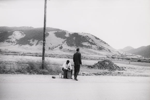
Garry Winogrand, Wyoming, 1964. © Estate of Garry Winogrand and courtesy Fraenkel Gallery, San Francisco
PL: Was he carpet-bombing the visual realm—shooting everything in sight? Why settle for one frame when you can have twenty?
LR: The idea that he was an extraordinarily prodigious shooter, a “carpet-bomber,” is actually a myth. I didn’t know that until I worked on SFMOMA’s project. From the time he started up until 1971 (twenty-one years—and most of his best pictures were from that period), he was shooting five hundred rolls of film a year on average, which is not very much: a roll-and-a-half a day. The large numbers came much later. In fact, when they did come, that’s when the quality of the work fell off sharply—almost as if Winogrand knew that he was weakening and was struggling furiously against it.
PL: Winogrand’s narratives are so elusive that they sometimes seem quite modern. But some of his work was almost corny, in the “tale told” way. I think as his picture structure started to fall apart, so did the conclusions to be drawn from the suggested narratives. And that’s where, for me, he becomes really interesting and surreal.
LR: He began in the world of magazine journalism, where pictures were functional and illustrative. But he resisted this from very early on, and by the ’60s he was working in an anti-narrative way and arrived at a kind of ambiguity that he found enlightening and beautiful. He would ultimately say: “There is nothing as mysterious as a fact clearly described,” as if the picture might stand in front of you like an apparition. It would be strange. It would be surprising. It would be disconnected from the rest of the world as you knew it, and from whatever story you expected it to tell. In the late work, in the 1970s and the early ’80s, there’s not only no narrative, there’s almost no event. The pictures are about the way faces look. They’re about space. And you could say that he learned how to find beauty in a picture in which you can’t tell what’s happening at a moment in time—the 1960s—when the entire American nation couldn’t tell what was happening in life itself. And so his way of picture making came to speak not just for him but for a vast collective experience.
PL: The street provides a constantly changing set of possibilities. The pushback that the world throws at you when you attempt to wrangle from it some sort of meaning with a camera is significant.
LR: In one way, Winogrand’s work is all about how the world coalesces, and then dissolves, about how chaos threatens to overtake order again and again. He often talked about himself and his work in relation to photography in general. He’d say: “I’m interested in the problem that a piece of material sets for the medium,” or “I’m interested in the contention between content and form.” Szarkowski, too, among others, argued that Winogrand was saying various things about photography itself with his work. But another aspect of his work is a ferocious attention that I associate with portrait making more than with most photography of the street, even though Winogrand brought it to the street, to crowds of people in motion. He looks at those people with a fierce grip, and he asks, What’s that hat you’re wearing? and Why does your foot turn the way it does? and Who are you? At one point he said: “You could say that I’m a student of photography, and I am, but really I’m a student of America.” At another time, he said to a close friend of his: “You know why your pictures are no fucking good? Because they don’t describe the chaos of life.” These two comments are the best guides I can think of to what Winogrand’s work is about. In the end, I think the street was just a site. The point was what he saw in the street—and what he saw there was a great many pieces of evidence that teach us serious things about the character of American people, about the evanescence of seeing, about the transience of life itself.
PL: There’s a reductiveness to photography, of course—in the framing of reality and the exclusion of chunks of it (the rest of the world, in fact). It’s almost as if the act of photography bears some relationship to how we consciously manage the uncontrollable set of possibilities that exist in life. I think that, more than any other photographer, Winogrand expressed the fact that everything is held together by the thinnest of threads. Strangely, I doubt that anybody in a photo program right now thinks of Garry Winogrand as their prime motivation, although the current practice of photography does have a certain relationship to his work, which could now seem outmoded. I think part of what he did, which is today a process in contemporary photography and art, was to break assumptions.
LR: Well, maybe that’s one reason why people should look at him again now. The work is very free, and it remains fresh. It’s powerful but it refuses to make grand declarations—it’s powerful partly because it refuses to do that. It’s only outmoded if one thinks that art progresses in a linear way, and that this year’s art disqualifies last year’s. But I don’t believe that there is any such progression. That kind of thinking is a fiction of certain criticism and of the art market. If a work of art is alive, it is alive, no matter when it was made. There is something tremendously open-ended about Winogrand’s work. It’s there picture by picture, and in the overall body of work. It’s a quality of Winogrand’s, but it was a quality that artists often sought in the 1960s. Fellini once said: “To make a movie that has an ending is immoral.” It’s immoral. It’s to lie to the audience. Because life has no endings; life is all flux and discontinuity.
Philip-Lorca diCorcia’s work is the subject of many books, including Eleven (Damiani, 2011), Thousand (Steidl/Dangin, 2007), A Storybook Life (twin palms, 2003), Heads (Steidl, 2001), and Hustlers (Steidl/Dangin, 2013).
Leo Rubinfien is the author of A Map of the East (Godine/thames & Hudson, 1992) and Wounded Cities (Steidl, 2008), and co-author of Shomei Tomatsu/Skin of the Nation (SFMOMA/Yale university press, 2004). The book accompanying his Winogrand exhibition was be co-published by SFMOMA and Yale university press.
The post Revisiting the Winogrand Archive: Philip Lorca diCorcia in Conversation with Leo Rubinfien appeared first on Aperture Foundation NY.
June 26, 2014
Aperture Magazine Live: “The São Paulo Issue” (Video)
On June 3, 2014, in conjunction with the release of The São Paulo Issue, Aperture magazine presented a night of presentations and conversations about contemporary photography from Brazil. Featured speakers included three leading Brazilian photographers: Caio Reisewitz, whose work is currently the subject of a solo exhibition at the International Center of Photography; Bárbara Wagner; and Mauro Restiffe. All three use photography to engage questions of Brazilian history, architecture, urban space, and the politics of the landscape. The three photographers’ presentations were followed by a panel discussion led by issue guest editor Thyago Nogueira, curator of contemporary photography at São Paulo’s Instituto Moreira Salles and editor of Zum, a key Brazilian photography magazine.
Watch “Aperture Magazine Live: ‘The São Paulo Issue’” Part 2, Part 3, and Part 4 on Vimeo.
The post Aperture Magazine Live: “The São Paulo Issue” (Video) appeared first on Aperture Foundation NY.
Aperture's Blog

- Aperture's profile
- 21 followers

