
Aperture's Blog, page 138
May 25, 2016
Vision & Justice: Around the Kitchen Table
Carrie Mae Weems combines performance and narrative to dynamic effect. For the “Vision & Justice” issue, Aperture invited voices from the fields of theater, photography, and art history to reflect on one of her most iconic projects.
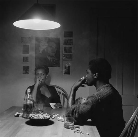
Carrie Mae Weems, Untitled (Man smoking), 1990 © the artist and courtesy Jack Shainman Gallery, New York
Robin Kelsey
Kitchens and streets. You could write a history of the twentieth century through that pairing. If the city street is a place of random encounter, of hustle and protest, the kitchen is a place of intimate habit, of sharing and aroma. Emotional distance is routine on the street, but excruciating in the kitchen. Yet if such a history is worth writing, it is because these two places are by no means discrete. The street presses into the kitchen, stocking shelves and burdening conversations. The kitchen is a delicate sanctuary, vulnerable to the threat of violence, and to the prejudice and fear that abound outside. But the kitchen has a subtle power of its own. It bears an improvisational capacity to bind subjects in shared experience, and to restore and refashion them in the midst of struggle.
In the Kitchen Table Series, Carrie Mae Weems takes these issues on with verve. The second photograph in the sequence depicts the protagonist drinking and playing cards with a man. A bottle of whiskey, a pair of mostly emptied tumblers, a dish of peanuts, some discarded shells, and a cigarette pack: these things constellate into a still life, lit by the glowing bulb above. The peanuts, cigarettes, and whiskey tie the kitchen into a larger economy and its history. As agricultural products grown mainly in the South, they mix into this leisurely moment signs of labor, suffering, and migration. A history of many streets, of rural South and urban North, has seeped into the scene, which recalls, in smoky black and white, earlier meditations on exodus and hope.
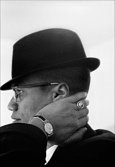
The streets of New York also arrive via the photographs on the back wall. At the center is an image of Malcolm X at a rally. The photograph was taken in 1963, but the popular poster featuring it dates to 1967. To the right is a familiar photograph from 1967 by Garry Winogrand, showing a light-skinned woman and a dark-skinned man in Central Park carrying chimpanzees dressed like children. Using racism and fears of miscegenation to make a joke, the Winogrand photograph exemplifies the troublesome role that humor plays in both exposing and perpetuating stereotype. These icons of the 1960s, blurred in the kitchen by a cigarette haze, elicit memories of turbulent race relations on New York streets. By enfolding these icons in a Roy DeCarava–esque 1950s mood, Weems layers the photograph with traces of formative decades.
Invoking these layers in 1990, Weems raises questions concerning their legacy for art and life. Consider the subtle play of mouths and hands linking the central poster to the foreground figures. While Malcolm X points toward the unseen crowd and seems on the verge of forcefully speaking, the protagonist holds her cards in her left hand while curling her right in front of her mouth. Her male companion offers a mirror image, cards in his right hand, his left holding a cigarette to his lips. In the kitchen table scene, the blazing public oratory of Malcolm X has turned inward. With cards held close, canny glances directed sidelong, mouths hidden, these players work the interior. The politics of the street have folded into a private circuit, an exchange predicated on a shared history and bound by the rules of a game. Although we can read the signs, we remain at the far end of the table, uncertain of the rules, and not privy to this intimacy and its unspoken content.
Robin Kelsey is Shirley Carter Burden Professor of Photography at Harvard University.

Carrie Mae Weems, Untitled (Woman brushing hair), 1990 © the artist and courtesy Jack Shainman Gallery, New York
Katori Hall
In my world, the kitchen table ain’t never been just for eating. Friday night “fish frys” segued into Saturday night hair fryings on the weekly. Till this day, I still have nightmares about the hot comb. I remember Mama would tell me to hold my ear down, and my body would just recoil, bracing for my skin’s possible kiss with a four-hundred-degree iron. The worst was when she told me to duck my head down so she could snatch my “kitchen.” Honey, let me tell you, it is a brave girl who submits the nape of her neck to that fire. Perhaps it is the reason why the delicate hairs that stake claim there have themselves been called “the kitchen,” as they are so often tortured into submission in the space that bears their name.
As barbaric as this nighttime ritual of singed hair may seem to some, it is the tenderness served up to us tender headed that has left its indelible mark. The kitchen is a place to be burned, but it is a space to be healed as well.
In this image from the Kitchen Table Series, Carrie Mae Weems gives viewers the privilege to witness this remarkable, ordinary-extraordinary ritual. Playing that everywoman we all have been at one time or another, the photographer herself sits in a black slip, cigarette just a-dangling, head cocked to the side, seeking solace against the belly of a kitchen beautician. Is it a sister? A mama? An auntie? A lover? Whoever we imagine, this image of blissful domestic intimacy reminds us all of the women who, while scratching that dandruff right on out, offered an ear as a cup for our tears. We couldn’t afford to sit on a therapist’s couch, and—even for those who could—Vanessa down the way could give you a mean Kool-Aid tip and advice on how to give that usher cheating with-a yo’ husband Heyell. The beautician’s chair in that kitchen was a healing throne. Fixing food … fixing hair … fixing poor souls.
Katori Hall is a writer and playwright from Memphis, Tennessee. Her recent plays include The Mountaintop and Hurt Village.

Carrie Mae Weems, Untitled (Woman and daughter with makeup), 1990 © the artist and courtesy Jack Shainman Gallery, New York
Salamishah Tillet
When my daughter, Seneca, was a nine-month-old, she would crawl over to the mirror every morning. There, she greeted herself with a wide, near toothless smile marked by such gusto that I wasn’t quite sure if she knew who was staring back at her.
In 1949, French psychoanalyst Jacques Lacan famously diagnosed this moment of child self-recognition as the “mirror stage,” that critical phase of human development in which the baby sees herself as distinct from—not, as she previously assumed, one with—her mother. He theorized it was the collapse of the human ego, our first real trauma, that led us to forever construct everyone else as the “other” as we learned to live as fractured selves.
But what if Lacan was wrong? At Carrie Mae Weems’s kitchen table, we witness another mirror stage: a mother with a lipstick in hand fixed on herself, her young daughter in a miniature version of the same pose. Even without looking at each other, they synchronize this gender performance. A mother who teaches her girl-child the fragile ways of femininity even as the mother does not fully embrace or embody these same terms of womanhood for herself.
But that is my cursory read. Weems’s genius has always been to reveal, consistently and with newness, in familiar and foreign settings, what poet Elizabeth Alexander calls “the black interior,” a vision of black life and creativity that exists “behind the public face of stereotype and limited imagination.” To tap “into this black imaginary,” Alexander writes, “helps us envision what we are not meant to envision: complex black selves, real and enactable black power, rampant and unfetishized black beauty.”
In this context, then, their self-gazing is a reparative act. A mother and a daughter (and we, always we) learning a far more valuable lesson: to be able to see each other, their black woman and black girl selves, in spite of the gendered and racial invisibility into which they both were born.
I still see glimpses of Weems’s radical vision when my now three-year-old daughter looks in the mirror, not every day and without a toothless grin; she has a slyer, wiser smile. Reflected back is a child who hasn’t been taught to un-love herself, who hasn’t yet been asked, as W. E. B. Du Bois once wrote of his boyhood, “How does it feel to be a problem?”
Instead, she is in process, an unfolding subjectivity, still waiting to live out the many possibilities of black interiority that Weems’s Kitchen Table Series has already given us.
Salamishah Tillet is Associate Professor of English and Africana Studies at the University of Pennsylvania.
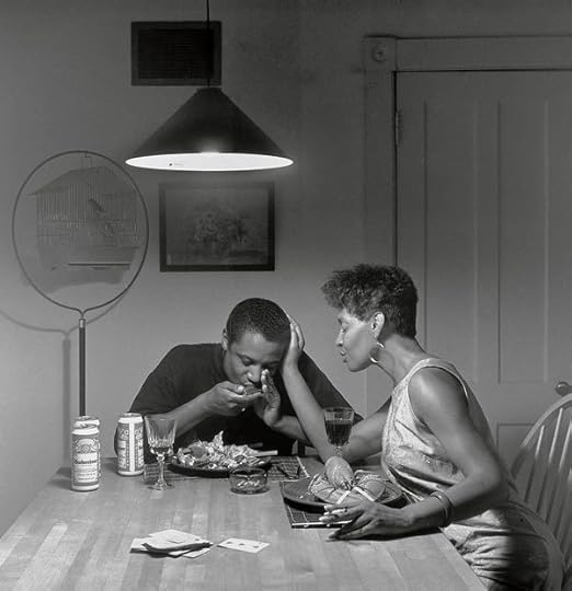
Carrie Mae Weems, Untitled (Eating lobster), 1990 © the artist and courtesy Jack Shainman Gallery, New York
Dawoud Bey
Oh, the blues ain’t nothin’
But a woman lovin’ a married man
Oh, the blues ain’t nothin’
But a woman lovin’ a married man
Can’t see him when she wants to
Got to see him when she can
“The Blues Ain’t Nothin’ But … ???”
—Georgia White
Looking at this photograph, one can almost hear it. And what one hears is the blues by way of the harmonica being played. The harmonica wasn’t always considered a blues instrument, you know. It was originally a German instrument, used to play traditional waltzes and marches of a decidedly European persuasion. But once the small instrument found its way to the southern part of the United States, and the black communities and musicians there, well … you know what happens when black folks get their hands on something. It becomes something else, molded to the idiosyncratic, emotional, and cultural shape of black southern tradition. In this case, an extension of black expressivity of a vernacular kind, played within the context of a music that came to be called the blues. Originally meant to be played by blowing into it, the harmonica, when it reached the black South, underwent a transformation.
Instead of simply blowing, black southern harmonica players realized that sucking at the instrument, and the reeds within, yielded a more plaintive sound and a different pitch, one more akin to the bending of notes on a guitar—the better to exact a more human, expressive tonality from the instrument. In so doing, black blues harmonica players found yet another way to bring an individual sense of black vocality to an instrument not necessarily made to speak that particular musical language.
The blues, of course, are about finding the good in the bad, playing through the pain to extract the joy and the lesson within. The scenario presented in this Carrie Mae Weems photograph from the Kitchen Table Series contains all of the tensions and dualities embedded in the blues: His succulent lobster is completely eaten, while hers remains untouched. His glass is almost empty, while hers is full. Eyes closed, they are both lost in the shared moment. As he plays, she sings and touches his face tenderly, cigarette dangling from her free hand. A man and a woman, lost in a beautiful, poetic, and forever enigmatic moment.
Dawoud Bey is a photographer based in Chicago.
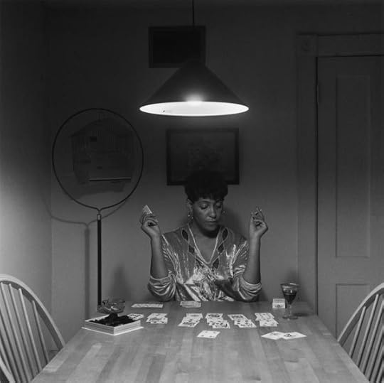
Carrie Mae Weems, Untitled (Woman playing solitaire), 1990 © the artist and courtesy Jack Shainman Gallery, New York
Jennifer Blessing
Carrie Mae Weems’s landmark Kitchen Table Series opens with a photograph of a woman caught between her reflection and a faceless phantom of a man. The final chapter of that unfolding story, the denouement after a violent off-camera climax, begins with a woman directly addressing the viewer, no longer surrounded by her lover, her friends, or her daughter. Weems’s grand finale, the last word of chapter and verse, is a woman playing solitaire. Having liberated herself from a bad relationship and the social constrictions of motherhood, her protagonist relaxes with a smoke, a glass of wine, and some chocolates—perhaps a valentine from a new suitor? Placed just before this picture, the closing text panel in the series announces, “Presently she was in her solitude.” Though her bird has literally and figuratively flown the coop, the woman seems unconcerned rather than lonely, defeated, or abandoned.
Kitchen Table Series, however, is not a story about simple justice served. The teller of this tale is neither saint nor sinner; the moral is not black or white but rich shades of gray. The measured photographic chronicle is countered by the raucous accompanying texts, which describe a far darker narrative echoing with a chorus of voices—those found in vernacular expressions, rhymes, and lyrics—coalescing into that of the imperfect heroine. The last text panel features lines from “Little Girl Blue,” a song immortalized by Ella Fitzgerald and Nina Simone, whose vocal shadings, we can imagine, provide a ghostly sound track for the woman playing solitaire, who is also a lady singing the blues about a man who done her wrong. She’s a little girl blue looking for a blue boy, who can only ever count on raindrops, who tells it like it is.
The woman is playing the game of solitaire, but is she also playacting as solitaire, a character like a jester, a harlequin, a domino? Just as the mute image is haunted by Nina Simone’s voice, its monochrome tonality calls for us to imagine the color of Weems’s costume, perhaps a shimmering gold blouse festooned with a regal purple trompe l’oeil jewel necklace. Is she a clairvoyant, a light seer (as well as a light writer/photographer), reading the cards to foretell her future? The text panel tells us finding a man will “have to come later.” This picture suggests she is in no hurry, she holds all the cards, she’s testing her luck before making her next move.
Jennifer Blessing is Senior Curator, Photography, at the Solomon R. Guggenheim Museum in New York.
Read more from “Vision & Justice” or subscribe to Aperture and never miss an issue.
The post Vision & Justice: Around the Kitchen Table appeared first on Aperture Foundation NY.


Centerfold

Click here to download the centerfold image designed by Kummer & Herrman.
The post Centerfold appeared first on Aperture Foundation NY.
May 24, 2016
Stephanie H. Tung on Xu Yong Negatives
I don’t expect to be reaching for my iPhone when I open a book. Yet Xu Yong’s Negatives instructs me to do just that, in order to interact with its dark, eerie images through the phone’s lens. A quick change of settings inverts the colors on the screen, and the images in this slim volume burst to life. Suddenly, photographs of the 1989 Tiananmen Square protests seem much closer to the present.
Negatives revisits some of Xu’s earliest, unpublished material from the beginning of his career: photographs of young protestors in the square, just before Chinese troops opened fire on the crowd on June 4. Xu’s rationale for printing his images of the protests—still a heavily censored subject in China—as color negatives is simple: negatives are less likely to be tampered with and therefore more reliable than normal photographs or digital media.
The act of using one’s phone to view these pictures also implicates the viewer in a way that looking straight at documentary photos does not. As the camera scans for a focal point amidst the crowd of students in the image, we too zoom around the composition, refocusing on one group declaring their hunger strike or another wielding a banner emblazoned with lines from Bei Dao’s poem “Proclamation” (“And we will not fall to the ground / Allowing the executioner to look tall / The better to obscure the wind of freedom”). There’s so much life, hope for democracy, and anger at the Communist government in these images. The only hint of the violence to come appears in the ominous photo of a tank on the last page, seen from behind a tree. Xu’s images allow us to inhabit the photographer’s point of view, watching and framing the unfolding events through our own devices.
As a documentarian, Xu is a prolific creator of photobooks, often adapting existing technology to suit his purpose. In the months after Tiananmen, Xu took pictures of the vanishing hutong alleyways in his neighborhood and published the pioneering work Beijing Hutong: 101 Photos (1990). He followed this with a number of innovative projects, including more recently This Face (2011), which documents the face of a single prostitute over her day of work. The preservation of history and memory, both collective and personal, in the shadow of authority is the thread running through his work.
At a time when the Chinese people’s collective memory of Tiananmen is lapsing, these images—hidden for over twenty-five years—act, in Xu Yong’s words, as an “immunization against amnesia” and a means to reconsider the social and historical circumstances of their creation. There is undoubtedly a sense of urgency in Xu’s project, and in Negatives, he points to the tenuous relationship between photography, truth, and history. It is only fitting, and perhaps politically prudent, that once the iPhone is turned off, the pages revert back to dormant abstractions.
Stephanie H. Tung is a PhD candidate focusing on modern and contemporary Chinese art at Princeton University. She is a contributing author to the Aperture volume The Chinese Photobook: From the 1900s to the Present (2015).
Xu Yong
Negatives
New Century Press • Hong Kong, 2015 (second edition)
Designed by Liu Song • 12 1/4 x 9 7/8 in. (31 x 25 cm)
72 pages • 54 color images • Hardcover with jacket
newcenturymc.com
• Shortlisted for a 2015 Paris Photo–Aperture Foundation PhotoBook Award
The post Stephanie H. Tung on Xu Yong Negatives appeared first on Aperture Foundation NY.
Design Books to Know
Designers and critics share the books that have inspired their work
Bruno Monguzzi on
John Szarkowski
The Photographer’s Eye
Museum of Modern Art • New York, 1966
I was asked to select a book that was eye-opening because of its content or its design. The Photographer’s Eye by John Szarkowski is my immediate answer—because of its content and its design.
When I first browsed through the pages of this book at the Museum of Modern Art in 1966, I was fascinated by the way the images had been connected, which for me is the fundamental aspect of photobook design. The page layouts are very diverse, ignoring the logic and rigidity of Swiss grids. Each image is very carefully sized and positioned in order to avoid the problems that often occur when placing images next to each other, particularly because of conflicting inner structures or scale.

John Szarkowski, The Photographer’s Eye, Museum of Modern Art, New York 1966
What is evident here is Szarkowski’s great capacity to read the photographic language, and his rare sensibility and intelligence in designing a sequence. An amazing lesson on the building of meaning—its definition through sensitive understanding of the complex interactions bridging the images displayed on a double page spread, or with the images of preceding and following spreads.
What is evident here is Szarkowski’s great capacity to read the photographic language, and his rare sensibility and intelligence in designing a sequence.
—Bruno Monguzzi
For decades, as a designer, my major goal when teaching has been to open people’s eyes, and for decades The Photographer’s Eye has been my very precious companion.
Bruno Monguzzi is a designer, typographer, and teacher. Monographs about his work have been published in Europe, the United States, China, and Japan. Member of the Alliance Graphique Internationale (AGI), he is the author of Lo Studio Boggeri, 1933–1981 (1981) and Piet Zwart: The Typographical Work, 1923–1933 (1987). In 2003 he was elected Honorary Royal Designer for Industry by the Royal Society of Arts, London.
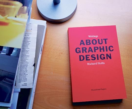
Richard Hollis, About Graphic Design, Occasional Papers, London, 2012
Rick Poynor on
Richard Hollis
About Graphic Design
Occasional Papers • London, 2012
Richard Hollis’s About Graphic Design, a collection of essays and lectures spanning five decades, is not the most obvious choice for this author. A compelling case could be made for his earlier studies, Graphic Design: A Concise History (1994) and Swiss Graphic Design (2006), which any design library should include. As a distinguished practitioner-turned-design-historian, Hollis (born in 1934) is an unusual figure among designers. About Graphic Design, less tightly focused than his two surveys, displays the grain of his thinking, and this helps to lift the lid on the practice for readers without specialist knowledge. In essays about the French postwar designer Pierre Faucheux, Penguin Books designer Germano Facetti, the evolution of the Architectural Review, and many other subjects, Hollis demonstrates the challenge and complexity of page-building. His tone can be didactic, but he writes from deep practical and cultural engagement, and his measured assessments and seriousness are always illuminating.
Produced by Occasional Papers, a small independent publisher in London, About Graphic Design’s editorial direction and page layouts reinforce its arguments. Hollis gave visual form to John Berger’s Ways of Seeing (1972) and here he effortlessly integrates more than five hundred images, running small reference pictures (often all that is needed) in the book’s inner margins, alongside the text. The choice of primary typeface—a bold serif—perfectly complements the economy and directness of the writing, and the entire book seems to speak in Hollis’s voice: calm, refined, rational, and persuasive.
Rick Poynor writes about design, photography, and visual culture. His Exposure column appears weekly on designobserver.com, and he contributes the Photo Critique column to eyemagazine.com. His books include Obey the Giant: Life in the Image World (2001), Jan van Toorn: Critical Practice (2008), and Sergei Sviatchenko: Collages (2014). He is visiting professor in critical writing in art and design at the Royal College of Art, London.

Tom Holert and Mark Terkessidis, Fliehkraft: Gesellschaft in Bewegung–von Migranten und Touristen, Kiepenheuer & Witsch, Cologne, 2006
Sven Ehmann on
Tom Holert and Mark Terkessidis
Fliehkraft: Gesellschaft in Bewegung—von Migranten und Touristen
Kiepenheuer & Witsch • Cologne, 2006
While I spend most of my time on the research and editing of design-related and highly visual books, my favorite publications about design are often text books. Books that widen my perspective. Books that make me reconsider what design is, could be, should be. Books about all sorts of things—sometimes closer to, but often further away from, the core of the term “design.”
Reading about the real challenges of migration … reminds me of the real issues out there—issues that matter, that I hope some of the smartest designers will take on.
—Sven Ehmann
I certainly spend my time with books about design history, theory, and thinking, as well as with numerous books about design trends. But the books on my desk right now are books about learning and migration. Design has opened up so much in recent years and claims to be the right tool to address all sorts of issues, yet for the large part it seems to be stuck with aesthetics. By contrast, reading about the real challenges of migration (as opposed to tourism) in Fliehkraft, a 2006 paperback by Tom Holert and Mark Terkessidis, reminds me of the real issues out there—issues that matter, that I hope some of the smartest designers will take on. One example of the way people are doing this is Workeer, a German job board for refugees which was recently created by two young design graduates.
For design to grow, evolve, and mature, I feel these paperbacks, with anonymous design but serious content, could be very influential.
Sven Ehmann is a freelance creative director based in Berlin. He has coedited over seventy books with publisher Gestalten, as well as working on exhibitions, writing, workshops, and lectures.
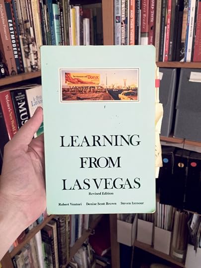
Robert Venturi, Denise Scott Brown, and Steven Izenour, Learning from Las Vegas: The Forgotten Symbolism of Architectural Form, MIT Press Cambridge, Massachusetts, 1977 (second edition)
Andrew Sloat on
Robert Venturi, Denise Scott Brown, and Steven Izenour
Learning from Las Vegas: The Forgotten Symbolism of Architectural Form
MIT Press
Cambridge, Massachussetts, 1977 (second edition)
The revised 1977 edition of Robert Venturi, Denise Scott Brown, and Steven Izenour’s Learning from Las Vegas: The Forgotten Symbolism of Architectural Form is no one’s idea of a superficially beautiful book. But the story of how it came to look like this is both a cautionary tale and a corollary to the architectural argument found inside.
The authors were architects who led a studio workshop in the architecture school at Yale in 1968. The first section of the book summarizes their students’ dazzling documentation of late ’60s Las Vegas architecture, via photographic strategies of all kinds, experimental maps, historical images, diagrams, drawings, and collages. They prove that the tacky architectural and graphic mish-mash of Vegas is as rich with formal subtlety and ingenuity as the respectable architectural fantasyland of Rome. The second section builds on the authority of the first, landing wild swings at the monumental modern architecture of the era, in an effort to show that the radicalism of the 1920s had devolved into a repetitive formalism that met no needs beyond proving the architect’s (and client’s) fancy taste. The book’s imagery exemplifies an approach to vernacular and commercial architecture that would be explored by the photographers soon to be categorized as the New Topographics—including Stephen Shore, who would later collaborate with the authors on the 1976 exhibition Signs of Life.
The first edition of the book, designed by the legendary Muriel Cooper in 1972, was a hardcover monument filled with stylish typography and color images, and wrapped in a vellum dust jacket. Consequently it was very expensive, and out of reach of most students. Scott Brown, in the revised edition, dispatches with the hated original design in three dismissive paragraphs. The edition that survives today was designed by the architects themselves and represents the argument in the text: that available materials, inventively handled to serve their purpose, can be as beautiful as the repetitive superficiality of heroic modernist design.
Andrew Sloat is a graphic designer and filmmaker based in Brooklyn, and a frequent collaborator with Aperture’s books program. He teaches at the Rhode Island School of Design and was recently appointed the creative director of the Brooklyn Academy of Music. andrewsloat.com
Irma Boom on
Kunst der sechziger Jahre
Wallraf-Richartz Museum • Cologne, 1970
Jan Vermeulen
Horrible Tango
Meulenhoff • Amsterdam, 1968
Turks Fruit
Meulenhoff • Amsterdam, 1969
I often find inspiration in books from the past. About ten years ago, I found a binder of sorts called Kunst der sechziger Jahre (Art of the ’60s), a catalogue published in 1970 by the Wallraf-Richartz Museum in Cologne. The concept is simple: there’s a brief text about each artist followed by their portrait, then one or two images. The artworks are reproduced on white paper and tipped onto kraft paper pages. Each artist’s portrait is printed on a clear acrylic page. The binding is not very attractive, but very suitable for the book: a plexiglass spine held together with big screws. The cover is also transparent plastic, embossed with the name of the museum.
There are five editions of the book, with more artists and content added to each one. I have always been inspired by this. My own bibliography, which I publish as a small book, follows a similar logic: each time I have a new show, I make a new edition; it grows in size by 3 percent, and more books are added.
These covers were critical to my decision to become a designer . . .
I still think they’re amazing. Anything that is really good stays good.
—Irma Boom
In 2014, I was honored to win the Johannes Vermeer Award. I decided to use the prize money to build a library of my own personal reference books—as a type of research, and as a way of building my own source material. This allowed me to get further into the idea of the book itself and explore how my points of reference and my own work are interconnected. My library focuses on the 1960s, as well as older books from the 1500s and 1600s. Some of the key volumes are novels by the author Jan Wolkers, for which the covers were designed by Jan Vermeulen—Horrible Tango (1968) and Turks Fruit (1969), among others. They are typographic covers, with really vibrant colors. The avant-garde design matches the avant-garde content precisely.
These covers were critical to my decision to become a designer. I originally studied painting, and when that wasn’t working out, I started looking for something else I could do. A professor of mine mentioned book design, and immediately I thought of Vermeulen’s designs and realized I could do something like that—find the right form for content. I still think they’re amazing. Anything that is really good stays good.
Irma Boom is an Amsterdam-based graphic designer who specializes in making books. She has received many awards for her book designs, and was the youngest ever person to receive the prestigious Gutenberg prize for her complete oeuvre. The University of Amsterdam manages the Irma Boom Archive, and the Museum of Modern Art in New York has acquired her work for their permanent collection. She is a senior critic in graphic design at Yale University. irmaboom.nl
The post Design Books to Know appeared first on Aperture Foundation NY.
Editor’s Note
Arthur Herrman and Jeroen Kummer
(Kummer & Herrman)
Making photographs is an independent and often solitary practice. So it’s not surprising that many photographers are cautious when it comes to exhibiting or publishing their projects—they may want to have as much control over that as they do over the images. But one could also say that a photographer’s work isn’t finished until it has found its final form of presentation. Whether this is as an exhibition, book, or other medium, photographers often realize at this stage that their project could benefit from adding someone else’s expertise—another perspective. In our opinion, this can be the big advantage of working with a designer.
When Lesley Martin invited us to act as guest editors for this issue of The PhotoBook Review—the first designers invited to do so—it didn’t take long for us to say yes. We were flattered, but we also knew it would be a great opportunity to add yet another perspective to the flourishing practice of conceiving and producing photobooks. In particular, we wanted to focus on the large number of projects in which content and design decisions come together and reinforce one another.
We believe togetherness and mutual reinforcement are key for creating a successful project—especially in its realization in book form. When you find common ground with other people, to play, search, question, and debate, you simultaneously build trust between you and your collaborators, and create space to reflect, breed ideas, and think freely. These words may sound big, but we strongly believe the outcome always reflects the process of creation. That’s probably why the projects we identify with most strongly are very often the result of a sustained, long-term, collaborative processes. Taco Hidde Bakker talked to six groups of collaborators about the books they created together and how collaborating can push your work to the next level, beginning on page 10.
Of course, this issue also focuses on the role of design and designers. Starting on page 6, designer Ania Nałęcka discusses her involvement with Sputnik, an international collective of documentary photographers from Central and Eastern Europe. This issue also includes an interview with the legendary designer, publisher, and gallery owner Willem van Zoetendaal (page 4), who has been one of our big inspirations as we’ve set off on our own journey.
A huge thank you to all the contributors for their dedication and generosity, as well as to Lesley Martin and the entire Aperture team for their trust and patience. We hope you will enjoy this issue. In its diversity, it forms a powerful argument for collaboration—and that’s exactly what we had in mind from the very first start. Creating damn good projects requires teamwork, partnership, and collaboration. So, let’s team up!
Arthur Herrman and Jeroen Kummer are the cofounders of the Utrecht-based design office Kummer & Herrman. They both studied graphic design in Utrecht, the Netherlands, and began by working in print. K&H, established in 1998, has developed into a multidisciplinary office with expertise in print, spatial, and interactive design. The office has received international acclaim for its work, often in the field of documentary photography—including for its collaboration with Rob Hornstra and Arnold van Bruggen, of The Sochi Project. K&H also designed a comprehensive book of Hornstra and Van Bruggen’s work in 2013, The Sochi Project: An Atlas of War and Tourism in the Caucasus (Aperture), which will be released in a new edition this fall. Herrman and Kummer both lecture at HKU University of the Arts Utrecht. K&H has received numerous nominations and awards, and, in 2014, won a Dutch Design Award for The Sochi Project. kummer-herrman.nl
The post Editor’s Note appeared first on Aperture Foundation NY.
One Plus One Is Three: A Conversation on Collaboration
Taco Hidde Bakker
Many good photobooks result from sustained, long-term collaboration—the kind that goes much further than just calling in a designer to make the finishing touches. An initial concept can be carried beyond the horizon of what an artist or photographer might have fancied on their own, with surprising results that could transcend individual authorship. Editors, typographers, graphic designers, or other photographers may act as collaborators and valuable sparring partners, for everything from determining sequence to designing layouts—delivering valuable input during the process and, in a sense, becoming authors in their own right. However, there are compromises to be made too: collaboration requires trust, honesty, open communication, and the ability to let go of favorite images or ideas. One must delegate, not dictate.
Here, six teams who have made collaboration part of their photobook-making process discuss the books they worked on together, and how they perceive two important aspects of collaboration: seeing your work through different eyes, and what forms of communication seem necessary to complete a successful collaborative project.
– Artist Daniel Mayrit and artist and publisher Verónica Fieiras. Publication discussed: You Haven’t Seen Their Faces (RIOT BOOKS, 2015). • Shortlisted for a 2015 Paris Photo– Aperture Foundation PhotoBook Award Artist
– Sarah Entwistle and graphic designer Antonio de Luca. Publication discussed: Please send this book to my mother (Sternberg Press, 2015).
– Photographer Alejandro Cartagena, photographer and editor Fernando Gallegos, and typographer and editor Roberto Salazar. Publication discussed: Before the War (self-published, 2015).
– Artist and photographer Laia Abril and editor and art director Ramón Pez. Publication discussed: The Epilogue (Dewi Lewis, 2014).
– Photographer Rob Hornstra and graphic designer Jeroen Kummer of Kummer & Herrman. Publication discussed: The Sochi Project: An Atlas of War and Tourism in the Caucasus (Aperture, 2013).
How does collaborating get you out of your so-called “comfort zone?” To what extent does seeking the input of others help you see your work with different eyes, take a more objective stance toward it, and perhaps deepen your emotional engagement with a project?
Thobias Fäldt: There is always that point in the encounter at which “the other” reshapes the initial idea to the extent that things will get uncomfortable. We have learned to appreciate this moment of crisis. It has become crucial for the development of what we wish to achieve. And it involves a great deal of trust between us all.
Verónica Fieiras: It’s a challenge, because as an editor you usually start working on a project which is already clear and finished in the artist’s mind. However, many things need to be rethought and transformed in order to translate an exhibition project into a book, which needs a different language. I had liked Daniel Mayrit’s project You Haven’t Seen Their Faces since the first time I saw it, but thought it was too cryptic and needed to be a bit riskier. Daniel was open to it and we both gave it a twist.
Daniel Mayrit: When Verónica first approached me with the idea of making a book together, I told her I didn’t want to. At the time I was working on a dummy which was the opposite of what the book would finally become. A few weeks after the proposal, I agreed to listen to Verónica, and thought, Maybe I was wrong after all. From that moment on I had left my comfort zone, and every decision that followed was a piece of cake.
Alejandro Cartagena: For my book Before the War I wanted to let go of the images as much as possible—to see them in a different light. So I let Fernando Gallegos, with whom I had worked on Carpoolers [2014], crop and sequence the images as he pleased. This was an important step in order to detach myself from the images and not force any of my feelings onto them. After we had finished the dummy we brought in Roberto Salazar to look for loopholes in the design, but were primarily interested in his passion for typography. After multiple tests, the three of us decided which type would work best for our publication.
Fernando Gallegos: Being a photographer myself, I think there is always a need for fresh eyes, for new directions in which a project could go. We pushed ourselves to go beyond what the images actually portrayed. At the same time, we always pulled each other back to our original idea. The basis of our collaboration was keeping a balance between the initial idea and making things more complex, as well as abstract.
Roberto Salazar: First and foremost, collaboration is based on the notion that nobody possesses a 360- degree view—not of their own practice, nor those of others. I have an aesthetic and technical bias; however, my subjectivity is only relevant within the context of collaboration. As such, I’m able to enrich a project by adding to the gene pool, as it were.
Jeroen Kummer: Trust is a key factor and liberating to the creative process. You should be able to leave your comfort zone but also enter a new one together. As a designer, you should be aware of entering someone else’s creative space, but this doesn’t mean you should not get your hands dirty because you respect the work too much. For their part, photographers need to trust that their publication is in good hands with a designer and leave space for them to do their thing, so common ground can be found—this is crucial to making something special.
Rob Hornstra: If you are not capable of leaving your comfort zone, I’m afraid you will end up with a mediocre book.
Laia Abril and Ramón Pez: In each project we adapt our skills, responsibilities, research, and motivation, depending on what we think the project needs. Our process is based on continuously researching every aspect of the edit. We find the inspiration and the answers to every project’s difficulties by seeking new forms for narrative structures.
If anything seems important in a collaboration, it’s open communication. You need to be able to trust one another and clearly and honestly share your feelings, doubts, and hopes for a possible outcome. Continuous debate and discussion often sharpen the concept and shape the project. How do you engage in such dialogue?
Entwistle: I had worked with my grandfather Clive Entwistle’s archival material for a couple of years before deciding to make a book. It’s an unstructured and pretty intimate collection. Until Antonio de Luca and I began working together, I was so steeped in this collaboration with my late grandfather that I felt an urgent need to have a live dialogue with someone, but also a desire to delineate the book as an object. I wanted a graphic collaborator who would have an emotional and visceral engagement with the material.
I had already begun constructing the text component and was eyeing up a large hoard of visual material when our collaboration began. Working with Tony from an early stage of the project was a pragmatic necessity for me: I had to answer his questions and complete tasks that would allow him to access the project. Straight away, he encouraged me to bring the images into the process. The action of inserting groups of images into the text was a fairly crude and practical remedy for communicating via a Word document, where images would appear throughout the text.
de Luca: There are two voices in the book: Clive (the protagonist) and the caption information (the deuteragonist). Clive always passed judgment on himself and others, whereas the caption information never judges Clive; it supports him, regardless of the fact that most of the architectural and other projects he designed never did materialize. The challenge was to create a book that could be read linearly and intermittently while experiencing the two voices simultaneously.
Originally I had begun designing a photobook, but Sarah wanted neither a photobook nor a literary book. She wanted something in between. Because of the amount of material Sarah kept discovering and sending to me, the book took one year to design. The images were copied and pasted into a Word document, forming a long chain. Each element connected to another element, forming Clive’s lifeline—which meant that if even one element was deleted or added, the entire book would have to be redesigned. It slowed down the process and forced me to respect Clive as a man with faults and triumphs, Sarah as an artist and as his granddaughter, and the book as an artifact.
Fieiras: Collaboration is a continuous process of reaffirmation, because you need to constantly justify your decisions and adjust your points of view, which helps make your ideas stronger. It’s an enriching back-and-forth process which teaches me a lot—not only about my collaborative partner, but also about myself. It’s a way of testing my flexibility.
Mayrit: We both made it very clear what we wanted, which helped a lot in staying focused on the main goal. From the beginning we decided to keep the political statement I was making with the book, but we also wanted to make something useful for the audience, not just a book to be looked at.
Abril: We distinguish between a photographic project and the concept of a book. Usually, the book’s concept is shaped by more people—such as an editor, designers, and a publisher. The moment at which the photographer stops being afraid to share the concept and all the ideas is when the book begins to grow exponentially. But no matter which point our collaboration starts at, both of us need to know everything, as if we were together on the project since day one. In our experience, this way of working can bring a story to a higher plane.
Pez: If a photographer knows how to do a good edit, and comes with a clear book concept, it’s still interesting to collaborate and brainstorm about new ideas. With The Epilogue, Laia was already shaping the concept of the book before she even started to take photographs, which really makes a difference in helping to structure the book—the edit in this case is equal to the concept and the story.
Källström: The interplay between everyone involved shapes the concept, and the structures are chiseled out from our different experiences and expertise. In the actual book object, its form and the photographs cannot be reduced to the sum of their parts. To reach coherence, there must be constant discussion stemming from our various points of view.
Kummer: I see shaping the concept and story as the most important parts of bookmaking. Sometimes I come up with ideas at an early stage; sometimes images already carry a clear direction. But in whatever order you work together, a book needs to stand on its own and should in fact be the publication the photographer wants. And designers, who often have more technical knowledge than photographers with regards to printing, lithography, paper, etc., have an obligation to include photographers as much as possible in the decision process.
Hornstra: Designers are not really involved with the content of my projects—for example, The Sochi Project, which I did with writer Arnold van Bruggen. We usually invite designers to learn what our work’s about while we’re still making it. You then need to make your ambitions for the project clear, and why you want to turn it into a publication. It’s important to express your feelings concerning the publication—not just how it should look, but what kind of emotion it should generate. You also need to articulate your desired audience.
This all creates a healthy starting point for designers to start thinking about a communication concept. The moment we start talking about the book, designers are totally involved and equal to us. This often goes wrong, as photographers and artists can find it difficult to treat designers as equal partners. It’s a good thing to learn how to be equally invested in a book project.
Taco Hidde Bakker is a writer, translator, and researcher based in Amsterdam. He worked with Paradox and Dana Lixenberg on the book, web documentary, and exhibition The Last Days of Shishmaref (2008–10). He writes for magazines such as Camera Austria International, Foam, EXTRA, and the British Journal of Photography. He also runs the Amsterdam chapter of The Photobook Club and Circle Rules Football Amsterdam.
The post One Plus One Is Three: A Conversation on Collaboration appeared first on Aperture Foundation NY.
Rahaab Allana on Laura El-Tantawy In the Shadow of the Pyramids
A photobook is most immersive when it arouses an awakening in the reader—and In the Shadow of the Pyramids, Laura El-Tantawy’s instinctive, four-year journey through the crowd at Cairo’s Tahrir Square, is a riveting, intimate, and spatially engaging testimony. A compact yet densely designed book that alternates between full-bleed images and smaller photos centered on the page, it features family snapshots from El-Tantawy’s past alongside her own photographs—constantly suggesting departure, rupture, and the return to her hometown, Cairo. Skillfully unmasking the fragments of the city, the book’s Japanese-bound pages conceal the photos’ dates inside their folds; the images see El-Tantawy living and breathing the humanity that gathered in Tahrir Square, capturing the protests that have happened there since 2011 as she positions the personal in the historical moment.
In the Shadow of the Pyramids documents Egyptians’ resistance to state control, surveillance, unchecked corruption, and, in some respects, the global economic crisis, all of which create an outer context for the mesh of people seeking liberation. “How do you tell a story when the plot keeps changing?” El-Tantawy asks. But there are also other protests insinuated here, such as the 2008 workers’ strike, initiated in the city of Mahalla el-Kubra; this predated and inspired the sentiment at Tahrir in January 2011, when protestors demanded the overthrow of then-president Hosni Mubarak. El-Tantawy’s photographs of the square are strung together as though taken over the course of a single, erratic night; the narrative shuffles time and reorders incidents, generating a streaming, episodic account that could almost seem fictionalized. But these images don’t keep reality at bay.
Distinct sections within the book are punctuated by black pages of text trimmed shorter than the rest, and they can be cross-referenced: Pieces of Me (2007), from when the author decided to move back to her city after several decades away, can be read in conjunction with Innocence Lost (2013), in which the darkest hour of the revolution seems to unravel. A similar sense of contrast finds its way into Faces of the Revolution (2011–13), in which extreme close-ups are hauntingly juxtaposed with family photographs from El-Tantawy’s youth, and Lingering Sadness (2014), which begins with an image of blood-streaked pavement and ends with photos that evoke memories from her upbringing.
The section Letting Go foregrounds the euphoric haze of the 2011 Arab Spring. But it also recalls a similar sense of rising under one banner that was felt in the square in 2003, with the onset of the American invasion of Iraq—not to mention earlier revolts, such as those after the loss of the 1948 Arab-Israeli War, when the Muslim Brotherhood began a series of incursions into city centers, only to be punished for rising against King Farouk. Tahrir Square also hosted student protests in the 1950s, against Israeli action in Palestine. It is no ordinary space, but one that triggers hope and aspiration.
For me, the aesthetic aspect of photography also draws attention to the power of images circulating in the public sphere. The protests that began in 2011 have been largely documented by the people rather than by news agencies, and have led to the establishment of activist-driven, citizen journalism organizations such as Mosireen and Thawramedia, which further substantiate the power of social media. They realign the contributions of other photographers who have documented the protests, such as Thomas Hartwell, Tarek Hefny, and Randa Shaath, as well as Heba Farid, coordinator of the Photographic Memory of Egypt archival program. This publication highlights the need to revisit such sites of contemporary history by reliving or re-viewing this space—not only with circumspection, but with emotion. A space that for El-Tantawy is always elusive, as she writes: “In the far distance, I catch sight of my dreams.”
Rahaab Allana is curator of the Alkazi Foundation for the Arts in New Delhi, India, and a fellow of the Royal Asiatic Society in London. He is the editor of the Indian photography quarterly and exhibitions platform PIX. In 2014, he copublished a book from his own private collection of cinema stills and ephemera, titled Filmi Jagat, A Scrapbook: Shared Universe of Early Hindi Cinema (in association with Art Heritage by Niyogi Books). pixquarterly.in
Image: Laura El-Tantawy
In the Shadow of the Pyramids
Self-published • Amsterdam, 2015
Designed by SYB • 440 pages
125 black-and-white and color images
6 7/8 x 9 in. (17.6 x 22.7 cm) • Hardcover
intheshadowofthepyramids.com
The post Rahaab Allana on Laura El-Tantawy In the Shadow of the Pyramids appeared first on Aperture Foundation NY.
Arnold van Bruggen on Carlos Spottorno Wealth Management
“There is no truer mark of financial success than making money work for you, instead of having to work for money,” reads one of the smooth opening lines of Carlos Spottorno’s book Wealth Management. This introduction sets the tone for a series of sumptuous, monochrome images that depict a world of tailored shoes and solutions, mega yachts and corporate jungles, antique shops and fur coats.
After his provocative, PhotoBook Award–shortlisted 2013 book The Pigs—a clever parody of the Economist magazine, illustrating the media stereotypes used to describe the economic woes of Portugal, Italy, Greece, and Spain—Spottorno now turns a mocking eye on the keepers of global wealth. Seen in this light, Wealth Management, a term used to describe the financial services offered to the superrich, is a sequel to The Pigs. The crimes have been documented; now the hunt for the perpetrators is on. It is a step that too few documentarians take, and for this reason alone Wealth Management would be worthy of attention.
The link between The Pigs and Wealth Management becomes even clearer after a visit to Spottorno’s accompanying website, wtfbank.com. “You don’t need money. All you need is credit,” says the bold type below the fictional WTF Bank’s slogan, “Live beyond your means.” If you click “I am looking for money” and fill in what you want on the simple online form—a villa in Portofino for 3 million euros, for instance, to be obtained with easy credit—you are redirected to the website for The Pigs, where you’ll be confronted with the bitter consequences of your hopes and dreams.
Wealth Management is more than a photobook; I leafed through it with the promotional video for WTF Bank and The Pigs website open on my computer. It’s a transmedia project that seems suspiciously akin to a prospectus: you consult the brochure, then check its credentials online. The “bank’s” promotional video is a slick version of the book, complete with a smooth commercial voiceover and stock music. Spottorno’s photographs take a sober, classic, documentary approach to the theme, detached from their subject; but their beautiful grays and grains almost make you want to be there, giving them the commercial quality needed for WTF’s promotional material.
Does it work? I read the book with a degree of irony and laughed out loud at the brilliant corporate-speak, both invented and borrowed from actual financial websites and advertising materials. I was initially puzzled by the choice of bank name: it’s almost too obvious. However, a second reading reminded me of the even-less-probable stories that have emerged since the start of the financial crisis, such as Goldman Sachs’s role in securing Greece’s place in the Eurozone by helping it to hide the true extent of its debt. Then the full irony became apparent of a slogan like: “At WTF Bank we don’t merely adapt to the circumstances, we determine the circumstances.” WTF, indeed.
Arnold van Bruggen is a writer, filmmaker, and founder of the Amsterdam-based documentary production agency Prospektor, which specializes in new forms of on- and offline storytelling. He is also a cofounder, with photographer Rob Hornstra, of The Sochi Project. A second edition of their summary book, The Sochi Project: An Atlas of War and Tourism in the Caucasus (Aperture, 2013), will be released this October. prospektor.nl
Translated from Dutch by Cecily Layzell
Image: Carlos Spottorno
Wealth Management
RM Verlag/Phree • Barcelona/Madrid, 2015
Designed by Jaime Narváez
9 1/2 x 13 3/8 in. (24 x 34 cm) • 64 pages
33 black-and-white images • Softcover
wtfbank.com
The post Arnold van Bruggen on Carlos Spottorno Wealth Management appeared first on Aperture Foundation NY.
May 23, 2016
Editor’s Note
Stanley Wolukau-Wanambwa
My bookshelves are a repository that’s both retrospective and forward-looking. They represent numerous journeys I’ve already taken and hope to repeat, as well as others as yet unfamiliar, which I plan to make at some undetermined point in the future. My bookshelves are emblematic of my optimism about the future, in that they imagine one in which I might have more time on my hands. But they are also inherently social, in that the objects they collect are intended to be shared, pored over, passed around, debated, and discussed in the presence of countless others.
Wright Morris wrote in his book Time Pieces: Photographs, Writing, and Memory (Aperture, 1989) that “to form a meaningful unit, one begins with a measurable multitude.” I take this to mean that no measurable thing can be understood as singular—that we are bound together by interdependence, relativities, and our shared histories. Morris’s claim seems especially relevant to photographs, words, and memories themselves: each are historically circumscribed instances in a long chain of prior events; each are simultaneously from the past, for the present, and integral to the future.
Robert Adams once wrote, “Your own photography is never enough. Every photographer who has lasted has depended on other people’s pictures too—photographs that may be public or private, serious or funny, but that carry with them a reminder of community.” Adams’s conviction and the sentiment he rightly defends underscore an optimism embodied by the humble bookshelf. In an issue of The PhotoBook Review such as this, dedicated to the intersections of the photobook and the archives, Adams reminds us of the multiple unpredictable and irreducibly social possibilities inherent in the photographic book.
In his essay “Eye and Mind,” Maurice Merleau-Ponty wrote that “we must take literally what vision teaches us: namely, that through it we touch the sun and the stars, that we are everywhere at once”—whether in the portrait studios of early-twentieth-century South Africa or in the trunk of a car in East Germany, on the silver screen or in some Springfield town in the United States. Merleau-Ponty continues: “Vision alone teaches us that beings that are different, ‘exterior,’ foreign to one another, are yet absolutely together, are ‘simultaneity.’”
I reach for such thoughts from the books on my shelves at moments when their insights seem most necessary: when a practiced cynicism represents the path of least resistance, in the face of the compounding complexities of everyday life. I imagine I will eventually donate my books to a family member, or to a friend, or perhaps to an institution where they might be of use to perfect strangers—at a point when they can better serve someone else. In this sense, my archive of books represents borrowed time, an interlude snatched from the inevitable succession of events. In this sense, the book is a reflection of ourselves: singular members of a vast multitude, small links in an immeasurable chain, moving falteringly together toward the future.
STANLEY WOLUKAU-WANAMBWA, a photographer,
writer, and editor of The Great Leap Sideways, is a faculty member in the photography department at Purchase College, SUNY.
Jane Mount published My Ideal Bookshelf, a collection of the favorite books of one hundred creative thinkers, with Little, Brown in 2012. idealbookshelf.com
Image: Jane Mount, Ideal Bookshelf #941, Stanley Wolukau-Wanambwa
The post Editor’s Note appeared first on Aperture Foundation NY.
Vision & Justice: A Curriculum by Hank Willis Thomas
For Hank Willis Thomas—conceptual photographer and multimedia artist—American commerce is a perpetual source of slogans and spectacles. In his series Unbranded: Reflections in Black by Corporate America, 1968–2008, Thomas excised the logos from post-civil-rights-era advertisements for products marketed to African Americans, unveiling an array of stereotypes. Question Bridge: Black Males, an ongoing transmedia project cocreated by Thomas, Chris Johnson, and other artists, is a forum for black men to ask other black men questions about their lives. In Question Bridge: Black Males in America, published by Aperture in 2015, one participant asks, “What is common to all of us that makes us who we are?”

Photographer unknown, James Baldwin Sitting Smoking a Cigarette, February 5, 1963 © Bettmann/CORBIS
Deborah Willis, Reflections in Black: A History of Black Photographers, 1840 to the Present, 2000
This was my mother’s fifteenth book looking at the experiences and revelations of black photographers. It was the culmination of thirty years of research, through which she unearthed aspects of American history that had been intentionally hidden and overshadowed by mainstream culture. The fact that African Americans were on the cutting edge of art, science, and technology, creating photographs from the moment the medium was invented—almost three decades before the end of slavery—forces us to reimagine and rethink everything we were taught about black history.

Cover of Audre Lorde, The Black Unicorn, 1978
Audre Lorde, The Black Unicorn, 1978
I have always been drawn to intersectional and expansive expressions of “blackness.” In her own words, Audre Lorde was a “black, lesbian, mother, warrior, poet.” You couldn’t just pick one to define her; she was all things, at all times, and more. My love for this work is best expressed in the final lines of her poem “A Litany for Survival.”
and when we speak we are afraid
our words will not be heard
nor welcomed
but when we are silent
we are still afraid
So it is better to speak
remembering
we were never meant to survive

Anthony Barboza, The Founders of Kamoinge, 1973. Courtesy the artist and Schiffer Publishing
Kamoinge
Kamoinge is a collective of African American photographers based in New York. Their name comes from a word in Kikuyu (an East African language) meaning “a group of people acting together”; since 1963, they have been doing just that. (Their work is collected in the 2015 book Timeless: Photographs by Kamoinge.) These artists have been a profound and pervasive influence in my life, from childhood to today. They do it for love.
Eve Arnold, Malcolm X, 1962 © Eve Arnold/Magnum Photos
The Autobiography of Malcolm X, 1965
No other book has shaped the way I understand human experience like this one. Malcolm X is perhaps best known for his “militancy” and opposition to Martin Luther King, Jr.’s commitment to nonviolence in the civil rights movement, but this is a gross reduction of his life and work. What I love most about the autobiography is that in it, we watch Malcolm redefine himself completely, continually willing to evolve his ideas regardless of the risk. The most revolutionary thing a person can do is to be open to change.
Jim Goldberg, Rich and Poor, 1985
This project is ultimately about vulnerability. There are few books that speak so genuinely to issues of class, race, and gender in American society. Before I encountered this book, I had never seen a photographic project where the subjects critiqued the images and themselves, speaking both to the photographer and to viewers.
James Baldwin, The Price of the Ticket: Collected Nonfiction 1948–1985, 1985
A person is more important than anything else. That’s the bottom line.
Naomi Klein, No Logo: Taking Aim at the Brand Bullies, 2000
This book became the manifesto for the work that I was doing about the corporatization of our lives. We are the first generation of humans whose lives are defined more by commodities than anything else. How did this come to be? How do we make sense of this, and what are we to do with this information?

DVD cover of Marlon Riggs, Black Is … Black Ain’t, 1995. Courtesy Signifyin’ Works
Marlon Riggs, Black Is … Black Ain’t, 1994
Along with Ethnic Notions (1987) and Tongues Untied (1989), this film by Marlon Riggs is the perfect merger of art, documentary, and activism. His films look at identity, intersectionality, and “postblackness” in ways that were, at the time of their making, groundbreaking and incredibly prescient. In the twenty-first century, we are still just beginning to address and understand what Riggs already knew then.
Stephanie Black, Life and Debt, 2001
This film gave me a foundation for understanding the ongoing devastating effects of slavery and colonialism, globalization and corporatization. We are often led to believe that “developing” countries are backward or just can’t get it right, while the truth is that “developed” countries (aka “mythmakers”) are still cheating, while also reaping the benefits of centuries of exploitation; the deck is stacked in their favor.
The odds for equality are slim.
The Watts Prophets, Rappin’ Black in a White World, 1971
Along with Gil Scott-Heron, Oscar Brown, Jr., and the Last Poets, the Watts Prophets are among the unsung pioneers of hip-hop. What I love about this album is how unafraid they were to speak truth to power and to express the rage of the beautiful struggle and their distaste for injustice.

Daniel Breaker and Eisa Davis in Passing Strange, 2007. Photograph by Sara Krulwich. Courtesy Sara Krulwich/The New York Times/Redux
Stew and Heidi Rodewald, Passing Strange, 2008
Yes, this is a musical. I saw it three times on stage and the film version five times. Every time I make anything, I want it to make people feel the way this piece made me feel when I first saw it. A lyric from the songbook: “What’s inside is just a lie. / Ideas are dependable, there’s a new one every week. / Emotions are expendable because they aren’t unique.”

Still from John Carpenter, They Live, 1988. Courtesy Universal Studios Licensing LLC
John Carpenter, They Live, 1988
No movie has had a greater impression on me. Yes, a Hollywood movie featuring pro wrestler “Rowdy” Roddy Piper and Keith David, in which they expose that aliens have been embedding subliminal messages in advertisements, turning us all into mindless consumers. “The Golden Rule: He who has the gold, makes the rules.”It opened my twelve-year-old mind to the ways consumerism and advertising create a culture of alienation, something I’ve been thinking about pretty much ever since.
Read more from “Vision & Justice” or subscribe to Aperture and never miss an issue.
The post Vision & Justice: A Curriculum by Hank Willis Thomas appeared first on Aperture Foundation NY.
Aperture's Blog

- Aperture's profile
- 21 followers

