
Aperture's Blog, page 136
June 29, 2016
Inside Aperture’s Annual Spring Patron Cocktail Party
On Wednesday, June 1, Aperture Patrons, board members, and special guests gathered for the third annual Spring Patron Cocktail Party at the home of Aperture trustee Michael Hoeh. The evening featured the rare treat of a private presentation by celebrated photographer Gregory Crewdson about his newest body of work, Cathedral of the Pines, published recently to critical acclaim by Aperture and exhibited at Gagosian Gallery. Crewdson, alongside Aperture’s Creative Director, Lesley A. Martin, discussed the work and also addressed the omnipresent nature of photography and the shift that occurs when image-making moves from the private act of creation to a more public process. A cocktail reception followed, where Crewdson inscribed copies of his book and engaged the group by answering questions about his creative practice.
Aperture Patron events bring together Members, trustees, and photographers. To join Aperture’s Patron Program, click here or contact Emily Grillo at egrillo@aperture.org or 212.946.7103.

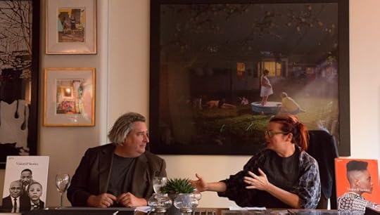
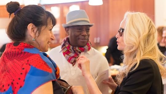
All photographs © Max Mikulecky.
The post Inside Aperture’s Annual Spring Patron Cocktail Party appeared first on Aperture Foundation NY.


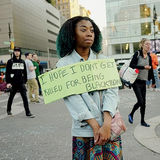
June 24, 2016
Queer Photography: A Reflection
For the “Queer” issue, originally published in spring 2015, Aperture asked artists and critics to reflect on the term queer and its relationship with photography. Here, Vince Aletti recalls Tomorrow’s Man, Peter Hujar, James Dean, and the thrill of discovering queer pictures.

Peter Hujar, David Wojnarowicz, 1981 © The Peter Hujar Archive LLC
The first queer photograph I ever saw excited and confused me. It was at a newsstand in the Jersey Shore town where my family spent the week of my father’s summer vacation, sometime in the late ’50s. Tucked between bodybuilder magazines like Strength & Health were some pocket-sized pamphlets with nearly naked men on their covers and titles like Tomorrow’s Man, Body Beautiful, and Fizeek. In one of them, I came across a picture of two dark-eyed young guys—they looked like regulars on Bandstand—in nothing but stripped-down jock straps, one slung across the other’s shoulder like a trophy. It was titled Victor and Vanquished, and I stared at it, mesmerized, until my mother called me away. I had no words for what that picture meant, certainly no classical references to fall back on. I’d seen kids horsing around in the locker room at school, but I’d never imagined anything as intimate as this. Maybe because I instinctively understood the way aggression masked tenderness, there was something thrilling about two naked men holding onto one another like that—something queer.
Queer was the word kids at school used to describe sissies or guys they didn’t like. It didn’t have anything to do with sex, homo or otherwise, until I was in high school, and by that time I knew they meant people like me: perverts (another period term, not yet reclaimed). By then I’d bought and hidden a cache of those little magazines and I knew that their pictures were about sex, although I had only the vaguest idea what that meant. I’d been going to the library and looking up homosexuality in the indexes of psychology books, which usually led to dry, alarming discussions of inverts, pathologies, regression, and abnormal urges. Physique magazines countered that tone of barely disguised clinical contempt with an upbeat, celebratory take on mid-century masculinity that was deeply queer but butch enough to pass as straight. With few exceptions, however, they weren’t holding up a mirror to their readers; they were providing us with all but unattainable objects of desire: handsome, heroic, almost supernaturally healthy young athletes (and mechanics, dancers, hustlers, pool boys, etc.). Physique pictures hinted—obliquely, teasingly—at homo sex but excluded homosexuals. We were outside looking in.
Around this same time, I came across another, even more potent image of naked men together in the pages of one of my father’s old U.S. Camera annuals. George Rodger’s famous 1949 photograph of a triumphant Nuba wrestler being carried upright on another man’s shoulders—the same totemlike image that Leni Riefenstahl said inspired her book The Last of the Nuba—was breathtaking. A real-world Victor and Vanquished, the picture’s body-to-body nudity was all the more stunning because it was so casual, so matter-of-fact. When I realized that the two men were surrounded by a milling crowd of other muscular, naked men, I felt like I’d tumbled through the looking glass. For a profoundly inexperienced fifteen-year-old, the erotic possibilities suggested by Rodger’s photograph were overwhelming. I went back to that image again and again, as if hypnotized, imagining myself in that naked paradise. Clearly, queer is in the eye of the beholder, and mine was wide open and avid. Having grown up with moving images of Elvis, Fabian, Little Richard, Chuck Berry, James Dean, Marlon Brando, Rock Hudson, Paul Newman, and Clint Walker, it would be reductive to say that my erotic imagination was shaped by two photographs. But the still image has always exerted a different sort of power for me, because a picture—in a book, in a magazine, in my hand—could be mine. To have and to hold. As they accumulated, those images began to define my life. The first thing I did in a new dorm room or apartment was tack pictures to the wall, claiming the space with Avedon’s portrait of the teenage Lew Alcindor from Harper’s Bazaar, a Warhol Flowers print, a cover of Body Beautiful, and the sleeve of a Frankie Avalon record. I wasn’t consciously queering the space, but as my rooms filled up with images of men, I realized I was queering the pictures. It didn’t matter who made them or with what intentions. Now that they were mine, they became expressions of my desire, my obsession, my imagination. They might not be gay, but they’d become queer. Context rules.
So what’s the difference? Until it, too, is reclaimed, gay remains the weaker word: fey, wishy-washy, limp-wristed. Screaming instead of shouting. Queer is more transgressive, more audacious, tougher, unsafe, unapologetic. And, it seems to me, more open, more comprehensive. Queer is hungry, insatiable. It doesn’t have a look, a size, a sex. Queer resists boundaries and refuses to be narrowly defined. Which is why, more often than not these days, queer absorbs and appreciates gay, embracing both Cecil Beaton and Peter Hujar, Duane Michals and Wolfgang Tillmans, Wilhelm von Gloeden and Ryan McGinley, Berenice Abbott and Zanele Muholi. And because queer doesn’t care who you’re sleeping with, it takes in Larry Clark, Nan Goldin, and Katy Grannan too. Like the photographs I couldn’t get out of my head, queer is unsettling and exciting and unforgettable. It bites hard and won’t let go.
Vince Aletti reviews photography exhibitions for The New Yorker and photography books for Photograph, Artforum, and W.
This article originally appeared in Aperture, issue 218, “Queer.” Subscribe to Aperture and never miss an issue.
The post Queer Photography: A Reflection appeared first on Aperture Foundation NY.
What Does Trans Love Look Like?
In a pioneering new book, Zackary Drucker and Rhys Ernst document their gender transitions and their lives together.
By William J. Simmons

Zackary Drucker and Rhys Ernst, Relationship, #23 (The Longest Day of the Year), 2011 © the artists and courtesy Prestel
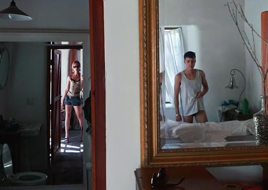
Relationship, the photobook by Zackary Drucker and Rhys Ernst, is both a beautiful documentation of two lovers and an important intervention into the heterosexist, homophobic landscape of art history. Spanning from 2008 through 2014, the images expand upon the artists’ presentation in the 2014 Whitney Biennial, organized by Stuart Comer, who also provides an introduction. We know Drucker and Ernst from their collaborative performances, as well as their spearheading of trans visibility with a distinctly LA flair (they lived in Ron Athey’s old house in Silver Lake—which, as Comer notes, recalls the gloriously queer Southern California world of Athey, Catherine Opie, and Vaginal Davis). Drucker and Ernst are now producers on the wildly popular Amazon series Transparent, which has perhaps led to the optimistic assumption made by the book’s back cover that “trans has never been more accepted.” While that may be true within a certain progressive subset of the American population, the fact remains that any depiction of a gender-nonconforming body is an act of revolution that unsettles the biomedical heterosexist patriarchy.

Zackary Drucker and Rhys Ernst, Relationship, #35, 2008–13 © the artists and courtesy Prestel
What is even more explosive is the fact that Relationship represents two individuals who undergo their transitions simultaneously and remain together throughout the process. As Kate Bornstein mentioned at a recent conversation at the Strand bookstore in New York celebrating the release of Relationship, this is the first visual account of trans-trans love. It’s hard for even self-professed “experts” of gender theory to wrap their minds around that. Even Judith Butler, the influential philosopher and gender theorist, for instance, was recently asked to grapple with the latent transphobia of her movement-creating, but often misunderstood, theories about gender performance. But Drucker and Ernst allow us to see their journey as it happens. They don’t have to explain themselves or allow us any access; it’s not their responsibility to educate cisgender people, but it is certainly an act of generosity that they do.
Zackary Drucker and Rhys Ernst, Relationship, #33, 2008–13 © the artists and courtesy Prestel
However, explaining is often what we expect of gender-nonconforming artists. Comer’s assertion in the foreword is a distillation of what would likely be said by anyone who has taken Gender Studies 101. He describes Relationship as “a codex for how we might reconsider our families and relationships, not as fixed structures but as elastic communities capable of celebrating, rather than fearing, transformation.” But Relationship should not be viewed merely as a lens through which cisgender readers can deconstruct their own lives. As perhaps its first priority, Relationship exists for itself and for the community that can most immediately understand it, as well as the community still to come—the queer and trans youth who are growing up in a world where trans identities are no longer consigned to invisibility. The photographs are not a rubric for a queer theory checklist. These are not images of Others that cisgender people might marvel at from a distance; Relationship is not a “codex.” Bornstein’s assertion that “the book takes trans a step beyond acceptance into desirability” should instead be the key takeaway. In these pages, we see the wondrous complexity of human sexuality—a physically and conceptually vast phenomenon. The beauty of trans-trans love—the gentle caresses and lightly muscled stomachs, legs dappled with endearing hairs, supple asses, veined breasts, and narrow waists—becomes its own kind of criticality even though it doesn’t have to be. Love can simply be glamorous or horny or sleepy or, really, whatever it wants.
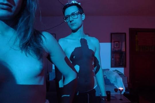
Zackary Drucker and Rhys Ernst, Relationship, #44 (Flawless Through the Mirror) © the artists and courtesy Prestel
Still, it is important that we do not lean on lofty concepts and attend to Relationship only as a photographic project. When I began looking at these images, my first instinct was to attempt to understand the historical underpinnings of the project. How do Drucker and Ernst compare to Larry Clark, Nan Goldin, and Cindy Sherman (the examples cited by the book’s cover)? Well, they don’t. All of those artists operate within the context of a normative art history that privileges established modes of sexuality. Sherman, Andy Warhol, and Marcel Duchamp don drag, but at their core is a reaffirmation of two fixed genders, if only ironically or as stereotype. Furthermore, although Clark and Goldin have produced important documentary images, Drucker and Ernst are not necessarily documenting; they are living. In Relationship, the term “documentary” might not even hold, given that the book is a record of two unique bodies in a state of mutual becoming. This defies the inherent fixity of the camera and points to what historian Ariella Azoulay has called photography’s “civil contract”—its ability to exteriorize previously unseen social relationships and differentials of power.

Zackary Drucker and Rhys Ernst, Relationship, #37, 2008–13 © the artists and courtesy Prestel
Most of the time, Drucker and Ernst are not in the picture together, but we understand a psychic relationship when a purely physical one is absent. The photographer is changing, even as the photograph is being taken, and so are the subjects, like two vines that slowly grow into each other and become unified. We come to understand the potential of the photograph to reveal bodies in flux but also modes of seeing in flux. This is more important, I think, than trying to find art historical precedents for Relationship, because what the book actually asks is that we rely not on outmoded visual cues and social narratives, but rather, like Drucker and Ernst, invent new ones.
William J. Simmons is an adjunct lecturer in art history at the City College of New York, and a PhD student in art history and women’s studies at the Graduate Center, CUNY.
Relationship was published by Prestel in June 2016.
The post What Does Trans Love Look Like? appeared first on Aperture Foundation NY.
June 22, 2016
Vision & Justice Online: Sheila Pree Bright in Conversation with Naima J. Keith
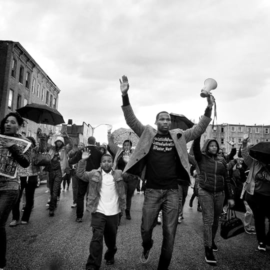
The photographer Sheila Pree Bright, a Georgia native who is currently based in Atlanta, has routinely questioned the power structures that inform representations of African American communities and individuals. In her latest series, #1960Now, Bright connects leaders of the civil rights movement to the young activists working today. In chronicling street demonstrations in Atlanta and Baltimore, she summons the dramatic energy of Leonard Freed’s high-contrast documentary photography, while her minimalist portraits of activists recall the intensity of Richard Avedon’s work from the 1960s. Bright presented an interactive version of #1960Now at The Museum of Contemporary Art of Georgia in fall 2015, but she has also moved her photography beyond the gallery walls through wheat pasting campaigns and Instagram hashtags. At a moment when social justice, inequality, and representation are national concerns at the highest levels of politics and media, Bright’s photography provides a potent mediation on the ongoing work toward racial progress in America.

Sheila Pree Bright, Atlanta, from the series #1960Now, 2015. Courtesy the artist
Naima Keith: You’ve been described as a cultural anthropologist, yet your work explores commercialism. Is this an accurate title? Would you describe yourself the same way?
Sheila Pree Bright: Considering my work, I understand why I’ve been described that way. However, I define myself as a fine art photographer. The visual content I capture challenges ideas about narratives that are controlled by Western thought and power structures. My approach is to seek the common thread that connects the human condition. I aim to examine what people define for themselves.
In my work, I explore the ways in which black bodies have been considered a commodity. I study the collective black experience against other histories to communicate the humanity in us all, with the intent to break taboos and stereotypes—but mostly to celebrate the beauty that lives beneath the surface of those presented as inferior, powerless, or misunderstood.

Sheila Pree Bright, from the series Plastic Bodies, 2003. Courtesy the artist
Keith: One of the ways you’ve investigated the black body is in the series Plastic Bodies, in which you take the famed Barbie doll, a toy prized among young children for decades, and explore the relationship African American women have with this Eurocentric standard of beauty. How do you view the relationship between women and Barbie dolls?
Bright: There is an infatuation about physical beauty among both men and women. Plastic Bodies (2003) explores deconstruction and reconstruction of beauty. I digitally manipulate photographs of women and dolls to address the thin line between fantasy and reality via PhotoShop. I use the Barbie as the “ideal” of beauty and examine her as a cultural icon. My interest is in how black bodies are seen as undesirable by Western standards. In my research, I closely studied the South African figure Saartjie Baartman, who became a spectacle of fascination when she was taken to Europe and publically displayed with attention on her large buttocks.
In 2016, Mattel launched a new line of dolls that are designed to be more “real.” On the front cover of the February issue of Time magazine, there is a Barbie with blue eyes and blonde hair that has a figure more like Kim Kardashian’s. African American female bodies are not frequently celebrated in Western culture, which is why, historically, platforms like Jet magazine’s “Beauty of the Week” have been important. As new counterculture blogs emerge, like AfroPunk, beauty is defined by cultural aesthetic, as seen in how their “Afro of the Day” series is reclaiming ideas of mainstream beauty trends.
Although Barbie serves as a toy for children, she represents much more. The doll somehow becomes a model of beauty, a false representation of how women are physically formed. In some cases, women will aspire to this model to the extent of deconstructing their own image by various forms of beautification. I show how these extremes are illusions by using models and dolls as the subjects.
Sheila Pree Bright, from the series Plastic Bodies, 2003. Courtesy the artist
Keith: What role does audience engagement play in your work?
Bright: Living in a world where millions of images are uploaded and consumed daily, it’s important for my work to live in different spaces in order to engage different audiences. Until 2012, my work only lived in museums and galleries. Young Americans (2008), a series of self-constructed photographic portraits of Generation Y, ages eighteen to twenty-five, shows attitudes and values of Generation Y as American citizens. Participants posed with the American flag, using it as a prop to express sentiments about America. The series premiered as a solo exhibition at the High Museum of Art. Then the series was taken to the streets of Atlanta and Art Basel Miami 2012 to reach people beyond museums. The work in a new space was a successful initiative in giving the residents of an urban neighborhood art they could own and relate to and in creating fresh dialogues about what it means to be an American in the twenty-first century. After the George Zimmerman verdict, having the work displayed in Florida was important and timely, as many Americans felt let down by the system.
Recently, social media platforms have become a big part of my audience engagement. From the inspiration of street art, I produced 1960Who (2013), photographic portraits of unknown members of the civil rights movement. The series was presented in urban spaces as a street gallery and was also re-enforced on social media platforms. For example, my Instagram account, @shepreebright, went from 800 to 60,000 followers in 2015 through curating and campaigns such as the hashtag #BringIt1960Now for #1960Now series. Simultaneously, I was working on the project in real time before the opening at the Museum of Contemporary Art of Georgia.
Sheila Pree Bright, Kwame Rose, from the series #1960Now, 2015. Courtesy the artist
Keith: I’m intrigued by a series like #1960Now because, like you said, it engages both an online and a museum-going audience.
Bright: #1960Now explores the state and condition of America now. Themes in the series explore what “disruption” looks like. There are protests against injustice across the country, and around the world, and also there has been an emergence of fresh new leadership that is becoming more visible from the ground up. I’m exploring power struggles and how America is shifting socially, politically, and economically. The work I produced in the ’90s—the era of hip-hop culture—seems to relate to themes of past and present. I’m revisiting this work with the intention of reframing former series such as Suburbia (2006), and to create multimedia work that examines ongoing narratives of gentrification and how culture exists in different spaces.

Sheila Pree Bright, Dr. Roslyn Pope, from the series #1960Now, 2013. Courtesy the artist
Keith: Has being based in the South inspired you to move work like #1960Now in a particular direction?
Bright: The region has definitely influenced my work. Atlanta, where I am based, is the home of the civil rights movement. It is the foundation for my research, and where I met the primary founder of the Atlanta Student Movement, Mr. Lonnie King, Jr. I learned a lot about that era that isn’t in history books when I placed the 1960Who street art series on walls where youth leaders of the ’60s once held meetings and traveled throughout the city. The South is a very interesting place. Being born in the South, but not being raised in the South, and then returning to the South as an adult has piqued my curiosity about how current and past histories intersect.

Sheila Pree Bright, Bree Newsome, from the series #1960Now, 2015. Courtesy the artist

Sheila Pree Bright, JT Johnson, from the series #1960Now, 2015. Courtesy the artist
Keith: What role does black and white photography (as used in #1960Now) play in your work that color photography does not? Was the choice for these works to be in black and white methodical or intentional?
Bright: Intentionally, the photos are black and white to represent a timeless history. #1960Now is a documentation of current events reminiscent of ’60s reportage in capturing the truth in struggles with police brutality and mass incarceration of black men. The aesthetic reinforces a critical thought about how different things really are today, compared to fifty years ago. To present the photographs in color would not honor the generations of people who took a stand. This is an important element of the work: I incorporate youth leaders both of current times and of the civil rights era who were not widely known. I hope the work will spark the audience to think critically, beyond what they see on the news, and to inspire dialogues between people of different races, genders, and generations.
Sheila Pree Bright, Baltimore, from the series #1960Now, 2015. Courtesy the artist
Keith: Where do you draw inspiration for your work? What inspires you?
Bright: I am an observer. I’m inspired by observing spaces, people, and culture. Growing up, I was shy and introverted. I preferred to experience the world by engaging books. I hid under the bed a lot and read books from back to front. I wanted the conclusion first. Taking photographs became the way I communicated best. Images don’t require a lot of words.
My work is about controlling the narrative and finding new ways to broaden audience globally in different spaces. Art is a way to learn from others.
Naima J. Keith is Deputy Director of Exhibits and Programs at the California African American Museum in Los Angeles.
The post Vision & Justice Online: Sheila Pree Bright in Conversation with Naima J. Keith appeared first on Aperture Foundation NY.
June 21, 2016
Freedom of the Night: 11 Reflections on Orlando
Following the attack on the Pulse club, artists and writers consider the nightclub as a symbolic space in queer culture.

Richard Renaldi, Nightlife (Untitled #2), 2016. Courtesy the artist
Richard Renaldi
The phone buzzed in my pocket. I was at a gay nightclub in Brooklyn, wasted. I was unable, or more likely, unwilling to process the first Times alerts. How many hundreds of nightclubs have I been to like Pulse over three decades of clubbing? Has this really never happened in a gay club? San Bernardino, Newtown, Virginia Tech. They are always the same and yet always unique in their lurid, agonizing details. Marco Rubio said it was “Orlando’s turn.” It’s just a game of roulette, you see, and on Sunday morning, June 12th, this club and this community and this city’s luck ran out. Somehow, it still felt personal. I was ashamed of my impulse toward tribalism and preferential empathy. That doesn’t help. Riveted to the computer. Compulsively refreshing the Internet browser. Helpless. Entering my credit card to make a donation to some group that will take this or that fight to Congress or somehow attempt to effect change, but knowing it won’t work. It will only be a short while before some other group’s luck runs out, before the phone buzzes again with similar words, before I have to take slow, deep breaths, flick the screen off, and shove it back in my pocket.
Richard Renaldi is a photographer based in New York.

Matthew Leifheit, Underwear Party, Fire Island, 2015. Courtesy the artist
Matthew Leifheit
“To make the private into something public is an action that has terrific repercussions in the pre-invented world.” —David Wojnarowicz, Postcards from America: X-Rays from Hell, 1989
I did not grow up in nightclubs. A bad dancer with social anxiety, I’ve instead found my queer family in less glamorous places. But Mitchell Sunderland, a journalist who was raised in the gay clubs of South Florida, has been taking me along on stories—ranging from no-hetero underwear parties on Fire Island to all-male strip clubs in midtown Manhattan—to photograph queers old and young, sharing shimmies in their 2(x)ist briefs. Despite the distance my camera sometimes imposes, I’ve seen that these places are crucial because they’re not about blending in, not about being in public and passing as regular, as male, as female, as OK. They are about constructing and embodying a modest fantasy of what a queer world could be and loving it for its ownness and malleability. It is the same need many photographers feel: to make a world and live in it.
Matthew Leifheit is a photographer, editor, and publisher currently pursuing his MFA at Yale.

Duane Michals, The Unfortunate Man Could Not Touch the One He Loved, 1976 © Duane Michals. Courtesy DC Moore Gallery, New York
Philip Gefter
I have been despondent all week about the massacre in Orlando. Every time I see pictures of the victims, my tears erupt from a well of sadness. It seems as if, in one heinous act, the arduous years we fought for our right to be who we are, for cultural respect and legal equality, are shattered in a monstrous crime of historic proportion. In the brief, pre-AIDS era of celebratory gay life in 1970s New York, I spent so many nights in the bars of the West Village. They were our neighborhood clubs. They were fun, infused with an atmosphere of camaraderie, intrigue, romantic promise, and, ultimately, the heat of animal sexuality. In the early 1980s, I spent a lot of time in The Bar in the East Village, a bare bones single room with no décor, where artists and writers and disaffected intellectuals hung out in t-shirts and jeans, drank and smoked and listened to the best rock ’n’ roll classics on the jukebox. People talked to each other and it felt like a refuge from the conventional world. I always believed that The Bar would end up as a footnote in art history. There would be Robert Mapplethorpe, or Peter Hujar, or David Wojnarowicz, or Keith Haring, each one standing alone with a beer in one hand, a cigarette in the other, on the prowl but willing to be amused by a conversation in the meantime. This week, when I allow myself to imagine the terror inside Pulse as Omar Mateen opened fire, I think of The Bar. Such a small room packed with men just wanting to have fun. Just like Pulse.
Philip Gefter, a photography critic and former picture editor at The New York Times, is the author, most recently, of Wagstaff: Before and After Mapplethorpe (2014).

madison moore, How to Go Clubbing, Performance Space Sydney, 2016. Photograph courtesy Hospital Hill
madison moore
Think about first time you set foot into a club. What did you feel able to do? Most of us have some kind of clubbing autobiography, a timeline of memorable stories and brunch-worthy sound bites about where we’ve partied and what happened. Even if you don’t go out as much as you used to, thinking about your clubbing autobiography tells you a great deal about where you were in your life at that time, who you were dating, what your tastes were and how you’ve evolved. It’ll even show you how your city has changed because the places you used to go to probably don’t exist anymore. They’re ghosts—or condos. As for me, a queer person of color, there’s nothing I love more than dancing to techno in a completely dark room. It’s disorienting but I never feel more present. Queer night spaces in particular allow us to press “record” on parts of our autobiographies that we wouldn’t be able to see otherwise.
madison moore is a Research Associate at King’s College, University of London.

Elle Perez, Sophia Campbell backstage at Club Hippo, Baltimore, 2014. Courtesy the artist
Elle Pérez
I grew up in nightclubs, bars, and queer Latinx spaces. These spaces have been both emotional and artistic outlets for me. This photograph is from Euforia Latina, a Latin night at the former Club Hippo in Baltimore, Maryland. Like many other queer nightclubs, Club Hippo is gone now—another one lost to gentrification. What do you do when all the places where you can be yourself start to disappear? What do you do when the illusion of a safe space is shattered, first by developers, and then by gun violence? I don’t know. I don’t have any of the answers. What I do know is that even if every nightclub disappears, queer nightlife never will.
Elle Pérez teaches photography at Williams College.
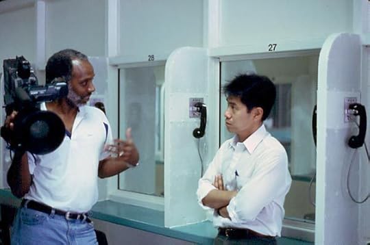
Robert Shepard (left) and Arthur Dong on the set of Licensed to Kill, 1997. Photograph by Angi Rosga. Courtesy Arthur Dong
Matt Wolf
I came out of the closet when I was fourteen years old, the night after watching Arthur Dong’s documentary Licensed to Kill (1997) on PBS. In an attempt to find meaning after his own antigay assault, Dong interviewed men from prison who have killed queer people. Their naked and disturbing testimonies are illustrated with gruesome crime scene photographs. As a teenager, the only way I could imagine resisting these annihilating forces was to make queerness the defining aspect of who I am politically, culturally, and emotionally. In the wake of the Orlando attacks, I’m asking myself again what being queer means to me today. Politically, it means that I reject conscription into the war on terror, and I denounce racism, Islamophobia, and domestic violence. Culturally, it means resisting assimilation by going to the gay bar—those real and figurative places where gay people see each other and share ideas and experiences. Emotionally it means internalizing the pain of others to the extent that their suffering becomes our suffering, and that it’s not forgotten.
Matt Wolf, a filmmaker based in New York, is the director, most recently, of Teenage (2013) and It’s Me, Hilary: The Man Who Drew Eloise (2015).

Ken Gonzales-Day, Royal Ball, Tacoma, n.d. Courtesy the artist and Luis De Jesus Los Angeles
Ken Gonzales-Day
I moved to New York City from a small town in Idaho. I wasn’t out of the closet. In my early twenties I was something of a club kid and I met Michael Alig, the now-infamous club promoter. I was young, the drinks were free, and the music was amazing. At Limelight, I saw Andy Warhol, Devine, and Lady Bunny. But my favorite memory is when I had an exhibition in the Laundry Room. It was special because it was one of the first exhibitions of my work. The art was poorly lit, but there were beautiful go-go boys dancing on top of the washing machines, and the music was pumping. Since then, I have shown in major museums, but I still think that was one of my favorite exhibitions because it taught me two things: always keep a sense of humor, and that I was not alone. You are not alone Orlando.
Ken Gonzales-Day is an artist based in Los Angeles.
Rafael Soldi, Wildrose, Seattle, 2013 © the artist
Rafael Soldi
As a gay person, the role that your chosen family—your community—plays in your life is impossible to describe; it is paramount to your survival. Bars and clubs have for decades acted as safe places for gathering and celebrating, as well being hotbeds for political activism and organizing. It was, in fact, at a queer bar in New York, The Stonewall Inn, in 1969, that gay men, lesbians, and especially our trans brothers and sisters, street queens, and LGBTQ persons of color rioted against the police, essentially igniting the gay rights movement, what we now call “Pride.” So it is important that when we think of the shooting at the Pulse nightclub we put it in this context. When you’re a gay person, a gay bar or club is more than just a place to get a drink—for many it’s the first place we ever felt at home. They are our places of worship, in a way, and I would align this awful hate crime with the shooting at Emanuel African Methodist Episcopal Church in Charleston last year. Our church was attacked in Orlando.
Rafael Soldi is a photographer and curator based in Seattle.
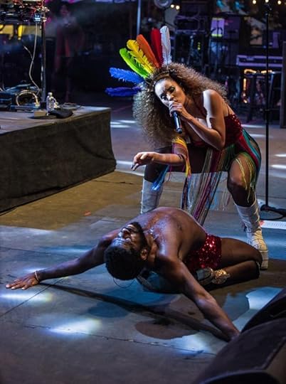
André D. Singleton performing with Lion Babe, LA Pride, June 11, 2016. Photograph by Chris Tuite © Chris Tuite Photography
André D. Singleton
I learned of the tragedy that happened in Orlando the next morning after I had performed with all of my heart, mind, body, and soul at LA Pride with the band Lion Babe. We had such an amazing and liberating experience together. Thousands of LGBTQIGN fam showing love. Dancing. Singing. Talking. Being. I have never had a performance like this one. Being my most authentic self on stage. Using my body to tell stories and celebrate my birth, rebirth, life, and even deaths. Yes, deaths. Because, as a LGBTQIGN person, I feel we are constantly dying. And as we die, we are born again. The massacre in Orlando immediately made me think of Sufi poet Rumi’s words: “Dance, when you’re broken open. Dance, if you’ve torn the bandage off. Dance in the middle of the fighting. Dance in your blood. Dance when you’re perfectly free.” The attack has definitely killed very important parts of me. But it’s given birth to new parts of me. I have fifty-plus brothers and sisters to dance and create even harder, deeper, unapologetically for. Axé.
André D. Singleton is an artist based in Brooklyn and the co-founder of The Very Black Project.

Paul Mpagi Sepuya, 144 Powers, 2014–15. Courtesy the artist
Paul Mpagi Sepuya
In my work lately I have been thinking about shared subjectivity, recognition through cruising, and what Gordon Hall calls “mutual objectification” in their essay Party Friends (2015). I think about the positive promiscuous creative, sexual, and platonic encounters that the club extends out from there to permeate the day-to-day exchanges queer life. It wasn’t until I left New York two years ago after fourteen years there—my late-teens to early thirties—that I realized how critical the learned language of the club and all of the clubs I inhabited were to the conceptualizing, encoding, producing, and distributing of my projects. That half-degree of separation between subject and viewer, sparked across the dance floor and completed in a glance across the train platform. It is a queer photographic production, that loving “mutual objectification” between collective strangers united in desire and affirmation. The club is art embodied and performed, a process that allows us to continually redefine our relationships to each other, the images we create, and how we reincorporate or otherwise respond in the fullness of our lives together.
Paul Mpagi Sepuya is an artist based in Los Angeles.

Christian Dietkus Lord, Zackary Drucker at the Soho Grand, New York, August 25, 2005. Courtesy Zackary Drucker Studio
Zackary Drucker
This atrocity is a reminder that our lives are equally important. I spent the first decade of my adult years in nightlife. I always felt like there was an unregulated and anything-is-possible element in nightlife, which is why people are drawn to it. I have seen violence erupt in a club more than once and have also been a target of violence in a club. Wherever unrestrained desire is expressed, there also exists an impulse to destroy that freedom; one person’s utopia is another’s dystopia. Without accepting each other’s difference—or our own for that matter—we lose our humanity. I don’t want to live in a Mad Max future with more guns. A world in which psychopaths can legally buy weapons designed to kill masses of people is a clear vision of hell to me. LGBT uprisings and activism have originated directly from nightlife; so many significant moments in our history have occurred in bars and clubs. I hope that queer communities in the future will not be relegated to bars and clubs, but will be everywhere.
Zackary Drucker is an artist based in Los Angeles and co-producer of the Amazon series Transparent.
The post Freedom of the Night: 11 Reflections on Orlando appeared first on Aperture Foundation NY.
June 20, 2016
Vision & Justice: Jason Moran on an Army Jazz Band
Collectors: The Jazz Musicians
For the “Vision & Justice” issue of Aperture, Wynton Marsalis, Ingrid Monson, Alicia Hall Moran, Jason Moran, and Somi reflect on photographs that represent moments in their lives. Here, Jason Moran responds to an unknown photographer’s picture of an army jazz band.
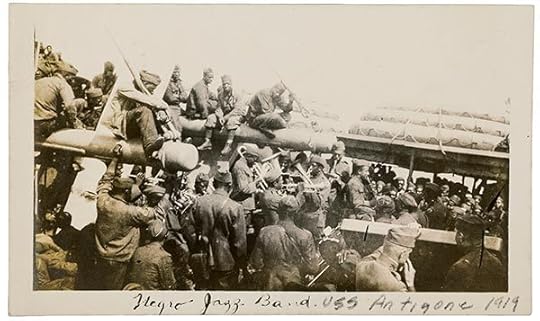
Photographer unknown, An army jazz band on the USS Antigone, 1919. Courtesy PBA Galleries
I’ve been obsessed with the various modes of jazz documentation throughout the genre’s evolution. This 1919 image of soldiers on the USS Antigone is simply phenomenal. Groups like this and James Reese Europe’s Harlem Hellfighters band changed the trajectory of modern music. Some soldiers perform, some listen, all are entranced. They could either be heading to the fight or returning from it. The music is serving as a balm, a shield, and a release for anyone close enough to hear it. I imagine the sound of that band as the ship bobs up and down, and how everyone is curious what will happen when they reach land. Improvise.
Jason Moran, a pianist and composer, is Artistic Director for Jazz at the John F. Kennedy Center for the Performing Arts in Washington, D.C.
Read more from “Vision & Justice” or subscribe to Aperture and never miss an issue.
The post Vision & Justice: Jason Moran on an Army Jazz Band appeared first on Aperture Foundation NY.
June 15, 2016
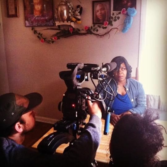
Vision & Justice Online: Deana Lawson and Nikki A. Greene in Conversation about the Emanuel 9
One year after the church shooting in Charleston, South Carolina, Deana Lawson speaks about her powerful portraits of the victims’ families.

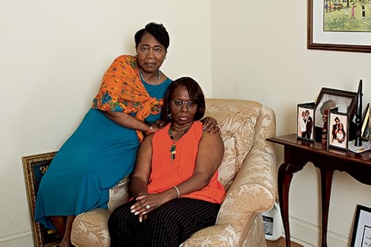
Deana Lawson, Bethane Middleton-Brown with Gracyn, Hali, Kaylin, and Czana DePayne, 2015. Courtesy the artist and Rhona Hoffman Gallery, Chicago
Nikki A. Greene: On June 17, 2015, the tragedy of the murders of nine African American members of the Emanuel African Methodist Episcopal Church in Charleston, South Carolina—Rev. Clementa Pinckney, Cynthia Graham Hurd, Ethel Lance, Rev. DePayne Middleton-Doctor, Tywanza Sanders, Myra Thompson, Sharonda Coleman-Singleton, Susie Jackson, and Rev. Daniel Simmons Sr.—became a peculiar terrorist act in the United States, primarily because it took place in a church during a Wednesday evening prayer meeting. For me, this kind of attack felt very similar to the bombing of the Sixteenth Street Baptist Church in Birmingham, Alabama, in 1963, particularly because of its violence within a black church. When you first heard about the attack in Charleston, what were some of your initial thoughts or reactions?
Deana Lawson: When I first heard about the attack, I felt an overwhelming anxiety about a continuum of violence occurring on black bodies in America. I thought about sanctuary spaces, both spiritual and domestic, within African American life, and how this act was such a violation of the sanctuary, a safe haven … a wild disrespect and madness rooted in racial fear. I also thought about the history of racial terror directed at African American personal and spiritual life from the transatlantic slave trade to the present day. I was reminded of the significance of the black church as a site of resistance to racial oppression and a space to promote African American power in the face of white fear.
Deana Lawson, Polly Sheppard and Felicia Sanders, 2015. Courtesy the artist and Rhona Hoffman Gallery, Chicago
Greene: What did it mean for you to photograph as part of Time magazine’s series, “Telling Charleston’s Story in Photographs”? Did you have any preconceived notions about the ways that your photos would “perform” for that audience?
Lawson: Time is such a powerful magazine with a vast audience of over seventeen million readers. So, I was honored that the magazine considered my aesthetic and sensitivity as a photographer to be most appropriate for the Charleston story. I immediately accepted the commission because the complex narrative of violence, loss, and humanity related to themes in my larger body of work. Further, I felt personally connected, as an African American woman, to the Emanuel 9 story. My intention was to stay true to my overarching vision and make portraits that I felt would honor the deceased loved ones. If the victims were present, I would want them to be proud of the photographs that represented themselves and their families.
Deana Lawson, Tyrone and Felicia Sanders, 2015. Courtesy the artist and Rhona Hoffman Gallery, Chicago
Greene: You are accustomed to photographing strangers in very specific locations: posing two nude strangers intimately within a lush background in the Democratic Republic of Congo or a woman in her kitchen in Detroit. For the Time commission, did you maintain the same kind of distance, since the lives of these families, or more precisely, the deaths of their loved ones, were so highly publicized? Did the distance in time between June and November, when the Time issue was published, help with creating some detachment, since much of their stories had receded from the limelight by then?
Lawson: The personal and psychological distance for the Time commission was unusual, in that I was given clear direction not to engage too much in talking about the story with the subjects because the reportage was highly confidential, and instead focus only on the photography. However, there were times when the subjects desired to talk and engage. Usually when we arrived at a subject’s house, they welcomed us like family and offered us food. I tried to exercise a balance of sensitivity, detachment, and engagement in order to make the pictures.
For example, Nadine Collier (the daughter of Ethel Lance), she has such a beautiful living room. We just went back to her bedroom to pick out the clothes that she would wear. I remember that her mother’s favorite color was royal blue. So we decided that she and her granddaughter, Najee, would wear blue for that picture. She showed us a picture of her mom that she had printed poster size, and as she was showing us the picture, she just broke down and started crying. I think that with my assistant and I, both of us being African American women, Nadine felt comfortable enough to show her emotions to us in that way. After the photo shoot, she offered us cake. She was really open, and it was a really great photograph.
One subject lost her son. Even though she didn’t cry in front of us, I could tell that she was definitely still dealing with it, the weight of that loss. When photographing her, my strobe lights made a “pop” sound when I took each picture. When we first began photographing, it actually scared her a bit. It reminded her of when the shooting took place, because she was one of the subjects who survived the shooting. So that shows how present and traumatic the incident still was in different people’s minds.
The passing of time is relative in both situations. The distance between June and November might seem like a lot, but it’s still quite fresh with regard to mourning, which can take years, and sometimes decades. The hurt and emotional weight of loss still felt very present.
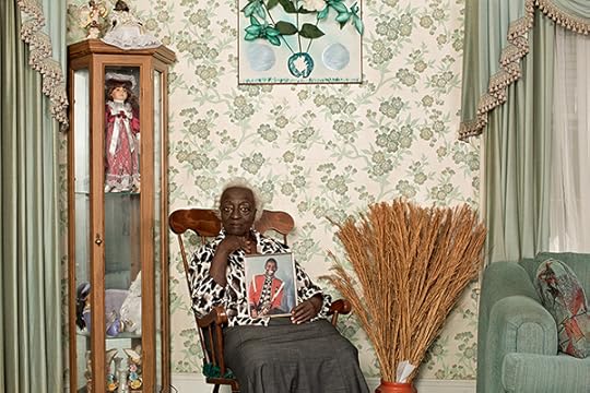
Deana Lawson, Gracie Broome, 2015. Courtesy the artist and Rhona Hoffman Gallery, Chicago
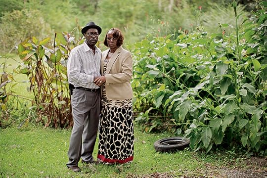
Greene: Also, many of the photographs really appear so southern (i.e., the curio cabinet in Gracie Broome’s Charleston home). Did you pick up on that as well, especially as a native northeasterner?
Lawson: Indeed, but still the décor felt familiar to me.
Greene: How so?
Lawson: The warm welcoming of us into their houses, but also just the domestic space. Many of the subjects’ homes reminded me of my family’s décor. Mother Broome’s home (Clementa Pinckney’s grandmother) had all the grandeur and warmth of a southern country home. The wallpaper, carpet, and mint green coloring welcomed us inside, along with Mother Broome’s quiet and regal spirit. Rarely do I see wallpaper in people’s houses today, even though I have wallpaper in my own apartment. There is also a similarity in class in terms of working class ways of decorating and adorning one’s home that felt familiar to me. The specific details of domestic spaces give visual dimension and texture towards the personal and emotional space of the Emanuel 9 families. The way that food was offered, and the overall hospitality, reminded me of growing up in church. The hospitality that the assailant, Dylann Roof, received from the church to welcome him into the Bible study was very much a metaphor for the warm welcome and spirit that we received from individuals as strangers from Time magazine photographing the subjects.
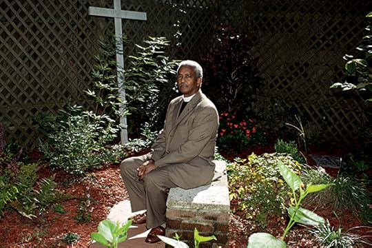
Deana Lawson, Reverend Anthony Thompson, 2015. Courtesy the artist and Rhona Hoffman Gallery, Chicago
Greene: The focus of your work over the last decade has come to take on not simply international locations, including Haiti, Ethiopia, and the DR Congo, but also sacred sites, both real and imagined. How does the site of Mother Emanuel, the victims’ families’ homes, and perhaps Charleston, in general, fit now within the spectrum of your photography? Did you view the assignment in Charleston as one that also had a global perspective?
Lawson: While on assignment, my assistant and I were intrigued by the speech accent of Charleston African Americans, which we thought distinct from a general southern accent. We soon realized what we were hearing was a Geechee accent of Gullah culture, which traces its ancestral roots back to Angola, Sierra Leone, and other countries in West and Central Africa. Visiting the city of Charleston and some of its outlying towns inspired me to return to the city for my own body of work.
I have not gone back to Charleston yet. Usually when I work, I have a sense of where I want to travel, eventually, for an ongoing project related to the African Diaspora. There are certain commonalities, differences, and affinities that I want to capture in the body and in the space, spiritual aesthetics; I felt like that really shined through in Charleston. Also, when we had some down time, we would go to soul food restaurants to get some fried chicken. To see the people coming in and out of spaces—I just felt like there was something about Charleston. I definitely want to go back not only to Charleston, but also to the Gulluah Island. In Robert Farris Thompson’s book, Flash of the Spirit (1983), he talks about Kongo spirituality and the mighty Kongo Kingdom. He talked about how, for many of the slaves from Kongo, their first port of entry into the U.S. was Charleston! I listened to him lecture maybe a month after I did the Time magazine job. That was also the catalyst to revisit Charleston because, as you mentioned, I went to the DR Congo, too, as a part of my other work.
Greene: So, the photographic assignment brings you full circle in your work then?
Lawson: Exactly.

Deana Lawson, An annex that leads to the room where the shooting took place, Emanuel African Methodist Episcopal Church in Charleston, South Carolina, 2015. Courtesy the artist and Rhona Hoffman Gallery, Chicago
Greene: Although the photographs of the individual sitters are all deeply moving, the photograph of the annex leading to the room where the shooting took place is particularly haunting. How did you did you decide to photograph that room as opposed to the interior of the main sanctuary?
Lawson: Although I took many pictures of the exquisite sanctuary, its stained glass windows and mahogany pews covered with red velvet, the image of the annex reverberated differently to me. I felt it important to capture the area where bible study is held and where the incident occurred. The silence and emptiness of the space, as depicted in the photograph, betrays the knowledge of violent mayhem that occurred. A tension is created through presence and resonate absence. This space is where much of the church’s behind-the-scenes activities take place; the kitchen and office are located nearby. Meetings, dinners, and office duties are handled near this area. When visiting, it was apparent that the church members were diligently and eloquently working to move forward and carry on with the day-to-day duties of the church, even with the painful memory of June 17th embedded in its space.
Greene: On the one-year anniversary of the shootings, do you have any reflections on the recirculation of your photographs in Aperture’s “Vision & Justice” issue?
It’s pretty amazing to have a selection of these images reprinted on a different platform in Aperture. Something happens when you have a photo story, and you have images with text. With Aperture, in addition to the article that Thomas J. Lax wrote for the issue, the way that the pictures are laid out, and even the picture of Mother Broome as the last spread of the magazine, honors the subjects’ families in a different way that essentially comes down to that harsh truth of what happened on June 17th. It is a story that we need to remember, just as we need to remember Denmark Vessey’s planned insurrection and the history of the founding of that particular AME church in Charleston.
I don’t know if the subjects will ever see this reprint in Aperture. I think the families would be really proud to know that their stories are being written about again, not only in the world of news reportage, but also in fine art photography.
Nikki A. Greene is Assistant Professor of Art at Wellesley College.
Read more from “Vision & Justice” or subscribe to Aperture and never miss an issue.
The post Vision & Justice Online: Deana Lawson and Nikki A. Greene in Conversation about the Emanuel 9 appeared first on Aperture Foundation NY.
June 13, 2016
Vision & Justice: Alicia Hall Moran on Ficre Ghebreyesus
Collectors: The Jazz Musicians
For the “Vision & Justice” issue of Aperture, Wynton Marsalis, Ingrid Monson, Alicia Hall Moran, Jason Moran, and Somi reflect on photographs that represent moments in their lives. Here, Alicia Hall Moran responds to Ficre Ghebreyesus’s Liberation Day, Amsara.
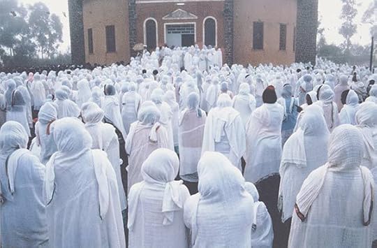
Ficre Ghebreyesus, Liberation Day, Asmara, May 24, 1991. Courtesy Elizabeth Alexander
I like the way I’m drawn into the bluish-white phalanx, a sort of cloud-gathering of women who are themselves being drawn—and by what?—into this Christian Coptic Orthodox Church. Are they submitting to an invisible force, or are they together the possibly greater force? Ficre Ghebreyesus captures a magisterial moment that could have been otherwise only matter of fact: people entering a structure. But he puts me in the throng. When he gave us this photo of his Eritrean homeland (he left Eritrea as a political refugee), it was in his new home in New Haven, Connecticut. This was at the very end of some quixotic celebration he and his wife, the poet Elizabeth Alexander, had put on. Their two sons, then still very young, had just said their good nights to the company, as all beautiful and adored children of spectacular hosts do. Ficre then disappeared for a moment and returned with this print. He laid it out on the floor. Then he rolled it carefully for us to carry back to New York. It’s the photo of our hearth.
Alicia Hall Moran is a New York–based classical singer, composer, and performance collaborator. Her most recent studio album, Heavy Blue, was released in 2015.
Read more from “Vision & Justice” or subscribe to Aperture and never miss an issue.
The post Vision & Justice: Alicia Hall Moran on Ficre Ghebreyesus appeared first on Aperture Foundation NY.
June 10, 2016
Vision & Justice: Radcliffe Roye
From the streets of New York and beyond, a democratic vision of humanity.
By Garnette Cadogan

Radcliffe Roye, Ryan, 2014–16. Courtesy the artist
Walking—such a mundane, commonplace act, and yet one so imbued with symbolic significance. Independence. Discovery. Freedom. Dignity. Every step we take is a movement from departure to arrival, propelled by desire, whether borne of necessity or choice. It’s no surprise, then, that many photographers concerned with human dignity have chosen to tell their stories from street level. Walking is a barometer, they know, and so the way someone walks—dejected or sprightly— and how that person is treated—as stroller or trespasser—reveals what kind of place, what kind of society, even, is being passed through. How vulnerable are we in public? How are some of us threatened or perceived as threats because of our skin color or the condition of our clothes? And how do people demonstrate their frustrations with the public slights or, worse, dangers that reduce their dignity and that of their fellow human beings? In essence, what does human dignity look like from on foot? Radcliffe “Ruddy” Roye has been pursuing those questions by wandering the streets—mainly in New York, where he has made his home since migrating from Jamaica in 2001— convinced that to show people walking, or having walked, is to show the human condition.
Radcliffe Roye, Black Today, 2014–16. Courtesy the artist
No lightweight on his feet, Roye, in 2000, walked 121 miles in Jamaica from Montego Bay to Kingston, at a rate of 10 miles per day, photographing squatters on and alongside a defunct train line. He roams around tirelessly, alert to the ways in which people move past each other. Whom they ignore, what they admire, how they interact: these are abiding concerns. A student of what urban activist Jane Jacobs called “the intricate sidewalk ballet,” Roye is especially concerned with what it means to belong. To that end, injustice and inequality are at the center of his focus. He documents them up close—literally. He almost always uses a 28mm or 35mm lens, which demands that he be between three and five feet from the people he sets his eye upon: usually the poor, the homeless, the dispossessed. In Roye’s photographs, people are put in conversation—often playfully so—with their surroundings. Signage serves as comment: a bus stop that says love thy neighbor is both object and exhortation. Color doubles as a key to mood: shadows of protestors, thrown against a wall, are soaked in blood red, capturing the rage and sorrow of the moment. Lines and shadows perform a geometric dance: a Euclidian spirit marks his compositions. The results are images characterized by intimacy and lyrical warmth, and alive to irony.
Radcliffe Roye, Ex-Cop, 2014–16. Courtesy the artist
Roye takes his vision to Instagram, trying to awaken his more than a quarter-million followers to the lives of people who are all too often forgotten or ignored. He does this first with his images, and does it again with captivating stories that accompany each posting. In the spirited conversations among his followers that appear beside each image, the word most frequently mentioned, by far, is dignity. And no wonder: his Instagram page insists that the invisible be made visible. “I want to walk with them on Main Street,” he says, “in a manner that speaks to their lives as individuals with dignity who deserve a square of my Instagram feed.” He has walked in rhythm with foot traffic all over the United States in the past few years, hoping to show “the faces of those whose lives are spent living in protest.” The resulting series, When Living Is a Protest, reminds us that to walk is to bear witness, for we are pilgrims, all.
Garnette Cadogan is a Visiting Fellow at the Institute for Advanced Studies in Culture at the University of Virginia, where he is at work on a book on walking.
Read more from “Vision & Justice” or subscribe to Aperture and never miss an issue.
The post Vision & Justice: Radcliffe Roye appeared first on Aperture Foundation NY.
June 9, 2016
Vision & Justice Online: dream hampton in Conversation with Geena Rocero
How has the death of a transgender African American teenager changed the debate around justice in the United States?
One night in fall 2011, police officers in Madison Heights, a suburb of Detroit, responded to a call at a Motel 6, where Shelly Hilliard was caught with marijuana. Shelly, a transgender African American teenager also known as Treasure, faced an impossible choice. Threatened with arrest—and the risk of violence if sent to a men’s jail—Shelly was coerced into a sting operation to entrap her marijuana dealer, Qasim Raqib. But, after the Raqib’s arrest, instead of protecting Shelly’s confidentiality as an informant, officers disclosed her identity. On October 23, in an apparent act of revenge, Raqib and another man, James Matthews, brutally murdered Shelly and scattered her dismembered body around Detroit. In her documentary Treasure: From Tragedy to Trans Justice, Mapping a Detroit Story (2015), filmmaker and Detroit native dream hampton recounts Shelly’s life and death in detail, emphasizing the stories of her friends and family. Here, in a wide-ranging conversation, hampton speaks with the model Geena Rocero, who came out as transgender in a 2014 TED Talk and later founded the organization Gender Proud, about Shelly Hilliard, community organizing in Detroit, the Black Lives Matter movement, and the urgent need to seek justice for transgender citizens.
Geena Rocero: Why do you want to tell this story?
dream hampton: Shelly’s story meant a lot to my community. By my community, I mean this inter-generational community in Detroit which is working in an incredibly oppressive structure. Detroit is a whole story in and of itself, and inside of this larger story are these other stories. But they’re all connected. And as a way of resisting that oppressive structure, a coalition emerged called Detroit Future Youth: twelve youth organizations in Detroit joined together basically to get to know one another.
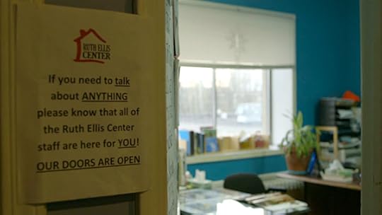
My daughter was working as a member of an organization that Grace Lee Boggs began, called Detroit Summer. Grace Lee Boggs is a great revolutionary and a philosopher, who we lost at 100 years old last year. I was an adult ally to Detroit Summer and I support that youth collective in any way I can. Shelly was in an organization called Ruth Ellis, which is a shelter, but it’s also this amazing place where young black queer youth get together in Detroit to connect and to get leadership training. My daughter was connected to Shelly in that they were under this large umbrella called Detroit Future Youth, where there were twelve local youth organizations working together. When Shelly went missing—and in the film her mom describes learning about it on Facebook; we all learned about it on Facebook—we were on alert. Then the story of her very gruesome murder unfolded on social media.
Rocero: As a transgender person of color, I want to thank you. Because I think being that Detroit is in the background—and when we’re talking about the narrative of a black trans person—the nuances and complexities were particularly felt in this documentary.
hampton: Well, I gratefully accept your thank you and your gratitude. But I’m not deserving of gratitude, because all I’m doing is paying attention to a story that deserves to be attended to. And we owe each other that. That’s what we’re here to do, to be attentive to one another, and to care for one another. So I don’t get a cookie for that. That is the struggle right now when it comes not only to talking about Black Death, but also, more importantly, talking about Black Life.
There’s a very old hierarchy in terms of how and who we care about, and it’s informed by white supremacist heteropatriarchy. All kinds of trauma informs how we attend to stories of Black Death. Do we care about someone who is not male? If they’re not male, were they “born female”? If they weren’t “born female,” are they at least light-skinned? We have all this trauma as black folks in America, and it produces and reproduces these hierarchies. And that doesn’t even bring in the socioeconomic. What kind of work did this person do? Did they do “aboveground” work, or were they doing so-called “criminal” work? Are they still worthy of our attention? All of these things affect who and how we pay our attention to folks.
I am someone who has tried to decolonize my mind my whole life. So I am trying to be mindful of those questions as I go into a story. But with Shelly’s story, I care about black women, first of all, and of course that includes trans women, and I care about black women in Detroit.

Still from Treasure: From Tragedy to Trans Justice, Mapping a Detroit Story, 2015. Courtesy dream hampton
Rocero: Regarding the queer inclusivity that you mentioned, and the bigger dynamics of the Black Lives Matter movement, I think that’s been one of the most powerful things that we’re seeing—that inclusivity has to be part of it. How was that interaction for you when you were building this story and when this story came out?
hampton: I think this is something I always have to be careful about, because I had a journey of learning and understanding, and being really wrong on things, and learning from that. But my journey as an ally isn’t as important as, say, Shelly’s. And I like the word “ally” because it means that there are boundaries.
I consider the Black Lives Matter movement to be another iteration of the Black Liberation Movement. I don’t see it as separate from this long trajectory of movement building. The new thing that Black Lives Matter organizers are bringing is the technology. But this technology, social media, while it’s radical, it’s no more radical than television was during the Civil Rights movement: I mean, that was an incredibly radical intervention in movement for Black Lives. At one point, the printing press was a radical technology. But this intervention into how and who we care for, and all Black Lives mattering, that is new. And so is this emphasis on healing in the moment.
I was mentored by the most radical folks of the long going Black Liberation Movement, so I was politicized in a particular way. But that politicization still centered around masculinity. We had Kuwasi Balagoon; he was a member of the Black Liberation Army. I believe he died of AIDS in the ’80s. He was always out about being a black gay man, but his emphasis was on his being black first. And he’s often used as an example. Right now, you have a whole bunch of black men and women who will say things like, “Well, I don’t care what you are as long as you’re black first.” So that kind of demand for blackness to be the very first thing that you lead with, which is really telling people not to bring your whole self to this movement, that’s a longstanding problem. In fact, even though I was brought into movement work by these incredible black radicals, I ended up leaving a particular organization that I was a member of for fifteen years because they couldn’t come together on an antihomophobic principle.
So that kind of antiqueer feeling, and that centering of black masculinity, performed in a very particular way, has been a part of the movement probably since it began. There’s always been pushback against it, but it’s never been as visible and as centered and as forward as what Patrisse Cullors and Alicia Garza and Opal Tometi articulated when they described what their political project was going to look like, which is the Black Lives Matter project.
Behind the scenes of Treasure: From Tragedy to Trans Justice, Mapping a Detroit Story, 2015. Courtesy dream hampton
Rocero: The thing you mentioned about the centering of narrative is so critical. Because of Shelly’s experience, it connects to so many layers of what is happening within her identity, within the family dynamic, within broader racist and classist issues, and within drug policy. This particular story needs to constantly be told. What was your process?
hampton: First, from the beginning, there was a need to bring everyone up to speed around language.
Rocero: And that’s critical.
hampton: To call people “prostitutes,” to call people “transvestites,” unless they themselves are using that language, then I don’t even know what it is you’re talking about. Are you talking about trans sex workers? Are you talking about people in survival economies? I mean, what are we talking about?
While that was a part of what Shelly did, she also had all these other facets of her life. But her death also illuminated a very multilayered story. In terms of intersections, that included Jim Crow drug laws. It included police coercion of youth. It included Detroit’s post-capitalist landscape. It included sex work and other survival economies. And it included our hostile borders. Detroit has always functioned as a donut where it’s so-called empty in the center. (I don’t believe that my city is empty, I believe that we have all kinds of value and that we’re rich in all kinds of ways that are outside of capitalism.) But, we are surrounded by these hostile suburbs that have put up gates to keep Detroit youth out.
How does this all relate to Shelly? Shelly was at a motel where she sometimes did sex work with her other trans friends, including someone who was like a mother to her. She was engaged by the police because she was smoking a blunt—for having basically a gram or two of marijuana—which is all that fits in a blunt. She was then forced to do incredibly dangerous police work, basically to become an informant on the spot, to call her drug dealer and get him to bring more drugs than she’s ever asked for before. And the way that they’re able to coerce her into doing this dangerous informant work is with the threat of putting her in a men’s prison, which is basically like promising her she’ll be raped. They put a nineteen-year-old in this position of either going to a men’s prison that night, dressed exactly as she was, which is who she was, a woman, or doing this dangerous work of setting up a drug dealer, which, in Detroit, has always meant certain death.
Still from Treasure: From Tragedy to Trans Justice, Mapping a Detroit Story, 2015. Courtesy dream hampton
Rocero: You talk about the power in the layers of these narratives. One of the things that just brought me to tears, I couldn’t control it, was when Shelly’s mother joined the interview, and there is this quiet tone. You can feel it in the whole narrative of the film from the moment Shelly’s mother started speaking—the intimacy and the particular vulnerability that she’s allowed us to go into her pain, but also the love. As a filmmaker, as someone who’s telling the story, when do you step in? When do you ask the question? When do you allow that moment to just set in? What was that process like? Because it’s so powerful.
hampton: I went back and forth with my editor a lot about this. Basically what you’re describing is how, in the first four minutes, you just are smacked in the face with Shelly’s biological mother’s deep mourning. I really thought that was the only way to deal with it. I had absolutely heard the criticism of cis people, which is a really valid criticism, that we’re only interested in trans corpses, we’re only interested in trans people as dead, as murdered and mutilated, as the victims of traumatic violence that we then fetishize. Right?
Rocero: Right.
hampton: When I heard that criticism, it made me take another look at some of the reports of trans death, about which details about trans death were salaciously reported. It also made me ask myself hard questions, not just about Shelly’s death and about trans death, but about Black Death—this important intervention that the scholar Fred Moten added to the Black Lives Matter movement. He just tweaked it, he said, “black life matters,” meaning that we can’t always be in this mode of resisting, reacting, and affirming life only after death.
So when I thought about Shelly’s life—and we didn’t have a lot of footage of her—at first I was like, “Well, we can’t make the film.” We had to hack her computer to get the tiny bit that we have at the top. So then it became about: Well, what about the community she belonged to? What about these young trans people in Detroit, young queer folks in Detroit, who are activated to do a particular kind of work because of Shelly’s death? Someone like Karimu, who worked at one of the centers where Shelly was active, and his decision, which in the film where he asked himself, “You know, I could have lived a stealth life, and after Shelly’s death I really had to ask myself, ‘What does this mean to me? Am I willing to put my life on the line for this?’ And I am.”
You have people like Emani Love, who wasn’t even at the Ruth Ellis Center when Shelly was killed, but has, of course, attended the memorials and some healing sessions around Shelly’s murder, and other people’s, trans women in the community who’ve been murdered since Emani came to Ruth Ellis—but she wasn’t a member of that community when she heard about Shelly’s death. And Shelly’s death brought Emani to the Ruth Ellis Center, where she found not only community, but also training to be the activist that she is now, where she convenes regional trans justice meetings, where she does Gender 101 workshops in churches and middle schools.

Still from Treasure: From Tragedy to Trans Justice, Mapping a Detroit Story, 2015. Courtesy dream hampton
Rocero: That commitment became this legacy, right? What you said when we talked about black life. A singular focus: this person had a life. However, when it’s reported in the media, when it’s a person of color, it’s always like, “Let’s bring up the criminal record. Let’s mis-gender this person.” Even within the context of what you said about not having enough footage, her family represents that vision.
hampton: Right.
Rocero: And the love that they have. The community that Shelly was surrounded by. That is alive. That is who she was. Those people were affected by her, because of her spirit. Because of her willingness to just be herself. If we’re going to put it in this local context of Detroit, being this place where one would say, like, “This is not a place for a trans person.” But Shelly existed. She had a family. She had a community. And you were able to show that. And I hate to keep on using the word “humanize,” but it’s just this validation of that legacy that she left, and you showed that. That’s lost in conversations a lot of times.
hampton: Shelly is a victim of state violence. She’s a victim of the war on drugs. It was two cis men from Detroit, one black, one white, who murdered Shelly in a very violent way. The manner of her murder could be argued to prove transphobia in terms of the dismemberment and the level of violence to her actual queer body. At the same time, she was a victim of state violence in that the police put her death in motion by giving her this false choice of a night in a men’s prison or doing this dangerous informant work, all over a couple of grams of marijuana, which, if they had gone a couple of miles north to the Oakland University campus, if they were looking to meet a quota of drug arrests for that month, they could have gone into the dorm of any one of those white students and found a couple of grams of marijuana. But the state targets the most vulnerable.
Black bodies have always been the collateral in the war on drugs. Then there’s the labor of the families. In Shelly’s family’s case, after they have to bury their brutally dismembered daughter—who they don’t mis-gender—they also have to do the work of rehumanizing her because there is also a criminalization of black corpses. There is this way that, even after these people have been brutally killed by community and state violence, their humanity has to be reestablished because their corpses themselves are being criminalized. Instead of talking at Shelly’s funeral about Shelly, some people took that opportunity to try to tell the trans women in the audience how they shouldn’t be doing sex work.
Rocero: Wow, what a dehumanizing moment that they have to experience.
hampton: And that was retraumatizing.
Rocero: When she died, all of a sudden people were forced to validate Shelly’s life because other people tried to impose this belief system about sex work. I felt so much for the family.
hampton: Well, not just for the family. For the trans women who were in the audience, who were attending the service, who then had to regroup back at Ruth Ellis Center and heal from her ceremony, from this homegoing that was meant to honor Shelly. And we’ve all seen this. We’ve been at family members’ funerals where the pastor thinks this is a perfect opportunity to save souls, so instead of talking about the deceased, they talk about how you should be accepting Jesus into your heart, so you don’t go to hell like this person. I have been through really traumatic funerals that have that tone.
Still from Treasure: From Tragedy to Trans Justice, Mapping a Detroit Story, 2015. Courtesy dream hampton
Rocero: As an immigrant, when I first moved to the United States, to San Francisco, my new community was the Trans Filipina community because of the Asian Pacific Islander Wellness Center. I know the importance of those spaces, especially for communities that are the most marginalized. What is the conversation like at Ruth Ellis now? Have you visited them recently?
hampton: Oh, of course. We had a real partnership around the film. But even establishing that partnership took a lot of work, because they are there as a service and a shelter, first and foremost. Forward-facing media work isn’t their priority, and they really vet. I couldn’t just be like, “Hey, I’m dream hampton; I’m from Detroit; here’s a bunch of stuff I’ve done in the past.” They’re not impressed with that. They’re there to make sure that these teenagers who have experienced all kinds of violence in their families—on the streets, emotionally, physically—are protected. So, coming in with cameras, having their work exposed, isn’t their priority. It took a year-and-a-half for them to even allow me to shoot there, and that was based on principles and trust agreements.
And that is what I expect from Detroit, which, especially over the last twenty years, has been a place where a lot of people thought they were going to drop in and tell a particular kind of story with or without Detroiters. Even though I am a Detroiter, I’ve been away for twenty years. In returning, I know that I have to do that same work of knowing that there’s work already being done on the ground, that I am not going to come in and tell this story of this trans woman and the whole city is going to care and should thank me. They’re not interested in that at all. There are problems in Detroit that the trans community faces specifically, and they are already working on solving those problems. So, how can this film serve the work that they’re already doing? That becomes the question.
Rocero: I remember some of the images in the film within the backdrop of Detroit, within the knowledge and the realities. People will dance. People will laugh. People will find a way for their spirit to blossom in their own little way. That was important for me and for the audience to see. There’s that hope within this. The voguing. Right? That was touching for me.
hampton: And I struggled with putting that in. One of the notes I got from someone I really respect was, “Do we need another scene black queer kids voguing?” Of course, my kneejerk defensive reaction was like, “This is honestly what happened, with or without our cameras.” I’ve gone in with cameras, without cameras, and every time I come there is dancing.
But the question was still a valid one. When we stand behind the camera, we are bringing in an apparatus that privileges people, that establishes power dynamics, that tells you what’s valuable and what’s not valuable. I think about these kinds of questions when it comes to being a storyteller all the time. And I love what you’re saying about this affirmation of life. I see that in your work also. As I follow you around the world, I am just reminded of how important it is to have this really affirming work happening. That’s as important as fighting against injustice.

Still from Treasure: From Tragedy to Trans Justice, Mapping a Detroit Story, 2015. Courtesy dream hampton
Rocero: You were there when I first publicly announced and shared to the world, sharing the most intimate moment of my life, my experiences. You were there and our community was there. So I think to be able to have Ruth Ellis Center to provide the space, it allows for this spark of that resurgence of that expression, of that willingness to just be yourself, whether there is a camera or not.
hampton: I was honored that you even told me that you were about to do that. I was just meeting you; I was in this space, you know, that we like to think of as a safe space. And you never know until you come out as your most real self if the space is safe. But we were in this circle of social justice activists and folks, who were privately invited into this space, and it was my first year there, and you came up to me and told me that you were about to do this. It was incredibly brave and generous.
I thought about this throughout my film, this idea of what’s considered conventional beauty. There is this way in which you are conventionally beautiful, and that you were able to live a stealth life before deciding to come out as a trans woman.
Rocero: It’s a choice. Right?
hampton: It’s a real choice. Now, I would say, though, that a lot of the sisters who are in my film are visibly trans.
Rocero: Exactly.
hampton: So that’s another kind of conversation.
Rocero: Well, it’s a privilege in itself, in a certain way. But, when I go to the Philippines, I walk down the street, I get screamed at, I get the s-word. That’s my reputation. When I moved to the States, it was a little bit of a different story.
hampton: That’s important to locate. I experienced that when I was in Palestine. I was like: How are these Israelis able to get on a bus and know the difference between someone from Iran, and a Palestinian? They’re just trained to know that. So I understand what you’re saying, that there’s this way that you may not be visible in America, where people just understand you as this beautiful model, but in the Philippines, there is a way that you’re visible.
Rocero: It’s the cultural dynamics of the relationship regarding beauty and social visibility of trans people. I exist within that. That’s my experience.
hampton: Thank you for adding that layer to it. In America, it’s a little rougher. This is happening right now with the trans bathroom laws. And cis black women—who can often be enemies of trans black women in this way, in that we are socialized to be gender essentialists, and have adopted some of the transphobic rhetoric of patriarchs and gender essentialists, and that’s because we’re trained to in every aspect of our life—are about to be put to a test. Like, do we really want white southern men policing our gender outside bathrooms? I’m talking about the way that a white supremacist lens already considers black women to be masculine, whether you’re talking about Serena Williams, whether you’re talking about Shelly’s mother. I remember screening the film to someone, and they asked me if Shelly’s biological mother was trans, and I was like, “It’s really interesting, this idea that we’re going to sit around to try to figure out people’s gender based on their presentation.” Because it’s not just based on their presentation. It’s based on all of the ways that we’ve been socialized. That’s why Sojourner Truth’s question “Ain’t I a Woman?” is essentially a gender-presenting question. You know?
Rocero: We need to be critical of this essentialist point of view. One should not stick to this rigid, binary point of view about expression. And people are all of a sudden realizing it affects everybody.
hampton: You think you’re femme as fuck, and now you’ve got a white man standing at the bathroom deciding who’s femme and who’s not? Well, what are you going to do when your transphobic cis black woman self doesn’t pass this white man’s gender test? Who are your alliances really with? That’s a deep question. Listen, we all need to have a reset around what gender is.
Rocero: Exactly.
hampton: I have hopes of supporting people like Emani Love who are asking hard questions about gender in the ‘hood in Detroit, and you’re speaking at the White House—but it all matters. You know what I’m saying?
Rocero: It all matters.
Read more from “Vision & Justice” or subscribe to Aperture and never miss an issue.
The post Vision & Justice Online: dream hampton in Conversation with Geena Rocero appeared first on Aperture Foundation NY.
Aperture's Blog

- Aperture's profile
- 21 followers

