
Aperture's Blog, page 133
August 24, 2016
Eight Facts You Didn’t Know About Photography and America’s National Parks
This year is the centennial of the National Park Service, established by President Woodrow Wilson. But 1916 was also an important year for photography of the parks. A century ago, at the age of fourteen, Ansel Adams took his first photographs of Yosemite with a Kodak No. 1 Brownie camera, the auspicious start to a lifetime of photographing America’s most stunning landscapes. The history of how the National Parks and photography are intertwined is explored in Aperture’s recent book, Picturing America’s National Parks, which includes stories about how photographers have made both their art and their living amongst the redwoods and the geysers. Here are a few of our favorites.
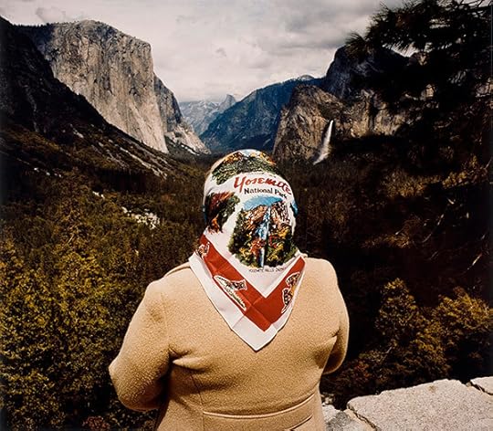
Roger Minick, Woman with Scarf at Inspiration Point, Yosemite National Park, 1980, from the series Sightseers © the artist and courtesy the George Eastman Museum
1. Carleton Watkins used the assistance of twelve pack-mules to carry his camera equipment through the natural vistas of Yosemite during his 1861 journeys.
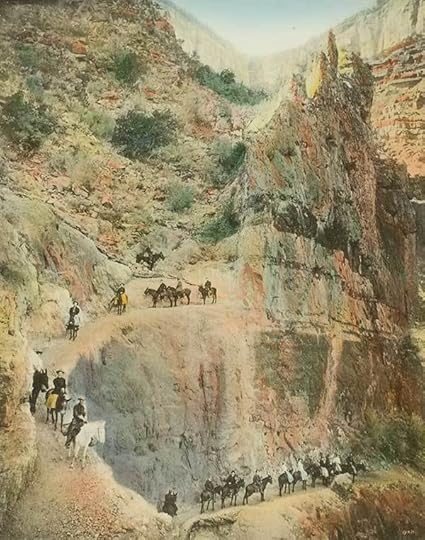
Kolb Brothers, Jacob’s Ladder, 2255 Feet Below the Rim, 1913. Courtesy the George Eastman Museum
2. From 1885 to1905, Frank Jay Haynes operated a photography studio within Yellowstone National Park from a Pullman railroad car called the Haynes Palace Studio Car. With his “penny postals,” he established iconic views of Yellowstone—Old Faithful, the Grand Prismatic Spring—and gave rise to the popularity of the photograph in postcard form. Haynes’s studios remained a family-run institution within Yellowstone until 1966.
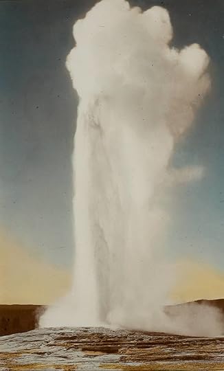
Frank Jay Haynes, Old Faithful Geyser, ca. 1900. Courtesy the George Eastman Museum
3. In 1904, Ellsworth and Emery Kolb had already figured out a way to sell same-day prints to hikers. They set up their photography studio at the top of Bright Angel Trail where they would photograph visitors at the beginning of their trip. Emory would then run down to the freshwater darkroom they had set up further down the trail so that, by the time the visitors finished their hike, the brothers could sell them the freshly-printed images.
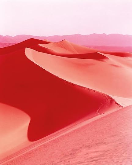
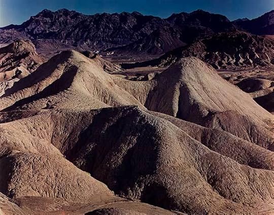
David Benjamin Sherry, Sunrise on Mesquite Flat Dunes, Death Valley, California, 2013 © the artist and courtesy Salon 94, New York
4. Ansel Adams began his career in 1919 with the National Park Service by working as a custodian for one of the Sierra Club’s lodges, the LeConte Memorial Lodge in Yosemite National Park. By 1934, he held a seat on the Board of Directors.
Edward Weston, Death Valley, 1947 © Edward Weston Archive and courtesy of The Center for Creative Photography at the University of Arizona, and George Eastman Museum
5. In the late 1940s, when Edward Weston began to print color photographs of the parks, viewers found the images to be otherworldly and shocking, because black-and-white images of the National Parks had previously been so ubiquitous.
Rebecca Norris Webb, Badlands, 2010 © the artist and courtesy Robert Koch Gallery, San Francisco
6. Even the gift shops and parking lots have been well documented. In the 1980s and ’90s, Roger Minick photographed the way visitors interacted with the National Parks as consumers of nature.
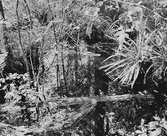
Marion Belanger, Alligator in Swamp, 2002; from the series Everglades © the artist
7. Who knew that Yosemite National Park employs a Chipmunk Researcher? Michael Matthew Woodlee captures the behind-the-scenes lives of the caretakers of the National Parks, from postal workers to maintenance crews and rangers.
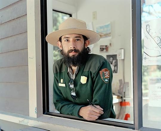
Michael Matthew Woodlee, Chris, Campground Ranger, Tuolumne Meadows Campground, 2014 from the series Yos-E-Mite © and courtesy the artist
8. Photographs of the National Parks were part of the effort to solidify the place of photography in the fine arts realm. The photography group f/64, which was founded by greats such as Edward Weston, Imogen Cunningham, and Ansel Adams used images of the National Parks to further their goals of establishing photography as a fine art medium in its own right.
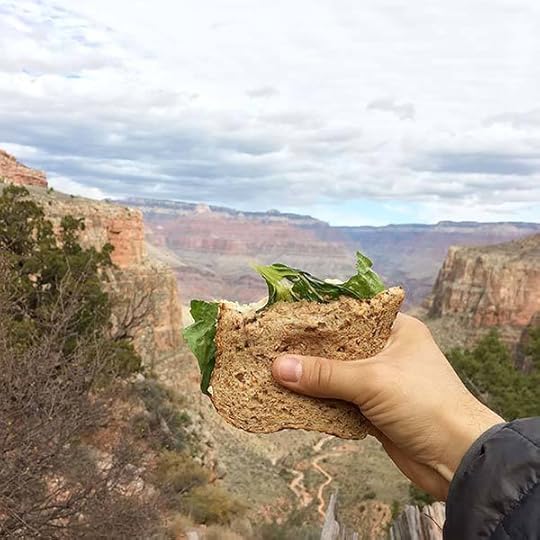
Jeremy Friedland (@jsfried), Adventure Sandwich, Grand Canyon National Park, 2015 © the artist
While contemporary artists continue to change how these iconic American landscapes are pictured, Instagrammers everywhere have embraced the most famous vantage points, picturing themselves within the same views first photographed by Carlton Watkins, William Bell, and William Henry Jackson. To see a sampling, search for #findyourpark—a social media campaign launched by the National Park Service in 2014 to engage the public in continuing the tradition of supporting, respecting, and preserving the landscapes of the National Parks through photography.
Picturing America’s National Parks was published by Aperture and the George Eastman Museum in 2016.
The post Eight Facts You Didn’t Know About Photography and America’s National Parks appeared first on Aperture Foundation NY.


August 18, 2016
Listening for Eggleston
A profile of the pioneering artist and his passion for music.
By John Jeremiah Sullivan
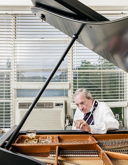
William Eggleston at his Bösendorfer piano, Memphis, 2016. Photograph by Stefan Ruiz
I remember the first William Eggleston photograph I ever saw, or the first that I knew was his, that it had been made by someone called “William Eggleston”—his images have percolated up into the culture so thoroughly, I guess it’s no longer possible to be an American without experiencing a few of them, if only as album covers (Big Star’s 1974 Radio City, most notably, but there are many), and certainly for anyone with the smallest interest in American art, it’s hard to avoid the name of a man whose work most credit with having legitimized color photography as an art form. Before Eggleston, there had been a sharp divide between black-and-white and color: artists used the former, tourists used the latter. After Eggleston, or with him, everything was altered.
In 1998, when I was twenty-three, I didn’t know anything about William Eggleston. I was a few months into my first magazine job, with the Oxford American (then in Mississippi, now in Arkansas). A woman named Maude (pronounced “Maw-dee”) Schuyler Clay was helping us as a photography consultant. She’s an excellent Southern photographer herself and happens to be Eggleston’s cousin. She also said a very perceptive thing about his work, namely that he started shooting the South just at the moment it began to look more like other places. Its banality, in other words, and not its exoticism, called to him first.
Maude came into the office one day. The magazine was doing a story on the great blues musician Mississippi Fred McDowell, and we wanted to run a memorable image of him, and probably the most memorable ever taken is one that Eggleston shot. It shows McDowell at his own funeral, in his coffin, wearing his spotless white Mason’s apron. Maude had been able, through family connections, to borrow an original print of this picture. I can see her carrying it through the offices. That scene in Pulp Fiction where the guy has the briefcase that glows like it’s full of magic gold? This was close to it. Every person in the office crowded around her as she pulled back the black cover of the portfolio she’d brought. The picture did, I think, literally give off light. Not gold, but pink, the pale pink of the satin around McDowell’s pinched, embalmed face. The whole corner of the art room glowed with that particular pink. I barely knew the brilliantly slashing music of Mississippi Fred McDowell at the time—I’d heard his signature “Shake ’Em On Down” and maybe one other song—but I was convinced that this photograph of his dead body was one of the most remarkable pictures my eyes had ever come up against. You knew a master had taken it, the same way that if you were to see a Caravaggio in a pawn shop one day without knowing who that painter was, you’d know it didn’t belong there, or that it belonged anywhere.
To continue reading, buy Aperture Issue 224, “Sounds,”or subscribe to Aperture and never miss an issue.
John Jeremiah Sullivan is a contributing writer for The New York Times Magazine and the southern editor of The Paris Review.
The post Listening for Eggleston appeared first on Aperture Foundation NY.
August 17, 2016
How Not to Design a Photobook
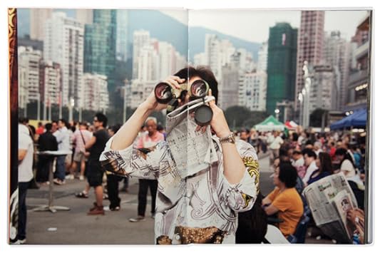
Spread from Martin Parr, Hong Kong Parr (GOST, 2014). Courtesy Stuart Smith
After studying design and photography at the School of Documentary Photography at Newport (now part of the University of Wales), Stuart Smith worked as a designer for the Architectural Association School of Architecture and Phaidon Press. He later established his independent bookmaking practice in 1994. Smith has worked on over forty books with Aperture’s Executive Director, Chris Boot, at Phaidon, Chris Boot Ltd., and, now, at Aperture. In advance of Smith’s first workshop for Aperture, September 17–18, Boot talked with the designer about “how not to design a photobook.”
Spread from Larry Towell, The World From My Front Porch (Chris Boot, 2008). Courtesy Stuart Smith
Chris Boot: You’ve been editing and designing photobooks for almost thirty years. I’m guessing you’ve designed hundreds of books by now. Which books that you’ve designed are you most proud of, and why?
Stuart Smith: I think I have done around one thousand books, more or less, and in the last fifteen years mostly photography.
The books that give me the most satisfaction are the ones where they feels more like a collaboration, and where I have been instrumental in editing and steering the book, in terms of the sequence, the picture edit, the overall size and feel of the book, and the reproduction and quality of the printed images. This is where the magic and unexpected things happen.
I am not very interested in designing a book if the photographer only wants me to be a digital monkey. If I have nothing to bring to the plate then I don’t need to be involved.
With most books my team and I work on, we’re very involved in the creative thinking about what the book is. These are the books I have the greatest fondness for, for example Martin Parr’s Hong Kong Parr, Mark Power’s The Sound of Two Songs, Larry Towell’s The World from My front Porch, Hiroji Kubota’s Hiroji Kubota Photographer, James Nachtwey’s Inferno, and Eve Arnold’s All About Eve.

Spread from Eve Arnold: All About Eve (TeNeues, 2012). Courtesy Stuart Smith
Boot: Your workshop is titled “How NOT to Design a Photobook.” What is it that photographers often get wrong?
Smith: Because photographers are visual, they usually assume two things: that they can design and that they can edit. But they benefit by letting someone else in. It doesn’t matter how well-known a photographer is, the fact is all photographers need a good editor, someone who they can trust checking or proposing picture and sequence decisions. It’s probably the most important part of putting a book together. Often the photographer is too close to the work, or to certain images, and they have a tendency to want to use more images, when they should let some of them go. The reverse can also be true. A photographer can become fixed on particular pictures. I usually want to see a wider edit than the photographer initially has in mind, and quite often between ten and twenty percent of the final picture selection will come in from this broader selection. This doesn’t seem like much, but it can make the difference between the mediocre and the sublime.
I’ve assembled all my experiences of putting books together to present as a workshop, and, of course, it’s a kind of joke to talk about how not to do a book. The do’s as well as the don’ts are all in there. I hope I can help guide people towards the best book they’re capable of making.
Spread from The Sound of Two Songs: Poland 2004–2009 (Photoworks, 2010). Courtesy Stuart Smith
Boot: Sometimes you work as designer of some books when someone else is working as the editor. But you also work on many books as both editor and designer. Do the roles of editor and designer naturally belong together? Is your design better if you are also the editor?
Smith: If I design and edit the book, then much of the work is in the edit. By the time we get to the design, we have established an understanding of the work, and what type of book it is going to be, as well as what the range of pictures are that it will include. It is more likely to be nuanced, and have subtlety, compared to if I am given someone else’s selection of pictures. Also, how a book works, its pace and flow, will depend on pairings and I usually need options to make the book work.
Elliott Erwitt, Home Around the World (Aperture, 2016). Courtesy Aperture
Boot: The book you’ve most recently designed for Aperture and the Harry Ransom Center is Elliott Erwitt: Home Around the World. Is this about the tenth book you’ve done with Erwitt, even though only the first with us? What’s the secret to being adopted by a major photographer in this way?
Smith: I think it’s the fifteenth. The secret, as with most photographers, who are a skittish bunch, is to be there to catch them. If you are able to do that then you are going to have a great relationship; they trust you. And then they show you pictures that they may not want others to see. All that applies to my work with Elliott. Also I have to get on with the photographer to do good work. And we have to have fun too!

Spread from Hiroji Kubota Photographer (Aperture, 2015). Courtesy Aperture
Boot: Is there one recommendation you can offer a photographer reading this who won’t be able to attend the workshop that they should consider when preparing themselves for the making of a photobook?
Smith: Do a tight edit but then also show a broader B edit. Unless you’re highly proficient as a designer, don’t try to do the graphic design on the book yourself. Don’t print your book via print-on-demand—this is only good for showing your grandmas 85th birthday party pictures, not for showcasing the beauty of your photographs.
Aperture will host a two-day workshop with Stuart Smith on September 17 and 18, 2016. Intended for photographers who are prepared to transition their images into book form, the workshop will focus on editing, sequencing, and pairing photographs, as well as how to design a successful and thoroughly considered photobook. Registration ends September 7. For more information about Smith’s workshop and other upcoming workshops at Aperture, please visit aperture.org/workshops-classes or contact education@aperture.org.
The post How Not to Design a Photobook appeared first on Aperture Foundation NY.
August 8, 2016
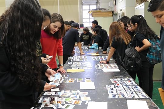
Aperture On Sight Student Exhibition: Final Week on View
In New York’s schools, Aperture introduces photography to the artists of tomorrow.
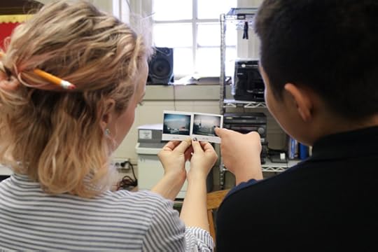
For the past three years, Aperture’s team of teaching artists has fanned out across Queens, Brooklyn, the Lower East Side, and Harlem to teach visual literacy in a range of school-based and after-school programs. This expansion of our education programming brings a year-long curriculum to middle and high school students in underserved communities. Aperture’s approach uses the reading and making of photographs as an avenue to acquiring visual literacy: the ability to understand an image’s meaning by thinking about its form, content, and context.
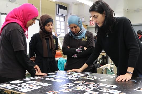
Aperture’s program this year reached over one hundred students at seven locations, which include Brooklyn Community Arts and Media High School (BCAM), Highland Park Community School, I.S. 61 Leonardo da Vinci, M.S. 136 Charles O. Dewey, Storefront Academy Harlem, East Side Community High School, and Grand St. Settlement’s after-school programs, facilitated by the Beacon Community Center and School’s Out New York City (SONYC). These students learn how to visually communicate their ideas and create photographs with intention and meaning; with these skills, students have the ability to make findings and interpretations when it comes to viewing art. Upon completing the program, students have the opportunity to be a part of an exhibition hosted by Aperture, showcasing the photographs and photobooks created throughout the year.
Alice Proujansky is Educational Partnerships Coordinator and Emily Stewart is Education Work Scholar, Aperture Foundation.
Aperture On Sight: Teaching Visual Literacy through Photography is on view at the Aperture Gallery through August 11, 2016.
The post Aperture On Sight Student Exhibition: Final Week on View appeared first on Aperture Foundation NY.
August 4, 2016
Matthew Connors: The Ordering of Intensities
Matthew Connors, Fire in Cairo, 2015
“Even the most elevated plateau is less interesting than a mountain.”
—Wayne C. Booth, The Rhetoric of Fiction
Join Matthew Connors for a two-day workshop on the process of transforming existing collections of photographs into publishable book dummies. Emphasis will be placed on the process of editing and sequencing images, incorporating text, and visualizing the final book as an object. Connors will present various literary and film techniques—voice, unreliability, plot progression, narrative structure, etc.—and discuss how they can inform the anatomy of a photobook. Numerous examples will be presented as a means of thinking about diverse approaches to structuring books. He will also show a collection of photobook dummies and discuss their evolution from rough-hewn objects to published books. Material considerations and publishing models will also be explored throughout the workshop.
Participants will be required to submit high-resolution image files in advance of the workshop and be prepared to present their work to the group. Their presentations will be the basis for individualized editing/sequencing sessions that will lead to the creation of basic dummies with the help of an InDesign assistant. The aim is for participants to emerge from the workshop with a working methodology for structuring their books.
Lunch and light refreshments will be served both days. Please contact Aperture staff at education@aperture.org with any dietary restrictions at least one week before the start of the workshop.
Matthew Connors (b. 1976, Port Washington, New York) lives and works in both Boston and Brooklyn. His work has been exhibited in galleries and museums worldwide, including the Museum of Modern Art, New York; DOX Centre for Contemporary Art, Prague; and the Storefront for Art and Architecture, New York. He has received the MacDowell Colony Fellowship, the Virginia Center for Creative Arts Fellowship, the William Hicks Faculty Fellowship from the Massachusetts College of Art and Design, and the Alice Kimball English Traveling Fellowship from the Yale School of Art. Most recently he was awarded the 2016 ICP Infinity Award for his publication Fire in Cairo, which was also on the shortlist for the 2015 Paris Photo–Aperture Foundation First PhotoBook Awards.
He received a BA in English literature from the University of Chicago and an MFA in photography from Yale University. Since 2004 he has been teaching at the Massachusetts College of Art and Design in Boston, where he is currently the chair of the photography department.
Tuition: $500 ($450 for currently enrolled photography students and Aperture Members at the $250 level and above)
Early Registration Special
Register before August 8 and receive a 10% discount.
Use the code EARLYWORK10 at checkout.
If you are a currently enrolled photography student or an Aperture Member at the $250 level or above,
contact us at education@aperture.org to receive a special code for an additional 10% discount on workshop tuition.
Register here
Registration ends on Wednesday, November 9
Contact education@aperture.org with any questions.
GENERAL TERMS AND CONDITIONS
Please refer to all information provided regarding individual workshop details and requirements. Registration in any workshop will constitute your agreement to the terms and conditions outlined.
Aperture workshops are intended for adults 18 years or older.
If the workshop includes lunch, attendees are asked to notify Aperture at the time of registration regarding any special dietary requirements.
Release and Waiver of Liability
Aperture reserves the right to take photographs or videos during the operation of any educational course or part thereof, and to use the resulting photographs and videos for promotional purposes.
By booking a workshop with Aperture Foundation, participants agree to allow their likenesses to be used for promotional purposes and in media; participants who prefer that their likenesses not be used are asked to identify themselves to Aperture staff.
Refund/Cancellation Policy for Aperture Workshops
Aperture workshops must be paid for in advance by credit card, cash, or debit card. All fees are non-refundable if you should choose to withdraw from a workshop less than one month prior to its start date, unless we are able to fill your seat. In the event of a medical emergency, please provide a physician’s note stating the nature of the emergency, and Aperture will issue you a credit that can be applied to future workshops. Aperture reserves the right to cancel any workshop up to one week prior to the start date, in which case a full refund will be issued. A minimum of eight students is required to run a workshop.
Lost, Stolen, or Damaged Equipment, Books, Prints Etc.
Please act responsibly when using any equipment provided by Aperture or when in the presence of books, prints etc. belonging to other participants or the instructor(s). We recommend that refreshments be kept at a safe distance from all such objects.
The post Matthew Connors: The Ordering of Intensities appeared first on Aperture Foundation NY.
Justine Kurland on Mariken Wessels Taking Off. Henry My Neighbor
If there is one part of a woman’s body available to anyone as a site of erotic fantasy, it is the breast. We all either did or did not satisfy our needs for nutrients from its voluptuous, pendulous amplitude. Drunk from milk, my son used to push his Hot Wheels car over the then-mountainous terrain of my chest. Or he might hold fast to the left nipple while sucking the right, as if trying to reconcile the doppelgängers with his little fist—the good mommy that nursed him, and the bad mommy that took it away. There are a hundred different scenarios that lead to the same fetish. The titular artist of Mariken Wessels’s Taking Off. Henry My Neighbor, Henry, was a boob man. More specifically, he loved his wife Martha’s breasts.
Of the three-hundred-plus pages, edited and arranged by Wessels from Henry’s archive, over a hundred pages show repetitive grids of middle-aged Martha posing in quasi-erotic positions, in states of undress at their home in New Jersey, from 1981 to 1983. She stiffly offers herself to her husband’s camera, exhibiting more of a clinical awareness of her body than any real pleasure in it. Her gaze never meets the lens, but seems to follow directions to look stage right or stage left. There is nothing extraordinary about these pictures, aside from their immense number. Anyone with an iPhone might have many similar images. By 1984 Martha had left Henry, maybe tired of the constant attention of his mammogram-like camera, or maybe simply tired of Henry. A photograph shows her now-familiar arms, stretching out from an upstairs window and throwing streams of photographs down to the street below. We see the objects of Henry’s fantasy unhinged from the person of Martha, literally blowing away.

Mariken Wessels, Taking Off. Henry My Neighbor, Art Paper Editions. Ghent, Belgium, 2015. Designed by Mariken Wessels and Jurgen Maelfeyt.
What happened after Martha left marked Henry as an artist. He recycled his archive of photographs and collaged together fantastic mutations, recombining body parts into sprawling new forms. These images enact Martha’s symbolic death, engendering a battalion of phantasmagoric monsters in her place. She becomes a mostly headless totem of bulbous flesh, an orgy of breasts, a psychosexual grotesquerie. Henry then used these composites as studies for clay figures, which are also documented here. These sculptures complete the process of abstraction. Martha remains only as a disembodied breast-phallus with a striking resemblance to modernist sculpture.
What is clear is this: Henry’s long obsessive relationship with his wife allowed him to develop a voice that gave rise to a powerful and complex body of work. It is less clear what Wessels’s relationship with Henry yielded. We are told only that Henry left his work in his house under a neighbor’s care, and the neighbor later gave the work to Wessels. Henry is not given a last name, and the neighbor remains anonymous. How did Henry, an artist from New Jersey, end up having his life’s work published by a Dutch artist? What distinguishes her work from that of an editor or curator?

Mariken Wessels, Taking Off. Henry My Neighbor, Art Paper Editions. Ghent, Belgium, 2015. Designed by Mariken Wessels and Jurgen Maelfeyt.
After Henry abandoned his work he built a cabin in the woods to live out his last days. This follows a fantasy dear to my heart, one of isolation and self-reliance—a trope as familiar for visionaries and outsiders as the proverbial ride into the sunset is for cowboys. The final sequence in the book, presumably made after Henry had retreated to his cabin, shows traps laid in the forest and the animals caught in them. These pictures can be read as a final objectification of Martha, or as a reflection of Henry’s own emotional state. In either case he seemed to repudiate carnal pleasure, finally reducing the body to the raw condition of meat.
JUSTINE KURLAND is a Brookyln-based photographer. She has published several books, including Spirit West (Coromandel, 2000), Black Threads from Meng Chiao / Threads, a collaboration with poet John Yau (TIS, 2015), and in October 2016, Aperture will publish Highway Kind.
The post Justine Kurland on Mariken Wessels Taking Off. Henry My Neighbor appeared first on Aperture Foundation NY.
August 3, 2016
Publisher’s Profile: Ruben Lundgren in conversation with Yuan Di, Jiazazhi Press
On a smoggy afternoon in Beijing, I meet with Yuan Di for a chat about his independent publishing house, Jiazazhi Press. We meet at the restaurant Timezone 8, which was once home to Beijing’s first specialized art and photobook store, as well as the influential Timezone 8 publishing house, run by Robert Bernell. Bernell gave up publishing a few years ago, around the same time that Yuan Di started. The thirty-two-year-old is based in Ningbo, a city just south of Shanghai, where he runs a small photobook store and will soon launch a photography magazine, both under the name Jiazazhi. Yuan Di seems somewhat shy upon first impression, but he is a man with a clear mission: to bring the Chinese photobook scene to a higher level.
Ruben Lundgren: How did you start your career as a photobook publisher?
Yuan Di: In 2007 I started a blog called Jiazazhi. The word jia in Chinese means “fake,” and zazhi means “magazine.” I used the word fake because my feeling toward the online platform was that it was somehow not quite real. At the time I was working as an editor for O2, a bilingual cultural magazine, and later for the Outlook Magazine. But I felt the need to work for myself. Although I started as a photographer, I quickly gave up that idea when I saw the high quality of work being made by others. I felt the desire to help introduce their work to the rest of the world.
RL: What was the first book you published?
YD: That was in 2011, a book called Obsessed, featuring the work of Sun Yanchu. Sun Yanchu and I were friends, and he gave me a copy of a photocopied book that he made himself in a small edition. It was a bit of a coincidence, really. I decided to help him make an offset book out of his dummy, with the same title and roughly the same edit, in a print run of five hundred copies. Although it was a relatively cheap book to print, it was a lot of money to me at the time. But I remember I made a calculation that we would be able to break even if we sold it for about $10 [U.S.] a book. The most popular platform to promote the book was [the microblogging website] Weibo, and of course the Chinese equivalent to eBay, Taobao. The book sold out within a few months.
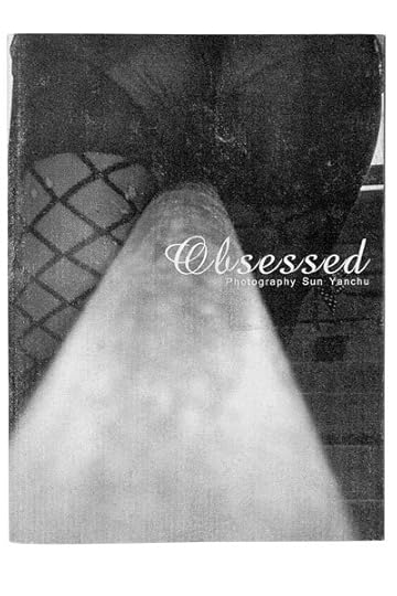
Sun Yanchu, Obsessed. Jiazazhi Press, Ningbo, China, 2011
RL:Was it a big step to give up your job at the magazine and become a full-time publisher? I can imagine your family might have had doubts about this step away from a fixed income.
YD: Yes, absolutely, especially because it was just after my son was born in 2012 and I had moved back to Ningbo. But I had a clear desire, a dream, to become a publisher myself. One part of that was to help out friends, but most important, I wanted to make real books by myself, with photography that interested me. Before I started I made a calculation of potential business, and I strongly believed that I could make it, based on successes like Obsessed and They by Zhang Xiao [another early book]. I have been lucky with some books. In June 2014 I published The Yellow River, by Zhang Kechun. The month it came out we only sold thirty-seven copies, but a month later it won the Arles Discovery Award. People jumped on the book, and it sold out very quickly.

Zhang Kechun, The Yellow River. Jiazazhi Press, Ningbo, China, 2014
RL: In recent years you have participated in a number of international fairs, such as the New York Art Book Fair, Polycopies in Paris, and the Tokyo Art Book Fair. Why do we rarely see independent publishers from China at this type of fair?
YD: Well, I can only guess. The first reason is probably financial, as flights and hotels are expensive. But, more important, the idea that it’s possible to actually just do this kind of thing is not really present [in China]. There is not a big photobook market in China yet, and with my photobook ideas it can feel a little lonely sometimes. At the fairs I can share my experiences with other publishers from all over. It’s more than just the money—it’s really like a family setting. I was the first independent publisher from China to have a booth at the NYABF. People seemed to be surprised and kept asking me if I was from Taiwan.
RL:Would that be because, especially in recent years of political change, it has actually become harder to be an “official” independent publisher? Your ISBN, for example, is registered in Hong Kong and not on the mainland.
YD: Yes and no. It has always been very clear that as long as you don’t cross the line, it’s OK to publish independently. The problem is that even officials often don’t know what that line looks like and where to draw it. I recently talked with the head of a major publishing authority, and he said he had been following my publications for years and liked them very much.
Thomas Sauvin, Until Death Do Us Part. Jiazazhi Press, Ningbo, China, 2015
RL: What is your take on the contemporary photobook market in China?
YD: It’s still a very traditional market, with opportunities to sell classic works from photographers such as Robert Frank and Daido Moriyama. My belief, however, is that the market is a little bit self-fulfilling. The assumption is that the market is keen on these traditional works, therefore publishers import or produce books that are like those books—and therefore the audience is not exposed to a wider perspective on contemporary photobook publishing. I see it as part of my job to introduce a larger variety of books. This is also the reason I’ve started to distribute books from other publishers. I think the reason is not that people don’t want to buy these books, but that those who supply the market are too conventional in their thinking compared to how smart the audience has become.
RL: What does the future hold for Jiazazhi?
YD: We recently published two new books, Fountain by Cai Dongdong and Qu Jing by Lin Shu, both very exciting. This year I am aiming to publish at least another five publications. Upcoming is the book Bees & the Bearable by Chen Zhe, designed by the awardwinning curator and designer Guang Yu. Besides that, I am planning a new book with the photographer [known as] 223, and I want to publish the 3-D portraits that Matja Tani made in North Korea. I am also working on a Jiazazhi magazine. The first issue is organized around the theme “Untouched.” We have an interview with my hero Alec Soth, and will show the work of Chinese photographers such as Zhou Jungang and You Li. There’s so much to do!
Chen Zhe, Bees & the Bearable. Jiazazhi Press, Ningbo, China, 2016
RUBEN LUNDGREN is a Dutch photographer based in Beijing. He works in collaboration with Thijs groot Wassink, who is based in London, under the name WassinkLundgren. Their work together includes book projects, exhibitions, and photography commissions. They have produced over a dozen books, including Empty Bottles (Veenman Publishers, 2007), Tokyo Tokyo (Kodoji Press and Archive of Modern Conflict, 2011), and Hits (Fw: Books, 2013), and in collaboration with Martin Parr, edited The Chinese Photobook (Aperture, 2015), a history of photobook publishing in China since 1900. www.wassinklundgren.com
The post Publisher’s Profile: Ruben Lundgren in conversation with Yuan Di, Jiazazhi Press appeared first on Aperture Foundation NY.
August 2, 2016
Subversive Novelist Seeks Her Muse in Pictures
In San Francisco, Hanya Yanagihara stages an exhibition about loneliness and beauty.
By Glen Helfand
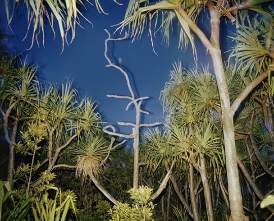
Richard Misrach, Untitled (Hawaii XV), 1978 © the artist and courtesy Fraenkel Gallery, San Francisco
Hanya Yanagihara’s novel A Little Life is seemingly everywhere, from bookstore displays to a shelf in my therapist’s office. On the cover is a powerful, closely cropped photograph of a man in the throes of petit mort. His eyes are tensely shut, his hand gracefully splayed along his cheek in a classical pose fit for a Greco-Roman sculpture. I’d seen this picture in Fraenkel Gallery’s 2014 Peter Hujar exhibition, Love & Lust, which positioned male nudes and erotic works in the context of gay history and bohemian New York. Hujar’s Orgasmic Man (1969) makes a particularly enthralling icon for A Little Life, leading one to imagine this unnamed man is the emotional focus of a feverishly addictive book. Yet the choice of a man in ecstasy is ironic; the book itself reveals a plot focused on pain, addiction, and abuse. (The Guardian’s laudatory take is headlined “relentless suffering.”)

Alec Soth, Riverview Motel, 2005 © the artist and courtesy Fraenkel Gallery, San Francisco
Yanagihara has been visiting Fraenkel Gallery in San Francisco for seventeen years, so the appearance of a summer group show curated by the author isn’t entirely out of left field. Her history with the gallery suggests she is clearly aware of Fraenkel’s large stable of photographers. Yet the resulting exhibition, How I Learned to See: An (Ongoing) Education in Pictures, doesn’t offer many surprises—most of the photographs by Diane Arbus, Robert Adams, Katy Grannan, Ralph Eugene Meatyard, Nicholas Nixon, and others, including Hujar, have been shown here before—but Yanagihara’s exhibition has a literary bent that gives the works a minor new spin.
Ralph Eugene Meatyard, Lucybelle Crater and bakerly, brotherly friend, Lucybelle Crater, 1970–72 © The Estate of Ralph Eugene Meatyard and courtesy Fraenkel Gallery, San Francisco
How I Learned to See takes the dialogue between image and text in the opposite direction as the cover of A Little Life by using words as an entry to the pictures. The show is installed in thematic chapters named after the kind of big themes that fuel great novels: Loneliness, Love, Aging, Solitude, Beauty, and Discovery. Each begins with its own text panel, written by the curator. The first reveals how Yanagihara is casting a wide novelistic net with her headings, describing them as “the things that define any life, and therefore the things that define all of us, a chronicling of the perpetual mystery of being alive.” It’s a serviceable, if broad, premise, though not quite as free as one would expect from an outsider set loose in a trove of major works.

Robert Adams, Colorado Springs, Colorado, 1968 © the artist and courtesy Fraenkel Gallery, San Francisco
In many ways, the result feels like the works are selected simply to illustrate themes. The “Loneliness” chapter, for example, features Robert Adams’s Colorado Springs, Colorado (1968), a classic, Edward Hopper-esque black-and-white image of a suburban ranch house façade with a woman’s silhouette framed in a window. It’s a great picture that declares loneliness straightforwardly. So does Alec Soth’s Riverview Motel (2005), a color image that presents the noir narrative setting of fleabag lodgings where some solitary character is holed up on the lam, perhaps the worn, gender fluid character in Grannan’s blaring sunlit Anonymous, Los Angeles (2008).

Katy Grannan, Anonymous, Los Angeles, 2008 © the artist and courtesy Fraenkel Gallery, San Francisco
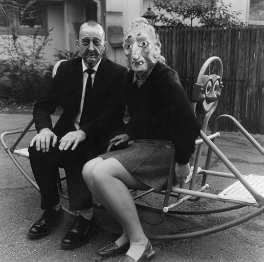
Portraits of same-sex couples populate the “Love” section. Pictures by Nan Goldin and Arbus, and a Meatyard photo of his wife “in a hideous hag’s mask.” Yanagihara’s wall text points to illegal, ambiguous, tortured, damaged, artistic, parental, and defiant versions of love. These images are narrative provoking; they invite us to imagine a particular scenario for each. As such, the exhibition sometimes feels like a collection of writer’s prompts.

Peter Hujar, Joseph Raffael at the Botanical Gardens, 1956 © The Estate of Peter Hujar and courtesy Fraenkel Gallery, San Francisco
The best moments are when Yanagihara uses the exhibition as a platform to ask questions. In the “Beauty” section, she ponders what that concept means to the camera: “Is it a lovely face? Or something else: a child captured in a moment of self-generated ecstasy; a wooden house piebald with shadows; a second of abandon we shouldn’t be witness to . . . but are?” Among the few surprises are two Hujar photographs from the 1950s. One is Joseph Raffael at the Botanical Gardens (1956), a portrait of a handsome artist sitting amidst foliage: a young man captured in a moment of thrilling contemplation. Yanagihara understands that seeing such potent images are as rooted in time as reading a novel. “The fact that what makes something beautiful is, after all, its temporality,” she writes. “Blink, turn your head, and it’s gone.”
Glen Helfand is a freelance writer and Associate Professor at California College of the Arts.
How I Learned to See: An (Ongoing) Education in Pictures is on view at Fraenkel Gallery in San Francisco through August 20, 2016.
The post Subversive Novelist Seeks Her Muse in Pictures appeared first on Aperture Foundation NY.
July 28, 2016
Photography is Magic: An Inside Look at the 2016 Aperture Summer Open
Aperture’s 2016 Summer Open was a call for contributions to the idea of photography as a magical form. This optimistic premise attracted a diverse scope of magical contemporary approaches—from pictures found in the happenstance of everyday life to elaborate stagings of studio or desktop experiments.
“What I really love about this exhibition is the conversation that happens between individual practitioners’ work,” said curator Charlotte Cotton. “It feels like there are a lot of people thinking along very similar lines, experimenting in similar ways, and it’s just a really beautiful reflection of how vibrant photography is at the moment.”
The works chosen by Cotton for the exhibition include a wide range of approaches to the theme, among them snow+concrete XIV, 2013, a series of black-and-white prints infused on glass by German photographer G. Ronald Biermann, and Your White Light, 2015, archival pigment prints on vinyl by Milwaukee-based artist Sonja Thomsen.
During the exhibition’s opening week, Aperture caught up with several of the participating artists, many of whom expressed a fascination with the illusory nature of photography, and the impact it’s had on their practice. “Our perception of the world can really only go as far as photography can,” said New York City–based artist Megan Paetzhold. “So, as long as we keep pushing, I think that our perception will keep broadening.”
See the 2016 Aperture Summer Open on view at Aperture Foundation through August 11, 2016.
The post Photography is Magic: An Inside Look at the 2016 Aperture Summer Open appeared first on Aperture Foundation NY.
Arbus Before Arbus
A new exhibition at the Met Breuer, featuring previously unseen prints, reveals the early impulses of a modern master.
By Will Heinrich
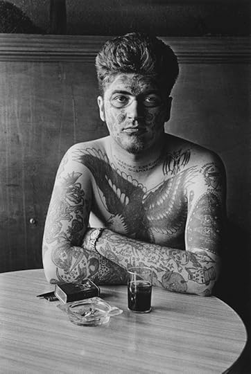
Diane Arbus, Jack Dracula at a bar, New London, Conn., 1961 © The Estate of Diane Arbus, LLC
Diane Arbus was looking for a mirror. By 1967, when her photographs were included in New Documents at the Museum of Modern Art, that search had settled into an intricately artificial kabuki of performed self-awareness. The photographer’s presence in her subject’s gaze was just as important as the subject’s presence in hers. But in the Met Breuer’s cautiously stunning new exhibition, diane arbus: in the beginning, she is just learning to catch a stranger’s eye. This show, curated by Jeff Rosenheim, consists of more than one hundred velvety, black-and-white photographs shot and printed by Arbus between 1956 and 1962 and mounted, each in its own spotlight, on an expansive zoetropic stagger of individual panels clipped between ceiling and floor. The lion’s share of the prints belongs to the Diane Arbus Archive, Doon Arbus and Amy Arbus’s 2007 gift to the Met, and has never been shown before.
At the very beginning, it seems, Arbus was barely there herself. Frozen tableaux showing the mechanics of representation—like the sharp-edged light of a movie projector hanging across a theater, or Bela Lugosi as Dracula on television (1958)—alternate with minuscule sparks of mutual recognition. Boy Stepping off the Curb (1957–8) looks as if he’s just seen a ghost, while Blonde receptionist behind a picture window (1962) confronts the same ghost with more sangfroid. Little man biting woman’s breast (1958) gazes into the lens like a child making sure his mother’s still watching, while Woman in white fur (1958) is haughty and indignant.

Diane Arbus, Lady on a bus, N.Y.C., 1957 © The Estate of Diane Arbus, LLC
Of course they’re all just reacting to the camera. But Arbus makes these fleeting, fragmentary reactions into incandescent moments of radical self-consciousness, sudden shocks of lucidity in the long waking dream of life. She pours so much desperate attention through her lens that some of it is bound to bounce back; even the carcass in Dead pigs hanging (1960) is animated and human. This exhibition also includes an annex of two unfortunately didactic rooms that display a handful of works by Arbus’s contemporaries (such as Garry Winogrand) and influences (August Sander), as well as some of her own later, more famous work. But those long-canonized pictures only serve to distract from the fresh, unexpected sincerity of Arbus’s early forays into the form.
Sometimes a flickering encounter is broad enough to support a textured revelation. Taxicab driver at the wheel with two passengers (1956), for example, is a chamber drama. A male passenger on the far side is confident and self-contained. His female companion, in the near window, is also self-contained, but hers, as she bites a thumbnail and burns down a cigarette, is a bubble of anxiety. And the driver, our Virgil through the ecstatic chaos of New York, looks at the camera with a confidently hopeless camaraderie, as if to say, Here’s another poor soul who can’t help me and whom I can’t help.
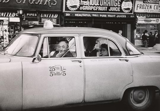
Diane Arbus, Taxicab driver at the wheel with two passengers, N.Y.C., 1956 © The Estate of Diane Arbus, LLC
And sometimes the flickers burst forth into fully formed portraits of people on the social fringes: the Human Pincushion, the Madman from Massachusetts, the Man Who Swallows Razor Blades, socialites, female impersonators, and a host of others—all living symbols of the alienation of being alive. But why did such serendipitous candid shots become, in Arbus’s later phase, posed portraits? Did Arbus’s search for connection simply crystallize into an empty ritual? Or did her fascination with unique human expressions curdle into a kind of nihilistic cynicism? At times, Arbus’s view shifts from the humanely documentary to a baffled disbelief in our shared social conventions, the language we use to live and communicate. A gaping old woman in her hospital bed, for example, looks as if she’s faking for the camera, or wax-work, and several shots of adults carrying sleeping children like corpses in their arms seem to imply that death itself is nothing but another false performance.
Miss Stormé de Larverie, the Lady Who Appears to be a Gentleman (1961), which shows a slender woman in a dark men’s suit, black boots, and a thin black tie sitting on a park bench, demonstrates what happened. The photo’s narrow palette and shallow depth of field flatten the bench and tilt the lawn and concrete walkway upward, as if all of Central Park were nothing but a painted backdrop in an indoor studio. Miss Stormé’s pose is casual but deliberate, self-possessed but carefully defended: she leans forward slightly, facing the lens but not quite looking into it, turns her crossed legs almost sideways, and crosses her hands over her lap for good measure. On her left hand is a pinky ring and a wristwatch. A cigarette burns between her fingers.
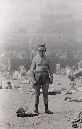
Diane Arbus, Man in hat, trunks, socks and shoes, Coney Island, N.Y., 1960 © The Estate of Diane Arbus, LLC
The photograph amounts to a collaboration, a relic of Arbus’s and de Larverie’s temporary agreement to create a particular character. But this kind of connection between Arbus and her subject is one that comes at the expense of their connections to anything else. What happened is that Arbus’s instinct for the spontaneous and human transformed itself, through an escalating cycle of self-consciousness and introversion, from a search for meaningful encounters to a method of entombing them. By the time she found her mirror, her vision was too sharp.
Will Heinrich is a critic and writer based in New York.
diane arbus: in the beginning is on view at the Met Breuer through November 27, 2016.
The post Arbus Before Arbus appeared first on Aperture Foundation NY.
Aperture's Blog

- Aperture's profile
- 21 followers

