
Aperture's Blog, page 131
October 12, 2016
Before They Were Stars
In his new memoir, the critic Douglas Crimp revisits the origins of the Pictures Generation, a fabled era of art, sex, and experimentation.
By Travis Diehl
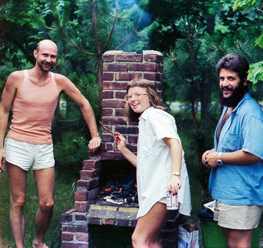
Douglas Crimp with Cindy Sherman and Robert Longo, 1977. Photograph by Helene Winer
Courtesy Douglas Crimp
The canniest thing he did with his milieu-making exhibition Pictures, writes Douglas Crimp in Before Pictures, his new memoir, was to choose a generic title. The 1977 outing at Artists Space in New York featured just five artists. Yet Pictures would come to embody an epochal attitude toward appropriation and mass culture in contemporary art, and absorbed the likes of Cindy Sherman and Richard Prince, who weren’t, in fact, part of the original. By 2009, when Douglas Eklund mounted a survey of the era at the Metropolitan Museum of Art, “Pictures Artists” was a category and the “Pictures Generation” a brand.
Crimp had something to do with this. In 1979, he rewrote his catalog essay for the poststructurally-inflected journal October, cutting Philip Smith and annexing Sherman, and elaborated his theory of the postmodern. The processes of “quotation, excerptation, framing, and staging,” he declared, had become the predominant sensibility of younger artists “committed to radical innovation.” Forty years on, Crimp’s memoir adds little to what even he calls an “overblown” discourse. Instead, the critic and art historian spends much of Before Pictures fitting that pivotal moment—the decade before the Artists Space exhibition—into a less academic setting.

Opening of Pictures at Artists Space, September 1977. Photograph by D. James Dee
Courtesy Artists Space
Crimp’s recollections of his art world and gay world educations, sometimes parallel, sometimes in concert, meander through an idyllically derelict, 1970s New York. The cast is familiar: ArtNews and October, the Flamingo and Max’s Kansas City, Jonas Mekas and Vito Acconci. Yet the book also fuzzes up the willful clarity of formal art history with sometimes awkward, personal asides. Crimp’s mother, for instance, helped him proofread the first Pictures on her front porch. When he revisited the text for October, he was laid up with a broken hip from the roller disco.
As Crimp tells it, his “first job” in the city was as a curatorial assistant at the Guggenheim. He was there when Daniel Buren’s giant striped banner, Peinture/Sculpture, unfurling decisively from the rotunda at the final Guggenheim International in 1971, tweaked the pride of his fellow artists—Dan Flavin called it “drapery”—and so rattled the institution that they took it down before the public opening. (The Guggenheim soon fired Crimp, he suspects, for “knowing too much.”) He writes, with tender self-mockery, “It was a famous museum, one of the most famous, because it had a famous building, one of the most famous, and that made my first job seem glamorous.”

Douglas Crimp in his office at the Solomon R. Guggenheim Museum, New York, ca. 1970
Courtesy Douglas Crimp
Meanwhile, his actual first job was a short stint with the couturier Charles James, “designer of the purple and green evening cape,” who was living in bohemian squalor at the Chelsea Hotel. Crimp ran errands and walked James’s beagle; instead of cash, he was offered payment in credit at Barneys. In 2005, when Buren fitted the Guggenheim’s skylight with green and purple gels for his retrospective, Crimp was ready to call it a vindication of decor. The story reads like a lecture pegged to biography. Illustrating the chapter, and providing its hinge, is a vintage picture of Crimp slumped in a chair in purple sweater and green slacks. (It’s the first of numerous pictures of the author.) Crimp’s account sometimes drags with nostalgia; such well-rehearsed episodes contain the desire for critical politics at museum scale—yet reactivating this desire is another matter. At a tie-in “Before Pictures” exhibition, presently at Galerie Buchholz in Manhattan, Buren’s censored piece appears for the first time since 1971. Its striped square meters sit neatly folded on a plinth.
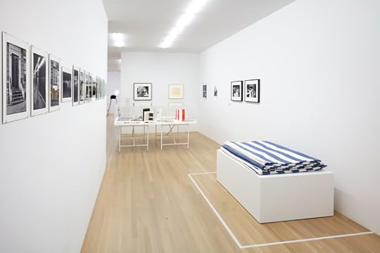
Douglas Crimp: Before Pictures, New York City 1967–1977. Installation view at Galerie Buchholz, New York, 2016. Photograph by Thomas Müller
Courtesy Galerie Buchholz, Berlin/Cologne/New York
The choreographer George Balanchine and painter Agnes Martin receive similar analysis. History and plain life coincide; they rarely seem to blend. During the first Watergate hearing, Crimp was glued to a portable transistor radio in a Water Island cabin. He spends several pages recounting the proceedings blow-for-blow, the only reward coming with an account of Nixonites gathered in the basement of the White House watching Tricia’s Wedding, the Cockettes’ camp send-up of Tricia Nixon’s televised wedding.
There are also breezier chapters. One passage details Crimp’s and his Parisian boyfriend’s try at writing a Moroccan cookbook. (Tajin recipe included!) But his more gossipy memories, like a dalliance with Ellsworth Kelly or buying a fridge that belonged to Jasper Johns, feel dutifully wedged between the intellectual debates that Crimp apparently found more compelling. “I resisted disinhibition probably because I was trying to get serious about being an art critic right at the time I became a disco bunny,” he writes. It’s a fair description of himself, and of his approach to writing this memoir, which swerves between the salacious and the cerebral. “I fought the effect of the drugs I took. I thought at the disco.”

Alvin Baltrop, Untitled, from the series Pier Photographs, 1975–86
© the artist and courtesy the Alvin Baltrop Trust
But where Crimp’s cultural, erotic, and quotidian searches wend through the city itself, his thinking builds on sensation. He spends a few lines reading a couple of Cindy Sherman’s Untitled Film Stills through the picturesquely abandoned New York buildings in their backgrounds. His “disco years” in Greenwich Village are marked by the resonance of decidedly avant performance venues with the rituals of barely appointed, underground clubs. Cruising on the West Side piers took him where Gordon Matta-Clark’s sunlit cuts met Alvin Baltrop’s photos of sex acts and sunbathers on collapsing wharfs. Here, Crimp’s almost architectural phrasing strays toward lust:
But the point of cruising, or at least one point of cruising, is feeling yourself alone and anonymous in the city, feeling that the city belongs to you, to you and maybe a chanced-upon someone else like you—at least, like you in your exploration of the empty city. Is there by chance someone else wandering these deserted streets? Might that someone else be on the prowl? Could the two of us find a dark corner where we could get together? Can the city become just ours for this moment?
Before Pictures isn’t chronological so much as geographical: Crimp’s interests follow his moves from one neighborhood to the next. Each chapter begins with moody photographs, taken for the book by Zoe Leonard, of the buildings where Crimp lived and the nearby subway stations. When he left the West Village for Tribeca, it was to party less, write more. Once Crimp found an apartment on Nassau Street, where he still lives today, he got down to the work of Pictures.

Peter Hujar, Leroy Street, 1976
© The Peter Hujar Archive LLC and courtesy Pace/MacGill Gallery, New York, and Fraenkel Gallery, San Francisco
The book trails a bit beyond its destination. In the 1980s, as the AIDS crisis gutted the gay world and art world alike, Crimp took up the activism that has defined the rest of his career—figured in 1987 by another October milestone, the special issue he edited on AIDS. New York, too, had changed beyond recognition. In the 1970s, the city was nearing bankruptcy. Today, those streets walked by Crimp and the rest have been redefined by boom. As Crimp writes of Joan Jonas’s 1973 film Songdelay, “We glimpse the city in pieces, in the background, in our peripheral vision—and in recollection.” That is the city “Before Pictures.”
Travis Diehl is a writer based in Los Angeles.
Before Pictures is published by Dancing Foxes Press and the University of Chicago Press. Douglas Crimp: Before Pictures, New York City 1967–1977 is on view at Galerie Buchholz, New York, through October 22, 2016.
The post Before They Were Stars appeared first on Aperture Foundation NY.


October 11, 2016
A Portrait of New York in Rocks and Clouds
In his latest series, Mitch Epstein reveals the natural world within the urban grid.
By Joanna Lehan

Mitch Epstein, Clouds #33, 2014
Courtesy the artist and Yancey Richardson Gallery
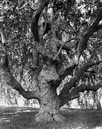
Unlike the frenetic energy of Garry Winogrand, one of his early teachers, the work for which Mitch Epstein is known reflects a contemplative approach to sweeping societal observations. Though he has pursued projects both intimate and far-reaching—Family Business (2004) documents his father’s furniture store and real estate firm and American Power (2009) concerns energy production in the United States—every few years it seems his abiding home of New York City demands his sustained attention.
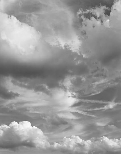
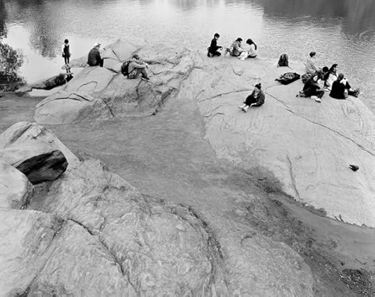
Epstein’s New York Arbor (2011–12) engages his interest in the ways elder trees inhabit the city’s landscape. Shot in large-format, black-and-white film, these trees were witnesses to the city’s development as they grew, gorgeous and ungainly, accommodated by the structures around them. His newest series, Rocks and Clouds (2014–15), currently on view at Yancey Richardson Gallery, can be seen as an extension of this interest: the natural world as it bears witness and participates in the business of New York—the rocks, patiently, for eons; the clouds, for minutes at a time.

Mitch Epstein, Central Park, New York II, 2014
Courtesy the artist and Yancey Richardson Gallery
Joanna Lehan: I was intrigued to read in your artist’s statement that Rocks and Clouds was inspired by both ancient Chinese painters and modern earthwork artists. Which works were you thinking of, and what inspired you about them?
Mitch Epstein: It was Robert Smithson’s essay about Frederick Law Olmsted, “The Dialectical Landscape” (1973), that got me thinking about rocks. Smithson cast Olmsted as the original Earthworks artist and Central Park as avant-garde. Olmsted had moved huge glacial erratic rocks there and uncovered mammoth geological formations, which he used to add a primeval quality to the park’s fields, forests, and ponds.
In Chinese painting and calligraphy, I was interested in the soft horizon, how sky and ground mimic each other and run into each other. Things that are opposite are somehow the same and it’s hard to tell where one stops and the other begins.
The Chinese scholars’ rocks and Isamu Noguchi’s found rocks encouraged me to see the inherent sculptural qualities in found rocks. Carleton Watkins’s wondrous photographs of rock formations in the Western frontier were also inspirational; and Michael Heizer’s enigmatic Levitated Mass (2012) at LACMA reminds me of Olmsted’s park erratics; it’s disorienting and humbling, too.

Mitch Epstein, Clouds #96, New York City, 2015
Courtesy the artist and Yancey Richardson Gallery
Lehan: We’ve spoken before during the production of other work, and I know that you take your time on the research phase and plot carefully where you will make photographs, at least you did with American Power and New York Arbor. How did you research Rocks and Clouds? Is the research portion exciting? Fun? Or is it more something you do dutifully to try to manage the results?
Epstein: I did extensive Internet research on the geological past of the city and where to find visible rock formations. My studio manager, Ryan Spencer, made an iPhone map identifying sites to scout, and I visited several hundred locations looking for rocks, but only photographed a fraction of them. Although I set out in the morning with a clear plan, I often wandered off track and made unexpected discoveries, which was fun! I’m not beholden in my approach to any fixed pictorial idea or typology: my pictures take shape as I compose them on the 8-by-10-inch ground glass.
Mitch Epstein, Rockaway, Queens, 2014
Courtesy the artist and Yancey Richardson Gallery
After six months photographing rocks, I knew the project called for a counterpart. I chose clouds as an opposite to rocks. I thought about ancient time versus contemporary time. Clouds opened up a much broader canvas for the project; they are the most democratic form of nature in the city—they’re accessible. I could photograph them anywhere and in conjunction with anything. I also had a “cloud map” on my iPhone referencing sites that would enable me to photograph clouds in tandem with meaningful elements of the city, be they architectural, human, or natural. The hardest part about clouds was predicting when they’d show up. I had nine weather apps, but none were completely reliable. So research has its limits. A lot of my work is serendipitous.
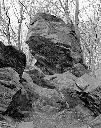
Mitch Epstein, Indian Prayer Rock, Pelham Bay Park, Bronx, 2015
Courtesy the artist and Yancey Richardson Gallery
Lehan: A rock, in particular, seems a challenging subject, but your rocks have a dynamic presence. They are monuments and they are—maybe characters?—notably in Central Park, New York II (2015) and Indian Prayer Rock, Pelham Bay Park, Bronx (2015). How did you achieve this? As you were editing your film, how did you know when you got the rock right?
Epstein: How to animate a rock and infer its unfathomable timeline of hundreds of millions of years was daunting. I often returned to photograph rocks multiple times, and there were rocks that I never photographed well. I looked for their kinetic qualities and what distinguished them. Traces of the human hand also mattered; like the Weeping Beech, Brooklyn Botanic Garden (2011) in New York Arbor, the Indian Prayer Rock has many layers of graffiti that have been painted over in a slapdash fashion by Parks Department workers, which give the rock’s surface an odd patina.
Mitch Epstein, Weeping Beech, Brooklyn Botanic Garden, 2011
Courtesy the artist and Sikkema Jenkins & Co., New York
I’m a proponent of a slow, introspective approach to photography. I think I avoid clichés by taking time to develop a relationship with my subject—repeat visits help. I consider carefully where to set the camera in relation to my subject, and how focus and depth of field will define and give dimension to my subject. Editing is central to my practice. I never know what my pictures will look like until I see them as contact sheets, and then I study them and work hard at seeing them with detachment and clarity.
Mitch Epstein, Clouds #89, New York City, 2015
Courtesy the artist and Yancey Richardson Gallery
Lehan: But clouds are freighted with photo history, from Stieglitz on. How did you avoid clichés with those?
Epstein: The history of art and photography, and my own past, are crucial reference points; however, I’m not consciously thinking about other photographs or photographers when I’m out in the real world with my camera. Photography, practiced with diligence and an open mind, is capable of transcending the heavy burden of photographic clichés.
My rocks and clouds, like my trees in New York Arbor, exist (photographically) in relation to human enterprise. I’m not a nature photographer. It’s the inextricability of human society and nature that interests me. How do they accommodate and alter one another? For decades, New York City has been a trope for me, a stand-in for all human society. The three series taken together—rocks, clouds, trees—invert a cultural mecca into an elemental city; they flip people’s characteristic self-importance, so that in these photographs, people (and the signs of their hand) are secondary.

Mitch Epstein, Clouds #18, New York City, 2014
Courtesy the artist and Yancey Richardson Gallery
Lehan: The work in New York Arbor, and these new works even more so—they seem to represent an evolution in your work, or maybe it’s a distillation. How do you characterize this shift?
Epstein: My evolution has led to a distillation, yes. The formal complexity of my older work, like Family Business and American Power, isn’t gone: it’s set deeper inside the image—there’s a metaphysical layering now, and many of the actual images are deceptively direct. Like certain poems that sound simple but aren’t.
Mitch Epstein, The Hernshead, Central Park, 2014
Courtesy the artist and Yancey Richardson Gallery
Lehan: While everything you’ve done shows a masterful ability for sociopolitical observation—these are more existential, more concerned with time. Has this been a conscious movement? Of course that one begs the question—after Rocks and Clouds, what has now captured your imagination?
Epstein: Time is as inescapable in life and as it is in picture making. In the winter of 2014, I ruptured my Achilles tendon and time, as I knew it, came to a halt, which forced me to think about my own human timeline in relation to the long duration of rocks. And later, I considered the speed of clouds—how they come and go so fast.
What I am doing now? Believe it or not, I’m recovering from a calcaneus fracture, only three years after rupturing my Achilles tendon. So who knows where this will lead me. I’m about to go back to a long-term project about the meeting of the animal and human worlds; and I’m also taking on some commissioned work for the first time in many years, and enjoying the challenges of making pictures within the constraints of an assignment, often in unfamiliar territory.
Joanna Lehan is a writer and an adjunct curator at The International Center of Photography. She teaches in the ICP-Bard MFA program.
Rocks and Clouds is on view at Yancey Richardson Gallery through October 22, 2016.
The post A Portrait of New York in Rocks and Clouds appeared first on Aperture Foundation NY.
October 6, 2016
The Archipelago of Desire
In Cape Verde, a Portuguese photographer documents the trans community with candid intimacy.
By Amelia Rina
Pauliana Valente Pimentel, Quel Pedra, 2016
Courtesy the artist and Museu Coleção Berardo, Lisbon
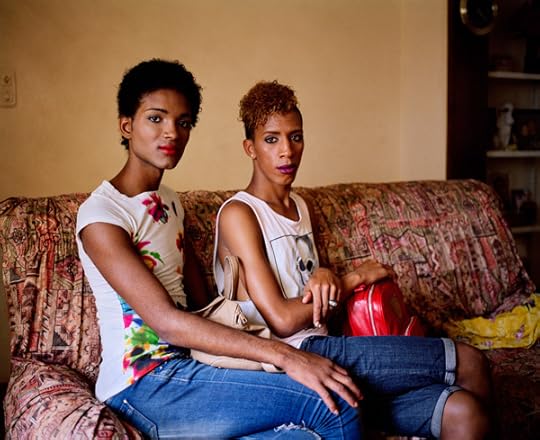
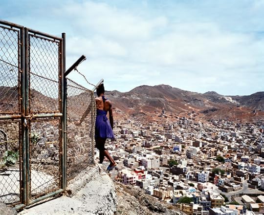
On the remote island of São Vicente, in the archipelagos of Cape Verde off the coast of West Africa, there is a rock referred to as Quel Pedra, or “that stone.” According to a local legend, anyone who sits on the stone instantly becomes gay. Such legends have lead to the discrimination against individuals who don’t conform to heteronormative gender roles, but on São Vicente a more inclusive perspective has developed.
When the Portuguese artist Pauliana Valente Pimentel traveled to São Vicente in 2014 as an artist-in-residence for the Cape Verde International Photo Festival, she was inspired by photographs of the island’s first gay pride parade the previous year. Once on the island, she befriended a group of young gay men and trans women, ages seventeen to twenty-five, and began to document their lives. In Quel Pedra (2016), her new series featured in the Novo Banco Photo prize exhibition at the Museu Coleção Berardo in Lisbon, Valente Pimentel portrays a distinctive community with insight and intimacy. When I visited the exhibition recently, which included the work of her fellow prize nominees Félix Mula and Mónica de Miranda, I was struck by Valente Pimentel’s candid view of young people experimenting with gender and sexuality.
Pauliana Valente Pimentel, Quel Pedra, 2016
Courtesy the artist and Museu Coleção Berardo, Lisbon
For over a decade, Valente Pimentel has immersed herself in the lives of others as a way to explore relationships, especially those between adolescents. Thinking about today’s global economic and migration crises, Valente Pimentel explained to me recently, she has been particularly attracted to the earnest nature and mutability of young people. (Her interest in fluid identities extends from previous work documenting transsexual prostitutes her hometown of Lisbon.) In Mindelo, the capital of Quel Pedra, Valente Pimentel was surprised to find members of the LGBTQ community living with the support of their families and friends.
Unlike the neighboring islands and mainland countries, São Vicente has developed an unusual acceptance of non-binary gender identities and sexualities. (In Santiago, Cape Verde’s capital, intolerance toward the LGBTQ community persists, despite the legalization of same-sex sexual conduct in 2004; same-sex marriage is still not recognized). During her time on the island, Valente Pimentel observed the hybrid influences of both European and African cultures within the city’s small population, which might account for an environment in which individuals have more latitude to define their identities on their own terms.
Pauliana Valente Pimentel, Quel Pedra, 2016
Courtesy the artist and Museu Coleção Berardo, Lisbon
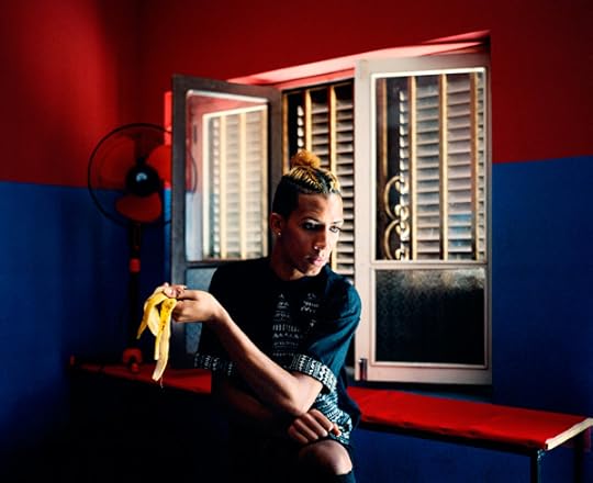
The spirit of hybridization saturates Valente Pimentel’s untitled photographs from São Vicente of Steffy and her seven friends Edinha, Gi, Elton, Sindji, Suzy Marie, Henio, and Jason. In one image, we see Suzy Marie wearing a leopard-print jumpsuit and mint, snake print heels; on a rocky hillside, she sits atop a rusting oil barrel, in front of her small, shed-like house. Her gaze is one of calm confidence, and her muscular body rests comfortably in a pose that exudes feminine strength and dignity. Through experimenting with fashions and poses, Valente Pimentel’s subjects consider ways to perform identities such as “sexy,” “feminine,” “tough,” or “masculine.” In another photograph, Suzy Marie wears a white bra with pulled-down straps and blue boxer briefs that read “MEN” on the waistband. Behind her hangs a garment bursting with pink and white feathers, pink satin, and jewels. The soft, light pose, luxurious textures and tones imitate the casual opulence of classical painting and sculpture. In this way, Valente Pimentel’s investigation of identity pays tribute to luminaries of queer and feminist theory such as Simone de Beauvoir, who famously wrote, “One is not born, but rather becomes, a woman.”
For her video Catwalk (2014), Valente Pimentel filmed an improvised runway show put on by the eight friends. They chose a former Portuguese fort called Fortim d’El-Rei (King’s Fort) as their stage, effectively contrasting the island’s militaristic and capitalist colonial history with its creative and sympathetic—though economically depressed—present. The unrehearsed film’s use of slow motion renders dreamlike choreography, alluding to the act of living between reality and fantasy. Taken together with the photographs, Valente Pimentel’s project captures a community that embraces the confident blurring of gender binaries. Unencumbered by the supposed obligation to be either a singular thing or its opposite, Steffy, Edinha, Gi, Elton, Sindji, Suzy Marie, Henio, and Jason each demonstrate the innumerable ways of being human.
Amelia Rina is a writer, critic, and editor based in Brooklyn.
Novo Banco Photo 2016 is on view at the Museu Coleção Berardo, Lisbon, through October 10, 2016.
The post The Archipelago of Desire appeared first on Aperture Foundation NY.
October 4, 2016
South Africa in Black and White
In David Goldblatt’s photographs from apartheid to the present, a striking account of South African life.
By Ian Bourland
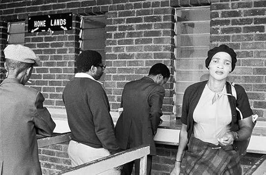
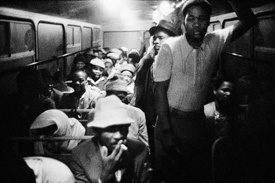
David Goldblatt, AM/PM. Travelers from KwaNdebele buying their weekly season tickets at the PUTCO depot in Pretoria, 1983
© the artist and courtesy Pace/MacGill Gallery, New York and Goodman Gallery, Johannesburg and Cape Town
David Goldblatt is relentless. A titan among photographers who chronicled South Africa during and after the Apartheid years, Goldblatt began his career in the 1960s by shooting for newsmagazines and the Anglo American mining company. He later gravitated toward landscape and the built environment, from the farmlands, to the Johannesburg suburbs, to prim Cape Dutch homes. Goldblatt’s trenchant account of 1970s-era, middle-class white privilege in the 1982 book In Boksburg is a sobering counterpoint to the politically inflected photojournalism of the time, in which incendiary racial conflicts portrayed South Africa in a state of endless crisis. Now in his eighties, Goldblatt—whose many photobooks, including In Boksburg, are being lavishly republished by Steidl—has found a smooth trajectory into the contemporary art market through international group and solo exhibitions.
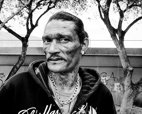
David Goldblatt, Blitz Maaneveld at the Terrace, Woodstock, Cape Town, where he murdered a man with whom he had been gambling, 7 October 2008
© the artist and courtesy Pace/MacGill Gallery, New York and Goodman Gallery, Johannesburg and Cape Town
For his debut at Pace/MacGill, Goldblatt juxtaposes two series created thirty years apart. One, The Transported of KwaNdebele: A South African Odyssey (1983–84) is vintage Goldblatt, made under the cover of night amid cramped interiors and gloomy depots. The Transported offers a grainy account of coach buses taking workers to the Marabastad terminal in Pretoria and back to the “Bantustans”—reserved “homelands” for blacks—over two hours away. The other, Ex-Offenders at the Scene of the Crime (2008–15) depicts former criminals and features detailed personal narratives, based on Goldblatt’s interviews, installed on placards jutting from the wall.
David Goldblatt, 3:15 a.m. Going to work: The Wolwekraal–Marabastad bus is licensed to carry 62 sitting and 29 standing passengers, 1983
© the artist and courtesy Pace/MacGill Gallery, New York and Goodman Gallery, Johannesburg and Cape Town
Goldblatt has said that he is not an artist but, then, as he reminds the viewer here, he’s not exactly a journalist either. As a result, he notes, his “allegiance is to no one other than my subjects and myself.” Even so, he came to international recognition by capturing the effects of life under a repressive state and attended to such images with lengthy, detailed captions. In The Transported, the meandering buses, crowded with men exhausted from the day’s work or their journey from the night before, were integral to a state that kept whites separate from everyone else but relied, nonetheless, on the cheap labor of black and other, mixed-race populations.
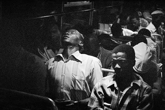
David Goldblatt, 9:00 p.m. Going home: Marabastad-Waterval bus: For most of the people in this bus the cycle will start again tomorrow at between 2:00 and 3:00 a.m., 1983
© the artist and courtesy Pace/MacGill Gallery, New York and Goodman Gallery, Johannesburg and Cape Town
Goldblatt represents this complexity with precision and economy in modest, 10-by-16-inch prints, as in a photograph titled 9:00 pm. Going home: Marabastad-Waterval bus: For most of the people in this bus the cycle will start again tomorrow between 2:00 and 3:00 am (1983). In this now-iconic photograph, soft lighting haloes a congested aisle and recedes into the distance, while a man in the foreground cranes his head back and steals a few moments of rest. The title says it all, with clinical precision; so do captions noting bumpy roads or standing room for twenty-nine riders. As a white photographer, of course, Goldblatt surveyed such scenes with a degree of detachment unavailable to his notable black contemporaries, such as Peter Magubane and Santu Mofokeng. Still, Goldblatt’s images, which are not portraits as such, vividly track overlooked moments in everyday life under a regime that controlled not only a person’s space, but also his or her time.
David Goldblatt, Adellah Snape on Hagley Road, Birmingham where she worked as a prostitute, 13 September 2014
© the artist and courtesy Pace/MacGill Gallery, New York and Goodman Gallery, Johannesburg and Cape Town
A similar investigative logic is at work in Ex-Offenders, but in this more recent work Goldblatt achieves a previously unseen level of poignancy—even rough beauty. These larger prints, tonally dense and rich in detail, show his technical prowess. Dialing in on the sitters’ wary faces, they are also his most startling portraits to date, as in Adellah Snape on the Hagley Road, Birmingham where she worked as a prostitute, 13 September 2014. Snape, a seemingly ordinary woman, is transfixing, as she gazes squarely from the frame. For the series, Goldblatt contacted ex-offenders through prison rehabilitation organizations and paid his subjects 800 South African rand (approximately fifty-eight dollars) for a photograph and an interview at the scenes of their crimes. These banal locations, Darling Street in downtown Cape Town, or the banks of the Thames River—in 2012, he extended the project to England—draw the figures into otherworldly depths of emotion, and remain consistent with Goldblatt’s longtime interest in physical sites of violence and trauma.
David Goldblatt, Eric Allison at the side entrance to the former bank to which he and his friends had secret access for six months. Manchester, 4 May 2015
© the artist and courtesy Pace/MacGill Gallery, New York and Goodman Gallery, Johannesburg and Cape Town
While Goldblatt remains committed to the power of place—the “structure of things” in society—Ex-Offenders suggests an intergenerational dialogue with younger photographers. Goldblatt founded the Market Photo Workshop in Johannesburg in 1989, and the bracing portraiture of such alumni as Zanele Muholi, Sabelo Mlangeni, and the late Thabiso Sekgala, to name a few, echos Goldblatt’s precise balance between banality and intensity, but commits more fully to portraiture as a means of framing postapartheid South Africa. The calm empathy of Ex-Offenders shows that, even now, Goldblatt’s practice continues to evolve—and to provoke, though images, the resonant questions he asks of his viewers: “Could they be my children or grandchildren? Are they you or me? How did they come to do this? What are their lives?”
Ian Bourland is an assistant professor at the Maryland Institute College of Art.
David Goldblatt is on view at Pace/MacGill in New York through October 29, 2016. Read more about David Goldblatt in Aperture Issue 220, “The Interview Issue.”
The post South Africa in Black and White appeared first on Aperture Foundation NY.
October 1, 2016
The 2016 PhotoBook Awards Shortlist
Aperture and Paris Photo are pleased to announce the shortlist for the 2016 PhotoBook Awards. This year, the awards have been organized in collaboration with C/O Berlin, a Berlin-based charitable institution and exhibition venue committed to photography and visual media.
The shortlist selection was made by Ann-Christin Bertrand, Curator, C/O Berlin; David Campany, independent curator and writer; Lesley A. Martin, Creative Director, Aperture Foundation and Publisher, The PhotoBook Review; Becky Senf, Chief Curator and Norton Family Curator of Photography, Center for Creative Photography at Woodstock; and Christoph Wiesner, Artistic Director, Paris Photo.
Established in 2013, the Paris Photo-Aperture Foundation PhotoBook Awards celebrate the photobook’s contribution to the evolving narrative of photography, with three major categories: First PhotoBook, Photography Catalogue of the Year, and PhotoBook of the Year.

Murray Ballard, The Prospect of Immortality (GOST Books), 2016

Dan Boardman and Aspen Mays, Where We’ve Been, Where We’re Going, Why? (Houseboat Press and Conveyer Editions), 2016

Andre Bradley, Dark Archives: 1–41 (Image Text Ithaca Press), 2015
Michael Christopher Brown, Libyan Sugar (Twin Palms Publishers), 2016

Cheng Xinhao, The Naming of a River (Jiazazhi Press), 2016

CJ Clarke, Magic Party Place (Kehrer Verlag), 2016
Amy Elkins, Black Is the Day, Black Is the Night
(Self-published), 2016
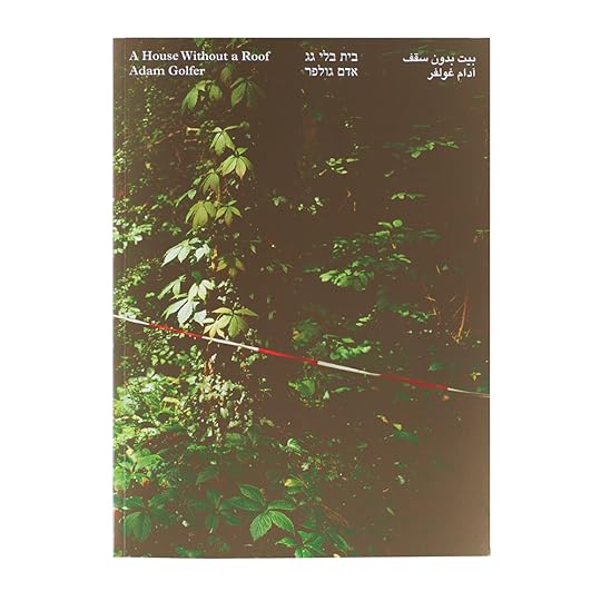
Adam Golfer, A House Without a Roof (Booklyn), 2016

Curran Hatleberg, Lost Coast (TBW Books), 2016
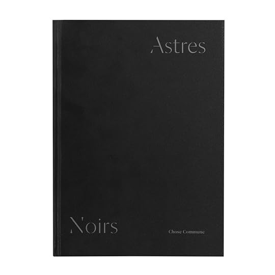
Katrin Koenning and Sarker Protick, Astres Noirs (Chose Commune), 2016
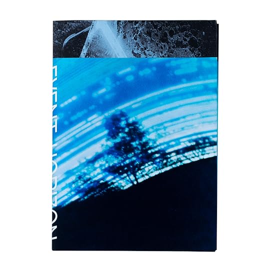
Quentin Lacombe, Event Horizon (Self-published), 2016

Jack Latham, Sugar Paper Theories (Here Press), 2016

Sara-Lena Maierhofer, Dear Clark,: Portrait of a Con Man, 2016

Sohei Nishino, Tokyo (amana), 2015
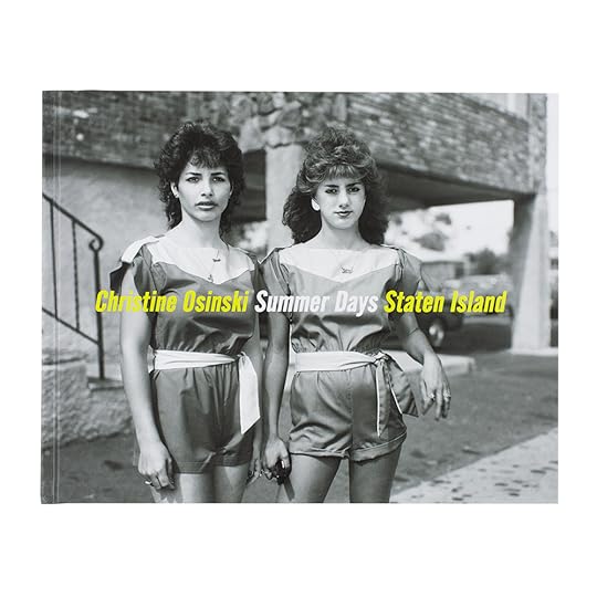
Christine Osinski, Summer Days Staten Island (Damiani Editore), 2016

John Radcliffe Studio, Foreigner: Migration into Europe 2015–2016 (Self-published), 2016
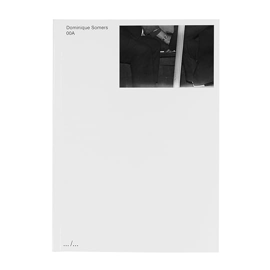
Dominique Somers, 00A (Art Paper Editions), 2015

Kate Stone and Hannah Schneider, How We End. (Self-Published), 2016
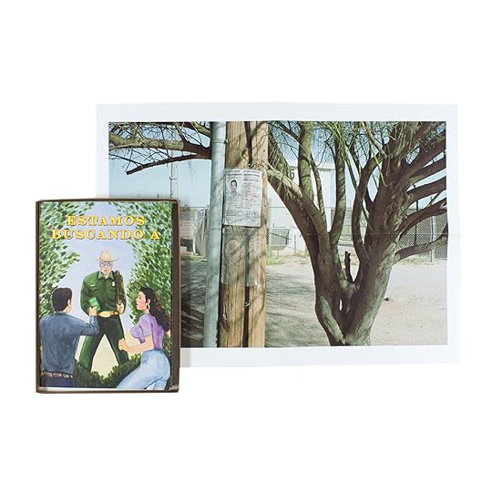
Paul Turounetm, Estamos Buscando A (We’re Looking For) (Self-published), 2016

David Campany, a Handful of Dust: from the Cosmic to the Domestic
(LE BAL and MACK), 2015
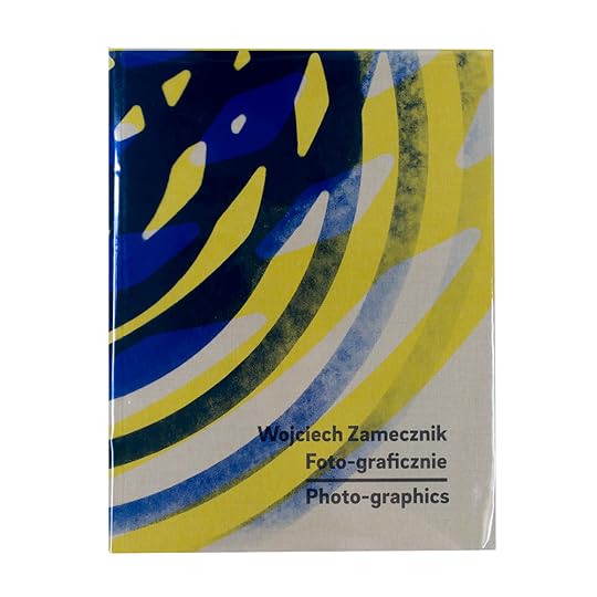
Karolina Puchała-Rojek and Karolina Ziębińska-Lewandowska, Wojciech Zamecznik: Photo-graphics (Fundacja Archeologia Fotografii), 2015

Marc Roig Blesa and Rogier Delfos, Werker 2—A Spoken History of the Young Worker
(Bunkier Sztuki Gallery of Contemporary Art and Fotomuseum Winterthur), 2016

Frances Terpak and Michelle Brunnick, Robert Mapplethorpe: The Archive (Getty Research Institute), 2016

Matthew S. Witkovsky, Carol S. Eliel, and Karole P. B. Vail, Moholy-Nagy: Future Present (Art Institute of Chicago), 2016

Barbara Bosworth and Margot Anne Kelley, The Meadow (Radius Books), 2015

Siân Davey, Looking For Alice (Trolley Books), 2015

Eamonn Doyle, Niall Sweeney, and David Donohoe, End.
(D1), 2016

Mark Holborn and William Eggleston III, The Democratic Forest (Steidl), 2015
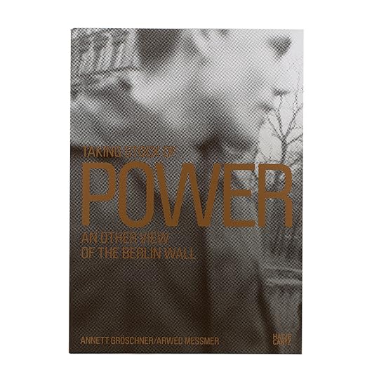
Annett Gröschner and Arwed Messmer, Taking Stock of Power: An Other View of the Berlin Wall (Hatje Cantz), 2016

Gregory Halpern, ZZYZX (MACK), 2016

Ron Kurtz and Hank O’Neal, Berenice Abbott: Paris Portraits, 1925–1930 (Steidl and Commerce Graphics), 2016
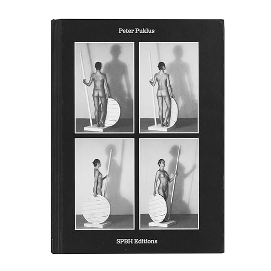
Peter Puklus, The Epic Love Story of a Warrior (SPBH Editions), 2016

Batia Suter, Parallel Encyclopedia #2 (Roma Publications), 2016

Daniel Traub, Wu Yong Fu, and Zeng Xian Fang, Little North Road: Africa in China (Kehrer Verlag), 2015
First PhotoBook
Murray Ballard
The Prospect of Immortality
Publisher: GOST Books, London, 2016
Designed by Stuart Smith
Dan Boardman and Aspen Mays
Where We’ve Been, Where We’re Going, Why?
Publisher: Houseboat Press and Conveyer Editions, Jersey City, NJ, 2016
Designed by Elana Schlenker
Yannick Bouillis
I Absolutely Forbade All Public Photographs of Myself
Self-published, Amsterdam, 2016
Designed by Virginie Gauthier and François Girard-Meunier
Andre Bradley
Dark Archives: 1–41
Publisher: Image Text Ithaca Press, Ithaca, NY, 2015
Designed by Elana Schlenker
Michael Christopher Brown
Libyan Sugar
Publisher: Twin Palms Publishers, Santa Fe, NM, 2016
Designed by Michael Christopher Brown and Ramon Pez
Cheng Xinhao
The Naming of a River
Publisher: Jiazazhi Press, Ningbo, China, 2016
Designed by Yanyou Di Yuan and Cheng Xinhao
Photographer: CJ Clarke
Magic Party Place
Publisher: Kehrer Verlag, Heidelberg, Germany, 2016
Designed by Teun van der Heijden, Heijdens Karwei
Amy Elkins
Black Is the Day, Black Is the Night
Self-published, Los Angeles, 2016
Designed by Amy Elkins and Ania Nałęcka/Tapir Book Design
Adam Golfer
A House Without a Roof
Publisher: Booklyn, Brooklyn, 2016
Designed by Ghazaal Vojdani
Curran Hatleberg
Lost Coast
TBW Books, Oakland, CA, 2016
Designed by Paul Schiek and Lester Rosso
John Radcliffe Studio
Foreigner: Migration into Europe 2015–2016
Self-published, London, 2016
Designed by Thomas Saxby
Photographers: Katrin Koenning and Sarker Protick
Astres Noirs
Chose Commune, Paris, 2016
Designed by Guillaume Allard and Vanessa Gœtz, Atelier Pentagon
Quentin Lacombe
Event Horizon
Self-published, Lausanne, Switzerland, 2016
Designed by Giliane Cachin
Jack Latham
Sugar Paper Theories
Publisher: Here Press, London, 2016
Designed by Ben Weaver
Sara-Lena Maierhofer
Dear Clark, Portrait of a Con Man
Publisher: Drittel Books, Berlin, 2016
Designed by Sven Lindhorst-Emme
Sohei Nishino
Tokyo
Publisher: amana, Tokyo, 2015
Designed by HIDEKI INABA Design
Christine Osinski
Summer Days Staten Island
Publisher: Damiani Editore, Bologna, Italy, 2016
Designed by Beverly Joel, pulp, ink.
Dominique Somers
00A
Publisher: Art Paper Editions, Ghent, Belgium, 2015
Designed by Studio Jurgen Maelfeyt
Kate Stone and Hannah Schneider
How We End.
Self-published, Brooklyn, 2016
Designed by Margot Laborde
Paul Turounet
Estamos Buscando A (We’re Looking For)
Self-published, San Diego, 2016
Designed by Paul Turounet
Photography Catalogue of the Year
David Campany
a Handful of Dust: from the Cosmic to the Domestic
Publisher: LE BAL and MACK, Paris and London, 2015
Designed by Grégoire Pujade-Lauraine and Lewis Chaplin
Karolina Puchała-Rojek and Karolina Ziębińska-Lewandowska
Wojciech Zamecznik: Photo-graphics
Publisher: Fundacja Archeologia Fotografii, Warsaw, 2015
Designed by Anna Piwowar and Magdalena Piwowar
Marc Roig Blesa and Rogier Delfos
Werker 2—A Spoken History of the Young Worker
Publisher: Bunkier Sztuki Gallery of Contemporary Art and Fotomuseum Winterthur, Kraków, Poland, and Winterthur, Switzerland, 2016
Designed by Marc Roig Blesa and Rogier Delfos
Frances Terpak and Michelle Brunnick
Robert Mapplethorpe: The Archive
Publisher: Getty Research Institute, Los Angeles, 2016
Designed by Catherine Lorenz
Matthew S. Witkovsky, Carol S. Eliel, and Karole P. B. Vail
Moholy-Nagy: Future Present
Publisher: Art Institute of Chicago, Chicago, 2016
Designed by Roy Brooks, Fold Four, Inc.
PhotoBook of the Year
Barbara Bosworth and Margot Anne Kelley
The Meadow
Publisher: Radius Books, Santa Fe, NM, 2015
Designed by David Chickey
Siân Davey
Looking For Alice
Publisher: Trolley Books, London, 2015
Designed by Emma Scott-Child
Eamonn Doyle, Niall Sweeney, and David Donohoe
End.
Publisher: D1, Dublin, 2016
Designed by Pony Ltd.
Mark Holborn and William Eggleston III
The Democratic Forest
Publisher: Steidl, Göttingen, Germany, 2015
Designed by Gerhard Steidl and Duncan Whyte
Annett Gröschner and Arwed Messmer
Taking Stock of Power: An Other View of the Berlin Wall
Publisher: Hatje Cantz, Ostfildern, Germany, 2016
Designed by Carsten Eisfeld
Gregory Halpern
ZZYZX
Publisher: MACK, London, 2016
Designed by Lewis Chaplin
Ron Kurtz and Hank O’Neal
Berenice Abbott: Paris Portraits, 1925–1930
Publisher: Steidl and Commerce Graphics, Göttingen, Germany, and New York, 2016
Designed by Gerhard Steidl and Duncan Whyte
Peter Puklus
The Epic Love Story of a Warrior
Publisher: SPBH Editions, London, 2016
Designed by Marco Campardo, Lorenzo Mason, and Simone Spinazzè, Tankboys
Batia Suter
Parallel Encyclopedia #2
Publisher: Roma Publications, Amsterdam, 2016
Designed by Roger Willems
Daniel Traub, Wu Yong Fu, and Zeng Xian Fang
Little North Road: Africa in China
Publisher: Kehrer Verlag, Heidelberg, Germany, 2015
Designed by Masumi Shibata
The post The 2016 PhotoBook Awards Shortlist appeared first on Aperture Foundation NY.
September 28, 2016
5 Photography Exhibitions to See This Fall
From modern dance to postwar portraits, here are this fall’s must-see exhibitions in New York.
By Genevieve Allison

Alex Prager, Orchestra East, Section B, 2016
Courtesy the artist and Lehmann Maupin, New York and Hong Kong
Lehmann Maupin, 201 Chrystie Street, New York
Through October 23, 2016
Through a synthesis of photography, film, and performance, Alex Prager’s third major solo show at Lehmann Maupin considers the fraught relationship between artist and audience. At the center is Prager’s eponymous film La Grande Sortie (2015), commissioned by the Paris Opera Ballet, which dramatizes the famed prima ballerina Émilie Cozette’s anxious return to the stage after an “unexplained hiatus.” The audience—populated by veteran performers of the company—is the subject of multiple still images reproduced as archival pigment prints. Like much of the Los Angeles–based artist and filmmaker’s most recognizable work, this exhibition reflects on aspects of staging, crowd dynamics, and the assumption of roles. Focusing on sections of the audience who are indicated by their location, the film portrays what appears to be a cross-section of “types” in the crowd: the young, the elderly, the single, the enthralled, the bored. The cinematic artifice in Prager’s photographs borrows heavily from Cindy Sherman’s Untitled Film Stills but is equally informed by William Eggleston’s striking use of color and sense of portent in the ordinary. Known for her lush, almost cartoonish images of Hollywood screen types and richly stylized mise-en-scènes, here Prager casts her subjects in a more tenebrous light, and inhabits a kind of twilight zone between life and affect.

Marco Breuer, Untitled (C-1807), 2016
© the artist and courtesy Yossi Milo Gallery, New York
Yossi Milo Gallery, 245 Tenth Avenue, New York
Through October 29, 2016
In this striking body of new work, Breuer presents a series of chromogenic paper prints marked by semi-organic shapes—paroxysms of searing color and tense edges. Pursuing stark articulations of form, the German photographer rips into the surface of light-sensitive paper. Through this process and other abrasive, incisive techniques that have become the hallmark of his practice, areas of highly saturated color emerge. Studies for these works and various pieces of ephemera, many in woodblock ink on black card stock paper, illuminate the highly methodical work process underlying the seemingly spontaneous violence of production. (Breuer’s previous drawing implements have included twelve-gauge shotguns, the guts of electric frying pans, modified turntables, razor blades, and power sanders.) The raw binary structures exposed—between negative and positive space, color and monochrome, field and line—are concerns that painters and sculptors have extensively explored, but rarely modulated so lucidly by artists utilizing photographic techniques. By taking up these formal interests, Breuer strides into a realm dominated by abstract painting but with a photographer’s studio and a sculptor’s sense for subtraction. In a separate but closely related series, Breuer photographed his body mimicking the abstract shapes produced in his cameraless images. These whimsical yet elegant distillations are reproduced in a sixteen-page black-and-white newsprint tabloid accompanying the exhibition.
Sergei Tcherepnin, Games, 2016. 10 double-sided hanging color photographs mounted on sintra, copper, brass, arduino, touch sensor, sound
Courtesy the artist and Murray Guy, New York
Murray Guy, 453 West 17th Street, New York
Through October 15, 2016
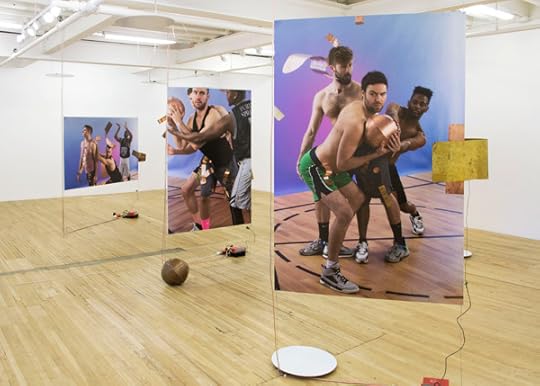
Vaslav Nijinsky’s Jeux stands as one of the most veiled, prophetic works in the modern canon of ballet. Composed by Claude Debussy and performed only a few times after it was completed in 1913, Jeux (Games) was a high-concept dance of flirtation instigated by a man and two women when a tennis ball is lost during a match. The piece, which drew upon classical reference by replicating poses from antique frescoes and sculptures, connected sports and sexuality, and predicted the link between the clubby, insular language of athletic teams and queer culture. In a new series of ten double-sided color photographs floating down from the ceiling, the performance and installation artist Sergei Tcherepnin substitutes tennis for basketball, and replaces the cast with three male athletes, a return to Nijinsky’s homoerotic intentions. (Jeux was originally meant for three male dancers.) His brightly colored prints are hooked up to sensors that, when touched, trigger a sound component. In an adjoining gallery, several sculptures set up a domestic tableau, which Tcherepnin characterizes as a “private locker room,” but more closely resembles a bedroom. Photographs taken in a gay cruising area on Fire Island known as the Meat Rack hang on the wall. Chairs, a lamp, and a side table all produce recorded sounds when touched. Despite the almost comical, animating effects of these audio-extensions, the images and objects remain resolutely static. As visitors create their own soundscape and impose effects on non-responsive objects, they reenact Najinsky’s probing scenario. There is a lightness, however, in Tcherepnin’s reinterpretation of the art of the chase. The exposed wiring systems, the fumbling ballplayers—all allude to an honest, if accidental, unbuttoning of the rules of attraction.
Zoe Leonard, DP Camp, 2016
© the artist and courtesy Hauser & Wirth
Hauser & Wirth, 32 East 69th Street, New York
Through October 22, 2016
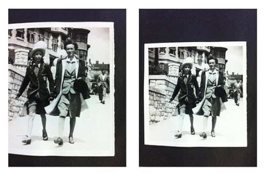
This spare but extensive exhibition sprawls across three floors of Hauser & Wirth’s Upper East Side townhouse gallery and seamlessly knits together a personal history of war and displacement with the rise of popular photography in the twentieth century. Taking a conceptual approach to reproduction, Zoe Leonard displays re-photographed snapshots of her mother’s family, who fled Poland and were stateless for more than a decade after World War II. Though Europe was in disarray in the immediate postwar years, the ever-growing industry of amateur photography nonetheless emerged as a cultural force. The reach of this mass phenomenon is represented by volumes of 1950s-era instructive manuals with titles such as How to Make Good Pictures and Photography Is …, collected in piles throughout the gallery. Together, the personal snapshots and generic books contrast society’s insatiable desire for artistic and technological advancement with the unpredictable realities of lived experience: while thousands of books were published on how to improve one’s photography technique, millions of people were struggling with the conditions of displacement. With her deliberate obfuscation of some reproductions, Leonard appears to question the nature of historical truth as it is represented by photographic documentation; in some of her images we see only the glare or torn edge of an original photograph’s surface. Illustrated history, Leonard implies, whether personal or global, is fragmented, partial, and opaque.

Stephen Berkman, Conjoined Twins, undated. Albumen print from wet plate collodion negative
Courtesy the artist and Howard Greenberg Gallery
A New and Mysterious Art: Ancient Photographic Methods in Contemporary Art
Howard Greenberg Gallery, 41 East 57th Street, New York
Through October 29, 2016
“It is now more than fifteen years ago that specimens of a new and mysterious art were first exhibited to our wondering gaze,” the British art critic and historian Lady Elizabeth Eastlake wrote in 1857. Fifteen decades later, the “ancient” photographic methods of the nineteenth century, and the vaporous, alchemical images they render, once again appear “new and mysterious.” Curated by Jerry Spagnoli, a leading practitioner of the daguerreotype, this beguiling exhibition presents works by contemporary artists mining photography’s rich technological and material history. The most notable are those in which artists use heritage techniques to amplify contemporary visions. At just over seven feet long, Vera Lutter’s gelatin silver print of the Venetian skyline, Campo San Moise, Venice, VIII: March 4 (2006), produced using a camera obscura, dominates the room. In an age of endless mutability and reproducibility, her unique negative print suspends the image of a sinking city in a single, eternal moment. The acclaimed Japanese photographer Takashi Arai has been making daguerreotypes since 2010 to create individual records, or “micro-monuments,” of subject matter relating to nuclear history. His piece A Maquette for a Multiple Monument for B29: Backscar (2014), from the series Exposed in a Hundred Suns, shows how an historic practice becomes, by virtue of size, instantly contemporary.
Genevieve Allison is a writer and editor based in New York.
The post 5 Photography Exhibitions to See This Fall appeared first on Aperture Foundation NY.
September 27, 2016
Bruce Conner’s Rebellion
In film and photography, the subversive artist confronted American life in the Atomic Age.
By Maika Pollack

Bruce Conner, BOMBHEAD, 1989. Collage of found illustration and photocopy
© the artist and courtesy Conner Family Trust and Artists Rights Society, New York
Kansas-born counterculture hero Bruce Conner has been something of an enigmatic figure in New York, despite several recent monographic exhibitions at Paula Cooper Gallery. The Cooper shows tended to focus so closely on Conner’s projects or series—for example, with his Max Ernst-like collages of found illustrations from the 1960s—in a space so small that it was hard to step back and get a view of the breadth, ambition, and interconnectedness of Conner’s radical practice. By contrast, Bruce Conner: It’s All True, organized by Museum of Modern Art and SFMOMA curators Stuart Comer, Laura Hoptman, Rudolf Frieling, and Gary Garrels, is a wide-ranging examination of Conner’s films, photographs, works on paper, and sculptural assemblages that gives exactly the broad view that previous exhibitions lacked.

Bruce Conner, LOOKING FOR MUSHROOMS, 1959–67. 16mm film, 3 minutes, color, sound
© the artist and courtesy Conner Family Trust
In this exhibition, the artist’s prescient commitment to subverting image-culture emerges clearly. From the first work on view, A MOVIE (1958)—a twelve-minute genre-defying collage of appropriated footage rhythmically edited to pop music—Conner can be seen as a forefather of the Pictures Generation. His assemblages of the 1950s and early 1960s are mystical-looking, Merz-like compositions. Dolls’ heads and costume jewelry crop up from dusty-looking surfaces; these feature cut-out photographs from “girlie” magazine pages alongside the postage stamps, nylons, bobby pins, and metal foil. Pictures are brought together in omnivorous disregard for a distinction between “high” and “low” art and life, popular culture and museum culture, just as his great films collage go-go dancers and bra ads. Of course we know Rauschenberg was making “Combines” on the East coast, but Conner’s pieces—PORTRAIT OF JAY DEFEO (1958), PORTRAIT OF ALLEN GINSBERG (1960)—are the West coast contemporaries often obscured in art history.

Installation view of Bruce Conner: It’s All True at The Museum of Modern Art, New York, 2016
Photograph by Martin Seck © The Museum of Modern Art
Among the crowd-pleasers are the life-sized “Angels” Conner made with photographer Edmund Shea. The angels are haunted photograms, full-scale traces of a fleeting presence—the artist himself posed against sheets of photosensitive paper. In SOUND OF ONE HAND ANGEL (1974), a palm pressed into the center of a grey torso creates an opaque white shape that looks like a clenched heart. Adding to the darkly romantic effect is the sound of live crickets, playing here as they did when the works were first exhibited in Berkeley, California in the mid-1970s. Conner also appropriated photographs of people bearing the same name as him: “Bruce Conner for Supervisor,” and “Bruce Conner’s Physical Services,” two such images read. Subverting mechanisms for self-promotion, these images are resonant with the practices of artists of our time, including works by Merlin Carpenter and Josh Smith.

Bruce Conner, BREAKAWAY, 1966. 16mm film, 5 minutes, black-and-white, sound
© the artist and courtesy Conner Family Trust
The most mysterious of Conner’s photographs were originally taken for the magazine Search and Destroy during the late 1970s at the San Francisco punk venue Mabuhay Gardens. These are not composed of pastiched elements, nor are they metaphysically leaning—instead, they are documentary snapshots of musicians and rapt punk audiences. Why would Conner make such “straight” pictures? Maybe the answer lies in style: the punks are themselves chaotic clashes of social signifiers, layering military uniforms, thrift store business suits, biker accessories, and schoolgirl skirts in a glorious collage. Conner’s interest in their style bridges Dada and punk—both favor DIY as ethos and je m’en foutisme for attitude. Later, Conner’s collages of the 1990s consist of pasted-in catheters, gauze, pills, and flyers surrounding the punk photographs. The ’90s work is not his best art or his best photography, but it’s smart and prescient; it reminded me of Seth Price’s tight, hyperlinked essays about culture in which images and object are shorthand for styles and their availability for pastiche.

Bruce Conner, FRANKIE FIX, 1977. Collage of photocopies on board
© the artist and courtesy Conner Family Trust and Artists Rights Society, New York
What was photography to Conner? A way to play with the simultaneous presence and absence of the artist in an artwork, a mechanism fix those ephemeral traces taking the pulse of throwaway culture and open them up to appropriation and collage. Conner’s acquisitive appetite for source material suggests that while photography has long generated new images, an equally important role has been to replicate and reuse extant ones. His images and films transform pop culture because of the availability of styles to get picked up and recycled, and propose that art is located in countercultural gestures of rebellion and resistance to the dominant image culture. Anticipating the East Coast appropriation of the late 1970s and giving some much-needed clues to the media-saturated DIS generation of today, Conner’s work, in this show, is more vital than ever.
Maika Pollack is an art historian teaching at Sarah Lawrence College.
Bruce Conner: It’s All True is on view through October 2, 2016 at the Museum of Modern Art in New York. The exhibition will travel to SFMOMA, October 29, 2016–January 22, 2017, and the Museo Nacional Centro de Arte Reina Sofia in Madrid, February 21–May 22, 2017.
The post Bruce Conner’s Rebellion appeared first on Aperture Foundation NY.
September 22, 2016
Dispatches: Cairo
On the rooftops of Egypt’s capital, photographers reclaim the urban landscape.
By Ismail Fayed
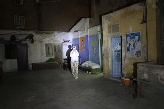
Cairo Bats, Act 1: The Roof (Downtown), 2015 © Cairo Bats
Setting: A rooftop that looks like a spacecraft. A glowing staircase with orange light. A repository of clutter. A jungle of satellite dishes. Figures appear. Women dressed in black pose within scenes of their own creation.
They are the Cairo Bats, a collective of female artists who gather to create staged photographs. For Act 1: The Roof (2015), their recent project at Cairo’s Contemporary Image Collective (CIC), the Cairo Bats presented a sequence of performative interventions that tackled the multifaceted potential of urban structures. It’s not the first time that artists working in Cairo chose the city and its landscape as points of departure. Since the early 2000s, with the rise of independent art spaces such as Townhouse Gallery and CIC, the complex relationships that humans have with the city have been a recurring exhibition theme. (Established in 2004, CIC is one of the few independent platforms in Egypt that is entirely dedicated to image-based practices.)
In a city of twenty-two million people, where up to 40 percent of the population live in some kind of informal housing, residents sometimes face no other choice but to move to the rooftops. As a result, the roof has emerged as one of Cairo’s many urban typologies. Driven by the postindependence euphoria of industrialization and centralization, and coupled with a lack of basic housing and parallel urban planning, the city morphed into organic, urban forms ranging from squatter settlements to repurposed rooftops. And, in that parallel urban landscape, we encounter a unique experience of urban life—an experience central to the work of the Cairo Bats.
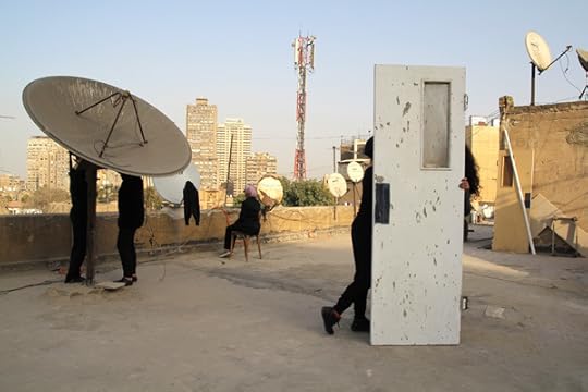
Cairo Bats, Act 1: The Roof (Zamalek), 2015 © Cairo Bats
In Act 1: The Roof, some of the collective’s images are purely scenographic, using the existing elements of a space to show its many visual possibilities. The intense contrasts between light and shadow, and multiple degrees of darkness, almost reach a baroque chiaroscuro in one work where spotlights are used to pick out the presence of three figures against the dark rooftop. Other images show more complex interventions and appropriations, as in the juxtaposition of satellite dishes with domestic interiors and household objects.
But the unusual presence of the artists—either in person or in the symbolic gesture of clothing left behind—highlights the absence of women in the urban landscape of Cairo. It’s a radical or even dangerous intervention. The presence of women in public spaces has been one of the most contested social phenomena in Egypt in the past three decades. Since independence in 1952, the increased involvement and visibility of women has been accompanied by a serious backlash from the conservative guardianship of a patriarchal system that dominates the country’s social fabric. The roof, being a liminal space somewhere between private and public, is a critical stage on which to dramatize these tensions, and to consider how and where women should be visible and active.

Cairo Bats, Act 1: The Roof, 2015 © Cairo Bats
The imaginative possibilities of what a rooftop can hold reach further in the group’s images of vegetation. Cairo is not known for its many green spaces, and the dire lack of greenery is part of the ecological makeup of the city’s landscape. With close-up photographs of flowers, shrubs, and leafy greens, the Cairo Bats divert our imagination to the fantastical.
Act 1: The Roof becomes a visual exploration of places fraught with disorder, informality, organic forms, and the marginalized of society. The play on darkness and light, the ambiguous choreography, and the bodies that situate themselves in relationship to the city itself, as well as to its history both past and present, make for an artistic vision that confronts Cairo, investigating possibilities of engagement beyond the limits of chaos.
Ismail Fayed, a writer and editor based in Cairo, is the associate editor of Arab Art in the Twentieth Century: Primary Documents, forthcoming from the Museum of Modern Art in 2017.
To read more, buy Aperture Issue 224, “Sounds,”or subscribe to Aperture and never miss an issue.
The post Dispatches: Cairo appeared first on Aperture Foundation NY.
A New Grammar for Blackness
From the “Vision & Justice” issue of Aperture, an award-winning poet reflects on the intricate drawings of Toyin Ojih Odutola.
By Claudia Rankine
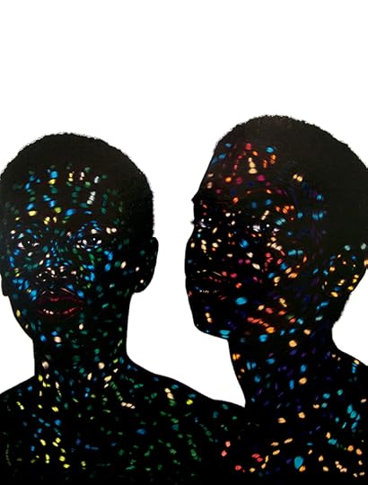
Toyin Ojih Odutola, I Wish You Would, 2011. Pen ink and acrylic ink on board. © the artist and courtesy Jack Shainman Gallery, New York
Toyin Ojih Odutola’s drawings engage, destroy, highlight, and ultimately privilege a new grammar for blackness. Using black ballpoint, graphite, pastel, and charcoal, Odutola subordinates representation and fact telling to mark making and open-ended image construction. Before a face becomes a face, for example, we take in its shapes, tonality, and lines. Whose particular face we are traveling toward rarely is the point. Whether Prince Charles’s portrait or Odutola’s self-portrait, what matters is not the specific identity of the subject but the cumulative buildup of line that brings weight, complexity, and mobility to her images. It is here—in the line—that Odutola’s genius lives.
In Odutola’s work, the materials and the marks they make become primary. In her hands, portraits hand over their individuality and negate racial specificity. The marks themselves are what become ineffaceable. The dark line and its repetition reimagines terrain—marking and thereby making blackness unfamiliar as it accumulates into flesh to be read as racially significant or not.
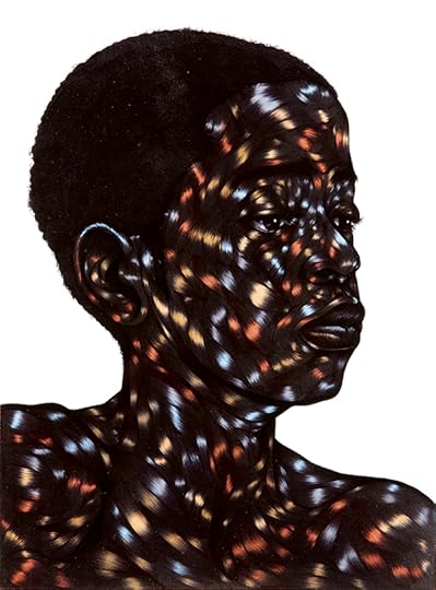
Toyin Ojih Odutola, Above all else make it look effortless, 2012. Pen ink, marker, and varnish on paper. © the artist and courtesy Jack Shainman Gallery, New York
Because Odutola’s own race is indisputable—she was born in Ile-Ife, Nigeria—the question of whether her portraits can be freed from the limited notion that black artists make “black art” seems to be Odutola’s private joke. Blackness, for her, is not only her subject; it is also her question. The space of blackness is itself the subject of her portraits. Historically, in a narrow read, blackness becomes unilaterally a signifier of race. But in Odutola’s work, race is there or it is not there, but its presence is never without our perceptions and projections. Blackness on the level of the line simply fills the terrain of the body with blackness.
Odutola’s portraits explore how to desegregate blackness from a fixed racial position and open it out to all the mythology, missteps, racism, beauty, and life that is held by the term, while still landing it within the free space of bodies. She engages blackness as a field of tonality. Her system of layering tones moves not toward the real but toward an alternative privileging of fluidity within the line. Individuals populate her portraits but remain in conversation with something less knowable than their presumed identity. To settle down her images, to name them, is to render them monolithic.

Toyin Ojih Odutola, My Country Has No Name, 2013. Pen ink and marker on board. © the artist and courtesy Jack Shainman Gallery, New York
In all ways Odutola complicates the historical pull, in a white supremacist frame, toward blackness as “simply” a racial demarcation. She renders blackness as topography while offering it life in the form of figures. Her artistic project demands the preeminence of her mark, which, depending on the tool she employs, renders a peripatetic blackness.
A poet, essayist, playwright, and 2016 MacArthur Fellow, Claudia Rankine is the author, most recently, of Citizen: An American Lyric (2014).
Read more from “Vision & Justice” or subscribe to Aperture and never miss an issue.
The post A New Grammar for Blackness appeared first on Aperture Foundation NY.
September 21, 2016
Photography is Miraculous
Kaja Silverman revises the history of a deceptive medium.
By Eugenie Shinkle

John Dugdale, Self Portrait with Lilacs for Walt Whitman, 1999. Courtesy Holden Luntz Gallery
Two claims have come to dominate our understanding of photography: the photograph’s link to the past, and its indexical relationship to the external world. Kaja Silverman, professor of contemporary art at the University of Pennsylvania, sets out to challenge these axioms in The Miracle of Analogy (2015), the first in a two-volume history of photography. Unlike much of her of her earlier writing, however, Silverman doesn’t roll out her argument with her usual lucidity—she makes you work for it. She also assumes a fairly good working knowledge of phenomenology.
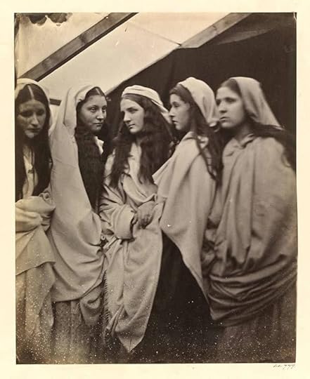
Julia Margaret Cameron, The Five Foolish Virgins, 1864. Courtesy the Victoria & Albert Museum
Nowhere in the book, for instance, is there a categorical definition of analogy; instead, it’s inferred through a series of historical and contemporary case studies. For many Renaissance and Enlightenment thinkers, for example, the camera obscura, an enclosed box or room into which images of the outside world were projected through a lens or small aperture, was understood as an analogy for the human eye—a darkened chamber for gathering visual impressions emanated by objects in the world. Early discussions of the camera obscura conceived of the image as something that was received by the subject rather than taken. It was only with the introduction of increasingly precise lenses in the seventeenth century that the camera obscura began to be appreciated as an instrument for capturing and stilling the flow of images rather than a medium for revealing analogies. And alongside this shift from receiving to capturing emerged the corresponding notion that the image did not originate in the world, but in the intentions of the subject who took the photograph.

Abelardo Morell, Camera Obscura: The Philadelphia Museum of Art East Entrance in Gallery with a de Chirico Painting, 2005 © the artist and courtesy Edwynn Houk Gallery, New York & Zürich
To insist on the photograph as something taken by the subject, Silverman writes, is to think of it as somehow separate from the rest of the world. This implies that the subject taking the photograph is outside of the world looking in, and that the camera is an instrument of control, a tool for mastering the world by creating visual representations. Early experiments in chemical photography were prompted by this imperative to control, to still the stream of moving images that entered the camera obscura. But early photographs, as Silverman shows, were often fluid, unsettled objects. The image that eventually appeared was far from instantaneous: exposures took up to eight hours, and the glass plate or paper negatives had a tendency to carry on developing (or, alternatively, to disappear) even after the fixing process. Because the photograph represented more than one moment in time, it acted as a “trans-temporal” object, evolving “in tandem with the world,” and never reaching what we would now consider to be a finished, permanent state.

William Henry Fox Talbot, Dandelion seeds, ca. 1858. Courtesy the Metropolitan Museum of Art
Similarly, before the positive became the privileged form, positive and negative images were regarded as equally valid depictions of the world. William Henry Fox Talbot, credited with the invention of the calotype process in 1841, understood his first negative images as full-fledged photographs—portraits that worldly forms made of themselves—rather than as templates from which positives could later be produced. Silverman likens this relationship to the philosophical notion of the chiasmus. Proposed by French phenomenologist Maurice Merleau-Ponty, the chiasmus describes the thread of shared experience that unites the person seeing and the object seen, that links “the toucher to what is touched, and sign and visibility to touch and tactility.” The essential reversibility and reflexivity that defines the chiasmus is also embodied in the stereograph, an early form of three-dimensional image. As Oliver Wendell Holmes Sr. wrote in 1859, the stereograph’s illusion of three-dimensionality allowed the viewer to “feel” their way around the depths of the image. However, it also permitted the unpleasant sensation that the pictured objects were reaching out into the viewer’s space.
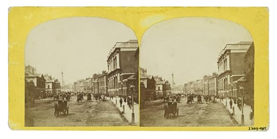
Unknown photographer, Stereoscopic photograph of Parliament Street, looking towards Trafalgar Square, with Whitehall in the foreground, ca. 1850–80. Courtesy the Victoria & Albert Museum
The reflexivity that defines photography is also aligned, Silverman suggests, with the essential reversibility that defines and binds us together as human subjects: the associations, similarities, and resemblances that link the photograph to the world are the same ones that shape our existence. We experience our own visibility through the gaze of others. In spoken language, our sense of shared being with others is expressed through the “reversible and mutually defining” pronouns I and you.
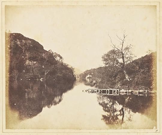
William Henry Fox Talbot, Loch Katrine, 1844. Courtesy the Getty’s Open Content Program
The Miracle of Analogy is more than an alternative history of photography. Silverman makes a number of provocative claims that unsettle not just the perception of photography as a human invention, but our certainty regarding the place of the human subject as master of the visible world. The photograph, Silverman suggests, is “the world’s primary way of revealing itself to us”—a vehicle for disclosing the analogies that bind all of creation together. As such, photography is, and has always been, part of the world—something that we have discovered, not something that we’ve created. Agency, moreover, is not unique to human subjects, it is also innate in the objects in the world that show themselves to vision, and that do so differently to the camera than they do to the human eye.

John Dugdale, Self Reliance, 1998. Cyanotype. Courtesy Holden Luntz Gallery
The industrialization of photography, on the other hand, is aligned with the philosophical drive—originating in the Enlightenment philosophy of René Descartes—to ascribe agency to human subjects alone, to establish the subject as the origin of the visible world and the creator of meaning. If this rupture between subject and world, as Silverman argues, has also come to dominate histories of photography, then The Miracle of Analogy seeks to restore to photography what history has stolen from it: its sense of interconnection with the world, and the camera as a means of experiencing the world rather than simply a tool for documenting it.
Eugenie Shinkle is Reader in Photography at the Westminster School of Media Arts and Design.
The post Photography is Miraculous appeared first on Aperture Foundation NY.
Aperture's Blog

- Aperture's profile
- 21 followers

