
Aperture's Blog, page 129
November 11, 2016
Announcing the Winners of the 2016 PhotoBook Awards
Paris Photo and Aperture Foundation are pleased to announce the winners of the 2016 edition of the Paris Photo–Aperture Foundation PhotoBook Awards, celebrating the photobook’s contribution to the evolving narrative of photography.
Winner of First PhotoBook ($10,000 prize)
Michael Christopher Brown
Libyan Sugar
Publisher: Twin Palms Publishers, Santa Fe, NM, 2016
Designed by Michael Christopher Brown and Ramon Pez
A record of photographer and filmmaker Michael Christopher Brown’s life during the 2011 Libyan Revolution, Libyan Sugar serves as a trip through a war zone. “An impressive book—you feel as though you are in the war with the photographer,” Thomas Zander says. Katja Stuke adds, “Libyan Sugar offers a strong combination of the personal and the documentary.”
Winner of Photography Catalogue of the Year
Karolina Puchała-Rojek and Karolina Ziębińska-Lewandowska
Wojciech Zamecznik: Photo-graphics
Publisher: Fundacja Archeologia Fotografii, Warsaw, 2015
Designed by Anna Piwowar and Magdalena Piwowar
Polish-English catalogue Wojciech Zamecznik: Photo-graphics is the first complex compilation of work by Wojciech Zamecznik, the Polish graphic artist, architect, photographer, and interior designer. “A true discovery,” says Agnès Sire.
Winner of PhotoBook of the Year
Gregory Halpern
ZZYZX
Publisher: MACK, London, 2016
Designed by Lewis Chaplin
Moving from the desert east of Los Angeles, and moving west toward the Pacific, Gregory Halpern’s photographed Los Angeles as a site of fantasy that reflects the city’s ironies, chaos, and paradoxes. “Great photography is the ultimate arbiter,” says Paul Graham. “The outstanding work in Gregory Halpern’s ZZYZX carries the day.”
Special Jurors’ Mention
Annett Gröschner and Arwed Messmer
Taking Stock of Power: An Other View of the Berlin Wall
Publisher: Hatje Cantz, Ostfildern, Germany, 2016
Designed by Carsten Eisfeld
Taken by members of the East German Border Patrol in the 1960s, the photographs in Gröschner and Messmer’s expansive two-volume project Taking Stock of Power: An Other View of the Berlin Wall were originally intended to document weak spots along the wall. Over fifty years later, the images, which were left in undeveloped rolls and forgotten in federal archives, are brought to light and restored, complete with maps and texts.
This year’s shortlist selection was made by Christoph Wiesner (Artistic Director, Paris Photo), Lesley A. Martin (Creative Director of the Aperture Foundation book program and The PhotoBook Review), David Campany, Ann-Christin Bertrand (Curator, C/O Berlin), and Dr. Rebecca Senf (Chief Curator and Norton Family Curator of Photography at the Center of Creative Photography, Tucson).
The shortlist was first announced at the Opening Days of the European Month of Photography on October 1, 2016. The thirty-five selected photobooks are profiled in issue 011 of The PhotoBook Review, Aperture Foundation’s biannual publication dedicated to the consideration of the photobook. Copies will be available at Aperture Gallery and Bookstore. Subscribers to Aperture magazine receive free copies of The PhotoBook Review with their summer and winter issues.
The post Announcing the Winners of the 2016 PhotoBook Awards appeared first on Aperture Foundation NY.


November 8, 2016
The Cotton Bowl and the Super Bowl
Coinciding with Aperture magazine’s “Vision & Justice” issue, students in Sarah Lewis’s Harvard University class “Vision & Justice: The Art of Citizenship” contributed essays on the relationship between images of social unrest and landmark Supreme Court decisions. Here, Eli Wilson Pelton reflects on Hank Willis Thomas and Dred Scott.
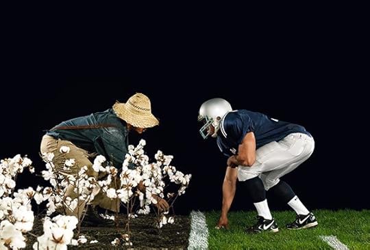
Hank Willis Thomas, The Cotton Bowl, 2011
Courtesy the artist and Jack Shainman Gallery, New York
How can one be free but not a citizen? This is the paradox that the Supreme Court codified with the 1857 ruling of Dred Scott v. Sandford, which declared “a negro, whose ancestors were imported into this country, and sold as slaves,” was “[not] a member of the political community formed and brought into existence by the Constitution” and therefore ineligible for citizenship, whether free or enslaved. This is the paradox that continues to manifest itself within our contemporary American landscape. The Dred Scott case reiterated citizenship as a contested site predicated on the body, one not found in the body’s relation to its surroundings, but in the very body itself. Dred Scott made explicit, via legal history, that which was implicit in everyday life: to be a black American was and always will be a shifting gradient of citizenship negotiated through the body.
Hank Willis Thomas’s photograph The Cotton Bowl, part of his 2011 series Strange Fruit, makes this legal history legible through the great American congregation that is football. His digital c-print closes the historical and imaginative gap between two fields familiar to black Americans: the cotton field and the football field. Two black male bodies, their faces obscured by a straw hat and a football helmet, respectively, face each other in similar poses: the slave crouching to pick cotton and the football player crouching as he waits for the ball. The anonymous bodies are mirror images of each other, strung like paper dolls against a jet-black background, and suspended in an environment of atemporality, spectacle, and artifice. The photo traces the lineage of black bodies as commodified tools of profit, and maps the genealogy of black ownership: yesterday it was massa, today the NFL. The figures’ anonymity reinforces their status as objects reduced to bodies and re-inscribes history on contemporary football parlance (players are bought, branded and traded, scorecards and stats are kept, chain gangs are made).
In interviews, Thomas makes clear that the field in The Cotton Bowl is intended to represent twentieth-century sharecropping instead of slavery, and is a greater rumination on “exploitation” and “spectacle.” His insistence on distinguishing between sharecropping and slavery points to his belief in the continual seepage of the historical past: black exploitation did not end with slavery, but continued with sharecropping, lynching, and redlining, and continues with the NFL, NBA, and police brutality. Thomas wants the viewer to imagine these legacies not as closed historical episodes, but instead as experiences on a continuum, shifting with time and always under constant, bodily negotiation. This is the paradoxical legacy of Dred Scott: freedom and citizenship continue to be a contested binary within the black body, regardless of the type of field.
Eli Wilson Pelton studies American history and literature at Harvard University.
The post The Cotton Bowl and the Super Bowl appeared first on Aperture Foundation NY.
Inside Aperture’s October Paul Strand Circle Cocktail Party
On October 13, Aperture Foundation Paul Strand Circle Members, trustees, and staff, along with executive director Chris Boot and editor-at-large Melissa Harris, gathered to celebrate pioneer of social documentary photography Bruce Davidson’s thirty-year publication history with Aperture and the recent monograph Bruce Davidson: Survey. Founding Aperture Paul Strand Circle Members Judy and Leonard Lauder hosted the party with cocktails and hors d’oeuvres at their Manhattan home. The artist shared with the group eloquent and funny stories about working with famous subjects at different locations. Guests had the opportunity to ask questions of Davidson and his wife Emily, in addition to receiving private, curated tours of the Lauders’ magnificent art collection. Guests were also treated to a complimentary and signed copy of Survey.
Aperture Foundation is a non-profit 501(c)(3) organization that relies on the generosity of individuals for support of its publications, exhibitions, and public and educational programming. To join Aperture’s Patron Program, click here or contact Emily Grillo at egrillo@aperture.org or 212.946.7103.


All photographs © Yi Huang
The post Inside Aperture’s October Paul Strand Circle Cocktail Party appeared first on Aperture Foundation NY.
November 7, 2016
In California, Trees as Witness and Living Memorial
Coinciding with Aperture magazine’s “Vision & Justice” issue, students in Sarah Lewis’s Harvard University class “Vision & Justice: The Art of Citizenship” contributed essays on the relationship between images of social unrest and landmark Supreme Court decisions. Here, Elizabeth Huber reflects on Ken Gonzales-Day and the history of lynching in California.

Ken Gonzales-Day, At daylight the miserable man was taken to an oak, 2003, from the series Searching for California’s Hang Trees
Courtesy the artist
Ken Gonzales-Day’s Searching for California’s Hang Trees is a series of photographs that depicts the possible or confirmed sites of lynching in California between 1850 and 1935. In one image from the series, At daylight the miserable man was taken to an oak (2003), Gonzales-Day photographed a Californian oak from a very low angle. Through this series, Gonzales-Day calls attention to the lack of historical memory regarding the lynching of Mexican Americans in California, as well as Native Americans, African Americans, and Chinese immigrants. Gonzales-Day visualizes the historical erasure of non-white, racialized bodies, and disrupts the traditional American understanding of race as a black/white binary.
Gonzales-Day cites the explicit use of photography as a tool for witnessing. In At daylight, he positions the oak as the subject of the image in a portrait-like manner: from a low angle perspective, the oak engulfs the entire frame. The close-up of the oak allows the viewer to examine the tree in great detail as an individual, living thing, set in contrast to the silenced lives that ended nearby. While the names of the lynched are sometimes absent in American history, the trees, as photographic subjects, become memorials to those who have died. The trees are conscripted as witnesses to an elided narrative: The trees were present before people were hung and they remained thereafter. This notion of the silent witness in conversation with the silenced victim further encapsulates the artist’s motivation to recover historical memory.
In choosing trees as subjects of his series, as well as through the composition of the images themselves, Gonzales-Day underscores both the pain and suffering endured by African Americans and Mexican Americans, and the additional violence of erasure from the official record. In speaking about his work, Gonzales-Day emphasizes how his work also functions as documentation. The work is able, as he puts it, to “relocate that history in the present.” Furthermore, he views Searching for California’s Hang Trees as a way of extending our historical understanding of race relations, rather than trying to “diminish or distract” from the historical legacies of lynching on the African American community. In this manner, Gonzales-Day challenges us to look back while we look ahead, and to reposition Latino bodies in the historical and cultural legacies of the United States.
Elizabeth Huber studies history and literature at Harvard University.
The post In California, Trees as Witness and Living Memorial appeared first on Aperture Foundation NY.
Keith Lamont Scott and the Legacy of Police Violence
Coinciding with Aperture magazine’s “Vision & Justice” issue, students in Sarah Lewis’s Harvard University class “Vision & Justice: The Art of Citizenship” contributed essays on the relationship between images of social unrest and landmark Supreme Court decisions. Here, David E. White Jr. reflects on Sean Rayford and equal protection for African Americans.

Sean Rayford, Protests Break Out In Charlotte After Police Shooting, 2016
© the artist/Getty Images
Sean Rayford, a freelance photojournalist and commercial photographer based in Columbia, South Carolina, captured this photograph of a woman smearing blood on a police riot shield during a protest in downtown Charlotte, North Carolina at about 9:00pm on September 21, 2016. Citizens were protesting the death of Keith Lamont Scott, a black man, who was shot and killed by the police the previous day. Married for more than twenty years, and a father of seven children, Scott was forty-three years old and had worked as a security guard at a local mall.
Mindful that photographs must be “composed to be readable” by his audience, Rayford often relies on his subjects’ faces to capture the emotion of a moment. But in this frame, faces are conspicuously absent. Instead, the hand of a black woman, soaked in blood, is wiped across a military-grade police riot shield. Describing the scene leading up to the photograph, Rayford recalled, “It happened right in front of me. I was surprised. I thought, ‘She’s going to do this—she’s going to smear blood on the shield’ … It’s almost as if she was saying, ‘The blood’s on you.’” Rayford believes the blood on the woman’s hand belonged to twenty-six-year-old Justin Carr, a black protestor who was shot and later died while demonstrating Scott’s death at the hands of police.
This photograph of a bloody hand on the police shield underscores that black citizens have yet to attain full American citizenship in that blacks still suffer an equal protection deficit. The U.S. legal system continues to prove that, practically speaking, the snuffing out of black lives by police is legally permissible, and Screws v. United States (1945) is one of the leading cases for this proposition. In Screws, a county sheriff and other law enforcement officers detained Robert Hall, a black man, under the guise of a potentially fraudulent arrest warrant. Once in the officers’ custody, Sheriff Screws and his fellow officers beat Hall to death, allegedly over a grudge. When the State of Georgia refused to prosecute the officers, the federal government interceded and charged the men under 18 U.S.C. § 242, a federal statute making it a crime for “whoever, under color of any law … willfully subjects any person … to the deprivation of any rights, privileges, or immunities secured or protected by the Constitution or laws of the United States.”
In a plurality opinion, the Court adopted a sharply narrow reading of § 242, finding that the defendant must have acted with “a purpose to deprive a person of a specific constitutional right.” This cramped interpretation not only led to Sheriff Screws and his co-defendants’ acquittal, but also stymied federal prosecution of law enforcement under § 242 for the next several decades, including through the present day. And although some scholars have noted that the Screws decision helped speed the development of 42 U.S.C. § 1983, the civil analogue to § 242, police continue to kill black people with impunity and evade federal criminal conviction because of feeble constitutional protections. If blacks were once legally considered three-fifths of a person, perhaps today’s unchecked state-sanctioned violence proves they have yet to attain the elusive two-fifths that remain.
David E. White Jr. is a third-year law student at Harvard Law School and former Captain in the U.S. Army.
The post Keith Lamont Scott and the Legacy of Police Violence appeared first on Aperture Foundation NY.
Envisioning the Right to Vote
Coinciding with Aperture magazine’s “Vision & Justice” issue, students in Sarah Lewis’s Harvard University class “Vision & Justice: The Art of Citizenship” contributed essays on the relationship between images of social unrest and landmark Supreme Court decisions. Here, Jonathan Karp reflects on Bruce Davidson and voter ID laws.
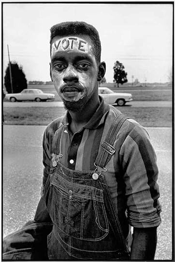
Bruce Davidson, Young man with “Vote” painted on his forehead walking in the Selma March, 1965
© Bruce Davidson/Magnum Photos
Somewhere between Selma and Montgomery, in the first days of spring 1965, Bruce Davidson took a photograph of a young black marcher. The young man’s name is not recorded, but he appears in several of Davidson’s photographs of the march from Selma to Alabama’s capital. It’s no mystery why. The young man’s painted face illustrates the fight for voting rights in literal, stark relief: “VOTE.” The word is his skin, his blackness. Whiteness, in the photo and in the United States, is required for both the word’s legibility and the citizenship it represents.
In other photographs, the young man moves. He marches, eyes forward and fixed beyond the frame, his mouth open in mid-chant. The sound and action of these photographs makes the “Vote” photograph seem still in equal measure. Here, the young man looks directly at the photographer’s lens. Although Davidson was working in the context of documentary photography, the angle of his subject’s torso and his direct gaze places the image in the tradition of portraiture. It’s the combination of this formal stillness, the provocative face paint, and the context of the civil rights movement, which, paradoxically, suggests a relationship between the photograph and a Supreme Court case that would be decided fifty-three years after it was taken. In fact, Davidson’s photograph finds its echo in the modern debate on photo ID laws.
Crawford v. Marion County Election Board, decided in 2008, holds that an Indiana law requiring voters to show photo identification does not violate the Constitution. Though voter ID laws have existed in the United States since 1950, Indiana was among the first states to require photo IDs specifically. These laws serve to discourage or outright prevent those without photo IDs—a disproportionate number of whom are African American—from voting. What does it mean for the state to require a portrait in exchange for exercising one’s rights as a citizen? In this context, Davidson’s photograph reveals how photo IDs are merely the latest visual site where ideas of race, citizenship, and justice collide.
ID photographs are a form of portraiture, but also the portrait’s fraternal twin, the “type,” which establishes norms and compares subjects against those norms. Through a scientific gaze as dispassionate as any at the DMV, nineteenth-century types codified racial difference and justified racism. Photo IDs, as a contemporary type, are similarly relied upon for their accuracy, their ability to classify, and their existence as proof of citizenship.
In the spring of 1965, a young man marched to claim his rights. A half-century later, his image might now exist in a state archive, allowing him, in some states, to vote. A century earlier, his image might have entered an archive and marked him as subhuman. These multiple visions mark the end of slavery, the maintenance of state power, and the uninterrupted life of photography as an apparatus with which black Americans must negotiate their humanity and their citizenship.
Jonathan Karp studies race, protest, and performance in Harvard University’s Ph.D. program in American Studies.
The post Envisioning the Right to Vote appeared first on Aperture Foundation NY.
Racial Innocence in Postwar America
Coinciding with Aperture magazine’s “Vision & Justice” issue, students in Sarah Lewis’s Harvard University class “Vision & Justice: The Art of Citizenship” contributed essays on the relationship between images of social unrest and landmark Supreme Court decisions. Here, Maia Silber reflects on Gordon Parks, “doll tests,” and segregation.

Gordon Parks, Untitled, Harlem, New York, 1947
© and courtesy The Gordon Parks Foundation
In the 1940s, the psychologists Dr. Kenneth Clark and Dr. Mamie Clark designed the infamous “doll tests” to study the effects of racial segregation on children. In their tests, the Clarks asked African American children to express preferences for black or white dolls. Their discovery that the majority of black children chose white dolls played an important part in the 1954 Supreme Court case Brown v. Board of Education, which ruled against segregation in public schools.
Since Brown v. Board, the Clarks’ “doll tests” have become a fixture in both psychological study and popular culture. In the sixty years since Brown v. Board, journalists, talk show hosts, and amateurs have replicated the “doll tests.” They have seen the consistent results of the experiment as evidence of internalized racism that has persisted long after desegregation.
The pioneering photographer Gordon Parks documented the experiments in a 1947 series for Ebony magazine. In one image, he depicts a young boy seated alone in the experiment room. Above the boy, disembodied hands clutch the heads of two dolls. The boy points at the white one. His stoic expression confirms the tragedy of the Clarks’ experiment while complicating our understanding of its results.
The Clarks asked their audience to examine the psyche of the black child, and imagine his vulnerability and his suffering. Parks facilitates this intimate exchange by cropping his image closely—even uncomfortably—around the boy. He positions the viewer behind the pair of disembodied hands. They are the actual hands of the experimenter and the symbolic hands of the system that forces black children to make impossible choices every day. They become our hands, too. We are no longer disinterested observers but direct actors.
Forced into this role, we confront the boy’s suffering, and his vulnerability, but also something more. The boy’s left hand, resting under his chin, draws our attention to his expressive eyes. Those eyes do not look at the white doll. Instead, the boy seems to gaze back into the experimenter’s eyes. His expression suggests neither despair nor defiance, but rather recognition of his impossible and tragic role.
In her book Racial Innocence: Performing American Childhood from Slavery to Civil Rights (2011), Robin Bernstein offers a different interpretation of the “doll tests.” Tracing a century-long history of children’s play, Bernstein argues that cultural scripts of both servitude and violence informed play with black dolls. Bernstein thus sees children’s choice of the white doll not as tacit acceptance of white superiority, but as conscious rejection of those demeaning play-acts. Their agency emerges not in defiance, but in compliance. By responding to the “doll tests” precisely as the Clarks expected them too, the children enacted their own form of resistance.
The Clarks constructed a performance of black childhood innocence, and black children, Parks suggests, understood their role in this performance. The boy appears to know that by pointing, he becomes both scientific evidence and legal testimony. A representative of childhood experience, he was asked to bear so much more than a child ever should.
Maia Silber studies history and literature at Harvard University.
The post Racial Innocence in Postwar America appeared first on Aperture Foundation NY.
November 3, 2016
The Pleasure of the Text
Merging images and words, conceptual artists in the 1970s advanced a new visual language.
By Travis Diehl
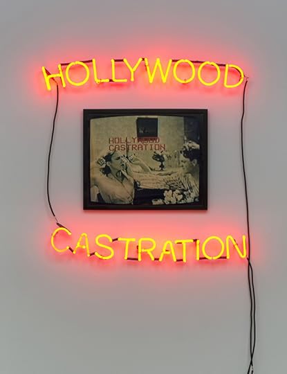
Lew Thomas, Hollywood Castration, 1986. Ektacolor print, neon
Courtesy Cherry and Martin, Los Angeles. Photograph by Brian Forrest
The four artists featured in Photography and Language, recently on view at Cherry and Martin in Los Angeles, worked in San Francisco in the 1970s and ’80s in a scene anchored by NFS Press, run by Lew Thomas and Donna-Lee Phillips. With dry, structuralist wit, Thomas and Phillips, as well as Peter D’Agostino, Hal Fischer, and their peers, probed the confusion between “conceptual art” and the sometimes-maligned genre “conceptual photography.” This often meant both mocking and reaffirming the abilities of the medium. Included in the exhibition were six panels from one of NFS’s more famous titles, Hal Fischer’s Gay Semiotics: A Photographic Study of Coding Among Homosexual Men (1977), a subcultural typology of gay signifiers like key rings and amulets and silk shorts that pokes gentle fun at the clichéd language of cruising—and the limits of signs.
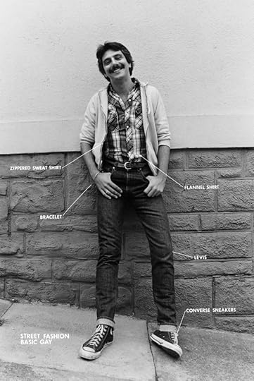
Hal Fischer, Basic Gay from the Street Fashion series from Gay Semiotics, 1977
Courtesy Cherry and Martin, Los Angeles
For the latest installation of Deposition (1974–76), Lew Thomas wallpapers one gallery wall with several copies of the August 3, 2016 Los Angeles Times. The splayed-out daily reveals its particular proportion of image to text, reiterating that the mystique of the photograph always comes connoted; in print and otherwise, we are told what pictures tell us. Mounted to this topical mess is a panoramic storyboard: a man has barricaded himself in his apartment during a string of racially motivated murders—the sensational “Zebra murders” of the mid-’70s—as if to protect against news itself. Strips of mundane photographs are captioned by increasingly involved, handwritten synopses. The denotative authority usually attributed to photos instead dissolves into a slurry of words. In another mode, Thomas’s LAVERNE’S PORTRAIT EQUALS 36 EXPOSURES (1972), a six-by-six grid of unflinching headshots, depicts the same man’s face thirty-six times, but Laverne remains a mystery.

Lew Thomas, PORTRAIT EQUALS 36 EXPOSURES, 1972
Courtesy Cherry and Martin, Los Angeles. Photograph by Jeff McLane
If the disembodied, technological nature of photography suggests systematic or even scientific control, these artists nonetheless found an eroticism in mechanized speculation. Peter D’Agostino’s Suburban Strategies: LA (Century City) (1980), is a kind of nonlinear soap opera shot in the style of surveillance cameras. A monitor plays the video beside a row of stills. Supposedly a romance, the story takes place in a granulated anonymity of freeways and malls. Whatever tenderness there might be is conveyed not so much through images as with plaintive intertitles (“Is everything alright?”). Both registers, text and image, leave us wanting: one definition of desire.

Donna-Lee Phillips, Muscle/Fascia, from the series Anatomical Insights, 1978
Courtesy Cherry and Martin, Los Angeles
In Donna-Lee Phillips’s Anatomical Insights: The Abdomen (1978), the artist overlays her own body with illustrated, labial incisions from a medical textbook. When process encounters the contingencies of flesh, desire offers an interface. Phillips’s piece is one part of thirteen total; as such, it feels like a token in a show that could have included work by JoAnn Callis, Ellen Brooks, and Barbara Kruger, among other women artists in the NFS orbit. Photography and Language takes its name from the press’s influential 1976 anthology of over a dozen artists, yet the show is weighted towards Thomas and Fischer, who are represented by Cherry and Martin, and augmented by just two more. Intriguing but unbalanced, Photography and Language is best considered a prompt for a full-scale treatment of this conceptualist coterie.
Travis Diehl is a writer based in Los Angeles.
Photography and Language was on view at Cherry & Martin, Los Angeles, from August 6–October 29, 2016.
The post The Pleasure of the Text appeared first on Aperture Foundation NY.
Tania Franco Klein’s Homage to William Eggleston
In advance of “Dear Bill,” Aperture Foundation’s 2016 Benefit Party honoring William Eggleston, Aperture asked photographers to submit their Eggleston-inspired images through the Instagram hashtag #aperturedearbill. Chris Boot, executive director of Aperture Foundation, chose the winner.

Tania Franco Klein, Untitled Self-Portrait, from the series Our Life in the Shadows, 2015
Courtesy the artist
We ran a little competition on Instagram, prompting people to post pictures that bore some inspired relationship to the work of William Eggleston. The winner, who I got to choose, received a pair of tickets to our benefit party on October 24, 2016.
I chose a strong self-portrait by—it turns out—a young Mexican photographer, Tania Franco Klein. Tania recently finished her Masters in Photography at the University of the Arts in London, and prior to that she earned a BA in Architecture in Mexico City. I thought no more of it, didn’t worry to check where she might be based, but Tania traveled to New York all the way from Mexico City. She came up to me to introduce herself in the course of the evening, with her mum, so happy to be there, and having the time of her life. Her face was one of the highlights for me of our benefit party!
We invited her in to Aperture to show us what she is up to. The series she had in her bag was striking and surreal. Called Pest Control, what would have been decent photographs of banal scenes of daily life—people in line at the post office line; a seat on a train; the reception desk at a seedy hotel—she has made strange and surprising by installing pigeon repellent spikes, as if a fashion accessory, or decorative detail. At some level, the series is a photographic response to the prevalence of pigeons in modern cities—and the pigeon spikes—and these photographs are a simple delight. —Chris Boot
Tania Franco Klein, Queue, Post Office NW10 2PX, from the series Pest Control, 2015
Courtesy the artist

Tania Franco Klein, Room 64, 88401, from the series Pest Control, 2016
Courtesy the artist
Tania Franco Klein, Front Desk, 28004, from the series Pest Control, 2016
Courtesy the artist
Tania Franco Klein, Customer Service, 10166, from the series Pest Control, 2016
Courtesy the artist
The post Tania Franco Klein’s Homage to William Eggleston appeared first on Aperture Foundation NY.
November 1, 2016
From the Corridors of Power, A Portrait of Reagan-era Politics
With a once-in-a-generation election on the horizon, Aperture spoke with photographer Judith Joy Ross, whose series Portraits of the United States Congress, 1986-87 is currently on view at Tops Gallery in Memphis. Here, Ross reflects on photographing the men and women at the height of American leadership. —Emma Kennedy
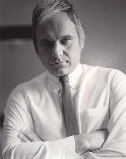
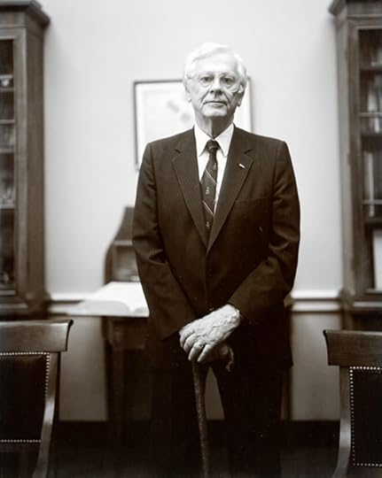
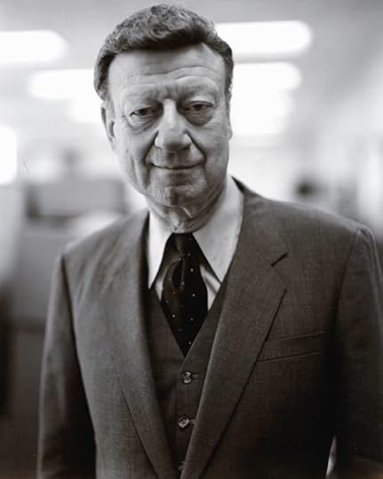
Judith Joy Ross, Congressman James A. Traficant Jr., Democrat, Ohio, 1986
Courtesy the artist
Aperture: You made Portraits of the United States Congress, 1986–87 ten years after Richard Avedon’s The Family, a project about American leaders in politics, finance, and media, originally commissioned by Rolling Stone for the United States Bicentennial. But, unlike Avedon’s forensic treatment of figures such as Rose Kennedy and Ronald Reagan, your series is more intimate and sensitive, while being no less authoritative. Did you have Avedon in mind when you made this project?
Judith Joy Ross: I bet you could never guess that it was the work by the great photographers Southworth and Hawes that compelled me to make Portraits of the United States Congress, 1986–87. I owned a book The Spirit of Fact: The Daguerreotypes of Southworth and Hawes, 1843–1862 (1976), by Robert Sobieszek and Odette Appel, published by Robert Godine. The overwhelming power and nobility of those faces, especially the portraits of Lemuel Shaw, was my guide to making congressional portraits.
The only thing I ever thought about Avedon is rather embarrassing: How come my pictures are not as renowned? But, I figured an Avedon portrait is like a magnificent and very costly arrangement of flowers. My work is like a backyard garden or wildflowers at the side of a road. One way isn’t better than another, just different. Avedon makes his subjects important with his form and style. I am more interested in our ordinariness, our flaws and strengths.
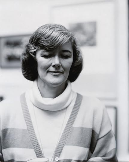
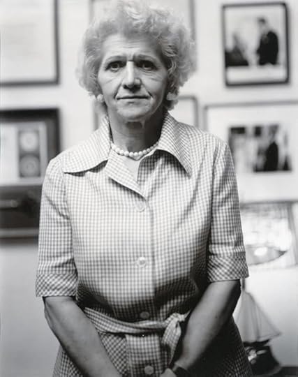
Judith Joy Ross, Congresswoman Pat Schroeder, Democrat, Colorado, 1986
Courtesy the artist
I made Portraits of the United States Congress, 1986–87 to deal with authority figures on my own terms. 1986 was the time of the Iran-Contra Affair. Ronald Reagan was President. Tip O’Neil was Speaker of the House. Congressional figures, just like today, promoted themselves with offensively banal photos. When I was photographing at the Vietnam Veterans Memorial in 1983–84, the Capitol was visible in the distance. I wanted to know who these people were who were in our government, the people who were running our lives. They didn’t look real to me in the media except for on the MacNeil/Lehrer show (now PBS NewsHour), where the masks were off.
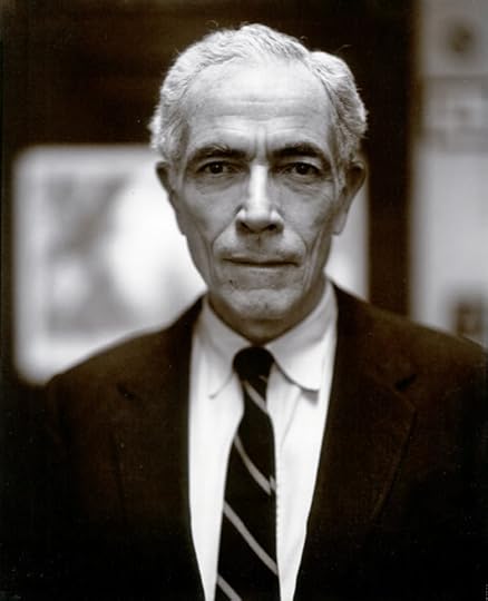
Judith Joy Ross, Senator Claiborne Pell, Democrat, Rhode Island, 1986
Courtesy the artist
Aperture: Could you tell us about your sessions with the Congresspeople? How did you describe your intentions to the politicians, and why do you think they agreed to be photographed?
Ross: I contacted the appropriate staff of the Senator or Congressman or Congresswoman who I wanted to photograph, and I requested an opportunity to photograph them in their office during a fifteen-minute appointment. I stated that their subsequent portrait would be exhibited during the Bicentennial of the U.S. Constitution at America’s oldest art museum, the Pennsylvania Academy of Fine Arts in Philadelphia. That’s all I had to offer them—a little bit of patriotic publicity. I had arranged an exhibition before I made the pictures. A very nervy thing.
I figured out who to photograph with the help of the wonderful Almanac of American Politics published by the National Journal. It is a 1,591-page compendium of information about the Members of the House and the Senate. There are tiny pictures of each member of the House and the Senate, with detailed informoation on how exactly they voted and who they represent. I picked people I disagreed with and people I agreed with. This was very inspiring.
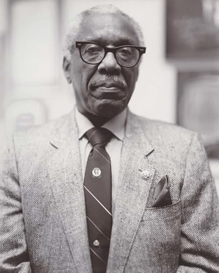
Judith Joy Ross, Congressman George W. Crockett Jr., Democrat, Michigan, 1986
Courtesy the artist
During the year I worked on this, I would spend one week arranging for appointments from my home in Allentown, Pennsylvania. (This was back in the day of typewriters and telephones with push buttons.) It was very nerve-wracking. I am a very disorganized person, so this was an immense challenge. The alternate week I went to D.C. to shoot.
I shot in available light with an 8-by-10 view camera. I used film designed for copy negatives, which gave me more ability to shoot in terrible light. I set up the camera in five minutes. I had ten minutes to shoot and leave. It could take an hour or more to get from one appointment to another through all the halls of the House or the Senate. There was a lot of waiting, worrying, fear and excitement at wandering those halls, dragging my heavy equipment. When I finally met the Congressperson, sure I was scared, but I was invested in making it work. Finally it was my time! Time to see. Time to discover what was to be seen. Time to make a portrait!
Judith Joy Ross, Congressman Charles E. Bennett, Democrat, Florida, 1986
Courtesy the artist
Aperture: Why did you decide to make classical portraits, with minimal, almost generic context provided by their office settings, instead of, say, images of Congresspeople at work in the chambers or on the campaign trail?
Ross: I did not have any idea I was making “classical portraits,” but I can see what you mean. They are, to me, the kind of pictures that someone who loves Eugène Atget and August Sander as much as I do would likely make.
These pictures are made in the offices of each Congressperson. A place that could not be more intimate. Did I have to include what kind of decor to know who they were? I decided absolutely not. The person was the subject and getting as much of them as possible in the picture was the goal, a huge challenge in low room light.
Also, consider that when you use an 8-by-10 camera, there is so shallow a depth of field with a normal lens, which I used, that you have to eliminate environment unless you back up and make a three-quarters or full-length figure. The congressional office environments were telling, but something has to be sacrificed when you make a picture. In my preceding body of work, Portraits at The Vietnam Veterans Memorial, Washington, D.C. 1983–84, only rarely is the Vietnam memorial seen. The memorial is in the faces of those depicted.
Judith Joy Ross, Congresswoman Helen Delich Bentley, Republican, Maryland, 1986
Courtesy the artist
Aperture: Photography might be a great equalizer, but that doesn’t mean formal portraiture can automatically instill empathy. You’ve said that you made this series in part to “confront” your prejudices. Does your formal portraiture of Congresspeople invite us to imagine perspectives that might be at odds with our own convictions and opinions? And, in the divisive, seemingly intractable negativity of the current election season, what can your portraits tell us about our past—and our future?
Ross: Susan Kismaric states in her admirable book, American Politicians, Photographs from 1843 to 1993 (1994), “Ross had gone to Washington with mix of emotions—hoping that the camera would objectify her subjects and in turn identify some truths about them, and simultaneously wishing that her previously held ideas about who was ‘good’ and who was ‘evil’ would be confirmed. To her surprise, instead of an either/or record of good or evil, she came away with a series of portraits of very human beings. Her subjects appear to suffer the same complicated lives we all do.” Was I always fair or accurate? No I wasn’t. This is a group portrait of us as a nation, including that fact that we are squired in favor of white male representation.
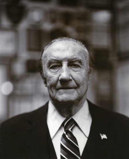
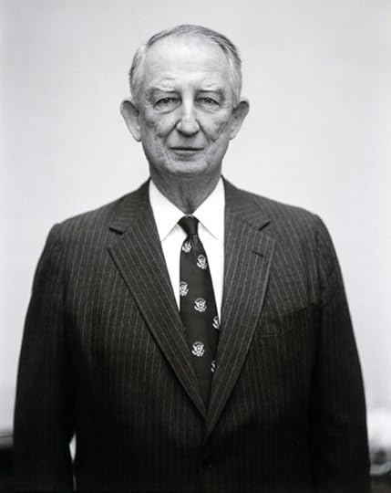
Judith Joy Ross, Senator Strom Thurmond, Republican, South Carolina, 1987
Courtesy the artist
Aperture: Several of the elected officials you photographed, notably Strom Thurmond and Robert C. Byrd, remain controversial for their outspoken resistance to civil rights. How do your images—and the new exhibition—engage this history?
Ross: I am more often than not horrified by the beliefs and actions of others, as we all are on both sides of a position. But this is the deal we have. We are flawed. We can do great things and absolutely horrendous things. And we do not agree on what those things are. Back in the day, when I made these pictures, compromises were made in the Congress. It’s how government works; I don’t have to tell you.
As for Strom Thurmond, I utterly disagreed with him. So what. Here is a man with charisma, and he looked like he could have been a king. He even had what I assumed was Louis XIV furniture in his office. Does he not have that presence here with his enormous shoulders and tiny apple-shrunken head and gleam in his eye, a force to be dealt with and yet….
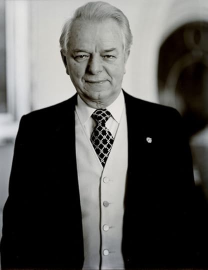
Judith Joy Ross, Senator Robert C. Byrd, Majority Leader, Democrat, West Virginia, 1987
Courtesy the artist
With Senator Byrd, his power also was overwhelming but strange. Yes, sadly at one time he was a member of the Ku Klux Klan. Years later Senator Byrd gave the best and only speech against the Iran–Iraq war. But I do not care about who I disagree with or not. It’s not an issue. Take a look at Senator William Roth. He was powerful and friendly; he looks like Walter Matthau. How about Senator Claiborne Pell. I thought he looked like the Buddha. He told me he was exhausted. I got so close to him because he was so astonishingly calm and beautiful. But I cannot talk about them all.
Judith Joy Ross, Senator William V. Roth Jr., Republican, Delaware, 1987
Courtesy the artist
I did my research, I had my opinion, and then I made discoveries. I believe it could be a truth that you are looking at in these portraits. But, perhaps you would like to know that there was one figure I disliked above all and from whom I walked away from a shoot appointment. I had an appointment to shoot Senator Jesse Helms. And it turned out this shoot was going to be on the Capitol steps, immediately after he was photographed with a high school group. I had my tripod and camera lying in the grass and trees below the Senate side of the Capitol at the right time I was to go up and photograph him. (I imagine I would have been shot by a sniper for such a thing today.) Anyway I walked off … just took my equipment and left. I was content not to make his portrait and to continue to demonize him in my mind. Yet, I was terrified of the responsibility and the incredible opportunity to deal with this site. I don’t know. I just continue to say to myself, I like that I walked away, because it gives me touch of self-righteousness I crave. Whereas the picture I might have made could perhaps have given a more complex and useful result.
Judith Joy Ross, Congressman Sam Gibbons, Democrat, Florida, 1986
Courtesy the artist
Aperture: How do you feel about exhibiting this series again, three decades later?
Ross: I am so pleased with the opportunity to get this work back out there in this politically charged and distressing time. Can these pictures tell us about our future? I can only tell you about me, and I am, as of this writing, terrified.
Emma Kennedy is a work scholar at Aperture magazine.
Portraits of the United States Congress, 1986–87 is on view at Tops Gallery, Memphis, through December 3, 2016.
The post From the Corridors of Power, A Portrait of Reagan-era Politics appeared first on Aperture Foundation NY.
Aperture's Blog

- Aperture's profile
- 21 followers

