
Aperture's Blog, page 109
October 24, 2017
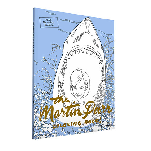
Announcing the Martin Parr Coloring Book Contest!
Photography and Pop-culture buffs, get out your crayons and colored pencils! Martin Parr’s colorful and tongue-in-cheek photographs have been transformed into a coloring book! To celebrate, Martin Parr is giving away a print of this classic photograph, and YOU could be the lucky winner! Announcing the #ParrColoringContest:
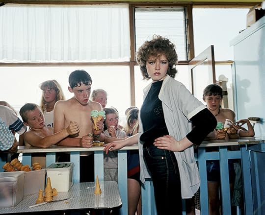
Martin Parr, New Brighton, England, 1983–85; from The Martin Parr Coloring Book! (Aperture, 2017)

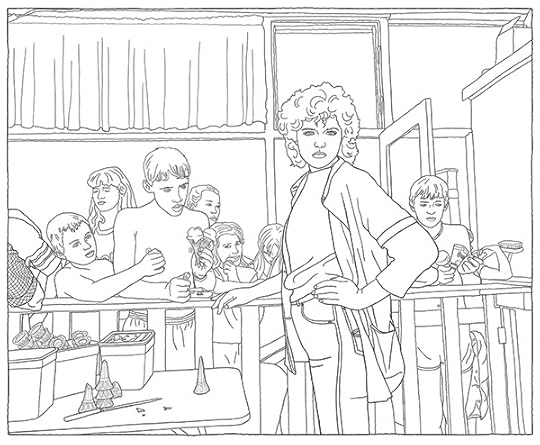
Jane Mount, Drawing of Martin Parr, New Brighton, England, 1983–85; from The Martin Parr Coloring Book! (Aperture, 2017)
To enter:
– On Instagram, post a photo of your colored rendition of the sassy ’80’s cone girl, “New Brighton, England,” pictured above (colored within the book pages only)
– Tag with #ParrColoringContest and @aperturefnd
– Enter by December 2, 2017
Martin Parr will judge the contest.
Order The Martin Parr Coloring Book! here.
For coloring advice from Parr himself, watch below:
The post Announcing the Martin Parr Coloring Book Contest! appeared first on Aperture Foundation NY.


October 23, 2017
Stuart Smith: How Not to Design a Photobook
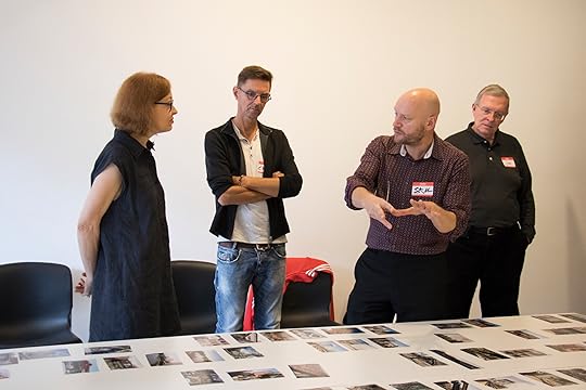
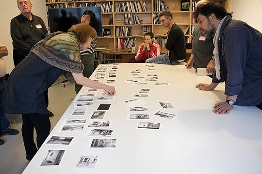
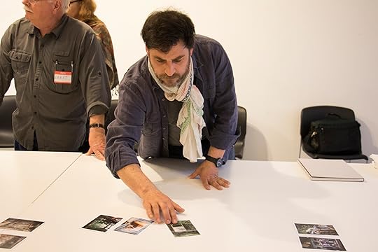
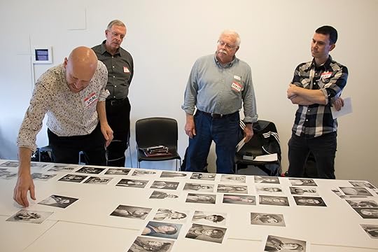
In a two-day weekend workshop at Aperture Foundation, GOST cofounder Stuart Smith taught ten students about the art of making photobooks from his over three decades of experience. “I tell everyone I’m a failed photographer,” Smith joked. From that failed career as a photographer, however, he has constructed a successful one designing photobooks, working first at Phaidon before founding his own companies SMITH and GOST. On the first day of the workshop, Smith gave a thorough lecture about his career in the photobook world, speaking about his favorite titles and what makes them work. Smith divided the rest of the workshop into hour-long individual sessions, in which the class looked on as he worked with each participant’s photographs, giving advice and aiding in sequencing and design. Smith stressed the importance of coherence and consistency when conceptualizing and carrying out a book project, as well as the importance of unexpected material that can be found in the “b-roll,” or the first round of photos that are removed when editing.
On Sunday, Aperture Executive Director Chris Boot joined the workshop for lunch, explaining his own history and perspective on the process of bookmaking. Boot warned against participants shaping their visions to meet market demand, instead encouraging them to “make the best book you can make.” Smith, similarly, highlighted the individuality of each participant’s vision, acknowledging that sometimes the work of bookmaking is intuitive: “It’s when we do it without really trying to do it that it works.”
Students say…
“For those who are trying to get further in the development of a coherent set of photographic images and can see a photobook as a good vehicle for that, this workshop with Mr. Smith’s particular different set of eyes can be invaluable.”
“Stuffed with great information and multiple items to consider when planning a photo project and a photo book.”
“The hours were rich with Mr. Smith’s consistently energetic review, criticism, and advice, over a range of di erent work.”
Stuart Smith has been designing since 1987, specializing in typography whilst gaining an excellent reputation for his distinctive book designs. Stuart started at the Architectural Association and then moved to Phaidon Press, before going on to establish SMITH in 1994, which offers services ranging from art direction and art/photography commissions to photographic editing and advertising, book, and exhibition design, among many other services. Smith is also the co-founder of GOST Books, a photography and visual arts publisher based in London.
Explore Workshops
The post Stuart Smith: How Not to Design a Photobook appeared first on Aperture Foundation NY.
October 18, 2017
A Different Kind of Protest
How did Michael Schmidt’s independent workshop change postwar German photography?
By Sabrina Mandanici
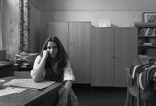
Michael Schmidt, Sozialarbeiterin beim Bezirksamt Wedding (Social worker at Wedding district offices), 1976–78, from the series Berlin-Wedding
© Foundation for Photography and Media Art with the Michael Schmidt Archive
In 1976, the same year that Bernd Becher inaugurated his now-famous photography class at the University of the Arts in Düsseldorf, Germany, the photographer Michael Schmidt founded the Werkstatt für Photographie. Sprung from a need for creative dialogue about the medium, for the following ten years the Werkstatt offered an elaborate program of classes, and invited German and international photographers, including Robert Adams, Lewis Baltz, Larry Clark, William Eggleston, Robert Frank, John Gossage, and Stephen Shore, to hold workshops and exhibit their work. Often, this was their introduction to a German audience. In what was then West Berlin, it was by no means inevitable that an independent workshop would be at the heart of change in German postwar photography. Now, with the expansive catalog Werkstatt für Photographie. 1976–1986 (2016), produced for the occasion of three exhibitions organized by the curators Florian Ebner, Felix Hoffmann, Inka Schube, and Thomas Weski, a hidden chapter of the country’s photographic history has been rediscovered.
Michael Schmidt, Sozialarbeiterin beim Bezirksamt Wedding (Social worker at Wedding district offices), 1976–78, from the series Berlin-Wedding
© Foundation for Photography and Media Art with the Michael Schmidt Archive
The Werkstatt was not a school in the traditional sense. Despite its quick development as Germany’s leading institution to develop, teach, and advocate for a new understanding of documentary photography, it did not provide a degree. Independent, yet part of the Volkshochschule Kreuzberg (Adult Education Center Kreuzberg)—one of the country’s public adult-education centers, many of which still exist today—the workshop’s operating principle was accessibility based on passion. The school was open to anyone, as Schmidt stated in a 1979 interview with Camera magazine, who was interested in studying “photography as a serious means of personal expression.” With darkrooms, various cameras, an office, and two spaces that served simultaneously as classrooms and exhibition venues, the idea was to provide an alternative to standard institutions—to allow for a less technical, more creative, approach to teaching, focused on innovations in content and style, as well as lively discussions about the medium.
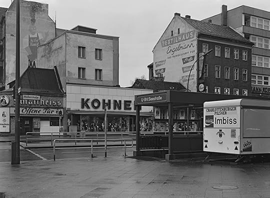
Michael Schmidt, Müller-/Ecke Seestraße, 1976–78, from the series Berlin-Wedding
© Foundation for Photography and Media Art with the Michael Schmidt Archive
As Ute Eskildsen, one of Germany’s first photography curators, describes in the 1995 exhibition catalogue Michael Schmidt: Fotografien Seit 1965 (Michael Schmidt: Photographs since 1965), Schmidt, who was born in Berlin in 1945 and who hadn’t trained as a photographer, encountered the medium by chance while working as a policeman. Intrigued by a colleague’s camera, he began to make pictures in 1965. At first, eager to acquire the skills needed to master the camera as a technical tool, he joined the Verband Deutscher Amateurfotografen (Association of German Amateur Photographers). In 1969, Schmidt’s growing need for a more creative dialogue, and the development of his own practice of subjective response to Berlin and its inhabitants, had exceeded the association’s educational capacity. Instead of looking for other classes that could provide such an exchange, which, in any case, didn’t exist, he began to teach at the adult education centers in the Berlin districts of Kreuzberg and Neukölln.
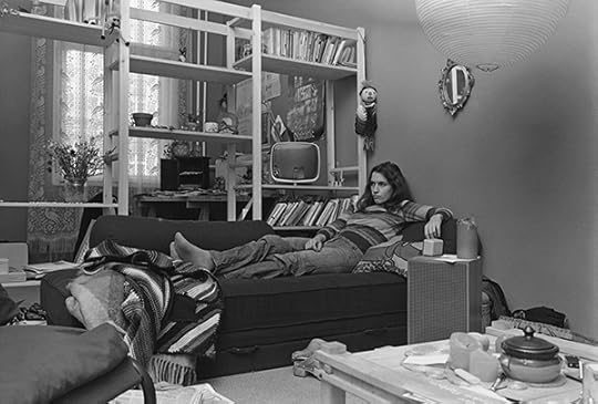
Wolfgang Eilmes, Untitled, 1979, from the series Kreuzberg
© and courtesy the artist
By the mid-1970s, like Schmidt’s career, West Germany’s photographic infrastructure was heading in a different direction. Schmidt had successfully published his first book, Berlin Kreuzberg (1973), had held several exhibitions in Berlin, and was teaching and working full time as a photographer. Meanwhile, a few commercial and nonprofit galleries had been established in Aachen, Berlin, Cologne, Essen, Hamburg, Hannover, and Kassel. Museums had begun to recognize photography as a medium worthy of display, and art schools offered photography classes, although often not with a degree in creative photography. The increasing exposure of the visual language of photojournalism, promoted through a variety of magazines, also informed and influenced a number of individual photographic practices, including Schmidt’s.
Uschi Blume, Untitled, 1980, from the series Worauf wartest du (What are you waiting for)
© the artist
According to Eskildsen, however, it was Camera magazine—through which Schmidt was introduced not only to historic photography, but also to contemporary, international approaches, particularly in American photography—that would have a more significant impact on him. In 1976, after Schmidt had already been developing the Werkstatt’s concept and program, he became a member of the Gesellschaft Deutscher Lichtbildner (Society of German Photographers), where he met André Gelpke, Heinrich Riebesehl, and Wilhelm Schürmann—all photojournalists, yet each pursuing a distinct personal practice. (All would be future guests of the workshop.) In sharing their desire for a photography that was not compromised by commercial pressure, Schmidt must have felt confirmation that is was time for an alternative network to emerge.
Wilmar Koenig, Untitled, 1982, from the series Portraits
© and courtesy the artist
As Thomas Weski and Enno Kaufhold have described, to attend the Werkstatt’s program, participants who did not already have a background in photography first had to sign up for a series of introductory classes. After acquiring the necessary technical skills and presenting their portfolios to the faculty—initially consisting of Schmidt and his former student Ulrich Görlich, and joined by Wilmar Koenig and Klaus-Peter Voutta in 1977—students could attend core and advanced courses. Classroom debates around content, aesthetics, and intention were grounded in Schmidt’s belief in a “sincere” photography, which required photographers to probe their personal relationships with their subjects. Given that these images were, therefore, intimately connected to the person who made them, the critiques could be quite tough. This new generation of photographers made images of landscapes and cityscapes, neighborhood studies, interiors, and portraits. Hildegard Ochse’s photographs of Berlin courtyards and street views, for example, focus on the tamed or uncontrollable appearances of nature, whereas Wolfgang Eilmes’s Kreuzberg (1979) is a sociological study of that neighborhood and its people.
Christa Mayer, Untitled, 1983, from the series Abwesende, Portraits von einer psychiatrischen Langzeitstation (Absentees, Portraits from a long-term psychiatric ward)
© the artist
While the Werkstatt and its faculty did not impose a specific type of imagery or genre, Weski, and former students, have stated that the photographic method taught throughout its first years was closely connected to Schmidt’s creative practice: a sober, factual, almost analytical style of documentary photography, as exemplified in Schmidt’s 1978 book Berlin-Wedding. Divided into two sections, “urban landscape” and “people,” Schmidt depicts Berlin’s Wedding district as a complex fabric of postwar architecture, pavement, and wasteland particular to construction sites. While these fabricated spaces are deprived of any human presence, the neighborhood’s inhabitants are portrayed at work and at home, juxtaposing the manifestation of their personalities in social and private spaces.
Christa Mayer, Untitled, 1983, from the series Abwesende, Portraits von einer psychiatrischen Langzeitstation (Absentees, Portraits from a long-term psychiatric ward)
© the artist
To focus on his own work, Schmidt stopped managing the Werkstatt in 1977 and was replaced by Ulrich Görlich, yet he continued to teach and to assist in developing the workshop’s profile. The following years were marked by the Werkstatt’s increasing interest in American photography and establishing a dialogue between Berlin and the United States, mainly organized by Wilmar Koenig. Individual and group exhibitions were presented by Ralph Gibson, Larry Clark, Lewis Baltz, Joe Deal, Frank Gohlke, and Stephen Shore, who introduced his pioneering approach to color photography; the collective influence of these photographers, in addition to Schmidt’s increasingly looser involvement, the influx of new photographers, and changes in the Werkstatt’s leadership—Wilmar Koenig and Klaus-Peter Voutta replaced Görlich in 1982—allowed for a more subjective photographic language to emerge, as revealed in the portraiture of Christa Mayer and Uschi Blume.
Instead of observing from a distance, Mayer and Blume engaged with their subjects in close proximity, at times even including the photographer’s shadow. In fact, they are part of their environment: Blume of the punk scene she depicts at a Berlin nightclub, and Mayer of the psychiatric ward where she worked as a therapist. As much as Blume’s Worauf wartest du (What are you waiting for) (1980) and Mayer’s Abwesende. Portraits von einer psychiatrischen Langzeitstation (Absentees. Portraits from a long-term psychiatric unit) (1982–86) resonate, respectively, with the grunginess of Larry Clark and the oddity of Diane Arbus, the series are also innately German. Blume and Mayer, together with this new generation of German photographers, reacted to the country’s sociopolitical past and its ramifications in the present, and posed questions about the relationship between society and the individual, as well as the complex notions of place and belonging.
Michael Schmidt, Untitled, 1985–87, from the series Waffenruhe
© Foundation for Photography and Media Art with the Michael Schmidt Archive
From 1984, when the Werkstatt underwent its last change of leadership, until its eventual dissolution two years later, an increasing number of photographers continued to push the subjective possibilities of the medium, culminating in the 1986 exhibition Remains of Authenticity at the Museum Folkwang in Essen, which was organized by one Ute Eskildsen. Many of the exhibition’s participating artists and photographers were connected with the Werkstatt or were former students of Schmidt. In her essay “Remains of Authenticity. Notes on photographic perspectives in 1980s Germany,” Carolin Förtster remarks that in different ways, most of them, including Schmidt, questioned not only the narrative, but also the representational capacities of the medium. Yet, it was not a disenchantment or crisis in photography that brought the Werkstatt to an end, but a change of management of the Volkshochschule Kreuzberg, ultimately leading to budget cuts and restrictions regarding the workshop’s autonomy. With the collective resignation of its members, the Werkstatt closed in the summer of 1986.
There’s more to rediscovering the Werkstatt für Photographie than only amending the history of German photography, or giving artists the credit and exposure they have earned, such as recognizing the striking imbalance between male and female teachers. The Werkstatt was first and foremost driven by the idea to make a difference, to create an environment that other institutions did not or could not provide. In doing so, it became a place of autonomy and a proof that art, indeed, can change our consciousness of what is possible.
Sabrina Mandanici is independent critic based in New York and Berlin.
The post A Different Kind of Protest appeared first on Aperture Foundation NY.
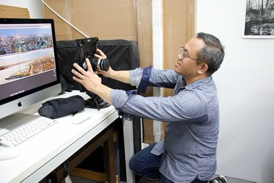
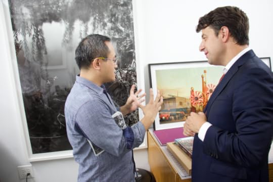
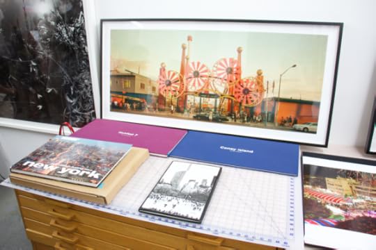
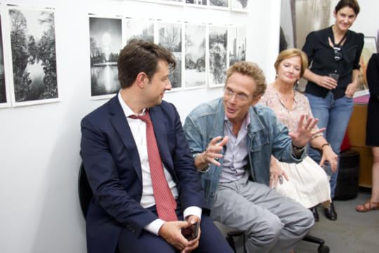
Inside Jeff Liao’s Studio
On September 26, Aperture Members met for a private visit to the Long Island City studio of photographer Jeff Chien-Hsing Liao.
Reagan Brown © Aperture Foundation
Reagan Brown © Aperture Foundation
Reagan Brown © Aperture Foundation
Reagan Brown © Aperture Foundation
Surrounded by vibrant images of Taiwan and New York City, Jeff Chien-Hsing Liao recently hosted Aperture Members at his studio, and explained what first drew him to photography. Following the discussion, Members had an inside look into Liao’s extensive editing process, and watched as he demonstrated the specific positioning of his equipment to perfectly capture the large composite landscapes that he has become known for.
Liao also spoke about his book Jeff Chien-Hsing Liao: New York (Aperture, 2014) while Members sipped wine and flipped through not-yet-released images of his most recent trip to Asia.
Jeff Chien-Hsing Liao (born in Taiwan, 1977) first received recognition with his series Habitat 7, which was featured in the September 11, 2005 issue of The New York Times Magazine as the winner of the Capture the Times photography contest. His solo exhibition, Central Park New York – 24 Solar Terms is on view at Foley Gallery, New York, through October 15, 2017.
To learn more about Aperture’s membership program or to join today, visit aperture.org/join or contact the membership office at 212.946.7108 / membership@aperture.org.
Aperture Foundation is a non-profit 501(c)(3) organization that relies on the generosity of individuals for support of its publications, exhibitions, and public and educational programming.
The post Inside Jeff Liao’s Studio appeared first on Aperture Foundation NY.
October 17, 2017
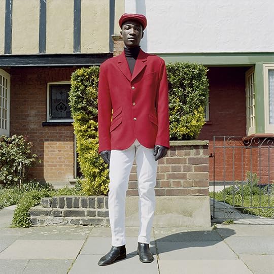
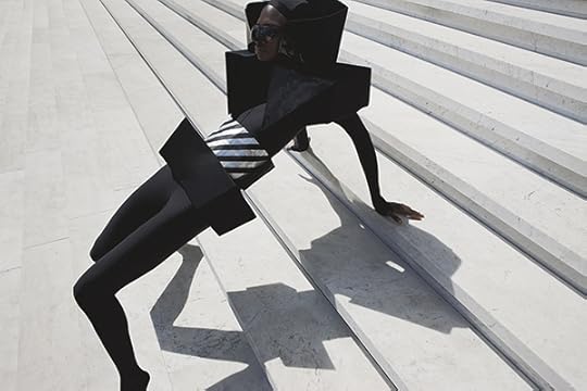
For Durimel, Black Humanity is Not a Fashion Trend
The young photography duo Jalan and Jibril Durimel are transforming the fashion world’s visions of beauty.
By Antwaun Sargent
Jalan & Jibril Durimel, Bigger then, Bigger Glenn, 2017
Courtesy the artists
It all began in front of the camera. In 2012, the French photography duo Jalan and Jibril Durimel created their streetstyle Tumblr Durimel. The blog announced the then eighteen-year-old twins to the world as a creative pair who ran around the streets of Paris taking pictures of themselves in the latest trends. They gained a following. Later that year, when they settled in Los Angeles for college, the twin brothers began modeling in campaigns for American Apparel, AXS Folk Technology, and Union Los Angeles, and made an appearance in the Japanese style tome Popeye.
As models, Durimel became frustrated by the contemporary reality that the commercial fashion image is dominated by trends and a brand’s ability to advertise a closeness to wealth, power, and idealized notions of beauty and cool. It’s a form of representation that diminishes the significance dress plays in telegraphing humanity. In an effort to resolve this tension, they stopped modeling and, like Gilbert & George, Doug and Mike Starn, and Inez & Vinoodh, began a collaborative artistic practice. Their mantra is to “help the world to familiarize itself with its neighborhoods” by “creating still beautiful moments.”
Jalan & Jibril Durimel, Untitled, 2017
Courtesy the artists
A Durimel photograph is distinguishable from the typical glossy fashion photography found on billboards as brand advertisements or seasonal editorials. The duo’s images are imbued with a surrealism derived from what they call a “sartorial interest in style, texture, color, and silhouette.” Pictures such as Kuoth (2015) further critique the notion of the promotional fashion image. As in all of Durimel’s work, the figures represent everyday black people cast from the streets of Jamaica, Sierra Leone, Miami, and Los Angeles as “characters,” not models, in diasporic narratives Durimel tell through dress.
For the R&B singer Sampha’s zine Shy Light, Durimel, in collaboration with the fashion designer Grace Wales Bonner, took natural images of the Process singer’s journey in his familial hometown of Freetown, Sierra Leone. Similar storytelling occurs in Black boys I knew who could self-reflect (2016), a landscape portrait shot on a grassy knoll in the San Pedro neighborhood of Los Angeles. The keen use of the sartorial grants the picture a transformative quality, challenging all who see it to access ordinary beauty through representations of black humanity.
Jalan & Jibril Durimel, Kuoth, 2015
Courtesy the artists
Over the last several years, Durimel have made character driven pictures concerned with evoking emotion and identity by blending interests in color theory, composition, and the politics of dress. “Our images share the story of life through blackness,” Jalan told me. Untitled (2017) and Daughters (2017), two images of the same group of women Durimel met while scouting in the historically black neighborhood of Watts in South Los Angeles, provide a glimpse into how the duo uses style in the characterization of blackness.
The conversations these women shared that day about life in public housing and raising children in those conditions resonated with the photographers, who, during high school, lived in public housing in St. Maarten. This dialogue inspired Daughters, an image of some of the Watts women, made with Durimel’s Pentax 67 medium-format lens, against a sandy-brown backdrop. Most of the women wear black suits, and one holds a baby boy. At first glance, Daughters seems like a conventional fashion image found in a magazine. But if you linger on the women’s sartorial togetherness and faces, they communicate the power, beauty, and importance of their lives, and yours.
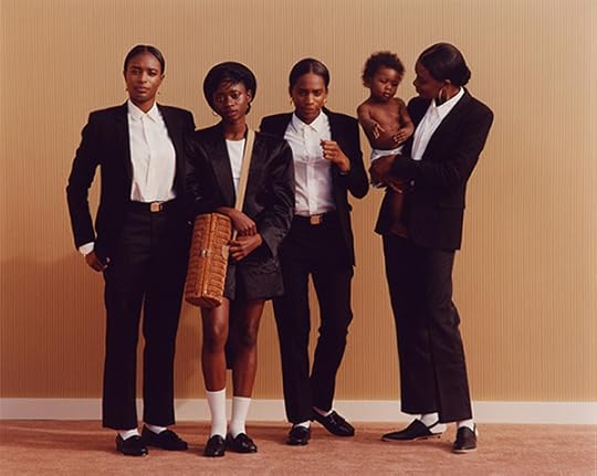
Jalan & Jibril Durimel, Daughters, 2017
Courtesy the artists
To read more, buy Aperture Issue 228, “Elements of Style,” or subscribe to Aperture and never miss an issue. Limited edition prints by Durimel are available from Aperture Foundation.
Antwaun Sargent is a writer based in New York.
The post For Durimel, Black Humanity is Not a Fashion Trend appeared first on Aperture Foundation NY.
October 16, 2017
The Poet of Black Baltimore
For Devin Allen, life in Baltimore is about the beautiful struggle.
By Jessica Lynne
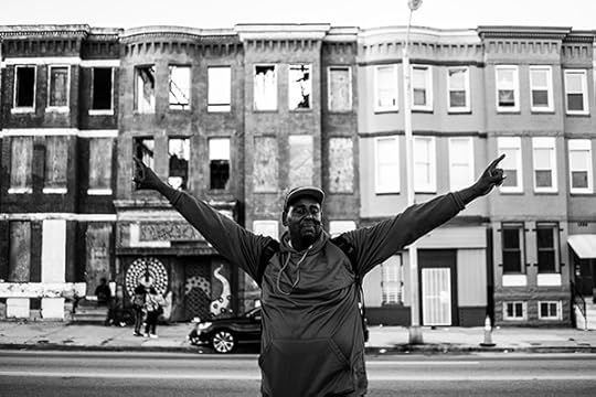
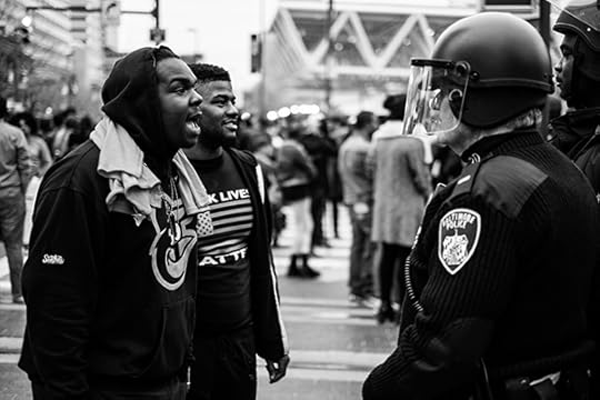
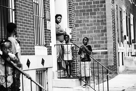
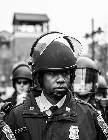
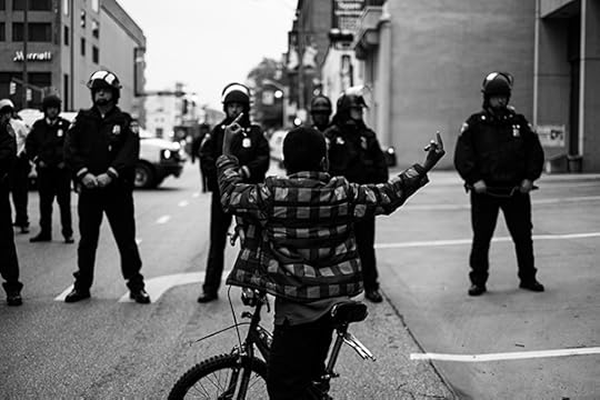
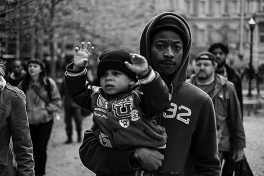
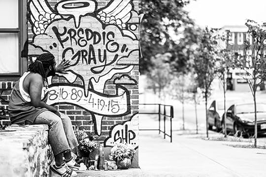
Devin Allen, from the book A Beautiful Ghetto, 2017
Courtesy the artist
Beyond the hyperbolic narratives about Black Baltimore that tend to circulate in mainstream news cycles—the blight, the crime, the poverty—is a story of tenderness and resilience, of love and resistance. Devin Allen is interested in that story. And after capturing images of the Baltimore protests that occurred in the wake of the death of Freddie Gray, in 2015, Allen has amassed a vault of photographs that depict the complicated poetry of his city. Indeed, his new photobook, A Beautiful Ghetto (2017), is a visual love note to Black Baltimore that could have only been produced by a Black Baltimorean. On the occasion of the release of the publication and accompanying exhibition at The Gordon Parks Foundation, I spoke with Allen about his personal relationship to photography and the beauty of the city that he calls home.

Devin Allen, from the book A Beautiful Ghetto, 2017
Courtesy the artist
Jessica Lynne: Let’s start before Freddie Gray, before the uprising in Baltimore. One of the things I’ve been thinking about is the relationship we form with photography long before we become photographers or become interested in thinking about photographs critically. What was your early relationship to photography? Were you the kid taking photographs at family gatherings? What brought you to the medium?
Devin Allen: I started photography in 2013. My grandmother actually helped me get my very first camera. She would always carry around a camera and document everything as we were growing up—every family get-together, those moments at a family cookout—and that’s when I realized that my grandmother was actually a photographer. I understand how important it is to savor and keep those moments. But, as a kid, I never in a hundred years would have thought that I would become a photographer.
Devin Allen, from the book A Beautiful Ghetto, 2017
Courtesy the artist
Lynne: As you began documenting Baltimore, especially in the wake of Freddie Gray’s death, did you have a sense of how important your images would become, not only to the way we, as a country, grapple with Gray’s death, but also to these longstanding, systemic circumstances that led to this that tragedy?
Allen: In Baltimore, we already have a bad rep, we’re only known for the violence, we’re known for having a high murder rate. So, my goal was to tell the story of West Baltimore, not just the death of Freddie Gray, but also what Freddie Gray saw leading up to his death. I wanted to show the positive but also the negative aspects. I didn’t plan for everything to get as big as it did; I just wanted to show the world the Baltimore that I knew. I knew that those bigger publications and media outlets don’t actually know anything about Baltimore; they only want to focus on one aspect of a project. I wanted to tell everything else in between: I wanted to talk about the cookout, the block party. It’s not about a burned-down city; there’s so much more that happened after the death of Freddie Gray, and I wanted to show the resilience of the people. We were, like, hopped-up, and that’s one of the main reasons why I said I’d document it. I never thought it would get this big.
Devin Allen, from the book A Beautiful Ghetto, 2017
Courtesy the artist
Lynne: In her essay for your book, “The Boisterous Demand of Black Baltimore,” Keeanga-Yamahtta Taylor writes something that really stuck with me: “Black life is not only about hardship, it is also about poetry, play, celebration, curiosity, tradition, and what some have referred to as, ‘the beautiful struggle.’” What should people know about the poetry of Black Baltimore that doesn’t necessarily get to exist in the mainstream media conversation?
Allen: The thing with Baltimore is that Baltimore is a very small city, everybody knows everybody. It’ll take you fifteen to twenty minutes to get around the whole city. A lot of people interact with people’s cousins, mothers, we grow up together and friends become family, and that’s the beautiful thing that people don’t understand. I’m really just talking about a city that has been neglected, forever.
There’s a thing we say: If you grow up here, you can survive anywhere. And I honestly believe that. I had my own trials and tribulations, like gun violence, which has heavily affected my life. I stopped counting at about twenty friends taken. I stopped counting. I lost my first friend at age sixteen or seventeen; he was shot. The death never stops. I buried two friends just over the summer this year.
You know, it’s like you said, it’s Black poetry, and that’s what it is. Violence is only one aspect of Baltimore. When the uprising was going on, a lot of people didn’t know that all of the basketball coaches, the popular hairdressers, people who have clothing lines, local business owners—they were all at the basketball courts figuring out how we can get our kids off of the streets. The reaction was that we should be proactive about it, to turn that negative into a positive. Baltimore is a city that fights for its own. That’s why I love my city so much.
Devin Allen, from the book A Beautiful Ghetto, 2017
Courtesy the artist
Lynne: I really like that—it’s the beautiful struggle. When did you realize that all of this documentation and storytelling work would become a book? And was it daunting to begin the process of sifting through all of your images to decide what was going to complete the final publication?
Allen: A Beautiful Ghetto started off with a hashtag, because I could not find the words to really describe my city. I met this guy named Mitchell Duneier, who wrote a book called Ghetto: The Invention of a Place, the History of an Idea (2016), and he came to Baltimore, and I took him to the local crab place. You know, being a kid from West Baltimore, I’m sitting here with Mitch Duneier from Princeton, just talking to him, and it was unreal. And he was like, “You should do a show. What would you name your show?” And I said, “I would name it A Beautiful Ghetto.” I wanted to put a bittersweet taste in your mouth. That’s the goal. And he said, “Do it.” And they took me to Philadelphia, and I did the show A Beautiful Ghetto, and that’s when I met Keeanga. I did a panel discussion and she basically narrated my show.
Devin Allen, from the book A Beautiful Ghetto, 2017
Courtesy the artist
Lynne: And the exhibition became the book? What was the selection process like?
Allen: Every image is very personal. The thing is, I don’t repeat frames, so every shot you see is as you see it. I don’t hold down the shutter and just let my shutter run. I literally go out and get the shot. I’m very particular and every shot is important to me; I didn’t want to take the easy way out. I also wanted to keep the book as cheap as possible, but I still wanted a good quality book. So, we started at like one thousand images, got it down to five hundred, and then 120, and then we had a book.
Devin Allen, from the book A Beautiful Ghetto, 2017
Courtesy the artist
Lynne: I love that the book, in some way, becomes a community ode to Baltimore. Looking at the images, they’re extremely sharp, but there’s also a deep feeling of tenderness, not only for the built environment of Baltimore, but also for the people. There’s an honesty and an urgency to them. How have people responded to the book, and your visual narrative of the city?
Allen: You know, the response has been amazing. I shoot with my heart and my eyes. My heart is in everything. A lot of the people that you see in the book, they are my friends. These are the people that I know, that I see every day. So, the book, for me, is a love letter to Baltimore. This is my letter to Baltimore. This is how I feel, this is love right here.
And the biggest thing is that, for my generation, coming from Baltimore, there has never been a book like this, a book for Baltimore by somebody from Baltimore. You can get the book for fifteen dollars on Amazon, and you can’t beat that. When I first started photography, I wanted to get Gordon Parks’s book, but it was $125 at Barnes & Noble and I couldn’t afford it. I would go to Barnes & Noble and get a whole bunch of inspiration to bring back to my work. But for the kids who are on Instagram now and want to be photographers, they can peek at my book. I figure they can get inspired to document themselves. I teach, I give out cameras, and so hopefully there will be someone better than me, coming behind me.
Devin Allen, from the book A Beautiful Ghetto, 2017
Courtesy the artist
Lynne: I know that Gordon Parks is a big inspiration for you, but there’s another photographer by the name of Joseph Rodriguez, who I’m also reminded of when I think of your work. Are there other people who you are learning from at the moment, who you feel like you are in conversation with, either conceptually or formally speaking? Who else are you looking at for your own continued growth as a photographer?
Allen: Anthony Barboza, right now, because I want to get more into portraiture. Ruddy Roye, who’s one of my favorites, I always follow him. And, of course, Jamel Shabazz, with all his hip hop ’80s stuff and portraiture. I’m getting a lot of inspiration from a lot of older black photographers in helping myself grow.
Devin Allen, from the book A Beautiful Ghetto, 2017
Courtesy the artist
Lynne: What’s next for you? Are you still interested in working in some capacity with mainstream national publications? What does the next year look like?
Allen: Like I said, I always live life winging it. The biggest thing, now that the book is out, is to really get that moving, get it out as much as I can. Even though my career has grown, it’s still a struggle. I’m still a starving artist, you know I’m still struggling. I wanted to stay in Baltimore, I didn’t want to just disappear, move to New York, and forget my community, so I took a job with Under Armour as my nine-to-five, so it helps me stay in Baltimore. I’m learning about the commercial side of the business; I’m actually doing more photo-editing.
As a Black photographer, it’s always going to be difficult to navigate—so many people say this. Hopefully this book will open up opportunities for me to do more photojournalism, to get more stories, but I also definitely want to dive into the fashion realm, as soon as possible. I want to be one of the greatest photographers of my generation, that’s the ultimate, long term goal. And then, I want to get into directing. I definitely want to bring back those Spike Lee films, and work on projects like that. I just want to do it all.
Jessica Lynne is editor of ARTS.BLACK.
Devin Allen: A Beautiful Ghetto was published by Haymarket Books in September 2017.
The post The Poet of Black Baltimore appeared first on Aperture Foundation NY.
October 12, 2017
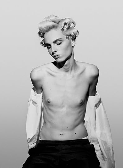
Humanity, Visibility, Power
Is the world finally ready for Collier Schorr’s women?
By Matthew Higgs
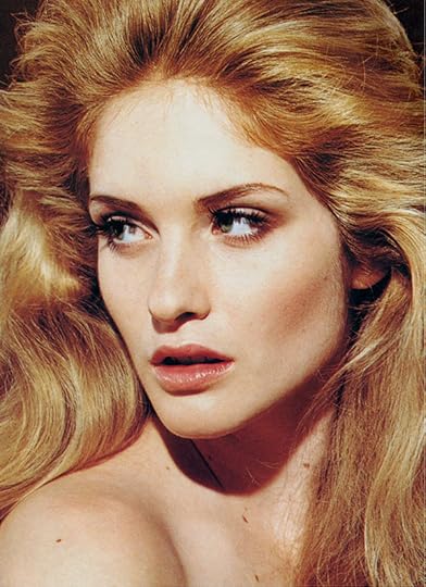
Collier Schorr, Picture for Women, 2010
© the artist and courtesy 303 Gallery, New York
Celebrated in the worlds of art and fashion, Collier Schorr has pushed photography to examine desire, sexuality, and beauty. From her work with teenage wrestlers, to her provocative advertising campaigns, to her exploration of the artist-muse relationship, she has exposed the fluidity and ambiguity of gender. In her images, boys appear girlish, and vice versa. Now sought after for her signature command of the gaze, Schorr’s interrogation of identity has broad reach—and great influence—in the pages of fashion magazines. Here she speaks about the evolving language of the fashion image and how her work challenges convention.
Collier Schorr, Image for Saint Laurent women’s summer campaign, 2017
© the artist and courtesy 303 Gallery, New York
Matthew Higgs: I am going to start with a quote you put on your Instagram feed. It says: “For anyone who wonders why I wanted to make fashion pictures, now you know.” And there is the hashtag #humanityvisibilityequalspower. What animated that? I think it’s worth mentioning that this conversation is taking place two days after Trump’s executive order on immigration.
Collier Schorr: For me, Instagram is a dual platform for showing your work and for showing what you stand for. The picture I made for Saint Laurent, which accompanied the post, was more typical of a documentary picture than a fashion advertisement. Any one element could be seen as typical, but the models were styled and encouraged to perform and play outside of what is traditionally seen: heteronormal women.
We all know that fashion is theater. But it felt like a real moment when I was with those models, Selena Forrest and Hiandra Martinez. Because I was working alongside filmmaker Nathalie Canguilhem, who was also directing them, I could watch as though I were a voyeur. Or, more correctly, there was a performance that seemed to be happening outside of my command. I wasn’t prepared for what it would feel like to see that image as a billboard. It took me back to when I first started making art. I wanted to essentially make a billboard in a gallery that talked about visibility and representation at a time when there was no real lesbian representation in the art world.
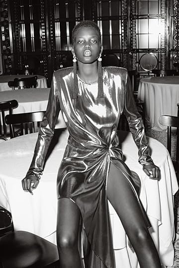
Collier Schorr, Blame (Jordan), 2015
© the artist and courtesy 303 Gallery, New York
Higgs: Your imagery circulates in the context of both the art world and the larger world of fashion. How would you characterize the differences between these cultural, social, and, I guess, political spheres?
Schorr: They are both places where you have an audience. I don’t really distinguish between the two audiences, because for the most part, they are the same people. More people look at advertising than go to galleries. But everybody who goes to a gallery looks at advertising.
Higgs: Do you think there’s a resistance, still, from the art context to artists who choose to work in the realm of fashion?
Schorr: I’ve always dealt with resistance, though not based on commercial work, but on making too many pictures of men and being seen as romantic. Or based on being an American artist working in Germany. Or not showing in Germany because the work was too American or because it was too dangerous. I’ve never had “permission” or been associated with a collective or a movement. The politics of the work left people uncertain of my identity. Was I a gay male? If I had been a gay male, I think there would have been more support for the work, because there is a tradition of gay men making work about male beauty.
Higgs: But that’s sort of the uncertain nature of the work in its totality. It remains disruptive to the stability the art world has sought.
Schorr: The last gallery show I did, 8 Women (2014), which was seventy percent archival commissioned work and thirty percent work that I made before I started doing fashion, was the most successful show I’ve had. It sold the most. It sold to museums. I walked away thinking, “Oh, of course it did well. They’re pictures of women, and that’s always been a comfortable spot for art.” I did feel like I was being radical by bringing in commercial work, but I was being really traditional by bringing in female nudes.
Collier Schorr, Jennifer (Head), 2002–14
© the artist and courtesy 303 Gallery, New York
Higgs: It seems almost every decade there’s an attempt to align or embrace the fashion image in the art world. There are exhibitions that address this, and everyone feels like it’s been done, and then a decade later it’s addressed again. Whereas now it seems it’s at its most interesting, most widespread, and hopefully—or potentially—most complex.
Schorr: In terms of destabilizing, my situation might be the result of not having an identity as an artist, a photographer, painter, et cetera. I became an artist really—I wouldn’t say “by accident,” but I didn’t study art. I didn’t train. I just had friends who were artists, and I worked in a gallery. I thought I was a writer. And I made work simply because I thought that the photo- and text-appropriation world made it possible for somebody to make something without having any talent.
I was working for Peter Halley and Richard Prince, and I had the opportunity to curate a show at 303 Gallery of friends of mine. I put myself in the show because there was a hole, a kind of representation, or protest, that wasn’t yet included. So I appropriated fashion imagery. It was a way of interacting with those images that I was drawn to from magazines. What I’m doing today is still the same thing. I never believed in a high-art position because I never fantasized about being an artist.
Collier Schorr, Image for Saint Laurent women’s summer campaign, 2017
© the artist and courtesy 303 Gallery, New York
Higgs: But a distinction would be that you’re producing those images now, as opposed to working with those images.
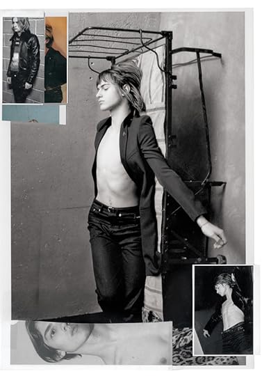
Schorr: Well, yes and no. My current Saint Laurent men’s campaign is collage. The images were shot as an advertising campaign, but by printing them out and cutting them up, they became commentary, a secondary text breaking down an original, static conceit. It’s an infiltration of representation, by bringing together a bunch of pictures made under one umbrella to create a dialogue on representation. The clothing is cut up, cut out; the characters become more important and have more authority. As though I were taking some Guess ads out of Vogue from 1989 and collaging them for an artwork. That was the proposition of my show 8 Women—images go out into the world in magazines, and then I take back those that I want to have a second comment on. I restage their being looked at.
Higgs: The commercial imperative of the fashion business dictates that it’s constantly in flux. Then there’s the market-driven flux, and the commercial realities of fashion. Is it possible to think about that when you’re trying to create an image within those structures?
Schorr: I think almost everything that’s bad about working in fashion is also good, depending upon the day. The fact that it moves. The fact that it’s disposable. The fact that you are so invested in something that you’re willing to have a huge fight over it. Then it gets thrown in the garbage. No matter how bad or no matter how good a picture is, it evaporates after six months. It’s not enshrined. I guess I keep what I love, by putting it into a frame.
Higgs: In the work you’ve done with Saint Laurent, do you have increasing license to make—this is a crude way to put it—more complicated images?
Schorr: I have the encouragement to do that, and that’s very rare. The designer at Saint Laurent, Anthony Vaccarello, was very interested and invested in seeing pictures come from the artist’s imagination rather than from the position of merchandising.
Collier Schorr, Image for Saint Laurent women’s summer campaign, 2017
© the artist and courtesy 303 Gallery, New York
Higgs: To return to #humanityvisibilityequalspower, that Instagram hashtag, what do you think about recent shifts in fashion casting and the bodies we’re seeing in this context?
Schorr: There is a real push toward diversity, but I think the fashion world has treated diversity in casting as a smoke bomb, because there is very little diversity in production. There are very few black fashion photographers in mainstream magazines. There are not that many black designers. But the casting revolution has been great because it’s releasing people who were stuck having to be represented by a certain ideal of beauty. I’m still very much concerned with the general ways I/we present women and sell an idea about them. How to shift what objectification does, how it functions. I’m suspect of merely propping up a picture by suggesting the woman has power.
Higgs: How do you approach the space of editorial work? To me, it’s substantially different from your approach to making a book, or making an exhibition, or even working with a client like Saint Laurent. The continuous narrative of editorial opens up a different agenda.
Schorr: For me, the best-case scenario of editorial work is being in a kind of consensual relationship with somebody else in which I can explore who they are, what they look like, and why they’re desirable.
Higgs: And the other person is the model?
Schorr: The other person is the model. Sometimes it’s a fleeting relationship, and sometimes it’s a sustained relationship. I’m really interested in a certain kind of seduction or flirtation. Like, you’re at a club, and you find your person, and you make this conversation, and then you get to do everything you want with them in this very consensual way. We fall in love with someone who is in love with themselves, and then we fall in love with our version of them. They can love you for a minute for recognizing them. Then some kid rips it out of a magazine, puts it on their bedroom wall, and has someone to dream about.
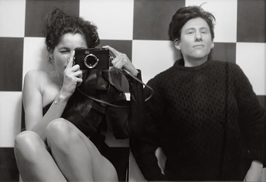
Collier Schorr, Laetitia with Leica, 2016
© the artist and courtesy 303 Gallery, New York
Higgs: The early weeks of the Trump administration left many people—and commentators, in the broader sense, including artists—stunned. How do you see fashion in relation to the current political reality?
Schorr: I’ve always had a really simple idea about what I wanted for my fashion pictures, because I think that they can only do so much based on the fact that it’s all fake, for the most part. Is it intimacy? Is intimacy a kind of gaze of empowerment, inclusion, and warmth?
Fashion basically promised me one day I would have a girlfriend, and she might be like that model in a sailor shirt with short bleached hair. She might not. But I could fantasize about it. And, at the same time, I could be repulsed by fashion images. I could be hurt by fashion images. And, I could be scarred by fashion images. I wanted to replace the pictures I found alienating with my pictures, so that I would somehow create a healthier pictorial environment for kids.
To continue reading Matthew Higgs’s interview with Collier Schorr, buy Aperture Issue 228, “Elements of Style,” or subscribe to Aperture and never miss an issue.
Matthew Higgs is Director and Chief Curator of White Columns, New York.
The post Humanity, Visibility, Power appeared first on Aperture Foundation NY.
Chris Maggio’s Great American Facade
In a new body of work, the photographer confronts the postelection U.S. landscape with dark humor.
By Will Matsuda

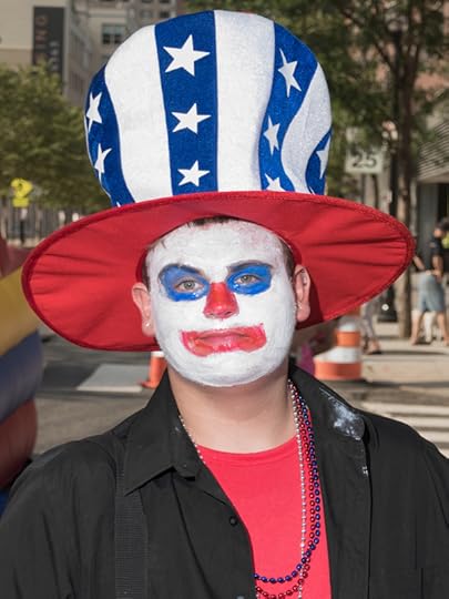
Chris Maggio, Untitled, from the series Bored on the 4th of July, 2017
© and courtesy the artist
Spend enough time on the internet and you will come across a Chris Maggio photograph. It will probably be uncredited, torn from its original context, and memed endlessly. He’s OK with that, and in fact, he takes pride in it. His newly released series, Bored on the 4th of July (2017), blends fact and an extrapolation of truth in the postelection landscape. This ambiguity forces the viewer to confront the absurdities of American culture—what does it say about America that, within these images, it’s hard to discern where fact ends and imagination begins?
Will Matsuda: A lot of photographers have tried to address the current political climate, but these projects often feel heavy-handed. Your new project is both fresh and cutting. Why did you make Bored on the 4th of July?
Chris Maggio: I really appreciate that! I wanted to make a series that openly admits to communication by an unreliable narrator. My intent was for documentary and opinion to sit as some kind of uneasy emulsion—often within the same image—and to have the viewer at least a little in on the joke. A lot of news about “politics” that we see online burdens us with the responsibility of sifting for what is real amongst a maelstrom of opinion, fact, and presumption. But this series is more like an honest caricature: there’s truth floating around in there, but you’re aware that some of it’s exaggerated to make a point.

Chris Maggio, Untitled, from the series Bored on the 4th of July, 2017
© and courtesy the artist
Matsuda: You describe the series as “both real and imagined, about a summer where, no matter what their politics, everyone has an opinion of what it means to be an American.” Are the images grounded in a specific place? Or is the series more representative of a nameless place that liberals imagine when they think of the “other side”?
Maggio: The problems facing the country right now are pandemic; it would be unfair to root them in a specific place. Some of the pictures do point to issues that the GOP both embraces and ignores, but not without acknowledging how in this current, polarizing time, paranoia and hyperbole are nonpartisan.
Chris Maggio, Untitled, from the series Bored on the 4th of July, 2017
© and courtesy the artist
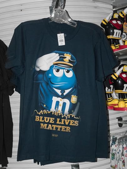
Matsuda: Last week on Twitter, I saw Ezra Koenig, the front man of Vampire Weekend (who has half a million followers), share your Blue Lives Matter photo without credit or context. Your images often get turned into memes. It happens so much that it seems like you create them for this reason, or at least have accepted it as part of your practice. What do you think when you see your images used in this way?
Maggio: To be a part of the fabric of someone’s day, even if your picture is fleetingly used to describe a “mood” or TFW, is really amazing. Whether it’s genuine or ironic, the image that you’ve created becomes part of their narrative, and even if your authorship is eroded in the process, there’s still a lot of pride there. People aren’t often inclined to research where these images originated from, but that’s the price you pay to have an idea snowball toward such a broad reach. Regardless, I just hope that folks garner something from the images that’s either emotionally positive or a catalyst for constructive thought.

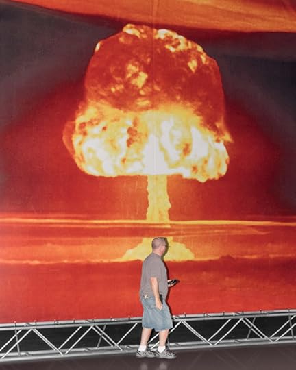
Chris Maggio, Untitled, from the series Bored on the 4th of July, 2017
© and courtesy the artist
Matsuda: The Chris Maggio “worldview” is so distinct. Why do you think you see the world in the way you do?
Maggio: I think it stems from my pessimism about who controls our day-to-day lives. I’m really scared that, as a population, we’re losing our autonomy to huge entities whose profits are contingent on our obedience to them. I’ve been in conversations with people where we’ll talk about iPhone updates for fifteen minutes—it’s chilling. The amount of control that companies can have on us is increasing exponentially. I’m not saying that the smartphone is the main culprit, but when you can watch the Candy Crush game show at your house, followed by Beat Shazam, and then go to the movies with your sweetie to watch The Emoji Movie—all while ignoring her by being on your phone—it’s hard not to lead with that example. That’s why I like going to county fairs, landmarks, tourist traps, and the like (which are the basis for some of my other photo series). Seeing people do their own thing, misbehaving and running amok in spaces where there’s a prescribed manner in which they’re supposed to conduct themselves—it gives me this weird little hope that there are parts of all us that won’t fall in line. I know I sound like a guy wearing a tinfoil hat—but I just like seeing people make their own fun.
Chris Maggio, Untitled, from the series Bored on the 4th of July, 2017
© and courtesy the artist
Matsuda: I see words like “late capitalism” and “Internet culture” used to describe your work. Do you think that is correct?
Maggio: Ha! I wouldn’t disagree—the aesthetic of a lot of my work is geared toward the Internet because it’s where the majority of it is consumed. My pictures are often visually loud, center-framed, and have an easy, literal first read. However, if folks linger on them for a minute, I’d hope that the message of some of my stuff burrows a little deeper—there’s often something of that “late capitalism” idea in there. We’re living in a blatantly dysfunctional society; however, if you were to look at most of our billboards, TV shows, and music, you wouldn’t sense anything wrong at all—there’s a very thin facade. I like dwelling in that zone—imagery that often appears cheerful, but has a kind of doomed, sinister patina on it.
Chris Maggio, Untitled, from the series Bored on the 4th of July, 2017
© and courtesy the artist
Matsuda: The people in your photographs are caught in awkward, funny moments, and I assume they are unaware you are taking their picture. How do you navigate the ethics of that?
Maggio: Street photography has a long, established history of capturing folks unaware—from Cartier-Bresson to Worldstar Hip Hop to your friend’s Instagram feed. By no means am I saying that that’s the ideal relationship between subject and photographer, but I still see it as an important relationship that can be explored as a form of introspection. I really do try to capture stuff that I see myself in, or at least the embodiment of an emotion or idea I’m wrestling with. To me, it’s not about “Ha! That person looks funny.” I think that any good photograph needs to speak a little more broadly.
Plus, we live in a time where privacy no longer exists! There’s no point in my day where I assume that my behavior isn’t being recorded and used without my knowledge and consent—and I would argue that, from the NSA to targeted advertising, this newly accepted (and formerly unfathomable) invasion of our privacy is far more malicious.
It’s shocking to see yourself in an image that you didn’t know was captured. But for me, human nature itself is what’s being documented—it’s never about the indictment of a specific person. Most of the photographs I make are autobiographical—they just feature someone else’s face.

Chris Maggio, Untitled, from the series Bored on the 4th of July, 2017
© and courtesy the artist
Will Matsuda is the social media associate at Aperture Foundation.
The post Chris Maggio’s Great American Facade appeared first on Aperture Foundation NY.
October 11, 2017
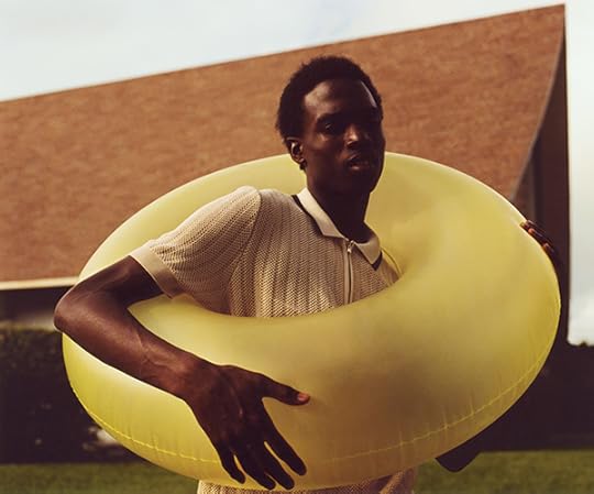
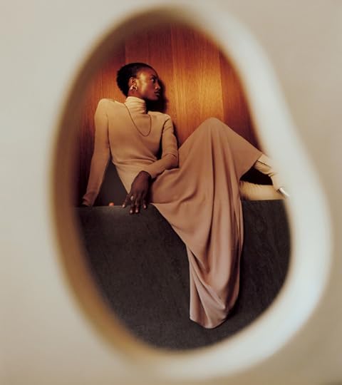
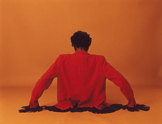
A Century of Fashion in 12 Iconic Photographs
From Horst P. Horst to Viviane Sassen, fashion’s novelty, desire, fantasy, and seduction.
By Eugénie Shinkle
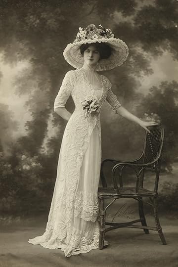
Félix studio, Robe Drecoll, ca. 1910
Courtesy Philippe Garner
Early Photographic Studios
Photographic records of fashionable dress began to appear within a few years of photography’s invention in 1839. Initially, such photographs would have been produced for private clients, or used as references for the engravers who supplied fashion illustrations for the press. However, by the 1880s, with the advent of mechanical reproduction, images of the latest fashions could circulate widely.
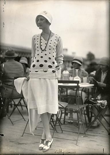
Séeberger Frères, Ensemble Welly Soeurs, Deauville, France, August 9, 1928
Courtesy Bibliothèque nationale de France
Séeberger Freres
The Séeberger Frères (active 1909–1975) began working as photojournalists in the 1870s, photographing fashionable subjects on the streets of Paris, at society events such as horse races, and at seaside resorts. Often credited with the invention of fashion photography, their work mixed the formal refinement of studio photographs with a relaxed and spontaneous attitude.
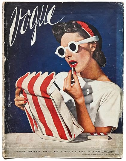
Horst P. Horst, British Vogue cover, August 9, 1939
Courtesy the collection of Vince Aletti
Horst P. Horst
The work of Horst P. Horst (1906–1999) embodied the formal, studio-based aesthetic that dominated fashion photography until after World War II. Strongly influenced by the culture of ancient Greece, Horst’s work celebrated the lines and shapes of the body as a sculptural object. Between 1935 and the 1960s, Horst produced numerous groundbreaking color photographs, including more than ninety covers for Vogue.
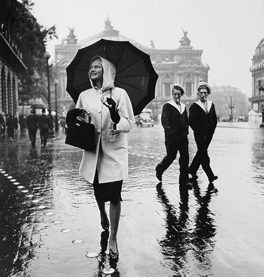
Jean Moral, Model in raincoat by Schiaparelli, Place de l’Opéra, for Harper’s Bazaar, October 1939
© Brigitte Moral, Paris
Jean Moral
By the 1930s, an aesthetic drawn from documentary imagery was making its way into fashion photography. Jean Moral (1906–1999) came from a documentary background, and, although he lacked formal training in photography, the visual language of early modernism, with its strong perspectives and unusual angles, came naturally to him. In 1933, he began photographing fashion as one of a number of realist photographers working for Harper’s Bazaar.
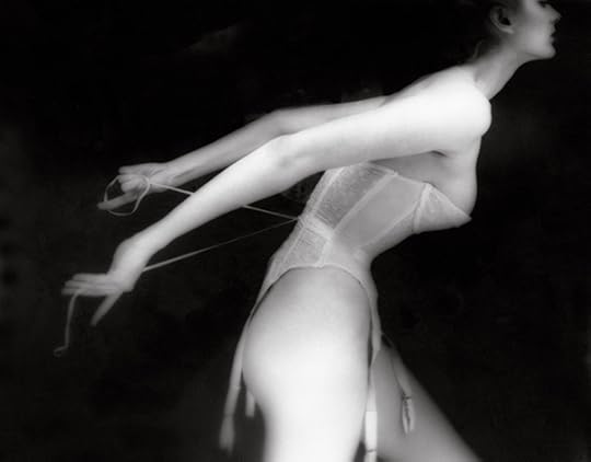
Lillian Bassman, Carmen, Merry Widow by Warner’s, outtake for Harper’s Bazaar article, “It’s a Cinch,” 1951
© Estate of Lillian Bassman
Lillian Bassman
Before taking up fashion photography, Lillian Bassman (1917–2017) worked as a graphic designer and assistant art director. She embraced an experimental approach to picture-making, and high-contrast, painterly images became her signature. Specializing in the photography of lingerie, her serene, sensual visual language evoked “a woman’s experience of undressing” and marked a fundamental shift away from the bland, sexless images traditionally used to advertise undergarments.
Jeanloup Sieff, Model Kellie Wilson Wearing an Outfit by Paco Rabanne, Nova, 1966
© Estate Jeanloup Sieff
Jeanloup Sieff
One of the key photographers of the “new realist” movement of the 1960s, Jeanloup Sieff (1933–2000) had a playful, surreal style that was influenced by the films of Michelangelo Antonioni and Ingmar Bergman. Born in France, Sieff first took up photography as a teenager and, after a short stint with the Magnum Photos agency in the late 1950s, returned to fashion photography, shooting for publications such as Queen, Vogue, Harper’s Bazaar, and Esquire.
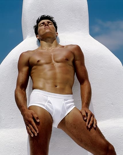
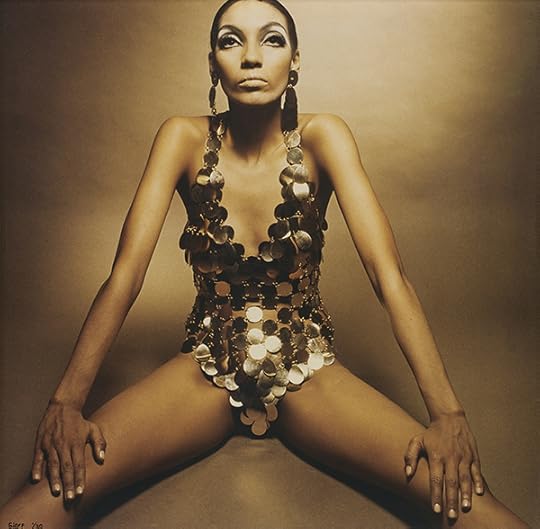
Bruce Weber, Tom Hintnaus, Santorini, Greece, 1982
© the artist
Bruce Weber
Bruce Weber’s (born 1946) infamous image of Olympic pole-vaulter Tom Hintnaus—bronzed, sensual, and clad in nothing more than a pair of Calvin Klein briefs—was radical for its time. Displayed on an enormous billboard in Times Square in 1982, the image signaled a shift in Western cultural values and a growing acceptance of homoeroticism and male nudity in an industry that had, up until that point, tended to keep its male models fully clothed and conspicuously straight.
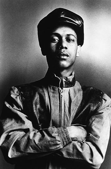
Coreen Simpson, Robert, The Roxy Club, NYC, 1985, from the series B-Boys
Courtesy the artist
Coreen Simpson
From an early age, Simpson had been drawn to individual and street style, and in 1982 she began her B-Boys series: “I wanted to photograph these kids and the whole break-dancing/rap genre,” she recalled. The B-Boys series explores the poise and self-possession of her subjects and the way that they expressed themselves through dress. On the other side of the Atlantic, alternative fashion titles like BLITZ, i-D, and The Face were also bringing street style to a young audience.
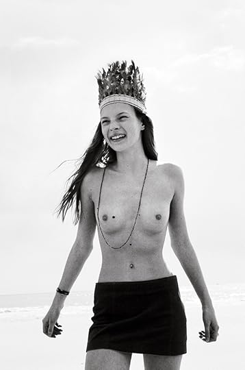
Corinne Day, Kate, 1990
© the artist/Trunk Archive
Corinne Day
Corinne Day (1962–2010) was a pioneer of the “grunge” aesthetic that dominated fashion photography throughout the 1990s. Shot in her signature lo-fi, documentary style, Day’s photographs often featured her friends and acquaintances posing makeup-free in dingy surroundings, casually styled in their own clothing. As Day remarked, “I never thought about the commercial aspect of fashion photography. I wasn’t recording anything more than the way we were living.”
Jason Evans, Untitled, from the series Strictly, 1991
Courtesy the artist
Jason Evans
“I was interested in the sociopolitical implication of making a fashion editorial that only featured black faces,” recalls Jason Evans (born 1968). Published in i-D in 1991, Strictly combined cultural perceptions of black youth and white suburbia with the nineteenth-century notion of the dandy. It was also driven by more serious questions about embedded social and racial prejudice in the fashion world.
Viviane Sassen, De La Mar Theatre, 2010
© the artist
Viviane Sassen
One of a handful of image-makers who redefined fashion photography in the early 2000s, Viviane Sassen (born 1972) broke with the increasingly restrictive rules and parameters that had come to dominate fashion advertising from the mid- 1990s onward. Sassen’s characteristic visual language of strong light and shadow, bright, saturated color, and extreme, angular poses has been widely emulated.
Collier Schorr, Andrej Pejic, Dossier 7, April 2011
Courtesy the artist
Collier Schorr
For Collier Schorr (born 1963), fashion photography is a natural extension of an art practice in which she has explored issues around gender, identity, and desire since the 1980s. “Gender, religion, nationality are all in flux in my work,” she has remarked. “The avenues to desire are skewed. I wanted to make work that spoke to as many people’s desires as possible.”
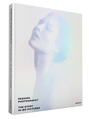
Eugenie Shinkle is Reader in Photography at Westminster School of Media Arts and Design, London. This feature is adapted from Fashion Photography: The Story in 180 Pictures, published by Aperture in September 2017.
The post A Century of Fashion in 12 Iconic Photographs appeared first on Aperture Foundation NY.
Italy’s First Photobook Festival
Gazebook brings contemporary photography to a remote village in Sicily.
By Giada De Agostinis
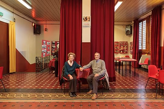
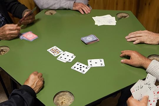
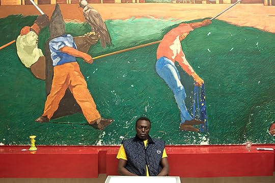
Marina Arienzale and Matteo Cesari, Self-organized afternoon dance with live music and snacks, Quinto Alto, Florence, 2015–17
Courtesy the artists
Once a year, in September, a photobook festival vivifies the quiet town of Punta Secca, a tiny fishing village in the southern region of Sicily. Photobook lovers flock here to discuss, brainstorm, teach, and learn about photobooks. Gazebook celebrated its third edition this year under the direction of photographer Lina Pallotta, and highlighted projects that are socially and politically engaged, especially with partners and artists in the Mediterranean. Here, Pallotta speaks about the latest edition of this burgeoning festival, where people bring their own chairs and sip lemonade under the trees.
Giada De Agostinis: The festival includes an open call for slideshows called Slideluck, organized by Mariateresa Salvati. Could you tell us more about this endeavor?
Lina Pallotta: The open call is a way to give visibility to new talents and projects. We want to empower multimedia, and not merely using one image after another with background music. As magazines now feature more multimedia stories, we feel the urgency of challenging photographers to explore how to use multimedia.
Marina Arienzale and Matteo Cesari, Card game, Sesto Fiorentino, Florence, 2015–17
Courtesy the artists
De Agostinis: One slideshow is Marina Arenziale and Matteo Cesari’s Casa del Pop. What is their project about?
Casa del Pop documents Tuscany’s community centers, originally linked to the Communist party, which became recreational centers within the cities. These photographs show a peculiar aspect of Italian culture and political history. I think it’s an important visual record of our country. The work is focused on Tuscany, where there is a widespread presence of these Casa del Popolo—meeting points where working-class people used to participate in social, cultural, and political activities. In some cases, especially in small towns, they were the places where people congregated, as opposed to the churches. Now, these recreational centers seem to have lost their original identity.
De Agostinis: Lina, I know you’re a photographer, an educator, and a curator, and that you divide your time between Rome and New York. How do you navigate your roles on two different continents?
Pallotta: I used to be a full-time photographer. I was working in editorial photography in Italy and doing freelance work in New York. Back then, if you didn’t photograph, you didn’t make money. Now, things have changed. Even if you photograph, you don’t make money! Teaching was the best way to convey my ideas about photography, of spreading my vision about images. I curate exhibitions in Italy so I can show projects that otherwise would not be seen here. The dialogue around photography in Italy is still narrow and concentrated on photojournalism and reportage, while the current exploration abroad opens the medium up to endless possibilities. In some ways, living between the U.S. and Italy has allowed me to travel through time.
Marina Arienzale and Matteo Cesari, Senegalese worker, Santa Croce, Pisa, 2015–17
Courtesy the artists
De Agostinis: You curated the third edition of Gazebook this year. It’s a challenge to start a photobook festival in Italy, and even more so in Sicily. Do you feel the village inhabitants are engaging with the festival?
Pallotta: Yes, this year the population of Punta Secca really welcomed us for the first time. They actively participated in the talks, and even brought their own chairs to be sure they would have a seat! The situation in Sicily, and elsewhere in Italy, is depressing as funding for art and cultural projects is lacking. Nevertheless, the festival has grown in these three years. Although institutions don’t help, we see local people supporting us. In a way, it’s easier to find our own crowd there, rather than in big cities, where there is more competition.
De Agostinis: Gazebook is probably the first festival in Italy that has a focus on photobooks. How did you come up with this idea?
Pallotta: Books are extremely important in the contemporary photography landscape. Collaborating with different partners—designers, editors, publishers, et cetera—has become essential to photographers. Twenty years ago, print magazines had higher circulation, so there were many more photo stories being published. As magazine circulation has declined, self-publishing and photobooks have flourished.
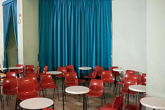
Marina Arienzale and Matteo Cesari, Theatre of the House of the People, one of the largest theatres in the area, Grassina, Florence, 2015–17
Courtesy the artists
De Agostinis: The topic of this year’s festival was “Visual communication in uncertainty and chaos.” There was a wide representation of Muslim artists from around the world, and projects about Islamic countries, which resonates with Sicilian history, where the Arab influence was monumental a millennium ago. There’s also a proximity to those waters where migrants arrive each day. For example, photographer Karim El Maktafi’s Hayati (2015–17) considers his double identity being Italian and Moroccan.
Pallotta: Yes, Karim El Maktafi was born in Italy from Moroccan parents. Through his work he tries to find a balance between those two cultures. Or, in her series Clothbound (2014), Leila Fatemi uses diptychs to show how she wants to direct the conversation about Muslim women. Fatemi is a Toronto-based photographer of Iranian, German, and Indian descent. On the left of each diptych, the pattern of a woman’s veil merges into the background, obscuring her figure; on the right, her face is revealed and her power asserted through her gaze.
Amak Mahmoodian’s book, Shenasnameh (2016), investigates Iranian women’s individuality through a collection of Iranian birth certificates, which are also used to record marriage, divorce, and include fingerprints. In their official photographs, women must wear a veil and no makeup. Mahmoodian turns homogenization into a tool for asserting these women’s different stories. In Italy, the perception of the Islamic culture is a contested topic, and we are constantly debating about immigration. People do not dare to call themselves racist, but, once people with different skin colors and religions started flocking to our country, their attitudes became controversial.
De Agostinis: You also included a selection of book dummies from Istanbul Foto Festival.
Pallotta: Yes, this is one of the partnerships we’ve launched this year, together with other initiatives from the Mediterranean. For example, we hosted a talk by Issa Touma, a Syrian photographer and filmmaker who created the first gallery dedicated to photography in the Middle East, in Aleppo, Syria. Issa presented his new movie, Greetings from Aleppo (2017), which opened at the International Film Festival Rotterdam.
Marina Arienzale and Matteo Cesari, Billiard room, Rifredi, Florence, 2015–17
Courtesy the artists
De Agostinis: During the festival you hosted a talk with Jason Fulford, who presented his project Fake Newsroom (2017), a project inspired by Newsroom (1983), created by Larry Sultan and Mike Mandel, where artists were using images from a news wire photo service and re-contextualizing them in a gallery. How do you think this project relates to our current political climate?
Pallotta: Back in the ’80s, the Newsroom project was conceived to let us question what we see in the media. Magazines dominated reportage and social issues, and the project showed us that nothing is objective. So, it was about opening up this monolithic culture of photojournalism. The current project has a narrower dimension, focusing on one binary: true or false.
Giada De Agostinis is an editor and communications specialist working in publishing and branding. Her work and research extends to photography and fine art publishing as well as new digital media platforms.
The post Italy’s First Photobook Festival appeared first on Aperture Foundation NY.
Aperture's Blog

- Aperture's profile
- 21 followers

