
Aperture's Blog, page 112
September 6, 2017
Photography is Limitless
What does photography look like in 2017? Emilia van Lynden, artistic director of Unseen Amsterdam, discusses how photography can be inclusive, flexible, and fun.
By Annika Klein
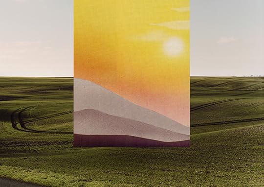
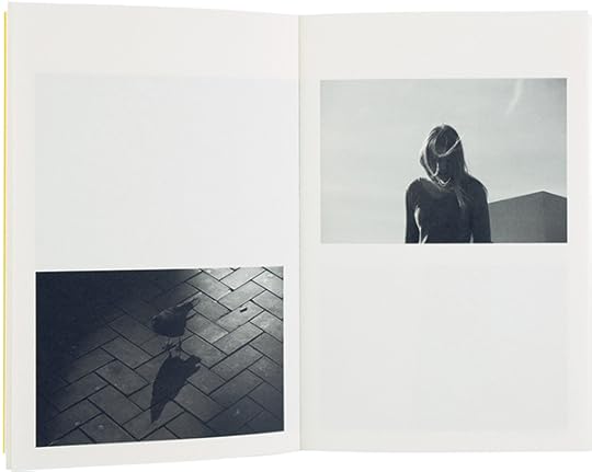
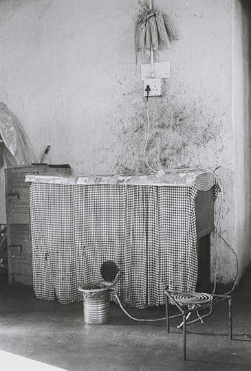
Theo Simpson, Vanden Plas, 2017
© the artist and courtesy Webber Represents, London
Annika Klein: Who are three young photographers that you are particularly excited about exhibiting at Unseen for the first time? How do you see them breaking with tradition?
Emilia van Lynden: I’ll start with Theo Simpson, a young British artist from Northern England who is interested in the industrial heritage of the north, and who deals with the steel industry and mythical themes relating to that landscape. He uses archived imagery alongside his own photographs and local materials from the surrounding industries, often printing directly onto steel from local factories. Some of his works are laser cut directly into steel and then framed. They’re interventions in and with the landscape. Simpson’s work highlights the manner in which photography is evolving. It’s no longer a two-dimensional image. Right now, there are artists incorporating many different materials within their photography and, through that, they are creating an extra level of depth.
Then, Tanya Habjouqa, who makes very different work. She’s a documentary photographer, who will be showing with ILEX Gallery from Rome and is a member of NOOR Images. Habjouqa is showing a project called Sacred Space Oddity: The Un/Holy Land (2016–17), made in the Palestinian Territories. Habjouqa considers the overlapping religions of Judaism, Christianity, and Islam within this area. The border between sacred and profane. This region has been photographed so much, and Westerners have a particular image in our heads, but the region is very diverse. Habjouqa shows that these different groups of believers and non-believers living along side one another, and the manner in which they do so. Her approach is often humorous, which is unusual.
The last one is the youngest of the three—Alexandra Hunts. She is originally from Ukraine, but she’s been living in the Netherlands for a long time. Hunts is a sculptor and installation artist who uses photography as a tool. She is interested in documenting phenomena that cannot be documented. Hunts investigates scientific inquiries such as: How do you document what a kilogram is? Or, how do you document time? In her piece Search for the Kilogram (2016) Hunts went to search for the “true” kilogram: she worked on an apple farm where she picked, weighed, and photographed one-thousand kilograms of apples, one kilogram at a time. The result is an installation of one thousand cut-out photographs of mass. Another work named Ton (2016) resulted from this same period of time researching mass in which she tried to show how the metric system’s artificial units influence our experiences. Hunts highlights the fact that photography is limitless. There’s so much that one can do with the medium.
Tanya Habjouqa, She Immerses, 2016, from the series Sacred Space Oddity: The Un/Holy Land
© the artist and courtesy ILEX Gallery, Rome
Klein: Erik Kessels and Thomas Mailaender, who both work with reappropriation, will present an exhibition titled, Photo Pleasure Palace, mimicking a classic carnival. Kessels describes it as “weird-and-wonder land, a place where pleasure is guaranteed and photos are in imminent danger.” What will this mean in terms of the installation? Will there be carnival games? What do you have planned?
van Lynden: There will be seven key elements to the exhibition and they’re all fun fair activities. One of them is the Photo Fortune Teller, in which a professional fortune teller sits in a caravan. Artists can bring portfolios and the fortune teller will reflect on their work, predict their careers, and explain the reasons for artistic decisions that they have made in the past. The fortune-teller can also react to a recent acquisition of a collector can and analyze what their reasoning was for buying it.
The second is the Smash Gallery. Kessels and Mailaender have a massive archive, from which they have selected images that they will frame and hang on the wall. It’s the classic carnival activity where each person gets three wooden blocks and they have to try and hit something, except this time they are not aiming for empty tin cans, but for framed works. If someone hits the work and the glass breaks, then they get to take it home. The game asks the audience to consider how we think about art.
Another one, which might be my favorite, is called the Human Photo Album. Drawing on the same archive, but with different images, visitors can have images temporarily tattooed on to their bodies. There will be scantily clad figures who are covered from top to bottom in the archive, and who will apply the tattoos. Visitors will therefore use their own skin as the canvas and carry an image home with them on their bodies. The project looks at how we can interact with photography in a completely different way. Instead of taking the market too seriously, visitors can enjoy interacting with and looking at a photograph. There is something for everyone, for all ages. I think that’s what makes this project so special.
Klara Källström and Thobias Fäldt The house arrest of Julian Assange, Norfolk, England, February 24–25, 2011, from the series Wikiland
© the artists
Klein: This year you are also launching CO-OP, a space devoted to “cutting-edge” collectives. How did this new initiative come about?
van Lynden: For the last four years, we’ve shown four artist-run collectives or initiatives per fair. The collectives loved connecting with a different audience and meeting a variety of collectors, and many collectives reached out to us wanting to participate. We constantly had to turn them away as we didn’t have enough space, or the collective wasn’t represented by a gallery. Therefore, we wanted to create a space for collectives who currently don’t have gallery representation, who do not have the sources to present themselves to such a large audience, and who need to be helped in order to be able to become more sustainable. I think that’s what’s at the core of CO-OP, increasing the sustainability of artists.
The fair system is also shifting. As an art fair and a platform, we want to be as inclusive as possible. If only galleries can exhibit, artists without representation have no way of participating. It’s our responsibility to create opportunities for as many artists as possible to get their work seen. Many artists who graduate from an academy might have the talent to create work, but don’t have the tools to live off of it. We have to make sure that they can actually survive doing what they’re best at—and that’s making art.
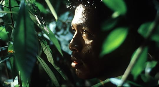
Apichatpong Weerasethakul, Tropical Malady (Sud Pralad), 2004
Courtesy the artist and Kick the Machine, Bangkok
Klein: International art fairs have proliferated in the past decade, and many take place in large spaces, isolated from the cities that host them. The fair can become a bubble. How does Amsterdam’s community influence the event? Do you work with local artists?
van Lynden: A third of our galleries are based in the Netherlands, the majority of which are in Amsterdam. Out of the 140 artists we are showing, over thirty are based in Amsterdam, including international artists Alexandra Hunts and Ola Lanko, both of whom are originally from Ukraine. It’s very important for us to show our visitors all that Amsterdam has to offer in regards to photography.
We have a city program where we work with leading institutions and project spaces. Amongst others, the Stedelijk will present their exhibition of Zanele Muholi, the photography museum FOAM will show their talent exhibition, EYE Film Museum is programming a major exhibition of Apichatpong Weerasethakul and Cao Guimarães, and Museum Van Loon will exhibit the site-responsive work of Güler Ates. There’s a huge variety. We’ll also be working with other project spaces that are showing less well known artists. For example, Glamcult, a youth culture platform, is presenting an exhibition by Barrie Hullegie in a studio located within the grounds of one of Amsterdam’s biggest night clubs.

Barrie Hullegie, Untitled, 2017
© the artist
Klein: As the lines between mediums become increasingly blurred, what is the value of an event or platform that focuses on one specific medium?
van Lynden: It shows the variety of photography, and how far it can go. We’ve always wanted to be an event that is reasonably niche, that’s why we really focus on emerging talent and the newest developments within the medium because we believe that this is missing in the art fair sector. Additionally, the general public still has to warm to the idea that photography is a collectable medium, or at least to the intricacies of collecting photography. We still need to inform our audience in regards to the diversity that photography has to offer.
Annika Klein is the editorial assistant of Aperture magazine.
Visit Aperture at Unseen Amsterdam, on view from September 22–24, 2017.
The post Photography is Limitless appeared first on Aperture Foundation NY.


Is Fashion Modern?
MoMA’s first fashion exhibition in seventy years is all about icons, accessories, and objects of desire.
By Paola Antonelli and Michelle Millar Fisher
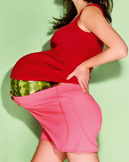
Photograph by Bobby Doherty, 2017
© the artist
“It will not be a style or fashion show; it will not display costumes; it will not offer specific dress reforms,” reads the press release for Bernard Rudofsky’s 1944 exhibition Are Clothes Modern? at the Museum of Modern Art (MoMA). “The purpose of the exhibition is to bring about an entirely new and fresh approach to the subject of clothes.” That approach is perhaps the wishful thinking of every curator who has ever mounted a fashion exhibition—and yet by all accounts Rudofsky organized an incisive show and catalog that prompted the public of its day to reconsider their relationship with the clothes they wore, and the designers and systems that produced them.
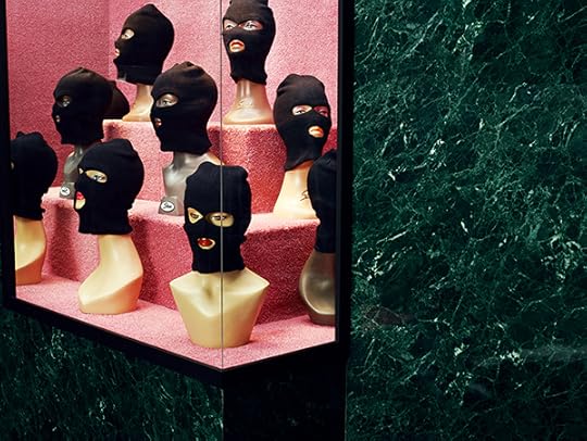
Photograph by Catherine Losing, 2017
© the artist
More than seven decades later, MoMA’s second foray into exhibiting fashion design, titled Items: Is Fashion Modern? (2017), returns to Rudofsky’s inquiry by considering items—accessories, icons, objects of desire, and mass-produced staples—that have had a strong influence on the world in the past century. These include humble masterpieces like the clog, the keffiyeh, and Levi’s 501 jeans; high-fashion ensembles from Pierre Cardin’s 1964 Cosmos collection and from Comme des Garçons’s 1997 Body Meets Dress–Dress Meets Body; and culturally specific items such as Breton shirts, door-knocker hoop earrings, Panama hats, and kente cloth wrappers.
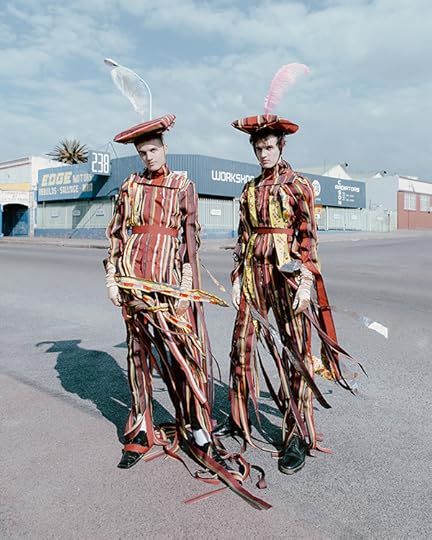
Photograph by Kristin-Lee Moolman in collaboration with Ibrahim Kamara, 2017
© the artist
In the catalog for Items, a new interpretation of all 111 exhibition “items” is entrusted to five young photographers—born between 1980 and 1992 and from Japan, the United States, Senegal, the United Kingdom, and South Africa—chosen for their strong, idiosyncratic talents and points of view: Omar Victor Diop, Bobby Doherty, Catherine Losing (in collaboration with stylist Anna Lomax), Monika Mogi, and Kristin-Lee Moolman (with longtime collaborator Ibrahim Kamara). Each photographer was given eight pages to fill with an equal portion of the items arranged in alphabetical order: Losing got Air Force 1s through bucket hat; Mogi, burkini through fur coat; Diop, Gore-Tex jacket through monogram; Doherty, Moon Boot through Snugli; and Moolman, Space Age Cosmos collection through YSL Touche Éclat. Given free rein in terms of approach, some chose to shoot the exact objects on the exhibition’s list, while others took the items as prompts from which they abstracted. The results speak to five very different strategies of documentation that are as much still life as fashion photography, and mine the histories of advertising and graphic design as well as conventional modes of sartorial presentation.
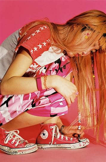
Photograph by Monika Mogi
© the artist
Diop created a set of twenty-one playing cards silhouetting doppelgänger items against boldly colored backgrounds. Doherty shot a ripe watermelon nearly bursting a two-piece maternity outfit at its seams. Losing pictured, among other pieces on her list, balaclavas haunting a 1950s-era shopwindow. Over a series of eight photographs, Moolman and Kamara synthesized wholly new ensembles culled from a secondhand clothes market in Johannesburg’s city center, each encapsulating several of the twenty-four items on their list. Mogi homed in on a kawaii teen decorating her Converse kicks, kitted out in capri pants and a Fitbit—checking off three items on her list in one shot. Each focused intervention plays against the denser heterogeneity of over four hundred images in the catalog that illustrate the alphabetic texts. Each photographer has used the 111 items as lenses through which to investigate form, color, gesture, environment, and more. The result embraces fashion photography and carries us beyond fashion into the realm of design and its many intersections with culture, technology, art, anthropology—in other words, with the world.
Paola Antonelli is Senior Curator, Department of Architecture and Design, and Michelle Millar Fisher is Curatorial Assistant, Department of Architecture and Design, at the Museum of Modern Art, where Items: Is Fashion Modern? is on view from October 1, 2017–January 28, 2018.
Read more from Aperture, Issue 228, “Elements of Style,” or subscribe to Aperture and never miss an issue.
The post Is Fashion Modern? appeared first on Aperture Foundation NY.
September 5, 2017
The Mexican Fotonovela
How comic books illustrated with photographs became a great popular art form.
By Stefan Ruiz

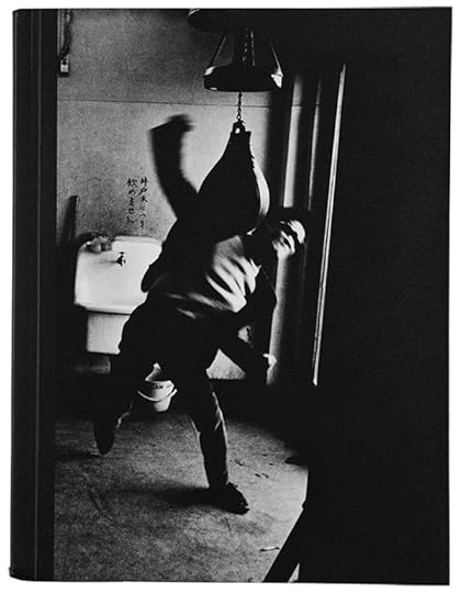
Santo: El Enmas Carado de Plata, Icavi, Columbia, n.d.
I’m not sure where I first saw fotonovelas, but it was probably when I was a little kid, during one of our family trips to Mexico to visit relatives. Fotonovelas are essentially comic books illustrated with photographs instead of drawings, operating somewhere between graphic novels, films, television, and pulp novels. Developed prior to the Second World War in Italy and France, they were originally made using film stills. They started to be produced in Latin America in the 1950s and were hugely popular in Mexico until the late 1980s, when VHS tapes of popular films and TV shows became readily available and affordable.
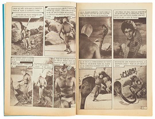
Santo: El Enmas Carado de Plata, Icavi, Columbia, n.d.
There are so many different forms of fotonovelas. There’s the classic telenovela type, the fotonovela rosa, which is the typical soap-opera Cinderella story: poor good girl meets rich, dashing guy (or a cad who treats her wrong). Then there are the fotonovelas rojas, which have more graphic depictions of sex and violence; among these are true-crime stories, which have dramatic reenactments of real cases. The sensationalist news magazine Alarma!, for which photographer Enrique Metinides often worked, even published a fotonovela edition called Casos de Alarma!. Finally, there are others that are essentially soft porn, although even these are careful to try to incorporate a moral element into the story. In fact, the fotonovela format has frequently been used for public-health and public-service announcements, and was even successfully drafted into AIDS-education efforts in Mexico.
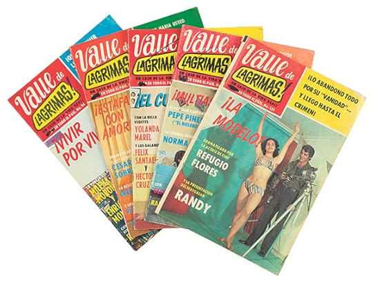
Valle de Lagrimas!, Publicaciones Llergo Mexico, 1977–1980
For kids in Mexico in the 1970s and early ’80s, El Santo, a character initially based on a real-life wrestler (but then dramatized to superhero proportions), was especially popular. Created in 1953, his was one of the first such stories that were photographed specifically with the creation of fotoaventuras, or adventure stories, in mind. This and other similar fotonovelas were aimed mostly at men and boys. They follow the adventures of various macho heroes—heroes with names like Kiling, or, of course, El Santo.
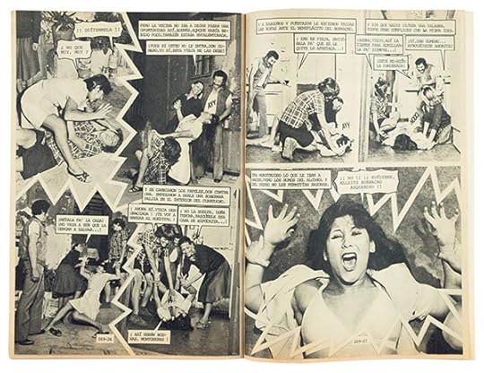
Valle de Lagrimas!, Publicaciones Llergo Mexico, 1977–1980
Fotonovelas are an obvious thing for me to collect because they fit my two primary interests: they’re photo-related, and they’re a popular art form. I started collecting them in the early 2000s, around the time I started my Telenovelas project, for which I photographed the real-life soap-opera stars of Mexico. I would pick up copies in flea markets and old bookstores. They were all over the place then. Similar to telenovelas, they deal with not only love and morality, but also class and race. They can be over the top, but they are almost always visually interesting—especially in the obvious yet creative ways they worked to get the “special effects” they needed, in a totally analog world.
Stefan Ruiz is a photographer whose work has appeared in magazines around the world, including the New York Times Magazine and Rolling Stone. In 2012, Aperture published his monograph The Factory of Dreams, a book on Mexican soap operas.
The post The Mexican Fotonovela appeared first on Aperture Foundation NY.
August 30, 2017
Martine Stig’s Sun-Drenched Amsterdam
In an unusual photobook, images move like the rhythm of free jazz.
By Taco Hidde Bakker
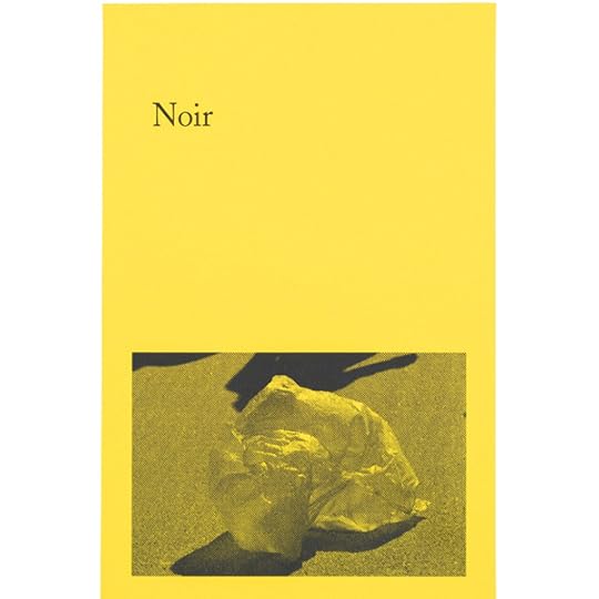
Martine Stig, Noir, Fw:Books, Amsterdam, 2016
Despite its matter-of-fact appearance, Martine Stig’s Noir is a rather offbeat photobook. A quote from Jacques Aumont’s Montage Eisenstein (1987), about Sergei Eisenstein’s art of montage, is printed on the spine of the small, canary-yellow paperback: “The essence of cinema,” Eisenstein wrote, “does not lie in the images, but in the relation between the images.” This seems to be an instruction for how to read this book as well as a source of inspiration for its edit, carried out by Stig in collaboration with book designer Hans Gremmen.
Between 2014 and 2016, Stig shot candid, contrasty, black-and-white photos on the streets of Amsterdam. They seem to have been taken mostly during sun-drenched summer days. The highly suggestive images are filled with shadow play, and when people are shown, it is mostly in isolation, their eyes closed and lost in thought. The thoughtful, seemingly “empty” compositions are a far cry from the familiar hustle and bustle of Amsterdam. But the images, taken together, also breathe uneasily, projecting a dystopian tale of disconnectedness.
Martine Stig, Noir, Fw:Books, Amsterdam, 2016
It is perhaps not accidental that so many of Stig’s images are eerily reminiscent of Chris Marker’s influential photo-film La Jetée (1962), set in postapocalyptic Paris. But whereas La Jetée is propelled forward by compelling narration and the force of linear editing—despite its theme of time travel, in which the past and future are “call[ed] . . . to the rescue of the present”—Noir is on a completely different narrative track. When they sat down to feed Stig’s sixteen image quartets (as shown grouped in the end of the book) into the book layout, Stig and Gremmen arrived at an editing style more akin to the syncopated rhythms of free jazz. Every set of images interlocks with the others, unsupported by any orderly scheme. Most of the images take up slightly less than a quarter of a spread and reappear two or three times, each time in different juxtapositions. Because the editing scheme is so irregular, each new image that is introduced is a surprise. With every turn of the page, I also found myself leafing back a few spreads—refreshing my memory of an earlier appearance of an image or combination of images—before moving on.

Martine Stig, Noir, Fw:Books, Amsterdam, 2016
While this little photonovel references cinema on multiple levels, from its title to its focus on montage, it is also rather anticinematic. Insofar as we can even speak of narrative flow, that flow is constantly being frustrated on a productive and reflective level. The sequencing plays with the Kuleshov effect, in which one’s perception of an image is affected by the images paired with it: “Each time you think you’re encountering the same photograph again, the meaning you might have attached to or projected onto it is put into question by its shifting conjunctions.”
Whether an image’s essence can only be found in its relationship to another remains an open discussion. However, this exciting experiment in photo editing strengthens my belief that printed photographic intelligence and cinematic intelligence are miles apart. In a book, the in-between of images conveys a dimension that is not only mental but spatial, too.
Taco Hidde Bakker is a writer, translator, and researcher based in Amsterdam. He worked with Paradox and Dana Lixenberg on the book, web documentary, and exhibition The Last Days of Shishmaref (2008–10). He writes for magazines such as Camera Austria International, Foam, EXTRA, and the British Journal of Photography.
The post Martine Stig’s Sun-Drenched Amsterdam appeared first on Aperture Foundation NY.
August 28, 2017
Rick Sands: Breaking the Light Barrier


“I always call him ‘the genius of light.’ He puts all of the lighting scenes together. He thinks differently than everyone else I know. He just responds to light. It’s remarkable.”
—Gregory Crewdson on Rick Sands
In a five-day workshop at Aperture Foundation, twelve participants worked with and learned from director of photography Rick Sands, whose masterful lighting illuminates scenes and narratives in photography, film, and television. “I don’t see natural light,” Sands quipped as he spoke to students, explaining that when he scouts locations he envisions them as dark; the only light he sees is the light that he adds to a scene.
Sands’s early background in theater and stage lighting taught him to look at scenes and settings holistically in order to create elaborately conceptualized lighting scenarios. On the first day of the workshop, Sands explained his take on the five properties of light—quantity, quality, color, direction, and shape—guiding workshop participants in the hands-on learning that they took part in throughout the session. With the help of Sands, students worked in groups to re-create the lighting found in images they had selected from fashion magazines, film stills, and fine-art photographers such as Cindy Sherman and Alessandra Sanguinetti. The images were eclectic, giving students the opportunity to re-create a diverse array of lighting scenarios. The workshop also consisted of informal lectures and slide viewings, lighting demonstrations, and question-and-answer periods. By the end of the workshop, students were not only confident in emulating the lighting found in the images of other photographers, but also in creating lighting to match their own personal photographic visions.
Students say…
“Rick is incredibly knowledgeable about lighting gear and I feel very confident working with lights after the workshop.”
“Rick is the ultimate king of lighting, period. It was so generous of him to have shared his invaluable experience and knowledge with all of us, with tremendous patience and great efforts. It was a life-changing workshop!”
“He’s a very good teacher. He gave everyone enough flexibility to explore how they might do something, he wasn’t dogmatic about an approach, but he also knew when to help us get back on track.”
Richard Sands is a director of photography whose roots are in cinema production. He has accomplished the lighting on 35 theatrical motion pictures with directors such as Steven Spielberg, Francis Ford Coppola, and Sam Raimi; 47 television movies; over 100 one-hour television episodes; and numerous advertisements. He was responsible for many award-winning projects, including three commercials he shot that have won ADDY Awards. For nearly twelve years, Sands has created the elaborate lighting for the fine-art narrative photographs of artist Gregory Crewdson. Through this unique collaboration, Sands’s lighting has been featured in four books and several international photographic exhibition tours.
Explore Workshops
The post Rick Sands: Breaking the Light Barrier appeared first on Aperture Foundation NY.
August 23, 2017
Designer Spotlight: Sebastian Hau in conversation with Pierre Hourquet
How does the designer of the sold-out Provoke catalogue conceive of new photobooks?
By Sebastian Hau

Lewis Baltz, Common Objects, Steidl and LE BAL, Göttingen, Germany, and Paris, 2014
Pierre Hourquet has designed books for and with Daido Moriyama, Susan Meiselas, Lewis Baltz, Alberto García-Alix, Sylvain Couzinet-Jacques, Guillaume Belvèze, Maciek Pozoga, Olivier Cablat, and Victor Boullet, as well as the recent sold-out Provoke catalogue that accompanied several exhibitions. I first met the Paris-based designer in 2010, when he was helping to set up Publish It Yourself, an exhibition that brought together a selection of important self-published titles. From that point onward, I’ve followed his work and—full disclosure—we have since collaborated on several projects together. Most notably, we cocurated the exhibition Open Book (2014) for Paris Photo, which attempted to break down the longstanding barrier between the histories of artists’ books and photobooks, and document and visualize the hidden influences between the two.
I remain fascinated by Hourquet’s wide interests in film, music, art, and photography, and by how he manages to bring them together in his work. In 2013, Hourquet created Temple Gallery and Editions, which he runs with his partner, Anna Planas. Their regular exhibitions feature young photographers in a small but well-thought-out and organized space in the Marais, Paris. Each exhibition is accompanied by a small publication conceived for the occasion. Hourquet is currently working as a curator for The Hobbyist, an exhibition that will open at Fotomuseum Winterthur this September.

Lewis Baltz, Common Objects, Steidl and LE BAL, Göttingen, Germany, and Paris, 2014
Sebastian Hau: What is the specificity of a photobook?
Pierre Hourquet: You can look at a book as an intimate object—the polar opposite of an exhibition. You can look at them longer and harder, without distractions, and return again and again. As a designer, I also like to consider books as containers, as specific spaces.
SH: Is a book an end in itself, or is it connected to other forms of expression?
PH: A book is not an end in and of itself. It’s a useful tool. At Temple, our publications are complementary to the exhibitions, but they’re also starting points. With Sonia Berger, we launched the collection “A Companion To,” related to some books that the Spanish publisher and bookshop Dalpine had published. Books make connections. They can share ideas and messages. They contain great educational and cultural potential.
SH: What’s the first thing you do when you see photographs you will work with? What’s the last?
PH: First I try to learn more about the work, looking for other books, interviews, or articles about the artist. I designed a book for Lewis Baltz for his exhibition at LE BAL. He was very sick at that moment, so we could not meet often. The first thing I did was watch all the films he had selected for the show from filmmakers who inspired him. It was really helpful for understanding his work and designing his book. When I showed him the final book, Common Objects (2014), he remarked with gentle irony that he couldn’t tell whether it was an artist’s book made by him or by me. That was an ambiguous compliment, but put forth in a very warmhearted way.
Another important thing is to create a structure for the book. For the Provoke catalogue, the first thing I did with Diane Dufour, the director of LE BAL and cocurator of the show, was organize everything. However, she also wanted to add more books and photographs to the initial selection of content. We were looking at more and more material and, as a result, we reconceived the structure several times! The final book holds more material than the actual shows. The last thing I do? The book cover!

Diane Dufour and Matthew Witkovsky, eds., Provoke: Between Protest and Performance, Photography in Japan 1960–1975, Steidl, Göttingen, Germany, 2016
SH: Can you describe the process of working on Susan Meiselas’s Prince Street Girls (2013)?
PH: I was experimenting with making books with a group of friends. We called ourselves Yellow Magic, inspired by the Japanese [music] group Yellow Magic Orchestra. We had already organized a printing show for Daido Moriyama and made a special book project for him. Susan had selected some images from the Prince Street Girls series for a solo show she had in a Parisian gallery. She wanted to make a small publication. One of her assistants had designed a very basic dummy, which she showed me. We kept the idea of a simple zine and made a more sophisticated version for Susan. It was the second book made by our group. We designed it, printed it, bound it, and sold it on our own. We assumed the responsibility for the whole process. A great performance!
SH: Do you find your work on book projects is changing over the years?
PH: As a designer, I’ve gotten more involved in the whole process, from editing to printing. I find I’m strongly interested in working on the content of the books—not just their graphic design. We are now in charge of the catalogue for an upcoming exhibition at Winterthur [The Hobbyist] that I will cocurate with Anna Planas. We have to bring all the content to create a publication that will enrich the purpose of the show. At Temple a few years ago, we started linking more and more exhibitions to accompanying publications, as most of the time we were showing works that had not been published before.
Susan Meiselas, Prince Street Girls, Yellow Magic Books, Paris, 2013
SH: What are your ideas about the relationship between words and images in books?
PH: For each project, I try to find the right relationship between text and images, even if there are only captions. With Yellow Magic, we tried to make a book project with a text from Jean Giono (The Man Who Planted Trees, 1954) and images from Robert Adams. The hardest thing was not putting images as an illustration of the text. We wanted to build a book where images could be readable as text—to find a narrative sequence where text and image were joined in a general story. Although Robert Adams likes the text by Jean Giono very much, in the end we didn’t manage to find the balance between these two languages—the first project we couldn’t finish.
SH: You work with both physical dummies and digital design tools. Can you explain the role of these techniques and how they come together?
PH: Even if I spend most of my time designing and working with files on my computer, I still like the materiality of the dummy. You cannot make a book without doing a paper dummy. It gives you a preview of the object you will get at the end. Digital tools bring technique, exactitude, and precision to the project. However, I have often done dummies without digital tools, made only with photocopies and Scotch tape. I like the raw aspect of them.
Susan Meiselas, Prince Street Girls, Yellow Magic Books, Paris, 2013
SH: You have published around seventy books yourself, online, with Temple, and as fanzines. How do you feel about the difference between self-publishing and publish- ing in general?
PH: I think all these books are really related to DIY. Self-publishing is about self-reliance. You can take things in hand and make a book by yourself. We publish books at Temple in this spirit of independence. I also like the urgency of self-publishing: you have to do something, so you do it.
Sebastian Hau publishes, curates, sells, writes about, and teaches classes about photography and photobooks. In collaboration with Olivier Cablat, he organizes the photobook fair Cosmos for the Rencontres d’Arles, as well as the photobook fair Polycopies Paris with Laurent Chardon.
More on Pierre Hourquet’s work and his collaborations can be found at templeparis.com and booksonline.fr.
The post Designer Spotlight: Sebastian Hau in conversation with Pierre Hourquet appeared first on Aperture Foundation NY.
August 18, 2017
Ed Ruscha on Stephen Shore’s America

Stephen Shore, Second Street and Matheson Street, Kenora, Ontario, August 15, 1974
© the artist

Stephen Shore, Fort Worth, Texas, June 2, 1976
© the artist

Stephen Shore, 2800 South Hayden Street, Amarillo, Texas, August 17, 1973
© the artist
Stephen Shore, Sixth Street, Orlando, Florida, November 7, 1977
© the artist
Stephen Shore, Room 38, Curly Redwood Lodge, Crescent City, California, September 1, 1974
© the artist
Stephen Shore, Hiawatha National Forest, Michigan, July 8, 1973
© the artist

Stephen Shore, Third Street and Hancock Street, Ithaca, New York, August 11, 1977
© the artist

Stephen Shore, Kelly’s Barber Shop, Key Largo, Florida, November 11, 1977
© the artist

Stephen Shore, Market Street, Harrisburg, Pennsylvania, July 4, 1973
© the artist
Stephen Shore, Ginger Shore, Aspen, Colorado, June 20, 1978
© the artist
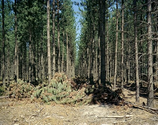
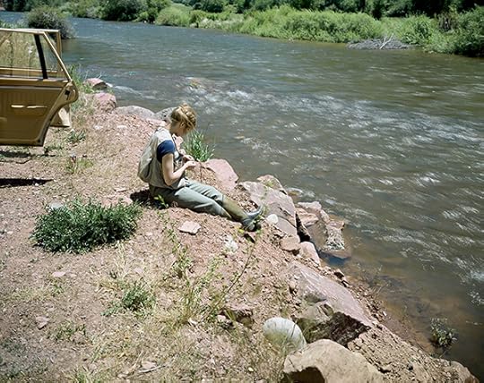
From this large collection of wide-ranging photographic subjects, no attempt was made to select images that displayed either civic America or variety, but rather ones that had a distinct voice on their own. Looking at one picture you could hear a pin drop. Another would roar with noise and yet another would hum along quite ordinary-like.
I seem to have favored scenes that were oblivious to the camera or forgot it was even there.
Ed Ruscha is an American conceptual artist. This feature is adapted from the Aperture book Stephen Shore: Selected Works, 1973–1981.
 Stephen Shore: Selected Works, 1973–1981Stephen Shore’s Uncommon Places is indisputably a canonic body of work—a touchstone for those interested in photography and the American landscape. Remarkably, despite having been the focus of numerous shows and books, including the eponymous 1982 Aperture classic (expanded and reissued several times), this series of photographs has yet to be explored in its entirety. Over the past five years, Shore has scanned hundreds of negatives shot between 1973 and 1981. In this volume, Aperture has invited an international group of fifteen photographers, curators, authors, and cultural figures to select ten images apiece from this rarely seen cache of images. Each portfolio offers an idiosyncratic and revealing commentary on why this body of work continues to astound; how it has impacted the work of new generations of photography and the medium at large; and proposes new insight on Shore’s unique vision of America as transmuted in this totemic series.
$80.00
The post Ed Ruscha on Stephen Shore’s America appeared first on Aperture Foundation NY.
August 16, 2017
In Rwanda and Europe, Images of Creativity and Survival
Amelia Umuhire, still from Mugabo, 2016
Courtesy the artist
Amelia Umuhire’s fictional web series Polyglot (2015) explores the lives of young black artists in Europe. The cinematic series is set in Berlin and London and focuses on ideas of home and identity in an increasingly hostile environment. Polygot was screened at various international festivals such as Film Africa London, Tribeca Film Festival, Festival D’Angers, and the Geneva International Film Festival, where it went on to win Best International Web Series 2015.
Umuhire’s most recent project, Mugabo (2016), set in Kigali, Rwanda, is an experimental short film about the return to the homeland and the question of what to do with our past. Umuhire, who survived the Genocide against the Tutsi in 1994 with her sisters and mother, explores the millennial survivor experience with unconventional sound and dialogue collage, mixing genres and tones to convey the complexity of loss, uprooting, and finally acceptance of the collective and individual past. Mugabo premiered at the 2016 Film Africa festival in London and recently won Best Experimental Film 2017 at the Blackstar Film Festival.
In this podcast, the first episode of Contemporary And (C&)’s conversation series “Second Glance,” Aïcha Diallo sat down with Umuhire in Berlin to talk about her practice as an image maker and storyteller. Listen to their conversation below.
Podcast by Aïcha Diallo and Bassano Bonelli; editing by Bassano Bonelli; mixing by Manuela Schininá; music by DJ Zhao, Cecile Kayirebwa, Daz baba ft. Ferooz, and Isang Yun; texts by Mara Senaga and Françoise Vergès.
Aïcha Diallo is Associate Editor of Contemporary And (C&) and contributing guest editor of Aperture’s summer 2017 issue “Platform Africa.” Amelia Umuhire is a Rwandan-born filmmaker, raised and educated in Germany.
This article is part of a series produced in collaboration with Contemporary And (C&) – Platform for International Art from African Perspectives.
Read more from Aperture Issue 227, “Platform Africa,” or subscribe to Aperture and never miss an issue.
The post In Rwanda and Europe, Images of Creativity and Survival appeared first on Aperture Foundation NY.
August 15, 2017
The Book of Film
How do filmmakers such as Jean-Luc Godard and Sofia Coppola translate moving images to the printed page?
By David Campany

Jean-Luc Godard, Journal d’une femme mariée, Méril, Paris, 1965
We have all heard photographs described as poetic, sculptural, painterly, literary, or cinematic. It is commonplace to look outside the medium when trying to account for it. But it will only get us so far. If a photo- graph is described as “painterly,” what might that mean? Caravaggio, Constable, or Kandinsky? If it is “cinematic,” does that suggest Kurosawa, Kubrick, or Cronenberg? Raised on a diet of Alfred Hitchcock and David Lynch movies, you might reasonably feel a Gregory Crewdson photograph was “cinematic.” If that diet was movies by Claire Denis and Béla Tarr . . . maybe not.
Beyond the single image, we often reach for filmic comparisons when discussing photo editing and publications. Of his book New York (1956), William Klein once declared: “Only the sequencing counts . . . like in a movie.” Given its flowing layout and informal framing, we can see what he meant. But it’s also nonsensical—how can only the sequencing count? On page or screen, there can be no sequencing without the images themselves. The late Allan Sekula thought of his photo-text works as “disassembled movies,” but he didn’t say which movies, and some of the directors he admired—Jean-Luc Godard and Jean Rouch—described their own movies as “disassembled.” Cinema’s aesthetics and modes of production are no more unified than those of photography. All the arts can be anything—and they can be like anything.
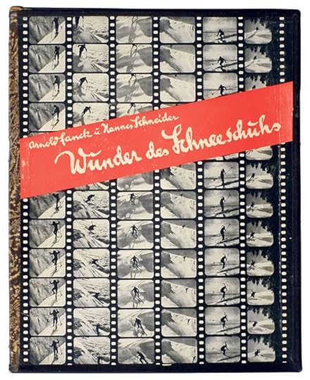
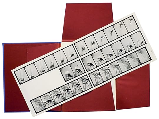
Arnold Fanck, Wunder des Schneeschuhs, Enoch, Hamburg, 1925
Such happy confusion aside, there is a particular kind of photographic book we can legitimately call cinematic, and that’s a book derived directly from cinema. Film became a form of mass entertainment alongside the emergence of the popular illustrated press. By the 1920s, all kinds of books related to movies were appearing, both mainstream and avant-garde. Across the ensuing decades, “cinema on the page” became a familiar part of visual culture.
The most popular publications presented movies much like cartoon strips of images and text. Sometimes the photos were frames of the movie itself; sometimes they were shot as stills, by specialist photographers on set. Peaking in the 1940s and ’50s, these cheaply printed magazines and little books were perfect for viewers hungry for a physical souvenir of the movie theater’s projection of pure light. Holding something cinematic in your hands was exciting. In Italy especially, these fotoromanzi of the latest releases were consumed in vast numbers.
Arnold Fanck, Wunder des Schneeschuhs, Enoch, Hamburg, 1925
There were also more graphically adventurous experiments. Printed movie frames featured in many interwar avant-garde publications, notably László Moholy-Nagy’s landmark Malerei, Photographie, Film (Painting, Photography, Film, 1925). Moholy-Nagy took inspiration from a remarkable project about skiing, of all things: in 1920, the photographer and filmmaker Arnold Fanck had made an instructional film and was experimenting with printing frames from it. Fanck became fascinated with the dilemma of whether action was better expressed by a single, well-timed photograph or a sequence from a movie camera. The two-volume Das Wunder des Schneeschuhs (The miracle of the snowshoe, 1925) presents copious examples of both, with filmstrips printed on spectacular, unbound foldouts. Studying this book in your lap may not be the best preparation for launching yourself down an alp, but it’s a fascinating presentation of a visual problem.
Indeed, the challenge of how to present the time of moving images on the page has never gone away. It is bound to fail, but there are endless ways of failing which can still be instructive, and attractive. The video artist Martin Arnold works with found footage from classic movies. He’s interested in cutting, combining, and repeating shots, often toggling back and forth so the image appears to flutter on the edge of perception. The effect cannot work in print, and yet his 2002 book Deanimated, designed by Anna Bertermann, is remarkable. The pages have a timeline marked out in dots. Along this line, the shots from his films are reproduced in sequence. The longer the shot is held on the screen, the more dots it must span, and thus the larger it appears on the page. In this way, image dimension corresponds directly to image duration. Clever.

Martin Arnold, Deanimated, Kunsthalle Wien and Springer, Vienna and New York, 2002
In general, most movie-related publications have not attempted that kind of equivalence. The elegant book of Le sang d’un poète (The Blood of a Poet, 1930), Jean Cocteau’s first film, is an elegant example, with elliptical moments from the script punctuated by striking photos shot on set by Sacha Masour. With its antireligious sub- text, the film caused a scandal upon release, but it gained a reputation as one of the key Surrealist films. Published much later, in 1948, the book is a recognition of this. It doesn’t attempt to recreate the film; the relation between page and screen here is complementary rather than supplementary.
With the rise of television in the 1960s, such books began to die away. Then VHS made films “possessable,” and DVD supplied the supplements beloved of fans and scholars. But as the cinematic book waned, European filmmakers began to make books as a means of revisiting and expanding their movies. Alain Robbe-Grillet converted his scripts written for films directed by Alain Resnais—including L’Année dernière à Marienbad (Last Year at Marienbad, 1961)—into what he called “ciné-novels,” halfway between illustrated script and novelization. Although radically hybrid, the ciné-novel has qualities all its own. Here is Robbe-Grillet explaining in the foreword to his self-directed L’Immortelle (The Immortal One, 1971):
“[A] detailed analysis of an audio-visual whole that is too complex and too rapid to be studied very easily during the actual projection. But the ciné-novel can also be read, by someone who has not seen the film, in the same way as a musical score; what is then communicated is a wholly mental experience, whereas the work itself [the film] is intended to be a primarily sensual experience, and this aspect of it can never really be replaced.”
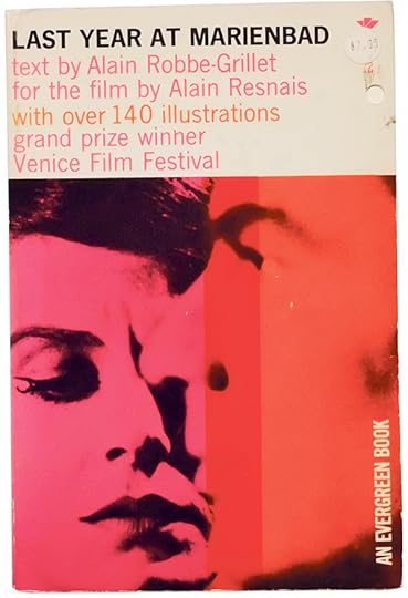
Alain Resnais and Alain Robbe-Grillet, L’Année derniére á Marienbad, Calder, London, 1961
The translation of a film into illustrated text opens up an interpretive gap; cinema’s fixed duration is converted into the more flexible time of reading. On the page, text and image can be contemplated at will and, in the process, the film can be “laid bare” for analysis. In 1965, Godard suggested that “one could imagine the critique of a film as the text and its dialogue, with photos and a few words of commentary.” Godard published print versions of nearly all his films of the 1960s. The book based on Une femme mariée (A Married Woman, 1964) recreates the episodic, first-person structure of the film. Whereas the film showed the married woman confronted with representations of consumer femininity (on billboards, magazines, and movie posters), the book appropriates various styles of layout from popular culture.

Jean-Luc Godard, Journal d’une femme mariée, Méril, Paris, 1965
In the 1950s, ’60s, and ’70s, the decades of European “auteur cinema,” dozens of illustrated books appeared for films by the great directors—Antonioni, Pasolini, De Sica, Tati, Truffaut, Bresson, Rohmer, Fassbinder, Bergman, Buñuel. I should confess here: this is where my affection for photography began. The film stills in these old books were the first images that really impressed me. Cinema seemed to be the means of making the sorts of photographs I wanted to look at. Years later, I was thrilled to come across a video of a 1974 lecture in which Walker Evans described Robert Altman’s McCabe and Mrs. Miller (1971) as “a marvelous bunch of photography.” He was right. Vilmos Zsigmond’s impressionistic camerawork on that film was a kind of photography not seen before, or since. For many years, I knew it only though images in books.
It is important to note that cinematography was included in many of the early books on the history of photography. Then, as film history began to establish itself, the two were split. For example, the first edition of Beaumont Newhall’s Photography: A Short Critical History (1937) included a chapter titled “Moving Pictures,” and even featured Eadweard Muybridge’s sequential locomotion studies on its dust jacket. That chapter was dropped from later editions.
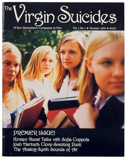
Sofia Coppola and Corinne Day, The Virgin Suicides: A New Generation’s Companion to Film, vol. 1, no. 1, American Zoetrope, 1999
If our histories of photography were to include the innovations of cinematography, the whole map of the medium would need to be rewritten. The exploration of light, composition, visual rhetoric, and communication has always been far more advanced in cinema than in still photography, especially when it comes to color. You only have to look at Jack Cardiff’s Technicolor cinematography for the films of Michael Powell and Emeric Pressburger to see this: A Matter of Life and Death (1946), Black Narcissus (1947), The Red Shoes (1948)—nothing in the still photography of the 1940s came close. In working with light projected through a subtle positive-transparency film, color cinema made enormous leaps, aesthetically and technically. Meanwhile, color still photography was held back severely by the practical problems of color print reproduction, which was not very good until well into the 1980s. If you want to see the very best color imagery that was possible between the late 1930s and the late 1980s, look to cinema. But the printed publications dedicated to those color movies are awful!
Surprisingly few cinematographers have made visual books about their work. Man with a Movie Camera (1984) is Néstor Almendros’s illustrated account of how he shot some of the most beautiful films of the 1960s and ’70s. (He won an Academy Award for Terrence Malick’s Days of Heaven from 1978.) Christopher Doyle, renowned for his work with director Wong Kar-wai, has published books of his collages and photos taken on set. A Cloud in Trousers (1998) is his remarkably honest and sidelong account of how he understands images.

Sofia Coppola and Corinne Day, The Virgin Suicides: A New Generation’s Companion to Film, vol. 1, no. 1, American Zoetrope, 1999
The “book of the film” remains split between tedious Hollywood blockbuster franchise cash-ins and more experimental publications for art-house movies. Rainer Werner Fassbinder, Wim Wenders, David Lynch, Larry Clark, Wes Anderson, Mike Mills, and Sofia Coppola have issued innovative books related to their films (little coincidence that all these directors have had a deep love of still photography). The sumptuous photographs taken by Roger Fritz on the set of Fassbinder’s highly theatrical Querelle (1982) predate by a few years the seedy glamour of Nan Goldin’s The Ballad of Sexual Dependency (1986). The book of Wenders’s Paris, Texas (1984) tells the road movie in double-spread frames. In this form, it is easy to see just how much he and cinematographer Robby Müller had learned from the imagery of photographers Walker Evans, William Eggleston, and Stephen Shore.
Two years later, some of Eggleston’s photos appeared in the book of the musician David Byrne’s only feature film, True Stories (1986). Along with Eggleston’s photography, there are images by Len Jenshel, Mark Lipson, and Byrne himself. At once script book, scrapbook, and photobook, it’s a thoroughly idiosyncratic publication, entirely in keeping with the film. (The True Stories revival starts here!)

Alain Resnais, Repérages, Éditions du Chêne, Paris, 1974
Eggleston’s photography has influenced many filmmakers of the last twenty years, but none more so than Sofia Coppola. All her films are accompanied by publications. One of the most engaging is the fake teen zine of The Virgin Suicides (1999), with Eggleston-esque photos by the late Corinne Day.
I have barely scratched the surface here. Cinema has given rise to such a great range of photographic books. I finish with my favorite, Alain Resnais’s Repérages (1974). It is a collection of photographs shot over many years in New York, Paris, Lyon, Hiroshima, and London while looking for locations for his films. The majority are for projects he never completed. The format is wide and the full-bleed images with black pages help to suggest a screen in a darkened room. The photographs are documents: raw, grainy, and factual. They are also richly evocative promises that the late director never managed to keep—love letters to the future of cinema. Perhaps someday someone else will pick up this book and make those movies.
David Campany is an author, photographer, and curator. His books include Photography and Cinema (Reaktion Books, 2008) and The Cinematic (Whitechapel Gallery and MIT Press, 2007). He recently cocurated The Still Point of the Turning World: Between Film and Photography for Fotomuseum Antwerp, which was on view from June 23–August 10, 2017.
The post The Book of Film appeared first on Aperture Foundation NY.
August 10, 2017
The Unsung Hero of South African Photography
In searing and poetic images, Andrew Tshabangu chronicles Johannesburg in the age of democracy.
By Bongani Madondo
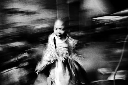
Andrew Tshabangu, Portrait of a Young Thwasa, from the series Bridges, 2008
Courtesy the artist and Gallery MOMO
Andrew Tshabangu’s two decades-plus visual repertoire, the best of which was showcased earlier this year at Johannesburg’s Standard Bank Gallery and Gallery MOMO in Footprints, is provocative and ultimately liberating. With its exploration of blackness as a lived, if banal and mundane experience (just as it is with any other racial group), Footprints, which was curated by Thembinkosi Goniwe, is also notable for its simplicity and aching, often sweeping quietness, and clarity. In “The Value of Andrew Tshabangu’s Photography,” an essay in the accompanying monograph, published by Fourthwall Books, the curator, critic and novelist Simon Njami tells us that Tshabangu’s journey began in the place where he was born, namely, South Africa. “While biography is never a trivial part of the analysis of any artist’s work,” Njami writes, “in Tshabangu’s case the contextual elements seem to render fundamental clues to a deeper understanding of his universe.”
Who is Andrew Tshabangu and why does he matter? Tshabangu was born in 1966 in Soweto, Johannesburg, where he currently works and lives. His lifelong visual subject is the city and its satellite township on the southwest frontier of the African megalopolis. Tshabangu studied photography in the Eastern part of the city, at the Alexandra Community Art Centre, in 1990; he later studied photojournalism at the Institute of Advancement for Journalism, shortly in the wake of the new democratic dispensation. He would go on to make his name as a photojournalist mainly at the then-exulted New Nation, an alternative weekly published by the South African Catholic Bishops’ Conference.
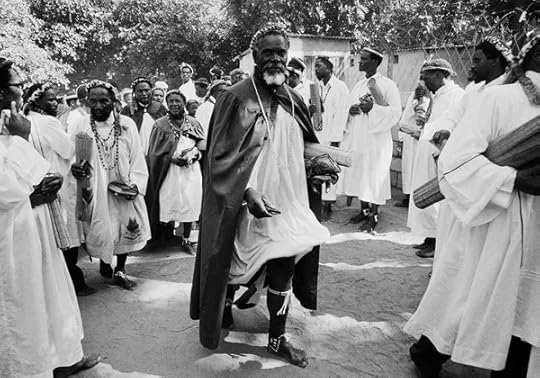
Andrew Tshabangu, Shembe Church Elders, from the series Bridges, 2008
Courtesy the artist and Gallery MOMO
“Without doubt,” writes Njami in Footprints, “a journey into the past is always necessary to get a better understanding of any photographic practice.” Njami then lets loose an obvious fact: “Tshabangu is black, and yet this biographical detail could seem almost irrelevant.” It isn’t—at least in the South African (or global) context. On March 21, 1960, six days before Tshabangu’s birth, the South African Police mowed down hundreds of unarmed civilians who were marching peacefully in Sharpeville to protest against the Pass Laws. When he was ten years old, in June 1976, half of Soweto, and by extension the country, was engulfed in fire as students marched against the government’s enforcement of Afrikaans as the language of instruction across the education system. The white regime again responded by shooting the youths and setting raging dogs on them. But, instead of heading into exile, like many teens slightly older than him who skipped the country at that time, Tshabangu, who grew up in a Catholic family, prayed and wished for inclusion in the one calling he felt would offer salvation to his tumultuous country—the priesthood.
Time would pass until he found other ways to tell and preach about the conditions of his people. Upon leaving high school, he applied to Wits University’s School of Dramatic Art, to study performance. “Alas, I was terrible at it. I was rejected, ” he told me recently. “And yet I kept on searching for ways I could train as a creative and tell my people’s stories. Hence I arrived at the Alexandra Community Art Centre where I took up taking up photography. It was not a complex decision to make.”

Andrew Tshabangu, Butchery, Traders and Taxis, from the series City in Transition, 2003
Courtesy the artist and Gallery MOMO
In a way, Footprints is both an accumulation, as well as a visual testimony, of the journey he has walked. Thematically divided into six chapters, “City in Transition,” “Bridges,” “Emakhaya,” “Hostel Interiors,” “Hostel Exteriors,” and “Water is Ours,” the exhibition and catalog comprise selections of Tshabangu’s photographs taken since 1994, a year of both personal and political resonance. The beginning of South Africa’s democracy, 1994 also marked the beginning of the end of foreign, NGO-supported African, feminist, and workerist independent media engaged in the antiapartheid movement. Tshabangu is a survivor of that “struggle photography” culture spawned by the activist literary titles such as Staffrider, Weekly Mail, Labour Bulletin, New Nation, and Learn & Teach, and he is stoically steeped in the social documentary mode exemplified by Afrapix, a collective of politically-conscious photojournalists active from 1982 to 1991. His work refuses easy categorization and defies agitprop politics, while remaining cognizant of his subjects’ undeniable blackness; his project, per the Du Bois-esque adage, is the soul of black folks.
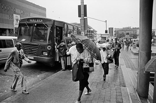
Andrew Tshabangu, Naledi-Bree Street Bus, from the series City in Transition, 2004
Courtesy the artist and Gallery MOMO
Stylistically, and by this I mean in terms of both aesthetic veneer and disciplinary strictures, Tshabangu can be said to have evolved within the social documentary genre. Early on, as testified by the section “City in Transition,” his camera was trained on black folks’ mobility—by taxi, train, or on foot—in and out of the city. Confident, he moved on to focus on a people dealing with the meaning of freedom via their age-old mysticism and African spiritual practices, before breaking out into the hostel dwellers’ digs and rural environs. By all intents, even in the post-1994 work displayed in Footprints, Tshabangu is a man of the 1980s, and in character and language, he appears stuck in there. There’s nothing extravagantly contemporary, hip, arty, current, or fashionable about his photographs, and yet his work is revolutionarily refreshing for its timelessness. It shouldn’t work wonders, but it does. There’s a backstory to this.
In the immediate postapartheid years, from 1994 to 2004, cultural spaces in South Africa metamorphosed from the tyranny of the apartheid-era single story—benign blacks doing nothing but enduring suffering from evil whites (when not burning everything in sight)—to an idealized narrative, One Nation Under a Groove. Of course, the entire project was optimistic at best and fictive at worst. Artists, the media, and the general public were exhorted to imagine the country anew. The process of re-imagining demanded of the newly democratic country to move the narrative from who we are to who we can be. In that period, the theory held that the past is a divisive if ugly country, a place we had better hurry to escape from, just in case it derails our march into cultural and social nirvana. Like all modern cultural and artistic expressions, photography as art or document found itself exposed and manipulated for propaganda purposes—this time propagating the Rainbow Nation Groove.
Andrew Tshabangu, Fantasy, from the series Hostel Interiors, 2009
Courtesy the artist and Gallery MOMO
In Tshabangu’s South Africa, the South Africa in his Footprints, photography, literature, and all modes of storytelling were no less besieged by the end of apartheid’s reconciliation project. Everyone was besieged. The new age of political correctness had arrived. Exhortations to ideological good manners grew all the louder. No matter what the economics and historical baggage your life might have been shaped by, the message was clear: You have to forget the past, you have to love thy neighbor, you have to believe in the untested miracles of the Nelson Mandela’s fantastical promise.
All attempts at wholesale loving and cultural kumbaya, with no solid legal or spiritual recourse to past injustices, kicked off with blistering immediacy in mid-1994. This is the era on which Tshabangu focused his lens. It was around this time that a question arose (with an implicit “nay” as its answer), a question that persists to this day, as galleries and commercial media wrestle with the conundrum: Does social documentary as a means of visual expression still matter? Is socially engaged art devoid of creative imagination? Is it propaganda?

Andrew Tshabangu, Women Praying at the Crucifix, from the series Bridges, 2001
Courtesy the artist
Out of the cultural turbulence brought about by the politics of hope, social documentarians such as the Afrapix vanguard Omar Badsha, Paul Weinberg, Cedric Nunn, Santu Mofokeng, and Peter McKenzie, among others, all Ernest Cole’s affective heirs, were relegated—while simultaneously valorized by academic theorists—into museum fare and college syllabi. Only the newspaper- and street-hardened, photo-punk collective called the “Bang Bang Club”—which specialized in photographing the police’s jackboot behavior, the disruption of workers and church organisations work, random shootings and arrests of young black males, and the township youth’s militant response to it—achieved glorious infamy.
The “Bang Bang” crew—notably, Kevin Carter, Greg Marinovich, Ken Oosterbroek, and João Silva—were mostly white men working in the black townships. They were treated with suspicion, even though they were often the most reliable visual agents the burning ghettoes could hope for to beam tales of their daily woes to the outside world. (They were later immortalized in The Bang Bang Club [2010], a Hollywood flick that curator-critic Khwezi Gule eviscerates in his essay “Bureaucratization of Memory” in Okwui Enwezor and Rory Bester’s exhibition catalog Rise and Fall of Apartheid [2013]. Gule calls out the photographers for “aestheticizing” as well as “commodifying” township folks’ suffering.) Through all these changes and aesthetic re-imaginations, Tshabangu pushed on quietly, alchemically, working through the raging trends, walking throughout the streets of Johannesburg, almost anonymously.
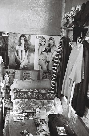
Andrew Tshabangu, Mielies, Stove and Heater, from the series Hostel Interiors, 2011
Courtesy the artist and Gallery MOMO
A twenty year survey (“and not retrospective,” Tshabangu insists), Footprints is perhaps the most fully realized and groundbreaking solo photography exhibition in South Africa in recent memory. Tshabangu circumvents all the cherished tropes of twentieth-century popular “black life” in Africa: sex, drugs, alcohol, cars, and witchcraft, or the joie de vivre of the stylized natives, as per Malick Sidibé’s postindependence nouveau noir aesthetic affirmation. Groundbreaking as Sidibé’s James Brown-inflected portraiture (in West Africa) and some of Drum magazine’s 1950s shebeen and fashion show photospreads (in South Africa) were—especially to the racist gaze that never expected outward self-celebration and dandified genius from the native—ultimately that vision was, and is still, susceptible to the single story trap, too.
Tshabangu directs his camera to the same hard done Africans, street idlers, and Johannesburg’s legendary traffic-disregarding minibus taxis at the ranks, or in motion, though he chooses to show neither the ugly nor its opposite, poverty chic. Take, for example, his hostel series, subdivided into “Interiors” and “Exteriors.” His photographs of the exteriors of the low wage workers’ compounds entitled Hostel Exterior I–IV (2008) give off an indifferent feel: trains of architecturally lackluster dwellings, windswept rows of laundry hung out to dry, no people in sight. In an interior view, Mielies, Stove and Heater (2011) depicts a kitchenette upon which stands a table decorated with a check-cloth covering, a bunch of mielies resembling a ponytail of a city slicker or Mafia hitman hung up above a whitewashed wall, and a long electric cord snaking around the table down to a makeshift tin stove that might work as both a tea-heating appliance or a DIY heater. It’s a stripped-down atmosphere: it’s minimalist without the trendy implication; here, minimalism implies a lack of material possessions, but also a willful commitment to “make it” by any means necessary.
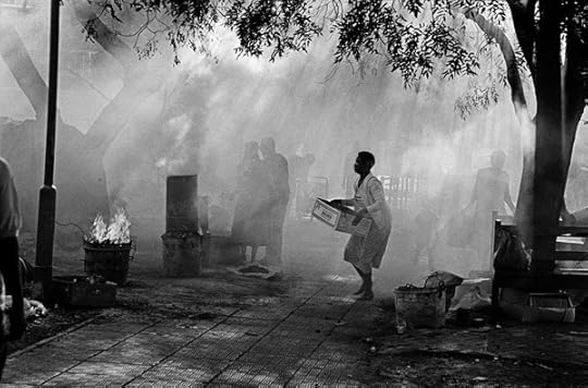
Andrew Tshabangu, Brazier, Joubert Park, from the series City in Transition, 1994
Courtesy the artist and Gallery MOMO
At the core of Footprints is a narrative of spiritual and ritual experience. The work speaks for itself like nothing else in current in South African social documentary. Why? The composition is specifically an oxymoron—motionless, mystical cinema, 1930s black-and-white Hollywood, a style reminiscent of Isaac Julien’s earlier work, and the process by which he has revisited his iconic film, Looking for Langston (1989), nearly thirty years later, with the emphasis on stills rather than video. There’s Tshabangu’s three-part series Brazier, Joubert Park (1994), which is is imbued with cinematic visual attributes. In the three frames, we see a random woman. She could be a grilled corn trader. She’s dashing across the frame carrying a random box. Behind her is a loose cast of several figures, figures almost blurred off under a haze of smoke, or cast behind a huge transparent smoke curtain. They are going about their interests, around open-fire braziers with raging fire emitting smog and additional smoke.
Brazier, Joubert Park is tricky, perhaps even throws up its own visual phantom jive. It’s as if, after printing it in the darkroom, Tshabangu continued to paint the cloud curtain of smog in it to trick the eye, or emotionally swindle us to connect with the image in a visceral way. Nothing could be further from the truth. Unlike the exuberant and performative visual language of say, Zanele Muholi, neither Tshabangu, nor his curator and gallery, are interested in moving the work from its reportorial grounding. That might seem to foreclose other readings, but, conversely, it also proves to be the only way Tshabangu’s magical realist work assumes its poetic potency, when not otherwise exulting in transcendental otherworldliness.
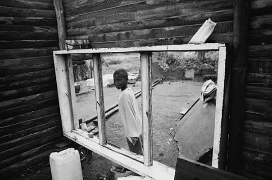
Andrew Tshabangu, Boy at the Window, from the series Emakhaya, 2004
Courtesy the artist and Gallery MOMO
Tshabangu grew up with ambitions of serving as an ordained priest. Instead, he might have become something else within that pantheon of the spiritual realm: the visual marabout. Haunted by this idea of humanity and dignity as something that can be imbued, passed on, gifted to, rather than an innate virtue and spiritual property, I revisited Footprints a month after it opened. The second time around, I started from the end and moved my way to the beginning, like loving backwards. Both the photographs as objects and the photographed spirits—shadows and figures, eyes daring the camera to get it wrong, or eyes trained far off beyond the horizons of the soul—are more than visual metaphors of a country. The work opens up like a flower, drawing the viewer into an omni-enfolded space from whence the bud, spurred by the gardener’s care and caress, reveals its secrets: bare, undemanding beauty. Which strains credulity, for what sort of beauty is undemanding? Yet, that is what bestows on Footprints its unimpeachable artistic and social gravitas. Tshabangu’s images pry the lid from our position as passive viewers. In other words, although we cannot simply swap places with his subjects, in looking at his photographs, we are participants, gazing at ourselves.
Bongani Madondo is the author, most recently, of Sigh, the Beloved Country (2016). He is an associate researcher at Wits Institute for Social and Economic Research, as well as contributing editor at the Johannesburg Review of Books. Footprints is on view at Gallery MOMO, Cape Town, through August 20, 2017, followed by a presentation at Iziko National Gallery, Cape Town.
This article is part of a series produced in collaboration with Contemporary And (C&) – Platform for International Art from African Perspectives.
Read more from Aperture Issue 227, “Platform Africa,” or subscribe to Aperture and never miss an issue.
The post The Unsung Hero of South African Photography appeared first on Aperture Foundation NY.
Aperture's Blog

- Aperture's profile
- 21 followers

