
Witold Rybczynski's Blog, page 38
April 20, 2013
MoMA Mia
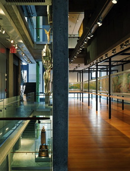
I find it hard to believe the stated rationale for the demolition of what had been the home of the American Folk Art Museum on 53rd Street—that its blank façade does not accord with MoMA’s glassy image. I’m not one to defend the inhospitable face that Williams & Tsien’s design turns to the street, but MoMA itself is hardly the most considerate neighbor, as I wrote in Slate shortly after Yoshio Taniguchi’s makeover opened. The truth is that the building whose announced demolition has caused such a furor, at least among architects and architecture critics, is not a very good museum. The idiosyncratic interior—mostly circulation space—with its exciting but distracting views, its multitude of materials, and its busy details, overwhelms whatever is being displayed. This may have been acceptable—just—when the museum was a kind of cabinet of curiosities; it’s hard to imagine it as a place for art.


April 15, 2013
Detached Retina
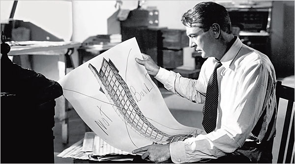
The Fountainhead
My friend George Holt and I were talking about how architectural education ill-prepares young architects for the world of practice. “Is this sort of detachment from the realities of the profession a deliberate agenda that’s perhaps for some other useful purpose that escapes me?” George asked me. I don’t think so. In part, the detachment is a legacy of the art school tradition that shaped architecture schools since the Ecole des Beaux-Arts and the Bauhaus. Of course, artists have always worked on commission, too, just like architects, but the unspoken ideal is the self-sufficient artist—Van Gogh, Gauguin, Matisse—whose inspiration was entirely personal. In this view, the outside world of patrons, dealers, museums, and the public is extraneous at best, intrusive at worst. There is also a sense that in the architecture studio the external world should be kept at bay, lest it crimp the imagination of the young tyros, who will learn soon enough, the argument goes, about the realities of practice. Thus, even experienced architects set aside their practical knowledge when they put on their teaching hats, and weave the fairy tale of pure design. And then there is the attractive—if grievously flawed—myth of the architect as outsider, as if buildings, large and expensive, were somehow a vehicle for personal expression rather than a product of societal forces.
April 10, 2013
Soleri

Paolo Soleri died yesterday at 93. I first heard of him when I was a college student. A classmate, Ray Catchpole, had spent the summer at Soleri’s desert compound in Arizona (he had several sand-cast bronze wind bells in his room), and he encouraged me to go if I had the chance. That year—1964—I was editor-in-chief of Asterisk, a student magazine, and it must have been through Ray that we got Soleri to send us an article: “Computer, Craft, and Art Architecture.” I admired Soleri’s work, several bridge designs, as well as a desert house with a retractable dome roof. A few years later, I almost made it to Arizona but an opportunity to do graduate work intervened. At that time, Soleri (born in Italy, apprenticed with Wright) was already a mythical if somewhat elusive figure. In 1978, Stewart Brand invited me to the Whole Earth Jamboree; the deal was that you could speak to the assembled crowd (8,000 people) on any subject at all—but only for five minutes. Irresistible. The jamboree took place on a rifle range in a military reservation on the Marin headland, and accommodations were army pup tents. My wife and I struggled to put up the tent, and like most people made a botch of it. I looked over to the next tent and recognized Soleri; his tent was perfectly pitched, taut as a sheet of plywood. I can’t recall what he spoke about (I do remember Peter Coyote’s talk), most of the day was spent waiting for Marlon Brando—who never showed up. By then, Soleri had shifted to his guru mode. I was never much convinced by his “city,” Arcosanti, neither architecturally, nor urbanistically. It seemed a hand-crafted version of the misguided megastructure ideas of the time. But I still wish I had gone to the desert and learned how to cast bells.
April 6, 2013
Collegiality
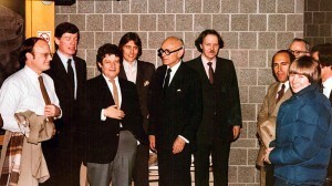
Members of the Chicago Seven (Beeby at left) with Philip Johnson
During his acceptance speech at the Driehaus Prize ceremony in Chicago a couple of weeks ago, laureate Thomas Beeby made an interesting point: architecture is turning into an uncollegial profession. Of course, architecture has always been highly competitive. Building is a zero-sum game, that is, only a limited number of commissions are available at any one time, so if one architect gets to build, another doesn’t. Established, experienced practitioners have always had the inside track and access to the best jobs and the best clients; novices get whatever’s left over. But Beeby was making a slightly different point. Despite the competitive nature of the profession, there have been always been periods when architects have banded together. One thinks of the Beaux-Arts-trained group who came together to create the World’s Columbian Exposition in Chicago, and the McMillan Plan in Washington, D.C. Or the early modernists who formed Der Ring in Berlin in the 1920s and later CIAM, and the young firebrands who founded Team Ten in the 1950s. Beeby himself was part of a group called the Chicago Seven in the 1970s, a Midwestern equivalent to the Greys and the Whites of the East Coast. That sort of collegiality is rare today, he observed. In a period of signature styles, architectural celebrity, intense self-promotion, and design-as-biography, it is every man and woman for themselves.
April 2, 2013
Big John

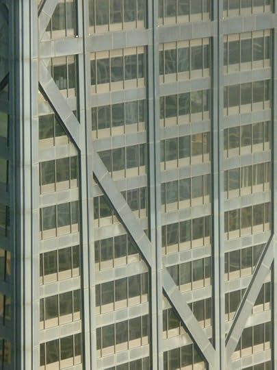
I was in Chicago recently for the Driehaus Prize ceremony, and I was staying in a hotel across North Michigan Avenue from the John Hancock Center, in fact my fortieth-floor room looked directly at the building. Built in 1969, and designed by Bruce Graham and Fazlur Khan of Skidmore Owings & Merrill, this has always been one of my favorite Chicago skyscrapers. The characteristic tapered silhouette is much more successful than the Sears Tower (another Graham-Khan collaboration), and the crisscrossing bracing remains an evocative expression of its structure. I could see Mies’s 860 Lake Shore Drive from my hotel room, and the Hancock tower seemed like a perfect hommage to the master, yet making its own way. I had always seen Hancock from a distance, or from the street, but never from this vantage point. I must confess to being disappointed. The matte black curtain wall appeared crude. The heavy diagonal braces were crude too, not just in execution but in the way they relentlessly enclosed the Miesian curtain wall in a clumsy corset. You could argue that the Hancock Center was not meant to be seen close-up. Yet immediately next to it is Holabird & Root’s Palmolive Building (1930), topped by the Lindbergh Beacon. This early example of a moderne style presents a lively and articulated mass that rewards close inspection. There is something appealing—dare I say humanist?—about Holabird & Root’s delicately articulated skyscraper, in contrast to its burly and somewhat intimidating neighbor.
March 30, 2013
The White City

K Street, Washington, DC
During the last decade or so, Washington, D.C. has undergone a little-noticed but remarkable transformation: a city of stone is becoming a city of glass. Ever since the McMillan Plan, and even before, important civic buildings in the capital were built out of marble, limestone, or concrete. There were a few early brick outliers such as the Smithsonian Castle, and the Pensions building, but generally architects followed this custom. This was not a question of style, since modernist as well as postmodernist architects—Breuer, Bunshaft, Pei, Stone, Obata, Erickson, Graves, Freed—all followed the age-old practice, which had been virtually codified by Burnham, McKim and company in the early 1900s. This materials choice, not confined to government buildings, gave the city a pleasant uniformity. Today, the capital is quickly becoming a city not of masonry, but of glass. With the notable exception of Moshe Safdie’s Institute of Peace and Bureau of Alcohol, Tobacco, Firearms and Explosives headquarters (both precast concrete), federal and commercial buildings have adopted glass as the new lingua franca. And precast concrete buildings of the 1960s are being retrofitted with glass curtain walls. This architectural fashion is not confined to DC, but it is more striking there given the city’s predominant neoclassic fabric. The new city has a somewhat schizophrenic appearance, since the transparency of the glass is contradicted by rings of security devices: screening pavilions, guardhouses, Delta barriers, and rings and rings of bollards.
March 25, 2013
Driehausville
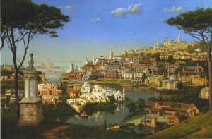
Carl Laubin has painted amore beautiful capriccio to commemorate the tenth anniversary of the Richard H. Driehaus Prize. He portrays an imaginary town made up of the works of the first ten Driehaus laureates, among whom are Léon Krier, Quinlan Terry, and Demetri Porphyrios, as well as Allan Greenberg, Jaquelin T. Robertson, and Michael Graves. In the foreground is the Choragic Monument of Lysicrates, a bronze miniature of which is presented to each laureate. It’s fun to try and identify the individual works in this large (5½ by over 8 feet long) painting. But what is more striking is that Laubin has created a convincing urban landscape solely out of landmark buildings. That, of course, is the advantage of classicism: however it is interpreted, it is a tradition that manages to produce a more or less coherent whole. Even Abdel-Wahed El Wakil’s mosque, standing next to a Seaside beach house by Robert A. M. Stern, doesn’t look too out of place. Can one imagine a similar townscape of Pritzker Prize winners? Well, maybe with the work of some of the early laureates—Pei, Bunshaft, Tange, Siza—but modern buildings need a background of nineteenth and early twentieth century urbanism to shine. A town made up of only signature buildings by our current generation of stars would resemble a carnival or a theme park—Pritzkerland.
March 21, 2013
Hitler’s Architect
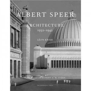
In 1985 Léon Krier published Albert Speer: Architecture 1932-1942, a monograph on the work of Hitler’s architect. The book, assembled with Speer’s assistance, was received with almost universal opprobrium, Krier was vilified, Speer’s version of classicism was ridiculed, the whole thing written off a sick joke. Now, almost thirty years later, Monacelli has produced a facsimile edition of the book, together with new material by Krier and a foreword by Robert A. M. Stern. Perhaps this time the reception will be different, but I doubt it. Speer’s brand of stripped classicism is so much associated with Nazism, and modernist ideologues have done such a good job of ensuring that this is so, that it is hard to evaluate the work objectively. Never mind that the architecture adopted by the Nazi regime is not therefore Nazi architecture—the stripped classicism, or New Classicism as its chief proponent Paul Cret called it, was a perfectly respectable style of that period. And never mind, as Krier points out, that other aspects of the Nazi regime—Leicas, Volkswagens, autobahns, rocketry—have easily shed their National Socialist roots. But if you are able, take a long hard look at Speer’s work, handsomely reproduced in photos, drawings and models, both architecture and urbanism. You may not agree with Krier that Speer was “one of the most famous architects of the twentieth century,” but it’s hard to deny him a leading position alongside such master of monumental classicism as Cret, John Russell Pope, and Gunnar Asplund. The Neue Reichskanzlei (demolished by the Soviets) in particular is a remarkable piece of work, inside and out.
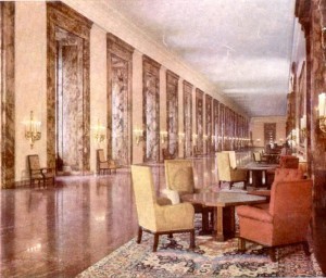
Neue Reichskanzlei, Marble Gallery, 1938
March 14, 2013
Day One

High Hollow, George Howe, arch., 1917
I live in a neighborhood with many old houses. There are plenty of late nineteenth-century examples, but the ones I like best are from 1900-1930. The acknowledged masterpiece of this period is George Howe’s High Hollow, but there are plenty of runners-up, the work of accomplished Philadelphia residential architects such as Wilson Eyre, Frank Miles Day, Robert Rodes McGoodwin, H. Louis Duhring, and Edmund Gilchrist. These old houses seem to improve with age—the slate roofs get a bit mossy, the stonework acquires a patina, and the heavy hardware gets burnished with use. Their architects worked in more or less revival styles, and because they acknowledged the past, the passage of time has been kind to their creations. Indeed, these houses probably look better today than when they were spanking new. In contrast, the handful of mid-twentieth-century works by Louis Kahn, Robert Venturi, and Romaldo Guirgola, seem embalmed, caught in the moment of their construction. It is not just a question of materials, although smooth stucco tends to weather poorly, and tar-and-gravel roofs don’t age gracefully. It has to do with their disconnection from history. Modern houses look their best on Day One, when they are new, fresh, unsullied by use or time. It is all downhill after that.
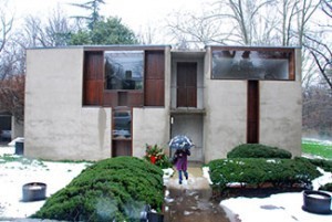
Esherick House, Louis Kahn, arch., 1959
March 9, 2013
No Hoopla
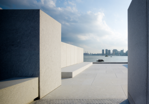
Much has been written about the recently completed FDR Memorial in New York, designed by Louis Kahn. It was the great architect’s last project, and he had just completed it when he died in 1974, almost four decades ago. Kahn’s design reminds us how much has changed in forty years. First, the commission was not the result of a competition, no hoopla, no wowing the jury, no rush. Instead Kahn was given the time to ponder and reflect—which is how he worked, anyway. Second, although the site covers about three and a half acres on the tip of Roosevelt Island, the memorial itself is an open-air room, only sixty feet square; Kahn felt no need to spread over the entire site, treating the rest instead as a green forecourt. The room is close in spirit to the commemorative block of marble that FDR’s friends erected in front of the National Archives in Washington, DC. Third, the memorial is not only small in size, it is focused. A single quotation (the famous Four Freedoms speech) and the president’s name, are all the writing there is; no didactic explanations, no rhetoric, no wheel chair, no Fala. Fourth, Kahn recognized that a memorial to a person must include that person’s presence, here in the form of a bust by Jo Davidson. All important lessons for future memorial builders.
Witold Rybczynski's Blog

- Witold Rybczynski's profile
- 178 followers

