
Witold Rybczynski's Blog, page 34
September 25, 2013
CALATRAVA CALLED OUT
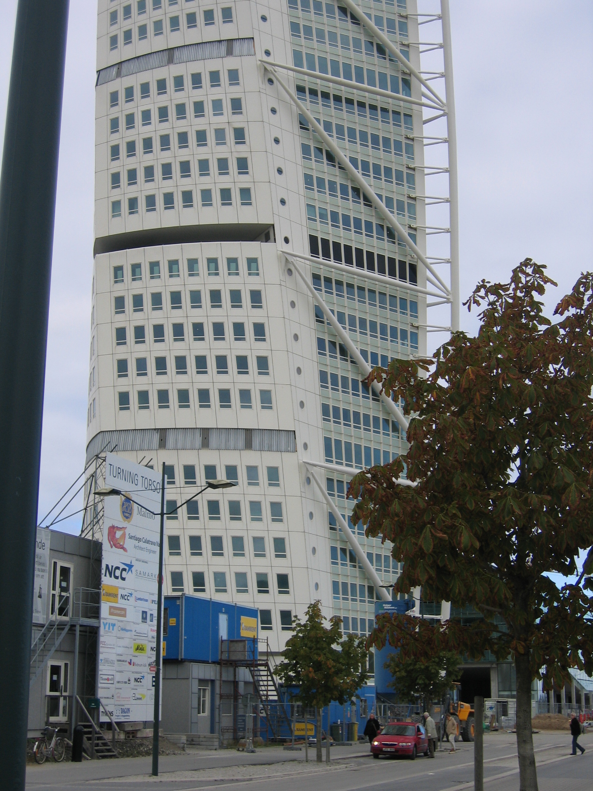
Turning Torso, Malmö
The front page of today’s New York Times carries a scathing indictment of Santiago Calatrava’s buildings. The solidly research article chronicles a record of work that is over-budget, poorly constructed, and in some cases downright dangerous to users. Many engineers have been skeptical of Calatrava’s approach to design, which seems to glamorize structure, while not making a whole lot of structural sense. I had this feeling when I saw his residential tower in Malmö, Sweden, portentously called Turning Torso. The 54-story building on the Öresund Strait is intended to be a landmark, and indeed, from a distance (crossing the 5-mile-long bridge that connects Sweden and Denmark), it is an impressive site, a tall twisting form. Close-up is something else again. The structural “spine” that supposedly braces the building appears a decorative add-on; the trapedzoidal windows look not interesting but odd; and the details are unresolved and crude. The tower was built by HSB, a Swedish cooperative housing association. I was told that the elevated construction cost (reported as $250,000 million), meant that sales of the 147 apartments were so slow that the building had to be converted to rental. HSB suffered serious losses, and its managing director was sentenced to jail time for fraud, although he was later cleared on appeal. As for Calatrava, he got away scot-free. Until today.


September 20, 2013
TOTTERING ON
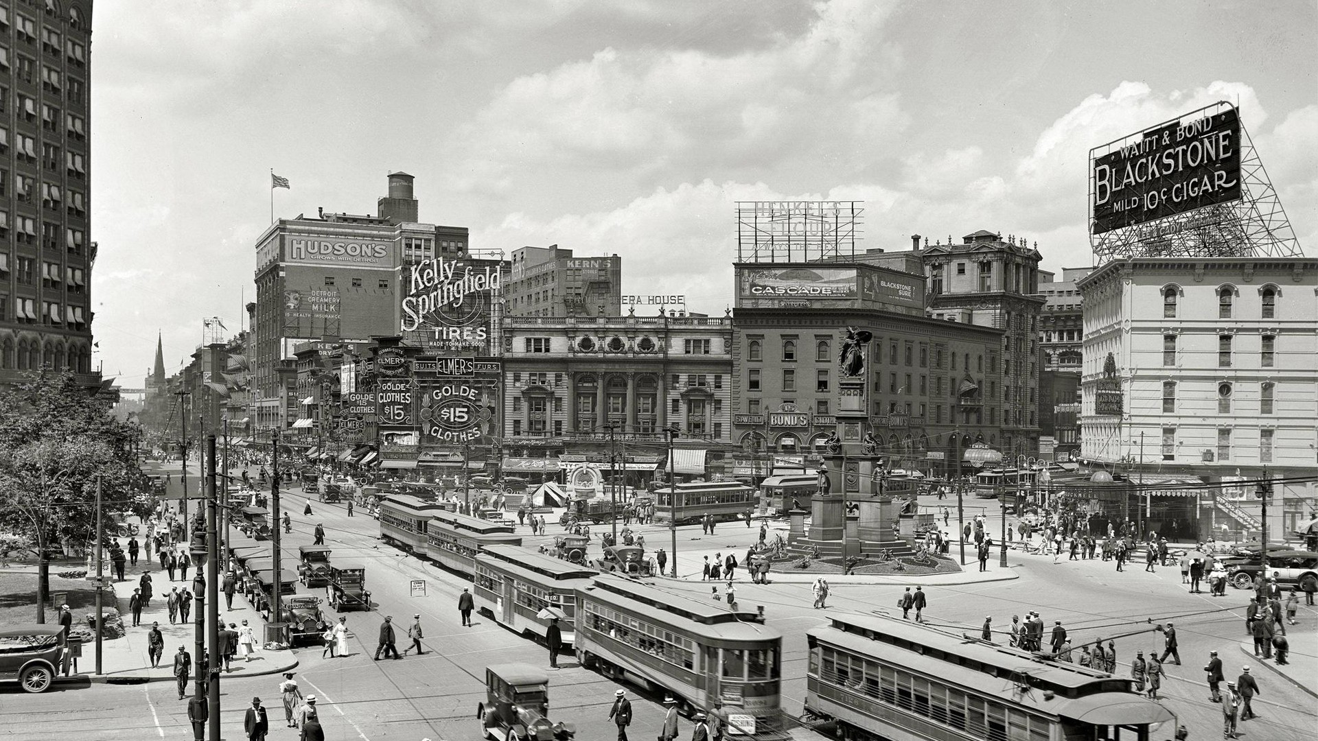
Detroit, Wodward Avenue, 1915
An editor with a national monthly magazine contacted me recently. He had read my Bloomberg View op-ed on shrinking Detroit, and had a proposal for an article. “Let’s say it is stipulated that Detroit has downsized, the economy is booming, and the tech world has moved in with a vengeance,” he wrote. “How should the city reimagine itself and how would it look and feel in 25 years. Who would live and work there? Are postwar Dresden, Warsaw, Pittsburgh, Montreal, or London valid precedents? Anything to be learned from the way the modern Rome is layered over the ancient Rome? Is post-Katrina New Orleans a model?”
It can be stipulated that Detroit will become a high-tech hotbed, but I can’t believe it. The work force just isn’t there. Henry Ford’s great invention was the assembly line, which allowed him to produce inexpensive automobiles. Unfortunately, simple, repetitive tasks also had the effect of reducing work skills. Very different from what was required to build a Boeing airplane for example, which is why Seattle attracted such industries as Cray and Microsoft, which did fuel a tech boom. But why would tech companies relocate to Detroit? It’s not very attractive, it’s cold, and it’s bankrupt.
Bombed cities like London, Berlin, even Warsaw, don’t offer useful lessons since their physical damage was sudden and had nothing to do with their urban viability. So they bounced back. As did Chicago after its Great Fire. You can’t keep a good city down. In any case, many of the European cities damaged in the war were national capitals–they were going to be rebuilt no matter what. The Montreal economy took a hit in the 1980s thanks to the excesses of Quebecois separatism, and if it has partially recovered (it has been far outstripped by Toronto as the prime Canadian city), that is because it is the metropole of a French-speaking province, and like Paris it is buoyed by its cultural hegemony. Pittsburgh has succeeded in remaking itself because of strong civic leadership. I don’t see that in Detroit. Also, Pittsburgh is a much smaller city, whose problems are more manageable. A large city like Detroit is another matter altogether. Scale counts.
As for post-Katrina New Orleans, the struggle that the Crescent City has had to recover after the hurricane has most to do with the poor situation before the hurricane. New Orleans has been declining for years; during the economic boom of the 1990s, metropolitan New Orleans was the only metro area in the US to actually lose population.
Much of the damage to Detroit is the result of how the city was unable to react to the changing economy after 1950. Some of this had to do with its deplorable administrations, especially that of Coleman Young, which lasted two decades. As James Q. Wilson wrote, “Mayor Coleman Young rejected the integrationist goal in favor of a flamboyant, black-power style that won him loyal followers, but he left the city a fiscal and social wreck.” Much of Detroit’s problems rests on its troubled racially-charged history.
I am convinced that downsizing is a prerequisite for a city like Detroit, but it will not solve the problem of economic stagnation, the lack of a skilled work-force, and decaying urban infrastructure. “Blow it up and start over” as Boston Mayor Thomas Menino recently suggested? Much too drastic. Tottering on is the most likely scenario. (PS I didn’t write the article.)
September 16, 2013
MUDDLING THROUGH
 Just returned from a brief visit to the UK. When you arrive in London, if you have £20 you can take the Heathrow Express (travel time 15 minutes) to the city; if you have £28 you can go first class. The spiffy train interior makes Acela look frumpy. When did the British get so good at design? The original London black cab was the Austin FX3, introduced in 1948. It had plenty of room for luggage, flip-down jump seats, and rear-hinged doors for the benefit of the passengers. The latest model of black cab, TX4, still has those useful features (except the rear-hinged doors), as well as a diesel engine, air-conditioning, ABS braking, a wheelchair ramp, and MP3 compatibility. It carries five passengers and is 2 feet shorter than a Ford Crown Vic, the New York cabbie’s favorite. And it still looks like a black cab.
I despair when I return home. The train from Philadelphia’s airport to downtown is cheaper ($8) but it takes longer, makes local stops, has all the charm of a 1950s subway car, and people struggle to find a place for their luggage. It’s still better than the taxis, though, old sedans that are uncomfortable, beat-up, and driven with reckless abandon by drivers whose newly-acquired knowledge of the city is minimal.
The British have developed an enviable ability to innovate without throwing out the baby with the bathwater. In 1971, they decimalized their money, retiring the halfpenny, threepence, sixpence, shilling, florin and half-crown–not to mention the guinea. The smallest paper money now is a five-pound note, and there are sensible one-pound and two-pound coins. The coins still carry the monarch’s image on one side. We can’t even get rid of the penny, let alone introduce a dollar coin. The US Army has adopted metric measure for distances, but the nation seems unable; after a half-hearted try in the 1970s we remain one of only three countries in the world to resist metrication (together with Burma and Liberia). The UK completed metrication more than 40 years ago–but in a very British way. Food is sold in grams and kilos, but people still weigh themselves using that mysterious British measure, the stone. The London Underground counts distances in metric but speeds in imperial. And while gas stations use liters, pubs still serve beer in pint glasses. Cheers.
September 9, 2013
MAX GATE
 Conrad was a sea captain, Chekhov was a doctor, but Thomas Hardy is the only famous writer I know who was an architect. Born in modest circumstances, he was apprenticed to an architect as a lad, and worked in London for five year before returning to his native Dorset to devote his time to writing. Max Gate is the name of the house that he designed for himself in Dorchester. He was 45 when he built the house, and he lived there for more than 40 years, until his death–he died in the upstairs bedroom–in 1928. Here he wrote The Mayor of Casterbridge, Tess of the d’Urbervilles, and Jude the Obscure. Hardy designed the house himself. I’m not usually a fan of Victorian architecture, but Hardy’s house has an appealing austerity. It is also unusually bright inside, for he made the windows exceptionally large, in part to see the extraordinary garden that surrounds the house. The building began as a rather small center hall, two-over-two plan, but over time, as Hardy’s writing became popular, he was able to add the entry porch and several rooms at the rear, including a study. The sundial was designed by Hardy, although added after his death. The inscription reads QUID DE NOCTE? (What of the night?), from a Latin verse.
September 4, 2013
THANKLESS
 How much influence does fundraising for a president buy you? Apparently, not much. In September 2012, Frank Gehry joined Ed Ruscha, Richard Serra, Claes Oldenburg, and other prominent “Artists for Obama” in contributing to a portfolio that was presented to big donors and is estimated to have raised $4.2 million for the president’s re-election campaign. This week the White House announced the appointment of the president’s new representative on the commission that is overseeing the design and construction of the planned Eisenhower Memorial in Washington, D.C., which is being designed by Gehry The appointee is Bruce Cole, an art historian and former chairman of the National Endowment for the Humanities (under George W. Bush). Cole is also an outspoken critic of Gehry’s design. In The Weekly Standard, Cole called it “incoherent” and “unintelligible”; in the Washington Examiner, he went further, calling it “a cross between an amusement park and a golf course.” Cole advocates terminating Gehry’s contract and starting the memorial design process over, which is also the opinion of the National Civic Art Society, on whose board of advisors he serves. The NCAS has diligently stoked the public debate that has pitted conservatives–political and architectural–as well as members of the Eisenhower family, against supporters of Gehry’s design such as the American Institute of Architects, and several architecture critics (including the author). President Obama has not previously expressed any strong opinions on architecture (remember the bland redo of the Oval Office?), so his endorsement of the NCAS position comes as a surprise. Not least, I imagine, to Frank Gehry.
NEWS DUMP
 The opening credits of Billy Wilder’s 1974 filmed version of The Front Page portray the short, inglorious life of a daily newspaper, from typesetting and printing to being distributed and read. The final frame shows the front page being used to line the bottom of a birdcage; catching bird droppings is all that old news is good for. Today, no news seems to be too old, at least not on the New York Times website. The pleasure of opening a daily newspaper is its freshness, not only the crisp newsprint, but the news itself. Once you’re finished reading, you can throw the paper in the recycling bin with the satisfying feeling of a job well done. That’s what’s so disturbing about reading the NYT online. Bits of yesterday’s news–of last week’s news!–linger for days. It’s nice to have access to archives, but here the archives are mixed in with breaking stories. It feels more like a news dump than a newspaper.
September 2, 2013
TV ASIDE
 It’s not often that politicians have anything penetrating to say about architecture. Even fictional politicians. Especially villainous fictional politicians. Kevin Spacey’s Rep. Francis Underwood, in Netflix’s House of Cards delivers this memorable aperçu: “Money is the McMansion in Sarasota that starts falling apart after ten years; power is the old stone building that stands for centuries.”
August 31, 2013
TYROS
 A recent article in the New York Times points out the youth and inexperience of many teachers in today’s charter schools. In a related Slate piece, Sarah Mosle observes of her three years as a young Teach for America grade school teacher: “I was single, childless, and clueless about even the most basic aspects of child-rearing. My students’ parents seemed like creatures from another planet, remote and distant from the job I thought I was doing. To the extent I understood family dynamics, it was solely from the perspective of the teenager I’d been just a few years before.” There is a parallel here with teaching architecture. It has become increasingly common to hire young graduates, newly minted and fresh out of school, as part-time teachers in design studios. The advantages are obvious: young teachers are motivated, enthusiastic, energetic, and willing to spend long hours in the studio. And since the architect job-market is over-supplied, they are willing to work for less than full-time professors. Having been students themselves recently, young teachers are able to establish an easy rapport with their charges. I remember when I taught my first studio–I was three years out of school and I had exactly one commission under my belt, a summer cottage for my parents. The problem is that the unseasoned teacher tends to perpetuate the fictive atmosphere of the studio: clients and budgets are unimportant, practical concerns can be dispensed with, all that matters is design, the more imaginative the better. Of course, this makes the studio much more fun than dealing with the harsh and unglamorous matters that make up a large part of architectural practice. No wonder that young graduates are shocked–and often discouraged–by the exigencies of the real world. Nobody prepared them for it.
August 28, 2013
WHAT’S IN A NAME
Michael Kimmelman in a New York Times article on a new Italian winery near Florence, identifies the architect as Archea. There is no Architetto Archea, it’s a made-up name. While most architecture firms continue to be named John Doe Associates, the use of invented names is increasingly common. There are the mega-practices Aecom and Aedas, the mainstream Ennead (originally Polshek Partnership), cutting-edge SHoP, and the recently disbanded Office dA. Some of the made-up names involve arcane wordplay–Coop Himmelb(l)au, Mecanoo, Asymptote, Arch-Tectonics–and some seem calculated simply to grab our attention, like the Danish firm BIG (Bjarke Ingels Group), the London firm, FAT (Fashion, Architecture, Taste), or the Beijing firm, MAD (which doesn’t seem to stand for anything). Pritzker Prize-winner Wang Shu’s firm is called Amateur Architecture Studio; Snøhetta is named after a Norwegian mountain peak. Interestingly, firms practicing traditional or classical architecture, tend to avoid made-up names. Perhaps tricky names are a subtle form of architectural branding: I’m not stodgy, I’m hip, in fact, I’m not a firm at all, I’m a creative force.
There is also a practical reason to adopt a neutral name: not privileging the founding partners by attaching their names to the practice. Most firms change over time (Archea, founded in 1988, now has four principals and eight partners), partners come and go, and in any case, an impersonal name better reflects the collaborative nature of large architectural practices. Or at least, that is the theory. In some cases, the need to personalize reasserts itself. Morphosis was founded in 1972 by a group of architects, although today projects by the firm are usually credited to “Thom Mayne of Morphosis,” a similar status is accorded “Rem Koolhaas of OMA,” and “Joshua Prince-Ramus of REX.” Several years ago the landscape architecture firm founded as Field Operations, began referring to itself as “James Corner Field Operations.” What’s in a name? Apparently, quite a lot.
August 26, 2013
SO MANY CLASSES, SO LITTLE TIME
École des Beaux-Arts, Atelier André, 1880s
Architectural curricula have changed in the last several decades. First, they are shorter. Architecture, since it concerns creativity, takes time. The original course of study at the École des Beaux-Arts recognized this; you simply kept at it until you were considered ready to leave. Modern architecture programs used to be five or six years. Since they devoted time to general subjects, this usually meant about four years of intensive architecture study. In the 1970s, most universities followed Harvard’s lead and made a three-year Master the professional degree. The problem was that a BA degree didn’t really prepare students for a career in architecture, so while graduate students might be more mature, they still had to be taught the basics, just as before. Compressing four years of material into three was made more challenging by the emergence of another trend: elective courses. When I was an architecture student my six-year program was composed entirely of required courses; today 20-25 percent of most programs is elective courses. These courses cover a large range of material, some essential, some peripheral, some downright arcane. Electives are popular with students, of course, and also with teachers, since they allow the teaching of highly focused subjects tailored to the instructor’s own interest or research agenda. Deans like electives because they can be taught by inexpensive part-timers.
But curriculum design is a zero-sum game: teach this, and you don’t have time to teach that. So, with less time and fewer required courses, what has been left out? Architectural history has taken the largest hit, compressed into one quick survey course, transformed into “history-theory,” or just cut out altogether. One of my classes was life drawing, two hours a week with charcoal, easel, and a model; I can’t imagine that many schools require this today. Another was an introduction to sociology–how people behave–important for an architect. Years ago, I taught a required course in specifications; today, that subject is generally folded into a catch-all class in “professional practice.”
Architecture is not the only profession facing the challenge of streamlining. In the 1970s, many American medical schools, in an attempt to produce more graduates to meet practitioner shortages, switched to three-year curricula. Subsequently, many of these schools reinstated a fourth year, but consisting chiefly of electives. It was not an unqualified success. One study of medical education concluded that “A much greater emphasis on educational rigor in all fourth-year courses (especially electives) is necessary to address the reputation for academic laxity and grade inflation.”
What is to be done? Extending graduate architecture programs by a year would be a start. It is not as if there is a shortage of architects–quite the contrary–so if a longer program reduced the number of graduates, that would not be a bad thing. The number of elective courses should be drastically curtailed. Important subjects should be mandatory; peripheral subjects such as furniture design (you can’t learn to design furniture in twelve weeks), should be cut. With a bit of ingenuity, it might even be possible to make room for life drawing.
Witold Rybczynski's Blog

- Witold Rybczynski's profile
- 178 followers

