
Witold Rybczynski's Blog, page 36
July 20, 2013
GEHRY’S TEMPLE
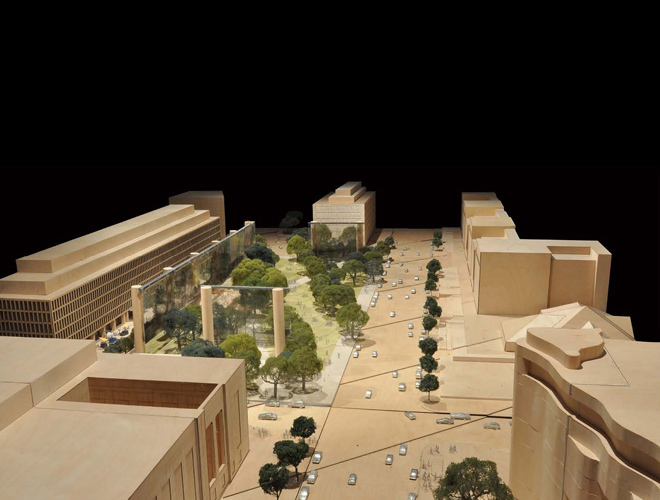 James Stirling once said, “Architects have always looked back in order to move forward.” That is precisely what Frank Gehry did in his original design proposal for the Eisenhower Memorial: in a city of classical temples he created a roofless temple, albeit magnified to suit the scale of the 4-acre site. It was obvious that he was looking back to the Lincoln Memorial (an alternative version, a circle of columns, channeled the Jefferson Memorial). Gehry hung a giant mesh tapestry from the columns, but their prime purpose was not to support the tapestry but to define a space. As my fellow commissioner on the Commission of Fine Arts, Michael McKinnell observed, a hundred years from now, whatever happened to the tapestry, the sense of a vast temple would remain. As the design evolved the number of columns was reduced from 13 to 10, and the row along Independence Avenue disappeared completely. Nevertheless, the sense of enclosure persisted. At a meeting of the Commission of Fine Arts three days ago, the memorial design was approved, but it was suggested that the two pairs of columns on the east and west sides be removed entirely. That would be a mistake, for instead of a roofless temple, what would be left would be a giant movie screen, supported on unaccountably large columns.


July 15, 2013
VALUE ADDED
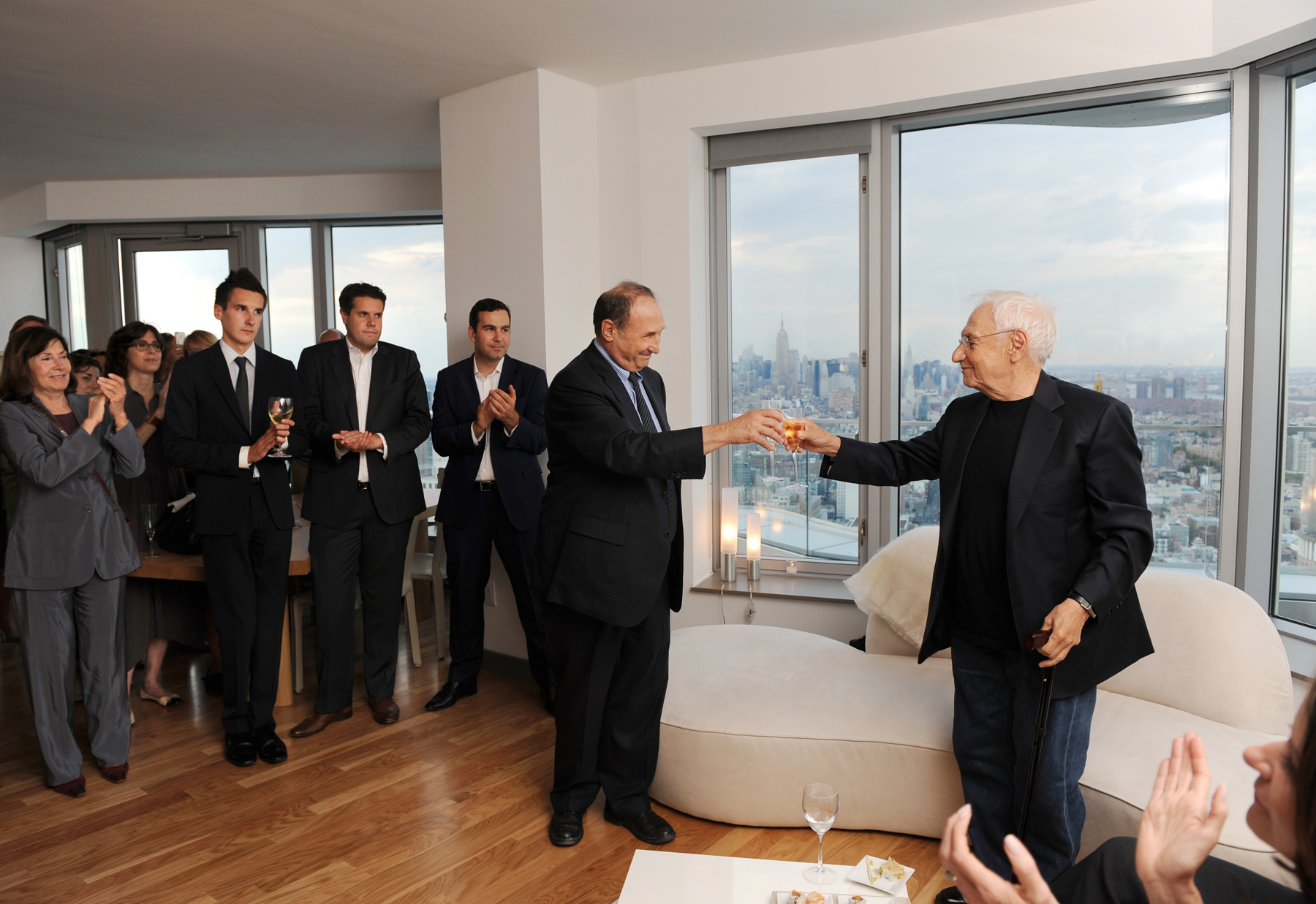
Developer and building owner Bruce C. Ratner toasts Frank Gehry on the 52nd floor of New York by Gehry.
Photo: Philip Greenberg.
The standing of a profession is a measurable calculus, a function of what it brings to the table. Doctors heal, lawyers navigate the complexity of the law, accountants do the same for the tax system, engineers solve problems, whether it is going to the moon or shrinking the size of a computer. What do architects do? Design buildings, of course. A key privilege of a professional is being granted a monopoly in his field. But, as Garry Stevens writes in his 1998 sociological study of architecture, The Favored Circle, “since the products of architects and non-architects are functionally indistinguishable, the profession has never been able to construct an ideological justification sufficiently convincing to persuade the state to allow it to monopolize the design of buildings.” Architects would argue that their buildings are more beautiful, but since there is no consensus about what is beautiful–neither in the profession, nor among the public–that is not much help. Perhaps this conundrum explains the growth of two dissimilar but related phenomena: LEED-ratings and starchitecture. Beauty is in the eye of the beholder, but a LEED platinum rating is a widely recognized (at least in the US) measure of a building’s greenness. Moreover, it is valued by many building owners, whether they are corporations, developers, municipalities, or educational institutions. Architects themselves can also be LEED-certified. “A LEED plaque is analogous to a college diploma,” observed an architect on a blog, although I can’t remember the last time I saw a framed diploma in an architect’s office. What about starchitects? Architectural stars don’t have numerical ratings, but they are, in effect, certified–by the media, by prize and award juries, by museum curators, by the academy, and by critics. A certified star architect can demand higher fees since his or her presence can raise public interest in a project, whether it is aiding fund-raising for a university, increasing attendance for a museum, or promoting sales for a condominium tower. LEED architects and star architects both add demonstrable value to a project.
July 10, 2013
CREAM RISES
 A friend who is a composer and musician, wrote to me recently after reading my essay on parametric design in Architect. “What I found surprising is that in the Sixties music was going through much the same thing,” he wrote. “Composers dealt only in parameters, and arranged them according to Set Theory. Milton Babbitt, who had a degree in math before concentrating on music, held forth at Princeton about the use of the Set, as derived from Schoenberg’s twelve-tone theory. Alan Forte at Yale wrote a book called Set Theory, in which you could look up all possible sets, 2 through 12 notes, all categorized and logically laid out. So you didn’t need a computer. Of course Set Theory could be applied to the other parameters, not just pitch.”
Unlike music, architecture is not a theoretical subject, that is, it’s an applied art–an old but still useful term. As such, architecture is based on practice; what succeeds, becomes the canon. That’s why architects have always traveled to look at the great works, since whatever we know about how to build great buildings expands the recognized achievements of the past. As James Stirling wisely observed, “Architects have always looked back in order to move forward.” Nevertheless, from time to time, academically-inclined architects–or architects who simply have time on their hands, that is, architects who are not building–become fascinated by theory. Despite surviving Renaissance treatises, architecture lacks a theoretical foundation, so they look for inspiration in other fields: philosophy, linguistics, biology, morphology, geometry, fine art, perhaps even music.
July 1, 2013
THE EMPEROR’S CLOTHES
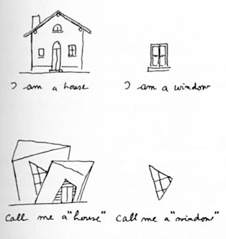
 Nicolai Ouroussoff called the Cooper Union Building “a bold architectural statement of genuine civic value.” Paul Goldberger described it as “the most exciting, energetic, and well-composed academic building to go up in the city in at least a decade.” James Russell was only slightly more circumspect: “Mayne’s high-wire act may offer an important lesson in creativity for Cooper’s students.” How could so many New Yorkers be taken in? I thought to myself as I looked across Cooper Square at the building. The photographs I had seen did make the building appear bold and exciting. The impression in real life was very different. The design struck me as a willful exercise in architectural nihilism. Everything you thought you knew about architecture is wrong. Columns should be vertical–wrong. Walls should be straight–wrong. God is in the details–wrong. The context is important–wrong. Buildings should represent some sort of order–wrong. Writing in Slate about the U.S. Federal Building in San Francisco, I once described Mayne as a Mannerist, as much so as Venturi, although Mayne’s vocabulary was industrial rather than historicist. But Cooper Union ventures into darker, dystopic territory. I found this shabby, crabbed design intensely upsetting–and not in a good way. “Thank goodness for the trees,” my wife said.
June 29, 2013
TOO MANY WORDS
 I was listening to a lecture on YouTube by Léon Krier. He was in full apocalyptic mode, his rousing talk illustrated by his charming but barbed drawings. At one point he recounted a quotation: “I wish I could speak a language where no word is repeated.” Krier couldn’t remember the source–it sounds like Marcel Duchamp or Max Ernst to me. In any case, Krier’s point was that this could serve as a maxim for today’s modernist architects, who judge themselves–and are judged–almost solely on their originality. What makes the metaphor so cutting is that a language of unrepeated words would be simply meaningless gobbledygook, which was Krier’s opinion of the architectural avant-garde. His point was that meaning in buildings emerges not from the maker’s imagination but from a shared tradition. He characterized this tradition as a blend (in the proportion of about 20:1) of vernacular and classical. (This formula is an implicit criticism of modern classicists, who drape the orders on everything–big and small, important and humble–with sometimes reckless abandon.) While I was fruitlessly trying to identify the no-repeated-word quotation I came across another. This one from Alexander Pope:
In words, as fashions, the same rule will hold;
Alike fantastic, if too new, or old:
Be not the first by whom the new are tried,
Nor yet the last to lay the old aside.
June 28, 2013
FANTASY FACTORIES
 Oliver Wainwright writes an excellent article on architectural education in The Guardian. He is particularly good describing the distortions that have accumulated in the so-called academy. Here are some highlights:
Wiry contraptions hang from the ceiling, while globular fungal forms nestle on tables between the spidery legs of 3D-printed creatures. A post-apocalyptic confetti of scalpel blades, empty Pot Noodles and cans of Coke is scattered among this landscape of foreign objects, while a sleeping bag pokes out from under a desk – perhaps with someone still in it.
Attending final presentations as an external critic, it has been striking quite how far students are marshalled under the prescriptive dogma of their tutors in a lot of schools, producing projects with astounding graphic flair, but with a tenuous grip on reality, and often little sign of a critical position. Taught by the same people who mark their work, many students said the safest thing was to keep their heads down and follow the prevailing agenda – or else literally pay for the consequences.
With all energies directed towards the climax of the final exhibition – conceived as a salesroom for students and tutors alike – the emphasis is too often weighted on creating a dazzling polished product, rather than the rigour of the process of getting there. Seductive alien imagery trumps the perceived banality of buildings, with the visual cacophony masking the lack of underlying spatial ideas.
The common retreat into introspective dreamworlds can be directly correlated against the dissolution of the architect’s powers, which are increasingly superseded by specialist consultants for every stage of the process.
No one has the answer yet, but at least students’ plaintive pleas for relevant teaching are finally being taken seriously – and they may soon have an alternative to costly years trapped in fantasy factories.
June 25, 2013
SAVE THE STACKS
 I am lending my voice to those who are calling for a reconsideration of the plan to demolish the stacks beneath the Reading Room of the New York Public Library. While it is true that these stacks are not generally open to the public, they are an integral part of this extraordinary building, a Beaux-Arts design but truly a machine for reading in. As a writer and researcher, libraries–especially public libraries–remain for me special places. Library stacks, even more than reading rooms, are their symbolic heart. I think that one of the things that drew me to writing was the experience of wandering the stacks of McGill’s old Redpath Library, an Erector set of steel shelves, glass-block floors, and low ceilings, clanging steel spiral stairs, murky light, and the smell of old paper. In those days, entering the stacks was a rare privilege reserved for graduate students. I remember the ever-present feeling of surprise whenever I found the book I was looking for, the mysterious LCCN numbers hand-lettered on the spine. And then discovering something even more interesting farther down on the same shelf.
June 22, 2013
PROBLEM SOLVER
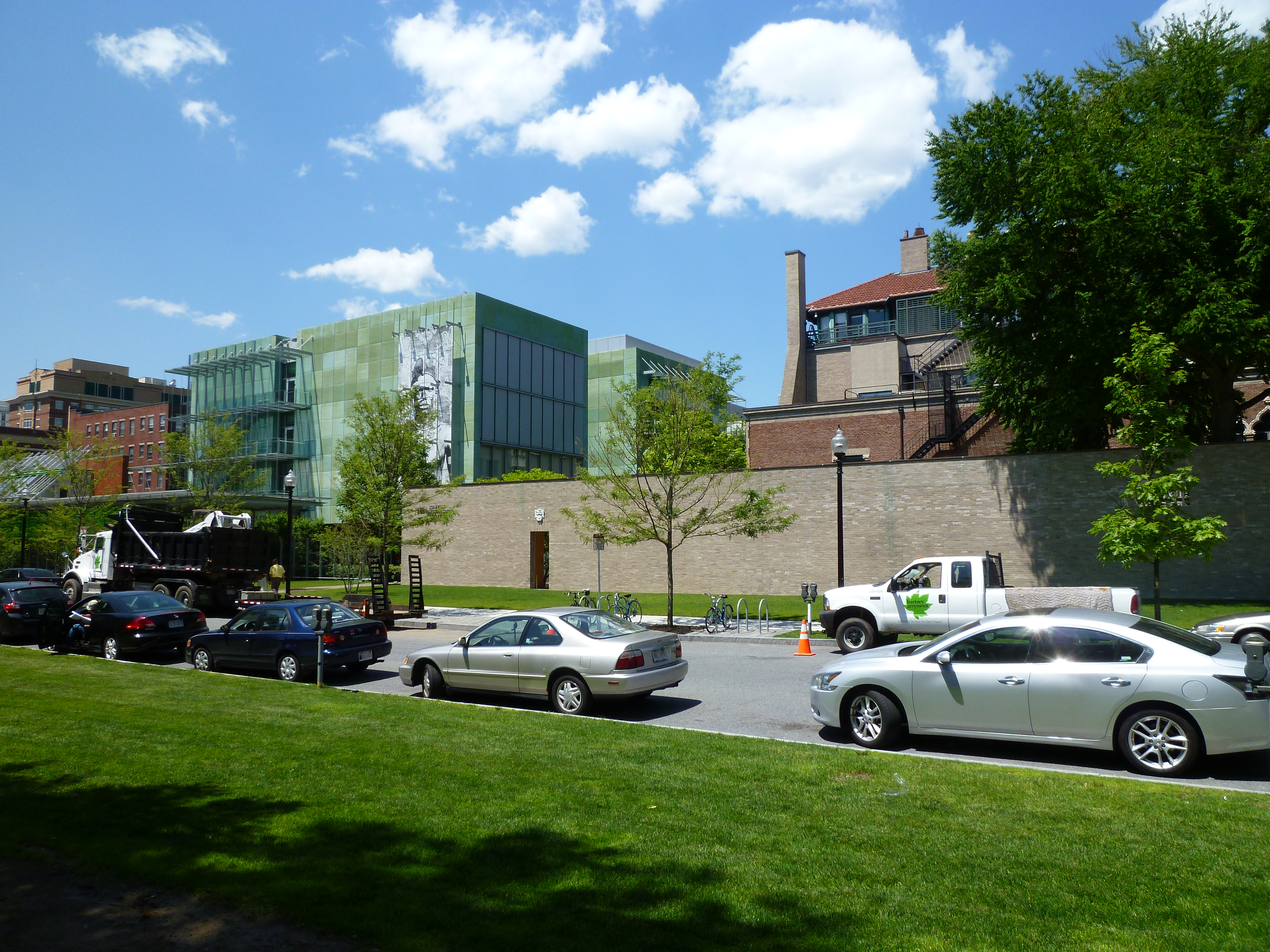
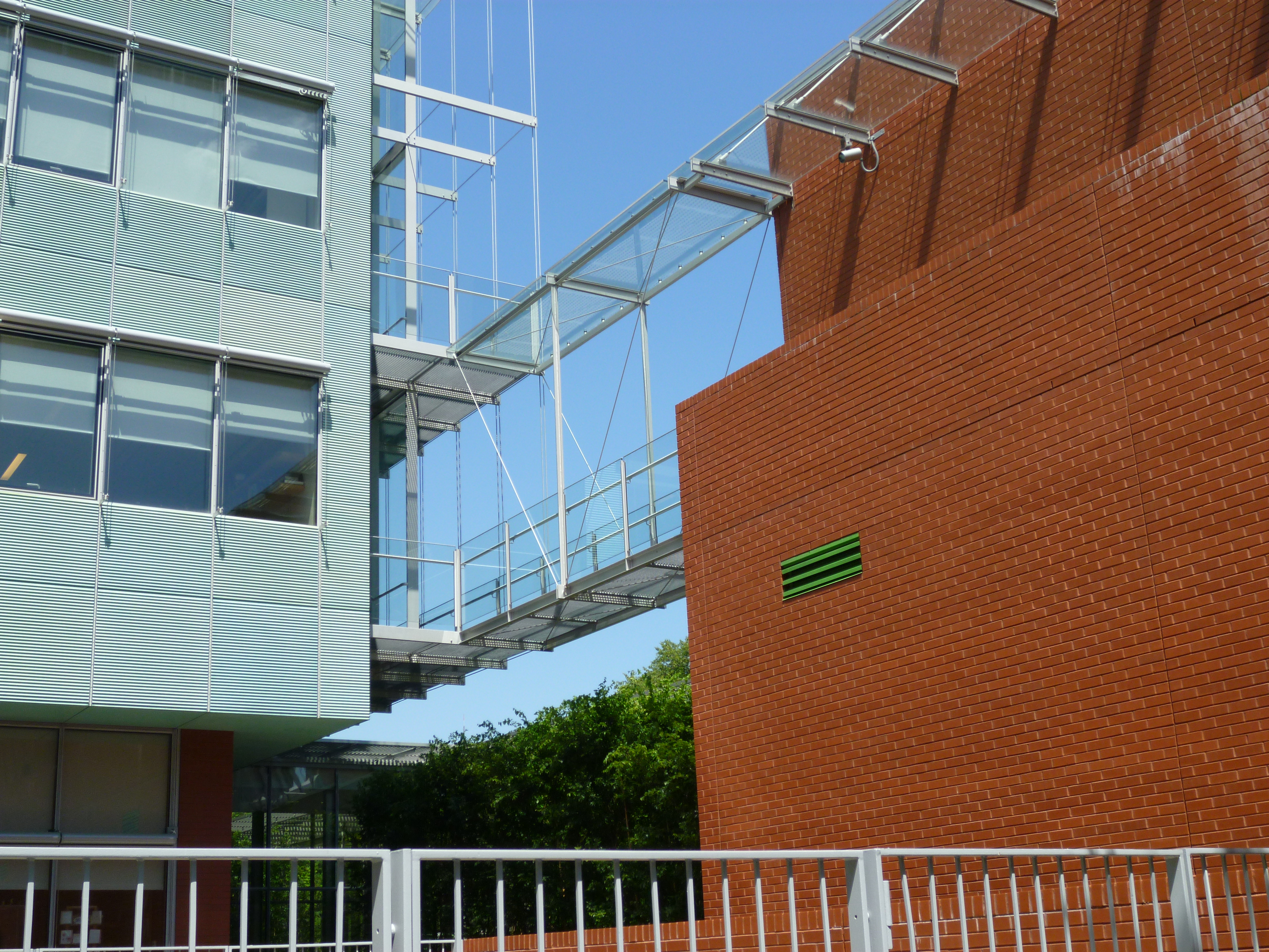
New (left) and old (right) at the Gardner.
I visited the Isabella Stewart Gardner Museum in Boston the other day. I had been there before, but not since the new addition, designed by Renzo Piano. Piano has become a specialist at adding to prominent buildings (Ronchamp, the Morgan Library, the High Museum, and soon the Kimbell Art Museum) and I was curious how he would respond to this rather eccentric museum–a Venetian palazzo in New England. At first glance, the new addition, clad in a green rain-screen, is distinctly odd. It seems to share nothing with its historicist neighbor. But it grew on me. I think that’s because Piano’s architecture has a certain inevitability; when there is a problem, he solves it, when there isn’t, he doesn’t. This needs saying for so many architects today put their energy into dramatically solving aesthetic problems of their own devising, which often results in complicated and eccentric buildings. The Gardner addition is neither. It neatly solves the problem of connecting to the palazzo by a) keeping its distance, and b) aligning the glass link with one of the cloisters, which produces a new entry sequence that actually improves on the original. I particularly liked the back of Piano’s building: ordinary moves but done with a light touch and a razor-sharp intelligence.
June 18, 2013
THE OTHER STYLE
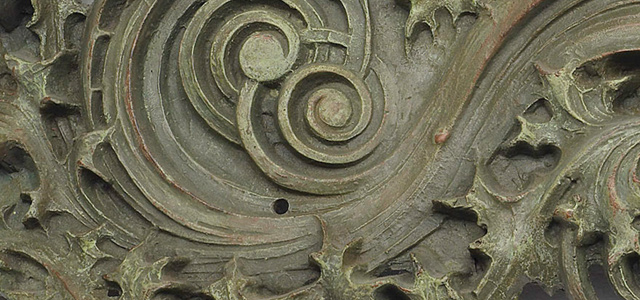
Louis Sullivan, Gage Building
The first international style in architecture was not the white-box style of Le Corbusier and Walter Gropius but Art Nouveau, modernism’s predecessor and in many ways its aesthetic and philosophical opposite. Art Nouveau flourished from 1890 to 1910, and along the way it produced a surprisingly large number of masters: Gaudí, Hoffmann, Horta, Mackintosh, Plečnik, Sullivan, Van de Velde, and Wagner. And that’s just the leading architects; there were also painters, designers and craftsmen: Beardsley, Klimt, Lalique, Moser, Tiffany. Thirty years is a good long run as architectural fashions go, indeed, the International Style lasted barely that long, nevertheless, modernist apologists have always pooh-poohed Art Nouveau, promulgating the view that “the demise of Art Nouveau was attributable to some fundamental internal flaw,” as Peter Kellow writes in a recent issue of American Arts Quarterly. The modernist apologists were understandably defensive; nobody would ever put a Gropius architectural fragment in a museum, as they would the work of Sullivan and Horta. Moreover, the anti-rationalism of Art Nouveau flew in the face of “scientific” modernism. Yet a quick glance at subsequent history reveals that Art Nouveau was the harbinger of a significant strain of modern architecture, visible in the work of Scharoun, Mendelsohn, Poelzig, the late Wright, and surviving today, though without the exquisite details, in the work of Gehry and Hadid. Though there was a brief revival of Art Nouveau, at least in graphic design, during the psychedelic Sixties, an architectural revival seems unlikely. But you never know. As Kellow writes. “Art Nouveau buildings are surely some of the most beautiful ever designed. Not necessarily the best, but the most beautiful.”
June 15, 2013
TWISTED THINKING
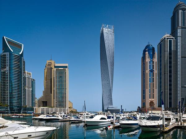
Cayan Tower, Dubai
SOM’s 75-story Cayan Tower in Dubai now has the dubious honor of being the tallest twisted tower in the world. According to the designer, one of the aims of this complicated exercise was to produce a “memorable” form. It is memorable, since we have become used to orthogonal high-rises. I haven’t seen the Cayan Tower, but I have seen Calatrava’s so-called Turning Torso in Sweden. It is striking from a distance, but closer-up the chief impression–not a particularly pleasant one–is of many parallelogram-shaped windows. It is as if a Miesian curtain wall had gotten too close to the fire.
Witold Rybczynski's Blog

- Witold Rybczynski's profile
- 178 followers

