
UXpin's Blog, page 33
August 10, 2023
UX Design Process – An Actionable 7-Step Guide

UX design process is systematic, iterative, and structured series of actions that is necessary for designing a product’s user experience. It helps teams to follow easy-to-replicate protocols to deliver products while meeting the organization’s quality standards.
Speed up your design process by building prototypes with the same UI components that devs build apps with. Meet tight deadlines and release quality products. Discover UXPin Merge.
Reach a new level of prototypingDesign with interactive components coming from your team’s design system.
Discover UXPin Merge .discover-merge { margin: 40px 8px;}.discover-merge__container { display: flex; max-width: 690px; height: 200px; padding: 20px; padding-left: 24px; border-radius: 4px; background-color: black; box-shadow: 10px 10px #9999ff; align-items: center; justify-content: space-between;}.discover-merge__left { width: 50%;}.discover-merge__left p { margin: 10px 0px !important; color: white !important; font-size: 18px !important;}.discover-merge__heading { font-weight: bold !important; color: white !important; font-size: 18px !important;}.discover-merge__text { margin: 0 !important; line-height: 22px !important;}.discover-merge__button { width: 174px; height: 44px; margin: 10px 0px; border: none; border-radius: 2px; background: white; color: black; font-size: 16px; text-align: center;}.discover-merge__button:hover { cursor: pointer;}.discover-merge__image { max-width: 320px !important; height: 200px; margin-right: -19px;}@media (max-width: 760px) { .discover-merge__container { height: auto; margin: 10px; align-items: left; }}@media (max-width: 500px) { .discover-merge__container { flex-direction: column; } .discover-merge__left { width: 100%; align-items: normal; }}What is UX Design?
UX design (user experience design) is a digital product design methodology to solve a human problem. This human-centered design approach ensures design teams make decisions based on users’ needs rather than assumptions.
Empathy is at the core of this human-centered approach. UX designers must understand what a user wants to achieve using a digital product and the pain points they might encounter along the way.
What is a UX Design Process?A UX design process is an iterative step-by-step methodology UX design teams use to complete projects. It is derivative from a design thinking process. As in design thinking process, UX designers spend time empathizing with the user, learning about the business, context, defining problem scope.
UX Design Process vs. Design Thinking ProcessThe design thinking process is a five-step process for developing user-centered solutions to human problems. A UX design process is a multi-stage, end-to-end methodology that incorporates design thinking for delivering UX projects.
While companies base their UX design process on design thinking principles, the steps and methods might differ slightly.
Importance of a UX Design ProcessHere are some reasons why companies standardize a UX design process:
Ensures projects meet quality and consistency standardsEnsures designers design solutions without bias and assumptionsEnables designers to test and iterate on many ideas to find the best solutionPromotes collaboration between teams and departmentsReduces the risk of rework by following set protocolsAllows stakeholders to track a project’s progress Identifies hidden risks and opportunities7 Steps of UX Design Process
A typical UX design process has 8 UX design process steps, from defining the product’s goal to design handoff and making sure everything works as intended.
Step 1: Define project & scopeThe first step of a UX design process defines the project’s goal and scope with team members and stakeholders from multiple departments–usually consisting of representatives from:
Business – explains business requirements and goals for the project.Design – communicate what they need to do prior to design and manage expectations.Product – shares context, help plan the timeline and resources needed for design.Technical – define feasibility and technical constraints of a UX design.This early design phase aims to identify the problem the new product or feature must solve. The product team will also outline the project’s scope, plan, deliverables, and delivery date.
Step 2: Run researchNext, designers research the problem to find possible solutions. During the research phase, UX designers conduct several types of research, including:
User research: Studies the target user to understand who they are, what they need, and what context they operate; the outcome of this research are user personas, journey maps, and so on.Market research: Analyzes the market to determine market segmentation and product differentiation.Competitive research: A competitive analysis to understand how competitors solve similar problems and identify opportunities.Product research: Analyzing insights and analytics from an existing product to understand user behavior.Step 3: Create rough draft of a solution
With a clear understanding of their users, market, and competitive landscape, designers can create a rough draft of what a solution would look like, which is often referred to as the ideation phase. Designers use paper and pen during early ideation to iterate on many ideas fast.
Some of these low-fidelity techniques include:
Sketching: Hand-drawn sketches of user interfaces Paper prototyping : Paper versions of a prototypeWireframing: Digital versions of paper prototypes featuring basic lines and shapesLow-fidelity prototypes: Digital prototypes using wireframes to test user flows and information architectureThe team might also use a design sprint to solve a specific problem fast.
Step 4: Design high-fidelity mockups and prototypesNext, the UI design team converts wireframes into mockups to build high-fidelity prototypes that look and function like the final product. If the company has a design system, designers will use the UI component library to build interactive prototypes.
Step 5: Conduct usability testing
The primary purpose of high-fidelity prototypes is usability testing. UX designers test these prototypes with real users to:
Validate ideasIdentify usability issuesTest accessibilitySteps 2 to 5 are iterable. Using test results, designers return to stage two or three to iterate on ideas until they find a solution that meets desirability, viability, and feasibility criteria.
It’s important to note that even though user testing is the fifth stage, design teams conduct multiple tests throughout the UX design process to validate ideas and hypotheses. These tests include internal testing with team members or sharing ideas and prototypes with stakeholders for feedback.
Step 6: Perform design HandoffThe second to last stage of the UX design process is the design handoff, where the design team hands over prototypes and documentation to the development team to start the engineering process.
Although the design handoff is near the end of the UX process, designers and engineers start collaborating during ideation to streamline the transition from design to development while ensuring designs meet technical constraints. Their collaboration is facilitated through different tools that make communication easier.
Read about 5 Mistakes that Kill Collaboration Between Designers and Developers.
Step 7: Launch your productThe final stage of the UX design process is a launch and a clear inspection of the new release. It’s time to ensure that the new release meets the project’s business goals, user experience, and accessibility requirements.
Best Practices for a Great UX Design Process
While the UX design process might not be the same for all organizations, projects, or teams, there are some best practices designers can follow to streamline the process.
Apply User-Centric ThinkingDesigners must keep end-users at the center of design decisions to ensure designs meet users’ needs. This human-centered mindset delivers products that users want while reducing costs on irrelevant UI components and features.
Practice EmpathyOne of the ways to maintain a user-centered mindset is by empathizing with users. As designers progress through the UX design process, they can drift from focusing on users to designing features that look great but don’t serve a specific user need.
By practicing empathy throughout the UX design process, designers stay focused on solving users’ pain points.
Build a Design SystemDesign systems can significantly reduce time to market while enhancing consistency and coherency across the organization. If you can’t afford to build a design system from scratch, consider using a themeable open-source component library like MUI or Bootstrap.
UXPin has built-in design libraries, including Material Design UI, Bootstrap, iOS, and Foundation so that design teams can build mockups and prototypes quickly.
Take prototyping to the next level using UXPin Merge–a tool that connects UXPin’s design editor to a component library, so designers can build fully functioning prototypes their dev’s components.
Communicate and Collaborate with DevsCommunication and collaboration are vital for a successful UX design process. Designers must connect with other design teams and open communication with engineers, business managers, product teams, and stakeholders.
DesignOps can help facilitate better communication and collaboration while streamlining other time-consuming operational and administrative tasks.
Enhancing the UX Design Process With UXPin
A successful UX process relies on tools that allow design teams to make changes and iterate fast. UXPin is an end-to-end design solution, providing designers with features for every stage of the UX design process.
Fully Interactive PrototypesDesigners can use one of UXPin’s built-in design libraries or import their dev’s component library to start prototyping immediately. Because UXPin is code-based, prototypes feature higher fidelity and more functionality than image-based design tools.
Quality User TestingWith code-based prototypes, UX designers can conduct accurate, more comprehensive tests. Better quality testing means fewer errors and usability issues make it into the final product.
Insightful Stakeholder FeedbackStakeholder feedback is crucial during the UX design process. If prototypes aren’t intuitive, stakeholders battle to understand design concepts that could impact buy-in and funding.
Whether you’re using UXPin, prototypes have significantly higher fidelity and interactivity than other popular design tools. In turn, designers enjoy meaningful, actionable feedback from stakeholders.
Level up Your UX Design ProcessUXPin Merge allows designers to get better results during testing while streamlining the design handoff, thus reducing time to market and costs.
Instead of designing from scratch, designers drag and drop components to build fully functioning code-based prototypes that look and work like the final product. Discover UXPin Merge.
Discover MergeThe post UX Design Process – An Actionable 7-Step Guide appeared first on Studio by UXPin.


August 9, 2023
Shared Insights, Shared Vision – Democratization and its Impact on Operations

UXPin invited Ethnio to talk about how DesignOps and ResearchOps teams can collaborate to be more effective and create more impact. Ethnio outlines a strategy for using research democratization, tools, and automation to keep product, UX, and research teams in sync.
Ethnio demonstrates how organizations can:
Recruit, schedule, and pay participants for global research studies using EthnioConduct high-quality usability testing with interactive UXPin prototypes using Merge technologyStreamline cross-functional collaboration and automate many DesignOps challenges with UXPin’s Merge technology. Visit our Merge page for more details and how to request access.
Reach a new level of prototypingDesign with interactive components coming from your team’s design system.
Discover UXPin Merge .discover-merge { margin: 40px 8px;}.discover-merge__container { display: flex; max-width: 690px; height: 200px; padding: 20px; padding-left: 24px; border-radius: 4px; background-color: black; box-shadow: 10px 10px #9999ff; align-items: center; justify-content: space-between;}.discover-merge__left { width: 50%;}.discover-merge__left p { margin: 10px 0px !important; color: white !important; font-size: 18px !important;}.discover-merge__heading { font-weight: bold !important; color: white !important; font-size: 18px !important;}.discover-merge__text { margin: 0 !important; line-height: 22px !important;}.discover-merge__button { width: 174px; height: 44px; margin: 10px 0px; border: none; border-radius: 2px; background: white; color: black; font-size: 16px; text-align: center;}.discover-merge__button:hover { cursor: pointer;}.discover-merge__image { max-width: 320px !important; height: 200px; margin-right: -19px;}@media (max-width: 760px) { .discover-merge__container { height: auto; margin: 10px; align-items: left; }}@media (max-width: 500px) { .discover-merge__container { flex-direction: column; } .discover-merge__left { width: 100%; align-items: normal; }}Introducing EthnioEthnio is a UX research CRM designed to streamline research operations. The platform allows UX researchers to automate everything from participant recruitment to scheduling, quotas, and incentive payouts.
Ethnio’s flagship product, Intercepts, allows UX researchers to target and recruit participants from inside product ecosystems–web and native–so researchers can speak to real users who actually use their products.
In this article, Ethnio outlines how Operations teams can use tools and automation paired with an effective democratization practice to create better relationships and operational efficiencies.
Using UX Research Democratization to Bridge the GapDesignOps and ResearchOps teams can leverage research democratization to enhance collaboration between departments. Democratization–paired with the right tools and automation–can help Ops teams create a greater impact for the organization while designing better product experiences.
“Research is a practice of rigorous curiosity, and the role of researchers in an organization is to help the people they work with make better decisions. At scale, this means building intentional, responsible, and sustainable systems of learning with and from the people you want to serve.” Behzod Sirjani, Research Advisor and Program Partner at Reforge.
What is UX research democratization?UX research democratization is about “making research (collecting, storing, sharing, and accessing) accessible and possible for anyone within an organization, regardless of their role. It aims to break down traditional barriers and hierarchies, allowing cross-functional teams to contribute to and benefit from user insights.”
Improving collaboration and research insightsDemocratization helps remove operational friction by allowing each team to see and understand the work of the other. It brings together researchers, designers, and product teams, improving communication, streamlining workflows, and developing high-quality research insights.
The result is a holistic design and research approach leveraging the organization’s collective intelligence. This democratization not only accelerates the design process but also improves the quality of the final product, ultimately delivering a more compelling and satisfying user experience while maximizing DesignOps and ResearchOps’ impact.
“When we talk about impact, we must ensure that we wear our business hats more than our researcher hats. It’s crucial to understand that from the business perspective, research is not just about running studies, but about providing value that the company can use to achieve its goals.” Carol Rossi, Expert Researcher, and Consultant.
So, how does utilizing research democratization, tools, and automation work in practice?
Recruit, Schedule, Test, & Pay Participants using Ethnio & UXPinLet’s say you are an operations expert in design or research, and you want to support your designer in talking directly with some prospective customers as part of a sprint.
Here’s the flow for reducing their time and effort to as little as possible and letting Ethnio do all the screening, scheduling, and paying participants for their time.
On the design end, DesignOps can invite researchers to collaborate in UXPin, sharing feedback and insights on interactive prototypes.
This brief case study will demonstrate how Research Ops and DesignOps teams can collaborate effectively and efficiently using their respective tools.
Step 1: Add designers as facilitators to a study
Ethnio allows researchers to add stakeholders to participate in participant interviews or usability studies as observers, facilitators, or collaborators—even if they don’t have an Ethnio account. Creating these connections enables UXRs to automate communications for key stakeholders and participants.
Step 2: Invite DesignOps to connect the right tools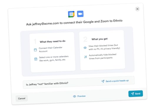
Keeping team members and stakeholders in sync with research initiatives is crucial for effective collaboration. Ethnio lets researchers connect their team’s meeting and scheduling tool stack, like Teams, Google Calendar, and Zoom, to automate communications and make it easy for team members to attend studies and interviews.
Step 3: Setup and collaborate on research quotasResearch quotas are vital for collecting data from representative user groups within your target audience. The industry standard is to use color-coded spreadsheets, which team members manage and update manually—one of the most time-consuming Research Ops tasks, especially when running multiple complex projects.
“A lot of our customers have struggled to manage multiple spreadsheets, Google Forms, and manually scheduling and paying participants. Ethnio helped automate and streamline this entire process.” Kyle Robertson, Product Specialist at Ethnio.
Ethnio simplifies quotas through automation and an intuitive UI to visualize an entire campaign. Researchers can also invite designers, product managers, and other stakeholders to review and approve, ensuring they recruit the right participants every time.

Connect Ethnio to Slack, and the platform will automatically ping team members and stakeholders to review the participants the instant they meet quota criteria. This simple automation streamlines quota selection in today’s async work environments.
Step 4: SchedulingScheduling is a challenge for UX researchers managing multiple simultaneous campaigns. Trying to sync participants with stakeholder availability can be complex and time-consuming. Automation is critical to increasing efficiency while ensuring the right team members and stakeholders are in the loop.
Ethnio can use fast mode to pick the best participants, automatically send calendar invites to participants and observers, and put each session on the facilitator’s calendar with their secure dynamic Zoom meeting.
Step 5: Running a usability study with UXPinThe day arrives to conduct the usability study. It’s time to bring UXRs into the design tool stack to share insights and collaborate.
Designers use UXPin with Merge technology to create an interactive prototype using the same component library engineers use during development.
This advanced prototype allows participants to interact with the user interface like they would the final product, providing accurate, meaningful insights for designers to iterate and improve.
DesignOps can invite UXRs and other stakeholders observing the session to collaborate and share feedback using UXPin’s Comments. Like Ethnio, collaborators don’t need a UXPin account to use Comments. They can annotate UIs and tag team members to discuss features and pain points. UXPin integrates with Slack to automate effective cross-functional collaboration.
“Our stakeholders are able to provide feedback pretty quickly using UXPin. We can send them a link to play with the prototype in their own time, and UXPin allows them to provide comments directly on the prototypes. UXPin’s comments functionality is great because we can follow along and mark comments as resolved once we address them.” Erica Rider, former UX Lead EPX at PayPal.
Step 6: Incorporating feedback
The design team can analyze user feedback to improve prototypes. Making changes is as easy as drag-and-drop with Merge components, meaning designers can iterate and test efficiently.
Once testing is complete, designers can hand off to devs for engineering and release. The development team already has the code, so it’s as easy as copying and pasting the production-ready JSX from UXPin to streamline development.
In the meantime, researchers are finalizing the study in Ethnio.
Step 7: Pay the participantsThe study is over, and it’s time to pay participants. Many organizations use third-party applications to deliver payouts in cash or via gift cards. The problem with these apps is that they increase costs and expose participant data to third parties, creating legal complications for organizations.
Ethnio’s native Incentives allow UXRs to pay participants in any currency worldwide in seconds. Pay via bank transfer, electronic rewards (Amazon, PayPal, and gift cards), and dozens of other payment methods. Participants can also choose to donate their incentive to 40+ global charities.
 Democratization in Action
The journey from research to final product development demands seamless collaboration and efficiency. Our use case with Ethnio and UXPin Merge demonstrates how democratized research practices can revolutionize this journey for greater operational impact and user experiences.
With Ethnio and UXPin Merge in operations’ tool stacks and an effective democratization practice, teams can optimize traditional UX and research processes to deliver better outcomes.
Enhance User Testing With Interactive Prototypes Using Merge TechnologyUXPin’s code-to-design solution enables designers to bring code components from a repository into the design process, enhancing prototype fidelity and functionality–without writing a single line of code.
Merge components are exact replicas engineers use to develop the final product, complete with styling and interactive properties. This single source of truth means designers and engineers speak the same language and work within the same constraints. Design handoffs are smoother with minimal documentation and explanation because design and development teams pull components from the exact same repository.
Ready to see how code-to-design can revolutionize your design process and enhance cross-functional collaboration? Visit our Merge page for more details and how to request access.
Discover MergeThe post Shared Insights, Shared Vision – Democratization and its Impact on Operations appeared first on Studio by UXPin.
August 8, 2023
8 Best Design System Examples

Design system is a set of components, rules, style guides, and documentation used to build a coherent and on-brand interface of a product. Most brands create their own design system and we prepared a list of eight most popular design systems that you can learn a lot from. Those and other design systems can be found in our design system repository called Adele.
Boost design system adoption and governance with UXPin Merge. Bring all interactive components from your design system to the editor, build fully interactive prototypes, and keep your designs consistent. Read more about UXPin Merge.
Reach a new level of prototypingDesign with interactive components coming from your team’s design system.
Discover UXPin Merge .discover-merge { margin: 40px 8px;}.discover-merge__container { display: flex; max-width: 690px; height: 200px; padding: 20px; padding-left: 24px; border-radius: 4px; background-color: black; box-shadow: 10px 10px #9999ff; align-items: center; justify-content: space-between;}.discover-merge__left { width: 50%;}.discover-merge__left p { margin: 10px 0px !important; color: white !important; font-size: 18px !important;}.discover-merge__heading { font-weight: bold !important; color: white !important; font-size: 18px !important;}.discover-merge__text { margin: 0 !important; line-height: 22px !important;}.discover-merge__button { width: 174px; height: 44px; margin: 10px 0px; border: none; border-radius: 2px; background: white; color: black; font-size: 16px; text-align: center;}.discover-merge__button:hover { cursor: pointer;}.discover-merge__image { max-width: 320px !important; height: 200px; margin-right: -19px;}@media (max-width: 760px) { .discover-merge__container { height: auto; margin: 10px; align-items: left; }}@media (max-width: 500px) { .discover-merge__container { flex-direction: column; } .discover-merge__left { width: 100%; align-items: normal; }}What is a Design System?A design system is a collection of all design resources that a product team may use to build user interface of their app, website, eCommerce store or any other UI design they need to develop.
Design systems aren’t only for designers. They are also for developers, as they contain all code snippets and development resources with necessary front-end code together with documentation as well as design guidelines, relevant plugins, design patterns, style guides, reusable components, rules plus guidelines, and all other building blocks useful for web design and development workflow.

These design systems are then hosted as websites online and can be publicly available (they are open-source design systems) or internal, whatever the brand decides.
We can think of a design system as a vast data library that acts as a valuable document with applicable instructions and examples, product design and coding guidelines, and a part of the UI kit all at the same time.
As you can see, there are many product design concepts related to design systems. If you want to learn to differentiate design systems from pattern libraries, component libraries, and UI kits, read our previous article on the topic: The difference between design system, pattern libraries, style guides, and component libraries.
Google Material Design System
One of the most popular design system is Google’s Material Design. Google created and publicly shared their Material Design System that goes into the tiniest details regarding everything there is to know about the design and design principles. Every UXPin user can easily use the Material Design components as they are one of the UXPin libraries.
Thanks to this system, users can get valuable information that perfectly unifies UI and UX across different devices, platforms and input methods.
Material Design allows other brands and individuals to have a strong foundation for building upon when it comes to their own approach to atomic design, industry innovation and unique brand expression.
The main features of the Google Material Design System include:
Starter KitsDesign Source FilesMaterial ThemingLayoutTypographyColorComponentsMobile GuidelinesGoogle’s Material Design System looks very mature. It has a lot of design guidelines, but it also contains documentation about UI components that are used in development. Did you know that such components can be used in design? Bring your developers’ components to design with UXPin’s Merge technology. Request access to UXPin Merge.
Apple Human Interface Guidelines
Apple has one of the top design system. It is called Apple Human Interface Guidelines and it presents a vast and rather valuable design system resource for the web design essentials and pattern libraries but downloadable templates. The iOS UI kit library is also available with a UXPin account.
The system follows Steve Job’s design principles:
Craft with great precision and attention to detailEmphasize user experience and connection with the usersFocus on what’s truly important on a larger scaleGenerate wanted user reactions thanks to the specific design language and practicesUtilize the friendly aspect of high tech for both novice and advanced usersSimplify everythingApple Human Interface Guidelines consist of practical resources, visual guidelines and style guides for both designers and developers for iOS, macOS, vOS and watchOS.
Its includes design system documentation about using:
MenusButtonsIcons and ImagesFields and LabelsWindow and ViewTouch BarIndicatorsSelectorsExtensionsVisual DesignVisual IndexApp ArchitectureSystem CapabilitiesUser InteractionThemesAtlassian Design System
Atlassian Design System is one of the best out there. Atlassian Design System focuses on providing valuable assistance to teams from all over the world by making their collaboration seamless and easy. Atlassian Design Guidelines are also a part of UXPin’s library collection.
Atlassian design philosophy is all about utilizing the digital experience to improve the productivity and overall potential of teams and individual team members, perfectly reflected in their globally used collaboration tools Trello and Jira.
That said, Atlassian Design System features agile practices and efficient tracking of every single step within a project that ultimately yields valuable results in terms of product delivery and development.
Atlassian’s design system includes
UI componentsbrand valuesUI kitUI patternsdesign tokensillustration librarycontent guidelinesUber Design System
According to Uber, movement ignites opportunity and that’s how they structured their design system.
After all, Uber service bases on movement with ride-hailing, peer-to-peer ridesharing, food delivery and micro-mobility involving scooters and electric bikes.
For this type of service to work impeccably, from sub-brands to internal ones and products to programs, Uber requires an effective design system that the company shares with the rest of the world.
Main features of Uber Design System:
Brand ArchitectureCompositionTone of VoiceMotionIllustrationPhotographyIconographyColorLogoTypographyShopify Design System Polaris
Shopify is a global eCommerce platform that provides everything a brand may need to run and grow its business in one place.
It’s no wonder that their design principles focus on creating a better and more accessible commerce experience.
Shopify’s public design system called Polaris encompasses the company’s core values:
Be caring and considerate to the usersProvide people with the right tools to accomplish whatever they set out to doEnjoy the top level of craftsmanship that matches the brand imageMinimize the hustle by providing accurate and quick solutionsAlways build upon users’ trustMake the users feel comfortable with using the productsPolaris Design System provides an easy-to-follow and practical style guide for designing for the Shopify platform. It offers a vast knowledge base on utilizing UI components, visual elements, content, and design language for creating a better user experience and product in general.
Shopify Design System Polaris includes main features that follow the practices mentioned above to a tee:
Data VisualizationAccessibilityInteraction StatesColorsTypographyIconsIllustrationsSpacingSoundsResourcesIBM Carbon Design System
IBM operates on a global scale by meeting large enterprise IT needs.
Their services range from business consulting and financing, software development and IT hosting/management to software-to-hardware products.
IBM’s core belief revolves around making constant progress, be that human condition, society or a brand, by utilizing science, reason and intelligence.
According to IBM, a good design is not only a mere requirement but an actual responsibility to the users.
This is where their Carbon Design System shines with its main features, offering plenty of tools and visual resources for Adobe, Axure and Sketch designers as well as developers:
Data VisualizationPatternsComponentsGuidelinesTutorialsUXPin users can conveniently find everything they need from Carbon in their account as well.
Mailchimp Design System
Mailchimp has come a long way from being a renowned email marketing leader to providing an all-in-one marketing platform that goes beyond email only.
Mailchimp has one clear goal: to help small businesses grow while remaining true to their brand identity and image.
That is also one of the many reasons behind creating the Mailchimp Design System and its main features that focus on creative expression, better user experience and top quality:
Data VisualizationGrid SystemColorTypographyComponentsSalesforce Lightning Design System
Salesforce goes above and beyond to deliver a personalized experience to its users through the integrated cloud-based CRM software.
The purpose of the Salesforce CRM is to improve marketing, commerce, IT, service and sales efforts – and allows their users to do the same with their users.
Their design philosophy is reflected in the Hawaiian word for intentional family, Ohana, with four core values that drive their company actions and overall culture:
InnovationEqualityTrustCustomer SuccessThat said, Salesforce has put out their own Lightning Design System that allows everyone working with content management systems to learn and benefit from its main features:
Design GuidelinesPlatformsAccessibilityComponents (and a lot of them)Lightning components are a part of the UXPin account libraries as well.
Why create a design system?Everyone who’s part of the company product team, such as developers, designers, product managers, etc., gets together to discuss and map out everything that’s currently an existing part of their digital product assets, from fonts and color palettes to UX writing rules and CSS code.
Then they collaborate on creating this ultimate master plan that explains how exactly things should be presented (designed and coded).
That way, all teams have one full-proof source (there’s a reason why a design system is referred to as a single source of truth in the industry) of visual references, tools, articles, patterns and data libraries. It allows them to keep their work consistent and uniform, and have every single member on the same page – the ultimate goal of design systems.
How to start with a design system?When it comes to implementing and developing design systems, developers don’t have to waste time on repeated code snippets when everything they need is right there to copy from reusable components and/or libraries.

Similarly, designers don’t have to create a new landing page from scratch when they have a library of standard design and UI elements such as colors, logos, headers, footers and other essential symbols to speed up the design process.
Also, web marketers don’t have to work out the tone and template of the newsletters repeatedly when they have everything they need within the system.
What is There to Learn from Design Systems?The majority of design systems follow rather general setup patterns.
The system often features its top navigation with the main categories: Design, Code, Language, Components, etc.
Each of these main categories has its subcategories that discuss things in more detail, making the most out of the atomic design structure. For instance, these subcategories could be something like Typography, Color, Forms, Banners, etc.
Following this intuitive navigation can get you valuable information about best practices in terms of design.
What’s in it for other people and brands?A great thing about design systems that many companies host online publicly is that other people can also learn from them and even use them as examples for their own atomic design.
Let’s refer to Shopify for a moment; their shopping design system is publicly displayed on the Web. It means anyone trying to design an eCommerce website can use their set of standards, design components and design language and pattern library for every single design element and be 100% sure that they’re doing a great job.
That said, let’s take a look at some of the best design system examples that you can learn a lot from (and steal from if you want to).
The Benefits of Creating a Design SystemWith a well-built design system in place, businesses can considerably improve their teamwork and streamline decision-making process, but that’s not all that you can get from creating a design system.
Such collection of guidelines, elements, and data minimizes communication issues between designers and developers and minimizes the room for potential UX design bugs or acquiring UX debt.
What’s more, having such a reference-rich library significantly reduces the necessary time to go from a prototype to an actual product.
For example, PayPal uses Fluent UI together with Merge technology. This allows them to incorporate the interactive components to the UXPin library. That way, both designers and product team members alike can easily access these components and design with them over and over again. 
Design systems are a great way to minimize the disconnect between designers and developers but are still not the ideal solution on their own. Thanks to the Merge technology revolution, product team members can easily use the same tools and improve their DesignOps workflow processes. This means that both developers and designers can access and use the same UI elements from one single source.
 Design System Challenges and Solution
Even when companies try to create their design system, specific issues and consistency disconnects can still happen, especially when maintaining all the elements, documentation and code.
Learn more about design system challenges and solutions from one of the top design leaders – Johnson & Johnson. During our webinar, the J&J team shared all their best practices.
Make the Most of Design System: the UXPin Merge WayMerge tech is created as an adequate solution to common challenges that often happen when there’s a communication gap between design and development teams. So, various UI components, coding and documentation inconsistencies can arise, affecting the product’s efficiency and maintenance.
With the design system that organizes all of the necessary components as a first step in the right direction, Merge will then take all those UI elements right to the design editor.
You’ll save time and money by avoiding inconsistencies, not to mention the joy of seeing an end product that’s exactly the same as what you originally envisioned!
Merge tech focuses on design with code components, that is converting a code component into the design. In that respect, designers don’t simply create prototypes based solely on the visual aspect of the final product (while only faking the necessary interactions); instead, designers use already coded components to design the prototype image.
There’s no need to go back and forth between the design and dev team since the design team can take the already existing coded components, synchronize them with UXPin’s editor, and drag and drop the components they need to create new designs.
Essentially, designers don’t have to create fake interactions, add them or search for the right colors.

On the other end, developers get the prototype preview and continue to work with the available production-ready elements.
Which Design System Example is Your Favorite?Design systems consist of tons of UI components and guidelines that are meant to optimize and improve the design efforts and promote consistency among the teams.
However, if the design system is poorly maintained and implemented, the said system can turn into nothing more than many clunky and confusing code snippets, libraries and components.
A design system can quickly help team members to promote consistency while also allowing designers to deal with more complex UX issues. And when you add revolutionary Merge tech to the mix, you can truly take your design system organization to the next level. Learn more about UXPin Merge.
Discover MergeThe post 8 Best Design System Examples appeared first on Studio by UXPin.
The Best React Design Patterns You Should Know About in 2023

There is no denying the immense popularity and practicality of React. For a long time, most web design was built with CSS, HTML, and JavaScript.
React brought a much-needed sigh of relief for developers with its ease of use. The reusable components, great developer tools, and extensive ecosystem are some of the most loved features of React.
Instead of the traditional approach of directly manipulating the DOM, React introduced a useful level of abstraction in the form of the virtual DOM concept.
The library is being actively developed and maintained by React developers at the tech giant Facebook. This provides it with a much-needed edge over other frameworks and libraries. Countless contributors in the JavaScript community also regularly contribute to refining and improving React.
All these factors allow React to maintain its popularity among developers even though newer frameworks are constantly emerging and competing for recognition amongst frontend developers.

There are numerous design patterns that are available in React.js. Here, we shortlist a few recommended React patterns that you should definitely know about when building web apps.
Help your designers build prototypes with React components from your repository. Bring React components to our design editor and create a single source of truth between design and devs. Request access to UXPin Merge.
Reach a new level of prototypingDesign with interactive components coming from your team’s design system.
Discover UXPin Merge .discover-merge { margin: 40px 8px;}.discover-merge__container { display: flex; max-width: 690px; height: 200px; padding: 20px; padding-left: 24px; border-radius: 4px; background-color: black; box-shadow: 10px 10px #9999ff; align-items: center; justify-content: space-between;}.discover-merge__left { width: 50%;}.discover-merge__left p { margin: 10px 0px !important; color: white !important; font-size: 18px !important;}.discover-merge__heading { font-weight: bold !important; color: white !important; font-size: 18px !important;}.discover-merge__text { margin: 0 !important; line-height: 22px !important;}.discover-merge__button { width: 174px; height: 44px; margin: 10px 0px; border: none; border-radius: 2px; background: white; color: black; font-size: 16px; text-align: center;}.discover-merge__button:hover { cursor: pointer;}.discover-merge__image { max-width: 320px !important; height: 200px; margin-right: -19px;}@media (max-width: 760px) { .discover-merge__container { height: auto; margin: 10px; align-items: left; }}@media (max-width: 500px) { .discover-merge__container { flex-direction: column; } .discover-merge__left { width: 100%; align-items: normal; }}Functional vs Container ComponentsComponents can be of two types, namely, stateful and stateless components. The difference between both is merely the presence of state or lack thereof.
What is the state? It’s simply the data that is imported into a component. Typically data is fetched from the database.
In stateless components, you can not reach this.state inside it.
Stateless components are also called functional components or presentational components. In React, such components always render the same thing or only what is passed to them via props.
Your aim, as a developer, should be to create stateless components even if there is no immediate scenario in which you would have to reuse that particular component.
Most often developers figure out whether a component needs to have a state or not once they start writing the code as it is not always clear beforehand.
For a hierarchy of components, the best practice is to let parent components keep as much state as possible and make stateless child components. Data can be passed down via props. Speaking of children and parents, we can go to the next React design pattern.
Compound ComponentsWhen React developers have two or more components that work together, more likely one is the parent while the rest are children. But did you know that you can make them share states and handle logic together?
That’s what the compound component React pattern is all about. The compound components API shows relationships between components and allows them to communicate in a flexible way.
If you want to know more about it, read this article by LogRocket about understanding React compound components.
Conditional RenderingConditions are the foremost tool in the arsenal of any software developer.
In the process of writing React components, the need often arises to render a certain JSX code based on the state. This is achieved through conditional rendering.

Conditional rendering is very useful as it allows you to create distinct components based on your needs and then render only the ones that are required by the application.
For instance, conditional rendering can be used to display different messages to the user based on the login status of the user. The message will be subject to the value of the prop isLoggedIn.
Render PropsWe discussed how design patterns are there to solve common problems. Render props are available in React to help us solve the problem of logic repetition.
According to official React documentation, render props are defined as a ‘technique for sharing code between React components using a prop whose value is a function’.
Render props prove really handy as they allow us to share the same state across different components. Instead of hardcoding the logic inside each component, you can use a function prop to determine what to render.
Some popular libraries that make use of render props include Formik, React Router, and Downshift.
Controlled ComponentsWeb forms are a common requirement in a large number of applications and controlled components are React’s answer to handling form state.
The controlled component takes the state through props. It can notify any changes by means of callbacks like onChange.
Parent components can control it by handling the callback and managing its own state meanwhile, the new values are passed to the controlled component as props.
By default React forms have support for both controlled and uncontrolled components. It is highly recommended that you use controlled components.
The following code snippet shows a controlled component.
React HooksHooks are a relatively new addition to React and were introduced in React 16.8.
These functions allow developers to use React without classes. There are a number of different pre-built hooks available like the Effect Hook ( useEffect ) and the State Hook.
For a complete list of available hooks, you can visit the Hooks API Reference.
Apart from the pre-built hooks in React, you can also create your own hooks. This allows you to extract the component logic and create reusable functions.
Hooks are a welcome addition to React and the developer community really appreciated this new addition with great enthusiasm.
However, it must be kept in mind that sometimes hooks can become a little tricky to work with when the arguments are objects, arrays, or functions. This can become somewhat confusing.
On the other hand, custom hooks are easy and simple to use and they also provide immense benefits to the developer.
Higher-Order Component PatternWhen it comes to more advanced React patterns, there’s higher-order component pattern, referred to as HOC. It’s applied whenever React developer wants to reuse logic within application.
HOC takes a component as an argument and when it returns it, it adds data and functionality to the component.
For instance, when using React with Redux, you can pass the component through connect function and it will get injected with data from the Redux store. The values that you get will be passed as Props.
HOC is not a part of the core React API. It’s a JavaScript function. Nonetheless, it is in line with the nature of React functional components, that’s composition over inheritance.
Use Most Common React Design PatternsReact has proven to be a highly popular library. The community is among the fastest-growing developer communities online.
You will also find lots of useful web development resources available online that make it easy to learn react.js and adapt to it.
The power of React is due to its amazing features and the robust architecture that it offers. One of the most prominent and widely loved features of React is its design patterns.
Design patterns are in fact what gives this library its extraordinary practicality and usefulness. They make code optimization and maintenance easier.
They allow developers to create apps that are flexible in nature, deliver better performance, and produce a codebase that is easier to maintain.
We have discussed a few popular React design patterns like stateless functions, render props, controlled components, conditional rendering, and react hooks.
However, it must be noted that react design patterns are not just limited to these patterns and there are several different design patterns that you can implement. Once you get familiar with the usage of the common design patterns, it will become easier to graduate to others.
Why You Should Follow React Design Patterns?Let us first briefly recap the role that design patterns play. Simply put, design patterns are repeatable solutions to commonly occurring problems in software development.
They serve as a basic template upon which you can build up the program’s functionality according to the given requirements.
The term ‘design pattern’ is not to be confused with a ‘design system’. We have discussed more design systems in a separate article.

Design patterns not only speed up the development process but also make the code easier to read and to maintain.
Some common examples of design patterns include the Singleton pattern and the Gang-of-Four pattern.
In software development, design patterns are associated with two common roles.
Design patterns offer a common platform to developers.Design patterns ensure that React best practices are applied.Let’s look at them closer.
Role #1: Offer a common platform to developersDesign patterns provide standard terminology and solutions to known problems. Let us take the example of the Singleton pattern that we mentioned above.

This pattern postulates the use of a single object. Developers implementing this pattern can easily communicate to other developers that a particular program follows the singleton pattern and they will understand what this means.
Role #2: Ensure that React best practices are appliedDesign patterns have been created as a result of extensive research and testing. They not only allow developers to become easily accustomed to the development environment but also ensure that the best practices are being followed.
This results in fewer errors and saves time during debugging and figuring out problems that could have been easily avoided if an appropriate design pattern had been implemented.
Like every other good programming library, React makes extensive use of design patterns to provide developers a powerful tool. By properly following the React philosophy, developers can produce some extraordinary applications.
Now that you have an understanding of design patterns. Let us move on to some of the most widely used design patterns available in React.js.
To learn how you can effectively reuse design patterns, check out our article on how great artists reuse.
The Functioning of ReactjsYou can install react using the create-react-app available on Github. Using npm you can add all the other dependencies.
React.js makes use of JSX. This is a syntax extension of JavaScript. It comes with the full power of JavaScript and provides us with what is termed as React ‘elements’.
Although it is not mandatory to use JSX, it is the preferred method due to the helpful visual aid and styling options that it provides. It also provides useful error messages and warnings.
The core philosophy that React.js follows is that of reusable React components. You will notice that this component-based approach can be leveraged to build rich user interfaces for web applications.

These React components can be considered as a small system in itself. Each component has its own state, input as well as output.
The input of a component is taken in the form of props. The component may be considered as a black box. Each having its own state and lifecycle. Components are easy to compose.
The final React app consists of a highly maintainable code.
See the list of 15 Websites Using ReactJS.
Interactive Prototyping with React componentsCapturing the true essence of React application development can be made easier by the use of the right technology. UXPin Merge, you can import React code components to UXPin and use them to build powerful prototypes.
With Merge technology, you can easily solved DesignOps challenges. See how Merge can help you use your dev’s React library at the prototyping stage. Request access.
Discover MergeThe post The Best React Design Patterns You Should Know About in 2023 appeared first on Studio by UXPin.
Code or Design – Which is a Better Source of Truth?

The global design system’s community, Into Design Systems, hosted a webinar in July 2023 where guest speaker Marcel Bertram talked about “Systematic Design With Code.” Marcel made some interesting comparisons about designing using vector-based vs. code-based design tools and how organizations can use the latter to create a single source of truth.
Into Design Systems is a virtual design systems conference for the global Design and DesignOps community, including designers, developers, Design Leads, design managers, DesignOps practitioners, and many others. The community-driven initiative shares knowledge to help evolve the industry and its members.
Marcel Bertram is a Brand Design Specialist leading the Design System team at a global automobile manufacturer. He is also the Co-Founder & UX Coach at MUDX.design, a consultancy for UX Design Operations.
This article is based on Marcel’s Into Design Systems live titled “The Power of Design, Code & Ai in Design Systems.” We have summarized Marcel’s talk into its key points, but you can watch the entire 3-hour webinar here.
Key takaways:
Vector-based design tools arose from a need to provide scalability and clarity across different resolutions in the digital landscape.The release of UXPin’s Merge technology in 2019 marked a significant shift in design paradigms, blending code components directly into the design process for a unified UI library.Recognizing code as the “source of truth” ensures consistency, efficiency, and a holistic understanding of application mechanics across design and development teams.German-based software agency dotSource utilized UXPin Merge to bridge the gap between design and development, synchronizing code, design, and documentation.UXPin’s Merge technology advances modern prototyping, enabling designers to test realistic user interactions and gain accurate insights during the design process.Use coded components as a single source of truth between designers and developers. Bridge the gap in the process and release products faster. Learn more about it. Discover UXPin Merge.
Reach a new level of prototypingDesign with interactive components coming from your team’s design system.
Discover UXPin Merge .discover-merge { margin: 40px 8px;}.discover-merge__container { display: flex; max-width: 690px; height: 200px; padding: 20px; padding-left: 24px; border-radius: 4px; background-color: black; box-shadow: 10px 10px #9999ff; align-items: center; justify-content: space-between;}.discover-merge__left { width: 50%;}.discover-merge__left p { margin: 10px 0px !important; color: white !important; font-size: 18px !important;}.discover-merge__heading { font-weight: bold !important; color: white !important; font-size: 18px !important;}.discover-merge__text { margin: 0 !important; line-height: 22px !important;}.discover-merge__button { width: 174px; height: 44px; margin: 10px 0px; border: none; border-radius: 2px; background: white; color: black; font-size: 16px; text-align: center;}.discover-merge__button:hover { cursor: pointer;}.discover-merge__image { max-width: 320px !important; height: 200px; margin-right: -19px;}@media (max-width: 760px) { .discover-merge__container { height: auto; margin: 10px; align-items: left; }}@media (max-width: 500px) { .discover-merge__container { flex-direction: column; } .discover-merge__left { width: 100%; align-items: normal; }}Why Are There Vector-Based Design Tools?In the early days of digital design, there was a pressing need to replicate the precision of physical art. Instead of constructing images from tiny dots, as pixel-based methods do, vectors use mathematical equations to shape graphics. As a result, these images stay sharp and scalable, no matter how you adjust their size.
Traditional graphic design laid the groundwork for vector tools. The industry adopted tools like Adobe Illustrator because they consistently delivered crisp visuals across platforms and resolutions. As the need for adaptable designs surged with the rise of websites, applications, and digital ads, designers naturally gravitated toward vector-based tools. Their choice wasn’t just aesthetic–it addressed the practical demands of the digital landscape.
The code-based revolutionWhile vector-based tools have helped get us to where we are today, they haven’t evolved to bridge the gap between design and development–until the release of UXPin’s Merge technology in 2019.
Merge’s code-based approach brings code components into the design process, so designers can use the same UI library for prototyping as engineers to develop the final product.
Vector-Based vs. Code-Based Design SystemsDigital product design is slowly shifting from traditional vector-based systems to the innovative code-based approach. The integration of code in the design process has changed how developers and designers collaborate, streamlining the entire product development process.
Let’s explore this evolution and understand its implications on design systems and prototyping.
Understanding vector-based systemsWhat are they?:
These are tools that use mathematical equations to represent images in computer graphics. Popular examples include Figma and Adobe Illustrator.Advantages:
Suitable for static prototyping and visual designs.Intuitive for designers to visualize, draft, and make rapid alterations.Limitations:
Lacks the dynamism of real-life applications.Can’t always accurately emulate user interactions, transitions, or advanced component behaviors.Doesn’t represent the intricacies and possibilities of code.Understanding code-based systemsWhat are they?:
Design tools that use actual coded components on the design canvas, like UXPin.Advantages:
Creates a single source of truth across the organization with automated updates for designers and developers.Seamless transition between design and development phases.Accurately represents the real-life behavior of components for realistic prototyping.More meaningful feedback from user testing and stakeholders.Less reliance on engineering teams for complex prototyping.Integrated accessibility features, semantics, and browser functionalities like password managers.Facilitates exploration based on real coded UI elements.Designers get the benefits of code but still work with a familiar design tool interface.Limitations:
Only the design system team can implement changes–which is good for governance.Code as the Source of TruthThe final digital product is code-based. Developers work with code. The design team uses a vector-based tool, creating a gap between them and the final product. Therefore, recognizing code as the central reference point or the “source of truth” is pivotal.
This philosophy ensures:
Consistency and cohesion: Ensuring that designers and developers draw components from the same repository ensures uniformity across the board.Efficiency: With everyone referencing the same library and documentation, there’s less room for miscommunication or discrepancies.In-depth understanding: Encourages designers to understand the core mechanics of how applications function, fostering a more holistic design approach.A Single Source of Truth with UXPin Merge – dotSource’s Case Study
Before switching to UXPin Merge, German-based software development agency dotSource had a problem:
Promoting new patterns and components to a design system involves many redundant processes. Most design system releases require updating in at least three places:
The design system’s codebase (component library)The design team’s UI kit (design tool)The design system’s documentation“Instead of a ‘single source of truth’ that gives ‘three single sources of truth’ for every UI component–this seems counterintuitive and increases errors. If the design system’s update process and technologies don’t align, the team ends up with redundant work because a single change requires three updates.”
dotSource found the only solution to this problem was to implement a code-based design process, creating a true single source of truth between design and development.
The company uses Merge technology to import a product’s design system into UXPin so designers can prototype using code components.
“We use UXPin’s Storybook integration , which allows designers to use our design system’s Storybook components in UXPin’s design editor. The result: a perfect synchronization of code, design, and documentation, making it possible for:
Designers to participate in QA and help developers identify bugsClose collaboration between designers and engineersBetter testing and faster iterations with high-fidelity interactive components ( component-driven prototyping )”Modern Prototyping – Static vs. Interactive Static prototyping
Using vector-based tools like Figma works well when the objective is to gauge comprehension or aesthetics. It provides a static visual representation without intricate interactive layers.
Designers typically move from a vector-based tool to a prototyping tool, which adds costs and operational burdens, and they still don’t achieve results comparable to code.
Interactive prototypingCode-based design tools increase prototyping scope for more comprehensive functionality and user journey tests. Tools like UXPin can emulate real interactions, toggle functionalities, input field behaviors, and more, offering a realistic user experience.
UXPin’s Merge technology goes beyond what you can see into how a prototype feels in a real-world scenario. Design teams can use insights from testing to iterate and improve with greater accuracy. Designers enhance usability and can identify more business opportunities during the design process, increasing their value to the organization.
Transitioning to a Code-Based Design Workflow
The world of digital design is vast and ever-evolving. While vector-based tools serve their purpose in initial design phases, embracing the advantages of code-based systems is the way forward. This integrated approach reduces inefficiencies and miscommunications while ensuring a more authentic user experience during testing.
As designers and developers continue to collaborate, it’s crucial to remember that our ultimate goal is to craft user-centric, efficient, and aesthetically pleasing applications. Understanding and utilizing the right tools is a significant step in that direction.
Increasing design system maturity with UXPin MergeUXPin’s Merge technology currently leads the code-based design revolution with tools and features that meet the needs of modern product development teams.
It can take years for organizations to reach full design system maturity–a fully integrated system with designers and developers using the same UI library and documentation. Most never get there, maintaining multiple sources of truth like our friends at dotSource.
UXPin Merge is the bridge to that gap. Organizations can create a fully integrated design system from the start, circumventing many years of wasted resources.
With UXPin Merge, you can:
Import Javascript-based design systems, including React, Vue, Angular, Ember, and others using Git or Storybook Combine UI elements from multiple design systems using UXPin’s Patterns to create new design system componentsImport components from open-source design systems to test new patterns before committing to developmentBuild prototypes 8X faster than traditional vector-based design toolsUse Version Control to give designers control over updates and design system version historyCreate centralized documentation for product teams to keep everything on one platformUse real data for prototyping via JSONReady to join the code-based revolution? Visit our Merge page to learn how to create a single source of truth for your design system and develop better product experiences for your users.
Discover MergeThe post Code or Design – Which is a Better Source of Truth? appeared first on Studio by UXPin.
August 7, 2023
Product Design Ultimate Guide – Designing Digital Products

Ever wondered why some digital products feel intuitive, while others leave you lost and frustrated? The key is effective digital product design.
In this comprehensive guide, we’ll demystify the process of designing digital products, emphasizing the importance of user experience, prototyping, and iterative development. We’ll also highlight common pitfalls to avoid in product design.
Key takeaways:
Product design is a process of creating an interactive interface of a digital product that aligns with user needs, business requirements, and technical constraints.Product designers are people in charge of creating the design of a product. To do this job, they can get a degree, attend courses and/or read books about product design.Product design has 5 distinctive steps, but it’s not a linear process; product designers may go back to certain steps if they uncover new insights.One of the step is prototyping – creating an interactive mockup of a product that shows behaviors and user journey prior to building the product in code.Successful product design puts emphasis on UX writing, manages errors, keep users in the center, and takes iterations seriously. An example of successful product design is Apple.Our goal is to provide a definitive resource for anyone passionate about creating digital products that truly enhance people’s lives.
Design products 10x faster with our revolutionary Merge technology. Drag and drop interactive components to build a fully functional prototype that behaves like an end-product and follows your design system. Discover UXPin Merge.
Reach a new level of prototypingDesign with interactive components coming from your team’s design system.
Discover UXPin Merge .discover-merge { margin: 40px 8px;}.discover-merge__container { display: flex; max-width: 690px; height: 200px; padding: 20px; padding-left: 24px; border-radius: 4px; background-color: black; box-shadow: 10px 10px #9999ff; align-items: center; justify-content: space-between;}.discover-merge__left { width: 50%;}.discover-merge__left p { margin: 10px 0px !important; color: white !important; font-size: 18px !important;}.discover-merge__heading { font-weight: bold !important; color: white !important; font-size: 18px !important;}.discover-merge__text { margin: 0 !important; line-height: 22px !important;}.discover-merge__button { width: 174px; height: 44px; margin: 10px 0px; border: none; border-radius: 2px; background: white; color: black; font-size: 16px; text-align: center;}.discover-merge__button:hover { cursor: pointer;}.discover-merge__image { max-width: 320px !important; height: 200px; margin-right: -19px;}@media (max-width: 760px) { .discover-merge__container { height: auto; margin: 10px; align-items: left; }}@media (max-width: 500px) { .discover-merge__container { flex-direction: column; } .discover-merge__left { width: 100%; align-items: normal; }}What is Product Design?Designing digital products is all about creating a solution that addresses a particular need or problem that people have. To do this, designers should follow this product design process:
Learn about target users – who are they? How do they behave? What do they like and dislike?Identify challenges that users face.Brainstorm potential solutions to these challenges.Figure out how your product might fit into the audiences’ lives.Test your design, gathering feedback from people who might end up using it.To gain a deeper understanding of product design and discover the steps involved, read our dedicated article: What is Product Design?
Product Designer vs UX DesignerProduct designers and UX designers both have important roles in the development of a digital product, but while they share some common interests they’re quite separate functions.
A UX designer is mainly focused on how the product feels to the user. In the early stages of a design project, they study users’ behavior and try to understand their needs and motivations.
A UX designer’s goal is to create a seamless and intuitive user journey, so they think carefully about how each step flows into the next. They want to ensure the user can accomplish their goals in the easiest way possible. They even incorporate principles of cognitive psychology into their designs to make digital products more usable.
On the other hand, a product designer has a broader role that includes not only the user experience but also the business goals and technical constraints.
They are involved in all aspects of product development, from the initial idea to the final implementation. They look at the bigger picture, thinking about how all the pieces fit together to create a coherent whole. This includes how the product looks (user interface), how it works (interaction design), and how it fits into the larger market.
In short, while UX designers focus on the user’s journey and experience, product designers consider the entire product from a holistic perspective, including the business and technical aspects. They both aim to create products that users love, but their approach and focus areas are slightly different.
To learn more, read our comparative piece on the specificity of a UX designer’s and product designer’s work.
How to Design a ProductHere are five steps you can take to ensure usability is at the heart of your digital product design process.
Step 1: Empathize with your usersThis is arguably the most important step in product design. Understanding your users goes beyond knowing their demographics; it’s about empathizing with them. This means finding out about their needs, habits, frustrations, and desires as these all relate to your product.
To do this, conduct interviews, surveys, or observe users in their natural environment. The more you know about your users, the better equipped you are to design a product that fits seamlessly into their lives.
 Step 2: Identify the problem
Once you understand your users, the next step is to identify the problems they face, which your product could help solve.
This is where you convert the insights you gained from empathizing with your users into a clear problem statement that captures the main issues your users are experiencing.
While the statement needs to be clear and specific enough to provide guidance, it shouldn’t be overly prescriptive – it’s essential to allow room for flexibility and creative thought.
Step 3: IdeationThis product design step is all about brainstorming as many ideas as possible. No idea is too wild or too mundane. Let your creativity flow, and try to think of every possible way to solve the problem you identified.

Tools like mind maps, sketches, or storyboards can help visualize these ideas. And don’t worry about practicality or feasibility – the goal is quantity, not quality. The more ideas you have, the more raw material you have for the next step.
Step 4: PrototypingNow it’s time to turn some of those ideas into tangible, testable, mini-versions of your product – also known as prototypes.
Start with paper prototypes such as rough sketches. These let you quickly see how your product might work without investing too much time or resources.
Once you’re satisfied with the basic function, you can progress to high-fidelity prototypes. These are more detailed and interactive, and they give a better representation of the final product.
 Step 5: Testing
The final step is where you’ll see if your product actually solves the problem it was designed for.
Give your prototypes to actual users, watch them interact with your product, and listen to their feedback.
Remember, this step is about learning and improving, not about proving that you’re right. Don’t be discouraged if there are issues; instead, see them as opportunities to refine your product.
Check out our “How to Design a Product in 5 Steps” article to learn more about this topic.
Best Tips on Product UX DesignThese pointers should help to enhance the user experience of your product.
Don’t ignore UX writingUX writing creates clear, useful text for digital products. It helps to reduce confusion and enhance navigation. Here are five essential UX writing tips:
Keep copy short and simple: the aim is to convey the necessary information in as few words as possible.Prioritize accessibility: make sure your text is easy to understand for all users – avoid jargon or colloquialisms. Use visuals and formatting for clarity: If images can explain your ideas better than words, use them instead. Also, break up large chunks of copy into shorter and more scannable lists. Use an active voice: it makes your writing easier to understand. Play it straight: try not to be too clever or humorous.Test your designs – alwaysIt’s essential to always test your designs. This ensures your product not only looks good but performs well and meets user expectations.
You can use a variety of testing methods. Gather feedback from users representing your target audience, use online platforms to gain access to lots of remote users, or conduct in-person panels for detailed insights.
Early testing catches issues when they’re still easy and cost-effective to fix. Just as importantly, it helps you stay laser-focused on delivering an excellent user experience, ultimately leading to a product that users will appreciate and love.
Regularly observe user behaviorAs a designer, it can be tempting to assume users will intuitively understand your product. To avoid making this mistake, observe their behavior consistently. Monitoring users’ interactions can uncover unexpected behaviors or misunderstandings, which act as a reality check.
Tests don’t have to be extensive. You can run sessions with as few as 5 users to spot 75% of issues. But ultimately, testing will improve your product’s intuitiveness and user-friendliness.
Deal with user errorsProduct design involves two key steps in addressing user errors:
Helping users when they make a mistake.Analyzing these errors to fine-tune the user experience – For instance, if a user misses a required field when completing a form, a clear error message should guide them. But if many users can’t recover from a given mistake, the design needs revisiting.Remember, users have varying tech skills and devices, so a minor hiccup for one might be a major obstacle for another. The designer’s role is to minimize these barriers, ensuring a seamless experience for everyone.
 Introduce changes gradually
When you have several changes or improvements to make to a product, it’s best not to introduce them all at the same time.
This is because if you make too many alterations at once, it can be hard to determine which changes are successful and which ones may need further tweaking.
To put it another way, if you adjust just one or two things, you can observe whether these changes fix the issues they were intended to resolve and if users understand and find them beneficial. This approach gives you a clear picture of each change’s effectiveness.
We’re discussing more tips on product UX design in our dedicated article. Give it a read: Best Tips on Product UX Design.
Best Tips on Prototyping for Product DesignA prototype is a simple model of your product that shows its basic functions and can help turn your product ideas into reality. Here are some tips to make the most of this important design stage.
Decide what to show with your prototypeBefore you start designing your prototype, follow these important steps:
1. Agree on what features your prototype needs to have.
2. Get a clear understanding of what the key stakeholders expect to see from your prototype.
3. Discuss the product features with developers and identify any potential technical issues.
4. Think about whether the prototype can realistically be made into a full product and if it could be a real business opportunity.
Gathering this information upfront can give clarity to your prototype designs, saving time and resources.
Turn to rapid collaborative prototyping if you’re under time pressureIf you’re working to tight deadlines, rapid prototyping can help you get to the testing stage much quicker.
The idea is to create a workable model of the product in as little as a day. While the resulting prototypes are usually simpler and less polished, the emphasis is very much on iterative design – the cycle of building, testing, refining, and repeating.

It helps if team members work together using a digital whiteboard and a collaborative product design tool like UXPin with its Merge technology, which lets you prototype with reusable components. This makes it easier to bounce ideas off each other and come up with a workable design much quicker. Discover UXPin Merge.
Select your fidelityWhen deciding how detailed and close to the final version your prototype should be – a characteristic known as ‘fidelity‘ – you need to consider who you’re showing the prototype to and what stage of the design process you’re at.
Low-fidelity prototypes, like simple sketches or basic wireframes, are sufficient for an internal design team review. They’re usually enough to help your colleagues visualize ideas and spark discussion.
High-fidelity prototypes are more polished – how they look and behave is closer to the final product. These are more suitable for gathering feedback from your target users.
Mid-level fidelity prototypes can be shown to stakeholders or team members who are neither part of your design team, nor target users. The level of detail these prototypes contain is somewhere between low and high fidelity.
 Test your prototypes with actual users
Testing functional designs with your colleagues can be helpful, but there’s a real chance they might miss issues that actual users would face.
That’s why it’s essential to test your prototypes with the people who’ll end up using the finished product.
As we mentioned in the previous section, before testing, you need to decide whether you’re using a basic, low-fidelity prototype or one that’s more detailed and closer to the final product. This decision influences what kind of feedback you’re looking for and what you want to learn from the test.
It’s also helpful to identify your end users’ personas and the scenarios in which they might use your product. This helps you understand the context of use and plan your tests accordingly.
You can test in person, which allows for more detailed feedback as you can observe users’ reactions and ask questions. Or you can use online platforms that allow you to reach a larger number of potential users.
To learn 5 more prototype product design tips, check out this article: Prototype Product Design – 9 Tips.
Best Examples of Digital Product Design AppleApple stands out as a shining example of a company that designs with diverse user needs at heart, constantly refining its products for increased accessibility and usability.
For people who have vision problems, Apple provides features like voiceover, zoom, and Braille support. These help users understand what’s on the screen or in the environment around them.Subtitles are made available for those with hearing impairments, covering everything from videos to conversations. Apple also produces bespoke devices aimed at helping these users hear better.Apple has features like voice navigation and devices that can be controlled with eye movements to help individuals with limited mobility. This means users can navigate their devices without touching them.Cognitive challenges are met with thoughtful designs that help filter out distracting background noise and visuals. Image source: AppleDiscord
The communication platform Discord was initially designed to make it easy for gamers to interact. It’s since expanded and now allows users to discuss a range of topics, helped by a design that’s simple enough to use without distraction, while also offering enough depth to cater to specific user needs. Features include:
The ability to join or create ‘servers’ or chat rooms. These can be large, public groups, or smaller, private ones.The creation of ‘channels’ within servers. This helps keep discussions on different topics separate and organized.Direct messaging and ‘pinging’ (notifying) individual users for quick, private communication.Users can choose to communicate via voice or text.The customizable user interface allows you to personalize text, emojis, usernames, and icons to reflect your preferences.TikTokThe hugely popular social media app has revolutionized the user experience with its unique design.
This includes a full-screen feed for immersive viewing, clear interactive features, an endless stream of short, personalized content, and features that support diverse user needs.
These design elements, combined with added accessibility options like auto-captions and photosensitivity warnings, have made TikTok a globally popular and user-friendly app. And its success underlines the importance of thoughtful product design.
We’ve only discussed 3 out of 5 best product design examples, you can find the remaining ones here.
Reasons for Bad Product Design with ExamplesAggressive popupsPopups that appear immediately on a website can be a big turn-off for users. Before they’ve even had a chance to explore what’s on offer, they’re being asked to sign up for a newsletter or download something, which can be disruptive and off-putting.
It’s important to remember that people visit your site seeking answers, often with limited time and attention. Being bombarded with popups can quickly ruin their experience and lead them to seek alternatives.
Of course, that’s not to say all pop-ups are bad – just that timing is crucial. It’s better to let users engage with your content first before trying to persuade them to sign up for additional services or promotions.
An overly complex navigationAmazon Web Services (AWS) is a popular platform that provides a wide range of cloud computing services, but it’s really difficult to navigate.
When you click on their products tab, you’re hit with a ton of choices which can feel overwhelming, especially on a mobile where you have to keep scrolling. This can frustrate users, making it hard to find what they need.
Even though AWS’s design is aesthetically pleasing, the tricky navigation could be improved to enhance the user experience. This would stop visitors from leaving the site in a huff because they can’t find what they’re looking for.
 Source: AWSStigmatizing certain user groups
Product design can unintentionally stigmatize certain user groups, particularly older people.
Take walking canes for example. Once upon a time, these were carefully crafted to look like fashionable accessories – as well as being sturdy and functional. But today, devices for seniors often look unattractive, signifying frailty. This can discourage people from using them.
Large-button phones for visually impaired people feel similarly outdated. Rather than designing ‘special’ products like these that make particular groups feel ostracized, we should make all products more inclusive, allowing for customizations like adjustable font sizes. That way, everyone will feel comfortable using them.
We share more bad product design examples in a dedicated article: Bad Product Design.
Product Design Degrees that Help you Land a JobThere are three main avenues that lead to a career in design, including product and UX design roles:
Bachelor’s Degree at a UniversityStudying for a design degree at a university can give you an advantage over others in this competitive field.
Universities offer comprehensive courses on all sorts of specialisms, including color, typography, layout, and idea communication. They also foster skills in giving and receiving feedback, which are highly valued in the professional world.
You could also consider degrees in programming as they allow you to understand the technical constraints that could influence product design.
One of the main benefits of a design degree is that it can potentially lead to higher pay.
But it’s worth saying that to get on a course you’ll need to have built a solid portfolio of work. Other potential obstacles include the fact that design degrees are expensive and take a long time to complete – often between two to four years.
Do-it-yourselfSelf-learning can be a viable and flexible route – as long as you have plenty of discipline!
Books like Don Norman’s ‘The Design of Everyday Things’ provide essential insights into human-centered design. But product design is complex, and involves more than just reading; learning from industry experts through mentorship, internships, or online courses can be invaluable.
Networking is also key. Be sure to maintain connections with classmates and industry contacts, as they might prove helpful in the future.
Some helpful resources include:
Nielsen Norman GroupCenterCentreCodecademyThe Shape Of DesignThe UX Design Process Book BundleBootcamp CoursesDesign bootcamps offer a fast-tracked learning experience in your chosen field.
These programs can be undertaken in-person, online, or through blended learning, and some even offer scholarships or deferred payment options.
Whether you’re a recent graduate or a professional seeking a career shift, bootcamp courses can effectively introduce you to the field and bridge knowledge gaps.
Here are some courses you can look into:
Become a UX Designer from ScratchDesign Thinking: The Beginner’s GuideUser Research – Methods and Best PracticesAccessibility: How to Design for AllMobile User Experience (UX) DesignConducting Usability TestingUI Design Patterns for Successful SoftwareUX Management: Strategy and TacticsFor more detailed guidance on product design careers, read our article on product design programs.
Top Books about Product DesignThese four titles are essential reading for anyone interested in the field of product design.
‘Hooked: How to Build Habit-Forming Products’ by Nir EyalEyal’s book offers valuable insights into creating products that attract and retain users, focusing on his four-step Hook Model used in many successful products.
‘Lean Startup’ by Eric RiesRies’ guide to creating value-driven products is a must-read for designers, teaching them to rapidly prototype, test, and iterate designs for optimal alignment with business strategy and user needs.
 ‘Laws of UX: Using Psychology to Design Better Products & Services’ by Jon Yablonski
Yablonski’s book stresses the role of human psychology in UX design, offering a practical guide on applying psychological principles to build intuitive products, illustrated with examples from popular apps.
‘Continuous Discovery Habits: Discover Products That Create Customer Value and Business’ by Teresa TorresTorres’s book highlights the importance of ongoing innovation in design to ensure that products and services remain relevant and valuable to users.
Read detailed review of those books and others here: Product Design Books that Will Push Your Skills Forward.
Master the Art of Designing Digital ProductsDesigning digital products balances functionality, aesthetics, and user needs, making it a diverse and complex field.
In today’s digital era, the importance of designing intuitive, engaging products can’t be overstated. As a designer, every detail of your work could impact someone’s life.
Hopefully, this guide has given you plenty of insight into digital product design, empowering you to create digital products that aren’t just useful and nice to look at, but lead to truly enriching experiences.
Use UXPin with its Merge technology to build a realistic and clickable prototype of your product. UXPin Merge allows you to use a single source of truth for designers and devs, so it makes product design collaborative from the start. Release products faster with Merge. Discover UXPin Merge.
Discover MergeThe post Product Design Ultimate Guide – Designing Digital Products appeared first on Studio by UXPin.
August 4, 2023
A Hands-On Guide to Mobile-First Responsive Design

Mobile-first design is an approach to designing UIs that prioritizes small-screen experience.
Given that different devices need different layouts based on their screen size and orientation, it makes sense to design multiple arrangements for your users. This article will show you how to create a mobile-first prototype of a product and transform it into tablet and desktop screens.
Make your own responsive or adaptive variations right in UXPin. Create a mobile-first design and scale it up for tablet and desktop views in UXPin – an advanced prototyping tool. Go ahead and create a free trial and follow along below.
Build advanced prototypesDesign better products with States, Variables, Auto Layout and more.
Try UXPin .try-uxpin-banner { margin: 40px 0px;}.try-uxpin__container { display: flex; max-width: 689px; height: 210px; padding: 20px; padding-left: 24px; border: 2px solid black; border-radius: 4px; align-items: center; justify-content: space-between; background-color: white; box-shadow: 10px 10px black;}.try-uxpin__left { width: 54%;}.try-uxpin__left p { margin: 10px 0px !important; color: black !important;}.try-uxpin__heading { font-size: 28px !important; font-weight: bold;}.try-uxpin__text { margin: 0 !important; font-size: 18px !important; line-height: 22px !important;}.try-uxpin__button { width: 135px; height: 44px; background: black; margin: 10px 0px; padding: 10px 20px; border: none; border-radius: 2px; color: white; font-size: 16px; text-align: center;}.try-uxpin__button:hover { cursor: pointer;}.try-uxpin__image { max-width: 320px !important; height: 200px; margin-right: -21px; margin-bottom: -6px;}@media (max-width: 760px) { .try-uxpin__container { height: auto; margin: 10px; align-items: left; }}@media (max-width: 500px) { .try-uxpin__container { flex-direction: column; } .try-uxpin__left { width: 100%; align-items: normal; }}What is Mobile-First Approach?
The mobile-first approach is exactly as it sounds: designing for the smallest screen and working your way up. It is one of the best strategies to create either a responsive or adaptive design.
The mobile-first approach is a tenet of progressive enhancement . It is the ideology that mobile design, as the hardest, should be done first. Once the mobile design questions are answered, designing for other devices will be easier. What it boils down to is that, the smallest of the designs will have only the essential features, so right away you have designed the heart of your UX.The opposite approach is graceful degradation . This incorporates all of the complexities right from the start, then strips them away later for smaller devices. The problem with graceful degradation is that when you build the all-inclusive design right from the start, the core and supplementary elements merge and become harder to distinguish and separate. The entire philosophy runs the risk of treating mobile design as more of an afterthought since you’re “cutting down” the experience.We, along with others, strongly recommend progressive enhancement with a mobile-first approach. In this post, we’ll explain tips & techniques, then finish off with a hands-on lesson in which we build a hypothetical website with the mobile-first workflow.
Mobile-First = Content-FirstIf your site is good on a mobile device, it translates better to all devices. More important, though, is that a mobile-first approach is also a content-first approach. Mobile has the most limitations, screen size, and bandwidth to name a few, and so designing within these parameters forces you to prioritize content ruthlessly.
The mobile-first approach organically leads to a design that’s more content-focused, and therefore user-focused. The heart of the site is content — that’s what the users are there for.
One caveat, though, is that mobile users sometimes require different content than desktop users. Device-specific content can be gauged by considering context — what, in a given situation and a given environment, will your user appreciate more. The best way to plan ahead for these is by creating user scenarios.
Another advantage to the mobile-first approach is that the small-screen breakpoints can better fit around the content. Again, the alternative is worse: having to squeeze an already plump design into a tiny framework. But with the mobile-first approach, the breakpoints develop naturally around content, so you don’t need any awkward edits.
The Mobile-First Design ProcessWe’ll describe a process that helps our designers at UXPin.
As usual, wireframing is a recommended early step to most efficiently structure your layout. When wireframing or prototyping, we use the responsive breakpoint menu to streamline the process of moving to different screen sizes, starting with the smallest.
These presets layout the proper screen size for you, so you can wireframe keeping only the content in mind.
Our procedure follows these steps:
1. Content Inventory — This is a spreadsheet or equivalent document containing all the elements you want to include. Learn more about doing an inventory of content.

Source: Maadmob
2. Visual Hierarchy — Prioritize the elements in the content inventory and determine how to display the most important elements prominently. Learn more about visual hierarchy.
3. Design with the smallest breakpoints and then scale up — Build the mobile wireframe first, then use that as the model for larger breakpoints. Expand the screen until there’s too much negative space.
4. Enlarge touch targets — Fingers are much wider than pixel-precise mouse cursors, and so need larger elements on which to tap. At the time of this writing, Apple recommends 44 pixels square for touch targets (read about mobile design for iOS and Android). Give hyperlinks plenty of space, and slightly enlarge buttons, and make sure that there’s enough space around all the interactive elements.
5. Don’t count on hovers — It almost goes without saying, but designers often rely on hover and mouseover effects in their interactive work. If you’re thinking mobile-friendly, don’t do that.
6. Think “app” — Mobile users are accustomed to the motion and a modicum of control in their experience. Think about off-canvas navigation, expandible widgets, AJAX calls, or other elements on the screen with which users can interact without refreshing the page.
7. Avoid large graphics — Landscape photos and complex graphics don’t display well when your screen is only a few inches across. Cater to mobile users with images that are readable on handheld screens.
8. Test it in a real device — Nothing beats discovering for yourself how usable a website is (or isn’t). Step away from your desktop/laptop computer and load up your product on a real phone or tablet. Tap through pages. Is the site easy to navigate? Does it load in a timely fashion? Are the text and graphics easy to read?
This is just a basic outline. For the complete guide to our process, download the free Content Wireframing for Responsive Design.
A Mobile-First Design TutorialSet your content prioritiesA “mobile-first approach” differs from “desktop-first” in that we add information to each progressively larger layout rather than cut away as we design smaller. Thinking mobile doesn’t mean eliminating information. It means sorting information into primary, secondary, and tertiary content.
In this example, we know that the home page should have certain elements, like the company’s name and links to products. A blog post wouldn’t hurt either. But like we said, not everything will fit into a smartphone view, so we set priorities based on what will achieve the site’s goal: selling bikes.
1. The newest model bike
2. The best-selling bike
3. “Find your perfect ride” CTA
4. Company name and hero image
5. Navigation
6. Search
7. The second-best-selling bike
8. Gift certificates
9. A testimonial
10. The latest blog post
Based on that ordered list, we can create with the confidence that our work will solve a design problem of getting sales.
Smartphone View
How much do users need?
Thinking mobile-first forces us to think about what’s really important. In this smartphone view, the top-selling bike and newest model will lead directly to sales, so can we leave other items — such as gift certificates, a less-popular model, the latest news — for inside pages. The final call to action is especially prominent and easy to hit with a single tap of the finger.
Tablet View
As we design for a tablet-sized view, we’re better able to add secondary information like additional products (e.g. “The Capacitor”). We can also expand the navigation at the top of the page and add content that encourages sales without actually leading to them — namely, the testimonial.
Because more options are available, this can be surprisingly more difficult than deciding what to include in a smartphone UI. The difference between secondary and tertiary elements is a blurry line, and temptation is strong to include everything.
Resist the urge. Use the ordered content list. Like smartphones, space is still limited.
Desktop View
Finally, the desktop view can support as much information as you decide is important. This is where the home page can accommodate all of the information you see fit, whether or not it fits. Notice some of the additional content we’ve included:
Gift certificatesCustomer testimonialsBlog post exploring the newest Lightning Bolt bikeDesign device-appropriate layouts yourselfIf you’re using UXPin, it’s fairly easy to create different layouts for these views.
Open a UXPin prototype.Tap “Add new adaptive version” at the bottom right of the UXPin editor Choose a preset size or enter your own dimensions.You don’t have to recreate everything from scratch. Choose a size from which to copy your design’s elements.
And that’s it. Switch between breakpoints by tapping the different sizes above your canvas, and adjust each to suit your needs. If you’d like to try prototyping mobile-first yourself, go ahead. Start a free trial in UXPin.
Try UXPin for freeThe post A Hands-On Guide to Mobile-First Responsive Design appeared first on Studio by UXPin.
August 3, 2023
What is Mobile Navigation? And How it Impacts User Experience

Mobile navigation refers to designing and implementing menus, controls, and interactions that enable users to navigate a digital product’s content and features. It encompasses the placement, visibility, and functionality of navigation elements, such as menus, icons, tabs, and gestures.
Well-designed navigation facilitates intuitive and effortless user interactions, allowing users to discover and access the desired content or functionality easily. Conversely, poor navigation can cause frustration, confusion, or high bounce rates, leading to a negative user experience and possibly abandonment.
Enhance your navigation prototyping with the world’s most advanced UX design tool. Sign up for a free trial and build your first interactive prototype with UXPin.
Build advanced prototypesDesign better products with States, Variables, Auto Layout and more.
Try UXPin .try-uxpin-banner { margin: 40px 0px;}.try-uxpin__container { display: flex; max-width: 689px; height: 210px; padding: 20px; padding-left: 24px; border: 2px solid black; border-radius: 4px; align-items: center; justify-content: space-between; background-color: white; box-shadow: 10px 10px black;}.try-uxpin__left { width: 54%;}.try-uxpin__left p { margin: 10px 0px !important; color: black !important;}.try-uxpin__heading { font-size: 28px !important; font-weight: bold;}.try-uxpin__text { margin: 0 !important; font-size: 18px !important; line-height: 22px !important;}.try-uxpin__button { width: 135px; height: 44px; background: black; margin: 10px 0px; padding: 10px 20px; border: none; border-radius: 2px; color: white; font-size: 16px; text-align: center;}.try-uxpin__button:hover { cursor: pointer;}.try-uxpin__image { max-width: 320px !important; height: 200px; margin-right: -21px; margin-bottom: -6px;}@media (max-width: 760px) { .try-uxpin__container { height: auto; margin: 10px; align-items: left; }}@media (max-width: 500px) { .try-uxpin__container { flex-direction: column; } .try-uxpin__left { width: 100%; align-items: normal; }}What is Mobile Navigation?Mobile navigation is a set of UI elements that help end-users move through the app or mobile website, access desired pages, and find information quicker. Those UI elements include buttons, icons, and menus. Most mobile apps and websites use familiar mobile navigation patterns. Let’s explore them.
Types of Mobile Navigation PatternsDesigners should carefully evaluate their product needs to determine the most appropriate design pattern for optimal user experience. Here are six common navigation patterns designers use for mobile interfaces.
Hamburger Menu: The hamburger icon is a popular navigation pattern that consists of a horizontally stacked icon resembling a hamburger. When tapped or clicked, it expands to reveal a hidden menu with navigation options. Designers use the hamburger pattern for its space-saving benefits and ability to provide access to secondary or less frequently used features.Tab Bar Navigation: Tab bar navigation is a horizontal bar of tabs used to segment and organize content. Each tab represents a different section or category, allowing users to switch between them with a single tap. Tab bars provide quick and easy navigation, making them ideal for applications with distinct sections or workflows.Bottom Navigation: Bottom navigation patterns are fixed to the bottom of the screen with 3-5 primary destinations. Each item typically includes icons or labels representing different sections or pages. A bottom navigation bar offers easy access to primary features and promotes thumb-friendly interaction, making it suitable for apps with few top-level destinations.Navigation Drawer: The navigational drawer slides in from the side or top of the screen with a list of navigation options. Designers often use navigational drawers for websites or as secondary navigation to complement the bottom nav for a mobile app.App bar: The app bar, also known as the top bar or action bar, is a navigation pattern located at the top of the screen. It often includes the app’s title, logo, navigation icons or tabs, and additional actions or settings. The app bar provides quick access to essential features and context-specific actions and can serve as a consistent element throughout the app.Gesture-based navigation: Swipe gestures involve horizontal or vertical swiping motions to navigate between screens or interact with content. Users can use swiping for tasks like navigating image galleries, switching between tabs, or revealing hidden menus. It provides a natural and intuitive way to navigate forwards and backward between screens, enhancing the overall user experience.Full-screen navigation: Full-screen navigation utilizes the entire screen to display navigational links, providing a focused and immersive experience. It often involves gestures, such as swiping or tapping, to reveal menus, navigation elements, or content.Floating action button (FAB): The floating action button is a prominent circular button that floats above the content and provides access to the app’s most important or frequently used action. It can be used for tasks like creating new content, initiating a chat, or making a call.Key Considerations for Mobile Navigation DesignHere are three things to consider when choosing a mobile navigation pattern for your app or digital product.
Account for limited screen real estateDesigners must consider the limited screen real estate to select the correct pattern, prioritize nav items, and streamline the design for optimal usability.
For example, collapsible menus or combining navigation items under a single menu icon (such as the hamburger menu) can help save valuable screen space while still providing access to critical sections of an app or website.
Plan touchscreen interactionMobile navigation design must account for touchscreen interactions, such as taps, swipes, and gestures. Designing touch-friendly navigation elements with sufficient tap targets and intuitive swipe gestures enhances the user experience.
For example, utilizing swipe gestures to navigate between screens or implementing thumb-friendly navigation buttons makes interactions effortless and intuitive.
Think about user context and goalsUnderstanding the user’s context and goals is vital when designing mobile navigation. Organizing navigation options based on user preferences, location, or the stage of their journey can improve usability.
For example, a food delivery app could prioritize search functionality on the home screen during lunchtime when users are in a buyer’s mindset, while during off-peak hours, it could promote discounts and specials to encourage more sales.
Best Practices for Mobile Navigation DesignApply clear labeling: Use descriptive labels that accurately convey the purpose of navigation elements, ensuring users can easily understand and navigate the app.Leverage icons and visual cues: Utilize recognizable and intuitive icons along with visual cues to assist users in understanding the navigation options and actions available.Keep consistency across screens: Maintain a consistent navigation structure, placement, and style throughout the app to provide familiarity and ease of use.Prioritize important actions: Organize navigation elements based on their importance and relevance, emphasizing primary actions and minimizing clutter for a seamless user experience.Responsive and adaptive design: Ensure the navigation design is responsive and adapts to different screen sizes and orientations, providing optimal usability across various devices.Think about accessibility: Implement accessibility features such as appropriate color contrast, sufficient touch target sizes, and support for assistive technologies to make navigation inclusive for all users.Collect user feedback: Conduct user testing and gather feedback to evaluate the effectiveness of the navigation design, making iterative improvements based on usability testing results.4 Common Mobile Navigation Pitfalls to Avoid Hidden or obscure navigation elements
Avoid hiding essential navigation elements, such as menus or buttons, behind ambiguous icons or gestures. Users should easily locate and access navigation options without guessing their purpose.
For example, using an unlabeled obscure navigation icon without clearly indicating its function can lead to confusion.
Overloading the navigation with optionsAvoid overwhelming users with too many navigation choices, as the interface can be cluttered and confusing. Prioritize essential options and simplify navigation to provide a focused, streamlined experience.
For example, a messaging app with numerous secondary navigation options and submenus can become overwhelming and hinder the core messaging functionality.
No or unclear feedbackProvide users with clear visual or interactive feedback when interacting with navigation elements. Visual cues, animations, or haptic feedback can confirm user actions and help them understand the system’s response. For example, highlighting the selected tab in a tab bar or providing microinteractions when users tap a link enhances user feedback.
Poor usability and discoverabilityUnderstanding the impacts of discoverability and usability is crucial for designing intuitive mobile navigation. Users must know how to navigate user interfaces and access a product’s key features. For example, you don’t want to bury your app’s most essential features in a multi-layered dropdown menu where people are unlikely to find or use them.
Advanced Mobile Navigation Techniques Gestural navigation and interactions
Explore innovative gestural interactions for navigation, such as swiping, pinching, or using multi-touch gestures. Utilizing a user’s device interactions creates a more intuitive user experience, giving your product a competitive edge. For example, a news app could allow users to swipe left or right to switch between articles or pinch to zoom in on images.
Voice and AI-powered navigationIntegrate voice user interactions and AI capabilities to offer hands-free navigation. For example, a VUI within a recipe app could guide users through the navigation and provide voice-controlled commands for hands-free cooking.
One-handed navigationThere are many instances where users use mobile devices with one hand. Designers can prioritize navigation items to meet user needs and even offer the option to optimize the experience for left-handed individuals.
Interactive Mobile Navigation Prototyping With UXPinBuild fully interactive prototypes with UXPin to test and optimize your navigation patterns. With UXPin’s advanced prototyping features, designers can create complex UI components and navigation interactions to enhance prototyping capabilities and solve more problems during the design process.
For example, this multilevel dropdown menu offers intuitive interactivity to replicate the final product experience accurately.
Designers can use UXPin Mirror (for iOS and Android) to test navigation prototypes on mobile phones–like this smart home app example demonstrating card and list navigation. Mobile app users can also swipe left and right on the cards to utilize gestures.
UXPin’s mobile triggers for Interactions include tap, double tap, swipe (left, right, up, down), press hold, and release hold. Depending on state changes and other interactivity, designers can also program many system/app triggers.
Discover how interactive prototypes can enhance your testing capability with UXPin. Sign up for a free trial to explore UXPin’s advanced features.
Try UXPin for freeThe post What is Mobile Navigation? And How it Impacts User Experience appeared first on Studio by UXPin.
August 2, 2023
Color Schemes for Apps – How to Choose One [+ 5 Examples]

Color scheme is a combination of colors that are used in projects or products in order to communicate or evoke emotions. An artist, designer or anyone responsible for visual communication of a project or a product picks colors that go well together and help achieve desired outcome.
An app’s color scheme makes user experiences familiar and memorable, setting your brand apart from competitors. Color also helps maintain UI and brand consistency, fostering trust with users.
A color palette impacts readability of an app’s text and navigation. For example, poor color contrast makes text legibility difficult for most users but nearly impossible for visually impaired users. Designers must assess how fonts and other design elements appear on the user interface’s background color to balance brand requirements and aesthetics with usability and accessibility.
Create a prototype of your app that will use your brand colors and test it with users. UXPin is an end-to-end prototyping tool for making UI design not only look good but also behave like a real app. Try it for free. Sign up for a free trial.
Build advanced prototypesDesign better products with States, Variables, Auto Layout and more.
Try UXPin .try-uxpin-banner { margin: 40px 0px;}.try-uxpin__container { display: flex; max-width: 689px; height: 210px; padding: 20px; padding-left: 24px; border: 2px solid black; border-radius: 4px; align-items: center; justify-content: space-between; background-color: white; box-shadow: 10px 10px black;}.try-uxpin__left { width: 54%;}.try-uxpin__left p { margin: 10px 0px !important; color: black !important;}.try-uxpin__heading { font-size: 28px !important; font-weight: bold;}.try-uxpin__text { margin: 0 !important; font-size: 18px !important; line-height: 22px !important;}.try-uxpin__button { width: 135px; height: 44px; background: black; margin: 10px 0px; padding: 10px 20px; border: none; border-radius: 2px; color: white; font-size: 16px; text-align: center;}.try-uxpin__button:hover { cursor: pointer;}.try-uxpin__image { max-width: 320px !important; height: 200px; margin-right: -21px; margin-bottom: -6px;}@media (max-width: 760px) { .try-uxpin__container { height: auto; margin: 10px; align-items: left; }}@media (max-width: 500px) { .try-uxpin__container { flex-direction: column; } .try-uxpin__left { width: 100%; align-items: normal; }}How to Use Color Psychology for Mobile App DesignColor psychology explores how hues influence human behavior, feelings, and decision-making. This color theory is a fascinating intersection of art, science, and culture.
Color psychology examines how color impacts our daily lives–from purchasing decisions to moods. It also plays a significant role in marketing and branding, “In an appropriately titled study called Impact of Color in Marketing, researchers found that up to 90% of snap judgments made about products can be based on color alone (depending on the product).” Gregory Ciotti, The Psychology of Color in Marketing and Branding.
For designers, this field offers invaluable insights. By grasping the emotional and psychological effects of colors, designers can craft more effective and resonant designs. They can curate experiences that align with a brand’s identity, drive user engagement, and elicit desired user responses. Incorporating color psychology isn’t just about aesthetics. It’s a strategic move to enhance user experience and satisfaction.
How do colors evoke emotions and feelings?Colors carry an inherent emotional weight, eliciting strong feelings and responses and shaping a user’s perception and experience within an app. Here are some examples of colors and their effects on humans:
Blue: Often associated with trust, calmness, and reliability.Red: Evokes feelings of passion, urgency, or even danger.Green: Symbolizes growth, harmony, and health.Yellow: Represents optimism, warmth, and energy.Black: Can signify elegance, power, or mystery.White: Denotes purity, simplicity, and clarity.What are the cultural implications of color choices?Color perceptions aren’t universal; they vary significantly across different cultures. For example, people perceive the color white differently across Eastern and Western cultures:
In Western cultures, it represents purity, innocence, and weddings.In Eastern cultures, white is traditionally linked to mourning and death.These vast differences underline the importance of cultural consideration in UX design. For global applications, understanding color implications in varied cultural contexts is essential to creating a universally resonant user experience.
When to use color gradientsA color gradient refers to transitioning from one color to another. It can add depth, dimension, and visual interest to app designs. Here are key considerations when integrating gradients:
Highlighting a focal point: Gradients can direct users’ attention to specific sections or elements, such as call-to-action buttons or banners.Background enhancement: Instead of a flat color, a subtle gradient can add richness and depth, providing a more immersive experience.Creating depth and dimension: Gradients combined with shadows can make UI elements appear more tactile and three-dimensional.Eliciting emotions: Just as individual colors evoke emotions, gradients can blend these feelings, creating a broader emotional palette.How to Choose a Color Scheme for Your AppDesigners must consider usability, brand perception, and user engagement when determining the right color palette, including:
The app’s purpose and the mood it aims to set.The existing brand identity and ensuring visual consistency.Insights from user research to match user preferences and expectations.Decide on an app’s purpose and moodEach app serves a unique purpose and aims to evoke specific feelings and emotions. A meditation app might lean towards calming blues or earthy greens, while energetic oranges or motivating reds would benefit a fitness app.
It’s vital to align the color palette with the intended mood. Before selecting colors, define the emotions and reactions you want your app to elicit. These emotions will guide color and design decisions, ensuring the chosen hues reinforce the app’s core objectives.
Incorporate brand identity and visual consistencyYour app should be an extension of your brand, and consistency is key to brand recognition. Begin by assessing your existing brand colors. Can they be directly integrated, or do they require adjustments to fit the app environment?
It’s important to note that colors render differently across various browsers, devices, and platforms, so it’s crucial to test color schemes thoroughly. Designers must ensure that hues maintain a strong brand identity while optimizing for digital displays, usability, and accessibility.
Conduct user research to determine your color schemeDesigners must include user research to understand the target audience’s preferences, cultural associations, and potential colorblindness concerns. UXPin offers built-in accessibility features for color testing, including a Color Blindness Simulator and Contrast Checker so designers can evaluate designs on the fly.
Start by conducting surveys or focus groups, asking users about their color preferences in similar apps. A/B testing with different color schemes can also offer data-driven insights.
How Top Tech Brands use Color for Their Digital ProductsEach of these brands has chosen colors that align with their brand identities and the emotions and values they aim to evoke in their users. The color choices aren’t just visually appealing; they resonate with the brand’s core mission and vision.
GooglePrimary Color: BlueSecondary Colors: Red, Yellow, and GreenGoogle’s colorful palette represents the brand’s playful and innovative nature. The four colors are prominently used across many of its products and logos, signifying diversity and inclusivity. FacebookPrimary Color: Facebook BlueSecondary Color: Light GrayFacebook’s dominant blue color scheme exudes a sense of trust, reliability, and connectivity. It’s calm yet authoritative.
 ApplePrimary Color: Black for logos and white for products.Secondary Color: Silver/Gray tones for product designs.Apple’s palette is minimalistic and sleek, reflecting its focus on innovation and user-centricity. The simplicity of the colors aligns with their ethos of sophisticated and intuitive design.
 HeadspacePrimary Color: OrangeSecondary Colors: Soft Yellow, Pale Blue, Light Green, and Light Lavender.Headspace’s calming and varied color palette mirrors its mission: to improve health and happiness through mindfulness and meditation. The primary orange denotes enthusiasm and encouragement, while the secondary colors radiate tranquility and balance.
 RobinhoodPrimary Color: Robinhood GreenSecondary Colors: Dark Green, Dark Gray, and Light GrayRobinhood’s dominant green, especially the minty shade, symbolizes wealth, growth, and prosperity. The name itself, derived from the Middle Ages hero who took from the rich to give to the poor, is represented by the green shade synonymous with money. At the same time, the grays provide a solid, stable backdrop, reflecting the stability one desires in finance.
 DuolingoPrimary Color: Duolingo GreenSecondary Colors: Light Green, Dark Green, Lighter Gray, and Dark GrayThe lively and vibrant shade of green is a nod to growth, learning, and progress–precisely what Duolingo aims to achieve in language learning. The shades of green represent the different stages and paces of learning, and the grays offer a neutral balance to the overall energetic palette.
 How UXPin Helps Streamline Digital Product Color Testing
UXPin’s advanced prototyping features allow designers to go beyond static mockups when testing app UIs to determine how interaction design, animations, and functionality will influence color choices.
With built-in accessibility features like the Color Blindness Simulator and Contrast Checker, UXPin ensures designers can quickly evaluate and refine their color choices during the design process to create digital experiences that are both visually captivating and universally inclusive.
Create high-quality, visually appealing mockups and interactive prototypes using the world’s most advanced user experience design tool. Test your app’s color scheme in a prototype built with UXPin. Sign up for a free trial.
Try UXPin for freeThe post Color Schemes for Apps – How to Choose One [+ 5 Examples] appeared first on Studio by UXPin.
August 1, 2023
6 Tools for Usability Testing

Usability testing evaluates the effectiveness and efficiency of a product or website by observing how real users interact with it. It involves conducting structured tests with representative users to identify usability issues and gather insights for improving the overall user experience.
Usability testing is vital in validating design decisions, uncovering usability problems, and informing design iterations during the UX design process. By directly involving users and collecting their feedback, designers can gain valuable insights into how well their product meets user needs, its intuitiveness, and if it effectively supports users in achieving their goals.
It helps bridge the gap between the designer’s perspective and the actual user experience, allowing for data-driven design decisions and ultimately leading to more user-centric and successful products.
Key takeaways:
Usability testing is an evaluation process that involves observing and gathering feedback from real users while they interact with a product, service, or system.Usability testing can be divided into moderated, unmoderated, and remote types. The biggest difference between them is whether the test facilitator is actively involved in the testing process by asking follow-up questions, helping the user out or he or she is just watching.The best apps for usability testing are FullStory, Maze, UXtweak, User Zoom, Hotjar, Userfeel.Want the highest quality of usability test results? Work on your prototype. Low-fidelity prototypes won’t tell much about your product’s experience. High-fidelity ones quite the opposite. Create fully functional prototypes that grant you the best usability test results. Discover UXPin Merge.
Reach a new level of prototypingDesign with interactive components coming from your team’s design system.
Discover UXPin Merge .discover-merge { margin: 40px 8px;}.discover-merge__container { display: flex; max-width: 690px; height: 200px; padding: 20px; padding-left: 24px; border-radius: 4px; background-color: black; box-shadow: 10px 10px #9999ff; align-items: center; justify-content: space-between;}.discover-merge__left { width: 50%;}.discover-merge__left p { margin: 10px 0px !important; color: white !important; font-size: 18px !important;}.discover-merge__heading { font-weight: bold !important; color: white !important; font-size: 18px !important;}.discover-merge__text { margin: 0 !important; line-height: 22px !important;}.discover-merge__button { width: 174px; height: 44px; margin: 10px 0px; border: none; border-radius: 2px; background: white; color: black; font-size: 16px; text-align: center;}.discover-merge__button:hover { cursor: pointer;}.discover-merge__image { max-width: 320px !important; height: 200px; margin-right: -19px;}@media (max-width: 760px) { .discover-merge__container { height: auto; margin: 10px; align-items: left; }}@media (max-width: 500px) { .discover-merge__container { flex-direction: column; } .discover-merge__left { width: 100%; align-items: normal; }}Types of Usability TestingThere are three types of usability testing methods:
moderated testing – a session is conducted by a facilitator who guides the participantunmoderated testing – a session is conducted by a facilitator who stays silent and observes the participantremote testing – this type of session is run without the physical presence of a facilitatorLet’s explore them one by one.
Moderated testingA facilitator guides users through predefined tasks and prompts while observing their actions.
Pros: The facilitator can clarify questions, gather in-depth insights, and provide real-time support.
Cons: Time-consuming and may induce bias due to facilitator influence.
Unmoderated TestingUsers complete tasks independently without a facilitator’s presence.
Pros: Cost-effective, flexible, and allows for larger sample sizes.
Cons: No one to clarify questions or observe users’ thought processes.
Remote Usability TestingDue to advances in technology and usability tools, most usability testing is remote rather than in-person these days. Remote testing allows participants to perform usability tests from their location, typically using screen sharing and video conferencing tools.
Pros: Geographic flexibility is convenient for remote participants and allows researchers to test anyone worldwide.
Cons: Limited control over the testing environment and potential technical issues.
Further reading: this article focuses specifically on tools. You can dive deeper into usability testing processes here:
What is Usability Testing, and How to Run It? – read this article to explore definition and a basic, step-by-step guide of running a test like that; a great starting point.Make Fully Functional Prototypes to Improve Usability Testing – learn about functional prototyping and how it can impact your usability test’s results; learn to create your own prototype for testing.Everything About Usability Testing Through Al-Powered Software – leverage AI-powered solutions to prepare, run, and analyze usability tests results.Moderated vs. Unmoderated Usability Testing: Which is Better? – compare moderated and unmoderated usability tests and choose a type that works for you.5 Ways to Ensure Usability Testing Results Aren’t Ignored – learn how you can turn usability test’s results into your product and make sure that stakeholders and team members will treat it seriously.FullStory Reviews: 4.3/5 stars on Product HuntPricing: No pricing available on the website
FullStory is a powerful user testing tool that allows you to record and analyze user interactions on your website or application. The platform has many integrations. Teams can view prototype and user actions, gather page insights, take notes, and share these with team members and stakeholders.
Key featuresSession Replays: FullStory records and replays user sessions, allowing you to watch how users navigate your website or application.Heatmaps and Analytics: FullStory generates heatmaps and provides detailed analytics to help you understand user engagement and behavior patterns. Frustration Signals: Get automated signals for an abandoned cart, a negative app review, or user churn to stay on top of issues and make necessary adjustments.Segmenting and Filtering: FullStory allows you to segment and filter user sessions based on various attributes such as location, device type, or specific user actions. This segmentation helps you focus on specific user groups or behavior patterns for deeper analysis.Cross-platform testing: Web, desktop, and mobile testing capabilities allow you to evaluate the usability of your apps and websites. You can conduct mobile-specific studies and gather insights into the mobile user experience.Search and Findability: The tool provides powerful search functionality, enabling you to search for specific user interactions, errors, or events.Collaborative Sharing and Annotations: FullStory allows teams to share session replays and add annotations to specific moments in the recordings. This feature facilitates collaboration and makes communicating findings and insights with stakeholders easier.Integration and API: FullStory offers integrations with other tools and platforms, allowing you to combine usability testing data with other data sources for comprehensive analysis. It also provides APIs for custom data integrations and automation.Maze Reviews: 4.9/5 stars on Product HuntPricing: Free plan, paid plans start at $99
Maze is a usability testing platform for evaluating and improving the user experience of interactive prototypes. Its focus on task-based UX testing and metrics-driven insights can help designers make data-informed decisions and iterate on their designs.
Key featuresPrototype Testing: Maze allows you to conduct usability testing on interactive prototypes, enabling you to gather user feedback and insights early in the design process.Task-Based Testing: Create task-based scenarios for users to complete while interacting with your prototypes. This approach allows you to observe how users navigate through your product and identify any usability issues or pain points they encounter.Metrics and Analytics: Maze provides quantitative metrics and analytics to measure and evaluate the usability of your prototypes. You can track success rates, completion times, and other performance indicators to gain insights into user behavior and identify areas for improvement.Remote Testing: Maze offers remote testing capabilities, allowing you to conduct usability testing with participants anywhere in the world. This feature provides flexibility and convenience in recruiting and engaging diverse users.Insights and Reports: The tool generates visual reports and insights based on user testing data, helping you communicate findings and share actionable recommendations with stakeholders.Integration and Collaboration: Maze integrates with various design and prototyping tools to incorporate usability testing into your existing design workflow. It also offers collaborative features that enable team members to share and collaborate on user testing projects.UXtweak 4.9/5 stars on Product HuntPricing: Free plan, paid plans start at $80
UXtweak is a user-friendly user-testing platform that offers valuable features for capturing user behavior, collecting feedback, and visualizing user journeys. Its focus on session recording and visualizations can help uncover usability issues and make informed design decisions.
Key featuresSession Recording: UXtweak allows you to record user sessions, capturing their interactions and behaviors as they navigate your website or application. Heatmaps and Clickmaps: Generate heatmaps and clickmaps that visualize user interactions, such as mouse movements, clicks, and scrolling behavior for user interfaces.Surveys and Feedback Collection: The tool offers survey and feedback collection features, enabling you to gather qualitative feedback from users. User Journey Mapping: UXtweak allows you to create user journey maps, visualizing the end-to-end customer experience across different touchpoints.Collaboration and Insights Sharing: The tool provides collaboration features that enable you to invite team members and stakeholders to view and analyze user data together. It also facilitates easy sharing of insights and findings, enabling effective communication and collaboration within the team.Privacy and GDPR Compliance: UXtweak provides options to anonymize user data and obtain user consent, ensuring that your usability testing practices align with data protection regulations.User Testing (UserZoom) Reviews: 4.2/5 stars on G2Pricing: No pricing available on the website
User Testing, previously, UserZoom is a user research platform offering features for remote studies, user research, metrics analysis, and participant management. Its comprehensive set of tools and analytics makes it suitable for organizations conducting in-depth usability studies and gathering actionable insights to improve their digital products.
Key featuresRemote Usability Testing: the tool allows you to conduct remote usability testing, enabling you to test your digital products with users worldwide.User Research Tools: it offers a range of UX research tools, including questionnaires, card sorting, tree testing, and task-based studies.Metrics and Analytics: The tool provides a variety of metrics and analytics to measure the usability and effectiveness of your designs. You can analyze task completion rates, time on task, success rates, and other performance indicators to identify areas for improvement.Behavioral Analysis: User Testing (UserZoom) allows you to analyze user behavior through session recordings, heatmaps, and clickstream analysis.Tree Testing: Ask users to find the right location for completing key tasks and evaluate your information architecture and hierarchy early in the design process.Participant Recruitment and Management: The tool provides participant recruitment and management features, making finding and engaging with target users for your usability studies easier. You can screen participants, schedule sessions, and track their progress within the platform.Hotjar Reviews: 5/5 stars on Product HuntPricing: Free plan, paid plans start at $80
Hotjar offers a range of features such as heatmaps, session recordings, feedback collection, and conversion rate optimization tools. It provides valuable insights into user behavior, helps optimize the user experience, and enables data-driven decision-making for website improvements.
Key featuresHeatmaps: Hotjar offers heatmaps that visually represent user interactions on your website or app. These heatmaps show where users click, move their mouse, or scroll, providing valuable insights into user behavior and areas of interest.Session Recordings: Record and playback user sessions on your website to observe how users navigate, interact with specific elements, and identify usability issues or pain points.Feedback and Polls: Hotjar enables you to collect user feedback through customizable on-site surveys and polls. Funnel and Form Analysis: The tool provides conversion funnel and form analysis capabilities, allowing you to track user journeys and identify conversion bottlenecks or form abandonment. Conversion Rate Optimization (CRO) Tools: Hotjar offers CRO tools such as A/B testing and behavior-based targeting. These features help you test different variations of your website, analyze user responses, and make data-driven decisions to optimize conversions.User Recruitment and Panel: Hotjar provides a user recruitment and panel feature that allows you to find and recruit specific user segments for research purposes. Userfeel Reviews: 4.4/5 stars on G2Pricing: Pay-as-you-go starting at $30
Userfeel is a comprehensive usability testing tool that offers remote testing capabilities, task-based testing, and detailed reporting. It provides valuable insights into the user experience, helps identify usability issues, and supports data-driven design decisions.
Key featuresRemote User Testing: Userfeel allows you to conduct remote usability testing with participants worldwide. Test participants can provide their feedback and complete tasks on your website or app while recording their screen, voice, and actions.Screen Recording and Audio: Userfeel captures screen recordings of participants’ interactions with your website or app, including mouse movements and clicks.Task-based Testing: Userfeel enables you to create specific tasks for participants to complete during the testing session. You can define the goals and actions you want participants to perform, allowing you to evaluate the usability and effectiveness of your website or app.Participant Filtering and Targeting: Userfeel allows you to filter and target participants based on specific demographics, such as age, location, and language. This feature helps you gather feedback from your target audience and ensure representative insights.Detailed Reports and Analytics: Userfeel provides detailed reports and analytics, including usability ratings, time-on-task metrics, and qualitative feedback from participants. Competitive Benchmarking: Userfeel offers competitive benchmarking capabilities, allowing you to compare your website or app’s usability against industry standards or competitors. This feature helps you gain insights into the strengths and weaknesses of your design.Build Test-Ready Prototypes with UXPinAmong many usability testing apps, a select few have proven to be the most popular among the people who run tests. They include FullStory, Maze, UXtweak, User Zoom, Hotjar, and Userfeel. By leveraging these powerful tools, product design teams can unlock valuable insights and facilitate design improvements that result in intuitive and user-friendly websites, desktop and mobile apps or other digital products that resonate with their target audience.
Get authentic, actionable user feedback that you can quickly incorporate into your design by letting your users interact with a prototype that they can click on, swipe through, fill out with their data and more. Build one with UXPin and transform your design workflow with UXPin Merge. Discover UXPin Merge.
Discover MergeThe post 6 Tools for Usability Testing appeared first on Studio by UXPin.
UXpin's Blog

- UXpin's profile
- 68 followers

