
UXpin's Blog, page 34
July 31, 2023
How UXPin Helps Document360 Improve Team’s Productivity
The level of prototyping fidelity isn’t important for users alone. It also helps stakeholders visualize the final product and decide whether the product development team is heading into the right direction. We’ve invited one of our long-time customers, Kovai.co, to tell us why and how they’re using UXPin.
Kovai.co has a portfolio of companies. BizTalk360, Serverless360, Churn360, and Document360. It is the last one that’s a highlight of today’s article. Document360 has been UXPin’s customer for over 10 years, using the tool to build high-fidelity prototypes that are clickable and consistent with the existing product’s style guide.
UXPin is an end-to-end design tool that connects the full design process. It makes it easy to build an interactive prototype that follows your design system rules and hand it over for development. Check it out. Sign up for free.
Build advanced prototypesDesign better products with States, Variables, Auto Layout and more.
Try UXPin .try-uxpin-banner { margin: 40px 0px;}.try-uxpin__container { display: flex; max-width: 689px; height: 210px; padding: 20px; padding-left: 24px; border: 2px solid black; border-radius: 4px; align-items: center; justify-content: space-between; background-color: white; box-shadow: 10px 10px black;}.try-uxpin__left { width: 54%;}.try-uxpin__left p { margin: 10px 0px !important; color: black !important;}.try-uxpin__heading { font-size: 28px !important; font-weight: bold;}.try-uxpin__text { margin: 0 !important; font-size: 18px !important; line-height: 22px !important;}.try-uxpin__button { width: 135px; height: 44px; background: black; margin: 10px 0px; padding: 10px 20px; border: none; border-radius: 2px; color: white; font-size: 16px; text-align: center;}.try-uxpin__button:hover { cursor: pointer;}.try-uxpin__image { max-width: 320px !important; height: 200px; margin-right: -21px; margin-bottom: -6px;}@media (max-width: 760px) { .try-uxpin__container { height: auto; margin: 10px; align-items: left; }}@media (max-width: 500px) { .try-uxpin__container { flex-direction: column; } .try-uxpin__left { width: 100%; align-items: normal; }}Document360’s Design Team
The Document360 design team consists of four UX designers who use UXPin extensively. Their primary role is to rapidly prototype the functionality and provide a workable prototype that meets the business requirements.
The team follows human-centered design principles with all UX processes based on its foundational concepts. The key objective is to maximize the user experience while optimizing the design for business goals.
Human-centered design requires teams to build solutions that puts humans that are using the product in the center. Document360’s team does that by testing their solutions with real users and incorporating gathered feedback into the next iteration of the design. They can get quality feedback because the prototypes that they create are fully interactive (read more about it here.) Let’s see how the team creates such prototypes.
Document360’s design team follows this step-by-step process:
Plan user flow based on the business requirement.Create clickable, high-fidelity mockups of the product using UXPin.Test the prototypes with real users to gather feedback.Analyze the test results and implement necessary changes to the design, refining the user experience based on user input. This also gathers data based on human behavior and user interaction with the design to make data-driven decisions.Work closely with developers to implement the design and ensure the user experience is consistent with the intended design.https://t.co/8lBfhlhvBa 👈 Share prototypes with devs with our spec mode. Try UXPin for free. pic.twitter.com/M3eK95Kzfl
— UXPin (@uxpin) July 21, 2023
Document360’s design team uses UXPin’s Spec mode to calibrate the design elements based on the screen size and other technical requirements that product managers share with them. In a matter of 5 days, they’re ready to send a polished prototype to production, which means that they stay within one sprint.
They take data-driven decisions based on the product analytics and feature adoption. The engagement cost (measured in terms of user clicks) and time taken to complete an activity (measured in terms of seconds) are involved in design tweaking for producing optimal designs.
How does UXPin Fit In?Prior to UXPin, designers were using wireframe-based tools. However, it was not well received by the product managers, developers, and product owners.
It was hard for stakeholders to visualize the final output of the design as wireframes lack complexity and interactivity. Plus, developers couldn’t understand what designers wanted them to build, so the product went through a lot of iterations, which prolonged the whole product development process. The lack of clarity in the wireframe based design was the major problem that they were looking to solve.
More efficient workflowWith UXPin Document360 is able to execute the designs for their product quickly. The designers built a library of design elements that can be reused across their product. This helps them keep consistency, design faster, and streamline the design decision-making process. “The prototyping workflow with UXPin aligns with our product design philosophy,” says Saravana Kumar, CEO, Document360.
Enhanced team collaborationUXPin helps them build a design prototype that will be showcased to the product owner and product manager for feedback. They aren’t the only ones who comment on the design. The developers also provide feedback that’s related to the technical feasibility.
Thanks to the ability for other team members to leave comments on particular aspects of the design components, the design team knows what needs iterations. The stakeholders also get notified when the comments are being addressed, so communication is a lot smoother than with other tools.
Showcasing how the product will workDesigners are able to execute how the end-product is supposed to work, including validating text inputs and creating clickable UI elements. They produce a workable prototype in a matter of hours, using interactive prototyping features, such as conditional logic and expressions that are discussed in great detail in a separate article: 7 Advanced Prototyping Features You Must Try.
https://t.co/8lBfhli3qI 🎨 Can you create a prototype that behaves like the end-product? Of course! Try UXPin and build prototypes 10x faster. pic.twitter.com/YZGUBxjrnD
— UXPin (@uxpin) July 12, 2023
The team says that they “greatly appreciate the way we can execute the design components and build condition-based UX interfaces. We’re able to provide a visual walkthrough of how a product feature should work. UXPin is a great communication tool.”
Build Your First Prototype TodayDocument360’s story shows that the tool you use impacts more than just the final output. It makes the process easier too. The team has managed to work out a transparent, collaborative, and efficient design process thanks to the tool they’re using – UXPin. Follow their path and try interactive prototyping in UXPin today. Sign up for a free trial.
Try UXPin for freeThe post How UXPin Helps Document360 Improve Team’s Productivity appeared first on Studio by UXPin.


July 26, 2023
12 Design Collaboration Tools for Fast and Organized Work
The design process is a collaborative effort where designers seek input and ideas from other design teams, product teams, engineers, and other stakeholders. Design collaboration tools help bring these people and ideas into a centralized workflow to increase productivity and streamline projects.
UXPin Merge is a design technology that’s able to sync design and development, so designers and engineers share a single source of truth and work more collaboratively. Take your design collaboration to a level that allows you to work at scale ans bridge communication gap between designers and devs. Learn more about how UXPin Merge brings design and engineering closer.
Reach a new level of prototypingDesign with interactive components coming from your team’s design system.
Discover UXPin Merge .discover-merge { margin: 40px 8px;}.discover-merge__container { display: flex; max-width: 690px; height: 200px; padding: 20px; padding-left: 24px; border-radius: 4px; background-color: black; box-shadow: 10px 10px #9999ff; align-items: center; justify-content: space-between;}.discover-merge__left { width: 50%;}.discover-merge__left p { margin: 10px 0px !important; color: white !important; font-size: 18px !important;}.discover-merge__heading { font-weight: bold !important; color: white !important; font-size: 18px !important;}.discover-merge__text { margin: 0 !important; line-height: 22px !important;}.discover-merge__button { width: 174px; height: 44px; margin: 10px 0px; border: none; border-radius: 2px; background: white; color: black; font-size: 16px; text-align: center;}.discover-merge__button:hover { cursor: pointer;}.discover-merge__image { max-width: 320px !important; height: 200px; margin-right: -19px;}@media (max-width: 760px) { .discover-merge__container { height: auto; margin: 10px; align-items: left; }}@media (max-width: 500px) { .discover-merge__container { flex-direction: column; } .discover-merge__left { width: 100%; align-items: normal; }}What Makes a Good Design Collaboration Tool?
Here are some things to consider when choosing design collaboration tools for your organization:
Integrations are essential to syncing other platforms and departments. These integrations also automate workflows to reduce operational redundancies so teams can focus on more important tasks.Single sign-on (SSO) helps reduce time switching between tools while providing security benefits. Check with your IT department about SSO requirements and which tools they recommend.Try to use products within your existing suite wherever possible. For example, Microsoft 365 and Google Workspace offer chat, file storage, whiteboarding, and project management products, to name a few. Keeping everything in one place increases productivity while reducing costs.Try to find tools that solve multiple problems. Again, Microsoft 365 and Google Workspace are great examples, but you can also find comprehensive design tools. For example, UXPin offers features for design collaboration, design systems, wireframing, mockups, interactive prototyping, and testing (native and web).UXPin MergeOne of the biggest product development challenges is creating a single source of truth between design and development. Even the best design systems have two separate libraries:
A UI kit for designers to use in an image-based design toolA component library with UI components for engineers
UXPin Merge solves this issue by importing a component library hosted in a repository into UXPin, so designers use the same UI elements during the design process as engineers use for front-end development–a true single source of truth!
Once you connect Merge to your repository, UXPin automates everything else. Any changes to the repo automatically sync to UXPin and notify design teams of the update. Merge’s Version Control lets designers switch versions and control when they want to update a project.
Merge is just one element of UXPin’s end-to-end design tool. Designers can use UXPin, like any other design tool, to create wireframes, mockups, and interactive prototypes. Designers can test web designs in the browser or use UXPin Mirror for mobile apps (iOS and Android).
UXPin’s Comments enable designers, product teams, engineers, and stakeholders to discuss design files and prototypes in real-time–even if they don’t have a UXPin account. Slack and Jira integrations keep everyone connected with design project updates.
There are three ways to use Merge:
npm integration : import components from open-source libraries from the npm registry Git Integration : connect Merge directly to a React repository Storybook Integration : use any Storybook component library, including React, Angular, Vue, and other front-end technologiesThis leads us to our next design collaboration tool…
Storybook
Storybook is a sandbox of sorts for developing UI elements in isolation. While engineering teams primarily use Storybook, the platform’s UI Review feature enables designers, product teams, and other stakeholders to test components and provide feedback before release.
Storybook is an essential tool for cross-functional design system teams, where designers and engineers work closely to build, update, and maintain components. Storybook’s Merge integration automates releases to design teams, so designers and engineers are always in sync.
MiroMiro is a cloud-based collaborative ideation tool for whiteboarding and brainstorming ideas. Design teams use Miro for in-person and remote team collaboration, including workshops, design sprints, and collaborative prototyping.
MuralMural is an excellent Miro alternative, and both platforms offer comparable features and pricing–it comes down to which user interface you prefer.
Google JamboardGoogle Jamboard is perfect if you’re looking for a free whiteboarding tool. The downside of Jamboard is that you don’t have access to the templates available with Miro and Mural, so you’ll have to create everything from scratch.
Slack
Slack has become the town hall for many organizations where teams can communicate, collaborate, share files, record videos (Loom alternative), and host calls.
Slack is a fantastic design collaboration tool because its extensive integration options mean teams can connect tools and platforms from other departments.
Google Chat & Spaces
If your organization uses Google Workspace for email and cloud storage, it makes sense (and saves money) to use Google Chat & Spaces instead of paying extra for Slack and other messaging apps.
Google Spaces works similarly to Slack, where you can create different channels or connect directly with team members through Chat. Its seamless integration with the Google Workspace suite means product development teams keep collaborative efforts, including file sharing, calendars, spreadsheets, documents, presentations, etc., in one centralized platform.
Google Chat offers native integrations with many design tools and connects to Zapier to sync with other products and platforms.
Notion
Notion’s minimalist UI, the vast range of templates, and versatility make it an excellent project management tool for product development teams. Teams can use Notion for product roadmaps, meeting notes, task management, wikis, documentation, and more.
Jira
With its issue tracking and DevOps integrations, Jira is one of the most popular project management tools for software development. If your organization uses other Atlassian products, Jira is an obvious choice with many benefits and integrations.
Trello
One of Jira’s native integrations is the popular design project management tool Trello–another Atlassian product. Trello’s many workspace features allow for brainstorming, meetings, task management, CRM (perfect for user testing participants), and calendar syncing at every stage of the design process.
AsanaAsana is a fantastic Trello alternative with similar features and many integrations to keep designers connected to the rest of the organization. Asana’s task automation and project tracking features help streamline design operations.
ProofHubProofHub is a comprehensive product management platform with features for every department, including design, engineering, and product teams.
Unlike other project management tools, which charge per user/seat, ProofHub works on a flat-rate model with unlimited users–great for cash-strapped startups and multi-national organizations with thousands of employees.
Improve Cross-Team Collaboration with MergeTraditional product development workflows create silos because everyone is using different tools. Often these tools don’t sync, resulting in manual updates that cause errors and delays.
UXPin Merge brings UX teams, product teams, and engineers into a single product development workflow where everyone is connected via a single source of truth–a process PayPal’s Erica Rider refers to as DesignOps 2.0.
Merge creates a drag-and-drop design environment that makes prototyping accessible to more team members. For example, PayPal’s product teams (who had no previous design tool experience) build, test, and handoff all of the organization’s internal products. The lean UX team jumps in to assist with complex usability issues and provides user experience mentoring.
Merge’s ready-made components include properties and interactivity defined by the design system, so there’s no need to design from scratch, significantly reducing the design tool and prototyping learning curve.
Prototype quality is another significant Merge benefit. Because Merge prototypes use the same UI components as front-end engineers from the same repo, designers can build replicas indistinguishable from the final product.
These prototypes enhance usability testing but also result in meaningful feedback and collaboration from stakeholders.
“One of the significant impacts of UXPin Merge is our ability to create higher fidelity prototypes. There’s a lot more confidence from everyone (including designers, C-suite, directors, and developers) about what the final product will look like, the user experience, and interactivity—giving us higher quality feedback from stakeholders.” Erica Rider – UX Lead EPX @ PayPal
Enhance your design workflows and achieve higher-quality design project outcomes with the world’s most advanced collaborative design tool. Visit our Merge page for more details and how to request access.
Discover MergeThe post 12 Design Collaboration Tools for Fast and Organized Work appeared first on Studio by UXPin.
Product Design Degrees That Will Help You Land A Job

Choosing the right degree for your dream job can be a daunting task. The average cost of a four-year degree program that’s earned while living on campus is $26,000 to $223,000. Regardless of what university you choose and the price you pay, these costs make finding a job after graduation from a state university is crucial.
So, what are the best product design degrees for landing your dream job?
To help you navigate the world of product design degrees, we have broken down the important steps required to enter this industry. There are plenty of unique paths for reaching your goal of working in product design. These product design programs are intended to inspire your journey and help you conceptualize how to effectively chase your design dreams.
Build advanced prototypes with interactive inputs, conditional logic, and real data using an end-to-end design tool – UXPin. Try UXPin for free today.
Build advanced prototypesDesign better products with States, Variables, Auto Layout and more.
Try UXPin .try-uxpin-banner { margin: 40px 0px;}.try-uxpin__container { display: flex; max-width: 689px; height: 210px; padding: 20px; padding-left: 24px; border: 2px solid black; border-radius: 4px; align-items: center; justify-content: space-between; background-color: white; box-shadow: 10px 10px black;}.try-uxpin__left { width: 54%;}.try-uxpin__left p { margin: 10px 0px !important; color: black !important;}.try-uxpin__heading { font-size: 28px !important; font-weight: bold;}.try-uxpin__text { margin: 0 !important; font-size: 18px !important; line-height: 22px !important;}.try-uxpin__button { width: 135px; height: 44px; background: black; margin: 10px 0px; padding: 10px 20px; border: none; border-radius: 2px; color: white; font-size: 16px; text-align: center;}.try-uxpin__button:hover { cursor: pointer;}.try-uxpin__image { max-width: 320px !important; height: 200px; margin-right: -21px; margin-bottom: -6px;}@media (max-width: 760px) { .try-uxpin__container { height: auto; margin: 10px; align-items: left; }}@media (max-width: 500px) { .try-uxpin__container { flex-direction: column; } .try-uxpin__left { width: 100%; align-items: normal; }}Do you Need a Product Design Degree to Land a Design Job?Product design is a field that is heavily reliant on hands-on skills and lived experience. A bachelor’s degree is a direct way to learn foundational skills in product design, but it isn’t a strict requirement. A mentor, internship, or full-time job can teach you design basics and it can be an effective alternative to an art and design degree.
Overall, there are three common paths for learning the skills required to land a job in product design or opening your own design studio:
bachelor’s degreeself-taughtbootcamps.What Product Design Roles Can You Choose from?
The product design industry is very diverse. There are a multitude of positions and titles to consider as you work your way into this field. Knowing exactly where you would like to work and what title you would like to have is not a requirement for choosing a product design program, but it can be helpful.
Some of the most common roles in product design have been listed below for you to explore. The summaries of these roles are intended to help you gain a better concept of what design jobs exist and what skills they require. If one stands out to you, dive deeper and ensure whatever path you choose teaches the skills needed for that position.
UX designerThe UX in this title stands for user experience, and this design role is as broad as it sounds. UX designers are commonly in charge of everything from collecting data on how user-friendly an application is to implementing methods to improve the user experience.
Individuals in this position are a representative of the users of an application. It is up to the UX designer to make the customer experience as positive as possible, so a wide skill set is beneficial. Research, organizing information, and prototyping are just a few of the skills commonly required to succeed in this role.
UI designerWhile a UX designer focuses on information flow and data regarding user interactions, UI designers fall more into the digital design category. UI stands for user interface, this is the visual display of an application including accessibility and intuitive design. It is up to UI designers to create a cohesive platform where all screen layouts work together and individually.
Individuals in this position influence the end-users’ interactions and interpretations of an application through design factors like color schemes, interactive elements, and how content is laid out.
To create a successful interface, a UI designer must be able to collaborate, build mockups, and have a strong understanding of UI design elements.
UX UI DesignerLarger companies with an adequate budget tend to have UX and UI designers who collaborate on projects. However, smaller companies have a tendency to combine these roles due to their relationship. A UX/UI designer takes on the responsibilities of both positions, fulfilling a majority of the roles in a product design team.
Upholding this dual title requires a combined set of skills, with some interesting additions. Project management, the ability to refine or learn new skills, and the ability to work alone are also useful in this position.
UX ResearcherUX designers rely on research specific to their product and target audience to make improvements, but where does all of that information come from? Well-staffed teams often have a member devoted to facilitating and organizing the results of user research.
A UX researcher’s studies can produce measurable data, as well as interpretive data. Thriving in this role requires a good understanding of research methods, data interpretation, and collaboration with the rest of your product development team.
UX WriterWhile user experience normally focuses on functional designs, it is not void of words. A UX writer is responsible for all of the guiding text present in an application. Their goal is to add writing that compliments the functionality of a design.
Information ArchitectMuch like an architect designs sound structures, an information architect creates strong information paths. Good information architecture ensures easy user navigation, reduces errors, and helps end-user achieve their goals.
Product DesignerThe title of product designer can cross into UX designer territory in companies where one individual is expected to perform a broad array of tasks. In situations where product designers and UX designers are both present, the product designer takes on more of a management-like role.
Product designers assist with product design, but they also help the team stay on target with product goals. Having a broad understanding of UX skills as well as experience in design leadership is crucial for this role.
13 Skills to Break into Product Design
Here are some of the abilities and skills that are essential for anyone working in product design:
Interaction – This is a foundational social skill regarding communication. Your ability to interact with colleagues in a productive and concise way can impact product design quality.UI Design – Even if you aren’t striving for the specific title of UI designer, it is crucial to have an understanding of UI design. The user interface drives the user experience, so understanding how to interact with and improve UI design is a foundational skill for all roles. Facilitation – Facilitation is a leadership skill that includes the ability to guide, manage, and prepare a team for success. This skill can apply to a whole project or to smaller goals within a project. Regardless, facilitation is a powerful tool for teamwork in design.Collaboration – A successful product design is the result of work from multiple individuals. Without the ability to collaborate with team members, it would not be possible for intricate designs to be created with efficiency and effectiveness. UX Design – A background in UX design is important when it comes to customizing applications to the product at hand as well as the target users. UX design includes many specialties, but having a foundational understanding offers you an opportunity to grow into various related roles. High Work Standards – High-quality products are the result of high work standards. Having high work standards shows an ability to critically review and pursue improvement. This is a skill that benefits every project. Efficiency – Efficiency is an effort to generate maximum production with minimum waste. In the world of product design, this can refer to how you converse with colleagues and the methods used to complete projects. Decision Making – Decision making is so much more than decisiveness and confidence. Skillful decision making requires resources and often involves collaboration with teammates. User Research / User Testing – Regardless of your specialty or position in a design team, user research is going to play a part in your decisions and actions. Individuals with an understanding of user research will be most effective at interpreting its implications and influencing areas of improvement. Customer and User Focus – You may never personally interact with users, but they are the focus of your design. Maintaining a customer and user focus inspires impactful improvements.Storytelling – The ability to convey the user’s story is incredibly useful in the designer’s day-to-day work. Among others, it supports you in your interactions with fellow design team members, and helps you make the product vision and users’ goals and challenges seem relatable to stakeholders.Business acumen – also known as business savviness, this trait characterizes designers who quickly understand changes in the product’s business circumstances and know how to best address them through design iterations.Project management – there are a lot of tasks that a product designer will have to handle. Good project management skills are necessary to ensure work is completed on time and to a high standard. 3 Routes to Landing a Role in Product Design Bachelor’s Degree in Product Design
With a four-year time investment and tuition costs, getting a bachelor of fine arts (BFA) requires high time and financial input in most cases. However, this is also the most traditional route and may be a requirement for product design positions, especially in larger corporations.
Product design students gain understanding the foundational aspects of product design. Your coursework will include design history, visual arts basics (like color theory, typography, etc.) and aspects of computer-aided design.
Earning a product design major has some added benefits. This form of education exposes you to regular collaboration with peers so you can practice the communication and teamwork skills that will be required in a job setting.
Self-taughtWith the right amount of drive and self-discipline, it is possible to teach yourself the basics of product design. How long this takes and how much you learn is completely up to you, so setting expectations and using good sources are important.
Earning a position with a self-taught background may require you to display your skills at interviews, as there is no degree or previous job history to back up your skills. You will also have to find unique ways to practice critical thinking and collaboration skills that are required for most design roles.
Here are some helpful resources to guide your journey in the right direction if you decide to teach yourself.
Nielsen Norman Group CenterCentre Codecademy The Shape Of Design The UX Design Process Book Bundle BootcampsBootcamps are an investment that is typically less expensive and faster than an undergraduate program or master’s degree. These programs help you explore design and decide if it’s the right career path for you, as they teach technical skills that are useful and align with job requirements in the product design industry.
The problem-specific design courses (such as human-centered design methodology) can be a great refresher if you have some education in design, and they can help you refine your knowledge on specific topics.
Here are a few helpful courses to consider:
Become a UX Designer from Scratch Design Thinking: The Beginner’s Guide User Research – Methods and Best Practices Accessibility: How to Design for All Mobile User Experience (UX) Design Conducting Usability Testing UI Design Patterns for Successful Software UX Management: Strategy and Tactics Finding your Future in Product DesignThe product design industry is constantly changing and growing. Product design degrees are becoming more common in universities, but there are multiple ways to acquire the necessary skills and a place in product development.
Whether you choose the traditional route, teach yourself or attend bootcamps, there are plenty of UX roles to specialize in and many skills to learn. The beauty of the product design industry is that there is no one way to succeed.
Focus on all of the problem-solving skills and design skills you are working on without worrying about the added pressure of understanding the ins-and-outs of product development.
Leverage the best tools to move your career forward. Try UXPin, an end-to-end design tool for prototyping, design handoff, and design systems. All you need for creating a life-like representation of product is there. Try UXPin for free today.
Try UXPin for freeThe post Product Design Degrees That Will Help You Land A Job appeared first on Studio by UXPin.
July 25, 2023
10 Product UX Design Tips for Building Top-Notch Solutions
User experience design helps you sell your product, and keep the users’ engaged. It’s a universal principle no matter what product design role you hold, be it industrial design, graphic design, or digital product design. It’s also true regardless of the tool you’re using. It can be Figma, Sketch, or our tool – UXPin. UX can make or break your product.
We’re here to help you figure out what to do to create an outstanding user experience design of your product. Let’s start.
Looking for a prototyping tool that brings the whole team together? UXPin Merge is an innovative technology that allows you to prototype interactive user interfaces by dragging and dropping React components onto the canvas. See how it works. Discover UXPin Merge.
Reach a new level of prototypingDesign with interactive components coming from your team’s design system.
Discover UXPin Merge .discover-merge { margin: 40px 8px;}.discover-merge__container { display: flex; max-width: 690px; height: 200px; padding: 20px; padding-left: 24px; border-radius: 4px; background-color: black; box-shadow: 10px 10px #9999ff; align-items: center; justify-content: space-between;}.discover-merge__left { width: 50%;}.discover-merge__left p { margin: 10px 0px !important; color: white !important; font-size: 18px !important;}.discover-merge__heading { font-weight: bold !important; color: white !important; font-size: 18px !important;}.discover-merge__text { margin: 0 !important; line-height: 22px !important;}.discover-merge__button { width: 174px; height: 44px; margin: 10px 0px; border: none; border-radius: 2px; background: white; color: black; font-size: 16px; text-align: center;}.discover-merge__button:hover { cursor: pointer;}.discover-merge__image { max-width: 320px !important; height: 200px; margin-right: -19px;}@media (max-width: 760px) { .discover-merge__container { height: auto; margin: 10px; align-items: left; }}@media (max-width: 500px) { .discover-merge__container { flex-direction: column; } .discover-merge__left { width: 100%; align-items: normal; }}1. Prioritize UX Writing
There are many exciting design career paths. UX writing is a great gem in the product designer’s skill set. It helps you with customer experience more than you might assume. The written word guides users through the product, helps them with problem-solving, and communicates your brand.
How can you improve your UX writing? Make sure your copy has following features.
Succinct – Be concise and use short sentences.Customized – Use a language that resonates with your users.Clear – Avoid using passive voice.Easy – Use imagery to illustrate your point and guide user’s eyes.Digestable – Avoid long blocks of texts and make the content more scannable.For more tips on writing and using other forms of content, check our other articles:
Who is a UX writer? – walks you through a UX writing as a career path for user experience designers. How to run a content audit? – explains to you strategic content analysis, step-by-step. What’s content strategy? – describes what you need to set up your content for success.2. Test Product Design Often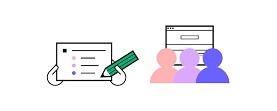
Product UX design testing is the process of checking how end-users interact with your product – in particular, whether they run into problems and can quickly recover from them or they are left on their own.
Running usability tests before releasing your product is always good idea. Most product teams perform tests at the design stage when there’s still room for ideation. They can afford to do a few iterations of the product because they are still figuring things out, checking what user flow or interaction design works and what doesn’t and optimize their user journey.
Many startups continue to overly focus on adding functionalities instead of solving an existing user need. This can lead to retention or engagement problems where people stop using the product shortly after downloading it.
Testing a wireframe or functional prototype before turning it into a new product helps you save design teams’ resources but it also refocus all stakeholders on what’s important – creating a great user experience for actual users. Once that is tackled, it’s way easier to meet business goals.
3. Stay Close to UsersWhether a product fulfills business needs or not is important to its growth. Yet, that growth is bound to stall if product development team forgets that they are creating the product for the user.
The best user experience design perfectly addresses users’ needs. As we covered before, it cannot be based on a hunch. Designers and product managers need to work together to keep in touch with their target group once their product is on the market. You need to get information directly from your users.
Some tools that may come in handy:
Persona development – even though being a UX artifact at the ideation phase, UX personas are a great insight into what users you need to observe carefully.Qualitative analysis – reach out to your users and ask them for an interview; this is great if you want to get to the “why” behind their actions and choices; a great tool for market research before developing a new functionality.Quantitive analysis – use heatmaps, NPS scores, Google Analytics and other UX data that will help you observe users behavior; we will cover it below.Talk to your users regularly and don’t fail to recognize and respond to their needs and problems.
4. Interactive Prototyping
Getting opinions on your design decision without actually showing your visual designs is close to impossible. If you want to have a constructive discussion and get feedback from all key stakeholders including your users, developers, product managers, etc. then you need an interactive prototype.
And there is no better way to create one than witth UXPin Merge. Forget about jumping between tools to bring your designs to life. Our platform allows you to build prototypes with React, Storybook or npm components that have interactivity built into them. Check more about it. Discover UXPin Merge.
5. Observe User Behavior Regularly
As designers, we might come with an assumption that users will know how to use a functionality or use it according to our vision. Still, it’s not until we actually put the designs or digital product out to the open that we can verify if we were right.
For this reason, it’s crucial to watch how your users interact with the product. The good news? It doesn’t have to be live in order for you to start collecting behavioral insights. You can run usability testing sessions with as few as 5 users to spot 75% of issues.
In your observations, make sure to do the following:
Observe what users are doing exactly, and compare their actions to your assumptionsRecord the interactions to identify every detail and draw conclusions When taking note of user behaviors, consider the wider context (for example, what time of day or device are they using to complete specific actions?)Aim to spot repetitive patterns – if you see that users behave the same way while going through the same step of the user journey, you might be on to a wider issue.6. Manage User Errors
Error management is one of the eight ergonomic criteria for digital interfaces. It circles around two aspects:
How well you describe an error to a user and help them solve it, andWhether you analyze the mistakes to refine the user experience.Why is it so important? Users come to your product with various objectives, levels of tech-savviness, and they use a variety of devices to access it. The same in-app mistake might be very simple to handle for one user, and completely confusing to another. Your error management process must account for this.
Make sure that you treat it holistically, i.e., extend your understanding of the word ‘error’ beyond technical glitches or feature bloat. Think of each occurrence as an opportunity to make the product more inclusive and, ultimately, user-friendly.
7. Run Design Feedback Sessions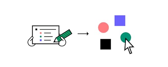
Nothing great is made alone. Collecting feedback from fellow designers is an important element of the product design process – one that companies for the likes of Spotify and Apple swear by.
There are several ways they can benefit you and the product team. Firstly, getting a pair (or several pairs) of fresh eyes on your work can help you refine your user interface design.
It opens you up to new perspectives and ideas, which might have been hidden in hindsight. Secondly, they reinforce design team culture, as you incorporate others’ opinions and concepts into your UI design.
There should be a clear itinerary for each feedback session – we recommend following a design critique procedure.
8. Consult Design Decisions with Devs
As designers are part of a wider product development team, it’s as important to communicate with engineers as with fellow designers.
Whenever you have an idea for a functionality but aren’t sure if it’s technically feasible, reach out to the dev team. They’re the ones who will be able to either green light your idea or tell you which parts you’ll need to re-work to make your designs possible to implement.
Better yet, use UX design tool that is built with design-developer collaboration in mind. For instance, UXPin lets you use the same code components used by devs to roll out new designs for your product.
Using it as a source of truth will make it easy to collaborate with developers and ensure your designs can be implemented into the live product. To learn more, read our Code to Design guide.
9. Don’t Fall Prey to Trends
Be reasonable about implementing changes according to the latest trends. While they indicate what is currently popular in UX (or the wider digital world), always ask yourself – does it fit my audience?
For example, if 70% of your users are 60 years old or more and aren’t tech-savvy, incorporating elements of VR might not be the best option. However, it might be perfect if your users belong to Gen Z and report spending hours on TikTok every day.
To sum up, observe the latest evolvements in UX product design trends, but always prioritize your users over exciting new features.
10. Avoid Too Many Changes at Once
Even if you have a backlog of several improvements, don’t be tempted to roll them out all at once. Limit yourself to a maximum of two changes and observe their influence. Do they solve the issues they were built out to fix? Do people know how they work and what purpose they serve?
If you implement too many changes simultaneously, you won’t be able to assess their impact. Also, remember that people like familiarity. If they log into your product and see too many alterations, they might become anxious. And this is quite the opposite of what you want to achieve.
Product UX Design is a Collaborative GameThe internet is full of advice on how you can get your UX product design right. Still, what works for one company won’t necessarily apply to a product like yours. To get it right, you need to base your design decisions on user data – their feedback, profile, and how they engage with your product.
The remaining part of the equation is working with your team collaboratively. Use a product design tool that not only offers great prototyping capabilities, but is also built to boost team collaboration. See how our technology can support cooperation with fellow designers and members of the software team alike. Discover UXPin Merge.
Discover MergeThe post 10 Product UX Design Tips for Building Top-Notch Solutions appeared first on Studio by UXPin.
July 24, 2023
22 Creative Design Thinking Exercises to Bring Your Team Closer Together
Design thinking exercises are crucial in fostering creative problem-solving, collaboration, and innovation. These exercises engage participants in a structured and iterative problem-solving approach, enabling them to explore, understand, and address complex challenges effectively.
Streamline design operations and enhance designer-developer collaboration with UXPin Merge. Visit our Merge page for more details and how to request access.
Reach a new level of prototypingDesign with interactive components coming from your team’s design system.
Discover UXPin Merge .discover-merge { margin: 40px 8px;}.discover-merge__container { display: flex; max-width: 690px; height: 200px; padding: 20px; padding-left: 24px; border-radius: 4px; background-color: black; box-shadow: 10px 10px #9999ff; align-items: center; justify-content: space-between;}.discover-merge__left { width: 50%;}.discover-merge__left p { margin: 10px 0px !important; color: white !important; font-size: 18px !important;}.discover-merge__heading { font-weight: bold !important; color: white !important; font-size: 18px !important;}.discover-merge__text { margin: 0 !important; line-height: 22px !important;}.discover-merge__button { width: 174px; height: 44px; margin: 10px 0px; border: none; border-radius: 2px; background: white; color: black; font-size: 16px; text-align: center;}.discover-merge__button:hover { cursor: pointer;}.discover-merge__image { max-width: 320px !important; height: 200px; margin-right: -19px;}@media (max-width: 760px) { .discover-merge__container { height: auto; margin: 10px; align-items: left; }}@media (max-width: 500px) { .discover-merge__container { flex-direction: column; } .discover-merge__left { width: 100%; align-items: normal; }}What is the Purpose of Design Thinking Exercises?The primary purpose of design thinking exercises is to cultivate empathy and a deep understanding of users’ needs and perspectives. By encouraging participants to step into users’ shoes through empathy mapping and user interviews, design thinking helps uncover valuable insights that inform the design process.
These design thinking workshops create a user-centered environment that encourages collaboration and creativity. These activities empower design teams to challenge assumptions, explore diverse perspectives, and approach problems from multiple angles.
Design Thinking Exercises for Empathy and User ResearchThese design thinking activities enable teams to gain empathy and a user-centric perspective during the research phase, informing the design process and ensuring solutions align with user needs.
Empathy mapping : Create visual representations of user perspectives by capturing their thoughts, feelings, actions, and aspirations. This exercise helps teams develop a deeper understanding of users’ experiences.Persona development: Create fictional user personas representing different user segments based on research and insights. Personas humanize user data, making it easier for teams to empathize and design for specific user groups. Customer journey mapping : Visualize users’ end-to-end experience as they interact with a product or service. This exercise helps identify pain points, opportunities, and moments of delight throughout the user journey.Ideation and Brainstorming Exercises
Ideation and brainstorming exercises are essential to the design thinking process, aiming to generate a range of ideas and possible solutions. Designers use these exercises to foster creativity, drive collaboration, and explore new possibilities.
SCAMPERSCAMPER is an acronym that stands for Substitute, Combine, Adapt, Modify, Put to another use, Eliminate, and Reverse. This technique prompts designers to creatively explore different dimensions of a concept or problem, encouraging alternative perspectives and generating fresh ideas.
Brainstorming sessionsBrainstorming is a group activity that encourages free thinking and the rapid generation of ideas. Participants share their thoughts, build on each other’s suggestions, and explore various possibilities without judgment or criticism.
Crazy 8sCrazy 8s is a fast-paced exercise that challenges participants to sketch eight ideas in eight minutes. This time-constrained activity encourages rapid ideation and pushes participants to think outside the box, resulting in diverse concepts.
Mind mapping and concept mappingMind mapping and concept mapping are visual techniques that help organize thoughts and ideas. By creating diagrams or visual frameworks, designers can explore connections, relationships, and associations between different concepts, stimulating further ideation.
Design studio workshopsDesign studio workshops unite cross-functional team members to generate ideas and potential solutions collaboratively. Participants share their perspectives, expertise, and insights through structured exercises and facilitated discussions, resulting in more comprehensive and well-rounded concepts.
Worst possible ideaThis exercise challenges participants to devise the worst possible ideas or solutions deliberately. By exploring extreme and unconventional concepts, designers can break free from conventional thinking and uncover unexpected insights or alternative paths.
5 Ws and HThe 5 Ws and H (Who, What, When, Where, Why, and How) is a questioning technique that prompts participants to analyze and explore different aspects of a design challenge. By systematically considering these elements, designers can uncover new perspectives, identify potential gaps, and generate innovative solutions.
Prototyping and Testing Exercises
These prototyping and testing exercises offer valuable opportunities for designers to gather feedback, iterate on ideas, and validate design concepts.
Paper prototypingPaper prototyping is a low-fidelity technique where designers create rough sketches or wireframe mockups on paper. This exercise lets designers quickly iterate and gather feedback on a design concept’s overall layout, content, and flow.
Designers can use paper prototypes to simulate user interactions and test usability, compiling valuable insights before investing time and resources into digital prototypes.
Role-playing and simulationRole-playing and simulation exercises involve participants acting out specific scenarios or user personas to understand user needs and behaviors better. By immersing themselves in the end user’s perspective, designers can empathize with their experiences, identify pain points, and uncover opportunities for improvement.
Wizard of Oz testingWizard of Oz testing is a technique where designers simulate the functionality of an interactive system while manually controlling it behind the scenes. This methodology allows designers to test user interactions and gather feedback without investing time and resources in developing a fully functional prototype.
By creating the illusion of an automated system, designers can observe user behavior, validate assumptions, and refine the design based on real-time feedback.
Collaborative Exercises for Teamwork and Co-creation Collaborative prototyping
Collaborative prototyping involves creating prototypes to test and validate design concepts within a day. Team members work in parallel on a single digital whiteboard and then collaborate using a design tool to build a prototype. By the end of the day, the team has a basic prototype to start the iterative process of prototyping and testing.
Co-design sessionsCo-design sessions bring together multidisciplinary team members and stakeholders to actively participate in the design process. These collaborative exercises foster teamwork and co-creation by leveraging the diverse perspectives and expertise of the participants.
By involving various stakeholders in the design process, co-design sessions facilitate shared understanding, generate innovative ideas, and ensure that the final design reflects the collective input and insights of the team.
Collaborative sketchingCollaborative sketching involves team members collectively sketching ideas and concepts on a shared surface or whiteboard. This exercise encourages open collaboration and rapid idea generation.
By visually expressing their thoughts, team members can communicate ideas more effectively, stimulate creativity, and spark discussions. Collaborative sketching promotes a sense of ownership while fostering teamwork.
Storyboarding and visual storytellingStoryboarding and visual storytelling exercises help teams convey design ideas and concepts in a narrative format. This technique involves creating illustrations or images that depict user interactions, scenarios, or journeys.
Storyboarding allows teams to visualize the user experience and identify gaps or opportunities in the design. Teams can communicate complex ideas, align design directions, and create engaging user experiences.
Design charrettesDesign charrettes are intensive collaborative workshops where team members solve design challenges within a set timeframe. These super-efficient sessions encourage active participation, foster creativity, and promote collective problem-solving.
Design charrettes often involve brainstorming, rapid prototyping, and iterative design exercises. By engaging in focused and time-constrained collaborative activities, teams can generate ideas, explore design alternatives, and make significant progress in a short period.
Design Thinking Exercises for Reflection and Learning Rose, Thorn, Bud
The Rose, Thorn, Bud exercise is a reflection activity that encourages participants to share positive aspects (roses), areas for improvement (thorns), and potential opportunities (buds) in a given project or experience.
Rose, Bud, Thorn helps teams identify strengths, address challenges, and explore new possibilities with a structured framework for reflection. The exercise enables team members to learn from past experiences and apply those insights to future iterations or projects.
Post-it votingPost-it voting is a simple and effective technique to gather insights and prioritize ideas within a group. Participants write their ideas or suggestions on individual sticky notes and then vote on the most valuable or relevant ones.
This exercise promotes active participation and empowers team members to have a voice in decision-making. Post-it voting helps teams identify popular ideas, build consensus, and focus efforts on the most impactful concepts.
Four LsThe Four Ls exercise (Liked, Learned, Lacked, and Longed for) provides a structured framework for reflection and feedback gathering. Participants share what they liked, learned, lacked, and longed for in a project or experience.
The Four Ls encourages constructive feedback, helps identify areas of improvement, and uncovers growth opportunities. The exercise promotes open dialogue and creates a safe space for team members to reflect on their collective experiences and identify ways to enhance future outcomes.
Retrospective exercisesRetrospective exercises are reflective activities conducted at the end of a project or iteration to evaluate the team’s performance and identify areas for improvement.
These exercises include team discussions, storytelling, timeline mapping, or even gamified approaches like “sailboat retrospective” or “stop, start, continue.”
Retrospectives foster a culture of continuous improvement by providing a dedicated space for teams to reflect on their successes, challenges, and lessons learned. These exercises enable teams to optimize processes, enhance collaboration, and evolve their practices.
Scale DesignOps With UXPin MergeOne of DesignOps’ biggest challenges is Merging design and development. These teams use different tools, speak different languages, and work with different constraints.
UXPin Merge aims to bridge that gap by bringing code components into the design process to create a Code-to-Design workflow. Designers and developers work with one component library from a single repository, creating a single source of truth across the organization.
This single source of truth eliminates many design system challenges, requiring fewer resources for product teams to scale and deliver products faster and with minimal errors or rework.
Scale your DesignOps–not your design team–with the world’s most advanced end-to-end design tool. Visit our Merge page to request access.
Discover MergeThe post 22 Creative Design Thinking Exercises to Bring Your Team Closer Together appeared first on Studio by UXPin.
July 20, 2023
The Atlassian Design System – Creating Design Harmony at Scale
 What is Atlassian Design System?
Atlassian Design System, ATL for short, is a design system which mission is to create simple, intuitive, and beautiful experiences for their end-users. Atlassian’s products include Jira, Trello, and Confluence, so their design system needs to work across those products plus serve for people who built internal prodcust and more.
How Atlassian Design System Was BuiltWhen Atlassian expanded their focus on design in 2012, Jürgen Spangl was hired as the new Head of Design. One of the first projects he initiated was creating the Atlassian Design Guidelines (ADG) – their new internal design system.
At the time, they faced several challenges common to scaling a design practice:
Design inconsistency – For example, 45 different types of dropdowns.Insufficient tooling – The team needed more powerful design tools to scale their work across multiple products. Redundant questions – Atlassian designers wanted to spend more time on core problems and less time answering the same questions (e.g. which button to use).Nathan Curtis once said that “a design system is a product serving other products”. Atlassian’s design system is certainly one of their most ambitious products, created from a need to solve complex problems.
To explore Atlassian’s journey from inconsistency to harmony, we spoke with Jürgen Spangl (Head of Design) and James Bryant (Lead Designer) about the creation, governance, and evolution of their design system.

Jürgen Spangl, Head of Design at Atlassian.

James Bryant, Lead Designer at Atlassian.
Creating and Adopting the First VersionInspired by Apple’s Human Interface Guidelines , Atlassian decided their design system needed to be based in code while maintaining ease of use.
People from multiple teams contributed to the process – a dedicated team wasn’t formed at first so that the design system wouldn’t be created in isolation. The decision paid off since it resulted in design systems champions embedded across the company.
“Instead of creating consistency for the sake of it, we wanted our design system to create a more harmonious user experience,” says Jürgen. “We wanted to equip everyone to make better design decisions – not just designers.”
The process, of course, was not without challenges.
“Early on, we weren’t sure how to document the design system at scale. We tried using Confluence, using embedded iFrames in Confluence, a Bitbucket repository,” says Jürgen. “It wasn’t until a ShipIt hackathon session that one of our designers turned our existing UI toolkit (known as AUI) into a Living Style Guide coupled to the code.”
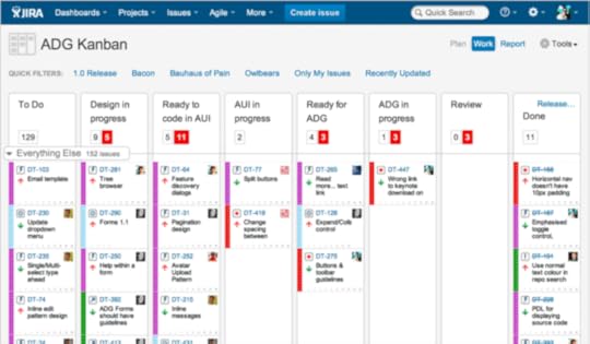
Planning for the first version of ADG in JIRA.
With a technical framework in place, the design systems team also needed to create a unified design language for the overall brand and each product.
“It’s never easy to align multiple teams on a path forward on the design language,” says Jürgen. “Do you create one direction or several smaller directions for each product?”
To define its design language and create all the patterns and components, the team followed a two-stage process:
Every month, the team would meet to work on ADG. The fast decisionmaking and momentum helped the team create many new patterns with 70-80% completeness. During the following week, the team would then spend small chunks of time refining the patterns and codifying them into ADG.The first iteration of ADG was released in June 2012 to govern its products. To allow for careful iteration, the team used a staged rollout and launched ADG first to Bitbucket, then Confluence and JIRA.
Atlassian Design Guidelines 3.0.
Supporting and Governing the Design SystemNow 5 years later, Atlassian Design has grown to almost 200 people while the design system governs the brand and its 12 products across multiple devices, platforms, and marketing properties.
The company has since built a dedicated ADG team of 18 full-time employees: 5 designers, a writer, a project manager, and 11 developers. To maintain a high level of technical proficiency, an engineering team was embedded into the overall design organization.

Design space in Atlassian Sydney.
“A coding background is a huge benefit for designers who want to join our team,” James says. “They also need a strong understanding of prototyping tools and be able to work with developers to ship their work quickly. Finally, they must understand how their work multiplies across different contexts, products, and teams.”
When it comes to contributing to the design system, the workflow is a two-way open source model:
1. The ADG team is regularly exploring changes and consolidations to the design system. Once they’ve done the initial research, the team converges to discuss specs and requirements. Program managers then work with other product teams to align on the design system changes, roll out the changes, and monitor feedback.
2. Product teams can also suggest changes to the design system. The process is made much easier since each product has its own ADG representative to collaborate with a member of the design systems team.
Change requests are managed in JIRA and Confluence. Updates are pushed live to AtlasKit (based in React), which acts as the source of truth for design patterns and code components. The ADG team also maintains a library of UI assets in Sketch for all designers. Meanwhile, the ADG website describes the logic and guidelines around how to use all the patterns and components
Evolving the Design System“Every 5-7 years, you probably need to revamp your design language completely because of new trends and technologies,” says Jürgen. “The world is constantly changing.”
The team works in 2-week sprints to ship iterations within days or weeks to customers. Larger changes (like revamping a color scheme or set of UI patterns) require more time. 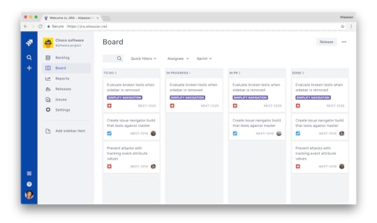
JIRA using ADG 3.0, the latest version of the design system.
Luckily, as James points out, embedding designers in product teams (and vice versa with developers in design teams) helps build consensus more quickly for changes to the design system.
“It’s very hard to scale when you need to talk to all designers for every single change,” James says. “We bring all the champions into large design critiques to understand whether our ideas and proposed changes affect their current projects or down the line. They may learn something from our way of thinking that they can then apply back to their own work.”
To measure the success of design systems updates, the team triangulates data from several sources:
Opt-in and opt-out in products for changes to the design systemChanges in NPS scores for products after design system updatesQualitative and quantitative feedback from testing iterations with UserTesting and in-person sessionsNow in its third version with strong adoption and instrumentation in place, one of the next goals of ADG is to make back-end services more consistent.
“A really good example of that is how we’re improving ‘@mentions’ for users in our products,” says James. “Design guidelines and front-end components make the experience feel more coherent, but you can also make back-end processes more consistent in a way that improves performance. Now we’re exploring how we can improve that level of platform services.”
Attlasian’s Design System SummaryWhen you consider the nature of Atlassian’s products, the stakes are almost too high to not have a design system in place.
“We’re changing the tools people use to get their work done,” says James. “I don’t think there’s anything more frustrating or frightening than having changes slow you down since that threatens your efficiency and livelihood.”
A design system is more than just a style guide or pattern library — it’s the blueprint for product development. By rooting the design patterns and code components to a common language, ADG gives room to innovate without forcing users out of their comfort zone.
“Some tension between the product and ADG team is perfectly healthy,” says Jürgen. “Product teams don’t just give in to ADG without good reason, and the ADG team doesn’t accommodate every change requested. That balance really helps drive us forward in the enterprise space.”
Interested in being a designer at Atlassian? To see available positions, check out Atlassian Design Careers.
The post The Atlassian Design System – Creating Design Harmony at Scale appeared first on Studio by UXPin.
July 19, 2023
User Error — All About Preventing, Detecting, and Managing Errors
User errors can cause frustration, confusion, and decreased user satisfaction, leading to many undesirable outcomes, including product abandonment. Identifying, understanding, and addressing user errors is crucial for designing user-centered experiences and optimizing product performance.
Solve more usability issues and identify more business opportunities during the design process with fully interactive prototypes from UXPin. Sign up for a free trial.
Build advanced prototypesDesign better products with States, Variables, Auto Layout and more.
Try UXPin .try-uxpin-banner { margin: 40px 0px;}.try-uxpin__container { display: flex; max-width: 689px; height: 210px; padding: 20px; padding-left: 24px; border: 2px solid black; border-radius: 4px; align-items: center; justify-content: space-between; background-color: white; box-shadow: 10px 10px black;}.try-uxpin__left { width: 54%;}.try-uxpin__left p { margin: 10px 0px !important; color: black !important;}.try-uxpin__heading { font-size: 28px !important; font-weight: bold;}.try-uxpin__text { margin: 0 !important; font-size: 18px !important; line-height: 22px !important;}.try-uxpin__button { width: 135px; height: 44px; background: black; margin: 10px 0px; padding: 10px 20px; border: none; border-radius: 2px; color: white; font-size: 16px; text-align: center;}.try-uxpin__button:hover { cursor: pointer;}.try-uxpin__image { max-width: 320px !important; height: 200px; margin-right: -21px; margin-bottom: -6px;}@media (max-width: 760px) { .try-uxpin__container { height: auto; margin: 10px; align-items: left; }}@media (max-width: 500px) { .try-uxpin__container { flex-direction: column; } .try-uxpin__left { width: 100%; align-items: normal; }}What are User Errors?User errors are actions or decisions that lead to unintended or undesired outcomes when interacting with a product, system, or interface. Product teams typically classify these into three types of errors:
Slips occur when users make unintentional errors due to inattention, distraction, or muscle memory. Mistakes involve cognitive errors in decision-making or problem-solving processes.Violations occur when users intentionally deviate from the expected behavior or rules.What is an Example of a User Error?Here are four examples of human errors:
Data entry error: When filling out a form, a user accidentally types the wrong email address, resulting in failed communication or an inability to access important information sent to that email.Navigation error: While browsing an eCommerce website, a user clicks on the wrong product image due to unclear labeling or misleading visuals, leading to frustration and potential loss of sales for the business.Misinterpretation error: In a mobile app, a user misinterprets the meaning of an icon and taps on it, expecting one action, but it performs something else. This misunderstanding can lead to unintended consequences and a negative user experience.Configuration error: When setting up a software application, a user incorrectly configures the privacy settings, unintentionally sharing personal information publicly or granting excessive permissions, compromising their privacy and potentially exposing sensitive data.These examples demonstrate how user error consequences can be banal, like clicking the wrong button, to extremely problematic when accidentally sharing sensitive information.
6 Factors Contributing to User ErrorsHere are some common factors which contribute to user errors:
A high cognitive load , such as information overload or complex decision-making requirements, can increase the likelihood of user errors.Design complexity, convoluted workflows, or confusing navigation can contribute to user errors by overwhelming or confusing users.Lack of feedback, including error messages, notifications, or visual cues, can prevent users from recognizing and rectifying mistakes promptly.When users are under time constraints or facing tight deadlines, they may rush through tasks, leading to more frequent errors.External distractions or interruptions can divert users’ attention, impairing their ability to focus on tasks and increasing the likelihood of mistakes.Insufficient user onboarding, familiarity with the system or interface, or inadequate onboarding can contribute to user errors.Detecting User ErrorsError logging and analyticsProduct teams use error-monitoring tools to gather data on user errors and analyze user behavior and error patterns. These tools capture error data, including error messages, error codes, and contextual information, such as the user’s actions leading up to the error. This data allows UX design teams to identify root causes for mistakes and implement corrective redesigns.
User feedback and support channelsOrganizations typically create dedicated feedback channels, such as online forms, feedback buttons (i.e., thumbs up or down), or support email addresses, where users can easily report errors and provide valuable feedback about their experiences.
11 Ways of Preventing User ErrorsClear and intuitive interface designDon Norman’s concepts of affordances, signifiers, and mapping from The Design of Everyday Things help designers create intuitive interfaces that guide users toward correct interactions and minimize the risk of errors.
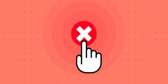
For example, using recognizable icons and labels for actions, such as a trash can icon for deleting, helps users quickly identify and execute the intended action without making errors.
Effective onboardingEffective onboarding provides clear instructions and interactive tutorials, so users can familiarize themselves with the product and understand how to use it properly.
For example, a mobile banking app onboarding process might explain how to set up an account and transact or highlight key security features to prevent user errors.
Thoughtful information architectureInformation architecture organizes content logically and hierarchically, enabling users to navigate a digital product easily. For example, an eCommerce website might categorize products into clear and distinct categories, so someone looking for kid’s clothing doesn’t end up in the men’s section accidentally.
Error prevention mechanismsSafety nets such as validation checks, error messages, troubleshooting, and confirmations alert users to double-check and correct mistakes before they cause issues.
For example, when a user tries to submit a form with missing required fields, an error message highlights them for the user to complete.
Consistent and familiar pattern and interaction designConsistent design patterns and interactions help users build familiarity, reduce cognitive load, and minimize user errors. Designers follow established conventions so users can rely on knowledge, mental models, and habits to interact with the product.
For example, consistent navigation menu placement across different website sections ensures users can navigate effortlessly, reducing the likelihood of errors.
User-friendly form designOptimizing form fields, providing clear labels and instructions, and implementing input validation enable users to enter information accurately. For example, using input masks or providing real-time feedback on the validity of the entered data (such as password strength indicators) can prevent errors and guide users to provide accurate information.
Clear instructions and tooltipsClear instructions and tooltips provide users with contextual guidance using tooltips and dialogs, helping them understand how to complete tasks or use features.
For example, Google Docs uses tooltips to clarify each icon in the toolbar and provides keyboard shortcuts to educate users on how to use the product more efficiently.
 Progressive disclosure
Progressive disclosure is a technique to present information gradually based on user context, preventing overwhelming users with too much information at once. By revealing information progressively, users can focus on what is relevant and avoid errors caused by information overload.
For example, a complex software application might hide advanced settings by default, only revealing them when users request to see or modify them, reducing errors due to overwhelming complexity.
User testing and feedbackUser testing and feedback allow designers to solve usability issues during the design process. Design teams collect user feedback to identify potential pain points, uncover usability issues, and make improvements to prevent errors.
For example, conducting usability testing sessions and observing how users engage with an interactive prototype can reveal areas where users struggle or make errors, allowing the design team to refine the interface and minimize those issues.
Smart defaultsSmart defaults can prevent user errors by preselecting sensible options or settings. Designers use smart defaults to anticipate preferences and behavior to provide a more seamless user experience while reducing errors. It’s crucial that product teams don’t abuse smart defaults for profits, as this could lead to mistrust and possible abandonment.
For example, a calendar app might set the default time zone to the user’s location, eliminating the need for user input and possible errors caused by incorrect time zone settings.
Limit user optionsLimiting options can help prevent user errors by simplifying decision-making and reducing cognitive load. When users have manageable options, it’s easier to choose without being overwhelmed.
For example, a booking platform might limit payment options to the most popular ones and use progressive disclosure to reveal additional options if the user chooses.
Reduce Errors With UXPin’s Interactive PrototypesDue to prototyping constraints from image-based design tools, designers often struggle to identify usability issues or design decisions that cause user errors. Design teams either have to rely on devs to build better prototypes or release products and add any problems captured during QA to the backlog–both options increase costs and front-end debt.
With UXPin’s interactive prototyping features, designers can build replicas indistinguishable from the final product, complete with code-like interactions and functionality.
Usability participants and stakeholders can interact with UXPin prototypes like they would the final product, giving design teams meaningful feedback to iterate and improve.
Build fully functioning componentsDesigners can build fully functioning user interfaces and components in UXPin to enhance testing. For example, this signup form example demonstrates how designers can create field error messages to help users complete forms correctly–accurately replicating the final product experience.
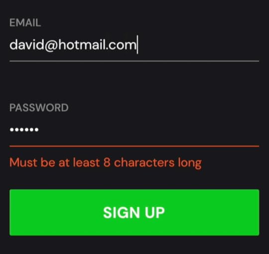
This prototype uses a single frame, with Conditional Interactions hiding and revealing error messages. This simplicity means designers can make changes on the fly and retest to maximize costly testing time.
To achieve comparable results in an image-based design tool, design teams would need to create multiple frames which don’t have the same smoothness or intuitiveness. Making quick changes and iterating fast with a frame-based design canvas is also tricky.
Ready to experience how code-based product design can enhance your prototyping scope to solve more usability issues during the design process? Sign up for a free trial.
Discover MergeThe post User Error — All About Preventing, Detecting, and Managing Errors appeared first on Studio by UXPin.
July 18, 2023
Assumptions Mapping – How to Remove Guesswork Out of Design
Assumptions mapping is important because it creates awareness of team members’ assumptions and potential associated risks. By making assumptions explicit and visible, teams can critically evaluate their validity and test them through research and validation methods. This approach fosters a more user-centered, data-driven design process, improving outcomes and user experiences.
Test your user assumptions and get meaningful results with interactive prototypes from UXPin, an end-to-end design tool for creating advanced prototypes and handing them off to development. Sign up for a free trial.
Build advanced prototypesDesign better products with States, Variables, Auto Layout and more.
Try UXPin .try-uxpin-banner { margin: 40px 0px;}.try-uxpin__container { display: flex; max-width: 689px; height: 210px; padding: 20px; padding-left: 24px; border: 2px solid black; border-radius: 4px; align-items: center; justify-content: space-between; background-color: white; box-shadow: 10px 10px black;}.try-uxpin__left { width: 54%;}.try-uxpin__left p { margin: 10px 0px !important; color: black !important;}.try-uxpin__heading { font-size: 28px !important; font-weight: bold;}.try-uxpin__text { margin: 0 !important; font-size: 18px !important; line-height: 22px !important;}.try-uxpin__button { width: 135px; height: 44px; background: black; margin: 10px 0px; padding: 10px 20px; border: none; border-radius: 2px; color: white; font-size: 16px; text-align: center;}.try-uxpin__button:hover { cursor: pointer;}.try-uxpin__image { max-width: 320px !important; height: 200px; margin-right: -21px; margin-bottom: -6px;}@media (max-width: 760px) { .try-uxpin__container { height: auto; margin: 10px; align-items: left; }}@media (max-width: 500px) { .try-uxpin__container { flex-direction: column; } .try-uxpin__left { width: 100%; align-items: normal; }}What is Assumptions Mapping?Assumptions mapping is a technique used in product design to identify, analyze, and validate the assumptions made during the design process.
It involves systematically uncovering the underlying beliefs and hypotheses that influence design decisions and mapping them for better visibility. This technique removes guesswork from the design process and replaces it with evidence-based insights to develop better product experiences.
Common types of assumptionsUser Behavior Assumptions: Assumptions about how users interact with the product, their preferences, motivations, and needs.Technology Assumptions: Assumptions about the capabilities and limitations of the underlying technology, such as platform compatibility or data processing speed.Business Assumptions: Assumptions about the market, target audience, competitors, and business goals, including assumptions about user demand and willingness to pay.Design Assumptions: Assumptions about the effectiveness of specific design choices, such as the placement of elements, color schemes, or visual hierarchy.Context Assumptions: Assumptions about the broader context in which the product will be used, including the user’s environment, cultural factors, or regulatory constraints.The Consequences of Unaddressed AssumptionsHow unaddressed assumptions can lead to design failuresUnaddressed assumptions can lead to design failures by introducing risks and uncertainties into the design process. Designers may base their product decisions on inaccurate or incomplete information when assumptions go unchallenged and unvalidated, leading to ineffective or irrelevant solutions.
Unaddressed assumptions can result in misaligned designs that fail to meet user needs, resulting in poor user experiences and low user satisfaction. By ignoring assumptions, designers risk investing time and resources in designs that don’t address the real problems or resonate with the target audience, ultimately leading to design failures.
Negative impact on user experience and product adoptionUnaddressed assumptions can harm user experience and product adoption. When assumptions about user behavior, preferences, or needs are left unverified, designers risk creating experiences that don’t meet user expectations. This misalignment can lead to frustration, confusion, and a lack of engagement with the product.
Unaddressed assumptions can also hinder product adoption, as users may find it difficult to understand or navigate the product due to unvalidated assumptions.
The Benefits of Assumptions Mapping Improved design decision-making: Assumptions mapping enables informed and data-driven design decisions by challenging and validating underlying assumptions.Enhanced user understanding and empathy: By challenging user assumptions, designers gain a deeper understanding of their needs, preferences, and behaviors, leading to more empathetic design solutions.Mitigating risks and reducing design iterations: Assumptions mapping helps identify potential risks and uncertainties early, minimizing the need for extensive design iterations and reducing the likelihood of design failures.Fostering collaboration and shared understanding within teams: Assumptions mapping promotes collaboration, shared understanding, and effective communication among team members and stakeholders, leading to a more harmonious and cohesive design process.Challenges in Assumptions MappingIdentifying implicit assumptions: Teams may struggle to uncover deeply ingrained or implicit assumptions. Overcoming this challenge requires fostering a culture of open communication and critical thinking, encouraging team members to question and challenge underlying assumptions.Prioritizing assumptions: With limited time and resources, teams must prioritize which assumptions to focus on. To overcome this challenge, teams can use criteria such as impact on user experience, risk level, or alignment with project goals to determine which assumptions are most critical and require further validation.Validating assumptions: Validating assumptions can be challenging, especially concerning user research or testing. Teams can overcome this challenge by conducting thorough user research, using various validation methods such as interviews, surveys, or usability testing from diverse users.Addressing resistance to change: Some team members may resist challenging existing assumptions or adopting a new approach. To overcome this challenge, teams should foster a collaborative and inclusive environment, encouraging open discussions, providing
evidence-based arguments
, and showcasing the benefits of assumptions mapping in improving design outcomes.Iterative process: Assumptions mapping is an ongoing process that may require multiple iterations. Teams should embrace an iterative mindset, continuously reviewing and updating assumptions as new insights emerge and adapting the design accordingly. Regular team communication and feedback loops can help address challenges and ensure continuous improvement.How to Get Started With Assumptions Mapping
Improved design decision-making: Assumptions mapping enables informed and data-driven design decisions by challenging and validating underlying assumptions.Enhanced user understanding and empathy: By challenging user assumptions, designers gain a deeper understanding of their needs, preferences, and behaviors, leading to more empathetic design solutions.Mitigating risks and reducing design iterations: Assumptions mapping helps identify potential risks and uncertainties early, minimizing the need for extensive design iterations and reducing the likelihood of design failures.Fostering collaboration and shared understanding within teams: Assumptions mapping promotes collaboration, shared understanding, and effective communication among team members and stakeholders, leading to a more harmonious and cohesive design process.Challenges in Assumptions MappingIdentifying implicit assumptions: Teams may struggle to uncover deeply ingrained or implicit assumptions. Overcoming this challenge requires fostering a culture of open communication and critical thinking, encouraging team members to question and challenge underlying assumptions.Prioritizing assumptions: With limited time and resources, teams must prioritize which assumptions to focus on. To overcome this challenge, teams can use criteria such as impact on user experience, risk level, or alignment with project goals to determine which assumptions are most critical and require further validation.Validating assumptions: Validating assumptions can be challenging, especially concerning user research or testing. Teams can overcome this challenge by conducting thorough user research, using various validation methods such as interviews, surveys, or usability testing from diverse users.Addressing resistance to change: Some team members may resist challenging existing assumptions or adopting a new approach. To overcome this challenge, teams should foster a collaborative and inclusive environment, encouraging open discussions, providing
evidence-based arguments
, and showcasing the benefits of assumptions mapping in improving design outcomes.Iterative process: Assumptions mapping is an ongoing process that may require multiple iterations. Teams should embrace an iterative mindset, continuously reviewing and updating assumptions as new insights emerge and adapting the design accordingly. Regular team communication and feedback loops can help address challenges and ensure continuous improvement.How to Get Started With Assumptions Mapping
Here is a foundational framework for creating an assumptions map.
Step 1: Identify and articulate assumptionsBegin by identifying the assumptions that underlie your design or product. These are your team’s beliefs or expectations about users, their behaviors, and the problem you’re solving.
It’s a good idea to hold design thinking workshops or brainstorming sessions with diverse team members to gather assumptions from across the organization. Articulate these assumptions clearly to gain a shared understanding among team members.
Step 2: Prioritize assumptions for mappingOnce you have a list of assumptions, prioritize them based on their potential impact on the design and the level of uncertainty surrounding them. Focus on the assumptions that have the highest risk or those that are critical to the success of your design to allocate resources and attention effectively.
Step 3: Create an assumptions mapVisualize the assumptions using an assumptions map using a diagram, matrix, or other visual representation. This map helps you see your assumption relationships and how they interact.
The assumptions map provides a holistic view of the landscape, aiding analysis and decision-making.
For example, an assumptions map for the mobile banking app might show the interdependencies between assumptions about user security concerns, user familiarity with mobile banking, and user preferences for transaction speed.
Step 4: Validate assumptions through research and testingConduct research and testing to validate the assumptions identified in the previous steps. This process involves gathering data, user feedback, and insights to determine the accuracy and validity of the assumptions.
Designers use research methods, including user interviews, surveys, usability testing, or analytics, to gather evidence and challenge assumptions.
Tools and Techniques for Assumptions Mapping Affinity mapping
Affinity mapping organizes and analyzes a large amount of information or assumptions. It involves grouping related assumptions into categories or themes to uncover patterns and insights.
For example, after conducting assumption mapping sessions, the team can use sticky notes or digital whiteboards to group similar assumptions, such as user preferences, technology limitations, or market trends. This visual representation facilitates discussions and prioritization of assumptions for further validation.
Desirability, feasibility, and viability frameworkMural outlines a framework for mapping assumptions using the desirability, feasibility, and viability design thinking methodology developed by former Precoil CEO David J Bland:
Desirability assumptions: Do They? – is this what users want?Viability assumptions: Should We? – assess whether you should do this. i.e., why hasn’t it been done before?Feasibility assumptions: Can We? – does the organization have the resources?This framework is also excellent for testing business ideas or developing unique value propositions. Teams map these assumptions to visualize them and identify trends, patterns, and areas of focus.
Mural’s assumptions mapping webinar provides a high-level overview of this desirability, feasibility, and viability framework and why it’s important for developing new products.
User research and feedbackUser research and feedback are essential tools for validating assumptions. Teams gather insights and data to challenge or support their assumptions by directly engaging with users through interviews, surveys, or usability testing. UX research methods like card sorting, diary studies, and service safaris can provide valuable insights into user behavior.
Data analysis and metricsData analysis and metrics play a crucial role in assumptions mapping. By analyzing quantitative data, such as website analytics or user engagement metrics, teams can identify patterns and trends that challenge or confirm their assumptions.
For example, tracking user behavior through heatmaps or clickstream data can reveal insights about how users interact with a product or website, shedding light on user flow or navigation assumptions. By using data to inform assumptions, teams can make more data-driven decisions and reduce reliance on guesswork.
Prototyping and usability testingPrototyping and usability testing allow teams to gather feedback and validate assumptions through real user interactions. Teams use interactive prototypes to observe how users interact with the design and gather insights about potential assumptions.
For example, usability testing can help identify assumptions about a user interface’s intuitiveness or the content’s clarity. By observing and gathering user feedback, teams can uncover hidden assumptions and iterate on the design to improve user experience.
Integrating Assumptions Mapping into Design Processes Incorporating assumptions mapping in agile and iterative workflows
Teams can seamlessly integrate assumptions mapping into agile and iterative design processes, enabling teams to address them at different stages of development.
For example, during the sprint planning phase in an agile workflow, the team can identify and prioritize assumptions that need validation and allocate time for research or testing activities. This iterative approach allows continuous learning and refinement throughout the design and development cycle.
Collaborative approaches to assumptions mapping within cross-functional teamsAssumptions mapping is most effective when done collaboratively within cross-functional teams. You can tap into diverse perspectives and expertise by involving stakeholders from different disciplines, such as designers, researchers, product managers, and developers.
For example, conducting assumption mapping workshops where team members collectively identify and discuss assumptions fosters shared understanding and generates valuable insights. This collaborative approach ensures that assumptions are thoroughly examined and helps build a culture of shared ownership and accountability for the design’s success.
Testing Assumptions With UXPin’s Interactive PrototypesInteractive prototypes are crucial for testing assumptions, allowing product teams to simulate user interactions and gather valuable feedback early in the design process. Teams can observe how users navigate user interfaces, interact with features, and uncover usability issues or gaps in their assumptions. With UXPin, design teams can create fully interactive prototypes that look and feel like the final product.
Some of UXPin’s key prototyping features include:
States: allow designers to create multiple states for a single UI element and design complex interactive components like dropdown menus, tab menus, navigational drawers, and more.Variables: capture data from user inputs and create personalized, dynamic user experiences–like their name and profile image in the app bar.Expressions: Javascript-like functions to create complex components and advanced functionality–no code required!Conditional Interactions: create if-then and if-else conditions based on user interactions to create dynamic prototypes with multiple outcomes to replicate the final product experience accurately.Increase prototype fidelity and functionality with the world’s most advanced UX design tool. Sign up for a free trial to build your first interactive prototype with UXPin.
Try UXPin for freeThe post Assumptions Mapping – How to Remove Guesswork Out of Design appeared first on Studio by UXPin.
July 17, 2023
Components in Figma vs UXPin (+ Other Design Tools)
Design tools like Figma use components as basic elements that can be copied and pasted across design. Components speed up design, promote consistency, and simplify designer’s work. Let’s see how Figma’s components are different from components in UXPin and Merge technology.
Optimize design-to-development handoff, create prototypes that are full of interactive UI components, such as input fields, clickable menus, and sortable data tables. Simplify design with UXPin Merge. Discover UXPin Merge.
Reach a new level of prototypingDesign with interactive components coming from your team’s design system.
Discover UXPin Merge .discover-merge { margin: 40px 8px;}.discover-merge__container { display: flex; max-width: 690px; height: 200px; padding: 20px; padding-left: 24px; border-radius: 4px; background-color: black; box-shadow: 10px 10px #9999ff; align-items: center; justify-content: space-between;}.discover-merge__left { width: 50%;}.discover-merge__left p { margin: 10px 0px !important; color: white !important; font-size: 18px !important;}.discover-merge__heading { font-weight: bold !important; color: white !important; font-size: 18px !important;}.discover-merge__text { margin: 0 !important; line-height: 22px !important;}.discover-merge__button { width: 174px; height: 44px; margin: 10px 0px; border: none; border-radius: 2px; background: white; color: black; font-size: 16px; text-align: center;}.discover-merge__button:hover { cursor: pointer;}.discover-merge__image { max-width: 320px !important; height: 200px; margin-right: -19px;}@media (max-width: 760px) { .discover-merge__container { height: auto; margin: 10px; align-items: left; }}@media (max-width: 500px) { .discover-merge__container { flex-direction: column; } .discover-merge__left { width: 100%; align-items: normal; }}What are Components in Figma?Figma’s documentation states, “Components are elements you can reuse across your designs. They help to create and manage consistent designs across projects.” Designers create Figma components using shapes, icons, images, text, and even other components. These components are vector-based, visual representations of the coded UI components engineers use to develop the final product.
Understanding vector-based design elementsWhile Figma’s vector-based are aesthetically accurate, their static nature means they’re graphical representations rather than functional UI elements or design patterns.
Most image-based or vector-based design tools have this limitation. Designers can make things look beautiful, but they can’t accurately replicate the experience. The platform renders vector graphics that cannot handle live data.
Improved workflow, not outputFigma’s Config 2023 releases make it easier for designers to build semi-interactive prototypes and components, but little has changed on the user testing end. Figma’s components still render the same; the company has just simplified the workflow.
Instead of using multiple frames to create interactivity, designers can apply the interactions, like state changes, directly to the components. While this is a massive step forward for simplifying designer workflows, it doesn’t change the tool’s vector-based limitations.
What are Components in UXPin–and how are they different?The principle of UXPin components is the same as Figma, but instead of working with static images, UXPin renders HTML, CSS, and Javascript behind the scenes, giving designers greater fidelity and functionality to play with. When combined, UXPin components enable design teams to create fully interactive prototypes.
For example, designers can program any form field to mimic code-like functionality. Using text components, they can capture a username and password at registration and ask the user to use those same credentials to sign in, accurately replicating a sign-up flow.
Understanding interactive prototypesInteractive prototypes closely mimic the final product by responding to user engagement like clicks/taps, swipes, scrolls, inputs, etc. These prototypes enhance testing because designers can present stakeholders and test participants with an authentic user experience.
There are two ways to create fully interactive prototypes:
Using code–requires engineering inputUsing a code-based design tool–no engineering inputThis code-based approach allows designers to create components like dropdown menus, accordions, image carousels, and other complex UI patterns.
Merging Design and DevelopmentUXPin’s proprietary Merge technology allows organizations to sync a design system from a repository to UXPin so that designers can use interactive components in the design process. Merge gives designers all the powers of code without writing or seeing a single line.
While the setup requires some engineering input and technical expertise, once this initial process is complete, Merge automatically syncs updates to UXPin, and notifies design teams of the new release.
You can import any kind of component, pattern, or page template using Merge, including graphs, data tables, date pickers, video/audio players, dashboards, and more.
UXPin Merge vs. Figma Dev ModeFigma’s Dev Mode allows engineers to inspect elements from a technical perspective, including CSS and front-end code. Figma automatically generates this generic code in a design-to-code workflow. While this code is helpful, it’s not production-ready and, in most cases, redundant because it won’t align with every product’s syntax and programming practices.
UXPin Merge works the opposite way in a code-to-design workflow: sending visual components from a repository rather than generating generic code from the design tool. The Merge components designers use in UXPin are exactly the same as those devs use for front-end development. Component properties, including interactivity, sync to UXPin, so designers never have to set these up or make adjustments.
This Merge workflow eliminates design drift and reduces technical debt because designers and engineers work with the same UI library within the same constraints, creating a single source of truth across the organization.
Comparing UXPin Merge & Figma ComponentsWe’ll use two identical Material Design button components to illustrate the differences between Figma and Merge. We’re using Material Design 2’s UI kit in Figma and imported MUI’s React components into UXPin using Merge–MUI uses Material Design as a foundation for its React component library.
We’ve dragged a component from each UI library onto the canvas without applying any changes.
Figma:
UXPin:
You’ll notice the UXPin component is interactive by default, with hover and click interactions defined in the repository. The Merge component is fully interactive because it’s an actual code component rather than a graphical representation.
The Figma component is not interactive by default because it’s essentially an image. Designers must set these interactions up in the design tool before prototyping. They must also share lots of supporting documentation and component variations at design handoff so engineers understand what to build.
Spec Mode vs. Dev ModeMerge’s Spec Mode is also very different from Figma’s Dev Mode. Dev Mode allows designers to inspect elements with suggested CSS and other code–which we’ve already established is not production ready. Designers must also share each Figma component’s variants, interactions, animations, triggers, etc.
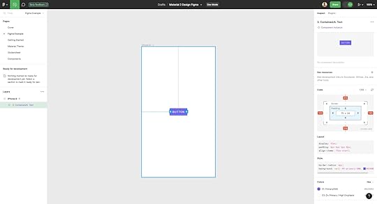
UXPin only displays the Merge component’s JSX properties (spacing, typography, size, etc.) for the prototype’s default or initial state. Developers already have the same UI library, which they import into their project from the same repository to start development. They simply copy/paste the JSX code from UXPin and apply it to the relevant component in their IDE.
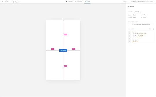
Developers don’t need additional documentation detailing each component’s interactions, triggers, etc., because the design system team has already defined these properties in the repository. These baked-in constraints mean designers can’t change a component’s interactivity, whereas, in Figma, they can detach a component instance from its master component and change its properties.
Prototyping in Figma vs. Prototyping in UXPinFor the most part, the design environment, tools, and workflow is similar in Figma and UXPin. The differences are following.
Frames vs. pagesOne of the biggest differences is Figma follows a frame and artboard workflow, while UXPin uses pages with a separate canvas for each screen. Designers can visualize the pages on a single screen as they would in Figma using UXPin’s Overview.
Adding interactivityFigma’s Prototype feature allows designers to add basic interactivity with limited user actions. Config 2023 releases make it easier to change component states using Variables, but these are still far from the code-like experience necessary for accurate testing.
UXPin’s Interactions include many user triggers and actions for desktop and mobile prototyping. As Merge components are interactive by default, designers focus primarily on navigational interactions like page transitions and popups, allowing for faster designing and iterating.
Testing scopeDue to Figma’s lack of fidelity and functionality, designers are limited by what they can test using the platform. Design teams often use plugins, integrations, or other tools to increase prototyping scope, which increases costs, time, and other resources.
With UXPin Merge, designers can build fully interactive prototypes indistinguishable from the final product without plugins or integrations. They can also use APIs to connect to external services, significantly increasing testing scope. These advanced prototypes allow designers to collect meaningful insights during testing to make accurate design decisions for better product outcomes.
Ready to experience the benefits and ease of working with a code-to-design workflow? Visit our Merge page for more details and how to request access to this revolutionary technology.
Discover MergeThe post Components in Figma vs UXPin (+ Other Design Tools) appeared first on Studio by UXPin.
July 14, 2023
How Functional Prototypes Improve Usability Testing?
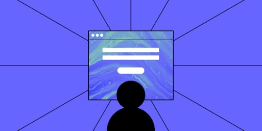
Launching a successful digital product takes a lot of effort. Working hard, however, does not ensure that users will adopt your product.
The truth is users may resign from your product, because you haven’t tested the product before release. If you skipped creating an advanced, fully functional prototype and decided to go with a low-fidelity one and then went into the development stage, there was no room for any reliable usability tests.
Only now do you realize that you spent countless hours building a product that is not as successful as you anticipated.
Let’s learn from this hypothetical mistake by taking a closer look at the importance of usability testing and why you need functional prototypes to get accurate results from your trials.
Build functional prototypes without missing deadlines. Use UXPin Merge and use functional components that can be assembled into ready-to-test prototypes in minutes instead of hours. Discover UXPin Merge.
Reach a new level of prototypingDesign with interactive components coming from your team’s design system.
Discover UXPin Merge .discover-merge { margin: 40px 8px;}.discover-merge__container { display: flex; max-width: 690px; height: 200px; padding: 20px; padding-left: 24px; border-radius: 4px; background-color: black; box-shadow: 10px 10px #9999ff; align-items: center; justify-content: space-between;}.discover-merge__left { width: 50%;}.discover-merge__left p { margin: 10px 0px !important; color: white !important; font-size: 18px !important;}.discover-merge__heading { font-weight: bold !important; color: white !important; font-size: 18px !important;}.discover-merge__text { margin: 0 !important; line-height: 22px !important;}.discover-merge__button { width: 174px; height: 44px; margin: 10px 0px; border: none; border-radius: 2px; background: white; color: black; font-size: 16px; text-align: center;}.discover-merge__button:hover { cursor: pointer;}.discover-merge__image { max-width: 320px !important; height: 200px; margin-right: -19px;}@media (max-width: 760px) { .discover-merge__container { height: auto; margin: 10px; align-items: left; }}@media (max-width: 500px) { .discover-merge__container { flex-direction: column; } .discover-merge__left { width: 100%; align-items: normal; }}Most Digital Products FailThe odds of success are not in your favor. That’s not a pessimistic outlook. That’s just what the numbers say.
Only about 0.5% of apps succeed. Let that sink in. If you build 200 apps, the statistics say that only one of them will succeed. What happens to the rest of them?
67.8% never reach 1,000 downloads.17.9% never reach 1,000 active users.5.8% don’t retain users, meaning they probably get deleted and forgotten.5.8% don’t earn any revenue. Nothing in return for all of that work!1.4% make some money but never turn a profit.You can’t deny the math, but you can test your products before committing to launch.
After this heavy dose of reality, you might wonder why user testing even matters. What’s the point?! One out of 200 apps turns out to be successful!
Fully Functional Prototypes Give You PerspectiveLet’s put this into perspective so you can see the true benefits of working prototypes and user testing.
First, a lot of those apps are worthless. They don’t perform functions that anyone wants. If you have seen the second season of Silicon Valley, you probably remember the “Bro app.” All it does is send the word “bro” to other people who have the app. Silicon Valley did an excellent job skewering some of the insane trends in technology. With the Bro app, the show lampooned all of the meaningless products out there.
The internet has thousands upon thousands of Bro apps.

Second, a lot of companies don’t spend enough time developing and testing their apps. According to appinventiv, 24% of developers spend three months or less working on their products before launch. Some of those companies launched their apps within one month. Is it feasible to research the market, design your product, develop your product, test it for quality assurance, and launch within a month? That seems unlikely.
Third — and this brings us to the heart of the matter — very few designers have the benefit of user testing with fully functional prototypes with interactive features and real data.
If you casually say to someone, “I’m going to make an app that sends the word ‘Bro’ to people,” you’ll probably get some encouragement from well-meaning friends. You’ll get a much different response when you put the app in their hands and tell them how much it will cost to develop, launch, and market.
With functional prototypes, you gain a perspective that you rarely get from mockups that don’t do anything except sit on the page (or screen).
Early Usability Testing Saves You Time and MoneyYou’re a project manager with two designers and three developers on your team. Over one year, you can expect to pay your designers about $53,400 each and your developers about $114,300 each. Your small team costs $449,700 per year, plus benefits. (These are the median salaries in the United States. Professionals might get paid different amounts in your area.)
Obviously, you want to get as much productivity as possible from your staff. You cannot make that happen when you wait until the end of the development process to test your products. When you enter the usability testing phase, you might discover that your developers spent a week adding a feature that no one even wants to use. What a waste!
Early usability testing that happens during the design phase speeds up your process (and shifts more of the responsibility to employees who earn lower salaries). With fully functional prototypes, you might discover that an interaction doesn’t perform as expected. You might learn that most users prefer one layout over another. You might find out that people despise the core concept of your product!
It’s always better to learn these things early in the process. If usability testing shows that you have a terrible concept, throw it out now before you dedicate more money toward it. You can always come up with a better idea.
By creating interactive components in your prototypes with states, conditions, and interactions, you do not need to rely on your developers to create a feature before you test it.
Also, you can send your prototype to anyone. They don’t need UXPin accounts. As long as someone has the right link to your project, they can interact with the prototype and leave comments.
Not sure how to improve product usability? Start with these 5 User Experience Principles to Help Guide Your Work . Nothing’s more effective than doing the job right the first time.
Working Prototypes Break Down Barriers Between Designers and DevelopersYou might worry that your prototype — as functional as it seems — might not perform as precisely as your end product does.

Merge eliminates your concerns as each component is fully coded. No, you don’t need to know how to write a single line of code! It’s easy because as a designer you look at the interactive UI and developer looks at the production-ready code of the same component. One element, yet two perspectives.
Merge’s code-based approach to design also means that your developers can create new products from existing components. You already know how the features behave, so you can fit them together in inventive ways and offer your users new tools. Once you have a library of React components or a Storybook, it’s easy to put them together and know how they will interact.
Get started with Merge to test fully functional prototypesMerge isn’t one of those prototyping tools that only give you an imitation of the final product. You get fully functional prototypes that you can start testing immediately. What’s most important, it takes you 10x faster to build a hi-fi prototype to test out.
Get started with Merge today so you can see how much easier, faster, and less expensive digital products become when you can improve usability testing with prototypes that work just like the final product.
Discover MergeThe post How Functional Prototypes Improve Usability Testing? appeared first on Studio by UXPin.
UXpin's Blog

- UXpin's profile
- 68 followers

