
UXpin's Blog, page 31
August 24, 2023
The 4 Types of Creative Website Scrolling Patterns
Creative scrolling patterns let you adjust the pace, delivery, and interactivity of the content. Considering that our attention span on the web has dropped to about 8 seconds, a delightful scrolling experience certainly prolongs user interest.
In this post, we’ll examine the most common and time-tested scrolling pattern. As explained in the free e-book Web UI Patterns 2016 Vol.1, each pattern is creative yet proven usable through years of refinement.
UXPin helps you build interactive, scrollable prototypes even on trial. Try UXPin and all its advanced features for free. Sign up for trial.
Build advanced prototypesDesign better products with States, Variables, Auto Layout and more.
Try UXPin .try-uxpin-banner { margin: 40px 0px;}.try-uxpin__container { display: flex; max-width: 689px; height: 210px; padding: 20px; padding-left: 24px; border: 2px solid black; border-radius: 4px; align-items: center; justify-content: space-between; background-color: white; box-shadow: 10px 10px black;}.try-uxpin__left { width: 54%;}.try-uxpin__left p { margin: 10px 0px !important; color: black !important;}.try-uxpin__heading { font-size: 28px !important; font-weight: bold;}.try-uxpin__text { margin: 0 !important; font-size: 18px !important; line-height: 22px !important;}.try-uxpin__button { width: 135px; height: 44px; background: black; margin: 10px 0px; padding: 10px 20px; border: none; border-radius: 2px; color: white; font-size: 16px; text-align: center;}.try-uxpin__button:hover { cursor: pointer;}.try-uxpin__image { max-width: 320px !important; height: 200px; margin-right: -21px; margin-bottom: -6px;}@media (max-width: 760px) { .try-uxpin__container { height: auto; margin: 10px; align-items: left; }}@media (max-width: 500px) { .try-uxpin__container { flex-direction: column; } .try-uxpin__left { width: 100%; align-items: normal; }}What are Scrolling Patterns?
Scrolling patterns are the various ways content is presented to the users as they scroll down a web page. Scrolling patterns influence how users engage with the content and how they feel about it.
Choosing the right scrolling pattern depends on the nature of the content, the user experience you want to create, and the specific goals of your website or application. A thoughtful selection of scrolling patterns can enhance engagement, guide user navigation, and contribute to a positive overall user experience.
Types of Scrolling PatternsHere are some common scrolling patterns:
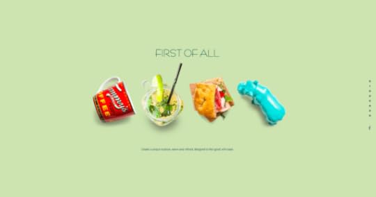
Traditional or Sequential Scrolling – This is the most common scrolling pattern where users scroll vertically through content in a linear manner, one section at a time.Infinite Scrolling – New content continuously loads as users scroll down. It’s often used in social media feeds and content-heavy websites. Parallax Scrolling – It creates an illusion of depth by moving background and foreground elements at different speeds as users scroll.Fixed or Sticky Elements – In this pattern, certain elements, such as navigation menus or headers, remain fixed in place as users scroll.Carousel or Slider – They allow multiple pieces of content to cycle through horizontally as users scroll. They’re useful for presenting a variety of information in a limited space.Full-Page Scrolling: Each scroll action takes users to a new full-page section, often with unique visual designs or interactions. It’s often used in portfolios or promotional websites to create a visually impactful experience.Scroll Snap: Scroll snap ensures that the page automatically aligns with defined points or sections as users scroll, creating a more controlled scrolling experience.Minimal Scrolling: In this pattern, the content is presented on a single screen without requiring users to scroll. It’s often used for landing pages with minimal content or single messages.Long ScrollingLe Mugs
Take It

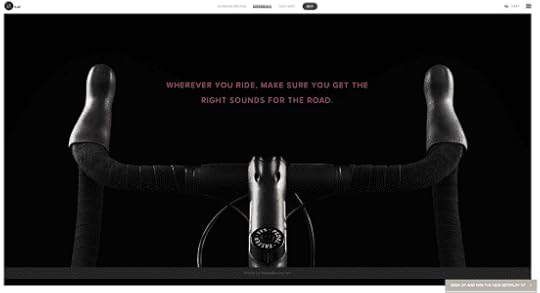
Beoplay
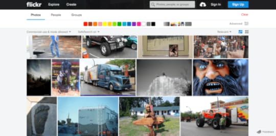
Flickr
Problem
A site has so much eclectic content that a multi-page format would be too difficult to navigate.
A site wants to tell a story in a smooth, linear fashion.
Solution
Create a single-page, long-scrolling site to consolidate your content in a single place. This works great for social media sites and others with user-generated content, where part of the fun is browsing through everything all at once, and the content is diverse and difficult to categorize because it’s always updating.
The prominence of mobile browsing supports the long scrolling pattern since smaller screen sizes call for more scrolling.
Combined with the infinite scrolling pattern described below, long scrolling can create a completely immersive browsing experience. If users are searching for something in particular, a more structured navigation system like Amazon’s works better — but for explorability, long scrolling is the fastest and most fun for users.
Tips
Use sticky navigation. Disorientation and the inability to go back are the innate drawbacks of long scrolling, but a fixed menu allows users to move freely.Long scrolling can have a negative effect on SEO.Don’t autoplay heavy media like videos, since in abundance they drastically slow down loading.You don’t have to commit to a single-page format with long scrolling: often sites feature a central long-scrolling home page that links out to traditional secondary pages, like Facebook and Twitter’s separate profile pages.For one-off long scrolling on specific page sections, try the fixed technique described below.Fixed Long ScrollingSquarespace
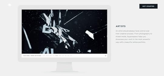
UXPin Tour
Problem
A site could benefit from the advantages of long scrolling but doesn’t want to convert entirely from a multi-page structure.
Solution
Fixed long scrolling sites display information that might otherwise require multiple sections within one long-scrolling section. The effect feels like a “scroll within a scroll”.
Tips
When deciding what to include in a fixed scroll section, make sure you only choose content that fits within a unified theme or category. Each part of Squarespace’s fixed scroll section, for example, focuses on explaining how to “Create a beautiful website” for different business types.Place CTAs in at the end of each of each fixed-scroll frame.As the UXPin product tour page shows, you can also consider adding a “scroll progress bar” to the top navigation. The pattern helps add a greater sense of pace if you have more than 3-4 frames.Infinite ScrollingTrue Tube

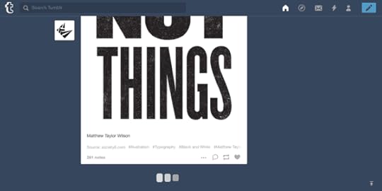
Tumblr
By Kato

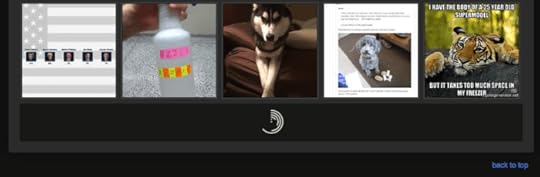
Imgur
Problem
Content is better organized on a single page, but there’s too much to load all at once.
Solution
With the infinite scrolling pattern, content is loaded as needed to provide a more paced experience. Infinite scrolling proves useful for single-page sites with more than a few screens worth of content, especially with multimedia galleries.
Infinite scrolling creates a rhythm for social media sites, where users are continually entertained with new content without clicking or waiting.
The problem with infinite scrolling is when users lose their place, though there are ways around this. Sticky navigation is the best way to give your user mobility in a near-infinite sea of content.
Tips
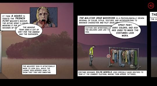
In addition to sticky navigation, there are other methods to help infinite scrolling’s disorientation. A jump-to-section option, as with Tumblr, lets users return to the start if they become lost.Infinite scrolling can be combined with pagination for more accurate searches. For example, Facebook allows users to search timelines by year.Don’t be constrained by the traditional loading circle — your choice of icon is an opportunity to deepen your site’s identity. Facebook, Tumblr, Imgur, and others all have custom loading signifiers.Tasteful Parallax ScrollingThe Walking Dead
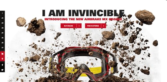
Oakley: Airbrake MX
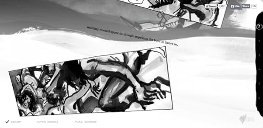
The Boat (SBS)
McWhopper

Problem
Users are not engaged enough in long scrolling formats.
Solution
Give your long scrolling site more impact with a parallax effect. Known to the video game industry for decades, this pattern refers to the layers of a two-dimensional image moving at different speeds when scrolling, i.e., the foreground and background moving at different speeds, or differing layers of the background. The effect creates a mesmerizing three-dimensional feel.
The parallax effect unlocks the more creative aspects of scrolling, especially when combined with scroll-triggered animations. This style lends itself to storytelling sites, building a more immersive and stimulating experience with better visuals.
The Walking Dead uses parallax and other scrolling techniques (i.e., atypical direction since the frames move left to right as you scroll down) to deepen their narrative. While not necessary, the differentiated backgrounds make just watching the scroll more enjoyable. It also makes sense for the context of the site since the character react to the scroll.
Tips
For help on coding for parallax sites, read Dave Gamache’s piece on Medium.Be careful of loading times. A simplified fast site is still better than an extravagant slow site.Create scrollable prototypes in UXPinApply what you’ve just learned in practice and build an interactive prototype that works like a real product. Use UXPin, build prototypes up to 10x faster, share them with your team, and streamline developer’s handoff by having them easily translate your design into code. Try it now.
Try UXPin for freeThe post The 4 Types of Creative Website Scrolling Patterns appeared first on Studio by UXPin.


How to Bring Bootstrap Components to UXPin – npm Integration Walkthrough
UXPin’s npm Integration empowers design teams to prototype at a higher fidelity and with code-like functionality. Component-driven prototyping in UXPin allows designers to create prototypes that previously required engineers to code.
With npm Integration, teams can bring component libraries to UXPin’s design tool and leverage full interactivity of shared components without complicated technical setup. Let’s see the tutorial to learn how fast it is to integrate components and use Merge.
Bring UI components to UXPin from Git repo, Storybook, or through our newest npm integration. Learn more about UXPin’s Merge technology.
Reach a new level of prototypingDesign with interactive components coming from your team’s design system.
Discover UXPin Merge .discover-merge { margin: 40px 8px;}.discover-merge__container { display: flex; max-width: 690px; height: 200px; padding: 20px; padding-left: 24px; border-radius: 4px; background-color: black; box-shadow: 10px 10px #9999ff; align-items: center; justify-content: space-between;}.discover-merge__left { width: 50%;}.discover-merge__left p { margin: 10px 0px !important; color: white !important; font-size: 18px !important;}.discover-merge__heading { font-weight: bold !important; color: white !important; font-size: 18px !important;}.discover-merge__text { margin: 0 !important; line-height: 22px !important;}.discover-merge__button { width: 174px; height: 44px; margin: 10px 0px; border: none; border-radius: 2px; background: white; color: black; font-size: 16px; text-align: center;}.discover-merge__button:hover { cursor: pointer;}.discover-merge__image { max-width: 320px !important; height: 200px; margin-right: -19px;}@media (max-width: 760px) { .discover-merge__container { height: auto; margin: 10px; align-items: left; }}@media (max-width: 500px) { .discover-merge__container { flex-direction: column; } .discover-merge__left { width: 100%; align-items: normal; }}What is UXPin Merge?
UXPin Merge is a code-based technology that enables component-driven prototyping for design teams. Instead of designing from scratch, designers use production-ready UI elements from a repository to build high-fidelity, fully functioning prototypes.
Designers work with visual elements, and engineers the code behind them, creating a single source of truth for the entire product development team. Teams like PayPal or TeamPassword improved the quality, speed, and consistency of their design with UXPin.
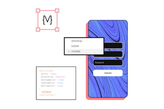
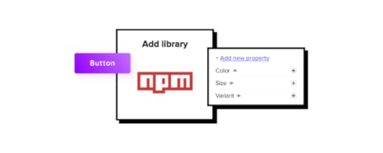
What is UXPin’s npm Integration?Using UXPin Merge for a private design system requires some engineering knowledge to set up the repository for syncing. But, to use an open-source component library, design teams can complete the npm Integration using an intuitive dashboard.
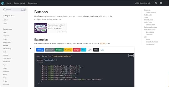
Designers can manage component imports and properties using Merge Component Manager. For example, you can import a button from Bootstrap’s component library and its nine variants:
PrimarySecondarySuccessDangerWarningInfoLightDarkLinkThese variants appear in UXPin’s Properties Panel as a dropdown. Merge also includes basic hover states for most components, so designers don’t have to worry about these minor details and can begin prototyping immediately.
Design teams can find component properties to import via the React Bootstrap docs. They can import every property or only those relevant to the project.
The Benefits of Working With BootstrapBootstrap is one of the oldest and most comprehensive mobile-first front-end frameworks available for React, Vue, and Angular. UXPin’s npm integration uses the React Bootstrap component library, but you can import the Vue or Angular versions using our Storybook Integration.
Bootstrap is best for building responsive websites and web applications, but you could use the React library for mobile app design projects. Bootstrap’s extensive collection of form elements, responsive tables, and other relevant components makes it an excellent option for web-based enterprise products.
We recommend checking Bootstrap’s Examples page to see what’s possible with this comprehensive front-end framework.
Bootstrap npm Integration With UXPin MergeYou can import Bootstrap components into UXPin’s design editor using the npm package (react-bootstrap). Merge Component Manager allows you to import each UI element and its available properties.
With component-driven prototyping in UXPin, design teams get the same fidelity and functionality as engineers because the elements come from the same repository. Designers can replicate whatever engineers can do with repository components in UXPin via the Properties Panel.
You can assign these properties using Bootstrap’s React props found in the framework’s documentation.
Assigning Properties in Merge Component ManagerMerge Component Manager is a central hub for importing and managing your npm components. You can import as many of these as you need to complete your project.
You also have control over how many properties you import. For example, if you’re only going to use the Bootstrap button’s primary and secondary variants, you only need to import two instead of all nine.
Connecting UXPin to the React Bootstrap npm PackageStep 1Navigate to your UXPin dashboard and click “New Project.”
 Step 2
Name your project and click “Create New Project.”
 Step 3
Click “Design with Merge components” and “+ Add new Library.”
 Step 4
Select “Import React Components with npm integration” and click “Next.”
 Step 5
Name your library. This name is purely for your reference and won’t impact the import.
Merge requires two Bootstrap packages for the npm Integration to work. You’ll need React Bootstrap (react-bootstrap) and Boostrap (bootstrap).
Lastly, you must include a path to Bootstrap’s CSS file for component properties to work in UXPin. You can find this path under CSS in React-Bootstrap’s documentation.
bootstrap/dist/css/bootstrap.min.css Importing React Bootstrap Components
Once you complete the steps above, UXPin will redirect you to Merge Component Manager. You can also get there from the canvas following Step 1.
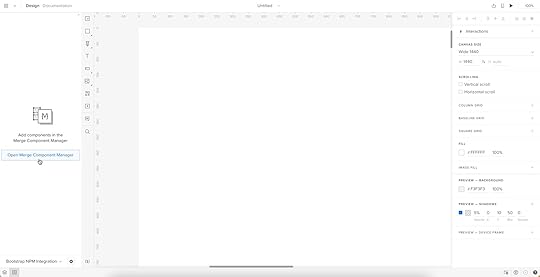
Step 1From the lefthand sidebar, click “Open Merge Component Manager.”
Merge Component Manager will open in a new tab.
Step 2Click “Add new component.”
 Step 3
Enter the name of the component you want to import.
You’ll find the correct naming convention in React Bootstrap’s documentation.
We’ll import a Bootstrap button for this tutorial and create a new category called “Components.” We recommend using the same categories as React Bootstrap’s docs so designers and engineers have the same reference point.
You can add multiple components to a single import, saving you time repeating steps two and three.
Click “Import Components.”
 Step 4
Click “Publish Changes” in the top right to initialize the import process.
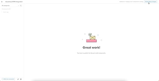
The first time you do this for a new component, it might take a minute.
Step 5Once the import is complete, click “Refresh Library” to update the changes in your project library.
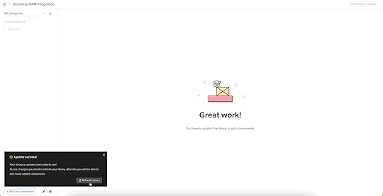
If you follow these instructions step-by-step, you’ll notice you have a category (Components) and your first component (Button) in the left sidebar.
Step 6Click on the Button to begin adding properties. You can find these React props in React Bootstrap’s documentation under API in Components > Button.
 Adding Component Properties with Merge Component Manager
We’ll add a couple of button properties using React Bootstrap’s documentation.
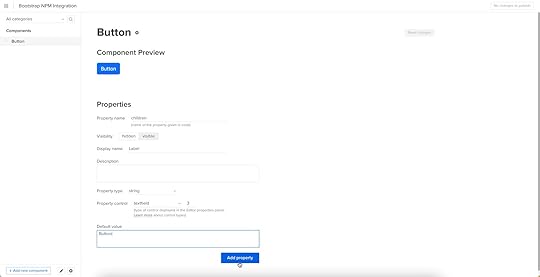
Button LabelStep 1You set a React Bootstrap button label using the children property as follows:
Property name: enter “children” (always use lowercase for props)Display name: This is for your reference, but something descriptive that both designers and engineers use–we’ve gone with “Label” to keep things uniformDescription: Add a short description or instructions for designersProperty type: “string”Property control: “textfield”Default value: Your preference–we’ve gone with “Button”As you complete the component’s properties, you’ll notice a component preview will appear and change according to your preferences.
Step 2Once you have completed all the fields, click “Add property.”
Then “Save Changes.”
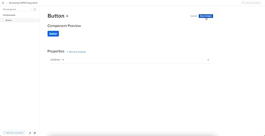
Lastly, “Publish library changes.”
 Try Component-Driven Prototyping in UXPin
Once you import the React Bootstrap components and properties you need, prototyping in UXPin is as simple as drag-and-drop to build layouts. We created this simple email sign-up form using three Bootstrap components in less than a minute.
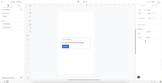
When you select a Bootstrap component, the properties you created in Merge Component Manager appear in the righthand Properties Panel.
Try component-driven prototyping with UXPin’s npm Integration today. Bring Bootstrap’s npm components and discover how quickly your product gets from ideation to development. Release features much faster.
Try npm integrationThe post How to Bring Bootstrap Components to UXPin – npm Integration Walkthrough appeared first on Studio by UXPin.
Merge npm Integration – Another Way of Importing Components
Here’s a designer-friendly way of bringing UI code components into UXPin’s editor. It’s our npm integration that makes Merge accessible to teams who lack active engineer’s support.
Try npm integration to speed up interactive prototyping and stay 100% consistent with the final product. The npm components will behave like a lego bricks that you can drag and drop to build advanced prototypes. Discover UXPin Merge.
Reach a new level of prototypingDesign with interactive components coming from your team’s design system.
Discover UXPin Merge .discover-merge { margin: 40px 8px;}.discover-merge__container { display: flex; max-width: 690px; height: 200px; padding: 20px; padding-left: 24px; border-radius: 4px; background-color: black; box-shadow: 10px 10px #9999ff; align-items: center; justify-content: space-between;}.discover-merge__left { width: 50%;}.discover-merge__left p { margin: 10px 0px !important; color: white !important; font-size: 18px !important;}.discover-merge__heading { font-weight: bold !important; color: white !important; font-size: 18px !important;}.discover-merge__text { margin: 0 !important; line-height: 22px !important;}.discover-merge__button { width: 174px; height: 44px; margin: 10px 0px; border: none; border-radius: 2px; background: white; color: black; font-size: 16px; text-align: center;}.discover-merge__button:hover { cursor: pointer;}.discover-merge__image { max-width: 320px !important; height: 200px; margin-right: -19px;}@media (max-width: 760px) { .discover-merge__container { height: auto; margin: 10px; align-items: left; }}@media (max-width: 500px) { .discover-merge__container { flex-direction: column; } .discover-merge__left { width: 100%; align-items: normal; }}Revolutionize Your Design Process with UXPin MergeUXPin with Merge technology allows you to create a new level of fidelity and interactivity in prototypes, smoothen design handoff, and unify designers and devs’ work with a single source of truth. It truly streamlines product development process.
Move Away from Static, Change to Fully-interactive DesignGone are the days of static prototypes. Companies, especially the ones that reached a higher design maturity level, look for more efficient ways of prototyping. Linking lifeless artboards, translating design to code with imperfect tools, and documenting nuanced interactions time and time again adds more work and stalls growth.
This is where Merge comes in. With this technology, you can create prototypes with the elements that have true functionality built into them. It scales design like it did for Erica’s team at PayPal.
Streamline Collaboration Between Design and DevelopmentWith Merge, the design and development teams work with the same interactive components throughout the entire production process. Designers use the UI components, whereas developers copy the ready code from the very same design.
The translation of design into code is already there. Getting the most of a single source of truth unites design and engineering and simplifies the design handoff stage. In short: designers are happy, same as developers, and they don’t waste time on back-and-forths.
Use Accurate UI Components that Guarantee Design ConsistencyCoded UI components used in the design process make the prototypes consistent from start to finish. The product is being built according to the designer’s intention. The best part – designers don’t even need to deal with code.
The outcome is that there is no drift between design and the end product’s look and feel which is extremely time and energy consuming without Merge technology.
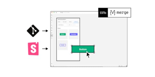
The Third way of Importing UI components to UXPin MergeBefore you can design with true components, you need to import a component library. There are three ways of bringing coded components to UXPin Merge.
Git integration
– developers use Git to host source code and its history; it requires technical help to import code components into UXPin.
Storybook integration
– Storybook stores public and private component libraries that you can bring to UXPin.
npm integration
– that gives designers a lot of autonomy.Merge npm integration – What Do You Get?Many design teams might struggle with the Merge Git integration if they lack developer’s active support. To make it easy for them to benefit from Merge, we’re releasing a designer-friendly way of importing a component library to UXPin.
How to use npm integration?Time to see how you can use npm integration. Let’s start with a written description of how to do it.
Import npm Components to UXPinAn npm is an online registry of packages with ready-made development elements that you can download to use in your project. Some of the most popular open-source design systems are being distributed in this way.
You can use Adele (UXPin’s design system repository) to find which design system is in an npm package. Just scroll to the final column to see the way of distribution.
Alternatively, you can upload your own React-based component library to npm and use it in UXPin.
Here’s how to do the steps of bringing the npm design system into UXPin.
1. Add a New Library to UXPin MergeOnce you know which React-based design system to use, it’s time to sync it with UXPin Merge. Go to the Merge Tab in your UXPin dashboard and add a library via npm package. You need to provide an npm package name and the version you want to use. If your documentation requires it, add styles to the “assets location” field.
2. Configure UI ComponentsOpen Merge Component Manager and specify components you want to import. You can categorize the components the way you want to. After publishing components, manage their properties and define which you want to import. Go to the library documentation to find the names and types of properties.
3. Start Creating Fully Interactive PrototypesTime to create your first design. Go to the design editor and drop components on the canvas. See how easy it is to change the properties of the components you use! To check the components’ interactivity, go to “Preview” mode.
Finished your prototype? Now, you can just pass the project link to your fellow developer so that they can copy the code from your design and check the specs.
Follow our instructions and import interactive components1. Watch a step-by-step video that tells you how to use the integrationWe prepared a video walk-through of the integration. Watch it to learn how you can import an npm design system to UXPin.
2. Import npm components from MUI to UXPinhttps://t.co/8GBMhKFDDi🫶 MUI ➕ #UXPinMerge 🟰 fast, interactive prototyping as easy as 1,2,3!
— UXPin (@uxpin) August 10, 2022
Check our tutorial on how to bring @npmjs components to UXPin starring @MUI_hq library!
Would you like to bring MUI to UXPin? Our step-by-step article will guide you through the process.
How to import MUI components to UXPin?
3. Import npm components from Ant Design to UXPinhttps://t.co/9nysjW1FGN 🎨 No need to code to create real-life product prototypes!
— UXPin (@uxpin) August 10, 2022
🥳 See how fast and interactive design gets when you import @AntDesignUI components to UXPin! 👇
Ant Design is one of the most popular libraries. When you log in to UXPin, you will see some of the Ant Design components that we’ve imported through npm. They are ready for you to use. Check how we imported them to UXPin in this article.
How to import Ant Design components to UXPin?
Use npm integration + PatternsOnce you import everything you need and save changes, you can build more complex components out of basic ones or save components with properties to avoid repeating the same steps over and over. In other words, create Patterns.
Read all about it: Patterns documentation.
Try Merge npm integrationhttps://t.co/3VOImSeSS5 👈 Eliminate repetitive work with Patterns! See how you can use it in #UXPinMerge 👏 pic.twitter.com/xPuXQeD0rz
— UXPin (@uxpin) July 1, 2022
With npm integration, you don’t need developers’ help to bring coded UI elements to UXPin. The designers can import and manage the UI components by themselves in UXPin. Just the way they want.
Bring UI components through npm integration. Connect the design and development team with a single source of truth and break organizational silos. Sign up for a 14-day trial to test the integration.
Try npm integrationThe post Merge npm Integration – Another Way of Importing Components appeared first on Studio by UXPin.
Review Card — How to Design it
Review card is a design element that appears on websites and applications to highlight feedback about a product, service or experience.
Solve more usability issues during the design process and deliver incredible user experiences for your customers with UXPin’s interactive prototypes. Sign up for a free trial to explore UXPin’s advanced features.
Build advanced prototypesDesign better products with States, Variables, Auto Layout and more.
Try UXPin .try-uxpin-banner { margin: 40px 0px;}.try-uxpin__container { display: flex; max-width: 689px; height: 210px; padding: 20px; padding-left: 24px; border: 2px solid black; border-radius: 4px; align-items: center; justify-content: space-between; background-color: white; box-shadow: 10px 10px black;}.try-uxpin__left { width: 54%;}.try-uxpin__left p { margin: 10px 0px !important; color: black !important;}.try-uxpin__heading { font-size: 28px !important; font-weight: bold;}.try-uxpin__text { margin: 0 !important; font-size: 18px !important; line-height: 22px !important;}.try-uxpin__button { width: 135px; height: 44px; background: black; margin: 10px 0px; padding: 10px 20px; border: none; border-radius: 2px; color: white; font-size: 16px; text-align: center;}.try-uxpin__button:hover { cursor: pointer;}.try-uxpin__image { max-width: 320px !important; height: 200px; margin-right: -21px; margin-bottom: -6px;}@media (max-width: 760px) { .try-uxpin__container { height: auto; margin: 10px; align-items: left; }}@media (max-width: 500px) { .try-uxpin__container { flex-direction: column; } .try-uxpin__left { width: 100%; align-items: normal; }}What is a Review Card?A review card displays user feedback in a compact, visual format on digital platforms. It’s a familiar UI pattern that presents a user’s evaluation—often accompanied by a rating, comments, and sometimes user-related information.
Review cards display social proof and insights from previous customers, enhancing brand trust, transparency, and credibility to facilitate a conversion–signup, purchase, download, etc.
Core Components of a Review CardProfile informationAllowing reviewers to customize their identity enhances the authenticity of feedback, including:
Making the reviewer to post their name offers a personalized touch to the review.Allowing reviewers to upload their profile picture makes them more relatable.Adding the option to share a reviewer’s location upon consent can also help users understand someone’s view–for example, someone from the UK might find a dish “too spicy,” while someone from India thinks it has “excellent flavor!”User-generated contentA review card displays the reviewer’s feedback, including:
The review text provides context and meaning behind the rating, emphasizing a specific experience or narrative.The review date helps users understand the relevance and timeliness of the feedback. For example, a product received unfavorable reviews two years ago, but more recent feedback is positive about the same experience–showing the brand’s willingness to improve.The reviewer’s images and videos help create more credibility and transparency. For example, Google My Business allows users to upload photo and video content which helps prove the reviewer was at the location and that real people are leaving feedback.Interactivity featuresMaking review patterns interactive helps with community-driven moderation while increasing shares and engagement. Some interactivity designers might consider includes:
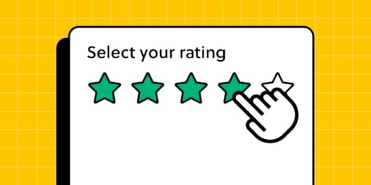
Including rating system (stars, points, etc.) to quickly determine the reviewer’s experience.Adding helpful/unhelpful voting buttons lets others validate the review’s accuracy.Allowing brands to reply to customer reviews enables them to address concerns and thank reviewers.Adding social share buttons, as people like to share online reviews with friends or across different platforms, amplifying the brand’s reach.Examples of Review Card UI PatternsAdidas reviews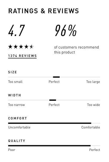
Adidas is a great review card UI example for eCommerce. It encourages reviewers to rate its shoes on overall star rating, size, width, comfort, and quality. This five-point rating system gives shoppers a snapshot of the product’s performance while providing Adidas with valuable data to pinpoint issues and improvements.
Amazon reviews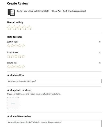
Like Adidas, Amazon is another good example of an eCommerce review card design. It customizes reviews to meet the product’s features and user needs. For example, this Kindle review interface lets customers rate its built-in light, touch screen, and “easy-to-hold” characteristics.
Yelp reviews
Yelp is a review site and it makes a great job of focusing on text feedback. The review pattern prioritizes the star rating, text, and media content.
The review form also prioritizes long-form text with prompts like food, service, and ambiance to prompt reviewers on what to mention.
Trustpilot reviews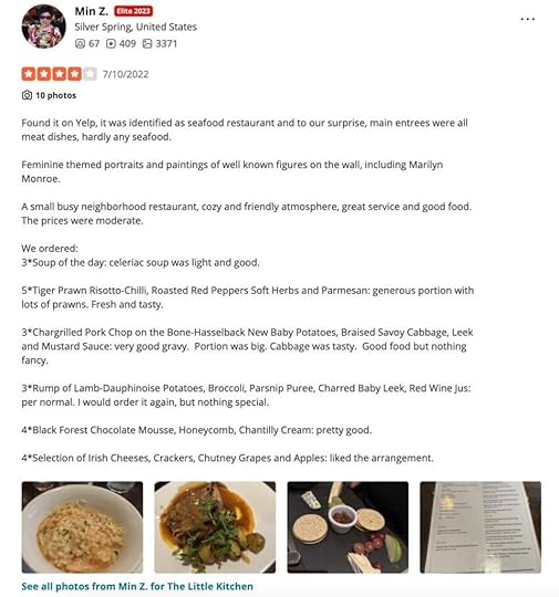
Like Yelp, Trustpilot’s review card prioritizes text content and its signature green-star review component. The footer allows users to like, share, or report the review and also displays the brand’s reply.
Apple App Store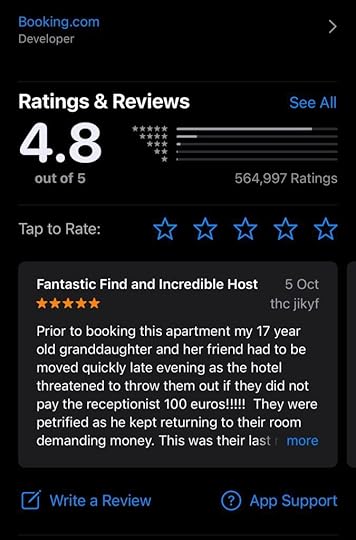
The app stores for Apple and Android prioritize a mobile-friendly experience, meaning their review cards must be minimal, only displaying the most crucial information.
This example from the Apple App Store displays the review’s headline, star rating, date, and reviewer’s username. Above, users can see the product’s rating out of five, rating distribution across the five stars, and total ratings. There are also CTAs above and below the review card for users to submit feedback.
Shopify App Store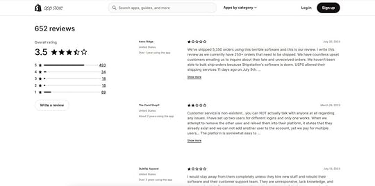
Many platforms have app stores for third-party applications and integrations. Shopify’s review card appears below each app description so store owners can read peer feedback.
The minimalist design uses a 2-column layout for desktop so users can see the app’s review breakdown and text reviews. They can also filter reviews by star rating.
Review Card Design Tips & Best Practices Simplicity and clarity
Avoid clutter. Make it scannable.
The examples above from top platforms and brands demonstrate that a review card should allow users to grasp the main points at a glance by eliminating unnecessary elements and focusing on the essentials like ratings, reviewer names, and the review text.
Consistency in designEnsure all review cards follow a uniform pattern.
UI and brand consistency are essential for building trust. Review cards must be consistent with the product’s design principles and integrate seamlessly with the surrounding user interface and patterns. This uniformity lets users predict where to find specific information, making their browsing experience smoother and more intuitive.
Use whitespace and hierarchyMake content easier to read.
Whitespace creates separation between components and patterns to enhance readability and scalability while reducing visual fatigue. Designers must apply whitespace and visual hierarchy techniques to review cards so users can read and absorb content with minimal mental effort.
Design interactive elementsClearly distinguishable buttons or links.
Designers must make buttons and text links obvious using different colors, underlining, icons, etc. These immediately identifiable interactive elements enable users to complete relevant actions, like sorting, filtering, liking, etc., creating immersive, enjoyable review card experiences.
Minimize frictionMinimizing friction through an intuitive and fast review process ensures more users provide feedback. People are more motivated to leave negative reviews, so if you want to encourage more positive ones, you must make every step effortless.
For example, Amazon sends customers a follow-up email or app notification post-purchase to prompt immediate, spontaneous feedback. Amazon’s review UI is simple and intuitive, and they can share images and videos about their product experience effortlessly.
Add filtering and sorting optionsFiltering and sorting enable users to choose how to consume reviews to find the people or content that resonate with their experience or expectations.
For example, Yelp allows users to filter reviews based on rating, time, or relevance and even look for specific keywords for efficient, tailored brand research.
Adapt review cards for different platformsDesigning consistent cross-platform experiences.
The cross-platform experience is crucial for modern digital products and review card design. For example, users can access Netflix on TVs, mobile devices, PCs, and tablets. Designers must design review cards for each platform while maintaining the highest standard of consistency.
Responsive design: Designers must maintain the same user experience when they stack or scale review card elements for different screen sizes. Read more about responsive design.Native components vs. web components: Designers can leverage platform-specific UI elements familiar to users, ensuring a cohesive native experience (iOS, Windows, Android, etc.). Conversely, web components offer broader compatibility, ensuring review cards look and function consistently across browsers and devices.High-Quality Interactive Prototyping With UXPinTesting interactive elements is challenging with traditional image-based design tools. For example, creating a dynamic, fully interactive user flow for writing a review isn’t possible using Figma or Sketch.
UXPin is powered by code, giving designers the same fidelity and functionality capabilities as devs for building interactive prototypes. Design teams can create a review user flow prototype, including:
Interactions and States for interactive elements like links and buttons.Capture a participant’s text review, name, date, and star rating using Variables from a form and display it on a review card.Use UXPin’s IFTTT integration to send users a thank you email for sharing their feedback.Better feedbackWith UXPin, designers can increase prototyping scope to solve more problems and identify business opportunities during the design process. Designers get better feedback from stakeholders and usability participants to iterate and improve designs using accurate, meaningful data.
Smoother handoffsUXPin’s prototypes also facilitate a smoother design handoff process with less friction between designers and engineers. Designers don’t need supporting documentation or videos recreating interactivity because they have the tools to build these experiences, interactions, and animations with UXPin.
Streamline your design process, increase prototyping scope, and get better feedback from stakeholders and users with UXPin. Sign up for a free trial to create your first interactive prototype with UXPin.
Try UXPin for freeThe post Review Card — How to Design it appeared first on Studio by UXPin.
August 23, 2023
Product Designer vs. UX Designer – A Comparative Analysis
Two digital product design roles that often confuse people are product designer vs. UX designer. Essentially, both of these roles focus on product development, and both use the design thinking process for problem-solving.
So, what’s the difference between a product designer and a UX designer? Which position are you better suited for? And does your company need to fulfill both roles?
Key takeaways:
UX designer is responsible for building a user experience of a digital product while product designer is tasked with creating and scaling UX and UI design of a product.UX design is a process of creating product’s user experience while product design is a process of creating product’s design which includes other design areas, like user interface and design systems.A lot of tasks of a UX designer and product designer overlap. They are both following a user-centered design process and create prototypes at work. Product design, tough, may involve running workshops, doing usability test, and testing the product’s UX after its release.UXPin is a design tool built to enhance collaboration between UX and product teams. UX designers and product designers can use UXPin to comment, assign tasks, and communicate throughout the design process. Sign up for a free trial.
Build advanced prototypesDesign better products with States, Variables, Auto Layout and more.
Try UXPin .try-uxpin-banner { margin: 40px 0px;}.try-uxpin__container { display: flex; max-width: 689px; height: 210px; padding: 20px; padding-left: 24px; border: 2px solid black; border-radius: 4px; align-items: center; justify-content: space-between; background-color: white; box-shadow: 10px 10px black;}.try-uxpin__left { width: 54%;}.try-uxpin__left p { margin: 10px 0px !important; color: black !important;}.try-uxpin__heading { font-size: 28px !important; font-weight: bold;}.try-uxpin__text { margin: 0 !important; font-size: 18px !important; line-height: 22px !important;}.try-uxpin__button { width: 135px; height: 44px; background: black; margin: 10px 0px; padding: 10px 20px; border: none; border-radius: 2px; color: white; font-size: 16px; text-align: center;}.try-uxpin__button:hover { cursor: pointer;}.try-uxpin__image { max-width: 320px !important; height: 200px; margin-right: -21px; margin-bottom: -6px;}@media (max-width: 760px) { .try-uxpin__container { height: auto; margin: 10px; align-items: left; }}@media (max-width: 500px) { .try-uxpin__container { flex-direction: column; } .try-uxpin__left { width: 100%; align-items: normal; }}Who is a UX Designer?
UX designers focus on solving usability issues and ensuring products follow a logical flow. They are heavily involved in early user and market research to identify and understand user problems and develop design solutions to fix them. If it’s a new product or feature, a UX designer is responsible for turning a concept into a working prototype, including designing UI elements and components.
User experience designers study cognitive psychology and how this impacts design and interaction to make digital products more enjoyable for customers while identifying business value opportunities. Sometimes UX designers are also tasked with designing user interface (UI design) which examines how customers interact with individual elements and components.
UX Designer Job Description & ResponsibilitiesConduct early user, market, and competitor researchCreate user personas, empathy maps, journey mapsUser experience design, interaction design, visual design, user interface designDesigning information architecture Designing and optimizing user flows and navigationUX writing (sometimes)Usability testingDesigning wireframes and mockupsPrototyping—low-fidelity and high-fidelityDesign system governanceWorking with product teams to develop new products and featuresCreating documentation and assets for design handoffsUX Designer Skill SetCreative and critical thinkingProblem-solvingGraphic designHigh competency with a range of design toolsCommunication and collaborationProject managementThe ability to empathizePublic speaking—for interviews and presentationsTechnically proficientResearchAverage UX Designer Salary in the United StatesAccording to Glassdoor, in 2021, UX designers earn an average of $95,944 per annum in the United States.
 Who is a Product Designer?
Product designers generally work with existing digital products. They perform many of the same tasks as UX designers but focus more on developing an existing product, designing new features, and maintenance.
Product designers also work closely with sales and marketing teams to find business value opportunities through competitor, market, and user research. They play a significant role in ensuring a digital product stays relevant and competitive, evolving with market trends and customer demands.
Rather than designing new elements and components, product designers usually build user interfaces using an existing design system using a drag-and-drop style design tool. A general understanding of HTML, CSS, and JS may come in handy in the job of a product designer.
PayPal’s product team uses UXPin Merge to build product interfaces. By syncing UXPin’s design editor to a company repo, product designers use fully functioning code components to design new products and features.
PayPal’s product designers now use the power of Merge technology to build one-page, fully functioning prototypes in less than 10 minutes! That’s eight times faster than an experienced UX designer using a popular vector-based design tool! Learn more about UXPin Merge and how you can sign up to request access for your company.
Product Designer Job Description & ResponsibilitiesProduct managementRegular user, market, competitor researchUsing research to identify business opportunities that align with user needsEnsure products stay relevant and up-to-dateDefine and manage product roadmapsCreate and execute product strategiesEnsure product design and development meets budget constraintsIdentify ways the product can increase market share, revenue, and attract new usersUnderstand the design and development process and the relevant constraints for product designWorking with sales and marketing teams to User experience design, visual designPresenting ideas and specifications to UX designers, developers, and other stakeholdersCollaborating with UX designers to design customer experiencesUsability testingDesigning prototypes—mostly high-fidelityProduct Designer Skill SetProduct designProblem-solvingProject managementThe ability to empathizePublic speaking—for interviews and presentationsGeneral understanding of HTML, CSS, JavascriptCreative and critical thinkingLong-term planning and strategyTechnically proficientBusiness acumenData scienceResearchAverage Product Designer Salary in the United StatesAccording to Glassdoor, in 2021, product designers earn an average of $105,448 per annum in the United States.
 Product Design vs UX Design
There are a lot more similarities than there are differences between UX and product designers.
The most significant difference between UX designers and product designers is their design roles rather than any specific tasks in a product lifecycle—development, introduction, growth, maturity, saturation, decline.
UX designers develop products and features before entering the market (during a product lifecycle development stage). In contrast, product designers manage, refine and evolve the product for the remainder of its lifespan.
UX designers often return to a project when the design system needs updating or when product designers have usability issues they’re struggling to fix.
Design ApproachBoth designers apply the design thinking process with a human-centered approach. They design products based on users’ needs.People often mistakenly assume that UX designers focus on the user and product designers focus on business needs. While each might lean in those directions, UX and product designers always consider both the user and business during research and design.UX and product designers often work in cross-functional teams, and therefore must have good communication skills.ResearchUX designers and product designers conduct similar research, but UX dives deeper into users and behavior, whereas product designers lean towards market and competitor analysis.UX designers drive early research and user testing before a product’s release.Product designers conduct tests on existing products when implementing new features, solving user issues, or looking for business opportunities.ToolsUX designers primarily use prototyping and testing tools.In contrast, product designers are generalists and often work with various tools for design, data analysis, design systems, and more.PrototypingUX designers create a range of prototypes throughout the design process, including paper and digital.Product designers are less likely to use paper or other low-fidelity prototypes and mostly build high-fidelity prototypes utilizing the product’s design system.TestingUX designers conduct usability testing before a product or feature launch to meet user experience requirements.Product designers test existing products to identify usability issues and business opportunities. They also test new products and interfaces they design.SummaryWhile there is a lot of overlap between the two design roles, product designers and UX designers both offer significant value to an organization. UX designers complete a product’s initial design work before handing the baton to product designers—who essentially become the product’s caretakers.
During the early stages of product design, UX designers must focus heavily on users and their needs to find design solutions. These solutions must align with the organization’s vision and business goals.
Product designers also focus on users, but they generally inherit a product where UX designers have identified and fixed most usability issues. So, the product designers focus more on business value and keeping the product attractive and relevant.
You could argue that product designers are generalists (design, marketing, data analysis, coding, user behavior) while UX designers are user experience specialists.
Design Collaboration With UXPinUXPin enhances design collaboration between UX and product teams with features like built-in documentation, design systems, comments (including tagging and assigning), and Preview and Share for prototypes.
Merge is another powerful feature that bridges the gap between design and development, making it easier for non-designers (like product teams) to build fully functioning high-fidelity prototypes.
By syncing the design editor with code components from a repository, UXPin Merge allows the entire organization to work with the same design system components, thus providing a single source of truth.
Any changes engineers make to the repository updates the design system for the entire organization. DesignOps no longer has to worry about updating individual departmental design libraries and systems because everyone uses the same version!
Find out more about UXPin Merge and how you can sync the design editor with your preferred technology through a Git or Storybook integration.
Getting Started With UXPinReady to find out how code-based design can improve prototyping and testing for UX designers and product designers?
Four powerful UXPin features to enhance prototype fidelity and functionality:
Design different States and properties for any element or component based on user and canvas actions.Use Variables to capture and store user data, and update elements based on that information.Set Conditional interactions or rules that trigger secondary interactions or animations. Expressions let you create Javascript-like functions for your prototypes—like updating shopping carts or validating user inputs.Try UXPin with your team today! Sign up for a free trial to improve designer collaboration and enhance prototypes with code-based technology from UXPin.
Try UXPin for freeThe post Product Designer vs. UX Designer – A Comparative Analysis appeared first on Studio by UXPin.
Rapid Prototyping Process and Fidelity – A 5-Minute Guide
Rapid prototyping accelerates the prototype phase, so design teams can push final designs to engineering teams faster. As Facebook Mark Zuckerberg once said, “Move fast and break things!”
Striving for perfection can cost precious time, putting product teams a step behind the competition. Rapid prototyping ensures that design teams only focus on a design’s key features and flows to get the project to market quickly.
Key takeaways:
Rapid prototyping is a methodology of creating a workable prototype of a product fast, considering key features and screens that are absolutely necessary for the next stages of product developmentThe process of rapid prototyping involves creating a prototype, testing it with users, and iterating it as fast as possible, so the design is ready for development as fast as possible.A rapid prototype allows stakeholders to quickly see how the product will look like and what its user experience will be like before committing resources to building it.Rapid prototyping is efficient, fast, accessible and focused on making a product that users will enjoy.UXPin’s advanced prototyping features enable design teams to build products faster. Use React components in prototyping and build production-ready prototypes 10x faster. Discover UXPin Merge.
Reach a new level of prototypingDesign with interactive components coming from your team’s design system.
Discover UXPin Merge .discover-merge { margin: 40px 8px;}.discover-merge__container { display: flex; max-width: 690px; height: 200px; padding: 20px; padding-left: 24px; border-radius: 4px; background-color: black; box-shadow: 10px 10px #9999ff; align-items: center; justify-content: space-between;}.discover-merge__left { width: 50%;}.discover-merge__left p { margin: 10px 0px !important; color: white !important; font-size: 18px !important;}.discover-merge__heading { font-weight: bold !important; color: white !important; font-size: 18px !important;}.discover-merge__text { margin: 0 !important; line-height: 22px !important;}.discover-merge__button { width: 174px; height: 44px; margin: 10px 0px; border: none; border-radius: 2px; background: white; color: black; font-size: 16px; text-align: center;}.discover-merge__button:hover { cursor: pointer;}.discover-merge__image { max-width: 320px !important; height: 200px; margin-right: -19px;}@media (max-width: 760px) { .discover-merge__container { height: auto; margin: 10px; align-items: left; }}@media (max-width: 500px) { .discover-merge__container { flex-direction: column; } .discover-merge__left { width: 100%; align-items: normal; }}What is Rapid Prototyping?
Rapid prototyping is the process of creating high-fidelity prototypes to test user flows and validate ideas fast. The goal of rapid prototyping is speed. Designers focus solely on optimizing the user experience to prevent getting sidetracked by “nice-to-have” features and aesthetics.
The quicker teams get a product to market, the faster it can generate revenue to fund growth and product improvements.
Rapid Prototyping vs Traditional Prototyping
In comparison to rapid prototyping, the traditional prototyping process follows five well-defined stages:
Sketching – Brainstorm by drawing quick and rough sketches on paper.Wireframing – Start laying out the skeletal framework with boxes and rough shapes.Mockups – Inject detail into wireframes with colors, typographies, photos, and other visual design elements.Prototyping – Add interactivity to mockups by stitching screens together for basic prototypes or adding animations/interactions for advanced prototypes.Development handoff – The engineering team receive a prototype in order to turn it into the final product.But with the popularization of new ideas such as Lean UX and rapid prototyping, plus the school of thought that wants to get into coding as quickly as possible, this traditional sequential method is becoming outdated.
Benefits of Rapid PrototypingTo recap, let’s look at the four primary benefits of rapid prototyping:
Saves money – getting products to market faster through rapid prototyping reduces labor costs while enabling products to generate revenue quicker.Saves time – rapid prototyping catches user pain points during testing eliminating the chance of errors reaching development where changes cost significantly more time and money.User-focused – with limited time, teams must focus on optimizing the user experience and not get distracted by nice-to-have features.Accessible – rapid prototyping creates an environment where non-designers can build and test prototypes. This process saves time by eliminating the necessity for product teams to explain ideas to UX designers, who then present designs back to product teams—often over several iterations.The Rapid Prototyping ProcessRapid prototyping is less of a separate process and more a filter for efficiency. In rapid prototyping, you revise quickly based on feedback and shift swiftly to high-fidelity prototyping to get as quality feedback as you can.
The key to rapid prototyping is setting clear objectives and KPIs, so teams only focus on the tasks required to meet those goals.
The following steps apply to rapid prototyping and testing phases—assuming that you have already completed the early stages of the design process.
Step 0 – Interactive WireframesWhere rapid prototyping focuses on the final stages of the design process, interactive wireframes bring speed and efficiency to early-stage design.
With interactive wireframes, UX teams have a massive head start as they move into designing mockups and high-fidelity prototypes.
Download our free e-book on interactive wireframes and learn how this early-stage design strategy can help optimize the rapid prototyping process.
Step 1 – Create a Design System
A design system helps designers maintain speed and consistency—essential elements for effective rapid prototyping. Design systems also streamline onboarding new designers or even allow non-designers to build products (like PayPal does with our Merge technology).
UXPin lets you create a design system from scratch or use popular systems like Google’s Material Design, Bootstrap, or iOS. Additionally, you can use ready-to-use interactive UI patterns to build reusable components fast!
Step 2 – Create Your MockupsOnce your design system is complete, creating mockups is as easy as drag-and-drop.
If you prefer to design in Sketch, UXPin’s Sketch import makes it easy for designers to upload mockups to begin prototyping and testing.
Step 3 – Creating Interactions – The UXPin WayWith your mockups complete, it’s time to connect user flows and add interactions.
Keep your interactions simple to start. You can even create guidelines for interactions in your design system, so team members just copy and paste. Not only will simple interactions save time, but they also maintain uniformity, keeping the final product clean and consistent. Designers can always come back to refining interactions at a later stage.
Remember, the goal is to only focus on the interactions that matter for users to complete a flow! UX designers must build prototypes that look and feel like the final product to get accurate feedback from testing.
With UXPin, you can create components, variables, add states, and use real data to make your high-fidelity prototypes look and behave exactly like the final product.
 Variables
allow you to store user inputs and take actions based on the provided data inside the prototype. UX teams can provide a personalized experience during usability testing and demonstrations to stakeholders—a powerful UXPin feature to enhance rapid prototyping.Another powerful UXPin feature is the ability to create element and component
states
—for example, default, hover, active, and disabled. Additionally, you can set up triggers to activate or switch between states, like a drop-down or navigation menu.
UXPin Merge
lets designers take high-fidelity prototypes to a level no other design tool can! As you design with components that were coded, UXPin Merge enables prototypes to look and function exactly like the final product—more on UXPin Merge later in this article!Step 3 – Test, Tweak, Repeat
Variables
allow you to store user inputs and take actions based on the provided data inside the prototype. UX teams can provide a personalized experience during usability testing and demonstrations to stakeholders—a powerful UXPin feature to enhance rapid prototyping.Another powerful UXPin feature is the ability to create element and component
states
—for example, default, hover, active, and disabled. Additionally, you can set up triggers to activate or switch between states, like a drop-down or navigation menu.
UXPin Merge
lets designers take high-fidelity prototypes to a level no other design tool can! As you design with components that were coded, UXPin Merge enables prototypes to look and function exactly like the final product—more on UXPin Merge later in this article!Step 3 – Test, Tweak, RepeatOnce high-fidelity prototypes are complete, it’s time for testing. With UXPin, you can test prototypes in the browser or download UXPin Mirror (iOS & Android) for testing on mobile devices—you can even lock prototypes in UXPin with password protection to prevent unauthorized access.
UX teams can collect feedback from stakeholders and usability studies to tweak designs before returning to the testing phase to validate the changes.
UX designers might make minor changes during testing to get instant feedback and accelerate the rapid prototyping process.
How UXPin Merge Accelerates Rapid PrototypingTraditional design tools render vector or raster graphics. While these graphics might look like the final product, they have limited functionality which doesn’t provide meaningful feedback from testing and stakeholders.
Prototypes created this way require the user to “imagine” that they have entered data or activated an element’s state—like adding a product to their cart or playing a video.
UXPin is a code-based design tool. When a designer draws something on the canvas, UXPin renders HTML/CSS/JS code. As UXPin is code-based, we went one step further and introduced Merge technology that integrates with Git or Storybook, and brings all the components your devs coded for the design system into UXPin library so that you can reuse them! The result? You can prototype with ready and fully interactive UI elements without designing from scratch.
Test participants and stakeholders no longer have to “imagine” what will happen when they interact with a UXPin prototype because it looks and functions like the final product! Using actual data from JSON, Google Sheets, or CSV, designers can also simulate an authentic product experience and make quick changes to test multiple scenarios.
Not only does UXPin Merge accelerate rapid prototyping with an authentic user experience and meaningful feedback, but it also makes the transition from designing to engineering and on to the final product significantly quicker.
PayPal’s DesignOps 2.0 – A UXPin Merge Success StoryUXPin Merge forms the core of PayPal’s DesignOps 2.0—where product team members (not designers) use rapid prototyping to build interfaces for PayPal’s internal tools.
Essentially, UXPin Merge provides PayPal’s product team with a no-code drag-and-drop tool to build user interfaces and test high-fidelity prototypes with React components. Additionally, PayPal’s product managers import real information from JSON, Google Sheets, or CSV—giving prototypes final product functionality.
Instead of taking part in the prototyping and testing process, PayPal’s UX designers (of which there are only three to 3,000 developers!) act as mentors to product teams, providing guidance and support when necessary.
With code components, PayPal’s engineers can develop the product team’s prototypes significantly faster than using a vector or raster-based design tool.
If PayPal can achieve efficient rapid prototyping with just three UX designers, imagine what UXPin Merge could do for your design process. Discover UXPin Merge.
Reach a new level of prototypingDesign with interactive components coming from your team’s design system.
Discover UXPin Merge .discover-merge { margin: 40px 8px;}.discover-merge__container { display: flex; max-width: 690px; height: 200px; padding: 20px; padding-left: 24px; border-radius: 4px; background-color: black; box-shadow: 10px 10px #9999ff; align-items: center; justify-content: space-between;}.discover-merge__left { width: 50%;}.discover-merge__left p { margin: 10px 0px !important; color: white !important; font-size: 18px !important;}.discover-merge__heading { font-weight: bold !important; color: white !important; font-size: 18px !important;}.discover-merge__text { margin: 0 !important; line-height: 22px !important;}.discover-merge__button { width: 174px; height: 44px; margin: 10px 0px; border: none; border-radius: 2px; background: white; color: black; font-size: 16px; text-align: center;}.discover-merge__button:hover { cursor: pointer;}.discover-merge__image { max-width: 320px !important; height: 200px; margin-right: -19px;}@media (max-width: 760px) { .discover-merge__container { height: auto; margin: 10px; align-items: left; }}@media (max-width: 500px) { .discover-merge__container { flex-direction: column; } .discover-merge__left { width: 100%; align-items: normal; }}The post Rapid Prototyping Process and Fidelity – A 5-Minute Guide appeared first on Studio by UXPin.
Prototype vs MVP vs Proof of Concept— Differences and Similarities
When diving into the world of product design and development, there are a lot of terms being thrown around. Today we will focus on the three of them:
Prototype is a representation of an end-product for testing design ideas, getting feedback from users, and showing stakeholders and developers what the final product will be like.MVP is a product that stakeholders use to find first users that would be willing to use the product. MVP stands for Minimum Viable Product, because it has all that’s needed to find first users.Proof of Concept is anything that helps you measure the feasibility, viability, and desirability of a product to secure funding, gather resources, and make sure you want to invest in the right thing.Key takeaways:
Prototype’s purpose is to test product’s UI and UX design with its intended users, get feedback, and achieve the best solution possible. MVP’s purpose is to find early adopters and Proof of Concept is there so you can check if it’s worth to build the product in the first place.Prototype needs to be as functional as it’s needed to test the product before comitting the resources to making it. MVP needs to be fully functional and Proof of Concept (PoC) doesn’t need to be functional at all.Prototype, MVP, and Proof of Concepts need to be developed with the focus on the user, they go through a series of iterations that are based on feedback and design validation.Build fully interactive prototypes to test your concepts using UXPin’s powerful Merge technology. Get accurate feedback during the product design process to validate ideas and iterate faster at higher fidelity than traditional image-based design tools. Discover UXPin Merge.
Reach a new level of prototypingDesign with interactive components coming from your team’s design system.
Discover UXPin Merge .discover-merge { margin: 40px 8px;}.discover-merge__container { display: flex; max-width: 690px; height: 200px; padding: 20px; padding-left: 24px; border-radius: 4px; background-color: black; box-shadow: 10px 10px #9999ff; align-items: center; justify-content: space-between;}.discover-merge__left { width: 50%;}.discover-merge__left p { margin: 10px 0px !important; color: white !important; font-size: 18px !important;}.discover-merge__heading { font-weight: bold !important; color: white !important; font-size: 18px !important;}.discover-merge__text { margin: 0 !important; line-height: 22px !important;}.discover-merge__button { width: 174px; height: 44px; margin: 10px 0px; border: none; border-radius: 2px; background: white; color: black; font-size: 16px; text-align: center;}.discover-merge__button:hover { cursor: pointer;}.discover-merge__image { max-width: 320px !important; height: 200px; margin-right: -19px;}@media (max-width: 760px) { .discover-merge__container { height: auto; margin: 10px; align-items: left; }}@media (max-width: 500px) { .discover-merge__container { flex-direction: column; } .discover-merge__left { width: 100%; align-items: normal; }}What is a Prototype?A prototype represents or simulates a product idea, allowing designers, stakeholders, and users to visualize and interact with its key features and functionalities. Prototypes help validate design concepts, gather feedback, and test usability during the early stages before investing significant time and resources into development.
There are various types of prototypes, ranging from low-fidelity sketches or wireframes to high-fidelity interactive replicas that closely resemble the final product. Designers can quickly iterate, refine, and improve their designs based on user insights, ensuring that the final product meets user needs and business goals.
How to build a prototypeUX designers or product designers are typically responsible for the prototyping process. They collaborate with other team members, such as UX researchers, developers, and stakeholders, to gather requirements, define the scope, and translate ideas into tangible prototypes.
Designers use various tools and methodologies to create interactive visual representations of their ideas and simulate user interactions.
What is an MVP?An MVP (Minimum Viable Product) is a simplified version of a product that includes only its core features and functionalities aimed at addressing the primary needs of early users. An MVP aims to test and validate the product idea in the market with minimal resources and investment.
An MVP is a functional product, allowing the product team to gather feedback, measure user engagement, and collect valuable data to inform future iterations and enhancements.
An MVP aims to balance delivering value to users and validating the product’s viability while minimizing development costs and time-to-market.
How to build an MVPDevelopers typically use a combination of tools and technologies to build an MVP, including programming languages, frameworks, and development platforms specific to the chosen tech stack. They may use foundational programming languages like HTML, CSS, and Javascript or frameworks like React, Angular, or Vue.
Engineering teams collaborate with designers, stakeholders, and other team members to define the MVP’s features, functionalities, and priorities. The development process involves:
Implementing core featuresIntegrating with necessary APIs or databasesDeploying the product to a testable environmentWhat is a Proof of Concept?A proof of concept (PoC) is a small-scale demonstration or experiment that aims to verify the feasibility and potential of an idea. Companies typically use PoCs to test a product’s or technology’s technical or functional aspects before investing significant resources in software development.
A proof of concept focuses on validating key hypotheses or showcasing specific features or capabilities of an idea to stakeholders or investors. It serves as evidence that the concept is possible and has the potential to solve a problem or meet a need.
Unlike a fully functional product, a proof of concept may not be production-ready or designed to be deployed to target users. Instead, its purpose is to demonstrate the viability and value of the idea, paving the way for further development and investment.
How to build a proof of conceptThe responsibility for building a PoC lies with a cross-functional team consisting of developers, engineers, designers, and subject matter experts. They collaborate to design and implement a simplified solution, focusing on the core features and functionalities that will validate the concept’s viability.
The tools and techniques organizations use to build a PoC vary due to the diverse nature of digital innovation. For example, an organization may use Python, Java, or C++ combined with various development frameworks. The organization may also incorporate data analysis tools, visualization software, or simulation platforms to run and analyze the PoC.
Comparing a PoC vs. Prototype vs. MVPKey differencesPurpose and scope:
Prototype: Used to visualize and test design concepts, interactions, and user experience.MVP: Developed to find product-market fit and refine the idea in a real-world context.PoC: Created to demonstrate the feasibility and potential value of a product.Level of functionality:
Prototype: Limited functionality that allows to test usability of a product.MVP: Full functionality of features with avoiding scope creep.PoC: No functionality necessary; the goal is to showcase the core concept.Audience and timing:
Prototype: Targets internal teams, stakeholders, and potential users in the early design and development stages.MVP: Intended for early adopters, potential customers, and investors to validate the product-market fit.PoC: Aimed at stakeholders, investors, and potential partners to showcase the viability and potential of a concept.Similarities and overlapsIterative approach:
Prototypes, MVPs, and PoCs embrace an iterative product development process.All involve a cycle of testing, gathering feedback, and refining the product.Insights and feedback from users or stakeholders drive iterations.User-centered design:
Teams use user-centered design principles to design prototypes, MVPs, and PoCs.User feedback and insights play a crucial role in shaping the product design process.Teams make iterations to improve the user experience and meet user needs and market demand.Learning and validation:
Companies use prototypes, MVPs and PoCs to learn and validate a business idea or product concept.They provide opportunities to gather feedback, test assumptions, and make informed decisions.Organizations build prototypes to gain insights through user testing and validation to refine the product and make necessary improvements.Example Case Study for Using a Prototype vs. MVP vs. PoCScenario: FinTech startup FinPin is working on a digital product for managing personal finances. The app aims to provide users with a seamless and intuitive experience for budgeting, expense tracking, and financial goal setting.
PrototypeFinPin creates a prototype to validate the user interface and gather feedback from potential users and stakeholders during the concept and design phase. The team builds several variations during this process, including low-fidelity and high-fidelity prototypes.
The low-fidelity prototypes allow design teams to test and iterate quickly–first, with paper before moving onto digital wireframes using a design tool. FinPin’s design team uses these low-fidelity prototypes to create the structure, navigation, and information architecture.
Next, the team converts its low-fidelity wireframes to high-fidelity interactive prototypes. FinPin’s designers use Material UI to build interactive prototypes to save time by leveraging the design system’s vast component library and well-defined design language.
They use UXPin’s Merge technology to prototype and test using React components. This interactive prototyping approach allows the team to gather accurate data and insights to validate ideas and solve usability issues.
These prototypes include color, typography, UI components, and real content, allowing the team to test the designs with end-users and iterate on feedback. Designers optimize the user experience during this iterative process while enhancing the user interface’s business value.
Minimum viable productAfter receiving positive feedback on the prototype, FinPin develops a minimum viable product for the mobile app. Instead of creating a mobile app, which is a costly process and time-consuming process, FinPin develops a mobile-friendly web app with the product’s core features.
The MVP includes essential features, including account linking, expense tracking, and basic budgeting capabilities. The goal is to create a functional web application to find first users and see what they appreciate about the app.
The web app also allows them to use tools like Google Analytics and Hotjar to track and analyze user behavior for future improvements. This data enables the team to gather valuable user insights, validate assumptions, and determine the product-market fit before investing further resources in additional features.
Proof of conceptFinPin aims to introduce innovative financial forecasting technology into the app. They build a proof of concept to demonstrate the technology’s feasibility and pitch their idea to investors to secure funding.
The PoC focuses on developing a small-scale, functional version of the forecasting algorithm and integrating it into the MVP. This integration with the MVP allows FinPin to test the accuracy and performance of the technology, evaluate any technical challenges or limitations, and showcase its potential value to potential investors or partners.
The outcomes of the PoC inform decisions on the scalability and viability of integrating the forecasting technology into the final product.
The example above demonstrates the three distinct scenarios where companies and startups use prototypes, MVPs, and PoCs. We can summarize this example as follows:
Prototype: design testingMVP: beta testingPoC: concept testingAdvanced Prototyping With UXPin MergeWhether you’re building a minimum viable product or proof of concept, prototyping is essential to test and validate ideas before committing to the development process.
UXPin’s Merge technology allows designers to bring code components into the design process to enhance prototyping scope and gather meaningful feedback from user testing and stakeholders. These interactive prototypes allow users and stakeholders to interact with user interfaces like they would the final product, providing accurate insights to iterate and improve before the development process.
Create prototypes that drive data-driven decisions for better product outcomes and user experiences. Visit our Merge page for more details and how to request access.
Discover MergeThe post Prototype vs MVP vs Proof of Concept— Differences and Similarities appeared first on Studio by UXPin.
What is Desirability, Viability, and Feasibility? [+ Design Review Template]

According to IDEO, a truly innovative product must have desirability, viability, and feasibility for sustainable long-term growth and success.
The design thinking process involves research, or a design review, to determine what product and features will serve your customers the best. A successful design review identifies a problem your competitors aren’t solving that will benefit both your end-users and the business.
But, where do you start? How do you find this competitive edge? And how do you know if it’s a viable business model that serves users and the organization?
This article explores research during the conceptualization phase of design thinking and how to identify an idea that meets three key criteria:
Desirability – is a need that the user have to use a product.Viability – is a commercial value of releasing a product.Feasibility – is practical and technical constraints of creating a product.Does your design tool provide you with features to take a product from concept to design handoff? UXPin is an advanced end-to-end design tool that makes it easy to create prototypes with live React, Storybook or npm components. Check why this approach to prototyping can help you. Discover UXPin Merge.
Reach a new level of prototypingDesign with interactive components coming from your team’s design system.
Discover UXPin Merge .discover-merge { margin: 40px 8px;}.discover-merge__container { display: flex; max-width: 690px; height: 200px; padding: 20px; padding-left: 24px; border-radius: 4px; background-color: black; box-shadow: 10px 10px #9999ff; align-items: center; justify-content: space-between;}.discover-merge__left { width: 50%;}.discover-merge__left p { margin: 10px 0px !important; color: white !important; font-size: 18px !important;}.discover-merge__heading { font-weight: bold !important; color: white !important; font-size: 18px !important;}.discover-merge__text { margin: 0 !important; line-height: 22px !important;}.discover-merge__button { width: 174px; height: 44px; margin: 10px 0px; border: none; border-radius: 2px; background: white; color: black; font-size: 16px; text-align: center;}.discover-merge__button:hover { cursor: pointer;}.discover-merge__image { max-width: 320px !important; height: 200px; margin-right: -19px;}@media (max-width: 760px) { .discover-merge__container { height: auto; margin: 10px; align-items: left; }}@media (max-width: 500px) { .discover-merge__container { flex-direction: column; } .discover-merge__left { width: 100%; align-items: normal; }}What are Desirability, Viability, and Feasibility in Design?Desirability, viability, and feasibility is a design thinking methodology to test ideas, concepts, and hypotheses to determine if you have a unique value proposition (aka unique selling point) and whether it’s worth pursuing.
Without checking all three boxes, you increase the risks, costs, and potential for failure. You could say desirability, viability, and feasibility are a risk analysis methodology for ideas – a toolkit to find that innovation sweet spot.
By applying this methodology, you can pinpoint the weak points in your design concepts, do further research or scrap the idea and move on.
Where Does this Methodology Originate?IDEO, a global design company, conceptualized the desirability, viability, and feasibility design thinking methodology in the early 2000s as a way to test ideas.
IDEO recognized that the best ideas succeed when they fulfill this trifecta. Conversely, “great ideas” often fail when they miss one or more of these three criteria.
Let’s look through these three lenses to understand how this trifecta fits together.
DesirabilityThe first box designers must check is desirability. If your product idea has no market value and people don’t want or need it, it won’t sell.
Researching desirability will also tell you whether your product is a want or a need. For example:
You need to get to work which you can do by walking, taking public transport, driving, carpooling, etc.You want a car to get to work because it offers convenience, and maybe more luxury than public transport.A need is something your customers cannot live without, while a want is often a more desirable option to fulfilling that need. Both check the box for desirability, but a product that fulfills someone’s need is far more valuable than something someone wants or is “nice to have.”
To find a desirable product, you must research your customers and identify pain points (wants and needs) that you can fulfill.
Does your product solve someone’s problem?Do your competitors offer a solution? Do you have a better idea? What makes your idea unique, and why would someone choose yours over the competition?How will your product make end-users feel?Is your product so desirable that people will tell their friends?Will your product be something that once people try it, they won’t want to live without it?When researching desirability, the intention is to stress-test your idea to find the gaps that need fixing. The more gaps you fill, the stronger your product and the better it will stand up against rigorous stakeholder questioning and customer satisfaction.
ViabilityViability tells you whether or not your product makes business sense. Even if you have the most desirable product in the world, if it’s too expensive or isn’t profitable, then it’s not a good business model.
A truly viable product idea makes business sense in the short-term and into the future. The quicker and longer it can deliver a positive return on investment, the higher the viability of your design idea.
A fantastic example of viability is how Coca-Cola designed a beverage formula in 1886 that’s still one of the most consumed drinks in the world today! That initial investment created massive wealth for its inventors and still delivers incredible returns for shareholders more than 135 years later.
Viability is also about societal and environmental impact—the ethical aspect of your design. Will your digital product provide a positive gain for society? In 2021, Facebook whistleblower Frances Haugen released documents showing that the social media giant’s internal research showed that Instagram creates anxiety, depression, and suicidal thoughts among teenage girls.
Instagram might deliver high financial returns in the short term, but is this harm to teenagers sustainable long-term? And what will governments do to regulate Facebook and Instagram?
Facebook is a massive company with the resources to overcome societal controversy, fines, and lawsuits. But, a smaller company or startup will mostly like fold when confronted with similar pressures.
So, when we look at viability, it must provide value for the business, customers, and society. Some questions you might want to consider include:
What has to be true for this design to work?What will it cost to turn your design into a functioning product?Do you have the capital investment to build the new product or feature?What is the pricing model? And, can the business make a profit?How long will it take to see a positive return on investment?Is the product sustainable?How does the product impact society?Like desirability, viability requires you to research, analyze, and stress-test ideas to ensure they’re viable and sustainable.
FeasibilityFeasibility looks at your current resources to determine if you’re capable of developing the product in the foreseeable future. Designers must consider how the product will impact the business.

Some feasibility factors include:
Technical constraintsFinancial constraintsProduct’s impact on branding, marketing, customer support, and other areas of the businessEstimated time-to-marketOperational capabilitiesIdeally, you want to design a new product or feature within the company’s current capabilities using available resources. When you have to build infrastructure to support a new product, you increase the risks and costs.
Here are some feasibility questions you might want to consider when designing a new product or feature:
Does the current design system have the components to develop the new product?How long will it take to design and develop the product?Do you have enough product designers, UX designers, and engineers to build and scale the new product?Can our technical constraints support the new design?Will the organization need to hire new talent?If you have to extend the organization’s capabilities, how can this benefit future products?What impact will the product have on the brand?Will the product’s release impact other areas of the organization, like marketing, sales, and customer support? And do these departments have the capacity for more work?Using Desirability, Viability, and Feasibility in a Design ReviewOrganizations conduct a design review during the early stages of a product design to evaluate the design against specific criteria. The goal is to identify any problems with the design or prototype before developing it–which carries the costs of infrastructure, marketing, sales, customer support, and more.
Essentially, the organization wants to know the product design’s desirability, viability, and feasibility.
A UX Design Review TemplateApplying the desirability, viability, and feasibility design thinking methodology will give you the insights and data to present a comprehensive and objective design review to stakeholders.
Below is a structure or template you can use to present your design review so that it’s easy for stakeholders to read and digest.
The problem: State the problem succinctly. The design and business teams will build a shared understanding from this foundation.
The system (current state): Show how the current system works (if it’s an existing product) to help put the problem in context. Later, you can show how the system could work with your proposed experience.
The Jobs To Be Done (JBTD): A shared understanding of what motivates your customers is crucial for a design review. As Tony Ulwick defines JBTD: “a lens through which you can observe markets, customers, user needs, competitors, and customer segments differently, and by doing so, make innovation far more predictable and profitable.” This lens helps stakeholders understand how customers decide whether to “hire” or “fire” your solution.
The business objective: State the business value and ROI for solving this customer problem.
The metrics that matter: You can’t improve what you don’t measure. These metrics should enable you to quantify the business and customer value you’ll create through your new product design.
The proposed experience: Summarize the proposal in a sentence. Make it clear and understandable. The people in the room need to understand how this proposal relates to the problem you’ve previously articulated.
The implications of your proposal: How will your proposal impact other parts of the business? Maybe you don’t know. Understanding this early in the product design process is critical to achieving balance in desirability, viability, and feasibility.
Basic experience design: Present your wireframes, mockups, prototypes, or minimum viable product (MVP) so that stakeholders can visualize how a customer might find the product desirable.
Insights informing the design: What led you to choose this design? What were the insights, hypotheses, etc.? Show your depth of thought in a few bullet points.
Hypotheses about the new design:
What are your hypotheses about the new design? How did you arrive at this hypothesis? How can you align these hypotheses to the metrics you believe matter?These should be clear and testable. By conducting tests with clear pass/fail metrics, these hypotheses should also give you a strong foundation for measuring the incremental progress you’re making.
The team’s collaborative focus: Why are you all in the room? What input do you need from stakeholders? This section of the design review template helps set a clear context and focus for the stakeholders responsible for the product’s success.
With UXPin Merge, you can use built-in component libraries to quickly assemble high-fidelity prototypes and MVPs and present these to stakeholders during the design review. This will definitely speed up your time to market, and make you release quality products faster. Discover UXPin Merge.
Discover MergeThe post What is Desirability, Viability, and Feasibility? [+ Design Review Template] appeared first on Studio by UXPin.
August 22, 2023
What is User Feedback?

User feedback is collecting opinions of real users about their experience of using the product that designers want to create or already created.
After people use the product, they share what they like about it or what was confusing. Such information helps designers understand the user’s perception of the product and make it more enjoyable and useful for the people who use it.
Get accurate user feedback using advanced prototypes during the design process to iterate and improve before the product development phase. Create your first interactive prototype with UXPin. Sign up for a free trial.
Build advanced prototypesDesign better products with States, Variables, Auto Layout and more.
Try UXPin .try-uxpin-banner { margin: 40px 0px;}.try-uxpin__container { display: flex; max-width: 689px; height: 210px; padding: 20px; padding-left: 24px; border: 2px solid black; border-radius: 4px; align-items: center; justify-content: space-between; background-color: white; box-shadow: 10px 10px black;}.try-uxpin__left { width: 54%;}.try-uxpin__left p { margin: 10px 0px !important; color: black !important;}.try-uxpin__heading { font-size: 28px !important; font-weight: bold;}.try-uxpin__text { margin: 0 !important; font-size: 18px !important; line-height: 22px !important;}.try-uxpin__button { width: 135px; height: 44px; background: black; margin: 10px 0px; padding: 10px 20px; border: none; border-radius: 2px; color: white; font-size: 16px; text-align: center;}.try-uxpin__button:hover { cursor: pointer;}.try-uxpin__image { max-width: 320px !important; height: 200px; margin-right: -21px; margin-bottom: -6px;}@media (max-width: 760px) { .try-uxpin__container { height: auto; margin: 10px; align-items: left; }}@media (max-width: 500px) { .try-uxpin__container { flex-direction: column; } .try-uxpin__left { width: 100%; align-items: normal; }}What is User Feedback?User feedback in UX design is direct user input about a product’s design, functionality, and overall experience. This feedback informs product managers about what works, what doesn’t, and potential improvements.
Rather than relying on assumptions or theoretical models, UX or product designers use this feedback as a foundation to refine and enhance designs, ensuring they align with user needs and expectations.
Why is User Feedback Important?User feedback guides the design process, ensuring the team’s solutions align with user needs and expectations. Here are several reasons why feedback is essential:
Informed Decisions: Instead of relying on guesswork, designers use real insights from users to make design decisions, keeping the process rooted in reality.Enhanced Usability: User feedback highlights areas where users struggle, allowing designers to promptly address and rectify usability issues.Elevated Customer Experience: When designers understand users’ likes, dislikes, and preferences, they can craft delightful experiences that resonate with the target audience reducing churn while increasing retention.Promotion of Inclusive Design: Diverse feedback ensures that design solutions cater to a wider audience, making products more accessible and inclusive.When to Ask for User FeedbackUser feedback is not a one-time event; it’s a continuous process that guides and influences the design process from the initial concept to the final product. Here are some typical scenarios at various stages of the UX design process:
Ideation Stage: Initially, designers seek feedback on general concepts or ideas to identify potential user needs and pain points. It’s about understanding users and framing the correct problems to solve.Prototyping Stage: When rough drafts or prototypes exist, designers gather user responses to validate or challenge their design assumptions. This stage aims to minimize usability issues early, saving resources and time.Testing Stage: Designers implement user feedback to refine prototypes, improving usability and functionality. The goal is to catch any remaining issues before a broader rollout.Post-launch Stage: Collecting user feedback is crucial even after the product launch. Combined with a UX audit, this feedback reveals real-world usage patterns and issues that may not have surfaced during testing. Insights gathered here drive future iterations and enhancements.How to Collect User FeedbackThese are the common types of user feedback methods designers use throughout the design process.
User interviewsWhen: During the ideation and prototyping stages.
User interviews dive deep into users’ needs, behaviors, and experiences. Designers engage in one-on-one discussions to gain insights beyond surface-level responses, uncovering nuanced details that quantitative methods might miss.
Surveys and questionnairesWhen: During the ideation and post-launch stages.
Surveys and questionnaires offer a way to efficiently gather feedback from larger user groups. Designers pose targeted questions to pinpoint specific areas of interest or concern, making it easier to chart refinements.
Usability testingWhen: During the prototyping and testing stages.
Usability testing allows designers to observe users interacting with a product or prototype. This method offers a clear view into where users struggle, succeed, or get confused, giving designers actionable feedback to enhance functionality and flow.
Feedback buttons and formsWhen: Utilized post-launch.
In-app feedback buttons–Net Promoter Score (NPS), Customer Satisfaction Score (CSAT), etc.–and feedback forms embedded within a product offer users an easy avenue to share their thoughts in real-time. This continuous feedback loop helps designers address pain points and make iterative improvements.
Analyzing user behaviorWhen: Across all stages, especially post-launch.
Understanding user behavior through in-product tracking and analytics tools (Hotjar, Google Analytics, etc.) becomes vital. By observing how users navigate, what features they use most, and where they drop off, designers gain a holistic view of user patterns, informing design choices and revealing areas for improvement.
How to Analyze and Incorporate User Feedback Step 1. Prioritizing user feedback:
Prioritizing user research requires a systematic approach to figure out what to tackle first:
Weigh feedback against your product roadmap and objectives. Not all feedback aligns with the project’s intended direction or vision.Consider the volume and frequency. If multiple users highlight the same issue, it demands immediate attention.Evaluate the impact. Assess if addressing the feedback will significantly enhance the user experience or if it’s a minor tweak.Step 2. Identifying patterns and trends:Spotting patterns in user feedback is essential for refining UX design effectively:
Group similar feedback. Clustering product feedback into categories can help understand broader user sentiment and needs.Use analytics tools. User behavior metrics can reinforce or challenge identified patterns along with direct feedback.Engage with the team. Regular feedback sessions with the design and development teams can help connect the dots and unveil deeper trends.Step 3. Iterating Based on User FeedbackOnce you’ve prioritized feedback and identified patterns, it’s time to incorporate feedback:
Make changes rooted in user requirements. Ensure that your iterations address the genuine concerns and needs of your users.Test your changes. Before fully implementing adjustments, test them using a prototyping tool with a subset of users to validate their effectiveness.Continuously collect feedback from customer support, interviews, social media, feature requests, and user reviews. The feedback loop doesn’t end with one round of changes. Keep the channels open for users to share their thoughts on the new iterations.Tips for Asking the Right QuestionsOpen-ended vs. closed-ended questionsOpen-ended questions allow users to express their feelings, perceptions, and experiences in their own words. These questions delve deeper, extracting qualitative feedback that helps designers grasp the ‘why’ behind user behaviors.
For example, instead of asking, “Did you find the navigation easy?” (a closed-ended question), you could ask, “How did you feel about the navigation experience?” This framing allows users to elaborate, share nuances, and provide richer feedback.
Avoiding leading questionsLeading questions nudge users towards a particular response, contaminating genuine feedback. They often introduce bias, making it challenging for designers to capture unbiased opinions. It’s vital to phrase questions neutrally to ensure the feedback remains unbiased by any presuppositions.
For example, instead of asking, “Do you think our new homepage looks better?” a neutral question would be, “How do you feel about the changes to our homepage?”
Encouraging honest feedbackCreating an environment where users feel comfortable sharing both positive and negative feedback is crucial. Assure users that their opinions, whether good or bad, are valuable and will improve the product. It’s beneficial to emphasize that constructive criticism is welcome.
For example, instead of asking, “How was your experience with our platform?” you could frame it as, “We’re looking for ways to improve. Could you share what you liked and where we can improve?”
Being specific in queriesPrecise questions can lead to more actionable insights. Vague questions might leave users confused or unsure about how to answer. You can extract detailed feedback that directly informs your design decisions by targeting specific aspects or functionalities of your design.
For example, rather than asking, “Do you like our website?” a more specific query might be, “What are your thoughts on the checkout process on our website?” This framing narrows the focus and prompts users to think about that feature.
Example of User Feedback in UX DesignA music streaming app was facing consistent drop-offs on its sign-up page. User conversion remained suboptimal despite an intuitive interface and a compelling value proposition. The UX team initiated user interviews and usability testing sessions to get to the root of the issue.
During these sessions, a recurring theme emerged: users felt overwhelmed by the many data fields they had to fill in on the registration page. Additionally, they were uncertain about how the company would use or share their data, leading to trust concerns.
The product team took several steps to incorporate this feedback:
Simplified the Sign-up Process: The team reduced the number of mandatory fields during onboarding, asking only for essential information. They moved secondary user details to the profile completion stage post-sign-up.Added Tooltips and Information: Designers added tooltips to input fields explaining why the company needed specific data and assured users of its confidentiality.Implemented Progressive Disclosure: Instead of presenting all information at once, designers used progressive disclosure techniques. The interface shows users just enough content to complete the immediate task, offering more details when requested–i.e., accordions, dropdowns, popups, etc.Post-implementation, the app saw a significant rise in successful sign-ups, with a 30% increase in conversions from the registration page. Feedback loops with real users highlighted the pain points, and the swift incorporation of this feedback led to tangible improvements in user experience and conversion rates.
Incorporating Feedback With UXPinUXPin’s advanced design features enable design teams to create prototype experiences that look and feel like the final product. These immersive prototypes elicit high-quality, actionable feedback for designers to make accurate adjustments and fixes during the design process.
With UXPin’s Comments, designers can share feedback from users and stakeholders and assign them to specific team members for action. As designers make changes, they can resolve comments for further testing and iterating.
Collect accurate feedback with UXPin’s advanced prototypes to enhance your product’s user experience faster than traditional design tools. Sign up for a free trial to build your first interactive prototype with UXPin.
Try UXPin for freeThe post What is User Feedback? appeared first on Studio by UXPin.
August 21, 2023
What is a Tooltip? Definition, Types, and Best Practices

A tooltip can be defined as a UI element that contains text that pops up to provide a definition or additional information to a user. Tooltips are vital in improving usability, reducing user confusion, and facilitating efficient task completion. They empower users with on-demand information at the point of need so users can make informed decisions, navigate interfaces more effectively, and understand the functionality of interactive elements.
Key takeaways:
Tooltips are UI modals with a text that is available to user by hovering or clicking an element of a user interface.Tooltips can give feedback, instructions or clarification to the users who are attempting to accomplish their goals.Tooltips should appear next to the element they are trying to address; they should also be consise, consistent with the rest of the UI design, and built with an accessibility in mind.Create fully interactive elements in UXPin to improve testing and deliver higher-quality outcomes. Design tooltips, sortable data tables, and accordion menu in UXPin. Sign up for a free trial.
Build advanced prototypesDesign better products with States, Variables, Auto Layout and more.
Try UXPin .try-uxpin-banner { margin: 40px 0px;}.try-uxpin__container { display: flex; max-width: 689px; height: 210px; padding: 20px; padding-left: 24px; border: 2px solid black; border-radius: 4px; align-items: center; justify-content: space-between; background-color: white; box-shadow: 10px 10px black;}.try-uxpin__left { width: 54%;}.try-uxpin__left p { margin: 10px 0px !important; color: black !important;}.try-uxpin__heading { font-size: 28px !important; font-weight: bold;}.try-uxpin__text { margin: 0 !important; font-size: 18px !important; line-height: 22px !important;}.try-uxpin__button { width: 135px; height: 44px; background: black; margin: 10px 0px; padding: 10px 20px; border: none; border-radius: 2px; color: white; font-size: 16px; text-align: center;}.try-uxpin__button:hover { cursor: pointer;}.try-uxpin__image { max-width: 320px !important; height: 200px; margin-right: -21px; margin-bottom: -6px;}@media (max-width: 760px) { .try-uxpin__container { height: auto; margin: 10px; align-items: left; }}@media (max-width: 500px) { .try-uxpin__container { flex-direction: column; } .try-uxpin__left { width: 100%; align-items: normal; }}What is a Tooltip?A tooltip is a small, contextual modal overlay providing essential information or guidance when users interact with an element in a user interface, typically by hovering over or tapping it on mobile devices. It offers a way to deliver concise and helpful content that can enhance the user experience by providing clarifications, explanations, or instructions.
Common Tooltip Examples and Use CasesProviding explanations for unfamiliar terms or jargon: Tooltips can offer brief definitions or explanations for technical terms, acronyms, or industry-specific terminology, helping users understand the meaning without leaving the current context–GMail uses tooltips to describe the names of its inbox tabs.

Displaying error messages or validation feedback: Tooltips can provide real-time feedback to users when they encounter errors or input invalid data, offering specific guidance on correcting the issue and ensuring a smooth form-filling experience–Designer Denys Sergushkin shows how to help users complete forms using a tooltip.

Offering tips and hints for form fields: Tooltips can offer guidance or suggestions to users when filling out form fields, such as providing examples of the expected format, offering advice for valid input, or highlighting any specific requirements–Shopify uses a tooltip to streamline user onboarding by offering to generate a random store name they can change later.

Indicating keyboard shortcuts: Tooltips can display keyboard shortcuts for specific actions or commands, helping users learn and utilize shortcuts to navigate the interface more efficiently–UXPin’s design interface uses tooltips to educate users about shortcuts.

Showing hidden or truncated content: Tooltips can reveal additional or truncated content that is not fully visible within a constrained space, allowing users to access the complete information without overwhelming the interface–YouTube does this for long video titles.
 Types of TooltipsInformational tooltips
Informational (informative) tooltips provide context about a particular element or feature on the interface. Designers use these to offer a brief description, explain the purpose or functionality of an icon or button, or provide tips on using a new feature.
For example, an informational tooltip can describe the purpose of a bin icon is to “Delete” something. These informational tooltips are critical for permanent actions like deletion, as they can prevent unwanted outcomes.
Instructional tooltipsInstructional tooltips guide users in performing a specific action or completing a task. They provide step-by-step instructions or walkthroughs, helping users understand how to use a feature or accomplish a particular goal.
For example, instructional tooltips can guide new users through setting up an account, providing clear instructions on each required field and the necessary steps to complete the registration.
Validation tooltipsValidation tooltips provide real-time feedback on user input or actions. Designers often use these for form fields to indicate whether the entered data is valid or to highlight errors or missing information.
For example, when a user enters an incorrect email format in a signup form, a validation tooltip can appear near the email field, stating, “Please enter a valid email address.” This immediate feedback helps users correct errors and ensures the accuracy of the input.
Progress tooltipsProgress tooltips show users the status or progress of a task, process, or loading. Product teams use these to inform users about the progress of a file upload, a download, or a complex operation that requires some time to complete. Progress tooltips keep users informed and alleviate any uncertainty or frustration caused by waiting for a process to finish.
How to Design Effective TooltipsTooltip placement and positioningDesigners must consider tooltip placement with the target element to ensure optimal visibility and accessibility. Here are some tips to optimize tooltip placement:
Position the tooltip close to the target element, preferably adjacent or slightly above or below.Avoid placing tooltips too far away from the target element, as it can lead to confusion or make it difficult for users to associate the tooltip with the relevant component.Ensure the tooltip popup does not block or cover the target element, which can hinder user interaction and create frustration.Positioning tooltips for optimal visibility and accessibility:
Position the tooltip in a location that grabs the user’s attention without obstructing other essential UI elements or interrupting the user’s workflow.Consider the user’s eye flow and natural reading, which differs depending on the text direction.Avoid overlap with other tooltips or UI elements to prevent clutter and confusion.Pay attention to the tooltip’s proximity to the edges of the screen to avoid cutoff or cropping, particularly on smaller devices or screens with limited real estate.Consider accessibility guidelines, notably providing enough space around the tooltip and using appropriate color contrast between the tooltip and the background for visually impaired users.Tooltip length and contentDesigning good tooltips involves crafting concise and explicit messages that provide helpful and actionable information to users.
Craft concise and clear tooltip messages:
Keep tooltips concise, using as few words as possible to convey a helpful, informative message.Use concise language to ensure that users can quickly scan and understand the information without feeling overwhelmed by excessive text.Avoid unnecessary or redundant information that can confuse or distract users from the main message of the tooltip.Use plain language and avoid jargon:
Use straightforward language that’s easy to understand, regardless of their familiarity with the subject matter.Avoid technical jargon or industry-specific terminology that may be unfamiliar to users and hinder their comprehension of the feature.Consider the target audience and use language that aligns with their knowledge and expertise to ensure clarity and accessibility.Incorporate helpful and actionable information:
Focus on providing relevant and helpful information so users understand the target element’s purpose or functionality.Include actionable instructions or tips that guide users on interacting with the element or achieving their desired goals.Consider the tooltip’s context and tailor content to address specific user needs or pain points.Visual designDesigning effective tooltips involves considering their visual presentation to ensure they are visually appealing and consistent with the overall UI design and branding.
Choose appropriate visual styles and aesthetics:
Select a visual style that aligns with the overall design language of the product.Ensure that the tooltip’s visual design matches the brand’s tone and personality to maintain consistency and cohesiveness.Use consistent typography, colors, and iconography in tooltips to create a harmonious visual experience and reinforce the brand’s identity.Align the visual elements of the tooltips with the overall UI design to ensure seamless integration within the user interface.Choose colors that complement the UI and provide sufficient contrast for readability.Select a legible typography style that matches the UI’s overall typography hierarchy.Incorporate relevant icons or visual cues to enhance the understanding and context of the tooltip content.Tooltip interaction and behaviorHere are some key considerations for tooltip interaction and behavior to ensure a seamless user experience:
Determine the appropriate trigger for displaying tooltips based on user actions. Common triggers include hover, click, or tap.Ensure the tooltip trigger is intuitive and discoverable for users, providing clear visual cues or affordances.Set an appropriate delay for the tooltip to appear after the trigger event, allowing users enough time to perceive and interact with the tooltip.Implement a smooth transition for tooltips to avoid abrupt appearances or disappearances that may disrupt the user’s focus.Optimize tooltips for touch devices by considering the absence of hover states. i.e., users can trigger tooltips with a long press or ‘information’ icon for touch-enabled interfaces.Ensure tooltips are responsive and adapt to different screen sizes and orientations, avoiding overlap with other UI elements.Tooltip accessibilityEnsure tooltips are accessible to all users, including those with disabilities:
Ensure that users can access tooltips and interact using keyboard navigation, as some users rely on keyboard-only navigation for accessibility.Ensure that tooltips are screen-reader-friendly so that users with assistive technologies can understand the tooltip content.Follow accessibility guidelines and standards, such as the Web Content Accessibility Guidelines (WCAG), to ensure that tooltips meet accessibility requirements.Use appropriate ARIA attributes (Accessible Rich Internet Applications) to provide additional information and context to assistive technologies.Common Pitfalls and Mistakes to AvoidWhile tooltips can be valuable for enhancing user experience, it’s essential to be aware of common pitfalls and mistakes in tooltip design to avoid usability issues, confusion, and information overload.
Here are some key points to consider:
Don’t overwhelm users with tooltips that appear frequently or for every element on the page. Use tooltips sparingly and only when necessary to provide additional information or clarification.Ensure that the information provided in the tooltip is truly valuable and adds meaningful context to the user’s interaction.Avoid excessive text. Keep the message concise and focused on the most critical information.Use plain language and avoid technical jargon to ensure everyone understands the tooltip content.Trigger tooltips only where users require additional information or clarification. Avoid displaying tooltips that offer redundant or irrelevant information.Keep content relevant to the user’s context and support their goals or tasks.Set an appropriate delay for displaying tooltips, allowing users enough time to move their cursor or interact with the element before the tooltip appears.Provide a clear and intuitive way for users to dismiss or hide tooltips if they are no longer needed.Improve UX Design Testing With UXPinTesting and optimizing tooltip interactions is crucial during the design process. UXPin’s advanced Interactions provide multiple triggers, actions, and animations to give participants and stakeholders a realistic prototype experience indistinguishable from the final product.
Unlike traditional image-based design tools, which generate vector graphics, UXPin renders HTML, CSS, and Javascript behind the scenes, giving designers increased prototyping capabilities and code-like interactivity.
With higher fidelity and functionality, design teams can build interactive prototypes and user flows to test microinteractions like tooltips, notifications, animated progress bars, and much more.
Solve more usability issues with UXPin’s interactive prototyping capabilities while optimizing business goals during the design process. Sign up for a free trial to design better tooltips and interactions for your digital products.
Try UXPin for freeThe post What is a Tooltip? Definition, Types, and Best Practices appeared first on Studio by UXPin.
UXpin's Blog

- UXpin's profile
- 68 followers

