
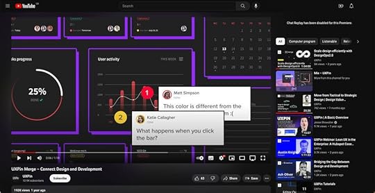
UXpin's Blog, page 32
August 17, 2023
Storybook-UXPin: Review of Merge Integration
I decided to share my impressions on UXPin Merge Storybook integration and write about how it influenced the designer-developer collaboration in our team.
Merge is a part of UXPin – that’s technology providing two main integrations with developers’ tools (Git and Storybook). It allows you to quickly prototype using ready UI code components that are React-based for Git integration, or any framework-based for Storybook integration. I tested the Merge integration with Storybook.
The review was written by Roy S. Kim, the CEO, and Jacobo Moreno Quiroga – Front end engineer & Digital Content Designer from Fixel Inc., the Japanese UX/UI design consulting company specializing in Design Systems.
Design with interactive Storybook components in UXPin. Build products 10x faster and bridge the gap between designers and developers. Discover UXPin Merge.
Reach a new level of prototypingDesign with interactive components coming from your team’s design system.
Discover UXPin Merge .discover-merge { margin: 40px 8px;}.discover-merge__container { display: flex; max-width: 690px; height: 200px; padding: 20px; padding-left: 24px; border-radius: 4px; background-color: black; box-shadow: 10px 10px #9999ff; align-items: center; justify-content: space-between;}.discover-merge__left { width: 50%;}.discover-merge__left p { margin: 10px 0px !important; color: white !important; font-size: 18px !important;}.discover-merge__heading { font-weight: bold !important; color: white !important; font-size: 18px !important;}.discover-merge__text { margin: 0 !important; line-height: 22px !important;}.discover-merge__button { width: 174px; height: 44px; margin: 10px 0px; border: none; border-radius: 2px; background: white; color: black; font-size: 16px; text-align: center;}.discover-merge__button:hover { cursor: pointer;}.discover-merge__image { max-width: 320px !important; height: 200px; margin-right: -19px;}@media (max-width: 760px) { .discover-merge__container { height: auto; margin: 10px; align-items: left; }}@media (max-width: 500px) { .discover-merge__container { flex-direction: column; } .discover-merge__left { width: 100%; align-items: normal; }}UXPin Merge and Storybook integration
 I have both an engineering and design background, and I work on a daily basis on finding solutions to processes inside an application and then writing them in code. The designer part comes in handy when I need to consider and improve the user’s perspective.
This involves more than defining visual aesthetics, it requires considering how the application interface can be subtle enough for someone to not notice it so that they can focus on what they are trying to achieve in the app.
I usually struggle with the back and forths between iterations of coding that aim to improve user experience.
Those kinds of improvements are not the same as fixing the product because something doesn’t work. It’s more of intuitive work when a user reports that something feels off. Even if you apply all the design and UX good practices, the user could still complain, and they would be 100% right. This is where a coded Design System or an organized UI component library can help. If you have tested and polished the components approved for your Design System, then you can treat them as ready building blocks for new applications without spending too much time thinking or adjusting them.
UXPin with Merge technology allows you to import all your Design System components stored in Git or Storybook to the design editor so that you can prototype with them right away. Thanks to this designers can use actual coded elements to speed up the prototyping. UXPin Merge’s motto is “The single source of truth” because what you see in the prototype is combining design with actual working code that developers use as well.
UXPin – designing to codingLet’s start with just UXPin. Essentially, UXPin is a UI/UX design tool similar to Sketch, AdobeXD, or Figma. It’s similar to other competitors so you can get used to it very quickly. You can start with wireframing and end with advanced prototyping in this single tool.
In most of the similar tools, there is a big difference between what the designer creates in the design tool and what happens in the dev environment, where the real working product is coded. Features like the inspect tab in Figma enable you to see roughly what the CSS behind a certain object would look like. However, this is not always an accurate depiction between what is designed and what is coded.
Designers and developers essentially come from two different worlds when it comes to the tools used in their daily work. Trying to find a common language between them can lead to way too many meetings and back-and-forths. This might be the very issue that UXPin Merge aims to solve, by having “The single source of truth” which the whole team can treat as the ultimate place of the right components and documentation.
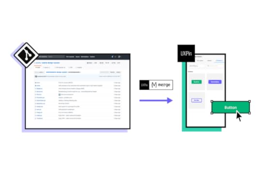
The UXPin Merge approachMerge is UXPin’s technology. Essentially, what Merge does is that it brings coded Design Systems stored in Git repositories or Storybooks to UXPin. Hence, a designer can use real components in their mock-ups and prototypes.
These components are already coded in the repository, and the designer can access its different versions inside UXPin as needed. This way, the integrity of each component is never compromised. It minimizes possibilities for a designer to make mistakes and use elements that aren’t in line with the company’s standards.
 The components from your repository are stored in UXPin library
 Once you have a Design System and repositories ready to go, you won’t be really modifying them often as their purpose is to store and unify all the versions of the possible elements to speed up the product development process and create governance.
Using UXPin Merge and the imported components, controls the design process as elements are predefined. The changes can be made without a problem but it must be done by developers, so that the chances for casual mistakes are pretty low.
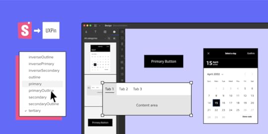
 Once imported, you can have a component with all its variations. In this case you can change the Type, Size, Disabled, Label, Click properties of a Button which are defined in the props of the React Component.
 These limitations actually simplify the work of a designer. They can use fully interactive and prepared elements to focus on the most crucial part – user experience. Sure; color, padding, fonts, and other visual elements are important parts of the experience, but choosing every single little detail can slow down the process.
If all of that is already sorted out in the Design System and repositories, building prototypes with real code components gets easier and faster. Also, it helps keep the consistency even if the components get updated in code as the imported UI is in sync with the components stored in devs’ libraries. No need to worry that elements will be outdated and designers will have to redesign the projects.
Connecting StorybookOne of the UXPin Merge integrations I got to see was Storybook. Storybook serves as a sort of developers’ Design Systems to store all the coded UI. It is used by many companies, and it’s very flexible framework-wise as it provides support for around 15 of them.
Now, for teams that are not supported by developers, setting up a Storybook project and placing all the components there may be a struggle. However, once it’s ready, it neatly holds and displays all the components that are in the Design System.
UXPin Merge aims to bring what is stored and defined in Storybook to UXPin so that components made in whichever framework can be used for prototyping. The integration part is very simple; grab the URL of a published Storybook project to import the components to the UXPin library for designing. I tested it and it seemed to work perfectly with React components – all the elements behaved in the design editor just as they should.
Thoughts for the futureThe design process including UXPin Merge in it can be visualized like this:
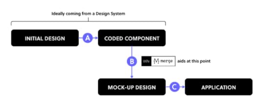
UXPin Merge plays a big part in Step B since it provides production-ready UI-coded components that you can use to iterate faster when creating prototypes. With a defined Design System or a component repository, you really shouldn’t worry about Step A because you most probably already have the organized components. Still, there is a possibility that you need to adjust something within the coded components, especially if you are in the middle of creating your own Design System.
With Step C, which is the build-up step of the application, the developers look at the Merge prototype to see how code components are put together, as well as what code corresponds to which part of the design. However, they won’t just copy and paste the whole code to build the product instantly – they will still need to adjust it so that the prototype becomes a product.
UXPin Merge seems to be a great solution for rapid prototyping and keeping the consistency thanks to making the most of Design Systems. However, it appears that certain steps are still to be covered.
To some extent, the work of designers is limited as they mostly can use pre-prepared components, however, it saves time and prototyping with code components brings the world of design and development together.
Want to try out the integration? Sign up for a 14-day trial!
Try Storybook integrationThe post Storybook-UXPin: Review of Merge Integration appeared first on Studio by UXPin.


MUI 5 Customisation – What is the Best Styling Method?
MUI is one of the most popular and robust React component libraries. Developers use MUI to put together user interfaces for React apps. MUI is also useful for prototyping. Using this library, a designer can create high-fidelity prototypes that are fully interactive and ready for usability testing or even the handoff in practically no time.
If you want to try prototyping with MUI, sign up for a free trial. You’ll be able to use the MUI kit for 14 days.
See how close to the real product your prototypes can get when you use a design tool that renders code instead of vector graphics. Explore the full potential of designing with MUI with UXPin Merge. Request access to UXPin Merge.
Reach a new level of prototypingDesign with interactive components coming from your team’s design system.
Discover UXPin Merge .discover-merge { margin: 40px 8px;}.discover-merge__container { display: flex; max-width: 690px; height: 200px; padding: 20px; padding-left: 24px; border-radius: 4px; background-color: black; box-shadow: 10px 10px #9999ff; align-items: center; justify-content: space-between;}.discover-merge__left { width: 50%;}.discover-merge__left p { margin: 10px 0px !important; color: white !important; font-size: 18px !important;}.discover-merge__heading { font-weight: bold !important; color: white !important; font-size: 18px !important;}.discover-merge__text { margin: 0 !important; line-height: 22px !important;}.discover-merge__button { width: 174px; height: 44px; margin: 10px 0px; border: none; border-radius: 2px; background: white; color: black; font-size: 16px; text-align: center;}.discover-merge__button:hover { cursor: pointer;}.discover-merge__image { max-width: 320px !important; height: 200px; margin-right: -19px;}@media (max-width: 760px) { .discover-merge__container { height: auto; margin: 10px; align-items: left; }}@media (max-width: 500px) { .discover-merge__container { flex-direction: column; } .discover-merge__left { width: 100%; align-items: normal; }}Why Material UI?A ton of teams use MUI as a ready-made component library for their design systems. It’s an open-source library, documented and maintained by a large community, so it makes a lot of sense to take advantage of it, instead of wasting resources on building a React library from the ground up.
MUI components are customizable. In this article, we will go through a simple overview of different ways to style MUI v5 components, and why you should consider those styling methods.
6 Methods of Customizing MUI Componentshttps://t.co/OoMuzMpoMf 🚀MUI is a powerful library with extensive documentation. Check out how easily you can access the documentation in UXPin Merge. 🎉 Request Merge access and use MUI.
— UXPin (@uxpin) January 27, 2022
Many thanks to @MUI_hq 🙌#uxpinmerge #mui #reactlibrary #FrontEndDevelopment pic.twitter.com/CtAq2Y9bmJ
When discussing the customisation of MUI components, it mostly comes down to how they are styled, with so many in-depth articles on this topic already, we’ll quickly go over the best styling methods.
1. ThemeProviderThe first styling method of MUI would be the ThemeProvider which is a HoC wrapping other components. It injects custom styling, allowing the user to override styles and props.
You’d want to use this to create an easily usable style across most of all of your components, for example, to build a branded library. Since it isn’t a tutorial but a really simple and quick showcase, see a Button component and pay attention to the way you can override styles and start developing a branded component.
2. createStyledThe second way of MUI customization is the styled method. It is a function extended from the styled utility. I found that method very useful when needing to apply styles that aren’t used very often, but they were important enough to spend time on making them reusable.
For instance, if you have a highly used component, but only 25% of the time you need to give it a certain style such as no padding or margin then add a corresponding prop to enable styles in these use cases. Shown in the image below, is a case where you need to remove the padding on a MenuItem component on occasion.
const stylesFromProps = { shouldForwardProp: (prop) => prop !== 'disablePadding',};const MenuItemM = styled( MenuItem, stylesFromProps,)(({ theme, disablePadding = false }) => ({ ...(disablePadding && { padding: 0, }),}));3. sx={…} PropWith the newly released MUI 5, the prop sx has been introduced, which is a quick way to define custom styling that has access to theming and it’s variables or any valid CSS you can think of.
This is very useful when you have a component that is being used in multiple places, but you need to have very specific styles or fix a niche issue for a single case, for example, the previously described issue of having to remove the padding on a MenuItem component.
4. Component WrappingNext, you could try wrapping the component and passing in props to change styles. It’s a possibility, but I found it quite prone to having duplicate props and just generally problematic.
5. Unstyled ComponentsAnother way of customizing MUI components is using the very new and not fully implemented Unstyled Components. It is said to support more components in the coming months.
This seems to be a great solution, as Unstyled Components can be used to create a component library that is not based on Material Design, which is a reason for some not to use MUI. It seems great for avoiding CSS conflicts.
6. MUI Box ComponentOne option that I’ve only just found out about is using the Box component to override styles. The documentation is continuously being updated, so I’m eager to find out more information about how it works..
In conclusion, these are the recommended methods to customize the MUI v5 components. Those methods provide a lot of possibilities and even allow you to create a unique branded library when using Unstyled Components.
Sync MUI with UXPin MergeWith so many styling methods, you need to give MUI a go. Once you’re ready to create interface design with it, see how UXPin Merge can help you.
It’s a revolutionary solution that allows you to design with full interactivity and functionality of MUI components, and then use those components in the production phase, without the need to translate your design into code with third-party tools. Finally, your design and development teams can share a single source of truth.
The post MUI 5 Customisation – What is the Best Styling Method? appeared first on Studio by UXPin.
Parsing Props for UXPin Merge Controls – A How-to Guide
Our friend from PayPal, Anthony Hand, decided to share how to make designers’ lives easier using parsing props with UXPin Merge.
Merge is UXPin’s revolutionary technology that helps you import and sync your dev’s UI components from the component library in the design tool.

You can bring the components via Storybook integration or Git repository. You can also use NPM integration for importing and components without engineer’s help. Either way, you don’t need to worry about trading off between time and robust prototypes – you can have both.
It’s possible to design fully interactive prototypes extremely fast because the UI elements you use during the design process are live code. Discover more about UXPin Merge.
Reach a new level of prototypingDesign with interactive components coming from your team’s design system.
Discover UXPin Merge .discover-merge { margin: 40px 8px;}.discover-merge__container { display: flex; max-width: 690px; height: 200px; padding: 20px; padding-left: 24px; border-radius: 4px; background-color: black; box-shadow: 10px 10px #9999ff; align-items: center; justify-content: space-between;}.discover-merge__left { width: 50%;}.discover-merge__left p { margin: 10px 0px !important; color: white !important; font-size: 18px !important;}.discover-merge__heading { font-weight: bold !important; color: white !important; font-size: 18px !important;}.discover-merge__text { margin: 0 !important; line-height: 22px !important;}.discover-merge__button { width: 174px; height: 44px; margin: 10px 0px; border: none; border-radius: 2px; background: white; color: black; font-size: 16px; text-align: center;}.discover-merge__button:hover { cursor: pointer;}.discover-merge__image { max-width: 320px !important; height: 200px; margin-right: -19px;}@media (max-width: 760px) { .discover-merge__container { height: auto; margin: 10px; align-items: left; }}@media (max-width: 500px) { .discover-merge__container { flex-direction: column; } .discover-merge__left { width: 100%; align-items: normal; }}Prop Parsers for UXPin Merge ControlsAs any UI developer knows, parsing and validating user inputs is as much of an art as a science. While most of the users most of the time may enter the expected values, we must always be prepared to do a little graceful massaging and tweaking, as well as error handling.
In my days as a Sr. UX Designer on a DevOps team at PayPal and all of my projects are internal web-based tools, we used UXPin Merge. After we settled on the Microsoft Fluent UI library for our next generation of web apps, we embarked on the process of importing the UI library into UXPin using their Merge technology. The process was straightforward enough, though it did have a little learning curve.
One of our first learnings with UXPin Merge was that standard parsing and validation needs applied. The Properties Panel in UXPin is, after all, just a fancy user input form. We developed a few standard parsing utilities for basic user inputs like colors and dates, for example.
As we got deeper into the UXPin Merge preparation, we soon realized that more complex UI controls would need complex JSON in the underlying control. However, surfacing raw JSON to non-technical people in UXPin would quickly kill user adoption.
JSON is a complex data model expressed as a string, created for computers, not humans. As a result, one of our most important innovations was to create an advanced multi-use parser that allowed us to gather plain text user inputs to configure complex UI controls like dropdowns, navigation lists, and data tables.
Basic ParsingWe created a few basic parser functions in JavaScript to handle the validation for common user inputs around colors, dates, and numbers, for example. Although these were primarily created to make it easier to configure UI controls in UXPin, some of these utilities have found wider use internally.
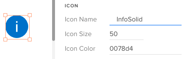
Parsers converted the string “50” to an integer and validated the hex color, adding back in the required # mark. Our Merge wrapper also trimmed leading and trailing whitespace from the icon name. (UXPin Editor and Props Panel view)
Color Parsing & FormattingThe Microsoft Fluent UI controls want hex values, such as “#0078d4” (a lovely shade of blue), but we wanted to allow users to use both hex values and easier to remember theme tokens (such as “themePrimary”). Plus, we wanted to support semantic tokens (e.g., “success”) and a handful of basic colors (e.g., “white”, “transparent”).
As for gracefully handling errors, we trimmed input text of whitespace and accepted valid hex values, even if they didn’t start with a # mark.
Our custom color parser gives a huge range of freedom to users and accepts all of those types of values, returning either a validated hex value for use by the UI control, or “undefined” as an error flag.
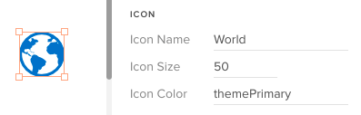
The color parser checked to see whether “themePrimary” was a color token in the theme, then retrieved its hex value for use by the icon object.
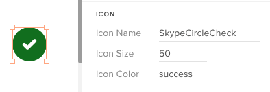
Similarly, the color parser looked up the special semantic color token, “success,” and converted it to a hex, as well. “Success” is easier to remember than an arbitrary hex value.
Complex ParsingAs mentioned previously, many of the underlying UI controls use complex JSON for configurations, like menus, navs, and dropdowns. However, JSON is hard to read for humans, and easy to break. So instead of JSON, we invented an innovative syntax that’s much easier for regular humans to use. In addition to plain text, the syntax tokens we developed include:
icon(Icon_Name | color): Any icon in Microsoft’s icon librarylink(Display Text | URL)Divider or —-: To display a divider in a list* : To mark a child in a section, like in a nav or menuCSV Parsing: For table rows or when commas are needed in plain text in certain controlsNote: In most cases, this special syntax is only for use within UXPin to help designers and (typically) non-technical people easily build prototypes. To build the actual web apps, developers would set up these UI controls in the standard way with JSON, event handling, etc.
Icons & Text in MenusLet’s look at how a user would add popup menu items to a CommandButton control in UXPin. In this example, the user clicks on the button with the text “New” to display a popup list of the types of objects the user could add, such as various file types, a folder, a user, etc.
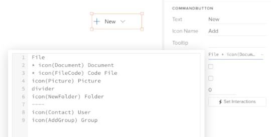
In the UXPin Editor, the user clicks on the Menu Items prop to view a large text editor. Our improved parser now looks ahead to determine whether a string like “File” is a regular menu item or a section heading. The star ( * ) indicates that “Document” is a child, so “File” must be a section heading . Note the usage of the icon() token , and two intuitive ways to indicate a divider .
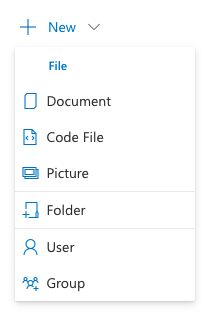
This is the view of the same CommandButton as rendered in the UXPin Prototype Preview mode.
This powerful, innovative syntax was reused across nearly a dozen other UI controls that supported a list-style view: Dropdown, Combobox, Pivot (tab strip), Nav, ChoiceGroup (radio buttons), GroupButton, SplitButton, Breadcrumb, and more.
Although support for icons, dividers and groups varied between controls, once UXPin users became familiar with this basic approach, they are able to easily apply the same approach across a ton of controls to create rich, interactive prototypes without knowing a lick of JSON.
Data TablesAs you might imagine, internal web apps are data intensive and data tables are extremely common. So, one of the main drivers for developing this advanced parsing engine was to help us easily create realistic — and modestly functional — data tables in our prototypes.
To create rich prototypes with reasonably advanced functionality, our workflow starts off with Excel. We first develop a model of the view in Excel, using the link() and icon() syntax mentioned above within each cell. Then we export that worksheet as a CSV file.
Using any text editor, we can open the CSV file and copy just the headers, or the row data, into the Headers and Rows props in UXPin, respectively. Compare this streamlined workflow to what we used to do to create tables in other prototyping tools!
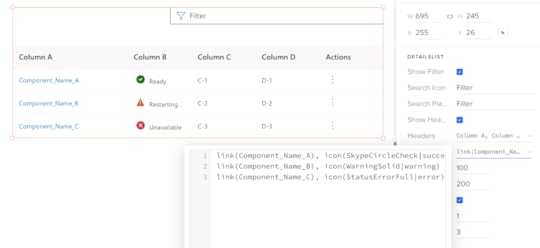
The UXPin Editor view for the DetailsList’s Rows prop showing the comma-delimited cells (CSV format) with our innovative link() and icon() syntax.
Designer’s Perspective on ParsingAs you look through the source code for our parsers, you may have some opinions on some of the design decisions in the code, and how (relatively) inefficient or verbose the code is. You may even notice some errors. I accept responsibility for these decisions.
Keep in mind that I’m a UX designer, not a professional programmer. More importantly, I explicitly decided to optimize for readability, modularity and ease of maintenance over efficiency, per se, given my limited knowledge of JavaScript. This is open source code, so you’re welcome to borrow some or all of the code, make modifications, or offer updates and bug fixes.
On Optimizing UXPin MergeUXPin’s Merge technology lets any company import the exact same UI component library that they use for development into UXPin so that anyone on the team can create rich, interactive prototypes. It’s a powerful technology that can dramatically increase the velocity of design for user feedback and stakeholder reviews, and can improve developer handoff.
However, as our team learned, there needs to be a modest investment in setting up the end user experience for success in UXPin. We made an explicit decision to optimize the UXPin user experience with smart parsing that brings maximum power while minimizing errors.
We recently ported our proprietary Microsoft Fluent UI library to an open source library which your team are welcome to experiment with and gain inspiration from. And feel free to liberally modify and/or borrow any of our parsers for your own UXPin Merge projects!
The post Parsing Props for UXPin Merge Controls – A How-to Guide appeared first on Studio by UXPin.
Storybook 7.0 – Why You Should Be Excited
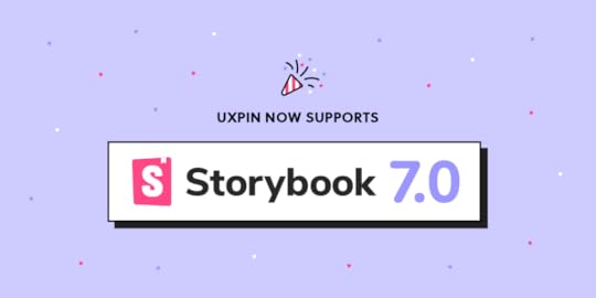
Storybook is a huge productivity boost for development teams, helping them scale their work and stay on the same page. The tool is launching its new version that you can also leverage in UXPin. The new update introduces some major improvements and extends Storybook’s capabilities.
Bring Storybook’s components to UXPin and design prototypes that look and behave like the end-product. Keep consistency between design and development and unite teams with a single source of truth. Try UXPin’s Storybook integration.
Reach a new level of prototypingDesign with interactive components coming from your team’s design system.
Discover UXPin Merge .discover-merge { margin: 40px 8px;}.discover-merge__container { display: flex; max-width: 690px; height: 200px; padding: 20px; padding-left: 24px; border-radius: 4px; background-color: black; box-shadow: 10px 10px #9999ff; align-items: center; justify-content: space-between;}.discover-merge__left { width: 50%;}.discover-merge__left p { margin: 10px 0px !important; color: white !important; font-size: 18px !important;}.discover-merge__heading { font-weight: bold !important; color: white !important; font-size: 18px !important;}.discover-merge__text { margin: 0 !important; line-height: 22px !important;}.discover-merge__button { width: 174px; height: 44px; margin: 10px 0px; border: none; border-radius: 2px; background: white; color: black; font-size: 16px; text-align: center;}.discover-merge__button:hover { cursor: pointer;}.discover-merge__image { max-width: 320px !important; height: 200px; margin-right: -19px;}@media (max-width: 760px) { .discover-merge__container { height: auto; margin: 10px; align-items: left; }}@media (max-width: 500px) { .discover-merge__container { flex-direction: column; } .discover-merge__left { width: 100%; align-items: normal; }}What Storybook 7.0 has to offer?
The official launch of Storybook 7.0 is planned on March 14th. You can try it on beta and experience its benefits before the official release. Learn more about it in Storybook’s article about plans for 2023.
Better performanceStorybook’s team upgraded the tool’s performance significantly. They managed to make it 2x faster compared to its previous version.
More compatible integrationsThe new version of Storybook makes integrations easier. By launching Frameworks API, Storybook now supports Vite, NextJS, and works on supporting SvelteKit. This also enabled them to think of integrations with new frameworks like Remix, Qwik, SolidJS, and more.
More extensive testingThey added code coverage reporting. Now it’s transparent which lines of code in the components and libraries are tested by the user’s stories.
Improved documentationStorybook has a few updates for documentation. One of them is that Storybook’s team upgraded documentation to version 2 of MDX. They also simplified the way of importing stories (component examples) in docs.
Integrate Storybook 7.0 with UXPin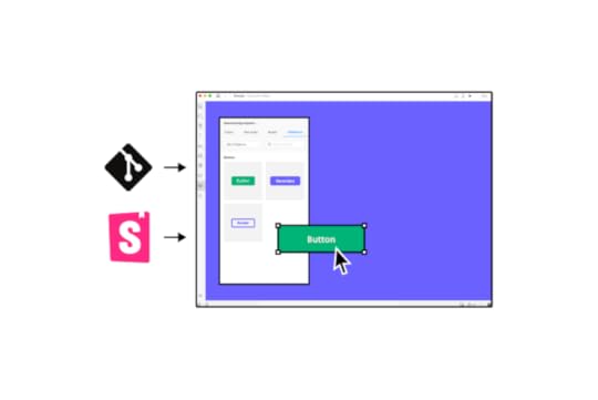
UXPin supports Storybook 7.0. Go ahead, sync your Storybook components with UXPin. It’s super easy and gives you a host of benefits that will improve your product design and development process.
Create prototypes with Storybook componentsThe components that you bring to UXPin are more than just a visual representation of what you have in Storybook. They are fully functioning, allowing you to test real user interactions. That’s what high-fidelity prototyping should be about.
Foster cross-functional collaborationThe integration will help you break the silos between product design and engineering. The teams will share the same components which will prevent them from inconsistencies between design and development.
Streamline design handoffBy building prototypes with fully functional components, designers are able to smooth out the design handoff process. Storybook components can become a single source of truth that both teams share, so there’s no need for extensive documentation or misalignment.
Here’s how to integrate with StorybookThe integration can take less than a minute. You need a link to a Storybook library you want to use (public or private), log in to UXPin and add a new library by pasting the link in the box: “Import Storybook components.”
Get a guided tour of UXPin’s Storybook integration.
Try UXPin and Storybook 7.0Storybook is a great tool for UI component quality control, but it will help you maintain and scale the design system once combined with UXPin. Start designing interactive prototypes with Storybook components. Try UXPin’s Storybook integration for free.
Try Storybook integrationThe post Storybook 7.0 – Why You Should Be Excited appeared first on Studio by UXPin.
10 UX UI Design Trends that Dominate 2023 and Beyond

Personalization, scrollytelling, data storytelling, and buttonless UIs are some of the most exciting 2023 UI design trends. Our research has also noticed an interesting UX UI trend toward larger screens, with Instagram improving its desktop experience to accommodate the growing demand.
Key takeaways:
Product personalization – a UX trend which means that 2023 will be abundant in customized experiences for users.Enhanced cross-platform experience – another UX trend that stands out in 2023; users want smooth experience regardless of the tool they’re using.Scrollytelling –using scroll interaction in web design of landing pages.Minimalism – a UI trend that keeps being popular even in 2023.Buttonless UI – designing button UI that doesn’t feel like a button.VR & AR – virtual and augmented reality are one of the most popular topics among designers.Bold and capitalized typography – we’re continuing with using typography as a statement in UI design.Light mode – dark mode is relevant but we feel there’s a light UI resurgance in 2023.Advanced interactions and animations – a UX trend that’s connected to VR, AR, and wearble UI design.Create high-quality, fully functioning prototypes to test your UI design ideas with UXPin. Sign up for a free trial to explore UXPin’s advanced features today!
Build advanced prototypesDesign better products with States, Variables, Auto Layout and more.
Try UXPin .try-uxpin-banner { margin: 40px 0px;}.try-uxpin__container { display: flex; max-width: 689px; height: 210px; padding: 20px; padding-left: 24px; border: 2px solid black; border-radius: 4px; align-items: center; justify-content: space-between; background-color: white; box-shadow: 10px 10px black;}.try-uxpin__left { width: 54%;}.try-uxpin__left p { margin: 10px 0px !important; color: black !important;}.try-uxpin__heading { font-size: 28px !important; font-weight: bold;}.try-uxpin__text { margin: 0 !important; font-size: 18px !important; line-height: 22px !important;}.try-uxpin__button { width: 135px; height: 44px; background: black; margin: 10px 0px; padding: 10px 20px; border: none; border-radius: 2px; color: white; font-size: 16px; text-align: center;}.try-uxpin__button:hover { cursor: pointer;}.try-uxpin__image { max-width: 320px !important; height: 200px; margin-right: -21px; margin-bottom: -6px;}@media (max-width: 760px) { .try-uxpin__container { height: auto; margin: 10px; align-items: left; }}@media (max-width: 500px) { .try-uxpin__container { flex-direction: column; } .try-uxpin__left { width: 100%; align-items: normal; }}Product Personalization
Personalization means creating personalized user experiences based on user behavior and browsing habits. This is gaining more and more popularity as a UX trend in 2023.
A great example of product personalization is Netflix. No two accounts look alike because the algorithms suggest programming based on your viewing history. eCommerce giant Amazon uses a similar approach, personalizing each shopper’s homepage based on purchase and browsing history.
Want to create a personalized app design with your team? Infosys suggests focusing on four elements to of product personalization:
Persona: Who is your customer?Product Recommendation: What do you offer, and how do you present your products and services?Product Pricing: What is your ideal price point?Product Positioning: How do you position the product to customers at each stage in the sales funnel?Considering those four aspects will help you create a really immersive experience.
Product personalization resources:
User Experience and Personalization in Digital ProductsProduct Personalization – The Present and the FuturePersonalization in Digital Marketing: What It is and How to Make It Happen9 best-in-class examples of product personalization5 steps you need to take to scale your digital personalization“The bar for product personalization has never been higher as it will be in 2023,” commented Cheryl Couris, Director of Product Design at Webex Events. She added”Products are personal – and we’ve all grown to expect products we know and love to know and love us right back, offering specific ways we can tailor our experiences that fit our own unique needs.”
Enhanced Cross-Platform User ExperiencesWhile cross-platform applications aren’t new, many products are slow to provide seamless user experiences across multiple devices–namely, desktop vs. mobile or tablet. Products that limit what services and features users can access on mobile could lose customers to competitors who can!
Cross-platform experiences don’t only refer to desktop-to-mobile. UX UI designers must also think about mobile-to-desktop. If you have a mobile-only application, it might be time to consider desktop users–a trend Instagram says is growing!
Head of Instagram, Adam Mosseri, mentioned in a Twitter post that “[Instagram for the web] is designed now to take advantage of large-screen monitors which have become more and more the norm.” The update allows users to do more with the desktop version, including optimizing the platform for a large-screen experience.
🎉 New Features 🎉
— Adam Mosseri (@mosseri) November 8, 2022
Some “finally features” that I think you’re going to be excited about…
– Schedule Posts (coming soon)
– IG Web Updates pic.twitter.com/5tyMxWh1n8
Cross-platform user experience resources:
5 Examples of Seamless Cross-Platform Experiences to Drive App GrowthMultiple User Interfaces and Cross-Platform User Experience: Theoretical FoundationsUX Design for Cross-Platform ExperiencesWhat Is Cross-Platform Mobile App Development?Native vs. Cross-Platform Apps – You’ll Be the WinnerScrollytellingScrolling + storytelling = scrollytelling. Not a new trend by any means, but certainly growing in popularity. Apple’s AirPods Max landing page is a fantastic example of scrollytelling. As you scroll, the page highlights different features and benefits with beautiful product images.
ven government organizations like the UK’s Office for National Statistics (ONS) use the immersive scrolling technique to inform people on public matters, “The strength of the scrollytelling format is its ability to engage the reader and bring a story to life…Interactive ‘scrollytelling’ articles are a great way to explain and explore complicated datasets.”
Scrollytelling resources:
A beginner’s guide to scrollytellingTransform Your Long-Form Content With This Guide to ScrollytellingWhat are Census 2021 interactive “scrollytelling” articles?Scrollytelling: Storytelling for The Next DecadeWhat is Scrollytelling? What is its Impact On Digital Content?Data StorytellingWe continue the storytelling theme with data storytelling. Microsoft describes this trend as “…building a compelling narrative based on complex data and analytics that help tell your story and influence and inform a particular audience.”
Data storytelling is nothing new for enterprise product design, but we’re seeing this UI trend grow in popularity for consumer digital products–most notably activity-related apps like Apple Health, Whoop, Garmin, Strava, etc. People love numbers and data!
Writing aid Grammarly uses data storytelling in a personalized weekly email to users, including several metrics:
 Number of consecutive weeks of productivityNumber of words checked/productivityAlerts shown/masteryUnique words used/vocabulary
Grammarly’s weekly data storytelling emails encourage users to use the tool more to improve their writing, ultimately increasing product usage and engagement.
How can your product leverage data storytelling to increase engagement?
Start by interviewing your target audience to learn what information they value most–try to identify something that will help them improve.Gather a cross-functional team, including content designers, product managers, marketers, data scientists, and engineers, to ideate how to present personalized data.Create fully-functioning high-fidelity data visualization prototypes for usability testing.Launch a beta version, and get feedback from end users.Improve and iterate!Data storytelling resources:
What is data storytelling?Data Storytelling: How to Effectively Tell a Story With DataIntroducing Grammarly Insights (example of data storytelling from Grammarly)How to Tell a Story With Data: A Guide for BeginnersThe next chapter in analytics: data storytellingMinimalismMinimalism is a trend that keeps on trending! YouTube refreshed its user interface design for a more modern, minimalist black and greyscale look in mid-2022. The old YouTube-red subscribe button is now black, and secondary CTAs are black on grey.
YouTube’s black and greyscale UI facilitates a seamless user experience between light and dark themes–dark mode is a trend that’s grown in popularity over the last few years.
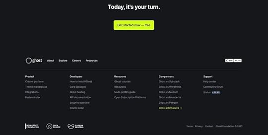
Many websites and digital products have adopted a similar black and greyscale variation. The benefit of this simple color palette is UI design team can use a single color to make important CTAs and features pop–like this example from the blogging plaform Ghost.
Minimalism resources:
How to Use Minimal Design to Create Practical Design Systems3 Techniques for the Perfect Minimalist Web InterfaceA Perfect UI Pairing: Minimalism and Bold TypographyFree e-book: Space, Ratios, Minimalism in Web UI DesignSimplicity Is Key: Exploring Minimal Web DesignButtonless User InterfacesContinuing the minimalism trend are buttonless user interfaces–say what? Buttonless UIs are more common than you think, but are they user-friendly? It depends on where they are used. Take mobile UIs. Most mobile devices use buttonless patterns for settings.
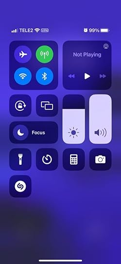
For example, users can adjust these iPhone settings using tap, slide, and swipe gestures. Instead of a + and – for volume and brightness, users slide either component up or down to adjust.
“Having a single action that has a clear outcome is an awesome invention but it’s pretty outdated, told us Piotr Makarewicz, Director Of Product Design at Pitcher AG. “We have many other ways of interacting – day to day we use voice, with our loved ones we can use touch, in a restaurant we use smell and taste.
Voice seems like the most natural communication device we have. We use that for our assistants and to control some home smart devices but it’s still pretty awkward. It’s great that Siri can rap but she is not a real day to day assistant. Neuralink is still far away and who’s to say that it wouldn’t be even more awkward.
When it comes to Buttonless Interfaces it’s not about changing the light switch to a clapper switch, it’s about making the light smart enough to light itself exactly when it’s needed.”
Buttons are often redundant in most UI patterns. For example, if a card only has one action, it doesn’t need a button; users can click/tap the card.
Other examples where designers can eliminate buttons include:
Using a devices biometrics to replace login formsLeveraging voice search/voice user interface (VUI) functionalityDragging or swiping messages and popups to close themDouble tap to like or favoriteUsing device a device’s return key to replace send buttons for text fieldsButtonless UI resources:
Future UI Design Without ButtonsFuture of UI Design Without Buttons in 2022VR & AR UI DesignWhether you believe in Meta’s Metaverse prophecies, demand for VR (virtual reality) and AR (augmented reality) user experience design continues to grow.
“We as designers need to be aware of that and make sure that we have our voices heard, noticed Piotr Makarewicz (Pitcher AG), “It’s something that can affect the landscape dramatically and we still are not ready for it. With new initiatives like Live Translator with Subtitles or virtual universes popping out you know there’s something out there. It’ll no longer be just Jarvis inside (or outside) Iron Man helmet or us furnishing homes with IKEA AR, it’ll stop being just a novelty and will become a necessity.”
VR & AR have expanded beyond gaming and social interactions to developing tools that help users navigate the real world better. For example, many companies use AR systems to train employees.
Retail brands are also using VR to create apps that enable users to try their products:
IKEA Place: an AR furnishing app that allows users to visualize how a room will look with products from IKEA. For example, which sofa will look best in your living room?Warby Parker: an outstanding AR experience allowing users to try different frames and purchase through the app.L’Oréal ModiFace: customers can try L’Oréal’s makeup range to find that perfect shade and tone.These creative applications show how brands selling physical products can leverage AR and VR technology to enable customers to “try before they buy.”
VR & AR UI design resources:
7 innovative cases of augmented reality used in enterpriseHyundai Virtual Guide Introduces Augmented Reality to the Owner’s ManualFor more companies, new ways of seeingUI/UX: Designing for AR & VRRole of UX UI on Augmented Reality designMinimum Lovable Product (MLP)Brian de Haaff, co-founder and CEO of leading product development software, Aha!, coined Minimum Lovable Product (MLP) in 2013 and wrote about it in his best-selling book, Lovability: How to Build a Business That People Love and Be Happy Doing it.
The idea behind MLP is to focus on delivering digital experiences customers love rather than getting to market as fast as possible with a Minimum Viable Product (MVP).
What does this mean for UI designers?
“Trendy apps have hooked us on instant, bite-sized gratification, and in the coming year we’ll see more of the minimum lovable product approach as new ideas and innovations emerge – shipping smaller, faster slices to test the market before going all-in. What an exciting time to be a designer (and consumer)! You’ll get to taste-test big ideas and watch them evolve over time.” – Cheryl Couris from Webex Events.
Focus on accessibility to create fully inclusive user experiences from the start.Leverage an open-source design system to build an MLP using tested and approved UI components rather than designing from scratch.Use component-driven prototyping to solve usability and accessibility issues while identifying more opportunities during the design process.With so much competition and new startups entering every market daily, quality UI design will be a significant competitive advantage over the next few years.
Minimum Lovable Product resources:
What Is a Minimum Lovable Product?Minimum Lovable Product: The Evolution Of Minimum Viable ProductWhat is a Minimum Lovable Product (MLP)?Have you ever heard about Minimum Lovable Product?What is a Minimum Lovable Product and How to Build One?2023 Typography TrendsThe latest trend in typography for 2023 can be summarized in three words: big, bold, and capitalized. It’s fantastic strategy for UI designers looking to grab users’ attention. Even the global web trends website, Awwwards, uses capitalized bold typography for its homepage H1 and header callout.

UI designers also mix typefaces and styles to emphasize words or draw users’ attention. For example, this hero from Lacoste’s Draw it Yourself campaign uses bold capital styling combined with solid and outlined text for its H1.
 lacoste bold text example
Tennis star Venus Williams also uses big, bold, capitalized typography throughout her website design. The font helps reinforce Venus’ status as a strong, dominant world number one.

If you want to stand out and position your brand as a dominant market leader, big, bold, capital typography can help achieve that in 2023! For a softer, calmer approach, you can use thin, condensed, and capitalized lettering–like this example from the Aussi-based creative initiative Hip Opera.

Typography resources:
25+ Typography Trends for 2023Top 10 Typography Trends in 2022Typography Trends in 2022: What Should You Know?What Are the Graphic Design Trends for 2023?10+ Trends for Pairing Fonts in 2023Light modeTime to brighten our screens. Another huge trend in user interface is light mode, or better yet, allowing your users to pick which theme they want–dark or light.
Dark mode is said to be more energy-saving for devices and less straining to the eyes. Yet, if a user suffers from astigmatism, they may prefer light mode since they have difficulties reading light text on dark. The same goes for people who are sensitive to light.
Advanced Microinteractions & AnimationsMicrointeractions breathe life into digital products. Technological and performance improvements over the last few years mean that designers can add these subtle animations to every component–giving UIs more character and personality.
Advanced microinteractions provide vital user feedback, particularly for buttonless UIs where components must respond to user actions. Returning to our Apple example, notice how each UI element animates to inform users of system changes. Turning flight mode on and off triggers multiple microinteractions, running until the system executes the task.
With advances in AR, VR, wearables, and even holographic UIs, we’ll see exciting changes during 2023/24 in how users interface with technology and the microinteractions that facilitate human-to-computer interaction (HCI).
Check out microinteractions resources:
What is Interaction Design?Powerful Microinteractions to Improve Your PrototypesMicrointeractions: Designing with Details (book by Dan Saffer)The Design of Everyday Things (book by Donald A. Norman)Interaction Design Trends: 11 Microinteractions DeconstructedTake your UI design to the next level with UXPin–the world’s most advanced design and prototyping tool.
Improve user testing and get meaningful stakeholder feedback with fully interactive prototypes that look and feel like the final product. Sign up for a free trial to explore UXPin’s advanced prototyping features.
Try UXPin for freeThe post 10 UX UI Design Trends that Dominate 2023 and Beyond appeared first on Studio by UXPin.
What is a Workable Prototype?
Designers create different types of prototypes depending on the project and its requirements. One of a commonly used type of prototypes is a working prototype or a workable prototype. We will go over the definition of a workable prototype, learn when this type is useful, and what the steps of designing a working prototype are.
Key takeaways:
A workable prototype is an interactive model of the final product. Designers build such a prototype to test their solutions with real users. A workable prototype is a high-fidelity design which means that it closely resembles the end-product’s experience.Component-driven prototyping is the best methodology for creating working prototypes. It saves you time on adding interactions and keep your design consistent from the start.Building workable prototype allows designers to test their design choices, user flow, and see if they create a smooth user experience. To get the most insight, include real images and copy when designing a workable prototype.One of the best technology for working prototypes is UXPin Merge, because it helps you use your app’s building blocks – React components – in the prototyping process.Create interactive working prototypes to get better feedback and insights with UXPin’s revolutionary Merge technology. Discover UXPin Merge.
Reach a new level of prototypingDesign with interactive components coming from your team’s design system.
Discover UXPin Merge .discover-merge { margin: 40px 8px;}.discover-merge__container { display: flex; max-width: 690px; height: 200px; padding: 20px; padding-left: 24px; border-radius: 4px; background-color: black; box-shadow: 10px 10px #9999ff; align-items: center; justify-content: space-between;}.discover-merge__left { width: 50%;}.discover-merge__left p { margin: 10px 0px !important; color: white !important; font-size: 18px !important;}.discover-merge__heading { font-weight: bold !important; color: white !important; font-size: 18px !important;}.discover-merge__text { margin: 0 !important; line-height: 22px !important;}.discover-merge__button { width: 174px; height: 44px; margin: 10px 0px; border: none; border-radius: 2px; background: white; color: black; font-size: 16px; text-align: center;}.discover-merge__button:hover { cursor: pointer;}.discover-merge__image { max-width: 320px !important; height: 200px; margin-right: -19px;}@media (max-width: 760px) { .discover-merge__container { height: auto; margin: 10px; align-items: left; }}@media (max-width: 500px) { .discover-merge__container { flex-direction: column; } .discover-merge__left { width: 100%; align-items: normal; }}What is a Workable Prototype?A workable prototype is an interactive representation of an end-product. It’s called “workable” because it allows people to engage with and the prototype, experiencing its features and functionalities.
Unlike a static or image-based prototype, a workable prototype enables users to navigate to different screens, interact with various elements, and perform actions that simulate user flows.
When to Build a Workable PrototypeDesign teams typically build a workable prototype in the later stages of UX design process after validating the design concept and major features through earlier iterations.
This prototype serves as a functional representation of the final product that helps assess its usability, gather user feedback, and verify key interactions and user flows.
Types of Prototypes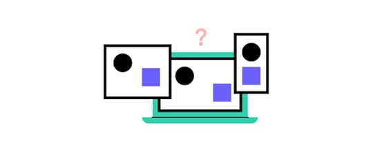 Low-fidelity prototypes: Basic representations with minimal details, often created using paper sketches or digital wireframes. Designers use low-fidelity prototypes in the early stages of the design process to quickly explore and validate design concepts before investing significant time and resources in more complex designs.High-fidelity prototypes: Advanced and visually polished prototypes resembling the finished product, including realistic visuals, clickable elements, animations, and simulated user flows. Designers use high-fidelity prototypes in later stages of the design process to gather detailed feedback on usability and interactivity.Paper prototypes: Prototypes created using paper materials, such as hand-drawn sketches or cutouts, are cost-effective for brainstorming and testing design concepts. Designers use paper prototypes in the early stages of the design process to iterate quickly, gather initial feedback, and make rapid design decisions before moving to more detailed digital prototypes.Functional prototype: Prototypes focusing on demonstrating core functionalities, enabling users to perform key tasks and actions. Product teams might use functional prototypes to test specific functionalities and workflows of the product, ensuring they meet user needs and expectations.Interactive prototypes: allow users to interact with the interface and experience product functionality, often created using design software or prototyping tools. Designers use interactive prototypes throughout the design process, especially during late-stage user testing and validation, to provide users with a realistic and interactive experience.What Makes a Prototype Workable?
A prototype should effectively communicate the product’s concept and demonstrate its viability to be “workable.” It must have the features and interactivity to elicit meaningful feedback from users and stakeholders to inform further design iterations and decision-making.
A workable prototype must possess specific features and characteristics to be effective for user testing. Here are key aspects that contribute to making a prototype workable:
Functionality: A workable prototype should demonstrate the core functionality of the final product, showcasing the main features and interactions that users will experience.Interactivity: It should allow users to interact with the prototype, providing a hands-on, realistic experience of the final product. Navigation: The prototype should include a clear and intuitive navigation system that enables users to move between screens or sections seamlessly.Visual design: The working prototype must reflect the final product’s UI design, including branding and aesthetics, to provide a realistic user experience.User flow: The prototype should capture the essential user flows and key interactions, allowing users to complete tasks and achieve goals within the prototype.Real content: Designers must use real content and data, giving users a true sense of the user interface’s layout and media elements to determine whether these contribute to or hinder the user experience.We have emphasized “providing a hands-on, realistic experience of the final product” because many image-based design tools lack the features to create real-world prototype experiences. Organizations must combine several tools and platforms to increase fidelity and functionality.
How a Component-Driven Workflow to Improve Working PrototypesComponent-driven prototyping is a design methodology inspired by component-driven development where devs reuse UI elements for front-end development. Designers mimic this engineering workflow in UXPin by importing code components using Merge technology. Instead of code, designers work with visual elements like in any other design tool.
Ultimate consistencyMerge components include properties and interactivity defined by the design system. For example, a button’s colors, sizes, variants, content, and states are available for designers to adjust using UXPin’s Properties Panel.
These baked-in properties offer many benefits for design teams:
No designing from scratchEliminates errors or changing properties which result in driftOrganization-wide consistencyMore time spent focused on product and user goalsRealistic working prototypesComponent-driven prototyping significantly improves prototyping fidelity and functionality because design teams can build exact replicas of the final product, giving user testing participants and stakeholders realistic user experiences without writing a single line of code–and significantly faster than image-based tools.
Design a Workable Prototype in 5 Steps
Following these steps will enable you to build a working prototype that effectively communicates the product concept, aligns with user needs, and provides a solid foundation for further development and refinement.
Define the objectives and scope to ensure that it aligns with the desired outcomes and provides a clear direction for the design process.Conduct thorough user research to understand user needs, preferences, and pain points. Gather requirements from stakeholders and users to inform the prototype’s design and functionality.Build the prototype using the right tools, like UXPin with Merge technology, to create an interactive prototype resembling the final product.Conduct usability testing with representative users to evaluate the prototype’s effectiveness and gather feedback on its usability, functionality, and overall user experience.Iterate and refine the prototype based on feedback to address any issues or concerns and improve its overall performance and user satisfaction.Best Practices for Workable PrototypesKeep the prototype focused and aligned with user needsEnsure the prototype addresses the core user needs and goals by focusing on the key features and functionalities essential for user testing and validation.
For example, when designing a mobile banking app, the prototype should prioritize crucial tasks like checking account balances, transferring funds, and making payments rather than including unnecessary features that may distract or confuse users.
Balance realism and usabilityThe prototype must be realistic enough to provide users with a sense of the final product’s look and feel but also functional and easy to navigate.
For example, when designing an eCommerce website, the prototype should showcase real product images and descriptions while maintaining a streamlined and intuitive user interface that facilitates smooth browsing and purchasing.
Use real content and dataIncorporate real content and data in the prototype whenever possible to make the user experience more authentic. This realistic experience helps users better understand and evaluate the product’s value and usability.
For example, when designing a travel booking app, use real destination names, prices, descriptions, and images to give users a realistic and immersive experience, improving their ability to make informed decisions.
Without this accurate data, users may use the prototype differently than the final product, giving you inaccurate insights to make changes during the design process and adversely affecting the project’s success.
Involve stakeholders and users in the prototyping processCollaborate with stakeholders and involve users in prototyping to gather valuable feedback and ensure the prototype meets their expectations. This collaboration helps validate design decisions, identify potential issues, and incorporate diverse perspectives.
For example, including feedback from business stakeholders, doctors, nurses, and patients when developing a medical app ensures the prototype addresses different types of user groups’ requirements, enhances usability for everyone, and meets industry standards.
Building Working Prototypes With UXPin MergeOne of the biggest challenges for prototyping during the product design process is designers lack the tools and skills to build working prototypes. They’re limited by the tool’s vector-based constraints, which causes issues in testing prototypes with users and stakeholders.
UXPin’s Merge technology removes those constraints by bridging the gap between design and development. Designers use the exact same UI library during the design process as engineers developing the final product. Not only does this mean better collaboration, but it vastly improves prototype quality for users and stakeholders.
“The C-suite people and the directors are able to give us stronger feedback about the ultimate direction because they experience the features and goals of these prototypes rather than just commenting about how these boxes don’t look like a text field.” – Erica Rider, former UX Lead EPX at PayPal.
Smoother design handoffsWith design and engineering teams using the same component library, handoffs are seamless, almost non-existent, because developers already have the code to start the development process. UXPin renders production-ready JSX, so devs simply copy/paste to develop the final product according to the design team’s prototype and mockups.
Stop wasting time and resources using multiple design platforms and workarounds to build realistic prototypes. UXPin is a full-stack design tool that enables designers to create prototype experiences indistinguishable from the final product–all the power of code without writing a single line.
Level up your prototyping capability with the power of UXPin’s Merge technology. Visit our Merge page for more details and how to request access.
Discover MergeThe post What is a Workable Prototype? appeared first on Studio by UXPin.
August 16, 2023
Prototype vs Final Product — A 5-Point Comparison
Designers create prototypes to perfect product’s look and feel, validate their design choices, and find areas for improvements. The final product is an implemented design that gets released into the market. Both prototypes and final products are essential elements of product design process. Let’s explore the differences between them.
Key takeaways:
A prototype is an artifact of product design process and it is a representation of an end product; designers use it to test their solutions, learn what users and stakeholders think of the product, and show developers what they need to build.The final product is a product that’s fully marketable. It has a backend and a frontend design, and it is fully usable by end users; developers build final product on the basis of product design that was created and tested by product designers.There are six differences between a prototype and final product; they differ in terms of resource and reasons you need to create them, flexibility, lifecycle, and a level of functionality.Design interactive prototypes that are easy to implement by devs. Release products faster and beat your competition. Discover UXPin Merge.
Reach a new level of prototypingDesign with interactive components coming from your team’s design system.
Discover UXPin Merge .discover-merge { margin: 40px 8px;}.discover-merge__container { display: flex; max-width: 690px; height: 200px; padding: 20px; padding-left: 24px; border-radius: 4px; background-color: black; box-shadow: 10px 10px #9999ff; align-items: center; justify-content: space-between;}.discover-merge__left { width: 50%;}.discover-merge__left p { margin: 10px 0px !important; color: white !important; font-size: 18px !important;}.discover-merge__heading { font-weight: bold !important; color: white !important; font-size: 18px !important;}.discover-merge__text { margin: 0 !important; line-height: 22px !important;}.discover-merge__button { width: 174px; height: 44px; margin: 10px 0px; border: none; border-radius: 2px; background: white; color: black; font-size: 16px; text-align: center;}.discover-merge__button:hover { cursor: pointer;}.discover-merge__image { max-width: 320px !important; height: 200px; margin-right: -19px;}@media (max-width: 760px) { .discover-merge__container { height: auto; margin: 10px; align-items: left; }}@media (max-width: 500px) { .discover-merge__container { flex-direction: column; } .discover-merge__left { width: 100%; align-items: normal; }}What is a Prototype?A prototype is a tangible or interactive representation of a design concept.
It simulates the final product, enabling designers and stakeholders to test functionalities, validate design decisions, and gather feedback.
Unlike the polished final product, a prototype is often incomplete, only focusing on core features or a single user flow, allowing quick iterations and changes based on insights and user interactions.
There are several types of prototypes designers utilize at different stages of the design process:
Paper prototypes – simple wireframes that are drawn on paper or a whiteboard; they are the best for testing user flow or visualizing information architecture.Working prototypes – prototypes that handle data, respond to user actions, but they aren’t ready real products–they are still work in progress.Functional prototype – prototypes that mimic the final product’s look and feel, but they lack the backend code to be end products.Interactive prototype – prototypes that have microinteractions added to them, such as click, scroll, move, etc. What is a Final Product?The final product is an app or a website that’s launched to the market. Often referred to as an end-product or finished product, it is derived from the last iteration of a prototype.
It represents the outcome of numerous design iterations, user feedback, and rigorous testing from the product design process.
Equipped with all intended features and optimized for end-user experience, this product is ready for launch and consumption by its target audience.
5 Key Differences Between a Prototype and Final ProductDifference #1: Intended purposePrototype:
Offers a tangible or even interactive representation of an ideaServes as a tool for testing and gathering feedbackFacilitates communication between stakeholders, designers, and developersEnables designers to identify and fix design or usability issues before full-scale developmentExplores a new product’s viability before committing resources to developmentFinal product:
Delivers a complete, functional solution to end-usersRepresents the realization of design decisions, feedback, and refinements from the product design processAims to achieve business goals, such as increased user engagement or salesProvides an optimized experience tailored for the target user groupDifference #2: Flexibility to adjustmentsPrototype:
Designed for rapid changes and iterationsFeedback loops are shorter, making it easier to pivot or modify design elementsMistakes or design flaws are expected and addressed in real-timeEmphasizes exploration and testing of multiple design solutionsFinal product:
Changes are more deliberate and often require extensive testing and validationIterations based on user feedback, analytics, bugs, or development updatesAdjustments can have implications on the broader system or related featuresFlexibility exists but within the constraints of the established product frameworkDifference #3: Resources needed to createPrototype:
Typically requires fewer resources and investmentFocuses on utilizing readily available tools and components for quick mockupsDesign tools make changes and adjustments less costly and more efficientAllows for cost-effective experimentation without fully committingFinal product:
Demands a more substantial investment in both time and moneyUtilizes high-quality components, coding, and resources for longevity and scalabilityAny modifications or fixes can result in increased expensesThe expected long-term returns and product stability justifies initial high costsDifference #4: Lifecycle of prototype vs final productPrototype:
Short-lived, serving as a temporary model for testing and validation during a specific projectLikely to undergo frequent changes and might be discarded once the project is releasedNot built for long-term use or for withstanding real-world challengesFinal product:
Designed for long-term utility and operationBuilt for real-world usage, including protection against security vulnerabilities and other programming challengesReceives periodic updates and maintenance but retains its core product functionalityExpected to fulfill its role until a new iteration replaces it–i.e., months or yearsDifference #5: Level of functionalityPrototype:
Primarily showcases key features to stakeholders or usersMay lack full functionality; often contains placeholder or dummy contentMimics visual or interactive user interface, helping in feedback collectionFocuses on testing specific elements or user flows and may exclude many UIs and featuresFinal product:
Fully functional with all intended features integratedUndergoes rigorous quality assurance to ensure feature reliabilityTailored for end-user experience, ensuring every feature aligns with user needsPolished interface, seamless navigation, and optimized performanceWhy Do You Need Prototypes Before Creating Final Products?Prototypes play a crucial role in steering a product toward success. They act as a blueprint, guiding teams to craft products that resonate with users, meet business objectives, and stand out in the market.
Here’s how:
Risk Mitigation: Prototypes allow teams to test product ideas before committing significant resources, helping avoid costly mistakes.User-Centered Design: Early user testing with prototypes uncovers users’ needs, ensuring the final product meets their expectations.Feedback Loop: Prototypes foster iterative feedback, allowing designers to continually refine and perfect the product.Stakeholder Alignment: They serve as tangible representations of the product vision, ensuring everyone, from developers to investors, shares a unified understanding.Efficiency in Development: Developers get a clearer picture, reducing back-and-forth and ensuring efficient code.How to Go from Prototype to Final ProductThis step-by-step workflow demonstrates how product development teams go from research to prototype and final product.
Step 1: Understanding the problemIdentify a problem or need in the marketConduct early-stage market research to gauge demand and potential user interestStep 2: User researchConduct surveys, interviews, and observations to gather user insightsUnderstand user needs, pain points, and desiresStep 3: IdeationBrainstorm potential solutions and featuresSketch or wireframe initial ideasStep 4: Designing the prototypeCreate a low-fidelity prototype based on research and ideationUse a professional UX design tool like UXPin to create low-fidelity interactive wireframes to iterate and improve ideasConvert low-fidelity designs to high-fidelity working prototypesShare prototypes with key stakeholders, incorporate feedback, and improve before user testingStep 5: User testing with prototypeRecruit participants that represent your end users for user testingHave them interact with the prototype while team members observe their actions, ask questions, and gather insightsAnalyze feedback and identify areas of improvementStep 6: Iterative designUse insights to make data-driven adjustments to the prototypeSome problems will require you to return to step one and ideate on new solutionsShift to a high-fidelity prototype as you refine the designStep 7: Technical FeasibilityConsult with engineers throughout the design process Ensure that the design is technically achievable and resource-efficientStep 8: Design handoffShare final designs and prototypes with engineersInclude documentation to explain user pain points and ideas behind solutionsEssential documentation includes a style guide, a breakdown of components and patterns and their states, information architecture, assets (icons, SVGs, media, etc.), and prototypesStep 9: Development and releaseEngineers use handoff documentation to guide the development processInteractive prototypes help devs understand interactions, animations, and transitionsDevs publish the changes to various platforms–web, native app stores, etc.Step 10: Quality assurance (QA) testingTest the final product for bugs, glitches, or inconsistenciesDesign teams conduct a UX audit to ensure the final product meets design specs and doesn’t introduce usability issuesTeams ensure the final product looks and functions as intendedBuilding Interactive Prototypes With UXPinUXPin allows designers to build prototypes that accurately represent the final product experience. Unlike traditional design tools that generate vector graphics, UXPin renders HTML, CSS, and Javascript behind the scenes, giving designers more fidelity and interactivity.
UXPin also has its propriety technology, UXPin Merge, for designing with fully functional React components.
Image-based vs. code-based design toolsImage-based design tools create images or visual representations of how a code component will look. While these mockups are aesthetically pleasing, the lack of fidelity means designers can’t test most basic user interactions–never mind complex interactivity.
Code-based design tools like UXPin offer more fidelity and functionality because components like form elements are interactive. When you drag a text input from UXPin’s Forms onto the canvas, it’s ready for users to enter data. Designers can use Variables to capture that information and use it elsewhere in the prototype, creating dynamic user experiences image-based tools can’t.
Conditional Interactions and ExpressionsTake prototypes to another level with UXPin’s Conditional Interactions and Expressions. Conditional Interactions allow you to create if-then and if-else conditions for user and system actions, while Expressions increase prototyping complexity with form validation, computational components, and other Javascript-like functions.
Better results with UXPin MergeCreate dynamic, immersive prototypes indistinguishable from the final product. These sophisticated prototypes enhance testing scope giving you accurate data and insights to iterate and refine designs before development. Use UXPin Merge, a technology for designing prototypes with reusable components that can be shared with developers. Discover UXPin Merge.
Discover MergeThe post Prototype vs Final Product — A 5-Point Comparison appeared first on Studio by UXPin.
August 15, 2023
Best Prototyping Tools that Use React
Are you creating a React app or website? If you are, here’s what you can do. Instead of recreating your components in a designer-led environment like Figma, you can use real React components in prototyping. How to that? You will find an answer in this article.
Before you try any of the listed tools, we recommend you get familiar with UX design process of creating prototypes and turning them into product. This process includes brainstorming, research, ideation, tests, and developer handoff. You need to find a React prototyping tool that facilitates all of those steps. Otherwise, you risk building an app or a product that falls short of expectations. Are you ready to learn about those design tools?
Build React prototypes with your dev’s components coming from Git, Storybook, or npm. Discover UXPin Merge and bridge the gap between design and code. Discover UXPin Merge.
Reach a new level of prototypingDesign with interactive components coming from your team’s design system.
Discover UXPin Merge .discover-merge { margin: 40px 8px;}.discover-merge__container { display: flex; max-width: 690px; height: 200px; padding: 20px; padding-left: 24px; border-radius: 4px; background-color: black; box-shadow: 10px 10px #9999ff; align-items: center; justify-content: space-between;}.discover-merge__left { width: 50%;}.discover-merge__left p { margin: 10px 0px !important; color: white !important; font-size: 18px !important;}.discover-merge__heading { font-weight: bold !important; color: white !important; font-size: 18px !important;}.discover-merge__text { margin: 0 !important; line-height: 22px !important;}.discover-merge__button { width: 174px; height: 44px; margin: 10px 0px; border: none; border-radius: 2px; background: white; color: black; font-size: 16px; text-align: center;}.discover-merge__button:hover { cursor: pointer;}.discover-merge__image { max-width: 320px !important; height: 200px; margin-right: -19px;}@media (max-width: 760px) { .discover-merge__container { height: auto; margin: 10px; align-items: left; }}@media (max-width: 500px) { .discover-merge__container { flex-direction: column; } .discover-merge__left { width: 100%; align-items: normal; }}What are React Prototyping Tools?React prototyping tools are design tools that help product designers create prototypes with React components. While many of React prototyping tools require you to have coding knowledge (like Storybook), design tools like UXPin with Merge technology make React prototyping designer-friendly.
In this article, we will go over top React prototyping tools, such as:
UXPin MergeFramerStorybookReact-ProtoLet’s start.
UXPin MergeUXPin’s Merge technology allows you to import code components from a repository into the design process. You can import your product’s design system or an open-source library to build high-fidelity, fully functioning React prototypes.
With Merge, you can prototype cross-platform applications from wearables to native apps, web applications, and even TVs. You can test prototypes in the browser or via UXPin Mirror for iOS and Android applications.
There are three ways to import code components into UXPin using Merge:
The Git Integration enables you to import React components directly from a Git repository giving you full access to Merge’s features.Merge’s Storybook Integration allows you to connect any Storybook, providing access to more front-end technologies, including React, Vue, Angular, and more.The npm Integration uses the Merge Component Manager to import individual UI elements from open-source design systems on the npm registry.Key features Version Control (Git Integration only): any changes to the design system’s repository automatically sync to UXPin and notify designers of the latest release. Patterns (Git Integration only): grow your library by creating new patterns using design system components or incorporating elements from other design systems.Drag-and-drop workflow: drag components from UXPin’s Design Libraries onto the canvas to create user interfaces. Adjust pre-defined properties via the Properties Panel to change styling, interactions, etc.Collaborative: product teams can collaborate with stakeholders via UXPin’s Comments–even if they don’t have a paid UXPin account.Spec Mode & Documentation: design handoffs are smoother with Merge because developers already have access to the same repository. They can use Spec Mode to inspect properties, measure distances, copy production-ready component CSS and JSX (Git Integration only), and view the product’s Style Guide and Documentation.PricingStarts from $119 per month when paid annually.
Pros and consPros:
Single source of truth: With UXPin Merge, you can import and use the same React components in the design process as devs use for the final product, effectively bridging the gap between designers and developers.Real data: designers can incorporate actual product data using JSON, Google Sheets, or CSV. They can also capture user inputs using Variables and use that data to populate a profile account or provide a dynamic, personalized user experience.Interactive prototyping: using React components for prototypes means designers can create interactive replicas indistinguishable from the final product.Cons:
Limited to Javascript: UXPin Merge only works with Javascript libraries and frameworks. Technical setup: product teams will need technical assistance to make their component library’s repository compatible with Merge; however, UXPin has a boilerplate and offers technical support to make this easier. Designers can use the built-in libraries, including MUI, Material UI, Ant Design, and Fluent UI, which don’t need any configuration.Storybook
StorybookJS is a UI development environment allowing devs to build components in isolation. Developers, designers, and other stakeholders can visualize different states of every UI element, creating a component-driven development environment. It supports various frameworks, including React.
While Storybook is excellent for internal prototyping and component-driven development, it lacks tools and features for user testing. A great workaround is using Merge’s Storybook Integration to import your organization’s Storybook projects for prototyping in UXPin.
Storybook and UXPin Merge combined effectively bridge the gap between designers and developers while creating a single source of truth across the organization.
Key featuresComponent Stories: Write Stories to display different states of your components.Addon ecosystem: Extend Storybook’s capabilities with a robust ecosystem of plugins.Component-driven development: Develop one UI element at a time, viewing all its properties, interactions, and variants.Documentation: Auto-generate documentation based on your stories and components.Automated testing: Run multiple tests before release to ensure components meet code syntax, design principles, accessibility, and other custom requirements.PricingStorybookJS is open-source and free to use. However, some addons or integrations might have associated costs.
Pros and consPros:
Framework agnostic: While prominent in the React community, it supports various Javascript frameworks.Rich ecosystem: A wide variety of addons and integrations allow you to tailor Storybook to your needs.Collaborative: Designers, developers, and stakeholders can collaborate, ensuring consistent UI/UX.Cons:
Technical expertise: Storybook is a developer tool, meaning you must have programming and Javascript skills to use it.Configuration: Depending on your project’s complexity, it may take time to set everything up correctly.Learning curve: Requires understanding of component structure and the framework you’re working with.Framer
Framer is a no-code design tool for React websites and web apps. The platform’s latest AI feature lets you create responsive starter templates with a few keywords.
Key featuresCode-backed design: Design with React components, streamlining the transition from prototype to development.Figma plugin: convert Figma designs to HTML for use in Framer–you must still convert this HTML to React.Code-like animations: add Javascript-like animations and effects without writing any code.Production-ready code: developers can export code from Framer to build React websites and web applications.PricingStarts from $5 per month per site (project) when paid annually.
Pros and consPros:
Interactive design: Design with code components for realistic interactions.No-code development: Create production-ready websites without writing any code.Starter templates: Framer offers a vast library of website and landing page templates to get you started–some of these are third-party paid templates averaging $29-$99.Cons:
Cost: Framer is cost-effective for small projects, but its per-site pricing model gets expensive when running multiple sites. If you purchase starter templates, your costs increase.Web-only: Framer is a no-code website design tool, limiting prototyping scope–i.e., unable to design cross-platform applications.Can’t import components: Unlike UXPin Merge, you can’t import design systems or UI libraries.React-Proto
React-proto is a prototyping tool designed specifically for React developers. It provides a visual interface for creating React components and their relationships. Developers can drag and drop UI elements to establish parent-child relationships between components, designating state location and prop relationships without writing any code.
Key featuresComponent tree visualization: Visualize your entire application’s structure and components’ relationships.Interactivity: Interact with your prototype and see changes reflected in the visual tree.State management: Designate locations for your state and understand the flow of data.Code Export: Translate your visual design into functional React code to begin front-end development.PricingReact-proto is open-source and free to use.
Pros and consPros:
Faster prototyping: React-proto’s drag-and-drop interface lets developers edit components and prototypes faster than writing code.Cost-Effective: Being open-source, it’s a cost-friendly option for all developers and designers.Code Generation: Translating design to code is straightforward, reducing the barrier between design and development.Cons:
Requires technical skills: React-proto is not a designer-friendly tool. It requires technical skills, including in-depth React experience, to operate effectively.Limited features: React-proto offers few features as an open-source tool and is unsuitable for user testing.No support: React-proto does not offer support or onboarding outside of its Github community.Prototype React Websites and Applications in UXPin MergeWhile there are several great React prototyping tools, UXPin is the only platform offering a designer-friendly, familiar work environment. UXPin looks and feels like any other design tool but increases prototyping scope by enabling designers to prototype using code components, including React, Vue, Angular, and more.
Join the code-to-design revolution and create a single source of truth between designers and developers with UXPin and Merge technology. Discover Merge.
Discover MergeThe post Best Prototyping Tools that Use React appeared first on Studio by UXPin.
August 14, 2023
Designing a Nonprofit Website for Better Conversions
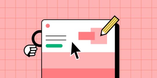
Are you running a nonprofit oragnization? Then, you know how tough it might be to get people to engage in the cause, leave a donation or support your efforts in any other ways. Those activities can all be conversions on your non-profit website. Web design may help you increase those conversions. Let’s see how.
Key takeaways:
Nonprofits set up websites to stay in touch with donors and volunteers but they can also collect payments, recruit volunteers, and grow their organization. All those activities can be understood as conversions.The best nonprofit websites include Charity: Water, Doctors without Borders, and the Red Cross.To drive conversions, nonprofits need to be constantly updated, stay clear about their goals, mission, and vision, as well as be well-designed.Well-designed non-profit website are responsive, accessible, secure, and easy to navigate. Let’s see what that means.Design, prototype, test, and optimize mission-driven websites with the world’s most advanced user experience design tool–UXPin. Use this tool to design a website that can be implemented quickly and send it to devs for fast development. Discover its all capabilities. Sign up for a free trial.
Build advanced prototypesDesign better products with States, Variables, Auto Layout and more.
Try UXPin .try-uxpin-banner { margin: 40px 0px;}.try-uxpin__container { display: flex; max-width: 689px; height: 210px; padding: 20px; padding-left: 24px; border: 2px solid black; border-radius: 4px; align-items: center; justify-content: space-between; background-color: white; box-shadow: 10px 10px black;}.try-uxpin__left { width: 54%;}.try-uxpin__left p { margin: 10px 0px !important; color: black !important;}.try-uxpin__heading { font-size: 28px !important; font-weight: bold;}.try-uxpin__text { margin: 0 !important; font-size: 18px !important; line-height: 22px !important;}.try-uxpin__button { width: 135px; height: 44px; background: black; margin: 10px 0px; padding: 10px 20px; border: none; border-radius: 2px; color: white; font-size: 16px; text-align: center;}.try-uxpin__button:hover { cursor: pointer;}.try-uxpin__image { max-width: 320px !important; height: 200px; margin-right: -21px; margin-bottom: -6px;}@media (max-width: 760px) { .try-uxpin__container { height: auto; margin: 10px; align-items: left; }}@media (max-width: 500px) { .try-uxpin__container { flex-direction: column; } .try-uxpin__left { width: 100%; align-items: normal; }}What is a Nonprofit Website?A nonprofit website is a website run by a nonprofit organization to stay in contact with its audience composed of donors, beneficiaries, and volunteers.
Aside from its informational benefit, a website helps nonprofits get donations, find new volunteers, and fans of the organizations. In other words, generate conversions.
Before we dive into how to do that, let’s explore the top nonprofit websites and discuss why they work.
Best Nonprofit Websites ExamplesHere are some of the world’s biggest nonprofits and how they use their websites to inspire action.
Charity: Water
Charity: Water uses compelling visuals and storytelling to educate visitors about its cause. The nonprofit makes donations effortless with a donation form in the hero section where visitors can choose a pre-set amount or enter a custom one.
Doctors Without Borders
Doctors Without Borders provides a user-friendly experience with large text and clear messaging. Immediately below the fold, the organization offers surety of where funds go and the scale of its operations. This information builds trust through transparency while informing donors about how Doctors Without Borders uses its funding to make an impact.
WWF (World Wildlife Fund)
The WWF’s web design is an excellent example of displaying primary and secondary drop-down menu CTAs discussed earlier in this article. Visitors can donate money or adopt an animal in trouble to support its care and rehabilitation. WWF also uses a basic three-link primary menu to streamline navigation.
The Red Cross
The Red Cross offers visitors vast content and resources, which designers have organized with an efficient and user-friendly information architecture. These resources provide credible news sources for many publications and media outlets, positioning The Red Cross as the leading authority for humanitarian aid.
The Red Cross also uses high-quality visuals to create an emotional connection, and the website’s bright red donate button is prominent against the dark nav bar, creating an obvious CTA for visitors.
Who is a Non-Profit Website Users?The first step to optimizing a nonprofit organization’s website begins with understanding your audience. Who are they? What motivates them?
In-depth user research will reveal these insights, giving you valuable data to drive design decisions that cater to your audience’s needs and expectations.
Donors, volunteers, and beneficiariesEvery nonprofit website caters to a diverse group: donors looking to contribute, volunteers offering time and skills, and beneficiaries needing assistance. Recognizing the unique objectives and motivations of each segment ensures content resonates.
For example, donors might want compelling stories and financial transparency, volunteers look for event schedules and roles, and beneficiaries prioritize available resources and support methods.
The role of audience analysis in nonprofit web designUnderstanding the audience’s preferences, behaviors, and pain points enables designers to craft a website layout, content, and navigation tailored to meet specific needs.
For example, a nonprofit website may prioritize fundraising with a donation button in the header and hero section. However, most website visitors want to volunteer, and designers have placed this link in the footer, thinking it’s less important.
With this user feedback, designers might add a secondary CTA above the fold for volunteers. This redesign would still prioritize donations but allow volunteers to sign up easier.
Design Checklist for High-Converting NonprofitsA lot of people who run nonprofit organizations make a mistake of making the website purely informational, but it should convert visitors into donors or volunteers. Here’s what you need to create a high-converting non-profit website.
1. Check if your site can be used on mobileSearch engines prioritize mobile-friendly websites for mobile results. Since most people use mobile devices for browsing, your nonprofit must optimize the user experience for this large cohort.
2. Test site’s navigationWebsite navigation helps visitors move through the page, accomplish goals, and find the right information.
You typically have three navigation spaces on a website:
Primary navigation: the nav bar in your website’s headerSecondary navigation: the website’s footerHero CTA: the main call to action button in your hero section or nav barWhen visitors find what they need effortlessly, they’re more inclined to interact, donate, or volunteer. Minimizing options in the header is an excellent way to increase conversions. For example, a typical nonprofit might want three primary navigation elements and a CTA above the fold, with the rest of the links in the footer.
3. ScannabilityScannability is the ability of a site visitor to move through content quickly. It impacts readability, comprehension, and user experience. There are a couple of recognized patterns of how a site visitors scan pages, which depend on the geography and type of content. Consider them in order to create a content that’s easy for the eyes and understanding.
4. Apply accessibility best practicesPrioritize website accessibility to ensure all visitors, including those with disabilities, can engage seamlessly. Implementing features like screen reader compatibility, high-contrast modes, and keyboard navigation is essential for NPOs. Not only does it broaden your audience reach, but it also underscores your organization’s commitment to inclusivity.
When your site can be accessed by everyone, it builds trust and fosters broader community engagement.
5. Use CTA buttonsTo drive conversions, you need to CTA buttons that will prompt your audience to take action. Button placement, copy, and the action that follows it depends on what you want to accomplish.
For example, a nonprofit website may prioritize fundraising with a donation button in the header and hero section. However, most website visitors want to volunteer, and designers have placed this link in the footer, thinking it’s less important.
With this user feedback, designers might add a secondary CTA above the fold for volunteers. This redesign would still prioritize donations but allow volunteers to sign up easier.
If you want to discover how to design a great button, check out our guide on button design.
6. Include secure payment optionsIncorporate reliable and well-known payment gateways like Stripe, PayPal, and Square into your site. Using these familiar services creates trust, increasing donors’ likelihood of contributing. Display security badges prominently, reassuring visitors that their financial information remains protected.
7. Take care of privacy and data protectionHave you heard about “Privacy by design”? Always be transparent about how you use donor and visitor data. Display a clear privacy policy, letting visitors know their information won’t be sold or misused.
Active assurance of data protection not only builds trust but also complies with global privacy regulations.
What Other Elements a Nonprofit Website Should Include?Optimizing a nonprofit website doesn’t only mean making it easy for users to complete tasks. You must strategically use content, design elements, layouts, and visuals to elicit desired actions.
Clear mission statement and goalsPlace your mission statement and goals front and center on your homepage. They should convey your nonprofit organization’s purpose clearly and succinctly, attracting potential donors and volunteers to your cause.
Stay consistentBrand consistency helps build trust, builds rapport, and engages website visitors. Maintaining this consistency across every facet, including messaging, color scheme, typography, layouts, and interactions, is crucial so everything feels intuitive and users never have to think about their actions.
Use high-quality visuals and videosImages, illustrations, and media help tell your story and engage users. Many nonprofits use visuals to grab people’s attention and highlight an important cause–for example, a polluted beach or a sea animal covered in oil. These media elements are powerful for tapping into human emotions, encouraging people to take a specific action.
Comprehensive “About Us” pageVisitors often want to know who drives the cause. Dive into your organization’s history, values, team, and milestones on the About Us page. When crafted authentically, this section builds trust and forms an emotional connection by showcasing your nonprofit’s journey.
Impact stories and testimonialsStories resonate more than statistics. Share real-life impact stories and testimonials, offering a firsthand look at the lives your nonprofit touches. These tales, whether in text, images, or video, act as persuasive endorsements, motivating others to support and engage with your mission.
Show certifications, awards, and recognitionsShowcase your nonprofit’s credibility by highlighting any certifications, awards, or recognitions your organization has earned–preferably as high on the homepage as possible. These accolades act as third-party endorsements, affirming your organization’s dedication to its cause and operational integrity.
Mention partnerships and affiliationsProminently feature any alliances or affiliations with reputable organizations. Such partnerships lend your nonprofit added legitimacy. When potential donors recognize familiar organizations or brands standing beside you, it enhances their confidence in your mission.
Transparent display of funds usageBuild trust by showing where the funds go. Display a clear breakdown of expenditures–illustrating how much covers administrative costs, supports fieldwork, etc. When you demonstrate the tangible impact of contributions, potential donors feel more compelled to get involved.
Regular updates and blog postsKeep your audience in the loop. Post regular updates and news, ensuring everyone knows about the latest progress, hurdles, and achievements. Being a thought leader is crucial for modern brands. By leading the conversation with regular updates, your nonprofit will stand out as the go-to source for information, increasing your exposure and likelihood of success.
These core website components lay the foundation for building rapport and trust with your target audience. Next, you must optimize for conversions.
Design Better Websites With UXPinAre you looking to optimize your nonprofit’s website and increase your online presence? Design interactive prototypes that look and feel like the final product, allowing product teams to solve more usability issues and identify better opportunities during the design process.
Designers can use UXPin’s advanced features to mimic code-like functionality, like a donation checkout flow, signing up for a newsletter, or completing a volunteer form. UXPin prototypes give design teams actionable insights to iterate and improve before investing in the costly website development process.
Build captivating websites your users will love with the world’s most advanced UX design tool. Try UXPin for web design. Sign up for a free trial.
Try UXPin for freeThe post Designing a Nonprofit Website for Better Conversions appeared first on Studio by UXPin.
August 10, 2023
The Latest UXPin Updates – Summer 2023
We’re reviving our series at UXPin’s blog to inform you about new features, updates, and upcoming product releases. In this one, you’ll read about new ways of adding and styling links, using eye-dropper, and editing components’ props.
🔍 Access specs for grouped elementsAside from inspecting components one by one, you can now get the specs for borders, radius, and CSS of grouped elements, including the ones that were added with Auto Layout.
🔗 Enjoy a greater control over linkingAdd a clickable link on a specific word, a string of words, or even a whole paragraph within one text box. Select the text you want to add a URL to or link it to any other page within the prototype.
That’s not all! Style the hyperlink to match your design system. Make your prototype hyperrealistic from now on. Try it now.
👁️ Smoother Eye-DropperEnjoy a faster and more intuitive Eye-Dropper. When picking colors, you can select an Eye-Dropper once and adjust the colors. No need to be constantly reselecting it. That’s one less step in designing.
🔢 Merge: Set up decimal places in number propsHey, for those of you who use Merge tech, for coded components with number props, such as grid (flex), you can now add numbers with decimal places to make your prototypes even more accurate.
🖱️ Merge: Embed JSX code into a chosen elementCreate advanced Merge components faster. Select a Merge component and pass its JSX code into the node property of another element. This works on UXPin’s canvas and in the library and it will come in handy when building prototypes.
🫣 Merge: Hide nested componentsNesting components? If you want to hide components that are nested together, do that without the need of ungrouping them or removing them entirely. Add toggle interaction to hide layers in nested components.
Give new updates a try in UXPin. Sign up for free and build an interactive prototype today.
Try UXPin for freeThe post The Latest UXPin Updates – Summer 2023 appeared first on Studio by UXPin.
UXpin's Blog

- UXpin's profile
- 68 followers

