
UXpin's Blog, page 36
June 27, 2023
UI Grids – All You Need to Know

UI grid systems are essential for responsive design, ensuring layouts adapt seamlessly to various screen sizes and resolutions. Designers use grid systems to create fluid layouts that maintain consistency and visual hierarchy, providing an optimal user experience across multiple devices such as desktops, tablets, and mobile phones.
Designers can create three UI grid types, including column, baseline, and square, in UXPin with a click of a button. Sign up for a free trial to explore UXPin’s advanced UX design features.
Build advanced prototypesDesign better products with States, Variables, Auto Layout and more.
Try UXPin .try-uxpin-banner { margin: 40px 0px;}.try-uxpin__container { display: flex; max-width: 689px; height: 210px; padding: 20px; padding-left: 24px; border: 2px solid black; border-radius: 4px; align-items: center; justify-content: space-between; background-color: white; box-shadow: 10px 10px black;}.try-uxpin__left { width: 54%;}.try-uxpin__left p { margin: 10px 0px !important; color: black !important;}.try-uxpin__heading { font-size: 28px !important; font-weight: bold;}.try-uxpin__text { margin: 0 !important; font-size: 18px !important; line-height: 22px !important;}.try-uxpin__button { width: 135px; height: 44px; background: black; margin: 10px 0px; padding: 10px 20px; border: none; border-radius: 2px; color: white; font-size: 16px; text-align: center;}.try-uxpin__button:hover { cursor: pointer;}.try-uxpin__image { max-width: 320px !important; height: 200px; margin-right: -21px; margin-bottom: -6px;}@media (max-width: 760px) { .try-uxpin__container { height: auto; margin: 10px; align-items: left; }}@media (max-width: 500px) { .try-uxpin__container { flex-direction: column; } .try-uxpin__left { width: 100%; align-items: normal; }}What is a UI Grid?
A UI grid is a foundational layout structure in design that organizes content into rows and columns, providing a systematic framework for arranging UI elements on a page or screen.
UI grids establish a consistent and harmonious visual order, making navigating and comprehending content easier. By implementing a grid system, designers can create a cohesive and balanced layout that enhances the user experience while ensuring adaptability and flexibility across various devices and screen sizes.
Types of UI GridsManuscript grid
A manuscript grid (single-column grid) is the simplest grid type, consisting of a single column that spans the entire width of a layout. Designers primarily use manuscript grids for long-form textual content, such as blog posts or articles, where readability is a priority.
For example, an online newspaper might use a manuscript grid to display its articles in an easy-to-read format.
Column grid
A column grid divides the layout into multiple vertical columns, providing a flexible structure for organizing content. Designers often use column grids for complex layouts, like web pages or app interfaces.
For example, most websites use a column grid system with a 12-column grid for desktop, down to 2-4 column grids for smaller aspect ratios.
Modular grid
A modular grid is a versatile structure that divides the layout into rows and columns, creating a matrix of equally sized modules. Designers use modular grids for organizing content that requires a high level of consistency and uniformity, such as image galleries, product listings, or card-based UIs.
An example of using a modular grid is an eCommerce site that displays products in a consistent grid format, making it easy for users to browse and compare items.
Hierarchical grid
A hierarchical grid is a flexible structure that allows for varying alignments and organization based on the visual hierarchy of the content. This grid type is especially useful when working with content that has varying levels of importance or complexity.
An example of a hierarchical grid is a portfolio website, where designers can emphasize particular projects or elements by varying the size and positioning of the content within the grid.
Baseline grid
A baseline grid is a horizontal grid structure that ensures consistent vertical alignment of text and other elements across a layout. Designers use baseline grids in typography-heavy designs to maintain readability and visual harmony.
An example of when to use a baseline grid is on a content-rich website or digital publication, where maintaining consistent text alignment across different sections and pages is essential for a professional appearance and improved user experience.
Square grid
A square grid (grid of squares or a checkerboard grid) is a modular grid consisting of evenly spaced, equal-sized square modules. Designers use square grids to create a visually balanced layout, particularly with square-shaped content like images or icons.
An example of applying a square grid is in a portfolio website, where project thumbnails are arranged in a uniform grid layout, creating a visually appealing presentation and making it easy for users to browse and explore the showcased work.
Understanding Fluid GridsFluid grids are a modern UI design approach that facilitates flexible, responsive layouts that automatically adjust to various screen sizes and devices. Front-end devs achieve this fluidity using relative units like percentages instead of fixed units like pixels.
Fluid grids create a dynamic layout that resizes and adapts to the user’s viewport, ensuring an optimal experience across different devices and orientations. Developers implement fluid grids using CSS and breakpoints, which define specific viewport widths at which the layout should adjust or reflow.
Anatomy of a UI Grid Columns: Vertical divisions of the grid, providing a structure for organizing content within the layout. They help create balance, hierarchy, and consistency across different sections of a design.Gutters (alleys): The space between columns providing breathing room and separation for content within the grid. Gutters help improve readability and create a sense of order within the layout.Margins: The space around the outer edges of the grid separating the design elements from the edge of the canvas or screen. Margins help frame the content and maintain consistency across various screen sizes and devices.Rows: Horizontal divisions within the grid, often used in conjunction with columns to create a complete grid structure. Rows help establish the vertical flow of content and maintain consistent spacing between elements.Modules: Individual units formed by the intersection of rows and columns in a modular grid. Modules provide a flexible and adaptable framework for organizing various types of content, such as text, images, and other design elements.Advantages of Using a Grid SystemConsistency: UI grids promote uniformity across different sections and pages of a design, resulting in a cohesive, polished appearance that reinforces brand identity and enhances user experience.Visual hierarchy: Grid systems help designers establish a clear hierarchy of content by guiding the placement and sizing of design elements, making it easier for users to comprehend and navigate the information presented.Scalability and adaptability: Grids enable designs to easily adapt to various screen sizes and devices, ensuring a consistent and responsive user experience across multiple platforms.Improved readability: Grid systems enhance readability and make it easier for users to scan by providing structured alignment and spacing for content, making it easier to digest.Facilitates collaboration: A shared grid framework simplifies the design process for teams, allowing multiple designers to work together cohesively and maintain consistency across different aspects of a project.How to Create and Use UI Grids
 Determine the purpose and content structure
Begin by defining the purpose of your design and the content structure you’ll be working with. This step allows you to understand the layout requirements and helps inform the type of grid and the number of columns (or rows) that will be most effective for organizing and presenting the content.
Choose the appropriate grid typeSelect the grid type that best suits your design needs based on the purpose and content structure. Consider complexity, layout flexibility, and hierarchy when choosing the grid type.
Establish margins and guttersDefine the margins and gutters to provide consistent spacing between elements and maintain a balanced layout. Margins give space around the layout’s edges, while gutters ensure consistent separation between columns and rows. Properly established margins and gutters contribute to a clean and organized appearance.
Define column and row sizesDetermine the size of columns and rows based on the content you plan to display and your desired flexibility. Consistent column and row sizes help maintain a uniform aesthetic.
Align elements and textAlign design elements and text within the grid structure, following the established columns, rows, margins, and gutters. Proper alignment ensures a cohesive appearance and enhances readability by creating a clear visual hierarchy.
Break the grid for emphasis and varietyWhile adhering to the grid is essential for consistency, occasionally breaking the grid can add emphasis and visual interest to your design. Breaking the grid for specific elements or sections can draw attention to critical content or create a dynamic, engaging user experience.
Best Practices for Using Grids in DesignKeep it simple and consistent: Use a column grid to create a clean, organized layout for a blog, ensuring uniform text and image alignment across all pages.Make it flexible and adaptable: For example, design a responsive website using a modular grid, allowing for smooth adaptation across various screen sizes and devices while maintaining a cohesive visual experience.Use whitespace effectively: In a portfolio website, use generous margins and gutters to create ample whitespace around each project, allowing the user to focus on individual pieces without distraction.Maintain visual balance: For an online magazine, balance text and images within a hierarchical grid, ensuring that the visual weight is distributed evenly across the layout for a balanced aesthetic.Break the grid deliberately and purposefully: For example, on a landing page for a new product, break the grid by placing a large, eye-catching image or call-to-action element outside the grid boundaries to emphasize something fresh and different.Using UXPin to Streamline Grid SystemsUXPin offers three types of UI grid systems:
Column gridBaseline gridSquare gridWe also have a Smart Grid that lets you quickly arrange and adjust the spacing between elements in grid layouts.
Once you’ve set up a desired grid system, UXPin will help with positioning and arrangement by snapping to grid edges–you can disable snapping in settings.
Depending on the grid type, you can adjust various grid properties, including columns, column width, rows, gutters, margin, and offset. UXPin will “remember” any grid settings you choose and apply them to any new pages within a prototype.
Take your prototyping to the next level with UXPin’s UI grids and many other advanced features. Sign up for a free trial to create your first interactive prototype with UXPin.
Try UXPin for freeThe post UI Grids – All You Need to Know appeared first on Studio by UXPin.


June 26, 2023
Best Examples of Product Design

As technology continues to advance, so do human expectations. The average person spends about 10 hours a day on devices while interacting with thousands of different platforms. When coupled with the downtrend in attention spans, little room is left for products that are not designed with the user experience in mind.
In today’s article, we are going to explore a curated list focused on iconic examples of product design. Our goal is to decipher the following:
What makes a design accessible?How can ease of use be constructed?Why are some products more user-centric?Speed up product design, improve collaboration with engineers, and prototype fully functional interfaces 10x faster. Try UXPin Merge, powerful technology for advanced prototyping for designing with UI components. Discover UXPin Merge.
Reach a new level of prototypingDesign with interactive components coming from your team’s design system.
Discover UXPin Merge .discover-merge { margin: 40px 8px;}.discover-merge__container { display: flex; max-width: 690px; height: 200px; padding: 20px; padding-left: 24px; border-radius: 4px; background-color: black; box-shadow: 10px 10px #9999ff; align-items: center; justify-content: space-between;}.discover-merge__left { width: 50%;}.discover-merge__left p { margin: 10px 0px !important; color: white !important; font-size: 18px !important;}.discover-merge__heading { font-weight: bold !important; color: white !important; font-size: 18px !important;}.discover-merge__text { margin: 0 !important; line-height: 22px !important;}.discover-merge__button { width: 174px; height: 44px; margin: 10px 0px; border: none; border-radius: 2px; background: white; color: black; font-size: 16px; text-align: center;}.discover-merge__button:hover { cursor: pointer;}.discover-merge__image { max-width: 320px !important; height: 200px; margin-right: -19px;}@media (max-width: 760px) { .discover-merge__container { height: auto; margin: 10px; align-items: left; }}@media (max-width: 500px) { .discover-merge__container { flex-direction: column; } .discover-merge__left { width: 100%; align-items: normal; }}Apple
As both an ecosystem and its individual products, Apple focuses on ensuring a diverse array of clients can enjoy its technology with ease. Apple accessibility features include adaptations for:
Vision. Individuals with visual impairment can go beyond bold text with a voiceover of what’s on the screen, zoom features that clarify what’s going on in the environment, and Braille integration. These features can be combined and customized with a variety of other visual adaptations that are constantly being improved. Hearing. Accommodative aspects for people with hearing impairment include subtitles on everything from videos to real-life conversations. Apple has even designed hearing devices that are intended to further highlight their auditory assisting features. Mobility. Aside from vocal navigation on their equipment, Apple also offers adaptive devices to suit various ranges of mobility. Some of them are also capable of pairing with eye-tracking software to make navigation possible without device contact.Cognitive. Apple allows its users to filter their experience of the world in an accommodating way, all the way down to bothersome background noise and distractions on certain platforms.GoogleIt’s no coincidence that of all the search engines available, Google covers 90% of the global market. Aside from creating an iconic brand, Google has designed a user experience like no other. They played to the public’s attention span and susceptibility to information overload by trimming their platform down to the necessities.
Google’s clean formatting, simple search bar, and efficient algorithms have made internet searches easily obtainable without instruction. Even Google’s applications are neatly designed, both in their appearance on the search page and as a main page. When this ease-of-use design is combined with speed, an undeniably effortless experience is created.
DiscordConnection and collaboration are key when it comes to digital interactions, but not every product is designed to be shared. Discord bridged this gap in the gaming world where its ease of use has since popularized it as a mode of connection for many topics.
Discord is one of the best product designs for communication because of its functional simplicity. This platform is simple enough to navigate during gameplay, yet complex enough to be customized to a group’s specific needs. Customizations include:
Joining or creating a server, which can be a large public group or a small private group.Creating channels within the server to ensure multiple topics can be discussed without confusion.Sending direct messages and pinging individuals for quick communication.Determining the format of preferred communication, verbally or through text.Text, emojis, user names, and icons can also be customized to suit each player’s preference.NetflixVariety is a valuable tool for entertainment, but it can become overwhelming when too many options are on the table. Netflix addressed the choice overload dilemma presented by the ever-growing motion picture industry through intelligent design.
A compilation of thousands of shows and movies is made both easily navigable and seemingly endless through Netflix’s recommendations. Specific titles are chosen to fit each viewer’s interests through an algorithm that considers many changing factors.
Whether viewers select a title that is recommended or one that falls outside of their normal preference, they can access that title on multiple platforms with ease. Streamed entertainment is available on gaming consoles, phones, and many other devices with the same easy-to-navigate format.
The compatibility and customizations available through Netflix’s design have created an iconic user experience in the media streaming industry.
TikTokSocial media is a core source of connection, entertainment, and information. TikTok’s approach to social media created a format that has improved the user experience to a point worth emulating.
What is their design secret?
Full-screen media feedClear but non-obstructive options for interactionEndless short-format content personalized for viewers by an algorithmAccessibility options intended to foster diversity.This curated and innovative design has boosted TikTok into a global sensation that can be navigated with a few simple swipes. With expanding accessibility options, like auto-captions and photosensitive warnings, the company’s user base can be expected to continue its growth.
With over 150 million users in America alone, TikTok stands as one of the best examples of product design.
AirbnbThe modern-day solution to stress-free travel planning required simplicity. This is exactly what Airbnb delivered. Booking a rental requires about 4 simple steps and can be completed on a variety of devices for travelers who are always on the go.
Renters simply check the availability of their desired lodging, click reserve, confirm, and pay in most cases. Some rentals may require a review of policies and contact with the owner before the reservation is completed. Still, either way, booking approval is very clear and concise.
With such a simplified reservation design, Airbnb’s point of sale is inviting and instills confidence in users who may be making an otherwise daunting purchase.
ZoomAs businesses continue to grow on a global scale and many industries shift to a work-from-home system, virtual forms of group communication are a pillar of success. However, a platform for communication is only as effective as it is accessible. Zoom shows great awareness of this concept through its user-centered design.
Colleagues working on a project or even entire classes can be held on Zoom because it is designed to function on an intuitive level. Each individual has access to a clear set of tools allowing them to start, schedule, or join a meeting with a single click.
Once in a meeting, users are also given a set of controls that are both uncomplicated and effective for communication at any group size. These controls include:
Host-specific controls also exist and more unique customizations, like background filters, can be navigated with ease.
The Key To Prototype SuccessAll seven of the companies discussed in this article have obtained a strong presence in their industries through their unique designs. But how did they come to fruition? When it comes to large-scale products like these, trial and error are important, however, prototypes are the defining factor.
Without a prototype that allows for testing, editing, and constant improvement, an ideal design cannot be created. This remains true regardless of the product’s purpose. Careful prototyping allows for user testing and helps identify issues early on.
The key to prototype success is using the right platform that allows for the creation of every alteration needed to perfect and market a design.
Powerful PrototypingWith the proper technology, prototyping becomes a powerful tool for businesses. Much like the companies discussed above, the prototyping process itself should be accessible, customizable, and easily navigable for the best results.
In a way, UXPin is the eighth company on this list, but its product design is ideal for creating product design. Here, products can be refined down to the smallest details and displays can be created to tell every company’s unique journey.
Using code components in the design process lets you create interactive prototypes quickly, with no coding skills. The result is efficient editing that allows for user testing and interactive stakeholder experiences.
Collaborate, test, iterate, and display prototypes to hone in on your perfect product design through a single tool with UXPin.
Best product designs ace user experience prototypesToday’s technology users are accustomed to designs that elevate the user experience in all aspects of life. Whether it’s searching the web or renting a vacation home, excellence in the area of user-focused design defines a company’s success.
The best examples of product design focus on three main points;
AccessibilityEase-of-useCustomizationAll the above are best accomplished through iterations and refinements of a product design prototype. The effort associated with creating a functioning prototype can be daunting, but not with an all-encompassing tool like UXPin.
Boost UXPin’s power of creating fully interactive prototypes and try its Merge technology. Bring coded UI components to design editor and build prototypes 10x faster. Discover UXPin Merge.
Discover MergeThe post Best Examples of Product Design appeared first on Studio by UXPin.
June 23, 2023
Web Accessibility Guide – Everything Designers Should Consider and Implement

Billions of people visit websites every day, some are able-bodied and others are not. How does a designer ensure that everyone can access and use their website? The answer is web accessibility.
Build accessible prototypes with UXPin, a design tool that has a built-in contrast checker and more. Explore all the features during a free trial. Sign up for a free UXPin’s trial.
Build advanced prototypesDesign better products with States, Variables, Auto Layout and more.
Try UXPin .try-uxpin-banner { margin: 40px 0px;}.try-uxpin__container { display: flex; max-width: 689px; height: 210px; padding: 20px; padding-left: 24px; border: 2px solid black; border-radius: 4px; align-items: center; justify-content: space-between; background-color: white; box-shadow: 10px 10px black;}.try-uxpin__left { width: 54%;}.try-uxpin__left p { margin: 10px 0px !important; color: black !important;}.try-uxpin__heading { font-size: 28px !important; font-weight: bold;}.try-uxpin__text { margin: 0 !important; font-size: 18px !important; line-height: 22px !important;}.try-uxpin__button { width: 135px; height: 44px; background: black; margin: 10px 0px; padding: 10px 20px; border: none; border-radius: 2px; color: white; font-size: 16px; text-align: center;}.try-uxpin__button:hover { cursor: pointer;}.try-uxpin__image { max-width: 320px !important; height: 200px; margin-right: -21px; margin-bottom: -6px;}@media (max-width: 760px) { .try-uxpin__container { height: auto; margin: 10px; align-items: left; }}@media (max-width: 500px) { .try-uxpin__container { flex-direction: column; } .try-uxpin__left { width: 100%; align-items: normal; }}Why is Web Accessibility Important?Web accessibility is designing websites that can be used by people who have disabilities like low vision, color blindness, blindness, cognitive disabilities, deafness or hearing impairment, and mobility impairments.

Web accessibility is important because it makes websites responsive to the needs of all users. At the moment, there are more than 1 billion people who have disabilities in the world while in the United States, 61 million people live with disabilities. When you design websites with accessibility in mind, you make your creations available to people who have disabilities.
Accessible web design is not just a ‘nice to have’ it is required by law in countries such as the US, Israel, Canada, the United Kingdom among others. In fact, 2,000 website accessibility lawsuits were filed in the United States in 2019 alone.
Research has shown that there is a strong business case for accessible website design because it improves SEO rankings, increases customer satisfaction, improves usability, and increases the reach of a website.
POUR – The 4 Web Accessibility StandardsAccording to the Web Content Accessibility Guidelines (WCAG) put forward by the Website Accessibility Initiative (WAI) of the World Wide Web Consortium (W3C), web content must be POUR.
This means it has to fulfill the following principles:
Perceivable InformationOperable UI and Navigation Understandable Information and UIRobust Content and Reliable Interpretation Perceivable Information PrinciplesAll the Information and UI components must be presented in a way that all users can understand in different ways. There should be no invisible or difficult to understand information or UI elements.
Here are the guidelines that your design must follow to fulfill this principle:Alternative text for all content that is not text such as pictures and graphics. This ensures that non-text content can be transformed into other forms like speech, braille, or larger fonts.Give alternatives such as subtitles and closed captions for all time-based media such as videos and animations. Create adaptable content that can be presented in a variety of ways such as a simple layout without interfering with its structure. Make it simple for users to see and hear your content by differentiating between your foreground and background. Operable UI and Navigation PrinciplesThis principle requires that your website’s UI components and navigation can be operated easily without a mouse and it should not require interactions that a user cannot do.
Here’s how to make your web design operable:Make all functionalities keyboard accessible. Give your users ample time to interact with your content. Avoid designing content (flashing elements) that can cause seizures.Give users ways to find out where they are, navigate your site, and find the content that they are looking for. Understandable Information and UI PrinciplesYou should ensure that users can understand how your site’s user interface works and the information presented on your site.
Here’s how to accomplish that:Ensure that the text on your site is easy to read and understand. Create and present web pages that work in predictable ways. Make it easy for users to avoid and correct input mistakes on your website. Robust Content and Reliable Interpretation PrinciplesRobust content is content that can be interpreted accurately by assistive technologies such as screen readers. Your content should continue being accessible to and compatible with these assistive devices even as their technologies evolve.
For each of the WCGA principles, there is a success rating of either A (minimum rating), AA (good), and AAA (gold standard).
What Makes Websites Accessible? Use Cases and ExamplesHere are some changes that you can make to your web designs to make them accessible.
Color ContrastWhen designing your website ensure that there is enough contrast between the background color and the foreground text. The principles of color contrast also apply to buttons, the text that’s on images, and other UI elements.
Color contrast has a significant impact on how easy it is for users to read the content on your website. Low contrast makes it difficult for people with low vision to read. According to the WCAG, the minimum acceptable contrast ratio is 3:1 while the gold standard is 7:1.
UXPin has a color contrast checker that helps you ensure that your designs are up to WCAG standards. The tool also lets you view your design the way people with the eight different types of color blindness would.

An example of the difference that color contrast makes from W3C.
Alternative textFor each image and graphic, provide descriptive alternative text that passes on the same meaning as seeing the text. Screen readers read this alternative text for visually impaired people so avoid using numeric descriptors or those that do not convey any meaning.
Additionally, for time-based media such as video or audio recordings, provide closed captions and transcripts that have visible links. This also applies to icons, buttons, tables, and graphs.
You can present alternative text using the tag or use captions to provide context.
Easy to read contentUsers interact with websites primarily through text content. This makes it important to use simple language that is free of jargon and uncommon words, WCAG requires that websites use language that is at a “lower secondary level” to make it as accessible as possible.
You can use tools such as the Hemmingway App to determine the readability level of your website copy.
Use header tags appropriatelyHeader tags make it easy for users to skim through web content and they give screen readers signals about the importance, relationship, and hierarchy of different pieces of information.
Start with the
and use the tags consistently and in the correct order.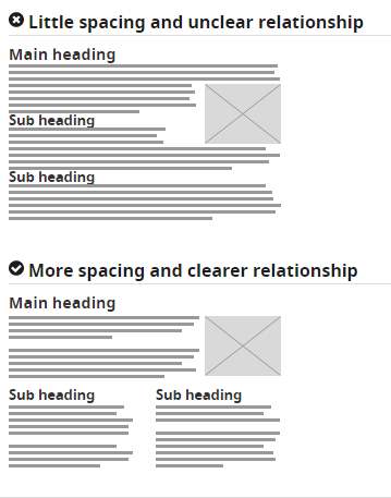
How to use header tags correctly from W3C.
Design clear focus statesFocus states make it easy for people navigating your website using the tab key to know where they are when using your site. They are used by screen readers, people with limited mobility, and power users.
Ensure that your menu items, forms, links, and buttons have clear, high contrast focus indicators that help them stand out.
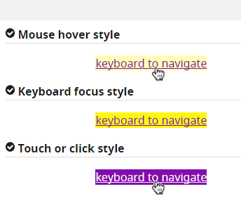
An example of clear focus states from W3C
Design helpful error statesProvide helpful and contextual information to users when they make errors. Also, explain to them how they can fix the errors and give them a chance to reverse their submissions.
Present instructions clearly and instances where user action is required should be displayed prominently.
An example of easily identifiable error states from W3C
Label all form fieldsMake sure that you have descriptive labels next to every form field. Additionally, avoid using placeholder text as the form label because it is often low contrast making it hard to read. Placeholder text also creates confusion because users can’t tell what to do after the text disappears.
Form labels are also useful for people using screen readers to understand your form, screen readers only read the information that is tagged as and skip over placeholder text.
A form with clear labels from W3C
Don’t use flashing UI animationsUI animations that flash more than 3 times per second can trigger seizures or physical reactions for some people. So it’s best to avoid them.
Avoid using only color to pass a messageColor is a good way to pass on a message but it should not be the only way as some people are color blind. Instead, use color plus other elements such as asterisks. For graphs and other charts, use labels plus color.
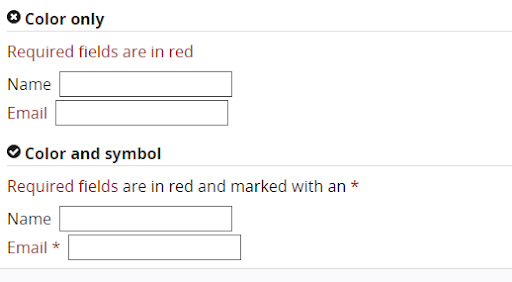
Using color plus other elements to pass on a message from W3C
Use easy to read fontsUse a font size and style that is easy to read. The readability of a font is often determined by its style rather than its type. As a rule, cursive or decorative fonts are hard to read. Use large text, with short line lengths, tall line heights, and more space between letters for improved readability.
New Accessibility Considerations for 2020 and BeyondWCAG 2.2 to Be Released in 2020The World Wide Web Consortium (W3C) released the first draft of WCAG 2.2 on the 27th of February 2020. This update aims to further improve web accessibility for disabled persons, especially on mobile devices.
Here’s what you need to know about WCAG 2.2:It is backward compliant with WCAG 2.0 and 2.1 meaning that if your website meets the criteria of 2.2 it also meets the criteria of the previous versions.It includes new criteria for focus visible states such as the size of focus area and color contrast. Growing Importance of VUI and Voice Interface DesignWith more people using voice-controlled devices like Alexa, Siri, and Amazon Echo for their search needs, there is a growing need for voice interface design.
Here’s how designers can make their voice interface designs more accessible:Tell users what they can do.Let users know the functionality that they are using.Don’t give too many options.Give visual feedback whenever possibleDon’t Over-Promise on “Full” or “100%” ADA ComplianceThe Americans with Disability Act (1990) was signed into law to prevent discrimination against people with disabilities. However, this law does not explicitly mention web accessibility and is therefore open to different interpretations. This means that as a designer you should not over-promise on full ADA compliance because it is not clear how ADA applies to web accessibility.
Prototyping, Designing and Developing With Accessibility in MindTo fully comply with accessibility web design, you need the best tools to help you with prototyping, design, and development. UXPin offers an all in one platform where you can check your designs for WCAG compliance and handoff your designs smoothly. Try UXPin for free.
Try UXPin for freeThe post Web Accessibility Guide – Everything Designers Should Consider and Implement appeared first on Studio by UXPin.
June 22, 2023
10 Fun Design Team Activities to Try Out in 2023

Successful designs are the result of a cohesive and creative design team. But how do leaders build teams that are rich in these skills? There may not be a universal formula for creating the perfect team, but fun design team activities offer room for collaboration and exploration.
Team building starts with engagement, and when done well, it results in a strong design culture. This article explores the ways in which you can support active involvement and encourage collaboration in your design team.
Boost your team happiness with a design technology that reduces duplicated work to zero. Try UXPin Merge and design prototypes with components that are interactive by default and reusable across the whole product development process, from design to development. Discover UXPin Merge.
Reach a new level of prototypingDesign with interactive components coming from your team’s design system.
Discover UXPin Merge .discover-merge { margin: 40px 8px;}.discover-merge__container { display: flex; max-width: 690px; height: 200px; padding: 20px; padding-left: 24px; border-radius: 4px; background-color: black; box-shadow: 10px 10px #9999ff; align-items: center; justify-content: space-between;}.discover-merge__left { width: 50%;}.discover-merge__left p { margin: 10px 0px !important; color: white !important; font-size: 18px !important;}.discover-merge__heading { font-weight: bold !important; color: white !important; font-size: 18px !important;}.discover-merge__text { margin: 0 !important; line-height: 22px !important;}.discover-merge__button { width: 174px; height: 44px; margin: 10px 0px; border: none; border-radius: 2px; background: white; color: black; font-size: 16px; text-align: center;}.discover-merge__button:hover { cursor: pointer;}.discover-merge__image { max-width: 320px !important; height: 200px; margin-right: -19px;}@media (max-width: 760px) { .discover-merge__container { height: auto; margin: 10px; align-items: left; }}@media (max-width: 500px) { .discover-merge__container { flex-direction: column; } .discover-merge__left { width: 100%; align-items: normal; }}How Do You Engage a Design Team?Recent studies suggest that as much as 18% of employees are disengaged in their work. With the remote workplaces and fractured team structures that followed in the wake of COVID-19, encouraging engagement is no simple task.
Before pursuing any of the following activities, customize these concepts to best suit your team’s needs and your design operation goals. Some workplaces may allot time for activities, while others may require voluntary attendance outside of company hours.
To maximize involvement, be sure to accommodate the needs of everyone in your group. The design team may even benefit from the involvement of other teams within your company, so keep an open mind as you refine these activities to support your team vision statement.
Ask team members to name examples of good and bad design
Comparing exercises help refine an individual’s perspective of what makes a good design. When coupled with the opportunity to choose self-identified examples of good and bad design, this can also highlight diverse perspectives.
Start by having each employee name three examples of design that they qualify as “good”. These choices can then be discussed amongst the team in a way that allows each member to explain the aspects that they are drawn to in designs. These personal interpretations inspire self-reflection in individuals and the adoption of various perspectives for the group, as patterns in preferences are noticed.
This method can also be used in reverse. Instead of identifying three examples of good design, team members can identify and discuss examples of bad design. To keep this exercise constructive, especially in the face of conflicting views or in large groups, it is helpful to have a moderator.
Set up design team book clubReading has been found to evoke engagement, especially when you apply deep reading practices. This form of literary interpretation is the result of readers drawing connections between other materials or real-world applications. And what better way to encourage these connections than to create a design team book club?
Much like a regular book club, one member would choose a book for the group to read, set a designated time frame to read the book, and then facilitate a conversation about it. Books focused on design and technology might be the most directly related to improving your team’s skills.
Still, classic titles concerning other topics can also support growth. You may be surprised to find that a variety of books can be related to your team’s work.
Organize a design workout
Most people align workouts with sports, but a workout can be any form of training intended to improve a set of skills. Innate skill and strength may help some teams succeed, but the most successful teams work out diligently to refine their skills as a group. In this sense, a design team is no different from a sports team!
Design-centered workouts can range from individual prompt-based design sketches to group challenges focused on communication. When generating workouts for a team, consider the factors that will impact team participation, like time and location.
Play a Tarot Card game
Context is key, and a special set of tarot cards can make that clear. With a set of tech tarot cards teams can view concepts and designs in relation to the many contexts they might end up in, such as environmental or relationship impacts.
This activity puts a focus on product impact. Also, much like standard tarot cards, each of the tech cards is intended to invoke ideas of both positive and negative outcomes. Teams can pass around a few cards from the deck and share their interpretation of how designs would fair in the face of each context.
Not only will this exercise highlight diverse views with a team, but it may also reveal areas of improvement on projects. Best of all, these cards can be downloaded from The Artefact Group for physical or virtual use.
Question mingle
Is a team really a team if its members don’t know each other? Whether your design team is new or old, there is a good chance it can benefit from some team building. Question mingling is an activity that encourages employees to ask each other questions in an effort to build relationships, trust, and learn each others’ strengths.
The setup is simple. Each employee gets to jot down three questions. Then, members pair up, ask each other their questions, and trade questions before meeting with another member. Time limits and a moderator are important to keep this activity flowing smoothly, especially when it comes to big groups and tight timelines.
“This VS That” game
There are few things as engaging as friendly competition, and that is exactly what this activity promotes. The “This VS That” game requires your team to be split into two groups that will host a spirited debate to decide which one of their topics wins.
The moderator picks the two combating topics and they can be as silly or serious as you see fit. One team can formulate an argument for waffles while the other stands for pancakes, or you can use this activity to encourage the assessment of two designs.
The goal is to get each team communicating and thinking creatively, so whether there is a true winner is completely up to you.
Hold 15 min, voluntary calls
A global study from 2021 found that about 1 in every 5 workers felt as if their organization did not care about them as a person. So how can you help team members feel like valued individuals in a team, rather than a corporate number?
Making time for conversation that goes beyond current projects can help your team members see their colleagues as individuals and also feel seen. Getting to know teammates on a more personal level allows for deeper team bonding and it can be a fun activity.
The key to keeping these 15-minute calls fun is ensuring they are voluntary. This way colleagues who like to chat will be engaged in this activity and more introverted individuals will not be pushed out of their comfort zone.
Share future design trends
It can be easy to get caught up in the current moment, so engaging in activities that encourage forward-thinking can keep your team on their toes. A facilitated discussion regarding future design trends can spark some interesting and possibly profitable concepts from your team.
How will data-driven algorithms impact our industry?What does AI have in store for the future of design?How will nostalgia-influenced design differ in the future from what it was in the recent past?Every future-focused question you can come up with is an opportunity to explore future design trends as a team.
Escape roomsProblem-solving is an important skill in the world of design, and it is even more useful when possessed by a team. Instead of waiting for your team to encounter problems in projects and hoping they will learn to problem-solve as a team in a timely fashion, you can prime them for problem-solving.
Escape rooms are the perfect playground for teams to explore each other’s strengths, compensate for weaknesses, and collaborate. In a way, escape rooms mirror the deadlines and creative collaboration needed to complete projects at work, but without any repercussions.
You might be surprised to see how many people are familiar with and excited about escape rooms when you offer this activity. Individuals from other teams might also want to get involved in some company-wide collaboration.
Bonus: create activities for the entire product team (devs included!)When team-building activities are opened up to the entire product team, the options for engaging individuals expand. When designers are paired with software developers or other product-centric team members, interesting side projects are created.
Some companies may come up with competitions like hackathons to encourage collaboration between team members. A software company, Netguru, held an interdisciplinary competition to develop an NGO app, resulting in a functional app for Poland’s largest charity within 4 weeks!
Activities targeted at the entire product team can be a force for good that benefits worthy causes, company collaboration as a whole, and individual development.
At UXPin, the value of collaboration on this level is a driving factor behind our function. With a centralized design process and the option to use UI coded components in prototypes, employees from all parts of a product team can collaborate with ease. Check how to connect designers and devs fast. Discover UXPin Merge.
Discover MergeThe post 10 Fun Design Team Activities to Try Out in 2023 appeared first on Studio by UXPin.
June 21, 2023
Pagination Examples that Work – We Analyzed the Most Effective Strategies

Pagination is a design pattern used to divide content into separate pages. It’s a fundamental component of digital product design, particularly important when dealing with large amounts of data or content, like e-commerce sites, blogs, data tables, or any other content-heavy platform.
Sometimes pagination design patterns are visible, like the examples above, but other times it’s invisible like the infinite scroll patterns often found in social media feeds.
The primary purpose of pagination is to enhance the user experience by making content more manageable and navigable, ensuring users aren’t overwhelmed with an avalanche of information all at once.
Role of pagination for user experiencePagination plays a crucial role in facilitating easy navigation and access to information. It offers users a clear pathway through the content, making it easy to locate specific items or revisit previous pages.
Additionally, pagination helps reduce the amount of data loaded simultaneously, improving loading times and overall website performance.
Design teams must implement pagination thoughtfully, as incorrect usage can cause confusion and frustration, resulting in poor engagement and user satisfaction.
Enhance your product’s engagement and user satisfaction with advanced prototyping and testing. Sign up for a free trial to build an interactive pagination prototype with UXPin.
Build advanced prototypesDesign better products with States, Variables, Auto Layout and more.
Try UXPin .try-uxpin-banner { margin: 40px 0px;}.try-uxpin__container { display: flex; max-width: 689px; height: 210px; padding: 20px; padding-left: 24px; border: 2px solid black; border-radius: 4px; align-items: center; justify-content: space-between; background-color: white; box-shadow: 10px 10px black;}.try-uxpin__left { width: 54%;}.try-uxpin__left p { margin: 10px 0px !important; color: black !important;}.try-uxpin__heading { font-size: 28px !important; font-weight: bold;}.try-uxpin__text { margin: 0 !important; font-size: 18px !important; line-height: 22px !important;}.try-uxpin__button { width: 135px; height: 44px; background: black; margin: 10px 0px; padding: 10px 20px; border: none; border-radius: 2px; color: white; font-size: 16px; text-align: center;}.try-uxpin__button:hover { cursor: pointer;}.try-uxpin__image { max-width: 320px !important; height: 200px; margin-right: -21px; margin-bottom: -6px;}@media (max-width: 760px) { .try-uxpin__container { height: auto; margin: 10px; align-items: left; }}@media (max-width: 500px) { .try-uxpin__container { flex-direction: column; } .try-uxpin__left { width: 100%; align-items: normal; }}Analyzing Effective Pagination Design StrategiesNumbered paginationNumbered pagination is one of the most familiar and widely used pagination methods.
Benefits of numbered pagination:
Clear navigation: Users can easily identify their current position and navigate to specific pages directly.Better for SEO: Each page with a unique URL is indexable, allowing search engines to crawl all pages.Scalability: Works well with large content volumes spread over multiple pages.A classic example of numbered pagination would be a blog directory, where each page presents a set number of blog post summaries. Users can quickly jump to a specific page to find the post they’re interested in.
Infinite scrollInfinite scroll automatically loads the next page’s content when users reach the bottom of the current one.
Benefits of infinite scroll:
Smooth, uninterrupted browsing experience: Users can continue scrolling without manually loading new pages.Ideal for mobile browsing: It’s touch-friendly and reduces the need for precise clicks.A popular use case of infinite scroll is social media platforms like Instagram, where users browse a continuous stream of posts without navigating to a new page.
Load more buttonA ‘Load More’ button combines features of numbered pagination and infinite scroll. Users click a button to load the next page of content at the bottom of what’s already on the screen.
Benefits of load more button:
Control over content load: Users decide when to load more content, reducing potential overwhelm.Good for performance: Reduces initial page load time, as not all content loads simultaneously.An e-commerce site is an excellent example of load more pagination. Users can load more products when they’re ready to view more, providing a balance between continuous browsing and loading speed. Load more pagination also allows users to locate the web page’s footer without content automatically loading.
Table paginationTable pagination is helpful for data tables where content is arranged in rows and columns.
Benefits of table pagination:
Improved readability: Users can easily read and compare data by limiting the number of rows per page.Better performance: Loading limited data at a time improves loading speed.Data tables use table pagination to view the next or previous entries. These patterns often allow users to control the number of rows per page, giving them more control.
Pagination ExamplesNumbered pagination exampleThe UXPin’s blog is an excellent example of basic numbered pagination. Users can navigate forward and backward or jump to a specific page using the numbers.
 Infinite scroll example
As of March 2019, Airbnb has more than six million listings worldwide. A search could produce hundreds, even thousands of listings, each with multiple images and text content. Airbnb uses infinite scroll pagination to provide a frictionless browsing experience where users never have to load the next page manually.
Load more buttonAmazon uses a load more button for many product listings, like this example for Amazon vouchers. Load more pagination is common for eCommerce websites where users typically want more time to browse. This control also allows users to scroll to the page’s footer and access secondary links, like return policies, shipping, contacts, and other important information.
 Table pagination
Table pagination helps users load and navigate through large volumes of database records. This example from Razy Hassan via Dribbble uses a dropdown to select the number of records per page combined with a truncated numbered pagination.
 Pagination Accessibility
Pagination is critical in interaction design and helping people with disabilities navigate a user interface effectively. Pagination provides a predictable, consistent content structure while facilitating easy navigation.
But pagination can also cause usability and accessibility challenges for users with motor disabilities and screen readers or confuse those with cognitive impairments. Designers can employ various strategies to make pagination more accessible and inclusive:
Ensure there is sufficient contrast between text and backgroundUse obvious hover and focus statesProvide ample click/touch targetsUser clear labels in plain languageImplement ARIA (Accessible Rich Internet Applications) roles and properties for assistive technologiesPagination Best PracticesClear navigation indicatorsUse obvious symbols or terms for the previous and next buttons, and highlight the current page using a prominent active state. This clarity helps users understand where they are in the sequence of pages.
For instance, Google uses unclickable black text to indicate the current page in search results.
 Include first and last page buttons
First and last buttons allow users to jump to the beginning or end of a list, which is particularly helpful when you have many pages with a structured or chronological order–like content within a specific date range or alphabetical order. You want to avoid using first and last buttons when this kind of structure doesn’t exist, which could lead to users navigating unnecessarily.
Limit the number of page linksTo avoid overwhelming users, limit the number of page links displayed at once. Consider using an ellipsis or a dropdown to condense the list if you have many pages. For example, our UXPin blog uses an ellipsis and allows users to jump 70 pages ahead to find older content faster.
Responsive designEnsure your pagination design adapts well to different screen sizes. Designers can achieve this by reducing the number of visible page links on smaller screens.
For example, Google uses different pagination patterns for its desktop and mobile search results. The desktop search results use a standard numbered pagination. For mobile devices, designers have opted for infinite scroll to reduce the necessity to tap a small focus area, providing a more user-friendly mobile experience.
SEO-friendly paginationImplement rel=”next” and rel=”prev” tags to help search engines understand the relationship between paginated pages. Developers can also use canonical tags to tell SERPs which page to index–Moz has an excellent article on canonical URLs, and you can check out Google’s official pagination documentation for SEO.
How to Design a Pagination PatternUse this framework as a template for designing pagination patterns:
Define the use case: Before you begin, it’s essential to understand what type of content you’re paginating and the user’s goal. Are they casually browsing or searching for something specific? The answer to these questions can guide the most effective pagination type.Choose the right pagination style: Based on your use case, choose the appropriate pagination style. For example, numbered pagination might be best for designing a blog. In contrast, a photo gallery might benefit from infinite scrolling.Design the interface: Consider the visual layout of your pagination controls. They should be easy to find but not intrusive. Make pagination controls large enough to click or tap easily, highlighting the active page number for clarity.Ensure accessibility: Make your pagination controls accessible to everyone, including appropriate ARIA labels for screen readers and ensuring high contrast for those with visual impairments.Test and iterate: As with any design element, testing your pagination design with real users is crucial. Gather feedback and make necessary adjustments. Remember, the goal is to make navigating your content as easy and intuitive as possible.Keep SEO in Mind: Lastly, ensure your pagination is SEO-friendly for web design projects. Collaborate with devs to use proper tags and avoid duplicate content to help search engines accurately index web pages.Interactive Pagination Prototyping With UXPinUXPin gives designers advanced features to prototype and test with code-like fidelity and functionality. With UXPin, designers can create fully interactive prototypes indistinguishable from the final product to test complex functionality, like chatbots, API requests, pagination, form validation, and more.
Unlike traditional design tools which generate vector graphics, UXPin renders HTML, CSS, and Javascript behind the scenes, increasing prototyping scope and creativity.
These advanced prototypes enable design teams to get accurate, meaningful feedback from usability testing and stakeholders for higher-quality outcomes that meet user needs and business goals.
Build your first interactive prototype to test and iterate your pagination design with UXPin. Sign up for a free trial.
Try UXPin for freeThe post Pagination Examples that Work – We Analyzed the Most Effective Strategies appeared first on Studio by UXPin.
June 20, 2023
5 Inspiring React Web Apps with Great UX

In the ever-evolving landscape of web applications, React has emerged as a preferred choice for developers and businesses alike. The open-source Javascript library’s powerful features and flexible ecosystem enable the development of engaging, high-performance web apps with exceptional user experiences.
We explore the benefits of using React from a UX perspective and how the front-end library can help design teams meet UX goals. We also look at five examples of the world’s most prominent React apps and how React facilitates a good user experience for these digital products.
Prototype and test your React web applications using actual React components in the design process with UXPin Merge. Visit our Merge page for more details and how to request access.
Reach a new level of prototypingDesign with interactive components coming from your team’s design system.
Discover UXPin Merge .discover-merge { margin: 40px 8px;}.discover-merge__container { display: flex; max-width: 690px; height: 200px; padding: 20px; padding-left: 24px; border-radius: 4px; background-color: black; box-shadow: 10px 10px #9999ff; align-items: center; justify-content: space-between;}.discover-merge__left { width: 50%;}.discover-merge__left p { margin: 10px 0px !important; color: white !important; font-size: 18px !important;}.discover-merge__heading { font-weight: bold !important; color: white !important; font-size: 18px !important;}.discover-merge__text { margin: 0 !important; line-height: 22px !important;}.discover-merge__button { width: 174px; height: 44px; margin: 10px 0px; border: none; border-radius: 2px; background: white; color: black; font-size: 16px; text-align: center;}.discover-merge__button:hover { cursor: pointer;}.discover-merge__image { max-width: 320px !important; height: 200px; margin-right: -19px;}@media (max-width: 760px) { .discover-merge__container { height: auto; margin: 10px; align-items: left; }}@media (max-width: 500px) { .discover-merge__container { flex-direction: column; } .discover-merge__left { width: 100%; align-items: normal; }}Asana
Asana is a project management platform helping teams organize work and collaborate effectively. The platform offers robust features such as task management, workflow visualization, team collaboration, and integrations with other tools, making it a go-to choice for teams of all sizes. Its clean and intuitive interface design reduces friction and increases productivity.
UX highlightsSimplicity and clarity: Asana’s interface is clean, with a simple layout makes it easy for users to navigate and find the information they need. It presents tasks and projects clearly, reducing cognitive load for users. The use of React enhances simplicity and clarity by enabling the creation of reusable UI components. This ensures a consistent look and feel throughout the app, reducing complexity and maintaining simplicity.Visual workflows: Asana provides visual project timelines and Kanban boards, making it easy for users to see the progress of tasks and projects at a glance. React contributes to these visual workflows through its efficient rendering capabilities, enabling smooth and fast updates of the visual elements for an uninterrupted user experience.Real-time updates: Asana offers real-time updates and notifications, ensuring users are always aware of task changes, comments, or updates. React’s efficient data handling and state management capabilities make these real-time updates possible, keeping the user interface in sync with the underlying data without unnecessary page refreshes.Intuitive interactions: From creating tasks to setting due dates, the interactions on Asana are intuitive and straightforward, contributing to a smooth user experience. React enhances these interactions by offering a robust event-handling system, enabling interactive UIs that respond to user inputs seamlessly.Facebook
Facebook is one of the world’s largest social networking platforms, boasting around 3 billion active users. It provides an online space where users can connect with friends, share content, join groups, and engage in many other social activities.
UX highlightsPersonalized user feed: Facebook’s personalized user feed delivers content tailored to each user’s preferences and interactions, creating a unique and engaging experience. With React, Facebook can efficiently update and render these personalized feeds, ensuring a smooth, up-to-date experience that engages users.Interactivity and responsiveness: Facebook is highly interactive–from liking and sharing posts to real-time messaging and video calling. React’s efficient event-handling system enhances these interactions, providing a responsive and seamless user experience.Real-time notifications: Users on Facebook receive real-time notifications about friend requests, messages, comments, and more. React’s state management capabilities allow for these real-time updates, ensuring the interface stays current without requiring page refreshes.Consistent design across platforms: Facebook maintains a uniform design and experience across its website and mobile apps, ensuring users can switch between platforms seamlessly. React (and React Native for native apps–iOS, Android, etc.) enables this consistency, allowing developers to create reusable components across different platforms.Airbnb
Airbnb is an online marketplace that connects people seeking accommodations with those offering them, allowing users to book unique homes and experiences worldwide. The platform provides a vast selection of listings, intuitive search, filter options, and seamless booking procedures, making it a popular choice for travelers.
UX highlightsIntuitive search and filters: Airbnb’s platform makes it easy for users to specify accommodation preferences with its intuitive search and robust filtering options. React’s component-based architecture allows for creating complex, customizable search and filter components, ensuring a smooth and user-friendly experience.Interactive map view: Alongside the list view of properties, Airbnb offers an interactive map view, allowing users to explore properties in their chosen location visually. React enhances this feature by efficiently rendering and updating map components based on user interactions.Detailed listings: Airbnb provides comprehensive information about each listing, including photos, amenities, host details, and reviews. React’s capabilities for handling complex data structures and state management allow for the efficient rendering of these complex components, ensuring a smooth user experience.Smooth booking process: Airbnb’s straightforward and user-friendly booking process provides real-time availability and pricing information, including currency conversions. React’s state management and real-time updating capabilities streamline this checkout user flow, providing users with accurate, real-time data as they navigate the booking steps.Netflix
As a global streaming service, Netflix offers a vast library of films and television series, including in-house productions. Thanks to its personalized content recommendations, user-friendly interface, and seamless streaming experience, Netflix dominates the streaming industry, serving over 200 million subscribers worldwide.
UX highlightsPersonalized content recommendations: Netflix uses sophisticated algorithms to curate and recommend content based on user behavior and preferences. React boosts this process, efficiently rendering and updating personalized content feeds to ensure a smooth, bespoke user experience that sustains subscriber engagement.User-friendly interface: The design of Netflix’s interface leans heavily towards ease of use, with intuitive navigation and a clean, visually appealing layout. The component-based architecture of React enhances this design, allowing the development of reusable UI components that maintain a consistent look and feel throughout the application.Seamless streaming experience: Netflix delivers high-quality streaming seamlessly across a wide range of devices. React’s efficient rendering and state management capabilities are crucial in this seamless experience, reducing latency and promoting smooth, uninterrupted viewing.Interactive features: Netflix offers interactive previews, ratings, and user profiles. With its robust event-handling system and component lifecycle methods, React powers these interactive features. It ensures real-time feedback and updates, contributing to a more engaging user experience.Slack
Slack is a widely-used communication platform that fosters collaboration among small and large teams. It successfully integrates messaging, file sharing, and video/voice calls in a single platform, thus facilitating seamless communication and efficient workflows.
UX highlightsOrganized Conversations: Slack organizes conversations into channels, ensuring discussions remain on-topic and easy to follow. React’s component-based architecture aids in managing these distinct areas of the interface, ensuring quick updates and a smooth user experience.Integrations: Slack offers many integrations, including tools like Google Drive, GitHub, and Trello. This level of integration simplifies workflows by providing a unified platform for various tasks. React’s flexibility plays a significant role by enabling seamless interaction with different APIs and services.Real-time Interaction: Slack’s real-time messaging system keeps teams connected, fostering collaboration. React’s efficient state management ensures users see updates instantly without page refreshes, enhancing the interaction experience and productivity.Customizable Notifications: Slack allows users to customize notifications, ensuring they stay focused without missing important updates. The flexibility of React supports this customization, allowing the app to efficiently manage changes in user settings and provide a tailored experience.Search Functionality: Slack’s powerful search functionality lets users quickly locate past conversations or files. React enhances this feature by facilitating fast rendering of search results, ensuring a smooth, uninterrupted user experience.Why Web Apps Use ReactJS?The React library promotes code reuse and modularity through its component-based architecture, enabling developers to construct complex user interfaces from small, isolated pieces of code.
Under the hood, Node.js, a powerful JavaScript runtime, often powers the server-side operations of these React applications, creating a seamless full-stack development experience.
React’s virtual DOM (ReactDOM) optimizes rendering and improves app performance, efficiently handling high-load applications. With JavaScript at its core, React allows seamless integration with other JS libraries and frameworks, providing a flexible app development environment.
React’s support for server-side rendering (converting pages to HTML, CSS, and Javascript in the browser) also aids in SEO, ensuring that web apps are discoverable and performant—a critical feature many libraries and frameworks (Angular, Vue, etc.) cannot replicate effectively.
How React impacts web app UXReact’s fast rendering creates a smooth, lag-free user experience critical for user engagement and satisfaction. A perfect example of React’s performance in action is Facebook, one of the most complex web applications in the world.
The ability to effortlessly reuse components throughout an application helps maintain design consistency and coherence for uniform user interfaces and interactions.
Criteria for Great UX in React Web AppsUser-centric designUser-centered design focuses on the needs and preferences of the target audience. React’s component-based architecture and flexibility allow developers to create highly customizable user interfaces that cater to specific user expectations and deliver a tailored experience.
Performance and speedA critical aspect of great UX is ensuring that web apps deliver the highest speed and performance. React’s virtual DOM and efficient rendering mechanisms help achieve this by minimizing updates to the actual DOM, leading to a smoother user experience with minimal latency, even in complex applications.
Consistency and predictabilityConsistency and predictability in a web app’s design and interactions are essential for enhancing user satisfaction. React’s component-based structure promotes the reuse of UI elements across the application, ensuring a consistent look and feel and providing predictable user interactions.
Accessibility and inclusivenessDesigners must make web apps accessible to all users, regardless of their abilities, devices, or assistive technologies. React’s ecosystem offers a range of libraries and tools to implement accessibility best practices, ensuring an inclusive user experience.
Feedback and responsivenessProviding timely feedback and responsiveness in web apps is crucial for maintaining user engagement. React’s state management capabilities and component lifecycle methods enable developers to handle user interactions efficiently, providing real-time feedback and updates. This instant feedback creates a more interactive and engaging user experience, fostering user satisfaction and loyalty.
How TeamPassword Using React Components for Prototyping With UXPin MergePassword manager TeamPassword uses a custom React MUI design system to develop its products. The startup doesn’t have a design team, meaning engineers must do all the prototyping and testing before releasing new features.
“Customers entrust us with sensitive information in their login records. Inconsistencies or an outdated design can cause some customers to question whether we are technologically up-to-date enough to keep that information secure. Front-end development builds trust and confidence in the backend performance.” Tony Caccavo, Director of Operations at TeamPassword.
The engineering team imports their React design system into UXPin using Merge, allowing them to leverage UXPin’s drag-and-drop design environment to build prototypes and make changes significantly quicker than writing code.
TeamPassword gets all the benefits of code with the simplicity of UXPin’s design interface allowing the company to ship UX-optimized releases fast. UXPin renders JSX, meaning React developers can copy/paste production-ready prop changes to develop the final product.
Prototype your React web applications with fully functional components to enhance testing with actionable feedback from test participants and stakeholders. Visit our Merge page for more details.
Discover MergeThe post 5 Inspiring React Web Apps with Great UX appeared first on Studio by UXPin.
June 19, 2023
How Do You Incorporate Feedback into Your Designs?
Constructive feedback provides UX designers with different perspectives, helping to highlight areas that may require improvement or revision. This process is essential as designers are often too close to their projects, blinding them from possible flaws or enhancements.
Feedback helps align product design with user needs and business goals, improving the design’s usability, user experience, and business value. Incorporating feedback can foster more collaborative, user-centric, and outcome-focused designs.
Does your design tool elicit good feedback? Deliver products that exceed user needs and stakeholder expectations. Discover how UXPin can enhance your prototyping capability to elicit more meaningful, actionable feedback. Sign up for a free trial.
Build advanced prototypesDesign better products with States, Variables, Auto Layout and more.
Try UXPin .try-uxpin-banner { margin: 40px 0px;}.try-uxpin__container { display: flex; max-width: 689px; height: 210px; padding: 20px; padding-left: 24px; border: 2px solid black; border-radius: 4px; align-items: center; justify-content: space-between; background-color: white; box-shadow: 10px 10px black;}.try-uxpin__left { width: 54%;}.try-uxpin__left p { margin: 10px 0px !important; color: black !important;}.try-uxpin__heading { font-size: 28px !important; font-weight: bold;}.try-uxpin__text { margin: 0 !important; font-size: 18px !important; line-height: 22px !important;}.try-uxpin__button { width: 135px; height: 44px; background: black; margin: 10px 0px; padding: 10px 20px; border: none; border-radius: 2px; color: white; font-size: 16px; text-align: center;}.try-uxpin__button:hover { cursor: pointer;}.try-uxpin__image { max-width: 320px !important; height: 200px; margin-right: -21px; margin-bottom: -6px;}@media (max-width: 760px) { .try-uxpin__container { height: auto; margin: 10px; align-items: left; }}@media (max-width: 500px) { .try-uxpin__container { flex-direction: column; } .try-uxpin__left { width: 100%; align-items: normal; }}Understanding Feedback
It’s important to understand what type of feedback you receive, who it’s from, and its relevance. This understanding will help differentiate valuable feedback vs. negative feedback and what information you use to drive decision-making.
Constructive vs. destructive feedbackConstructive criticism aims to foster improvement and is generally given with positive intent to drive design decisions. For example, a colleague might say, “The call-to-action button doesn’t stand out. Maybe making it more prominent would lead to higher user engagement.”
Conversely, destructive feedback is negative, unhelpful, and does not provide any direction for improvement. An example would be, “I don’t like the design. It’s dull.”
User vs. stakeholder or client feedbackUser feedback refers to insights provided by a product’s end-users, often gathered through user testing or surveys. For example, a user might suggest, “I prefer websites and apps with dark mode because I suffer from screen fatigue.”
Stakeholder feedback typically comes from people involved with a design project. For example, a stakeholder from the branding team might say, “This color scheme doesn’t align with our brand identity.”
Peer vs. expert feedbackPeer feedback refers to input from fellow designers or colleagues, typically during design critiques or standups. An example might be, “I think we need to adjust the typography to improve readability.”
Expert feedback comes from seasoned professionals or individuals with significant experience or expertise in a specific domain. An expert might provide insights such as, “The current design might have accessibility issues for visually impaired users. This project requires a color contrast of Level AA–contrast ratio of at least 3:1 for text not smaller than 24px or 4.5:1 for text smaller than 24px.”
This example demonstrates that peers might spot a problem but not know how to fix it. Designers must contact domain experts to gather more data and implement a suitable solution.
Techniques for Eliciting Great Design FeedbackAsking the right stakeholder questionsIt’s crucial to ask the right questions when eliciting feedback from stakeholders. Instead of general queries like “What do you think of this design?” guide your reviewers with more specific questions about your design goals.
For example, asking, “Do you think we have prioritized the primary and secondary navigation appropriately?” or “Does the color scheme evoke the emotions we’re aiming for in our target audience?” These pointed questions will encourage more targeted, actionable responses that you can incorporate into your designs.
Using open-ended questionsOpen-ended questions can be a powerful tool for eliciting user and stakeholder feedback. Unlike closed questions that limit responses to yes or no, open-ended questions encourage users to share their thoughts, feelings, and ideas in detail.
For example, rather than asking, “Do you like feature X?” you could ask, “How does this feature X help you?” By allowing users to express their thoughts freely, you gain deeper insights into their experiences and needs, which can guide you in refining your design.
Setting clear expectationsFeedback is more valuable when designers set clear goals and expectations. Clarify what kind of feedback you’re seeking and when you need it. For example, if you’re in the initial design stage, you may say, “I’m looking for feedback on the overall layout and color palette by the close of business tomorrow.” This way, reviewers understand the feedback’s scope and urgency, enabling them to provide more thoughtful, timely responses.
Design Feedback FrameworkHere is a basic design feedback framework designers can apply to users and stakeholders.
 Step 1: Set your feedback goal
Before you even start collecting feedback, it’s essential to identify the purpose and goal. What aspect of your design are you focusing on? Is it usability, aesthetic, or functionality? Or are you interested in how well your design aligns with your target audience’s expectations?
By establishing clear feedback goals, you can set the direction for your feedback session, ask the right questions and ensure responses are meaningful and actionable.
Step 2: Identify who you need feedback fromIdentifying the right stakeholders for your feedback session is crucial. For example, if it’s a question about usability, you have to recruit participants from a specific user group, while a technical question will require input from an engineering stakeholder. In some instances, you may need diverse feedback to ensure your solution meets many needs.
Identifying who you need to speak to and what questions to ask is essential for gathering feedback to propel your project forward while meeting user and business goals.
Step 3: Collect feedbackOnce you’ve defined your goals and identified your audience, it’s time to collect feedback. You might do this through one-on-one interviews, group workshops, or digital tools for remote feedback collection. Remember to create a comfortable space (virtual or in-person) for stakeholders and users to express their thoughts. Be sure to ask open-ended questions to encourage in-depth responses.
Step 4: Organize responsesYou’ll often have lots of data and UX assets at the end of a feedback session. For example, one 30-minute interview will produce several transcript pages, a video, notes, and a report. You must organize and store these so it’s easy for team members to fetch and analyze the data.
To make sense of it all, you need to organize and categorize the feedback–for example, usability, aesthetics, functionality, technical, etc. This step will make it easier for you to analyze and prioritize the feedback.
UX researchers often use tools like Condens, Dovetail, and Productboard as asset repositories to organize and distribute data.
Step 5: EvaluateOnce you’ve organized the feedback, it’s time to analyze the data objectively. Focus on understanding the underlying concerns or ideas behind what users and stakeholders have shared. Look for common themes or recurring issues, as these can highlight areas to prioritize.
Step 6: PrioritizeAfter evaluating the feedback, you may have several changes, but they’re not equally important. It’s essential to prioritize these changes based on their impact on the overall user experience and the project’s goals–according to the goals you set in Step 1. You can add the non-essential items to the product’s backlog.
Step 7: ImplementNow that you’ve identified and prioritized the necessary changes, it’s time to implement them. For example, stakeholders have asked designers to improve conversions with a more prominent CTA. The design team must build prototypes based on the feedback to begin testing.
Step 8: Iterate and improveThe process doesn’t end with implementing the changes. The next step is to prototype and test these changes with users and stakeholders to see if they’ve improved the design.
Collect feedback on these new iterations, evaluate them, and make further changes if necessary. Design is an iterative process, and each round of feedback takes you one step closer to a design that meets user needs and business goals.
Incorporate feedback with UXPinThe quality of your prototype significantly impacts the quality of feedback you get from users and stakeholders. Digital products are highly interactive, but the prototypes from traditional design tools are not!
This lack of interactivity limits prototyping scope, the questions designers can ask, and the feedback quality. For example, most design tools don’t have functioning input fields. Design teams must use multiple frames or plugins to achieve basic functionality–which still doesn’t provide a realistic user experience.
A stakeholder might comment, “This button doesn’t do anything,” or “Why can’t I enter my name in this input field?” Unfortunately, these are the frustrating limitations of image-based design tools.
Better Design Decisions with Interactive PrototypesUXPin is a complete end-to-end design tool with features to create wireframes, mockups, and high-fidelity prototypes faster and with enhanced functionality.
UXPin is interactive by default. When designers add an input field to the canvas, it’s fully functional and ready to receive data–no plugins or additional frames required.
Designers can use UXPin’s Variables to capture user inputs and create dynamic prototypes to impress stakeholders while providing usability participants with a realistic user experience.
Variables are just one of UXPin’s many advanced prototyping features:
Conditional Interactions : take interactions to the next level with if-then and if-else rules to determine outcomes based on user actions. Expressions : design Javascript-like functionality to validate passwords or update a shopping cart. States : create multiple variants of a component that respond to specific user interactions, including dropdown menus, accordions, image carousels, and more. IFTTT : connect other apps or products to create realistic prototyping experiences, like adding an event to a user’s calendar or sending an email verification.Ready to see how UXPin can enhance your digital product design process? Sign up for a free trial.
Try UXPin for freeThe post How Do You Incorporate Feedback into Your Designs? appeared first on Studio by UXPin.
June 16, 2023
Agile vs. Scrum vs. Kanban – Comparing Top 3 Project Management Methodologies

Choosing the ideal project management methodology enables users to optimize results by identifying and handling the critical components of their projects. This ensures that teams are able to manage deadlines and budgets by leveraging specific processes.
For example, agile methodologies (as the term suggests), focus on dynamic communication and constant feedback among cross-functional teams and end-users.
A project management method provides your team with a consistent reference point toward success, however, there is no one-size-fits-all choice. As such, it is vital that project management teams identify the advantages of a method before making a decision.
When using any of those methods, you need a fast and reliable prototyping tool to bring your ideas to life. UXPin is such a tool. It will cover every part of design process, so it makes collaboration easy. Experience product design with UXPin. Sign up for a free trial.
Build advanced prototypesDesign better products with States, Variables, Auto Layout and more.
Try UXPin .try-uxpin-banner { margin: 40px 0px;}.try-uxpin__container { display: flex; max-width: 689px; height: 210px; padding: 20px; padding-left: 24px; border: 2px solid black; border-radius: 4px; align-items: center; justify-content: space-between; background-color: white; box-shadow: 10px 10px black;}.try-uxpin__left { width: 54%;}.try-uxpin__left p { margin: 10px 0px !important; color: black !important;}.try-uxpin__heading { font-size: 28px !important; font-weight: bold;}.try-uxpin__text { margin: 0 !important; font-size: 18px !important; line-height: 22px !important;}.try-uxpin__button { width: 135px; height: 44px; background: black; margin: 10px 0px; padding: 10px 20px; border: none; border-radius: 2px; color: white; font-size: 16px; text-align: center;}.try-uxpin__button:hover { cursor: pointer;}.try-uxpin__image { max-width: 320px !important; height: 200px; margin-right: -21px; margin-bottom: -6px;}@media (max-width: 760px) { .try-uxpin__container { height: auto; margin: 10px; align-items: left; }}@media (max-width: 500px) { .try-uxpin__container { flex-direction: column; } .try-uxpin__left { width: 100%; align-items: normal; }}Comparing Agile vs. Scrum vs. Kanban at a GlanceAgile Methodology
The Agile methodology focuses on an incremental and iterative approach that caters to the changing landscape of a project. Generally, agile methods apply to any process that is tied to the concepts contained in the Agile Manifesto drafted in 2001.
Scrum Methodology
Scrum is one of the most widely applied implementations of the agile methodology. The methodology utilizes a consistent and specific set of roles, meetings, and responsibilities that are maintained throughout the project. Scrum was created in 1993 by software developer Jeff Sutherland and remains a popular methodology.
Kanban Methodology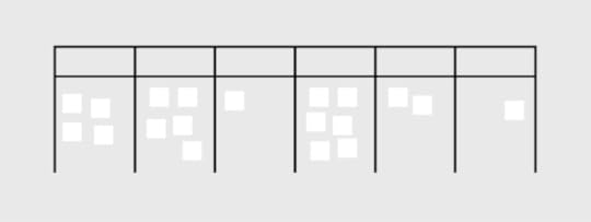
Kanban approaches are visual implementations of the agile methodology. It provides users with a comprehensive breakdown of project details at a glance, which minimizes cycle time while optimizing the overall workflow.
Here is a breakdown of the main features of each methodology:
Agile Agile features a 12-point manifesto that guides teams toward more agile communication practices. Encourage continuous improvement through dynamic communication between teams and end-user customers.Supports projects with vaguely outlined end goals, i.e. work-in-progress shaped by feedback.Focuses on the adaptation to change. Shorter planning cycles pave the way for convenient editing and optimization of backlogs.ScrumScrum is a subset of the Agile method.Ideal for projects that focus on transparency and user visibility. It collectively handles coding and related processes in small quantities, which improves accountability. Reduces the risks of misunderstandings through improved teamwork while facilitating changes. Functions through uniform iterations known as sprints that last between 1-2 weeks, which enables project teams to ship software with uninterrupted consistency.KanbanKanban is a highly visual framework that presents project details in a concise manner.It sorts workflow management through online Kanban boards that are easily customized. Kanban Boards apply multiple swimlanes categorized by key details such as project status and roles.Boards are color-coded for easy referencing at a glance, i.e. grouping all completed tasks in purple and work-in-progress in green.Choosing The Right MethodologyWhat is the Project’s Goal?The project’s goal will determine the ideal approach by narrowing down on the processes prioritized by a team or organization. As such, it is important for users to identify the type of project and its involved processes before settling on a project management methodology.
This means examining the critical criteria that drive a project, some of which include: its budget, complexity(based on the timeline and number of people involved), scalability (the targeted outreach, long-term business plans), role specializations, availability of resources, industry practices, and timeline.
Upon assessing the criteria, project managers will be able to seek a methodology that enhances the structure of their project. This involves comparing the pros and cons of each methodology and determining the choice that will deliver maximum impact while eliminating those that carry the most risks.
Who Needs to Be Involved in the Project?Customer Involvement
It is essential to establish the customer’s role in project management. Project managers should seek to provide seamless communication channels between customers and the development team. This may include the facilitation of interactions such as real-time updates between customer user responses and backend data management.
Kanban and Scrum differ in a way that the feedback will be presented to the rest of the team. While in Kanban, they will end up on the backlog board, in Scrum, they will be carefully considered.
Team and Stakeholders
Project managers should determine the size of each team and the best method of communication among various roles. The selected methodology should support teams in achieving individual deliverables while maintaining efficient collaboration.
Project managers should also work closely with major stakeholders who are responsible for high-level planning such as budget approval. A best-fit methodology should optimize connections among every tier within project management.
Scrum is praised for its efficiency. A sprint lasts two weeks, while Kanban doesn’t have such rules.
Role Specialization
The roles involved in a project will determine the type and frequency of communication in project management. Additionally, it is essential to identify various role specializations to ensure that each stakeholder is provided relevant support and privileges.
When comparing Scrum vs Kanban vs Agile, only Scrum has clearly specialized roles that you need to adhere to. In Kanban, every team member is the owner of the board. Choose this method if role assignment is something that will improve project flow for your team.
What Is Your Timeline?Timelines will help project managers determine realistic targets. Timeline planning should include budget considerations, the estimated response rates of the various roles involved, and leeway for technical error and other potential setbacks.
What is Your Budget?Project managers should establish the budget for the project by considering its processes, roles, and timeline. Complex projects may require a combination of various project management methodologies.
Budget tracking should be available to stakeholders in a transparent and consistent manner. A project’s budget is a major factor in assessing the preferred methodology since it serves as the baseline in estimating the variance of a project.
How Complex is Your Project?A project involving multiple roles and procedures might require a combination of methodologies for the most successful results. Complexity is assessed based on requirements such as the roles involved, time and cost.
How Scalable is Your Project?Determine the long-term targets of the project, which include the scope and timelines for expansion. Project managers should check if their programs are equipped to scale-up according to set goals. Scalability might include additional processes and roles among other variables. Project managers must decide how these changes are implemented in the quickest, most effective, and affordable manner.
Use the Best Possible ToolsProject management can be simplified with excellent results by applying the most suitable methodology. The selection of an effective project management software is equally critical to the success of projects.
UXPin is a leading project management solution that supports every methodology. The platform utilizes a massive range of dynamic features, which include:
Neat and structured dashboards for highly visual Kanban-style projects, where the permissions and statuses of members are clearly displayed for easy reference. Additionally, each uploaded design is encrypted and backed up for added security. Built-in notifications, task assignments, and approval requests ensure that projects are carefully handled under the Scrum framework for maximum accountability. Optimizes user accessibility of agile methods through a dynamic and cohesive system that connects people in a project with simple push and pull changes. Users may easily share project specifications with developers through password-protected links.Additionally, UXPin enhances project management with a vast range of design and prototyping elements which include unlimited prototypes and reviewers, stakeholder approval, conditional logic and contextual documentation.
UXPin is your one-stop design tool for your project needs, suitable for all methodologies. We are here to help you bring your greatest ideas to life. From prototyping, collaboration to design handoff. Sign up for a UXPin’s trial.
Try UXPin for freeThe post Agile vs. Scrum vs. Kanban – Comparing Top 3 Project Management Methodologies appeared first on Studio by UXPin.
June 15, 2023
A Designer’s Guide to Content Inventory

A content inventory is a comprehensive and structured collection of all the content assets within a digital product or website. It’s a detailed catalog that captures information about each piece of content, including its location, format, metadata, and key attributes.
Managing a content inventory is essential for user experience as it provides a centralized and organized view of the content landscape, allowing designers to understand the content’s breadth, depth, and relationships.
With a content inventory, UX designers can clearly understand the content’s scope and structure, enabling them to plan and create user-centered experiences effectively.
By managing the content inventory, designers can ensure that content is properly structured, labeled, and accessible, improving navigation, findability, and overall user satisfaction. The content inventory is a foundational tool for content strategy, governance, and optimization efforts, ultimately contributing to a seamless and engaging user experience.
Create a single source of truth and streamline design operations with UXPin Merge. Visit our Merge page for more details and how to request access.
Reach a new level of prototypingDesign with interactive components coming from your team’s design system.
Discover UXPin Merge .discover-merge { margin: 40px 8px;}.discover-merge__container { display: flex; max-width: 690px; height: 200px; padding: 20px; padding-left: 24px; border-radius: 4px; background-color: black; box-shadow: 10px 10px #9999ff; align-items: center; justify-content: space-between;}.discover-merge__left { width: 50%;}.discover-merge__left p { margin: 10px 0px !important; color: white !important; font-size: 18px !important;}.discover-merge__heading { font-weight: bold !important; color: white !important; font-size: 18px !important;}.discover-merge__text { margin: 0 !important; line-height: 22px !important;}.discover-merge__button { width: 174px; height: 44px; margin: 10px 0px; border: none; border-radius: 2px; background: white; color: black; font-size: 16px; text-align: center;}.discover-merge__button:hover { cursor: pointer;}.discover-merge__image { max-width: 320px !important; height: 200px; margin-right: -19px;}@media (max-width: 760px) { .discover-merge__container { height: auto; margin: 10px; align-items: left; }}@media (max-width: 500px) { .discover-merge__container { flex-direction: column; } .discover-merge__left { width: 100%; align-items: normal; }}What is a Content Audit?A content audit systematically and thoroughly evaluates the content inventory within a digital product or website. It involves reviewing and analyzing the content to assess its quality, relevance, accuracy, and effectiveness in meeting user needs and business goals–like the company’s content marketing strategy.
UX designers use content audits to identify content gaps, redundancies, inconsistencies, and areas for improvement, enabling them to make informed decisions about content strategy, organization, and optimization.
Who is Responsible for a Content Audit?
Typically, a content audit is a collaborative effort involving multiple stakeholders. The primary responsibility for a content audit often lies with the UX design team, specifically the content designers or strategists. These individuals possess the expertise and knowledge to effectively assess and evaluate the content.
Do you need a content designer?A dedicated content designer plays a crucial role in content management and strategy. They take ownership of the content audit process, working closely with the UX design team, content creators, and stakeholders.
A content designer’s responsibilities include:
Collecting and analyzing content.Identifying gaps and redundancies.Organizing the content inventory.Documenting findings.They collaborate with stakeholders to implement content improvements based on the audit’s recommendations, ensuring the content aligns with user needs and business goals.
The content designer also contributes to content strategy development, guiding the creation and maintenance of high-quality, user-centered content across digital platforms. Their expertise helps establish consistent brand messaging, tone, and style while ensuring content meets accessibility, SEO, and usability standards.
How to Conduct a Content Audit Collect existing content
Start by identifying the content sources and compiling a comprehensive inventory list. This process involves gathering all the content assets from various sources, such as web pages, documents, images, videos, and downloadable files.
Create a structured inventory including URL or location, content type, metadata, and other relevant information to ensure a thorough content representation.
The NN Group recommends using a spreadsheet (Google Sheets or Excel) for managing content inventories and audits. Spreadsheets have all the required features, and the design team can invite collaborators from across the organization without investing in additional tools and subscriptions.
Analyze contentReview the content inventory for relevance and accuracy. Assess the quality and consistency, considering factors such as readability, tone, language, and alignment with brand guidelines.
Evaluate the effectiveness of the content in meeting user needs and business goals, ensuring it provides value, supports key messages, and aligns with the overall user experience strategy.
Organize it into categoriesCategorize the content based on topics or themes to create a logical organization. Establish a content hierarchy or structure that reflects the relationships between different content pieces.
This organization helps users navigate the content more effectively and enhances their overall experience. Consider user personas, user journeys, and information architecture principles when organizing the content.
Assess content gaps and redundanciesIdentify any missing or outdated content that must be created or updated. Eliminate redundant or overlapping content to streamline the user experience and ensure clarity and consistency. By identifying gaps and redundancies, you can optimize the content ecosystem and ensure that users can easily find the information they need without confusion or frustration.
Document findings and recommendationsCreate a comprehensive content inventory report that documents the findings from the audit. Include an analysis of the content, highlighting strengths, weaknesses, and areas for improvement.
Based on the audit’s findings, outline actionable recommendations for content enhancement, restructuring, or removal. Provide clear guidelines for content creators and stakeholders to implement the recommended changes, fostering a user-centric approach to content management and improving the overall user experience.
When Should You Conduct a Content Audit?
There are several instances where UX teams might want to consider conducting content audits:
Website redesign or migration: Conduct a content audit before a website redesign or migration to evaluate the existing content’s relevance, accuracy, and quality. This audit helps inform decisions on what content to keep, revise, or remove during the redesign process.Content strategy development: Perform a content audit when developing a content strategy to gain insights into the current content landscape, identify gaps and redundancies, and inform future content planning and creation.User experience optimization: Conduct a content audit to improve the user experience by ensuring the content is organized, structured, and easily accessible. This optimization helps identify improvements, such as updating outdated content or adapting content for different devices.SEO and keyword analysis: Use a content audit to assess the performance of existing content in search engine rankings, identify keyword opportunities, and optimize content for improved visibility and search engine optimization.Compliance and legal requirements: Regular content audits ensure compliance with legal and regulatory standards, such as data privacy, accessibility, and copyright. The UX team can identify potential risks or address non-compliant content.Best Practices and Tips for Successful Content Inventory Involve stakeholders and subject matter experts
Collaborate with individuals from various teams, including content creators, designers, developers, and subject matter experts, to gather insights and ensure comprehensive coverage of the content landscape.
Engaging stakeholders throughout the process promotes a shared understanding of content goals and facilitates a more accurate and thorough inventory.
Maintain version control and documentationEstablish a clear system for tracking changes, updates, and revisions to the content inventory, ensuring everyone works from the most up-to-date version.
Document important details, such as content sources, metadata, and relevant notes or observations, to provide a comprehensive record for future reference and maintain consistency and accuracy.
Consider scalability and future content updatesAnticipate future growth and changes in content, ensuring the inventory framework and structure can accommodate new content and adjustments. A flexible inventory design allows for easy additions, modifications, and scalability as the content landscape evolves.
This proactive approach ensures that the content inventory remains valuable and effective long-term, even as the team adds new content or the strategy evolves.
Tools and Resources for Content Inventory Management and AuditsContent inventory spreadsheet templatesContent inventory templates provide a structured framework for capturing essential information about each piece of content, including metadata, URLs, page titles, and descriptions.
Tools like Google Sheets, Microsoft Excel, Notion, or Airtable offer customizable templates specifically designed for content inventory purposes. These templates streamline the inventory process, allowing you to efficiently input and analyze content data.
The NN Group provides a list of standard inventory attributes you can use as a foundation for your spreadsheet:
Name or title of the piece of content (not the page title, the actual name or title); if it doesn’t have one, give it a clear name or summarize what it isURL or link to where it livesAuthor, owner, or source (who wrote or created it, who owns it, is it user-generated, fed in from somewhere else, etc.)Subject matter or topic it relates toFormat (article, video, image, web part or component, webpage type, PDF)Creation or last-modified dateMetadata (page title, meta description, alt text, etc.)Where raw files reside, internallyContent analysis and mapping toolsTools like Smartocto and Siteimprove enable you to analyze and visualize content hierarchies, relationships, and performance metrics.
These tools provide data-driven insights to uncover content gaps, redundancies, and opportunities for optimization. Utilizing these tools lets you make informed decisions about content strategy, information architecture, and user experience.
Here are a few content inventory tools for analysis and mapping:
Smartocto (formally Content Insight): Provides detailed content inventory reports, site mapping, and content quality analysis.Siteimprove’s Content Mapping: Offers content hierarchy visualization and analysis to identify gaps and overlaps.DYNO Mapper: Helps create sitemaps, conduct content audits, and visualize content relationships.Collaboration and project management softwareCollaboration and project management software facilitates effective teamwork and streamlined content inventory workflows.
Tools like Trello, Asana, Notion, or Jira help teams collaborate, assign tasks, set deadlines, and track audit progress.
Content Prototyping With UXPin MergeUXPin Merge enables content designers to build interactive prototypes that replicate the final product experience accurately. With UXPin Patterns, designers can create multiple instances of interactive components or interfaces and quickly swap these during usability testing or stakeholder feedback sessions to get instant feedback on different types of content.
UXPin Merge’s drag-and-drop workflow empowers non-designers to build and test prototypes at a higher fidelity and with greater interactivity than traditional design tools.
Take your content strategy to the next level with interactive prototyping from UXPin Merge. Visit our Merge page for more details and how to request access.
Discover MergeThe post A Designer’s Guide to Content Inventory appeared first on Studio by UXPin.
June 14, 2023
3 Types of Accessibility Testing Tools that You 100% Need

Accessibility testing evaluates digital products or services to ensure they can be accessed and used by individuals with disabilities. It involves assessing various websites, applications, or content aspects to identify and address barriers that hinder users with disabilities.
UX teams aim to identify and rectify issues related to visual, auditory, motor, and cognitive impairments, making their digital products more inclusive and usable.
Accessibility testing is crucial because it helps ensure equal access and usability for all individuals, regardless of their abilities. It plays a vital role in creating inclusive digital experiences that comply with accessibility standards and guidelines, such as the Web Content Accessibility Guidelines (WCAG 2.0) and Section 508.
Test your designs without leaving the canvas with UXPin’s built-in accessibility features. Sign up for a free trial to explore the world’s most advanced UX design tool.
Build advanced prototypesDesign better products with States, Variables, Auto Layout and more.
Try UXPin .try-uxpin-banner { margin: 40px 0px;}.try-uxpin__container { display: flex; max-width: 689px; height: 210px; padding: 20px; padding-left: 24px; border: 2px solid black; border-radius: 4px; align-items: center; justify-content: space-between; background-color: white; box-shadow: 10px 10px black;}.try-uxpin__left { width: 54%;}.try-uxpin__left p { margin: 10px 0px !important; color: black !important;}.try-uxpin__heading { font-size: 28px !important; font-weight: bold;}.try-uxpin__text { margin: 0 !important; font-size: 18px !important; line-height: 22px !important;}.try-uxpin__button { width: 135px; height: 44px; background: black; margin: 10px 0px; padding: 10px 20px; border: none; border-radius: 2px; color: white; font-size: 16px; text-align: center;}.try-uxpin__button:hover { cursor: pointer;}.try-uxpin__image { max-width: 320px !important; height: 200px; margin-right: -21px; margin-bottom: -6px;}@media (max-width: 760px) { .try-uxpin__container { height: auto; margin: 10px; align-items: left; }}@media (max-width: 500px) { .try-uxpin__container { flex-direction: column; } .try-uxpin__left { width: 100%; align-items: normal; }}Understanding Accessibility GuidelinesThe most widely recognized and adopted guidelines are the Web Content Accessibility Guidelines (WCAG) developed by the World Wide Web Consortium (W3C). It covers various aspects of accessibility, including visual design, multimedia, navigation, forms, and assistive technologies.
WCAG uses four principles: Perceivable, Operable, Understandable, and Robust (POUR), to categorize accessibility, accompanied by specific success criteria. These criteria outline the requirements that digital products must meet to be considered accessible.
WCAG has three conformance levels:
A (basic)AA (intermediate)AAA (advanced)Achieving a higher conformance level indicates a higher level of accessibility.
This article focuses on accessibility tools. You can learn more about accessibility and testing here:
Things Every Designer Needs to Know About Accessibility – We outline the basics of accessibility to help you get into the topic.Design System Accessibility: Check What You Need to Know – Some teams need to have accessibility built into their design systems. Learn how to do it.Accessibility UX Best Practices – 8 Tactics for Web Design – We recap some of the best practices that you can find in our eBook about web accessibility.Web Accessibility Checklist – 28 Points You Must Comply With – Need an easily skimmed piece of content? Here’s an accessibility checklist ready to be printed out.Web Accessibility Guide: Everything Designers Should Consider and Implement – A great piece of content about user interface design for accessibility.Types of Accessibility Testing Tools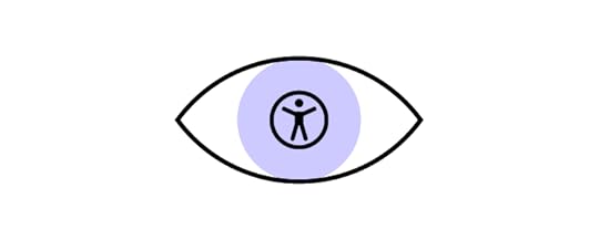
Accessibility testing tools fall into three primary categories:
Automated testing toolsManual testing toolsHybrid testing toolsWhat are automated testing tools?Automated Testing Tools are software applications designed to scan and evaluate digital products for accessibility issues automatically. These tools use algorithms and predefined rules to analyze web pages or applications, identifying potential violations of accessibility standards and guidelines.
They can detect common issues like missing alternative text for images, improper heading structure, and color contrast accessibility problems.
While Automated Testing Tools are valuable for identifying specific types of accessibility issues, it’s important to note that they have limitations and cannot fully replace manual testing and expert judgment.
What are manual testing tools?Manual Testing Tools are tools that require human intervention and evaluation to assess the accessibility of digital products. Unlike automated testing tools, which rely on algorithms and predefined rules, manual testing tools involve direct interaction with the product, thorough inspections, and expert judgment.
Teams use manual testing tools to conduct in-depth evaluations of various accessibility aspects, such as keyboard navigation, screen reader compatibility, and cognitive accessibility. These tools often include checklists, guidelines, and testing methodologies to guide testers through the evaluation process.
What are hybrid testing tools?Hybrid Testing Tools are a combination of both automated and manual testing approaches in accessibility testing. These tools leverage the benefits of automation to streamline the testing process while incorporating human evaluation for a more comprehensive assessment.
Teams use hybrid testing tools to take advantage of the efficiency and speed of automated testing, which can quickly scan and identify common accessibility issues. These tools often integrate with automated accessibility testing engines or APIs to analyze code (HTML, CSS, Javascript), markup (ARIA, alt text, etc.), and design elements.
Hybrid testing tools also provide room for manual inspection, allowing testers to conduct deeper evaluations, assess user interactions, and identify complex accessibility barriers that may require human judgment.
Automated Accessibility Testing Toolsaxe by Deque
Developed by Deque Systems, axe offers a comprehensive set of features to identify and address accessibility issues, helping to ensure that digital products are usable by individuals with disabilities. The automated accessibility testing tool evaluates the accessibility of web pages and applications.
Pros:
axe provides extensive automated accessibility testing capabilities, scanning web pages and applications for various accessibility issues.You can integrate axe into various development workflows and environments, including popular web browsers and frameworks.axe generates detailed reports highlighting accessibility violations and provides guidance on how to fix them.You can customize axe’s rulesets to fit your specific accessibility requirements and preferences, allowing for more targeted and tailored testing.axe has an active and supportive community, offering resources, documentation, and ongoing updates to stay aligned with evolving accessibility standards.Cons:
axe’s automated analysis may not fully understand the context and intent of specific design elements or interactions, leading to potential limitations in identifying nuanced accessibility barriers.axe’s accuracy and effectiveness relies on the quality and accuracy of the underlying code and markup. axe may not capture issues related to poorly structured code or incomplete implementation.WAVE
WAVE (Web Accessibility Evaluation Tool) is a widely used automated accessibility testing tool developed by WebAIM. It helps evaluate web content for accessibility issues and provides visual feedback for identifying potential problems.
Pros:
User-friendly interface and intuitive visualizations make it easy to understand accessibility issues.Provides detailed reports with clear explanations of accessibility errors and warnings.Offers a browser extension for quick on-page accessibility testing.Supports testing of both live websites and local development environments.Available as a free browser extension and an online tool.Cons:
Limited to automated testing and may not detect all accessibility issues.Requires manual interpretation of results for accurate assessment.The tool may not fully capture some features, such as dynamic content or complex web applications.Pa11yPa11y is an open-source automated accessibility audit tool that helps identify accessibility issues in web pages. It allows developers and testers to automate accessibility testing and integrate it into their development workflow.
Pros:
Supports multiple testing standards, including WCAG and Section 508, providing comprehensive accessibility evaluation.Offers a command-line interface for easy integration with build processes and continuous integration tools.Provides detailed reports with specific accessibility errors and warnings.Allows customization of testing rules and thresholds to match project requirements.Available as a free and open-source tool, allowing customization and community contribution.Cons:
Requires technical knowledge to set up and configure.Pa11y relies solely on automated testing, which may not capture all accessibility issues.Requires manual interpretation of results for accurate assessment.Limited support for dynamic content and complex web applications.Manual Testing ToolsUXPin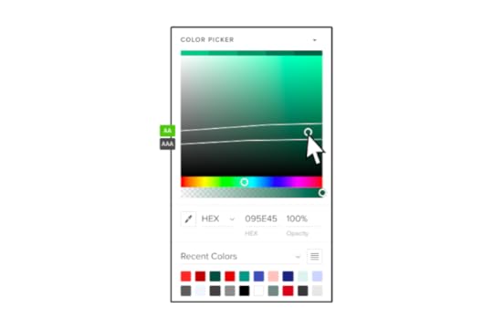
UXPin provides designers with two built-in accessibility tools to test UIs on the fly, including a contrast checker and color blindness simulator.
Pros:
Enables designers to test colors without leaving the design tool.Automatically identifies text colors with insufficient contrast.Displays results for all types of color blindness and allows designers to preview interfaces as a user with each visual impairment would see it.Doesn’t require plugins or external tools when testing designs in UXPin.Cons:
Limited to testing color only.Only works with UXPin designs (but you can import Figma and Sketch files).NVDANVDA (NonVisual Desktop Access) is a free accessibility tool and open-source screen reader designed for Windows. It enables users with visual impairments to navigate and interact with digital content by converting on-screen information into synthesized speech or Braille output.
Pros:
A free and open-source screen reader for Windows, making it accessible for users with visual impairments.Supports various web browsers (Chrome, Firefox, Internet Explorer, and Edge), applications, and document formats, allowing comprehensive testing across different platforms.NVDA is actively maintained and regularly updated, ensuring compatibility with the latest technologies and accessibility standards.It offers customizable settings and options, allowing testers to simulate different user experiences and preferences.Cons:
NVDA is limited to the Windows operating system, so it may not be suitable for testing on other platforms like macOS or Linux (you can use VoiceOver in conjunction with NVDA to cover all platforms)There may be slight differences in interpretation and rendering compared to other assistive technologies, so it’s important to conduct additional testing with multiple tools.NVDA requires some level of familiarity and training to use effectively, particularly for accurately interpreting complex web content and interactions.Support resources are limited, and users may need to rely on community forums or documentation for assistance.Hybrid Testing ToolsStorybook Testing
Storybook is a web-based open-source tool primarily used for developing UI components in isolation. The free tool offers a built-in accessibility toolkit that helps developers identify and address accessibility issues within their components.
Pros:
Storybook’s accessibility tool seamlessly integrates into the component development workflow, allowing developers to catch accessibility issues early in development.By testing components in isolation, developers can focus specifically on their accessibility and ensure they meet the required standards.The tool provides visual feedback on accessibility violations, making it easier for developers to identify and understand the issues.Integrates with UXPin Merge to provide product teams with design and development accessibility testing capability.Cons:
Storybook’s accessibility tool focuses primarily on the accessibility of UI components and may not comprehensively evaluate the entire website or application.The platform requires developers to manually check and address accessibility issues, which may require some accessibility expertise.While Storybook offers customization options, it may require further configuration to align the tool with specific accessibility requirements.Google LighthouseGoogle Lighthouse is an open-source web accessibility testing tool. It includes an accessibility auditing feature that evaluates a website’s adherence to accessibility standards.
Pros:
Google Lighthouse thoroughly evaluates accessibility issues, covering a wide range of accessibility best practices and guidelines.Lighthouse’s accessibility tool is part of a suite of performance audits, allowing users to assess multiple aspects of their website simultaneously.The tool generates detailed reports highlighting specific accessibility issues and suggestions for improvements.Chrome extension allows you to test user interfaces on the fly.Cons:
Using Lighthouse effectively may require technical knowledge and familiarity with web development tools.Lighthouse focuses specifically on web accessibility and may not be suitable for evaluating accessibility in native mobile apps or other digital products.While Lighthouse automates some aspects of accessibility testing, manual testing is still necessary to evaluate specific interactive or dynamic components.Accessibility InsightsAccessibility Insights is an open-source accessibility testing tool developed by Microsoft. It provides automated and manual testing features to help identify and fix accessibility issues in digital products.
Pros:
Accessibility Insights offers automated tests to quickly identify common accessibility issues and manual testing capabilities for evaluating more complex interactions.The tool integrates seamlessly with popular web browsers and developer tools, making it convenient for developers and testers to incorporate accessibility testing into their workflows.Provides detailed guidance on how to fix identified issues, including code examples and best practices.Cons:
While the tool offers extensive features, there may be a learning curve for users new to accessibility testing.Accessibility Insights primarily focuses on web accessibility and may not be as suitable for evaluating native mobile apps or other non-web digital products.Some features have compatibility limitations with specific browsers or development environments.Streamline your accessibility testing with UXPin. Sign up for a free trial to explore UXPin’s advanced design and prototyping features.
Try UXPin for freeThe post 3 Types of Accessibility Testing Tools that You 100% Need appeared first on Studio by UXPin.
UXpin's Blog

- UXpin's profile
- 68 followers

