
UXpin's Blog, page 37
June 12, 2023
8 Design System Best Practices that Top Enterprise Companies Follow
Together with Whitespace, we hosted a webinar for hundreds of tech professionals titled: How to Overcome Challenges of Scaling a Design System? DesignOps and Product Design Leadership expert Dave Malouf moderated the event with speakers from two enterprise multinationals:
Ryan Kane: Head of UX Design at Weir GroupJulien Vanière: Senior Design System Director at SageThis webinar provided interesting insights into how two enterprise giants approach design systems, including maintenance, scaling, and governance.
Achieve design system maturity and a single source of truth with UXPin Merge. Visit our Merge page for more details and how to request access.
Reach a new level of prototypingDesign with interactive components coming from your team’s design system.
Discover UXPin Merge .discover-merge { margin: 40px 8px;}.discover-merge__container { display: flex; max-width: 690px; height: 200px; padding: 20px; padding-left: 24px; border-radius: 4px; background-color: black; box-shadow: 10px 10px #9999ff; align-items: center; justify-content: space-between;}.discover-merge__left { width: 50%;}.discover-merge__left p { margin: 10px 0px !important; color: white !important; font-size: 18px !important;}.discover-merge__heading { font-weight: bold !important; color: white !important; font-size: 18px !important;}.discover-merge__text { margin: 0 !important; line-height: 22px !important;}.discover-merge__button { width: 174px; height: 44px; margin: 10px 0px; border: none; border-radius: 2px; background: white; color: black; font-size: 16px; text-align: center;}.discover-merge__button:hover { cursor: pointer;}.discover-merge__image { max-width: 320px !important; height: 200px; margin-right: -19px;}@media (max-width: 760px) { .discover-merge__container { height: auto; margin: 10px; align-items: left; }}@media (max-width: 500px) { .discover-merge__container { flex-direction: column; } .discover-merge__left { width: 100%; align-items: normal; }}Benefits of a Design System
Before we get into the webinar, we wanted to highlight the high-level benefits of a design system:
Improved consistency and coherence: Design systems establish a unified visual design language and functionality, ensuring a cohesive user experience across products and platforms.Enhanced collaboration and communication: By serving as a single source of truth, design systems facilitate better teamwork among designers, developers, and stakeholders, streamlining handoffs and reducing miscommunications.Faster design and development process: Reusable components and guidelines within a design system enable teams to accelerate their workflows, reducing the time spent on designing and coding individual elements.Scalability and maintainability: Design systems are built for adaptability, allowing product teams to easily update, expand, and maintain their products while preserving consistency and usability.Better user experience and product quality: By providing a structured approach to design, design systems help deliver a refined, high-quality user experience that meets user needs and expectations.Do you recognize any challenges in your organization related to the benefits above? The next step is to build a business case. Here’s how teams at Sage and Weir Group secure funding and resources for their design systems.
Acquiring and Maintaining Funding and Resources for Design Systems Building a case for large federated design teams at Weir Group
Ryan Kane, who works for the Weir Group–a large corporation with numerous federated design teams–argues that the efficiency savings realized from design systems can make a compelling case for funding.
The company can save significant resources by avoiding the redundancy of rebuilding and redesigning components across different projects.
Ryan explains this saving through the lens of coded and design components and considers the broader scope of design language systems that cater to teams relying on low-code or no-code solutions.
This broad approach ensures that all teams benefit from time-saving, consistency, trust, and a coherent product experience regardless of their development approach.
A fascinating part of the Weir Group’s strategy includes creating lighter versions of their React and React Native components to suit configuration needs. It also extends the design system’s benefits to teams not directly engaged in development but that use bought and configured solutions.
An additional layer of complexity in larger organizations is the various tech stacks, which may include systems like Salesforce and SAP, further reinforcing the need for an adaptable design system.
A creative approach from Dave MaloufDave Malouf described how his team at Northwestern Mutual used accessibility as a foundational argument for acquiring design system funding. Dave’s team partnered with legal to demonstrate the organization could build accessibility into the design system and avoid regulatory challenges–which could lead to potential fines and lawsuits in some jurisdictions.
Dave’s example shows how teams must assess the product and industry landscape holistically to build a case for a design system and other UX initiatives.
Learning from experience at SageJulian Vaniere’s experience at Sage differs slightly. His team started their design system proactively, based on knowledge from a manager who had previously created a design system at Intuit. They didn’t need to justify each step but instead focused on adoption and eventual constraints.
Vaniere’s team focuses on patterns more than components, which they see as making a significant difference. Sage’s global and diverse products drive this focus, including HR software, ERPs, accounting software, and more. Sage is working towards a seamless experience across these products and needs rather than perfect consistency.
The key to securing and maintaining funding and resources for a design system depends on an organization’s unique circumstances.
Demonstrating cost and efficiency savings, scalability, and the ability to deliver a seamless user experience across diverse products and regions can make a compelling case. It’s crucial to think beyond patterns and consider larger design language for a more inclusive and comprehensive design system.
Making the Development Process More Efficient
Julian Vaniere provides insight into how Sage structures its design system efforts and highlights the importance of focusing on accessibility. His team comprises various roles, with five UX/UI designers and an Accessibility Designer.
Julian drives the accessibility initiative in his organization, which adds another dimension to their design system. He indicates that having an Accessibility Designer on the team is crucial as it ensures that products are accessible to all users. This accessibility is essential to creating a seamless user experience, regardless of geographical location or user needs.
Developers want to build rather than make design decisionsAccording to Julian, developers at Sage are most interested in building features; they typically prefer not to spend time fixing accessibility or making design decisions. This tendency among developers can justify the cost of a design system team who can efficiently handle these aspects. This separation of responsibility allows developers to focus on what they do best – building features.
Vaniere’s team implemented the concept of “accessibility champions” within each team. These individuals can leverage their knowledge and expertise to guide the rest of the organization, clarifying precisely what everyone must do for accessibility.
How design systems enable devs to focus on developmentA design system can facilitate the dev team’s desire to focus on building features rather than design decisions or accessibility by providing guidelines and components. This unified design language streamlines the development process and ensures consistency across different projects and products.
With roles like Sage’s Accessibility Champions, the knowledge and expertise about design considerations, including accessibility, can be efficiently distributed among design teams, creating a more focused and efficient development process while reinforcing the cost-effectiveness of a dedicated design team.
Maintaining Great Work When Things Get Tight
The Weir Group has a federated structure consisting of individual businesses with a corporate function on top. Each business uses the same design language but has autonomy regarding strategies and budgets.
The corporate level manages the design language, but Ryan emphasizes that no one truly “owns” the design language–it’s a living, breathing entity for which the entire community is responsible.
The challenge many design organizations faceThe rationale for the so-called ownership at the corporate level is to have a dedicated resource that isn’t juggling too many responsibilities. In many companies, design teams often bear the dual burden of delivering design on products and projects while also maintaining and growing the design language. Inevitably, when resources become tight, maintaining the design language is deprioritized.
Join our next webinar: Strategies for Building a Resilient DesignOps Practice.
Distributed, shared responsibilityTo compensate for this deprioritization, Ryan’s team segregates the design work and the maintenance of the design system. The federated businesses handle the hands-on design work, while the centralized design system team manages the maintenance and growth of the design system.
This delegation of responsibilities ensures the organization’s design teams focus on products and design projects while the corporate team manages design system maturity and maintenance.
Design systems are never completeThe Weir Group runs a “contribution model” for its governance. They acknowledge the design system is an evolving entity and should never be considered complete.
The design teams in the federated businesses are empowered to design and develop new components based on emerging use cases that the library doesn’t cater to. Teams then contribute these components back to the central library via UXPin Merge, similar to GitHub releases.
This approach has multiple benefits:
Eliminates duplication of effort by allowing teams to contribute to one central library. Fosters efficiency, with empowered teams across the business contributing to a shared resource, guided by a corporate function overseeing it all.Ensures the maintenance and growth of the design system even when resources are limited.Build, Scale, Mature, and Distribute Your Design System With UXPin MergeThe Weir Group uses UXPin Merge as a single source of truth for its federated design teams. Ryan Kane’s team utilizes UXPin Merge’s Version Control to sync and distribute changes to the entire organization. A complex task for traditional DesignOps teams is fully automated with UXPin Merge.
“With UXPin Merge, we’ve removed duplication and created efficiency where we’ve got empowered teams contributing to one central library–the design system’s repository–with a corporate function managing and maintaining it.” Ryan Kane, Head of UX Design at The Weir Group.
Are you still using multiple design tools for designing, prototyping, and testing your design projects? With DesignOps working tirelessly to sync and update design system changes?
Create a single source of truth and automate redundant, time-consuming tasks with UXPin Merge. Visit our Merge page for more details and request access.
Discover MergeThe post 8 Design System Best Practices that Top Enterprise Companies Follow appeared first on Studio by UXPin.


June 8, 2023
React vs HTML – Can You Spot a Difference?

HTML is a markup language while React is a JavaScript library. Both are used in front-end development and you might have heard about them while designing websites or web apps. Without further ado, let’s see what’s the difference between HTML and React.
Build prototypes with coded components and bridge the gap between designers and developers. Ship designs faster, improve design handoff, and achieve 100% UI consistency. Discover UXPin Merge.
Reach a new level of prototypingDesign with interactive components coming from your team’s design system.
Discover UXPin Merge .discover-merge { margin: 40px 8px;}.discover-merge__container { display: flex; max-width: 690px; height: 200px; padding: 20px; padding-left: 24px; border-radius: 4px; background-color: black; box-shadow: 10px 10px #9999ff; align-items: center; justify-content: space-between;}.discover-merge__left { width: 50%;}.discover-merge__left p { margin: 10px 0px !important; color: white !important; font-size: 18px !important;}.discover-merge__heading { font-weight: bold !important; color: white !important; font-size: 18px !important;}.discover-merge__text { margin: 0 !important; line-height: 22px !important;}.discover-merge__button { width: 174px; height: 44px; margin: 10px 0px; border: none; border-radius: 2px; background: white; color: black; font-size: 16px; text-align: center;}.discover-merge__button:hover { cursor: pointer;}.discover-merge__image { max-width: 320px !important; height: 200px; margin-right: -19px;}@media (max-width: 760px) { .discover-merge__container { height: auto; margin: 10px; align-items: left; }}@media (max-width: 500px) { .discover-merge__container { flex-direction: column; } .discover-merge__left { width: 100%; align-items: normal; }}What is HTML?HTML (HyperText Markup Language) is the fundamental programming language structure of the web. Every website you visit, whether or not it uses a front-end framework, comprises HTML, CSS, and Javascript.
HTML uses various tags to define elements such as headings, paragraphs, links, and media objects, allowing browsers to interpret and correctly interpret and display the content.
A basic understanding of HTML is vital for anyone involved in web design or development, as it’s the starting point for all websites and many web applications.
What is React?React (ReactJS) is an open-source JavaScript library developed by Facebook. Developers initially used React primarily for single-page applications, but it has evolved to support multi-page websites with SEO features.
Unlike HTML, which structures content, React allows developers to create reusable components. Each component in React has its own logic and controls its rendering. This rendering is crucial because it allows a single element to change while the rest of the page remains static and doesn’t have to reload.
For example, when you like a post on social media, only the thumbs-up or heart icons change. If the same page used HTML, CSS, and Javascript, the entire page would have to reload whenever you liked or interacted with content.
React also has many workflow benefits over traditional HTML, CSS, and Javascript code. The ability to break down complex UI into simpler components makes React highly popular among developers for its efficiency and flexibility.
Key Differences Between HTML and React
While you can build the same website or web application using either React or HTML, they often work together, with HTML structuring the content and React adding interactivity and a component-based architecture.
Therefore, it’s fair to say that HTML vs. React is a redundant comparison because these are two different front-end technologies with different applications which mostly complement each other.
This comparison examines what would happen if you built a website or web application using HTML or React.
Functionality: HTML structures content on the web, while React, a JavaScript library, creates dynamic and interactive user interfaces.Component-based: React employs a component-based architecture. Each component represents a part of the UI and can be reused throughout the application, enhancing development efficiency and consistency. In contrast, HTML doesn’t inherently support a component structure.Interactivity: HTML, on its own, can’t create dynamic content or manage application state. It needs JavaScript or similar languages to add interactivity to a webpage. As a JavaScript library, React creates interactive UIs and effectively manages the application state.Rendering: Traditional HTML-based applications often require a full page refresh to implement view changes. React uses a Virtual DOM (Document Object Model) to update only the components that change, eliminating the need for a full page refresh and offering more efficient, smoother updates.Data Binding: HTML lacks a built-in system for data binding. Changes in the UI, like user input, don’t automatically update the application data. React enables one-way data binding, allowing efficient updates to UI components without affecting underlying data.Use Cases: HTML typically structures content for static websites. React builds dynamic and interactive UIs, making it ideal for complex single-page applications (SPAs) and mobile applications with React Native.Is it Possible to Spot the Difference Between HTML and React?It’s difficult to spot the difference between a React vs. an HTML website or web application. No matter what framework (Angular, Vue, etc.) you use, the browser must render HTML, CSS, and Javascript.

Even websites like BuiltWith cannot be certain about a digital product’s tech stack without the developers explicitly sharing this information or publicizing the project’s repository (i.e., a public GitHub repo).
Deeper Dive into HTMLHow HTML worksWhen a user requests a webpage, the browser fetches the HTML file from a server and interprets it to display the page’s structure and content. HTML uses a set of predefined HTML tags to define content types, such as
for paragraphs,
to for headings, for links, , and [image error] for images, to name a few.HTML structureHTML uses a tree-like structure, with the tag as the root with the
and tags acting as the two main branches.The
tag houses metadata, stylesheets, and scripts for the page’s styling and functionality. The tag contains all the visible content, such as text, images, and links. Within these main branches, other tags, known as child elements, define and structure the content.Page loadingWhen a page loads, the browser reads the HTML from top to bottom. It interprets the tags to construct the Document Object Model (DOM), a representation of the page structure.
The browser then displays the content according to the DOM. If the HTML includes links to CSS stylesheets or JavaScript files, the browser fetches and applies these, which can affect how the content looks (CSS) or behaves (JavaScript).
HTML’s structure makes it easy for browsers to interpret and for developers to understand and manipulate. It’s a fundamental building block of the web, providing the foundation upon which styles (CSS) and interactivity (JavaScript or libraries/frameworks like React) are added.
Deeper Dive into ReactHow React worksReact creates a virtual representation of the DOM (the Virtual DOM), which it uses to improve performance.
When a user interacts with the application, instead of updating the entire DOM (which can be slow), React only updates the parts of the Virtual DOM where the state has changed. It then reconciles the Virtual DOM with the actual DOM in the most efficient way possible, updating only the changed parts in the actual DOM. This process is known as “diffing.”
React structureReact organizes code into components, reusable pieces of code that return JSX. These components can be as simple as a button or as complex as an entire page template.
Components can maintain their own state (data that can change over time), receive data from parent components via props, and pass data to child components. This data flow establishes a clear and predictable coding structure.
Page loadingWhen a React application loads, it initializes the components and renders the JSX to the actual DOM using the ReactDOM library. During this process, it also sets up event listeners for user interactions.
When a user interacts with the application (e.g., clicks a button), this may trigger state changes in one or more components. React then updates the Virtual DOM to reflect these state changes and efficiently updates the actual DOM to match.
React’s structure and approach to DOM manipulation make it excellent for building complex, interactive web applications that must be fast and responsive. While the learning curve can be steeper than plain HTML, the performance and code organization benefits are substantial.
Why Developers Choose HTML vs. React Why do developers choose HTML?
Even though HTML may seem more straightforward and less powerful than React, it still has a crucial role in web development. Here’s why:
Fundamental and universal: HTML is the foundational language of the web. Every browser can interpret HTML, making it universally recognized and supported.Perfect for static content: HTML is a straightforward and efficient choice when building a website with mostly static content.Easy to learn: HTML is one of the easiest languages for beginners. It’s an excellent starting point for anyone interested in web development.SEO friendly: Search engines can easily crawl and understand HTML, making it favorable for SEO.
For example, HTML is perfect for a business that wants a simple website to showcase its products and services. It’s also an excellent option for beginners learning about web development.
Why do developers choose React?React offers several features that make it a preferred choice for many developers:
Component-based architecture: React’s component-based approach promotes reusability and consistency across the application, making development more efficient.Efficient updates: React uses a Virtual DOM to only update parts of the page that need to change, making it highly performant, especially for complex applications.Advanced JavaScript: React utilizes advanced JavaScript features and concepts, giving React developers more power and flexibility.Strong community and ecosystem: React has a large and active community, which means plenty of resources for learning and troubleshooting, as well as a rich ecosystem of libraries and tools.
For example, Facebook, Instagram, and WhatsApp use React for their complex, highly interactive UIs. Startups and tech companies also favor React for its efficiency, scalability, and productivity. Organizations also use React to build design systems due to the component-based nature of the front-end library.
HTML or React: which one should you choose?Choosing between HTML and React depends on your project’s needs:
For static websites: HTML is often the preferred choice for building a simple, mostly static website.For dynamic, complex applications: React is a far better option to HTML for building complex, highly interactive web applications.HTML vs. React Impact on User Experience
 Performance
HTML-based websites generally load quickly due to their static nature. However, they might be slower to navigate if each user interaction requires a new page to load.
Conversely, React’s ability to update only the components that change leads to smoother and faster interactions, providing a more fluid experience for users, especially in complex applications.
InteractivityHTML alone isn’t capable of creating dynamic, interactive user experiences. It requires JavaScript or similar languages to add interactive elements.
Being a JavaScript library, React excels at building dynamic and interactive UIs that can respond instantaneously to user input. This interactivity can lead to a more engaging, app-like user experience.
ConsistencyWith React’s component-based architecture, developers can ensure consistent implementation of UI elements across an application.
This uniformity promotes a consistent look and feel, which is critical to a good user experience. With HTML, this would require careful manual coding to ensure consistency.
Progressive Web Apps (PWAs)Developers often use React for building Progressive Web Apps (PWAs). PWAs can offer app-like experiences on the web, including offline functionality, which can significantly enhance user experience. While you can develop PWAs using HTML, CSS, and JavaScript, the process is more complex and time-consuming.
SEO and initial load timeHTML is straightforward for search engines to crawl and index, which can lead to better SEO. Also, an HTML page can start rendering immediately after the initial HTML file is loaded.
In contrast, a React application generally needs to load the entire JavaScript bundle before it can start rendering. This rendering can lead to longer initial load times, impacting the user experience and SEO. However, techniques like Server-Side Rendering (SSR) and Next.js can help address these issues in React applications.
Building Interactive Prototypes in UXPin With MergeUXPin’s Merge technology enables product teams to import UI components from a repository to build fully functioning interactive prototypes in UXPin’s design canvas.
Design teams use the same UI elements for prototyping as engineers use to develop the final product, creating a single source of truth between design and development.
With Merge, designers don’t have to learn React to create React applications. They simply drag and drop components to build interactive prototypes. These advanced prototypes enhance testing, giving design teams meaningful, actionable results to iterate and refine.
Ready to join the code-to-design revolution? Visit our Merge page for more details and how to request access.
Discover Merge
The post React vs HTML – Can You Spot a Difference? appeared first on Studio by UXPin.
June 7, 2023
What is Data-Driven Design and How to Use it?
Data-driven design is a method of making design decisions based on data collected by designers. It has a great potential of perfecting design in a way of fulfilling user needs and keeping them happy. Let’s learn all about it.
Discover how UXPin can enhance your data-driven design process with the world’s most advanced UX design tool. Unlock the full potential of your design decisions. Sign up for a free UXPin trial.
Build advanced prototypesDesign better products with States, Variables, Auto Layout and more.
Try UXPin .try-uxpin-banner { margin: 40px 0px;}.try-uxpin__container { display: flex; max-width: 689px; height: 210px; padding: 20px; padding-left: 24px; border: 2px solid black; border-radius: 4px; align-items: center; justify-content: space-between; background-color: white; box-shadow: 10px 10px black;}.try-uxpin__left { width: 54%;}.try-uxpin__left p { margin: 10px 0px !important; color: black !important;}.try-uxpin__heading { font-size: 28px !important; font-weight: bold;}.try-uxpin__text { margin: 0 !important; font-size: 18px !important; line-height: 22px !important;}.try-uxpin__button { width: 135px; height: 44px; background: black; margin: 10px 0px; padding: 10px 20px; border: none; border-radius: 2px; color: white; font-size: 16px; text-align: center;}.try-uxpin__button:hover { cursor: pointer;}.try-uxpin__image { max-width: 320px !important; height: 200px; margin-right: -21px; margin-bottom: -6px;}@media (max-width: 760px) { .try-uxpin__container { height: auto; margin: 10px; align-items: left; }}@media (max-width: 500px) { .try-uxpin__container { flex-direction: column; } .try-uxpin__left { width: 100%; align-items: normal; }}What is Data-Driven Design?
Data-driven design uses quantitative and qualitative data to inform and shape design decisions in digital product development. Designers use actual user behavior and preferences from user research to drive decision-making, creating more effective and user-centric solutions.
This data-driven approach minimizes assumptions and guesswork, resulting in more targeted and relevant product design decisions. By incorporating data into the design process, designers can better understand user needs and enhance user satisfaction, allowing them to balance user and business goals successfully.
Types of Data for DesignThere are two types of data UX designers and stakeholders rely on for decisions:
Quantitative data–what, when, and how it happensQualitative data–why it happensQuantitative dataQuantitative data is numerical and measurable, giving designers objective insights into user behavior and interactions. This quantifiable data type is valuable for identifying trends and patterns, allowing designers to make informed decisions based on hard evidence.
For example, a designer might analyze website analytics to determine which pages receive the most traffic or where users tend to drop off, guiding layout and content improvement decisions.
Qualitative dataQualitative data is non-numerical and focuses on subjective user opinions, feelings, and motivations. This qualitative data helps designers understand the “why” behind user behavior, offering a deeper insight into user needs and preferences.
For instance, conducting user interviews or analyzing feedback from usability testing can reveal user pain points or preferences that inform the design process, leading to more user-centric solutions.
Important Data Sources for DesignersHere are six domains where design teams typically source data:
Analytics toolsUser surveys & interviewsA/B testingUsability testingHeatmaps & click trackingMultivariate testingAnalytics toolsAnalytics tools (Google Analytics, product metrics, social media analytics, email analytics, etc.) provide designers with valuable quantitative data on user behavior, demographics, and engagement.
These tools offer quantifiable insights into how users interact with a digital product, helping designers identify areas of improvement and optimize the user experience.
For example, a design team might analyze the bounce rate of a specific page to identify issues and make adjustments to retain users and encourage further interaction.
User surveys & interviewsUser surveys and interviews are essential for collecting qualitative data, offering insights into user opinions, preferences, and motivations. Designers engage with users directly to better understand their needs and pain points, leading to more informed design decisions.
For example, a design team may conduct user interviews to uncover the reasons behind low adoption rates for a specific feature, guiding necessary improvements or adjustments.
A/B testingA/B testing (split testing) is a valuable method for comparing two or more design variants to determine which performs better with users. Designers use A/B testing to make informed decisions about the most effective and intuitive design layouts or elements.
For example, a design team might test two different call-to-action button styles to determine which one leads to higher conversion rates, ultimately choosing the version with the best performance.
Usability testingUsability testing is a crucial step in the design process, allowing designers to observe users as they interact with a product and identify any usability issues.
For instance, a design team might conduct a usability test on a new checkout process and discover that users struggle to find the “Continue” button, prompting a redesign to improve visibility and user flow.
Heatmaps & click trackingHeatmaps and click-tracking tools, such as Hotjar or Crazy Egg, visually represent user interactions on a website or app, offering insights into user behavior and preferences. Designers can use this data to identify popular elements or areas where users may struggle, leading to more informed design decisions.
For example, a design team might analyze a heatmap of their homepage and notice that users frequently click on an unlinked image, prompting the team to add a link to improve the user experience.
Multivariate testingMultivariate testing is an advanced technique that allows designers to test multiple variables simultaneously within a single test, providing a more comprehensive understanding of how different design elements interact and impact user behavior.
Multivariate testing is beneficial when optimizing complex layouts or features, as it helps identify the most effective combination of design elements.
For example, a design team might conduct a multivariate test on a landing page, simultaneously comparing different headlines, images, and call-to-action button colors.
Challenges and Limitations of Data-Driven Design Data collection and privacy concerns
Data collection and privacy concerns are significant challenges for UX designers. They must balance gathering valuable user data, respecting user privacy, and complying with data protection regulations, such as GDPR and CCPA.
Design teams can address these concerns by adopting privacy-by-design principles, collecting only necessary data, and obtaining explicit user consent. Additionally, designers should anonymize data whenever possible and use secure data storage and transmission methods to maintain user trust and adhere to legal requirements.
Potential data biasesData biases can arise from various sources, such as sampling errors or the influence of pre-existing beliefs. These biases may lead to incorrect conclusions and negatively impact design decisions.
To mitigate potential biases, design teams should:
Strive for diverse and representative samplesCross-validate data with multiple sourcesContinuously question their assumptionsTo mitigate potential biases, design teams should strive for diverse and representative samples, cross-validate data with multiple sources, and continuously question their assumptions.
It’s also beneficial to involve a multidisciplinary team in data analysis, as different perspectives can help identify potential biases and improve decision-making.
Misinterpreting data and making incorrect assumptionsMisinterpreting data, poor data, or incorrect assumptions can lead to flawed design decisions and a suboptimal user experience. To prevent this, design teams should approach data analysis with a clear understanding of the context and limitations of the data.
They should verify their findings by triangulating data from various sources and employing rigorous statistical methods when analyzing quantitative data.
It’s vital to involve domain experts and users in the design process. Their input can help validate assumptions and interpretations, ensuring design decisions are expert-vetted and user-centric.
Implementing Data-Driven Decisions in the Design Process Step 1 – Setting goals and objectives
Designers must establish clear goals and objectives before collecting and analyzing data. This goal-setting process involves identifying the key performance indicators (KPIs) aligning with user needs and business objectives. Setting specific, measurable goals enables designers to ensure their efforts and focus on the most impactful areas of the product or user experience.
Step 2 – Collecting and analyzing dataOnce goals and objectives are in place, design teams must collect relevant quantitative and qualitative data from various sources, such as analytics tools, user surveys, and usability testing. Designers must employ rigorous methods to analyze this data, ensuring their conclusions are accurate and free from potential biases.
Step 3 – Identifying patterns and insightsDesigners look for patterns and insights in collected data to inform their design decisions. This analysis may involve identifying user pain points, preferences, or behavior trends. By recognizing these patterns, designers can better understand user needs and make informed decisions throughout the design process.
Step 4 – Making data-informed design decisionsWith valuable insights, designers can make data-driven decisions to address user needs and meet business objectives. This process involves iterating on the design, incorporating user feedback, and refining the product based on data. Designers often have to adjust or change direction as new data emerge, ensuring solutions remain relevant and practical.
Design teams build prototypes to test ideas and assumptions throughout the design process–from paper prototyping in the early stages to fully functional interactive prototypes later.
Step 5 – Using data to iterate and refineThroughout the design process, it’s essential to measure the impact of design changes and iterate accordingly continually. Design teams monitor KPIs and gather ongoing user and stakeholder feedback, refining the design to optimize the user experience and achieve the desired results.
By embracing a data-driven approach, designers can ensure their work remains user-centric and aligned with user needs and business goals.
Balancing Data-Driven Design with Creativity and Intuition
While data-driven design is essential for creating user-centric solutions, designers must also remember the importance of creativity and intuition in the design process. Relying on data alone results in stale design decisions that lack originality and innovation.
The importance of intuition and creativity in designIntuition and creativity play a crucial role in innovative design, allowing designers to think outside the box and generate novel solutions to user problems. These qualities enable designers to empathize with users, anticipate their needs, and craft engaging, memorable experiences that set products apart from competitors.
For example, designers might draw on their intuition and creativity to develop a unique, visually appealing layout that captures users’ attention, increasing engagement and better user satisfaction.
Striking the right balance between data and intuitionBalancing data-driven design with intuition and creativity is essential for producing truly effective, user-centric solutions. Designers should use data to inform and validate their decisions while trusting their instincts and expertise to guide the design process.
For example, a designer might notice a pattern in the data that suggests a specific feature is underutilized. While the data provides valuable insight, the designer’s intuition and creativity can help them identify and implement a more engaging design solution that resonates with users.
Avoiding over-reliance on dataWhile data is a powerful tool, over-reliance on data can stifle creativity and limit innovation. Designers should be mindful of this risk and ensure they don’t become overly constrained by data, which can lead to generic or unimaginative solutions.
For example, a design team might discover that a specific design pattern is popular among users. While it’s essential to consider this data, designers should also explore alternative solutions, as blindly following trends may result in a product that lacks distinction and fails to meet users’ unique needs.
Data-Driven UX Design With UXPinMaking data-driven design decisions relies on good data. Image-based design tools lack the fidelity and functionality to get accurate feedback during user testing, limiting the decision design teams can make.
UXPin is powered by code, enabling designers to build prototypes that look and feel like the final product. These interactive prototypes give designers actionable feedback to iterate and refine ideas while solving more problems and identifying better opportunities during the design process.
Want to see how interactive prototyping can enhance your decision-making ability? Build your first UXPin prototype. Sign up for a free trial.
Try UXPin for freeThe post What is Data-Driven Design and How to Use it? appeared first on Studio by UXPin.
June 6, 2023
Free Webinar: “Strategies for Building a Resilient DesignOps Practice”

Join our upcoming webinar with DesignOps Assembly’s members. We invited Meredith Black, Salomé Mortazavi, and Adam Fry-Pierce to discuss strategies for building a resilient DesignOps practice.
Build a Reliable Design OperationsDesignOps strengthens your design team and processes for producing the best work possible. In difficult times, it’s extremely important to show the impact of the work you’re doing, back up your operations with data that make sense for the business, and tackle the real needs of the design team.
UXPin partnered up with DesignOps Assembly and invited top experts to discuss how to set up design operations to success when the resources are spare, designers have mixed feelings, and there’s an aura of uncertainty around us. Join us to listen to their discussion.
Save your free spot for the “Strategies for Building a Resilient DesignOps Practice” webinar.
You’ll learn about:
Pinpointing the real needs of design teams. Rightsizing the DesignOps practices.Establishing critical cross-functional partnerships.Measuring and impacting: How to tell a story about ROI of DesignOps.Influencing metrics in our sphere of control.About DesignOps ExpertsWe invited three excellent DesignOps practitioners who have immense experience in leadership.
Salomé Mortazavi – leads the DesignOps team at SiriusXM. Before DesignOps, she consulted Fortune 500 companies on how to transform their development practices through Lean, Agile and user centered methodologies and led design teams.Adam Fry-Pierce – Chief-Of-Staff for UX Leadership at Google. Previously the Head of DesignOps at DocuSign and the founding director of the Design Leadership Forum, he’s been a long-time community builder. Now, he’s involved in DesignOps Assembly.Meredith Black – Founder of DesignOps Assembly. She also consults companies worldwide on running DesignOps. She started and grew the DesignOps team at Pinterest, being instrumental for the team success and their international recognition.Sounds exciting? Join our experts for free on June 28th at 9:00 AM PDT. You’ll get a unique opportunity of asking your questions and learning about improving your own operations. The webinar will be full of knowledge that will come in handy no matter if you’re expert or a fledgling designer.
Save your spot for the webinar here.
The post Free Webinar: “Strategies for Building a Resilient DesignOps Practice” appeared first on Studio by UXPin.
June 5, 2023
8 Tips for Shaping Product Aesthetics with UI Mood Boards
Mood boards are a compilation of illustrations, newspaper cutouts, images or pieces of text put together on a physical or digital board. The purpose of a mood board is to make everyone agree on the creative direction of a project. You can use it for any creative endeavour, and it’s immensely useful in product design. Let’s see do’s and dont’s of UI moodboards.
Keep everyone on the same page, collaborate easily, and make sure you’re meeting your design goals. Try UXPin for free and find out how it streamlines prototyping, user testing, and design handoff. Sign up for a 14-day free trial.
Build advanced prototypesDesign better products with States, Variables, Auto Layout and more.
Try UXPin .try-uxpin-banner { margin: 40px 0px;}.try-uxpin__container { display: flex; max-width: 689px; height: 210px; padding: 20px; padding-left: 24px; border: 2px solid black; border-radius: 4px; align-items: center; justify-content: space-between; background-color: white; box-shadow: 10px 10px black;}.try-uxpin__left { width: 54%;}.try-uxpin__left p { margin: 10px 0px !important; color: black !important;}.try-uxpin__heading { font-size: 28px !important; font-weight: bold;}.try-uxpin__text { margin: 0 !important; font-size: 18px !important; line-height: 22px !important;}.try-uxpin__button { width: 135px; height: 44px; background: black; margin: 10px 0px; padding: 10px 20px; border: none; border-radius: 2px; color: white; font-size: 16px; text-align: center;}.try-uxpin__button:hover { cursor: pointer;}.try-uxpin__image { max-width: 320px !important; height: 200px; margin-right: -21px; margin-bottom: -6px;}@media (max-width: 760px) { .try-uxpin__container { height: auto; margin: 10px; align-items: left; }}@media (max-width: 500px) { .try-uxpin__container { flex-direction: column; } .try-uxpin__left { width: 100%; align-items: normal; }}What are mood boards?A mood board is a visual tool that designers use to capture ideas and communicate them to each other. They can ‘pin’ various visual scraps, illustrations, or fonts to see if they work with one another and help build a unique style for the product. Since they support conceptual work, designers usually create them before proceeding with later stages of UI design, such as mockups.
As a result, all stakeholders can get a rough idea of how the product might look and feel.
Mood boards can either be physical or digital, depending on what tools designers prefers to use. However, most people today use the latter as they’re more accessible, easy to work on collaboratively, and more affordable in the long run. We discuss this in further detail next.
Physical vs digital mood boardsSo, what do designers take into account while choosing between the two? It mostly comes down to their preferences and project goals. From a technical standpoint, how do these two mood board types differ?
Physical mood boards involve the use of tangible materials. Such assets include pages from magazines, various types of paper, fabric swatches, and other ‘tangible’ elements.
Some designers may prefer the tactile and immersive experience of physical mood boards. They can be particularly useful when collaborating in person, as well as when you need to feel the texture of what you’re designing.
If the entire design team is based in-house, it’s easy to use physical boards in on-site brainstorming sessions and to apply real-time adjustments. The downside is that creating physical mood boards is more time-consuming. It can also be more costly, since they require printed materials.
Digital mood boards, on the other hand, involve compiling several elements into a digital collage. One of the more distinct types are UI mood boards, which let designers work on digital product interfaces.
Among others, these online boards can feature color palettes, typography samples, and screenshots from inspiring websites or apps. They offer several benefits over physical ones. Two of them stand out the most – convenience and flexibility.

To sum up, if you’re working on a UI, digital mood boards will likely be the best option. They make it easy to share your concepts not only with fellow design team members, but also developers and other project stakeholders.
When choosing between the two, consider all factors. These may include the size of the product development team, project requirements, budget, and whether you cooperate with others entirely on-site or remotely.
How to Integrate Mood Boards in Your Design ProcessTo make the most of your mood board, you have to effectively integrate it into your design process. Here is how you can use it for a couple of purposes.
For exploratory purposes, when you’re working on a new featureWhen creating a product, mood boards can serve as a starting point for gathering inspiration and exploring different design directions. Irrespective whether you’re a solo designer or part of a team.
By curating a collection of diverse visuals, color palettes, typography samples, videos, and other design elements, designers can ignite their creativity and explore various possibilities before deciding on a specific aesthetic. Better yet, mood boards can help you spot any potential issues, well before you work on your wireframes.
For example, say that you’re thinking of using a highly-decorative, serif font. After adding it onto your website mood board, you realize that it wouldn’t be consistent with the remaining elements of the design. Or, that serif type could be challenging to read on smaller screens.
To figure out product brandingYou can use brand mood boards to ensure that your design ideas are on-brand. For instance, if you are creating a mobile app for a fashion company, a mood board could include photos from the catwalk, vibrant color palettes, and sleek typography. You could experiment with layout from traditional fashion magazines to see if they would work for your project.

Or, if you are working on a website for a meditation platform, you might want to create a UI mood board consisting of serene nature images, soft color palettes, and minimalistic font.
As you can see, having those elements on the mood board can set the tone for the entire design. It ensures that it’s appealing to the target audience and evokes the right emotions. In fact, studies show that 94% of consumers are likely to recommend a brand with which they are emotionally engaged.
Boosting understanding and collaboration across the product design teamThough indirectly, mood boards serve as an effective communication tool. Particularly, if there are multiple stakeholders involved in the product ideation stage, including your clients.
Sharing the mood board ahead of any brainstorming sessions lets everyone take note of how the current design direction makes them feel. If anyone on your team believes that part of your board doesn’t fit the style, they can share their opinion, and come up with an alternative solution.
Such feedback can influence the direction of the entire project.
Maximizing UI Mood Board’s Potential – Do’s & Don’tsAs mentioned earlier, mood boards can be a great tool in the design process, but you need to know how to use them to get the best results. Here are some do’s and don’ts that you can follow to make the most out of your mood boards.
Clearly define your goalsBefore adding any elements to your mood board, set clear goals and objectives for your design project.
Why are you designing the website or app?Who is your target audience and why would they use a product like yours?What message do you want to convey?You should also consider any project requirements or limitations you’re aware of. Also worth noting? Having clear objectives will make it easier to choose the best UI mood board template for your project, if you don’t want to start from scratch.
Diversify your sources of inspirationWhether you’re creating a digital or physical product, you don’t have to reinvent the wheel. Seek inspiration from various sources, even those that don’t seem to be connected to an industry like yours.
Peruse various websites, magazines, art, and nature. Opening yourself up to more diverse sources means exceeding assumptions and boosting your creativity.
Continuously reference your mood boardThe main goal of your app or website mood board is to inspire and remind your team of the core narrative, or their vision, that they must consider when making certain design choices.
Encourage everyone on the team to refer back to the mood board when in doubt, as a guiding reference.
Don’t get attached to your initial conceptsDespite being a source of inspiration and direction, mood boards are not meant to be static. You should look at your mood board as a living document

It should evolve alongside your design and new information on your target audience.
Don’t overcrowd the mood boardEven though mood boards are meant to inspire and guide design teams, it is crucial to keep them simple and well-organized. So, you should resist the temptation to include every interesting piece of design you come across.
Overcrowding the brand mood board can lead to visual clutter and confusion as to which elements take precedence over others. You should only include the most impactful and relevant design elements that align with your goals and convey your desired message.
UI mood boards – the perfect tool for design ideationAs we’ve demonstrated in this piece, UI mood boards enable designers to create digital products that are not only aesthetic, but also trigger the right emotional response. They’re a true source of inspiration for designers, particularly in the first stages of the design process.
Not to mention they create a common understanding between design and software teams, clients, and other project stakeholders, early on in the product development process.
Increase transparency and understanding between designers and other people on the team. Use one of the most collaborative prototyping tools out there. Sign up for a free UXPin trial.
Try UXPin for freeThe post 8 Tips for Shaping Product Aesthetics with UI Mood Boards appeared first on Studio by UXPin.
June 1, 2023
Prototype Product Design – 9 Tips To Get You Started

Developing prototypes can lead you nowhere in product development process unless you are using the right tools and following best practices. These tips are perfect for ensuring that you prototype the right solution that has user experience in mind.
Build interactive prototypes and speed up product design with UXPin Merge, powerful technology that helps designers build a stronger, more collaborative process by importing coded components to design. Discover UXPin Merge.
Reach a new level of prototypingDesign with interactive components coming from your team’s design system.
Discover UXPin Merge .discover-merge { margin: 40px 8px;}.discover-merge__container { display: flex; max-width: 690px; height: 200px; padding: 20px; padding-left: 24px; border-radius: 4px; background-color: black; box-shadow: 10px 10px #9999ff; align-items: center; justify-content: space-between;}.discover-merge__left { width: 50%;}.discover-merge__left p { margin: 10px 0px !important; color: white !important; font-size: 18px !important;}.discover-merge__heading { font-weight: bold !important; color: white !important; font-size: 18px !important;}.discover-merge__text { margin: 0 !important; line-height: 22px !important;}.discover-merge__button { width: 174px; height: 44px; margin: 10px 0px; border: none; border-radius: 2px; background: white; color: black; font-size: 16px; text-align: center;}.discover-merge__button:hover { cursor: pointer;}.discover-merge__image { max-width: 320px !important; height: 200px; margin-right: -19px;}@media (max-width: 760px) { .discover-merge__container { height: auto; margin: 10px; align-items: left; }}@media (max-width: 500px) { .discover-merge__container { flex-direction: column; } .discover-merge__left { width: 100%; align-items: normal; }}Figure out Features to Test in the Prototype
Knowing your product’s primary features is critical to your prototype’s success. This is best followed up by checking off some elementary steps before diving into the design process:
Define and agree on the minimum viable product (MVP) prototype features. Establish stakeholder expectations, gather comments, and identify their priorities. Engage early with developers on features. Discuss any technical constraints that may make building the product difficult. Consider your user’s needs, pain points, and goals are taken into account during the design process.Define your product’s intended features from the outset. This lets you ensure that your prototype’s design has a clear direction from the get-go.
Plan out How You’re Going to Validate the Prototype
Start with a testing target of three to five tasks per session. And focus on the overall concept and core functionality in the first rounds. You can then move on to those smaller features or specific tasks that are still important but less critical.
Focusing on the right things first allows you to answer the questions that matter most. These questions will assist in defining the goals of testing and give you a view of where your focus needs to be.
What? Pick the elements and goals you’re testing in a session. How? Clearly define and quantify the relevant pass or fail testing benchmarks. Why? Establish your hypotheses and assumptions around the prototype’s usability, feasibility, and scale. Who? Assign specific testing phase roles and responsibilities. When? Confirm your deadlines and timeline targets to ensure you’re on track.Many people end up prototyping the entire product when they should have focused on the key features that provide the most value. Non-critical sections can always be taken care of later.
Consider Rapid Prototyping if You’re Short on Time
Rapid prototyping can turn a 5-day design sprint into just one. This prototyping tactic is effective for teams under time pressure. It means that while the first prototype iteration may be a little basic, teams can:
Produce a basic product prototype in a day instead of a week. Save time and move into the next phases quickly. Ideate together in the same space and at high speed.Start testing almost immediately.Product development and design team members working together on one whiteboard are more productive. And when collaborating in a single design tool instead of hopping between tools, basic prototyping and testing can happen in record time.
Decide on the Product Prototype Fidelity
When establishing how closely a prototype will resemble the final product (high vs. low fidelity), it is important to remember at what stage of the product development you’re in. Product prototype fidelity thus depends on the type of prototype you’re designing.
Low-fidelity prototypes are intended for design teams to brainstorm possible solutions at low cost and effort without committing to any idea. They can be done on paper, digitally, or on a whiteboard. High-fidelity prototypes are what is typically shown to stakeholders, startup’s investors or users who are testing the product. Hi-fi prototypes can be in form of a static mockup which resembles a final product or a functional prototype that can be clicked through. Component-based prototypes boast a high level of fidelity, because they not only look polished but are fully functional and interactive. Those prototypes are assembled with interactive components that come from coded design libraries.A good prototyping tool allows you to design prototype versions ranging from low to high fidelity. The ability to present prototypes across differing fidelity levels means more feedback and different perspectives during testing.
Test your Prototypes with REAL Users
Testing prototypes exposes problems early. But effective testing also depends on whom you use to assess your prototype. Design team and product development members provide critical insights through testing. But they cannot deliver the feedback and input that matters most – what the user will think.
Using real end-product users to test your prototype will allow you to establish what it needs most.
Decide if you’re testing low- or high-fidelity prototypes early since this will help you to target the right testing objectives. Establish the personas and likely user scenarios to understand where and how you should be running your testing. Face-to-face moderated tests or usability testing are ideal for validating your assumptions. In-person testing gives you a more accurate result. Alternatively, you can turn to user testing platforms to gain access to a broad market.The nature of the project you’re dealing with determines how much fidelity you’re aiming for. Low-fidelity testing works when starting from scratch (like product idea or developing new startups). However, if your design system is already up and running – and you’re building a prototype of a new feature for an existing product – you can quickly assemble ready-to-test prototype with UI components.
Fill in Your Prototypes with Real Content
The more realistic your prototype is, the better. Testing your feature or product idea with the actual content that’s intended for the end-product provides better feedback, fosters understanding, and good communication.
Much of the content likely to make it onto the finished product won’t be ready just yet. Instead, consider using content that at least resembles your final product’s copy and imagery.
Avoid using placeholder text , which can confuse people and leave your prototype feeling vague and generic. If you see the words “ Lorem ipsum …” anywhere, swap it out for something else. Use the right imagery and visual elements , especially if testers are unfamiliar with you. If you can’t get hold of the necessary logos, images, and icons, do what you can to include similar elements that bear a resemblance instead. Deploy related copy if you cannot find someone to generate written testing content in time. Look at associated products or use template content within a similar product category.A design and prototyping tool that uses realistic content is necessary for comprehensive testing. Give test users a less-generic taste of the product’s user interface elements. Provide a hint of its character, and make your testing easier and more effective.
Iterate and TestPrototyping means going through the motions over and over. Each time you iterate, you’ll learn something new, spotting and improving issues. The more you test, the more confident you will be that you’re going in the right direction.
Test your prototype for the first time with an open mind. Anticipate it will fall short of expectations, and don’t be overly critical of yourself. Gather information and analyze feedback in minute detail. The closer you look at the test results, the sooner you reach your goals. Make changes fast and avoid getting bogged down on arbitrary revisions. And test again. And again… and again if need be. Keep testing until you’re certain that the product meets the needs of your users.Collaborate with Developers
The modern prototype product design process often sees designer and developer efforts overlapping. This can often lead to friction and problems. Cooperation is the biggest factor here. Finding common ground with product developers is vital to your prototyping success.
Establish timeline expectations , especially where design decisions and testing results may impact already-existing app. By giving developers an idea of when they can expect answers, teams can plan accordingly. Communicate effectively from the outset by establishing your communication channels, roles, and contact points. Operate from a single source of truth between designers and devs, no matter what. When this changes, ensure everyone is aware and in agreement before proceeding. Check how to establish a single source of truth.Good collaboration always makes for good product design. Cooperation and effective communication are key to good prototyping process. Thankfully, there are design tools that allow teams to use code-based UI elements in their product design and development process. These tools make for smooth collaboration and open the door to interactive prototyping.
This leads us to the last point.
Select the Right Prototyping ToolMany designers make the mistake of employing multiple tools in their prototyping process. This can cause frustration and complicate things when transitioning from static design to interactive, coded ones.
With UXPin’s features, resources, and capabilities, designers and developers alike can enjoy the benefits of an all-in-one designing, prototyping, and testing resource. A tool that makes prototype product design easy. Here are just some of UXPin’s features:
Life-like prototypes which closely resemble the finished product. Advanced interactions, variables, or states allow you to present all microinteractions. A fully interactive prototyping that not only resembles a look of the product, but also mimics its behavior that’s aligned with existing design system.UXPin’s superior ability to gather, curate, and present detailed feedback and analysis is game-changing. It means that testing your prototype is more effective and representative of target user needs.
Getting Prototype Product Design RightLike any good product design process, digital product design demands effective prototype testing. Prototypes that boast interactivity are far better at succeeding than those that simply look good.
Understand your product features and improve your prototyping skills. Define your focus areas and establish your prototyping scope with product developers from the outset. Test using the right subjects and show optimal fidelity along with the right balance of realistic prototype content. Re-test and iterate until you’re happy with your product prototype and find the tools that work for you, your team, and developers.
Designers rely on these interactive prototypes for testing before passing them on to developers. One tool that helps you create interactive prototypes from the start is UXPin. When powered with Merge technology, it also helps you connect design and development processes in a way you didn’t expect.Learn more about it. Discover UXPin Merge.
Discover MergeThe post Prototype Product Design – 9 Tips To Get You Started appeared first on Studio by UXPin.
May 31, 2023
Web Design Basics that Will Kick-Start Your Career
Web design basics help you get a grasp of what web design is and how it affects user experience. Let’s learn all of that in today’s article.
Start your web design journey and impress clients and employers with interactive prototypes from UXPin. Sign up for a free trial and discover how UXPin’s advanced features can enhance your design projects.
Build advanced prototypesDesign better products with States, Variables, Auto Layout and more.
Try UXPin .try-uxpin-banner { margin: 40px 0px;}.try-uxpin__container { display: flex; max-width: 689px; height: 210px; padding: 20px; padding-left: 24px; border: 2px solid black; border-radius: 4px; align-items: center; justify-content: space-between; background-color: white; box-shadow: 10px 10px black;}.try-uxpin__left { width: 54%;}.try-uxpin__left p { margin: 10px 0px !important; color: black !important;}.try-uxpin__heading { font-size: 28px !important; font-weight: bold;}.try-uxpin__text { margin: 0 !important; font-size: 18px !important; line-height: 22px !important;}.try-uxpin__button { width: 135px; height: 44px; background: black; margin: 10px 0px; padding: 10px 20px; border: none; border-radius: 2px; color: white; font-size: 16px; text-align: center;}.try-uxpin__button:hover { cursor: pointer;}.try-uxpin__image { max-width: 320px !important; height: 200px; margin-right: -21px; margin-bottom: -6px;}@media (max-width: 760px) { .try-uxpin__container { height: auto; margin: 10px; align-items: left; }}@media (max-width: 500px) { .try-uxpin__container { flex-direction: column; } .try-uxpin__left { width: 100%; align-items: normal; }}What is Web Design?Web design is a multidisciplinary craft that crafts visually appealing, intuitive, and functional digital environments. It goes beyond aesthetics. Designers must create interfaces users can easily navigate, leading to satisfying and efficient interactions.
Web design aims to enhance user experience through the thoughtful arrangement of elements–colors, typography, images, and more–to drive engagement and fulfill the website’s purpose, be it a news publication, eCommerce store, or online community.
Website Design vs. Web DevelopmentThere are two distinct disciplines within the web development process. People often use web development as the all-encompassing end-to-end process of building a website, but there are two separate phases within the web development process:
The web design phase includes research, user interviews, ideation, prototyping, and testing.The web development phase must develop the solution into a functioning website or web application based on the design team’s designs, prototypes, and documentation.The design process creates a plan and roadmap for developers, including the look and feel of the site, navigation structure, information architecture, and interaction design. Without a solid design, developers lack direction, resulting in a poor final product, bad user experience, rework, and designer/developer friction.
To use a restaurant analogy, the design team creates a recipe and sources the ingredients based on what users and stakeholders need. And the engineering team prepares and serves the final dish.
User Interface vs. User Experience DesignThere are two roles within web design, each with a slightly different focus:
User interface design (UI design): Focuses on creating the visual design elements users interact with when using a digital product or website–i.e., buttons, color, icons, typography, images, forms, and other elements and components.User experience design (UX design): Encompasses the broader user experience and how people feel when interacting with a product–including user interfaces. UX designers also focus more on navigation and user flows to optimize the product’s experience and make it more enjoyable and user-friendly.In large organizations, you may have other design roles, including:
Interaction designContent designUX researchDesignOpsFurther reading: UX Team Structure – How to Plan Your Career in Product Design
Web Design BasicsHere is a broad overview of the basic web design elements.
Layout: The arrangement and structure of elements on a webpage. Layout influences how users interact with a site, guiding their eye from one point to another. An effective layout ensures a smooth user journey, promoting a positive user experience.Typography: The typefaces and styles used on a site convey a brand’s personality and facilitate readability. Good typography uses fonts, sizes, and arrangements that complement the overall design, enhance readability, and maintain visual harmony.Colors: Colors evoke emotions and can drive user behavior. An effective color scheme is consistent with a brand’s identity and the target audience’s preferences. Contrasting colors can highlight essential elements like call-to-action (CTAs) buttons.Images and Graphics: Visual content like photos, illustrations, icons, and other assets can elevate a website’s appeal and reinforce the brand message. Supporting graphics must be high-quality, relevant, and optimized for fast loading.Navigation: Navigation is the roadmap of a website. Clear, intuitive navigation makes it easy for users to move around a site, improving user satisfaction and engagement. A user-friendly navigation system includes a logical page hierarchy and clickable buttons.Content: Content design incorporates text, images, maps, videos, etc., to provide information, tell a brand’s story, and drive user action. Content must be relevant, valuable, and engaging to users, as well-structured content can boost SEO rankings (search engine optimization) and user engagement.Principles of Web DesignBalance: Balance in web design refers to the distribution of visual elements across the layout. A balanced design helps maintain stability and harmony. Designers can achieve balance by using appropriate proportions in size, colors, and textures.Contrast: Contrast uses shapes, sizes, and colors to make elements stand out. It aids in highlighting key points and guiding users’ attention to essential areas, such as call-to-action buttons or key messages.Emphasis: Emphasis is the technique of making a particular element or feature stand out more than others. Designers can achieve emphasis by using color, size, or animation. Emphasizing specific elements helps guide users’ attention to the most essential parts of the site.Consistency: Consistency in design helps create a coherent and predictable user experience. Using consistent fonts, colors, and styles across a website ensures a smoother user journey and strengthens brand recognition.Unity: Unity refers to how well all the parts of the design work together. It’s about ensuring that all elements on the page appear harmoniously and create a cohesive user experience, reinforcing the overall design theme and purpose.Responsive Web DesignResponsive web design provides an optimal viewing experience across a range of devices and viewports. Whether a visitor accesses a site on a desktop computer, tablet, or mobile phone, the user interface must look and function consistently and seamlessly.
Importance of responsive web designResponsive web design is critical to provide consistent user experiences across the multitude of devices people use worldwide. Websites that aren’t responsive can appear cramped, unreadable, or skewed on mobile devices, leading to a frustrating user experience and a high likelihood of user abandonment.
Impact on user experienceResponsive design significantly enhances user experience by ensuring that no matter the screen size or orientation, users can easily read and navigate your site with minimal resizing, panning, and scrolling.
A responsive design isn’t just about fitting the screen; it’s about applying a user-centered mindset to create a cross-platform environment that accommodates users’ preferences and circumstances. Responsive web design is no longer optional; it’s vital to creating an inclusive, user-friendly website.
Understanding Web AccessibilityWeb accessibility considers how a web design impacts users with disabilities. It’s a critical aspect of inclusive design, and in some countries, web accessibility is a legal requirement.
Web Content Accessibility Guidelines (WCAG) are a set of recommendations that designers should follow to make their web content more accessible. These guidelines cover visual, auditory, cognitive, and physical accessibility to ensure that all users, regardless of their abilities or disabilities, can interact with and benefit from the web.
3 Steps to Getting Started in Web DesignGet learning resourcesPlatforms like Coursera, Udemy, and Khan Academy offer extensive online courses, some of which are taught by leading experts in UX design. For example, Coursera offers a UX design course taught by former and current Google employees. There are also many free tutorials and courses available on YouTube.
Books such as “Don’t Make Me Think” by Steve Krug and “The Elements of User Experience” by Jesse James Garrett provide valuable insights into user-centric design.
Get our book recommendations: Best books about Product Design.
Build a portfolioMost UX design and web design courses teach you how to create a portfolio. A portfolio showcases your work and understanding of design principles, including design thinking, user experience, research, wireframing, prototyping, etc. Your portfolio must evolve; regularly updating it with your latest work is vital to showing your growth and versatility as a designer.
Seek networking and mentorshipNetworking and mentorship are critical for a career in web design, especially if you plan to climb the ladder to a Design Leader or launch a startup. These relationships help you grow as a designer and professional, exposing you to more opportunities and earning potential.
Web Designer SkillsHard skillsUnderstanding of Design Principles: Proficiency in design principles, like balance, contrast, and typography, is fundamental to creating aesthetically pleasing and practical web designs.Proficiency in Design Software: Mastery of various design tools is essential for web designers. These tools help to create and edit visuals, develop prototypes, and design user interfaces.HTML/CSS Knowledge: Though not always required, understanding HTML and CSS is advantageous for web designers. It lets you know how devs will implement your designs, facilitating better collaboration with engineering teams.Responsive Design: Understanding how to design for various devices and screen sizes is critical. Familiarity with media queries and fluid grids is vital in creating responsive designs.User Experience (UX) and User Interface (UI) Design: UX design focuses on creating a smooth and enjoyable user journey, while UI design concentrates on the look and feel of the website. Both are crucial for creating user-friendly designs.SEO Knowledge: While often associated with content creation, SEO is also important in web design. Knowing SEO best practices can help a designer create a more effective and easily discoverable site.Soft SkillsCommunication: You must often articulate your ideas to clients and stakeholders, understand their requirements, and collaborate efficiently with other team members.Problem-Solving: Web design has many complex challenges, from usability issues to client/stakeholder demands. Being able to identify problems and find creative solutions is an essential skill.Versatility: Web design trends and technologies are constantly evolving. Adapting and learning new skills is crucial in this ever-changing field.Time Management: Web designers often juggle multiple projects simultaneously. Good time management skills help to meet deadlines and manage workloads effectively.Empathy: Empathy is fundamental to understanding user needs and creating designs that offer a great user experience.Attention to Detail: Even minor details can impact the overall user experience in web design. An eye for detail can help a designer create a polished and efficient design.Receptiveness to Feedback: Design is subjective, and critiques are part of the job. Being open to feedback and criticism–and using it constructively–can help you grow as a designer.Interactive Prototyping With UXPinOne of the biggest challenges designers encounter with traditional image-based design tools is the lack of fidelity and functionality, making it nearly impossible to create a prototype that looks and feels like the final product.
UXPin’s biggest differentiator is that instead of producing vector graphics when a designer draws or places an object on the canvas–like other popular design tools–it renders HTML, CSS, and Javascript behind the scenes.
This code-based design approach enables designers to achieve prototyping fidelity and functionality indistinguishable from the final product. Higher-quality prototypes improve testing, giving designers meaningful, actionable feedback to iterate and improve.
Enhance your design skills with the world’s most advanced user experience design tool. Sign up for a free trial to build your first interactive prototype with UXPin.
Try UXPin for freeThe post Web Design Basics that Will Kick-Start Your Career appeared first on Studio by UXPin.
May 30, 2023
Examples of Interaction Design — Patterns and Best Practices
Interaction design is the discipline of creating intuitive interfaces that promote seamless interaction between users and products. It’s not just about UI design and visual appeal; it’s about functional, efficient, and enjoyable usage.
Consider the swipe gesture on Tinder or the pull-to-refresh on Twitter or Instagram. These are the results of careful interaction design that facilitate user engagement. A well-designed interaction doesn’t merely look good—it feels intuitive, creating a more enjoyable and satisfying user experience.
Effective interaction design is key to user satisfaction, engagement, and product success. Interaction design elevates usability, information architecture, and user needs to make products more intuitive and user-friendly. It can even introduce elements of delight, contributing to a memorable user experience.
Conversely, poor interaction design leads to confusion and user frustration, no matter how attractive the product might appear.
Build fully interactive prototypes with a single source of truth shared across design and development. Supercharge your design process and speed up design handoff. Discover UXPin Merge.
Reach a new level of prototypingDesign with interactive components coming from your team’s design system.
Discover UXPin Merge .discover-merge { margin: 40px 8px;}.discover-merge__container { display: flex; max-width: 690px; height: 200px; padding: 20px; padding-left: 24px; border-radius: 4px; background-color: black; box-shadow: 10px 10px #9999ff; align-items: center; justify-content: space-between;}.discover-merge__left { width: 50%;}.discover-merge__left p { margin: 10px 0px !important; color: white !important; font-size: 18px !important;}.discover-merge__heading { font-weight: bold !important; color: white !important; font-size: 18px !important;}.discover-merge__text { margin: 0 !important; line-height: 22px !important;}.discover-merge__button { width: 174px; height: 44px; margin: 10px 0px; border: none; border-radius: 2px; background: white; color: black; font-size: 16px; text-align: center;}.discover-merge__button:hover { cursor: pointer;}.discover-merge__image { max-width: 320px !important; height: 200px; margin-right: -19px;}@media (max-width: 760px) { .discover-merge__container { height: auto; margin: 10px; align-items: left; }}@media (max-width: 500px) { .discover-merge__container { flex-direction: column; } .discover-merge__left { width: 100%; align-items: normal; }}Elements of Interaction DesignThese five elements of interaction design come from Don Norman’s 1988 book, The Design of Everyday Things, where he introduced concepts like affordance and visibility.
Visibility involves making critical components and navigation options clearly visible to users. Visibility promotes intuitive use by allowing users to perceive possible functions without needing instructions or a guide. This visibility enhances user experience as it reduces confusion and promotes user self-sufficiency.Feedback is about informing users about the results of their actions or decisions. Feedback could be a simple color change, a vibration, or a message indicating success or failure. This feedback helps users understand whether their interactions have been successful, making the interface more transparent and reliable.Constraints are limitations that prevent users from performing specific actions, reducing the likelihood of errors. Constraints could disable certain functions until users complete a required action or guide user input through specific formats. Constraints help streamline the user experience by reducing errors and ensuring users only make appropriate interactions.Consistency promotes similar patterns and designs throughout the user interface. This user interface design consistency could involve maintaining the same color scheme, typography, or button design across all screens. Consistency helps users quickly learn and understand the interface, making navigation smoother and more comfortable.Affordance refers to design attributes that suggest how someone must use an element. For instance, a 3D effect on a button suggests it’s clickable, or a hand icon on mouse hover implies an interactive component. Affordances enhance usability by providing cues about how users interact with different elements, making interfaces more intuitive.Further reading on interaction design:
Improve Your UX with Interaction Design ElementsWhat is Interaction Design?Interaction Design (IxD): The Next Step for UX DesignersA Review of the Interaction Design FoundationTypes of InteractionsInteractions typically fall into two primary categories: desktop and mobile. Here are the interactions available to designers in each category:
Desktop interactionsClick: Users use a mouse or trackpad to interact by clicking elements like buttons or links. Essential for navigation and performing actions.Hover: Users move the cursor over a component, triggering a reaction. Common for revealing additional information, tooltips, or options.Drag and Drop: Users click, hold, and move an item to a new location. Often used in file explorers and graphic design tools.Keyboard Shortcuts: Combinations of keys execute commands without navigating menus. Enhances efficiency and speed.Scrolling: Users roll the mouse wheel or swipe on a trackpad to navigate vertically or horizontally. Primarily used for browsing content.Right-click (Contextual Menus): Offers additional options relevant to the selected object or area.Mobile interactionsMobile interactions are typically called gestures because users interact with a device using hand and finger motions.
Tap: The primary interaction method on mobile, equivalent to a click on a desktop device.Double-tap: Two quick taps are often used for specific actions, like zooming in on maps or liking posts in social media apps.Swipe: Users touch the screen and move their fingers in a certain direction. Widely used for navigation, like scrolling or moving between screens.Press, hold, drag: Users can reorder items in a list or move content around the interface.Pinch (Zoom in/out): Users touch the screen with two fingers and move them closer or apart. Common for zooming in or out.Long Press (Press and Hold): Holding down a tap for an extended period reveals additional options or functions.Pull Down (Refresh): Users drag content downwards to update or refresh the content. Common in social media or news apps.Examples of Interaction DesigniOS swipe backiOS devices offer a convenient swipe-back feature where users can swipe from the right edge of the screen to return to a previous interface. This swipe feature means users don’t need to return to the top of the screen to hit the back button, creating a more efficient user experience.
Pull to refreshMany apps use a pull-to-refresh feature for mobile devices. This interaction enables users to load more content with minimal effort.
Pinching to zoomPinching is a quick way to zoom in and out of content on mobile devices. This interaction is available on Google Maps, but users can also pinch to zoom in on images, including social media apps like Facebook, Pinterest, Instagram, etc.
Communication through statesComponent states are crucial for interaction design because they inform users about completing tasks, successes, and errors. For example, a simple checkbox example from MUI’s design system demonstrates how states help users complete a task successfully. The user must only select two options. The component changes color and displays an error message if the user selects more or less than two choices.
Cross-platform consistencyOne of the challenges with interaction design is creating a consistent and cohesive user experience across multiple devices, operating systems, and platforms. LinkedIn, and other social media apps, offer ‘reactions’ to posts—an evolution of the simple like button.
LinkedIn shows how designers have used familiar user interactions to create an intuitive and cohesive user experience between their web and mobile applications. On LinkedIn’s web app, users hover to reveal reactions, while on the mobile app, they press and hold to achieve the same result.
Voice interactionsWith the rise of voice user interfaces (VUI), interaction design extends beyond the physical to verbal interactivity and commands. For example, users can initiate VUI’s like Amazon’s Alexa or Apple’s Siri by saying “Alexa,…” or “Hey Siri,…”
A voice command like “Hey Siri, what’s the weather like today?” is similar to a user opening the weather app on their device. Instead of viewing the weather, Siri describes the conditions to the user.
These voice commands initiate actions, making interaction hands-free and efficient, particularly useful when the user’s hands or eyes are occupied.
Auto-complete interactions for efficiencyAuto-complete uses machine learning to help users create content or write faster. The most famous example is Gmail, which allows you to compose emails quickly by providing suggestions.
Users can complete common phrases like “I trust you are well” or “I’ve attached proof of payment” simply by typing the first few letters and hitting tab or desktop or tapping the suggestion on mobile.
This auto-complete functionality is an excellent example of human-computer interaction (HCI) and how machine learning can predict our behavior to provide efficient, intuitive, and user-friendly interactions.
Interactive Digital Product Design With UXPin MergeUnlike image-based design tools, which create visual representations of user interfaces, UXPin renders HTML, CSS, and Javascript, giving designers more fidelity and functionality to create fully interactive prototypes.
UXPin Merge takes this code-based design approach one step further with a code-to-design workflow where designers import UI components from a repository into UXPin. Designers can use these repository components like any other image-based UI element, only the outcome changes—a far superior prototype that looks and feels like the final product.
Interactive Merge componentsMerge components are interactive by default. Whatever animations, states, and other interactivity developers program and save to the repository are available to designers in UXPin.
To demonstrate this interactivity, we’ve dragged four random Merge components from the built-in MUI design library and previewed them. The input field, checkbox, star rating, and select menu are interactive with states and default content defined by the repository. None of these interactions were created in UXPin, meaning you can build interactive prototypes in minutes.
To replicate this functionality in an image-based tool, designers must spend time setting up the components. They may have to use multiple frames, plugins, and other tools to mimic a UXPin prototype. Even then, they can’t achieve comparable results.
With UXPin Merge, designers accomplish this high level of interactivity simply by dragging and dropping Merge elements from the library onto the canvas and make adjustments via the properties panel.
With this code-like fidelity and functionality, designers can prototype and test complex interaction design ideas during the design process—something they can’t do with image-based design tools.
Take your interaction design prototyping to the next level with a code-to-design solution from UXPin. Visit our Merge page for more details and how to request access.
Discover MergeThe post Examples of Interaction Design — Patterns and Best Practices appeared first on Studio by UXPin.
May 29, 2023
Bad Product Design – 3 Examples of Poorly Designed Products
Bad product design is expensive. Visitors will leave your site if it loads for too long or if it’s too difficult to navigate. App users may stop using it if they’re unhappy with the experience once they’re presented with an alternative. Both scenarios will result in revenue loss. Simply, in the words of Ralph Speth, CEO of Jaguar, if you think that good design is expensive, poor product design will cost a fortune!
In today’s article, we’re going to share a few examples of bad product design. Hopefully, this will help you avoid some of the most common mistakes that designers make.
Design prototypes with UI elements that have interactivity built into them. Explore UXPin Merge, a powerful technology for bringing React, npm, or Storybook components to UXPin for faster prototyping and easier design handoff. Discover UXPin Merge.
Reach a new level of prototypingDesign with interactive components coming from your team’s design system.
Discover UXPin Merge .discover-merge { margin: 40px 8px;}.discover-merge__container { display: flex; max-width: 690px; height: 200px; padding: 20px; padding-left: 24px; border-radius: 4px; background-color: black; box-shadow: 10px 10px #9999ff; align-items: center; justify-content: space-between;}.discover-merge__left { width: 50%;}.discover-merge__left p { margin: 10px 0px !important; color: white !important; font-size: 18px !important;}.discover-merge__heading { font-weight: bold !important; color: white !important; font-size: 18px !important;}.discover-merge__text { margin: 0 !important; line-height: 22px !important;}.discover-merge__button { width: 174px; height: 44px; margin: 10px 0px; border: none; border-radius: 2px; background: white; color: black; font-size: 16px; text-align: center;}.discover-merge__button:hover { cursor: pointer;}.discover-merge__image { max-width: 320px !important; height: 200px; margin-right: -19px;}@media (max-width: 760px) { .discover-merge__container { height: auto; margin: 10px; align-items: left; }}@media (max-width: 500px) { .discover-merge__container { flex-direction: column; } .discover-merge__left { width: 100%; align-items: normal; }}What is Bad Product Design? Bad product design causes user confusion and, generally speaking, complicates their lives. The best way to think of it is to contradict it with the values of good product design.
For example, instead of making it fast and easy to complete a purchase, a user finds themselves entangled in various forms they need to fill in, or can’t see a “buy” button anywhere.
There’s a clear monetary loss to events of bad product design. Not only does it distract users from their main goal by showing unnecessary information, but it might also block them from reaching it entirely.
What Causes Poor Product Design?Here are some of the most common mistakes leading to poor product design, along with examples of badly designed products on the market.
Choosing form over functionalityHave you ever heard the saying – “the best design is no design?”. It’s a controversial one for a reason. Namely, while it’s absolutely correct when it comes to flawless, almost “invisible” user experience, it doesn’t apply to all products.
Let’s take Apple’s infamous stairs project as a prime design fail example.
In this industrial design example, we can clearly see how you can block users from completing their journeys from point A to point B (in this case, quite literally).
 Source:
Patently Apple
Source:
Patently Apple
In the late 2000s and early-2010s, the electronics company became fascinated with glass store architecture. They saw it as an ideal extension to their minimal device design and wanted to patent and launch see-through stores all across the globe.
While, admittedly, they do look “light” and are cohesive with Apple branding, it failed to foresee some common user scenarios. A translucent store could fail at least in three ways:
Discriminating against those who are wearing apparel without a pant section – skirts, dresses, or ethnic garments, among others. Since staircases were also designed in glass, it put some Apple Store customers, particularly those from a conservative background, in an uncomfortable position. Think of it as a physical counterpart of a ‘blocker’ in an app, i.e., something that disrupts a person from continuing on their journey. Say that a potential customer wants to buy a new phone, but finds out that it’s on the first floor. They might abandon the idea of going through with the purchase if there’s no way of getting to the item without feeling discomfort. One might argue that the problem could be easily tackled by using opaque glass . Still, this wouldn’t suffice with the next issue.It can be hard to use by the vision-impaired. How so? Two words – lack of color contrast . In the words of Don Norman , the Co-Founder of the NN Group and UX design pioneer, “with age, vision deteriorates. The lens of our eyes harden, making focusing more difficult”. The older the population, the more likely they are to have floaters block the light from passing through the retina. This means that a person entering a translucent store might find it difficult to see object boundaries. This leads to the last argument below:Risk of injury. People can mistakenly walk into a glass door or trip on a stair. Not to mention, there’s also the risk of birds flying into invisible walls at full speed.To sum up, form should never fail user’s needs or, worse yet, make them feel incapacitated.
Takeaways for the design team:
Before prototyping, run thorough user researchAlways design with functionality in mindMaintain a balance between visual appeal and function – remember that UX and UI go hand in hand.Aggressive popupsFew things annoy users as much as pop-ups, which show immediately after entering a website. They haven’t even had the chance to look at what the brand has to offer, and they’re already asked to sign up for a newsletter or download an ebook. This is hugely discouraging and disruptive.
People come to your website to get answers to their questions – their time as well as attention span is limited. Flooding them with requests to complete a specific action ruins their experience, and can simply be considered bad product design. High chances are they’ll leave (especially, if the pop-up is hard to exit) and search for alternatives.
We’re not saying that you should give up on pop-ups altogether. Just make sure they appear at the right time – and not necessarily during the first visit. Consider waiting until the user absorbs some of the content. Once the user sees value in what you offer, they might consider signing up for a demo or a newsletter.
Takeaways for the design team:
Make sure that pop-ups don’t appear as soon as a visitor enters your website, give them time to look around;Turn to hello bars rather than pop-ups as they’re less obtrusive way of getting user’s attention with web design;Ensure that your pop-up is task related, otherwise, it will be considered annoying. Complex navigationAnother example of poor product design? Amazon Web Services – a comprehensive cloud-computing platform that has over a million users, and really complex navigation. The fact that it offers a wide variety of features shouldn’t stop the brand from creating a good user experience, right?
However, as soon as you click on the products tab, you’re overwhelmed with options – there is so much choice it’s very difficult to find what you’re looking for. And if you’re browsing on a mobile device, then it becomes even harder as you have to scroll endlessly.
 Source:
AWS
Source:
AWS
Such complex navigation might cause frustration as users are unable to find the information they need. While overall, the design itself is pleasing to the eye, the information could be displayed better. There’re so many products to choose from that the visitor might simply feel lost. And instead of searching for a suitable product, they’ll exit in panic.
Takeaways for the design team:
Pay attention to the Information Architecture, especially if there is a lot of content that you’d like to display;Use card sorting to test your navigation before committing to it;Don’t neglect discoverability, it’s an important UX principle.Inability to manage expectationsWhenever you introduce a new feature, you’re hoping that it will meet users’ expectations. Unfortunately, this isn’t always the case (which makes prototyping even more important), and WhatsApp is a great example of such a scenario. If you’ve ever used their messaging app, then you’ve probably noticed that WhatsApp informs you when a message gets deleted.
This creates a lot of confusion. Most users expect not to see the message after deleting it, instead of getting a notification that the message was deleted. This creates awkwardness and sometimes leads to follow-up questions like – “what did you write” or “why did you delete your message”.
This is definitely not what human beings want or expect – unless they love drama.
 Source:
techweez
Source:
techweez
Takeaways for the design team:
User requirements come first, account for them Put yourself in your users’ shoes while designing featuresMake sure that the design team applies user stories in feature planning.Stigmatizing certain user groupsLet’s once again go back to the elderly user perspective, but this time not in terms of accessibility, but how products make them feel. The older the population, the more prominent the aesthetics problem becomes in digital and physical products for seniors.
Before the industrial revolution, when many items were custom-made, products like canes were often treated as a work of art. On top of serving their core purpose, i.e., keeping the user upright and stable, they often came meticulously designed, with intricate carvings. Fast forward to today, devices – both electronic and analog – .
According to Norman, they nearly ‘scream’ as a signal of frailty. It’s hardly an emotion anyone, regardless of age, wants to give off to their surroundings. That’s one of the reasons why some people decide not to use walking devices in the first place.
The same can be said of phones designed for users with vision impairment – traditional buttons on phones don’t have to be the only option. If the phone interface and apps offer font or any other user interface element size adjustments, elderly customers might continue using products for the ‘general’ population.
It’s important to bring this forward when you and the design team work on ideation and prototyping your solution. Since the global population of people over 60 years will double between 2020 and 2050 (reaching 2.1 billion), this will likely be the most prominent example of bad product design in the near future.
Takeaways for the design team:
Dive deep into the world of inclusive design Build user personas to better understand different user groups and adjust their experiencesFocus on the end-user when designing and continuously collect feedback. Tracking your user base’s average age will help you decide when it’s time to do a product re-vamp and include more accessibility features.Collaborative Prototyping for Preventing Bad Product DesignYou can avoid the bad product design examples above by following a well-thought-out product design process. Namely, before putting the first version of your solution out on the market, you need to run extensive user research, ideate, and test out your concepts in the form of prototypes.
Here’s where using the right prototyping tool will be extremely helpful. Using a solution like UXPin lets you, among others:
Test out your product’s early concepts with potential users, design team, and stakeholders. You can work together to come up with better solutions. Collect feedback on your product design – you don’t have to create the designs from scratch. UXPin lets you pull them in from your design system. You can use UI coded components from Git repo, npm, or Storybook. Discover UXPin Merge.Collaborate with developers and save time by improving design handoff and communication with developers.Zero Tolerance for Bad Product DesignPoor design comes in various forms. Commonly, it circles around:
Ignoring user needs or being unaware of them altogether. This can be avoided by taking on a humble approach to design. A bit of Socratesian “I know that I know nothing” could go miles here. Product design must start with research – ultimately, designers aren’t made to cater to the needs of stakeholders, but the end-user. The design must also go through user testing, as designers can’t predict how users will respond to their user interface design without checking its usability.Poor collaboration. When product development team members don’t know how to communicate project requirements or their ideas, problems are bound to happen.Lack of iteration in the design process. No one gets it right the first time around. So, it’s important to continuously collect feedback, prototype, and implement changes.Considering the number of options that people get these days, there is simply no room for poor product design. Users will switch to a solution, which not only satisfies their needs but is also pleasant to use. And given the advanced prototyping tools at your disposal, you can easily prevent bad product design with UXPin and its Merge technology. Discover UXPin Merge.
Discover MergeThe post Bad Product Design – 3 Examples of Poorly Designed Products appeared first on Studio by UXPin.
May 26, 2023
6 Mobile Navigation Examples and 8 Types You Should be Aware of
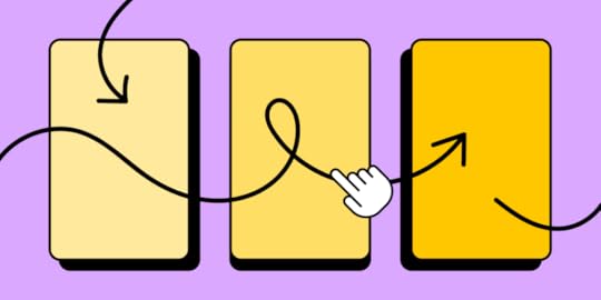
Mobile navigation is crucial for digital product design as it directly impacts user satisfaction and engagement. Many users access the web on mobile devices, so designers must prioritize mobile navigation to ensure seamless interaction and a positive user experience.
Mobile navigation should be easily accessible and intuitive. Mobile users must quickly locate and understand how to navigate through your app or website. Using familiar UI design patterns such as hamburger menus or tab bars, designers can capitalize on established mental models to make navigation feel effortless.
Due to limited screen real estate, mobile navigation should be small and prioritized but with a touch target sufficient for thumbs and fingers while allowing enough surrounding whitespace to avoid accidental taps. Designers must also consider reach and placement so users can access mobile navigation effortlessly and intuitively.
This article explores various types, examples, and ten best practices to elevate your mobile navigation design game. With a keen focus on accessibility, intuitive patterns, and optimized touchpoints, learn how to captivate and keep users engaged with your app or website through thoughtful mobile navigation patterns.
Design responsive experiences your customers will love with UXPin, an all-round prototyping solution for conceptualization, interactive prototyping, and design handoff. Sign up for a free trial.
Build advanced prototypesDesign better products with States, Variables, Auto Layout and more.
Try UXPin .try-uxpin-banner { margin: 40px 0px;}.try-uxpin__container { display: flex; max-width: 689px; height: 210px; padding: 20px; padding-left: 24px; border: 2px solid black; border-radius: 4px; align-items: center; justify-content: space-between; background-color: white; box-shadow: 10px 10px black;}.try-uxpin__left { width: 54%;}.try-uxpin__left p { margin: 10px 0px !important; color: black !important;}.try-uxpin__heading { font-size: 28px !important; font-weight: bold;}.try-uxpin__text { margin: 0 !important; font-size: 18px !important; line-height: 22px !important;}.try-uxpin__button { width: 135px; height: 44px; background: black; margin: 10px 0px; padding: 10px 20px; border: none; border-radius: 2px; color: white; font-size: 16px; text-align: center;}.try-uxpin__button:hover { cursor: pointer;}.try-uxpin__image { max-width: 320px !important; height: 200px; margin-right: -21px; margin-bottom: -6px;}@media (max-width: 760px) { .try-uxpin__container { height: auto; margin: 10px; align-items: left; }}@media (max-width: 500px) { .try-uxpin__container { flex-direction: column; } .try-uxpin__left { width: 100%; align-items: normal; }}Types of Mobile Navigation MenusHere are some common types of mobile navigation used for responsive web design and native applications.
Tab menu (or tab bar):A tab menu sits at the top or bottom of a screen, with icons and labels representing different app sections. Users can quickly switch between sections by tapping on the corresponding icon.
 Bottom navigation
Like a tab menu, the bottom navigation pattern places the primary options at the bottom of the screen, making it easily accessible for users with one-handed operation.
 Top navigation (App bar)
App bars are standard across websites and cross-platform applications, typically featuring a back button/hamburger menu, page title, and other action buttons.
 Hamburger menu (or side drawer)
The three-horizontal line hamburger menu is the standard UI pattern for mobile navigation, like hidden drawers and modals. Users tap the hamburger icon to reveal the menu’s items.
 Navigation rail
A navigation rail is a compact sidebar menu for tablets, but you also see this navigational pattern in Gmail’s desktop application. Navigation rails offer great space-saving benefits while keeping menu items visible and easy to access.
 Floating action button (FAB)
A FAB is a button floating above the main content, usually in the bottom right of the screen, so users can easily reach it with their thumb. Designers use FABs for a primary action within the user interface–for example, Gmail uses a FAB for composing a new email in its mobile app.
 Bottom sheets
Bottom sheets display supplementary content and actions on mobile screens. These sheets can be scrollable, allowing designers to offer many additional options and links only when the user needs them (progressive disclosure), keeping UIs uncluttered.
 Gesture-based navigation
Gesture-based navigation allows users to navigate a user interface through various touch gestures, like swiping or pinching–for example, iOS app developers can use swipe gestures for forward and back navigation. This gesture-based navigation makes navigating UIs easy and intuitive and reduces the need for a back button to clutter screen space.
 Mobile Navigation ExamplesSpotify’s top and bottom navigation bars
Spotify’s mobile application provides users with top and bottom navigation links. The bottom navigation features three items, Home, Search, and Your Library. These are the three most important features for users wanting to play music, podcasts, or audiobooks.
Spotify’s header uses an app bar with a settings icon to open the primary navigation drawer, which includes links to many features and settings. The time icon takes users to a “Recently played” screen, and the bell icon opens the latest releases according to the artists and podcasts a user follows.
Google Calendar on AndroidGoogle Calendar on Android uses several mobile navigational UI elements:
App bar: The top app bar features a hamburger menu, search, calendar icon (takes the user to today’s date), and user’s image to open profile settings.FAB: The FAB enables users to create a new event.Bottom navigation: Android’s bottom navigation features three standard Android navigational actions, view all open apps, exit app, and back.
Combining these mobile navigation items makes it easy for users to complete most Google Calendar tasks without accessing the navigational drawer.
Google Maps on iOSGoogle Maps has several navigational elements with many actions on a small screen. The top app bar offers a large search field with a microphone icon for voice commands–an essential accessibility feature. The user’s image opens a modal with account-related links.
There are two FABs in Google Maps. One takes users to their current location, and the other opens the map’s directions feature. Below the FABs is a bottom sheet that opens an interface showing users location sites and attractions.
Google Maps’ bottom navigation provides users with five primary menu items:
ExploreGoSavedContributeUpdates
Google Maps is a good example of using multiple navigational menus for complex features and actions on one screen.
UXPin’s responsive web navigationIf you navigate to UXPin’s homepage on a mobile device, you’ll see this screen featuring a prominent CTA with UXPin’s logo and a hamburger menu icon in the header navigation.
Opening the hamburger displays UXPin’s primary menu items in a neat navigational drawer. The down arrows next to some items indicate that there are additional submenus to explore.
 Creative Snakebar navigation from Dribbble
Jarek Maćków from Poland-based HeroDOT Digital House posted this open-source bottom navigation on the company’s Dribbble account.
The Flutter prototype features an onboarding sequence with swipe navigation followed by a “Snakebar navigation” example. The active indicator crawls across the nav bar like a snake when the user clicks a menu item.
This navigation pattern from HeroDOT provides a fun, intuitive, and immersive user experience to engage users during onboarding.
eCommerce cart bottom sheetThis eCommerce bottom sheet cart design from Rishabh Varshney on Dribbble illustrates how designers can use mobile navigation patterns to balance user needs with business goals. The user enjoys a fast, intuitive checkout process while the website increases conversions with creative navigation, prompting the user to complete their purchase.
 Tips & Best Practices for Effective Mobile Navigation
Here are ten best practices to improve your mobile navigation design:
Keep it simple: Minimize the number of navigation options and ensure the menu labels are concise and easy to understand.Prioritize important features: Place the most frequently used or essential features at the forefront of the navigation.Make navigation accessible: Ensure the navigation elements are easily reachable, especially for one-handed use. Test your navigation with assistive technologies to provide everyone with an intuitive user experience.Utilize standard navigation patterns: Stick to familiar navigation patterns familiar to users, like tab menus and hamburger menus. Use obvious names to prevent confusion.Optimize for touch: Design navigation elements with sufficient touch targets and spacing to avoid accidental taps.Use clear visual cues: Highlight the currently active navigation item and provide visual/haptic feedback when users tap a menu item.Adapt to screen size and orientation: Design navigation that adapts to various screen sizes, orientations, and devices.Offer gesture-based navigation: Integrate gestures like swipes and pinches to make navigation more intuitive and efficient.Provide context-sensitive navigation: Provide menu options based on the user’s current task or context.Test and iterate: Continuously test the navigation with users and gather feedback to optimize the design.Mobile Navigation Prototyping With UXPinUXPin is the only design tool that offers complete interactive prototyping with code-like fidelity and functionality. This high-level interactivity means designers can build complex components that look and feel like the final product, providing accurate results and meaningful feedback during the design process.
Here’s how UXPin can revolutionize your design workflows to produce sophisticated final-product like prototypes:
States: allow designers to create multiple states for a single UI element and design complex interactive components like dropdown menus, tab menus, navigational drawers, and more.Variables: capture data from user inputs and create personalized, dynamic user experiences–like their name and profile image in the app bar.Expressions: Javascript-like functions to create complex components and advanced functionality–no code required!Conditional Interactions: create if-then and if-else conditions based on user interactions to create dynamic prototypes with multiple outcomes to accurately replicate the final product experience.Create advanced prototypes that accurately replicate the final product experience to improve testing and solve more usability issues. Sign up for a free trial to design your first interactive prototype with UXPin.
Try UXPin for freeThe post 6 Mobile Navigation Examples and 8 Types You Should be Aware of appeared first on Studio by UXPin.
UXpin's Blog

- UXpin's profile
- 68 followers

