
UXpin's Blog, page 39
May 9, 2023
Design Mission Statement – Examples and Tips

Designing a meaningful and impactful future begins with a clear and concise mission statement. This article explores the essential elements of an effective design mission statement, including a step-by-step guide to crafting one that reflects your team’s unique values, principles, and aspirations.
Whether you’re a UX designer, DesignOps leader, or product owner, understanding the importance of a good mission statement is crucial for aligning your team, driving innovation, and inspiring growth.
Create real design process improvements and make an impact on the speed and efficiency of prototyping with component-driven design with UXPin Merge. Sync your dev’s UI components with UXPin and design up to 10x faster. Visit our Merge page for more details.
Reach a new level of prototypingDesign with interactive components coming from your team’s design system.
Discover UXPin Merge .discover-merge { margin: 40px 8px;}.discover-merge__container { display: flex; max-width: 690px; height: 200px; padding: 20px; padding-left: 24px; border-radius: 4px; background-color: black; box-shadow: 10px 10px #9999ff; align-items: center; justify-content: space-between;}.discover-merge__left { width: 50%;}.discover-merge__left p { margin: 10px 0px !important; color: white !important; font-size: 18px !important;}.discover-merge__heading { font-weight: bold !important; color: white !important; font-size: 18px !important;}.discover-merge__text { margin: 0 !important; line-height: 22px !important;}.discover-merge__button { width: 174px; height: 44px; margin: 10px 0px; border: none; border-radius: 2px; background: white; color: black; font-size: 16px; text-align: center;}.discover-merge__button:hover { cursor: pointer;}.discover-merge__image { max-width: 320px !important; height: 200px; margin-right: -19px;}@media (max-width: 760px) { .discover-merge__container { height: auto; margin: 10px; align-items: left; }}@media (max-width: 500px) { .discover-merge__container { flex-direction: column; } .discover-merge__left { width: 100%; align-items: normal; }}What is a Design Mission Statement?
A design mission statement guides designers by outlining and defining company values, principles, and aspirations in design. This concise declaration helps define the UX team’s unique approach to product design and serves as a foundation for creative and user experience decision-making.
By establishing a clear sense of direction, a mission statement enables designers to focus on their goals and consistently deliver value to users, stakeholders, and collaborators.
How does a design mission statement fit with the overall UX strategy?A design mission statement incorporates the overall UX strategy by guiding and aligning design decisions with organizational goals. It fosters consistent, purposeful design choices, enhancing the user experience across products and platforms.
What is a Vision Statement?A design vision statement outlines the long-term aspirations and desired future state for a product or organization’s design department. It provides designers with a clear direction or “north star” and is a source of inspiration and motivation.
Vision Statement vs. Mission Statement – What’s the difference?A design mission statement focuses on the organization’s present design objectives, principles, and values. It establishes the foundation for design decisions, ensuring alignment with the organization’s goals.A design vision statement describes where the organization wants to be in the future, while the mission statement defines its current purpose and approach to design.Key Elements of an Effective Design Mission Statement Vision and values
The foundation of a strong design mission statement lies in articulating your team’s aspirations and core beliefs. Clearly define your organization’s purpose and what it stands for, guiding the team toward meaningful outcomes. For example, a company focused on sustainability might emphasize eco-friendly design practices in its mission statement.
Design philosophy and principlesOutline the design approach that underpins your team’s work. You can include aspects like user-centered design, simplicity, or innovation. By expressing these principles, you establish a framework that drives consistent decision-making. For example, if accessibility is a priority, your mission statement could mention a commitment to inclusive design for all users.
Focus on user needs and experienceA successful design mission statement places your target audience at the center, highlighting a dedication to understanding and addressing their needs. Your statement must emphasize the importance of empathy, research, and user testing. For example, you might mention a commitment to providing intuitive, enjoyable, and seamless experiences that solve users’ problems.
Commitment to collaboration and communicationEffective design implementation often requires teamwork and clear communication with stakeholders. In your mission statement, highlight the value of collaboration and transparent dialogue, fostering a culture of openness and constructive feedback. For example, a mission statement could mention fostering cross-functional collaboration to ensure well-rounded and high-quality design solutions that incorporate diverse input and ideas.
Continuous learning and growthThe design and technology landscape is ever-evolving. A strong mission statement should reflect a dedication to improvement and adaptation. Encourage a growth mindset within your team, emphasizing the importance of learning from mistakes, staying updated on industry trends, and refining skills. For instance, your mission statement might underline a commitment to ongoing professional development and experimentation with new design methodologies.
Crafting Your Design Mission Statement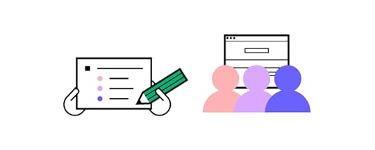 Setting the stage
Before diving into creating your design mission statement, setting the stage for a successful and collaborative session is essential. Involving the right people, preparing the appropriate materials, and choosing the ideal setting will help ensure that your mission statement truly reflects the values and aspirations of your team.
Who to include: Invite key members of your design team, including designers, DesignOps leaders, product owners, and any other relevant stakeholders. Including a diverse group ensures that the mission statement encompasses various perspectives and insights.The setting: Select a comfortable, distraction-free environment to foster creativity and collaboration. This location could be a dedicated meeting room, a quiet office corner, or a virtual space for remote teams. Ensure the setting encourages open communication and allows for brainstorming and sharing ideas.Materials: Provide materials to facilitate brainstorming and idea generation, such as whiteboards, markers, sticky notes, and pens. For remote UX workshops, use online collaboration tools like Miro or Mural.Step 1 – Reflect on your organizational and UX valuesConsider your company’s broader values and how they align with your UX team’s objectives. Determine the core values that will guide your design decisions.
Action: List your organization’s values and identify those most relevant to your design team. Reflect on how these values influence your design process and outcomes.
Step 2 – Identify your design principles and philosophiesEstablish your team’s fundamental design principles, such as simplicity, user-centricity, innovation, accessibility, etc.
Action: Brainstorm and list the design philosophies that resonate with your team. Consider how these principles shape your team’s design initiatives and problem-solving approach.
Step 3 – Consider the impact you want to make on users, stakeholders, and colleaguesThink about the desired outcomes of your design work and how they contribute to the success of users, the organization, and your team.
Action: List the key impacts you want to achieve through your design work. Reflect on the benefits for users, the company, and your team members.
Step 4 – Balance between idealism and pragmatismWhile it’s essential to have aspirational goals, your mission statement should also be grounded in reality. Strive for a balance between lofty ideals and practical, achievable objectives.
Action: Review your mission statement draft and evaluate if the goals are attainable while still being ambitious. Adjust the statement as needed to ensure a balance between idealism and pragmatism.
Step 5 – Involve your team in the processGather input from team members and non-designers to ensure the mission statement represents your organization and design team’s values and aspirations.
Action: Organize a workshop or brainstorming session with your team to discuss and refine the mission statement. Incorporate feedback and suggestions to create a statement that truly represents your team.
Step 6 – Keep it concise and memorableA powerful mission statement is brief, clear, and easy to remember. Aim to communicate your message in a way that resonates with your team and stakeholders.
Action: Edit and refine your mission statement to ensure it’s succinct and straightforward. Remove unnecessary words or phrases, focusing on the most critical elements of your team’s mission.
Examples of Design Mission Statements
We’ve done our best to find mission statements relevant to design. Since these are generally internal documents, they can be challenging to find. Here are three mission statement examples and the lessons you can take from them.
Google’s mission statement“To organize the world’s information and make it universally accessible and useful.” – Source: Google’s about page.
While not explicitly a design mission statement, Google’s mission statement encompasses its design philosophy, as they aim to create user experiences that are intuitive and accessible to everyone.
Human Experience’s mission statement“Our mission is to elevate patient safety, create beautiful therapeutic spaces for healing, and establish viable long-term programs. Through our design and consulting work, we advocate for all stakeholders in behavioral health, including patients, hospital administration and staff, and healthcare architects. Simply put, we want to make a difference in the world. When we combine our beliefs with our years of experience, we believe we can.” Source: Human Experience–Who We Are.
Human Experience’s mission statement showcases its commitment to enhancing patient safety and creating therapeutic spaces for healing. They emphasize the importance of considering all stakeholders and advocating for their cause in the healthcare industry. This mission statement demonstrates the power of clearly outlining the purpose and goals of a design team, inspiring change in their field.
Spotify’s mission statement“Our mission is to unlock the potential of human creativity—by giving a million creative artists the opportunity to live off their art and billions of fans the opportunity to enjoy and be inspired by it.” Source: Spotify Design.
Again, not a design-specific mission statement, but a fantastic example of placing users front and center. Spotify’s mission statement emphasizes the power of human creativity, focusing on the dual goals of supporting artists and inspiring fans.
This statement showcases their dedication to fostering a vibrant creative expression and enjoyment ecosystem. By putting both creators and listeners at the heart of its mission, Spotify highlights the importance of prioritizing the needs and aspirations of its diverse user base.
Updating and Evolving Your Design Mission Statement
Updating and evolving a design mission statement is crucial to maintaining relevance as the design landscape and user needs change. Periodically revisiting the statement ensures it aligns with the organization’s current goals and priorities.
Design teams should consider updating their mission statement when:
Organizational goals shift: Reflect new objectives to keep design efforts focused.Industry trends change: Adapt to emerging technologies and user expectations.Team dynamics evolve: Accommodate new members or leadership changes.User needs expand: Stay responsive to shifting user preferences and requirements.Design products that align with your company’s vision using the world’s most advanced code-based design tool. UXPin Merge bridges the gap between design and development to create a reliable single source of truth across the organization, aligning teams toward a common goal. Visit our Merge page for more details and how to request access.
Discover MergeThe post Design Mission Statement – Examples and Tips appeared first on Studio by UXPin.


May 8, 2023
What is Design System Testing? Definition, Benefits, and Process

Testing is vital for ensuring your design system provides the tools, guidance, components, and support teams need to deliver high-quality products efficiently. Design system testing assesses every aspect of the component library, documentation, syntax, accessibility, and more to ensure it meets the organization’s standards and expectations.
This article explores design system testing, when to test, roles and responsibilities, procedures, and tools teams use to conduct various tests.
Create a single source of truth, reduce operation burdens, and minimize errors with a code-to-design design system workflow from UXPin Merge. Visit our Merge page for more details and how to request access.
Reach a new level of prototypingDesign with interactive components coming from your team’s design system.
Discover UXPin Merge .discover-merge { margin: 40px 8px;}.discover-merge__container { display: flex; max-width: 690px; height: 200px; padding: 20px; padding-left: 24px; border-radius: 4px; background-color: black; box-shadow: 10px 10px #9999ff; align-items: center; justify-content: space-between;}.discover-merge__left { width: 50%;}.discover-merge__left p { margin: 10px 0px !important; color: white !important; font-size: 18px !important;}.discover-merge__heading { font-weight: bold !important; color: white !important; font-size: 18px !important;}.discover-merge__text { margin: 0 !important; line-height: 22px !important;}.discover-merge__button { width: 174px; height: 44px; margin: 10px 0px; border: none; border-radius: 2px; background: white; color: black; font-size: 16px; text-align: center;}.discover-merge__button:hover { cursor: pointer;}.discover-merge__image { max-width: 320px !important; height: 200px; margin-right: -19px;}@media (max-width: 760px) { .discover-merge__container { height: auto; margin: 10px; align-items: left; }}@media (max-width: 500px) { .discover-merge__container { flex-direction: column; } .discover-merge__left { width: 100%; align-items: normal; }}What is Design System Testing?Design system testing (design system auditing) evaluates a design system’s functionality, usability, documentation, quality, and consistency. This evaluation aims to ensure the design system meets the requirements and expectations of its users and stakeholders.
A typical design system testing process might include:
Component testing: Evaluate individual components for visual consistency and function as expected.Pattern testing: Ensure patterns are applied consistently across user interfaces and use cases.Design file testing: Comparing design files to repository components to ensure designers and engineers share the same UI elements and patterns.Accessibility testing: Validate that components, patterns, and templates meet design system accessibility standards and guidelines.Cross-platform and cross-browser testing: Ensure the design system and components works consistently across different devices, platforms, operating systems, and browsers.Performance testing: Measure the design system’s impact on overall product performance, including load times and responsiveness.Usability testing: Analyze user research and conduct interviews to ensure the design system supports a positive user experience.Documentation testing: Review design system documentation, including its guidelines (brand, content, code, design, etc.), to ensure it’s comprehensive and provides adequate user support.Why is Design System Testing Important?Design system testing is vital for the integrity of the UI library and the products it serves. Errors and inconsistencies left unchecked can quickly compound into bigger issues for product teams and end-users.
A design system’s primary purpose is to serve as a single source of truth. When a design system is compromised, it no longer serves as a trustworthy source for product consistency and coherence.
How Often Should You Test a Design System?
The frequency of design system testing will depend on multiple factors:
The size and complexity of the design systemDesign system maturityAvailable resources (labor, time, financial)Product ecosystemFrequency of updatesHere are some scenarios and intervals organizations might consider testing a design system.
Regular interval testingThe design system team may create a schedule for regular testing, such as monthly, quarterly, bi-annually, etc. A fixed testing program allows the DS team to plan while managing stakeholder and user expectations.
After significant updates or additionsIt’s common for design system teams to audit a design system after a major update or when introducing new components, patterns, or guidelines. This audit ensures the changes function as expected while maintaining high UI consistency and coherence standards.
Addressing usability, accessibility, and performance issuesWhen product teams identify usability, accessibility, or performance issues, it’s crucial to audit the entire design system. This audit will evaluate the depth of the problem and appropriate corrective action.
It’s important to note that waiting for problems to emerge is not a good strategy for testing a design system. Adopting a more proactive approach, like regular interval testing or post updates, is better for catching and correcting issues early.
Agile developmentOrganizations that follow agile development practices may incorporate regular testing into the development process. This agile approach would mean tests occur more frequently, possibly integrated into sprints or release cycles.
Who is Responsible for a Design System Audit?
A comprehensive design system audit requires a cross-functional team with different expertise. In contrast, smaller or more specific tests may only need one or two specialists.
Depending on the scale and scope, here is a list of team members you might consider for your design system test. Keep in mind that companies may have one team member performing multiple functions listed below. For example, a UX designer may assess design, accessibility, and content, while an engineer covers UI components and QA.
UX/UI designers: assess visual consistency, usability, and overall user experience of the components and patterns. They also check design-specific documentation, tools, and UI kits.Developers: Front-end and back-end developers evaluate component functionality, syntax, performance, and implementation. They also test the UI library across platforms and browsers.Accessibility specialists: These team members have up-to-date expertise in accessibility standards and guidelines. They test the design system to organizational and regional accessibility requirements.QA engineers: Quality assurance (QA) engineers create and execute tests in accordance with the design system’s quality standards.Product managers or project managers: Many companies treat testing like a project requiring a team member to coordinate and oversee the process, including establishing timelines, allocating resources, and ensuring the team aligns on objectives and priorities. They may also gather findings to produce a final report, including the next steps.Content designers or copywriters: Review design system documentation, content guidelines, messaging, tone, voice, etc., for consistency and accuracy across components and patterns.Design System Testing Workflow
Here are some suggested steps for executing a design system audit.
Define objectives: Establish the goals and objectives of the design system test. i.e., identifying inconsistencies, evaluating accessibility, or assessing performance.Develop a plan: A test plan outlines the audit’s scope, methods, resources, schedule, and success criteria. An effective test plan must guide testing, assigns roles, and keep team members aligned.Identify test cases and scenarios: Determine the specific test cases and scenarios team members must use to evaluate various parts of the design system. These must be consistent for every test to ensure you can measure KPIs and performance over time.Prepare tools and resources: Gather the tools and resources team members need to complete their work, including testing frameworks, accessibility checkers, performance analyzers, usability testing methods, etc.Execute tests: Conduct tests according to the plan, documenting the results and issues.Analyze test results: Review tests to identify patterns, trends, or areas of concern. Determine issue severity, prioritize fixes, and add to UX or tech backlogs.Report findings and recommendations: Prepare a comprehensive report for design system users and stakeholders with test outcomes, findings, and recommendations.Fix issues and implement improvements: The design system team must implement changes according to the report updating components, patterns, guidelines, and documentation as needed.Monitor, re-test, and iterate: Test releases to ensure they solve issues appropriately. Monitor changes to assess effectiveness, testing and iterating until you achieve the desired outcome.Tools for Design System Testing
There are many tools available for testing different aspects of a design system. Here are a few categories and examples.
Visual consistency testing Percy : A visual testing tool that helps detect visual changes and inconsistencies across components and layouts. Chromatic : Automates gathering UI feedback, visual testing, and documentation–created by Storybook for built-in tests. SauceLabs Sauce Visual Testing : Find and fix visual errors and inconsistencies across all browsers and resolutions early in the development lifecycle.Functionality and integration testing Jest : A JavaScript testing framework that supports component and integration testing for JavaScript libraries and frameworks, including React, Vue, and Angular. Cypress : An end-to-end testing tool for testing browser-based web applications.Accessibility testing axe : An accessibility testing tool for identifying and resolving accessibility issues in web applications. Lighthouse : An open-source tool from Google that provides automated auditing for accessibility, performance, and other best practices. WAVE : A web accessibility evaluation tool that helps identify and resolve accessibility issues. UXPin : Built-in color contrast checker and color blindness simulators allow designers to test UIs on the fly.Cross-platform and cross-browser testing BrowserStack : A platform providing access to various browsers and devices for testing web applications across different environments. Sauce Labs : A cloud-based platform for automated and manual testing across browsers, platforms, and devices.Performance testing WebPageTest : An open-source tool for measuring web page performance, including load times, rendering speed, and optimization recommendations. Google PageSpeed Insights : A free tool that analyzes web page performance and provides suggestions for improvement. Digital.ai Continuous Testing : Continuously test functional, performance, and accessibility scenarios on a matrix of devices and browsers with various manufacturers operating systems.Usability testing UserTesting : A platform for conducting remote usability tests with real users, capturing their feedback and interactions. Ethnio : A research ops platform for recruiting participants who use your products and features using intercepts. Helpful for getting feedback from users who interact with specific components or patterns. Optimal Workshop : A suite of usability testing tools, including card sorting, tree testing, and first-click testing. UXPin Merge : A tool for building prototypes using components from your design system for accurate high-fidelity usability testing.Design system documentation and collaboration Storybook : An open-source tool for building and organizing UI components, making design system testing collaborative and accessible. Storybook integrates with UXPin to bridge the gap between design and development. UXPin Design Systems : A tool for building, managing, and scaling design systems with shared documentation, assets, and style guide.A Single Source of Truth With UXPin MergeMaintenance and governance are the biggest design system challenges, especially when there is no single source of truth between design and development.
UXPin Merge bridges the gap between design and development by syncing your design system’s repository with UXPin’s design editor so design and engineering teams use the same component library–creating a true single source of truth across the organization.
Learn more about UXPin Merge’s code to design workflow and how it benefits design systems, including better maintenance, collaboration, and governance. Visit our Merge page for more details.
Discover MergeThe post What is Design System Testing? Definition, Benefits, and Process appeared first on Studio by UXPin.
May 2, 2023
How to Design a Product in 5 Steps
The quality of design is about more than offering a visually-appealing interface; it has a direct impact on the product’s commercial success. According to McKinsey & Company, using design thinking methods leads to a 35% increase in revenue. It also prompts a 56% increase in return compared to businesses that put product design in the back seat. But what does it take to get product design “right”? This is what we’re going to cover in this part.
Release products 10x faster with powerful design technology – UXPin Merge which makes it easy for designers to prototype with ready-made UI components that are fully interactive. Discover UXPin Merge.
Reach a new level of prototypingDesign with interactive components coming from your team’s design system.
Discover UXPin Merge .discover-merge { margin: 40px 8px;}.discover-merge__container { display: flex; max-width: 690px; height: 200px; padding: 20px; padding-left: 24px; border-radius: 4px; background-color: black; box-shadow: 10px 10px #9999ff; align-items: center; justify-content: space-between;}.discover-merge__left { width: 50%;}.discover-merge__left p { margin: 10px 0px !important; color: white !important; font-size: 18px !important;}.discover-merge__heading { font-weight: bold !important; color: white !important; font-size: 18px !important;}.discover-merge__text { margin: 0 !important; line-height: 22px !important;}.discover-merge__button { width: 174px; height: 44px; margin: 10px 0px; border: none; border-radius: 2px; background: white; color: black; font-size: 16px; text-align: center;}.discover-merge__button:hover { cursor: pointer;}.discover-merge__image { max-width: 320px !important; height: 200px; margin-right: -19px;}@media (max-width: 760px) { .discover-merge__container { height: auto; margin: 10px; align-items: left; }}@media (max-width: 500px) { .discover-merge__container { flex-direction: column; } .discover-merge__left { width: 100%; align-items: normal; }}How to Design a Product? – 5 Steps of Product DesignIrrespective of your design process, you must ensure it circles around usability. Below are the five steps of product design that you should follow as you roll out solutions.
Bear in mind that – while it’s divided into stages – design isn’t an iterative process, so you engage in all of these actions on an ongoing basis as you refine your product.
Step 1: EmpathizeShowing empathy is the first and, arguably, most crucial step of product design. It requires a deep understanding of your users, their experiences, and their needs. Essentially, you and the design team set aside your own assumptions and personal biases.
There are plenty of methods you can use to learn about your target users. For instance, you can collect qualitative data directly by asking them questions in surveys or interviews. Alternatively, you can decide to ‘sit back’ and observe how users interact with the product or service uninterrupted, in their natural environment. This can be done through unmoderated usability tests.

What to do if you’re designing for a group of users who seem inaccessible? Talk to experts in the field who can help you better understand the most common needs and problems in the niche. It’s not uncommon for designers to pair up with psychologists, sociologists, or even anthropologists. By doing so, you learn about the social and cultural background of the users, making your solution even more user-friendly.
Useful Tools and Resources:
Learn about desirability, feasibility, and viability.Learn about UX research.Learn the business value of design.Step 2: DefineThe second step in learning how to design a product is creating a clear problem statement. At this stage, you use the insights gathered during the ‘Empathize’ phase and define the challenges you seek to solve with your product.
The statement needs to be:
Human-centered. Focus on the user’s perspective, emphasizing their needs and goals. The statement should resonate with the target user.Balances between specificity and flexibility. While it should be specific enough to provide guidance, it must also guarantee enough flexibility to encourage creativity and innovative solutions. This helps designers have a clear direction without constraining their ability to generate ideas.Problem statements can be short or take on a descriptive form. Some teams use the Point of View Madlib, which is a sentence that follows the template:
[User X] needs to/does [explanation of the action] because [the insight].
Others use 2-4 sentences to define the challenge and any unique circumstances.
Here are some examples of well-defined problem statements:
We’re seeing an unexpected increase in people abandoning the signup process. Customers say that they’re frustrated with the number of forms they need to fill in to create an account. We need to streamline the sign-up process.New customers say that they can’t understand our pricing scheme without asking customer support for help. The “pricing” page has a significant bounce rate because they don’t know how to easily compare features between tiers.Streaming platform users say that they are missing a filtering option or – if it exists – they can’t find it. They can’t eliminate movies that have an IMDb score lower than 7/10 and have to check each rating movie by movie, on their phones.So, the Define step of product design zeroes in on a specific, user-centric issue statement. When designers grasp the issue they’re trying to solve, they’re more likely to create a solution that helps people.
Useful Tools and Resources:
Learn about creating personas.Learn about problem statements.Step 3: IdeateIdeation, the third step in product design, inspires new ideas. The prior two stages—empathizing and defining—provide a solid basis for this phase. With this information, designers can question preconceptions and explore alternate problem-solving techniques.
Sketching facilitates this process, allowing designers to visualize ideas and iterate on concepts.
It’s a good idea to turn to techniques like Google’s Crazy 8s and the 4-step Sketch exercise. They set time limits for each brainstorming session, which boosts your team’s focus (and, ultimately, productivity).

After developing ideas and exploring them, you start eliminating those that aren’t viable. By the end, you’ll agree on the one idea to proceed with next.
Next, you frame it as a user story. It’s quite similar to the previously mentioned Madlib problem statement, and follows the template below:
As a [user], I want to do [X], so that [Y].
For example:
“As a customer, I want to pay through the app, so that I don’t have to reach for my credit card every time I complete an order”.
It helps articulate the goal and defines an actionable task. Knowing the ‘what’, designers can now focus on the ‘how’.
As you can see, designing a successful product comes up to a lot of preliminary research, way before you create the first wireframe. The product design process lets you discover industry-changing breakthroughs by challenging the status quo. Tried-and-true methods like user stories help design teams create a clear roadmap for the prototyping step, discussed next.
Useful Tools and Resources:
Try out Google’s Crazy 8s.Run the 4-step Sketch exercise.Step 4: PrototypeIn the product design process, the prototyping stage helps turn ideas into the first tangible, testable collateral. By developing scaled-down prototypes, design teams can check potential solutions and identify any limitations or problems the product might face. This step ensures the end product meets user expectations.
Prototyping can be divided into two types: low-fidelity and high-fidelity.
Low-Fidelity PrototypesLow-fidelity prototypes are simple, hand-drawn, or basic digital wireframes without color or content. They enable UX teams to visualize screen layouts, test navigation, and assess user flows. For example, a typical eCommerce checkout flow with a cart, delivery, and payment module can be represented as a low-fidelity prototype.
According to the Nielsen Norman Group, low-fidelity prototyping helps designers iterate faster and facilitates stakeholder buy-in. Also, it encourages a focus on functionality rather than aesthetics.
High-Fidelity PrototypesHigh-fidelity prototypes incorporate color, content, interactions, transitions, and animations. This assists in creating a more immersive user experience. In essence, they closely resemble the final product. And since they’re more relatable to users and stakeholders, they’re also likely to make the design feedback you collect more valuable.
What’s more, high-fidelity prototypes are great at pointing out usability issues. Remember that they might be missed or unaccounted for in low-fidelity versions.
One powerful tool for creating high-fidelity prototypes is UXPin Merge. It enables designers to work with coded UI components, which can be imported from Storybook, NPM, or Git repositories. Using UXPin Merge, even small design teams can create life-like prototypes that adhere to design system guidelines. The imported components look and function like those in the final product, which helps streamline the prototyping process.
Useful Tools and Resources:
Learn about high-fidelity prototyping vs. low-fidelity.Learn about interactive prototypes.Step 5: TestThe fifth and last step in successful product design is the testing phase. Designers or evaluators rigorously assess the efficacy and viability of the product. This stage is a key ingredient of iterative design thinking, letting designers spot problems and brainstorm how to refine them.
The main goal of the testing phase is to determine how well the prototype solves the identified issue. It doesn’t involve implementing or synthesizing research. Instead, the focus lies on employing the most appropriate research methods. These approaches help gather detailed feedback, insights, and document findings.
While various usability testing methods exist, they can be roughly narrowed down to two categories:
Moderated tests. These involve direct interactions between the facilitator and the participant. Users are asked to complete a task, like downloading a PDF report from the user panel. They might either be asked to comment on what they’re doing at each step, or asked questions by the facilitator.Unmoderated tests. These exclude the facilitator’s presence, but the participants still get a list of instructions they are to follow.The good news is that usability testing doesn’t require a large investment. According to Jakob Nielsen of the Nielsen Norman Group, you can spot as many as 85% of all issues by testing with just five users!
Better yet, evaulating your product design doesn’t have to be limited to structured usability testing sessions. You can also do so asynchronously, for instance, by sharing a prototype and asking users and stakeholders to comment directly on the design.
They can place a pin on any elements that they want to comment or ask about. This makes it easy for users to comment either on the overall user experience and product ‘feel’, or zero-in on details like buttons or images.
This is possible with a tool like UXPin, which lets you design and collect specific user feedback directly on the prototype. This means fewer errors in the final product.
Useful Tools and Resources:
Learn how to run insightful usability testingLearn how you can use fully functional prototypes in usability testing Getting the Product Design Process RightThere isn’t a single, one-size-fits-all answer to the question of how to design a product. Each product enters the market at a different time, and its target users have their own, unique challenges and goals. Still, regardless of any external factors, the key lies in following a well-thought-out product design process.
Creating the right solution is about diving deep into the needs and emotions of your users. Before you create a first wireframe – even the most simple one – it’s important that you clearly define your users’ goals and know how to best serve them.
Also, remember that product design is a collaborative process. A large part of your success depends on whether your fellow team members – designers, product managers, and developers alike – can all work towards the same objective. Here’s where using prototyping tools like UXPin will do wonders, allowing you to design, collect feedback, and handle developer handoffs all with a single tool.
Powering UXPin with its Merge technology will speed up prototyping for you for about ten fold. Why? It makes it simple to bring your dev’s component library to UXPin and build prototypes that are fully interactive and easily translated to code. Discover UXPin Merge.
Discover MergeThe post How to Design a Product in 5 Steps appeared first on Studio by UXPin.
May 1, 2023
Affordances 101 – What You Can Learn About User Interactions

Users require physical clues on what they should do on your site and where they should do it. This is where visual clues or affordances come in – they show users what they should do. This article will show you how you can design the best affordances to guide your site users.
Design advanced prototypes that allow you to test real user experience. Try UXPin, an end-to-end design tool that facilitates collaboration, simplifies design handoff, and makes high-fidelity prototyping fast and easy. Sign up for a free trial.
Build advanced prototypesDesign better products with States, Variables, Auto Layout and more.
Try UXPin .try-uxpin-banner { margin: 40px 0px;}.try-uxpin__container { display: flex; max-width: 689px; height: 210px; padding: 20px; padding-left: 24px; border: 2px solid black; border-radius: 4px; align-items: center; justify-content: space-between; background-color: white; box-shadow: 10px 10px black;}.try-uxpin__left { width: 54%;}.try-uxpin__left p { margin: 10px 0px !important; color: black !important;}.try-uxpin__heading { font-size: 28px !important; font-weight: bold;}.try-uxpin__text { margin: 0 !important; font-size: 18px !important; line-height: 22px !important;}.try-uxpin__button { width: 135px; height: 44px; background: black; margin: 10px 0px; padding: 10px 20px; border: none; border-radius: 2px; color: white; font-size: 16px; text-align: center;}.try-uxpin__button:hover { cursor: pointer;}.try-uxpin__image { max-width: 320px !important; height: 200px; margin-right: -21px; margin-bottom: -6px;}@media (max-width: 760px) { .try-uxpin__container { height: auto; margin: 10px; align-items: left; }}@media (max-width: 500px) { .try-uxpin__container { flex-direction: column; } .try-uxpin__left { width: 100%; align-items: normal; }}What is an Affordance?
 The term affordance refers to the properties of an object that imply how the object can be used. Affordances give clues on how an object can be used to carry out an action. For instance, the slots on a vending machine are affordances, they show you that you can insert something, perhaps a coin in order to make a purchase. The possibility of inserting something into a slot, is its affordance.
In the context of UI and UX, affordances are used to help users know what they should do without having to use pictures, labels or instructions. A great example of affordances are buttons, users know that buttons can be pushed because they resemble the buttons that they encounter and push in real life. The likelihood of a user pushing a button is the button’s affordance.
Affordances provide useful visual cues and psychological shortcuts that help users understand the tasks that they can carry out on a website or within an app. When used well, affordances make your designs intuitive and easy to use which increases conversion, engagement, and user satisfaction.
Affordance vs. Signifier – Key DifferencesWhat’s the difference between an affordance and a signifier? A signifier indicates that an affordance exists, it can be a mark, a sound or a label. Microcopy on a button that states ‘click to create an account’ is a signifier that indicates the presence of the affordance of pushing a button.
Types of affordancesFor you to understand how you can use affordances to improve user interactions, you need to first understand the different types of affordances available. They are: explicit, hidden, pattern, metaphorical, false and negative.
Explicit affordancesThese affordances give cues using the physical appearance of an object or language. Buttons that have a high contrast and resemble real life buttons afford pushing. Similarly, an input field with the words ‘enter email address’ affords an email address being entered. Facebook uses explicit affordances on its buttons that are clearly labelled as ‘Log In’ and ‘Create Account’ and on its input fields that are also labeled.
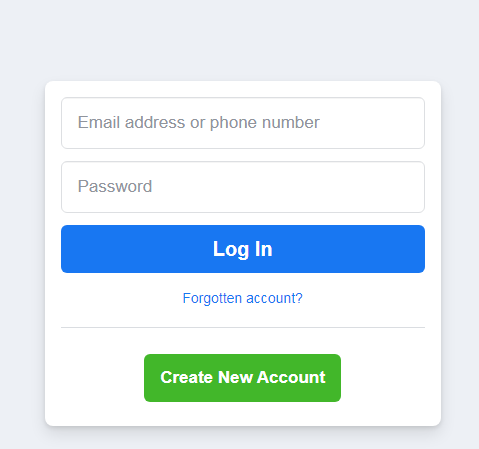
Explicit affordances (Source)
These affordances are said to be explicit because almost anyone can understand how they need to interact with the element, even if they have never interacted with digital interfaces before.
Explicit affordances are easily discoverable by users and are thus well suited for users who are not tech-savvy and do not understand common design conventions or patterns. These affordances are also useful when you are introducing new or innovative digital interfaces that users are not familiar with.
Hidden affordancesHidden affordances are not revealed to the user until they take a specific action such as hoovering or mousing over an element. The drop down menu is a hidden affordance where the user cannot see the other menu items unless they click on or hover on the parent tab.
The Asos Marketplace website uses a drop down menu to display more clothing categories. Users cannot see this drop down menu until they click on the clothing tab.
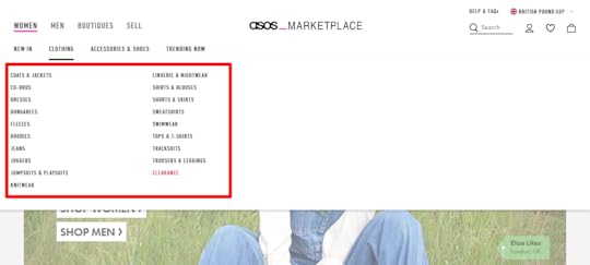 Hidden affordances (Source)
Hidden affordances are used to reduce clutter and emphasize on the hierarchy/level of importance of the actions that users can take.
However, there is a danger that users might not know how to reveal the hidden affordances. This danger shows that hidden affordances should not be used for important actions and should be reserved for actions that users can do without.
Pattern affordancesPattern affordances are the most common type of affordance because they rely on patterns that users already recognize. The navigation on the homepage of a website is a pattern that many users understand and therefore many websites, such as Apple, have a navigation on their homepages.
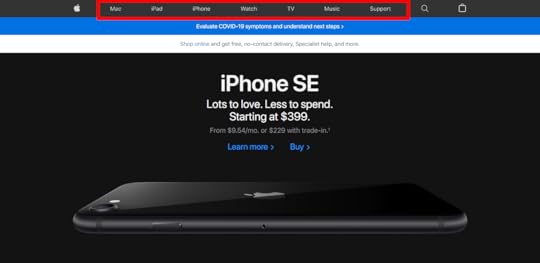 Pattern affordances (Source)
Another pattern is the logo on a website which takes users back to the homepage when clicked. Users also understand that in a body of text, text that has a different color, is underlined or italicized is almost always a link.
Patterns provide useful mental shortcuts for users which removes the need for memorization. Patterns are useful when designing for an audience that is tech savvy but might be confusing for audiences that have less experience with digital interfaces. As a designer, you should be wary of breaking existing patterns because users will have to learn the new pattern before they can recognize it.
Metaphorical affordancesThese affordances use real-life objects as metaphors for actions that users can take. Metaphorical affordances are used in many interface icons to inform users of the actions that they can take.
The magnifying glass icon affords searching, the envelope icon affords sending an email and the plus sign icon affords creating something new like a document or email.
 Metaphorical affordances (Source)
 These affordances can be contextual as in the case of the magnifying glass ison which affords searching when put next an input field and affords zooming when put in a document viewer. Because of their relationship to real world objects, metaphorical affordances are useful for communicating complex tasks quickly as users can easily understand them.
Negative affordancesThese affordances tell users that some design elements are inactive and that they cannot be acted upon. Such affordances include greyed out buttons or input fields that can only be activated if another action is complete. In the example below, the password input field can only be activated when the user clicks on the change button.
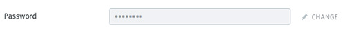 Negative affordance
Negative affordances are useful in guiding users on the order in which they need to take action. A user cannot submit a form unless they fill out all the fields, so the submit button is greyed out and only becomes active when all the fields are filled out.
False affordancesThese are affordances that appear to afford one action but actually afford another action or no action at all. A piece of text that is colored and underlined but not linked is a false affordance. A greyed out button which affords the pattern of being inactive but is actually clickable is a false affordance.
This is the case on Medium, the ‘Manage Publications’ and ‘Manage Newsletters‘ buttons are greyed out and thus look inactive but they are actually clickable. 
False affordance causes user errors and lower conversions, so designers should avoid them.
How to Design the Best Affordances?When done right, affordances reduce user errors and cognitive load while improving user experience and increasing conversions. Here are some tips to help you design the best affordances.
Always put the users first by researching their needs and their context. This information will help you to design helpful affordances for your users. Create logical and clear affordances which will make it easy for your users to intuitively understand your affordances.Use signifiers to provide more information to your users about the affordances you design. You can use text labels, highlights, color and shadows to male affordances obvious. Follow common design conventions to make it easy for users to understand your affordances.Use size to show your users the affordances that they should prioritize.Design the Best AffordancesAffordances give users metal shortcuts that help them understand the tasks that they can carry out on a digital interface. Use UXPin to create realistic buttons that get clicks and use the pattern library to create clear and consistent affordances throughout your designs.
Sign up for a free trial of UXPin today and start collaborating with your team on your affordance designs.
Try UXPin for freeThe post Affordances 101 – What You Can Learn About User Interactions appeared first on Studio by UXPin.
April 28, 2023
User Goals vs. Business Goals – Finding the UX Tipping Point
Striking the right balance between user and business goals is crucial for an organization and its products’ success. To deliver win-win solutions, product teams must encompass user objectives, desires, and challenges while meeting a company’s strategic goals.
We explore user vs. business goals and common associated KPIs. We also look at two real-world examples from Airbnb and Spotify, where product teams were able to balance these goals successfully.
Build fully interactive prototypes to enhance testing with end-users and stakeholders. Get meaningful feedback throughout the UX design process to deliver digital product experiences that meet user and business needs. Sign up for a free trial.
Build advanced prototypesDesign better products with States, Variables, Auto Layout and more.
Try UXPin .try-uxpin-banner { margin: 40px 0px;}.try-uxpin__container { display: flex; max-width: 689px; height: 210px; padding: 20px; padding-left: 24px; border: 2px solid black; border-radius: 4px; align-items: center; justify-content: space-between; background-color: white; box-shadow: 10px 10px black;}.try-uxpin__left { width: 54%;}.try-uxpin__left p { margin: 10px 0px !important; color: black !important;}.try-uxpin__heading { font-size: 28px !important; font-weight: bold;}.try-uxpin__text { margin: 0 !important; font-size: 18px !important; line-height: 22px !important;}.try-uxpin__button { width: 135px; height: 44px; background: black; margin: 10px 0px; padding: 10px 20px; border: none; border-radius: 2px; color: white; font-size: 16px; text-align: center;}.try-uxpin__button:hover { cursor: pointer;}.try-uxpin__image { max-width: 320px !important; height: 200px; margin-right: -21px; margin-bottom: -6px;}@media (max-width: 760px) { .try-uxpin__container { height: auto; margin: 10px; align-items: left; }}@media (max-width: 500px) { .try-uxpin__container { flex-direction: column; } .try-uxpin__left { width: 100%; align-items: normal; }}User Goals vs. Business Goals What are User Goals?User goals refer to the objectives, desires, or problems users want to achieve, satisfy, or solve when using a product. Understanding and prioritizing user goals ensures a product is usable, functional, and delightful–the core principles of design thinking.
What are Business Goals?Business goals are the objectives that a company aims to achieve through its product or service. Some examples include increasing revenue, expanding market share, or improving brand reputation.
Understanding User Goals & KPIs
User goals vary depending on the type of product and its target audience. Some common user goals and KPIs organizations use to track them.
EfficiencyUsers want to complete tasks efficiently with minimal effort. Products must streamline processes and reduce users’ time to complete tasks and accomplish goals.
KPIs for efficiency:
Task completion timeNumber of clicks/steps/interactions required to complete a taskUsabilityUsers want products that are easy to understand, learn, and operate. Intuitive products with simple navigation and helpful guidance enhance the user experience.
KPIs for usability:
Error ratesCustomer Effort Score (CES)System Usability Scale (SUS)AccessibilityDesigners must create product experiences that cater to diverse users and abilities. Features like adjustable font sizes, alternative input methods, and compatibility with screen readers are essential to delivering inclusive user experiences.
KPIs for accessibility:
Level of compliance according to an accessibility checklist.PersonalizationPersonalization enhances the product experience with content and features tailored to meet individual needs and preferences. Satisfying this need increases enjoyment, retention, and the likelihood that someone will share their positive experience.
KPIs for personalization:
Percentage of users who customize settingsNumber of customizations availableNumber of customizations utilizedReliabilityUsers expect products to work consistently without errors–especially if they’re paying for something. Products must function correctly without errors, glitches, or performance issues to maintain user trust and satisfaction.
KPIs for reliability:
Technical error rates (crashes, downtime, etc.)Mean Time Between Failures (MTBF)Mean Time to Recover (MTTR)Security and privacyUsers expect organizations to secure personal information and data. Implementing robust security measures and transparent privacy policies reassures users that their data is protected.
KPIs for security and privacy:
Number of security incidentsNumber of data breachesNumber of privacy complaintsNumber of privacy complaints per jurisdictionAestheticsAn attractive and visually appealing product can enhance the customer experience and contribute to a favorable product perception. Good aesthetics also reinforce a brand’s identity and make a product stand out from its competitors.
KPIs for aesthetics:
User feedback on design elements (interviews, reviews, surveys, etc.)EnjoymentIncorporating elements of fun, delight, or entertainment can make a product more engaging and enjoyable.
KPIs for enjoyment (engagement metrics):
Average session lengthRetention rateFrequency of useNet Promoter Score (NPS)Social interactionsUsers often seek social interaction or the ability to share their experiences with others. Integrating social features or facilitating user communication can improve a product’s appeal.
KPIs for social interactions:
Number of comments, likes, shares, etc.Average follows per accountNumber of invitations sent to friendsSupport and assistanceProviding accessible and responsive customer support and comprehensive documentation or tutorials can enhance user satisfaction and build loyalty.
KPIs for support and assistance:
Number of customer support ticketsCustomer support response timesTicket resolution ratesSatisfaction scores from support interactionsUnderstanding Business Goals & KPIsBusiness goals vary depending on the business, industry, and the organization’s strategic priorities. Here are some common company goals you’ll find across multiple sectors in product design.
Revenue growthIncreasing sales and revenue is a primary objective for most businesses. The product design team can contribute to revenue growth by creating appealing, functional, and well-priced products. They can also streamline revenue-generating interfaces and user flows to increase revenue.
KPIs for revenue growth:
Total daily/weekly/monthly/quarterly/annual revenueRevenue growth rateAverage revenue per user (ARPU)Market share expansionMarket share is a crucial product metric because it represents a company’s percentage of an industry’s total sales. Increasing market share relies on organizations being competitive in many factors. Those most relevant to product teams are innovation, features, performance, and good user experience, to name a few.
Innovative design can help differentiate a product and make it more attractive to potential customers, thus increasing market share.
KPIs for market share expansion:
Market share percentageMarket penetration rateCustomer acquisition vs. industry/competitor benchmarksCustomer acquisitionAcquiring new customers is crucial for business growth and influences many other business objectives. Designing products that cater to the needs and preferences of target audiences can help attract new users and convert them into paying customers.
KPIs for customer acquisition:
Number of new daily/monthly/annual customersCustomer acquisition cost (CAC)Conversion rates (from trial to paid plans, subscribers/users to customers, etc.)Customer retentionKeeping existing customers engaged and satisfied (customer life cycle) is essential for long-term success. Product design can help improve customer retention by addressing user feedback, implementing feature requests, and continuously refining the user experience.
KPIs for customer retention:
Customer retention rateChurn rateCustomer lifetime value (CLV)Brand reputation and recognitionA strong, consistent brand identity can help businesses stand out and build consumer trust. Product design can enhance brand reputation by ensuring that products align with the company’s values, aesthetics, and overall brand strategy.
KPIs for brand reputation and recognition:
Measuring brand awarenessNet Promoter Score (NPS)Periodic sentiment analysisSocial media sentiment analysisCost reductionCosts impact profit, which means lower salaries, bonuses, and shareholder returns. Businesses often seek to reduce product development, manufacturing, or support-related costs.
Efficient product design can minimize these costs in several ways:
Optimizing product performance (reducing server costs)Reducing input costsSimplifying workflows and processesImproving product qualityReducing time to market for new releasesReducing support ticketsKPIs for cost reduction:
Product design costs (design, prototyping, testing, etc.)Product development costs (programming, servers, API requests, etc.)Operational costsLabor time and costsEmployee onboarding costsScalabilityBusinesses must often scale to meet increasing demand or expand into new markets–especially growth-hungry startups. Product design teams must consider scalability to ensure products and supporting resources can adapt or grow to meet future needs.
KPIs for cost scalability:
Time to market for new product releasesSystem performance under increased load or demandProduct adaptability to new markets or customer segmentsInnovation and differentiationRemaining relevant and competitive requires continuous innovation. Product teams are crucial in driving innovation by exploring new technologies, products, and approaches.
KPIs for cost innovation and differentiation:
Number of new features or product improvements releasedPercentage of R&D budget allocated to innovationNumber of patents filed or industry awards receivedRegulatory complianceBusinesses must ensure products comply with relevant laws, regulations, and industry standards. Product teams must ensure that products, UIs, and processes meet regulatory requirements, making necessary adjustments for specific jurisdictions–for example, Californian and European users.
KPIs for regulatory compliance:
Number of compliance audits passedNumber of non-compliance incidentsFines or penalties incurred due to non-complianceEnvironmental and social responsibilityMany companies prioritize sustainability and social responsibility initiatives, particularly in countries and states where the laws mandate they meet specific goals and requirements. Product teams can contribute to these goals by reducing e-waste (digital waste), optimizing performance (reducing server requests), and reducing product file sizes to minimize storage.
KPIs for environmental and social responsibility:
Measuring and reducing greenhouse gas emissions related to the productMeasuring and reducing energy consumption during the design and development processMeasuring and reducing e-wasteMeasuring the social impact of productsHow do you Balance Business Goals and User Goals?
Balancing business goals and user goals is challenging. It requires continuous iteration to develop features and improvements that address user needs and business goals.
Here are two real-world examples where product teams have managed to strike the right balance.
Example 1: SpotifyUser goals: Spotify users want a personalized and enjoyable listening experience, with easy access to their favorite songs, artists, and playlists. They also appreciate discovering new music based on their preferences.
Business Goals: Spotify aims to grow its user base and increase revenue through premium subscriptions and ads. Product teams also constantly update the user interface, features, and performance to maintain a competitive advantage in the streaming industry.
Balancing Approach: Spotify addresses user and business goals by investing in algorithms that generate personalized playlists, such as Discover Weekly and Release Radar. These features enhance user satisfaction by providing tailored music recommendations, encouraging users to spend more time on the platform, increasing ad exposure, and driving subscription upgrades. By focusing on features that improve the user experience while also supporting its revenue model, Spotify successfully balances user and business goals.
Example 2: AirbnbUser Goals: Airbnb guests want a seamless booking experience, accommodation variety, and reliable communication with hosts.
Business Goals: Airbnb aims to grow its network of hosts, increase bookings, and generate revenue through service fees. The company also wants to maintain its reputation as a trusted accommodation marketplace.
Balancing Approach: Airbnb addresses user goals by investing in an intuitive user interface, robust search and filtering capabilities, and a reliable messaging system between guests and hosts. To meet its business goals, Airbnb offers support and resources for hosts to improve their listings and customer service, such as the “Airbnb Host Resource Centre.” (for the UK, but there are similar resources for other countries.)
By implementing a review and rating system, Airbnb ensures transparency and trustworthiness for guests and hosts. This balance between user and business goals has been vital to Airbnb’s growth and success.
Design user-centric products your customers will love while impressing stakeholders with fully interactive prototypes. Sign up for a free trial to explore UXPin’s advanced features.
Try UXPin for freeThe post User Goals vs. Business Goals – Finding the UX Tipping Point appeared first on Studio by UXPin.
April 27, 2023
Creating a Design System in UXPin – The 3-Minute Guide

There has never been a better time to build a design system.
The rise of design systems has created more jobs in the digital product development domain, increasing the need for UX designers, product managers, and software developers.
Developers and designers are among the most desired people on the market. Companies worldwide have a never-ending thirst for software experts. In 2003 the US Bureau of Labor Statistics estimated the number of software engineers working in the US to be 677,900 people.
According to data from the Evans Data Corporation reported by Orbit Labs, there are approximately 26,9 million software engineers worldwide, 4,4 million of whom are US-based–a 550% increase in a decade!
At the same time, design teams have scaled faster than engineering teams. Between 2012 and 2017, the design-developer ratio increased by an average of 2.5×. In 2020, the NN Group reported the average UX researcher:designer:developer ratio was 1:5:50.
These changes put enormous pressure on designers and developers to take on more projects while delivering higher quality faster. The challenge is that software development doesn’t scale efficiently.
Creating a design systems process is one of the best ways to prevent this problem.
Bridge the gap between design and development with a single source of truth from UXPin Merge. Visit our Merge page for more details and how to request access.
Design with interactive components coming from your team’s design system.
Discover UXPin Merge .discover-merge { margin: 40px 8px;}.discover-merge__container { display: flex; max-width: 690px; height: 200px; padding: 20px; padding-left: 24px; border-radius: 4px; background-color: black; box-shadow: 10px 10px #9999ff; align-items: center; justify-content: space-between;}.discover-merge__left { width: 50%;}.discover-merge__left p { margin: 10px 0px !important; color: white !important; font-size: 18px !important;}.discover-merge__heading { font-weight: bold !important; color: white !important; font-size: 18px !important;}.discover-merge__text { margin: 0 !important; line-height: 22px !important;}.discover-merge__button { width: 174px; height: 44px; margin: 10px 0px; border: none; border-radius: 2px; background: white; color: black; font-size: 16px; text-align: center;}.discover-merge__button:hover { cursor: pointer;}.discover-merge__image { max-width: 320px !important; height: 200px; margin-right: -19px;}@media (max-width: 760px) { .discover-merge__container { height: auto; margin: 10px; align-items: left; }}@media (max-width: 500px) { .discover-merge__container { flex-direction: column; } .discover-merge__left { width: 100%; align-items: normal; }}The Era of SystemsCompanies worldwide, including Salesforce, IBM, Airbnb, Google, Spotify, and Microsoft, have invested heavily in design systems for faster and more consistent product development.
Some of these companies have open-sourced these design systems, making it easy for startups and small teams to replicate and implement what works.
Unlike past approaches to setting up standards in software development (pattern libraries, style guides, etc.), design systems are not static deliverables created from months of work. Design systems are not a deliverable at all – they’re the new process of building software.
What is a Design System?A design system is a comprehensive collection of reusable UI components, patterns, templates, style guides, and design guidelines that help product teams create consistent, cohesive, and scalable digital experiences.
A design system must reflect the truth about an organization’s user experience. It’s trustworthy documentation and a modular toolkit for designers and developers. A design system must be flexible, adapting naturally to changes in the product and syncing design and code for an easier way to create consistent experiences.
 The Toolset for the new Era
In 2016, we did an intense user research campaign. After 40+ interviews with design and engineering leaders and a survey of 3,100+ designers and developers, we concluded traditional design tools aren’t good enough to serve modern product development.
Workflows are too fragmented, disconnected, and unfocused. Design system tools must be a complete hub for design and development.
We summarized our findings with three simple rules for our first release of UXPin Design Systems:
Dynamic environment, not static documentationAn actionable system, not a reference documentFacilitate a connection between design and development, not just a library of design patternsWith these principles in mind, we released the first design system platform on June 13th, 2017.
UXPin’s product evolutionSince 2017, UXPin has evolved to become the go-to platform for design system solutions, including:
UXPin Merge –A code-based single source of truth syncing design and development available for React, Vue, Ember, and Angular UI libraries. Version Control –A flexible solution for managing design system releases in UXPin. Patterns –Combine UI elements to create new components, patterns, templates, and layouts for your design system. Merge Design System Documentation –Create and share design system documentation from a centralized dashboard. npm integration –Import individual components from open-source npm component libraries to supplement your design system or build minimum viable products. Merge Component Manager –An intuitive dashboard for managing npm imports.These UXPin features have recreated the UX process to facilitate a code-to-design workflow where design teams use the same UI components for prototyping as engineers use to develop the final product.
Let’s start with the traditional design system approach, building a UI kit for design teams.
Step by Step in UXPin: Creating a Design System ProcessUsing our internal design system as an example, let’s explore how to create the foundation for your design system:
Color Palette and Text StylesAssets (logos, icons)Design PatternsDevelopment DocumentationImportant disclaimer: All the following examples were created within UXPin only, but the UXPin Design Systems solution also supports Sketch and Figma imports.
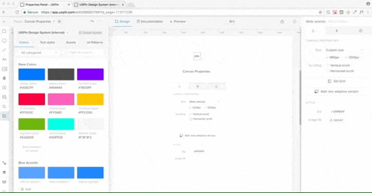
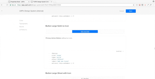
Create an Actionable Library of StylesStart with the most prevalent design elements – text styles and color palettes.
UXPin lets you pull color palettes and text styles directly from your design projects and save them in a shared Design Systems Library–an actionable toolkit for your product’s design system.
UXPin’s Design System Library allows the design system manager to set permissions to maintain the library’s integrity and minimize the temptation of introducing yet another typeface or shade of gray.
To add every color or text style, select layers in Sketch or UXPin, and UXPin will pull the proper styling and add it to the system. All these styles always stay in sync with the library in UXPin or Sketch, which makes for a living, dynamic system beyond static documentation.
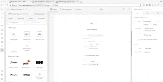
 Create an Actionable Library of Assets
Save your graphic design assets and share them with your colors and text styles–i.e., logos, approved stock photos, or icon libraries.
You can save all these in the Design Systems Library, which your entire team can access–keeping your design toolkit and repository in one centralized platform.
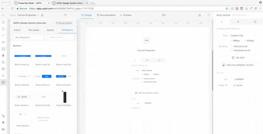
Create an Actionable Library of PatternsMost importantly, you create, save, and share your design system’s components and patterns, including those pulled from Sketch. You can add interactivity and animations so designers don’t have to recreate them at the beginning of a project–saving countless hours of setup time.
 Generate a System and Keep it in Sync
 Having a library of shared assets is an excellent first step, but it’s not enough to solve the problem of scaling software development.
Most solutions stop here and don’t move toward development. We’ve decided to go all the way.
In UXPin Design Systems, all the colors, text styles, assets, and patterns become a living system with one click. When you add new patterns, text styles, assets, or colors, UXPin automatically updates your design system and generates documentation. These changes are immediately available to all team members and stakeholders.
Add Documentation for DevelopersOnce you’ve built your system, you can add documentation, including code snippets for patterns and components. Developers can view this documentation with prototypes and mockups, keeping style guides, assets, and instructions in one platform for smoother, faster design handoffs.
 Make Documentation Actionable
Design system documentation shouldn’t just be a reference document. It must be where the action is – inside the design projects.
With UXPin, your design system documentation follows your projects.
When you deliver a new release, UXPin automatically generates documentation from the product’s design system, including markup, imports, names of Javascript components, etc
 Scaling Design Systems With UXPin Merge
UXPin’s Design System Libraries take you from stage one to three in design system maturity. The final stage is syncing design and development to create a fully integrated design system where designers and engineers share one component library–a single source of truth.
And that’s where UXPin Merge comes in.
Merge imports code components from your design system’s repository as visual design elements designers can use to build prototypes using a simple drag-and-drop workflow.
Merge components render on UXPin’s canvas exactly as they do in the repository, allowing designers to build fully functioning prototypes indistinguishable from code.
This high degree of fidelity and code-like functionality enables design teams to get meaningful, actionable feedback from usability testing and stakeholders who can interact and engage with prototypes as they would the final product.
Single source of truthMerge also significantly enhances the product development process by centralizing the design system’s management and distribution from a single repository–no more managing UI kits and a component library with separate instructions and documentation to maintain.
Any changes to the repository automatically sync to UXPin, notifying teams of the update. With UXPin’s Version Control, designers can choose which projects to update and even revert to earlier design system releases when needed.
Teams can use Merge Design System Documentation or Storybook’s Docs (for Merge Storybook Integration) to manage documentation for all team members, simplifying one of the most time-consuming governance and maintenance procedures.
Scaling and streamlining with PatternsUXPin’s Patterns enable design teams to create new patterns and templates by combining Merge components. They can use elements from the design system or combine components from other design systems.
UXPin’s Patterns are also helpful for saving multiple versions or states of a component, template, or screen, allowing designers to swap out and try different variations during testing or feedback sessions with stakeholders. These “on-the-fly” changes allow designers to iterate faster and maximize valuable testing time.
Start your design system journey with the world’s most sophisticated design systems platform, with tools and features for every stage of maturity. Get access to this revolutionary technology. Visit our Merge page.
Discover MergeThe post Creating a Design System in UXPin – The 3-Minute Guide appeared first on Studio by UXPin.
April 26, 2023
Advice to New Design System Managers from 5 Experts
We sat down with five experts to gather insights and advice new Design Systems Managers should consider when taking on a design system position.
Introducing our five collaborators for this article:
Nina Jurcic is a Product Design Manager and Advisor with expertise in managing efficient Design Systems and design teams.Nicolas Chatelain is a Design System Designer in the DesignOps team at Orange. Nicolas is involved in growing DesignOps communities (DesignOps Assembly) and mentoring at ADPlist.Anie Silva Chiba is a UX Design Manager with a strong experience in wireframing, prototyping, and design management.Justyna Piwowarska is a Design Lead at Klarna and currently leads its Design System Team.Rikard Nilsson led Klarna’s Design System Team before Justyna for two years and is now a Senior Product Manager at Checkly.This article was a collaborative effort with the experts and UXPin’s team. UXPin Merge is a code-based design technology bridging the gap between design and development by syncing your design system’s repository to UXPin’s design editor–creating a single source of truth across design, product, and development. Visit our Merge page for more details.
Reach a new level of prototypingDesign with interactive components coming from your team’s design system.
Discover UXPin Merge .discover-merge { margin: 40px 8px;}.discover-merge__container { display: flex; max-width: 690px; height: 200px; padding: 20px; padding-left: 24px; border-radius: 4px; background-color: black; box-shadow: 10px 10px #9999ff; align-items: center; justify-content: space-between;}.discover-merge__left { width: 50%;}.discover-merge__left p { margin: 10px 0px !important; color: white !important; font-size: 18px !important;}.discover-merge__heading { font-weight: bold !important; color: white !important; font-size: 18px !important;}.discover-merge__text { margin: 0 !important; line-height: 22px !important;}.discover-merge__button { width: 174px; height: 44px; margin: 10px 0px; border: none; border-radius: 2px; background: white; color: black; font-size: 16px; text-align: center;}.discover-merge__button:hover { cursor: pointer;}.discover-merge__image { max-width: 320px !important; height: 200px; margin-right: -19px;}@media (max-width: 760px) { .discover-merge__container { height: auto; margin: 10px; align-items: left; }}@media (max-width: 500px) { .discover-merge__container { flex-direction: column; } .discover-merge__left { width: 100%; align-items: normal; }}Understand the Role and ResponsibilitiesNina Jurcic pointed out that “a design system manager acts as a bridge between design, engineering, and product teams. They must manage relationships and safeguard priorities for cross-functional collaboration to thrive.”
Interdisciplinary backgroundNina Jurcic also directed our attention to the fact that “ideally, [a Design System Manager] should come from a technical, interaction design, or interdisciplinary product background.” She also revealed that “if you are strong in one of these areas, you need a sparring partner who is strong in the other — in my case, that was a front-end lead.”
This interdisciplinary skillset provides a comprehensive understanding of the needs and challenges of UX designers, developers, and product teams.
“When you are a Design System Manager, you are simultaneously a UX Researcher, an excellent communicator, a trainer, an entertainer, a sensitizer, a UI Designer…” – Nicolas Chatelain.
Effective communicationDesign System Managers must be able to communicate on multiple organizational levels, from executives to end-users. They must understand the needs of stakeholders, designers, product teams, and developers to facilitate communication and collaboration effectively.
“Speaking the same language and aligning vocabulary is important to streamline communication and understanding. Avoid trending terms and use those familiar to the team.” – Anie Silva Chiba.
Informed decision-makingA well-rounded understanding of a product’s design and technical aspects is crucial for making informed decisions when prioritizing features, setting goals, and making trade-offs during the design system development process.
Problem-solvingDesign System Managers must solve problems across several disciplines and multiple levels. An interdisciplinary knowledge base helps identify and solve issues related to design and development, ensuring that the design system addresses the challenges faced by the teams using it.
AdaptabilityDesign System Managers will need the knowledge and experience to adapt to an ever-changing landscape of digital products and technologies. They must be able to react to these changes and implement updates to keep the design system relevant.
Operational and strategic skillsNew design system manager’s role demands operational skills and having a broad view of what’s going on.
“Much of your day-to-day work will be similar to that of a Product Owner or Product Manager — managing the day-to-day operational aspects such as gathering requirements, writing tickets, and prioritising” – revealed Nina Jurcic, Product Design Manager and Advisor – “And while you’ve got one foot in the present, you should ideally be two steps ahead of the other product teams, anticipating their future needs and requirements and incorporating them into your roadmap and strategy.”
Shift Mindset to Internal ProductsDesign systems are different from consumer-facing products. Managers must understand that they will focus on enabling product teams to iterate faster and build more confidently.
“An internal product does not have the hard metric of revenue directly tied to it – you are the enabler that allows product teams to iterate faster and build with more confidence, but it will be difficult to show in revenue terms how much you and your team are contributing.” – Justyna Piwowarska and Rikard Nilsson.
Here are some key points from our experts on an internal product mindset shift.
Value measurementUnlike consumer-facing products, which use revenue metrics, measuring ROI for internal products like design systems is difficult. Design system managers must focus on the indirect value their work delivers, notably:
Increasing efficiencyReducing design and development timeImproving consistency across product teamsUser proximityWorking on internal products means design system managers have direct user access–their colleagues. This proximity gives DS managers a significant benefit over consumer-facing products giving them more effective communication and feedback loops. They can use this proximity better to understand user needs, pain points, and expectations.
“What you will have, though, is direct access to all of your users, which is a superpower if managed well. Talk to your users weekly or daily if you can.” – Justyna Piwowarska and Rikard Nilsson.
Governance and diplomacyAs design system managers interact with various stakeholders, they must navigate the complexities of internal politics diplomatically. DS managers must be confident to say “no” to requests that do not align with the design system’s strategy or objectives while maintaining positive relationships with their colleagues.
Iterative and incremental growthInternal products, like design systems, benefit from an iterative and incremental approach to development. Starting small and focusing on the most critical components allows for manageable growth and easier maintenance. This gradual expansion also enables the design system to evolve alongside the organization’s needs and priorities.
Focus on maintainabilityDesign systems require ongoing maintenance to remain effective; conversely, consumer-facing products will have more distinct release cycles. DS managers must prioritize maintainability when creating components and guidelines. This prioritization ensures efficient updates and improvements without disrupting product teams and schedules.
Start Small and Expand SlowlyStarting small and expanding slowly is crucial for building a functional foundation before adding complexity to your design system. This incremental approach ensures the core elements of the design system are well-established and scalable, making it easier to build upon them as the system grows.
“By starting small, you have a better chance of getting it right, and then you can add complexity as you go.” – Nicolas Chatelain, Design System Designer at Orange.
Begin with a limited set of componentsFocus on the most commonly used components and patterns, ensuring these are well-designed, documented, and functional. This solid base allows product teams to use the design system as soon as possible while providing a solid foundation to scale.
“A Design System is not only made of visuals and code. Remember that products have communication in their essence, the standards that guarantee the coherence of speech with the brand (Tone and Voice). The writing team must participate in this process from the beginning, setting the standards for text structure, hierarchy, capitalization, verb tenses, and other items intrinsic to the field.” – Anie Silva Chiba, UX Design & DesignOps Manager.
Incremental improvementsApply Gall’s Law: complex systems that work evolved from simpler systems that worked. Gradually refine and expand your design system, making improvements and adding complexity only when necessary.
Monitor usage and feedbackMonitor your design system closely and how product teams use it. Ask for regular feedback on which components are most valuable, and you must prioritize for expansion.
“Remember, the Design System is not a product under the exclusive responsibility or management of the design team.” – Anie Silva Chiba, UX Design & DesignOps Manager.
Be mindful of organizational needsAs the design system grows, ensure that it aligns with the overall goals and requirements of the organization. This alignment involves adapting the system to accommodate new products, features, or design trends.
Avoid over-engineeringWhen expanding the design system, focus on practical solutions rather than creating overly complex components or patterns. This focus on practicality will make it easier for product teams to adopt and utilize the design system effectively.
Get Buy-In and SponsorshipGetting buy-in and sponsorship is essential to ensure the success of new design systems. Acquiring this support involves convincing stakeholders and higher-ups within the organization about the design system’s value and ROI.
“To get started, you need a champion – someone in the organization who understands the importance of a design system and is willing to provide sponsorship and support. Your first task is to secure this sponsorship and build a case.” – Nina Jurcic, Product Design Manager & Advisor.
“Once you have the green light and key stakeholder support, you can assemble a balanced team with diverse skills and industry insights to start working on the design system,” Nina added.
Involve Stakeholders and UsersInvolving stakeholders and users is crucial for the success of a design system. When design system managers actively engage with their stakeholders and users, they can better understand their needs, expectations, and potential challenges. This involvement ensures the design system remains relevant, valuable, and user-centered.
“Not everyone will immediately see its value and potential, and that’s okay. Take the time to get to know your stakeholders and bring them on board – establish a regular operating rhythm to keep them informed or involved as needed. In the early stages, spend more time listening than talking.” – Nina Jurcic, Product Design Manager & Design System Expert.
Here are some ways to involve stakeholders and users:
Regular communication: set up communication channels (Slack, email, etc.) for stakeholders and users, and create regular meetings, status updates, or progress reports to keep everyone informed.Workshops and training: Organize workshops, training sessions, or demos for users and stakeholders to familiarize them with the design system, gather feedback, and encourage adoption.Collaborative decision-making: Involve stakeholders and users in important decisions related to the design system, such as prioritization of components, design decisions, and setting milestones.Encourage contributions: Allow users to contribute to the design system by adding new components, improving existing ones, or updating documentation. This involvement turns users into creators, fosters a sense of ownership, and ensures that the design system remains relevant and valuable to all teams.Resources for New Design System ManagersDesign Systems: Step-by-Step Guide to Creating Your OwnDesignOps 101: Guide to Design OperationsUX Business Case – How to Build a Strong Case for Investing in DesignAdopting Design System with Delivery Hero (talabat)11 Powerful Lessons on Building and Scaling an Enterprise Design SystemTop 3 Design System StructuresContent Design System – Do You Need It?Free Report on Design Systems and DesignOps in the EnterpriseDesign System Maintenance – How to Keep Design System Up to Date?Accelerate design system maturity and create a single source of truth from day one with UXPin Merge. Visit our Merge page for more details and how to request access.
Discover MergeThe post Advice to New Design System Managers from 5 Experts appeared first on Studio by UXPin.
April 25, 2023
UI Design for Developers – Beginner’s Guide and Tips

UI developers play a vital role in a digital product’s usability, intuitiveness, and performance.
“UX designers have zero control over UX delivered to users but 100% accountability. Engineers have zero accountability for UX delivered to users but 100% control.” Erica Rider, UX Lead EPX at PayPal
Understanding user interface design principles, user experience, and user-friendly design is a strategic advantage for engineers. They can anticipate potential issues and ensure they solve these to avoid debt, redesigns, and friction with design teams. This advantage means product development teams can ship high-quality products faster, with fewer errors, at lower costs.
UXPin Merge is a developer-friendly design tool for prototyping and testing UIs using code components from a design system repository. Visit our Merge page for more details and how to request access.
Reach a new level of prototypingDesign with interactive components coming from your team’s design system.
Discover UXPin Merge .discover-merge { margin: 40px 8px;}.discover-merge__container { display: flex; max-width: 690px; height: 200px; padding: 20px; padding-left: 24px; border-radius: 4px; background-color: black; box-shadow: 10px 10px #9999ff; align-items: center; justify-content: space-between;}.discover-merge__left { width: 50%;}.discover-merge__left p { margin: 10px 0px !important; color: white !important; font-size: 18px !important;}.discover-merge__heading { font-weight: bold !important; color: white !important; font-size: 18px !important;}.discover-merge__text { margin: 0 !important; line-height: 22px !important;}.discover-merge__button { width: 174px; height: 44px; margin: 10px 0px; border: none; border-radius: 2px; background: white; color: black; font-size: 16px; text-align: center;}.discover-merge__button:hover { cursor: pointer;}.discover-merge__image { max-width: 320px !important; height: 200px; margin-right: -19px;}@media (max-width: 760px) { .discover-merge__container { height: auto; margin: 10px; align-items: left; }}@media (max-width: 500px) { .discover-merge__container { flex-direction: column; } .discover-merge__left { width: 100%; align-items: normal; }}The Importance of User Experience and UI Consistency for DevelopersDevelopers may want to focus primarily on the technical aspects of their work. However, it is crucial to understand that the user experience and user interface consistency are integral to a digital product’s success.
One of the most significant consequences of poor UX is the accumulation of UX or technical debt. When development teams prioritize short-term gains, such as rapid deployment, over long-term considerations, such as usability and maintainability, accumulated technical debt leads to increased maintenance costs, reduced development velocity, and an overall decline in product quality.
User-friendly products are vital for user satisfaction, engagement, and retention. A well-designed user interface that caters to users’ needs and expectations can make the difference between retention and abandonment. By understanding and implementing good UI design principles, developers can create products that are not only visually appealing but also intuitive and efficient to use.
When programmers understand UI design principles and user experience, they can collaborate and communicate with design teams more effectively. This mutual understanding fosters a more cohesive and efficient product development process, ensuring design and development goals are aligned.
Fundamental Product Design Principles for Developers Hierarchy refers to the arrangement of design elements in order of importance, guiding the user’s attention through the interface. For example, using larger fonts for headings and smaller fonts for body text helps users easily distinguish between different sections.Contrast involves using different colors, sizes, or shapes to distinguish between elements and make them stand out. For instance, using a bold color for call-to-action buttons helps them stand out against the background and attract users’ attention.
Consistency
means maintaining a uniform look and feel across your interface, including colors, fonts, and design elements. For example, using the same button style and color throughout your application ensures a cohesive and predictable user experience.Alignment refers to the placement of elements relative to each other or a common baseline, creating a sense of order and visual harmony. For example, vertically aligning form labels and input fields makes the form appear organized and easy to read.Proximity is the principle of grouping related elements to establish a relationship. For example, placing a label directly above or beside its corresponding input field helps users understand which label belongs to which field.Balance involves distributing elements evenly in your layout, using symmetry or asymmetry to create visual stability. For example, a two-column layout with equal column widths and similar amounts of content creates a balanced and visually appealing interface.
Usability
and accessibility focus on making your interface easy to use and understand, while accessibility ensures that people with disabilities can access and interact with your product. For example, providing clear navigation, descriptive labels, and adhering to color contrast standards can improve both usability and accessibility.Key UI Design Terms and Concepts
Hierarchy refers to the arrangement of design elements in order of importance, guiding the user’s attention through the interface. For example, using larger fonts for headings and smaller fonts for body text helps users easily distinguish between different sections.Contrast involves using different colors, sizes, or shapes to distinguish between elements and make them stand out. For instance, using a bold color for call-to-action buttons helps them stand out against the background and attract users’ attention.
Consistency
means maintaining a uniform look and feel across your interface, including colors, fonts, and design elements. For example, using the same button style and color throughout your application ensures a cohesive and predictable user experience.Alignment refers to the placement of elements relative to each other or a common baseline, creating a sense of order and visual harmony. For example, vertically aligning form labels and input fields makes the form appear organized and easy to read.Proximity is the principle of grouping related elements to establish a relationship. For example, placing a label directly above or beside its corresponding input field helps users understand which label belongs to which field.Balance involves distributing elements evenly in your layout, using symmetry or asymmetry to create visual stability. For example, a two-column layout with equal column widths and similar amounts of content creates a balanced and visually appealing interface.
Usability
and accessibility focus on making your interface easy to use and understand, while accessibility ensures that people with disabilities can access and interact with your product. For example, providing clear navigation, descriptive labels, and adhering to color contrast standards can improve both usability and accessibility.Key UI Design Terms and Concepts Typography
Typography is a crucial aspect of UI design that involves selecting and organizing typefaces, sizes, and spacing to create a visually appealing and easily readable interface.
For frontend developers, understanding typography means considering factors such as font choice, hierarchy, and legibility to ensure that the text is visually appealing, effectively communicates the content, and supports the overall user experience.
Color palettes and theoryColor theory is the study of how colors interact and influence one another and the emotions and perceptions they evoke. In UI design, color helps guide users’ attention, convey information, and create a cohesive visual experience.
Frontend developers should understand the basics of color theory, such as the color wheel, color harmony, and color psychology, to create visually appealing interfaces that support the desired user experience.
Design process stagesA UX design process is an iterative step-by-step methodology UX teams use to complete projects. These steps vary depending on the product and organization:
Discovery: In this stage, designers and developers gather information about project requirements, user needs, and business goals.Define: After gathering insights, the team defines the project’s scope, objectives, and user personas.Ideation: In this creative phase, designers brainstorm and explore multiple design concepts and ideas.Design: Designers create detailed mockups and prototypes of the user interface based on the chosen concept.Prototype: Designers build high-fidelity prototypes that look and function like the final product.Test: Design teams test prototypes with end-users and stakeholders to iterate on feedback and enhance designs.Design Handoff: Designers deliver wireframes, mockups, prototypes, documentation, and assets to engineers for development.UX audit: Design teams evaluate the release to ensure it meets design specifications and doesn’t introduce usability issues.Grid systemsGrid systems provide a structured layout for organizing design elements consistently and logically. They help maintain alignment, balance, and proportion across an interface.
Frontend developers can leverage grid systems to develop well-structured layouts that are easy to navigate, create balance, and use screen real estate efficiently, ultimately enhancing the user experience.
Responsive designResponsive design ensures interfaces adapt to different screen sizes and devices automatically, providing users with an optimal viewing and interaction experience.
While most frontend developers are well aware of responsive design techniques, such as fluid grids, flexible images, and media queries, it’s essential to understand how these concepts impact usability and accessibility to ensure user interfaces support all users.
User flows and navigationUser flows describe the steps users take to complete a task or achieve a goal within an interface. Effective user flows, and navigation structures guide users through these steps with ease and efficiency.
Frontend developers must understand and implement clear and intuitive navigation systems, considering factors like information architecture, breadcrumbs, and menu design, to ensure a seamless and enjoyable user experience.
Design patterns and componentsDesign patterns are reusable solutions to common UI design challenges, while components are the building blocks of an interface, such as buttons, input fields, and cards.
Frontend developers should be familiar with standard design patterns and the usability cases these UI elements solve. This comprehension will help devs know the correct UI patterns to apply when solving usability issues.
UX metrics in UI designUX metrics are measurable values that help assess the effectiveness and quality of a user interface. Common UX metrics include quantitative measures, such as page load times, click-through rates, and task completion times, as well as qualitative measures, like user satisfaction and perceived ease of use.
Frontend developers must understand and track relevant UX metrics to make data-driven design decisions and continually optimize and improve the user experience.
Making Informed Design Decisions Importance of collaboration between designers and developers
Effective collaboration between designers and developers is crucial for creating successful user interfaces. This partnership streamlines the design handoff process, ensuring that both parties clearly understand the project’s goals and requirements.
For example, a close collaboration can create an interface where the designer’s vision is accurately translated into code, resulting in a seamless user experience that meets aesthetic and functional expectations.
Understanding the design feedback loopThe design feedback loop is an iterative process that involves implementing design changes, gathering user feedback, and making further refinements based on that feedback.
For example, after implementing a new feature, developers can request user feedback through surveys or usability testing from design teams and make necessary UI adjustments, resulting in a more user-centered design.
Balancing aesthetics and functionalityStriking the right balance between aesthetics and functionality is crucial for creating a successful user interface. While visually appealing designs make a positive impression and enhance brand perception, they should not compromise usability or accessibility.
For example, a visually stunning website with unconventional navigation elements may initially impress users, but if it’s not intuitive, they will leave the site frustrated by the poor user experience.
Improving UI consistency with design systemsDesign systems help improve UI consistency by providing standardized guidelines, components, and patterns. Developers can leverage a design system to ensure their user interfaces maintain a coherent visual design language and adhere to established best practices, leading to a more efficient development process and a better user experience.
For instance, a design system can prevent inconsistencies in button styles or navigation elements through reusable code, making it easier for users to understand and interact with the interface while streamlining developer workflows.
Try UXPin Merge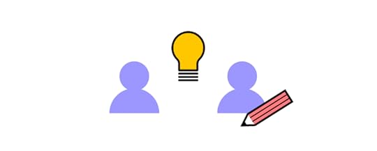
UXPin Merge is a collaborative design tool that makes high-fidelity prototyping and testing accessible to design teams and frontend developers.
Unlike image-based tools like Figma, Sketch, or Adobe XD, UXPin is a code-based design tool. Every component on the canvas is powered by HTML, CSS, and Javascript on the back-end, creating a more accurate environment for digital product design while providing familiarity for devs.
TeamPassword’s two-person developer team uses UXPin Merge to prototype and test user interfaces before shipping releases. Before, the team would prototype and test in code or simply ship releases to save time, resulting in UI inconsistencies and usability issues–not ideal when managing company passwords!
TeamPassword adopted a custom version of the open-source MUI design system which helped solve most foundational UI design principles, including accessibility. This foundational usability enables the team to prototype, test, and ship releases faster, with significantly better consistency and quality.
TeamPassword’s developers have complete control over their React UI library, patterns, templates, and layouts, which sync from the design system’s repository to UXPin Merge. Any changes they make to the repo automatically sync to UXPin, creating a single source of truth across design and development.
Streamline your product development and create better collaborations between design and engineering teams with UXPin Merge. Visit our Merge page for more details and how to request access.
Discover MergeThe post UI Design for Developers – Beginner’s Guide and Tips appeared first on Studio by UXPin.
April 24, 2023
UX Designer Bio Examples and How to Write One Yourself

UX Design is a competitive world. Standing out from the crowd is essential for success. Crafting a compelling UX designer bio is a powerful way to showcase your unique value proposition, share your design philosophy, and present your skills and work experience.
This comprehensive guide explores the best practices for writing an engaging UX designer bio tailored for platforms like resumes, LinkedIn, and personal websites or portfolios. These guidelines and real-life UX designer bio examples will equip you to create a memorable first impression, establish credibility, and set the stage for a successful UX design career.
Stand out from the crowd by featuring final product-like prototypes in your UX portfolio. Try UXPin’s advanced features and build your first interactive prototype. Sign up for a free trial.
Build advanced prototypesDesign better products with States, Variables, Auto Layout and more.
Try UXPin .try-uxpin-banner { margin: 40px 0px;}.try-uxpin__container { display: flex; max-width: 689px; height: 210px; padding: 20px; padding-left: 24px; border: 2px solid black; border-radius: 4px; align-items: center; justify-content: space-between; background-color: white; box-shadow: 10px 10px black;}.try-uxpin__left { width: 54%;}.try-uxpin__left p { margin: 10px 0px !important; color: black !important;}.try-uxpin__heading { font-size: 28px !important; font-weight: bold;}.try-uxpin__text { margin: 0 !important; font-size: 18px !important; line-height: 22px !important;}.try-uxpin__button { width: 135px; height: 44px; background: black; margin: 10px 0px; padding: 10px 20px; border: none; border-radius: 2px; color: white; font-size: 16px; text-align: center;}.try-uxpin__button:hover { cursor: pointer;}.try-uxpin__image { max-width: 320px !important; height: 200px; margin-right: -21px; margin-bottom: -6px;}@media (max-width: 760px) { .try-uxpin__container { height: auto; margin: 10px; align-items: left; }}@media (max-width: 500px) { .try-uxpin__container { flex-direction: column; } .try-uxpin__left { width: 100%; align-items: normal; }}UX Designer Bio ExamplesEntry-Level UX DesignerTypically, an entry-level UX designer has less than two years of experience. They may have recently graduated from a relevant program or have transitioned from another field into UX design.
Jenevieve Ghaly is a junior/entry-level UX designer from Los Angeles. Although Jenevieve has limited experience in UX, she highlights the value her psychology degree has for understanding human behavior:
“Hi! I’m a UX/UI Designer with a background in Psychology, which gives me a unique edge in empathizing with users and improving their experience through design. My research experience has refined my problem-solving skills and user insights. I’m constantly seeking new ways to learn and grow through real-world experiences.
My skills include user experience design, interaction design, user research, collaboration, problem-solving, and organization.
Let’s work together to create a seamless user experience using tools such as Figma/FigJam, Miro, Adobe XD, and Trello.”
Mid-Level UX DesignerA mid-level UX designer typically has between 2 and 5 years of experience. They have a solid foundation in UX design principles and have completed multiple projects, demonstrating their skills and ability to work independently or within a team.
Sandra Ekpechi is a mid-level UX designer from London, UK. Her bio is succinct while highlighting her core skills and experience:
“Hey there, I’m Sandra 👋🏼
🌐 I’m a user experience designer at MachineMax based in London, UK. Previously a UI/UX designer at EveryFarmer. I optimize business goals by solving human problems through user research and design.
🎨💭 I believe a product is wholesome if different kinds of users feel seen during their interactions with the product. Hence, I am passionate about human psychology, inclusive and accessible design, as well as cross-functional collaboration within teams.
🧩 In my spare time, I love to build legos, cycle, and binge standups on Netflix.”
Senior UX DesignerAn expert UX designer has more than five years of experience and has demonstrated high proficiency in their craft. They may have an extensive portfolio of successful projects, a strong understanding of advanced UX design concepts, and possibly a leadership role or mentorship experience.
Adham Dannaway is an expert UX Designer and Product Designer from Sydney, Australia. We featured Adham’s website in our UX Portfolios article. Adham’s about page showcases his impressive resume with text, case studies, and visual design elements; here is the first paragraph:
“I’m a product designer based in sunny Sydney, Australia. Since 2005, I’ve enjoyed turning complex problems into simple, beautiful and intuitive designs. When I’m not pushing pixels, you’ll find me cooking, gardening or working out in the park.”–we recommend reading his entire bio for inspiration and ideas here.
Other notable UX designer bio examples:
Camryn Manker (portfolio website)Melody Koh (portfolio website)Christopher Wong (LinkedIn)Allison Milchling (portfolio website)Vera Chen (portfolio website)Elisa Volpato (LinkedIn)Importance of a Well-Crafted UX Designer BioA compelling UX designer bio showcases your unique value proposition, highlights your skills and experience, and increases professional opportunities. Your bio must inform potential employers, clients, and peers about your background and explain your design philosophy, problem-solving approach, and personal values.
A UX designer bio aims to create a memorable first impression, establishing your credibility in the field and distinguishing you from other professionals. A well-structured and engaging bio opens doors to networking, collaboration, and career advancement opportunities. Lastly, your bio will be vital in building your personal brand and positioning yourself for success in the competitive UX design landscape.
5 Key Elements of a Compelling Designer Bio Personal brand statement
A personal brand statement concisely captures your unique strengths and value proposition as a UX designer. It should communicate your design philosophy, the problems you solve, and the impact you create in just a few sentences. This statement must hook readers (recruiters, clients, hiring managers, etc.) and encourage them to learn more about your expertise.
Relevant experienceHighlight your relevant experience by showcasing your background in UX design, notable projects you’ve worked on, and the industries or clients you’ve served. Focusing on experiences demonstrating your ability to deliver results and solve design challenges helps establish your credibility and showcases your adaptability in different contexts.
Skills and expertiseEmphasize your core UX design skills and any specialized expertise that sets you apart. Consider including your proficiency in design tools, user research methods, prototyping techniques, graphic design abilities, and familiarity with programming languages or front-end frameworks. Showcasing your technical skills (HTML, CSS, and Javascript), hard skills, and soft skills demonstrates your well-roundedness and ability to contribute effectively to a team or design project.
AccomplishmentsShare your professional accomplishments, such as awards, certifications, or successful projects, to demonstrate your impact in the UX design field and previous organizations. Quantify your achievements using metrics like increased conversion rates or improved user satisfaction scores. Highlighting your accomplishments showcases your ability to drive tangible results and create meaningful user experiences.
Personal values and characteristicsInclude the values and characteristics that make you a unique UX designer. These can be your approach to collaboration, your dedication to user-centered design, or your passion for continuous learning. By sharing your personal traits, you connect with readers on a deeper level and present yourself as a well-rounded professional with a strong sense of purpose.
Tailoring Your UX Bio for Different PlatformsResume
Word count recommendation: 100-150 words
Your resume bio should be concise and focused, summarizing your core skills, experiences, and accomplishments relevant to the job description you’re applying for. It serves as an introduction to your resume and provides a snapshot of your unique value as a UX designer.
Example: If the job posting emphasizes user research skills, highlight your experience conducting interviews, surveys, and usability testing, along with any notable outcomes from those projects.
LinkedInWord count recommendation: 200-300 words
Your LinkedIn bio (About section) offers more flexibility than a resume bio, allowing you to delve deeper into your personal story, experiences, and professional goals. Use this space to showcase your personality and connect with your network on a more personal level. Also, use keywords strategically in your About section and throughout your LinkedIn bio so you show up in search results.
Example: Share a brief story about what inspired you to become a UX designer or discuss your passion for creating accessible and inclusive digital experiences.
Personal website or portfolio
Word count recommendation: 300-500 words
Your UX design portfolio or website bio offers the most freedom to express yourself and provide a comprehensive overview of your UX design journey. Treat this as a space to share your design philosophy, showcase your thought leadership, and further detail your experiences and expertise.
Example: Explain your unique approach to UX design, such as using empathy to understand user needs or employing iterative design processes to refine and optimize user experiences. You may also create blog posts about your design approach and philosophy–which you can link to from your bio–to establish yourself as an expert or thought leader.
Best Practices for Writing a UX Designer Bio Showcase your unique value proposition
Explain what differentiates you from other UX designers, highlighting your specific skills, background, or niche expertise.
For example: “As a UX designer with a background in psychology, I specialize in creating intuitive and emotionally resonant user experiences for mental health apps.”
Emphasize your design philosophyShare the principles that guide your design process and demonstrate how they shape your work.
For example: “I firmly believe in designing with empathy, putting users at the center of every decision to create products that truly resonate and improve lives.”
Highlight your problem-solving approachDescribe your methods for tackling design challenges and showcase how you have successfully applied them in previous projects.
For example: “Using a blend of data-driven insights and user testing, I develop innovative solutions to complex problems, leading to a 25% increase in user satisfaction in my last project.”
Quantify your achievementsUse specific UX metrics to demonstrate the tangible impact of your work, highlighting your ability to deliver results.
For example: “I have successfully led the redesign of 10+ mobile apps, resulting in a 35% average increase in user engagement and a 20% reduction in churn rate.”
Demonstrate your ability to work in a teamShare examples of your teamwork, collaboration, and communication skills to illustrate your value as a team player.
For example: “As a team lead, I foster a collaborative environment, working closely with developers, product managers, and stakeholders to ensure seamless execution of user-centered design solutions.”
Keep your bio concise and engagingWrite a concise bio using active voice and avoiding unnecessary jargon or fluff. A tool like Grammarly can help optimize your bio for grammar, fix sentence structures, and optimize for readability.
For example: “I’m a passionate UX designer dedicated to creating seamless, user-centric digital experiences that drive engagement and improve lives.”
Updating your bio regularlyRegularly review and update your bio to reflect your latest skills, experiences, certifications, and accomplishments, ensuring it stays current and accurately represents your professional growth.
For example: “I’ve recently completed Content Design London’s Advanced Content Design course, which has enhanced my expertise in creating user-centered content for digital platforms. This new skill set will enable me to deliver more effective UX design solutions that cater to diverse user needs.”
Showcase Your UX Skills With UXPinLeverage UXPin’s advanced features to build an impressive portfolio exhibiting your wireframing, mockups, and interactive prototyping proficiency. Using UXPin to create visually engaging, high-fidelity prototypes will demonstrate your ability to bring design concepts to life, effectively communicate your design vision, and showcase your problem-solving skills in real-world scenarios.
Is your current portfolio in Sketch or Figma? Import your projects into UXPin to impress recruiters, clients, and hiring managers with UXPin’s advanced prototyping features. Sign up for a free trial to build your first interactive prototype with UXPin today.
Try UXPin for freeThe post UX Designer Bio Examples and How to Write One Yourself appeared first on Studio by UXPin.
April 21, 2023
Top 5 Prototyping Tools for 2023

Prototyping tools allow you to create a replica of the final product, which design teams use for testing and presenting to stakeholders. Most design tools offer a prototyping as an additional feature, but you will get to an advanced prototyping with dedicated tools.
Prototyping is a crucial part of the design process because it allows UX and product designers to validate ideas and fix usability issues before the product enters the engineering stage. Development is costly, and correcting errors can take time and potentially damage the brand through poor user experience.
Designers use prototypes to test the product comprehensively before handing it off to the developers. So, you need a prototyping tool that can offer as close to the same fidelity and functionality as the final product to perform tests that deliver accurate results.
UXPin is one of the companies leading the code-based design revolution. Sign up for a 14-day free trial to explore UXPin’s advanced prototyping features for your next digital product or web design project.
Build advanced prototypesDesign better products with States, Variables, Auto Layout and more.
Try UXPin .try-uxpin-banner { margin: 40px 0px;}.try-uxpin__container { display: flex; max-width: 689px; height: 210px; padding: 20px; padding-left: 24px; border: 2px solid black; border-radius: 4px; align-items: center; justify-content: space-between; background-color: white; box-shadow: 10px 10px black;}.try-uxpin__left { width: 54%;}.try-uxpin__left p { margin: 10px 0px !important; color: black !important;}.try-uxpin__heading { font-size: 28px !important; font-weight: bold;}.try-uxpin__text { margin: 0 !important; font-size: 18px !important; line-height: 22px !important;}.try-uxpin__button { width: 135px; height: 44px; background: black; margin: 10px 0px; padding: 10px 20px; border: none; border-radius: 2px; color: white; font-size: 16px; text-align: center;}.try-uxpin__button:hover { cursor: pointer;}.try-uxpin__image { max-width: 320px !important; height: 200px; margin-right: -21px; margin-bottom: -6px;}@media (max-width: 760px) { .try-uxpin__container { height: auto; margin: 10px; align-items: left; }}@media (max-width: 500px) { .try-uxpin__container { flex-direction: column; } .try-uxpin__left { width: 100%; align-items: normal; }}UXPinUXPin is a code-based prototyping tool for an end-to-end design workflow. Unlike many leading design solutions, UXPin doesn’t need plugins – everything you need for prototyping and testing is built-in!
UXPin gives you the option to download the software on your desktop (Mac & Windows) or use it in the browser. The benefit of downloading UXPin is that you can continue working even when you’re offline.
You can test prototypes in the browser or use UXPin’s Mirror app to run prototypes on mobile devices (including iOS and Android). UXPin’s documentation is excellent, covering every aspect of the tool with step-by-step instructions and video tutorials.
We’re going to quickly dive into four features that make UXPin’s code-based prototypes far superior to other leading vector-based design tools.
States allow you to different properties for a single element or component based on user and system triggers. A good example is how a button might have four states – default, hover, active, and disabled. Each of these will have separate properties and interactions. States also allow you to create complex components like drop-down menus, accordions, and carousels that function like they would in the final product.
Most prototyping tools feature interactions, but UXPin allows you to take interactivity to the level with a multitude of triggers and immersive transitions and animations. You can even go one step further with Conditional Interactions, which lets you create a dynamic user experience with “if-then” or “if-else” conditions–like validating an email address or password!
With Variables, you can capture information from user inputs and take actions based on that data–like capturing personal information during sign-up and displaying them on their profile page.
Expressions allow you to program Javascript-like functions, so your prototypes can perform form validation, update a shopping cart (and the order total), or ensure a password meets specific security criteria. Designers don’t need to know any code and can set up Expressions with some basic naming and a few clicks!
UXPin also offers a technology called Merge. Merge lets you sync fully coded design system components from a repository to UXPin’s editor.
Designers can build fully-functioning interactive prototypes using the same components used in the final product.
With Merge, you have the option to sync React components via Git repo, npm or use the Storybook integration for other technologies, including Vue, Angular, Web Components, Ember, and more. It’s a truly revolutionary design technology that’s changing how organizations design user experiences for their customers.
FigmaFigma is one of the most widely used design tools. They have a big, engaged community with lots of YouTube content and detailed documentation.
Figma has built-in prototyping functionality with a mobile app to test prototypes on multiple devices. You can work in the browser or download Figma to work offline on your desktop.
While Figma is excellent for creating wireframes and mockups, this tool, like the rest image-based prototyping apps, lacks functionality and fidelity for prototyping. Interactions are limited, and you often have to design several artboards of the same screen to perform functions that UXPin does in a few clicks – like creating a drop-down menu.
Figma’s inputs aren’t functional, so UX researchers can’t test any actions that require users to enter information. You also can’t create dynamic user flows that adapt to user interaction.
Adobe XDAdobe XD is another popular user experience design tool. Unlike Figma and UXPin, Adobe XD doesn’t offer a browser version; you have to download the software to your desktop.
One of the major bonuses of working with Adobe UX is that on the full plan, you get access to 20+ Creative Cloud products, including Photoshop, Illustrator, After Effects, and more. You can also upload projects directly to Behance to showcase your work.
Adobe XD offers built-in prototyping, which runs in the browser, and an app for mobile devices. Unfortunately, XD lacks prototyping functionality and fidelity.
One interesting Adobe UX prototyping feature is Auto-Animate which can help save time for specific interactions. With Auto-Animate, you create the first and last frame of an animation sequence and Adobe XD fills in the rest. The feature doesn’t work for all animations, but it saves a significant amount of time when creating something like a parallax effect.
InvisionInvision offers a suite of UX tools from conceptualization to design and prototyping. Invision’s UI and functionality are very similar to Figma or Adobe XD. Like Adobe XD, Invision only works as a desktop application.
Invision’s prototypes are similar to Figma in that they look great but don’t offer functionality that mirrors the final product.
Invision has a similar feature to Adobe’s Auto-Animate called Motion. Motion is an impressive feature that automates some work but doesn’t offer your prototypes real value or fidelity.
Invision’s DSM (Design System Management) is handy for managing your design system and providing developers with CSS and starter code at handoffs. DSM integrates with Storybook so that designers and developers can sync their design systems. Unfortunately, designers can’t use the code components to build prototypes like you can with UXPin Merge.
FramerFramer’s biggest selling point is the speed at which designers can build website’s user interfaces and reduce repetitive tasks. Essentially a rapid prototyping tool.
Notable features include Layout and Insert Menu, which allow you to design and iterate concepts fast. Although impressive, UXPin offers similar features with Auto-Layout and built-in design libraries.
Framer’s Smart Components feature offers similar functionality to UXPin’s States, but not as comprehensive. Using Variants and Variables, you can give elements a hover or pressed state, like toggling a switch or activating a checkbox.
While Smart Components is a step up from other vector-based design tools, it still doesn’t give you as much fidelity as you get from UXPin’s States, Interactions, Expressions, and Variables features.
More Design Tool ComparisonsCheck out more popular prototyping tools and how they stack up against UXPin:
Marvel AppJustinmindProto.ioAxureZeplinBalsamiqWould you like to try UXPin?If you’re looking for a design tool, there are plenty (including the five listed above) that designers can use to create beautiful low-fidelity wireframes and mockups.
But designing a user experience requires testing, which means you need high-fidelity prototypes, not mockups! UX designers design products for coded products but conduct user testing on image-based prototypes. It’s impossible to get accurate and meaningful results. Invariably there will be usability issues that make their way into the final product.
With code-based tools like UXPin, designers can build functioning high-fidelity prototypes. Usability participants don’t have to “imagine” that a button or input works; they can use it as they would with a final coded product.
Join the user experience design revolution. Sign up for a 14-day free trial and discover better prototyping and testing with UXPin.
Try UXPin for freeThe post Top 5 Prototyping Tools for 2023 appeared first on Studio by UXPin.
UXpin's Blog

- UXpin's profile
- 68 followers

