
UXpin's Blog, page 42
March 20, 2023
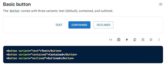
7 Pricing Page Examples and Design Lessons that Come with Them
An effective pricing page is crucial for highlighting your value proposition and increasing conversions. Designing a pricing page requires a clear understanding of your potential customer’s problems and using the correct UI elements and content to show your product is the solution.
We’ve reviewed seven leading organizations to see how these companies use design to create high-converting pricing landing pages. We also explore different pricing models you might want to copy from companies like Google, Asana, Hubspot, and Mailchimp.
Design high-converting pricing pages with fully functional onboarding flows in UXPin. Explore UXPin’s advanced design and prototyping features. Sign up for a free trial.
Build advanced prototypesDesign better products with States, Variables, Auto Layout and more.
Try UXPin .try-uxpin-banner { margin: 40px 0px;}.try-uxpin__container { display: flex; max-width: 689px; height: 210px; padding: 20px; padding-left: 24px; border: 2px solid black; border-radius: 4px; align-items: center; justify-content: space-between; background-color: white; box-shadow: 10px 10px black;}.try-uxpin__left { width: 54%;}.try-uxpin__left p { margin: 10px 0px !important; color: black !important;}.try-uxpin__heading { font-size: 28px !important; font-weight: bold;}.try-uxpin__text { margin: 0 !important; font-size: 18px !important; line-height: 22px !important;}.try-uxpin__button { width: 135px; height: 44px; background: black; margin: 10px 0px; padding: 10px 20px; border: none; border-radius: 2px; color: white; font-size: 16px; text-align: center;}.try-uxpin__button:hover { cursor: pointer;}.try-uxpin__image { max-width: 320px !important; height: 200px; margin-right: -21px; margin-bottom: -6px;}@media (max-width: 760px) { .try-uxpin__container { height: auto; margin: 10px; align-items: left; }}@media (max-width: 500px) { .try-uxpin__container { flex-direction: column; } .try-uxpin__left { width: 100%; align-items: normal; }}What Should a Pricing Page Include?
A pricing landing page must communicate your product’s value while building trust and credibility with potential customers. Here are six things to consider when designing pricing pages.
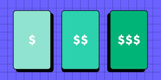
Clear pricing & descriptionsEach plan must include straightforward pricing and descriptions so that customers can compare options, make a decision, and take action. If your pricing is confusing, forcing customers to do math or overthink, there’s a good chance they’ll leave and find a competitor.
Call-to-Action ButtonCTAs must be prominent and explicit. For example, is the user buying a plan or contacting sales? Many enterprise products require demos and onboarding, meaning users can’t simply purchase a plan and start using the service. Using explicit language for CTAs provides transparency while managing expectations.
Some examples include:
Buy Now/Get StartedStart Free TrialContact SalesSubscribePricing tableA pricing table or comparison chart is essential for offering multiple plans. These tables allow potential customers to compare pricing options and relevant features to decide which plan best meets their needs.
For example, an email marketing software provider may offer 1,000 subscribers on the Basic Plan and 5,000 on its Standard Plan. A comparison table lets customers quickly decide which option is better according to their database–and what they can expect to pay as they scale.
Curious about designing tables? Read: Table UX Design Best Practices
Payment optionsPayment options are another vital question pricing pages must answer. You can include these below your comparison table in an FAQ section with answers to other common questions.
Trust indicatorsTrust indicators like testimonials, reviews, and other social proof help build legitimacy and trust. These indicators are particularly beneficial when they mention numbers and data. Testimonials from reputable organizations strengthen your product’s credibility, resulting in higher pricing page conversion rates.
Terms and conditionsHighlighting key points from your terms and conditions provides transparency and trust. Refunds and cancellations are two critical deciding factors. Alleviating these concerns in plain language helps manage expectations so potential customers can make an informed buying decision.
7 Best Pricing Page ExamplesSemrush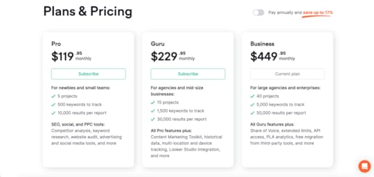
Keyword research tool Semrush (see Semrush’s pricing page) uses a clean black text on white background layout for its pricing page. The vibrant green buttons and large pricing stand out, so visitors don’t have to read or scan to find them–allowing for faster decision-making.
Semrush uses a switcher for users to quickly see the difference between paying annually or monthly. The designers also highlight the saving in a secondary color, so users don’t have to calculate the discount.
This SaaS pricing page from Semrush is an excellent example of using visual hierarchy, color, and spacing to make content easy to scan and digest quickly.
Asana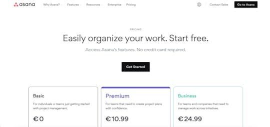
Asana’s pricing page captures users’ attention with free signup and “No credit card required” to access all features, followed by a “Get Started” call-to-action button.
This is an excellent strategy to get potential customers to use your product immediately with no risk, and the copy reflects that. Additionally, the platform uses a freemium model, so people can use Asana until they’re ready to use the premium features.
Freemium pricing models are an excellent way for users to use your product without risk or obligation. As the tool integrates into their daily workflow, they are less likely to leave, increasing the likelihood of converting to a paid plan as their needs grow. Thus, the design prioritizes this business decision.
Help Scout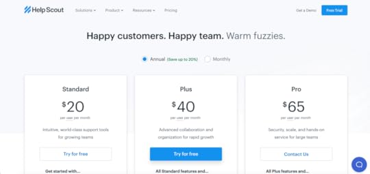
Help Scout’s pricing page highlights the brand’s core message of helping people–perfect for a customer service SaaS platform. The simple three-tier pricing table highlights the company’s best plan with a bright blue button, utilizing color to their best advantage.
Help Scout uses two radio buttons for users to switch between annual and monthly pricing and highlights the 20% saving for the annual payment (Learn more about persuasive design patterns.)
Help Scout also follows the rule of third in their pricing page table design. They show you three different plans, and it is only below the table that they mention offering special plans for nonprofits.
Help Scout is a Certified B Corporation, planting a tree for every new customer. This environmentally-friendly commitment makes customers feel good about their buying decision, strengthening Help Scout’s brand of helping people.
Psychology and UX design have their overlapping areas. Learn more about it in the article: Should UX designers be aware of psychology?
Google Workspace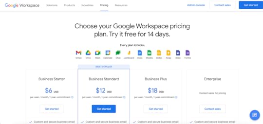
Google Workspace’s pricing page announces the platform’s 14-day trial in the heading and pricing models in the subheading. Adding these pricing options high on the page outside of the tables makes it easy for users with screen readers to get pricing fast. This pricing introduction is an excellent example of accessibility benefiting all users, as everyone can read and understand Google Workspace’s pricing instantly.
Google uses icons with text to showcase what customers get with every plan, allowing people to decide without scrolling. The pricing page also highlights the “MOST POPULAR” plan, with a bright blue “Get started” call-to-action button.
Another excellent user-friendly feature is the sticky secondary header keeping the four pricing plans and CTAs visible as users scroll down the comparison table. Users never have to scroll up to remember which plan they’re viewing and can take action as soon as they decide.
Mailchimp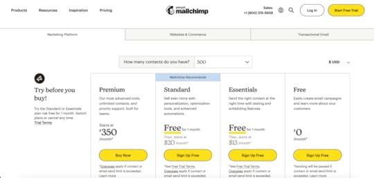
Mailchimp’s pricing page features three product categories and multiple plans within each. Designers use tabs below the header to separate the three categories, keeping the UI clean and easy to read.
Mailchimp displays two dropdowns above the pricing table, one for the number of contacts and a second currency switcher, which is a great thing to replicate if you create multiregional UX experience.
This layout from Mailchimp is an excellent example of understanding what users need and fitting a complex pricing model above the fold so they don’t need to scroll to make a buying decision.
Hubspot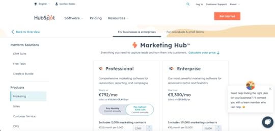
Hubspot’s pricing page is another example of a complex yet user-friendly pricing design. Like Mailchimp, Hubspot’s designers have done an excellent job of keeping everything on one page with the most crucial information above the fold.
Hubspot uses two tabs below the header to separate pricing categories for enterprise vs. small businesses/individuals. A left sidebar shows Hubspot’s bundles and the company’s five products with a currency switcher.
Hubspot offers three pricing models:
Annual commitment pay upfrontAnnual commitment pay monthlyMonth-to-monthHubspot also gives users more control with an option to create a custom bundle and purchase specific add-ons depending on their needs.
Simplified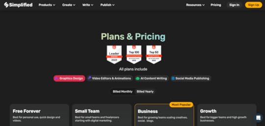
Simplified uses awards and social proof from real users, including social media posts, to demonstrate the product’s success. Like Google Workspace, the pricing page shows what every plan includes above the pricing table.
A switcher enables customers to view pricing billed monthly vs. yearly. When yearly is selected, a new UI element appears on each table showing the relevant discount.
Simplified’s four pricing tiers provide a “Best for…” below each plan, allowing users to understand which option best suits their needs–i.e., personal use, small teams, growing teams, and high-growth. This detail is helpful as it answers “which one is right for me?” You can easily replicate this by addressing your plans to your user personas.
Pricing Page Prototype With UXPinYour website’s pricing page is the most crucial web page. Designers must use buyer personas when designing pricing pages to understand what users need to make a buying decision.
With UXPin’s advanced prototyping features, designers can build prototypes that accurately replicate the pricing page experience, including complex UI components and interactivity.
Use States to create monthly/yearly pricing switchers, tabs for multiple pricing categories, component states, and much more.With States and Variables, you can create a fully functioning stepper to show pricing when users increase/decrease seats, contacts, etc.Keep user interfaces clean by hiding less critical content like FAQs behind accordions.Create dropdown menus for users, CRM contacts, currency switchers, etc.In addition to pricing pages, designers can prototype the onboarding user experience with fully functioning signup forms and APIs. With UXPin’s advanced prototypes, designers can identify potential roadblocks while discovering valuable business opportunities during the design process. Try UXPin for free.
Try UXPin for freeThe post 7 Pricing Page Examples and Design Lessons that Come with Them appeared first on Studio by UXPin.


March 17, 2023
5 UI Components in Atomic Design
Atomic Design: once an obscure concept, it’s gained popularity in recent years. And it’s a hot interface design trend for good reason. When done correctly, Atomic Design allows design teams to deploy truly unique design systems. What’s more, these design systems offer unparalleled high-quality, consistent interfaces, which benefits end-users and developers alike.
In this post, we’ll discuss the ins and outs of Atomic Design, and what you need to know about the UI components within it.
Make it easier for your design team to adopt atomic design methodology. Design component-based prototypes. Bring React components to UXPin with its revolutionary Merge technology. Learn more about UXPin Merge.
Reach a new level of prototypingDesign with interactive components coming from your team’s design system.
Discover UXPin Merge .discover-merge { margin: 40px 8px;}.discover-merge__container { display: flex; max-width: 690px; height: 200px; padding: 20px; padding-left: 24px; border-radius: 4px; background-color: black; box-shadow: 10px 10px #9999ff; align-items: center; justify-content: space-between;}.discover-merge__left { width: 50%;}.discover-merge__left p { margin: 10px 0px !important; color: white !important; font-size: 18px !important;}.discover-merge__heading { font-weight: bold !important; color: white !important; font-size: 18px !important;}.discover-merge__text { margin: 0 !important; line-height: 22px !important;}.discover-merge__button { width: 174px; height: 44px; margin: 10px 0px; border: none; border-radius: 2px; background: white; color: black; font-size: 16px; text-align: center;}.discover-merge__button:hover { cursor: pointer;}.discover-merge__image { max-width: 320px !important; height: 200px; margin-right: -19px;}@media (max-width: 760px) { .discover-merge__container { height: auto; margin: 10px; align-items: left; }}@media (max-width: 500px) { .discover-merge__container { flex-direction: column; } .discover-merge__left { width: 100%; align-items: normal; }}The 5 UI Components of Atomic Design
Atomic Design is a web design theory pioneered by Brad Frost. A student of chemistry, Frost used the basis of the periodic table to develop this mental model of component-based design and development. In chemistry, a group of atoms combine to form a single molecule, which can then be combined into a series of progressively larger molecules and organisms.
Frost adapts this process as the foundation of his Atomic Design approach.

In essence, Atomic Design consists of five elements that build on one another. They are as follows:
Atoms. In Atomic Design, as in chemistry, atoms are the basic elements that help inform everything. In the world of web applications, atoms are the foundational elements, such as HTML tags, fonts, animations, and color palettes. Web design “atoms” can also be less concrete. Examples include buttons or forms.Molecules. Molecules are the next-largest building block. Created by the joining of different atomic elements, molecules are complex by nature. Because they’re the product of various atoms, though, it’s possible to break them down, conceptually, into UI elements that are easier to digest. Examples of web design molecules include the things that become the backbone of the larger design system, such as form labels or input field.Organisms. Atoms combine to form molecules, and groups of molecules form organisms. In the world of Atomic Design, organisms are the UI elements that shape both the appearance and functionality of a website. They’re also the elements that start to impact user interface. The way a developer arranges molecules informs the site experience and the complexity of the finished product. Examples of organisms include logos, search fields, and main navigation which together may form a header organism.Templates. At this phase of the Atomic Design process, we start to break with the chemistry analogy and shift back into the lexicon of front-end development, as a whole. Templates, then, are “organisms” strung together at the page-level or beyond. Templates, online atoms, organisms, and molecules, are highly concrete. They provide a fixed context for the more abstract pieces to fit and are responsible for pulling the site together into something resembling its final form. An HTML wireframe is an excellent example of a template.Pages. Pages, finally, are the final element of Atomic Design. According to Frost himself, pages are the specific instances of templates. Pages are the most tangible element of all and are the places users spend most of their time. They’re also one of the most essential phases of the Atomic Design process since the final iteration of pages is where developers get to see whether the entire design system is effective or not. In short, the final appearance of the pages dictates whether the product design is ready to launch, or whether the developer needs to loop back and make changes to earlier UI design elements.The Benefits of Atomic DesignNow that we’ve discussed the basic UI components of Atomic Design, let’s take a deeper dive into why these components are beneficial, and why it’s emerged as such a popular approach to structuring a design system.
Atomic Design allows for a “mix and match” approach
With Atomic Design methodology, developers can take UI elements independently, rather than as a single brick that needs to move as one. This allows developers to reuse, repurpose, or pair atomic components with other elements to form new, more complex components.
Atomic Design generates straightforward layouts
This is true for both developers and final users. For developers, the code of sites created with Atomic Design is easier to read and understand. For users, atomically designed sites are easier to navigate and more intuitive. When and if developers need to go back into the site to make changes in its content structure, Atomic Design makes it easy to identify each element and what it represents and alter things accordingly.
Atomic Design creates a simpler UX design, overallWhile the basics of Atomic Design may sound complex, the fact is that sites created from a place of Atomic Design contain fewer UI components, overall.
Here’s why:
When developers have a list of basic building blocks (including atoms, molecules, and organisms) available before they begin to build a user interface, they’re more likely to employ existing infrastructure than they are to create new UI elements needlessly.
The end result is fewer components, which makes for leaner, easier-to-use sites.
Atomic Design Enhances UI ComponentsThe world of web design is intensely UI-focused right now, and for good reason. As customers become more advanced and discerning, web development needs to keep up. Fortunately, Atomic Design makes it easy to do just that. By simplifying otherwise-complex web development outlooks, Atomic Design streamlines workflows for developers and promotes better UIs for end users.
Design with reusable components in UXPin. Bring React components to product design and follow atomic design principles in prototyping. Learn more about UXPin Merge.
Discover MergeThe post 5 UI Components in Atomic Design appeared first on Studio by UXPin.
March 16, 2023
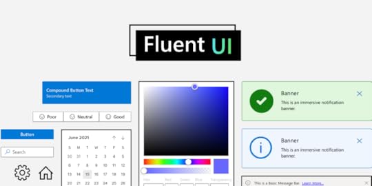
Fluent UI – A New Interactive UI Library in UXPin
Try a full set of interactive, ready-made components created by Microsoft and used by hundreds of enterprise companies. Build prototypes with the drag-and-drop elements that developers can easily copy. Learn more about Fluent UI.
Build advanced prototypesDesign better products with States, Variables, Auto Layout and more.
Try UXPin .try-uxpin-banner { margin: 40px 0px;}.try-uxpin__container { display: flex; max-width: 689px; height: 210px; padding: 20px; padding-left: 24px; border: 2px solid black; border-radius: 4px; align-items: center; justify-content: space-between; background-color: white; box-shadow: 10px 10px black;}.try-uxpin__left { width: 54%;}.try-uxpin__left p { margin: 10px 0px !important; color: black !important;}.try-uxpin__heading { font-size: 28px !important; font-weight: bold;}.try-uxpin__text { margin: 0 !important; font-size: 18px !important; line-height: 22px !important;}.try-uxpin__button { width: 135px; height: 44px; background: black; margin: 10px 0px; padding: 10px 20px; border: none; border-radius: 2px; color: white; font-size: 16px; text-align: center;}.try-uxpin__button:hover { cursor: pointer;}.try-uxpin__image { max-width: 320px !important; height: 200px; margin-right: -21px; margin-bottom: -6px;}@media (max-width: 760px) { .try-uxpin__container { height: auto; margin: 10px; align-items: left; }}@media (max-width: 500px) { .try-uxpin__container { flex-direction: column; } .try-uxpin__left { width: 100%; align-items: normal; }}What is Fluent UI?Fluent UI is an open-source React component library developed by Microsoft. It helps teams build accessible, scalable, and usable applications that work across devices (mobile, tablet, desktop) and operating systems (iOs, Android, Windows).
It’s one of the most popular design systems, preferred by companies that build enterprise solutions. It’s well-documented, customizable, and used by Microsoft to build Windows products. That’s why it includes pivot tables, charts, and other complex UI components.
Use Fluent UI in UXPinWe’ve just added a built-in Fluent UI library. It contains 70+ components that you can use in prototyping. They are fully interactive. Once you use them, you can set up their properties and they will behave the same way as they do in the product.
Design faster – build prototypes by dragging and dropping fully functional UI components; assemble your prototypes, test them with users, do multiple iterations in the same timeframe as you would just design a prototype.Build interactive interfaces without coding – Fluent UI components are fully interactive, so you don’t need to ask developers to help you build advanced prototypes with a high level of interactivity. You can do it on your own without limits to how the prototype could behave.Streamline design handoff – share prototypes with developers – they can just copy the ready code in a few clicks. Put an end to a lengthy design handoff process and make sure what you design can be easily translated into code.How to Use Fluent UI on Trial?Sign up for a trial – Fluent UI is available for 14 days.Open a new prototype from the UXPin Dashboard.Go to Design System Libraries in the Toolbar on the left. Drag and drop interactive components from the library and preview how they behave.View and copy the code in the Spec Mode. Fluent UI is available until your trial ends.https://t.co/KHc6ho8mlr 💫 Build interactive prototypes with 60+ ready-made @fluentui components, such as color picker, charts, and more. Try it for free! pic.twitter.com/88Agen5Gmj
— UXPin (@uxpin) March 16, 2023
Try Interactive Prototyping with Fluent UIhttps://t.co/1QU5DZC1HZ 🎉Performance, documentation, accessibility… there are dozens more benefits that come with using Fluent UI library. Try it yourself. pic.twitter.com/LmEGEhUlGK
— UXPin (@uxpin) March 16, 2023
Create prototypes that are interactive from the start. Use Fluent UI components in UXPin.
Try Fluent UI LibraryThe post Fluent UI – A New Interactive UI Library in UXPin appeared first on Studio by UXPin.
March 15, 2023
What is Happy Path in UX Design?
Designing happy paths is every designer’s priority. Happy paths create positive user experiences, increasing product adoption and retention.
This article explores the concept of a happy path in UX design, its importance, and best practices for creating them. We will also discuss edge cases and error states and how UXPin can help you create and test happy paths.
Design digital product experiences users love with UXPin, an advanced prototyping tool. Sign up for a free trial.
Build advanced prototypesDesign better products with States, Variables, Auto Layout and more.
Try UXPin .try-uxpin-banner { margin: 40px 0px;}.try-uxpin__container { display: flex; max-width: 689px; height: 210px; padding: 20px; padding-left: 24px; border: 2px solid black; border-radius: 4px; align-items: center; justify-content: space-between; background-color: white; box-shadow: 10px 10px black;}.try-uxpin__left { width: 54%;}.try-uxpin__left p { margin: 10px 0px !important; color: black !important;}.try-uxpin__heading { font-size: 28px !important; font-weight: bold;}.try-uxpin__text { margin: 0 !important; font-size: 18px !important; line-height: 22px !important;}.try-uxpin__button { width: 135px; height: 44px; background: black; margin: 10px 0px; padding: 10px 20px; border: none; border-radius: 2px; color: white; font-size: 16px; text-align: center;}.try-uxpin__button:hover { cursor: pointer;}.try-uxpin__image { max-width: 320px !important; height: 200px; margin-right: -21px; margin-bottom: -6px;}@media (max-width: 760px) { .try-uxpin__container { height: auto; margin: 10px; align-items: left; }}@media (max-width: 500px) { .try-uxpin__container { flex-direction: column; } .try-uxpin__left { width: 100%; align-items: normal; }}What is a Happy Path in UX Design?A happy path (happy flow) in software development describes a frictionless, error-free user flow. The user completes their task as intended without problems resulting in a “happy user experience.” The intent is not to make users feel happy. Instead, designers must create an efficient, intuitive user flow that meets the user’s expectations.
For example, a first-time user wants to create an account for a new mobile app.
The user opens the app and is immediately presented with a signup screen.The user can enter their name and email address or use a social login for faster onboarding.They enter their name and email and click a large signup button.The user immediately receives an email to verify their account.They open the email and click the verification link, redirecting them to the application where they can begin using the product.There are actually two happy paths in this example. The user could use a social login, ending the process at step two. Both use cases provide a smooth, frictionless user experience where users can signup.
Why is a happy path important?Happy paths are crucial for digital product design because they create positive user experiences. Products that serve users by delivering what they need with optimal efficiency increase usage, engagement, and retention.
So, what is a golden path, then?A golden path is a term coined by Spotify to describe the optimal workflow and environment for backend engineers. Organizations have copied this concept with their own variations, notably Paved Road (Netflix) and Silver Path. These concepts are not related to UX or happy path.
Edge Cases and Error states – The Opposite of Happy Paths
You’d expect the opposite of a happy path to be a sad path, a bad path, or an unhappy path–but these are not terms design teams use. Instead, designers use edge cases and error states to describe problematic user flows.
Edge casesEdge cases are scenarios outside of the expected behavior of users or technology. These anomalies are often tricky to solve during the design process as designers don’t think to expect them.
For example, a digital product’s iOS app may render an animation differently from the Android and Web versions, creating an unexpected usability issue.
When Apple released its new M1 chips in 2021, the laptops were incompatible with many apps and services. Developers had to release patches or compatible versions to accommodate Apple’s new chips.
Other edge cases include:
A specific screen reader unable to navigate a user interfaceSlow internet connectionsThe combination of a browser, device, and application causes a digital product to crashError statesError states prevent users from completing a specific task due to a system failure, incorrect user input/action, or other issues. Unlike edge cases, designers can usually anticipate error states and provide users with steps to fix the problem.
A typical example of an error state is the red error messages on form fields. If the user doesn’t complete the field correctly, an error message appears to help them–i.e., “Password must be at least 8 characters long.”
10 Best Practices for Creating Happy Paths
Design simple user interfaces
Design simplicity is the key to creating happy paths and positive user experiences. Designers provide users only the UI elements and features needed to make decisions and complete tasks.
Use clear visual cuesVisual cues like arrows, icons, color, typography, visual hierarchy, and other UI elements guide users, making it obvious what to do next. When users don’t have to overthink their actions, they move through user flows efficiently to complete tasks.
Offer shortcuts and offrampsShortcuts allow users to complete tasks as quickly as possible. These shortcuts allow people to skip less important steps in a user flow or pre-filling forms with data from someone’s account. For example, allowing users to save delivery or credit card details means they don’t need to enter them for future purchases.
Offramps make it easy for users to back out or save a task to complete later. For example, include a back button to a user flow or a “save for later” option.
Helpful error messagesDesigners must test error states to ensure messages help users fix issues. Error messages must provide clear instructions for resolving a problem so users can continue on the happy path as quickly as possible.
Contextual helpersTooltips, popups, and other contextual helpers streamline onboarding while educating users about elements and features. Contextual help enables users to solve problems without referencing documentation or contacting support.
Progress indicatorsProgress indicators manage expectations by telling users where they are and what they still need to do to complete a task. This feedback keeps users engaged and motivated as they move through your happy path.
PersonalizationPersonalization is an excellent way to keep users engaged and provide a happy user experience. For example, apps like YouTube, Instagram, and TikTok use personalization in algorithms to suggest content based on viewing history.
Make it easy to ask for helpMany organizations intentionally make customer support difficult to access–adding to the frustration of being stuck. Providing help when people need it is crucial for creating happy paths to completing tasks. Apps like Intercom and Zendesk provide users instant access to FAQs, documentation, and customer support to solve problems in-task.
Feedback and microinteractionsMicrointeractions provide feedback to confirm user actions and display status. For example, if you click a button to submit a form, a spinning loading icon tells the user the system is processing their action. These helpful microinteractions give users confidence the app is working correctly while navigating them through tasks and problems efficiently.
Test, test, and test againLastly, the best method for designing happy paths is engaging with users through testing. User testing confirms that your happy paths solve user needs while identifying better ways to create UIs.
When UX designer Kai Wong and his team tested their prototype with a visually impaired user, they discovered that the screen reader confirmed the user’s social security number out loud–meaning anyone nearby would hear it. This test revealed that the team’s happy path created a security vulnerability for screen readers–not a happy path for some!
Happy Path Testing With UXPinDesign tools often don’t provide a happy path for designers during user testing. These image-based tools lack the fidelity and functionality to test user flows and interactions effectively.
With UXPin, designers can create exact replicas of digital product experiences with code-like fidelity and interactivity. These fully interactive prototypes enable teams to conduct high-quality tests, identify more usability issues, and get meaningful feedback to optimize happy paths during the design process.
Advanced prototyping featuresStates: Create multiple state variants, each with different properties and interactions for a single component.Variables: Capture user input data and use it to create personalized, dynamic user experiences.Expressions: Javascript-like functions to create complex components and advanced functionality–like password validation for forms or a fully functioning checkout flow.Conditional Interactions: set conditions to create multiple dynamic, happy path scenarios based on user interactions, accurately replicating the final product experience.Interactive prototypingThese features enable designers to design prototypes with code-like functionality and fidelity. UXPin’s Calming App is an example of these four features in action with smooth transitions, animations, and microinteractions, providing an immersive, intuitive user experience.
The “Relax” feature includes real audio clips embedded in the prototype–impossible to create using traditional image-based design tools. Designers also have access to real data and APIs to develop prototypes indistinguishable from the final product with just a few clicks.
Software testing error statesThese advanced features allow designers to test error states with helper text, alerts, snackbars, and other UI elements. The example below demonstrates how designers can combine UXPin’s States, Variables, Expressions, and Conditional Interactions to display form field error messages for many possible scenarios.
 Better stakeholder feedback and smoother design handoffs
Interactive prototypes don’t only benefit users with exceptional experiences; they also receive better feedback from stakeholders. Designers don’t have to explain designs to stakeholders because UXPin’s prototypes function like the final product.
Design handoffs are smoother, with less friction, because UXPin prototypes require less interpretation and documentation. Engineers can use UXPin’s Spec Mode to inspect properties, measure distances, copy starter CSS, and view the product’s style guide–everything required for development in one place.
Solve more problems and design immersive happy paths with UXPin’s advanced prototyping features. Sign up for a free trial.
Try UXPin for freeThe post What is Happy Path in UX Design? appeared first on Studio by UXPin.
March 14, 2023
Content Design System – Do You Need It?
Designers have long recognized the benefits of using a design system in their work, streamlining their processes and saving time by not having to start from scratch every time. However, not everyone is aware that the same concept can be applied to content design, helping content and UX writing teams avoid the tedious task of reinventing the wheel.
In this article, we’ll explore the concept of a Content Design System (CDS) and help you determine if your project could benefit from one. We’ll also guide you on how to effectively garner stakeholder and team buy-in for such a system. If you’re new to the world of content design, be sure to check out our article “What is Content Design?” for a comprehensive explanation of the concept.
Fewer design tweaks and less back-and-forth communication between content, design, and developer teams? Solve these issues with the right technology. Learn more about it.
Reach a new level of prototypingDesign with interactive components coming from your team’s design system.
Discover UXPin Merge .discover-merge { margin: 40px 8px;}.discover-merge__container { display: flex; max-width: 690px; height: 200px; padding: 20px; padding-left: 24px; border-radius: 4px; background-color: black; box-shadow: 10px 10px #9999ff; align-items: center; justify-content: space-between;}.discover-merge__left { width: 50%;}.discover-merge__left p { margin: 10px 0px !important; color: white !important; font-size: 18px !important;}.discover-merge__heading { font-weight: bold !important; color: white !important; font-size: 18px !important;}.discover-merge__text { margin: 0 !important; line-height: 22px !important;}.discover-merge__button { width: 174px; height: 44px; margin: 10px 0px; border: none; border-radius: 2px; background: white; color: black; font-size: 16px; text-align: center;}.discover-merge__button:hover { cursor: pointer;}.discover-merge__image { max-width: 320px !important; height: 200px; margin-right: -19px;}@media (max-width: 760px) { .discover-merge__container { height: auto; margin: 10px; align-items: left; }}@media (max-width: 500px) { .discover-merge__container { flex-direction: column; } .discover-merge__left { width: 100%; align-items: normal; }}4 Questions to Help You Decide If You Need a Content Design SystemDo you have limited access to UX writers?If you do, then you’re not alone. In fact, according to a study by UX Writing Hub, almost 90% of UX writers work in a 1:10 ratio to designers. Some teams have an even higher imbalance, standing at 1:20!
What this means is that – more often than not – product designers have to make content decisions on their own. What’s more, some companies can’t afford a ux writer altogether, and the responsibility of creating microcopy falls on those without the necessary skills or gets delegated to copywriters who are experienced in writing for sales and not UX.
Even if your team has UX writers on board, it can be difficult to maintain consistency and scale without a content design system in place. This can lead to a domino effect. Namely, the writing team may not have the time to create copy early in the design process, which means that designers will not be able to prove their concept due to lack of real-life context. Think prototypes filled with “Lorem Ipsum” or other placeholder text.
A content design system, paired with a prototyping tool like UXPin, can help overcome these challenges. It lets you draw some of the CDS or include content box templates.
Do you want to ensure consistency in your communication with users?Inconsistent language or terms can create confusion for the user, leading to frustration and potentially even to abandoning your product altogether. A content design system can help ensure that your team is communicating with users in a clear, consistent manner.
For example, the use of words like “delete,” “discard,” and “remove” can vary in meaning, but they all have similar connotations. If your team is not using these terms consistently, it can result in confusion. The same goes for terms like “export,” “download,” and “share.”
It’s important to be cohesive with the terms you use and document them in your content style guide. Map out all terminology, write down tone guidelines or then audit your product ongoingly to identify any inconsistencies. By making a habit of documenting these decisions, you can bring clarity to your product design and improve communication with your users.
Do you want to ship your designs faster?When it comes to designing a product, speed and efficiency are key factors. A CDS can greatly enhance the speed and efficiency of the design process. By having key content decisions built into the design system, teams can avoid wasting time debating or testing certain decisions, such as how to capitalize items in a dropdown or whether to use contractions.
Having a clear set of content guidelines allows teams to move forward with their designs without having to constantly pause and reassess. This means teams will be able to finalize their designs faster, and focus on other areas of the product that require their attention.
Do you want to ensure good usability?Having consistent UI patterns helps create an experience that feels intuitive and welcoming to users, leading to better engagement and satisfaction. A CDS that incorporates standards for accessibility, inclusivity, legal clearance, and translation-friendliness can help ensure that the content and user experience are consistent across all aspects of the product ecosystem.
By following these standards, teams can be confident that they are providing a positive experience for all users. This is an essential step in creating digital products that are not only aesthetically pleasing but also stress the importance of functionality and readability. By focusing on good usability, you can build a loyal user base and foster a positive brand image. This, in turn, will set you apart from your competitors.
If you answered YES to all of the above questions, then you clearly need a content design system. Let’s now take a look at how to get started.
How to Start a Content Design SystemGetting started with a CDS can seem daunting, but the key to success is to understand the needs of those who will be using it. For starters, it’s important to consider the size and scope of your company, as well as the products you work on.
If your organization is small and only works on a few products, then a simple and streamlined solution like Bulb’s content design system could be a good source of inspiration.
Keep in mind that building a comprehensive and effective system requires a significant amount of work. It will need to be updated and adapted as your company’s design maturity evolves. Some companies have designated design or content operations teams that are responsible for building and maintaining their CDS.
To create your own system, your UX writers or content strategists should first document your company’s existing best practices and design guidelines, even if they are currently informal. This process will help to formalize these guidelines and make them part of your content design system.
The content strategy they build from the ground up must document how the brand tone of voice (ToV) is applied to UX writing.
It’s common for the ToV guidelines to be created by brand or marketing teams with a focus on marketing copy, rather than on elements such as button labels or error messages. By considering these important factors, you’ll be well on your way to creating a CDS that meets the needs of your team and supports your overall design goals.
If you’re wondering where you can keep your content design system, then there are two ways you can go about it. For instance, you can make it available publicly, i.e., make it ‘live’ beyond your product design toolset. A good example is how Google structured its Material Design library, which can be accessed online through the browser.

Source: Material.io
How to Get Internal Buy-in for Content Design SystemHere are four ways to help build support for your CDS:
Provide a clear value propositionWhen proposing a CDS, it is important to clearly communicate the benefits it will bring to the organization. To do this, take a product management approach and define a clear value proposition that outlines the problems you are trying to solve, and the solutions provided by the CDS.
You can present this information in a simple three-column table to make it easy to understand. Jot down some of the problems your team is facing in one column, ways that a CDS could potentially solve them in another, and, finally, the value generated by the solution in the third one.
Seek alliesIdentifying allies who have similar goals and outcomes within the organization can be a valuable way to build support for your CDS. Look for individuals who can become champions of the system, and engage with team members from multiple disciplines as well as users in the decision-making process. This means reaching out to designers, developers, writers, and product team members who will use the system in the discussions. By working together, you can ensure that everyone is invested in the success of the CDS.
Set clear expectations and avoid overpromisingIt is important to be realistic about what a CDS can and cannot achieve. Set clear expectations about its limitations and capabilities and be transparent about the assumptions and calculation methods behind your ROI estimations.
Avoid overpromising and ensure that you have the capacity to deliver what you promise. If a content design system truly is a good fit for your team, conservative estimates should still get them excited if you present them correctly. Then, when the system is in place, the team might be pleasantly surprised by how well it performs.
Demonstrate how a CDS can streamline the product development processIn order to further convey the importance of a CDS, it can be helpful to prepare a short presentation that compares the results of projects carried out with and without a CDS in place. You can show how a CDS can streamline the product development process and help save time for your content and design teams. Or how a CDS with content patterns can quickly provide relevant copy as opposed to a screen full of “Lorem Ipsum.”
For example, say you’re designing a landing page and need to fill out the headings and call-to-action box. Instead of filling them all with “Lorem Ipsum”, you could easily dive into your CDS and use existing templates, like “Sign up for free” for your CTA button.
You can run a presentation and display how a design could look like if it were filled with “Lorem Ipsum” from top to bottom, and then, on the next slide, show the same layout with relevant copy.
This type of demonstration will contrast both versions, prove the importance of context in the design process, and help get buy-in for your CDS.
Create a Content Design SystemHaving a content design system is essential for ensuring the overall success of a digital product as it significantly improves its usability. The content in an app or website is context-specific, which calls for a good content strategy that has to be supported by a content design system for effective execution. Remember that visual style guide, component library, and UI writing must be approached holistically.
Investing time and effort into creating a comprehensive content design system will pay off in the long run with a more intuitive, accessible, and user-friendly product. If you’re searching for a tool that will help you build prototypes with your design library components, then check out UXPin Merge.
Discover MergeThe post Content Design System – Do You Need It? appeared first on Studio by UXPin.
March 13, 2023
What is Progressive Disclosure? Show & Hide the Right Information
Progressive disclosure is one of the ways of reducing UI complexity and it may come in handy whenever designers want to make products less overwhelming for the end-user.
This article explores progressive disclosure, when to use it, helpful UI components, real-world examples, and a step-by-step process for implementing this design technique.
Design user experiences your customers love with the world’s most advanced design tool. Sign up for a free trial to create your first interactive prototype with UXPin.
Build advanced prototypesDesign better products with States, Variables, Auto Layout and more.
Try UXPin .try-uxpin-banner { margin: 40px 0px;}.try-uxpin__container { display: flex; max-width: 689px; height: 210px; padding: 20px; padding-left: 24px; border: 2px solid black; border-radius: 4px; align-items: center; justify-content: space-between; background-color: white; box-shadow: 10px 10px black;}.try-uxpin__left { width: 54%;}.try-uxpin__left p { margin: 10px 0px !important; color: black !important;}.try-uxpin__heading { font-size: 28px !important; font-weight: bold;}.try-uxpin__text { margin: 0 !important; font-size: 18px !important; line-height: 22px !important;}.try-uxpin__button { width: 135px; height: 44px; background: black; margin: 10px 0px; padding: 10px 20px; border: none; border-radius: 2px; color: white; font-size: 16px; text-align: center;}.try-uxpin__button:hover { cursor: pointer;}.try-uxpin__image { max-width: 320px !important; height: 200px; margin-right: -21px; margin-bottom: -6px;}@media (max-width: 760px) { .try-uxpin__container { height: auto; margin: 10px; align-items: left; }}@media (max-width: 500px) { .try-uxpin__container { flex-direction: column; } .try-uxpin__left { width: 100%; align-items: normal; }}What is Progressive Disclosure?Progressive disclosure is a technique UX designers use to reduce cognitive load by gradually revealing more complex information or features as the user progresses through a user interface of a digital product.
Jakob Nielsen, co-founder of the famous Nielsen Norman Group, introduced progressive disclosure in 1995 as an interaction design pattern to reduce user errors for complex applications.
Designers achieve this by breaking complex tasks into smaller, more manageable steps and presenting these to users one at a time. This step-by-step approach allows users to complete large tasks without being overwhelmed by too much information and instructions at once.
The most common example of progressive disclosure is a multi-step form, typically used for eCommerce checkouts. An example may look like the following:
Step one: name and delivery addressStep two: shipping optionsStep three: order confirmation and payment detailsStep four: success/thank you pageWhat are the three categories of progressive disclosure?There are three categories for progressive disclosure:
Step-by-step: breaking complex tasks into manageable stepsConditional: hiding certain elements and features until the user requests themContextual: offering additional information and options to provide context based on the user’s current situationWhat is progressive enabling?Progressive enabling is a similar design technique that gives users incremental access to features and functionality as they become more familiar with a product. This technique is especially effective for complex products, allowing users to fully comprehend each feature before moving to the next.
The levels in video games are an excellent example of progressive enabling. Players start with basic features and difficulty, which grow in complexity with each level.
When to Implement Progressive Disclosure
Here are four instances where designers might consider progressive disclosure.
Complex tasksBreaking complex tasks into manageable chunks makes it easier for users to understand and complete. If you save each step, users don’t have to complete everything at once and can return later.
Contextual helpDesigners often use contextual help through tooltips, popups, hotspots, and other UI elements to direct users through tasks. For example, a designer can highlight the form field a user must complete next so they know where to focus.
OnboardingProgressive disclosure is highly effective for onboarding, where designers provide in-app tutorials and walkthroughs to explain steps in a specific process, including using contextual help.
Content designContent, especially in product documentation, can be overwhelming to read and digest. Content designers can use progressive disclosure to present users with the most important information first, with the option to explore more content for those who need it.
UI Patterns for Progressive DisclosureHere are some examples of how designers use UI design patterns for progressive disclosure.
AccordionsAccordions give users control over when and if they need content. These design patterns are particularly helpful when designers have to present a lot of content, like FAQs.
TabsTabs allow designers to organize content into categories so users can choose when they need it. These tabs also reduce scrolling, which is particularly helpful on mobile apps.
Dropdown menusDropdown menus help keep UIs uncluttered by hiding long lists. Hiding this content allows users to focus on the current task without being distracted by irrelevant content. For example, imagine trying to complete a form with all the countries, states/provinces, and cities visible. It would be a nightmare to navigate.
ScrollingPresenting users with the most important content high on the page above the fold can help them find answers or complete tasks without scrolling. Designers can provide supplementary content and features when users scroll. Sales landing pages often use this type of progressive disclosure to make a decision immediately or scroll for more information.
Explore: 4 types of scrolling patterns.
Dialog boxes & popupsDialog boxes, popups, and tooltips provide users with additional information when they hover or click on a UI element. This progressive disclosure technique lets users find answers without leaving the task while keeping interfaces uncluttered.
Examples of Progressive DisclosureGOV.UK bank holiday pageThe most famous progressive disclosure case study for content design is the UK government’s GOV.UK bank holiday page redesign. The initial web design was busy and overwhelming.
Through user research, the team learned that most people wanted to know the date of the next bank holiday. The redesign presents users with the upcoming bank holiday at the top of the screen using a clear visual hierarchy, with the following days in smaller text below.
 Google’s Advanced Search
Google’s primary search is simple: one input field with a few options, including an image search and two buttons. Most users will only use this basic search feature.
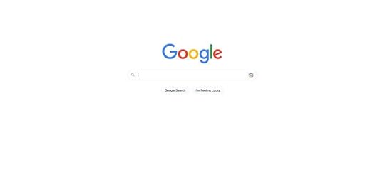
Google’s Advanced Search is more complex, with multiple fields and options for users to get more granular, including settings for language, region, exact phrase, last updated, etc.
 Dropbox’s File-Sharing Options
When you share a file in Dropbox, the file-sharing options are initially hidden, with only the email field and “Share file” button visible.
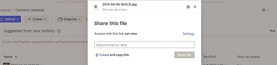
Users must click “Settings” to access more advanced settings like “File settings” and “Link for viewing” options.
 eCommerce product pages
Designers use progressive disclosure on product pages, so they don’t overwhelm customers. A standard technique is to use accordions or tabs to hide details so shoppers can choose if and when they want to see them.
For example, only the quantity stepper and “Add to Cart” button are visible on this product page from Shopify Themes. The product’s description, shipping and returns, and reviews are hidden behind accordions.
 Progressive Disclosure Design ProcessIdentify user needs
As we saw in the GOV.UK example above, understanding what content and information your users need is vital for progressive disclosure. Designers can use fundamental UX research techniques like user interviews and usability testing to determine these needs.
Prioritize informationNext, designers use card sorting and affinity mapping to prioritize information and features to help users accomplish their goals efficiently. For example, designers may hide the lowest priority items or use the hierarchy to create an efficient multi-step process.
Determine the correct level of detailOnce they have prioritized the information, designers must determine the level of detail for each one. What information must designers present immediately, and what must follow?
For example, with GOV.UK, the most important information what the next bank holiday. The level of detail users required was the date and name of the holiday–for example, December 25, Christmas Day. The other holidays followed sequentially with the same level of detail.
Design for simplicityKeeping user interfaces simple and easy to use is crucial. Designers must only provide the content and features required to complete a single task or decision–which is why the first three steps above are essential for progressive disclosure.
John Maeda’s 10 Laws provide an excellent framework for achieving design simplicity:
Reduce: remove what isn’t neededOrganize: makes complex systems easierTime: saving time feels like simplicityLearn: knowledge makes things simpleDifferences: balancing simplicity and complexityContext: “What lies in the periphery of simplicity is not peripheral”Emotion: more emotion is better than lessTrust: simplicity = trustFailure: some things aren’t meant to be simpleThe one: subtract the obvious and add the meaningfulPrototype and testThe last step is to prototype and test your solution. Designers must also consider usability and ensure the design doesn’t introduce problems. For example, hiding features so users can’t find them.
Create Better Prototypes With UXPinUXPin’s advanced features allow designers to create immersive prototypes indistinguishable from the final product. With fully functional forms and code-like interactivity, design teams can test ideas to find a solution that best solves user needs while providing maximum business value.
These four UXPin features enable designers to build advanced prototypes:
States : create multiple states for a single component and build complex UI patterns like dropdown menus, steppers, carousels, and accordions–essential for progressive disclosure user testing. Interactions : use Triggers, Actions, and Animations to design immersive prototype experiences. With Conditional Interactions, designers can create dynamic interactivity according to user actions. Variables : collect data from user inputs and use it elsewhere in the application. Designers can use these variables to personalize the prototype experience to feel like the final product. Expressions : design form validation, computational components, dynamic error messages, and more. When combined with States, Interactions, and Variables, Expressions enable designers to create Javascript-like functionality.Build prototypes that allow your team to get meaningful, actionable results from testing. Sign up for a free trial to create your first UXPin prototype today.
Try UXPin for freeThe post What is Progressive Disclosure? Show & Hide the Right Information appeared first on Studio by UXPin.
March 9, 2023
How to Turn Code into Design?
The standard product design workflow is that designers create prototypes in a vector-based tool and convert them to code. Your design starts as an image and then needs to be translated into code to make it functional.
Is there an alternative to that approach? One that would allow you to start with code? Code-to-design prototyping is one of them. It helps you create code-based prototypes using dev’s UI components that stay functional even when used in a design tool. This article will show you how to turn code into design using this alternative approach to design-to-code workflow.
Get started with code to design today using our solution. For more details, visit our Merge page.
Reach a new level of prototypingDesign with interactive components coming from your team’s design system.
Discover UXPin Merge .discover-merge { margin: 40px 8px;}.discover-merge__container { display: flex; max-width: 690px; height: 200px; padding: 20px; padding-left: 24px; border-radius: 4px; background-color: black; box-shadow: 10px 10px #9999ff; align-items: center; justify-content: space-between;}.discover-merge__left { width: 50%;}.discover-merge__left p { margin: 10px 0px !important; color: white !important; font-size: 18px !important;}.discover-merge__heading { font-weight: bold !important; color: white !important; font-size: 18px !important;}.discover-merge__text { margin: 0 !important; line-height: 22px !important;}.discover-merge__button { width: 174px; height: 44px; margin: 10px 0px; border: none; border-radius: 2px; background: white; color: black; font-size: 16px; text-align: center;}.discover-merge__button:hover { cursor: pointer;}.discover-merge__image { max-width: 320px !important; height: 200px; margin-right: -19px;}@media (max-width: 760px) { .discover-merge__container { height: auto; margin: 10px; align-items: left; }}@media (max-width: 500px) { .discover-merge__container { flex-direction: column; } .discover-merge__left { width: 100%; align-items: normal; }}What You Need to Turn Code into DesignIf you want to build a code-based prototype, you need a component library and a design tool that supports it.
Component libraryYou can use a private design system if you have one or an open-source component library like MUI, Bootstrap, Fluent UI, etc.
Here are some things to consider when choosing a component library:
High ratings on GitHub and the npm registry indicate the library’s quality and versatility. For example, MUI and Bootstrap have exceptionally high ratings.What are you trying to build? Each component library offers elements and features for specific use cases. For example, MUI is excellent for cross-platform applications, while Bootstrap is better for websites and web apps.Documentation and support are vital for learning the component library and solving issues. Most popular component libraries have active communities where devs ask questions and share solutions.Themeable component libraries allow you to customize certain aspects via design tokens, like colors, spacing, typography, sizing, etc.Here are a few open-source libraries we recommend for product development:
MUI: great for cross-platform applications, including enterprise products. MUI offers a vast component library and third-party templates.React-Bootstrap: best for responsive websites and web applications. One of the oldest frameworks with a massive community and regular updates.Semantic UI React: excellent Bootstrap alternative with a more modern, stylistic aesthetic.Ant Design: a massive design system with components for cross-platform and native applications. Design tool
The next step of turning code into a design is getting a design tool. You may get a vector-based tool and upload your components into it. Yet, those components will be reduced to images. They will look like code components but they will lose all the functionality.
Traditional image-based design tools lack features to test even the most basic functionality. For example, a form field in Figma or Sketch is essentially an image. You can’t interact with form fields or enter data.
When using code-based prototyping tools, the components stay interactive. They look like components from the library and behave like ones too. You can use our code-based prototyping for this kind of workflow: UXPin Merge.
Merge components work like building blocks, allowing you to drag and drop to create user interfaces.
You can adjust each component’s properties via the Properties Panel according to any props assigned in the repository. For example, this MUI Button has several properties that correspond to the libraries documentation available in the Properties Panel, including:
LabelColorDisabled (true or false)Full width (true or false)SizeVarianthref (link)Leading/start iconTrailing/end iconInteractions
UXPin has canvas templates for multiple screen sizes, including wearables, allowing you to effortlessly create cross-platform apps and responsive websites. Connect your screens and add interactivity using UXPin’s Interactions to create immersive prototyping experiences.
Once you finish prototyping, you can hand over the prototype to development.
UXPin’s Spec Mode provides details about each mockup, including measurements, properties, and JSX presets for each Merge component. You can view each screen individually and its corresponding responsive layout. The Simulate mode enables you to use the prototype as intended, including microinteractions, animations, and page transitions.
Spec Mode also displays your project’s style guide so devs can copy the correct HEX codes, typography, and assets. Even if you’re working as a solo designer/engineer, having everything in one place streamlines your workflow and serves as a repository for future reference.
Examples of Companies Using Code to DesignTeamPasswordTeamPassword is a startup with five employees, including two developers and no designers. The password manager startup uses a custom MUI React library for its products, which they import to UXPin for prototyping.
TeamPassword is an excellent example of how Merge makes UX design and testing accessible to non-designers. The startup’s two devs complete all the prototyping and testing in UXPin, before developing the final product.
Since switching to this workflow, TeamPassword’s UI consistency and speed to market have improved significantly, making them more competitive in a market dominated by billion-dollar organizations.
PayPalIf TeamPassword is a good startup model, PayPal is a fantastic example of Merge working at the enterprise level. PayPal uses Merge for its 60+ internal products.
Like TeamPassword, non-designers from PayPal’s product teams complete most design projects, leaving the UX team to focus on high-level user experience initiatives.
After switching to Merge, PayPal delivers design projects 8X faster than experienced UX designers could previously with traditional image-based design tools.
Quick Note on Importing ComponentsWhen using UXPin Merge, you have three options for importing components.
Git IntegrationStorybook Integrationnpm IntegrationIt’s important to note that the Git and Storybook integrations require technical expertise to set up the boilerplate and repository. You’ll also need to maintain the repo and add new components as you scale. Once you connect the repository, Merge will automatically sync updates to the Design System Libraries in UXPin.
The npm Integration is a better option for non-technical users as it uses a dashboard instead.
Git IntegrationThe Git Integration is the best option for importing React libraries because you benefit from all Merge’s features, including Version Control, Patterns, and JSX presets–which aren’t available with Storybook.
Storybook IntegrationThere are two reasons why you might choose the Storybook Integration over Git:
You want to develop and manage your components using Storybook.You want to use a framework other than React.Firstly, Storybook is an excellent platform for developing and managing components in isolation. It also offers documentation, testing, and governance features vital for scalability and collaboration with cross-functional teams.
If you’re developing a product using Vue, Ember, HTML, Web Components, or Angular, you can only import these libraries via the Storybook Integration.
npm IntegrationThe npm Integration is the best option for designers with little or no technical skills. If you don’t want to mess with boilerplates and repositories, then using npm and UXPin’s Merge Component Manager (MCM) is recommended.
You can import most component libraries available on the npm registry via MCM. Unlike Git and Storybook, with npm, you select which components and associated props to import. Unfortunately, you can’t customize the props, so you’re constrained to the library’s standard theme properties.
The npm Integration is also helpful for importing components your current design system doesn’t have. For example, if you need a bottom navigation component for a mobile application but don’t have one. Instead of designing from scratch, you can import MUI’s Bottom Navigation for prototyping.
Whether you’re a one-person startup or a multinational organization, UXPin Merge bridges the gap between design and development by allowing teams to use the same components in their workflow. Interested to hear more? Visit our Merge page.
Discover MergeThe post How to Turn Code into Design? appeared first on Studio by UXPin.
March 8, 2023
Why Developers Use Frameworks?
Modern product and web development rely on frameworks, libraries, and dependencies to achieve desired results and outcomes. Understanding these frameworks’ capabilities and limitations can help designers collaborate better with engineers throughout the design process and, most importantly, during design handoffs.
Bridge the gap between design and development with UXPin Merge. Design fully interactive prototypes using UI coded components without writing a single line of code. Visit our Merge page.
Reach a new level of prototypingDesign with interactive components coming from your team’s design system.
Discover UXPin Merge .discover-merge { margin: 40px 8px;}.discover-merge__container { display: flex; max-width: 690px; height: 200px; padding: 20px; padding-left: 24px; border-radius: 4px; background-color: black; box-shadow: 10px 10px #9999ff; align-items: center; justify-content: space-between;}.discover-merge__left { width: 50%;}.discover-merge__left p { margin: 10px 0px !important; color: white !important; font-size: 18px !important;}.discover-merge__heading { font-weight: bold !important; color: white !important; font-size: 18px !important;}.discover-merge__text { margin: 0 !important; line-height: 22px !important;}.discover-merge__button { width: 174px; height: 44px; margin: 10px 0px; border: none; border-radius: 2px; background: white; color: black; font-size: 16px; text-align: center;}.discover-merge__button:hover { cursor: pointer;}.discover-merge__image { max-width: 320px !important; height: 200px; margin-right: -19px;}@media (max-width: 760px) { .discover-merge__container { height: auto; margin: 10px; align-items: left; }}@media (max-width: 500px) { .discover-merge__container { flex-direction: column; } .discover-merge__left { width: 100%; align-items: normal; }}What is a Front-End Framework in Programming?Front-end frameworks are pre-written code with tools, templates, functionality, and components that help developers build websites and applications fast. These frameworks provide a foundation for developers to be more product-focused rather than writing from scratch.
Front-End Library vs. Front-End FrameworkPeople often use front-end frameworks and front-end libraries interchangeably, but there are distinct differences.
Front-end libraries include pre-written code for common tasks, like manipulating the DOM, making HTTP requests, and animating elements. Libraries require less setup and configuration and have fewer constraints than frameworks, giving software engineers more freedom and control. Popular front-end libraries include Reactjs, jQuery, Django (for Python), and Redux.
Front-end frameworks are pre-written code that provides structure for building websites and applications. These frameworks usually include libraries, tools, and other features to develop, scale, and maintain applications. Popular front-end open-source frameworks include React Native, AngularJS, Vue (check out the difference between the three of them,) and last but not least, Bootstrap.
Wait, isn’t React a Framework, not a library?React is a Javascript library floating between being a library and a framework. Many developers debate whether React is one or the other.
While React technically isn’t a framework, it does provide the foundation to create reusable UI components–which is why so many developers use React for design systems. Engineers can combine React with other libraries to create a custom front-end solution.
For the purposes of this article, we’re referring to React as a framework for product development.
Programming language vs. frameworkAnother important distinction is the difference between a programming language and a framework. Programming languages are the actual code behind frameworks. Javascript, PHP, Typescript, HTML, and Python are all programming languages.
For example, Javascript is a programming language. React, Angular, and Vue are all Javascript frameworks.
Types of Programming FrameworksFor digital product development, there are two primary framework categories:
Server-side/back-end frameworksClient-side/front-end frameworksYou also get full-stack frameworks with everything programmers need to build a complete application, including front-end, back-end, and database management. The most famous full-stack framework example is Ruby on Rails.
Some common examples of other programming frameworks include:
Web application frameworksMobile application frameworksGame development frameworksAI frameworksData science frameworksSince this article focuses on digital product development, we will explore client-side or front-end frameworks, as these directly impact the design process and designer/engineer collaboration.
Advantages & Disadvantages of Using a Programming Framework?Programming frameworks offer many benefits, notably streamlining workflows, improving code quality, and faster cross-platform application development. But there are some disadvantages and limitations, which we outline below.
AdvantagesEfficiencyDevelopers can leverage a framework’s features to build applications faster than programming from scratch. This efficiency is also beneficial for developing minimum viable products and prototypes.
ConsistencyMany frameworks use standardized structures, and code conventions engineers must follow. This standardization allows organizations to maximize cohesion and consistency across products and teams.
ReliabilityThe most popular frameworks are well-maintained, with regular updates and fixes. They’re also compatible across multiple browsers and devices, so engineers can confidently build and ship products without worrying about bugs or compatibility issues.
ScalabilityFrameworks provide the tools and features to scale faster than writing from scratch. Engineers can also add libraries, tools, and packages to extend functionality as the product evolves.
CommunityMost frameworks have large communities where engineers can ask questions and discover new ideas. For example, React, Vue, Angular, and Bootstrap all have massive active global communities with users sharing ideas in multiple languages and across many markets and industries. It’s hard to find a problem that someone hasn’t already solved.
DisadvantagesRestrictiveWhile the structure and guidelines frameworks allow for faster development and scalability, they can limit creativity and flexibility. Developers must follow the framework’s architecture or conventions, which may stifle innovation.
PerformanceFrameworks add an extra layer of code which can slow performance and increase memory if developers don’t optimize code properly. There are fixes for these performance issues, but it comes with additional costs.
DependenciesMany frameworks, including React, Vue, and Angular, rely on third-party libraries and tools. Additionally, developers will use various dependencies and devDependencies to build projects. These dependencies increase maintenance and security risks.
MaintenanceAside from dependencies, frameworks require constant maintenance and updates to stay up-to-date and secure–over and above maintaining the product.
Learning curveEach framework has different syntax, conventions, and codebase, which can take a long time to learn and master. This learning curve can be particularly challenging for beginners.
Most popular frameworks have excellent documentation and many tutorials, but this education requires significant time and resources. These learning curves are why most developers specialize in a specific programming language or framework rather than being a jack of all trades.
Using Front-End Frameworks for PrototypingMany developers use front-end frameworks like React, Angular, and Vue for prototyping. These frameworks provide front-end developers with tools and functionality to create prototypes with basic functionality.
For example, if you want to create a prototype with MUI’s React UI library, you install the MUI package and import components into your project file. You can then add a button, complete with styling and interactivity, using one line of code:
Contained.
While prototyping with front-end frameworks is significantly quicker than programming from scratch, it’s nowhere near as efficient as using a design tool. Dragging and dropping components is much faster than writing code.
Startup TeamPassword struggled with this challenge before fullstack developer Matthew Chigira joined the team. TeamPassword still had a 2-person engineering team and no UX designers. They were using outdated development methods resulting in slow time to market and UI inconsistencies.
Matthew suggested switching to React and creating a custom version of the MUI design system to solve these issues. TeamPassword also added UXPin Merge to their tool stack to facilitate faster prototyping and testing.
Read the full story: TeamPassword Case Study.
Prototyping With React using UXPin MergeUXPin’s Merge technology syncs a UI library from a repository to UXPin’s design editor, giving design teams fully interactive components for prototyping.
These Merge components render the same in UXPin as they do in the repository, allowing designers to build prototypes indistinguishable from the final product.
TeamPassword’s engineering team achieves comparable results in UXPin using Merge than they do writing code, making it the perfect tool for prototyping and iterating quickly–critical for a small startup competing with billion-dollar competitors.
Once TeamPassword completes prototyping and testing, they have production-ready code to develop the final product. They install their custom MUI library, import the components into the project, and copy the layouts from UXPin. UXPin even renders JSX to copy/paste for each component’s props.
How does Merge work?UXPin renders HTML, CSS, and Javascript, unlike other design tools that generate vector graphics. This code-based approach means that a React button on UXPin’s design canvas is exactly the same as a React button in a developer’s IDE. Any props associated with the button will appear in UXPin’s Properties Panel, so designers can make changes using a mouse instead of editing code.
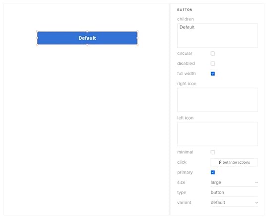
Once you sync Merge with UXPin, the component library (green arrow) appears under Design System Libraries (purple arrow). Designers drag and drop UI elements onto the canvas to build user interfaces.
 Connecting UXPin Merge
UXPin offers three ways to connect a design system using Merge:
Git Integration – React libraries onlyStorybook Integration – React, Vue, Ember, Angular, and morenpm Integration – import components from open-source libraries on the npm registryUltimate consistencyConsistency is one of Merge’s biggest benefits. With every design and engineering team using one UI library, design drift, and inconsistencies are almost non-existent. While designers can adjust the component’s props, they can’t change its structure or interactivity.
This single source of truth means designers and engineers can focus on solving user problems and product challenges rather than designing or programming from scratch or fixing errors and inconsistencies.
Better testingTesting is significantly better with Merge than with image-based design tools. UXPin’s component-driven prototyping methodology enables design teams to prototype and test with code-like fidelity and functionality.
Designers can also connect external tools and services using UXPin’s API, extending the scope beyond what’s possible using other design tools–like sending a confirmation email from a prototype or syncing a user’s calendar.
Merge prototypes allow design teams to get accurate, meaningful feedback from testing. Participants can interact with prototypes like they would the final product, allowing designers to solve more problems and identify more opportunities during the design process.
Stakeholders also provide better feedback because the prototype experience closely resembles the final product.
“The C-suite people and the directors are able to give us stronger feedback about the ultimate direction because they experience the features and goals of these prototypes rather than just commenting about how, how these boxes don’t look like a text field, for example.” – Erica Rider, UX Lead EPX at PayPal.
Smoother design handoffsDesign handoffs in Merge are seamless and frictionless. With design and engineering teams using the same components and constraints, the transition from design to development is much smoother than traditional design-to-code workflows.
“The markup required to render the prototype can be taken directly from Merge and handed over to the engineer, who can place it in their software development tool of choice. The engineer no longer needs to start from scratch and already knows what components and settings to use. It will help us avoid the ‘design drift’ we so often see. Things like spacing and typography should all be aligned, as it is all driven from one place.” – Nick Elliott, Design System Product Owner and Regional Head of Product Design at Iress.
Designing products using components from the same framework your engineers use makes the most sense, yet few design tools offer this code-based workflow. Only UXPin Merge bridges this gap successfully.
Designers and engineers still work within their familiar tools and environments, while Merge provides the translation to facilitate this code-based workflow.
Whether you’re an early-stage startup like TeamPassword or a multinational tech giant like PayPal, UXPin Merge will streamline your product development process with a single source of truth across the organization. For more details, visit our Merge page.
Discover MergeThe post Why Developers Use Frameworks? appeared first on Studio by UXPin.
Why Do Developers Use Frameworks?
Modern product and web development rely on frameworks, libraries, and dependencies to achieve desired results and outcomes. Understanding these frameworks’ capabilities and limitations can help designers collaborate better with engineers throughout the design process and, most importantly, during design handoffs.
Bridge the gap between design and development with UXPin Merge. Design fully interactive prototypes using UI coded components without writing a single line of code. Visit our Merge page.
Reach a new level of prototypingDesign with interactive components coming from your team’s design system.
Discover UXPin Merge .discover-merge { margin: 40px 8px;}.discover-merge__container { display: flex; max-width: 690px; height: 200px; padding: 20px; padding-left: 24px; border-radius: 4px; background-color: black; box-shadow: 10px 10px #9999ff; align-items: center; justify-content: space-between;}.discover-merge__left { width: 50%;}.discover-merge__left p { margin: 10px 0px !important; color: white !important; font-size: 18px !important;}.discover-merge__heading { font-weight: bold !important; color: white !important; font-size: 18px !important;}.discover-merge__text { margin: 0 !important; line-height: 22px !important;}.discover-merge__button { width: 174px; height: 44px; margin: 10px 0px; border: none; border-radius: 2px; background: white; color: black; font-size: 16px; text-align: center;}.discover-merge__button:hover { cursor: pointer;}.discover-merge__image { max-width: 320px !important; height: 200px; margin-right: -19px;}@media (max-width: 760px) { .discover-merge__container { height: auto; margin: 10px; align-items: left; }}@media (max-width: 500px) { .discover-merge__container { flex-direction: column; } .discover-merge__left { width: 100%; align-items: normal; }}What is a Front-End Framework in Programming?Front-end frameworks are pre-written code with tools, templates, functionality, and components that help developers build websites and applications fast. These frameworks provide a foundation for developers to be more product-focused rather than writing from scratch.
Front-End Library vs. Front-End FrameworkPeople often use front-end frameworks and front-end libraries interchangeably, but there are distinct differences.
Front-end libraries include pre-written code for common tasks, like manipulating the DOM, making HTTP requests, and animating elements. Libraries require less setup and configuration and have fewer constraints than frameworks, giving software engineers more freedom and control. Popular front-end libraries include Reactjs, jQuery, Django (for Python), and Redux.
Front-end frameworks are pre-written code that provides structure for building websites and applications. These frameworks usually include libraries, tools, and other features to develop, scale, and maintain applications. Popular front-end open-source frameworks include React Native, AngularJS, Vue (check out the difference between the three of them,) and last but not least, Bootstrap.
Wait, isn’t React a Framework, not a library?React is a Javascript library floating between being a library and a framework. Many developers debate whether React is one or the other.
While React technically isn’t a framework, it does provide the foundation to create reusable UI components–which is why so many developers use React for design systems. Engineers can combine React with other libraries to create a custom front-end solution.
For the purposes of this article, we’re referring to React as a framework for product development.
Programming language vs. frameworkAnother important distinction is the difference between a programming language and a framework. Programming languages are the actual code behind frameworks. Javascript, PHP, Typescript, HTML, and Python are all programming languages.
For example, Javascript is a programming language. React, Angular, and Vue are all Javascript frameworks.
Types of Programming FrameworksFor digital product development, there are two primary framework categories:
Server-side/back-end frameworksClient-side/front-end frameworksYou also get full-stack frameworks with everything programmers need to build a complete application, including front-end, back-end, and database management. The most famous full-stack framework example is Ruby on Rails.
Some common examples of other programming frameworks include:
Web application frameworksMobile application frameworksGame development frameworksAI frameworksData science frameworksSince this article focuses on digital product development, we will explore client-side or front-end frameworks, as these directly impact the design process and designer/engineer collaboration.
Advantages & Disadvantages of Using a Programming Framework?Programming frameworks offer many benefits, notably streamlining workflows, improving code quality, and faster cross-platform application development. But there are some disadvantages and limitations, which we outline below.
AdvantagesEfficiencyDevelopers can leverage a framework’s features to build applications faster than programming from scratch. This efficiency is also beneficial for developing minimum viable products and prototypes.
ConsistencyMany frameworks use standardized structures, and code conventions engineers must follow. This standardization allows organizations to maximize cohesion and consistency across products and teams.
ReliabilityThe most popular frameworks are well-maintained, with regular updates and fixes. They’re also compatible across multiple browsers and devices, so engineers can confidently build and ship products without worrying about bugs or compatibility issues.
ScalabilityFrameworks provide the tools and features to scale faster than writing from scratch. Engineers can also add libraries, tools, and packages to extend functionality as the product evolves.
CommunityMost frameworks have large communities where engineers can ask questions and discover new ideas. For example, React, Vue, Angular, and Bootstrap all have massive active global communities with users sharing ideas in multiple languages and across many markets and industries. It’s hard to find a problem that someone hasn’t already solved.
DisadvantagesRestrictiveWhile the structure and guidelines frameworks allow for faster development and scalability, they can limit creativity and flexibility. Developers must follow the framework’s architecture or conventions, which may stifle innovation.
PerformanceFrameworks add an extra layer of code which can slow performance and increase memory if developers don’t optimize code properly. There are fixes for these performance issues, but it comes with additional costs.
DependenciesMany frameworks, including React, Vue, and Angular, rely on third-party libraries and tools. Additionally, developers will use various dependencies and devDependencies to build projects. These dependencies increase maintenance and security risks.
MaintenanceAside from dependencies, frameworks require constant maintenance and updates to stay up-to-date and secure–over and above maintaining the product.
Learning curveEach framework has different syntax, conventions, and codebase, which can take a long time to learn and master. This learning curve can be particularly challenging for beginners.
Most popular frameworks have excellent documentation and many tutorials, but this education requires significant time and resources. These learning curves are why most developers specialize in a specific programming language or framework rather than being a jack of all trades.
Using Front-End Frameworks for PrototypingMany developers use front-end frameworks like React, Angular, and Vue for prototyping. These frameworks provide front-end developers with tools and functionality to create prototypes with basic functionality.
For example, if you want to create a prototype with MUI’s React UI library, you install the MUI package and import components into your project file. You can then add a button, complete with styling and interactivity, using one line of code:
Contained.
While prototyping with front-end frameworks is significantly quicker than programming from scratch, it’s nowhere near as efficient as using a design tool. Dragging and dropping components is much faster than writing code.
Startup TeamPassword struggled with this challenge before fullstack developer Matthew Chigira joined the team. TeamPassword still had a 2-person engineering team and no UX designers. They were using outdated development methods resulting in slow time to market and UI inconsistencies.
Matthew suggested switching to React and creating a custom version of the MUI design system to solve these issues. TeamPassword also added UXPin Merge to their tool stack to facilitate faster prototyping and testing.
Read the full story: TeamPassword Case Study.
Prototyping With React using UXPin MergeUXPin’s Merge technology syncs a UI library from a repository to UXPin’s design editor, giving design teams fully interactive components for prototyping.
These Merge components render the same in UXPin as they do in the repository, allowing designers to build prototypes indistinguishable from the final product.
TeamPassword’s engineering team achieves comparable results in UXPin using Merge than they do writing code, making it the perfect tool for prototyping and iterating quickly–critical for a small startup competing with billion-dollar competitors.
Once TeamPassword completes prototyping and testing, they have production-ready code to develop the final product. They install their custom MUI library, import the components into the project, and copy the layouts from UXPin. UXPin even renders JSX to copy/paste for each component’s props.
How does Merge work?UXPin renders HTML, CSS, and Javascript, unlike other design tools that generate vector graphics. This code-based approach means that a React button on UXPin’s design canvas is exactly the same as a React button in a developer’s IDE. Any props associated with the button will appear in UXPin’s Properties Panel, so designers can make changes using a mouse instead of editing code.
Once you sync Merge with UXPin, the component library (green arrow) appears under Design System Libraries (purple arrow). Designers drag and drop UI elements onto the canvas to build user interfaces.
Connecting UXPin MergeUXPin offers three ways to connect a design system using Merge:
Git Integration – React libraries onlyStorybook Integration – React, Vue, Ember, Angular, and morenpm Integration – import components from open-source libraries on the npm registryUltimate consistencyConsistency is one of Merge’s biggest benefits. With every design and engineering team using one UI library, design drift, and inconsistencies are almost non-existent. While designers can adjust the component’s props, they can’t change its structure or interactivity.
This single source of truth means designers and engineers can focus on solving user problems and product challenges rather than designing or programming from scratch or fixing errors and inconsistencies.
Better testingTesting is significantly better with Merge than with image-based design tools. UXPin’s component-driven prototyping methodology enables design teams to prototype and test with code-like fidelity and functionality.
Designers can also connect external tools and services using UXPin’s API, extending the scope beyond what’s possible using other design tools–like sending a confirmation email from a prototype or syncing a user’s calendar.
Merge prototypes allow design teams to get accurate, meaningful feedback from testing. Participants can interact with prototypes like they would the final product, allowing designers to solve more problems and identify more opportunities during the design process.
Stakeholders also provide better feedback because the prototype experience closely resembles the final product.
“The C-suite people and the directors are able to give us stronger feedback about the ultimate direction because they experience the features and goals of these prototypes rather than just commenting about how, how these boxes don’t look like a text field, for example.” – Erica Rider, UX Lead EPX at PayPal.
Smoother design handoffsDesign handoffs in Merge are seamless and frictionless. With design and engineering teams using the same components and constraints, the transition from design to development is much smoother than traditional design-to-code workflows.
“The markup required to render the prototype can be taken directly from Merge and handed over to the engineer, who can place it in their software development tool of choice. The engineer no longer needs to start from scratch and already knows what components and settings to use. It will help us avoid the ‘design drift’ we so often see. Things like spacing and typography should all be aligned, as it is all driven from one place.” – Nick Elliott, Design System Product Owner and Regional Head of Product Design at Iress.
Designing products using components from the same framework your engineers use makes the most sense, yet few design tools offer this code-based workflow. Only UXPin Merge bridges this gap successfully.
Designers and engineers still work within their familiar tools and environments, while Merge provides the translation to facilitate this code-based workflow.
Whether you’re an early-stage startup like TeamPassword or a multinational tech giant like PayPal, UXPin Merge will streamline your product development process with a single source of truth across the organization. For more details, visit our Merge page.
Discover MergeThe post Why Do Developers Use Frameworks? appeared first on Studio by UXPin.
March 7, 2023
The Future of Product Design – Top Predictions Around AI, VUI, Design Process, and More

We’ve looked at various trends and technology to make predictions for the future of product design. Rather than put on a tinfoil hat and talk about flying cars, we’ve focused on how current tech will evolve and identified some real opportunities for product designers and developers to innovate.
This article explores six key topics: AI, voice user interfaces, code-to-design innovation, humanity-centered design, and smart cities. The opportunities for product designers are immense, with fully interconnected cross-device and platform systems required for the next decade and beyond.
Code to design is the future of product development–and it’s already here. Bridge the gap between design and development with a single source of truth from UXPin Merge. Visit our Merge page for more details.
Reach a new level of prototypingDesign with interactive components coming from your team’s design system.
Discover UXPin Merge .discover-merge { margin: 40px 8px;}.discover-merge__container { display: flex; max-width: 690px; height: 200px; padding: 20px; padding-left: 24px; border-radius: 4px; background-color: black; box-shadow: 10px 10px #9999ff; align-items: center; justify-content: space-between;}.discover-merge__left { width: 50%;}.discover-merge__left p { margin: 10px 0px !important; color: white !important; font-size: 18px !important;}.discover-merge__heading { font-weight: bold !important; color: white !important; font-size: 18px !important;}.discover-merge__text { margin: 0 !important; line-height: 22px !important;}.discover-merge__button { width: 174px; height: 44px; margin: 10px 0px; border: none; border-radius: 2px; background: white; color: black; font-size: 16px; text-align: center;}.discover-merge__button:hover { cursor: pointer;}.discover-merge__image { max-width: 320px !important; height: 200px; margin-right: -19px;}@media (max-width: 760px) { .discover-merge__container { height: auto; margin: 10px; align-items: left; }}@media (max-width: 500px) { .discover-merge__container { flex-direction: column; } .discover-merge__left { width: 100%; align-items: normal; }}AI and the Future of Design ProfessionWe can’t do a future of product design article and not have AI top the list. There are so many predictions about how this technology will shape product design and UX–here is what we know.
Interpreting dataAI and machine learning are strongest at interpreting data. These models can use this data to understand user behavior better, predict outcomes, and identify patterns (good and bad). This data analysis capability is where AI will serve design teams most in the short term.
AI models can analyze products, create heatmaps, etc., and give UX researchers accurate diagnostics of what the data means, with suggestions to fix the issues. This type of analysis will reduce research time, allowing teams to solve usability issues faster.
As AI models evolve, they can make programming changes and solve these minor problems autonomously.
Automated QA and UX auditsQA and UX audits take considerable time and resources but are essential for developing quality, error-free products. Handing this task to AI will make product teams more efficient while increasing product quality.
Better personalizationAI will allow product teams to take personalization to the next level. Instead of personalized content, designers can deliver a customized product, including navigation, interactivity, and layouts tailored to each user’s needs. AI will also allow users to customize their algorithms to give them specific content, data, and feedback.
AI-generated designsTools like Galileo AI and Uizard will generate UI designs based on your text instructions. As these tools evolve, they could aid UI designers by creating mockups much faster, using components from your product’s design system.
UX and ChatGPT
Asked about the design trends for 2023, Agata Orłowska, UX Expert at Dietly, said that she immediately thought about ChatGPT. She even used ChatGPT to write the following section about it. Let’s read what Agata wrote us about UX and ChatGPT in collaboration with the tool itself.
What exactly is ChatGPT?ChatGPT is a technology that allows computers to generate human-like responses to user inputs. This tech is becoming increasingly popular in chatbot applications, where it can provide users with more natural and conversational interactions.
Created by a research institute in the field of artificial intelligence (by the way, Open AI was also co-founded by Elon Musk, but he is no longer with the company), and is known for its work on advanced language models. Can simulate dialogue, answer questions, admit mistakes, question wrong answers, and reject inappropriate requests, making it even more like a human-to-human conversation.
Why is ChatGPT important?This technology has already been used in Alexa or Siri, but it is only now that each user can see that it can do much more than turn on their favorite music or tell a joke. Now, this solution already has more than 1 mln+ users, and the first million was achieved in FIVE DAYS. Not surprisingly, it is currently difficult to distinguish whether we are talking to humans or artificial intelligence.
At the user’s request, AI is able to generate a fairytale, or a marketing article, suggest Christmas gifts for family or write simple code instead of a programmer. Currently, it is quietly able to replace simple programming work, Internet search results, writing an academic paper, or simple medical advice (sic!).
But what does ChatGPT have to do with Design or UX?Some of the surprising uses of chatbot AI I have already encountered were:
Asking interview questions of users from a narrow target group (for example, airplane pilots) in order to better understand their work characteristics and better understand their needs. Of course, as support for interviews and to deepen knowledge, not to replace user interviews ;)Generating catchy marketing slogans for a landing page tailored to specific target groups of users.Generating an agenda for an expert presentation at an industry event.Of course, it’s not all, I asked also the GPT chat itself how it thinks where we could use its potential in UX/Design/Research in the coming year, here is the answer:
“UX writing: Use chat GPT to generate multiple language options for user interfaces. Chat GPT can be used to quickly generate multiple language options for use in user interfaces, such as buttons, labels, and error messages. This can help designers to understand which language options are most effective at achieving their desired goals, and can help to optimize the user experience of the product.”
“Research: One way that Chat GPT can be used in user research is through the use of chatbot interviews. In a chatbot interview, designers can use Chat GPT to create a conversational chatbot that can ask users questions about their preferences and experiences. The chatbot can then use Chat GPT to generate human-like responses to the user’s answers, providing designers with valuable insights into how users think and what they want from a product.”
“Design: Use chat GPT to generate personalized responses for users. Chat GPT can be used to generate personalized responses for users based on their preferences and behavior. For example, a chatbot might use chat GPT to generate personalized recommendations for a user based on their past purchases or interests. This can help to create a more personalized and engaging user experience, and can help to build loyalty and engagement with the product.”
Fasten your seatbelts, grab your popcorn, and don’t forget to watch and test carefully! AI can support the work of all of us and make us more time for what is important.
More Voice User Interfaces
According to Statista research, there were 4.2 billion voice user interfaces (VUI) in 2020, with expectations that this number will grow to around 8.4 billion in 2024. We’re unsure if this Statista report considered AI, but the rapid growth of AI and machine learning in 2022/23 could see VUIs exceed 8.4 billion.
VUI is prevalent in our daily lives, but these systems are fast becoming more advanced and integrated, for example, automotive voice controls, industrial applications, aviation, and other complex systems.
The 2023 version of the Mercedes-Benz User Experience (MBUX) system features AI-powered Voice Control and Touch Control. The system pairs with other Smart Home devices, so you can ask, “Hey Mercedes, is there anybody in my home right now?” “I’ve had a look. The last movement detected was in the kitchen one hour ago.”
Tesla’s Voice Commands are even more advanced, allowing drivers to ask the car to drive to a specific destination and adjust controls like wipers, lights, mirrors, and more.
Code to Design
We will see more code in the design process as design tools evolve. UXPin is leading this code-to-design revolution with UXPin Merge. This technology allows product teams to sync a design system from a repository to UXPin’s design canvas so designers can build prototypes with the same UI components front-end devs use for development.
Code to design has already significantly impacted PayPal’s internal product development process–what Erica Rider, UX Lead EPX at PayPal, refers to as DesignOps 2.0. DesignOps 2.0 integrates design and development into a single iterative process rather than the traditional model that separates design and development.
With a single source of truth, product teams can deliver projects faster with fewer errors and higher quality outcomes. Design handoffs are frictionless and smoother because devs and designers use the exact same components, meaning less documentation and explanation are required to deliver the final product.
Code to design will become the new product development standard, where designers use code components instead of image-based design tools to prototype and test products.
Augmented Reality (AR) and Virtual Reality (VR)
AR and VR have been around for some time, but it wasn’t until recently that companies started using the technologies for practical uses rather than entertainment.
For example, business technology giant Accenture uses AR and VR to connect its global workforce with virtual coworking offices, onboarding new hires, training programs, and other events. Microsoft Mesh is one of the enterprise AR platforms for these collaborative systems, which integrates with Teams.
Training is the fastest-growing application for these AR systems. Organizations use AR and VR to train employees, particularly for high-risk jobs, complex tasks, and frontline workers. Vsight and Glartek are two companies leading this type of AR training.
AR and VR are also making waves in B2C markets:
Houzz has a 3D Floor Planner that uses AR to give clients a walkthrough of their remodeled home. Wayfair offers a similar 3D Room Planner.The L’Oréal Paris Makeup Genius app allows users to try beauty products virtually and purchase those they like.This tech is still in its infancy, so there will be a lot of space for innovation over the next decade. As the demand for AR and VR technologies grows, so will the jobs and roles of product designers.
Humanity-Centered Design
The Interaction Design Foundation published an interesting article about shifting from user-centered design to humanity-centered design–an idea proposed by Don Norman of the Nielsen Norman Group. Humanity-centered design seeks the best solutions for complex global problems rather than individual users.
Designers must consider how products impact complex, interrelated societal systems and how these will likely evolve into the future. The aim is to design products that positively impact society rather than satisfy frivolous needs and dopamine hits.
Humanity-centered design represents a design thinking mindset shift more than a new technology or trend. It considers sustainability and ethics when designing products and what impact you want your product to have on society and the environment.
Product Design Around Us
As parastatal and government services become more digitized, the demand for digital products and IoT increases. Smart cities require a lot of interconnected devices and systems to function–meaning large-scale product development and innovation from the private sector.
And guess what, those things will also have interfaces to design!
Microsoft outlines several examples where smart cities require digital products and infrastructure:
Cloud computingCloud-based infrastructure is the foundation necessary to support the apps and systems of a smart city. Countries and cities will have to develop localized versions of Google Cloud Platform and Amazon Web Services to protect their state and citizens’ data.
Artificial intelligenceArtificial intelligence and machine learning play a critical role in smart cities, from monitoring sensors and cameras to analyzing data and providing real-time feedback and solutions.
Internet of Things (IoT)Smart cities require many IoT products, from smart bins to fully automated public transport. These products need connected digital user interfaces and apps for user-facing operations with platforms and software for municipalities and states to manage them.
BlockchainAccording to Microsoft, blockchain technology is vital for smart cities: “organizations and governments are investing in this innovative technology to create more efficient supply chains, simplify complex processes, reduce fraud, and quickly verify transactions.”
Blockchain will make city governance more transparent and give citizens more visibility over budgets and expenditures. Dubai, one of the leading smart cities, has spent over $300 million to integrate blockchain into its services.
This expenditure from a single city demonstrates the tremendous opportunities for product developers to create and manage solutions for countries and cities worldwide.
Future Product Design With UXPin
Traditional UX design methods and workflows are slow and cumbersome. The design-to-code process is inefficient and doesn’t facilitate the speed and accuracy required to meet modern technologies and demands.
UXPin Merge and code-to-design are the future of product development. The streamlined design methodology enables anyone from inexperienced solopreneurs to multinational enterprises to prototype and test ideas with code-like fidelity and functionality.
Reasons why code to design enhances product development:
A single source of truth between designers and engineers from a centralized repo reduces the inefficiencies and challenges of design-to-code workflows.Realistic prototypes improve testing so product teams can identify better opportunities and solve more problems during the design process.Realistic, interactive prototypes mean stakeholders can accurately visualize the final product resulting in meaningful feedback and increased confidence in the design process.Code to design results in faster time-to-market with better quality and fewer usability issues, allowing startups to compete with enterprise organizations.Take your product design process into the future with the world’s most advanced end-to-end design tool. Visit our Merge page.
Discover MergeThe post The Future of Product Design – Top Predictions Around AI, VUI, Design Process, and More appeared first on Studio by UXPin.
UXpin's Blog

- UXpin's profile
- 68 followers

