
UXpin's Blog, page 45
February 1, 2023
Design System Maintenance — How to Keep Design System Up to Date?
Building a design system is no small feat–but that’s just the first step. Design system maintenance is a continuous operation requiring human, time, and financial resources to evolve and mature it.
UX, technology, regulatory, product, and organizational changes require the design system team to manage and update many facets of the design system. This article provides a high-level overview of maintaining a design system, including its governance, audits, roadmap, and maturity.
Optimize your design system’s operational challenges and reduce maintenance with UXPin Merge. Sync design and development to create a single source of truth, reduce debt, and eliminate drift. Request access to Merge.
Reach a new level of prototypingDesign with interactive components coming from your team’s design system.
Discover UXPin Merge .discover-merge { margin: 40px 8px;}.discover-merge__container { display: flex; max-width: 690px; height: 200px; padding: 20px; padding-left: 24px; border-radius: 4px; background-color: black; box-shadow: 10px 10px #9999ff; align-items: center; justify-content: space-between;}.discover-merge__left { width: 50%;}.discover-merge__left p { margin: 10px 0px !important; color: white !important; font-size: 18px !important;}.discover-merge__heading { font-weight: bold !important; color: white !important; font-size: 18px !important;}.discover-merge__text { margin: 0 !important; line-height: 22px !important;}.discover-merge__button { width: 174px; height: 44px; margin: 10px 0px; border: none; border-radius: 2px; background: white; color: black; font-size: 16px; text-align: center;}.discover-merge__button:hover { cursor: pointer;}.discover-merge__image { max-width: 320px !important; height: 200px; margin-right: -19px;}@media (max-width: 760px) { .discover-merge__container { height: auto; margin: 10px; align-items: left; }}@media (max-width: 500px) { .discover-merge__container { flex-direction: column; } .discover-merge__left { width: 100%; align-items: normal; }}Treat Your Design System Like a Product
In a Medium article, Nathan Curtis, founder of UX and design systems agency EightShapes, said, “A Design System isn’t a Project. It’s a Product, Serving Products.”
Framing your design system as a product means the design system team must manage several key aspects:
Marketing: increasing design system adoption, update/release announcements, news, etc.UX: creating a good design system user experience (for designers, engineers, product teams, etc.)Engineering: writing and maintaining scalable, error-free codePeople management: building a successful design system team–even if it’s a team of oneOperations: procedures, systems, tools, etc.Governance: process and protocols for maintaining and updating a design systemCustomer service: logging support tickets and helping users solve problems with component/pattern recommendationsCommunications: talking to users, advocates, and stakeholdersEffective design system maintenance requires the DS team to create systems and protocols beyond updating pattern libraries to increase the product’s adoption and lifecycle.
For example, if you have an amazing design system with beautiful code and UI elements, but no one is using it, or it doesn’t deliver a return on investment, stakeholders will likely sunset the project or replace team members.
Start With GovernanceMaintaining a design system requires good governance. It’s best to define these before launching your design system so that you’re ready to handle any issues and requests.
These are seven key areas your design system governance must address:
Bug reporting and fixing: how do users report bugs, how do you keep a backlog, and how does the team fix these issues?Introducing elements: what is the procedure for adding new components?Promoting patterns: how does the design system team decide whether a new pattern is a one-off or best new practice?Reviewing and adapting patterns: procedures for ensuring new patterns meet design system guidelines and principles.Design system releases: defining a consistent release schedule and quality assurance procedures.Design system auditing: how often do you audit the design system, and what are the methods for analysis and reporting?Documentation: procedures for updating documentation.Codifying Your Design SystemDesign system codification organizes a design system’s UI components into a searchable archive or hub with guidelines, principles, documentation, tutorials, governance procedures, and more.
Here are 11 things to consider when codifying and maintaining your design system’s documentation hub:
Display your design principles and values on the design system’s homepage to remind users whenever they visit.A brand style guide is essential for maintaining design and copywriting consistency.The writing style guide provides instructions for all copy, including content, marketing, ALT text, and UX writing–i.e., voice, tone, grammar, slang/jargon/joke/language policies, structure, messages, and labels.Your design system’s best practices include a list of methods, tools, and processes–for example, how to use image assets or which design tool to use.Your design system’s website/hub must have easy, searchable navigation so product teams can find components and documentation.The DS team must provide clear governance for contributing and bug reporting. For example, adding forms on your design system’s website or creating specific Slack channels.The component library must include an example of each component, a code snippet, interactivity guidelines, use cases/implementation, dark/light variations, dos and don’ts, and variations (size, shape, colors, etc.).Your color palette must include a swatch and relevant color codes for each platform (iOS, Android, Web, etc.).Include a complete list of your product’s icons and variations, i.e., outline, circular, color, etc.Display approved fonts with examples for the various styles, like bold, semibold, regular, light, italic, etc.Include a list of tools for design, development, accessibility, and cloud storage.Correctly codifying your design system will reduce errors, increase adoption, and streamline onboarding.
Design System AuditsDesign system maintenance starts with a comprehensive audit–if you don’t know what’s wrong, how can you fix it? Design agency Ramotion provides a step-by-step approach for auditing a design system. This audit will assess the following:
The design system’s qualityIdentify gapsAssess resourcesAnalyze consistencyUpdate documentation
It’s important to schedule regular and consistent design system audits. This schedule will depend on the size of your design system and available resources.
Step one – Create clear audit goals: where will your audit focus, and what are the desired outcomes (reporting, recommendations, actions, etc.)? Over time, you’ll want to develop frameworks for different outcomes to maintain consistency.Step two – Analyze your resources: the necessary budget, time, and human resource allocation to achieve your audit goals.Step three – Conduct a design inventory: the design system team catalogs the component library’s UI elements, patterns, and templates, including the corresponding documentation. They also catalog policies, principles, brand guidelines, and other parts of the design system.Step four – Categorize UI elements: group UI elements and patterns by categories as they appear in your design system, i.e., buttons, icons, forms, etc. Placing everything side-by-side in categories enables one to visualize the entire design system.Step five – Identify redundant and missing components: completing step four helps identify duplications, redundancies, and missing components easier. For example, you may notice two buttons with slight variations, which could be redesigned into one element to serve both purposes.Step six: – Analyze the visual and typographic elements: this step includes all visual elements beyond your components and patterns, including color palette, images, fonts, etc. Does the system apply these properties correctly, and are there any inconsistencies?Step seven – Perform an accessibility analysis: design system accessibility is the foundation for building accessible user interfaces. Auditors must review accessibility policies and confirm these have been applied correctly across the entire design system. They may also check Web Content Accessibility Guidelines (WCAG) for updates and ensure the design system and its digital products remain compliant.Step eight – Consider the branding guidelines: auditors must assess components and copy to ensure the entire design system meets brand guidelines.Step nine – Create a roadmap for the future: use your findings to create a plan and roadmap to fix any issues from the audit.Step ten – Present your findings: the final step is to present your findings to stakeholders, which may include requesting buy-in for resources to execute your design system roadmap.Create and Share Your Design System RoadmapA design system roadmap outlines tasks, milestones, timelines, and deliverables as they relate to:
Recent releasesWhat the DS team is currently working onWhat they will work on nextFuture releases (6-12 months)At the end of every audit, the design system team must update this roadmap to align with any updates or changes. For example, the product might be undergoing a redesign, so the team must update the component library. The audit will determine which elements the team must update and how long it will take.
A design system roadmap will influence two other important aspects of its ongoing maintenance:
Changelog: chronologically-dated releases and notesVersion control: the ability for teams to switch to any available version of the design systemMeasuring Your Design SystemThe DS team must use KPIs to measure the design system and its impact on product development. These KPIs also identify problem areas and where to focus.
For example, if adoption remains stagnant, the team must market it better or interview non-users to understand why they’re not using the design system.
Some design system KPI examples include:
Adoption: % of users using the design system and its growth over timeDebt (UX & Front-end): the design system’s impact on debtEfficiency: measure how long it takes for teams to build products using the design system vs. not using it. Also, measure how this efficiency changes over time.Time to market: how the design system impacts time to market–again, with the design system and without, and how this changes over time.Writing code: how does the design system reduce writing code, and how this relates to adoption over time.Design System Maintenance – Michael Todd’s Frequency of FunctionDesign systems Manager Michael Todd describes his “Frequency of Function” in a Medium article about maintaining a SaaS design system with a small team of two.
Daily tasks:Lead UI design decisionsDesign system advocacyDesignOps facilitationWeeklyCollaborate with front-end engineersFacilitate design pattern complianceRun a design pattern guildTracking and reducing UX debtMeet with various stakeholdersMaintain and improve design tool librariesMonthlyConsult on the product’s UI design directionMentor UX designers on systems thinkingAnticipate future design system needsQuarterlyUpdate style guides and documentationNetwork with product leads and stakeholdersAnnuallyUpdate the design system’s goals and roadmapStreamline Design System Maintenance With UXPin MergeOne of the biggest challenges with maintaining a design system is managing and updating separate systems for designers and engineers. Designers use UI kits for design tools, while engineers work with a component library hosted in a repository.
UXPin Merge bridges the gap between design and development by syncing a design system from a repository to UXPin’s design editor, so designers use the same UI components during the design process as engineers use for development.
This single source of truth offers several key benefits for design system maintenance:
Managing one component library–no more image-based static UI kits.No designing from scratch–Merge components include properties and interactivity defined by the design system. Designers drag and drop components for an efficient product design workflow.Less front-end development work–engineers already have the same pattern library, properties, styling, and interactions.No design drift–significantly reducing UX and front-end debt.Built-in version control–versioning automatically synced between design and development. Designers can choose when to update and switch to any earlier version of the design system.Seamless handovers–enhance workflows to demonstrate the design system’s value, thus increasing adoption while winning resources from stakeholders.Reduce operational and maintenance redundancies with UXPin Merge–the world’s most advanced end-to-end design tool with sophisticated design systems capabilities. Request access to Merge.
Discover MergeThe post Design System Maintenance — How to Keep Design System Up to Date? appeared first on Studio by UXPin.


January 31, 2023
Website Design Ideas for Practicing Design
We’ve put together some of the best website design ideas to delight and inspire you. We’ve also created a seven-step process to generate ideas based on your target audience’s needs and business goals.
Whether you’re a design agency, startup, small business, or solopreneur looking for inspiration, this article will guide you through the best web design trends and how they solve users’ problems.
Prototype and test your website design ideas with UXPin–the world’s most sophisticated design tool. Sign up for a free trial to explore UXPin’s advanced features and create better user experiences for your website’s visitors.
Build advanced prototypesDesign better products with States, Variables, Auto Layout and more.
Try UXPin .try-uxpin-banner { margin: 40px 0px;}.try-uxpin__container { display: flex; max-width: 689px; height: 210px; padding: 20px; padding-left: 24px; border: 2px solid black; border-radius: 4px; align-items: center; justify-content: space-between; background-color: white; box-shadow: 10px 10px black;}.try-uxpin__left { width: 54%;}.try-uxpin__left p { margin: 10px 0px !important; color: black !important;}.try-uxpin__heading { font-size: 28px !important; font-weight: bold;}.try-uxpin__text { margin: 0 !important; font-size: 18px !important; line-height: 22px !important;}.try-uxpin__button { width: 135px; height: 44px; background: black; margin: 10px 0px; padding: 10px 20px; border: none; border-radius: 2px; color: white; font-size: 16px; text-align: center;}.try-uxpin__button:hover { cursor: pointer;}.try-uxpin__image { max-width: 320px !important; height: 200px; margin-right: -21px; margin-bottom: -6px;}@media (max-width: 760px) { .try-uxpin__container { height: auto; margin: 10px; align-items: left; }}@media (max-width: 500px) { .try-uxpin__container { flex-direction: column; } .try-uxpin__left { width: 100%; align-items: normal; }}How to Create Website Design Ideas
For most businesses, the goal is to attract customers using your website. While aesthetics and visual design are essential for great website design, a user-centered mindset is crucial for your website’s success.
This seven-step process will help determine which website ideas and features work best for your target audience.
Conduct thorough user researchUser research includes gathering data about your target audience, their needs, goals, and motivations. UX designers use various methods to collect this data and create user personas, including interviews, surveys, usability testing, and focus groups.
Identify the website’s main objectivesUse your research to determine your website’s primary goals and how it will serve users. It’ll also help you create the messaging and language. For example, a website targeting a teenage audience will look very different from one designed to attract retirees. These users will have different needs and priorities, which is why step one is so important.
Create a user journey mapA user journey map is a visual representation of the steps users take to achieve their goals on the website. It helps to understand the user’s perspective and identify potential pain points and areas for improvement.
Generate design ideasUse your user research and journey maps (you may have several user flows) to brainstorm design ideas that can help users achieve their goals and solve any pain points identified. UX designers often use sketches and paper prototypes to generate many ideas quickly.
Refine and prioritize the ideasReview your ideas and select those that align with the website’s objectives and offer the most value to the users. Prioritize the ideas based on their importance and feasibility.
Create wireframes and prototypesUse the best ideas to create website wireframes and prototypes. Wireframes help visualize the website’s structure and define the information architecture.
You can use the wireframes as a foundation for high-fidelity prototypes to test your ideas and gather feedback from your target audience, other designers, and stakeholders.
Iterate and refineUse the feedback to make changes and refine your designs. Repeat this process until you have a final website that meets user needs while achieving your business goals–i.e., more signups, sales, blog views, etc.
5 eCommerce Website Design IdeasCreative hover effectsUkrainian-based brand Mr. Pops uses a clever emoji hover effect for its product images. This small design choice surprises users while creating a fun and positive brand impression–perfect for an ice cream store.
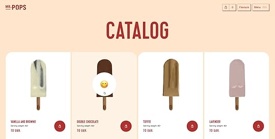
Key takeaway: be detail-oriented and find subtle ways to be creative and engage users. These small details help brand awareness and encourage people to buy from your online store.
On-brand color palettePopcorn eCommerce brand Popcornopolis uses bright colors to increase brand awareness and highlight each page’s most important features. Designers have also done a fantastic job of keeping the most important content and CTAs (call-to-action) above the fold on product pages, enabling users to get to the checkout and complete a purchase fast.
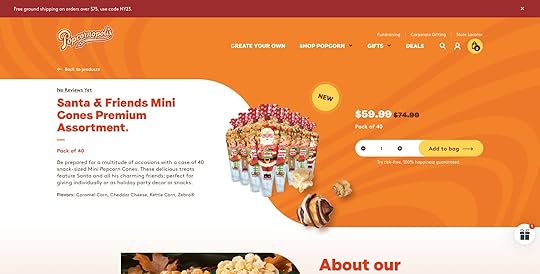
Key takeaway: your color scheme is one of the most critical brand elements, but it must also help users complete their goals. It’s also vital to prioritize content and display the most important design elements above the fold to reduce scrolling–this will get users to complete purchases faster.
Bold minimalist typographyWukiyo uses bold minimalist typography to make text easy to read. The website also uses oversized buttons with a bright blue for the most important CTA–”ADD TO CART.” The blue stands out from the website’s otherwise muted color palette.
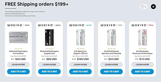
Key takeaway: choose a legible font that’s easy to read. You also want to prioritize content, so you only present enough for users to make decisions. And lastly, always make sure your most important CTA is prominent using size and color.
Shopping cart drawerPremium soda brand Perfy uses bold colors and UI elements to reinforce its brand and product range. A drawer opens when someone adds a product to the cart, revealing the shopper’s basket with a CTA to checkout.
The drawer also provides important messaging to help alleviate any hesitation, including Perfy’s shipping and refund policy. Below that, there are recommended products to increase business value.
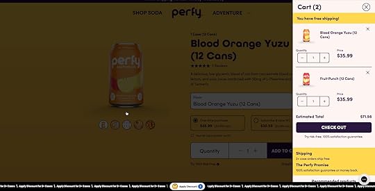
Key takeaway: design ways to get users to checkout effortlessly while anticipating and addressing any hesitations. Make sure you use clear, succinct language so users can comprehend messaging quickly and make a decision.
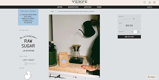
Above the fold product pageLike Popcornopolis, Verve Coffee Roasters uses an above-the-fold, 3-column product page layout. Ample whitespace surrounds the primary CTA with price and quantity selection to help the most important prominent. The product details use keywords rather than lengthy descriptions so that users can make a decision quickly.
Verve’s cart drawer informs shoppers about free shipping while recommending related products to increase transaction value.
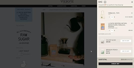
Key takeaway: optimize product pages for scannability and reduce the need to read whenever possible by combining text and graphics. Less is always more–don’t be afraid of using white space to make important content stand out. eCommerce web design must incorporate opportunities to increase transaction value with upsells and cross-sells.
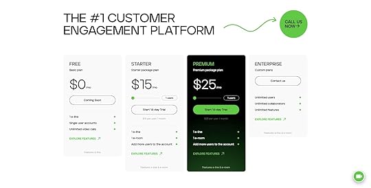
5 SaaS/Digital Product Web Design IdeasMinimalist pricing page design11Sight’s pricing page uses a black-and-white design with bright green accents to highlight important content and actions. Designers also use a contrasting layout to draw attention to the product’s premium plan, which offers the most value to users and the business.
Key takeaway: design pricing pages that are easy for
website visitors to understand with minimal text and distractions, and prominent CTAs.
Draw attention with white spaceAgorapulse’s homepage uses a single-column design with lots of white space, instantly drawing your eyes to the title and CTAs. Designers also do an excellent job summarizing the product’s key benefits from a user’s perspective. While there are two CTAs, it’s obvious which one is the most important with its bright background and light text.
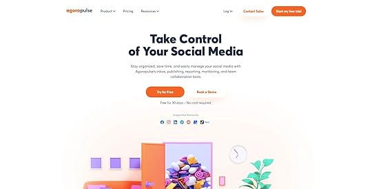
Agorapulse uses a sticky header navigation bar to keep these CTAs visible as users scroll, so they can take action whenever they’re ready.
Key takeaway: if you have more than one CTA, always ensure the primary action is more prominent than the other. Highlight your product’s benefits over features as high on the web page as possible so your site’s visitors know precisely what your business can do for them.
Tell your storyVenture capital firm Nordic Eye uses video for its homepage hero to tell its brand story and connect with website visitors immediately. Video and visuals are excellent ways to tell users who you are and what you do. Short product demos, walk-throughs, etc., allow users to explore your product and determine whether it solves their problems.
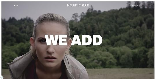
Key takeaway: video is a powerful medium for creating instant connections and demonstrating your product/company’s strengths. Learn about the video optimization tips for user experience.
Speak to your target audienceInvestment app Alinea speaks directly to its target Gen Z audience using relatable, empathetic language. Designers use a clever homepage hero design with a prominent CTA, an app store review widget demonstrating social proof, and leading media publications that have featured the product.
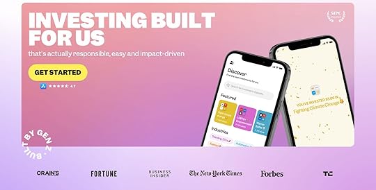
Key takeaway: understanding your target audience and what they value most is critical for successful web design. A homepage hero must describe why your product exists and eliminate any doubts before website visitors will take action.
Cross-functional app websiteMany digital products offer web and mobile applications. Weera’s homepage gives users three options to use their family-orientated app–web, iOS, and Android. These choices enable users to try your product using their preferred medium, increasing the likelihood of signing up.
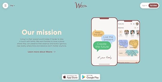
Key takeaway: if you have a cross-platform application, allow users to choose how they want to experience your digital product. Placing these choices as high on the page as possible reduces scrolling while increasing conversions.
Resources for website design ideasHere are some excellent resources if you’re looking for some web design inspiration.
Awwwards: a vast collection of some of the world’s best web designsThemeforest: the world’s largest marketplace for WordPress themes, website templates, plugins, and digital toolsBehance: a social network for designers to share UI design ideasDribbble: a Behance alternativeBuild Great Websites With UXPinUXPin’s advanced design technology enables designers to prototype and test their web design ideas with functionality and fidelity comparable to the final product.
With UXPin, designers get meaningful feedback from end-users and stakeholders to iterate with better accuracy, delivering high-quality results.
Whether you’re designing a new website, landing page, eCommerce store, or cross-platform application, UXPin offers the tools and features to create interactive prototypes that look and feel like the final product.
Take your web development to the next level with the world’s most advanced design tool. Sign up for a free trial to explore UXPin’s advanced features.
Try UXPin for freeThe post Website Design Ideas for Practicing Design appeared first on Studio by UXPin.
January 30, 2023
What is Product Thinking and Why it Matters?

Product thinking is where UX design and product management intersect to deliver outcomes that create value for the organization and its users. There are several frameworks for product thinking, but the underlying concept is always the same–finding a problem-solution fit with clear goals and measurable KPIs for a successful product.
Whether you’re a startup or a multinational organization, developing a product-thinking mindset is crucial for modern product development and its highly competitive landscape. Some variation of what you plan to build already exists. It’s about identifying problems and opportunities competitors haven’t seen or aren’t fulfilling.
Experimentation is core to product thinking and finding the right solution. These experiments require MVPs or prototypes to test ideas and hypotheses. UXPin Merge is a powerful design tool empowering product teams to build high-fidelity, fully functioning prototypes with little or no design tool experience. Visit our Merge page for more details.
Reach a new level of prototypingDesign with interactive components coming from your team’s design system.
Discover UXPin Merge .discover-merge { margin: 40px 8px;}.discover-merge__container { display: flex; max-width: 690px; height: 200px; padding: 20px; padding-left: 24px; border-radius: 4px; background-color: black; box-shadow: 10px 10px #9999ff; align-items: center; justify-content: space-between;}.discover-merge__left { width: 50%;}.discover-merge__left p { margin: 10px 0px !important; color: white !important; font-size: 18px !important;}.discover-merge__heading { font-weight: bold !important; color: white !important; font-size: 18px !important;}.discover-merge__text { margin: 0 !important; line-height: 22px !important;}.discover-merge__button { width: 174px; height: 44px; margin: 10px 0px; border: none; border-radius: 2px; background: white; color: black; font-size: 16px; text-align: center;}.discover-merge__button:hover { cursor: pointer;}.discover-merge__image { max-width: 320px !important; height: 200px; margin-right: -19px;}@media (max-width: 760px) { .discover-merge__container { height: auto; margin: 10px; align-items: left; }}@media (max-width: 500px) { .discover-merge__container { flex-direction: column; } .discover-merge__left { width: 100%; align-items: normal; }}What is Product Thinking?Product thinking is a problem-solving methodology for developing valuable solutions for user problems. It looks at how users, technology, and business goals intersect to deliver products that benefit customers while generating a positive return on investment.
One of the fundamental aims of product thinking is to ship value rather than features. Instead of, “this is nice; customers will love it,” product thinking forces teams to ask, “Does this solve a problem? Will customers use it? Is it valuable for customers and the organization?”
Product thinking is crucial for extending a product’s lifecycle as product teams explore new problems, users, and markets.
Product thinking vs. design thinkingProduct thinking is a holistic method for understanding users, the market, competitors, business goals, and other influencing factors. When an organization designs a new product, the product management team uses product thinking to understand the problem and decide how to solve it using technology.
Design thinking is more user-centered and focuses on solving a specific user problem. Where product thinking defines what to build, design thinking considers the user experience and solving specific usability issues within a product.
The biggest overlap between these methodologies is that they place users and user problems front and center. The primary differentiator is that product thinking is a broad mindset encompassing multiple factors and complexities, while design thinking focuses on user experience.
The Product Thinking ProcessIn a webinar with Mind the Product, Merissa Silk outlines a three-part product thinking framework. The framework has many hallmarks of the design thinking process but with a broader scope and a greater emphasis on business goals, the market, and competitors.
ProblemProduct managers start by identifying the problem. This first stage looks similar to the empathize and define steps of the design thinking process but looks beyond users to understand the market and competitors. Product teams identify a user problem and analyze it from multiple perspectives to determine the value of solving this issue.
There are two key research tools product teams use to define the problem:
User personas : understanding users, their motivations, habits, environment, and problems JTBD (jobs to be done) : a technique for visualizing markets, customers, needs, competitors, and customer segments from multiple perspectives to identify innovative solutionsThere are two templates product teams can use to define problems for stakeholders.
Basic template:
Description of the problem or pain pointHow will the organization solve the problem?What are the KPIs for success?Advanced template (5W1H):
What is the problem?Who does it impact?Why is this problem important?Where does the problem occur?When does the problem occur?How could we solve this problem?OpportunityNext, product teams assess how they might solve the problem and what that will mean for the organization and its users, including the size of the opportunity and the return on investment. They also look at the market opportunity and how solving this problem might increase the organization’s market share or attract new customers.
While assessing the opportunity, product teams may build prototypes to test ideas and hypotheses.
SolutionFinally, product managers must analyze the results and decide which solutions solve the problem best. They must consider multiple factors, including:
Possible ROIConstraints–including financial, human resources, and technical limitationsHow does solving this problem align with the current product roadmapDoes this new product align with organizational goals?How to Use Product Thinking for Building ProductsEx-Google PM Prashant Nair outlines a Practical Template for Product Thinking. Prashant makes the case that product thinking isn’t linear like many product frameworks. Instead, product teams use “continuous recalibration” as they move through the process and identify opportunities.
Prashant’s product thinking template has eight “boxes,” each with a set of questions to dig deep and stress test ideas.
UsersMarketSolutionBuildTeamMeasureResearchIteratePMs start by going through each box systematically and can jump to any box when an idea or opportunity arises.
UsersThe first box is identifying your users and understanding their needs. You might ask:
Who are the direct users?Who are the impacted users?What are the users trying to achieve?These are examples; you might have specific questions about your product or market. This step aims to understand your users deeply, their motivations, problems, goals, needs, wants, etc. Using this data, you can create personas to guide the product thinking process.
MarketThe second box looks at the market:
How are the use cases being met today?Do you see any gaps/opportunities?Are those gaps big enough worth solving?Why are market players not solving this problem?The primary aim of box two is identifying marketing opportunities and assessing whether there is value in solving them. When you identify a problem, it’s crucial to dig deeper and understand why competitors aren’t addressing this issue.
SolutionThe first two boxes are designed to find problems and opportunities. The following two boxes focus on solutions and delivery, which brings us to the third box, Solution:
Does our solution address the gaps providing value to the users?Can we sufficiently monetize the value so that our solution is sustainable?Have we uncovered any 10X innovation?BuildThe fourth box looks at building an MVP while identifying any challenges:
How can we test our solution quickly and cheaply?How can we anticipate issues and unblock the team?How can we ensure a smooth landing?The build box aims to test solutions. PMs need a cost-effective way to test hypotheses–i.e., prototyping. During the prototyping phase, product teams might identify a new opportunity, returning them to an earlier box to research further. From there, they might jump back to the build box to iterate on a new idea and so on.
At the same time, PMs must anticipate any issues related to the solution; some examples include:
Regulations or legal implicationsOrganizational limitations and capacityCost and resource challengesTechnical constraintsLastly, PMs must look at how they might enter the market with this solution and what that process might look like.
TeamThe fifth box looks at the organization’s current resources:
Do we have the right skills and motivations?Are incentives aligned?Do we have funding/sponsorship to see this through?The team box is crucial because if you don’t have the skills or resources, the solution is redundant, and you must return to the drawing board.
PMs must also assess whether the solution aligns with the organization’s values, goals, and roadmap. You may have an excellent solution, but if it pulls the organization in a new direction, that could have adverse implications.
MeasureThe sixth box looks at key performance indicators (KPIs) for success and failure:
What metrics will tell us if we are heading in the right direction?Have we built the instrumentation to track continuously?When things fail, do we have enough granularity to know what is failing?PMs will identify business and product metrics and measure these across multiple demographics like location, age, language, gender, etc.
The most important thing when designing these metrics is granularity–do you have the ability to pinpoint issues?
ResearchContinuous research helps keep product teams in touch with market and competitor changes. Some questions the team might ask include:
Are we tracking external factors?Are we able to generate insights?Are the insights making it to the correct forums?It’s crucial to keep track of external factors like market and competitors because it could render your product redundant. For example, if you’re developing a new crypto product in the United States and the government passes legislation requiring new licenses and oversight, this could increase your time and cost to market. Your company might not have the resources to meet these new requirements.
Any external changes will force PMs to return to earlier boxes to address the new problem and adapt the current solution. Without these research systems in place, PMs risk delivering a product that no longer fits the market or serves users.
IterateThe final box is Iterate, which is something that applies to all boxes:
Have we fostered a culture of experimentation?Are we making data-driven decisions?How fast can we adapt?Google is one of the world’s leading tech innovations. One way they achieve this is by encouraging experimentation and framing failures as learning experiences, eliminating negative connotations. Innovation and great products come from many iterations. When team members are afraid of failure, they don’t try new things, resulting in mediocre outcomes.
Product teams must measure each iteration using KPIs defined in the Measure box. Those KPIs are crucial for telling team members when something isn’t working and why. They can use this data to make changes and iterate. Data-driven decision-making also informs teams when to abandon an idea altogether.
Product teams must go through each box systematically to create a baseline. Then, when they make a change to one box, they have to recalibrate the other seven to get a holistic view of the product idea.
UXPin Merge – The Ultimate Product Design ToolUXPin Merge enables UX designers and product teams to build fully functioning prototypes using interactive components. Product teams can iterate on new ideas and test hypotheses faster than traditional design tools or code.
“With UXPin Merge, some of our product managers can build similar one-page prototypes in eight to ten minutes—the same time it takes our experienced designers in UXPin! Before, with our limited resources and designers, a one-page product would take two or three months just to design mockups. Now product teams can design and deliver a product within the same time frame.” Erica Rider, UX Lead EPX at PayPal
Revolutionize your product thinking and build better MVPs with the world’s most advanced design tool. Visit our Merge page for more details.
Discover MergeThe post What is Product Thinking and Why it Matters? appeared first on Studio by UXPin.
January 26, 2023
6 Design Culture Examples and How to Create Your Own
The design culture examples in this article demonstrate how design-driven companies create positive customer experiences and enhance overall business success.
Creating a good design culture starts with understanding user needs, encouraging collaboration between departments, experimenting with new ideas, investing in the right tools, and developing design team rituals.
Examples from J&J, PayPal, Rexlabs, Google, Revolut, and Dave Malouf demonstrate how these strategies can lead to better decision-making, improved efficiency, and increased innovation.
Build fully functioning prototypes that look and feel like the final product for meaningful feedback from user testing and stakeholders. Create a design culture focused on solving more user problems during the design process with accurate prototyping from UXPin Merge. Visit our Merge page for more details.
Reach a new level of prototypingDesign with interactive components coming from your team’s design system.
Discover UXPin Merge .discover-merge { margin: 40px 8px;}.discover-merge__container { display: flex; max-width: 690px; height: 200px; padding: 20px; padding-left: 24px; border-radius: 4px; background-color: black; box-shadow: 10px 10px #9999ff; align-items: center; justify-content: space-between;}.discover-merge__left { width: 50%;}.discover-merge__left p { margin: 10px 0px !important; color: white !important; font-size: 18px !important;}.discover-merge__heading { font-weight: bold !important; color: white !important; font-size: 18px !important;}.discover-merge__text { margin: 0 !important; line-height: 22px !important;}.discover-merge__button { width: 174px; height: 44px; margin: 10px 0px; border: none; border-radius: 2px; background: white; color: black; font-size: 16px; text-align: center;}.discover-merge__button:hover { cursor: pointer;}.discover-merge__image { max-width: 320px !important; height: 200px; margin-right: -19px;}@media (max-width: 760px) { .discover-merge__container { height: auto; margin: 10px; align-items: left; }}@media (max-width: 500px) { .discover-merge__container { flex-direction: column; } .discover-merge__left { width: 100%; align-items: normal; }}What is Good Design Culture?Good design culture is the practice of proactively incorporating design principles into the product development process. Incorporating these principles takes a lot of work and collaboration. Design avocates must actively work to integrate design culture and user experience values into the company’s culture and daily operations.
These five key factors characterize good design culture:
Focus on user experienceCommitment to researching and understanding customer needsAdvocating for UX and user needsWillingness to take creative risks through experimentationEncourage collaboration between disciplinesCreating a good design culture requires commitment from leadership and collaboration between different departments within an organization.
The importance of design cultureGood design culture can significantly impact the success of an organization’s products and services. It allows organizations to create products that are more attractive, easier to use, and better suited for customer needs.
How do you Create a Healthy Design Culture?Here are five things you can do to build the foundation for a strong design culture.
Focus on collaboration: Design is a collaborative process. Creating a thriving design culture starts with fostering an environment that encourages collaboration between all stakeholders.
Celebrate successes: Acknowledge and celebrate big and small achievements for design initiatives. This acknowledgment helps foster a culture of creativity and innovation.
Foster open dialogue: Encourage an open dialogue between designers, developers, and other stakeholders throughout the design process. An open forum for ideas ensures everyone is in sync with the project’s vision.
Encourage experimentation: Give designers the freedom to try new things and experiment. Like successes, teams must celebrate experimentation–succeed or fail. This autonomy encourages creative thinking while celebrating the attempt and what the organization learned rather than the result.
Invest in tools: Investing in the right tools is essential for successful design projects. Designers must have the hardware, software, and resources to create great work and push creative boundaries.
Implement DesignOps: DesignOps can reduce operational burdens and break down silos that adversely impact morale and culture. The DesignOps mindset, which we discuss in DesignOps 101, takes the same strategies and thinking for design projects and applies it to your company structure and work mentality.
Activities to Enhance Design CultureDesign team ritualsDesign culture must flourish within the design department before spreading organization-wide. Design team rituals are an effective way to instill UX principles, foster connections, and create design advocates within the department.
Some design rituals include:
Design critiques: designers present ideas and designs for feedback.Coffee rituals: scheduled informal meetups to keep designers connected.Weekly 1:1s: Design leader one-on-ones with team members to discuss their challenges, work in progress, career path, etc.Daily stand-ups: an agile exercise where team members share their daily progress and any blockers/challenges.Check-in/Check-out: morning check-in and afternoon check-out rituals foster communication and allow designers to ask for help if needed.Design sprintsDesign sprints foster a culture of experimentation, collaboration, and rapid prototyping. These intensive, focused sessions encourage a diverse team to solve problems using design thinking principles.
Including participants from different departments creates more design advocates while spreading design thinking and user experience principles across the organization.
Design thinking workshopsDesign thinking workshops provide an opportunity for non-designers to learn about and practice design thinking methodologies. These workshops encourage a culture of empathy and problem-solving, which are core UX values.
Participating in design thinking workshops teaches team members how to approach problem-solving and innovation with a user-centered mindset, helping to promote design culture within the organization. Design teams can leverage this organizational mindset to encourage cross-functional collaboration for developing ideas for new products and features.
Invite team members and stakeholders to user testingUser interviews and testing are fantastic opportunities to humanize users and create empathy. Usually, only designers and researchers see how users struggle with problems, leaving other departments and stakeholders to question design decisions.
Bringing these parties into user interviews and testing sessions allows them to witness problems firsthand and how design teams use design thinking to solve them.
Design Culture Examples From Six Leading OrganizationsDesign culture through education at J&JJ&J debuted its design system at a “Lunch & Learn” session where the design team demonstrated how they create interactive prototypes using UXPin Merge.
J&J’s team hosts regular Lunch & Learn sessions where they discuss interactive prototyping and encourage team members and stakeholders to develop their own ideas using anything from basic sketches to high-fidelity prototypes–depending on their available tools and skills.
When team members have a concept to test, they bring it to designers to prototype using the organization’s design system and UXPin Merge. This educational process encourages everyone at J&J to develop product concepts, creating a diversity of ideas and more possibilities for innovation.
DesignOps 2.0 at PayPalIn 2019, PayPal completely reinvented its internal product development process using UXPin Merge. The org’s DesignOps 2.0 creates a single source of truth with UXPin Merge while bringing design and development into a single iterative process.
DesignOps 2.0 educates product teams and engineers about user experience and user-centered principles. Now, everyone in the product development team shares accountability for user experience, including a custom tool to measure UX success in delivering products.
Through DesignOps 2.0, PayPal’s small team of designers has increased their sphere of influence and developed a UX mindset for everyone in the product development process.
Designing a Design Culture at RexlabsYolanda van Kimmenade, a Senior Product Designer at Rexlabs, describes how she and her design team designed a design culture at the software development agency.
Yolanda and her team started by defining the values and behaviors they believed were important to them and the organization, including:
CollaborationInclusivityContinuous learningOpen communicationGiving and receiving feedbackNext, Rexlabs’ designers created systems and processes to support these values and behaviors, which included:
Establishing a shared language and set of tools for communicationSetting up regular check-ins and feedback sessionsCreating a system for sharing knowledge and resources within the teamYolanda emphasizes that design culture isn’t static. The design team must revisit and adjust the culture as the organization and products evolve. Rexlabs’ designers created a positive and productive work environment by continuously aligning their culture with their goals and values.
Rexlabs’ design team spread these values through a design ritual called “Scribbles.”
“We meet every Wednesday for ‘Scribbles’ — alternating in-person and remote meetups. We discuss topics of interest, give each other feedback on designs (e.g., user research insights, user flows, or WIP designs), and have a delicious coffee…During one Scribbles session, the topic turned to our frustrations about processes that needed improvements. Anton Babkov (our head of design and CEO, who gives us business insights and support), suggested we document these challenges and decide how we’re going to tackle them.” – Yolanda van Kimmenade, Senior Product Designer at Rexlabs.
This discovery from Rexlabs’ CEO was made possible by the company’s strong design culture that welcomes giving and receiving feedback.
Building a Better Design Culture at GoogleMike Buzzard, a Design Manager at Google, argues that a strong design culture leads to increased innovation, customer satisfaction, and overall business success.
Mike suggests three key strategies for developing a healthy design culture:
Establish clear design principles and apply them throughout the company, so team members understand the organization’s design philosophy and how to make design decisionsInvest in ongoing design training and education for all team members to foster continuous learning and improvementEncourage collaboration and communication to create a sense of community, so that team members feel invested in the success of the organization’s design efforts“I do think Google can become more design-oriented. Signals of that would be in the vocabulary engineers use when talking to designers about their work, or even just a top-down, bottom-up sort of comfort in understanding how design influences the company’s products and culture… The number of people working in UX at Google has multiplied over the last 5 years—that magnitude of growth is partly why we created a team dedicated to UX community and culture, to ensure the health and success of UX across all of Google.” – Mike Buzzard, Design Manager at Google.
Creating a strong design culture at RevolutIn a 2020 Medium article, Lucas Vallim discusses how a strong design culture can lead to better decision-making, improved efficiency, and increased innovation.

Lucas says you must first understand the role of design within the organization and how this fits into the overall business strategy. Conversely, the company must prioritize design and invest in design talent and resources. Additionally, the company should foster a collaborative and inclusive design process and encourage open communication and feedback.
Lucas argues that building a design culture on these values helps the organization better understand its customers while creating more effective and satisfying products.
Using Holistic DesignOps for enterprise design cultureIn an informative UXPin webinar, long-time DesignOps advocate Dave Malouf describes how a holistic DesignOps strategy creates a design culture beyond the design team.
Dave argues that the foundation for a holistic design culture starts with communication and collaboration, which helps everyone in the organization understand design, its principles, needs, areas of influence, and potential.
Dave describes three pillars for holistic DesignOps:
Delivery operations: how to get things delivered by optimizing efficiency, velocity, and cost reduction.Practice operations: The people, spaces, methods, and tools that make it possible for designers to design.Business operations: Streamlining organizational bureaucracy from finance, IT, procurement, compliance, legal, etc.Revolutionize your design workflows and bridge the gap between design and development with the only design tool built to solve modern DesignOps challenges. Discover Merge.
Discover MergeThe post 6 Design Culture Examples and How to Create Your Own appeared first on Studio by UXPin.
January 25, 2023
8 Most Common Problems in Website Design

With so many variables to manage, website design problems often creep in, resulting in a poor user experience and adverse effects on SEO (search engine optimization). Designers and engineers must collaborate to prevent these common web design problems so users can find content and complete tasks with minimal effort.
We’ve identified 8 common web design problems in 2023 and the steps designers and developers can take to reduce or solve these issues.
Design better website experiences with the world’s most advanced design tool. Improve cross-functional collaboration and reduce usability issues with UXPin. Sign up for a free trial to explore UXPin’s features.
Build advanced prototypesDesign better products with States, Variables, Auto Layout and more.
Try UXPin .try-uxpin-banner { margin: 40px 0px;}.try-uxpin__container { display: flex; max-width: 689px; height: 210px; padding: 20px; padding-left: 24px; border: 2px solid black; border-radius: 4px; align-items: center; justify-content: space-between; background-color: white; box-shadow: 10px 10px black;}.try-uxpin__left { width: 54%;}.try-uxpin__left p { margin: 10px 0px !important; color: black !important;}.try-uxpin__heading { font-size: 28px !important; font-weight: bold;}.try-uxpin__text { margin: 0 !important; font-size: 18px !important; line-height: 22px !important;}.try-uxpin__button { width: 135px; height: 44px; background: black; margin: 10px 0px; padding: 10px 20px; border: none; border-radius: 2px; color: white; font-size: 16px; text-align: center;}.try-uxpin__button:hover { cursor: pointer;}.try-uxpin__image { max-width: 320px !important; height: 200px; margin-right: -21px; margin-bottom: -6px;}@media (max-width: 760px) { .try-uxpin__container { height: auto; margin: 10px; align-items: left; }}@media (max-width: 500px) { .try-uxpin__container { flex-direction: column; } .try-uxpin__left { width: 100%; align-items: normal; }}Not Using Responsive Design The problem
Responsive design is one of Google’s primary ranking factors. The tech giant even has a free Learn Responsive Design tutorial to educate designers and engineers. Why? Because Google wants to deliver the best user experience for every result, non-responsive websites are notoriously difficult for mobile users.
The solutionDesigners and front-end developers must follow mobile-first web design principles and progressive enhancement to deliver a seamless user experience across the three primary screen sizes, mobile devices, tablets, and desktops.
Web Accessibility The problem
Many websites still ignore web accessibility guidelines, resulting in poor user experiences, particularly for those with disabilities and challenges. Accessibility doesn’t only apply to disabilities. Users endure situational challenges, like slow internet, temporary injuries, or navigating the internet when someone only has one hand free.
Not every website must be accessible. There are projects where designers push creative and technological boundaries, but everyone must have access if your website aims to serve your target audience with helpful information and resources.
The solutionDesigners can use a web accessibility checklist to ensure designs meet Web Content Accessibility Guidelines (WCAG). Some accessibility basics include:
Color: using a color blindness simulator and contrast checker to ensure users with visual impairments can read and interpret content.Use plain language: content must be free of jargon and slang so users can fully comprehend information and instructions. The outcomes for links and CTAs (calls to action) must be obvious and never “trick” users–whether that’s intentional or not.Header tags: only one H1 title tag per web page. Nested headings must follow the conventional order of H1, H2, H3, H4, H5, and H6.Images: use descriptive alt text for every image and never use images to replace text because users with screen readers can’t see them.Forms: use the label HTML tag for every field and include helper text for additional instructions. Error messages must provide explicit instructions to fix an input issue.Additional web accessibility resources:
Accessibility UX Best PracticesWeb Accessibility ChecklistThings Every Designer Needs to Know About AccessibilityPoor Website Usability The problem
Usability is the foundation for user experience. It’s about getting the basics right so users can easily navigate your website and find features. Some common usability issues include:
Broken linksPoor navigationToo many steps to complete tasksUnfamiliar UX patterns–increases the website’s learning curvePoor website performanceInconsistent UI designCluttered user interfaces with redundant UI elementsThe solutionDesigners must reduce and eliminate wherever possible. For example, simplifying and minimizing steps in user flows so users can get to the end goal faster.
Optimizing usability means designers must remove roadblocks and inefficiencies. For example, eliminate UI elements, animations, and content that distracts rather than serves.
Poor User Experience The problem
Usability is one aspect of a website’s user experience. User experience considers how people might think and feel as they engage with a website and its features. UX also extends to the customer experience, which includes brand perception.
Organizations place a high emphasis on UX because if someone doesn’t enjoy a web experience, it’s likely they won’t convert or return.
The solutionDesigners must understand users’ needs and priorities to optimize a website’s user experience. Human-centered design and design thinking principles help designers understand website visitors and how they can best solve their problems. For example, placing contact information in the header for a local small business or prioritizing the primary navigation menu to meet common browsing habits.
Poorly Executed Content StrategyThe problemMost people visit websites to find answers to their questions. Designers have many ways to answer these questions using content, for example:
TextMapsImagesVideos/GIFsInfographicsWhen designers assume what’s best for users, they often use incorrect content. For example, GOV.UK’s old bank holiday page was cluttered and difficult to read.
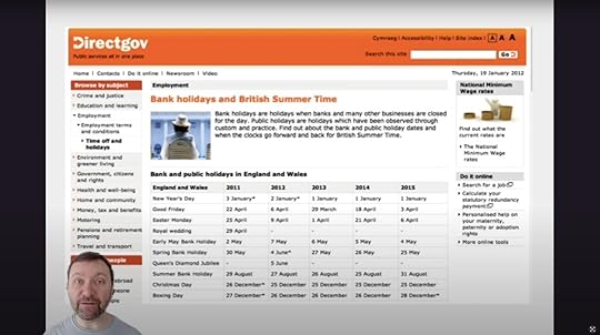
The content design team conducted user research to understand why people visit this page. They learned that most users wanted to know the date for the next bank holiday. The result was a significantly cleaner user interface with the next date in large highlighted text. The following dates were below this in sequential order.
 The solution
Recognizing which content to serve requires a deep understanding of users and their needs.
Why is someone visiting your website?What content will answer their question comprehensively and efficiently?Your header and hero section (above-the-fold content) are prime real estate for serving content that meets user needs. Instead of an irrelevant hero image and CTA, deliver content that helps people find what they need fast. That might be a link to your contact page or your store’s hottest-selling product.
Outdated Content & Design The problem
Using a web template or WordPress theme is a quick way to build your new website, but the result is often generic, with outdated features–like a feature-packed sidebar or performance-killing hero carousel. The biggest mistake is designing a website before researching the content.
Another related issue is outdated content which could damage your brand and user trust. For example, if your eCommerce site is still running winter promos on the homepage in summer, customers might think no one is managing the store and fear placing an order in case no one processes it.
The solutionDesigners must design around content rather than fit content into a template or pre-made UI pattern. This approach will help eliminate redundant UI patterns while delivering exactly what users need in the appropriate format.
Regular UX audits ensure designers spot usability issues, outdated designs, and content so the website is always relevant while providing the best user experience.
Inconsistent Design Language The problem
Design inconsistencies cause confusion, making navigating user interfaces and completing actions difficult. For example, using multiple colors for CTAs or applying different styling (fonts, sizing, colors, borders, etc.) to the same UI elements across separate pages.
These minor inconsistencies require a user’s brain to think and relearn a user interface whenever the components change.
Design inconsistencies also increase development times because engineers must create new components rather than reuse existing ones.
In short, design inconsistencies create problems for everyone, from users to designers, engineers, and stakeholders.
The solutionDesign systems help eliminate design inconsistencies and drift. Reusing the same components, patterns, and templates means engineers can copy/paste existing code rather than designing from scratch.
Most website projects don’t have the resources to develop and maintain a design system. But there are tools designers can leverage to build a design system with minimal resources.
UXPin’s Design Systems feature allows designers to create UI libraries to share with other designers. They can create as many design systems as they like–one for each project if needed. The design system owner can set permissions to avoid unauthorized changes and maintain the library’s integrity.
When designers need to redesign a website, they simply apply new styling to the design system’s components in UXPin rather than starting from scratch.
Saving and reusing these components offers several key benefits:
Less designing from scratchLess front-end web developmentFaster time to marketLess drift and inconsistenciesFewer usability issuesEnhanced brand and user experienceUnhelpful Errors and 404s The problem
Errors are bound to happen on every website and digital product. Good UX anticipates these issues and provides solutions to solve them. Most 404 pages try to be comical with a short message, “Oops, looks like this page doesn’t exist,” with a link taking the user back to the homepage. If this is someone’s entry to your website via an external link, it’s a terrible first impression, and they’re almost certain to leave.
Forms are another area where errors often occur, causing frustration for users. When error messages don’t provide adequate assistance, users hit roadblocks, unable to complete tasks.
The solution404s happen for various reasons, but the one that has the most detrimental effect on bounce rates is when you delete a webpage with no redirect. Users will find your 404 instead of the expected content if that page has external and internal backlinks.
It might seem counterintuitive, but when you delete a page, create a new one explaining that this page no longer exists with links to related content. For example, if you delete a t-shirt from your store, create a custom 404 explaining you no longer sell this product with links to related t-shirts or apparel. You can reuse this 404 for all your t-shirt products or create one for specific categories.
This strategy creates transparency with relevant solutions for users while increasing the likelihood they’ll stay on your website rather than exiting and finding a competitor.
Designers must also create helpful form error messages, including:
Highlighting the field with the errorProviding helper text with explicit instructions to fix the issueSolve Common Problems and Reduce Errors With UXPinUXPin’s sophisticated end-to-end design tool enables designers to build website prototypes with the same fidelity and functionality as developers. These advanced prototypes improve user testing, so designers solve more problems during the design process, resulting in better user experiences and fewer errors.
Solve common issues, enhance designer/developer collaboration, and deliver high-quality user experiences with UXPin. Sign up for a free trial to explore UXPin’s advanced features.
Try UXPin for freeThe post 8 Most Common Problems in Website Design appeared first on Studio by UXPin.
January 24, 2023
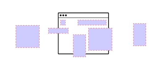
10 Essential Design System Components
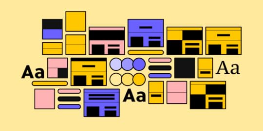
Design systems cannot exist without a reusable component library. These design system components create workflow and UI consistency across design and development to minimize drift and streamline handoffs.
But these UI components don’t simply appear. The design system team must first lay the foundation for these UI elements to exist, including design language (design principles) and guidelines that unify teams in building a consistent and cohesive component library.
Sync your design system components hosted in a repository to UXPin using Merge technology for a single source of truth across your product development team. Visit our Merge page for more details and how to request access.
Reach a new level of prototypingDesign with interactive components coming from your team’s design system.
Discover UXPin Merge .discover-merge { margin: 40px 8px;}.discover-merge__container { display: flex; max-width: 690px; height: 200px; padding: 20px; padding-left: 24px; border-radius: 4px; background-color: black; box-shadow: 10px 10px #9999ff; align-items: center; justify-content: space-between;}.discover-merge__left { width: 50%;}.discover-merge__left p { margin: 10px 0px !important; color: white !important; font-size: 18px !important;}.discover-merge__heading { font-weight: bold !important; color: white !important; font-size: 18px !important;}.discover-merge__text { margin: 0 !important; line-height: 22px !important;}.discover-merge__button { width: 174px; height: 44px; margin: 10px 0px; border: none; border-radius: 2px; background: white; color: black; font-size: 16px; text-align: center;}.discover-merge__button:hover { cursor: pointer;}.discover-merge__image { max-width: 320px !important; height: 200px; margin-right: -19px;}@media (max-width: 760px) { .discover-merge__container { height: auto; margin: 10px; align-items: left; }}@media (max-width: 500px) { .discover-merge__container { flex-direction: column; } .discover-merge__left { width: 100%; align-items: normal; }}What are Design System Components?UI components are the foundation for any design system. Front-end developers use these code components to build user interfaces and digital products.
UI components have two dimensions:
The visual design elementThe code snippet that gives the component its styling and interactivityMost design systems have two versions of these UI libraries:
An image-based UI kit or style guide for designersA code component (UI component) library for developersUnderstanding UI component propertiesEvery component has properties that give it interactive and aesthetic characteristics, like color, spacing, typography, state, etc. A design system’s design language and UI guidelines define these properties.
Since many design systems use React, we’ll use this framework as an example of how component properties work.
In React, we call properties “props.” Props contain styling, interactivity, and content. The example below shows the React props for an MUI button.
 The children prop defines the button’s content, usually a label like “Buy Now” or “Submit.”The color prop defines the button’s color. Each type, ‘inherit,’ ‘primary,’ ‘secondary,’ etc., represents a color from the design system’s theme. Engineers define these using design tokens or variables in the library’s CSS file.The disabled prop is a bool (boolean) which is either true or false. Engineers can use this prop to set a button as disabled until a user completes a task or action–like completing all the required fields on a form.
As you can see from these three examples, component properties can define many characteristics, functionality, and content.
Component Library vs. Pattern LibraryUI Components provide the building blocks for creating an effective user interface. Designers use UI components to create various layouts and designs depending on the application’s needs. For example, users can use buttons to trigger actions or navigate between pages, while menus display options or provide access to additional features.

On the other hand, UI Patterns provide structure and organization for how these components should interact. Design patterns ensure that users can easily find what they need and understand how to use the product. Common UI patterns include navigation bars, search boxes, and dropdown menus. Following established patterns, designers ensure that their applications have a consistent look and feel across all platforms.
Read more about component library vs. pattern library here.
UI Component Structure and Atomic DesignUI components and design patterns comprise of multiple smaller UI elements. Brad Frost’s Atomic Design is the best way to explain this structure and how these smaller parts combine to form the components we see and interact with.
AtomsAtoms are the foundational elements of a design system and cannot be broken down further. The design system team combines these atoms to create UI components and design patterns. Some atom examples include:
LabelsInput fieldsButtonsColor palettesFontsIconsAnimationsDesign tokensMoleculesMolecules are UI components or patterns comprised of multiple atoms. These molecules provide functionality within a user interface, for example, a search bar, logo, or navigational links.
OrganismsOrganisms are UI patterns designers use as building blocks for templates and user interfaces. Some examples include navigation bars, image carousels, footers, and sidebars.
The Atomic Design structure continues to templates and pages, which you can read more about in building a component library.
10 Essential Design System ComponentsThis list of design system components is by no means exhaustive. We’ve chosen these ten components to demonstrate their use cases and how they fit within the design system ecosystem.
ButtonsButtons are one of the most essential design system components. They provide a way for users to interact with a user interface and complete actions, like submitting a form, navigating to a new page, or adding an item to a shopping cart.
When product teams audit products before building a design system, they often find many button variations, which ultimately cause frustration and confusion. Button consistency lets users quickly identify the correct UI element to action or find information.
Text inputs
Text fields are another common design system component. These input elements enable users to share text or numerical content (like personal details) and access search. Text fields typically have three key properties:
LabelHelper text (for accessibility)PlaceholderDesigners also use prefixes and suffixes to make the input more obvious. For example, a $ symbol as a prefix for USD or lbs/kg as a suffix for weight. In both these examples, users know to include numbers rather than letters.
Checkboxes and radio buttonsCheckboxes are used for multiple select UI patterns, while radio buttons allow users to select a single option from numerous choices.
Toggles (Switches)Toggle components provide a simple, intuitive way for users to quickly and easily switch between different states or options, reducing the time spent navigating UIs and completing tasks.
Dropdown menusDropdown menus reduce clutter on a user interface and allow users to select only the options that are relevant to them. Hiding long lists of options until the user needs them helps create a more organized and user-friendly experience.
CardsDesigners use cards to organize and present information in a visually appealing and user-friendly way. Cards allow users to quickly scan through content, making it easier to find what they need. Cards also provide a consistent look and feel across platforms, creating a unified cross-platform user experience.
Dialog boxesDialogs are modals that create a moment of friction for confirming critical or irreversible actions, like deleting something. These dialogs vary visually across platforms, so designers must create multiple versions, including iOS, Android, Web, Windows, etc.
Progress bars
Progress bars are vital feedback components designers use to inform users of their progress during a multi-step task. This feedback helps manage user expectations and limit frustration–i.e., “how long is this going to take!”
TooltipsTooltips provide users with additional information about a feature or element on a page. Designers use tooltips to explain the purpose of a button, link, or other UI elements and provide helpful hints and tips for how to use it.
Tooltips are particularly helpful for enterprise design systems where products and user interfaces are more complex. Tooltips can explain features without the user leaving the UI to check the product’s documentation.
Alerts & snackbarsAlerts and snackbars provide users with vital information in a concise, user-friendly, actionable message. Designers use alerts to inform users of errors, warnings, or successes, while snackbars provide contextual information about an action.
Examples of Design System ComponentsHere are the best examples of leading design systems and their component libraries:
Shopify PolarisSalesforce LightningAtlassian Design SystemGoogle’s Material DesignIBM Carbon Design SystemMicrosoft Fluent Design SystemYou can find those examples is our list of 8 best design systems.
Component-Driven Prototyping With UXPin MergeDesigners can use design system components from a UI kit to create visually appealing user interfaces. The problem with these image-based tools is they render a vector representation of a UI component with no functionality.
With UXPin Merge, designers use a component-driven prototyping method, similar to component-driven development, to build fully functioning prototypes that look and feel like the final product.
How Merge worksMerge syncs your design system’s UI library hosted in a repository (GitHub) with UXPin’s design editor. Designers use the same components during the design process as engineers use for development, thus creating a single source of truth from concept to final release.
Once you sync Merge to your design system’s repository, any changes to components automatically sync to UXPin’s editor, notifying designers of the update. Merge’s Version Control allows design teams to choose when they want to update and even switch to an earlier version of the design system–for example, when working on an old project.
Johnson & Johnson’s transition to component-driven prototypingBefore switching to UXPin Merge, Johnson & Johnson’s (J&J) design teams used image-based UI kits with separate PDF and print style guides. The problem?
“…you can never know whether you have updated all of them to meet the enterprise’s current standards. You can hold as many meetings as humanly possible, but an outdated style guide will manage to sit in someone’s desk drawer, just waiting to make your life more difficult a year or two from now.” Ben Shectman, Experience Design Expert Service Leader at Johnson & Johnson
J&J uses Storybook to manage its design system’s development and UXPin Merge for designers. Merge’s Storybook integration enables J&J to sync the two technologies, so designers and engineers use the same UI library from the same repository.
“These components keep all the interactivity and are still production-ready, which saves a lot of handoff troubles. It speeds up building digital products, both the design and development process.” Ben Shectman, Experience Design Expert Service Leader at Johnson & Johnson
Fully-functioning prototypes in minutesIn a 2021 webinar with UXPin, Ben Shectman and Gil Gerard of J&J demonstrated how Merge enabled the design team to build a fully functioning prototype of an old UI in under 10 minutes.
PayPal experienced similar results after switching to Merge, where product designers build new one-page, fully functioning UIs in under ten minutes–a process that used to take experienced UI designers more than an hour in image-based tools with limited interactivity.
If Merge can simplify the product development process for these multinational enterprise giants, imagine what it could do for your business. Visit our Merge page for more details and how to request access.
Discover MergeThe post 10 Essential Design System Components appeared first on Studio by UXPin.
January 23, 2023
7 Constraints in Design and How to Overcome Them
Whether you work in an early-stage startup or a multinational enterprise, design constraints limit or influence design projects and the desired output.
The first step is acknowledging these limitations and that they constrain UX designers from delivering great design outcomes. Understanding and managing design constraints will minimize adverse effects or eliminate issues altogether.
Eliminate prototyping constraints, bridge the gap between designers and engineers, and deliver exceptional user experiences with UXPin Merge. Visit our Merge page for more details and how to request access.
Reach a new level of prototypingDesign with interactive components coming from your team’s design system.
Discover UXPin Merge .discover-merge { margin: 40px 8px;}.discover-merge__container { display: flex; max-width: 690px; height: 200px; padding: 20px; padding-left: 24px; border-radius: 4px; background-color: black; box-shadow: 10px 10px #9999ff; align-items: center; justify-content: space-between;}.discover-merge__left { width: 50%;}.discover-merge__left p { margin: 10px 0px !important; color: white !important; font-size: 18px !important;}.discover-merge__heading { font-weight: bold !important; color: white !important; font-size: 18px !important;}.discover-merge__text { margin: 0 !important; line-height: 22px !important;}.discover-merge__button { width: 174px; height: 44px; margin: 10px 0px; border: none; border-radius: 2px; background: white; color: black; font-size: 16px; text-align: center;}.discover-merge__button:hover { cursor: pointer;}.discover-merge__image { max-width: 320px !important; height: 200px; margin-right: -19px;}@media (max-width: 760px) { .discover-merge__container { height: auto; margin: 10px; align-items: left; }}@media (max-width: 500px) { .discover-merge__container { flex-direction: column; } .discover-merge__left { width: 100%; align-items: normal; }}What are Design Constraints?Design constraints are limitations or restrictions in the design process imposed by internal and external factors. These constraints impact the final product, so it’s critical that everyone in the organization is aware of them and considers these limitations before every project.
Common types of design constraints include:
Technical constraints: how a product’s tech stack and engineering team limit designFinancial constraints: departmental and project budgetsLegal and regulatory constraints: laws design teams must followOrganizational constraints: culture, structure, policies, bureaucracySelf-imposed constraints: each designer’s workflow and creative decision-makingTalent constraints: designer skills and experience and professional shortcomingsProject-specific constraints: limitations relating to the project, including time, budget, available team members, etc.We’ll explore these in greater detail and discuss how team members and stakeholders address design constraints.
Technical constraintsTechnical constraints significantly impact design projects because they dictate how far designers can push creative and innovative boundaries.
Some examples include:
Device and operating system limitations: iOS and Android constraints, screen sizes, processing power, etc.Accessibility constraints: how voice control and screen readers impact design decisions.Performance constraints: the impact of user bandwidth/Internet connectivity, product servers, and tech stacks.Integrations and APIs: limitations from external services and API requirements.Tech stack constraints: how front-end and back-end tech impact the design process.Financial constraintsFinancial constraints impact many areas of the design process, including human resources, tools, user research, project scope, and technology. While many see financial constraints as a roadblock, they often drive creative thinking and design innovation through bootstrapping and workarounds.
Some ways financial constraints impact the design process include:
Limiting the scope of each discipline (research, wireframing, prototyping, interviews, testing, etc.)Limits the number of iterations and testing roundsSpecifies what tools designers useDetermines the size and skill level of the design teamLegal and regulatory constraintsLegal constraints impact content and user data the most regarding UX projects. These laws change depending on the country, so designers rely on advice from legal counsel and stakeholders.
Some examples of how legal constraints impact design include:
Privacy laws: dictate what data designers collect, how they collect it, the legal notices they give users, and how they get permission–notably, General Data Protection Regulation (GDPR) in the European Union or the California Consumer Privacy Act (CCPA).Accessibility laws: what designers must do legally to make user interfaces accessible for users with various impairments– for example, the Americans with Disabilities Act (ADA) in the United States.Intellectual property laws: copyright for original works, including text, images, video, etc. Additionally, designers must consider whether they infringe on competitor/brand IP, trademarks, and other legal protections.Industry-specific regulations: some industries, like financial and healthcare, have laws about privacy and security that significantly impact design–for example, login and authentication procedures.Organizational constraintsOrganizational constraints describe limitations imposed on Design by other parts of the company. These limitations often relate to the organization’s values, culture, company vision, and competing interests from other departments.
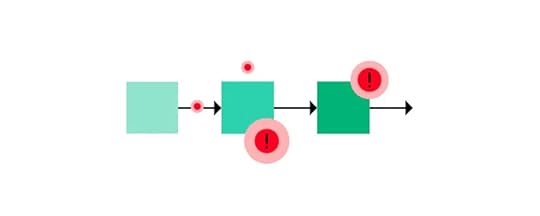
Some examples of organizational constraints include:
Time constraints: deadlines set by stakeholders can impact how designers research, prototype, and test design ideas.Brand guidelines: an organization’s brand influences stylistic and messaging decisions.Marketing and business goals: designers often have to balance user needs with organizational goals, which can limit design choices.Design system constraints: available components, design principles, style guides, guidelines, and design system governance impact how designers create products.Organizational silos: poor communication and collaboration lead to silos that hamper progress. These silos often lead to duplicate work, delays, design drift, inconsistencies, and other friction.Design’s value: how the organization perceives the UX department can impact resource allocation and buy-in, limiting what designers can do.Self-imposed constraintsSelf-imposed constraints come from the designers, relating to the choices and options during the design process, like which design tool they use, the time it takes to complete tasks, and whether they use the product’s design system.
Talent constraintsTalent constraints relate to the skills and specialists available to the design team. It’s important to know every designer’s skill set and expertise so that managers can assign people who complement one another. Understanding talent constraints enables managers to source the right people and when to hire specialist contractors for specific design projects.
Project-specific constraintsProject constraints create design problems that otherwise don’t exist or are rare to an organization. For example, designers might have to complete a project in a shorter timeframe than they’re used to, resulting in adapting workflows or switching tools to accomplish the desired outcome.
How to Overcome Design ConstraintsIn many organizations, overcoming constraints is a DesignOps function. The DesignOps team must reduce these limitations and roadblocks to maximize the department’s output and organizational value.

This problem-based framework will help overcome design constraints starting with your organization’s biggest challenges. A problem-based approach will allow you to solve a specific issue and its related constraints, thus increasing the impact.
Define the problem: what challenge are you trying to solve? This could be reducing time-to-market or increasing designer productivity.Identify the constraints: list the constraints related to this problem, i.e., budget, resources, time, technical, etc.Prioritize the constraints: determine which limitations are most consequential and prioritize accordingly.Brainstorm solutions: meet with appropriate experts, team members, and stakeholders to brainstorm solutions. Create a list of possibilities.Evaluate the solutions: consider the pros and cons of each idea and determine which has the highest feasibility with the most significant potential impact.Choose a solution: select the solution you believe will deliver the best results and put plans in place to implement it.Test and iterate: create KPIs to measure your solution’s effectiveness and tweak them over time to optimize the results. Don’t be afraid to abandon poor-performing ideas and iterate on new ones.Define the problem: efficacy vs. efficiencyIn a webinar with UXPin, DesignOps expert Patrizia Bertini outlined how practitioners must frame problems to measure results from solutions. Patrizia argues that it’s essential to recognize the difference between efficacy and efficiency because you evaluate these differently.
Efficacy uses qualitative metrics, including:
Empathy and ongoing user engagementIdeation and experimentation cycle timesComposition of teams’ skills (skill matrix)Design skills’ distributionPerceived value of design by cross-functional partnersDesigner satisfaction and retentionEfficiency is measurable and quantifiable using numbers, percentages, and ratios:
Tools’ ROI (cost/engagement/adoption)Testing and prototyping lead time (time)Number and type of quality reviewsTeam productivity (resources utilization)End-to-end delivery time (time)Reducing Constraints With UXPin MergeTraditional design workflows and image-based tools present many constraints for designers–most notably, prototyping fidelity and functionality which have many adverse effects, including:
Limited user testing scopeInability to spot usability issues during the design processFewer problem-solving opportuntiesLimited stakeholder comprehension impacting buy-inLess ability to identify business opportunitiesPoor designer/developer collaboration and challenging design handoffsUXPin Merge solves these issues and many more by syncing your product’s component library to UXPin’s design editor, so designers use the same UI elements during the design process as engineers use to develop the final product.
Merge components are fully interactive and function in UXPin exactly as they do in the repository and final product. This interactivity provides design teams with a component-driven workflow that increases project scope and enables significantly faster testing and iterations.
Merge breaks down silos and operational constraints because designers and engineers speak the same language. Design handoffs with Merge are seamless and frictionless, requiring less documentation and explanation because engineers already have the same component library. UXPin renders JSX, so engineers simply copy/paste to apply these to the component’s props.
Merge also significantly reduces testing constraints. Usability testing participants and stakeholders can interact with prototypes like they would the final product, producing meaningful, actionable results to iterate and improve outcomes.
“Our stakeholders are able to provide feedback pretty quickly using UXPin Merge. We can send them a link to play with the prototype in their own time and UXPin allows them to provide comments directly on the prototypes. UXPin’s Comments functionality is great because we can follow along and mark comments as resolved once we address them.” – Erica Rider, UX Lead EPX at PayPal.
Eliminate prototyping limitations with a code-based design solution from UXPin Merge. Iterate faster to deliver high-quality projects, even under the tightest time constraints. Visit our Merge page for more details and how to request access.
Discover MergeThe post 7 Constraints in Design and How to Overcome Them appeared first on Studio by UXPin.
January 19, 2023
Taming Scope Creep in Product Design
Scope creep is a common issue in UX design projects. By proactively preventing scope creep, UX designers can ensure that their projects are completed on time and within budget.
Establishing clear goals and objectives, creating a design brief, encouraging collaboration, planning for the unexpected, and creating a system of governance are all effective ways project teams can reduce project scope creep.
Eliminate designing and coding from scratch to reduce scope creep while creating a single source of truth between design and development with UXPin Merge. Visit our Merge page for more details and how to request access to this revolutionary technology.
Reach a new level of prototypingDesign with interactive components coming from your team’s design system.
Discover UXPin Merge .discover-merge { margin: 40px 8px;}.discover-merge__container { display: flex; max-width: 690px; height: 200px; padding: 20px; padding-left: 24px; border-radius: 4px; background-color: black; box-shadow: 10px 10px #9999ff; align-items: center; justify-content: space-between;}.discover-merge__left { width: 50%;}.discover-merge__left p { margin: 10px 0px !important; color: white !important; font-size: 18px !important;}.discover-merge__heading { font-weight: bold !important; color: white !important; font-size: 18px !important;}.discover-merge__text { margin: 0 !important; line-height: 22px !important;}.discover-merge__button { width: 174px; height: 44px; margin: 10px 0px; border: none; border-radius: 2px; background: white; color: black; font-size: 16px; text-align: center;}.discover-merge__button:hover { cursor: pointer;}.discover-merge__image { max-width: 320px !important; height: 200px; margin-right: -19px;}@media (max-width: 760px) { .discover-merge__container { height: auto; margin: 10px; align-items: left; }}@media (max-width: 500px) { .discover-merge__container { flex-direction: column; } .discover-merge__left { width: 100%; align-items: normal; }}What is Scope Creep?Scope creep occurs when the scope of a project expands beyond its original objectives. Various factors cause scope creep, including changes in user requirements, lack of communication between stakeholders, or inadequate planning.
When scope creep occurs, it can significantly impact a project’s timeline and budget. It can also lead to increased complexity and difficulty in completing the project. UX designers must be aware of the potential for scope creep and take steps to prevent it.
One way to prevent scope creep is to ensure that all stakeholders are involved in the planning process from concept to project launch. This collaboration will help ensure that everyone clearly understands the project’s objectives and deliverables while staying in sync with any changes.
It’s crucial to set realistic expectations for the timeline and budget of the project to account for any changes ahead of time. UX designers must remain flexible throughout the development process. This flexibility allows them to quickly adapt to any changes during development without completely overhauling their plans or starting from scratch.
By proactively preventing scope creep, UX designers can ensure that their projects are completed on time and within budget.
10 Common Causes of Scope CreepHere are ten examples of scope creep and what causes them. Use these examples to create systems to mitigate scope creep for future projects.
Poorly defined requirements and project deliverablesWhen the project requirements and deliverables are not clearly defined, it can lead to scope creep as stakeholders add new features or change existing ones. For example, a client may ask for a website design that includes a blog, then request additional features such as an e-commerce store or a forum later.
Unclear project goalsScope creep often occurs when stakeholders don’t clearly outline and agree on a project’s goals. Stakeholders and team members try to add more features or adjust existing ones to meet their interests, and no one interjects because they haven’t agreed on the desired outcome or scope.
Poor communicationPoor communication often results in silos across teams and misinformed stakeholders. Without clear communication, stakeholders may be confused or frustrated when teams report unexpected changes or delays, leading to additional requests for changes that were not part of the project’s original scope.
Unforeseen circumstancesEven with excellent planning and clearly defined goals, unforeseen circumstances can derail a project beyond its original scope. Technology changes, new regulations, or a company merger/acquisition can lead to scope creep.
These unforeseen circumstances are often harder to plan for, so project managers and team leaders must design project scopes for flexibility and have contingencies for critical features and KPIs.
Lack of prioritizationPrioritization helps team members focus on what’s important and allocate resources accordingly. This prioritization also helps with tracking progress and clear goal-setting. Without proper prioritization, teams may spend too much time on less important aspects of a project and even go beyond the original scope within a specific area.
For example, designers may allocate too many resources to creating a website’s homepage when the most critical part of the project is optimizing product pages for conversions.
Unclear roles & responsibilitiesEvery project brief must define roles, responsibilities, and decision-makers for every discipline (i.e., research, prototyping, interviews, testing, etc.). Without authority and accountability, team members and stakeholders add features that may not align with the project scope or goals.
Unrealistic deadlinesSetting unrealistic deadlines can lead to scope creep as team members rush through tasks to meet them without considering how they fit into the overall project plan and timeline.
Changing stakeholdersIt’s common for new stakeholders to join a project, bringing new ideas and expectations. If the project doesn’t have clear goals, responsibilities, and priorities, new, overzealous stakeholders keen to impress could introduce features or ideas that don’t align with the project’s scope.
Poor risk managementRisk management is vital for planning a project. Project managers must identify any risks and implement plans to mitigate or reduce them while remaining within the project’s scope. This proactive approach will ensure team members don’t adopt a solution that doesn’t align with the project’s goals and objectives.
Poor budgeting and resource allocationA project’s budget and resource allocation must align with the project’s goals and desired outcomes. Without adequate resources, stakeholders set unrealistic expectations, forcing team members to find alternative solutions, often resulting in scope creep.
How can Designers Help Reduce Scope Creep? Create a scope statement
Before beginning a project, designers must establish clear goals and objectives to create a scope statement which includes:
Project goals and objectivesProject requirementsProject scope descriptionProject exclusionsProject constraintsProject assumptionsProject deliverablesMeeting with project stakeholders, including management, the product owner, and the technical lead, will help ensure everyone is on the same page with these above points clearly defined.
During these meetings, design leads must agree on KPIs to manage expectations so stakeholders can monitor key milestones without asking for updates.
Create a design briefWhere a project plan outlines the entire project’s goals, a design brief is specific to the UX team. It’s important to create a template or framework for taking on projects.
Omkar Chandgadkar, a Senior UX Designer at Amazon Alexa Smart Home, created three design offerings or frameworks for UX projects. Each offering had a different scope, from basic usability fixes to a long-term product vision.
Creating these different offerings streamlined project onboarding for Omkar’s team, with design brief templates specific to each one. For example, a design brief to fix a usability issue requires fewer details than a product redesign.
Encourage collaborationClear communication and collaboration from before the project begins until post quality assurance is critical for ensuring design projects stay within scope and everyone is in sync.
The first step is to create a collaborative environment between teams, departments, and project stakeholders with
Open communication channels for the project (Slack, Teams, etc.)Shared/integrated project management softwareSchedule regular project meetings and updates with stakeholdersShared resource access (Google Drive, One Drive, Dropbox, etc.)Plan for the unexpected and document scope changesNo project goes perfectly to plan. Change is inevitable and often necessary for the project’s success. Designers need to remain flexible and open to changes.
For example, during the initial design of Quuu (a content-curating platform for social media), the product team decided to delay the launch in favor of adding a referral system. They realized the feature wouldn’t add much value if implemented after launch, meaning the delay resulted in a positive return on investment.
Create a system of governance to document and approve changes before implementation. This process will allow those responsible to make the final call and notify everyone of the changes. Keeping a record of this process creates transparency and accountability while reducing scope creep.
Reducing Scope Creep and Enhancing Collaboration with UXPin MergeUXPin Merge enables you to sync a design system to UXPin’s design editor, so designers and engineers use the same component library. This single source of truth enhances collaboration between designers and developers.
Merge is also effective for reducing scope creep. With ready-made, interactive components, designers don’t have to design from scratch minimizing the risk of errors, inconsistencies, and design drift.
Project collaborationUXPin also facilitates collaboration through Comments. Designers and stakeholders can preview designs and leave comments as feedback (even if they don’t have a UXPin account). Designers and stakeholders can assign comments to specific team members, who can mark them as resolved once complete.
UXPin’s Comments keep everyone in sync with design progress while enhancing feedback and collaboration. UXPin also integrates with project management tools like Jira and Slack to keep teams connected at all times.
Faster time to marketWith styling and functionality “baked-in” to every Merge component, designers only focus on building and testing UIs to solve user problems and meet project goals.
UXPin Merge creates a drag-and-drop environment where designers can simply swap UI elements and design patterns with every iteration. These quick changes enable designers to get immediate feedback to test and iterate faster.
“It’s been so helpful for us to have these high-fidelity prototypes built with UXPin Merge . We build high-fidelity prototypes much quicker, and we get immediate feedback after the session. If there’s something we can fix immediately, we make that change before the next participant and get feedback much faster than before.” Erica Rider, UX Lead EPX at PayPal
Streamline project processes, sync designer/developer workflows, and create a single source of truth with UXPin Merge. Visit our Merge page for more details and how to request access.
Discover MergeThe post Taming Scope Creep in Product Design appeared first on Studio by UXPin.
January 18, 2023
How to Write a Good Design Brief? [+ Templates]
A design brief is crucial in guiding the design process toward a successful outcome where designers meet client/stakeholder expectations. A good design brief can avoid costly scope creep, missed deadlines, poor communication, and inferior results.
Enhance your design projects with the world’s most advanced collaborative design tool. Create high-fidelity prototypes that look and feel like the end product for meaningful feedback from stakeholders and user testing. Sign up for a free trial to explore UXPin’s features and build your first fully interactive prototype.
Build advanced prototypesDesign better products with States, Variables, Auto Layout and more.
Try UXPin .try-uxpin-banner { margin: 40px 0px;}.try-uxpin__container { display: flex; max-width: 689px; height: 210px; padding: 20px; padding-left: 24px; border: 2px solid black; border-radius: 4px; align-items: center; justify-content: space-between; background-color: white; box-shadow: 10px 10px black;}.try-uxpin__left { width: 54%;}.try-uxpin__left p { margin: 10px 0px !important; color: black !important;}.try-uxpin__heading { font-size: 28px !important; font-weight: bold;}.try-uxpin__text { margin: 0 !important; font-size: 18px !important; line-height: 22px !important;}.try-uxpin__button { width: 135px; height: 44px; background: black; margin: 10px 0px; padding: 10px 20px; border: none; border-radius: 2px; color: white; font-size: 16px; text-align: center;}.try-uxpin__button:hover { cursor: pointer;}.try-uxpin__image { max-width: 320px !important; height: 200px; margin-right: -21px; margin-bottom: -6px;}@media (max-width: 760px) { .try-uxpin__container { height: auto; margin: 10px; align-items: left; }}@media (max-width: 500px) { .try-uxpin__container { flex-direction: column; } .try-uxpin__left { width: 100%; align-items: normal; }}What is a Design Brief?A design brief describes a project’s scope, expectations, responsibilities, deadlines, and deliverables specific to designers. It tells designers what to design, who it’s for, and when to deliver it.
Projects that don’t have a comprehensive design brief risk wasting resources, for example:
Unnecessary back-and-forth communication between designers and stakeholdersExceeding budgetsMisunderstood deliverables and expectationsMissed deadlinesScope creepNo accountabilityWhat is the purpose of the design brief?A design brief serves multiple purposes:
Most importantly, it informs designers of the problem they must solve–i.e., what they must design.Defines the design project’s goals and features.Tells designers about the target audience, including pain points and needsIt defines expectations so designers know how to approach a project and what they must deliver.Ensures UX design teams allocate and prioritize resources to meet time and budget constraints.Defines timelines and deadlines.Informs designers of key stakeholders, i.e., project manager, client, product owner, technical lead, etc.What is the difference between a design brief and a design specification?A design brief outlines what designers must create, while the specifications define specific details, including visual design elements, user flows, assets, file formats, accessibility requirements, brand guidelines, technical limitations, etc. Many design briefs include design specs to provide context and guidance for design teams.
How to Create a Design Brief TemplateCreating a design brief template can save time while prompting the right questions before writing one at the start of a project.
 Project summary
The project summary provides a high-level overview of the project, whether it’s an existing product or something designers are building from scratch. If the brief is for a design agency, the summary might include client details and contact information.
The project overview might also include high-level details like:
Industry/market segmentCompetitorsCurrent challengesRelevant product and user metricsSummaries are essential for stakeholders who typically don’t need too much detail but want to understand the purpose of the design project.
Project overviewThe project overview defines the scope and deliverables. Most importantly, it’ll outline the problem designers must solve or the purpose of the design project.
Some points to include in the overview include:
Define the problemWhat must the team design?Is this a new product or a redesign?Who are the key stakeholders, and what is their involvement?Potential challengesWhat is not within the project’s scope?UX research & artifactsIf there is any existing research, the brief will list these UX artifacts with links to a shared project folder. Some examples include:
User personasProduct analyticsMood boards, empathy maps, user journeys, etc.InterviewsCompetitor and market researchVideos or screenshots showing the problem(s)Existing design files (wireframes, mockups, prototypes, etc.)Brand assets (logos, colors, fonts, etc.)Project goalsThe project’s goals describe what the design must achieve. These are typically business or marketing-related metrics like increasing conversions or reducing a website’s bounce rate.
Most importantly, project goals must be measurable using a baseline and KPIs and have a deadline. For example, “we want to increase the current conversion rate from 1.4% to the industry average of 3% by April 10, 2022.” Designers can analyze the current design, research competitors, conduct tests, see why users might be hesitant to convert, and design an appropriate solution.
Target audienceMost redesigns have an existing target audience and user groups with personas and other user research data. The person compiling the design brief will include a high-level overview of this information, with links to any research.
If there is little or no user data, the UX team will have to research the market and competitors to identify the product’s target audience and create personas, empathy maps, user journeys, etc., for the design project. Conducting this research from scratch will take considerable time, which stakeholders must consider when setting deadlines.
Design requirementsThe design requirements (design specifications) describe the visual assets, formats, guidelines, and tools designers must use.
Some examples include:
Brand assets (logos, fonts, etc.)Brand guidelines (usually an external link or supporting documentation)Color paletteTechnical information (front-end framework, CMS, APIs, etc.)Existing design filesThe project’s design system or UI kitThe design requirements will also include the project’s deliverables, but you can have this as a separate section. Some examples include:
What format(s) must designers deliver the project for development–i.e., wireframes, mockups, prototypes, etc.?How and where to save assetsNaming conventionsTimelines and budgetThe project’s timeline and budget are essential for any design brief. This section lets designers plan, prioritize, and allocate the appropriate resources.
Some considerations for the project’s timeline include:
Project roadmap and key milestonesStakeholder feedback sessionsPrototyping and testing scheduleUser interview datesDesign handoff dateTask dependenciesFinal releaseQuality assuranceIt’s essential to allocate the project budget to specific tasks or disciplines within the project so that team members can take ownership and manage resources accordingly. For example, defining budgets for the following areas:
ResearchIdeationDesignCopywritingTestingToolsHuman resourcesAdditional notes and informationYou can create an extra session for additional notes and information. Some examples of what to include here:
A link to the project in your project management tool (Trello, Notion, Asana, etc.)Information about the project’s toolsWhere designers have creative freedomDesign Brief Example Templates
Here are some design brief templates from popular project management tools.
Free Google Docs and Word design brief templatesNotion creative brief templateMilanote website design brief templateMilanote app design brief templateMiro UX brief templateFree PDF design brief template from ElementorClickUp design brief templateFree Google Doc design brief template from Superside5 Tips for Writing a Design BriefInterviewing clients and stakeholdersMost of a design brief’s details will come from a client or stakeholders. A project manager or design lead’s job is to interview these people and gather the information required to compile the design brief.
Encourage creativityDesigners are experts at finding creative and innovative solutions. A good design brief must guide rather than dictate the creative process. While it’s important to outline your design requirements, it’s just as important to inform designers where they have creative freedom.
Define tasks and decision-makersAn effective design brief delegates tasks and identifies key stakeholders and decision-makers. Assigning these roles at the beginning of a design project creates accountability while eliminating the “too many cooks in the kitchen” scenario. Designers must know who has the final say to avoid adding features or taking instructions from the wrong people.
A succinct way to include these key people in your design brief is by using the RACI project management model:
Responsible: who must do the workAccountable: the team leader who ensures the work gets doneConsulted: stakeholders who provide input and feedbackInformed: stakeholders designers must keep in the loop with high-level progress updates–they do not have any decision-making authorityEffective timelines and deadlinesMany design briefs only include a final deadline, but there are many milestones for a design project. Setting deadlines for each milestone ensures designers prioritize their time effectively and don’t spend too much time in one discipline.
Some critical time milestones include:
Project start dateKey milestones and timelines–i.e., research, design, prototyping, testing, etc.Stakeholder feedback sessionsDesign handoffRelease dateQuality assurancePlan beyond the scopeThinking about the future is crucial. There might be a marketing campaign to promote the release or a possible future redesign. Make sure you include these requirements in the design brief.
For example, a marketing campaign will require social media assets. The design brief can instruct designers to provide images and videos in the necessary formats for Instagram, LinkedIn, Facebook, Pinterest, etc.
Getting all the design files, prototypes, and research for future design projects is also crucial because they could save valuable time and resources. Create a shared folder where designers can dump these assets for future reference.
Clear brand expectationsClear guidelines save time with back-and-forth communication or redesigns because designers used the wrong elements. Create a shared folder or zip file that designers can download and use for the project.
Some key brand assets include:
FontsLogos (dark and light versions in vector format)Brand guidelinesColor paletteBrand graphics and videoCopyImprove Product Design Projects With UXPinUser testing and client/stakeholder feedback are crucial for delivering design projects. Designers use this feedback to iterate and improve design ideas to deliver great user experiences.
The biggest challenge for designers and stakeholders is poor prototype quality. These inferior prototypes are difficult to interpret, making it difficult to get client/stakeholder buy-in.
With UXPin, designers can build fully interactive prototypes indistinguishable from the final product. They can even connect APIs and use live data to demonstrate the end result accurately. These high-fidelity prototypes get meaningful, actionable feedback from testing and stakeholders, so designers can iterate faster with higher quality outcomes.
Enhance your projects with a sophisticated design tool built for modern UX demands. Sign up for a free trial to explore UXPin’s advanced design and prototyping features.
Try UXPin for freeThe post How to Write a Good Design Brief? [+ Templates] appeared first on Studio by UXPin.
January 16, 2023
UX Strategy — How to Create One Effectively
A well-defined UX strategy is as important as your organization’s mission statement. A user experience strategy helps guide UX teams when conceptualizing and designing innovative digital products.
This article is a summary of our free eBook, The Field Guide to UX Strategy, written by acclaimed designer and author Robert Hoekman Jr.
Looking for ways to improve your user experience strategy? Why not try UXPin, the world’s most advanced code-based design and prototyping tool. Sign up for a 14-day free trial and create better user experiences with UXPin.
Build advanced prototypesDesign better products with States, Variables, Auto Layout and more.
Try UXPin .try-uxpin-banner { margin: 40px 0px;}.try-uxpin__container { display: flex; max-width: 689px; height: 210px; padding: 20px; padding-left: 24px; border: 2px solid black; border-radius: 4px; align-items: center; justify-content: space-between; background-color: white; box-shadow: 10px 10px black;}.try-uxpin__left { width: 54%;}.try-uxpin__left p { margin: 10px 0px !important; color: black !important;}.try-uxpin__heading { font-size: 28px !important; font-weight: bold;}.try-uxpin__text { margin: 0 !important; font-size: 18px !important; line-height: 22px !important;}.try-uxpin__button { width: 135px; height: 44px; background: black; margin: 10px 0px; padding: 10px 20px; border: none; border-radius: 2px; color: white; font-size: 16px; text-align: center;}.try-uxpin__button:hover { cursor: pointer;}.try-uxpin__image { max-width: 320px !important; height: 200px; margin-right: -21px; margin-bottom: -6px;}@media (max-width: 760px) { .try-uxpin__container { height: auto; margin: 10px; align-items: left; }}@media (max-width: 500px) { .try-uxpin__container { flex-direction: column; } .try-uxpin__left { width: 100%; align-items: normal; }}What is a UX Strategy?
A user experience strategy is a plan that aligns UX goals with the product and organization. It defines how the organization wants its customers to experience brand and product interactions, so UX designers always consider the business strategy and its users when making decisions.
A company should consider the following when formulating a UX strategy:
How the organization defines its user experience in relation to the brandHow UX design aligns with product strategyHow user experience aligns with business objectivesDetailed user personas from qualitative and quantitative data, including behaviors, expectations, user needsMarket trends influence the user experienceCompetitive researchCurrent product performance against future goalsDefining, prioritizing, and executing product goals, objectives, and KPIsUser research proceduresReporting findings to stakeholdersThe Importance of a UX StrategyA design thinking process focuses primarily on the user, and rightfully so. But, without a UX design strategy, designers forget about the brand and its goals. A UX strategy brings the organization and end-user into a designer’s focus to align product and brand experiences.
A UX strategy ensures the organization and its stakeholders also have a say during research, design process, and usability testing.
Here are five reasons why it’s essential to have a UX strategy.
Keeps stakeholders updated on user experience and the benefits of UX designOutlines UX research and design processesDefines how to measure UX successesGives the entire organization an understanding and importance of user experience designAligns the brand’s promise with the user experienceWhere to Start With a UX Strategy
Developing a UX strategy starts with a discovery process of researching data and interviewing the relevant people, including:
Primary stakeholdersSecondary stakeholdersCurrent usersBeta testersSubject matter expertsUsers of competing digital productsIndustry DataPrimary StakeholdersYour primary stakeholders are the people in charge of the product. Primary stakeholders will be the CEO and CTO in most startups, while more established businesses may have several C-suite members you must engage.
Primary stakeholders generally want to know how the user experience will impact growth, cash flow, business value, and profits.
Examples of questions to ask primary stakeholders:
Why have we chosen this revenue model?What do you see as the biggest concerns concerning the user’s experience, and why?What do you think is working well?How do you believe this product compares to its competitors?What metrics would you like to see improved?Pro tip: Do your research about what each primary stakeholder is most focused on and ask questions relevant to their role in the business. This understanding will give you meaningful feedback during the discovery phase.
Secondary StakeholdersSecondary stakeholders are the people responsible for managing departments and executing the organization’s objectives. These stakeholders are important because they understand the company’s constraints and challenges—which ultimately impact the user experience.
Secondary stakeholders include product managers, marketing leads, lead researchers, executives, and other department heads that influence or rely on a product’s user experience.
When interviewing secondary stakeholders, first outline the C-suite’s expectations and concerns. That way, you can explore ways to improve the user experience that align with high-level directives. You should also focus on each secondary stakeholder’s role and responsibilities and how that affects users.
Make sure you keep your questions in line with the stakeholder’s area of interest. Anything outside of that carries a high risk of misleading information and perspective.
Current Users
If your product already exists, you can interview current users to get a customer’s perspective of real-world use.
Try to avoid offering compensation for these interviews; this might influence the feedback and opinions they share. Try to keep your interactions to a minimum—preferably one call/meeting under 20 minutes.
When contacting users, explain your role and that you’re researching ways to improve the product.
Tips for interviewing current users:
Set up meetings with at least three users. After five or so, you’ll start to hear all the same things the first four said.Invite other team members. For example, another designer or researcher can help take notes while you focus on follow-up questions. Marketers and developers can also benefit from a firsthand understanding of the user’s background and behaviors.Build rapport by asking how they found the product and what features they use most.Instead of asking only about feelings and preferences, ask about behaviors. For example, “What do you do when…” instead of “How do you feel when…”. Open-ended questions provide more meaningful feedback compared to binary yes/no questions.Prepare a list of questions to use as a guideline, but don’t stick to a rigid script like you would during user research or usability testing. Leave room to deviate and explore feedback you might not have considered.Ask lots of follow-up questions when you start discussing the product. No answer is cut and dry. If a complaint starts but then goes nowhere, chase it. Find out what’s causing the grief. Do this for anything that piques your curiosity.Beta TestersInterviewing beta testers is often the most challenging part of a UX strategy discovery because these people are less invested in a new product than users of more established products.
A beta tester might be frustrated with bugs or the new product’s lacking features. So, you’ll have to get past those issues to find the actual struggles and problems your product is trying to solve.
Be empathetic. Ask the user about their usage so far, their problems, disappointments, and product wishes. Stress that your purpose is to improve the product experience, and you can’t do it without them.
Subject Matter ExpertsSubject matter experts can help provide context to complicated market, product, or user data. Examples of subject matter experts include:
Experienced visual designersProgramming/technical specialistsBehavioral psychologistsUser researchersData scientistsProject managersSuccessful startup foundersBusiness consultantsMake sure you prepare well for expert interviews and only ask questions relevant to your product, users, and organization’s goals. Make sure you understand what they are explaining explicitly, and don’t cherry-pick the information that best supports any narrative or bias you or your company holds.
Users of Competing ProductsIt’s important to understand your competitive advantage and how that impacts your UX strategy. You can do this by researching what users want and how they feel about your competitors’ products.
A quick and easy way to find user pain points is by reading your competitor’s reviews. There are three valuable resources for finding competitor reviews:
Apple App StoreGoogle Play StoreTrustpilotIf your product has a browser extension, also check the browser stores, like the Google Chrome Web Store.
Look for parallels with your product and make notes of common complaints. Also, check out the positive feedback to see what delights customers.
Industry DataComparing analytics data with user feedback can give you context into patterns and behavior.
For example, if you have a lot of drop-offs during signup, and users say they battle to navigate the signup flow, then there’s a clear correlation between feedback and data.
Event-tracking tools like KISSMetrics and predictive behavior tools like MadKudu can help determine what user feedback is most meaningful.
At UXPin, we use MadKudu to map user behavior for our purchase flow to find ways to optimize the process and remove any roadblocks.
6 Tips for Creating a UX StrategyNot sure where to start with your UX strategy? We’ve created a set of free UX Process & Documentation Templates, including a UX strategy template.
Here are six tips to consider when creating a UX strategy.
Maintain a User-Centered ApproachAlways stay user-focused when setting goals for your UX strategy. The point of a UX strategy is to align the company’s goals with UX design, not find ways to enrich the business at the user’s expense.
Prioritize Users Over ProfitsThe user experience should always be transparent. While the business must make money, ensure your UX strategy doesn’t put profits over users. For example, don’t hide or make it difficult for a user to cancel or opt-out of a service.
Define the Company’s User Experience RoadmapUse stakeholder interviews and user interviews to define the company’s long-term roadmap for UI design and user experience.
Create Specific & Realistic GoalsUse your UX design strategy discovery to identify your product’s design aspirations based on:
Stakeholder feedbackUser researchCompetitor analysisBe explicit about your UX strategy’s goals and avoid broad or vague aspirations. Instead of “increase user signups,” define a specific objective, “increase user signups by 15% annually.” Make sure these goals are realistic and based on actual data rather than intuition.
Define Circumstances of UseDefine the circumstances and environments where customers use your products (Who, What, When, Where, Why). Don’t hesitate to detail as much about your end-user and their environment as possible—this will help designers empathize with users when thinking about the user experience.
Remember to consider that the customer experience extends beyond the product to other touchpoints, including ads, messaging, policies, user agreements, and customer support interactions.
Review & Update Your StrategyThe ancient Greek philosopher Heraclitus once said, “The only thing that is constant is change.” This statement couldn’t be more true for the fast-paced tech and UX industry.
Great UX strategists consider adapting to new technologies, market shifts, new legislation, and other forces that disrupt their plans.
Review your UX strategy annually to see where you are and whether you’re on course to meet your long-term goals. Based on the previous year’s performance, you may update these goals or set new ones.
Don’t forget to get your free copy of The Field Guide to UX Strategy, which will help you define, document, execute, and test your UX strategy with methods proven through practice.
How UXPin can Enhance Your UX Strategy“UXPin’s mission is to enable the best user experiences by merging design and engineering into one world of better, faster product development.”
UXPin’s high-fidelity prototypes feature states, code-based interactions, conditional formatting, variables, data capture and validation, functions, and more to create an accurate replica of the final product—features you cannot get with a vector-based design tool!
These high-fidelity prototypes improve usability testing because participants get the same user experience as the final product. You also get fewer errors which means a faster time to market.
UXPin’s high-fidelity prototypes also significantly improve design handoffs. Thanks to automated design specs, CSS, style guides, and the ability to create documentation inside UXPin, engineers know what each prototype should do—minimizing the back and forth communication we often see between product teams, design teams, and developers during design handover.
Ready to experience how code-based design can improve your company’s UX strategy and reach your user experience and business goals faster? Try UXPin for 14-days to see what code-based design can do for you!
Try UXPin for freeThe post UX Strategy — How to Create One Effectively appeared first on Studio by UXPin.
UXpin's Blog

- UXpin's profile
- 68 followers

