
UXpin's Blog, page 46
January 12, 2023
What is Design System Theming? [+ 4 Use Cases]
Building a design system is expensive. Whether an organization develops from scratch or adopts an open-source design system, theming is crucial for customization. This customization could be as simple as creating a dark mode or a multi-brand design system to accommodate a product suite.
Design tokens and variables are crucial to design system theming, allowing teams to make significant, global changes by editing a few lines of code–sometimes a single digit or letter.
Sync your multi-theme design system to UXPin using our Git Integration for React component libraries. Visit our Merge for Git page for more details and how to request access.
Reach a new level of prototypingDesign with interactive components coming from your team’s design system.
Discover UXPin Merge .discover-merge { margin: 40px 8px;}.discover-merge__container { display: flex; max-width: 690px; height: 200px; padding: 20px; padding-left: 24px; border-radius: 4px; background-color: black; box-shadow: 10px 10px #9999ff; align-items: center; justify-content: space-between;}.discover-merge__left { width: 50%;}.discover-merge__left p { margin: 10px 0px !important; color: white !important; font-size: 18px !important;}.discover-merge__heading { font-weight: bold !important; color: white !important; font-size: 18px !important;}.discover-merge__text { margin: 0 !important; line-height: 22px !important;}.discover-merge__button { width: 174px; height: 44px; margin: 10px 0px; border: none; border-radius: 2px; background: white; color: black; font-size: 16px; text-align: center;}.discover-merge__button:hover { cursor: pointer;}.discover-merge__image { max-width: 320px !important; height: 200px; margin-right: -19px;}@media (max-width: 760px) { .discover-merge__container { height: auto; margin: 10px; align-items: left; }}@media (max-width: 500px) { .discover-merge__container { flex-direction: column; } .discover-merge__left { width: 100%; align-items: normal; }}What is Design System Theming?
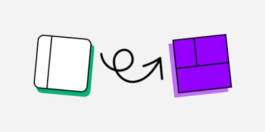
Design system theming is a process of making a design system flexible to stylistic changes. These changes are made possible through design tokens or stylesheet variables, where engineers make a single change to impact the entire cross-platform ecosystem.
Some examples where organizations use design system theming include:
Dark mode : essential for accessibility in modern product development to accommodate users with visual impairments.White labeling: open-source design systems use theming to allow users to customize the component library. Multi-brand design systems : organizations with a suite of products use theming to change a single design system rather than develop multiple component libraries.Marketing campaigns: theming allows product teams to make stylistic changes for marketing campaigns, like green, red, and white for Christmas, red for Valentine’s Day, or red, white, and blue for July 4th.What are the benefits of design system theming?A themeable design system enables organizations to reuse a single design system for multiple products or purposes. For example, MUI is one of the world’s most widely used open-source component libraries. MUI’s theming enables brands to customize the library to meet their specific requirements. So, two or more products using MUI can look completely different.
Theming saves product teams considerable time and resources because it allows them to make many changes with minimal effort. The benefit for organizations is that designers and engineers spend more time on product development than messing with styles or designing and programming from scratch.
How Does a Design System Theme Work?Products use design tokens or variables to represent a specific property–we’ll use color to explain how design system theming works.

A design system’s color palette typically has several essential colors:
PrimarySecondaryErrorWarningInfoSuccessFor websites and web applications, engineers use a six-digit HEX code to define each color. These HEX codes appear many times across multiple components in the design system. If engineers need to make a change, they must find every instance where the HEX code appears and revise it–which could be hundreds, even thousands of changes.
Using variablesTheming provides a global solution for applying these changes. Engineers assign properties to a variable they use in place of fixed values. So, a primary blue value of #1976d2 becomes “primary” or something to that effect, depending on the design system’s naming convention. A button component may look something like this:
Submit
If engineers want to make a global change, they change the primary variable, updating every instance where that variable appears in the product’s stylesheets. Instead of hundreds of changes, they make one.
Creating theme stylesheetsTo create multiple themes, engineers only have to update the stylesheet with the variables and give it an appropriate name. For example, a multi-brand design system may have three brands, each with dark and light modes, resulting in six different variable stylesheets:
Brand A Light (brand.a.light)Brand A Dark (brand.a.dark)Brand B Light (brand.b.light)Brand B Dark (brand.b.dark)Brand C Light (brand.c.light)Brand C Dark (brand.c.dark)This button component’s code would look the same for every theme, but the primary variable would reference a different color code.
Submit
To apply Brand B Light, engineers import brand.b.light into the component’s file and apply it using a theme property.
What Can You Change With Theming?Theming happens within a product’s stylesheet, meaning you can create design tokens or variables for any CSS properties. Common theming properties include:
Color palettesTypography and font stylesSpacing and sizingResponsive breakpointsCSS transitions and animationsRadiiWhen to Use Design System Theming?Should you use design system theming? And how much theming will you allow? You also need to consider factors specific to your product and business, including:
Framework constraintsPlatform-specific requirementsSupported tech stackTechnical requirements and limitationsBudget and human resourcesDark modeMost organizations will only use design system theming to switch between dark and light modes. This type of theming should only impact your design system’s color palette.
Designers will need to test how these colors appear across many styles, including:
Font colorsBackground colorsBordersShadowsGradientsIcon colorsColor contrast is the most important thing designers must focus on for light and dark modes. Contrast significantly impacts users with visual impairments.
With UXPin’s built-in contrast checker and color blindness simulator, designers can test colors for light and dark modes without leaving the design canvas.
Multi-brand design systemsMulti-brand design systems are another reason organizations use theming. Product teams and engineers need more flexibility than color to meet each brand’s requirements. But greater flexibility impacts more properties, meaning more customization.

For example, one theme might use square corners while another uses rounded ones. They may also use different typefaces and font styles. Changing fonts will impact other properties like padding, spacing, margins, line heights, etc.
Cross-platform design systemsMany devices and operating systems have specific styling, or components products must use. For example, you might want to use the system typography for iOS (San Francisco) and Android (Roboto). Each of these would need a different theme to accommodate the fonts and any additional styling, like padding, sizing, line heights, etc.
White-labelingSoftware developers often use white-label design systems to deliver products to multiple customers more efficiently. This design system theming requires a lot of customization to meet many scenarios, platforms, brands, and use cases.
If you’re building a white-label design system, you might want to use variables in place of every value to offer complete customizability and flexibility–i.e., everything has a variable.
Design System Theming ResourcesHere are some resources to help with your design system theme:
The many faces of themeable design systems – Brad FrostHow to add a theme switcher to Storybook – Storybook BlogCreating themeable design systems – Kolby SiskEvolution of theming in NewsKit design system – James SpencerTheming in Design Systems – KnapsackMulti-Theme Design System Prototyping With UXPin MergeMulti-theme design systems are challenging to develop for engineers but require even more effort for designers. Every theme requires a separate UI kit to use in image-based design tools.
With UXPin Merge, you can sync your multi-theme design system to UXPin’s design canvas, so designers and engineers use the same component library. Any changes to the library, including adding a new theme, automatically sync to UXPin and notify designers of the update–a true single source of truth saving your DesignOps and DevOps teams countless hours of work and collaboration.
Higher-quality prototypes and testingTheming is currently only available for React with Merge’s Git Integration, which syncs directly to your component library’s repository. Merge components are fully interactive and include properties (via React props) defined by the design system.
Component props appear in UXPin’s Properties Panel so designers can make changes and switch themes with a few clicks. They can also combine components or save multiple versions as Patterns to streamline prototyping and testing by simply swapping Patterns instead of adjusting properties.
These Merge components function as they do in the final product, allowing designers to create exact prototype replicas resulting in accurate, meaningful results during user testing.
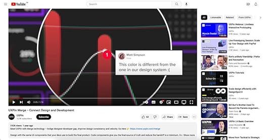
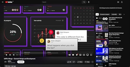
Erica Rider, UX Lead EPX at PayPal, describes how UXPin allows her team to iterate faster during testing, “It’s been so helpful for us to have these high-fidelity prototypes built with UXPin Merge. We build high-fidelity prototypes much quicker, and we get immediate feedback after the session. If there’s something we can fix immediately, we make that change before the next participant and get feedback much faster than before.”
Streamlined handoffsDesign handoffs are smoother, almost non-existent with UXPin Merge. Engineers already have copies of every component, so it’s a matter of importing them from the repository, copying JSX changes from UXPin, and replicating the design team’s layouts.
Since switching to UXPin Merge, German-based software developer dotSource enjoys “seamless collaboration between design and development,” including some other key benefits:
No inconsistencies or design driftOne change automatically syncs design and codeDocumentation is always up to dateSwitch to the only design tool that automatically syncs multi-theme design systems between design and development for a powerful single source of truth to reduce DesignOps burdens while optimizing product development workflows. Visit our Merge for Git page for more details and how to request access.
Discover MergeThe post What is Design System Theming? [+ 4 Use Cases] appeared first on Studio by UXPin.


January 11, 2023
How to Choose the Best UX Tool? 7 Key Features to Look for

Are you searching for the best UX tool? If so, then you might have noticed that the tools out there vary greatly in terms of the features they offer. Because of that, it can be hard to assess if the user experience software you’re considering genuinely has all you need. Or, even, if you’ll need to get multiple design tools just to create a prototype from start to finish.
Luckily, all hope is not lost, as there is a way to find the perfect design software for your upcoming project. We’ll show you what key features you should be looking for and why they are necessary for the design process that makes product development fast and easy.
Looking for a tool that will support your development and design collaboration? Try UXPin for free.
Build advanced prototypesDesign better products with States, Variables, Auto Layout and more.
Try UXPin .try-uxpin-banner { margin: 40px 0px;}.try-uxpin__container { display: flex; max-width: 689px; height: 210px; padding: 20px; padding-left: 24px; border: 2px solid black; border-radius: 4px; align-items: center; justify-content: space-between; background-color: white; box-shadow: 10px 10px black;}.try-uxpin__left { width: 54%;}.try-uxpin__left p { margin: 10px 0px !important; color: black !important;}.try-uxpin__heading { font-size: 28px !important; font-weight: bold;}.try-uxpin__text { margin: 0 !important; font-size: 18px !important; line-height: 22px !important;}.try-uxpin__button { width: 135px; height: 44px; background: black; margin: 10px 0px; padding: 10px 20px; border: none; border-radius: 2px; color: white; font-size: 16px; text-align: center;}.try-uxpin__button:hover { cursor: pointer;}.try-uxpin__image { max-width: 320px !important; height: 200px; margin-right: -21px; margin-bottom: -6px;}@media (max-width: 760px) { .try-uxpin__container { height: auto; margin: 10px; align-items: left; }}@media (max-width: 500px) { .try-uxpin__container { flex-direction: column; } .try-uxpin__left { width: 100%; align-items: normal; }}How should your UX tool help you in the design process?
There are seven key features that you should check off your list while searching for the right UX design platform. You’ll want to look for design software that:
It has real-time collaborationReal-time collaboration will allow you to work together with your team on the same project whether team members are in the same room or not. This increases productivity and enables those who are working remotely to interact with other team members in real time. UXPin, for example, features advanced collaboration abilities that allow you to get feedback on projects, leave comments, and even share prototypes.

You can also save your project and flip through previously saved versions on command. For an enhanced collaboration environment, you can also integrate Slack and Jira. You can also see any edits made by team members, which helps keep everyone on the same page.
It has convenient design handoffsAs you know, once the prototype process is complete, the next step is to hand the prototype off to developers so that they can create the finished product. Unfortunately, this process isn’t as simple as it seems. Most high-end tools like Adobe XD allow the user to share design documents with other team members. While this is a simple process, the problem is that your designs are typically going to be rendered in vectors. On the other hand, UXPin will render your designs in code.
Since the design documents will be rendered in code instead of vectors, developers will have a clear understanding of each component in your design. On top of that, when creating the final product, developers can refer to your coded designs, which results in a faster and more convenient development process. When it comes down to it, coded designs help ensure that there is no misunderstanding or complications while the team works on bringing the product to life.
It’s equipped with interactive prototypingInteractive prototyping is becoming more and more popular because it allows you to explore different design ideas by creating an interactive environment that lets you put your idea to the test. It is also great when you want to explain a design or pitch an idea, as others will be able to better understand the value that your design offers. UXPin is equipped with interactive prototyping features, and with it, you can:
Give engineers or stakeholders an interactive experience of your design so that they can fully understand and experience what your product will look like.Test your products with real-life users to gather more accurate feedback and data on how users will go about using your design.Design prototypes that function like the finished product by using features such as states, variables, advanced interactions, and more.Add details to make your prototypes look closer to the finished product by using the “auto-generate” feature that will add names, images, and more to your design.Create interactive components such as button hovers and conditional navigation flows so as to best show off your design.With UXPin, your prototypes don’t have to be static and non-clickable designs. Instead, you can create dynamic prototypes that accurately reflect the look, user experience, and functionality of the finished product.
It helps stakeholders understand your designAs you know, when it comes to designing a product, it is critical to make sure that stakeholders and other interested parties are on the same page. That is why it is important to keep them involved throughout the design process, from brainstorming new ideas to testing out your design.
So, you’ll want to make sure you have a UX tool that:
Allows stakeholders to experience and test out prototypes and design components via an interactive experience. This will help them understand your design and how it will play out when it is finished.Gives stakeholders the ability to leave feedback on your designs throughout the design process. Tools like UXPin allow others to add comments and questions on designs. You can then easily reply to their feedback all without ever having to be in the same room as them.It helps designers communicate with developersDesigners are not only responsible for creating the design, but also for showing developers how to create the finished product. And so, communication is critical—especially in this day and age where remote work is becoming more of the norm. Because of that, having the right communication tools have become an essential part of the design process.

So, using tools such as UXPin, you can ensure that there is better communication and understanding between you and the developers. With UXPin’s Merge technology, you can also use the Git repository and Storybook integrations which let designers use the same technology as developers so as to produce consistency between the two teams. Plus, there is no need for designers to compromise on their own design process. UXPin’s Merge technology ensures that there is no extra work that the designer needs to perform to achieve that level of consistency between the teams.
Lastly, because Merge is a tool that both developers and designers use, both will be able to work on projects together without complications.
It’s a tool that doesn’t require you to buy pluginsIf you’re like me, then you may find it annoying whenever you buy a product only to find that many of its features are locked behind a paywall. Unfortunately, that can be the case with many design tools on the market.
A lot of design software out there is lacking needed features. So, it is not uncommon for designers to find themselves having to purchase plugins to complete their product.
Thankfully, you don’t have to buy any plugins when using UXPin as all the necessary features are built-in and come at no additional costs. In other words, UXPin comes with everything you need to carry out your design from start to finish.
It’s available on both Mac and Windows, and is cloud-basedDesign tools like Figma are only web-based. Because of that, designers can run into compatibility issues when using different devices as well as various limitations. So, it is important to find design software that is compatible and available on multiple systems including Mac, Windows, and cloud-based systems.
UXPin works across systems and can be used through desktop apps as well as on the web. On top of that, you can even import your Figma design to UXPin so that you have access to more features and increase usability across systems.
You’ll also be able to download UXPin to your computer or simply use the web-based version. By using the downloaded software, you will have the additional ability to work on projects when offline.
What’s more, UXPin also has a mobile app view. This allows you to create and test prototypes for mobile devices, which greatly helps assess the user experience of an app.
Try UX Design with UXPinAll in all, UXPin is really a one-stop solution for all designers. It comes with all the features you could need such as being able to scale a design on command or engage in interactive prototyping.
UXPin also comes with some of the best collaboration features, which will allow you to cooperate seamlessly with your team—regardless of whether you’re all working remotely or not. Plus, it is available across devices and systems which will ensure that there are no compatibility issues among team members.
So, whether you’re building out a simple design or a complex system, UXPin has all the features you need to complete a project from start to finish. Try UXPin for free here.
Try UXPin for freeThe post How to Choose the Best UX Tool? 7 Key Features to Look for appeared first on Studio by UXPin.
January 10, 2023
Product Redesign — How to Make it Work
A product redesign is an opportunity to improve many aspects of a digital product, most importantly, its user experience, visual design, technical bugs, and business value. Product teams can also extend the product’s lifecycle by making it more relevant and up-to-date with modern trends.
Improve product redesign scope and achieve significantly better results with component-driven prototyping from UXPin Merge. Visit our Merge page for more details.
Reach a new level of prototypingDesign with interactive components coming from your team’s design system.
Discover UXPin Merge .discover-merge { margin: 40px 8px;}.discover-merge__container { display: flex; max-width: 690px; height: 200px; padding: 20px; padding-left: 24px; border-radius: 4px; background-color: black; box-shadow: 10px 10px #9999ff; align-items: center; justify-content: space-between;}.discover-merge__left { width: 50%;}.discover-merge__left p { margin: 10px 0px !important; color: white !important; font-size: 18px !important;}.discover-merge__heading { font-weight: bold !important; color: white !important; font-size: 18px !important;}.discover-merge__text { margin: 0 !important; line-height: 22px !important;}.discover-merge__button { width: 174px; height: 44px; margin: 10px 0px; border: none; border-radius: 2px; background: white; color: black; font-size: 16px; text-align: center;}.discover-merge__button:hover { cursor: pointer;}.discover-merge__image { max-width: 320px !important; height: 200px; margin-right: -19px;}@media (max-width: 760px) { .discover-merge__container { height: auto; margin: 10px; align-items: left; }}@media (max-width: 500px) { .discover-merge__container { flex-direction: column; } .discover-merge__left { width: 100%; align-items: normal; }}What is Product Redesign?A digital product redesign means updating and improving an existing product, like a website, app, software, or game. These redesigns are essential to keep products relevant and competitive with every changing technology, trends, and demand.
The extent of the redesign will depend on the project’s scope, which might include making significant changes to the user interface, functionality, or new features to improve the user experience, meet changing user needs, or address technical issues.
The redesign process typically involves a thorough analysis of the current product, user research to understand the needs and preferences of the target audience, and the development of new design concepts and prototypes. Designers must test and iterate on these prototypes to ensure the final product meets the design brief’s goals and objectives.
Product redesigns are often complex and time-consuming because designers must collaborate with many stakeholders, review past research, and conduct new research.
Why Do We Redesign Products? Improve the user experience
Improving the user experience is often a priority regardless of the redesign project scope. Designers aim to make the product more user-friendly, efficient, and enjoyable. For example, a company might redesign a website to make it more intuitive and easy to navigate.
Technical issuesDesigners often collaborate with engineers to solve technical issues or bugs that adversely impact performance or functionality. For example, the engineering team may require a new authentication system to fix a security flaw. Designers must test the new login flow to identify potential usability issues before release.
Meet new industry trends and demandsOrganizations often redesign products to stay current with industry trends and best practices. Instagram is an excellent example of redesigning to meet industry trends. The company has made two significant redesigns over the last decade: Stories to compete with Snapchat and Reels to compete with TikTok.
Meet changing user needsLike technology, users’ needs evolve. Organizations to redesign products to meet these changes. It’s also common for a target audience to change, meaning the organization must redesign the product to meet new needs and priorities.
Improve performance and scalabilityWhen products experience growth spikes, they often have to redesign the product to accommodate new technology, increased traffic, and usage that goes along with the growth.
Optimize for new devicesWith new devices and IoT frequently entering the market, designers must update UIs and features to meet demand. For example, in May 2021, Google released Material Design 3, which included new layouts and components to accommodate foldable devices.
Better align with business goalsProduct redesigns are often required to align with business goals and objectives. These goals could relate to seasonal promotions, like Christmas, Black Friday, Valentine’s Day, etc., or new products. For example, an eCommerce brand is releasing a new product range and needs a redesign to promote and prioritize it on the website.
Improve brand identityCompanies may want to redesign the product’s visual design and branding to better reflect the organization’s identity or to align with a rebranding. For example, an organization may feel a product’s design looks outdated and want a redesign to make the brand relevant to modern design trends.
Address competitive pressureOrganizations must often redesign products to keep up with or surpass their competitors. For example, the research team identifies demand for a feature or functionality not offered in the market. So, the company redesigns its product to gain this competitive advantage.
Learn to do competitive analysis for UX in our other blog post.
Drive business growthRedesigns are often necessary to facilitate business growth by entering new markets, attracting new users, retaining existing ones, and increasing engagement and revenue.
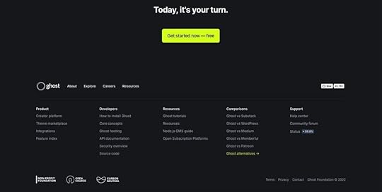
The popular blogging platform Ghost redesigned its product over the last five years to focus on the creator economy. Ghost still attracts its original customer base of bloggers and publishers, but the redesign means the platform is a preferred choice for subscription-based businesses and creators.
What is a Typical Product Redesign Process?These are the steps for a typical redesign process.
 Define the goals and objectives of the redesign
Defining goals and objectives is a crucial first step in guiding the redesign process. This step involves meeting stakeholders to list and prioritize the redesign’s business goals while considering user needs.
Conduct a thorough analysis of the current productNext, designers analyze the current design paying close attention to its features, functionality, user experience, and performance. This analysis will identify any problems or issues designers must address during the redesign.
Conduct user researchUser research enables designers to understand the needs, preferences, and behaviors of the target audience for the product. Some user research techniques include interviews, surveys, user testing, focus groups, and existing product analytics.
Designers use this customer feedback to update user personas or create new ones to guide the redesign process.
Create design concepts and prototypesDesigners analyze the research collected in steps one to three to ideate on design concepts. During this phase, designers may run a design sprint or rapid collaborative prototyping session to iterate over many ideas fast. Step four aims to find a solution that meets the project’s goals and objectives while solving user problems–essentially a balancing act for design teams.
Test and iterateTesting is an essential part of any design process. Designers present prototypes to stakeholders and conduct usability testing for feedback on ideas. Depending on the project’s budget and scope, designers may iterate several times to refine the concept before the handoff.
Design handoff and development processNext, designers hand off design files, prototypes, and documentation for engineers to develop the final product. Once engineers complete the development process, designers conduct quality assurance to ensure the final product meets the design project’s specifications.
Monitor and maintainAfter the organization releases the redesign, product owners monitor performance through predetermined metrics (KPIs) and gather user feedback. They may use this data to update or improve the product, maximizing its lifecycle and relevance in the market.
Rapid Product Redesign With UXPin Merge
UXPin Merge is an advanced code-based technology enabling organizations to sync a design system to UXPin’s design editor, so designers use the same components during the design process as engineers use for the final product.
This component-driven prototyping workflow allows designers to build fully functioning replicas of the final product for accurate usability testing and meaningful stakeholder feedback.
Version Control for Product AnalysisMerge’s Version Control enables design teams to switch to earlier versions of a design system for prototyping old products–perfect for product analysis purposes. Designers can build prototypes of the existing product to identify issues and opportunities for improvement.
High-fidelity prototyping in minutesOnce designers have completed product analysis and research, they can begin prototyping and testing their solution to iterate and improve. They can build prototypes using the existing component library or create new ones with UXPin’s Patterns feature.
This component-driven prototyping environment enables teams to build, prototype, test, and iterate at a higher fidelity and greater accuracy than traditional design workflows.
In a webinar with UXPin, UX designers from pharmaceutical giant Johnson & Johnson demonstrate how the team builds a fully functioning redesign of a user interface using the organization’s design system in under ten minutes.
PayPal conducted a similar experiment with Merge, where an experienced UX designer built a one-page prototype in under ten minutes using UXPin vs. one hour plus for a traditional image-based design tool.
Usability participants and stakeholders can interact with Merge prototypes like they would using the final product, providing design teams with an accurate representation of the redesign’s user experience and performance.
Smooth, seamless design handoffsThe design handoff process using Merge is a frictionless, smooth experience for designers and engineers. Engineers require less documentation and explanation, with everyone using the same component library.
UXPin renders JSX, so engineers simply import the components into their project and copy/paste the code from UXPin to complete front-end development.
Automatic updatesIf engineers need to add new components to the design system after a redesign, UXPin will track these changes from the repository and automatically update the library for designers. UXPin even notifies designers of the new version, and with Version Control, they can choose when they want to switch to the latest release or return to an earlier version.
Enhance your product redesign process with the world’s most advanced component-driven prototyping tool. Visit our Merge page for more details.
Discover MergeThe post Product Redesign — How to Make it Work appeared first on Studio by UXPin.
January 9, 2023
What is Continuous Discovery and How to Get Started?
If you’ve ever heard about continuous discovery (CD), then high chances are you associate it with the work of product managers. However, this agile approach to research and project refinement isn’t confined to product people work only. It’s also a critical part of how design teams shape products and create value.
CD offers a method of discovering and adapting products based on customer feedback, allowing both design and development teams to pursue results that provide value to users.
Once you have all this feedback, time to check if you can use it to improve your product. UXPin is a collaborative, end-to-end design tool that makes it easy to create interactive prototypes that guarantee the most accurate feedback. Sign up for UXPin trial and design your first prototype right away. Try UXPin for free.
Build advanced prototypesDesign better products with States, Variables, Auto Layout and more.
Try UXPin .try-uxpin-banner { margin: 40px 0px;}.try-uxpin__container { display: flex; max-width: 689px; height: 210px; padding: 20px; padding-left: 24px; border: 2px solid black; border-radius: 4px; align-items: center; justify-content: space-between; background-color: white; box-shadow: 10px 10px black;}.try-uxpin__left { width: 54%;}.try-uxpin__left p { margin: 10px 0px !important; color: black !important;}.try-uxpin__heading { font-size: 28px !important; font-weight: bold;}.try-uxpin__text { margin: 0 !important; font-size: 18px !important; line-height: 22px !important;}.try-uxpin__button { width: 135px; height: 44px; background: black; margin: 10px 0px; padding: 10px 20px; border: none; border-radius: 2px; color: white; font-size: 16px; text-align: center;}.try-uxpin__button:hover { cursor: pointer;}.try-uxpin__image { max-width: 320px !important; height: 200px; margin-right: -21px; margin-bottom: -6px;}@media (max-width: 760px) { .try-uxpin__container { height: auto; margin: 10px; align-items: left; }}@media (max-width: 500px) { .try-uxpin__container { flex-direction: column; } .try-uxpin__left { width: 100%; align-items: normal; }}What is Continuous Discovery? Traditional product release involves two main processes: discovery and development/delivery. In the ‘discovery’ phase, product teams decide what to create based on customer needs and pain points. Simply put, you’ll discover what your users need and develop solutions to those problems.
Over time, however, your customers’ needs and problems may change rapidly. And so, traditional product development doesn’t allow any opportunity space to iterate on existing solutions.
In continuous discovery, product people and product design teams use ongoing user research and iterations in order to understand and improve the user experience and business outcome.
It integrates the “discovery phase” into the entire product development process, and makes sure that day-to-day product decisions are guided by user research and validation.
Within this, insights are continuously discovered so they can be acted on immediately as they change. These include things like new requirements, problems, or a change in user habits. As a result, you can rest assured that products stay relevant and useful to customers.
How Can UX Design Benefit from Continuous Discovery?Continuous discovery can guide UX design teams to create good products.
Here’s how.
Lets designers prioritize work to align with users’ changing needsMany startups suffer from scope creep, where they focus on solutions and features that aren’t relevant to users. After all, it’s difficult to prioritize based on your user’s needs when they change so frequently.
Instead, why not let your users tell you their up-to-date problems and pain points? By infusing customer feedback and research into your design decisions, you can prioritize work and features to match your customers’ needs.
Recent data can guide your decision-making process and improve prioritization, saving your team plenty of time and resources. You can also prioritize the product backlog based on user feedback.
Build genuinely user-centric productsEngaging with customer feedback regularly helps you understand what your users want from your product. Without regular insight into user pains and expectations, you risk creating products that have no customer value.
This is especially the case for design teams, where UX designers can get lost in what a product looks like, and focus less on how a user wants to interact with it.
This can lead to end products that are disconnected from users’ goals – and so customers simply won’t find it useful enough to keep using it.
Reveal interesting new solutions and featuresContinuous discovery can also help you build user-centric products by presenting new solutions and pain points they would have identified in an initial discovery phase.
Design teams will often have a different understanding of their product than customers, and using data and feedback can help reveal interesting ways to solve customer needs. Sometimes, you might go as far as discovering that users have a completely different image of what your product does than product people.

Also, this process may very well uncover features and approaches you wouldn’t have thought of before, resulting in a more creative and resilient product.
Uncover market and competitive opportunitiesWhen you collect feedback from users, chances are the insights you’ll gain will identify gaps in your new product that direct competitors may provide.
Staying on top of what your users want from your product can help establish yourself in a crowded market and even uncover new growth opportunities.
For example, customer interviews uncover that users in a specific industry wish your product had a new feature that would help their workflow, focusing on this pain point may further expose your product to a new target sector. That’s a true power of discovery work.
Keeping track of trendsContinual research can help identify patterns and changes in the way your users behave and interact with your product. Identifying trends is an important step to keeping your product relevant to your core audience.
Where do these behavioral changes come from? How can you identify them?
Users asking for a missing functionality could indicate that your customer’s preferences and needs may have shifted. Shifts in the UX design orthodoxy may change your users’ expectations. For example, if customers are used to interactive experiences from other apps and services, they’d love to see it in your product.[image error]To integrate such customer input into your product roadmap, your UX design team should examine how these shifts and trends impact both user and business objectives.
Implementing Continuous DiscoveryHow should your UX design team approach continuous discovery? Here are a few things to include:
Ensure that you have a steady flow of customer feedbackGaining actionable insights into how your users interact with your product requires comprehensive user feedback. In essence, icorporating user reviews into your design process helps you make better products.
Recruiting customers to participate in discovery calls or fill out customer surveys is crucial. By planning customer touchpoints, you’ll be able to find out how your product hinders or enables your customers’ goals.
You’ll need a representative sample size for your product development team members to be confident in your insights and implement effective continuous discovery.
[image error]Different users experience different usability issues and user needs. Reach out to a wide variety of customers from different backgrounds, sectors, and locations.
The best part? Useful customer feedback doesn’t just come from voluntary means. Customer-facing teams such as sales and customer support will find out useful insights every day from both thrilled and disappointed customers.
Work with these teams to gather a list of users to contact for honest, grounded feedback.
Agree on the roles in the product discovery processA product discovery team will often involve three departments:
DesignersDevelopers Product managerEach member will likely have a different point of view on how to approach the discovery process. We recommend encouraging leaders from all three of these departments to interact with customers. This will give them an accurate view of the user situation.
As a result, all teams’ perspectives are taken into account when discussing user feedback, avoiding inefficient silos. These leaders will then discuss the next steps jointly. In the discussion of solutions, they may bring in more members of their respective teams when needed.
Keep a clear focus on the outcomes you want to achieveTo avoid scope creep, continuous discovery should stay focused on the outcomes and business objectives that you want to meet.
That’s where defining team goals is so important. We recommend using OKRs (objectives and key results) methodology to keep your team focused on metrics and goals.
This process guides teams to both identify what the intended objectives are and keep track of progress through real data.

How can design teams ensure that solutions align with desired outcomes? KPIs, or key performance indicators, outline how you can measure whether a design decision creates business value.
As you engage in product discovery, keeping your OKRs in mind will help you decide whether a piece of feedback from your discussions with users is critical for achieving your team-level goals and reaching crucial business objectives.
Want to explore how the OKR methodology can guide your team? Read our full guide on design team goals.
Use a prototyping tool that makes continuous delivery easier to implementThe secret to effectively adapting products based on user feedback is using a prototyping tool that allows different departments within a discovery to collaborate on product iterations.
Prototyping is a crucial step in the product development process, and involving development teams, product managers, and more in this step can help iron out any potential issues later down the lifecycle.
That’s why it’s so important to use a prototyping tool that allows teams to work together collaboratively.

UXPin is a component-driven prototyping tool that lets you build prototypes that act like real products. You create products in the cloud and loop in key team members to ask for comments and revisions.
This tool helps product teams maintain UI consistency, speed up design handoff, and help ensure that user feedback is instilled into every design decision. Designers can create interactive prototypes to successfully demonstrate your product’s user experience.
The increased collaboration and information flow afforded by UXPin support teams as they embrace continuous discovery as part of their process.
Prototype User-Centric Products Through Continuous Discovery with UXPinContinuous discovery ensures that every design decision is laser-focused on improving your user experience and providing solutions to customer pain points. It keeps your digital products relevant and useful to your target user base – especially in our ever-changing digital world.
To keep up with shifts in consumers’ tastes and expectations, we recommend using this agile and adaptable approach to product development.
Collaborative prototyping is a crucial part of this step, allowing product discovery teams to shape and craft the user experience to address customer feedback. That’s where UXPin can help. Our all-in-all prototyping tool allows you to bridge the gap between design and development so that teams can build user-centric products together. Get started with UXPin.
Try UXPin for freeThe post What is Continuous Discovery and How to Get Started? appeared first on Studio by UXPin.
January 5, 2023
13 UI Terms – A Cheat Sheet for Product Designers
Entering the UI/UX world is an exciting endeavor for anyone new to the world of design. However, it comes with a few challenges — one being, that there is a whole different language you must wrap your head around. It’s safe to say that some UI terminology is not common knowledge for the everyday person.
Basic concepts can be learned through immersion in the industry, but the more technical language will not come so easily. This means that you must familiarize yourself with it to effectively communicate with designers and developers.
To help you avoid confusion during the design process and to better communicate with co-workers, it is best to become “fluent” in UI terminology. Here’s a list that will certainly come in handy.
Ready to build a prototype and use UI terms in practice? Use UXPin, an advanced end-to-end design tool for building interactive prototypes of digital interfaces. Try it for free.
Build advanced prototypesDesign better products with States, Variables, Auto Layout and more.
Try UXPin .try-uxpin-banner { margin: 40px 0px;}.try-uxpin__container { display: flex; max-width: 689px; height: 210px; padding: 20px; padding-left: 24px; border: 2px solid black; border-radius: 4px; align-items: center; justify-content: space-between; background-color: white; box-shadow: 10px 10px black;}.try-uxpin__left { width: 54%;}.try-uxpin__left p { margin: 10px 0px !important; color: black !important;}.try-uxpin__heading { font-size: 28px !important; font-weight: bold;}.try-uxpin__text { margin: 0 !important; font-size: 18px !important; line-height: 22px !important;}.try-uxpin__button { width: 135px; height: 44px; background: black; margin: 10px 0px; padding: 10px 20px; border: none; border-radius: 2px; color: white; font-size: 16px; text-align: center;}.try-uxpin__button:hover { cursor: pointer;}.try-uxpin__image { max-width: 320px !important; height: 200px; margin-right: -21px; margin-bottom: -6px;}@media (max-width: 760px) { .try-uxpin__container { height: auto; margin: 10px; align-items: left; }}@media (max-width: 500px) { .try-uxpin__container { flex-direction: column; } .try-uxpin__left { width: 100%; align-items: normal; }}13 UI Terms You Should Be Familiar WithTo make it simpler, we have divided the UI design terminology into two main categories—Verbs (Actions Terms) and Nouns (Identifier Terms).
UI Terms – Verbs (Actions Terms)Click / Tap – An act of tapping, clicking, touching, pressing, and releasing a mouse or screen button. Typically, for touchscreen interfaces, the term “tap” or sometimes even “touch” is used to represent the action. Conversely, the term “click” or “press” is used in reference to a physical button. A lesser-known term that is sometimes used is “long tap.” This term should not be used in the general public but is appropriate to use, for example, in a software specification meant for a UI developer.
Press – An act of pressing a physical button on a user keyboard such as the “Tab” or “Power” button. While it may seem simple, it contains a series of actions to complete. First, the user needs to know that the button exists and whether or not it should be pressed. If pressed, a specific reaction should occur from the system, and that reaction should be associated in the user’s mind with the button. On top of that, it is very rare to have a one-button system which means that there need to be different “levels” of actions that the pressed button can perform.
Type – An act of pressing a key with the intent to type text into the UI. “Type” refers to the appearance of the text (i.e. style, size, color, etc.), and the process of designing/creating text that is appropriate, legible, and appealing to enhance user experience. Designers are responsible for choosing typefaces, alignment and spacing specifications, and ordering the text in a hierarchy to effectively convey the message of the text.
Swipe – An act of performing a “swipe” motion that usually involves moving a finger across a touch screen.
Hold – An act of clicking, tapping, or pressing a button without releasing it. In other words, it involves pressing and holding down a button and can be used to describe an action in relation to either mechanical or touch screen buttons.
While these actions may seem simple, they should not be used interchangeably as they describe a very specific interaction. They are especially useful when creating an interactive prototype. UXPin, for example, is a prototyping tool that allows designers to create a prototype by adding element triggers. These triggers will set off a specific action when activated by the user. There are also canvas triggers that can change the canvas state when activated.
UI Terms – Nouns (Identifier Terms)Field – An area in the Web User Interface (WUI) or Graphical User Interface (GUI) where the user can enter information. Otherwise known as “input fields,” these fields allow users to input personal/non-standardized information and are often used when personal details are needed from the user such as addresses, names, or answers to questionnaire forms. Utilizing fields will allow for an enhanced experience that helps create a better interaction between the interface and the user.
Dialogue – A pop-up that creates a “conversation” between the user and the interface. It can appear before or after an action and typically asks the user for some type of response whether that be through imputing information or completing an action. Dialogues can be used in many ways such as:
When there is promotional or some other type of information that you want to show the user without redirecting them to a different page.When there is important information that the user needs to see.When there is information that the user needs to input to continue.When there is information that is not necessarily related to the current page but can provide useful information or updates.There are three main types of dialogues which include:
Confirm Dialogue: Ideal for situations in which a user may automatically agree to a warning or disclaimer without reading it or realizing the possible consequences.Forced Interaction Dialogue: Should be implemented when an action is needed from the user to continue.Detailed View Dialogue: Best when used to display detailed information about an object on the page.Panel – Some form of panel typically in the form of a control panel or toolbar. For example, a UI panel contains widgets that can be chosen and implemented. Panels can also act as a hub or list of all available widgets that can be used and arranged.
Pane – A section of a window within the WUI or GUI that contains and provides the user with access to additional features and/or additional information. Well-known examples of a pane are the “Preview” pane and the “Explorer” pane. As displayed in the picture below, the “Explorer” pane on the left displays additional folders and drives such as “Documents” that can be accessed with the left pane displaying specific contents of the selected drive—the “Primary Drive.”
 Source: Computer Hope
Button – A web or graphical element that performs an action once clicked on. Buttons are a simple way to allow users to perform actions of their choosing simply by clicking on the desired button/action. Buttons are commonplace on web pages and are meant to create a more streamlined experience. As such, it is critical to clearly identify each button with the action that it will execute if pressed. They are also meant to fit within the style of each interface and can therefore come in many forms and sizes. Though they may seem simple on the surface, a considerable amount of time is needed to create, position, and map out what a button will do and how it will blend into the site’s design. All while still being noticeable when needed.
Icon – An image that represents a certain function, idea, or direction. Icons are meant to replace words while still conveying the same meaning in a simpler and more direct form. An example of an icon is a picture of a lock that is meant to represent that a certain function or feature is locked and cannot be accessed by the user. Another one is the ubiquitous magnifying glass for search. Icons are often used on buttons to succinctly communicate the function of the button. Oftentimes, icons are divided up into categories based on interactions, themes, style, etc., and commonly represent real-life objects.

Tab – A navigation and divider tool similar to tabs in a filing cabinet or binder. Tabs will often separate different parts of a page or whole pages. Users can interact and organize tabs as well as click on them to “travel” to a specific location. Tabs are usually not used for smaller pages but can be a great tool to divide up and organize larger pages. A common example of tabs being used is on a more global level such as when opening up multiple website pages in a browser—each website page is represented on a tab at the top of the web browser.
Wizard – A guide or setup assistant that helps the user fulfill a series of actions that are necessary to complete a task. Instead of giving the user all the information and a list of needed actions that need to be completed, a wizard will often simplify the process by dividing up a series of tasks into smaller and related portions. One of the more popular examples of a wizard is the classic e-commerce checkout process. There are often four tasks that need to be completed to buy a product:
Choose to Buy an Item in the Shopping CartEnter Delivery DetailsEnter Payment InformationPreview and Confirm the OrderBy dividing the series of actions that need to be completed into easily understandable, manageable, and logical parts, the user is able to more easily complete a task.
 Source: UXDesign.ccWhy Do You Need to Know UI Design Terminology?
 When working in UI, a whole new world of communicating becomes apparent. Buzzwords, jargon, and other niche words in the industry are used throughout the entire design process. It is critical to understand this “language” so as to more accurately communicate with colleagues and to better understand the design process.
Some other ways that understanding UI terminology can be of benefit are:
UI terms help colleagues, project managers, and even developers understand how the product should function and behave.Developers are there to bring the designs to life and use well-defined terminology as a guide on how to more accurately develop the design.UI terms help with organizing design files and knowing what each file is meant for.The design hand-off process can be difficult and can result in a lot of confusion if not done right. However, by using proper UI terms, you can help avoid some of the confusion during the handoff and product development process.
In the long run, understanding and using UI design terminology will help streamline the design and development process, reduce confusion, and serve for more precise communication.
Start Building Your First PrototypeKnowing UI terms will help when it comes to creating an interactive prototype. UXPin is the ideal tool to use when creating interactive prototypes.
It is a component-driven platform that helps you maintain UI consistency while bringing the design to life. This can result in smoother development and faster product releases.
UXPin can be used to make interactive prototypes of apps, websites, and more. It is used by designers to create a design that behaves like an end product. As a result, designers can show stakeholders and developers not only what the solution will look like, but also present the behavior which leads to better communication and limits misunderstandings. Experience prototyping in UXPin. Start a free trial.
Try UXPin for freeThe post 13 UI Terms – A Cheat Sheet for Product Designers appeared first on Studio by UXPin.
January 4, 2023
10 UX and UI Design Trends that Dominate 2023 and Beyond

Personalization, scrollytelling, data storytelling, and buttonless UIs are some of the most exciting 2023 UI design trends. Our research has also noticed an interesting trend toward larger screens, with Instagram improving its desktop experience to accommodate the growing demand.
Create high-quality, fully functioning prototypes to test your UI design ideas with UXPin. Sign up for a free trial to explore UXPin’s advanced features today!
Build advanced prototypesDesign better products with States, Variables, Auto Layout and more.
Try UXPin .try-uxpin-banner { margin: 40px 0px;}.try-uxpin__container { display: flex; max-width: 689px; height: 210px; padding: 20px; padding-left: 24px; border: 2px solid black; border-radius: 4px; align-items: center; justify-content: space-between; background-color: white; box-shadow: 10px 10px black;}.try-uxpin__left { width: 54%;}.try-uxpin__left p { margin: 10px 0px !important; color: black !important;}.try-uxpin__heading { font-size: 28px !important; font-weight: bold;}.try-uxpin__text { margin: 0 !important; font-size: 18px !important; line-height: 22px !important;}.try-uxpin__button { width: 135px; height: 44px; background: black; margin: 10px 0px; padding: 10px 20px; border: none; border-radius: 2px; color: white; font-size: 16px; text-align: center;}.try-uxpin__button:hover { cursor: pointer;}.try-uxpin__image { max-width: 320px !important; height: 200px; margin-right: -21px; margin-bottom: -6px;}@media (max-width: 760px) { .try-uxpin__container { height: auto; margin: 10px; align-items: left; }}@media (max-width: 500px) { .try-uxpin__container { flex-direction: column; } .try-uxpin__left { width: 100%; align-items: normal; }}Product PersonalizationPersonalization has grown in popularity during 2021/22–and no, that doesn’t mean simply adding someone’s name to a user interface. Companies use first and third-party data to create personalized user experiences based on user behavior and browsing habits.
A great example of product personalization is Netflix. No two accounts look alike because the algorithms suggest programming based on your viewing history. eCommerce giant Amazon uses a similar approach, personalizing each shopper’s homepage based on purchase and browsing history.
Infosys uses four elements to summarize product personalization:
Persona: Who is your customer?Product Recommendation: What do you offer, and how do you present your products and services?Product Pricing: What is your ideal price point?Product Positioning: How do you position the product to customers at each stage in the sales funnel?Product personalization resources:
User Experience and Personalization in Digital ProductsProduct Personalization – The Present and the FuturePersonalization in Digital Marketing: What It is and How to Make It Happen9 best-in-class examples of product personalization5 steps you need to take to scale your digital personalization“The bar for product personalization has never been higher as it will be in 2023,” commented Cheryl Couris, Director of Product Design at Webex Events. She added”Products are personal – and we’ve all grown to expect products we know and love to know and love us right back, offering specific ways we can tailor our experiences that fit our own unique needs.”
Enhanced Cross-Platform User ExperiencesWhile cross-platform applications aren’t new, many products are slow to provide seamless user experiences across multiple devices–namely, desktop vs. mobile/tablet. Products that limit what services and features users can access on mobile could lose customers to competitors who can!
Cross-platform experiences don’t only refer to desktop-to-mobile. Product designers must also think about mobile-to-desktop. If you have a mobile-only application, it might be time to consider desktop users–a trend Instagram says is growing!
Head of Instagram, Adam Mosseri, mentioned in a Twitter post that “[Instagram for the web] is designed now to take advantage of large-screen monitors which have become more and more the norm.” The update allows users to do more with the desktop version, including optimizing the platform for a large-screen experience.
🎉 New Features 🎉
— Adam Mosseri (@mosseri) November 8, 2022
Some “finally features” that I think you’re going to be excited about…
– Schedule Posts (coming soon)
– IG Web Updates pic.twitter.com/5tyMxWh1n8
Cross-platform user experience resources:
5 Examples of Seamless Cross-Platform Experiences to Drive App GrowthMultiple User Interfaces and Cross-Platform User Experience: Theoretical FoundationsUX Design for Cross-Platform ExperiencesWhat Is Cross-Platform Mobile App Development?Native vs. Cross-Platform Apps – You’ll Be the WinnerScrollytellingScrolling + storytelling = scrollytelling. Not a new trend by any means, but certainly growing in popularity. Apple’s AirPods Max landing page is a fantastic example of scrollytelling. As you scroll, the page highlights different features and benefits with beautiful product images.
ven government organizations like the UK’s Office for National Statistics (ONS) use the immersive scrolling technique to inform people on public matters, “The strength of the scrollytelling format is its ability to engage the reader and bring a story to life…Interactive ‘scrollytelling’ articles are a great way to explain and explore complicated datasets.”
Scrollytelling resources:
A beginner’s guide to scrollytellingTransform Your Long-Form Content With This Guide to ScrollytellingWhat are Census 2021 interactive “scrollytelling” articles?Scrollytelling: Storytelling for The Next DecadeWhat is Scrollytelling? What is its Impact On Digital Content?Data StorytellingWe continue the storytelling theme with data storytelling. Microsoft describes this trend as “…building a compelling narrative based on complex data and analytics that help tell your story and influence and inform a particular audience.”
Data storytelling is nothing new for enterprise product design, but we’re seeing this UI trend grow in popularity for consumer digital products–most notably activity-related apps like Apple Health, Whoop, Garmin, Strava, etc. People love numbers and data!
Writing aid Grammarly uses data storytelling in a personalized weekly email to users, including several metrics:
 Number of consecutive weeks of productivityNumber of words checked/productivityAlerts shown/masteryUnique words used/vocabulary
Grammarly’s weekly data storytelling emails encourage users to use the tool more to improve their writing, ultimately increasing product usage and engagement.
How can your product leverage data storytelling to increase engagement?
Start by interviewing your target audience to learn what information they value most–try to identify something that will help them improve.Gather a cross-functional team, including content designers, product managers, marketers, data scientists, and engineers, to ideate how to present personalized data.Create fully-functioning high-fidelity data visualization prototypes for usability testing.Launch a beta version, and get feedback from end users.Improve and iterate!Data storytelling resources:
What is data storytelling?Data Storytelling: How to Effectively Tell a Story With DataIntroducing Grammarly Insights (example of data storytelling from Grammarly)How to Tell a Story With Data: A Guide for BeginnersThe next chapter in analytics: data storytellingMinimalismMinimalism is a trend that keeps on trending! YouTube refreshed its user interface design for a more modern, minimalist black and greyscale look in mid-2022. The old YouTube-red subscribe button is now black, and secondary CTAs are black on grey.
YouTube’s black and greyscale UI facilitates a seamless user experience between light and dark themes–dark mode is a trend that’s grown in popularity over the last few years.
Many websites and digital products have adopted a similar black and greyscale variation. The benefit of this simple color palette is UI designers can use a single color to make important CTAs and features pop–like this example from the blogging platform Ghost.
Minimalism resources:
How to Use Minimal Design to Create Practical Design Systems3 Techniques for the Perfect Minimalist Web InterfaceA Perfect UI Pairing: Minimalism and Bold TypographyFree e-book: Space, Ratios, Minimalism in Web UI DesignSimplicity Is Key: Exploring Minimal Web DesignButtonless User InterfacesContinuing the minimalism trend are buttonless user interfaces–say what? Buttonless UIs are more common than you think. Most mobile devices use buttonless patterns for settings.
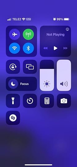
For example, users can adjust these iPhone settings using tap, slide, and swipe gestures. Instead of a + and – for volume and brightness, users slide either component up or down to adjust.
“Having a single action that has a clear outcome is an awesome invention but it’s pretty outdated, told us Piotr Makarewicz, Director Of Product Design at Pitcher AG. “We have many other ways of interacting – day to day we use voice, with our loved ones we can use touch, in a restaurant we use smell and taste.
Voice seems like the most natural communication device we have. We use that for our assistants and to control some home smart devices but it’s still pretty awkward. It’s great that Siri can rap but she is not a real day to day assistant. Neuralink is still far away and who’s to say that it wouldn’t be even more awkward.
When it comes to Buttonless Interfaces it’s not about changing the light switch to a clapper switch, it’s about making the light smart enough to light itself exactly when it’s needed.”
Buttons are often redundant in most UI patterns. For example, if a card only has one action, it doesn’t need a button; users can click/tap the card.
Other examples where designers can eliminate buttons include:
Using a devices biometrics to replace login formsLeveraging voice search/voice user interface (VUI) functionalityDragging or swiping messages and popups to close themDouble tap to like or favoriteUsing device a device’s return key to replace send buttons for text fieldsButtonless UI resources:
Future UI Design Without ButtonsFuture of UI Design Without Buttons in 2022VR & AR UI DesignWhether you believe in Meta’s Metaverse prophecies, demand for VR (virtual reality) and AR (augmented reality) user experience design continues to grow.
“We as designers need to be aware of that and make sure that we have our voices heard, noticed Piotr Makarewicz (Pitcher AG), “It’s something that can affect the landscape dramatically and we still are not ready for it. With new initiatives like Live Translator with Subtitles or virtual universes popping out you know there’s something out there. It’ll no longer be just Jarvis inside (or outside) Iron Man helmet or us furnishing homes with IKEA AR, it’ll stop being just a novelty and will become a necessity.”
VR & AR have expanded beyond gaming and social interactions to developing tools that help users navigate the real world better. For example, many companies use AR systems to train employees.
Retail brands are also using VR to create apps that enable users to try their products:
IKEA Place: an AR furnishing app that allows users to visualize how a room will look with products from IKEA. For example, which sofa will look best in your living room?Warby Parker: an outstanding AR experience allowing users to try different frames and purchase through the app.L’Oréal ModiFace: customers can try L’Oréal’s makeup range to find that perfect shade and tone.These creative applications show how brands selling physical products can leverage AR and VR technology to enable customers to “try before they buy.”
VR & AR UI design resources:
7 innovative cases of augmented reality used in enterpriseHyundai Virtual Guide Introduces Augmented Reality to the Owner’s ManualFor more companies, new ways of seeingUI/UX: Designing for AR & VRRole of UX UI on Augmented Reality designMinimum Lovable Product (MLP)Brian de Haaff, co-founder and CEO of leading product development software, Aha!, coined Minimum Lovable Product (MLP) in 2013 and wrote about it in his best-selling book, Lovability: How to Build a Business That People Love and Be Happy Doing it.
The idea behind MLP is to focus on delivering product experiences customers love rather than getting to market as fast as possible with a Minimum Viable Product (MVP).
What does this mean for UI designers?
“Trendy apps have hooked us on instant, bite-sized gratification, and in the coming year we’ll see more of the minimum lovable product approach as new ideas and innovations emerge – shipping smaller, faster slices to test the market before going all-in. What an exciting time to be a designer (and consumer)! You’ll get to taste-test big ideas and watch them evolve over time.” – Cheryl Couris from Webex Events.
Focus on accessibility to create fully inclusive user experiences from the start.Leverage an open-source design system to build an MLP using tested and approved UI components rather than designing from scratch.Use component-driven prototyping to solve usability and accessibility issues while identifying more opportunities during the design process.With so much competition and new startups entering every market daily, quality UI design will be a significant competitive advantage over the next few years.
Minimum Lovable Product resources:
What Is a Minimum Lovable Product?Minimum Lovable Product: The Evolution Of Minimum Viable ProductWhat is a Minimum Lovable Product (MLP)?Have you ever heard about Minimum Lovable Product?What is a Minimum Lovable Product and How to Build One?2023 Typography TrendsBig, bold, and capitalized appears to be the biggest typography trend for 2023–a fantastic strategy for UI designers looking to grab users’ attention. Even the global web trends website, Awwwards, uses capitalized bold typography for its homepage H1 and header callout.

UI designers also mix typefaces and styles to emphasize words or draw users’ attention. For example, this hero from Lacoste’s Draw it Yourself campaign uses bold capital styling combined with solid and outlined text for its H1.
 lacoste bold text example
Tennis star Venus Williams also uses big, bold, capitalized typography throughout her website. The font helps reinforce Venus’ status as a strong, dominant world number one.

If you want to stand out and position your brand as a dominant market leader, big, bold, capital typography can help achieve that in 2023! For a softer, calmer approach, you can use thin, condensed, and capitalized lettering–like this example from the Aussi-based creative initiative Hip Opera.

Typography resources:
25+ Typography Trends for 2023Top 10 Typography Trends in 2022Typography Trends in 2022: What Should You Know?What Are the Graphic Design Trends for 2023?10+ Trends for Pairing Fonts in 2023Advanced Microinteractions & AnimationsMicrointeractions breathe life into digital products. Technological and performance improvements over the last few years mean that designers can add these subtle animations to every component–giving UIs more character and personality.
Advanced microinteractions provide vital user feedback, particularly for buttonless UIs where components must respond to user actions. Returning to our Apple example, notice how each UI element animates to inform users of system changes. Turning flight mode on and off triggers multiple microinteractions, running until the system executes the task.
With advances in AR, VR, wearables, and even holographic UIs, we’ll see exciting changes during 2023/24 in how users interface with technology and the microinteractions that facilitate human-to-computer interaction (HCI).
Check out microinteractions resources:
What is Interaction Design?Powerful Microinteractions to Improve Your PrototypesMicrointeractions: Designing with Details (book by Dan Saffer)The Design of Everyday Things (book by Donald A. Norman)Interaction Design Trends: 11 Microinteractions DeconstructedTake your UI design to the next level with UXPin–the world’s most advanced design and prototyping tool.
Improve user testing and get meaningful stakeholder feedback with fully interactive prototypes that look and feel like the final product. Sign up for a free trial to explore UXPin’s advanced prototyping features.
Try UXPin for freeThe post 10 UX and UI Design Trends that Dominate 2023 and Beyond appeared first on Studio by UXPin.
January 2, 2023
A Quick Guide to Interactive Prototyping
As digital product complexity increases, so does the need for interactive prototyping. To minimize UX debt and reduce usability issues, designers must test and iterate with the highest accuracy during the design process.
Get the world’s most advanced end-to-end design tool. Create fully functioning interactive prototypes that look and feel like the final product. Sign up for a free trial to explore UXPin’s advanced prototyping features.
Build advanced prototypesDesign better products with States, Variables, Auto Layout and more.
Try UXPin .try-uxpin-banner { margin: 40px 0px;}.try-uxpin__container { display: flex; max-width: 689px; height: 210px; padding: 20px; padding-left: 24px; border: 2px solid black; border-radius: 4px; align-items: center; justify-content: space-between; background-color: white; box-shadow: 10px 10px black;}.try-uxpin__left { width: 54%;}.try-uxpin__left p { margin: 10px 0px !important; color: black !important;}.try-uxpin__heading { font-size: 28px !important; font-weight: bold;}.try-uxpin__text { margin: 0 !important; font-size: 18px !important; line-height: 22px !important;}.try-uxpin__button { width: 135px; height: 44px; background: black; margin: 10px 0px; padding: 10px 20px; border: none; border-radius: 2px; color: white; font-size: 16px; text-align: center;}.try-uxpin__button:hover { cursor: pointer;}.try-uxpin__image { max-width: 320px !important; height: 200px; margin-right: -21px; margin-bottom: -6px;}@media (max-width: 760px) { .try-uxpin__container { height: auto; margin: 10px; align-items: left; }}@media (max-width: 500px) { .try-uxpin__container { flex-direction: column; } .try-uxpin__left { width: 100%; align-items: normal; }}What are Interactive Prototypes?
Interactive prototypes respond to user engagement like clicks/taps, swipes, scrolls, etc., accurately replicating the final product experience. These prototypes include navigation, transitions, animations, popups, and other interaction design characteristics.
What is the difference between an interactive and a non-interactive prototype?The short answer is interactive prototypes have interactivity triggered by user engagement or system changes, while non-interactive prototypes don’t.
Product teams often call prototypes built using image-based design tools non-interactive, even though they have some basic functionality. Image-based design tools are excellent for designing wireframes and mockups, but they lack features to add interactivity–most don’t even offer functioning input fields.
Designers can only build truly interactive prototypes using a design tool like UXPin or collaborating with UX engineers to develop a code prototype (HTML, CSS, & Javascript)–the latter being the more expensive and time-consuming option.
High vs. low fidelity interactive prototypesDesigners can create both high and low-fidelity interactive prototypes. Low-fidelity interactive prototypes are usually wireframes with basic interactivity, while the high-fidelity version looks and feels like the final product. Check out an extensive comparison of low-fidelity and high-fidelity here.
Designers use low-fidelity prototypes early in the user experience design process because they’re easy to build and allow faster iterations. This speed enables designers to test many ideas quickly without wasting too many resources. Because these wireframes are interactive, designers can increase the prototyping scope during the early stages.
High-fidelity interactive prototypes are fully functional, offering a comparable, immersive user experience indistinguishable from the final product. These high-fidelity prototypes allow designers to identify usability issues and business opportunities. Insights they wouldn’t get using traditional image-based design tools (non-interactive prototypes).
Benefits of Interactive Prototyping Accurate usability testing
The closer designers get prototypes to the final product, the more accurate their testing results. One of the challenges with image-based design tools is that designers can’t test UI elements like forms, date pickers, filters, dropdown navigation, accordions, and other “complex” components, without using multiple frames, plugins, and other workarounds.
The problem with these workarounds is that they’re time-consuming to create and don’t provide an authentic user experience. Designers may think they have solved an issue within the design tool’s constraints which doesn’t translate to the final product.
Interactive prototypes increase prototyping scope, so designers get accurate results from usability testing. They can pinpoint usability issues and iterate on solutions.
Meaningful stakeholder feedbackTo get feedback and approval, UX designers must present stakeholders with wireframes, mockups, and prototypes throughout the design process. Poor quality prototypes result in stakeholders fixating on what the UI design doesn’t do rather than visualizing the bigger picture.
Designers can present ideas that accurately replicate the final product with interactive prototypes. Instead of “imagining” what a prototype does, stakeholders can engage with user interfaces, components, etc., to get a true sense of what the final product will do.
“There’s a lot more confidence from everyone (including designers, C-suite, directors, and developers) about what the final product will look like, the user experience, and interactivity—giving us higher quality feedback from stakeholders.” Erica Rider, UX Lead EPX @ PayPal, discusses interactive prototyping with UXPin Merge.
Visualizing information architecture and navigation pathsUnderstanding how users navigate digital products and the different paths is crucial for designing information architecture that meets user needs. Image-based prototyping tools allow basic navigational functionality but lack features for dynamic outcomes, testing search fields, and filters.
Designers must create multiple frames to achieve comparable final product functionality in image-based design tools or rely on UX engineers to build coded prototypes, requiring significant time and resources!
With interactive prototypes, designers can test search fields, filters, and other navigational elements to organize and optimize information architecture to align with user behavior.
Smoother design handoffs with less documentationDesign handoffs are challenging for product development teams. The friction between designers and engineers is usually down to prototype quality or not meeting technical constraints.
Interactive prototypes eliminate ambiguity while conforming to technical constraints with code-like interactivity, providing engineers with an accurate reference for programming.
With a clearer picture of the final product, engineers need less explanation, documentation, or back-and-forth communication for development.
Design handoffs are seamless if the product design team uses a tool like UXPin Merge for bringing interactive components to UXPin. Engineers install the design system’s package and pull the components they need to replicate the prototype. Merge renders any component changes as JSX for developers to copy and paste.
Learn more about Merge and how to request access.
How to Build Interactive Prototypes in UXPinOur sign-up form example provides an excellent demonstration of what’s possible with interactive prototyping in UXPin. You can download the sign-up form example and import it to a new project to follow along.
This article provides the steps for creating a new project and importing .uxp (UXPin) files.
Build a mockupWe’re using a template for this example, but you can build mockups from scratch in UXPin.
UXPin works like any other design tool when it comes to designing mockups. Designers can choose from a selection of shapes, freehand tools, text, and boxes. UXPin also provides several function form fields and icons, enabling designers to create high-fidelity mockups much faster.
Check out our documentation for more details about the UXPin Interface and how to design UIs.
Add interactionsYou’ll notice some of the elements in the sign-up form example, have a little yellow and black lightning icon, like the one pictured below.
This icon tells us the component has interactions set up, which you can view by clicking Interactions in the Properties Panel.
Compared to elements with no interactions like this one.
Select the element you want to make interactive and click Interactions at the top of the Properties Panel and New interaction (in this example, we’re adding interactions to the SIGN UP button).
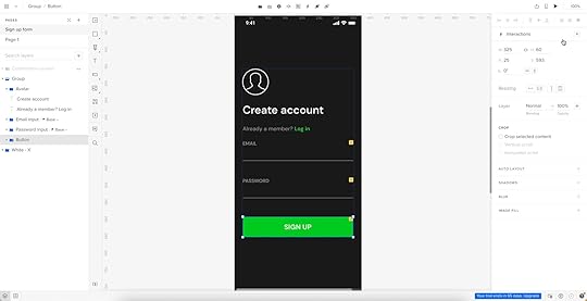
UXPin Interactions have four properties:
 Trigger
: a user action that starts the interaction–click/tap, swipe, scroll, etc. UXPin offers 20+ triggers for mobile and desktop.
Conditions
: allow designers to make rules before the prototype performs an action or design dynamic user flows.
Action
: what happens after the trigger (assuming this meets any conditions). Actions can be as simple as a page transition or more complex, like an API call or playing a video.Select: below actions is a select property that changes depending on the action. For example, the selector will include a dropdown with available pages if you choose Go to Page.
Animation
: lastly, you can add animation. UXPin provides many CSS animations with easing, duration, and delay to breathe life into your prototypes.
Trigger
: a user action that starts the interaction–click/tap, swipe, scroll, etc. UXPin offers 20+ triggers for mobile and desktop.
Conditions
: allow designers to make rules before the prototype performs an action or design dynamic user flows.
Action
: what happens after the trigger (assuming this meets any conditions). Actions can be as simple as a page transition or more complex, like an API call or playing a video.Select: below actions is a select property that changes depending on the action. For example, the selector will include a dropdown with available pages if you choose Go to Page.
Animation
: lastly, you can add animation. UXPin provides many CSS animations with easing, duration, and delay to breathe life into your prototypes.Our sign-up form button has four interactions:
Show confirmation screen: if the user completes the email and password fields correctly, the prototype will open the confirmation page. We’ve used a regex expression to ensure the email field includes an @ and domain extension, and the password must be longer than eight characters. The following error messages appear if the user doesn’t meet these conditions.Email error: if the user doesn’t complete the required email field, an error message appears below the input “Can’t be blank.”Password error: performs the same error message as email above.Set content of Email: creates a Variable for designers to use elsewhere in the prototype. In this example, we use the email variable to tell the user we have sent a verification link to their email address (see below).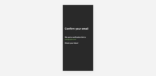
UXPin’s Interactions allow designers to create dynamic prototypes that respond to user engagement comparable to code. To achieve similar results in an image-based tool, designers must create multiple frames, predicting potential user actions and outcomes, thus biasing the test’s results. Image-based tools don’t have functioning inputs, limiting the testing scope.
Interactive Prototype ExamplesHere are some more interactive prototype examples created in UXPin.
Share Text Between ScreensUXPin’s Variables enable designers to personalize a user experience and pass data between screens, as we saw with the sign-up form’s confirmation screen above. Designers can share a single input, like the user’s name, or populate an entire profile with the user’s full name, address, contact number, and billing information used for eCommerce checkouts.
Follow the Share Text Between Screens to learn more about UXPin Variables.
Scrollable ContentVertical and horizontal scrolling is a significant facet of the mobile user experience. UXPin lets designers set up scrolling in a few clicks, creating a smooth, intuitive mobile app interface.
Follow the Scrollable Content tutorial to learn more.
StepperSteppers are essential eCommerce patterns. They allow users to add multiple pieces of the same item to their cart. Designers can use stepper functionality for volume control, light dimmers, and other incrementally controlled features.
Follow the Stepper tutorial to learn more.
Get started with interactive prototyping in UXPinDesign user experiences your customers love with the world’s most advanced design tool. Sign up for a free trial to discover UXPin’s interactive prototyping features.
Try UXPin for freeThe post A Quick Guide to Interactive Prototyping appeared first on Studio by UXPin.
December 29, 2022
2022 Wrap-Up – A Compilation of Must-Read Articles, eBooks, and Webinars
This year was full of exciting projects. Our content revolved around design systems, design operations, and design itself! We released an eBook, organized a virtual conference, and released a few features that let the design community experience component-driven prototyping.
Want to try it yourself? Beyond being an all-round advanced prototyping software, UXPin allows designers to build fully functional and interactive prototypes with component libraries imported from Git, Storybook or npm packages. See how it solves design challenges for teams, such as PayPal, Lumen, and more. Explore UXPin Merge.
Reach a new level of prototypingDesign with interactive components coming from your team’s design system.
Discover UXPin Merge .discover-merge { margin: 40px 8px;}.discover-merge__container { display: flex; max-width: 690px; height: 200px; padding: 20px; padding-left: 24px; border-radius: 4px; background-color: black; box-shadow: 10px 10px #9999ff; align-items: center; justify-content: space-between;}.discover-merge__left { width: 50%;}.discover-merge__left p { margin: 10px 0px !important; color: white !important; font-size: 18px !important;}.discover-merge__heading { font-weight: bold !important; color: white !important; font-size: 18px !important;}.discover-merge__text { margin: 0 !important; line-height: 22px !important;}.discover-merge__button { width: 174px; height: 44px; margin: 10px 0px; border: none; border-radius: 2px; background: white; color: black; font-size: 16px; text-align: center;}.discover-merge__button:hover { cursor: pointer;}.discover-merge__image { max-width: 320px !important; height: 200px; margin-right: -19px;}@media (max-width: 760px) { .discover-merge__container { height: auto; margin: 10px; align-items: left; }}@media (max-width: 500px) { .discover-merge__container { flex-direction: column; } .discover-merge__left { width: 100%; align-items: normal; }}Table of contentsThe Most Engaging Webinar in 2022Top 3 Product Releases3 Most-Read Articles on Product DesignTwo eBooks to Add to Your Reading ListHappy 2023!The Most Engaging Webinar in 2022We couldn’t have wished for more interesting speakers this year. Carola Cassaro talked about building and advocating for IKEA’s design system. Dave Malouf taught us how design teams can improve operations of the whole organization.
Amber Jabeen made us realize that the design system is more than a collection of reusable patterns and needs to be treated like a product. Her presentation should be bookmarked by anyone who needs to sell the idea of selling the business case for a design system. You can watch it on our YouTube channel where we put the recordings of most webinars.
Top 3 Product ReleasesIn 2022, we celebrated a few product releases to make interactive prototyping and cross-team collaboration easy.
Here are three of them.
npm integration – enjoy the easiest way of bringing UI components to UXPin; you import npm components and build production-ready prototypes without dev’s support. Check what the integration is about.Figma copy & paste plugin – import Figma designs to UXPin with our new Figma plugin; keep using the two design tools in unison and streamline your interactive design process. Follow the tutorial.MUI built-in library – build prototypes with MUI components that are interactive by default. Experience fully functional prototyping that requires no code and technical skills. Assemble your first prototype today with MUI.As Yuga Koda, our CEO, said during our Design Value Conference, UXPin aims at bridging the gap between design and development by giving designers the tools they need to build prototypes that developers can easily translate into code.
3 Most-Read Articles on Product DesignBased on the feedback, we chose three articles that seemed to be the most important ones this year.
Top 8 Design System Examples – this article dives into eight design systems used by the most design-driven organizations. Learn more about each of them.Design Consistency Best Practices – some designers see consistency as constraint, others claim that it helps them be more creative. Decide for yourself after reading our article.What is Component-Driven Prototyping? – this approach to prototyping can help teams work more efficiently. Discover what it is and see if it can help your team.If you want to stay up to date with our content, follow us on Facebook, LinkedIn or Twitter.
Two eBooks to Add to Your Reading ListThose of you who like to read about organizing design teams, setting up team rituals, and improving collaboration, we have something for you.
Apart from writing an introduction to Design Operations, we released another eBook on the field. It was about DesignOps’ First Pillar – How We Work Together. Read both of them:
DesignOps 101 – Read the eBook composed of six chapters; discover DesignOps essentials, full of advice on the field that’s coming from leading design operations expert from top enterprises.DesignOps 1st Pillar – Get a deeper insight into design operations by exploring its first pillar and learning about hiring, onboarding and leading a stellar design team.Happy 2023!https://t.co/AZTyTxdAcY 🚀 Have you heard about DesignOps first pillar? Here's your chance to learn everything about it!
— UXPin (@uxpin) August 4, 2022
🎉 Grab our free eBook and read how you can create and nourish an amazing design team! 📚 pic.twitter.com/CaxQ05L49H
Next year will be full of exciting projects at UXPin. As for this blog, we will continue writing about product design, sharing best practices of creating, maintaining, and scaling work, useful tools, and design hacks for you.
Looking for a tool that will help you bridge the gap between design and development? Try our Merge technology that allows you to bring interactive components from Git repo, Storybook or npm package to UXPin. Move beyond image-based design and create prototypes with UI components from your design library Read more about UXPin Merge.
Discover MergeThe post 2022 Wrap-Up – A Compilation of Must-Read Articles, eBooks, and Webinars appeared first on Studio by UXPin.
December 27, 2022
What Is A User Interface? Definition & Best Practices For UI Design
In 2022, there were an estimated 4.95 billion global internet users. That’s more than 60 percent of the world’s population.
For so many people to use smartphones, tablets, laptops, and desktops — not to mention the websites and apps — they need to be easy, efficient, and enjoyable to use. If they’re not, it’s a massive turn-off.
At the heart of this is the user interface (UI). In this article, we’ll explain what is a user interface, why it’s so important, and offer some golden rules for incorporating it into the design of your website or app.
Build advanced prototypesDesign better products with States, Variables, Auto Layout and more.
Try UXPin .try-uxpin-banner { margin: 40px 0px;}.try-uxpin__container { display: flex; max-width: 689px; height: 210px; padding: 20px; padding-left: 24px; border: 2px solid black; border-radius: 4px; align-items: center; justify-content: space-between; background-color: white; box-shadow: 10px 10px black;}.try-uxpin__left { width: 54%;}.try-uxpin__left p { margin: 10px 0px !important; color: black !important;}.try-uxpin__heading { font-size: 28px !important; font-weight: bold;}.try-uxpin__text { margin: 0 !important; font-size: 18px !important; line-height: 22px !important;}.try-uxpin__button { width: 135px; height: 44px; background: black; margin: 10px 0px; padding: 10px 20px; border: none; border-radius: 2px; color: white; font-size: 16px; text-align: center;}.try-uxpin__button:hover { cursor: pointer;}.try-uxpin__image { max-width: 320px !important; height: 200px; margin-right: -21px; margin-bottom: -6px;}@media (max-width: 760px) { .try-uxpin__container { height: auto; margin: 10px; align-items: left; }}@media (max-width: 500px) { .try-uxpin__container { flex-direction: column; } .try-uxpin__left { width: 100%; align-items: normal; }}Table of contentsWhat is a user interface?What is a graphical user interface (GUI)? How is it different from a UI?The elements of a user interfaceWhy is a good user interface key to product success?Better user acquisitionHigher customer retention Improved brand loyalty ScalabilityFewer errorsAccessibilityHow to approach creating a good UI Ready to design user interface?What is a user interface?A user interface (UI) is how we interact with smartphones, laptops, and other devices. It might include a display screen, keyboard, or mouse.
Each application or website we encounter also has its own UI, the design of which requires careful consideration so that it’s intuitive and satisfying to use. Getting it right is important, especially for businesses — according to a study by Forester, good UI can raise a website’s conversion rate by up to 200%.
The user interface is often talked about alongside user experience (UX). This includes the visual design and experience of a web page, desktop or mobile app screen, how it behaves (for example its load time and responsiveness), and how well users understand the role it plays in their lives.
Both UI and UX are in the field of human-computer interaction (HCI). Read UX vs. UI Design – The Differences You Need to Know to learn more about interaction design.
What is a graphical user interface (GUI)? How is it different from a UI?There are different types of user interfaces.
In the early days of computers, information was often presented in command-line interfaces, consisting of text lines on a screen. This was a relatively basic example of a user interface.
As technology and design advanced, images, icons, and dialogue boxes were added to make interactions more accessible. This is a graphical user interface (GUI). As the name suggests, it’s a UI with the addition of graphics. A graphical user interface is best thought of as a subset of UIs.
Another UI subset is voice user interfaces (VUIs). Examples of these include Amazon’s Alexa and Apple’s Siri.
The elements of a user interfaceUser interfaces are made up of elements. They’re the building blocks of apps and websites and are designed to be consistent, so users know what to expect when they’re interacting with the digital product.

There are hundreds of examples, but common design patterns include:
Input Controls — for example, checkboxes, dropdown lists, and buttonsNavigational Components — these include breadcrumbs, sliders, and search fieldsInformational Components – for example, progress bars, notifications, or message boxesContainers — accordions and other elements that help to group contentTo learn more about UI elements, read User Interface Elements Every Designer Should Know.
Why is a good user interface key to product success?Research suggests it takes users just 0.017 seconds to form an opinion about a website. The single most important factor in this snap judgment is how it looks and feels. What’s more, 94% of decisions to exit a site are design related.
Clearly, the UI is crucial in determining whether a web design or app is a success. And given that most enterprises see these platforms as their ‘shop window’, it may make or break their business, too. Here are more reasons why good UI is important…
Better user acquisitionHaving a good design for an app or website is a great way to attract new customers and it can give you a competitive advantage. Here’s an example.
Let’s say you’re interested in buying a product. There are two companies that sell it — and for the same price. The only difference is that one company’s website is clear and simple to navigate; they showcase the product well with lots of visual elements and present information to help users reach their goals.

On the other hand, their competitor’s site takes ages to load, is hard to navigate, and when you finally find the product in question, information is buried near the bottom of the page and you can’t find the ‘Checkout’ button. The experience design is horrible. So is the user interface design.
With that in mind, which company do you buy from? It’s a no-brainer, right?
Higher customer retentionAttractive user interface design doesn’t just help to attract new customers. If your site or app is simple to use, you can bet they’ll keep coming back regularly. Good UI encourages browsing, so end-users spend more time on your site. It increases the chances of conversion, so you make more sales. And it reduces the probability of users cutting their site visit short and jumping ship to your competitors’ platforms.
Improved brand loyaltyOf course, if a good UI prompts end-users to keep coming back to your site, it’s inevitable that they’ll develop an affinity with your brand. And loyal customers are incredibly valuable, as they sing your praises to people they know.
ScalabilityThe most effective user interfaces are those that incorporate the principles of design simplicity. That means designing only what’s essential and making sure your website or app is coherent, consistent, and user-friendly. It’s about keeping things clear and avoiding confusion by disrupting their mental models.
When you achieve design simplicity, it’s easier to add new features and develop the infrastructure of your website or app. In other words, it’s scalable.
To learn more, read What is Design Simplicity and How to Achieve it?
Fewer errorsUser testing is an important part of the UI design process.
There are a number of stages of user testing. As the process goes on, UX designers learn more about user requirements and iron out any problems with user journeys. As they grow in confidence, the designs become workable prototypes that more closely resemble the final product.
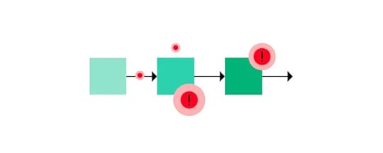
When the time comes to hand over the designs to developers, the UX designers have ironed out any problems users had when navigating the website or app prototypes. This saves time and resources; a developer can bring the designs to life knowing that the end product works for the user.
UX designers are well-placed to offer insights that can help resolve issues during the development process. If a page loads slowly, for example, they can quickly assess the impact it has on the user and help the developer determine whether it’s critical to the success of the final product.
AccessibilityGood UI requires a website or app to be accessible for all. It’s estimated that as many as one in five people has a disability that makes accessing information online difficult — a significant percentage of your audience. So it’s in your interest to comply with accessibility guidelines.
For more on that, read Web Accessibility Checklist – 28 Points You Must Comply With.
How to approach creating a good UIGood UI starts with a prototype.
If a prototype reflects the look, feel, and functionality of a working website or app, it’s easier to get in-depth feedback on the user experience. If a prototype is more basic — for example, static images linked together — it’s hard to know if your designs will work in real life. This could compromise the usability of your final product.
UXPin is a design tool that helps to create fully-functional prototypes. It’s component-driven, which means that instead of starting from scratch, design teams drag and drop interactive components to build prototypes. This helps to speed up the design and build process.
Anyone who interacts with prototypes made with UXPin could easily think they’re using the real interface; they can input data, click links, scroll pages, or perform any other task that the designer permits.
As users interact with prototypes, UXPin captures data that lets designers know what’s working and what needs improvement.
When it’s time to hand over the final designs to developers, UXPin prototypes give developers a clear idea of how the end product is supposed to work. This makes for smoother collaboration between design and dev teams.
Ready to design user interface?If you were wondering, ‘what is a user interface?’ then hopefully this article has given you a better idea. The UI isn’t just about aesthetics — it determines how people interact with your website or app and, ultimately, how they perceive your brand.
Designed well, your UI can help you attract new, loyal customers and gain an advantage over your competitors.
If your UI incorporates the principles of design simplicity, your product should be easier to scale as your business grows. And it’s important not to overlook the importance of making your UI accessible to all.
At the heart of good UI is user testing. And strong UX design tools such as UXPin can certainly help with that. UXPin contains every feature you need to design fully functional UI prototypes that can be tested with users, before being translated into code and shared with developers. You’ll certainly benefit from its functionality if you’re involved in UI design.
Try UXPin for freeThe post What Is A User Interface? Definition & Best Practices For UI Design appeared first on Studio by UXPin.
December 26, 2022
How Storybook Helps Developers With Design Systems?
Storybook has become THE DevOps tool for developing and maintaining design systems. The platform’s excellent documentation, intuitive UI, built-in testing, and collaborative features make it the perfect tool for building and releasing components.
Understanding how Storybook works can help designers collaborate with front-end devs better and leverage the platform’s features to improve prototyping and testing.
One of Storybooks best features for design teams is its ability to sync a component library with UXPin using Merge technology. Merge creates a drag-and-drop prototyping environment using fully interactive prototypes from a repository–the exact same components engineers use in Storybook. Visit our Merge for Storybook page for more details.
Reach a new level of prototypingDesign with interactive components coming from your team’s design system.
Discover UXPin Merge .discover-merge { margin: 40px 8px;}.discover-merge__container { display: flex; max-width: 690px; height: 200px; padding: 20px; padding-left: 24px; border-radius: 4px; background-color: black; box-shadow: 10px 10px #9999ff; align-items: center; justify-content: space-between;}.discover-merge__left { width: 50%;}.discover-merge__left p { margin: 10px 0px !important; color: white !important; font-size: 18px !important;}.discover-merge__heading { font-weight: bold !important; color: white !important; font-size: 18px !important;}.discover-merge__text { margin: 0 !important; line-height: 22px !important;}.discover-merge__button { width: 174px; height: 44px; margin: 10px 0px; border: none; border-radius: 2px; background: white; color: black; font-size: 16px; text-align: center;}.discover-merge__button:hover { cursor: pointer;}.discover-merge__image { max-width: 320px !important; height: 200px; margin-right: -19px;}@media (max-width: 760px) { .discover-merge__container { height: auto; margin: 10px; align-items: left; }}@media (max-width: 500px) { .discover-merge__container { flex-direction: column; } .discover-merge__left { width: 100%; align-items: normal; }}Table of contentsWhy Devs use Storybook for Design SystemsDeveloping and testing components in isolationQuality AssuranceDocumentationSingle source of truthAccessibilityHow Devs Work With a Design System in StorybookBuildDocumentReviewTestDistributeSyncing Design With Storybook Through UXPin MergeWhat is UXPin Merge?Enhanced testing and stakeholder feedbackScaling component libraries with UXPin PatternsStage four design system maturity with UXPin MergeWhy Devs use Storybook for Design SystemsThese are a few reasons why Storybook is the preferred DevOps tool for managing design systems.
Developing and testing components in isolationStorybook enables engineers to develop UI components in isolation. This development workflow is great for design systems and component-driven front-end frameworks like React–which many organizations use for their component libraries.
Before Storybook, engineers would use sandbox platforms like CodePen and CodeSandbox to build and test components in isolation. Storybook offers this sandbox-style development environment with an intuitive user interface for engineers and stakeholders to view, test, and approve UI elements. They can also combine components and build little prototype patterns for testing.
Quality AssuranceDeveloping in isolation also benefits design system quality assurance. Engineers can invite designers, product managers, and other stakeholders to test and submit feedback on new UI elements before release.
DocumentationDocumentation is crucial for component libraries, but it’s often the last thing anyone wants to think about because it’s time-consuming.

Storybook’s DocsPage is a “zero-config default documentation” that automates basic doc creation. Product and engineering teams can expand this documentation to create usage and guideline information.
Single source of truthManaging the codebase for cross-platform applications is challenging. Storybook provides a single source of truth for testing components and patterns for each platform from a centralized environment.
This centralized environment maximizes consistency, as engineers can view components and patterns side-by-side and collaborate with developers responsible for each platform–iOS, Web, Android, etc.
AccessibilityStorybook’s A11y Accessibility add-on enables engineers to automate accessibility testing. The add-on creates a new Accessibility tab for each element showing WCAG standards in three categories:
Violations: accessibility issues to resolvePassed: standards metIncomplete: A checklist of accessibility to-dosHow Devs Work With a Design System in StorybookStorybook’s docs outline a standard five-step design system workflow:
BuildDocumentReviewTestDistributeBuildOnce engineers have set up Storybook and connected to a GitHub repository, they begin developing each component and its variants. For example, a button might have several states, sizes, types, etc.
During the build process, engineers can install Storybook add-ons to automate workflows, integrate with other tools, or enhance the Storybook environment.
DocumentEngineers can add comments to components during the build process to enrich the automatically generated documentation. This example from Storybook’s docs demonstrates how these comments appear in your Storybook UI.
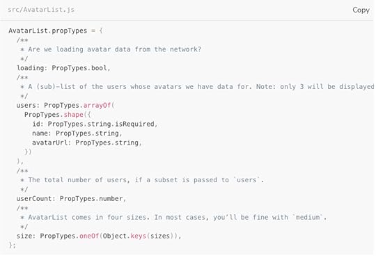
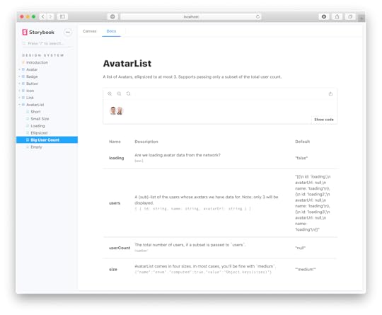
This documentation is crucial for the next step, Review, because it shows stakeholders how front-end developers interpret designs and what each ‘prop’ represents.
ReviewThe component is now staged and ready to be promoted to the design system. Engineers can invite designers, product managers, and other stakeholders to review the element to ensure it meets interactive and aesthetic expectations.
Traditionally, engineers would have to create a staging environment or meet with stakeholders to present the component. With Storybook, it’s as easy as visiting a website, making the review process more accessible. Stakeholders can log in on their own time, interact with the component, read the docs, and leave feedback.
If there are any changes, engineers may iterate steps one to three until the new components meet all stakeholder’s expectations.
TestJest and Playwright power Storybook’s framework-agnostic testing. When engineers commit the component, Storybook tests its code to ensure there are no programming errors, including:
Visual tests (visual regression tests): creates screenshots of every commit and compares them to catch UI inconsistencies. Accessibility tests : runs code against WCAG standards and reports any issues. Interaction tests : checks interactivity and states to ensure there are issues with links or functionality. Test coverage : examines code against industry standards, including conditions, logic branches, functions, and variables. Snapshot tests : identifies markup changes by comparing rendered code to the baseline.DistributeThe final step is to update the design system package on GitHub. Once complete, it’ll automatically sync the changes to npm. Engineers can install the updated npm package to use the new component(s).
Syncing Design With Storybook Through UXPin MergeIf your design team works with UXPin Merge, these engineering changes will also be distributed to UXPin’s design editor and notify team members of the latest design system release.
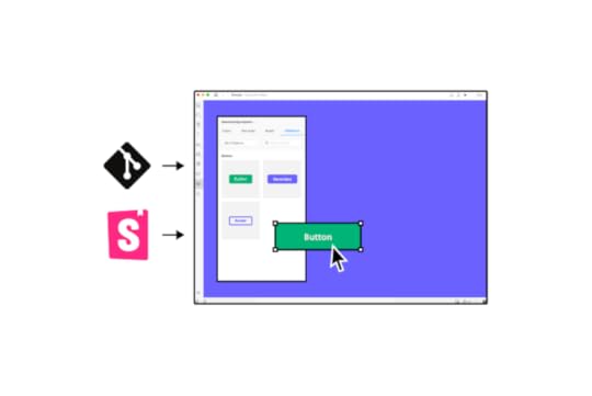
UXPin’s Version Control allows designers to change to the latest release whenever they choose and switch to earlier versions of the design system.
What is UXPin Merge?UXPin Merge is a technology that bridges (or Merges) the gap between design and development. Organizations can sync a design system hosted in a repository to UXPin’s design editor so designers can use the same component library as engineers to build fully functioning prototypes.
Merge components are fully interactive and include React props (or Args for Storybook) defined by the design system, including colors, typography, states, sizes, etc. These props appear in UXPin’s Properties Panel so designers can adjust components to meet prototyping requirements while maintaining absolute consistency and zero drift.
Enhanced testing and stakeholder feedbackMerge prototypes look and function like the final product because they use the same components. For example, a button in Storybook will render exactly the same in UXPin, including interactivity and styling.
Usability participants and stakeholders can interact with these UI elements and Merge prototypes like they would the final product, giving design teams accurate, actionable testing insights.
“It’s been so helpful for us to have these high-fidelity prototypes built with UXPin. We build high-fidelity prototypes much quicker, and we get immediate feedback after the session. If there’s something we can fix immediately, we make that change before the next participant and get feedback much faster than before.” Erica Rider – UX Lead EPX at PayPal, talking about how UXPin Merge enhances user testing.
Scaling component libraries with UXPin PatternsDesign systems evolve as products grow and scale. The design system team is constantly making changes and promoting new UI elements and patterns.
UXPin Patterns enables design teams to create new patterns for the design system–as one-offs or as a best new practice. Designers can combine UI elements (atoms and molecules) from the design system to create new patterns or use UXPin’s npm integration to import components from open-source libraries if the current library doesn’t support their needs.
Designers can save and share these patterns across the organization, so teams can continue prototyping while they wait for the DS team to follow governance procedures to develop and release the new component–following the five-step Storybook development process outlined above.
Stage four design system maturity with UXPin MergeIress achieved stage three design system maturity in 2017. For the next few years, the design system team searched for a design tool to take them to the next and final maturity level–Stage Four – Fully Integrated:
Design in (no) codeNo design driftConsistent designSeamless (no) handoffMerge solves these four design system challenges by default.
Designers use ready-made components with styling and interactive properties–no designing from scratch. Drag and drop UI elements to design new products.No code development. Engineers install a package and copy prototypes that use the exact same UI library. UXPin renders JSX for each component, so engineers copy/paste to apply styling and interactivity.Drift is nonexistent when everyone uses the same component library (design and engineering teams) with the same constraints.Using the same components with built-in constraints ensures ultimate consistency across design teams.With Merge, there’s a seamless handoff because designers and engineers use the same single source of truth. Designers don’t have to explain UIs or provide endless documentation explaining their prototypes–they already look and function like the final product.UXPin reduces the four stages of design system maturity to just two.
Design your library using UXPin’s design editor.Convert designs to code components, add them to a repository, and sync back to UXPin using Merge. Iterate to scale.Take your product development to the next level by Merging the two best design and engineering tools for design systems:
UXPin Merge + Storybook = a single source of truthVisit UXPin’s Merge for Storybook page for more details and how to request access to this revolutionary design technology.
Discover MergeThe post How Storybook Helps Developers With Design Systems? appeared first on Studio by UXPin.
UXpin's Blog

- UXpin's profile
- 68 followers

