
UXpin's Blog, page 43
March 6, 2023
Should User Experience Designers Be Aware of Psychology?
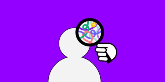
Products are built by people for people. To do it right, UX designers must have a genuine interest in human psychology – to understand the emotions and motivations behind users’ actions. Only then you are able to create products, which perfectly resonate with the target audience. Without this knowledge, it’s like shooting in the dark – high chances are, you’ll miss your target.
In this piece, we’re going to focus on the question – should user experience designers be aware of human psychology? We’ll discuss the psychology principles you should be aware of and how you can apply them to your design process.
Implement all UX psychology principles that we’re about to outline right away. Create advanced prototypes using UXPin, an end-to-end prototyping tool that supports product design and development teams on their journey to build the best apps, websites, and other digital products for their users. Try UXPin for free.
Build advanced prototypesDesign better products with States, Variables, Auto Layout and more.
Try UXPin .try-uxpin-banner { margin: 40px 0px;}.try-uxpin__container { display: flex; max-width: 689px; height: 210px; padding: 20px; padding-left: 24px; border: 2px solid black; border-radius: 4px; align-items: center; justify-content: space-between; background-color: white; box-shadow: 10px 10px black;}.try-uxpin__left { width: 54%;}.try-uxpin__left p { margin: 10px 0px !important; color: black !important;}.try-uxpin__heading { font-size: 28px !important; font-weight: bold;}.try-uxpin__text { margin: 0 !important; font-size: 18px !important; line-height: 22px !important;}.try-uxpin__button { width: 135px; height: 44px; background: black; margin: 10px 0px; padding: 10px 20px; border: none; border-radius: 2px; color: white; font-size: 16px; text-align: center;}.try-uxpin__button:hover { cursor: pointer;}.try-uxpin__image { max-width: 320px !important; height: 200px; margin-right: -21px; margin-bottom: -6px;}@media (max-width: 760px) { .try-uxpin__container { height: auto; margin: 10px; align-items: left; }}@media (max-width: 500px) { .try-uxpin__container { flex-direction: column; } .try-uxpin__left { width: 100%; align-items: normal; }}Is UX design related to psychology?
Psychology and user experience are inseparable. You cannot design products that will appeal to your target audience without diving into human psychology – at least on a basic level. Otherwise, how will you know how to influence their decisions and resolve their problems?
If you’re a designer, then high chances are you’ve heard the term “design psychology”. It’s a combination of the following:
NeuroscienceCognitive psychologySocial psychologyAnd human-computer interaction.By wrapping your head around these branches of psychology dedicated to human thinking, you’ll be able to view the design process through a more human lens.
In other words, you’ll be capable of implementing mechanisms that will drive specific responses and actions from your users into your products.
4 UX Psychology Factors Designers Need to Know
At UXPin, we’ve noticed that plenty of sources online reduce the role of psychology in design to ‘studying behavior’. However, it’s far beyond that. It’s a complex process, which circles around analyzing the user’s emotions, attention, cognition, and perception levels. Of these four criteria, the last two should be studied particularly well by designers.
In this section, we’re going to discuss all four UX psychology factors and how you can make them play out in your digital product’s favor.
CognitionHave you ever stepped into a store to buy yogurt, only to stare blankly at the fridge, overwhelmed with the choice? This is a prime example of Miller’s law. In a nutshell, people struggle to compare multiple options against one another due to cognitive limitations.
The average person can simultaneously process anywhere between five to nine options. Anything above this threshold either makes us pause our actions or withdraw from them altogether. The same is likely to happen to your users if you clutter too much information on your website or app.
To tackle this UX psychology challenge, it’s best to distribute information over multiple, progressive screens. For example, if you operate an online store, show no more than nine products per page. If it isn’t possible, then try to group them into categories to ease navigation.
The same rules apply when designing entire user journeys. If you’re creating, say, an in-app onboarding sequence, break it down into smaller chunks, and show a progress bar at the top.
Here’s a great example from WordPress:
 Source: UseronboardPerception
Perception kicks in as soon as a person comes across your brand name or logo for the first time, and stays with them in all interactions with your website and services. It’s a mixture of opinions and emotions that your product triggers in them, and is subject to change over time.
So, what contributes to how users perceive digital products? The Interaction Design Foundation points to several Gestalt principles. While discussing all of them in depth would be beyond the scope of this piece, designers should particularly consider the following:
Proximity – users tend to think that elements placed close to one another in an interface are part of a group, i.e., there’s a relation among them.Similarity – people believe that similar elements are related to one another, even if they’re dispersed on a screen miscellaneously. What we see as ‘similar’ can be based on shape, color, or size.Closure – the human brain tends to imagine lines and links between shapes if it helps us see a pattern. Look at the famous Champions League logo below. Even though the stars aren’t linked on the outer edges, we clearly see a star-shaped football. Source: Wikipedia
To learn more about the role of perception in design, grab our free eBook on Web UI design for the Human eye.
AttentionThere is a statistic circling the internet that the average human’s attention span is just 8.25 seconds, which would put us behind goldfish (9 seconds). This number has rung alarm bells among psychology scholars. While the goldfish analogy has luckily been debunked, it’s true that our attention has worsened when compared to the pre-personal tech era.
There are two things that can disrupt your user’s journey. Firstly, they can get distracted by their own thoughts or physical surroundings. Secondly, they can be deliberately interrupted by other apps competing for their time – for example, via push notifications.
Here’s how to tackle this while designing your website or product:
Refrain from any strong stimuli that could interfere with the user’s goals. For example, if they visited your product page, showing them random pop-up surveys or colorful banners could keep them from converting (i.e., draw their attention away from the “Buy now” button). Inform your users about where they are in the process. Imagine they were setting up your tool, but were interrupted by a phone call. Will they know where they’ve left off once they return to your app or site? A good idea is to create breadcrumbs or even a progress bar, so they can see how many steps are left in the process.Finally, try to make your product stand out. People are attracted to and interested in new experiences. That being said, don’t break any UX design conventions. Simple actions like moving between categories or finalizing a purchase need to be easy to complete.EmotionThe age-old rule says that you become who you surround yourself with. But it’s also strongly about what we surround ourselves with. If we dedicate, say, 80% of our leisure time to watching sad movies, it will be easy for us to pick up the gloomy mood. This is a subconscious reaction, which can luckily also be used to evoke positive feelings.
How does this relate to digital product design? Don Norman, UX design guru and co-founder of the NN Group, says that aesthetics play a key role. One of his research papers circles around the claim that “attractive things work better”.
What Norman has noticed throughout decades of UX design work is that people tend to forgive usability glitches if they like the design. They will also feel that aesthetically pleasing interfaces are more functional. So, when it comes to emotion in UX, it’s not only about your company’s message. It’s also about how you present it through visual and functional design.
Is a Psychology Degree Necessary for UX Designer?
Both psychology and UX revolve around people. So while a user experience designer should be aware of human psychology, they don’t necessarily need to be a psychologist.
Most psychology principles are easy to understand but can have a tremendous impact on your design process if applied correctly. Let’s take a look at what UX design and psychology have in common:
Research – humans are complicated creatures, and figuring out their motivations and needs can be hard, especially when they can’t verbalize them. Having basic psychological knowledge will help you apply specific techniques to gather information and derive insights from them.
Empathy – a lot of us think that empathy is something we’re born with. However, the truth is that it can be trained, and psychologists spend years trying to become more empathetic. Being able to step into your users’ shoes, which is what empathy is about, will become handy in UX design.
Emotional design – successful products and services are built around users’ emotional journeys. When you run user interviews and usability testing, you’ll be able to apply your basic psychological knowledge to figure out how people feel while using your product.
Check out: UX Design Degrees and Courses that Are Worth it
Psychology in Design – How Can it Help You?
Applying psychology to your designs will help you make better design decisions.
Here is how:
Decision making – giving users more options to choose from isn’t always the right thing to do as it can lead to a paradox of choice. The more choice they have, the harder it is to make a decision. Offering your users guidance, and simplifying their entire journey will improve their experience.
Motivation – UX designers have to understand their target audience’s pain points and needs. In short, they have to know what motivates them to use a product. Without this knowledge, they won’t be able to retain a user for long.
Influence – as humans we’re often indecisive; we don’t know what action to take until we actually take it. This is a very important piece of information, as it shows that people need guidance. Psychologists are aware of mechanisms that can be applied to “push” individuals towards a certain action. The same principles can be used while designing products. However, there is a thin line between manipulation and influence. Trust and credibility are the basis for building a lasting relationship with customers.
Interactions – the more complex the product the harder it is to interact with it. And this is worth taking into consideration as people have different levels of tech savviness. If you want people to use your product or service then you have to adapt it to your users, not the other way around.
Use Psychology Principles in UX DesignAn understanding of psychology principles is a must-have in any UX designer’s skill set. Humans are complex beings, and our reactions aren’t always the most ‘rational’ ones on the table. Knowing how people create visual connections and what triggers their positive and negative emotions will help you do more than just build more enjoyable experiences. It will also support your business goals and have users return for more.
The best part is that, since we’re all humans, you can test your concepts well before you put out a design. By using UXPin, you can create interactive prototypes, from start to finish. Have an idea for a functionality or an assumption you’d like to build and test out? Get started with UXPin.
Try UXPin for freeThe post Should User Experience Designers Be Aware of Psychology? appeared first on Studio by UXPin.


March 3, 2023
Powerful Microinteractions to Improve Your Prototypes

Well-designed microinteractions enhance the user experience by providing reinforcement and feedback. Without microinteractions, user interfaces would be dull and lifeless.
Like it or not, digital products play on human psychology. When you see the flashing “typing…” in chat or social media apps, you want to stick around to see what the person’s going to say.
These microinteractions keep users engaged, so they’re more likely to continue using the product, make a purchase, or share a positive brand experience.
Microinteractions can also distract or impede the user from completing user flows, resulting in a negative experience.
Finding the right balance comes down to UX teams testing high-fidelity prototypes with end-users through usability studies and feedback from stakeholders.
If you want to speed up the process of adding interactions, use UXPin Merge to have UX designers create high-fidelity prototypes using fully interactive components from a Git repository or Storybook. By using code-based prototypes, UX teams can test the exact microinteractions used in the final product. Get started with a free trial to experience advanced prototyping with UXPin today!
Build advanced prototypesDesign better products with States, Variables, Auto Layout and more.
Try UXPin .try-uxpin-banner { margin: 40px 0px;}.try-uxpin__container { display: flex; max-width: 689px; height: 210px; padding: 20px; padding-left: 24px; border: 2px solid black; border-radius: 4px; align-items: center; justify-content: space-between; background-color: white; box-shadow: 10px 10px black;}.try-uxpin__left { width: 54%;}.try-uxpin__left p { margin: 10px 0px !important; color: black !important;}.try-uxpin__heading { font-size: 28px !important; font-weight: bold;}.try-uxpin__text { margin: 0 !important; font-size: 18px !important; line-height: 22px !important;}.try-uxpin__button { width: 135px; height: 44px; background: black; margin: 10px 0px; padding: 10px 20px; border: none; border-radius: 2px; color: white; font-size: 16px; text-align: center;}.try-uxpin__button:hover { cursor: pointer;}.try-uxpin__image { max-width: 320px !important; height: 200px; margin-right: -21px; margin-bottom: -6px;}@media (max-width: 760px) { .try-uxpin__container { height: auto; margin: 10px; align-items: left; }}@media (max-width: 500px) { .try-uxpin__container { flex-direction: column; } .try-uxpin__left { width: 100%; align-items: normal; }}What Are Microinteractions?Microinteractions provide feedback based on triggers from the system (system-initiated triggers) or end-user (user-initiated triggers). This feedback helps users know when a task is completed or alerts them when action is required.

Microinteractions work in trigger-feedback pairs. First the trigger, then the feedback in acknowledgment:
Trigger: user action or system state changeFeedback: visual, audio, haptic changes to the user interfaceAn excellent example of a microinteraction we mindlessly use every day is swiping away preview notifications. If you receive a notification while using your mobile, you often swipe it, and the notification popup slides off the screen.
In the above example, we can define the microinteraction trigger-feedback as:
Trigger: user swipes the notification popupFeedback: notification slides off the screenThe notification appearing in a popup is also a microinteraction.
Trigger: system receives a notificationFeedback: notification popup animationThe notification popup is a fantastic example of a microinteraction serving more than one purpose:
Helpful: notifies the user of a new messageMarketing: encourages the user to use the product that sent the notificationThe Four Stages of MicrointeractionsTo the user, microinteractions happen as trigger-feedback. But as product design teams and engineers know, there’s more happening behind the scenes.
There are four stages or parts of a microinteraction:
Trigger: user action or system state changeConditions: system rules that define what microinteraction is triggeredFeedback: visual, audio, haptic changes to the user interfaceLoops & Modes: those are the meta-rules of the microinteraction and determine what happens once the microinteraction is complete—state or UI changes (modes) and how long it will last (loops)UXPin provides UX designers with various user-initiated triggers, including click/tap, mouse actions, and gestures. You can also set “if-then” conditions for the prototype’s next actions (including microinteractions)—similar to running a Javascript function.
Try it for yourself. Sign up for a free UXPin trial to play with the world’s most advanced prototyping tool.
Why Are Microinteractions Important?Microinteractions allow a brand to communicate with the user—providing clarity, validation, brand engagement, and more.
Provide Clarity & System FeedbackFor example, when you pull down on your Instagram feed (or most apps), a loading animation appears at the top to indicate that the system is working to refresh the feed.
Without that microinteraction, the user wouldn’t know if the system had A, complied with their action, or B, completed the task.
Take ActionMicrointeractions also help guide users to take action. The most common of which is a call to action, such as the “add to cart” microinteraction that we see in eCommerce.
When a shopper adds a product to their cart, the cart icon jiggles or changes color in the header. In some cases, the cart might slide in from the side of the screen—prompting the user to checkout.
BrandingMicrointeractions also enhance the brand experience. Those small moments provide the user with positive reinforcement or they are a fun animation.
A great use case for this is DuckDuckGo’s app experience. If you’ve ever used DuckDuckGo’s app, when you click Clear All Tabs And Data, a flame appears to indicate that the browser has erased your browsing history.
This microinteraction affirms DuckDuckGo’s commitment to providing users with browsing privacy and blocking tracking cookies.
More Examples of the Importance of MicrointeractionsImprove navigation and user flowsProvide prompts and direction—especially during the onboarding stageIndicate or prevent user errors—a red highlight around a required incomplete form fieldEncourage engagement and sharingTypes of MicrointeractionsThe possibilities are endless when it comes to microinteractions. UX designers often have fun showcasing their creativity while designing microinteractions.
These are some of the most common examples of microinteractions and how they enhance the user experience.
Mouse Hover Effects
Mouse hover effects are some of the most common microinteractions for desktop users. These microinteractions can provide clarity through tooltips or change the cursor to indicate a clickable element.
Hover microinteractions can also initiate or stop image carousels or preview a video, so the user can “browse” across the screen before deciding where they want to click.
Click/Tap Effects
Most interactions occur when a user clicks or taps an element on the screen. There are endless microinteractions and possibilities for click/tap interactions, but most of the time, they provide a way to navigate through a product or website.
Click/tap actions might trigger a microinteraction on the element, like a button press effect, triggering a page slide transition to show the user they’ve navigated to another screen—typical microinteractions for an eCommerce checkout flow.
Tap/Click and Hold EffectsTap and hold microinteractions are fantastic alternatives to dropdown menus, especially for mobile devices with limited screen space. Users can tap and hold an element to get more options—usually activating a popup with some sort of microinteraction.
A perfect example is Facebook’s like button. On desktop, you can hover over the like button for more post reactions. You don’t have a mouse cursor on mobile, so you must tap and hold the thumbs up button to get the same functionality.
Haptic FeedbackApart from visual feedback that we discussed, mobile apps and gaming controllers feature haptic feedback—vibrations that correspond to a user or system action.

Games often use haptic feedback for action sequences, like when you’re getting shot or punched. These vibrations create an immersive experience where the user hears, sees, and feels what’s happening on screen.
If you use thumbprint biometrics on your smartphone, you’ll feel a slight vibration under your thumb if the authentication fails. This haptic microinteraction lets you know that you must reposition your thumb and try again.
Data Input & Progress MicrointeractionsMicrointeractions are highly effective for data input and progress. Often when you create a new password, a progress bar will appear starting from “weak” and progressing to “strong” or “very strong” as you go.

The Signup or Confirm button might also remain shaded dark/unclickable and illuminate once you have created a strong enough password to proceed.
Progress bars at the top of a flow can tell users how far they still have to go to the confirmation page. The bar might animate or change a different shade as they progress to encourage completion.
Swipe/Slide MicrointeractionsUX designers often use slide microinteractions, such as scroll bar, to indicate movement or navigation. These microinteractions are most effective on mobile but also work well on desktop screens for image carousels, sales funnels, and checkout flows.
On mobile devices, swiping can replace tapping for smoother, faster navigation. Slide microinteractions work well with swipes because they correspond to the action.
An excellent example of slide microinteractions is the swipe left or right on dating apps. As the user swipes, the potential match slides off-screen. If it’s a match, the app rewards the user with “It’s a Match” microinteraction and a button or link to start chatting.
System FeedbackMicrointeractions play a crucial role in communicating system feedback to the user. Spinning loading icons are the most common system microinteractions. These microinteractions let the user know to wait while the app or website is loading.

Without the spinning icon, the user might think the app has crashed, or they might keep clicking or tapping, resulting in multiple server requests.
Message notifications are also great examples of system feedback. The app receives a new message (from another user) and alerts you to open the app.
Effective Microinteractions Enhance UXWe’ve demonstrated the importance of microinteractions and how to use them to enhance the user experience. Like anything, less is more. Don’t overuse microinteractions or create long, unnecessary animations that slow user progress or derail users’ attention.
UX designers must use feedback from usability studies to determine where users might need microinteractions to help with navigation or if they’re missing vital instructions—like creating a strong password.
Creating Microinteractions for Your UXPin PrototypesUXPin provides UX designers with Triggers, Conditions, and Interactions to create immersive user experiences for their high-fidelity prototypes.
You can also create variables to personalize microinteractions. For example, capturing a user’s name from a signup form to personalize a welcome animation when the user signs in successfully.
You can also activate page transitions, show/hide elements, toggle, set state, create an API request, and much more. UXPin provides the tools and flexibility for UX teams to exercise their creativity by building fully functioning high-fidelity prototypes.
Get started designing your next prototype with UXPin. We offer a 14-day free trial to let you experience the power of prototyping with the world’s most advanced code-based design tool.
Try UXPin for freeThe post Powerful Microinteractions to Improve Your Prototypes appeared first on Studio by UXPin.
March 2, 2023
UX and SEO – An SEO Guide For UX Designers
There’s more to the website that meets the eye! Beside the layout, colors, fonts, there are also technical factors such as site speed, indexing, and metrics that UX designers need to consider when working on a website experience.
We invited Tomasz Niezgoda, Head of Marketing at Surfer, a platform that merges content strategy, creation, and optimization into one smooth process to write an SEO guide for UX designers. If you need a tool that will support your content marketing efforts, try Surfer. For designing a website, app, or any other digital product, try UXPin, an end-to-end design solution that will improve your design process from start to finish. Try UXPin for free.
Build advanced prototypesDesign better products with States, Variables, Auto Layout and more.
Try UXPin .try-uxpin-banner { margin: 40px 0px;}.try-uxpin__container { display: flex; max-width: 689px; height: 210px; padding: 20px; padding-left: 24px; border: 2px solid black; border-radius: 4px; align-items: center; justify-content: space-between; background-color: white; box-shadow: 10px 10px black;}.try-uxpin__left { width: 54%;}.try-uxpin__left p { margin: 10px 0px !important; color: black !important;}.try-uxpin__heading { font-size: 28px !important; font-weight: bold;}.try-uxpin__text { margin: 0 !important; font-size: 18px !important; line-height: 22px !important;}.try-uxpin__button { width: 135px; height: 44px; background: black; margin: 10px 0px; padding: 10px 20px; border: none; border-radius: 2px; color: white; font-size: 16px; text-align: center;}.try-uxpin__button:hover { cursor: pointer;}.try-uxpin__image { max-width: 320px !important; height: 200px; margin-right: -21px; margin-bottom: -6px;}@media (max-width: 760px) { .try-uxpin__container { height: auto; margin: 10px; align-items: left; }}@media (max-width: 500px) { .try-uxpin__container { flex-direction: column; } .try-uxpin__left { width: 100%; align-items: normal; }}Why Understanding SEO is Important?Contrary to popular belief, SEO is not only about keywords and content. Search engines started understanding users’ needs and considering them in ranking pages. So, although it may not seem so evident, SEO and UX influence each other interchangeably, and it is undisputed.
UX metrics such as page speed and mobile friendliness have become primary ranking factors for Google. Therefore, it’s crucial to consider user experience in terms of SEO because search engines rank websites based on how users interact with them.
From this article, you can learn how SEO and UX influence each other and what you can do to improve your website to rank higher in search engines.
Interrelation between SEO and UXSearch Engine Optimization strives to improve a website’s visibility in organic search results and, as a result, increase organic traffic. A strong SEO strategy boosts a website’s visibility on the SERPs (Search Engine Results Pages) and improves ranking for relevant search queries. Many people use dedicated SEO tools (like SEO tool–Surfer) to help them improve their site’s visibility in Google.
To connect users with the information they’re looking for, search engine algorithms assess the pertinence of a page’s content to the user’s search query by analyzing topics and relevant keywords. Sometimes it’s helpful to use paraphrasing tools to implement as many keywords as possible without overstuffing the content.

Search engine algorithms also gauge the authority of a page by analyzing backlinks and other off-page factors that indicate a site’s trustworthiness. Finally, search engine algorithms measure how users interact with a web page to determine the quality of user experience it provides. That’s where SEO user experience comes into play.
The purpose of search engines is to provide a rich user experience, which means directing users to web pages that can provide it. Google algorithm evaluates user interaction with a site by assessing UX signals, such as clicks and dwell time. They are a sign to Google that a website has a high level of user engagement and great UX design.
In summary, to create an effective SEO strategy, you need to make your website user-friendly, and to achieve that, you need to consider UX design.
How Can UX Metrics Affect SEO?As you can see, user experience is an influential ranking factor. So, keeping an eye on some UX metrics that can make or break your position in search engines is essential.
When it comes to SEO, behavior metrics measure user engagement and how content aligns with search intent. You need to optimize your website for these markers if you want to be a user-friendly resource and appear higher in search engine rankings.
Some user engagement metrics that matter for SEO include:
dwell time; time spent on the page before navigating back to the SERPbounce rate; how many people exit the website after seeing one pageuser engagement; where people go after navigating to your websitepages per session; how many pages people browse through during one sessionIf you look out for these metrics, you can make adjustments to your content and website design to help people find the information and encourage them to stay longer on your website. Below, we go over the specific steps you can take to improve UX SEO on your site.
4 UX SEO Best PracticesNow that you know the importance of UX and SEO, here are some actionable tips you can implement in your website.
Improve the page load timeImproving page load time is the first and most important thing you should do to improve SEO rankings. Not only does slow site speed cause a higher bounce rate, but it also directly correlates with search rankings.
Most people want to find information quickly, and if your page takes forever to load, they will simply leave the website. Moreover, Google regards page speed as a ranking factor.
It’s also essential to boost the load of different page elements. It’s not only crucial for improving UX but also for preventing layout shifts. It happens when page content unexpectedly moves; the most common reason is that resources are loaded asynchronously.
There are several things you can do to make sure that your page with all of its contents loads fast and simultaneously; here are some of them:
Make sure the images you use have defined dimensionsUse images in the right format (Google recommends WebP)Identify the problems using Google’s PageSpeed Insights Conduct a Core Web Vitals assessment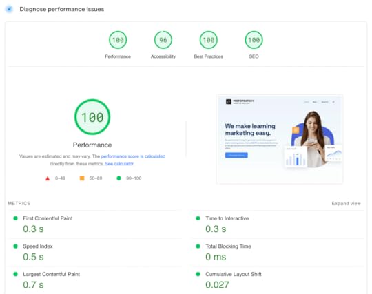
If you make sure your page loads fast, you can be sure that both search engines and users will favor your content.
Simplify your site navigationIntuitive site architecture and easy navigation help people find what they need fast. It also helps boost engagement with other parts of a website.
Remember that often users won’t enter your website through your homepage. This means you must make your site easy to navigate wherever users or search engine crawlers land.
Moreover, the way you structure and organize your website’s content helps Google understand which pages are most important. This way, you can also show Google how each page relates to others and what is your website’s topical domain authority.
Additionally, clean site navigation and structure can make sitelinks show in Google search results. Sitelinks can help you cover more real estate on search engine result pages, which means less room for your competitors.

If you’re deciding on the type of website structure, the best one for SEO UX is a flat hierarchy. In this type of website hierarchy, every page is 3-4 clicks away from the home page and can be discovered through internal links.
So every page should have an internal link pointing to it. Not only does flat architecture help users and Google identify the relevance of your website, but it also helps pass link authority from one page to another.
Optimize your website for mobilePeople access Google on mobile devices every day in various situations, so it’s crucial to optimize your website to be easily accessible. And because the majority of users now search for information using a mobile device, Google started to crawl and index pages optimized for mobile as a priority.
To make your website accessible to mobile users, leverage a responsive web design. It enables websites to resize and adjust to mobile phones, tablets, and other devices and prevents rendering issues.
In mobile layouts, the emphasis should be on simplicity and clarity. So make sure your content is easily readable, eliminate unnecessary pop-ups, and make calls to action clear and easy to tap on.
A mobile-friendly website should also include the following:
Reasonably big buttonsPinch to zoom Simple menusVisible search boxWhen it comes to text content, remember that the font shouldn’t be smaller than 16, and the text blocks should be smaller, so divide the content into more paragraphs.
The image above shows an example of a terrible mobile version of a website. As you can see, there is a part of the headline that didn’t adjust to the size of the window. That makes for a poor user experience.
Create a User-Friendly Web Page LayoutAs mentioned above, creating clear navigation paths makes your content easily accessible. To support the website’s straightforward navigation, you also need to use a layout that reflects that—usually, the simpler and more visible, the better.
Don’t use too many elements. Also, pick only two or three contrasting colors that will catch users’ attention.
Another thing you can do is place the most important website elements in familiar locations and make them highly visible. These elements should be evidently interactive and easy to manipulate.
If your website has a lot of content, for example, it includes a blog or other sections, display lower-level content with drop-down navigation menus.
Moreover, use visual communication, for example, in the form of CTA buttons, to boost user comprehension and website engagement.
Think About SEO When Designing WebsitesSEO has changed over the years. It’s no longer about keyword stuffing anymore. If you want to attract traffic to your website, you also need to focus on delivering a positive user experience.
If you want to create a user- and Google-friendly website, follow these tips for an impeccable SEO user experience:
Improve the page load timeSimplify your site navigationOptimize your website for mobileCreate a user-friendly web page layoutMoreover, use responsive design, focus on simplicity, and ensure your most important website elements are highly visible. Additionally, use layout tricks like contrasting colors and visual communication to boost user comprehension and engagement.
By following these steps, you can optimize your website for SEO UX and improve your chances of appearing higher in search engine results pages.
Build a web design prototype in UXPin, an all-round tool for improving your design process, from basic wireframing to fully interactive prototyping that’s easy to develop. Try UXPin now.
Try UXPin for freeThe post UX and SEO – An SEO Guide For UX Designers appeared first on Studio by UXPin.
March 1, 2023
15 Examples of Reactjs Websites
ReactJS is the most popular front-end library in the world. The library’s component-based methodology allows the development team to build and reuse components throughout a project, resulting in less programming from scratch and faster development.
We’ve put together 15 ReactJS websites and web apps to demonstrate what’s possible with this versatile framework. We also showcase tools product developers use to achieve specific outcomes or optimize ReactJS website performance.
Use ReactJS throughout the product development process–from early-stage prototyping to final front-end development. UXPin Merge is a revolutionary design technology that allows you to bring React-based components to a design tool. Learn more about Merge.
Reach a new level of prototypingDesign with interactive components coming from your team’s design system.
Discover UXPin Merge .discover-merge { margin: 40px 8px;}.discover-merge__container { display: flex; max-width: 690px; height: 200px; padding: 20px; padding-left: 24px; border-radius: 4px; background-color: black; box-shadow: 10px 10px #9999ff; align-items: center; justify-content: space-between;}.discover-merge__left { width: 50%;}.discover-merge__left p { margin: 10px 0px !important; color: white !important; font-size: 18px !important;}.discover-merge__heading { font-weight: bold !important; color: white !important; font-size: 18px !important;}.discover-merge__text { margin: 0 !important; line-height: 22px !important;}.discover-merge__button { width: 174px; height: 44px; margin: 10px 0px; border: none; border-radius: 2px; background: white; color: black; font-size: 16px; text-align: center;}.discover-merge__button:hover { cursor: pointer;}.discover-merge__image { max-width: 320px !important; height: 200px; margin-right: -19px;}@media (max-width: 760px) { .discover-merge__container { height: auto; margin: 10px; align-items: left; }}@media (max-width: 500px) { .discover-merge__container { flex-direction: column; } .discover-merge__left { width: 100%; align-items: normal; }}What Can You Build With ReactJS?
React developers use the framework for everything from simple landing pages and websites to complex games, social networking platforms, and enterprise applications. React’s flexibility and versatility make it the preferred choice for many projects, including responsive websites and cross-platform apps.
The component-based web development approach makes it easy for developers to build user interfaces and move elements around to make changes and iterate faster than using a standard HTML, CSS, and Javascript workflow.
React is written in Javascript, the most widely used programming language, so it’s relatively easy to learn and boasts one of the biggest developer communities in the world.
When you should and shouldn’t use ReactReact works best for single-page applications and complex web-based projects–for example, social media platforms, news publications, and SaaS products.
Landing pages, native applications, and small websites are instances where you might want to choose a different front-end technology. For example, React Native and Flutter are better for native iOS and Android apps.
15 Examples of ReactJS Websites
We’ve included a mix of enterprises, startups, SaaS companies, small businesses, and others that use React in their tech stack. This list demonstrates React’s versatility for websites and web applications built using the powerful Javascript library.
FacebookFacebook is the most famous React website example because parent company Meta developed the front-end library in 2012 and still maintains it as an open-source project.
Meta initially used React for the Facebook newsfeed but now uses the library across its product ecosystem. React was a game changer for Facebook because when someone liked a post, only the component changed rather than a full page reload, resulting in significantly better performance and fewer resources.
Meta uses React Native–the mobile version of React–for Facebook, Facebook Ads Manager, and Oculus’ iOS and Android apps.
Repeat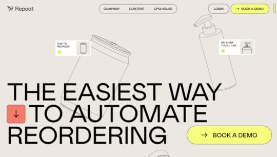
SaaS platform Repeat uses NextJS for its website and web application. NextJS allows you to create fullstack web applications, extending what’s possible with “vanilla React.”
Repeat’s homepage is full of motion and immersive animations made possible by NextJS’s powerful features, like rending, routing, and asset optimization.
PayPalPayPal uses a React version of Microsoft’s Fluent Design for its 60+ internal products. These products include a lot of dashboards and data visualizations necessary for daily operations.
PayPal also uses UXPin Merge, allowing the company’s design teams to prototype and test using React components. This code-to-design workflow bridges the gap between design and development, so designers and software engineers work with the same component library.
NetflixNetflix uses React and React Redux for state management. According to the official Netflix Technology Blog, “React enabled us to build JavaScript UI code that can be executed in both server (e.g., Node.js) and client contexts.”
Performance is crucial for Netflix as users expect HD videos to load fast. Developers use the virtual DOM to reduce latency from live DOM manipulation.
Netflix also uses React’s Component and Mixin APIs to “create reusable views, share common functionality, and patterns to facilitate feature extension.” This functionality enables Netflix to A/B test components to determine the best solutions during user testing.
Product Hunt
Product Hunt is another React/NextJS user. Like Facebook, Product Hunt must handle microinteractions for each post, including upvotes and comments.
Puma CampaignsGatsby is a front-end technology built on React which makes it possible to develop high-performing websites and landing pages. Puma uses Gatsby for its campaign landing pages, including this one for the Velocity running shoes.
Gatsby allows devs to build React websites and applications using popular CMS platforms like WordPress, Netlify, Drupal, and Contentful, to name a few, for content management. This framework gives developers the versatility of React with the convenience of their content team’s preferred CMS.
SEO is a big problem for single-page application frameworks like React and Angular. Gatsby helps to solve this problem with its SEO Component, which enables search engines to index the website’s content and individual pages.
Puma also uses React Native for its iOS and Android applications.
TeamPassword
Password-management startup TeamPassword uses a customized version of the MUI design system–an open-source React component library developed using Material Design used by many B2B enterprise and SaaS providers.
TeamPassword’s developers chose React as it was easier to maintain than their old framework. The 2-person engineering team also uses UXPin Merge, which allows them to import their React library from its private repository into UXPin’s design editor for prototyping and testing.
BBCThe British Broadcasting Association (BBC) was an early adopter of React and even hosted a workshop in 2015 introducing people to the front-end library and its capabilities.
In 2022, with the help of Vercel, the BBC rebuilt its website using NextJS and Vercel. The rebuild resulted in significant performance benefits, with HMR (Hot Module Replacement) reduced from 1.3s to 131ms–a staggering achievement for a website as large and complex as the BBC.
AirbnbAirbnb uses React for some of its product ecosystems, including Airbnb.io, its open-source project famous for developing Lottie–an open-source animation tool for Android, iOS, and React Native mobile applications.
Airbnb.io is a website developed using Gatsby featuring the company’s blog posts and details about its open-source projects with links to the GitHub repos.
CloudflareCloudflare migrated from Backbone and Marionette to React and Redux in 2015 to develop its cf-ui design system. The multi-brand design system serves Cloudflare’s internal and external websites and products.
Since Cloudflare had to rebuild its component library, the team focused on accessibility, creating three open-source projects in the process:
react-modal2, a11y-focus-store, a11y-focus-scope.UberEATSUber uses React Native for its UberEATS web-based restaurant dashboard. The team needed to develop a web application restaurants could access via a tablet and decided to use React Native. The single-page web application communicates with three parties in the UberEATS marketplace and connects to restaurant receipt printers.
Uber also developed Base Web, an open-source design system for building ReactJS websites and web apps. The highly customizable design system boasts an extensive UI component library with theming capabilities.
Related content: Learn about design operations at Uber.
Shopify
Shopify uses React for its website and web application and React Native for its mobile applications. Developers can build React apps for Shopify using its famous Polaris Design System.
SkyscannerSkyscanner is one of the most widely used travel websites, with over 40 million monthly visits. The website connects to hundreds of airlines and thousands of hotels to show users trip data in seconds.
Skyscanner uses React and React Native for its website and product ecosystem. The company’s Backpack design system features an extensive UI library with web and native components.
PinterestPinterest is another social media platform using React. The company’s Gestalt design system features components for its React web app and React Native mobile applications (iOS and Android).
Pinterest is another example where React provides massive performance benefits for single-page applications. The website’s famous infinite scroll uses lazy loading to display six columns of images and video with impressive speed.
Cuckoo
Cuckoo is a UK-based broadband supplier that uses React and NextJS for its website. The website has a fair amount of animations, including a large revolving sequence in the hero. These animations do not impact the website’s performance, a product of using NextJS.
Prototyping React Websites & Web Apps With UXPin MergePrototyping and testing are crucial for any digital product, including websites and web applications. Designers must determine whether their designs solve user needs while providing business value. To get accurate results, designers must use quality prototypes that replicate the final product experience.
Merge is a code-based design technology that imports React components into UXPin so designers can build interactive prototypes. These Merge components have the same fidelity and functionality as the final product because they come from the same repository–the designer’s workflow doesn’t change; they just work with better-quality UI elements.
UXPin Merge doesn’t only benefit design teams. Because Merge creates a drag-and-drop design environment, it makes prototyping and testing accessible to developers and other non-designers.
Startup TeamPassword’s 2-person engineering team uses Merge synced with their custom MUI design system to prototype and test new products. Before switching to Merge, TeamPassword prototyped in code, which made time-to-market slow, reducing the company’s ability to compete.
Since switching to UXPin Merge, TeamPassword ships features much faster, and using a design system has increased UI consistency. TeamPassword also used its React library to redesign its website.
Whether you’re building a React website, web app, native app, or cross-platform application, UXPin Merge bridges the gap between design and development with a seamless code-to-design workflow.
Design your next digital product using the world’s most advanced design tool. Visit our Merge page for more details and how to request access.
Discover MergeThe post 15 Examples of Reactjs Websites appeared first on Studio by UXPin.
February 28, 2023
Design Project Management 101 – Methods, Tools, and Necessary Skills
To deliver successful outcomes, design project management incorporates several key UX functions, including creative direction, UX design, DesignOps, and design leadership.
This article explores the design project management discipline, a manager’s skills, relevant tools, and the five stages from initiation to final delivery.
Achieve better results during the design process with high-quality, interactive prototypes using UXPin Merge. Learn what makes this technology stand out among other design tools. Visit our Merge page.
Reach a new level of prototypingDesign with interactive components coming from your team’s design system.
Discover UXPin Merge .discover-merge { margin: 40px 8px;}.discover-merge__container { display: flex; max-width: 690px; height: 200px; padding: 20px; padding-left: 24px; border-radius: 4px; background-color: black; box-shadow: 10px 10px #9999ff; align-items: center; justify-content: space-between;}.discover-merge__left { width: 50%;}.discover-merge__left p { margin: 10px 0px !important; color: white !important; font-size: 18px !important;}.discover-merge__heading { font-weight: bold !important; color: white !important; font-size: 18px !important;}.discover-merge__text { margin: 0 !important; line-height: 22px !important;}.discover-merge__button { width: 174px; height: 44px; margin: 10px 0px; border: none; border-radius: 2px; background: white; color: black; font-size: 16px; text-align: center;}.discover-merge__button:hover { cursor: pointer;}.discover-merge__image { max-width: 320px !important; height: 200px; margin-right: -19px;}@media (max-width: 760px) { .discover-merge__container { height: auto; margin: 10px; align-items: left; }}@media (max-width: 500px) { .discover-merge__container { flex-direction: column; } .discover-merge__left { width: 100%; align-items: normal; }}What is Design Project Management?Design project management oversees the design process for digital product development projects, including resource allocation, task delegation, goal setting, stakeholder reporting, and other project-related functions.
Design project management functions similarly to traditional project management, but managers must understand design thinking, UX research, and user experience principles to implement effective plans and strategies.
5 Design Project Manager Skills
Here are five essential skills every design project manager must have.
UX DesignUX Design is one of the skills unique to design project managers vs. regular project managers. This knowledge helps define a realistic roadmap and project timelines, allocate resources effectively, and assign tasks to the right team members. These UX design skills also help design project managers communicate with stakeholders.
UX design skills can be acquired on a job or formally via UX design degrees.
Technical understandingWhile design project managers don’t have to learn code, it’s important to have a foundational understanding of the product’s framework and technical limitations. Technical skills help when collaborating with engineering teams and stakeholders and articulating the impact of missed deadlines to designers.
CommunicationDesign project managers must be excellent communicators, capable of communicating and collaborating with team members at every level of the organization. They must facilitate design and cross-functional meetings, often bridging the gap between designer/engineer communications–further reiterating the importance of foundational UX and technical proficiency.
Collaboration can be facilitated with the right tools. Read about: Top Design Collaboration Tools.
LeadershipLeadership is a significant part of any project management role. Design project managers must often motivate and mentor project team members to complete challenging work to tight deadlines. They also play an essential role in conflict resolution within the project and, therefore, must be someone the team respects as an unbiased mediator.
Resource managementDesign project managers are responsible for a project’s due dates, deliverables, budget, and team members. They must understand how to manage these resources and implement corrective actions with contingencies when things don’t go according to plan.
Design Project Management Frameworks and Methodologies
Design project management frameworks don’t differ too much from regular project management. Here are five common frameworks used for design projects.
AgileAgile is an iterative project management methodology with shorter planning cycles, flexible to changes (market, product, tech, etc.), work-in-progress (WIP), and vaguely outlined project goals. This flexibility makes Agile popular for digital product development, where new technology and trends can influence the direction of a project.
ScrumScrum is an Agile framework that divides a complex project into digestible short-term goals or sprints. These sprints vary between 2-4 weeks, where teams iterate over a single problem to find the best solution.
KanbanKanban is a transparent framework that uses a kanban board with columns or sections to visualize a project and its tasks. Kanbans typically have three columns:
To-doDoing (work in progress/WIP)DoneTeam members move tasks through these sections as they start and end each one. In some instances, the project manager may add additional columns–for example, “in review,” “QA,” “backlog,” etc.
Lean UXLean UX is a collaborative outcomes-based framework focused on conducting many experiments during the design process to solve a specific problem. Designers must deliver a solution that offers maximum value without “nice to have” features.
WaterfallWaterfall is a sequential methodology with five static phases:
RequirementsDesignImplementControlClosureThe aim is to complete each phase before moving to the next. Waterfall is a rigid project management method with no room for error or iteration. PMs typically use waterfall when a project’s budget, requirements, and scope are clearly defined, reducing the need for flexibility.
Design Project Management Software
Design teams use project management software and various design tools to complete projects.
Project management toolsProject management software is vital to define tasks, manage workflows, and track progress in a centralized repository. Common project management apps used by creative teams include:
TrelloAsanaNotionWrikeMonday.comWhiteboarding & brainstormingDesigners use whiteboarding tools throughout the design process to collaborate and share ideas. Some popular examples include:
MiroMuralGoogle JamboardUser research and testingResearch and testing are vital for any design project. Designers use various tools to recruit, schedule, test/analyze, and pay participants. Some examples include:
EthnioUser InterviewsUserbackHotjarTeam communicationCommunication is critical to keep team members connect with one another and the rest of the organization–especially in remote work environments. Some examples include:
SlackGoogle Chat & SpacesMicrosoft TeamsDesign & Prototyping ToolsDesign tools allow designers to create user flows, wireframes, mockups, and prototypes. Common design tools include:
UXPinFigmaSketchStorybookThe Five Stages of Project ManagementThere are five stages of project management which design projects also follow:
InitiationPlanningExecutionMonitoringClosureProject InitiationDesign leads and stakeholders review two documents to determine whether they will initiate a design project:
Business case : outlines the benefits of a project, initiative, or strategy and why the company or department needs it.Feasibility study: defines the problem and whether the design project will solve it.If the organization decides to proceed, they create a project initiation document (PID) which includes:
The project’s scope and goalsConstraintsBudgetRisk assessmentKey stakeholdersControls and reportingDeadlines and deliveryDesign BriefProject PlanningFollowing the PID and design brief, the design project manager and various stakeholders define the project’s roadmap, including scope, goals, tasks, schedule, and resources.
A typical design project plan will include:
Available resources, including time, budget, and laborRoles and responsibilitiesProject milestones and objectivesKPIsReporting intervalsRisks and contingenciesProject tools and communication methodsProject deliverables, file formats, and delivery method (Dropbox, Google Drive, etc.)Project ExecutionA “kickoff” usually starts a project where the entire team and stakeholders gather to discuss the problem the project must solve and relevant deliverables. The design team begins working according to the project framework and assigned responsibilities.
Project MonitoringMonitoring is the project manager’s primary responsibility and runs parallel to execution. The PM monitors KPIs, budgets, and tasks, ensuring the project stays on track while paying close attention to potential scope creep. PMs also meet with stakeholders for regular reporting and updates.
Project ClosureProject closure occurs when the design team is ready for the design handoff. In some cases, stakeholders might dissolve the project due to unforeseen circumstances.
Some examples of design project closure tasks include:
Design handoff to engineersCompleting quality assurance or UX auditArchiving UX deliverables for future referenceCanceling any supplier contracts–i.e., software subscriptions, contractors, etc.Presenting the final budget and report to stakeholdersReleasing team membersImprove Design Project Delivery with UXPin
Prototyping and testing are integral to every design project. Designers must iterate fast to deliver within timeframes while ensuring they solve the project’s core problem according to the design brief and users’ needs. Unfortunately, traditional image-based design tools lack the fidelity and functionality designers need to achieve this successfully.
UXPin Merge is a code-based design tool bridging the gap between designers and engineers. Designers can build fully functioning prototypes using interactive components pulled from a design system’s repository.
This component-driven prototyping methodology allows designers to iterate faster while scaling the design process. PayPal proved this concept on an enterprise level when the internal UX team switched to UXPin Merge in 2019. Now, PayPal’s product teams complete 90% of design projects 8X faster than experienced UX designers could previously with traditional design methods.
“UXPin Merge enables us to perform this “snap-together” type design. We provide product teams with components they can drag and drop to build user interfaces. Product teams create layouts with fixed margins and components, so everything looks and works as it should. Designers didn’t have to police anything or step in to design products.” – Erica Rider, UX Lead EPX at PayPal.
Better quality prototypes improve testingWith Merge’s fully functioning components, designers can build prototypes indistinguishable from the final product. These high-quality prototypes allow designers to get actionable results from user testing and meaningful feedback from stakeholders.
Smoother design handoffsThe transition from design to development is seamless with UXPin Merge because designers and engineers use the same component library from the same repository.
Front-end engineers install the design system’s package and copy prototype layouts from UXPin. UXPin Merge renders JSX for each component which devs can view in Spec Mode.
“With this new UXPin approach, we’re seeing a more collaborative, integrative design process. Rather than separating design, prototyping, and development, UXPin allows us to create an integrated flow where we engage engineering and product teams throughout the process. As a result, the product’s final quality has improved dramatically.” – Erica Rider, UX Lead EPX at PayPal.
Enhance your design project management with the world’s most advanced design tool. Visit our Merge page to find out how to get started with revolutionary technology.
Discover MergeThe post Design Project Management 101 – Methods, Tools, and Necessary Skills appeared first on Studio by UXPin.
February 27, 2023
Mobile App vs. Web App – What to Design?
Deciding between launching a mobile app vs. web app isn’t always an easy decision. There are many factors to keep in mind before making the call – from user experience and technical constraints to cost-effectiveness and scalability.
We’ll explore web design vs mobile app design. All so that you can make an informed decision about which approach is best for your project. Follow along our tips and sign up for a free trial at UXPin. It’s an end-to-end prototyping tool that allows you to build advanced prototypes that look and behave like a mobile or web app you’re about to develop. Try UXPin for free.
Build advanced prototypesDesign better products with States, Variables, Auto Layout and more.
Try UXPin .try-uxpin-banner { margin: 40px 0px;}.try-uxpin__container { display: flex; max-width: 689px; height: 210px; padding: 20px; padding-left: 24px; border: 2px solid black; border-radius: 4px; align-items: center; justify-content: space-between; background-color: white; box-shadow: 10px 10px black;}.try-uxpin__left { width: 54%;}.try-uxpin__left p { margin: 10px 0px !important; color: black !important;}.try-uxpin__heading { font-size: 28px !important; font-weight: bold;}.try-uxpin__text { margin: 0 !important; font-size: 18px !important; line-height: 22px !important;}.try-uxpin__button { width: 135px; height: 44px; background: black; margin: 10px 0px; padding: 10px 20px; border: none; border-radius: 2px; color: white; font-size: 16px; text-align: center;}.try-uxpin__button:hover { cursor: pointer;}.try-uxpin__image { max-width: 320px !important; height: 200px; margin-right: -21px; margin-bottom: -6px;}@media (max-width: 760px) { .try-uxpin__container { height: auto; margin: 10px; align-items: left; }}@media (max-width: 500px) { .try-uxpin__container { flex-direction: column; } .try-uxpin__left { width: 100%; align-items: normal; }}What Is a Mobile App?Mobile applications are tools designed specifically for portable, mobile devices. They come in various forms. From small, single-function applications to more complex, multi-functional mobile platforms, each should provide users with a quality experience.
Apps vary significantly in their purpose and scope, allowing people to engage in activities ranging from gaming and leisure to business and professional pursuits.
When it comes to developing an app, product development teams often need to consider the screen size and operating system of the device they are creating the app for. As mobile technology advances rapidly, many apps are now built with cross-platform compatibility in mind so users across various devices and platforms can enjoy them.
The types of mobile apps available today include:
Native – native mobile apps are usually developed for one platform or operating system (iOs or Android apps),Hybrid – hybrid apps leverage reusable code to provide a native-like user experience for less effort and money,PWAs – it’s short for Progressive Web Apps, PWAs are mobile web apps built with HTML, CSS, JavaScript, and other frameworks. they should function on desktop and mobile, standards-compliant browsers.Pros of mobile appsThey work efficiently (they’re created natively for mobile devices)They can work offline, without the Internet connectionThey offer better analytics, i.e., more accurate data collection and conversion tracking.Cons of mobile appsThey’re expensive to design, more so to maintainYou need to build a separate app for iOS and Android You’re in charge of maintaining privacy and security.What Is a Web App?A web app is an application that users can access through the web on any device with an internet connection. It runs in a browser, reducing users’ need to install and keep track of a separate application on their PC, which increases its accessibility.
What’s great about using web apps is that you can create more interactive user experiences in comparison to traditional websites. All thanks to powerful front-end frameworks such as AngularJS or ReactJS. They allow app developers to quickly build dynamic single-page applications, which provide smooth transitions between different views and respond quickly when user input is received.
Web apps are a popular solution since they offer incredible performance and scalability without compromising security.
Pros of web appsThey work on any platform – a web application is hosted on a server and delivered over the internet through a browser interface.Since it’s stored on a remote server and supplied online via a browser interface, users don’t need to install updates.Easy to maintain by web development teamConsThey require internet access to be usedThey might be slow to load – if a server is overloaded, the contents of your app won’t appear quickly, which can severely affect the user experience. Or, worse yet, cause the user to leave the app before it loads.Not as easily discovered by target audience – web apps are not promoted in app stores because they are not listed there. Product Hunt, Capterra, and app review sites can be a decent way to promote your web apps, but their discoverability is nowhere near as robust as in Apple and Android app stores.Discussing the Differences Between a Mobile App and a Web AppLet’s now take a quick look at how mobile apps and web apps differ.
While web apps can be accessed via virtually any browser, mobile apps must be downloaded from the app store.Differences in screen size requirements. Mobile apps can’t be accessed on desktop, and are created solely for smaller screens. This, in turn, implies lesser pixels. Meanwhile, web apps can be accessed on both mobile and desktop.Mobile apps can be used without internet access, while web apps can’t. Since web apps need access to internet connection and rely on web browsers, they tend to be slower than mobile apps. Most people use computers while sitting. App users may be commuting to work or even jogging while using their phones. As a designer, you must account for these different scenarios to ensure high usability and accessibility standards.Mobile apps have more advanced security than web apps. Therefore, mobile app development should cater to this by creating two-factor authentication or other means that improve safety. Effective Ways to Help You Choose Between a Mobile App and a Web App
Here are the top considerations while deciding between a mobile app vs. web app.
Determine user context and purposeThe web offers an abundance of resources and information to users, who typically access it from a comfortable seated position. Mobile devices offer a unique opportunity for users to search for and quickly obtain information on the go.
When designing for mobile UX, navigation should be simple and easy to follow, with well-structured code written concisely, and visually prioritized. The goal is to ensure maximum accessibility of the desired information in the least amount of time.
User experience designers must pay close attention to design elements such as:
natural gestures, which are most intuitive for users on small screenssimplicity in menu selection optionsclear visual pathwaysconsistent user interface elements like fonts and colorseasily clickable and accessible buttons and linksand other interactive elements that make user navigation easier.This must also be paired with relevant accessibility standards, to ensure that all users can use the app to its full advantage and functionality.
Verdict: Web apps are great for longer user sessions and don’t compete with mobile apps. A mobile app may be suitable if your product can be used regularly in shorter periods, such as habit or meal tracking app, mobile eCommerce app or social media app.
Assess your product or service’s required screen sizeMany B2B tools are now web-based, allowing users to access them from their phones, tablets, or other mobile devices. This is advantageous for several reasons:
It enables the user to access information quickly and conveniently regardless of their device.It allows them to view content more clearly and in more detail on a larger screen.If any PDF downloads or exports need to be done regularly, it’s much easier and more efficient for the user to do this on a desktop computer than on a mobile device. This is because PDFs can take up considerable amounts of data space on mobile devices, and saving them frequently could result in the device becoming bogged down. Not to mention, it’s not exactly the most convenient screen size to peruse these files.Users may prefer their files to stay on one machine rather than having them spread across multiple devices. For businesses to get the most out of their B2B platform, providing web-based access is essential since it gives customers both convenience and flexibility when interacting with the company.By allowing users to access the app on a larger screen rather than solely on mobile – where content may not always be visible clearly – companies can ensure that their clients always have a good user experience.Verdict: Web apps are suitable for complex (often work-related) apps, where there are plenty of charts and analytical data. These types of apps usually require a lot of jumping back and forth between screens.
List device-specific featuresIf you sell beauty products, for example, it is much more beneficial to develop a tailored beauty app for mobile devices since that’s where people tend to spend most of their day.
This platform provides you with a larger audience and allows you to take advantage of multiple features not available on computers, particularly the higher-resolution phone cameras. When it comes to these kinds of products, image quality is essential for market success.
Although designing a web-based application that is accessible via mobile view can enable the use of the device camera, some other features are only accessible through mobile hardware and functionalities. Think of things like your phone’s built-in gyroscope or GPS, which would have been essential if you were to create a runner’s app, for one.
Also, when designing the UX/UI design for a mobile app, make sure to always include device-specific elements like larger interactive buttons and simple navigation. Furthermore, make sure to work hand in hand with your software development team to ensure all third-party apps integrations work flawlessly. The types of integrations depend on your product – these can be those with social media, online payment methods, and push notifications.
Verdict: Mobile apps come with the added value of device-specific hardware and features like GPS and high-resolution cameras.
Check your competitors’ choicesBusinesses should analyze the competitive landscape prior to launching a new product or app to make an informed decision as to what to develop.
If it turns out that many of the top players in the market are web-based solutions, it’s probably the best way to go. They’ve created a solution for a platform users find convenient to use, and the UX they’ve created allows them to complete their goals (after all, otherwise these apps would not have had this level of market success).
Let’s not forget that users appreciate familiarity in products from the same category – it will make it that much easier for them to start using your app, if they were to switch to you from a competitor. Thoroughly researching competitors can help identify opportunities and potential risks before investing in a project.
Verdict: If your app’s goal isn’t to revolutionize your category, it’s worth going with the platform others are finding success with. That’s where your target audience can be reached.
Mobile or Desktop App? Design it in UXPin
It’s our hope that after reading this piece, you can now pick a winner in your mobile app vs web app dilemma. Use the considerations above to understand how user context, screen size, and your competitor landscape can contribute to your app’s success.
With UXPin, you can create advanced prototypes and quickly share them with stakeholders or developers – regardless whether you’ve decided to go with a web app or mobile app. Ready to take it for a spin? Try our tool on a free trial.
And with our free trial, nothing is stopping you from trying it out for yourself today. So what are you waiting for? Try UXPin and streamline product design and development process. Start your trial.
Try UXPin for freeThe post Mobile App vs. Web App – What to Design? appeared first on Studio by UXPin.
February 24, 2023
How To Run A Successful Design Thinking Workshop?

Running a design thinking workshop is one of the best ways to spark creativity and nurture a user-centric mindset within your design team. As a designer, you will encounter situations where you need to run design thinking workshops either with your team, your stakeholders, or other departments in your organization.
UXPin is an end-to-end design tool that will support you throughout the full human-centered design process, from creating basic user flows, through prototyping, and up to design handoff. Create a strong, transparent, and quality design process with UXPin. Enjoy a free trial.
Build advanced prototypesDesign better products with States, Variables, Auto Layout and more.
Try UXPin .try-uxpin-banner { margin: 40px 0px;}.try-uxpin__container { display: flex; max-width: 689px; height: 210px; padding: 20px; padding-left: 24px; border: 2px solid black; border-radius: 4px; align-items: center; justify-content: space-between; background-color: white; box-shadow: 10px 10px black;}.try-uxpin__left { width: 54%;}.try-uxpin__left p { margin: 10px 0px !important; color: black !important;}.try-uxpin__heading { font-size: 28px !important; font-weight: bold;}.try-uxpin__text { margin: 0 !important; font-size: 18px !important; line-height: 22px !important;}.try-uxpin__button { width: 135px; height: 44px; background: black; margin: 10px 0px; padding: 10px 20px; border: none; border-radius: 2px; color: white; font-size: 16px; text-align: center;}.try-uxpin__button:hover { cursor: pointer;}.try-uxpin__image { max-width: 320px !important; height: 200px; margin-right: -21px; margin-bottom: -6px;}@media (max-width: 760px) { .try-uxpin__container { height: auto; margin: 10px; align-items: left; }}@media (max-width: 500px) { .try-uxpin__container { flex-direction: column; } .try-uxpin__left { width: 100%; align-items: normal; }}What is a Design Thinking Workshop? A design thinking workshop is a creative problem-solving session that is based on the principles of design thinking. These workshops are activity-based and they involve real-time collaboration. For that, they are often done in person but they can also be done remotely.
The activities of a design thinking workshop are organized according to the three phases of the design thinking process: empathy, ideation, and prototyping.
Empathy: Developing a deep understanding of the problem that end-users face and empathizing with them.Ideation: Coming up with many ideas on how the user problem can be solved. Prototyping: Creating a prototype of potential solutions and then testing it with real users.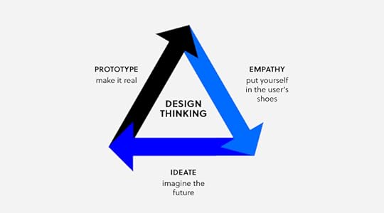
A workshop can last for a few hours long, a whole day, or even a week.
What are the Goals of a Design Thinking Workshop?Design thinking workshops help design teams to create feasible and user-focused solutions to complex problems in design. This helps the team to design better products faster, reduce costs, and increase profits. Other goals include:
Improving the problem-solving skills of the team. These skills are transferable to other design problems within the team. Creating a sense of community in the design team because workshop participants have to collaborate in order to get a solution. Giving the team members a competitive edge by producing innovative and industry-leading ideas. Who Should Run a Design Thinking Workshop?
A design thinking workshop should be run by a facilitator, that is a person who understands the design thinking process and guides the participants throughout the workshop. The facilitator should have presentation skills and the ability to keep the group engaged. It would also be great if facilitator had a hands-on experience with running workshops.
If you need tips on facilitation, see our other article: How to be a facilitator.
How to Run a Design Thinking Workshop Step by StepThe design thinking process is made up of activities that are done before the workshop and during the workshop.
Step 1: Planning and preparationBefore you can run a design thinking workshop, there are some things that need to be in place first, they include:
Workshop objectives: This is a clear definition of the goals that the workshop should achieve. Is it to generate new ideas or to improve on an existing design product? This is also a good time to define the challenge or question that the workshop will answer. It might be “how can we improve the user experience of our website users?”Workshop location: Choose a suitable location for your design thinking workshop. If the workshop is happening physically, choose a location that has enough space for your design team. If the workshop is happening online, decide on the meeting and presentation tools that you are going to use. Workshop agenda: This is a plan of how and when the different activities are going to happen. Do not make the workshop too long and be sure to include a lot of activities in your design thinking workshop agenda. Workshop toolkit: Ensure that all the necessary design thinking workshop materials such as paper, marker pens, post-it notes, whiteboards, and props are in place.After making all the necessary preparations as outlined above, the next steps will be the execution of your workshop agenda.
Step 2: IntroductionWelcome all the participants to the workshop and brief them on what they should expect during the workshop. Share the following information:
The main objective of the workshop and the problem that it is going to solve.A schedule of the workshop activities. Step 3: Kick off the meeting using an icebreakerUse fun icebreaker activities to help your team warm up before the workshop begins. This will make it easy for them to collaborate and share their ideas with team members.
Step 4: Introduce design thinkingMake a brief presentation on what design thinking is, the phases of design thinking, and its benefits. This presentation is useful even for designers who are already familiar with the design thinking philosophy because it brings everyone up to speed and ensures that you are all on the same page.
Step 5: Empathizing with the userThis is the first step in the design thinking process where you encourage the workshop participants to put themselves in the shoes of the user. This will help them to start generating ideas on what the user needs from the product.
What can help you empathize with the end-user? You can use activities such as role-playing and creating an empathy map to help the participants really understand the needs, wants, feelings, and language of the user. After these activities, give the participants a chance to share their findings and ask questions, if any.
The output of this step could be creating user personas. Read more about it here: Personas in UX.
Step 6: Get more specific on the problemAfter the empathy exercise, participants are better placed to really narrow down on the problem that the user faces. Ask your team to create a problem statement that will guide the rest of the design thinking workshop.
Step 7: Come up with ideas and possible solutionsThe next design thinking step is ideation where your team suggests possible solutions to the problem that they identified in step 6. Use techniques such as brainstorming to come up with a list of potential solutions.
Give the participants a chance to discuss their solutions and then come up with one refined solution.
Step 8: Create a user journey mapAfter settling on one solution, get your team to map out the steps that users will take so that they can solve the problem. These steps can be downloading an application, setting up an account, adding their bank details, and then sending money. Give them enough space and sticky notes to create a step by step representation of the user journey.
Step 9: Prototyping and testingThis is the final step in the design thinking process where participants will create low fidelity prototypes of their solution. Ask the users to create screens for each step of the user journey and then ask them to add functionality to their screens in the form of buttons.
Once again, give your team some time to compare their prototypes and then ask them to vote for the best prototype.
Step 10: Describe the next steps and close the workshopClose the workshop by explaining to your team the next steps such as turning their prototypes into wireframes, high fidelity prototypes, and actual user testing.
This is also a good time to ask your design team what they learned from the design thinking workshop. Don’t forget to ask for feedback so that you can improve your design thinking workshop facilitation skills.
Solve design challenges with the best design toolsDesign thinking workshops help your design team to come up with innovative and user-centered solutions to design problems. Use UXPin to design, wireframe, and prototype the innovative ideas that you come up with during your design thinking workshop. Sign up for a free trial of UXPin and turn your ideas into wonderful designs.
Try UXPin for freeThe post How To Run A Successful Design Thinking Workshop? appeared first on Studio by UXPin.
February 23, 2023
Storybook 7.0 – Why You Should Be Excited About the Upcoming Update
Storybook is a huge productivity boost for development teams, helping them scale their work and stay on the same page. The tool is launching its new version that you can also leverage in UXPin. The new update introduces some major improvements and extends Storybook’s capabilities.
Bring Storybook’s components to UXPin and design prototypes that look and behave like the end-product. Keep consistency between design and development and unite teams with a single source of truth. Try UXPin’s Storybook integration.
What Storybook 7.0 has to offer?
The official launch of Storybook 7.0 is planned on March 14th. You can try it on beta and experience its benefits before the official release. Learn more about it in Storybook’s article about plans for 2023.
Better performanceStorybook’s team upgraded the tool’s performance significantly. They managed to make it 2x faster compared to its previous version.
More compatible integrationsThe new version of Storybook makes integrations easier. By launching Frameworks API, Storybook now supports Vite, NextJS, and works on supporting SvelteKit. This also enabled them to think of integrations with new frameworks like Remix, Qwik, SolidJS, and more.
More extensive testingThey added code coverage reporting. Now it’s transparent which lines of code in the components and libraries are tested by the user’s stories.
Improved documentationStorybook has a few updates for documentation. One of them is that Storybook’s team upgraded documentation to version 2 of MDX. They also simplified the way of importing stories (component examples) in docs.
Integrate Storybook 7.0 with UXPinUXPin already supports Storybook 7.0. Go ahead, sync your Storybook components with UXPin. It’s super easy and gives you a host of benefits that will improve your product design and development process.
Create prototypes with Storybook componentsThe components that you bring to UXPin are more than just a visual representation of what you have in Storybook. They are fully functioning, allowing you to test real user interactions. That’s what high-fidelity prototyping should be about.
Foster cross-functional collaborationThe integration will help you break the silos between product design and engineering. The teams will share the same components which will prevent them from inconsistencies between design and development.
Streamline design handoffBy building prototypes with fully functional components, designers are able to smooth out the design handoff process. Storybook components can become a single source of truth that both teams share, so there’s no need for extensive documentation or misalignment.
Here’s how to integrate with StorybookThe integration can take less than a minute. You need a link to a Storybook library you want to use (public or private), log in to UXPin and add a new library by pasting the link in the box: “Import Storybook components.”
Get a guided tour of UXPin’s Storybook integration.
Try UXPin and Storybook 7.0Storybook is a great tool for UI component quality control, but it will help you maintain and scale the design system once combined with UXPin. Start designing interactive prototypes with Storybook components. Try UXPin’s Storybook integration for free.
The post Storybook 7.0 – Why You Should Be Excited About the Upcoming Update appeared first on Studio by UXPin.
February 22, 2023
What is Contrast in Web Design? [+7 Tips How to Use it]
When it comes to web design, the concept of contrast is often discussed in terms of aesthetics and visual appeal. However, the truth is that contrast plays a much more important role in the overall usability and accessibility of a website. We’ll explore the basics of contrast in web design and show you how to use it to improve the user experience for all visitors, regardless of their abilities.
Test website design tips right away. Design a website using contrast advice from this article in UXPin, a tool for building advanced prototypes that simplify design-development workflow. Try UXPin for free.
Try UXPin for freeWhat is Contrast in Web Design?Contrast in web design refers to the relationship between two or more design elements, such as text and background that stand out in relation to one another. It is about emphasizing the differences between these elements rather than their similarities.
The degree of contrast is inversely proportional to the level of similarity. The less similar two items are, the greater the contrast between them. High-contrast elements are very different from each other, while low-contrast elements are more similar.
Contrast plays a crucial role in making the design elements on a website stand out and be more easily noticed by the viewer, making the design more aesthetically pleasing and user-friendly.
Types of Contrast in Web DesignThere are several types of contrast that can be used in web design to enhance the visual appeal and user experience of a website.
Color contrast is the difference in light between the font (or anything in the foreground) and its background. This type of contrast is essential for ensuring that text is easily legible and that other design elements stand out.Size contrast relates to the multitude of different sizes in a graphic interface. By leveraging it, you can emphasize certain elements, as well as generate a visual depth and create a sense of hierarchy.Space contrast, also known as negative space, is the emptiness around an element, whether created by white space or any other type of visual spacing. This type of contrast highlights the contrast between the element’s background and the design details surrounding it.Foreground and background contrast refers to the visual relationship between an element in the foreground of an image and the background behind it. In web design, this type of contrast is unique in that the background can change dynamically as the site visitor interacts with it.Shape contrast is achieved by making things notable by their difference in physical shape compared to other things on the page. This type of contrast can be used to create interest and to guide the viewer’s eye.Elements contrast refers to the different types of media that can be used in web design, such as photographs, illustrations, or hand-drawn sketches. The choice of media can have a significant impact on the overall look and feel of a website. It should be chosen based on the website’s goals and the type of content being presented.Why is Contrast Important in Web Design?Contrast affects more than just aesthetics. It has strategic and usability purposes.
Supports visual hierarchy. Emphasizing the difference between two design elements supports intuitive design. It also helps users hone in on the important actions and elements.Ensures accessibility. Heavily contrasting colors or elements can be very helpful in making your design more accessible. The goal is to make sure no one – particularly those with visual disabilities – is blocked from using a website.Compliance with local & international web regulations. There is an international standard, which outlines these rules for contrast accessibility in web design – the Web Content Accessibility Guidelines (WCAG). There are also governmental ones, like compliance with the USA’s Title III of the Americans with Disabilities Act. Lack of ADA-compliance has resulted in thousands of federal lawsuits against non-accessible websites. So, it’s imperative to adhere to best practices for accessibility.Contrast in Web Design – 7 tipsContrast in web design is a crucial element in creating visually appealing and user-friendly websites. However, it’s not always easy to know how to effectively use contrast in your designs. Here are a few tips you can follow.
Check your text contrast ratioThis is an important step in assessing the overall contrast in your web design. One of the best ways to do this is to use a contrast ratio calculator.
The golden rule is to keep the 4.5:1 ratio for text and text-based images. However, there is an exception for logotypes and large text, such as headings. In these cases, using contrasting typefaces for headlines versus body copy can help create hierarchy and improve readability. This helps readers skim or search through your page for the information they need.
One tool for this is the UXPin built-in contrast checker, which you can try out for free.
 Source: McSaatchiCreate large spacing to bring attention to detail
Creating large spacing, also known as negative spacing, is a powerful design technique that can be used to bring attention to specific elements on a website. This is achieved by strategically placing large amounts of empty space around a particular element, which serves to highlight the contrast between the element and its background.
By creating a sense of emptiness around a design element, you create visual tension and the element will stand out more. The viewer’s attention is naturally drawn to the element that stands out in the emptiness. Negative spacing is also effective in creating a sense of hierarchy within the design, which can make it easier for the viewer to navigate and understand the content.
This technique can be achieved by using white space, or by using other types of visual spacing such as margins, padding, or line spacing. It is also highly useful when creating call-to-action buttons, separating different sections of your web page, and creating visual interest.
Look at these two examples from Apple’s announcement of the iPhone 14. Notice how both images have a copious amount of space around them, bringing the visitor’s attention to underline the key message, i.e., the phone has a great camera and superb battery life.
 Source: AppleUse sufficient color contrast
 When text contrasts poorly with its background, it makes reading more difficult, especially for people with impaired vision, or even strained/tired eyes. The same goes for icons and situations where highlighting is used to draw attention (such as the hover effects on links).
 Source: HBR
This example shows two color combinations: one that has a low contrast ratio and one that has a high contrast ratio.
Here, in the case of text, make sure that the contrast ratio between text color and background color is at least 4.5:1. There are color-contrast tools that can help you test color pairs for contrast and adjust the values as necessary.
Such a contrast checker is built into UXPin, so you can easily check the values as you work on your prototypes. It also features a color blindness simulator – so, you can make sure that the color contrast you put the effort into building out is genuinely seen by all user groups.
With that in mind, it’s advisable to avoid very high contrast. Be aware that for some people, especially people with dyslexia, a very high contrast color scheme can make reading more difficult. It’s a good idea to choose an off-white background color rather than a white background to aid on-screen reading.
Use a background with vivid imageryIf you are creating a page for a travel agency, for example, you can always choose to put a background that represents some of the travel destinations where you offer tours to.
Always keep in mind how the different background types will affect such other important factors as loading speed and site performance. Awesome video backgrounds might have a huge impact on the overall design, but if they take too long to load, they may defeat the sole purpose of engaging the user.
With UXPin, you can fill your prototypes with real data. Make your prototypes look and feel more real. Fill them with auto-generated names, cities, and even images. It just takes two clicks using UXPin’s built-in data. That’s right, no more lorem ipsum or searching for images on stock sites.
Let the size variation be noticeableWhen all elements in a design are the same size, it can be difficult for the user to understand which ones are most important and where to focus their attention. Size contrast can be used to create emphasis on particular elements.
By making certain elements larger or smaller than others, you can draw the viewer’s attention to specific parts of the design. This technique is especially useful for headings, calls-to-action, and other important information that you want to stand out. Additionally, it can be useful to make sure that the font size of the text is easy to read and accessible, to follow the general design principles.
Scale is also a powerful tool for creating a dynamic and interesting layout. By using different sizes in elements, you can create a sense of depth and movement, which can add drama to a design and make it more engaging for the viewer.
It is worth noting that when using size contrast, it is important to keep the overall design in mind and make sure that the size variations used are proportional to the other elements on the page. Size variations that are too extreme can be distracting, and it could cause issues in the overall readability and accessibility of the website.
 Source: MediumUse textures and patterns
 Textures and patterns can help you create high-contrast designs when their characteristics are significantly different from each other. For instance, pairing a rough textured background with smooth foreground text would add contrast to the design.
Textures give designs character. Rough, grainy textures will give your designs vintage qualities whereas a subtle noise texture will help create a natural variation similar to one you’d find on printed newspaper. Similarly, photographic textures give realistic-looking results and are another popular way of adding contrast to your designs.
 Source: secretstache
As it takes trial and error to get the textures and patterns right for your web design project, it’s worth using a prototyping tool that will enable you to save and repurpose the ones that work. UXPin lets you incorporate them into your design system and repurpose the components in your future work – and this means a faster product design process.
Experiment with shapes: organic vs. geometric, edges vs. cornersMost shapes can be categorized as either geometric (rectangles, triangles, circles, etc.) or organic (fluid, nature-inspired).
Here, a label design incorporates organic, almost abstract shapes that complement and enhance the straight, clean lines of the typographic choices.
 Source: Canva
One more way you can subtly use shape in your design is on the edges and corners of your design elements, whether typography, boxes, or buttons. If you use a more rounded shape, you’ll get a softer, more friendly appearance. Sharper shapes, on the other hand, create a more ordered and crispy style. You can contrast these qualities against each other, as in the example below.
 Source: CanvaUsing Contrast in Web Design
Using contrast in web design is a powerful tool for creating visually appealing and user-friendly websites. The types of contrast include color, size, space, shape, and elements. By using them effectively, designers can create designs that are both aesthetically pleasing and easy to navigate.
One important aspect of contrast in web design is ensuring that text and text-based images have a ratio of 4.5:1. The only exceptions are logotypes and large text-like headings.
Creating large spacing is another technique that can be used to bring attention to specific elements. And the use of size contrast can also help create hierarchical relationships between elements, making it easier for users to understand their importance.
To ensure proper web design contrast, use a prototyping tool like UXPin – not only will you be able to create visually appealing prototypes; you’ll also have access to a built-in contrast checker and real-life interface texts. Create a web design using UXPin. Start a free trial.
Try UXPin for freeThe post What is Contrast in Web Design? [+7 Tips How to Use it] appeared first on Studio by UXPin.
February 21, 2023
6 Storybook Tutorials for Product Development Teams
There are so many Storybook tutorials that it’s difficult to know which is best for your needs. We’ve summarized the five best Storybook tutorials to help get you started with this component-driven development technology.
Merge design and development with UXPin’s Storybook integration. Create a single source of truth where designers and engineers use the same component library from concept to final release. Visit our Merge for Storybook page for more details and how to request access.
Reach a new level of prototypingDesign with interactive components coming from your team’s design system.
Discover UXPin Merge .discover-merge { margin: 40px 8px;}.discover-merge__container { display: flex; max-width: 690px; height: 200px; padding: 20px; padding-left: 24px; border-radius: 4px; background-color: black; box-shadow: 10px 10px #9999ff; align-items: center; justify-content: space-between;}.discover-merge__left { width: 50%;}.discover-merge__left p { margin: 10px 0px !important; color: white !important; font-size: 18px !important;}.discover-merge__heading { font-weight: bold !important; color: white !important; font-size: 18px !important;}.discover-merge__text { margin: 0 !important; line-height: 22px !important;}.discover-merge__button { width: 174px; height: 44px; margin: 10px 0px; border: none; border-radius: 2px; background: white; color: black; font-size: 16px; text-align: center;}.discover-merge__button:hover { cursor: pointer;}.discover-merge__image { max-width: 320px !important; height: 200px; margin-right: -19px;}@media (max-width: 760px) { .discover-merge__container { height: auto; margin: 10px; align-items: left; }}@media (max-width: 500px) { .discover-merge__container { flex-direction: column; } .discover-merge__left { width: 100%; align-items: normal; }}What is Storybook?
Storybook is a Javascript-based, open-source collaborative development environment for front-end engineers to build UI components in isolation. The platform works with several front-end frameworks, including React, React Native, Angular, Vue, Ember, and HTML, to name a few.
The intuitive user interface makes collaboration more accessible for UX designers, product teams, and stakeholders to interact with UI elements, share feedback, and approve for release.
One of Storybook’s primary use cases is developing and maintaining design systems. Cross-functional teams use the platform to build components, create documentation, run multiple tests (visual, interaction, accessibility, code, etc.), and publish directly to GitHub for distribution.
How does Storybook work?Front-end devs create components as they would with any project but include a “story” (in the form of a .stories.js file) for each one to appear in the Storybook UI. Within the stories file, devs create controls using arguments, or args for short (the equivalent of React props). These controls appear in the Storybook UI so teams can change a component’s properties, states, interactions, etc.
Read more: What are Storybook args?
The benefit of this file structure and workflow means Storybook runs outside yet parallel to your primary application. So, there’s no need to add any Storybook code to your component library’s files.
Why would you use Storybook?Sharing, testing, and collaborating on UI components is challenging if you don’t have technical skills. You must set up a local environment and connect your IDE to a shared repository. This workflow is simply too complicated for UX designers, product teams, and non-technical stakeholders.
With Storybook, devs can host their component library on a server for everyone to access as they would any website. Everyone has a user account, allowing them to collaborate and share feedback without writing code or installing extra software.
Read more about Storybook’s benefits: How Storybook helps developers with design systems?
6 Storybook TutorialsStorybook’s Official TutorialLink: Storybook for React tutorialCreated by: Storybook teamOne of the reasons devs and product teams love Storybook is its comprehensive documentation and community. The Storybook team has created an excellent 10-part tutorial on how to get started setting up the environment and making your first story.
The official Storybook tutorial will give you a foundational understanding of the platform and its features but maybe a little technical and concise for inexperienced front-end engineers.
That said, there are two reasons why you should start with this Storybook tutorial before looking at alternatives:
Like any technology, Storybook is constantly releasing updates. The official documentation is updated regularly to reflect these changes. Some Storybook tutorials are outdated, particularly if they use addons that have been updated or no longer exist.Most Storybook tutorials focus on one framework, usually React. Storybook’s docs cover six front-end frameworks: React, React Native, Vue, Angular, Ember, and Svelte. Additionally, these tutorials are available in 11 languages, so it’s an excellent resource for multinational teams.Atomic Design and StorybookLink: Atomic Design and StorybookCreated by: Brad Frost and Michael ChanBrad Frost created the Atomic Design principles many organizations use to develop their UI libraries. Atomic Design and Storybook describes how to apply these principles when building components and stories. There’s also an interesting one-hour discussion between Brad Frost and Michael Chan about the history of component libraries.
The Atomic Design and Storybook tutorial is a fantastic resource for anyone who wants a systematic, scalable approach to building UI libraries in Storybook. Brad breaks down an Instagram post to demonstrate how atomic principles apply to a real-world user interface.
React Storybook TutorialLink: React Storybook Tutorial (YouTube)Created by: CodevolutionCodevolution’s step-by-step Storybook tutorial will take you from novice to expert within a few hours. If you like video code-along style tutorials, then Codevolution’s course is an excellent option.
The tutorial covers every facet of Storybook, including:
Setting up a Storybook environmentWriting stories and story hierarchyHow to use ArgsStorybook addonsAccessibility and testingEnvironment variablesJudging by the comments, by the end of this 20-video tutorial series, you’ll have enough knowledge to build a Storybook from scratch or start collaborating on an existing project.
Codevolution offers many free React courses on the same YouTube channel, including Node.js, npm, and Typescript, which you’ll need for setting up your Storybook local environment.
React Storybook Crash CourseLink: React Storybook Crash Course (YouTube)Created by: Web Dev SimplifiedWeb Dev Simplified is one of the most popular developer channels on YouTube, with over a million subscribers. Kyle aims to explain technical concepts, tools, frameworks, etc., with simple examples and tutorials.
Kyle’s React Storybook Crash Course is one of the best tutorials to understand the fundamentals of creating and managing stories. He doesn’t take you through the setup process but focuses on the code and file structure.
The 17-minute tutorial covers the following:
Creating a basic storyAdding interactivity to Storybook storiesCreating multiple stories for a single React componentAdvanced tipsStorybook in Vue 3Link: Getting started with Storybook in Vue 3Created by: LogRocketStorybook supports several front-end frameworks, including Vue. The quick tutorial will show you how to set up a Storybook project using Vue 3 and create two stories for a button and card.
LogRocket also explains several Storybook features and how you might apply them to your project, including:
The template sectionNamed exportsAddonsTestingFAQsPrototyping with Storybook componentsLink: Import Components into Storybook and Use Them in Product DesignCreated by: UXPinSo far, we’ve focused on Storybook for development. While designers and product teams can collaborate in Storybook, the platform doesn’t provide the features for prototyping and testing like they would using a design tool.
UXPin Merge integrates directly with Storybook, so that designers can use the component library for prototyping. These fully interactive components look and feel in UXPin, like in Storybook or the final product, allowing designers to build fully functioning prototypes.
Learn How to Import Your Components into Storybook and Use Them in UXPin in this step-by-step tutorial. Sync once, and Merge will automatically update the component library in UXPin and notify design teams of the change.
Sync Storybook to Design with UXPin MergeIntegrate Storybook with UXPin Merge and create a product development workflow that supports a cross-functional collaborative environment where everyone uses the same UI library, eliminating inconsistencies and drift while reducing time-to-market. Visit our Storybook integration page for more details.
Try Storybook integrationThe post 6 Storybook Tutorials for Product Development Teams appeared first on Studio by UXPin.
UXpin's Blog

- UXpin's profile
- 68 followers

