
UXpin's Blog, page 44
February 20, 2023
Game UX — Blending Game Design and User Experience
The video game industry is a fun and exciting place for UX designers passionate about art, creativity, design innovation, and, of course, gaming. Game UX designers work on diverse projects, creating UIs and interactions to enhance the gaming experience.
This article is for UX designers looking for an introduction to game UX and the various user experience roles. We’ve included insights from several game industry experts about the many UX design disciplines and responsibilities.
Get better results from design projects and deliver better outcomes with interactive prototypes from UXPin. Sign up for a free trial to explore UXPin’s advanced design and prototyping capabilities.
Build advanced prototypesDesign better products with States, Variables, Auto Layout and more.
Try UXPin .try-uxpin-banner { margin: 40px 0px;}.try-uxpin__container { display: flex; max-width: 689px; height: 210px; padding: 20px; padding-left: 24px; border: 2px solid black; border-radius: 4px; align-items: center; justify-content: space-between; background-color: white; box-shadow: 10px 10px black;}.try-uxpin__left { width: 54%;}.try-uxpin__left p { margin: 10px 0px !important; color: black !important;}.try-uxpin__heading { font-size: 28px !important; font-weight: bold;}.try-uxpin__text { margin: 0 !important; font-size: 18px !important; line-height: 22px !important;}.try-uxpin__button { width: 135px; height: 44px; background: black; margin: 10px 0px; padding: 10px 20px; border: none; border-radius: 2px; color: white; font-size: 16px; text-align: center;}.try-uxpin__button:hover { cursor: pointer;}.try-uxpin__image { max-width: 320px !important; height: 200px; margin-right: -21px; margin-bottom: -6px;}@media (max-width: 760px) { .try-uxpin__container { height: auto; margin: 10px; align-items: left; }}@media (max-width: 500px) { .try-uxpin__container { flex-direction: column; } .try-uxpin__left { width: 100%; align-items: normal; }}What is Game UX Design?
Game UX design is the process of designing enjoyable video game experiences. Rather than designing the gameplay, UX designers ensure UIs, controls, menu items, navigation, etc., are intuitive, free of usability issues, and easy to access.
UX designers also consider the game’s features and how they teach new gamers through onboarding, providing contextual information, and guides. The better someone understands how to play, the more likely they will spend time with the product and share it with friends.
Game design vs. Game UI/UXIt’s important to differentiate between a game designer and a game UX designer:
Game designers design the actual game. They use 2D and 3D design tools to create the interactive gaming experience, including visual design elements, interactions, VFX, etc.Game UX designers design the interface overlays, menus, onboarding, and settings. They also present the necessary feedback and data about what’s happening in the game.Differences and similarities between game UX and other digital productsFounder of the famous NN Group, Jakob Nielsen, discussed the similarities and differences between game UX and other digital products in a five-minute YouTube video.
Jakob notes that the most significant difference is that UX designers don’t try to make actions and tasks easier. He joked that if UX teams approached games the same way they did other digital products, there would be a “Kill All Enemies” button, and the game would be over.
Instead, UX designers must ensure the controls are intuitive and easy to use.
UX principles still apply the same way for games as they do with other products, namely:
The game must be easy to learnIt must be efficient to useMemorable so that you can return to the game after some absenceUIs must facilitate low error ratesThe game and UIs must produce satisfaction–more so than other digital productsThese principles apply more to the operations, menus, controls, product feedback, and settings than to the game itself. Games must be challenging; otherwise, people lose interest.
Jakob emphasizes the importance of learnability. If someone can’t figure out how everything works, it causes frustration resulting in abandonment.
One of the biggest challenges for UX designers is facilitating memorability. Games are complex. If a player doesn’t have the means to remind them of their place in the game, what they have achieved, where everything is, how to complete tasks, etc., it layers an extra level of complexity which may be too overwhelming to want to return.
The challenge of play testing (user testing)User testing (called play testing in gaming) offers a unique challenge for UX/UI designers creating game experiences. Where digital products typically test user flows with several screens lasting a few minutes (even seconds), gameplay can take 40 to 80 hours plus.
For these long games, play testing can take several days in a lab environment rather than a one-hour session for most other digital products.
What’s the Purpose of UX Design in Video Game DevelopmentIn a 2021 YouTube video, Intro to UI/UX in Games, Lead UI/UX Game Designer at Creative Assembly Alex Tokmakchiev, outlines the purpose of UX/UI design in game development.
Communicate to the playerOne of the essential functions of UI design in games is communication–for example, a player’s damage, fuel/ammo status, enemy/ally location, etc. This information is a UI overlay that sits on top of the game, giving players real-time data and feedback.
Outside of the game are the menus, and settings players navigate. UX designers must understand the users’ needs at different stages of the game to prioritize menu content accordingly.
Allowing players to interactThere are two ways players and game interact:
Players can interact with the game via the user interfaceThe game can interact with the player via the user interfaceStyle and aestheticsAs if things weren’t complex enough, UX/UI designers must “look stylish as heck,” as Alex puts it. The UI must mirror the game’s character and enhance the gaming experience.
OnboardingOnboarding is another vital UX responsibility in game design. UX designers must introduce players to the game’s purpose, features, and controls.
Onboarding is a balancing act–too much information can overwhelm players, while too little will bore them. UX designers typically use progressive disclosure, introducing players to functionality, actions, and mechanics in manageable stages. This incremental increasing complexity develops the player’s skill and confidence.
Feedback in Game UX Design
In a Medium article, Game UX Designer Alex Harbuzinski talks about the importance of feedback in game design and how it impacts gameplay and player experience.
Players get feedback from games through various mediums:
VisualAudioHapticFeedback enhances the experience by making players feel like they’re in the game. For example, in an explosion, there are massive visual FX, the screen shakes, and the player’s controller vibrates violently.
This feeling also occurs more subtly. For example, if someone walks into an object, the controller may vibrate softly, and the screen moves slightly as the NPC bounces off.
Creating feeling is crucial because it produces an immersive, unique gaming experience. UX designers also use feedback to emphasize emotional experiences by adding UI elements to enhance what’s happening within the game.
The Viewing Experience
Gamers don’t only play; they watch others playing–for example, Twitch or Esports. UX designers are responsible for designing this user experience too.
Alex Wheeler, a User Experience Designer from Riot Games, lists four key elements designers must communicate on a broadcast UI:
How long has the match been going;How each team is performing;Individual player performance;Upcoming key moments;Additionally, designers must provide data like performance statistics. Including this information is challenging with limited screen real estate and diverse user needs and expectations.
Keeping viewers engagedGame watching is big business. The design team’s job is to attract viewers to their stream and keep them engaged. At Riot Games, designers gamify the game-watching experience with incentives, rewards, and “Watch Missions.”
These UIs display the league’s schedule, VODs, standings, rewards, and upsells to increase business value.
“While there’s a lot to consider, we try to focus on decisions that make the watching experience informative, intuitive, and accessible to fans. As fans ourselves, we know how tilting a subpar viewing experience can be.” – Alex Wheeler, UX Designer at Riot Games.
Game UX Design Process
UX designers looking to get into game UX will be pleased to know that the design process is similar but with slight variations.
Like other digital products, UX designers use sketches and low-fidelity prototypes to iterate on ideas and generate solutions.
“Your flow diagrams, user journeys, card sorting, story-boarding, and prototyping muscles that you’ve built over many years of practice and study will all still serve you extremely well in games.” – Alex Wheeler, UX Designer at Riot Games.
Prototyping and testing are more frequent and intense with game UX. At Riot Games, Alex’s team reviews analytics or runs play tests daily to improve the user experience and make UIs more intuitive.
Game UX Design RolesCheryl Platz, Director of UX for Player Platform at Riot Games, provides detailed insights about the various UX roles at the gaming giant.
There are five different types of opportunities for UX designers:
Production games: UX designers own the user experience for a game in production, working closely with game designers.R&D games: designers work on unreleased projects designing games from scratch.Player platform: game-adjacent user experiences like product websites, mobile app UIs, authentication, etc.–more traditional digital product UX.Developer & internal tools: the digital products and tools required to build and deliver games.Esports, events, & entertainment: focuses on marketing-style content and optimizing the game viewing experience.Core UX designer jobs and roles at Riot GamesCheryl also offers excellent insight into the UX roles, required experience, and career paths at Riot Games:
Junior UX Designer: 1-2 years experience (possibly through an internship)–owns and works on small features.Mid-Level UX Designer: 2-4+ years experience–drives design with moderate supervision.Senior or Lead UX Designer: 5+ years experience–works on complex design projects across multiple platforms. Applies product ownership skills, responsible for delivering outcomes based on KPIs.Principal UX Designer: 8+ years experience–Designs solutions for multiple audiences, systems, or products. Leads projects, owns a project vision, and mentors other designers.UX Architect: 11+ years experience–develops new ideas, collaborates across departments (including to the leadership level), and transforms products.Additionally, there are three DesignOps roles, which Riot Games refer to as UX Management:
UX Manager: 5+ years experience–manages mid-level design teams of 3-5 people. Focuses on audience needs for a specific area while managing organizational strategy, UX artifacts, communication, and collaboration.Senior UX Manager: 8+ years experience–manages junior to senior teams of between 3-6 people. Advocates for a broad range of player groups, regions, and cultures. Works on high-level strategy and gathers expertise from cross-disciplinary experts.UX Director: 11+ years–manages careers for designers of all levels, including creating spaces and programs for individual growth. Works on strategic business goals and OKRs. Communicates with leadership and advocates for UX across the organization.While this structure is specific to Riot Games, designers can expect similar roles and opportunities at other gaming companies.
Better Product Design With UXPinDesigning any digital product, including game UIs, requires interactive prototypes to test ideas and hypotheses. Traditional design tools lack the fidelity and functionality to get meaningful, actionable results from user testing.
UXPin is an end-to-end design tool that enables designers to create fully interactive prototypes. Usability participants and stakeholders can interact with these advanced prototypes like they would the final product, allowing design teams to identify more usability issues and business opportunities during the design process.
Enhance your prototyping scope and deliver better user experiences with the world’s most advanced design tool. Sign up for a free trial to explore UXPin’s features and build your first hi-fi prototype without writing a single line of code today.
Discover MergeThe post Game UX — Blending Game Design and User Experience appeared first on Studio by UXPin.


February 16, 2023
10 Examples of Design Decisions and How to Make them
Design decisions define the direction and outcome of design projects. Designers use research and data to validate assumptions and eliminate biases during the decision-making process.
Making decisions is one part of this process. Design teams must also articulate their thought process to get stakeholders, engineers, and product owners on the same page.
Articulate your design decisions using UXPin Merge to create high-quality interactive prototypes that accurately replicate the final-product experience. Visit our Merge page for more details.
Reach a new level of prototypingDesign with interactive components coming from your team’s design system.
Discover UXPin Merge .discover-merge { margin: 40px 8px;}.discover-merge__container { display: flex; max-width: 690px; height: 200px; padding: 20px; padding-left: 24px; border-radius: 4px; background-color: black; box-shadow: 10px 10px #9999ff; align-items: center; justify-content: space-between;}.discover-merge__left { width: 50%;}.discover-merge__left p { margin: 10px 0px !important; color: white !important; font-size: 18px !important;}.discover-merge__heading { font-weight: bold !important; color: white !important; font-size: 18px !important;}.discover-merge__text { margin: 0 !important; line-height: 22px !important;}.discover-merge__button { width: 174px; height: 44px; margin: 10px 0px; border: none; border-radius: 2px; background: white; color: black; font-size: 16px; text-align: center;}.discover-merge__button:hover { cursor: pointer;}.discover-merge__image { max-width: 320px !important; height: 200px; margin-right: -19px;}@media (max-width: 760px) { .discover-merge__container { height: auto; margin: 10px; align-items: left; }}@media (max-width: 500px) { .discover-merge__container { flex-direction: column; } .discover-merge__left { width: 100%; align-items: normal; }}What are 10 Examples of Common Design Decisions?
The types of decisions a designer makes during the design process will vary depending on an organization’s size and the product’s maturity.
For example, designers make fewer design decisions for products with a design system. The design system’s style guide, design language, and other guidelines reduce decision-making so designers can focus on solving user needs.
These are ten examples of common types of design decisions:
Color palette selectionTypography selectionDesign layoutVisual hierarchyMedia selection (images, video, maps, etc.)Interaction designMicrointeractions, animations, and motionAccessibility considerationsContent designIconography and graphicsIn isolation, these decisions are somewhat straightforward. Designers can choose a trendy color palette and typeface to make a UI look cool, but how do these elements impact accessibility? What is the impact on performance, and how will interfaces change across multiple platforms?
When you zoom out, design decision-making is a complex process involving multiple factors and considerations.
4 Ways Designers Make Decisions
There are four ways UX designers make decisions:
ExperienceIntuitionImitationReferenceExperienceExperience decision-making comes from a UX designer’s knowledge and past work. Over time, designers make these decisions unconsciously, like creating layouts, alignment, and spacing.
This experience provides designers with a boilerplate to begin work, but it won’t solve every problem and quickly becomes outdated–meaning, experience alone is unreliable, which leads us to intuition.
IntuitionIntuition can inspire designs and decision-making, particularly early in the design process, which relies on out-of-the-box thinking and making many decisions fast.
Intuition and experience are also great for collaborative design exercises–bringing diverse ideas and perspectives together to find the best solution.
ImitationMuch of design is imitation. For example, designers rely on universally recognized design patterns to solve fundamental usability issues. You’ll find variations of these UI patterns across multiple products and industries.
Sometimes imitation is necessary to remain competitive. Meta launched Reels to compete with TikTok, and Twitter launched Spaces in answer to Clubhouse.
ReferenceReference is similar to imitation, but instead of copying, designers use one another’s work to form new ideas and outcomes–similar to how musicians remix old songs.
Design teams also reference competitors, industry standards, accessibility guidelines, and other external sources to formulate decisions about solving specific user problems.
How to Make Good Design Decisions Start with research
UX designers cannot make decisions in a vacuum. They rely on UX research to identify problems and formulate ideas that solve user needs. Some research methods that guide the decision-making process include:
User research (interviews, surveys, etc.)Market researchCompetitive analysisOf these three categories, user research is the most critical for decision-making. Designers must pinpoint a specific problem, understand why it’s happening, and design a solution for that user persona.
UX designers reference user research such as personas, customer journeys, empathy maps, and problem statements throughout the design process to keep users at the forefront of decision-making.
Using data and analyticsData and analytics help designers make informed decisions backed by evidence, eliminating assumptions and biases. Some examples include:
Product analytics: web and app analytics from tools like Google Analytics help designers identify bottlenecks, dropoffs, and opportunities. Designers also use these metrics to define a baseline before a redesign and measure the project’s success after delivery.A/B testing: helps designers choose the best decision between two options. A/B testing works best when designers want to test subtle differences, like color choice, headlines, and CTAs.Heatmaps: inform design teams how users interact with user interfaces and content. For example, do most users use the primary CTA or look for another option in the navigation menu?Incorporating business needsDesigners must balance user needs with an organization’s business goals when making decisions. Meeting with stakeholders is key to prioritizing and incorporating these business needs.
Achieving successful business outcomes and delivering a positive return on investment is critical for designers as this determines future buy-in and resource allocation.
Test early, test oftenUser testing is vital for a designer’s decision-making process. The results from every test drive the next decision through wireframing, mockups, high-fidelity prototyping, and final delivery.
During the early stages of the design process, designers use sketches and paper prototypes to iterate on many ideas fast. During this phase, UX designers and collaborators use experience and intuition to drive decision-making based on the problems they’ve identified during user research.

By the time designers begin digital wireframes and mockups, they have a foundational user flow and information architecture. They test wireframe prototypes to finalize the steps in the user flow and navigational elements.
The final step is high-fidelity testing using interactive prototypes. UX designers test these prototypes with end-users and stakeholders to gather insights and make educated decisions about the final result.
Document design decisionsDocumenting design decisions is critical, and many teams fail to do this properly. They often record what works and leave out what doesn’t. Documenting every design decision–good and bad–allows designers to see what’s working and what other team members have already tried.
Knowing where others have failed prevents designers from duplicating design decisions that don’t work. Conversely, documenting the process behind design decisions implemented by previous designers will help future teams understand why the solution exists the way it does.
Product Designer Edward Chechique offers practical advice in this Medium article about the importance of documenting design decisions.
Articulating design decisions
Articulating your design decisions is just as important as making them. It’s a challenge many designers battle with. As UX designer Mirela Ignat puts it in a 2019 Medium article about design decisions, “I believe an essential thing that makes us better designers is the ability to explain the “why” behind the solutions we propose. And if you’re lacking this ability, there is a high chance of ending up on the losing side of the argument, forced to make some changes you will not agree with.”
Mirela argues that designers must become better communicators, using analogies and storytelling to relate with stakeholders, product managers, and developers. These people often don’t understand user experience or design thinking, so they don’t have the framework to understand the “why” behind design decisions.
Using user storiesUX artifacts that describe users’ stories are excellent for getting stakeholders to understand problems and empathize. User personas help humanize users, while journey maps and storyboards illustrate their challenges.
Using these user research tools to tell user stories helps non-designers understand how designers get to their decision while providing the foundation for stakeholders to offer meaningful input and feedback.
Showing through prototypesOften the best way to articulate design decisions is by showing stakeholders using prototypes. When stakeholders experience how your design solves a problem, they’re more likely to trust your decision-making.
For example, you might create two prototypes. One using their proposal and a second based on user insights and data. They’ll understand why your design works better when they experience the prototypes from a user’s perspective.
Making Better Design Decisions With UXPin Merge
The problem with traditional image-based design tools is that they make poor prototypes. Designers are limited by what they can create and test–making it challenging to articulate design decisions and get buy-in.
UXPin Merge is a code-to-design technology that bridges the gap between design and development. Organizations can bring a design library hosted in a repository to UXPin’s design editor, giving designers interactive components to build fully functioning prototypes that look and feel like the final product.
Streamline decision-makingMerge components include properties and interactivity defined by the design system, so designers can spend more time building user interfaces to solve user problems rather than making component-level decisions.
This Merge workflow has reduced time-to-market for many organizations, including FinTech giant PayPal.
“Now that we’re using UXPin with Merge, my design philosophy and productivity have gone way up! I’m confident that I can implement a prototype in 30 minutes or less. Whereas with the tools I was using previously, it would take me half a day.” Erica Rider UX Lead EPX at PayPal.
Better understanding from stakeholdersErica and her team also benefit from better stakeholder feedback: “The C-suite people and the directors are able to give us stronger feedback about the ultimate direction because they experience the features and goals of these prototypes rather than just commenting about how these boxes don’t look like a text field, for example.”
With meaningful feedback and accurate insights from usability testing, designers can solve more problems while making better decisions during the design process using UXPin Merge.
Build better product experiences for your customers with the world’s most advanced design tool. Visit our Merge page.
Discover MergeThe post 10 Examples of Design Decisions and How to Make them appeared first on Studio by UXPin.
February 15, 2023
Free Report on Design Systems and DesignOps in the Enterprise
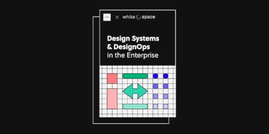
Between December 2021 and January 2022, UXPin and Whitespace interviewed Design Systems Managers from nearly twenty enterprise-level organizations. We compiled this research in a free ten thousand-word report titled Design Systems and DesignOps in the Enterprise.
Download the report for free. Head onto Design Systems and DesignOps in the Enterprise.
This outline provides an introduction to the report and what you can expect to learn from our research. We learned that in an ideal world, organizations want a common set of tools, documentation, and governance–but currently fail to achieve these results effectively.
The Purpose of This Report
Our team at UXPin wanted to understand how organizations use design systems and what role DesignOps plays in facilitating and streamlining this usage.
Through this report, we wanted to understand organizational challenges with design systems and identify tools and solutions to solve these issues.
Research sourcesUXPin partnered with Whitespace to interview 19 enterprise organizations from seven countries, including the United States, Switzerland, Germany, France, the United Kingdom, Indonesia, and Australia.
These companies serve several industries, including technology, health care, transportation, retail, and government.
Topics coveredWe covered six key topics when interviewing each organization:
Design system journey to dateDesign system maturityGovernance and processesDesigner/developer cooperation and challengesRoadmap and milestonesComparisons to the existing market researchQuick viewHere’s where most companies stand regarding design systems:
A “single source of truth“ is the primary goal, but silos and poor documentation stifle progress toward this ideal outcome.Design system governance lacks support, and team members waste resources trying to demonstrate ROI for their work.Design system adoption is a challenge for many organizations.Design system maturity varies widely across organizations and industries, often hinging on support from leadership and stakeholders.Download the report for free at Design Systems and DesignOps in the Enterprise.
A Brief Overview of Each Chapter Design Team
The Design Team Chapter discusses the organizational structure, cross-functional collaboration, and its influence on design system adoption.
Even in cases with leadership support, design system adoption is slow and challenging due to silos and poor communication channels. The report outlines several solutions, including:
Transparent communication between teamsEstablishing a single source of truthSetting measurable goals with KPIs to track progressAssigning accountability across teams toward a common goalDesign ProcessThe Design Process Chapter looks at working standards, the handoff process, and team aspirations. We learned that designers like to create new things, while developers prefer to reuse as much as possible.
Many design system workflows and components are outdated. Updating component libraries, adding elements, and making changes overall are some of the companies’ biggest areas of concern.
Another challenge is the design handoff. Most organizations voiced concerns about their current design process but didn’t have a clear path to making it more effective. Even with a solid design system, the transition from design to development is challenging. Teams adopt tools to simplify this handoff process, often introducing fragmented communication and inefficiencies.
ToolingWe explore how the tools used during design and development impact a design system’s adoption and success.
Many organizations recognize they need intuitive tools that provide a single source of truth–but switching tools is a heavy lift requiring time and resources to change people’s mindsets.
Design System DocumentationOne of the most daunting tasks of managing a design system is keeping every part of it up to date. Documentation is a valuable resource helping designers and developers model their efforts to deliver consistent user interfaces.

Organizations have learned that successfully designing and delivering products is nearly impossible without adequate documentation. But, the bandwidth required to maintain design system documentation is challenging, particularly for small teams with fewer resources.
The right tools can help facilitate design system maturity while providing structure for documentation. Learn more about the tools from the report: Design Systems and DesignOps in the Enterprise.
Design System AdoptionDesign system adoption requires continuous evangelism and outreach to ensure that stakeholders understand its value and how it can improve efficiency.
Effective adoption requires top-down support combined with change management from HR and DesignOps teams. An adoption strategy must be measurable so organizations can monitor progress and identify successful initiatives.
A Vision of the Ideal ModelWe put together a vision for the ideal design system model using insights from our research. While the ideal design system framework differed between organizations, one distinct commonality was “to create more effective workflows for better product development.”
Organizations implement design systems to achieve several goals:
Create design and development work at scale with greater efficiency and the ability to replicate elements and componentsReduce strain on design resourcesCreate a unified design languageCreate visual consistency across products, channels, and departmentsServe as an onboarding tool with clear standards, processes, and documentationHow to Use This Report
This research demonstrates that organizations share similar struggles with product development and design systems. Through sharing our findings, we hope companies can model solutions based on how others have solved (or plan to solve) similar challenges. We also hope it will feed the discourse around design system maturity and the future of product design.
Download the report for free. Head onto Design Systems and DesignOps in the Enterprise.
The post Free Report on Design Systems and DesignOps in the Enterprise appeared first on Studio by UXPin.
February 14, 2023
Code to Design Complete Guide for 2023

Design-to-code is a familiar workflow. Designers create a prototype using a design tool, and developers convert it to code–a simplified version of the standard product development process.
UXPin Merge turns this process upside down with a revolutionary code-to-design workflow. This article explains code to design and how it enhances the product development process with four case studies, including FinTech giant PayPal. Learn more about UXPin Merge.
Reach a new level of prototypingDesign with interactive components coming from your team’s design system.
Discover UXPin Merge .discover-merge { margin: 40px 8px;}.discover-merge__container { display: flex; max-width: 690px; height: 200px; padding: 20px; padding-left: 24px; border-radius: 4px; background-color: black; box-shadow: 10px 10px #9999ff; align-items: center; justify-content: space-between;}.discover-merge__left { width: 50%;}.discover-merge__left p { margin: 10px 0px !important; color: white !important; font-size: 18px !important;}.discover-merge__heading { font-weight: bold !important; color: white !important; font-size: 18px !important;}.discover-merge__text { margin: 0 !important; line-height: 22px !important;}.discover-merge__button { width: 174px; height: 44px; margin: 10px 0px; border: none; border-radius: 2px; background: white; color: black; font-size: 16px; text-align: center;}.discover-merge__button:hover { cursor: pointer;}.discover-merge__image { max-width: 320px !important; height: 200px; margin-right: -19px;}@media (max-width: 760px) { .discover-merge__container { height: auto; margin: 10px; align-items: left; }}@media (max-width: 500px) { .discover-merge__container { flex-direction: column; } .discover-merge__left { width: 100%; align-items: normal; }}What is Code to Design?Code to design is a UX workflow developed by UXPin using Merge technology. With Merge, Designers can import UI components from a repository into UXPin’s design editor and use them to build fully interactive prototypes–a process called component-driven prototyping.
Component-driven prototyping gives designers all the benefits of code without needing to write or learn a programming language.

This code to design workflow offers several benefits for UX designers, stakeholders, and product teams:
Designers build production-ready prototypes, increasing testing scope during the design process.Using “ready-made” code components means designers don’t design from scratch, reducing time to market while increasing prototype quality, fidelity, and functionality.Stakeholders can better visualize a design’s vision because Merge prototypes look and behave like an end-product.Design handoffs are smoother with less friction because designers and engineers speak the same language and use the same source of truth.Increases design system adoption because Merge integrates the component library into the product development workflow.The drag-and-drop workflow makes product design more accessible to non-designers.Design to Code vs. Code to Design The challenges of design to code
Design to code is the traditional UX workflow. Design teams create mockups and prototypes using standard image-based design tools, which developers convert to code.
The biggest challenge with a design-to-code workflow is that it creates a gap between designers and engineers. To bridge that gap, designers must use external tools, write detailed documentation, and meet with devs to explain how prototypes and interactions must function.
Even with all this extra work and explanation, the final product often doesn’t meet the designer’s specifications and expectations. Designers and engineers argue over who is to blame, but the real issue is a language barrier. Designers work with vector graphics tools, while engineers work with code.
The code to design solutionA code-to-design workflow bridges the gap between designers and engineers. They still speak different languages, but a technology like Merge facilitates the translation between design and development.
Design teams work with visual UI elements, while engineers work with the code powering them–the same component from two perspectives.
Teams working with a design system benefit most from this code-to-design workflow.
With design-to-code workflow, teams work with two versions of the design system:
Image-based UI kit for design toolsUI component library for programmingCode to design eliminates this separation because design teams and engineers use the same component library from the same repository–creating a true single source of truth.
Read more about code to design vs. design to code.
Code to Design Use Cases
You’re probably thinking, “this code-to-design thing sounds great, but how does it translate to real-world product development?” Glad you asked. Here are four use cases where companies use code-to-design for product development.
PayPalIn 2019, PayPal completely redesigned its internal product development process using UXPin Merge. PayPal’s internal UX team had a unique challenge–they had five designers to over one thousand engineers managing 60+ products. No two products looked the same, and each had usability and design inconsistency issues.
Erica Rider, UX Lead EPX at PayPal, was tasked with solving this problem. To add a layer of complexity, Erica had to create a workflow that enabled PayPal’s product team to design, test, and deliver products. They lacked design skills and had little design tool experience.
After trying several solutions using traditional image-based tools, Erica discovered Merge. PayPal’s UX team used Merge to sync a customized Fluent UI design system to UXPin.
PayPal’s stakeholders wanted to test the effectiveness of this new code-to-design investment. Erica’s experiment involved creating two versions of a one-page prototype: one using an image-based tool and the other using the UXPin Merge. The results were better than expected:
Image-based tool: over one hourUXPin Merge: 8 minutesThe Merge prototype had far superior fidelity and functionality. And, with some coaching, PayPal’s product teams achieved the same results.
Read PayPal’s full case study.
IressSoftware developer Iress was on a four-stage process to design system maturity.
 Stage one: PDF style guidesStage two: HTML pattern library with CSSStage three: UI kit and component libraryStage four: a fully integrated single source of truth with no design or code required for releases
Iress was stuck on stage three, unsure how they would bridge the gap between design and development to reach the final goal–until the team discovered code-to-design approach.
This workflow ticked all the boxes for Iress at that moment:
A single repository serving designers and engineers the components they need to build and release products.Better alignment between designers and engineers, with seamless design handoffs.No designing or front-end programming from scratch.No design drift or inconsistencies across the organization.Realistic, interactive prototypes give testing participants and stakeholders an accurate representation of the final product.The opportunity to experiment with theme switching for dark mode or multi-brand design systems.TeamPasswordThe first two use cases were enterprise products. But what can code-to-design do for startups and small teams? TeamPassword operates in the highly competitive password management market. The startup’s biggest challenge is that they don’t have any UX designers.
For a startup entrusted with people’s passwords and sensitive data, usability issues and design inconsistencies erode trust, ruining TeamPassword’s reputation and resulting in churn.
TeamPassword’s engineers did all the design and user testing using code prototypes. While these prototypes accurately represented the product’s functionality and user experience, building and iterating on ideas was time-consuming.
In 2022, TeamPassword switched to the MUI design system, which they synced to UXPin using Merge. Instead of developing prototypes, engineers used their custom MUI React library in UXPin. This code-to-design workflow significantly reduced time-to-market while eliminating usability issues and design drift.
When TeamPassword’s developers update the design system repository, the change automatically sync to UXPin, so they always have the latest version. Merge’s Version Control allows the team to track changes and switch between versions during testing.
Read TeamPassword’s full case study.
Reach a new level of prototypingDesign with interactive components coming from your team’s design system.
Discover UXPin Merge .discover-merge { margin: 40px 8px;}.discover-merge__container { display: flex; max-width: 690px; height: 200px; padding: 20px; padding-left: 24px; border-radius: 4px; background-color: black; box-shadow: 10px 10px #9999ff; align-items: center; justify-content: space-between;}.discover-merge__left { width: 50%;}.discover-merge__left p { margin: 10px 0px !important; color: white !important; font-size: 18px !important;}.discover-merge__heading { font-weight: bold !important; color: white !important; font-size: 18px !important;}.discover-merge__text { margin: 0 !important; line-height: 22px !important;}.discover-merge__button { width: 174px; height: 44px; margin: 10px 0px; border: none; border-radius: 2px; background: white; color: black; font-size: 16px; text-align: center;}.discover-merge__button:hover { cursor: pointer;}.discover-merge__image { max-width: 320px !important; height: 200px; margin-right: -19px;}@media (max-width: 760px) { .discover-merge__container { height: auto; margin: 10px; align-items: left; }}@media (max-width: 500px) { .discover-merge__container { flex-direction: column; } .discover-merge__left { width: 100%; align-items: normal; }}dotSourcedotSource is a German-based digital product consulting and development agency. The company uses multiple design systems to deliver products and solutions to clients.
dotSource’s biggest problem in delivering these products was redundant processes and duplicate work with two design systems–a UI kit for design and a component library for development. The design system’s documentation created a third piece the team had to maintain.
dotSource’s “single source of truth” was actually three sources, not one–a problem many organizations encounter with design systems.
dotSource knew they had to make their single source of truth code-based but didn’t know how to achieve this workflow using traditional image-based design tools–until they discovered UXPin Merge.
dotSource uses Merge’s Storybook Integration to sync its design system to UXPin. Storybook allows dotSource to update the design system’s repository, documentation, and UXPin’s components with every release.
“Switching to a code-based design workflow is the only way around these image-based limitations. A code-based prototyping tool like UXPin with Merge technology enables this workflow by rendering code (instead of vector graphics), just like a browser. In UXPin, UI components look and behave exactly as they do for developers, effectively bridging the gap between design and development–a real single source of truth.” – dotSource
Read dotSource’s full article.
How Does Code to Design Work in UXPin?Product teams have two options when importing code components into UXPin:
Import a product design systemImport an open-source UI library (MUI, Bootstrap, Ant Design, etc.)There are three ways to bring these libraries into UXPin:
Git Integration: syncs React component libraries from a repository to UXPin.Storybook Integration: allows teams to sync many front-end frameworks, including React, Vue, Angular, Web Components, and Ember, to name a few (find the complete list in Storybook’s docs).npm Integration: designers can import UI components from open-source libraries from the npm registry using the Merge Component Manager (MCM).We have three tutorials for using the npm Integration and Component Manager:
React-BootstrapAnt DesignMUIThe Git and Storybook integrations are a little more complex, requiring technical skills to complete the Merge setup with UXPin’s Technical Support Team.
Combining components with UXPin PatternsWith UXPin Patterns, designers can combine UI components to create new UI patterns and templates. This feature is particularly helpful when a design system doesn’t have a specific element.
For example, suppose you need to add an analytics dashboard to your product, but the design system doesn’t have charts. You can find an open-source UI library on the npm registry, import the package using the MCM, and add the chart components to create new patterns while maintaining the same fidelity and functionality. The team can promote this pattern to the design system or use it as a once-off.
Learn more about UXPin Patterns in this tutorial.
Ready to get started with code to design? Visit our Merge page to request access to this revolutionary code-based technology.
Discover MergeThe post Code to Design Complete Guide for 2023 appeared first on Studio by UXPin.
February 13, 2023
A Complete Website Checklist for Quality Web Design
From creating high-quality visuals to making sure all the web pages are intuitive and responsive, website design requires a combination of technical know-how and artistic vision.
To ensure your website is successful in both areas, you’ll need to do your due diligence and follow a website checklist. In this article, we’ll describe the qualities of a good website and how to work with a team of web developers. We’ll also outline tasks to follow if you want to make your website functional in addition to being aesthetically pleasing.
If you’re creating a web design, use UXPin. It’s an end-to-end prototyping tool with which you can create an interactive prototype of a website, share it with others, and use it for user testing. It’s the only prototyping tool that allows you to test true experience of a website. Sign up for a UXPin trial.
Build advanced prototypesDesign better products with States, Variables, Auto Layout and more.
Try UXPin .try-uxpin-banner { margin: 40px 0px;}.try-uxpin__container { display: flex; max-width: 689px; height: 210px; padding: 20px; padding-left: 24px; border: 2px solid black; border-radius: 4px; align-items: center; justify-content: space-between; background-color: white; box-shadow: 10px 10px black;}.try-uxpin__left { width: 54%;}.try-uxpin__left p { margin: 10px 0px !important; color: black !important;}.try-uxpin__heading { font-size: 28px !important; font-weight: bold;}.try-uxpin__text { margin: 0 !important; font-size: 18px !important; line-height: 22px !important;}.try-uxpin__button { width: 135px; height: 44px; background: black; margin: 10px 0px; padding: 10px 20px; border: none; border-radius: 2px; color: white; font-size: 16px; text-align: center;}.try-uxpin__button:hover { cursor: pointer;}.try-uxpin__image { max-width: 320px !important; height: 200px; margin-right: -21px; margin-bottom: -6px;}@media (max-width: 760px) { .try-uxpin__container { height: auto; margin: 10px; align-items: left; }}@media (max-width: 500px) { .try-uxpin__container { flex-direction: column; } .try-uxpin__left { width: 100%; align-items: normal; }}What are the Top Qualities of a Good Website?A website should be more than just functional; it also needs to look aesthetically pleasing and consistent in portraying your brand. In short:
It should answer your target audience’s questions,The content should be organized and accessible to all users, including those with disabilities,It should be optimized for mobile devices,It should guarantee the highest security standards (have an SSL certificate and more).These are just a few of the qualities of a good website that must be taken into account during the web design process. If you are looking for a full list of website design elements, this web development checklist can be very useful for webmasters and web designers.
A pre-launch website checklist for creating effective web designs Interview stakeholdersStakeholder interviews have a major impact on the final product. They help gather valuable insights that would otherwise be difficult to obtain. Here are a few things you need to do to prepare for a stakeholder interview:
Pinpoint your research objectives: What outcomes are you seeking? It’s best to devise a script or list of questions that will assist in uncovering vital information.Identify the stakeholders: Depending on the project you are working on, the people who have a say in it may be from different parts of the company, like management, engineering, marketing, or sales. A stakeholder is anyone whose job will be affected by the product.Define the setup: For any stakeholder interview, be sure to have all the essential tools on hand. Understanding the website’s objectives, functionalities, and timeline help you structure the interview.Stakeholder interviews are a great way to learn about what people want. They help you understand how users behave, what limits them, and what problems they have.
Research competitors
To compare your website to others, you need to first identify who your competitors are. You can find this information in three different sources:
Well-known direct competitors in your industry. This complete detailed guide on competitive analysis for UX should help you out. Identify your most relevant keywords and conduct a Google search. Search the results and see which websites are appearing.Take the time to research related companies on Capterra and G2. Arm yourself with knowledge of what potential customers look for to craft the perfect content and structure when planning your website. This information can give you insights into both the features and services that will make it stand out.An ideal way to kick off an analysis of the competition’s design is by evaluating their website performance. When rating each website, assess its performance using a scale from 1 to 5 (with 5 being the highest score).
What is the site performance?Is the layout easy to navigate?Is the font easy to read ?Are the images properly sized and have alt text?Is the website responsive ?How would you rate your new site’s usability?Use this scale to make sure each page is graded the same way. This will help ensure that your assessments are accurate. Be sure to take notes as you go along. The goal is to look at each page and see what it has, how it works in different areas, and what’s missing. The most important part is seeing how you can do better than the other pages.
Do user researchUser research is very important in the process of making a website. In short, it helps you design something that your target audience will like, understand what consumers want, and, ultimately, help your business grow.
Once you’ve gained a rough understanding, do additional research to check if your initial assumptions align with the people you want to reach. They will give you important information about what design to use. You can learn more by doing things like diary studies, interviews, and focus groups. This way you will know if your design meets your users’ needs.
Creating website personas is another helpful way to identify the brand’s tone. By building personas, you can gain a better understanding of the website user. Personas are fictional characters created to represent website users. They help you understand how users behave, how they think, and what website features will engage them.
Check if there are any functional constraints
Construction of an app or website requires three essential components: desirability, viability, and feasibility. All must be carefully considered to ensure a successful new site launch.
This point centers on the feasibility of this initiative. For example, if you are planning to design and develop a website with Webflow, you must understand the full capabilities of the platform. By discovering what can be accomplished with it, you’ll have greater control over your digital project and create an incredible end result.
Tap into a current design system or craft your own for maximum impact
A Design System is a shared vocabulary for product teams that allows them to communicate more effectively and efficiently.
By having this common language, designers can create consistent experiences across different platforms with clarity and cohesion. It makes the design process go faster and helps teams communicate better so they can make products. This article goes into more depth on Design Systems.
Plan information architecture (IA)
Interaction design, which includes information architecture (IA), takes into account content, context, and users for a more efficient user experience. To create a user-friendly experience, it’s essential to consider users’ needs, business objectives, search engine’s requirements, and the site pages involved.
To start your information architecture plan, you will need a few things from the IA starter pack.
Craft your content to meet the needs of your audience in an organized mannerUse headings to create content structureStart making a map in your head and planning how people will move around your website.Ultimately, you want people to convert or take the desired action. By developing website content that caters to your website visitors, you can create an enhanced user experience and increase website conversions. You’ll need to structure website content and create labels that are meaningful, consistent, and user-friendly.
Build a prototype of a new website
When deciding which prototyping tool to use, it is essential to consider how product teams work, exchange information, and gather feedback.
Here’s where a tool like UXPin will be immensely useful. It allows designers to use coded UI components to create fully interactive prototypes that feel like the end product while removing silos and miscommunication during the design-developer handoff stage.
Test with users
User testing involves observing real users interacting with homepage, contact page or any other site pages and seeing how they complete certain tasks, such as filling a contact form. It’s best to start running the tests when your design drafts are complete, but also for initial wireframes.
When you are designing something, establish when it’s time to move from sketching to low-fidelity mockups to high-fidelity prototypes.
UXPin lets you create interactive prototypes filled with real data, and easily share them with all your stakeholders. This makes design testing and feedback gathering more effective.
Iterate
Use a tool that will help you be more productive when you are working on multiple design iterations. The best way is to use one tool for both making a model of your idea and collecting people’s opinions about it.
For example, PayPal’s Senior Manager for UX, Erica Rider, says it used to take her half a day to roll out a new iteration. Ever since she’s turned to UXPin, she can do so in as little as 30 minutes.
Hand your project over to the development team
Now is the time to equip your developer with all of the digital assets they need to begin working. Some tips to make the handoff process easier for you include:
Create templates: To make the handoff process simpler, create a template for each task and all deliverables associated with it. This template will change to match your needs and how you work. That way, when you need to hand something off at a moment’s notice, these templates will be ready.
Prevent clutter: Make sure your designs are easy to understand. This will make it less frustrating for people who are looking at them for the first time. Make sure everything is organized and labeled clearly. This way, you can easily find what you are looking for and won’t have to waste time searching. In addition, you should give developers access to all documents before they start working.
Review your work: Before you hand your work in, review every aspect of the deliverables. Double-check that all of your links are functional and accessible. To ensure that each section is presented clearly, double-check for errors in spelling and grammar as well as the appropriate use of visuals.
Run design handoff meetings: Gather both the design and development teams for a meeting. Demonstrate how each deliverable will be included in the handoff. Be prepared to answer any inquiries that may come up and convey as much insight as possible during this meeting.
Takes notes and explain: When you are done with designing, it’s a good idea to write down why you made each decision. This will help you remember your thought process later on. These annotations explain how the product is supposed to work and what it is supposed to do.
UXPin allows you to work with your team anywhere. No more endless file swapping. You can share your work and collaborate with your team on one prototype. No plug-ins, and no third-party handoff apps are necessary. You can use it to create contextual documentation.
Leave perfectly detailed descriptions of elements on your designs, down to the smallest detail, for anyone involved – especially developers. Describe when and how certain elements should be used. You can even include accessibility guidance.
What to do post-launch?
Website launch checklist doesn’t end with the first launch. You need to constantly monitor your site using website analytics tools, such as Google Analytics or Google Search Console. Websites are prone to have problems with pagespeed, indexing, or broken links. It’s necessary to monitor your site’s health and SEO.
Plus, the best websites stay on top of their conversion rates. We have a separate article about improving site conversion, but to be brief, you need to test your call-to-actions and implement other best practices that set up your site for success.
Follow this website checklist during web designCreating website checklists and collecting feedback on a new site design are important steps. Use it to ensure that your website meets all of the qualities of good website design. Iterate your designs with a tool like UXPin to save time and be more productive.
Finally, hand your project over to the development team by creating templates, holding design handoff meetings, annotating and explaining your web design decisions, avoiding clutter, and ensuring that you review your own work.
By following these steps, website design will become a much smoother process for all involved. With the right tools and processes in place, website design can be completed quickly, efficiently, and easily.
Create the prototype of a website right away. Use the steps we outlined in this article and create your website design in UXPin. Sign up for a free trial.
Try UXPin for freeThe post A Complete Website Checklist for Quality Web Design appeared first on Studio by UXPin.
Best Design Conferences in 2023

One of the best things about being a part of the design community is that most designers love to exchange ideas, spread knowledge, and share their experiences regardless of their seniority level. You can be a starting designer or an established thought leader, and it’s almost a given that you find a design conference that may teach you something new.
What’s also great about UX conferences is that not all of them target the UX/UI community, but the people who work with them on a daily basis. Product managers, developers and other professionals who work closely with design can find an event for themselves.
Increase design maturity with UXPin Merge. Build a more collaborative design process and bridge the gap between designers and devs by using a single source of truth in your prototypes: interactive components. Discover more about UXPin Merge.
Reach a new level of prototypingDesign with interactive components coming from your team’s design system.
Discover UXPin Merge .discover-merge { margin: 40px 8px;}.discover-merge__container { display: flex; max-width: 690px; height: 200px; padding: 20px; padding-left: 24px; border-radius: 4px; background-color: black; box-shadow: 10px 10px #9999ff; align-items: center; justify-content: space-between;}.discover-merge__left { width: 50%;}.discover-merge__left p { margin: 10px 0px !important; color: white !important; font-size: 18px !important;}.discover-merge__heading { font-weight: bold !important; color: white !important; font-size: 18px !important;}.discover-merge__text { margin: 0 !important; line-height: 22px !important;}.discover-merge__button { width: 174px; height: 44px; margin: 10px 0px; border: none; border-radius: 2px; background: white; color: black; font-size: 16px; text-align: center;}.discover-merge__button:hover { cursor: pointer;}.discover-merge__image { max-width: 320px !important; height: 200px; margin-right: -19px;}@media (max-width: 760px) { .discover-merge__container { height: auto; margin: 10px; align-items: left; }}@media (max-width: 500px) { .discover-merge__container { flex-direction: column; } .discover-merge__left { width: 100%; align-items: normal; }}January 2023 ConferencesIf your New Year’s resolution is to network more, there are a few design conferences and events that seem to be a great fun.
Design Matters MexicoJoin Design Matters and review design impact, rethink sustainability and design for the future.
Date: Jan 25-26, 2023Free: NoWhere: Mexico CityAudience: UX researchers, UI designers, UX designersCommon topics: design sustainability, design process, leadershipFebruary 2023 ConferencesWhat about the second month of the year? We’ve found a couple of conferences that may catch your eye. Let’s see them.
Leading DesignIt’s the eighth time Clearleft decided to host their event for design leaders who want to hone their skills. The program looks very promising with the speakers coming from IBM, Stripe, Shopify, and more!
Date: Feb 7-8, 2023Free: NoWhere: San Francisco, USAudience: UX designersCommon topics: career, leadership, future of designUX New Zealand [Hybrid]Explore the layers of UX research, information architecture, design, strategy, leadership, psychology and organization in this two-day live event that will be streamed across the globe.
Date: Feb 15-17, 2023Free: NoWhere: Virtual & Wellington, New ZealandAudience: UX designers, UX researchers, UX writersCommon topics: accessibility, information architecture, researchUX360 Research SummitLearn how to promote the value of research, make an impact, and take care of your team. UX360 is one of the best research conferences out there. You can select sessions to watch right now.
Date: Feb 15-16, 2023Free: NoWhere: VirtualAudience: UX researchers, UX designersCommon topics: research, career, leadershipProduct World [Hybrid]Product manager and product developer conference that concerns itself with creating agile environment, boosting leadership and collaboration, and presenting success stories that you can replicate.
Date: Feb 15-23, 2023Free: NoWhere: Virtual and San Francisco Bay AreaAudience: product managers, developers, product designersCommon topics: collaboration, leadership, growthExperience Design ConferenceThe Denver-based conference is devoted to human-centered design and sharing best practices coming from the Experience Design industry leaders.
Date: Feb 27 – Mar 1, 2023Free: NoWhere: DenverAudience: UX designers, UI designers, product designersCommon topics: UX, product management, human-centered design, design thinkingMarch 2023 ConferencesMarch is going to be an exciting month for those of you who love tuning in for virtual conferences.
Interaction Week 23 [Hybrid]This interaction design conference is a perfect excuse to visit Zürich if you haven’t yet. Listen to great talks about interaction design and sign up for workshops that will help you hone your facilitation, decision making, and analytical skills.
Date: Mar 1-3, 2023Free: NoWhere: Virtual and Zürich, SwitzerlandAudience: UX designers, UI designers, researchersCommon topics: UX, interaction design QRCA 2023 Annual ConferenceQRCA stands for Qualitative Research Consultants Association. The association is celebrating its 40th birthday in 2023. Time flies, doesn’t it? The conference that it organizes covers research methods, tools, and lessons that will prepare designers for the next era of qualitative research.
Date: March 22-24, 2023Free: NoWhere: Virtual & Charlotte, North CarolinaAudience: UX researchers, marketing researchersCommon topics: qualitative research, research methods, research toolsDesign Research by UX Australia [Hybrid]A great conference for anyone who’s engaged in doing research before design work. The conference is still accepting submissions.
Date: Mar 14-16, 2023Free: NoWhere: Virtual & MelbourneAudience: UX researchers, product managers, product designersCommon topics: research operations, leadership, research methods, research toolsUX CopenhagenMarch will be exciting month. This year UX Copenhagen comes back to the city with “Invisibility” as its leading theme. It will scrutinize design process and skills of designers to check if making UX hidden doesn’t leave any user behind.
Date: Mar 23-24, 2023Free: NoWhere: Virtual & CopenhagenAudience: UX designers, UX researchersCommon topics: UX design, leadership, contentACM IUI 2023Interested in AI for design? If so, you can’t miss out on this conference! It is focus on presenting outstanding research and development on intelligent user interfaces.
Date: Mar 27-31, 2023Free: NoWhere: Sydney, Australia Audience: product designers, researchersCommon topics: information architecture, artificial intelligence Information Architecture Conference 2023It’s one of the leading conferences for information architects, designers, and others who create and manage UI and information environments.
Date: Mar 28 – Apr 1, 2023Free: NoWhere: Virtual Audience: product designers, researchers, product managersCommon topics: information architecture, UX research, content strategyApril 2023 ConferencesYou’ll get a couple of conferences that will be interesting for designers, researchers and product teams. What are they?
WebExpo 2023Travel to Prague, an extraordinary European city, to join fellow web designers, developers, marketers, and more discussing innovations in web design and development.
Date: Apr 19-21, 2023Free: NoWhere: Prague, CzechiaAudience: designers, developers, product managersCommon topics: web design, front-end design, UXCHI 2023 [Hybrid]This year’s annual ACM Computer Human Interaction conference will be a hybrid event, which means that it will take place on-site in Hamburg and online.
Date: Apr 23-28, 2023Free: NoWhere: Virtual & Hamburg, GermanyAudience: researchersCommon topics: research tools, research methodsAn Event ApartOne of the most recognizable conferences for UX designers and front-end developers who want to expand their knowledge on web design.
Date: Apr 24-26, 2023Free: NoWhere: SeattleAudience: product designers, developersCommon topics: design process, front-end design, leadershipConfabHey, content managers! There’s an event dedicated to increasing your skills. Confab is a conference dedicated to content strategy where you can get insights from industry leaders.
Date: April 30 – May 3, 2023Free: NoWhere: MinneapolisAudience: content managers, product designers, UX writersCommon topics: career, content management, toolsMay 2023 ConferencesMay will be the month for on-site UX and product conferences. Let’s see where we can travel to. Are you ready?
DDX 2023 | UX ConferenceLearn how to facilitate, foster and design positive business visions in emerging innovation fields.
Date: May 6, 2023Free: NoWhere: Munich, GermanyAudience: product designers, product managers, design leadersCommon topics: innovation, UX, leadership, sustainabilityUXDX Community USA [Hybrid]UXDX is a popular conference for UX designers, developers and product people around the world. The topics of this year’s design conference revolve around using data, innovating, working together, and building design systems.
Date: May 16-18, 2023Free: YesWhere: Virtual and on siteAudience: UX designers, UX researchers, developers and product managersCommon topics: DesignOps, collaboration, design systemUXistanbulOrganized by UXServices, this conference is a place for gathering Web3 enthusiasts and designers interested in the field. Come and join them on Discord.
Date: May 22-26, 2023Free: NoWhere: Virtual Audience: product designers, researchers, product managersCommon topics: NFT, metaverseACE!This Polish conference has two tracks: Agile Software Development and Product Design & Management. Yet, there will be a lot of content for product designers, too.
Date: May 18-19, 2023Free: NoWhere: Kraków, PolandAudience: product managers, developers, product designersCommon topics: leadership, product strategy, product growthJune 2023 ConferencesThat month looks very exciting for those of you who got used to participating in events from the comfort of their homes. In other words, there will be a few interesting virtual meetups.
UX STRAT EuropeSign up for a European edition of a popular UX STRAT conference. Learn from the design and innovation experts.
Date: Jun 5-7, 2023Free: NoWhere: AmsterdamAudience: product designers, researchersCommon topics: design strategy, future of designPixel PioneersIt may be just a day-long, but the Pixel Pioneers is fully-packed with inspirational presentations from leading UX/UI designers and front-end developers.
Date: Jun 16, 2023Free: NoWhere: BristolAudience: product designers, developers, researchersCommon topics: human-centered design, inclusive design, future of designUXPA 2023Looking for inspirational talks? San Diego’s UXPA conference may be your cup of tea.
Date: Jun 20-22, 2023Free: NoWhere: San DiegoAudience: product designers, researchersCommon topics: human-centered design, leadership, researchJuly 2023 ConferencesThe summer season is on, but there are a few exciting events coming. Curious what are they?
ProductConOrganized by Product School, ProductCon is a 1-day conference for product people who want to learn more about managing products.
Date: July 2023Free: Yes until April 2023Where: VirtualAudience: product managers, developers, product designersCommon topics: leadership, product innovation, collaborationHCI INTERNATIONAL 2023That international conference on human-computer interaction that is usually held in Gothenburg, Sweden.
Date: Jul 23-28, 2023Free: NoWhere: VirtualAudience: product designers, researchersCommon topics: human-centered design, research, leadership#mtpcon Digital AmericasThe summer edition of the Mind the Product conference for both Americas.
Date: Jul 10-14, 2023Free: NoWhere: VirtualAudience: product designers, product managers, developersCommon topics: leadership, future of product, product growthAugust 2023 ConferencesFor now, we haven’t heard about any design conferences happening in August, but we will update it as soon as we find something.
September 2023 ConferencesWe’re still searching the web for 2023 conferences.
October 2023 ConferencesSee October conferences for designers and product teams.
ProductCon San FranciscoAnother Product School’s ProductCon event is happening in October. It is a 1-day conference for product people who want to learn more about managing products and the future of product management.
Date: Oct, 2023 (TBD)Free: NoWhere: San FranciscoAudience: product managers, developers, product designersCommon topics: leadership, future of product management, product growthWorld Usability ConferenceLet’s meet in Austria and discuss usability with other UX professionals and participate in talks and masterclasses where handpicked speakers share meaningful hands-on insights.
Date: Oct 10-12, 2023Free: NoWhere: Graz, AustriaAudience: product designers, researchersCommon topics: design process, usability, sustainabilityNovember 2023 ConferencesUXDX APAC 2023It’s yet another UXDX event, but this one is an Audio-Pacific version. It’s dedicated to Product, UX, Design and Development teams that want to find a way of working together.
Date: Nov 14-16, 2023Free: NoWhere: San DiegoAudience: product managers, developers, product designersCommon topics: product direction, scaling design, validation, product growthWhich Design Conferences Are You Attending in 2022 and 2023?It seems as if 2023 is going to be full of inspiring and educational content coming from the best speakers in design and product management. Have you found a conference for you? We will definitely keep you posted if any new event comes our way.
Use the knowledge that you acquired from design conferences in practice. Instead of working in siloed environment, unite your team with a single source of truth: interactive components that can be used across design and product. Discover more about it. Check out UXPin Merge.
Discover MergeThe post Best Design Conferences in 2023 appeared first on Studio by UXPin.
February 9, 2023
Code to Design vs. Design to Code – Which is Better?
Just completed the final iteration of your prototype? Great! Let’s send the design to the development team, so they can translate it to code. Here the question pops up: is design to code really the best direction you can hope for? Actually, there’s a second model of working: pushing code to design and working with coded UI components.
In this article, we will discuss design-to-code model and why design teams cannot eliminate inconsistencies and lack of collaboration without changing their tools. Luckily, with UXPin Merge, designers still enjoy an intuitive design tool’s user interface; all that changes is what’s behind the components that they use for prototyping.
Ready to experience code-to-design technology? Request access to UXPin Merge and obtain a single source of truth between design and development. Read more about UXPin Merge.
Reach a new level of prototypingDesign with interactive components coming from your team’s design system.
Discover UXPin Merge .discover-merge { margin: 40px 8px;}.discover-merge__container { display: flex; max-width: 690px; height: 200px; padding: 20px; padding-left: 24px; border-radius: 4px; background-color: black; box-shadow: 10px 10px #9999ff; align-items: center; justify-content: space-between;}.discover-merge__left { width: 50%;}.discover-merge__left p { margin: 10px 0px !important; color: white !important; font-size: 18px !important;}.discover-merge__heading { font-weight: bold !important; color: white !important; font-size: 18px !important;}.discover-merge__text { margin: 0 !important; line-height: 22px !important;}.discover-merge__button { width: 174px; height: 44px; margin: 10px 0px; border: none; border-radius: 2px; background: white; color: black; font-size: 16px; text-align: center;}.discover-merge__button:hover { cursor: pointer;}.discover-merge__image { max-width: 320px !important; height: 200px; margin-right: -19px;}@media (max-width: 760px) { .discover-merge__container { height: auto; margin: 10px; align-items: left; }}@media (max-width: 500px) { .discover-merge__container { flex-direction: column; } .discover-merge__left { width: 100%; align-items: normal; }}Design to Code Design to code describes a typical product development process. Designers use design and prototyping tools to design user interfaces and hand these off to developers to code.
Over the years, the design-to-code process has evolved, but there is still a big gap between design and development. Designers still create static vector user interfaces, which engineers must translate into code.
Due to the lack of fidelity and functionality, design teams must include documentation, annotations, and explanation about what designs and prototypes are supposed to do.
Many designers use GIFs and videos to demonstrate animations and transitions because their tools lack interactivity, which requires significant time and resources. It also fragments design files and documentation, confusing developers and stakeholders.
Read more about it in our article about image-based vs. code-based tools.
Benefits of design to codeThe design-to-code process is comfortable for designers and engineers because it allows each party to work with familiar tools, workflows and using familiar vocabulary that’s comprehesive to them.
Design tools are built for ease of use and speed. Experienced designers can create a screen mockup really fast using an image-based design tool.
Limitations of design to codeUnfortunately, the limitations outweigh the benefits–which is why so many companies seek ways to improve and update their design processes.
Misalignment between design and developmentFidelity and functionality are massive limitations with current design-to-code workflows. Image-based prototypes don’t look or function like the end product. Even with documentation, annotations, and handover meetings explaining prototypes, designers still complain that engineers haven’t met their expectations. Conversely, engineers struggle to articulate technical limitations to designers, creating friction.
Design system challengesEven with high-quality design systems, design to code creates challenges for handoffs, scalability, and maturity. The design system team must manage two design systems:
UI kit for designersComponent library for developersAdditionally, they must maintain documentation for both systems.
Describing this workflow as a single source of truth is a fallacy. As the German-based software development agency dotSource points out in this article,
“Most design system releases require updating in at least three places:
The design system’s codebase ( component library )The design team’s UI kit (design tool)The design system’s documentationInstead of a “single source of truth” that gives “three single sources of truth” for every UI component–this seems counterintuitive and increases errors. If the design system’s update process and technologies don’t align, the team ends up with redundant work because a single change requires three updates.”
Duplicated workWhen engineers get the final version of design, they need to translate it to code. Thus, their work takes much longer than it could if the team didn’t need to push design to code.
Code to DesignCode-to-design is a workflow pioneered by UXPin using Merge technology.
Designers still use a design tool with the same familiar UI and features, but the designs render production-ready code instead of vector graphics.
Many design tools try replicating this system with plugins and extensions, but the code is rarely usable for engineers. Merge is different because it syncs components from a design system’s repository to UXPin–engineers can use the code because they wrote it.
Designers use the same component library during the design process as engineers use for development.
Benefits of code to designSingle source of truthCode to design solves many product development problems, but the most significant benefit is a true single source of truth–everyone uses the same component library from the same repository. Any changes to the repo automatically sync to UXPin, notifying design teams of the update.
Merge’s Version Control allows design teams to change to earlier releases and only update an existing project when they choose.
If devs are using UXPin’s Storybook Integration, they update documentation simultaneously with every release. This single source of truth solves many DesignOps challenges, allowing team members to focus on high-level tasks.
Another significant benefit of a code-to-design workflow is smoother design handoffs. Engineers import the component library’s package, add the components, and copy JSX code from UXPin to complete frontend development.
Component-driven prototypingMerge components appear in UXPin with the same properties and interactivity as the repository. Each component’s Props (Args in Storybook) appear in UXPin’s Properties Panel, allowing designers to make changes according to the design system–i.e., colors, states, sizes, etc.
These ready-made UI elements facilitate rapid component-driven prototyping, where designers simply drag and drop components and patterns to build fully functioning prototypes.
Ultimate consistency with zero design driftThese ready-made components eliminate inconsistencies because everyone uses the same UI library with the same limitations and constraints.
Designers can only change elements via the properties available in UXPin’s Properties Panel. There are no overrides, thus eliminating the possibility for changes, resulting in no drift.
Better governanceThese limitations improve governance and design system integrity. The design system team has absolute control over the repo; therefore, everyone must follow the correct procedures to promote new patterns and components.
Scalability and maturityMerge facilitates the highest design system maturity stage with every team member using the same component library–no designing or developing from scratch to release products. Using this technology, organizations can achieve this level of maturity significantly quicker than following a design-to-code workflow.
With everyone using a single codebase, it’s easier to scale a design system following technological and market changes. Whenever the design system team adds new components, patterns, or templates to the repository, they’re immediately available for the entire product development team.
Enhanced testingBetter prototypes mean better testing. Designers can solve more issues and find better opportunities during the design process with prototypes that accurately represent the final product experience.
Usability participants and stakeholders can interact with these prototypes like they would the final product, resulting in meaningful feedback and actionable data-driven insights.
LimitationsCode to design requires a component libraryCode to design can only work with a component library. You can use an open-source UI library if your organization doesn’t have a design system. For example, PayPal’s internal product development team uses a customized Microsoft Fluent UI design system.
Designers can also use Merge’s npm integration to import components from open-source libraries available on the npm registry. This method requires no technical skills. Instead, designers use the Merge Component Manager to import and manage UI elements.
Designers rely on engineersCode-to-design requires designers and engineers to work closer together. Most organizations have a dedicated design system team, so this won’t be too different from standard governance procedures.
Less flexibilityA code-based design system is less flexible than a UI kit that designers can quickly assemble. Designers have limited or no possibility of changing or manipulating components once uploaded into the design tool. This inflexibility is necessary for design system governance and integrity, but some might argue that it restricts innovation and creativity.
UXPin functions like any other design tool, so designers can develop new ideas and patterns to present to team members. With UXPin Patterns, designers can combine existing design system elements or import open-source libraries to create new components, patterns, and templates.
With this in mind, code-to-design creates more opportunities for creativity and innovation because designers can leverage the best parts of open-source libraries to develop new patterns.
Companies Using Code to DesignOur diverse client base proves that code-to-design works for multinational enterprises, agencies delivering white-label software, and startups. Here are three great examples of code-to-design in practice.
PayPalPayPal’s internal UX team revolutionized its product development process by switching to a code-to-design model. Since the switch in 2019, PayPal’s product teams deliver releases 8X faster with no design drift or inconsistencies. PayPal’s new product development process has improved cross-functional collaboration, with everyone taking responsibility for user experience.
Merge also improved PayPal’s prototyping and testing, with better feedback from test participants and stakeholders.
“One of the significant impacts of UXPin Merge is our ability to create higher-fidelity prototypes. There’s a lot more confidence from everyone (including designers, C-suite, directors, and developers) about what the final product will look like, the user experience, and interactivity–giving us higher quality feedback from stakeholders.” – Erica Rider, UX Lead EPX at PayPal.
TeamPasswordTeamPassword is a 5-person startup (as of Feb 2023) operating in the highly competitive password management market. The startup doesn’t have a UX team, requiring engineers to prototype and test new releases.
Before switching to Merge, TeamPassword’s engineers would develop each prototype–a time-consuming process for a company with limited resources. In 2022, TeamPassword changed to Merge and synced a custom MUI design system.
Since changing to a code-to-design workflow, TeamPassword’s speed-to-market has drastically improved, and the product has no usability issues or inconsistencies, making the company more competitive.
Ready to overhaul your design-to-code workflow with a revolutionary code-to-design solution? Visit our Merge page.
Discover MergeThe post Code to Design vs. Design to Code – Which is Better? appeared first on Studio by UXPin.
February 8, 2023
App Engagement – 7 Ways UX Design Can Increase it
Mobile app competition is fierce, with millions of digital products vying for people’s limited attention. Increasing app engagement is a high priority for many product development teams, constantly looking for innovative ways to retain and entertain.
UX designers play an essential role in keeping app users engaged using various design and psychology techniques. Prototyping and testing are vital for helping designers fix usability issues or business opportunities that could lead to higher engagement.
Test your design ideas with the world’s most advanced design tool. Create immersive prototypes that look and function like the final product. Sign up for a free trial to explore UXPin’s features today.
Build advanced prototypesDesign better products with States, Variables, Auto Layout and more.
Try UXPin .try-uxpin-banner { margin: 40px 0px;}.try-uxpin__container { display: flex; max-width: 689px; height: 210px; padding: 20px; padding-left: 24px; border: 2px solid black; border-radius: 4px; align-items: center; justify-content: space-between; background-color: white; box-shadow: 10px 10px black;}.try-uxpin__left { width: 54%;}.try-uxpin__left p { margin: 10px 0px !important; color: black !important;}.try-uxpin__heading { font-size: 28px !important; font-weight: bold;}.try-uxpin__text { margin: 0 !important; font-size: 18px !important; line-height: 22px !important;}.try-uxpin__button { width: 135px; height: 44px; background: black; margin: 10px 0px; padding: 10px 20px; border: none; border-radius: 2px; color: white; font-size: 16px; text-align: center;}.try-uxpin__button:hover { cursor: pointer;}.try-uxpin__image { max-width: 320px !important; height: 200px; margin-right: -21px; margin-bottom: -6px;}@media (max-width: 760px) { .try-uxpin__container { height: auto; margin: 10px; align-items: left; }}@media (max-width: 500px) { .try-uxpin__container { flex-direction: column; } .try-uxpin__left { width: 100%; align-items: normal; }}Why is App Engagement Important?App engagement is a crucial business value metric because it influences many other factors, including revenue, brand loyalty, retention, and, most importantly, a company’s valuation.
Here are four reasons why app engagement is essential:
Revenue: whether your app uses an ad or paid model, higher engagement typically results in higher earnings.Retention: higher engagement is a good indication that users rely on your product in their daily lives, leading to increased retention and customer lifetime value (CLV).Brand affinity: higher engagement leads to increased brand affinity, which impacts key business metrics like Net Promoter Score (NPS) and Customer Satisfaction Score (CSAT). Improving these scores indicates that customers will share product experiences leading to free exposure.Data and research: increasing engagement enriches data analytics, allowing product teams to understand user behavior better and optimize for growth.What is a Good Engagement Rate For an App?Determining a good app engagement rate will depend on many factors, including the product, industry, niche, market, and users. Researchers use UX benchmarking to calculate the correct app engagement industry standard and measure this against the product’s performance.
The formula for calculating app engagement rate is simple:
monthly active users / total users X 100You can use the same equation for daily engagement by replacing monthly active users (MAU) with daily active users (DAU).
What is the UX Team’s Role in Increasing App Engagement?UX designers play a critical role in app engagement and user retention. Intuitive UIs and well-designed features that enable users to complete tasks and solve problems efficiently create an enjoyable experience and increase engagement.
During prototyping and testing, designers can identify roadblocks and streamline user flows to make products more intuitive and easier to use.
App Engagement Metrics for UX DesignersHere are some key performance indicators (KPIs) UX designers can use to measure performance:
Retention rate: the percentage of users who continue to use an applicationChurn rate: the number of users who have stopped using an applicationAverage session length: the average time users spend using an app during a single session Daily active users (DAU): the number of users who open an app on a single calendar dayMonthly active users (MAU): the number of users who open an app over 30 daysStickiness: a radio or percentage indicating how often users return to an appUser engagement rate: how many active users complete a specific action in an appPush notification open rate: the percentage of app users who open notifications–expressed overall and per notification typeApp reviews: the percentage of users who leave a review in app stores or on platforms like TrustpilotDesign teams must measure these app engagement metrics before and after design projects to demonstrate how design decisions create business value and deliver a return on investment.
How Can UX Designers Help Increase App Engagement?Progressive disclosureProgressive disclosure is a design technique that only shows users the most critical features or options to complete a single task or action. For example, many eCommerce stores often hide a product description and other information behind accordions to minimize cognitive overload, allowing users to choose when and if they need to see it.
Progressive disclosure increases app engagement by:
Making products easier to learn and navigatePlaces less important features on secondary screens so users complete tasks quickerReducing errors, creating a more enjoyable user experienceStreamline the app onboarding processIt’s no good looking at app engagement if users struggle with the onboarding process. Designers must aim to eliminate roadblocks so new users can start using the product and experiencing its benefits as soon as possible.
Here are some ways designers can streamline app onboarding:
Allow users to sign up using popular social media accounts like Facebook, Google, LinkedIn, etc.Use simple product walkthroughs explaining features when users log in for the first time to reduce checking the documentation. Ensure form fields have practical helper text and error messages that enable users to solve issues quickly.Incorporate gamification
Gamification is a tried and tested method for increasing customer engagement. Many products use badges and points, but there are subtle ways to reward users for engagement.
Grammarly sends users a “Weekly Writing Update” newsletter showing their productivity, mastery, and vocabulary in relation to other users.
The great thing about Grammarly’s Weekly Writing Update is that it’s uncomplicated and uses product analytics–making it cheap and easy to implement. The update only exists in email for premium users, so it doesn’t add unnecessary data to Grammarly’s UI.
Create personalized user experiencesApp personalization makes users feel like designers created the product specifically for them. Personalization goes beyond adding someone’s name to a user interface. If you’ve ever visited YouTube using a browser’s incognito mode, you’ll get a wide range of recommendations–most of which you have zero interest in ever watching.
YouTube and other social media platforms use personalization to recommend content based on your browsing history–which is why no two homepages will ever look the same. Presenting users content and features that interest them increases engagement because everything they need is right in front of them.
Here are three tips for creating personalized app experiences:
Show users recently visited features or content on the home screen to continue incomplete tasks or return a project they were working on.Use browsing history to anticipate what someone might want to do–i.e., a budgeting app might encourage users to add expenses for the day when they open the app in the evening.Allow users to customize user interface layouts and widgets to prioritize and organize content–for example, a user might want to regularly reorganize their project management dashboard to align with new projects and tasks.Using microinteractions to create immersive user experiencesDesigners use microinteractions and animations to engage and entertain users. For example, double-tapping an Instagram post and seeing a red heart appear–so addictive!
Some examples where microinteractions increase app engagement include:
Progress bars display progress, encouraging users to complete tasks.Helpful push notifications that remind users of incomplete tasks, in-app messages, or items requiring their attention.Infinite scroll or swipe animations that keep users engaged while exploring content.Short celebration animations reward users for completing tasks, encouraging them to continue using the app or move on to the next task.Using scarcity and FOMO to engage usersWhen the social audio app Clubhouse launched in 2019, it was an invite-only application. Each user had a limited number of invites they could send, creating scarcity and FOMO for those who wished to join.
This scarcity also kept users engaged because they wanted to be “there” for the most popular conversations so they could talk about the experience firsthand to friends or followers on other social platforms.
Many dating apps limit the number of likes a user can complete on their free plan. This scarcity works twofold:
One, it keeps users who wish to stay on the free plan more engaged because they’re more careful about conserving their swipes, increasing their session length and opportunities to present ads.Two, limiting like actions means users are more likely to sign up for a paid plan–ever seen your dream match on the very next profile after your free likes run out? This isn’t a coincidence.Improving app performanceThere’s nothing more frustrating than waiting for an application to load. Users quickly lose interest, stop using the product and find a competitor with better app performance.
While engineers typically have the most control over optimizing app performance, there are four ways UX designers can help:
Optimize asset files by reducing file sizes and dimensionsMinimize content per screen to reduce load timesCreate loading interactions to momentarily distract users for big system tasksKeep animations short and only use them to help usersIncreasing App Engagement With UXPinUXPin is an end-to-end design tool enabling designers to build prototypes with final product like fidelity and functionality.
These fully interactive prototypes give design teams meaningful, actionable insights to improve and iterate on ideas, solve more problems, and identify valuable business opportunities–like app engagement. Designers can test prototypes in the browser or optimize mobile app engagement via the UXPin Mirror app (iOS & Android).
Build prototypes to test and improve app engagement with these four UXPin features:
States: create multiple states for a single component and build complex UI patterns like dropdown menus, steppers, carousels, accordions, and more.Interactions: use Triggers, Actions, and Animations to design immersive prototype experiences. Designers can also use Conditional Interactions to create dynamic interactivity that responds to user actions.Variables: collect data from user inputs and use it elsewhere in the application. Designers can use these variables to personalize user interfaces and give real-world app experiences.Expressions: design form validation, computational components, dynamic error messages, and more. When combined with States, Interactions, and Variables, Expressions enable designers to create functionality comparable to code.Improve app retention and engage more users by solving more issues and identifying more opportunities during the design process with UXPin. Sign up for a free trial to explore UXPin’s advanced prototyping features.
Try UXPin for freeThe post App Engagement – 7 Ways UX Design Can Increase it appeared first on Studio by UXPin.
February 6, 2023
How to Create a Wireframe? Step-by-Step Guide + Examples
Wireframing is a crucial part of the design process, where designers typically complete most of the work, including information architecture, layout, structure, identifying key navigational elements, and screen transitions.
The more work designers complete during wireframing, the less they do during the mockup and high-fidelity prototyping phases, thus streamlining the design process.
UXPin features built-in UI design elements, including forms, shapes, icons, and dummy content, for designers to create wireframes from scratch in minutes. Sign up for a free trial to design your first interactive wireframe with UXPin.
Build advanced prototypesDesign better products with States, Variables, Auto Layout and more.
Try UXPin .try-uxpin-banner { margin: 40px 0px;}.try-uxpin__container { display: flex; max-width: 689px; height: 210px; padding: 20px; padding-left: 24px; border: 2px solid black; border-radius: 4px; align-items: center; justify-content: space-between; background-color: white; box-shadow: 10px 10px black;}.try-uxpin__left { width: 54%;}.try-uxpin__left p { margin: 10px 0px !important; color: black !important;}.try-uxpin__heading { font-size: 28px !important; font-weight: bold;}.try-uxpin__text { margin: 0 !important; font-size: 18px !important; line-height: 22px !important;}.try-uxpin__button { width: 135px; height: 44px; background: black; margin: 10px 0px; padding: 10px 20px; border: none; border-radius: 2px; color: white; font-size: 16px; text-align: center;}.try-uxpin__button:hover { cursor: pointer;}.try-uxpin__image { max-width: 320px !important; height: 200px; margin-right: -21px; margin-bottom: -6px;}@media (max-width: 760px) { .try-uxpin__container { height: auto; margin: 10px; align-items: left; }}@media (max-width: 500px) { .try-uxpin__container { flex-direction: column; } .try-uxpin__left { width: 100%; align-items: normal; }}What is Wireframing in UX Design?A wireframe is the structure of a digital product or website. Wireframes are composed of shapes (circles, squares, rectangles, triangles, etc.) to represent UI elements and lines for text–except for critical copy like call-to-actions (CTAs), headers, pricing, or instructions.
Wireframes must answer four critical UI design questions:
What UI components and content do we need to achieve business goals and user needs?How will we arrange and prioritize content?What is the screen layout?What are the key navigational elements and CTAs?Wireframing is the process of iterating over many design ideas using wireframe UIs. These rudimentary designs make it easy for designers to identify and fix fundamental user experience issues before they commit to mockups and high-fidelity prototyping–which require significantly more time and resources to change.
What is the difference between a wireframe and a mockup?Wireframes generally contain no color, fonts, graphics, or other visual design elements and are therefore referred to as low-fidelity designs. Mockups are high-fidelity designs that provide an accurate graphical representation (or screenshot) of a final user interface.
Why do Designers Create a Wireframe?Wireframing is integral to the design process because it forces designers to zoom in on what users need without being distracted by picking the right colors, typography, images, and other content.
The wireframing phase can significantly reduce product’s time-to-market and avoid costly design mistakes. Designers can use it to test their design idea and communicate it to stakeholders without committing to colors, fonts, or copy, thus making fewer design decisions at the start of the project.
Information architecture and navigationWireframing is also crucial for a digital product’s navigation and information architecture. Designers can solidify these decisions before creating high-fidelity mockups.
Imagine designing a high-fidelity, 10-step user flow only to discover you can do it with six. That’s four steps of wasted resources, which could mean missing a deadline or going over budget.
Sharing ideasDesigners use wireframes to share ideas and gather feedback from team members and stakeholders. They explore various layouts and move elements around to determine the best outcome for user experience and business goals. For example, designers might collaborate with the marketing team to find space above the fold for a specific CTA.
How to Create a WireframeWhat do you need to create a wireframe?You’ll need several key UX artifacts when designing a wireframe, including:
User persona: defines the user group you’re designing forUser journey map: a high-level visualization of how your persona interacts with a digital productSitemap or information architecture (for existing products): a visual representation of a product’s screens and how they connectBusiness goals: the elements or features required by the organization (banners, forms, CTAs, etc.)
Only start sketching once you have synthesized your research and defined user needs and business goals.
These documents will guide the design process and tell you what features, elements, assets, and content you’ll need in your designs. More importantly, it’ll tell you what you don’t need.
Define your user flowA user flow is a high-level flow diagram (flow chart) with shapes and lines. Each shape represents a screen or decision, while the lines show the user’s progress and direction through a sequence–like completing a signup process for a mobile app.
Teams often use a whiteboard and sticky notes (digital or physical) to visualize a user flow and define each step. They move the sticky notes around, trying different possibilities while considering different scenarios–for example, there may be more than one entry point to a user flow.
This process aims to have a clearly defined map of how users will navigate your user flow, the screens needed, and the decisions users must make at each step.
Do paper sketchesOnce you have a user flow, you can create wireframes. Designers typically start wireframing with a pen and paper. This method offers three benefits:
It’s faster and cheaper than using a design toolSketching is more collaborativeAllows designers to focus on the problem without distractions
While there are some best practices for sketching wireframes, the aim is to test as many design ideas as possible. Sketching is probably the most creative part of the design process, where designers are encouraged to think out of the box–there’s even a UX ideation method called “worst possible idea.”
Crazy 8s is a popular paper wireframing method for exploring many ideas to achieve the same outcome–for example, eight ways to design a signup screen. Designers have eight minutes to sketch eight variations of a single screen and choose the best option to iterate.
By the end of the sketching process, you should have a layout with placeholders for content and features for each screen. If you’re designing a cross-platform product or responsive website, you’ll need a version for each screen size–i.e., mobile, tablet, desktop.
Try to complete as much as possible during the sketching process. The more you do during sketching, the faster the rest of the design process will go.
Create digital wireframesCopy your paper wireframes to a design tool and recreate it in a digital design tool for product prototyping like UXPin.
Designers look at spacing, sizing, and alignment to ensure wireframes are consistent and visually appealing. They may add copy like CTAs and headlines to provide more clarity and context.
Low-fidelity prototyping & testingLow-fidelity prototyping allows designers to test user flows, ensure they have the correct navigational elements and solve foundational usability issues.
They present these prototypes to stakeholders for feedback and may do a few iterations until they’re satisfied the designs adequately solve user needs and meet business goals.
Once designers complete this wireframing process, they move on to UI mockups and high-fidelity prototyping.
UXPin – The Most Advanced Prototyping ToolUXPin provides designers with everything they need to start prototyping immediately. Unlike other design tools which require plugins and extensions, UXPin comes with out-of-the-box features to build wireframes and mockups.
User FlowsUser Flows is one of UXPin’s built-in design libraries allowing designers to design flow diagrams and map information architecture. The User Flows library includes all the elements required to create flow diagrams, including actions, decisions, arrows, gestures, message icons, etc.
Team members can collaborate on user flows, trying different variations while commentating and annotating using UXPin Comments–perfect for remote design teams.
Built-in ElementsUXPin’s Elements library includes shapes, forms, icons, and text to create wireframes fast. Unlike image-based design tools, UXPin’s form elements are fully functional, allowing designers to create interactive wireframes with minimal effort.
UXPin’s interactive form elements include:
Text inputButtonSelectCheckboxRadio buttonUXPin also provides a Content and Data feature to populate elements with accurate dummy data like names, addresses, dates, eCommerce products, and more–no more lorem ipsum.
Simplified wireframing toolUXPin provides designers with multiple canvas sizes for desktop, tablet, mobile, and wearables. Instead of drawing wireframe elements from scratch, designers select them from the Quick Tools menu to create layouts.
Designers can create a wireframe design system in UXPin, including components and wireframe templates, and share it with team members, saving valuable time and resources for future projects.
Interactive low-fidelity wireframe prototypingDesigners generally leave interactivity to the high-fidelity prototyping phase, but with UXPin’s interactive components, they can complete more advanced experiments during wireframing–for example, capturing a user’s name and email using UXPin’s text inputs or testing a checkbox for a consent form.
Leveraging built-in design librariesWith UXPin’s built-in design libraries (iOS, Material Design, Bootstrap, and Foundation), designers can go from wireframes to high-fidelity mockups and prototypes effortlessly.
These built-in libraries enable designers to test and iterate on ideas, including interactions, before committing to the time-consuming task of converting wireframes.
High-fidelity prototypingUXPin is powered by code, enabling designers to add interactivity and functionality that other design tools can’t. These powerful features extend the prototyping scope so designers can solve more problems and identify more business opportunities during the design process.
States : Create multiple state variants, each with different properties and interactions for a single component. Variables : Capture user input data and use it to create personalized, dynamic user experiences. Expressions : Javascript-like functions to create complex components and advanced functionality–no code required! Conditional Interactions : Set if-then and if-else conditions based on user interactions to create dynamic prototypes with multiple outcomes to replicate the final product experience accurately.Enhance your wireframing and prototyping capabilities with the world’s most advanced product design tool. Sign up for a free trial to explore UXPin’s features and start designing better user experiences for your customers.
Try UXPin for freeThe post How to Create a Wireframe? Step-by-Step Guide + Examples appeared first on Studio by UXPin.
February 2, 2023
Experience Design — What is it and How Does it Relate to UX?
Experience design is a fast-growing design discipline focused on creating meaningful experiences. Experience designers use an interdisciplinary approach combining design, psychology, and technology to develop user-centered digital products.
This article explores experience design fundamentals and how practitioners use human-centered design techniques to create engaging product and service experiences.
Prototype and test your experiences with final-product fidelity and functionality with UXPin. Sign up for a free trial to explore UXPin’s advanced features.
Build advanced prototypesDesign better products with States, Variables, Auto Layout and more.
Try UXPin .try-uxpin-banner { margin: 40px 0px;}.try-uxpin__container { display: flex; max-width: 689px; height: 210px; padding: 20px; padding-left: 24px; border: 2px solid black; border-radius: 4px; align-items: center; justify-content: space-between; background-color: white; box-shadow: 10px 10px black;}.try-uxpin__left { width: 54%;}.try-uxpin__left p { margin: 10px 0px !important; color: black !important;}.try-uxpin__heading { font-size: 28px !important; font-weight: bold;}.try-uxpin__text { margin: 0 !important; font-size: 18px !important; line-height: 22px !important;}.try-uxpin__button { width: 135px; height: 44px; background: black; margin: 10px 0px; padding: 10px 20px; border: none; border-radius: 2px; color: white; font-size: 16px; text-align: center;}.try-uxpin__button:hover { cursor: pointer;}.try-uxpin__image { max-width: 320px !important; height: 200px; margin-right: -21px; margin-bottom: -6px;}@media (max-width: 760px) { .try-uxpin__container { height: auto; margin: 10px; align-items: left; }}@media (max-width: 500px) { .try-uxpin__container { flex-direction: column; } .try-uxpin__left { width: 100%; align-items: normal; }}What is Experience Design?Experience design refers to creating a physical or digital experience. This experience involves curating every detail across multiple touchpoints and may include what people see, hear, smell, taste, and feel.
Disney World is an excellent example of physical experience design. The Disney team designed a carefully curated experience from the time someone enters the gates until they leave.
The park’s experience design team will likely include hundreds of stakeholders and collaborators, each with different responsibilities, including architects, builders, interior decorators, landscapers, graphic designers, artists, choreographers, and actors, to name a few.
In digital product design, the experience will include physical and digital experiences and often considers how these intersect. For example, a food delivery app will analyze how someone at work might order lunch:
What are they doing before picking up their phone?What triggers them to place an order?What steps do they take, from picking up their phone to completing the order?What is their experience while using the application? How does the organization curate this experience for users? i.e., do they want them to feel happy or excited, and how must the design influence this?What happens when the food arrives?How do they open and serve their food? Do they transfer it to a plate or eat it out of the box?Do they eat at their desk or in the cafeteria?What do they do with the packaging? Do they recycle it or throw it in the trash?Considering experiences holistically is crucial for digital product design because it helps product teams understand user behavior, triggers, motivations, and other factors beyond the digital realm, which ultimately impact how and why someone uses a product.
Why is Experience Design Important?Experience design is crucial for any industry because it influences how people feel when they use a product or service. It also impacts brand perception and the overall customer experience.
Giving people a good experience improves satisfaction and loyalty while differentiating a brand from its competitors. To design this experience successfully, the design team must understand user needs, preferences, expectations, motivations, and other critical factors. Get this experience wrong, and you’ll drive people away rather than attract them.
Experience Design vs. User Experience DesignExperience design and user experience design are closely related disciplines with a lot of overlap, but there are subtle differences.
User experience designUser experience design refers specifically to the interactivity and usability of a digital product. UX designers aim to create an intuitive, enjoyable user experience, enabling users to complete tasks and actions effortlessly.
Experience designExperience design refers to any experience (physical and digital) and considers a holistic customer journey, including sensory and emotional elements. Where UX designers are typically responsible for user experience design, the responsibility of experience design will depend on the product, service, or industry.
For digital products, a typical experience design team will include a cross-functional unit which may consist of team members from:
UX designProductGraphic designBrandingMarketingEngineeringCustomer serviceExperience Design ProcessThe experience design process uses identical design frameworks to UX using design thinking and a human-centered design approach.

Service and Interaction Designer Marion Baylé describes how the creative institution, Hyper Island, uses the Double Diamond model to educate students on designing experiences through four phases:
DiscoverDefineDevelopDeliveryDiscoverThe discovery phase involves researching your target audience’s needs, motivations, behaviors, and challenges. Marion argues that interviews are the best experience design research method and reiterates this in her article with an Ideo quote:
“There is no better way to understand the hopes, desires, and aspirations of those you are designing for than by talking to them directly.”
Researchers must speak to the right target audience and interview a diverse subset within the user group(s).
Other experience user research methods include:
Desk research: Qualitative and quantitative research on the organization, market, competitors, experts, published papers, etc.Surveys: enable researchers to gather lots of data quickly. Marion emphasizes the importance of asking the right questions to get meaningful feedback.DefineNext, researchers synthesize the discovery data to define problems and identify opportunities. Experience designers use tools familiar with UX, including:
User persona : a fictional representation of a target audience representing their demographics, needs, desires, problems, etc.Experience map: visualizes the persona’s “journey within a given domain by focusing on the broader context of human activity.”–a more complex and holistic version of a typical customer journey map. Design synthesis : a collaborative “sensemaking process” where researchers summarize and synthesize data to reach a consensus.DevelopDevelop is an ideation process where experience designers use various methods to push creative thinking and develop many ideas quickly. Some examples include:
Crazy 8s: a sketching exercise where designers must create eight ideas in eight minutes.How might we (HMW): a problem-solving Q&A exercise.Worst possible idea: an out-of-the-box creative thinking process to generate innovative ideas.Impact/effort matrix: a technique for ranking and selecting the best ideas.The aim is to have a handful of ideas to prototype and test.
DeliverThe final phase is an iterative prototyping and testing process. Experience designers start with low-fidelity prototypes to narrow ideas to the best solution. The higher the fidelity, the more time and resources are required to create them. So, design teams must eliminate poor-performing ideas during low-fidelity prototyping.
Some of the prototyping techniques used during the deliver phase include:
Paper prototyping (low-fidelity): hand-sketched wireframes of user interfaces that enable designers to test various ideas and user flows quickly. Wireframing (low-fidelity): once designers have completed paper prototyping, they recreate the paper mockups in a design tool and connect navigational elements to build user flows. Interactive prototyping (high-fidelity): prototypes that accurately resemble the final product’s fidelity and functionality, including color, microinteractions, transitions, animations, etc.Experience designers test these prototypes with stakeholders and end-users, iterating until they develop a successful solution. Unlike UX designers who focus on users and usability, experience designers want to create a more holistic, meaningful experience that aligns with the brand, product, users, and real-world activities.
Validate Design Decisions With Interactive Prototyping From UXPinUXPin is an advanced design tool allowing designers to create final product-like prototype experiences for meaningful results during the design process. These advanced prototypes enable designers to spot more opportunities and solve more problems during testing resulting in a higher-quality final product.
Higher fidelity = better experience testingExperience design relies on accurate prototypes to test ideas and hypotheses. The problem with traditional image-based design tools is they focus on visual design rather than interactivity. Your prototypes look great but don’t function like the final product, meaning designers don’t get accurate data.
UXPin is an all-in-all design tool that looks and functions like any other popular design tool but renders code instead of vector graphics. This code rendering gives design teams the same prototyping capabilities as front-end developers. Using UXPin’s advanced features, designers can achieve prototyping results comparable to a code prototype.
Exploring UXPin’s advanced prototyping featuresFour key features set UXPin apart from other popular design tools:
States : enable designers to create multiple states for a single UI element and build complex components like dropdown menus, steppers, carousels, accordions, and more. Interactions : UXPin provides many Triggers, Actions, and Animations to design immersive prototype experiences. Designers can also use Conditional Interactions to create Javascript-like dynamic interactivity that responds to user actions. Variables : collect data from user inputs and use it elsewhere in the application–exactly how variables work in code. Designers can use these variables to personalize user interfaces to give test participants a meaningful, real-world experience. Expressions : allow designers to enhance prototype complexity with form validation, computational components, dynamic error messages, and more. When combined with States, Interactions, and Variables, Expressions enable designers to create functionality comparable to code.Whether you’re building a new product or redesigning an existing one, UXPin’s sophisticated prototyping features empower design teams to create immersive, interactive experiences.
These prototypes don’t only offer benefits for testing but enhance designer/engineer collaboration and understanding. Engineers and stakeholders don’t have to “imagine” something happening or use generic data; UXPin prototypes do it!
Design, prototype, and test experiences with the world’s most advanced design tool. Take your user interface design and prototyping to the next level and create digital products your customers will love with UXPin. Start interactive prototyping with UXPin today. Sign up for a free trial.
Try UXPin for freeThe post Experience Design — What is it and How Does it Relate to UX? appeared first on Studio by UXPin.
UXpin's Blog

- UXpin's profile
- 68 followers

