
UXpin's Blog, page 48
December 6, 2022
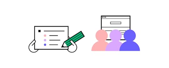
UX Content Strategy – How to Create and Track it
Content exists across multiple touchpoints sourced from numerous creators. A UX content strategy ensures content production and governance remain high quality and consistency to enhance a product’s user experience while meeting business goals.
We’ll explore two significant factors in developing and maintaining a content strategy:
The content lifecycleThe four elements of a content strategyA content strategy team uses these facets to create a framework for creating and maintaining a product’s content.
Scale design and improve collaboration across product design and development with UXPin’s Merge technology. Review content of your prototypes easily, speed up design iterations, and share a single source of truth between design and development. Visit our Merge page.
Reach a new level of prototypingDesign with interactive components coming from your team’s design system.
Discover UXPin Merge .discover-merge { margin: 40px 8px;}.discover-merge__container { display: flex; max-width: 690px; height: 200px; padding: 20px; padding-left: 24px; border-radius: 4px; background-color: black; box-shadow: 10px 10px #9999ff; align-items: center; justify-content: space-between;}.discover-merge__left { width: 50%;}.discover-merge__left p { margin: 10px 0px !important; color: white !important; font-size: 18px !important;}.discover-merge__heading { font-weight: bold !important; color: white !important; font-size: 18px !important;}.discover-merge__text { margin: 0 !important; line-height: 22px !important;}.discover-merge__button { width: 174px; height: 44px; margin: 10px 0px; border: none; border-radius: 2px; background: white; color: black; font-size: 16px; text-align: center;}.discover-merge__button:hover { cursor: pointer;}.discover-merge__image { max-width: 320px !important; height: 200px; margin-right: -19px;}@media (max-width: 760px) { .discover-merge__container { height: auto; margin: 10px; align-items: left; }}@media (max-width: 500px) { .discover-merge__container { flex-direction: column; } .discover-merge__left { width: 100%; align-items: normal; }}Table of contentsWhat is a UX Content Strategy? Who is responsible for the UX content strategy?What does a Content Strategist do?Who creates the content?The Content Lifecycle in 5 StepsAuditStrategyPlanCreateMaintainThe Four Elements of Content StrategyEditorial strategyExperience designStructure engineering (content engineering)Process designPrototype, Test, and Iterate With UXPin MergeWhat is a UX Content Strategy?
 A UX content strategy defines a product’s content goals, creation, management, and distribution across multiple touchpoints, including (but not limited to):
Digital product user interfacesWebsitesBlog articlesEmails (system notifications, marketing, etc.)Mobile notificationsSocial mediaAdsContent strategists aim to create consistent and coherent messaging across these touchpoints to meet user needs and achieve business goals.
Like a UX strategy, a UX content strategy provides the framework for content designers and UX designers to align the product(s) and brand for a better user experience.
Beyond unifying an organization’s content, UX content strategists work closely with content designers and UX writers to design content that meets user needs precisely when they need it. For example, UXPin’s documentation uses written instructions, text highlights, images, and explainer videos/GIFs to help designers understand the design tool and its features.
Who is responsible for the UX content strategy?The person responsible for an organization’s UX content strategy varies depending on the organizational structure. For example, many startups don’t have a dedicated content design team. In these small companies, UX designers are responsible for content.
Larger organizations may have a dedicated content strategist, but often content designers will fulfill this role.
What does a Content Strategist do?Here is an overview of a typical content strategist’s role and responsibilities:
Content principles: defines how the organization uses copy, including language, sentence structure, reading level, etc.Content policies: the organization’s content standards and guidelines, including legal requirements like GDPR, CCPA, etc.Voice and tone: the brand’s personality and how to speak to the target usersContent roadmap: prioritizing content, assigning tasks, etc., for creating and maintaining contentContent audits: auditing content across every touchpoint regularly to ensure its relevant and up-to-dateWho creates the content?Content strategists work cross-functionally to source content from multiple sources. Here are some examples of the people responsible for creating the various types of content:
Copywriters (blogs and other long-form content)UX writers (user interface copy, messages, notifications, labels, etc.)Graphic designers (icons, infographics, maps, and other visual elements)UI designers (user interface elements and components)Video editors (sourcing and editing video content)The Content Lifecycle in 5 StepsMeta (formally Facebook) Content Designer Erin Scime created the Content Lifecycle in 2009–a framework referenced on Usability.gov, and content strategists still use it today.

Erin’s five-step content lifecycle is an iterative process where content strategists regularly evaluate the organization’s content needs.
AuditA content audit works similarly to a UX audit, including interviews and research to fully evaluate a brand’s existing content and business goals. Content designers can audit a single product, project, domain, or organization. A typical content audit includes:
Stakeholder interviews: understanding what key stakeholders and departments’ content goalsCompetitive analysis: research competitors to identify opportunitiesMarket research: analyze the demand and find gapsCatalog content: listing and categorizing all existing contentUser research: evaluating user personas, user journeys, product data (analytics, heatmaps, etc.), and other UX research to define user needsThe primary aim of a content audit is to understand the organization’s current state, identify issues and opportunities, and how these align with the content, UX, and product roadmaps.
StrategyThe strategy step defines the high-level content needs and priorities, including:
Content sourcing, production, and workflowsSetting timelines and deadlines for content deliveryContent taxonomy (categories, structure, metadata, etc.)Defining the voice and tonePlanThe strategy phase outlines what content the organization needs, and the plan specifies who, how, and when to create it. Some examples include:
Assigning tasks for content sourcing and creationContent management system customizationMetadata planningMigration planMarketing/ad modelCreateTeams create content according to the plan and strategy, including:
Create a governance modelCopywriting, editing, and reviewCreating and optimizing assetsQuality assurance for branding and SEOMaintainWith an actionable content roadmap, the content design team uses KPIs to monitor progress. They also plan the next audit to repeat the process. This iterative content lifecycle ensures content stays relevant, serves users, and meets business goals.
The Four Elements of Content StrategyBrain Traffic, a leading content strategy consultancy founded by content design pioneer Kristina Halvorson, developed the Content Strategy Quad, which the company published in a 2018 blog post.

The Content Strategy Quad uses four elements divided into two parts:
Content design: solving user problems through content and UX design strategies.
Editorial strategyExperience designSystem design: the systems, architecture, interfaces, and technical constraints content designers must work within.
Structure engineeringProcess designEditorial strategyThe editorial strategy focuses on visual content and copy guidelines, including principles, voice, tone, brand, grammar, etc. If your product uses a design system, the content team will define these guidelines in the documentation.
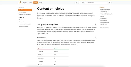
A great example is Stack Overflow’s Content Guidelines in the company’s Stacks Design System.
A clear editorial strategy published through a style guide or design system ensures creators deliver consistent content that aligns with brand values and user needs.
According to Brain Traffic, the editorial strategy answers the following:
What is our editorial mission?Who are our target audiences?What is our point of view?What are our voice and tone?What brand and language standards must we comply with?Experience designExperience design analyzes a product’s user experience and its relation to content. Content designers must assess the product’s different audiences, customer journey maps, and user needs to understand what problems they must solve.
Brain Traffic’s Experience Design aims to answer the following:
What are our users’ needs and preferences?What does our content ecosystem look like?What are our customers’ journeys?What content formats do we need?How will our design patterns shape content across platforms–web, mobile, tablet, etc.?Structure engineering (content engineering)Structure engineering looks at a product’s information architecture, each interface’s layout/structure, and how users engage with content.
Brain Traffic’s Content Engineering quadrant aims to answer the following:
How will we organize content for browse-and-find?What tags are most intuitive for users?How will we categorize content for efficient management?How will we structure our content for future reuse?What are the requirements for personalization, dynamic delivery, and information architecture?Process designProcess design focuses on content governance–creation, reviewing, editing, and approval. What is the workflow for the content lifecycle? Who is responsible for each facet of the UX content strategy?
Brain Traffic’s Process Design focuses on the following:
How will content move through its lifecycle?What tools will we use to create, deliver, and maintain content?Who is responsible and accountable for content? Who needs to be consulted and informed along the way?What standards and metrics will we use to measure our content quality and performance?How and when do we care for our existing content?Who gets to say no?Prototype, Test, and Iterate With UXPin MergeThe content design process is no different from a typical user experience design workflow. Content designers must prototype, test, and iterate to find content solutions that meet user needs.
While traditional design tools enable designers to build aesthetically-pleasing user interfaces, they don’t provide the fidelity or functionality for accurate prototyping and testing. Many content designers and UX writers don’t have the skills to use these tools, limiting their prototyping ability.
With UXPin Merge, content designers can sync their product’s design system, including components, patterns, and templates, with UXPin’s design editor to build prototypes that look and feel like the final product.
These ready-made components mean content designers don’t have to worry about designing from scratch, allowing them to focus on dragging-and-dropping UI elements to build fully interactive prototypes to test with end users.
TeamPassword is a fantastic example of how non-designers can leverage UXPin Merge to test a product’s user experience. TeamPassword doesn’t have a UX department, so engineers with no design tool experience build and test prototypes using UXPin Merge.
Users can interact with Merge prototypes like they would using the final product, giving content designers accurate data to test and iterate–for example, fully functioning, dynamic form fields to test error messages based on user engagement.
Get accurate feedback during testing to create meaningful content that solves user needs with the world’s most advanced prototyping tool. Visit our Merge page for more details and how to request access.
Discover MergeThe post UX Content Strategy – How to Create and Track it appeared first on Studio by UXPin.


December 5, 2022
Design Handoff Basics – What Do Developers Need from Designers?

Design handoffs are a tense time. Designers and engineers speak separate languages and work within different constraints, making communication and collaboration challenging.
The first step to bridging this gap is defining what engineers need for development. Communicating these needs at the start of the design process will help designers prepare accordingly and streamline the design handoff process.
We’ve included a list of what engineers need from designers at handoff, what they don’t need, and how to optimize your handovers using sophisticated tools.
One of such tools is UXPin Merge. It enables you to design prototypes with a single source of truth between design and engineering, that is interactive components. Designers can bring their app’s UI elements to UXPin, and share them with devs for easier design handover. Create seamless design handoffs with the world’s most advanced design tool. Visit our UXPin Merge page.
Reach a new level of prototypingDesign with interactive components coming from your team’s design system.
Discover UXPin Merge .discover-merge { margin: 40px 8px;}.discover-merge__container { display: flex; max-width: 690px; height: 200px; padding: 20px; padding-left: 24px; border-radius: 4px; background-color: black; box-shadow: 10px 10px #9999ff; align-items: center; justify-content: space-between;}.discover-merge__left { width: 50%;}.discover-merge__left p { margin: 10px 0px !important; color: white !important; font-size: 18px !important;}.discover-merge__heading { font-weight: bold !important; color: white !important; font-size: 18px !important;}.discover-merge__text { margin: 0 !important; line-height: 22px !important;}.discover-merge__button { width: 174px; height: 44px; margin: 10px 0px; border: none; border-radius: 2px; background: white; color: black; font-size: 16px; text-align: center;}.discover-merge__button:hover { cursor: pointer;}.discover-merge__image { max-width: 320px !important; height: 200px; margin-right: -19px;}@media (max-width: 760px) { .discover-merge__container { height: auto; margin: 10px; align-items: left; }}@media (max-width: 500px) { .discover-merge__container { flex-direction: column; } .discover-merge__left { width: 100%; align-items: normal; }}Table of contentsA Design Handoff From a Developer’s PerspectiveWhat do Developers Need From Designers?Create a design system (even if your product doesn’t use one)Organized componentsFile structure and naming conventionDocumentationInformation architectureMockups and PrototypesSpecificationsChecklistWhat Developers Don’t NeedPick Developer-Friendly Design Handoff ToolSeamless (NO) Handover With UXPin MergeA Design Handoff From a Developer’s PerspectiveWe’ve talked a lot about designer/developer collaboration and creating better design handoff processes. The key takeaway is designers and engineers must start handoffs early in the design process.
Engineers must provide a list to designers of the files, documentation, assets, and specs they need to develop the final product. The teams must also decide on a file structure and naming convention to make everything easy to locate.
Defining technical and developer needs at the start of a project enables design teams to set up tools, workflows, and infrastructure (files, project management software, etc.) to support a streamlined handoff process.
What do Developers Need From Designers? Create a design system (even if your product doesn’t use one)
Many engineers build components in isolation and pull them into project files for front-end development–especially with component-based front-end frameworks like React. Creating a design system or style guide for your projects will help facilitate this workflow, making it easy to develop the final product.
Most design tools require additional plugins or extensions, but UXPin offers its Design Systems feature standard with every plan. UXPin has four categories for Design Systems:
ColorsTypographyAssetsComponentsDesigners can also include written design system documentation, so everything is in one place. If an existing product already uses elements from your design system, find the correct file names and inform engineers to prevent duplicate work.
Organized componentsBeyond creating a design system, designers must organize components so that it’s easier to code them systematically. This example from Material Design arranges UI elements by type.

Designers could also categorize components using atomic design principles:
Atoms: foundational elementsMolecules: UI components Organisms: Larger components and patternsFile structure and naming conventionEngineers work with repositories where file structure and naming conventions are essential for successful workflows and collaboration. Mirroring these practices for design projects reduces the “language barrier” between designers and engineers.
DocumentationDesigners must create written documentation to support annotations on mockups and prototypes. The written documentation is a story to provide context to interactions, interfaces, and user flows–what happens when a user clicks “element X”? What are the success/error/warning messages? What happens if a user isn’t logged in?
Information architecturePrototypes and mockups aren’t enough to develop websites and digital products. Engineers need to see how everything goes together and where user flows start and end through information architecture.
Wireframes or flowcharts are the best methods for presenting information architecture. Designers can share these with engineers using Miro or a free tool like Google Jamboard. Alternatively, UXPin provides a User Flows Design Library to build flowcharts for your information architecture.
Engineers can use this information architecture to organize file structures and prepare each screen before they start development.
Mockups and PrototypesEngineers use mockups to develop each user interface and prototypes to create navigational points, interactions, and animations. The higher the fidelity and interactivity of prototypes, the easier it is for engineers to interpret and replicate them with less documentation and explanation.
While most design tools create beautiful mockups, they lack features for interactive prototyping. UXPin is powered by code, giving designers tools and features to build fully interactive prototypes that look and feel like the final product.
Some key UXPin prototyping features include:
States : Apply multiple states to a single element, each with different properties, interactions, and animations. Designers can use States to create simple interactivity like button states or complex components like accordions, multi-level navigation, and more. Interactions : UXPin offers an extensive list of triggers, actions, and animations to replicate code-like interactivity. Conditional Interactions allow designers to create dynamic experiences based on user actions, giving engineers an accurate reference for development. Variables : UXPin features fully functioning forms designers can use to capture user inputs and use that data elsewhere in the prototype. Variables help engineers understand how the product’s inputs must work, including vital error messages to help users complete tasks. Expressions : Javascript-like functions to create complex interactivity like form validation or fully functioning shopping carts. Engineers can use these Expressions as a foundation for writing the product’s Javascript functions.SpecificationsSpecifications give engineers detailed information about an interface’s CSS properties like spacing, font sizes, heights, widths, etc. Design tools usually have plugins or extensions to automate this process.
UXPin’s built-in Spec Mode allows developers to select UI elements to view specifications, including automatically generated starter CSS they can copy/paste.
 Checklist
A design handoff checklist itemizes everything designers give to engineers. This checklist is one of the most important documents because it ensures designers remember to hand everything over and engineers confirm that they receive everything.
What Developers Don’t NeedWhat developers don’t need for design handoffs is just as important as what they do! As you can see above, there are many artifacts, and documentation engineers must reference to develop the final product. Too much information can confuse and delay development while engineers sift through unnecessary documentation.
Engineers don’t need access to your UX research artifacts like user personas, journey maps, competitive analysis, etc. High-level overviews, reports, and summaries are sufficient to outline the problems your designs solve.
Pick Developer-Friendly Design Handoff ToolDesigners who use image-based design tools like Figma and Sketch must rely on additional tools and plugins for design handoffs. These extras increase design costs and create room for error.
Even with these extra tools, designers still battle with fidelity and functionality, limiting prototyping scope. Sometimes, they use videos and GIFs to demonstrate interactions, which need additional context and clarification for engineering teams and stakeholders.
UXPin is an end-to-end design tool with everything designers need from concept to final design handoff. Designers can build prototypes that accurately replicate the final product experience, leaving no ambiguity regarding features, navigation, interactions, and animations.
Engineers can view prototypes, mockups, documentation, specs, and components and download assets from one interface. Teams can collaborate during handoffs via UXPin’s Comments and even assign comments to direct questions to specific team members.
UXPin also integrates with Slack and Jira so product development teams and stakeholders can stay up-to-date with design handoffs and project status.
Using one tool for ideation, wireframing, mockups, prototyping, testing, user flows, design systems, documentation, and design handoffs creates a productive environment for designers as they don’t have to switch between platforms. UXPin’s high-quality prototypes mean designers spend less time explaining features and interactivity, creating a smoother transition from design to code.
Seamless (NO) Handover With UXPin MergeWhere UXPin makes design handoffs easier, UXPin’s Merge technology facilitates a seamless (no) handover process where there is no designing or writing front-end code! Designers drag and drop, while engineers copy/paste.
UXPin Merge syncs a design system (private or open source) hosted in a repo to UXPin’s design editor, giving designers the same component library engineers use to develop the final product. This single source of truth means designers and engineers speak the same languages and work within the same constraints.
Any changes to the component library’s repository automatically sync to UXPin, notifying design teams of the update. Merge’s Version Control allows designers to choose when to switch to the latest version, and they can change to early versions of the design system at any time.
Merge components are fully interactive and include properties defined by the design system, including states, colors, sizing, etc. Designers can adjust these properties via the Properties Panel, which UXPin renders as JSX for engineers to copy at design handoffs.
Nick Elliott, Design System Product Owner and Regional Head of Product Design at Iress, noted that Merge has a huge potential for streamlining the company’s handoff process:
“The engineer no longer needs to start from scratch and already knows what components and settings to use. It will help us avoid the ‘design drift’ we so often see. Things like spacing and typography should all be aligned, as it is all driven from one place.”
Ready to make painful design handoffs a thing of the past? Switch to UXPin Merge create a seamless (no) handover product development process. Visit our Merge page for more details and how to request access.
Discover MergeThe post Design Handoff Basics – What Do Developers Need from Designers? appeared first on Studio by UXPin.
December 1, 2022
React for Designers – Build React-Based Prototypes without Coding
Learning React for designers–is it necessary? Can you build code prototypes without learning to code? These are common questions among product development teams and designers.
Most designers don’t want to learn to code. And rightly so. Learning React or even the basics of HTML, CSS, and Javascript takes a lot of time. A designer’s time is better spent investing in user experience and solving design challenges.
It’s a bit of a catch-22 because to improve usability testing and user experiences, you need high-quality prototypes that look and feel like the final product–something image-based tools don’t facilitate. For most designers, better prototyping capabilities drive the motivation to learn React.
What if you could get all the benefits of React for prototyping and testing without relying on engineers or writing code yourself? A solution already exists with UXPin Merge!
UXPin Merge allows you to sync code components from a repository into UXPin’s design editor so designers can use the same UI elements (React, Vue, Angular, etc.) engineers use for development. Visit our Merge page for more details and how to request access to this revolutionary technology.
Reach a new level of prototypingDesign with interactive components coming from your team’s design system.
Discover UXPin Merge .discover-merge { margin: 40px 8px;}.discover-merge__container { display: flex; max-width: 690px; height: 200px; padding: 20px; padding-left: 24px; border-radius: 4px; background-color: black; box-shadow: 10px 10px #9999ff; align-items: center; justify-content: space-between;}.discover-merge__left { width: 50%;}.discover-merge__left p { margin: 10px 0px !important; color: white !important; font-size: 18px !important;}.discover-merge__heading { font-weight: bold !important; color: white !important; font-size: 18px !important;}.discover-merge__text { margin: 0 !important; line-height: 22px !important;}.discover-merge__button { width: 174px; height: 44px; margin: 10px 0px; border: none; border-radius: 2px; background: white; color: black; font-size: 16px; text-align: center;}.discover-merge__button:hover { cursor: pointer;}.discover-merge__image { max-width: 320px !important; height: 200px; margin-right: -19px;}@media (max-width: 760px) { .discover-merge__container { height: auto; margin: 10px; align-items: left; }}@media (max-width: 500px) { .discover-merge__container { flex-direction: column; } .discover-merge__left { width: 100%; align-items: normal; }}Table of contentsWhat is React?What is the difference between React and React Native?What is React for Designers?Should Designers Learn React?Can you Design a React App Prototypes Without Learning React?What do React components look like in UXPin?Code-based vs. image-based design toolsExamples of Companies Prototyping with React ComponentsPayPalTeamPassworddotSourceIressDesign With React Components in UXPin MergeWhat is React?React is an open-source front-end Javascript library developed by Facebook. According to an August 2022 survey, React is still the most widely-used front-end framework–a position React has held for several years.
React’s component-based workflow enables engineers to create reusable components they can call anywhere in a user interface by writing a single line of code. This component-based approach makes React an excellent framework for component libraries and design systems.
What is the difference between React and React Native?React is a web-based technology that interacts with the DOM, meaning it renders in a web browser and doesn’t work with mobile operating systems. React Native is the mobile equivalent of ReactJS used for cross-platform native and web applications.
In short:
ReactJS: websites and web applicationsReact Native: native and web applicationsMany organizations use React for their websites and web applications because it offers better browser performance than React Native.
What is React for Designers?
React for designers is a movement to educate designers about React and other front-end frameworks. The idea is that learning React will empower designers to build basic prototypes or, at the very least, better understand technical constraints and the development process.
Should Designers Learn React?An introductory course to React will only reap positive benefits for designers. But, like any language, if you don’t practice it regularly, you’ll lose it. So, it depends on your goals and motivations for learning React.
Here are three common reasons why designers learn React:
Career development: programming expertise is advantageous if you plan to climb the corporate ladder–even within Design. The higher you climb, the more important it is to learn the technical aspects of product development for communication, collaboration, and decision-making.
Higher paying jobs: a natural transition for a UX designer who codes is to a front-end developer or UX engineer. According to Glassdoor, the average UX designer makes under $100k in the United States, while the average UX engineer earns over $120k. On average, engineers earn more than designers. Design and development expertise increases your value to an organization and earning potential.
Skills development: understanding the engineering aspects of digital product development can improve cross-functional collaboration. Learning React can also help designers understand technical impacts on user experience and how to solve these problems during the design process.
Better prototyping: unfortunately, image-based design tools limit what designers can test during the design process. To improve prototyping capabilities, designers must rely on engineers to build code-based prototypes–a time-consuming and expensive process. Designers who code can make these prototypes themselves to enhance usability testing.
Can you Design a React App Prototypes Without Learning React?The short answer–yes, you can with UXPin Merge. UXPin Merge allows designers to import React (and other frameworks) component libraries into UXPin to build fully functioning React prototypes–without writing a single line of code!
Designers use these React components in UXPin like any other design tool, dragging and dropping UI components to build user interfaces. The only difference is that Merge components are fully interactive and include colors, spacing, typography, sizing, and other properties defined by the component library or design system.
What do React components look like in UXPin?This text field from MUI’s component library demonstrates how designers see and edit React components in UXPin. The text field is fully functional and ready to prototype out of the box.
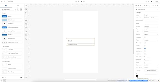
The properties displayed in UXPin’s Properties Panel relate to React props from the component library’s repository. Designers can switch modes and view the component’s React props in JSX.
This JSX also makes design handoffs much easier because engineers simply copy/paste the code for front-end development.
Code-based vs. image-based design toolsImage-based design tools use plugins and extensions to achieve similar results, but this code is rarely usable for engineers. Why? Because these plugins scan UIs and “guess” what the code should be. There are many ways to develop React components, so this code is usually redundant, meaning it’s faster for the engineers to code from scratch than restructure plugin-generated code.
Merge is a code-based technology, meaning UXPin renders code as it’s written in the repository instead of vector graphics. Engineers already have exact versions of the components in their repo, so it’s a matter of adding the component library as a project dependency and copying the JSX from UXPin to develop the final product.
UXPin Merge gives designers all the benefits of learning React without learning React!
Examples of Companies Prototyping with React ComponentsFrom startups to agencies, and enterprise design teams, here are examples of companies prototyping with React components during the design process.
PayPalPayPal’s internal product development team switched to UXPin Merge in 2019. Erica Rider, UX Lead EPX at PayPal, discovered Merge while looking for tools and systems to scale her 5-person UX team, which serviced 60+ products and supported 1,000+ engineers!
PayPal uses a React Fluent UI design system with custom components, patterns, and templates. Erica and her team have built the library to minimize design decisions, so product teams only focus on creating products to solve user problems.
The system works so well that PayPal’s product teams build one-page prototypes 8X faster than experienced UX designers using image-based tools could previously.
“Before, with our limited resources and designers, a one-page product would take two or three months just to design mockups. Now product teams can design and deliver a product within the same time frame.” – Erica Rider – UX Lead EPX at PayPal.
TeamPasswordTeamPassword uses UXPin Merge slightly differently. With no UX team, TeamPassword’s engineers must do all the prototyping and testing. The two-person team used to do this with code, but it took a lot of time to test, edit, and iterate.
TeamPassword’s engineering team now uses UXPin Merge for developing and testing new products using a custom MUI component library. With production-ready React code, TeamPassword’s engineering team saves significant resources by not writing front-end code to deliver new products and UI updates.
dotSourceGerman-based digital product consulting and development agency dotSource uses UXPin’s Storybook Integration to import libraries for multiple frameworks, including React, Vue, Angular, Ember, etc. This flexibility means dotSource’s design team can use UXPin Merge with almost every client and product the company collaborates on.
One of the most significant benefits of using UXPin Merge is that design system properties are “baked in” to every component. As an agency collaborating with various organizations and their internal teams, these baked-in React properties create constraints that guarantee ultimate UI consistency.
Using code components in the design process also makes cross-functional collaboration easier for dotSource’s teams while facilitating smooth, effortless design handoffs–which are usually more challenging when working with external contractors.
IressFinancial services software developer Iress uses UXPin Merge to create a single source of truth for the organization’s design system. With designers and engineers using the same component library, there’s better cross-functional alignment and understanding of technical constraints.
“UXPin Merge will help us create more interactive and realistic prototypes. People can tab around or see the same interactions – hover styles, animations, etc. – as they would expect in a real app. We can do more insightful user testing and discover usability issues much earlier in the process.” Nick Elliott – Design System Product Owner and Regional Head of Product Design at Iress.
Like PayPal, Nick sees the benefit of UXPin Merge for non-designers “It will give non-designers access to a tool, whereby they can also experiment and have exposure to the same design considerations.”
Design With React Components in UXPin MergeThere are three ways designers can get started designing with React components using UXPin Merge:
npm Integration : import open-source React component libraries available as npm packages into UXPin using the Merge Component Manager (the quickest and easiest way to get started as a designer). Git Integration : sync a React repository directly to UXPin. Requires engineering collaboration to set up. Storybook Integration : supports more front-end frameworks via Storybook, including Vue, Angular, React, Ember, and more.Designers can also take advantage of UXPin’s MUI integration which comes standard with all Merge plans.
Ready to get started? Visit our Merge page for more details and how to request access.
Discover MergeThe post React for Designers – Build React-Based Prototypes without Coding appeared first on Studio by UXPin.
November 30, 2022
Customer Experience vs. User Experience – Why the Difference Matters
Don Norman, the founder of the Nielsen Norman Group and former Apple VP, coined the term user experience or UX in the 90s. Almost two decades later, Tony Hillson from Service Design in New Zealand came up with customer experience or CX.
Many people incorrectly use CX and UX interchangeably, but these describe different levels of user/customer interactions. We explore CX vs. UX, how these differ/intersect, and the metrics teams use to measure and optimize performance.
Table of contentsWhat is User Experience (UX)?What is Customer Experience (CX)?CX vs. UX – Differences in Focus and ResponsibilitiesAreas of focusAreas of responsibilitiesCX vs. UX – SimilaritiesHuman-centeredRetentionPersonas and journey mappingUnderstanding UX vs. CX Performance MetricsCustomer lifetime value (CLV)Net Promoter Score (NPS)Churn rateError rateSuccess rateConversion rateHow Can UX Improve CX?Make customer feedback easyDesign seamless cross-platform experiencesOptimize performanceCross-functional collaborationAdvocate for designCreate a great customer experience with a good user experience. Switch to UXPin–the world’s most sophisticated design tool. Build better prototypes to solve more problems while identifying valuable business opportunities. Sign up for a free trial to explore UXPin’s advanced features.
Build advanced prototypesDesign better products with States, Variables, Auto Layout and more.
Try UXPin .try-uxpin-banner { margin: 40px 0px;}.try-uxpin__container { display: flex; max-width: 689px; height: 210px; padding: 20px; padding-left: 24px; border: 2px solid black; border-radius: 4px; align-items: center; justify-content: space-between; background-color: white; box-shadow: 10px 10px black;}.try-uxpin__left { width: 54%;}.try-uxpin__left p { margin: 10px 0px !important; color: black !important;}.try-uxpin__heading { font-size: 28px !important; font-weight: bold;}.try-uxpin__text { margin: 0 !important; font-size: 18px !important; line-height: 22px !important;}.try-uxpin__button { width: 135px; height: 44px; background: black; margin: 10px 0px; padding: 10px 20px; border: none; border-radius: 2px; color: white; font-size: 16px; text-align: center;}.try-uxpin__button:hover { cursor: pointer;}.try-uxpin__image { max-width: 320px !important; height: 200px; margin-right: -21px; margin-bottom: -6px;}@media (max-width: 760px) { .try-uxpin__container { height: auto; margin: 10px; align-items: left; }}@media (max-width: 500px) { .try-uxpin__container { flex-direction: column; } .try-uxpin__left { width: 100%; align-items: normal; }}What is User Experience (UX)?
UX or user experience describes a user’s journey and interactions with a digital product. Factors impacting user experience include usability, information architecture, navigation, learnability, and visual hierarchy, to name a few.
It’s important to note that users aren’t always customers. For example, website traffic are users, which include customers and visitors. Many digital products offer free plans for users, hoping that these people will convert to becoming paying customers. Optimizing your UX creates a positive customer experience while increasing the likelihood of converting leads.
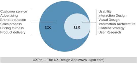
What is Customer Experience (CX)?Customer experience describes a customer’s holistic relationship with a brand across multiple touchpoints–including a product’s user experience. The customer experience extends beyond products and UX to include:
Buyer’s journey–the process of paying for goods and servicesPricing fairnessMarketing communicationsBrand reputation–are people proud to use your products?Customer service interactionsThe sales process–purchases, upsells, and retentionSocial media engagementIn-store experiences (for retail and physical products)Product delivery–physical (shipping, packaging, etc.) and digitalWithin many of these touchpoints are user experiences organizations must manage and optimize.
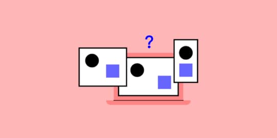
CX vs. UX – Differences in Focus and ResponsibilitiesAreas of focusThis simple diagram demonstrates the differences between UX and CX. As you can see, CX encapsulates the user experience. CX is a high-level initiative, whereas UX focuses on digital touchpoints–i.e., website, applications, devices, etc.
Tesla is a great company to demonstrate these different areas of focus. Telsa’s customer experience may look something like this:
Purchasing a car–including interactions with salespeopleTaking deliveryInteracting with customer serviceCharging the vehicleServicingThe driving experienceAttending Telsa eventsVehicle servicing and updatesWithin these touchpoints are multiple user experiences:
Using Telsa’s website to purchase a vehicleAny Telsa native or web applicationsUsing the car’s digital automotive user interfacesAs you can see, many customer experiences have little or nothing to do with Telsa’s user experiences.
 Areas of responsibilities
CX and UX differ in ownership and responsibility:
User experience: product development teams (product managers, engineers, UX designers)Customer experience: marketing and customer service teamsWhile these responsibilities are a generalization and may differ depending on the organization, the key distinction between responsibilities is:
User experience: those in charge of technology and digital user interfacesCustomer experience: those who directly or indirectly communicate with customersCX vs. UX – SimilaritiesHuman-centeredCX and UX use human-centered research and personas to understand users/customers and their journeys. Teams use similar methods for collecting this data, including:
Product/website analyticsInterviewsSurveysCustomer support ticketsUser profile/account dataUX designers will also collect data through usability testing, which they may share with other teams.
 Retention
CX and UX aim to engage and retain users to create lasting business value. Teams do this by solving problems and creating positive experiences. For example:
A customer purchases a product through a brand’s website. The user flow from selecting the product to checkout is effortless, creating a positive user experience, meaning the customer is likely to return.The customer receives their parcel within 48 hours, but it’s not the correct size. The company included return packaging, so the customer simply drops it in the bag provided and uses the brand’s website (user experience) to book a return collection.As soon as the courier collects the parcel, the company credits the customer’s account, and they can purchase the correct size. This positive customer experience increases the likelihood the brand will retain this customer.Personas and journey mappingUX and CX use personas and journey mapping to understand their audiences and how they complete tasks. While the structure and focus might differ, the tools and methods are similar.
Understanding UX vs. CX Performance MetricsHere are a few examples of UX and CX metrics and how marketing and product teams might use them.
Customer lifetime value (CLV)Customer lifetime value (CLV) is the company’s average expected revenue from a single customer during their business relationship. CX professionals use this metric to guide budget and marketing decisions.
UX teams typically won’t use CLV because it has no direct connection to understanding user behavior or building empathy. UX metrics are more valuable to UX designers when they provide insights into how users think and feel.
Net Promoter Score (NPS)Net promoter score is a critical metric most marketing managers/CMOs monitor closely. NPS indicates customer satisfaction and how likely people are to recommend your brand.
Organizations use NPS testing in digital products and real-world experiences. We often see physical NPS systems in airport bathrooms or retail stores asking to “rate your experience” with three faces representing happy, satisfied/content, and poor.
UX designers use NPS scores for digital products to identify issues. For example, if people repeatedly score a specific feature poorly, UX teams can research to determine the problem.
Churn rateChurn rate is another critical CX metric because it tells organizations the rate at which people stop doing business with you over a specific period, represented as a percentage.
UX teams typically only review churn rates if customers leave a company due to technical issues and poor user experiences.
Error rateError rate is a crucial UX metric because it tells designers where users get stuck or can’t complete tasks, resulting in a poor user experience.
CX professionals don’t necessarily follow error rates. Still, this metric can directly impact churn rates and NPS, at which point marketing and UX teams must collaborate to find a solution fast!
Success rateThe success rate (completion rate) defines how many people complete a specific task. This metric is a gauge for UX designers, particularly after a new release. If the success rate improves, the design is successful; if it drops, there’s a problem.
CX professionals don’t typically follow success rates, but, like error rates, it can affect other CX metrics.
Conversion rateConversion rate is another crucial CX metric indicating the percentage of traffic/non-paying users converting to paying customers. For example, if 100 people visit a website and 10 purchase a product, your conversion rate is 10%.
UX teams also use conversions against designs and new releases as a success metric. For example, if the design team fixes a problem with an eCommerce checkout, the conversion rate will tell them whether the new release improves conversions.
How Can UX Improve CX?UX is one of the strongest influences on the overall CX. If customers can’t complete tasks or solve problems using a brand’s app, website, or other digital touchpoints, this is a negative customer experience that ultimately results in higher churn, fewer conversions, and lowers CLV.
Make customer feedback easyMake it easy for customers to contact customer service or find help. Add a contact link to your website’s footer and include a help screen in your desktop and mobile apps.
Design seamless cross-platform experiencesUsers must be able to complete the same functions across multiple devices and operating systems. Ever wanted to complete a task in a brand’s mobile app, but they find you can only do this via the web application?
This restriction causes frustration for users and may have negative consequences for them, resulting in a poor user experience and customer experience.
Optimize performanceSlow load times are incredibly frustrating for users. If users have to constantly wait for screens to load or actions to complete, they will lose trust in the product/website and find a better alternative. UX designers must collaborate with engineering teams to find solutions to improve product performance and reduce friction in completing tasks.
Cross-functional collaborationBehind designing, look for ways to collaborate and share information to improve customer experiences with other departments. For example, UX and CX professionals can share data to enrich one another’s personas and journey maps.
Designers can also include marketing team members in design sprints to gain more customer experience insights and improve design projects.
Advocate for designDesign advocacy is a strategy for educating an organization about design thinking and user experience. Design advocates also promote wins for the department–like demonstrating how a design project improved CX metrics.
Design advocacy is essential because it increases the department’s value, making it easier to secure resources for better tools and systems, ultimately improving user experience and CX.
Improve your user experiences across every touchpoint with UXPin. Sign up for a free trial to discover how code-based design can revolutionize your product development workflows to deliver better user experiences to your customers.
Try UXPin for freeThe post Customer Experience vs. User Experience – Why the Difference Matters appeared first on Studio by UXPin.
November 29, 2022
What Are User Pain Points?
User pain points are the foundation for every design project. Solving these problems creates business value while enhancing a product’s usability and desirability.
The best way to identify customer pain points is through comprehensive prototyping and usability testing. Designers use test results, plus insights from other UX research, to iterate on solutions to solve these problems.
Use the user pain points you discover after reading this article and apply them during your prototyping process. Build highly interactive prototypes in UXPin Sign up for a free trial and build your first prototype today.
Build advanced prototypesDesign better products with States, Variables, Auto Layout and more.
Try UXPin .try-uxpin-banner { margin: 40px 0px;}.try-uxpin__container { display: flex; max-width: 689px; height: 210px; padding: 20px; padding-left: 24px; border: 2px solid black; border-radius: 4px; align-items: center; justify-content: space-between; background-color: white; box-shadow: 10px 10px black;}.try-uxpin__left { width: 54%;}.try-uxpin__left p { margin: 10px 0px !important; color: black !important;}.try-uxpin__heading { font-size: 28px !important; font-weight: bold;}.try-uxpin__text { margin: 0 !important; font-size: 18px !important; line-height: 22px !important;}.try-uxpin__button { width: 135px; height: 44px; background: black; margin: 10px 0px; padding: 10px 20px; border: none; border-radius: 2px; color: white; font-size: 16px; text-align: center;}.try-uxpin__button:hover { cursor: pointer;}.try-uxpin__image { max-width: 320px !important; height: 200px; margin-right: -21px; margin-bottom: -6px;}@media (max-width: 760px) { .try-uxpin__container { height: auto; margin: 10px; align-items: left; }}@media (max-width: 500px) { .try-uxpin__container { flex-direction: column; } .try-uxpin__left { width: 100%; align-items: normal; }}What Are User Pain Points?User pain points are the problems, friction, and bottlenecks users experience during their relationship with a product. These pain points can be directly or indirectly related to the product. For example:
Direct pain point: the user can’t complete a taskIndirect pain point: no network connection–can’t log inWhile indirect pain points like network issues aren’t a result of product failure, designers must still find ways to minimize problems like this–for example, storing critical information on the user’s device for retrieval offline.
Types of User Pain PointsSarah Gibbons from the NN Group describes the three levels of user pain points:
Interaction-level: pain points relating to interactions with an organization’s products and team members.Journey-level: pain points pertaining to customer and user journeys.Relationship-level: pain points customer experience during their lifetime with a brand.At each level are four types of pain points:
FinancialProductProcessSupportFinancial pain pointsFinancial pain points relate to paywalls and premium services that lock users out. While these financial pain points are frustrating, the company must make money to survive, making them necessary.
One way to alleviate these is to be transparent and avoid “tricking” or frustrating users. For example, many products allow users to start a paid task, but they must upgrade to complete it. This process wastes people’s time and amplifies the financial pain point.
Product pain pointsProduct pain points relate to quality, performance, and usability issues that cause users frustration while using a product–for example, when users struggle to complete tasks or when an app crashes.
Of the four types, product pain points significantly impact user experience, which ultimately affects other business metrics like conversion rates, retention, Net Promoter Score (NPS), and customer churn.
User research and testing are crucial for identifying and solving product pain points. Designers must also conduct regular UX audits for usability and performance issues.
Process pain pointsProcess pain points are linked to product pain points but focus on user journeys and navigation rather than individual user interfaces and usability.
The aim is to optimize these processes to ensure users can complete tasks with minimal effort. However, there are exceptions to this rule, like applying cognitive friction for critical tasks and journeys.
Customer journey maps and user testing are key to identifying process pain points and designing solutions.
Support pain pointsSupport pain points relate to how organizations answer user questions or attend to problems. If users can’t complete tasks due to product issues or comprehension, how do they find solutions?
Organizations use many support layers to help users find solutions:
Frequently ask questionsProduct documentationProduct messages (error, warning, success, etc.)Brand communities/forumsCustomer support channelsDesign teams must ensure users can locate these services when needed and with explicit messaging and instructions to solve problems as soon as possible.
User Pain Points Research MethodsDesign teams must use several research methods to find user pain points.
User personasUser personas are a critical first step to understanding whose problems you’re solving. Personas provide design teams with a user overview, including:
Their backgroundsGoalsMotivationsFrustrations (pain points)DemographicsProduct dataProduct analytics, heatmaps, and other data help design teams identify problems and bottlenecks. This data is important for understanding how, when, and where pain points occur.
User interviewsUser interviews help fill in the blanks and understand why users experience a specific problem. Designers ask open-ended questions to avoid biasing users’ answers resulting in accurate feedback.
These interviews also help product teams empathize with people because they can hear their frustrations, and these impact their lives.
Qualitative market researchQualitative market research looks at user behavior within a specific market to look for problems (pain points) and opportunities. UX researchers use several methods, including:
Focus groupsSurveys/questionnairesUser interviewsMarket-related community forumsSocial mediaData analysisService safariA service safari is an immersive research method where UX designers become customers to understand product experiences from a user’s perspective. UX teams conduct service safaris on their own products or competitors to identify pain points and opportunities.
Field studiesOften the best way to solve a problem is to experience it from a user’s perspective in their environment. UX researchers go to places where people use products to observe their behavior and environmental challenges.
User journey mappingUser journey mapping enables design teams to visualize processes and pinpoint problems. Journey maps are crucial for ideation, where design teams create paper prototypes to iterate on solutions.
Customer support ticketsCustomer support tickets are often a great place to find product pain points. UX designers can also use these tickets to determine whether a product release fixes the problem–i.e., customer support tickets for that specific issue stop or decline.
Product reviewsProduct reviews are another excellent resource for identifying pain points. Designers can analyze reviews of their products to solve problems or research competitors’ products to identify opportunities.
Tips to Solve User Pain PointsUse multiple data pointsUX teams must always rely on more than one data point for identifying problems. UX researchers must use several of the above research methods to identify, prioritize, and understand pain points.
For example, interviews are great for understanding issues from a user’s perspective but are unreliable for identifying and prioritizing pain points–the sample size is too small. A user might express an issue during an interview, but this problem isn’t reflected in the broader customer base.
Actively seek user feedbackFeedback is crucial for understanding user problems. UX designers have many tools for collecting this feedback, including chat, contact forms, interviews, surveys, etc.
Tools like Feature Upvote enable product teams to collect feedback and allow users to vote for the features or fixes that matter most. This feedback helps to prioritize pain points according to user needs.
Be transparentCustomer-facing changelogs or product roadmaps tell users you’re aware of specific issues and when to expect a solution. This transparency helps manage expectations while building brand trust.
Test, and then test again!Designers use prototypes to test user interfaces and flows at every stage of the design process. During early testing, designers use prototypes to identify pain points and opportunities. Later in the design process, designers use high-fidelity prototypes to test and iterate on solutions.
Improve Prototyping to Solve Pain Points Accurately With UXPinThe problem with traditional design tools is they lack the fidelity and functionality to A) diagnose pain points accurately and B) determine if design solutions fix the problem. The disconnect between the prototyping tool and the final product means designers don’t get accurate results and insights.
Poor prototypes also impact stakeholder feedback, crucial for buy-in and determining if designs meet business requirements.
Unlike image-based tools, UXPin allows designers to build interactive prototypes. These immersive prototypes provide accurate testing because the user experience is indistinguishable from the final product–increasing the prototyping scope while delivering meaningful feedback from usability participants and stakeholders.
Advanced prototyping featuresThese four key features are what set UXPin apart from other popular design tools so designers can build advanced, high-quality prototypes:
States : create simple component states (e.g., default, active, hover, disabled, etc.) or build complex UI patterns, including fully functioning accordions, multilevel dropdown navigation, and carousels. Interactions : design fully interactive components with triggers, animations, and actions comparable to code. Variables : capture user inputs from UXPin’s fully functioning forms, including text fields, checkboxes, selectors, and radios and use this data to trigger dynamic interactions or use elsewhere in your prototype–like a personalized welcome message with the user’s name. Expressions : create Javascript-like functions to validate forms, build computational components, check password/email input criteria, and more!Increase prototyping scope with APIsUXPin’s IFTTT integration enables designers to take prototyping beyond the design tool to connect other platforms and APIs. For example, pulling real data from your product’s database or sending a verification email using a user’s email address captured from a UXPin prototype.
Connecting APIs extends prototyping scope so designers get an accurate picture of the user experience and the problems they must solve.
Accurate prototypes don’t only help solve more problems–they also create better workflows and engineering collaboration. Engineers need less documentation and fewer back and forth communication, resulting in smoother, frictionless design handoffs.
Improve your product’s user experience and solve more pain points during the design process with UXPin’s advanced prototyping features. Sign up for a free trial and build a better design process with UXPin.
Try UXPin for freeThe post What Are User Pain Points? appeared first on Studio by UXPin.
November 24, 2022
Responsive Design vs. Adaptive Design: What’s the Best Choice for Designers?
Google has always recommended responsive web design (RWD), especially after rolling out a big update on 4/21/15 which ranked mobile-friendly sites higher.
It doesn’t specify in the update that you must use responsive design though, just that a site be accessible on mobile, with good UX and performance.
With that in mind, let’s examine the pros and cons of adaptive vs. responsive design with regards to performance and UX design.
One of the biggest debates that we’ve seen since the rise of mobile is whether you should choose to develop a responsive, adaptive web design (AWD) or standalone mobile site (with its own m. URL). For the purposes of this discussion, we’ll leave out standalone mobile sites as it appears to be the least favorite solution for designers and businesses since they must be created separately (which accrues more upfront cost and maintenance costs).
Go to section:What’s the Difference between Adaptive and Responsive Design?Why Use Adaptive Web Design?Why Use Responsive Web Design?Adaptive vs. Responsive? Consider Site Speed, Content, and UXWhich is Better: Responsive or Adaptive Design?Design UI in UXPinLooking for a prototyping tool for web design? UXPin is the app for you. You can use the various breakpoints. If you want to play around with them, start a free trial.
Build advanced prototypesDesign better products with States, Variables, Auto Layout and more.
Try UXPin .try-uxpin-banner { margin: 40px 0px;}.try-uxpin__container { display: flex; max-width: 689px; height: 210px; padding: 20px; padding-left: 24px; border: 2px solid black; border-radius: 4px; align-items: center; justify-content: space-between; background-color: white; box-shadow: 10px 10px black;}.try-uxpin__left { width: 54%;}.try-uxpin__left p { margin: 10px 0px !important; color: black !important;}.try-uxpin__heading { font-size: 28px !important; font-weight: bold;}.try-uxpin__text { margin: 0 !important; font-size: 18px !important; line-height: 22px !important;}.try-uxpin__button { width: 135px; height: 44px; background: black; margin: 10px 0px; padding: 10px 20px; border: none; border-radius: 2px; color: white; font-size: 16px; text-align: center;}.try-uxpin__button:hover { cursor: pointer;}.try-uxpin__image { max-width: 320px !important; height: 200px; margin-right: -21px; margin-bottom: -6px;}@media (max-width: 760px) { .try-uxpin__container { height: auto; margin: 10px; align-items: left; }}@media (max-width: 500px) { .try-uxpin__container { flex-direction: column; } .try-uxpin__left { width: 100%; align-items: normal; }}What’s the Difference between Adaptive and Responsive Design?So first up, what are the key differences between responsive and adaptive design?
Responsive vs. Adaptive Website DesignPut simply, responsive is fluid and adapts to the size of the screen no matter what the target xdevice. Responsive uses CSS media queries to change styles based on the target device such as display type, width, height, etc., and only one of these is necessary for the responsive website to adapt to different screen sizes.
Adaptive design, on the other hand, uses static layouts based on breakpoints that don’t respond once they’re initially loaded.
Adaptive works to detect the screen size and load the appropriate layout for it – generally you would design an adaptive site for six common screen widths:
32048076096012001600.On the surface, it appears that adaptive requires more work as you have to design layouts for a minimum of six widths. However, responsiveness can be more complex as improper use of media queries (or indeed not using them at all) can make for display and performance issues.
The latter in particular has created a lot of discussion over the past few years as it’s been the case that many sites deliver the full desktop model which, even if it’s not loading on the mobile device, slows sites down considerably. To get around this, you can use media queries–but there will be a few tradeoffs since a responsive site is never going to be as quick as a dedicated mobile site.
Why Use Adaptive Web Design?Adaptive is useful for retrofitting an existing site in order to make it more suitable for mobile phones. This allows you to take control of the design and web development for specific, multiple viewports. The number of viewports that you choose to design for is entirely up to you, your company, and your overall budget. It does, however, afford you a certain amount of control (for example over content and layout) that you won’t necessarily have using responsive design.

Generally, you would begin by designing for a low-resolution viewport and work your way up to ensure that the UI design doesn’t become constrained by the content, and that usability isn’t lost.
As mentioned previously, it’s standard to design for six resolutions. However, you can make a more informed decision by looking at your web analytics for the most commonly used devices and then designing for those viewports.
If you want to design an adaptive website from scratch, that’s OK too. Start again by designing for the lowest resolution and work your way up. You can then use media queries to expand the layout for higher resolution viewports. However, if you do UI design for different screen sizes, you may find that this causes the layout to ‘jump’ when resizing a window to a smaller or bigger device screen.
It can be extra work designing and developing a site with adaptive for multiple viewports so it’s usually used for retrofitting.
Examples of Adaptive Web DesignWhen looking for examples of sites using adaptive web design, you’ll likely find them on the websites of large companies and corporations. Since many of these organizations have been around since before the advent of mobile, it is far easier (and cheaper) for them to retrofit their enormous websites with adaptive web designs rather than more complex responsive re-design options.
Here, we look at how some of the world’s biggest companies have employed adaptive web design solutions in giving their websites the contemporary design elements they need to meet Google’s mobile-friendly rankings factors.
AmazonThe eCommerce titan Amazon quickly found that its website needed an adaptive design overhaul. This would help them ensure that its global customer base would enjoy faster page load speeds (a critical Google rankings factor) and a consistent UX, no matter which device they were accessing the site from.
Amazon’s adaptive web design approach aligns the full-site experience with its branded apps, allowing users to switch between the two and enjoy the same functionality and workflow arrangement, irrespective of the aesthetic web and app design differences. Powered by adaptive design templates that ensure this consistency across all devices, users get to browse, shop, and checkout without having to learn how to navigate differently.
This approach allows Amazon to ensure that page load speeds are optimized and that users are just as likely to access the eCommerce platform from a desktop website as a mobile. With elements like the all-important search bar remaining the focal point of the design layout across all formats, despite various other features optimized for mobile, Amazon’s adaptive design approach is a successful example of how to keep things efficient and consistent.
USA TodayWhen America’s favorite daily newspaper chose to revamp its website to ensure that its online news source remained prominent, USA Today took a tech-savvy adaptive web design approach – one that responsive web design simply couldn’t replicate.
 Source: USA Today
The newspaper adopted a technology that allows its website and applications to identify the device, OS, and screen size being used, and adapts the content accordingly. This innovative approach allowed developers to create an experience that isn’t limited to the six common screen widths, ensuring that users received a unique experience.
IHGWhen considering adaptive web design approaches, hospitality companies wouldn’t usually be top of mind.
But once IHG realized that its customers were looking for a faster web and app booking experience that allowed them to make reservations faster, irrespective of whether they were doing it on mobile or their PCs, the hotel chain responded accordingly.
 Source: IHG
 IHG employed an adaptive web design approach that took advantage of accessible GPS data and location services – features you find on nearly all mobile devices. This allowed the group to develop an adaptive website interface that encourages on-the-go booking with local hotels, allowing users to review reservations and access available offers quickly and with ease.
Why Use Responsive Web Design?The majority of new sites now use responsive, which has been made easier for less experienced designers and developers, thanks to the availability of themes accessible through CMS systems such as WordPress, Joomla, and Drupal.
Responsive design doesn’t offer as much control as adaptive, but takes much less work to both build and maintain. Responsive layouts are also fluid, and whilst adaptive can and do use percentages to give a more fluid feel when scaling, these can again cause a jump when a window is resized. For example, in the image below, which shows a fluid layout, the designer is using percentage widths so that the view will be adjusted for each user.
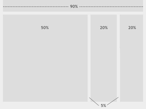
Photo credit: Smashing Magazine
With responsive, you will be designing with all layouts in mind and this, of course, can confuse the process and make it quite complex. This means that you should focus on creating a viewport for mid-resolution and you can then use media queries to adjust for low and high resolutions later on.
So in essence, it’s usually better to use responsive for new projects, and adaptive for retrofits.
Check out how to make your design responsive: 8 Steps to Responsive Design.
Examples of Responsive Web DesignResponsive web design is the go-to for newer sites that demand a more fluid experience among users or for Google to pay more attention to. It is also the design approach of choice for many of the leading technology and design firms around the world, owing to the ease with which developers and designers can create and maintain responsive sites.
Next, we look at some of the best examples of responsive web design-based sites and how they affect their sites’ performance and UX. All while delivering on the demands of big brands operating within the eCommerce and messaging space.
SlackOne of the biggest reasons for Slack’s surging popularity among businesses is the ease with which users can adopt and use the messaging app. Boasting a straightforward interface coupled with a raft of integration and optimization features, Slack’s simplicity and ‘human’ feel are reflected in its impressive responsive web design.
The app’s famous adaptability between desktop and mobile is highlighted by how seamlessly the display transitions and rearranges its layout. By using a Flexbox and CSS Grid Layout, Slack’s responsive interface is a step above.
All this means that Slack’s website needs to match the app, allowing users to experience the same simplicity and ease of use on their mobile devices as they do on their work laptops and PCs.
 Source: SlackShopify
Shopify has taken a different route to its responsive web design. It took the website and app in different directions and chose device-choice optimization over a ‘one-size-fits-all’ approach.
Designers at Shopify felt that no matter the screen size, their design elements should match the screen the user was using. So, in order to ensure that all users enjoy a consistent UX (even if that meant changing things up), Shopify designed their site to respond according to the device’s screen size. It also delivered different CTAs and illustrations in different sizes and at different locations on the page.
While PCs and tablets display Shopify CTAs and images to the right of the form, on mobile, you’ll find those elements below it and in the center. This responsive design approach allows users to enjoy a more divergent UX while still being able to experience optimized interaction capabilities, no matter the size of their screen.
DribbbleAnyone who uses creative design hub Dribbble will likely agree that the self-promotion and social networking platform has aced its responsive web design. The platform’s website represents an excellent example of a flexible space that enhances the browsing experience by actively responding to the device on which it is being viewed.
Dribbble’s website employs a flexible grid layout that works in concert with the screen dimensions. It actively responds to the user’s interactions by adapting the layout into grid columns that shift according to the device. This means that designers can adjust the items displayed on the grid to optimize for visibility and item count. As a result, users can enjoy a balanced experience that doesn’t appear cluttered or disorganized.
Users accessing the site on a 13” laptop or PC screen will see a 4×3 grid configuration, while those using a smaller screen will be able to see the same portfolio presented in a single-column format.
 Source: DribbbleAdaptive vs. Responsive? Consider Site Speed, Content, and UX
As discussed earlier, responsive sites can suffer when it comes to site speed (if they aren’t properly implemented).
Responsive also requires more in the way of coding in order to ensure that the site fits each and every screen that accesses it. However, the extra work is debatable (compared to adaptive design) since adaptive design requires that you develop and maintain separate HTML and CSS code for each layout. Modifying adaptive sites is also more complex since it’s likely you’ll have to ensure that everything is still working sitewide (such as SEO, content, and links) when it’s time for implementation.
You should, of course, also consider the user experience. Because responsive essentially shuffles the content around in order to fluidly fit the device window, you will need to pay particular attention to the visual hierarchy of the design as it shifts around.
According to Nielsen Norman Group, “Responsive design often turns into solving a puzzle — how to reorganize elements on larger pages to fit skinnier, longer pages or vice versa. However, ensuring that elements fit within a page is not enough. For a responsive design to be successful, the design must also be usable at all screen resolutions and sizes.”
So there are no shortcuts to whichever technique you decide to use – both require the work that comes with creating a site that’s essentially one-size-fits-all. Responsive has a slight edge, as you won’t, going forward, need to spend an awful lot of time in site maintenance.
Which is Better: Responsive or Adaptive Design?When it comes down to it, the key is to consider your audience first and foremost no matter what design technique you adopt. Once you know exactly who they are and what types of devices they tend to access the site on, then it’s easier to design with them in mind when it comes to different layouts, content, and so on.
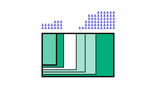
When it comes down to it, the key is to consider your audience first and foremost no matter what design technique you adopt. Once you know exactly who they are and what types of devices they tend to access the site on, then it’s easier to design with them in mind when it comes to different layouts, content, and so on.
It will also depend largely on whether you have an existing site to work with or you’re starting from scratch. Responsive design has become the go-to design technique and it’s thought that around 1/8 websites now use responsive (while there’s little to no data on how many use adaptive). Adoption rates for responsive are growing quickly too and have almost reached the same level as standalone mobile sites.
With all of that in mind, it’s safe to say that responsive is usually the preferred technique if only because of the ongoing work that adaptive design demands.
However, if a client or company has the budget, then adaptive might be a better choice, according to a test carried out by Catchpoint. They built two web pages in WordPress, one using the standard WP TwentyFourteen responsive theme and the other using a plugin called Wiziapp.
The plugin serves a mobile theme to users depending on the device they’re accessing the web pages from and also offers advanced configuration options so that you can further streamline the process.
The results in load time speak for themselves:
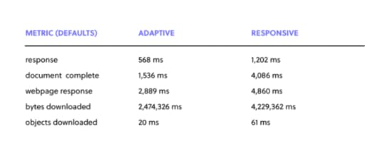
It should be pointed out that no optimization was carried out at all, but this does show that the responsive site is downloading everything that is required for the desktop computer. So right out of the box, the theme doesn’t offer a very good performance at all.
Again, this can be overcome using media queries, but the above serves as a good example of why responsive UX design – whilst being a popular choice – is not always the best for smartphones. Until something better comes along though, it’s difficult to know what we can do about it other than learn how to properly code and implement a great responsive site.
So the conclusion?
Responsive design will remain popular, but that might be because we have not yet found a decent solution to the heavy maintenance that adaptive demands. Adaptive web design hasn’t died out though, despite the web’s apparent love of responsive, so it’s possible – in theory at least – that we’ll see some improvements emerge yet that will blow responsive web design out of the water.
Responsive vs Adaptive Website Design – Common MistakesDesign is an iterative process, requiring some degree of trial and error before figuring out what works – and what doesn’t. But that doesn’t mean that mastering the responsive vs adaptive web design field requires designers to endure painful failures before nailing it.
We can still count on avoiding some of the most common mistakes that tend to slow the process.
Too much focus on desktop versionsMobile design is fast hauling in its desktop-based counterpart, delivering an optimized UX on smaller devices that oftentimes beats out design choices seen on PCs and laptops. But most things online began as desktop-based sites, with mobile versions only coming along later. This has left many platforms, tools, and sites leaning towards desktop origins, and mobile seen as a supplementary need.
Designers need to start adapting to a mobile-first work approach, moving away from their desktop-focused mentality and focusing on the potential that design has to work for mobile and how much more of an impact this can have on the evolution of design thinking.
This means transitioning towards an approach rooted in designing for multiple screen sizes, uncoupled from the conventional six that have been touted as the most likely to require a dedicated design, and targeting percentages rather than fixed ratios. This doesn’t mean discounting desktop design altogether, but rather balancing it with mobile.
Not considering gesturesWith most of today’s mobile devices boasting touch functionality, it is only a matter of time before users can navigate a website without making contact with any hardware or surfaces. Gestures are an often overlooked responsive web design element with massive potential.
From using gestures to zoom, swipe, scroll, and return to delivering instructions and executing complex commands, responsive design is fertile ground for taking these movements to the next level. Yet designers continue to bypass this potentially revolutionary aspect of design. Primarily, due to the complexity of developing a gesture architecture that allows for consistent navigation across all devices.
One possible solution would be to ensure that a website follows a uniform structure that replicates on other devices and provides ease of use and accuracy.
Buttons are too smallAnybody who has ever dealt with an app that has buttons too small to hit accurately will agree that this is one of the most frustrating design issues on mobile. While desktop versions enjoy the benefit of accurate mouse cursors, thumbs and fingers have a habit of missing their mark on smaller screens and mobile devices.
Sometimes responsive design looking to optimize layouts and available space will tend to bunch clickable elements together or shrink them down as they scale with smaller screens. This can cause frustration among users and even cause a site’s accuracy, navigability, and UX to degrade.
Developers must pay attention to how buttons will be affected by their responsive design approach, considering that not all thumbs, fingers and eyes were created equal.
Putting design over functionalityWhile a website that looks good on both desktop and mobile is important, a website should, first and foremost, work. Users who access an attractive site will naturally assume that an equivalent amount of effort has been invested in its utility. So, one can imagine the anger at a website that doesn’t work as well as it looks. Anger that can lead to significant drops in traffic and reputation.
The same goes for the level of functionality between desktop and mobile. A desktop site that sets a benchmark for good design and operability only to fail miserably on the mobile front would be better off not even bothering with mobile at all.
Go beyond developer perceptions by testing with different niches and using effective prototyping to ensure that the design matches its functionality.
Having a separate URL for mobileMaking use of separate URLs between desktop and mobile website versions is a design killer, wasting precious time and damaging your search rankings. Aside from frustrating users by ferrying them back and forth between each version, using multiple URLs goes against SEO best practices and are often unnecessary.
In some cases, however, using multiple URLs can allow developers to create lightweight mobile versions of websites that perform better on mobile devices, though only in instances where the desktop version is very anti-mobile.
Not accounting for future maintenance and development costsDevelopment costs money, and oftentimes, design decisions are taken based on short-term financial considerations without thinking about what the future holds.

While adaptive web design requires higher upfront investment owing to the labor-intensive nature of its development, AWD maintenance costs generally remain stable down the line.
Responsive web design, on the other hand, can lead to unexpected cost implications. However, the rewards stemming from an improved UX may offset those financial risks.
Design UI in UXPinIf you’d like to start mocking up your own adaptive user interface design, you can do so with UXPin. The collaborative platform comes with pre-set and custom breakpoints. Once you’re done, activate Spec Mode to automate your design handoff to developers.
Use UXPin to build prototypes for mobiles, desktops, and everything in between. Try various interactive prototyping features and make your design easy to understand for stakeholders and engineers. Start a free trial.
Try UXPin for freeThe post Responsive Design vs. Adaptive Design: What’s the Best Choice for Designers? appeared first on Studio by UXPin.
November 23, 2022
Best Design Conferences in 2022-23
One of the best things about being a part of the design community is that most designers love to exchange ideas, spread knowledge, and share their experiences regardless of their seniority level. You can be a starting designer or an established thought leader, and it’s almost a given that you find a design conference that may teach you something new.
What’s also great about UX conferences is that not all of them target the UX/UI community, but the people who work with them on a daily basis. Product managers, developers and other professionals who work closely with design can find an event for themselves.
Increase design maturity with UXPin Merge. Build a more collaborative design process and bridge the gap between designers and devs by using a single source of truth in your prototypes: interactive components. Discover more about UXPin Merge.
Reach a new level of prototypingDesign with interactive components coming from your team’s design system.
Discover UXPin Merge .discover-merge { margin: 40px 8px;}.discover-merge__container { display: flex; max-width: 690px; height: 200px; padding: 20px; padding-left: 24px; border-radius: 4px; background-color: black; box-shadow: 10px 10px #9999ff; align-items: center; justify-content: space-between;}.discover-merge__left { width: 50%;}.discover-merge__left p { margin: 10px 0px !important; color: white !important; font-size: 18px !important;}.discover-merge__heading { font-weight: bold !important; color: white !important; font-size: 18px !important;}.discover-merge__text { margin: 0 !important; line-height: 22px !important;}.discover-merge__button { width: 174px; height: 44px; margin: 10px 0px; border: none; border-radius: 2px; background: white; color: black; font-size: 16px; text-align: center;}.discover-merge__button:hover { cursor: pointer;}.discover-merge__image { max-width: 320px !important; height: 200px; margin-right: -19px;}@media (max-width: 760px) { .discover-merge__container { height: auto; margin: 10px; align-items: left; }}@media (max-width: 500px) { .discover-merge__container { flex-direction: column; } .discover-merge__left { width: 100%; align-items: normal; }}Choose a monthNovember 2022December 2022January 2023February 2023March 2023Aprill 2023May 2023June 2023July 2023August 2023September 2023October 2023November 2023November 2022 ConferencesCanUX 2022
An annual UX event, featuring hands-on workshops and a world-class mix of amazing presentations, with plenty of chances to find inspiration.
Date: Nov 3-6, 2022Free: NoWhere: Ottawa, CanadaAudience: product designersCommon topics: design leadership UX BrightonHear from a hand-picked range of the best speakers within the realms of UX, product management, and more.
Date: Nov 4, 2022Free: NoWhere: Brighton, UKAudience: product designers, product managers, researchersCommon topics: design process, product growth Product Elevation Conference 2022 [Hybrid]The conference connects Product & UX people around the globe to share real-life stories about elevating products to solve customers’ most wicked problems.
Date: Nov 9-10, 2022Free: NoWhere: Virtual and DublinAudience: product designers, developers, product managementCommon topics: design process, front-end design, leadership STHLM Xperience Conference 2022 [Hybrid]The conference partnered with World Usability Day and decided to take up health as a theme. It will explore how our digital wellbeing affects our health.
Date: Nov 10, 2022Free: NoWhere: Virtual and Stockholm, SwedenAudience: product designers, researchersCommon topics: design process, accessibility, future of designDecember 2022 ConferencesUX Live London 2022Explore ideas revolving around journey mapping, user research, UX writing, wireframing, and more. Learn about design’s impact on product and users.
Date: Dec 6-7, 2022Free: NoWhere: London, UKAudience: UX designers, UI designersCommon topics: design processUXVN Festival 2022Travel to Vietnam to learn about UX. The conference returns to an offline venue.
Date: Dec 10-11, 2022Free: NoWhere: Ho Chi Minh, VietnamAudience: UX designers, UI designersCommon topics: design processAn Event Apart San Francisco
An all-round product design and development event that will cover popular design topics as well as CSS code that will make you a better designer for the web.
Date: Dec 12-14, 2022Free: NoWhere: San Francisco, USAAudience: product designers, developersCommon topics: design process, accessibility, developmentJanuary 2023 ConferencesIf your New Year’s resolution is to network more, there are a few design conferences and events that seem to be a great fun.
Design Matters MexicoJoin Design Matters and review design impact, rethink sustainability and design for the future.
Date: Jan 25-26, 2023Free: NoWhere: Mexico CityAudience: UX researchers, UI designers, UX designersCommon topics: design sustainability, design process, leadershipFebruary 2023 ConferencesWhat about the second month of the year? We’ve found a couple of conferences that may catch your eye. Let’s see them.
UX360 Research SummitLearn how to promote the value of research, make an impact, and take care of your team. UX360 is one of the best research conferences out there. You can select sessions to watch right now.
Date: Feb 15-16, 2023Free: NoWhere: VirtualAudience: UX researchers, UX designersCommon topics: research, career, leadershipProduct World [Hybrid]Product manager and product developer conference that concerns itself with creating agile environment, boosting leadership and collaboration, and presenting success stories that you can replicate.
Date: Feb 15-23, 2023Free: NoWhere: Virtual and San Francisco Bay AreaAudience: product managers, developers, product designersCommon topics: collaboration, leadership, growthExperience Design ConferenceThe Denver-based conference is devoted to human-centered design and sharing best practices coming from the Experience Design industry leaders.
Date: Feb 27 – Mar 1, 2023Free: NoWhere: DenverAudience: UX designers, UI designers, product designersCommon topics: UX, product management, human-centered design, design thinkingMarch 2023 ConferencesMarch is going to be an exciting month for those of you who love tuning in for virtual conferences.
Interaction Week 23 [Hybrid]This interaction design conference is a perfect excuse to visit Zürich if you haven’t yet. Listen to great talks about interaction design and sign up for workshops that will help you hone your facilitation, decision making, and analytical skills.
Date: Mar 1-3, 2023Free: NoWhere: Virtual and Zürich, SwitzerlandAudience: UX designers, UI designers, researchersCommon topics: UX, interaction design QRCA 2023 Annual ConferenceQRCA stands for Qualitative Research Consultants Association. The association is celebrating its 40th birthday in 2023. Time flies, doesn’t it? The conference that it organizes covers research methods, tools, and lessons that will prepare designers for the next era of qualitative research.
Date: March 22-24, 2023Free: NoWhere: Virtual & Charlotte, North CarolinaAudience: UX researchers, marketing researchersCommon topics: qualitative research, research methods, research toolsDesign Research by UX Australia [Hybrid]A great conference for anyone who’s engaged in doing research before design work. The conference is still accepting submissions.
Date: Mar 14-16, 2023Free: NoWhere: Virtual & MelbourneAudience: UX researchers, product managers, product designersCommon topics: research operations, leadership, research methods, research toolsUX CopenhagenMarch will be exciting month. This year UX Copenhagen comes back to the city with “Invisibility” as its leading theme. It will scrutinize design process and skills of designers to check if making UX hidden doesn’t leave any user behind.
Date: Mar 23-24, 2023Free: NoWhere: Virtual & CopenhagenAudience: UX designers, UX researchersCommon topics: UX design, leadership, contentInformation Architecture Conference 2023It’s one of the leading conferences for information architects, designers, and others who create and manage UI and information environments.
Date: Mar 28 – Apr 1, 2023Free: NoWhere: Virtual Audience: product designers, researchers, product managersCommon topics: information architecture, UX research, content strategyApril 2023 ConferencesYou’ll get a couple of conferences that will be interesting for designers, researchers and product teams. What are they?
CHI 2023 [Hybrid]This year’s annual ACM Computer Human Interaction conference will be a hybrid event, which means that it will take place on-site in Hamburg and online.
Date: Apr 23-28, 2023Free: NoWhere: Virtual & Hamburg, GermanyAudience: researchersCommon topics: research tools, research methodsAn Event ApartOne of the most recognizable conferences for UX designers and front-end developers who want to expand their knowledge on web design.
Date: Apr 24-26, 2023Free: NoWhere: SeattleAudience: product designers, developersCommon topics: design process, front-end design, leadershipConfabHey, content managers! There’s an event dedicated to increasing your skills. Confab is a conference dedicated to content strategy where you can get insights from industry leaders.
Date: April 30 – May 3, 2023Free: NoWhere: MinneapolisAudience: content managers, product designers, UX writersCommon topics: career, content management, toolsMay 2023 ConferencesMay will be the month for on-site UX and product conferences. Let’s see where we can travel to. Are you ready?
DDX 2023 | UX ConferenceLearn how to facilitate, foster and design positive business visions in emerging innovation fields.
Date: May 6, 2023Free: NoWhere: Munich, GermanyAudience: product designers, product managers, design leadersCommon topics: innovation, UX, leadership, sustainabilityUXDX Community USA [Hybrid]UXDX is a popular conference for UX designers, developers and product people around the world. The topics of this year’s design conference revolve around using data, innovating, working together, and building design systems.
Date: May 16-18, 2023Free: YesWhere: Virtual and on siteAudience: UX designers, UX researchers, developers and product managersCommon topics: DesignOps, collaboration, design systemUXistanbulOrganized by UXServices, this conference is a place for gathering Web3 enthusiasts and designers interested in the field. Come and join them on Discord.
Date: May 22-26, 2023Free: NoWhere: Virtual Audience: product designers, researchers, product managersCommon topics: NFT, metaverseACE!This Polish conference has two tracks: Agile Software Development and Product Design & Management. Yet, there will be a lot of content for product designers, too.
Date: May 18-19, 2023Free: NoWhere: Kraków, PolandAudience: product managers, developers, product designersCommon topics: leadership, product strategy, product growthJune 2023 ConferencesThat month looks very exciting for those of you who got used to participating in events from the comfort of their homes. In other words, there will be a few interesting virtual meetups.
UX STRAT EuropeSign up for a European edition of a popular UX STRAT conference. Learn from the design and innovation experts.
Date: Jun 5-7, 2023Free: NoWhere: AmsterdamAudience: product designers, researchersCommon topics: design strategy, future of designPixel PioneersIt may be just a day-long, but the Pixel Pioneers is fully-packed with inspirational presentations from leading UX/UI designers and front-end developers.
Date: Jun 16, 2023Free: NoWhere: BristolAudience: product designers, developers, researchersCommon topics: human-centered design, inclusive design, future of designUXPA 2023Looking for inspirational talks? San Diego’s UXPA conference may be your cup of tea.
Date: Jun 20-22, 2023Free: NoWhere: San DiegoAudience: product designers, researchersCommon topics: human-centered design, leadership, researchJuly 2023 ConferencesThe summer season is on, but there are a few exciting events coming. Curious what are they?
ProductConOrganized by Product School, ProductCon is a 1-day conference for product people who want to learn more about managing products.
Date: July 2023Free: Yes until April 2023Where: VirtualAudience: product managers, developers, product designersCommon topics: leadership, product innovation, collaborationHCI INTERNATIONAL 2023That international conference on human-computer interaction that is usually held in Gothenburg, Sweden.
Date: Jul 23-28, 2023Free: NoWhere: VirtualAudience: product designers, researchersCommon topics: human-centered design, research, leadership#mtpcon Digital AmericasThe summer edition of the Mind the Product conference for both Americas.
Date: Jul 10-14, 2023Free: NoWhere: VirtualAudience: product designers, product managers, developersCommon topics: leadership, future of product, product growthAugust 2023 ConferencesFor now, we haven’t heard about any design conferences happening in August, but we will update it as soon as we find something.
September 2023 ConferencesWe’re still searching the web for 2023 conferences.
October 2023 ConferencesSee October conferences for designers and product teams.
ProductCon San FranciscoAnother Product School’s ProductCon event is happening in October. It is a 1-day conference for product people who want to learn more about managing products and the future of product management.
Date: Oct, 2023 (TBD)Free: NoWhere: San FranciscoAudience: product managers, developers, product designersCommon topics: leadership, future of product management, product growthWorld Usability ConferenceLet’s meet in Austria and discuss usability with other UX professionals and participate in talks and masterclasses where handpicked speakers share meaningful hands-on insights.
Date: Oct 10-12, 2023Free: NoWhere: Graz, AustriaAudience: product designers, researchersCommon topics: design process, usability, sustainabilityNovember 2023 ConferencesUXDX APAC 2023It’s yet another UXDX event, but this one is an Audio-Pacific version. It’s dedicated to Product, UX, Design and Development teams that want to find a way of working together.
Date: Nov 14-16, 2023Free: NoWhere: San DiegoAudience: product managers, developers, product designersCommon topics: product direction, scaling design, validation, product growthWhich Design Conferences Are You Attending in 2022 and 2023?It seems as if 2023 is going to be full of inspiring and educational content coming from the best speakers in design and product management. Have you found a conference for you? We will definitely keep you posted if any new event comes our way.
Use the knowledge that you acquired from design conferences in practice. Instead of working in siloed environment, unite your team with a single source of truth: interactive components that can be used across design and product. Discover more about it. Check out UXPin Merge.
Discover MergeThe post Best Design Conferences in 2022-23 appeared first on Studio by UXPin.
November 22, 2022
Design Handoff Checklist – 47 Points that Will Guide You Through the Process

Is design handoff stresses you out? It won’t anymore. Let’s see the exact tasks you need to do to make design handoff better. Let’s explore!
Design handoff doesn’t need to be point of friction between designers and engineers. Use UXPin Merge and bridge the gap between those teams by using a single source of truth. UXPin Merge allows you to bring reusable UI components from devs’ component library to the design editor and make them accessible to designers. Learn more about UXPin Merge.
Reach a new level of prototypingDesign with interactive components coming from your team’s design system.
Discover UXPin Merge .discover-merge { margin: 40px 8px;}.discover-merge__container { display: flex; max-width: 690px; height: 200px; padding: 20px; padding-left: 24px; border-radius: 4px; background-color: black; box-shadow: 10px 10px #9999ff; align-items: center; justify-content: space-between;}.discover-merge__left { width: 50%;}.discover-merge__left p { margin: 10px 0px !important; color: white !important; font-size: 18px !important;}.discover-merge__heading { font-weight: bold !important; color: white !important; font-size: 18px !important;}.discover-merge__text { margin: 0 !important; line-height: 22px !important;}.discover-merge__button { width: 174px; height: 44px; margin: 10px 0px; border: none; border-radius: 2px; background: white; color: black; font-size: 16px; text-align: center;}.discover-merge__button:hover { cursor: pointer;}.discover-merge__image { max-width: 320px !important; height: 200px; margin-right: -19px;}@media (max-width: 760px) { .discover-merge__container { height: auto; margin: 10px; align-items: left; }}@media (max-width: 500px) { .discover-merge__container { flex-direction: column; } .discover-merge__left { width: 100%; align-items: normal; }}Table of contents47-Point Design Handoff ChecklistDuring DesignDuring HandoffAfter Design HandoffAchieve Better Design Handoff with UXPin Merge47-Point Design Handoff ChecklistWe’ve created this simple 47-point checklist as a guide for your next design handoff. If you want to learn more about the process itself, head on to our previous article: Create a Better Design Handoff.
 During Design
Discovery:
Invite developers to attend user interviews when possible. Circulate bulleted summary of user interview insights with developers. Conduct a 30-minute to 1-hour stakeholder interview with at least one developer. Use Kim Goodwin’s excellent questions. Create and quickly review lean personas with developers. Get developer input and alignment on technical restraints for the design brief.Planning:
 Ensure developers (or at least the development lead) attends the kickoff.Conduct user story mapping with developers to plan epics and sprints. Estimate build time for user stories with developers using tactics like planning poker. Plan 1-2 design sprints ahead of the development process. Check which framework the designs must use (Bootstrap, Foundation, custom, etc.). Adapt grids and elements accordingly. Verify browser support with developers. After each standup meeting, quickly review the backlog with developers.
Prototyping:
Walkthrough user flows and lo-fi prototypes for developer feedback on feasibility. Start designing extreme viewports (smallest and largest) to accurately “bracket” your content. Consider how your design will respond to screen sizes slightly smaller or larger than your assumptions. Incorporate rough content (not Lorem Ipsum) into the prototype within the first two iterations. Invite developers to attend at least one user testing session. Prototypes account for all interaction states, error states, and transitions between states. Prototypes account for data extremes (e.g., short and long last names, phone number formats, non-US postcodes). Circulate all user test recordings with a bulleted summary of insights to developers. Collect feedback and approval from developers at each iteration of the prototype.UI Design:
With each iteration, rename your design file (v.1, v.2, etc.). Do not rename “Latest” or “Newest.” Upload every new version into a shared repository. Create as many reusable patterns as possible (menus, links, buttons, panels, etc.) so developers have a component-based system. Make UI decisions that create consistency for the user experience and codebase. Get developer buy-in on image formats and sizes. Create designs in all significant breakpoints on a grid system with guides/overlays. To preserve typographic integrity, use whole font values and leading values (e.g., 15 instead of 15.75).Use web-safe fonts when possible. Don’t use more than one custom font. Check that you own the rights for all photography and typography. Hold a 30-minute to an hour review of final approved mockups alongside the prototype: walkthrough project goals, user stories, interactions, states, and failure states.During Handoff
Visual Hygiene:
Delete all unused layers. Don’t just hide them since that may confuse developers. Delete all unused guides. Group and name layers appropriately based on UI modules (navigation, footer, etc.) Follow a common naming convention with developers (e.g., a “widget” is not the same as a “module”). Consider using BEM notation. Instead of naming artboards with “FINAL” or “LATEST,” follow a standard versioning protocol (v.1, v.2, etc.). For easier navigation, collapse all layers before sending off designs.Assets:
Create subfolders within your main project containing all relevant icons, fonts, images. Include SVGs wherever possible. For raster files, include versions at 2x.Documentation:
Annotate prototypes with use cases, failure states, and interaction nuances. Annotate the full code snippet (or classes in frameworks) next to every element. Use an inspection tool to auto-generate visual specs (color codes, dimensions, font sizes, margins, padding, etc.). Avoid redlining as much as possible. Ensure all documentation stays updated to reflect the final system as it evolves. Developers will refer to the documentation to understand the depth and breadth of the system, using the final prototype as a reference for acceptable behaviors.After Design HandoffAccuracy of Build:
 Designers perform an “implementation audit” of each build during the QA process against the final prototype. Designers attend sprint demos along with PMs. Acceptance testing includes UX criteria based on the final prototype.
Design System:
Describe accessibility requirements and any implications on the development process. For example, Salesforce Lightning: “Our forms offer proper use of and tags as well as appropriate labeling for input controls.” Include code snippets for all UI components (menus, buttons, etc.) along with specific descriptions of use cases. Include links to downloadable UI kits, color swatches, and code repositories (e.g., Github).Achieve Better Design Handoff with UXPin MergeWhat if you could use a tool that makes it impossible for design drift to occur? Bring interactive, fully-functional UI components to UXPin and improve your design handoff instantly. That’s exactly what our Merge technology offers.
Make your designers and developers share a single source of truth between design and code, so they can be on the same page and avoid all the errors of poorly executed design handoff. Bring UI components stored in a Git repository or Storybook. Streamline design handoff with Merge. See how UXPin Merge works.
Discover MergeThe post Design Handoff Checklist – 47 Points that Will Guide You Through the Process appeared first on Studio by UXPin.
What is Collaborative Prototyping?

We’re always looking for new ways to enhance prototyping and cross-functional collaboration. Collaborative prototyping is a “hyper-efficient” sprint methodology to create a prototype in one day.
Bring collaboration between designers and developers to the ultimate level. Introduce a single source of truth for design and create high-fidelity interactive prototypes in minutes that devs can replicate 1:1. Visit our Merge page for more details about this revolutionary technology that united hunderds of teams.
Reach a new level of prototypingDesign with interactive components coming from your team’s design system.
Discover UXPin Merge .discover-merge { margin: 40px 8px;}.discover-merge__container { display: flex; max-width: 690px; height: 200px; padding: 20px; padding-left: 24px; border-radius: 4px; background-color: black; box-shadow: 10px 10px #9999ff; align-items: center; justify-content: space-between;}.discover-merge__left { width: 50%;}.discover-merge__left p { margin: 10px 0px !important; color: white !important; font-size: 18px !important;}.discover-merge__heading { font-weight: bold !important; color: white !important; font-size: 18px !important;}.discover-merge__text { margin: 0 !important; line-height: 22px !important;}.discover-merge__button { width: 174px; height: 44px; margin: 10px 0px; border: none; border-radius: 2px; background: white; color: black; font-size: 16px; text-align: center;}.discover-merge__button:hover { cursor: pointer;}.discover-merge__image { max-width: 320px !important; height: 200px; margin-right: -19px;}@media (max-width: 760px) { .discover-merge__container { height: auto; margin: 10px; align-items: left; }}@media (max-width: 500px) { .discover-merge__container { flex-direction: column; } .discover-merge__left { width: 100%; align-items: normal; }}What is Collaborative Prototyping?Collaborative prototyping (rapid collaborative prototyping) is a design sprint methodology created by Douglas Ferguson, President of Voltage Control, an Austin-based design agency.
Where a typical design sprint takes five days, the collaborative prototyping process produces an outcome in just one. Team members work in parallel on a single digital whiteboard and then collaborate using a design tool to build a prototype.
While this is a basic prototype, it gives design teams a head start in the design process, allowing them to begin testing and iterating their idea within a day.
What are the benefits of collaborative prototyping?The main benefit of Douglas Ferguson’s rapid collaborative prototyping method is that it explores many ideas efficiently. As Douglas describes in this article, “This approach unleashes the entire Design Sprint team and supports everyone contributing in an efficient and productive manner.”
Rapid collaborative prototyping can produce comparable results in one day if you don’t have a week available for a design sprint. By the end of the day, the team has a basic prototype to start the iterative process of prototyping and testing.
Collaborative prototyping is also an excellent teamwork exercise. Organizations can use a group of designers or a cross-functional team to develop many ideas and iterate on the best solution.
Lastly, rapid collaborative prototyping is just as effective as a remote exercise as in-person. Douglas’s team uses digital whiteboards and design tools for collaborative prototyping so everyone can take part and share their ideas quickly.
With team members connected to the same tools, everyone is focused and engaged during the various collaborative prototyping tasks. Because this prototyping methodology is so short and people can connect from anywhere, it makes the process more accessible to busy stakeholders who generally don’t have time to participate in 5-day design sprints.
The Rapid Collaborative Prototyping ProcessHere is an overview of the 7-step rapid collaborative prototyping process.

Note: this process uses sprint terms and methods. Check out this article on Design Sprints for more context and understanding of the methodology.
PreparationWhat you will need for a collaborative prototyping session:
Time: One full 8-hour dayParticipants: 3 – 12 team members (7 is optimal for a standard design sprint) – including a deciderDesign facilitator: 1 (must understand the design sprint framework)Tools (everyone must have access to these tools to provide input and collaborate):
Digital whiteboard: Mural, Miro, Google Jamboard (you can copy Douglas’ Collaborative Prototyping Mural Template to save time)Design tool: UXPin with Merge – a collaborative design tool for creating fully functioning prototypes to which you can bring interactive components to build prototypes withIn-person collaborative prototyping: use a boardroom-style layout so team members can use their laptops and talk to one another.
Remote collaborative prototyping: everyone connects via Zoom (other videoconferencing software).
If your team has never done collaborative prototyping, it’s a good idea to tell them what to expect and the format–you could share this article as a reference.
Step 1. Introduction (5 minutes)Introduce the rapid prototyping process outlining the steps below and the day’s objective–what problem are you aiming to solve?
Step 2. Storyboard (60 – 90 minutes)The storyboard should map the user flow you want to prototype–i.e., an onboarding sequence or eCommerce checkout. This first step helps to align team members on the day’s goal with a shared understanding of the problem.
Douglas recommends focusing on four or five key moments in the flow rather than getting too granular. Remember, this prototype is a foundation for further iteration rather than a final solution.
Each team member writes seven steps people will encounter during testing. They review these as a group and vote on the best four or five. The facilitator draws these five steps on the whiteboard using post-it notes, and the team adds details to each step to enhance the story and fill missing gaps.
Step 3. Create a Kanban (30 minutes)The Kanban lists the tasks on post-it notes in three columns:
To doDoingDoneSort these tasks by priority, with the highest at the top. Team members can self-select tasks by adding their initials to the post-it note, always taking the highest priority first.
If you’re running an in-person collaborative prototyping session, it’s best to use a physical whiteboard so it’s always visible and everyone can monitor progress.
Step 4. Narrate the Storyboard (20 minutes)The facilitator recaps by narrating the storyboard to everyone as they follow along. They may add additional notes as they narrate. Team members take individual notes, which the facilitator adds to the Kanban after the recap.
Step 5. Collaborative Prototyping (4 hours)Create a shared whiteboard divided into sections representing each screen of the prototype. Based on the Kanban tasks, team members place assets and content into each section.
The stitcher (or design facilitator) organizes the assets on the whiteboard and ensures everything is accurate for prototyping.
At the same time, the prototype makers use a design tool to create each screen. They grab content and assets from the whiteboard to produce a mockup for each screen.
Team members communicate through comments and annotations (on the whiteboard and prototype) to maximize efficiency. Sharing feedback on the whiteboard and prototype enables the facilitator to keep track of tasks and follow up where necessary.
This collaborative workflow creates a prototyping production line where each task feeds the next to maximize productivity and efficiency.
Step 6. Adding interactivityOnce the mockups are complete, the team finishes the user flow by adding interactions and pages flow. UXPin’s Interactions allow designers to copy and duplicate interactions. One team member can create interactions for others to replicate throughout the prototype–maximizing collaborative prototyping efficiency.
Step 7. Prototype playbackThe final step reviews the prototype and lists any revisions as tasks, adding them to the Kanban. The design facilitator clicks through the prototype, discussing each step. At the same time, the group follows and creates tasks to revise the prototype–for example, during playback, the facilitator notices that the input fields don’t have error messages.
Team members add these revisions to the Kanban and assign them for fixing before testing.
Collaborative Prototyping With UXPin MergeDouglass’ method is great for getting an initial project. Yet, few teams will be able to complete a prototype that can be pushed to development. For a prototype to be a design handoff ready, designers need to think about every state, micro-interaction, etc. That’s why they need to build a prototype a while longer.
What can significantly enhances prototyping accuracy and efficiency is UXPin Merge. Go from ideation to a fully functioning prototype ready for testing in less than a day! That’s all using interactive building blocks of an app or a website that you want to build.
Use the built-in MUI library or connect your product’s design system to build a fully functioning prototype in minutes. PayPal’s product designers create one-page Merge prototypes that look and feel like the final product using the company’s custom Fluent UI design system in under 10 minutes–perfect for rapid collaborative prototyping.
“With this new UXPin approach, we’re seeing a more collaborative, integrative design process. Rather than separating design, prototyping, and development, UXPin allows us to create an integrated flow where we engage engineering and product teams throughout the process.” – Erica Rider, UX Lead EPX @ PayPal.
How Merge WorksMerge lets you sync a design system with UXPin’s design editor so designers can build prototypes using interactive components, complete with basic interactivity, states, colors, sizing, and other properties defined by the design system.
Merge components are interactive by default, saving designers countless hours from adding interactions to user interface elements for each project. The example below shows several UI components from the MUI library, all of which have default MUI interactions. We simply dragged these components onto the canvas and hit preview.
[ADD mui-component-example]
These default interactions make Merge the perfect collaborative prototyping, maximizing consistency when more than one person is working on the same project. Using interactive components means designers create fewer interactions, saving time while allowing them to focus more on navigation and user flows.
For example, creating a dynamic, functioning date picker using an image-based design tool is impossible. With endless date possibilities, designers can’t replicate this component, no matter how many frames they use!
With UXPin Merge, designers can drag a fully functioning date picker from the component library onto the canvas, ready to go.
[ADD date-picker-demo]
With this prototyping efficiency, designers can achieve significantly better results during rapid collaborative prototyping in a shorter time!
Better collaborationWith UXPin Comments, team members can assign comments to each other and mark them as resolved once actioned–perfect for in-person and remote collaborative prototyping sessions. Team members can also filter comments by:
Comments assigned to themUnassigned commentsComments from all pagesUnresolved commentsThe team can also invite stakeholders to preview prototypes and add feedback via Public Comments–even if they don’t have a UXPin account.
Meaningful testing resultsBetter quality prototypes mean better results during testing. End-users can interact with Merge prototypes during testing as they would the final product–giving designers meaningful, actionable results to iterate and improve much faster.
Designers also get better feedback from stakeholders, who can engage with prototypes and use every feature instead of asking why they can’t use text fields or select a date and time.
“Our stakeholders are able to provide feedback pretty quickly using UXPin. We can send them a link to play with the prototype in their own time and UXPin allows them to provide comments directly on the prototypes. UXPin’s comments functionality is great because we can follow along and mark comments as resolved once we address them.” – Erica Rider, UX Lead EPX @ PayPal.
Achieve better results with the world’s most advanced collaborative prototyping tool. Visit our Merge page for more details and how to request access.
Discover MergeThe post What is Collaborative Prototyping? appeared first on Studio by UXPin.
November 21, 2022
Internationalization and Localization – Key Differences in App Design
Internationalization is crucial for startups and companies with global aspirations. If organizations want to succeed in an international market and compete locally, they must create relatable, locally relevant product experiences.
Internationalization and localization go beyond translated text and currency changes. Designing experiences related to users, their cultures, and their environments create the trust necessary to increase adoption and grow in global markets.
Prototyping and testing are vital for delivering positive user experiences for a global market. Sign up for a free trial to explore UXPin’s advanced design, prototyping, and testing features.
Build advanced prototypesDesign better products with States, Variables, Auto Layout and more.
Try UXPin .try-uxpin-banner { margin: 40px 0px;}.try-uxpin__container { display: flex; max-width: 689px; height: 210px; padding: 20px; padding-left: 24px; border: 2px solid black; border-radius: 4px; align-items: center; justify-content: space-between; background-color: white; box-shadow: 10px 10px black;}.try-uxpin__left { width: 54%;}.try-uxpin__left p { margin: 10px 0px !important; color: black !important;}.try-uxpin__heading { font-size: 28px !important; font-weight: bold;}.try-uxpin__text { margin: 0 !important; font-size: 18px !important; line-height: 22px !important;}.try-uxpin__button { width: 135px; height: 44px; background: black; margin: 10px 0px; padding: 10px 20px; border: none; border-radius: 2px; color: white; font-size: 16px; text-align: center;}.try-uxpin__button:hover { cursor: pointer;}.try-uxpin__image { max-width: 320px !important; height: 200px; margin-right: -21px; margin-bottom: -6px;}@media (max-width: 760px) { .try-uxpin__container { height: auto; margin: 10px; align-items: left; }}@media (max-width: 500px) { .try-uxpin__container { flex-direction: column; } .try-uxpin__left { width: 100%; align-items: normal; }}Table of contentsWhat is Internationalization? What is Localization?Legal requirements and complianceInternationalization and AccessibilityA universal source code baseText directionTime zones, currencies, datesCultural norms & expectationsInternationalization and Localization Best Practices1. Avoid metaphors and cultural references2. Design internationally-friendly forms3. Design UIs to accommodate translations4. Prototype with real copy5. Don’t embed text in images6. Use relatable content7. Internationalizing Typography8. Number formats and separatorsInternationalized Product Design With UXPinWhat is Internationalization? Internationalization (or what Google calls globalization) is designing and developing digital products to allow language, regional, and cultural adaptations. This flexibility enables companies to adapt products and enter new markets while maintaining the product’s integrity and user experience.
Simple examples of internationalization are language and currency selectors–not specific languages or currency, but the UI design and programming that make it possible.
The Cuber Shopify Theme uses dropdowns for the store’s internationalization design. Shopify store owners can use these internationalization features to localize their eCommerce store for different countries–i.e., A US-based store providing Mexican Peso and Spanish for a Mexico-based target audience.

This eCommerce example leads us to localization.
What is Localization?Localization is the process of adapting a product to meet specific market needs, including translation, currency, and cultural changes.
Localization aims to deliver a user experience that’s relevant and relatable–beyond simply changing the language and currency.
For example, it doesn’t snow in New Zealand over Christmas because it’s summer. Referring to snow and keeping warm during December wouldn’t make sense to New Zealanders as it would to Canadians.
Designers must also adapt user interfaces to meet native language markup and structure, like left-to-right (LTR) (i.e., English) vs. right-to-left languages (RTL) (i.e., Arabic, Hebrew).
Legal requirements and complianceProduct teams must also consider compliance for different locales and legislative impacts on content and user data. GDPR, CCPA, and other data privacy acts dictate how products and websites collect, store, and share user information.
Designers must notify customers in these regions about their cookie policy and allow them to opt out of tracking–like this example from Stack Overflow.
 Internationalization and Accessibility
Internationalization is vital for accessibility, inclusive design, and making products localizable. W3C provides an overview of i18n (industry standard abbreviation for ‘internationalization’) and how to make products more inclusive for a global audience.
 A universal source code base
Product developers must use Unicode for internationalization and architecture. Unicode gives digital products the foundation to translate and serve content in any language.
Engineers must also consider appropriate metadata to support different language structures and markups.
Text directionRight-to-left languages are complicated for digital product design because they often mix directions within a single line of text. This example from W3C demonstrates bidirectional text in Arabic content.
Designers must collaborate with engineers to ensure these directional nuances are correctly addressed.
Names & addressesForms often create confusion for users from different parts of the world. For example, some European countries write the street before the number, whereas in the United States, its number, street.
Some countries don’t have postal codes, so making this a required form field creates a frustrating roadblock for those users.
. Some cultures place their family name (surname/last name) first and “first name” second. A person’s name may also have several words–how do they enter this data?
Time zones, currencies, datesDate formats can cause a lot of confusion and frustration. For example, users can interpret 10/02/2022 as:
October 02, 2022, in the United States10 February 2022, in EuropeA good way around this confusion is to abbreviate the month so everyone can read the date–i.e., Oct 02, 2022. Designers can also separate these fields on forms, so users enter the correct date and databases read and save them correctly.
If your product uses time, it’s crucial to factor in timezones and daylight savings to save and present users with the correct time format.
Currencies present another design challenge. Some currency formats place the symbol before and others after. Thailand, Turkey, Vietnam, and Sweden are four examples where people position the currency symbol after the number.
Cultural norms & expectationsUX teams must do their homework and perhaps hire local UX designers when entering a new market.
For example, thumbs up in the West means good, but it’s insulting in Japan, Bangladesh, and the Middle East! Using thumbs up or thumbs down to rate a service or feature might get mixed results from users in these regions.
Colors, symbols, words, phrases, and metaphors carry different meanings across various languages and cultures. Extensive user and cultural research must be a priority for UX teams, especially when they don’t speak the language.
Further reading and research: W3C provides a list of groups for regional internationalization, including the Americas, Europe, Africa, the Middle East, the Far East, and South East Asia.
Internationalization and Localization Best Practices1. Avoid metaphors and cultural referencesEvery country and culture has metaphors and references, but these often don’t translate to a global audience; in some instances, they might be offensive–like a thumbs up in Bangladesh.
Designers must also use descriptive names rather than “clever” cultural references. Australians are renowned for their hilarious slang, but using these in a product would be confusing rather than entertaining.
2. Design internationally-friendly formsForm field labels, particularly addresses, can create confusion. Designers must design forms that accommodate an international audience.
For example, most countries use “postal code” instead of “zip code.” They also write the entire state/province/county rather than abbreviating it into two letters like the United States (i.e., Florida = FL). An international approach to form labels and field sizes will make forms more globally inclusive.
Further reading:
Web Form Design Best PracticesForm Internationalization TechniquesInternational Address Fields in Web Forms3. Design UIs to accommodate translationsDesigners must avoid designing UIs to accommodate a single language. As designer John Saito points out in a Medium article about internationalization, “Think of the label ‘New!’ for example. In English, it’s 4 characters with the exclamation point. But in French, it’s 9 characters: ‘Nouveau!'”
John recommends creating a Google Sheet and using a Google Translate function to visualize multiple languages and calculate character count.
We compared a standard CTA, “Sign up,” against ten languages. Sign up has seven (including the space), but most languages have ten or more characters, which could create issues if designers don’t leave enough room.
 4. Prototype with real copy
The example above demonstrates the importance of prototyping with real copy. If you’re adapting your product for a new language, translate content on every UI as it would appear in the final product.
As we saw with translations, some words might be longer than the English version requiring the extra UI width.
If your UI element doesn’t have enough space, it will break the text into a new line. This looks unprofessional and might push other components creating usability issues.
5. Don’t embed text in imagesAnother recommendation from John Saito is not to embed text in images. Even if you translate these, it creates multiple assets which adversely impact performance.
Embedding text in images also excludes users with visual impairments and screen readers.
Text overlays are a good alternative, but they create additional CSS and Javascript, so designers must use this method sparingly.
6. Use relatable contentIf you’re going to use content, particularly images and video, make sure it’s culturally relatable. Users must feel like someone from their country or region designed the product specifically for them.
For example, the Google News and Apple News apps use location tracking to present relevant, localized stories. In some instances, this localization might be as changing a picture of NYC for Americans to Nairobi for Kenyan users.
7. Internationalizing TypographyYona Gidalevitz’s interesting UsabilityGeek article looks at language’s impact on typography. Asian languages like Mandarin, Korean, and Japanese have complex characters which don’t translate well into bold typefaces.
These languages also represent multi-character English words as a single character, requiring a large font for legibility which ultimately alters the UI element or the entire screen.
8. Number formats and separatorsNumber formats and separators differ in languages and regions. Microsoft’s number formatting for globalization demonstrates that countries will display the number negative five hundred and twenty-seven in four different ways:
-527527-(527)[527]People also use date and number separators differently. Returning to our example of Oct 02, 2022, we can write this date in at least three ways:
10-02-202210.02.202210/02/2022In the United States, people use a comma (,) to separate the thousands, while Germany uses a period (.).
While these might seem like minor issues, they could severely impact usability. Understanding these nuances will help product teams avoid potential problems.
Internationalized Product Design With UXPinDesigning digital products is challenging. Developing multilingual products for a global audience adds an extra layer of complexity for design teams.
With UXPin’s Design Systems, product teams can create multiple design systems for each language to streamline prototyping and testing. Create a new design system from an existing library and edit the components to meet language/market requirements.
Each design system can have locale-specific components, assets, typography, and documentation, giving designers the tools to build localized prototypes for testing.
Avoid the time-consuming process of prototyping and testing for multiple markets with the world’s most advanced user experience design tool. Iterate faster to build inclusive products capable of competing internationally with UXPin. Sign up for a free trial today.
Try UXPin for freeThe post Internationalization and Localization – Key Differences in App Design appeared first on Studio by UXPin.
UXpin's Blog

- UXpin's profile
- 68 followers

