
UXpin's Blog, page 35
July 13, 2023
A Simple Recipe to Building Resilient Design Operations
As organizations strive to streamline their design processes and enhance collaboration, DesignOps serves as the backbone to align design objectives with business goals.
UXPin recently hosted a webinar with three DesignOps experts titled Strategies for Building a Resilient DesignOps Practice, which provided valuable insights and strategies.
The webinar featured a panel of three industry experts:
Salomé Mortazavi, Senior Director of DesignOps and Design Systems at SiriusXMMeredith Black, a seasoned DesignOps consultantAdam Fry-Pierce, Chief of Staff for UX Leadership at GoogleThese highly knowledgeable individuals brought unique perspectives and experiences, discussing the challenges and opportunities in DesignOps.
Streamline redundant operational tasks and workflows with a single source of truth from UXPin. Visit our Merge page for more details and how to request access.
Reach a new level of prototypingDesign with interactive components coming from your team’s design system.
Discover UXPin Merge .discover-merge { margin: 40px 8px;}.discover-merge__container { display: flex; max-width: 690px; height: 200px; padding: 20px; padding-left: 24px; border-radius: 4px; background-color: black; box-shadow: 10px 10px #9999ff; align-items: center; justify-content: space-between;}.discover-merge__left { width: 50%;}.discover-merge__left p { margin: 10px 0px !important; color: white !important; font-size: 18px !important;}.discover-merge__heading { font-weight: bold !important; color: white !important; font-size: 18px !important;}.discover-merge__text { margin: 0 !important; line-height: 22px !important;}.discover-merge__button { width: 174px; height: 44px; margin: 10px 0px; border: none; border-radius: 2px; background: white; color: black; font-size: 16px; text-align: center;}.discover-merge__button:hover { cursor: pointer;}.discover-merge__image { max-width: 320px !important; height: 200px; margin-right: -19px;}@media (max-width: 760px) { .discover-merge__container { height: auto; margin: 10px; align-items: left; }}@media (max-width: 500px) { .discover-merge__container { flex-direction: column; } .discover-merge__left { width: 100%; align-items: normal; }}Pinpoint the Real Needs of Design Teams
It’s essential to understand and address the real needs of design teams when building a resilient DesignOps practice. One of the fundamental challenges that design teams face is the lack of alignment between design and the overall business strategy. This misalignment can lead to inefficiencies, communication gaps, and resource constraints that hinder the design process.
Creating a common visionA pivotal step in addressing the needs of design teams is to create a common vision. This shared vision involves aligning the design team’s objectives with the business’s broader goals. By establishing a shared understanding of the role of design within the organization, teams can work more cohesively and effectively.
Streamlining workflowsAnother critical aspect of supporting design teams is streamlining workflows. Design teams often encounter bottlenecks and inefficiencies due to fragmented processes. DesignOps can help design teams overcome these challenges by streamlining workflows to improve efficiency while fostering a more collaborative environment.
Implementing design systemsThe implementation of design systems is an effective way to address communication gaps and resource constraints. Design systems provide a set of standards and guidelines that help maintain consistency across different design projects, facilitating better communication and collaboration among team members.
Aligning roadmaps with maturity modelsAligning roadmaps with maturity models is beneficial in the design planning process, including assessing the design practice’s current state and identifying improvement areas. By aligning roadmaps with maturity models, design teams can ensure their efforts focus on achieving specific milestones and objectives.
Rightsize the DesignOps practicesRightsizing DesignOps practices is essential for tailoring operations to the specific needs and maturity of the design teams, including aligning the DesignOps roadmap with the organization’s maturity model, which helps define areas of focus within the dimensions of maturity.
Using maturity modelsOne effective approach is to align DesignOps roadmaps around a maturity model by gathering the design leadership team and discussing qualitative challenges, needs, and goals. The maturity model helps outline focus areas and identify and prioritize themes. This alignment ensures that DesignOp’s efforts focus on achieving specific milestones and objectives that align with the organization’s maturity.
Advocacy for design inclusion in planningAnother critical aspect is advocacy for the inclusion of design in the organization’s planning process. Sometimes design is not seen as an essential planning component, so it takes advocacy from the design team to change this perception. By advocating for design and demonstrating its value, DesignOps can ensure that design is a key consideration in the organization’s planning and decision-making processes.
Internal focus and team growthIn addition to aligning with organizational goals, it’s vital to focus internally on the design team’s needs. This alignment involves assessing how the team can grow and how to provide designers with development prospects. Sometimes designers may get stuck working on the same type of project, and it’s essential to provide them with diverse opportunities that contribute to their growth and development.
Identify and Establish Critical Cross-Functional PartnershipsEstablishing critical cross-functional partnerships is essential for the success of DesignOps. These partnerships ensure that the design operations align with the goals and incentives of other teams and departments within the organization.
Understanding goals and incentivesOne of the key aspects of establishing cross-functional partnerships is understanding the goals and incentives of partners. It is essential to recognize that different teams and departments have distinct goals and motivations that drive their actions.
By understanding these goals and incentives, DesignOps can align its efforts with those of other teams and work towards common organizational objectives. This alignment is crucial for ensuring that DesignOps integrates with the broader organizational goals and doesn’t operate in isolation.
Balancing urgency and importanceAnother important consideration in establishing cross-functional partnerships is balancing urgency with importance. While it is important to focus on building culture and connecting designers, it is also crucial to recognize that urgency often takes precedence. DesignOps must focus on driving value for design organizations while ensuring efficiency.
Scaling and scoping DesignOpsWhen establishing cross-functional partnerships, it is also essential to consider the scale and scope of DesignOps, including assessing the unique needs of different teams and determining the appropriate scale and scope of DesignOps to meet these needs.
Starting slow and understanding the nuances of the team and organization can help identify what types of support and resources they need. This systematic approach ensures that DesignOps is rightsized and tailored to the organization’s specific needs.
Measure and Impact: How to tell a story about the ROI of DesignOpsMeasuring the impact and telling a story about the ROI of DesignOps is essential for justifying its role within an organization and focusing on the critical aspects that drive value for design and cross-functional teams.
Focus on impactOne of the vital aspects of measuring DesignOps is focusing on impact. DesignOps practitioners must resist the urge to do everything and instead concentrate on the most critical things. It is important to recognize that the size of the DesignOps team does not necessarily equate to impact. Therefore, focusing on efforts that are low cost but high reward is essential.
Building the foundationBefore adding layers to DesignOps, you must build a solid foundation by focusing on the essential aspects that drive value for design and cross-functional teams. Once you lay this foundation and there is buy-in from the organization, you can start adding additional layers while being mindful not to detract from the core value that DesignOps provides.
Internal scaling and multipliersIn times of austerity, getting creative with scaling efforts is crucial, which does not necessarily involve increasing headcount but may involve partnering with managers or leaders interested in DesignOps. It may also affect unlocking opportunities for design leads interested in processes and DesignOps activities. These internal multipliers can help scale efforts without necessarily increasing costs.
Transitioning designers to DesignOpsAnother approach to scaling DesignOps is transitioning designers to DesignOps roles. Many designers may already be performing DesignOps activities without realizing it. By transitioning these designers to DesignOps roles, organizations can leverage their understanding of design to drive value for DesignOps.
Scope Impact: Cost Centers and Revenue Generators – Metrics in our Sphere of ControlIt’s essential to focus on business needs through cost centers and revenue generators when scoping the impact of DesignOps. This scoping involves establishing robust cross-functional partnerships and focusing on metrics within DesignOps’ sphere of control.
Focus on business needsIdentifying the critical aspects that drive value for the business and focusing efforts on these aspects is vital for impact scoping. It is essential to recognize that while there are many things that DesignOps can do, focusing on those that have the most significant impact on the business creates the most value and ROI.
Establishing cross-functional partnershipsEstablishing strong cross-functional partnerships involves building relationships with other departments and functions within the organization, such as engineering, product, and technical program managers. These partnerships ensure that DesignOps is aligned with the organization’s broader goals and can contribute to achieving them.
Personal relationships as an investmentBuilding personal relationships with cross-functional partners allows DesignOps to better understand other departments’ and functions’ goals and needs, which helps align efforts while focusing on metrics within DesignOps’ sphere of control.
Adapting to changing timesDesignOps must be agile and adaptable to change by being resilient and looking for opportunities to grow and develop, even in times of austerity. By being flexible and resilient, DesignOps can continue to drive value for the business, even during change.
DesignOps and ChatGPT (+ Other Generative AI)In the context of DesignOps, artificial intelligence (AI) and generative models like ChatGPT can significantly streamline design processes and enhance productivity. Here’s how:
Automating routine tasksAI can automate routine and repetitive tasks in the design process, freeing designers to focus on more complex and creative aspects of their work. For example, DesignOPs can use AI to automate design asset generation, user interface components, and even entire layouts based on predefined rules and guidelines.
Rapid prototypingGenerative AI models can assist in rapid prototyping by generating design concepts based on specific inputs. Leveraging AI can significantly speed up the design ideation and concept development phase, allowing designers to explore a broader range of ideas in less time.
User research and data analysisAI can also assist in user research and data analysis. For example, AI can analyze user behavior data to identify patterns and trends, providing valuable insights to inform design decisions. DesignOps can also use AI to conduct user testing and gather feedback, automating the otherwise time-consuming process of collecting and analyzing user responses.
Enhancing collaborationAI models like ChatGPT can improve collaboration by serving as virtual team members generating ideas, providing feedback, and assisting with various tasks. These AI assistants can enhance the efficiency and productivity of design teams, especially in remote and distributed work environments.
Enhance designer and developer collaboration by bridging the gap with UXPin’s Merge technology. Create a single source of truth across the organization, eliminate drift, reduce time to market, and minimize debt with one tool. Visit our Merge page.
Discover MergeThe post A Simple Recipe to Building Resilient Design Operations appeared first on Studio by UXPin.


July 12, 2023
What Is Green UX? Definition, Best Practices & Resources
Everything we do affects the planet. From recycling and saving water to going electric and reducing our environmental impact – all of these make a difference. But what about web and mobile apps? Yes, these digital resources also play an important role in how much damage gets done to the environment.
According to the IEA, the average person’s annual energy-related carbon footprint is around 4.7 tonnes of CO2. Data centers and transmission networks are responsible for about 1% of global energy consumption. These are big numbers, but people can do more to bring them down.
This article unpacks the concept of Green UX. It explores what teams can do to pursue it and the tools and resources available in the fight against the climate crisis.
Bridge the gap between designers and developers and build digital products faster. Use UXPin Merge technology, the only end-to-end prototyping technology for bringing code-based components to design. Optimize your workflow. Discover UXPin Merge.
Reach a new level of prototypingDesign with interactive components coming from your team’s design system.
Discover UXPin Merge .discover-merge { margin: 40px 8px;}.discover-merge__container { display: flex; max-width: 690px; height: 200px; padding: 20px; padding-left: 24px; border-radius: 4px; background-color: black; box-shadow: 10px 10px #9999ff; align-items: center; justify-content: space-between;}.discover-merge__left { width: 50%;}.discover-merge__left p { margin: 10px 0px !important; color: white !important; font-size: 18px !important;}.discover-merge__heading { font-weight: bold !important; color: white !important; font-size: 18px !important;}.discover-merge__text { margin: 0 !important; line-height: 22px !important;}.discover-merge__button { width: 174px; height: 44px; margin: 10px 0px; border: none; border-radius: 2px; background: white; color: black; font-size: 16px; text-align: center;}.discover-merge__button:hover { cursor: pointer;}.discover-merge__image { max-width: 320px !important; height: 200px; margin-right: -19px;}@media (max-width: 760px) { .discover-merge__container { height: auto; margin: 10px; align-items: left; }}@media (max-width: 500px) { .discover-merge__container { flex-direction: column; } .discover-merge__left { width: 100%; align-items: normal; }}What is Green UX?Green UX means focusing on how ecologically sustainable a product is. It involves considering what designers and developers can do to minimize the product’s impact. In other words, it’s all about ensuring that the result of UX design efforts is environmentally conscious and ‘greener’.
But Green UX starts with aligning team project goals by implementing eco-conscious prototyping principles into early product design. This drives an increased sense of responsibility among team members. All this while fostering the development objectives aimed at educating customers while serving them.
How Designers Can Reduce Carbon Footprint
Sustainable design is already an important consideration for many. And encouraging customers to play their part makes for good business. But going green with web and mobile apps is essential to the fight against climate change.
Here are some tips and best practice ideas that allow designers to boost sustainable design ambitions.
1. Upload smaller images and files where possible.
The bigger the file, the longer it takes to load in the app. Aside from hurting the user experience, images and files that take longer to load demand more of the device’s power. And unnecessary power consumption isn’t great for those eco-friendly goals.
Prototyping aims to prove that an app’s design works. So save the attractive parts for later. This is why prototypes shouldn’t boast high-res images or oversized files. There’s no point in using high-resolution images when designing minor elements for small-screen mobile devices in any case.
Instead, use a JPEG image or a file format with similar efficiency properties. The difference in quality on a smaller screen won’t be noticeable. And the far smaller file size will help the app to run smoothly without degrading function or design.
2. Use file formats will take up less space.
Storage space matters. The format chosen for saving files plays an important role in how much space is needed to store them. Since designers must continually transfer, download, and import files, larger ones can also chew up resources. This can affect performance and increase energy output.
Picking the right file formats for prototypes is essential to green UX. Besides ensuring optimal load performance, efficient file formats mean more effective space usage. Naturally, avoid formats that may compromise the project and pick from the more efficient formats available.
Opting for file formats like SVGs over embedded videos or GIFs lowers both page load times and storage space. For example, one designer shared that the decision to use SVGs for animations instead of video or GIFs helped reduce the page load speed from 8.75 to 412 ms. and page size from 1.6 MB to 389 KB.
Similarly, turning to CSV versus larger data file types is ideal for improving sustainability while still using a widely utilized file format and decreasing its data usage.
3. Choose a simpler design over a complicated one.
Keeping things on the design front simple means less time, resources, and energy invested in developing web and mobile apps. Lighter design elements and uncomplicated design structures allow designers to save time – and energy – creating them. “Less is more” design approaches are tried-and-tested UX angles, and end-users prefer the uncomplicated journey over a congested one.
Prototypes with oversized multimedia and complex JavaScripts consume more to build and roll out. Eliminating unnecessary components allows a smoother UX, limiting the chances of problems. Custom fonts, optimized images, and structures demanding fewer HTTP requests are effective green UX enablers.
CSS image sprites are always a good idea. They allow designers to combine optimized images into easy-to-access collections. This reduces server redirects and saves on bandwidth. With all pictures, logos, and other visual elements in one place, designers can decrease carbon emissions.
4. Prioritize design accessibility.
Product design accessibility and usability don’t have to be sacrificed in pursuing Green UX. In fact, they can be incorporated into the sustainable UX design mission. By prioritizing things like readability and navigation, users spend less time in the app, saving on CO2 output.
Content presented in a light and accessible layout allows users to understand what they’re doing faster. This also helps with improving the overall experience. At the same time, an intuitive app architecture makes for more efficient navigation. This enables users to reach their target content in fewer clicks. Easier-to-read content clearly laid out and easily interpreted improves design appeal for everyone.
Designers can consider reducing app interface clutter. Doing so makes things clearer and minimizes page load volumes. Improving findability with content organized into helpful categories means better efficiency. Clear menus are a must-have for any good UX too.
5. Optimize user journeys.
A user journey optimization is essential to reducing app energy outputs. With around 90% of the time spent on peoples’ smartphones taken up by apps, attention spans are decreasing.
Apps with more content naturally demand more time from the user and, thus, requiring more instead of less energy. Congested pages can lead to higher rates of page abandonment. They also complicate key information discoverability, resulting in missed CTAs.
Designers should consider optimizing user journeys to assist people in getting from A to B quicker. When users get distracted or confused, app time spikes as they struggle to reach their goals.
Usability testing is an effective way to identify the points in these journeys where people are drifting off-course. Designers can streamline them by addressing real user problems more efficiently. UX professionals should also ensure that every page element supports the user journey. They can do this by minimizing the steps and time taken to reach goals.
6. Create a prototype.
Possibly the most effective Green UX action design teams can take is to develop a prototype. This allows them to test the app out before heading into full-scale development.
Prototyping:
Helps avoid feature bloatReduces redesignsPrevents serious mistakesAnd ensures the product design process is more efficient.But building a functional prototype can still increase CO2 output if the process is not managed correctly. From presenting only essential features to soliciting feedback faster, effective prototyping is critical.
UXPin Merge is the ideal tool for efficient prototyping. UXPin delivers realistic prototypes because it helps you use your app’s components in prototyping. It allows advanced feedback sourcing and a more engaging experience for users.
Merge technology helps design teams reuse their UI coded components, sourced from developer repositories. UXPin means faster prototype delivery, efficient design handoffs, and an optimized design process. What better way to deliver prototypes while minimizing output and an app’s carbon footprint?
Resources & Tools
Here are some resources and tools perfect for helping teams pursue a Green UX agenda when developing their app UX.
Image formats – For understanding the differences between PNG, GIF, JPEG, and SVG formats. This StackOverflow community analyzes the best options for figuring out the optimal file formats for design teams. Reducing file sizes – TinyPNG is an effective tool for compressing WEBP, JPEG, and PNG files. The web app decreases selected colors without compromising the image. Optimizing team collaboration – Mural.co makes teamwork easy and fast. This intuitive digital whiteboard tool will save teams time and effort, reducing energy output. Green UX and digital sustainability resources – This ScreenSpan blog post offers a library of resources for teams looking to learn more about digital sustainability. The Green UX checklist – Manoverboard’s Green UX checklist is the ideal starting point for design teams. Perfect for those looking to follow a step-by-step sustainability agenda. Motivation & inspiration – Boasting content, videos, and speakers who understand the need for Green UX, sustainableux.com is an MIT-affiliated resource worth exploring. Switch to Green UXFrom developing the digital product to rolling it out and the energy required to run it, everything matters. Green UX is an often-overlooked UX design concept. It means designing a user experience that thinks about the planet. It helps designers build something with a reduced carbon footprint. At the same time, ensuring that end-users still enjoy the benefits of a clean, effective UX and UI design.
But it extends beyond the direct ecological impact of web pages or mobile apps. It allows designers – and eventually users – to think differently. It’s a concept that is growing in stature, and it is being rolled out across many different industries and platforms.
Everybody wins with a Green UX agenda – not just the planet. With a more sustainable approach to design, an app’s user experience is seen as more beneficial. It appeals to a more environmentally conscious market. Go green. Go Green UX. Your app will thank you.
Release products faster with UXPin’s Merge technology. Design realistic prototypes fast and keep consistency between design and code. Streamline your DesignOps processes. Discover UXPin Merge.
Discover MergeThe post What Is Green UX? Definition, Best Practices & Resources appeared first on Studio by UXPin.
July 11, 2023
Design Planning 101 – A Step-by-Step Guide

Design planning promotes consistency, scalability, and efficiency throughout the design process, resulting in a higher-quality end product and a more satisfying user experience.
Increase your end product’s quality and deliver better user experiences with interactive prototypes from UXPin. Visit our Merge page for more details and how to request access.
Reach a new level of prototypingDesign with interactive components coming from your team’s design system.
Discover UXPin Merge .discover-merge { margin: 40px 8px;}.discover-merge__container { display: flex; max-width: 690px; height: 200px; padding: 20px; padding-left: 24px; border-radius: 4px; background-color: black; box-shadow: 10px 10px #9999ff; align-items: center; justify-content: space-between;}.discover-merge__left { width: 50%;}.discover-merge__left p { margin: 10px 0px !important; color: white !important; font-size: 18px !important;}.discover-merge__heading { font-weight: bold !important; color: white !important; font-size: 18px !important;}.discover-merge__text { margin: 0 !important; line-height: 22px !important;}.discover-merge__button { width: 174px; height: 44px; margin: 10px 0px; border: none; border-radius: 2px; background: white; color: black; font-size: 16px; text-align: center;}.discover-merge__button:hover { cursor: pointer;}.discover-merge__image { max-width: 320px !important; height: 200px; margin-right: -19px;}@media (max-width: 760px) { .discover-merge__container { height: auto; margin: 10px; align-items: left; }}@media (max-width: 500px) { .discover-merge__container { flex-direction: column; } .discover-merge__left { width: 100%; align-items: normal; }}What is Design Planning?Design planning is a strategic project planning process of outlining and organizing the design approach for a digital product. It sets the foundation for effective collaboration, efficient execution, and successful outcomes in the product development journey.
Design planning involves, but is not limited to:
Setting clear objectivesDefining design principles and guidelinesEstablishing information architectureDetermining the overall visual and interaction design directionWhy is Design Planning Important?Design planning is crucial in digital product development as it provides a roadmap for the design team. It ensures that design decisions align with user needs, business goals, and brand identity.
Effective design planning helps streamline the product design process by conducting thorough research, defining clear goals, and establishing guidelines to reduce ambiguity and minimize rework. It enables effective communication among team members, facilitates stakeholder alignment, and increases the chances of creating a user-centered, visually appealing, and functional digital product.
Who is Responsible for Design Planning?Someone from the design team is typically responsible for creating the design plan. The individual varies depending on the organization and org structure. Some common examples include:
Design LeaderUX designerDesignOps (DPM or Leader)While the design team is responsible for creating and executing the design plan, it’s a collaborative effort involving multiple teams and stakeholders to align user needs with business goals and objectives.
Aligning Design Efforts for Business Success
In a recent webinar hosted by UXPin titled Strategies for Building a Resilient DesignOps Practice, experts Salomé Mortazavi, Meredith Black, and Adam Fry-Pierce discussed the importance of aligning design efforts with business strategies. The panelists shared insights on the challenges design teams face and how DesignOps can address these challenges.
Key challenges in aligning design effortsSalomé Mortazavi, Senior Director of DesignOps and Design Systems at SiriusXM, highlighted that a common root cause of challenges faced by design teams is the lack of alignment and understanding of Design’s role within the overall business strategy. Salomé emphasizes the importance of creating a shared vision and aligning the design and business charter.
Addressing bottlenecks and inefficienciesMeredith Black, a DesignOps consultant, added that design teams often face bottlenecks and inefficiencies due to fragmented processes, communication gaps, and resource constraints.
Meredith stresses that DesignOps can streamline workflows, create design systems, and foster collaboration across teams, which helps in moving forward with deliverables.
Planning and vision settingThe panelists also discussed the significance of planning and vision-setting in aligning design efforts. Salomé shared that her go-to tool for planning is aligning roadmaps around a maturity model she calls the Design Maturity Index. This strategy involves continuous planning throughout the year to ensure design efforts align with business objectives.
The following high-level design planning framework provides a step-by-step process to create a comprehensive plan for digital product development.
Step 1: Understanding the Problem
The first step is understanding the problem and target audience. Design frameworks like design thinking, double diamond, Agile UX, and others help designers research and plan projects with a user-centered mindset. To understand the problem, design teams will:
Conducting user research: gather insights about the target users through interviews, surveys, and usability testing to understand their behaviors, preferences, and pain points.Defining project goals and objectives: provide direction for the design planning process by outlining what the final product aims to achieve and the problem it intends to solve.Analyzing user needs and pain points: crucial for designing a product that effectively addresses their problems by analyzing research findings to identify patterns, trends, and user requirements.Identifying business requirements and constraints: aligning the plan with organizational budget limitations, technical feasibility, and timeline considerations ensures a viable and successful product outcome.Step 2: Establishing Design Principles and Guidelines
Design systems are valuable in design planning as they provide a comprehensive framework for establishing design principles and guidelines. A design system will simplify or mitigate having to set principles and guidelines for every project.
Defining design principlesDesign principles serve as guiding statements that inform the overall approach to design. They outline the fundamental values and goals teams must include in the product’s design. Defining design principles helps maintain consistency, coherence, and a user-centric focus throughout the design process.
Setting usability guidelinesUsability guidelines establish standards and best practices that ensure the product is easy to use and provides a positive user experience. These guidelines cover navigation, layout, content organization, and interaction design. Setting usability guidelines helps create a consistent and intuitive user interface that meets user expectations and needs.
Incorporating brand guidelines and visual identityBrand guidelines and visual identity elements define the visual representation of the product and ensure consistency with the organization’s brand, including typography, color palette, logo usage, and imagery style. Incorporating brand guidelines and visual identity elements into the design planning process helps maintain a cohesive and recognizable brand presence across the product.
Step 3: Creating Information Architecture
Designers can establish a solid information architecture that ensures a logical and intuitive user experience, making it easier for users to find and navigate through the content and features of the digital product.
Conducting content audit and inventoryBegin by reviewing and analyzing the existing content within the app or website by identifying all the relevant information, assessing its relevance and quality, and determining what to keep, revise, and remove.
Organizing information and content structureOrganize the information into a clear and logical structure by grouping related content, creating categories and hierarchies, and establishing a coherent flow of information for users to navigate.
Creating user flows and navigation mapsMapping user flows allows you to identify the most intuitive and efficient ways for users to achieve their goals. Navigation maps, on the other hand, visually represent the structure of the website or application, showing how different pages or sections are connected.
Designing wireframes and low-fidelity prototypesWireframes serve as a blueprint for the final design and focus on the arrangement of content, functionality, and user interactions. Low-fidelity prototypes allow for user testing and feedback before investing significant resources into high-fidelity prototypes.
Step 4: Defining Interaction Design
A product’s interaction design must facilitate smooth and engaging user experiences, enabling users to navigate and interact with the digital product seamlessly.
Mapping user interactions and actionsMap the product’s interactions and actions to understand user goals, define user journeys, and identify touchpoints where users engage with the interface.
Designing intuitive and user-friendly interfacesCreate intuitive, user-friendly interfaces by designing clear navigation, logically organizing content, and ensuring the UI elements are consistent and visually appealing.
Incorporating interactive elements and microinteractionsInteraction design includes designing buttons, menus, forms, and other interactive components that respond to user input. Microinteractions, such as hover effects or animated transitions, can add subtle but meaningful feedback to user actions.
Step 5: Visual Design and BrandingThe design plan must guide designers in creating visually appealing and cohesive designs that align with the product’s brand and effectively communicate its purpose and message to the users.
Choose an appropriate visual style that aligns with the product’s objectives and target audience. Defining color palettes and typography to create a visually pleasing and consistent design, including colors that evoke the desired emotions and choosing legible fonts that reflect the brand’s personality.Creating visually appealing layouts and components like buttons, cards, or icons, paying attention to spacing, hierarchy, and balance to ensure a harmonious and engaging design.Ensuring consistency and coherence in visual design involves defining design patterns, guidelines, and style guides that provide a framework for maintaining consistency across all design elements and screens.Step 6: Collaboration and CommunicationAs we discovered from our DesignOps experts above, collaboration and incorporating stakeholder feedback are crucial for design planning. Establishing effective communication channels, collaborating with stakeholders and cross-functional teams, and conducting design reviews and feedback sessions, facilitates knowledge sharing to align the design plan with business goals.
Collaboration and communication considerations for the design plan include:
Establishing effective communication channels, including project management tools, email, instant messaging platforms, or virtual collaboration spaces, to ensure smooth and timely communication among team members.Collaborating with stakeholders and cross-functional teams involves key stakeholders, such as product managers, developers, and marketers, throughout the design process to gather their insights and align the design decisions with the overall product strategy.Conducting design reviews and feedback sessions provides an opportunity to present design concepts, prototypes, or wireframes to the relevant teams and gather constructive feedback to iterate and improve the design.Step 7: Project Management and Timeline
Effective project and timeline management are essential for keeping design initiatives on track, optimizing resource utilization, and ensuring timely delivery of design outputs.
Creating project schedules and milestones ensures a structured and organized approach to design planning and execution.Managing design resources and timelines ensures that design tasks are appropriately scheduled and coordinated within the overall project timeline.Tracking progress and adapting to changes to meet project goals and address any unforeseen challenges or changes helps maintain open lines of communication with stakeholders to ensure alignment and make informed decisions.Deliver Better Product Outcomes With UXPin MergeUXPin Merge bridges the gap between design and development to simplify design planning and product development. With design and engineering teams in sync, DesignOps can spend more time on strategic initiatives rather than wasting resources on redundant processes–like updating multiple design libraries and documentation.
With a real single source of truth, the design system team syncs updates to every team with one release–no more separate design libraries for designers, developers, prototyping, etc. Teams can access UI components and documentation from one centralized repository, resulting in absolute consistency, zero design drift, and minimal technical debt.
Streamline your design process with a single source of truth from Merge. Visit our Merge page for more details and how to request access.
Discover MergeThe post Design Planning 101 – A Step-by-Step Guide appeared first on Studio by UXPin.
July 10, 2023
High-Fidelity Prototype – How to Create One in UXPin?
Fidelity refers to the level of detail and realism in a prototype or design. It represents how closely the prototype resembles the final product in terms of visual design, interactions, and functionality. High-fidelity prototypes are highly realistic and aim to simulate the final user experience as closely as possible.
High-fidelity prototypes (hi-fi prototypes) include visual and interactive elements that align with an actual product’s user interface, such as accurate colors, typography, interactions, animations, and imagery. These prototypes offer users and stakeholders a more immersive and realistic experience, enabling them to better understand the end product’s look and feel.
Designers create high-fidelity prototypes in the later stages of the design process to test and validate concepts, gather user feedback, and refine the user experience. These prototypes allow designers to assess the usability and effectiveness of the interface, identify potential issues or improvements, and make informed product design decisions.
Make better design decisions with fully interactive prototypes with UXPin’s Merge technology. Visit our Merge page for more details and how to request access.
Reach a new level of prototypingDesign with interactive components coming from your team’s design system.
Discover UXPin Merge .discover-merge { margin: 40px 8px;}.discover-merge__container { display: flex; max-width: 690px; height: 200px; padding: 20px; padding-left: 24px; border-radius: 4px; background-color: black; box-shadow: 10px 10px #9999ff; align-items: center; justify-content: space-between;}.discover-merge__left { width: 50%;}.discover-merge__left p { margin: 10px 0px !important; color: white !important; font-size: 18px !important;}.discover-merge__heading { font-weight: bold !important; color: white !important; font-size: 18px !important;}.discover-merge__text { margin: 0 !important; line-height: 22px !important;}.discover-merge__button { width: 174px; height: 44px; margin: 10px 0px; border: none; border-radius: 2px; background: white; color: black; font-size: 16px; text-align: center;}.discover-merge__button:hover { cursor: pointer;}.discover-merge__image { max-width: 320px !important; height: 200px; margin-right: -19px;}@media (max-width: 760px) { .discover-merge__container { height: auto; margin: 10px; align-items: left; }}@media (max-width: 500px) { .discover-merge__container { flex-direction: column; } .discover-merge__left { width: 100%; align-items: normal; }}High-Fidelity vs. Low-Fidelity PrototypesDesigners use high-fidelity and low-fidelity prototypes at separate stages of the design process for different purposes and goals.
Low-fidelity prototypes (lo-fi prototypes) are simplified design concepts typically created using rough sketches, wireframes, or basic digital mockups. Designers create these lo-fi prototypes early in the design process to iterate on many ideas collaboratively and as quickly as possible.
Low-fidelity prototypes focus on the design’s core structure, information architecture, and functionality. They are quick and easy to create, allowing designers to explore and iterate on multiple design ideas without investing excessive time and resources.
High-fidelity prototypes are more detailed and realistic representations of the final design that closely resemble the finished product’s intended look, feel, and functionality, incorporating visual design elements, interactive features, and realistic content. Design teams create high-fidelity prototypes later in the design process to finalize concepts before the design handoff.
Planning Your High-Fidelity PrototypeDesigners complete most research and planning during the early stages of the design process. So this step is about synthesizing and reviewing the findings to guide high-fidelity prototyping.
Defining the purpose and objectives of your prototypeDefine the specific goals you want to achieve with your high-fidelity by determining what aspects of the design you want to test, evaluate, or showcase to stakeholders.
For example, if you’re designing an eCommerce website:
Objective: test the user flow of adding items to the cart and completing the checkout process.Purpose: identify any usability issues and optimize the conversion rate.Applying user goals from UX researchThorough UX research must precede prototyping, so designers know what to build and who they’re building it for before jumping into a prototyping tool. Understanding user goals helps tailor a high-fidelity prototype to meet the target audience’s needs and preferences.
For example, if you’re designing a mobile app for fitness enthusiasts, your target audience might be individuals interested in tracking their workouts and progress. This user group’s goals include setting fitness objectives, tracking calories burned, and analyzing workout statistics. Using this research, designers can plan features and interactions accordingly.
Outlining the key functionalities and interactionsDetermine the core elements your prototype needs to achieve the desired user experience while meeting the above goals and objectives. Identifying these key functionalities helps you prioritize your design efforts and ensure your prototype captures the essential interactions and user flows.
For example, if you’re designing a flight booking mobile app, key functionalities might include:
Searching for flightsFiltering search resultsViewing flight detailsSelecting seatsBooking payment and confirmationViewing “my bookings”Designing the Visual ElementsDesigners use research, sketches, and wireframes as a foundation to design the visual elements of a high-fidelity prototype. When designing the visual elements, designers consider various aspects such as typography, colors, iconography, and imagery.
The product’s typography and colors must align with the brand identity and enhance readability. A product’s iconography communicates actions and features using familiar and intuitive symbols. Imagery, including illustrations and photos, enhances the user experience and conveys the desired message.
Designers must also consider how these design elements impact accessibility, including color contrast, legibility, and assistive technologies.
Leveraging open-source component librariesDesigners can accelerate the visual design process by using open-source component libraries–i.e., MUI, Ant Design, or Fluent UI. Designers can leverage ready-made visual elements, such as buttons, forms, and navigation bars, to reduce the time and effort required to design and maintain consistent visual language throughout the high-fidelity prototype.
UXPin offers tools and features to simplify the UI design process. They can also use one of UXPin’s built-in Merge libraries to build screens and layouts simply by dragging and dropping UI elements. These components are interactive by default and contain properties defined by the design system, facilitating faster, streamlined, and consistent UI design.
Once this stage is complete, designers will have a set of high-fidelity mockups ready to build interactive prototypes.
Adding Component Interactions and AnimationsDesigners define different states, such as hover, active, or disabled, to reflect the user’s interactions with the elements. They also create transitions between components to simulate the dynamic behavior of the final product and provide a more realistic user experience. For example, a button remains disabled until users complete a form’s required fields.
Additionally, designers incorporate microinteractions and animations. Microinteractions are small, subtle, and purposeful animations that provide feedback and guide users through their interactions with the prototype. These microinteractions make prototypes feel more engaging and interactive but also communicate important information to the users and guide them through the interface more intuitively.
Leveraging Merge’s interactive componentsUXPin’s Merge technology allows designers to bring code components from a repository into the design process. These UI elements contain properties, including interactions, defined by the design system.
This code-to-design methodology means designers never have to worry about setting up component properties, including styling and interactions. Each component’s variants appear in UXPin’s Properties Panel for designers to select. For example, choosing a component’s state.
Designers can also add microinteractions using UXPin’s Interactions feature, which includes triggers and actions for keyboard and mobile.
Simulating User FlowsMapping user flows and navigation pathsDesigners define the logical sequence of screens and the user’s journey through a digital product, including identifying entry points, exit points, and the various paths users can take to accomplish their tasks. This user journey map ensures a seamless and intuitive navigation experience for users.
Defining interactionsDesigners use interactive elements such as buttons or links to establish connections between screens according to the user journey map. These connections allow users to navigate different screens and simulate the transitions and interactions they will encounter in the product.
Taking care of transitionsDesigners use animations, transitions, and interactive elements to simulate how users interact with the prototype. For example, a button click might trigger a modal to appear, or scrolling might reveal additional content.
By the end of this process, designers are ready for testing your hi-fi prototype with end-users.
Testing and IteratingTesting is an iterative process where designers continuously improve the high-fidelity prototype by incorporating user feedback and refining the design to create a more effective and user-friendly solution.
Here is a high-level overview of the high-fidelity prototyping process:
Conduct usability testing sessions with representative users to evaluate the high-fidelity prototype and gather valuable feedback on its usability.Present the prototypes to stakeholders for business value feedback.Collect and analyze user and stakeholder feedback and insights regarding their interactions, comprehension, and overall experience with the prototype.Identify areas for improvement and make changes to the prototype based on the feedback received.Refine the design to address usability issues and enhance the overall user experience.Repeat the iterative testing and refining process to ensure the prototype meets user needs and aligns with design objectives.Sharing and Collaborating on Prototypes in UXPinSharing UXPin prototypes for feedback and reviewUXPin’s Preview and Share lets designers share designs and prototypes with team members and stakeholders. UXPin allows designers to choose what they want to share, including the Sitemap, Comments, Spec Mode, and Documentation.
UXPin share links are available on the open web, meaning anyone with the link can access the project. Designers can password-protect projects so only team members and stakeholders can access them.
Collaborating with team members and stakeholdersUXPin’s Comments feature makes collaborating with team members and stakeholders easy. They can comment directly on the interface, tag one another, assign comments, and resolve them after the appropriate action. With Team and Public Comments, even those without a UXPin account can participant in the feedback process.
Smoother developer collaboration and design handoffsBuilding high-fidelity prototypes with code components bridges the gap between the design and development process because designers and engineers speak the same language interpreted through UXPin’s Merge technology.
Designers and engineers see the exact same component, just through a different lens. Designers see the visual elements in UXPin, and engineers work with code in their IDE. This single source of truth reduces friction because designers and engineers work within the same constraints. These constraints also prevent design drift, technical debt, and inconsistencies, creating a more harmonious product development process.
Build better high-fidelity prototypes faster and with more interactivity to enhance user testing and streamline stakeholder collaboration. Learn more about hi-fi prototyping with UXPin Merge.
Discover MergeThe post High-Fidelity Prototype – How to Create One in UXPin? appeared first on Studio by UXPin.
July 6, 2023
11 Best Material UI Alternatives
Material UI, developed and maintained by MUI, is a popular React component library that implements Google’s Material Design guidelines. It offers a comprehensive set of reusable and customizable components, such as buttons, cards, menus, form elements, predefined styles, and themes.
The library promotes a modular and structured approach to building user interfaces, enabling developers to create visually consistent and responsive designs. With Material UI, developers can streamline their front-end development process and deliver intuitive and visually appealing web apps.
Use Material UI’s React components for prototyping and testing in UXPin using our proprietary Merge technology. Visit our Merge page for more details and how to request access.
Reach a new level of prototypingDesign with interactive components coming from your team’s design system.
Discover UXPin Merge .discover-merge { margin: 40px 8px;}.discover-merge__container { display: flex; max-width: 690px; height: 200px; padding: 20px; padding-left: 24px; border-radius: 4px; background-color: black; box-shadow: 10px 10px #9999ff; align-items: center; justify-content: space-between;}.discover-merge__left { width: 50%;}.discover-merge__left p { margin: 10px 0px !important; color: white !important; font-size: 18px !important;}.discover-merge__heading { font-weight: bold !important; color: white !important; font-size: 18px !important;}.discover-merge__text { margin: 0 !important; line-height: 22px !important;}.discover-merge__button { width: 174px; height: 44px; margin: 10px 0px; border: none; border-radius: 2px; background: white; color: black; font-size: 16px; text-align: center;}.discover-merge__button:hover { cursor: pointer;}.discover-merge__image { max-width: 320px !important; height: 200px; margin-right: -19px;}@media (max-width: 760px) { .discover-merge__container { height: auto; margin: 10px; align-items: left; }}@media (max-width: 500px) { .discover-merge__container { flex-direction: column; } .discover-merge__left { width: 100%; align-items: normal; }}Ant Design
Best for: web applications, cross-platform applications, native apps
The Ant Design library is a comprehensive UI component library developed by Ant Design that offers a wide range of reusable and well-documented components for building high-quality applications. It follows the principles of the Ant Design system, emphasizing a clean and minimalist design aesthetic with a focus on usability and accessibility.
The library also provides powerful features like internationalization support, theming capabilities, and responsive design, making it a popular choice among developers for creating professional and user-friendly interfaces.
Developers can quickly create consistent and visually appealing interfaces by leveraging its extensive collection of components, including forms, tables, navigation menus, and more.
The Ant Design system also offers libraries for mobile and charts, giving product teams a comprehensive set of components and patterns for a wide variety of cross-platform applications.
React-Bootstrap
Best for: web applications
React-Bootstrap is a widely used React UI library for building responsive web applications with React. It combines the power of React’s component-based architecture with Bootstrap’s flexibility and styling capabilities, offering a comprehensive set of pre-designed and customizable components.
React-Bootstrap provides a range of UI elements such as buttons, forms, modals, navigation menus, and more, allowing developers to rapidly create visually appealing and functional interfaces.
React-Bootstrap’s detailed docs and active community support simplify web development by providing reusable and well-tested components, enabling developers to focus on building robust and user-friendly applications.
Fluent UIBest for: web applications, iOS & Android applications, native apps, cross-platform applications
Fluent UI is a robust and comprehensive design system developed by Microsoft that provides reusable components and styling options for building cross-platform and mobile apps. The library follows the principles of Fluent Design, focusing on clarity, content prioritization, and smooth animations.
It offers a consistent and cohesive experience across different platforms and devices, making it suitable for many cross-platform and mobile projects.
With its extensive documentation and active community, Fluent UI empowers teams to build intuitive and accessible user interfaces that align with Microsoft’s design language. From buttons and forms to complex data grids and charts, Fluent UI provides the necessary tools to deliver delightful and user-centered experiences.
Read about the differences between Material UI and Fluent UI.
Carbon Design SystemBest for: web applications, iOS & Android applications, native apps, cross-platform applications
Built on the principles of IBM’s design philosophy, Carbon focuses on simplicity, clarity, and purposeful interactions. It provides a range of components, from buttons and forms to data visualizations and icons, enabling designers and developers to create intuitive and visually appealing interfaces.
With its modular and flexible architecture, the Carbon Design System promotes reusability and scalability, making it suitable for large-scale enterprise applications and smaller projects. The system’s documentation and resources empower teams to maintain design consistency and streamline collaboration.
Tailwind CSSBest for: web applications
The Tailwind CSS library enables developers to rapidly build custom user interfaces using a utility-first CSS framework. It provides a comprehensive set of pre-defined utility classes, eliminating the need for writing custom CSS styles.
The library supports React, Vue, and HTML. Developers can easily apply these utility classes to HTML elements, giving them granular control over the appearance and behavior of their UI components.
Tailwind CSS promotes a modular approach to styling, where devs can combine classes to create unique and responsive designs. It offers utilities for layout, typography, colors, spacing, and more, allowing developers to create consistent and visually appealing interfaces with minimal effort.
Semantic UIBest for: web applications
Semantic UI is a versatile front-end framework that offers a wide range of semantic and intuitive components for creating user interfaces. It provides a comprehensive collection of pre-designed UI elements for web applications, including buttons, forms, menus, cards, and modals.
The framework follows a natural language naming convention, making it user-friendly and easy to understand. Developers can leverage Semantic UI’s extensive set of CSS classes to build visually appealing and responsive designs quickly. The library supports React, Meteor, Ember, and Angular front-end frameworks.
Semantic UI supports theming and customization, allowing developers to customize the appearance of their UI components to align with their project’s branding. With its intuitive syntax and detailed documentation, Semantic UI is a valuable tool for designing and developing modern web interfaces.
FoundationBest for: web applications, email templates, landing pages
Foundation is a responsive front-end framework with CSS and JavaScript components for building modern, mobile-friendly websites. It offers a comprehensive toolkit with a modular approach, allowing developers to customize and tailor their designs to meet specific project requirements.
Devs can easily create responsive grids, navigation menus, forms, buttons, and other UI elements that adapt seamlessly across different screen sizes. The framework also includes a powerful JavaScript library that enables interactive features and smooth animations.
With its extensive documentation and active community support, Foundation empowers developers to create visually appealing and highly functional web interfaces.
Chakra UIBest for: web applications
Chakra UI is a modern and accessible React component library for streamlining user interface development. The library supports several frameworks, including React, Next.js, Meteor, and Gatsby, to name a few.
The project was founded by Segun Adebayo of Nigeria, making it one of the most prominent open-source component libraries to come out of Africa.
Chakra UI provides pre-designed components and utility functions, allowing developers to create visually appealing and responsive websites. Developers can leverage Chakra UI’s customizable and reusable components, such as buttons, forms, cards, and navigation elements, to design intuitive and accessible user interfaces.
The library also focuses on accessibility by adhering to WCAG standards, ensuring that the created interfaces are usable by individuals with disabilities. Chakra UI’s simplicity, flexibility, and robust documentation make it a popular choice among developers looking to build efficient and visually stunning React applications.
BulmaBest for: web applications, landing pages
Bulma is a lightweight and modern CSS framework based on Flexbox, providing a flexible and responsive grid system and a set of ready-to-use UI components. The framework’s intuitive class naming convention supports quick and efficient styling, while its modular architecture ensures scalability and customization.
Bulma’s simplicity, extensive documentation, and community support make it a popular choice for projects of all sizes. Whether you’re building a landing page, a dashboard, or an eCommerce site, Bulma provides a solid foundation for building aesthetically pleasing and functional interfaces.
Styled ComponentsBest for: web applications, landing pages
Styled Components is a popular JavaScript library that allows developers to write CSS directly in their JavaScript code using tagged template literals. It provides a way to encapsulate styles within components, making them more maintainable and reusable.
Styled Components is widely used in the React ecosystem and offers seamless integration with popular UI frameworks and libraries. Developers can create dynamic and responsive styles by leveraging the power of JavaScript, including the ability to access component props and states. The library offers many features, including support for CSS-in-JS, automatic vendor prefixing, and theme management.
PrimeReactBest for: web applications, landing pages
PrimeReact is a comprehensive UI component library for React applications, offering ready-to-use components and advanced features. It provides a wide range of UI elements, including buttons, inputs, tables, modals, and charts, for various digital products.
PrimeReact follows a responsive design approach, ensuring components adapt well to different screen sizes and devices. The library also offers powerful features, such as data binding, filtering, sorting, and pagination, making it suitable for building data-intensive applications.
By leveraging PrimeReact’s pre-built components and features, developers can save time and effort, resulting in faster development cycles and improved user experiences. The library is regularly updated, ensuring compatibility with the latest React versions and providing ongoing support and bug fixes.
High-Quality Prototypes with UXPin’s Code-to-Design MethodologyUXPin’s Merge technology enables product teams to import these and other open-source design systems into UXPin’s design editor so designers can prototype and test using code components.
A code-to-design workflow enhances prototyping and testing because designers use the same components in the design process as engineers use to develop the final product. Designers can build immersive prototype experiences for user testing and stakeholders, providing meaningful feedback to iterate and improve concepts.
Merge creates a single source of truth across the product development environment, from early-stage design to development and the final product. Design handoffs are smoother, with less friction between designers and developers. Merge prototypes also require minimal supporting documentation and explanation because devs already have the exact same component library pulled from the same repository.
Solve more usability issues, increase business opportunities, automate time-consuming governance procedures, and create a real single source of truth with UXPin’s Merge technology. Visit our Merge page for more details and how to request access.
Discover MergeThe post 11 Best Material UI Alternatives appeared first on Studio by UXPin.
July 5, 2023
Top Methods of Identifying User Needs
User needs are the specific requirements and expectations of users that a product or service should fulfill to provide value and enhance their experience. These needs represent users’ perspectives, goals, motivations, pain points, and other human factors.
By identifying and addressing user needs, UX designers can create relevant, usable, and possible solutions for the target audience. User needs help define the scope and direction of the product development process, influencing key decisions such as functionality, features, layout, and interaction design.
Understanding user needs also enables designers to prioritize design elements, allocate resources effectively, and make informed design decisions. Make better design decisions with UXPin’s interactive prototypes. Sign up for a free trial to explore UXPin’s advanced features.
Build advanced prototypesDesign better products with States, Variables, Auto Layout and more.
Try UXPin .try-uxpin-banner { margin: 40px 0px;}.try-uxpin__container { display: flex; max-width: 689px; height: 210px; padding: 20px; padding-left: 24px; border: 2px solid black; border-radius: 4px; align-items: center; justify-content: space-between; background-color: white; box-shadow: 10px 10px black;}.try-uxpin__left { width: 54%;}.try-uxpin__left p { margin: 10px 0px !important; color: black !important;}.try-uxpin__heading { font-size: 28px !important; font-weight: bold;}.try-uxpin__text { margin: 0 !important; font-size: 18px !important; line-height: 22px !important;}.try-uxpin__button { width: 135px; height: 44px; background: black; margin: 10px 0px; padding: 10px 20px; border: none; border-radius: 2px; color: white; font-size: 16px; text-align: center;}.try-uxpin__button:hover { cursor: pointer;}.try-uxpin__image { max-width: 320px !important; height: 200px; margin-right: -21px; margin-bottom: -6px;}@media (max-width: 760px) { .try-uxpin__container { height: auto; margin: 10px; align-items: left; }}@media (max-width: 500px) { .try-uxpin__container { flex-direction: column; } .try-uxpin__left { width: 100%; align-items: normal; }}Desk research
Desk research (secondary research) is valuable for gathering information and insights to understand user needs based on existing data from various internal and external sources. This data can come from published materials, academic papers, industry reports, social media, online resources, and other third-party data sources.
User interviews
Interviews are a widely used user research method that involves direct conversations with end users to gather insights, understand their perspectives, and uncover their needs.
Researchers ask questions and prompt participants to share their experiences, opinions, and expectations about a product or service. Interviews provide rich qualitative data and allow researchers to delve deeper into users’ thoughts and emotions.
Structured interviews : follow a predetermined set of questions and a fixed order, allowing for consistency and comparability in data collection. They help gather specific information from participants systematically. Semi-structured interviews : offer more flexibility, combining predefined questions with the freedom to explore additional topics and follow up on participants’ responses. This approach encourages participants to express themselves more freely, providing richer insights. User story interviews : focus on understanding users’ goals, motivations, and behaviors by having them narrate their experiences through storytelling. These interviews capture the user’s journey and provide valuable context for understanding their needs and expectations.Surveys and questionnaires
Surveys and questionnaires are popular user research methods that systematically collect data from many participants. Surveys typically consist of questions designed to gather quantitative or qualitative data about users’ preferences, opinions, behaviors, and demographics.
They provide researchers with a structured approach to gathering insights from a broader audience, allowing for statistical analysis and identification of trends.
Surveys : allow researchers to reach a wide audience and collect data efficiently, providing quantitative insights. Surveys are beneficial for gathering feedback on specific features, user satisfaction, or demographic information. Likert scale questionnaires : use a series of statements or items with response options, allowing participants to rate their level of agreement or disagreement. This method provides researchers with quantitative data to statistically analyze user preferences, perceptions, or attitudes.Observation and field studies
Observation and field studies are user research methods that directly observe users in their natural environment to gain insights into their behaviors, needs, and experiences.
Researchers can gather rich qualitative data that helps uncover user needs and understand the context in which people use products or services.
Contextual inquiry : combines observation and interviewing techniques to understand users’ workflows and the context in which they perform tasks. Researchers observe users in their work or living environment and engage in conversations to gain deeper insights into their needs, motivations, and challenges. Ethnographic research : involves immersing oneself in the users’ cultural or social context to better understand their behaviors, values, and norms. Researchers spend an extended period with the users, observing and participating in their daily activities, to uncover deep insights that influence design decisions. Diary studies : involve participants documenting their experiences, behaviors, or interactions over time. Participants record their thoughts, activities, and emotions in a diary or journal, providing researchers with detailed and longitudinal data. Diary studies offer insights into users’ daily lives, habits, and pain points, helping to identify patterns and uncover unmet needs.Focus groups
Focus groups are small groups of participants engaging in a guided discussion about a specific topic or product. This method allows researchers to collect qualitative data by leveraging group dynamics and participant interactions.
Participants can share their opinions, ideas, and experiences in a focus group, providing valuable insights into user needs and preferences.
Plan and conduct effective focus groups by defining clear objectives, selecting appropriate participants, creating a discussion guide, and facilitating the session effectively. Creating a comfortable and inclusive environment encourages participants to express their thoughts and opinions freely.Analyze and synthesize focus group data to identify patterns, themes, and key insights. This analysis involves transcribing or reviewing the discussion, extracting meaningful data points, and organizing them into categories. Researchers can use affinity mapping or thematic analysis techniques to make sense of the data and draw meaningful conclusions.Usability testing
Usability testing evaluates a product or interface’s usability and user experience. It involves observing users performing specific tasks and providing feedback on their interactions. Usability testing helps identify usability issues, understand user behavior, and gather insights for improving the design.
Moderated usability testing : a researcher facilitates the session and guides participants through predefined tasks while observing their interactions and gathering feedback. The researcher can ask follow-up questions, clarify uncertainties, and delve deeper into participants’ thoughts and experiences. Remote usability testing : researchers use video conferencing or screen-sharing tools to observe their interactions and gather feedback. Thinking aloud : participants are encouraged to verbalize their thoughts, feelings, and decision-making processes as they navigate a digital product. This narration provides valuable insights into users’ cognitive processes and helps uncover usability issues.Data Analysis and Synthesis
Data analysis and synthesis is a crucial step in user research that involves organizing, examining, and interpreting the collected data to derive meaningful insights.
Qualitative analysisUX researchers use qualitative analysis methods to analyze and make sense of qualitative data, such as interview transcripts, observation notes, and open-ended survey responses.
Thematic analysis involves identifying and categorizing recurring themes, patterns, and concepts within the qualitative data. Researchers review the data, generate codes or labels to represent key ideas, and then group similar codes into broader themes to identify meaningful patterns. Affinity diagrams organize qualitative data by grouping related ideas or concepts. Researchers write each finding on sticky notes and then arrange and rearrange them on a wall or board to discover connections and identify patterns or themes. Narrative analysis examines the structure, content, and meaning of individual stories participants share. Researchers analyze the storytelling elements, underlying themes, and narrative arcs to gain insights into users’ experiences, perspectives, and motivations.Quantitative analysisQuantitative analysis methods analyze numerical data and metrics collected through surveys, questionnaires, and quantitative research studies.
Statistical analysis applies various statistical techniques to analyze and interpret quantitative data. Researchers use measures of central tendency, dispersion, correlation, and statistical tests to identify data relationships, trends, and patterns. Data visualization represents quantitative data using charts, graphs, and other visual representations. Visualizing data helps researchers and stakeholders easily understand patterns, trends, and relationships within the data. Pattern recognition helps identify recurring patterns, trends, or anomalies within quantitative data. Researchers look for clusters, outliers, or other patterns that can provide insights into user behavior, preferences, or trends.Combining multiple methodsCombining multiple research methods enables researchers to validate ideas and identify user needs from various sources, providing more accurate and reliable data.
Triangulation : Combining multiple user research methods, such as interviews, observations, and surveys, to cross-validate findings and increase the reliability and validity of the data. Mixed-methods approach : Integrating qualitative and quantitative research methods, such as combining interviews with surveys or usability testing with analytics, to comprehensively understand user needs and obtain richer insights.Integrating User Needs into DesignDesigners analyze and interpret user research findings to identify specific design requirements that address user needs. These requirements serve as guidelines for the design process, ensuring that the resulting solutions align with user expectations and user-centered design principles.
Designers create several documents and visualizations to guide the design process, including user need statements, personas, case studies, and other UX artifacts.
Design teams also meet with stakeholders to integrate business goals and user needs. They must consider user feedback, conduct usability testing, and incorporate iterative feedback loops to achieve the right balance. This iterative approach allows designers to continuously refine their solutions based on user needs, preferences, and feedback.
Advanced Prototyping and Testing With UXPinUXPin’s advanced prototyping features enable design teams to build accurate replicas of the final product. These fully interactive prototypes allow designers to observe and analyze user behavior, preferences, and pain points, validating whether designs effectively address user needs.
Users and stakeholders can interact with user interfaces like they would the final product, giving designers meaningful, actionable insights to iterate and improve.
Whether you’re a startup looking to validate a new product idea or an enterprise team looking to scale your DesignOps, UXPin has a solution for your business. Sign up for a free trial to explore the world’s most advanced UX design tool.
Try UXPin for freeThe post Top Methods of Identifying User Needs appeared first on Studio by UXPin.
July 4, 2023
90s Websites – Key Characteristics & Examples
Trends have a way of repeating themselves. This is perhaps most apparent in fashion – the 1970s drew inspiration from the 1950s, and in a cycle that repeated itself about every 20 years. That said, this design cycle is not exclusive to clothing trends – it can also be seen in other areas, including website design.
In recent years, we’ve seen quite a few references to the early days of the world wide web. In this piece, we discuss the main traits of 90s-inspired digital design and give you a few most prominent examples. If you’d like to give your designs that 1990s ‘feel’, you’ve come to the right place.
Build realistic prototypes of websites or apps in minutes in UXPin. Make your prototypes behave like an end-product with UXPin’s powerful features like variables, states, and expressions. Start prototyping. Sign up for a free trial.
Build advanced prototypesDesign better products with States, Variables, Auto Layout and more.
Try UXPin .try-uxpin-banner { margin: 40px 0px;}.try-uxpin__container { display: flex; max-width: 689px; height: 210px; padding: 20px; padding-left: 24px; border: 2px solid black; border-radius: 4px; align-items: center; justify-content: space-between; background-color: white; box-shadow: 10px 10px black;}.try-uxpin__left { width: 54%;}.try-uxpin__left p { margin: 10px 0px !important; color: black !important;}.try-uxpin__heading { font-size: 28px !important; font-weight: bold;}.try-uxpin__text { margin: 0 !important; font-size: 18px !important; line-height: 22px !important;}.try-uxpin__button { width: 135px; height: 44px; background: black; margin: 10px 0px; padding: 10px 20px; border: none; border-radius: 2px; color: white; font-size: 16px; text-align: center;}.try-uxpin__button:hover { cursor: pointer;}.try-uxpin__image { max-width: 320px !important; height: 200px; margin-right: -21px; margin-bottom: -6px;}@media (max-width: 760px) { .try-uxpin__container { height: auto; margin: 10px; align-items: left; }}@media (max-width: 500px) { .try-uxpin__container { flex-direction: column; } .try-uxpin__left { width: 100%; align-items: normal; }}90s Website Key CharacteristicsThe early days of the world wide web were iconic, but not nearly as efficient as today’s Internet experience. This breakdown of the most eye-catching and enjoyable aspects of 90s website design is intended to be used as a muse.
When the right amount of nostalgia is mixed with decades of advancement, beautiful and functional websites can be created.
Patterned backgroundThe 90s were a lot of things, but they certainly weren’t minimalistic! Bright colors and patterns were a staple of the decade, especially when it came to website backgrounds. The night sky, studded metal, bright geometric patterns, and repeating logos were just a few of the bold backgrounds that would catch your eye some 20-30 years ago.
The busy nature of these backgrounds might make them seem unreasonable, especially when streamlining website design for ease of use. In cases where these designs overwhelm other factors on the web page that might be true. Still, the human brain loves patterns. Research suggests that looking at repeating patterns can reduce stress, since they are a form of visual stimuli often found in nature.
So how can you create your own 90s-inspired website background? You have a few options, with the most simplistic being a search for “free repeating background”.
If you find something you like, add it to your site, and if you don’t, check out sites like Pixabay. A search for repeating patterns will provide you with hundreds of options. If you’re still not satisfied with your findings, create your own design or you hire an artist to bring your background pattern ideas to life.
For some extra 90s magic, you can incorporate an animated background. Sites like Textures Town offer 3D animated designs to fit a variety of themes. The site itself is also a great source of retro inspiration.
NavigationToday, website navigation is a core factor when it comes to user experience and attention retention. But that wasn’t always the case. In the 90s most websites were cluttered with links and options that lacked clean categories.
AliWeb, the world’s oldest search engine, is an interactive example of this navigation style. You’ll quickly notice that the navigation of this site is “stacked” unlike navigation on similar search engines, like Google.
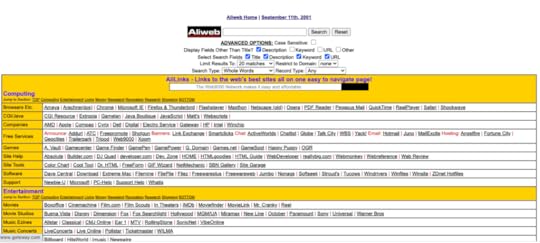
Sub-navigation systems, most commonly identified as drop-down menus, were not invented until the late 90s to early 2000s. As a result, the most iconic 90s websites used lists of links, icons, or flash animations. User-friendly navigation and 90s-era navigation don’t have to be mutually exclusive.
Research suggests that the order of website menu items has little effect on the ease with which people locate their options, but the best results come from menus with 10 or fewer options. This suggests that the right balance of 90s-designed menu options can be both, functional and fashionable.
Clickable iconsMenu icons and banners are a common sight on most webpage templates. These simple navigation tools allow words to guide visitors through sites, but icons used to be a preferred method. Embedding images with links allowed early websites a creative and eye-catching alternative to simply listing links with uniform text.
CSS, or cascading style sheets, used to simplify the structure of current web pages was not available in the 90s. Icons offered a simplified and stylish form of navigation that was easy to identify. In some cases, the icons would be suited to their background as if they were interacting with it, or they would stand in stark contrast to it.
 Source
Apple offers a great example of the effectiveness of well-placed image icons. The icons used today for Apple’s clock, calculator, and notepad are reminiscent of their original forms because their design supports ease of use.
Bright, bold, and boxy icons may be the closest to authentic 90s website design styles, but this form of navigation can be designed with a modern twist to suit your style.
AnimationsOne of the most unforgettable, and arguably enjoyable, aspects of 90s website design was the animations. A cursor with a trail of hearts, shooting stars, swimming fish, and a myriad of other whimsical animations brought web pages to life.
Animations came about through the use of Flash. They were cutting-edge and accessible during a period when there were limited resources to make web pages stand out. Animations were most commonly incorporated into mouse movement and clickable icons, but they could also be a part of the background.
The goal was to make interacting with a website more exciting, and early designers were on to something. Human eyes are drawn to movement, especially when other items in view are unchanging.
Design aspects and preferences may have changed over the years, but eyes and perception have not. This makes animations a valuable tool to this day. Through (the still available) Flash animation software, you can create animations unique to your site’s needs.
The color palette of the 90sSome periods in history can be defined by popular colors that appeared in everything from fashion to furniture, and the 90s was one of those eras. The color palette of the 90s, especially that which appeared on websites, was split into the two main groups listed below.
 Memphis Style
The brighter designs apparent in the 90s fell into a category known as Memphis style. This included bold primary colors, pastels, and neon colors that were often used in contrast with black and white. Geometric shapes were commonly incorporated into Memphis design and a main focus was creating a visually stunning contrast.
This style originated in the 80s and is apparent in the fashion of that decade. Memphis style went on to inspire many web designers of the 90s, and it is still occasionally referenced in modern design.
Grunge StyleThe darker side of 90s web design fell into a color pallet known as Grunge style. In stark contrast to Memphis, Grunge is neutral and dark. Black, grey, brown, and beige took center stage in gloomy designs. Inspiration was drawn from the rising alternative rock scene, also known as Grunge bands.
These two styles may feel mutually exclusive, but they can be blended together to create unique designs inspired by all color pallets of the 90s. By mixing bold colors in muted forms or creating brutal designs with geometric aspects, Memphis and Grunge can create a spectrum of 90s style.
FontsBased on all the other attributes of 90s website design, it’s safe to assume that font styles would be anything but simple. Fonts were used like another form of art, and regardless of what color pallet a site followed, fonts tended towards being bold. Bubbly, boxy, and brushed fonts were common for titles while smaller texts tended towards playful fonts like Comic Sans.
Finding the ideal combination of color, animation, and font for your design can seem daunting, but with a functional prototype, 90s-inspired visions can come to life. With UXPin, you can work on creating web designs reminiscent of the era and revive the nostalgia of the 90s in every detail. With an interactive prototype that behaves like a final product, it is possible to test every aspect, including those 90s animations. Sign up for a free trial.
Website Examples From The 90sDescriptions are great, but some of the best inspirations for designs are visual. Let’s look at two iconic websites in their 90s era to see how they stood out.
NASABeing at the forefront of science and technology, NASA had to create a webpage that centralized relevant information in an iconic way. Their first webpage, from 1994, did so with a textured grey background. Colorful but grainy images on buttons intended for navigation stood out against the dull background.
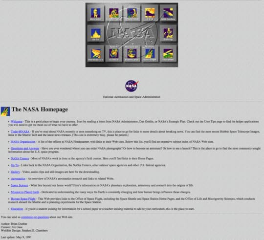
The drop shadows and embossed logo across the screen made this webpage as modern as it could appear in the 90s. Most importantly, its design made it possible for students, educators, and scientists to reference all things NASA in one place.
LegoThe colorful and creative nature of Legos fit perfectly with design trends in the 90s. When their first site was released in 1996 it incorporated texture with a Lego-studded background. The site also incorporated motion with many of its Lego person icons being animated.
The icons on the Lego page may have been pixilated, but the color contrast and creativity worked into their web design captured their audience’s attention regardless.
 Design your 90s website in UXPin
Drawing design inspiration from 90s trends is natural, especially as more and more aspects of 90s design resurface in modern culture. Luckily, the technological barriers that restricted web design of that decade have since been simplified. But the ability to experiment with nostalgic patterns, colors, fonts, and animations is just a few clicks away thanks to powerful prototyping tools like UXPin.
Today’s trend toward simplicity and user-friendly design can be skillfully blended with iconic characteristics of the 90s in any way you choose. UXPin allows for web design that is detail oriented and fully functional even in its prototype phase. This way, you can interact with every retro design aspect prior to launch to ensure they are as functional as they are fashionable. Ready to blend retro style with modern UX and UI capabilities? Try UXPin today.
Try UXPin for freeThe post 90s Websites – Key Characteristics & Examples appeared first on Studio by UXPin.
July 3, 2023
What is Desk Research? Definition & Useful Tools
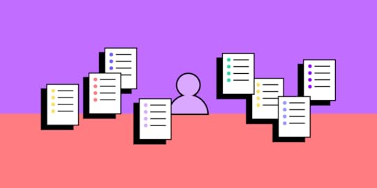
Desk research typically serves as a starting point for design projects, providing designers with the knowledge to guide their approach and help them make informed design choices.
Make better design decisions with high-quality interactive UXPin prototypes. Sign up for a free trial to explore UXPin’s advanced prototyping features.
Build advanced prototypesDesign better products with States, Variables, Auto Layout and more.
Try UXPin .try-uxpin-banner { margin: 40px 0px;}.try-uxpin__container { display: flex; max-width: 689px; height: 210px; padding: 20px; padding-left: 24px; border: 2px solid black; border-radius: 4px; align-items: center; justify-content: space-between; background-color: white; box-shadow: 10px 10px black;}.try-uxpin__left { width: 54%;}.try-uxpin__left p { margin: 10px 0px !important; color: black !important;}.try-uxpin__heading { font-size: 28px !important; font-weight: bold;}.try-uxpin__text { margin: 0 !important; font-size: 18px !important; line-height: 22px !important;}.try-uxpin__button { width: 135px; height: 44px; background: black; margin: 10px 0px; padding: 10px 20px; border: none; border-radius: 2px; color: white; font-size: 16px; text-align: center;}.try-uxpin__button:hover { cursor: pointer;}.try-uxpin__image { max-width: 320px !important; height: 200px; margin-right: -21px; margin-bottom: -6px;}@media (max-width: 760px) { .try-uxpin__container { height: auto; margin: 10px; align-items: left; }}@media (max-width: 500px) { .try-uxpin__container { flex-direction: column; } .try-uxpin__left { width: 100%; align-items: normal; }}What is Desk Research?Desk research (secondary research or literature review) refers to gathering and analyzing existing data from various sources to inform design decisions for UX projects. It’s usually the first step in a design project as it’s cost-effective and informs where teams may need to dig deeper.
This data can come from published materials, academic papers, industry reports, online resources, and other third-party data sources. UX designers or researchers use this information to supplement data, learn about certain markets/user groups, explore industry trends, understand specific topics, or navigate design challenges.
The importance of desk research in the design processDesk research gives designers a comprehensive understanding of the context, users, and existing solutions. It allows designers to gather valuable insights without conducting primary research which can be time-consuming and resource-intensive.
Desk research helps designers better understand the problem space, explore best practices and industry trends, and identify potential design opportunities without reinventing the wheel while learning from others’ mistakes.
Primary Research vs. Secondary ResearchPrimary research: new and original data from first-hand sources collected by the team, such as questionnaires, interviews, field research, or experiments, specifically for a particular research project.Secondary research: utilizing existing data sets and information that others have collected, including books, articles, reports, and databases.Primary and secondary research complement each other in comprehensively understanding a topic or problem. While primary research provides new first-party data specifically for a project’s goals, secondary data leverages existing knowledge and resources to gain insights.
What is the Purpose of Desk Research? Understanding the problem or design challenge
Desk research helps designers comprehensively understand the problem or design challenge. By reviewing existing knowledge and information, designers can grasp the context, identify pain points, and define the scope of their design project.
For example, when tasked with designing a new mobile banking app, desk research can provide insights into user preferences, common challenges in the banking industry, and emerging trends in mobile banking.
Gathering background informationDesk research allows designers to gather background information related to their design project. It helps them explore the domain, industry, target audience, and relevant factors that may influence their design decisions.
For example, when designing a fitness-tracking app, desk research may involve collecting information about fitness activities, wearable technologies, and health guidelines.
Exploring existing solutions and best practicesDesk research enables designers to explore existing solutions and best practices. By studying successful designs, case studies, and industry standards, designers can learn from previous approaches and incorporate proven techniques.
For example, when creating a website’s navigation menu, desk research can involve analyzing navigation patterns used by popular websites to ensure an intuitive user experience.
Identifying trends and patternsDesk research helps designers identify trends and patterns within the industry or user behavior. Designers examine market reports, user surveys, and industry publications to identify trends, emerging technologies, and user preferences.
For example, when designing a smart home app, desk research can involve analyzing market trends in connected devices and user expectations for seamless integration.
Informing decision-making and design choicesDesk research provides designers valuable insights that inform their decision-making and design choices. It helps designers make informed design decisions based on existing knowledge, data, and research findings.
For example, when selecting a color palette for a brand’s website, desk research can involve studying color psychology, cultural associations, and industry trends to ensure the chosen colors align with the brand’s values and resonate with the target audience.
Secondary Research Methods and TechniquesResearchers use these methods individually or in combination, depending on the specific design project and research objectives. They select and adapt these based on the nature of the problem, available resources, and desired outcomes.
Literature review : gathers and analyzes relevant data from academic and research publications, government agencies, educational institutions, books, articles, and online resources (i.e., Google Scholar, social media, etc.). It helps designers gain a deeper understanding of existing knowledge, theories, and perspectives on the subject matter. Market research : studying and analyzing market reports, industry trends, consumer behavior, and demographic data. It provides valuable insights into the target market, user preferences, emerging trends, and potential opportunities for design solutions. Competitor analysis : examines and evaluates the products, services, and strategies of competitors in the market. By studying competitors’ strengths, weaknesses, and unique selling points, designers can identify gaps, potential areas for improvement, and opportunities to differentiate their designs. User research analysis : User research analysis involves reviewing and analyzing data collected from various user research methods, such as surveys, interviews, and usability testing. It helps designers gain insights into user needs, preferences, pain points, and behaviors, which inform the design decisions and enhance the user-centeredness of the final product. Data analysis : processing and interpreting quantitative and qualitative data from various sources, such as surveys, analytics, and user feedback. It helps designers identify patterns, trends, and correlations in the data, which can guide decision-making and inform design choices.How to Conduct Desk Research Defining research objectives and questions
Start by defining the research objectives and formulating specific research questions. A clear goal will inform the type and method of secondary research.
For example, if you’re designing a mobile app for fitness tracking, your research objective might be to understand user preferences for workout-tracking features. Your research question could be: “What are the most commonly used workout tracking features in popular fitness apps?”
Identifying and selecting reliable sourcesIdentify relevant and reliable sources of information that align with your research objectives. These sources include academic journals, industry reports, reputable websites, and case studies.
For example, you might refer to academic journals and industry reports on fitness technology trends and user behavior to gather reliable insights for your research.
Collecting and analyzing relevant informationCollect information from the selected sources and carefully analyze it to extract key insights.
For example, you could collect data on user preferences for workout-tracking features by reviewing user reviews of existing fitness apps, analyzing market research reports, and studying user surveys conducted by fitness-related organizations.
Organizing and synthesizing findingsOrganize the research data and synthesize the findings to identify common themes, patterns, and trends.
For example, you might categorize the collected data based on different workout tracking features, identify the most frequently mentioned features, and analyze user feedback to understand the reasons behind their preferences.
Limitations and Considerations of Secondary Research
Considering these desk research limitations and considerations allows designers to approach it with a critical mindset, apply appropriate methodologies to address potential biases, and supplement it with other research methods when necessary.
Potential bias in sources: Desk research heavily relies on existing information, which may come from biased or unreliable sources. It is essential to critically evaluate the credibility and objectivity of the sources used to minimize the risk of incorporating biased information into the research findings.Limited access to certain information: Desk research may have limitations in accessing certain types of information, such as proprietary data or sensitive industry insights. This limited access can restrict the depth of the research and may require designers to rely on alternative sources or approaches to fill the gaps.Lack of real-time data: Desk research uses existing data and information, which may not always reflect the most up-to-date or current trends. It is essential to consider the data’s publication date and recognize that certain aspects of the research may require complementary methods, such as user research or market surveys, to capture real-time insights.Necessary cross-referencing and triangulation: Given the potential limitations and biases in individual sources, it is crucial to cross-reference information from multiple sources and employ triangulation techniques. This due diligence helps validate the findings and ensures a more comprehensive and accurate understanding of the subject matter.Test Research Findings With UXPin’s Interactive PrototypesSecondary research is the first step. Design teams must test and validate ideas with end-users using prototypes. With UXPin’s built-in design libraries, designers can build fully functioning prototypes using patterns and components from leading design systems, including Material Design, iOS, Bootstrap, and Foundation.
UXPin’s prototypes allow usability participants and stakeholders to interact with user interfaces and features like they would the final product, giving design teams high-quality insights to iterate and improve efficiency with better results.
These four key features set UXPin apart from traditional image-based design tools:
States : create multiple states for a single UI element and design complex interactive components like dropdown menus, tab menus, navigational drawers, and more. Variables : create personalized, dynamic prototype experiences by capturing data from user inputs and using it throughout the prototype–like a personalized welcome message or email confirmation. Expressions : Javascript-like functions to create complex components and advanced functionality–no code required! Conditional Interactions : create if-then and if-else conditions based on user interactions to create dynamic prototypes with multiple outcomes to replicate the final product experience accurately.Gain valuable insights with fully functioning prototypes to validate UX research hypotheses and make better design decisions. Sign up for a free trial to build your first interactive prototype with UXPin.
Try UXPin for freeThe post What is Desk Research? Definition & Useful Tools appeared first on Studio by UXPin.
June 29, 2023
Advanced Search UX Done Right — Powerful Examples and Tips
Where basic search displays a list of results, advanced search enables users to refine their search queries for highly targeted results using filters, facet selection, and other parameters. This filtering lets users find specific information faster than sifting through queries–especially when there is vast content.
Advanced search is crucial for user experience because it gives users more control while increasing efficiency. A well-implemented advanced search can dramatically improve the usability of a website or application, leading to increased user retention and conversion rates.
Design advanced search prototypes that look and feel like the final product. Sign up for a free trial to explore UXPin’s interactive prototyping features.
Build advanced prototypesDesign better products with States, Variables, Auto Layout and more.
Try UXPin .try-uxpin-banner { margin: 40px 0px;}.try-uxpin__container { display: flex; max-width: 689px; height: 210px; padding: 20px; padding-left: 24px; border: 2px solid black; border-radius: 4px; align-items: center; justify-content: space-between; background-color: white; box-shadow: 10px 10px black;}.try-uxpin__left { width: 54%;}.try-uxpin__left p { margin: 10px 0px !important; color: black !important;}.try-uxpin__heading { font-size: 28px !important; font-weight: bold;}.try-uxpin__text { margin: 0 !important; font-size: 18px !important; line-height: 22px !important;}.try-uxpin__button { width: 135px; height: 44px; background: black; margin: 10px 0px; padding: 10px 20px; border: none; border-radius: 2px; color: white; font-size: 16px; text-align: center;}.try-uxpin__button:hover { cursor: pointer;}.try-uxpin__image { max-width: 320px !important; height: 200px; margin-right: -21px; margin-bottom: -6px;}@media (max-width: 760px) { .try-uxpin__container { height: auto; margin: 10px; align-items: left; }}@media (max-width: 500px) { .try-uxpin__container { flex-direction: column; } .try-uxpin__left { width: 100%; align-items: normal; }}What is Advanced Search?Advanced search is a feature of websites or apps that allows users to narrow down the content they’re seeing by using specific filters. It is widely used in eCommerce to help users find items that have specific colors, fabric, ingredients, and other factors they may look for.
The Impact of Advanced Search UX on User BehaviorAdvanced search plays a major role in user experience, as it directly influences how users interact with a website or application. Users want to locate information and complete tasks quickly.
Advanced search UX facilitates this efficiency by enabling users to locate information faster, keeping them engaged, and increasing overall user satisfaction.
According to a study by the Nielsen Norman Group, users who successfully apply advanced search filters are more likely to find what they’re looking for and feel satisfied with their experience.
“That’s always helpful, the information on the side, the filters. I appreciate that when I shop, especially when I know what I’m looking for.” Usability-test participant from a 2018 NN Group study.
In short, good advanced search UX streamlines the search process while boosting user satisfaction by providing a sense of control and efficiency.
Key Elements of Advanced Search UI Search bar design and placement
The UI design and placement of the search input field are fundamental to an effective advanced search UX. The field must be large enough to accommodate typical queries and located prominently in the user interface–typically at the top of the screen.
This prominent location ensures users can quickly find the search feature functionality and start searching.
Predictive search and auto-completePredictive search and auto-complete (auto-suggest) are significant components of advanced search UX. As users type into the search input field, these features provide real-time suggestions based on initial input, accelerating the search process.
Some sophisticated predictive search technologies can even identify spelling mistakes and other inaccuracies and suggest corrective actions or results, reducing errors while increasing efficiency.
Use of filters and faceted searchWhile filters and facets help refine search results, they do so in slightly different ways. Filters typically apply broader categorizations, like date ranges or content types. Conversely, facets are more granular and often used in contexts where items possess multiple attributes, such as eCommerce sites where products may have various sizes, colors, and brands.
Filters and facets are critical tools in an advanced search system. They enable users to refine search results based on specific criteria, such as product attributes, content types, or date ranges. Narrowing results empowers users to find precisely what they want with minimal effort.
Handling of ‘No Results’ scenariosEven with a comprehensive search system, there will be times when a user’s query yields no results. In these situations, providing a friendly, helpful response that encourages further exploration rather than frustration is crucial for effective UX design. Designers can design an empty state for no results, including alternative search suggestions, a prompt to revise the query, or links to popular or related content.
Using data from a user’s deviceUsing data from a user’s device, such as location and language settings, can significantly enhance relevance and personalization. Tailoring search results to a user’s context increases the likelihood of meeting their needs and expectations, fostering a more satisfying and efficient search experience.
The Role of AI and Machine Learning in Advanced Search UX
We couldn’t write an article on advanced search user experience in 2023 and not mention AI. AI and Machine Learning are revolutionizing advanced search UX, bringing in a new level of intelligence and personalization.
These technologies analyze past user behavior and search patterns, use natural language processing to understand intent and provide more accurate, context-aware results.
For instance, Google’s search engine uses AI and Machine Learning for features like autocomplete, spell check, and understanding synonyms. Amazon employs machine learning technology for its search and offers an AWS enterprise search product called Amazon Kendra.
AI and Machine Learning enhance advanced search by making it more user-friendly, responsive, intelligent, and efficient, ultimately elevating the overall user experience.
Common Advanced Search Pitfalls and How to Avoid Them Overcomplicated interface: Providing too many options can overwhelm users. Stick to essential filters and options relevant to your audience. Conduct user testing to streamline your advanced search features.Hidden advanced search: Users may not use advanced search features if they can’t find them. Ensure the advanced search option is easy to locate and intuitive.Poor auto-complete suggestions: These can lead to irrelevant search results. Improve this by utilizing user data and machine learning to offer more accurate, personalized recommendations.Not catering to natural language search queries: This can cause frustration when users use conversational phrases. Implement natural language processing to handle conversational queries effectively.Ineffective ‘No Results’ empty state: Inadequate empty states can lead to user abandonment. Enhance your ‘No Results’ page by providing helpful suggestions or alternatives when a search yields no results.Lack of guidance: Users can struggle using advanced search without explicit instructions. Provide tooltips, help text, or a brief tutorial to guide users.Ignoring mobile experience: The search experience should be seamless across all devices. Design your search with mobile responsiveness in mind, ensuring the same functionality is available on all platforms.5 Examples of Excellent Advanced Search UXAirbnb
Shifting through millions of listings to find your ideal stay would be excruciating without Airbnb’s advanced search. Airbnb’s advanced search has many filtering options to refine results. Even with all these options, the design team has done an excellent job making the UI user-friendly and intuitive.
Airbnb’s advanced search uses various UI elements, including checkboxes, dropdowns, text, graphics, icons, and a price range slider. Users can modify results to find a listing in seconds.
Instagram
Instagram’s advanced search offers predictive search, displaying personalized results, including prominent accounts. If the predictive search doesn’t render the desired result, Instagram displays five tabs:
For you: personalized content recommendationsAccounts: list of Instagram accountsAudio: audio clips associated with the keywordTags: relevant hashtagsPlaces: locations where people have posted contentThese categories enable users to navigate the results and find relevant content quickly.
GitHub
GitHub’s advanced search will appear confusing and technical to non-developers. The repository platform has a sophisticated search syntax enabling engineers to locate specific code, repos, issues, languages, etc. The user interface also provides a sidebar with multiple filters and facets to achieve similar results.
Zalando
Efficiency is crucial for eCommerce stores to capitalize on a shopper’s “buyer intent state.” If shoppers can’t find something fast, they will likely abandon the process and spend their money elsewhere.
eCommerce giant Zalando uses predictive search and multiple filters to help shoppers narrow results, including size, brand, color, price, and material, to name a few.
AmazonAmazon’s advanced search adapts to the shopper’s query, providing highly relevant filters. For example, this search for ‘brown boots’ displays typical eCommerce filters, like brand, price, department, etc., but Amazon provides additional filters relevant to the keyword. For our ‘brown boots’ query, these filters include:
Boot styleBoot shaft heightHeel typeHeel heightBoots special featuresShoe outer materialIf you search for a TV or toolkit, Amazon won’t show you heel height or boot style. Instead, they’ll present options relevant to those products. This personalized, adaptive, and highly relevant filtering enables shoppers to get super granular in the ocean of products available on Amazon.
Advanced Search Design and User Testing in UXPinUser testing is essential when designing advanced search features. It provides valuable insights into how real users interact with your search functions, what works well for them, and what doesn’t. You can use these insights to refine your design, ensuring it meets user needs and expectations.
Importance of interactive prototypingInteractive prototyping is a vital step in the design process. It allows you to test and refine your design before development, saving time and resources. Interactive prototypes can provide a realistic representation of your final product’s appearance and function, enabling you to identify and address usability issues early.
Interactive prototypes are essential for testing UI components like search and other user inputs, but traditional design tools cannot perform this type of testing.
UXPin is powered by code, giving designers the tools and features to build realistic prototypes indistinguishable from the final product. Designers can even mimic interactions like predictive search or connect APIs to create dynamic prototype experiences using real data.
Enhance your prototyping scope with interactive prototyping from UXPin. Sign up for a free trial to explore UXPin’s advanced features.
Try UXPin for freeThe post Advanced Search UX Done Right — Powerful Examples and Tips appeared first on Studio by UXPin.
June 28, 2023
How to Scale Design Systems with UXPin – A Practical Guide
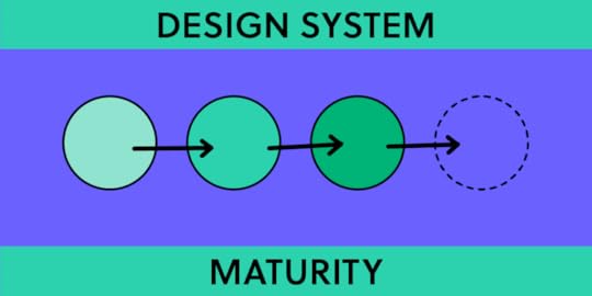
A design system serves as a single source of truth, grouping all elements that allow teams to design, prototype, test, and develop a product. This system includes pattern libraries, coded component libraries, code samples, APIs, and documentation.
Organizations use the four-level design system maturity scale to gauge the evolution of design systems.
The ultimate goal for many organizations is to attain Level 4 maturity in a design system, a stage characterized by fully integrating coded components into the design process.
However, most linger indefinitely at level three because they lack the tools, systems, knowledge, and resources to achieve level-four maturity.
UXPin Merge aims to simplify design system maturity by translating coded UI components into visual elements designers can use in the design process, thus bridging the gap between design and development.
Transform your design workflow with UXPin Merge and embrace the future of component-driven prototyping. Achieve level four design system maturity faster and with fewer resources. Visit our Merge page.
Reach a new level of prototypingDesign with interactive components coming from your team’s design system.
Discover UXPin Merge .discover-merge { margin: 40px 8px;}.discover-merge__container { display: flex; max-width: 690px; height: 200px; padding: 20px; padding-left: 24px; border-radius: 4px; background-color: black; box-shadow: 10px 10px #9999ff; align-items: center; justify-content: space-between;}.discover-merge__left { width: 50%;}.discover-merge__left p { margin: 10px 0px !important; color: white !important; font-size: 18px !important;}.discover-merge__heading { font-weight: bold !important; color: white !important; font-size: 18px !important;}.discover-merge__text { margin: 0 !important; line-height: 22px !important;}.discover-merge__button { width: 174px; height: 44px; margin: 10px 0px; border: none; border-radius: 2px; background: white; color: black; font-size: 16px; text-align: center;}.discover-merge__button:hover { cursor: pointer;}.discover-merge__image { max-width: 320px !important; height: 200px; margin-right: -19px;}@media (max-width: 760px) { .discover-merge__container { height: auto; margin: 10px; align-items: left; }}@media (max-width: 500px) { .discover-merge__container { flex-direction: column; } .discover-merge__left { width: 100%; align-items: normal; }}The Design System Maturity ScaleDesign System Product Owner and Regional Head of Product Design at Iress, Nick Elliot, got the inspiration for this design system maturity scale from TJ Harrop, Design System Product Manager at the NSW Government.
UXPin offers tools and features to support organizations at every level of maturity. The comprehensive toolset also enables organizations to accelerate progress toward level four.
UXPin for levels 1 and 2Level 1: The organization doesn’t have a design system but might have common assets defined and some documentation.Level 2: The organization has design components and can provide HTML and CSS guidelines. These are not yet coded components but patterns that require development.UXPin Merge for levels 3 and 4Level 3: The organization has two libraries with design and development still operating in separate silos:A code component library for developersDesign pattern libraries for designersLevel 4: The organization has a fully integrated system with a single source of truth where designers and engineers use the same design system components and documentation. There is no design drift and no coding or interpretation required to build interfaces.Scaling a Design System from Levels 1 to 3 in UXPinNavigating the platformUXPin is a code-based, full-stack UX/UI design platform that removes constraints in collaboration between designers and developers. UXPin covers the entire UX process from ideation to handoff, including high-fidelity prototyping.
Designers can access UXPin’s Design Libraries without leaving the canvas, which includes colors (tokens), text styles, assets (icons and logos), and design elements (components).
Documentation is a crucial aspect of design systems, but it’s challenging to create and maintain. UXPin automatically generates documentation for each library, including colors, typography elements, assets, and pattern libraries. Designers can edit these pages and add information, such as use cases and tips for each component’s usage.
UXPin also includes a component spec tool, allowing devs to explore its properties and grab CSS. This tool is essential for developers who need guidance on recreating patterns in code.
This inspection tool is essential for maturity levels one and two or when teams release new elements and patterns, as it enables developers to convert design mockups into functioning components for the UI library.
Building the design system’s foundation in UXPin – levels one and twoDesigners can create components from scratch using UXPin’s Forms, Shapes, Text, and Box tools as a foundation. They can also edit master components in isolation, including adding interactions.
Unlike image-based tools, designers don’t need to create multiple frames or duplicate elements to add component interactivity in UXPin. For example, they can design several button states, like default, hover, active, disabled, etc., simply by editing the master component’s interactions and properties to change based on user or system actions.
UXPin’s Documentation provides space for the design system team to add code examples beside visual components, including CSS, Handlebars, HTML, Javascript, JSX, Ruby, and PHP, to name a few.
These features allow design teams to navigate levels one and two, giving them a complete pattern library with documentation in UXPin.
Level three maturityOnce the pattern library is complete and devs have successfully converted the components to code, the organization is at level three maturity.
Many organizations refer to this level as a single source of truth, but there are, in fact, two libraries and two sets of documentation to update and maintain.
While level three is significantly better than level two, there are many DesignOps challenges when maintaining and updating separate libraries:
Double the time and resourcesThe necessity for many tools in the design process–i.e., a design tool, prototyping tool, documentation, etc.Slow updates due to managing releases for multiple platformsErrors and inconsistenciesTeams working with out-of-date design system versionsDesign and engineers speak different languagesLack of fidelity and interactivity for prototyping in the design processAnother challenge with level three is that the code is often not production ready. Some organizations have design system repositories, but many at this level rely on guidance code from documentation. The development process is open to errors and inconsistencies without a coded component library hosted in a single repository.
Fully Integrated – Level Four MaturityAt level four, designers use code components in the design process, pulled from the same repository developers use to build the final product. In UXPin, this component-driven prototyping methodology is made possible by Merge technology.
Merge fetches UI components from a repository and renders them in UXPin for design teams to build prototypes. The benefits of this workflow include:
High fidelity and pixel-perfect parityConsistent user experienceFaster design and developmentCode reuseSimplified governanceHarmony between designers and developersA real single source of truthMerge IntegrationsOrganizations have three primary methods for importing components:
Git Integration : access to Merge’s complete feature set, including Patterns, Version Control, and JSX presets–only available for React libraries. Storybook Integration : connect any Storybook to UXPin, including Vue, React, Angular, Web Components, and more. npm integration : import components from open-source libraries through the Merge Component Manager.Bridging the gapTraditional design software provides prototypes, assets, documentation, and redlining, but this doesn’t fully bridge the gap. The prototypes are mid-fidelity at best and require translation and assumptions, which can lead to product drift and increased costs.
Level 4 bridges the design development gap with coded components from a repository, serving as a single source of truth. Developers leverage these components in code, while UXPin Merge translates the code and integrates the components with its toolset.
Using Merge results in high-fidelity prototypes that are fully functional and testable without assumptions. It ensures pixel-perfect parity between design and development, faster design processes, code reuse, and ultimately higher profits. It also leads to better collaboration and understanding between designers and developers.
Understanding Merge’s CapabilitiesComponent propertiesComponents imported into UXPin through Merge are driven by properties defined in the design system’s repository. These properties are the same as those used by developers. For example, a button component can have label, color, and variant properties, which designers can adjust in UXPin’s Properties Panel.
Real code componentsThe components in UXPin Merge are real code components. Component behavior, such as hover effects, is inherent in the code and doesn’t need to be configured by the designer. Using code in the design process ensures high fidelity between the design and the final product.
Atomic Design methodologyIn the Atomic Design methodology, designers build components from the smallest building blocks, called atoms, up to more complex patterns (molecules, organisms, templates, and pages). In UXPin Merge, designers can compose components using other components, each with its own configurable properties.
Component compositionUXPin doesn’t restrict designers to the initial composition of components. They can modify components by adding or removing elements. For example, removing the header from a card component, adding a video player, and adjusting the typography are all possible in UXPin.
Spec Mode with JSX codeSpec Mode in UXPin provides clean JSX code as configured by the designer with properties. This JSX ensures that developers can access the exact code needed to recreate the component as designed.
Fully testable prototypesBecause the components are coded and have inherent behavior, the prototypes built with UXPin Merge are fully functional and testable without assumptions. This enhanced testing is particularly useful for components with states, such as dropdowns and tabs.
Collaboration and documentationUXPin Merge facilitates collaboration between designers, stakeholders, and developers by providing access to documentation, properties, behavior, and rule sets for components.
Accessibility and configurationDesigners can configure components for accessibility by exporting ARIA tags as properties, allowing for screen reader testing. This configuration can also help achieve more complexity, such as enabling or disabling checkboxes or filtering a data table.
Data componentsDashboards and tables are near impossible to prototype in traditional design tools due to their complex interactivity. With Merge, designers can import a data grid component for sorting, selecting, and filtering. They can populate the data by copy-pasting from a spreadsheet or through an API connection within the component.
Inter-component communicationComponents can communicate with each other in UXPin. For example, a button can trigger a dialog component, much like it would in the final product. The dialog has an ‘open’ property that controls its visibility, which designers can activate using a button (or any other element).
Version ControlUXPin Merge includes Version Control, essential for scaling and future-proofing a design system. Each prototype links to a version of the design system, and designers can switch between different versions or branches. This versioning is helpful in testing new versions, working with different themes, or managing multiple products that use the same design system.
Responsive designIf a component has responsive properties, its media queries will reflect in UXPin. This responsiveness allows designers to create a single prototype that is adaptive to different breakpoints.
Adaptability and scalabilityUXPin Merge is adaptable and scalable, allowing for various use cases such as testing prototypes with new versions of the design system, managing different themes for different products or clients, and rolling out new design systems with new components.
Unlock the full potential of your design system by bridging the gap between design and development with UXPin Merge. Experience the power of component-driven prototyping and ensure consistency in your projects. Visit our Merge page.
Discover MergeThe post How to Scale Design Systems with UXPin – A Practical Guide appeared first on Studio by UXPin.
UXpin's Blog

- UXpin's profile
- 68 followers

