
UXpin's Blog, page 28
November 2, 2023
What is a Component Library, and Why Should You Use One for UI Development?
When optimizing development across many platforms, it’s wise to consider using a component library. By offering an accessible, open-source repository of production-ready, customizable, and reusable code components—like buttons and accordions—component libraries let UI and UX designers leverage faster development and growth.
Key takeaways:
A component library is a set of pre-made, tested, and well-documented UI components that can be easily reused across the user interface of a product.It ensures that the product has a consistent look and feel and promotes efficiency and scalability.With component libraries, designers and developers can quickly add new features and pages while preserving the overall design consistency.Share a single source of truth between designers and engineers. Use UXPin Merge to bring one of the component libraries to our design tool and use its elements to create interactive prototypes that can be easily passed to developers for production. Learn more about UXPin Merge.
Reach a new level of prototypingDesign with interactive components coming from your team’s design system.
Discover UXPin Merge .discover-merge { margin: 40px 8px;}.discover-merge__container { display: flex; max-width: 690px; height: 200px; padding: 20px; padding-left: 24px; border-radius: 4px; background-color: black; box-shadow: 10px 10px #9999ff; align-items: center; justify-content: space-between;}.discover-merge__left { width: 50%;}.discover-merge__left p { margin: 10px 0px !important; color: white !important; font-size: 18px !important;}.discover-merge__heading { font-weight: bold !important; color: white !important; font-size: 18px !important;}.discover-merge__text { margin: 0 !important; line-height: 22px !important;}.discover-merge__button { width: 174px; height: 44px; margin: 10px 0px; border: none; border-radius: 2px; background: white; color: black; font-size: 16px; text-align: center;}.discover-merge__button:hover { cursor: pointer;}.discover-merge__image { max-width: 320px !important; height: 200px; margin-right: -19px;}@media (max-width: 760px) { .discover-merge__container { height: auto; margin: 10px; align-items: left; }}@media (max-width: 500px) { .discover-merge__container { flex-direction: column; } .discover-merge__left { width: 100%; align-items: normal; }}What is a Component Library?
A UI component library, often referred to as a User Interface (UI) component library or design system, is a collection of pre-designed and pre-built user interface elements that are used to create consistent user interfaces for digital products, such as websites and applications.
These libraries include a range of UI elements, such as buttons, forms, navigation menus, icons, typography, and more, each designed with a consistent look and feel.
UI component libraries are particularly useful in collaborative design and development environments, as they help ensure that all team members are on the same page in terms of design and that the end product maintains a professional and polished appearance.
Component Library Can Offer a Single Source of TruthAs part of any design system, a component library can reduce the risk of any variation between products, or ending up with different components in different places. They handle the source code for UI elements and usually leverage CSS and JavaScript.
React is a prime example of a popular open-source framework, developed by Facebook as a component library but since grown into a large ecosystem for creating apps, static sites, and desktop applications. 
Plus, there are many more advantages worth highlighting:
Accessibility: As a single repository for housing ready-made, reusable components, a component library offers quick access to developers and designers everywhere. This improves collaboration and communication between developers and designers working across teams.Reduced code duplication: Often, code gets duplicated across varying designs and projects. But with a component library, there’s no need to convert the design to code. Instead, you can use the code component to design with no further development.Consistency: Promoting a single source of truth is more likely with a component library. By enabling consistent UI and UX across entire projects, it’s easier to achieve uniformity. And this is a key advantage over different designers working across a range of designs. Speed: By avoiding building from the bottom up, teams save time. Instead of redesigning or creating a calendar, it’s already there to use. Plus, thanks to a set of ready-made, pre-set components, teams can avoid any drawn-out, time-draining decision-making processes they may have once faced. Compatibility: Frontend developers can struggle with ensuring cross-browser and cross-device compatibility. But a component library will go a long way to avoiding incompatibility through standardization.When Is It Best to Use a Component Library?There are some particular situations where a component library can add measurable value to a project. So let’s look at what they are:
Code-first prototypingProjects that focus on functionality over visual design are more likely to benefit from a component library. Plus, prototyping with code is more efficient than starting with images and then converting them into code. So rather than expecting developers to interpret image-based designs and then create the codes, they simply take the code component from the ready-made design.

This also opens up the chance for developers to design with pre-built components without worrying about any lack of design skills.
When you lack the skills or experience to build your ownCreating your own component library or developing one as part of your own enterprise design system may be your dream. But this may not be a reality when your team lacks experience in building reusable UI components or you’re working to tight project deadlines.
Instead, integrated component libraries provide all the code components designers and developers need to test functionality, usability, and design before conversion to digital products.
If you’re a smaller company or teamStartups and small or medium-sized businesses may need to be more careful with financial resources. And with a wide range of effective, versatile, open-source component libraries around, smaller companies can set themselves up to scale, step by step. After all, no industry giant got there overnight. And many of them continue to stick with their original component library throughout their evolution.
There Are Some Exceptional Tools Available to Help You ScaleIf it’s not yet clear how you’ll benefit from a component library, then here are some questions that could prompt your thinking:
Do you see developers building the same components for each project but with slight variations?Are any developers confused about which UI or UX convention they should use in interfaces?Do you need to release updates and changes fast?Do you need a lot of customization?Are you looking for a combined design system and component library?If the answer to any of these questions is yes, then consider one of the tools below.
1. Merge Component ManagerMerge Component Manager is a design operations tool for managing React UI components in UXPin. You can bring your own component library and use Component Manager to manage component’s properties. It’s perfect for those of you who lack active development support.
Once you upload UI components, you can use them to design UI in UXPin. The components have their full interactivity in UXPin since they’re coded in React.
2. Merge npm integrationOne of the ways to bring UI components from your component library to UXPin is through NPM package integration. All you need to import the components is a library name. Then, you would use Merge Component Manager to set up props and write desicriptions, etc. Read more about npm integration.
3. Merge Storybook integrationStorybook is an open-source tool for developing UI components in 15 different frameworks, among others the most popular ones: React, Vue, and Angular. It’s a combined coded design system and component library that acts as a sandbox for effective components and page development, testing, and documentation. Your developers can take a more effective component-driven approach over a visual one.
As Storybook is used by developers, there’s an integration with UXPin that can help you with designing as well. With UXPin Merge technology, you can sync any Storybook with UXPin editor to design with code components. The fully functional UI elements will show up in one of the UXPin libraries so that you have access to them right away.
Be the First to Design with Code Using Innovative Merge technologyComponent libraries offer the chance to standardize development, reduce code duplications, improve collaboration between teams, and drive scalability. And with so much influence over your project deliverable and team motivation, it’s important to choose the right solution for your needs.
But if you’re looking to improve design consistency and development productivity, UXPin’s Merge technology offers a unique point of integration with Storybook, as well as its own tool, Merge Component Manager for managing components in design. Discover more about UXPin Merge.
Discover MergeThe post What is a Component Library, and Why Should You Use One for UI Development? appeared first on Studio by UXPin.


Website Structure 101 with Examples
A Website structure helps users to navigate sites and find the information that they are looking for. This article will explain why site structure is important for designers and how designers can create effective site structures.
Key takeaways:
A website structure is the way a website’s content and pages are organized and interconnected. It involves the hierarchical arrangement of web pages and their relationships to one another.Website structure helps visitors and search engines navigate and understand the website’s content.There are four types of website architectures: hierarchical, sequential, matrix, database.Designing a new site? Use UXPin and build website architecture and turn it into a workable prototype. It’s an end-to-end solution that simplifies UI and UX design process up to design handoff, so your developers can extract ready HTML and CSS code to kick start website development. Try UXPin right now.
Build advanced prototypesDesign better products with States, Variables, Auto Layout and more.
Try UXPin .try-uxpin-banner { margin: 40px 0px;}.try-uxpin__container { display: flex; max-width: 689px; height: 210px; padding: 20px; padding-left: 24px; border: 2px solid black; border-radius: 4px; align-items: center; justify-content: space-between; background-color: white; box-shadow: 10px 10px black;}.try-uxpin__left { width: 54%;}.try-uxpin__left p { margin: 10px 0px !important; color: black !important;}.try-uxpin__heading { font-size: 28px !important; font-weight: bold;}.try-uxpin__text { margin: 0 !important; font-size: 18px !important; line-height: 22px !important;}.try-uxpin__button { width: 135px; height: 44px; background: black; margin: 10px 0px; padding: 10px 20px; border: none; border-radius: 2px; color: white; font-size: 16px; text-align: center;}.try-uxpin__button:hover { cursor: pointer;}.try-uxpin__image { max-width: 320px !important; height: 200px; margin-right: -21px; margin-bottom: -6px;}@media (max-width: 760px) { .try-uxpin__container { height: auto; margin: 10px; align-items: left; }}@media (max-width: 500px) { .try-uxpin__container { flex-direction: column; } .try-uxpin__left { width: 100%; align-items: normal; }}What is Website Structure?
 Website structure is how the different pages of the site are linked with each other through internal links and their hierarchy. It is about how the information on a site is organized and presented, so that the users know how to move through the site whilst the algorithm can read its context well.
Good website structure facilitates easy navigation for both users and crawlers. Apart from influencing user experience, it also affects the SEO ranking of a website in search engines.
Why is website structure important for designers?The role of a UX designer is to create a website that has a great UX that takes care of accessibility and is easy to use. A great website structure improves the usability or user-friendliness of your website by making it easy for users to find what they are looking for.
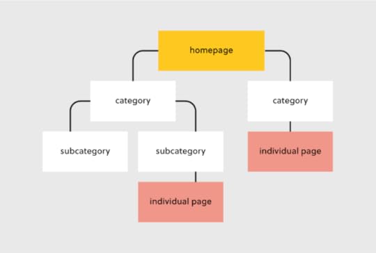
4 Types of Website StructureThere are different types of web structure that you may use in UX design. They are hierarchical, sequential, matrix, and database model. What are they about?
Hierarchical website structure
Hierarchical structure is the most common website structure is a hierarchical structure that is based on one parent page (main page) and child pages (categories and sub-categories) that flow from the main page. Think of UXPin’s page (image above).
Sequential website structure
Sequential structure is used when you want your users to go through steps or any other sequence. A good example of that structure is Growth Design‘s UX case study pages that they share in their newsletter.
Matrix web structure content website structure
Matrix structure is site structure that’s common for online newspapers, such as New York Times. The site architecture, although present, isn’t as clear as in the hierarchical model.
Database website structure
Database model, also called dynamic website structure, is the model prevalent for sites that have a lot user-generated content.
How to Choose the Best Website Structure?To create a website structure, you need to map out how you will organize the content on your site (homepage, categories, individual page, blog posts). This is why website structuring should be the first step in any web design project.
The underlying principle in great website structure is Information Architecture (IA). IA ensures that content is organized, structured, and labeled effectively and consistently.
Consider the following factors to design an information architecture of your site:
User journey: Since websites are created to serve users, it is important to consider how they might experience or interact with your site and their expectations of how your website should work. You can determine the journey of your users through interviewing them or doing a card sorting exercise. Content: The structure of your website will also be largely determined by the type and volume of content on your site. The structure of an e-commerce site will be different from the structure of an academic site. Read more about UX content: Content Strategy for UX.Context: The context of a website is determined by its business goals, the cultural context that it exists in, and the resources available. It is important to consider this fact as you structure your website.Key Elements of Website StructureLet’s focus on hierarchical structure of a website. This is a structure which most content websites, such as company website, eCommerce store, common blogs, etc. are based on.
Let’s look at each of these elements and how you can optimize them during your design process.
Homepage web structureYour homepage is the top page in your website hierarchy and the central place where users navigate your website from. Ensure that all the important pages on your website are linked from this page. The relationship between your homepage and the main category pages is represented by your website’s menu or main navigation.
Here’s how to design a useful navigation/menu for your website.
Navigation or menu web structureYour site visitors will use the navigation to understand how information is structured on a website and to find what they are looking for. Ensure that all your main category pages are represented on your menu or main navigation. Additionally, use the following rules when creating your navigation:
Use short phrases or even one word for each element.Use simple language that your users can understand. Don’t clutter your navigation with sitelinks.Apple’s main navigation follows these rules to create a simple but super-useful menu.

If your site has some subcategories that are useful for users such as their account information. You can create a secondary vertical menu like Asos has.
Other useful categories such as utility pages (privacy policies, disclaimers and legal information) can be placed on the footer of the website.
Categories and subcategories web structure best practicesUse categories to group website pages that have similar content which makes it easy for users to access the content. Blog posts can be grouped into categories such as ‘marketing’ and then be further subdivided into subcategories such as ‘landing pages’ and ‘email marketing.’
If you are designing an e-commerce website, you can group your products into categories such as ‘men’ and ‘women.’ If your categories are too many you can further subdivide them into subcategories. Continuing with our example of an e-commerce store example, the women category can have subcategories such as ‘clothes’, ‘shoes’, and ‘handbags’.
A great example of this is the Asos Marketplace website where their clothing category has a subcategory that shows the types of clothing available in the marketplace such as swimwear, sweatshirts, tracksuits, and hoodies.
 Web structure tips for individual pages
It is important to structure your individual website pages or blog posts in a way that makes it easy for users to find what they are looking for, find similar content and understand where they are on your website. Breadcrumb trails, tags, and contextual sitelinks are used to structure information architecture on individual pages.
Take care of the headers that you put on individual pages. Make sure that they follow the right order, for example, the title of the blog post is H1 and that they all have metadata. Metadata are important part of UX, too. You don’t want to confuse users what your site is about.
Use breadcrumb trailsYou can add navigation on your pages or posts in the form of a breadcrumb trail. A breadcrumb trail is made up of clickable sitelinks that show users exactly where they are on your site plus your site structure. Breadcrumb trails like the one used by Mailchimp improve usability and user experience.
 Add tags and categories
Tags are another useful way of grouping similar content on a specific page. The difference between tags and categories is that categories have a hierarchy and can be further subdivided into subcategories but tags have no hierarchy. They simply group similar content.
For example, Grammarly’s blog uses categories and tags, such as ‘how to,’ ‘product’ and ‘inspiration’ to group blog content.

The usefulness of these tags is displayed when a user clicks on one of the posts tagged ‘how to’ and they are shown other posts that are also tagged ‘how to’ at the end of the blog post. This is a great example of how website structure makes it easy for users to find information.
Tags can also be used in e-commerce websites to group products according to brand and direct users to similar products.
Here are 3 best practices for creating tags:
Don’t create too many tags or a new tag for every post.Place tags in a place where site visitors can easily see them such as your sidebar or at the end of your blog posts/product pages.Make sure that the tags are clickable and users can view similar content if they need to.Contextual linksThese are links on webpages or blog posts that point to other relevant content on other webpages. Contextual links are useful in showing users related content. In the context of a blog post, contextual links can be used to point users to other blog posts that have similar content. Grammarly does this in their blog post as shown below.
Contextual links can also be used in e-commerce pages to link to pages that have related items, what other people have bought, or which products are often bought together.
Easily Incorporate Website Structure In Your DesignsWeb structure is how information is organized and interconnected on a website. An effective site structure improves usability and user experience which makes web structuring an important step in the web design process. The UXPin design tool makes it easy for you to design, prototype and structure a website, as you collaborate with other team members and designers. Try UXPin now.
Try UXPin for freeThe post Website Structure 101 with Examples appeared first on Studio by UXPin.
Button States Explained – How to Design them
Buttons are pivotal in this experience, acting as road signs for user actions. This guide unravels the complex world of button states, revealing how they facilitate effective user interface design. Learn about common types of button states, design principles, and cross-platform considerations.
Key takeaways:
Button states serve as critical visual cues that inform users of possible interactions within a digital interface.Consistent design across various button states enhances user experience by providing familiar, easy-to-recognize cues.Accessibility considerations like ARIA roles and keyboard navigation are non-negotiables when designing button states.Cross-platform design requires adapting button states to meet the distinct guidelines and user expectations of web, mobile, and other devices like smart TVs.UXPin’s States lets you apply states depending on different user actions or system changes to enhance testing during the design process. Sign up for a free trial to design with States and other advanced UXPin features.
Build advanced prototypesDesign better products with States, Variables, Auto Layout and more.
Try UXPin .try-uxpin-banner { margin: 40px 0px;}.try-uxpin__container { display: flex; max-width: 689px; height: 210px; padding: 20px; padding-left: 24px; border: 2px solid black; border-radius: 4px; align-items: center; justify-content: space-between; background-color: white; box-shadow: 10px 10px black;}.try-uxpin__left { width: 54%;}.try-uxpin__left p { margin: 10px 0px !important; color: black !important;}.try-uxpin__heading { font-size: 28px !important; font-weight: bold;}.try-uxpin__text { margin: 0 !important; font-size: 18px !important; line-height: 22px !important;}.try-uxpin__button { width: 135px; height: 44px; background: black; margin: 10px 0px; padding: 10px 20px; border: none; border-radius: 2px; color: white; font-size: 16px; text-align: center;}.try-uxpin__button:hover { cursor: pointer;}.try-uxpin__image { max-width: 320px !important; height: 200px; margin-right: -21px; margin-bottom: -6px;}@media (max-width: 760px) { .try-uxpin__container { height: auto; margin: 10px; align-items: left; }}@media (max-width: 500px) { .try-uxpin__container { flex-direction: column; } .try-uxpin__left { width: 100%; align-items: normal; }}What are Button States?A button’s state indicates the element’s current interactive condition, whether ready for a user action or in a non-responsive mode. Understanding these states ensures clear user feedback, highlighting possible actions or barriers.
For example, a hover microinteraction (changes the button style, animation, etc.) suggests a button is clickable, while a grayed-out one indicates an unavailable action. Properly utilized button states streamline user experiences, reduce confusion, and elevate interface intuitiveness.
What are the Types of Button States?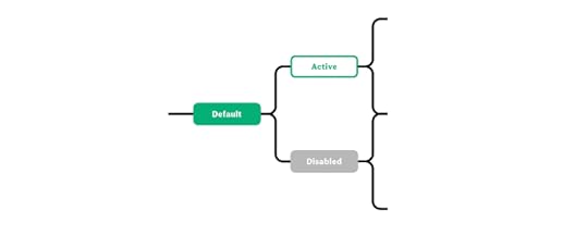
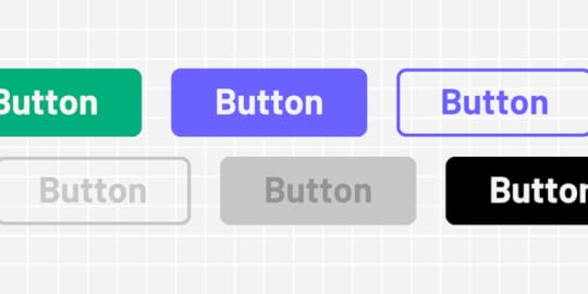
Buttons typically have four to six states (sometimes more) depending on the product and available actions. Here are seven standard states found in modern product development:
Default stateHover stateActive stateFocus stateDisabled stateLoading stateToggle stateThese states apply to all button types, including:
Primary: The main action button, often bold and contrasting, directs users to the most important task.Secondary: Less prominent but still important, used for alternative actions that complement the primary task.Tertiary: Least emphasized, usually for low-priority tasks, often appearing as simple text or an outline.Default stateUse case:
Default is a button’s initial or clickable state, the one users see when a page loads.
Design principles and best practices:
Opt for high-contrast colors that are compliant with accessibility standards. Make sure the label clearly communicates the button’s function.
Hover stateUse case:
The hover state is triggered when a user places a cursor over the button without clicking, indicating that the UI element is clickable.
Design principles and best practices:
Change the color or elevation slightly to indicate it’s interactable. Don’t make drastic changes; it should be subtle yet noticeable.
Active stateUse case:
This state appears when the user clicks the button, informing users the product has successfully received the action.
Design principles and best practices:
Apply a visual effect like a color fill or a shade to signify the action is processing. Make sure the effect reverses when the click is released.
Focus stateUse case:
The focus state activates when the keyboard navigation or other non-user action selects a button, usually on page load or after completing a specific task.
Design principles and best practices:
Implement a border or outline to indicate focus. Focus states are crucial for accessibility because they reduce work for screen readers and keyboard users.
Disabled stateUse case:
The disabled state indicates a button is not available for interaction. The users must usually complete another action–like a form’s required fields–before the button is clickable.
Design principles and best practices:
Gray out the button and lower its opacity. Ensure it’s visually distinct from the default state, but don’t hide it entirely–users should know it’s unavailable.
Loading stateUse case:
Loading state activates when the system processes an action triggered by a user click or tap. This state follows the active state immediately after the user releases their click or tap.
Design principles and best practices:
Use a spinner or other loading indicator within the button. Keep the user informed without requiring them to leave the button area.
Toggle stateUse case:
A toggle button turns someone on and off. You often see a toggle state in settings or interactive elements that let the user choose between two conditions, such as turning a feature on or off.
Design principles and best practices:
Clearly differentiate the two states–commonly “on” and “off”–through color, shading, or icons. The user must understand the current state immediately. Make text labels descriptive to eliminate ambiguity.
What are the Design Principles for Button StatesVisual consistencyMaintain uniformity across button states to improve usability. Consistency speeds up interaction by creating familiar visual cues. For example, use the same rounded corners for default, hover, and active states.
Size & positionPosition buttons where users expect them and keep sizes optimal for interaction–i.e., touch targets large enough to avoid mishits or errors on mobile devices. Predictable placement and sizing reduce navigation effort. For example, place primary action buttons on the bottom-right corner of modal windows.
TransitionsUse subtle transitions for state changes to avoid jarring shifts. Smooth transitions guide users’ eyes and improve flow. For example, implement a 200 and 500 ms fade effect when a button transitions from hover to active state.
Color & contrastLeverage color and contrast to indicate button states effectively. High contrast aids visibility; color changes signal state shifts. For example, use a darker shade of the original color for the hover state to ensure the button remains noticeable.
AccessibilityMake button states discernible for all users, including those with impairments. ARIA roles and attributes clarify button functions, while keyboard navigation compatibility ensures universal usability. For example, add role=”button” and aria-pressed attributes to make custom buttons accessible and ensure they’re focusable for keyboard navigation.
What are Some Common Mistakes in Button State Design?Inconsistent visual cues: Failing to standardize button state cues across the interface disrupts the user experience.Indiscernible disabled state: When disabled and active buttons look too similar, users click without feedback or understanding.Overcomplicated transitions: Using excessive or inconsistent animations can distract and disorient users.Low contrast: When button states lack sufficient color contrast, users can’t distinguish between them, affecting engagement and causing potential errors.Ignoring Accessibility: Lack of ARIA roles or non-functional keyboard navigation alienates users who rely on assistive technologies.How to Design Button StatesHere is a step-by-step tutorial for designing button states. We’re using a FinTech app to provide context and examples.
Step 1 – Identify User Actions: List the actions users will take in your FinTech app. For example, users need to “Transfer Money,” “View Account,” or “Invest.”Step 2 – Sketch Initial Designs: Use wireframes to sketch your buttons’ basic shapes, sizes, and placements.Step 3 – Determine Button States: Decide which states each button will have–default, hover, active, focus, disabled, loading, and possibly toggle for feature toggles. For example, the “Transfer Money” button will need a default, hover, active, and disabled state.Step 4 – Pick Colors and Contrast: Use high-contrast colors that align with your FinTech app’s brand guidelines. Use a Contrast Checker and Color Blindness Simulator to test accessibility.Step 5 – Design Transitions: Choose subtle animations for transitioning between states and screens.Step 6 – Test Size and Position: Ensure buttons are large enough for mobile users and positioned where they are most intuitive.Step 7 – Implement ARIA and Keyboard Navigation: Make the button states accessible. Use ARIA roles and ensure keyboard navigation works seamlessly.Step 8 – Testing: Conduct usability testing to catch any mistakes or areas for improvement. Share designs with stakeholders for feedback on business objectives.Step 9 – Iterate: Based on testing feedback, make necessary adjustments. Test redesigns to ensure they solve user and stakeholder issues.Step 10 – Design handoff: Collaborate with engineering teams to convert designs to functional code. Ensure devs implement non-visual elements like ARIA attributes for accessibility.How to Design Button States for Cross-Platform ApplicationsPlatform differences between mobile, web, and other interfaces like smart TVs require distinct design strategies. Even within the mobile universe, iOS and Android have different rules and principles for UI design and interactivity. Here are some things to consider when designing button states for cross-platform applications.
Mobile vs. web designMobile: Buttons must be large enough for touch but not so big that they overwhelm the interface. Mobile environments often use tap states similar to hover states on web interfaces.
Web: You can employ hover states and tooltips with more space and a cursor. These don’t translate well on mobile, so make sure your web designs are mobile-friendly.
iOS vs. AndroidiOS: Apple’s Human Interface Guidelines specify rounded corners and a flat design. States are often less flashy, focusing on simple color changes or subtle shading.
Android: Google’s Material Design allows for more expressive animations and elevations. Android buttons lift when tapped, adding depth to the state transition.
Other platforms and devicesSmart TVs, Game Consoles: These platforms often rely on remote or controller-based navigation. Button states must be prominent and highly visible, and focus states are more of a priority than web and mobile design.
Interactive Button State Design With UXPinUXPin is a code-based design tool with more features and functionality to create fully interactive prototypes. UXPin’s States lets you create simple component states and complex UI patterns like dropdown menus, tab menus, navigational drawers, and more.
Designers can define properties and interactivity for each state, with triggers for web and mobile applications–i.e., click and hover for desktop or tap and swipe for mobile.
UXPin’s code-based interactivity provides users with a realistic prototyping experience, indistinguishable from the final product, giving designers meaningful, actionable feedback to iterate and solve more challenges during the design process.
Design button states faster and achieve accurate results during testing with UXPin. Sign up for a free trial to explore States and other advanced UXPin features.
The post Button States Explained – How to Design them appeared first on Studio by UXPin.
October 31, 2023
FullStory Integration – Test Usability inside UXPin
Here’s some news that will make you rethink how you’re running usability testing. UXPin has an integration with FullStory, one of the leading product analytics tools. Get valuable insights on how your end users will interact with your product right at the prototyping stage.
Key takeaways
UXPin integrates with FullStory, so you can get quality insights about your design on the prototyping stage.UXPin and FullStory integration is available for everyone – you just need an active FullStory account to support it in UXPin.Test your products before committing resources to having them built, get quality test results, and run remote testing sessions with ease.Design fully interactive prototypes that your test subjects can use like end-products. Build sortable data tables, interactive input fields, and clickable buttons that can be easily handed off for development. Get a free trial of UXPin.
Build advanced prototypesDesign better products with States, Variables, Auto Layout and more.
Try UXPin .try-uxpin-banner { margin: 40px 0px;}.try-uxpin__container { display: flex; max-width: 689px; height: 210px; padding: 20px; padding-left: 24px; border: 2px solid black; border-radius: 4px; align-items: center; justify-content: space-between; background-color: white; box-shadow: 10px 10px black;}.try-uxpin__left { width: 54%;}.try-uxpin__left p { margin: 10px 0px !important; color: black !important;}.try-uxpin__heading { font-size: 28px !important; font-weight: bold;}.try-uxpin__text { margin: 0 !important; font-size: 18px !important; line-height: 22px !important;}.try-uxpin__button { width: 135px; height: 44px; background: black; margin: 10px 0px; padding: 10px 20px; border: none; border-radius: 2px; color: white; font-size: 16px; text-align: center;}.try-uxpin__button:hover { cursor: pointer;}.try-uxpin__image { max-width: 320px !important; height: 200px; margin-right: -21px; margin-bottom: -6px;}@media (max-width: 760px) { .try-uxpin__container { height: auto; margin: 10px; align-items: left; }}@media (max-width: 500px) { .try-uxpin__container { flex-direction: column; } .try-uxpin__left { width: 100%; align-items: normal; }}About UXPin and FullStory IntegrationUXPin is an end-to-end design tool for building prototypes and handing them to the development team. Many design teams use UXPin’s preview mode to test the prototype’s user flow and get feedback from real users. The feedback helps them iterate on design and build an end-product that their users love.
When integrated with FullStory, UXPin gives the designers even more power when conducting user testing. They don’t need to worry about recording the session, writing down what users did, where they clicked or what they couldn’t understand. FullStory has their back. FullStory tracks the user’s behavior, making it super easy for you to conduct usability tests right in UXPin.
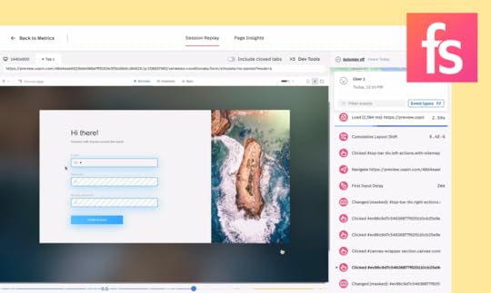
Catch every detailWith FullStory integration, designers can rest assured that every user action will be documented. They can analyze it later or share it with stakeholders for additional feedback. It makes testing a lot easier, doesn’t it?
Focus on facilitatingWhen you have a tool that records your users every move, you can focus on what you’re good at– facilitating the session. Gain the time to ask follow-up questions, record where users have their points of friction, and any feedback that they had to you. When a tool documents users’ movements, you get a bandwidth to focus on their reactions.
Run remote testsUXPin’s FullStory integration simplifies remote user testing for you. It gives you a way to run tests without the need to be in the same room as your test participants and everything gets recorded. How does it work?
Send your prototype to your test subjects.Run a live test – they don’t need a UXPin account to interact with the prototype.See how FullStory saves their actions for you.Record stakeholder feedbackThe same way you send your prototype to users, you can share it with any stakeholder who needs to see the design. Track whatever they do and act on feedback fast.
How does it work?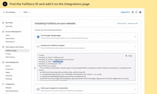
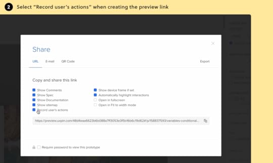
The integration with FullStory is available for everyone who uses UXPin. To use it, you need to have an account in UXPin and FullStory. Here’s how to sync the tools together.
Log in to UXPin.Go to the Integration page in Settings.Paste in your FullStory Org Id and click ‘Apply.’Open the prototype that you want to enable tracking for.Open the Share modal and select the “Record user’s actions.’ Copy the preview link listed below.Find more details on how to connect and use integration in our help documentation.
UXPin is making this integration available for trial users, too. So, go ahead, give this integration a shot. Start a free UXPin trial.
 Try our FullStory integration
Conduct user testing sessions right at the prototyping stage. Learn how end-users interact with your design before committing resources to having it built.
Since design and prototyping is a much lower investment from the business point of view for the company, such product teams can create a better ROI on their work and ship their products to market faster, gaining the upper hand over their competitors.
What makes UXPin stand apart from other prototyping tools is that all visual elements and UI components are, in fact, HTML & CSS-based, which gives you the power of creating fully interactive prototypes without asking devs to help you.
Check how UXPin’s FullStory integration works. Sign up for a free trial.
Try UXPin for freeThe post FullStory Integration – Test Usability inside UXPin appeared first on Studio by UXPin.
October 30, 2023
Design Insights – 15 Tricks to Get them
Design insights are the foundation for successful product design and user experience, bridging user needs and business objectives. This comprehensive guide unpacks the importance of these insights, offering strategies to gather, analyze, and utilize them effectively. We explore various methods like user interviews, usability testing, design research, and advanced techniques like AI and machine learning.
Key takeaways:
Design insights provide a critical foundation for human-centered design, guiding decision-making and reducing project risks.Various methods, including user interviews, usability testing, and analytics, can be employed to gather robust design insights.Proper analysis of these insights involves categorizing the data, validating with stakeholders, and prioritizing actionable steps to make impactful changes during product development.Advanced tools like UXPin offer code-based, fully interactive prototypes that allow designers to test and iterate more accurately than traditional methods.Leveraging multiple data sources, such as crowdsourcing and real-time feedback, can provide more profound, actionable design insights.Make better decisions using design insights with UXPin’s advanced prototyping capabilities. Sign up for a free trial to build your first interactive prototype.
Build advanced prototypesDesign better products with States, Variables, Auto Layout and more.
Try UXPin .try-uxpin-banner { margin: 40px 0px;}.try-uxpin__container { display: flex; max-width: 689px; height: 210px; padding: 20px; padding-left: 24px; border: 2px solid black; border-radius: 4px; align-items: center; justify-content: space-between; background-color: white; box-shadow: 10px 10px black;}.try-uxpin__left { width: 54%;}.try-uxpin__left p { margin: 10px 0px !important; color: black !important;}.try-uxpin__heading { font-size: 28px !important; font-weight: bold;}.try-uxpin__text { margin: 0 !important; font-size: 18px !important; line-height: 22px !important;}.try-uxpin__button { width: 135px; height: 44px; background: black; margin: 10px 0px; padding: 10px 20px; border: none; border-radius: 2px; color: white; font-size: 16px; text-align: center;}.try-uxpin__button:hover { cursor: pointer;}.try-uxpin__image { max-width: 320px !important; height: 200px; margin-right: -21px; margin-bottom: -6px;}@media (max-width: 760px) { .try-uxpin__container { height: auto; margin: 10px; align-items: left; }}@media (max-width: 500px) { .try-uxpin__container { flex-direction: column; } .try-uxpin__left { width: 100%; align-items: normal; }}What is a Design Insight?A design insight is a deep understanding of user needs, behaviors, and challenges. Insights are pivotal for informing good design decisions. Typically derived from a blend of data and observations, insights bridge the gap between user needs and business goals.
Why are Design Insights Important? Drive user-centricity
Insights keep the focus on the user. Design isn’t about what you think looks good; it’s about solving problems for real people. Insights allow you to shape a user experience tailored to actual user needs and behaviors rather than assumptions and biases.
Reduce risksRelying on solid insights avoids the pitfalls of designing something that looks great but has poor UX. Without a clear understanding of user needs, you may spend weeks or months delivering something that no one uses, resulting in massive losses for the organization.
Inform iterationsDesign insights are the data points that enable you to test a hypothesis rigorously. Data points you to where adjustments are needed, ensuring that each iteration is more successful than the last.
Align teamsInsights provide a common ground for design teams, developers, and stakeholders to align their efforts. They eliminate subjectivity, making the design process more efficient while eliminating guesswork and disputes about what to build.
Enhance ROIA design grounded in solid insights is more likely to succeed, improving metrics like user engagement, conversion rates, and customer satisfaction. This data-driven decision-making results in a better return on investment (ROI) for the design project.
How to Gather Design Insights
Obtaining robust design insights demands a multifaceted approach. Each method offers unique perspectives on user behavior, user needs, and business goals.
Run user interviewsArrange face-to-face or virtual meetings with users. Structure your interviews with a combination of open-ended and targeted questions. Encourage stories rather than simple yes-no answers–for example, if you’re building a trip planner, you might ask, “Could you walk me through how you planned and booked one of your favorite vacations?” Always ask “Why?” to dig deeper into someone’s thought process.
Perform usability testingUsability testing pinpoints exactly what elements improve or impede user interaction, steering your design modifications. Designers use prototypes to observe user interactions and flows and generate insights to guide the next steps.
Do UX researchVarious UX research methods exist, including contextual inquiry, desk research, user feedback, ethnographic studies, user personas, and eye-tracking, to name a few. UX research provides empirical data that either supports or refutes your design assumptions.
Interview othersOther people who are involved in the product development and growth offer insights about business objectives, technical constraints, marketing initiatives, product goals, etc. These insights come from internal sources, including:
Designers: Insights into visual design, usability, and user needsResearchers: Have a deep understanding of end users, their behaviors, and other user-centered dataDevelopers: Technical limitations and capabilitiesProduct Managers: Product roadmap, analytics and metricsExecutives: High-level business goals and revenue targetsAnalyze the product’s useMonitor user engagement metrics like session durations, click-through rates, and conversion rates. These insights tell designers when and what problem occurs. For example, a high bounce rate often indicates a mismatch between user expectations and the website’s content. The next step is to conduct interviews to determine the why behind the high bounce rate.
HeatmapsHeatmaps illustrate where users focus their attention, offering a visual guide to your design’s strong and weak spots. Designers utilize tools like Crazy Egg or Hotjar to obtain these visual insights.
Market researchMarket research uncovers trends and user expectations, which should inform your design strategy. For example, market research finds that “75% of users in the 18-34 age bracket prefer mobile apps that offer dark mode settings.”
Designers could prioritize implementing a dark mode feature, ensuring it is easily accessible within the app. This decision directly responds to market demand, likely increasing user engagement and satisfaction among the 18-34 age bracket.
Competitor analysisA competitor analysis informs industry standards and unveils opportunities for differentiation. Designers often focus on usability, feature set, and user reviews for a well-rounded comparison.
A/B testingA/B testing offers empirical evidence on what works between two design options, allowing designers to focus on what works and ditch what doesn’t. Testing one element at a time–a button color or a headline–is vital to measure its impact accurately.
AI and machine learningAI goes beyond reactive data interpretation, offering forecasts on user behavior based on existing data. Leverage platforms like TensorFlow or RapidMiner for powerful predictive analytics.
Social listeningIn our hyper-connected world, social listening offers real-time feedback, making it invaluable for adaptive design strategies. Platforms like Hootsuite, Qualtrics, or Mention can automate social listening and track mentions of your brand, product, or relevant keywords.
Leverage crowdsourcingUse platforms like Reddit or specialized design forums to gather diverse viewpoints. You can also set specific design challenges to attract relevant feedback. The more specific you are, the more actionable the insights.
Implement real-time feedback loopsIntegrate in-app pop-ups or chatbots to capture user feedback as they interact with your design. Quick post-interaction surveys can offer instant data without hampering the user experience.
Surveys and questionnairesCraft questions that are open-ended but focused. Instead of asking, “Was everything okay?”, probe deeper with questions like “What challenges did you face?” Distribute your surveys through multiple channels like emails, in-app notifications, and social media to ensure a wide range of responses.
Correlate Data SourcesCombine data sources for deeper insights. For example, you might correlate user survey insights with analytics data to get a fuller picture. Trend forecasting can also be more accurate when pulling data from multiple places.
How to Analyze Design InsightsResearch insights are worthless if organizations don’t use them to make decisions or drive change. Designers use insights with design thinking and problem-solving methodologies to develop effective solutions.
Here’s a step-by-step framework to help you analyze and use your design insights.
Categorize the dataStep 1: Sort Information: Classify your insights by source and relevance. Whether it’s from user interviews or market research, keep them separate but accessible.Step 2: Identify Patterns: Look for recurring themes or issues from multiple sources to identify correlating patterns.Validate the insightsStep 3: Cross-reference: Validate your findings by comparing them across different sources. For instance, if users complained about a feature in interviews, does the usability testing support this?Step 4: Confirm with Stakeholders: Brief your stakeholders and ensure your insights align with business goals.Prioritize action itemsStep 5: Create a Priority List: Rank the insights based on the impact and effort required. Tackle the ones that yield the highest impact with the least effort first–these will drive ROI and get you early wins.Step 6: Set Deadlines: Associate each action item with a timeline to keep the team accountable. Make sure these deadlines are realistic and align with your organization’s capacity.Implement changesStep 7: Make Adjustments: Begin implementing changes in your design based on prioritized insights.Step 8: Document: Keep a detailed record of the changes and why.Monitor impactStep 9: Use Metrics: Employ analytics tools to measure the impact of your changes. You can also use prototypes to test the implementation before release.Step 10: Iterate: Use new data to make further adjustments–test, make changes, and iterate.Share knowledgeStep 11: Debrief: Share these findings with the team once you’ve made changes and observed the outcomes.Step 12: Update Company Insights Database: Keep an insights database for future projects. This database avoids duplicate work and builds valuable first-party data.Prototype and Test Design Insights with UXPinUXPin offers powerful code-based features to translate design insights into working prototypes for accurate testing. Designers can build fully interactive prototypes to test hypotheses and use meaningful data to iterate and improve with greater accuracy and confidence.
Step 1: Create your designsDesigners can design from scratch or use one of UXPin’s built-in design libraries to build prototypes fast. UXPin also allows you to import Sketch or Figma designs for prototyping.
Step 2: Add interactive elementsUse UXPin’s rich interactive elements to build realistic components, patterns, and prototypes. Some unique UXPin features include:
States: Allow you to create multiple states for a single UI element and design complex interactive components like dropdown menus, tab menus, navigational drawers, and more.Variables: Capture data from user inputs and create personalized, dynamic user experiences–like a custom welcome message after signing up.Expressions: Javascript-like functions to create complex components and advanced functionality–no code required!Conditional Interactions: Create if-then and if-else conditions based on user interactions to create dynamic prototypes with multiple outcomes to accurately replicate the final digital product experience.Step 3: Conduct usability testingRecord user interactions and gather qualitative feedback. The real-time data you collect with UXPin is more valuable because your prototypes are fully interactive, unlike traditional static image-based design tools.
Step 4: Share prototypes with stakeholdersGenerate shareable links and send prototypes to stakeholders for feedback via UXPin’s Comments. Comments make it easy for stakeholders to interact with the prototype and share valuable feedback through annotations.
Step 5: Iterate with confidenceUXPin’s interactive prototypes provide actionable insights to iterate and improve on feedback with confidence. Make data-driven design decisions, redesign, retest, and refine until your metrics indicate success.
Generate better design insights with interactive prototypes to deliver high-quality user experiences. Sign up for a free trial to explore UXPin’s advanced prototyping features.
Try UXPin for freeThe post Design Insights – 15 Tricks to Get them appeared first on Studio by UXPin.
October 24, 2023
Filter UI and UX 101 – An In-Depth Guide
Filters are powerful user interface patterns, streamlining user journeys and driving engagement by increasing efficiency and content discovery. We explore UI filter design, providing insights and best practices to help you design user-friendly patterns, including examples from leading tech companies and how they simplify the user experience through filters.
Key takeaways:
UI filters are design elements that aid search within an app or a website.They directly influence user navigation, ensuring efficient and tailored content discovery.Prioritizing simplicity, responsiveness, and user control is paramount for effective filter design.Cross-platform filter design requires a harmonious blend of platform-specific patterns and consistent core functionalities.Incorporating natural language, progressive disclosure, and accessibility ensures filters cater to all users and their diverse needs.Advanced design tools like UXPin enable designers to prototype and test interactive filter components, maximizing their impact on the final product.Design intuitive filters and other interactive components with the world’s most advanced UX design tool. Sign up for a free trial to build your first interactive prototype with UXPin today.
Build advanced prototypesDesign better products with States, Variables, Auto Layout and more.
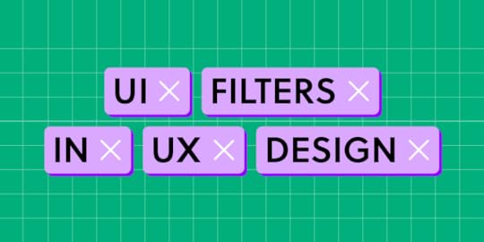
Try UXPin .try-uxpin-banner { margin: 40px 0px;}.try-uxpin__container { display: flex; max-width: 689px; height: 210px; padding: 20px; padding-left: 24px; border: 2px solid black; border-radius: 4px; align-items: center; justify-content: space-between; background-color: white; box-shadow: 10px 10px black;}.try-uxpin__left { width: 54%;}.try-uxpin__left p { margin: 10px 0px !important; color: black !important;}.try-uxpin__heading { font-size: 28px !important; font-weight: bold;}.try-uxpin__text { margin: 0 !important; font-size: 18px !important; line-height: 22px !important;}.try-uxpin__button { width: 135px; height: 44px; background: black; margin: 10px 0px; padding: 10px 20px; border: none; border-radius: 2px; color: white; font-size: 16px; text-align: center;}.try-uxpin__button:hover { cursor: pointer;}.try-uxpin__image { max-width: 320px !important; height: 200px; margin-right: -21px; margin-bottom: -6px;}@media (max-width: 760px) { .try-uxpin__container { height: auto; margin: 10px; align-items: left; }}@media (max-width: 500px) { .try-uxpin__container { flex-direction: column; } .try-uxpin__left { width: 100%; align-items: normal; }}What is UI Filter in UX Design?A UI filter is a design element that allows users to narrow down a data set or options based on specific criteria. For example, we use filters for eCommerce stores to find products by size, color, price, etc. A filter UI lets users find what they want quickly, saving time and reducing frustration.
Designers design filters based on user needs to help them navigate content or offerings efficiently. When implemented correctly, filters streamline navigation, making interfaces user-friendly and intuitive.
How Do Filters Affect User Experience?Filters empower users by controlling how they find and experience content, speeding up tasks, and enhancing engagement with digital products.
Here’s how filters enhance the user experience:
Navigation efficiency: Users don’t waste time scrolling through irrelevant data. For example, instead of browsing through hundreds of shoes on an eCommerce site, users can filter for their size, preferred color, or brand to find the most relevant results.Personalized content delivery: Filters cater to individual preferences. Consider a news app; by selecting specific categories like ‘Technology’ or ‘Health,’ users receive news tailored to their interests.Decision-making support: Overwhelming users with options can paralyze decision-making. Filters limit choices, making it easier for users to decide. In a streaming app, rather than sifting through thousands of movies, filters can display only “Top-rated” or “New releases.”Reduction in cognitive load: Users don’t need to process excessive information. Filters help display only what’s necessary, ensuring users aren’t overwhelmed or fatigued.Improved Satisfaction and Retention: When users find what they’re looking for quickly and efficiently, they’re more likely to be satisfied and continue using the platform.What are the Principles of User-Friendly Filter Design? Simplicity and clarity
The filter interface should be straightforward to understand. Avoid overwhelming users with too many options or using ambiguous names. For example, an online clothing store should have clear categories like size, color, fit, brand, price, etc., rather than intricate sub-filters that confuse shoppers.
Responsiveness and feedbackFilters should apply changes quickly and give users feedback about their actions. For example, displaying a result count of the applied filters tells users how many options they must scroll through, setting expectations and preventing frustration.
Prioritization of filtersNot all filters hold the same importance. By understanding user needs, prioritize the most commonly used filters and hide the rest. For example, an accommodation filter might display the dates, guests, and location in the primary UI with a “View all filters” button or icon to access the rest.
Flexibility and controlUsers should feel in command. If they make a mistake, it should be easy to rectify. For example, a “reset filters” button lets users revert to default quickly.
Visibility and accessibilityFilters must be conveniently located and accessed on a page. For example, users are used to seeing filters above results near the search field.
Designing filter user interfaces for cross-platform applicationsBuilding filters for cross-platform applications demands awareness of varying platform-specific UI patterns and best practices. Ensuring consistent user experience across different operating systems while adhering to platform-specific guidelines is vital.
Here are some design decisions to consider when designing cross-platform filter patterns:
iOS Platform-Specific Patterns: iOS design often uses segmented controls for filters. For instance, in a shopping app, ‘Men,’ ‘Women,’ and ‘Kids’ might be segmented controls at the top of the browsing screen.Android Platform-Specific Patterns: Android UIs frequently employ tabs for primary filtering options. Dropdowns are also standard for secondary filtering or sorting options.Consistency Across Platforms: While it’s essential to respect platform-specific patterns to maintain a native experience, ensure that the core functionality remains consistent across all platforms and mobile apps. If a filter option exists on iOS, the same should be accessible on Android, even if represented differently.Adaptive UI Components: Utilize components that adapt to the user’s device and operating system, providing a seamless experience regardless of device.How to Design Effective UI FiltersUse natural language for filter optionsUse words and phrases users naturally use or expect to ensure users understand filter options without ambiguity.
For example, instead of using “Canine” and “Feline” as filter options on a pet eCommerce store, use “Dogs” and “Cats”. The latter terms align more with common user language.
Provide search within filters for extensive listsWhen dealing with long lists of filter options, a search function aids users in finding their choice without scrolling endlessly.
For example, an online bookstore with multiple genres provides a search bar within the filter instead of listing every genre. Users can type “thriller” and directly access that genre without navigating a lengthy list.
Utilize progressive disclosureFirst, display the most commonly used filters and provide an option to see more if users need further granularity.
For example, a real estate site might show Price, City, and Price Range filters upfront with a “Show More” filtering option for users who want specifics like Bedrooms, Suburbs, and other property features.
Employ visual cuesVisual elements, like colors, icons, and typography, effectively guide users, clarify options, and enhance filter understanding.
For example, color swatches beside filter options give users a visual cue to scan results faster.
Design filters for accessibilityFilters should be usable by everyone, including those with disabilities, considering contrast, screen reader compatibility, and keyboard navigation.
For example, if your app uses color for filter categories, consider adding icons to help color-blind users navigate and scan results.
What are Some Use Cases of Good Filter UI Design?Airbnb
Airbnb redesigned its filter UI in 2023 to be more accessible and user-friendly. Users can access the search filter overlay via a universally recognizable icon next to the search filter.
Recognizing that price is most important to users, Airbnb offers two UI design patterns for price filtering. Users can scroll to get more granular using large buttons, icons, checkboxes, sliders, and switches to apply preferences.
Booking.com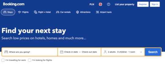
Like Airbnb, Booking.com must display millions of properties to travelers and uses filters to help narrow options. Booking.com uses a slightly different pattern with the filter icon and label to help with accessibility.
Booking.com also displays a price filter at the top and a list of popular filters below, enabling users to apply choices without too much scrolling. Beside each filter is a number displaying the amount of results per filter, providing users with helpful feedback and managing expectations.
For example, you don’t want to apply a filter and discover no properties, forcing you to return and try again–possibly several times, causing immense frustration.
Spotify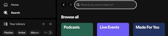
Filter doesn’t always apply to search. It can also help users decide what content they want to access. Spotify has three primary categories:
MusicPodcasts & ShowsAudiobooksThe streaming service uses a button for each category on the home screen for users to filter what content they want to consume. These filters make Spotify’s home screen user-friendly and efficient because users can apply a preference in one click, eliminating the need to search or access navigation.
Amazon
Amazon’s desktop interface displays a search field at the top of the page and filters in a neatly organized left sidebar. Users can apply filters using icons, checkboxes, buttons, or form fields for custom pricing. Selecting an item automatically loads the filter results, eliminating the need for an “Apply Button,” reducing clicks and interactions.
This highly granular filtering is crucial for large databases like Amazon’s product inventory. In the example above, we apply two options in the filtering sidebar to get shoe results from over 50,000 to 202, streamlining the browsing experience to checkout faster.
Google Maps
Google Maps uses a horizontal scroll navigation pattern to display a list of common search categories. Once users apply a broad term like “Coffee,” they can use the secondary filters to apply more granularity and narrow results.
Google Maps’ filtering interface is an excellent example of how designers can help users find what they want with minimal clicks and typing, even when diverse, seemingly endless options are available.
Design Better Filter UI and UX with UXPinDesigning and prototyping filters is challenging in image-based tools like Figma, Adobe XD, and Sketch. While you can achieve excellent visual design results, these design tools lack the features to create interactive prototypes–a big problem for testing an interactive filter component.
UXPin is a code-based design tool. Instead of generating vector graphics, UXPin renders HTML, CSS, and Javascript behind the scenes, giving designers the power of code without writing a single line.
Advanced prototyping featuresDesigners can use UXPin’s code-based features to build functioning filters that look and feel like the final product without plugins or external tools:
States: create multiple states for a single UI element and design complex interactive components like dropdown menus, tab menus, navigational drawers, and more.Variables: capture data from user inputs and create personalized, dynamic user experiences–like displaying a user’s selected filters with results.Expressions: Javascript-like functions to create complex components and advanced functionality–no code required!Conditional Interactions: create if-then and if-else conditions based on user interactions to create dynamic prototypes with multiple outcomes to accurately replicate the final product experience.Enhanced testingWith UXPin’s advanced features, design teams can test ideas and get accurate, actionable feedback from end-users and stakeholders. This meaningful feedback allows designers to solve more usability issues and identify better business opportunities during the design process, maximizing their impact within the organization.
Design better interactive components like UI filters with the world’s most advanced digital product design tool. Sign up for a free trial to explore UXPin’s features and create your first interactive prototype.
Try UXPin for freeThe post Filter UI and UX 101 – An In-Depth Guide appeared first on Studio by UXPin.
October 23, 2023
Profile Page UI Design – How to Create User Profiles for Your App
The power of profile pages with UI design in mind may have been mastered by major platforms, but it can also be harnessed for applications of any size. With a comprehensive understanding of the core elements that make up a user profile, you can create engaging experiences.
Read on for expert insight and examples to inspire successful profile page UI designs.
Key takeaways:
Profile page UI design is an app element that displays information and details about a specific user or account. The primary purpose of a profile page is to provide a personalized and easily accessible space for users to view and manage their own information, preferences, and activity.Key elements of a page like that are profile card, About me section, follow button, and more.To design a perfect profile page for your app, focus on your users’ needs, as well as design simplicity and consistency.Design super interactive prototypes that can be quickly tested with real users – without switching to another app. Use UXPin to build wireframes, mockups, and advanced prototypes that look and behave like real products. Try UXPin for free.
Build advanced prototypesDesign better products with States, Variables, Auto Layout and more.
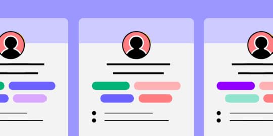
Try UXPin .try-uxpin-banner { margin: 40px 0px;}.try-uxpin__container { display: flex; max-width: 689px; height: 210px; padding: 20px; padding-left: 24px; border: 2px solid black; border-radius: 4px; align-items: center; justify-content: space-between; background-color: white; box-shadow: 10px 10px black;}.try-uxpin__left { width: 54%;}.try-uxpin__left p { margin: 10px 0px !important; color: black !important;}.try-uxpin__heading { font-size: 28px !important; font-weight: bold;}.try-uxpin__text { margin: 0 !important; font-size: 18px !important; line-height: 22px !important;}.try-uxpin__button { width: 135px; height: 44px; background: black; margin: 10px 0px; padding: 10px 20px; border: none; border-radius: 2px; color: white; font-size: 16px; text-align: center;}.try-uxpin__button:hover { cursor: pointer;}.try-uxpin__image { max-width: 320px !important; height: 200px; margin-right: -21px; margin-bottom: -6px;}@media (max-width: 760px) { .try-uxpin__container { height: auto; margin: 10px; align-items: left; }}@media (max-width: 500px) { .try-uxpin__container { flex-direction: column; } .try-uxpin__left { width: 100%; align-items: normal; }}Key profile page UI design elementsProfile pages can contain a myriad of information and interactive options depending on an application’s purpose. Regardless of what extras inspire your design, the following elements will provide a strong foundation that many users will instantly recognize as a profile page.
Profile cardA profile card is one of the first things users look to add. This page allows individuals on a platform to easily identify each other and stand out. One of the most notable aspects of profile cards are user images.
If you think of any major social or business profile, what is always present? A picture of course! Most people tend to while pictures tend to be remembered better than text.
Profile pictures are a simple addition that should be kept simple. This means adding, changing, and customizing profile pictures should be as intuitive as possible for users. Depending on the purpose and audience for a given application, profile pictures may include avatars or more than one image.
A profile card would not be complete without a name. Providing users with an easy way to add and edit their name as needed offers a searchable source of identity. Names can change with marital status, legal cases, or personal preferences, so easy editing is crucial. Nicknames or preferred names are also common and should have a space on most profile cards.
About me sectionWhile names and images make a person identifiable to others, there are many parts of an individual’s identity that cannot be seen in an image. These aspects are best displayed in an “About me” section in the user’s profile.
A well-designed section that users can fill out allows users to express who they are. This may include work experience, travel, cultural identities, pets, and whatever else is suitable for the platform the profile is being built on.
In networking apps, “About me” sections are expected to be a quick way to learn about applicants or colleagues. If this section is too cluttered or irrelevant, hiring teams may skip the profile altogether. This is why it is important for profile page user design to set users up for success with ideal formats and useful suggested content in their summary section.
Interests and achievementsA clean and concise summary section is useful, but it may leave users feeling as if they have more to say. This is where an interests and achievements section comes into play.
Interests are socially significant, offering users opportunities to find common topics of communication. This section should still have an intuitive and easily interpreted design, but it shouldn’t be as restrictive as a summary. The same applies to achievements, which are both professionally and personally significant.
While both interests and achievements are important for painting a full picture of an individual’s personality and life story, they are not mandatory. Some users may become frustrated if they are forced to fill out a multitude of questions to complete their profile.
Users can be gently guided to fill out their profile by requiring key information, like a name and summary, at the creation of their page, and leaving the extras to be completed later. This is progressive profiling, and it allows for the easy registry of users.
This area of a user profile opens up space for creativity, making it perfect for engaging additions like star ratings, icons, tags, and other design elements.
Follow buttonTo encourage social and networking behavior, profile pages require a follow button. Adding it may seem simple enough, but without proper care, this tool will not achieve its goal.
A well-placed follow button is always easy to identify, responds to interaction, and is within reach. For apps or mobile pages, this means the follow button should be placed within the area of the page that can be pressed with a thumb. If the follow button is out of this range, the extra effort required to shift a phone and reach the button may cause it to be ignored.
Examples of great profile page UIIt can be hard to imagine your ideal profile page UI without inspiration, so here are some prime examples.
Example #1: Personal page template by Monty Hayton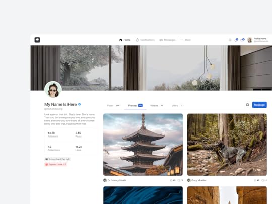
We will start out with a personal page template. The goal here is to highlight the individual on this page and who they are as a person.
The organized layout allows for multiple photos that hint at the person’s interests, but their profile photo still stands out due to its location and shape.
A short summary that encapsulates their view of the world along with a list of connections rounds out this profile. Overall, it is plenty of information with no clutter.
Example #2: Sports app by Rifayet Uday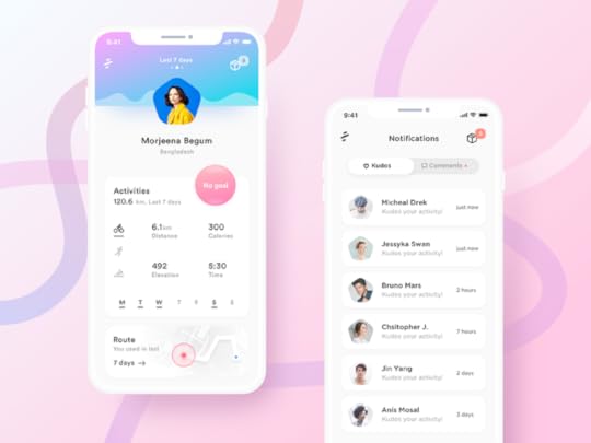
Our next user profile is an excellent example of how UI can be themed to suit an app’s purpose.
The colors and shapes draw attention to the profile pictures displayed. Instead of building out the typical summary and interests section, modes of movement are emphasized. This layout highlights activity type, distance, calories, and routes taken to support the application’s purpose, encouraging exercise.
Example #3: Fashion profile page by Vijay Verma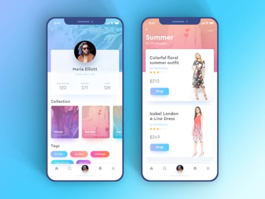
If you are considering a more colorful profile screen, there are plenty of ways to create intrigue without encouraging clutter. This example contains many colors with an ombre theme, however, they are strategically placed to draw attention to the interactive aspects of the page.
Example #4: Healthcare professional profile by Mehedi Hasan Roni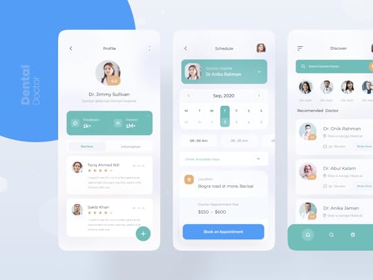
It is always important to keep your audience in mind. This doctor profile page UI design is a unique example of two groups being catered to with one design. Here, the doctor can display their name, availability, and other important information that describes who they are.
At the same time, this page makes it easy for clients to read fellow patient reviews and learn about each doctor. This profile contains plenty of information for both parties while maintaining a clean and easy-to-navigate interface.
How to design a profile pageTip #1: Listen to your usersIt is hard to impress an audience if you don’t know who your audience is. Research should be an early step in all UI design. Even as a design develops and grows, user research should guide improvements and ideas.
The first step is identifying the demographic(s) your profile page is intended for. How and why will these groups of people interact with your platform? Designs should always prioritize their user’s goals and needs.
An example of this would be creating a dentistry application. Researching the most important aspects of choosing a dentist and highlighting those factors in your app will encourage users to skip internet searches in favor of your platform. Discovering and eliminating pain points, like calling to schedule an appointment, can make your design even more attractive to users.
Tip #2: Ensure design consistency across the entire digital productA well-rounded digital product is designed in a manner that is cohesive enough for clients to navigate easily. This entails the color palette, patterns, fonts, and flow of information. Managing so many factors across multiple pages of information might seem daunting, but there are design systems to help with this exact task.
With libraries of design factors and design principles to work with, creating a cohesive product becomes simple. Design systems allow you to access and edit details to create consistency without making each page a copy of the last.
Tip #3: Use the right prototyping toolDesign templates are efficient, but you can’t always guarantee their effectiveness. The best way to test a design for its intended function is to use a prototyping tool. These tools allow for real-time interaction with designs, so you can ensure they function just as you had hoped.
UXPin is one such tool that allows you to experience an interactive prototypes. This is great for design iterations. Learn more and explore all the prototype possibilities that can benefit your designs in UXPin.
Tip #4: Collect feedback from team members and users alikePlatforms are created for users, but they could not exist without the efforts of a well-connected team. Designing and prototyping with a tool that allows for collaboration between teams is crucial. Insights can also come to light and be easily explored through organizing design critique sessions.
After considering team input, user feedback can also be included. Test groups from your target demographics can be given an opportunity to work with end-stage prototypes of your page to determine areas of improvement. This input can also be considered in real time, where feedback from users on a live app can be used to guide future updates in UI design.
Tip #5: Avoid clutter by prioritizing user informationThe perfect balance of personality and clarity is dependent on your page’s purpose. An exercise profile can function with a name, image, and recent workout stats while a social media profile may spill over with hobbies and fun facts.
For the best of both worlds, consider the ways in which profile information can be condensed, such as drop-down menus or other interactive components that break information into palatable chunks.
SummaryIn the end, profile pages are all about the users. Their design offers a chance to be seen and see others in a functional format. Your ideal balance of design elements may be hard to visualize, but that is what prototyping tools are for. UXPin offers you an opportunity to see and interact with your design through all stages of development. The result is a cohesive, well-rounded platform that can even be vetted through user testing and team critiques.
Refine your profile page UI design prototype by filling it with real user data at UXPin. Sign up for a free trial.
Try UXPin for freeThe post Profile Page UI Design – How to Create User Profiles for Your App appeared first on Studio by UXPin.
October 19, 2023
Design to React code – How UXPin Merge Speeds it up
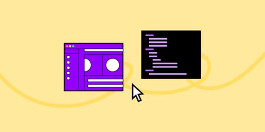
Converting designs into functional React code is a pivotal step that often comes with challenges such as misinterpretation, inefficiency, and inconsistency. Emerging technologies like UXPin’s Merge aim to streamline this antiquated process by facilitating a code-to-design workflow, allowing you to design with React components.
Key takeaways:
The traditional design-to-code workflow often results in lost design details, extended iteration cycles, and version inconsistencies.UXPin’s Merge technology offers a code-based design approach streamlining the transition from design to functional React code.Merge allows you to import React components directly into UXPin’s design editor for a more dynamic and interactive design experience.With UXPin’s Merge, changes to React components in the repository automatically sync, making maintenance and customization easier.The code-to-design workflow in UXPin provides both time efficiency and higher fidelity between the initial design and the final product.Design with React code using an intuitive design interface and Merge technology. Discover UXPin Merge.
Create beautiful layouts without designersTake UI components directly from Git repo, Storybook, or through NPM and design production-ready prototypes.
Bring code to design .discover-merge { margin: 40px 8px;}.discover-merge__container { display: flex; max-width: 690px; height: 200px; padding: 20px; padding-left: 24px; border-radius: 4px; background-color: black; box-shadow: 10px 10px #9999ff; align-items: center; justify-content: space-between;}.discover-merge__left { width: 50%;}.discover-merge__left p { margin: 10px 0px !important; color: white !important; font-size: 18px !important;}.discover-merge__heading { font-weight: bold !important; color: white !important; font-size: 18px !important;}.discover-merge__text { margin: 0 !important; line-height: 22px !important;}.discover-merge__button { width: 174px; height: 44px; margin: 10px 0px; border: none; border-radius: 2px; background: white; color: black; font-size: 16px; text-align: center;}.discover-merge__button:hover { cursor: pointer;}.discover-merge__image { max-width: 320px !important; height: 200px; margin-right: -19px;}@media (max-width: 760px) { .discover-merge__container { height: auto; margin: 10px; align-items: left; }}@media (max-width: 500px) { .discover-merge__container { flex-direction: column; } .discover-merge__left { width: 100%; align-items: normal; }}How Do You Convert Designs to React Code?In the traditional product development workflow, designers craft mockups and prototypes, often using tools like Sketch or Figma. They then hand off these designs and documentation to developers who translate them into functional React code.
The handoff usually involves exporting designs into a standard format, perhaps annotated with extra details like dimensions, colors, and assets.
This process relies on designer/developer cooperation or a solo dev with both skill sets. Since it takes many years to develop competency in design and development, not many people choose to master both. There are other challenges.
What are the Challenges of Getting Design to React Code? Lost in Translation: Despite the best efforts, some design details often get lost or misinterpreted during the handoff.Iteration Lag: If the developer needs clarification or the designer needs to make changes, the iterative cycle elongates, wasting time and resources.Component Inconsistency: Without a shared language or toolset, designers and developers can end up creating their own versions of the same reusable components, leading to inconsistency.Static Designs: Traditional design tools often produce static mockups, not accounting for dynamic data and states, leaving gaps in the representation of the final product.Version Confusion: As design and code evolve, keeping track of the most current version becomes a nightmare.Why we need a better alternative
The legacy workflow has its merits, but it’s far from optimal in a world where user experience can make or break a product. Add the component-centric architecture of React, and the room for error widens.
Here’s why we need a better alternative to the traditional design-to-code workflow:
Time Efficiency: The traditional method extends project timelines. Shorter development cycles are not just a desire; they’re a need.Design Integrity: The fidelity of the final product to the initial design often gets compromised. A new approach can uphold the designer’s vision to the tee.Dynamic Reality: Today’s UI is interactive and data-driven. Static design handoffs can’t encapsulate this dynamic and interactive reality.Consistency: A consistent UI requires a single source of truth for designers and developers, which the traditional model lacks.Feedback Loop: Real-time collaboration can iron out issues on the fly instead of post facto corrections.The traditional model also makes it challenging and time-consuming for solo devs to prototype and test. They must either learn a design tool or build, test, and iterate in code, adding significant time to the project.
Luckily, there is an alternative to this legacy design workflow where you can design using React code.
How Do You Design in React?
Wouldn’t it be easier to drag and drop UI components to prototype user interfaces instead of writing and editing React code? That’s precisely what UXPin’s Merge technology does.
Unlike Figma, Adobe XD, and other image-based UI design tools, UXPin is code-based, rendering HTML, CSS, and Javascript behind the scenes. This code-based technology means you can use code components on the design canvas in a no-code environment with Merge technology.
Merge lets you import React components from a repository into UXPin’s design editor. The UI elements appear in UXPin’s Design System Libraries for you to drag and drop for prototyping. You can edit styling and interactivity via the Properties Panel defined by the component’s React props.
How UXPin Merge helps you design with React code componentsDevs can use the standard Properties Panel interface or switch to JSX mode for a more familiar code environment. Any changes you make to the React components in the repository automatically sync to UXPin, allowing you to update, maintain, and customize your UI elements, patterns, and templates.
This code-to-design workflow gives developers the best of both worlds–complete control over the codebase and repository with the simplified workflow of a design tool interface. Instead of editing code, devs can drag and drop to move components about the UI or make adjustments via the Properties Panel.
How to Connect Merge to Your Repository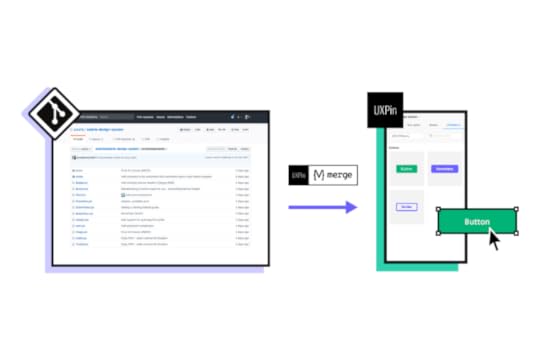
UXPin offers two ways to sync a component library:
Git Integration (React only):Direct connection to a React component repository (GitHub, GitLab, etc. ). We recommend the Git Integration because it gives you Merge’s features, including:
Version ControlPatternsJSX authoringStorybook IntegrationConnect any Storybook to UXPin, including React, Vue, Angular, Ember, and more. While you don’t get all the Merge features, Storybook offers many benefits, including addons and plugins for managing component libraries.
npm Integration and Merge Component ManagerYou can also use the npm integration and Merge Component Manager to import individual UI elements from open-source design systems on the npm registry.
UXPin offers several built-in Merge design systems to start prototyping without any setup process, including Fluent UI (Git), Ant Design (npm integration), MUI (Git), Material UI (Storybook), or UXPin Boilerplate (Git).
How to Add React Components and Sync to UXPin Using Merge’s Git IntegrationOnce you have created a UXPin account and completed the onboarding process–request access to Merge–you can start setting up your repository using the Merge boilerplate repository.
Prerequisites for this step-by-step tutorial from UXPin’s docs:
You have completed the Easy Start tutorial (request access to Merge).You’re familiar with HTML, CSS, and Javascript.You have at least a basic understanding of React.js.Step 1: Run the dev environmentStart by running your Merge Dev environment. Execute npm start at the root, which runs the following script:
uxpin-merge –webpack-config ./webpack.config.js –wrapper ./src/UXPinWrapper/UXPinWrapper.js –uxpin-domain merge.uxpin.cloud
–webpack-config: Specifies the webpack config location.–wrapper: Use if your React components need a wrapper, like a theme provider.–uxpin-domain: Points Merge to the correct server.Step 2: Naming conventionsMaintain identical directory, filename, and component names.
Example: ./src/NewComponent/NewComponent.jsStep 3: Export componentEnsure your component has an export default.
Example: export default NewComponent;Step 4: Define propsUse PropTypes or Flow for props definition (Typescript interfaces scheduled for release). They become editable in UXPin’s Properties Panel.
Step 5: JSX presetCreate a JSX preset file within a presets directory inside your component folder.
Example: ./src/NewComponent/presets/0-default.jsxStep 6: Update configFinally, add the component to uxpin.config.js, located in the root directory.
Step 7: Restarting MergeAfter adding new components, restart the Merge process by hitting CMD+C in the terminal. If you get a lifecycle error upon starting a new Merge process, type killall node -9 into the terminal and try again.
How the React Code to Design Works in UXPinOnce you have completed the initial setup, Merge will automatically sync any changes to UXPin’s Design System Libraries. Merge’s Version Control notifies you of the update, and you can choose when to switch to the latest release. Version Control also lets you change to earlier design system versions.
Setting up pagesUnlike traditional design tools using frames and artboards, UXPin uses a pages approach–a more familiar project structure for developers. You can add and manage your project’s pages in the Pages & Layers panel left of the design canvas. You can also view all pages to get an overview of your project file.
UXPin offers many standard page/screen sizes for desktop, TV, mobile (iOS, Windows, Android), tablet, wearables, and more. You can also create a custom viewport.
Designing with React code componentsDrag and drop components onto the design canvas to create prototypes. Merge components “snap together” so you can create seamless layouts that look like a coded UI.
You can adjust the UI element’s properties via the Properties Panel and add Interactions for page transitions, animations, and microinteractions. UXPin offers Javascript-like Conditional Interactions with “if-then” and “if-else” conditions to create dynamic prototypes indistinguishable from code.
Any APIs, interactivity, or other properties you program in the repo are available in UXPin, allowing you to generate accurate replicas of the final product.
How to grow your component library with UXPin’s PatternsWith UXPin’s Patterns, you can evolve your design system by combining UI elements without writing code. You can use any Merge libraries imported using the Git or npm integrations–unfortunately, this feature is not available for Storybook.
Once you create a new pattern, you can save it to your Pattern’s library and share it with team members. This feature allows you to prototype and test comprehensively before committing the UI element to code, saving countless hours of fixes and front-end debt.
Patterns also lets you:
Save multiple variants of a pattern to optimize prototyping workflows.Design with advanced components–even if they are not in your design library.Design to code fasterDesigning with React components creates a smooth, seamless transition from the design process to development. Simply import the component library to your project and copy the layouts from UXPin. Merge produces production-ready JSX to copy/paste from UXPin’s Spec Mode to your IDE.
Use Case: How Code to Design Simplifies Design for Non-DesignersTeamPassword is a five-person startup with two developers and no designers. The development team switched to React in 2022 and adopted a custom version of MUI. TeamPassword’s engineers use Merge to sync their UI library to UXPin for prototyping and testing.
Merge enables TeamPassword to ship products and features much faster with higher consistency and fewer errors, giving them an edge in the highly competitive security tech market. They have also eliminated drift because they use the same components for design and development.
“Brand is essential in this market. Customers entrust us with sensitive information in their login records. Inconsistencies or an outdated design can cause some customers to question whether we are technologically up-to-date enough to keep that information secure. Front-end development builds trust and confidence in the backend performance.” Tony Caccavo, Director of Operations at TeamPassword
Ditch design to code and switch to UXPin’s code-to-design workflow to prototype and test faster. Visit our Merge page for more details and how to request access.
Discover MergeThe post Design to React code – How UXPin Merge Speeds it up appeared first on Studio by UXPin.
October 18, 2023
Low Code vs Traditional Development – Which is Best for You?
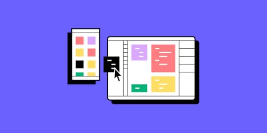
Traditionally, any software project called for a high upfront investment and an expert team, who would spend months on creating code. Fast forward to today, and the software development process has become much more accessible, with solutions like low code keeping the need for manual coding at a minimum.
In this piece, we look at what low code development is, where it overlaps with design, and how it fits into the wider product development process.
Key takeaways:
Low code development is a method of creating an app with a pre-built components; it differs from traditional development, because a developer doesn’t need to start coding from scratch.Low code democratizes software development, increases its speed, simplifies maintenance, decreases costs, and makes coding a collaborative experience.Traditional development provides full control over the process but it tends to be more time-consuming and requires a higher level of coding expertise.Try our low code UI design solution – UXPin Merge. It allows you to drag and drop coded components to create layouts and user flows for your app. Join our revolution. Discover UXPin Merge.
Create beautiful layouts without designersTake UI components directly from Git repo, Storybook, or through NPM and design production-ready prototypes.
Bring code to design .discover-merge { margin: 40px 8px;}.discover-merge__container { display: flex; max-width: 690px; height: 200px; padding: 20px; padding-left: 24px; border-radius: 4px; background-color: black; box-shadow: 10px 10px #9999ff; align-items: center; justify-content: space-between;}.discover-merge__left { width: 50%;}.discover-merge__left p { margin: 10px 0px !important; color: white !important; font-size: 18px !important;}.discover-merge__heading { font-weight: bold !important; color: white !important; font-size: 18px !important;}.discover-merge__text { margin: 0 !important; line-height: 22px !important;}.discover-merge__button { width: 174px; height: 44px; margin: 10px 0px; border: none; border-radius: 2px; background: white; color: black; font-size: 16px; text-align: center;}.discover-merge__button:hover { cursor: pointer;}.discover-merge__image { max-width: 320px !important; height: 200px; margin-right: -19px;}@media (max-width: 760px) { .discover-merge__container { height: auto; margin: 10px; align-items: left; }}@media (max-width: 500px) { .discover-merge__container { flex-direction: column; } .discover-merge__left { width: 100%; align-items: normal; }}What is low code development?Low code development is a software development method that simplifies and speeds up the app development process by allowing you to code through a graphic user interface. Instead of following a traditional app development environment that relies on text, you create your app by using prebuilt, drag-and-drop elements. This helps keep the need for manual coding at a bare minimum.
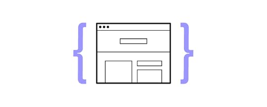
On top of software development, product team members can also use low code solutions to create prototypes and deploy the latest version of the app to the live environment.
While you might have also heard of an approach called “no code development”, it’s not synonymous with low code. As the names already hint, the former entirely eliminates the need to write script and can be used by those who have zero coding knowledge. Meanwhile, low code might call for a small amount of coding.
How does low code development differ from a traditional development process?There are significant differences between low code and traditional development processes, which mainly relate to the development speed, cost, and customization options. Let’s take a look at each one in more detail.
Coding democratizationSince low code solutions offer a visual interface and pre-built components, they can be used even by those who have very limited coding skills. They include a library of ready-made templates and drag-and-drop tools that users can take advantage of. This makes low code platforms much more accessible. The traditional app development process, on the other hand, cannot be done without the involvement of developers, who usually have to be proficient in multiple programming languages. It includes a lot of manual work.
Development speedOne of the biggest advantages of using low code platforms is improving the speed of product development. A lot of stages of the development process, including prototyping and testing, can be automated. In traditional app development, programmers write code from scratch, and then Q&A specialists run extensive testing, and the development team implements iterations when necessary. All this prolongs the product launch.
CustomizationWhen it comes to customization, low code platforms perform great if you want to mainly stick with standardized functionalities. If you want to get a bit more creative and stand out, for example, by offering a wide range of integrations, you’ll be better off going with the traditional product development process. Customized, complex, and unique features require manual coding.
MaintenanceAs elements in low code solutions are standardized and ready-made, and therefore thoroughly tested, they include fewer bugs and integration problems. However, the downside is that these functionalities are not as sophisticated as in the case of those developed by programmers. The traditional development process grants more control over maintenance and offers more scaling possibilities, but also requires continuous product updates, which are done manually by developers.
CollaborationSince low code platforms require little coding skills, they can be understood and used by individuals with no tech background. This, in turn, encourages collaboration between IT and business teams and creates a more inclusive development environment. The traditional app development process, on the other hand, relies heavily on specialized knowledge, which might lead to friction between developers and non-technical team members.
 Cost
CostLow code should be your go-to approach if you want to create a simple product, the cost of development will be much lower than in the case of a traditional development process, with faster time to market. But you need to be aware of licensing fees, the more licenses you require the higher your costs will be. If you decide to develop your app using the traditional app development process, then you might have to invest more upfront but you will have total control of your costs.
How to tell which one is better for your project?In summary, low code development offers speed, accessibility, and ease of use but may be limited in handling complex, highly customized applications. Traditional development provides full control, flexibility, and scalability but tends to be more time-consuming and requires a higher level of coding expertise. The choice between low code and traditional development depends on the specific project requirements, the complexity of the application, and the available development resources. Some organizations may even use a hybrid approach, combining low code and traditional development.
Low Code and Traditional Development Follow the Same ProcessRegardless of whether you decide to follow the traditional coding route or turn to low code solutions, you’ll need to follow the same steps of the product development. Software development is the penultimate stage, preceded by ideation, research, prototyping, and design.
Here’s a brief overview of the seven steps of the product development process:
Step 1: IdeationYou begin by meeting together as a team to generate and brainstorm ideas. The goal is to unravel your creativity, explore various solutions, and assess their initial viability.
Step 2: Research & Idea ScreeningAfter shortlisting the most promising ideas, you move on to proof of concept – researching and validating them against potential users and the broader market. Some methods include running surveys and interviews with those who share the same traits as your target audience. Once you’ve proven the idea promising and worth further exploring, you can move on to prototypes.
Step 3: PrototypingHere’s where you generate your very first visuals. Prototypes come in two forms – low fidelity (lo-fi) and high fidelity (hi-fi). Depending on where you want to test them out, you could work with a digital prototype or a physical one (like cut-out, paper wireframes).
Step 4: Detailed UI DesignsHigh-fidelity prototypes created with tools like UXPin closely emulate your real-life product. They come with all the interactivity and branding you want in the live app to give testers the full experience.
Step 5: Validation & testingAt this stage, you engage in the final validation of your designs. You collect feedback from testers, brainstorm with other members of the team, and aim to distinguish your solution from any competitors on the market.
 Step 6: Development
Traditionally, this step is often called the “developer handoff”. Your design team provides your software engineers with the complete design, along with comprehensive design guidelines and specifications. Developers use these guidelines as they translate the designs into the coded app.
Step 7: LaunchLastly, you create a go-to-market strategy and bring your app to the market.
You can learn more about each stage by giving our product development guide a read. For the sake of this piece, however, it’s important that you understand how critical the transition between the design and development phases is for your turning your idea into an outstanding product. Let’s discuss how it affects both your low code and traditional development projects.
Why Design Matters for Low Code and Traditional DevelopmentHere’s what a strong focus on design brings to the table:
1. Idea validation & minimizing risk: Lack of product-market fit and running out of cash are the top two reasons for startup failure. Both could be avoided by validating the app idea by asking testers to interact with the prototype. This way, you can ensure that you won’t invest your time and financial resources into launching a product that won’t resonate with the market or still needs significant refining.
3. Keeping your go-to-market process cost-efficient: Creating prototypes, both low- and high-fidelity, can be an incredibly cost-effective and insightful process. By using a product design tool like UXPin, you create visuals that reflect the end product’s functionalities, features, and overall ‘feel’. Additionally, if you already have any coded components of your app, you can merge them into your prototypes. This only accelerates design testing and further minimizes your upfront financial investment. This brings us to the next point.
4. Iteration and improvements: As you haven’t committed to coding the end app yet, you can continuously improve and iterate your designs. This agility lets you incorporate feedback from testers and react to any market trends or fluctuations that require design changes.
5. Alignment with resources: It’s hard to figure out how much money you’ll have to invest in app development without having a well-defined design. It allows you to effectively allocate resources, know what technology to use, how much time it requires to develop it, and what skills you need to successfully complete the project.
6. Enhanced communication: Good design often leads to better communication among those involved in the project, including stakeholders and potential investors. Since it visually shows your ideas, it’s easier for everyone to grasp your vision, provide feedback, and get buy-in. By using the right prototyping tools such as UXPin, not only can you bring new products to the market faster, but also significantly improve communication between developers and designers.
Try Low Code with UXPin MergeFacilitate your product team’s work by allowing them to use drag-and-drop for coding. Build beautiful and fully functional UIs with UXPin Merge. Accelerate your product development process. Discover UXPin Merge.
Discover MergeThe post Low Code vs Traditional Development – Which is Best for You? appeared first on Studio by UXPin.
October 17, 2023
Overengineering — What is it and How Design Can Help?
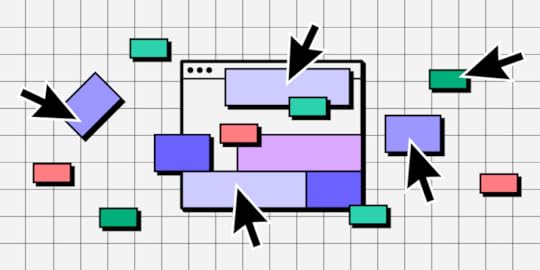
Striking a balance between innovation and usability is essential. However, many organizations fall into the costly overengineering trap, adding unnecessary complexities that diverge from user needs, often overshadowing the primary product purpose. Explore the signs your product is overengineered and the steps you can take to prevent this resource-hungry problem.
Key takeaways:
Overengineering introduces unnecessary complexities to products, distracting from user-centric design and functionality.Manifestations of overengineering include feature bloat, redundant processes, and overly advanced tech in simple products.Regular user feedback, product analytics, and competitor analysis can help identify signs of overengineering.Combatting overengineering involves adhering to design principles like clarity and simplicity, using iterative design processes, and leveraging tools like UXPin’s Merge.Unifying design and development teams through shared UI libraries and systems reduces drift and the risk of over-complicated solutions.Reduce overengineering, front-end debt, and other common product development challenges. Discover UXPin Merge, the only design technology that makes it easy to prototype with coded components from Git, Storybook or npm package. Visit our Merge page for more details and how to request access.
Create beautiful layouts without designersTake UI components directly from Git repo, Storybook, or through NPM and design production-ready prototypes.
Bring code to design .discover-merge { margin: 40px 8px;}.discover-merge__container { display: flex; max-width: 690px; height: 200px; padding: 20px; padding-left: 24px; border-radius: 4px; background-color: black; box-shadow: 10px 10px #9999ff; align-items: center; justify-content: space-between;}.discover-merge__left { width: 50%;}.discover-merge__left p { margin: 10px 0px !important; color: white !important; font-size: 18px !important;}.discover-merge__heading { font-weight: bold !important; color: white !important; font-size: 18px !important;}.discover-merge__text { margin: 0 !important; line-height: 22px !important;}.discover-merge__button { width: 174px; height: 44px; margin: 10px 0px; border: none; border-radius: 2px; background: white; color: black; font-size: 16px; text-align: center;}.discover-merge__button:hover { cursor: pointer;}.discover-merge__image { max-width: 320px !important; height: 200px; margin-right: -19px;}@media (max-width: 760px) { .discover-merge__container { height: auto; margin: 10px; align-items: left; }}@media (max-width: 500px) { .discover-merge__container { flex-direction: column; } .discover-merge__left { width: 100%; align-items: normal; }}What is Overengineering?Overengineering occurs when designers or developers add unnecessary complexity to digital products rather than focusing on what users need. While aiming for perfection, they complicate processes, interfaces, or functionalities.
Overengineering stems from a few sources:
Predicting distant future needsMisunderstanding usersTechnological over-exuberanceWhat are Examples of Overengineering?Knowing what it looks like in real-world scenarios is essential to identify overengineering. Here are typical examples where the urge to do too much overshadows the user’s actual needs.
Example #1: Feature bloat in software productsThink of a word processing tool developed for basic document editing but ends up with numerous advanced features better suited for graphic design or database management. Such additions confuse average users and divert resources from improving core functionalities.
Example #2: eCommerce platforms with complex checkoutsInstead of a straightforward three-step checkout process, an online store incorporates unnecessary steps like quizzes to determine shopping preferences or overly detailed account creation protocols. These additions add friction, often leading to cart abandonment.
Example #3: Redundant user onboarding flowsA task management app has an onboarding process with multiple screens and excessive tutorials. Design teams thought they were helping users but created roadblocks and friction. Users seeking quick solutions might find this cumbersome and abandon the product.
Example #4: Physical products with overly advanced techConsider a toaster with Wi-Fi connectivity, voice commands, and a dozen bread settings. While it sounds cutting-edge, most users only want evenly toasted bread without navigating a tech maze each morning.
Example #5: Websites with overdone animations and interactionsSome websites prioritize aesthetics so much that they inundate users with animations, autoplay videos, and hover effects on every element. This overengineering hampers page load speed and distracts from the primary content.
Example #6: Mobile apps with unnecessary permissionsAn alarm clock app requesting access to contacts, messages, and media files is a classic overengineering case. Such overreaches often raise privacy concerns and deter downloads.
How to Identify OverengineeringStep 1: Conduct regular user feedback sessionsEngage your core user base through surveys, interviews, and usability tests. Listen for indications that they’re overwhelmed, confused, or unable to pinpoint the product’s primary function.
Step 2: Analyze feature usage metricsProduct analytics are an excellent indicator of overengineering. Keep a keen eye on how users adopt new features. Employ analytics tools to monitor which features users frequently access. If significant portions of your product remain untouched, it’s a sign of overengineering or misunderstanding user needs.
For example, many companies have rushed to implement AI into their products in 2023. Imagine a photo-editing app’s analytics reveal that only 10% of users use the AI voice-controlled editing tool, whereas 90% stick to basic editing features.
While counting lines of code isn’t a direct measure of overengineering, an inflated code count for simple functionalities may be telling.
Step 3: Review software development complexityEvaluate how intricate the development process is for each feature. A bloated or overly complex codebase can be a telltale sign of overengineering. Consider software engineering best practices to avoid ‘nice-to-haves’ and unnecessarily intricate solutions.
Step 4: Check iteration and maintenance durationIf updating or fixing small sections of your product demands excessive time, the product might be overengineered. Products should be modular and easily maintainable.
Review the need for frequent refactoring in the codebase. Regular rewrites or significant changes indicate complexities that could be due to overengineering.
Step 5: Evaluate onboarding and training timeHow long does it take new users to understand your product? A steep learning curve often indicates unnecessary complexity.
Step 6: Benchmark against competitorsCompare your product’s feature set and complexity with direct competitors using a service safari to identify if your product is more complex without clear added value.
Step 7: Consult cross-functional teamsGet feedback from designers, developers, product managers, and stakeholders on whether the product’s complexity aligns with its goals.
How to Combat Overengineering in a New ProductUsing design thinking–desirability, viability, and feasibilityDesirability: Ground your designs in real user needs. Conduct in-depth user research, including interviews and surveys, to establish what users genuinely want or need. This data ensures that every design choice aligns with user requirements, effectively curbing the urge to add unnecessary UI elements. Ensure that every design aligns with business requirements to add true value and avoid unnecessary complexities.Viability: Ensure your design choices support overarching business needs by continually weighing the design’s potential impact on the business regarding revenue and brand perception. Adopt a disciplined approach, asking tough questions about the long-term business value of each design feature or element.Feasibility: Maintain close-knit collaboration with the development team to understand the product’s technical limitations and capabilities. By designing with an awareness of what’s technically feasible, you prevent creating unnecessarily complex designs, saving valuable time and resources.Read more about desirability, viability, and feasibility in product design in our top article about it.
User-centered design approachGround every design decision in user insights using methods and processes that place the user front and center:
Deep Dive into Research: Start every project with comprehensive user research to identify pain points, needs, and aspirations. Utilize tools like user personas and journey maps to visualize and prioritize this information.Prioritize Feedback: Make user feedback an integral part of the design process. Use tools like feedback forms, usability testing sessions, and A/B testing to collect and act on this input.Continuous Validation: The user-centered design approach requires ongoing validation, constantly checking your designs against user needs, ensuring alignment, and avoiding unnecessary complexity.Iterative design and prototypingRapid prototyping and iterative design are your best defenses against overengineering:
Start Simple: Always start with the most basic version of your design, focusing on core functionalities. Low-fidelity wireframes or paper sketches are effective starting points. Focus on creating an MVP first, ensuring you’re addressing core needs before adding supplementary features.Iterate Often: As feedback comes in, refine the design. This progressive refinement ensures you build a solid foundation rather than piling on unnecessary features.Embrace Failures: Recognize that not every iteration will be perfect, so you can pivot without wasting time on over-complicated solutions. Implementing an Agile methodology can further support iterative design, as it emphasizes adaptability and user feedback.Following clear design principlesSetting clear and concise design principles aligns product teams with a common goal and purpose. Here are some typical examples of design principles to help with overengineering:
Clarity Over Creativity: While we strive to be design innovators, clarity should always be the priority. Ensure that users can intuitively understand and navigate your designs.Consistency is Key: Maintain consistency in UI elements, typography, and color schemes. This uniformity reduces cognitive load and avoids the pitfall of designing overly complex interfaces.Simplicity Matters: Less is often more. Eliminate unnecessary elements and prioritize content and features that add genuine value to the user.Remember the KISS (Keep It Simple Stupid) and YAGNI (You Aren’t Gonna Need It) principles–overcomplicating often leads to more problems than solutions.
Leverage design systems to align teamsDesign systems help streamline and standardize design and development with a shared UI library, guidelines, documentation, and principles.
Unified Components: Design systems provide reusable components to ensure consistency while discouraging one-off, overengineered solutions.Documented Guidelines: With clear guidelines on design, typography, and interaction patterns, you prevent “reinventing the wheel” and keep designs within established efficient boundaries.Facilitate Collaboration: A well-maintained design system eases the collaboration between designers, developers, and other stakeholders, ensuring everyone is on the same page and reducing the likelihood of overengineering. Design systems also promote extensibility, ensuring that they remain cohesive and manageable as products evolve.UXPin’s Merge technology further streamlines design decisions by unifying teams through consistent design patterns.
How to Solve Overengineering With UXPin MergeProduct developers can use UXPin’s Merge technology to import code components into the design process, bridging the gap between design and development while creating an organization-wide single source of truth.
Unifying teams with a single UI libraryUsing the same UI library for design and development eliminates drift and inconsistencies, preventing teams from creating the glut that often leads to overengineering. Designers have the same constraints in UXPin as engineers developing the final product because they pull components from the same repository.
These UI elements have styling, interactions, APIs, and other properties ‘baked-in,’ so designers build solutions focused on user needs rather than designing from scratch–which often leads to drift and overengineering.
Designers and developers speak the same languageDesigners often use additional platforms and workarounds to mimic code’s fidelity and functionality, leading to features or implementations that don’t align with reality.
Using code components in the design process means designers and programmers speak a unified language backed by code, translated by Merge. Designers use visual elements, and engineers use the code behind them so they’re always aligned and grounded in reality. Merge promotes transparency between writing code and design, ensuring both aspects progress in harmony.
Leveraging microservices architecture combined with UXPin Merge can further modularize functionalities, reducing chances of overcomplication.
Enhanced user testingThese interactive components allow designers to build prototypes that look and feel like the final product. End users and stakeholders can interact with Merge prototypes like they would the end product, providing design teams with meaningful, actionable feedback during the design process.
Designers can use this data to make accurate, data-driven decisions, reducing unnecessary features and the possibility of overengineering.
Stop overengineering and enhance your product development process with UXPin Merge. Visit our Merge page for more details and how to request access.
Discover MergeThe post Overengineering — What is it and How Design Can Help? appeared first on Studio by UXPin.
UXpin's Blog

- UXpin's profile
- 68 followers

