
UXpin's Blog, page 24
March 19, 2024
Webinar Announcement – Build Products 8.6x Faster

Want to build web apps faster? Join our upcoming webinar for busy developers who have no time to learn vector-based design tools. Our experts will walk you through creating a UI design by dragging and dropping React components from top libraries like Material UI.
That’s just the beginning! They will also show you how to copy code off the design and use it to build a Laravel app. This kind of workflow is proven to speed up design by 8.6 times. How do we know it? Our customers measured it!
Join our webinar. Save your spot here: How to speed up building your product 8.6x.
Learn about rapid design and developmentBy the end of the webinar, you’ll understand how to develop apps in a span of one day.
You’ll see in detail:
Why developers need a code-first design toolAn overview of the Merge interfaceBuilding UI with React componentsIntegrating generated React components into a web applicationAdvanced Merge features and the roadmapReady to speed up your workflow?We’ll share a recording with you and there will be time to ask your questions. Get equipped with the latest knowledge on web development for 2024. Merge expert Jack Behar and full-stack developer Jason Gilmore on March 26 for a one hour introduction to Merge.
Jack and Jason will introduce Merge by designing React components in Merge and then integrating the exported React code into a Laravel application.
Join us here: How to speed up building your product 8.6x.
When: March 26, 2024 at 11:00 AM PDT / 7:00 PM CETWhere: Online over ZoomWhat: How to speed up building your product 8.6xSee you there!
The post Webinar Announcement – Build Products 8.6x Faster appeared first on Studio by UXPin.


March 13, 2024
How to Use Tailwind to Build Responsive UI Design

Tailwind provides a set of pre-designed and pre-built styles that you can apply directly to your HTML markup. Unlike traditional CSS frameworks, which often come with pre-defined components and styles, Tailwind focuses on providing low-level utility classes that you can combine to create custom UI designs.
To start a project, front-end developers typically install it via npm or yarn and then include the generated CSS file in your HTML. Once installed, they start applying utility classes to HTML elements to style them according to UI design requirements.
Tailwind CSS is often used to build a wide range of web applications and websites, such as landing pages, dashboards, admin panels, eCommerce sites, and of course, rapid prototyping.
Want to create interactive prototypes with Tailwind UI components? UXPin Merge gives you a library full of official Tailwind UI components that you just drag and drop on the canvas. Then, you just copy the code and paste it into your project for product development. Try UXPin Merge for free.
Create beautiful layouts without designersDesign production-ready prototypes 8.6x faster. No pixels. pure code.
Try UXPin Merge .discover-merge { margin: 40px 8px;}.discover-merge__container { display: flex; max-width: 690px; height: 200px; padding: 20px; padding-left: 24px; border-radius: 4px; background-color: black; box-shadow: 10px 10px #9999ff; align-items: center; justify-content: space-between;}.discover-merge__left { width: 50%;}.discover-merge__left p { margin: 10px 0px !important; color: white !important; font-size: 18px !important;}.discover-merge__heading { font-weight: bold !important; color: white !important; font-size: 18px !important;}.discover-merge__text { margin: 0 !important; line-height: 22px !important;}.discover-merge__button { width: 174px; height: 44px; margin: 10px 0px; border: none; border-radius: 2px; background: white; color: black; font-size: 16px; text-align: center;}.discover-merge__button:hover { cursor: pointer;}.discover-merge__image { max-width: 320px !important; height: 200px; margin-right: -19px;}@media (max-width: 760px) { .discover-merge__container { height: auto; margin: 10px; align-items: left; }}@media (max-width: 500px) { .discover-merge__container { flex-direction: column; } .discover-merge__left { width: 100%; align-items: normal; }}What is Tailwind CSS?
Tailwind CSS is a different way to style your website from traditional CSS framework. Think of it as a set of predefined building blocks (or Lego pieces,) but for your website’s style. Instead of writing a bunch of CSS rules, you could use pre-made classes directly in your HTML code.
Imagine you want to style a website, and you’re faced with the task of writing a lot of CSS code to make things look good. Now, traditional CSS involves creating rules for each element, defining margins, paddings, colors, and more. It can be time-consuming and sometimes a bit repetitive.
Tailwind simplifies styling by providing a set of pre-made classes that you can apply directly to your HTML elements, making the styling process more efficient and flexible.
For example, instead of writing:
cssCopy code.button { background-color: #3490dc; color: #ffffff; padding: 10px 20px; border-radius: 5px; }You can just apply these styles directly in your HTML using Tailwind classes:
htmlCopy codeClick meHere, each class (bg-blue-500, text-white, p-2, rounded-md) represents a specific style. So, bg-blue-500 gives the button a blue background, text-white makes the text white, p-2 adds padding, and rounded-md gives it rounded corners.
Tailwind is highly customizable. If you decide you don’t need a particular style or you want to add your own, you can easily tweak this framework to fit your needs. Tailwind has also a plugin system that allows you to extend its functionality. You can add third-party plugins or create your own to tailor the framework to your specific needs.
You can hear that web developers call Tailwind a utility-first CSS framework. In the context of Tailwind CSS, “utilities” refer to small, single-purpose classes that directly apply styling to an element. These utility classes are named based on their purpose, making it easy to understand what each class does. They are the building blocks of the framework and can be combined to create complex styles.
What can you build with Tailwind CSS?Here are some examples of what you can build with Tailwind CSS:
Responsive Websites: Tailwind’s responsive utility classes make it easy to create websites that adapt to different screen sizes, providing a seamless experience across devices.Web Applications: Tailwind can be used to build the user interface of web applications. Its modular utility classes allow for quick and efficient styling of application components.Landing Pages: Tailwind is well-suited for designing and styling landing pages. Its simplicity and ease of use make it a popular choice for quickly prototyping and building marketing pages.Blogs and Content Websites: Whether you’re building a personal blog or a content-heavy website, Tailwind’s utility classes make it easy to style text, images, and other content elements.E-commerce Sites: Tailwind can be applied to the design of product listings, shopping carts, and checkout pages in e-commerce websites. Its flexibility allows for customization to match specific brand requirements.Dashboards and Admin Panels: Web applications with dashboards and admin panels often benefit from the modular and customizable nature of Tailwind CSS. It provides the tools to create a clean and functional user interface.Prototypes and Rapid Development: Tailwind is popular for quickly prototyping ideas and for projects that require fast development. Its utility-first approach allows developers to iterate rapidly without needing to write custom CSS for every style.Portfolio Websites: Tailwind can be used to build stylish and responsive portfolios for showcasing personal or professional projects. Its utility classes enable the creation of visually appealing layouts.Documentation Sites: Tailwind can be employed to style documentation and help center websites. Its simplicity makes it easy to create clean and readable documentation layouts.Custom UI Components: Tailwind can be used to style custom UI components, allowing developers to create unique and visually appealing interfaces and responsive design.Where to take Tailwind components from?There are a few different sources where you can find Tailwind CSS components and resources. One notable resource is Tailwind UI, a premium set of professionally designed components and templates.
Tailwind UI was created by the founders of Tailwind CSS, Adam Wathan and Steve Schoger. The primary motivation behind creating Tailwind UI was to provide a set of professionally designed, ready-to-use UI components and templates that seamlessly integrate with Tailwind CSS. The goal was to offer front-end developers a premium resource for building beautiful and consistent user interfaces with ease.
One of the main selling points of Tailwind UI is the quality of its designs. The components and templates are professionally crafted by Steve Schoger, known for his expertise in design. This ensures a polished and visually appealing look for your web applications.
Here are some examples of the types of components and templates you can expect from Tailwind UI:
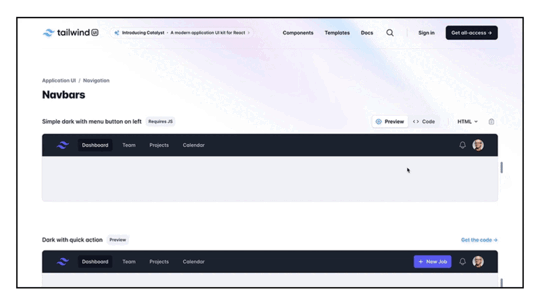
Navigation Components — you can find navbars, dropdowns or mega menus.Form Components — components for building forms, such as Input fields, checkboxes and radio buttons, select dropdowns, buttons, and for gorups.Content Display Components — those include cards, modals and popovers, alerts, badges, and tooltips.Typography and Text Components — for adding headings, blockquotes, lists, and text styles.Grid and Layout Components — you’ll find container, grid system, and flexbox utilities.Media Components — they include image cards, galleries, and responsive video components.Utility Components — spacing, margin, flexbox, alignment and visibility utilities.Templates — the library has templates for landing pages, dashboards, eCommerce products, pricing, and blog layouts.These are just a couple of examples, and Tailwind UI provides a comprehensive set of components and templates that cater to different use cases in web development. Each component is designed to be flexible and customizable, allowing you to easily adapt them to fit the specific needs and branding of your project.
The components in Tailwind UI are often built with the principles of good design and usability in mind, thanks to the expertise of Steve Schoger, who is known for his work in design and user interface aesthetics. Overall, Tailwind UI aims to save developers time by providing high-quality, ready-to-use components that align with the Tailwind CSS framework.
What makes Tailwind different from Material UI and Bootstrap?Tailwind CSS, Material UI, and Bootstrap are all popular libraries in web development, but they differ significantly in their approach to styling and the user interface.
As we covered already, Tailwind follows a utility-first approach. It provides a set of low-level utility classes that you can apply directly in your HTML markup to build your styles. This approach is highly flexible and allows for more granular control over styling. It’s often favored for rapid prototyping and customization.
Bootstrap and Material UI are widely used for quickly building responsive websites. Bootstrap comes with a set of pre-designed components and styles. It follows a more component-centric approach, providing developers with a set of ready-made UI components that can be easily customized through a theming system. Developers can modify variables like colors and fonts to match their brand.
MUI, on the other hand, is a React component library that implements Google’s Material Design guidelines. MUI like Bootstrap is component-centric, providing a set of pre-designed React components. It’s easy to customize and it has a large and active community with good support and documentation.
How to create a responsive UI design with Tailwind
You don’t need to spend time reading documentation to create a Tailwind UI design. Here’s how you can do it quickly with UXPin Merge.
UXPin Merge is a prototyping tool that allows designers and developers to create and collaborate on interactive UI design seamlessly. It’s part of UXPin, which is known for its focus on collaborative design. UXPin Merge specifically emphasizes the integration of design and development workflows, enabling faster design and development processes.
In this article, we will show you how to create a UI design with Tailwind UI and UXPin.
Then, we will give you quick tips on installing Tailwind CSS. To follow along the article, sign up for UXPin and start your trial.
Step 1: Pull Tailwind UI components out of the library.UXPin Merge comes with a built-in library of Tailwind UI components. This library includes a collection of pre-designed UI elements, such as buttons, cards, forms, and more, adhering to the Tailwind CSS styling principles.
To start designing, Design System Libraries in UXPin. Access them by clicking the Design System Libraries icon in the bottom bar or with the Option + 2 keyboard shortcut.
Then, scroll to Merge libraries and you’ll see Tailwind UI among React libraries like MUIv5 (see how to design with it,) Ant design or React Bootstrap. The Tailwind library isn’t React-based for now. You can copy HTML only off your design while using it.
Place components that you like on the canvas. It can be button, card, whatever you need to build an interface.
Step 2: Generate complex components with ChatGPT.Up until this point, we were using children. Based on the atomic design principles, children are the smallest building blocks that together make up molecules and organisms. Atomic design, coined by Brad Frost, is a methodology that breaks down web design into its fundamental building blocks, facilitating the creation of consistent and scalable user interfaces.
To learn more about atomic design, follow our article Atomic UI Components or read Brad Frosts’s article.
For bringing the so-called “molecules,” use UXPin Merge’s AI Component Creator that assists in generating components. This can be particularly useful for creating dynamic or custom components that you may need for your project. The AI Component Creator leverages machine learning to understand design patterns and generate code snippets or components based on your design.
Read ou guide on speeding up design with AI Component Creator and ChatGPT.
Step 3: Use Custom Component to bring whole layouts in.
We’re not leaving atomic design methodology yet, because there is a way of importing organisms, that is combinations of molecules that form distinct sections or components of an interface, into UXPin.
The built-in Tailwind UI library has a New Custom Component option for directly copying UI components, patterns, and full layouts from the Tailwind UI website into your UXPin project. The components can be customized and themed in UXPin.
At the top of Tailwind library inside the editor, you will see a see-through component with a plus sign. It’s our Custom Component. Go to Tailwind UI website, copy a code from examples or components pages and paste it into UXPin’s Custom Component. Then, save the component to Patterns for future reuse.
See how Sage uses this feature in our Product Tour.
Step 4: Edit properties of componentsNow that you have building blocks of your interface, adjust properties of your UI components, so your design feels consistent and professional. A properties panel appears on the right once you click on the component you want to adjust. You can change colors, text, add state, and any special styling that you have in mind.
This is also the place of switching themes. For that, you have two options.
Global themes — pick a light or dark theme for the full page.Local themes — pick a light ot dark theme for each component.Here you can also add interactions. Decide what should happen if a user clicks a button, such as take them to the next page, make a modal appear or disappear, etc. You’ll also be able to set a property for coded components.
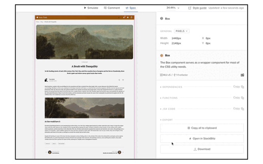
Step 5: Copy the code to your dev’s environmentThe layout is done, time to build the thing. Go to “Preview mode” > “Spec mode.” and click on the component you want to copy the code of, or export the full prototype in one click by using one of the export functions. That’s a good start for building the app.
If you haven’t yet, set up a new project that will use the Tailwind UI library. Create a new HTML file and link to the Tailwind CSS and Tailwind UI stylesheets in the
section. Alternatively, use our Stackblitz integration and have a project preconfigured there.Build layouts 8.6x faster with Tailwind UIPrototyping, working with design systems, AI-generated Tailwind components, opening in StackBlitz…
— StackBlitz (@stackblitz) March 6, 2024
this Product Hunt launch from UXPin has it all 🤌 pic.twitter.com/yq38x6i5oe
Tailwind CSS stands out for its unique approach to styling. Unlike conventional CSS frameworks, Tailwind offers a collection of pre-designed styles through low-level utility classes, allowing front-end developers to craft custom UI designs effortlessly. Installation involves a simple npm or yarn setup, followed by the application of utility classes directly to HTML elements to meet specific UI design requirements.
Tailwind CSS finds its application in diverse web projects, ranging from landing pages and dashboards to admin panels, eCommerce sites, and rapid prototyping.
For those seeking interactive prototypes with Tailwind UI components, UXPin Merge presents an ideal solution. This tool provides a library brimming with official Tailwind UI components, facilitating a seamless drag-and-drop experience on the canvas. Copy the generated code and integrate it into your project for efficient product development. Try UXPin Merge for free.
Try UXPin MergeThe post How to Use Tailwind to Build Responsive UI Design appeared first on Studio by UXPin.
March 12, 2024
Merge AI – What You Get in a New Plan?

Our new plan is a game-changer for many teams. One of the reviewers during our ProductHunt Launch called UXPin an “Apple” of product design, and we couldn’t be more proud. Apple stands for innovation, creativity, and future – the values which are important to us, too.
Merge AI aims at democratizing design for many teams. Finally, they can create interfaces fast and without compromising quality and consistency. In this article, we’ll look closer at what we’re offering in this new plan and invite you to try it out.
Ready to give Merge AI a go? All the features we will talk about are available on trial. Try UXPin Merge for free.
Create beautiful layouts without designersDesign production-ready prototypes 8.6x faster. No pixels. pure code.
Try UXPin Merge .discover-merge { margin: 40px 8px;}.discover-merge__container { display: flex; max-width: 690px; height: 200px; padding: 20px; padding-left: 24px; border-radius: 4px; background-color: black; box-shadow: 10px 10px #9999ff; align-items: center; justify-content: space-between;}.discover-merge__left { width: 50%;}.discover-merge__left p { margin: 10px 0px !important; color: white !important; font-size: 18px !important;}.discover-merge__heading { font-weight: bold !important; color: white !important; font-size: 18px !important;}.discover-merge__text { margin: 0 !important; line-height: 22px !important;}.discover-merge__button { width: 174px; height: 44px; margin: 10px 0px; border: none; border-radius: 2px; background: white; color: black; font-size: 16px; text-align: center;}.discover-merge__button:hover { cursor: pointer;}.discover-merge__image { max-width: 320px !important; height: 200px; margin-right: -19px;}@media (max-width: 760px) { .discover-merge__container { height: auto; margin: 10px; align-items: left; }}@media (max-width: 500px) { .discover-merge__container { flex-direction: column; } .discover-merge__left { width: 100%; align-items: normal; }}Four built-in Merge libraries, backed with production-ready codehttps://t.co/opR7VnCZgg 🎉 Embrace the future of UI design with AI-powered component creator, built-in libraries, and templates. pic.twitter.com/ptJANeTTq2
— UXPin (@uxpin) March 9, 2024
Remember the time you needed to redraw a button, just to make it look consistent? Not anymore! With Merge AI, you can access four fully-coded components that come from top open-source libraries for building interface layouts like MUIv5, React Bootstrap, Ant design (those are React-based libraries) or Tailwind UI (this one is HTML only.)
Choose a library, place its components on the canvas and build layouts 8.6x faster than with vector-based tools. Yes, we tested it! The most important thing here, nonetheless, is that all UI components are backed with code, so you don’t need to worry about recreating your design to fit the developer’s environment. Pixels are burning with jealousy, aren’t they?
What we added: MUIv5, React Bootstrap, Ant design, and Tailwind UI.
Quick instruction:
Open UXPin.Create a new prototype.Head on to Design System Libraries.Pick a Merge library.Use pre-built layouts and patternshttps://t.co/ZaQOt1bTE8 🏝️ Your dream UI is one click away. Access ready-to-customize templates and elevate your UI without long design cycles. 🥳 pic.twitter.com/OPKcSppSgF
— UXPin (@uxpin) March 7, 2024
With the new plan, Merge AI, you have access to the most popular layouts, including eCommerce product pages, checkouts, internal apps, and more. Those templates belong to you. You can edit them, add elements in, or switch themes.
The layouts are backed with ready-to-use code and they were built with open-source library components, so you can stay consistent with a component library you want to use from this point onwards, as well as, adjust.
What we added: Fully coded and interactive layouts and patterns.
Instruction:
Open UXPinScroll down until you see Projects.Pick a layout and copy its code.AI Component Creator for ChatGPT wizardryhttps://t.co/Zilv5dpsVY 👀 Get a peek inside our AI Component Creator. Generate a Tailwind UI component based on a prompt and save it to your library for future reuse. 🤩 pic.twitter.com/yeItzgUISu
— UXPin (@uxpin) March 8, 2024
One of the biggest productivity boosts these days is ChatGPT. With our integration via OpenAI API, you’re able to generate a Tailwind CSS component with a prompt. It generates complex components, such as data reports, sign-up forms, and shopping cards that are backed with HTML and can be fully customizable.
What we added: AI Component Creator
Instruction:
Create a new prototype (sign up for UXPin.)Navigate to “Quick Tools’ bar.Open AI Component Creator.Paste OpenAI API key.Write your prompt.UXPin and StackBlitz integrationPrototyping, working with design systems, AI-generated Tailwind components, opening in StackBlitz…
— StackBlitz (@stackblitz) March 6, 2024
this Product Hunt launch from UXPin has it all 🤌 pic.twitter.com/yq38x6i5oe
StackBlitz is a development environment that simplifies creating, sharing, and collaborating on web applications directly from their web browsers. We’ve built an integration that allows users to open their design as code in StackBlitz.
What we added: Stackblitz integration for easy code export.
Instruction:
Open a prototype in your browser.Click “Preview Prototype.”Go to Spec mode.Click “Copy to Stackblitz.”Export clean and working code off UIhttps://t.co/YacvepbSYD 🧹 Clean code with a design tool? You got it! Export React code with a click. pic.twitter.com/j96QKmBjdh
— UXPin (@uxpin) March 12, 2024
A while back a ProductHunter called us “Google Translator” for design to code, and it stuck with us. In UXPin Merge, you are using coded components, not vector ones, so it’s a given that you’ll be able to copy the code behind them. Now, you are able to copy the code of your entire prototype with one click.
We support any React-based component library, so if you have your own, reach out to us, and we will integrate it, so you can try it by yourself. See how you can reach out to us.
What we built: Code export.
Instruction:
Open a prototype in your browser.Click “Preview Prototype.”Go to Spec mode.Click “Copy code.”Try Merge AI for freeThank you for being with us for so long and seeing all the transformations. UXPin started as a paper prototyping tool, then online wireframing solution, and code-to-design facilitator. This release is even more special because it helps build MVPs in lightning speed. Want to try it? Try UXPin Merge AI for free.
Try UXPin MergeThe post Merge AI – What You Get in a New Plan? appeared first on Studio by UXPin.
March 7, 2024
ChatGPT in UI Design – How UXPin Can Generate UI Components

ChatGPT is a language model developed by OpenAI. It is part of the generative AI tools which utilize deep learning techniques to understand and generate text.
The model works like a chatbot for asking questions or giving prompts, and it generates contextually relevant responses. Designed to handle a variety of natural language understanding and generation tasks, this OpenAI tool is versatile for different applications, including generating UI components from open-source libraries based on prompts.
Try UXPin’s AI Component Creator and generate custom UI components with ChatGPT. Quickly save the components as patterns for future reuse. Explore this and other features that make design 8.6x faster than with other tools. Try UXPin Merge for free.
Create beautiful layouts without designersDesign production-ready prototypes 8.6x faster. No pixels. pure code.
Try UXPin Merge .discover-merge { margin: 40px 8px;}.discover-merge__container { display: flex; max-width: 690px; height: 200px; padding: 20px; padding-left: 24px; border-radius: 4px; background-color: black; box-shadow: 10px 10px #9999ff; align-items: center; justify-content: space-between;}.discover-merge__left { width: 50%;}.discover-merge__left p { margin: 10px 0px !important; color: white !important; font-size: 18px !important;}.discover-merge__heading { font-weight: bold !important; color: white !important; font-size: 18px !important;}.discover-merge__text { margin: 0 !important; line-height: 22px !important;}.discover-merge__button { width: 174px; height: 44px; margin: 10px 0px; border: none; border-radius: 2px; background: white; color: black; font-size: 16px; text-align: center;}.discover-merge__button:hover { cursor: pointer;}.discover-merge__image { max-width: 320px !important; height: 200px; margin-right: -19px;}@media (max-width: 760px) { .discover-merge__container { height: auto; margin: 10px; align-items: left; }}@media (max-width: 500px) { .discover-merge__container { flex-direction: column; } .discover-merge__left { width: 100%; align-items: normal; }}What is ChatGPT?ChatGPT is a language model developed by OpenAI. It is designed to understand and generate text based on the input it receives. The model has been trained on a diverse range of Internet text, and it can perform various natural language processing tasks. This includes answering questions, engaging in conversations, summarizing text, translating languages, and more.
ChatGPT was created to provide a powerful, versatile, and user-friendly language model that’s capable of addressing various natural language processing challenges. Its broad applicability, combined with the scale of data it was trained on, makes it a significant advancement in the field of conversational AI and language understanding.
It’s one of the most powerful language models, but not the only one. There are also Google’s Bert, T5, Baidu’s ERNIE, Facebook’s Blender Bot or a model named XLNet. ChatGPT 3.5 was the one of the largest language models ever created at the time of its release, with a staggering 175 billion parameters. The training data gave it the power to generate more contextually relevant, coherent and versatile responses compared to smaller models.
Many users implemented ChatGPT into their workflow, built AI tools using its API key, and contributed to its success. An API provided by OpenAI allows developers to integrate the model into their applications, products or services. That’s what we did when we built our AI Component Creator.
How does ChatGPT work?
ChatGPT works by generating a human-like text in response to a prompt it receives from a user. It can generate all types of responses – from a block of text to real conversations and even visuals. Users come into interactions with ChatGPT by typing in what is known as “prompt” into ChatGPT UI.
Prompts are input queries or statements provided to the model to generate responses. The prompt is the command or question that the user gives to the model to elicit the desired output. How users phrase the prompt has an influence on the quality and relevance of what they get in return.

Here are examples of prompts for language models like ChatGPT:
Conversation: “Tell me about your favorite programming language and why you like it.”Instruction: “Provide tips for improving website performance and speed.”Creative writing: “Write a short story about an unexpected adventure in a futuristic city.”Problem-solving: “I’m having trouble debugging my code. Can you help me identify the issue in this JavaScript function?”Education: “Explain the concept of machine learning in simple terms.”Opinion: “What’s your opinion on the latest advancements in AI?”Scenario for role-playing: “Imagine you are a travel assistant. Plan a weekend getaway itinerary for someone who loves outdoor activities.”Comparison: “Compare and contrast the pros and cons of using Python and JavaScript for web development.”Task: “Write a Python function to find the factorial of a given number.”Explanation: “Explain the functioning of blockchain technology and its applications.”You can see that those prompts start with an action verb. They provide a cue of what the user wants from ChatGPT, be it an explanation, plan, comparison, answer or mistake spotting. ChatGPT comes up with the best answers to those. You can ask one prompt per conversation or continue a discussion until you are satisfied.
When using prompts, it’s helpful to be specific about the challenges you’re facing or the aspects you want to improve. Providing context and asking for practical advice will get you more tailored and actionable responses from ChatGPT.
The benefits of using ChatGPT in UI designChatGPT can increase your productivity, help you refine your skills, and provide answers to your questions. Of course, it’s just a language model, so take its recommendations with a grain of salt and if you’re not sure if the answer is correct, fine-tune it, and try again.
The benefits of using ChatGPT in UI design are as follows:
No training required — unlike traditional machine learning models that require extensive training on specific datasets, ChatGPT comes pre-trained about various topics, including UI design. This eliminates the need for users to train the model themselves.Instant design assistance — ChatGPT provides rapid responses to a query, offering instant guidance, eliminating the need of looking for the answer on the Internet or asking peers.Efficient problem-solving — with ChatGPT’s quick and informative responses, designers can maintain a high level of productivity. This model’s efficiency enhances the overall productivity of the design process.While UX designers use ChatGPT to help them with preliminary user research, building personas, perfecting user flows, UI designers ask ChatGPT to come up with layout, color schemes or typography combinations. When it comes to AI Component Creator, it helps you generate simple or complex UI components, so you can build MVPs or advanced apps faster. Let’s see what you can expect.
How to generate UI components with ChatGPTUsing ChatGPT to generate UI components involves providing clear and detailed prompts to receive the component that you need.
With UXPin Merge, you don’t need to go to OpenAI’s website to get help with UI design. The tool is built in UXPin’s editor. It’s available in the “Quick Tools” bar and it can be quickly launched whenever you need it. And what it does is it generates you UI components based on your prompt that appear directly on your design.

The UI component that’s generated with the ChatGPT integration is the Tailwind UI component. It’s one of a few built-in open-source component libraries available in UXPin Merge. Tailwind is a great resource for building content-first web designs, such as landing pages, documentation hubs, task management apps, employee portals, and more.
You can use the component that has been generated as any other UXPin Merge component in your project. You can resize it, change its position, and more.
How to use ChatGPT integration in UXPinDo you have a UXPin Merge account? Now, it’s the right time to log in. And if you don’t have an account yet, try UXPin for free, so you can follow along with our tutorial.
The integration requires you to have an OpenAI API. Don’t have it? Write to our support and they will be happy to assist you. Read our help documentation, so you know how to contact our support.
#1: Write the prompt for componentsYou are in the midst of creating your user interface design and you can’t find a component to go with your design? Let’s generate it. Navigate to the ChatGPT plugin that’s in Quick Tools bar and click the icon labeled “AI” (look at the first screenshot above.)
Now, you will see a modal popping out that looks like this:

Here you can type in your prompt. What will it be? Going back to the section about “How does ChatGPT work?” we’ve seen examples of prompts. They had an action verb (write, provide, identify), some context for the chatbot to grasp what you want, and specific details, such as “responsive,” “gradient,” “customizable,” and more.
Additionally, make sure you specify any requirements and limitations that you have. The requirements may be about the color scheme, such as a specific HEX code for a background color, or accessibility limitations.
Tailwind UI is a great component resource AND component inspiration. So, head to their website to discover what kind of components you can generate. Some suggestions:
Pricing table — “Generate a pricing table with 3 columns. Column 1: freelancer priced at $19, Column 2: startup and be priced at $39. Column 3: company and be priced $59. Company column should be highlighted and labeled as most popular.”Testimonial card — “Create a testimonial card with 5-star rating. The testimonial should be in quotes. Its copy should be “The best tool I’ve ever used” and 5 out of 5 stars should be active. Use #FFD700 for stars and #636363 for text. Add a label long-time customer.”CTA section — “Create a CTA section that’s split with an image. An image is on the column on the left and it has a person in front of a whiteboard. The other column is a CTA “Let’s work together” and it has a button “Contact us” that is orange.”Look at the Tailwind UI site to learn what is possible.
#2: Generate UI componentsThe component prompt that we will use for the purpose of this tutorial is this:
Please create a contact form with a header “Leave your message”, an email field, a checkbox with text “I accept privacy policy” and a field where a user can type their message. Use color #0000FF for background.
We generated the following component (screenshot below).

It has a blue background, interactive input fields for email address and user input, submit button, and clickable checkbox. The result is pretty nice. There are some things that could be improved, so if you feel like it, write another, more specific prompt.
Check the component place in Pages & Layers Panel. Make sure it is a standalone component and not a part of any other Layer.
#3: Save your components for reuseNow that you have a component you like, save it to your library in case you want to use it elsewhere or keep it as part of your design documentation. The component is backed with code, and you can export it to your dev’s environment with one click.
Read more about it in our documentation about AI Component Creator.
Resources for writing better promptsHere are some resources that will help you write better prompts:
Prompt Engineering Course by OpenAI — Prompting Guidelines by Andrea ValenzuelaHow To Write ChatGPT Prompts (150+ Awesome Prompts Inside) by Emily GertenbachWriting Effective Prompts in ChatGPT by UxcelDesign with ease with UXPin MergeAi Component Creator is a new addition to UXPin and it’s great for getting you a component that is backed with code and fully consistent with the Tailwind UI library. Think of it as an AI-design assistant that generates a UI element based on an instruction.
Get custom nav bars, persona cards, gallery of images, or sidebars that can be easily reused throughout your design. And if you can’t imagine what you can create with Tailwind UI components, go through their website for some inspiration.
UXPin Merge makes it extremely easy for non-designers to build interactive and beautiful UI without having design skills. It works in a drag-and-drop like fashion, so you can take a component from a library and build an interface with it. Aside from Tailwind UI, it has other open-source libraries, such as MUIv5, React Bootstrap, Ant Design which are based in React.
Give it a try. Pick one of the available templates and customize it or start a completely new design. Then, copy the code off your design and bring it straight to a development tool. Try UXPin Merge for free.
Try UXPin MergeThe post ChatGPT in UI Design – How UXPin Can Generate UI Components appeared first on Studio by UXPin.
March 6, 2024
How to Build a Sign-Up Page in Under 15 Minutes

Sign-up pages serve as the welcoming gateway for users eager to explore apps, websites, and other digital products. Whether it’s a social media network, e-commerce site, or a productivity tool, these pages grant access to whatever it is that you’re offering. They are the digital reception area where users take their first steps into getting to know your product more.
In this article, we will guide you through the process of building a sign-up page with MUIv5 components and create a prototype like this under 15 minutes. Material UI is one of the best open-source component libraries for code-based prototyping. We’ll build a sign-up page with it.
Design beautiful and consistent user interfaces even if you don’t have a designer on the team. Drag fully coded components from the library and arrange them on the canvas. Customize them as you like and ship stunning layouts 8.6x times faster. Try UXPin Merge.
Create beautiful layouts without designersDesign production-ready prototypes 8.6x faster. No pixels. pure code.
Try UXPin Merge .discover-merge { margin: 40px 8px;}.discover-merge__container { display: flex; max-width: 690px; height: 200px; padding: 20px; padding-left: 24px; border-radius: 4px; background-color: black; box-shadow: 10px 10px #9999ff; align-items: center; justify-content: space-between;}.discover-merge__left { width: 50%;}.discover-merge__left p { margin: 10px 0px !important; color: white !important; font-size: 18px !important;}.discover-merge__heading { font-weight: bold !important; color: white !important; font-size: 18px !important;}.discover-merge__text { margin: 0 !important; line-height: 22px !important;}.discover-merge__button { width: 174px; height: 44px; margin: 10px 0px; border: none; border-radius: 2px; background: white; color: black; font-size: 16px; text-align: center;}.discover-merge__button:hover { cursor: pointer;}.discover-merge__image { max-width: 320px !important; height: 200px; margin-right: -19px;}@media (max-width: 760px) { .discover-merge__container { height: auto; margin: 10px; align-items: left; }}@media (max-width: 500px) { .discover-merge__container { flex-direction: column; } .discover-merge__left { width: 100%; align-items: normal; }}What is a sign-up page?A sign-up page is a web page or form where users provide the necessary information to create an account or access online services. It typically includes fields for entering details like name, email, and password. This page serves as the starting point for users to join a digital community, start using an app, or buy a product.
A well-designed sign-up page makes the registration process easy, builds trust, ensures security, and collects data.
What are the sign-up page elements?After looking at a dozen sign-up pages, anyone can spot that most of them use the same UI elements: input fields, buttons, sign-up text, visuals, and so on. Those UI elements are a staple, but to make a sign-up process even more user-friendly, designers also put in error handling, password strength indicators, confirmation messages, and more.
Let’s break down the essential elements of a sign-up page.
Input field
Input fields are the primary means of collecting essential user information, such as name, email address, and password. They serve as the entry points for users to provide the necessary data for completing the sign-up process.
Well-designed input fields enhance the user experience by providing clear and easily navigable areas for entering information. Users should be able to understand what is expected in each field without confusion.
They should also realize that this is the place for entering data. To make that clear, designers apply a subtle background color or shading. This technique helps create a visual contrast, making it easier for users to recognize where they need to interact.
Input fields on a sign-up page are not just blank spaces; they are integral components that facilitate data entry, enhance user experience, and contribute to the overall success of the sign-up process.
ButtonButtons in a sign-up form play a critical role in guiding users through the registration process. Their importance lies in providing a clear call to action and facilitating user interactions.
Well-designed buttons meet user expectations in terms of placement, size, and styling. Users anticipate a button to be the actionable element that moves them forward or finalizes an action.
Buttons also contribute to the visual hierarchy of the page. The design, color, and placement of the primary sign-up button should make it stand out, guiding users’ attention effectively.
Sign-up text (header)
Most sign-up pages feature a header or a sign-up text as one of the top UI elements. It’s important to make it stand out. The header provides a clear and concise message about the purpose of the page — getting users to sign up. Thanks to the text, users instantly understand that they are on a sign-up page, reducing confusion and giving them reassurance that they are in the right place.
The header can also have a persuasive function and increase conversion rates. It can reinforce the call-to-action, providing additional motivation for users to complete the registration process.
VisualsVisuals on a sign-up page refer to the graphical elements that complement the overall design and contribute to the visual appeal of the page. These elements play a crucial role in enhancing user engagement, conveying information, and establishing a desired brand impression.
Visuals contribute to the overall aesthetics of the sign-up page, making it visually appealing. An aesthetically pleasing design can positively impact the user’s perception of the platform and encourage them to proceed with the sign-up process.
Well-designed visuals can help break up text and reduce cognitive load. They guide users’ attention, making it easier for them to understand the information presented and navigate through the sign-up process.
CheckboxCheckboxes are commonly used for obtaining user consent for terms and conditions, newsletter subscriptions, or additional features. They empower users to express their preferences and make informed choices during the sign-up process.
Considering checkbox design, these UI elements need sufficient size and contrast to ensure legibility. Users should easily recognize the state of the checkbox (whether it is checked or unchecked), minimizing confusion and enhancing the overall clarity of the sign-up form.
To enhance the comprehension of those UI elements, you may consider learning about different layouts, visual hierarchy, and contrast.
What do you need for this tutorial?We’ll go over building a sign-up page. It’s possible to do that super quick if you get the same tools. You will need two things:
UXPin trial account – sign up for free here, so you can follow our walkthrough.Access to MUIv5 kit – all trial accounts at UXPin have access to our built-in MUIv5 kit. It includes pre-built UI coded elements that you will use to build the layout of your sign-up page.This walkthrough is also available as a built-in tutorial for the users who open the MUIv5 trial kit. Where to find it? Just jump into the dashboard, go to project “Start here”, and enter a prototype with the walkthrough as well as the sign-up prototype, ready to be copied and customized.
 How to build a sign-up page, step by step
In about 15 minutes, we’re going to create a simple layout of a sign-up page. We’ll use some of the available MUIv5 components, lay them out on the canvas, and do a simple design magic to make the sign-up page look professional. Here we go!
Step 1: Place UI components on the canvas
Prepare your working area. Navigate to design system libraries in the bottom-left corner, and double-check if you have MUIv5 chosen as your UXPin library. You will see that you have various components to choose from. For this tutorial drag and drop onto the canvas the following components:
Image x1Breadcrumbs x1Typography x2TextField x1Checkbox x1Button x1Grid x1Paper x1Box x2Below is a simple visualization of the components.

You can scroll through the MUIv5 library and drag the components onto the canvas. Can’t find them? Just type their names inside of the search field. Click the magnifying glass icon and you’ll see this field. Once you have all the components on the canvas, go to the next step.
Step 2: Adjust UI components
Let’s take components and set up the right properties, so it fits our purpose – a sign-up form. Click on the UI element you want to adjust, and you will see that the Properties panel appears on the right-hand menu.
Let’s start with editing following components properties:
Adjust colors and copy of breadcrumbs links – The breadcrumbs tell users where they are located inside of the app or site. Change the color of the link to primary and secondary. Plus, edit the copy. It should say “Account / Security / Settings”.Edit the TextField – This component is our input field and our sign-up form collects email addresses. Edit the copy, so it says “Email” and change its variant.Change the size and copy of Typography – Adjust the size of two typography components. Set up the variant of the first one as H3 and the second one as Caption and edit the copy, so it says “Create your account” and “Check this box to receive our weekly newsletter” respectively.Change the size and copy of the button – Set up the button size to large, edit the copy, so it says “Next,” and switch its width.We introduced changes to five components: Breadcrumbs, Typography, Typography, TextField, Button.
Step 3: Organize components inside the boxes
Take the components we’ve just adjusted, and place them into the boxes. One box should contain Checkbox and Typography, and together they will form our checkbox field. The other box has breadcrumbs, typography, input field and button. This arrangement helps us organize our design, providing a necessary structure.
Notice that we are not including Grid, Image and Paper in any of those boxes.
If done correctly, you should be able to see the following structure in Layers Panel, located next to Design System Libraries.
Step 4: Add padding
Add the padding to boxes, so the UI elements have room to breathe. Padding is a common UI term that refers to the space between an element and the border.
Start with Box 1. Add Top and Bottom padding to components in Box 1. Use 12px for the Top padding and 32px for the Bottom. Remember to type in “px” next to the number, so the measurements are crystal clear.
Let’s move on to Box 2. For this one, add a 64px padding on each side for the whole box.
If you struggle to select the right box, use Layers Panel and click on the box you want to add padding to.
Your boxes should look like the image below.
 Step 5: Set up grids
The sign-up form has a two-column layout. To make that happen, use the Grid component. It looks like this:

We want to have an Image in one column and the rest of the design in the other column. So, drag an Image component to one of the Grid’s columns (it’s this rectangle that says XS:12, SM:6) and the rest of the components into the other Grid’s column (the other rectangle.) Then, stretch the Grid component into a desired width.
Your Image component will not fit the column appropriately at first. It will be too small. To stretch it, get rid of Width and Height by clicking ‘X’. By selecting ‘cover’, the Image component will look like the one below.
Step 6: Drag everything into Paper component
There’s one component that is left. It is Paper. It adds dimension to the sign-up page. We want our design to fit inside Paper, so we can improve our form visually.
Notice that Paper has a Typography component inside, but we don‘t need it. Replace it with Grid. Stretch the Paper components, so all elements of our sign-up form fit nicely.
Step 7: Final UI design touchesThere are a couple of tricks that designers use to make their design more harmonious and easy for the eye. Right now the design looks a bit stiff.
First of all, there’s too much padding. Get rid of it by deleting ‘SX’ PADDING from Paper and SPACING from Grid.
Secondly, Image can take less space in order to make the more important sign-up form shine. Adjust the width of both columns of the grid. Right now both columns take up 6 units. Change Image width to 4 units and the other column will take up 8 units.
Small changes, but the effect is huge, isn’t it?
Step 8: Preview your design
Head on to the preview mode to see your design in flesh. A preview mode is a powerful place where you can simulate your design’s interactions, leave comments, get specs, and copy clean JSX code out of your design. If you’re ready, you can add interactions to the form to make it sensitive to users’ input. Read our help documentation to learn how to add interactions.
What will you build next?You did it! Congrats! Together we’ve built your first form but that’s just a tip of an iceberg. You can build interactive interfaces of pages, apps, no matter how complex they are. To do that, you can use one of the built-in libraries like the MUI one we used in this tutorial or import your own React library.
Need more practice? Take a look at our ready layouts that you can copy and customize to your needs. Or just watch our mini-course where Rachel walks you through building an employee portal in UXPin Merge. Sign up for a trial and follow her along: from creating a prototype to pushing it to code. Try UXPin Merge for free.
Try UXPin MergeThe post How to Build a Sign-Up Page in Under 15 Minutes appeared first on Studio by UXPin.
March 5, 2024
Product Announcement – Helping You Bring Design Vision to Life

We are excited to share what we’ve been working on in the past few months. We’ve been doing extensive research and development concerning the technology behind UXPin Merge, and today’s the day when we announce it all.
Evolution of UXPinOur tool was grounded in a passion for innovation and a strong desire to make design accessible to anyone. It started as a paper prototyping notepad, aimed at democratizing prototyping and making it a universal concept that can be used to conceptualize design ideas fast.
Around 2011 we developed a digital wireframing solution. At that time, this type of design work had its limitations. UXPin emerged as a solution to overcome existing flaws and introduce new advantages – from better collaboration with teammates outside of design to the challenges of quick iterations.
UXPin was dedicated to reinventing the design process from the very beginning. Instead of operating on pixels, the tool was backed with code. Instead of focusing on flat mockups, it gave users the power to build highly interactive prototypes. Instead of following a well-threaded path of making a design handoff an afterthought, it married it into the design process from the very beginning.
All of that is backed up with many interesting feature releases, such as Spec Mode, an advanced version of Figma’s “Dev Mode” which UXPin has had for about 8 years. With Spec Mode, developers could inspect properties, measure distance, and get a generated style guide from the design.
We’ve never stopped innovating – the next step was developing a unique design technology – UXPin Merge – meant to bridge the gap between design and development by making teams share a single source of truth (coded UI components.)
And now, we clarified our mission even further – we want to foster an even more inclusive design environment for everyone.
The Journey to ChangeOur journey began with a critical realization – developers often struggle to find a designer and need to build a UI by themselves. This sparked the inspiration to refocus UXPin Merge to cater specifically to design-less or developer-driven teams, seeking a more straightforward way to create highly interactive and beautifully-looking user interfaces.
After talking to the users, we understood that UXPin Merge can play a key role in making design accessible and heralding the new era of design – one in which you can blend both design and development into one cohesive process.
Starting with the most popular coded component libraries, MUI, Ant Design, Bootstrap, and Tailwind UI, we transformed UXPin Merge into a drag-and-drop UI builder that serves as a powerful tool for anyone who wants to design fast without compromising on quality, interactivity, and documentation.
UXPin Merge Update – Drag-and-Drop UI Builder with Code ExportTo achieve our mission, we introduced key functionalities that make the product development process easier. Let’s explore them one by one.
AI Component Creator
AI proved itself to increase productivity, speed of work, and when it comes to the world of UI and code – product development. That’s why we decided to include it in our design tool.
Our built-in ChatGPT integration can help you get AI-generated fully customizable components based on the prompts you use. Just describe the component you need, and in seconds, it will appear on the canvas. If you need to reuse it or share it – save it as UXPin Pattern.
The AI Component Creator is located on the left (see the screenshot below.) For now, it works with the Tailwind component library (you will read more about that in a separate article.)
It’s a great tool for getting custom components to complement your Tailwind UI library. A form field, menu, modal – the AI Component Creator can generate fully coded components. Once you finish up your AI-generated design, you can copy the working code off the prototype, and kick off the product development phase.

The plugin requires an OpenAI API key, but we’re ready to help with that. Anyone interested in the plugin is welcome to write to our support team or read our help documentation.
Open-source UI component libraries
We’re adding new UI libraries, so that you can enjoy 100% code parity between design and development. This release includes MUIv5, Ant Design, React Bootstrap, and Tailwind UI – four powerful UI libraries that are fully themeable, customizable and their elements can be copied to the development environment without translation.
What’s worth highlighting is that since code comes from open-source libraries, you are the owner of it! You can copy the entire code and use it outside UXPin Merge. We’re giving you a safe design environment to do UI and code exploration. Without making you dependent on our tool.
1. Tailwind UI
We’re adding a full library of Tailwind UI components that is available in UXPin. Tailwind is one of the best choices for reusable CSS code and it’s a great fit for anyone who wants to rapidly build a polished front-end without the need to start from scratch.
It works like this: open Tailwind library in UXPin, pick components that you need, adjust their props, go to Spec Mode and copy the code off your design with one click. We’re including 18 components (button, alerts, input, avatar group, dropdown, and more,) plus we’re giving users the option to add custom Tailwind components, be it with AI Component Creator or just the “Custom component” option in the library.
With Custom component, you can take any code from Tailwind UI and paste it into UXPin. Let’s say you want a Hero Section. Go to Tailwind UI > Components > Marketing > Hero Sections (quick link here.) Then, copy the code by clicking the icon on the right. Go to UXPin’s Tailwind library and click the first component named “Custom component.” Paste the code and watch how your hero section gets dropped on the canvas.

Additionally, with this integration, users can set up themes:
Global theme property to have the theme propagated across the entire prototype. Local theme property to change a theme only on a specific page.To read more about Tailwind, head to our help documentation.
2. MUIv5
Another new built-in library in UXPin is MUIv5. You’re free to use it on a trial and we have a tutorial plus fully-functional layouts waiting for you. As with Tailwind, just take the component that you like out of a built-in library, place it on the canvas, adjust properties, and copy code.

MUIv5 is a React library that many teams use as a design system. With UXPin, you can easily do that too, and get consistent UI without constantly updating two environments.
Access documentation with one click – place a component onto the canvas, click on it, and preview its official documentation, linked in the Properties panel.Switch themes to make your design unique – MUIv5 is fully themeable and you can update it to match the theme you want to use.Forget about redesigning the same element over and over again – most design tools keep the look of your components consistent, we’re going a step further. With our tool, components’ states are also baked in the library..What’s amazing about this and the rest of libraries in this update is that you get clean code behind every component that you use. Unlike in other design tools, you don’t need to translate components to be usable in the dev’s environment.
Here’s a guide on how to use MUIv5 library components: How to build a simple and responsive dashboard.
Want to get skilled at using MUIv5 in design? Follow our mini-course with Rachel. Here’s the first episode.
3. Antd (Ant Design)
This release also includes Ant Design. Ant Design is a React component library and like any library in UXPin, it works in a drag-and-drop mode. Search for a component you want to use, use it in your design, and copy the clean code that’s fully consistent with official documentation.

If your team is looking for a design system, Antd can be your React component library to base it on. The components that are inside UXPin include avatar, breadcrumbs, cards, inputs, but we also have elements for building layout, adding feedback, such as alerts, and navigation.
You’re free to check it out on trial. Sign up for UXPin Merge.
4. React Bootstrap
We’re also integrating React Bootstrap to UXPin Merge. Next to MUI, Bootstrap is one of the most popular open-source React component libraries that forms a foundation for design systems.

Just navigate to Design Systems Libraries in the Editor, pick React Bootstrap and explore dozens of built-in components that are fully consistent with official Bootstrap documentation.
Drag and drop React Bootstrap components on the canvas, manage their props, arrange the layout, and go to Spec Mode to copy the code.
Do you want to learn how to use it? Great! React Bootstrap is available on trial and comes with its own trial kit. Dive into this React library. Try UXPin Merge for free.
Templates
A blank canvas can be quite scary. For that reason, our release comes with a host of customizable templates. Pick a layout that fits your use case, edit it as you like, and ship it as your own UI.
The templates are not exclusive to UXPin. As with coded components, you can copy the code behind the elements and use it to build your own product.
We’ve built the templates with the MUIv5 component library mentioned above. They are based on the official documentation, contain clean React code, and are a great representation of what UXPin Merge is capable of.
The templates include:
Dashboard – get a template of a fully-fledged UI dashboard with an activity chart, order history, sales report, and search bar; perfect for internal tools.Blog – use a layout for a blog with an article structure, images, author avatar, tags, and breadcrumbs. Store – copy the store template and populate the images with your own content, adjust tags names, edit prices, and add your own ranking.Product details – edit the product card that contains UI elements like image, star rating, price changes, and more.Checkout – play around with a checkout page, personalize it to your product needs, and copy the code behind it.Spec Mode Improvements (Beta)
Our Spec Mode also got revamped. Right now it’s available with MUIv5 library, but we plan to do a full release later on. UXPin’s Spec Mode is a feature that allows developers to copy specifications, assets, and HTML, CSS, and JSX code.
When building a prototype with MUIv5 components, Spec mode has additional features. What are they?
Stackblitz integration – with a click of a button, users can copy the code to Stackblitz, a popular front development environment.Clean React code that’s fully consistent with official documentation – get clean working code that you can copy to your developer’s environment or use one of our available integrations.Resizable Spec Panel – users can change the size of Spec Panel instead of using a fixed size.Collapsible code sections – a small but mighty usability improvement in which you can collapse sections that you don’t want to see.JSON Tree Viewer
We’re releasing a user-friendly version of a JSON code editor – JSON Tree Viewer. Users can expand and collapse nodes, easily navigate through the data, and make modifications visually.
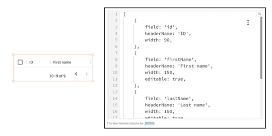
We also support JSON5 format, so there’s no need to use double quotes for keys. Read how to use JSON Tree Viewer in our help documentation.
Start Using UXPin MergeWith this strategic shift, we look forward to a future where developers can create stunning user interfaces, marking a new era for UXPin Merge and the design community as a whole. Join us in this exciting chapter as we redefine the way teams approach design and product development. The capabilities you’ve seen are available on trial – try them out, post your feedback, and spread the word about UXPin Merge new directions.
Another great news is that we have a new pricing plan that includes all those features: Merge AI, an option tailored for those of you who want to use UXPin Merge technology, AI Component Creator, and code export to their full extent. So, go ahead and try UXPin Merge for free.
If you happen to have a React-based component library of your own, we can integrate it so that you can keep designing with your own code components. Talk to us to get it synced.
Try UXPin MergeThe post Product Announcement – Helping You Bring Design Vision to Life appeared first on Studio by UXPin.
February 29, 2024
Admin UI — How to Design it Fast for a React App

Admin UI is a graphical user interface designed for administrators to manage and control a system, application, or website. This interface is distinct from the regular user interface and provides advanced features and controls necessary for overseeing and configuring various aspects of the system.
The Admin UI often includes functionalities such as user management, access control, system configuration, monitoring, and reporting tools. It is designed to be intuitive for administrators and typically requires authentication to access to ensure security.
The specific features and design of an Admin UI can vary depending on the context, such as whether it’s for a web application, server, database, or any other system that requires administrative oversight. Admin UIs are crucial for simplifying complex administrative tasks and ensuring that administrators can efficiently and securely manage the underlying system or application.
Build a React app Admin UI with UXPin Merge — a drag-and-drop UI builder that allows you to create interfaces with React components, and then, export their code with a single click. Try UXPin Merge for free.
Create beautiful layouts without designersDesign production-ready prototypes 8.6x faster. No pixels. pure code.
Try UXPin Merge .discover-merge { margin: 40px 8px;}.discover-merge__container { display: flex; max-width: 690px; height: 200px; padding: 20px; padding-left: 24px; border-radius: 4px; background-color: black; box-shadow: 10px 10px #9999ff; align-items: center; justify-content: space-between;}.discover-merge__left { width: 50%;}.discover-merge__left p { margin: 10px 0px !important; color: white !important; font-size: 18px !important;}.discover-merge__heading { font-weight: bold !important; color: white !important; font-size: 18px !important;}.discover-merge__text { margin: 0 !important; line-height: 22px !important;}.discover-merge__button { width: 174px; height: 44px; margin: 10px 0px; border: none; border-radius: 2px; background: white; color: black; font-size: 16px; text-align: center;}.discover-merge__button:hover { cursor: pointer;}.discover-merge__image { max-width: 320px !important; height: 200px; margin-right: -19px;}@media (max-width: 760px) { .discover-merge__container { height: auto; margin: 10px; align-items: left; }}@media (max-width: 500px) { .discover-merge__container { flex-direction: column; } .discover-merge__left { width: 100%; align-items: normal; }}What is Admin UI?Admin UI, short for Administrative User Interface, is a graphical interface designed for administrators to manage and control system settings, user permissions, and other advanced configurations in a simplified and intuitive manner.
It’s an essential tool that empower app providers, website owners, and system administrators to effectively configure, manage, secure, and monitor their applications and systems, contributing to the smooth operation and success of the digital services they provide.
It provides security against unauthorized access to data, handling backend of an app, website or system, and other things that administrators are tasked with.
What is an example of Admin UI?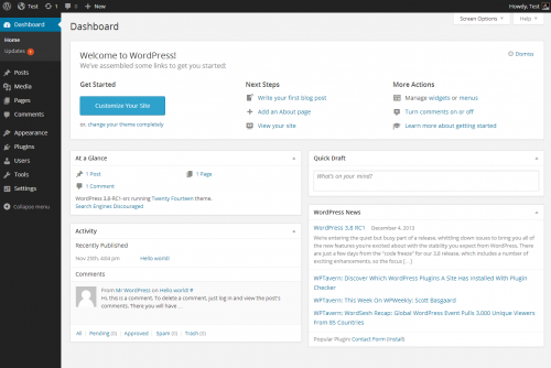
Take WordPress. Its admin panel serves as a great example of a high-quality Admin UI design due to its user-friendly UX design, powerful features, and widespread adoption. It’s designed with a focus on user-friendly navigation. The menu structure is intuitive, making it easy for users, including those with limited technical expertise, to find and manage various functionalities.
The WordPress Admin dashboard design provides a comprehensive overview of the site’s key metrics, recent activity, and quick access to essential tasks. This summary allows administrators to grasp the site’s status at a glance.
This admin panel is modular, allowing users to rearrange and customize widgets on the dashboard. This flexibility enables administrators to tailor the interface based on their specific needs and preferences. It also incorporates security features, including password strength indicators, user role management, and the ability to enforce two-factor authentication through plugins.
What should be in an admin dashboard?App providers, website owners, and system administrators build administrative user interfaces to handle following tasks:
System Configuration and Management: Admin UIs provide a dedicated space for configuring and managing various aspects of a system, application, or website. This includes settings related to functionality, user roles, permissions, and system preferences.User Management: Admin UIs allow administrators to manage users efficiently. This includes tasks such as user registration, authentication, role assignment, and user profile management. Admins can also monitor user activity and take appropriate actions.Content and Data Management: Admin UIs enable the management of content and data within an application or website. This involves tasks such as creating, editing, and deleting content, as well as organizing data in a structured manner.Access Control and Security: Admin UIs play a crucial role in access control and security management. System administrators can define user roles, permissions, and restrictions to ensure that sensitive information is protected, and only authorized individuals have access to certain features or data.Real-Time Monitoring and Analytics: Such UIs often include an admin dashboard for monitoring the performance and usage of the mobile or web app (or website.) This may involve tracking user activity, analyzing system logs, and generating reports to gain insights into how the system is being used.Debugging and Troubleshooting: For system administrators, Admin UIs serve as a valuable tool for debugging and troubleshooting issues. They can view error logs, diagnose problems, and take corrective actions without delving into the technical details of the underlying infrastructure.Updates and Maintenance: Admin UIs facilitate the process of updating and maintaining the application or website. This includes applying patches, installing updates, and managing version control to ensure that the system remains secure and up-to-date.Customization and Configuration: Admin UIs often allow for customization and configuration of the user interface itself. This can include themes, layouts, and other visual elements that suit the preferences of the administrators.Workflow Automation: Admin UIs may include features that enable administrators to automate certain workflows and tasks, streamlining repetitive processes and increasing overall efficiency.Enhanced User Experience for Administrators: By providing a dedicated and user-friendly interface for administrators, an Admin UI ensures that those responsible for managing the system can do so efficiently and with minimal friction. This improves the overall user experience for administrators.Your admin UI design will depend on the task that you need an admin panel for. For examples, CRM apps need real-time monitoring and analytics dashboard UI, while CMS need a wide range of customizations as well as content and data management.
How to design an Admin UI for a React app?
Admin UI can be designed pretty fast once you use UI components that come from an open-source React library like the one created by Material Design or Bootstrap teams. Such components will be a foundation of your design system, ensuring that the Admin UI design is consistent and high-quality.
For the purpose of this tutorial, we will show you how to quickly assemble an interactive admin dashboard with MUI components. In our app, you may find an admin dashboard template. We have also UI kits that make React UI design super easy and fast.
Let’s start.
Step 1: Pick UI components.Material Design offers a rich set of pre-designed components that serve as the foundation for your Admin UI. From navigation bars to data tables, Material Design provides a comprehensive suite of components. Identify the components that align with your admin dashboard requirements, ensuring a consistent and professional appearance.
You can preview the components in MUI documentation or jump straight to UXPin to see which components we offer as part of our Merge library. To do that, start a new project, create a new prototype, and pick the Library and Design System icon from the bottom-left corner. Next, search for MUIv5 and preview all the components. If you want to group components together, you may use a responsive flexbox.
We recommend you following UI components for building admin UI:
Table – it’s a data display component for building a basic table, data table, dense table, and manage sorting and selecting; more about in official documentation.Bar Chart – one of MUI-X chart components for expressing quantities.Line Chart– a MUI-X chart component for showing trends.Pie Chart – the last MUI-X chart component that we want to highlight here.List – a data display component for different types of lists that can be fully interactive.Typography – one of the handy data display components for input.Select – an input component that allows users to pick an item from a drop-down list; more about how to style it in official docs.Menu – a complex navigation component.Breadcrumbs – a handy navigation component to add for user-friendly websites.
They all belong to our built-in Merge library, so you can easily find them in UXPin. We also have more input, navigation components, as well as the ones for theming.
Step 2: Arrange UI components and change their properties.Assemble the chosen components to create the layout of your admin dashboard. MUI’s modular structure allows for easy arrangement and customization. Adjust properties such as colors, typography, and spacing to match your app’s branding and visual identity. This step ensures a cohesive design that resonates with your users.
If you want to learn more about using MUI components in UXPin, watch this part of our mini-course on using UXPin’s library.
Step 3: Set up interactions.Enhance user experience by adding interactive elements. MUI components in UXPin come with built-in interactivity, but you can further customize or add event handlers to meet specific requirements. Consider incorporating features like collapsible panels, responsive navigation, and tooltips to make your admin UI intuitive and user-friendly.
UXPin’s editor is code-based, so you’re working with a fully coded components, but you also have an option of adding interactions, like clickable menu that leads you to another page, an alert popping up in front of the users or input validation. You can add such interactions with variables, interactions, and expressions. More about them in our docs.
Step 4: Share your admin dashboard with stakeholders for review.Before moving forward, share your admin dashboard prototype with stakeholders for feedback. Material-UI’s components not only enhance design consistency but also facilitate a quicker review process. Collect input on the layout, usability, and overall aesthetics to ensure alignment with the project’s goals.
UXPin has a Preview mode that allows you to see design as if it was a real thing, and share it with your stakeholders for feedback. This is a great feature, because UXPin’s design’s are fully interactive, and you don’t need to leave a tool for other people to test them by themselves. It helps with stakeholder reviews.
The shortcut for accessing the preview is Command + P.
The preview also contains a sitemap, and for mobile designs, you can use our Mirror App and run an app on hand-held devices.
Step 5: Export React code to develop the app.Once your admin dashboard design is approved, UXPin simplifies the process of exporting React code off your MUI-based design. This code can be seamlessly integrated into your React app, saving development time and ensuring a smooth transition from design to implementation.
Just go to the Preview mode we discussed earlier, navigate to Spec Mode and then, export the code. You can open the code directly in Stackblitz or just copy it to another dev environment that you’re using.
Design more than Admin UI in UXPinDesigning an Admin UI for a React app becomes a seamless process when utilizing powerful and well-designed UI components. MUI, with its extensive library and flexibility, allows developers to create a consistent, visually appealing, and interactive admin dashboard. By following these steps, you can efficiently design and implement an Admin UI that meets both user and stakeholder expectations.
Ready to explore design in UXPin? With our pre-built templates, trial kits, ready React components, you will become a design wizard instantly. Just drag and drop components on the canvas, adjust their props, and you’re ready for the product development phase. Try UXPin for free.
Try UXPin MergeThe post Admin UI — How to Design it Fast for a React App appeared first on Studio by UXPin.
February 22, 2024
How Does React Work?

React is a JavaScript library used for building user interfaces, especially for single-page applications where the user interacts with the web page without requiring a full page reload. Developed and maintained by Facebook, React has become popular for its declarative approach to building UI components and its efficient rendering through a virtual DOM (Document Object Model).
Build React app prototypes that are ready for development with one click. Drag-and-drop UI components that come from best open-source React libraries like MUI, Ant design, React Bootstrap or bring in your own React components. Try UXPin Merge.
Create beautiful layouts without designersDesign production-ready prototypes 8.6x faster. No pixels. pure code.
Try UXPin Merge .discover-merge { margin: 40px 8px;}.discover-merge__container { display: flex; max-width: 690px; height: 200px; padding: 20px; padding-left: 24px; border-radius: 4px; background-color: black; box-shadow: 10px 10px #9999ff; align-items: center; justify-content: space-between;}.discover-merge__left { width: 50%;}.discover-merge__left p { margin: 10px 0px !important; color: white !important; font-size: 18px !important;}.discover-merge__heading { font-weight: bold !important; color: white !important; font-size: 18px !important;}.discover-merge__text { margin: 0 !important; line-height: 22px !important;}.discover-merge__button { width: 174px; height: 44px; margin: 10px 0px; border: none; border-radius: 2px; background: white; color: black; font-size: 16px; text-align: center;}.discover-merge__button:hover { cursor: pointer;}.discover-merge__image { max-width: 320px !important; height: 200px; margin-right: -19px;}@media (max-width: 760px) { .discover-merge__container { height: auto; margin: 10px; align-items: left; }}@media (max-width: 500px) { .discover-merge__container { flex-direction: column; } .discover-merge__left { width: 100%; align-items: normal; }}What is React?React, also known as ReactJS or React.js, is a JavaScript library for front-end development. It was originally developed by Facebook and is now maintained by Facebook and Instagram developers, along with contributions from the open-source community.
React is widely used for creating interactive and dynamic web applications and websites, and it has been employed in the development of some major websites and apps such as PayPal and Netflix.
React simplifies the process of building user interfaces by offering a declarative and component-based approach, leveraging the power of JavaScript, and optimizing performance through features like the virtual DOM.
It’s often confused with React Native — a JavaScript framework, whereas React is commonly referred to React js — a React library. Learn about the differences between React js and React Native here.
What is React often compared with?React is often compared with other JavaScript libraries and frameworks, such as Angular, Vue or Svelte.
Angular is a JavaScript framework. While both are used for building dynamic web applications, React is a library focused on the view layer, providing more flexibility in terms of integrating with other tools. Angular, on the other hand, is a comprehensive framework that comes with an opinionated structure and a set of tools for building large-scale applications.
When it comes to Vue, it is a progressive JavaScript framework that shares similarities with React in terms of being component-based. Vue.js is often considered more approachable for beginners due to its simplicity, while React is favored for its flexibility and a larger ecosystem of libraries and tools.
Lastly, Svelte is a newer approach to web development that shifts much of the work from the browser to the build step. Unlike React, which works with a virtual DOM, Svelte shifts the work to compile time, resulting in smaller, more efficient code at runtime. React’s virtual DOM approach is often contrasted with Svelte’s compile-time approach.
How does React work?React works by combining several key principles and features that contribute to its efficiency and flexibility in building user interfaces.
An overview of how React worksHere’s an overview of how it works:
Declarative views — React adopts a declarative approach, where developers describe how the user interface should look based on different states and data. When the underlying data changes, React efficiently updates and renders only the components that are affected, simplifying the development process and enhancing the user experience.JavaScript code and JSX — React is written in JavaScript, one of the most widely used programming languages. JSX, a syntax extension for JavaScript, allows developers to write UI components in a format that resembles XML or HTML. This makes the code more readable and expressive, contributing to a more efficient development workflow.Component-based architecture — React applications are structured using a component-based architecture. Components are modular, self-contained units of code that represent different parts of the user interface. This modularity promotes code reusability, making it easier to manage and maintain large codebases. React has functional components and class components.Hierarchical arrangement of components — One of the key advantages of this architecture lies in the relationship between parent and children components. In React, components can be arranged hierarchically, with some components serving as parents and others as children. The parent component encapsulates the logic or functionality that is common to its children, promoting a structured and organized codebase.Virtual DOM — React uses a virtual DOM (short for Document Object Model) to optimize the manipulation of the actual DOM. Instead of directly updating the entire DOM when data changes, React first creates a virtual representation of the DOM in memory. It then calculates the most efficient way to update the actual DOM, reducing the need for full page reloads and improving performance.JavaScript libraries integration — React’s open-source nature and popularity make it compatible with a variety of JavaScript libraries. These libraries, developed by the community, offer pre-written code for various functionalities. Integrating these libraries into React applications helps save development time and effort, allowing developers to leverage existing solutions. Here you can find examples of those libraries based on their popularity.How to make React workReact developers usually set up a React project to make it work. The process consists of several steps that provide a basic setup for a React project. First, they install Node.js and npm. After this, they create React app. They open a terminal or command prompt and use the create-react-app command to create a new React app. This command creates a new directory called my-react-app with the basic structure of a React app.
Try this yourself if you want to learn React. Install Node.js and npm with this command:
npx create-react-app my-react-app
Then, move into the newly created project directory with this:
cd my-react-app
Start the development server to preview your app locally by typing in:
npm start
Familiarize yourself with the project structure. Key directories include src (source code), public (static assets), and various configuration files such as package.json and src/index.js. React applications are built using components. Open the src/App.js file to see the default component. JSX, a syntax extension for JavaScript, is used to define the component structure.
If you need more resources, check out this simple article: Create your first React app.
Instead of adding or editing components in code, you can use a UI builder like UXPin Merge to build a React app’s user interface and copy the code from the design directly to Stackblitz or other dev environment to set up data structures and deploy your React project.
UXPin has built-in React component libraries, such as MUI, Bootstrap or Ant design and it works by dropping the components on the canvas to arrange an app layout. You can build any layout you want with React elements that are on your disposal, be it an employee portal or a podcast app. And you can bring in your own library of React components if you have one. The components are fully customizable and functional, so you can see how your app would work before deployment. Try UXPin Merge for free.
Why use React?React, a powerful JavaScript library, offers a multitude of compelling reasons for its widespread adoption in the development community.
Open Source — React is an open-source library, maintained by both Facebook and Instagram developers, along with a large and active community. This community contributes to the ongoing improvement of React, develops additional libraries (e.g., Redux for state management), and provides support through forums and documentation.Individual component editing — React follows a downward data flow, meaning that changes in a component do not impact components higher in the hierarchy. This enables developers to edit and update individual components without affecting the entire application, resulting in more efficient development and easier maintenance.Fast and consistent user interface design — React excels in building rich user interfaces, transcending mere aesthetics. Its components act as building blocks, enabling the creation of intuitive and visually stunning UIs. Each interaction, button, and visual element can be meticulously crafted and customized, ensuring an engaging user experience. React is a foundation of many design systems.Reusable components — Once you create a component, you can reuse it in multiple parts of your application without having to rewrite the same code. This reduces redundancy, making your codebase more concise and easier to maintain.Flexibility — With the ability to create anything from static websites and desktop applications to iOS or Android mobile apps, React adapts to diverse project requirements. This adaptability is bolstered by its extensive community, which over time has developed a myriad of tools, libraries, and extensions.Great user experience — React’s prowess in facilitating instant updates without reloading the entire page is a game-changer. This feature provides a smoother and faster user experience, exemplified by actions like ‘liking’ a post on Facebook, where changes occur seamlessly without the need for a full page refresh.Community — The sheer size and activity of React’s community further solidify its standing. With over 460,000 questions on Stack Overflow’s ‘React.js’ thread and JavaScript’s extensive support, developers can find a wealth of resources and solutions, making React an accessible and well-supported technology.What can you build with React?React is a versatile and popular JavaScript library that can be used to build a wide range of React projects.
React is well-suited for creating Single-Page Applications where a single HTML page is dynamically updated as the user interacts with the app. Examples include social media platforms, project management tools, and real-time collaboration apps.
React can also be used to build eCommerce sites. React’s ability to efficiently update the user interface makes it ideal for this type of project. You can create dynamic product listings, shopping carts, and seamless checkout experiences.
Just check out our pre-built eCommerce templates that we include in our tool, UXPin Merge. Those templates are perfect examples of what can be created as a React project. We have a React shopping cart, product page, and product listing. You can quickly copy them to your workflow.
React is great for building data dashboards that require real-time updates. This is particularly useful for analytics tools, monitoring systems, and business intelligence applications that need to streamline internal operations.
What’s more, React can be integrated with mapping libraries to create interactive and dynamic maps. This is useful for applications that involve geolocation, such as travel apps or location-based services. It’s also great for weather apps that utilize maps and location.
Applications that require real-time collaboration, such as messaging apps, collaborative document editing tools, and video conferencing platforms, can benefit from React’s ability to efficiently update the user interface.
Build your app layout with React componentsIn this article, we explored how React works, its basic features, and give you an idea of what you can build with React components. If you want to experiment now, let’s head on to UXPin and test React by creating a simple app interface. Set up a UXPin trial account and create a new project. Choose MUIv5 library from Design System Library (use keys Option + 2 to open it) and move components onto the canvas. It’s as simple as that.
You can build whatever you want and if you need to access documentation, just click the component and see it linked on the right. Build your first React-based user interface today. Try UXPin Merge.
Try UXPin MergeThe post How Does React Work? appeared first on Studio by UXPin.
February 13, 2024
What is Throwaway Prototyping?

Throwaway prototyping is a software development approach that involves rapid creation of a prototype with the understanding that it will be discarded after use. The primary goal of throwaway prototyping is to provide a tangible representation of the app functionality early in the development process, allowing stakeholders to visualize and interact with the proposed system.
This approach is particularly useful in agile projects where teams still trying to conceptualize initial requirements and specifications, or where frequent feedback is crucial. However, it may not be suitable for all types of product development, especially those with strict regulatory or documentation requirements.
Throwaway prototyping can take a form of a paper prototype, wireframe or working model of a product — it all depends on the tools you use. UXPin Merge is a perfect tool for throwaway prototyping model, because it allows you to build a prototype that resembles a final product in one day or less. With built-in templates, patterns, and fully coded components, you can assemble a prototype on the spot. Try UXPin Merge.
Create beautiful layouts without designersDesign production-ready prototypes 8.6x faster. No pixels. pure code.
Try UXPin Merge .discover-merge { margin: 40px 8px;}.discover-merge__container { display: flex; max-width: 690px; height: 200px; padding: 20px; padding-left: 24px; border-radius: 4px; background-color: black; box-shadow: 10px 10px #9999ff; align-items: center; justify-content: space-between;}.discover-merge__left { width: 50%;}.discover-merge__left p { margin: 10px 0px !important; color: white !important; font-size: 18px !important;}.discover-merge__heading { font-weight: bold !important; color: white !important; font-size: 18px !important;}.discover-merge__text { margin: 0 !important; line-height: 22px !important;}.discover-merge__button { width: 174px; height: 44px; margin: 10px 0px; border: none; border-radius: 2px; background: white; color: black; font-size: 16px; text-align: center;}.discover-merge__button:hover { cursor: pointer;}.discover-merge__image { max-width: 320px !important; height: 200px; margin-right: -19px;}@media (max-width: 760px) { .discover-merge__container { height: auto; margin: 10px; align-items: left; }}@media (max-width: 500px) { .discover-merge__container { flex-direction: column; } .discover-merge__left { width: 100%; align-items: normal; }}What is Throwaway Prototyping?Throwaway prototyping is a way of making a fast and cost-effective model of app user interface and its features. Its key characteristic is that this prototype is not intended to being passed to the development phase. Instead, it serves as a learning tool to enhance communication between designers, developers, and stakeholders, clarify requirements, and identify potential design flaws early in the development cycle.
Once the prototype has fulfilled its purpose, it is set aside, and the team moves on to a more structured prototype development with multiple stages of iterations and tests with end users.
This type of prototyping is frequently contrasted with evolutionary prototyping. Throwaway prototyping and evolutionary prototyping are two distinct approaches in the prototyping spectrum, and they are often placed against one another due to their different objectives and methodologies.
Evolutionary prototyping assumes a more stable understanding of requirements. The aim is to build a prototype that evolves into the final product. The prototype is incrementally refined based on user feedback, ultimately becoming the complete system with an utmost care to user experience.
Is a Throwaway Prototype Still Relevant in 2024?
Throwaway prototyping is relevant in certain scenarios within the software development process. Here are some situations where a throwaway prototype might be particularly useful:
Dealing with uncertain requirements — when initial requirements are not well-defined or are expected to change during the development process, a throwaway prototype can help quickly explore and refine those requirements.Getting stakeholders involved — for web development or app development projects where early stakeholder feedback is crucial, a throwaway prototype allows stakeholders to visualize and interact with a tangible representation of the final product, facilitating better communication and understanding.Reducing risk of misunderstandings — if there is a risk of misinterpretation or misinterpreting requirements, a throwaway prototype can serve as an ideation device, helping clarify expectations and avoid compromising project success.Delivering proof of concept — when there’s a need to test the feasibility of a concept or technology, a throwaway prototype allows for a quick proof of concept without the commitment of developing the entire system.Managing time and budget constraints — in projects with tight timeframes or limited budgets, throwaway prototyping provides a cost-effective way to gather early feedback and make necessary adjustments before committing to full-scale development.Enhancing communication — for projects involving diverse stakeholders with varying technical backgrounds, a throwaway prototype can serve as a common visual representation that aids communication and aligns expectations.While this approach to software prototyping has its advantages in these situations, it’s essential to recognize that it might not be the best fit for all projects.
Key Problems with the Throwaway Prototype Approach
This form of rapid prototyping isn’t beneficial to the projects with complex approval cycles and strict regulatory compliance.
In industries with strict regulatory requirements, where thorough documentation and traceability are essential, throwaway prototyping may not align with the need for comprehensive documentation and formal processes.
Whereas, in projects where obtaining approvals involves a complex and lengthy process, throwaway prototyping may introduce challenges.
The rapid development and discarding of prototypes may not align well with extended approval cycles, potentially leading to delays and inefficiencies in the project timeline. A more structured form of project management may require design and development teams to build an actual prototype that will serve as a UX deliverable and accommodate the necessary approval procedures.
Advice on Creating a Rapid Throwaway PrototypeThe success of a throwaway prototype lies in its ability to gather valuable information efficiently, improve the overall understanding of the project, and rapidly explore ideas. How to do that? Here are key pieces of advice that come in handy for anyone who creates a rapid throwaway prototype.
Communicate the purposeClearly communicate to all stakeholders the purpose of creating a throwaway prototype. Emphasize that the throwaway prototype is not intended to become the final product. It is a tool designed for exploration, learning, and refinement. This distinction is important to prevent any misconception that the prototype is the actual product in progress.
Highlight that the throwaway prototype enables quick mock-up of the final system, and thus, it is open to iterations. It’s a flexible and adaptable approach that allows for rapid adjustments based on feedback, ultimately leading to a better understanding of initial requirements.
When stakeholders understand the purpose of the throwaway prototype, their expectations align with the intended outcomes. This reduces the likelihood of disappointment or confusion regarding the role of the prototype in the overall project.
Clear communication encourages active participation from stakeholders. When they know that the prototype is a tool for collaboration and refinement, they are more likely to engage proactively in the feedback and evaluation process.
Involve stakeholders from the startBring stakeholders into the process from the initial stages of prototype development. Early involvement ensures that their perspectives are considered in the conceptualization and design phases, reducing the likelihood of misalignment in the later stages of project life cycle.
Moreover, involving decision-makers early ensures that the end product meets their expectations. It is also crucial for project approvals, resource allocation, and overall project direction.
Discovering discrepancies or issues late in the development process can be costly and time-consuming. Involving stakeholders in this type of prototyping helps catch and address concerns before extensive development work has been completed, reducing the risk of late-stage changes or miscommunication.
Take design risksTaking design risks in throwaway prototyping can be a powerful strategy for innovation and refinement, ultimately contributing to the development of a more effective and user-centered final product.
Throwaway prototyping provides a low-risk environment for experimenting with creative and innovative design concepts. The team can push boundaries, explore new ideas, and test unconventional approaches without the fear of impacting the final product.
Since the throwaway prototype is not intended to evolve into the final product, it allows for rapid iteration and adjustment of design elements. Design risks can be taken, and based on feedback, the prototype can be quickly modified to explore alternative approaches.
The freedom to take risks early in the software engineering process helps spot potential issues or challenges with innovative ideas, identifying and addressing them before significant resources are invested in full-scale development. This proactive approach minimizes the risk of discovering problems late in the project.
Embrace interactive prototypingIt’s often said that throwaway prototyping should be done as a sketch on paper or a basic wireframe, but we’re here to propose something different. Design tools evolved so much that you can add functionality to your prototype without wasting resources, such as money and time.
A functional prototype provides clarity on how the proposed idea will work in practice. It helps in addressing uncertainties and ensuring that everyone involved in the project has a shared understanding of the concept.
With UXPin Merge, you don’t start with a blank canvas. The tool gives you fully interactive coded components that you can arrange on the canvas to quickly explore your design idea. Check out how quickly yoou can build a dashboard design with it.
Seek feedback activelyThe throwaway prototype is a communication tool to align everyone’s understanding of the project. Establish open communication channels for feedback. Provide multiple avenues, such as surveys, interviews, or dedicated feedback sessions, to make it convenient for stakeholders and users to share their thoughts on the prototype.
Actively seeking feedback is not a one-time activity but an ongoing process throughout the prototyping and development phases. This mindset fosters a culture of adaptability and responsiveness.
Create a Throwaway Prototype with UXPin MergeThrowaway prototypes are useful when you want to align your team on the requirements for the product you are creating. It helps to find team agreement, explore possibilities, and find an innovative solution while saving costs and time. One of the best tools for this and other kind of prototyping is UXPin Merge. It has templates, patterns, and built-in component libraries that makes prototyping process intuitive. Explore design ideas in a friendly environment. Try UXPin Merge.
Discover MergeThe post What is Throwaway Prototyping? appeared first on Studio by UXPin.
February 9, 2024
Complex Approvals – How to Design an App to Streamline Approvals

Complex approval processes refer to intricate and multi-step procedures that organizations follow to authorize or endorse certain actions, decisions, projects, or transactions.
These processes typically involve the review and approval of various stakeholders or decision-makers, each contributing their expertise or perspective before granting final approval.
Developers can create customized applications that automate and optimize the approval workflow. Building an app tailored to the organization’s specific needs can enhance efficiency, reduce errors, and improve overall transparency in the approval process.
Design a prototype of an approval app and share it with your stakeholders for feedback. Learn if you are building the right solution to their needs. With UXPin Merge, you can design fully functional and aesthetically-pleasing interfaces without designers. Try UXPin Merge for free.
Create beautiful layouts without designersDesign production-ready prototypes 8.6x faster. No pixels. pure code.
Try UXPin Merge .discover-merge { margin: 40px 8px;}.discover-merge__container { display: flex; max-width: 690px; height: 200px; padding: 20px; padding-left: 24px; border-radius: 4px; background-color: black; box-shadow: 10px 10px #9999ff; align-items: center; justify-content: space-between;}.discover-merge__left { width: 50%;}.discover-merge__left p { margin: 10px 0px !important; color: white !important; font-size: 18px !important;}.discover-merge__heading { font-weight: bold !important; color: white !important; font-size: 18px !important;}.discover-merge__text { margin: 0 !important; line-height: 22px !important;}.discover-merge__button { width: 174px; height: 44px; margin: 10px 0px; border: none; border-radius: 2px; background: white; color: black; font-size: 16px; text-align: center;}.discover-merge__button:hover { cursor: pointer;}.discover-merge__image { max-width: 320px !important; height: 200px; margin-right: -19px;}@media (max-width: 760px) { .discover-merge__container { height: auto; margin: 10px; align-items: left; }}@media (max-width: 500px) { .discover-merge__container { flex-direction: column; } .discover-merge__left { width: 100%; align-items: normal; }}What are Complex Approvals?Complex approval processes are when business uses intricate, multi-step procedures to approve actions, decisions, projects, or transactions. You might deal with complex approval processes at work whenever you need several people to sign off on something before it can move forward.
Complexity comes from factors like the multiple of approval levels, record-keeping, the organization’s size and structure, and regulatory compliance.
In some industries, approval processes must comply with external regulations or industry standards. This adds an extra layer of complexity as organizations need to ensure that their processes align with legal requirements.
Similarly, comprehensive documentation of the approval process, including who approved what and when, is essential for accountability, audit purposes, and future reference.
What are Examples of Complex Approval Processes?Examples of complex approval processes in various domains include:
Budget Approvals: Organizations often have multi-tiered approvals for budget proposals. There’s a need to automate the submission, review, and approval of budget proposals. Other activities include tracking the status of proposals, notifying stakeholders, and generating reports.Product Development: When it comes to developing products, approvals required at different stages of new product development, involving departments like R&D, marketing, legal, and finance. To streamline product development, one would need to facilitate collaboration among departments, streamline document sharing, and ensure that all necessary approvals are obtained.Contract Agreements: Legal, finance, and executive teams may need to review and approve contractual agreements. Those teams would benefit from a centralized contract review process, version control, and automated reminders for approvals and renewals.Project Initiatives: Project proposals may need approval at various stages, such as initiation, planning, execution, and closure. It’s essential to manage project proposals, automate milestone approvals, and provide real-time project status updates.Leave Requests: Employees seeking approval for leave require supervisor and HR approvals. There are a few Leave Request Approval apps that simplify the submission of leave requests, automate supervisor approvals, and maintain a centralized leave calendar.Expense Reimbursements: Employees submit expense reports that need approval from managers and finance departments. There’s a need for a centralize place for submission of expense reports, automated approval workflows that integrate with accounting systems for reimbursement processing.Regulatory Compliance: Ensuring that business activities comply with external regulations and track regulatory compliance tasks, automate compliance checks, and generate compliance reports.By leveraging technical expertise, developers can significantly contribute to the optimization of those complex approval processes. The result is a more streamlined, efficient, and transparent workflow that empowers organizations to make informed decisions while saving time and resources.
How to Speed up Complex Approval ProcessesTo streamline decision-making in these processes, consider creating customizable workflow automation apps. These apps can include features such as dashboard view, notifications, integration with existing systems, and reporting tools.
To enhance the efficiency of complex approval processes, it’s crucial to implement a well-designed workflow automation app with a set of key features.
Build a centralized dashboard and data visualization UI elementsA centralized dashboard serves as the nerve center, providing stakeholders with a quick, comprehensive overview of the entire approval process. Through intuitive visualizations, progress trackers, and status indicators, the dashboard facilitates easy monitoring, ensuring that stakeholders stay well-informed at every stage.
Learn about choosing between dashboard and data reports in UI design.
Turn notifications onAutomation extends to communication with the incorporation of timely and automated notifications. Stakeholders receive alerts, either through email or in-app messages, keeping them informed about pending approvals. This not only ensures swift responses but also helps prevent bottlenecks that could impede the overall process.
Integrate with a databaseSeamless integration with existing organizational systems and databases is paramount. This integration not only enhances efficiency but also ensures data consistency, eliminating the need for manual data entry across multiple platforms.
Generate reports automaticallyDecision-makers benefit from the inclusion of robust reporting tools, providing valuable insights into approval trends, potential bottlenecks, and overall process efficiency.
Real-time analytics empower decision-makers to make informed and data-driven choices, contributing to more agile and effective decision-making processes.
Don’t ignore ease of useThe user interface plays a pivotal role in user adoption. Designing an intuitive and user-friendly interface facilitates smooth navigation for all users, regardless of their technical expertise. Prioritizing a positive user experience encourages widespread adoption across different departments.
Include app customization for end-usersFlexibility that is built into the app can help you accommodate to diverse approval paths based on the type of request. Allow administrators to easily modify workflows, adapting to the changing needs of the organization.
Build a responsive app designResponsive design ensures a seamless experience across various devices, allowing stakeholders to engage with the approval process on the go. This adaptability contributes to the accessibility and convenience of the entire workflow.
Take care of onboardingLastly, comprehensive training resources and support materials are provided to users. Documentation and tutorials address common issues, enhancing user competence and fostering a positive experience with the approval app.
By implementing these functionalities, UX principles, and UI elements, your organization can significantly expedite complex approval processes, fostering efficiency, transparency, and collaboration among stakeholders. The deployment of customizable workflow automation apps ensures that decision-makers have the tools they need to make informed choices promptly.
How to design an app to streamline business processes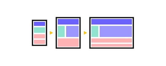 Step 1: Define Objectives
Clearly outline the goals of your app. Identify the specific business processes you intend to streamline. Invite stakeholders to a meeting that will help you gather detailed requirements and understand the intricacies of the workflows involved.
Remember, you are building the app for other people and you want to make their lives convenient. So, you need to look at the project from their perspective and truly listen to their needs, expectations, and goals.
Decide how your app fits into the company’s existing software, so what you need to integrate it with, what data should it use, and more. And choose the appropriate development stack based on your project requirements. This includes selecting programming languages, frameworks, and databases that align with the app’s functionalities.
Step 2: Design a potential solutionVisualize the app’s interface and functionality with a prototype. Seek feedback from stakeholders to refine the design. Prioritize user-centric design principles during this step.
Consider your app interface from end-users’ perspectives, preferences, and pain points. Ensure that the design aligns with their expectations and enhances their overall experience. How can you do that? By testing the design. For that, you will need an interactive prototype. The best tool to create one is UXPin Merge.
With this tool, your prototyping will be 10x faster. Instead of devoting time to sketch a wireframe, you can drag and drop UI elements, such as buttons, input fields more from the menu and build a test-ready prototype. Once you are happy, you can deploy the design. Copying the code behind it is super easy. UXPin Merge makes you create interface with React components that you can copy into your workflow.
Step 3: Refine your ideaShow your solution to a couple of users and ask them if your app has everything they need. If not, write down their tips, and refine your design. Don’t take it personally if they don’t like your solution. They are not criticizing you.
Although it may not seem like it, it is the role of a designer to handle feedback and use it constructively. Learn from designers the art of feedback loops, feedback sessions, and user feedback. It will come in handy.
Step 4: Develop your appTransitioning from app design to development involves converting the design into a functional application. With UXPin Merge, you have ready-made components to deploy in your workflow.
But apart from the interface, you need to ensure seamless integration with existing organizational systems and databases. Eliminate manual data entry by establishing data consistency across platforms, promoting accuracy and efficiency.
Work on the back-end development to create the server-side logic, database interactions, and application functionalities. Choose a back-end framework and database system that suits your project requirements.
Implement secure user authentication and authorization mechanisms to control access to different app features. This is crucial for protecting user data and ensuring the app’s integrity.
Integrate automated notifications via email or in-app alerts to keep stakeholders informed about pending actions, reducing bottlenecks.
Step 5: Launch and monitor the app performanceOnce everything is in order, deploy the app to the live environment. Monitor the app’s performance closely during the initial launch period to address any unforeseen issues.
Offer ongoing support for users and administrators post-launch. Monitor user feedback, address issues promptly, and plan for future updates and enhancements based on user needs.
Streamline complex approvals with your skillsIn conclusion, complex approval processes are intricate and multi-step procedures essential for organizations to authorize and endorse specific actions, decisions, projects, or transactions. In navigating these processes, the involvement of various stakeholders or decision-makers, each contributing their expertise, ensures a thorough review before final approval is granted.
By creating customized applications tailored to the unique needs of an organization, developers introduce automation that streamlines processes. This not only enhances overall efficiency but also mitigates the risk of errors, fostering a more transparent and collaborative approval environment.
Remember that effective product development starts with design. Design user-friendly interface with drag-and-drop UI builder that uses what is familiar to you — React components. Quickly test, improve, and deploy your design quickly. Try UXPin Merge.
Discover MergeThe post Complex Approvals – How to Design an App to Streamline Approvals appeared first on Studio by UXPin.
UXpin's Blog

- UXpin's profile
- 68 followers

