
UXpin's Blog, page 26
January 9, 2024
The Best React Design Patterns You Should Know About in 2024

There is no denying the immense popularity and practicality of React. For a long time, most web design was built with CSS, HTML, and JavaScript. React brought a much-needed sigh of relief for developers with its ease of use. The reusable components, great developer tools, and extensive ecosystem are some of the most loved features of React.
Instead of the traditional approach of directly manipulating the DOM, React introduced a useful level of abstraction in the form of the virtual DOM concept.
The library is being actively developed and maintained by React developers at the tech giant Facebook. This provides it with a much-needed edge over other frameworks and libraries. Countless contributors in the JavaScript community also regularly contribute to refining and improving React.
All these factors allow React to maintain its popularity among developers even though newer frameworks are constantly emerging and competing for recognition amongst frontend developers.

There are numerous design patterns that are available in React.js. Here, we shortlist a few recommended React patterns that you should definitely know about when building web apps.
Build prototypes with UI components from a Git repository, Storybook or through an npm. Bring the components to our design editor and create stunning layouts without designers. Request access to UXPin Merge.
Create beautiful layouts without designersTake UI components directly from Git repo, Storybook, or through NPM and design production-ready prototypes.
Bring code to design .discover-merge { margin: 40px 8px;}.discover-merge__container { display: flex; max-width: 690px; height: 200px; padding: 20px; padding-left: 24px; border-radius: 4px; background-color: black; box-shadow: 10px 10px #9999ff; align-items: center; justify-content: space-between;}.discover-merge__left { width: 50%;}.discover-merge__left p { margin: 10px 0px !important; color: white !important; font-size: 18px !important;}.discover-merge__heading { font-weight: bold !important; color: white !important; font-size: 18px !important;}.discover-merge__text { margin: 0 !important; line-height: 22px !important;}.discover-merge__button { width: 174px; height: 44px; margin: 10px 0px; border: none; border-radius: 2px; background: white; color: black; font-size: 16px; text-align: center;}.discover-merge__button:hover { cursor: pointer;}.discover-merge__image { max-width: 320px !important; height: 200px; margin-right: -19px;}@media (max-width: 760px) { .discover-merge__container { height: auto; margin: 10px; align-items: left; }}@media (max-width: 500px) { .discover-merge__container { flex-direction: column; } .discover-merge__left { width: 100%; align-items: normal; }}Why You Should Follow React Design Patterns?
Let us first briefly recap the role that design patterns play. Simply put, design patterns are repeatable solutions to commonly occurring problems in software development.
They serve as a basic template upon which you can build up the program’s functionality according to the given requirements.
The term ‘design pattern’ is not to be confused with a ‘design system’. We have discussed more design systems in a separate article.

Design patterns not only speed up the development process but also make the code easier to read and to maintain.
Some common examples of design patterns include the Singleton pattern and the Gang-of-Four pattern.
In software development, design patterns are associated with two common roles.
Design patterns offer a common platform to developers.Design patterns ensure that React best practices are applied.Let’s look at them closer.
Role #1: Offer a common platform to developersDesign patterns provide standard terminology and solutions to known problems. Let us take the example of the Singleton pattern that we mentioned above.

This pattern postulates the use of a single object. Developers implementing this pattern can easily communicate to other developers that a particular program follows the singleton pattern and they will understand what this means.
Role #2: Ensure that React best practices are appliedDesign patterns have been created as a result of extensive research and testing. They not only allow developers to become easily accustomed to the development environment but also ensure that the best practices are being followed.
This results in fewer errors and saves time during debugging and figuring out problems that could have been easily avoided if an appropriate design pattern had been implemented.
Like every other good programming library, React makes extensive use of design patterns to provide developers a powerful tool. By properly following the React philosophy, developers can produce some extraordinary applications.
Now that you have an understanding of design patterns. Let us move on to some of the most widely used design patterns available in React.js.
Functional vs Class ComponentsComponents can be of two types, namely, functional and class components. The difference between the two is explained in a separate blog article: Functional vs Class Components – What Do You Need to Know?
Class ComponentsClass components are built upon JavaScript classes, extending the React.Component class. They are the traditional approach to building React components and offer a robust structure for managing state and lifecycle events. Class components are particularly advantageous for complex scenarios where precise control over state and lifecycle behavior is essential.
In a class component, you define a class that inherits from React.Component. This class can contain a constructor for initializing state, lifecycle methods for handling various stages of a component’s existence, and a render method to define the component’s UI. This structured approach is beneficial when dealing with intricate components that require meticulous management of internal state and lifecycle events.
Functional ComponentsOn the other hand, functional components resemble typical JavaScript functions. They receive properties (props) as arguments and return React elements for rendering. While initially lacking some features present in class components, functional components have gained prominence with the introduction of React Hooks.
Functional components are well-suited for simpler scenarios, promoting a more functional programming approach. With the advent of Hooks, functional components can now handle state and lifecycle events, eliminating the need for class components in many cases. The concise syntax and ease of understanding make functional components an excellent choice for straightforward UI elements.
Compound PatternWhen React developers have two or more components that work together, more likely one is the parent while the rest are children. But did you know that you can make them share states and handle logic together?
That’s what the compound component React pattern is all about. The compound components API shows relationships between components and allows them to communicate in a flexible way.
If you want to know more about it, read this article by LogRocket about understanding React compound components.
Conditional RenderingConditions are the foremost tool in the arsenal of any software developer.
In the process of writing React components, the need often arises to render a certain JSX code based on the state. This is achieved through conditional rendering.

Conditional rendering is very useful as it allows you to create distinct components based on your needs and then render only the ones that are required by the application.
For instance, conditional rendering can be used to display different messages to the user based on the login status of the user. The message will be subject to the value of the prop isLoggedIn.
Render PropsWe discussed how design patterns are there to solve common problems. Render props are available in React to help us solve the problem of logic repetition.
According to official React documentation, render props are defined as a ‘technique for sharing code between React components using a prop whose value is a function’.
Render props prove really handy as they allow us to share the same state across different components. Instead of hardcoding the logic inside each component, you can use a function prop to determine what to render.
Some popular libraries that make use of render props include Formik, React Router, and Downshift.
Controlled ComponentsWeb forms are a common requirement in a large number of applications and controlled components are React’s answer to handling form state.
The controlled component takes the state through props. It can notify any changes by means of callbacks like onChange.
Parent components can control it by handling the callback and managing its own state meanwhile, the new values are passed to the controlled component as props.
By default React forms have support for both controlled and uncontrolled components. It is highly recommended that you use controlled components.
The following code snippet shows a controlled component.
React Hooks PatternHooks are a relatively new addition to React and were introduced in React 16.8.
These functions allow developers to use React without classes. There are a number of different pre-built hooks available like the Effect Hook ( useEffect ) and the State Hook.
For a complete list of available hooks, you can visit the Hooks API Reference.
Apart from the pre-built hooks in React, you can also create your own hooks. This allows you to extract the component logic and create reusable functions.
Hooks are a welcome addition to React and the developer community really appreciated this new addition with great enthusiasm.
However, it must be kept in mind that sometimes hooks can become a little tricky to work with when the arguments are objects, arrays, or functions. This can become somewhat confusing.
On the other hand, custom hooks are easy and simple to use and they also provide immense benefits to the developer.
Higher-Order Component PatternWhen it comes to more advanced React patterns, there’s higher-order component pattern, referred to as HOC. It’s applied whenever React developer wants to reuse logic within application.
HOC takes a component as an argument and when it returns it, it adds data and functionality to the component.
For instance, when using React with Redux, you can pass the component through connect function and it will get injected with data from the Redux store. The values that you get will be passed as Props.
HOC is not a part of the core React API. It’s a JavaScript function. Nonetheless, it is in line with the nature of React functional components, that’s composition over inheritance.
Use Most Common React Design PatternsReact has proven to be a highly popular library. The community is among the fastest-growing developer communities online.
You will also find lots of useful web development resources available online that make it easy to learn react.js and adapt to it.
The power of React is due to its amazing features and the robust architecture that it offers. One of the most prominent and widely loved features of React is its design patterns.
Design patterns are in fact what gives this library its extraordinary practicality and usefulness. They make code optimization and maintenance easier.
They allow developers to create apps that are flexible in nature, deliver better performance, and produce a codebase that is easier to maintain.
We have discussed a few popular React design patterns like stateless functions, render props, controlled components, conditional rendering, and react hooks.
However, it must be noted that react design patterns are not just limited to these patterns and there are several different design patterns that you can implement. Once you get familiar with the usage of the common design patterns, it will become easier to graduate to others.
Build React-Based Prototypes with UXPin MergeCapturing the true essence of React application development can be made easier by the use of the right technology. UXPin Merge, you can import React code components to UXPin and use them to build powerful prototypes.
With Merge technology, you can easily put together code-based prototypes that can be quickly translated into code. Create beautiful layouts without designers on board. Request access.
Discover MergeThe post The Best React Design Patterns You Should Know About in 2024 appeared first on Studio by UXPin.


December 13, 2023
UX Design Process – An Actionable, 7-Step Guide

UX design process is systematic, iterative, and structured series of actions that is necessary for designing a product’s user experience. It helps teams to follow easy-to-replicate protocols to deliver products while meeting the organization’s quality standards.
Speed up your design process by building prototypes with the same UI components that devs build apps with. Meet tight deadlines and release quality products. Discover UXPin Merge.
Reach a new level of prototypingDesign with interactive components coming from your team’s design system.
Discover UXPin Merge .discover-merge { margin: 40px 8px;}.discover-merge__container { display: flex; max-width: 690px; height: 200px; padding: 20px; padding-left: 24px; border-radius: 4px; background-color: black; box-shadow: 10px 10px #9999ff; align-items: center; justify-content: space-between;}.discover-merge__left { width: 50%;}.discover-merge__left p { margin: 10px 0px !important; color: white !important; font-size: 18px !important;}.discover-merge__heading { font-weight: bold !important; color: white !important; font-size: 18px !important;}.discover-merge__text { margin: 0 !important; line-height: 22px !important;}.discover-merge__button { width: 174px; height: 44px; margin: 10px 0px; border: none; border-radius: 2px; background: white; color: black; font-size: 16px; text-align: center;}.discover-merge__button:hover { cursor: pointer;}.discover-merge__image { max-width: 320px !important; height: 200px; margin-right: -19px;}@media (max-width: 760px) { .discover-merge__container { height: auto; margin: 10px; align-items: left; }}@media (max-width: 500px) { .discover-merge__container { flex-direction: column; } .discover-merge__left { width: 100%; align-items: normal; }}What is UX Design?UX design (user experience design) is a digital product design methodology to solve a human problem. This human-centered design approach ensures design teams make decisions based on users’ needs rather than assumptions.
Empathy is at the core of this human-centered approach. UX designers must understand what a user wants to achieve using a digital product and the pain points they might encounter along the way.
What is a UX Design Process?A UX design process is an iterative, step-by-step methodology UX design teams use to complete projects. It is derivative from a design thinking process. As in design thinking process, UX designers spend time empathizing with the user, learning about the business, context, and defining problem scope.
What’s the Difference Between UX Design Process and Design Thinking Process?The design thinking process is a five-step process for developing user-centered solutions to human problems. A UX design process is a multi-stage, end-to-end methodology that incorporates design thinking for delivering UX projects.
While companies base their UX design process on design thinking principles, the steps and methods might differ slightly.
Why is a UX Design Process Important?Here are some reasons why companies standardize a UX design process:
Ensures projects meet quality and consistency standardsEnsures designers design solutions without bias and assumptionsEnables designers to test and iterate on many ideas to find the best solutionPromotes collaboration between teams and departmentsReduces the risk of rework by following set protocolsAllows stakeholders to track a project’s progress Identifies hidden risks and opportunitiesWhat are 7 Steps of UX Design Process?
A typical UX design process has 7 UX design steps, from defining the product’s goal to design handoff and making sure everything works as intended.
Step 1: Define project & scopeThe first step of a UX design process defines the project’s goal and scope with team members and stakeholders from multiple departments–usually consisting of representatives from:
Business – explains business requirements and goals for the project.Design – communicate what they need to do prior to design and manage expectations.Product – shares context, help plan the timeline and resources needed for design.Technical – define feasibility and technical constraints of a UX design.This early design phase aims to identify the problem the new product or feature must solve. The product team will also outline the project’s scope, plan, deliverables, and delivery date.
Step 2: Perform UX ResearchNext, designers research the problem to find possible solutions. During the research phase, UX designers conduct several types of research, including:
User research: Studies potential users to understand who they are, what they need, and what context they operate. They may invite focus groups to explore user needs or do a desk research. The outcome of UX research are user personas, user journey maps, and so on.Market research: Analyzes the market to determine market segmentation and product differentiation.Competitive research: A competitive analysis to understand how competitors solve similar problems and identify opportunities.Product research: Analyzing insights and analytics from an existing product to understand user behavior.Step 3: Create rough draft of a solution
With a clear understanding of their users, market, and competitive landscape, designers can run a brainstorming session to make initial drafts of what a solution would look like, which is often referred to as the ideation phase. Designers may use paper and pen during early visual design planning or jump straight to digital UX tools.
Some of these low-fidelity techniques include:
Sketching: Hand-drawn sketches of user interfaces Paper prototyping : Paper versions of a prototypeWireframing: Digital versions of paper prototypes featuring basic lines and shapesLow-fidelity prototypes: Digital prototypes using wireframes to test user flows and information architectureThe team might also use a design sprint to solve a specific problem with their stakeholders or other team members.
Step 4: Design high-fidelity mockups and prototypesNext, the UI design team converts wireframes into mockups to build high-fidelity prototypes that look and function like the final product. If the company has a design system, designers will use the UI component library to build interactive prototypes.
Step 5: Conduct usability testing
The primary purpose of high-fidelity prototypes is usability testing. UX designers test these prototypes with real users to:
Validate ideasIdentify usability issuesTest accessibilitySteps 2 to 5 are iterable. Using test results, designers return to stage two or three to iterate on ideas until they find a solution that meets desirability, viability, and feasibility criteria.
It’s important to note that even though user testing is the fifth stage, design teams conduct multiple tests throughout the UX design process to validate ideas and hypotheses. These tests include internal testing with team members or sharing ideas and prototypes with stakeholders for feedback.
Step 6: Arrange Design HandoffThe second to last stage of the UX design process is the design handoff, where the design team hands over the final design and its documentation to the development team to start the engineering process.
Although the design handoff is near the end of the UX process, designers and engineers start collaborating during ideation to streamline the transition from design to development while ensuring designs meet technical constraints. Their collaboration is facilitated through different tools that make communication easier.
Read about 5 Mistakes that Kill Collaboration Between Designers and Developers.
Step 7: Launch your ProductThe final stage of the UX design process is a launch and a clear inspection of the new release. It’s time to ensure that the new release meets the project’s business goals, user experience, and accessibility requirements.
Best Practices for a Great UX Design Process
While the UX design process might not be the same for all organizations, projects, or teams, there are some best practices designers can follow to streamline the process.
Apply User-Centric ThinkingDesigners must keep end-users at the center of design decisions to ensure designs meet users’ needs. This human-centered mindset delivers products that users want while reducing costs on irrelevant UI components and features.
Practice EmpathyOne of the ways to maintain a user-centered mindset is by empathizing with users. As designers progress through the UX design process, they can drift from focusing on users to designing features that look great but don’t serve a specific user need.
By practicing empathy throughout the UX design process, designers stay focused on solving users’ pain points.
Build a Design SystemDesign systems can significantly reduce time to market while enhancing consistency and coherency across the organization. If you can’t afford to build a design system from scratch, consider using a themeable open-source component library like MUI or Bootstrap.
UXPin has built-in design libraries, including Material Design UI, Bootstrap, iOS, and Foundation so that design teams can build mockups and prototypes quickly.
Take prototyping to the next level using UXPin Merge–a tool that connects UXPin’s design editor to a component library, so designers can build fully functioning prototypes their dev’s components.
Communicate and Collaborate with DevsCommunication and collaboration are vital for a successful UX design process. Designers must connect with other design teams and open communication with engineers, business managers, product teams, and stakeholders.
DesignOps can help facilitate better communication and collaboration while streamlining other time-consuming operational and administrative tasks.
Enhancing the UX Design Process With UXPin
A successful UX process relies on tools that allow design teams to make changes and iterate fast. UXPin is an end-to-end design solution, providing designers with features for every stage of the UX design process.
Fully Interactive PrototypesDesigners can use one of UXPin’s built-in design libraries or import their dev’s component library to start prototyping immediately. Because UXPin is code-based, prototypes feature higher fidelity and more functionality than image-based design tools.
Quality User TestingWith code-based prototypes, UX designers can conduct accurate, more comprehensive tests. Better quality testing means fewer errors and usability issues make it into the final product.
Insightful Stakeholder FeedbackStakeholder feedback is crucial during the iterative process of UX design. If prototypes aren’t intuitive, stakeholders battle to understand design concepts that could impact buy-in and funding.
Whether you’re using UXPin, prototypes have significantly higher fidelity and interactivity than other popular design tools. In turn, designers enjoy meaningful, actionable feedback from stakeholders.
Level up Your UX Design ProcessUXPin Merge allows designers to get better results during testing while streamlining the design handoff, thus reducing time to market and costs.
Instead of designing from scratch, designers drag and drop components to build fully functioning code-based prototypes that look and work like the final product. Discover UXPin Merge.
Discover MergeThe post UX Design Process – An Actionable, 7-Step Guide appeared first on Studio by UXPin.
December 12, 2023
Calculator Design – How to Prototype a Functioning Calculator with a Design Tool

Calculators break down complex numerical problems into user-friendly solutions. This guide dives deep into calculator UI design, navigating its multifaceted dimensions, from types and fundamental principles to the nuances of mobile vs. desktop design. We also explore how designers can use React components in the design process to test complex calculator functionality.
Key takeaways:
Effective calculator UX design seamlessly merges utility with user experience, enhancing user engagement.The type of calculator—simple, scientific, financial, or graphing—dictates its application and targeted user base.Core design principles, such as simplicity, consistency, and intuitive layout, underpin successful calculator interfaces.Adapting calculator designs across devices, from mobile to desktop, demands unique considerations like touch inputs and cross-platform consistency.Leveraging React components in the design process through platforms like UXPin Merge offers dynamic interactivity, bridging the design-development gap.How do you design interactive calculator prototypes using React components without writing a single line of code? Discover how UXPin’s Merge technology bridges the gap between design and development to significantly enhance prototyping capability for better testing and outcomes.
Reach a new level of prototypingDesign with interactive components coming from your team’s design system.
Discover UXPin Merge .discover-merge { margin: 40px 8px;}.discover-merge__container { display: flex; max-width: 690px; height: 200px; padding: 20px; padding-left: 24px; border-radius: 4px; background-color: black; box-shadow: 10px 10px #9999ff; align-items: center; justify-content: space-between;}.discover-merge__left { width: 50%;}.discover-merge__left p { margin: 10px 0px !important; color: white !important; font-size: 18px !important;}.discover-merge__heading { font-weight: bold !important; color: white !important; font-size: 18px !important;}.discover-merge__text { margin: 0 !important; line-height: 22px !important;}.discover-merge__button { width: 174px; height: 44px; margin: 10px 0px; border: none; border-radius: 2px; background: white; color: black; font-size: 16px; text-align: center;}.discover-merge__button:hover { cursor: pointer;}.discover-merge__image { max-width: 320px !important; height: 200px; margin-right: -19px;}@media (max-width: 760px) { .discover-merge__container { height: auto; margin: 10px; align-items: left; }}@media (max-width: 500px) { .discover-merge__container { flex-direction: column; } .discover-merge__left { width: 100%; align-items: normal; }}What is the Function of a Calculator in UI Design?Calculators help users do instant, on-the-spot numerical computations. Its primary function is to offer users a streamlined interface to input data, perform operations, and see results without leaving the primary application or platform.
Digital products rely on key UX metrics like engagement, completion rate, etc. When needed, presenting users with a calculator UI improves these vital metrics, increasing the product’s business value while serving user needs.
Types of Calculators in UI DesignThere are four types of calculators designers can use:
SimpleScientificFinancialGraphingSimple calculatorCommon use cases:
Meal planning apps (calculating total ingredients)E-commerce platforms (quick price additions or subtractions)Note-taking tools (swift arithmetic on written content)The simple calculator handles standard arithmetic operations—addition, subtraction, multiplication, and division. Designers use this type when embedding a quick calculation feature in applications like note-taking tools or basic finance apps.
Scientific calculatorCommon use cases:
Educational apps for high school and college studentsEngineering applications (computing formulas or solving equations)Physics or chemistry simulators (calculating reactions or forces)The scientific calculator aids complex computations, from trigonometry to calculus. It’s essential for applications targeting students, engineers, or professionals dealing with scientific tasks.
Financial calculatorCommon use cases:
Mortgage calculators in real estate platformsSalary calculators in job portalsInvestment calculations in stock trading appsLoan interest and payoff calculators in banking appsFinancial calculators help with operations like interest calculations, annuities, or ROI evaluations. Designers embed these in banking apps, investment platforms, or e-commerce sites to assist users in making informed financial decisions.
Graphing calculatorCommon use cases:
Educational platforms teaching algebra, calculus, or statisticsMarket trend analysis tools in stock and forex trading platformsResearch tools for data scientists visualizing complex datasetsA graphing calculator visualizes mathematical equations, showcasing graphs and plots. Predominantly found in educational tools or advanced analytical platforms, it allows users to grasp trends, intersections, or data relationships through visual representations.
What are the Principles of Good Calculator App UI Design? Simplicity and clarity:
Users require a straightforward interface to easily input data and get results without unnecessary options or distracting visuals.
Example: Apple’s native calculator app focuses on essential functions. Users can instantly understand and use a clean, minimalist layout without wading through extraneous features.
Consistency in designUniform button shapes, colors, and typography facilitate swift navigation and reduce cognitive load.
Example: Apple’s calculator iOS app groups arithmetic operators–addition, subtraction, multiplication, and division–by colors, allowing users to identify and apply them without thinking.
Intuitive layoutAn intuitive layout draws from familiar calculator designs and arranges functions logically, aiding rapid data entry and function application.
Example: Financial calculators often position compound interest or annuity functions prominently, reflecting their frequent usage in monetary contexts.
How to Design a Calculator’s Layout & StructureGrid layout and the arrangement of keysEstablish a grid layout to ensure logical button placement. This foundational design aspect arranges buttons systematically, with most calculators displaying characters in a recognizable four-column by five-row grid. When users see this familiar format, they don’t have to think about how to use it.
Hierarchy of operations and functionsPrioritize operations based on frequency of use. Positioning common operations, such as arithmetic operators, at easily accessible points optimizes user experience. This approach ensures that primary functions stand out, guiding users seamlessly through their tasks.
Importance of spacing and groupingImplement precise spacing between keys to minimize accidental presses. Group functions by similarity to aid swift location and use. Users can intuitively navigate and select the needed operations when you group related buttons, such as all trigonometric functions.
Designing for different screen sizes and devicesAdapt your calculator design for versatility. A responsive design adjusts and optimizes its layout depending on the device–i.e., smartphone, tablet, or desktop. Ensure your calculator remains user-friendly and maintains its functionality regardless of screen size.
How to Use Visual Design to Improve Calculator User Experience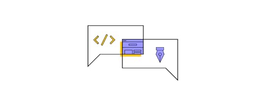 Color psychology in calculator design
Choose shades that invoke precision, reliability, and clarity, such as blues and grays. Complementary colors can differentiate functions, while muted tones minimize distractions. Always prioritize user comfort and focus.
Typography and readabilitySelect typography that enhances legibility. Fonts with clean lines and ample spacing ensure users can quickly discern numbers and functions. Consider weight and style variations to distinguish between primary actions and secondary information.
Iconography for functionsCraft icons that immediately convey purpose. Simplify complex ideas into recognizable symbols, ensuring users identify functions at a glance. Uniformity in icon style and size promotes a cohesive look and avoids misinterpretation.
How to Enhance Your Calculator UI with Advanced Features and Functionality Memory functions and history logs
Memory functions and history logs help save users time by storing calculations for later use, allowing for quick reference or modifications. For example, a financial analyst working on yearly projections might use memory functions to save critical figures and easily refer back to them, streamlining their workflow.
Custom themes and personalizationCustom themes and personalization options enhance the comfort of prolonged usage. For example, a user might switch to a dark theme to reduce eye strain.
Integrating AI and voice recognitionAI and voice recognition integration accelerate input and aid in accessibility. For example, with their hands occupied in a lab, a researcher might voice a complex formula and, with AI assistance, receive instantaneous results and scenarios, optimizing productivity.
How Calculator User Interface Design Differs for Mobile vs. DesktopDesigning for touch vs. mouse/keyboard inputsFor touch, prioritize larger, discernible buttons, ensuring they’re tap-friendly. Conversely, you can optimize for precision for mouse and keyboard-driven interfaces with compact layouts and keyboard shortcut functionalities.
Utilizing mobile featuresIntegrate haptic feedback to confirm input or signal errors, providing a tactile response for mobile app users. Harness gestures like swiping to clear entries or pinching to toggle between basic and scientific modes to streamline user interactions.
Optimizing cross-platform user experienceUsers should transition seamlessly between mobile, desktop, or wearables (iOS, Windows, Android, etc.) without relearning the interface. Utilize unified native and web design principles, maintain consistent functionality, and prioritize data synchronization for those using multiple devices.
Calculator UI Design InspirationHere are five calculator designs we found on Dribbble.
Example 1: Simple calculator design by Hikmet Atceken on Dribbble .

We like how Hikmet uses the full screen for this simple calculator example. There is adequate spacing between buttons, and Hikmet uses subtle colors to differentiate functionality and hierarchy.
Example 2: Neuromorphic design by Mariana Konstantynova on Dribbble .

Mariana’s savings calculator uses a trendy neomorphism style–perfect for targeting a younger audience. This aesthetically pleasing UI catches the eye, encouraging engagement.
Example 3: Mortgage calculator design by Paramveer on Dribbble .

Paramveer’s mortgage calculator is an excellent example of incorporating many features and functionalities into a compact viewport. Paramveer uses a mix of mobile-friendly components, like sliders and buttons with large touch targets, to optimize the mobile experience.
Example 4: Good example of using color by Ramona Tăbuşcă on Dribbble .

Ramona uses color brilliantly to allow for consistency in light and dark modes. The calculator’s functionality is separated into three distinct color groups, making it easy to identify which buttons to press.
Example 5: Mortgage calculator design by LLT Group on Dribbble .

The LLT Group’s mortgage calculator is an excellent example for users on large screens. The use of whitespace, hierarchy, font size, and color makes it easy for users to identify key values and digest data instantly.
How to Improve Calculator Prototypes With React Components in the Design ProcessWhile image-based design tools like Figma or Sketch are powerful UI design tools, the designs are fundamentally static. These tools can visualize the calculator’s aesthetics but fall short of simulating its intricate interactivity. Creating an effective interactive calculator takes hours of prep and setup–taking valuable resources from actual prototyping and testing.
UXPin is a code-based tool. Instead of producing vector graphics, UXPin renders HTML, CSS, and Javascript behind the scenes. Designers can also import live components from React, Vue, Ember, and other Javascript-based libraries via Storybook–including foundational elements, patterns, interactive widgets, and UI templates.
Using React components in the design process via UXPin Merge proves pivotal for complex, interactive applications like calculators. React’s component-based structure means every UI element is modular and reusable, allowing for real, live interactions within UXPin–without writing any code.
This dynamic interactivity mimics the final product much closer than any static design tool can. As calculators demand immediate and precise feedback to user inputs, such real-time functionality testing becomes indispensable, ensuring that design and function align seamlessly.
Using React’s live components in UXPin via Merge bridges the gap between design and development, letting designers test actual functionalities in real-world scenarios. This difference accelerates the design-validation loop and reduces the chances of oversight, ensuring a robust and user-friendly calculator app design.
Go from static and time-consuming to fully interactive, fast, and effortless with UXPin and Merge technology. Visit our Merge page for more details and how to request access.
Discover MergeThe post Calculator Design – How to Prototype a Functioning Calculator with a Design Tool appeared first on Studio by UXPin.
December 11, 2023
Top UX Design Tools to Try Before 2023 Ends

User Experience (UX) design is all about ensuring that the relationship between the user and the digital product is positive. Thankfully, with the many modern tools out there, teams of designers can easily collaborate on a design in real-time as well as test its usability and make iterations to designs.
However, not all UX design tools are equal and there are some that just focus on one part of the design process (like wireframing tools) whereas others are more comprehensive and can take the design from idea to reality, plus help you keep consistency by using design systems’ elements in your projects.
So, depending on your needs, you may find yourself needing an advanced tool that allows for personal coding inputs, or you may just need a tool that provides you with a library of features that you can simply drag and drop into your design.
Research is one thing, but you will be able to pick the best UX design tool only after you try it. Design prototypes that feel real in UXPin. Try UXPin for free.
Build advanced prototypesDesign better products with States, Variables, Auto Layout and more.
Try UXPin .try-uxpin-banner { margin: 40px 0px;}.try-uxpin__container { display: flex; max-width: 689px; height: 210px; padding: 20px; padding-left: 24px; border: 2px solid black; border-radius: 4px; align-items: center; justify-content: space-between; background-color: white; box-shadow: 10px 10px black;}.try-uxpin__left { width: 54%;}.try-uxpin__left p { margin: 10px 0px !important; color: black !important;}.try-uxpin__heading { font-size: 28px !important; font-weight: bold;}.try-uxpin__text { margin: 0 !important; font-size: 18px !important; line-height: 22px !important;}.try-uxpin__button { width: 135px; height: 44px; background: black; margin: 10px 0px; padding: 10px 20px; border: none; border-radius: 2px; color: white; font-size: 16px; text-align: center;}.try-uxpin__button:hover { cursor: pointer;}.try-uxpin__image { max-width: 320px !important; height: 200px; margin-right: -21px; margin-bottom: -6px;}@media (max-width: 760px) { .try-uxpin__container { height: auto; margin: 10px; align-items: left; }}@media (max-width: 500px) { .try-uxpin__container { flex-direction: column; } .try-uxpin__left { width: 100%; align-items: normal; }}UXPin
UXPin gives you all the features you need to design high-fidelity prototypes that actually feel like you’re using the finished digital product. UXPin comes with hundreds of user interface elements that make it easy to design fast and stay consistent across the team.
One of the greatest benefits of UXPin is its one-of-a-kind Merge technology which allows for a high level of team collaboration on a project. It allows you and your team to work on the same code components as the actual developers. In simple terms, you can import a piece of the coded app into UXPin and use it to further improve your designs.
On top of that, instead of having to manually create standard design elements, UXPin provides a library of thousands of components that you can use, customize, and simply drag and drop into your design. This includes animations and icons as well as components that are specifically designed for other systems like iOS and Bootstrap.
If you want to create your own animations, you can, or you can simply use Photoshop or some other program and download the file to UXPin. There is no need to worry about the layers of the animation being erased as UXPin will preserve the layers for easy integration.
FigmaFigma focuses on interface design and brainstorming. Similar to Google Docs, you can see who is presently working on the project and what they are inputting, which allows for a convenient real-time collaboration on a project. You can build mockups and partially functional prototypes.
To make Figma designs work like an end-product, you may integrate it with a prototyping tool. UXPin has their own extension of copying and pasting Figma designs to UXPin, to make it interactive. Read the full tutorial of how to do that: From Figma to UXPin – Full Tutorial.
SketchSketch is another UX design tool that supports shared libraries and layouts and allows you to share and export designs with others. It also has many editing tools such as vector and plugin tools. If you are working on a detailed design, then you can zoom in and edit at a more precise level. Another convenient feature is the ability to resize parts of your design on command.
Sketch is good for creating unique icons and designs that you can then save in your library. This allows for an easy share feature across projects where, for example, an icon can be used on multiple separate designs with relative ease. On top of that, you can store your designs on the cloud which allows your team or organization to have easy access to designs and a more fluid design process. Another important feature allows contributors to comment, edit, and make changes to a project that are then automatically synced to the cloud.
MarvelMarvel is another cloud-based platform that will automatically sync web designs to the cloud. Plus, it offers mobile support for quick changes on the go. There is also a library of templates, images, and screen components like buttons that can easily be accessed and implemented into your project.
Marvel is built more for beginner use and has a drag-and-drop system that allows users to develop a design without the need for self-imputed coding. It is also a collaborative design platform that allows other team members to provide feedback and input their own designs.
There are templates specifically designed for various devices such as tablets, smartphones, and desktop computers. Mockups can be tested as if they were the real thing which allows for the designer to quickly find any faults and update the design as needed.
You can also download the Marvel app onto your iOS or Android device. This allows for ideas to be tested on smartphone devices and easy sharing options.
Pick the best UX design toolAs you’ve seen from the examples above, some of the most popular design platforms allow you to focus on one element of the design process. While some, like Marvel, are great for casual designs, others are catered to working on more complex digital products and mobile apps.
Unfortunately, using several solutions means a larger design toolkit that can slow you down. Your designers will need to integrate or jump between a number of apps in their daily work.
Luckily, you can also turn to advanced tools that allow you to work on a design from idea to completion. Or, like UXPin, they’ll even allow developers to copy HTML and CSS code from design to their workflow.
When compared to other solutions, UXPin is one of the most comprehensive UX design tools in the industry. This makes it a particularly attractive alternative to software like Axure, Proto.io or Figma which were traditionally used for specific phases of the design process.
With UXPin you can design fully interactive prototypes that make it clear what the final user experience should be like. See how UXPin helps you design more realistic prototypes. Sign up for UXPin trial.
Try UXPin for freeThe post Top UX Design Tools to Try Before 2023 Ends appeared first on Studio by UXPin.
Best Design Conferences in 2024

One of the best things about being a part of the design community is that most designers love to exchange ideas, spread knowledge, and share their experiences regardless of their seniority level. You can be a starting designer or an established thought leader, and it’s almost a given that you find a design conference that may teach you something new.
What’s also great about UX conferences is that not all of them target the UX/UI community, but the people who work with them on a daily basis. Product managers, developers and other professionals who work closely with design can find an event for themselves.
Increase design maturity with UXPin Merge. Build a more collaborative design process and bridge the gap between designers and devs by using a single source of truth in your prototypes: interactive components. Discover more about UXPin Merge.
Reach a new level of prototypingDesign with interactive components coming from your team’s design system.
Discover UXPin Merge .discover-merge { margin: 40px 8px;}.discover-merge__container { display: flex; max-width: 690px; height: 200px; padding: 20px; padding-left: 24px; border-radius: 4px; background-color: black; box-shadow: 10px 10px #9999ff; align-items: center; justify-content: space-between;}.discover-merge__left { width: 50%;}.discover-merge__left p { margin: 10px 0px !important; color: white !important; font-size: 18px !important;}.discover-merge__heading { font-weight: bold !important; color: white !important; font-size: 18px !important;}.discover-merge__text { margin: 0 !important; line-height: 22px !important;}.discover-merge__button { width: 174px; height: 44px; margin: 10px 0px; border: none; border-radius: 2px; background: white; color: black; font-size: 16px; text-align: center;}.discover-merge__button:hover { cursor: pointer;}.discover-merge__image { max-width: 320px !important; height: 200px; margin-right: -19px;}@media (max-width: 760px) { .discover-merge__container { height: auto; margin: 10px; align-items: left; }}@media (max-width: 500px) { .discover-merge__container { flex-direction: column; } .discover-merge__left { width: 100%; align-items: normal; }}January 2024 Conferences QRCA 2024 Annual ConferenceQRCA stands for Qualitative Research Consultants Association. The conference covers research methods, tools, and lessons that will prepare designers for the next era of qualitative research.
Date: Jan 22-25, 2024Free: NoWhere: Virtual & DenverAudience: UX researchers, marketing researchersCommon topics: qualitative research, research methods, research toolsUX360 Research Summit 2024We will welcome the third edition of a conference dedicated entirely to research. The line up includes UX researchers from top companies: Google, Meta, Dropbox, Delivery Hero, and more.
Date: Jan 30-31, 2023Free: NoWhere: VirtualAudience: UX researchers, UI designers, UX designersCommon topics: research, design strategy, human-centered designDesign Matters MexicoJoin Design Matters and listen to Mexican designers telling you about local design and the intersection between technology and humanity.
Date: Jan 31-Feb 1, 2023Free: NoWhere: Mexico CityAudience: UX researchers, UI designers, UX designersCommon topics: inclusivity, design future, technologyFebruary 2024 ConferencesWhat about the second month of the year? We’ve found a couple of conferences that may catch your eye. Let’s see them.
AXE CON 2024Sign up to attend a virtual accessibility conference focused on building, testing, and maintaining accessible digital experiences.
Date: Feb 20-22, 2024Free: NoWhere: VirtualAudience: designersCommon topics: accessibility, UXProduct World [Hybrid]Product conference that concerns itself with sharing the product success stories from tech product professionals at Silicon Valley’s top tech companies.
Date: Feb 21-29, 2024Free: NoWhere: Virtual and San Francisco Bay AreaAudience: product managers, developers, product designersCommon topics: collaboration, leadership, growthConveyUX 2024 [Hybrid]Learn about what is going on in the world of user experience in this AI-driven era.
Date: Feb 27-29, 2024Free: NoWhere: Virtual and Seattle, USAudience: product managers, developers, product designersCommon topics: design process, design future, AIHUCCAP 2024At the same time as ConveyUX, there’s a Human-Computer Interaction Conference hosted in Rome, Italy. Join to discuss HCI matters in an interdisciplinary environment.
Date: Feb 27-29, 2024Free: NoWhere: Virtual and Seattle, USAudience: product managers, developers, product designersCommon topics: human-computer interaction.March 2024 ConferencesLeading Design New YorkOne of the design conferences by Clearleft will be hosted in New York.
Date: Mar 20-21, 2024Free: NoWhere: New York, USAudience: UX designersCommon topics: career, leadership, future of designUX Copenhagen [Hybrid]It’s the 10th edition of annual “Human Experience” conference. This year it will examine overconsumption and tackle degrowth.
Date: Mar 20-21, 2024Free: NoWhere: Virtual & Copenhagen, DenmarkAudience: UX designers, UX researchersCommon topics: UX design, leadership, futureACM IUI 2024Interested in AI for design? If so, you can’t miss out on this conference! It focuses on the advances at the intersection of Artificial Intelligence (AI) and Human-Computer Interaction (HCI).
Date: Mar 18-21, 2024Free: NoWhere: Sydney, Australia Audience: product designers, researchersCommon topics: information architecture, artificial intelligence April 2024 ConferencesInformation Architecture ConferenceIt’s one of the leading conferences for information architects, designers, and others who create and manage UI and information environments. This year theme is to examine the impact of AI on information architecture.
Date: Apr 9-13, 2024Free: NoWhere: Virtual Audience: product designers, researchers, product managersCommon topics: information architecture, artificial intelligenceUX Research Festival [Hybrid]Being a brainchild of UXInsights, the largest UX research communities in Europe, UX Research Festival invites you to Breda (in the Netherlands) to hear out amazing talks about UX research.
Date: Apr 15-17, 2024Free: NoWhere: Virtual and Breda, NetherlandsAudience: researchers, designersCommon topics: UX research, ResearchOpsMay 2024 ConferencesCHI 2024 [Hybrid]This year’s annual ACM Computer Human Interaction conference is hosted in beautiful Hawaii. It embraces the theme of Surfing the World – which means reflecting the focus on pushing forth the wave of cutting-edge technology and riding the tide of new developments in human-computer interaction.
Date: May 11-16, 2024Free: NoWhere: Virtual & Honolulu, HawaiiAudience: researchersCommon topics: research tools, research methodsUXDX Community USA [Hybrid]UXDX is a popular conference for UX designers, developers and product people around the world, sharing with them collaboration ideas.
Date: May 15-17, 2024Free: YesWhere: Virtual and on siteAudience: UX designers, UX researchers, developers and product managersCommon topics: leadership, collaboration, design systemUXLxJoin fellow designers in sunny Lisbon. Soak up UX knowledge, network with like-minded individual, and hone your design skills.
Date: May 21-24, 2024Free: NoWhere: Lisbon, PortugalAudience: designersCommon topics: UX, design processFrom Business to Buttons 2024Spend one day in Stockholm to discuss user experience and customer expaerience. Great conference for business-savvy designers.
Date: May 24 2024Free: NoWhere: Stockholm, SwedenAudience: designers, product managersCommon topics: design process, design impact, leadershipWebExpoTravel to Prague, an extraordinary European city, to join fellow web designers, developers, marketers, and more discussing innovations in web design and development.
Date: May 29-31, 2024Free: NoWhere: Prague, CzechiaAudience: designers, developers, product managersCommon topics: web design, front-end design, UXJune 2024 ConferencesDRS 2024 BOSTONHosted by Design Research Society, this conference is about 4 Rs: resistance, recovery, reflection, and reimagination, which we’re sure are relevant to the state of design in 2024.
Date: Jun 24-28, 2024Free: NoWhere: Boston, USAudience: design researchCommon topics: research, leadership, future of designAugust 2024 ConferencesUX Nordic [Hybrid]Sharpen your skills and nurture your growth as a UX researcher, designer or writer. Meet other design professionals and explore your interests.
Date: Aug 28-29, 2024Free: NoWhere: Virtual & Aarhus, NorwayAudience: UX researchers, UX designers, UX writersCommon topics: design process, leadershipUX Australia [Hybrid]It’s the 16th edition of UX Australia. The conference focuses on UX, product and service design, and the surrounding disciplines of research, content, operations, management, and more.
Date: Aug 27-30, 2024Free: NoWhere: Virtual & Melbourne, AustraliaAudience: UX researchers, product managers, product designersCommon topics: research operations, leadership, research methods, research toolsNovember 2024 ConferencesLeading Design LondonLet’s meet in London to discuss design.
Date: Nov 6-7, 2024Free: NoWhere: London, UKAudience: UX designersCommon topics: career, leadership, future of designMay 2023 ConferencesMay will be the month for on-site UX and product conferences. Let’s see where we can travel to. Are you ready?
Product Day by ADPlistElevate your career in product design with ADPlist. The conference has four tracks: entrepreneurship, career growth, trends, and groundbreaking work, so everyone can find something for themselves.
Date: May 10, 2023Free: NoWhere: virtualAudience: product designers, product managers, design leadersCommon topics: design career, design leadership, innovationDIBI ConferenceDIBI stands for Design it, Build it, and it’s one of the best conferences in the UK for everyone who’s involved in the product development process.
Date: May 11-12, 2023Free: NoWhere: Edinburgh, Scotland Audience: product designers, product managers, design leadersCommon topics: design process, design leadershipUXistanbulOrganized by UXServices, this conference is a place for gathering Web3 enthusiasts and designers interested in the field. Come and join them online on Discord.
Date: May 22-26, 2023Free: NoWhere: Virtual Audience: product designers, researchers, product managersCommon topics: NFT, metaverseACE!This Polish conference has two tracks: Agile Software Development and Product Design & Management. Yet, there will be a lot of content for product designers, too.
Date: May 18-19, 2023Free: NoWhere: Kraków, PolandAudience: product managers, developers, product designersCommon topics: leadership, product strategy, product growthJune 2023 ConferencesThat month looks very exciting for those of you who got used to participating in events from the comfort of their homes. In other words, there will be a few interesting online design conferences and meetups.
UX STRAT EuropeSign up for a European edition of a popular UX STRAT conference. Learn from the product design and innovation experts.
Date: Jun 5-7, 2023Free: NoWhere: AmsterdamAudience: product designers, researchersCommon topics: design strategy, future of designPixel PioneersIt may be just a day-long, but the Pixel Pioneers is fully-packed with inspirational presentations from leading UX/UI designers and front-end developers.
Date: Jun 16, 2023Free: NoWhere: Bristol, UKAudience: product designers, developers, researchersCommon topics: human-centered design, inclusive design, future of designUXPA 2023Looking for inspirational talks? San Diego’s UXPA conference may be your cup of tea. It is a design conference in the USA.
Date: Jun 20-22, 2023Free: NoWhere: San Diego, USAudience: product designers, researchersCommon topics: human-centered design, leadership, researchJuly 2023 ConferencesThe summer season is on, but there are a few exciting events coming. Curious what are they?
ProductConOrganized by Product School, ProductCon is a 1-day conference for product people who want to learn more about managing products. This is an online design conference, so you can watch it whenever you are.
Date: July 2023Free: Yes until April 2023Where: VirtualAudience: product managers, developers, product designersCommon topics: leadership, product innovation, collaborationHCI INTERNATIONAL 2023That international conference on human-computer interaction that is usually held in Gothenburg, Sweden, but this year it will be hosted in Copenhagen, Denmark. We highly recommend to attend. It’s a great treat for the interaction designers.
Date: Jul 23-28, 2023Free: NoWhere: VirtualAudience: product designers, researchersCommon topics: human-centered design, research, leadership#mtpcon Digital AmericasThe summer edition of the Mind the Product conference for both Americas.
Date: Jul 10-14, 2023Free: NoWhere: VirtualAudience: product designers, product managers, developersCommon topics: leadership, future of product, product growthAugust 2023 ConferencesUX Australia 2023 [Hybrid]You don’t need to be located in Australia (but if you are, we’re jealous) to attend this. Designers from the vast fields like UX, product and service design, research, content, operations, etc. meet to discuss product design.
Date: Aug 22-25, 2023Free: NoWhere: Sydney, AustraliaAudience: product designers, UX researchers, content designersCommon topics: design process, leadership, DesignOpsUX Nordic [Hybrid]Almost on the exact same date, another conference is taking place – UX Nordic. This one is great if you want to hone your skills and to grow as a user experience designer in 2023.
Date: Aug 24-25, 2023Free: NoWhere: Aarhus, DenmarkAudience: product designers, researchers, content designersCommon topics: accessibility, case studies, design processSeptember 2023 ConferencesSmashingConf Freiburg 2023Are you a UX Architect, UI Developer, or a Product Designer that needs to work a lot with engineers? You can’t miss this UX design conference that oh-so-smoothly merges development and design.
Date: Sep 4-6, 2023Free: NoWhere: Freiburg, GermanyAudience: product designers, developersCommon topics: accessibility, web development, design processThe UXConf 2023Brought to you by The School of UX, The UXConf has an incredible lineup. Designers from Hotjar, TripAdvisor, HubSpot, Skyscanner, Goldman Sachs, Eurostar, and more will walk you through important UX-related topics.
Date: Sep 13, 2023Free: NoWhere: London, UKAudience: product designers, UX researchersCommon topics: tutorials, design process, toolsUX+ Conference 2023Gain creativity and inspiration by attending Asia’s biggest UX conference in 2023. This year’s theme is “Redefining the UX path: embracing growth, inclusivity, and impact.”
Date: Sep 17, 2023Free: NoWhere: Manila, PhilippinesAudience: product designersCommon topics: design leadership, design process, design futureDesign Matters Copenhagen [Hybrid]This well-known design conference advertises itself as, “Made for designers, by designers.” And it truly is so! We highly recommend you attend it, but if you can’t, check their library of talks.
Date: Sep 27-28, 2023Free: NoWhere: Copenhagen, DenmarkAudience: product designers, UX researchersCommon topics: tutorials, design process, leadershipOctober 2023 ConferencesSee October conferences for designers and product teams.
World Usability ConferenceLet’s meet in Austria and discuss usability with other UX professionals and participate in talks and masterclasses where handpicked speakers share meaningful hands-on insights.
Date: Oct 10-12, 2023Free: NoWhere: Graz, AustriaAudience: product designers, UX researchersCommon topics: design process, usability, sustainabilityProductized Conference 2023Come to Lisbon for a product conference that gathers people interested in product development, design thinking, and product management. It is an exciting two-day event for anyone who works in SaaS or enterprise solutions.
Date: Oct 11-12, 2023Free: NoWhere: Lisbon, PortugalAudience: product designers, front-end developersCommon topics: design process, design thinking, product growthPush UX 2023From Lisbon travel to a lovely Munich to meet like-minded UX professionals that will discuss design research, presentation, and other aspects of daily UX designer’s activities.
Date: Oct 19-20, 2023Free: NoWhere: Munich, GermanyAudience: product designers, UX researchersCommon topics: design process, design leadership, product growthGeorge UX Conf [Hybrid]Are you designing a FinTech or banking app? Then, this UX design conference is a must-watch. Connect with experts in the field coming from Revolut, Wise, Deutsche Bank, and more.
Date: Oct 19, 2023Free: NoWhere: Vienna, AustriaAudience: product designers, UX researchersCommon topics: design process, design leadership, product growthNovember 2023 ConferencesWeb Summit LisbonCome to a sunny Lisbon to participate in lively discussions on web design and development.
Date: Nov 13-16, 2023Free: NoWhere: Lisbon, PortugalAudience: product managers, developers, product designersCommon topics: web design, web developmentUXDX APAC 2023It’s yet another UXDX event, but this one is an Audio-Pacific version. It’s dedicated to Product, UX, Design and Development teams that want to find a way of working together.
Date: Nov 14-16, 2023Free: NoWhere: San Diego, USAAudience: product managers, developers, product designersCommon topics: product direction, scaling design, validation, product growth7th Design Thinking Summit [Hybrid]Get inspired and discuss innovations in design thinking in Europe. Discuss the methodologies of managing design systems and discover innovations that make human-centered design even more relevant in 2023.
Date: Nov 15-17, 2023Free: NoWhere: Prague, CzechiaAudience: product designers, UX designers, developersCommon topics: design thinking, design process, leadershipProductCon San FranciscoAnother Product School’s ProductCon is happening in November. It is a 1-day product design conference for those who want to learn more about managing products and the future of product management.
Date: Nov 16, 2023Free: NoWhere: San FranciscoAudience: product managers, developers, product designersCommon topics: leadership, future of product management, product growthWhich Design Conferences Are You Attending in 2023?It seems as if 2023 is going to be full of inspiring and educational content coming from the best speakers in design and product management. Have you found a conference for you? We will definitely keep you posted if any new event comes our way.
Use the knowledge that you acquired from design conferences in practice. Instead of working in siloed environment, unite your team with a single source of truth: interactive components that can be used across design and product. Discover more about it. Check out UXPin Merge.
Discover MergeThe post Best Design Conferences in 2024 appeared first on Studio by UXPin.
December 7, 2023
App Icon Design – 5 Amazing Ideas from Tech Companies

One of the most critical choices any app development company will make is the design of the app icon. Good icons are inviting and will increase interaction, while a bad design can slow down adoption and make users less likely to use it. Their first impression will be your app’s icon – it’s what they’ll first see from whatever store they first download your newly-released product, and it’s what they’ll look at every time they launch it.
Getting the right depiction is not just nice to have; it’s essential if you want your app to be successful. Fortunately, when it comes to crafting icons, there are plenty of places and companies from which to draw inspiration. In this article, we’ll talk about what five top tech companies are doing for app icon design – and what you can learn from these amazing designers.
Key takeaways:
App icon design needs to meet a combination of criteria, including aesthetics, functionality, brand representation, and platform-specific considerations.When considering designing your own icons, consider tips by top companies, such as Apple’s emphasis on simplicity or Microsoft’s Fluent Design System balancing innovation with legacy. Build advanced prototypesDesign better products with States, Variables, Auto Layout and more.
Try UXPin .try-uxpin-banner { margin: 40px 0px;}.try-uxpin__container { display: flex; max-width: 689px; height: 210px; padding: 20px; padding-left: 24px; border: 2px solid black; border-radius: 4px; align-items: center; justify-content: space-between; background-color: white; box-shadow: 10px 10px black;}.try-uxpin__left { width: 54%;}.try-uxpin__left p { margin: 10px 0px !important; color: black !important;}.try-uxpin__heading { font-size: 28px !important; font-weight: bold;}.try-uxpin__text { margin: 0 !important; font-size: 18px !important; line-height: 22px !important;}.try-uxpin__button { width: 135px; height: 44px; background: black; margin: 10px 0px; padding: 10px 20px; border: none; border-radius: 2px; color: white; font-size: 16px; text-align: center;}.try-uxpin__button:hover { cursor: pointer;}.try-uxpin__image { max-width: 320px !important; height: 200px; margin-right: -21px; margin-bottom: -6px;}@media (max-width: 760px) { .try-uxpin__container { height: auto; margin: 10px; align-items: left; }}@media (max-width: 500px) { .try-uxpin__container { flex-direction: column; } .try-uxpin__left { width: 100%; align-items: normal; }}What is App Icon Design?App icon design involves creating the perfect icon for your app. It often encapsulates the app’s brand, purpose, and primary features, distilling these elements into a simple, memorable image. Consider color choice, shape, and scalability factors when designing an app icon.
Furthermore, designers must keep in mind platform-specific guidelines. iOS, Android, and other operating systems have unique design standards to ensure a coherent user experience. We’ll discuss those in more detail when we look at what popular tech companies do for their app icons.
In essence, app icon design is a blend of aesthetics, functionality, and brand representation, all confined within a small visual space. Given its impression on users and the limited pixel space, getting the best app icon design is crucial.
What Top Companies Say about App Icon Design?When it comes to design, there’s a lot to learn from the top tech companies as they often employ some of the highest-talent designers on the market. And their market leader position means they usually can set some of the trends. Here’s what Apple, Microsoft, IBM, Atlassian, and Google are doing for app design.
1. AppleMany people regard Apple as the leader in design. From iconic devices to amazing apps, countless companies look to them for inspiration. Like many platform developers, Apple lists their best practices online. In terms of icon design, here are the three key takeaways from the brand.
First, simple is better. Think about all the memorable icons you’ve seen. Let’s take Facebook or Twitter’s old logo. These are simply a bird and an “f,” respectively. Now, think about Apple’s designs. Apple Music, for example, is nothing but a couple of notes. Each of these icons embraces simplicity. Remember, these graphical depictions tend to be pretty small on user devices. Crafting intricate details gets lost quickly. Great app icon design is bold and recognizable – it’s simple and easy to spot in a sea of apps. Think about how you can make your icon design process result in something simple!
Next, remove text, if possible, or at least keep it to a minimum. Only include text if it is a vital part of your brand. Too many people want to include a company name or a tagline, but that’s often hard to read, especially on smaller devices. Keep your app icon graphical, if possible.
Finally, consider your platform and create alternate app icons if necessary. What looks good on iOS with the rounded corners may not look as good on Android with the circular design. By considering (and tailoring your app icon, too) the platform, you’ll create a unique but unified experience, no matter where people use your app.
2. MicrosoftMicrosoft’s Fluent Design System encapsulates the future of user interface and experience design, all while ensuring a profound connection with the company’s historical roots. Regarding app icon design through Fluent, there’s an evident synthesis of past, present, and future – something that designers of modern apps should consider!
Fluent-based icons go beyond mere aesthetics. While they embrace depth, light, motion, and materiality for a modern and interactive user experience, there’s a foundational respect for Microsoft’s legacy. The challenge lies in striking a balance: how does one innovate while respecting and recalling the iconic imagery from earlier software generations? Microsoft wanted to create a facelift for their products while keeping much of that history. Here are a couple of rules they applied:
Going beyond monochrome. Microsoft’s answer is layered and dynamic icons that nod to the past. These icons maintain familiarity, ensuring long-standing users feel at home while drawing new users with their contemporary look. Color palettes resonate with both legacy themes and modern design paradigms. The textures and materials are current and modern but reminiscent of a tactile, real-world experience.

Balancing legacy with innovation. If your company is not entirely new, there’s much to learn from what Microsoft did with Fluent. In the design process for your app icon, nodding to your company’s history while simultaneously conveying your company’s fresh, new app is vital. By looking at what Microsoft did with Fluent, you can see how to balance that rich history while conveying the bold future you want for your app and company.
3. IBMPeople may not think of IBM when they think of apps, but they have developed a compelling design system called the IBM Design Language. Designers should consider a few things that IBM has noted, as these concepts serve as guidelines for our app icons.
Central to their icon design philosophy is the categorization into four distinct groups: “stroke” and “fill” icons, hero brands, third-party logos, and the unique IBM Plex app icons. This concept hints at something very critical for app icon design – space. Is your icon a stroke icon? A fill one? How are you using the app icon’s available space, or are you using negative space? These are essential considerations.

Additionally, IBM applies the same grid for all icons. Designers craft every IBM icon on a pixel-based grid measuring 32px x 32px for uniformity. This serves as a foundational guideline, ensuring each piece of artwork snaps perfectly into place. However, designers are encouraged to make fine-tuning adjustments during creation to achieve the desired shape.
IBM also maintains icon consistency by creating icon groups. This is vital if you have more than one app because it lets people subtly know that your company is behind all of them. It is not just IBM that does this, of course – so do Apple and Microsoft. You can often tell which company is behind an app just by looking at the icon!
If you’re a designer, it’s worth flipping through the IBM Design Language, as it has many fantastic pointers to achieve the perfect design.
4. AtlassianAs is often the case with any visual art form, various designers and companies have different perspectives. Atlassian emphasizes some things the previous companies have not mentioned – accessibility and avoiding inundating users.
In today’s modern world, accessibility is not a nice to have. It’s a must. Ensure your app’s icon is accessible. This means it should adhere to WCAG contrast ratios and there should be no text with unfamiliar icons. You want people to immediately grasp what your icon and app are about, regardless of their abilities.
Additionally, Atlassian also encourages people to avoid going overboard with icons. Keep them simple and clean to minimize “icon fatigue.” People look at dozens of app icons daily, and if yours is too visually cluttered or intricate, they will tune out from your app rather than lean into it.
 5. Google
Like all the companies above, Google also significantly emphasizes its icons through Material – Google’s app icon design system. While Material has numerous paradigms, three that designers should consider stand out.
First, think about color. The Material guidelines specify which colors to use for active and inactive icons. Additionally, you should differentiate between active and focused versus just active. Designers often leave out the focused state, especially for apps with touch capabilities.
Next, make complex icons legible. As the companies above note, these must be readable, and Google is no exception to this policy. If you need to adjust icons to ensure they are legible and clear, do so, even if they are system icons.
Finally, Google’s system icons with Material are bold, symmetrical, and minimal. They convey just the amount of information necessary for the user to determine what the action behind the icon does. This design principle is worth considering with your app icon design.
For example, the icons below show just enough information to convey their meaning without being overly complex.
 Use UXPin to Prototype Your App Icons
UXPin is the leading solution for crafting user interfaces and prototyping apps. It is also one of the best ways to prototype your app icons and see how users will react to them before finalizing every single little detail across multiple platforms. As you can likely see from the examples above, companies put tremendous thought into app icons to ensure they convey the right message and feel for an app.
If you’re in the design phase for your app, try UXPin for free and prototype your perfect app icon!
Try UXPin for freeThe post App Icon Design – 5 Amazing Ideas from Tech Companies appeared first on Studio by UXPin.
December 5, 2023
The Code-Based Adobe XD Alternative – UXPin Merge

Overwhelmed by the plethora of Adobe XD alternatives? Are you looking for an upgrade to Adobe XD rather than a copy of your existing workspace? Discover why UXPin is the best Adobe XD alternative and the benefits of using a code-based design platform. We also introduce Merge and how this revolutionary technology bridges the gap between designers and engineers while creating a single source of truth for design systems.
Key takeaways:
Adobe XD was a prominent vector-based design tool, but its standalone version is no longer available for new buyers.Consider intuitive UI, prototyping capabilities, design systems, collaboration features, and cost-effectiveness when seeking an Adobe XD alternative.UXPin Merge is a great choice, offering advanced code-based design capabilities over traditional vector-based tools.Unlike many Adobe XD alternatives, UXPin Merge addresses challenges across the product development spectrum, streamlining workflows for all stakeholders.Connect design and development teams with a single source of truth – coded components that can be used across prototyping, design handoff, and app development stages of product creation. Learn more about it. Discover UXPin Merge.
Reach a new level of prototypingDesign with interactive components coming from your team’s design system.
Discover UXPin Merge .discover-merge { margin: 40px 8px;}.discover-merge__container { display: flex; max-width: 690px; height: 200px; padding: 20px; padding-left: 24px; border-radius: 4px; background-color: black; box-shadow: 10px 10px #9999ff; align-items: center; justify-content: space-between;}.discover-merge__left { width: 50%;}.discover-merge__left p { margin: 10px 0px !important; color: white !important; font-size: 18px !important;}.discover-merge__heading { font-weight: bold !important; color: white !important; font-size: 18px !important;}.discover-merge__text { margin: 0 !important; line-height: 22px !important;}.discover-merge__button { width: 174px; height: 44px; margin: 10px 0px; border: none; border-radius: 2px; background: white; color: black; font-size: 16px; text-align: center;}.discover-merge__button:hover { cursor: pointer;}.discover-merge__image { max-width: 320px !important; height: 200px; margin-right: -19px;}@media (max-width: 760px) { .discover-merge__container { height: auto; margin: 10px; align-items: left; }}@media (max-width: 500px) { .discover-merge__container { flex-direction: column; } .discover-merge__left { width: 100%; align-items: normal; }}What is Adobe XD?Adobe XD is a vector-based UI/UX design software developed and maintained by Adobe. It caters to web and mobile app design, an end-to-end solution for designers to create wireframes, mockups, and prototypes.
Some noteworthy features include:
Vector Design and Drawing Tools: Adobe XD enables designers to create and edit intricate vector designs, ensuring sharp outputs regardless of the display size.Repeat Grid: This feature streamlines design processes. Designers can replicate elements like lists or photo galleries with a few clicks, reducing tedious, repetitive tasks.Prototyping: Designers can link artboards, adding animations and microinteractions to mimic interactivity. Voice Design: Adobe XD supports voice commands, making designing voice user interfaces and integrating voice triggers possible.Responsive Resize: Automatically adjust and resize elements to fit different screen sizes, ensuring designs look good on all devices.Collaboration Tools: Adobe XD isn’t just for solo designers. Teams can comment, share, and co-edit in real time with in-app collaboration tools.Integration Capabilities: It seamlessly integrates with other Adobe Suite applications and some third-party tools, bridging the gap between prototype and final output.Is Adobe XD Discontinued?Contrary to speculation on social media, Adobe has not discontinued Adobe XD. While it’s no longer available as a single application for new buyers, it will continue supporting existing customers. You must purchase the Adobe Creative Cloud All Apps subscription to access Adobe XD as a new customer.
What to Look for in an Adobe XD Alternative?If you’re an avid Adobe XD user, then you’ll want a design tool that’s comparable or better. Here’s a breakdown of essential aspects:
User-Friendly UI: Design tools should simplify, not complicate. An intuitive interface speeds up the design process, reduces learning curves, and increases efficiency.Prototyping Capabilities:Real-time Previews: Witness design changes as they happen.Interactive Prototyping: Add life to prototypes with interactive elements, microinteractions, and animations.Responsiveness: Your tool must allow you to create multiple viewports for designs with minimal effort.Design Systems: A must-have feature in modern digital product design. Guage a design system feature by its ability to bridge the gap between designers and engineers.Collaboration Features:Commenting: Offer insights directly on designs.Sharing: Distribute prototypes for feedback.Real-time Collaboration: An integrated chat feature allows design teams to collaborate without leaving the workspace.Design Handoff: A seamless transition curtails back-and-forths between design and development teams. Look for tools that generate accurate specs, assets, and code snippets.Platform Integration: Integration capabilities mean less juggling between applications, promoting a unified workflow.Cost-effectiveness: A stellar design tool won’t drain budgets. Opt for solutions that offer robust features without a hefty price tag, ensuring value for every dollar spent.What’s an Alternative to Adobe XD?While vector-based tools like Adobe XD, Figma, and InVision have dominated the design scene for years, there’s a notable shift towards code-based platforms like UXPin.
With UXPin’s Merge technology, designers can go beyond basic prototypes to advanced code-based replicas that look and feel like the final product. Some advantages of using Merge and code-based design platforms include:
Realistic Interactive Prototypes: Code-based tools like UXPin mirror the final product, allowing designers to get high-quality insights from testing.Dynamic Elements: Unlike static elements in vector-based tools, UXPin has live code UI components with states, styling, logic, and real data.Seamless Handoff: Designers and developers speak the same language based on code via Merge, creating a smoother workflow with seamless handoff and fewer revisions.Superior Performance: Merge components have complex interactions and animations without lag or stutter, accurately replicating a final product experience.Desktop and Web Applications: Designers can use UXPin’s desktop application offline (Windows and MacOS) or web app with a comparable user experience in both environments.All Features Built-in: UXPin is a full-stack design tool with everything designers need from concept to final delivery, eliminating the need for plugins, extensions, and other third-party apps and subscriptions.How is UXPin Used for Prototyping?Merge creates a drag-and-drop prototyping environment in UXPin–like Logo blocks for designers. Every component has styling, interactivity, content, and other properties programmed into it from the design system’s repository, ready to start prototyping.
The design system team can include foundational UI elements to complete screen templates so designers can build prototypes faster. Any API components with connections are also available for designers to use in UXPin.
The design system team uses React props (or Args for the Storybook Integration) to give designers access to component properties, like text styles, sizing, colors, interactivity, and more.
Designers grab a component from UXPin’s Design System Libraries and adjust its properties via the Properties Panel. They can also switch to JSX mode to view and make changes in code.
Testing in UXPin with MergeThese fully interactive prototypes increase prototyping scope, allowing designers to build and test complex interfaces and user flows that usually require technical input from devs.
Designers can test prototypes in the browser using Preview and Share or UXPin Mirror for native iOS and Android app testing. They can send stakeholders a link to view the prototype and share feedback by annotating using UXPin’s Comments.
“Our stakeholders are able to provide feedback pretty quickly using UXPin. We can send them a link to play with the prototype in their own time, and UXPin allows them to provide comments directly on the prototypes. UXPin’s Comments functionality is great because we can follow along and mark comments as resolved once we address them.” Erica Rider, Product, UX, and DesignOps thought leader.
How is UXPin Used for the Design Handoff?Design handoffs with Adobe UX and other vector-based design tools are notoriously challenging, often fraught with friction and many calls with designers trying to explain mockups and prototypes to devs and developers trying to explain technical limitations to design teams.
UXPin’s Merge technology smooths the transition from design to development because every team and department works with the exact same component library, from the exact same repository. This single source of truth means design handoffs require less documentation and explanation.
Engineers simply import the component repository into their project, copy interfaces from UXPin, and apply the same component properties using props or Args.
How is UXPin Used for Design Systems?UXPin offers a design system solution for every stage of maturity, from creating a design system to a fully integrated UI library using Merge technology where designers and engineers use the same components.
Merge enables organizations to sync a UI library from a repository to UXPin’s design editor so designers use the same design system components in the design process as devs use to develop the final product.
Any changes to the repository automatically push to UXPin and notify teams of the latest release. UXPin’s Version Control allows designers to decide when they switch to the new release, and they can revert to earlier versions whenever they want.
This code-based approach to design systems gives organizations a real single source of truth, where every team uses the same UI library, and powerful Merge automation keeps everyone in sync with a single release–no need to update code and design separately.
How is UXPin Used for Collaboration?UXPin’s Comments are perfect for modern digital product design where teams work asynchronously. Slack and Jira integrations keep cross-functional teams in sync and constantly updated.
Comments functions like a chat app within UXPin. Team members can assign comments and mark them as resolved once actioned. Email notifications keep everyone updated. Designers can invite stakeholders to collaborate in UXPin, even if they don’t have an account, reducing the need to purchase extra seats.
Why UXPin Merge Beats the Best Adobe XD AlternativesWhere do Zeplin, Proto.io, Marvel, Figma, and other Adobe XD alternatives get wrong? These graphic design, prototyping, and editing tools focus on optimizing the designer workflow and UI design, neglecting other vital stakeholders and interactivity prototyping.
UXPin and Merge technology benefit the end-to-end digital product development process, including designers, product managers, engineers, DesignOps, and DevOps, by facilitating a single source of truth for cross-functional teams.
While there are many Adobe XD alternatives, UXPin is the only platform that solves many product development challenges by bridging the gap between design and development.
Are you still working with image-based tools with multiple platforms to achieve code-like results?
Switch to UXPin and instantly sync design and development with a single full-stack product design solution. Visit our Merge page for more details and how to request access.
Discover MergeThe post The Code-Based Adobe XD Alternative – UXPin Merge appeared first on Studio by UXPin.
December 3, 2023
10 UX UI Design Trends that Will Dominate 2024

Personalization, scrollytelling, data storytelling, and buttonless UIs are some of the most exciting 2023 UI design trends. Our research has also noticed an interesting UX UI trend toward larger screens, with Instagram improving its desktop experience to accommodate the growing demand.
Create high-quality, fully functioning prototypes to test your UI design ideas with UXPin. Sign up for a free trial to explore UXPin’s advanced features today!
Build advanced prototypesDesign better products with States, Variables, Auto Layout and more.
Try UXPin .try-uxpin-banner { margin: 40px 0px;}.try-uxpin__container { display: flex; max-width: 689px; height: 210px; padding: 20px; padding-left: 24px; border: 2px solid black; border-radius: 4px; align-items: center; justify-content: space-between; background-color: white; box-shadow: 10px 10px black;}.try-uxpin__left { width: 54%;}.try-uxpin__left p { margin: 10px 0px !important; color: black !important;}.try-uxpin__heading { font-size: 28px !important; font-weight: bold;}.try-uxpin__text { margin: 0 !important; font-size: 18px !important; line-height: 22px !important;}.try-uxpin__button { width: 135px; height: 44px; background: black; margin: 10px 0px; padding: 10px 20px; border: none; border-radius: 2px; color: white; font-size: 16px; text-align: center;}.try-uxpin__button:hover { cursor: pointer;}.try-uxpin__image { max-width: 320px !important; height: 200px; margin-right: -21px; margin-bottom: -6px;}@media (max-width: 760px) { .try-uxpin__container { height: auto; margin: 10px; align-items: left; }}@media (max-width: 500px) { .try-uxpin__container { flex-direction: column; } .try-uxpin__left { width: 100%; align-items: normal; }}Top UX UI Trends in 2024Trend #1: AI-integrated DesignFrom brainstorming design solutions, constructing research plan to complex UX design decisions, artificial intelligence is becoming integrated into the design process. ChatGPT took most industries by the storm and design is no different.
In 2023, designers shared prompts left and right and design tools like Framer and other integrated AI processes to help users come up with initial UI to iterate. We believe that AI-integrated design will be a thing that will help put most repetitive tasks on autopilot. Let’s put our energy into solving complex problems, right?
Trend #2: Cross-Platform UXWhile cross-platform UX isn’t new to most of you, it will be taken to another level in 2024. Last year we reported that apps like Instagram have upgraded their desktop versions to take advantage of large-screen monitors. YouTube, on the other hand, embraced TikTok-like stories format, making it better suited for hand-held devices.
An approaching trend is personalization within cross-platform experience. Apps want to stay relevant and give the users content that they may enjoy to make them stay longer.
Trend #3: Location-Based UXThe buzz around location-based experiences is growing. The apps that offer it will be the epitome of user-centric design next year, as users are starting to value experiences that are both personalized and effortlessly convenient. Picture this: having public transport recommendations more suitable to your lifestyle.
AI takes center stage in shaping the future of location-based experiences. It helps predict user movements and behaviors. Product teams may use AI to anticipate user preferences, intuitively suggesting relevant places, events, or services—often before users actively seek them out.
Trend #4: Animated IconsAnimated icons have officially made their grand entrance into iOS17, injecting life into your Apple apps. Whether you prefer solid icons or lean towards the elegance of outline icons, now is the time to infuse movement into your visual elements.
Get ready to breathe new life into your interface with animated icons that resonate seamlessly with the dynamic spirit of iOS17.
Trend #5: 3D Visual ElementsAre you trying to visualize complex data, building a UX of a VR app or trying to enhance brand recognition? Include 3D elements in your work! Such interfaces are going to be big in 2024.
3D elements help designers draw the user’s eye and add depth and realism that draws users in. We can’t say what originated the trend but some of the designs look like something that was created using Midjourney – another AI tool.
Trend #6: Emotinally Intelligent DesifnEmotionally Intelligent Design means creating products, services, or experiences that take into account users’ emotions. It acknowledges and addresses the emotional aspects of human interaction with technology. Examples of emotionally intelligent design might include features like empathetic error messages or interfaces that adapt to users’ moods.
Key aspects of emotionally intelligent design include:
Empathy: Understanding and empathizing with users’ needs, desires, and emotions. This involves considering the user’s perspective, emotions, and potential pain points throughout the design process.Anticipation: Predicting and responding to users’ emotions and needs before they explicitly express them. This can involve using data, user research, and intuitive design to anticipate user reactions and proactively address potential issues.Feedback and Communication: Providing clear and supportive feedback to users, acknowledging their actions, and communicating effectively. This includes using language, visuals, and interactions that resonate emotionally with the user.Adaptability: Designing interfaces that can adapt to users’ emotional states or changing needs. This might involve customization options, personalization features, or dynamic content that responds to user behavior.Inclusivity: Recognizing and accommodating a diverse range of users with different emotional responses, cultural backgrounds, and preferences. Inclusive design ensures that products and experiences are emotionally resonant for a broad audience.Ethical Considerations: Ensuring that design decisions consider the ethical implications of the product or service, including potential emotional impact. This involves avoiding manipulative practices and prioritizing the well-being of users.Trend #7: Focus on TypographyThe latest trend in typography for 2024 can be summarized in three words: big, bold, and capitalized. It’s fantastic strategy for UI designers looking to grab users’ attention. Even the global web trends website, Awwwards, uses capitalized bold typography for its homepage H1 and header callout.

UI designers also mix typefaces and styles to emphasize words or draw users’ attention. For example, this hero from Lacoste’s Draw it Yourself campaign uses bold capital styling combined with solid and outlined text for its H1.

Tennis star Venus Williams also uses big, bold, capitalized typography throughout her website design. The font helps reinforce Venus’ status as a strong, dominant world number one.

If you want to stand out and position your brand as a dominant market leader, big, bold, capital typography can help achieve that in 2024! For a softer, calmer approach, you can use thin, condensed, and capitalized lettering–like this example from the Aussi-based creative initiative Hip Opera.

Take your UI design to the next level with UXPin–the world’s most advanced design and prototyping tool.
Improve user testing and get meaningful stakeholder feedback with fully interactive prototypes that look and feel like the final product. Sign up for a free trial to explore UXPin’s advanced prototyping features.
Try UXPin for freeThe post 10 UX UI Design Trends that Will Dominate 2024 appeared first on Studio by UXPin.
November 27, 2023
Design System Engineer – Job Description, Responsibilities, and Skills

Design System Engineers don’t just bridge gaps; they ensure a smooth transition from pixel to code. This comprehensive guide digs deep into what a DSE does, the skill set required, and how they fit into the product development cycle. Whether you’re an aspiring DSE, a hiring manager, or just intrigued, read on to unravel the multifaceted role of a Design System Engineer.
Key takeaways:
A Design System Engineer is the crucial link between designers and developers, standardizing UI components and design guidelines.Beyond code and design, DSEs play an active role in quality assurance, documentation, and cross-team collaboration.Mastery of front-end development languages like HTML, CSS, and JavaScript, as well as design tools like Sketch and Figma, is essential for a DSE.DSEs are instrumental throughout the product development cycle, ensuring design systems are consistently implemented and updated.Familiarity with version control systems like Git and frameworks like React enhances a DSE’s ability to manage and scale design systems effectively.Bridge the gap to serve designers and engineers more efficiently with UXPin’s Merge technology. Visit our Merge page for more details and how to request access.
Reach a new level of prototypingDesign with interactive components coming from your team’s design system.
Discover UXPin Merge .discover-merge { margin: 40px 8px;}.discover-merge__container { display: flex; max-width: 690px; height: 200px; padding: 20px; padding-left: 24px; border-radius: 4px; background-color: black; box-shadow: 10px 10px #9999ff; align-items: center; justify-content: space-between;}.discover-merge__left { width: 50%;}.discover-merge__left p { margin: 10px 0px !important; color: white !important; font-size: 18px !important;}.discover-merge__heading { font-weight: bold !important; color: white !important; font-size: 18px !important;}.discover-merge__text { margin: 0 !important; line-height: 22px !important;}.discover-merge__button { width: 174px; height: 44px; margin: 10px 0px; border: none; border-radius: 2px; background: white; color: black; font-size: 16px; text-align: center;}.discover-merge__button:hover { cursor: pointer;}.discover-merge__image { max-width: 320px !important; height: 200px; margin-right: -19px;}@media (max-width: 760px) { .discover-merge__container { height: auto; margin: 10px; align-items: left; }}@media (max-width: 500px) { .discover-merge__container { flex-direction: column; } .discover-merge__left { width: 100%; align-items: normal; }}Who is a Design System Engineer?A Design System Engineer ensures a seamless transition from visual concept to functional code.
DSEs curate and maintain the design system, a centralized repository standardizing UI components and design guidelines. They share the responsibility of code with developers and user experience and design principles with the UX design team.
DSEs have a broad skill set from design tools and design thinking to writing code (HTML, CSS, and Javascript) and using front-end technologies (React, Vue, Angular, etc.). DSEs are the go-to experts for design system’s consistency, component’s structure, and cross-team collaboration within a design system team. They keep the design and development workflows cohesive and streamlined.
How is a DSE different from a UX designer or front-end engineer?Filling all three roles, designer, developer, and design system engineer, facilitates a seamless transition from a user’s need to a functional, well-designed product. Each position complements the other, ensuring that nothing falls through the cracks.
UX Designers: focus on the overall user experience of the product. Their realm is user-centric design, not code.Developers: turn designs into functional applications. They may or may not have a deep understanding of UX principles.Design System Engineers (DSE): DSEs bridge the gap between design and development. They implement design systems, ensuring consistency and scalability across products.How these three complement each other in developing and maintaining a design system:
User Insight: UX designers bring invaluable user insights, guiding the team on what works best for the end-user.Technical Implementation: Developers make sure everything runs smoothly under the hood. No user insights or design systems matter if the application doesn’t work.Design Scalability: DSEs ensure that design remains consistent and easily implementable across different parts of a project. They allow both design and engineering teams to work more efficiently.What are a Design System Engineer’s Responsibilities?Create and Update Design System: Build the foundational design system and keep it updated to ensure it aligns with project requirements.Quality Assurance: Implement automated testing for UI components to guarantee they meet design and functionality standards.Documentation: Produce clear, actionable guidelines that help designers and developers understand the design system.Version Control: Use tools like Git to manage changes, ensuring every update is adequately tracked and documented.Code Reviews: Participate in code reviews to ensure adherence to design guidelines and code quality.Cross-Team Collaboration: Act as the liaison between the design and development teams, ensuring design principles are implemented accurately in code.Training: Conduct workshops and training sessions to familiarize team members with the design system’s components and best practices.Tool Integration: Set up and maintain tools like Storybook that facilitate easier design system implementation.Performance Optimization: Regularly audit the design system to remove redundancy and improve load times.Stakeholder Communication: Regularly update stakeholders on the state of the design system, any changes made, and how it impacts projects.What Skills Does a Design System Engineer Need?While the design system engineer is a specialist role, their skill set must be broad to meet the position’s multifaceted demands. Here are the hard and soft skills you’ll need to be a design system engineer.
Hard SkillsFront-End Development: HTML, CSS, and JavaScript are non-negotiable. It’s the bedrock for implementing a robust design system.Frameworks and Libraries: Familiarity with React, Angular, or Vue is often required, given that these technologies power modern web applications.Version Control: Proficiency in Git is another non-negotiable for tracking and managing design system changes.Design Tools: Competency in Sketch, Figma, or UXPin facilitates collaborating with design teams to create and modify UI components.Automated Testing: Skills in Jest, Mocha, or similar testing frameworks guarantee the design system’s quality and reliability.Accessibility Standards: Understanding WCAG guidelines ensures the design system is inclusive and legally compliant.Soft SkillsCommunication skills: Clear articulation of complex technical ideas to designers, developers, and stakeholders makes everyone’s life easier.Attention to Detail: Minor visual or functional inconsistencies can derail a project. Accuracy is key.Problem-Solving: Design systems are complex, requiring an ability to troubleshoot issues swiftly and effectively.Collaboration: The role sits at the intersection of design and development; teamwork skills are crucial.Time Management: Juggling design, development, and stakeholder meetings means strong organizational skills are essential.What is a Design System Engineer’s Role in the Product Development Cycle?DSEs ensure that design and functionality merge into a coherent, scalable product throughout the product development cycle. They act as the bridge between different departments, ensuring the design system remains consistent and up-to-date.
Inception phaseDuring the idea validation and planning stage, DSEs assess potential design systems or components that can be reused or adapted. They work closely with product managers and designers to define the design system’s scope, feasibility, and technical requirements.
Design phaseDSEs actively collaborate with UX/UI designers in design critiques and offer technical guidance on implementing design systems without compromising functionality.
For example, when a UX designer proposes a new button style, a DSE ensures the design fits existing patterns and is easily implementable in code.
Development phaseDSEs turn approved design elements into reusable code components. They also provide documentation to facilitate implementation by developers.
For example, if a designer creates a new card layout, the DSE transfers it to code, makes it a reusable component, and documents how to implement it in different scenarios.
Post-launchAfter release, DSEs monitor design system components’ usage and make updates for scalability and performance. Additionally, they collect feedback for continuous improvement.
For example, analytics indicate a navigation component is not as intuitive as expected, DSEs work with the designers and developers to optimize it.
How to Become a Design System EngineerEducational and career steps to becoming a design system engineerEarn a Bachelor’s Degree (+- 4 years): Usually in Computer Science, Graphic Design, or a related field.Learn Relevant Skills: Parallel to your degree, master HTML, CSS, and JavaScript, and familiarize yourself with design tools like Figma, UXPin, and Sketch.Entry-Level Position: Start as a Junior Developer or Designer, typically requiring 1-2 years of experience.Specialized Training: Take specialized courses in Design Systems or UX/UI Design–a few months to a year.Mid-Level Role: Move to a role like Front-End Developer or UX Designer.Gain Experience in Design Systems: In your mid-level position, focus on projects that allow you to work with design systems.Transition to DSE: With adequate experience and a strong portfolio, transition into a Design System Engineer role.Growth prospects for a design system engineerLead Design System Engineer: Lead projects and teams. Requires at least 2-3 years as a DSE and proven leadership skills.Design Systems Manager: Oversee multiple projects and multiple design systems. Requires 4-6 years of specialized experience.Director of Design or Engineering: Reach the pinnacle by heading an entire department. Generally requires 10+ years in the field and extensive leadership experience.What are a Design System Engineer’s Tools of the Trade?Here’s a breakdown of essential tool categories and examples for a DSE. Familiarizing yourself with these tools will help your career prospects and enhance your understanding of this complex role.
Version control systemsGit: The gold standard for version control, essential for tracking changes and collaborating with others.SVN: Less popular than Git but valuable in certain enterprise environments.Design toolsSketch: Offers powerful design functionalities; however, it’s Mac-only.Figma: Cloud-based and collaborative; allows real-time changes.UXPin Merge: Unique in allowing design and code components to be combined and reused.Programming languages and frameworksHTML: The building block for web development.CSS: Critical for styling and layout.JavaScript: Enables interactivity and controls web behavior.React: A go-to library for design systems due to its component-based architecture and cross-platform efficiency.Utilizing UXPin Merge and React to Design, Develop, Maintain, and Scale Design SystemsBuilding and maintaining a design system is a complex, time-consuming undertaking involving a multi-disciplinary team and a vast tool set. UXPin and Merge technology combined with your framework (React, Vue, Angular, and other popular front-end technologies) simplify design system management and governance while bridging design and development.
A single source of truthThe holy grail of design system maturity is a single source of truth, but few organizations ever reach this stage–even though they claim to possess one. High costs and tool constraints mean most design systems maintain two versions:
Design tool UI kitDevelopment component libraryDesign and development must have platform-specific documentation, adding to maintenance and costs.
Merge facilitates a genuine single source of truth by importing UI components from a design system repository into UXPin. This integration means designers use the same UI library during the design process as engineers use to develop the final product.
Any changes to the repository automatically sync to UXPin and notify design teams of the update. Merge’s Version Control lets designers choose when to switch to the latest release or revert to an older version.
Using UXPin’s Patterns to scale design systemsDesign system engineers can collaborate with design teams to scale design systems using UXPin’s Patterns. Rather than starting from scratch, Patterns allows designers to combine UI elements from multiple design systems to create new component, pattern, and template prototypes.
Designers can test these Patterns thoroughly in UXPin before working with DSEs to promote the new component to the design system’s library.
Smoother design handoffs for design system engineersDesign handoffs are one of the biggest product development challenges. Even with a DSE’s competency on both sides of the fence, the process of converting designs to code is time-consuming and error-prone.
Using code components for design and development streamlines the handoff for design system engineers. Creating new components with Patterns means design teams never have to design from scratch, leveraging existing open-source libraries to scale while making it easy for DSEs and developers to implement.
If UXPin Merge and design system engineers have one thing in common, it’s bridging the gap between design and development.
Simplify your design system management with the world’s most advanced design tool. Visit our Merge page for more details and how to request access.
Discover MergeThe post Design System Engineer – Job Description, Responsibilities, and Skills appeared first on Studio by UXPin.
November 23, 2023
Functional vs Class Components – What Do You Need to Know?

As a web developer, you may have heard of React, a popular JavaScript library for building user interfaces. One of the key features of React is its component-based architecture, which allows you to break down your user interface into reusable and independent building blocks called components.
In this article, we will explore two types of components in React: functional components and class components.
Key takeaways:
Class components employ JavaScript classes that extend the React.Component class. Functional components are similar to JavaScript functions that receive properties (props) and return React elements for rendering.Class components are preferred for complex components that demand precise control over state and lifecycle behavior.Functional components shine in simpler scenarios, embracing a more functional programming approach.Before you build a React app, you need to design it! Create a stunning, responsive layout without design skills. Use drag-and-drop components that come from the best open-source libraries. Discover UXPin Merge.
Create beautiful layouts without designersTake UI components directly from Git repo, Storybook, or through NPM and design production-ready prototypes.
Bring code to design .discover-merge { margin: 40px 8px;}.discover-merge__container { display: flex; max-width: 690px; height: 200px; padding: 20px; padding-left: 24px; border-radius: 4px; background-color: black; box-shadow: 10px 10px #9999ff; align-items: center; justify-content: space-between;}.discover-merge__left { width: 50%;}.discover-merge__left p { margin: 10px 0px !important; color: white !important; font-size: 18px !important;}.discover-merge__heading { font-weight: bold !important; color: white !important; font-size: 18px !important;}.discover-merge__text { margin: 0 !important; line-height: 22px !important;}.discover-merge__button { width: 174px; height: 44px; margin: 10px 0px; border: none; border-radius: 2px; background: white; color: black; font-size: 16px; text-align: center;}.discover-merge__button:hover { cursor: pointer;}.discover-merge__image { max-width: 320px !important; height: 200px; margin-right: -19px;}@media (max-width: 760px) { .discover-merge__container { height: auto; margin: 10px; align-items: left; }}@media (max-width: 500px) { .discover-merge__container { flex-direction: column; } .discover-merge__left { width: 100%; align-items: normal; }}What are Class Components?Class components have been the traditional way of creating components in React and are still widely used in many existing codebases. They offer a more familiar syntax for software engineers coming from object-oriented programming backgrounds and provide more fine-grained control over the component’s behavior.
Class components in React are created using JavaScript classes, which extend the React.Component class provided by React itself. This inheritance grants class components access to React’s features and functionalities.
One fundamental capability of class components is their ability to manage their own internal state using the setState method. This method enables class components to update and handle data that changes over time, allowing the component to re-render when the state is modified.
Additionally, class components make use of lifecycle methods, which are predefined functions that execute at different stages of a component’s existence. They help developers orchestrate specific actions or behaviors at different phases of a component’s lifecycle, enhancing control and customization over how the component behaves and interacts within the application.
Advantages of Class Components vs Functional ComponentsLet’s see the advantages of class components over the other type.
Performance: Class components can optimize performance by reusing instances and updating only necessary parts. This comes in handy when handling large datasets.Internal State Management: They can maintain their own internal state using setState. This allows for handling dynamic data changes within the component itself.Precise Control over Behavior: They offer detailed control and structure, which can be beneficial when dealing with components requiring intricate control over their behavior.Downsides of Using Class ComponentsWhile class components have their benefits, they also come with some drawbacks. One of the main drawbacks is their complexity. Class components have a steeper learning curve compared to functional components, especially for developers who are new to React. The syntax and concepts used in class components, such as the use of this and the lifecycle methods, can be confusing for beginners.
Class-based components are also more verbose compared to functional components. They require more code to achieve the same functionality, which can result in more boilerplate code and make the code harder to read and maintain.
Another drawback of class components is that they can lead to code that is tightly coupled and harder to test. Since class components encapsulate both the UI and the behavior, it can be challenging to isolate and test specific parts of the component. This can make it harder to write unit tests for your components and make your code less modular and reusable.
What are Functional Components?Functional components are the simpler form of React components. They are essentially JavaScript functions that don’t have their own internal state. They rely on props (short for properties) to receive data and return the JSX that represents the component’s output.
Functional components gained popularity with the introduction of React Hooks that gave the stateless class components the ability to handle state and lifecycle features. Introduced in version 16.8, hooks closed the gap between functional and class components. From that point, functional components could do what a Class component did, but they were simpler and easier to reuse.
Advantages of Functional Components vs Class ComponentsThere are at least three advantages to using functional components in your React project.
Easier to reuse and compose: Since they are just functions, you can easily extract logic into separate functions and reuse them in multiple components.Promoting Functional Programming: They encourage a functional programming style, leading to more modular code that’s easier to reason about and debug.Easier to test: Functional components, lacking internal state and lifecycle methods, are easier to test as they involve straightforward input-output testing based on props.Best Practices for Using Functional and Class ComponentsRegardless of whether you choose to use functional or class components, there are some best practices you can follow to write clean and maintainable code. Here are a few tips:
Keep your components small and focused: Break down your UI into smaller, reusable components. This makes your code more modular and easier to understand.Use descriptive names for your components: Choose meaningful names for your components that accurately describe their purpose and functionality. This makes your code more readable and easier to navigate.Separate concerns: Separate your UI logic from your business logic. Keep your components focused on rendering the UI and move any data fetching or state management logic outside of the component.Follow the single responsibility principle: Each component should have a single responsibility and do one thing well. This makes your code more maintainable and easier to test.Write unit tests for your components: Test your components to ensure they behave as expected. Use tools like Jest and React Testing Library to write unit tests for your components.Time to Build a React App LayoutUnderstanding the strengths and limitations of functional and class components empowers developers to make informed decisions while building React applications.
React Hooks extend the capabilities of functional components, while class components provide control over state and lifecycles. By grasping these concepts and adopting best practices, developers can create robust and efficient React applications.
Now that you have a better understanding of functional and class components, it’s time to put your knowledge into practice. Build your first React app user interface with UXPin Merge, an intuitive design technology that makes it easy to create prototypes with coded components. See how easy it is to build your first frontend design. Discover UXPin Merge.
Discover MergeThe post Functional vs Class Components – What Do You Need to Know? appeared first on Studio by UXPin.
UXpin's Blog

- UXpin's profile
- 68 followers

