
UXpin's Blog, page 25
February 8, 2024
Top 10 Signup Page Examples That Will Make You Want to Redesign Your Own
Many people underestimate the importance of a signup page and use a generic template to onboard new users. Signup pages are your organization’s first point of contact with a new customer, so designers should focus on the user experience just as carefully as they do with any other user interface.
We’re going to explore some of the internet’s best signup forms and why they matter. We’ll also show you how to build and test your signup forms using our code-based design tool.
Can your image-based design tool capture user inputs and validate that data? The problem with image-based design tools is they lack fidelity and functionality. With UXPin’s code-based prototypes, designers can capture user inputs, validate emails and passwords, create conditional formatting, and more! Sign up for a 14-day free trial and discover the endless possibilities with code-based design from UXPin.
Build advanced prototypesDesign better products with States, Variables, Auto Layout and more.
Try UXPin .try-uxpin-banner { margin: 40px 0px;}.try-uxpin__container { display: flex; max-width: 689px; height: 210px; padding: 20px; padding-left: 24px; border: 2px solid black; border-radius: 4px; align-items: center; justify-content: space-between; background-color: white; box-shadow: 10px 10px black;}.try-uxpin__left { width: 54%;}.try-uxpin__left p { margin: 10px 0px !important; color: black !important;}.try-uxpin__heading { font-size: 28px !important; font-weight: bold;}.try-uxpin__text { margin: 0 !important; font-size: 18px !important; line-height: 22px !important;}.try-uxpin__button { width: 135px; height: 44px; background: black; margin: 10px 0px; padding: 10px 20px; border: none; border-radius: 2px; color: white; font-size: 16px; text-align: center;}.try-uxpin__button:hover { cursor: pointer;}.try-uxpin__image { max-width: 320px !important; height: 200px; margin-right: -21px; margin-bottom: -6px;}@media (max-width: 760px) { .try-uxpin__container { height: auto; margin: 10px; align-items: left; }}@media (max-width: 500px) { .try-uxpin__container { flex-direction: column; } .try-uxpin__left { width: 100%; align-items: normal; }}What is a Sign Up Page?
Sign up page is a page designed to collect information from users who wish to create an account or register for a service, website, or application. It is a crucial component of online platforms that require user authentication and personalized access.
Why Your Signup Page Matters?Signup pages are a way for organizations to attract new leads or sales. It’s usually the first time a potential customer will interact with your brand, so it’s critical that you impress and delight new signups.
Signup forms are probably the least complicated UI element to design but the most challenging to entice people to take action. Designers must understand their target audience and UX psychology to overcome hesitancy and increase conversions.
There are no rules to creating the perfect landing page. A/B testing is crucial for registration form optimization.
Top 10 Signup Page ExamplesHere are 10 excellent signup form examples to inspire your next landing page.
1. GetResponse
GetResponse is an industry-leading email marketing and lead generation software with landing pages, forms, and other tools. You would expect such a company to have an excellent registration page, and they do!
GetResponse ticks all the boxes when it comes to UX design principles; it is consistent, accessible, easy to digest, uses simple language, and provides feedback, to name a few. The page only has three form fields:
Full NameEmailPasswordThink of each form field as another reason why someone won’t sign up for your product or service. By reducing form fields, you increase conversion rates.
GetResponse also highlights its benefits on the signup page, reminding customers why they need this product and the problems it’ll solve.
One feature you won’t often find on a signup page is an accessibility button to change the form’s background color marketing it more accessible for visually impaired users to read. GetResponse must know that their brand’s blue didn’t contrast well for people with visual impairments, so they added an accessibility button to fix it.
2. Flux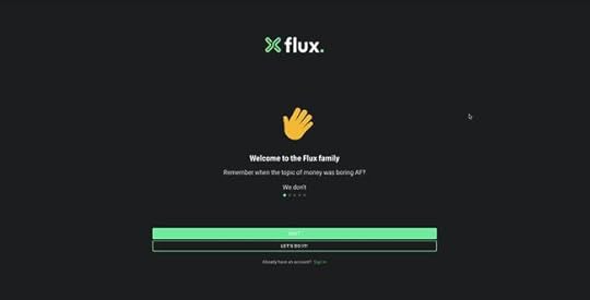
Flux uses a full-screen signup form to onboard new customers. This strategy allows the user to focus on completing a single task without distractions. Even though Flux only requires users to complete three form fields, they break these up into steps, with a separate page for name, email, and password.
Flux also includes a list of requirements below the password field, so users know what length and characters they must use. As they complete each condition, it turns from red to green with a checkmark, so the user knows they have fulfilled it correctly.
3. Leadinfo
The quickest way to get signups is to make it easy, which is precisely what Leadinfo does on its home page signup form. All Leadinfo require to onboard a new customer is an email address. While there is a risk that they might not complete the signup process right away, you have an email address to nurture the lead into a customer.
Leadinfo’s UI design uses typography and color to highlight a problem and how the product can solve it. The clever use of color draws a visitor’s attention to the effortless signup form or the live chat to engage with a sales representative–giving users options and making them feel in control.
4. Cleo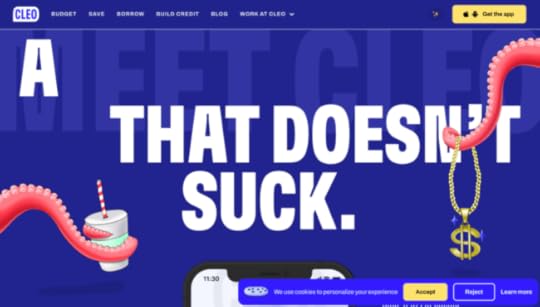
Cleo is an app-based product, so users can only signup via the iOS or Android apps. If a potential customer finds Cleo’s website using a desktop, they need to funnel that customer to download the app.
Cleo makes this easy with a dropdown animation revealing a QR code redirecting users to their preferred app store. They also provide links to Apple’s App Store or Google Play.
While Cleo’s example isn’t a signup page, it’s a great example of creating an immersive, on-brand experience for users to find your product and sign up.
5. Designmodo
Managing users’ expectations and providing context are crucial for good UX design. Designmodo does this well with a three-step signup sequence that displays a progress bar above the form.
Users know what each step requires and approximately how long it will take them to complete the process. Another intelligent strategy about Designmodo’s signup page is to first ask for the user’s email. If the user abandons the signup sequence, they can try to win them back through an email sequence.
6. Salesforce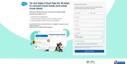
Salesforce is the world’s leading CRM platform with an extensive suite of tools and products. The company requires a lot of information during signup, including company name, email, phone number, to name a few. Still, they offer a 30-day trial in return–with no credit card or obligation.
Salesforce uses compelling copy to highlight the product’s primary benefits and remind customers that they’re getting 30 days free. The CTA button even says START MY FREE TRIAL, so users know there is a reward for completing Salesforce’s lengthy form.
If you’re asking customers for a lot of information during signup, use value to incentivize the process. Most free trials last 7 to 14 days, so by offering 30 days, Salesforce creates a lot of value. They’re also an established brand with a lot of prestige, so customers are more willing to spend time completing Salesforce’s signup form.
7. Typeform
It’s impossible to have an article about signup pages without mentioning the master of the form, Typeform. Typeform’s immersive and intuitive forms make completing signups, or any form, an enjoyable experience.
Typeform only requires two fields to complete its signup sequence; email and password. The company also offers two social media options, Google and Microsoft. As Typeform is a business product, offering corporate-type social signup options makes more sense than Facebook or Twitter.
Typeform also offers users the opportunity to customize their data privacy with three options to opt in or out of specific communications below the newsletter signup. As this would create a busy signup interface, Typeform uses a dropdown menu to hide these until the user clicks “See options.”
8. Transmetrics
Providing social proof and testimonials on your sign up page is a fantastic way to tell people how the product or service benefits customers. Transmetrics uses a quote from a prominent European customer explaining the company’s excellent customer service and understanding of the logistics industry.
Transmetrics also uses simple language and bullet points to highlight the product’s key benefits. Lastly, the call to action button says “REQUEST A DEMO,” telling the customer exactly why they are filling out this form.
9. Glide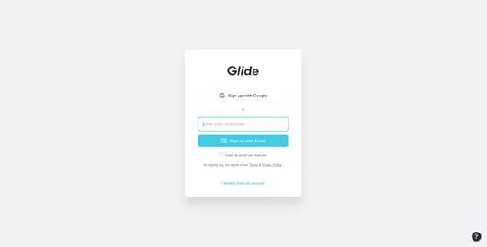
Glide’s email signup form is minimal and effortless. Users can signup using their Google account or email address. The product integrates with Google Sheets, so it makes sense to only offer one social network signup option.
The simple UI design uses a bright blue signup button, immediately drawing users’ attention to the center of the screen. Glide’s signup form can onboard a new customer smoothly and efficiently with two clicks.
10. PayPal
As a financial service, PayPal must collect a lot of personal information during signup. If PayPal had to create a single signup form for its onboarding, it might overwhelm customers, resulting in high dropoffs.
To overcome this problem, PayPal uses a step-by-step process of capturing personal data. The company asks for users’ mobile and email first to follow up if the person drops off.
If you have to collect a lot of information, consider doing it in a step-by-step process and use a progress bar to show customers how many steps they must complete. You should also consider offering the option to save their progress to return later.
Prototyping Signup Pages With UXPinPrototyping forms in traditional vector-based design tools is impossible. These tools don’t offer the functionality to create working inputs users can interact with.
UXPin is a code-based design tool, which means designers can build prototypes that capture and process data like a website or digital product. Designers can create actual signup forms with inputs that check for conditions and provide error messages.
For example, UXPin lets you create email and password validation. If the user forgets the @ or .com in an email input, designers can program an error message for the user to fix the problem. You can also include password conditions, like character count, letters, numbers, and symbols.
Once a user completes signup, you can welcome them with their name on the next page and include their personal information on a profile page. No image-based design tool offers the fidelity or functionality to prototype signup forms like UXPin!
Ready to give signup form prototyping a try? Here’s how in three easy steps:
Sign up for a free UXPin trial.Download our working example of a signup form prototype.Drag and drop the .uxp file into your free UXPin account, and you’re ready to go.Here is a preview of the signup form prototype you can edit and customize in UXPin.
Try UXPin for freeThe post Top 10 Signup Page Examples That Will Make You Want to Redesign Your Own appeared first on Studio by UXPin.


February 7, 2024
Best App Landing Page Examples and Why They Work

An app landing page is a dedicated web page designed to showcase and promote a specific application. Its primary purpose is to provide information about the app, highlight its key features and benefits, and encourage target audience to download and install the app.
App landing pages are an essential part of the marketing strategy for apps, serving as a central point for potential users to learn more about the app and decide to download it.
Are you an app developer? Create a beautiful and interactive app landing page design with UXPin Merge’s drag-and-drop features. Use React components that you can then copy to build a React-based app landing page. Try UXPin Merge for free.
Create beautiful layouts without designersDesign production-ready prototypes 8.6x faster. No pixels. pure code.
Try UXPin Merge .discover-merge { margin: 40px 8px;}.discover-merge__container { display: flex; max-width: 690px; height: 200px; padding: 20px; padding-left: 24px; border-radius: 4px; background-color: black; box-shadow: 10px 10px #9999ff; align-items: center; justify-content: space-between;}.discover-merge__left { width: 50%;}.discover-merge__left p { margin: 10px 0px !important; color: white !important; font-size: 18px !important;}.discover-merge__heading { font-weight: bold !important; color: white !important; font-size: 18px !important;}.discover-merge__text { margin: 0 !important; line-height: 22px !important;}.discover-merge__button { width: 174px; height: 44px; margin: 10px 0px; border: none; border-radius: 2px; background: white; color: black; font-size: 16px; text-align: center;}.discover-merge__button:hover { cursor: pointer;}.discover-merge__image { max-width: 320px !important; height: 200px; margin-right: -19px;}@media (max-width: 760px) { .discover-merge__container { height: auto; margin: 10px; align-items: left; }}@media (max-width: 500px) { .discover-merge__container { flex-direction: column; } .discover-merge__left { width: 100%; align-items: normal; }}What is an app landing page?
An app landing page is a special web page made to show off and promote a specific app. It’s like a virtual brochure that tells you all about the app – what it does, its cool features, and why you should get it. The main goal is to help people decide to download and install the app.
These pages are crucial for marketing mobile apps. They act as a central spot where potential customers can get all the details they need before deciding if they want to download the app to their mobile devices or computers. Essentially, it’s like a one-stop-shop to learn how the app works and make an informed choice.
In simpler terms, an app landing page is like a friendly guide that introduces you to an app, explains what it can do, and invites you to give it a try by downloading it.
Key elements of an app landing page
Most app landing page examples use similar elements. These elements matter because they contribute to a positive user experience and makes the target audience understand what the landing page is for.
Standard UI elements are commonly used across various websites and apps. When users encounter familiar elements, they feel more comfortable and can quickly grasp how to interact with the content.
Certain UI elements have become industry standards. For example, having a prominent and clear CTA button aligns with users’ expectations. Meeting these expectations helps target audience find what they’re looking for without unnecessary confusion.
What are they? Let’s explore key elements of app landing pages in layman’s terms.
App logo: Placing the logo in the top left corner of the landing page is a common and effective practice. This aligns with the standard layout of many websites.Hero image or video in the header: Eye-catching visuals at the top of the page help to introduce the app and draw the users in to scroll down for more information.App description text: A concise and compelling overview of the app, including its value proposition, main functionalities, and high-converting benefits.Feature highlights: Sections showcasing the key app features and functionalities of the app, often presented with screenshots of the app or icons to enhance scannability of text and boost messaging.Call-to-Action (CTA) buttons: Prominent buttons encouraging users to download the app with a download link or take specific actions.User testimonials: User reviews or any other form of social proof that describe typical use cases and opionions. Believe it or not, testimonials truly boost your conversion goals. Sometimes a great social proof is just showing the number of app downloads.Social media integration: Links or feeds to the app’s social media profiles to encourage visitors to follow for updates and engage with the app community.Compatibility information: Information about the platforms and devices supported by the app, such as iOS, Android, smartphones, tablets, etc.Contact or support information: Providing ways for users to get in touch with the app’s developers or support team for inquiries or assistance.By incorporating these elements, app landing pages create a user-friendly environment that aligns with user expectations, enhances usability, and encourages visitors to engage with the content and ultimately get the app.
Best app landing page examplesWe prepared a list of high-converting landing pages for mobile apps that you can find at Google Play Store, Apple App Store, or web apps sold by popular SaaS companies. Let’s analyze what makes those landing pages effective.
Headspace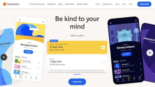
Headspace is a meditation app and a great mobile app landing page example. It has a logo in the top-left corner, colorful app screenshots, and a value proposition as a H1. Its CTA button and pricing tiers are above the fold which definitely impacts conversion rates. What is above the fold? It is any content that is immediately visible on a webpage without requiring the user to scroll down.
What’s in it for you?Don’t fear bold colors — Minimalist design is still on trend, but it doesn’t mean that your website should be black and white. Experiment with colors to make your site a delightful user experience.Test if pricing is something that converts —SaaS websites usually highlight pricing on a dedicated landing page, but why not to try it above the fold. Run an a/b test to see if it works for your target audience.Give users a sample of what they can expect — A couple of scrolls down and you can actually hear the recording of one of the meditations. It’s a great hook that draws people in.MonopolyGo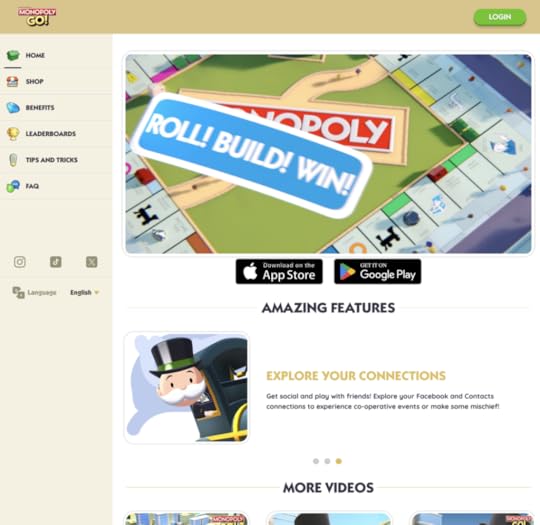
MonopolyGo is one of the best selling mobile apps. It’s landing page is simple and to the point. Even though it’s downloaded by millions of people, the landing page creators decided to feature only three testimonials. It seems that it’s not a lot, but each review has a candid photo of a smiling person and a high energy description. Way to go, isn’t it?
What’s in it for you?Boost excitement with an energetic animation — No header? It’s not necessary! Most people know what Monopoly is, but they don’t know how fun it is to play it. Encourage more interest with a high-energy animation of your product.Put links to social media — If social media marketing is important to you and your potential customers, feature the links to it in a visible spot. Notice that for MonopolyGo, it’s not the footer, it’s a left-hand side of their site.Chat option in the right corner —Give your target audience a possibility to reach out to your customer service. This way you’ll know what issues they have and what they expected to get from your site. Feedback matters!WhatsApp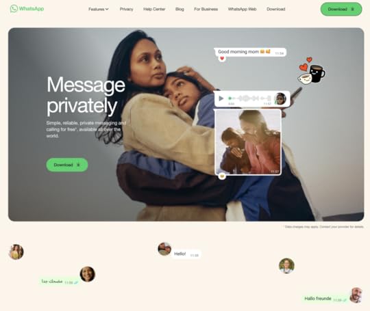
WhatsApp is a great example of website design that sells. It pairs great copy with heart-warming visuals to make you click the “Download” CTA. This is why aside from great UI design, you need to work with a copywriter who knows how to compose a high-converting copy.
What’s in it for you?Focus on your value proposition —WhatsApp differentiates itself from other communicators by telling their potential customers that they’re a secure app. What is your value proposition and why should it be important to your users?Use negative space to make copy sink in — WhatsApp makes a great use of whitespace and we think it’s because they want to make the text and visuals stand out. Let your copy breathe, so it can create the impact that you want.Doodles —Headspace used bold colors, MonopolyGo video, and WhatsApp uses doodles to make their landing page more unique.Vinted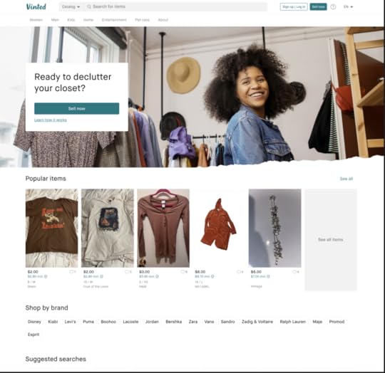
Vinted is a platform for selling and buying clothes from people. It took ecommerce space by storm. It works on a premise that when you’re using the platform you are giving clothes a new life, and it plays well with a sustainability trend so popular in 2024.
What’s in it for you?Candid photos — it uses photos from the platform on its landing page. Be careful with this one, because you need user consent to do it.Navigation with categories —Vinted is in ecommerce category and it features navigation to communicate what you can expect from the platform.Search bar — what happens when you type in what you’re looking for and click search? You get search results, and from this point you are one step away from buying an item and becoming a user. Since items are indexed, it boosts Vinted’s SEO rankings.Create an app landing page design with UXPin MergeYou are one step away from creating a high-converting app landing page? Use our tips and log in to UXPin in order to use your knowledge in practice. Design a beautiful layout of your app landing page. Soon you’ll find optimized landing page templates in our app.
And if you are new to our site, we’re creating UXPin Merge, a drag-and-drop UI builder that helps non-designers assemble landing pages, apps, websites, and more 10x faster. Try UXPin Merge.
Discover MergeThe post Best App Landing Page Examples and Why They Work appeared first on Studio by UXPin.
February 1, 2024
Web-Based Application Development – Do’s and Don’ts
Web-based application development is the process of creating software applications that are accessed and run through a web browser. These applications can be designed to work on various devices and operating systems. Web-based app development process typically involves using technologies such as HTML, CSS, and JavaScript, along with frameworks and libraries, to build interactive and dynamic experiences.
Build interactive web application prototypes and wireframes with a drag-and-drop UI builder. Use fully coded React components and move them around to create beautiful and interactive layout of your app. You don’t need a designer to design anymore. Try UXPin Merge.
Create beautiful layouts without designersTake UI components directly from Git repo, Storybook, or through NPM and design production-ready prototypes.
Bring code to design .discover-merge { margin: 40px 8px;}.discover-merge__container { display: flex; max-width: 690px; height: 200px; padding: 20px; padding-left: 24px; border-radius: 4px; background-color: black; box-shadow: 10px 10px #9999ff; align-items: center; justify-content: space-between;}.discover-merge__left { width: 50%;}.discover-merge__left p { margin: 10px 0px !important; color: white !important; font-size: 18px !important;}.discover-merge__heading { font-weight: bold !important; color: white !important; font-size: 18px !important;}.discover-merge__text { margin: 0 !important; line-height: 22px !important;}.discover-merge__button { width: 174px; height: 44px; margin: 10px 0px; border: none; border-radius: 2px; background: white; color: black; font-size: 16px; text-align: center;}.discover-merge__button:hover { cursor: pointer;}.discover-merge__image { max-width: 320px !important; height: 200px; margin-right: -19px;}@media (max-width: 760px) { .discover-merge__container { height: auto; margin: 10px; align-items: left; }}@media (max-width: 500px) { .discover-merge__container { flex-direction: column; } .discover-merge__left { width: 100%; align-items: normal; }}What is web-based application development?Web-based app development is the software development process of creating applications that users can access and interact with through a web browser. Unlike traditional desktop or mobile applications, which are installed on a user’s device, web-based apps are hosted on servers and need the Internet connection to run.
When working on web-based app development, programmers primarily use a combination of web technologies. HTML defines the structure of your content, CSS handles the presentation and layout, and JavaScript brings interactivity to the application. These technologies form the backbone of what’s commonly known as the frontend.
For the backend development, programmers likely use server-side programming languages such as Node.js, Python, Ruby on rails, or PHP, coupled with databases like MySQL, PostgreSQL, or other SQL database. The backend is responsible for processing requests from the frontend, managing data, and performing any necessary business logic.
Types of web applicationsThere are several types of web applications. We explored them in our previous article about making a web app from scratch. What you need to know is that you can encounter:
Single-page applications: Web-based applications that load a single HTML page and dynamically update the content as the user interacts with the app.Multi-page applications: Web applications that consist of multiple HTML pages, with each page representing a distinct view or functionality, requiring full page reloads when navigating between them.Progressive web applications: Progressive web apps (PWAs) provide a native app-like experience, offering features such as offline access, push notifications, and responsive design while being accessible directly through web browsers.You also have static and dynamic web applications. To explore them, read our article about creating a web app.
What is a web application development process?
Web application development process is a systematic approach to creating web apps. It comprises multiple steps that result in building a user-friendly web app. The process is similar to creating a mobile app: it has a design stage with a few iterations, development stage, and testing phase.
Whenever, design and developmenet teams want to add a new feature, they follow the same workflow as if they were building a new web app. They design a feature, iterate on it, and develop it. The same process gets replicated for web development for mobile devices.
The Do’s of web app development
We’re creating a web app. It means that we need to follow a couple of principles regarding app user experience and user interface design as well as software development. We recommend you stick to those do’s.
Follow responsive design best practicesResponsive design is an approach to web app development that ensures a web application’s user interface and layout adapt seamlessly to different screen sizes, resolutions, and device types. The primary goal is to provide an optimal viewing and interaction experience for end users.
Since your users can access your web through a wide range of devices, from desktop computers and laptops to tablets and mobile devices, you need to take care of responsive user interface design.
Some tips about responsive user interface design include:
Start with a Mobile-First Approach: Begin your design process by focusing on the smallest screens first, typically mobile devices. This approach ensures that your core content and functionality are prioritized for smaller screens and then progressively enhanced for larger ones.Use Fluid Grids and Flexible Layouts: Implement fluid grid systems and flexible layouts using relative units like percentages and ems instead of fixed units like pixels. This allows your web content to adapt proportionally to the screen size, ensuring a consistent user experience across devices.Use Media Queries for Breakpoints: Use media queries to set breakpoints at which your design will change to accommodate different screen sizes. Adjust your layout, font sizes, and other styles based on these breakpoints to provide an optimized experience for various devices.Test Across Multiple Devices: Regularly test your responsive web design across a variety of devices and browsers. Emulators and browser developer tools can help, but real-world testing on actual devices is crucial to identify and address specific issues that may arise on different platforms.Prioritize Content: Prioritize and organize content based on its importance and relevance to users. Ensure that critical content is accessible and prominent, especially on smaller screens where space is limited.Typography Adjustments: Adjust font sizes and line heights to ensure readability on different devices. Consider using relative units for font sizes to ensure that text scales appropriately across various screen sizes.Consider Touch and Gesture Inputs: Design with touch and gesture interactions in mind, especially for mobile devices. Ensure that buttons and interactive elements are appropriately sized and spaced to accommodate touch input.Accessibility Considerations: Pay attention to accessibility standards. Ensure that your responsive design accommodates users with disabilities and provides a seamless experience for everyone, regardless of their abilities or the devices they use.Performance Optimization: Optimize your website’s performance by minimizing unnecessary assets and reducing the overall page load time. Consider lazy loading images, minimizing HTTP requests, and leveraging browser caching to enhance the user experience.Want to build an app wireframe that is responsive from the start? Follow our guide on how to do that with UXPin Merge and MUI components: How to Build a Responsive Dashboard?
Adhere to coding standardsCoding standards are a set of guidelines and conventions that developers adhere to when writing code. Coding standards act as a common language, ensuring that all team members write code in a similar manner. This consistency fosters better communication, minimizes misunderstandings, and allows developers to seamlessly switch between different parts of the codebase.
Additionally, when coding standards are followed, it becomes simpler for software developers to identify and fix issues. Debugging becomes a more straightforward process because the code is structured in a predictable way, making it easier to trace the flow of execution and locate potential problems.
Coding standards cover various aspects of coding, including naming conventions, indentation, formatting, and best practices.
Optimize images and mediaOptimizing images is crucial for web-based apps because it directly impacts the app’s performance, user experience, and overall loading speed. Large or poorly optimized images can significantly increase page load times, leading to slower user interactions and potentially driving visitors away from a web page or application. Here are some ways to achieve optimized images and media:
Compression: Use image compression techniques to reduce the file size without compromising image quality excessively. Tools like ImageOptim, TinyPNG, or online services like Squoosh can help in compressing images effectively.Resize Images: Ensure that images are resized to the appropriate dimensions for their display on the web app. If an image is larger than needed, resizing it can significantly reduce its file size. Use tools like Photoshop, GIMP, or online platforms to adjust dimensions.Choose the Right File Format: Select the appropriate file format for each image. For photographs, JPEG is often suitable, while PNG is ideal for images with transparency. SVG is a good choice for simple graphics and icons. Each format has its compression and quality considerations.Lazy Loading: Implement lazy loading for images, especially for those that are not initially visible on the user’s screen. Lazy loading ensures that images are loaded only when they come into the user’s viewport, reducing the initial page load time.Responsive Images: Use responsive images that adapt to different screen sizes. This prevents unnecessary loading of large images on smaller screens and ensures a better user experience on various devices.Content Delivery Network (CDN): Utilize a Content Delivery Network to distribute images across servers geographically. CDNs reduce latency by serving images from servers closer to the user, further improving loading times.Leverage caching strategicallyCaching is a technique used in web development to store and reuse certain data or resources, reducing the need to repeatedly request and retrieve them from the original source.
It improves the performance and user experience of web applications by minimizing the time and resources required to load and display content. Caching is particularly beneficial for frequently accessed or static data.
Use browser caching, server-side caching, and content delivery networks (CDNs) to reduce the load on servers and improve the overall speed of your web-based application.
Engage in Continuous Integration and Deployment (CI/CD)CI/CD stands for Continuous Integration and Continuous Delivery, and it represents a set of modern software development practices aimed at improving the development and delivery process.
Continuous Integration is about automating the deployment process of software to staging or production environments. Continuous Delivery focuses on automating the deployment process of software to staging or production environments.
So, set up a CI/CD pipeline to automate the testing, building, and deployment processes. Continuous integration ensures that changes are merged seamlessly, and continuous deployment allows for faster and more reliable updates to your web application.
CI/CD is crucial for web-based apps because it enhances the speed, reliability, and collaboration aspects of the development and deployment process, ultimately leading to a more efficient and competitive development lifecycle.
The Dont’s of web app development
There are a few no-no’s when it comes to web-based apps. Here are key things that front-end developers and designers need to avoid.
Inconsistent UIUI consistency in web app development refers to maintaining a uniform and cohesive design across the user interface elements, visual elements, and interaction patterns throughout the entire application. It ensures that users encounter a predictable and harmonious experience as they navigate different pages and sections of the web app.
Consistency involves adhering to established design patterns, styling conventions, and interaction behaviors to create a seamless and intuitive user interface. Here are a few dangers of having an inconsistent user interface:
Confusing User Experience: Inconsistencies in the UI can lead to confusion among users. If elements like buttons, navigation menus, or color schemes vary across different pages, users may struggle to understand how to interact with the application, leading to a less intuitive and frustrating experience.Higher Cognitive Load: Users must invest additional cognitive effort to adapt to an inconsistent UI. When design elements behave differently or have varying visual cues, users need to constantly readjust their mental model of the application, resulting in increased cognitive load and potentially hindering their overall experience.Increased Error Rates: Inconsistencies may lead to higher error rates. Users accustomed to a certain interaction pattern may make mistakes when confronted with unexpected changes. This can result in unintended actions, frustration, and a higher likelihood of errors during the use of the web app.If your UI is inconsistent, you need to redesign your app. Now! Check how other companies updated their UI quickly by using a modern component library that’s perfect for the web-based apps.
Poor usabilityUsability encompasses factors such as ease of use, intuitiveness, navigation, and overall user experience. A web app with poor usability often presents challenges that lead to frustration, confusion, and an overall negative user experience.
Identifying poor usability in your web app involves assessing various aspects of user interaction and experience. Here are signs that may indicate your web app’s usability needs improvement:
High exit rates on key pages: If users are frequently exiting your web app on crucial pages, such as checkout or registration pages, it may signal usability issues. Analyze exit rates on important pages to identify potential roadblocks or confusing elements.Frequent support requests: An increased number of support requests or inquiries related to how to use the web app may indicate poor usability. Users should be able to navigate and perform tasks intuitively without the need for extensive guidance.Low task completion rate: Users might encounter difficulties in completing tasks, leading to task abandonment, they may leave forms unfilled, not convert to paid users or they won’t invite friends or coworkers to join them in app.Limited user engagement: A lack of user engagement with key features or functionalities may suggest poor usability. Users might not be discovering or using certain elements, indicating that the design or placement is not intuitive.Not handling users errorsHandling user errors effectively in web applications is crucial for providing a positive user experience and preventing user frustration. Web developers and designers should provide clear and descriptive error messages that convey the nature of the problem and suggest possible solutions.
The text should be written without technical jargon or complex terminology that might confuse users further. Communicate the error in a way that makes sense to the user. Another important thing is the error message placement. Display error messages in proximity to the specific field or area where the error occurred. This helps users quickly identify the problem and understand which part of the form or process needs attention.
Implement real-time validation for user inputs. As users fill out forms, provide instant feedback on whether their input is valid. This proactive approach helps users correct errors before submitting the form.
If you want to create a prototype that can test validation, use UXPin Merge for your web app design. It helps you quickly set up user input validation and test it with real users.
Lack of testing UI before releaseThe development team may forget about testing the UI before they release the first version of the app. Testing the user interface is crucial for identifying and addressing potential issues that end users may encounter.
Testing the UI early in the development process helps detect design flaws or inconsistencies that may have been overlooked during the design phase. Addressing these issues before the release saves time on redesigning app’s user interface.
Gather feedback from potential users through usability testing sessions. Observing how users interact with the UI can provide valuable insights into areas that may need improvement. You can also release a beta version of your web app to collect feedback, monitor user interactions, and identify any unexpected issues before the full release.
Neglecting cross-browser compatibilityNeglecting cross-browser compatibility is a common mistake in web development that can have significant repercussions on a website’s usability, functionality, and overall user experience.
Cross-browser compatibility refers to the ability of a website or web application to function consistently and effectively across different web browsers. Ignoring this aspect can lead to various challenges and user frustrations, as some users will not be able to use your app or they may encounter performance and layout errors.
Always test UI across various browsers (Google Chrome, Firefox, Safari, Edge, etc.) to ensure that your web app looks and functions consistently across different browser environments. This is crucial for avoiding potential issues specific to certain browsers. There are some tools that can help you with that.
Failing to provide documentationDocumentation serves as a crucial resource for understanding the codebase, facilitating collaboration, and ensuring the maintainability of the web app.
Without proper documentation, app maintenance becomes a challenging and time-consuming process. Documented codebase explanations, architectural decisions, and coding conventions help development team members understand the project more efficiently.
Well-documented code provides clarity on the intended behavior, reducing the likelihood of introducing errors during maintenance. Documented codebase guidelines and architectural documentation are also essential for scaling the app without any problems.
Overlooking security measuresNeglecting security can lead to severe consequences, including data breaches, unauthorized access, and compromised user trust. Since the app is based on web, it is susceptible to common cyber attacks such as SQL injection, cross-site scripting (XSS), and cross-site request forgery (CSRF). These attacks can lead to unauthorized access, data manipulation, and session hijacking.
Neglecting security often results in a lack of incident response preparedness. Without a well-defined incident response plan, software developers and security teams may struggle to contain and mitigate the impact of security incidents promptly.
Build an interactive web application prototype with UXPin MergeWe explored do’s and dont’s of web application development. Do you feel inspired to build your own web-based app? If so, try our drag-and-drop UI builder, UXPin Merge and design with React UI components that come from MUI and other open-source libraries to move from design to development 10x faster. Try UXPin Merge.
Discover MergeThe post Web-Based Application Development – Do’s and Don’ts appeared first on Studio by UXPin.
January 31, 2024
GUI Database — Don’t Miss Those Steps When Designing Your Own UI
Web developers or database administrators, working with SQL databases streamline tasks such as querying the database, executing SQL code, generating reports, taking backups, and diagnosing application problems related to the database. Building a graphical user interface for your database can make database management easier.
In this article, we explain how you can create a user-friendly database GUI using React components for front-end design. By following our tips, even beginners or non-admin users will find your database intuitive.
Create interactive prototypes of your app GUI. No matter if your creating a web-based, mobile or desktop app, access a full library of essential React.js elements to build GUI with. Build interfaces with a code that you own for utmost security and independence. Try UXPin Merge.
Create beautiful layouts without designersTake UI components directly from Git repo, Storybook, or through NPM and design production-ready prototypes.
Bring code to design .discover-merge { margin: 40px 8px;}.discover-merge__container { display: flex; max-width: 690px; height: 200px; padding: 20px; padding-left: 24px; border-radius: 4px; background-color: black; box-shadow: 10px 10px #9999ff; align-items: center; justify-content: space-between;}.discover-merge__left { width: 50%;}.discover-merge__left p { margin: 10px 0px !important; color: white !important; font-size: 18px !important;}.discover-merge__heading { font-weight: bold !important; color: white !important; font-size: 18px !important;}.discover-merge__text { margin: 0 !important; line-height: 22px !important;}.discover-merge__button { width: 174px; height: 44px; margin: 10px 0px; border: none; border-radius: 2px; background: white; color: black; font-size: 16px; text-align: center;}.discover-merge__button:hover { cursor: pointer;}.discover-merge__image { max-width: 320px !important; height: 200px; margin-right: -19px;}@media (max-width: 760px) { .discover-merge__container { height: auto; margin: 10px; align-items: left; }}@media (max-width: 500px) { .discover-merge__container { flex-direction: column; } .discover-merge__left { width: 100%; align-items: normal; }}What is a Database GUI?Database GUI is a graphical user interface of a database. It helps visualize data and makes database management easy. With it, you don’t need to be skilled at database administration in order to use operate on database, because you have graphical elements such as windows, icons, buttons, and menus to interact with instead of using text-based commands or SQL queries.
If your users are not familiar with command-line interfaces (CLIs) or queries, you can create a database GUI for them to interact with. That’s one of the option. The other one is using database GUI tools.

Popular database management systems, such as MySQL, PostgreSQL, Microsoft SQL Server, MongoDB, Redshift and Oracle, often come with their own GUI tools. Additionally, there are no-code tools that provide an SQL GUI for interacting with multiple database systems. Those tools are DBeaver, Navicat, DbVisualizer. They differ in pricing and functionalities, such as syntax highlighting, debugging, and more.
You can always design your own database GUI with drag-and-drop UI builder like UXPin Merge. Your SQL GUI can take many forms, from a mobile app to a web-based app or even a desktop application. This way you own your code 100% and you can store it on a secure server. Try UXPin Merge.
What Functionalities Database GUIs Have?A typical Database GUI provides a user-friendly environment for tasks. Some of those functionalities include the following:
Data Entry: Users can input, modify, or delete data in the database using forms or input fields.Querying: Users can create and execute queries to retrieve specific information from the database. This can often be done using visual query builders rather than writing SQL code directly.Report Generation: Users can generate and view reports based on the data stored in the database.Dashboard Navigation: Users can navigate through the database structure, explore tables, relationships, and other components visually.Administration: Database administrators (DBAs for short) often use GUIs to manage and monitor the database, including tasks like user management, backup, and recovery.Real-time Performance Monitoring: Users can monitor and analyze database performance. Plus, they can track resource usage, query execution times, and other performance metrics.Cross-Platform Compatibility: Support for different operating systems, such as Windows, macOS, and Linux.These functionalities collectively provide users with a comprehensive set of tools to interact with databases efficiently, making database management more accessible to users with varying levels of technical expertise.
What Do You Need to Remember When Designing Your Own Database GUI?Designing a Database GUI (Graphical User Interface) involves careful consideration of various factors to ensure a user-friendly and efficient experience. Here are key considerations to remember when designing your own database GUI:
Compile a list with requirements
Open a doc file or Miro board and brainstorm what you need from an SQL database. Write down the features in terms of Jobs-to-Be-Done framework. It will help you think from the perspective of using the Database GUI instead of enlisting nice-to-have features.
If you haven’t heard about this before, Jobs-to-Be-Done focuses on understanding the practical tasks or problems that we are trying to solve with a product. It takes a form of a statement, “When [situation/context], I want to [functional job], so that I can [desired outcome].”
In the case of SQL development, you may write down a following JTBD statement, “When I’m in an SQL editor, I want to check syntax and code completion, so that I can write accurate and efficient database queries without errors.”
This framework was popularized by Harvard Business School professor Clayton Christensen and his colleagues. But there are other tools that will help you come up with a list of requirements like a design sprint, design thinking workshop or interviewing the users.
Check out our article on CRUD apps to get inspiration for more JTBD statements.
Experiment with layout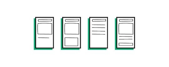
The list is done, so it’s high time you explore UI of your database GUI. You can use UXPin Merge for that. UXPin comes with a pre-built React components that you can drag and drop to find the perfect layout of your elements.
Visual exploration will help you understand what functionalities you need to highlight (a dashboard with columns and rows), which one don’t need to take a center page (admin stuff), and how many pages your database project requires.
With UXPin Merge, you’re not limited to an existing solution for integrating your data sources. You can build a UI and handle the backend later. Open-source, low-code platforms would speed up your app building workflow, yet UXPin Merge will help you create a fully customizable solution that you can scale in any way you want.
Read more about designing in UXPin in our walkthrough on “How to build a responsive data table.”
Follow design principlesDesign principles are fundamental guidelines that inform the intentional creation and organization of elements within a system or product.
They serve as a set of rules or best practices that guide the decision-making process during the design phase, ensuring a thoughtful and purposeful approach to solving problems and achieving specific goals.
Consistency: Maintain a consistent design language throughout the interface to provide a cohesive and predictable user experience. It relates to typography, color scheme, imagery, but also UX copy, and components.Simplicity: In the world of design, less is more. It makes sense to have more pages than to pack tight your UI with features that users don’t need at this point. JTBD framework will help you decide on the information architecture of your site.Clarity and Readability: Use clear and concise labels for buttons, fields, and menu items., choose legible fonts and appropriate font sizes and ensure proper contrast for readability.Error handling: Implement mechanisms to prevent errors when possible and provide informative error messages with guidance when errors occur.Efficiency: This is more of a UX thing than UI, but pay attention to task efficiency. Optimize workflows to reduce the number of steps required to perform common tasks. Consider providing shortcuts and quick access to frequently used features.Responsive design
A responsive design allows users to access and interact with the database GUI seamlessly across various devices, including desktops, laptops, tablets, and smartphones. This adaptability enhances accessibility and accommodates diverse user preferences.
Users may need to manage databases or perform queries while on the go or from different devices. A responsive design ensures a consistent and user-friendly experience regardless of the device being used, improving overall usability.
A responsive GUI adapts its layout and functionality based on the screen size, providing an optimal user experience. This adaptation prevents issues such as awkward scrolling, distorted layouts, or elements being cut off, which can occur on non-responsive interfaces.
Consider scalability
Your data sources and formats will evolve, and so does your app. Think about the future and design your GUI in a way that it can handle large datasets and complex queries gracefully, ensuring optimal performance as the database grows.
The same goes with adding more features. It’s better to start with a Minimum Viable Product and work your way to a more complex solution than fall prey of a feature creep.
Rethink collaboration
Design welcomes feedback, and so should you. You may may have biases or overlook certain aspects of a project. Feedback from other people helps identify blind spots, allowing you to address issues you might not have considered.
You’re not the only person who will use your database GUI, so show your design to others. Check if they can understand the interface that you are designing and ask them for feedback.
Feedback acts as a quality control mechanism. By collecting feedback, designers can catch errors, inconsistencies, or usability issues that may have been overlooked during the design process, contributing to a more polished and refined final product.
Test with usersTesting your database GUI prototype with users is a critical step that offers numerous benefits and contributes to the overall success of your product. Here’s a compelling argument for why you should conduct user testing:
Feedback on Design Choices: Users can provide valuable feedback on specific design elements, layout, and features. This feedback helps you understand which aspects are working well and where improvements can be made, guiding further design iterations.Early Detection of Issues: User testing enables the early detection of potential issues before the product is launched. Addressing problems in the prototype phase is more cost-effective than making changes post-launch, saving time and resources.Optimization of Workflows: Understanding how users navigate through your GUI allows you to optimize workflows and streamline tasks. This can lead to increased efficiency and productivity for users interacting with the database.There are a couple of ways you can test your prototype. We recommend you read about task analysis that you can easily perform once you build a UXPin Merge prototype.
Refine your designAnalyze the results of usability testing. Identify areas where users experienced improvements, as well as any unexpected issues or challenges. Based on the feedback received, refine the design further. Iterate on the changes, addressing any remaining issues or incorporating additional improvements suggested by users.
Don’t forget to document the design changes systematically. Create updated design documentation, including wireframes, user flows, and any revised specifications. This documentation serves as a reference for developers and other stakeholders.
Build a prototype of your database GUIIn this blog post, we explored the essentials of designing a Database GUI for efficient database management. Starting with the benefits for developers and administrators, we highlighted the user-friendly approach using React components and tools like UXPin Merge for interactive prototypes. The Database GUI, a graphical interface, simplifies tasks such as data entry, querying, and administration, catering to users with diverse technical backgrounds.
We delved into popular database management systems and GUI tools, emphasizing the option of designing a personalized GUI with UXPin Merge for complete control and security. If you want to design a database GUI with UXPin Merge, try it for free.
Discover MergeThe post GUI Database — Don’t Miss Those Steps When Designing Your Own UI appeared first on Studio by UXPin.
January 25, 2024
The Ultimate Guide to Prototype Testing

We asked UXTweak to write for you about prototype testing. The following article is a guest post by Daria Krasovskaya, their Head of Content and Designer. Enjoy!
If you have just finished your design prototype and you are looking for ways to validate your design look no further. In this article, we have collated everything you need to know about prototype testing including best practices to take on board when implementing it.
Prototype testing is an excellent way to test a design and to ensure that it meets the needs of the user while serving the goals of the business. Prototype testing is a quintessential user research methodology that can massively help UX teams make data-informed decisions and create user-centered products.
What is a prototype?
A prototype is a tangible representation of a product that is constructed to validate design concepts and processes, enabling refinement before the product goes to full-scale production. Based on the unique needs of the product and the stage of the product lifecycle different types of prototypes can be deployed:
High-Fidelity Prototypes : These are detailed models that can imitate the final product. This type of prototype is used later down in the product development process to refine the usability of the product.Low-Fidelity Prototypes: These are simple models that are used early on in the product lifecycle to test and validate the design concepts that the product will be built upon.Wireframe or Paper Prototypes: These are very basic representations outlining the structure and layout of the product and can take the form of either wireframes or hand-drawn paper prototypesWhat is prototype testing?

Prototype testing is a UX methodology that involves the evaluation of a prototype to validate a design or identify areas for improvements before the product advances to full-scale production.
Prototype testing occurs in a critical phase and can help UX professionals ensure that the product aligns with the needs as well as expectations of its users. Depending on the type of prototype, the test can assess general user experience, functionality, usability as well as the overall aesthetics of the product in question.
Why Is It Important to Test a Product Prototype?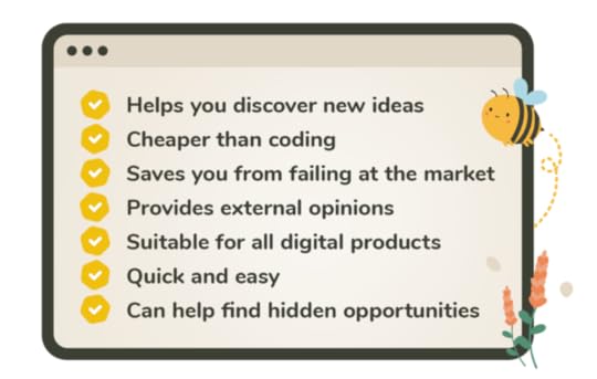
Engaging in prototype testing can have a host of advantages for the development of a product as it is an unmissable opportunity to see the product through the eyes of its intended users. This adds a unique value to the whole design process and the development of the end product.
Here are the main benefits of conducting prototype testing:
Iterative ImprovementPrototype testing is the epitome of the continuous improvement mindset in UX design. Prototype testing allows UX professionals to identify potential areas for improvement when it comes to the usability, functionality, and aesthetics of a product aiding in this way in the incremental rectification of any flaws. UX is an iterative process and so is prototype testing!
Cost and Time SavingsCreating prototypes and testing those early on in the UX process is an excellent way to save money, time, and resources. Prototype testing allows for cost-effective and time-efficient tweaks in the product before this goes into production, saving product professionals from expensive redesigns and reworks.
Stakeholder CommunicationAs mentioned earlier prototypes are tangible representations of a product. Hence, those can act as great tools to ensure that teams are on the same page when it comes to the development of the product.
On top of that, prototype testing offers an unmissable opportunity to gather feedback from internal stakeholders as well as ensure that the product still serves the strategic goals of the business while meeting user needs.
Risk MitigationAnother critical benefit of prototype testing is that it serves as a risk mitigation mechanism. With prototype testing, UX professionals can identify and address risks and challenges early in the development process boosting in this way the chances of the product being adopted by its intended users.
When it comes to prototype testing, mobile prototype testing should not be neglected. According to Unswitch, the global mobile phone market statistics show that as of 2023 there are 4.6 billion smartphone users worldwide.
When Should You Test A Prototype?Prototype testing is an iterative, dynamic process and should not be perceived as a one-off task to be ticked off a list. Thus, the testing of prototypes can and should happen through product development. In those earlier stages, prototype testing can be a great method to validate a concept.
Once the idea has been validated, prototype testing can help you test basic functionalities and ensure that the product is not against the main mental models of its intended users.
At later stages, just before or after the launch, testing of prototypes can help assess overall user experience and continuously pinpoint areas for improvement to meet the constantly changing user needs.
Kinds of Products for Prototype TestingPrototype testing is a versatile tool, hence why it can be applied to a host of products, spanning software applications and platforms. Any digital product entailing some sort of user interface can be tested using a prototype. However, it is worth noting that physical products such as household appliances or even medical devices can also benefit from prototype user testing.
Types of Prototype Tests

There are an array of prototype tests out there each serving distinct purposes when it comes to evaluating a product. Quantitative and qualitative testing are the two most well-known categories. Additionally, prototype testing can be characterized either as moderated or unmoderated depending on the presence of a facilitator.
To better learn and digest the unique nature of those categories we have created two handy tables outlining their main characteristics and differences:
Qualitative vs Qualitative TestingTypeQuantitative TestingQualitative TestingDefinitionCollection and analysis of quantitative data that access metrics and key performance indicators.Collection and analysis of user insights to better understand user behavior.MethodsUsing analytics tools to track user interactions within the prototype.Conducting a usability test to observe and find common themes when it comes to the identification of issues.BenefitsOffers statistical precision and can quantify the user experience by providing objective metrics.Offers a deep understanding of the pain points and motivations that underline user behavior.Moderated vs Unmoderated TestingTypeModerated Prototype TestingUnmoderated Prototype TestingDefinitionInvolving a facilitator that guides users through the testing process.There is no facilitator involved and users interact independently with the prototype.MethodsThink-aloud protocols where users are encouraged to verbalize their thoughts and questions asked by the facilitator are the main methods here.Remote usability testing and automated analytics are the main methods for collecting data within the unmoderated setting.BenefitsOffers opportunities for clarifying or delving deeper into a response.Offers a cost and time-effective approach to prototype testing.How to Conduct Prototype Testing?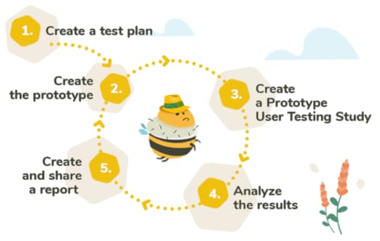
If you are just starting your prototype testing journey, this step-by-step guide can help you conduct effective software prototype testing and make data-informed decisions toward more user-centric products.
1. Plan Your Prototype TestStart by setting clear objectives for your test. For example, you might want to focus on usability or maybe user satisfaction. Once your goals are all set it is time to choose the type of prototype testing that best suits the needs of the project. Begin by creating testing scenarios that align with the goals of your study. Use your user personas to define your audience and recruit your test participants.
2. Choose a Prototype Testing ToolSelecting the right prototype testing tool can make or break your prototype testing efforts. Choose the appropriate tool based on the unique requirements of your testing but also on the ease of integration with your prototyping tool.
3. Run the TestRun the prototype sessions and try to capture both qualitative and quantitative data. Do not forget to take thorough notes and create reports so that you don’t miss a beat!
4. Analyze ResultsNext up is analyzing the results. Identify patterns and take into consideration both your qualitative and quantitative data before drawing any conclusions. Prioritizing the issues that you identify based on their severity or impact.
5. Iterate & RepeatNow it is time to translate the findings into actionable recommendations for the design team. Implement the changes on the prototype and make sure to add additional rounds of testing to validate the positive effect of the improvements made. Continue to refine and test until you are happy with the final product.
Best Prototype Testing ToolsHere is our top pick when it comes to the prototype testing tools that are currently in the market:
1. UXtweak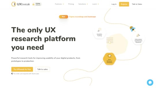
Featuring a seamless integration with the major prototyping tools like UXtweak allows for effortless prototype testing. Its easy-to-use interface makes UXtweak accessible to professionals of all levels while its dedicated support team offers specialist guidance throughout. Last but not least, UXtweak’s platform boasts a user panel for recruitment that can massively streamline your prototype testing studies.
2. Lookback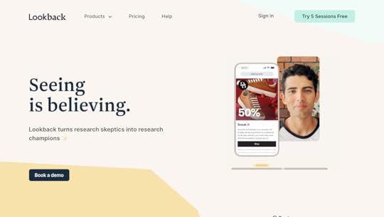
Lookback is another robust tool that enables prototype testing. It boasts a live remote testing tool that allows UX researchers and designers to interact with participants in real-time while its collaboration features foster collaboration among team members.
3. Userlytics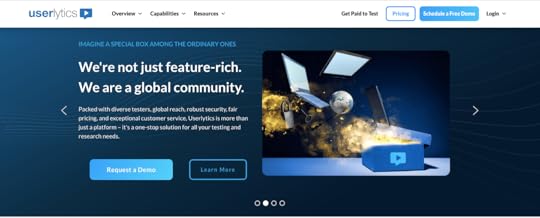
Userlytics is a comprehensive UX analytics tool that features a remote prototype testing tool. It also boasts a nicely done multimedia feedback tool that allows the participants of the prototype testing to give feedback in different forms such as written notes and audio as well as video.
4. Optimizely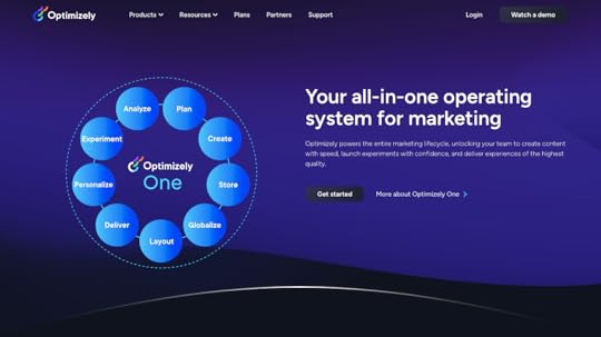
Optimizely is another great experimentation platform that allows for prototype testing. Boasting tools like A/B testing and remote session recording, this platform offers data-driven insights and personalization features that can up your prototype testing game.
Tip: You can also test the prototype inside of UXPin with our FullStory integration. Nevertheless, we encourage you to give our friends at UXtweak a shot. Try UXtweak for free.
How to Recruit for Prototype TestingRecruiting participants for prototype testing is a quintessential step in every prototype testing study. The validity of the insights is highly dependent on recruiting quality, and diversified participants who are representative of the target demographic. To achieve this make sure to define the specific characteristics of the targeted population and consult your user personas before you engage in participant recruitment.
Another great tip is to use specific screening questions to ensure that the participants are representative of the demographics you are targeting. Once this is done, do not pigeonhole yourself into recruiting participants solely from one channel.
Instead, use an array of recruitment channels such as social media or relevant online communities to attract diversified participants that will offer richer insights into your study.
Always remember that thoughtful participant recruitment can yield quality and actionable results contributing to a more user-centric product.
Best Practices for Prototype TestingIf you are looking to start your prototype testing journey, here are a few golden rules to keep in mind:
Combine Quantitative and Qualitative DataIntegrating both qualitative and quantitative methodologies into your prototype testing studies can go a long way. While numerical stats can help you quantify user behavior, qualitative insights can reveal the ‘why’ behind user behavior. This allows for a more rounded understanding of the intrinsic motivations and needs of the user and results in a more user-centric design process.
Include Realistic ScenariosWhen conducting prototype testing it is easy to get carried away and jump pack the sessions with multiple scenarios and edge cases. Stay on track by crafting realistic tasks for the participants. Using real-world tasks will help participants to engage with the prototype in a more realistic way making the insights more actionable.
Diversify Test ParticipantsThis is one to treasure! As mentioned earlier, participant recruitment is the alpha and the omega of every prototype testing study. Always aim for diversity in your test participants as this will provide broader insights into needs and expectations and will give you a more comprehensive understanding of your target users.
Ensure Consistency Across TestsLast but not least, always ensure consistency across the different prototype testing sessions.
Consistency ensures that the insights gained from your prototype testing sessions are reliable and most importantly comparable.
Common Mistakes to Avoid When Testing PrototypesHere are some common pitfalls to avoid when testing prototypes:
Neglecting Accessibility ConsiderationsTempting as it might be, do not fail to take into consideration accessibility in your prototype testing sessions. Failing to do so can result in designs that are not inclusive and that overlook basic user needs.
Ignoring Mobile TestingMobile users are on the rise so do not ignore mobile prototype testing. Always test the mobile experience and never assume that the desktop performance can be a good indicator of the user experience on mobile devices.
Failure to Document InsightsYes, you’ve read this right! Failing to document insights is one of the major pitfalls when it comes to prototype testing. Do not neglect to thoroughly document and take quality notes from each prototype testing session to avoid losing valuable insights or jumping to conclusions.
The gist of itPrototype testing plays a crucial role in aligning the design with both the needs of the users and those of the business. This is one of the top user research methodologies that are worth integrating into your UX design process as it can hugely help UX teams build more user-centric products. To get the full out of your prototype testing, adopt an iterative approach towards prototype testing and never treat it as a one-off task to be crossed off your list.
Build interactive prototypes with UXPin, an all-in-one design tool that covers the entire design process, from ideation to design handoff. Try UXPin for free.
Try UXPin for freeThe post The Ultimate Guide to Prototype Testing appeared first on Studio by UXPin.
January 24, 2024
How to Make a Web App from Scratch

Web apps are software applications that run on web browsers. As with mobile apps, users access web applications to perform tasks, access information, and communicate with others. Creating a web app may seem like a daunting task. This guide will help you get a grasp of what you need to create your own web application.
Design a web experiences that your users love. Use UXPin Merge to design a user interface of your web application and quickly translate it into code. Without designers. Discover UXPin Merge.
Create beautiful layouts without designersTake UI components directly from Git repo, Storybook, or through NPM and design production-ready prototypes.
Bring code to design .discover-merge { margin: 40px 8px;}.discover-merge__container { display: flex; max-width: 690px; height: 200px; padding: 20px; padding-left: 24px; border-radius: 4px; background-color: black; box-shadow: 10px 10px #9999ff; align-items: center; justify-content: space-between;}.discover-merge__left { width: 50%;}.discover-merge__left p { margin: 10px 0px !important; color: white !important; font-size: 18px !important;}.discover-merge__heading { font-weight: bold !important; color: white !important; font-size: 18px !important;}.discover-merge__text { margin: 0 !important; line-height: 22px !important;}.discover-merge__button { width: 174px; height: 44px; margin: 10px 0px; border: none; border-radius: 2px; background: white; color: black; font-size: 16px; text-align: center;}.discover-merge__button:hover { cursor: pointer;}.discover-merge__image { max-width: 320px !important; height: 200px; margin-right: -19px;}@media (max-width: 760px) { .discover-merge__container { height: auto; margin: 10px; align-items: left; }}@media (max-width: 500px) { .discover-merge__container { flex-direction: column; } .discover-merge__left { width: 100%; align-items: normal; }}What is a Web App?A web application is a type of software program designed to operate within a web browser. Unlike traditional desktop applications, which are launched by your operating system, web apps must be accessed through a web browser. They typically rely on a combination of web technologies, such as HTML, CSS, and JavaScript, to provide a user interface and deliver functionality to users.
Web apps have at least three advantages.
cross-platform compatibility — they can run on different devices and operating systems;automatic updates — users don’t need to install updates manually since they access the latest version through the web;easy access — users can access the app from any device with an internet connection.What are the Types of Web Applications?
There are various types of web applications, which can be categorized based on their structure. One classification is between single-page applications (SPAs) and multi-page applications (MPAs). Additionally, web applications can be distinguished by their behavior and defined as static apps, dynamic apps, and Progressive Web Apps (PWAs).
Web applications can exhibit characteristics from both divisions, and the choice depends on the specific requirements and goals of the application. Modern web development often involves a combination of these approaches to provide the best user experience.
Single-page applications vs multi-page applicationsIf you consider a web app architecture, you can divide web applications into single-page and multi-page apps.
Multi-page applications are traditional web applications with multiple pages where each interaction with the server involves reloading the entire page.Single-page applications are a type of web application that loads a single HTML page and dynamically updates the content as the user interacts with the app.Instead of relying on the server to handle navigation, single-page applications often implement client-side routing. This means that navigation and page rendering are handled by JavaScript on the client side, reducing the need for server requests.
In multi-page web applications (MPAs), each distinct page has its own HTML document, and navigation typically involves full-page reloads. When a user clicks on a link or enters a URL, the server sends the corresponding HTML document to the browser, resulting in a complete page refresh.
Static vs dynamic vs PWAAnother categorization of web applications comprises static, dynamic, and web apps.
Static web applications — websites that consist of static content and do not involve server-side processing. They are often used for informational purposes.Dynamic web applications – generate content on the server side and often involve server-side processing. They can fetch and update data in real-time.Progressive Web Apps — they combine features of both dynamic and static apps but PWAs provide a dynamic, app-like experience with offline capabilities, smooth interactions, and automatic updates.Both single-page applications and multi-page applications can have static elements. In the context of single-page apps, static content may be loaded initially and then dynamically updated. In multi-page apps, some pages may consist of mostly static content.
Similarly, both single- and multi-page apps can be dynamic. Single-page applications, by design, often involve dynamic content loading and updating. In multi-page apps, dynamic behavior can be implemented within each page or during navigation between pages.
PWAs can be implemented within both single- and multi-page apps. The term “Progressive Web App” refers more to the set of features and capabilities rather than the specific structure. Both single-page and multi-page apps can adopt PWA principles, including offline functionality, fast loading, and app-like experiences.
3 Web App ExamplesExamples of web apps include online email services (e.g., Gmail), social media platforms (e.g., Facebook), productivity tools (e.g., Google Docs), and various other applications that you access through a web browser rather than installing on your device. Here are three examples that are worth highlighting.
Spotify web app
Spotify is a music streaming service that provides users access to a vast library of songs, playlists, and podcasts.
The interface is organized around a left-hand navigation panel, including sections for Home, Search, Your Library, and more. The central area features personalized playlists, recommended music, and current listening activity. Users can search for specific songs or artists, create and manage playlists, and explore curated content.
The playback controls, such as play, pause, skip, and volume, are easily accessible at the bottom, and album artwork is prominently displayed. The overall design emphasizes a visually pleasing and user-friendly experience for music discovery and playback.
Google Drive
Google Drive is a cloud-based storage and collaboration platform.
The interface is clean and intuitive, featuring a left-hand navigation panel for easy access to folders, documents, and shared drives.
The main area displays the file and folder structure, and clicking on an item opens a preview or an editing interface, depending on the file type. The top bar provides options for creating new documents, searching, and managing settings.
Collaborative features are prominently displayed, allowing users to share and comment on files in real-time.
Amazon
Amazon is a widely-used e-commerce platform that offers a diverse range of products, including electronics, books, clothing, and more. The interface is designed for intuitive navigation and efficient shopping.
The homepage typically features personalized recommendations, deals of the day, and quick access to various product categories. A persistent top navigation bar provides links to key sections like Your Account, Lists, and Cart. The search bar is prominently positioned, allowing users to quickly find specific products.
Amazon’s combination of a vast product selection, user-friendly interface, personalization, and additional benefits make it a great web application for online shopping.
What are the basics of web application development?
Before diving into the world of web app development, it is important to understand the basics of web development. Web development involves two main components: front-end and back-end development.
Front-end developmentFront-end development focuses on creating the user interface and user experience of a web app. It involves HTML, CSS, and JavaScript, which are the building blocks of web design. HTML provides the structure, CSS enhances the visual appeal, and JavaScript adds interactivity to the web app.
Back-end developmentOn the other hand, back-end development deals with the server-side of the web app. It involves programming languages such as Python, Ruby, or PHP, and databases like MySQL or MongoDB. The back-end handles the logic and functionality of the web app, ensuring that data is processed and stored securely.
How to make a web app, step by stepResearch your web app ideaBegin your project by making extensive research about target market, technology stack, and existing solutions. Define your goals, target audience, and desired features (read about: desirability, feasibility, and viability in design.) Conduct market research to identify any existing competitors and analyze their strengths and weaknesses by doing SWOT analysis.
It’s tempting to create a replica of existing web app. Nevertheless, it never ends well. You need to find a unique value for your market and differentiate your web app from the competition. This is usually achieved through making either a more complex or simpler product. Ben Evans has great presentations about that.
Plan your web app projectEffective planning is the foundation of a successful web app development process. Before starting any design or software development work, it is crucial to plan your workflow. Create a roadmap and allocate resources accordingly. Set realistic deadlines and milestones to keep yourself on track.
Define your Minimum Viable Product (MVP)Instead of building a full-fledged web app right from the start, create an MVP to test if you can find customers for your solution. An MVP, or Minimum Viable Product, is a stripped-down version of a product that focuses on delivering the core features to users quickly. It’s an agile and iterative approach to software development, loved mostly by bootstrapped startups.
To define your MVP’s scope, there are at least three more tasks to do:
Define core problem – based on your research, articulate the main problem your web app is solving for users. Focus on the key pain points that your MVP should address.List Key Features – identify and list the features to build. Prioritize these features based on their importance to the user and the overall functionality of the app.Create User Stories – develop user stories for each feature, describing how users will interact with them. This helps in understanding the user’s perspective and ensures that features align with user needs.Design user interfaceCreate a wireframe or prototype of your web app to visualize the user interface and flow. This will give you a clear idea of how different components will interact with each other.
Here are some key principles to keep in mind while designing the UI of your web app:
Navigation – users should be able to navigate through your web app easily. Avoid cluttered interfaces and prioritize simplicity. Use clear labels, icons, and menus to guide users.Consistency – maintain a consistent design throughout your web app. Use the same color scheme, layout and typography across different pages. This creates a cohesive user experience.Responsiveness – ensure that your web app is responsive and can adapt to different screen sizes. With the increasing use of mobile devices, it is essential to provide a seamless experience across all devices.Feedback and confirmation – provide immediate feedback to user actions. Use visual or auditory cues to confirm that an action has been completed successfully. This helps in reducing user uncertainty and provides a sense of control.Visual hierarchy – use visual cues like size, color, and contrast to prioritize important elements. This helps users to quickly scan and understand the content of your web app.User persona alignment – ensure that your UI design aligns with the preferences and expectations of your target user personas. Understanding your users’ habits and preferences helps in creating a more user-centric design.User onboarding – create a smooth onboarding process for new users. Provide guidance and tutorials to help users understand key features. Balancing simplicity with informative elements is crucial during the onboarding phase.Error handling – design clear and user-friendly error messages. When users encounter errors, provide guidance on how to resolve the issue. Avoid generic error messages and help users understand what went wrong.Whitespace utilization – use whitespace effectively to improve readability and avoid visual clutter. Well-spaced elements create a clean and organized layout, making it easier for users to focus on the essential content.Remember to continuously gather user feedback and make iterative improvements to your UI design. User testing and usability studies can provide valuable insights into how users interact with your web app.
Developing the front-end of your web appOnce you have finalized the UI design, it’s time to start developing the front-end of your web app. As mentioned earlier, front-end development involves HTML, CSS, and JavaScript. As you remember from the content above, HTML provides the foundation of your web app. Use semantic HTML tags to structure the content and define the different sections of your web app.
CSS allows you to style your web app and make it visually appealing, while JavaScript brings life to your web app by adding interactivity and dynamic features like handling user interactions, validating input, and fetching data from the back-end.
Consider using front-end frameworks like React, Angular, or Vue.js to streamline the front-end development process. These frameworks provide pre-built components and libraries that can significantly speed up your development process.
Creating the back-end of your web appOnce the front-end is ready, it’s time to create the back-end of your web app. The back-end handles the server-side logic and communication with databases. Here are the steps to create the back-end of your web app:
Set up a server – set up a server to host your web app. This can be done using cloud platforms like AWS, Google Cloud, or Microsoft Azure. Configure the server to handle incoming requests and route them to the appropriate parts of your web app.Implement the business logic – copy from the design or write the code that handles the core functionality of your web app. This includes processing user input, performing calculations, and interacting with databases.Connect to a database – choose a suitable database for your web app and establish a connection. This allows you to store and retrieve data efficiently. Common choices include SQL databases like MySQL or PostgreSQL, or NoSQL databases like MongoDB or Firebase.Ensure that your back-end is secure by implementing robust authentication and authorization mechanisms. Protect sensitive user data and prevent unauthorized access to your web app.
Testing and debugging your web appTesting and debugging are vital steps in the web app development process. Thoroughly test your web app to ensure that it functions as expected and is free from bugs and errors. Here are some testing techniques to consider:
Unit testing – test each component or module of your web app individually to ensure that they work correctly. Use testing frameworks like Jest or Mocha to automate the testing process.Integration testing – test how different components of your web app interact with each other. Verify that data flows correctly between the front-end and back-end.User acceptance testing – invite a group of users to test your web app and provide feedback. This helps identify usability issues and potential improvements.Debugging is the process of identifying and fixing errors or issues in your web app. Use debugging tools and techniques to trace the source of errors and resolve them. Continuous testing and debugging will ensure that your web app is stable and reliable.
Deploying and launching your web appOnce you are satisfied with the testing and debugging phase, it’s time to deploy and launch your web app. Deploying a web app involves making it accessible to users over the internet. Here are the steps to deploy your web app:
Choose a hosting provider – select a hosting provider that suits your needs and budget. Popular options include AWS, Google Cloud, Heroku, and Netlify.Set up your domain – register a domain name for your web app and configure it to point to your hosting provider. This allows users to access your web app using a memorable URL.Deploy your web app – follow the hosting provider’s instructions to deploy your web app. This usually involves uploading your web app files, configuring server settings, and setting up SSL certificates for secure communication.Monitor and optimize performance – regularly monitor the performance of your web app and optimize it for speed and efficiency. Use tools like Google Analytics to track user behavior and identify any bottlenecks.Maintaining and updating your web appLaunching your web app is just the beginning. To ensure its success, you need to maintain and update it regularly. Here are some key tasks involved in maintaining your web app:
Monitor performance and security – continuously monitor your web app for performance issues and security vulnerabilities. Regularly update software libraries and frameworks to keep your web app secure.Collect user feedback – encourage users to provide feedback on your web app. This can help you identify areas for improvement and prioritize future updates.Fix bugs and issues – address any reported bugs or issues promptly. Regularly release bug fixes and updates to keep your web app running smoothly.Add new features – keep your web app fresh and engaging by adding new features and functionalities. Analyze user behavior and market trends to identify potential enhancements.Make your web appCreating a web app from scratch may seem challenging, but with the right approach and knowledge, anyone can do it. By understanding the basics of web development, planning your project, designing an intuitive UI, developing the front-end and back-end, testing and debugging rigorously, deploying and launching, and maintaining and updating your web app, you can bring your ideas to life.
Remember, the process of making a web app requires continuous learning and improvement. Embrace new technologies, stay updated with industry trends, and never stop experimenting. With dedication and perseverance, you can create a successful web app that fulfills the needs of your target audience.
Start your web app development journey today and bring your ideas to life. Design an interactive prototype 10x faster with UXPin Merge. Read about it here.
Discover MergeThe post How to Make a Web App from Scratch appeared first on Studio by UXPin.
January 18, 2024
What is Operations Automation? [+ Examples to Try]

Operations automation, at its core, entails the strategic incorporation of technology to streamline and optimize various business processes, marking a departure from traditional manual methods.
One of the hottest topics around automation efforts at companies is artificial intelligence. It helps in some areas of process automation, such as software development, identifying inefficiencies, analyzing data, and coming up with templates, but it still needs human intervention.
AI is just one facet of the vast landscape of operations automation. In this article, we delve into the world of automating repetitive tasks, exploring innovative approaches that extend beyond AI services. From ingenious solutions in enterprises to cutting-edge applications elsewhere, we discuss the most common use cases for operations automation.
Build a UI for your operations automation tool 10x faster. Try an easy drag-and-drop design editor that has you using fully coded components. Assemble an interactive prototype without the help of a designer and push it to code in seconds. Discover UXPin Merge.
Create beautiful layouts without designersTake UI components directly from Git repo, Storybook, or through NPM and design production-ready prototypes.
Bring code to design .discover-merge { margin: 40px 8px;}.discover-merge__container { display: flex; max-width: 690px; height: 200px; padding: 20px; padding-left: 24px; border-radius: 4px; background-color: black; box-shadow: 10px 10px #9999ff; align-items: center; justify-content: space-between;}.discover-merge__left { width: 50%;}.discover-merge__left p { margin: 10px 0px !important; color: white !important; font-size: 18px !important;}.discover-merge__heading { font-weight: bold !important; color: white !important; font-size: 18px !important;}.discover-merge__text { margin: 0 !important; line-height: 22px !important;}.discover-merge__button { width: 174px; height: 44px; margin: 10px 0px; border: none; border-radius: 2px; background: white; color: black; font-size: 16px; text-align: center;}.discover-merge__button:hover { cursor: pointer;}.discover-merge__image { max-width: 320px !important; height: 200px; margin-right: -19px;}@media (max-width: 760px) { .discover-merge__container { height: auto; margin: 10px; align-items: left; }}@media (max-width: 500px) { .discover-merge__container { flex-direction: column; } .discover-merge__left { width: 100%; align-items: normal; }}What is operations automation?Operations automation refers to the process of using technology to streamline and optimize various operational tasks within an organization. It involves automating repetitive and time-consuming processes, allowing businesses to increase efficiency, reduce errors, and improve overall productivity.
By leveraging the power of automation, companies can free up valuable resources, spend less time on manual work, and focus on more strategic initiatives.
Why do you need operations automation?
In today’s fast-paced business landscape, organizations are constantly striving to do more with less. With the increasing complexity of operations and the need to handle large volumes of data, manual processes can become a bottleneck. Operations automation can automate routine tasks, enabling employees to focus on more strategic work, and cut down operational costs. By reducing human error and improving accuracy, it can also enhance the quality of outputs.
The benefits of operations automation extend beyond efficiency gains. By automating repetitive tasks, businesses can enhance employee satisfaction by freeing up their time for more meaningful work. With less manual tasks eating up their time, employees have a clear mind to work on their skills and bring new innovative ideas to the table.
Organizations can scale their operations without a linear increase in resources, enabling them to handle growing demands efficiently. Moreover, operations automation provides real-time visibility into workflows, enabling better decision-making and faster response times.
The automation of business processes not only streamlines internal workflow but also plays a pivotal role in enhancing the overall customer experience. By automating repetitive tasks and processes, organizations can improve response times, accuracy, and customer satisfaction.
How can you identify operations to automate?
Identifying the right operations to automate is crucial for a successful automation initiative. Here are some steps to help you identify the most suitable processes for automation:
Evaluate repetitive tasks: Identify tasks that are performed repeatedly and consume a significant amount of time and resources. These tasks are prime candidates for automation as they can free up valuable resources.Assess error-prone processes: Look for processes that are prone to human error. Automating these processes can significantly reduce errors and improve overall accuracy.Consider scalability: Consider processes that are likely to scale with the growth of your business. By automating these processes, you can handle increased volumes efficiently without adding additional resources.Analyze process dependencies: Identify processes that are dependent on other processes or systems. Automating these interdependent processes can streamline the overall workflow and improve coordination.Evaluate ROI potential: Assess the potential return on investment (ROI) of automating a particular process. Look for business processes where automation can lead to significant cost savings or revenue growth.Example 1: Automations in Project ManagementProject management is a critical function for any organization, and automating certain aspects of it can yield substantial benefits. Here are some real-life examples of operations automation in project management:
Task assignment and tracking: Automating the assignment of tasks to team members and tracking their progress can save significant time and effort. By leveraging workflow automation, organizations can ensure efficient resource utilization.Reporting and analytics: Generating project reports and analyzing data manually can be a time-consuming and error-prone process. Automating these tasks can provide real-time insights and keeping up with metrics, enabling better decision-making and timely interventions.Communication and collaboration: Automating communication and collaboration processes can improve project team coordination. Tools like project management software and instant messaging platforms can automate notifications, reminders, and document sharing, ensuring seamless communication and collaboration.See our tutorial of how to build a responsive dashboard in UXPin Merge for examples of UI for this automation.
Example 2: Automations in HelpdeskCustomer support and helpdesk operations can greatly benefit from automation. Here are some examples of how operations automation can transform helpdesk operations:
Ticket management: Automating ticket creation, routing, and escalation can significantly improve response times and customer satisfaction. By leveraging helpdesk automation tools, organizations can ensure that tickets are assigned to the right agent based on predefined criteria, reducing manual intervention.Knowledge base management: Maintaining an up-to-date knowledge base is crucial for efficient customer support and fast client onboarding. Automating the management of the knowledge base, including updating articles and searching for relevant solutions, can save time and improve the accuracy of information provided to customers.Self-service options: Automating self-service options, such as chatbots, can provide instant assistance to customers. These automated systems can handle common queries and provide relevant information, freeing up support agents for more complex issues.Example 3: IT OperationsIT services play a vital role in supporting business operations, and automation can revolutionize IT processes. Here are some examples of operations automation in IT services:
Incident management: Automating incident management processes can improve response times and minimize downtime. By leveraging IT service management tools, operations teams can automate incident ticket creation, routing, and resolution, ensuring efficient incident resolution.Change management: Automating change management processes can reduce the risk of errors and ensure compliance. By using change management tools, organizations can automate change approvals, notifications, and documentation, streamlining the entire change management process.Asset management: Automating asset management processes can enhance visibility and control over IT assets. By leveraging asset management tools, operations teams can automate asset discovery, tracking, and lifecycle management, improving resource allocation and minimizing inventory discrepancies.IT infrastructure: IT operations automation empowers DevOps management to efficiently manage complex networks and systems with minimal manual intervention.What should you consider when implementing operations automation?
Implementing operations automation requires careful planning and consideration. Here are some key considerations to keep in mind:
Process optimization: Before automating a process, it is essential to optimize it to ensure maximum efficiency. Identify areas for improvement, eliminate redundancies, and streamline workflows.Change management: Introducing automation solutions may require changes in workflows, roles, and responsibilities. Communicate the benefits of automation and provide onboarding for employees.Data security and privacy: As automation involves handling sensitive data, it is important to ensure robust security measures are in place, deploying data encryption, access controls, and regular audits to protect confidential information.Continuous improvement: Automation is not a one-time effort but an ongoing process. Regularly review and analyze automated processes to identify areas for improvement and optimize performance.What are best practices for operations automation?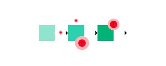
To ensure a successful operations automation implementation, consider the following best practices:
Start small: Begin with automating a small, well-defined process to gain confidence and showcase the benefits of automation. Starting small allows for easier troubleshooting and adjustment before scaling up.Collaborate with stakeholders: Involve all relevant stakeholders, including employees, managers, and IT teams, in the automation initiative. Their input and feedback can provide valuable insights and ensure a smooth implementation.Test before implementing: Prior to introducing new solution, test if what you’re building makes sense. Test the proposed solution and make sure that employees find it intuitive and user-friendly. To see if your solution is the right one, build a functional prototype of it, using a tool like UXPin Merge.Measure and track success: Establish key performance indicators to measure the success of automation. Regularly monitor and analyze the impact of automation on efficiency, productivity, and customer satisfaction. Use these insights to make data-driven decisions and further optimize automated processes.Stay updated: Stay abreast of the latest automation technologies and trends. Regularly evaluate new tools and solutions to ensure that your automation initiatives remain up-to-date and aligned with industry best practices.Embrace operations automationBy embracing automation, organizations can streamline their operations, enhance efficiency, and improve customer satisfaction. Real-life examples of operations automation in project management, helpdesk, and IT services demonstrate the transformative power of automation.
What areas of your businsess do you want to automate? Why don’t you create a prototype of your solution using UXPin Merge? It’s a drag-and-drop UI builder that makes it easy for developers to design intuitive and pretty UIs without designer’s help. Give it a shot. Discover UXPin Merge.
Discover MergeThe post What is Operations Automation? [+ Examples to Try] appeared first on Studio by UXPin.
January 16, 2024
What is a CRUD App?
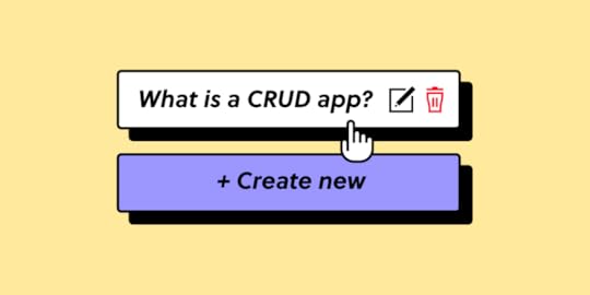
A CRUD app is an application that performs the basic operations of Create, Read, Update, and Delete on data. That’s why it’s abbreviated into CRUD. The four operations represent the fundamental actions that can be performed on most database management systems and are essential for managing data within an application.
CRUD operations are most commonly used in cases where there is a need to manage and manipulate data. Its use spans across various industries, such as task management tools, booking and reservations systems, CMS platforms, and more.
Build an interactive prototype of admin panels, internal tools or any other user interface without a designer. Drag and drop pre-built components on the canvas and create beautiful interfaces that are ready for development. Discover UXPin Merge.
Create beautiful layouts without designersTake UI components directly from Git repo, Storybook, or through NPM and design production-ready prototypes.
Bring code to design .discover-merge { margin: 40px 8px;}.discover-merge__container { display: flex; max-width: 690px; height: 200px; padding: 20px; padding-left: 24px; border-radius: 4px; background-color: black; box-shadow: 10px 10px #9999ff; align-items: center; justify-content: space-between;}.discover-merge__left { width: 50%;}.discover-merge__left p { margin: 10px 0px !important; color: white !important; font-size: 18px !important;}.discover-merge__heading { font-weight: bold !important; color: white !important; font-size: 18px !important;}.discover-merge__text { margin: 0 !important; line-height: 22px !important;}.discover-merge__button { width: 174px; height: 44px; margin: 10px 0px; border: none; border-radius: 2px; background: white; color: black; font-size: 16px; text-align: center;}.discover-merge__button:hover { cursor: pointer;}.discover-merge__image { max-width: 320px !important; height: 200px; margin-right: -19px;}@media (max-width: 760px) { .discover-merge__container { height: auto; margin: 10px; align-items: left; }}@media (max-width: 500px) { .discover-merge__container { flex-direction: column; } .discover-merge__left { width: 100%; align-items: normal; }}What is a CRUD app?A CRUD application is a foundational software app designed to perform fundamental operations on data that form the basis of data management in various platforms, providing end users with the ability to interact, organize, and maintain data efficiently.
The acronym CRUD stands for Create, Read, Update and Delete — four actions that represents the core operations performed on data. In the acronym, “Create” involves adding new data, “Read” focuses on retrieving and displaying existing data, “Update” allows for modifying existing data, and “Delete” provides the capability to remove unwanted or obsolete data.
From content management systems to e-commerce websites, CRUD apps empower end users to interact, organize, and maintain data efficiently, forming the backbone of dynamic and responsive user experiences.
In essence, a CRUD app is the engine driving data interactions, enabling users to systematically and intuitively create, retrieve, update, and delete information. Understanding these fundamental operations is key to grasping the essence of data management in the digital realm.
What are 4 CRUD operations?Here’s a breakdown of each CRUD operation:
Create Operation: Adding new data or records to the system. In a CRUD app, this could be, for example, creating a new user account, adding a new product to an inventory, or creating a new post in a blogging platform.Read Operation: Reading or retrieving data from the database is the second operation. This includes fetching and displaying information. In a CRUD app, reading may involve displaying a list of all user accounts, showing details of a specific product or presenting a feed of posts.Update Operation: Modifying existing data in the system to keep it current. This could include editing user information, changing the details of a product, or updating the content of a post.Delete Operation: Removing unwanted or obsolete data from the system. This could be deleting a user account, removing a product from inventory, or deleting a post.Breaking CRUD operations into distinct categories enhances front-end and back-end development practices by promoting clarity, modularity, reusability, and maintainability. It aligns with best practices in software engineering and contributes to the overall efficiency and robustness of a software application.
Each operation has a clear and specific purpose, making it easier for fullstack developers and stakeholders to comprehend the system’s functionality. They all can be implemented independently, allowing for easier maintenance, updates, and scalability.
What’s more, developers can create standardized functions or components for each CRUD operation, making it possible to reuse these elements across different parts of the application or in future projects.
Breaking CRUD into discrete operations also makes sense from the end user’s perspective. It allows for granular control over user permissions. Different roles or users can be granted or restricted access to specific CRUD functionalities based on their responsibilities and requirements.
Plus, CRUD operations help users easily grasp the distinct actions they can perform—create, read, update, or delete. It contributes to creating more user-friendly applications with clear and intuitive interfaces.
What are examples of CRUD apps?Here are some common examples of CRUD applications that most of us heard about.
WordPress Type of application: Content Management SystemCRUD Operations:Create: Authors can create new blog posts, pages, and media content.Read: Users can read published content on the website.Update: Authors can edit and update existing posts and pages.Delete: Unwanted or outdated content can be deleted.Salesforce
 Type of application: CRM SystemCRUD Operations:Create: Sales representatives can create new customer records.Read: Users can view customer profiles and interactions.Update: Sales teams can update customer details based on new information.Delete: Remove records for customers who are no longer relevant.Shopify
 Type of application: eCommerce platformCRUD Operations:Create: Merchants can add new products to the inventory.Read: Shoppers can view product listings.Update: Merchants can update product details, prices, and availability.Delete: Remove products that are discontinued or out of stock.Facebook
 Type of application: Social Media PlatformCRUD Operations:Create: Users can create new posts, upload photos, and add comments.Read: Users can view posts, photos, and comments from their friends.Update: Users can edit or update their own posts and profile information.Delete: Remove posts, comments, or even the entire account.Trello
 Type of application: Task Management ApplicationCRUD Operations:Create: Users can create new tasks, boards, and cards.Read: Team members can view tasks, boards, and project progress.Update: Users can edit and update task details, due dates, and assignments.Delete: Tasks that are completed or no longer relevant can be archived or deleted.What are the equivalents to CRUD operations?
In the world of web development, equivalents to CRUD exist with slight variations in function names and operations. For instance, SQL, a widely-used language for interacting with databases, refers to these functions as Insert, Select, Update, and Delete.
In NoSQL databases (MongoDB, Cassandra, and CouchDB), however, the expressions corresponding to CRUD operations are based on the specific database and its query language. For example, in MongoDB, you have insertOne, find, updateOne, and deleteOne.
Cassandra uses CQL (Cassandra Query Language) with INSERT INTO, SELECT, UPDATE, and DELETE FROM. CouchDB employs HTTP methods like POST, GET, PUT, and DELETE.
While the specific names and syntax may vary across different databases and programming languages, the basic CRUD actions performed—creating, reading, updating, and deleting data—are essentially equivalent or analogous.
What are the steps of building CRUD apps?Here is an overview of developing a crud app. The process involves prototyping phase – a very important step. Why is that? Prototyping ensures that the app will be a user-centric, reliable, and scalable solution that stands the test of time.
Gather requirementsBefore you will build a Crud app, sit down with your team and decide what your app needs to do, outlining the specific information you intend to handle through each CRUD operation. This initial step lays the foundation for a robust and efficient application that seamlessly manages data interactions.
The easiest way of gathering requirements is design thinking workshop, a structured meeting during which you discuss what needs to be built and how, imagining user journeys and user requirements, as well as technical constraints and business objectives. In design thinking, user, business, and technical requirements are translated into desirability, feasibility, and viability.
Learn about design thinking workshops here.
Design a Prototype of a Crud AppAn aesthetically pleasing and user-friendly interface is the face of any successful CRUD app. Leverage UXPin Merge to build prototypes that function like an end-product. Craft screens that cater to each CRUD operation—creation, reading, updating, and deleting data.
Why would you start with a design? The design-centric approach ensures that you can test the design before committing resources to building it. It allows you to check if what you want to design is intuitive to the end-users. What’s more, it helps you make sure you’re creating an app that you actually need. Lastly, it ensures that your design is feasible as UXPin Merge is a design tool for designing with real React components that will be building blocks of your app.
Set Up DatabaseAre you happy with your design? Great! The next step is installing and configuring a database based on your data model. Let’s say you picked MongoDB. It’s high time to install and configure it
Build API endpoints and Connect them with UIDevelop dedicated routes and controllers to facilitate smooth communication between the user interface and the database. Embed proper validation and error-handling mechanisms, ensuring the reliability and security of your app as it processes data through each CRUD operation.
Then, build a front-end based on your design and connect the interface with API endpoints.
Test your Crud appValidate each CRUD operation extensively to ensure they function as anticipated. This testing phase also encompasses ensuring data integrity and addressing potential edge cases. Rigorous testing guarantees that your app is not only user-friendly but also robust, resilient, and capable of handling various scenarios.
Deploy the appThe final step in the journey of crafting a CRUD app is its deployment. Make your app accessible to the public by deploying it to a server or a cloud platform. This ensures that users worldwide can benefit from the functionality you’ve meticulously designed. Deployment is the culmination of your efforts, transforming the app from a local development environment into a valuable asset in the digital realm.
Build an interface of a CRUD app with UXPin MergeTime to build your own CRUD app. Start by planning its interface. Use UXPin Merge to quickly assemble an interactive, fully functional prototype of a Crud app that you can test and show to other team members. Try a design tool that’s made with developers in mind. Discover UXPin Merge.
Discover MergeThe post What is a CRUD App? appeared first on Studio by UXPin.
January 12, 2024
Top UX Design Tools for 2024

User Experience design is all about ensuring that the relationship between the user and the digital product is positive. Thankfully, with the many modern tools out there, teams of designers can easily collaborate on a design in real-time as well as test its usability and make iterations to designs.
Research is one thing, but you will be able to pick the best UX design tool only after you try it. Design prototypes that feel real in UXPin. Try UXPin for free.
Build advanced prototypesDesign better products with States, Variables, Auto Layout and more.
Try UXPin .try-uxpin-banner { margin: 40px 0px;}.try-uxpin__container { display: flex; max-width: 689px; height: 210px; padding: 20px; padding-left: 24px; border: 2px solid black; border-radius: 4px; align-items: center; justify-content: space-between; background-color: white; box-shadow: 10px 10px black;}.try-uxpin__left { width: 54%;}.try-uxpin__left p { margin: 10px 0px !important; color: black !important;}.try-uxpin__heading { font-size: 28px !important; font-weight: bold;}.try-uxpin__text { margin: 0 !important; font-size: 18px !important; line-height: 22px !important;}.try-uxpin__button { width: 135px; height: 44px; background: black; margin: 10px 0px; padding: 10px 20px; border: none; border-radius: 2px; color: white; font-size: 16px; text-align: center;}.try-uxpin__button:hover { cursor: pointer;}.try-uxpin__image { max-width: 320px !important; height: 200px; margin-right: -21px; margin-bottom: -6px;}@media (max-width: 760px) { .try-uxpin__container { height: auto; margin: 10px; align-items: left; }}@media (max-width: 500px) { .try-uxpin__container { flex-direction: column; } .try-uxpin__left { width: 100%; align-items: normal; }}UXPinUXPin gives you all the features you need to design high-fidelity prototypes that actually feel like you’re using the finished digital product. UXPin comes with hundreds of user interface elements that make it easy to design fast and stay consistent across the team.
UXPin MergeUXPin has a one-of-a-kind Merge technology for building layouts faster than in any other tool. Your team can design with drag-and-drop components that come from an open-source component library, such as MUI, Fluent UI, or any other coded design system.
Once your design is done, you can extract the code behind each component and use it to develop the app. You don’t need a design to code translation anymore – your design is already ready for development. You have all the specs inside the tool. Watch a quick review below.
What’s more, UXPin makes it easy to perform usability testing. Simply, share your design with others and watch how they can interact with a design. That’s all without wasting your time on developing the design.
FigmaFigma focuses on interface design and brainstorming. Similar to Google Docs, you can see who is presently working on the project and what they are inputting, which allows for a convenient real-time collaboration on a project. You can build mockups and partially functional prototypes.
To make Figma designs work like an end-product, you may integrate it with a prototyping tool. UXPin has their own extension of copying and pasting Figma designs to UXPin, to make it interactive. Read the full tutorial of how to do that: From Figma to UXPin – Full Tutorial.
InVisionOnce a revolutionary tool and a great hub for designers, InVision used to offer a comprehensive set of UX design features. The platform’s intuitive interface made it easy to design and iterate on user interfaces, saving valuable time and resources.
Designers used InVision to gather feedback from team members and stakeholders, fostering a more iterative and collaborative design process. InVision offered a user-centric approach to prototyping and UX design, empowering designers to deliver high-quality, interactive designs that align with user needs and business goals.
Unfortunately, InVision was shut down in January 2024. If you’re looking for an alternative, we strongly recommend you try UXPin Merge, which is a leader when it comes to interactive UX design. Discover UXPin Merge.
SketchSketch is another UX design tool that supports shared libraries and layouts and allows you to share and export designs with others. It also has many editing tools such as vector and plugin tools. If you are working on a detailed design, then you can zoom in and edit at a more precise level. Another convenient feature is the ability to resize parts of your design on command.
Sketch is good for creating unique icons and designs that you can then save in your library. This allows for an easy share feature across projects where, for example, an icon can be used on multiple separate designs with relative ease.
On top of that, you can store your designs on the cloud which allows your team or organization to have easy access to designs and a more fluid design process. Another important feature allows contributors to comment, edit, and make changes to a project that are then automatically synced to the cloud.
MarvelMarvel is another cloud-based platform that will automatically sync web designs to the cloud. Plus, it offers mobile support for quick changes on the go. There is also a library of templates, images, and screen components like buttons that can easily be accessed and implemented into your project.
Marvel is built more for beginner use and has a drag-and-drop system that allows users to develop a design without the need for self-imputed coding. It is also a collaborative design platform that allows other team members to provide feedback and input their own designs.
There are templates specifically designed for various devices such as tablets, smartphones, and desktop computers. Mockups can be tested as if they were the real thing which allows for the designer to quickly find any faults and update the design as needed.
You can also download the Marvel app onto your iOS or Android device. This allows for ideas to be tested on smartphone devices and easy sharing options.
Pick the best UX design toolAs you’ve seen from the examples above, some of the most popular design platforms allow you to focus on one element of the design process. While some, like Marvel, are great for casual designs, others are catered to working on more complex digital products and mobile apps.
Unfortunately, using several solutions means a larger design toolkit that can slow you down. Your designers will need to integrate or jump between a number of apps in their daily work.
Luckily, you can also turn to advanced tools that allow you to work on a design from idea to completion. Or, like UXPin, they’ll even allow developers to copy HTML and CSS code from design to their workflow.
When compared to other solutions, UXPin is one of the most comprehensive UX design tools in the industry. This makes it a particularly attractive alternative to software like Axure, Proto.io or Figma which were traditionally used for specific phases of the design process.
With UXPin you can design fully interactive prototypes that make it clear what the final user experience should be like. See how UXPin helps you design more realistic prototypes. Sign up for UXPin trial.
Try UXPin for freeThe post Top UX Design Tools for 2024 appeared first on Studio by UXPin.
January 10, 2024
Product Design Trends for 2024

Every year we’re sit down to observe products’ UIs to determine the trends to come. This year was no different. By looking closely at the trending products, we can pinpoint some trending design patterns and solutions. Let’s discuss them.
Build interactive user interfaces without developers’ help. Try UXPin – a collaborative design tool that allows you to include real interactions. From the push of a button, to complex multi-step forms, give a UXPin a shot on a free trial. Try UXPin for free.
Build advanced prototypesDesign better products with States, Variables, Auto Layout and more.
Try UXPin .try-uxpin-banner { margin: 40px 0px;}.try-uxpin__container { display: flex; max-width: 689px; height: 210px; padding: 20px; padding-left: 24px; border: 2px solid black; border-radius: 4px; align-items: center; justify-content: space-between; background-color: white; box-shadow: 10px 10px black;}.try-uxpin__left { width: 54%;}.try-uxpin__left p { margin: 10px 0px !important; color: black !important;}.try-uxpin__heading { font-size: 28px !important; font-weight: bold;}.try-uxpin__text { margin: 0 !important; font-size: 18px !important; line-height: 22px !important;}.try-uxpin__button { width: 135px; height: 44px; background: black; margin: 10px 0px; padding: 10px 20px; border: none; border-radius: 2px; color: white; font-size: 16px; text-align: center;}.try-uxpin__button:hover { cursor: pointer;}.try-uxpin__image { max-width: 320px !important; height: 200px; margin-right: -21px; margin-bottom: -6px;}@media (max-width: 760px) { .try-uxpin__container { height: auto; margin: 10px; align-items: left; }}@media (max-width: 500px) { .try-uxpin__container { flex-direction: column; } .try-uxpin__left { width: 100%; align-items: normal; }}Inspiring Product Design Trends for 2024There are so many unique, quirky, and engaging graphic design trends this year that we battled to narrow them down. Here are our top product design trends for 2024.
Coded design systemsIn 2024, designers will embrace coded design system more. As the new version of Porsche Design System has seen the light of day, more and more designers will see the value of having their design system be integrated with code. They will adopt tools like Storybook and make sure their design system meets user needs of their development team too.
Artificial intelligenceWho haven’t heard about AI in 2023? 2024 will be a year of AI as well. With Google releasing Gemini to updates of ChatGPT, AI will stay on our lips. AI tools have heavily impacted the world of design. Designers can use in research (competitive analysis, user research), artifacts creation, and UX optimization (A/B testing, segmentation, accessibility measurement.)
AI-driven design will be also a thing. A lot of tools are adding AI to their set of features to give designers more time to focus on what matters.
Brutalist typographyBrutalist typography is characterized by a raw, straightforward, and often unadorned approach to typefaces. Popular first in industrial design, the term “Brutalist” originates from the French word “brut,” meaning raw or raw concrete, and this is a feeling that you get when looking at a brutalist typography.
These typefaces are rather simple. Decorative elements, such as serifs or embellishments, are typically minimal or absent. The focus is on clear and direct communication through the use of basic letterforms. Think bold and geometric shapes. The emphasis is on strong, visible letterforms as a stand-alone design elements.
Demand for conversational UI designThe increasing popularity of ChatGPT and advancements in similar conversational AI models contributes to a growing demand for chatbot design and conversational UI design. For that reason, it’s important to know how to design an high-quality user interface for that purposes.
Users are becoming accustomed to conversational interfaces that offer seamless interactions. Chatbots, powered by advanced language models, can provide more human-like and contextually relevant responses, raising user expectations for intelligent and responsive digital conversations.
As the use of advanced chatbots becomes a competitive differentiator, businesses are increasingly investing in well-designed chatbot experiences to enhance their brand image, stay competitive in the market, and meet evolving customer expectations.
User-initiated interactive animationsIn 2024, interactive animations take center stage as dynamic, motion-driven elements within user interfaces. The goal is to inject dynamism, intuition, and visual allure into UI design. Designers deliberately create surprising microinteractions and animations that are initiated by a user instead of always playing in the background.
Users are empowered to incite these interactive marvels through a range of actions, such as:
Clicking or Tapping: Many interactive animations are triggered by a user clicking a mouse or tapping on a touchscreen device. For example, a button may have a hover effect or change in size and color when clicked.Hovering: Hover effects occur when a user moves their cursor over an interactive element without clicking. This can reveal additional information, change the appearance of an element, or trigger a subtle animation.Scrolling: Animations can be tied to the user’s scrolling behavior. As the user scrolls down a webpage, elements may appear, disappear, or transition in response to the scroll action.Gestures: On touch-enabled devices, gestures such as swiping, pinching, or rotating can trigger interactive animations. This is common in mobile apps and interfaces designed for touch interactions.Form Inputs: Interactive animations can be associated with form inputs. For instance, a form field might expand or display additional options when the user clicks on it, providing a more interactive form-filling experience.Voice Commands: In interfaces with voice recognition capabilities, users can provoke interactive animations through voice commands. This is more common in virtual assistants and voice-activated applications.Interactive Elements: Certain elements within an interface may inherently respond to user interactions. For example, a draggable slider or a collapsible menu can be considered interactive elements that provoke animations when manipulated by the user.User-initiated interactive animations help to create an illusion of a friendly product and boosts brand identity.
SustainabilityDesign can solve real-world problems. In the context of app and web design, sustainability is the practice of creating products in a way that minimizes their environmental impact and ensures long-term viability. This approach takes into consideration various aspects of the design and development process to promote a more eco-friendly and socially conscious digital products.
Key elements of sustainability in app and web design include:
Energy Efficiency: Sustainable design aims to reduce the energy consumption of digital products. This includes optimizing code, minimizing unnecessary features, and employing efficient hosting and server practices. By doing so, designers contribute to lower energy usage and reduced carbon footprints.Minimalism in User Interfaces: Reducing the number of elements in UI contributes to sustainability. How? A minimalist design approach often leads to lighter, faster-loading websites and apps, which, in turn, require less data transfer and energy consumption.User-Controlled Animations: Providing users with the option to control or disable animations and other resource-intensive features can contribute to a more sustainable experience. This puts the user in control of their data usage and device performance.Modular Design: Adopting a modular design approach allows for more scalable and flexible systems. This means that updates and additions can be made without significant disruptions, reducing the resource consumption.Optimized Images and Media: Compressing and optimizing assets reduce the overall file size of a website or app, leading to faster load times and decreased data transfer. This not only enhances user experience but also minimizes the energy required for content delivery.Immersive experiencesImmersive design refers to the practice of creating digital experiences that deeply engage users and provide a sense of presence within a virtual or augmented environment. This design approach aims to captivate users by leveraging technologies such as Virtual Reality (VR) and Augmented Reality (AR) to create rich, interactive, and realistic user experiences.
Yes, VR and AR continue to be trends in the world of design. For those of you who don’t know, Virtual Reality is a computer-generated simulation of a three-dimensional environment. Augmented Reality, on the other hand, overlays digital information, such as images, text, or 3D models, onto the real-world environment.
Unlike VR, Augmented Reality does not replace the real world but enhances it by adding digital elements that users can perceive through devices with a camera.
AR has its practical application in eCommerce. It helps users to visualize products in their real-world environment before making a purchase decision. For instance, trying out furniture in one’s living room using an AR app.
It can also be used for educational purposes by overlaying informative content onto real-world objects. This interactive learning experience enhances engagement and understanding.
Virtual Reality found its application in the HealthTech. From pain management and optimizing surgical procedures to gamifying physical therapy, VR is proving a diverse array of use cases.
Particularly notable is its potential to transform the field of behavioral health, as supported by extensive research on its efficacy. VR is actively employed in the treatment of various conditions such as anxiety, post-traumatic stress disorder (PTSD), substance use disorders, and autism.
If you want to create a user-friendly UI for VR or AR, read our guide.
Take Your Product Design to New Heights With UXPinCode-based design is revolutionizing UX workflows and changing the way designers approach design. With UXPin’s advanced features, product teams can create high-fidelity prototypes that accurately replicate code-based products.
Here are four UXPin features that designers can use to enhance prototypes:
States: Apply multiple states to a single element or component, each with different properties, interactions, and animations.Interactions: Create complex interactions with advanced animations and conditional formatting.Variables: Capture and store user inputs and use that information to take actions or personalize a user experience.Expressions: Create fully functioning forms, validate passwords, update shopping carts, and more with Javascript-like functions.Sign up for a free trial and see how UXPin can optimize design processes, enhance prototyping and testing and create beautiful product experiences for your customers. Try it now.
Try UXPin for freeThe post Product Design Trends for 2024 appeared first on Studio by UXPin.
UXpin's Blog

- UXpin's profile
- 68 followers

